Mathematical Statistics Stockholm University Statistical modeling of the spatial distribution of dengue fever - an investigation of the validity of different selection strategies when using presence only and pseudo absence data Ying Liu Examensarbete 2014:1

Welcome message from author
This document is posted to help you gain knowledge. Please leave a comment to let me know what you think about it! Share it to your friends and learn new things together.
Transcript
Mathematical Statistics
Stockholm University
Statistical modeling of the spatial
distribution of dengue fever - an
investigation of the validity of different
selection strategies when using presence
only and pseudo absence data
Ying Liu
Examensarbete 2014:1

Postal address:Mathematical StatisticsDept. of MathematicsStockholm UniversitySE-106 91 StockholmSweden
Internet:http://www.math.su.se/matstat

Mathematical StatisticsStockholm UniversityExamensarbete 2014:1,http://www.math.su.se/matstat
Statistical modeling of the spatial distribution of
dengue fever - an investigation of the validity of
different selection strategies when using presence
only and pseudo absence data
Ying Liu∗
April 2014
Abstract
Dengue fever is a widely dispersed vector-borne infectious disease withan uncertain global geographic distribution. Recent studies have createdrisk maps identifying global risk areas of dengue transmission to enhancesurveillance, control, risk awareness and local and international policies.Being a climate sensitive disease, the potential change in the risk area ofdengue has also been studied under climate change projections to the endof the 21st century. The validity of prediction and projections of denguedepends on the data quality, how researchers avoid systematic bias, andthe type modeling approach taken. Boosted regression tree (BRT) model-ing has been credited to perform species distributions and disease presenceand absence mapping. Here a BRT model is used to investigate climaticconditions and human population as possible predictors of dengue fevertransmission. There are two forms of information about dengue fever uti-lized: presence only (PO) and pseudo absence (PA) data. The locationswhere dengue fever has been reported globally (totally 1537 different ge-ographical locations) is referred to as presence only (PO) data. The setof geographical locations where dengue has not been reported constitutesa set of potential, but not confirmed is pseudo absence (PA) data. Thisthesis aims to 1) model the spatial distribution for dengue fever; 2) usedifferent methods to generate pseudo absence data in order to comparehow different strategies of simulating PA data affect BRT model fits andthe importance of predictor variables; and 3) discuss the implications ofthis to risk mapping strategies of dengue. Two combinations of strategiesare used to randomly select PA data. One strategy uses a selection basedon the geographical distance to PO, the other strategy selects the dataaccording to evidence based consensus regions of dengue absence. Theresult shows that different PA selection methods do affect the distribu-tion of dengue. The risk maps show that the risk areas of dengue arelarger under selection according to evidence-based consensus compared toselection at random.
∗Postal address: Mathematical Statistics, Stockholm University, SE-106 91, Sweden.
E-mail:[email protected]. Supervisor: Kristoffer Spricer.

2
Acknowledgements
I would like to thank Kristoffer Spricer, my internal supervisor, for his many suggestions and
help during this research. I also want to thank my external supervisor Joacim Rocklöv, for offer-
ing me this interesting topic and for his constant support and suggestions.
I am grateful to my parents for their patience and support. Without them this work would never
have come into existence. I will also thank my inspirational friend Jing Helmersson since she
gives me many inspirations and help.

3
Contents
1 Introduction 5
2 Objectives 7
3 Scope of this study 7
4 Data description 8
4.1 Global climate data set 8
4.2 Brady data set 10
5 Statistical method-BRT 11
5.1 Background 12
5.2 Boosted regression trees 13
5.3 Important characteristics 14
5.4 Interaction 15
5.5 Area under the receiver operating characteristic curve 15
6 Datasets created for validation 16
6.1 Brady data set 16
6.2 Brady1537 data set 17
6.3 Brady5o data set 18
6.4 Brady10o data set 19
6.5 Random data set 20
6.6 Random5o data set 20
6.7 Random10o data set 21
7 Results 22
7.1 Model A 22
7.2 Model A1 24
7.3 Model A2 25

4
7.4 Model B 26
7.5 Model B1 28
7.6 Model B2 29
7.7 Global risk maps for all models 30
8 Conclusions and discussion 32
8.1 Alternative method-GLM 32
8.2 How the different PA selection strategies affect model fits 33
8.3 Predicted global risk maps 33
References 35
Appendix 37
5
1 Introduction
Dengue is a widely dispersed vector-borne viral infectious disease. It is transmitted between hu-
mans via mosquitoes. Symptoms of dengue include high fever, headaches, joint and muscle pain,
vomiting and a rash [1]
. Dengue can develop into a hemorrhagic fever with life threatening com-
plications in humans. WHO reports that although there is no specific treatment to cure dengue
fever, fatality rate can be reduced below 1% by early detection and access to proper medical care [2]
. The global burden of dengue becomes larger and larger because effective spread and adapta-
tion of the disease to urban areas. WHO estimates approximately 50-100 million infections
worldwide per year [2]
, however, new estimates are around 4 times higher [3]
. It is important to
study dengue fever so as to investigate and outline its spatial distribution and risk areas for at-
tracting the disease. Several research studies have attempted to do so [3] [4] [5] [6] [7]
. Since it is
spread by mosquitoes, dengue fever is climate sensitive. It is also important to better understand
the impact of climate and climate change on dengue expansion into previously uninfected areas.
This has been attempted by several studies [5] [7]
.
Species and disease distributions can be studied with the help of various analytical methods [8]
.
The analytical methods have been evaluated on presence only (PO) data corresponding to geo-
graphically coded confirmed observations of dengue. Sometimes they also have been used with
true absence observations or in disease mapping often with pseudo absence (PA). The PO data
corresponds to locations where the species or disease has been reported. The set of geographical
locations where dengue has not been reported constitutes a set of potential, but not confirmed,
dengue absence. These observations therefore fall into the category of data for selection for use
as pseudo absence (PA) data. Alternatively, the absence observations have been confirmed ab-
sence and constitute the true absence. If the selection of PA includes a systematic bias with re-
spect to the true absence or to the predictors used in forming the predictions and projections from
the models, the resulting risk maps from these models will be incorrect and biased.
Using presence-only and presence-absence data to model the species distribution of animal spe-
cies, general linear models (GLM), boosted regression trees (BRT), and various other analytical
methods have been used [8]
. Comparing BRTs and GLMs, both can be used to do regression anal-
ysis. However, BRT modeling differs from GLMs, which aim to fit a single parsimonious model.
BRT modeling involves many single models for each predictor variable by recursive binary splits
and combines these models to form a final additive regression model, which has a better predic-
tive performance that GLM [8]
. Studies have shown BRT can also provide better fits than GLM
and various other methods, [8]
therefore it is widely recommended and used to fit and study the
distribution of vector-borne disease [3]
. Modeling the spatial distribution of a vector-borne disease
has similarities to modelling a species distribution. The use of BRT to model the distribution of
species and disease has been suggested to provide better fits than many other methods [8]
.

6
Observations of dengue fever have been reported and collected in global data bases traditionally
by WHO at a country and sub-country level, later by researchers, MEDLINE, Google and institu-
tions such as the U.S. Centers for Disease Control and Prevention (CDC) and the European Cen-
tre for Disease Prevention and Control (ECDC). In 1970 there were only 9 countries who report-
ed their dengue activities. Now more than 100 countries report dengue [2]
. Dengue has increased
by urbanization and international trade. ECDC initiated a collection of all dengue presence data
(PO) constituting credible reports from various sources. This data was later extended and de-
scribed by Simmonds et al [4]
and Brady et al [6]
. According to the passive collection method,
some locations may have incidence, but they are not reported. In particular, gaps in reporting may
occur in areas of low and middle income countries with inadequate surveillance and disease di-
agnostic tools, e.g. in many regions of Africa. Therefore the disjunct set of non-presence observa-
tions may be either simply non-reported presence or true absence. Handling of all of this data as
if it was true absence (or pseudo-absence) may potentially give rise to bias. Since taking the true
absence data (or PA data) as the PO data to fit the model will give bias to the data sample. Fur-
thermore, the estimated statistic from the fitted model, which is modelled under the biased data
sample, will differ from the true parameter of dengue fever in reality. If the estimated statistic
from a fitted model is not equal to the true parameter, then, according to a statistical definition of
bias, this statistic contains a bias.
Pseudo absence data is being used to evaluate the model fit when actual instances of confirmed
absence are missing. The methods for generating the pseudo absence may have great impact on
the fitted relationship and resulting risk maps and the corresponding estimate of the spatial distri-
bution of the disease. It is unknown but important to understand how model fits vary according to
sample bias in the selection of the pseudo absence for vector-borne diseases, such as dengue. In
this study we will find out how the selection of pseudo absence data and how the bias of such da-
ta affects the fit of the spatial distribution of dengue fever. There are some different approaches
for choosing pseudo validation for dengue fever, such as random selection [9]
and systematic se-
lection related to the distance from PO [4]
locations. Alternatively data can be selected from evi-
dence based consensus data [3]
. When generating PA data, choosing the same number of PA ob-
servations as the available PO data, has been identified to provide a better predictive accuracy
when using the BRT method [10]
. Using too little PA data does not supply enough useful infor-
mation, whereas using too much PA data automatically increases the number of false absences.
Both will decrease the predictive accuracy of the fitted model.
Climatic conditions and weather variability are important determinants of dengue disease prolif-
eration, although other factors can also be of importance, such as population densities and inter-
ventions to control mosquitoes and disease. Climate factors influence and lay the ground for the
successful life cycle and growth of the mosquitoes transmitting dengue. They determine the vec-
torial capacity (life expectancy of vectors, biting rate, extrinsic incubation period etc.) and the
vector competence (how well the virus replicates in the vector) [11]
[12]
. Thus, without the climate
conditions being suitable dengue cannot proliferate. However, in addition to this there are obvi-

7
ous other factors that are important for the disease spread and that modify the intensity of trans-
mission such as urbanization, population growth and human interventions. Also, the spread of
dengue vectors and virus to new areas is depending on human transportation (e.g. migration) and
mobility networks (e.g. air travel network) [13] [14] [15][16]
.
Moreover, in a study of distribution of dengue fever, the actual case reports can only come from
places where people live. Thus, case reports (presence of dengue) and population density should
be correlated. Also population density may be correlated with climate variables because people
have a tendency to habituate and reproduce more effectively in certain climate zones. Therefore
population density should be considered as a factor in the spatial distribution of dengue fever in
order to avoid confounding bias. Since dengue fever is a vector-borne disease which is transmit-
ted through mosquitoes, the spatial distribution of the mosquitos could also be a confounder.
However, in the PO data it is inherit that all factors important for the disease proliferation are
present. This is not to say that all areas with population and suitable climate absolutely are areas
with dengue transmission. However, at present it appears this may be more likely than the alter-
native situation as dengue vectors and virus has been incredibly efficient in spreading to most ar-
eas of its climate niche that are habituated by humans.
2 Objectives
1) Use BRT models to fit the spatial distribution for dengue fever.
2) Find out how the most influential variables change and prediction maps change according
to different PA selection strategies, e.g. the distance from PO and confidence based con-
sensus level.
3) Discuss the implications of this to risk mapping strategies of dengue.
3 Scope of this study
This thesis studies the dengue distribution and its relationships with 30 climatic factors and popu-
lation density. It investigates how the predictors change due to different validation schemes based
on the selection of pseudo absence data.
Since dengue fever is a vector-borne disease, the vectors and its population density are important
influencing factors. Mosquitoes are directly influenced by climatic variables [15]
. However, the
factor “presence of mosquito” is difficult to know accurately. A limitation of this thesis is that
mosquitoes are not taken into account explicitly. Its consequence may be that climatic factors and
population density account for more of the variance of the dengue distribution in the model.
8
Therefore, the model should also work without the information of where the mosquito is present.
In the longer run (long time perspective) the mosquito is only an intermediate of climate as the
mosquito has spread basically to all climate regimens they can inhabit. This is because certain
climate is necessary for the survival of mosquitoes.
4 Data description
There are two different kinds of data sets used in this thesis. One kind of the data sets is raw data
set and the other is called the created data set for validation, which is described in chapter 6. The
raw data sets include global climate data set and Brady data set. They are two distinct data sets.
4.1 Global climate data set
The global data set is made of dengue data and predictor data which contains climatic predictors
and population density.
Dengue data
A global dengue observation data set referred to as presence only (PO) with 1537 unique geo-
graphical observations was obtained for this study through collaboration with the European Cen-
tre of Disease Control and Prevention (ECDC). It was collected from publication in scientific lit-
erature and online resources including Medline and HealthMap reports, 1960 and 2012 [3]
. The
PO data was obtained on a 0.5*0.5 arc degree (1 arc degree is approx. 111km) latitude/longitude
global geographical grid.
Figure 1 Geographic position plot for the PO data. This figure shows the geographic locate for

9
the 1537 unique presence only observations. The red points represent PO observations. All of
these PO observations are located in the tropical or sub-tropical areas.
Figure 2 Geographic position plot for the non-presence data. This figure shows the geograph-
ic locations for the non-presence observations. The green dots represent the global non-presence
observations.
Predictor data
Climatic data was obtained from the Climate Research Unit of East Anglia (CRU) [17]
. All climat-
ic data was obtained on a 0.5*0.5 arc degree latitude/longitude global geographical grid. The
global climate data set contains thirty climate predictor variables. Climatic variables of potential
predictive ability on the global dengue distribution were aggregated and studied in terms of their
relationship with dengue PO and PA observations.
The climatic predictor variables and population density variable are listed in Table 1. Each of the
ten weather-variables recorded monthly was aggregated to annual average 30 year mean, as well
as their 30 year annual average maximum or minimum values for the period 1980-2009. We use a
number of 1 to denote minimum, 2 for mean, and 3 to denote maximum for each climate predic-
tor in Tables and Graphs. For instance, Cld1 is the minimum value for predictor Cld (cloud cover)
and Cld3 is the maximum value. Cloud cover data is synthesized from Dtr in areas where sun
hours are not measured [17]
. A frost day is a period of 24 hours in which the minimum tempera-
ture falls below 0°C [17]
. Observations’ statistical descriptions such as mean, median, min and
max values are displayed in Table 1. In the global climate data set there are 4937 missing values
in the factor potential Evapo-Transpiration. The reason for these missing values is because some
of the monthly average data that was generated from the daily data was not recorded if the daily
data of that month were less than 28 days.
10
Population data was obtained from the ISI-MIP project gridded to a 0.5*0.5 arc degree lati-
tude/longitude global geographical grid [18]
.
Table 1: Descriptions of original predictor variables and scale
Variable Description Mean Minimum Maximum Unit
cld cloud cover 57,11 11,45 92 %
dtr diurnal tempera-
ture range 11,33 2,68 29
o C
frs frost day frequen-
cy 14,64 0 30 days
pet Potential Evapo-
transpiration 2,73 0,35 8 millimeters
pre precipitation 54,61 0 617 millimeters
tmp daily mean tem-
perature 8,57 -27,61 31
o C
tmn
monthly average
daily minimum
temperature
2,91 -41,97 26 o C
tmx
monthly average
daily maximum
temperature
14,25 -23,16 38 o C
vap vapour pressure 10,71 0,1 32 hPa
wet wet day frequency 9,02 0 30 days
pop population count
of people 92158,78 0 17259910 people
4.2 Brady data set
A global national or sub-national dengue evidence based consensus dataset was obtained on a
0.5*0.5 arc degree latitude/longitude global geographical grid [6]
. Creating the dataset of evidence
based consensus, Brady et al. utilized all available information on dengue occurrence to produce
a global dengue map of uncertainty-certainty of dengue presence and absence. They obtained ev-
idence for indigenous dengue virus transmission from four different ways: health organizations,
case data, peer-reviewed evidence and supplementary evidence. Sources of peer-reviewed evi-
dence were for the period 1960-2012. Based on evidence quality, accuracy and contemporariness,
and expert judgments, they gave each country an evidence consensus score. Based on these
scores they divided dengue transmission evidence consensus into 9 categories globally going
from complete absence of transmission to complete presence (see Table 2). The map provided a

11
list of dengue status for 128 countries [6]
. The difference between the Brady dataset and the global
climate dataset is their dengue data. In the Brady dataset, the dengue data is dengue evidence
consensus score, which scale is from 0 to 200. However, in the global climate dataset, its dengue
data was obtained from ECDC and denoted by 0 and 1 where 1 denotes for presence and 0 de-
notes for non-presence.
Table 2: Evidence consensus category
Brady et al. had displayed current global dengue evidence of ASCII data which has 720 columns
and 360 rows per time step and presents exactly 360 latitude x 720 longitude. The first row in
each grid is the southernmost (centred on 89.75S) and the first column is the westernmost (cen-
tred on 179.75W) [17]
. In this ASCII data Brady used score scales to identify the status of dengue
fever and used -9999 to denote missing values. The missing values are some locations which not
included in these 128 countries. If Brady’s global dengue map is correct, it will provide an excel-
lent reference for dengue status in global scales. This is much better than PO data, because it not
only provides the dengue presence but also dengue absence as well as poor, intermediate etc. sta-
tus.
5 Statistical method-BRT
Boosted regression tree is a powerful machine-learning method. In this study, it is used to fit spa-
tial distribution for dengue (presence-absence) and find out the relationship between it and pre-
dictors. Using BRT to fit models, we can study the strength of statistical predictor variables and
investigate how model fits vary according to different PA selection strategies. BRT models disen-
tangle the contribution of each predictor variable into percent of all explanatory power adding up
to a total of 100%. The percent of each predictor variable is called relative importance of predic-
tor variables. Larger numbers for relative importance of given predictor variables indicate that
these given predictors have stronger influences on the response variable. The 10-fold cross-
validation is also applied to prevent overfitting to the data.
Evidence consensus category
Complete (absence)
Good
Moderate
Poor
Indeterminate
Poor
Moderate
Good
Complete (presence)

12
5.1 Background
BRT is rarely used to fit spatial distribution since it is a new technique [19]
. It is identified that
BRT model has strong predictive performance and is flexible to include nonlinearities and higher
level interactions. More and more studies of spatial distribution use this method, especially in
ecology and disease. Year 2006, Elith et al. used some different methods to fit species distribu-
tion (e.g. BRT and GLM) and found out that BRT was better than the traditional statistical meth-
ods [8]
. Several studies of global dengue applied BRT models to fit the species distribution of
dengue.
Year 2012, Simmons et al. used BRT to model the suitability of dengue transmission based on
the climatic and environmental predictors [4]
. The predictors used in this study are land surface
temperature, enhanced vegetation index, precipitation, dengue temperature suitability index, ele-
vation and urban extent. The data set contains 1537 (with 0.5*0.5 grid) occurrence records of
dengue from the period 1956 to 2009. According to the expert opinion consensus, Simmons et al.
randomly generated PA data within 2 arc degrees to 10 arc degrees at the distance from PO data.
Bhatt et al. in 2013 also applied BRT to build dengue distribution by using 1537 (with 0.5*0.5
grid) dengue occurrence records between 1960 and 2012 [3]
. They built 336 BRT models and av-
eraged predictions to produce a mean predicted global risk map. The PA data in Bhatt’s study
was generated by four steps.
1) Apply the national and sub-national evidence consensus of dengue fever. It has a consen-
sus scale from absence to presence [-100,…, 100], with -100 indicating complete absence
and 100 indicating complete presence.
2) Create a random point and restrict it to a maximum distance c from any PO data.
3) Generate a uniform random variable t on the scale -100<d<100. If t>d then the random
point in step 2 is accepted as a PA data. If t<d and d>-25 then accept it as a pseudo-
presence data.
4) Repeat step 2 and step 3 to generate pseudo-absence and pseudo-presence.
The chosen proportions of PA to the total number of data set were 1:1, 2:1, 4:1, 6:1, 8:1, 10:1,
and 12:1. The chosen proportions for pseudo-presence were 0:1, 0.01:1, 0.025:1, 0.075:1 and
0.1:1. The maximum distance c values were 5, 10, 15, 20, 25, 30, 35 and 40 arc degrees.
Rogers et al. used BRT method to fit the distribution of dengue fever. They applied the bootstrap
tool for evaluating the accuracy of model. 100 sample datasets were randomly drawn with re-
placement from the original dataset and with the same size. The 100 different models were fitted
by these sample datasets. The predictions were average values of these models which were used
to conduct a single global risk map. The two modelled distributions of vector species Aedes ae-
gyptii and Aedes albopictus were also used as predictors to produce the map. Rogers et al. gener-
ated the PA data with combining geographic distance and Mahalanobis distance. First, select the
PA data randomly at the distance scale [0.5 arc degrees, 5 arc degrees] from any of the PO data.
13
Second, apply the Mahalanobis distance method: if the Mahalanobis distance between a non-PO
data and PO data is larger than 7 then choose this non-PO data as PA data. There are 2927 PO
data of dengue fever and 14000 PA data was generated. 100 bootstrap samples were selected with
equal numbers of the PO and PA data with replacement, and were used to conduct species distri-
bution.
5.2 Boosted regression trees
A BRT model comprises two methods-boosting and regression trees. Firstly the data set is parti-
tioned into a set of partitions; secondly each partition is fitted to a simple model [20]
: ( )
( ), there is a constant in partition j.
The recursive binary partition is used to split the space into different partitions which are called
regions. The region is also called (terminal) node or leave of the tree. It is a unit interval of ex-
planatory values.
Assume a dataset, which has a response variable, k explanatory variables and N paired observa-
tions ( ), i=1…N. For it equals to vector ( ) Suppose J regions …,
were split by the previous process-binary partitions. The response variable y can be modeled
as a constant in each region [20]
:
( ) ∑ ( )
[20] (5.1)
Using the minimization of the sum of squares ∑ ( ( ))
as the split criterion, the best
fitted constant for region is the mean value of . Since the average value of y can give the
sum of squares the minimum value.
( | ) [20]
(5.2)
Now with all the data, we start to find out how the regression trees are built.
Step 1: Assume a splitting variable m, and a split point n, then the half-planes can be defined as
( ) { | } and ( ) { | } (5.3)
There X represents explanatory variable, and is one of the explanatory variables. For instance,
the whole data was first split at where is a value of . Then we got two regions
and there ( ) { } and ( ) { }.
Step 2: Find the best pair of (m, n). Since minimization of the sum of squares is used as the split
criterion, the best m and n should minimize the formula below:
[ ∑ ( )
( )
∑ ( )
( )
] [20] (5.4)
The minimization constants and are computed as
( | ( )) and ( | ( )) [20]
(5.5)
14
All the explanatory data is scanned through for each splitting variable m to determine the best
pair (m, n). The order of the data to be scanned through will not affect the results based on this
step.
Step 3: Based on the best pair of (m, n), the data is partitioned into two regions. Repeat the previ-
ous step on both of the regions ( ) and ( ) to split two more regions. Then repeat the
same process on all resulting regions [20]
.
Step 4: Stop step 3 if the minimum node size (the total number of regions) is achieved.
Step 5: Find the optimal tree size. The previous steps grow a large tree T with several nodes.
Cost-complexity pruning is a strategy that prunes the large tree T to get an optimal tree which is
smaller than T.
The cost-complexity criterion is defined as:
( ) ∑ | | ( ) | |
[20] (5.6)
is a sub tree of T and it can be any sub tree of T through pruning T. f represents the
terminal node f. | | represents the nodes number in
{
{ }
∑
( )
∑ ( )
[20] (5.7)
The cost-complexity criterion aims to seek a sub tree Tsub for 0 which can minimize ( ).
is the tuning parameter and manages the tradeoff between the goodness of fit to the data and
size of tree [20]
. The larger is, the smaller Tsub we will get. For each there is only one smallest
sub tree T corresponding to it [20]
.
By collapsing the internal node, the smallest per-node increase is produced in ∑ ( )
Continue this process until the single-node is obtained and it contains [20]
. The estimation of
is obtained by n-fold cross-validation. Therefore is the final tree.
BRT has various distribution options [21]
, such as Gaussian, Bernoulli, Poisson, AdaBoost, La-
place and Cox Proportional Hazard. In this thesis, a Poisson BRT model is built, since the re-
sponse variable dengue has two values: 0 and 1.
5.3 Important characteristics
BRT has three important characteristics, each of which can affect modeling fitness: the number of
trees (nt), learning rate (lr), and tree complexity (tc). The learning rate is used to shrink the con-
tribution of each tree as it is added to the model. For instance, a model has 2000 trees and is fitted
with lr =0.05, then the produced predictions are the sum of predictions from each of the 2000
trees multiplied by 0.05 [19]
. Tree complexity is used to control the number of nodes in a tree [19]
.

15
When tc =1, the model only has main effects; when tc =2 or 3, it has up to 2-way or 3-way inter-
actions, etc. [22]
. The nt, which can optimize model’s prediction, is determined by parameters lr
and tc, because the best nt is estimated by minimizing the deviance through adding signal trees
with fitted lr and tc.
Gbm package of statistical software R is used in this study, with a learning rate of 0.005 and a
tree complexity of 5. The best number of trees is calculated automatically then. Thus different
BRT models have different nt. Based on these 5-way interactions are also included in results. The
smaller lr we choose the more stable prediction of BRT model can we get [19]
. However, the
smallest lr also requires a great number of trees (usually over thousands) and reaches the best
predictive performance slower than when using a larger lr. Therefore we choose lr=0.005 which
is a good rate. If a higher tc is used to model a data set, it will take longer time to get reliable es-
timates; if a lower tc is used to model a data set, it has a larger predictive deviance [19]
. So we
choose tc=5 which has been identified that model’s estimates are reliable if value of tc is between
3 and 7 [23]
.
5.4 Interaction
The maximum level of interaction of a model is determined by the tc. The value of interaction is
called interaction size. In gbm, all possible pairs of interactions of predictors along with their
range are estimated automatically at the same time. For each pair of interactions, setting other
predictors to their mean values, the predictions of the predictor pair are formed on the linear scale.
Then using the predictors as factors, a linear model was built to relate these predictions to the
marginal predictors. Finally, the relative size of interaction is represented by the residual variance
of this linear model [19]
. An interaction size of zero indicates no interaction between the marginal
predictors. The largest interactions are ranked and listed in the gbm output.
5.5 Area under the receiver operating characteristic curve (AUC)
The predictive performance of the model is measured by the area under the receiver operating
characteristic curve (ROC). ROC is a plot of the true positive rate versus the false positive rate [3]
.
It has the ability to determinate between presence data and absence data [3]
. AUC is a measure for
the median difference between the prediction scores in two groups [20]
.
The value of the area under the ROC is from 0 to 1. It is used to describe models predictive accu-
racy. The predictive performance of model is good if its AUC value is between 0.9 and 1; if its
value is between 0.7 and 0.9, it indicates that predictive performance is reasonable; if the value is
between 0.5 and 0.7 it indicates poor; if the value is equal to 0.5, it means the model has a ran-
dom performance [24]
.
16
6 Datasets created for validation
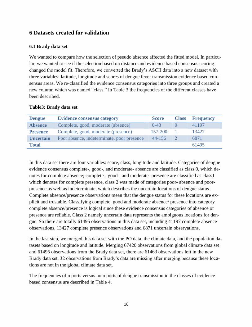
6.1 Brady data set
We wanted to compare how the selection of pseudo absence affected the fitted model. In particu-
lar, we wanted to see if the selection based on distance and evidence based consensus scoring
changed the model fit. Therefore, we converted the Brady’s ASCII data into a new dataset with
three variables: latitude, longitude and scores of dengue fever transmission evidence based con-
sensus areas. We re-classified the evidence consensus categories into three groups and created a
new column which was named “class.” In Table 3 the frequencies of the different classes have
been described.
Table3: Brady data set
In this data set there are four variables: score, class, longitude and latitude. Categories of dengue
evidence consensus complete-, good-, and moderate- absence are classified as class 0, which de-
notes for complete absence; complete-, good-, and moderate- presence are classified as class1
which denotes for complete presence, class 2 was made of categories poor- absence and poor-
presence as well as indeterminate, which describes the uncertain locations of dengue status.
Complete absence/presence observations mean that the dengue status for these locations are ex-
plicit and trustable. Classifying complete, good and moderate absence/ presence into category
complete absence/presence is logical since these evidence consensus categories of absence or
presence are reliable. Class 2 namely uncertain data represents the ambiguous locations for den-
gue. So there are totally 61495 observations in this data set, including 41197 complete absence
observations, 13427 complete presence observations and 6871 uncertain observations.
In the last step, we merged this data set with the PO data, the climate data, and the population da-
tasets based on longitude and latitude. Merging 67420 observations from global climate data set
and 61495 observations from the Brady data set, there are 61463 observations left in the new
Brady data set. 32 observations from Brady’s data are missing after merging because these loca-
tions are not in the global climate data set.
The frequencies of reports versus no reports of dengue transmission in the classes of evidence
based consensus are described in Table 4.
Dengue Evidence consensus category Score Class Frequency
Absence Complete, good, moderate (absence) 0-43 0 41197
Presence Complete, good, moderate (presence) 157-200 1 13427
Uncertain Poor absence, indeterminate, poor presence 44-156 2 6871
Total 61495

17
Table 4: Brady data set vs. global climate data set
Dengue reporting’s in relation to
evidence based consensus groups
Dengue no presence report presence Total (Brady’s data)
Class=0 41171 9 41180 (41197)1
Class=1 12146 1266 13412 (13427)2
Class=2 6854 17 6871 (6871)
Total 60171 1292 61463
1. 17 observations are missing after merging with population data for class 0.
2. 15 observations are missing after merging with population data for class 1.
Figure 3 Geographic location plot for the complete absence data. This figure shows the geo-
graphic locations for the 41180 complete absence data in the Brady data set. These observations
which were represented by the green points were used as the PA data.
A more precise description of the validation datasets can be found below.
6.2 Brady1537 data set
To evaluate how different PA selection strategies affect model fits, we need to create some com-
binations of PO and PA data by using certain algorithms for the selection of the PA observations.
We created one dataset including all 1537 PO observations, where the same number of the pseu-
do absence observations (PA) is selected randomly in areas where the evidence based consensus
maps by Brady et al. supported no transmission. The selected locations were then merged with
the population and climate data for the selected grid locations. This combination of PO and PA is
referred to as Brady1537, see Figure 4 below.

18
Figure 4 Geographic position plot of dengue in the Brady1537 data set. This figure shows the
geographic positions for the dengue presence and absence points in the dataset Brady1537. The
points in green are absence and the points in red are presence. The absence points are randomly
chosen in the global scale from the Brady data set. All the presence points (in blue) are from the
PO data set.
6.3 Brady5o data set
We created another dataset including all 1537 PO observations, where the same numbers of the
pseudo absence observations (PA) were selected randomly in areas where the evidence based
consensus maps by Brady et al. supported no transmission with a maximum distance of 5 degree
latitude/longitude between the PO´s and the PA΄s. The selected locations were then merged with
the population and climate data for the selected grid locations. This combination of PO and PA is
referred to as Brady5o.
The data set Brady5o was generated by two steps. Firstly, generate PA data at distance of no
greater than 5 degrees and no less than 0.5 degrees from the PO data set. This was achieved by
creating PA data with PO data’s latitude and longitude:
Longitude pa= longitude po +i
Latitude pa = latitude po +j
There i and j are equal to 0, 1, 2…10.
Thus, PA data was generated, including the original 1537 PO observations, since when i and j =0
the latitude and longitude are not altered. Secondly, the generated PA data was merged with the
Brady data set based on longitude and latitude. Finally, the randomly selected 1537 observations
form the generated PA data, and combine with the PO data set. Therefore the Brady5o data set
was constructed by a total of 3074 observations.
19
Figure 5 Geographic position plot of dengue in the Brady5o data set. This figure shows the
geographic positions for the dengue presence and absence points in Brady5o. The points in green
are absence and the points in red are presence. All the presence points (red points) are from the
PO data set.
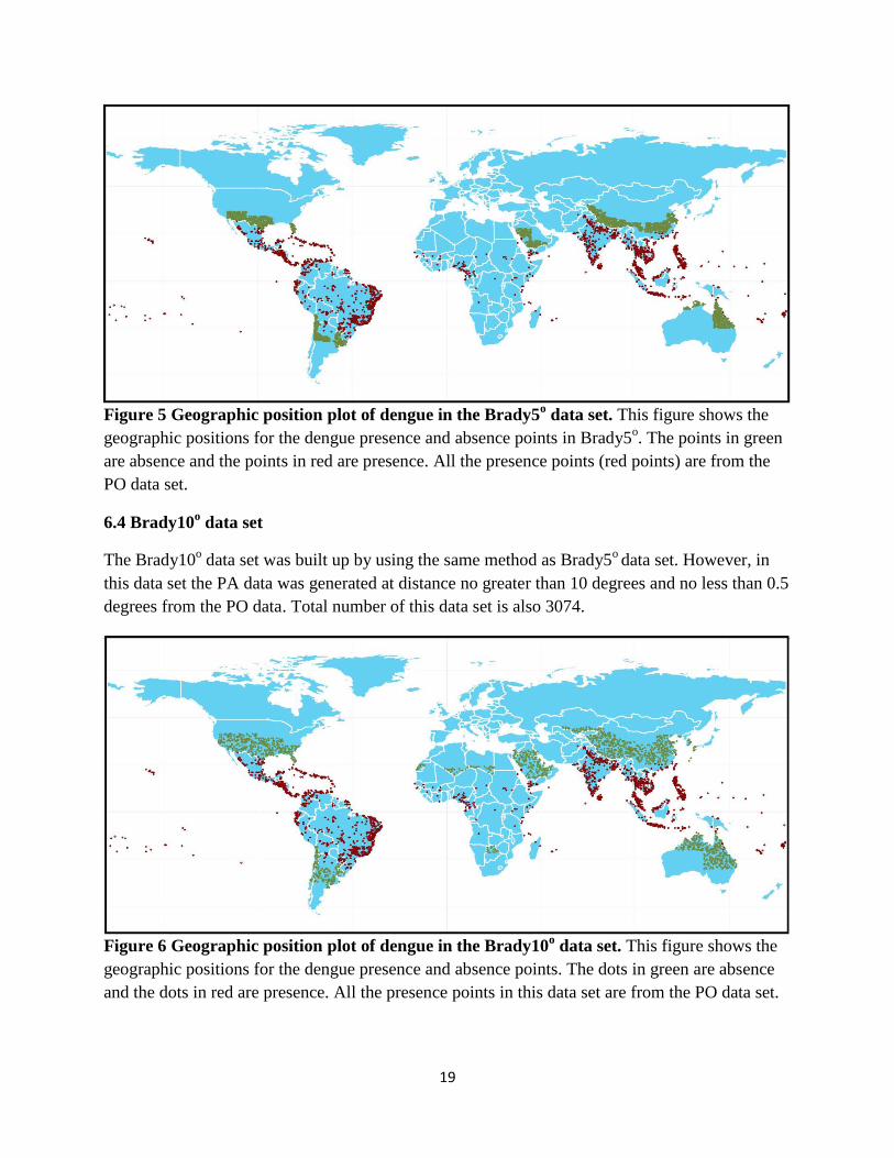
6.4 Brady10o data set
The Brady10o data set was built up by using the same method as Brady5
o data set. However, in
this data set the PA data was generated at distance no greater than 10 degrees and no less than 0.5
degrees from the PO data. Total number of this data set is also 3074.
Figure 6 Geographic position plot of dengue in the Brady10o data set. This figure shows the
geographic positions for the dengue presence and absence points. The dots in green are absence
and the dots in red are presence. All the presence points in this data set are from the PO data set.

20
6.5 Random data set
We created one data set including all 1537 PO observations, where the same numbers of the
pseudo absence observations (PA) were selected randomly from the global climate data set. This
combination of PO and PA is referred to as Random.
Randomly we selected 1537 observations from non-presence data of global climate data set, so
that the number of absence observations is the same as the PO data set. Combining these newly
selected absence observations with the PO data set, the random data set was made up, having
3074 observations.
Figure 7 Geographic position plot of dengue in the random data set. This figure shows the
geographic positions for the dengue presence and absence points. The points in green are absence
and the points in red are presence. The absence points are randomly chosen in the global scale
from the global climate data set. All the presence points are from the PO data set.
6.6 Random5o data set
We combined in a similar way PA΄s selected from a 5 arc degree latitude and longitude from the
PO΄s and refer to this combination of dengue, climate and population data as Random5o.
We used the same method to create Random5o data set as Brady5
o data set, with the exception of
the PA data being chosen from the global climate data set.
21
Figure 8 Geographic position plot of dengue in the random5 data set. This figure shows the
geographic positions for the dengue presence and absence points. The points in green are absence
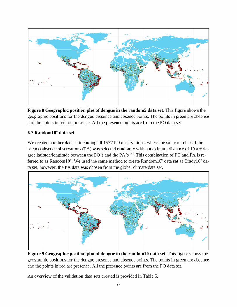
and the points in red are presence. All the presence points are from the PO data set.
6.7 Random10o data set
We created another dataset including all 1537 PO observations, where the same number of the
pseudo absence observations (PA) was selected randomly with a maximum distance of 10 arc de-
gree latitude/longitude between the PO΄s and the PA΄s [7]
. This combination of PO and PA is re-
ferred to as Random10o. We used the same method to create Random10
o data set as Brady10
o da-
ta set, however, the PA data was chosen from the global climate data set.
Figure 9 Geographic position plot of dengue in the random10 data set. This figure shows the
geographic positions for the dengue presence and absence points. The points in green are absence
and the points in red are presence. All the presence points are from the PO data set.
An overview of the validation data sets created is provided in Table 5.
22
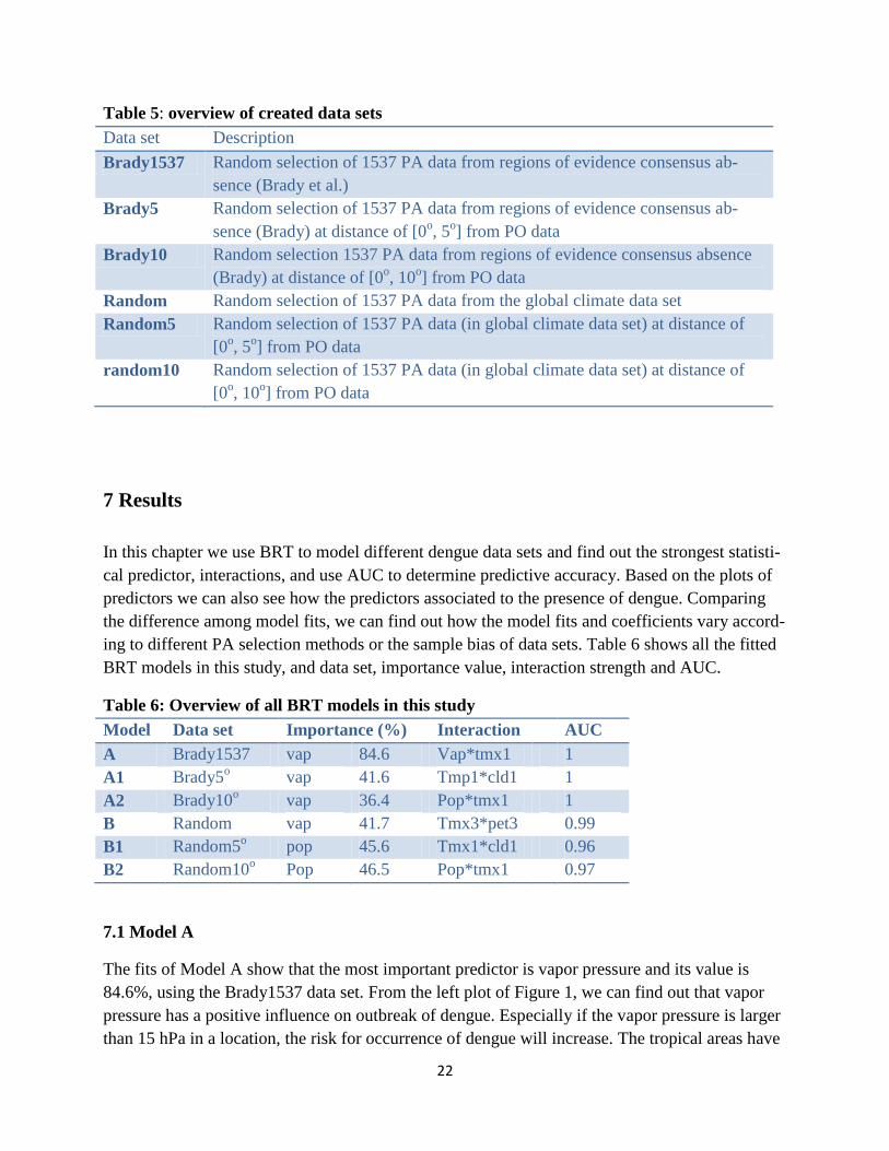
Table 5: overview of created data sets
Data set Description
Brady1537 Random selection of 1537 PA data from regions of evidence consensus ab-
sence (Brady et al.)
Brady5 Random selection of 1537 PA data from regions of evidence consensus ab-
sence (Brady) at distance of [0o, 5
o] from PO data
Brady10 Random selection 1537 PA data from regions of evidence consensus absence
(Brady) at distance of [0o, 10
o] from PO data
Random Random selection of 1537 PA data from the global climate data set
Random5 Random selection of 1537 PA data (in global climate data set) at distance of
[0o, 5
o] from PO data
random10 Random selection of 1537 PA data (in global climate data set) at distance of
[0o, 10
o] from PO data
7 Results
In this chapter we use BRT to model different dengue data sets and find out the strongest statisti-
cal predictor, interactions, and use AUC to determine predictive accuracy. Based on the plots of
predictors we can also see how the predictors associated to the presence of dengue. Comparing
the difference among model fits, we can find out how the model fits and coefficients vary accord-
ing to different PA selection methods or the sample bias of data sets. Table 6 shows all the fitted
BRT models in this study, and data set, importance value, interaction strength and AUC.
Table 6: Overview of all BRT models in this study
Model Data set Importance (%) Interaction AUC
A Brady1537 vap 84.6 Vap*tmx1 1
A1 Brady5o
vap 41.6 Tmp1*cld1 1
A2 Brady10o
vap 36.4 Pop*tmx1 1
B Random vap 41.7 Tmx3*pet3 0.99
B1 Random5o
pop 45.6 Tmx1*cld1 0.96
B2 Random10o
Pop 46.5 Pop*tmx1 0.97
7.1 Model A
The fits of Model A show that the most important predictor is vapor pressure and its value is
84.6%, using the Brady1537 data set. From the left plot of Figure 1, we can find out that vapor
pressure has a positive influence on outbreak of dengue. Especially if the vapor pressure is larger
than 15 hPa in a location, the risk for occurrence of dengue will increase. The tropical areas have

23
a larger vapor pressure, which is higher than 30 hPa, while the desert areas have a lower value,
around 10 to 15 hPa. This result also shows that the largest interaction of dengue fever is the in-
teraction of vap and tmx1. This high degree of interaction highlights that the combination of two
variables, lowest monthly average daily maximum temperature (tmx1) ad vapor pressure (vap)
can account for an increase in the suitability of dengue outbreak by 90%, compared the BRT
model having no interactions. See the right plot in Figure 1. AUC value for Model A is 1, which
indicates that this model has an excellent predictive performance.
Global predicted risk map for dengue fever is also produced, see Figure 10. This risk map is plot-
ted by using fitted predictions of Brady1537. Taking background predictors from the global cli-
mate data set as a new background data set, the fitted predictions are used to predict global den-
gue transmission in the background data set.
Figure 10 Plots for the most important predictor and interaction. The left figure is the plot of
the most important predictor, vapor pressure, with the importance value of 84.6%. The fitted
function on the Y-axis is the logarithmic scale of response variable dengue. When vapor pressure
is larger than15 hPa, the fitted function increases rapid. The right figure is the three-dimensional
plot of the largest pairwise interaction: tmx1 and vap. The top panel indicates model with interac-
tions, the bottom panel indicates model without interactions. Predicted suitability of dengue will
increase 90% with combining the lowest monthly average daily maximum temperature and high-
er vapor pressure, compare with no interactions modeled in the BRT model.

24
Figure 11.Global risk map for Brady1537 data set. The predicted probability for the transmis-
sion of dengue fever is from 0 to 1. The locations in dark green are those areas have the highest
risk for dengue occurrence (with probability=1). The locations in white are those zones, which
are not at risk for dengue.
7.2 Model A1
Using the Brady5o data set to fit Model A1, the most important predictor is also vapor pressure,
with the importance value of 41.6%. It has a positive effect on the suitability of dengue. When
vapor pressure is larger than 18, the risk for outbreak of dengue could also become higher. The
largest interaction is tmp1combining with cld1. Combining of the low daily mean temperature
and high cloud cover will increase the suitability of dengue 94% compared with no interaction is
allowed in the BRT model. AUC is 1, which means Model A1 has a great predictive performance.
Figure 12 Plots for the most important predictor and interaction. The left figure is the plot of
the most important predictor vapor pressure, with the importance value of 41.6%. When vapor
25
presure is larger than 18, the fitted function increases rapidly. The right figure is the plot of the
largest pairwise interaction: combining of tmp1 and cld1 will increase the suitability of dengue
94% compared with the model without interactions.
Figure 13 Global risk map for Brady5o data set. The predicted probability for the outbreak of
dengue fever is from 0 to 1. The locations displayed in dark green are those locations, which have
the highest risk for dengue occurrence (with probability=1). The locations in white are those
zones that are not at risk for dengue.
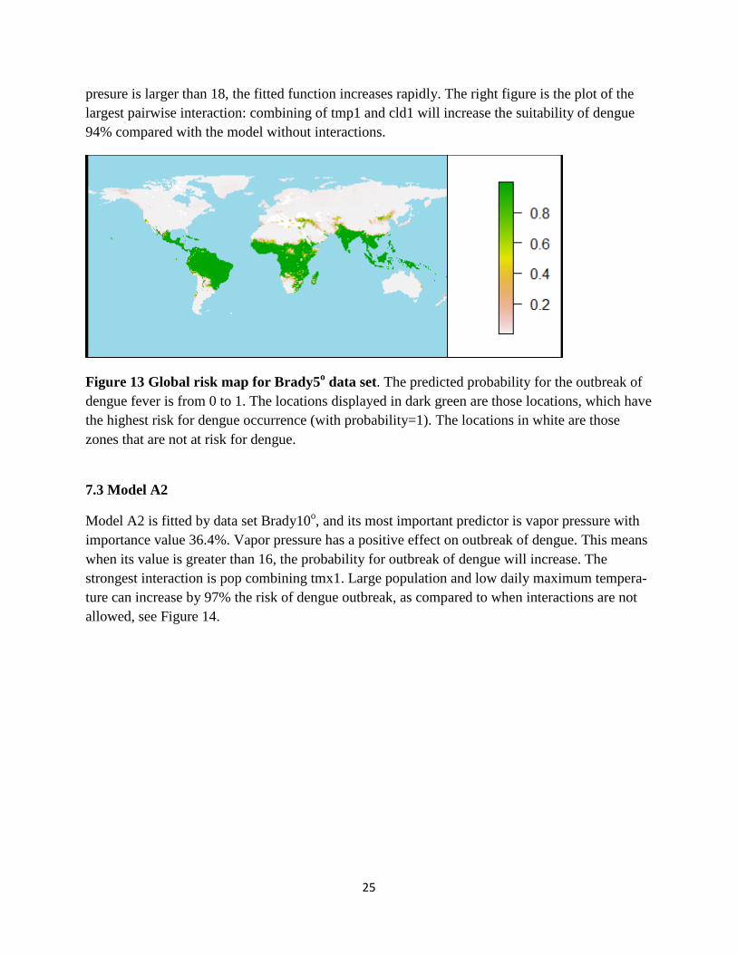
7.3 Model A2
Model A2 is fitted by data set Brady10o, and its most important predictor is vapor pressure with
importance value 36.4%. Vapor pressure has a positive effect on outbreak of dengue. This means
when its value is greater than 16, the probability for outbreak of dengue will increase. The
strongest interaction is pop combining tmx1. Large population and low daily maximum tempera-
ture can increase by 97% the risk of dengue outbreak, as compared to when interactions are not
allowed, see Figure 14.

26
Figure 14 Plots for the most important predictor and interaction. The left figure is the plot of
the most important predictor vapor pressure, with value of 36.4%. When vapor pressure is larger
than16 hPa, the fitted function increases rapidly. The right figure is the plot of the largest pair-
wise interaction: combination of tmx1 and pop with the maximum value of 0.97. Compared with
no interactions in the BRT model, the interaction of population and the lowest monthly average
daily maximum temperature will increase the occurrence of dengue fever by 97%.
Figure 15 Global risk map for Brady10o data set. The predicted probability for the outbreak of
dengue fever is from 0 to 1. The locations in dark green have the highest risk for dengue occur-
rence (with probability=1).The locations in white are not under risk for dengue.
7.4 Model B
When using random data set to fit Model B, the model fits show that: the most important predic-
tor for dengue fever is vapor pressure of the importance value 41.7%. It has a positive influence

27
on the suitability of dengue. The largest interaction is tmx3 combining with pet3. Their maximum
fitted value is 0.83, which means that combining will increase the risk for dengue by 83%, com-
pared to no interaction. AUC value is 0.99, thus indicating Model B has a good predictive per-
formance.
Figure 16 Plots for the most important predictor and interaction. The left figure is the plot of
the most important predictor vapor pressure, with the importance value of 41.7%. When vapor
pressure is larger than 15, the fitted function increases rapidly. The right figure is the plot of the
largest pairwise interaction: the combination of tmx3 and pet3 increases the occurrence of dengue
fever by 83% in comparison to the model with no interactions allowed.
Figure 17 Global risk map for random data set. The predicted probability for the outbreak of
dengue fever is from 0 to 1. The locations in dark green have the highest risk for dengue occur-
rence (with probability=1). The locations in white are not at risk for dengue.
28
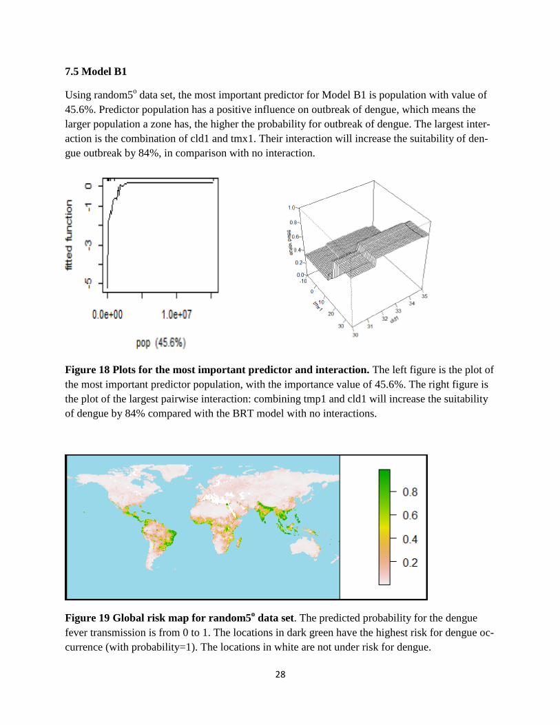
7.5 Model B1
Using random5o data set, the most important predictor for Model B1 is population with value of
45.6%. Predictor population has a positive influence on outbreak of dengue, which means the
larger population a zone has, the higher the probability for outbreak of dengue. The largest inter-
action is the combination of cld1 and tmx1. Their interaction will increase the suitability of den-
gue outbreak by 84%, in comparison with no interaction.
Figure 18 Plots for the most important predictor and interaction. The left figure is the plot of
the most important predictor population, with the importance value of 45.6%. The right figure is
the plot of the largest pairwise interaction: combining tmp1 and cld1 will increase the suitability
of dengue by 84% compared with the BRT model with no interactions.
Figure 19 Global risk map for random5o data set. The predicted probability for the dengue
fever transmission is from 0 to 1. The locations in dark green have the highest risk for dengue oc-
currence (with probability=1). The locations in white are not under risk for dengue.

29
7.6 Model B2
Using random10o data set, the most important predictor for Model B1 is population of the im-
portance value of 46.5%. Predictor population has a positive influence on outbreak of dengue,
which means the larger population a zone has, the higher probability for outbreak of dengue. The
largest interaction is results from combining pop and tmx1. Their interaction will increase the fit-
ted value of dengue occurrence 0.94%, compared with if there is no interaction in the model.
Figure 20 Plots for the most important predictor and interaction. The left figure is the plot of
the most important predictor vapor pressure, with the importance value of 46.5%. When vapor
pressure is large, the risk for dengue occurrence will also increase. The right figure is the plot of
the largest pairwise interaction: combining tmx1and population density increases the suitability
of dengue by 94% compared with no interaction being allowed in the BRT model.
Figure 21 global risk map for random10o data set. The predicted probability for the outbreak
of dengue fever is from 0 to 1. The locations in dark green have the highest risk for dengue oc-
currence (with probability=1). The locations in white are not at risk for dengue.
30
7.7 Global Risk maps for all models
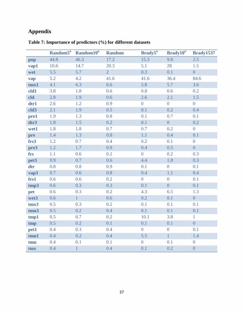
All BRT model fits are tabulated in Table 7 (see Appendix). When selecting the PA data within
five degrees from the PO data in the Random5o data set, the five most important predictor are
population (44.8%), vap1 (10.6%), wet (5.5%), vap (5.2%) respectively tmx1 (4.1%); When us-
ing the Brady5o data set, the five most important predictors are vap (41.6%), population (15.3%),
tmp1 (10.1%), tmx1 (5.8%) and tmn1 (5.5%). When using the Random10o data set, the five most
important predictor are respectively population (46.3%), vap1 (14.7%), tmx1 (6.3%), wet (5.7%)
and vap (4.2%). Using the Brady10o data set, the five most important predictors are vap (36.4%),
vap1 (28%), population (9.8%), pet (6.5%) and tmx1 (5.7%). The five most important predictors
for the Random data set are vap (41.6%), vap1 (20.3%), population (17.2%), tmx1 (6.6%) and
wet (2%). When using the Brady1537 data set to model distribution for dengue, the five most
contributed predictor are vapor pressure (84.6), tmx1 (3.6%), population (2.5%), vap1 (1.5%) re-
spectively cld (1.5%) . However, the important value of vapor pressure varies based on different
PA selected scales: In the Brady1537 data set, the value of vapor pressure is 84.6%, and its PA
data is selected with global scale; in the Brady5o data set, the value reduces to 41.6%; in
Brady10o it reduces to 36.4%. In comparison with the Brady data set, the most important predic-
tor for random5o and random10
o data set is population. Using the random data set, the most im-
portant predictor is also vapor pressure.
We plot global risk maps for all the data sets in this study, in order to find out the how sensitive
these maps are to the different PA selection methods. Using the fitted BRT models and 31 predic-
tors in the global climate data set, we have predicted the probability of dengue transmission glob-
ally. It is obvious to see that six risk maps are different, which indicates that prediction of global
dengue is very sensitive to the different PA selection strategies.
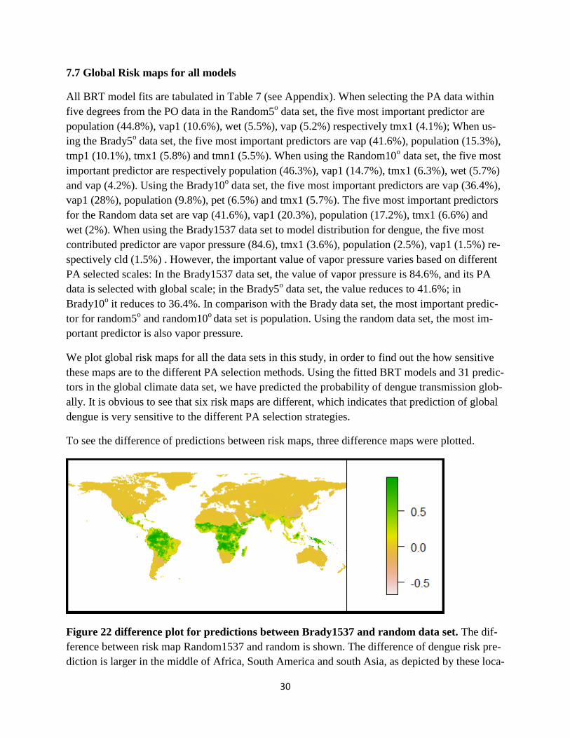
To see the difference of predictions between risk maps, three difference maps were plotted.
Figure 22 difference plot for predictions between Brady1537 and random data set. The dif-
ference between risk map Random1537 and random is shown. The difference of dengue risk pre-
diction is larger in the middle of Africa, South America and south Asia, as depicted by these loca-

31
tions being displayed in dark green and green. The remaining regions show no obvious differ-
ences.
Figure 22 shows when using different datasets random and Brady1537, the predicted risk map is
different. Recall risk map A and B: the dengue transmission locations in the risk map A are larger
than the risk map B. Therefore this difference map clearly points out the potential risk locations
for the risk map B. In the Brady1537 data set, the PA data is the complete absence data, which
was analyzed and scored by Brady et al. In the random data set, the PA data is non-presence data,
which could be a biased sample since it may include some unfound presence data.
Using the same data set, we can find out how the different geographic distances for selecting the
PA data affect the predicted risk map.
Figure 23 stands for the difference between risk map random5 and random. The difference for
these two risk maps is that one uses PA data, which is randomly selected worldwide, while the
other is selected within 5 degrees from the PO data. For this difference map, the difference of
predictions is small. In the tropical and sub-tropical areas, the random5 has a smaller probability
than the random risk map, since the difference value is negative. Therefore there is a negative bi-
as for the fitted statistic when the PA data was selected from 5 degree distance from the PO data
to the global scale.
Figure 23 difference plot for predictions between random5 and random data set. This risk
map shows the difference of risk predictions between random5 and random risk map, by using
predictions of random5 minus predictions of random risk map. Its scale is from -0.8 to 0.6. In
dark green locations the difference of predicted risk maps between random5o and random is 60%.
In white locations it is -0.8, which means that in such areas the predicted risk map of random5o is
80% weaker than the random risk map.
When using the Brady data set, the difference plot between the risk map of Bradty5 and
Brady1537 is shown below. It is obvious to see that some locations in the South Africa and Asia
are in dark green, which means in these locations the difference of prediction is almost 100%.

32
The majority of areas on this difference map are yellow, which means that the difference for
these two risk maps is small. It is obvious too find out that when the selection scale of PA data is
enlarged from 5 degree to the global, it causes a positive bias for the fitted statistic.
Figure 24 difference plot between Brady5 and Brady1537 data set. This risk map shows the
difference of risk predictions between Brady5 and Brady1537 risk maps, by using predictions of
random5 minus prediction of random risk map. Its scale is from -1 to 1. In dark green areas the
predicted risk of Brady5o
is 100% higher than Brady1537. In white areas the predicted risk of
Brady5o is 100% lower than Brady1537.
8 Conclusions and discussion
8.1 Alternative method-GLM
In this thesis we use BRT method to predict distribution of dengue fever, while other applicable
methods, such as GLM which is not used. There are some reasons for BRT being chosen over
GLM:
1) For GLM, it fits a single appropriate data model and estimates model parameters. By contrast,
BRT does not start by fitting a single data model but partitioning and fitting lots of single tree
models and combines them adaptively for prediction [19]
. Therefore BRT has a stronger predictive
performance than GLM.
2) BRT has been identified to provide better fits of species distributions than GLM [8] [23]
.
3) BRT is better at investigating complex responses [3]
. GLM allows only one signal response
variable. By contrast, BRT allows more than two response variables.
4) In BRT, there was no need for prior transformation or outliers’ elimination. Besides, interac-
tions for predictors are modelled automatically [19]
.

33
5) BRT trees can also use surrogates to accommodate missing data of predictor [19]
.
Therefore we only use BRT to model the spatial distribution of dengue fever based on different
PA selection methods and to compare the model fits which are calculated by the same statistical
method.
8.2 How the different PA selection strategies affect model fits.
From the table of model fits, we can find out that different PA data selection methods do affect
model fits. When the PA data was selected from Brady data set by using random selection, the
most important predictor is vapor pressure with the importance value of 84.6%; when PA data
was randomly selected from the global climate data set, the most important predictor is also va-
por pressure, but its importance value is 41.7%. The difference is because the PA data in the
Brady data set is estimated by evidence of dengue consensus; in contrast, the PA data in the glob-
al climate data set is collected from publications. Since the evidence consensus is more trustable,
using the Brady data set to model the distribution of dengue is better.
The most important predictor is vapor pressure when PA data was selected within geographic dis-
tance 5o and 10
o from the PO data in the Brady data set. When the geographic distance has been
reduced from 10 degree to 5 degree, the importance value of vapor pressure has increased from
36.4% to 41.6%. This indicates that the true climate parameters have a positive climate parameter
bias when PA data is selected systematically closer to the PO data. In contrast, when PA data is
selected systematically closer to the PO data of the Brady data set-from 10 degree to 5 degree, the
true climate parameters have a negative bias, because the importance value of population de-
creases from 46.5% to 45.6%. In both data sets, the importance values do not change too much,
as the difference of distance between 10 degree and 5 degree is small and the climate will not
vary too much.
According to the AUC value, we can see that when using Brady data set to fit models, the AUC
value is 1, which is higher than using the global climate data set. It indicates that using Brady da-
ta set to fit the spatial distribution of dengue is a better choice.
8.3 Predicted global risk maps
Several studies have used the methods applied here and selected PA according to different strate-
gies (e.g. Simmonds et al, Bhatt et al, Brady et al, Rogers et al). This study clearly highlights that
the way of selecting PA is important and may lead to large differences and bias in risk maps and
predictions based on climatic factors. We find that if PA data are chosen closer to the PO the cli-
matic associations to the disease risk areas become much weaker. Such approaches may be ap-
propriate if fitting local models, but often such models have been fitted and predicted global risk
areas for dengue. Simmonds et al. is one of such examples, and clearly shows similar results as
the Random5 models. Such risk maps are thus suspected to be biased, and maybe the true risk
map would be better described by the Brady10 or Brady1537 model predictions as they are based

34
on evidence based consensus absence to remove the influence of non-reporting bias together with
the close distance selection resulting in potential climate bias.
Future studies for global risk maps should carefully consider these matters, to avoid bias arising
from the selection of PA. Also, studies making projections of dengue with climate change scenar-
ios should carefully consider the use of distance as a selection strategy for PA as the climate to
dengue association appear to potentially become severely biased.

35
Reference
[1]: Srivastava, V. K., Suri, S., Bhasin, A., Srivastava, L., & Bharadwaj, M. (1990). An epidemic
of dengue haemorrhagic fever and dengue shock syndrome in Delhi: a clinical study. Annals of
tropical paediatrics, 10(4), 329-334.
[2]: World Health Organization. Dengue and severe dengue, WHO. January, 2012.
http://www.who.int/mediacentre/factsheets/fs117/en/
[3]: Samir Bhatt et al. (2013) The global distribution and burden of dengue. Nature 2013.
Doi:10.1038.
[4]: Simmons CP, Farrar JJ, Nguyen v V, Wills B. Dengue. N Engl J Med. 2012;366(15):1423-32.
Epub 2012/04/13
[5]: Astrom C, Rocklov J, Hales S, Beguin A, Louis V, Sauerborn R. Potential Distribution of
Dengue Fever Under Scenarios of Climate Change and Economic Development. EcoHealth.
[6]: Oliver J. Brady et al. (2012). Refining the global spatial limits of dengue virus transmission
by evidence-based consensus. Plos Negl Trop Dis 6(8): e1760.
Doi:10.1371/journal.pntd.0001760
[7]: Hales S, de Wet N, Maindonald J, Woodward A. Potential effect of population and climate
changes on global distribution of dengue fever: an empirical model. Lancet. 2002;360(9336):830-
4.
[8]: Jane Elith, et al. (2006). Novel methods improve prediction of species’ distributions from oc-
currence data. Ecography: Volume 29; Issue 2, pages 129-151.
[9]: Mary S Wise and Antoine Gusian (2009). Do pseudo-absence selection strategies influence
species distribution models and their predictions? BMC Ecology 2009, 9:8 doi: 0. 86/472-6785-
9-8
[10]: Morgane Barbet-Massin et al. (2012) Selecting pseudo-absences for species distribution
models: how, where and how many? Methods in Ecology and Evolution 2012, 3, 327-338.
[11]: Cory W. Morin, Andrew C. Comrie, and Kacey Ernst. Climate and Dengue Transmission:
Evidence and Implications. http://dx.doi.org/10.1289/ehp.1306556
[12]: Helmersson J, Stenlund H, Wilder-Smith A, Rocklöv J. Effects of diurnal temperature vari-
ations on global dengue epidemic potential. In press
[13]: Huang Z, Das A, Qiu Y, Tatem AJ. Web-based GIS: the vector-borne disease airline impor-
tation risk (VBD-AIR) tool. Int J Health Geogr. 2012;11:33. Epub 2012/08/16.

36
[14]: Wilder-Smith A, Gubler DJ. Geographic expansion of dengue: the impact of international
travel. The Medical clinics of North America. 2008;92(6):1377-90, x. Epub 2008/12/09.
[15]: David J. Rogers and Simon Hay (2012). ECDC technical report: The climatic suitability for
dengue transmission in continental Europe. ISBN 978-92-9193-382-2. doi 10.2900/62095
[16]: Randolph SE, Rogers DJ. The arrival, establishment and spread of exotic diseases: patterns
and predictions. Nature reviews Microbiology. 2010;8(5):361-71. Epub 2010/04/08.
[17]: http://badc.nerc.ac.uk/view/badc.nerc.ac.uk__ATOM__dataent_1256223773328276
(2013.09)
[18]: http://www.pik-potsdam.de/research/climate-impacts-and-vulnerabilities/research/rd2-
cross-cutting-activities/isi-mip
[19]: J. Elith et al. A working guide to boosted regression trees. Journal of Animal Ecology 2008,
77, 802-813.
[20]: Trevor H, Robert T, Jerome F. The elements of statistical learning. ISBN: 978-0-387-
84857-0
[21]: Friedman, Jerome H. (2001) "Greedy function approximation: a gradient boosting ma-
chine." Annals of Statistics: 1189-1232.
[22]: Shane M Abeare (2009). Comparisons of boosted regression tree, GLM and GAM perfor-
mance in the standardization of yellow fin tuna catch-rate data from the gulf of Mexico lonline
fishery.
[23]: Schonlau M. (2005) Boosted regression (Boosting): An introductory tutorial and a stata
plugin. The Stata Journal, 5(3), 330-354.
[24]: J.M. McPherson er al. (2006). Ecologivcal Modelling 192 499-522.
37
Appendix
Table 7: Importance of predictors (%) for different datasets
Random5
o Random10
o Random Brady5
o Brady10
o Brady1537
pop 44.8 46.3 17.2 15.3 9.8 2.5
vap1 10.6 14.7 20.3 5.1 28 1.5
wet 5.5 5.7 2 0.3 0.1 0
vap 5.2 4.2 41.6 41.6 36.4 84.6
tmx1 4.1 6.3 6.6 5.8 5.7 3.6
cld1 3.8 1.8 0.6 0.8 0.6 0.2
cld 2.8 1.9 0.6 2.6 2.1 1.5
dtr1 2.6 1.2 0.9 0 0 0
cld3 2.1 1.9 0.5 0.1 0.2 0.4
pre1 1.9 1.3 0.8 0.1 0.7 0.1
dtr3 1.8 1.5 0.2 0.1 0 0.2
wet1 1.8 1.8 0.7 0.7 0.2 0
pre 1.4 1.3 0.8 1.1 0.4 0.1
frs3 1.2 0.7 0.4 0.2 0.1 0
pre3 1.2 1.7 0.9 0.4 0.5 0
frs 1.1 0.6 0.2 0 0.2 0.3
pet3 0.9 0.7 0.6 4.4 1.8 0.3
dtr 0.8 0.8 0.9 0.1 0 0.1
vap3 0.7 0.6 0.8 0.4 1.1 0.4
frs1 0.6 0.6 0.2 0 0 0.1
tmp3 0.6 0.3 0.3 0.1 0 0.1
pet 0.6 0.3 0.2 4.3 6.5 1.3
wet3 0.6 1 0.6 0.2 0.1 0
tmx3 0.5 0.3 0.2 0.1 0.1 0.1
tmn3 0.5 0.2 0.4 0.1 0.1 0.1
tmp1 0.5 0.7 0.2 10.1 3.8 1
tmp 0.5 0.2 0.1 0.1 0.1 0
pet1 0.4 0.3 0.4 0 0 0.1
tmn1 0.4 0.2 0.4 5.5 1 1.4
tmn 0.4 0.1 0.1 0 0.1 0
tmx 0.4 1 0.4 0.1 0.2 0
Related Documents


