Statistical Methods for Data Science Elizabeth Purdom 2020-08-13

Welcome message from author
This document is posted to help you gain knowledge. Please leave a comment to let me know what you think about it! Share it to your friends and learn new things together.
Transcript

Statistical Methods for Data Science
Elizabeth Purdom
2020-08-13

2

Contents
1 Introduction 51.1 Acknowledgements . . . . . . . . . . . . . . . . . . . . . . . . . . 5
2 Data Distributions 72.1 Basic Exporatory analysis . . . . . . . . . . . . . . . . . . . . . . 72.2 Probability Distributions . . . . . . . . . . . . . . . . . . . . . . . 272.3 Distributions of samples of data . . . . . . . . . . . . . . . . . . . 312.4 Continuous Distributions . . . . . . . . . . . . . . . . . . . . . . 352.5 Density Curve Estimation . . . . . . . . . . . . . . . . . . . . . . 49
3 Comparing Groups and Hypothesis Testing 633.1 Hypothesis Testing . . . . . . . . . . . . . . . . . . . . . . . . . . 653.2 Permutation Tests . . . . . . . . . . . . . . . . . . . . . . . . . . 693.3 Parametric test: the T-test . . . . . . . . . . . . . . . . . . . . . 763.4 Digging into Hypothesis tests . . . . . . . . . . . . . . . . . . . . 873.5 Confidence Intervals . . . . . . . . . . . . . . . . . . . . . . . . . 933.6 Parametric Confidence Intervals . . . . . . . . . . . . . . . . . . . 953.7 Bootstrap Confidence Intervals . . . . . . . . . . . . . . . . . . . 993.8 Thinking about confidence intervals . . . . . . . . . . . . . . . . 1063.9 Revisiting pairwise comparisons . . . . . . . . . . . . . . . . . . . 108
4 Curve Fitting 1134.1 Linear regression with one predictor . . . . . . . . . . . . . . . . 1134.2 Inference for linear regression . . . . . . . . . . . . . . . . . . . . 1204.3 Least Squares for Polynomial models & beyond . . . . . . . . . . 1304.4 Local fitting . . . . . . . . . . . . . . . . . . . . . . . . . . . . . . 1344.5 Big Data clouds . . . . . . . . . . . . . . . . . . . . . . . . . . . . 1404.6 Time trends . . . . . . . . . . . . . . . . . . . . . . . . . . . . . . 144
5 Visualizing Multivariate Data 1515.1 Relationships between Continous Variables . . . . . . . . . . . . 1515.2 Categorical Variable . . . . . . . . . . . . . . . . . . . . . . . . . 1555.3 Heatmaps . . . . . . . . . . . . . . . . . . . . . . . . . . . . . . . 1725.4 Principal Components Analysis . . . . . . . . . . . . . . . . . . . 186
3

4 CONTENTS
6 Multiple Regression 2196.1 The nature of the ‘relationship’ . . . . . . . . . . . . . . . . . . . 2226.2 Multiple Linear Regression . . . . . . . . . . . . . . . . . . . . . 2256.3 Important measurements of the regression estimate . . . . . . . . 2346.4 Multiple Regression With Categorical Explanatory Variables . . 2446.5 Inference in Multiple Regression . . . . . . . . . . . . . . . . . . 2536.6 Variable Selection . . . . . . . . . . . . . . . . . . . . . . . . . . . 278
7 Logistic Regression 2997.1 The classification problem . . . . . . . . . . . . . . . . . . . . . . 2997.2 Logistic Regression Setup . . . . . . . . . . . . . . . . . . . . . . 3017.3 Interpreting the Results . . . . . . . . . . . . . . . . . . . . . . . 3137.4 Comparing Models . . . . . . . . . . . . . . . . . . . . . . . . . . 3187.5 Classification Using Logistic Regression . . . . . . . . . . . . . . 322
8 Regression and Classification Trees 3378.1 Basic Idea of Decision Trees. . . . . . . . . . . . . . . . . . . . . 3378.2 The Structure of Decision Trees . . . . . . . . . . . . . . . . . . . 3388.3 The Recursive Partitioning Algorithm . . . . . . . . . . . . . . . 3418.4 Random Forests . . . . . . . . . . . . . . . . . . . . . . . . . . . 354

Chapter 1
Introduction
This book consist of materials to accompany the course “Statistical Methods forData Science” (STAT 131A) taught at UC Berkeley, which is a upper-divisioncourse that is a follow-up to an introductory statistics, such as DATA 8 or STAT20 taught at UC Berkeley.
The textbook will teach a broad range of statistical methods that are used tosolve data problems. Topics include group comparisons and ANOVA, standardparametric statistical models, multivariate data visualization, multiple linearregression and logistic regression, classification and regression trees and randomforests.
These topics are covered at a very intuitive level, with only a semester of calculusexpected to be able to follow the material. The goal of the book is to explainthese more advanced topics at a level that is widely accessible.
Students in this course are expected to have had some introduction to program-ming, and the textbook does not explain programming concepts nor does itgenerally explain the R Code shown in the book. The focus of the book is un-derstanding the concepts and the output. To have more understanding of theR Code, please see the accompanying .Rmd that steps through the code in eachchapter (and the accompanying .html that gives a compiled version). Thesecan be found at the (epurdom.github.io/Stat131A/Rsupport/index.html)
The datasets used in this manuscript should be made available to students inthe class on bcourses by their instructor.
1.1 Acknowledgements
This manuscript is based on lecture notes developed by Aditya Guntuboyinaand Elizabeth Purdom in the Spring of 2017 for the course.
5

6 CHAPTER 1. INTRODUCTION
Chapter 2
Data Distributions
We’re going to review some basic ideas about distributions you should havelearned in Data 8 or STAT 20. In addition to review, we introduce some newideas and emphases to pay attention to:
• Continuous distributions and density curves• New tools for visualizing and estimating distributions: boxplots and kernel
density estimators• Types of samples and how they effect estimation
2.1 Basic Exporatory analysis
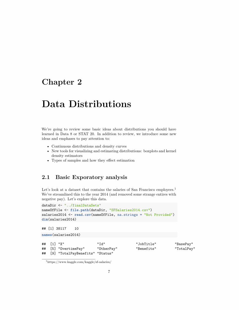
Let’s look at a dataset that contains the salaries of San Francisco employees.1We’ve streamlined this to the year 2014 (and removed some strange entires withnegative pay). Let’s explore this data.dataDir <- "../finalDataSets"nameOfFile <- file.path(dataDir, "SFSalaries2014.csv")salaries2014 <- read.csv(nameOfFile, na.strings = "Not Provided")dim(salaries2014)
## [1] 38117 10names(salaries2014)
## [1] "X" "Id" "JobTitle" "BasePay"## [5] "OvertimePay" "OtherPay" "Benefits" "TotalPay"## [9] "TotalPayBenefits" "Status"
1https://www.kaggle.com/kaggle/sf-salaries/
7

8 CHAPTER 2. DATA DISTRIBUTIONS
salaries2014[1:10, c("JobTitle", "Benefits", "TotalPay","Status")]
## JobTitle Benefits TotalPay Status## 1 Deputy Chief 3 38780.04 471952.6 PT## 2 Asst Med Examiner 89540.23 390112.0 FT## 3 Chief Investment Officer 96570.66 339653.7 PT## 4 Chief of Police 91302.46 326716.8 FT## 5 Chief, Fire Department 91201.66 326233.4 FT## 6 Asst Med Examiner 71580.48 344187.5 FT## 7 Dept Head V 89772.32 311298.5 FT## 8 Executive Contract Employee 88823.51 310161.0 FT## 9 Battalion Chief, Fire Suppress 59876.90 335485.0 FT## 10 Asst Chf of Dept (Fire Dept) 64599.59 329390.5 FT
Let’s look at the column ‘TotalPay’ which gives the total pay, not includingbenefits.
Question:
How might we want to explore this data? What single number summaries wouldmake sense? What visualizations could we do?
summary(salaries2014$TotalPay)
## Min. 1st Qu. Median Mean 3rd Qu. Max.## 0 33482 72368 75476 107980 471953
Notice we entries with zero pay! Let’s investigate why we have zero pay bysubsetting to just those entries.zeroPay <- subset(salaries2014, TotalPay == 0)nrow(zeroPay)
## [1] 48head(zeroPay)
## X Id JobTitle BasePay OvertimePay OtherPay## 34997 145529 145529 Special Assistant 15 0 0 0## 35403 145935 145935 Community Police Services Aide 0 0 0## 35404 145936 145936 BdComm Mbr, Grp3,M=$50/Mtg 0 0 0## 35405 145937 145937 BdComm Mbr, Grp3,M=$50/Mtg 0 0 0## 35406 145938 145938 Gardener 0 0 0## 35407 145939 145939 Engineer 0 0 0## Benefits TotalPay TotalPayBenefits Status## 34997 5650.86 0 5650.86 PT## 35403 4659.36 0 4659.36 PT## 35404 4659.36 0 4659.36 PT

2.1. BASIC EXPORATORY ANALYSIS 9
## 35405 4659.36 0 4659.36 PT## 35406 4659.36 0 4659.36 PT## 35407 4659.36 0 4659.36 PTsummary(zeroPay)
## X Id JobTitle BasePay OvertimePay## Min. :145529 Min. :145529 Length:48 Min. :0 Min. :0## 1st Qu.:145948 1st Qu.:145948 Class :character 1st Qu.:0 1st Qu.:0## Median :145960 Median :145960 Mode :character Median :0 Median :0## Mean :147228 Mean :147228 Mean :0 Mean :0## 3rd Qu.:148637 3rd Qu.:148637 3rd Qu.:0 3rd Qu.:0## Max. :148650 Max. :148650 Max. :0 Max. :0## OtherPay Benefits TotalPay TotalPayBenefits Status## Min. :0 Min. : 0 Min. :0 Min. : 0 Length:48## 1st Qu.:0 1st Qu.: 0 1st Qu.:0 1st Qu.: 0 Class :character## Median :0 Median :4646 Median :0 Median :4646 Mode :character## Mean :0 Mean :2444 Mean :0 Mean :2444## 3rd Qu.:0 3rd Qu.:4649 3rd Qu.:0 3rd Qu.:4649## Max. :0 Max. :5651 Max. :0 Max. :5651
It’s not clear why these people received zero pay. We might want to removethem, thinking that zero pay are some kind of weird problem with the data wearen’t interested in. But let’s do a quick summary of what the data would looklike if we did remove them:summary(subset(salaries2014, TotalPay > 0))
## X Id JobTitle BasePay## Min. :110532 Min. :110532 Length:38069 Min. : 0## 1st Qu.:120049 1st Qu.:120049 Class :character 1st Qu.: 30439## Median :129566 Median :129566 Mode :character Median : 65055## Mean :129568 Mean :129568 Mean : 66652## 3rd Qu.:139083 3rd Qu.:139083 3rd Qu.: 94865## Max. :148626 Max. :148626 Max. :318836## OvertimePay OtherPay Benefits TotalPay## Min. : 0 Min. : 0 Min. : 0 Min. : 1.8## 1st Qu.: 0 1st Qu.: 0 1st Qu.:10417 1st Qu.: 33688.3## Median : 0 Median : 700 Median :28443 Median : 72414.3## Mean : 5409 Mean : 3510 Mean :24819 Mean : 75570.7## 3rd Qu.: 5132 3rd Qu.: 4105 3rd Qu.:35445 3rd Qu.:108066.1## Max. :173548 Max. :342803 Max. :96571 Max. :471952.6## TotalPayBenefits Status## Min. : 7.2 Length:38069## 1st Qu.: 44561.8 Class :character## Median :101234.9 Mode :character## Mean :100389.8
10 CHAPTER 2. DATA DISTRIBUTIONS
## 3rd Qu.:142814.2## Max. :510732.7
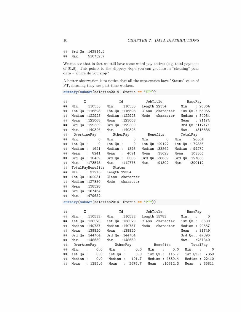
We can see that in fact we still have some weird pay entires (e.g. total paymentof $1.8). This points to the slippery slope you can get into in “cleaning” yourdata – where do you stop?
A better observation is to notice that all the zero-entries have ”Status” value ofPT, meaning they are part-time workers.summary(subset(salaries2014, Status == "FT"))
## X Id JobTitle BasePay## Min. :110533 Min. :110533 Length:22334 Min. : 26364## 1st Qu.:116598 1st Qu.:116598 Class :character 1st Qu.: 65055## Median :122928 Median :122928 Mode :character Median : 84084## Mean :123068 Mean :123068 Mean : 91174## 3rd Qu.:129309 3rd Qu.:129309 3rd Qu.:112171## Max. :140326 Max. :140326 Max. :318836## OvertimePay OtherPay Benefits TotalPay## Min. : 0 Min. : 0 Min. : 0 Min. : 26364## 1st Qu.: 0 1st Qu.: 0 1st Qu.:29122 1st Qu.: 72356## Median : 1621 Median : 1398 Median :33862 Median : 94272## Mean : 8241 Mean : 4091 Mean :35023 Mean :103506## 3rd Qu.: 10459 3rd Qu.: 5506 3rd Qu.:38639 3rd Qu.:127856## Max. :173548 Max. :112776 Max. :91302 Max. :390112## TotalPayBenefits Status## Min. : 31973 Length:22334## 1st Qu.:102031 Class :character## Median :127850 Mode :character## Mean :138528## 3rd Qu.:167464## Max. :479652summary(subset(salaries2014, Status == "PT"))
## X Id JobTitle BasePay## Min. :110532 Min. :110532 Length:15783 Min. : 0## 1st Qu.:136520 1st Qu.:136520 Class :character 1st Qu.: 6600## Median :140757 Median :140757 Mode :character Median : 20557## Mean :138820 Mean :138820 Mean : 31749## 3rd Qu.:144704 3rd Qu.:144704 3rd Qu.: 47896## Max. :148650 Max. :148650 Max. :257340## OvertimePay OtherPay Benefits TotalPay## Min. : 0.0 Min. : 0.0 Min. : 0.0 Min. : 0## 1st Qu.: 0.0 1st Qu.: 0.0 1st Qu.: 115.7 1st Qu.: 7359## Median : 0.0 Median : 191.7 Median : 4659.4 Median : 22410## Mean : 1385.6 Mean : 2676.7 Mean :10312.3 Mean : 35811
2.1. BASIC EXPORATORY ANALYSIS 11
## 3rd Qu.: 681.2 3rd Qu.: 1624.7 3rd Qu.:19246.2 3rd Qu.: 52998## Max. :74936.0 Max. :342802.6 Max. :96570.7 Max. :471953## TotalPayBenefits Status## Min. : 0 Length:15783## 1st Qu.: 8256 Class :character## Median : 27834 Mode :character## Mean : 46123## 3rd Qu.: 72569## Max. :510733
So it is clear that analyzing data from part-time workers will be tricky (and wehave no information here as to whether they worked a week or eleven months).To simplify things, we will make a new data set with only full-time workers:salaries2014_FT <- subset(salaries2014, Status == "FT")
2.1.1 Histograms
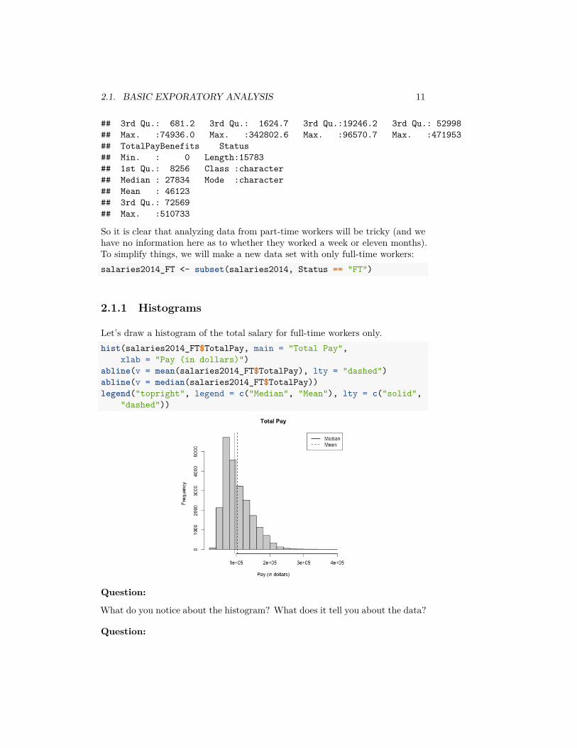
Let’s draw a histogram of the total salary for full-time workers only.hist(salaries2014_FT$TotalPay, main = "Total Pay",
xlab = "Pay (in dollars)")abline(v = mean(salaries2014_FT$TotalPay), lty = "dashed")abline(v = median(salaries2014_FT$TotalPay))legend("topright", legend = c("Median", "Mean"), lty = c("solid",
"dashed"))
Question:
What do you notice about the histogram? What does it tell you about the data?
Question:

12 CHAPTER 2. DATA DISTRIBUTIONS
How good of a summary is the mean or median here?
2.1.1.1 Constructing Frequency Histograms
How do you construct a histogram? Practically, most histograms are created bytaking an evenly spaced set of 𝐾 breaks that span the range of the data, callthem 𝑏1 ≤ 𝑏2 ≤ ... ≤ 𝑏𝐾, and counting the number of observations in each bin.2Then the histogram consists of a series of bars, where the x-coordinates of therectangles correspond to the range of the bin, and the height corresponds to thenumber of observations in that bin.
2.1.1.1.1 Breaks of Histograms Here’s two more histogram of the samedata that differ only by the number of breakpoints in making the histograms.par(mfrow = c(2, 2))hist(salaries2014_FT$TotalPay, main = "Total Pay, default breaks",
xlab = "Pay (in dollars)")hist(salaries2014_FT$TotalPay, main = "Total Pay, breaks=100",
xlab = "Pay (in dollars)", breaks = 100)hist(salaries2014_FT$TotalPay, main = "Total Pay, breaks=1000",
xlab = "Pay (in dollars)", breaks = 1000)hist(salaries2014_FT$TotalPay, main = "Total Pay, Zoomed-in",
xlab = "Pay (in dollars)", xlim = c(0, 1e+05),breaks = 1000)
2You might have been taught that you can make a histogram with uneven break points,which is true, but in practice is rather exotic thing to do. If you do, then you have to calculatethe height of the bar differently based on the width of the bin because it is the area of the binthat should be proportional to the number of entries in a bin, not the height of the bin.
2.1. BASIC EXPORATORY ANALYSIS 13
Question:
What seems better here? Is there a right number of breaks?
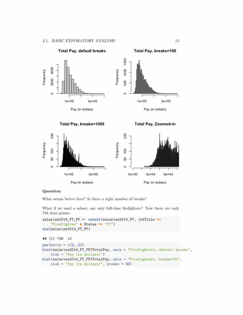
What if we used a subset, say only full-time firefighters? Now there are only738 data points.salaries2014_FT_FF <- subset(salaries2014_FT, JobTitle ==
"Firefighter" & Status == "FT")dim(salaries2014_FT_FF)
## [1] 738 10par(mfrow = c(2, 2))hist(salaries2014_FT_FF$TotalPay, main = "Firefighters, default breaks",
xlab = "Pay (in dollars)")hist(salaries2014_FT_FF$TotalPay, main = "Firefighters, breaks=30",
xlab = "Pay (in dollars)", breaks = 30)
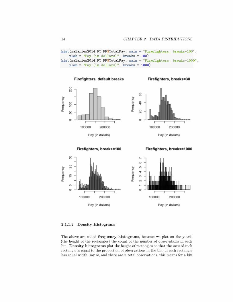
14 CHAPTER 2. DATA DISTRIBUTIONS
hist(salaries2014_FT_FF$TotalPay, main = "Firefighters, breaks=100",xlab = "Pay (in dollars)", breaks = 100)
hist(salaries2014_FT_FF$TotalPay, main = "Firefighters, breaks=1000",xlab = "Pay (in dollars)", breaks = 1000)
2.1.1.2 Density Histograms
The above are called frequency histograms, because we plot on the y-axis(the height of the rectangles) the count of the number of observations in eachbin. Density histograms plot the height of rectangles so that the area of eachrectangle is equal to the proportion of observations in the bin. If each rectanglehas equal width, say 𝑤, and there are 𝑛 total observations, this means for a bin
2.1. BASIC EXPORATORY ANALYSIS 15
𝑘, it’s height is given by
𝑤 ∗ ℎ𝑘 = #observations in bin 𝑘𝑛
So that the height of a rectangle for bin 𝑘 is given by
ℎ𝑘 = #observations in bin 𝑘𝑤 × 𝑛
In other words, the density histogram with equal-width bins will look like thefrequency histogram, only the heights of all the rectangles will be divided by𝑤𝑛.We will return to the importance of density histograms more when we discusscontinuous distributions.
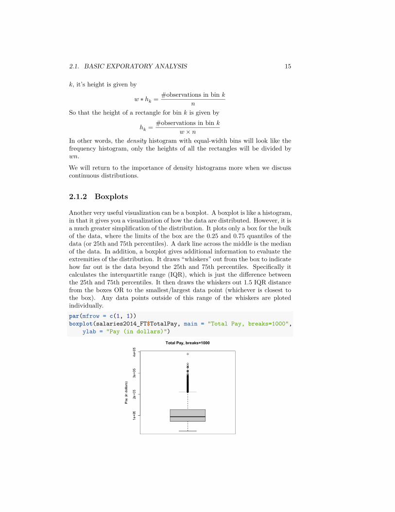
2.1.2 Boxplots
Another very useful visualization can be a boxplot. A boxplot is like a histogram,in that it gives you a visualization of how the data are distributed. However, it isa much greater simplification of the distribution. It plots only a box for the bulkof the data, where the limits of the box are the 0.25 and 0.75 quantiles of thedata (or 25th and 75th percentiles). A dark line across the middle is the medianof the data. In addition, a boxplot gives additional information to evaluate theextremities of the distribution. It draws “whiskers” out from the box to indicatehow far out is the data beyond the 25th and 75th percentiles. Specifically itcalculates the interquartitle range (IQR), which is just the difference betweenthe 25th and 75th percentiles. It then draws the whiskers out 1.5 IQR distancefrom the boxes OR to the smallest/largest data point (whichever is closest tothe box). Any data points outside of this range of the whiskers are plotedindividually.par(mfrow = c(1, 1))boxplot(salaries2014_FT$TotalPay, main = "Total Pay, breaks=1000",
ylab = "Pay (in dollars)")
16 CHAPTER 2. DATA DISTRIBUTIONS
These points are often called “outliers” based the 1.5 IQR rule of thumb. Theterm outlier is usually used for unusual or extreme points. However, we cansee a lot of data points fall outside this definition of “outlier” for our data; thisis common for data that is skewed, and doesn’t really mean that these pointsare “wrong”, or “unusual” or anything else that we might think about for anoutlier.3
You might think, why would I want such a limited display of the distribution,compared to the wealth of information in the histogram? I can’t tell at all thatthe data is bimodal from a boxplot, for example.
First of all, the boxplot emphasizes different things about the distribution. Itshows the main parts of the bulk of the data very quickly and simply, andemphasizes more fine grained information about the extremes (“tails”) of thedistribution.
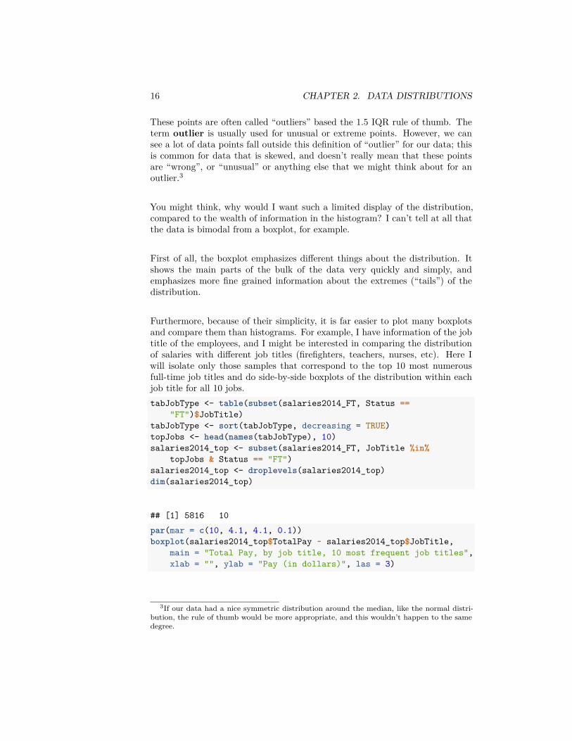
Furthermore, because of their simplicity, it is far easier to plot many boxplotsand compare them than histograms. For example, I have information of the jobtitle of the employees, and I might be interested in comparing the distributionof salaries with different job titles (firefighters, teachers, nurses, etc). Here Iwill isolate only those samples that correspond to the top 10 most numerousfull-time job titles and do side-by-side boxplots of the distribution within eachjob title for all 10 jobs.tabJobType <- table(subset(salaries2014_FT, Status ==
"FT")$JobTitle)tabJobType <- sort(tabJobType, decreasing = TRUE)topJobs <- head(names(tabJobType), 10)salaries2014_top <- subset(salaries2014_FT, JobTitle %in%
topJobs & Status == "FT")salaries2014_top <- droplevels(salaries2014_top)dim(salaries2014_top)
## [1] 5816 10par(mar = c(10, 4.1, 4.1, 0.1))boxplot(salaries2014_top$TotalPay ~ salaries2014_top$JobTitle,
main = "Total Pay, by job title, 10 most frequent job titles",xlab = "", ylab = "Pay (in dollars)", las = 3)
3If our data had a nice symmetric distribution around the median, like the normal distri-bution, the rule of thumb would be more appropriate, and this wouldn’t happen to the samedegree.
2.1. BASIC EXPORATORY ANALYSIS 17
This would be hard to do with histograms – we’d either have 10 separate plots, orthe histograms would all lie on top of each other. Later on, we will discuss “violinplots” which combine some of the strengths of both boxplots and histograms.
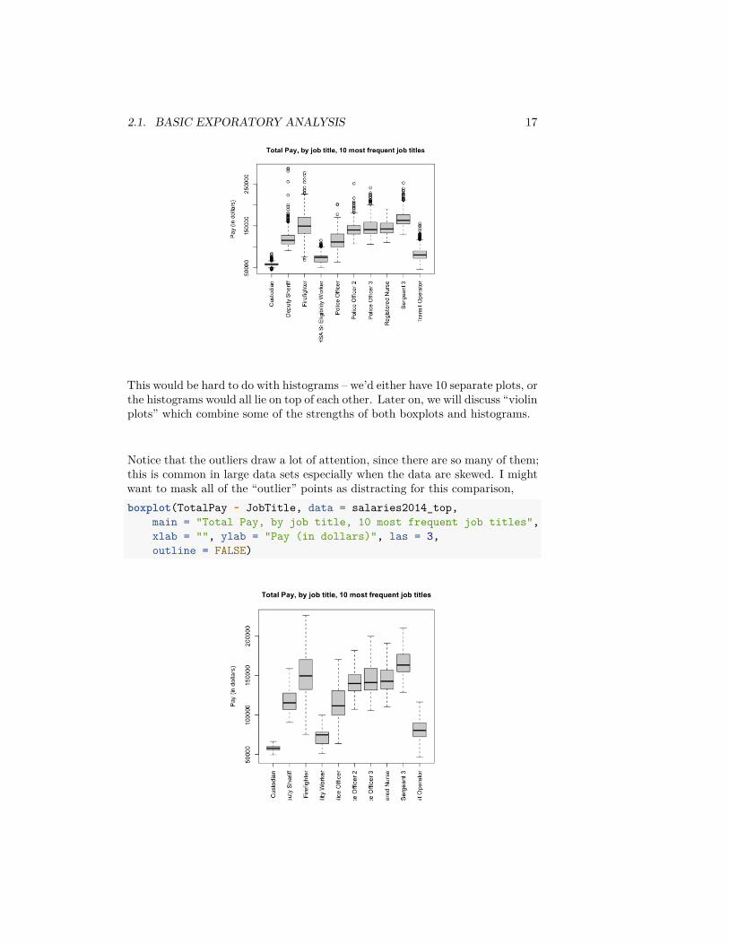
Notice that the outliers draw a lot of attention, since there are so many of them;this is common in large data sets especially when the data are skewed. I mightwant to mask all of the “outlier” points as distracting for this comparison,boxplot(TotalPay ~ JobTitle, data = salaries2014_top,
main = "Total Pay, by job title, 10 most frequent job titles",xlab = "", ylab = "Pay (in dollars)", las = 3,outline = FALSE)
18 CHAPTER 2. DATA DISTRIBUTIONS
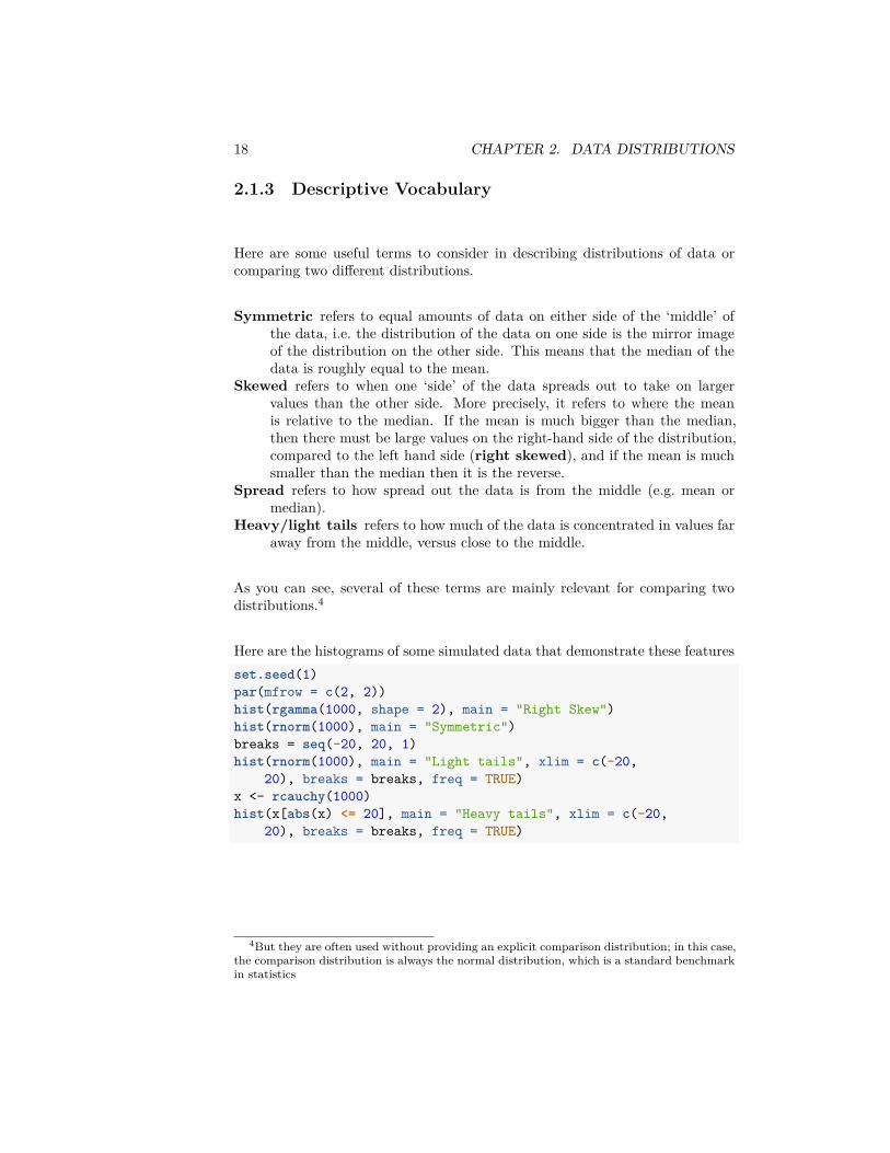
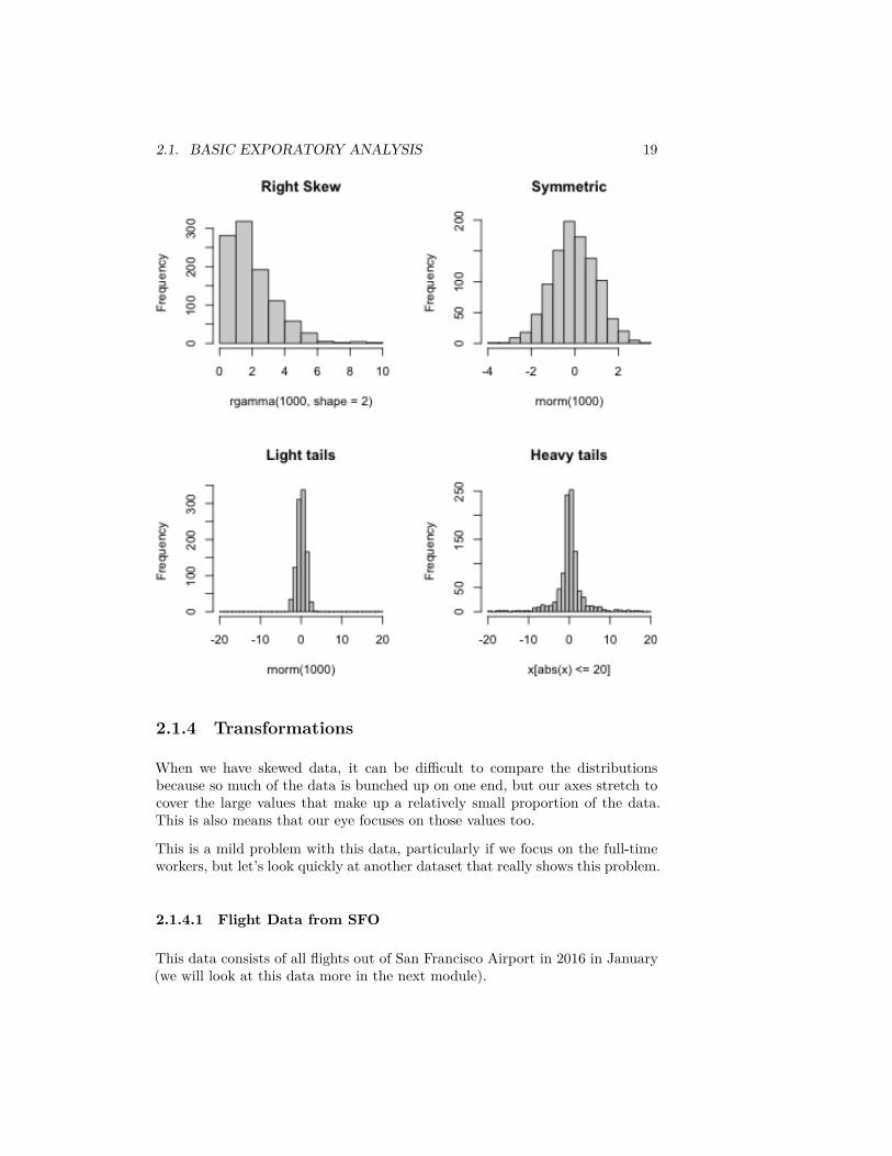
2.1.3 Descriptive Vocabulary
Here are some useful terms to consider in describing distributions of data orcomparing two different distributions.
Symmetric refers to equal amounts of data on either side of the ‘middle’ ofthe data, i.e. the distribution of the data on one side is the mirror imageof the distribution on the other side. This means that the median of thedata is roughly equal to the mean.
Skewed refers to when one ‘side’ of the data spreads out to take on largervalues than the other side. More precisely, it refers to where the meanis relative to the median. If the mean is much bigger than the median,then there must be large values on the right-hand side of the distribution,compared to the left hand side (right skewed), and if the mean is muchsmaller than the median then it is the reverse.
Spread refers to how spread out the data is from the middle (e.g. mean ormedian).
Heavy/light tails refers to how much of the data is concentrated in values faraway from the middle, versus close to the middle.
As you can see, several of these terms are mainly relevant for comparing twodistributions.4
Here are the histograms of some simulated data that demonstrate these featuresset.seed(1)par(mfrow = c(2, 2))hist(rgamma(1000, shape = 2), main = "Right Skew")hist(rnorm(1000), main = "Symmetric")breaks = seq(-20, 20, 1)hist(rnorm(1000), main = "Light tails", xlim = c(-20,
20), breaks = breaks, freq = TRUE)x <- rcauchy(1000)hist(x[abs(x) <= 20], main = "Heavy tails", xlim = c(-20,
20), breaks = breaks, freq = TRUE)
4But they are often used without providing an explicit comparison distribution; in this case,the comparison distribution is always the normal distribution, which is a standard benchmarkin statistics
2.1. BASIC EXPORATORY ANALYSIS 19
2.1.4 Transformations
When we have skewed data, it can be difficult to compare the distributionsbecause so much of the data is bunched up on one end, but our axes stretch tocover the large values that make up a relatively small proportion of the data.This is also means that our eye focuses on those values too.
This is a mild problem with this data, particularly if we focus on the full-timeworkers, but let’s look quickly at another dataset that really shows this problem.
2.1.4.1 Flight Data from SFO
This data consists of all flights out of San Francisco Airport in 2016 in January(we will look at this data more in the next module).
20 CHAPTER 2. DATA DISTRIBUTIONS
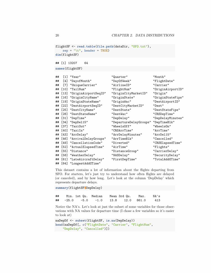
flightSF <- read.table(file.path(dataDir, "SFO.txt"),sep = "\t", header = TRUE)
dim(flightSF)
## [1] 13207 64names(flightSF)
## [1] "Year" "Quarter" "Month"## [4] "DayofMonth" "DayOfWeek" "FlightDate"## [7] "UniqueCarrier" "AirlineID" "Carrier"## [10] "TailNum" "FlightNum" "OriginAirportID"## [13] "OriginAirportSeqID" "OriginCityMarketID" "Origin"## [16] "OriginCityName" "OriginState" "OriginStateFips"## [19] "OriginStateName" "OriginWac" "DestAirportID"## [22] "DestAirportSeqID" "DestCityMarketID" "Dest"## [25] "DestCityName" "DestState" "DestStateFips"## [28] "DestStateName" "DestWac" "CRSDepTime"## [31] "DepTime" "DepDelay" "DepDelayMinutes"## [34] "DepDel15" "DepartureDelayGroups" "DepTimeBlk"## [37] "TaxiOut" "WheelsOff" "WheelsOn"## [40] "TaxiIn" "CRSArrTime" "ArrTime"## [43] "ArrDelay" "ArrDelayMinutes" "ArrDel15"## [46] "ArrivalDelayGroups" "ArrTimeBlk" "Cancelled"## [49] "CancellationCode" "Diverted" "CRSElapsedTime"## [52] "ActualElapsedTime" "AirTime" "Flights"## [55] "Distance" "DistanceGroup" "CarrierDelay"## [58] "WeatherDelay" "NASDelay" "SecurityDelay"## [61] "LateAircraftDelay" "FirstDepTime" "TotalAddGTime"## [64] "LongestAddGTime"
This dataset contains a lot of information about the flights departing fromSFO. For starters, let’s just try to understand how often flights are delayed(or canceled), and by how long. Let’s look at the column ‘DepDelay’ whichrepresents departure delays.summary(flightSF$DepDelay)
## Min. 1st Qu. Median Mean 3rd Qu. Max. NA's## -25.0 -5.0 -1.0 13.8 12.0 861.0 413
Notice the NA’s. Let’s look at just the subset of some variables for those obser-vations with NA values for departure time (I chose a few variables so it’s easierto look at)naDepDf <- subset(flightSF, is.na(DepDelay))head(naDepDf[, c("FlightDate", "Carrier", "FlightNum",
"DepDelay", "Cancelled")])
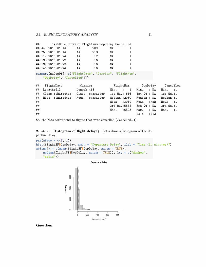
2.1. BASIC EXPORATORY ANALYSIS 21
## FlightDate Carrier FlightNum DepDelay Cancelled## 44 2016-01-14 AA 209 NA 1## 75 2016-01-14 AA 218 NA 1## 112 2016-01-24 AA 12 NA 1## 138 2016-01-22 AA 16 NA 1## 139 2016-01-23 AA 16 NA 1## 140 2016-01-24 AA 16 NA 1summary(naDepDf[, c("FlightDate", "Carrier", "FlightNum",
"DepDelay", "Cancelled")])
## FlightDate Carrier FlightNum DepDelay Cancelled## Length:413 Length:413 Min. : 1 Min. : NA Min. :1## Class :character Class :character 1st Qu.: 616 1st Qu.: NA 1st Qu.:1## Mode :character Mode :character Median :2080 Median : NA Median :1## Mean :3059 Mean :NaN Mean :1## 3rd Qu.:5555 3rd Qu.: NA 3rd Qu.:1## Max. :6503 Max. : NA Max. :1## NA's :413
So, the NAs correspond to flights that were cancelled (Cancelled=1).
2.1.4.1.1 Histogram of flight delays} Let’s draw a histogram of the de-parture delay.par(mfrow = c(1, 1))hist(flightSF$DepDelay, main = "Departure Delay", xlab = "Time (in minutes)")abline(v = c(mean(flightSF$DepDelay, na.rm = TRUE),
median(flightSF$DepDelay, na.rm = TRUE)), lty = c("dashed","solid"))
Question:

22 CHAPTER 2. DATA DISTRIBUTIONS
What do you notice about the histogram? What does it tell you about the data?
Question:
How good of a summary is the mean or median here? Why are they so different?
Effect of removing data
What happened to the NA’s that we saw before? They are just silently notplotted.
Question:
What does that mean for interpreting the histogram?
We could give the cancelled data a ‘fake’ value so that it plots.flightSF$DepDelayWithCancel <- flightSF$DepDelayflightSF$DepDelayWithCancel[is.na(flightSF$DepDelay)] <- 1200hist(flightSF$DepDelayWithCancel, xlab = "Time (in minutes)",
main = "Departure delay, with cancellations=1200")
Boxplots
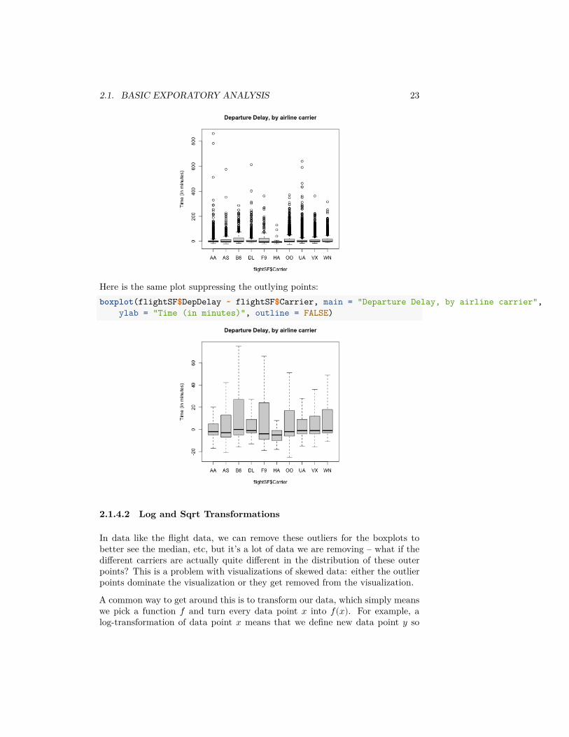
If we do boxplots separated by carrier, we can see the problem with plottingthe ”outlier” pointsboxplot(flightSF$DepDelay ~ flightSF$Carrier, main = "Departure Delay, by airline carrier",
ylab = "Time (in minutes)")
2.1. BASIC EXPORATORY ANALYSIS 23
Here is the same plot suppressing the outlying points:boxplot(flightSF$DepDelay ~ flightSF$Carrier, main = "Departure Delay, by airline carrier",
ylab = "Time (in minutes)", outline = FALSE)
2.1.4.2 Log and Sqrt Transformations
In data like the flight data, we can remove these outliers for the boxplots tobetter see the median, etc, but it’s a lot of data we are removing – what if thedifferent carriers are actually quite different in the distribution of these outerpoints? This is a problem with visualizations of skewed data: either the outlierpoints dominate the visualization or they get removed from the visualization.
A common way to get around this is to transform our data, which simply meanswe pick a function 𝑓 and turn every data point 𝑥 into 𝑓(𝑥). For example, alog-transformation of data point 𝑥 means that we define new data point 𝑦 so
24 CHAPTER 2. DATA DISTRIBUTIONS
that𝑦 = log(𝑥).
A common example of when we want a transformation is for data that are allpositive, yet take on values close to zero. In this case, there are often many datapoints bunched up by zero (because they can’t go lower) with a definite rightskew.
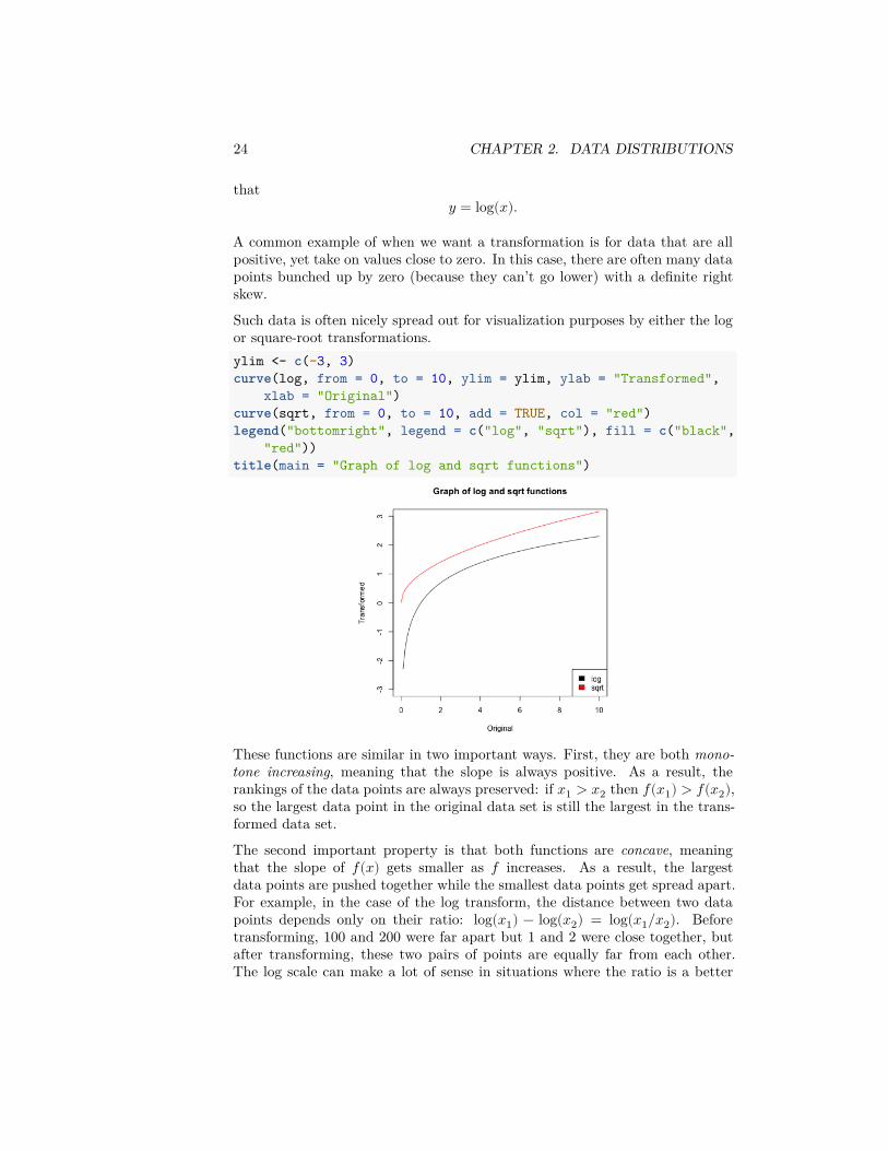
Such data is often nicely spread out for visualization purposes by either the logor square-root transformations.ylim <- c(-3, 3)curve(log, from = 0, to = 10, ylim = ylim, ylab = "Transformed",
xlab = "Original")curve(sqrt, from = 0, to = 10, add = TRUE, col = "red")legend("bottomright", legend = c("log", "sqrt"), fill = c("black",
"red"))title(main = "Graph of log and sqrt functions")
These functions are similar in two important ways. First, they are both mono-tone increasing, meaning that the slope is always positive. As a result, therankings of the data points are always preserved: if 𝑥1 > 𝑥2 then 𝑓(𝑥1) > 𝑓(𝑥2),so the largest data point in the original data set is still the largest in the trans-formed data set.
The second important property is that both functions are concave, meaningthat the slope of 𝑓(𝑥) gets smaller as 𝑓 increases. As a result, the largestdata points are pushed together while the smallest data points get spread apart.For example, in the case of the log transform, the distance between two datapoints depends only on their ratio: log(𝑥1) − log(𝑥2) = log(𝑥1/𝑥2). Beforetransforming, 100 and 200 were far apart but 1 and 2 were close together, butafter transforming, these two pairs of points are equally far from each other.The log scale can make a lot of sense in situations where the ratio is a better
2.1. BASIC EXPORATORY ANALYSIS 25
match for our “perceptual distance,” for example when comparing incomes, thedifference between making $500,000 and $550,000 salary feels a lot less importantthan the difference between $20,000 and $70,000.
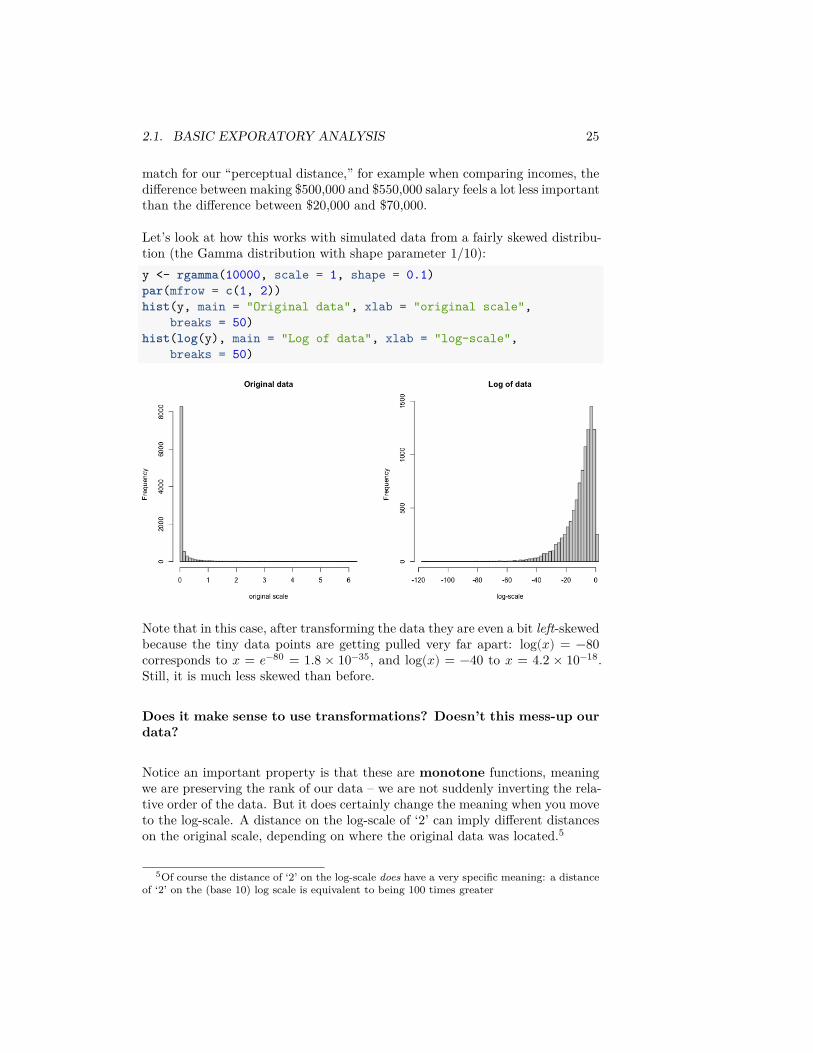
Let’s look at how this works with simulated data from a fairly skewed distribu-tion (the Gamma distribution with shape parameter 1/10):y <- rgamma(10000, scale = 1, shape = 0.1)par(mfrow = c(1, 2))hist(y, main = "Original data", xlab = "original scale",
breaks = 50)hist(log(y), main = "Log of data", xlab = "log-scale",
breaks = 50)
Note that in this case, after transforming the data they are even a bit left-skewedbecause the tiny data points are getting pulled very far apart: log(𝑥) = −80corresponds to 𝑥 = 𝑒−80 = 1.8 × 10⁻³⁵, and log(𝑥) = −40 to 𝑥 = 4.2 × 10⁻¹⁸.Still, it is much less skewed than before.
Does it make sense to use transformations? Doesn’t this mess-up ourdata?
Notice an important property is that these are monotone functions, meaningwe are preserving the rank of our data – we are not suddenly inverting the rela-tive order of the data. But it does certainly change the meaning when you moveto the log-scale. A distance on the log-scale of ‘2’ can imply different distanceson the original scale, depending on where the original data was located.5
5Of course the distance of ‘2’ on the log-scale does have a very specific meaning: a distanceof ‘2’ on the (base 10) log scale is equivalent to being 100 times greater

26 CHAPTER 2. DATA DISTRIBUTIONS
2.1.4.3 Transforming our data sets
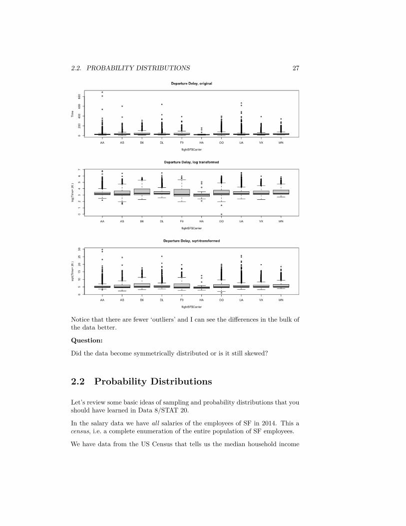
Our flight delay data is not so obliging as the simulated data, since it alsohas negative numbers. But we could, for visualization purposes, shift the databefore taking the log or square-root. Here I compare the boxplots of the originaldata, as well as that of the data after the log and the square-root.addValue <- abs(min(flightSF$DepDelay, na.rm = TRUE)) +
1par(mfrow = c(3, 1))boxplot(flightSF$DepDelay + addValue ~ flightSF$Carrier,
main = "Departure Delay, original", ylab = "Time")boxplot(log(flightSF$DepDelay + addValue) ~ flightSF$Carrier,
main = "Departure Delay, log transformed", ylab = paste("log(Time+",addValue, ")"))
boxplot(sqrt(flightSF$DepDelay + addValue) ~ flightSF$Carrier,main = "Departure Delay, sqrt-transformed", ylab = paste("sqrt(Time+",
addValue, ")"))
2.2. PROBABILITY DISTRIBUTIONS 27
Notice that there are fewer ‘outliers’ and I can see the differences in the bulk ofthe data better.
Question:
Did the data become symmetrically distributed or is it still skewed?
2.2 Probability Distributions
Let’s review some basic ideas of sampling and probability distributions that youshould have learned in Data 8/STAT 20.
In the salary data we have all salaries of the employees of SF in 2014. This acensus, i.e. a complete enumeration of the entire population of SF employees.
We have data from the US Census that tells us the median household income

28 CHAPTER 2. DATA DISTRIBUTIONS
in 2014 in all of San Fransisco was around $72K.6 We could want to use thisdata to ask, what was the probability an employee in SF makes less than theregional median household number?
We really need to be more careful, however, because this question doesn’t reallymake sense because we haven’t defined any notion of randomness. If I pickemployee John Doe and ask what is the probability he makes less than $72K,this is not a reasonable question, because either he did or didn’t make less thanthat.
So we don’t actually want to ask about a particular person if we are interestedin probabilities – we need to have some notion of asking about a randomly se-lected employee. Commonly, the randomness we will assume is that a employeeis randomly selected from the full population of full-time employees, with allemployees having an equal probability of being selected. This is called a simplerandom sample.
Now we can ask, what is the probability of such a randomly selected employeemaking less than $72K? Notice that we have exactly defined the randomnessmechanism, and so now can calculate probabilities. How would you calculatethe following probabilities based on this probability mechanism?
1. 𝑃(income = $72𝐾)2. 𝑃(income ≤ $72K)3. 𝑃(income > $200K)
This kind of sampling is called a simple random sample and is what most peoplemean when they say “at random” if they stop to think about it. However, thereare many other kinds of samples where data are chosen randomly, but not everydata point is equally likely to be picked. There are, of course, also many samplesthat are not random at all.
Notation and Terminology
We call the salary value of a randomly selected employee a random variable.We can simplify our notation for probabilities by letting the variable 𝑋 be shorthand for the value of that random variable, and make statements like 𝑃(𝑋 > 2).We call the complete set of probabilities the probability distribution of 𝑋.
2.2.1 Probabilities and Histograms
The frequency histograms we plotted of the entire population above giveus information about the probabilities of discrete distributions, since they givethe count of the numbers of observations in an interval. We can divide that
6http://www.hcd.ca.gov/grants-funding/income-limits/state-and-federal-income-limits/docs/inc2k14.pdf
2.2. PROBABILITY DISTRIBUTIONS 29
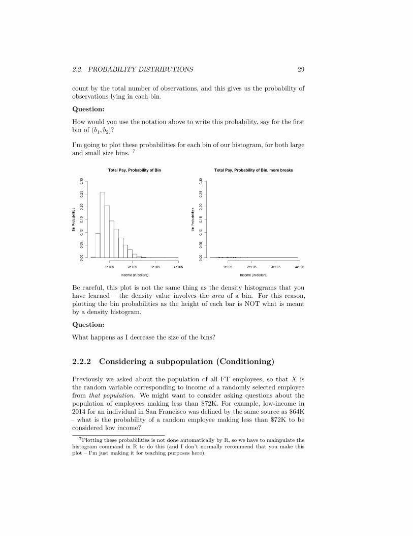
count by the total number of observations, and this gives us the probability ofobservations lying in each bin.
Question:
How would you use the notation above to write this probability, say for the firstbin of (𝑏1, 𝑏2]?
I’m going to plot these probabilities for each bin of our histogram, for both largeand small size bins. 7
Be careful, this plot is not the same thing as the density histograms that youhave learned – the density value involves the area of a bin. For this reason,plotting the bin probabilities as the height of each bar is NOT what is meantby a density histogram.
Question:
What happens as I decrease the size of the bins?
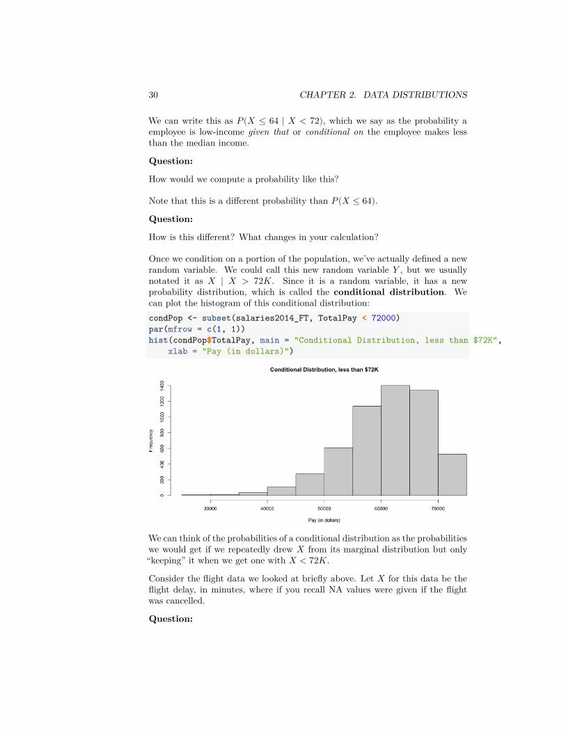
2.2.2 Considering a subpopulation (Conditioning)
Previously we asked about the population of all FT employees, so that 𝑋 isthe random variable corresponding to income of a randomly selected employeefrom that population. We might want to consider asking questions about thepopulation of employees making less than $72K. For example, low-income in2014 for an individual in San Francisco was defined by the same source as $64K– what is the probability of a random employee making less than $72K to beconsidered low income?
7Plotting these probabilities is not done automatically by R, so we have to mainpulate thehistogram command in R to do this (and I don’t normally recommend that you make thisplot – I’m just making it for teaching purposes here).
30 CHAPTER 2. DATA DISTRIBUTIONS
We can write this as 𝑃(𝑋 ≤ 64 ∣ 𝑋 < 72), which we say as the probability aemployee is low-income given that or conditional on the employee makes lessthan the median income.
Question:
How would we compute a probability like this?
Note that this is a different probability than 𝑃(𝑋 ≤ 64).Question:
How is this different? What changes in your calculation?
Once we condition on a portion of the population, we’ve actually defined a newrandom variable. We could call this new random variable 𝑌 , but we usuallynotated it as 𝑋 ∣ 𝑋 > 72𝐾. Since it is a random variable, it has a newprobability distribution, which is called the conditional distribution. Wecan plot the histogram of this conditional distribution:condPop <- subset(salaries2014_FT, TotalPay < 72000)par(mfrow = c(1, 1))hist(condPop$TotalPay, main = "Conditional Distribution, less than $72K",
xlab = "Pay (in dollars)")
We can think of the probabilities of a conditional distribution as the probabilitieswe would get if we repeatedly drew 𝑋 from its marginal distribution but only“keeping” it when we get one with 𝑋 < 72𝐾.
Consider the flight data we looked at briefly above. Let 𝑋 for this data be theflight delay, in minutes, where if you recall NA values were given if the flightwas cancelled.
Question:
2.3. DISTRIBUTIONS OF SAMPLES OF DATA 31
How would you state the following probability statements in words?
𝑃(𝑋 > 60|𝑋 ≠ NA)
𝑃 (𝑋 > 60|𝑋 ≠ NA&𝑋 > 0)
2.3 Distributions of samples of data
Usually the data we work with is a sample, not the complete population. Thisneeds to changes our interpretation of what the plots we have previously doneon the complete census mean when it is only a sample of the entire population.
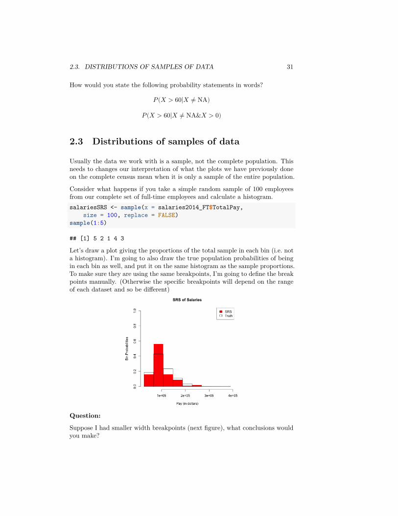
Consider what happens if you take a simple random sample of 100 employeesfrom our complete set of full-time employees and calculate a histogram.salariesSRS <- sample(x = salaries2014_FT$TotalPay,
size = 100, replace = FALSE)sample(1:5)
## [1] 5 2 1 4 3
Let’s draw a plot giving the proportions of the total sample in each bin (i.e. nota histogram). I’m going to also draw the true population probabilities of beingin each bin as well, and put it on the same histogram as the sample proportions.To make sure they are using the same breakpoints, I’m going to define the breakpoints manually. (Otherwise the specific breakpoints will depend on the rangeof each dataset and so be different)
Question:
Suppose I had smaller width breakpoints (next figure), what conclusions wouldyou make?
32 CHAPTER 2. DATA DISTRIBUTIONS
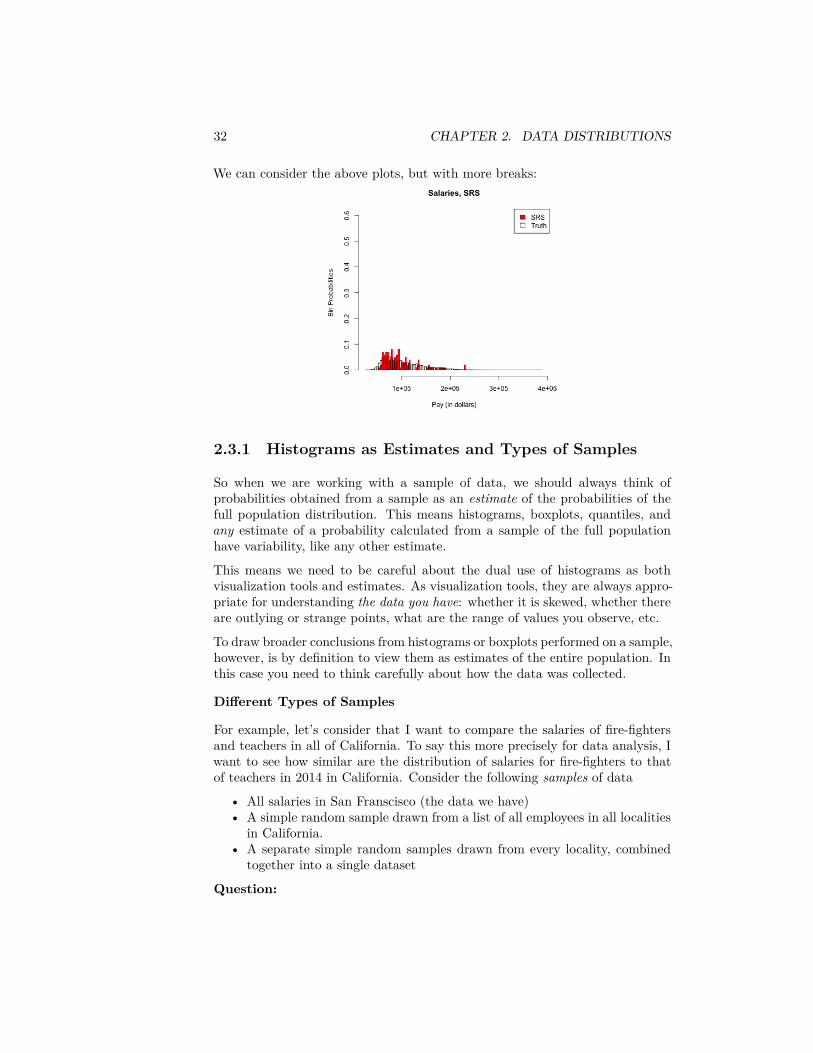
We can consider the above plots, but with more breaks:
2.3.1 Histograms as Estimates and Types of Samples
So when we are working with a sample of data, we should always think ofprobabilities obtained from a sample as an estimate of the probabilities of thefull population distribution. This means histograms, boxplots, quantiles, andany estimate of a probability calculated from a sample of the full populationhave variability, like any other estimate.
This means we need to be careful about the dual use of histograms as bothvisualization tools and estimates. As visualization tools, they are always appro-priate for understanding the data you have: whether it is skewed, whether thereare outlying or strange points, what are the range of values you observe, etc.
To draw broader conclusions from histograms or boxplots performed on a sample,however, is by definition to view them as estimates of the entire population. Inthis case you need to think carefully about how the data was collected.
Different Types of Samples
For example, let’s consider that I want to compare the salaries of fire-fightersand teachers in all of California. To say this more precisely for data analysis, Iwant to see how similar are the distribution of salaries for fire-fighters to thatof teachers in 2014 in California. Consider the following samples of data
• All salaries in San Franscisco (the data we have)• A simple random sample drawn from a list of all employees in all localities
in California.• A separate simple random samples drawn from every locality, combined
together into a single dataset
Question:
2.3. DISTRIBUTIONS OF SAMPLES OF DATA 33
Why do I now consider all salaries in San Franscisco as a sample, when beforeI said it was a census?
All three of these are samples from the population of interest and for simplicitylet’s assume that we make them so that they are all same total sample size.
One is not a random sample (which one? ). Only one is a simple random sample .The last sampling scheme, created by doing a SRS of each month and combiningthe results, is also a random sampling scheme. We know it’s random becauseif we did it again, we wouldn’t get exactly the same set of data (unlike our SFdata). But it is not a SRS – it is called a Stratified random sample.
If we draw histograms of these different samples, they will all describe theobserved distribution of the sample we have, but they will not all be goodestimates of the underlying population distribution.
2.3.1.1 Example on Data
We don’t have this data, but we do have the full year of flight data in 2015/2016academic year (previously we imported only the month of January). Considerthe following ways of sampling from the full set of flight data and consider howthey correspond to the above:
• 12 separate simple random samples drawn from every month in the2015/2016 academic year, combined together into a single dataset
• All flights in January• A simple random sample drawn from all flights in the 2015/2016 academic
year.
We can actually make all of these samples and compare them to the truth (I’vemade these samples previously and I’m going to just read them, because theentire year is a big dataset to work with in class).flightSFOSRS <- read.table(file.path(dataDir, "SFO_SRS.txt"),
sep = "\t", header = TRUE, stringsAsFactors = FALSE)flightSFOStratified <- read.table(file.path(dataDir,
"SFO_Stratified.txt"), sep = "\t", header = TRUE,stringsAsFactors = FALSE)
par(mfrow = c(2, 2))xlim <- c(-20, 400)hist(flightSF$DepDelay, breaks = 100, xlim = xlim,
freq = FALSE)hist(flightSFOSRS$DepDelay, breaks = 100, xlim = xlim,
freq = FALSE)hist(flightSFOStratified$DepDelay, breaks = 100, xlim = xlim,
freq = FALSE)
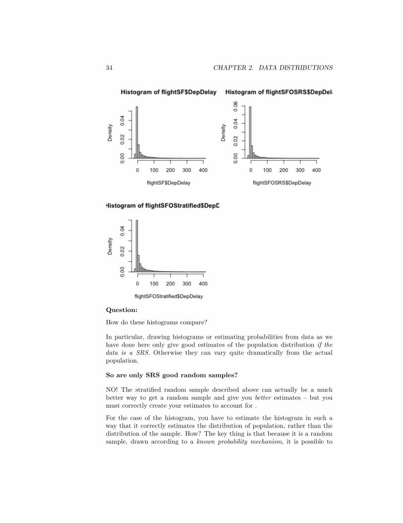
34 CHAPTER 2. DATA DISTRIBUTIONS
Question:
How do these histograms compare?
In particular, drawing histograms or estimating probabilities from data as wehave done here only give good estimates of the population distribution if thedata is a SRS. Otherwise they can vary quite dramatically from the actualpopulation.
So are only SRS good random samples?
NO! The stratified random sample described above can actually be a muchbetter way to get a random sample and give you better estimates – but youmust correctly create your estimates to account for .
For the case of the histogram, you have to estimate the histogram in such away that it correctly estimates the distribution of population, rather than thedistribution of the sample. How? The key thing is that because it is a randomsample, drawn according to a known probability mechanism, it is possible to
2.4. CONTINUOUS DISTRIBUTIONS 35
make a correct estimate of the population.
How to make these kind of estimates for random samples that are not SRS isbeyond the scope of this class, but there are standard ways to do so for stratifiedsamples and many other sampling designs (this field of statistics is called surveysampling). Indeed most national surveys, particularly any that require face-to-face interviewing, are not SRS but much more complicated sampling schemesthat can give equally accurate estimates, but often with less cost.
2.4 Continuous Distributions
Data 8 and Stat 20 primarily relied on probability from discrete distributions,meaning that the complete set of possible values that can be observed is a finiteset of values. For example, if we draw a random sample from our salary datawe know that only the 35711 unique values of the salaries in that year can beobserved – not all numeric values are possible. We saw this when we asked whatwas the probability that we drew a random employee with salary exactly equalto $72K.
However, it can be useful to think about probability distributions that allowfor all numeric values (i.e. continuous values), even when we know the actualpopulation is finite. These are continuous distributions.
For example, suppose we wanted to use this set of data to make decisions aboutpolicy to improve salaries for a certain class of employees. It’s more reasonableto think that there is an (unknown) probability distribution that defines whatwe expect to see for that data that is defined on a continuous range of values,not the specific ones we see in 2014.
Of course some features of the data are “naturally” discrete, like the set of jobtitles, and there no rational way to think of them being continuous.
2.4.1 Probability with Continuous distributions
Some probability ideas become more complicated/nuanced for continuous dis-tributions. In particular, for a discrete distribution, it makes sense to say𝑃 (𝑋 = 72𝐾) (the probability of a salary exactly equal to 72𝐾). For continuousdistributions, such an innocent statement is actually fraught with problems.
To see why, remember what you know about discrete probability distributions.In particular,
0 ≤ 𝑃(𝑋 = 72, 000) ≤ 1Furthermore, any probability statment has to have this property, not just onesinvolving ‘=’: e.g. 𝑃(𝑋 ≤ 10) or 𝑃(𝑋 ≥ 0). This is a fundamental rule ofprobability, and thus also holds true for continuous distributions.
36 CHAPTER 2. DATA DISTRIBUTIONS
Okay so far. Now another thing you learned is if I give all possible values thatmy random variable 𝑋 can take (the sample space) and call them 𝑣1, … , 𝑣𝐾,then if I sum up all these probabilities they must sum exactly to 1,
𝐾∑𝑖=1
𝑃(𝑋 = 𝑣𝑖) = 1
Furthermore, 𝑃(𝑋 ∈ {𝑣1, … , 𝑣𝐾}) = 1, i.e. the probability 𝑋 is in the samplespace must of course be 1.Well this becomes more complicated for continuous values – this leads us to aninfinite sum since we have an infinite number of possible values. Moreover, if wegive any positive probability (i.e. ≠ 0) to each point in the sample space, thenwe won’t ‘sum’ to one 8 These kinds of concepts from discrete probability justdon’t translate over exactly to continuous random variables.
To deal with this, continuous distributions do not allow any positive probabilityfor a single value: if 𝑋 has a continuous distribution, then 𝑃(𝑋 = 𝑥) = 0 forany value of 𝑥.
Notation:
Notice the notation here. We generally use a capital letter, like 𝑋 for randomvariables, and lower case value for a particulary possible value that they cantake on (a value that it takes on is also called a realization). We often usethe same letter, with one lower-case and one upper case, as is done here. Why?Otherwise we start to run out of letters and symbols once we have multiplerandom variables – we don’t want statements like 𝑃(𝑊 = 𝑣, 𝑋 = 𝑦, 𝑍 = 𝑢)because it’s hard to remember which value goes with which random variable.
Instead, continuous distributions only allow for positive probability of an inter-val: 𝑃(𝑥1 ≤ 𝑋 ≤ 𝑥2) can be greater than 0.
Question:
Note that this also means that for continuous distributions 𝑃(𝑋 ≤ 𝑥) = 𝑃(𝑋 <𝑥), why?
Giving zero probability for a single value isn’t so strange if you think about it.Think about our flight data. What is your intuitive sense of the probability ofa flight delay of exactly 10 minutes – and not 10 minutes 10 sec or 9 minutes 45sec? You see that once you allow for infinite precision, it is actually reasonableto say that exactly 10 minutes has no real probability that you need worry about.
For our salary data, of course we don’t have infinite precision, but we still seethat it’s useful to think of ranges of salary – there is no one that makes exactly
8For those with more math: convergent infinite series can of course sum to 1. But weare working with the continuous real line (or an interval of the real line), and there is not abijection between the integers and the continuous line.
2.4. CONTINUOUS DISTRIBUTIONS 37
$72K, but there are 1 within $1 dollar of that amount, and 6 employees within$10 dollars of that amount, all equivalent salaries in any practical discussion ofsalaries.
What if you want the chance of getting a 10 minute flight delay? Well, youreally mean a small interval around 10 minutes, since there’s a limit to our mea-surement ability anyway. This is what we also do with continuous distributions:we discuss the probability in terms of increasingly small intervals around 10minutes.
The mathemtatics of calculus give us the tools to do this via integration. Inpractice, the functions we want to integrate are not tractable anyway, so wewill use the computer. We are going to focus on understanding how to thinkabout continuous distributions so we can understand the statistical question ofhow to estimate distributions and probabilities (rather than the more in-depthprobability treatment you would get in a probability class).
2.4.2 Cummulative Distribution Function (cdfs)
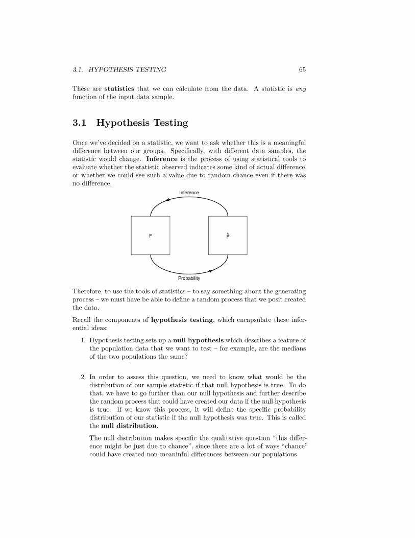
For discrete distributions, we can completely describe the distribution of a ran-dom variable by describing the probability of each of the discrete values it takeson. In other words, knowing 𝑃(𝑋 = 𝑣𝑖) for all possible values of 𝑣𝑖 in the samplespace completely defines the probability distribution.
If we can’t talk about 𝑃(𝑋 = 𝑥), then how do we define a continous distribution?We basically define the probably of every single possible interval. Obviously,there are an infinite number of intervals, but we can use the simple fact that
𝑃(𝑥1 < 𝑋 ≤ 𝑥2) = 𝑃(𝑋 ≤ 𝑥2) − 𝑃(𝑋 ≤ 𝑥1)
Question:
Why is this true? (Use the case of discrete distribution to reason it out)
Thus rather than define the probably of every single possible interval, we cantackle the simpler task to define 𝑃(𝑋 ≤ 𝑥) for every single 𝑥 on the real line.That’s just a function of 𝑥
𝐹(𝑥) = 𝑃(𝑋 ≤ 𝑥)
𝐹 is called a cumulative distribution function (cdf). And while we willfocus on continuous distributions, discrete distributions can also be defined inthe same way by their cumulative distribution function.
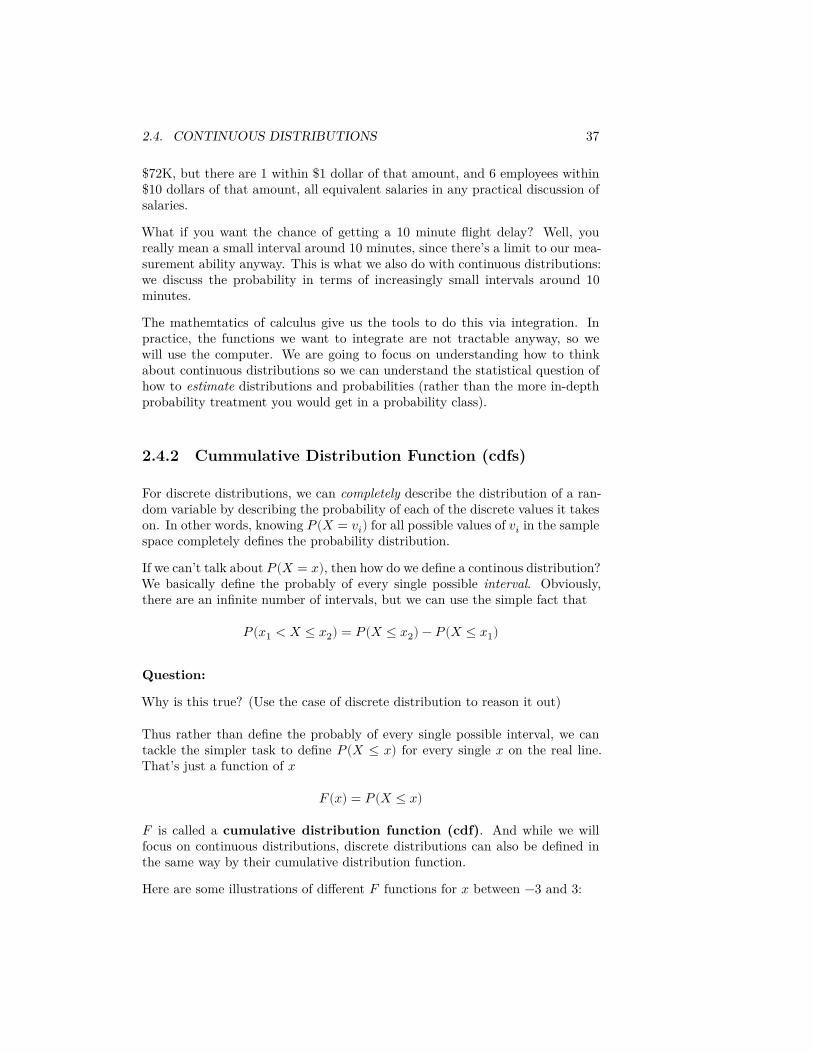
Here are some illustrations of different 𝐹 functions for 𝑥 between −3 and 3:
38 CHAPTER 2. DATA DISTRIBUTIONS
Which of these distributions is likely to have values of 𝑋 less than −3?• Which equally likely to be positive or negative?
• What is the 𝑃(𝑋 > 3) – how would you calculate that? Which distribu-tions are likely to have 𝑃(𝑋 > 3) be large?
• What is lim𝑥→∞ 𝐹(𝑥) for all cdfs? What is lim𝑥→−∞ 𝐹(𝑥) for all cdfs?Why?
Key properties of continuous distributions
1. Probabilities are always between 0 and 1, inclusive.2. Probabilities are only calculated for intervals, not individual points
2.4.3 Probability Density Functions (pdfs)
You see from these questions, that you can make all of the assessments we havediscussed (like symmetry, or compare if a distribution has heavier tails thananother) from the cdf. But it is not the most common way to think aboutthe distribution. More frequently the probability density function (pdf) ismore intuitive, and is similar to a histogram in the information it gives aboutthe distribution.
Formally, the pdf 𝑝(𝑥) is derivative of 𝐹(𝑥), if 𝐹(𝑥) is differentiable
𝑝(𝑥) = 𝑑𝑑𝑥𝐹(𝑥)
If 𝐹 isn’t differentiable, the distribution doesn’t have a density, which in practiceyou will rarely run into for continuous variables.9
9Discrete distributions have cdfs where 𝐹(𝑥) is not differentiable, so they do not havedensities. But even some continuous distributions can have cdfs that are non-differentiable
2.4. CONTINUOUS DISTRIBUTIONS 39
Conversely, 𝑝(𝑥) is the function such that if you take the area under its curvefor an interval, i.e. the integral, it gives you probability of that interval:
∫𝑏
𝑎𝑝(𝑥) = 𝑃(𝑎 ≤ 𝑋 ≤ 𝑏) = 𝐹(𝑏) − 𝐹(𝑎)
More formally, you can derive 𝑃(𝑋 ≤ 𝑣) = 𝐹(𝑣) from 𝑝(𝑥) as
𝐹(𝑣) = ∫𝑣
−∞𝑝(𝑥)𝑑𝑥.
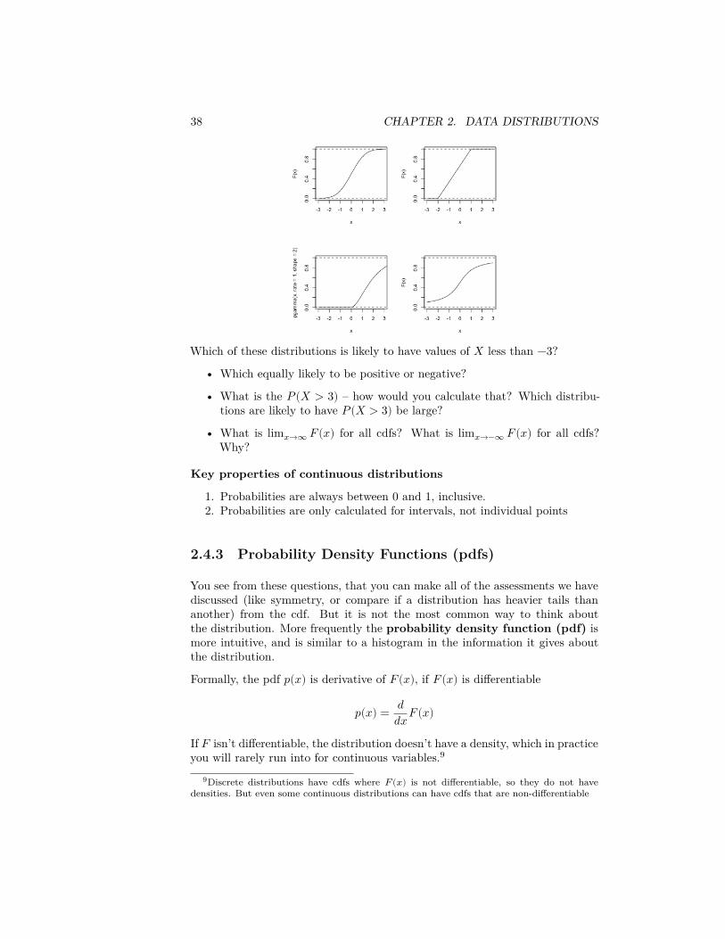
Let’s look at an example with the following pdf, which is perhaps vaguely similarto our flight or salary data, though on a different scale of values for 𝑋,
𝑝(𝑥) = 14𝑥𝑒−𝑥/2
Suppose that 𝑋 is a random variable from a distribution with this pdf. Thento find 𝑃(5 ≤ 𝑋 ≤ 10), I find the area under the curve of 𝑝(𝑥) between 5 and10, by taking the integral of 𝑝(𝑥) over the range of (5, 10):
∫10
5
14𝑥𝑒−𝑥/2
40 CHAPTER 2. DATA DISTRIBUTIONS
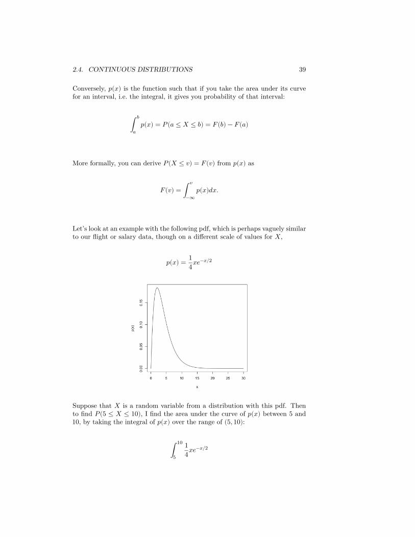
In this case, we can actually solve the integral through integration by parts(which you may or may not have covered),
∫10
5
14𝑥𝑒−𝑥/2 = (−1
2𝑥𝑒−𝑥/2 − 𝑒−𝑥/2)∣10
5=
Evaluating this gives us 𝑃(5 ≤ 𝑋 ≤ 10) = 0.247. Most of the time, however,the integrals of common pdfs that are used as models for data (like the normal),cannot be done by hand, and we rely on the computer to evaluate the integralfor us.
Total Probability
Our same rule from discrete distribution applies, namely that the probabilityof 𝑋 being in the entire sample space must be 1. Here the sample space is thewhole real line.
Question:
What does this mean in terms of the cumulative area under the curve of 𝑝(𝑥)?
It must be exactly 1
2.4.4 Normal Distribution and Central Limit Theorem
You’ve seen a continuous distribution when you learned about the central limittheorem.
Recall, if I take a SRS of a population and calculate it’s mean, call it ��, thisis itself a random variable that has a distribution. It’s randomness is due tothe randomness in the SRS. If I do this process many times I can look at thedistribution of ��
2.4. CONTINUOUS DISTRIBUTIONS 41
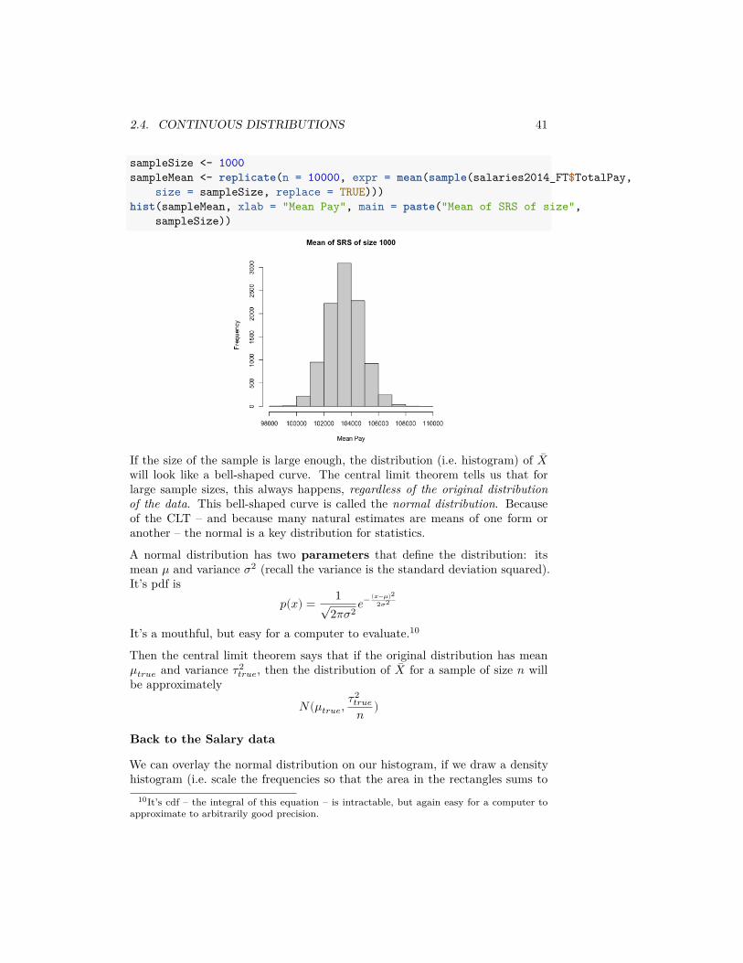
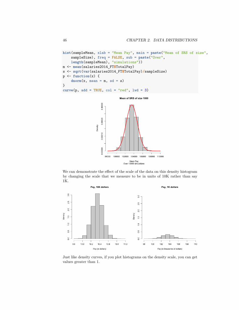
sampleSize <- 1000sampleMean <- replicate(n = 10000, expr = mean(sample(salaries2014_FT$TotalPay,
size = sampleSize, replace = TRUE)))hist(sampleMean, xlab = "Mean Pay", main = paste("Mean of SRS of size",
sampleSize))
If the size of the sample is large enough, the distribution (i.e. histogram) of ��will look like a bell-shaped curve. The central limit theorem tells us that forlarge sample sizes, this always happens, regardless of the original distributionof the data. This bell-shaped curve is called the normal distribution. Becauseof the CLT – and because many natural estimates are means of one form oranother – the normal is a key distribution for statistics.
A normal distribution has two parameters that define the distribution: itsmean 𝜇 and variance 𝜎2 (recall the variance is the standard deviation squared).It’s pdf is
𝑝(𝑥) = 1√2𝜋𝜎2 𝑒− (𝑥−𝜇)2
2𝜎2
It’s a mouthful, but easy for a computer to evaluate.10
Then the central limit theorem says that if the original distribution has mean𝜇𝑡𝑟𝑢𝑒 and variance 𝜏2
𝑡𝑟𝑢𝑒, then the distribution of �� for a sample of size 𝑛 willbe approximately
𝑁(𝜇𝑡𝑟𝑢𝑒, 𝜏2𝑡𝑟𝑢𝑒𝑛 )
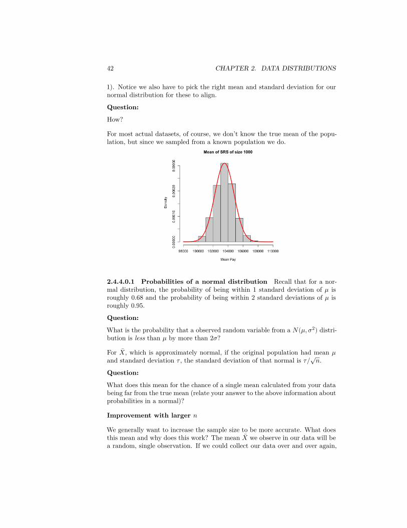
Back to the Salary data
We can overlay the normal distribution on our histogram, if we draw a densityhistogram (i.e. scale the frequencies so that the area in the rectangles sums to
10It’s cdf – the integral of this equation – is intractable, but again easy for a computer toapproximate to arbitrarily good precision.
42 CHAPTER 2. DATA DISTRIBUTIONS
1). Notice we also have to pick the right mean and standard deviation for ournormal distribution for these to align.
Question:
How?
For most actual datasets, of course, we don’t know the true mean of the popu-lation, but since we sampled from a known population we do.
2.4.4.0.1 Probabilities of a normal distribution Recall that for a nor-mal distribution, the probability of being within 1 standard deviation of 𝜇 isroughly 0.68 and the probability of being within 2 standard deviations of 𝜇 isroughly 0.95.
Question:
What is the probability that a observed random variable from a 𝑁(𝜇, 𝜎2) distri-bution is less than 𝜇 by more than 2𝜎?
For ��, which is approximately normal, if the original population had mean 𝜇and standard deviation 𝜏 , the standard deviation of that normal is 𝜏/√𝑛.Question:
What does this mean for the chance of a single mean calculated from your databeing far from the true mean (relate your answer to the above information aboutprobabilities in a normal)?
Improvement with larger 𝑛
We generally want to increase the sample size to be more accurate. What doesthis mean and why does this work? The mean �� we observe in our data will bea random, single observation. If we could collect our data over and over again,
2.4. CONTINUOUS DISTRIBUTIONS 43
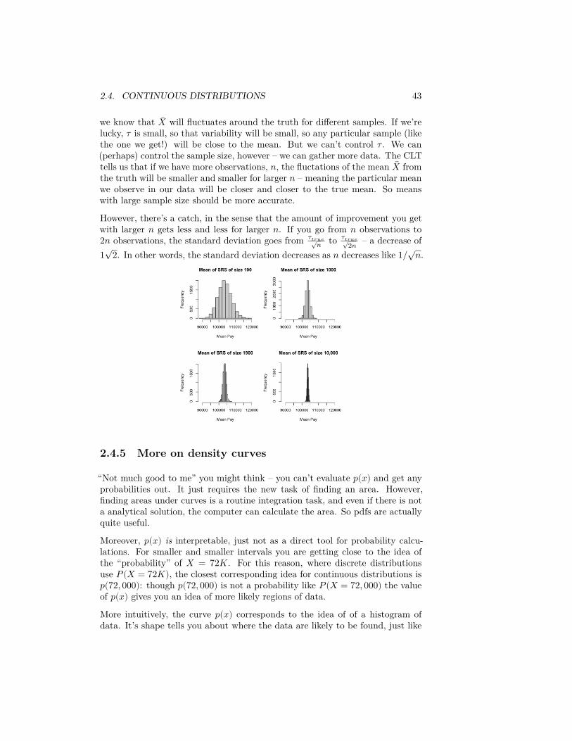
we know that �� will fluctuates around the truth for different samples. If we’relucky, 𝜏 is small, so that variability will be small, so any particular sample (likethe one we get!) will be close to the mean. But we can’t control 𝜏 . We can(perhaps) control the sample size, however – we can gather more data. The CLTtells us that if we have more observations, 𝑛, the fluctations of the mean �� fromthe truth will be smaller and smaller for larger 𝑛 – meaning the particular meanwe observe in our data will be closer and closer to the true mean. So meanswith large sample size should be more accurate.
However, there’s a catch, in the sense that the amount of improvement you getwith larger 𝑛 gets less and less for larger 𝑛. If you go from 𝑛 observations to2𝑛 observations, the standard deviation goes from 𝜏𝑡𝑟𝑢𝑒√𝑛 to 𝜏𝑡𝑟𝑢𝑒√
2𝑛 – a decrease of1√
2. In other words, the standard deviation decreases as 𝑛 decreases like 1/√𝑛.
2.4.5 More on density curves
“Not much good to me” you might think – you can’t evaluate 𝑝(𝑥) and get anyprobabilities out. It just requires the new task of finding an area. However,finding areas under curves is a routine integration task, and even if there is nota analytical solution, the computer can calculate the area. So pdfs are actuallyquite useful.
Moreover, 𝑝(𝑥) is interpretable, just not as a direct tool for probability calcu-lations. For smaller and smaller intervals you are getting close to the idea ofthe “probability” of 𝑋 = 72𝐾. For this reason, where discrete distributionsuse 𝑃(𝑋 = 72𝐾), the closest corresponding idea for continuous distributions is𝑝(72, 000): though 𝑝(72, 000) is not a probability like 𝑃(𝑋 = 72, 000) the valueof 𝑝(𝑥) gives you an idea of more likely regions of data.
More intuitively, the curve 𝑝(𝑥) corresponds to the idea of of a histogram ofdata. It’s shape tells you about where the data are likely to be found, just like
44 CHAPTER 2. DATA DISTRIBUTIONS
the bins of the histogram. We see for our example of �� that the histogram of�� (when properly plotted on a density scale) approaches the smooth curve of anormal distribution. So the same intuition we have from the discrete histogramscarry over to pdfs.
Properties of pdfs
1. A probability density function gives the probability of any interval bytaking the area under the curve
2. The total area under the curve 𝑝(𝑥) must be exactly equal to 1.3. Unlike probabilities, the value of 𝑝(𝑥) can be ≥ 1 (!).
This last one is surprising to people, but 𝑝(𝑥) is not a probability – only thearea under it’s curve is a probability.
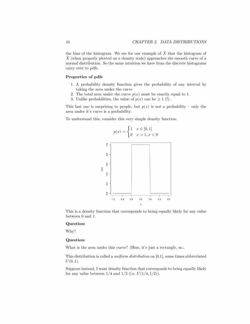
To understand this, consider this very simple density function:
𝑝(𝑥) = {1 𝑥 ∈ [0, 1]0 𝑥 > 1, 𝑥 < 0
This is a density function that corresponds to being equally likely for any valuebetween 0 and 1.
Question:
Why?
Question:
What is the area under this curve? (Hint, it’s just a rectangle, so…
This distribution is called a uniform distribution on [0,1], some times abbreviated𝑈(0, 1).Suppose instead, I want density function that corresponds to being equally likelyfor any value between 1/4 and 1/2 (i.e. 𝑈(1/4, 1/2)).
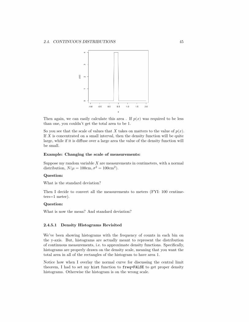
2.4. CONTINUOUS DISTRIBUTIONS 45
Then again, we can easily calculate this area . If 𝑝(𝑥) was required to be lessthan one, you couldn’t get the total area to be 1.So you see that the scale of values that 𝑋 takes on matters to the value of 𝑝(𝑥).If 𝑋 is concentrated on a small interval, then the density function will be quitelarge, while if it is diffuse over a large area the value of the density function willbe small.
Example: Changing the scale of measurements:
Suppose my random variable 𝑋 are measurements in centimeters, with a normaldistribution, 𝑁(𝜇 = 100cm, 𝜎2 = 100cm2).Question:
What is the standard deviation?
Then I decide to convert all the measurements to meters (FYI: 100 centime-ters=1 meter).
Question:
What is now the mean? And standard deviation?
2.4.5.1 Density Histograms Revisited
We’ve been showing histograms with the frequency of counts in each bin onthe y-axis. But, histograms are actually meant to represent the distributionof continuous measurements, i.e. to approximate density functions. Specifically,histograms are properly drawn on the density scale, meaning that you want thetotal area in all of the rectangles of the histogram to have area 1.Notice how when I overlay the normal curve for discussing the central limittheorem, I had to set my hist function to freq=FALSE to get proper densityhistograms. Otherwise the histogram is on the wrong scale.
46 CHAPTER 2. DATA DISTRIBUTIONS
hist(sampleMean, xlab = "Mean Pay", main = paste("Mean of SRS of size",sampleSize), freq = FALSE, sub = paste("Over",length(sampleMean), "simulations"))
m <- mean(salaries2014_FT$TotalPay)s <- sqrt(var(salaries2014_FT$TotalPay)/sampleSize)p <- function(x) {
dnorm(x, mean = m, sd = s)}curve(p, add = TRUE, col = "red", lwd = 3)
We can demonstrate the effect of the scale of the data on this density histogramby changing the scale that we measure to be in units of 10K rather than say1K.
Just like density curves, if you plot histograms on the density scale, you can getvalues greater than 1.
2.4. CONTINUOUS DISTRIBUTIONS 47
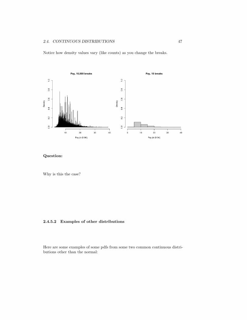
Notice how density values vary (like counts) as you change the breaks.
Question:
Why is this the case?
2.4.5.2 Examples of other distributions
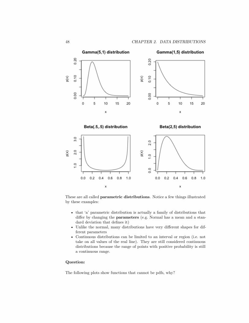
Here are some examples of some pdfs from some two common continuous distri-butions other than the normal:
48 CHAPTER 2. DATA DISTRIBUTIONS
These are all called parametric distributions. Notice a few things illustratedby these examples:
• that ‘a’ parametric distribution is actually a family of distributions thatdiffer by changing the parameters (e.g. Normal has a mean and a stan-dard deviation that defines it)
• Unlike the normal, many distributions have very different shapes for dif-ferent parameters
• Continuous distributions can be limited to an interval or region (i.e. nottake on all values of the real line). They are still considered continuousdistributions because the range of points with positive probability is stilla continuous range.
Question:
The following plots show functions that cannot be pdfs, why?
2.5. DENSITY CURVE ESTIMATION 49
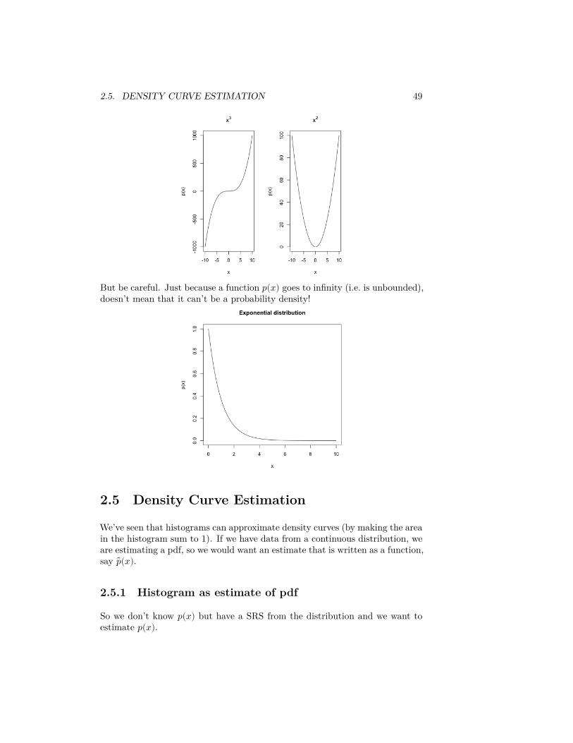
But be careful. Just because a function 𝑝(𝑥) goes to infinity (i.e. is unbounded),doesn’t mean that it can’t be a probability density!
2.5 Density Curve Estimation
We’ve seen that histograms can approximate density curves (by making the areain the histogram sum to 1). If we have data from a continuous distribution, weare estimating a pdf, so we would want an estimate that is written as a function,say 𝑝(𝑥).
2.5.1 Histogram as estimate of pdf
So we don’t know 𝑝(𝑥) but have a SRS from the distribution and we want toestimate 𝑝(𝑥).
50 CHAPTER 2. DATA DISTRIBUTIONS
Let’s think of an easy situation. Suppose that we want to estimate 𝑝(𝑥) betweenthe values 𝑏1, 𝑏2, and that in that region, we happen to know that 𝑝(𝑥) isconstant, i.e. a flat line
Question:
Then, if 𝑝(𝑥) defines the pdf, what do we know about how to find 𝑃(𝑏1 ≤ 𝑋 ≤𝑏2)?
So in this very simple case, we have a obvious way to estimate 𝑝(𝑥): estimate𝑃(𝑏1 ≤ 𝑋 ≤ 𝑏2) and then let
𝑝(𝑥) =𝑃 (𝑏1 ≤ 𝑋 ≤ 𝑏2)
𝑏2 − 𝑏1
Question:
We have already discussed above one way to estimate 𝑃(𝑏1 ≤ 𝑋 ≤ 𝑏2) from aSRS. How?
So a good estimate of 𝑝(𝑥) if it is a flat function in that area is going to be
𝑝(𝑥) = 𝑃 (𝑏1 ≤ 𝑋 ≤ 𝑏2)/(𝑏2 − 𝑏1) = # Points in [𝑏1, 𝑏2]𝑤 × 𝑛
Relationship to Density Histograms
In fact, this is a pretty familiar calculation, because it’s also exactly what wecalculate for a density histogram. However, we don’t expect 𝑝(𝑥) to be a flatline. But more generally, if the pdf 𝑝(𝑥) is a pretty smooth function of 𝑥, thenin a small enough window around a point 𝑥, 𝑝(𝑥) is going to be not changingtoo much roughly. In other words it will be roughly the same value in a smallinterval–i.e. flat. So if 𝑥 is in an interval [𝑏1, 𝑏2] with width 𝑤, and the widthof the interval is small, we can more generally say a reasonable estimate of 𝑝(𝑥)would be the same as above.
With this idea, we can view our (density) histogram as a estimate of the pdf.For example, suppose we consider a histogram of our SRS of salaries,
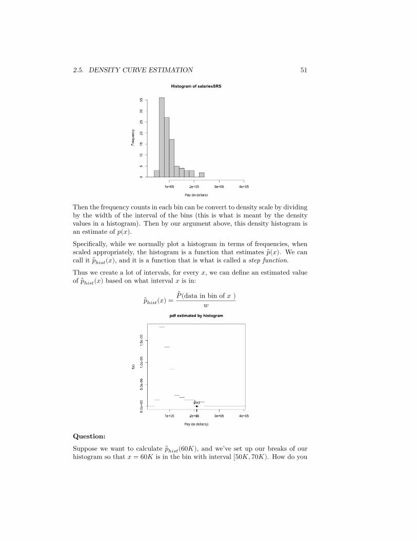
2.5. DENSITY CURVE ESTIMATION 51
Then the frequency counts in each bin can be convert to density scale by dividingby the width of the interval of the bins (this is what is meant by the densityvalues in a histogram). Then by our argument above, this density histogram isan estimate of 𝑝(𝑥).Specifically, while we normally plot a histogram in terms of frequencies, whenscaled appropriately, the histogram is a function that estimates 𝑝(𝑥). We cancall it 𝑝ℎ𝑖𝑠𝑡(𝑥), and it is a function that is what is called a step function.
Thus we create a lot of intervals, for every 𝑥, we can define an estimated valueof 𝑝ℎ𝑖𝑠𝑡(𝑥) based on what interval 𝑥 is in:
𝑝ℎ𝑖𝑠𝑡(𝑥) =𝑃 (data in bin of 𝑥 )
𝑤
Question:
Suppose we want to calculate 𝑝ℎ𝑖𝑠𝑡(60𝐾), and we’ve set up our breaks of ourhistogram so that 𝑥 = 60𝐾 is in the bin with interval [50𝐾, 70𝐾). How do you
52 CHAPTER 2. DATA DISTRIBUTIONS
calculate 𝑝ℎ𝑖𝑠𝑡(60𝐾) from a sample of size 100?
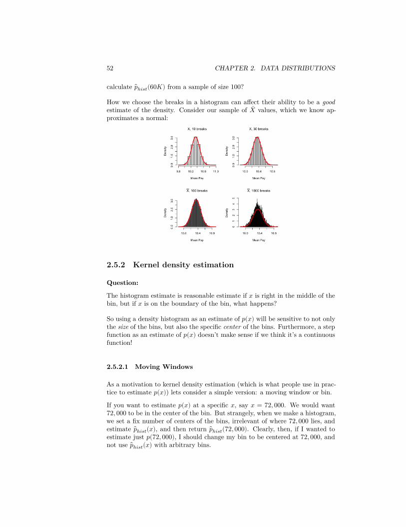
How we choose the breaks in a histogram can affect their ability to be a goodestimate of the density. Consider our sample of �� values, which we know ap-proximates a normal:
2.5.2 Kernel density estimation
Question:
The histogram estimate is reasonable estimate if 𝑥 is right in the middle of thebin, but if 𝑥 is on the boundary of the bin, what happens?
So using a density histogram as an estimate of 𝑝(𝑥) will be sensitive to not onlythe size of the bins, but also the specific center of the bins. Furthermore, a stepfunction as an estimate of 𝑝(𝑥) doesn’t make sense if we think it’s a continuousfunction!
2.5.2.1 Moving Windows
As a motivation to kernel density estimation (which is what people use in prac-tice to estimate 𝑝(𝑥)) lets consider a simple version: a moving window or bin.
If you want to estimate 𝑝(𝑥) at a specific 𝑥, say 𝑥 = 72, 000. We would want72, 000 to be in the center of the bin. But strangely, when we make a histogram,we set a fix number of centers of the bins, irrelevant of where 72, 000 lies, andestimate 𝑝ℎ𝑖𝑠𝑡(𝑥), and then return 𝑝ℎ𝑖𝑠𝑡(72, 000). Clearly, then, if I wanted toestimate just 𝑝(72, 000), I should change my bin to be centered at 72, 000, andnot use 𝑝ℎ𝑖𝑠𝑡(𝑥) with arbitrary bins.
2.5. DENSITY CURVE ESTIMATION 53
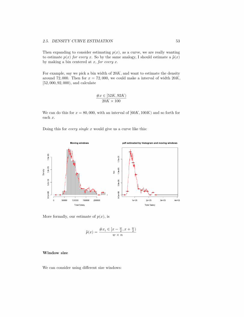
Then expanding to consider estimating 𝑝(𝑥), as a curve, we are really wantingto estimate 𝑝(𝑥) for every 𝑥. So by the same analogy, I should estimate a 𝑝(𝑥)by making a bin centered at 𝑥, for every 𝑥.
For example, say we pick a bin width of 20𝐾, and want to estimate the densityaround 72, 000. Then for 𝑥 = 72, 000, we could make a interval of width 20𝐾,[52, 000, 92, 000), and calculate
#𝑥 ∈ [52𝐾, 92𝐾)20𝐾 × 100
We can do this for 𝑥 = 80, 000, with an interval of [60𝐾, 100𝐾) and so forth foreach 𝑥.
Doing this for every single 𝑥 would give us a curve like this:
More formally, our estimate of 𝑝(𝑥), is
𝑝(𝑥) = #𝑥𝑖 ∈ [𝑥 − 𝑤2 , 𝑥 + 𝑤
2 )𝑤 × 𝑛
Window size
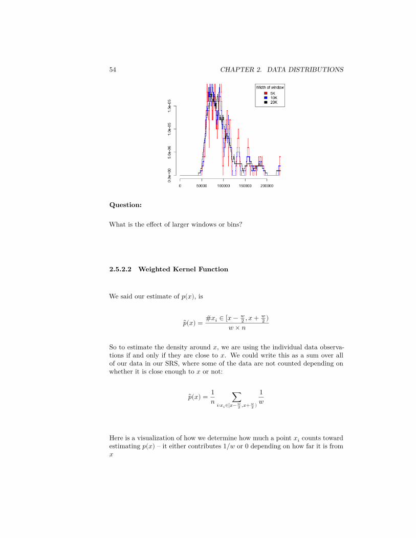
We can consider using different size windows:
54 CHAPTER 2. DATA DISTRIBUTIONS
Question:
What is the effect of larger windows or bins?
2.5.2.2 Weighted Kernel Function
We said our estimate of 𝑝(𝑥), is
𝑝(𝑥) = #𝑥𝑖 ∈ [𝑥 − 𝑤2 , 𝑥 + 𝑤
2 )𝑤 × 𝑛
So to estimate the density around 𝑥, we are using the individual data observa-tions if and only if they are close to 𝑥. We could write this as a sum over allof our data in our SRS, where some of the data are not counted depending onwhether it is close enough to 𝑥 or not:
𝑝(𝑥) = 1𝑛 ∑
𝑖∶𝑥𝑖∈[𝑥− 𝑤2 ,𝑥+ 𝑤
2 )
1𝑤
Here is a visualization of how we determine how much a point 𝑥𝑖 counts towardestimating 𝑝(𝑥) – it either contributes 1/𝑤 or 0 depending on how far it is from𝑥
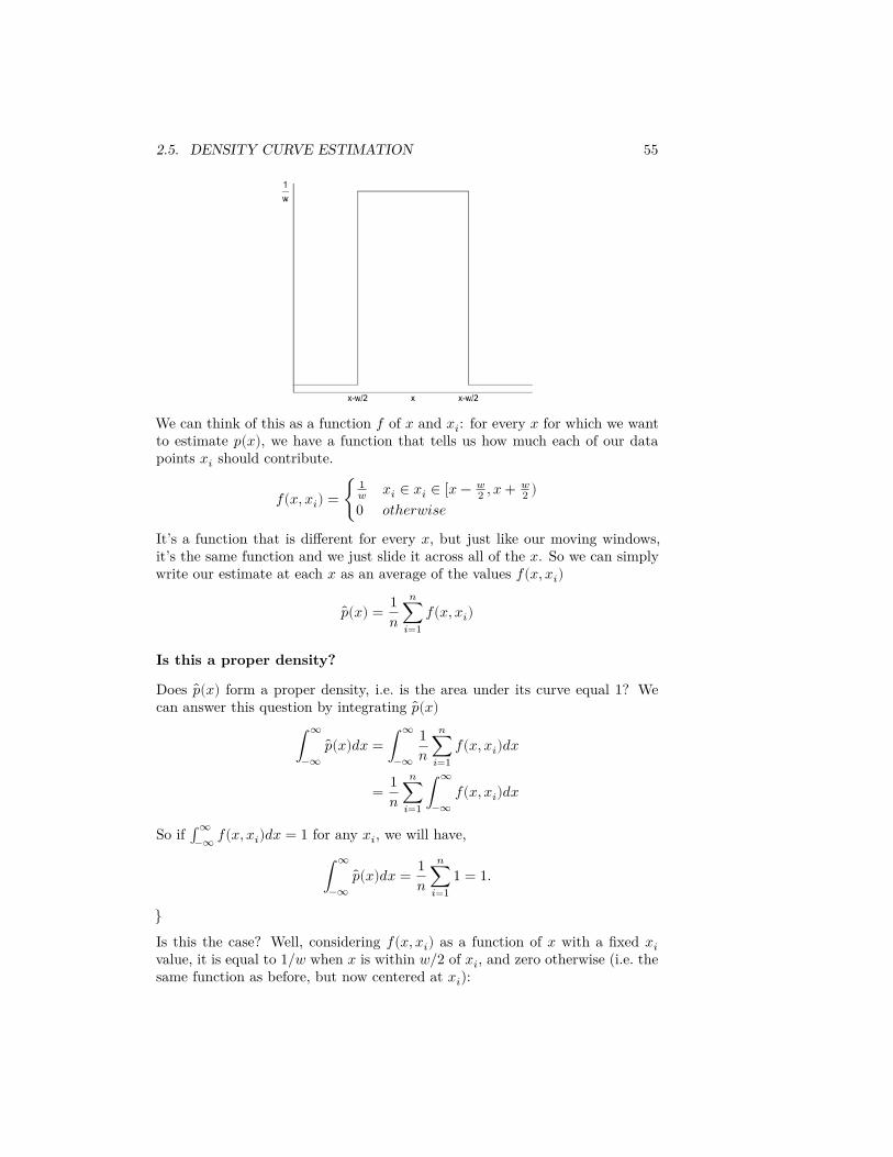
2.5. DENSITY CURVE ESTIMATION 55
We can think of this as a function 𝑓 of 𝑥 and 𝑥𝑖: for every 𝑥 for which we wantto estimate 𝑝(𝑥), we have a function that tells us how much each of our datapoints 𝑥𝑖 should contribute.
𝑓(𝑥, 𝑥𝑖) = {1𝑤 𝑥𝑖 ∈ 𝑥𝑖 ∈ [𝑥 − 𝑤
2 , 𝑥 + 𝑤2 )
0 𝑜𝑡ℎ𝑒𝑟𝑤𝑖𝑠𝑒It’s a function that is different for every 𝑥, but just like our moving windows,it’s the same function and we just slide it across all of the 𝑥. So we can simplywrite our estimate at each 𝑥 as an average of the values 𝑓(𝑥, 𝑥𝑖)
𝑝(𝑥) = 1𝑛
𝑛∑𝑖=1
𝑓(𝑥, 𝑥𝑖)
Is this a proper density?
Does 𝑝(𝑥) form a proper density, i.e. is the area under its curve equal 1? Wecan answer this question by integrating 𝑝(𝑥)
∫∞
−∞𝑝(𝑥)𝑑𝑥 = ∫
∞
−∞
1𝑛
𝑛∑𝑖=1
𝑓(𝑥, 𝑥𝑖)𝑑𝑥
= 1𝑛
𝑛∑𝑖=1
∫∞
−∞𝑓(𝑥, 𝑥𝑖)𝑑𝑥
So if ∫∞−∞ 𝑓(𝑥, 𝑥𝑖)𝑑𝑥 = 1 for any 𝑥𝑖, we will have,
∫∞
−∞𝑝(𝑥)𝑑𝑥 = 1
𝑛𝑛
∑𝑖=1
1 = 1.
}
Is this the case? Well, considering 𝑓(𝑥, 𝑥𝑖) as a function of 𝑥 with a fixed 𝑥𝑖value, it is equal to 1/𝑤 when 𝑥 is within 𝑤/2 of 𝑥𝑖, and zero otherwise (i.e. thesame function as before, but now centered at 𝑥𝑖):
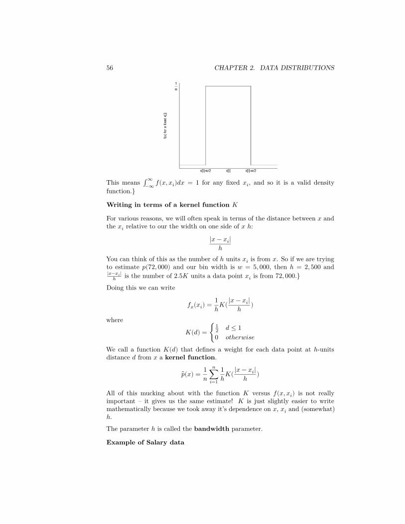
56 CHAPTER 2. DATA DISTRIBUTIONS
This means ∫∞−∞ 𝑓(𝑥, 𝑥𝑖)𝑑𝑥 = 1 for any fixed 𝑥𝑖, and so it is a valid density
function.}
Writing in terms of a kernel function 𝐾
For various reasons, we will often speak in terms of the distance between 𝑥 andthe 𝑥𝑖 relative to our the width on one side of 𝑥 ℎ:
|𝑥 − 𝑥𝑖|ℎ
You can think of this as the number of ℎ units 𝑥𝑖 is from 𝑥. So if we are tryingto estimate 𝑝(72, 000) and our bin width is 𝑤 = 5, 000, then ℎ = 2, 500 and|𝑥−𝑥𝑖|
ℎ is the number of 2.5𝐾 units a data point 𝑥𝑖 is from 72, 000.}Doing this we can write
𝑓𝑥(𝑥𝑖) = 1ℎ𝐾(|𝑥 − 𝑥𝑖|
ℎ )
where
𝐾(𝑑) = {12 𝑑 ≤ 10 𝑜𝑡ℎ𝑒𝑟𝑤𝑖𝑠𝑒
We call a function 𝐾(𝑑) that defines a weight for each data point at ℎ-unitsdistance 𝑑 from 𝑥 a kernel function.
𝑝(𝑥) = 1𝑛
𝑛∑𝑖=1
1ℎ𝐾(|𝑥 − 𝑥𝑖|
ℎ )
All of this mucking about with the function 𝐾 versus 𝑓(𝑥, 𝑥𝑖) is not reallyimportant – it gives us the same estimate! 𝐾 is just slightly easier to writemathematically because we took away it’s dependence on 𝑥, 𝑥𝑖 and (somewhat)ℎ.The parameter ℎ is called the bandwidth parameter.
Example of Salary data
2.5. DENSITY CURVE ESTIMATION 57
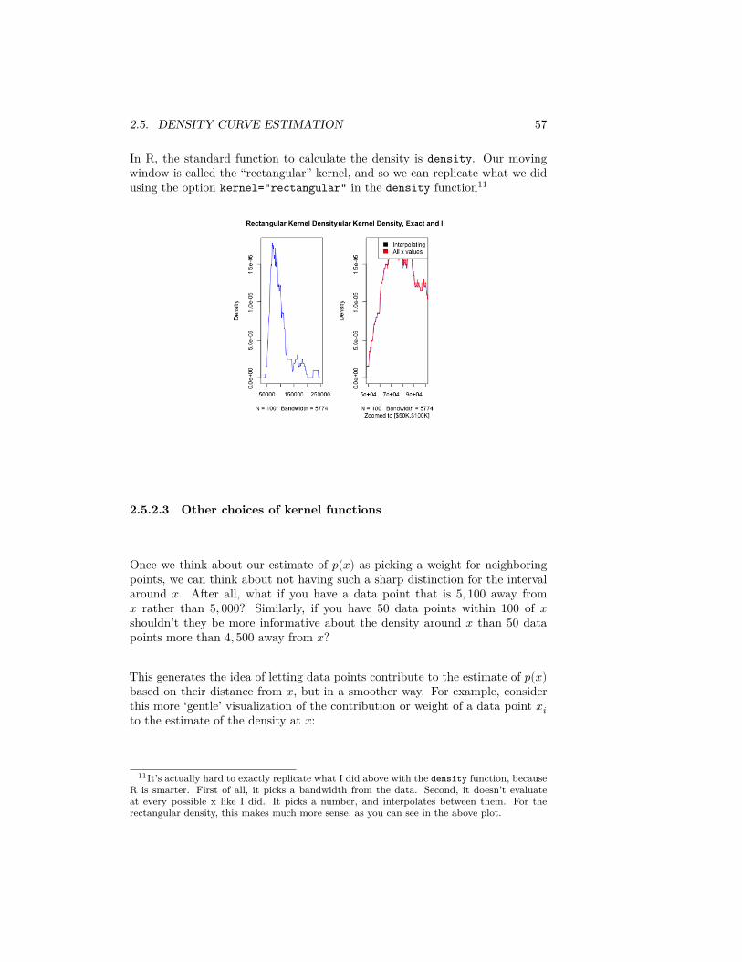
In R, the standard function to calculate the density is density. Our movingwindow is called the “rectangular” kernel, and so we can replicate what we didusing the option kernel="rectangular" in the density function11
2.5.2.3 Other choices of kernel functions
Once we think about our estimate of 𝑝(𝑥) as picking a weight for neighboringpoints, we can think about not having such a sharp distinction for the intervalaround 𝑥. After all, what if you have a data point that is 5, 100 away from𝑥 rather than 5, 000? Similarly, if you have 50 data points within 100 of 𝑥shouldn’t they be more informative about the density around 𝑥 than 50 datapoints more than 4, 500 away from 𝑥?
This generates the idea of letting data points contribute to the estimate of 𝑝(𝑥)based on their distance from 𝑥, but in a smoother way. For example, considerthis more ‘gentle’ visualization of the contribution or weight of a data point 𝑥𝑖to the estimate of the density at 𝑥:
11It’s actually hard to exactly replicate what I did above with the density function, becauseR is smarter. First of all, it picks a bandwidth from the data. Second, it doesn’t evaluateat every possible x like I did. It picks a number, and interpolates between them. For therectangular density, this makes much more sense, as you can see in the above plot.
58 CHAPTER 2. DATA DISTRIBUTIONS
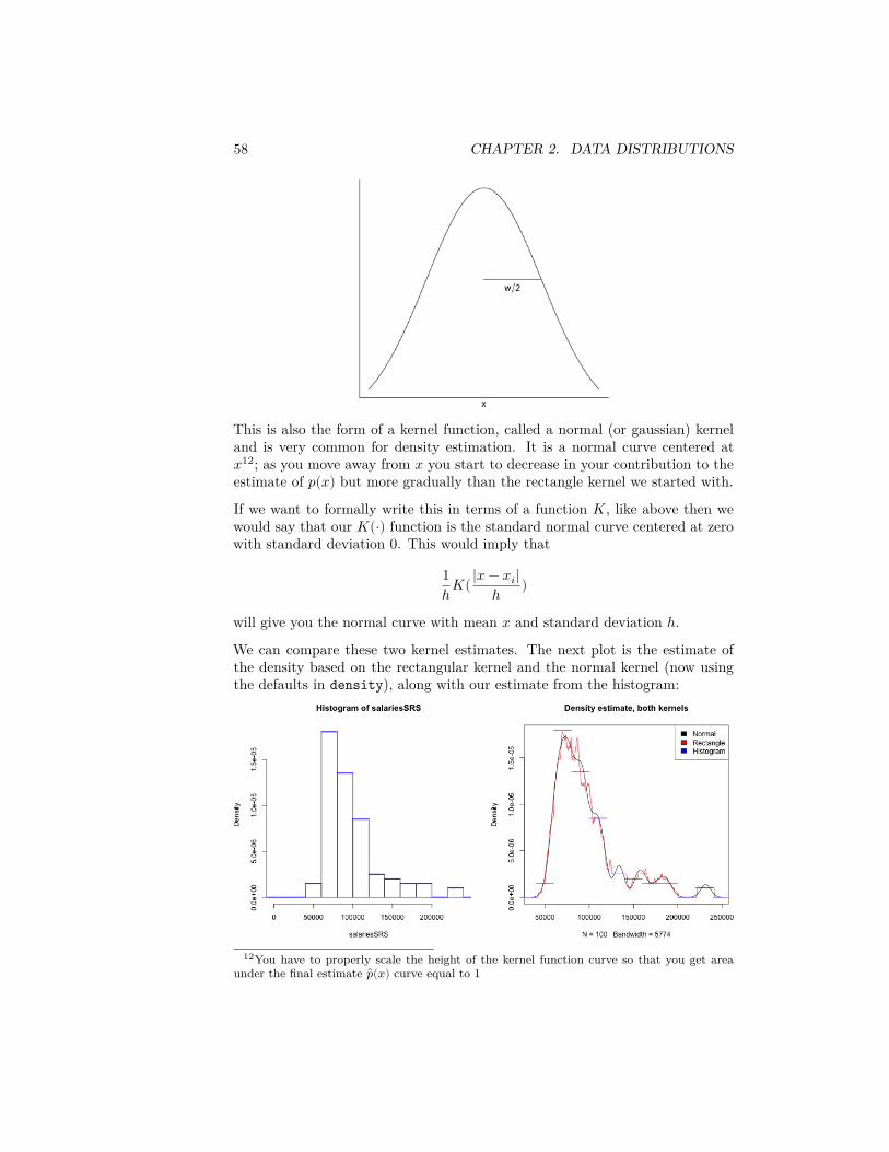
This is also the form of a kernel function, called a normal (or gaussian) kerneland is very common for density estimation. It is a normal curve centered at𝑥12; as you move away from 𝑥 you start to decrease in your contribution to theestimate of 𝑝(𝑥) but more gradually than the rectangle kernel we started with.
If we want to formally write this in terms of a function 𝐾, like above then wewould say that our 𝐾(⋅) function is the standard normal curve centered at zerowith standard deviation 0. This would imply that
1ℎ𝐾(|𝑥 − 𝑥𝑖|
ℎ )
will give you the normal curve with mean 𝑥 and standard deviation ℎ.We can compare these two kernel estimates. The next plot is the estimate ofthe density based on the rectangular kernel and the normal kernel (now usingthe defaults in density), along with our estimate from the histogram:
12You have to properly scale the height of the kernel function curve so that you get areaunder the final estimate ��(𝑥) curve equal to 1
2.5. DENSITY CURVE ESTIMATION 59
Question:
What do you notice when comparing the estimates of the density from thesetwo kernels?
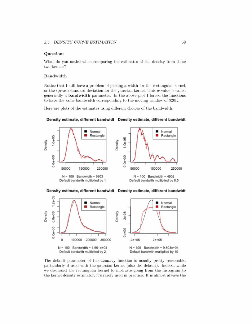
Bandwidth
Notice that I still have a problem of picking a width for the rectangular kernel,or the spread/standard deviation for the gaussian kernel. This 𝑤 value is calledgenerically a bandwidth parameter. In the above plot I forced the functionsto have the same bandwidth corresponding to the moving window of $20K.
Here are plots of the estimates using different choices of the bandwidth:
The default parameter of the density function is usually pretty reasonable,particularly if used with the gaussian kernel (also the default). Indeed, whilewe discussed the rectangular kernel to motivate going from the histogram tothe kernel density estimator, it’s rarely used in practice. It is almost always the
60 CHAPTER 2. DATA DISTRIBUTIONS
gaussian kernel.
2.5.3 Comparing multiple groups with density curves
In addition to being a more satisfying estimation of a pdf, density curves aremuch easier to compare between groups than histograms because you can easilyoverlay them.
2.5.4 Violin Plots
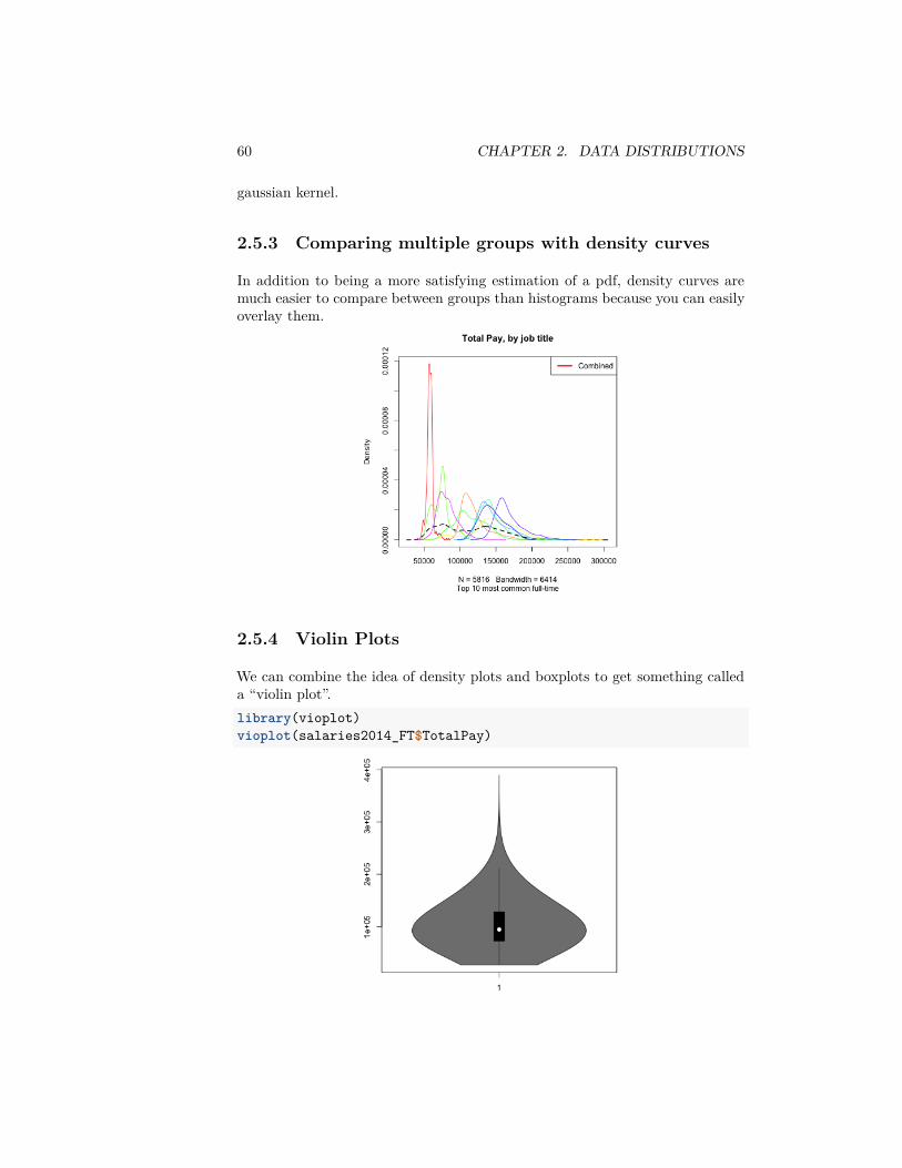
We can combine the idea of density plots and boxplots to get something calleda “violin plot”.library(vioplot)vioplot(salaries2014_FT$TotalPay)
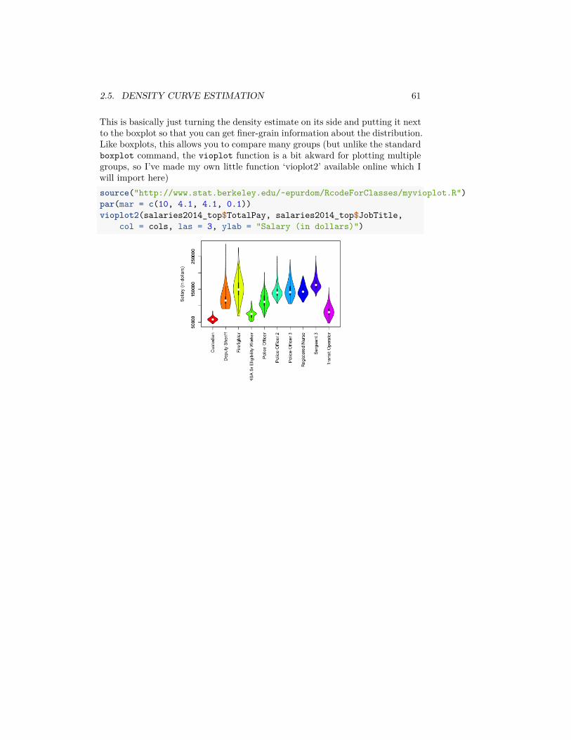
2.5. DENSITY CURVE ESTIMATION 61
This is basically just turning the density estimate on its side and putting it nextto the boxplot so that you can get finer-grain information about the distribution.Like boxplots, this allows you to compare many groups (but unlike the standardboxplot command, the vioplot function is a bit akward for plotting multiplegroups, so I’ve made my own little function ‘vioplot2’ available online which Iwill import here)source("http://www.stat.berkeley.edu/~epurdom/RcodeForClasses/myvioplot.R")par(mar = c(10, 4.1, 4.1, 0.1))vioplot2(salaries2014_top$TotalPay, salaries2014_top$JobTitle,
col = cols, las = 3, ylab = "Salary (in dollars)")

62 CHAPTER 2. DATA DISTRIBUTIONS
Chapter 3
Comparing Groups andHypothesis Testing
We’ve mainly reviewed about informally comparing the distribution of data indifferent groups. Now we want to explore tools about how to use statistics tomake this more formal – specifically to quantify whether the differences we seeare due to natural variability or something deeper.
We will first consider the setting of comparing two groups. Depending onwhether you took STAT 20 or Data 8, you may be more familiar with oneset of tools than the other.
In addition to the specific hypothesis tests we will discuss (review), we have thefollowing goals:
• abstract the ideas of hypothesis testing, in particular what it means to be“valid”, what makes a good procedure
• dig a little deeper as to what assumptions we are making in using a par-ticular test
• Two paradigms of hypothesis testing:– parametric ideas of hypothesis testing– resampling methods for hypothesis testing
Example of Comparing Groups – Choosing a Statistic
Recall the airline data, with different airline carriers. We could ask the questionabout whether the distribution of flight delays is different between carriers.
Question:
If we wanted to ask whether United was more likely to have delayed flights thanAmerican Airlines, how might we quantify this?
63

64 CHAPTER 3. COMPARING GROUPS AND HYPOTHESIS TESTING
The following code subsets to just United (UA) and American Airlines (AA) andtakes the mean of DepDelay (the delay in departures per flight)flightSubset <- flightSFOSRS[flightSFOSRS$Carrier %in%
c("UA", "AA"), ]mean(flightSubset$DepDelay)
## [1] NA
Question:
What do you notice happens in the above code when I take the mean of all ourobservations?
Instead we need to be careful to use na.rm=TRUE if we want to ignore NA values(which may not be wise if you recall from Chapter 2, NA refers to cancelledflights!)mean(flightSubset$DepDelay, na.rm = TRUE)
## [1] 11.13185
We can use a useful function tapply that will do calculations by groups. Wedemonstrate this function below where the variable Carrier (the airline) is afactor variable that defines the groups we want to divide the data into beforetaking the mean (or some other function of the data):tapply(X = flightSubset$DepDelay, flightSubset$Carrier,
mean)
## AA UA## NA NA
Again, we have a problem of NA values, but we can pass argument na.rm=TRUEto mean:tapply(flightSubset$DepDelay, flightSubset$Carrier,
mean, na.rm = TRUE)
## AA UA## 7.728294 12.255649
We can also write our own functions. Here I calculate the percentage of flightsdelayed or cancelled:tapply(flightSubset$DepDelay, flightSubset$Carrier,
function(x) {sum(x > 0 | is.na(x))/length(x)
})
## AA UA## 0.3201220 0.4383791
3.1. HYPOTHESIS TESTING 65
These are statistics that we can calculate from the data. A statistic is anyfunction of the input data sample.
3.1 Hypothesis Testing
Once we’ve decided on a statistic, we want to ask whether this is a meaningfuldifference between our groups. Specifically, with different data samples, thestatistic would change. Inference is the process of using statistical tools toevaluate whether the statistic observed indicates some kind of actual difference,or whether we could see such a value due to random chance even if there wasno difference.
Therefore, to use the tools of statistics – to say something about the generatingprocess – we must have be able to define a random process that we posit createdthe data.
Recall the components of hypothesis testing, which encapsulate these infer-ential ideas:
1. Hypothesis testing sets up a null hypothesis which describes a feature ofthe population data that we want to test – for example, are the mediansof the two populations the same?
2. In order to assess this question, we need to know what would be thedistribution of our sample statistic if that null hypothesis is true. To dothat, we have to go further than our null hypothesis and further describethe random process that could have created our data if the null hypothesisis true. If we know this process, it will define the specific probabilitydistribution of our statistic if the null hypothesis was true. This is calledthe null distribution.
The null distribution makes specific the qualitative question “this differ-ence might be just due to chance”, since there are a lot of ways “chance”could have created non-meaninful differences between our populations.
66 CHAPTER 3. COMPARING GROUPS AND HYPOTHESIS TESTING
3. How do we determine whether the null hypothesis is a plausible explana-tion for the data? We take the value of the statistic we actually observedin our data, and we determine whether this observed value is too unlikelyunder the null distribution to be plausible.
Specifically, we calculate the probability (under the null distribution) ofrandomly getting a statistic 𝑋 under the null hypothesis as extreme asor more extreme than the statistic we observed in our data (𝑥𝑜𝑏𝑠). Thisprobability is called a p-value.
“Extreme” means values of the test-statistic that are unlikely under thenull hypothesis we are testing. In almost all tests it means large numericvalues of the test-statistic, but whether we mean large positive values, largenegative values, or both depends on how we define the test-statistic andwhich values constitute divergence from the null hypothesis. For example,if our test statistic is the absolute difference in the medians of two groups,then large positive values are stronger evidence of not following the nulldistribution:
p-value(𝑥𝑜𝑏𝑠) = 𝑃𝐻0(𝑋 ≥ 𝑥𝑜𝑏𝑠)
If we were looking at just the difference, large positive or negative valuesare evidence against the null that they are the same,1
p-value(𝑥𝑜𝑏𝑠) = 𝑃𝐻0(𝑋 ≤ −𝑥𝑜𝑏𝑠, 𝑋 ≥ 𝑥𝑜𝑏𝑠) = 1−𝑃𝐻0
(−𝑥𝑜𝑏𝑠 ≤ 𝑋 ≤ 𝑥𝑜𝑏𝑠).
4. If the observed statistic is too unlikely under the null hypothesis we cansay we reject the null hypothesis or that we have a statistically sig-nificant difference.
How unlikely is too unlikely? Often a proscribed cutoff value of 0.05 isused so that p-values less than that amount are considered too extreme.But there is nothing magical about 0.05, it’s just a common standard ifyou have to make a “Reject”/“Don’t reject” decision. Such a standardcutoff value for a decision is called a level. Even if you need to make aYes/No type of decision, you should report the p-value as well because itgives information about how discordant with the null hypothesis the datais.
3.1.1 Where did the data come from? Valid tests & As-sumptions
Just because a p-value is reported, doesn’t mean that it is correct. You musthave a valid test. A valid test simply means that the p-value (or level) that youreport is accurate. This is only true if the null distribution of the test statistic
1In fact the distribution of 𝑋 and |𝑋| are related, and thus we can simplify our life byconsidering just |𝑋|.

3.1. HYPOTHESIS TESTING 67
is correctly identified. To use the tools of statistics, we must assume some kindof random process created the data. When your data violates the assumptionsof the data generating process, your p-value can be quite wrong.
What does this mean to violate the assumptions? After all, the whole pointof hypothesis testing is that we’re trying to detect when the statistic doesn’tfollow the null hypothesis distribution, so obviously we will frequently run acrossexamples where the assumption of the null hypothesis is violated. Does thismean p-values are not valid unless the null-hypothesis is true? Obviously not,other. Usually, our null hypothesis is about one specific feature of the randomprocess – that is our actual null hypothesis we want to test. The random processthat we further assume in order to get a precise null statistic, however, will havefurther assumptions. These are the assumptions we refer to in trying to evaluatewhether it is legitimate to rely on hypothesis testing/p-values.
Sometimes we can know these assumptions are true, but often not; knowingwhere your data came from and how it is collected is critical for assessing thesequestions. So we need to always think deeply about where the data come from,how they were collected, etc.
Example: Data that is a Complete Census For example, for the airlinedata, we have one dataset that gives complete information about the month ofJanuary. We can ask questions about flights in January, and get the answer bycalculating the relevant statistics. For example, if we want to know whether theaverage flight is more delayed on United than American, we calculate the meansof both groups and simply compare them. End of story. There’s no randomnessor uncertainty, and we don’t need the inference tools from above. It doesn’tmake sense to have a p-value here.
Types of Samples
For most of statistical applications, it is not the case that we have a completecensus. We have a sample of the entire population, and want to make statementsabout the entire population, which we don’t see. Notice that having a sampledoes not necessarily mean a random sample. For example, we have all of Januarywhich is a complete census of January, but is also a sample from the entire year,and there is no randomness involved in how we selected the data from the largerpopulation.
Some datasets might be a sample of the population with no easy way to describethe process of how the sample was chosen from the population, for exampledata from volunteers or other convenience samples that use readily availabledata rather than randomly sampling from the population. Having conveniencesamples can make it quite fraught to try to make any conclusions about thepopulation from the sample; generally we have to make assumptions about thedata was collected, but because we did not control how the data is collected, wehave no idea if the assumptions are true.
Question:
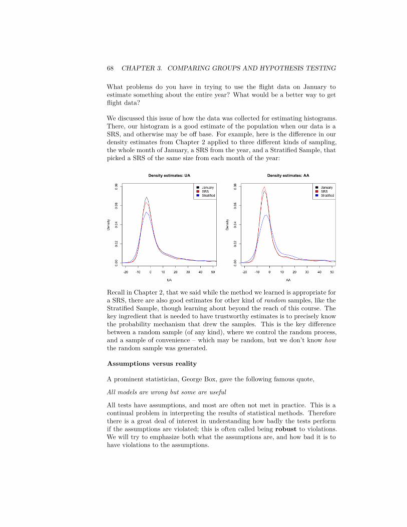
68 CHAPTER 3. COMPARING GROUPS AND HYPOTHESIS TESTING
What problems do you have in trying to use the flight data on January toestimate something about the entire year? What would be a better way to getflight data?
We discussed this issue of how the data was collected for estimating histograms.There, our histogram is a good estimate of the population when our data is aSRS, and otherwise may be off base. For example, here is the difference in ourdensity estimates from Chapter 2 applied to three different kinds of sampling,the whole month of January, a SRS from the year, and a Stratified Sample, thatpicked a SRS of the same size from each month of the year:
Recall in Chapter 2, that we said while the method we learned is appropriate fora SRS, there are also good estimates for other kind of random samples, like theStratified Sample, though learning about beyond the reach of this course. Thekey ingredient that is needed to have trustworthy estimates is to precisely knowthe probability mechanism that drew the samples. This is the key differencebetween a random sample (of any kind), where we control the random process,and a sample of convenience – which may be random, but we don’t know howthe random sample was generated.
Assumptions versus reality
A prominent statistician, George Box, gave the following famous quote,
All models are wrong but some are useful
All tests have assumptions, and most are often not met in practice. This is acontinual problem in interpreting the results of statistical methods. Thereforethere is a great deal of interest in understanding how badly the tests performif the assumptions are violated; this is often called being robust to violations.We will try to emphasize both what the assumptions are, and how bad it is tohave violations to the assumptions.
3.2. PERMUTATION TESTS 69
For example, in practice, much of data that is available is not a carefully con-trolled random sample of the population, and therefore a sample of conveniencein some sense (there’s a reason we call them convenient!). Our goal is not tomake say that analysis of such data is impossible, but make clear about whythis might make you want to be cautious about over-interpreting the results.
3.2 Permutation Tests
Suppose we want to compare the the proportion of flights with greater than 15minutes delay time of United and American airlines. Then our test statistic willbe the difference between that proportion
The permutation test is a very simple, straightforward mechanism for comparingtwo groups that makes very few assumptions about the distribution of the un-derlying data. The permutation test basicallly assumes that the data we saw wecould have seen anyway even if we changed the group assignments (i.e. Unitedor American). Therefore, any difference we might see between the groups is dueto the luck of the assignment of those labels.
The null distribution for the test statistic (difference of the proportion) under thenull hypothesis for a permutation tests is determined by making the followingassumptions:
1. There is no difference between proportion of delays greater than 15 min-utes between the two airlines,
𝐻0 ∶ 𝑝𝑈𝐴 = 𝑝𝐴𝐴
This is the main feature of the null distribution to be tested2. The statistic observed is the result of randomly assigning the labels
amongst the observed data. This is the additional assumption about therandom process that allows for calculating a precise null distribution ofthe statistic. It basically expands our null hypothesis to say that thedistribution of the data between the two groups is the same, and thelabels are just random assignments to data that comes from the samedistribution.
3.2.1 How do we implement it?
This is just words. We need to actually be able to compute probabilities undera specific distribution. In other words, if we were to have actually just randomlyassigned labels to the data, we need to know what is the probablility we sawthe difference we actually saw?
The key assumption is that the data we measured (the flight delay) was fixed foreach observation and completely independent from the airline the observation
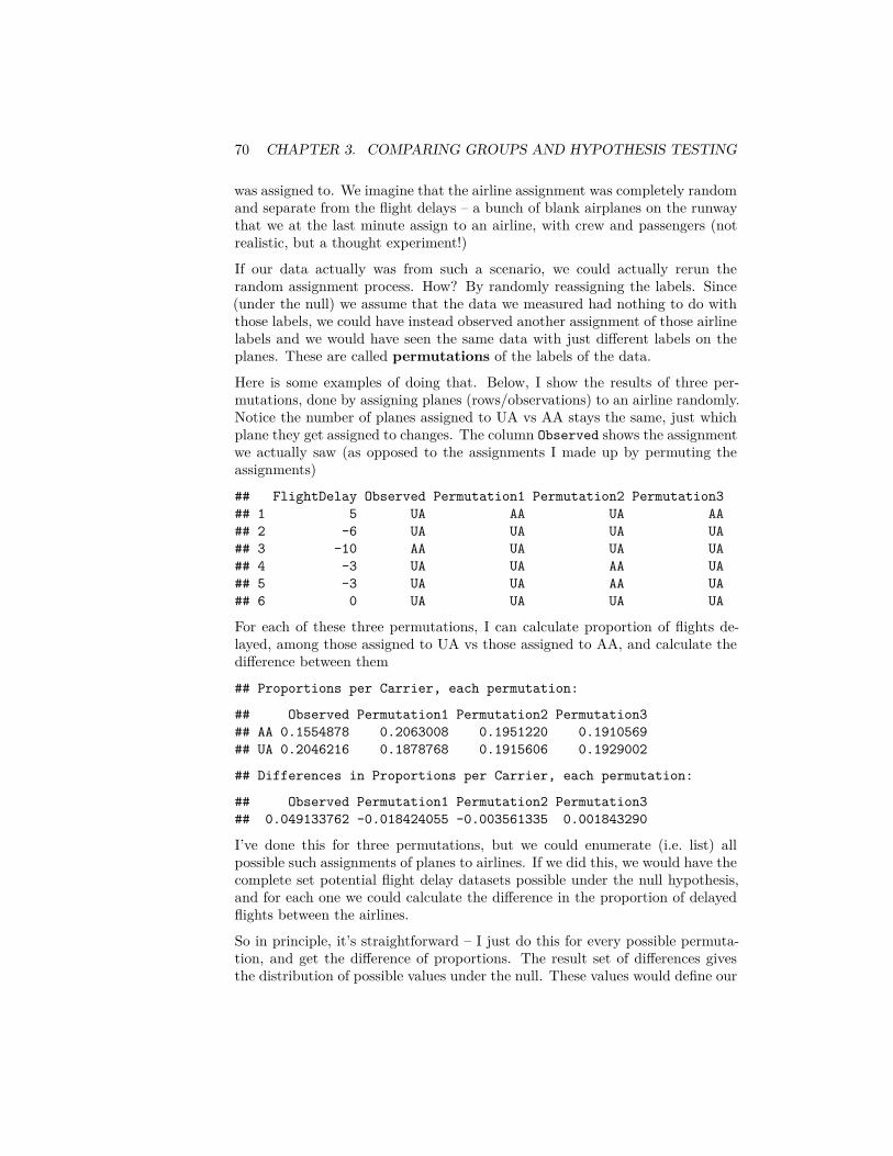
70 CHAPTER 3. COMPARING GROUPS AND HYPOTHESIS TESTING
was assigned to. We imagine that the airline assignment was completely randomand separate from the flight delays – a bunch of blank airplanes on the runwaythat we at the last minute assign to an airline, with crew and passengers (notrealistic, but a thought experiment!)
If our data actually was from such a scenario, we could actually rerun therandom assignment process. How? By randomly reassigning the labels. Since(under the null) we assume that the data we measured had nothing to do withthose labels, we could have instead observed another assignment of those airlinelabels and we would have seen the same data with just different labels on theplanes. These are called permutations of the labels of the data.
Here is some examples of doing that. Below, I show the results of three per-mutations, done by assigning planes (rows/observations) to an airline randomly.Notice the number of planes assigned to UA vs AA stays the same, just whichplane they get assigned to changes. The column Observed shows the assignmentwe actually saw (as opposed to the assignments I made up by permuting theassignments)
## FlightDelay Observed Permutation1 Permutation2 Permutation3## 1 5 UA AA UA AA## 2 -6 UA UA UA UA## 3 -10 AA UA UA UA## 4 -3 UA UA AA UA## 5 -3 UA UA AA UA## 6 0 UA UA UA UA
For each of these three permutations, I can calculate proportion of flights de-layed, among those assigned to UA vs those assigned to AA, and calculate thedifference between them
## Proportions per Carrier, each permutation:
## Observed Permutation1 Permutation2 Permutation3## AA 0.1554878 0.2063008 0.1951220 0.1910569## UA 0.2046216 0.1878768 0.1915606 0.1929002
## Differences in Proportions per Carrier, each permutation:
## Observed Permutation1 Permutation2 Permutation3## 0.049133762 -0.018424055 -0.003561335 0.001843290
I’ve done this for three permutations, but we could enumerate (i.e. list) allpossible such assignments of planes to airlines. If we did this, we would have thecomplete set potential flight delay datasets possible under the null hypothesis,and for each one we could calculate the difference in the proportion of delayedflights between the airlines.
So in principle, it’s straightforward – I just do this for every possible permuta-tion, and get the difference of proportions. The result set of differences givesthe distribution of possible values under the null. These values would define our

3.2. PERMUTATION TESTS 71
null distribution. With all of these values in hand, I could calculate probabilities– like the probability of seeing a value so large as the one observed in the data(p-value!).
Too many! In practice: Random selection
This is the principle of the permutation test, but I’m not about to do that inpractice, because it’s not computationally feasible!
Consider if we had only, say, 14 observations with two groups of 7 each, howmany permutations do we have? This is 14 “choose” 7, which gives 3,432 per-mutations.
So for even such a small dataset of 14 observations, we’d have to enumeratealmost 3500 permutations. In the airline data, we have 984-2986 observationsper airline. We can’t even determine how many permutations that is, much lessactually enumerate them all.
So for a reasonably sized dataset, what can we do? Instead, we consider thatthere exists such null distribution and while we can’t calculate it perfectly, weare going to just estimate what that null distribution.
How? Well, generally if we want to estimate a true distribution of values, wedon’t have a census – i.e. all values. Instead we draw a SRS from the populationand then can estimate that distribution, either by a histogram or by calculatingprobabilities (see Chapter 2).
How does this look like here? We know how to create a single random permuta-tion – it’s what I did above using the function sample. So if we create a lot ofrandom permutations, we are creating a SRS from our population. Specifically,each possible permutation is an element of our sample space, and we need torandomly draw a permutation. We’ll do this many times (i.e. many calls to thefunction sample), and this will create a SRS of permutations. Once we havea SRS of permutations, we can calculate the test statistic for each permuta-tion, and get an estimate of the true null distribution. Unlike SRS of an actualpopulation data, we can make the size of our SRS as large as our computercan handle to improve our estimate (though we don’t in practice need it to beobscenely large)
Practically, this means we will repeating what we did above many times. Thefunction replicate in R allows you to repeat something many times, so we willuse this to repeat the sampling and the calculation of the difference in medians.
I wrote a little function permutation.test to do this for any statistic, not justdifference of the medians; this way I can reuse this function repeatedly in thischapter. You will go through this function in lab and also in the accompanyingcode.permutation.test <- function(group1, group2, FUN, n.repetitions) {
stat.obs <- FUN(group1, group2)
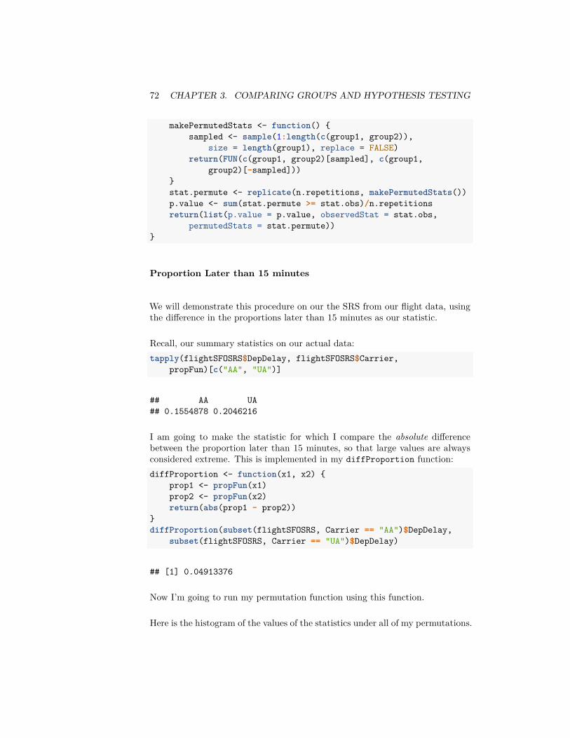
72 CHAPTER 3. COMPARING GROUPS AND HYPOTHESIS TESTING
makePermutedStats <- function() {sampled <- sample(1:length(c(group1, group2)),
size = length(group1), replace = FALSE)return(FUN(c(group1, group2)[sampled], c(group1,
group2)[-sampled]))}stat.permute <- replicate(n.repetitions, makePermutedStats())p.value <- sum(stat.permute >= stat.obs)/n.repetitionsreturn(list(p.value = p.value, observedStat = stat.obs,
permutedStats = stat.permute))}
Proportion Later than 15 minutes
We will demonstrate this procedure on our the SRS from our flight data, usingthe difference in the proportions later than 15 minutes as our statistic.
Recall, our summary statistics on our actual data:tapply(flightSFOSRS$DepDelay, flightSFOSRS$Carrier,
propFun)[c("AA", "UA")]
## AA UA## 0.1554878 0.2046216
I am going to make the statistic for which I compare the absolute differencebetween the proportion later than 15 minutes, so that large values are alwaysconsidered extreme. This is implemented in my diffProportion function:diffProportion <- function(x1, x2) {
prop1 <- propFun(x1)prop2 <- propFun(x2)return(abs(prop1 - prop2))
}diffProportion(subset(flightSFOSRS, Carrier == "AA")$DepDelay,
subset(flightSFOSRS, Carrier == "UA")$DepDelay)
## [1] 0.04913376
Now I’m going to run my permutation function using this function.
Here is the histogram of the values of the statistics under all of my permutations.

3.2. PERMUTATION TESTS 73
If my data came from the null, then this is the (estimate) of the actual distri-bution of what the test-statistic would be.
How would I get a p-value from this? (what is the definition of a p-value onceyou know its distribution?). Recall the definition of a p-value – the probabilityunder the null of getting a value that larger or larger. So I need to calculate thatvalue from my estimate of the null distribution (demonstrated in the histogramabove), i.e. the proportion of the that are greater than observed.
My function calculated the p-value as well in this way, so we can output thevalue
## pvalue= 0.0011
Question:
1. So what conclusions would you draw from this permutation test?2. What impact does this test have? What conclusions would you be likely
to make going forward?3. Why do I take the absolute difference? What difference does it make if
you change the code to be only the difference?
Median difference
What about if I look at the difference in median flight delay between the twoairlines? Let’s first look at what is the median flight delay for each airline:tapply(flightSFOSRS$DepDelay, flightSFOSRS$Carrier,
function(x) {median(x, na.rm = TRUE)
})[c("AA", "UA")]
## AA UA## -2 -1
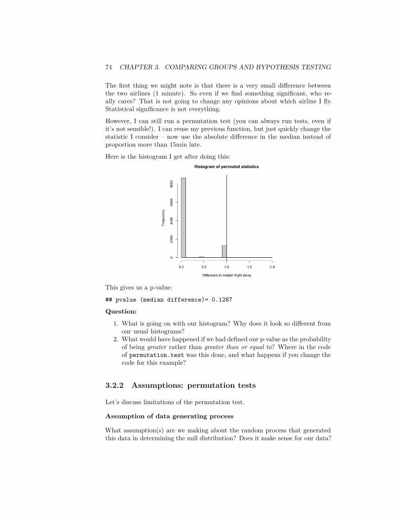
74 CHAPTER 3. COMPARING GROUPS AND HYPOTHESIS TESTING
The first thing we might note is that there is a very small difference betweenthe two airlines (1 minute). So even if we find something significant, who re-ally cares? That is not going to change any opinions about which airline I fly.Statistical significance is not everything.
However, I can still run a permutation test (you can always run tests, even ifit’s not sensible!). I can reuse my previous function, but just quickly change thestatistic I consider – now use the absolute difference in the median instead ofproportion more than 15min late.
Here is the histogram I get after doing this:
This gives us a p-value:
## pvalue (median difference)= 0.1287
Question:
1. What is going on with our histogram? Why does it look so different fromour usual histograms?
2. What would have happened if we had defined our p-value as the probabilityof being greater rather than greater than or equal to? Where in the codeof permutation.test was this done, and what happens if you change thecode for this example?
3.2.2 Assumptions: permutation tests
Let’s discuss limitations of the permutation test.
Assumption of data generating process
What assumption(s) are we making about the random process that generatedthis data in determining the null distribution? Does it make sense for our data?
3.2. PERMUTATION TESTS 75
We set up a model that the assignment of a flight to one airline or another wasdone at random. This is clearly not a plausible description of our of data.
Some datasets do have this flavor. For example, if we wanted to decide which oftwo email solicitations for a political campaign are most likely to lead to someoneto donate money, we could assign a sample of people on our mailing list to getone of the two. This would perfectly match the data generation assumed in thenull hypothesis.
What if our assumption about random labels is wrong?
Clearly random assignment of labels is not a good description for how thedatasets regarding flight delay data were created. Does this mean the per-mutation test will be invalid? No, not necessarily. In fact, there are otherdescriptions of null random process that do not explicitly follow this descrip-tion, but in the end result in the same distribution as that of the randomlyassigned labels model.
Explicitly describing the full set of random processes that satisfy this require-ment is beyond the level of this class2, but an important example is if each ofyour data observations can be considered under the null a random, independentdraw from the same distribution. This is often abbreviated i.i.d: independentand identically distributed. This makes sense as an requirement – the veryact of permuting your data implies such an assumption about your data: thatyou have similar observations and the only thing different about them is whichgroup they were assigned to (which under the null doesn’t matter).
Assuming your data is i.i.d is a common assumption that is thrown around,but is actually rather strong. For example, non-random samples do not havethis property, because there is no randomness; it is unlikely you can show thatconvenience samples do either. However, permutation tests are a pretty goodtool even in this setting, however, compared to the alternatives. Actual randomassignments of the labels is the strongest such design of how to collect data.
Inferring beyond the sample population
Note that the randomness queried by our null hypothesis is all about the specificobservations we have. For example, in our political email example we describedabove, the randomness is if we imagine that we assigned these same peopledifferent email solicitations – our null hypothesis asks what variation in ourstatistic would we expect? However, if we want to extend this to the generalpopulation, we have to make the assumption that these people’s reaction arerepresentative of the greater population.
If our sample of participants was only women, then the permutation test mighthave answered the question about any affect seend amongst these women was
2Namely, if the data can be assumed to be exchangeable under the null hypothesis, thenthe permutation test is also a valid test.
76 CHAPTER 3. COMPARING GROUPS AND HYPOTHESIS TESTING
due to the chance assignment to these women. But that wouldn’t answer ourquestion very well about the general population of interest (that presumablyincludes men). Men might have very different reactions to the same email. Per-mutation tests do not get around the problem of a poor data sample. Randomsamples from the population are needed to be able to make the connection backto the general population.
So while permuting your data seems to intuitive and is often thought to makeno assumptions, it does have assumptions about where your data are from.The assumptions for a permutation test are much less than some alternativetests (like the parametric tests we’ll describe next), but it’s useful to realize thelimitations even for something as intuitive and as non-restrictive as permutationtests.
3.3 Parametric test: the T-test
In parametric testing, we assume the data comes from a specific family of dis-tributions that share a functional form for their density, and define the featuresof interest for the null hypothesis based on this distribution.
Rather than resampling from the data, we will use the fact that we can ana-lytically write down the density to determine the null distribution of the teststatistic. For that reason, parametric tests tend to be limited to narrower classof statistics, since they have to be tractable for mathematical analysis.
3.3.1 Parameters
We have spoken about parameters in the context of parameters that define afamily of distributions with the same mathematical form for the density, suchas the normal distribution which has two parameters, the mean (𝜇) and thevariance (𝜎2). Knowing those two values defines the entire distribution of anormal. The parameters of a distribution are often used to define a null hypoth-esis; a null hypothesis will often be a direct statement about the parametersthat define the distribution of the data. For example, if we believe our data isnormally distributed in both of our groups, our null hypothesis could be thatthe mean parameter in one group is equal to that of another group.
General Parameters However, we can also talk more generally about a param-eter of any distribution beyond the defining parameters of the distribution. Aparameter is any numerical summary that we can calculate from a distribution.For example, we could define the .75 quantile as a parameter of the data distri-bution. Just as a statistic is any function of our observed data, a parameteris a function of the true generating distribution 𝐹 . Which means that our nullhypothesis could also be in terms of other parameters than just the ones thatdefine the distribution. For example, we could assume that the data comes from
3.3. PARAMETRIC TEST: THE T-TEST 77
a normal distribution and our null hypothesis could be about the .75 quantileof the distribution. Indeed, we don’t have to have assume that the data comesfrom any parametric distribution – every distribution has a .75 quantile.
If we do assume our data is generated from a family of distributions definedby specific parameters (e.g. a normal distribution with unknown mean and vari-ance) then those parameters completely define the distribution. Therefore anyarbitrary parameter we might define of the distribution can be written as afunction of those parameters. So the 0.75 quantile of a normal distribution is aparameter, but also a function of the mean parameter and variance parameterof the normal distribution.
Parameters are often indicated with greek letters, like 𝜃, 𝛼, 𝛽, 𝜎.Statistics of our data sample are often chosen because they are estimates ofour parameter. In that case they are often called the same greek letters as theparameter, only with a “hat” on top of them, e.g. 𝜃, 𝛼, 𝛽, ��. Sometimes, however,a statistic will just be given a upper-case letter, like 𝑇 or 𝑋, particularly whenthey are not estimating a parameter of the distribution.
3.3.2 More about the normal distribution and two groupcomparisons
Means and the normal distribution play a central role in many parametric tests,so lets review a few more facts.
Standardized Values
If 𝑋 ∼ 𝑁(𝜇, 𝜎2), then𝑋 − 𝜇
𝜎 ∼ 𝑁(0, 1)
This transformation of a random variable is called standardizing 𝑋, i.e. puttingit on the standard 𝑁(0, 1) scale.
Sums of normals
If 𝑋 ∼ 𝑁(𝜇1, 𝜎21) and 𝑌 ∼ 𝑁(𝜇2, 𝜎2
2) and 𝑋 and 𝑌 are independent, then
𝑋 + 𝑌 ∼ 𝑁(𝜇1 + 𝜇2, 𝜎21 + 𝜎2
2)
If 𝑋 and 𝑌 are both normal, but not independent, then their sum is still anormal distribution with mean equal to 𝜇1 + 𝜇2 but the variance is different.3
CLT for differences of means3𝑋 + 𝑌 ∼ 𝑁(𝜇1 + 𝜇2, 𝜎2
1 + 𝜎22 + 2𝑐𝑜𝑣(𝑋, 𝑌 )), where 𝑐𝑜𝑣 is the covariance between 𝑋 and
𝑌
78 CHAPTER 3. COMPARING GROUPS AND HYPOTHESIS TESTING
We’ve reviewed that a sample mean of a SRS will have a sampling distributionthat is roughly a normal distribution if we have a large enough sample size – theCentral Limit Theorem. Namely, that if 𝑋1, … , 𝑋𝑛 are i.i.d from a distribution4
with mean 𝜇 and variance 𝜎2, then 𝜇 = �� = 1𝑛 ∑𝑛
𝑖=1 𝑋𝑖 will have a roughlynormal distribution
𝑁(𝜇, 𝜎2
𝑛 ).
If we have two groups,
• 𝑋1, … , 𝑋𝑛1i.i.d from a distribution with mean 𝜇1 and variance 𝜎2
1, and• 𝑌1, … , 𝑌𝑛2
i.i.d from a distribution with mean 𝜇2 and variance 𝜎22
Then if the 𝑋𝑖 and 𝑌𝑖 are independent, then the central limit theorem appliesand �� − 𝑌 will have a roughly normal distribution equal to
𝑁(𝜇1 − 𝜇2, 𝜎21
𝑛1+ 𝜎2
2𝑛2
)
3.3.3 Testing of means
Let 𝜇𝑈𝐴, and 𝜇𝐴𝐴 be the true means of the distribution of flight times of thetwo airlines in the population. Then if we want to test if the distributions havethe same mean, we can write our null hypothesis as
𝐻0 ∶ 𝜇𝐴𝐴 = 𝜇𝑈𝐴
This could also be written as
𝐻0 ∶ 𝜇𝐴𝐴 − 𝜇𝑈𝐴 = 𝛿 = 0,
so in fact, we are testing whether a specific parameter 𝛿 is equal to 0.Let’s assume 𝑋1, … , 𝑋𝑛1
is the data from United and 𝑌1, … , 𝑌𝑛2is the data
from American. A natural sample statistic to estimate 𝛿 from our data wouldbe
𝛿 = �� − 𝑌 ,i.e. the difference in the means of the two groups.
Null distribution
To do inference, we need to know the distribution of our statistic of interest.Our central limit theorem will tell us that under the null, for large sample sizes,the difference in means is distributed normally,
�� − 𝑌 ∼ 𝑁(0, 𝜎21
𝑛1+ 𝜎2
2𝑛2
)
4And in fact, there are many variations of the CLT, which go beyond i.i.d samples
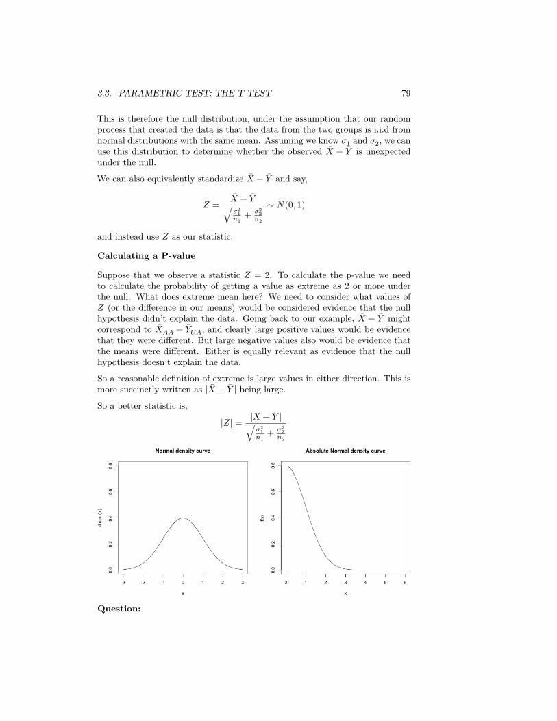
3.3. PARAMETRIC TEST: THE T-TEST 79
This is therefore the null distribution, under the assumption that our randomprocess that created the data is that the data from the two groups is i.i.d fromnormal distributions with the same mean. Assuming we know 𝜎1 and 𝜎2, we canuse this distribution to determine whether the observed �� − 𝑌 is unexpectedunder the null.
We can also equivalently standardize �� − 𝑌 and say,
𝑍 = �� − 𝑌√ 𝜎2
1𝑛1
+ 𝜎22
𝑛2
∼ 𝑁(0, 1)
and instead use 𝑍 as our statistic.
Calculating a P-value
Suppose that we observe a statistic 𝑍 = 2. To calculate the p-value we needto calculate the probability of getting a value as extreme as 2 or more underthe null. What does extreme mean here? We need to consider what values of𝑍 (or the difference in our means) would be considered evidence that the nullhypothesis didn’t explain the data. Going back to our example, �� − 𝑌 mightcorrespond to ��𝐴𝐴 − 𝑌𝑈𝐴, and clearly large positive values would be evidencethat they were different. But large negative values also would be evidence thatthe means were different. Either is equally relevant as evidence that the nullhypothesis doesn’t explain the data.
So a reasonable definition of extreme is large values in either direction. This ismore succinctly written as |�� − 𝑌 | being large.
So a better statistic is,
|𝑍| = |�� − 𝑌 |√ 𝜎2
1𝑛1
+ 𝜎22
𝑛2
Question:
80 CHAPTER 3. COMPARING GROUPS AND HYPOTHESIS TESTING
With this better |𝑍| statistic, what is the p-value if you observe 𝑍 = 2? Howwould you calculate this using the standard normal density curve? With R?
|𝑍| is often called a ‘two-sided’ t-statistic, and is the only one that we willconsider.5
3.3.4 T-Test
The above test is actually just a thought experiment because |𝑍| is not in facta statistic because we don’t know 𝜎1 and 𝜎2. So we can’t calculate |𝑍| from ourdata!
Instead you must estimate these unknown parameters with the sample vari-ance
��21 = 1
𝑛 − 1 ∑(𝑋𝑖 − ��)2,
and the same for ��22. (Notice how we put a “hat” over a parameter to indicate
that we’ve estimated it from the data.)
But once you must estimate the variance, you are adding additional variabilityto inference. Namely, before, assuming you knew the variances, you had
|𝑍| = |�� − 𝑌 |√ 𝜎2
1𝑛1
+ 𝜎22
𝑛2
,
where only the numerator is random. Now we have
|𝑇 | = |�� − 𝑌 |√ ��2
1𝑛1
+ ��22
𝑛2
.
and the denominator is also random. 𝑇 is called the t-statistic.
This additional uncertainty means seeing a large value of |𝑇 | is more likely thanof |𝑍|. Therefore, |𝑇 | has a different distribution, and it’s not 𝑁(0, 1).Unlike the central limit theorem, which deals only with the distributions ofmeans, when you add on estimating the variance terms determining even ap-proximately what is the distribution of 𝑇 (and therefore |𝑇 |) is more compli-cated, and in fact depends on the distribution of the input data 𝑋𝑖 and 𝑌𝑖(unlike the central limit theorem). But if the distributions creating your dataare reasonably close to normal distribution, then 𝑇 follows what is called at-distribution.
5There are rare cases in comparing means where you might consider only evidence againstthe null that is positive (or negative). In this case you would then calculate the p-valuecorrespondingly. These are called “one-sided” tests, for the same value of the observed statistic𝑍 they give you smaller p-values, and they are usually only a good idea in very specificexamples.
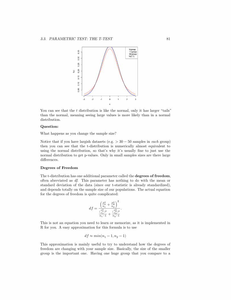
3.3. PARAMETRIC TEST: THE T-TEST 81
You can see that the 𝑡 distribution is like the normal, only it has larger “tails”than the normal, meaning seeing large values is more likely than in a normaldistribution.
Question:
What happens as you change the sample size?
Notice that if you have largish datasets (e.g. > 30 − 50 samples in each group)then you can see that the t-distribution is numerically almost equivalent tousing the normal distribution, so that’s why it’s usually fine to just use thenormal distribution to get p-values. Only in small samples sizes are there largedifferences.
Degrees of Freedom
The t-distribution has one additional parameter called the degrees of freedom,often abreviated as df. This parameter has nothing to do with the mean orstandard deviation of the data (since our t-statistic is already standardized),and depends totally on the sample size of our populations. The actual equationfor the degrees of freedom is quite complicated:
𝑑𝑓 =( ��2
1𝑛1
+ ��22
𝑛2)
2
( ��21
𝑛1)2
𝑛1−1 + ( ��22
𝑛2)2
𝑛2−1
.
This is not an equation you need to learn or memorize, as it is implemented inR for you. A easy approximation for this formula is to use
𝑑𝑓 ≈ 𝑚𝑖𝑛(𝑛1 − 1, 𝑛2 − 1)
This approximation is mainly useful to try to understand how the degrees offreedom are changing with your sample size. Basically, the size of the smallergroup is the important one. Having one huge group that you compare to a
82 CHAPTER 3. COMPARING GROUPS AND HYPOTHESIS TESTING
small group doesn’t help much – you will do better to put your resources intoincreasing the size of the smaller group (in the actual formula it helps a littlebit more, but the principle is the same).
3.3.5 Assumptions of the T-test
Parametric tests usually state their assumptions pretty clearly: they assume aparametric model generated the data in order to arrive at the mathematicaldescription of the null distribution. For the t-test, we assume that the data𝑋1, … , 𝑋𝑛1
and 𝑌1, … , 𝑌𝑛2are normal to get the t-distribution.
What happens if this assumption is wrong? When will it still make sense to usethe t-test?
If we didn’t have to estimate the variance, the central limit theorem tells us thenormality assumption will work for any distribution, if we have a large enoughsample size.
What about the t-distribution? That’s a little tricker. You still need a largesample size; you also need that the distribution of the 𝑋𝑖 and the 𝑌𝑖, while notrequired to be exactly normal, not be too far from normal. In particular, youwant them to be symmetric (unlike our flight data).6
Generally, the t-statistic is reasonably robust to violations of these assumptions,particularly compared to other parametric tests, if your data is not too skewedand you have a largish sample size (e.g. 30 samples in a group is good). But thepermutation test makes far fewer assumptions, and in particular is very robustto assumptions about the distribution of the data.
For small sample sizes (e.g. < 10 in each group), you certainly don’t really haveany good justification to use the t-distribution unless you have a reason to trustthat the data is normally distributed (and with small sample sizes it is also veryhard to justify this assumption by looking at the data).
3.3.6 Flight Data and Transformations
Let’s consider the flight data. Recall, the t-statistic focuses on the difference inmeans.
Question:
Looking at the histogram of the flight data , what would you conclude?
Why might this not be a compelling comparison for the flight delay? :::6Indeed, the central limit theorem requires large data sizes, and how large a sample you
need for the central limit theorem to give you a good approximation also depends on thingsabout the distribution of the data, like how symmetric the distribution is.
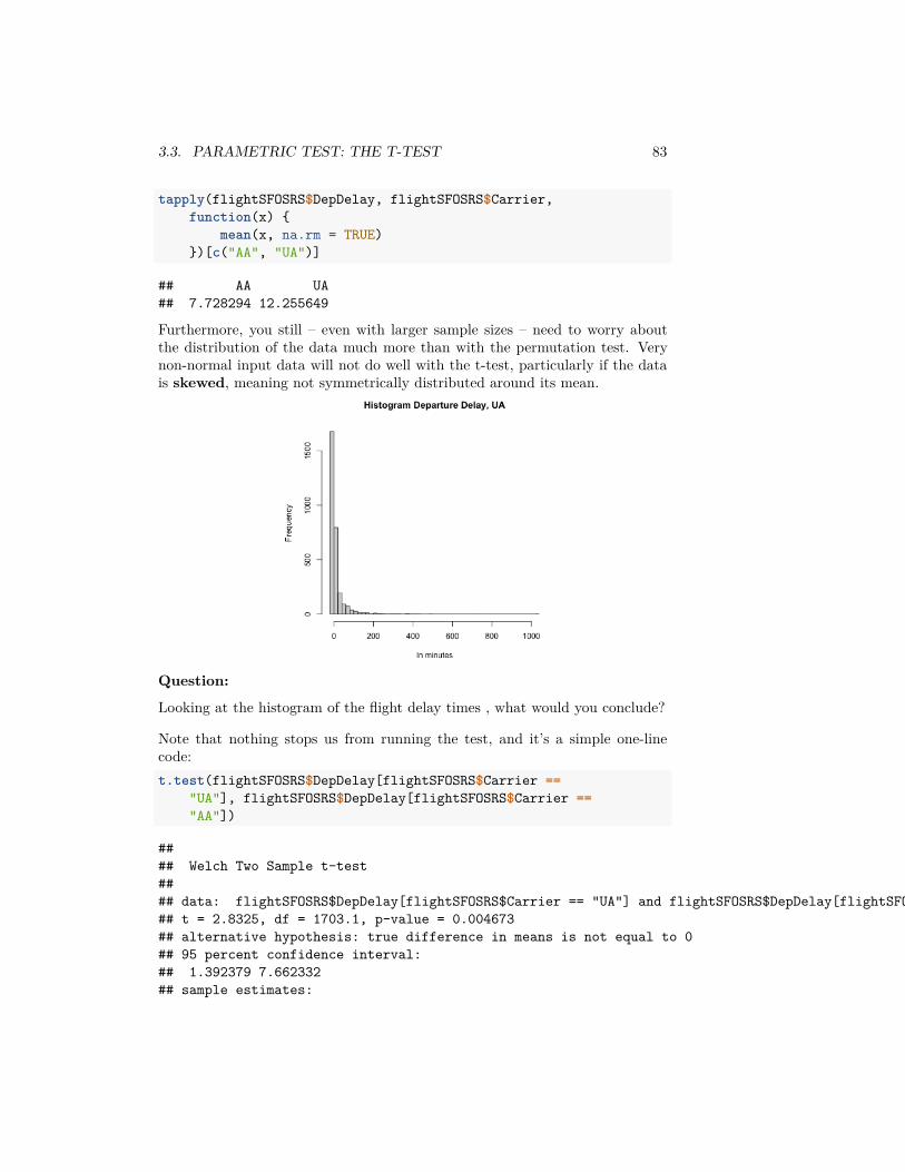
3.3. PARAMETRIC TEST: THE T-TEST 83
tapply(flightSFOSRS$DepDelay, flightSFOSRS$Carrier,function(x) {
mean(x, na.rm = TRUE)})[c("AA", "UA")]
## AA UA## 7.728294 12.255649
Furthermore, you still – even with larger sample sizes – need to worry aboutthe distribution of the data much more than with the permutation test. Verynon-normal input data will not do well with the t-test, particularly if the datais skewed, meaning not symmetrically distributed around its mean.
Question:
Looking at the histogram of the flight delay times , what would you conclude?
Note that nothing stops us from running the test, and it’s a simple one-linecode:t.test(flightSFOSRS$DepDelay[flightSFOSRS$Carrier ==
"UA"], flightSFOSRS$DepDelay[flightSFOSRS$Carrier =="AA"])
#### Welch Two Sample t-test#### data: flightSFOSRS$DepDelay[flightSFOSRS$Carrier == "UA"] and flightSFOSRS$DepDelay[flightSFOSRS$Carrier == "AA"]## t = 2.8325, df = 1703.1, p-value = 0.004673## alternative hypothesis: true difference in means is not equal to 0## 95 percent confidence interval:## 1.392379 7.662332## sample estimates:

84 CHAPTER 3. COMPARING GROUPS AND HYPOTHESIS TESTING
## mean of x mean of y## 12.255649 7.728294
This is a common danger of parametric tests. They are implemented everywhere(there are on-line calculators that will compute this for you; excel will do thiscalculation), so people are drawn to doing this, while permutation tests are moredifficult to find pre-packaged.
Direct comparison to the permutation test
The permutation test can use any statistic we like, and the t-statistic is a per-fectly reasonable way to compare two distributions. So we can compare thet-test to a permutation test of the mean using the t-statistic:set.seed(489712)tstatFun <- function(x1, x2) {
abs(t.test(x1, x2)$statistic)}dataset <- flightSFOSRSoutput <- permutation.test(group1 = dataset$DepDelay[dataset$Carrier ==
"UA"], group2 = dataset$DepDelay[dataset$Carrier =="AA"], FUN = tstatFun, n.repetitions = 10000)
cat("permutation pvalue=", output$p.value)
## permutation pvalue= 0.0076tout <- t.test(flightSFOSRS$DepDelay[flightSFOSRS$Carrier ==
"UA"], flightSFOSRS$DepDelay[flightSFOSRS$Carrier =="AA"])
cat("t-test pvalue=", tout$p.value)
## t-test pvalue= 0.004673176
We can compare the distribution of the permutation distribution of thet-statistic, and the density of the 𝑁(0, 1) that the parametric model assumes.We can see that they are quite close, even though our data is very skewedand clearly non-normal. Indeed for larger sample sizes, they will give similarresults.
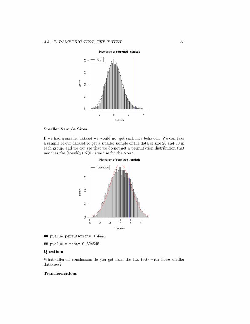
3.3. PARAMETRIC TEST: THE T-TEST 85
Smaller Sample Sizes
If we had a smaller dataset we would not get such nice behavior. We can takea sample of our dataset to get a smaller sample of the data of size 20 and 30 ineach group, and we can see that we do not get a permutation distribution thatmatches the (roughly) N(0,1) we use for the t-test.
## pvalue permutation= 0.4446
## pvalue t.test= 0.394545
Question:
What different conclusions do you get from the two tests with these smallerdatasizes?
Transformations
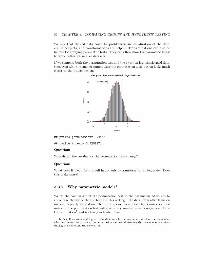
86 CHAPTER 3. COMPARING GROUPS AND HYPOTHESIS TESTING
We saw that skewed data could be problematic in visualization of the data,e.g. in boxplots, and transformations are helpful. Transformations can also behelpful for applying parametric tests. They can often allow the parametric t-testto work better for smaller datasets.
If we compare both the permutation test and the t-test on log-transformed data,then even with the smaller sample sizes the permutation distribution looks muchcloser to the t-distribution.
## pvalue permutation= 0.4446
## pvalue t.test= 0.3261271
Question:
Why didn’t the p-value for the permutation test change?
Question:
What does it mean for my null hypothesis to transform to the log-scale? Doesthis make sense?
3.3.7 Why parametric models?
We do the comparison of the permutation test to the parametric t-test not toencourage the use of the the t-test in this setting – the data, even after transfor-mation, is pretty skewed and there’s no reason to not use the permutation testinstead. The permutation test will give pretty similar answers regardless of thetransformation7 and is clearly indicated here.
7In fact, if we were working with the difference in the means, rather than the t-statistics,which estimates the variance, the permutation test would give exactly the same answer sincethe log is a monotone transformation.
3.4. DIGGING INTO HYPOTHESIS TESTS 87
This exercise was to show the use and limits of using the parametric tests, andparticularly transformations of the data, in an easy setting. Historically, para-metric t-tests were necessary in statistics because there were not computersto run permutation tests. That’s clearly not compelling now! However, it re-mains that parametric tests are often easier to implement (one-line commandsin R, versus writing a function); you will see parametric tests frequently (evenwhen resampling methods like permutation tests and bootstrap would be morejustifiable).
The take-home lesson here regarding parametric tests is that when there arelarge sample sizes, parametric tests can overcome violations of their assump-tions8 so don’t automatically assume parametric tests are completely wrong touse. But a permutation test is the better all-round tool for this question: it ishas more minimal assumptions, and can look at how many different statisticswe can use.
There are also some important reasons to learn about t-tests, however, beyonda history lesson. They are the easiest example of a parameteric test, whereyou make assumptions about the distribution your data (i.e. 𝑋1, … , 𝑋𝑛1
and𝑌1, … , 𝑌𝑛2
are normally distributed). Parametric tests generally are very im-portant, even with computers. Parametric models are particularly helpful forresearchers in data science for the development of new methods, particularly indefining good test statistics, like 𝑇 .
Parametric models are also useful in trying to understand the limitations ofa method, mathematically. We can simulate data under different models tounderstand how a statistical method behaves.
There are also applications where the ideas of bootstrap and permutation testsare difficult to apply. Permutation tests, in particular, are quite specific. Boot-strap methods, which we’ll review in a moment, are more general, but still arenot always easy to apply in more complicated settings. A goal of this class is tomake you comfortable with parametric models (and their accompanying tests),in addition to the resampling methods you’ve learned.
3.4 Digging into Hypothesis tests
Let’s break down some important concepts as to what makes a test. Note thatall of these concepts will apply for any hypothesis test.
1. A null hypothesis regarding a particular feature of the data2. A test statistic for which extreme values indicates less correspondence with
the null hypothesis3. An assumption of how the data was generated under the null hypothesis4. The distribution of the test statistic under the null hypothesis.
8At least those tests based on the central limit theorem!
88 CHAPTER 3. COMPARING GROUPS AND HYPOTHESIS TESTING
As we’ve seen, different tests can be used to answer the same basic “null” hy-pothesis – are the two groups “different”? – but the specifics of how that nullis defined can be quite different. For any test, you should be clear as to whatthe answer is to each of these points.
3.4.1 Significance & Type I Error
The term significance refers to measuring how incompatible the data is withthe null hypothesis. There are two important terminologies that go along withassessing significance.
p-values You often report a p-value to quantify how unlikely the data is underthe null.
Decision to Reject/Not reject : We can just report the p-value, but it is commonto also make an assessment of the p-value and give a final decision as to whetherthe null hypothesis was too unlikely to have reasonably created the data we’veseen. This is a decision approach – either reject the null hypothesis or not. Inthis case we pick a cutoff, e.g. p-value of 0.05, and report that we reject the null.
Question:
Does the p-value give you the probability that the null is true?
You might see sentences like “We reject the null at level 0.05.” The level chosenfor a test is an important concept in hypothesis testing and is the cutoff valuefor a test to be significant. In principle, the idea of setting a level is that it is astandard you can require before declaring significance; in this way it can keepresearchers from creeping toward declaring significance once they see the dataand see they have a p-value of 0.07, rather than 0.05. However, in practice itcan have the negative result of encouraging researchers to fish in their data untilthey find something that has a p-value less than 0.05.
Commonly accepted cutoffs for unlikely events are 0.05 or 0.01, but these valuesare too often considered as magical and set in stone. Reporting the actual p-value is more informative than just saying yes/no whether you reject (rejectingwith a p-value of 0.04 versus 0.0001 tells you something about your data).
The deeper concept about the level of the test is that it defines a repeatableprocedure (“reject if p-value is < 𝛼”). Then the level actually reports theuncertainity in this procedure. Specifically, with any test, you can make twokinds of mistakes:
• Reject the null when the null is true (Type I error)• Not reject the null when the null is in fact not true (Type II error)
Then the level of a decision is the probability of this procedure making a typeI error: if you always reject at 0.05, then 5% of such tests will wrongly rejectthe null hypothesis when in fact the null is true is true.
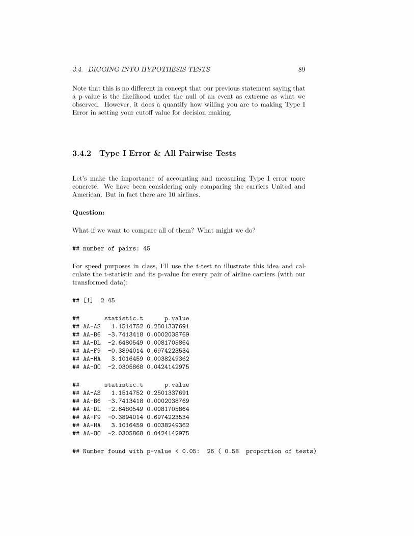
3.4. DIGGING INTO HYPOTHESIS TESTS 89
Note that this is no different in concept that our previous statement saying thata p-value is the likelihood under the null of an event as extreme as what weobserved. However, it does a quantify how willing you are to making Type IError in setting your cutoff value for decision making.
3.4.2 Type I Error & All Pairwise Tests
Let’s make the importance of accounting and measuring Type I error moreconcrete. We have been considering only comparing the carriers United andAmerican. But in fact there are 10 airlines.
Question:
What if we want to compare all of them? What might we do?
## number of pairs: 45
For speed purposes in class, I’ll use the t-test to illustrate this idea and cal-culate the t-statistic and its p-value for every pair of airline carriers (with ourtransformed data):
## [1] 2 45
## statistic.t p.value## AA-AS 1.1514752 0.2501337691## AA-B6 -3.7413418 0.0002038769## AA-DL -2.6480549 0.0081705864## AA-F9 -0.3894014 0.6974223534## AA-HA 3.1016459 0.0038249362## AA-OO -2.0305868 0.0424142975
## statistic.t p.value## AA-AS 1.1514752 0.2501337691## AA-B6 -3.7413418 0.0002038769## AA-DL -2.6480549 0.0081705864## AA-F9 -0.3894014 0.6974223534## AA-HA 3.1016459 0.0038249362## AA-OO -2.0305868 0.0424142975
## Number found with p-value < 0.05: 26 ( 0.58 proportion of tests)
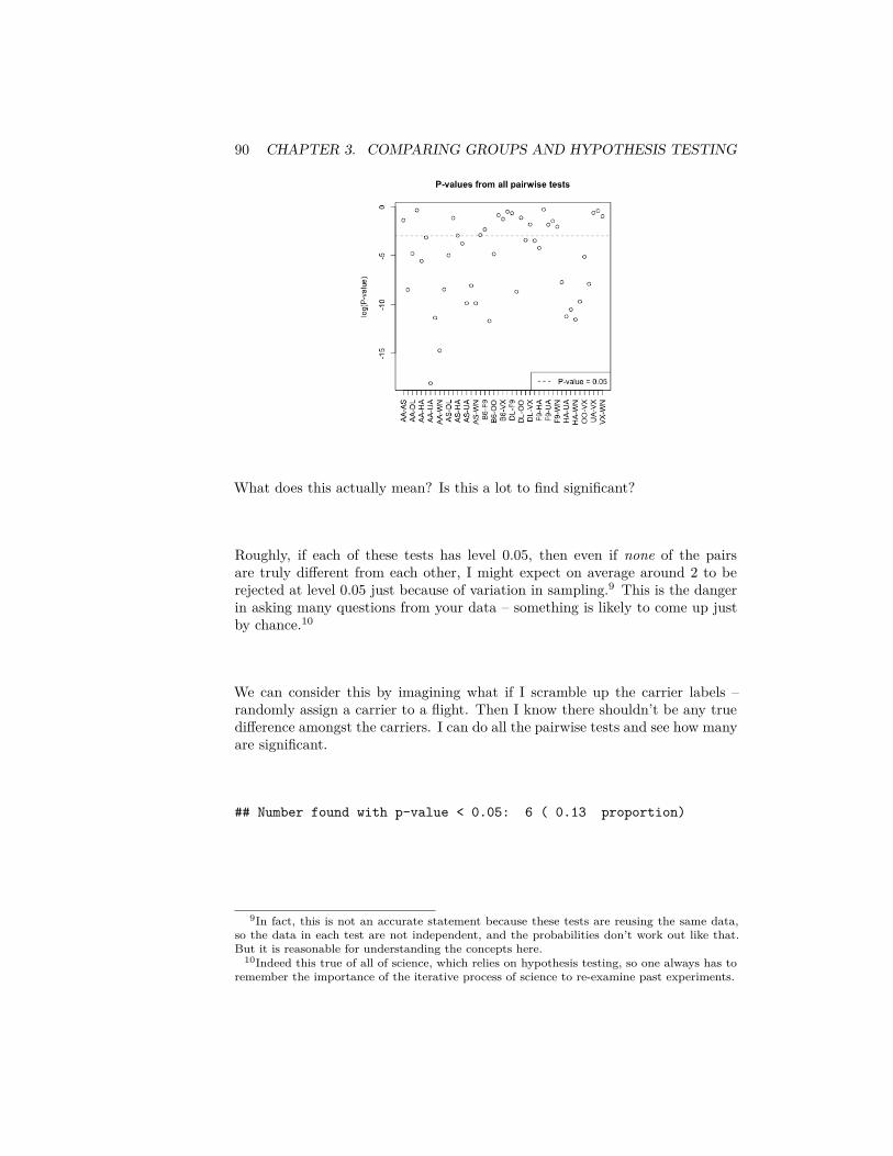
90 CHAPTER 3. COMPARING GROUPS AND HYPOTHESIS TESTING
What does this actually mean? Is this a lot to find significant?
Roughly, if each of these tests has level 0.05, then even if none of the pairsare truly different from each other, I might expect on average around 2 to berejected at level 0.05 just because of variation in sampling.9 This is the dangerin asking many questions from your data – something is likely to come up justby chance.10
We can consider this by imagining what if I scramble up the carrier labels –randomly assign a carrier to a flight. Then I know there shouldn’t be any truedifference amongst the carriers. I can do all the pairwise tests and see how manyare significant.
## Number found with p-value < 0.05: 6 ( 0.13 proportion)
9In fact, this is not an accurate statement because these tests are reusing the same data,so the data in each test are not independent, and the probabilities don’t work out like that.But it is reasonable for understanding the concepts here.
10Indeed this true of all of science, which relies on hypothesis testing, so one always has toremember the importance of the iterative process of science to re-examine past experiments.
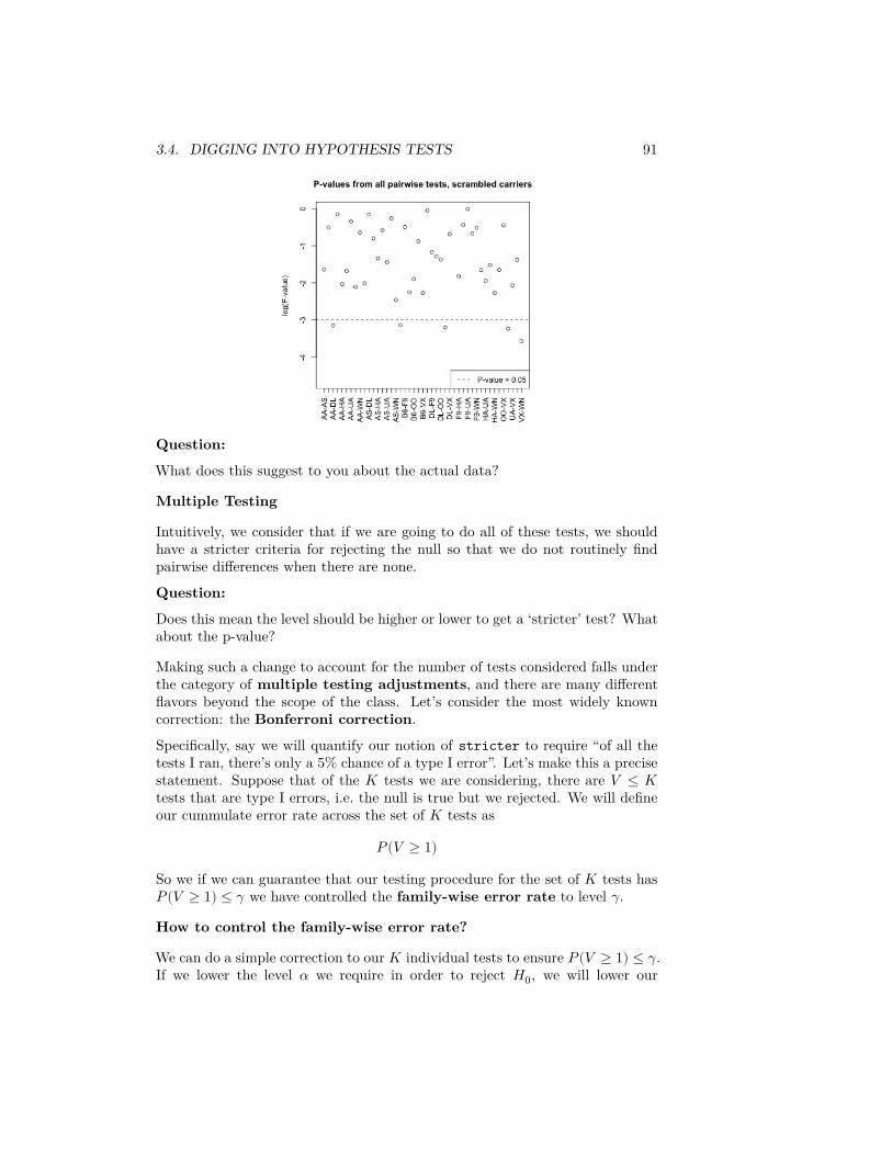
3.4. DIGGING INTO HYPOTHESIS TESTS 91
Question:
What does this suggest to you about the actual data?
Multiple Testing
Intuitively, we consider that if we are going to do all of these tests, we shouldhave a stricter criteria for rejecting the null so that we do not routinely findpairwise differences when there are none.
Question:
Does this mean the level should be higher or lower to get a ‘stricter’ test? Whatabout the p-value?
Making such a change to account for the number of tests considered falls underthe category of multiple testing adjustments, and there are many differentflavors beyond the scope of the class. Let’s consider the most widely knowncorrection: the Bonferroni correction.
Specifically, say we will quantify our notion of stricter to require “of all thetests I ran, there’s only a 5% chance of a type I error”. Let’s make this a precisestatement. Suppose that of the 𝐾 tests we are considering, there are 𝑉 ≤ 𝐾tests that are type I errors, i.e. the null is true but we rejected. We will defineour cummulate error rate across the set of 𝐾 tests as
𝑃(𝑉 ≥ 1)
So we if we can guarantee that our testing procedure for the set of 𝐾 tests has𝑃(𝑉 ≥ 1) ≤ 𝛾 we have controlled the family-wise error rate to level 𝛾.
How to control the family-wise error rate?
We can do a simple correction to our 𝐾 individual tests to ensure 𝑃(𝑉 ≥ 1) ≤ 𝛾.If we lower the level 𝛼 we require in order to reject 𝐻0, we will lower our
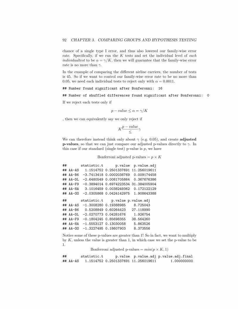
92 CHAPTER 3. COMPARING GROUPS AND HYPOTHESIS TESTING
chance of a single type I error, and thus also lowered our family-wise errorrate. Specifically, if we run the 𝐾 tests and set the individual level of eachindividualtest to be 𝛼 = 𝛾/𝐾, then we will guarantee that the family-wise errorrate is no more than 𝛾.In the example of comparing the different airline carriers, the number of testsis 45. So if we want to control our family-wise error rate to be no more than0.05, we need each individual tests to reject only with 𝛼 = 0.0011.## Number found significant after Bonferonni: 16
## Number of shuffled differences found significant after Bonferonni: 0
If we reject each tests only if
𝑝 − 𝑣𝑎𝑙𝑢𝑒 ≤ 𝛼 = 𝛾/𝐾
, then we can equivalently say we only reject if
𝐾 𝑝 − 𝑣𝑎𝑙𝑢𝑒≤ 𝛾
We can therefore instead think only about 𝛾 (e.g. 0.05), and create adjustedp-values, so that we can just compare our adjusted p-values directly to 𝛾. Inthis case if our standard (single test) p-value is 𝑝, we have
Bonferroni adjusted p-values = 𝑝 × 𝐾
## statistic.t p.value p.value.adj## AA-AS 1.1514752 0.2501337691 11.256019611## AA-B6 -3.7413418 0.0002038769 0.009174458## AA-DL -2.6480549 0.0081705864 0.367676386## AA-F9 -0.3894014 0.6974223534 31.384005904## AA-HA 3.1016459 0.0038249362 0.172122129## AA-OO -2.0305868 0.0424142975 1.908643388
## statistic.t p.value p.value.adj## AA-AS -1.3008280 0.19388985 8.725043## AA-B6 0.5208849 0.60264423 27.118990## AA-DL -2.0270773 0.04281676 1.926754## AA-F9 -0.1804245 0.85698355 38.564260## AA-HA -1.5553127 0.13030058 5.863526## AA-OO -1.3227495 0.18607903 8.373556
Notice some of these p-values are greater than 1! So in fact, we want to multiplyby 𝐾, unless the value is greater than 1, in which case we set the p-value to be1.
Bonferroni adjusted p-values = 𝑚𝑖𝑛(𝑝 × 𝐾, 1)## statistic.t p.value p.value.adj p.value.adj.final## AA-AS 1.1514752 0.2501337691 11.256019611 1.000000000
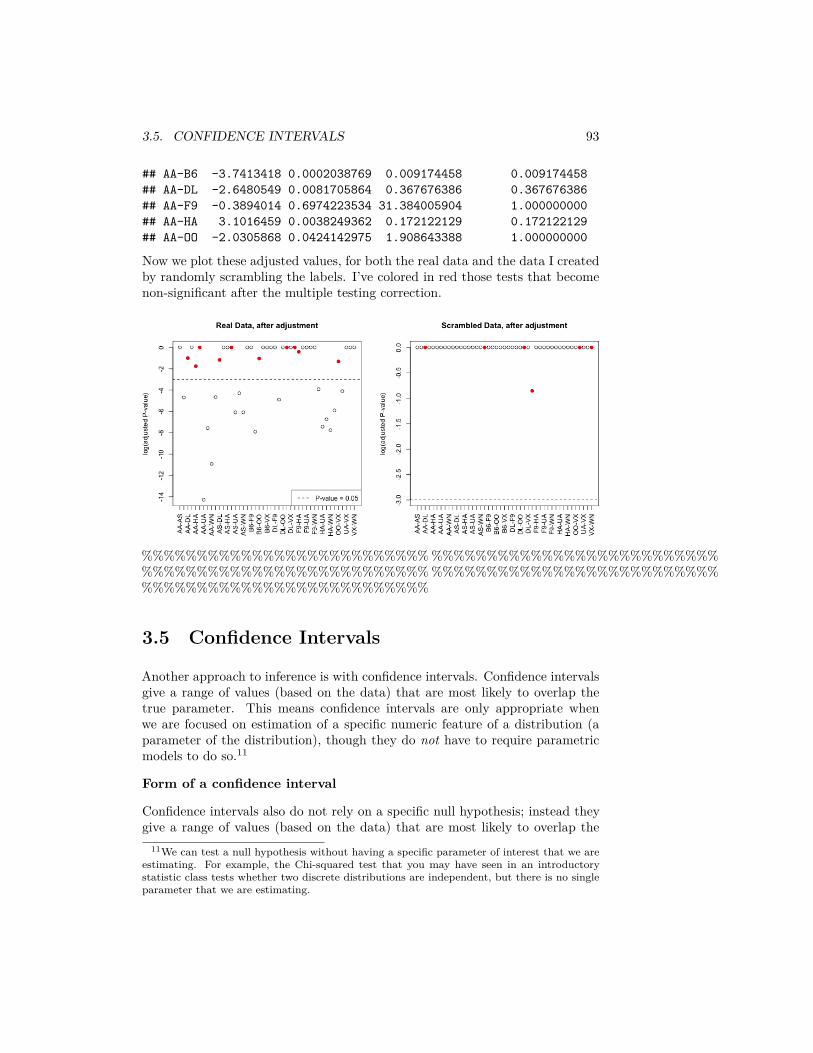
3.5. CONFIDENCE INTERVALS 93
## AA-B6 -3.7413418 0.0002038769 0.009174458 0.009174458## AA-DL -2.6480549 0.0081705864 0.367676386 0.367676386## AA-F9 -0.3894014 0.6974223534 31.384005904 1.000000000## AA-HA 3.1016459 0.0038249362 0.172122129 0.172122129## AA-OO -2.0305868 0.0424142975 1.908643388 1.000000000
Now we plot these adjusted values, for both the real data and the data I createdby randomly scrambling the labels. I’ve colored in red those tests that becomenon-significant after the multiple testing correction.
%%%%%%%%%%%%%%%%%%%%%%%%%%%%%%%%%%%%%%%%%%%%%%%%%%%%%%%%%%%%%%%%%%%%%%%%%%%%%%%%%%%%%%%%%%%%%%%%%%%%%%%%%%%%%%%%%%%%%%%%%%%%%%%%%%
3.5 Confidence Intervals
Another approach to inference is with confidence intervals. Confidence intervalsgive a range of values (based on the data) that are most likely to overlap thetrue parameter. This means confidence intervals are only appropriate whenwe are focused on estimation of a specific numeric feature of a distribution (aparameter of the distribution), though they do not have to require parametricmodels to do so.11
Form of a confidence interval
Confidence intervals also do not rely on a specific null hypothesis; instead theygive a range of values (based on the data) that are most likely to overlap the
11We can test a null hypothesis without having a specific parameter of interest that we areestimating. For example, the Chi-squared test that you may have seen in an introductorystatistic class tests whether two discrete distributions are independent, but there is no singleparameter that we are estimating.
94 CHAPTER 3. COMPARING GROUPS AND HYPOTHESIS TESTING
true parameter. Confidence intervals take the form of an interval, and are pairedwith a confidence, like 95% confidence intervals, or 99% confidence intervals.
Question:
Which should should result in wider intervals, a 95% or 99% interval?
General definition of a Confidence interval
A 95% confidence interval for a parameter 𝜃 is a interval (𝑉1, 𝑉2) so that
𝑃(𝑉1 ≤ 𝜃 ≤ 𝑉2) = 0.95.
Notice that this equation looks like 𝜃 should be the random quantity, but 𝜃 isa fixed (and unknown) value. The random values in this equation are actuallythe 𝑉1 and 𝑉2 – those are the numbers we estimate from the data. It can beuseful to consider this equation as actually,
𝑃(𝑉1 ≤ 𝜃 and 𝑉2 ≥ 𝜃) = 0.95,
to emphasize that 𝑉1 and 𝑉2 are the random variables in this equation.
3.5.1 Quantiles
Without even going further, it’s clear we’re going to be inverting our probabilitycalculations, i.e. finding values that give us specific probabilities. For example,you should know that for 𝑋 distributed as a normal distribution, the probabilityof 𝑋 being within about 2 standard deviations of the mean is 0.95 – moreprecisely 1.96 standard deviations.
Figuring out what number will give you a certain probability of being less than(or greater than) that value is a question of finding a quantile of the distribu-tion. Specifically, quantiles tell you at what point you will have a particularprobability of being less than that value. Precisely, if 𝑧 is the 𝛼 quantile of adistribution, then
𝑃(𝑋 ≤ 𝑧) = 𝛼.We will often write 𝑧𝛼 for the 𝛼 quantile of a distribution.
So if 𝑋 is distributed as a normal distribution and 𝑧 is a 0.25 quantile of anormal distribution,
𝑃(𝑋 ≤ 𝑧) = 0.25.𝑧 is a 0.90 quantile of a normal if 𝑃(𝑋 ≤ 𝑧) = 0.90, and so forth
These numbers can be looked up easily in R for standard distributions.qnorm(0.2, mean = 0, sd = 1)
## [1] -0.8416212
3.6. PARAMETRIC CONFIDENCE INTERVALS 95
qnorm(0.9, mean = 0, sd = 1)
## [1] 1.281552qnorm(0.0275, mean = 0, sd = 1)
## [1] -1.918876
Question:
What is the probability of being between -0.84 and 1.2815516 in a 𝑁(0, 1)?
3.6 Parametric Confidence Intervals
This time we will start with using parametric models to create confidence inter-vals. We will start with how to construct a parametric CI for the mean of singlegroup.
3.6.1 Confidence Interval for Mean of One group
As we’ve discussed many times, a SRS will have a sampling distribution thatis roughly a normal distribution (the Central Limit Theorem). Namely, that if𝑋1, … , 𝑋𝑛 are a SRS from a distribution with mean 𝜇 and variance 𝜎2, then
𝜇 = �� = 1𝑛 ∑𝑛
𝑖=1 𝑋𝑖 will have a roughly normal distribution
𝑁(𝜇, 𝜎2
𝑛 ).
Let’s assume we know 𝜎2 for now. Then a 95% confidence interval can beconstructed by
�� ± 1.96 𝜎√𝑛More generally, we can write this as
�� ± 𝑧𝑆𝐷(��)
Where did 𝑧 = 1.96 come from?
Note for a r.v. 𝑌 ∼ 𝑁(𝜇, 𝜎2) distribution, the value 𝜇 − 1.96√
𝜎2 is the 0.025quantile of the distribution, and 𝜇 + 1.96
√𝜎2 is the 0.975 quantile of the distri-
bution, so the probability of 𝑌 being between these two values is 0.95. By theCLT we’ll assume �� ∼ 𝑁(𝜇, 𝜎2
𝑛 ), so the the probability that �� is within
𝜇 ± 1.96√
𝜎2
96 CHAPTER 3. COMPARING GROUPS AND HYPOTHESIS TESTING
is 95%. So it looks like we are just estimating 𝜇 with ��.
That isn’t quite accurate. What we are saying is that
𝑃(𝜇 − 1.96√𝜎2
𝑛 ≤ �� ≤ 𝜇 + 1.96√𝜎2
𝑛 ) = 0.95
and we really need is to show that
𝑃(�� − 1.96√𝜎2
𝑛 ≤ 𝜇 ≤ �� + 1.96√𝜎2
𝑛 ) = 0.95
to have a true 0.95 confidence interval. But we’re almost there.
We can invert our equation above, to get
0.95 = 𝑃(𝜇 − 1.96√𝜎2
𝑛 ≤ �� ≤ 𝜇 + 1.96√𝜎2
𝑛 )
= 𝑃(−1.96√𝜎2
𝑛 ≤ �� − 𝜇 ≤ 1.96√𝜎2
𝑛 )
= 𝑃(−1.96√𝜎2
𝑛 − �� ≤ −𝜇 ≤ 1.96√𝜎2
𝑛 − ��)
= 𝑃(1.96√𝜎2
𝑛 + �� ≥ 𝜇 ≥ −1.96√𝜎2
𝑛 + ��)
= 𝑃(�� − 1.96√𝜎2
𝑛 ≤ 𝜇 ≤ �� + 1.96√𝜎2
𝑛 )
General equation for CI
Of course, we can do the same thing for any confidence level we want. If wewant a (1 − 𝛼) level confidence interval, then we take
�� ± 𝑧𝛼/2𝑆𝐷(��)
Where 𝑧𝛼/2 is the 𝛼/2 quantile of the 𝑁(0, 1).In practice, we do not know 𝜎 so we don’t know 𝑆𝐷(��) and have to use ��,which mean that we need to use the quantiles of a 𝑡-distribution with 𝑛 − 1degrees of freedom for smaller sample sizes.
Example in R
For the flight data, we can get a confidence interval for the mean of the Unitedflights using the function t.test again. We will work on the log-scale, sincewe’ve already seen that makes more sense for parametric tests because our datais skewed:
3.6. PARAMETRIC CONFIDENCE INTERVALS 97
t.test(log(flightSFOSRS$DepDelay[flightSFOSRS$Carrier =="UA"] + addValue))
#### One Sample t-test#### data: log(flightSFOSRS$DepDelay[flightSFOSRS$Carrier == "UA"] + addValue)## t = 289.15, df = 2964, p-value < 2.2e-16## alternative hypothesis: true mean is not equal to 0## 95 percent confidence interval:## 3.236722 3.280920## sample estimates:## mean of x## 3.258821
Notice the result is on the (shifted) log scale! Because this is a monotonicfunction, we can invert this to see what this implies on the original scale:logT <- t.test(log(flightSFOSRS$DepDelay[flightSFOSRS$Carrier ==
"UA"] + addValue))exp(logT$conf.int) - addValue
## [1] 3.450158 4.600224## attr(,"conf.level")## [1] 0.95
3.6.2 Confidence Interval for Difference in the Means ofTwo Groups
Now lets consider the average delay time between the two airlines. Then theparameter of interest is the difference in the means:
𝛿 = 𝜇𝑈𝑛𝑖𝑡𝑒𝑑 − 𝜇𝐴𝑚𝑒𝑟𝑖𝑐𝑎𝑛.
Using the central limit theorem again,
�� − 𝑌 ∼ 𝑁(𝜇1 − 𝜇2, 𝜎21
𝑛1+ 𝜎2
2𝑛2
)
You can do the same thing for two groups in terms of finding the confidenceinterval:
𝑃((�� − 𝑌 ) − 1.96√𝜎21
𝑛1+ 𝜎2
2𝑛2
≤ 𝜇1 − 𝜇2 ≤ (�� − 𝑌 ) + 1.96√𝜎21
𝑛1+ 𝜎2
2𝑛2
) = 0.95
98 CHAPTER 3. COMPARING GROUPS AND HYPOTHESIS TESTING
Then a 95% confidence interval for 𝜇1 − 𝜇2 if we knew 𝜎21 and 𝜎2
2 is
�� ± 1.96√𝜎21
𝑛1+ 𝜎2
2𝑛2
Estimating the variance
Of course, we don’t know 𝜎21 and 𝜎2
2, so we will estimate them, as with thet-statistic. We know from our t-test that if 𝑋1, … , 𝑋𝑛1
and 𝑌1, … , 𝑌𝑛2are
normally distributed, then our t-statistic,
𝑇 = |�� − 𝑌 |
√ 𝜎12
𝑛1+ 𝜎2
2
𝑛2
.
has actually a t-distribution.
How does this get a confidence interval (T is not an estimate of 𝛿)? We canuse the same logic of inverting the equations, only with the quantiles of thet-distribution to get a confidence interval for the difference.
Let 𝑡0.025 and 𝑡0.975 be the quantiles of the t distribution. Then,
𝑃((�� − 𝑌 ) − 𝑡0.975√𝜎21
𝑛1+ 𝜎2
2𝑛2
≤ 𝜇1 − 𝜇2 ≤ (�� − 𝑌 ) − 𝑡0.025√𝜎21
𝑛1+ 𝜎2
2𝑛2
) = 0.95
Of course, since the 𝑡 distribution is symmetric, −𝑡0.025 = 𝑡0.975.
Question:
Why does symmetry imply that −𝑡0.025 = 𝑡0.975?
We’ve already seen that for reasonably moderate sample sizes, the differencebetween the normal and the t-distribution is not that great, so that in mostcases it is reasonable to use the normal-based confidence intervals only with ��2
1and ��2
2. This is why ±2 standard errors is such a common mantra for reportingestimates.
2-group test in R
We can get the confidence interval for the difference in our groups using t.testas well.logUA <- log(flightSFOSRS$DepDelay[flightSFOSRS$Carrier ==
"UA"] + addValue)logAA <- log(flightSFOSRS$DepDelay[flightSFOSRS$Carrier ==
"AA"] + addValue)t.test(logUA, logAA)
3.7. BOOTSTRAP CONFIDENCE INTERVALS 99
#### Welch Two Sample t-test#### data: logUA and logAA## t = 5.7011, df = 1800.7, p-value = 1.389e-08## alternative hypothesis: true difference in means is not equal to 0## 95 percent confidence interval:## 0.07952358 0.16293414## sample estimates:## mean of x mean of y## 3.258821 3.137592
Question:
What is the problem from this confidence interval on the log-scale that we didn’thave before when we were looking at a single group?
3.7 Bootstrap Confidence Intervals
The Setup
Suppose we are interested instead in whether the median of the two groups isthe same.
Question:
Why might that be a better idea than the mean?
Or, alternatively, as we saw, perhaps a more relevant statistic than either themean or the median would be the difference in the proportion greater than 15minutes late. Let 𝜃𝑈𝑛𝑖𝑡𝑒𝑑, and 𝜃𝐴𝑚𝑒𝑟𝑖𝑐𝑎𝑛 be the true proportions of the twogroups, and now
𝛿 = 𝜃𝑈𝑛𝑖𝑡𝑒𝑑 − 𝜃𝐴𝑚𝑒𝑟𝑖𝑐𝑎𝑛.
Question:
The sample statistic estimating 𝛿 would be what?
To be able to do hypothesis testing on other statistics, we need the distributionof our test statistic to either construct confidence intervals or the p-value. Inthe t-test, we used the central limit theorem that tells us the difference inthe means is approximately normal. We can’t use the CLT theory for themedian, however, because the CLT was for the difference in the means of thegroups. We would need to have new mathematical theory for the differencein the medians or proportions. In fact such theory exists (and the proportionis actually a type of mean, so we can in fact basically use the t-test, whichsome modifications). Therefore, many other statistics can also be handled with
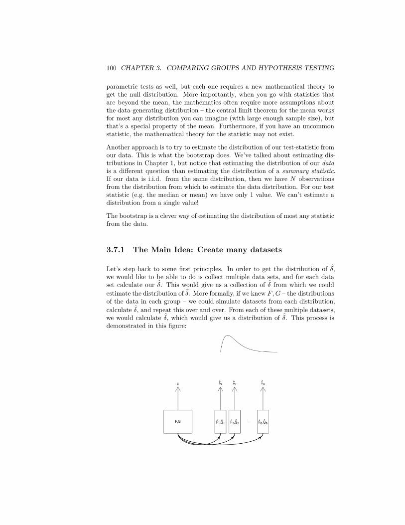
100 CHAPTER 3. COMPARING GROUPS AND HYPOTHESIS TESTING
parametric tests as well, but each one requires a new mathematical theory toget the null distribution. More importantly, when you go with statistics thatare beyond the mean, the mathematics often require more assumptions aboutthe data-generating distribution – the central limit theorem for the mean worksfor most any distribution you can imagine (with large enough sample size), butthat’s a special property of the mean. Furthermore, if you have an uncommonstatistic, the mathematical theory for the statistic may not exist.
Another approach is to try to estimate the distribution of our test-statistic fromour data. This is what the bootstrap does. We’ve talked about estimating dis-tributions in Chapter 1, but notice that estimating the distribution of our datais a different question than estimating the distribution of a summary statistic.If our data is i.i.d. from the same distribution, then we have 𝑁 observationsfrom the distribution from which to estimate the data distribution. For our teststatistic (e.g. the median or mean) we have only 1 value. We can’t estimate adistribution from a single value!
The bootstrap is a clever way of estimating the distribution of most any statisticfrom the data.
3.7.1 The Main Idea: Create many datasets
Let’s step back to some first principles. In order to get the distribution of 𝛿,we would like to be able to do is collect multiple data sets, and for each dataset calculate our 𝛿. This would give us a collection of 𝛿 from which we couldestimate the distribution of 𝛿. More formally, if we knew 𝐹, 𝐺 – the distributionsof the data in each group – we could simulate datasets from each distribution,calculate 𝛿, and repeat this over and over. From each of these multiple datasets,we would calculate 𝛿, which would give us a distribution of 𝛿. This process isdemonstrated in this figure:
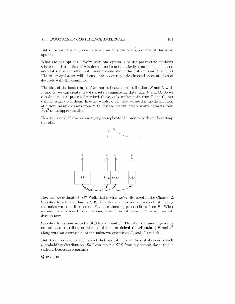
3.7. BOOTSTRAP CONFIDENCE INTERVALS 101
But since we have only one data set, we only see one 𝛿, so none of this is anoption.
What are our options? We’ve seen one option is to use parametric methods,where the distribution of 𝛿 is determined mathematically (but is dependent onour statistic 𝛿 and often with assumptions about the distributions 𝐹 and 𝐺).The other option we will discuss, the bootstrap, tries instead to create lots ofdatasets with the computer.
The idea of the bootstrap is if we can estimate the distributions 𝐹 and 𝐺 with𝐹 and 𝐺, we can create new data sets by simulating data from 𝐹 and 𝐺. So we
can do our ideal process described above, only without the true 𝐹 and 𝐺, butwith an estimate of them. In other words, while what we need is the distributionof 𝛿 from many datasets from 𝐹, 𝐺, instead we will create many datasets from
𝐹 , 𝐺 as an approximation.
Here is a visual of how we are trying to replicate the process with our bootstrapsamples:
How can we estimate 𝐹 , 𝐺? Well, that’s what we’ve discussed in the Chapter 2.Specifically, when we have a SRS, Chapter 2 went over methods of estimatingthe unknown true distribution 𝐹 , and estimating probabilities from 𝐹 . Whatwe need now is how to draw a sample from an estimate of 𝐹 , which we willdiscuss next.
Specifically, assume we get a SRS from 𝐹 and 𝐺. The observed sample gives usan estimated distribution (also called the empirical distribution) 𝐹 and 𝐺,along with an estimate 𝛿, of the unknown quantities 𝐹 , and 𝐺 (and 𝛿).But it’s important to understand that our estimate of the distribution is itselfa probability distribution. So I can make a SRS from my sample data; this iscalled a bootstrap sample.
Question:
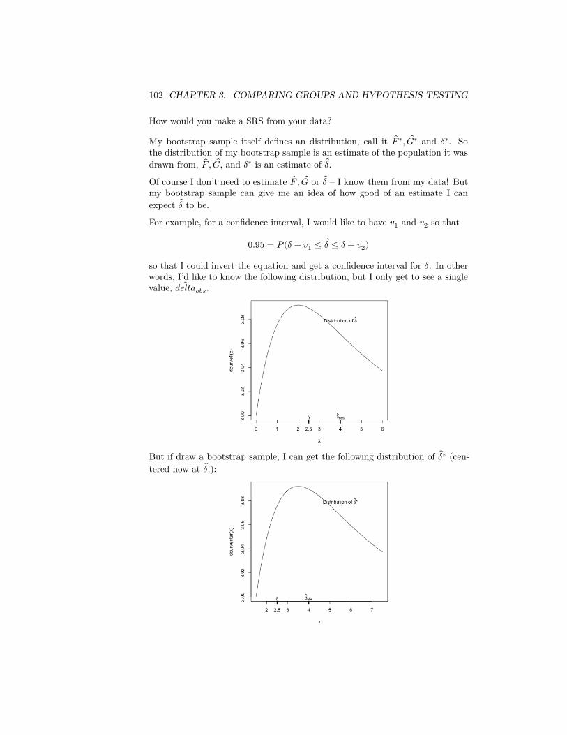
102 CHAPTER 3. COMPARING GROUPS AND HYPOTHESIS TESTING
How would you make a SRS from your data?
My bootstrap sample itself defines an distribution, call it 𝐹 ∗, 𝐺∗ and 𝛿∗. Sothe distribution of my bootstrap sample is an estimate of the population it wasdrawn from, 𝐹 , 𝐺, and 𝛿∗ is an estimate of 𝛿.Of course I don’t need to estimate 𝐹 , 𝐺 or 𝛿 – I know them from my data! Butmy bootstrap sample can give me an idea of how good of an estimate I canexpect 𝛿 to be.
For example, for a confidence interval, I would like to have 𝑣1 and 𝑣2 so that
0.95 = 𝑃(𝛿 − 𝑣1 ≤ 𝛿 ≤ 𝛿 + 𝑣2)
so that I could invert the equation and get a confidence interval for 𝛿. In otherwords, I’d like to know the following distribution, but I only get to see a singlevalue, 𝑑𝑒𝑙𝑡𝑎𝑜𝑏𝑠.
But if draw a bootstrap sample, I can get the following distribution of 𝛿∗ (cen-tered now at 𝛿!):

3.7. BOOTSTRAP CONFIDENCE INTERVALS 103
So 𝛿∗ is not a direct estimate of the distribution of 𝛿! But if the distributionof 𝛿∗ around 𝛿 is like that of 𝛿 around 𝛿, then that gives me useful informationabout how likely it is that my 𝛿 is far away from the true 𝛿, e.g.
𝑃(| 𝛿 − 𝛿| > 1) ≈ 𝑃(| 𝛿∗ − 𝛿| > 1)
Or more relevant, for a confidence interval, I could find 𝑣1 and 𝑣2 so that
0.95 = 𝑃( 𝛿 − 𝑣1 ≤ 𝛿∗ ≤ 𝛿 + 𝑣2)and then use the same 𝑣1, 𝑣2 to approximate that
0.95 = 𝑃(𝛿 − 𝑣1 ≤ 𝛿 ≤ 𝛿 + 𝑣2)
In short, we don’t need that 𝛿∗ approximates the distribution of 𝛿. We just wantthat the distance of 𝛿∗ from it’s true generating value 𝛿 replicate the distanceof 𝛿 from the (unknown) true generating value 𝛿.
3.7.2 Implementing the bootstrap confidence intervals
What does it actually mean to resample from 𝐹? It means to take a samplefrom 𝐹 just like the kind of sample we took from the actual data generatingprocess, 𝐹 .
Specifically in our two group setting, say we assume we have a SRS$X_1,…,X_{n_1},Y_1,…,Y_{n_2} $ from an unknown distributions 𝐹 and𝐺.
Question:
What does this actually mean? Consider our airline data; if we took the fullpopulation of airline data, what are we doing to create a SRS?
Then to recreate this we need to do the exact same thing, only from our sample.Specifically, we resample with replacement to get a single bootstrap sample of thesame size consisting of new set of samples, 𝑋∗
1, … , 𝑋∗𝑛1
and 𝑌 ∗1 , … , 𝑌 ∗
𝑛2. Every
value of 𝑋∗𝑖 and 𝑌 ∗
𝑖 that I see in the bootstrap sample will be a value in myoriginal data.
Question:
Moreover, some values of my data I will see more than once, why?
From this single bootstrap sample, we can recalculate the difference of the me-dians on this sample to get 𝛿∗.We do this repeatedly, and get a distribution of 𝛿∗; specifically if we repeat this𝐵 times, we will get 𝛿∗
1, … , 𝛿∗𝐵. So we will now have a distribution of values for
𝛿∗.
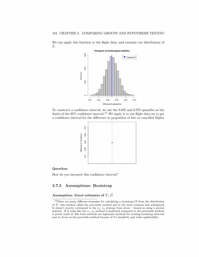
104 CHAPTER 3. COMPARING GROUPS AND HYPOTHESIS TESTING
We can apply this function to the flight data, and examine our distribution of𝛿∗.
To construct a confidence interval, we use the 0.025 and 0.975 quantiles as thelimits of the 95% confidence interval.12 We apply it to our flight data set to geta confidence interval for the difference in proportion of late or cancelled flights.
Question:
How do you interpret this confidence interval?
3.7.3 Assumptions: Bootstrap
Assumption: Good estimates of 𝐹 , 𝐺12There are many different strategies for calculating a bootstrap CI from the distribution
of 𝛿∗; this method called the percentile method and is the most common and widespread.It doesn’t exactly correspond to the 𝑣1, 𝑣2 strategy from above – known as using a pivotalstatistic. If it looks like the 𝑣1, 𝑣2 method is backward compared to the percentile method,it pretty much is! But both methods are legitimate methods for creating bootstrap intervalsand we focus on the percentile method because of it’s simplicity and wider applicability.
3.7. BOOTSTRAP CONFIDENCE INTERVALS 105
A big assumption of the bootstrap is that our sample distribution 𝐹 , 𝐺 is agood estimate of 𝐹 and 𝐺. We’ve already seen that will not necessarily the case.Here are some examples of why that might fail:
• Sample size 𝑛1/𝑛2 is too small• The data is not a SRS
Assumption: Data generation process
Another assumption is that our method of generating our data 𝑋∗𝑖 , and 𝑌 ∗
𝑖matches the way 𝑋𝑖 and 𝑌𝑖 were generated from 𝐹, 𝐺. In particular, in thebootstrap procedure above, we are assuming that 𝑋𝑖 and 𝑌𝑖 are i.i.d from 𝐹and 𝐺 (i.e. a SRS with replacement).
Assumption: Well-behaved test statistic
We also need that the parameter 𝜃 and the estimate 𝜃 to be well behaved incertain ways
• 𝜃 needs to be an unbiased estimate of 𝜃, meaning across many samples,the average of the 𝜃 is equal to the true parameter 𝜃 13
• 𝜃 is a function of 𝐹 and 𝐺, and we need that the value of 𝜃 changessmoothly as we change 𝐹 and 𝐺. In other words if we changed from 𝐹to 𝐹 ′, then 𝜃 would change to 𝜃′; we want if our new 𝐹 ′ is very “close”to 𝐹 , then our new 𝜃′ would be very close to 𝜃. This is a pretty math-ematical requirement, and requires a precise definition of ”close” for twodistributions that is not too important for this class to understand.
But here’s an example to make it somewhat concrete: if the parameter 𝜃 youare interested in is the maximum possible value of a distribution 𝐹 , then 𝜃 doesNOT change smoothly with 𝐹 . Why? because you can choose distributions 𝐹 ′
that are very close to 𝐹 in every reasonable way to compare two distributions,but their maximum values 𝜃 and 𝜃′ are very far apart.14
Another bootstrap confidence interval (Optional)
We can actually use the bootstrap to calculate a confidence interval similarly tothat of the normal distribution based on estimating the distribution of 𝛿 − 𝛿.Notice with the previous calculation for ��, if I know
0.95 = 𝑃(1.96√𝜎2
𝑛 ≤ �� − 𝜇 ≤ 1.96√𝜎2
𝑛 )
Then I can invert to get
0.95 = 𝑃(�� − 1.96√𝜎2
𝑛 ≤ 𝜇 ≤ �� − 1.96√𝜎2
𝑛 )13There are methods for accounting for a small amount of bias with the bootstrap, but if
the statistic is wildly biased away from the truth, then the bootstrap will not work.14This clearly assumes what is a “reasonable” definition of ”close” between distributions
that we won’t go into right now.

106 CHAPTER 3. COMPARING GROUPS AND HYPOTHESIS TESTING
So more generally, suppose we have points 𝑧0.025 and 𝑧0.975 so that
0.95 = 𝑃(𝑧0.025 ≤ 𝛿 − 𝛿 ≤ 𝑧0.975)
e.g. the 0.025 and 0.975 quantiles of 𝛿 − 𝛿. Then I can invert to get
0.95 = 𝑃( 𝛿 − 𝑧0.975 ≤ 𝛿 ≤ 𝛿 − 𝑧0.025)
So if I can get the quantiles of 𝛿 − 𝛿, I can make a confidence interval.
So we could use the bootstrap to get estimates of the distribution of 𝛿−𝛿 insteadof the distribution of 𝛿 and use the quantiles of 𝛿 − 𝛿 to get confidence intervalsthat are ( 𝛿 −𝑧0.975, 𝛿−𝑧0.025). This actually gives a different confidence interval,particularly if the distribution of 𝛿 is not symmetric. The earlier method wetalked about is called the percentile method, and is most commonly used, partlybecause it’s easier to generalize than this method.15
3.8 Thinking about confidence intervals
Suppose you have a 95% confidence interval for 𝛿 given by (.02, .07).Question:
What is wrong with the following statements regarding this confidence interval?- 𝛿 has a 0.95 probability of being between (.02, .07) - If you repeatedly resampledthe data, the difference 𝛿 would be within (.02, .07) 95% of the time.
Confidence Intervals or Hypothesis Testing?
Bootstrap inference via confidence intervals is more widely applicable than per-mutation tests we described above. The permutation test relied on being ableto simulate from the null hypothesis, by using the fact that if you detach thedata from their labels you can use resampling techniques to generate a null dis-tribution. In settings that are more complicated than comparing groups, it canbe difficult to find this kind of trick.
More generally, confidence intervals and hypothesis testing are actually closelyintertwined. For example, for the parametric test and the parametric confidenceinterval, they both relied on the distribution of the same statistics, the t-statistic.If you create a 95% confidence interval, and then decide to reject a specific nullhypothesis (e.g. 𝐻0 ∶ 𝛿 = 0) only when it does not fall within the confidenceinterval, then this will exactly correspond to a test with level 0.05. So the samenotions of level, and type I error, also apply to confidence intervals
Confidence intervals, on the other hand, give much greater interpretation andunderstanding about the parameter.
15If it looks like this method is backward compared to the percentile method, it pretty muchis! But both methods are legitimate methods for creating bootstrap intervals.
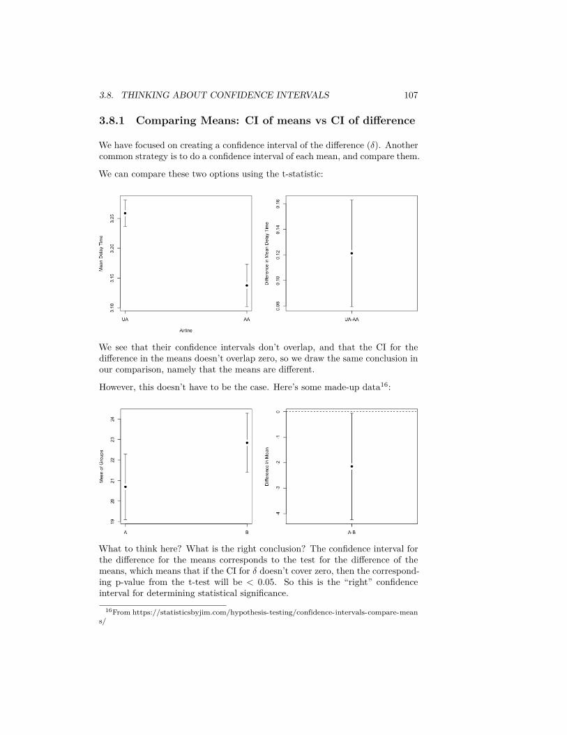
3.8. THINKING ABOUT CONFIDENCE INTERVALS 107
3.8.1 Comparing Means: CI of means vs CI of difference
We have focused on creating a confidence interval of the difference (𝛿). Anothercommon strategy is to do a confidence interval of each mean, and compare them.
We can compare these two options using the t-statistic:
We see that their confidence intervals don’t overlap, and that the CI for thedifference in the means doesn’t overlap zero, so we draw the same conclusion inour comparison, namely that the means are different.
However, this doesn’t have to be the case. Here’s some made-up data16:
What to think here? What is the right conclusion? The confidence interval forthe difference for the means corresponds to the test for the difference of themeans, which means that if the CI for 𝛿 doesn’t cover zero, then the correspond-ing p-value from the t-test will be < 0.05. So this is the “right” confidenceinterval for determining statistical significance.
16From https://statisticsbyjim.com/hypothesis-testing/confidence-intervals-compare-means/
108 CHAPTER 3. COMPARING GROUPS AND HYPOTHESIS TESTING
Why does this happen?
Basically, with the t-test-based CI, we can examine this analytically (a bigadvantage of parametric models).
In the first case, for a CI of the difference 𝛿 to be significantly larger than zero,it means that the lower end of the CI for delta is greater than zero:
�� − 𝑌 > 1.96√��21
𝑛1+ ��2
2𝑛2
Alternatively, if we create the two confidence intervals for �� and 𝑌 , separately,to have them not overlap, we need that the lower end of the CI for 𝑋 be greaterthan the upper end of the CI of 𝑌 :
�� − 1.96√��21
𝑛1> 𝑌 + 1.96√��2
2𝑛2
�� − 𝑌 > 1.96 ⎛⎜⎝
√��22
𝑛2+ √��2
1𝑛1
⎞⎟⎠
Note that these are not the same requirements. In particular,
√��21
𝑛1+ ��2
2𝑛2
< ⎛⎜⎝
√��22
𝑛2+ √��2
1𝑛1
⎞⎟⎠
(take the square of both sides…).
So that means that the difference of the means doesn’t have to be as big forCI based for 𝛿 to see the difference as for comparing the individual mean’s CI.We know that the CI for 𝛿 is equivalent to a hypothesis test, so that meansthat IF there is a difference between the individual CI means there is a signifi-cant difference between the groups, but the converse is NOT true: there couldbe significant differences between the means of the groups but the CI of theindividual means are overlapping.
Reality Check
However, note that the actual difference between the two groups in our toyexample is pretty small and our significance is pretty marginal. So it’s not sucha big difference in our conclusions after all.
3.9 Revisiting pairwise comparisons
Just as with hypothesis testing, you can have multiple comparison problemswith confidence intervals. Consider our pairwise comparisons of the different
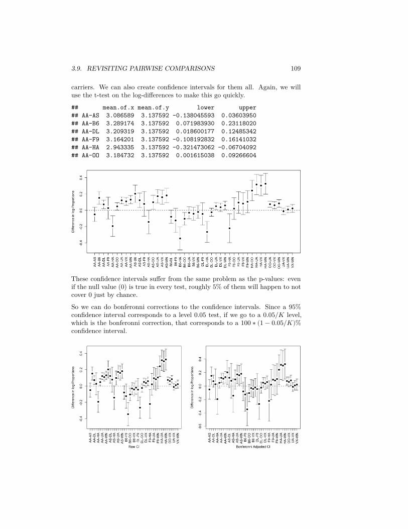
3.9. REVISITING PAIRWISE COMPARISONS 109
carriers. We can also create confidence intervals for them all. Again, we willuse the t-test on the log-differences to make this go quickly.
## mean.of.x mean.of.y lower upper## AA-AS 3.086589 3.137592 -0.138045593 0.03603950## AA-B6 3.289174 3.137592 0.071983930 0.23118020## AA-DL 3.209319 3.137592 0.018600177 0.12485342## AA-F9 3.164201 3.137592 -0.108192832 0.16141032## AA-HA 2.943335 3.137592 -0.321473062 -0.06704092## AA-OO 3.184732 3.137592 0.001615038 0.09266604
These confidence intervals suffer from the same problem as the p-values: evenif the null value (0) is true in every test, roughly 5% of them will happen to notcover 0 just by chance.
So we can do bonferonni corrections to the confidence intervals. Since a 95%confidence interval corresponds to a level 0.05 test, if we go to a 0.05/𝐾 level,which is the bonferonni correction, that corresponds to a 100 ∗ (1 − 0.05/𝐾)%confidence interval.
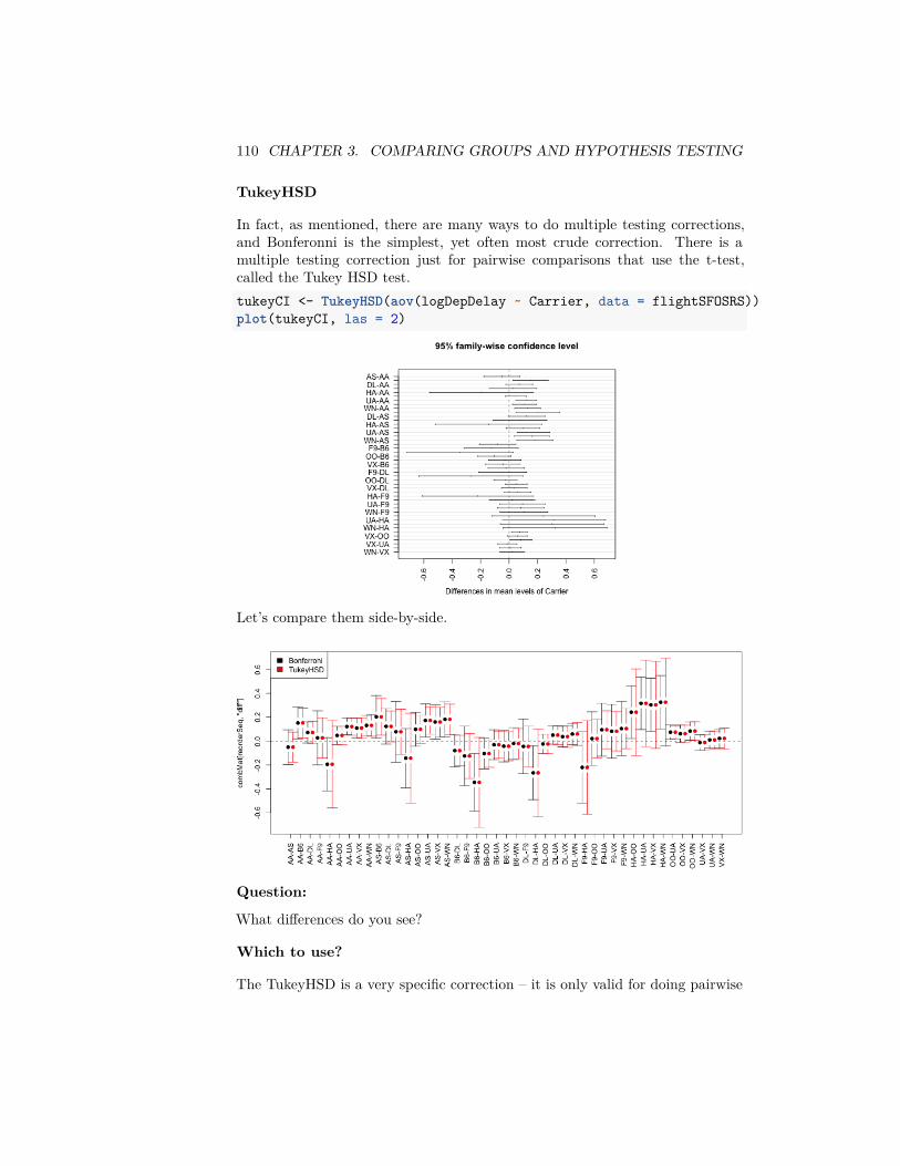
110 CHAPTER 3. COMPARING GROUPS AND HYPOTHESIS TESTING
TukeyHSD
In fact, as mentioned, there are many ways to do multiple testing corrections,and Bonferonni is the simplest, yet often most crude correction. There is amultiple testing correction just for pairwise comparisons that use the t-test,called the Tukey HSD test.tukeyCI <- TukeyHSD(aov(logDepDelay ~ Carrier, data = flightSFOSRS))plot(tukeyCI, las = 2)
Let’s compare them side-by-side.
Question:
What differences do you see?
Which to use?
The TukeyHSD is a very specific correction – it is only valid for doing pairwise

3.9. REVISITING PAIRWISE COMPARISONS 111
comparisons with the t-test. Bonferonni, on the other hand, can be used withany set of p-values from any test, e.g. permutation, and even if not all of thetests are pairwise comparisons.

112 CHAPTER 3. COMPARING GROUPS AND HYPOTHESIS TESTING
Chapter 4
Curve Fitting
Comparing groups evaluates how a continuous variable (often called the re-sponse or independent variable) is related to a categorical variable. In ourflight example, the continuous variable is the flight delay and the categoricalvariable is which airline carrier was responsible for the flight.
Now let us turn to relating two continuous variables. We will review the methodthat you’ve learned already – simple linear regression – and briefly discuss in-ference in this scenario. Then we will turn to expanding these ideas for moreflexible curves than just a line.
4.1 Linear regression with one predictor
Let’s consider the following data collected by the Department of Education re-garding undergraduate institutions in the 2013-14 academic year ((https://catalog.data.gov/dataset/college-scorecard)). The department of education collectsa great deal of data regarding the individual colleges/universities (including for-profit schools). Let’s consider two variables, the tuition costs and the retentionrate of students (percent that return after first year). We will exclude the for-profit institutes (there aren’t many in this particular data set), and focus onout-of-state tuition to make the values more comparable between private andpublic institutions.dataDir <- "../finalDataSets"scorecard <- read.csv(file.path(dataDir, "college.csv"),
stringsAsFactors = FALSE)scorecard <- scorecard[-which(scorecard$CONTROL ==
3), ]xlab = "Out-of-state tuition fee"ylab = "Full time student retention rate"
113
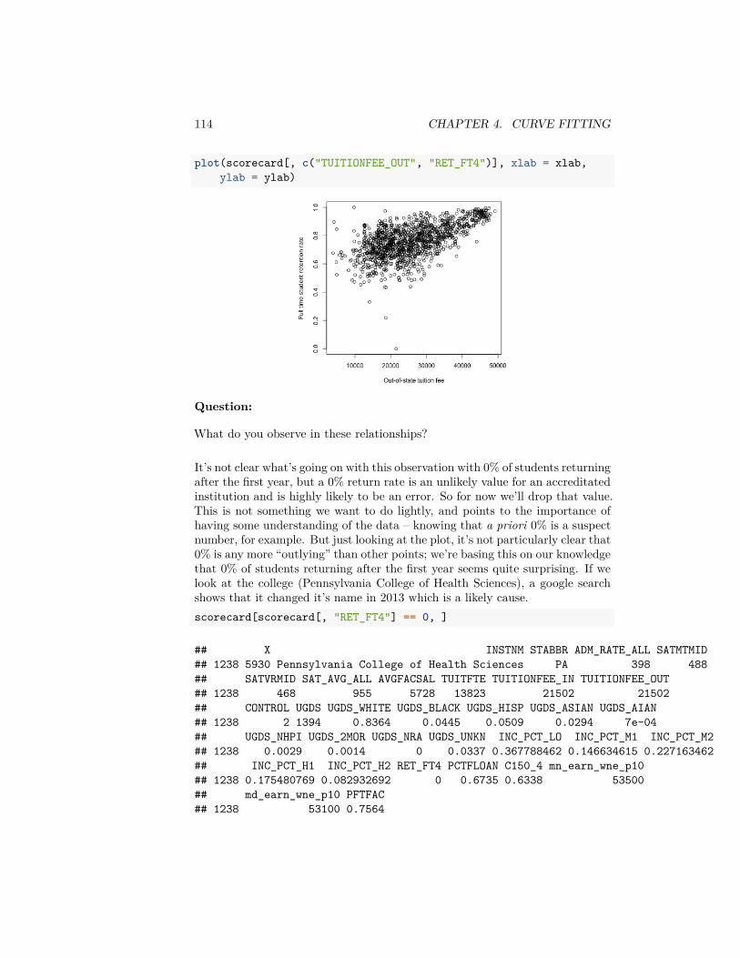
114 CHAPTER 4. CURVE FITTING
plot(scorecard[, c("TUITIONFEE_OUT", "RET_FT4")], xlab = xlab,ylab = ylab)
Question:
What do you observe in these relationships?
It’s not clear what’s going on with this observation with 0% of students returningafter the first year, but a 0% return rate is an unlikely value for an accreditatedinstitution and is highly likely to be an error. So for now we’ll drop that value.This is not something we want to do lightly, and points to the importance ofhaving some understanding of the data – knowing that a priori 0% is a suspectnumber, for example. But just looking at the plot, it’s not particularly clear that0% is any more “outlying” than other points; we’re basing this on our knowledgethat 0% of students returning after the first year seems quite surprising. If welook at the college (Pennsylvania College of Health Sciences), a google searchshows that it changed it’s name in 2013 which is a likely cause.scorecard[scorecard[, "RET_FT4"] == 0, ]
## X INSTNM STABBR ADM_RATE_ALL SATMTMID## 1238 5930 Pennsylvania College of Health Sciences PA 398 488## SATVRMID SAT_AVG_ALL AVGFACSAL TUITFTE TUITIONFEE_IN TUITIONFEE_OUT## 1238 468 955 5728 13823 21502 21502## CONTROL UGDS UGDS_WHITE UGDS_BLACK UGDS_HISP UGDS_ASIAN UGDS_AIAN## 1238 2 1394 0.8364 0.0445 0.0509 0.0294 7e-04## UGDS_NHPI UGDS_2MOR UGDS_NRA UGDS_UNKN INC_PCT_LO INC_PCT_M1 INC_PCT_M2## 1238 0.0029 0.0014 0 0.0337 0.367788462 0.146634615 0.227163462## INC_PCT_H1 INC_PCT_H2 RET_FT4 PCTFLOAN C150_4 mn_earn_wne_p10## 1238 0.175480769 0.082932692 0 0.6735 0.6338 53500## md_earn_wne_p10 PFTFAC## 1238 53100 0.7564
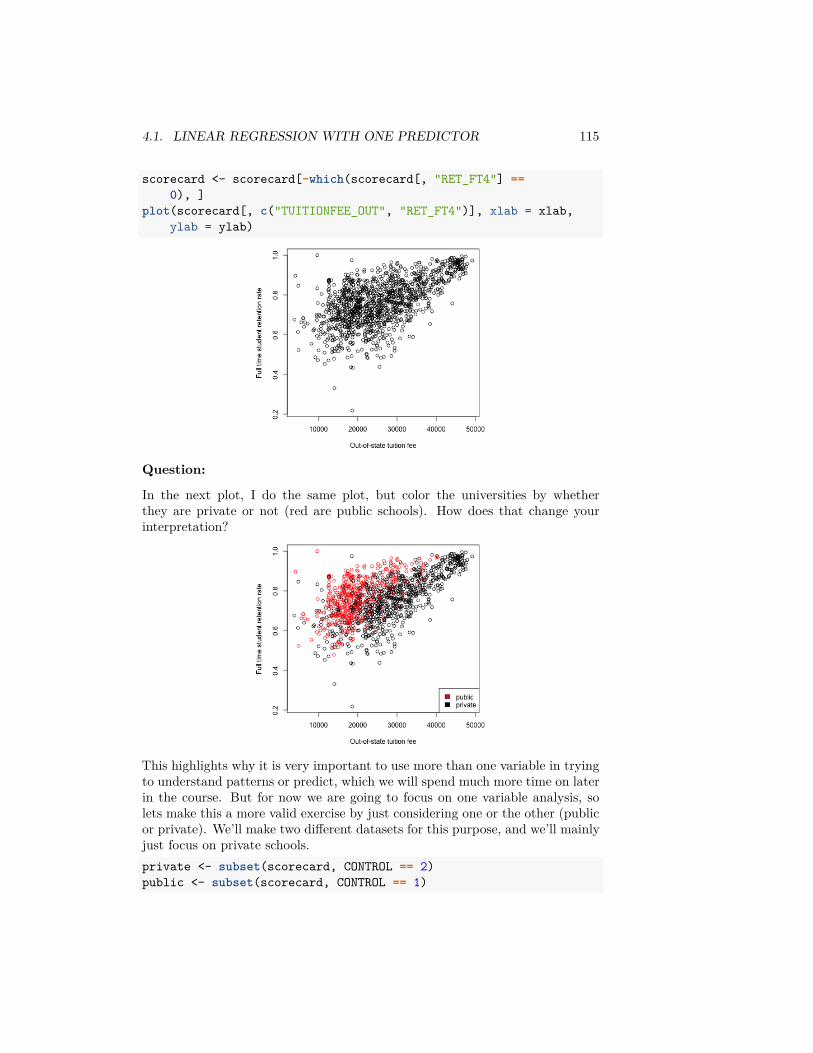
4.1. LINEAR REGRESSION WITH ONE PREDICTOR 115
scorecard <- scorecard[-which(scorecard[, "RET_FT4"] ==0), ]
plot(scorecard[, c("TUITIONFEE_OUT", "RET_FT4")], xlab = xlab,ylab = ylab)
Question:
In the next plot, I do the same plot, but color the universities by whetherthey are private or not (red are public schools). How does that change yourinterpretation?
This highlights why it is very important to use more than one variable in tryingto understand patterns or predict, which we will spend much more time on laterin the course. But for now we are going to focus on one variable analysis, solets make this a more valid exercise by just considering one or the other (publicor private). We’ll make two different datasets for this purpose, and we’ll mainlyjust focus on private schools.private <- subset(scorecard, CONTROL == 2)public <- subset(scorecard, CONTROL == 1)
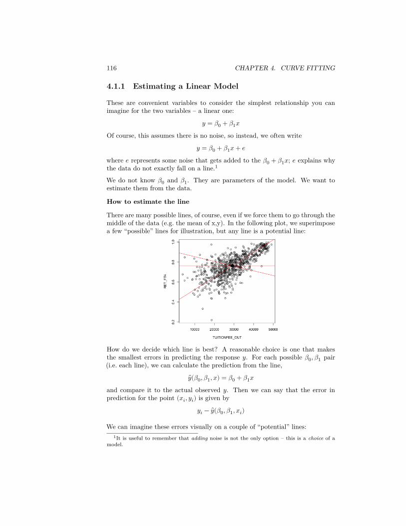
116 CHAPTER 4. CURVE FITTING
4.1.1 Estimating a Linear Model
These are convenient variables to consider the simplest relationship you canimagine for the two variables – a linear one:
𝑦 = 𝛽0 + 𝛽1𝑥Of course, this assumes there is no noise, so instead, we often write
𝑦 = 𝛽0 + 𝛽1𝑥 + 𝑒where 𝑒 represents some noise that gets added to the 𝛽0 + 𝛽1𝑥; 𝑒 explains whythe data do not exactly fall on a line.1
We do not know 𝛽0 and 𝛽1. They are parameters of the model. We want toestimate them from the data.
How to estimate the line
There are many possible lines, of course, even if we force them to go through themiddle of the data (e.g. the mean of x,y). In the following plot, we superimposea few “possible” lines for illustration, but any line is a potential line:
How do we decide which line is best? A reasonable choice is one that makesthe smallest errors in predicting the response 𝑦. For each possible 𝛽0, 𝛽1 pair(i.e. each line), we can calculate the prediction from the line,
𝑦(𝛽0, 𝛽1, 𝑥) = 𝛽0 + 𝛽1𝑥and compare it to the actual observed 𝑦. Then we can say that the error inprediction for the point (𝑥𝑖, 𝑦𝑖) is given by
𝑦𝑖 − 𝑦(𝛽0, 𝛽1, 𝑥𝑖)
We can imagine these errors visually on a couple of “potential” lines:1It is useful to remember that adding noise is not the only option – this is a choice of a
model.
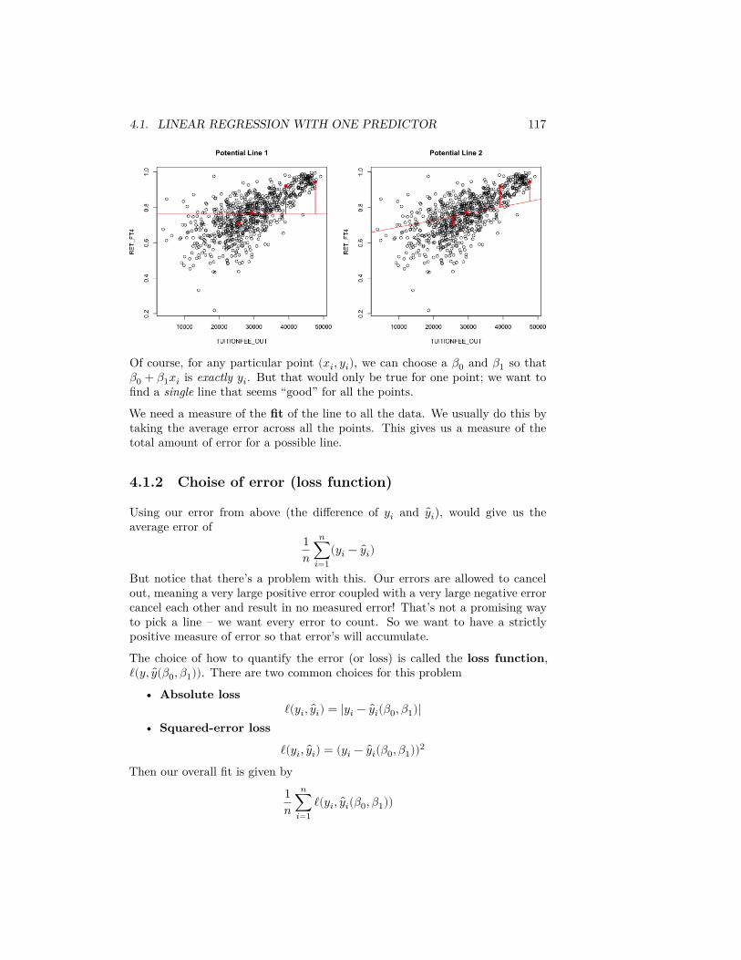
4.1. LINEAR REGRESSION WITH ONE PREDICTOR 117
Of course, for any particular point (𝑥𝑖, 𝑦𝑖), we can choose a 𝛽0 and 𝛽1 so that𝛽0 + 𝛽1𝑥𝑖 is exactly 𝑦𝑖. But that would only be true for one point; we want tofind a single line that seems “good” for all the points.
We need a measure of the fit of the line to all the data. We usually do this bytaking the average error across all the points. This gives us a measure of thetotal amount of error for a possible line.
4.1.2 Choise of error (loss function)
Using our error from above (the difference of 𝑦𝑖 and 𝑦𝑖), would give us theaverage error of
1𝑛
𝑛∑𝑖=1
(𝑦𝑖 − 𝑦𝑖)
But notice that there’s a problem with this. Our errors are allowed to cancelout, meaning a very large positive error coupled with a very large negative errorcancel each other and result in no measured error! That’s not a promising wayto pick a line – we want every error to count. So we want to have a strictlypositive measure of error so that error’s will accumulate.
The choice of how to quantify the error (or loss) is called the loss function,ℓ(𝑦, 𝑦(𝛽0, 𝛽1)). There are two common choices for this problem
• Absolute lossℓ(𝑦𝑖, 𝑦𝑖) = |𝑦𝑖 − 𝑦𝑖(𝛽0, 𝛽1)|
• Squared-error loss
ℓ(𝑦𝑖, 𝑦𝑖) = (𝑦𝑖 − 𝑦𝑖(𝛽0, 𝛽1))2
Then our overall fit is given by
1𝑛
𝑛∑𝑖=1
ℓ(𝑦𝑖, 𝑦𝑖(𝛽0, 𝛽1))
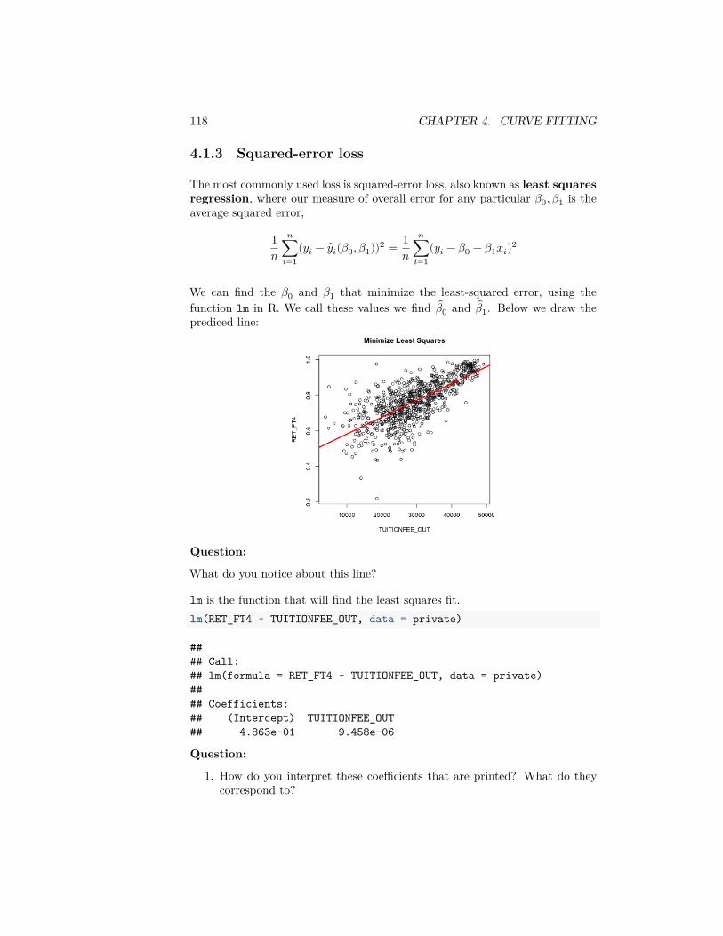
118 CHAPTER 4. CURVE FITTING
4.1.3 Squared-error loss
The most commonly used loss is squared-error loss, also known as least squaresregression, where our measure of overall error for any particular 𝛽0, 𝛽1 is theaverage squared error,
1𝑛
𝑛∑𝑖=1
(𝑦𝑖 − 𝑦𝑖(𝛽0, 𝛽1))2 = 1𝑛
𝑛∑𝑖=1
(𝑦𝑖 − 𝛽0 − 𝛽1𝑥𝑖)2
We can find the 𝛽0 and 𝛽1 that minimize the least-squared error, using thefunction lm in R. We call these values we find 𝛽0 and 𝛽1. Below we draw theprediced line:
Question:
What do you notice about this line?
lm is the function that will find the least squares fit.lm(RET_FT4 ~ TUITIONFEE_OUT, data = private)
#### Call:## lm(formula = RET_FT4 ~ TUITIONFEE_OUT, data = private)#### Coefficients:## (Intercept) TUITIONFEE_OUT## 4.863e-01 9.458e-06
Question:
1. How do you interpret these coefficients that are printed? What do theycorrespond to?
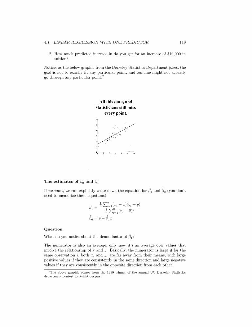
4.1. LINEAR REGRESSION WITH ONE PREDICTOR 119
2. How much predicted increase in do you get for an increase of $10,000 intuition?
Notice, as the below graphic from the Berkeley Statistics Department jokes, thegoal is not to exactly fit any particular point, and our line might not actuallygo through any particular point.2
The estimates of 𝛽0 and 𝛽1
If we want, we can explicitly write down the equation for 𝛽1 and 𝛽0 (you don’tneed to memorize these equations)
𝛽1 =1𝑛 ∑𝑛
𝑖=1(𝑥𝑖 − 𝑥)(𝑦𝑖 − 𝑦)1𝑛 ∑𝑛
𝑖=1(𝑥𝑖 − 𝑥)2
𝛽0 = 𝑦 − 𝛽1 𝑥
Question:
What do you notice about the denominator of 𝛽1?
The numerator is also an average, only now it’s an average over values thatinvolve the relationship of 𝑥 and 𝑦. Basically, the numerator is large if for thesame observation 𝑖, both 𝑥𝑖 and 𝑦𝑖 are far away from their means, with largepositive values if they are consistently in the same direction and large negativevalues if they are consistently in the opposite direction from each other.
2The above graphic comes from the 1999 winner of the annual UC Berkeley Statisticsdepartment contest for tshirt designs
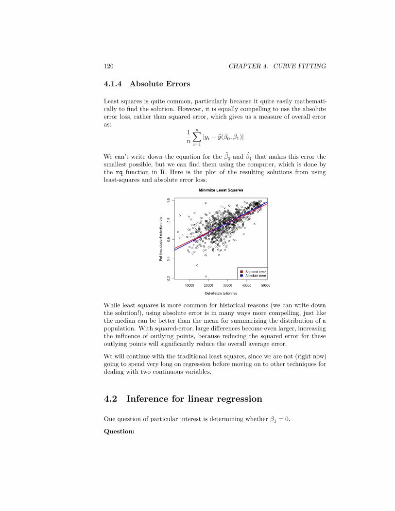
120 CHAPTER 4. CURVE FITTING
4.1.4 Absolute Errors
Least squares is quite common, particularly because it quite easily mathemati-cally to find the solution. However, it is equally compelling to use the absoluteerror loss, rather than squared error, which gives us a measure of overall erroras:
1𝑛
𝑛∑𝑖=1
|𝑦𝑖 − 𝑦(𝛽0, 𝛽1)|
We can’t write down the equation for the 𝛽0 and 𝛽1 that makes this error thesmallest possible, but we can find them using the computer, which is done bythe rq function in R. Here is the plot of the resulting solutions from usingleast-squares and absolute error loss.
While least squares is more common for historical reasons (we can write downthe solution!), using absolute error is in many ways more compelling, just likethe median can be better than the mean for summarizing the distribution of apopulation. With squared-error, large differences become even larger, increasingthe influence of outlying points, because reducing the squared error for theseoutlying points will significantly reduce the overall average error.
We will continue with the traditional least squares, since we are not (right now)going to spend very long on regression before moving on to other techniques fordealing with two continuous variables.
4.2 Inference for linear regression
One question of particular interest is determining whether 𝛽1 = 0.Question:
4.2. INFERENCE FOR LINEAR REGRESSION 121
Why is 𝛽1 particularly interesting? (Consider this data on college tuition – whatdoes 𝛽1 = 0 imply)?
We can use the same strategy of inference for asking this question – hypothesistesting, p-values and confidence intervals.
As a hypothesis test, we have a null hypothesis of:
𝐻0 ∶ 𝛽1 = 0
We can also set up the hypothesis
𝐻0 ∶ 𝛽0 = 0
However, this is (almost) never interesting.
Question:
Consider our data: what would it mean to have 𝛽0 = 0?
Does this mean we can just set 𝛽0 to be anything, and not worry about it? No, ifwe do not get the right intercept, our line won’t fit. An arbitrary intercept (like𝛽0 = 0) will mess up our line. Rather, we just don’t usually care about inter-preting that intercept, and therefore we also don’t care about doing hypothesistesting on 𝛽0 for most problems.
4.2.1 Bootstrap Confidence intervals
Once we get estimates 𝛽0 and 𝛽1, we can use the same basic idea as with ourgroups to get bootstrap confidence intervals for the parameters.
Let’s review our previous bootstrap method on the pairs, but restating it usinga similar notation as here. Previously, we had our observed response 𝑦 whichhad a corresponding categorical data value (e.g. what airline the 𝑦 came from).To write it more in the notation we have here, we could have said that we hada categorical variable 𝑥 on each observation as well, where 𝑥 took on the valuesof the different groups (i.e. the different airline carriers). So each observationconsisted of the pairs
(𝑥𝑖, 𝑦𝑖)This is similar to our regression case, only 𝑥𝑖 is now continuous.
In the case of comparing groups, we can consider bootstrapping by taking sam-ples of these pairs (𝑥𝑖, 𝑦𝑖), and this is exactly what we want to do here.
Specifically,
1. We create a bootstrap sample by sampling with replacement 𝑁 times fromour data (𝑥1, 𝑦1), … , (𝑥𝑁 , 𝑦𝑁)
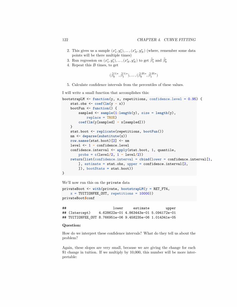
122 CHAPTER 4. CURVE FITTING
2. This gives us a sample (𝑥∗1, 𝑦∗
1), … , (𝑥∗𝑁 , 𝑦∗
𝑁) (where, remember some datapoints will be there multiple times)
3. Run regression on (𝑥∗1, 𝑦∗
1), … , (𝑥∗𝑁 , 𝑦∗
𝑁) to get 𝛽∗1 and 𝛽∗
04. Repeat this 𝐵 times, to get
( 𝛽(1)∗0 , 𝛽(1)∗
1 ), … , ( 𝛽(𝐵)∗0 , 𝛽(𝐵)∗
1 )
5. Calculate confidence intervals from the percentiles of these values.
I will write a small function that accomplishes this:bootstrapLM <- function(y, x, repetitions, confidence.level = 0.95) {
stat.obs <- coef(lm(y ~ x))bootFun <- function() {
sampled <- sample(1:length(y), size = length(y),replace = TRUE)
coef(lm(y[sampled] ~ x[sampled]))}stat.boot <- replicate(repetitions, bootFun())nm <- deparse(substitute(x))row.names(stat.boot)[2] <- nmlevel <- 1 - confidence.levelconfidence.interval <- apply(stat.boot, 1, quantile,
probs = c(level/2, 1 - level/2))return(list(confidence.interval = cbind(lower = confidence.interval[1,
], estimate = stat.obs, upper = confidence.interval[2,]), bootStats = stat.boot))
}
We’ll now run this on the private dataprivateBoot <- with(private, bootstrapLM(y = RET_FT4,
x = TUITIONFEE_OUT, repetitions = 10000))privateBoot$conf
## lower estimate upper## (Intercept) 4.628622e-01 4.863443e-01 5.094172e-01## TUITIONFEE_OUT 8.766951e-06 9.458235e-06 1.014341e-05
Question:
How do we interpret these confidence intervals? What do they tell us about theproblem?
Again, these slopes are very small, because we are giving the change for each$1 change in tuition. If we multiply by 10,000, this number will be more inter-pretable:
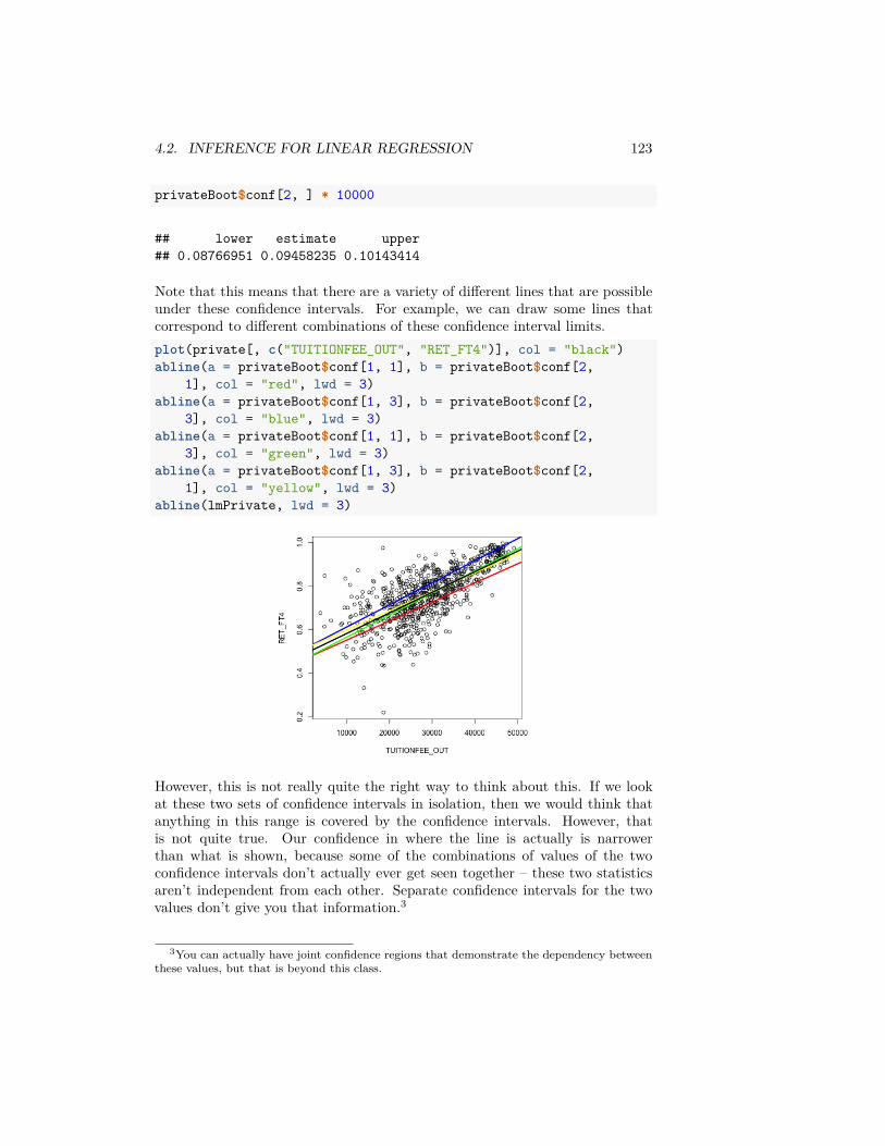
4.2. INFERENCE FOR LINEAR REGRESSION 123
privateBoot$conf[2, ] * 10000
## lower estimate upper## 0.08766951 0.09458235 0.10143414
Note that this means that there are a variety of different lines that are possibleunder these confidence intervals. For example, we can draw some lines thatcorrespond to different combinations of these confidence interval limits.plot(private[, c("TUITIONFEE_OUT", "RET_FT4")], col = "black")abline(a = privateBoot$conf[1, 1], b = privateBoot$conf[2,
1], col = "red", lwd = 3)abline(a = privateBoot$conf[1, 3], b = privateBoot$conf[2,
3], col = "blue", lwd = 3)abline(a = privateBoot$conf[1, 1], b = privateBoot$conf[2,
3], col = "green", lwd = 3)abline(a = privateBoot$conf[1, 3], b = privateBoot$conf[2,
1], col = "yellow", lwd = 3)abline(lmPrivate, lwd = 3)
However, this is not really quite the right way to think about this. If we lookat these two sets of confidence intervals in isolation, then we would think thatanything in this range is covered by the confidence intervals. However, thatis not quite true. Our confidence in where the line is actually is narrowerthan what is shown, because some of the combinations of values of the twoconfidence intervals don’t actually ever get seen together – these two statisticsaren’t independent from each other. Separate confidence intervals for the twovalues don’t give you that information.3
3You can actually have joint confidence regions that demonstrate the dependency betweenthese values, but that is beyond this class.
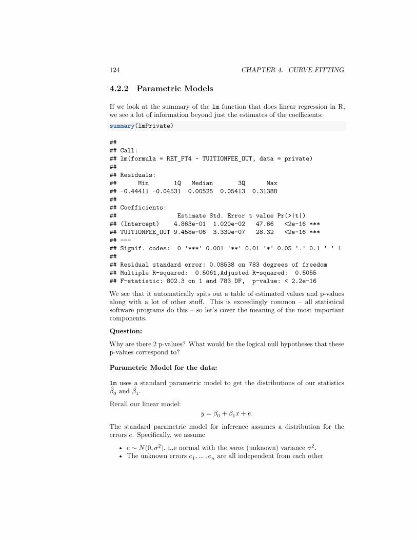
124 CHAPTER 4. CURVE FITTING
4.2.2 Parametric Models
If we look at the summary of the lm function that does linear regression in R,we see a lot of information beyond just the estimates of the coefficients:summary(lmPrivate)
#### Call:## lm(formula = RET_FT4 ~ TUITIONFEE_OUT, data = private)#### Residuals:## Min 1Q Median 3Q Max## -0.44411 -0.04531 0.00525 0.05413 0.31388#### Coefficients:## Estimate Std. Error t value Pr(>|t|)## (Intercept) 4.863e-01 1.020e-02 47.66 <2e-16 ***## TUITIONFEE_OUT 9.458e-06 3.339e-07 28.32 <2e-16 ***## ---## Signif. codes: 0 '***' 0.001 '**' 0.01 '*' 0.05 '.' 0.1 ' ' 1#### Residual standard error: 0.08538 on 783 degrees of freedom## Multiple R-squared: 0.5061,Adjusted R-squared: 0.5055## F-statistic: 802.3 on 1 and 783 DF, p-value: < 2.2e-16
We see that it automatically spits out a table of estimated values and p-valuesalong with a lot of other stuff. This is exceedingly common – all statisticalsoftware programs do this – so let’s cover the meaning of the most importantcomponents.
Question:
Why are there 2 p-values? What would be the logical null hypotheses that thesep-values correspond to?
Parametric Model for the data:
lm uses a standard parametric model to get the distributions of our statistics𝛽0 and 𝛽1.
Recall our linear model:𝑦 = 𝛽0 + 𝛽1𝑥 + 𝑒.
The standard parametric model for inference assumes a distribution for theerrors 𝑒. Specifically, we assume
• 𝑒 ∼ 𝑁(0, 𝜎2), i..e normal with the same (unknown) variance 𝜎2.• The unknown errors 𝑒1, … , 𝑒𝑛 are all independent from each other
4.2. INFERENCE FOR LINEAR REGRESSION 125
Notice, that means for a given 𝑥𝑖, each 𝑦𝑖 is normally distributed, since it is justa normal (𝑒𝑖) with a (unknown) constant added to it (𝛽0 + 𝛽1𝑥𝑖). So
𝑦𝑖|𝑥𝑖 ∼ 𝑁(𝛽0 + 𝛽1𝑥𝑖, 𝜎2)
Question:
However, even though the errors 𝑒𝑖 are assumed 𝑖.𝑖.𝑑 the 𝑦𝑖 are not i.i.d, why?
This assumption regarding the distribution of the errors allows us to know thedistribution of the 𝛽1. We won’t show this, but since each 𝑦𝑖 is normally dis-tributed, the 𝛽1 is as well.4
𝛽1 ∼ 𝑁(𝛽1, 𝜈21)
where𝜈2
1 = 𝑣𝑎𝑟( 𝛽1) = 𝜎2
∑𝑛𝑖=1(𝑥𝑖 − 𝑥)2
In what follows, just try to follow the logic, you don’t need to memorize theseequations or understand how to derive them.
Notice the similarities in the broad outline to the parametric t-test for two-groups. We have an statistic, 𝛽1, and the assumptions of the parametric modelgives us that the distribution of 𝛽1 is normal.
Estimating 𝜎2
Of course, we have the same problem as the t-test – we don’t know 𝜎2! But wecan estimate 𝜎2 too and get an estimate of the variance (we’ll talk more abouthow we estimate �� when we return to linear regression with multiple variables)
𝜈21 = 𝑣𝑎𝑟( 𝛽1) = ��2
∑𝑛𝑖=1(𝑥𝑖 − 𝑥)2
Hypothesis Testing
Using this, we can use the same idea as the t-test for two-groups, and create asimilar test statistic for 𝛽1 that standardizes 𝛽1
5
𝑇1 =𝛽1
√ 𝑣𝑎𝑟( 𝛽1)
Just like the t-test, 𝑇1 should be normally distributed6 This is exactly what lmgives us:
4If you look at the equation of 𝛽1, then we can see that it is a linear combination of the 𝑦𝑖,and linear combinations of normal R.V. are normal, even if the R.V. are not independent.
5In fact, we can also do this for 𝛽0, with exactly the same logic, though 𝛽0 is not interesting.6with the same caveat, that when you estimate the variance, you affect the distribution of
𝑇1, which matters in small sample sizes.
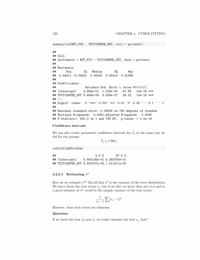
126 CHAPTER 4. CURVE FITTING
summary(lm(RET_FT4 ~ TUITIONFEE_OUT, data = private))
#### Call:## lm(formula = RET_FT4 ~ TUITIONFEE_OUT, data = private)#### Residuals:## Min 1Q Median 3Q Max## -0.44411 -0.04531 0.00525 0.05413 0.31388#### Coefficients:## Estimate Std. Error t value Pr(>|t|)## (Intercept) 4.863e-01 1.020e-02 47.66 <2e-16 ***## TUITIONFEE_OUT 9.458e-06 3.339e-07 28.32 <2e-16 ***## ---## Signif. codes: 0 '***' 0.001 '**' 0.01 '*' 0.05 '.' 0.1 ' ' 1#### Residual standard error: 0.08538 on 783 degrees of freedom## Multiple R-squared: 0.5061,Adjusted R-squared: 0.5055## F-statistic: 802.3 on 1 and 783 DF, p-value: < 2.2e-16
Confidence intervals
We can also create parametric confidence intervals for 𝛽1 in the same way wedid for two groups:
𝛽1 ± 1.96 𝜈1
confint(lmPrivate)
## 2.5 % 97.5 %## (Intercept) 4.663136e-01 5.063750e-01## TUITIONFEE_OUT 8.802757e-06 1.011371e-05
4.2.2.1 Estimating 𝜎2
How do we estimate 𝜎2? Recall that 𝜎2 is the variance of the error distribution.We don’t know the true errors 𝑒𝑖, but if we did, we know they are i.i.d and soa good estimate of 𝜎2 would be the sample variance of the true errors:
1𝑛 − 1 ∑(𝑒𝑖 − 𝑒)2
However, these true errors are unknown.
Question:
If we knew the true 𝛽0 and 𝛽1 we could calculate the true 𝑒𝑖, how?
4.2. INFERENCE FOR LINEAR REGRESSION 127
But these coefficeints are also unknown. Yet, this does give us the idea that wedo have some idea of the errors since we have estimates of 𝛽0 and 𝛽1. Namely,we can calculate the error of our data from the estimated line,
𝑟𝑖 = 𝑦𝑖 − ( 𝛽0 + 𝛽1𝑥𝑖)
The 𝑟𝑖 are called the residuals. They are often called the errors, but they arenot the actual (true) error, however. They are the error from the estimated line.
Using the residuals, we can take the sample variance of the residuals as a goodfirst estimate of 𝜎2,
1𝑛 − 1 ∑(𝑟𝑖 − 𝑟)2
Mean of residuals, 𝑟 In fact, it is an algebraic fact that 𝑟 = 0. But, this isNOT a sign the line is a good fit. It is just always true, even when the line is alousy fit to the data.
Better estimate of 𝜎
For regression, a better estimate is to divide by 𝑛 − 2 rather than 𝑛 − 1. Doingso makes our estimate unbiased, meaning that the average value of ��2 overmany repeated samples will be 𝜎. This is the same reason we divide by 𝑛 − 1 inestimating the sample variance rather than 1/𝑛 for the estimate of the varianceof a single population.
These two facts gives us our final estimate:
��2 = 1𝑛 − 2 ∑
𝑖𝑟2
𝑖 .
The residuals 𝑟𝑖 are not always great estimates of 𝑒𝑖 (for example, they aren’tindependent, they don’t have the same variance, etc). But, despite that, it turnsout that ��2 is a very good estimate of 𝜎2, even if the errors aren’t normal.
4.2.3 Assumptions
Like the t-test, the bootstrap gives a more robust method than the parametriclinear model for creating confidence intervals.
The parametric linear model makes the following assumptions:
• Errors 𝑒𝑖 are independent• Errors 𝑒𝑖 are i.i.d, meaning they have the same variance• Errors are normally distributed
The bootstrap makes the same kind of assumptions as with the two groupcomparisons:
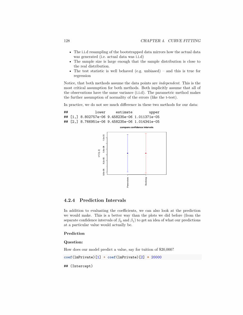
128 CHAPTER 4. CURVE FITTING
• The i.i.d resampling of the bootstrapped data mirrors how the actual datawas generated (i.e. actual data was i.i.d)
• The sample size is large enough that the sample distribution is close tothe real distribution.
• The test statistic is well behaved (e.g. unbiased) – and this is true forregression
Notice, that both methods assume the data points are independent. This is themost critical assumption for both methods. Both implicitly assume that all ofthe observations have the same variance (i.i.d). The parametric method makesthe further assumption of normality of the errors (like the t-test).
In practice, we do not see much difference in these two methods for our data:
## lower estimate upper## [1,] 8.802757e-06 9.458235e-06 1.011371e-05## [2,] 8.766951e-06 9.458235e-06 1.014341e-05
4.2.4 Prediction Intervals
In addition to evaluating the coefficients, we can also look at the predictionwe would make. This is a better way than the plots we did before (from theseparate confidence intervals of 𝛽0 and 𝛽1) to get an idea of what our predictionsat a particular value would actually be.
Prediction
Question:
How does our model predict a value, say for tuition of $20,000?
coef(lmPrivate)[1] + coef(lmPrivate)[2] * 20000
## (Intercept)
4.2. INFERENCE FOR LINEAR REGRESSION 129
## 0.675509predict(lmPrivate, newdata = data.frame(TUITIONFEE_OUT = 20000))
## 1## 0.675509
These predictions are themselves statistics based on the data, and the uncer-tainty/variability in the coefficients carries over to the predictions. So we canalso give confidence intervals for our prediction. There are two types of confi-dence intervals.
• Confidence intervals about the predicted average response – i.e. predictionof what is the average completion rate for all schools with tuition $20,000.
• Confidence intervals about a particular furture observation, i.e. predictionof a particular school that has tuition $20,000. These are actually notcalled confidence intervals, but prediction intervals.
Clearly, we predict the same estimate for both of these settings, but our estimateof the precision of these estimates varies.
Question:
Which of these settings do you think would have wider CI?
predict(lmPrivate, newdata = data.frame(TUITIONFEE_OUT = 20000),interval = "confidence")
## fit lwr upr## 1 0.675509 0.6670314 0.6839866predict(lmPrivate, newdata = data.frame(TUITIONFEE_OUT = 20000),
interval = "prediction")
## fit lwr upr## 1 0.675509 0.5076899 0.843328
We can compare these two intervals by calculating them for a large range of 𝑥𝑖values and plotting them:
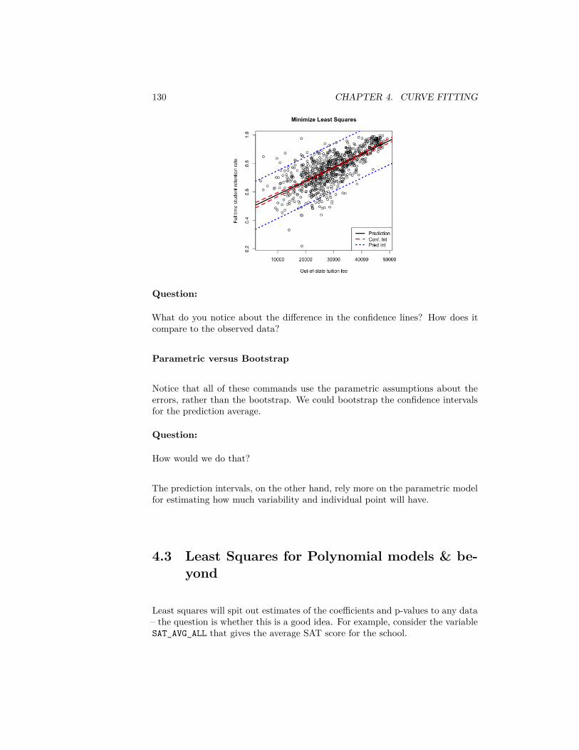
130 CHAPTER 4. CURVE FITTING
Question:
What do you notice about the difference in the confidence lines? How does itcompare to the observed data?
Parametric versus Bootstrap
Notice that all of these commands use the parametric assumptions about theerrors, rather than the bootstrap. We could bootstrap the confidence intervalsfor the prediction average.
Question:
How would we do that?
The prediction intervals, on the other hand, rely more on the parametric modelfor estimating how much variability and individual point will have.
4.3 Least Squares for Polynomial models & be-yond
Least squares will spit out estimates of the coefficients and p-values to any data– the question is whether this is a good idea. For example, consider the variableSAT_AVG_ALL that gives the average SAT score for the school.
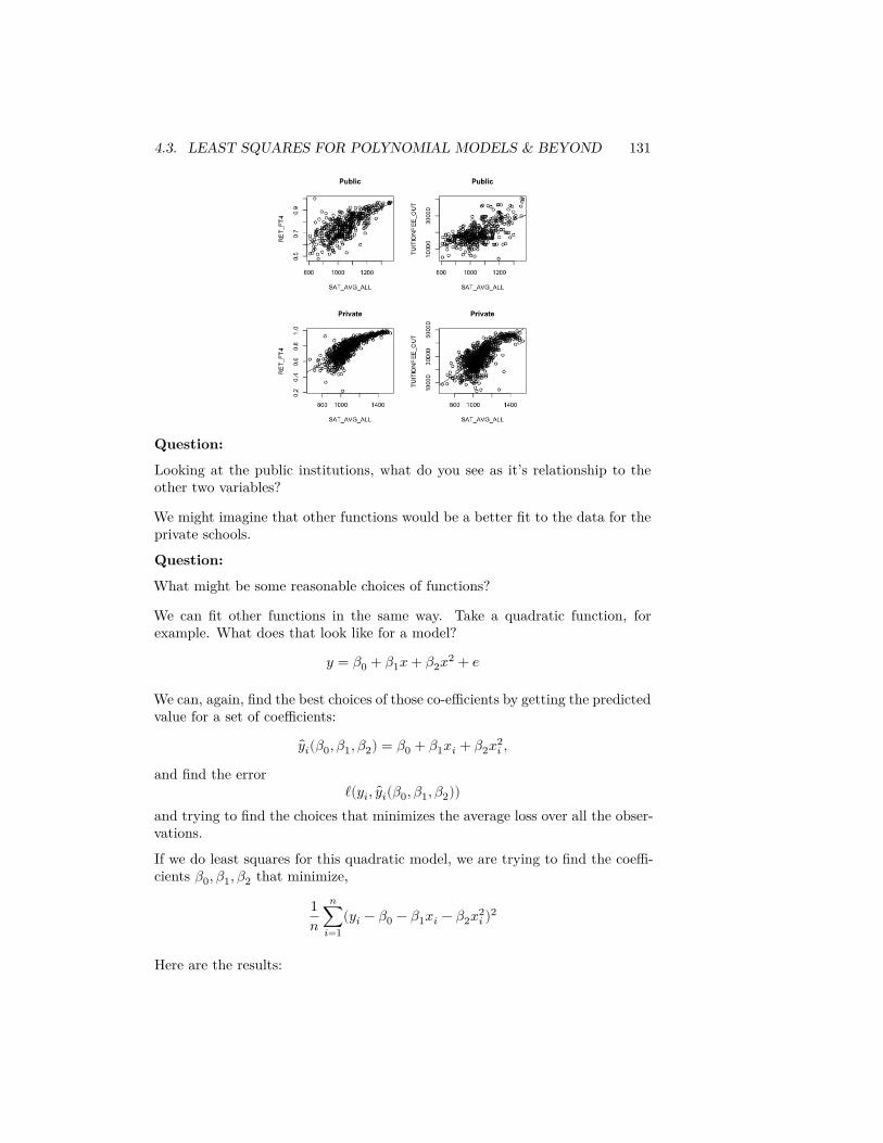
4.3. LEAST SQUARES FOR POLYNOMIAL MODELS & BEYOND 131
Question:
Looking at the public institutions, what do you see as it’s relationship to theother two variables?
We might imagine that other functions would be a better fit to the data for theprivate schools.
Question:
What might be some reasonable choices of functions?
We can fit other functions in the same way. Take a quadratic function, forexample. What does that look like for a model?
𝑦 = 𝛽0 + 𝛽1𝑥 + 𝛽2𝑥2 + 𝑒
We can, again, find the best choices of those co-efficients by getting the predictedvalue for a set of coefficients:
𝑦𝑖(𝛽0, 𝛽1, 𝛽2) = 𝛽0 + 𝛽1𝑥𝑖 + 𝛽2𝑥2𝑖 ,
and find the errorℓ(𝑦𝑖, 𝑦𝑖(𝛽0, 𝛽1, 𝛽2))
and trying to find the choices that minimizes the average loss over all the obser-vations.
If we do least squares for this quadratic model, we are trying to find the coeffi-cients 𝛽0, 𝛽1, 𝛽2 that minimize,
1𝑛
𝑛∑𝑖=1
(𝑦𝑖 − 𝛽0 − 𝛽1𝑥𝑖 − 𝛽2𝑥2𝑖 )2
Here are the results:
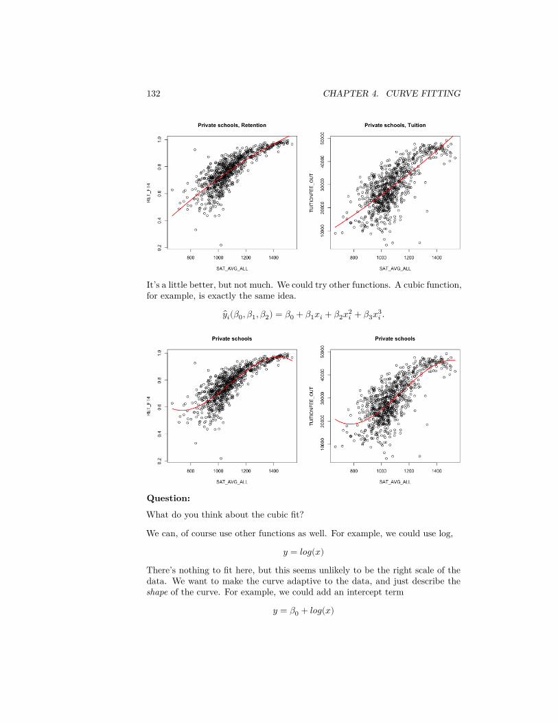
132 CHAPTER 4. CURVE FITTING
It’s a little better, but not much. We could try other functions. A cubic function,for example, is exactly the same idea.
𝑦𝑖(𝛽0, 𝛽1, 𝛽2) = 𝛽0 + 𝛽1𝑥𝑖 + 𝛽2𝑥2𝑖 + 𝛽3𝑥3
𝑖 .
Question:
What do you think about the cubic fit?
We can, of course use other functions as well. For example, we could use log,
𝑦 = 𝑙𝑜𝑔(𝑥)
There’s nothing to fit here, but this seems unlikely to be the right scale of thedata. We want to make the curve adaptive to the data, and just describe theshape of the curve. For example, we could add an intercept term
𝑦 = 𝛽0 + 𝑙𝑜𝑔(𝑥)
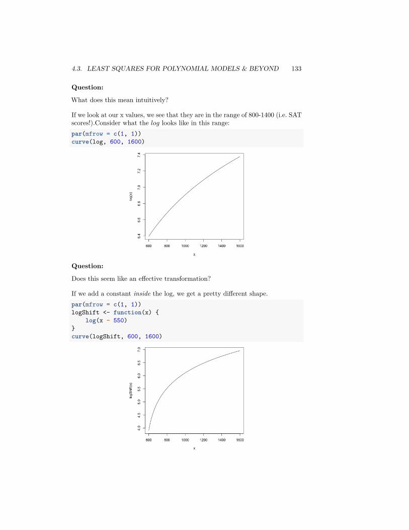
4.3. LEAST SQUARES FOR POLYNOMIAL MODELS & BEYOND 133
Question:
What does this mean intuitively?
If we look at our x values, we see that they are in the range of 800-1400 (i.e. SATscores!).Consider what the 𝑙𝑜𝑔 looks like in this range:par(mfrow = c(1, 1))curve(log, 600, 1600)
Question:
Does this seem like an effective transformation?
If we add a constant inside the log, we get a pretty different shape.par(mfrow = c(1, 1))logShift <- function(x) {
log(x - 550)}curve(logShift, 600, 1600)
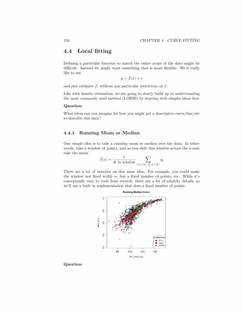
134 CHAPTER 4. CURVE FITTING
4.4 Local fitting
Defining a particular function to match the entire scope of the data might bedifficult. Instead we might want something that is more flexible. We’d reallylike to say
𝑦 = 𝑓(𝑥) + 𝑒and just estimate 𝑓 , without any particular restriction on 𝑓 .Like with density estimation, we are going to slowly build up to understandingthe most commonly used method (LOESS) by starting with simpler ideas first.
Question:
What ideas can you imagine for how you might get a descriptive curve/line/etcto describe this data?
4.4.1 Running Mean or Median
One simple idea is to take a running mean or median over the data. In other-words, take a window of points, and as you slide this window across the x-axis,take the mean.
𝑓(𝑥) = 1# in window ∑
𝑖∶𝑥𝑖∈[𝑥− 𝑤2 ,𝑥+ 𝑤
2 )𝑦𝑖
There are a lot of varieties on this same idea. For example, you could makethe window not fixed width 𝑤, but a fixed number of points, etc. While it’sconceptually easy to code from scratch, there are a lot of nitpicky details, sowe’ll use a built in implementation that does a fixed number of points.
Question:
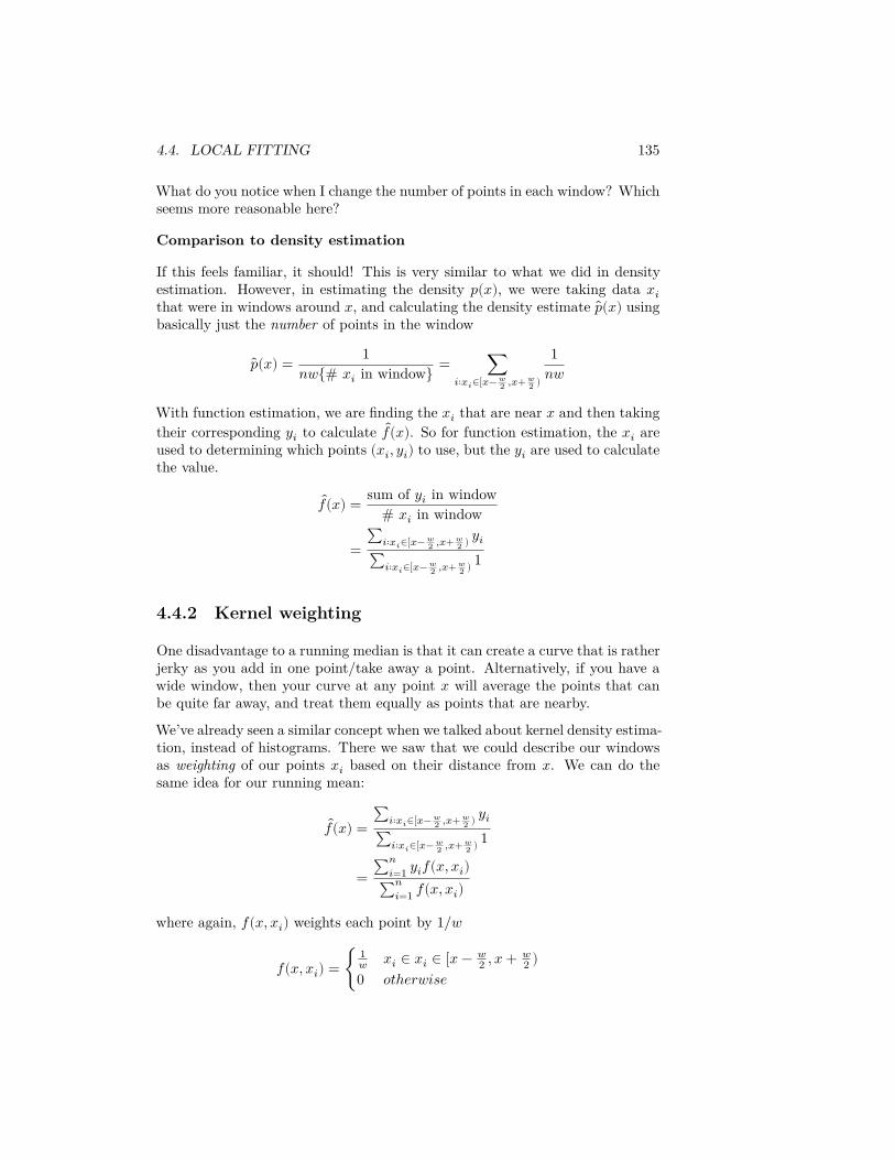
4.4. LOCAL FITTING 135
What do you notice when I change the number of points in each window? Whichseems more reasonable here?
Comparison to density estimation
If this feels familiar, it should! This is very similar to what we did in densityestimation. However, in estimating the density 𝑝(𝑥), we were taking data 𝑥𝑖that were in windows around 𝑥, and calculating the density estimate 𝑝(𝑥) usingbasically just the number of points in the window
𝑝(𝑥) = 1𝑛𝑤{# 𝑥𝑖 in window} = ∑
𝑖∶𝑥𝑖∈[𝑥− 𝑤2 ,𝑥+ 𝑤
2 )
1𝑛𝑤
With function estimation, we are finding the 𝑥𝑖 that are near 𝑥 and then takingtheir corresponding 𝑦𝑖 to calculate 𝑓(𝑥). So for function estimation, the 𝑥𝑖 areused to determining which points (𝑥𝑖, 𝑦𝑖) to use, but the 𝑦𝑖 are used to calculatethe value.
𝑓(𝑥) = sum of 𝑦𝑖 in window# 𝑥𝑖 in window
=∑𝑖∶𝑥𝑖∈[𝑥− 𝑤
2 ,𝑥+ 𝑤2 ) 𝑦𝑖
∑𝑖∶𝑥𝑖∈[𝑥− 𝑤2 ,𝑥+ 𝑤
2 ) 1
4.4.2 Kernel weighting
One disadvantage to a running median is that it can create a curve that is ratherjerky as you add in one point/take away a point. Alternatively, if you have awide window, then your curve at any point 𝑥 will average the points that canbe quite far away, and treat them equally as points that are nearby.
We’ve already seen a similar concept when we talked about kernel density estima-tion, instead of histograms. There we saw that we could describe our windowsas weighting of our points 𝑥𝑖 based on their distance from 𝑥. We can do thesame idea for our running mean:
𝑓(𝑥) =∑𝑖∶𝑥𝑖∈[𝑥− 𝑤
2 ,𝑥+ 𝑤2 ) 𝑦𝑖
∑𝑖∶𝑥𝑖∈[𝑥− 𝑤2 ,𝑥+ 𝑤
2 ) 1
= ∑𝑛𝑖=1 𝑦𝑖𝑓(𝑥, 𝑥𝑖)
∑𝑛𝑖=1 𝑓(𝑥, 𝑥𝑖)
where again, 𝑓(𝑥, 𝑥𝑖) weights each point by 1/𝑤
𝑓(𝑥, 𝑥𝑖) = {1𝑤 𝑥𝑖 ∈ 𝑥𝑖 ∈ [𝑥 − 𝑤
2 , 𝑥 + 𝑤2 )
0 𝑜𝑡ℎ𝑒𝑟𝑤𝑖𝑠𝑒
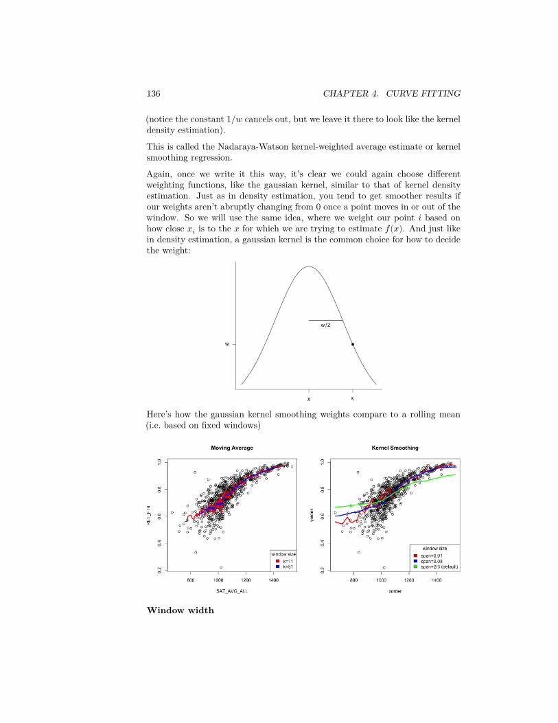
136 CHAPTER 4. CURVE FITTING
(notice the constant 1/𝑤 cancels out, but we leave it there to look like the kerneldensity estimation).
This is called the Nadaraya-Watson kernel-weighted average estimate or kernelsmoothing regression.
Again, once we write it this way, it’s clear we could again choose differentweighting functions, like the gaussian kernel, similar to that of kernel densityestimation. Just as in density estimation, you tend to get smoother results ifour weights aren’t abruptly changing from 0 once a point moves in or out of thewindow. So we will use the same idea, where we weight our point 𝑖 based onhow close 𝑥𝑖 is to the 𝑥 for which we are trying to estimate 𝑓(𝑥). And just likein density estimation, a gaussian kernel is the common choice for how to decidethe weight:
Here’s how the gaussian kernel smoothing weights compare to a rolling mean(i.e. based on fixed windows)
Window width
4.4. LOCAL FITTING 137
The span argument tells you what percentage of points are used in predicting𝑥 (like bandwidth in density estimation)7. So there’s still an idea of a windowsize; it’s just that within the window, you are giving more emphasis to pointsnear your 𝑥 value.
Notice that one advantage is that you can define an estimate for any 𝑥 in therange of your data – the estimated curve doesn’t have to jump as you add newpoints. Instead it transitions smoothly.
Question:
What other comparisons might you make here?
Weighted Mean
If we look at our estimate of 𝑓(𝑥), we can actually write it more simply as aweighted mean of our 𝑦𝑖
𝑓(𝑥) = ∑𝑛𝑖=1 𝑦𝑖𝑓(𝑥, 𝑥𝑖)
∑𝑛𝑖=1 𝑓(𝑥, 𝑥𝑖)
=𝑛
∑𝑖=1
𝑤𝑖(𝑥)𝑦𝑖
where
𝑤𝑖(𝑥) = 𝑓(𝑥, 𝑥𝑖)∑𝑛
𝑖=1 𝑓(𝑥, 𝑥𝑖)
are weights that indicate how much each 𝑦𝑖 should contribute to the mean (andnotice that these weights sum to one). The standard mean of all the points isequivalent to choosing 𝑤𝑖(𝑥) = 1/𝑛, i.e. each point counts equally.
4.4.3 Loess: Local Regression Fitting
In the previous section, we use kernels to have a nice smooth way to decidehow much impact the different 𝑦𝑖 have in our estimate of 𝑓(𝑥). But we haven’tchanged the fact that we are essentially taking just a mean of the nearby 𝑦𝑖 toestimate 𝑓(𝑥).
Let’s go back to our simple windows (i.e. rectangular kernel). When we estimate𝑓(𝑥), we are doing the following:
7There’s a lot of details about span and what points are used, but we are not going toworry about them. What I’ve described here gets at the idea
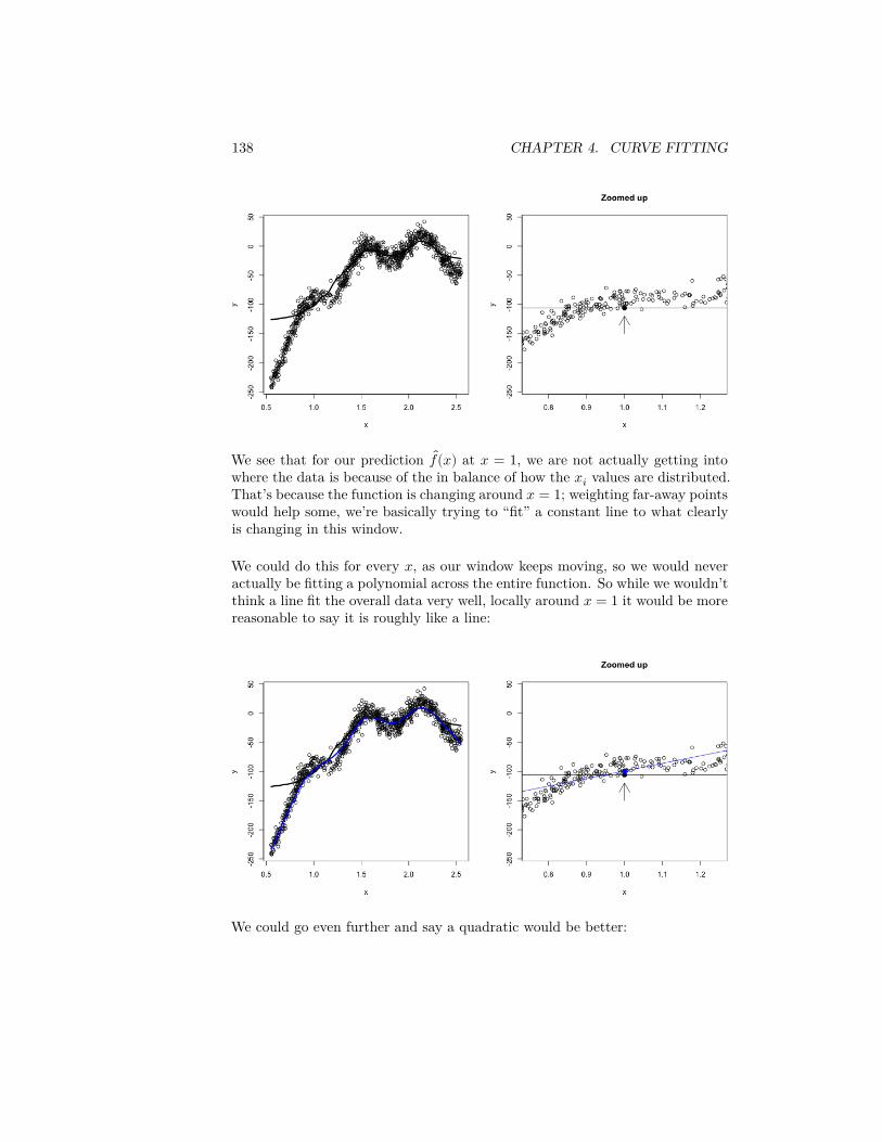
138 CHAPTER 4. CURVE FITTING
We see that for our prediction 𝑓(𝑥) at 𝑥 = 1, we are not actually getting intowhere the data is because of the in balance of how the 𝑥𝑖 values are distributed.That’s because the function is changing around 𝑥 = 1; weighting far-away pointswould help some, we’re basically trying to “fit” a constant line to what clearlyis changing in this window.
We could do this for every 𝑥, as our window keeps moving, so we would neveractually be fitting a polynomial across the entire function. So while we wouldn’tthink a line fit the overall data very well, locally around 𝑥 = 1 it would be morereasonable to say it is roughly like a line:
We could go even further and say a quadratic would be better:
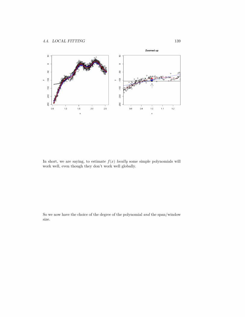
4.4. LOCAL FITTING 139
In short, we are saying, to estimate 𝑓(𝑥) locally some simple polynomials willwork well, even though they don’t work well globally.
So we now have the choice of the degree of the polynomial and the span/windowsize.
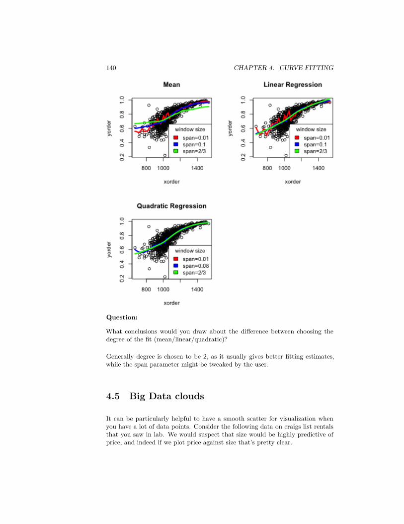
140 CHAPTER 4. CURVE FITTING
Question:
What conclusions would you draw about the difference between choosing thedegree of the fit (mean/linear/quadratic)?
Generally degree is chosen to be 2, as it usually gives better fitting estimates,while the span parameter might be tweaked by the user.
4.5 Big Data clouds
It can be particularly helpful to have a smooth scatter for visualization whenyou have a lot of data points. Consider the following data on craigs list rentalsthat you saw in lab. We would suspect that size would be highly predictive ofprice, and indeed if we plot price against size that’s pretty clear.
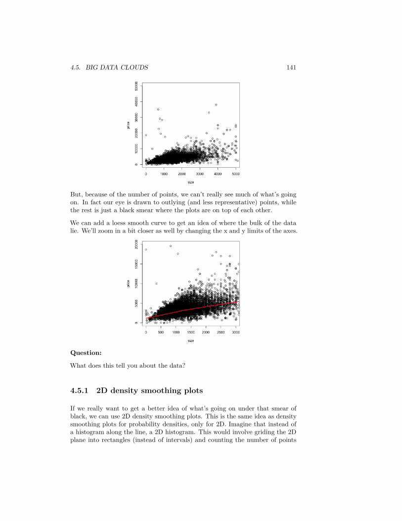
4.5. BIG DATA CLOUDS 141
But, because of the number of points, we can’t really see much of what’s goingon. In fact our eye is drawn to outlying (and less representative) points, whilethe rest is just a black smear where the plots are on top of each other.
We can add a loess smooth curve to get an idea of where the bulk of the datalie. We’ll zoom in a bit closer as well by changing the x and y limits of the axes.
Question:
What does this tell you about the data?
4.5.1 2D density smoothing plots
If we really want to get a better idea of what’s going on under that smear ofblack, we can use 2D density smoothing plots. This is the same idea as densitysmoothing plots for probability densities, only for 2D. Imagine that instead ofa histogram along the line, a 2D histogram. This would involve griding the 2Dplane into rectangles (instead of intervals) and counting the number of points

142 CHAPTER 4. CURVE FITTING
within each rectangle. The high of the bars (now in the 3rd dimension) wouldgive a visualization of how many points there are in different places in the plot.
Then just like with histograms, we can smooth this, so that we get a smoothcurve over the 2 dimensions.
A 3D picture of this would be cool, but difficult to actually see information, axes,etc. So its common to instead smash this information into 2D, by representingthe 3rd dimension (the density of the points) by a color scale instead.
Here is an example of such a visualization of a 2D histogram (the hexbin pack-age)
We can use a smoother version of this and get more gradual changes (and a lessfinicky function) using the smoothScatter function
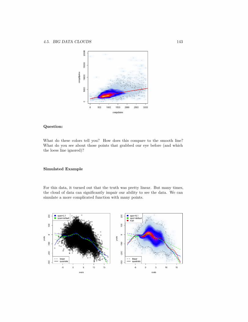
4.5. BIG DATA CLOUDS 143
Question:
What do these colors tell you? How does this compare to the smooth line?What do you see about those points that grabbed our eye before (and whichthe loess line ignored)?
Simulated Example
For this data, it turned out that the truth was pretty linear. But many times,the cloud of data can significantly impair our ability to see the data. We cansimulate a more complicated function with many points.
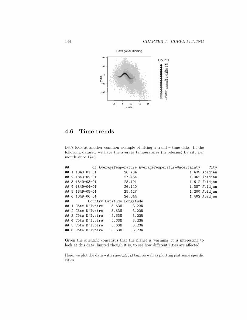
144 CHAPTER 4. CURVE FITTING
4.6 Time trends
Let’s look at another common example of fitting a trend – time data. In thefollowing dataset, we have the average temperatures (in celecius) by city permonth since 1743.
## dt AverageTemperature AverageTemperatureUncertainty City## 1 1849-01-01 26.704 1.435 Abidjan## 2 1849-02-01 27.434 1.362 Abidjan## 3 1849-03-01 28.101 1.612 Abidjan## 4 1849-04-01 26.140 1.387 Abidjan## 5 1849-05-01 25.427 1.200 Abidjan## 6 1849-06-01 24.844 1.402 Abidjan## Country Latitude Longitude## 1 Côte D'Ivoire 5.63N 3.23W## 2 Côte D'Ivoire 5.63N 3.23W## 3 Côte D'Ivoire 5.63N 3.23W## 4 Côte D'Ivoire 5.63N 3.23W## 5 Côte D'Ivoire 5.63N 3.23W## 6 Côte D'Ivoire 5.63N 3.23W
Given the scientific consensus that the planet is warming, it is interesting tolook at this data, limited though it is, to see how different cities are affected.
Here, we plot the data with smoothScatter, as well as plotting just some specificcities
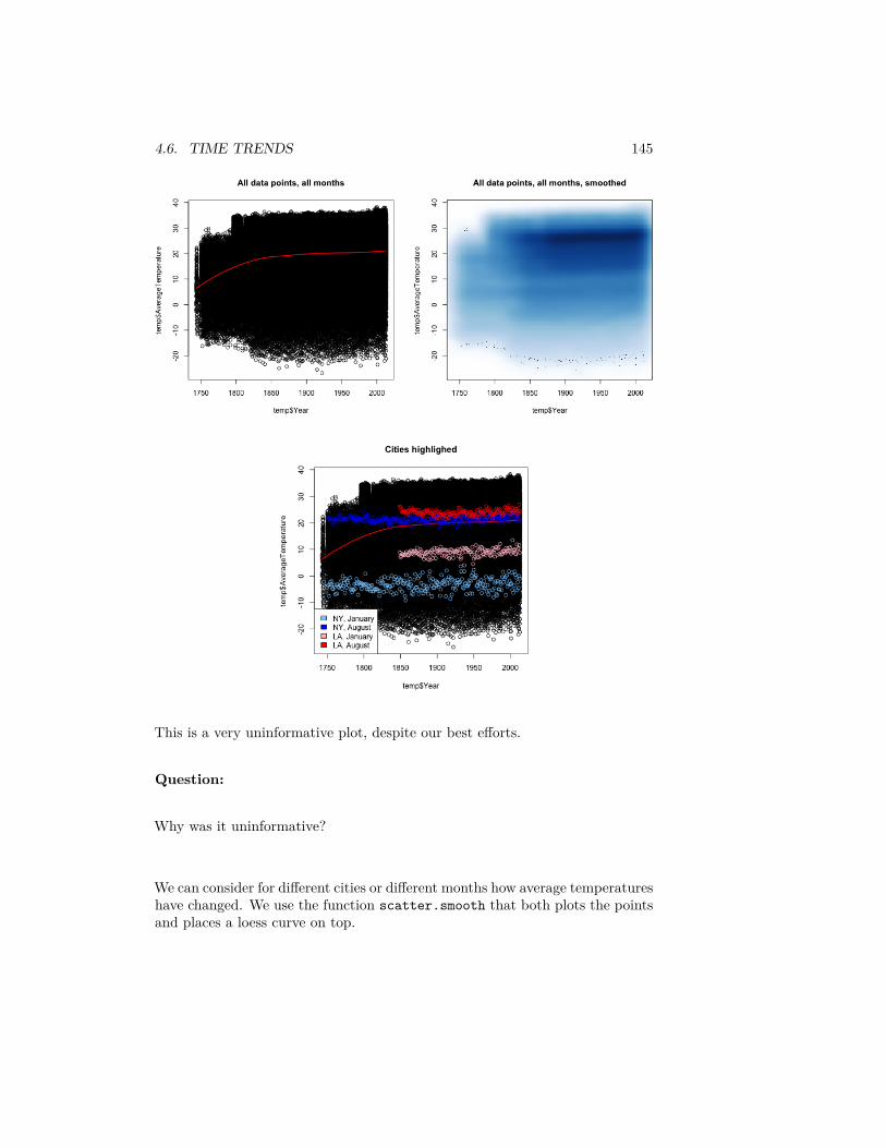
4.6. TIME TRENDS 145
This is a very uninformative plot, despite our best efforts.
Question:
Why was it uninformative?
We can consider for different cities or different months how average temperatureshave changed. We use the function scatter.smooth that both plots the pointsand places a loess curve on top.
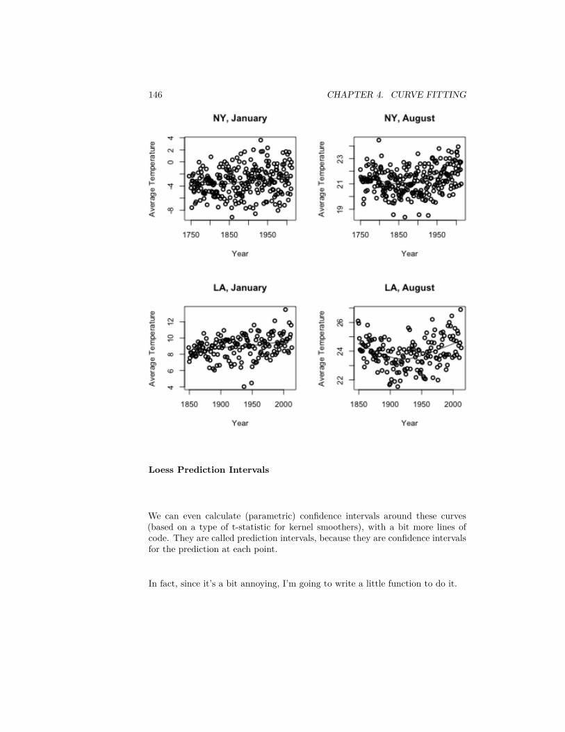
146 CHAPTER 4. CURVE FITTING
Loess Prediction Intervals
We can even calculate (parametric) confidence intervals around these curves(based on a type of t-statistic for kernel smoothers), with a bit more lines ofcode. They are called prediction intervals, because they are confidence intervalsfor the prediction at each point.
In fact, since it’s a bit annoying, I’m going to write a little function to do it.
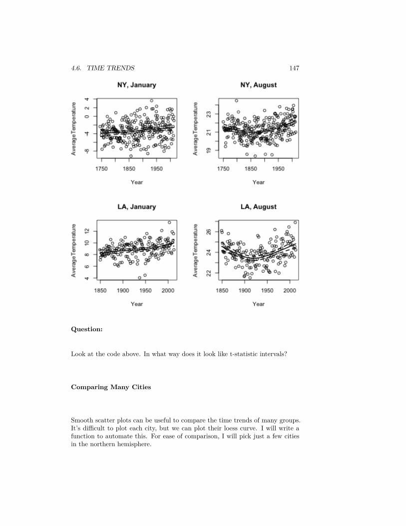
4.6. TIME TRENDS 147
Question:
Look at the code above. In what way does it look like t-statistic intervals?
Comparing Many Cities
Smooth scatter plots can be useful to compare the time trends of many groups.It’s difficult to plot each city, but we can plot their loess curve. I will write afunction to automate this. For ease of comparison, I will pick just a few citiesin the northern hemisphere.
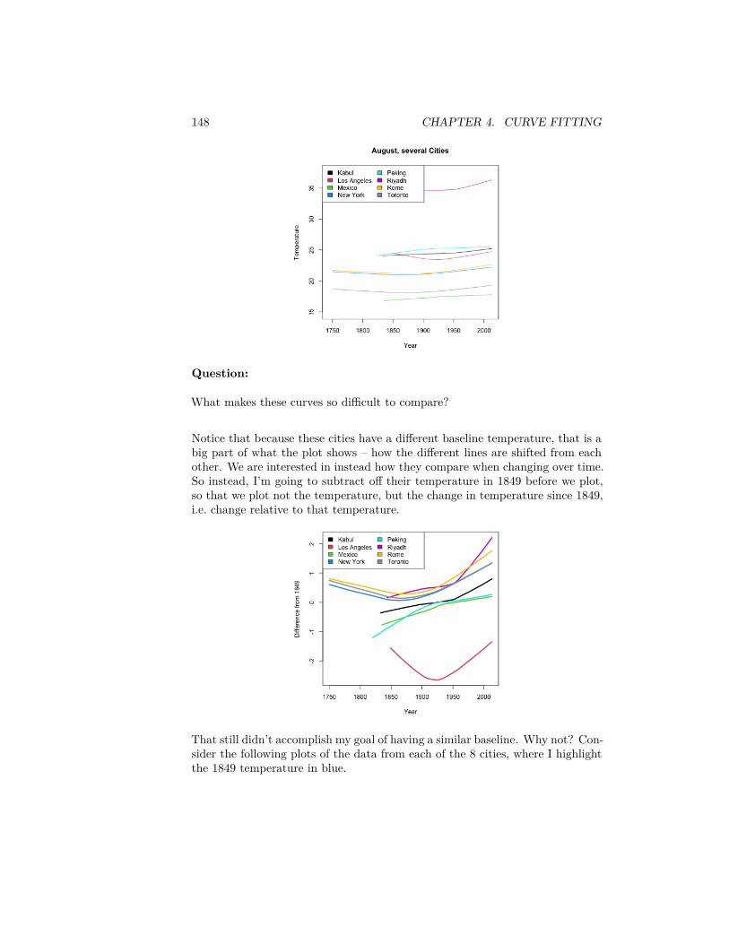
148 CHAPTER 4. CURVE FITTING
Question:
What makes these curves so difficult to compare?
Notice that because these cities have a different baseline temperature, that is abig part of what the plot shows – how the different lines are shifted from eachother. We are interested in instead how they compare when changing over time.So instead, I’m going to subtract off their temperature in 1849 before we plot,so that we plot not the temperature, but the change in temperature since 1849,i.e. change relative to that temperature.
That still didn’t accomplish my goal of having a similar baseline. Why not? Con-sider the following plots of the data from each of the 8 cities, where I highlightthe 1849 temperature in blue.
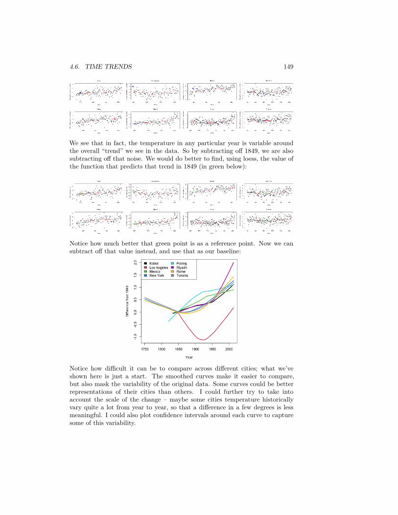
4.6. TIME TRENDS 149
We see that in fact, the temperature in any particular year is variable aroundthe overall “trend” we see in the data. So by subtracting off 1849, we are alsosubtracting off that noise. We would do better to find, using loess, the value ofthe function that predicts that trend in 1849 (in green below):
Notice how much better that green point is as a reference point. Now we cansubtract off that value instead, and use that as our baseline:
Notice how difficult it can be to compare across different cities; what we’veshown here is just a start. The smoothed curves make it easier to compare,but also mask the variability of the original data. Some curves could be betterrepresentations of their cities than others. I could further try to take intoaccount the scale of the change – maybe some cities temperature historicallyvary quite a lot from year to year, so that a difference in a few degrees is lessmeaningful. I could also plot confidence intervals around each curve to capturesome of this variability.

150 CHAPTER 4. CURVE FITTING
Chapter 5
Visualizing MultivariateData
We’ve spent a lot of time so far looking at analysis of the relationship of twovariables. When we compared groups, we had 1 continuous variable and 1categorical variable. In our curve fitting section, we looked at the relationshipbetween two continuous variables.
The rest of the class is going to be focused on looking at many variables. Thischapter will focus on visualization of the relationship between many variablesand using these tools to explore your data. This is often called exploratorydata analysis (EDA)
5.1 Relationships between Continous Variables
In the previous chapter we looked at college data, and just pulled out twovariables. What about expanding to the rest of the variables?
A useful plot is called a pairs plot. This is a plot that shows the scatter plotof all pairs of variables in a matrix of plots.dataDir <- "../finalDataSets"scorecard <- read.csv(file.path(dataDir, "college.csv"),
stringsAsFactors = FALSE, na.strings = c("NA","PrivacySuppressed"))
scorecard <- scorecard[-which(scorecard$CONTROL ==3), ]
smallScores <- scorecard[, -c(1:3, 4, 5, 6, 9, 11,14:17, 18:22, 24:27, 31)]
pairs(smallScores)
151
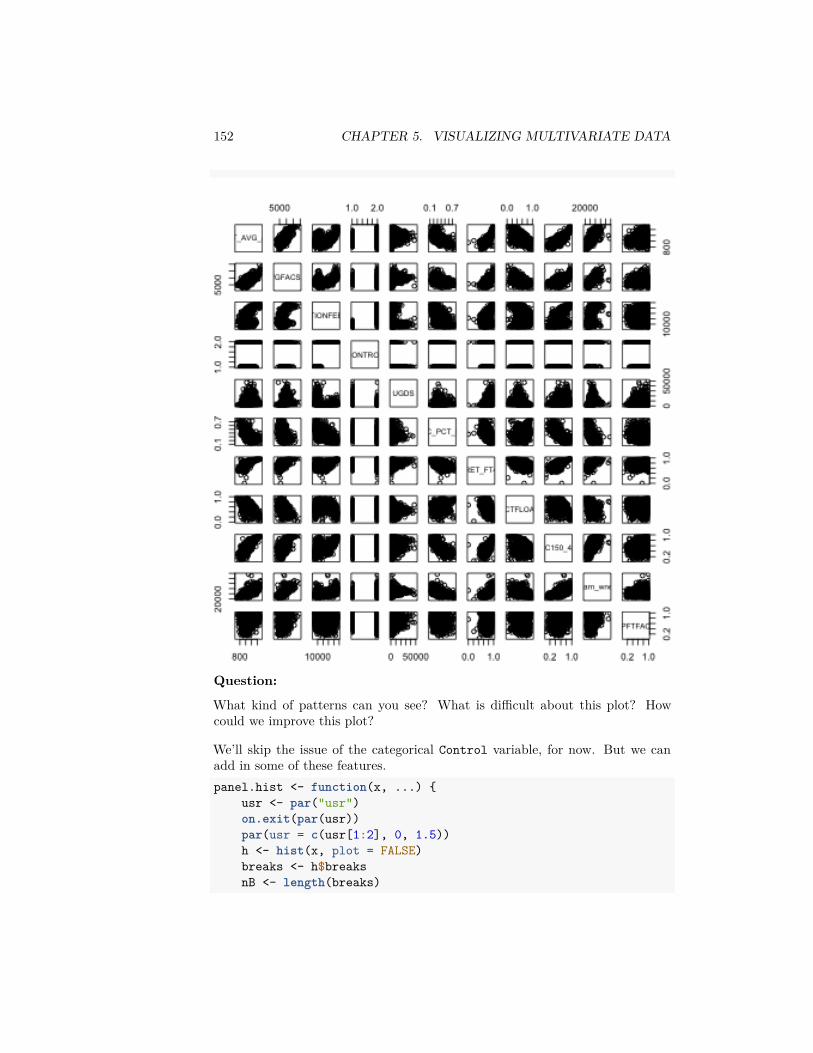
152 CHAPTER 5. VISUALIZING MULTIVARIATE DATA
Question:
What kind of patterns can you see? What is difficult about this plot? Howcould we improve this plot?
We’ll skip the issue of the categorical Control variable, for now. But we canadd in some of these features.panel.hist <- function(x, ...) {
usr <- par("usr")on.exit(par(usr))par(usr = c(usr[1:2], 0, 1.5))h <- hist(x, plot = FALSE)breaks <- h$breaksnB <- length(breaks)
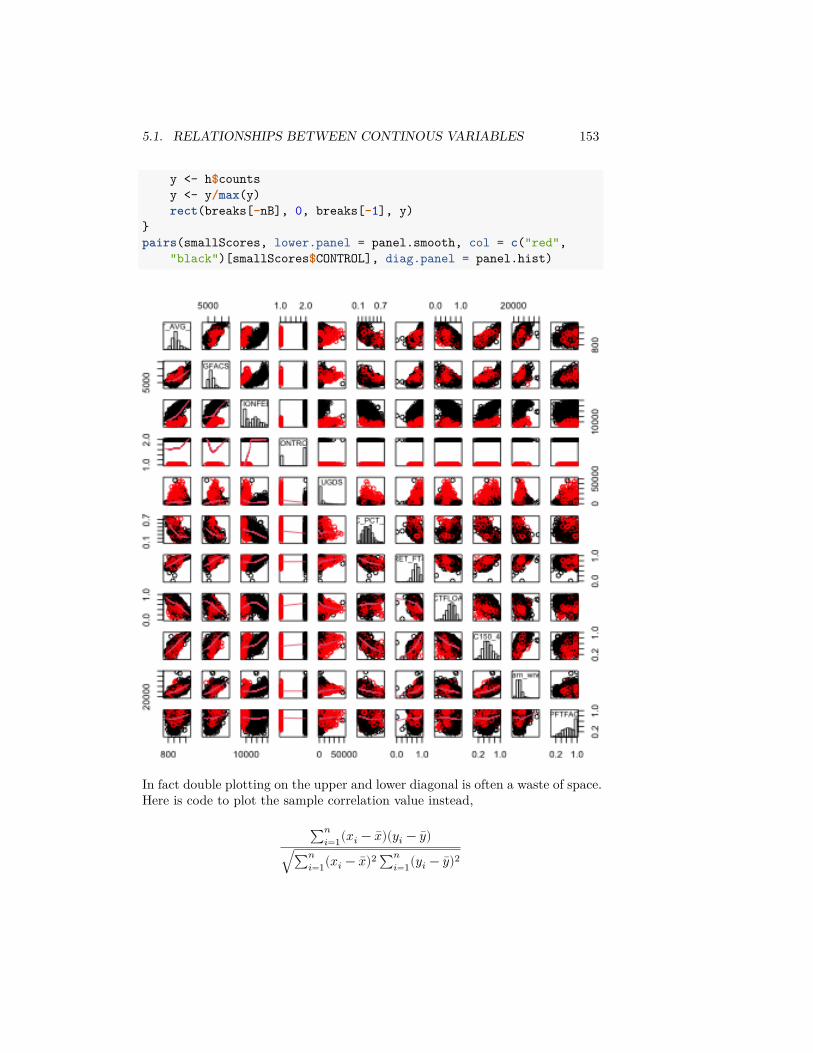
5.1. RELATIONSHIPS BETWEEN CONTINOUS VARIABLES 153
y <- h$countsy <- y/max(y)rect(breaks[-nB], 0, breaks[-1], y)
}pairs(smallScores, lower.panel = panel.smooth, col = c("red",
"black")[smallScores$CONTROL], diag.panel = panel.hist)
In fact double plotting on the upper and lower diagonal is often a waste of space.Here is code to plot the sample correlation value instead,
∑𝑛𝑖=1(𝑥𝑖 − 𝑥)(𝑦𝑖 − 𝑦)
√∑𝑛𝑖=1(𝑥𝑖 − 𝑥)2 ∑𝑛
𝑖=1(𝑦𝑖 − 𝑦)2
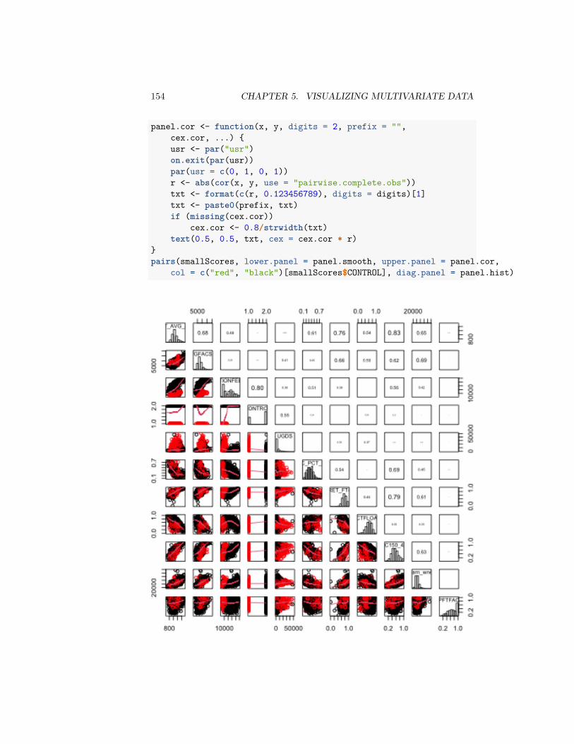
154 CHAPTER 5. VISUALIZING MULTIVARIATE DATA
panel.cor <- function(x, y, digits = 2, prefix = "",cex.cor, ...) {usr <- par("usr")on.exit(par(usr))par(usr = c(0, 1, 0, 1))r <- abs(cor(x, y, use = "pairwise.complete.obs"))txt <- format(c(r, 0.123456789), digits = digits)[1]txt <- paste0(prefix, txt)if (missing(cex.cor))
cex.cor <- 0.8/strwidth(txt)text(0.5, 0.5, txt, cex = cex.cor * r)
}pairs(smallScores, lower.panel = panel.smooth, upper.panel = panel.cor,
col = c("red", "black")[smallScores$CONTROL], diag.panel = panel.hist)
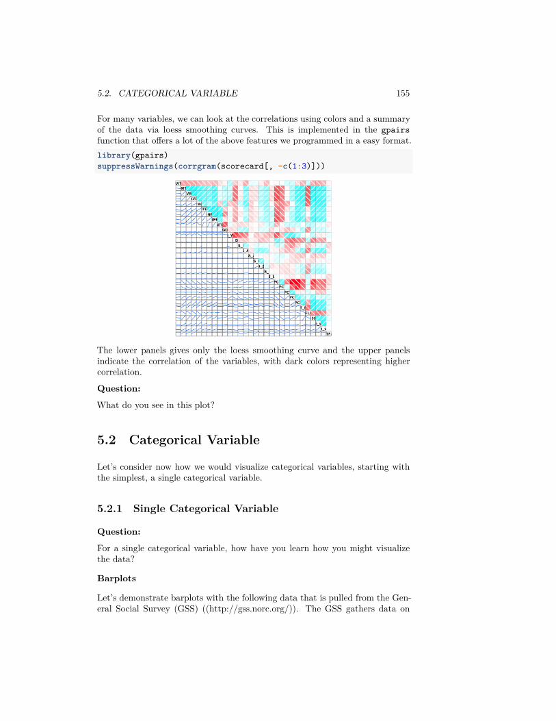
5.2. CATEGORICAL VARIABLE 155
For many variables, we can look at the correlations using colors and a summaryof the data via loess smoothing curves. This is implemented in the gpairsfunction that offers a lot of the above features we programmed in a easy format.library(gpairs)suppressWarnings(corrgram(scorecard[, -c(1:3)]))
The lower panels gives only the loess smoothing curve and the upper panelsindicate the correlation of the variables, with dark colors representing highercorrelation.
Question:
What do you see in this plot?
5.2 Categorical Variable
Let’s consider now how we would visualize categorical variables, starting withthe simplest, a single categorical variable.
5.2.1 Single Categorical Variable
Question:
For a single categorical variable, how have you learn how you might visualizethe data?
Barplots
Let’s demonstrate barplots with the following data that is pulled from the Gen-eral Social Survey (GSS) ((http://gss.norc.org/)). The GSS gathers data on
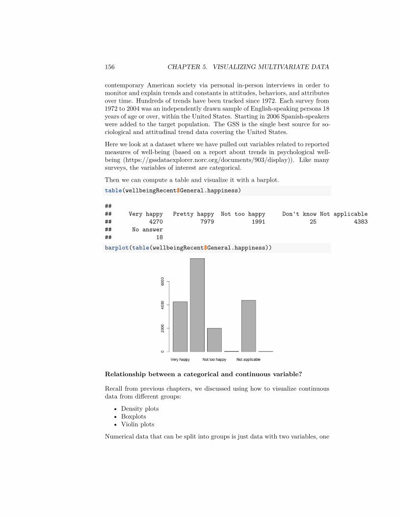
156 CHAPTER 5. VISUALIZING MULTIVARIATE DATA
contemporary American society via personal in-person interviews in order tomonitor and explain trends and constants in attitudes, behaviors, and attributesover time. Hundreds of trends have been tracked since 1972. Each survey from1972 to 2004 was an independently drawn sample of English-speaking persons 18years of age or over, within the United States. Starting in 2006 Spanish-speakerswere added to the target population. The GSS is the single best source for so-ciological and attitudinal trend data covering the United States.
Here we look at a dataset where we have pulled out variables related to reportedmeasures of well-being (based on a report about trends in psychological well-being (https://gssdataexplorer.norc.org/documents/903/display)). Like manysurveys, the variables of interest are categorical.
Then we can compute a table and visualize it with a barplot.table(wellbeingRecent$General.happiness)
#### Very happy Pretty happy Not too happy Don't know Not applicable## 4270 7979 1991 25 4383## No answer## 18barplot(table(wellbeingRecent$General.happiness))
Relationship between a categorical and continuous variable?
Recall from previous chapters, we discussed using how to visualize continuousdata from different groups:
• Density plots• Boxplots• Violin plots
Numerical data that can be split into groups is just data with two variables, one
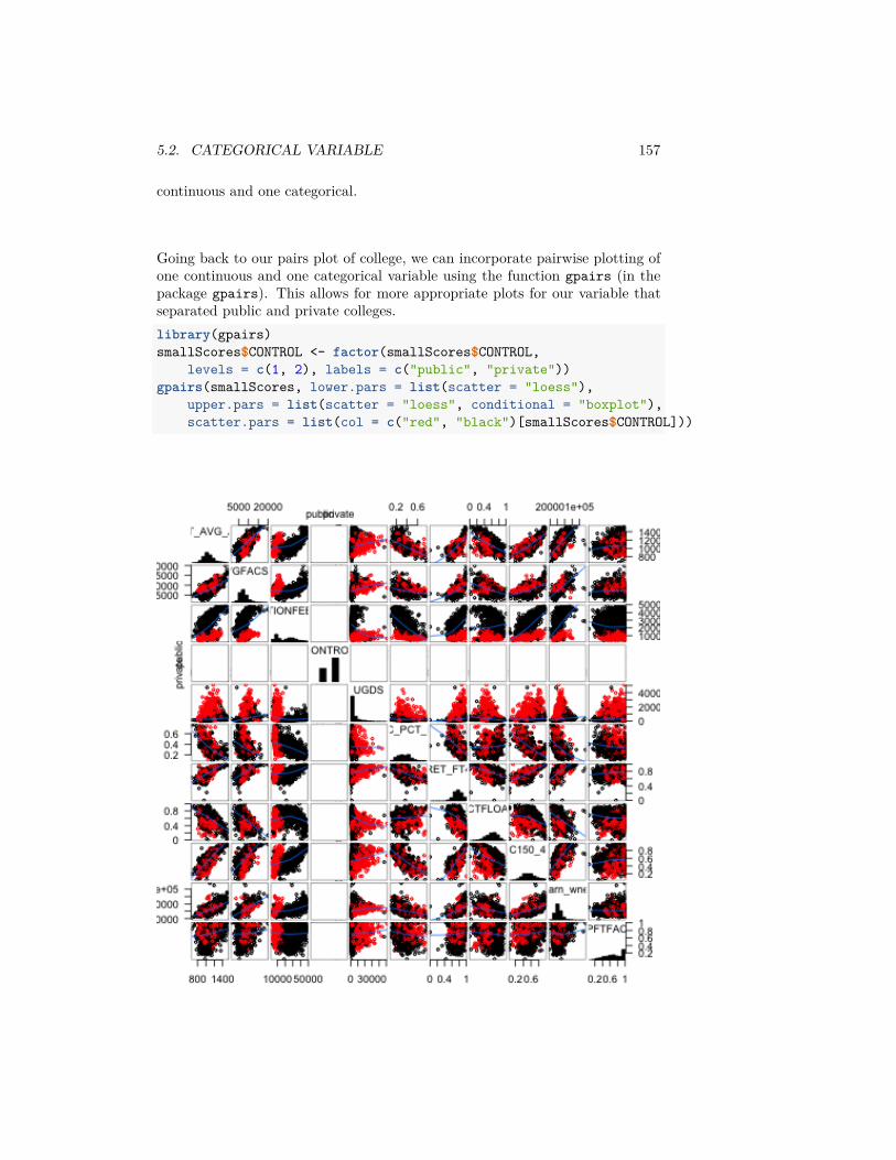
5.2. CATEGORICAL VARIABLE 157
continuous and one categorical.
Going back to our pairs plot of college, we can incorporate pairwise plotting ofone continuous and one categorical variable using the function gpairs (in thepackage gpairs). This allows for more appropriate plots for our variable thatseparated public and private colleges.library(gpairs)smallScores$CONTROL <- factor(smallScores$CONTROL,
levels = c(1, 2), labels = c("public", "private"))gpairs(smallScores, lower.pars = list(scatter = "loess"),
upper.pars = list(scatter = "loess", conditional = "boxplot"),scatter.pars = list(col = c("red", "black")[smallScores$CONTROL]))
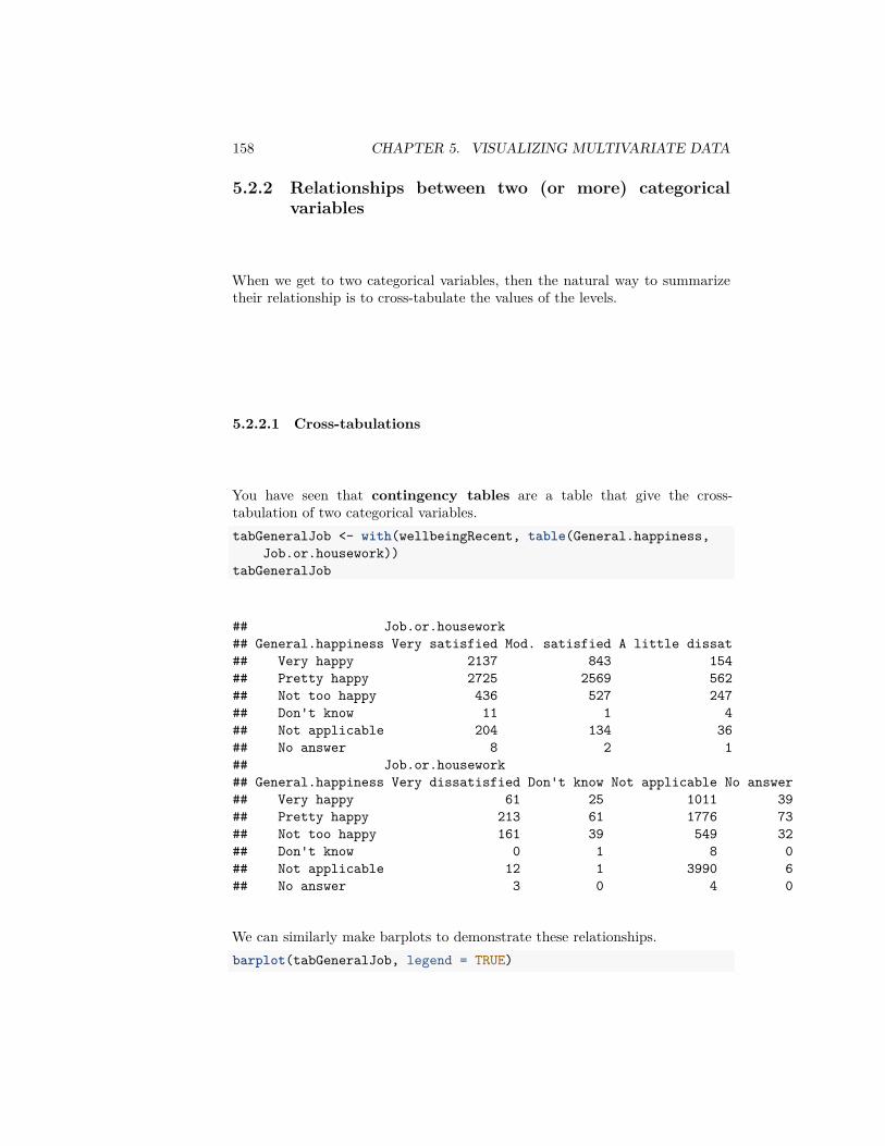
158 CHAPTER 5. VISUALIZING MULTIVARIATE DATA
5.2.2 Relationships between two (or more) categoricalvariables
When we get to two categorical variables, then the natural way to summarizetheir relationship is to cross-tabulate the values of the levels.
5.2.2.1 Cross-tabulations
You have seen that contingency tables are a table that give the cross-tabulation of two categorical variables.tabGeneralJob <- with(wellbeingRecent, table(General.happiness,
Job.or.housework))tabGeneralJob
## Job.or.housework## General.happiness Very satisfied Mod. satisfied A little dissat## Very happy 2137 843 154## Pretty happy 2725 2569 562## Not too happy 436 527 247## Don't know 11 1 4## Not applicable 204 134 36## No answer 8 2 1## Job.or.housework## General.happiness Very dissatisfied Don't know Not applicable No answer## Very happy 61 25 1011 39## Pretty happy 213 61 1776 73## Not too happy 161 39 549 32## Don't know 0 1 8 0## Not applicable 12 1 3990 6## No answer 3 0 4 0
We can similarly make barplots to demonstrate these relationships.barplot(tabGeneralJob, legend = TRUE)
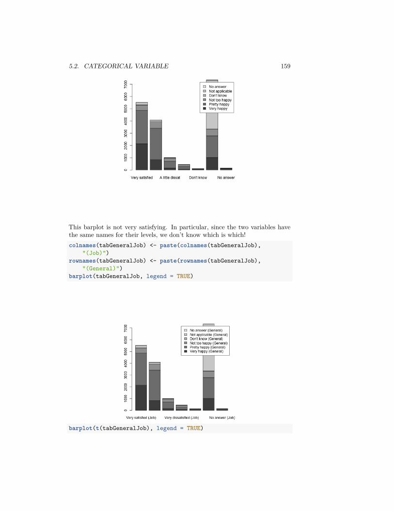
5.2. CATEGORICAL VARIABLE 159
This barplot is not very satisfying. In particular, since the two variables havethe same names for their levels, we don’t know which is which!colnames(tabGeneralJob) <- paste(colnames(tabGeneralJob),
"(Job)")rownames(tabGeneralJob) <- paste(rownames(tabGeneralJob),
"(General)")barplot(tabGeneralJob, legend = TRUE)
barplot(t(tabGeneralJob), legend = TRUE)
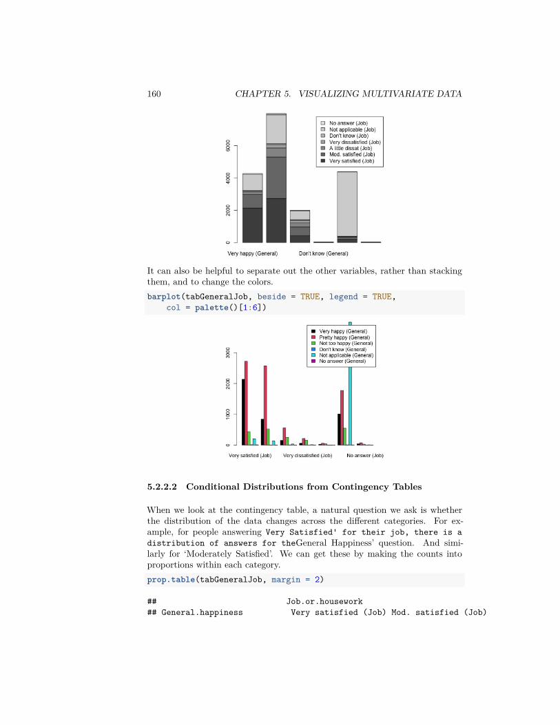
160 CHAPTER 5. VISUALIZING MULTIVARIATE DATA
It can also be helpful to separate out the other variables, rather than stackingthem, and to change the colors.barplot(tabGeneralJob, beside = TRUE, legend = TRUE,
col = palette()[1:6])
5.2.2.2 Conditional Distributions from Contingency Tables
When we look at the contingency table, a natural question we ask is whetherthe distribution of the data changes across the different categories. For ex-ample, for people answering Very Satisfied' for their job, there is adistribution of answers for theGeneral Happiness’ question. And simi-larly for ‘Moderately Satisfied’. We can get these by making the counts intoproportions within each category.prop.table(tabGeneralJob, margin = 2)
## Job.or.housework## General.happiness Very satisfied (Job) Mod. satisfied (Job)
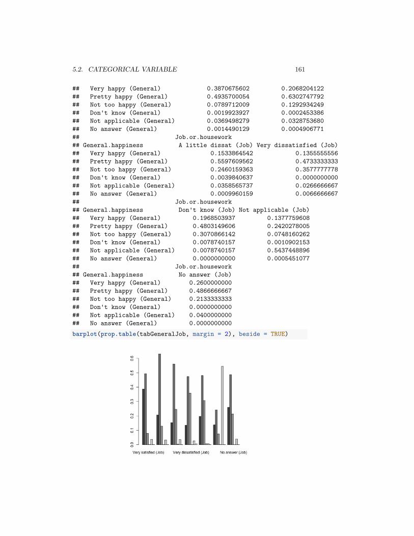
5.2. CATEGORICAL VARIABLE 161
## Very happy (General) 0.3870675602 0.2068204122## Pretty happy (General) 0.4935700054 0.6302747792## Not too happy (General) 0.0789712009 0.1292934249## Don't know (General) 0.0019923927 0.0002453386## Not applicable (General) 0.0369498279 0.0328753680## No answer (General) 0.0014490129 0.0004906771## Job.or.housework## General.happiness A little dissat (Job) Very dissatisfied (Job)## Very happy (General) 0.1533864542 0.1355555556## Pretty happy (General) 0.5597609562 0.4733333333## Not too happy (General) 0.2460159363 0.3577777778## Don't know (General) 0.0039840637 0.0000000000## Not applicable (General) 0.0358565737 0.0266666667## No answer (General) 0.0009960159 0.0066666667## Job.or.housework## General.happiness Don't know (Job) Not applicable (Job)## Very happy (General) 0.1968503937 0.1377759608## Pretty happy (General) 0.4803149606 0.2420278005## Not too happy (General) 0.3070866142 0.0748160262## Don't know (General) 0.0078740157 0.0010902153## Not applicable (General) 0.0078740157 0.5437448896## No answer (General) 0.0000000000 0.0005451077## Job.or.housework## General.happiness No answer (Job)## Very happy (General) 0.2600000000## Pretty happy (General) 0.4866666667## Not too happy (General) 0.2133333333## Don't know (General) 0.0000000000## Not applicable (General) 0.0400000000## No answer (General) 0.0000000000barplot(prop.table(tabGeneralJob, margin = 2), beside = TRUE)

162 CHAPTER 5. VISUALIZING MULTIVARIATE DATA
We could ask if these proportions are the same in each column (i.e. each levelof Job Satisfaction'). If so, then the value forJob Satisfaction’ is notaffecting the answer for ‘General Happiness’, and so we would say the variablesare unrelated.
Question:
Looking at the barplot, what would you say? Are the variables related?
We can, of course, flip the variables around.prop.table(tabGeneralJob, margin = 1)
## Job.or.housework## General.happiness Very satisfied (Job) Mod. satisfied (Job)## Very happy (General) 0.5004683841 0.1974238876## Pretty happy (General) 0.3415214939 0.3219701717## Not too happy (General) 0.2189854345 0.2646911100## Don't know (General) 0.4400000000 0.0400000000## Not applicable (General) 0.0465434634 0.0305726671## No answer (General) 0.4444444444 0.1111111111## Job.or.housework## General.happiness A little dissat (Job) Very dissatisfied (Job)## Very happy (General) 0.0360655738 0.0142857143## Pretty happy (General) 0.0704348916 0.0266950746## Not too happy (General) 0.1240582622 0.0808638875## Don't know (General) 0.1600000000 0.0000000000## Not applicable (General) 0.0082135524 0.0027378508## No answer (General) 0.0555555556 0.1666666667## Job.or.housework## General.happiness Don't know (Job) Not applicable (Job)## Very happy (General) 0.0058548009 0.2367681499## Pretty happy (General) 0.0076450683 0.2225842837## Not too happy (General) 0.0195881467 0.2757408338## Don't know (General) 0.0400000000 0.3200000000## Not applicable (General) 0.0002281542 0.9103353867## No answer (General) 0.0000000000 0.2222222222## Job.or.housework## General.happiness No answer (Job)## Very happy (General) 0.0091334895## Pretty happy (General) 0.0091490162## Not too happy (General) 0.0160723255## Don't know (General) 0.0000000000## Not applicable (General) 0.0013689254## No answer (General) 0.0000000000barplot(t(prop.table(tabGeneralJob, margin = 1)), beside = TRUE,
legend = TRUE)
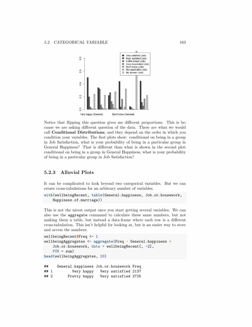
5.2. CATEGORICAL VARIABLE 163
Notice that flipping this question gives me different proportions. This is be-cause we are asking different question of the data. These are what we wouldcall Conditional Distributions, and they depend on the order in which youcondition your variables. The first plots show: conditional on being in a groupin Job Satisfaction, what is your probability of being in a particular group inGeneral Happiness? That is different than what is shown in the second plot:conditional on being in a group in General Happiness, what is your probabilityof being in a particular group in Job Satisfaction?
5.2.3 Alluvial Plots
It can be complicated to look beyond two categorical variables. But we cancreate cross-tabulations for an arbitrary number of variables.with(wellbeingRecent, table(General.happiness, Job.or.housework,
Happiness.of.marriage))
This is not the nicest output once you start getting several variables. We canalso use the aggregate command to calculate these same numbers, but notmaking them a table, but instead a data.frame where each row is a differentcross-tabulation. This isn’t helpful for looking at, but is an easier way to storeand access the numbers.wellbeingRecent$Freq <- 1wellbeingAggregates <- aggregate(Freq ~ General.happiness +
Job.or.housework, data = wellbeingRecent[, -2],FUN = sum)
head(wellbeingAggregates, 10)
## General.happiness Job.or.housework Freq## 1 Very happy Very satisfied 2137## 2 Pretty happy Very satisfied 2725
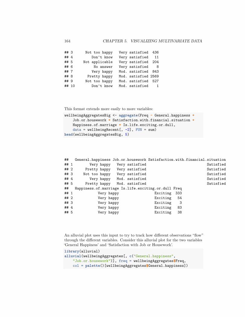
164 CHAPTER 5. VISUALIZING MULTIVARIATE DATA
## 3 Not too happy Very satisfied 436## 4 Don't know Very satisfied 11## 5 Not applicable Very satisfied 204## 6 No answer Very satisfied 8## 7 Very happy Mod. satisfied 843## 8 Pretty happy Mod. satisfied 2569## 9 Not too happy Mod. satisfied 527## 10 Don't know Mod. satisfied 1
This format extends more easily to more variables:wellbeingAggregatesBig <- aggregate(Freq ~ General.happiness +
Job.or.housework + Satisfaction.with.financial.situation +Happiness.of.marriage + Is.life.exciting.or.dull,data = wellbeingRecent[, -2], FUN = sum)
head(wellbeingAggregatesBig, 5)
## General.happiness Job.or.housework Satisfaction.with.financial.situation## 1 Very happy Very satisfied Satisfied## 2 Pretty happy Very satisfied Satisfied## 3 Not too happy Very satisfied Satisfied## 4 Very happy Mod. satisfied Satisfied## 5 Pretty happy Mod. satisfied Satisfied## Happiness.of.marriage Is.life.exciting.or.dull Freq## 1 Very happy Exciting 333## 2 Very happy Exciting 54## 3 Very happy Exciting 3## 4 Very happy Exciting 83## 5 Very happy Exciting 38
An alluvial plot uses this input to try to track how different observations “flow”through the different variables. Consider this alluvial plot for the two variables‘General Happiness’ and ‘Satisfaction with Job or Housework’.library(alluvial)alluvial(wellbeingAggregates[, c("General.happiness",
"Job.or.housework")], freq = wellbeingAggregates$Freq,col = palette()[wellbeingAggregates$General.happiness])

5.2. CATEGORICAL VARIABLE 165
Notice how you can see the relative numbers that go through each category.
We can actually expand this to be many variables, though it gets to be a bit ofa mess when you have many levels in each variable as we do. Moreover, this isa very slow command when you start adding additional variables, so I’ve runthe following code off line and just saved the result:alluvial(wellbeingAggregatesBig[, -ncol(wellbeingAggregatesBig)],
freq = wellbeingAggregatesBig$Freq, col = palette()[wellbeingAggregatesBig$General.happiness])
Very happy
Pretty happy
Not too happy
Don't know
Not applicable
No answer
Very satisfied
Mod. satisfied
A little dissat
Very dissatisfiedDon't know
Not applicable
No answer
Satisfied
More or less
Not at all sat
Don't know
Not applicable
No answer
Very happy
Pretty happy
Not too happyDon't know
Not applicable
No answer
Exciting
Routine
DullDon't know
Not applicable
No answer
General.happiness Job.or.housework Satisfaction.with.financial.situation Happiness.of.marriage Is.life.exciting.or.dull
Putting aside the messiness, we can at least see some big things about the data.For example, we can see that there are a huge number of ‘Not Applicable’ for allof the questions. For some questions this makes sense, but for others is unclearwhy it’s not applicable (few answer Don't know' orNo answer)
Question:
What other things can you see about the data from this plots?
These are obviously self-reported measures of happiness, meaning only whatthe respondent says is their state; these are not external, objective measureslike measuring the level of a chemical in someone’s blood (and indeed, withhappiness, an objective, quantifiable measurement is hard!).

166 CHAPTER 5. VISUALIZING MULTIVARIATE DATA
Question:
What are some possible problems in interpreting these results?
While you are generally stuck with some problems about self-reporting, thereare other questions you could ask that might be more concrete and might suffersomewhat less from people instinct to say ‘fine’ to every question. For example,for marital happiness, you could ask questions like whether fighting more withyour partner lately, feeling about partner’s supportiveness, how often you tellyour partner your feelings etc., that would perhaps get more specific responses.Of course, you would then be in a position of interpreting whether that addsup to a happy marriage when in fact a happy marriage is quite different fordifferent couples!
Based on this plot, however, it does seem reasonable to exclude some ofthe categories as being unhelpful and adding additional complexity withoutbeing useful for interpretation. We will exclude observations that say Notapplicable' on all of these questions. We will also exclude thosethat do not answer or saydon’t know’ on any of these questions (consider-ing non-response is quite important, as anyone who followed the problems with2016 polls should know, but these are a small number of observations here).
I’ve also asked the alluvial plot to hide the very small categories, which makesit faster to plot. Again, this is slow, so I’ve created the plot off-line.wh <- with(wellbeingRecent, which(General.happiness ==
"Not applicable" | Job.or.housework == "Not applicable" |Satisfaction.with.financial.situation == "Not applicable"))
wellbeingCondenseGroups <- wellbeingRecent[-wh, ]wellbeingCondenseGroups <- subset(wellbeingCondenseGroups,
!General.happiness %in% c("No answer", "Don't know") &!Job.or.housework %in% c("No answer", "Don't know") &!Satisfaction.with.financial.situation %in%
c("No answer", "Don't know") & !Happiness.of.marriage %in%c("No answer", "Don't know") & !Is.life.exciting.or.dull %in%c("No answer", "Don't know"))
wellbeingCondenseGroups <- droplevels(wellbeingCondenseGroups)wellbeingCondenseAggregates <- aggregate(Freq ~ General.happiness +
Job.or.housework + Satisfaction.with.financial.situation +Happiness.of.marriage + Is.life.exciting.or.dull,data = wellbeingCondenseGroups, FUN = sum)
alluvial(wellbeingCondenseAggregates[, -ncol(wellbeingCondenseAggregates)],freq = wellbeingCondenseAggregates$Freq, hide = wellbeingCondenseAggregates$Freq <
quantile(wellbeingCondenseAggregates$Freq,0.5), col = palette()[wellbeingCondenseAggregates$General.happiness])
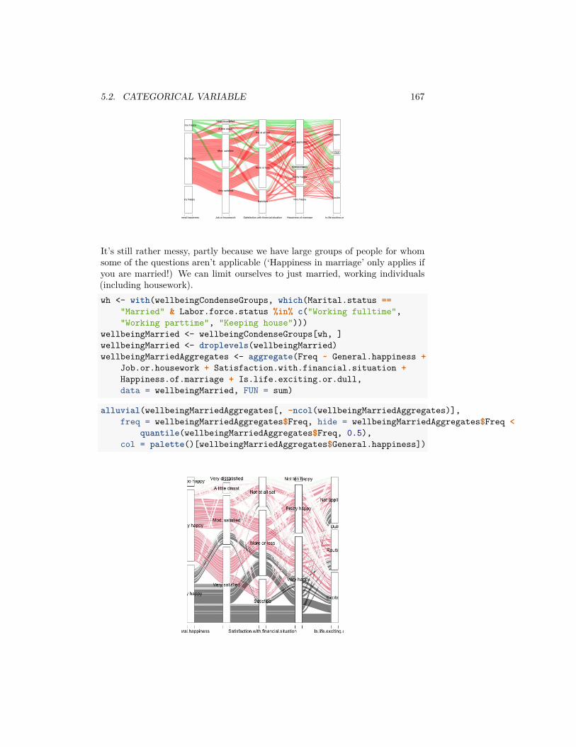
5.2. CATEGORICAL VARIABLE 167
Very happy
Pretty happy
Not too happy
Very satisfied
Mod. satisfied
A little dissat
Very dissatisfied
Satisfied
More or less
Not at all sat
Very happy
Pretty happy
Not too happy
Not applicable
Exciting
Routine
Dull
Not applicable
General.happiness Job.or.housework Satisfaction.with.financial.situation Happiness.of.marriage Is.life.exciting.or.dull
It’s still rather messy, partly because we have large groups of people for whomsome of the questions aren’t applicable (‘Happiness in marriage’ only applies ifyou are married!) We can limit ourselves to just married, working individuals(including housework).wh <- with(wellbeingCondenseGroups, which(Marital.status ==
"Married" & Labor.force.status %in% c("Working fulltime","Working parttime", "Keeping house")))
wellbeingMarried <- wellbeingCondenseGroups[wh, ]wellbeingMarried <- droplevels(wellbeingMarried)wellbeingMarriedAggregates <- aggregate(Freq ~ General.happiness +
Job.or.housework + Satisfaction.with.financial.situation +Happiness.of.marriage + Is.life.exciting.or.dull,data = wellbeingMarried, FUN = sum)
alluvial(wellbeingMarriedAggregates[, -ncol(wellbeingMarriedAggregates)],freq = wellbeingMarriedAggregates$Freq, hide = wellbeingMarriedAggregates$Freq <
quantile(wellbeingMarriedAggregates$Freq, 0.5),col = palette()[wellbeingMarriedAggregates$General.happiness])
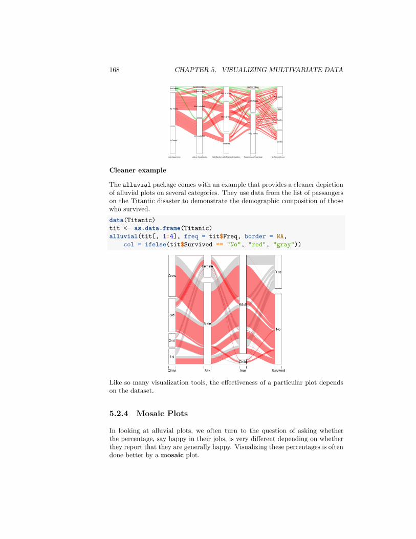
168 CHAPTER 5. VISUALIZING MULTIVARIATE DATA
Very happy
Pretty happy
Not too happy
Very satisfied
Mod. satisfied
A little dissat
Very dissatisfied
Satisfied
More or less
Not at all sat
Very happy
Pretty happy
Not too happy
Exciting
Routine
Dull
Not applicable
General.happiness Job.or.housework Satisfaction.with.financial.situation Happiness.of.marriage Is.life.exciting.or.dull
Cleaner example
The alluvial package comes with an example that provides a cleaner depictionof alluvial plots on several categories. They use data from the list of passangerson the Titantic disaster to demonstrate the demographic composition of thosewho survived.data(Titanic)tit <- as.data.frame(Titanic)alluvial(tit[, 1:4], freq = tit$Freq, border = NA,
col = ifelse(tit$Survived == "No", "red", "gray"))
Like so many visualization tools, the effectiveness of a particular plot dependson the dataset.
5.2.4 Mosaic Plots
In looking at alluvial plots, we often turn to the question of asking whetherthe percentage, say happy in their jobs, is very different depending on whetherthey report that they are generally happy. Visualizing these percentages is oftendone better by a mosaic plot.

5.2. CATEGORICAL VARIABLE 169
Let’s first look at just 2 variables again.mosaicplot(~General.happiness + Job.or.housework, data = wellbeingMarried,
las = 1, col = palette())
How do we interpret this plot? Well first, like the plots above, these areshowing conditional dependencies, so there is an order to these variables, basedon how we put them in. First was General Happiness (x-axis). So the amountof space on the x-axis for Very Happy' is proportional to the numberof people who respondedVery Happy’ on the general happiness question.Next is Job Satisfaction' (y-axis). *Within* each group of generalhappiness, the length on the y-axis is the proportion within thatgroup answering each of the categories forJob Satisfaction’. That isthe conditional dependencies that we saw above.
Let’s add a third variable, ‘Satisfaction with financial situation’.

170 CHAPTER 5. VISUALIZING MULTIVARIATE DATA
mosaicplot(~General.happiness + Job.or.housework +Satisfaction.with.financial.situation, data = wellbeingMarried,las = 1, col = palette())
This makes another subdivision on the x-axis. This is now subsetting down tothe people, for example, that are very satisfied with both Job and their Generallife, and looking at the distribution of ‘Satisfaction with financial situation’ forjust those set of people.
Question:
Using this information, how do you interpret this plot? What does this tell youabout people who are ‘Very Happy’ in general happiness?
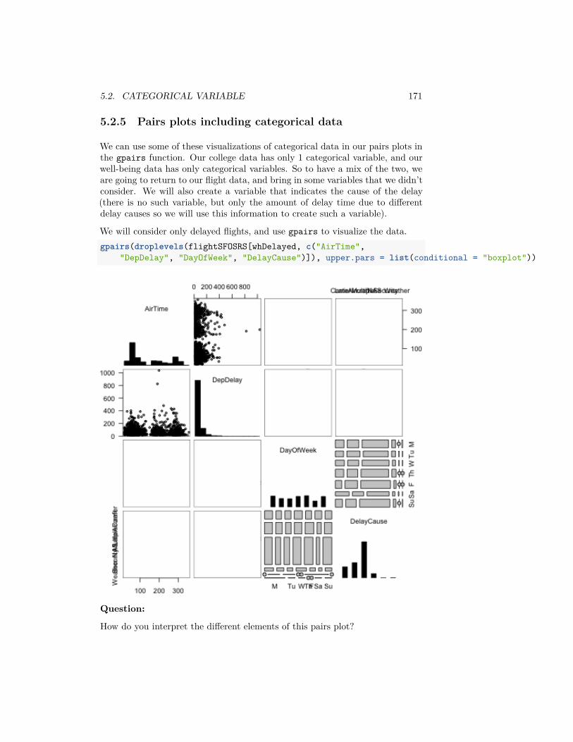
5.2. CATEGORICAL VARIABLE 171
5.2.5 Pairs plots including categorical data
We can use some of these visualizations of categorical data in our pairs plots inthe gpairs function. Our college data has only 1 categorical variable, and ourwell-being data has only categorical variables. So to have a mix of the two, weare going to return to our flight data, and bring in some variables that we didn’tconsider. We will also create a variable that indicates the cause of the delay(there is no such variable, but only the amount of delay time due to differentdelay causes so we will use this information to create such a variable).
We will consider only delayed flights, and use gpairs to visualize the data.gpairs(droplevels(flightSFOSRS[whDelayed, c("AirTime",
"DepDelay", "DayOfWeek", "DelayCause")]), upper.pars = list(conditional = "boxplot"))
Question:
How do you interpret the different elements of this pairs plot?
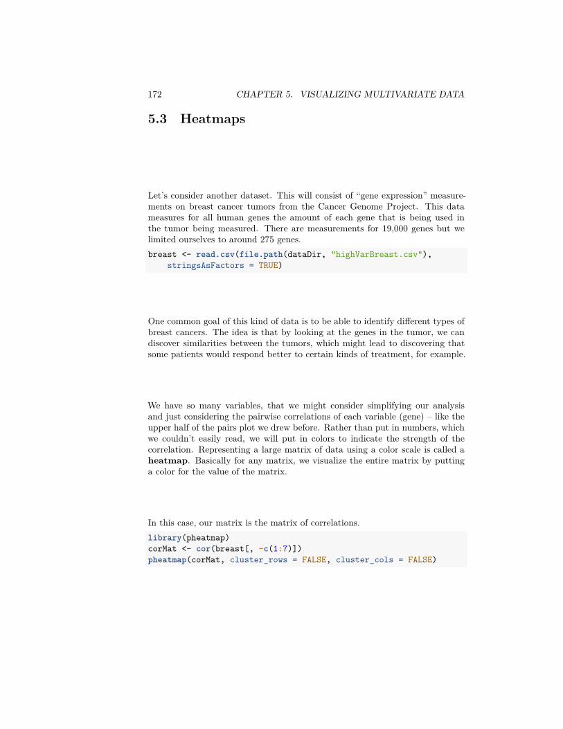
172 CHAPTER 5. VISUALIZING MULTIVARIATE DATA
5.3 Heatmaps
Let’s consider another dataset. This will consist of “gene expression” measure-ments on breast cancer tumors from the Cancer Genome Project. This datameasures for all human genes the amount of each gene that is being used inthe tumor being measured. There are measurements for 19,000 genes but welimited ourselves to around 275 genes.breast <- read.csv(file.path(dataDir, "highVarBreast.csv"),
stringsAsFactors = TRUE)
One common goal of this kind of data is to be able to identify different types ofbreast cancers. The idea is that by looking at the genes in the tumor, we candiscover similarities between the tumors, which might lead to discovering thatsome patients would respond better to certain kinds of treatment, for example.
We have so many variables, that we might consider simplifying our analysisand just considering the pairwise correlations of each variable (gene) – like theupper half of the pairs plot we drew before. Rather than put in numbers, whichwe couldn’t easily read, we will put in colors to indicate the strength of thecorrelation. Representing a large matrix of data using a color scale is called aheatmap. Basically for any matrix, we visualize the entire matrix by puttinga color for the value of the matrix.
In this case, our matrix is the matrix of correlations.library(pheatmap)corMat <- cor(breast[, -c(1:7)])pheatmap(corMat, cluster_rows = FALSE, cluster_cols = FALSE)

5.3. HEATMAPS 173
Question:
Why is the diagonal all dark red?
This is not an informative picture, however – there are so many variables (genes)that we can’t discover anything here.
However, if we could reorder the genes so that those that are highly correlatedare near each other, we might see blocks of similar genes like we did before.In fact this is exactly what heatmaps usually do by default. They reorder thevariables so that similar patterns are close to each other.
Here is the same plot of the correlation matrix, only now the rows and columnshave been reordered.pheatmap(corMat, cluster_rows = TRUE, cluster_cols = TRUE,
treeheight_row = 0, treeheight_col = 0)
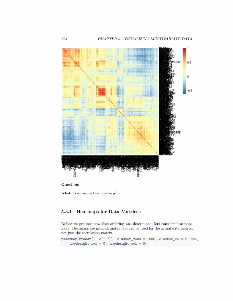
174 CHAPTER 5. VISUALIZING MULTIVARIATE DATA
Question:
What do we see in this heatmap?
5.3.1 Heatmaps for Data Matrices
Before we get into how that ordering was determined, lets consider heatmapsmore. Heatmaps are general, and in fact can be used for the actual data matrix,not just the correlation matrix.pheatmap(breast[, -c(1:7)], cluster_rows = TRUE, cluster_cols = TRUE,
treeheight_row = 0, treeheight_col = 0)
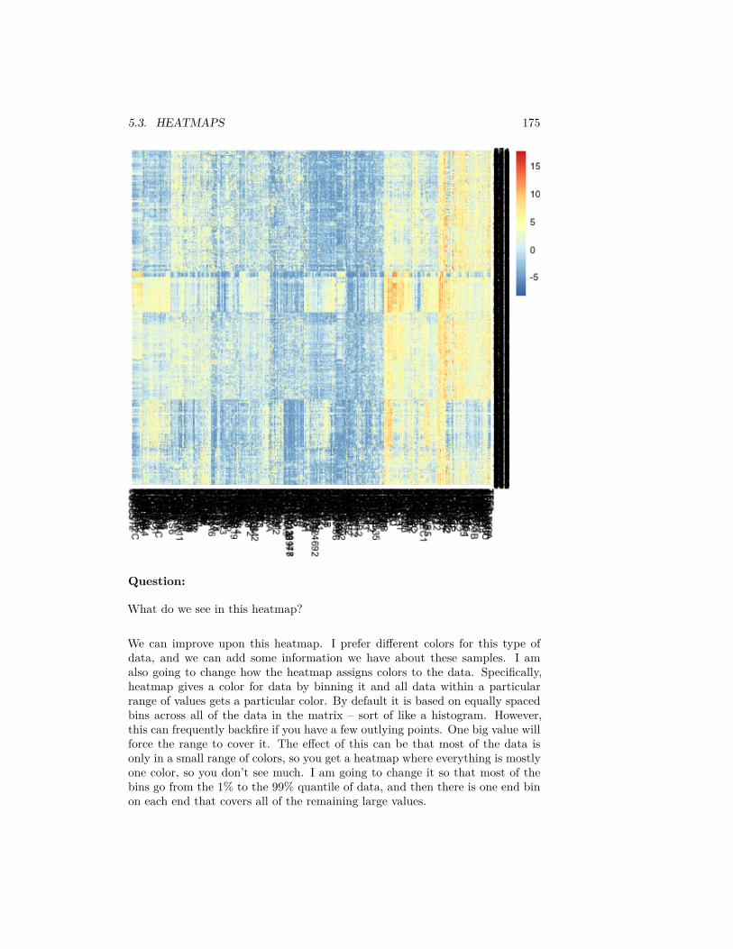
5.3. HEATMAPS 175
Question:
What do we see in this heatmap?
We can improve upon this heatmap. I prefer different colors for this type ofdata, and we can add some information we have about these samples. I amalso going to change how the heatmap assigns colors to the data. Specifically,heatmap gives a color for data by binning it and all data within a particularrange of values gets a particular color. By default it is based on equally spacedbins across all of the data in the matrix – sort of like a histogram. However,this can frequently backfire if you have a few outlying points. One big value willforce the range to cover it. The effect of this can be that most of the data isonly in a small range of colors, so you get a heatmap where everything is mostlyone color, so you don’t see much. I am going to change it so that most of thebins go from the 1% to the 99% quantile of data, and then there is one end binon each end that covers all of the remaining large values.

176 CHAPTER 5. VISUALIZING MULTIVARIATE DATA
typeCol <- c("red", "black", "yellow")names(typeCol) <- levels(breast$TypeSample)estCol <- palette()[c(4, 3, 5)]names(estCol) <- levels(breast$EstReceptor)proCol <- palette()[5:7]names(proCol) <- levels(breast$Progesteron)qnt <- quantile(as.numeric(data.matrix((breast[, -c(1:7)]))),
c(0.01, 0.99))brks <- seq(qnt[1], qnt[2], length = 20)head(brks)
## [1] -5.744770 -4.949516 -4.154261 -3.359006 -2.563751 -1.768496seqPal5 <- colorRampPalette(c("black", "navyblue",
"mediumblue", "dodgerblue3", "aquamarine4", "green4","yellowgreen", "yellow"))(length(brks) - 1)
row.names(breast) <- c(1:nrow(breast))fullHeat <- pheatmap(breast[, -c(1:7)], cluster_rows = TRUE,
cluster_cols = TRUE, treeheight_row = 0, treeheight_col = 0,color = seqPal5, breaks = brks, annotation_row = breast[,
5:7], annotation_colors = list(TypeSample = typeCol,EstReceptor = estCol, Progesteron = proCol))
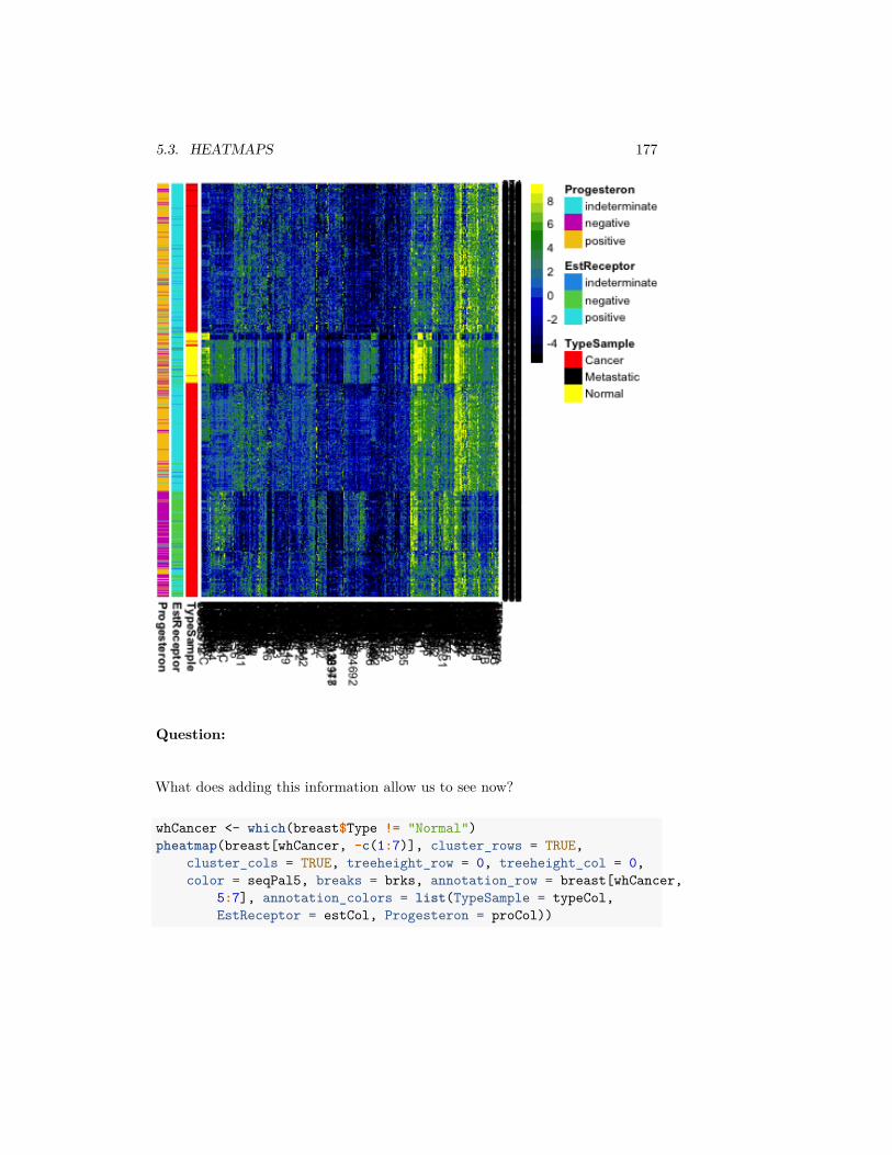
5.3. HEATMAPS 177
Question:
What does adding this information allow us to see now?
whCancer <- which(breast$Type != "Normal")pheatmap(breast[whCancer, -c(1:7)], cluster_rows = TRUE,
cluster_cols = TRUE, treeheight_row = 0, treeheight_col = 0,color = seqPal5, breaks = brks, annotation_row = breast[whCancer,
5:7], annotation_colors = list(TypeSample = typeCol,EstReceptor = estCol, Progesteron = proCol))

178 CHAPTER 5. VISUALIZING MULTIVARIATE DATA
Centering/Scaling Variables
Some genes have drastic differences in their measurements for different samples.But we might also can notice that many of the genes are all high, or all low.They might show similar patterns of differences, but at a lesser scale. It wouldbe nice to put them on the same basis. A simple way to do this is to subtractthe mean or median of each variable.
Notice our previous breaks don’t make sense for this centered data. Moreover,now that we’ve centered the data, it makes sense to make the color scale sym-metric around 0, and also to have a color scale that emphasizes zero.
Question:
Why this focus on being centered around zero?

5.3. HEATMAPS 179
breastCenteredMean <- scale(breast[, -c(1:7)], center = TRUE,scale = FALSE)
colMedian <- apply(breast[, -c(1:7)], 2, median)breastCenteredMed <- sweep(breast[, -c(1:7)], MARGIN = 2,
colMedian, "-")qnt <- max(abs(quantile(as.numeric(data.matrix((breastCenteredMed[,
-c(1:7)]))), c(0.01, 0.99))))brksCentered <- seq(-qnt, qnt, length = 50)seqPal2 <- colorRampPalette(c("orange", "black", "blue"))(length(brksCentered) -
1)seqPal2 <- (c("yellow", "gold2", seqPal2))seqPal2 <- rev(seqPal2)pheatmap(breastCenteredMed[whCancer, -c(1:7)], cluster_rows = TRUE,
cluster_cols = TRUE, treeheight_row = 0, treeheight_col = 0,color = seqPal2, breaks = brksCentered, annotation_row = breast[whCancer,
6:7], annotation_colors = list(TypeSample = typeCol,EstReceptor = estCol, Progesteron = proCol))
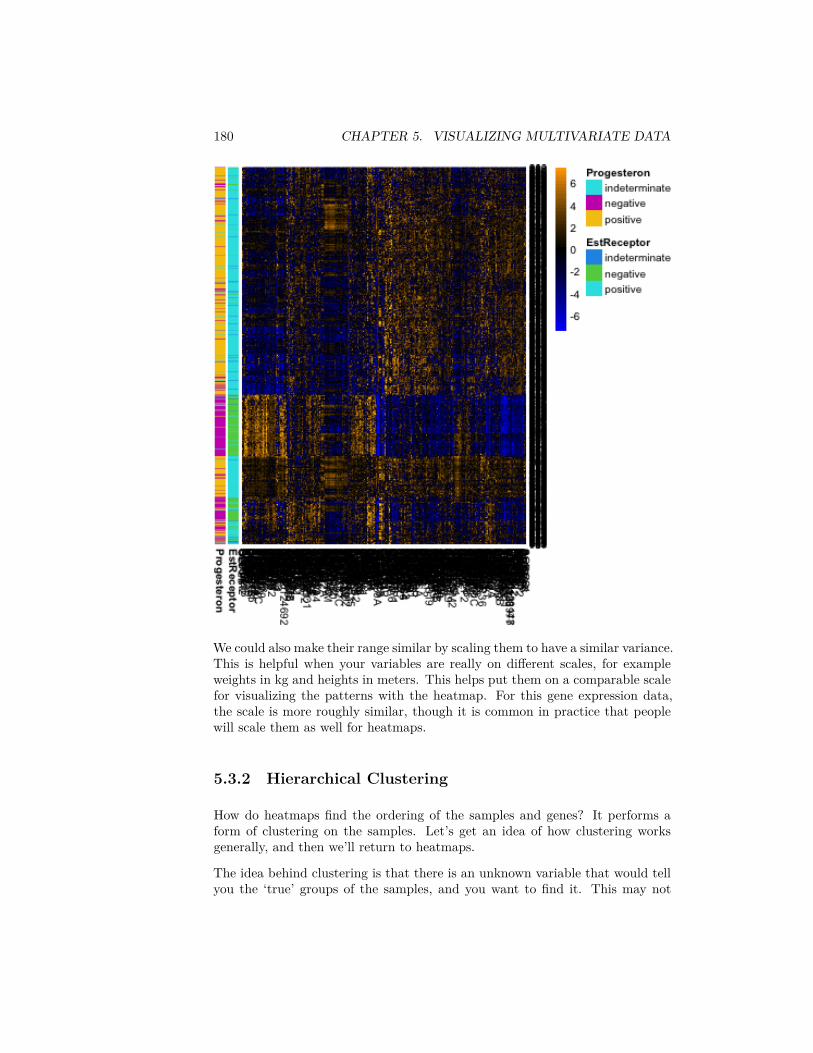
180 CHAPTER 5. VISUALIZING MULTIVARIATE DATA
We could also make their range similar by scaling them to have a similar variance.This is helpful when your variables are really on different scales, for exampleweights in kg and heights in meters. This helps put them on a comparable scalefor visualizing the patterns with the heatmap. For this gene expression data,the scale is more roughly similar, though it is common in practice that peoplewill scale them as well for heatmaps.
5.3.2 Hierarchical Clustering
How do heatmaps find the ordering of the samples and genes? It performs aform of clustering on the samples. Let’s get an idea of how clustering worksgenerally, and then we’ll return to heatmaps.
The idea behind clustering is that there is an unknown variable that would tellyou the ‘true’ groups of the samples, and you want to find it. This may not

5.3. HEATMAPS 181
actually be true in practice, but it’s a useful abstraction. The basic idea ofclustering relies on examining the distances between samples and putting intothe same cluster samples that are close together. There are countless num-ber of clustering algorithms, but heatmaps rely on what is called hierarchicalclustering. It is called hiearchical clustering because it not only puts obser-vations into groups/clusters, but does so by first creating a hierarchical tree ordendrogram that relates the samples.
Here we show this on a small subset of the samples and genes. We see on theleft the dendrogram that relates the samples (rows).1
smallBreast <- read.csv(file.path(dataDir, "smallVarBreast.csv"),header = TRUE, stringsAsFactors = TRUE)
row.names(smallBreast) <- 1:nrow(smallBreast)pheatmap(smallBreast[, -c(1:7)], cluster_rows = TRUE,
cluster_cols = FALSE, treeheight_col = 0, breaks = brks,col = seqPal5)
1I have also clustered the variables (columns) in this figure because otherwise it is hard tosee anything, but have suppressed the drawing of the dendrogram to focus on the samples –see the next figure where we draw both.

182 CHAPTER 5. VISUALIZING MULTIVARIATE DATA
We can use the same principle for clustering the variables:pheatmap(smallBreast[, -c(1:7)], , cluster_rows = TRUE,
cluster_cols = TRUE, breaks = brks, col = seqPal5,annotation_row = smallBreast[, 5:7], annotation_colors = list(TypeSample = typeCol,
EstReceptor = estCol, Progesteron = proCol))

5.3. HEATMAPS 183
Notice that with this small subset of genes and samples, we don’t see the samediscrimination between normal and cancer samples.
Where are the clusters?
If hierarchical clustering is a clustering routine, were are the clusters. The ideais that the dendrogram is just a first step toward clustering. To get a cluster, youdraw a line across the dendrogram to “cut” the dendrogram into pieces, whichcorrespond to the clusters. For the purposes of a heatmap, however, what isinteresting is not the clustesr, but ordering of the samples that it provides.
5.3.2.1 How Hierarchical Clustering Works
Hierarchical clustering is an iterative process, that builds the dendrogram byiteratively creating new groups of samples by either
1. joining pairs of individual samples into a group
184 CHAPTER 5. VISUALIZING MULTIVARIATE DATA
2. add an individual samples to an existing group3. combine two groups into a larger group2
Step 1: Pairwise distance matrix between groups We consider each sam-ple to be a separate group (i.e. 𝑛 groups), and we calculate the pairwise distancesbetween all of the 𝑛 groups.
For simplicity, let’s assume we have only one variable, so our data is 𝑦1, … , 𝑦𝑛.Then the standard distance between samples 𝑖 and 𝑗 could be
𝑑𝑖𝑗 = |𝑦𝑖 − 𝑦𝑗|or alternatively squared distance,
𝑑𝑖𝑗 = (𝑦𝑖 − 𝑦𝑗)2.So we can get all of the pairwise distances between all of the samples (a distancematrix of all the 𝑛 × 𝑛 pairs)
Step 2: Make group by joining together two closest “groups” Youravailable choices from the list above are to join together two samples to make agroup. So we choose to join together the two samples that are closest together,and forming our first real group of samples.
Step 3: Update distance matrix between groups Specifically, say youhave already joined together samples 𝑖 and 𝑗 to make the first true group. Tojoin update our groups, our options from the list above are:
1. Combine two samples 𝑘 and ℓ to make next group (i.e. do nothing withthe group previously formed by 𝑖 and 𝑗.
2. Combine some sample 𝑘 with your new group
Clearly, if we join together two samples 𝑘 and ℓ it’s the same as above (pick twoclosest). But how do you decide to do that versus add sample 𝑘 to my group ofsamples 𝑖 and 𝑗? We need to decide whether a sample 𝑘 is closer to the groupconsisting of 𝑖 and 𝑗 than it is to any other sample ℓ.We do this by recalculating the pairwise distances we had before, replacingthese two samples 𝑖 and 𝑗 by the pairwise distance of the new group to the othersamples.
Of course this is easier said than done, because how do we define how close agroup is to other samples or groups? There’s no single way to do that, and infact there are a lot of competing methods. The default method in R is to saythat if we have a group 𝒢 consisting of 𝑖 and 𝑗, then the distance of that groupto a sample 𝑘 is the maximum distance of 𝑖 and 𝑗 to 𝑘3 ,
𝑑(𝒢, 𝑘) = max(𝑑𝑖𝑘, 𝑑𝑗𝑘).2This is called an agglomerative method, where you start at the bottom of the tree and
build up. There are also divisive method for creating a hiearchical tree that starts at the “top”by continually dividing the samples into two group.
3This is called complete linkage.
5.3. HEATMAPS 185
Now we have a updated 𝑛−1×𝑛−1 matrix of distances between all our currentlist of “groups” (remember the single samples form their own group).
Step 4: Join closest groups Now we find the closest two groups and join thesamples in the group together to form a new group.
Step 5+: Continue to update distance matrix and join groups Thenyou repeat this process of joining together to build up the tree. Once you getmore than two groups, you will consider all of the three different kinds of joinsdescribed above – i.e. you will also consider joining together two existing groups𝒢1 and 𝒢2 that both consist of multiple samples. Again, you generalize thedefinition above to define the distance between the two groups of samples to bethe maximum distance of all the points in 𝒢1 to all the points in 𝒢2,
𝑑(𝒢1, 𝒢2) = max𝑖∈𝒢1,𝑗∈𝒢2
𝑑𝑖𝑗.
Distances in Higher Dimensions
The same process works if instead of having a single number, your 𝑦𝑖 are nowvectors – i.e. multiple variables. You just need a definition for the distancebetween the 𝑦𝑖, and then follow the same algorithm.
What is the equivalent distance when you have more variables? For each variableℓ, we observe 𝑦(ℓ)
1 , … , 𝑦(ℓ)𝑛 . And an observation is now the vector that is the
collection of all the variables for the sample:
𝑦𝑖 = (𝑦(1)𝑖 , … , 𝑦(𝑝)
𝑖 )
We want to find the distance between observations 𝑖 and 𝑗 which have vectorsof data
(𝑦(1)𝑖 , … , 𝑦(𝑝)
𝑖 )and
(𝑦(1)𝑗 , … , 𝑦(𝑝)
𝑗 )The standard distance (called Euclidean distance) is
𝑑𝑖𝑗 = 𝑑(𝑦𝑖, 𝑦𝑗) =√√√⎷
𝑝∑ℓ=1
(𝑦(ℓ)𝑖 − 𝑦(ℓ)
𝑗 )2
So its the cummulative (i.e. sum) amount of the individual (squared) distanceof each variable. You don’t have to use this distance – there are other choicesthat can be better depending on the data – but it is the default.
We generally work with squared distances, which would be
𝑑2𝑖𝑗 =
𝑝∑ℓ=1
(𝑦(ℓ)𝑖 − 𝑦(ℓ)
𝑗 )2
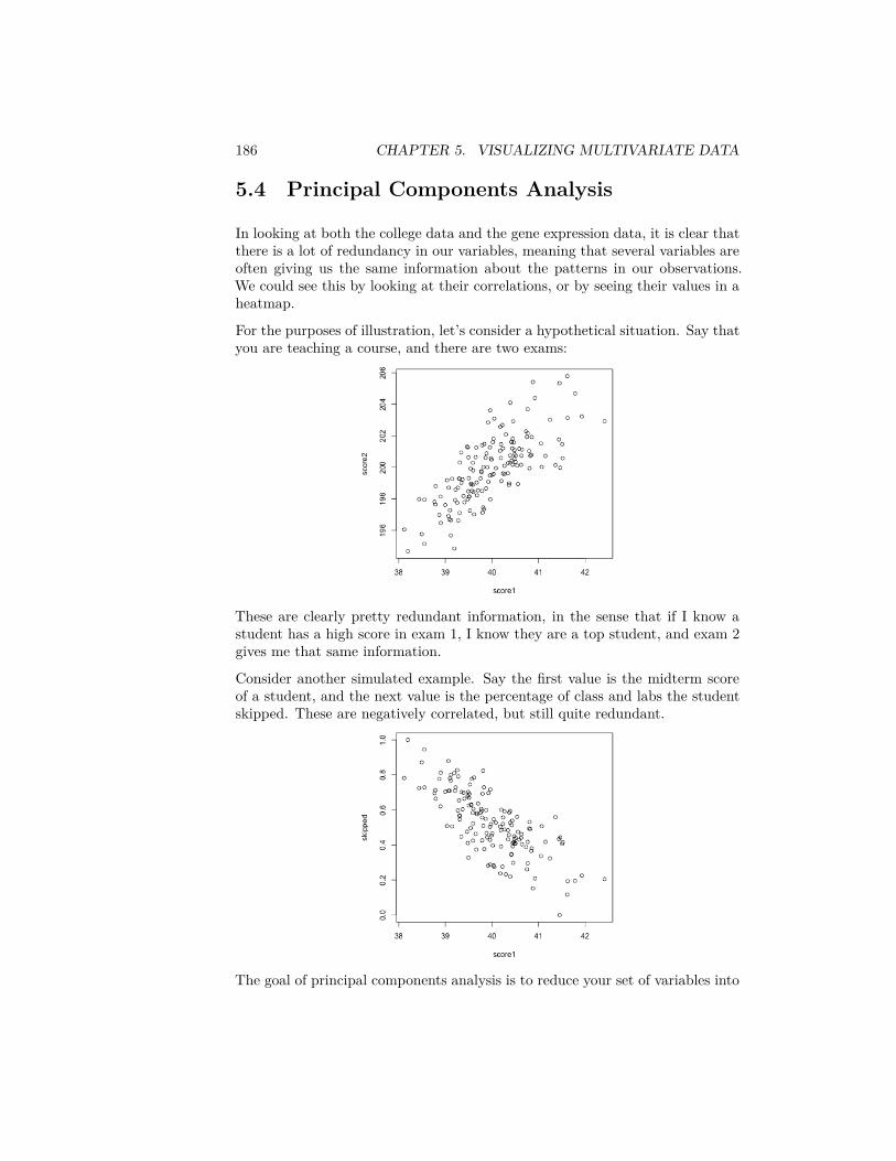
186 CHAPTER 5. VISUALIZING MULTIVARIATE DATA
5.4 Principal Components Analysis
In looking at both the college data and the gene expression data, it is clear thatthere is a lot of redundancy in our variables, meaning that several variables areoften giving us the same information about the patterns in our observations.We could see this by looking at their correlations, or by seeing their values in aheatmap.
For the purposes of illustration, let’s consider a hypothetical situation. Say thatyou are teaching a course, and there are two exams:
These are clearly pretty redundant information, in the sense that if I know astudent has a high score in exam 1, I know they are a top student, and exam 2gives me that same information.
Consider another simulated example. Say the first value is the midterm scoreof a student, and the next value is the percentage of class and labs the studentskipped. These are negatively correlated, but still quite redundant.
The goal of principal components analysis is to reduce your set of variables into
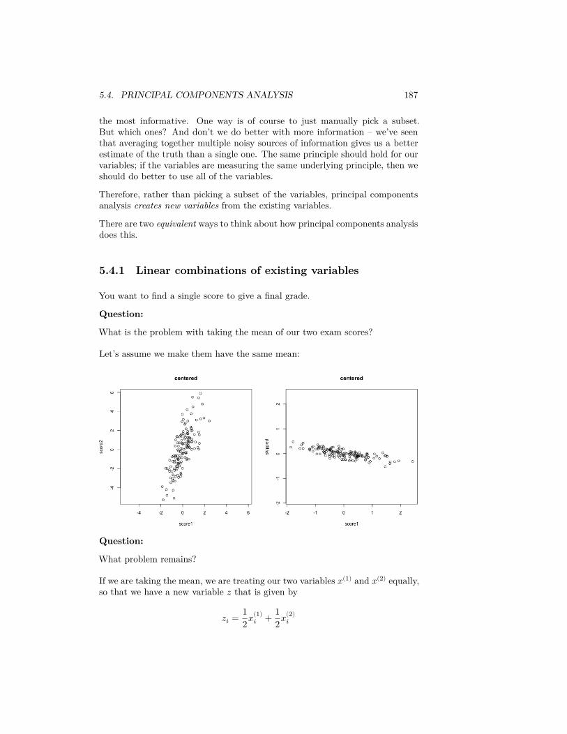
5.4. PRINCIPAL COMPONENTS ANALYSIS 187
the most informative. One way is of course to just manually pick a subset.But which ones? And don’t we do better with more information – we’ve seenthat averaging together multiple noisy sources of information gives us a betterestimate of the truth than a single one. The same principle should hold for ourvariables; if the variables are measuring the same underlying principle, then weshould do better to use all of the variables.
Therefore, rather than picking a subset of the variables, principal componentsanalysis creates new variables from the existing variables.
There are two equivalent ways to think about how principal components analysisdoes this.
5.4.1 Linear combinations of existing variables
You want to find a single score to give a final grade.
Question:
What is the problem with taking the mean of our two exam scores?
Let’s assume we make them have the same mean:
Question:
What problem remains?
If we are taking the mean, we are treating our two variables 𝑥(1) and 𝑥(2) equally,so that we have a new variable 𝑧 that is given by
𝑧𝑖 = 12𝑥(1)
𝑖 + 12𝑥(2)
𝑖
188 CHAPTER 5. VISUALIZING MULTIVARIATE DATA
The idea with principal components, then, is that we want to weight themdifferently to take into account the scale and whether they are negatively orpositively correlated.
𝑧𝑖 = 𝑎1𝑥(1)𝑖 + 𝑎2𝑥(2)
𝑖
So the idea of principal components is to find the “best” constants (or coeffi-cients), 𝑎1 and 𝑎2. This is a little bit like regression, only in regression I hada response 𝑦𝑖, and so my best coefficients were the best predictors of 𝑦𝑖. HereI don’t have a response. I only have the variables, and I want to get the bestsummary of them, so we will need a new definition of ”best”.
So how do we pick the best set of coefficients? Similar to regression, we need acriteria for what is the best set of coefficients. Once we choose the criteria, thecomputer can run an optimization technique to find the coefficients. So what isa reasonable criteria?
If I consider the question of exam scores, what is my goal? Well, I would likea final score that separates out the students so that the students that do muchbetter than the other students are further apart, etc. %Score 2 scrunches mostof the students up, so the vertical line doesn’t meet that criteria.
The criteria in principal components is to find the line so that the new variablevalues have the most variance – so we can spread out the observations the most.So the criteria we choose is to maximize the sample variance of the resulting 𝑧.
In other words, for every set of coefficients 𝑎1, 𝑎2, we will get a set of 𝑛 newvalues for my observations, 𝑧1, … , 𝑧𝑛. We can think of this new 𝑧 as a newvariable.
Then for any set of cofficients, I can calculate the sample variance of my resulting𝑧 as
𝑣𝑎𝑟(𝑧) = 1𝑛 − 1
𝑛∑𝑖=1
(𝑧𝑖 − 𝑧)2
Of course, 𝑧𝑖 = 𝑎1𝑥(1)𝑖 + 𝑎2𝑥(2)
𝑖 , this is actually
𝑣𝑎𝑟(𝑧) = 1𝑛 − 1
𝑛∑𝑖=1
(𝑎1𝑥(1)𝑖 + 𝑎2𝑥(2)
𝑖 − 𝑧)2
(I haven’t written out 𝑧 in terms of the coefficients, but you get the idea.) Nowthat I have this criteria, I can use optimization routines implemented in thecomputer to find the coefficients that maximize this quantity.
Here is a histogram of the PCA variable 𝑧 and that of the mean.
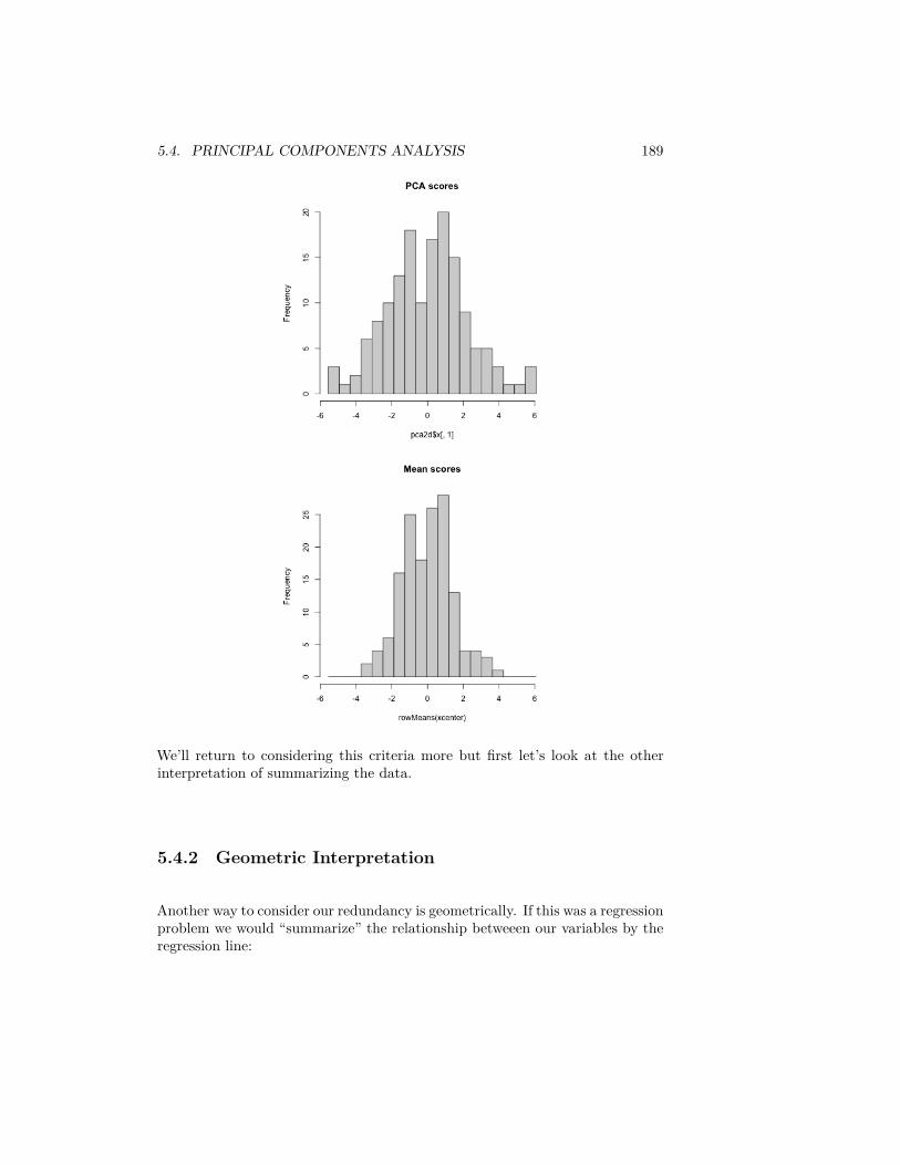
5.4. PRINCIPAL COMPONENTS ANALYSIS 189
We’ll return to considering this criteria more but first let’s look at the otherinterpretation of summarizing the data.
5.4.2 Geometric Interpretation
Another way to consider our redundancy is geometrically. If this was a regressionproblem we would “summarize” the relationship betweeen our variables by theregression line:
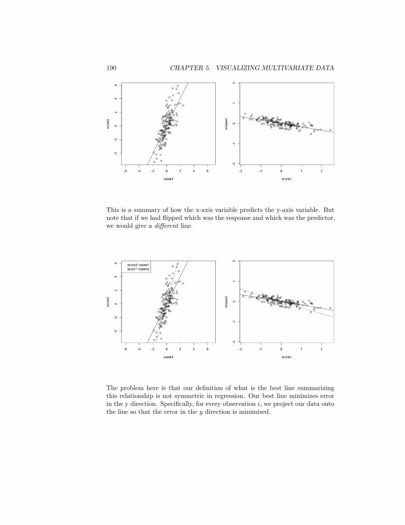
190 CHAPTER 5. VISUALIZING MULTIVARIATE DATA
This is a summary of how the x-axis variable predicts the y-axis variable. Butnote that if we had flipped which was the response and which was the predictor,we would give a different line.
The problem here is that our definition of what is the best line summarizingthis relationship is not symmetric in regression. Our best line minimizes errorin the y direction. Specifically, for every observation 𝑖, we project our data ontothe line so that the error in the 𝑦 direction is minimized.
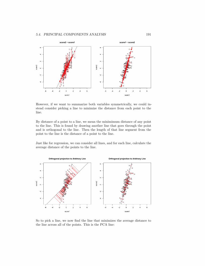
5.4. PRINCIPAL COMPONENTS ANALYSIS 191
However, if we want to summarize both variables symmetrically, we could in-stead consider picking a line to minimize the distance from each point to theline.
By distance of a point to a line, we mean the minimimum distance of any pointto the line. This is found by drawing another line that goes through the pointand is orthogonal to the line. Then the length of that line segment from thepoint to the line is the distance of a point to the line.
Just like for regression, we can consider all lines, and for each line, calculate theaverage distance of the points to the line.
So to pick a line, we now find the line that minimizes the average distance tothe line across all of the points. This is the PCA line:
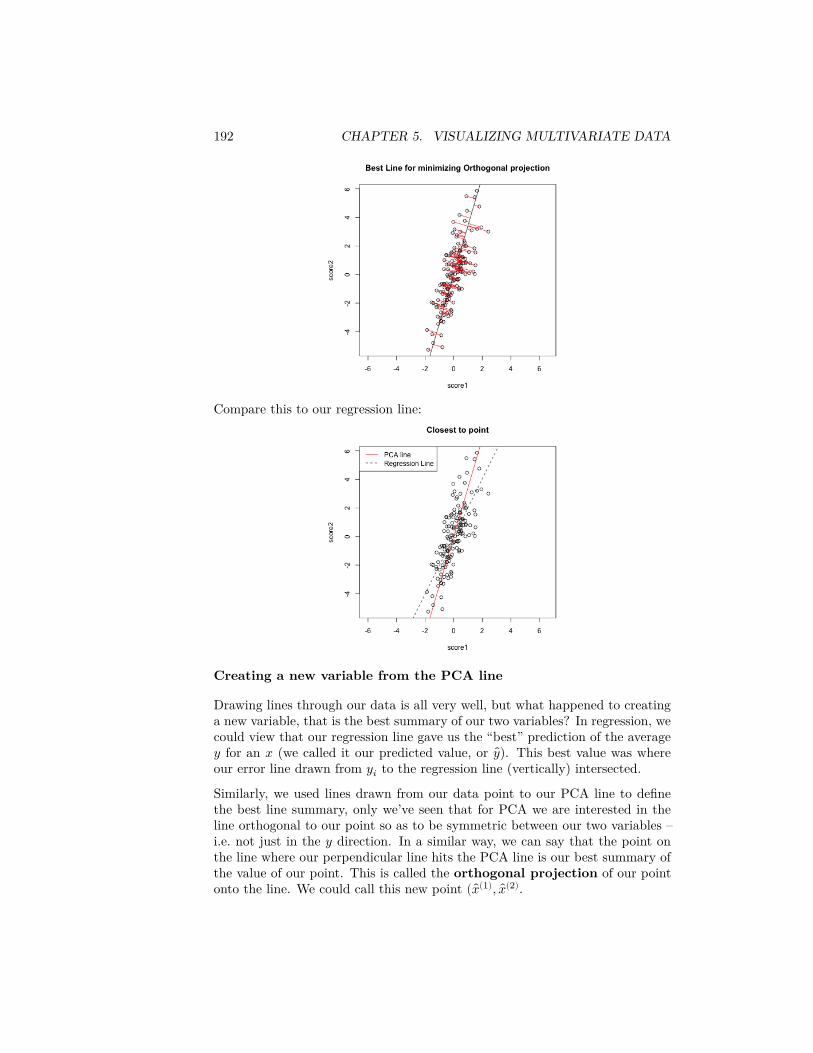
192 CHAPTER 5. VISUALIZING MULTIVARIATE DATA
Compare this to our regression line:
Creating a new variable from the PCA line
Drawing lines through our data is all very well, but what happened to creatinga new variable, that is the best summary of our two variables? In regression, wecould view that our regression line gave us the “best” prediction of the average𝑦 for an 𝑥 (we called it our predicted value, or 𝑦). This best value was whereour error line drawn from 𝑦𝑖 to the regression line (vertically) intersected.
Similarly, we used lines drawn from our data point to our PCA line to definethe best line summary, only we’ve seen that for PCA we are interested in theline orthogonal to our point so as to be symmetric between our two variables –i.e. not just in the 𝑦 direction. In a similar way, we can say that the point onthe line where our perpendicular line hits the PCA line is our best summary ofthe value of our point. This is called the orthogonal projection of our pointonto the line. We could call this new point ( 𝑥(1), 𝑥(2).
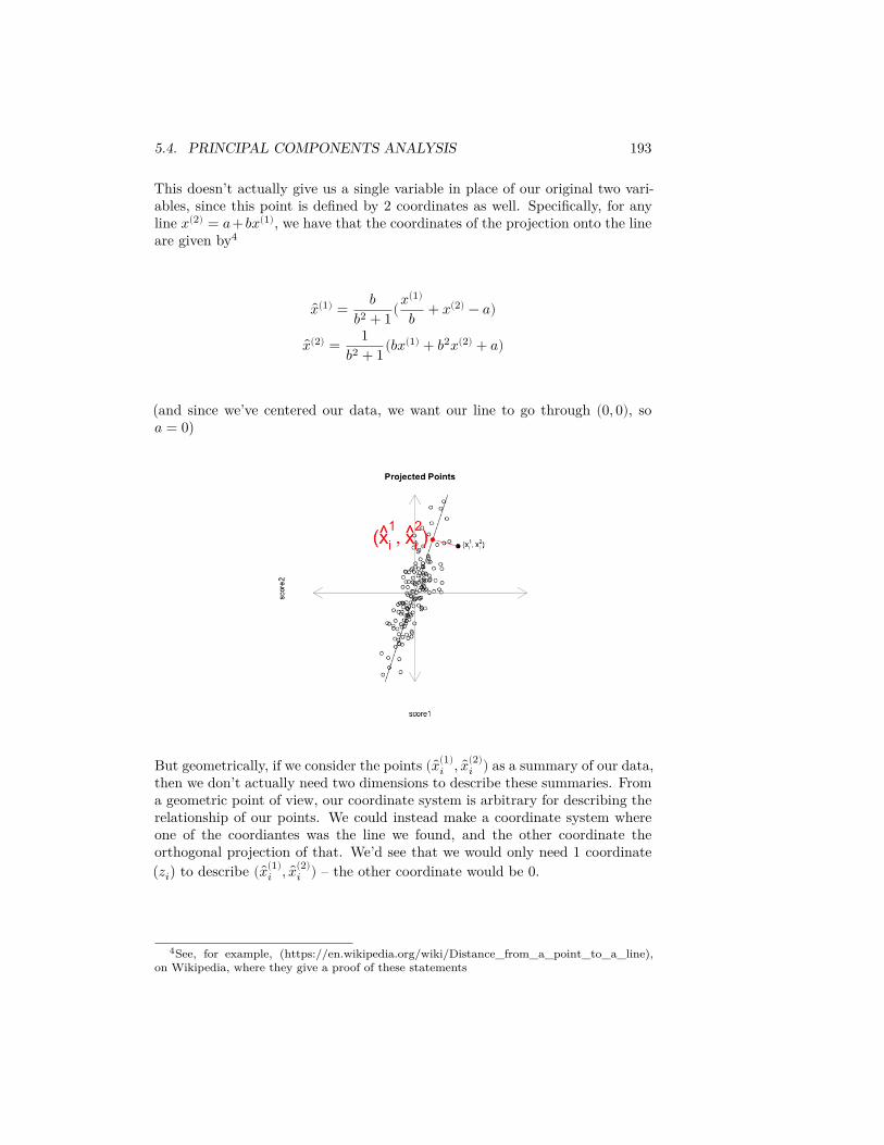
5.4. PRINCIPAL COMPONENTS ANALYSIS 193
This doesn’t actually give us a single variable in place of our original two vari-ables, since this point is defined by 2 coordinates as well. Specifically, for anyline 𝑥(2) = 𝑎+𝑏𝑥(1), we have that the coordinates of the projection onto the lineare given by4
𝑥(1) = 𝑏𝑏2 + 1(𝑥(1)
𝑏 + 𝑥(2) − 𝑎)
𝑥(2) = 1𝑏2 + 1(𝑏𝑥(1) + 𝑏2𝑥(2) + 𝑎)
(and since we’ve centered our data, we want our line to go through (0, 0), so𝑎 = 0)
But geometrically, if we consider the points ( 𝑥(1)𝑖 , 𝑥(2)
𝑖 ) as a summary of our data,then we don’t actually need two dimensions to describe these summaries. Froma geometric point of view, our coordinate system is arbitrary for describing therelationship of our points. We could instead make a coordinate system whereone of the coordiantes was the line we found, and the other coordinate theorthogonal projection of that. We’d see that we would only need 1 coordinate(𝑧𝑖) to describe ( 𝑥(1)
𝑖 , 𝑥(2)𝑖 ) – the other coordinate would be 0.
4See, for example, (https://en.wikipedia.org/wiki/Distance_from_a_point_to_a_line),on Wikipedia, where they give a proof of these statements
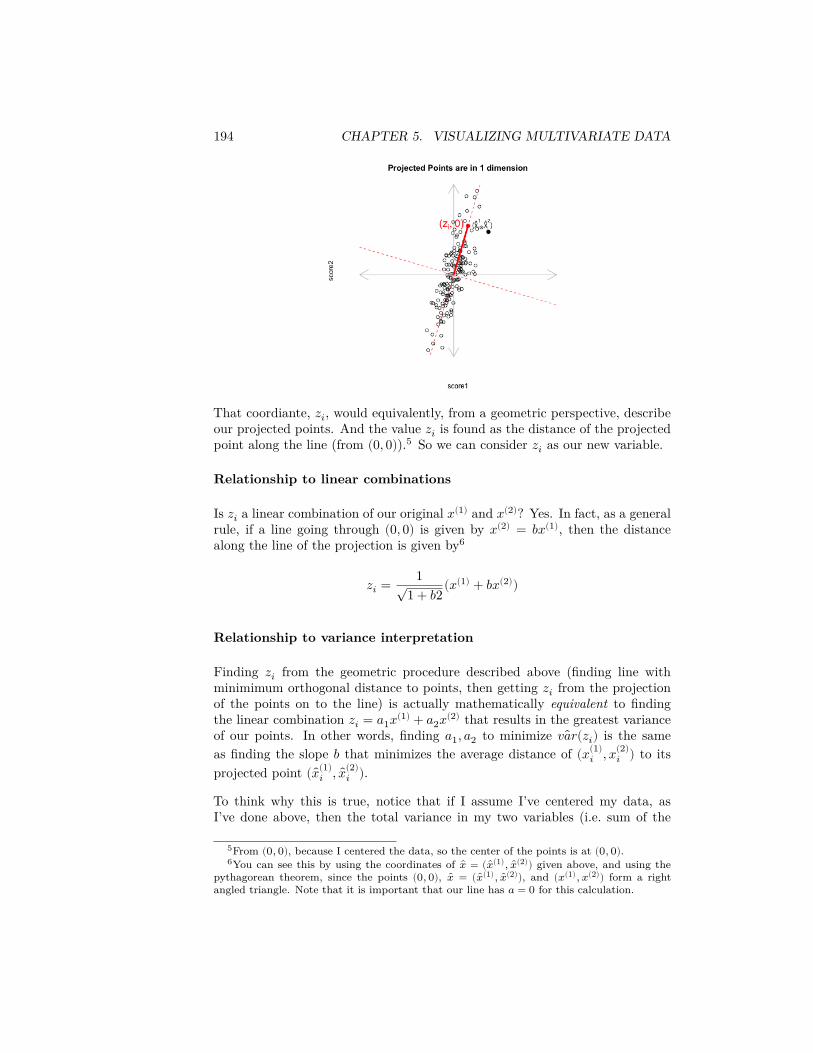
194 CHAPTER 5. VISUALIZING MULTIVARIATE DATA
That coordiante, 𝑧𝑖, would equivalently, from a geometric perspective, describeour projected points. And the value 𝑧𝑖 is found as the distance of the projectedpoint along the line (from (0, 0)).5 So we can consider 𝑧𝑖 as our new variable.
Relationship to linear combinations
Is 𝑧𝑖 a linear combination of our original 𝑥(1) and 𝑥(2)? Yes. In fact, as a generalrule, if a line going through (0, 0) is given by 𝑥(2) = 𝑏𝑥(1), then the distancealong the line of the projection is given by6
𝑧𝑖 = 1√1 + 𝑏2(𝑥(1) + 𝑏𝑥(2))
Relationship to variance interpretation
Finding 𝑧𝑖 from the geometric procedure described above (finding line withminimimum orthogonal distance to points, then getting 𝑧𝑖 from the projectionof the points on to the line) is actually mathematically equivalent to findingthe linear combination 𝑧𝑖 = 𝑎1𝑥(1) + 𝑎2𝑥(2) that results in the greatest varianceof our points. In other words, finding 𝑎1, 𝑎2 to minimize 𝑣𝑎𝑟(𝑧𝑖) is the sameas finding the slope 𝑏 that minimizes the average distance of (𝑥(1)
𝑖 , 𝑥(2)𝑖 ) to its
projected point ( 𝑥(1)𝑖 , 𝑥(2)
𝑖 ).
To think why this is true, notice that if I assume I’ve centered my data, asI’ve done above, then the total variance in my two variables (i.e. sum of the
5From (0, 0), because I centered the data, so the center of the points is at (0, 0).6You can see this by using the coordinates of �� = (��(1), ��(2)) given above, and using the
pythagorean theorem, since the points (0, 0), �� = (��(1), ��(2)), and (𝑥(1), 𝑥(2)) form a rightangled triangle. Note that it is important that our line has 𝑎 = 0 for this calculation.
5.4. PRINCIPAL COMPONENTS ANALYSIS 195
variances of each variable) is given by
1𝑛 − 1 ∑
𝑖(𝑥(1)
𝑖 )2 + 1𝑛 − 1 ∑
𝑖(𝑥(2)
𝑖 )2
1𝑛 − 1 ∑
𝑖[(𝑥(1)
𝑖 )2 + (𝑥(2)𝑖 )2]
So that variance is a geometrical idea once you’ve centered the variables – thesum of the squared length of the vector ((𝑥(1)
𝑖 , 𝑥(2)𝑖 ). Under the geometric inter-
pretation your new point ( 𝑥(1)𝑖 , 𝑥(2)
𝑖 ), or equivalently 𝑧𝑖, has mean zero too, sothe total variance of the new points is given by
1𝑛 − 1 ∑
𝑖𝑧2
𝑖
Since we know that we have an orthogonal projection then we know that thedistance 𝑑𝑖 from the point (𝑥(1)
𝑖 , 𝑥(2)𝑖 ) to ( 𝑥(1)
𝑖 , 𝑥(2)𝑖 ) satisfies the Pythagorean
theorem,𝑧𝑖(𝑏)2 + 𝑑𝑖(𝑏)2 = [𝑥(1)
𝑖 ]2 + [𝑥(2)𝑖 ]2.
That means that finding 𝑏 that minimizes ∑𝑖 𝑑𝑖(𝑏)2 will also maximize ∑𝑖 𝑧𝑖(𝑏)2
because∑
𝑖𝑑𝑖(𝑏)2 = constant − ∑
𝑖𝑧𝑖(𝑏)2
so minimizing the left hand size will maximize the right hand side.
Therefore since every 𝑧𝑖(𝑏) found by projecting the data to a line through theorigin is a linear combination of 𝑥(1)
𝑖 , 𝑥(2)𝑖 AND minimizing the squared distance
results in the 𝑧𝑖(𝑏) having maximum variance across all such 𝑧2𝑖 (𝑏), then it MUST
be the same 𝑧𝑖 we get under the variance-maximizing procedure.
The above explanation is to help give understanding of the mathematical under-pinnings of why they are equivalent. But the important take-home fact is thatboth of these procedures are the same: if we minimize the distance to the line,we also find the linear combination so that the projected points have the mostvariance (i.e. we can spread out the points the most).
Compare to Mean
We can use the geometric interpretation to consider what is the line correspond-ing to the linear combination defined by the mean,
12𝑥(1) + 1
2𝑥(2)
It is the line 𝑦 = 𝑥,
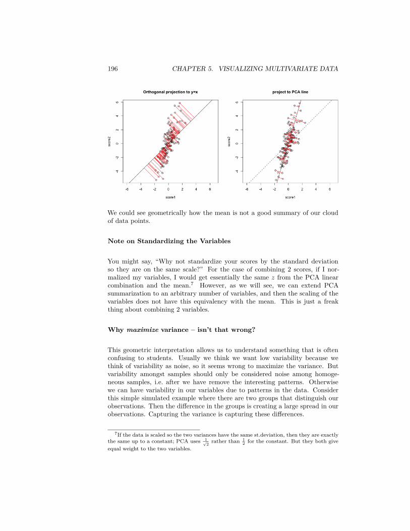
196 CHAPTER 5. VISUALIZING MULTIVARIATE DATA
We could see geometrically how the mean is not a good summary of our cloudof data points.
Note on Standardizing the Variables
You might say, “Why not standardize your scores by the standard deviationso they are on the same scale?” For the case of combining 2 scores, if I nor-malized my variables, I would get essentially the same 𝑧 from the PCA linearcombination and the mean.7 However, as we will see, we can extend PCAsummarization to an arbitrary number of variables, and then the scaling of thevariables does not have this equivalency with the mean. This is just a freakthing about combining 2 variables.
Why maximize variance – isn’t that wrong?
This geometric interpretation allows us to understand something that is oftenconfusing to students. Usually we think we want low variability because wethink of variability as noise, so it seems wrong to maximize the variance. Butvariability amongst samples should only be considered noise among homoge-neous samples, i.e. after we have remove the interesting patterns. Otherwisewe can have variability in our variables due to patterns in the data. Considerthis simple simulated example where there are two groups that distinguish ourobservations. Then the difference in the groups is creating a large spread in ourobservations. Capturing the variance is capturing these differences.
7If the data is scaled so the two variances have the same st.deviation, then they are exactlythe same up to a constant; PCA uses 1√
2 rather than 12 for the constant. But they both give
equal weight to the two variables.
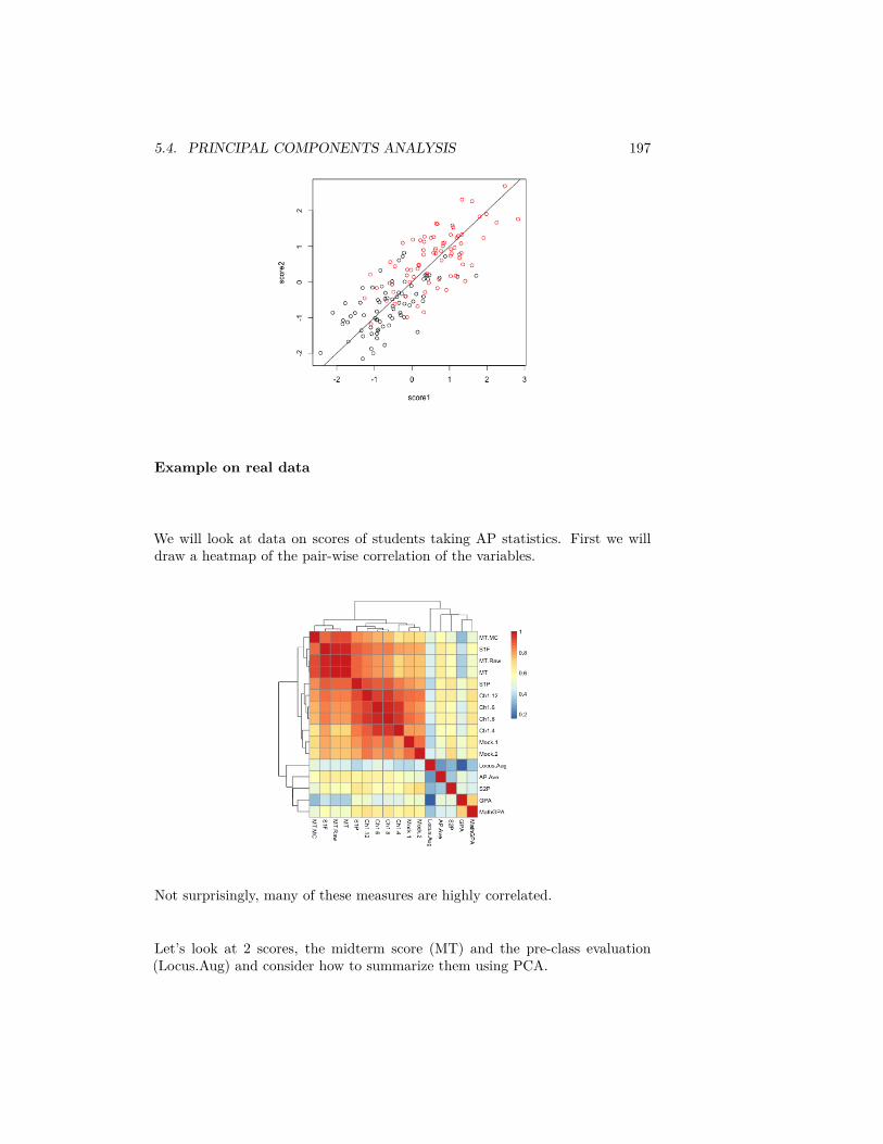
5.4. PRINCIPAL COMPONENTS ANALYSIS 197
Example on real data
We will look at data on scores of students taking AP statistics. First we willdraw a heatmap of the pair-wise correlation of the variables.
Not surprisingly, many of these measures are highly correlated.
Let’s look at 2 scores, the midterm score (MT) and the pre-class evaluation(Locus.Aug) and consider how to summarize them using PCA.
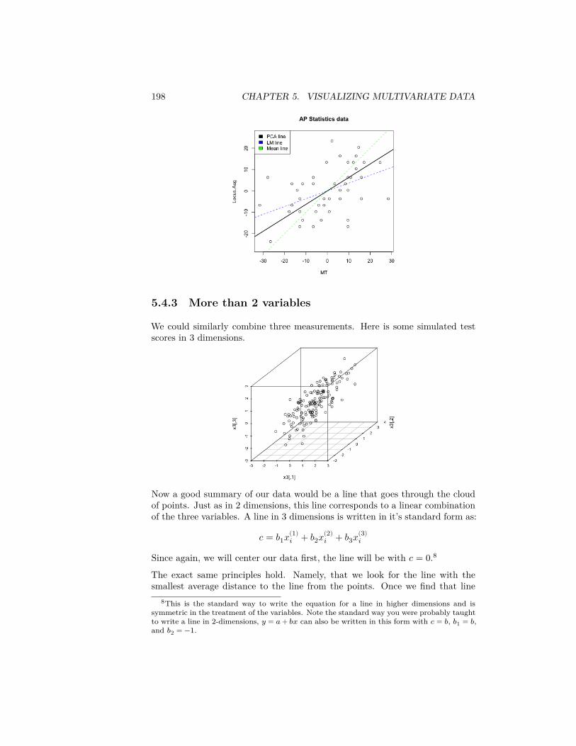
198 CHAPTER 5. VISUALIZING MULTIVARIATE DATA
5.4.3 More than 2 variables
We could similarly combine three measurements. Here is some simulated testscores in 3 dimensions.
Now a good summary of our data would be a line that goes through the cloudof points. Just as in 2 dimensions, this line corresponds to a linear combinationof the three variables. A line in 3 dimensions is written in it’s standard form as:
𝑐 = 𝑏1𝑥(1)𝑖 + 𝑏2𝑥(2)
𝑖 + 𝑏3𝑥(3)𝑖
Since again, we will center our data first, the line will be with 𝑐 = 0.8
The exact same principles hold. Namely, that we look for the line with thesmallest average distance to the line from the points. Once we find that line
8This is the standard way to write the equation for a line in higher dimensions and issymmetric in the treatment of the variables. Note the standard way you were probably taughtto write a line in 2-dimensions, 𝑦 = 𝑎 + 𝑏𝑥 can also be written in this form with 𝑐 = 𝑏, 𝑏1 = 𝑏,and 𝑏2 = −1.
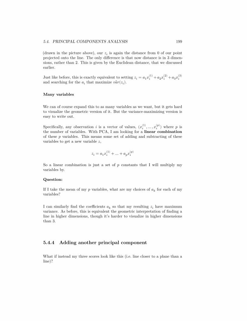
5.4. PRINCIPAL COMPONENTS ANALYSIS 199
(drawn in the picture above), our 𝑧𝑖 is again the distance from 0 of our pointprojected onto the line. The only difference is that now distance is in 3 dimen-sions, rather than 2. This is given by the Euclidean distance, that we discussedearlier.
Just like before, this is exactly equivalent to setting 𝑧𝑖 = 𝑎1𝑥(1)𝑖 + 𝑎2𝑥(2)
𝑖 + 𝑎3𝑥(3)𝑖
and searching for the 𝑎𝑖 that maximize 𝑣𝑎𝑟(𝑧𝑖).
Many variables
We can of course expand this to as many variables as we want, but it gets hardto visualize the geometric version of it. But the variance-maximizing version iseasy to write out.
Specifically, any observation 𝑖 is a vector of values, (𝑥(1)𝑖 , … , 𝑥(𝑝)
𝑖 ) where 𝑝 isthe number of variables. With PCA, I am looking for a linear combinationof these 𝑝 variables. This means some set of adding and subtracting of thesevariables to get a new variable 𝑧,
𝑧𝑖 = 𝑎1𝑥(1)𝑖 + … + 𝑎𝑝𝑥(𝑝)
𝑖
So a linear combination is just a set of 𝑝 constants that I will multiply myvariables by.
Question:
If I take the mean of my 𝑝 variables, what are my choices of 𝑎𝑘 for each of myvariables?
I can similarly find the coefficients 𝑎𝑘 so that my resulting 𝑧𝑖 have maximumvariance. As before, this is equivalent the geometric interpretation of finding aline in higher dimensions, though it’s harder to visualize in higher dimensionsthan 3.
5.4.4 Adding another principal component
What if instead my three scores look like this (i.e. line closer to a plane than aline)?
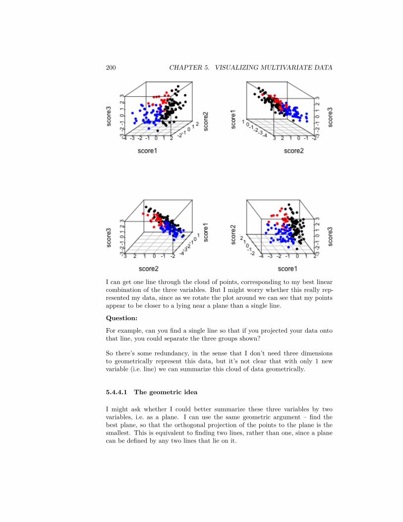
200 CHAPTER 5. VISUALIZING MULTIVARIATE DATA
I can get one line through the cloud of points, corresponding to my best linearcombination of the three variables. But I might worry whether this really rep-resented my data, since as we rotate the plot around we can see that my pointsappear to be closer to a lying near a plane than a single line.
Question:
For example, can you find a single line so that if you projected your data ontothat line, you could separate the three groups shown?
So there’s some redundancy, in the sense that I don’t need three dimensionsto geometrically represent this data, but it’s not clear that with only 1 newvariable (i.e. line) we can summarize this cloud of data geometrically.
5.4.4.1 The geometric idea
I might ask whether I could better summarize these three variables by twovariables, i.e. as a plane. I can use the same geometric argument – find thebest plane, so that the orthogonal projection of the points to the plane is thesmallest. This is equivalent to finding two lines, rather than one, since a planecan be defined by any two lines that lie on it.
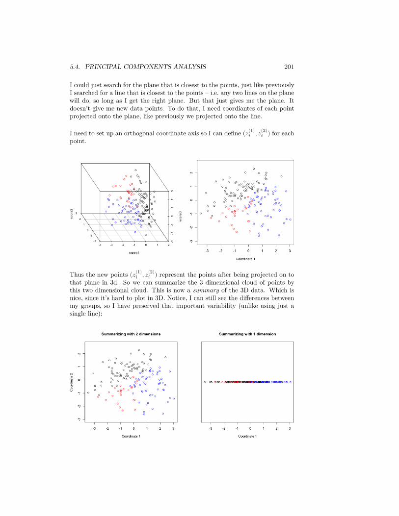
5.4. PRINCIPAL COMPONENTS ANALYSIS 201
I could just search for the plane that is closest to the points, just like previouslyI searched for a line that is closest to the points – i.e. any two lines on the planewill do, so long as I get the right plane. But that just gives me the plane. Itdoesn’t give me new data points. To do that, I need coordiantes of each pointprojected onto the plane, like previously we projected onto the line.
I need to set up an orthogonal coordinate axis so I can define (𝑧(1)𝑖 , 𝑧(2)
𝑖 ) for eachpoint.
Thus the new points (𝑧(1)𝑖 , 𝑧(2)
𝑖 ) represent the points after being projected on tothat plane in 3d. So we can summarize the 3 dimensional cloud of points bythis two dimensional cloud. This is now a summary of the 3D data. Which isnice, since it’s hard to plot in 3D. Notice, I can still see the differences betweenmy groups, so I have preserved that important variability (unlike using just asingle line):
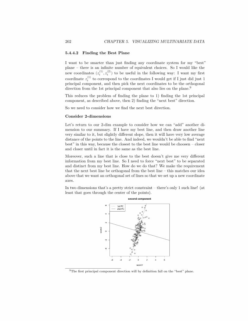
202 CHAPTER 5. VISUALIZING MULTIVARIATE DATA
5.4.4.2 Finding the Best Plane
I want to be smarter than just finding any coordinate system for my “best”plane – there is an infinite number of equivalent choices. So I would like thenew coordinates (𝑧(1)
𝑖 , 𝑧(2)𝑖 ) to be useful in the following way: I want my first
coordinate 𝑧(1)𝑖 to correspond to the coordinates I would get if I just did just 1
principal component, and then pick the next coordinates to be the orthogonaldirection from the 1st principal component that also lies on the plane.9
This reduces the problem of finding the plane to 1) finding the 1st principalcomponent, as described above, then 2) finding the “next best” direction.
So we need to consider how we find the next best direction.
Consider 2-dimensions
Let’s return to our 2-dim example to consider how we can “add” another di-mension to our summary. If I have my best line, and then draw another linevery similar to it, but slightly different slope, then it will have very low averagedistance of the points to the line. And indeed, we wouldn’t be able to find “nextbest” in this way, because the closest to the best line would be choosen – closerand closer until in fact it is the same as the best line.
Moreover, such a line that is close to the best doesn’t give me very differentinformation from my best line. So I need to force “next best” to be separatedand distinct from my best line. How do we do that? We make the requirementthat the next best line be orthogonal from the best line – this matches our ideaabove that we want an orthogonal set of lines so that we set up a new coordinateaxes.
In two dimensions that’s a pretty strict constraint – there’s only 1 such line! (atleast that goes through the center of the points).
9The first principal component direction will by definition fall on the “best” plane.
5.4. PRINCIPAL COMPONENTS ANALYSIS 203
Return to 3 dimensions
In three dimensions, however, there are a whole space of lines to pick from thatare orthogonal to the 1st PC and go through the center of the points.
Not all of these lines will be as close to the data as others lines. So there isactually a choice to be made here. We can use the same criterion as before.Of all of these lines, which minimize the distance of the points to the line? Or(equivalently) which result in a linear combination with maximum variance?
To recap: we find the first principal component based on minimizing the points’distance to line. To find the second principal component, we similarly findthe line that minimize the points’ distance to the line but only consider linesorthogonal to the the first component.
If we follow this procedure, we will get two orthogonal lines that define a plane,and this plane is the closest to the points as well (in terms of the orthogonaldistance of the points to the plane). In otherwords, we found the two lineswithout thinking about finding the “best” plane, but in the end the plane theycreate will be the closest.
5.4.4.3 Projecting onto Two Principal Components
Just like before, we want to be able to not just describe the best plane, but tosummarize the data. Namely, we want to project our data onto the plane. Wedo this again, by projecting each point to the point on the plane that has theshortest distance, namely it’s orthogonal projection.
We could describe this project point in our original coordinate space (i.e. withrespect to the 3 original variables), but in fact these projected points lie on aplane and so we only need two dimensions to describe these projected points.So we want to create a new coordinate system for this plane based on the two(orthogonal) principal component directions we found.
Finding the coordiantes in 2Dim
Let’s consider the simple 2-d case again. Since we are in only 2D, our two princi-pal component directions are equivalent to defining a new orthogonal coordinatesystem.
Then the new coordinates of our points we will call (𝑧(1)𝑖 , 𝑧(2)
𝑖 ). To figure outtheir values coordiantes of the points on this new coordinate system, we do whatwe did before:
1. Project the points onto the first direction. The distance of the point alongthe first direction is 𝑧(1)
𝑖2. Project the points onto the second direction. The distance of the point
along the second direction is 𝑧(2)𝑖
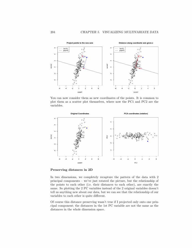
204 CHAPTER 5. VISUALIZING MULTIVARIATE DATA
You can now consider them as new coordinates of the points. It is common toplot them as a scatter plot themselves, where now the PC1 and PC2 are thevariables.
Preserving distances in 2D
In two dimensions, we completely recapture the pattern of the data with 2principal components – we’ve just rotated the picture, but the relationship ofthe points to each other (i.e. their distances to each other), are exactly thesame. So plotting the 2 PC variables instead of the 2 original variables doesn’ttell us anything new about our data, but we can see that the relationship of ourvariables to each other is quite different.
Of course this distance preserving wasn’t true if I projected only onto one prin-cipal component; the distances in the 1st PC variable are not the same as thedistances in the whole dimension space.
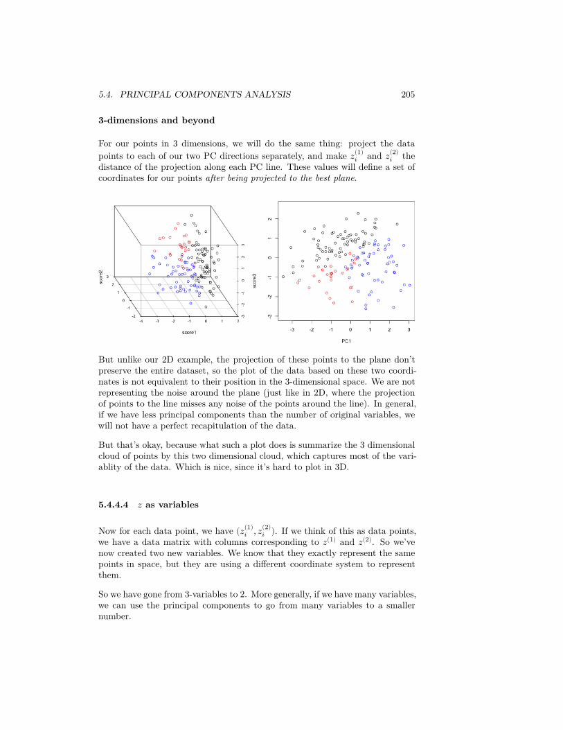
5.4. PRINCIPAL COMPONENTS ANALYSIS 205
3-dimensions and beyond
For our points in 3 dimensions, we will do the same thing: project the datapoints to each of our two PC directions separately, and make 𝑧(1)
𝑖 and 𝑧(2)𝑖 the
distance of the projection along each PC line. These values will define a set ofcoordinates for our points after being projected to the best plane.
But unlike our 2D example, the projection of these points to the plane don’tpreserve the entire dataset, so the plot of the data based on these two coordi-nates is not equivalent to their position in the 3-dimensional space. We are notrepresenting the noise around the plane (just like in 2D, where the projectionof points to the line misses any noise of the points around the line). In general,if we have less principal components than the number of original variables, wewill not have a perfect recapitulation of the data.
But that’s okay, because what such a plot does is summarize the 3 dimensionalcloud of points by this two dimensional cloud, which captures most of the vari-ablity of the data. Which is nice, since it’s hard to plot in 3D.
5.4.4.4 𝑧 as variables
Now for each data point, we have (𝑧(1)𝑖 , 𝑧(2)
𝑖 ). If we think of this as data points,we have a data matrix with columns corresponding to 𝑧(1) and 𝑧(2). So we’venow created two new variables. We know that they exactly represent the samepoints in space, but they are using a different coordinate system to representthem.
So we have gone from 3-variables to 2. More generally, if we have many variables,we can use the principal components to go from many variables to a smallernumber.
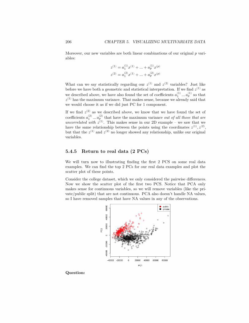
206 CHAPTER 5. VISUALIZING MULTIVARIATE DATA
Moreover, our new variables are both linear combinations of our original 𝑝 vari-ables:
𝑧(1) = 𝑎(1)1 𝑥(1) + … + 𝑎(1)
𝑝 𝑥(𝑝)
𝑧(2) = 𝑎(2)1 𝑥(1) + … + 𝑎(2)
𝑝 𝑥(𝑝)
What can we say statistically regarding our 𝑧(1) and 𝑧(2) variables? Just likebefore we have both a geometric and statistical interpretation. If we find 𝑧(1) aswe described above, we have also found the set of coefficients 𝑎(1)
1 … 𝑎(1)𝑝 so that
𝑧(1) has the maximum variance. That makes sense, because we already said thatwe would choose it as if we did just PC for 1 component.
If we find 𝑧(2) as we described above, we know that we have found the set ofcoefficients 𝑎(2)
1 … 𝑎(2)𝑝 that have the maximum variance out of all those that are
uncorrelated with 𝑧(1). This makes sense in our 2D example – we saw that wehave the same relationship between the points using the coordinates 𝑧(1), 𝑧(2),but that the 𝑧(1) and 𝑧(2) no longer showed any relationship, unlike our originalvariables.
5.4.5 Return to real data (2 PCs)
We will turn now to illustrating finding the first 2 PCS on some real dataexamples. We can find the top 2 PCs for our real data examples and plot thescatter plot of these points.
Consider the college dataset, which we only considered the pairwise differences.Now we show the scatter plot of the first two PCS. Notice that PCA onlymakes sense for continuous variables, so we will remove variables (like the pri-vate/public split) that are not continuous. PCA also doesn’t handle NA values,so I have removed samples that have NA values in any of the observations.
Question:
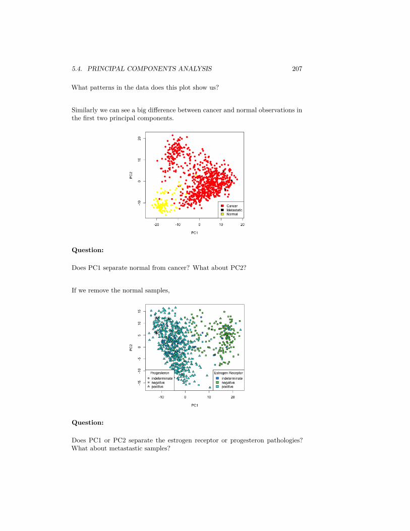
5.4. PRINCIPAL COMPONENTS ANALYSIS 207
What patterns in the data does this plot show us?
Similarly we can see a big difference between cancer and normal observations inthe first two principal components.
Question:
Does PC1 separate normal from cancer? What about PC2?
If we remove the normal samples,
Question:
Does PC1 or PC2 separate the estrogen receptor or progesteron pathologies?What about metastastic samples?

208 CHAPTER 5. VISUALIZING MULTIVARIATE DATA
5.4.6 Interpreting
5.4.6.1 Loadings
The scatterplots doen’t tell us how the original variables relate to our newvariables, i.e. the coefficients 𝑎𝑗 which tell us how much of each of the originalvariables we used. These 𝑎𝑗 are sometimes called the loadings. We can go backto what their coefficients are in our linear combination
We can see that the first PC is a combination of variables related to the costof the university (TUITFTE, TUITIONFEE_IN, TUITIONFEE_OUT are re-lated to the tuition fees, and mn_earn_wne_p10/md_earn_wne_p10 are re-lated to the total of amount financial aid students earn by working in aggregateacross the whole school, so presumably related to cost of university); so it makessense that in aggregate the public universities had lower PC1 scores than privatein our 2-D scatter plot. Note all the coefficients in PC1 are positive, so we canthink of this as roughly mean of these variables.
PC2, however, has negative values for the tuition related variables, and positivevalues for the financial aid earnings variables; and UGDS is the number ofUndergraduate Students, which has also positive coefficients. So university withhigh tuition relative to the aggregate amount of financial aid they give andstudent size, for example, will have low PC2 values. This makes sense: PC2 isthe variable that pretty cleanly divided private and public schools, with privateschools having low PC2 values.
5.4.6.2 Correlations
It’s often interesting to look at the correlation between the new variables andthe old variables. Below, I plot the heatmap of the correlation matrix consistingof all the pair-wise correlations of the original variables with the new PCs
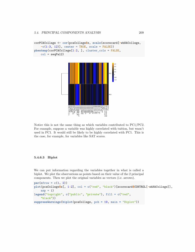
5.4. PRINCIPAL COMPONENTS ANALYSIS 209
corPCACollege <- cor(pcaCollege$x, scale(scorecard[-whNACollege,-c(1:3, 12)], center = TRUE, scale = FALSE))
pheatmap(corPCACollege[1:2, ], cluster_cols = FALSE,col = seqPal2)
Notice this is not the same thing as which variables contributed to PC1/PC2.For example, suppose a variable was highly correlated with tuition, but wasn’tused in PC1. It would still be likely to be highly correlated with PC1. This isthe case, for example, for variables like SAT scores.
5.4.6.3 Biplot
We can put information regarding the variables together in what is called abiplot. We plot the observations as points based on their value of the 2 principalcomponents. Then we plot the original variables as vectors (i.e. arrows).par(mfrow = c(1, 2))plot(pcaCollege$x[, 1:2], col = c("red", "black")[scorecard$CONTROL[-whNACollege]],
asp = 1)legend("topright", c("public", "private"), fill = c("red",
"black"))suppressWarnings(biplot(pcaCollege, pch = 19, main = "Biplot"))
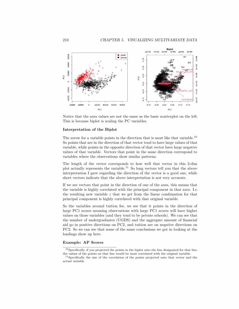
210 CHAPTER 5. VISUALIZING MULTIVARIATE DATA
Notice that the axes values are not the same as the basic scatterplot on the left.This is because biplot is scaling the PC variables.
Interpretation of the Biplot
The arrow for a variable points in the direction that is most like that variable.10
So points that are in the direction of that vector tend to have large values of thatvariable, while points in the opposite direction of that vector have large negativevalues of that variable. Vectors that point in the same direction correspond tovariables where the observations show similar patterns.
The length of the vector corresponds to how well that vector in this 2-dimplot actually represents the variable.11 So long vectors tell you that the aboveinterpretation I gave regarding the direction of the vector is a good one, whileshort vectors indicate that the above interpretation is not very accurate.
If we see vectors that point in the direction of one of the axes, this means thatthe variable is highly correlated with the principal component in that axes. I.e.the resulting new variable 𝑧 that we get from the linear combination for thatprincipal component is highly correlated with that original variable.
So the variables around tuition fee, we see that it points in the direction oflarge PC1 scores meaning observations with large PC1 scores will have highervalues on those variables (and they tend to be private schools). We can see thatthe number of undergraduates (UGDS) and the aggregate amount of financialaid go in positive directions on PC2, and tuition are on negative directions onPC2. So we can see that some of the same conclusions we got in looking at theloadings show up here.
Example: AP Scores10Specifically, if you projected the points in the biplot onto the line designated for that line,
the values of the points on that line would be most correlated with the original variable.11Specifically the size of the correlation of the points projected onto that vector and the
actual variable.
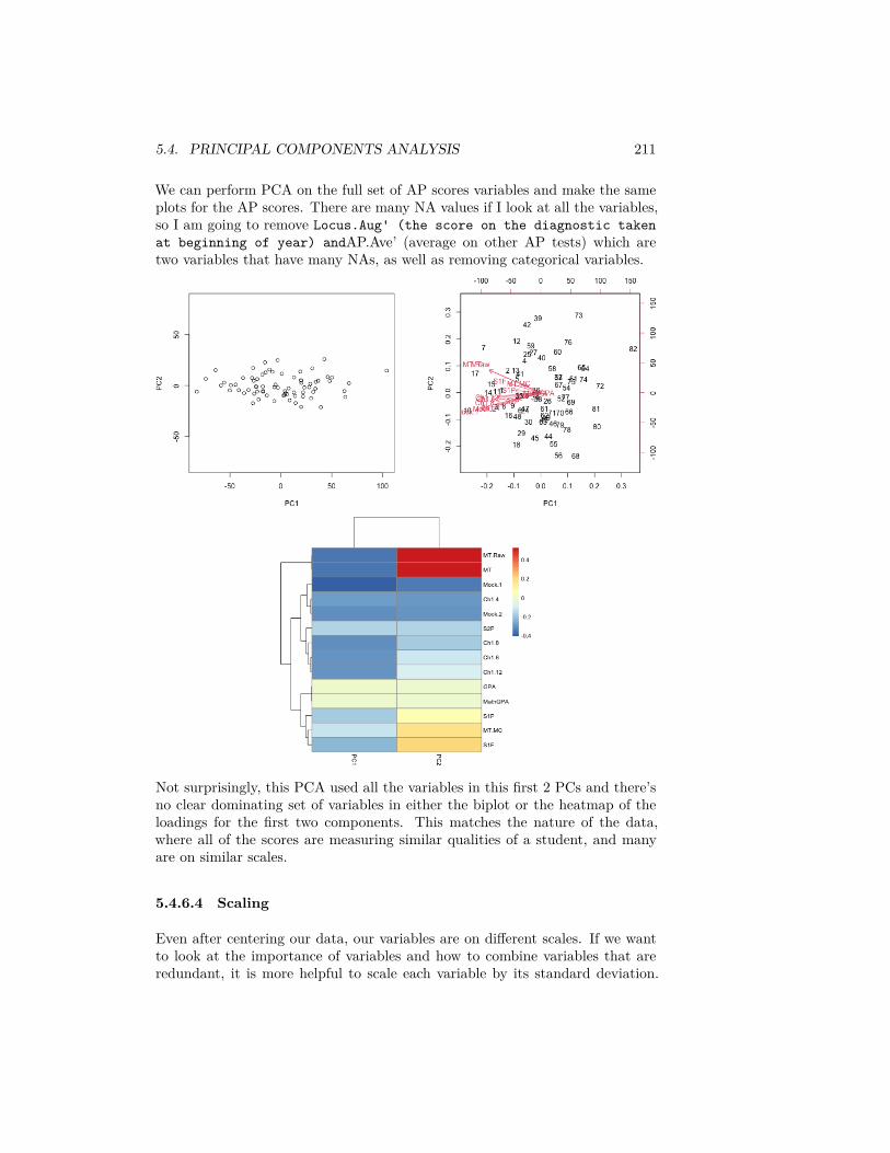
5.4. PRINCIPAL COMPONENTS ANALYSIS 211
We can perform PCA on the full set of AP scores variables and make the sameplots for the AP scores. There are many NA values if I look at all the variables,so I am going to remove Locus.Aug' (the score on the diagnostic takenat beginning of year) andAP.Ave’ (average on other AP tests) which aretwo variables that have many NAs, as well as removing categorical variables.
Not surprisingly, this PCA used all the variables in this first 2 PCs and there’sno clear dominating set of variables in either the biplot or the heatmap of theloadings for the first two components. This matches the nature of the data,where all of the scores are measuring similar qualities of a student, and manyare on similar scales.
5.4.6.4 Scaling
Even after centering our data, our variables are on different scales. If we wantto look at the importance of variables and how to combine variables that areredundant, it is more helpful to scale each variable by its standard deviation.
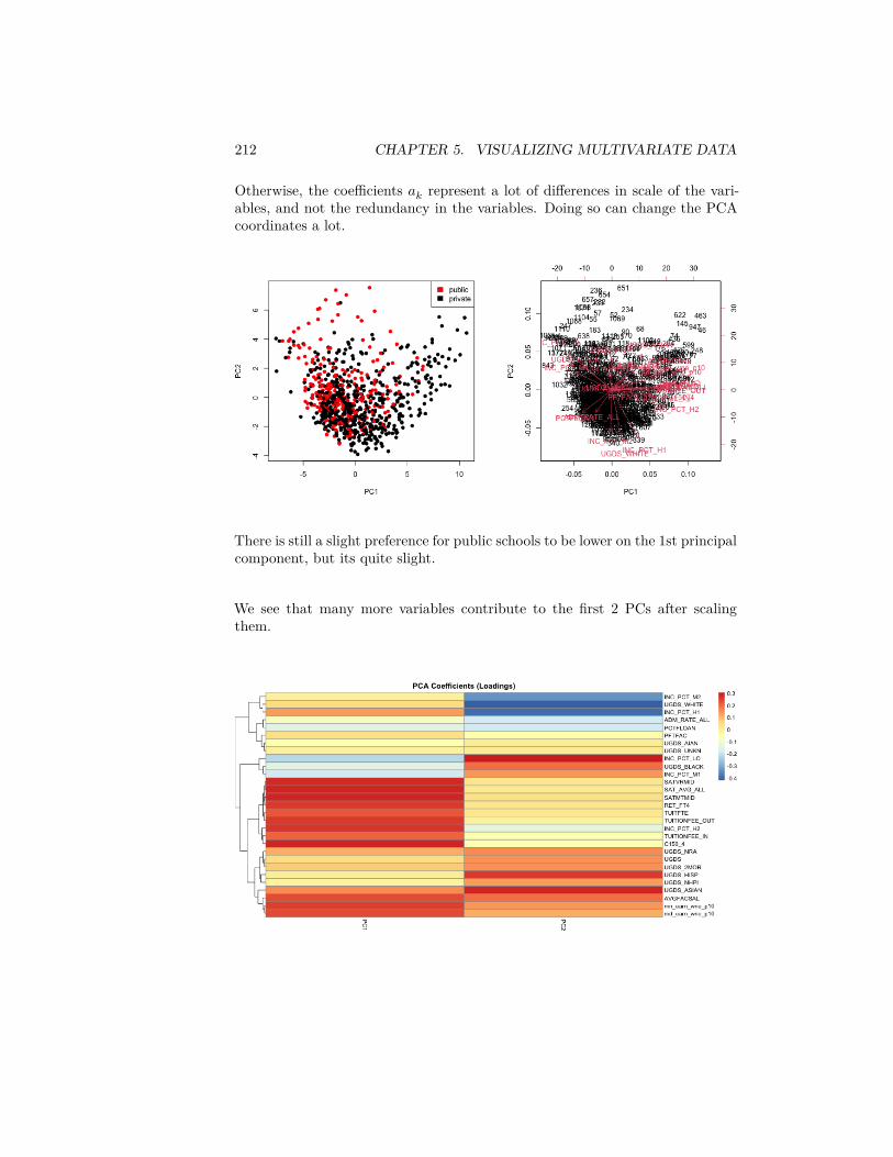
212 CHAPTER 5. VISUALIZING MULTIVARIATE DATA
Otherwise, the coefficients 𝑎𝑘 represent a lot of differences in scale of the vari-ables, and not the redundancy in the variables. Doing so can change the PCAcoordinates a lot.
There is still a slight preference for public schools to be lower on the 1st principalcomponent, but its quite slight.
We see that many more variables contribute to the first 2 PCs after scalingthem.
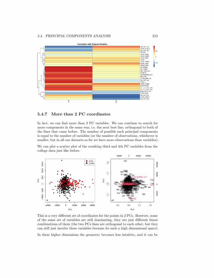
5.4. PRINCIPAL COMPONENTS ANALYSIS 213
5.4.7 More than 2 PC coordinates
In fact, we can find more than 2 PC variables. We can continue to search formore components in the same way, i.e. the next best line, orthogonal to both ofthe lines that came before. The number of possible such principal componentsis equal to the number of variables (or the number of observations, whichever issmaller; but in all our datasets so far we have more observations than variables).
We can plot a scatter plot of the resulting third and 4th PC variables from thecollege data just like before.
This is a very different set of coordinates for the points in 2 PCs. However, someof the same set of variables are still dominating, they are just different linearcombinations of them (the two PCs lines are orthogonal to each other, but theycan still just involve these variables because its such a high dimensional space).
In these higher dimensions the geometry becomes less intuitive, and it can be

214 CHAPTER 5. VISUALIZING MULTIVARIATE DATA
helpful to go back to the interpretation of linear combinations of the originalvariables, because it is easy to scale that up in our minds.
We can see this by a heatmap of all the coefficients. It’s also common to scaleeach set of PC coefficients by the standard deviation of the final variable 𝑧 thatthe coefficients create. This makes later PCs not stand out so much. 12
Breast data
We can also look at the higher PCs from the breast data (with the normalsamples).
12We haven’t discussed this, but in fact the coefficients are scaled so the sum of the squareof the coefficients equal 1 (norm is one). Otherwise there’s not a unique set of coefficients,since you could always just multiply all the coefficients by a number and get larger and largervariance. So the coefficients are all on the similar scale, regardless of the original variabilityor importance of the PC in explaining the data.

5.4. PRINCIPAL COMPONENTS ANALYSIS 215
Question:
If there are 500 genes and 878 observations, how many PCs are there?
We can see that there are distinct patterns in what genes/variables contributeto the final PCs (we plot only the top 25 PCs). However, it’s rather hard to see,because there are large values in later PCs that mask the pattern.
This is an example of why it is useful to scale the variables by their variance

216 CHAPTER 5. VISUALIZING MULTIVARIATE DATA
%We can also look at the correlations with our original variables (genes), and seethe patterns more clearly. % % “‘{r pcaBreastCor,out.width=doubleWidth,fig.width=2*figWidth}% #’ Now we plot the heatmap of the correlations between the original andthe new variables. % par(mfrow=c(1,2)) % aheatmap(breastCenteredMed[,-c(1:7)],Rowv = FALSE, Colv = FALSE, % breaks=brksCentered,annRow=breast[,5:7],labRow=NA,col=seqPal2,% annColors=list(“TypeSample”=typeCol,“EstReceptor”=estCol,“Progesteron”=proCol))% corPCABreast<-cor(pcaBreast𝑥, 𝑏𝑟𝑒𝑎𝑠𝑡𝐶𝑒𝑛𝑡𝑒𝑟𝑒𝑑𝑀𝑒𝑑[, −𝑐(1 ∶ 7)])colInd,col=seqPal2,Rowv=NA)% @
5.4.8 How many dimensions?
If I can draw my data in 3d, then I can guess what is the write number ofcoordinates – not 1 but 2 in our toy example case were needed. When I have alot of coordinates, like the college data, how can I possibly know? One techniqueis to look at how much variability there is in each of the coordinates – how
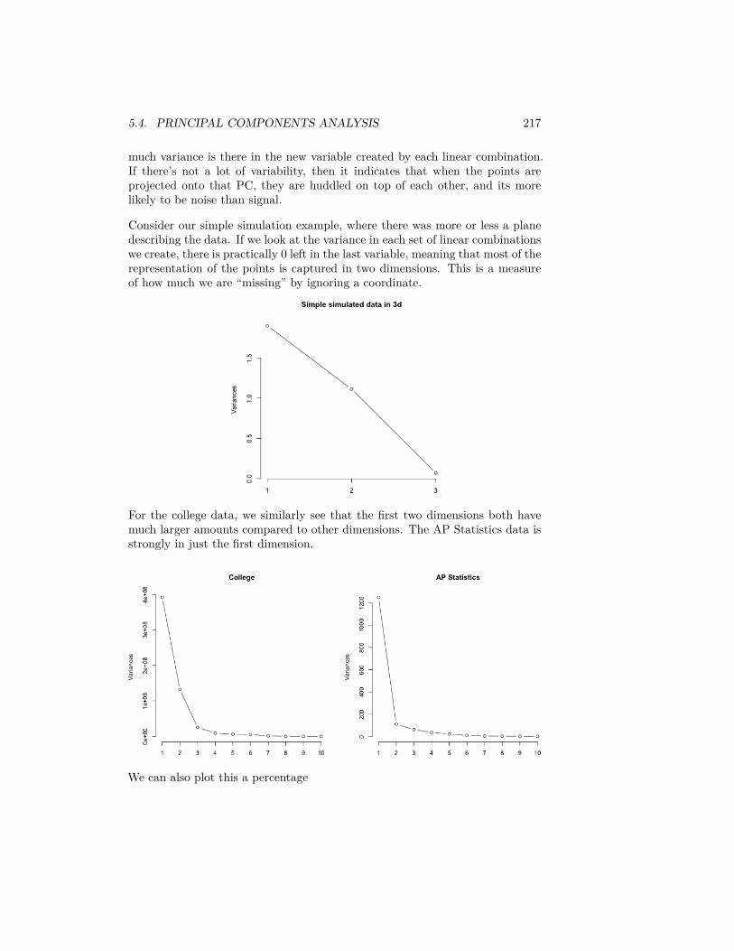
5.4. PRINCIPAL COMPONENTS ANALYSIS 217
much variance is there in the new variable created by each linear combination.If there’s not a lot of variability, then it indicates that when the points areprojected onto that PC, they are huddled on top of each other, and its morelikely to be noise than signal.
Consider our simple simulation example, where there was more or less a planedescribing the data. If we look at the variance in each set of linear combinationswe create, there is practically 0 left in the last variable, meaning that most of therepresentation of the points is captured in two dimensions. This is a measureof how much we are “missing” by ignoring a coordinate.
For the college data, we similarly see that the first two dimensions both havemuch larger amounts compared to other dimensions. The AP Statistics data isstrongly in just the first dimension.
We can also plot this a percentage
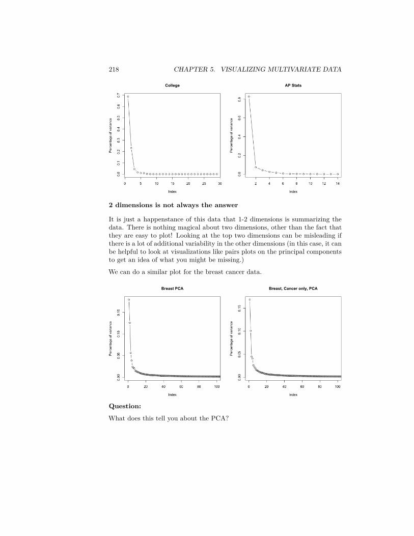
218 CHAPTER 5. VISUALIZING MULTIVARIATE DATA
2 dimensions is not always the answer
It is just a happenstance of this data that 1-2 dimensions is summarizing thedata. There is nothing magical about two dimensions, other than the fact thatthey are easy to plot! Looking at the top two dimensions can be misleading ifthere is a lot of additional variability in the other dimensions (in this case, it canbe helpful to look at visualizations like pairs plots on the principal componentsto get an idea of what you might be missing.)
We can do a similar plot for the breast cancer data.
Question:
What does this tell you about the PCA?
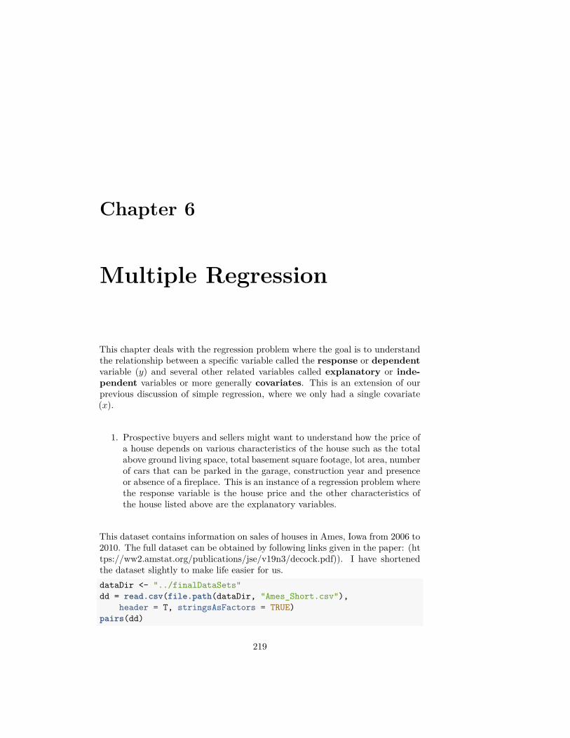
Chapter 6
Multiple Regression
This chapter deals with the regression problem where the goal is to understandthe relationship between a specific variable called the response or dependentvariable (𝑦) and several other related variables called explanatory or inde-pendent variables or more generally covariates. This is an extension of ourprevious discussion of simple regression, where we only had a single covariate(𝑥).
1. Prospective buyers and sellers might want to understand how the price ofa house depends on various characteristics of the house such as the totalabove ground living space, total basement square footage, lot area, numberof cars that can be parked in the garage, construction year and presenceor absence of a fireplace. This is an instance of a regression problem wherethe response variable is the house price and the other characteristics ofthe house listed above are the explanatory variables.
This dataset contains information on sales of houses in Ames, Iowa from 2006 to2010. The full dataset can be obtained by following links given in the paper: (https://ww2.amstat.org/publications/jse/v19n3/decock.pdf)). I have shortenedthe dataset slightly to make life easier for us.dataDir <- "../finalDataSets"dd = read.csv(file.path(dataDir, "Ames_Short.csv"),
header = T, stringsAsFactors = TRUE)pairs(dd)
219
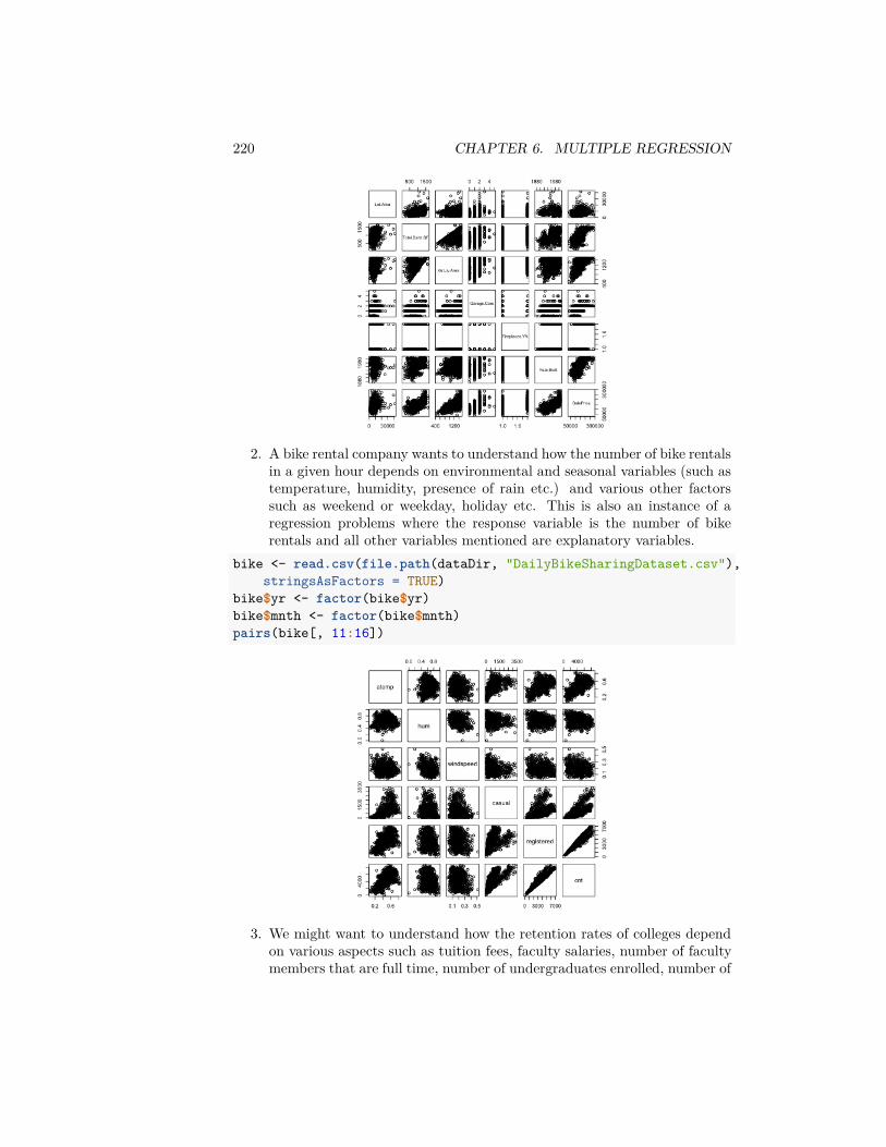
220 CHAPTER 6. MULTIPLE REGRESSION
2. A bike rental company wants to understand how the number of bike rentalsin a given hour depends on environmental and seasonal variables (such astemperature, humidity, presence of rain etc.) and various other factorssuch as weekend or weekday, holiday etc. This is also an instance of aregression problems where the response variable is the number of bikerentals and all other variables mentioned are explanatory variables.
bike <- read.csv(file.path(dataDir, "DailyBikeSharingDataset.csv"),stringsAsFactors = TRUE)
bike$yr <- factor(bike$yr)bike$mnth <- factor(bike$mnth)pairs(bike[, 11:16])
3. We might want to understand how the retention rates of colleges dependon various aspects such as tuition fees, faculty salaries, number of facultymembers that are full time, number of undergraduates enrolled, number of
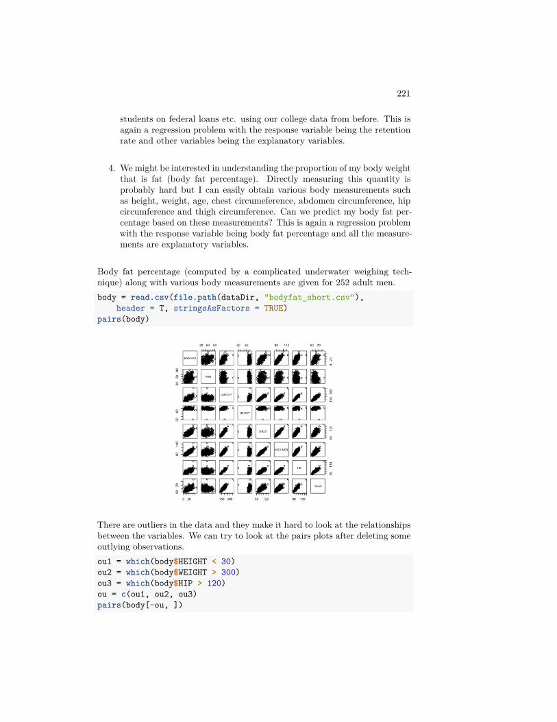
221
students on federal loans etc. using our college data from before. This isagain a regression problem with the response variable being the retentionrate and other variables being the explanatory variables.
4. We might be interested in understanding the proportion of my body weightthat is fat (body fat percentage). Directly measuring this quantity isprobably hard but I can easily obtain various body measurements suchas height, weight, age, chest circumeference, abdomen circumference, hipcircumference and thigh circumference. Can we predict my body fat per-centage based on these measurements? This is again a regression problemwith the response variable being body fat percentage and all the measure-ments are explanatory variables.
Body fat percentage (computed by a complicated underwater weighing tech-nique) along with various body measurements are given for 252 adult men.body = read.csv(file.path(dataDir, "bodyfat_short.csv"),
header = T, stringsAsFactors = TRUE)pairs(body)
There are outliers in the data and they make it hard to look at the relationshipsbetween the variables. We can try to look at the pairs plots after deleting someoutlying observations.ou1 = which(body$HEIGHT < 30)ou2 = which(body$WEIGHT > 300)ou3 = which(body$HIP > 120)ou = c(ou1, ou2, ou3)pairs(body[-ou, ])
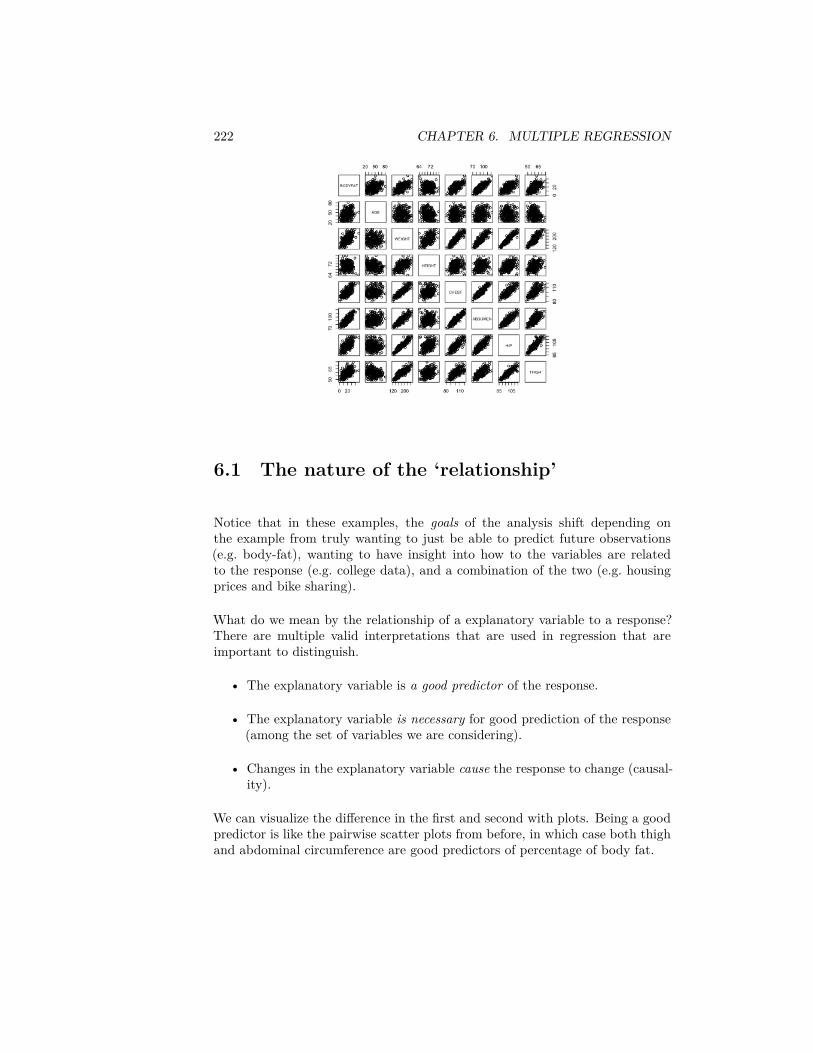
222 CHAPTER 6. MULTIPLE REGRESSION
6.1 The nature of the ‘relationship’
Notice that in these examples, the goals of the analysis shift depending onthe example from truly wanting to just be able to predict future observations(e.g. body-fat), wanting to have insight into how to the variables are relatedto the response (e.g. college data), and a combination of the two (e.g. housingprices and bike sharing).
What do we mean by the relationship of a explanatory variable to a response?There are multiple valid interpretations that are used in regression that areimportant to distinguish.
• The explanatory variable is a good predictor of the response.
• The explanatory variable is necessary for good prediction of the response(among the set of variables we are considering).
• Changes in the explanatory variable cause the response to change (causal-ity).
We can visualize the difference in the first and second with plots. Being a goodpredictor is like the pairwise scatter plots from before, in which case both thighand abdominal circumference are good predictors of percentage of body fat.
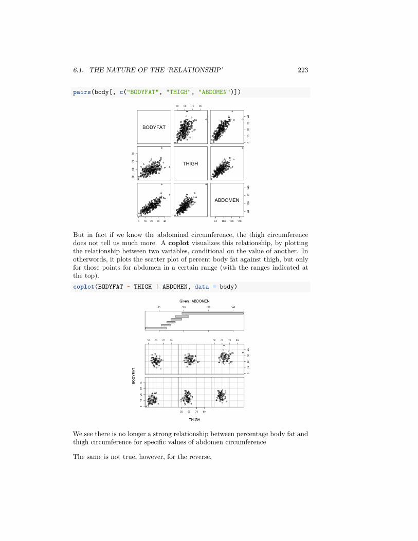
6.1. THE NATURE OF THE ‘RELATIONSHIP’ 223
pairs(body[, c("BODYFAT", "THIGH", "ABDOMEN")])
But in fact if we know the abdominal circumference, the thigh circumferencedoes not tell us much more. A coplot visualizes this relationship, by plottingthe relationship between two variables, conditional on the value of another. Inotherwords, it plots the scatter plot of percent body fat against thigh, but onlyfor those points for abdomen in a certain range (with the ranges indicated atthe top).coplot(BODYFAT ~ THIGH | ABDOMEN, data = body)
We see there is no longer a strong relationship between percentage body fat andthigh circumference for specific values of abdomen circumference
The same is not true, however, for the reverse,
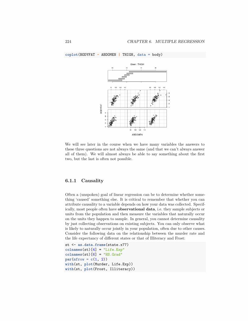
224 CHAPTER 6. MULTIPLE REGRESSION
coplot(BODYFAT ~ ABDOMEN | THIGH, data = body)
We will see later in the course when we have many variables the answers tothese three questions are not always the same (and that we can’t always answerall of them). We will almost always be able to say something about the firsttwo, but the last is often not possible.
6.1.1 Causality
Often a (unspoken) goal of linear regression can be to determine whether some-thing ‘caused’ something else. It is critical to remember that whether you canattribute causality to a variable depends on how your data was collected. Specif-ically, most people often have observational data, i.e. they sample subjects orunits from the population and then measure the variables that naturally occuron the units they happen to sample. In general, you cannot determine causalityby just collecting observations on existing subjects. You can only observe whatis likely to naturally occur jointly in your population, often due to other causes.Consider the following data on the relationship between the murder rate andthe life expectancy of different states or that of Illiteracy and Frost:st <- as.data.frame(state.x77)colnames(st)[4] = "Life.Exp"colnames(st)[6] = "HS.Grad"par(mfrow = c(1, 2))with(st, plot(Murder, Life.Exp))with(st, plot(Frost, Illiteracy))
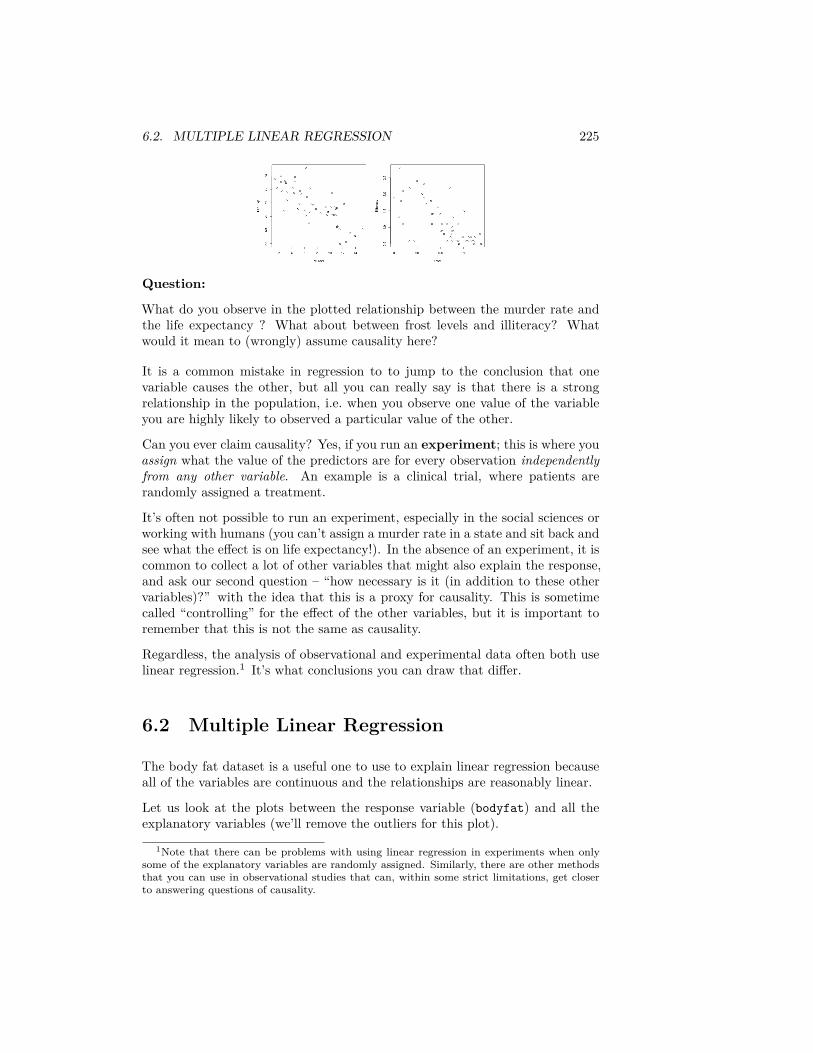
6.2. MULTIPLE LINEAR REGRESSION 225
Question:
What do you observe in the plotted relationship between the murder rate andthe life expectancy ? What about between frost levels and illiteracy? Whatwould it mean to (wrongly) assume causality here?
It is a common mistake in regression to to jump to the conclusion that onevariable causes the other, but all you can really say is that there is a strongrelationship in the population, i.e. when you observe one value of the variableyou are highly likely to observed a particular value of the other.
Can you ever claim causality? Yes, if you run an experiment; this is where youassign what the value of the predictors are for every observation independentlyfrom any other variable. An example is a clinical trial, where patients arerandomly assigned a treatment.
It’s often not possible to run an experiment, especially in the social sciences orworking with humans (you can’t assign a murder rate in a state and sit back andsee what the effect is on life expectancy!). In the absence of an experiment, it iscommon to collect a lot of other variables that might also explain the response,and ask our second question – “how necessary is it (in addition to these othervariables)?” with the idea that this is a proxy for causality. This is sometimecalled “controlling” for the effect of the other variables, but it is important toremember that this is not the same as causality.
Regardless, the analysis of observational and experimental data often both uselinear regression.1 It’s what conclusions you can draw that differ.
6.2 Multiple Linear Regression
The body fat dataset is a useful one to use to explain linear regression becauseall of the variables are continuous and the relationships are reasonably linear.
Let us look at the plots between the response variable (bodyfat) and all theexplanatory variables (we’ll remove the outliers for this plot).
1Note that there can be problems with using linear regression in experiments when onlysome of the explanatory variables are randomly assigned. Similarly, there are other methodsthat you can use in observational studies that can, within some strict limitations, get closerto answering questions of causality.
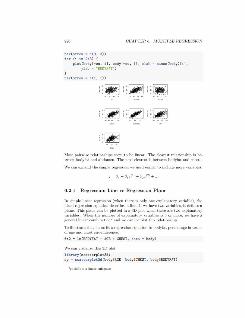
226 CHAPTER 6. MULTIPLE REGRESSION
par(mfrow = c(3, 3))for (i in 2:8) {
plot(body[-ou, i], body[-ou, 1], xlab = names(body)[i],ylab = "BODYFAT")
}par(mfrow = c(1, 1))
Most pairwise relationships seem to be linear. The clearest relationship is be-tween bodyfat and abdomen. The next clearest is between bodyfat and chest.
We can expand the simple regression we used earlier to include more variables.
𝑦 = 𝛽0 + 𝛽1𝑥(1) + 𝛽2𝑥(2) + …
6.2.1 Regression Line vs Regression Plane
In simple linear regression (when there is only one explanatory variable), thefitted regression equation describes a line. If we have two variables, it defines aplane. This plane can be plotted in a 3D plot when there are two explanatoryvariables. When the number of explanatory variables is 3 or more, we have ageneral linear combination2 and we cannot plot this relationship.
To illustrate this, let us fit a regression equation to bodyfat percentage in termsof age and chest circumference:ft2 = lm(BODYFAT ~ AGE + CHEST, data = body)
We can visualize this 3D plot:library(scatterplot3d)sp = scatterplot3d(body$AGE, body$CHEST, body$BODYFAT)
2so defines a linear subspace
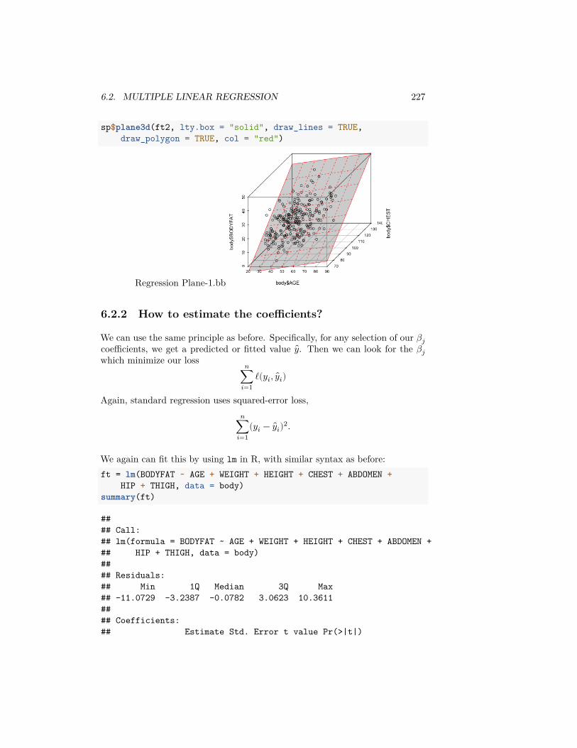
6.2. MULTIPLE LINEAR REGRESSION 227
sp$plane3d(ft2, lty.box = "solid", draw_lines = TRUE,draw_polygon = TRUE, col = "red")
Regression Plane-1.bb
6.2.2 How to estimate the coefficients?
We can use the same principle as before. Specifically, for any selection of our 𝛽𝑗coefficients, we get a predicted or fitted value 𝑦. Then we can look for the 𝛽𝑗which minimize our loss 𝑛
∑𝑖=1
ℓ(𝑦𝑖, 𝑦𝑖)
Again, standard regression uses squared-error loss,𝑛
∑𝑖=1
(𝑦𝑖 − 𝑦𝑖)2.
We again can fit this by using lm in R, with similar syntax as before:ft = lm(BODYFAT ~ AGE + WEIGHT + HEIGHT + CHEST + ABDOMEN +
HIP + THIGH, data = body)summary(ft)
#### Call:## lm(formula = BODYFAT ~ AGE + WEIGHT + HEIGHT + CHEST + ABDOMEN +## HIP + THIGH, data = body)#### Residuals:## Min 1Q Median 3Q Max## -11.0729 -3.2387 -0.0782 3.0623 10.3611#### Coefficients:## Estimate Std. Error t value Pr(>|t|)
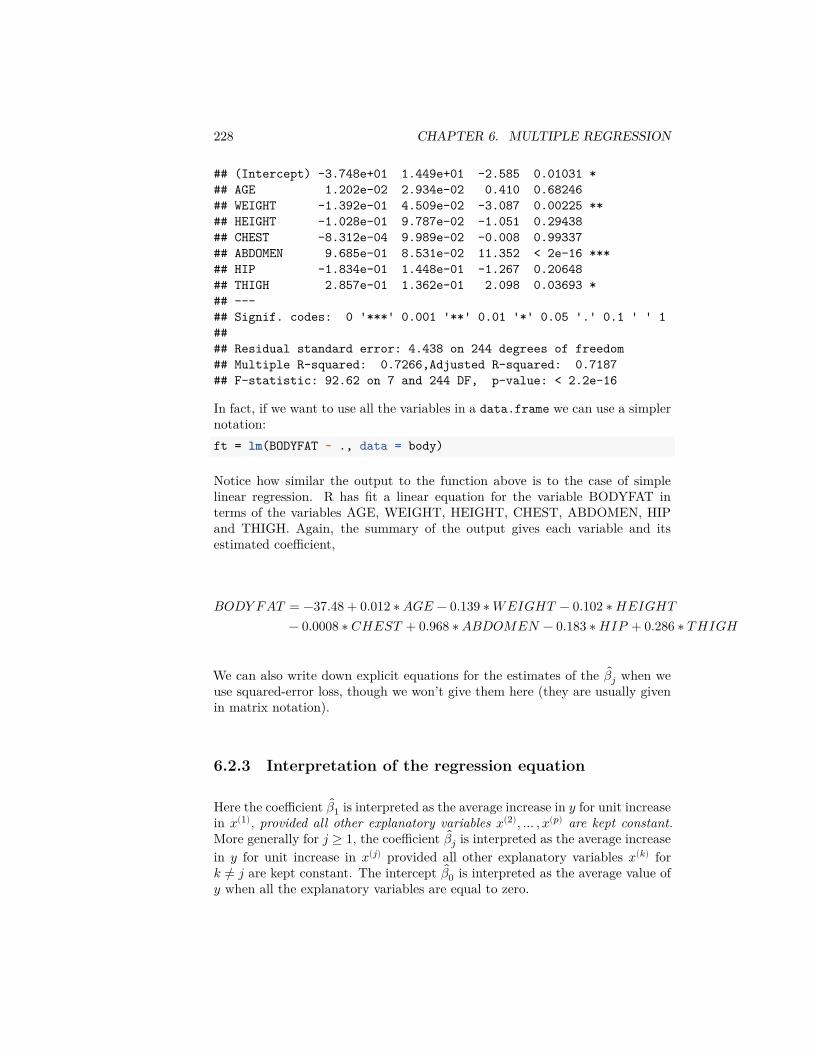
228 CHAPTER 6. MULTIPLE REGRESSION
## (Intercept) -3.748e+01 1.449e+01 -2.585 0.01031 *## AGE 1.202e-02 2.934e-02 0.410 0.68246## WEIGHT -1.392e-01 4.509e-02 -3.087 0.00225 **## HEIGHT -1.028e-01 9.787e-02 -1.051 0.29438## CHEST -8.312e-04 9.989e-02 -0.008 0.99337## ABDOMEN 9.685e-01 8.531e-02 11.352 < 2e-16 ***## HIP -1.834e-01 1.448e-01 -1.267 0.20648## THIGH 2.857e-01 1.362e-01 2.098 0.03693 *## ---## Signif. codes: 0 '***' 0.001 '**' 0.01 '*' 0.05 '.' 0.1 ' ' 1#### Residual standard error: 4.438 on 244 degrees of freedom## Multiple R-squared: 0.7266,Adjusted R-squared: 0.7187## F-statistic: 92.62 on 7 and 244 DF, p-value: < 2.2e-16
In fact, if we want to use all the variables in a data.frame we can use a simplernotation:ft = lm(BODYFAT ~ ., data = body)
Notice how similar the output to the function above is to the case of simplelinear regression. R has fit a linear equation for the variable BODYFAT interms of the variables AGE, WEIGHT, HEIGHT, CHEST, ABDOMEN, HIPand THIGH. Again, the summary of the output gives each variable and itsestimated coefficient,
𝐵𝑂𝐷𝑌 𝐹𝐴𝑇 = −37.48 + 0.012 ∗ 𝐴𝐺𝐸 − 0.139 ∗ 𝑊𝐸𝐼𝐺𝐻𝑇 − 0.102 ∗ 𝐻𝐸𝐼𝐺𝐻𝑇− 0.0008 ∗ 𝐶𝐻𝐸𝑆𝑇 + 0.968 ∗ 𝐴𝐵𝐷𝑂𝑀𝐸𝑁 − 0.183 ∗ 𝐻𝐼𝑃 + 0.286 ∗ 𝑇 𝐻𝐼𝐺𝐻
We can also write down explicit equations for the estimates of the 𝛽𝑗 when weuse squared-error loss, though we won’t give them here (they are usually givenin matrix notation).
6.2.3 Interpretation of the regression equation
Here the coefficient 𝛽1 is interpreted as the average increase in 𝑦 for unit increasein 𝑥(1), provided all other explanatory variables 𝑥(2), … , 𝑥(𝑝) are kept constant.More generally for 𝑗 ≥ 1, the coefficient 𝛽𝑗 is interpreted as the average increasein 𝑦 for unit increase in 𝑥(𝑗) provided all other explanatory variables 𝑥(𝑘) for𝑘 ≠ 𝑗 are kept constant. The intercept 𝛽0 is interpreted as the average value of𝑦 when all the explanatory variables are equal to zero.
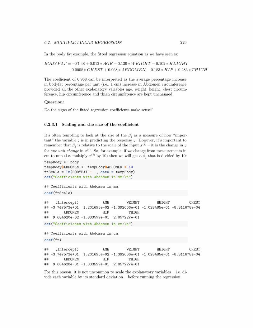
6.2. MULTIPLE LINEAR REGRESSION 229
In the body fat example, the fitted regression equation as we have seen is:
𝐵𝑂𝐷𝑌 𝐹𝐴𝑇 = −37.48 + 0.012 ∗ 𝐴𝐺𝐸 − 0.139 ∗ 𝑊𝐸𝐼𝐺𝐻𝑇 − 0.102 ∗ 𝐻𝐸𝐼𝐺𝐻𝑇− 0.0008 ∗ 𝐶𝐻𝐸𝑆𝑇 + 0.968 ∗ 𝐴𝐵𝐷𝑂𝑀𝐸𝑁 − 0.183 ∗ 𝐻𝐼𝑃 + 0.286 ∗ 𝑇 𝐻𝐼𝐺𝐻
The coefficient of 0.968 can be interpreted as the average percentage increasein bodyfat percentage per unit (i.e., 1 cm) increase in Abdomen circumferenceprovided all the other explanatory variables age, weight, height, chest circum-ference, hip circumference and thigh circumference are kept unchanged.
Question:
Do the signs of the fitted regression coefficients make sense?
6.2.3.1 Scaling and the size of the coefficient
It’s often tempting to look at the size of the 𝛽𝑗 as a measure of how “impor-tant” the variable 𝑗 is in predicting the response 𝑦. However, it’s important toremember that 𝛽𝑗 is relative to the scale of the input 𝑥(𝑗) – it is the change in 𝑦for one unit change in 𝑥(𝑗). So, for example, if we change from measurements incm to mm (i.e. multiply 𝑥(𝑗) by 10) then we will get a 𝛽𝑗 that is divided by 10:tempBody <- bodytempBody$ABDOMEN <- tempBody$ABDOMEN * 10ftScale = lm(BODYFAT ~ ., data = tempBody)cat("Coefficients with Abdomen in mm:\n")
## Coefficients with Abdomen in mm:coef(ftScale)
## (Intercept) AGE WEIGHT HEIGHT CHEST## -3.747573e+01 1.201695e-02 -1.392006e-01 -1.028485e-01 -8.311678e-04## ABDOMEN HIP THIGH## 9.684620e-02 -1.833599e-01 2.857227e-01cat("Coefficients with Abdomen in cm:\n")
## Coefficients with Abdomen in cm:coef(ft)
## (Intercept) AGE WEIGHT HEIGHT CHEST## -3.747573e+01 1.201695e-02 -1.392006e-01 -1.028485e-01 -8.311678e-04## ABDOMEN HIP THIGH## 9.684620e-01 -1.833599e-01 2.857227e-01
For this reason, it is not uncommon to scale the explanatory variables – i.e. di-vide each variable by its standard deviation – before running the regression:
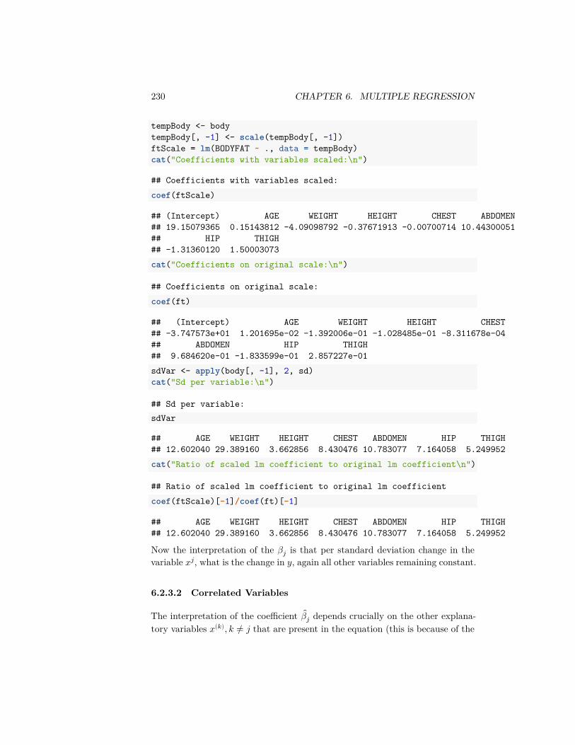
230 CHAPTER 6. MULTIPLE REGRESSION
tempBody <- bodytempBody[, -1] <- scale(tempBody[, -1])ftScale = lm(BODYFAT ~ ., data = tempBody)cat("Coefficients with variables scaled:\n")
## Coefficients with variables scaled:coef(ftScale)
## (Intercept) AGE WEIGHT HEIGHT CHEST ABDOMEN## 19.15079365 0.15143812 -4.09098792 -0.37671913 -0.00700714 10.44300051## HIP THIGH## -1.31360120 1.50003073cat("Coefficients on original scale:\n")
## Coefficients on original scale:coef(ft)
## (Intercept) AGE WEIGHT HEIGHT CHEST## -3.747573e+01 1.201695e-02 -1.392006e-01 -1.028485e-01 -8.311678e-04## ABDOMEN HIP THIGH## 9.684620e-01 -1.833599e-01 2.857227e-01sdVar <- apply(body[, -1], 2, sd)cat("Sd per variable:\n")
## Sd per variable:sdVar
## AGE WEIGHT HEIGHT CHEST ABDOMEN HIP THIGH## 12.602040 29.389160 3.662856 8.430476 10.783077 7.164058 5.249952cat("Ratio of scaled lm coefficient to original lm coefficient\n")
## Ratio of scaled lm coefficient to original lm coefficientcoef(ftScale)[-1]/coef(ft)[-1]
## AGE WEIGHT HEIGHT CHEST ABDOMEN HIP THIGH## 12.602040 29.389160 3.662856 8.430476 10.783077 7.164058 5.249952
Now the interpretation of the 𝛽𝑗 is that per standard deviation change in thevariable 𝑥𝑗, what is the change in 𝑦, again all other variables remaining constant.
6.2.3.2 Correlated Variables
The interpretation of the coefficient 𝛽𝑗 depends crucially on the other explana-tory variables 𝑥(𝑘), 𝑘 ≠ 𝑗 that are present in the equation (this is because of the
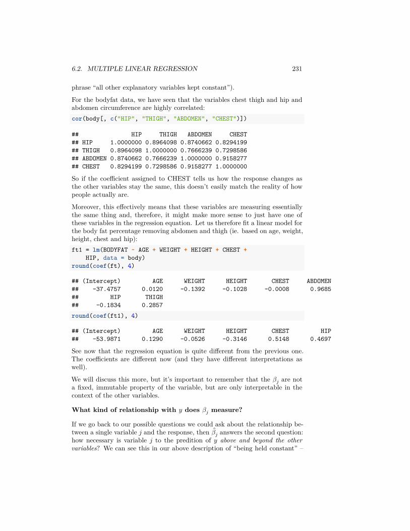
6.2. MULTIPLE LINEAR REGRESSION 231
phrase “all other explanatory variables kept constant”).
For the bodyfat data, we have seen that the variables chest thigh and hip andabdomen circumference are highly correlated:cor(body[, c("HIP", "THIGH", "ABDOMEN", "CHEST")])
## HIP THIGH ABDOMEN CHEST## HIP 1.0000000 0.8964098 0.8740662 0.8294199## THIGH 0.8964098 1.0000000 0.7666239 0.7298586## ABDOMEN 0.8740662 0.7666239 1.0000000 0.9158277## CHEST 0.8294199 0.7298586 0.9158277 1.0000000
So if the coefficient assigned to CHEST tells us how the response changes asthe other variables stay the same, this doesn’t easily match the reality of howpeople actually are.
Moreover, this effectively means that these variables are measuring essentiallythe same thing and, therefore, it might make more sense to just have one ofthese variables in the regression equation. Let us therefore fit a linear model forthe body fat percentage removing abdomen and thigh (ie. based on age, weight,height, chest and hip):ft1 = lm(BODYFAT ~ AGE + WEIGHT + HEIGHT + CHEST +
HIP, data = body)round(coef(ft), 4)
## (Intercept) AGE WEIGHT HEIGHT CHEST ABDOMEN## -37.4757 0.0120 -0.1392 -0.1028 -0.0008 0.9685## HIP THIGH## -0.1834 0.2857round(coef(ft1), 4)
## (Intercept) AGE WEIGHT HEIGHT CHEST HIP## -53.9871 0.1290 -0.0526 -0.3146 0.5148 0.4697
See now that the regression equation is quite different from the previous one.The coefficients are different now (and they have different interpretations aswell).
We will discuss this more, but it’s important to remember that the 𝛽𝑗 are nota fixed, immutable property of the variable, but are only interpretable in thecontext of the other variables.
What kind of relationship with 𝑦 does 𝛽𝑗 measure?
If we go back to our possible questions we could ask about the relationship be-tween a single variable 𝑗 and the response, then 𝛽𝑗 answers the second question:how necessary is variable 𝑗 to the predition of 𝑦 above and beyond the othervariables? We can see this in our above description of “being held constant” –
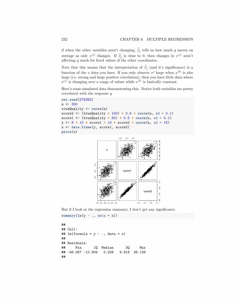
232 CHAPTER 6. MULTIPLE REGRESSION
if when the other variables aren’t changing, 𝛽𝑗 tells us how much 𝑦 moves onaverage as only 𝑥(𝑗) changes. If 𝛽𝑗 is close to 0, then changes in 𝑥(𝑗) aren’taffecting 𝑦 much for fixed values of the other coordinates.
Note that this means that the interpretation of 𝛽𝑗 (and it’s significance) is afunction of the 𝑥 data you have. If you only observe 𝑥𝑗 large when 𝑥(𝑘) is alsolarge (i.e. strong and large positive correlation), then you have little data where𝑥(𝑗) is changing over a range of values while 𝑥(𝑘) is basically constant.
Here’s some simulated data demonstrating this. Notice both variables are prettycorrelated with the response 𝑦set.seed(275382)n <- 300trueQuality <- rnorm(n)score2 <- (trueQuality + 100) * 0.5 + rnorm(n, sd = 0.1)score1 <- (trueQuality + 80) * 0.5 + rnorm(n, sd = 0.1)y <- 8 + 10 * score1 + 10 * score2 + rnorm(n, sd = 15)x <- data.frame(y, score1, score2)pairs(x)
But if I look at the regression summary, I don’t get any significance.summary(lm(y ~ ., data = x))
#### Call:## lm(formula = y ~ ., data = x)#### Residuals:## Min 1Q Median 3Q Max## -46.067 -10.909 0.208 9.918 38.138##
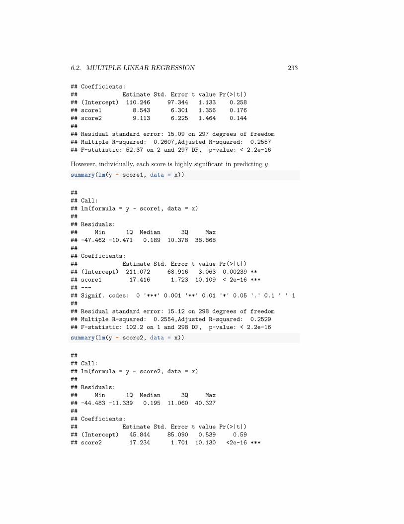
6.2. MULTIPLE LINEAR REGRESSION 233
## Coefficients:## Estimate Std. Error t value Pr(>|t|)## (Intercept) 110.246 97.344 1.133 0.258## score1 8.543 6.301 1.356 0.176## score2 9.113 6.225 1.464 0.144#### Residual standard error: 15.09 on 297 degrees of freedom## Multiple R-squared: 0.2607,Adjusted R-squared: 0.2557## F-statistic: 52.37 on 2 and 297 DF, p-value: < 2.2e-16
However, individually, each score is highly significant in predicting 𝑦summary(lm(y ~ score1, data = x))
#### Call:## lm(formula = y ~ score1, data = x)#### Residuals:## Min 1Q Median 3Q Max## -47.462 -10.471 0.189 10.378 38.868#### Coefficients:## Estimate Std. Error t value Pr(>|t|)## (Intercept) 211.072 68.916 3.063 0.00239 **## score1 17.416 1.723 10.109 < 2e-16 ***## ---## Signif. codes: 0 '***' 0.001 '**' 0.01 '*' 0.05 '.' 0.1 ' ' 1#### Residual standard error: 15.12 on 298 degrees of freedom## Multiple R-squared: 0.2554,Adjusted R-squared: 0.2529## F-statistic: 102.2 on 1 and 298 DF, p-value: < 2.2e-16summary(lm(y ~ score2, data = x))
#### Call:## lm(formula = y ~ score2, data = x)#### Residuals:## Min 1Q Median 3Q Max## -44.483 -11.339 0.195 11.060 40.327#### Coefficients:## Estimate Std. Error t value Pr(>|t|)## (Intercept) 45.844 85.090 0.539 0.59## score2 17.234 1.701 10.130 <2e-16 ***
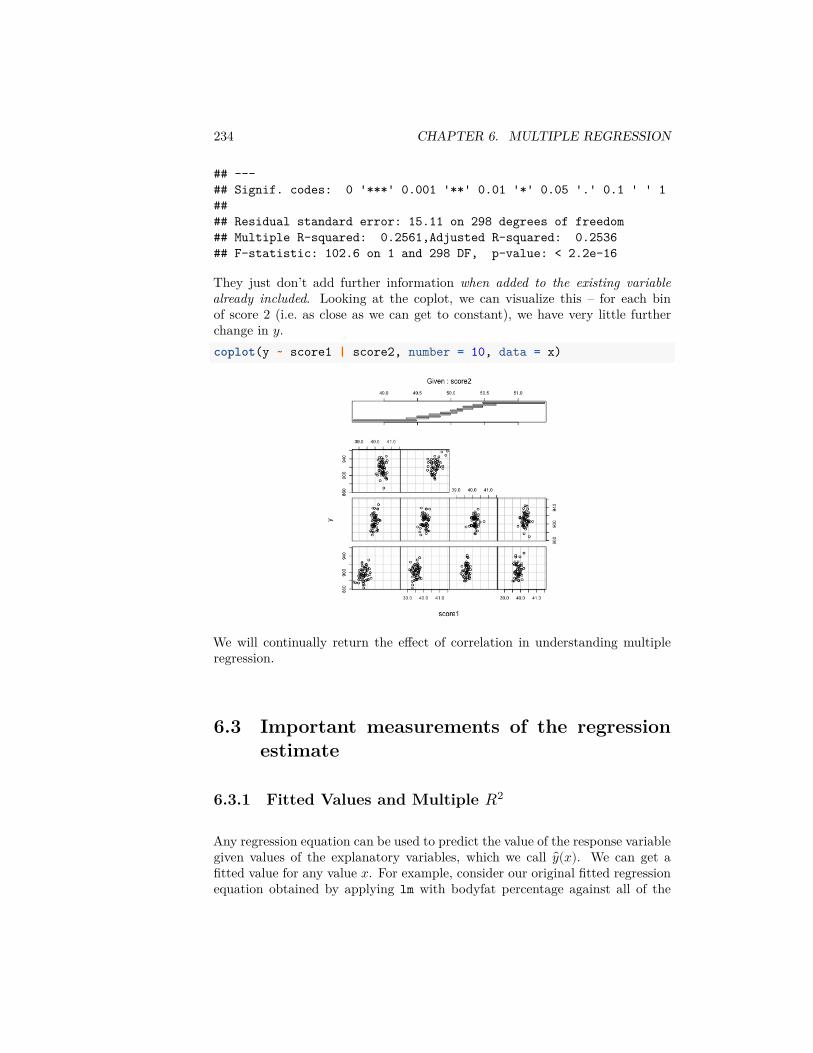
234 CHAPTER 6. MULTIPLE REGRESSION
## ---## Signif. codes: 0 '***' 0.001 '**' 0.01 '*' 0.05 '.' 0.1 ' ' 1#### Residual standard error: 15.11 on 298 degrees of freedom## Multiple R-squared: 0.2561,Adjusted R-squared: 0.2536## F-statistic: 102.6 on 1 and 298 DF, p-value: < 2.2e-16
They just don’t add further information when added to the existing variablealready included. Looking at the coplot, we can visualize this – for each binof score 2 (i.e. as close as we can get to constant), we have very little furtherchange in 𝑦.coplot(y ~ score1 | score2, number = 10, data = x)
We will continually return the effect of correlation in understanding multipleregression.
6.3 Important measurements of the regressionestimate
6.3.1 Fitted Values and Multiple 𝑅2
Any regression equation can be used to predict the value of the response variablegiven values of the explanatory variables, which we call 𝑦(𝑥). We can get afitted value for any value 𝑥. For example, consider our original fitted regressionequation obtained by applying lm with bodyfat percentage against all of the
6.3. IMPORTANT MEASUREMENTS OF THE REGRESSION ESTIMATE235
variables as explanatory variables:
𝐵𝑂𝐷𝑌 𝐹𝐴𝑇 = −37.48 + 0.01202 ∗ 𝐴𝐺𝐸 − 0.1392 ∗ 𝑊𝐸𝐼𝐺𝐻𝑇 − 0.1028 ∗ 𝐻𝐸𝐼𝐺𝐻𝑇− 0.0008312 ∗ 𝐶𝐻𝐸𝑆𝑇 + 0.9685 ∗ 𝐴𝐵𝐷𝑂𝑀𝐸𝑁 − 0.1834 ∗ 𝐻𝐼𝑃 + 0.2857 ∗ 𝑇 𝐻𝐼𝐺𝐻
Suppose a person X (who is of 30 years of age, weighs 180 pounds and is 70inches tall) wants to find out his bodyfat percentage. Let us say that he is ableto measure his chest circumference as 90 cm, abdomen circumference as 86 cm,hip circumference as 97 cm and thigh circumference as 60 cm. Then he cansimply use the regression equation to predict his bodyfat percentage as:bf.pred = -37.48 + 0.01202 * 30 - 0.1392 * 180 - 0.1028 *
70 - 0.0008312 * 90 + 0.9685 * 86 - 0.1834 * 97 +0.2857 * 60
bf.pred
## [1] 13.19699
The predictions given by the fitted regression equation *for each of the obser-vations} are known as fitted values, 𝑦𝑖 = 𝑦(𝑥𝑖). For example, in the bodyfatdataset, the first observation (first row) is given by:obs1 = body[1, ]obs1
## BODYFAT AGE WEIGHT HEIGHT CHEST ABDOMEN HIP THIGH## 1 12.3 23 154.25 67.75 93.1 85.2 94.5 59
The observed value of the response (bodyfat percentage) for this individualis 12.3 %. The prediction for this person’s response given by the regressionequation (??) is-37.48 + 0.01202 * body[1, "AGE"] - 0.1392 * body[1,
"WEIGHT"] - 0.1028 * body[1, "HEIGHT"] - 0.0008312 *body[1, "CHEST"] + 0.9685 * body[1, "ABDOMEN"] -0.1834 * body[1, "HIP"] + 0.2857 * body[1, "THIGH"]
## [1] 16.32398
Therefore the fitted value for the first observation is 16.424%. R directly calcu-lates all fitted values and they are stored in the 𝑙𝑚() object. You can obtainthese via:head(fitted(ft))
## 1 2 3 4 5 6## 16.32670 10.22019 18.42600 11.89502 25.97564 16.28529
If the regression equation fits the data well, we would expect the fitted valuesto be close to the observed responses. We can check this by just plotting thefitted values against the observed response values.
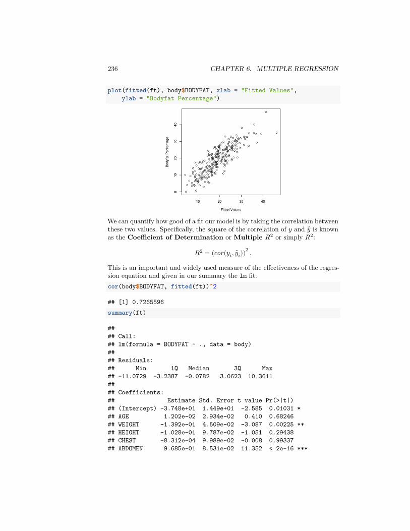
236 CHAPTER 6. MULTIPLE REGRESSION
plot(fitted(ft), body$BODYFAT, xlab = "Fitted Values",ylab = "Bodyfat Percentage")
We can quantify how good of a fit our model is by taking the correlation betweenthese two values. Specifically, the square of the correlation of 𝑦 and 𝑦 is knownas the Coefficient of Determination or Multiple 𝑅2 or simply 𝑅2:
𝑅2 = (𝑐𝑜𝑟(𝑦𝑖, 𝑦𝑖))2 .
This is an important and widely used measure of the effectiveness of the regres-sion equation and given in our summary the lm fit.cor(body$BODYFAT, fitted(ft))^2
## [1] 0.7265596summary(ft)
#### Call:## lm(formula = BODYFAT ~ ., data = body)#### Residuals:## Min 1Q Median 3Q Max## -11.0729 -3.2387 -0.0782 3.0623 10.3611#### Coefficients:## Estimate Std. Error t value Pr(>|t|)## (Intercept) -3.748e+01 1.449e+01 -2.585 0.01031 *## AGE 1.202e-02 2.934e-02 0.410 0.68246## WEIGHT -1.392e-01 4.509e-02 -3.087 0.00225 **## HEIGHT -1.028e-01 9.787e-02 -1.051 0.29438## CHEST -8.312e-04 9.989e-02 -0.008 0.99337## ABDOMEN 9.685e-01 8.531e-02 11.352 < 2e-16 ***
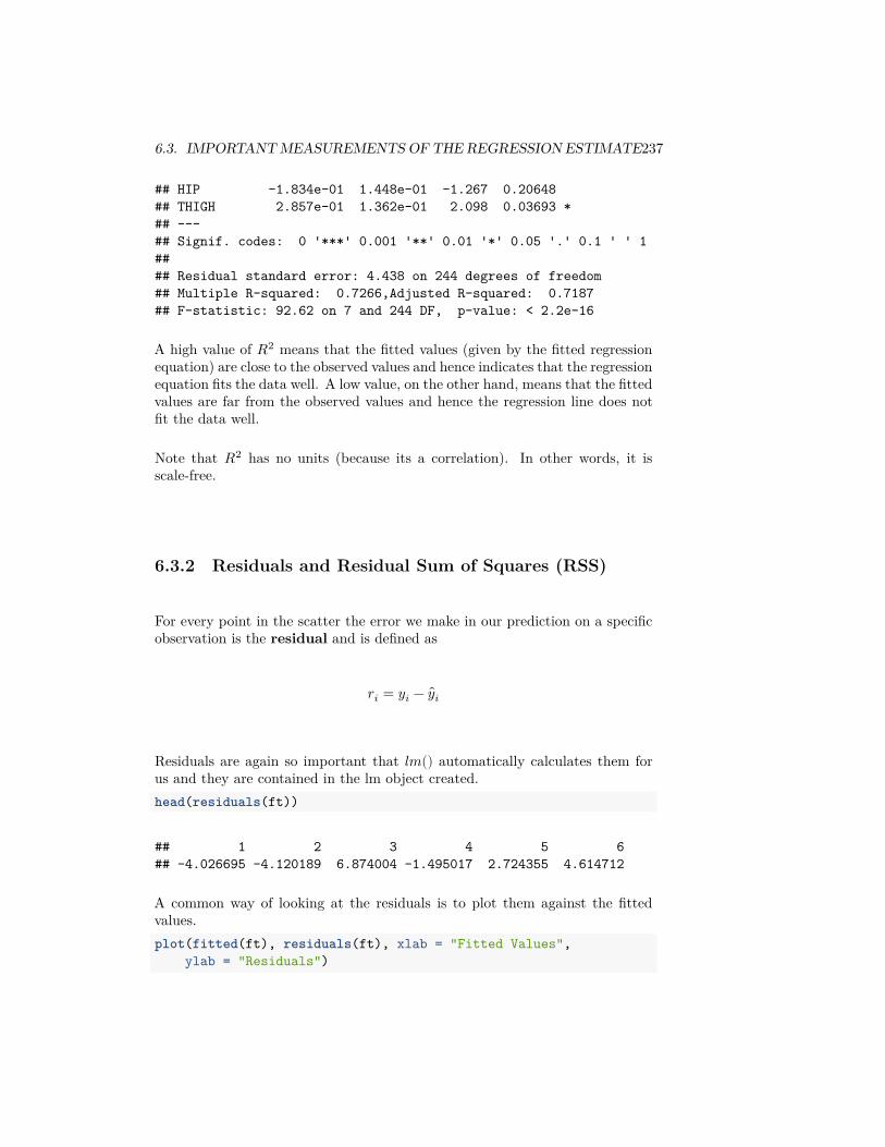
6.3. IMPORTANT MEASUREMENTS OF THE REGRESSION ESTIMATE237
## HIP -1.834e-01 1.448e-01 -1.267 0.20648## THIGH 2.857e-01 1.362e-01 2.098 0.03693 *## ---## Signif. codes: 0 '***' 0.001 '**' 0.01 '*' 0.05 '.' 0.1 ' ' 1#### Residual standard error: 4.438 on 244 degrees of freedom## Multiple R-squared: 0.7266,Adjusted R-squared: 0.7187## F-statistic: 92.62 on 7 and 244 DF, p-value: < 2.2e-16
A high value of 𝑅2 means that the fitted values (given by the fitted regressionequation) are close to the observed values and hence indicates that the regressionequation fits the data well. A low value, on the other hand, means that the fittedvalues are far from the observed values and hence the regression line does notfit the data well.
Note that 𝑅2 has no units (because its a correlation). In other words, it isscale-free.
6.3.2 Residuals and Residual Sum of Squares (RSS)
For every point in the scatter the error we make in our prediction on a specificobservation is the residual and is defined as
𝑟𝑖 = 𝑦𝑖 − 𝑦𝑖
Residuals are again so important that 𝑙𝑚() automatically calculates them forus and they are contained in the lm object created.head(residuals(ft))
## 1 2 3 4 5 6## -4.026695 -4.120189 6.874004 -1.495017 2.724355 4.614712
A common way of looking at the residuals is to plot them against the fittedvalues.plot(fitted(ft), residuals(ft), xlab = "Fitted Values",
ylab = "Residuals")
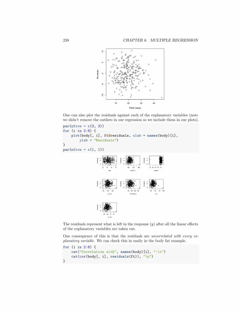
238 CHAPTER 6. MULTIPLE REGRESSION
One can also plot the residuals against each of the explanatory variables (notewe didn’t remove the outliers in our regression so we include them in our plots).par(mfrow = c(3, 3))for (i in 2:8) {
plot(body[, i], ft$residuals, xlab = names(body)[i],ylab = "Residuals")
}par(mfrow = c(1, 1))
The residuals represent what is left in the response (𝑦) after all the linear effectsof the explanatory variables are taken out.
One consequence of this is that the residuals are uncorrelated with every ex-planatory variable. We can check this in easily in the body fat example.for (i in 2:8) {
cat("Correlation with", names(body)[i], ":\t")cat(cor(body[, i], residuals(ft)), "\n")
}
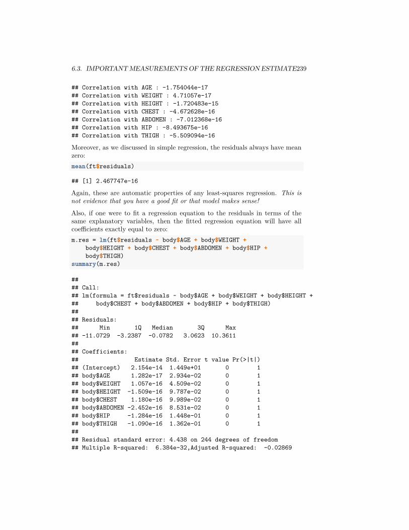
6.3. IMPORTANT MEASUREMENTS OF THE REGRESSION ESTIMATE239
## Correlation with AGE : -1.754044e-17## Correlation with WEIGHT : 4.71057e-17## Correlation with HEIGHT : -1.720483e-15## Correlation with CHEST : -4.672628e-16## Correlation with ABDOMEN : -7.012368e-16## Correlation with HIP : -8.493675e-16## Correlation with THIGH : -5.509094e-16
Moreover, as we discussed in simple regression, the residuals always have meanzero:mean(ft$residuals)
## [1] 2.467747e-16
Again, these are automatic properties of any least-squares regression. This isnot evidence that you have a good fit or that model makes sense!
Also, if one were to fit a regression equation to the residuals in terms of thesame explanatory variables, then the fitted regression equation will have allcoefficients exactly equal to zero:m.res = lm(ft$residuals ~ body$AGE + body$WEIGHT +
body$HEIGHT + body$CHEST + body$ABDOMEN + body$HIP +body$THIGH)
summary(m.res)
#### Call:## lm(formula = ft$residuals ~ body$AGE + body$WEIGHT + body$HEIGHT +## body$CHEST + body$ABDOMEN + body$HIP + body$THIGH)#### Residuals:## Min 1Q Median 3Q Max## -11.0729 -3.2387 -0.0782 3.0623 10.3611#### Coefficients:## Estimate Std. Error t value Pr(>|t|)## (Intercept) 2.154e-14 1.449e+01 0 1## body$AGE 1.282e-17 2.934e-02 0 1## body$WEIGHT 1.057e-16 4.509e-02 0 1## body$HEIGHT -1.509e-16 9.787e-02 0 1## body$CHEST 1.180e-16 9.989e-02 0 1## body$ABDOMEN -2.452e-16 8.531e-02 0 1## body$HIP -1.284e-16 1.448e-01 0 1## body$THIGH -1.090e-16 1.362e-01 0 1#### Residual standard error: 4.438 on 244 degrees of freedom## Multiple R-squared: 6.384e-32,Adjusted R-squared: -0.02869
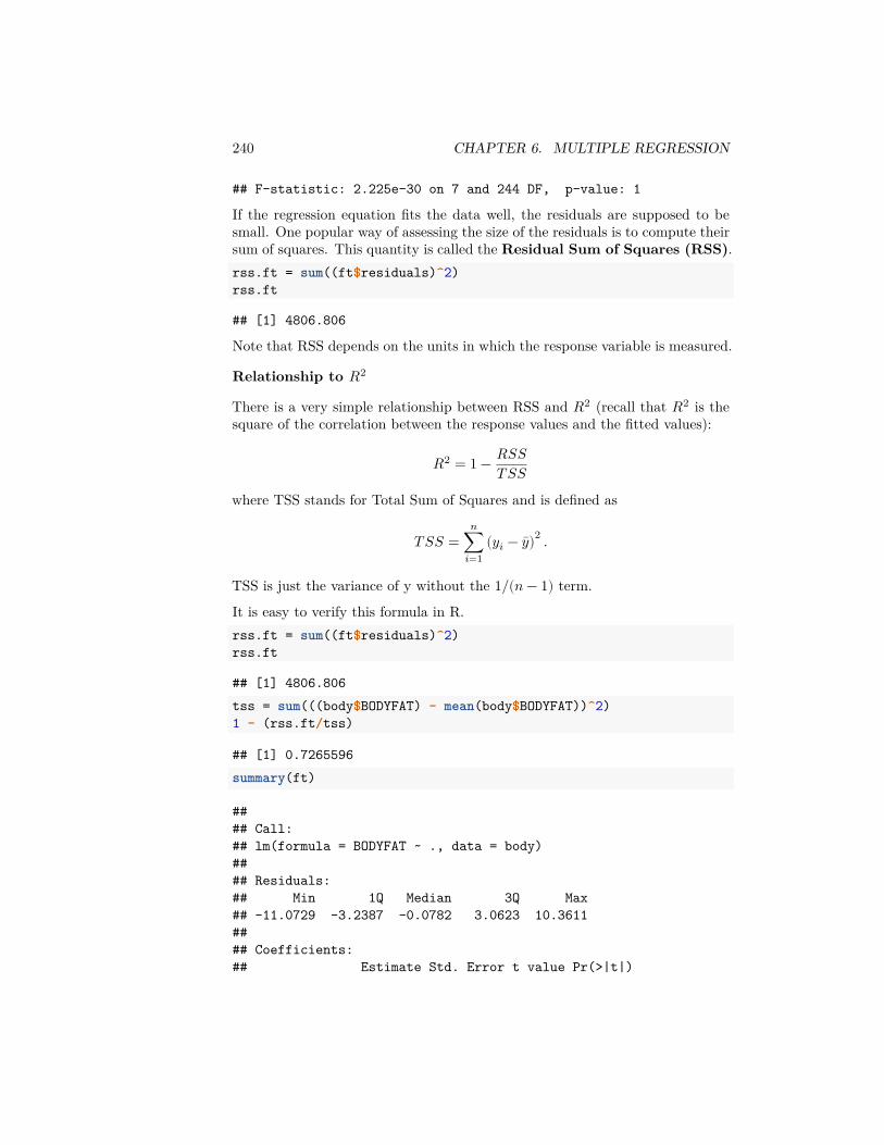
240 CHAPTER 6. MULTIPLE REGRESSION
## F-statistic: 2.225e-30 on 7 and 244 DF, p-value: 1
If the regression equation fits the data well, the residuals are supposed to besmall. One popular way of assessing the size of the residuals is to compute theirsum of squares. This quantity is called the Residual Sum of Squares (RSS).rss.ft = sum((ft$residuals)^2)rss.ft
## [1] 4806.806
Note that RSS depends on the units in which the response variable is measured.
Relationship to 𝑅2
There is a very simple relationship between RSS and 𝑅2 (recall that 𝑅2 is thesquare of the correlation between the response values and the fitted values):
𝑅2 = 1 − 𝑅𝑆𝑆𝑇 𝑆𝑆
where TSS stands for Total Sum of Squares and is defined as
𝑇 𝑆𝑆 =𝑛
∑𝑖=1
(𝑦𝑖 − 𝑦)2 .
TSS is just the variance of y without the 1/(𝑛 − 1) term.
It is easy to verify this formula in R.rss.ft = sum((ft$residuals)^2)rss.ft
## [1] 4806.806tss = sum(((body$BODYFAT) - mean(body$BODYFAT))^2)1 - (rss.ft/tss)
## [1] 0.7265596summary(ft)
#### Call:## lm(formula = BODYFAT ~ ., data = body)#### Residuals:## Min 1Q Median 3Q Max## -11.0729 -3.2387 -0.0782 3.0623 10.3611#### Coefficients:## Estimate Std. Error t value Pr(>|t|)
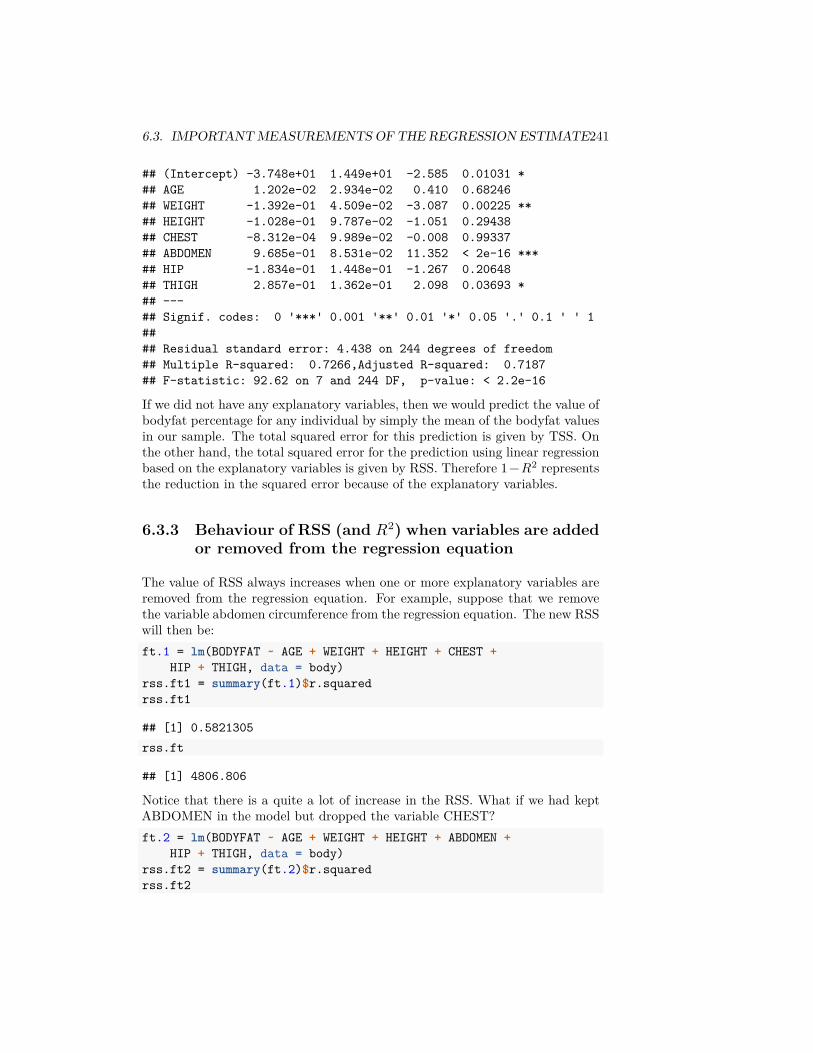
6.3. IMPORTANT MEASUREMENTS OF THE REGRESSION ESTIMATE241
## (Intercept) -3.748e+01 1.449e+01 -2.585 0.01031 *## AGE 1.202e-02 2.934e-02 0.410 0.68246## WEIGHT -1.392e-01 4.509e-02 -3.087 0.00225 **## HEIGHT -1.028e-01 9.787e-02 -1.051 0.29438## CHEST -8.312e-04 9.989e-02 -0.008 0.99337## ABDOMEN 9.685e-01 8.531e-02 11.352 < 2e-16 ***## HIP -1.834e-01 1.448e-01 -1.267 0.20648## THIGH 2.857e-01 1.362e-01 2.098 0.03693 *## ---## Signif. codes: 0 '***' 0.001 '**' 0.01 '*' 0.05 '.' 0.1 ' ' 1#### Residual standard error: 4.438 on 244 degrees of freedom## Multiple R-squared: 0.7266,Adjusted R-squared: 0.7187## F-statistic: 92.62 on 7 and 244 DF, p-value: < 2.2e-16
If we did not have any explanatory variables, then we would predict the value ofbodyfat percentage for any individual by simply the mean of the bodyfat valuesin our sample. The total squared error for this prediction is given by TSS. Onthe other hand, the total squared error for the prediction using linear regressionbased on the explanatory variables is given by RSS. Therefore 1−𝑅2 representsthe reduction in the squared error because of the explanatory variables.
6.3.3 Behaviour of RSS (and 𝑅2) when variables are addedor removed from the regression equation
The value of RSS always increases when one or more explanatory variables areremoved from the regression equation. For example, suppose that we removethe variable abdomen circumference from the regression equation. The new RSSwill then be:ft.1 = lm(BODYFAT ~ AGE + WEIGHT + HEIGHT + CHEST +
HIP + THIGH, data = body)rss.ft1 = summary(ft.1)$r.squaredrss.ft1
## [1] 0.5821305rss.ft
## [1] 4806.806
Notice that there is a quite a lot of increase in the RSS. What if we had keptABDOMEN in the model but dropped the variable CHEST?ft.2 = lm(BODYFAT ~ AGE + WEIGHT + HEIGHT + ABDOMEN +
HIP + THIGH, data = body)rss.ft2 = summary(ft.2)$r.squaredrss.ft2
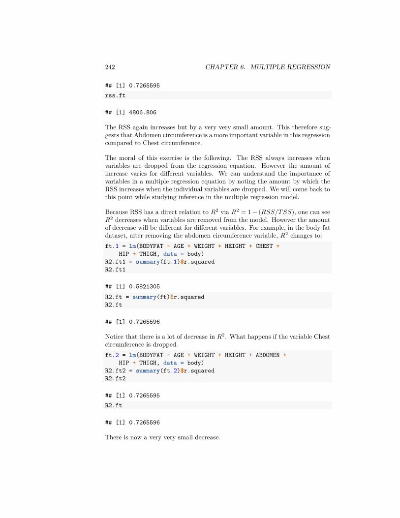
242 CHAPTER 6. MULTIPLE REGRESSION
## [1] 0.7265595rss.ft
## [1] 4806.806
The RSS again increases but by a very very small amount. This therefore sug-gests that Abdomen circumference is a more important variable in this regressioncompared to Chest circumference.
The moral of this exercise is the following. The RSS always increases whenvariables are dropped from the regression equation. However the amount ofincrease varies for different variables. We can understand the importance ofvariables in a multiple regression equation by noting the amount by which theRSS increases when the individual variables are dropped. We will come back tothis point while studying inference in the multiple regression model.
Because RSS has a direct relation to 𝑅2 via 𝑅2 = 1 − (𝑅𝑆𝑆/𝑇 𝑆𝑆), one can see𝑅2 decreases when variables are removed from the model. However the amountof decrease will be different for different variables. For example, in the body fatdataset, after removing the abdomen circumference variable, 𝑅2 changes to:ft.1 = lm(BODYFAT ~ AGE + WEIGHT + HEIGHT + CHEST +
HIP + THIGH, data = body)R2.ft1 = summary(ft.1)$r.squaredR2.ft1
## [1] 0.5821305R2.ft = summary(ft)$r.squaredR2.ft
## [1] 0.7265596
Notice that there is a lot of decrease in 𝑅2. What happens if the variable Chestcircumference is dropped.ft.2 = lm(BODYFAT ~ AGE + WEIGHT + HEIGHT + ABDOMEN +
HIP + THIGH, data = body)R2.ft2 = summary(ft.2)$r.squaredR2.ft2
## [1] 0.7265595R2.ft
## [1] 0.7265596
There is now a very very small decrease.
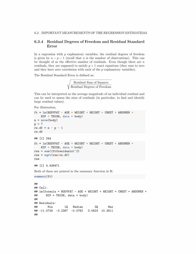
6.3. IMPORTANT MEASUREMENTS OF THE REGRESSION ESTIMATE243
6.3.4 Residual Degrees of Freedom and Residual StandardError
In a regression with 𝑝 explanatory variables, the residual degrees of freedomis given by 𝑛 − 𝑝 − 1 (recall that 𝑛 is the number of observations). This canbe thought of as the effective number of residuals. Even though there are 𝑛residuals, they are supposed to satisfy 𝑝 + 1 exact equations (they sum to zeroand they have zero correlation with each of the 𝑝 explanatory variables).
The Residual Standard Error is defined as:
√ Residual Sum of SquaresResidual Degrees of Freedom
This can be interpreted as the average magnitude of an individual residual andcan be used to assess the sizes of residuals (in particular, to find and identifylarge residual values).
For illustration,ft = lm(BODYFAT ~ AGE + WEIGHT + HEIGHT + CHEST + ABDOMEN +
HIP + THIGH, data = body)n = nrow(body)p = 7rs.df = n - p - 1rs.df
## [1] 244ft = lm(BODYFAT ~ AGE + WEIGHT + HEIGHT + CHEST + ABDOMEN +
HIP + THIGH, data = body)rss = sum((ft$residuals)^2)rse = sqrt(rss/rs.df)rse
## [1] 4.438471
Both of these are printed in the summary function in R:summary(ft)
#### Call:## lm(formula = BODYFAT ~ AGE + WEIGHT + HEIGHT + CHEST + ABDOMEN +## HIP + THIGH, data = body)#### Residuals:## Min 1Q Median 3Q Max## -11.0729 -3.2387 -0.0782 3.0623 10.3611##
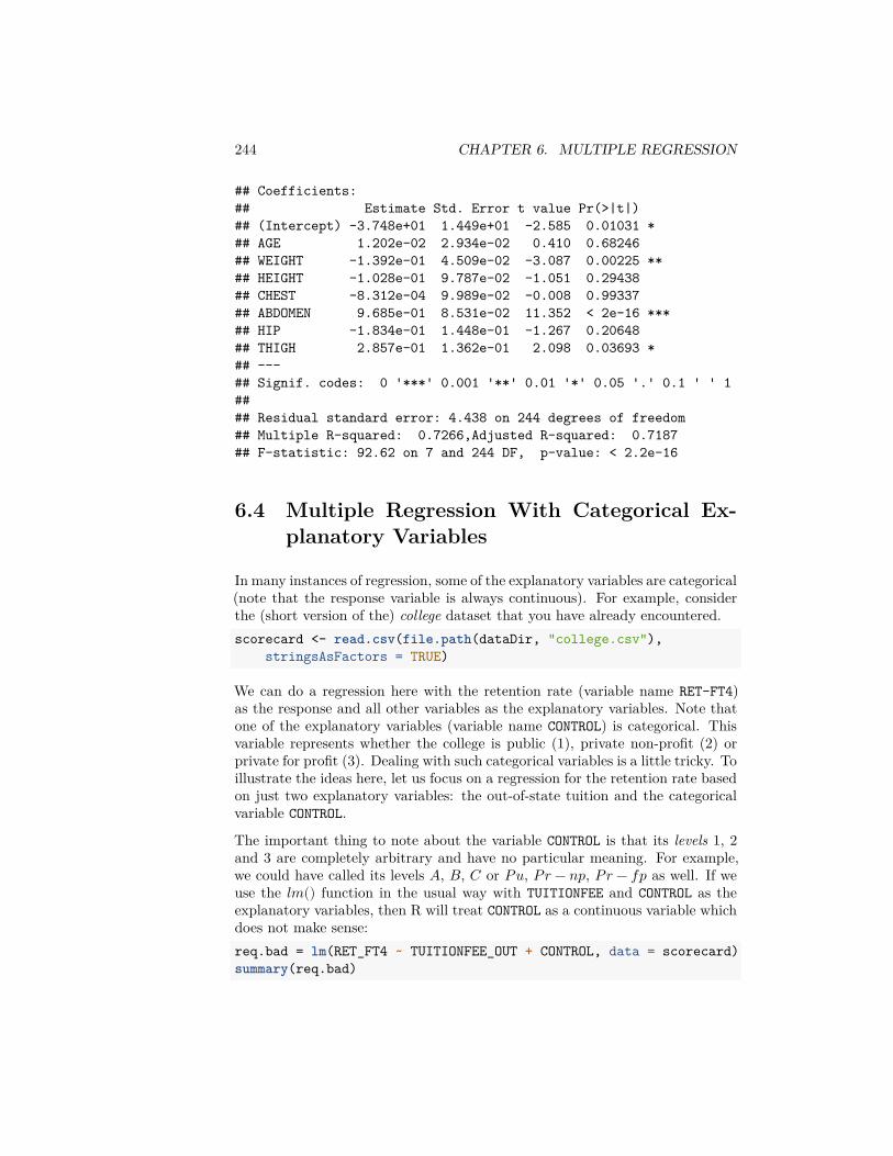
244 CHAPTER 6. MULTIPLE REGRESSION
## Coefficients:## Estimate Std. Error t value Pr(>|t|)## (Intercept) -3.748e+01 1.449e+01 -2.585 0.01031 *## AGE 1.202e-02 2.934e-02 0.410 0.68246## WEIGHT -1.392e-01 4.509e-02 -3.087 0.00225 **## HEIGHT -1.028e-01 9.787e-02 -1.051 0.29438## CHEST -8.312e-04 9.989e-02 -0.008 0.99337## ABDOMEN 9.685e-01 8.531e-02 11.352 < 2e-16 ***## HIP -1.834e-01 1.448e-01 -1.267 0.20648## THIGH 2.857e-01 1.362e-01 2.098 0.03693 *## ---## Signif. codes: 0 '***' 0.001 '**' 0.01 '*' 0.05 '.' 0.1 ' ' 1#### Residual standard error: 4.438 on 244 degrees of freedom## Multiple R-squared: 0.7266,Adjusted R-squared: 0.7187## F-statistic: 92.62 on 7 and 244 DF, p-value: < 2.2e-16
6.4 Multiple Regression With Categorical Ex-planatory Variables
In many instances of regression, some of the explanatory variables are categorical(note that the response variable is always continuous). For example, considerthe (short version of the) college dataset that you have already encountered.scorecard <- read.csv(file.path(dataDir, "college.csv"),
stringsAsFactors = TRUE)
We can do a regression here with the retention rate (variable name RET-FT4)as the response and all other variables as the explanatory variables. Note thatone of the explanatory variables (variable name CONTROL) is categorical. Thisvariable represents whether the college is public (1), private non-profit (2) orprivate for profit (3). Dealing with such categorical variables is a little tricky. Toillustrate the ideas here, let us focus on a regression for the retention rate basedon just two explanatory variables: the out-of-state tuition and the categoricalvariable CONTROL.
The important thing to note about the variable CONTROL is that its levels 1, 2and 3 are completely arbitrary and have no particular meaning. For example,we could have called its levels 𝐴, 𝐵, 𝐶 or 𝑃𝑢, 𝑃𝑟 − 𝑛𝑝, 𝑃𝑟 − 𝑓𝑝 as well. If weuse the 𝑙𝑚() function in the usual way with TUITIONFEE and CONTROL as theexplanatory variables, then R will treat CONTROL as a continuous variable whichdoes not make sense:req.bad = lm(RET_FT4 ~ TUITIONFEE_OUT + CONTROL, data = scorecard)summary(req.bad)
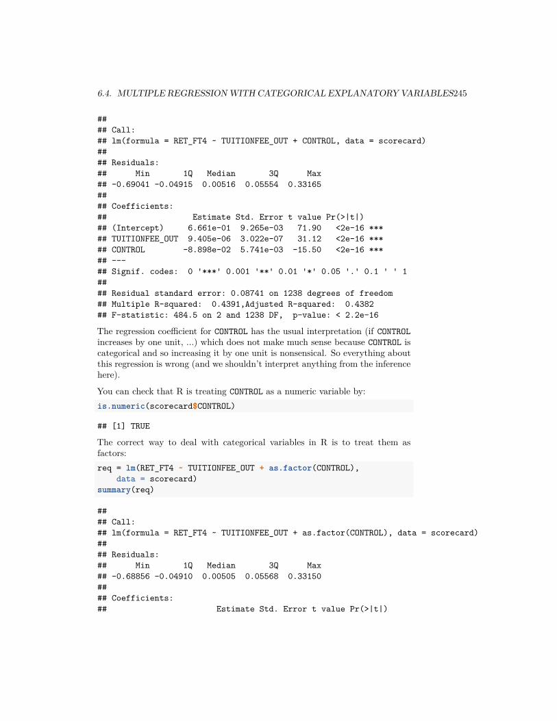
6.4. MULTIPLE REGRESSION WITH CATEGORICAL EXPLANATORY VARIABLES245
#### Call:## lm(formula = RET_FT4 ~ TUITIONFEE_OUT + CONTROL, data = scorecard)#### Residuals:## Min 1Q Median 3Q Max## -0.69041 -0.04915 0.00516 0.05554 0.33165#### Coefficients:## Estimate Std. Error t value Pr(>|t|)## (Intercept) 6.661e-01 9.265e-03 71.90 <2e-16 ***## TUITIONFEE_OUT 9.405e-06 3.022e-07 31.12 <2e-16 ***## CONTROL -8.898e-02 5.741e-03 -15.50 <2e-16 ***## ---## Signif. codes: 0 '***' 0.001 '**' 0.01 '*' 0.05 '.' 0.1 ' ' 1#### Residual standard error: 0.08741 on 1238 degrees of freedom## Multiple R-squared: 0.4391,Adjusted R-squared: 0.4382## F-statistic: 484.5 on 2 and 1238 DF, p-value: < 2.2e-16
The regression coefficient for CONTROL has the usual interpretation (if CONTROLincreases by one unit, …) which does not make much sense because CONTROL iscategorical and so increasing it by one unit is nonsensical. So everything aboutthis regression is wrong (and we shouldn’t interpret anything from the inferencehere).
You can check that R is treating CONTROL as a numeric variable by:is.numeric(scorecard$CONTROL)
## [1] TRUE
The correct way to deal with categorical variables in R is to treat them asfactors:req = lm(RET_FT4 ~ TUITIONFEE_OUT + as.factor(CONTROL),
data = scorecard)summary(req)
#### Call:## lm(formula = RET_FT4 ~ TUITIONFEE_OUT + as.factor(CONTROL), data = scorecard)#### Residuals:## Min 1Q Median 3Q Max## -0.68856 -0.04910 0.00505 0.05568 0.33150#### Coefficients:## Estimate Std. Error t value Pr(>|t|)
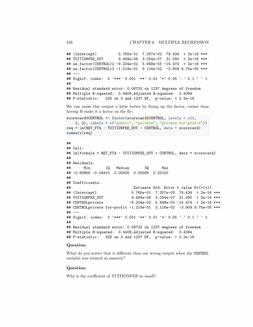
246 CHAPTER 6. MULTIPLE REGRESSION
## (Intercept) 5.765e-01 7.257e-03 79.434 < 2e-16 ***## TUITIONFEE_OUT 9.494e-06 3.054e-07 31.090 < 2e-16 ***## as.factor(CONTROL)2 -9.204e-02 5.948e-03 -15.474 < 2e-16 ***## as.factor(CONTROL)3 -1.218e-01 3.116e-02 -3.909 9.75e-05 ***## ---## Signif. codes: 0 '***' 0.001 '**' 0.01 '*' 0.05 '.' 0.1 ' ' 1#### Residual standard error: 0.08732 on 1237 degrees of freedom## Multiple R-squared: 0.4408,Adjusted R-squared: 0.4394## F-statistic: 325 on 3 and 1237 DF, p-value: < 2.2e-16
We can make this output a little better by fixing up the factor, rather thanhaving R make it a factor on the fly:scorecard$CONTROL <- factor(scorecard$CONTROL, levels = c(1,
2, 3), labels = c("public", "private", "private for-profit"))req = lm(RET_FT4 ~ TUITIONFEE_OUT + CONTROL, data = scorecard)summary(req)
#### Call:## lm(formula = RET_FT4 ~ TUITIONFEE_OUT + CONTROL, data = scorecard)#### Residuals:## Min 1Q Median 3Q Max## -0.68856 -0.04910 0.00505 0.05568 0.33150#### Coefficients:## Estimate Std. Error t value Pr(>|t|)## (Intercept) 5.765e-01 7.257e-03 79.434 < 2e-16 ***## TUITIONFEE_OUT 9.494e-06 3.054e-07 31.090 < 2e-16 ***## CONTROLprivate -9.204e-02 5.948e-03 -15.474 < 2e-16 ***## CONTROLprivate for-profit -1.218e-01 3.116e-02 -3.909 9.75e-05 ***## ---## Signif. codes: 0 '***' 0.001 '**' 0.01 '*' 0.05 '.' 0.1 ' ' 1#### Residual standard error: 0.08732 on 1237 degrees of freedom## Multiple R-squared: 0.4408,Adjusted R-squared: 0.4394## F-statistic: 325 on 3 and 1237 DF, p-value: < 2.2e-16
Question:
What do you notice that is different than our wrong output when the CONTROLvariable was treated as numeric?
Question:
Why is the coefficient of TUITIONFEE so small?

6.4. MULTIPLE REGRESSION WITH CATEGORICAL EXPLANATORY VARIABLES247
6.4.1 Separate Intercepts: The coefficients of Categori-cal/Factor variables
What do the multiple coefficients mean for the variable CONTROL?
This equation can be written in full as:
𝑅𝐸𝑇 = 0.5765+9.4×10⁻⁶∗𝑇 𝑈𝐼𝑇 𝐼𝑂𝑁𝐹𝐸𝐸−0.0092∗𝐼 (𝐶𝑂𝑁𝑇 𝑅𝑂𝐿 = 2)−0.1218∗𝐼 (𝐶𝑂𝑁𝑇 𝑅𝑂𝐿 = 3) .
The variable 𝐼 (𝐶𝑂𝑁𝑇 𝑅𝑂𝐿 = 2) is the indicator function, which takes the value1 if the college has CONTROL equal to 2 (i.e., if the college is private non-profit)and 0 otherwise. Similarly the variable 𝐼 (𝐶𝑂𝑁𝑇 𝑅𝑂𝐿 = 3) takes the value 1 ifthe college has CONTROL equal to 3 (i.e., if the college is private for profit) and 0otherwise. Variables which take only the two values 0 and 1 are called indicatorvariables.
Note that the variable 𝐼 (𝐶𝑂𝑁𝑇 𝑅𝑂𝐿 = 1) does not appear in the regressionequation (??). This means that the level 1 (i.e., the college is public) is thebaseline level here and the effects of −0.0092 and 0.1218 for private for-profitand private non-profit colleges respectively should be interpreted relative topublic colleges.
The regression equation (??) can effectively be broken down into three equations.For public colleges, the two indicator variables in (??) are zero and the equationbecomes:
𝑅𝐸𝑇 = 0.5765 + 9.4 × 10⁻⁶ ∗ 𝑇 𝑈𝐼𝑇 𝐼𝑂𝑁𝐹𝐸𝐸.For private non-profit colleges, the equation becomes
𝑅𝐸𝑇 = 0.5673 + 9.4 × 10⁻⁶ ∗ 𝑇 𝑈𝐼𝑇 𝐼𝑂𝑁𝐹𝐸𝐸.
and for private for-profit colleges,
𝑅𝐸𝑇 = 0.4547 + 9.4 × 10⁻⁶ ∗ 𝑇 𝑈𝐼𝑇 𝐼𝑂𝑁𝐹𝐸𝐸.
Note that the coefficient of TUITIONFEE is the same in each of these equations(only the intercept changes). We can plot a scatterplot together with all theselines.cols <- c("blue", "red", "black")plot(RET_FT4 ~ TUITIONFEE_OUT, data = scorecard, xlab = "Tuition Fee (out of state)",
ylab = "Retention Rate", col = cols[scorecard$CONTROL])baseline <- coef(req)[["(Intercept)"]]slope <- coef(req)[["TUITIONFEE_OUT"]]for (ii in 1:nlevels(scorecard$CONTROL)) {
lev <- levels(scorecard$CONTROL)[[ii]]if (ii == 1) {
abline(a = baseline, b = slope, col = cols[[ii]])}
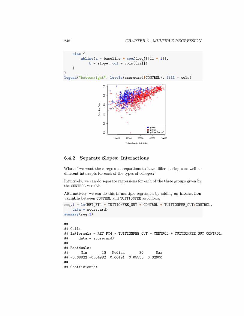
248 CHAPTER 6. MULTIPLE REGRESSION
else {abline(a = baseline + coef(req)[[ii + 1]],
b = slope, col = cols[[ii]])}
}legend("bottomright", levels(scorecard$CONTROL), fill = cols)
6.4.2 Separate Slopes: Interactions
What if we want these regression equations to have different slopes as well asdifferent intercepts for each of the types of colleges?
Intuitively, we can do separate regressions for each of the three groups given bythe CONTROL variable.
Alternatively, we can do this in multiple regression by adding an interactionvariable between CONTROL and TUITIONFEE as follows:req.1 = lm(RET_FT4 ~ TUITIONFEE_OUT + CONTROL + TUITIONFEE_OUT:CONTROL,
data = scorecard)summary(req.1)
#### Call:## lm(formula = RET_FT4 ~ TUITIONFEE_OUT + CONTROL + TUITIONFEE_OUT:CONTROL,## data = scorecard)#### Residuals:## Min 1Q Median 3Q Max## -0.68822 -0.04982 0.00491 0.05555 0.32900#### Coefficients:

6.4. MULTIPLE REGRESSION WITH CATEGORICAL EXPLANATORY VARIABLES249
## Estimate Std. Error t value Pr(>|t|)## (Intercept) 5.814e-01 1.405e-02 41.372 < 2e-16## TUITIONFEE_OUT 9.240e-06 6.874e-07 13.441 < 2e-16## CONTROLprivate -9.830e-02 1.750e-02 -5.617 2.4e-08## CONTROLprivate for-profit -2.863e-01 1.568e-01 -1.826 0.0681## TUITIONFEE_OUT:CONTROLprivate 2.988e-07 7.676e-07 0.389 0.6971## TUITIONFEE_OUT:CONTROLprivate for-profit 7.215e-06 6.716e-06 1.074 0.2829#### (Intercept) ***## TUITIONFEE_OUT ***## CONTROLprivate ***## CONTROLprivate for-profit .## TUITIONFEE_OUT:CONTROLprivate## TUITIONFEE_OUT:CONTROLprivate for-profit## ---## Signif. codes: 0 '***' 0.001 '**' 0.01 '*' 0.05 '.' 0.1 ' ' 1#### Residual standard error: 0.08734 on 1235 degrees of freedom## Multiple R-squared: 0.4413,Adjusted R-squared: 0.4391## F-statistic: 195.1 on 5 and 1235 DF, p-value: < 2.2e-16
Note that this regression equation has two more coefficients compared to theprevious regression (which did not have the interaction term). The two ad-ditional variables are the product of the terms of each of the previous terms:𝑇 𝑈𝐼𝑇 𝐼𝑂𝑁𝐹𝐸𝐸 ∗ 𝐼(𝐶𝑂𝑁𝑇 𝑅𝑂𝐿 = 2) and 𝑇 𝑈𝐼𝑇 𝐼𝑂𝑁𝐹𝐸𝐸 ∗ 𝐼(𝐶𝑂𝑁𝑇 𝑅𝑂𝐿 =3).Question:
The presence of these product terms means that three separate slopes per eachlevel of the factor are being fit here, why?
Alternatively, this regression with interaction can also be done in R via:summary(lm(RET_FT4 ~ TUITIONFEE_OUT * CONTROL, data = scorecard))
#### Call:## lm(formula = RET_FT4 ~ TUITIONFEE_OUT * CONTROL, data = scorecard)#### Residuals:## Min 1Q Median 3Q Max## -0.68822 -0.04982 0.00491 0.05555 0.32900#### Coefficients:## Estimate Std. Error t value Pr(>|t|)## (Intercept) 5.814e-01 1.405e-02 41.372 < 2e-16## TUITIONFEE_OUT 9.240e-06 6.874e-07 13.441 < 2e-16
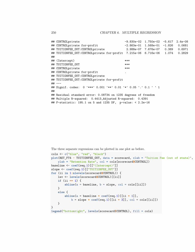
250 CHAPTER 6. MULTIPLE REGRESSION
## CONTROLprivate -9.830e-02 1.750e-02 -5.617 2.4e-08## CONTROLprivate for-profit -2.863e-01 1.568e-01 -1.826 0.0681## TUITIONFEE_OUT:CONTROLprivate 2.988e-07 7.676e-07 0.389 0.6971## TUITIONFEE_OUT:CONTROLprivate for-profit 7.215e-06 6.716e-06 1.074 0.2829#### (Intercept) ***## TUITIONFEE_OUT ***## CONTROLprivate ***## CONTROLprivate for-profit .## TUITIONFEE_OUT:CONTROLprivate## TUITIONFEE_OUT:CONTROLprivate for-profit## ---## Signif. codes: 0 '***' 0.001 '**' 0.01 '*' 0.05 '.' 0.1 ' ' 1#### Residual standard error: 0.08734 on 1235 degrees of freedom## Multiple R-squared: 0.4413,Adjusted R-squared: 0.4391## F-statistic: 195.1 on 5 and 1235 DF, p-value: < 2.2e-16
The three separate regressions can be plotted in one plot as before.cols <- c("blue", "red", "black")plot(RET_FT4 ~ TUITIONFEE_OUT, data = scorecard, xlab = "Tuition Fee (out of state)",
ylab = "Retention Rate", col = cols[scorecard$CONTROL])baseline <- coef(req.1)[["(Intercept)"]]slope <- coef(req.1)[["TUITIONFEE_OUT"]]for (ii in 1:nlevels(scorecard$CONTROL)) {
lev <- levels(scorecard$CONTROL)[[ii]]if (ii == 1) {
abline(a = baseline, b = slope, col = cols[[ii]])}else {
abline(a = baseline + coef(req.1)[[ii + 1]],b = slope + coef(req.1)[[ii + 3]], col = cols[[ii]])
}}legend("bottomright", levels(scorecard$CONTROL), fill = cols)
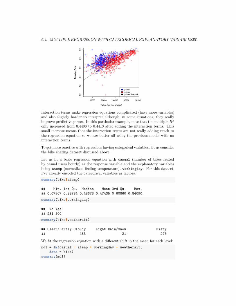
6.4. MULTIPLE REGRESSION WITH CATEGORICAL EXPLANATORY VARIABLES251
Interaction terms make regression equations complicated (have more variables)and also slightly harder to interpret although, in some situations, they reallyimprove predictive power. In this particular example, note that the multiple 𝑅2
only increased from 0.4408 to 0.4413 after adding the interaction terms. Thissmall increase means that the interaction terms are not really adding much tothe regression equation so we are better off using the previous model with nointeraction terms.
To get more practice with regressions having categorical variables, let us considerthe bike sharing dataset discussed above.
Let us fit a basic regression equation with casual (number of bikes rentedby casual users hourly) as the response variable and the explanatory variablesbeing atemp (normalized feeling temperature), workingday. For this dataset,I’ve already encoded the categorical variables as factors.summary(bike$atemp)
## Min. 1st Qu. Median Mean 3rd Qu. Max.## 0.07907 0.33784 0.48673 0.47435 0.60860 0.84090summary(bike$workingday)
## No Yes## 231 500summary(bike$weathersit)
## Clear/Partly Cloudy Light Rain/Snow Misty## 463 21 247
We fit the regression equation with a different shift in the mean for each level:md1 = lm(casual ~ atemp + workingday + weathersit,
data = bike)summary(md1)
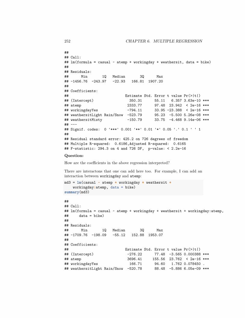
252 CHAPTER 6. MULTIPLE REGRESSION
#### Call:## lm(formula = casual ~ atemp + workingday + weathersit, data = bike)#### Residuals:## Min 1Q Median 3Q Max## -1456.76 -243.97 -22.93 166.81 1907.20#### Coefficients:## Estimate Std. Error t value Pr(>|t|)## (Intercept) 350.31 55.11 6.357 3.63e-10 ***## atemp 2333.77 97.48 23.942 < 2e-16 ***## workingdayYes -794.11 33.95 -23.388 < 2e-16 ***## weathersitLight Rain/Snow -523.79 95.23 -5.500 5.26e-08 ***## weathersitMisty -150.79 33.75 -4.468 9.14e-06 ***## ---## Signif. codes: 0 '***' 0.001 '**' 0.01 '*' 0.05 '.' 0.1 ' ' 1#### Residual standard error: 425.2 on 726 degrees of freedom## Multiple R-squared: 0.6186,Adjusted R-squared: 0.6165## F-statistic: 294.3 on 4 and 726 DF, p-value: < 2.2e-16
Question:
How are the coefficients in the above regression interpreted?
There are interactons that one can add here too. For example, I can add aninteraction between workingday and atemp:md3 = lm(casual ~ atemp + workingday + weathersit +
workingday:atemp, data = bike)summary(md3)
#### Call:## lm(formula = casual ~ atemp + workingday + weathersit + workingday:atemp,## data = bike)#### Residuals:## Min 1Q Median 3Q Max## -1709.76 -198.09 -55.12 152.88 1953.07#### Coefficients:## Estimate Std. Error t value Pr(>|t|)## (Intercept) -276.22 77.48 -3.565 0.000388 ***## atemp 3696.41 155.56 23.762 < 2e-16 ***## workingdayYes 166.71 94.60 1.762 0.078450 .## weathersitLight Rain/Snow -520.78 88.48 -5.886 6.05e-09 ***
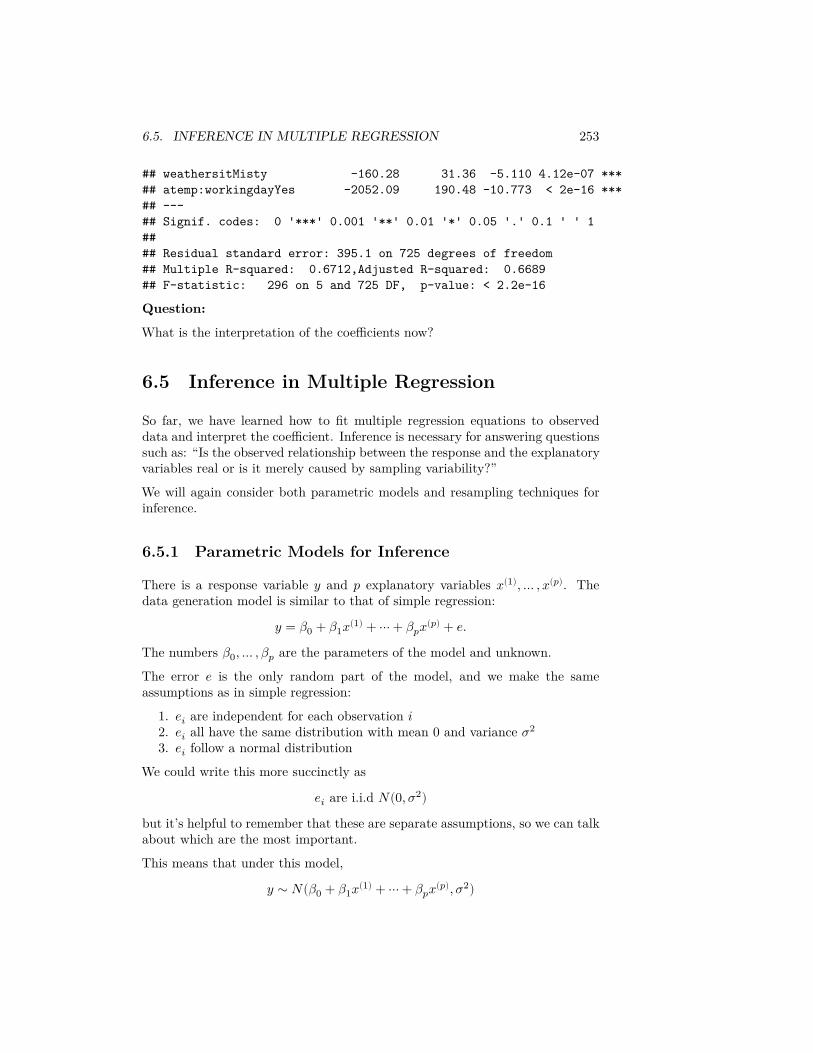
6.5. INFERENCE IN MULTIPLE REGRESSION 253
## weathersitMisty -160.28 31.36 -5.110 4.12e-07 ***## atemp:workingdayYes -2052.09 190.48 -10.773 < 2e-16 ***## ---## Signif. codes: 0 '***' 0.001 '**' 0.01 '*' 0.05 '.' 0.1 ' ' 1#### Residual standard error: 395.1 on 725 degrees of freedom## Multiple R-squared: 0.6712,Adjusted R-squared: 0.6689## F-statistic: 296 on 5 and 725 DF, p-value: < 2.2e-16
Question:
What is the interpretation of the coefficients now?
6.5 Inference in Multiple Regression
So far, we have learned how to fit multiple regression equations to observeddata and interpret the coefficient. Inference is necessary for answering questionssuch as: “Is the observed relationship between the response and the explanatoryvariables real or is it merely caused by sampling variability?”
We will again consider both parametric models and resampling techniques forinference.
6.5.1 Parametric Models for Inference
There is a response variable 𝑦 and 𝑝 explanatory variables 𝑥(1), … , 𝑥(𝑝). Thedata generation model is similar to that of simple regression:
𝑦 = 𝛽0 + 𝛽1𝑥(1) + ⋯ + 𝛽𝑝𝑥(𝑝) + 𝑒.The numbers 𝛽0, … , 𝛽𝑝 are the parameters of the model and unknown.
The error 𝑒 is the only random part of the model, and we make the sameassumptions as in simple regression:
1. 𝑒𝑖 are independent for each observation 𝑖2. 𝑒𝑖 all have the same distribution with mean 0 and variance 𝜎2
3. 𝑒𝑖 follow a normal distribution
We could write this more succinctly as
𝑒𝑖 are i.i.d 𝑁(0, 𝜎2)but it’s helpful to remember that these are separate assumptions, so we can talkabout which are the most important.
This means that under this model,
𝑦 ∼ 𝑁(𝛽0 + 𝛽1𝑥(1) + ⋯ + 𝛽𝑝𝑥(𝑝), 𝜎2)

254 CHAPTER 6. MULTIPLE REGRESSION
i.e. the observed 𝑦𝑖 are normal and independent from each other, but each witha different mean, which depends on 𝑥𝑖 (so the 𝑦𝑖 are NOT i.i.d. because notidentically distributed).
Estimates
The numbers 𝛽0, … , 𝛽𝑝 capture the true relationship between 𝑦 and 𝑥1, … , 𝑥𝑝.Also unknown is the quantity 𝜎2 which is the variance of the unknown 𝑒𝑖. Whenwe fit a regression equation to a dataset via 𝑙𝑚() in R, we obtain estimates 𝛽𝑗of the unknown 𝛽𝑗.
The residual 𝑟𝑖 serve as natural proxies for the unknown random errors 𝑒𝑖. There-fore a natural estimate for the error standard deviation 𝜎 is the Residual Stan-dard Error,
��2 = 1𝑛 − 𝑝 − 1 ∑ 𝑟2
𝑖 = 1𝑛 − 𝑝 − 1𝑅𝑆𝑆
Notice this is the same as our previous equation from simple regression, onlynow we are using 𝑛 − 𝑝 − 1 as our correction to make the estimate unbiased.
6.5.2 Global Fit
The most obvious question is the global question: are these variables cummu-latively any good in predicting 𝑦? This can be restated as, whether you couldpredict 𝑦 just as well if didn’t use any of the 𝑥(𝑗) variables.
Question:
If we didn’t use any of the variables, what is our best “prediction” of 𝑦?
So our question can be phrased as whether our prediction that we estimated,𝑦(𝑥), is better than just 𝑦 in predicting 𝑦.
Equivalently, we can think that our null hypothesis is
𝐻0 ∶ 𝛽𝑗 = 0, for all 𝑗
6.5.2.1 Parametric Test of Global Fit
The parametric test that is commonly used for assessing the global fit is a F-test.A common way to assess the fit, we have just said is either large 𝑅2 or small𝑅𝑆𝑆 = ∑𝑛
𝑖=1 𝑟2𝑖 .
We can also think our global test is an implicit test for comparing two possibleprediction models
Model 0: No variables, just predict 𝑦 for all observations
Model 1: Our linear model with all the variables
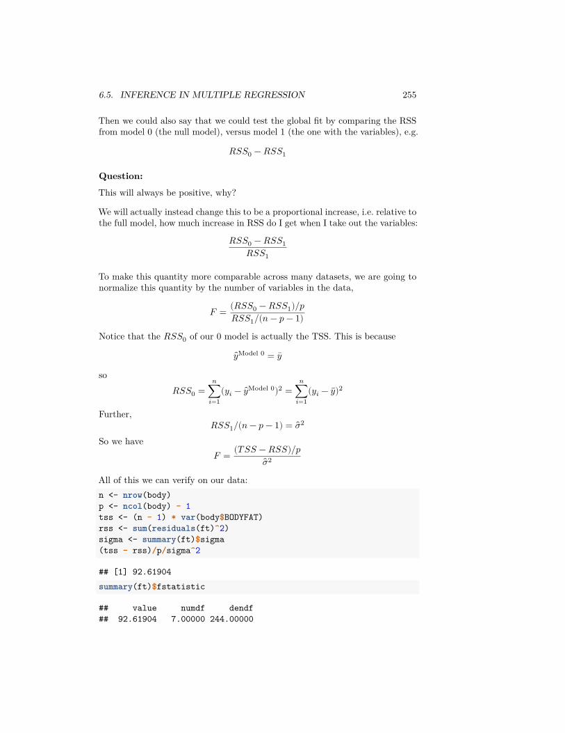
6.5. INFERENCE IN MULTIPLE REGRESSION 255
Then we could also say that we could test the global fit by comparing the RSSfrom model 0 (the null model), versus model 1 (the one with the variables), e.g.
𝑅𝑆𝑆0 − 𝑅𝑆𝑆1
Question:
This will always be positive, why?
We will actually instead change this to be a proportional increase, i.e. relative tothe full model, how much increase in RSS do I get when I take out the variables:
𝑅𝑆𝑆0 − 𝑅𝑆𝑆1𝑅𝑆𝑆1
To make this quantity more comparable across many datasets, we are going tonormalize this quantity by the number of variables in the data,
𝐹 = (𝑅𝑆𝑆0 − 𝑅𝑆𝑆1)/𝑝𝑅𝑆𝑆1/(𝑛 − 𝑝 − 1)
Notice that the 𝑅𝑆𝑆0 of our 0 model is actually the TSS. This is because
𝑦Model 0 = 𝑦
so𝑅𝑆𝑆0 =
𝑛∑𝑖=1
(𝑦𝑖 − 𝑦Model 0)2 =𝑛
∑𝑖=1
(𝑦𝑖 − 𝑦)2
Further,𝑅𝑆𝑆1/(𝑛 − 𝑝 − 1) = ��2
So we have𝐹 = (𝑇 𝑆𝑆 − 𝑅𝑆𝑆)/𝑝
��2
All of this we can verify on our data:n <- nrow(body)p <- ncol(body) - 1tss <- (n - 1) * var(body$BODYFAT)rss <- sum(residuals(ft)^2)sigma <- summary(ft)$sigma(tss - rss)/p/sigma^2
## [1] 92.61904summary(ft)$fstatistic
## value numdf dendf## 92.61904 7.00000 244.00000
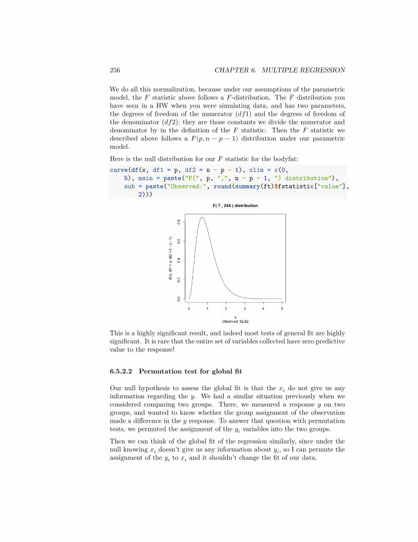
256 CHAPTER 6. MULTIPLE REGRESSION
We do all this normalization, because under our assumptions of the parametricmodel, the 𝐹 statistic above follows a 𝐹 -distribution. The 𝐹 distribution youhave seen in a HW when you were simulating data, and has two parameters,the degrees of freedom of the numerator (𝑑𝑓1) and the degrees of freedom ofthe denominator (𝑑𝑓2); they are those constants we divide the numerator anddenominator by in the definition of the 𝐹 statistic. Then the 𝐹 statistic wedescribed above follows a 𝐹(𝑝, 𝑛 − 𝑝 − 1) distribution under our parametricmodel.
Here is the null distribution for our 𝐹 statistic for the bodyfat:curve(df(x, df1 = p, df2 = n - p - 1), xlim = c(0,
5), main = paste("F(", p, ",", n - p - 1, ") distribution"),sub = paste("Observed:", round(summary(ft)$fstatistic["value"],
2)))
This is a highly significant result, and indeed most tests of general fit are highlysignificant. It is rare that the entire set of variables collected have zero predictivevalue to the response!
6.5.2.2 Permutation test for global fit
Our null hypothesis to assess the global fit is that the 𝑥𝑖 do not give us anyinformation regarding the 𝑦. We had a similar situation previously when weconsidered comparing two groups. There, we measured a response 𝑦 on twogroups, and wanted to know whether the group assignment of the observationmade a difference in the 𝑦 response. To answer that question with permutationtests, we permuted the assignment of the 𝑦𝑖 variables into the two groups.
Then we can think of the global fit of the regression similarly, since under thenull knowing 𝑥𝑖 doesn’t give us any information about 𝑦𝑖, so I can permute theassignment of the 𝑦𝑖 to 𝑥𝑖 and it shouldn’t change the fit of our data.
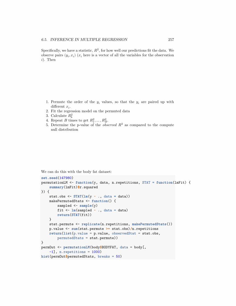
6.5. INFERENCE IN MULTIPLE REGRESSION 257
Specifically, we have a statistic, 𝑅2, for how well our predictions fit the data. Weobserve pairs (𝑦𝑖, 𝑥𝑖) (𝑥𝑖 here is a vector of all the variables for the observation𝑖). Then
1. Permute the order of the 𝑦𝑖 values, so that the 𝑦𝑖 are paired up withdifferent 𝑥𝑖.
2. Fit the regression model on the permuted data3. Calculate 𝑅2
𝑏4. Repeat 𝐵 times to get 𝑅2
1, … , 𝑅2𝐵.
5. Determine the p-value of the observed 𝑅2 as compared to the computenull distribution
We can do this with the body fat dataset:set.seed(147980)permutationLM <- function(y, data, n.repetitions, STAT = function(lmFit) {
summary(lmFit)$r.squared}) {
stat.obs <- STAT(lm(y ~ ., data = data))makePermutedStats <- function() {
sampled <- sample(y)fit <- lm(sampled ~ ., data = data)return(STAT(fit))
}stat.permute <- replicate(n.repetitions, makePermutedStats())p.value <- sum(stat.permute >= stat.obs)/n.repetitionsreturn(list(p.value = p.value, observedStat = stat.obs,
permutedStats = stat.permute))}permOut <- permutationLM(body$BODYFAT, data = body[,
-1], n.repetitions = 1000)hist(permOut$permutedStats, breaks = 50)
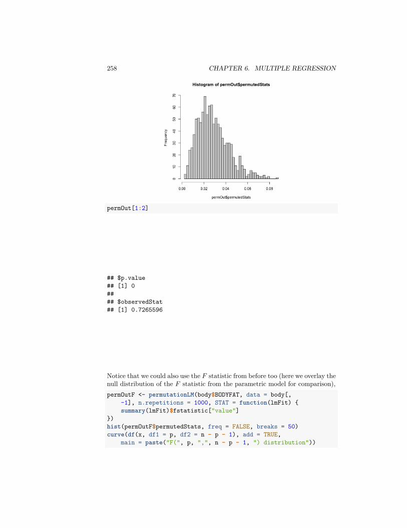
258 CHAPTER 6. MULTIPLE REGRESSION
permOut[1:2]
## $p.value## [1] 0#### $observedStat## [1] 0.7265596
Notice that we could also use the 𝐹 statistic from before too (here we overlay thenull distribution of the 𝐹 statistic from the parametric model for comparison),permOutF <- permutationLM(body$BODYFAT, data = body[,
-1], n.repetitions = 1000, STAT = function(lmFit) {summary(lmFit)$fstatistic["value"]
})hist(permOutF$permutedStats, freq = FALSE, breaks = 50)curve(df(x, df1 = p, df2 = n - p - 1), add = TRUE,
main = paste("F(", p, ",", n - p - 1, ") distribution"))
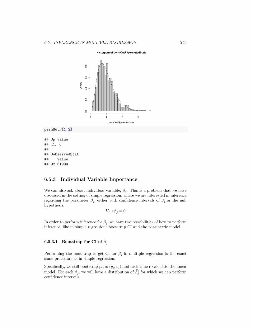
6.5. INFERENCE IN MULTIPLE REGRESSION 259
permOutF[1:2]
## $p.value## [1] 0#### $observedStat## value## 92.61904
6.5.3 Individual Variable Importance
We can also ask about individual variable, 𝛽𝑗. This is a problem that we havediscussed in the setting of simple regression, where we are interested in inferenceregarding the parameter 𝛽𝑗, either with confidence intervals of 𝛽𝑗 or the nullhypothesis:
𝐻0 ∶ 𝛽𝑗 = 0
In order to perform inference for 𝛽𝑗, we have two possibilities of how to performinference, like in simple regression: bootstrap CI and the parametric model.
6.5.3.1 Bootstrap for CI of 𝛽𝑗
Performing the bootstrap to get CI for 𝛽𝑗 in multiple regression is the exactsame procedure as in simple regression.
Specifically, we still bootstrap pairs (𝑦𝑖, 𝑥𝑖) and each time recalculate the linearmodel. For each 𝛽𝑗, we will have a distribution of 𝛽∗
𝑗 for which we can performconfidence intervals.
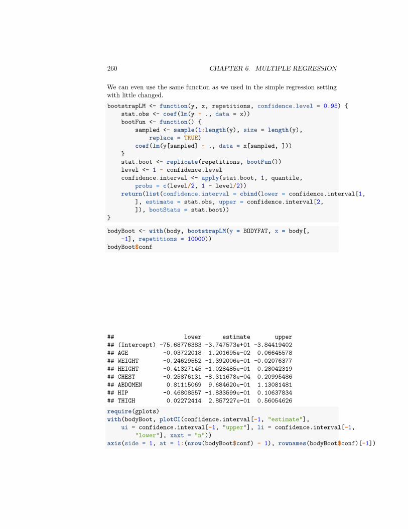
260 CHAPTER 6. MULTIPLE REGRESSION
We can even use the same function as we used in the simple regression settingwith little changed.bootstrapLM <- function(y, x, repetitions, confidence.level = 0.95) {
stat.obs <- coef(lm(y ~ ., data = x))bootFun <- function() {
sampled <- sample(1:length(y), size = length(y),replace = TRUE)
coef(lm(y[sampled] ~ ., data = x[sampled, ]))}stat.boot <- replicate(repetitions, bootFun())level <- 1 - confidence.levelconfidence.interval <- apply(stat.boot, 1, quantile,
probs = c(level/2, 1 - level/2))return(list(confidence.interval = cbind(lower = confidence.interval[1,
], estimate = stat.obs, upper = confidence.interval[2,]), bootStats = stat.boot))
}
bodyBoot <- with(body, bootstrapLM(y = BODYFAT, x = body[,-1], repetitions = 10000))
bodyBoot$conf
## lower estimate upper## (Intercept) -75.68776383 -3.747573e+01 -3.84419402## AGE -0.03722018 1.201695e-02 0.06645578## WEIGHT -0.24629552 -1.392006e-01 -0.02076377## HEIGHT -0.41327145 -1.028485e-01 0.28042319## CHEST -0.25876131 -8.311678e-04 0.20995486## ABDOMEN 0.81115069 9.684620e-01 1.13081481## HIP -0.46808557 -1.833599e-01 0.10637834## THIGH 0.02272414 2.857227e-01 0.56054626require(gplots)with(bodyBoot, plotCI(confidence.interval[-1, "estimate"],
ui = confidence.interval[-1, "upper"], li = confidence.interval[-1,"lower"], xaxt = "n"))
axis(side = 1, at = 1:(nrow(bodyBoot$conf) - 1), rownames(bodyBoot$conf)[-1])
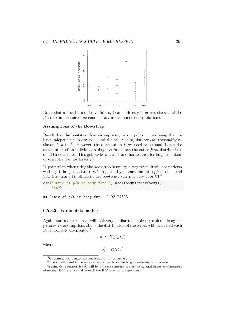
6.5. INFERENCE IN MULTIPLE REGRESSION 261
Note, that unless I scale the variables, I can’t directly interpret the size of the𝛽𝑗 as its importance (see commentary above under interpretation).
Assumptions of the Bootstrap
Recall that the bootstrap has assumptions, two important ones being that wehave independent observations and the other being that we can reasonably es-timate 𝐹 with 𝐹 . However, the distribution 𝐹 we need to estimate is not thedistribution of an individual a single variable, but the entire joint distributionsof all the variables. This gets to be a harder and harder task for larger numbersof variables (i.e. for larger 𝑝).In particular, when using the bootstrap in multiple regression, it will not performwell if 𝑝 is large relative to 𝑛.3 In general you want the ratio 𝑝/𝑛 to be small(like less than 0.1); otherwise the bootstrap can give very poor CI.4
cat("Ratio of p/n in body fat: ", ncol(body)/nrow(body),"\n")
## Ratio of p/n in body fat: 0.03174603
6.5.3.2 Parametric models
Again, our inference on 𝛽𝑗 will look very similar to simple regression. Using ourparametric assumptions about the distribution of the errors will mean that each
𝛽𝑗 is normally distributed 5
𝛽𝑗 ∼ 𝑁(𝛽𝑗, 𝜈2𝑗 )
where𝜈2
𝑗 = ℓ(𝑋)𝜎2
3Of course, you cannot do regression at all unless 𝑛 > 𝑝.4The CI will tend to be very conservative…too wide to give meaningful inference5again, the equation for 𝛽𝑗 will be a linear combination of the 𝑦𝑖, and linear combinations
of normal R.V. are normal, even if the R.V. are not independent.
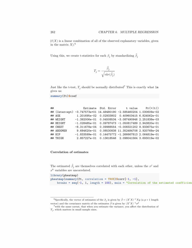
262 CHAPTER 6. MULTIPLE REGRESSION
(ℓ(𝑋) is a linear combination of all of the observed explanatory variables, givenin the matrix 𝑋).6
Using this, we create t-statistics for each 𝛽𝑗 by standardizing 𝛽𝑗
𝑇𝑗 =𝛽𝑗
√ 𝑣𝑎𝑟( 𝛽𝑗)
Just like the t-test, 𝑇𝑗 should be normally distributed7 This is exactly what lmgives us:summary(ft)$coef
## Estimate Std. Error t value Pr(>|t|)## (Intercept) -3.747573e+01 14.49480190 -2.585460204 1.030609e-02## AGE 1.201695e-02 0.02933802 0.409603415 6.824562e-01## WEIGHT -1.392006e-01 0.04508534 -3.087490946 2.251838e-03## HEIGHT -1.028485e-01 0.09787473 -1.050817489 2.943820e-01## CHEST -8.311678e-04 0.09988554 -0.008321202 9.933675e-01## ABDOMEN 9.684620e-01 0.08530838 11.352484708 2.920768e-24## HIP -1.833599e-01 0.14475772 -1.266667813 2.064819e-01## THIGH 2.857227e-01 0.13618546 2.098041564 3.693019e-02
Correlation of estimates
The estimated 𝛽𝑗 are themselves correlated with each other, unless the 𝑥𝑗 and𝑥𝑘 variables are uncorrelated.library(pheatmap)pheatmap(summary(ft, correlation = TRUE)$corr[-1, -1],
breaks = seq(-1, 1, length = 100), main = "Correlation of the estimated coefficients")
6Specifically, the vector of estimates of the 𝛽𝑗 is given by 𝛽 = (𝑋′𝑋)−1𝑋𝑦 (a 𝑝 + 1 lengthvector) and the covariance matrix of the estimates 𝛽 is given by (𝑋′𝑋)−1𝜎2
7with the same caveat, that when you estimate the variance, you affect the distribution of𝑇𝑗, which matters in small sample sizes.
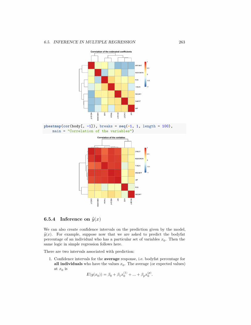
6.5. INFERENCE IN MULTIPLE REGRESSION 263
pheatmap(cor(body[, -1]), breaks = seq(-1, 1, length = 100),main = "Correlation of the variables")
6.5.4 Inference on 𝑦(𝑥)
We can also create confidence intervals on the prediction given by the model,𝑦(𝑥). For example, suppose now that we are asked to predict the bodyfat
percentage of an individual who has a particular set of variables 𝑥0. Then thesame logic in simple regression follows here.
There are two intervals associated with prediction:
1. Confidence intervals for the average response, i.e. bodyfat percentage forall individuals who have the values 𝑥0. The average (or expected values)at 𝑥0 is
𝐸(𝑦(𝑥0)) = 𝛽0 + 𝛽1𝑥(1)0 + … + 𝛽𝑝𝑥(𝑝)
0 .
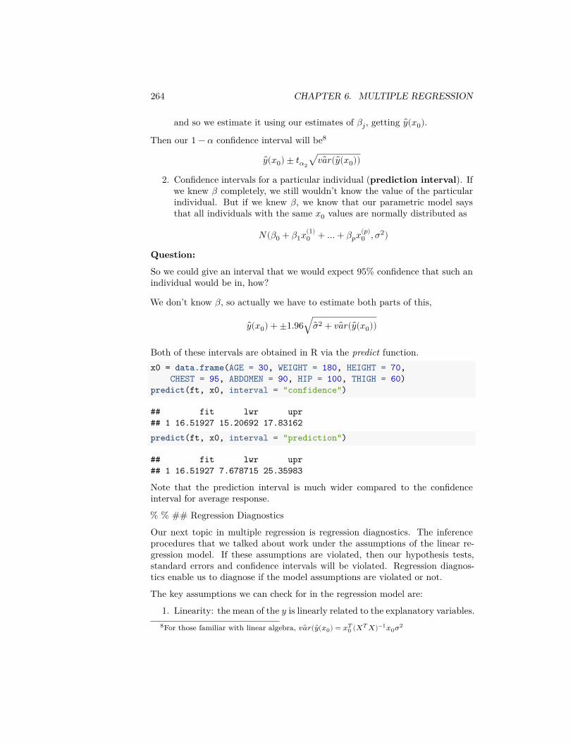
264 CHAPTER 6. MULTIPLE REGRESSION
and so we estimate it using our estimates of 𝛽𝑗, getting 𝑦(𝑥0).Then our 1 − 𝛼 confidence interval will be8
𝑦(𝑥0) ± 𝑡𝛼2√ 𝑣𝑎𝑟( 𝑦(𝑥0))
2. Confidence intervals for a particular individual (prediction interval). Ifwe knew 𝛽 completely, we still wouldn’t know the value of the particularindividual. But if we knew 𝛽, we know that our parametric model saysthat all individuals with the same 𝑥0 values are normally distributed as
𝑁(𝛽0 + 𝛽1𝑥(1)0 + … + 𝛽𝑝𝑥(𝑝)
0 , 𝜎2)
Question:
So we could give an interval that we would expect 95% confidence that such anindividual would be in, how?
We don’t know 𝛽, so actually we have to estimate both parts of this,
𝑦(𝑥0) + ±1.96√��2 + 𝑣𝑎𝑟( 𝑦(𝑥0))
Both of these intervals are obtained in R via the predict function.x0 = data.frame(AGE = 30, WEIGHT = 180, HEIGHT = 70,
CHEST = 95, ABDOMEN = 90, HIP = 100, THIGH = 60)predict(ft, x0, interval = "confidence")
## fit lwr upr## 1 16.51927 15.20692 17.83162predict(ft, x0, interval = "prediction")
## fit lwr upr## 1 16.51927 7.678715 25.35983
Note that the prediction interval is much wider compared to the confidenceinterval for average response.
% % ## Regression Diagnostics
Our next topic in multiple regression is regression diagnostics. The inferenceprocedures that we talked about work under the assumptions of the linear re-gression model. If these assumptions are violated, then our hypothesis tests,standard errors and confidence intervals will be violated. Regression diagnos-tics enable us to diagnose if the model assumptions are violated or not.
The key assumptions we can check for in the regression model are:
1. Linearity: the mean of the 𝑦 is linearly related to the explanatory variables.8For those familiar with linear algebra, 𝑣𝑎𝑟( 𝑦(𝑥0) = 𝑥𝑇
0 (𝑋𝑇 𝑋)−1𝑥0𝜎2

6.5. INFERENCE IN MULTIPLE REGRESSION 265
2. Homoscedasticity: the errors have the same variance.3. Normality: the errors have the normal distribution.4. All the observations obey the same model (i.e., there are no outliers or
exceptional observations).
These are particularly problems for the parametric model; the bootstrap will berelatively robust to these assumptions, but violations of these assumptions cancause the inference to be less powerful – i.e. harder to detect interesting signal.
These above assumptions can be checked by essentially looking at the residuals:
1. Linearity: The residuals represent what is left in the response variableafter the linear effects of the explanatory variables are taken out. So ifthere is a non-linear relationship between the response and one or moreof the explanatory variables, the residuals will be related non-linearly tothe explanatory variables. This can be detected by plotting the residualsagainst the explanatory variables. It is also common to plot the residualsagainst the fitted values. Note that one can also detect non-linearity bysimply plotting the response against each of the explanatory variables.
2. Homoscedasticity: Heteroscedasticity can be checked again by plottingthe residuals against the explanatory variables and the fitted values. Itis common here to plot the absolute values of the residuals or the squareroot of the absolute values of the residuals.
3. Normality: Detected by the normal Q-Q plot of the residuals.4. Outliers: The concern with outliers is that they could be effecting the fit.
There are three measurements we could use to consider whether a pointis an outlier• Size of the residuals (𝑟𝑖) – diagnostics often use standardized residuals
to make them more comparable between different observations9
• Leverage – a measure of how far the vector of explanatory variablesof an observation are from the rest, and on average are expected tobe about 𝑝/𝑛.
• Cook’s Distance – how much the coefficients 𝛽 will change if youleave out observation 𝑖, which basically combines the residual andthe leverage of a point.
Outliers typically will have either large (in absolute value) residuals and/or largeleverage.
Consider the bodyfat dataset. A simple way for doing some of the standardregression diagnostics is to use the plot command as applied to the linearmodel fit:par(mfrow = c(2, 2))plot(ft)
9in fact 𝑟𝑖 is not a good estimate of 𝑒𝑖, in terms of not having constant variance and beingcorrelated. Standardized residuals are still correlated, but at least have the same variance
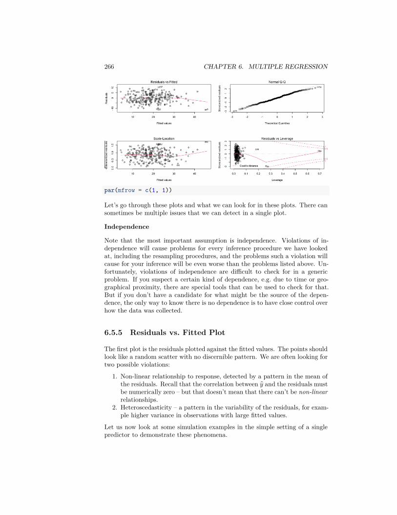
266 CHAPTER 6. MULTIPLE REGRESSION
par(mfrow = c(1, 1))
Let’s go through these plots and what we can look for in these plots. There cansometimes be multiple issues that we can detect in a single plot.
Independence
Note that the most important assumption is independence. Violations of in-dependence will cause problems for every inference procedure we have lookedat, including the resampling procedures, and the problems such a violation willcause for your inference will be even worse than the problems listed above. Un-fortunately, violations of independence are difficult to check for in a genericproblem. If you suspect a certain kind of dependence, e.g. due to time or geo-graphical proximity, there are special tools that can be used to check for that.But if you don’t have a candidate for what might be the source of the depen-dence, the only way to know there is no dependence is to have close control overhow the data was collected.
6.5.5 Residuals vs. Fitted Plot
The first plot is the residuals plotted against the fitted values. The points shouldlook like a random scatter with no discernible pattern. We are often looking fortwo possible violations:
1. Non-linear relationship to response, detected by a pattern in the mean ofthe residuals. Recall that the correlation between 𝑦 and the residuals mustbe numerically zero – but that doesn’t mean that there can’t be non-linearrelationships.
2. Heteroscedasticity – a pattern in the variability of the residuals, for exam-ple higher variance in observations with large fitted values.
Let us now look at some simulation examples in the simple setting of a singlepredictor to demonstrate these phenomena.
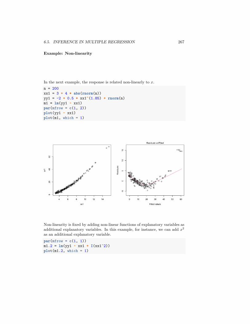
6.5. INFERENCE IN MULTIPLE REGRESSION 267
Example: Non-linearity
In the next example, the response is related non-linearly to 𝑥.n = 200xx1 = 3 + 4 * abs(rnorm(n))yy1 = -2 + 0.5 * xx1^(1.85) + rnorm(n)m1 = lm(yy1 ~ xx1)par(mfrow = c(1, 2))plot(yy1 ~ xx1)plot(m1, which = 1)
Non-linearity is fixed by adding non-linear functions of explanatory variables asadditional explanatory variables. In this example, for instance, we can add 𝑥2
as an additional explanatory variable.par(mfrow = c(1, 1))m1.2 = lm(yy1 ~ xx1 + I(xx1^2))plot(m1.2, which = 1)
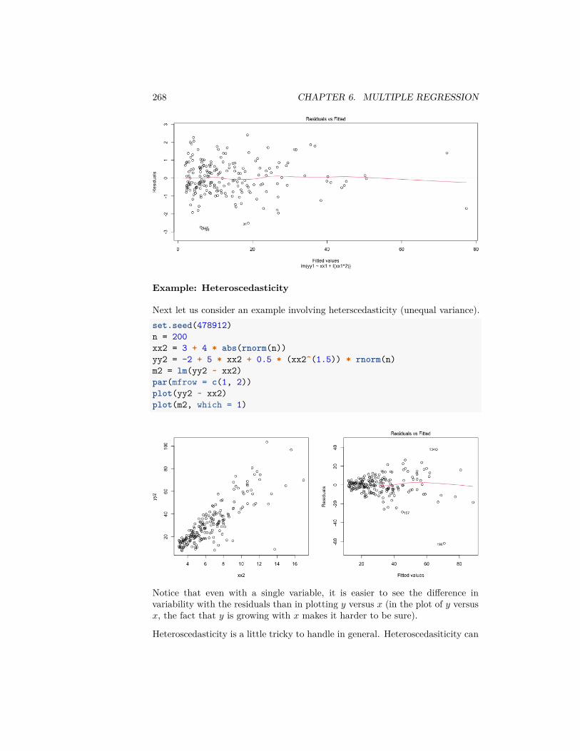
268 CHAPTER 6. MULTIPLE REGRESSION
Example: Heteroscedasticity
Next let us consider an example involving heterscedasticity (unequal variance).set.seed(478912)n = 200xx2 = 3 + 4 * abs(rnorm(n))yy2 = -2 + 5 * xx2 + 0.5 * (xx2^(1.5)) * rnorm(n)m2 = lm(yy2 ~ xx2)par(mfrow = c(1, 2))plot(yy2 ~ xx2)plot(m2, which = 1)
Notice that even with a single variable, it is easier to see the difference invariability with the residuals than in plotting 𝑦 versus 𝑥 (in the plot of 𝑦 versus𝑥, the fact that 𝑦 is growing with 𝑥 makes it harder to be sure).
Heteroscedasticity is a little tricky to handle in general. Heteroscedasiticity can
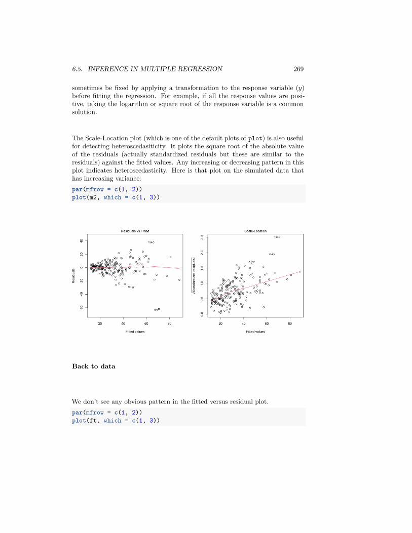
6.5. INFERENCE IN MULTIPLE REGRESSION 269
sometimes be fixed by applying a transformation to the response variable (𝑦)before fitting the regression. For example, if all the response values are posi-tive, taking the logarithm or square root of the response variable is a commonsolution.
The Scale-Location plot (which is one of the default plots of plot) is also usefulfor detecting heteroscedasiticity. It plots the square root of the absolute valueof the residuals (actually standardized residuals but these are similar to theresiduals) against the fitted values. Any increasing or decreasing pattern in thisplot indicates heteroscedasticity. Here is that plot on the simulated data thathas increasing variance:par(mfrow = c(1, 2))plot(m2, which = c(1, 3))
Back to data
We don’t see any obvious pattern in the fitted versus residual plot.par(mfrow = c(1, 2))plot(ft, which = c(1, 3))
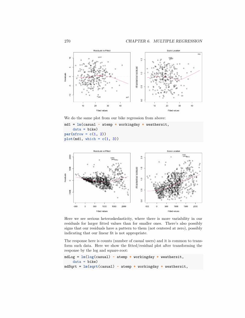
270 CHAPTER 6. MULTIPLE REGRESSION
We do the same plot from our bike regression from above:md1 = lm(casual ~ atemp + workingday + weathersit,
data = bike)par(mfrow = c(1, 2))plot(md1, which = c(1, 3))
Here we see serious heteroskedasticity, where there is more variability in ourresiduals for larger fitted values than for smaller ones. There’s also possiblysigns that our residuals have a pattern to them (not centered at zero), possiblyindicating that our linear fit is not appropriate.
The response here is counts (number of casual users) and it is common to trans-form such data. Here we show the fitted/residual plot after transforming theresponse by the log and square-root:mdLog = lm(log(casual) ~ atemp + workingday + weathersit,
data = bike)mdSqrt = lm(sqrt(casual) ~ atemp + workingday + weathersit,
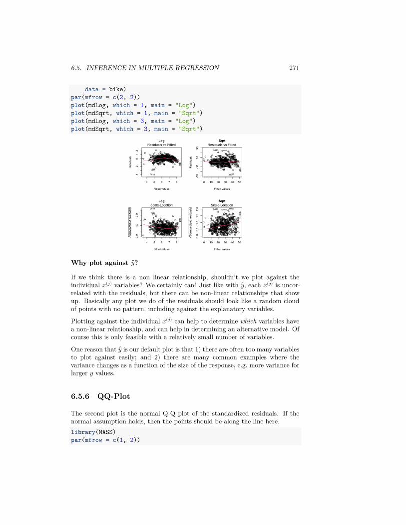
6.5. INFERENCE IN MULTIPLE REGRESSION 271
data = bike)par(mfrow = c(2, 2))plot(mdLog, which = 1, main = "Log")plot(mdSqrt, which = 1, main = "Sqrt")plot(mdLog, which = 3, main = "Log")plot(mdSqrt, which = 3, main = "Sqrt")
Why plot against 𝑦?
If we think there is a non linear relationship, shouldn’t we plot against theindividual 𝑥(𝑗) variables? We certainly can! Just like with 𝑦, each 𝑥(𝑗) is uncor-related with the residuals, but there can be non-linear relationships that showup. Basically any plot we do of the residuals should look like a random cloudof points with no pattern, including against the explanatory variables.
Plotting against the individual 𝑥(𝑗) can help to determine which variables havea non-linear relationship, and can help in determining an alternative model. Ofcourse this is only feasible with a relatively small number of variables.
One reason that 𝑦 is our default plot is that 1) there are often too many variablesto plot against easily; and 2) there are many common examples where thevariance changes as a function of the size of the response, e.g. more variance forlarger 𝑦 values.
6.5.6 QQ-Plot
The second plot is the normal Q-Q plot of the standardized residuals. If thenormal assumption holds, then the points should be along the line here.library(MASS)par(mfrow = c(1, 2))
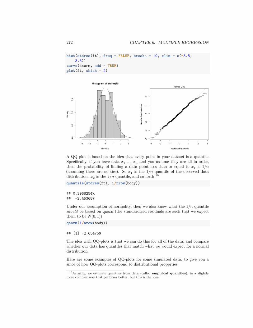
272 CHAPTER 6. MULTIPLE REGRESSION
hist(stdres(ft), freq = FALSE, breaks = 10, xlim = c(-3.5,3.5))
curve(dnorm, add = TRUE)plot(ft, which = 2)
A QQ-plot is based on the idea that every point in your dataset is a quantile.Specifically, if you have data 𝑥1, … , 𝑥𝑛 and you assume they are all in order,then the probability of finding a data point less than or equal to 𝑥1 is 1/𝑛(assuming there are no ties). So 𝑥1 is the 1/𝑛 quantile of the observed datadistribution. 𝑥2 is the 2/𝑛 quantile, and so forth.10
quantile(stdres(ft), 1/nrow(body))
## 0.3968254%## -2.453687
Under our assumption of normality, then we also know what the 1/𝑛 quantileshould be based on qnorm (the standardized residuals are such that we expectthem to be 𝑁(0, 1))qnorm(1/nrow(body))
## [1] -2.654759
The idea with QQ-plots is that we can do this for all of the data, and comparewhether our data has quantiles that match what we would expect for a normaldistribution.
Here are some examples of QQ-plots for some simulated data, to give you asince of how QQ-plots correspond to distributional properties:
10Actually, we estimate quantiles from data (called empirical quantiles), in a slightlymore complex way that performs better, but this is the idea.
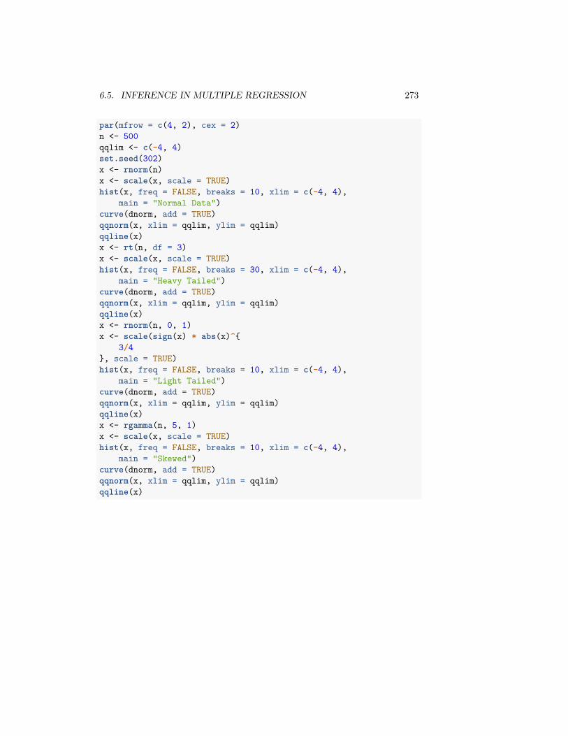
6.5. INFERENCE IN MULTIPLE REGRESSION 273
par(mfrow = c(4, 2), cex = 2)n <- 500qqlim <- c(-4, 4)set.seed(302)x <- rnorm(n)x <- scale(x, scale = TRUE)hist(x, freq = FALSE, breaks = 10, xlim = c(-4, 4),
main = "Normal Data")curve(dnorm, add = TRUE)qqnorm(x, xlim = qqlim, ylim = qqlim)qqline(x)x <- rt(n, df = 3)x <- scale(x, scale = TRUE)hist(x, freq = FALSE, breaks = 30, xlim = c(-4, 4),
main = "Heavy Tailed")curve(dnorm, add = TRUE)qqnorm(x, xlim = qqlim, ylim = qqlim)qqline(x)x <- rnorm(n, 0, 1)x <- scale(sign(x) * abs(x)^{
3/4}, scale = TRUE)hist(x, freq = FALSE, breaks = 10, xlim = c(-4, 4),
main = "Light Tailed")curve(dnorm, add = TRUE)qqnorm(x, xlim = qqlim, ylim = qqlim)qqline(x)x <- rgamma(n, 5, 1)x <- scale(x, scale = TRUE)hist(x, freq = FALSE, breaks = 10, xlim = c(-4, 4),
main = "Skewed")curve(dnorm, add = TRUE)qqnorm(x, xlim = qqlim, ylim = qqlim)qqline(x)
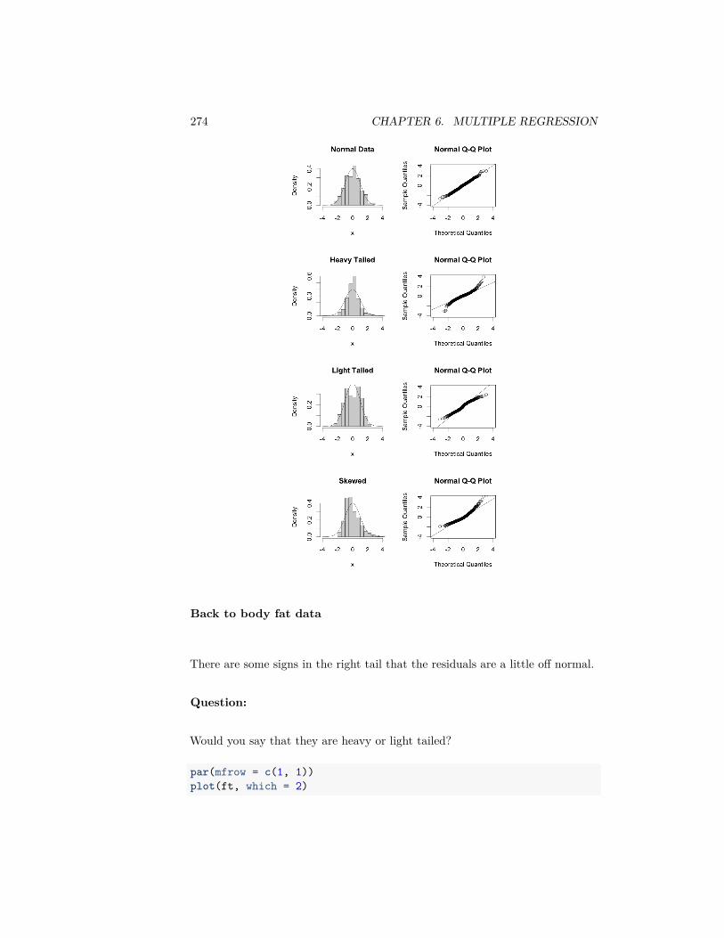
274 CHAPTER 6. MULTIPLE REGRESSION
Back to body fat data
There are some signs in the right tail that the residuals are a little off normal.
Question:
Would you say that they are heavy or light tailed?
par(mfrow = c(1, 1))plot(ft, which = 2)
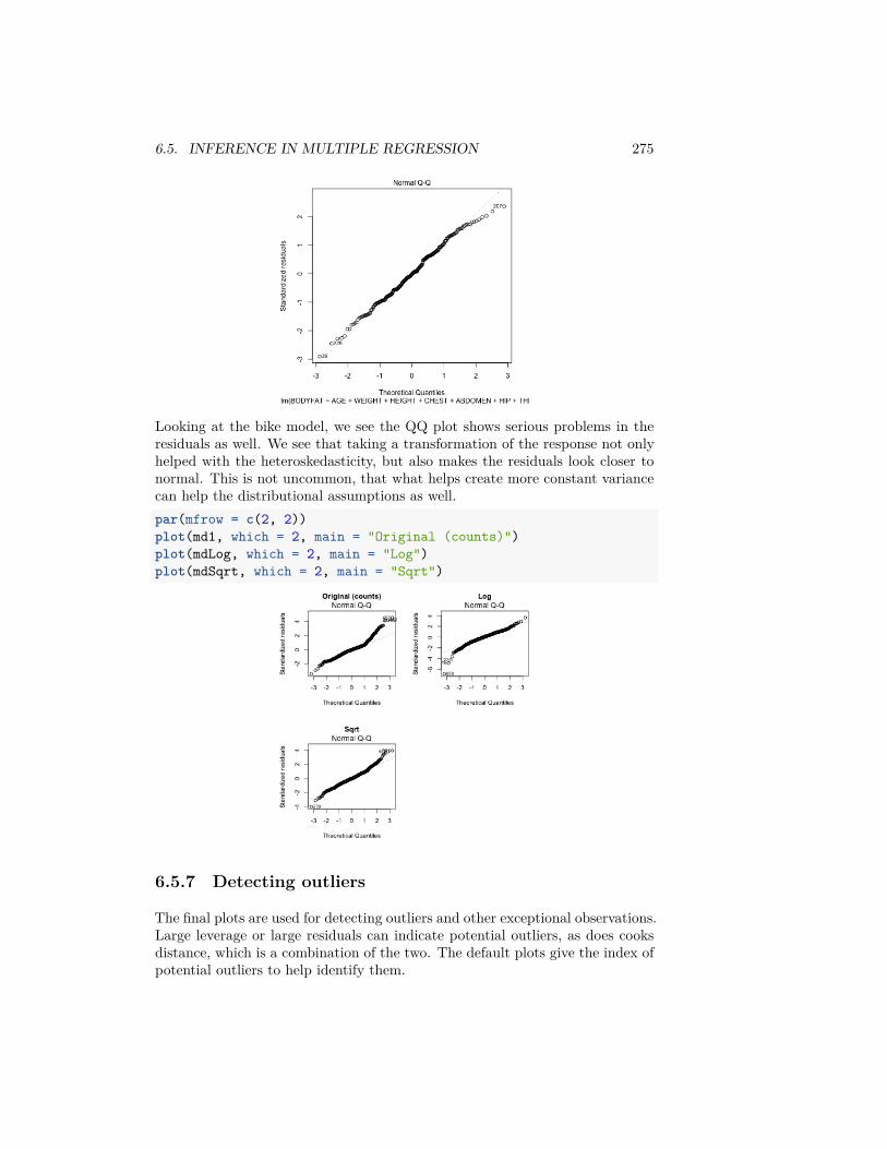
6.5. INFERENCE IN MULTIPLE REGRESSION 275
Looking at the bike model, we see the QQ plot shows serious problems in theresiduals as well. We see that taking a transformation of the response not onlyhelped with the heteroskedasticity, but also makes the residuals look closer tonormal. This is not uncommon, that what helps create more constant variancecan help the distributional assumptions as well.par(mfrow = c(2, 2))plot(md1, which = 2, main = "Original (counts)")plot(mdLog, which = 2, main = "Log")plot(mdSqrt, which = 2, main = "Sqrt")
6.5.7 Detecting outliers
The final plots are used for detecting outliers and other exceptional observations.Large leverage or large residuals can indicate potential outliers, as does cooksdistance, which is a combination of the two. The default plots give the index ofpotential outliers to help identify them.
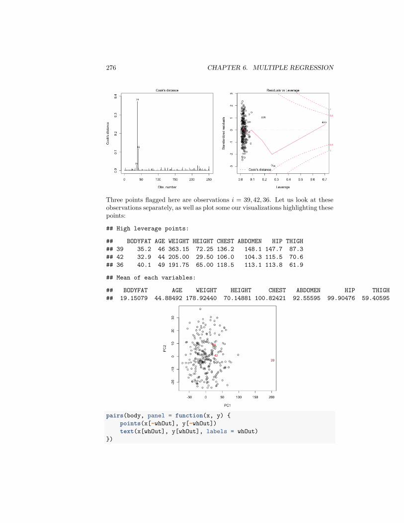
276 CHAPTER 6. MULTIPLE REGRESSION
Three points flagged here are observations 𝑖 = 39, 42, 36. Let us look at theseobservations separately, as well as plot some our visualizations highlighting thesepoints:
## High leverage points:
## BODYFAT AGE WEIGHT HEIGHT CHEST ABDOMEN HIP THIGH## 39 35.2 46 363.15 72.25 136.2 148.1 147.7 87.3## 42 32.9 44 205.00 29.50 106.0 104.3 115.5 70.6## 36 40.1 49 191.75 65.00 118.5 113.1 113.8 61.9
## Mean of each variables:
## BODYFAT AGE WEIGHT HEIGHT CHEST ABDOMEN HIP THIGH## 19.15079 44.88492 178.92440 70.14881 100.82421 92.55595 99.90476 59.40595
pairs(body, panel = function(x, y) {points(x[-whOut], y[-whOut])text(x[whOut], y[whOut], labels = whOut)
})
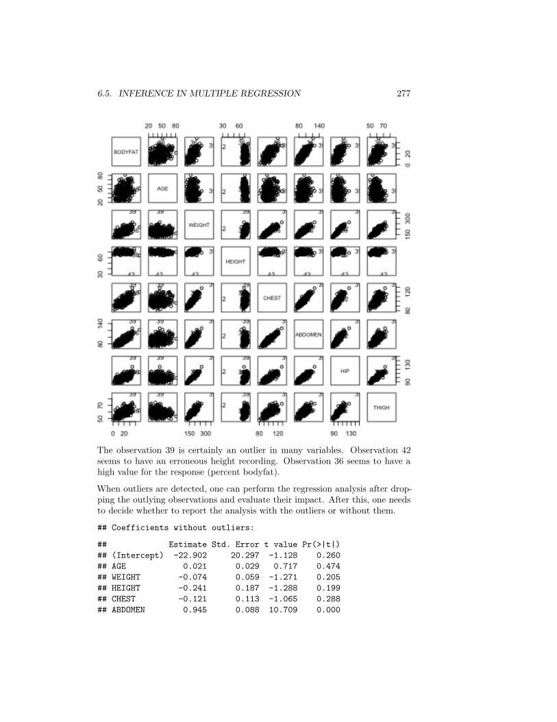
6.5. INFERENCE IN MULTIPLE REGRESSION 277
The observation 39 is certainly an outlier in many variables. Observation 42seems to have an erroneous height recording. Observation 36 seems to have ahigh value for the response (percent bodyfat).
When outliers are detected, one can perform the regression analysis after drop-ping the outlying observations and evaluate their impact. After this, one needsto decide whether to report the analysis with the outliers or without them.
## Coefficients without outliers:
## Estimate Std. Error t value Pr(>|t|)## (Intercept) -22.902 20.297 -1.128 0.260## AGE 0.021 0.029 0.717 0.474## WEIGHT -0.074 0.059 -1.271 0.205## HEIGHT -0.241 0.187 -1.288 0.199## CHEST -0.121 0.113 -1.065 0.288## ABDOMEN 0.945 0.088 10.709 0.000
278 CHAPTER 6. MULTIPLE REGRESSION
## HIP -0.171 0.152 -1.124 0.262## THIGH 0.223 0.141 1.584 0.114
#### Coefficients in Original Model:
## Estimate Std. Error t value Pr(>|t|)## (Intercept) -37.476 14.495 -2.585 0.010## AGE 0.012 0.029 0.410 0.682## WEIGHT -0.139 0.045 -3.087 0.002## HEIGHT -0.103 0.098 -1.051 0.294## CHEST -0.001 0.100 -0.008 0.993## ABDOMEN 0.968 0.085 11.352 0.000## HIP -0.183 0.145 -1.267 0.206## THIGH 0.286 0.136 2.098 0.037
We can see that WEIGHT and THIGH are no longer significant after removingthese outlying points. We should note that removing observations reduces thepower of all tests, so you may often see less significance if you remove manypoints (three is not really many!). But we can compare to removing threerandom points, and see that we don’t have major changes in our results:
## Coefficients without three random points:
## Estimate Std. Error t value Pr(>|t|)## (Intercept) -36.732 14.620 -2.513 0.013## AGE 0.008 0.030 0.287 0.774## WEIGHT -0.139 0.045 -3.070 0.002## HEIGHT -0.108 0.098 -1.094 0.275## CHEST 0.002 0.100 0.016 0.987## ABDOMEN 0.972 0.086 11.351 0.000## HIP -0.182 0.145 -1.249 0.213## THIGH 0.266 0.136 1.953 0.052
6.6 Variable Selection
Consider a regression problem with a response variable 𝑦 and 𝑝 explanatory vari-ables 𝑥1, … , 𝑥𝑝. Should we just go ahead and fit a linear model to 𝑦 with all the𝑝 explanatory variables or should we throw out some unnecessary explanatoryvariables and then fit a linear model for 𝑦 based on the remaining variables?One often does the latter in practice. The process of selecting important ex-planatory variables to include in a regression model is called variable selection.The following are reasons for performing variable selection:
1. Removing unnecessary variables results in a simpler model. Simpler mod-els are always preferred to complicated models.

6.6. VARIABLE SELECTION 279
2. Unnecessary explanatory variables will add noise to the estimation of quan-tities that we are interested in.
3. Collinearity (i.e. strong linear relationships in the variables) is a problemwith having too many variables trying to do the same job.
4. We can save time and/or money by not measuring redundant explanatoryvariables.
Several common, interrelated strategies for asking this question
1. Hypothesis testing on variables or submodels2. Stepwise regression based on 𝑝-values3. Criteria based Variable Selection
We shall illustrate variable selection procedures using the following dataset(which is available in R from the faraway package). This small dataset givesinformation about drivers and the seat position that they choose, with the ideaof trying to predict a seat position from information regarding the driver (age,weight, height,…).
We can see that the variables are highly correlated with each other, and novariables are significant. However, the overall 𝑝-value reported for the 𝐹 -statisticin the summary is almost zero (this is an example of how you might actuallyfind the 𝐹 statistic useful, in that it provides a check that even though no singlevariable is significant, the variables jointly do fit the data well )library(faraway)data(seatpos)pairs(seatpos)
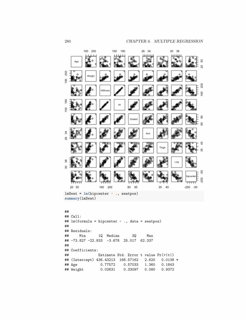
280 CHAPTER 6. MULTIPLE REGRESSION
lmSeat = lm(hipcenter ~ ., seatpos)summary(lmSeat)
#### Call:## lm(formula = hipcenter ~ ., data = seatpos)#### Residuals:## Min 1Q Median 3Q Max## -73.827 -22.833 -3.678 25.017 62.337#### Coefficients:## Estimate Std. Error t value Pr(>|t|)## (Intercept) 436.43213 166.57162 2.620 0.0138 *## Age 0.77572 0.57033 1.360 0.1843## Weight 0.02631 0.33097 0.080 0.9372
6.6. VARIABLE SELECTION 281
## HtShoes -2.69241 9.75304 -0.276 0.7845## Ht 0.60134 10.12987 0.059 0.9531## Seated 0.53375 3.76189 0.142 0.8882## Arm -1.32807 3.90020 -0.341 0.7359## Thigh -1.14312 2.66002 -0.430 0.6706## Leg -6.43905 4.71386 -1.366 0.1824## ---## Signif. codes: 0 '***' 0.001 '**' 0.01 '*' 0.05 '.' 0.1 ' ' 1#### Residual standard error: 37.72 on 29 degrees of freedom## Multiple R-squared: 0.6866,Adjusted R-squared: 0.6001## F-statistic: 7.94 on 8 and 29 DF, p-value: 1.306e-05
6.6.1 Submodels and Hypothesis testing
We already saw that we can evaluate if we need any of the variables by settingup two models
Model 0: No variables, just predict 𝑦 for all observations
Model 1: Our linear model with all the variables
Then we compare the RSS from these two models with the F-statistic,
𝐹 = (𝑅𝑆𝑆0 − 𝑅𝑆𝑆1)/𝑝𝑅𝑆𝑆1/(𝑛 − 𝑝 − 1)
which the null hypothesis that these two models are equivalent (and assumingour parametric model) has a 𝐹 distribution
𝐻0 ∶ 𝐹 ∼ 𝐹(𝑝, 𝑛 − 𝑝 − 1)
We can expand this framework to compare any submodel to the full model,where a submodel means using only a specific subset of the 𝑝 parameters. Forexample, can we use a model with only ABDOMEN, AGE, and WEIGHT?
For convenience lets say we number our variables so we have the first 𝑞 variablesare our submodel (𝑞 = 3 in our example). Then we now have two models:
Model 0: Just the first 𝑞 variables (and the intercept) Model 1: Our linearmodel with all the 𝑝 variables
We can do the same as before and calculate our 𝑅𝑆𝑆 for each model and comparethem. We can get a 𝐹 statistic,
𝐹 = (𝑅𝑆𝑆0 − 𝑅𝑆𝑆1)/(𝑝 − 𝑞)𝑅𝑆𝑆1/(𝑛 − 𝑝 − 1)
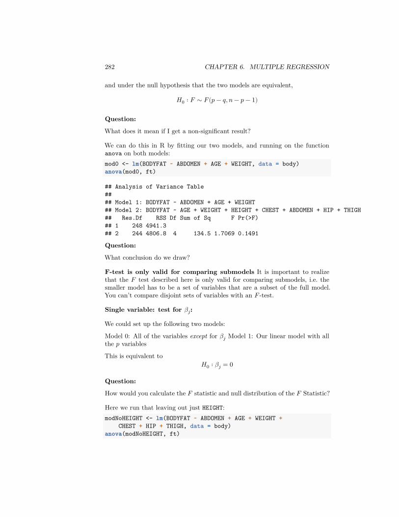
282 CHAPTER 6. MULTIPLE REGRESSION
and under the null hypothesis that the two models are equivalent,
𝐻0 ∶ 𝐹 ∼ 𝐹(𝑝 − 𝑞, 𝑛 − 𝑝 − 1)
Question:
What does it mean if I get a non-significant result?
We can do this in R by fitting our two models, and running on the functionanova on both models:mod0 <- lm(BODYFAT ~ ABDOMEN + AGE + WEIGHT, data = body)anova(mod0, ft)
## Analysis of Variance Table#### Model 1: BODYFAT ~ ABDOMEN + AGE + WEIGHT## Model 2: BODYFAT ~ AGE + WEIGHT + HEIGHT + CHEST + ABDOMEN + HIP + THIGH## Res.Df RSS Df Sum of Sq F Pr(>F)## 1 248 4941.3## 2 244 4806.8 4 134.5 1.7069 0.1491
Question:
What conclusion do we draw?
F-test is only valid for comparing submodels It is important to realizethat the 𝐹 test described here is only valid for comparing submodels, i.e. thesmaller model has to be a set of variables that are a subset of the full model.You can’t compare disjoint sets of variables with an 𝐹 -test.
Single variable: test for 𝛽𝑗:
We could set up the following two models:
Model 0: All of the variables except for 𝛽𝑗 Model 1: Our linear model with allthe 𝑝 variables
This is equivalent to𝐻0 ∶ 𝛽𝑗 = 0
Question:
How would you calculate the 𝐹 statistic and null distribution of the 𝐹 Statistic?
Here we run that leaving out just HEIGHT:modNoHEIGHT <- lm(BODYFAT ~ ABDOMEN + AGE + WEIGHT +
CHEST + HIP + THIGH, data = body)anova(modNoHEIGHT, ft)
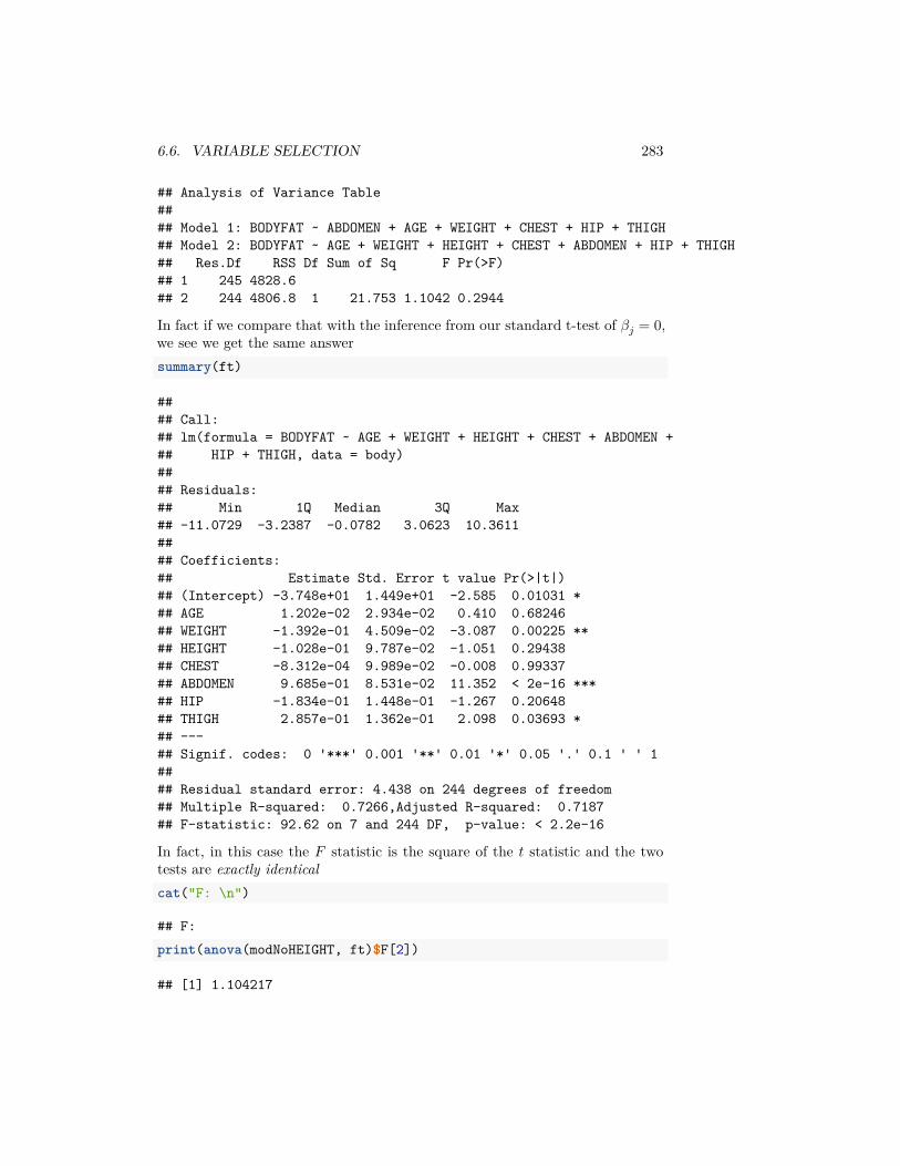
6.6. VARIABLE SELECTION 283
## Analysis of Variance Table#### Model 1: BODYFAT ~ ABDOMEN + AGE + WEIGHT + CHEST + HIP + THIGH## Model 2: BODYFAT ~ AGE + WEIGHT + HEIGHT + CHEST + ABDOMEN + HIP + THIGH## Res.Df RSS Df Sum of Sq F Pr(>F)## 1 245 4828.6## 2 244 4806.8 1 21.753 1.1042 0.2944
In fact if we compare that with the inference from our standard t-test of 𝛽𝑗 = 0,we see we get the same answersummary(ft)
#### Call:## lm(formula = BODYFAT ~ AGE + WEIGHT + HEIGHT + CHEST + ABDOMEN +## HIP + THIGH, data = body)#### Residuals:## Min 1Q Median 3Q Max## -11.0729 -3.2387 -0.0782 3.0623 10.3611#### Coefficients:## Estimate Std. Error t value Pr(>|t|)## (Intercept) -3.748e+01 1.449e+01 -2.585 0.01031 *## AGE 1.202e-02 2.934e-02 0.410 0.68246## WEIGHT -1.392e-01 4.509e-02 -3.087 0.00225 **## HEIGHT -1.028e-01 9.787e-02 -1.051 0.29438## CHEST -8.312e-04 9.989e-02 -0.008 0.99337## ABDOMEN 9.685e-01 8.531e-02 11.352 < 2e-16 ***## HIP -1.834e-01 1.448e-01 -1.267 0.20648## THIGH 2.857e-01 1.362e-01 2.098 0.03693 *## ---## Signif. codes: 0 '***' 0.001 '**' 0.01 '*' 0.05 '.' 0.1 ' ' 1#### Residual standard error: 4.438 on 244 degrees of freedom## Multiple R-squared: 0.7266,Adjusted R-squared: 0.7187## F-statistic: 92.62 on 7 and 244 DF, p-value: < 2.2e-16
In fact, in this case the 𝐹 statistic is the square of the 𝑡 statistic and the twotests are exactly identicalcat("F: \n")
## F:print(anova(modNoHEIGHT, ft)$F[2])
## [1] 1.104217
284 CHAPTER 6. MULTIPLE REGRESSION
cat("Square of t-statistic: \n")
## Square of t-statistic:print(summary(ft)$coef["HEIGHT", "t value"]^2)
## [1] 1.104217
This again shows us that our inference on 𝛽𝑗 is equivalent to asking if addingin this variable significantly improves the fit of our model – i.e. on top of theexisting variables.
6.6.2 Finding the best submodel
The above method compares a specific defined submodel to the full model. Butwe might instead want to find the best submodel for prediction. Conceptuallywe could imagine that we would just fit all of possible subsets of variables forthe model and pick the best. That creates two problems
1. How to compare all of these models to each other? What measure shouldwe use to compare models? For example, we’ve seen that the measuresof fit we’ve discussed so far (e.g. 𝑅2 and 𝑅𝑆𝑆) can’t be directly com-pared between different sized models, so we have to determine how muchimprovement we would expect simply due to adding another variable.
2. There often way too many possible submodels. Specifically, there are 2𝑝
different possible submodels. That’s 256 models for 8 variables, which isactually manageable, in the sense that you can run 256 regressions on acomputer. But the number grows rapidly as you increase the number ofvariables. You quickly can’t even enumerate all the possible submodels inlarge datasets with a lot of variables.
6.6.3 Criterion for comparing models
We are going to quickly go over different types of statistics for comparing models.By a model 𝑀 , we mean a linear model using a subset of our 𝑝 variables. Wewill find the 𝛽(𝑀), which gives us a prediction model, and we will calculate astatistic based on our observed data that measures how well the model predicts𝑦. Once we have such a statistic, say 𝑇 (𝑀), we want to compare across models𝑀𝑗 and pick the model with the smallest 𝑇 (𝑀𝑗) (or largest depending on thestatistic).
Notice that this strategy as described is not inferential – we are not generallytaking into account the variability of the 𝑇 (𝑀𝑗), i.e. how 𝑇 (𝑀𝑗) might vary fordifferent random samples of the data. There might be other models 𝑀𝑘 that

6.6. VARIABLE SELECTION 285
have slightly larger 𝑇 (𝑀𝑘) on this data than the “best” 𝑇 (𝑀𝑗), but in a differentdataset 𝑇 (𝑀𝑘) might be slightly smaller.
6.6.3.1 RSS: Comparing models with same number of predictors(RSS)
We’ve seen that the RSS (Residual Sum of Squares) is a commonly used mea-sure of the performance of a regression model, but will always decrease as youincrease the number of variables. However, RSS is a natural criterion to usewhen comparing models having the same number of explanatory variables.
A function in R that is useful for variable selection is regsubsets in the Rpackage leaps. For each value of 𝑘 = 1, … , 𝑝, this function gives the best modelwith 𝑘 variables according to the residual sum of squares.
For the body fat dataset, we can see what variables are chosen for each size:library(leaps)bFat = regsubsets(BODYFAT ~ ., body)summary(bFat)
## Subset selection object## Call: eval(expr, envir, enclos)## 7 Variables (and intercept)## Forced in Forced out## AGE FALSE FALSE## WEIGHT FALSE FALSE## HEIGHT FALSE FALSE## CHEST FALSE FALSE## ABDOMEN FALSE FALSE## HIP FALSE FALSE## THIGH FALSE FALSE## 1 subsets of each size up to 7## Selection Algorithm: exhaustive## AGE WEIGHT HEIGHT CHEST ABDOMEN HIP THIGH## 1 ( 1 ) " " " " " " " " "*" " " " "## 2 ( 1 ) " " "*" " " " " "*" " " " "## 3 ( 1 ) " " "*" " " " " "*" " " "*"## 4 ( 1 ) " " "*" " " " " "*" "*" "*"## 5 ( 1 ) " " "*" "*" " " "*" "*" "*"## 6 ( 1 ) "*" "*" "*" " " "*" "*" "*"## 7 ( 1 ) "*" "*" "*" "*" "*" "*" "*"
This output should be interpreted in the following way. The best model withone explanatory variable (let us denote this by 𝑀1) is the model with AB-DOMEN. The best model with two explanatory variables (denoted by 𝑀2) isthe one involving ABDOMEN and WEIGHT. And so forth. Here “best” means

286 CHAPTER 6. MULTIPLE REGRESSION
in terms of RSS. This gives us 7 regression models, one for each choice of 𝑘:𝑀1, 𝑀2, … , 𝑀7. The model 𝑀7 is the full regression model involving all theexplanatory variables.
For the body fat dataset, there’s a natural hierarchy in the results, in that foreach time 𝑘 is increased, the best model 𝑀𝑘 is found by adding another variableto the set variables in 𝑀𝑘−1. However, consider the car seat position data:bSeat = regsubsets(hipcenter ~ ., seatpos)summary(bSeat)
## Subset selection object## Call: eval(expr, envir, enclos)## 8 Variables (and intercept)## Forced in Forced out## Age FALSE FALSE## Weight FALSE FALSE## HtShoes FALSE FALSE## Ht FALSE FALSE## Seated FALSE FALSE## Arm FALSE FALSE## Thigh FALSE FALSE## Leg FALSE FALSE## 1 subsets of each size up to 8## Selection Algorithm: exhaustive## Age Weight HtShoes Ht Seated Arm Thigh Leg## 1 ( 1 ) " " " " " " "*" " " " " " " " "## 2 ( 1 ) " " " " " " "*" " " " " " " "*"## 3 ( 1 ) "*" " " " " "*" " " " " " " "*"## 4 ( 1 ) "*" " " "*" " " " " " " "*" "*"## 5 ( 1 ) "*" " " "*" " " " " "*" "*" "*"## 6 ( 1 ) "*" " " "*" " " "*" "*" "*" "*"## 7 ( 1 ) "*" "*" "*" " " "*" "*" "*" "*"## 8 ( 1 ) "*" "*" "*" "*" "*" "*" "*" "*"
Question:
Does the carseat data have this hiearchy?
Note though, that we cannot compare the models 𝑀1, … , 𝑀7 with RSS becausethey have different number of variables. Moreover, for the car seat positiondataset, we also cannot use the 𝐹 statistic to compare the models because thesets of variables in the different models are not subsets of each other.
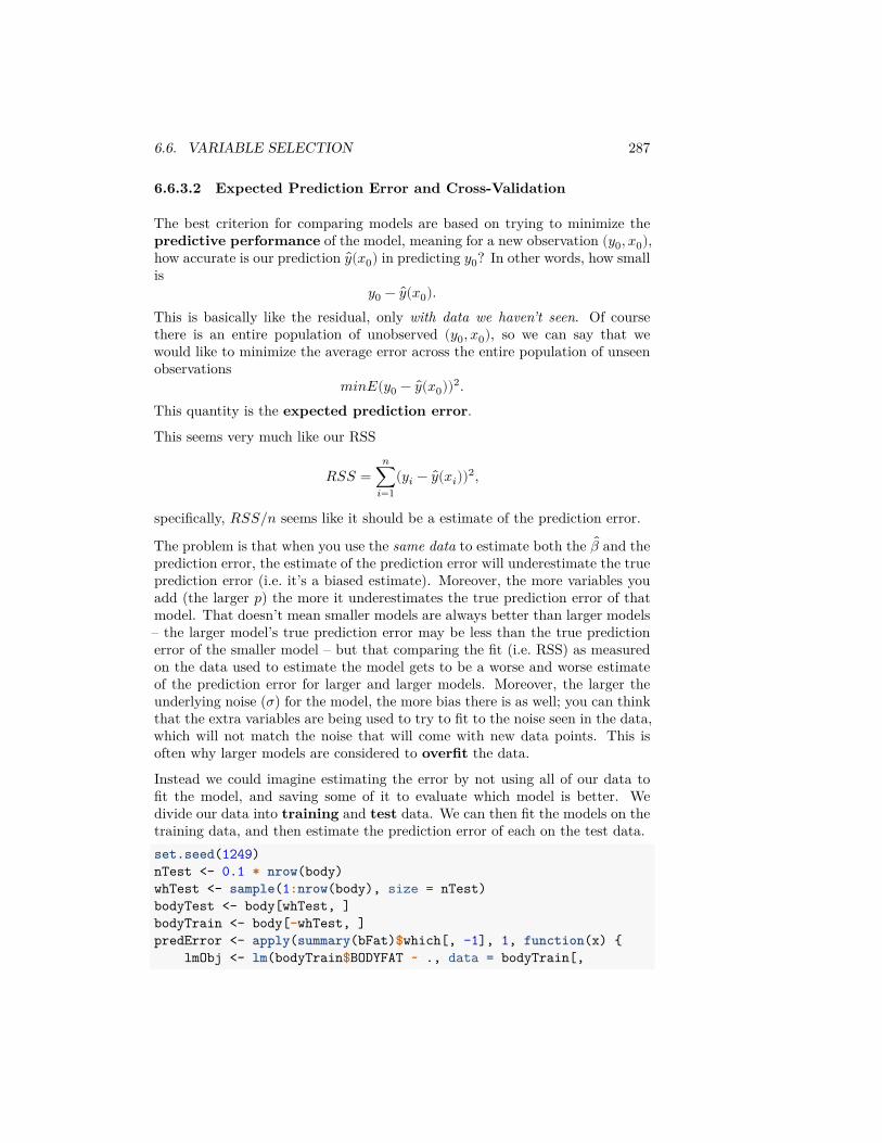
6.6. VARIABLE SELECTION 287
6.6.3.2 Expected Prediction Error and Cross-Validation
The best criterion for comparing models are based on trying to minimize thepredictive performance of the model, meaning for a new observation (𝑦0, 𝑥0),how accurate is our prediction 𝑦(𝑥0) in predicting 𝑦0? In other words, how smallis
𝑦0 − 𝑦(𝑥0).This is basically like the residual, only with data we haven’t seen. Of coursethere is an entire population of unobserved (𝑦0, 𝑥0), so we can say that wewould like to minimize the average error across the entire population of unseenobservations
𝑚𝑖𝑛𝐸(𝑦0 − 𝑦(𝑥0))2.This quantity is the expected prediction error.
This seems very much like our RSS
𝑅𝑆𝑆 =𝑛
∑𝑖=1
(𝑦𝑖 − 𝑦(𝑥𝑖))2,
specifically, 𝑅𝑆𝑆/𝑛 seems like it should be a estimate of the prediction error.
The problem is that when you use the same data to estimate both the 𝛽 and theprediction error, the estimate of the prediction error will underestimate the trueprediction error (i.e. it’s a biased estimate). Moreover, the more variables youadd (the larger 𝑝) the more it underestimates the true prediction error of thatmodel. That doesn’t mean smaller models are always better than larger models– the larger model’s true prediction error may be less than the true predictionerror of the smaller model – but that comparing the fit (i.e. RSS) as measuredon the data used to estimate the model gets to be a worse and worse estimateof the prediction error for larger and larger models. Moreover, the larger theunderlying noise (𝜎) for the model, the more bias there is as well; you can thinkthat the extra variables are being used to try to fit to the noise seen in the data,which will not match the noise that will come with new data points. This isoften why larger models are considered to overfit the data.
Instead we could imagine estimating the error by not using all of our data tofit the model, and saving some of it to evaluate which model is better. Wedivide our data into training and test data. We can then fit the models on thetraining data, and then estimate the prediction error of each on the test data.set.seed(1249)nTest <- 0.1 * nrow(body)whTest <- sample(1:nrow(body), size = nTest)bodyTest <- body[whTest, ]bodyTrain <- body[-whTest, ]predError <- apply(summary(bFat)$which[, -1], 1, function(x) {
lmObj <- lm(bodyTrain$BODYFAT ~ ., data = bodyTrain[,
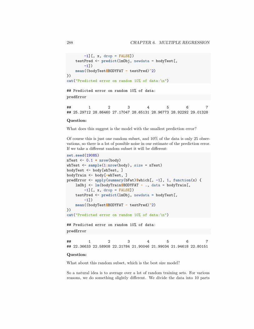
288 CHAPTER 6. MULTIPLE REGRESSION
-1][, x, drop = FALSE])testPred <- predict(lmObj, newdata = bodyTest[,
-1])mean((bodyTest$BODYFAT - testPred)^2)
})cat("Predicted error on random 10% of data:\n")
## Predicted error on random 10% of data:predError
## 1 2 3 4 5 6 7## 25.29712 28.86460 27.17047 28.65131 28.96773 28.92292 29.01328
Question:
What does this suggest is the model with the smallest prediction error?
Of course this is just one random subset, and 10% of the data is only 25 obser-vations, so there is a lot of possible noise in our estimate of the prediction error.If we take a different random subset it will be different:set.seed(19085)nTest <- 0.1 * nrow(body)whTest <- sample(1:nrow(body), size = nTest)bodyTest <- body[whTest, ]bodyTrain <- body[-whTest, ]predError <- apply(summary(bFat)$which[, -1], 1, function(x) {
lmObj <- lm(bodyTrain$BODYFAT ~ ., data = bodyTrain[,-1][, x, drop = FALSE])
testPred <- predict(lmObj, newdata = bodyTest[,-1])
mean((bodyTest$BODYFAT - testPred)^2)})cat("Predicted error on random 10% of data:\n")
## Predicted error on random 10% of data:predError
## 1 2 3 4 5 6 7## 22.36633 22.58908 22.21784 21.90046 21.99034 21.94618 22.80151
Question:
What about this random subset, which is the best size model?
So a natural idea is to average over a lot of random training sets. For variousreasons, we do something slightly different. We divide the data into 10 parts
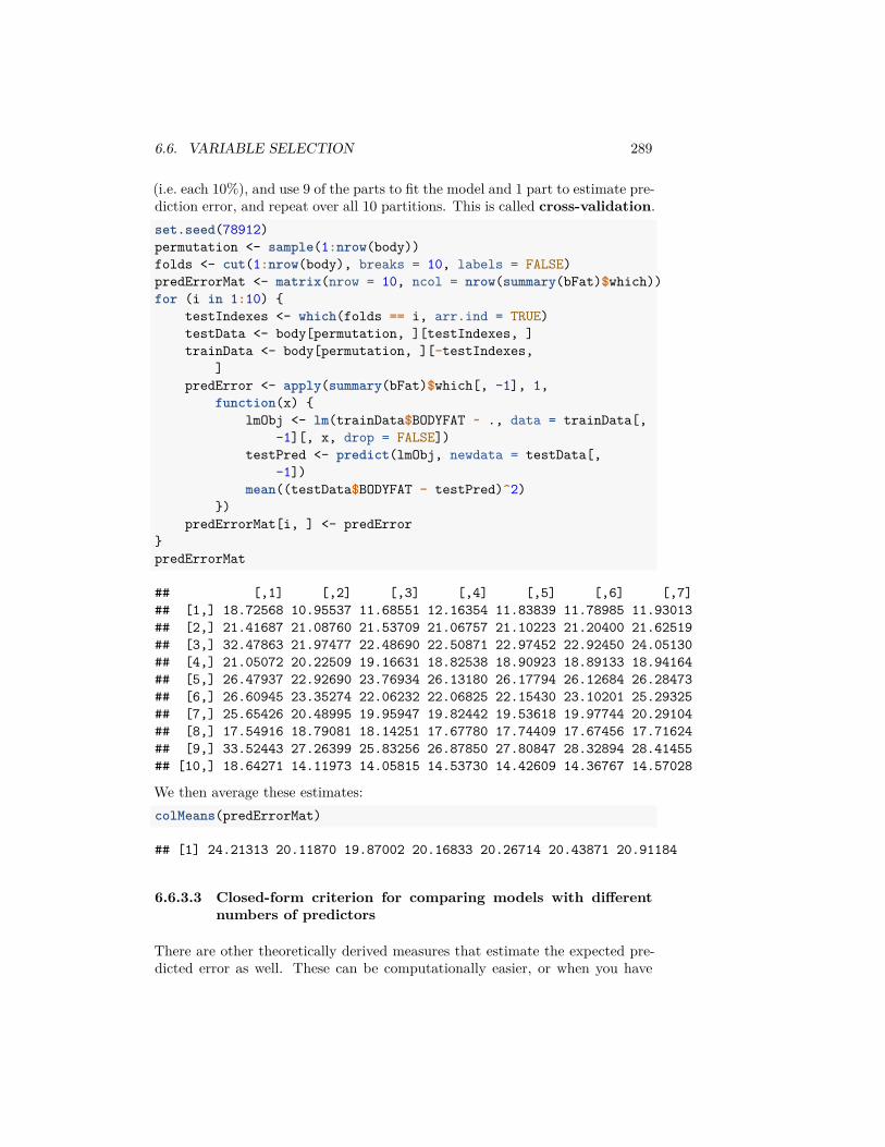
6.6. VARIABLE SELECTION 289
(i.e. each 10%), and use 9 of the parts to fit the model and 1 part to estimate pre-diction error, and repeat over all 10 partitions. This is called cross-validation.set.seed(78912)permutation <- sample(1:nrow(body))folds <- cut(1:nrow(body), breaks = 10, labels = FALSE)predErrorMat <- matrix(nrow = 10, ncol = nrow(summary(bFat)$which))for (i in 1:10) {
testIndexes <- which(folds == i, arr.ind = TRUE)testData <- body[permutation, ][testIndexes, ]trainData <- body[permutation, ][-testIndexes,
]predError <- apply(summary(bFat)$which[, -1], 1,
function(x) {lmObj <- lm(trainData$BODYFAT ~ ., data = trainData[,
-1][, x, drop = FALSE])testPred <- predict(lmObj, newdata = testData[,
-1])mean((testData$BODYFAT - testPred)^2)
})predErrorMat[i, ] <- predError
}predErrorMat
## [,1] [,2] [,3] [,4] [,5] [,6] [,7]## [1,] 18.72568 10.95537 11.68551 12.16354 11.83839 11.78985 11.93013## [2,] 21.41687 21.08760 21.53709 21.06757 21.10223 21.20400 21.62519## [3,] 32.47863 21.97477 22.48690 22.50871 22.97452 22.92450 24.05130## [4,] 21.05072 20.22509 19.16631 18.82538 18.90923 18.89133 18.94164## [5,] 26.47937 22.92690 23.76934 26.13180 26.17794 26.12684 26.28473## [6,] 26.60945 23.35274 22.06232 22.06825 22.15430 23.10201 25.29325## [7,] 25.65426 20.48995 19.95947 19.82442 19.53618 19.97744 20.29104## [8,] 17.54916 18.79081 18.14251 17.67780 17.74409 17.67456 17.71624## [9,] 33.52443 27.26399 25.83256 26.87850 27.80847 28.32894 28.41455## [10,] 18.64271 14.11973 14.05815 14.53730 14.42609 14.36767 14.57028
We then average these estimates:colMeans(predErrorMat)
## [1] 24.21313 20.11870 19.87002 20.16833 20.26714 20.43871 20.91184
6.6.3.3 Closed-form criterion for comparing models with differentnumbers of predictors
There are other theoretically derived measures that estimate the expected pre-dicted error as well. These can be computationally easier, or when you have
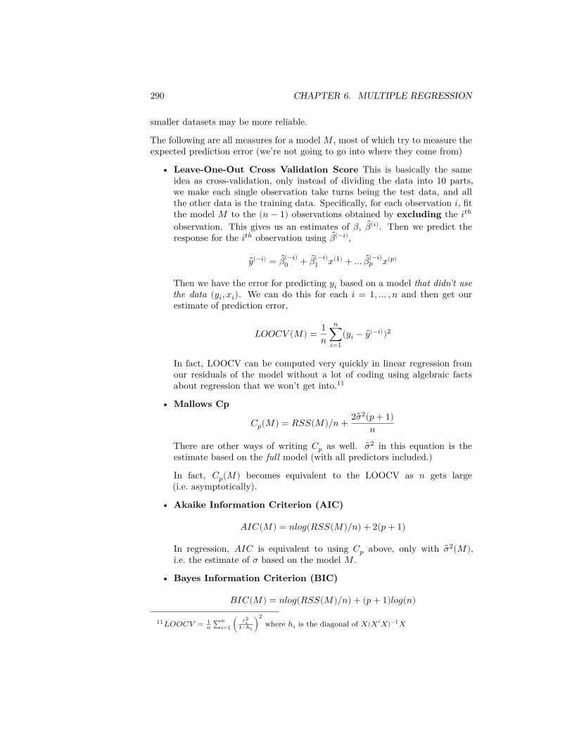
290 CHAPTER 6. MULTIPLE REGRESSION
smaller datasets may be more reliable.
The following are all measures for a model 𝑀 , most of which try to measure theexpected prediction error (we’re not going to go into where they come from)
• Leave-One-Out Cross Validation Score This is basically the sameidea as cross-validation, only instead of dividing the data into 10 parts,we make each single observation take turns being the test data, and allthe other data is the training data. Specifically, for each observation 𝑖, fitthe model 𝑀 to the (𝑛 − 1) observations obtained by excluding the 𝑖𝑡ℎ
observation. This gives us an estimates of 𝛽, 𝛽(𝑖). Then we predict theresponse for the 𝑖𝑡ℎ observation using 𝛽(−𝑖),
𝑦(−𝑖) = 𝛽(−𝑖)0 + 𝛽(−𝑖)
1 𝑥(1) + … 𝛽(−𝑖)𝑝 𝑥(𝑝)
Then we have the error for predicting 𝑦𝑖 based on a model that didn’t usethe data (𝑦𝑖, 𝑥𝑖). We can do this for each 𝑖 = 1, … , 𝑛 and then get ourestimate of prediction error,
𝐿𝑂𝑂𝐶𝑉 (𝑀) = 1𝑛
𝑛∑𝑖=1
(𝑦𝑖 − 𝑦(−𝑖))2
In fact, LOOCV can be computed very quickly in linear regression fromour residuals of the model without a lot of coding using algebraic factsabout regression that we won’t get into.11
• Mallows Cp
𝐶𝑝(𝑀) = 𝑅𝑆𝑆(𝑀)/𝑛 + 2��2(𝑝 + 1)𝑛
There are other ways of writing 𝐶𝑝 as well. ��2 in this equation is theestimate based on the full model (with all predictors included.)
In fact, 𝐶𝑝(𝑀) becomes equivalent to the LOOCV as 𝑛 gets large(i.e. asymptotically).
• Akaike Information Criterion (AIC)
𝐴𝐼𝐶(𝑀) = 𝑛𝑙𝑜𝑔(𝑅𝑆𝑆(𝑀)/𝑛) + 2(𝑝 + 1)
In regression, 𝐴𝐼𝐶 is equivalent to using 𝐶𝑝 above, only with ��2(𝑀),i.e. the estimate of 𝜎 based on the model 𝑀 .
• Bayes Information Criterion (BIC)
𝐵𝐼𝐶(𝑀) = 𝑛𝑙𝑜𝑔(𝑅𝑆𝑆(𝑀)/𝑛) + (𝑝 + 1)𝑙𝑜𝑔(𝑛)
11𝐿𝑂𝑂𝐶𝑉 = 1𝑛 ∑𝑛
𝑖=1 ( 𝑟2𝑖
1−ℎ𝑖)
2where ℎ𝑖 is the diagonal of 𝑋(𝑋′𝑋)−1𝑋
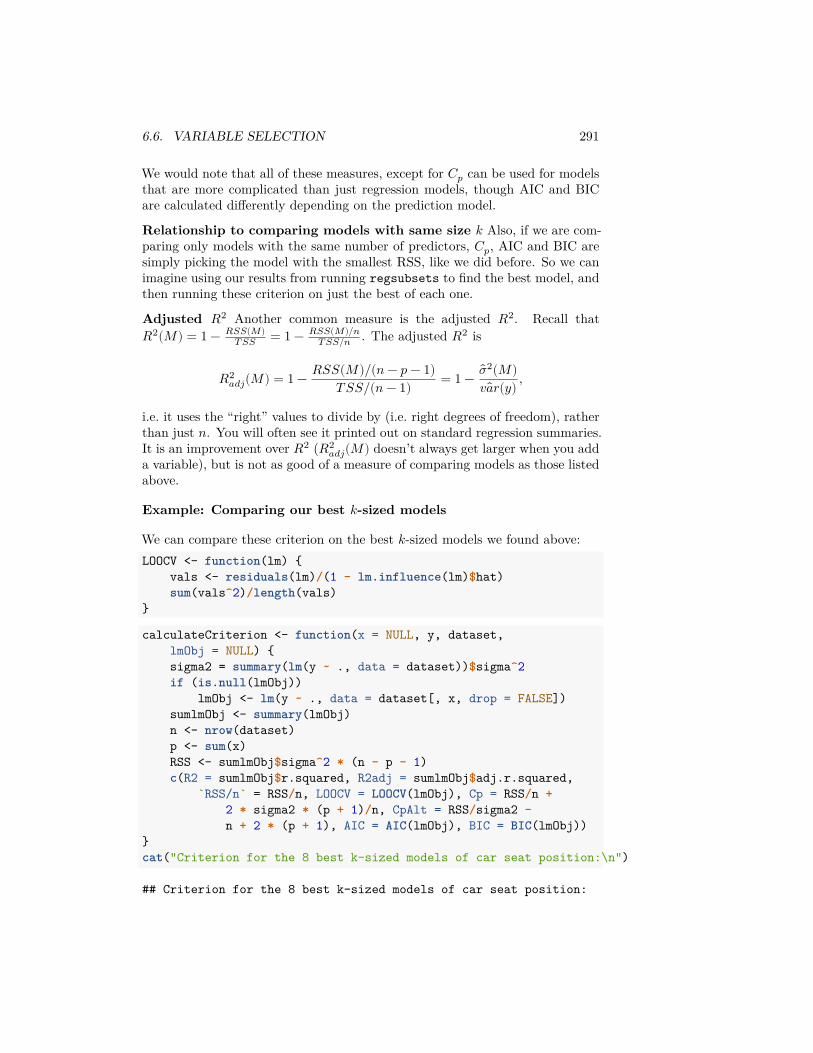
6.6. VARIABLE SELECTION 291
We would note that all of these measures, except for 𝐶𝑝 can be used for modelsthat are more complicated than just regression models, though AIC and BICare calculated differently depending on the prediction model.
Relationship to comparing models with same size 𝑘 Also, if we are com-paring only models with the same number of predictors, 𝐶𝑝, AIC and BIC aresimply picking the model with the smallest RSS, like we did before. So we canimagine using our results from running regsubsets to find the best model, andthen running these criterion on just the best of each one.
Adjusted 𝑅2 Another common measure is the adjusted 𝑅2. Recall that𝑅2(𝑀) = 1 − 𝑅𝑆𝑆(𝑀)
𝑇 𝑆𝑆 = 1 − 𝑅𝑆𝑆(𝑀)/𝑛𝑇 𝑆𝑆/𝑛 . The adjusted 𝑅2 is
𝑅2𝑎𝑑𝑗(𝑀) = 1 − 𝑅𝑆𝑆(𝑀)/(𝑛 − 𝑝 − 1)
𝑇 𝑆𝑆/(𝑛 − 1) = 1 − ��2(𝑀)𝑣𝑎𝑟(𝑦) ,
i.e. it uses the “right” values to divide by (i.e. right degrees of freedom), ratherthan just 𝑛. You will often see it printed out on standard regression summaries.It is an improvement over 𝑅2 (𝑅2
𝑎𝑑𝑗(𝑀) doesn’t always get larger when you adda variable), but is not as good of a measure of comparing models as those listedabove.
Example: Comparing our best 𝑘-sized models
We can compare these criterion on the best 𝑘-sized models we found above:LOOCV <- function(lm) {
vals <- residuals(lm)/(1 - lm.influence(lm)$hat)sum(vals^2)/length(vals)
}
calculateCriterion <- function(x = NULL, y, dataset,lmObj = NULL) {sigma2 = summary(lm(y ~ ., data = dataset))$sigma^2if (is.null(lmObj))
lmObj <- lm(y ~ ., data = dataset[, x, drop = FALSE])sumlmObj <- summary(lmObj)n <- nrow(dataset)p <- sum(x)RSS <- sumlmObj$sigma^2 * (n - p - 1)c(R2 = sumlmObj$r.squared, R2adj = sumlmObj$adj.r.squared,
`RSS/n` = RSS/n, LOOCV = LOOCV(lmObj), Cp = RSS/n +2 * sigma2 * (p + 1)/n, CpAlt = RSS/sigma2 -n + 2 * (p + 1), AIC = AIC(lmObj), BIC = BIC(lmObj))
}cat("Criterion for the 8 best k-sized models of car seat position:\n")
## Criterion for the 8 best k-sized models of car seat position:
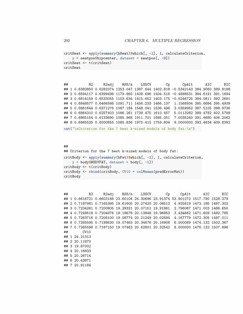
292 CHAPTER 6. MULTIPLE REGRESSION
critSeat <- apply(summary(bSeat)$which[, -1], 1, calculateCriterion,y = seatpos$hipcenter, dataset = seatpos[, -9])
critSeat <- t(critSeat)critSeat
## R2 R2adj RSS/n LOOCV Cp CpAlt AIC BIC## 1 0.6382850 0.6282374 1253.047 1387.644 1402.818 -0.5342143 384.9060 389.8188## 2 0.6594117 0.6399496 1179.860 1408.696 1404.516 -0.4888531 384.6191 391.1694## 3 0.6814159 0.6533055 1103.634 1415.652 1403.175 -0.5246725 384.0811 392.2691## 4 0.6848577 0.6466586 1091.711 1456.233 1466.137 1.1568934 385.6684 395.4939## 5 0.6861644 0.6371276 1087.184 1548.041 1536.496 3.0359952 387.5105 398.9736## 6 0.6864310 0.6257403 1086.261 1739.475 1610.457 5.0113282 389.4782 402.5789## 7 0.6865154 0.6133690 1085.968 1911.701 1685.051 7.0035240 391.4680 406.2062## 8 0.6865535 0.6000855 1085.836 1975.415 1759.804 9.0000000 393.4634 409.8392cat("\nCriterion for the 7 best k-sized models of body fat:\n")
#### Criterion for the 7 best k-sized models of body fat:critBody <- apply(summary(bFat)$which[, -1], 1, calculateCriterion,
y = body$BODYFAT, dataset = body[, -1])critBody <- t(critBody)critBody <- cbind(critBody, CV10 = colMeans(predErrorMat))critBody
## R2 R2adj RSS/n LOOCV Cp CpAlt AIC BIC## 1 0.6616721 0.6603188 23.60104 24.30696 23.91374 53.901272 1517.790 1528.379## 2 0.7187981 0.7165395 19.61605 20.27420 20.08510 4.925819 1473.185 1487.302## 3 0.7234261 0.7200805 19.29321 20.07151 19.91861 2.796087 1471.003 1488.650## 4 0.7249518 0.7204976 19.18678 20.13848 19.96853 3.434662 1471.609 1492.785## 5 0.7263716 0.7208100 19.08774 20.21249 20.02584 4.167779 1472.305 1497.011## 6 0.7265595 0.7198630 19.07463 20.34676 20.16908 6.000069 1474.132 1502.367## 7 0.7265596 0.7187150 19.07463 20.62801 20.32542 8.000000 1476.132 1507.896## CV10## 1 24.21313## 2 20.11870## 3 19.87002## 4 20.16833## 5 20.26714## 6 20.43871## 7 20.91184
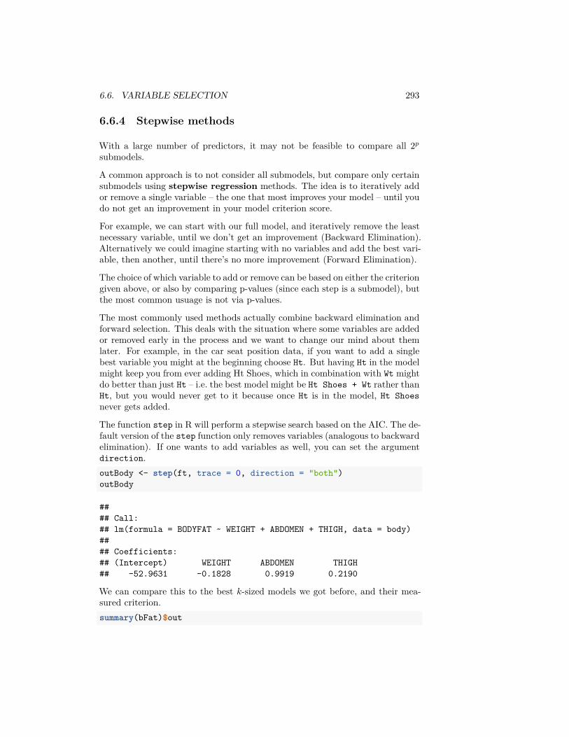
6.6. VARIABLE SELECTION 293
6.6.4 Stepwise methods
With a large number of predictors, it may not be feasible to compare all 2𝑝
submodels.
A common approach is to not consider all submodels, but compare only certainsubmodels using stepwise regression methods. The idea is to iteratively addor remove a single variable – the one that most improves your model – until youdo not get an improvement in your model criterion score.
For example, we can start with our full model, and iteratively remove the leastnecessary variable, until we don’t get an improvement (Backward Elimination).Alternatively we could imagine starting with no variables and add the best vari-able, then another, until there’s no more improvement (Forward Elimination).
The choice of which variable to add or remove can be based on either the criteriongiven above, or also by comparing p-values (since each step is a submodel), butthe most common usuage is not via p-values.
The most commonly used methods actually combine backward elimination andforward selection. This deals with the situation where some variables are addedor removed early in the process and we want to change our mind about themlater. For example, in the car seat position data, if you want to add a singlebest variable you might at the beginning choose Ht. But having Ht in the modelmight keep you from ever adding Ht Shoes, which in combination with Wt mightdo better than just Ht – i.e. the best model might be Ht Shoes + Wt rather thanHt, but you would never get to it because once Ht is in the model, Ht Shoesnever gets added.
The function step in R will perform a stepwise search based on the AIC. The de-fault version of the step function only removes variables (analogous to backwardelimination). If one wants to add variables as well, you can set the argumentdirection.outBody <- step(ft, trace = 0, direction = "both")outBody
#### Call:## lm(formula = BODYFAT ~ WEIGHT + ABDOMEN + THIGH, data = body)#### Coefficients:## (Intercept) WEIGHT ABDOMEN THIGH## -52.9631 -0.1828 0.9919 0.2190
We can compare this to the best 𝑘-sized models we got before, and their mea-sured criterion.summary(bFat)$out
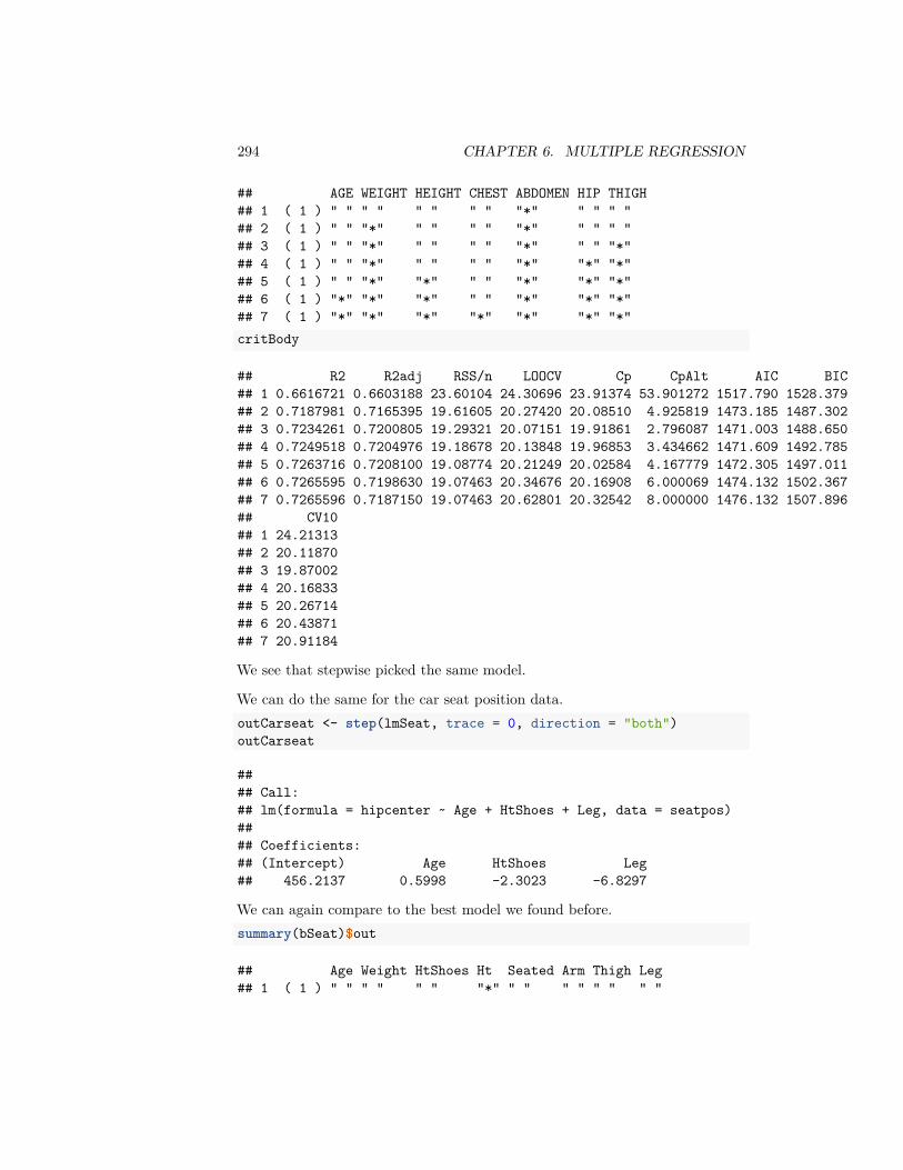
294 CHAPTER 6. MULTIPLE REGRESSION
## AGE WEIGHT HEIGHT CHEST ABDOMEN HIP THIGH## 1 ( 1 ) " " " " " " " " "*" " " " "## 2 ( 1 ) " " "*" " " " " "*" " " " "## 3 ( 1 ) " " "*" " " " " "*" " " "*"## 4 ( 1 ) " " "*" " " " " "*" "*" "*"## 5 ( 1 ) " " "*" "*" " " "*" "*" "*"## 6 ( 1 ) "*" "*" "*" " " "*" "*" "*"## 7 ( 1 ) "*" "*" "*" "*" "*" "*" "*"critBody
## R2 R2adj RSS/n LOOCV Cp CpAlt AIC BIC## 1 0.6616721 0.6603188 23.60104 24.30696 23.91374 53.901272 1517.790 1528.379## 2 0.7187981 0.7165395 19.61605 20.27420 20.08510 4.925819 1473.185 1487.302## 3 0.7234261 0.7200805 19.29321 20.07151 19.91861 2.796087 1471.003 1488.650## 4 0.7249518 0.7204976 19.18678 20.13848 19.96853 3.434662 1471.609 1492.785## 5 0.7263716 0.7208100 19.08774 20.21249 20.02584 4.167779 1472.305 1497.011## 6 0.7265595 0.7198630 19.07463 20.34676 20.16908 6.000069 1474.132 1502.367## 7 0.7265596 0.7187150 19.07463 20.62801 20.32542 8.000000 1476.132 1507.896## CV10## 1 24.21313## 2 20.11870## 3 19.87002## 4 20.16833## 5 20.26714## 6 20.43871## 7 20.91184
We see that stepwise picked the same model.
We can do the same for the car seat position data.outCarseat <- step(lmSeat, trace = 0, direction = "both")outCarseat
#### Call:## lm(formula = hipcenter ~ Age + HtShoes + Leg, data = seatpos)#### Coefficients:## (Intercept) Age HtShoes Leg## 456.2137 0.5998 -2.3023 -6.8297
We can again compare to the best model we found before.summary(bSeat)$out
## Age Weight HtShoes Ht Seated Arm Thigh Leg## 1 ( 1 ) " " " " " " "*" " " " " " " " "
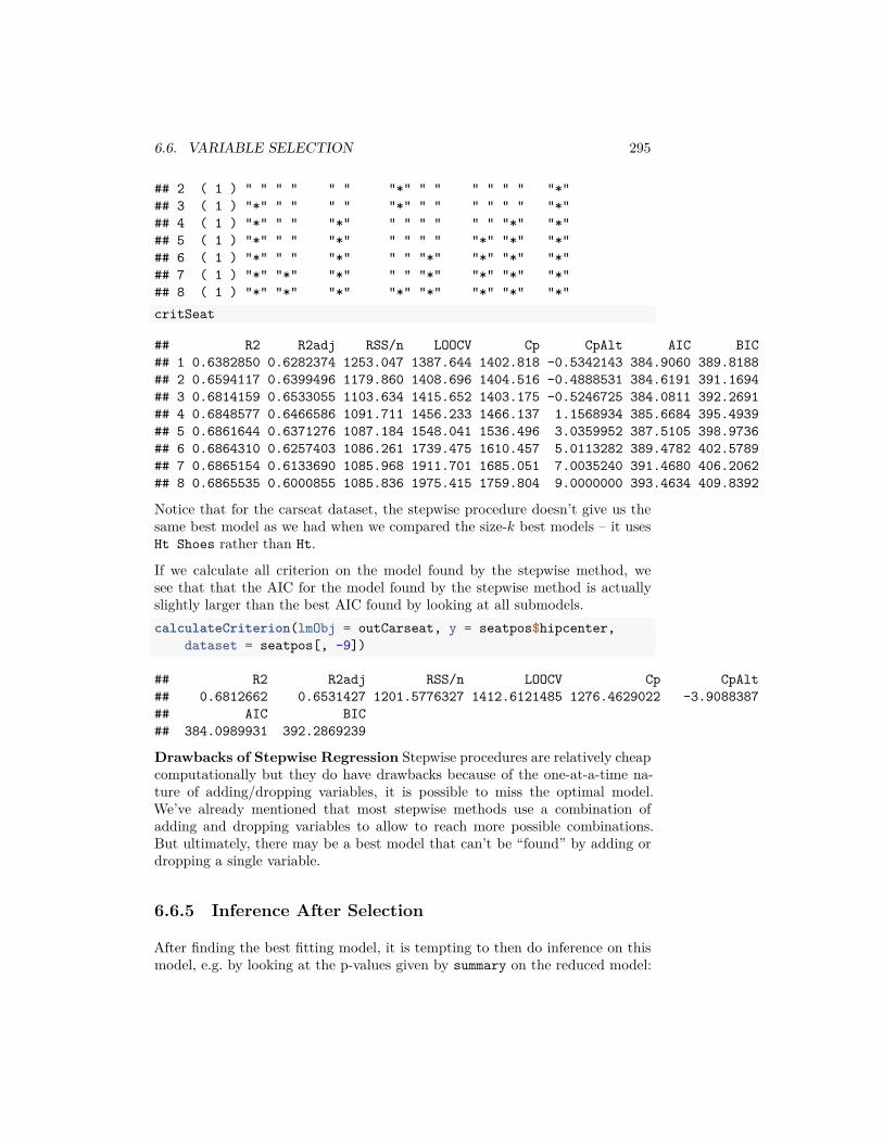
6.6. VARIABLE SELECTION 295
## 2 ( 1 ) " " " " " " "*" " " " " " " "*"## 3 ( 1 ) "*" " " " " "*" " " " " " " "*"## 4 ( 1 ) "*" " " "*" " " " " " " "*" "*"## 5 ( 1 ) "*" " " "*" " " " " "*" "*" "*"## 6 ( 1 ) "*" " " "*" " " "*" "*" "*" "*"## 7 ( 1 ) "*" "*" "*" " " "*" "*" "*" "*"## 8 ( 1 ) "*" "*" "*" "*" "*" "*" "*" "*"critSeat
## R2 R2adj RSS/n LOOCV Cp CpAlt AIC BIC## 1 0.6382850 0.6282374 1253.047 1387.644 1402.818 -0.5342143 384.9060 389.8188## 2 0.6594117 0.6399496 1179.860 1408.696 1404.516 -0.4888531 384.6191 391.1694## 3 0.6814159 0.6533055 1103.634 1415.652 1403.175 -0.5246725 384.0811 392.2691## 4 0.6848577 0.6466586 1091.711 1456.233 1466.137 1.1568934 385.6684 395.4939## 5 0.6861644 0.6371276 1087.184 1548.041 1536.496 3.0359952 387.5105 398.9736## 6 0.6864310 0.6257403 1086.261 1739.475 1610.457 5.0113282 389.4782 402.5789## 7 0.6865154 0.6133690 1085.968 1911.701 1685.051 7.0035240 391.4680 406.2062## 8 0.6865535 0.6000855 1085.836 1975.415 1759.804 9.0000000 393.4634 409.8392
Notice that for the carseat dataset, the stepwise procedure doesn’t give us thesame best model as we had when we compared the size-𝑘 best models – it usesHt Shoes rather than Ht.
If we calculate all criterion on the model found by the stepwise method, wesee that that the AIC for the model found by the stepwise method is actuallyslightly larger than the best AIC found by looking at all submodels.calculateCriterion(lmObj = outCarseat, y = seatpos$hipcenter,
dataset = seatpos[, -9])
## R2 R2adj RSS/n LOOCV Cp CpAlt## 0.6812662 0.6531427 1201.5776327 1412.6121485 1276.4629022 -3.9088387## AIC BIC## 384.0989931 392.2869239
Drawbacks of Stepwise Regression Stepwise procedures are relatively cheapcomputationally but they do have drawbacks because of the one-at-a-time na-ture of adding/dropping variables, it is possible to miss the optimal model.We’ve already mentioned that most stepwise methods use a combination ofadding and dropping variables to allow to reach more possible combinations.But ultimately, there may be a best model that can’t be “found” by adding ordropping a single variable.
6.6.5 Inference After Selection
After finding the best fitting model, it is tempting to then do inference on thismodel, e.g. by looking at the p-values given by summary on the reduced model:
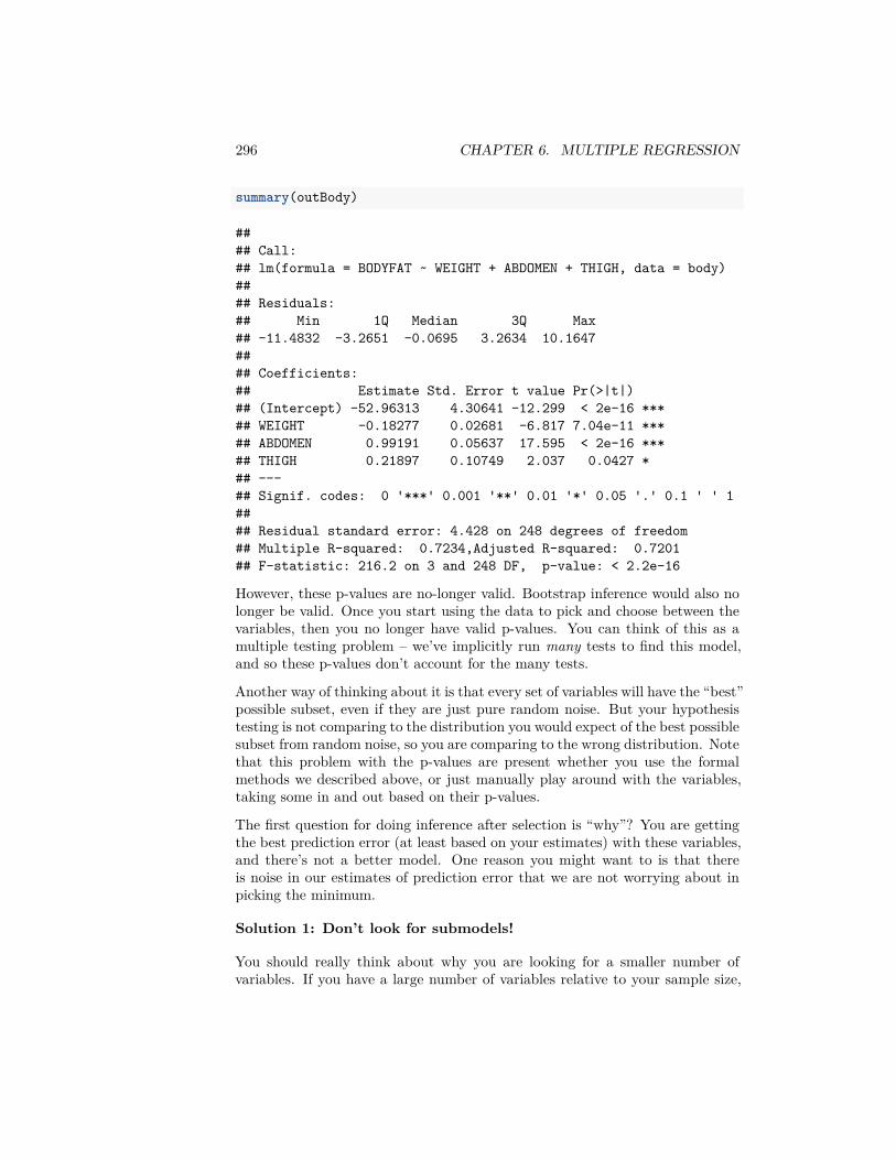
296 CHAPTER 6. MULTIPLE REGRESSION
summary(outBody)
#### Call:## lm(formula = BODYFAT ~ WEIGHT + ABDOMEN + THIGH, data = body)#### Residuals:## Min 1Q Median 3Q Max## -11.4832 -3.2651 -0.0695 3.2634 10.1647#### Coefficients:## Estimate Std. Error t value Pr(>|t|)## (Intercept) -52.96313 4.30641 -12.299 < 2e-16 ***## WEIGHT -0.18277 0.02681 -6.817 7.04e-11 ***## ABDOMEN 0.99191 0.05637 17.595 < 2e-16 ***## THIGH 0.21897 0.10749 2.037 0.0427 *## ---## Signif. codes: 0 '***' 0.001 '**' 0.01 '*' 0.05 '.' 0.1 ' ' 1#### Residual standard error: 4.428 on 248 degrees of freedom## Multiple R-squared: 0.7234,Adjusted R-squared: 0.7201## F-statistic: 216.2 on 3 and 248 DF, p-value: < 2.2e-16
However, these p-values are no-longer valid. Bootstrap inference would also nolonger be valid. Once you start using the data to pick and choose between thevariables, then you no longer have valid p-values. You can think of this as amultiple testing problem – we’ve implicitly run many tests to find this model,and so these p-values don’t account for the many tests.
Another way of thinking about it is that every set of variables will have the “best”possible subset, even if they are just pure random noise. But your hypothesistesting is not comparing to the distribution you would expect of the best possiblesubset from random noise, so you are comparing to the wrong distribution. Notethat this problem with the p-values are present whether you use the formalmethods we described above, or just manually play around with the variables,taking some in and out based on their p-values.
The first question for doing inference after selection is “why”? You are gettingthe best prediction error (at least based on your estimates) with these variables,and there’s not a better model. One reason you might want to is that thereis noise in our estimates of prediction error that we are not worrying about inpicking the minimum.
Solution 1: Don’t look for submodels!
You should really think about why you are looking for a smaller number ofvariables. If you have a large number of variables relative to your sample size,

6.6. VARIABLE SELECTION 297
a smaller model will often generalize better to future observations (i.e. givebetter predictions). If that is the goal (i.e. predictive modeling) then it canbe important to get concise models, but then often inference on the individualvariables is not terribly important.
In practice, often times people look for small models to find only the variablesthat “really matter”, which is sort of implicitly trying to infer causality. Andthen they want inferential results (p-values, CI) to prove that these particularvariables are significant. This is hedging very close to looking for causalityin your variables. A great deal of meaningful knowledge about causality hascummulatively been found in observational data (epidemiological studies onhuman populations, for example), but it’s really important to keep straight theinterpretation of the coefficients in the model and what they are not telling you.
Generally, if you have a moderate number of variables relative to your samplesize, and you want to do inference on the variables, you will probably do well tojust keep all the variables in. In some fields, researchers are actually requiredto state in advance of collecting any data what variables they plan to analyzeprecisely so they don’t go “fishing” for important variables.
Solution 2: Use different data for finding model and inference
If you do want to do inference after selection of submodels the simplest solutionis to use a portion of your dataset to find the best model, and then use theremaining portion of the data to do inference. Since you will have used com-pletely different data for finding the model than from doing inference, then youhave avoided the problems with the p-values. This requires, however, that youhave a lot of data. Moreover, using smaller amounts of data in each step willmean both that your choice of submodels might not be as good and that yourinference will be less powerful.

298 CHAPTER 6. MULTIPLE REGRESSION
Chapter 7
Logistic Regression
7.1 The classification problem
We move now from the regression problem to the classification problem. Thesetting for the classification problem is similar to that of the regression problem.We have a response variable 𝑦 and 𝑝 explanatory variables 𝑥1, … , 𝑥𝑝. We collectdata from 𝑛 subjects on these variables.
The only difference between regression and classification is that in classification,the response variable 𝑦 is binary (takes only two values; for our purposes weassume it is coded as 0 and 1) while in regression, the response variable is contin-uous. The explanatory variables, as before, are allowed to be both continuousand discrete.
There are many examples for the classification problem. Two simple examplesare given below. We shall look at more examples later on.
Frogs Dataset
This dataset consists of 212 sites of the Snowy Mountain area of New SouthWales, Australia. Each site was surveyed to understand the distribution of theSouthern Corroboree frog. The variables are is available as a dataset in R viathe package DAAG.library(DAAG)data(frogs)
The variables are:
1. pres.abs – 0/1 indicates whether frogs were found.2. easting – reference point3. northing – reference point
299
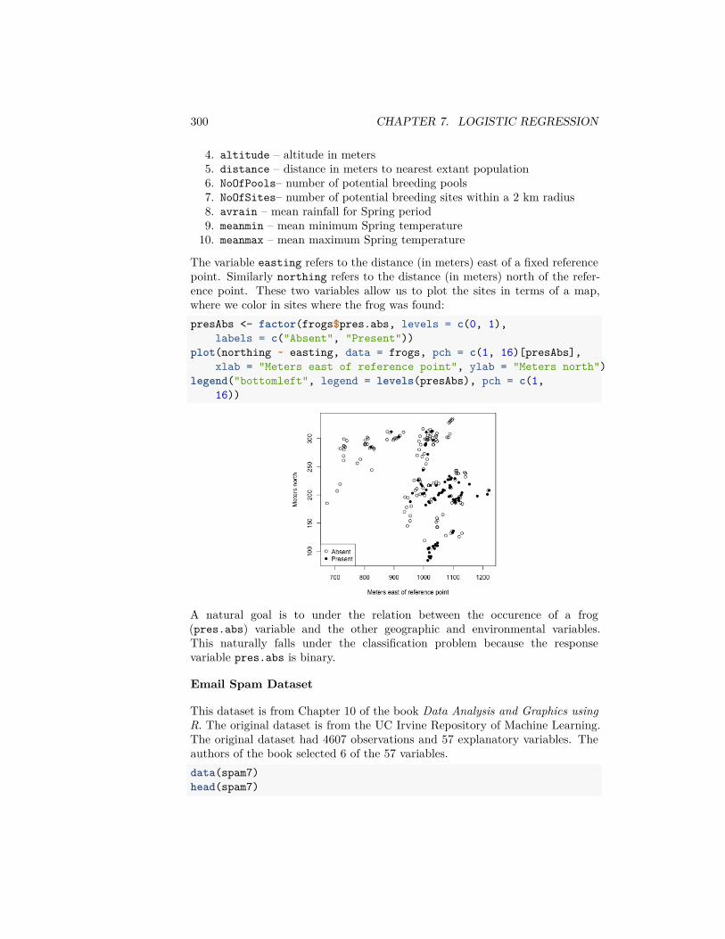
300 CHAPTER 7. LOGISTIC REGRESSION
4. altitude – altitude in meters5. distance – distance in meters to nearest extant population6. NoOfPools– number of potential breeding pools7. NoOfSites– number of potential breeding sites within a 2 km radius8. avrain – mean rainfall for Spring period9. meanmin – mean minimum Spring temperature10. meanmax – mean maximum Spring temperature
The variable easting refers to the distance (in meters) east of a fixed referencepoint. Similarly northing refers to the distance (in meters) north of the refer-ence point. These two variables allow us to plot the sites in terms of a map,where we color in sites where the frog was found:presAbs <- factor(frogs$pres.abs, levels = c(0, 1),
labels = c("Absent", "Present"))plot(northing ~ easting, data = frogs, pch = c(1, 16)[presAbs],
xlab = "Meters east of reference point", ylab = "Meters north")legend("bottomleft", legend = levels(presAbs), pch = c(1,
16))
A natural goal is to under the relation between the occurence of a frog(pres.abs) variable and the other geographic and environmental variables.This naturally falls under the classification problem because the responsevariable pres.abs is binary.
Email Spam Dataset
This dataset is from Chapter 10 of the book Data Analysis and Graphics usingR. The original dataset is from the UC Irvine Repository of Machine Learning.The original dataset had 4607 observations and 57 explanatory variables. Theauthors of the book selected 6 of the 57 variables.data(spam7)head(spam7)
7.2. LOGISTIC REGRESSION SETUP 301
## crl.tot dollar bang money n000 make yesno## 1 278 0.000 0.778 0.00 0.00 0.00 y## 2 1028 0.180 0.372 0.43 0.43 0.21 y## 3 2259 0.184 0.276 0.06 1.16 0.06 y## 4 191 0.000 0.137 0.00 0.00 0.00 y## 5 191 0.000 0.135 0.00 0.00 0.00 y## 6 54 0.000 0.000 0.00 0.00 0.00 yspam = spam7
The main variable here is yesno which indicates if the email is spam or not.The other variables are explanatory variables. They are:
1. crl.tot - total length of words that are in capitals2. dollar - frequency of the $ symbol, as percentage of all characters3. bang - freqency of the ! symbol, as a percentage of all characters,4. money - freqency of the word money, as a percentage of all words,5. n000 - freqency of the text string 000, as percentage of all words,6. make - freqency of the word make, as a percentage of all words.
The goal is mainly to predict whether a future email is spam or not based onthese explanatory variables. This is once again a classification problem becausethe response is binary.
There are, of course, many more examples where the classification problem arisesnaturally.
7.2 Logistic Regression Setup
We consider the simple example, where we just have a single predictor, 𝑥. Wecould plot our 𝑦 versus our 𝑥, and might have something that looks like theseexamples (this is toy data I made up):
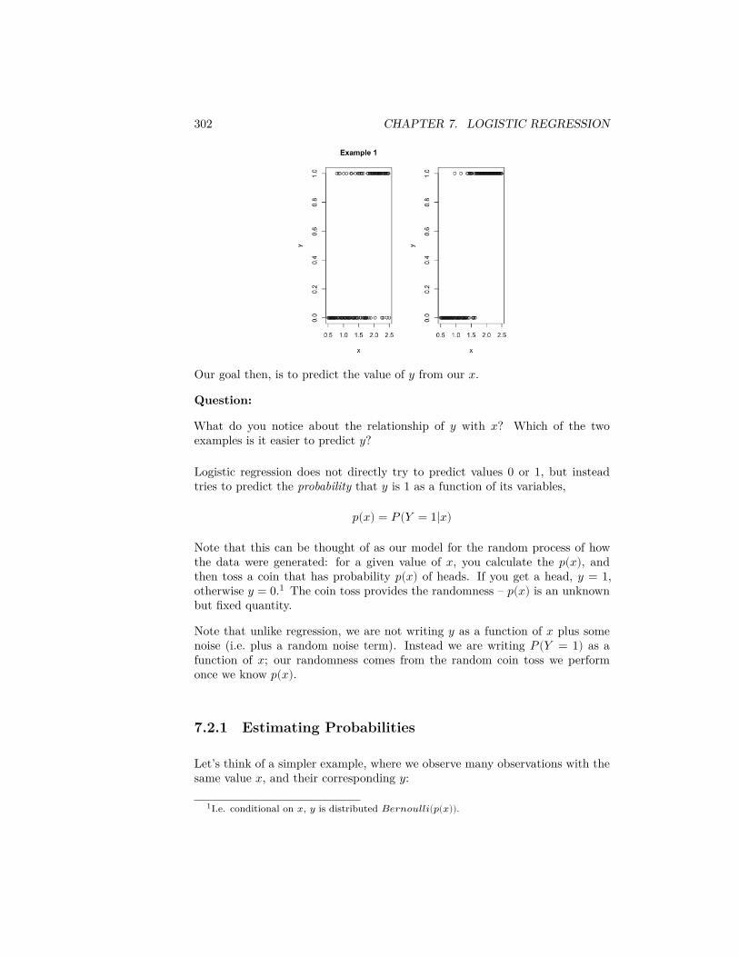
302 CHAPTER 7. LOGISTIC REGRESSION
Our goal then, is to predict the value of 𝑦 from our 𝑥.
Question:
What do you notice about the relationship of 𝑦 with 𝑥? Which of the twoexamples is it easier to predict 𝑦?
Logistic regression does not directly try to predict values 0 or 1, but insteadtries to predict the probability that 𝑦 is 1 as a function of its variables,
𝑝(𝑥) = 𝑃(𝑌 = 1|𝑥)
Note that this can be thought of as our model for the random process of howthe data were generated: for a given value of 𝑥, you calculate the 𝑝(𝑥), andthen toss a coin that has probability 𝑝(𝑥) of heads. If you get a head, 𝑦 = 1,otherwise 𝑦 = 0.1 The coin toss provides the randomness – 𝑝(𝑥) is an unknownbut fixed quantity.
Note that unlike regression, we are not writing 𝑦 as a function of 𝑥 plus somenoise (i.e. plus a random noise term). Instead we are writing 𝑃(𝑌 = 1) as afunction of 𝑥; our randomness comes from the random coin toss we performonce we know 𝑝(𝑥).
7.2.1 Estimating Probabilities
Let’s think of a simpler example, where we observe many observations with thesame value 𝑥, and their corresponding 𝑦:
1I.e. conditional on 𝑥, 𝑦 is distributed 𝐵𝑒𝑟𝑛𝑜𝑢𝑙𝑙𝑖(𝑝(𝑥)).
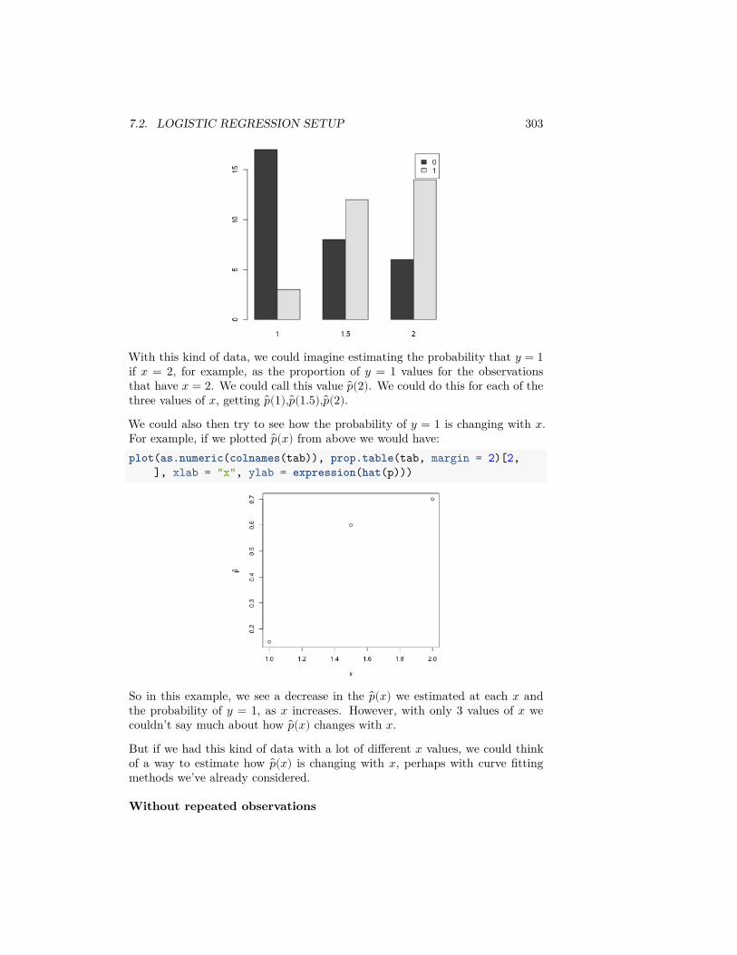
7.2. LOGISTIC REGRESSION SETUP 303
With this kind of data, we could imagine estimating the probability that 𝑦 = 1if 𝑥 = 2, for example, as the proportion of 𝑦 = 1 values for the observationsthat have 𝑥 = 2. We could call this value 𝑝(2). We could do this for each of thethree values of 𝑥, getting 𝑝(1), 𝑝(1.5), 𝑝(2).We could also then try to see how the probability of 𝑦 = 1 is changing with 𝑥.For example, if we plotted 𝑝(𝑥) from above we would have:plot(as.numeric(colnames(tab)), prop.table(tab, margin = 2)[2,
], xlab = "x", ylab = expression(hat(p)))
So in this example, we see a decrease in the 𝑝(𝑥) we estimated at each 𝑥 andthe probability of 𝑦 = 1, as 𝑥 increases. However, with only 3 values of 𝑥 wecouldn’t say much about how 𝑝(𝑥) changes with 𝑥.But if we had this kind of data with a lot of different 𝑥 values, we could thinkof a way to estimate how 𝑝(𝑥) is changing with 𝑥, perhaps with curve fittingmethods we’ve already considered.
Without repeated observations
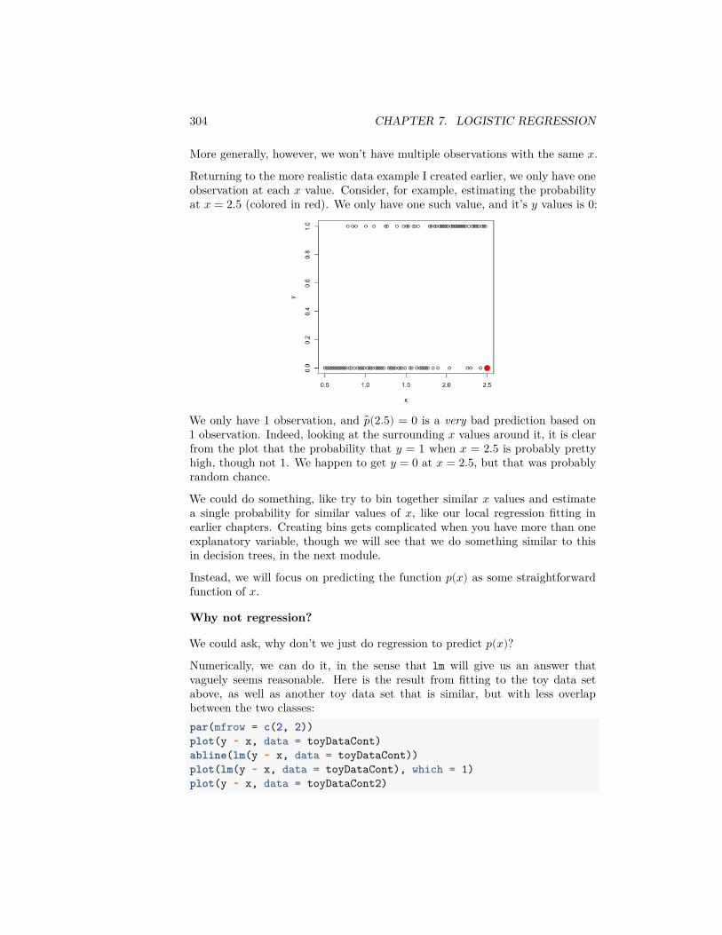
304 CHAPTER 7. LOGISTIC REGRESSION
More generally, however, we won’t have multiple observations with the same 𝑥.Returning to the more realistic data example I created earlier, we only have oneobservation at each 𝑥 value. Consider, for example, estimating the probabilityat 𝑥 = 2.5 (colored in red). We only have one such value, and it’s 𝑦 values is 0:
We only have 1 observation, and 𝑝(2.5) = 0 is a very bad prediction based on1 observation. Indeed, looking at the surrounding 𝑥 values around it, it is clearfrom the plot that the probability that 𝑦 = 1 when 𝑥 = 2.5 is probably prettyhigh, though not 1. We happen to get 𝑦 = 0 at 𝑥 = 2.5, but that was probablyrandom chance.
We could do something, like try to bin together similar 𝑥 values and estimatea single probability for similar values of 𝑥, like our local regression fitting inearlier chapters. Creating bins gets complicated when you have more than oneexplanatory variable, though we will see that we do something similar to thisin decision trees, in the next module.
Instead, we will focus on predicting the function 𝑝(𝑥) as some straightforwardfunction of 𝑥.
Why not regression?
We could ask, why don’t we just do regression to predict 𝑝(𝑥)?Numerically, we can do it, in the sense that lm will give us an answer thatvaguely seems reasonable. Here is the result from fitting to the toy data setabove, as well as another toy data set that is similar, but with less overlapbetween the two classes:par(mfrow = c(2, 2))plot(y ~ x, data = toyDataCont)abline(lm(y ~ x, data = toyDataCont))plot(lm(y ~ x, data = toyDataCont), which = 1)plot(y ~ x, data = toyDataCont2)
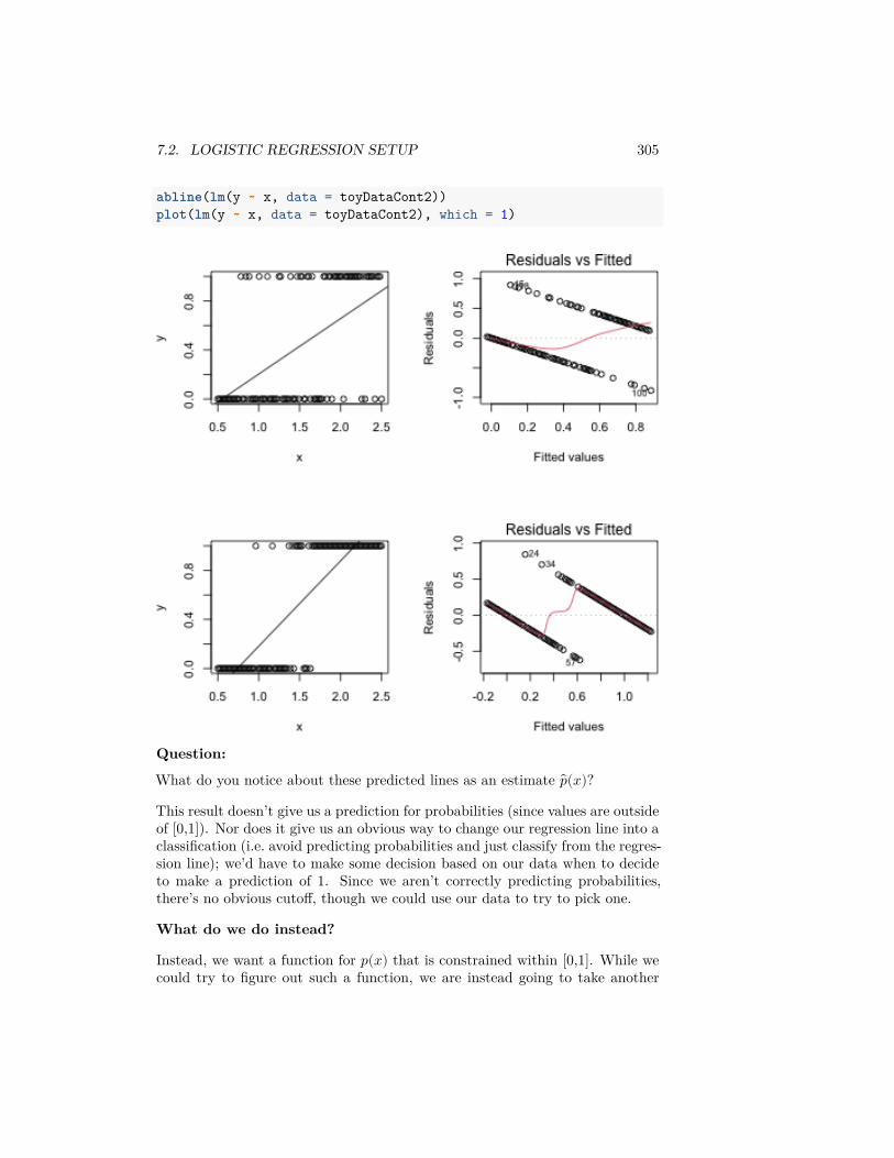
7.2. LOGISTIC REGRESSION SETUP 305
abline(lm(y ~ x, data = toyDataCont2))plot(lm(y ~ x, data = toyDataCont2), which = 1)
Question:
What do you notice about these predicted lines as an estimate 𝑝(𝑥)?
This result doesn’t give us a prediction for probabilities (since values are outsideof [0,1]). Nor does it give us an obvious way to change our regression line into aclassification (i.e. avoid predicting probabilities and just classify from the regres-sion line); we’d have to make some decision based on our data when to decideto make a prediction of 1. Since we aren’t correctly predicting probabilities,there’s no obvious cutoff, though we could use our data to try to pick one.
What do we do instead?
Instead, we want a function for 𝑝(𝑥) that is constrained within [0,1]. While wecould try to figure out such a function, we are instead going to take another

306 CHAPTER 7. LOGISTIC REGRESSION
tack which will lead us to such a function. Specifically, we are going to considertransforming our 𝑝(𝑥) so that it takes on all real-valued values, say
𝑧(𝑥) = 𝜏(𝑝(𝑥))
Instead of trying to estimate 𝑝(𝑥), we will try to estimate 𝑧(𝑥) as a function ofour 𝑥.
Why? Because 𝑧(𝑥) is no longer constrained to be between 0 and 1, and we aregoing to be free to use any simple modeling we’ve already learned to estimate𝑧(𝑥) – for example linear regression – without worrying about any constraints.Then to get 𝑝(𝑥), we will invert to get
𝑝(𝑥) = 𝜏−1( 𝑧(𝑥)).
(Note that while 𝑝(𝑥) and 𝑧(𝑥) are unknown, we pick our function 𝜏 so we don’thave to estimate it)
The other reason is that we are going to choose a function 𝜏 such that the value𝑧(𝑥) is actually interpretable and makes sense on its own; thus the function 𝑧(𝑥)is actually meaningful to estimate on its own.
7.2.2 Logit function / Log Odds
The function we are going to use is called the logit function. It takes any value𝑝 in (0,1), and returns a real value:
𝜏(𝑝) = 𝑙𝑜𝑔𝑖𝑡(𝑝) = 𝑙𝑜𝑔( 𝑝1 − 𝑝).
p <- seq(0, 1, length = 100)z <- log(p/(1 - p))par(mfrow = c(1, 1))plot(p, z, type = "l", ylab = "z=Logit(p)", xlab = "Probability",
main = "Logit Function")
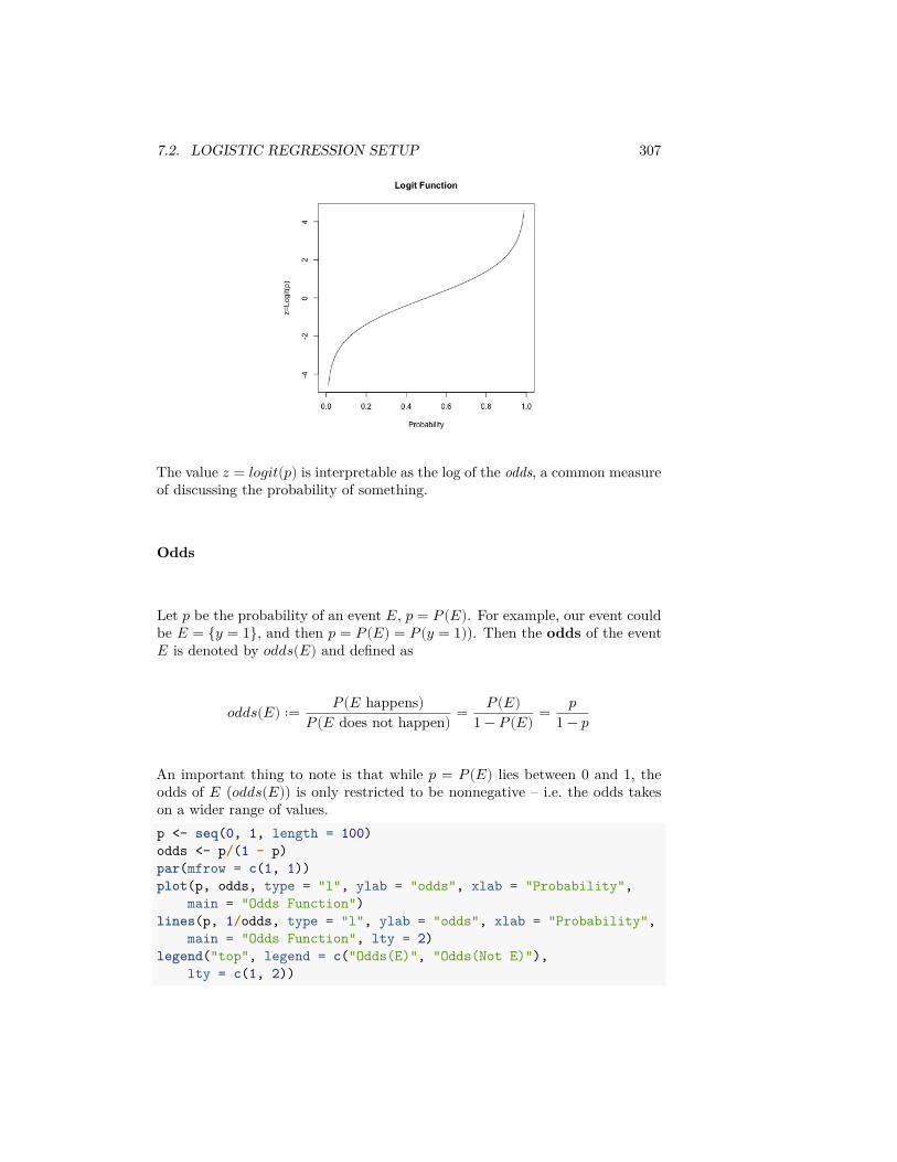
7.2. LOGISTIC REGRESSION SETUP 307
The value 𝑧 = 𝑙𝑜𝑔𝑖𝑡(𝑝) is interpretable as the log of the odds, a common measureof discussing the probability of something.
Odds
Let 𝑝 be the probability of an event 𝐸, 𝑝 = 𝑃(𝐸). For example, our event couldbe 𝐸 = {𝑦 = 1}, and then 𝑝 = 𝑃(𝐸) = 𝑃(𝑦 = 1)). Then the odds of the event𝐸 is denoted by 𝑜𝑑𝑑𝑠(𝐸) and defined as
𝑜𝑑𝑑𝑠(𝐸) ∶= 𝑃(𝐸 happens)𝑃 (𝐸 does not happen) = 𝑃(𝐸)
1 − 𝑃(𝐸) = 𝑝1 − 𝑝
An important thing to note is that while 𝑝 = 𝑃(𝐸) lies between 0 and 1, theodds of 𝐸 (𝑜𝑑𝑑𝑠(𝐸)) is only restricted to be nonnegative – i.e. the odds takeson a wider range of values.p <- seq(0, 1, length = 100)odds <- p/(1 - p)par(mfrow = c(1, 1))plot(p, odds, type = "l", ylab = "odds", xlab = "Probability",
main = "Odds Function")lines(p, 1/odds, type = "l", ylab = "odds", xlab = "Probability",
main = "Odds Function", lty = 2)legend("top", legend = c("Odds(E)", "Odds(Not E)"),
lty = c(1, 2))
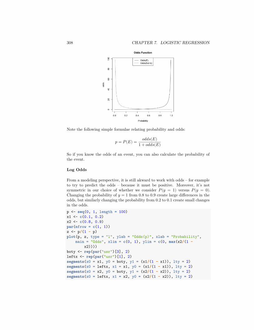
308 CHAPTER 7. LOGISTIC REGRESSION
Note the following simple formulae relating probability and odds:
𝑝 = 𝑃(𝐸) = 𝑜𝑑𝑑𝑠(𝐸)1 + 𝑜𝑑𝑑𝑠(𝐸)
So if you know the odds of an event, you can also calculate the probability ofthe event.
Log Odds
From a modeling perspective, it is still akward to work with odds – for exampleto try to predict the odds – because it must be positive. Moreover, it’s notsymmetric in our choice of whether we consider 𝑃(𝑦 = 1) versus 𝑃(𝑦 = 0).Changing the probability of 𝑦 = 1 from 0.8 to 0.9 create large differences in theodds, but similarly changing the probability from 0.2 to 0.1 create small changesin the odds.p <- seq(0, 1, length = 100)x1 <- c(0.1, 0.2)x2 <- c(0.8, 0.9)par(mfrow = c(1, 1))z <- p/(1 - p)plot(p, z, type = "l", ylab = "Odds(p)", xlab = "Probability",
main = "Odds", xlim = c(0, 1), ylim = c(0, max(x2/(1 -x2))))
boty <- rep(par("usr")[3], 2)leftx <- rep(par("usr")[1], 2)segments(x0 = x1, y0 = boty, y1 = (x1/(1 - x1)), lty = 2)segments(x0 = leftx, x1 = x1, y0 = (x1/(1 - x1)), lty = 2)segments(x0 = x2, y0 = boty, y1 = (x2/(1 - x2)), lty = 2)segments(x0 = leftx, x1 = x2, y0 = (x2/(1 - x2)), lty = 2)
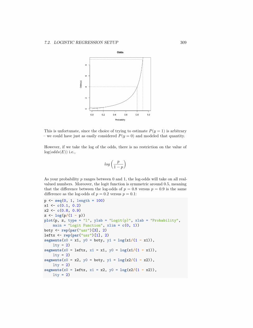
7.2. LOGISTIC REGRESSION SETUP 309
This is unfortunate, since the choice of trying to estimate 𝑃(𝑦 = 1) is arbitrary– we could have just as easily considered 𝑃(𝑦 = 0) and modeled that quantity.
However, if we take the log of the odds, there is no restriction on the value oflog(𝑜𝑑𝑑𝑠(𝐸)) i.e.,
𝑙𝑜𝑔 ( 𝑝1 − 𝑝)
As your probability 𝑝 ranges between 0 and 1, the log-odds will take on all real-valued numbers. Moreover, the logit function is symmetric around 0.5, meaningthat the difference between the log-odds of 𝑝 = 0.8 versus 𝑝 = 0.9 is the samedifference as the log-odds of 𝑝 = 0.2 versus 𝑝 = 0.1:p <- seq(0, 1, length = 100)x1 <- c(0.1, 0.2)x2 <- c(0.8, 0.9)z <- log(p/(1 - p))plot(p, z, type = "l", ylab = "Logit(p)", xlab = "Probability",
main = "Logit Function", xlim = c(0, 1))boty <- rep(par("usr")[3], 2)leftx <- rep(par("usr")[1], 2)segments(x0 = x1, y0 = boty, y1 = log(x1/(1 - x1)),
lty = 2)segments(x0 = leftx, x1 = x1, y0 = log(x1/(1 - x1)),
lty = 2)segments(x0 = x2, y0 = boty, y1 = log(x2/(1 - x2)),
lty = 2)segments(x0 = leftx, x1 = x2, y0 = log(x2/(1 - x2)),
lty = 2)
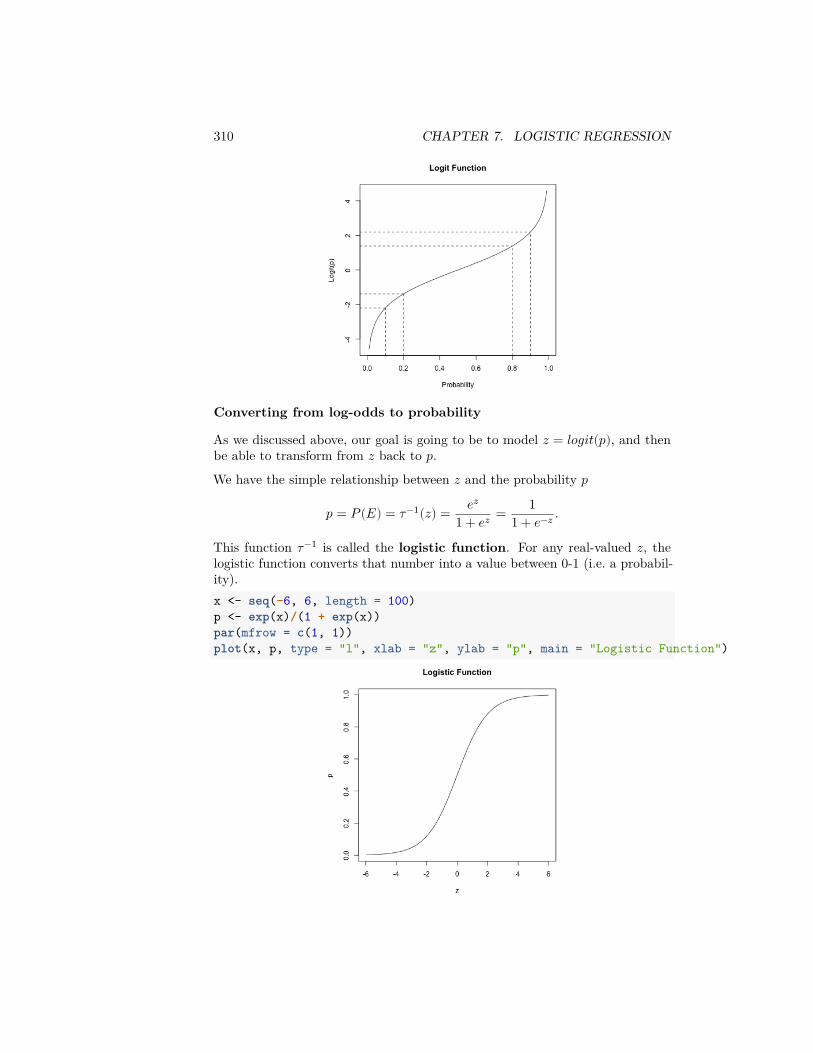
310 CHAPTER 7. LOGISTIC REGRESSION
Converting from log-odds to probability
As we discussed above, our goal is going to be to model 𝑧 = 𝑙𝑜𝑔𝑖𝑡(𝑝), and thenbe able to transform from 𝑧 back to 𝑝.We have the simple relationship between 𝑧 and the probability 𝑝
𝑝 = 𝑃(𝐸) = 𝜏−1(𝑧) = 𝑒𝑧
1 + 𝑒𝑧 = 11 + 𝑒−𝑧 .
This function 𝜏−1 is called the logistic function. For any real-valued 𝑧, thelogistic function converts that number into a value between 0-1 (i.e. a probabil-ity).x <- seq(-6, 6, length = 100)p <- exp(x)/(1 + exp(x))par(mfrow = c(1, 1))plot(x, p, type = "l", xlab = "z", ylab = "p", main = "Logistic Function")
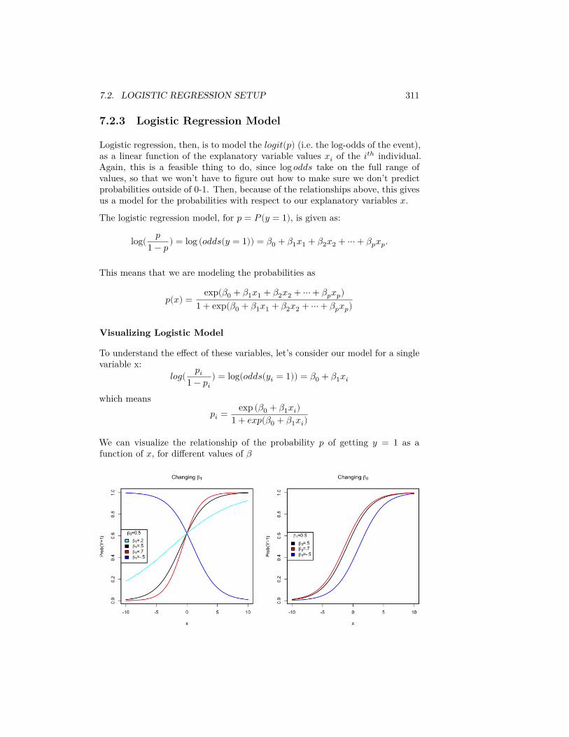
7.2. LOGISTIC REGRESSION SETUP 311
7.2.3 Logistic Regression Model
Logistic regression, then, is to model the 𝑙𝑜𝑔𝑖𝑡(𝑝) (i.e. the log-odds of the event),as a linear function of the explanatory variable values 𝑥𝑖 of the 𝑖𝑡ℎ individual.Again, this is a feasible thing to do, since log 𝑜𝑑𝑑𝑠 take on the full range ofvalues, so that we won’t have to figure out how to make sure we don’t predictprobabilities outside of 0-1. Then, because of the relationships above, this givesus a model for the probabilities with respect to our explanatory variables 𝑥.The logistic regression model, for 𝑝 = 𝑃(𝑦 = 1), is given as:
log( 𝑝1 − 𝑝) = log (𝑜𝑑𝑑𝑠(𝑦 = 1)) = 𝛽0 + 𝛽1𝑥1 + 𝛽2𝑥2 + ⋯ + 𝛽𝑝𝑥𝑝.
This means that we are modeling the probabilities as
𝑝(𝑥) = exp(𝛽0 + 𝛽1𝑥1 + 𝛽2𝑥2 + ⋯ + 𝛽𝑝𝑥𝑝)1 + exp(𝛽0 + 𝛽1𝑥1 + 𝛽2𝑥2 + ⋯ + 𝛽𝑝𝑥𝑝)
Visualizing Logistic Model
To understand the effect of these variables, let’s consider our model for a singlevariable x:
𝑙𝑜𝑔( 𝑝𝑖1 − 𝑝𝑖
) = log(𝑜𝑑𝑑𝑠(𝑦𝑖 = 1)) = 𝛽0 + 𝛽1𝑥𝑖
which means𝑝𝑖 = exp (𝛽0 + 𝛽1𝑥𝑖)
1 + 𝑒𝑥𝑝(𝛽0 + 𝛽1𝑥𝑖)
We can visualize the relationship of the probability 𝑝 of getting 𝑦 = 1 as afunction of 𝑥, for different values of 𝛽

312 CHAPTER 7. LOGISTIC REGRESSION
Fitting the Logistic Model in R
The R function for logistic regression in R is glm() and it is not very differentfrom lm() in terms of syntax.
For the frogs dataset, we will try to fit a model (but without the geographicalvariables)frogsNoGeo <- frogs[, -c(2, 3)]glmFrogs = glm(pres.abs ~ ., family = binomial, data = frogsNoGeo)summary(glmFrogs)
#### Call:## glm(formula = pres.abs ~ ., family = binomial, data = frogsNoGeo)#### Deviance Residuals:## Min 1Q Median 3Q Max## -1.7215 -0.7590 -0.2237 0.8320 2.6789#### Coefficients:## Estimate Std. Error z value Pr(>|z|)## (Intercept) 1.105e+02 1.388e+02 0.796 0.42587## altitude -3.086e-02 4.076e-02 -0.757 0.44901## distance -4.800e-04 2.055e-04 -2.336 0.01949 *## NoOfPools 2.986e-02 9.276e-03 3.219 0.00129 **## NoOfSites 4.364e-02 1.061e-01 0.411 0.68077## avrain -1.140e-02 5.995e-02 -0.190 0.84920## meanmin 4.899e+00 1.564e+00 3.133 0.00173 **## meanmax -5.660e+00 5.049e+00 -1.121 0.26224## ---## Signif. codes: 0 '***' 0.001 '**' 0.01 '*' 0.05 '.' 0.1 ' ' 1#### (Dispersion parameter for binomial family taken to be 1)#### Null deviance: 279.99 on 211 degrees of freedom## Residual deviance: 198.74 on 204 degrees of freedom## AIC: 214.74#### Number of Fisher Scoring iterations: 6
GLM is not just the name of a function in R, but a general term that standsfor Generalized Linear Model. Logistic regression is a special case of ageneralized linear model; the family = binomial clause in the function callabove tells R to fit a logistic regression equation to the data – namely whatkind of function to use to determine whether the predicted probabilities fit ourdata.
7.3. INTERPRETING THE RESULTS 313
7.3 Interpreting the Results
7.3.1 Coefficients
The parameter 𝛽𝑗 is interpreted as the change in log-odds of the event 𝑦 = 1 for aunit change in the variable 𝑥𝑗 provided all other explanatory variables are keptunchanged. Equivalently, 𝑒𝛽𝑗 can be interpreted as the multiplicative change inodds due to a unit change in the variable 𝑥𝑗 – provided all other explanatoryvariables are kept unchanged.
The R function provides estimates of the parameters 𝛽0, … , 𝛽𝑝. For exam-ple, in the frogs dataset, the estimated coefficient of the variable NoOfPoolsis 0.02986. This is interpreted as the change in log-odds of the event of find-ing a frog when the NoOfPools increases by one (provided the other variablesremain unchanged). Equivalently, the odds of finding a frog get multiplied byexp(0.02986) = 1.03031 when the NoOfPools increases by one.
P-values are also provided for each 𝛽𝑗; they have a similar interpretation as inlinear regression, namely evaluating the null hypothesis that 𝛽𝑗 = 0. We arenot going to go into how these p-values are calculated. Basically, if the modelis true, 𝛽𝑗 will be approximately normally distributed, with that approximationbeing better for larger sample size. Logistic regression significance statementsrely much more heavily on asymptotics (i.e. having large sample sizes), even ifthe data exactly follows the data generation model!
7.3.2 Fitted Values and prediction
Now suppose a new site is found in the area for which the explanatory variablevalues are:
• altitude=1700• distance=400• NoOfPools=30• NoOfSites=8• avrain=150• meanmin=4• meanmax=16
What can our logistic regression equation predict for the presence or absence offrogs in this area? Our logistic regression allows us to calculate the log(𝑜𝑑𝑑𝑠)of finding frogs in this area as:x0 = c(1, 1700, 400, 30, 8, 150, 4, 16)sum(x0 * glmFrogs$coefficients)
## [1] -13.58643
314 CHAPTER 7. LOGISTIC REGRESSION
Remember that this is log(𝑜𝑑𝑑𝑠). From here, the odds of finding frogs is calcu-lated asexp(sum(x0 * glmFrogs$coefficients))
## [1] 1.257443e-06
These are very low odds. If one wants to obtain an estimate of the probabilityof finding frogs at this new location, we can use the formula above to get:exp(sum(x0 * glmFrogs$coefficients))/(1 + exp(sum(x0 *
glmFrogs$coefficients)))
## [1] 1.257441e-06
Therefore, we will predict that this species of frog will not be present at thisnew location.
Similar to fitted values in linear regression, we can obtain fitted probabilities inlogistic regression for each of the observations in our sample using the fittedfunction:head(fitted(glmFrogs))
## 2 3 4 5 6 7## 0.9994421 0.9391188 0.8683363 0.7443973 0.9427198 0.7107780
These fitted values are the fitted probabilities for each observation in our sample.For example, for 𝑖 = 45, we can also calculate the fitted value manually as:i = 45rrg = c(1, frogs$altitude[i], frogs$distance[i], frogs$NoOfPools[i],
frogs$NoOfSites[i], frogs$avrain[i], frogs$meanmin[i],frogs$meanmax[i])
eta = sum(rrg * glmFrogs$coefficients)prr = exp(eta)/(1 + exp(eta))c(manual = prr, FittedFunction = unname(glmFrogs$fitted.values[i]))
## manual FittedFunction## 0.5807378 0.5807378
The following plots the fitted values against the actual response:boxplot(fitted(glmFrogs) ~ frogs$pres.abs, at = c(0,
1))points(x = jitter(frogs$pres.abs), fitted(glmFrogs))
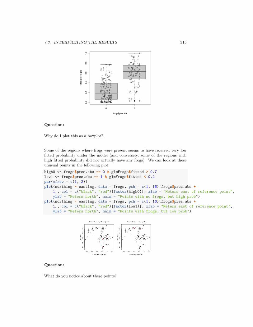
7.3. INTERPRETING THE RESULTS 315
Question:
Why do I plot this as a boxplot?
Some of the regions where frogs were present seems to have received very lowfitted probability under the model (and conversely, some of the regions withhigh fitted probability did not actually have any frogs). We can look at theseunusual points in the following plot:high0 <- frogs$pres.abs == 0 & glmFrogs$fitted > 0.7low1 <- frogs$pres.abs == 1 & glmFrogs$fitted < 0.2par(mfrow = c(1, 2))plot(northing ~ easting, data = frogs, pch = c(1, 16)[frogs$pres.abs +
1], col = c("black", "red")[factor(high0)], xlab = "Meters east of reference point",ylab = "Meters north", main = "Points with no frogs, but high prob")
plot(northing ~ easting, data = frogs, pch = c(1, 16)[frogs$pres.abs +1], col = c("black", "red")[factor(low1)], xlab = "Meters east of reference point",ylab = "Meters north", main = "Points with frogs, but low prob")
Question:
What do you notice about these points?
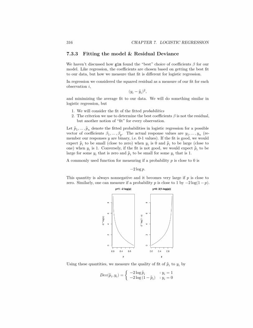
316 CHAPTER 7. LOGISTIC REGRESSION
7.3.3 Fitting the model & Residual Deviance
We haven’t discussed how glm found the “best” choice of coefficients 𝛽 for ourmodel. Like regression, the coefficients are chosen based on getting the best fitto our data, but how we measure that fit is different for logistic regression.
In regression we considered the squared residual as a measure of our fit for eachobservation 𝑖,
(𝑦𝑖 − 𝑦𝑖)2,and minimizing the average fit to our data. We will do something similar inlogistic regression, but
1. We will consider the fit of the fitted probabilities2. The criterion we use to determine the best coefficients 𝛽 is not the residual,
but another notion of “fit” for every observation.
Let 𝑝1, … , 𝑝𝑛 denote the fitted probabilities in logistic regression for a possiblevector of coefficients 𝛽1, … , 𝛽𝑝. The actual response values are 𝑦1, … , 𝑦𝑛 (re-member our responses 𝑦 are binary, i.e. 0-1 values). If the fit is good, we wouldexpect 𝑝𝑖 to be small (close to zero) when 𝑦𝑖 is 0 and 𝑝𝑖 to be large (close toone) when 𝑦𝑖 is 1. Conversely, if the fit is not good, we would expect 𝑝𝑖 to belarge for some 𝑦𝑖 that is zero and 𝑝𝑖 to be small for some 𝑦𝑖 that is 1.
A commonly used function for measuring if a probability 𝑝 is close to 0 is
−2 log 𝑝.
This quantity is always nonnegative and it becomes very large if 𝑝 is close tozero. Similarly, one can measure if a probability 𝑝 is close to 1 by −2 log(1 − 𝑝).
Using these quantities, we measure the quality of fit of 𝑝𝑖 to 𝑦𝑖 by
𝐷𝑒𝑣( 𝑝𝑖, 𝑦𝑖) = { −2 log 𝑝𝑖 ∶ 𝑦𝑖 = 1−2 log (1 − 𝑝𝑖) ∶ 𝑦𝑖 = 0
7.3. INTERPRETING THE RESULTS 317
This is called the deviance.2 If 𝐷𝑒𝑣( 𝑝𝑖, 𝑦𝑖) is large, it means that 𝑝𝑖 is not agood fit for 𝑦𝑖.
Because 𝑦𝑖 is either 0 or 1, the above formula for 𝐷𝑒𝑣( 𝑝𝑖, 𝑦𝑖) can be writtenmore succinctly as
𝐷𝑒𝑣( 𝑝𝑖, 𝑦𝑖) = 𝑦𝑖 (−2 log 𝑝𝑖) + (1 − 𝑦𝑖) (−2 log(1 − 𝑝𝑖)) .
Note that this is the deviance for the 𝑖𝑡ℎ observation. We can get a measureof the overall goodness of fit (across all observations) by simply summing thisquantity over all our observations. The resulting quantity is called the ResidualDeviance:
𝑅𝐷 =𝑛
∑𝑖=1
𝐷𝑒𝑣( 𝑝𝑖, 𝑦𝑖).
Just like RSS, small values of 𝑅𝐷 are preferred and large values indicate lackof fit.
This doesn’t have our 𝛽𝑗 anywhere, so how does this help in choosing the best 𝛽?Well, remember that our fitted values 𝑝𝑖 is a specific function of our 𝑥𝑖 values:
𝑝𝑖 = 𝑝(𝑥𝑖) = 𝜏−1( 𝛽0 + … + 𝛽𝑝𝑥(𝑝)𝑖 ) = exp( 𝛽0 + … + 𝛽𝑝𝑥(𝑝)
𝑖 )1 + exp( 𝛽0 + … + 𝛽𝑝𝑥(𝑝)
𝑖 )
So we can put those values into our equation above, and find the 𝛽𝑗 that max-imize that quantity. Unlike linear regression, this has to be maximized by acomputer – you can’t write down a mathematical expression for the 𝛽𝑗 thatminimize the residual deviance.
Residual Deviance in R
The function deviance can be used in R to calculate deviance. It can, of course,also be calculated manually using the fitted probabilities.
RD (Residual Deviance) can be calculated from our glm object asdeviance(glmFrogs)
## [1] 198.7384
2This comes from assuming that the 𝑦𝑖 follow a Bernoulli distribtion with probability 𝑝𝑖.Then this is the negative log-likelihood of the observation, and by minimizing the average ofthis over all observations, we are maximizing the likelihood.

318 CHAPTER 7. LOGISTIC REGRESSION
7.4 Comparing Models
7.4.1 Deviance and submodels
Residual Deviance has parallels to RSS in linear regression, and we can usedeviance to compare models similarly to linear regression.
RD decreases as you add variables
Just like the RSS in linear regression, the RD in logistic regression will alwaysdecrease as more variables are added to the model. For example, in the frogsdataset, if we remove the variable NoOfPools, the RD changes to:m2 = glm(pres.abs ~ altitude + distance + NoOfSites +
avrain + meanmin + meanmax, family = binomial,data = frogs)
deviance(m2)
## [1] 210.8392deviance(glmFrogs)
## [1] 198.7384
Note that RD decreased from 210.84 to 198.7384 by adding NoOfPools.
The Null Model (No Variables)
We can similarly ask whether we need any of the variables (like the F test). TheNull Deviance (ND) is the analogue of TSS (Total Sum of Squares) in linearregression. It simply refers to the deviance when there are no explanatoryvariables i.e., when one does logistic regression with only the intercept.
We can fit a model in R with no variables with the following syntax:m0 <- glm(pres.abs ~ 1, family = binomial, data = frogs)deviance(m0)
## [1] 279.987
Note, when there are no explanatory variables, the fitted probabilities are allequal to 𝑦:head(fitted(m0))
## 2 3 4 5 6 7## 0.3726415 0.3726415 0.3726415 0.3726415 0.3726415 0.3726415mean(frogs$pres.abs)
## [1] 0.3726415
7.4. COMPARING MODELS 319
Notice that this null deviance is reported in the summary of the full model wefit:summary(glmFrogs)
#### Call:## glm(formula = pres.abs ~ ., family = binomial, data = frogsNoGeo)#### Deviance Residuals:## Min 1Q Median 3Q Max## -1.7215 -0.7590 -0.2237 0.8320 2.6789#### Coefficients:## Estimate Std. Error z value Pr(>|z|)## (Intercept) 1.105e+02 1.388e+02 0.796 0.42587## altitude -3.086e-02 4.076e-02 -0.757 0.44901## distance -4.800e-04 2.055e-04 -2.336 0.01949 *## NoOfPools 2.986e-02 9.276e-03 3.219 0.00129 **## NoOfSites 4.364e-02 1.061e-01 0.411 0.68077## avrain -1.140e-02 5.995e-02 -0.190 0.84920## meanmin 4.899e+00 1.564e+00 3.133 0.00173 **## meanmax -5.660e+00 5.049e+00 -1.121 0.26224## ---## Signif. codes: 0 '***' 0.001 '**' 0.01 '*' 0.05 '.' 0.1 ' ' 1#### (Dispersion parameter for binomial family taken to be 1)#### Null deviance: 279.99 on 211 degrees of freedom## Residual deviance: 198.74 on 204 degrees of freedom## AIC: 214.74#### Number of Fisher Scoring iterations: 6
Significance of submodels
The deviances come with degrees of freedom. The degrees of freedom of RD is𝑛 − 𝑝 − 1 (exactly equal to the residual degrees of freedom in linear regression)while the degrees of freedom of ND is 𝑛 − 1.Unlike regression, the automatic summary does not give a p-value as to whetherthis is a significant change in deviance. Similarly, the anova function for com-paring submodels doesn’t give a significance for comparing a submodel to thelarger modelanova(m0, glmFrogs)
## Analysis of Deviance Table
320 CHAPTER 7. LOGISTIC REGRESSION
#### Model 1: pres.abs ~ 1## Model 2: pres.abs ~ altitude + distance + NoOfPools + NoOfSites + avrain +## meanmin + meanmax## Resid. Df Resid. Dev Df Deviance## 1 211 279.99## 2 204 198.74 7 81.249
The reason for this that because for logistic regression, unlike linear regression,there are multiple tests that for the same test. Furthermore, the glm functioncan fit other models than just the logistic model, and depending on those models,you will want different tests. I can specify a test, and get back a significancevalue:anova(m0, glmFrogs, test = "LRT")
## Analysis of Deviance Table#### Model 1: pres.abs ~ 1## Model 2: pres.abs ~ altitude + distance + NoOfPools + NoOfSites + avrain +## meanmin + meanmax## Resid. Df Resid. Dev Df Deviance Pr(>Chi)## 1 211 279.99## 2 204 198.74 7 81.249 7.662e-15 ***## ---## Signif. codes: 0 '***' 0.001 '**' 0.01 '*' 0.05 '.' 0.1 ' ' 1
Question:
What are the conclusions of these tests?
Comparison with Tests of 𝛽𝑗
Notice that unlike linear regression, you get slightly different answers testing theimportance of leaving out NoOfPools using the anova above and test statisticsthat come with the summary of the logistic object:anova(m2, glmFrogs, test = "LRT")
## Analysis of Deviance Table#### Model 1: pres.abs ~ altitude + distance + NoOfSites + avrain + meanmin +## meanmax## Model 2: pres.abs ~ altitude + distance + NoOfPools + NoOfSites + avrain +## meanmin + meanmax## Resid. Df Resid. Dev Df Deviance Pr(>Chi)## 1 205 210.84## 2 204 198.74 1 12.101 0.000504 ***## ---
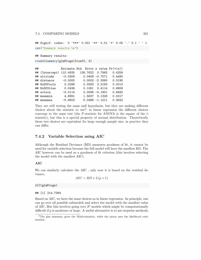
7.4. COMPARING MODELS 321
## Signif. codes: 0 '***' 0.001 '**' 0.01 '*' 0.05 '.' 0.1 ' ' 1cat("Summary results:\n")
## Summary results:round(summary(glmFrogs)$coeff, 4)
## Estimate Std. Error z value Pr(>|z|)## (Intercept) 110.4935 138.7622 0.7963 0.4259## altitude -0.0309 0.0408 -0.7571 0.4490## distance -0.0005 0.0002 -2.3360 0.0195## NoOfPools 0.0299 0.0093 3.2192 0.0013## NoOfSites 0.0436 0.1061 0.4114 0.6808## avrain -0.0114 0.0599 -0.1901 0.8492## meanmin 4.8991 1.5637 3.1329 0.0017## meanmax -5.6603 5.0488 -1.1211 0.2622
They are still testing the same null hypothesis, but they are making differentchoices about the statistic to use3; in linear regression the different choicesconverge to the same test (the 𝐹 -statistic for ANOVA is the square of the 𝑡-statistic), but this is a special property of normal distribution. Theoreticallythese two choices are equivalent for large enough sample size; in practice theycan differ.
7.4.2 Variable Selection using AIC
Although the Residual Deviance (RD) measures goodness of fit, it cannot beused for variable selection because the full model will have the smallest RD. TheAIC however can be used as a goodness of fit criterion (this involves selectingthe model with the smallest AIC).
AIC
We can similarly calculate the AIC , only now it is based on the residual de-viance,
𝐴𝐼𝐶 = 𝑅𝐷 + 2 (𝑝 + 1)
AIC(glmFrogs)
## [1] 214.7384
Based on AIC, we have the same choices as in linear regression. In principle, onecan go over all possible submodels and select the model with the smallest valueof AIC. But this involves going over 2𝑝 models which might be computationallydifficult if 𝑝 is moderate or large. A useful alternative is to use stepwise methods,
3The glm summary gives the Wald-statistics, while the anova uses the likelihood ratiostatistic.
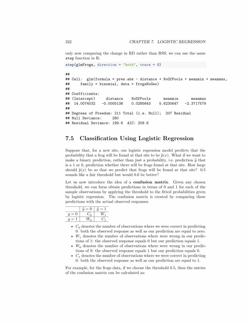
322 CHAPTER 7. LOGISTIC REGRESSION
only now comparing the change in RD rather than RSS; we can use the samestep function in R:step(glmFrogs, direction = "both", trace = 0)
#### Call: glm(formula = pres.abs ~ distance + NoOfPools + meanmin + meanmax,## family = binomial, data = frogsNoGeo)#### Coefficients:## (Intercept) distance NoOfPools meanmin meanmax## 14.0074032 -0.0005138 0.0285643 5.6230647 -2.3717579#### Degrees of Freedom: 211 Total (i.e. Null); 207 Residual## Null Deviance: 280## Residual Deviance: 199.6 AIC: 209.6
7.5 Classification Using Logistic Regression
Suppose that, for a new site, our logistic regression model predicts that theprobability that a frog will be found at that site to be 𝑝(𝑥). What if we want tomake a binary prediction, rather than just a probability, i.e. prediction 𝑦 thatis a 1 or 0, prediction whether there will be frogs found at that site. How largeshould 𝑝(𝑥) be so that we predict that frogs will be found at that site? 0.5sounds like a fair threshold but would 0.6 be better?
Let us now introduce the idea of a confusion matrix. Given any chosenthreshold, we can form obtain predictions in terms of 0 and 1 for each of thesample observations by applying the threshold to the fitted probabilities givenby logistic regression. The confusion matrix is created by comparing thesepredictions with the actual observed responses.
𝑦 = 0 𝑦 = 1𝑦 = 0 𝐶0 𝑊1𝑦 = 1 𝑊0 𝐶1
• 𝐶0 denotes the number of observations where we were correct in predicting0: both the observed response as well as our prediction are equal to zero.
• 𝑊1 denotes the number of observations where were wrong in our predic-tions of 1: the observed response equals 0 but our prediction equals 1.
• 𝑊0 denotes the number of observations where were wrong in our predic-tions of 0: the observed response equals 1 but our prediction equals 0.
• 𝐶1 denotes the number of observations where we were correct in predicting0: both the observed response as well as our prediction are equal to 1.
For example, for the frogs data, if we choose the threshold 0.5, then the entriesof the confusion matrix can be calculated as:

7.5. CLASSIFICATION USING LOGISTIC REGRESSION 323
## Confusion matrix for threshold 0.5:
𝑦 = 0 𝑦 = 1𝑦 = 0 𝐶0 = 112 𝑊1 = 21𝑦 = 1 𝑊0 = 21 𝐶1 = 58
On the other hand, if we use a threshold of 0.3, the numbers will be:
## Confusion for threshold 0.3:
𝑦 = 0 𝑦 = 1𝑦 = 0 𝐶0 = 84 𝑊1 = 49𝑦 = 1 𝑊0 = 10 𝐶1 = 69
Note that 𝐶0 and 𝐶1 denote the extent to which the response agrees with ourthreshold. And 𝑊1 and 𝑊0 measure the extent to which they disagree. Anoptimal threshold can be chosen to be one which minimizes 𝑊1 + 𝑊0. We cancompute the entries of the confusion matrix for a range of possible thresholds.
## C0 W1 W0 C1## 0 0 133 0 79## 0.05 33 100 3 76## 0.1 47 86 5 74## 0.15 61 72 5 74## 0.2 69 64 6 73## 0.25 80 53 10 69## 0.3 84 49 10 69## 0.35 91 42 13 66## 0.4 100 33 14 65## 0.45 106 27 18 61## 0.5 112 21 21 58## 0.55 118 15 26 53## 0.6 121 12 35 44## 0.65 126 7 44 35## 0.7 129 4 50 29## 0.75 130 3 59 20## 0.8 133 0 69 10## 0.85 133 0 71 8## 0.9 133 0 73 6## 0.95 133 0 78 1## 1 133 0 79 0
Notice that I can get either 𝑊1 or 𝑊0 exactly equal to 0 (i.e no mis-classifications).
Question:
Why is it not a good idea to try to get 𝑊1 exactly equal to 0 (or alternativelytry to get 𝑊0 exactly equal to 0)?
324 CHAPTER 7. LOGISTIC REGRESSION
We can then plot the value of 𝑊1 + 𝑊0 for each value of the threshold in thefollowing plot:plot(thr, conf[, "W1"] + conf[, "W0"], xlab = "threshold",
ylab = "W1+W0")
The smallest value of 𝑊1 + 𝑊0 corresponds to the threshold 0.55. It is sensibletherefore to use this threshold for predictions.
But there might be settings where you want to allow more of one type of mis-take than another. For example, you might prefer to detect a higher percentageof persons with a communicable disease, so as to limit the chances that some-one further transmits the disease, even if that means slightly more people arewrongly told that they have the disease. These are trade-offs that frequentlyhave to be made based on domain knowledge.
7.5.1 Example of Spam Dataset
Let us now consider the email spam dataset. Recall the dataset:head(spam7)
## crl.tot dollar bang money n000 make yesno## 1 278 0.000 0.778 0.00 0.00 0.00 y## 2 1028 0.180 0.372 0.43 0.43 0.21 y## 3 2259 0.184 0.276 0.06 1.16 0.06 y## 4 191 0.000 0.137 0.00 0.00 0.00 y## 5 191 0.000 0.135 0.00 0.00 0.00 y## 6 54 0.000 0.000 0.00 0.00 0.00 y
Before fitting a logistic regression model, let us first look at the summary andhistograms of the explanatory variables:
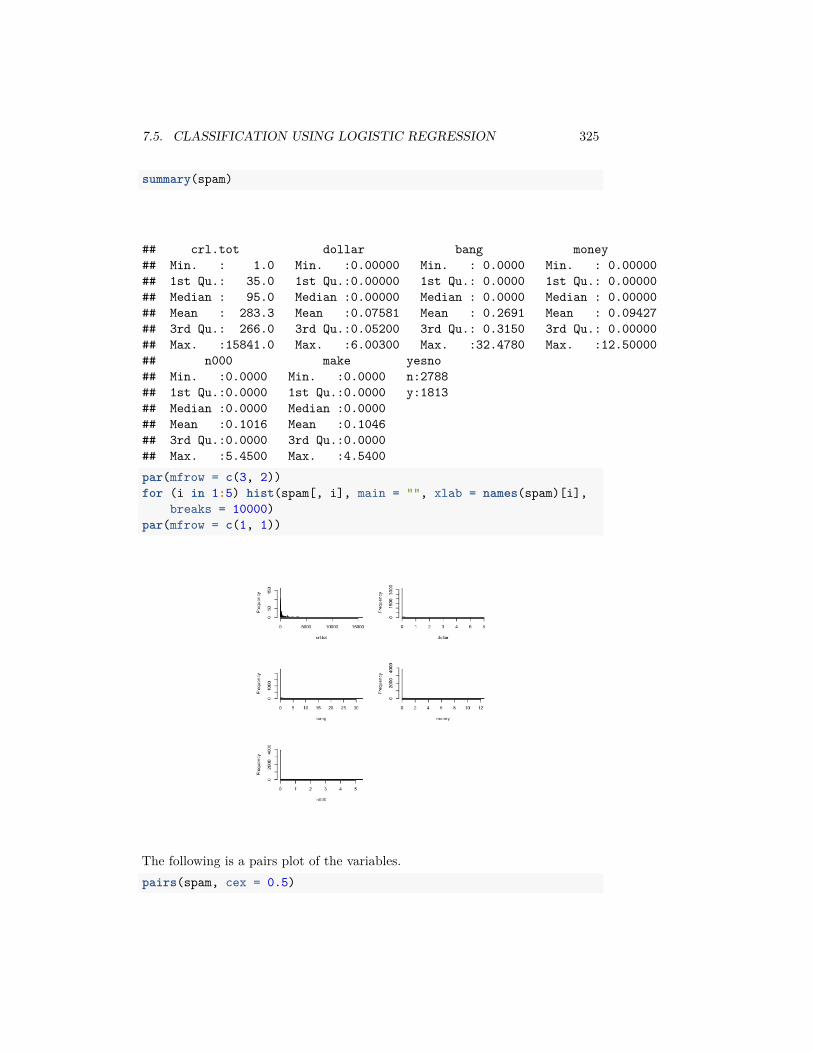
7.5. CLASSIFICATION USING LOGISTIC REGRESSION 325
summary(spam)
## crl.tot dollar bang money## Min. : 1.0 Min. :0.00000 Min. : 0.0000 Min. : 0.00000## 1st Qu.: 35.0 1st Qu.:0.00000 1st Qu.: 0.0000 1st Qu.: 0.00000## Median : 95.0 Median :0.00000 Median : 0.0000 Median : 0.00000## Mean : 283.3 Mean :0.07581 Mean : 0.2691 Mean : 0.09427## 3rd Qu.: 266.0 3rd Qu.:0.05200 3rd Qu.: 0.3150 3rd Qu.: 0.00000## Max. :15841.0 Max. :6.00300 Max. :32.4780 Max. :12.50000## n000 make yesno## Min. :0.0000 Min. :0.0000 n:2788## 1st Qu.:0.0000 1st Qu.:0.0000 y:1813## Median :0.0000 Median :0.0000## Mean :0.1016 Mean :0.1046## 3rd Qu.:0.0000 3rd Qu.:0.0000## Max. :5.4500 Max. :4.5400par(mfrow = c(3, 2))for (i in 1:5) hist(spam[, i], main = "", xlab = names(spam)[i],
breaks = 10000)par(mfrow = c(1, 1))
The following is a pairs plot of the variables.pairs(spam, cex = 0.5)
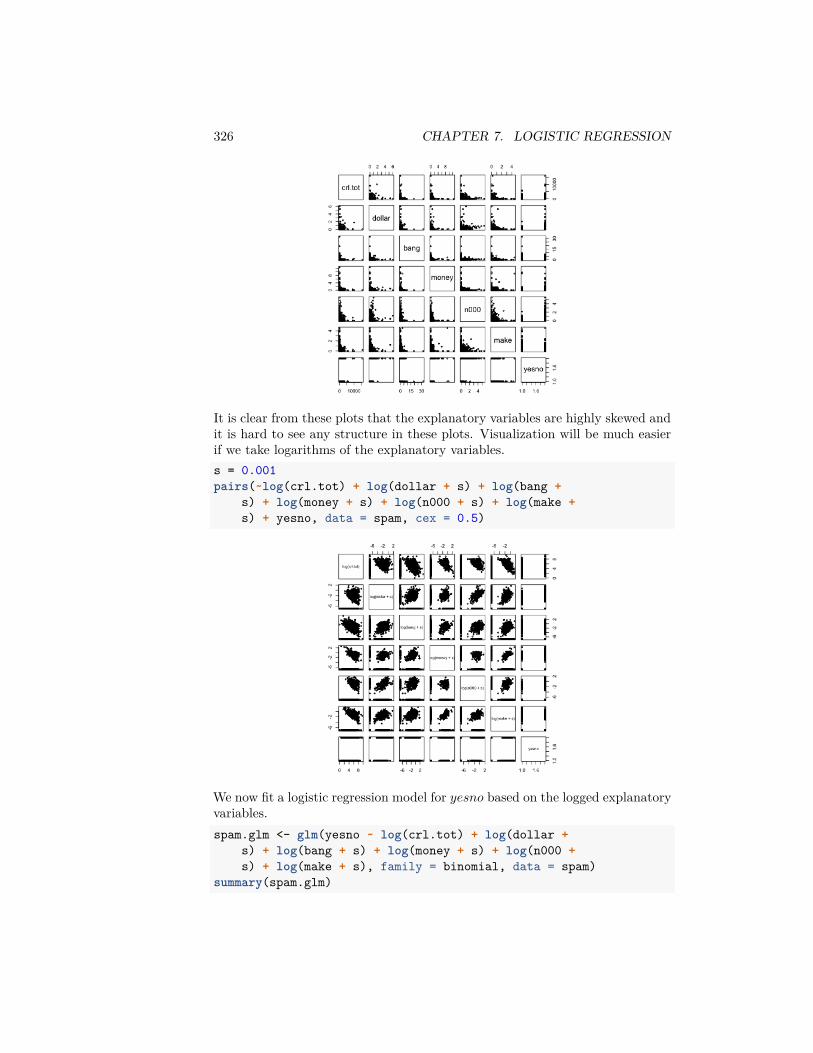
326 CHAPTER 7. LOGISTIC REGRESSION
It is clear from these plots that the explanatory variables are highly skewed andit is hard to see any structure in these plots. Visualization will be much easierif we take logarithms of the explanatory variables.s = 0.001pairs(~log(crl.tot) + log(dollar + s) + log(bang +
s) + log(money + s) + log(n000 + s) + log(make +s) + yesno, data = spam, cex = 0.5)
We now fit a logistic regression model for 𝑦𝑒𝑠𝑛𝑜 based on the logged explanatoryvariables.spam.glm <- glm(yesno ~ log(crl.tot) + log(dollar +
s) + log(bang + s) + log(money + s) + log(n000 +s) + log(make + s), family = binomial, data = spam)
summary(spam.glm)
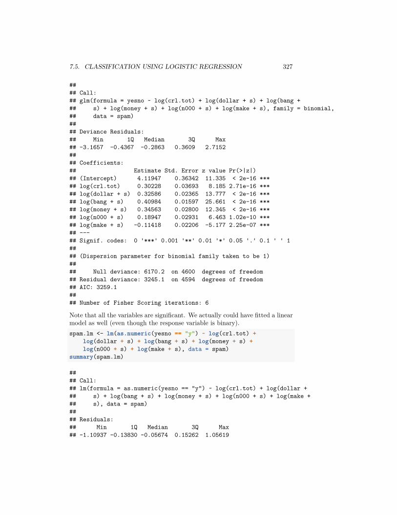
7.5. CLASSIFICATION USING LOGISTIC REGRESSION 327
#### Call:## glm(formula = yesno ~ log(crl.tot) + log(dollar + s) + log(bang +## s) + log(money + s) + log(n000 + s) + log(make + s), family = binomial,## data = spam)#### Deviance Residuals:## Min 1Q Median 3Q Max## -3.1657 -0.4367 -0.2863 0.3609 2.7152#### Coefficients:## Estimate Std. Error z value Pr(>|z|)## (Intercept) 4.11947 0.36342 11.335 < 2e-16 ***## log(crl.tot) 0.30228 0.03693 8.185 2.71e-16 ***## log(dollar + s) 0.32586 0.02365 13.777 < 2e-16 ***## log(bang + s) 0.40984 0.01597 25.661 < 2e-16 ***## log(money + s) 0.34563 0.02800 12.345 < 2e-16 ***## log(n000 + s) 0.18947 0.02931 6.463 1.02e-10 ***## log(make + s) -0.11418 0.02206 -5.177 2.25e-07 ***## ---## Signif. codes: 0 '***' 0.001 '**' 0.01 '*' 0.05 '.' 0.1 ' ' 1#### (Dispersion parameter for binomial family taken to be 1)#### Null deviance: 6170.2 on 4600 degrees of freedom## Residual deviance: 3245.1 on 4594 degrees of freedom## AIC: 3259.1#### Number of Fisher Scoring iterations: 6
Note that all the variables are significant. We actually could have fitted a linearmodel as well (even though the response variable is binary).spam.lm <- lm(as.numeric(yesno == "y") ~ log(crl.tot) +
log(dollar + s) + log(bang + s) + log(money + s) +log(n000 + s) + log(make + s), data = spam)
summary(spam.lm)
#### Call:## lm(formula = as.numeric(yesno == "y") ~ log(crl.tot) + log(dollar +## s) + log(bang + s) + log(money + s) + log(n000 + s) + log(make +## s), data = spam)#### Residuals:## Min 1Q Median 3Q Max## -1.10937 -0.13830 -0.05674 0.15262 1.05619
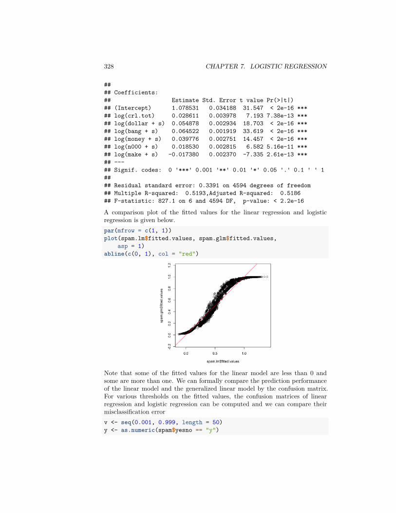
328 CHAPTER 7. LOGISTIC REGRESSION
#### Coefficients:## Estimate Std. Error t value Pr(>|t|)## (Intercept) 1.078531 0.034188 31.547 < 2e-16 ***## log(crl.tot) 0.028611 0.003978 7.193 7.38e-13 ***## log(dollar + s) 0.054878 0.002934 18.703 < 2e-16 ***## log(bang + s) 0.064522 0.001919 33.619 < 2e-16 ***## log(money + s) 0.039776 0.002751 14.457 < 2e-16 ***## log(n000 + s) 0.018530 0.002815 6.582 5.16e-11 ***## log(make + s) -0.017380 0.002370 -7.335 2.61e-13 ***## ---## Signif. codes: 0 '***' 0.001 '**' 0.01 '*' 0.05 '.' 0.1 ' ' 1#### Residual standard error: 0.3391 on 4594 degrees of freedom## Multiple R-squared: 0.5193,Adjusted R-squared: 0.5186## F-statistic: 827.1 on 6 and 4594 DF, p-value: < 2.2e-16
A comparison plot of the fitted values for the linear regression and logisticregression is given below.par(mfrow = c(1, 1))plot(spam.lm$fitted.values, spam.glm$fitted.values,
asp = 1)abline(c(0, 1), col = "red")
Note that some of the fitted values for the linear model are less than 0 andsome are more than one. We can formally compare the prediction performanceof the linear model and the generalized linear model by the confusion matrix.For various thresholds on the fitted values, the confusion matrices of linearregression and logistic regression can be computed and we can compare theirmisclassification errorv <- seq(0.001, 0.999, length = 50)y <- as.numeric(spam$yesno == "y")
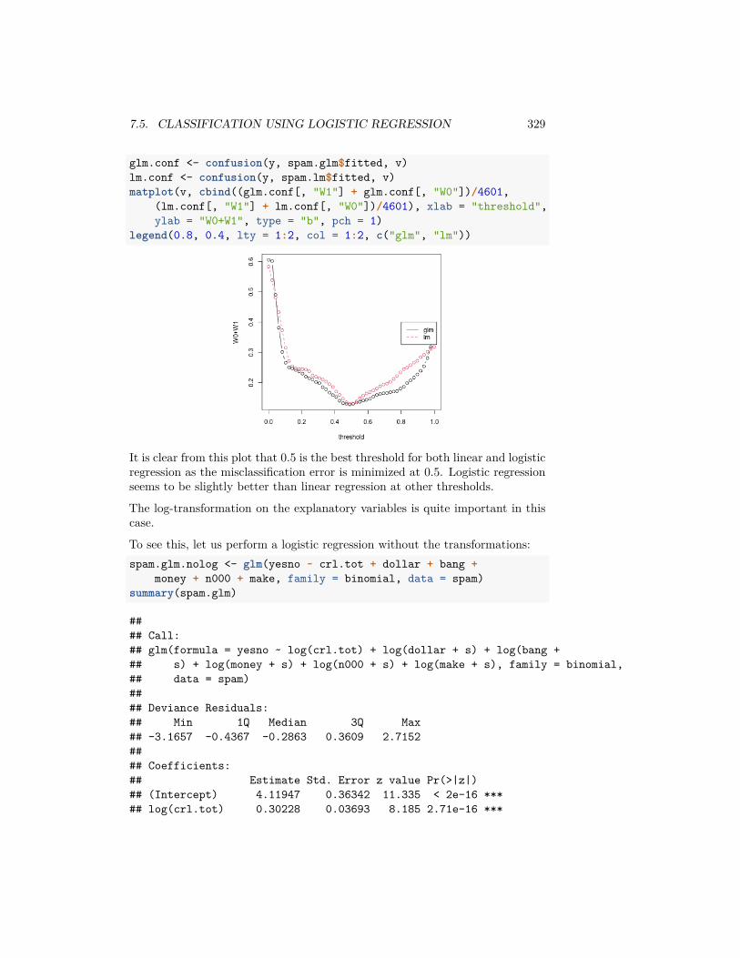
7.5. CLASSIFICATION USING LOGISTIC REGRESSION 329
glm.conf <- confusion(y, spam.glm$fitted, v)lm.conf <- confusion(y, spam.lm$fitted, v)matplot(v, cbind((glm.conf[, "W1"] + glm.conf[, "W0"])/4601,
(lm.conf[, "W1"] + lm.conf[, "W0"])/4601), xlab = "threshold",ylab = "W0+W1", type = "b", pch = 1)
legend(0.8, 0.4, lty = 1:2, col = 1:2, c("glm", "lm"))
It is clear from this plot that 0.5 is the best threshold for both linear and logisticregression as the misclassification error is minimized at 0.5. Logistic regressionseems to be slightly better than linear regression at other thresholds.
The log-transformation on the explanatory variables is quite important in thiscase.
To see this, let us perform a logistic regression without the transformations:spam.glm.nolog <- glm(yesno ~ crl.tot + dollar + bang +
money + n000 + make, family = binomial, data = spam)summary(spam.glm)
#### Call:## glm(formula = yesno ~ log(crl.tot) + log(dollar + s) + log(bang +## s) + log(money + s) + log(n000 + s) + log(make + s), family = binomial,## data = spam)#### Deviance Residuals:## Min 1Q Median 3Q Max## -3.1657 -0.4367 -0.2863 0.3609 2.7152#### Coefficients:## Estimate Std. Error z value Pr(>|z|)## (Intercept) 4.11947 0.36342 11.335 < 2e-16 ***## log(crl.tot) 0.30228 0.03693 8.185 2.71e-16 ***
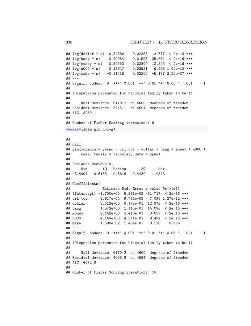
330 CHAPTER 7. LOGISTIC REGRESSION
## log(dollar + s) 0.32586 0.02365 13.777 < 2e-16 ***## log(bang + s) 0.40984 0.01597 25.661 < 2e-16 ***## log(money + s) 0.34563 0.02800 12.345 < 2e-16 ***## log(n000 + s) 0.18947 0.02931 6.463 1.02e-10 ***## log(make + s) -0.11418 0.02206 -5.177 2.25e-07 ***## ---## Signif. codes: 0 '***' 0.001 '**' 0.01 '*' 0.05 '.' 0.1 ' ' 1#### (Dispersion parameter for binomial family taken to be 1)#### Null deviance: 6170.2 on 4600 degrees of freedom## Residual deviance: 3245.1 on 4594 degrees of freedom## AIC: 3259.1#### Number of Fisher Scoring iterations: 6summary(spam.glm.nolog)
#### Call:## glm(formula = yesno ~ crl.tot + dollar + bang + money + n000 +## make, family = binomial, data = spam)#### Deviance Residuals:## Min 1Q Median 3Q Max## -8.4904 -0.6153 -0.5816 0.4439 1.9323#### Coefficients:## Estimate Std. Error z value Pr(>|z|)## (Intercept) -1.700e+00 5.361e-02 -31.717 < 2e-16 ***## crl.tot 6.917e-04 9.745e-05 7.098 1.27e-12 ***## dollar 8.013e+00 6.175e-01 12.976 < 2e-16 ***## bang 1.572e+00 1.115e-01 14.096 < 2e-16 ***## money 2.142e+00 2.418e-01 8.859 < 2e-16 ***## n000 4.149e+00 4.371e-01 9.492 < 2e-16 ***## make 1.698e-02 1.434e-01 0.118 0.906## ---## Signif. codes: 0 '***' 0.001 '**' 0.01 '*' 0.05 '.' 0.1 ' ' 1#### (Dispersion parameter for binomial family taken to be 1)#### Null deviance: 6170.2 on 4600 degrees of freedom## Residual deviance: 4058.8 on 4594 degrees of freedom## AIC: 4072.8#### Number of Fisher Scoring iterations: 16
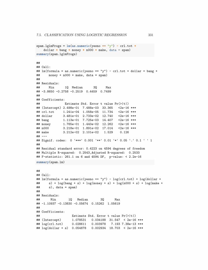
7.5. CLASSIFICATION USING LOGISTIC REGRESSION 331
spam.lglmFrogs = lm(as.numeric(yesno == "y") ~ crl.tot +dollar + bang + money + n000 + make, data = spam)
summary(spam.lglmFrogs)
#### Call:## lm(formula = as.numeric(yesno == "y") ~ crl.tot + dollar + bang +## money + n000 + make, data = spam)#### Residuals:## Min 1Q Median 3Q Max## -3.8650 -0.2758 -0.2519 0.4459 0.7499#### Coefficients:## Estimate Std. Error t value Pr(>|t|)## (Intercept) 2.498e-01 7.488e-03 33.365 <2e-16 ***## crl.tot 1.241e-04 1.058e-05 11.734 <2e-16 ***## dollar 3.481e-01 2.733e-02 12.740 <2e-16 ***## bang 1.113e-01 7.725e-03 14.407 <2e-16 ***## money 1.765e-01 1.440e-02 12.262 <2e-16 ***## n000 3.218e-01 1.891e-02 17.014 <2e-16 ***## make 3.212e-02 2.101e-02 1.529 0.126## ---## Signif. codes: 0 '***' 0.001 '**' 0.01 '*' 0.05 '.' 0.1 ' ' 1#### Residual standard error: 0.4223 on 4594 degrees of freedom## Multiple R-squared: 0.2543,Adjusted R-squared: 0.2533## F-statistic: 261.1 on 6 and 4594 DF, p-value: < 2.2e-16summary(spam.lm)
#### Call:## lm(formula = as.numeric(yesno == "y") ~ log(crl.tot) + log(dollar +## s) + log(bang + s) + log(money + s) + log(n000 + s) + log(make +## s), data = spam)#### Residuals:## Min 1Q Median 3Q Max## -1.10937 -0.13830 -0.05674 0.15262 1.05619#### Coefficients:## Estimate Std. Error t value Pr(>|t|)## (Intercept) 1.078531 0.034188 31.547 < 2e-16 ***## log(crl.tot) 0.028611 0.003978 7.193 7.38e-13 ***## log(dollar + s) 0.054878 0.002934 18.703 < 2e-16 ***
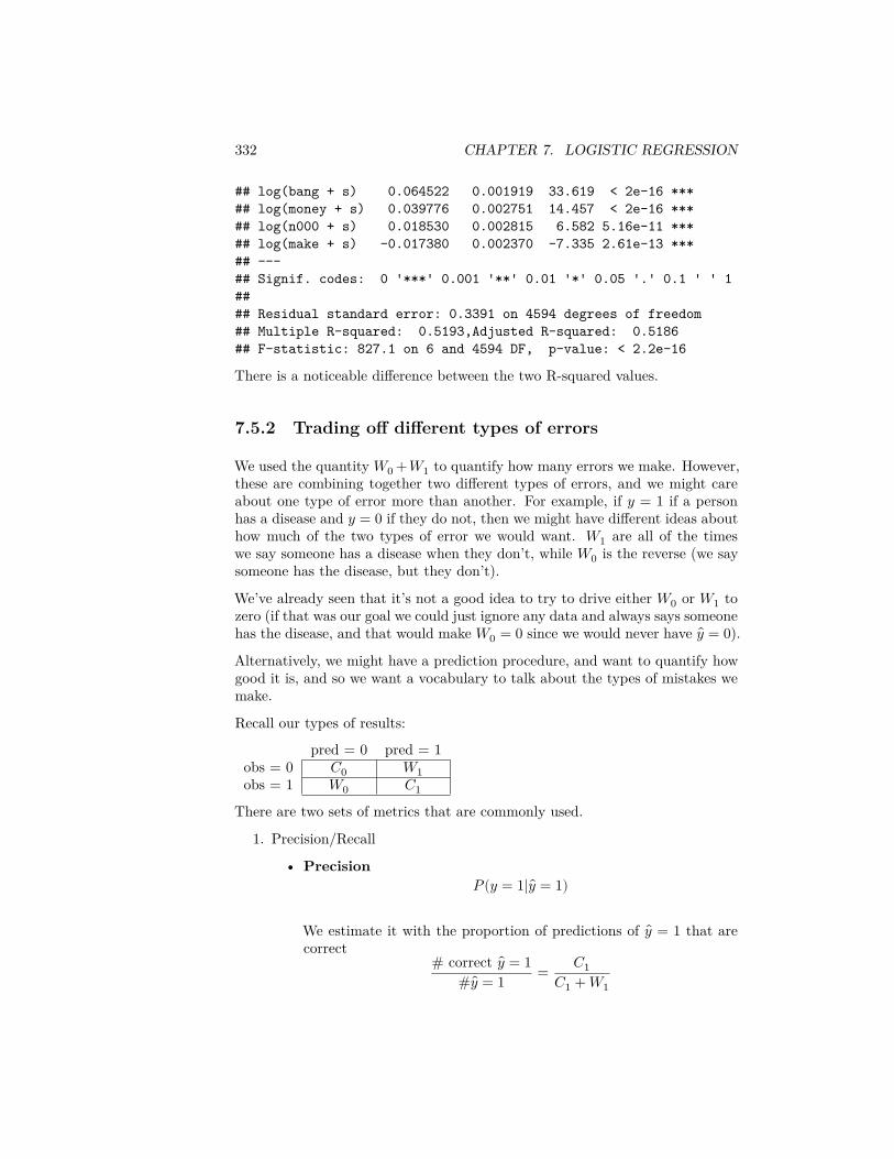
332 CHAPTER 7. LOGISTIC REGRESSION
## log(bang + s) 0.064522 0.001919 33.619 < 2e-16 ***## log(money + s) 0.039776 0.002751 14.457 < 2e-16 ***## log(n000 + s) 0.018530 0.002815 6.582 5.16e-11 ***## log(make + s) -0.017380 0.002370 -7.335 2.61e-13 ***## ---## Signif. codes: 0 '***' 0.001 '**' 0.01 '*' 0.05 '.' 0.1 ' ' 1#### Residual standard error: 0.3391 on 4594 degrees of freedom## Multiple R-squared: 0.5193,Adjusted R-squared: 0.5186## F-statistic: 827.1 on 6 and 4594 DF, p-value: < 2.2e-16
There is a noticeable difference between the two R-squared values.
7.5.2 Trading off different types of errors
We used the quantity 𝑊0 +𝑊1 to quantify how many errors we make. However,these are combining together two different types of errors, and we might careabout one type of error more than another. For example, if 𝑦 = 1 if a personhas a disease and 𝑦 = 0 if they do not, then we might have different ideas abouthow much of the two types of error we would want. 𝑊1 are all of the timeswe say someone has a disease when they don’t, while 𝑊0 is the reverse (we saysomeone has the disease, but they don’t).
We’ve already seen that it’s not a good idea to try to drive either 𝑊0 or 𝑊1 tozero (if that was our goal we could just ignore any data and always says someonehas the disease, and that would make 𝑊0 = 0 since we would never have 𝑦 = 0).Alternatively, we might have a prediction procedure, and want to quantify howgood it is, and so we want a vocabulary to talk about the types of mistakes wemake.
Recall our types of results:
pred = 0 pred = 1obs = 0 𝐶0 𝑊1obs = 1 𝑊0 𝐶1
There are two sets of metrics that are commonly used.
1. Precision/Recall
• Precision𝑃(𝑦 = 1| 𝑦 = 1)
We estimate it with the proportion of predictions of 𝑦 = 1 that arecorrect
# correct 𝑦 = 1# 𝑦 = 1 = 𝐶1
𝐶1 + 𝑊1
7.5. CLASSIFICATION USING LOGISTIC REGRESSION 333
• Recall𝑃( 𝑦 = 1|𝑦 = 1)
Estimated with proportion of 𝑦 = 1 that are correctly predicted
# correct 𝑦 = 1#𝑦 = 1
𝐶1𝐶1 + 𝑊0
2. Sensitivity/Specificity
• Specificity (or true negative rate)
𝑃( 𝑦 = 0|𝑦 = 0)Estimated with the proportion of all 𝑦 = 0 that are correctly pre-dicted
# correct 𝑦 = 0# 𝑦 = 0 = 𝐶0
𝐶0 + 𝑊1• Sensitivity (equivalent to Recall or true positive rate)
𝑃( 𝑦 = 1|𝑦 = 1)Estimated with the proportion of all 𝑦 = 1 that are correctly pre-dicted
# correct 𝑦 = 1#𝑦 = 1 = 𝐶1
𝐶1 + 𝑊0
Example: Disease classification
If we go back to our example of 𝑦 = 1 if a person has a disease and 𝑦 = 0 if theydo not, then we have:
• Precision The proportion of patients classified with the disease that ac-tually have the disease.
• Recall/Sensitivity The proportion of diseased patients that will be cor-rectly identified as diseased
• Specificity The proportion of non-diseased patients that will be correctlyidentified as non-diseased
7.5.3 ROC/Precision-Recall Curves
These metrics come in pairs because you usually consider the two pairs togetherto decide on the right cutoff, as well as to generally compare techniques.
These measures are usually done plotted: Sensitivity plotted against specificityis called a ROC curve (“Receiver operating characteristic” curve); the other plotis just the precision-recall plot.
Here are these curves estimated for our glm model on the spam dataset (notethat the points are where we actually evaluated it, and we draw lines betweenthose points to get a curve)
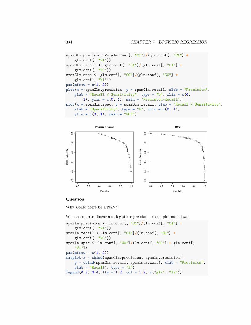
334 CHAPTER 7. LOGISTIC REGRESSION
spamGlm.precision <- glm.conf[, "C1"]/(glm.conf[, "C1"] +glm.conf[, "W1"])
spamGlm.recall <- glm.conf[, "C1"]/(glm.conf[, "C1"] +glm.conf[, "W0"])
spamGlm.spec <- glm.conf[, "C0"]/(glm.conf[, "C0"] +glm.conf[, "W1"])
par(mfrow = c(1, 2))plot(x = spamGlm.precision, y = spamGlm.recall, xlab = "Precision",
ylab = "Recall / Sensitivity", type = "b", xlim = c(0,1), ylim = c(0, 1), main = "Precision-Recall")
plot(x = spamGlm.spec, y = spamGlm.recall, ylab = "Recall / Sensitivity",xlab = "Specificity", type = "b", xlim = c(0, 1),ylim = c(0, 1), main = "ROC")
Question:
Why would there be a NaN?
We can compare linear and logistic regressions in one plot as follows.spamlm.precision <- lm.conf[, "C1"]/(lm.conf[, "C1"] +
glm.conf[, "W1"])spamlm.recall <- lm.conf[, "C1"]/(lm.conf[, "C1"] +
glm.conf[, "W0"])spamlm.spec <- lm.conf[, "C0"]/(lm.conf[, "C0"] + glm.conf[,
"W1"])par(mfrow = c(1, 2))matplot(x = cbind(spamGlm.precision, spamlm.precision),
y = cbind(spamGlm.recall, spamlm.recall), xlab = "Precision",ylab = "Recall", type = "l")
legend(0.8, 0.4, lty = 1:2, col = 1:2, c("glm", "lm"))
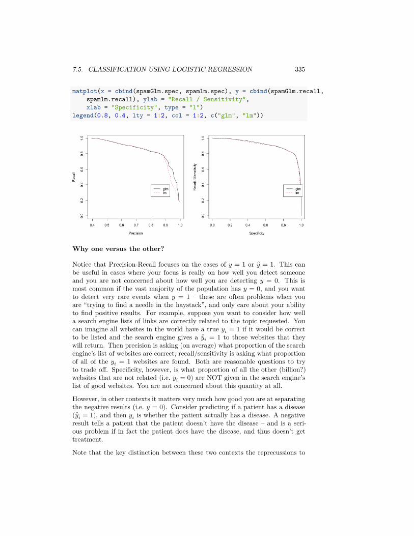
7.5. CLASSIFICATION USING LOGISTIC REGRESSION 335
matplot(x = cbind(spamGlm.spec, spamlm.spec), y = cbind(spamGlm.recall,spamlm.recall), ylab = "Recall / Sensitivity",xlab = "Specificity", type = "l")
legend(0.8, 0.4, lty = 1:2, col = 1:2, c("glm", "lm"))
Why one versus the other?
Notice that Precision-Recall focuses on the cases of 𝑦 = 1 or 𝑦 = 1. This canbe useful in cases where your focus is really on how well you detect someoneand you are not concerned about how well you are detecting 𝑦 = 0. This ismost common if the vast majority of the population has 𝑦 = 0, and you wantto detect very rare events when 𝑦 = 1 – these are often problems when youare “trying to find a needle in the haystack”, and only care about your abilityto find positive results. For example, suppose you want to consider how wella search engine lists of links are correctly related to the topic requested. Youcan imagine all websites in the world have a true 𝑦𝑖 = 1 if it would be correctto be listed and the search engine gives a 𝑦𝑖 = 1 to those websites that theywill return. Then precision is asking (on average) what proportion of the searchengine’s list of websites are correct; recall/sensitivity is asking what proportionof all of the 𝑦𝑖 = 1 websites are found. Both are reasonable questions to tryto trade off. Specificity, however, is what proportion of all the other (billion?)websites that are not related (i.e. 𝑦𝑖 = 0) are NOT given in the search engine’slist of good websites. You are not concerned about this quantity at all.
However, in other contexts it matters very much how good you are at separatingthe negative results (i.e. 𝑦 = 0). Consider predicting if a patient has a disease( 𝑦𝑖 = 1), and then 𝑦𝑖 is whether the patient actually has a disease. A negativeresult tells a patient that the patient doesn’t have the disease – and is a seri-ous problem if in fact the patient does have the disease, and thus doesn’t gettreatment.
Note that the key distinction between these two contexts the reprecussions to

336 CHAPTER 7. LOGISTIC REGRESSION
being negative. There are many settings where the use of the predictions is ulti-mately as a recommendation system (movies to see, products to buy, best timesto buy something, potential important genes to investigate, etc), so mislabelingsome positive things as negative (i.e. not finding them) isn’t a big deal so longas what you do recommend is high quality.
Indeed, the cases where trade-offs lead to different conclusions tend to be caseswhere the overall proportion of 𝑦𝑖 = 1 in the population is small. (However,just because they have a small proportion in the population doesn’t mean youdon’t care about making mistakes about negatives – missing a diagnosis for arare but serious disease is still a problem)
Chapter 8
Regression andClassification Trees
Now we are going to turn to a very different statistical approach, called deci-sion trees. This approach is focused on prediction of our outcome 𝑦 based oncovariates 𝑥. Unlike our previous regression and logistic regression approaches,decision trees are a much more flexible model and are primarily focused on ac-curate prediction of the 𝑦, but they also give a very simple and interpretablemodel for the data 𝑦Decision trees, themselves, are not very powerful for predictions. However, whenwe combine them with ideas of resampling, we can combine together manydecision trees (run on different samples of the data) to get what are calledRandom Forests. Random Forests are a pretty powerful and widely-usedprediction tool.
8.1 Basic Idea of Decision Trees.
The basic idea behind decision trees is the following: Group the 𝑛 subjects inour observed data (our training data) into a bunch of groups. The groupsare defined based on binning the explanatory variables (𝑥) of the observed data,and the bins are picked so that the observed data in a bin have similar outcomes𝑦.Prediction for a future subject is then done in the following way. Look at theexplanatory variable values for the future subject to figure into which binnedvalues of the 𝑥 the observation belongs. Then predict the future response basedon the responses in the observed data that were in that group.
337
338 CHAPTER 8. REGRESSION AND CLASSIFICATION TREES
When the output 𝑦 is continuous, we call it regression trees, and we will pre-dict a future response based on the mean of the training data in that group/bin.If the outcome 𝑦 is binary we call this technique classification trees. Justlike with regression and logistic regression, there are important distinctions inhow the model is built for continuous and binary data, but there is a generalsimilarity in the approach.
8.2 The Structure of Decision Trees
The main thing to understand here is how the grouping of the data into groupsis constructed. Let’s return to the bodyfat data from our multiple regressionchapter.
The groups of data are from partitioning (or binning) the 𝑥 covariates in thetraining data. For example, one group of data in our training data could beobservations that meet all of the following criterion:
• HEIGHT>72.5• 91<ABDOMEN<103• 180<WEIGHT<200
Notice that this group of observations is constructed by taking a simple rangefor each of the variables used. This is the partitioning of the 𝑥 data, and decisiontrees limit themselves to these kind of groupings of the data. The particularvalues for those ranges are picked, as we said before, based on what best dividesthe training data so that the response 𝑦 is similar.
Why Trees?
The reason these are called decision trees, is that you can describe the rules forhow to put an observation into one of these groups based on a simple decisiontree.
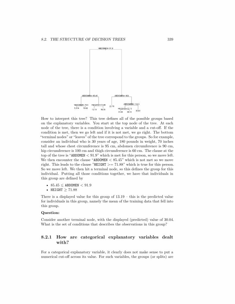
8.2. THE STRUCTURE OF DECISION TREES 339
How to interpret this tree? This tree defines all of the possible groups basedon the explanatory variables. You start at the top node of the tree. At eachnode of the tree, there is a condition involving a variable and a cut-off. If thecondition is met, then we go left and if it is not met, we go right. The bottom“terminal nodes” or “leaves” of the tree correspond to the groups. So for example,consider an individual who is 30 years of age, 180 pounds in weight, 70 inchestall and whose chest circumference is 95 cm, abdomen circumference is 90 cm,hip circumference is 100 cm and thigh circumference is 60 cm. The clause at thetop of the tree is “ABDOMEN < 91.9” which is met for this person, so we move left.We then encounter the clause “ABDOMEN < 85.45” which is not met so we moveright. This leads to the clause ”HEIGHT >= 71.88” which is true for this person.So we move left. We then hit a terminal node, so this defines the group for thisindividual. Putting all those conditions together, we have that individuals inthis group are defined by
• 85.45 ≤ ABDOMEN < 91.9• HEIGHT ≥ 71.88
There is a displayed value for this group of 13.19 – this is the predicted valuefor individuals in this group, namely the mean of the training data that fell intothis group.
Question:
Consider another terminal node, with the displayed (predicted) value of 30.04.What is the set of conditions that describes the observations in this group?
8.2.1 How are categorical explanatory variables dealtwith?
For a categorical explanatory variable, it clearly does not make sense to put anumerical cut-off across its value. For such variables, the groups (or splits) are
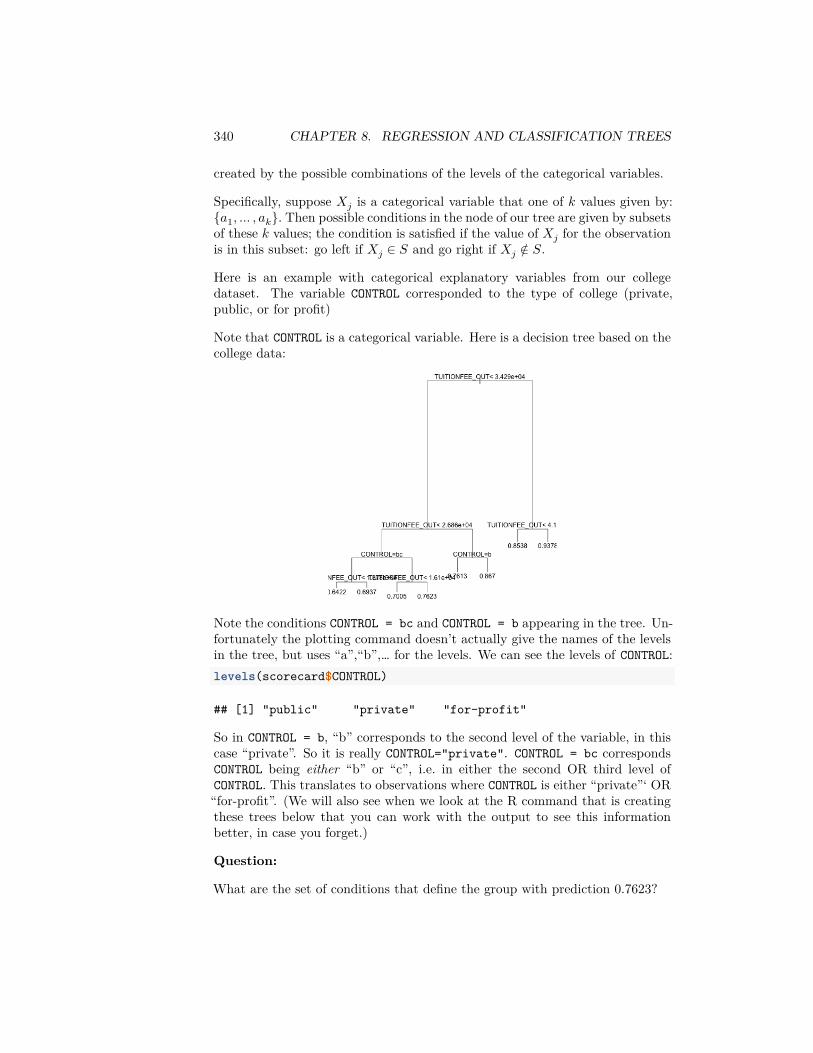
340 CHAPTER 8. REGRESSION AND CLASSIFICATION TREES
created by the possible combinations of the levels of the categorical variables.
Specifically, suppose 𝑋𝑗 is a categorical variable that one of 𝑘 values given by:{𝑎1, … , 𝑎𝑘}. Then possible conditions in the node of our tree are given by subsetsof these 𝑘 values; the condition is satisfied if the value of 𝑋𝑗 for the observationis in this subset: go left if 𝑋𝑗 ∈ 𝑆 and go right if 𝑋𝑗 ∉ 𝑆.
Here is an example with categorical explanatory variables from our collegedataset. The variable CONTROL corresponded to the type of college (private,public, or for profit)
Note that CONTROL is a categorical variable. Here is a decision tree based on thecollege data:
Note the conditions CONTROL = bc and CONTROL = b appearing in the tree. Un-fortunately the plotting command doesn’t actually give the names of the levelsin the tree, but uses “a”,“b”,… for the levels. We can see the levels of CONTROL:levels(scorecard$CONTROL)
## [1] "public" "private" "for-profit"
So in CONTROL = b, “b” corresponds to the second level of the variable, in thiscase “private”. So it is really CONTROL="private". CONTROL = bc correspondsCONTROL being either “b” or “c”, i.e. in either the second OR third level ofCONTROL. This translates to observations where CONTROL is either “private”‘ OR“for-profit”. (We will also see when we look at the R command that is creatingthese trees below that you can work with the output to see this informationbetter, in case you forget.)
Question:
What are the set of conditions that define the group with prediction 0.7623?
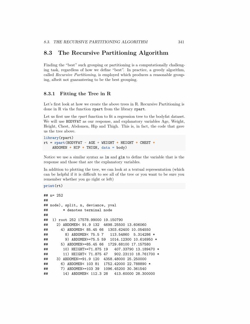
8.3. THE RECURSIVE PARTITIONING ALGORITHM 341
8.3 The Recursive Partitioning Algorithm
Finding the “best” such grouping or partitioning is a computationally challeng-ing task, regardless of how we define “best”. In practice, a greedy algorithm,called Recursive Partitioning, is employed which produces a reasonable group-ing, albeit not guaranteeing to be the best grouping.
8.3.1 Fitting the Tree in R
Let’s first look at how we create the above trees in R. Recursive Partitioning isdone in R via the function rpart from the library rpart.
Let us first use the rpart function to fit a regression tree to the bodyfat dataset.We will use BODYFAT as our response, and explanatory variables Age, Weight,Height, Chest, Abdomen, Hip and Thigh. This is, in fact, the code that gaveus the tree above.library(rpart)rt = rpart(BODYFAT ~ AGE + WEIGHT + HEIGHT + CHEST +
ABDOMEN + HIP + THIGH, data = body)
Notice we use a similar syntax as lm and glm to define the variable that is theresponse and those that are the explanatory variables.
In addition to plotting the tree, we can look at a textual representation (whichcan be helpful if it is difficult to see all of the tree or you want to be sure youremember whether you go right or left)print(rt)
## n= 252#### node), split, n, deviance, yval## * denotes terminal node#### 1) root 252 17578.99000 19.150790## 2) ABDOMEN< 91.9 132 4698.25500 13.606060## 4) ABDOMEN< 85.45 66 1303.62400 10.054550## 8) ABDOMEN< 75.5 7 113.54860 5.314286 *## 9) ABDOMEN>=75.5 59 1014.12300 10.616950 *## 5) ABDOMEN>=85.45 66 1729.68100 17.157580## 10) HEIGHT>=71.875 19 407.33790 13.189470 *## 11) HEIGHT< 71.875 47 902.23110 18.761700 *## 3) ABDOMEN>=91.9 120 4358.48000 25.250000## 6) ABDOMEN< 103 81 1752.42000 22.788890 *## 7) ABDOMEN>=103 39 1096.45200 30.361540## 14) ABDOMEN< 112.3 28 413.60000 28.300000

342 CHAPTER 8. REGRESSION AND CLASSIFICATION TREES
## 28) HEIGHT>=72.125 8 89.39875 23.937500 *## 29) HEIGHT< 72.125 20 111.04950 30.045000 *## 15) ABDOMEN>=112.3 11 260.94910 35.609090 *
Note that the tree here only uses the variables Abdomen and Height even thoughwe gave many other variables. The other variables are not being used. This isbecause the algorithm, which we will discuss below, does variable selection inchoosing the variables to use to split up observations.
Interaction Terms
You should note that rpart gives an error if you try to put in interactionterms. This is because interaction is intrinsically included in decision treestrees. You can see this by thinking about what an interaction is in our regressionframework: giving a different coefficient for variable 𝑋𝑗 based on what the valueof another variable 𝑋𝑘 is. For example, in our college data, a different slope forthe variable TUITIONFEE_OUT based on whether the college is private or publicis an interaction between TUITIONFEE_OUT and CONTROL.
Looking at our decision trees, we can see that the groups observations are putin also have this property – the value of TUITIONFEE_OUT that puts you into onegroup will also depend on the value of CONTROL. This is an indication of howmuch more flexible decision trees are in their predictions than linear regression.
8.3.2 How is the tree constructed?
How does rpart construct this tree? Specifically, at each node of the tree, thereis a condition involving a variable and a cut-off. How does rpart choose thevariable and the cut-off?
The first split
Let us first understand how the first condition is selected at the top of the tree,as this same process is repeated iteratively.
We’re going to assume that we have a continuous response (we’ll discuss varia-tions to this procedure for binary response in the next section).
Our condition is going to consist of a variable and a cutoff 𝑐, or if the variableis categorical, a subset 𝑆 of levels. For simplicity of notation, let’s just assumethat we are looking only at numerical data so we can assume for each conditionwe need to find a variable 𝑗 and it’s corresponding cutoff 𝑐, i.e. the pair (𝑗, 𝑐).Just remember for categorical variables it’s really (𝑗, 𝑆).We are going to consider each possible variable and a possible cutoff 𝑐 find thebest (𝑗, 𝑐) pair for dividing the data into two groups. Specifically, each (𝑗, 𝑐)pair, can divide the subjects into two groups:
• 𝐺1 given by observations with 𝑋𝑗 ≤ 𝑐
8.3. THE RECURSIVE PARTITIONING ALGORITHM 343
• 𝐺2 given by observations with 𝑋𝑗 > 𝑐.Then we need to evaluate which (𝑗, 𝑐) pair gives the best split of the data.
For any particular split, which defines groups 𝐺1 and 𝐺2, we have a predictedvalue for each group, 𝑦1 and 𝑦2, corresponding to the mean of the observationsin group 𝐺1 and 𝐺2 (i.e. 𝑦1 and 𝑦2). This means that we can calculate the loss(or error) in our prediction for each observation. Using standard squared-errorloss, this gives us the RSS for the split defined by (𝑗, 𝑐):
𝑅𝑆𝑆(𝑗, 𝑐) ∶= ∑𝑖∈𝐺1
(𝑦𝑖 − 𝑦1)2 + ∑𝑖∈𝐺2
(𝑦𝑖 − 𝑦2)2.
To find the best split, then, we compare the values 𝑅𝑆𝑆(𝑗, 𝑐) and pick the valueof 𝑗 and 𝑐 for which 𝑅𝑆𝑆(𝑗, 𝑐) is the smallest.
Further splits
The above procedure gives the first node (or split) of the data. The same processcontinues down the tree, only now with a smaller portion of the data.
Specifically, the first node split the data into two groups 𝐺1 and 𝐺2. The nextstep of the algorithm is to repeat the same process, only now with only the datain 𝐺1 and 𝐺2 separately. Using the data in group 𝐺1 you find the variable 𝑋𝑗and cutoff 𝑐 that divides the observations in 𝐺1 into two groups 𝐺11 and 𝐺12.You find that split by determining the pair (𝑗, 𝑐) with the smallest 𝑅𝑆𝑆, justlike before. And similarly the observations in 𝐺2 are split into two by a differentpair (𝑗, 𝑐), obtaining groups 𝐺21 and 𝐺22.
This process continues, continuing to split the current sets of groups into twoeach time.
Measuring the improvement due to the split
Just like in regression, the improvement in fit can be quantified by comparingthe error you get from adding variables (RSS) to the error you would have ifyou just used the group mean (TSS). This same principle applies here. For eachsplit (𝑗, 𝑐), the smallest RSS,
min𝑗,𝑐
𝑅𝑆𝑆(𝑗, 𝑐)
can be compared with the to the total variability in the data before splitting
𝑇 𝑆𝑆 = ∑𝑖
(𝑦𝑖 − 𝑦)2.
Notice that TSS here is only calculated on the current set of observations in thegroup you are trying to split.
The ratiomin𝑗,𝑐 𝑅𝑆𝑆(𝑗, 𝑐)
𝑇 𝑆𝑆
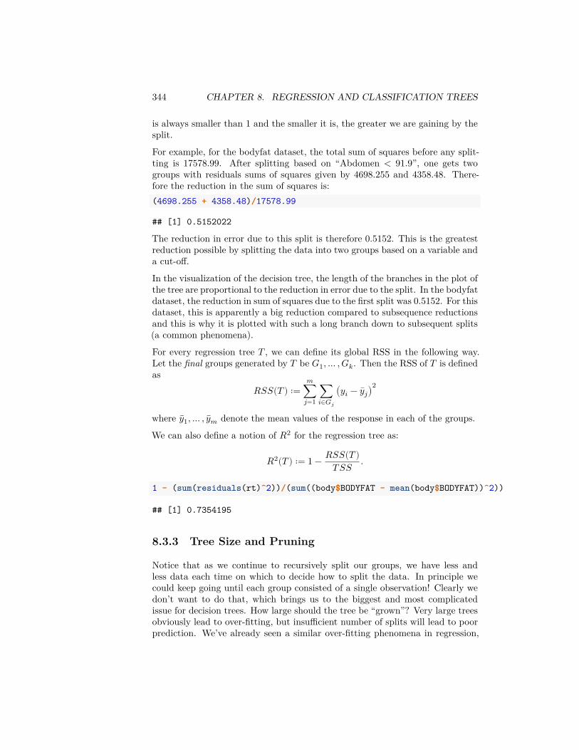
344 CHAPTER 8. REGRESSION AND CLASSIFICATION TREES
is always smaller than 1 and the smaller it is, the greater we are gaining by thesplit.
For example, for the bodyfat dataset, the total sum of squares before any split-ting is 17578.99. After splitting based on “Abdomen < 91.9”, one gets twogroups with residuals sums of squares given by 4698.255 and 4358.48. There-fore the reduction in the sum of squares is:(4698.255 + 4358.48)/17578.99
## [1] 0.5152022
The reduction in error due to this split is therefore 0.5152. This is the greatestreduction possible by splitting the data into two groups based on a variable anda cut-off.
In the visualization of the decision tree, the length of the branches in the plot ofthe tree are proportional to the reduction in error due to the split. In the bodyfatdataset, the reduction in sum of squares due to the first split was 0.5152. For thisdataset, this is apparently a big reduction compared to subsequence reductionsand this is why it is plotted with such a long branch down to subsequent splits(a common phenomena).
For every regression tree 𝑇 , we can define its global RSS in the following way.Let the final groups generated by 𝑇 be 𝐺1, … , 𝐺𝑘. Then the RSS of 𝑇 is definedas
𝑅𝑆𝑆(𝑇 ) ∶=𝑚
∑𝑗=1
∑𝑖∈𝐺𝑗
(𝑦𝑖 − 𝑦𝑗)2
where 𝑦1, … , 𝑦𝑚 denote the mean values of the response in each of the groups.
We can also define a notion of 𝑅2 for the regression tree as:
𝑅2(𝑇 ) ∶= 1 − 𝑅𝑆𝑆(𝑇 )𝑇 𝑆𝑆 .
1 - (sum(residuals(rt)^2))/(sum((body$BODYFAT - mean(body$BODYFAT))^2))
## [1] 0.7354195
8.3.3 Tree Size and Pruning
Notice that as we continue to recursively split our groups, we have less andless data each time on which to decide how to split the data. In principle wecould keep going until each group consisted of a single observation! Clearly wedon’t want to do that, which brings us to the biggest and most complicatedissue for decision trees. How large should the tree be “grown”? Very large treesobviously lead to over-fitting, but insufficient number of splits will lead to poorprediction. We’ve already seen a similar over-fitting phenomena in regression,
8.3. THE RECURSIVE PARTITIONING ALGORITHM 345
where the more variables you include the better the fit will be on your trainingdata. Decision trees are have a similar phenomena only it is based on how bigthe tree is – bigger trees will fit the training data better but may not generalizeto new data well creating over-fitting.
How is rpart deciding when to stop growing the tree?
In regression we saw that we could make this choice via cross-validation – we fitour model on a portion of the tree and then evaluated it on the left out portion.This is more difficult to conceptualize for trees. Specifically, with regression,we could look at different a priori submodels (i.e. subset of variables), fit thesubmodels to our random subsets of data, and calculate the cross-validationerror for each submodel to choose the best one. For our decision trees, however,what would be our submodels be? We could consider different variables as input,but this wouldn’t control the size of the tree, which is a big source of over-fitting.
One strategy is to instead stop when the improvement
min(𝑗,𝑐) 𝑅𝑆𝑆(𝑗, 𝑐)𝑇 𝑆𝑆
is not very large. This would be the case when we are not gaining all thatmuch by splitting further. This is actually not a very smart strategy. Why?Because you can actually sometimes split the data and get small amount ofimprovements, but because you were able to split the data there, it allows youto make another split later that adds a lot of improvement. Stopping the firsttime you see a small improvement would keep you from discovering that futureimprovement.
Regression and classification trees were invented by Leo Breiman from UC Berke-ley. He also had a different approach for the tree size issue. He advocatedagainst stopping the recursive partitioning algorithm. Instead, he recommendsgrowing a full tree (or a very large tree), 𝑇max, and then “pruning” back 𝑇maxby cutting back lower level groupings. This allows you to avoid situations likeabove, where you miss a great split because of an early unpromising split. This“pruned” tree will be a subtree of the full tree.
How to Prune
The idea behind pruning a tree is to find a measure of how well a smaller(prunned) tree is fitting the data that doesn’t suffer from the issue that largertrees will always fit the training data better. If you think back to variable se-lection in regression, in addition to cross-validation, we also have measures inaddition to cross-validation, like CP, AIC, and BIC, that didn’t involve resam-pling, but had a form
𝑅(𝛼) = 𝑅𝑆𝑆 + 𝛼𝑘In other words, use RSS as a measure of fit, but penalize models with a largenumber of variables 𝑘 by adding a term 𝛼𝑘. Minimizing this quantity meant
346 CHAPTER 8. REGRESSION AND CLASSIFICATION TREES
that smaller models with good fits could have a value 𝑅(𝛼) that was lower thanbigger models.
Breiman proposed a similar strategy for measuring the fit of a potential subtreefor pruning, but instead penalizing for the size of the tree rather than the numberof variables. Namely, for a possible subtree 𝑇 , define
𝑅𝛼(𝑇 ) ∶= 𝑅𝑆𝑆(𝑇 ) + 𝛼(𝑇 𝑆𝑆)|𝑇 |
where |𝑇 | is the number of terminal nodes of the tree 𝑇 . 𝑅𝛼(𝑇 ) is evaluatedfor all the possible subtrees, and the subtree with the smallest 𝑅𝛼(𝑇 ) is chosen.Since it depends on 𝛼, we will call the subtree that minimizes 𝑅𝛼(𝑇 ) 𝑇 (𝛼).Obviously the number of possible subtrees and possible values of 𝛼 can be large,but there is an algorithm (weakest link cutting) that simplifies the process. Infact it can be shown that only a fixed number of 𝛼𝑘 values and the correspondingoptimal 𝑇 (𝛼𝑘) subtrees need to be considered. In other words you don’t need toconsider all 𝛼 values, but only a fixed set of 𝛼𝑘 values and compare the fit of theiroptimal 𝑇 (𝛼𝑘) subtree. After obtaining this sequence of trees 𝑇 (𝛼1), 𝑇 (𝛼2), …,the default choice in R is to take 𝛼∗ = 0.01 and then generating the tree 𝑇 (𝛼𝑘)for the 𝛼𝑘 closest to 𝛼∗.1 The value of 𝛼∗ is set by the argument cp in rpart.
The 𝑝𝑟𝑖𝑛𝑡𝑐𝑝() function in R gives those fixed 𝛼𝑘 values for this data and alsogives the number of splits of the subtrees 𝑇 (𝛼𝑘) for each 𝑘:printcp(rt)
#### Regression tree:## rpart(formula = BODYFAT ~ AGE + WEIGHT + HEIGHT + CHEST + ABDOMEN +## HIP + THIGH, data = body)#### Variables actually used in tree construction:## [1] ABDOMEN HEIGHT#### Root node error: 17579/252 = 69.758#### n= 252#### CP nsplit rel error xerror xstd## 1 0.484798 0 1.00000 1.00612 0.081033## 2 0.094713 1 0.51520 0.57471 0.050505## 3 0.085876 2 0.42049 0.49673 0.045046## 4 0.024000 3 0.33461 0.42030 0.035298## 5 0.023899 4 0.31061 0.41798 0.035935## 6 0.012125 5 0.28672 0.39799 0.034162## 7 0.010009 6 0.27459 0.39185 0.030580
1specifically the 𝛼𝑘 such that 𝛼𝑘 ≤ 𝛼∗ < 𝛼𝑘−1

8.3. THE RECURSIVE PARTITIONING ALGORITHM 347
## 8 0.010000 7 0.26458 0.38959 0.030355
Each row in the printcp output corresponds to a different tree 𝑇 (𝛼𝑘). Notethat each tree has an increasing number of splits. This is a property of the𝑇 (𝛼𝑘) values, specifically that the best trees for each 𝛼𝑘 value will be nestedwithin each other, so going from 𝛼𝑘 to 𝛼𝑘+1 corresponds to adding an additionalsplit to one of the terminal nodes of 𝑇 (𝛼𝑘).
Also given in the printcp output are three other quantities:
• rel error: for a tree 𝑇 this simply 𝑅𝑆𝑆(𝑇 )/𝑇 𝑆𝑆. Because more deeptrees have smaller RSS, this quantity will always decrease as we go downthe column.
• xerror: an accuracy measure calculated by 10-fold cross validation (andthen divided by TSS). Notice before we mentioned the difficult in concep-tualizing cross-validation. But now that we have the complexity parameter𝛼, we can use this for cross-validation. Instead of changing the number ofvariables 𝑘 and comparing the cross-validated error, we can change valuesof 𝛼, fit the corresponding tree on random subsets of the data, and evalu-ate the cross-validated error as to which value of 𝛼 is better. Notice thatthis quantity will be random (i.e., different runs of 𝑟𝑝𝑎𝑟𝑡() will result indifferent values for xerror); this is because 10-fold cross-validation relieson randomly partitioning the data into 10 parts and the randomness ofthis partition results in xerror being random.
• xstd: The quantity xstd provides a standard deviation for the randomquantity xerror. If we do not like the default choice of 0.01 for 𝛼, we canchoose a higher value of 𝛼 using 𝑥𝑒𝑟𝑟𝑜𝑟 and 𝑥𝑠𝑡𝑑.
For this particular run, the xerror seems to be smallest at 𝛼 = 0.012125 andthen xerror seems to increase. So we could give this value to the argument cpin rpart instead of the default cp = 0.01.rtd = rpart(BODYFAT ~ AGE + WEIGHT + HEIGHT + CHEST +
ABDOMEN + HIP + THIGH, data = body, cp = 0.0122)plot(rtd)text(rtd)
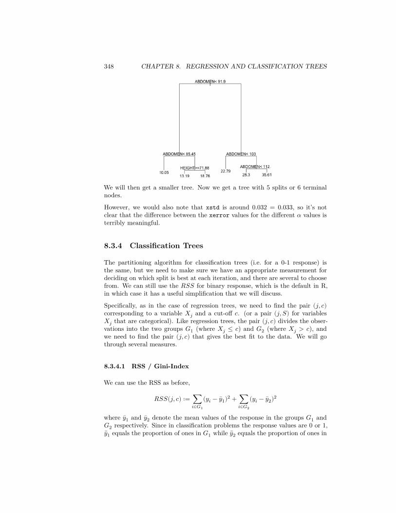
348 CHAPTER 8. REGRESSION AND CLASSIFICATION TREES
We will then get a smaller tree. Now we get a tree with 5 splits or 6 terminalnodes.
However, we would also note that xstd is around 0.032 = 0.033, so it’s notclear that the difference between the xerror values for the different 𝛼 values isterribly meaningful.
8.3.4 Classification Trees
The partitioning algorithm for classification trees (i.e. for a 0-1 response) isthe same, but we need to make sure we have an appropriate measurement fordeciding on which split is best at each iteration, and there are several to choosefrom. We can still use the 𝑅𝑆𝑆 for binary response, which is the default in R,in which case it has a useful simplification that we will discuss.
Specifically, as in the case of regression trees, we need to find the pair (𝑗, 𝑐)corresponding to a variable 𝑋𝑗 and a cut-off 𝑐. (or a pair (𝑗, 𝑆) for variables𝑋𝑗 that are categorical). Like regression trees, the pair (𝑗, 𝑐) divides the obser-vations into the two groups 𝐺1 (where 𝑋𝑗 ≤ 𝑐) and 𝐺2 (where 𝑋𝑗 > 𝑐), andwe need to find the pair (𝑗, 𝑐) that gives the best fit to the data. We will gothrough several measures.
8.3.4.1 RSS / Gini-Index
We can use the RSS as before,
𝑅𝑆𝑆(𝑗, 𝑐) ∶= ∑𝑖∈𝐺1
(𝑦𝑖 − 𝑦1)2 + ∑𝑖∈𝐺2
(𝑦𝑖 − 𝑦2)2
where 𝑦1 and 𝑦2 denote the mean values of the response in the groups 𝐺1 and𝐺2 respectively. Since in classification problems the response values are 0 or 1,
𝑦1 equals the proportion of ones in 𝐺1 while 𝑦2 equals the proportion of ones in
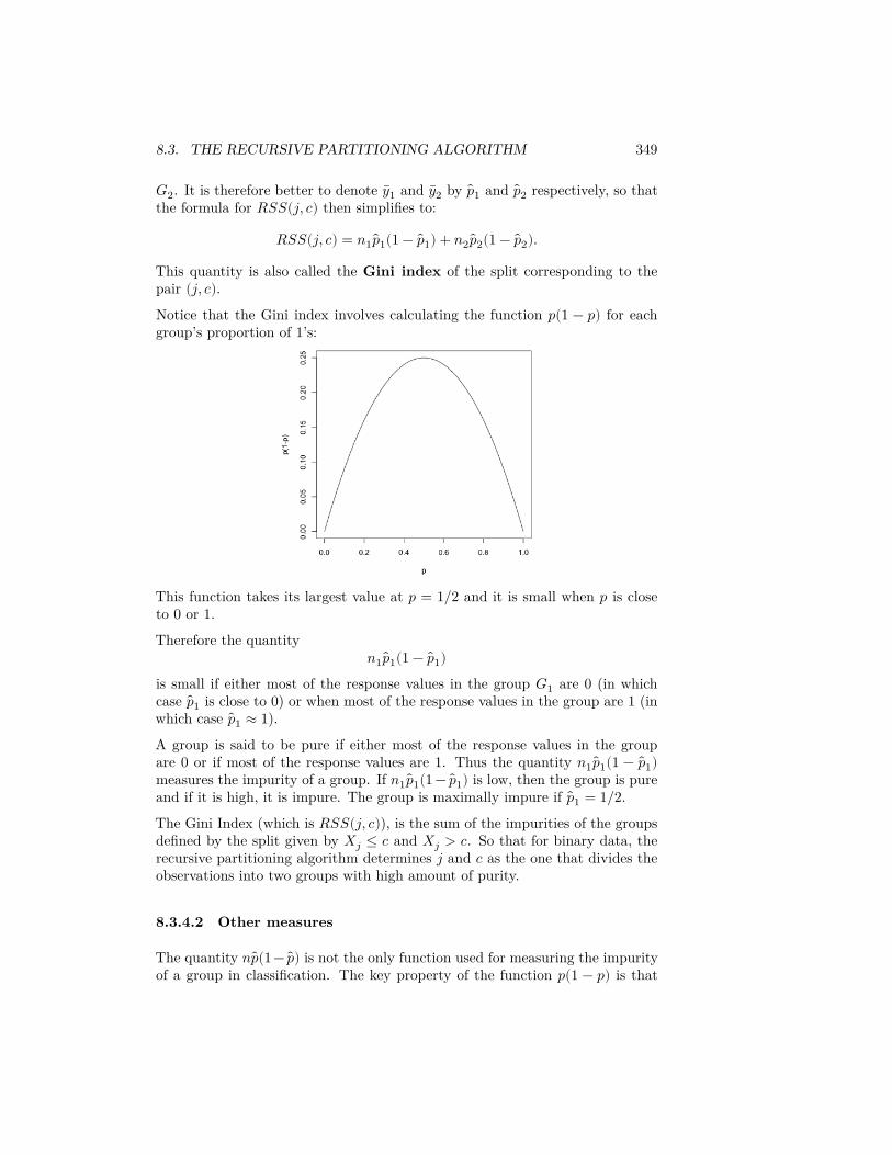
8.3. THE RECURSIVE PARTITIONING ALGORITHM 349
𝐺2. It is therefore better to denote 𝑦1 and 𝑦2 by 𝑝1 and 𝑝2 respectively, so thatthe formula for 𝑅𝑆𝑆(𝑗, 𝑐) then simplifies to:
𝑅𝑆𝑆(𝑗, 𝑐) = 𝑛1 𝑝1(1 − 𝑝1) + 𝑛2 𝑝2(1 − 𝑝2).
This quantity is also called the Gini index of the split corresponding to thepair (𝑗, 𝑐).Notice that the Gini index involves calculating the function 𝑝(1 − 𝑝) for eachgroup’s proportion of 1’s:
This function takes its largest value at 𝑝 = 1/2 and it is small when 𝑝 is closeto 0 or 1.
Therefore the quantity𝑛1 𝑝1(1 − 𝑝1)
is small if either most of the response values in the group 𝐺1 are 0 (in whichcase 𝑝1 is close to 0) or when most of the response values in the group are 1 (inwhich case 𝑝1 ≈ 1).A group is said to be pure if either most of the response values in the groupare 0 or if most of the response values are 1. Thus the quantity 𝑛1 𝑝1(1 − 𝑝1)measures the impurity of a group. If 𝑛1 𝑝1(1 − 𝑝1) is low, then the group is pureand if it is high, it is impure. The group is maximally impure if 𝑝1 = 1/2.The Gini Index (which is 𝑅𝑆𝑆(𝑗, 𝑐)), is the sum of the impurities of the groupsdefined by the split given by 𝑋𝑗 ≤ 𝑐 and 𝑋𝑗 > 𝑐. So that for binary data, therecursive partitioning algorithm determines 𝑗 and 𝑐 as the one that divides theobservations into two groups with high amount of purity.
8.3.4.2 Other measures
The quantity 𝑛 𝑝(1− 𝑝) is not the only function used for measuring the impurityof a group in classification. The key property of the function 𝑝(1 − 𝑝) is that
350 CHAPTER 8. REGRESSION AND CLASSIFICATION TREES
it is symmetric about 1/2, takes its maximum value at 1/2 and it is small nearthe end points 𝑝 = 0 and 𝑝 = 1. Two other functions having this property arealso commonly used:
• Cross-entropy or Deviance: Defined as
−2𝑛 ( 𝑝 log 𝑝 + (1 − 𝑝) log(1 − 𝑝)) .
This also takes its smallest value when 𝑝 is 0 or 1 and it takes its maximumvalue when 𝑝 = 1/2. We saw this value when we did logistic regression, asa measure of the fit.
• Misclassification Error: This is defined as
𝑛min( 𝑝, 1 − 𝑝).
This quantity equals 0 when 𝑝 is 0 or 1 and takes its maximum value when𝑝 = 1/2.
This is value is called misclassification error based on prediction using amajority rule decision for prediction. Specifically, assume we predictthe response for an observation in group 𝐺 based on the which responseis seen the most in group 𝐺. Then the number of observations that aremisclassified by this rule will be equal to 𝑛min( 𝑝, 1 − 𝑝).
One can use Deviance or Misclassification error instead of the Gini index whilegrowing a classification tree. The default in R is to use the Gini index.
8.3.4.3 Application to spam email data
Let us apply the classification tree to the email spam dataset from the chapteron logistic regression.library(DAAG)data(spam7)spam = spam7
The only change to the rpart function to classification is to use the argumentmethod = "class".sprt = rpart(yesno ~ crl.tot + dollar + bang + money +
n000 + make, method = "class", data = spam)plot(sprt)text(sprt)
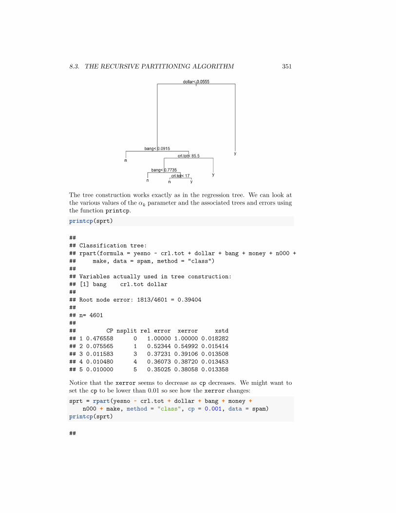
8.3. THE RECURSIVE PARTITIONING ALGORITHM 351
The tree construction works exactly as in the regression tree. We can look atthe various values of the 𝛼𝑘 parameter and the associated trees and errors usingthe function printcp.printcp(sprt)
#### Classification tree:## rpart(formula = yesno ~ crl.tot + dollar + bang + money + n000 +## make, data = spam, method = "class")#### Variables actually used in tree construction:## [1] bang crl.tot dollar#### Root node error: 1813/4601 = 0.39404#### n= 4601#### CP nsplit rel error xerror xstd## 1 0.476558 0 1.00000 1.00000 0.018282## 2 0.075565 1 0.52344 0.54992 0.015414## 3 0.011583 3 0.37231 0.39106 0.013508## 4 0.010480 4 0.36073 0.38720 0.013453## 5 0.010000 5 0.35025 0.38058 0.013358
Notice that the xerror seems to decrease as cp decreases. We might want toset the cp to be lower than 0.01 so see how the xerror changes:sprt = rpart(yesno ~ crl.tot + dollar + bang + money +
n000 + make, method = "class", cp = 0.001, data = spam)printcp(sprt)
##
352 CHAPTER 8. REGRESSION AND CLASSIFICATION TREES
## Classification tree:## rpart(formula = yesno ~ crl.tot + dollar + bang + money + n000 +## make, data = spam, method = "class", cp = 0.001)#### Variables actually used in tree construction:## [1] bang crl.tot dollar money n000#### Root node error: 1813/4601 = 0.39404#### n= 4601#### CP nsplit rel error xerror xstd## 1 0.4765582 0 1.00000 1.00000 0.018282## 2 0.0755654 1 0.52344 0.54937 0.015408## 3 0.0115830 3 0.37231 0.38720 0.013453## 4 0.0104799 4 0.36073 0.37672 0.013302## 5 0.0063431 5 0.35025 0.37286 0.013246## 6 0.0055157 10 0.31660 0.35466 0.012972## 7 0.0044126 11 0.31109 0.34473 0.012819## 8 0.0038610 12 0.30667 0.33591 0.012679## 9 0.0027579 16 0.29123 0.32984 0.012581## 10 0.0022063 17 0.28847 0.33149 0.012608## 11 0.0019305 18 0.28627 0.33205 0.012617## 12 0.0016547 20 0.28240 0.32984 0.012581## 13 0.0010000 25 0.27413 0.33149 0.012608
Now the minimum xerror seems to be the tree with 16 splits (at cp = 0.0027).A reasonable choice of cp here is therefore 0.0028. We can refit the classificationtree with this value of cp:sprt = rpart(yesno ~ crl.tot + dollar + bang + money +
n000 + make, method = "class", cp = 0.0028, data = spam)plot(sprt)text(sprt)
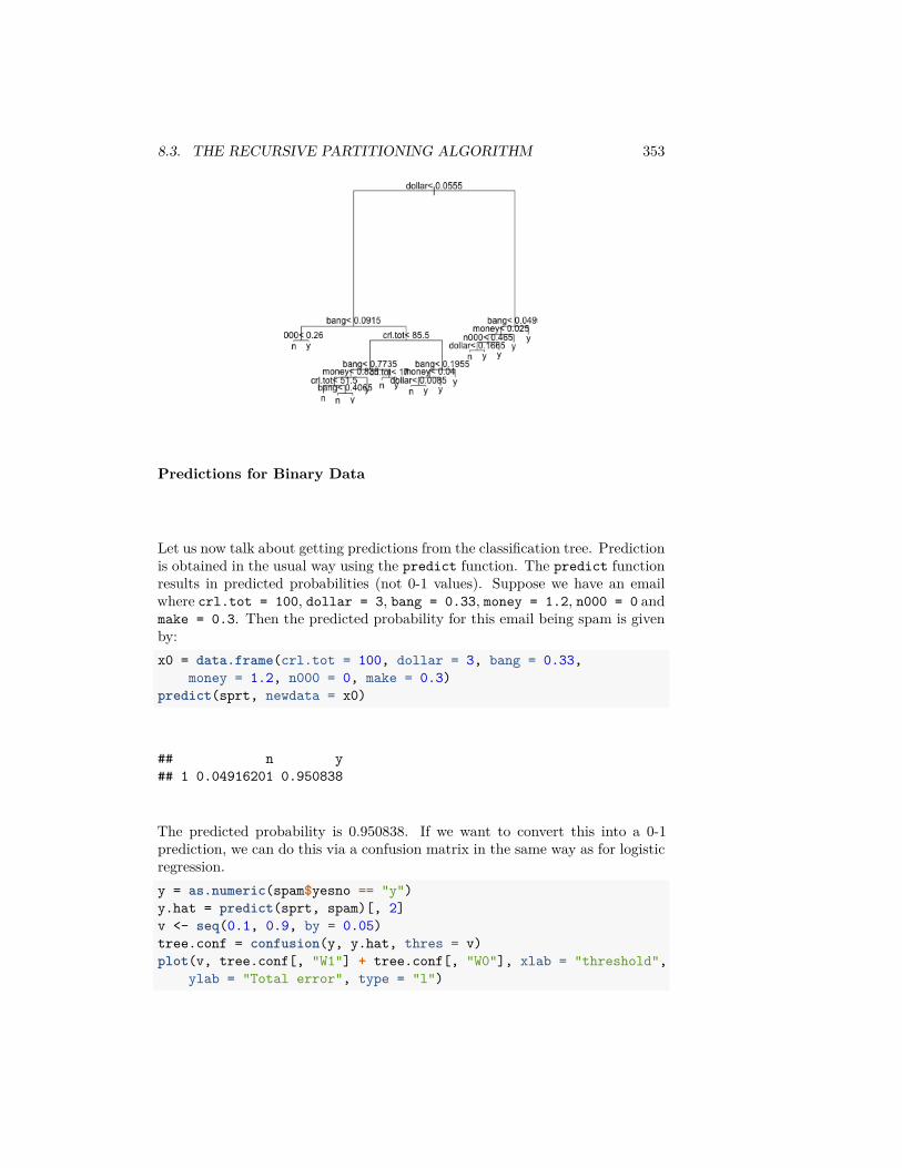
8.3. THE RECURSIVE PARTITIONING ALGORITHM 353
Predictions for Binary Data
Let us now talk about getting predictions from the classification tree. Predictionis obtained in the usual way using the predict function. The predict functionresults in predicted probabilities (not 0-1 values). Suppose we have an emailwhere crl.tot = 100, dollar = 3, bang = 0.33, money = 1.2, n000 = 0 andmake = 0.3. Then the predicted probability for this email being spam is givenby:x0 = data.frame(crl.tot = 100, dollar = 3, bang = 0.33,
money = 1.2, n000 = 0, make = 0.3)predict(sprt, newdata = x0)
## n y## 1 0.04916201 0.950838
The predicted probability is 0.950838. If we want to convert this into a 0-1prediction, we can do this via a confusion matrix in the same way as for logisticregression.y = as.numeric(spam$yesno == "y")y.hat = predict(sprt, spam)[, 2]v <- seq(0.1, 0.9, by = 0.05)tree.conf = confusion(y, y.hat, thres = v)plot(v, tree.conf[, "W1"] + tree.conf[, "W0"], xlab = "threshold",
ylab = "Total error", type = "l")
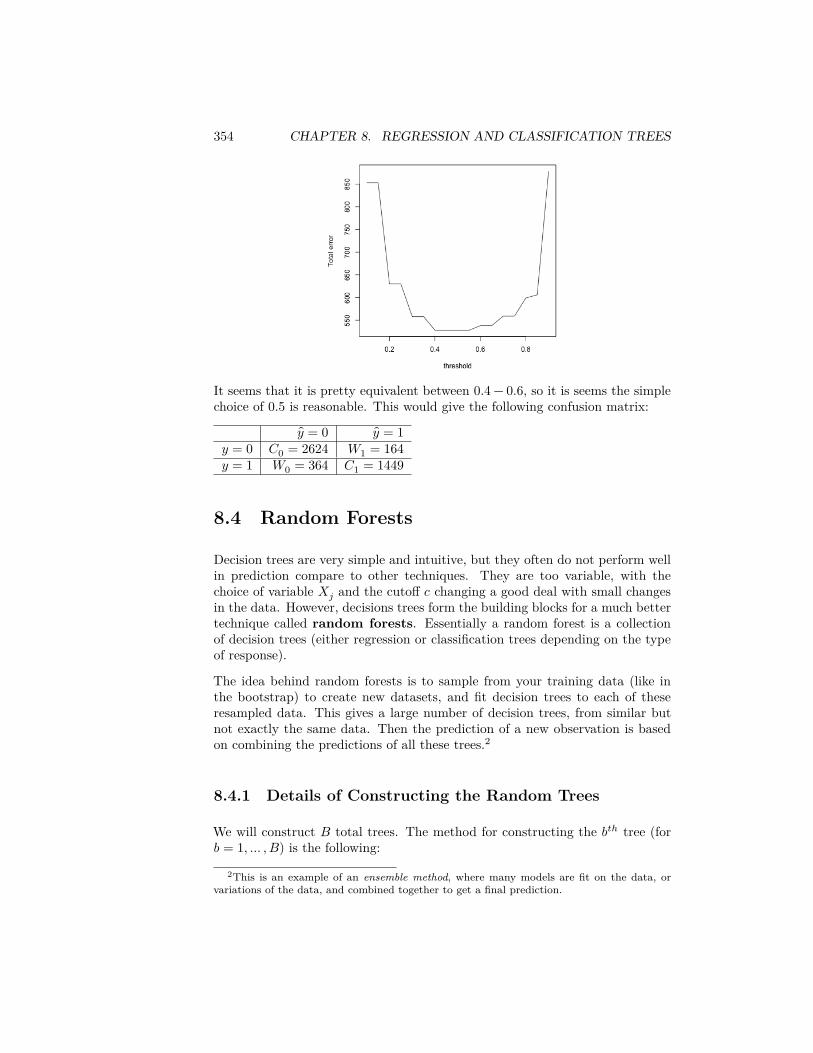
354 CHAPTER 8. REGRESSION AND CLASSIFICATION TREES
It seems that it is pretty equivalent between 0.4 − 0.6, so it is seems the simplechoice of 0.5 is reasonable. This would give the following confusion matrix:
𝑦 = 0 𝑦 = 1𝑦 = 0 𝐶0 = 2624 𝑊1 = 164𝑦 = 1 𝑊0 = 364 𝐶1 = 1449
8.4 Random Forests
Decision trees are very simple and intuitive, but they often do not perform wellin prediction compare to other techniques. They are too variable, with thechoice of variable 𝑋𝑗 and the cutoff 𝑐 changing a good deal with small changesin the data. However, decisions trees form the building blocks for a much bettertechnique called random forests. Essentially a random forest is a collectionof decision trees (either regression or classification trees depending on the typeof response).
The idea behind random forests is to sample from your training data (like inthe bootstrap) to create new datasets, and fit decision trees to each of theseresampled data. This gives a large number of decision trees, from similar butnot exactly the same data. Then the prediction of a new observation is basedon combining the predictions of all these trees.2
8.4.1 Details of Constructing the Random Trees
We will construct 𝐵 total trees. The method for constructing the 𝑏𝑡ℎ tree (for𝑏 = 1, … , 𝐵) is the following:
2This is an example of an ensemble method, where many models are fit on the data, orvariations of the data, and combined together to get a final prediction.
8.4. RANDOM FORESTS 355
1. Generate a new dataset having 𝑛 observations by resampling uniformlyat random with replacement from the existing set of observations. Thisresampling is the same as in bootstrap. Of course, some of the originalset of observations will be repeated in this bootstrap sample (because ofwith replacement draws) while some other observations might be droppedaltogether. The observations that do not appear in the bootstrap arereferred to as out of bag (o.o.b) observations.
2. Construct a decision tree based on the bootstrap sample. This tree con-struction is almost the same as the construction underlying the rpartfunction but with two important differences:
• Random selection of variables At each stage of splitting the data intogroups, 𝑘 number of variables are selected at random from the availableset of 𝑝 variables and only splits based on these 𝑘 variables are considered.In contrast, in rpart, the best split is chosen by considering possible splitsfrom all 𝑝 explanatory variables and all thresholds.
So it can happen, for example, that the first split in the tree is chosen fromvariables 1, 2, 3 resulting in two groups 𝐺1 and 𝐺2. But then in splittingthe group 𝐺1, the split might chosen from variables 4, 5, 6 and in furthersplitting group 𝐺2, the next split might be based on variables 1, 5, 6 andso on.
The rationale behind this random selection of variables is that often co-variates are highly correlated with each other, and the choice of using one𝑋𝑗 versus a variable 𝑋𝑘 is likely to be due to training observations youhave. Indeed we’ve seen in the body fat data, that the variables are highlycorrelated with each other. On future data, a different variable 𝑋𝑘 mightperform better. So by actually forcing the tree to explore not always re-lying on 𝑋𝑗, you are more likely to give good predictions for future datathat may not match your training data.
• No “pruning” of trees We discussed above how to choose the depth orsize of a tree, noting that too large of a tree results in a tree with a lotof variability, as your groups are based on small sample sizes. However,the tree construction in random forests the trees are actually grown to fullsize. There is no pruning involved, i.e. no attempt to find the right sizetree. More precisely, each tree is grown till the number of observations ineach terminal node is no more than a size 𝑚. This, of course, means thateach individual tree will overfit the data. However, each individual treewill overfit in a different way and when we average the predictions fromdifferent trees, the overfitting will be removed.
At the end, we will have 𝐵 trees. These 𝐵 trees will all be different becauseeach tree will be based on a different bootstrapped dataset and also because ofour randomness choice of variables to consider in each split. The idea is thatthese different models, that might be roughly similar, when put together will fitfuture data more robustly.
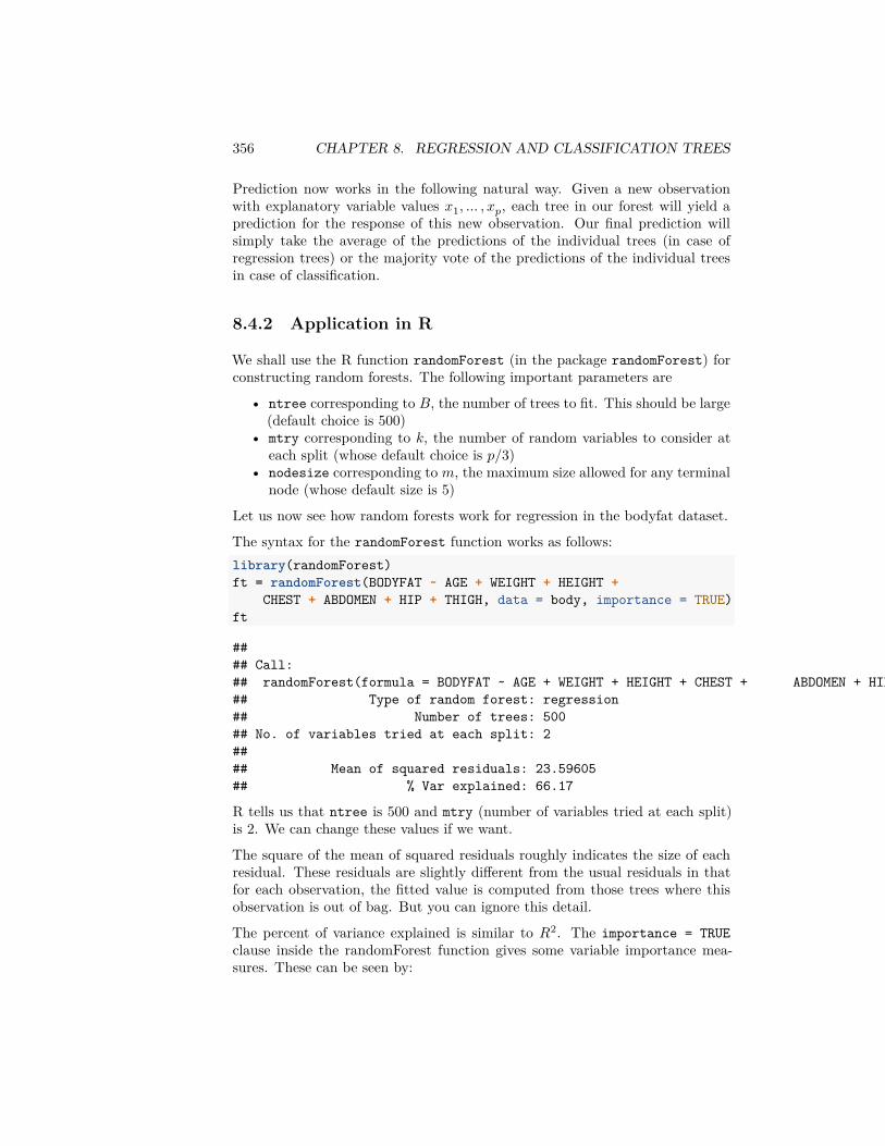
356 CHAPTER 8. REGRESSION AND CLASSIFICATION TREES
Prediction now works in the following natural way. Given a new observationwith explanatory variable values 𝑥1, … , 𝑥𝑝, each tree in our forest will yield aprediction for the response of this new observation. Our final prediction willsimply take the average of the predictions of the individual trees (in case ofregression trees) or the majority vote of the predictions of the individual treesin case of classification.
8.4.2 Application in R
We shall use the R function randomForest (in the package randomForest) forconstructing random forests. The following important parameters are
• ntree corresponding to 𝐵, the number of trees to fit. This should be large(default choice is 500)
• mtry corresponding to 𝑘, the number of random variables to consider ateach split (whose default choice is 𝑝/3)
• nodesize corresponding to 𝑚, the maximum size allowed for any terminalnode (whose default size is 5)
Let us now see how random forests work for regression in the bodyfat dataset.
The syntax for the randomForest function works as follows:library(randomForest)ft = randomForest(BODYFAT ~ AGE + WEIGHT + HEIGHT +
CHEST + ABDOMEN + HIP + THIGH, data = body, importance = TRUE)ft
#### Call:## randomForest(formula = BODYFAT ~ AGE + WEIGHT + HEIGHT + CHEST + ABDOMEN + HIP + THIGH, data = body, importance = TRUE)## Type of random forest: regression## Number of trees: 500## No. of variables tried at each split: 2#### Mean of squared residuals: 23.59605## % Var explained: 66.17
R tells us that ntree is 500 and mtry (number of variables tried at each split)is 2. We can change these values if we want.
The square of the mean of squared residuals roughly indicates the size of eachresidual. These residuals are slightly different from the usual residuals in thatfor each observation, the fitted value is computed from those trees where thisobservation is out of bag. But you can ignore this detail.
The percent of variance explained is similar to 𝑅2. The importance = TRUEclause inside the randomForest function gives some variable importance mea-sures. These can be seen by:
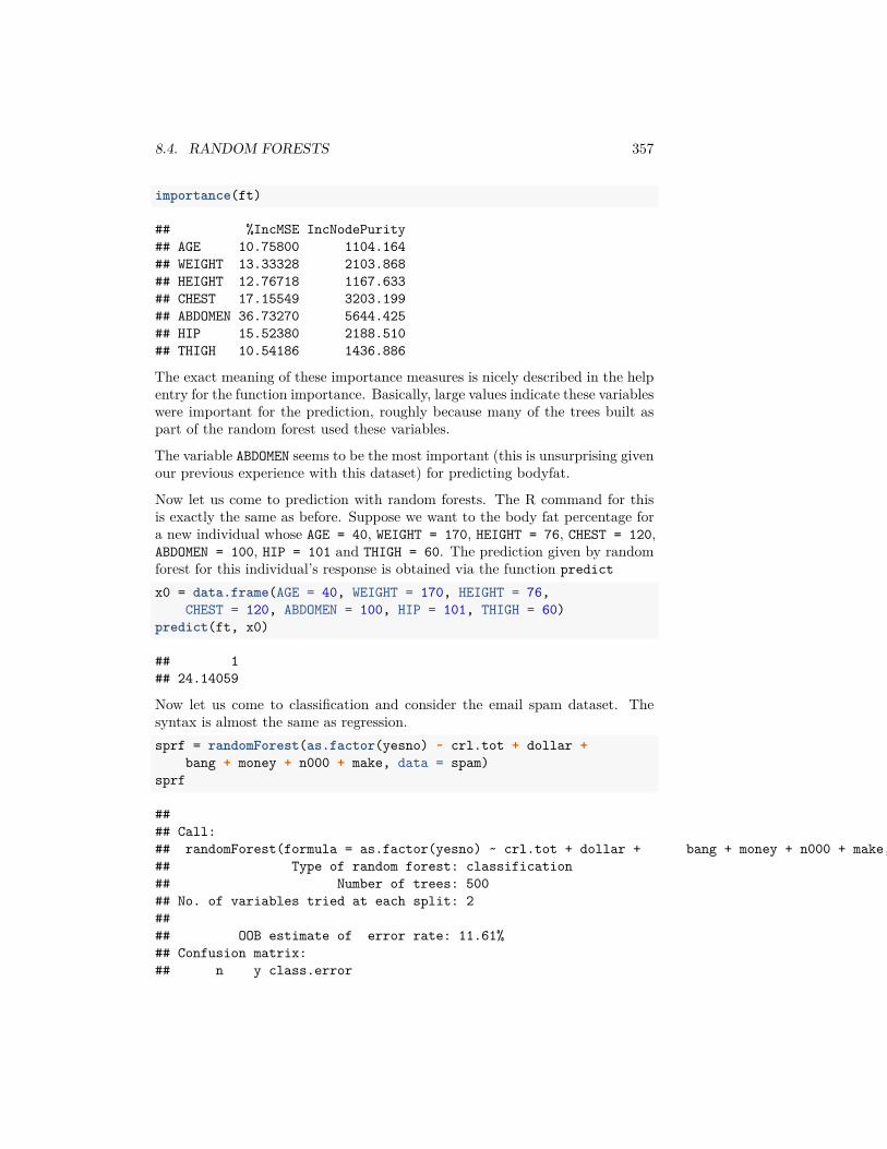
8.4. RANDOM FORESTS 357
importance(ft)
## %IncMSE IncNodePurity## AGE 10.75800 1104.164## WEIGHT 13.33328 2103.868## HEIGHT 12.76718 1167.633## CHEST 17.15549 3203.199## ABDOMEN 36.73270 5644.425## HIP 15.52380 2188.510## THIGH 10.54186 1436.886
The exact meaning of these importance measures is nicely described in the helpentry for the function importance. Basically, large values indicate these variableswere important for the prediction, roughly because many of the trees built aspart of the random forest used these variables.
The variable ABDOMEN seems to be the most important (this is unsurprising givenour previous experience with this dataset) for predicting bodyfat.
Now let us come to prediction with random forests. The R command for thisis exactly the same as before. Suppose we want to the body fat percentage fora new individual whose AGE = 40, WEIGHT = 170, HEIGHT = 76, CHEST = 120,ABDOMEN = 100, HIP = 101 and THIGH = 60. The prediction given by randomforest for this individual’s response is obtained via the function predictx0 = data.frame(AGE = 40, WEIGHT = 170, HEIGHT = 76,
CHEST = 120, ABDOMEN = 100, HIP = 101, THIGH = 60)predict(ft, x0)
## 1## 24.14059
Now let us come to classification and consider the email spam dataset. Thesyntax is almost the same as regression.sprf = randomForest(as.factor(yesno) ~ crl.tot + dollar +
bang + money + n000 + make, data = spam)sprf
#### Call:## randomForest(formula = as.factor(yesno) ~ crl.tot + dollar + bang + money + n000 + make, data = spam)## Type of random forest: classification## Number of trees: 500## No. of variables tried at each split: 2#### OOB estimate of error rate: 11.61%## Confusion matrix:## n y class.error
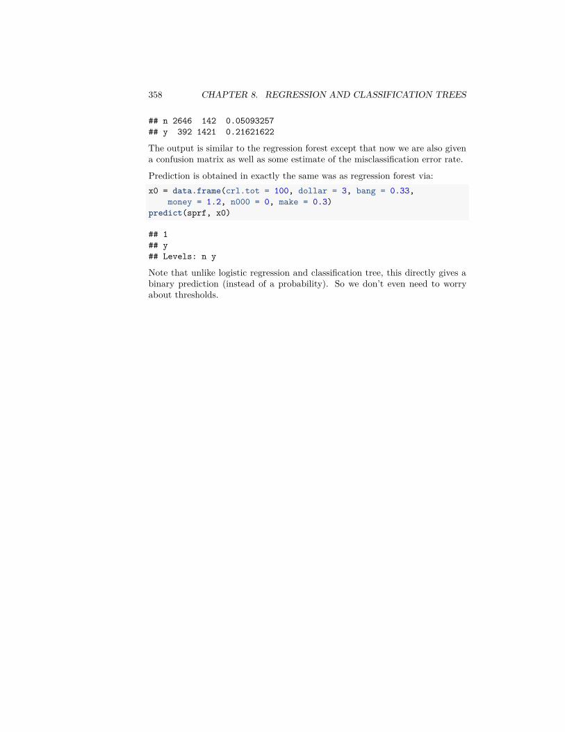
358 CHAPTER 8. REGRESSION AND CLASSIFICATION TREES
## n 2646 142 0.05093257## y 392 1421 0.21621622
The output is similar to the regression forest except that now we are also givena confusion matrix as well as some estimate of the misclassification error rate.
Prediction is obtained in exactly the same was as regression forest via:x0 = data.frame(crl.tot = 100, dollar = 3, bang = 0.33,
money = 1.2, n000 = 0, make = 0.3)predict(sprf, x0)
## 1## y## Levels: n y
Note that unlike logistic regression and classification tree, this directly gives abinary prediction (instead of a probability). So we don’t even need to worryabout thresholds.
Related Documents


