Statistical Computing 1 Stat 590 Chapter 01 L A T E X and R Erik B. Erhardt Department of Mathematics and Statistics MSC01 1115 1 University of New Mexico Albuquerque, New Mexico, 87131-0001 Office: MSLC 312 [email protected] Spring 2013

Welcome message from author
This document is posted to help you gain knowledge. Please leave a comment to let me know what you think about it! Share it to your friends and learn new things together.
Transcript

Statistical Computing 1Stat 590Chapter 01LATEX and R
Erik B. Erhardt
Department of Mathematics and StatisticsMSC01 1115
1 University of New MexicoAlbuquerque, New Mexico, 87131-0001
Office: MSLC [email protected]
Spring 2013

Welcome!
Erik B. Erhardt, UNM Stat 590, SC1, Ch 01, LATEX and R 2/56

ErikErik B. Erhardt, UNM Stat 590, SC1, Ch 01, LATEX and R 3/56

Prof. ErhardtErik B. Erhardt, UNM Stat 590, SC1, Ch 01, LATEX and R 4/56

About me
Erik B. Erhardt, UNM Stat 590, SC1, Ch 01, LATEX and R 5/56

I adore my cats
Harpo Zeppo
Erik B. Erhardt, UNM Stat 590, SC1, Ch 01, LATEX and R 6/56

In my dissertation I developedstatistical models and software
for estimating a consumer’s dietof sources in its foodweb
using stable isotopes.
Epiphyteson leaves
n=4
Plankton SeagrassBenthicmicroalgae
Macroalgae
Sources
Consumers
Intermediateconsumers
and
Source isotopesmixing in
consumers
( 13 15 34S)
Isotopic fractionationwith trophic level (λ)
increase
consumer λβm estimated
source λs=1 assumed(can also be
modeled and estimated)
n=4
n=14, 4 missing S
n=9, 2 missing Sn=8
Pig�sh
n=7
Pin�sh
n=13
Croaker
n=5
Erik B. Erhardt, UNM Stat 590, SC1, Ch 01, LATEX and R 7/56

A
B
-0.6 -0.3 0 0.3 0.6
-1.5 -0.75 0 0.75 1.5
average βgender
average βage
increase with agedecrease with age
females > malesmales > females
7
2117
23243856294664674839595053256834605272715542204749
MO
TV
ISB
GD
MN
ATTN
FRO
NT
AU
D
7
2117
23243856294664674839595053256834605272715542204749
MO
TV
ISB
GD
MN
ATTN
FRO
NT
AU
D
fract
ion
of c
ompo
nent
0
0.2
0.4
0.6
0.8
1
0
0.2
0.4
0.6
0.8
1
fract
ion
of c
ompo
nent
L medial R medial
L lateral R lateral
X = -48 mm Y = 5 mm Z = -2 mm
X = 4 mm Y = -54 mm Z = 49 mm
L medial R medial
L lateral R lateral
-15
-10
-5
0
5
10
15
-15
-10
-5
0
5
10
15
X =
−48
mm
Y =
-1 m
mZ
= −6
mm
Z =
−9 m
mY
= 9
mm
X =
-7 m
mZ
= 3
mm
Z =
−4 m
m
GENDER (females-males)
-sig
n(t)
log 10
(p)
-sig
n(t)
log 10
(p)
AGE
20 40 602
3
4
5
age in years
adju
sted
inte
nsity
V
= 1926, rp= −0.45
20 40 60
4
6
8
age in years
adju
sted
inte
nsity
V
= 210, rp= 0.26
male female
4
6
8
10
gender
adju
sted
inte
nsity
V
= 192, rp= 0.22
male female
2
3
4
5
genderad
just
ed in
tens
ity
V
= 268, rp= 0.31
SU
RFA
CE
VIE
WS
VO
LUM
ETR
IC V
IEW
SS
UR
FAC
E V
IEW
SV
OLU
ME
TRIC
VIE
WS
A1 A2 A3
A4
B1 B2 B3
B4
significant effects effect sizes examples
IC 21
IC 21
IC 20
IC 25
X = 25 mm Y = -15 mm Z = 3 mm
X = 54 mm Y = -54 mm Z = 55 mm
As a postdoc, I developed models for brain imaging data.
Erik B. Erhardt, UNM Stat 590, SC1, Ch 01, LATEX and R 8/56

I used to Mountain Unicycle (MUni)
Erik B. Erhardt, UNM Stat 590, SC1, Ch 01, LATEX and R 9/56

and now I dance.
Erik B. Erhardt, UNM Stat 590, SC1, Ch 01, LATEX and R 10/56

I’m an Assistant Professor of Statistics here at UNM.Sometimes, I’m also the Director of the Statistics Consulting Clinic:www.stat.unm.edu/~clinic
Erik B. Erhardt, UNM Stat 590, SC1, Ch 01, LATEX and R 11/56

Syllabus
Erik B. Erhardt, UNM Stat 590, SC1, Ch 01, LATEX and R 12/56

StatAcumen.com /teaching /sc1
Erik B. Erhardt, UNM Stat 590, SC1, Ch 01, LATEX and R 13/56

Tools
Computer: Windows/Mac/Linux
Software: LATEX, R, text editor (Rstudio)
Brain: scepticism, curiosity, organization
planning, execution, clarity
Erik B. Erhardt, UNM Stat 590, SC1, Ch 01, LATEX and R 14/56

Syllabushttp://statacumen.com/teaching/sc1
I Step 0
I Tentative timetable
I Grading
I Homework
Erik B. Erhardt, UNM Stat 590, SC1, Ch 01, LATEX and R 15/56

Statistics can be challengingbecause
we operate at the higher levels of Bloom’s Taxonomyen.wikipedia.org/wiki/Bloom’s_Taxonomy
1. * Create/synthesize
2. * Evaluate
3. * Analyze
4. Apply
5. Understand
6. Remember
Erik B. Erhardt, UNM Stat 590, SC1, Ch 01, LATEX and R 16/56

This week:Reproducible research
Erik B. Erhardt, UNM Stat 590, SC1, Ch 01, LATEX and R 17/56

Reproducible research
The goal of reproducible research is to tie specific instructions to dataanalysis and experimental data so that scholarship can be recreated, betterunderstood, and verified.
Formula: success = LATEX + R + knitr (Sweave)
http://cran.r-project.org/web/views/ReproducibleResearch.html
Erik B. Erhardt, UNM Stat 590, SC1, Ch 01, LATEX and R 18/56

Rstudio
Erik B. Erhardt, UNM Stat 590, SC1, Ch 01, LATEX and R 19/56

RstudioSetup
Install LATEX, R, and Rstudio on your computer, as outlined at the top of thecourse webpage.
Erik B. Erhardt, UNM Stat 590, SC1, Ch 01, LATEX and R 20/56

RstudioQuick tour
(I changed my background to black for stealth coding at night)
Erik B. Erhardt, UNM Stat 590, SC1, Ch 01, LATEX and R 21/56

Program editor - write code here
Erik B. Erhardt, UNM Stat 590, SC1, Ch 01, LATEX and R 22/56

Console - execute code here
Erik B. Erhardt, UNM Stat 590, SC1, Ch 01, LATEX and R 23/56

Workspace - variables in memoryHistory - commands submitted
Erik B. Erhardt, UNM Stat 590, SC1, Ch 01, LATEX and R 24/56

Plots and Help
Erik B. Erhardt, UNM Stat 590, SC1, Ch 01, LATEX and R 25/56

RstudioQuick tour
Learning the keyboard shortcutswill make your life more wonderful.
(Under Help menu)
Erik B. Erhardt, UNM Stat 590, SC1, Ch 01, LATEX and R 26/56

Introduction to R
Erik B. Erhardt, UNM Stat 590, SC1, Ch 01, LATEX and R 27/56

Erik B. Erhardt, UNM Stat 590, SC1, Ch 01, LATEX and R 28/56

Erik B. Erhardt, UNM Stat 590, SC1, Ch 01, LATEX and R 29/56

Erik B. Erhardt, UNM Stat 590, SC1, Ch 01, LATEX and R 30/56

R building blocks
Erik B. Erhardt, UNM Stat 590, SC1, Ch 01, LATEX and R 31/56

R as calculator
# Arithmetic
2 * 10
## [1] 20
1 + 2
## [1] 3
# Order of operations is preserved
1 + 5 * 10
## [1] 51
(1 + 5) * 10
## [1] 60
# Exponents use the ^ symbol
2 ^ 5
## [1] 32
4 ^ (1/2)
## [1] 2
Erik B. Erhardt, UNM Stat 590, SC1, Ch 01, LATEX and R 32/56

Vectors# Create a vector with the c (short for combine) function
c(1, 4, 6, 7)
## [1] 1 4 6 7
c(1:5, 10)
## [1] 1 2 3 4 5 10
# or use a function
# (seq is short for sequence)
seq(1, 10, by = 2)
## [1] 1 3 5 7 9
seq(0, 50, length = 11)
## [1] 0 5 10 15 20 25 30 35 40 45 50
seq(1, 50, length = 11)
## [1] 1.0 5.9 10.8 15.7 20.6 25.5 30.4 35.3 40.2 45.1 50.0
1:10 # short hand for seq(1, 10, by = 1), or just
## [1] 1 2 3 4 5 6 7 8 9 10
seq(1, 10)
## [1] 1 2 3 4 5 6 7 8 9 10
5:1
## [1] 5 4 3 2 1
Erik B. Erhardt, UNM Stat 590, SC1, Ch 01, LATEX and R 33/56

Assign variables
# Assign a vector to a variable with <-
a <- 1:5
a
## [1] 1 2 3 4 5
b <- seq(15, 3, length = 5)
b
## [1] 15 12 9 6 3
c <- a*b
c
## [1] 15 24 27 24 15
Erik B. Erhardt, UNM Stat 590, SC1, Ch 01, LATEX and R 34/56

Basic functions# Lots of familiar functions work
a
## [1] 1 2 3 4 5
sum(a)
## [1] 15
prod(a)
## [1] 120
mean(a)
## [1] 3
sd(a)
## [1] 1.581139
var(a)
## [1] 2.5
min(a)
## [1] 1
median(a)
## [1] 3
max(a)
## [1] 5
range(a)
## [1] 1 5
Erik B. Erhardt, UNM Stat 590, SC1, Ch 01, LATEX and R 35/56

Extracting subsets# Specify the indices you want in the square brackets []
a <- seq(0, 100, by = 10)
# blank = include all
a
## [1] 0 10 20 30 40 50 60 70 80 90 100
a[]
## [1] 0 10 20 30 40 50 60 70 80 90 100
# integer +=include, 0=include none, -=exclude
a[5]
## [1] 40
a[c(2, 4, 6, 8)]
## [1] 10 30 50 70
a[0]
## numeric(0)
a[-c(2, 4, 6, 8)]
## [1] 0 20 40 60 80 90 100
a[c(1, 1, 1, 6, 6, 9)] # subsets can be bigger
## [1] 0 0 0 50 50 80
a[c(1,2)] <- c(333, 555) # update a subset
a
## [1] 333 555 20 30 40 50 60 70 80 90 100Erik B. Erhardt, UNM Stat 590, SC1, Ch 01, LATEX and R 36/56

True/False
a
## [1] 333 555 20 30 40 50 60 70 80 90 100
(a > 50)
## [1] TRUE TRUE FALSE FALSE FALSE FALSE TRUE TRUE TRUE TRUE TRUE
a[(a > 50)]
## [1] 333 555 60 70 80 90 100
!(a > 50) # ! negates (flips) TRUE/FALSE values
## [1] FALSE FALSE TRUE TRUE TRUE TRUE FALSE FALSE FALSE FALSE FALSE
a[!(a > 50)]
## [1] 20 30 40 50
Erik B. Erhardt, UNM Stat 590, SC1, Ch 01, LATEX and R 37/56

Comparison functions# < > <= >= != == %in%
a
## [1] 333 555 20 30 40 50 60 70 80 90 100
# equal to
a[(a == 50)]
## [1] 50
# equal to
a[(a == 55)]
## numeric(0)
# not equal to
a[(a != 50)]
## [1] 333 555 20 30 40 60 70 80 90 100
# greater than
a[(a > 50)]
## [1] 333 555 60 70 80 90 100
# less than
a[(a < 50)]
## [1] 20 30 40
# less than or equal to
a[(a <= 50)]
## [1] 20 30 40 50
# which values on left are in the vector on right
(c(10, 14, 40, 60, 99) %in% a)
## [1] FALSE FALSE TRUE TRUE FALSE
Erik B. Erhardt, UNM Stat 590, SC1, Ch 01, LATEX and R 38/56

Boolean operators
# & and, | or, ! not
a
## [1] 333 555 20 30 40 50 60 70 80 90 100
a[(a >= 50) & (a <= 90)]
## [1] 50 60 70 80 90
a[(a < 50) | (a > 100)]
## [1] 333 555 20 30 40
a[(a < 50) | !(a > 100)]
## [1] 20 30 40 50 60 70 80 90 100
a[(a >= 50) & !(a <= 90)]
## [1] 333 555 100
Erik B. Erhardt, UNM Stat 590, SC1, Ch 01, LATEX and R 39/56

Missing values
# NA (not available) means the value is missing.
# Any calculation involving NA will return an NA by default
NA + 8
## [1] NA
3 * NA
## [1] NA
mean(c(1, 2, NA))
## [1] NA
# Many functions have an na.rm argument (NA remove)
mean(c(NA, 1, 2), na.rm = TRUE)
## [1] 1.5
sum(c(NA, 1, 2))
## [1] NA
sum(c(NA, 1, 2), na.rm = TRUE)
## [1] 3
Erik B. Erhardt, UNM Stat 590, SC1, Ch 01, LATEX and R 40/56

Missing values
# Or you can remove them yourself
a <- c(NA, 1:5, NA)
a
## [1] NA 1 2 3 4 5 NA
a[!is.na(a)]
## [1] 1 2 3 4 5
a
## [1] NA 1 2 3 4 5 NA
# To save the results of removing the NAs, reassign
# write over variable a and the
# previous version is gone forever!
a <- a[!is.na(a)]
a
## [1] 1 2 3 4 5
Erik B. Erhardt, UNM Stat 590, SC1, Ch 01, LATEX and R 41/56

Ch 0, R building blocksQ1
What value will R return for z?x <- 3:7
y <- x[c(1, 2)] + x[-c(1:3)]
z <- prod(y)
z
A 99
B 20
C 91
D 54
E NA
Erik B. Erhardt, UNM Stat 590, SC1, Ch 01, LATEX and R 42/56

R building blocks 1Answer
x <- 3:7
x
## [1] 3 4 5 6 7
x[c(1, 2)]
## [1] 3 4
x[-c(1:3)]
## [1] 6 7
y <- x[c(1, 2)] + x[-c(1:3)]
y
## [1] 9 11
z <- prod(y)
z
## [1] 99
Erik B. Erhardt, UNM Stat 590, SC1, Ch 01, LATEX and R 43/56

Ch 0, R building blocksQ2
What value will R return for z?
x <- seq(-3, 3, by = 2)
a <- x[(x > 0)]
b <- x[(x < 0)]
z <- a[1] - b[2]
z
A −2
B 0
C 1
D 2
E 6
Erik B. Erhardt, UNM Stat 590, SC1, Ch 01, LATEX and R 44/56

R building blocks 2Answer
x <- seq(-3, 3, by = 2)
x
## [1] -3 -1 1 3
a <- x[(x > 0)]
a
## [1] 1 3
b <- x[(x < 0)]
b
## [1] -3 -1
z <- a[1] - b[2]
z
## [1] 2
Erik B. Erhardt, UNM Stat 590, SC1, Ch 01, LATEX and R 45/56

Clicker, Q3
What value will R return for z?a <- 2:-3
b <- a[(a > 0) & (a <= 0)]
d <- a[!(a > 1) & (a <= -1)]
z <- sum(c(b,d))
z
E −6
A −3
D 0
B 3
C 6
Erik B. Erhardt, UNM Stat 590, SC1, Ch 01, LATEX and R 46/56

R building blocks 3Answer
a <- 2:-3
a
## [1] 2 1 0 -1 -2 -3
a[(a > 0)]
## [1] 2 1
a[(a <= 0)]
## [1] 0 -1 -2 -3
b <- a[(a > 0) & (a <= 0)]
b
## integer(0)
a[!(a > 1)]
## [1] 1 0 -1 -2 -3
a[(a <= -1)]
## [1] -1 -2 -3
d <- a[!(a > 1) & (a <= -1)]
d
## [1] -1 -2 -3
z <- sum(c(b,d))
z
## [1] -6
Erik B. Erhardt, UNM Stat 590, SC1, Ch 01, LATEX and R 47/56

How’d you do?
Outstanding Understanding the operations and how to put them together,without skipping steps.
Good Understanding most of the small steps, missed a couple details.
Hang in there Understanding some of the concepts but all the symbols makemy eyes spin.
Reading and writing a new language takes work.You’ll get better as you practice.Having a buddy to work with will help.
Erik B. Erhardt, UNM Stat 590, SC1, Ch 01, LATEX and R 48/56

SummaryR commands
# <-
# + - * / ^
# c()
# seq() # by=, length=
# sum(), prod(), mean(), sd(), var(),
# min(), median(), max(), range()
# a[]
# (a > 1), ==, !=, >, <, >=, <=, %in%
# &, |, !
# NA, mean(a, na.rm = TRUE), !is.na()
Erik B. Erhardt, UNM Stat 590, SC1, Ch 01, LATEX and R 49/56

Your turnHow’s it going so far?
Muddy Any “muddy” points — anything that doesn’t make sense yet?
Thumbs up Anything you really enjoyed or feel excited about?
Erik B. Erhardt, UNM Stat 590, SC1, Ch 01, LATEX and R 50/56

LATEX
Erik B. Erhardt, UNM Stat 590, SC1, Ch 01, LATEX and R 51/56

LATEX
LATEX is a high-quality typesetting system; it includes features designed forthe production of technical and scientific documentation. LATEX is the defacto standard for the communication and publication of scientificdocuments. LATEX is available as free software.http://www.latex-project.org/
All files are plain text files. Images of many formats can be included.
Erik B. Erhardt, UNM Stat 590, SC1, Ch 01, LATEX and R 52/56

LATEXOur first document
From the course website:
1. Downloadhttp://statacumen.com/teach/SC1/SC1_LaTeX_basic.tex
2. Open in Rstudio
3. Click “Compile PDF”
4. You’ve made your (possibly) first LATEX document
5. Make some edits and recompile
Erik B. Erhardt, UNM Stat 590, SC1, Ch 01, LATEX and R 53/56

LATEX + R + knitrEmbed code and results
Rstudio set-up for knitr:
1. Menu, Tools, Options
2. Sweave
3. Weave Rnw files using: knitr
4. Preview PDF: (System Viewer might be good)
5. Save options
From the course website:
1. Downloadhttp://statacumen.com/teach/SC1/SC1_student_template.Rnw
2. Open in Rstudio
3. Click “Compile PDF”
4. Look carefully at the Rnw (R new web) source and pdf output
5. Make some edits and recompile
Erik B. Erhardt, UNM Stat 590, SC1, Ch 01, LATEX and R 54/56

Learning LATEX
I See the LATEX resources on the course website.
I Practice.
I When you have errors, become good at reading the log file (with respectto the generated .tex file line numbers).
I Can’t find the errors? Comment big chunks of code until no errors, thenuncomment small chunks until you see the error. Fix it.
Erik B. Erhardt, UNM Stat 590, SC1, Ch 01, LATEX and R 55/56

For next time
I Step 0 for Thursday
I Set up LATEX + R + Rstudio
I Homework: read the introductions to LATEX and R
I Read the rubric http://statacumen.com/teach/rubrics.pdf
I If you have a disability requiring accommodation, please see me andregister with the UNM Accessibility Resource Center.
Erik B. Erhardt, UNM Stat 590, SC1, Ch 01, LATEX and R 56/56

Statistical Computing 1Stat 590Chapter 02R plotting
Erik B. Erhardt
Department of Mathematics and StatisticsMSC01 1115
1 University of New MexicoAlbuquerque, New Mexico, 87131-0001
Office: MSLC [email protected]
Spring 2013

Edward TuftePresenting dataand information
Erik B. Erhardt, UNM Stat 590, SC1, Ch 02, R plotting 2/65

Tufte on Graphical Excellence(VDQI p. 13)
Excellence in statistical graphics consists of complex ideas communicatedwith clarity, precision, and efficiency. Graphical displays should
I show the dataI induce the viewer to think about the substance rather than about
methodology, graphic design, the technology of graphic production, orsomething else
I avoid distorting what the data have to sayI present many numbers in a small spaceI make large data sets coherentI encourage the eye to compare different pieces of dataI reveal the data at several levels of detail, from a broad overview to the
fine structureI serve a reasonably clear purpose: description, exploration, tabulation, or
decorationI be closely integrated with the statistical and verbal descriptions of a
data set.Erik B. Erhardt, UNM Stat 590, SC1, Ch 02, R plotting 3/65

Why plot?
Graphics reveal data. Indeed graphics can be more precise and revealing thanconventional statistical computations. Consider Anscombe’s quartet1: allfour of these data sets are described by exactly the same linear model (atleast until the residuals are examined).# read data in wide format from space delimited text
# textConnection() will read text into an object
anscombe <- read.table(text = "
X Y X Y X Y X Y
10.0 8.04 10.0 9.14 10.0 7.46 8.0 6.58
8.0 6.95 8.0 8.14 8.0 6.77 8.0 5.76
13.0 7.58 13.0 8.74 13.0 12.74 8.0 7.71
9.0 8.81 9.0 8.77 9.0 7.11 8.0 8.84
11.0 8.33 11.0 9.26 11.0 7.81 8.0 8.47
14.0 9.96 14.0 8.10 14.0 8.84 8.0 7.04
6.0 7.24 6.0 6.13 6.0 6.08 8.0 5.25
4.0 4.26 4.0 3.10 4.0 5.39 19.0 12.50
12.0 10.84 12.0 9.13 12.0 8.15 8.0 5.56
7.0 4.82 7.0 7.26 7.0 6.42 8.0 7.91
5.0 5.68 5.0 4.74 5.0 5.73 8.0 6.89
", header=TRUE)
#anscombe
Erik B. Erhardt, UNM Stat 590, SC1, Ch 02, R plotting 4/65

# reformat the data into long format
anscombe.long <- data.frame(
x = c(anscombe[, 1], anscombe[, 3]
, anscombe[, 5], anscombe[, 7])
, y = c(anscombe[, 2], anscombe[, 4]
, anscombe[, 6], anscombe[, 8])
, g = sort(rep(1:4, nrow(anscombe)))
)
head(anscombe.long, 2)
## x y g
## 1 10 8.04 1
## 2 8 6.95 1
tail(anscombe.long, 2)
## x y g
## 43 8 7.91 4
## 44 8 6.89 4
Erik B. Erhardt, UNM Stat 590, SC1, Ch 02, R plotting 5/65
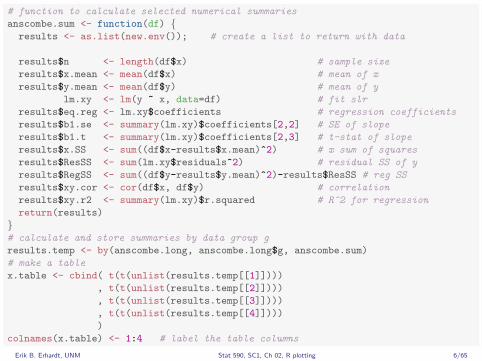
# function to calculate selected numerical summaries
anscombe.sum <- function(df) {results <- as.list(new.env()); # create a list to return with data
results$n <- length(df$x) # sample size
results$x.mean <- mean(df$x) # mean of x
results$y.mean <- mean(df$y) # mean of y
lm.xy <- lm(y ~ x, data=df) # fit slr
results$eq.reg <- lm.xy$coefficients # regression coefficients
results$b1.se <- summary(lm.xy)$coefficients[2,2] # SE of slope
results$b1.t <- summary(lm.xy)$coefficients[2,3] # t-stat of slope
results$x.SS <- sum((df$x-results$x.mean)^2) # x sum of squares
results$ResSS <- sum(lm.xy$residuals^2) # residual SS of y
results$RegSS <- sum((df$y-results$y.mean)^2)-results$ResSS # reg SS
results$xy.cor <- cor(df$x, df$y) # correlation
results$xy.r2 <- summary(lm.xy)$r.squared # R^2 for regression
return(results)
}# calculate and store summaries by data group g
results.temp <- by(anscombe.long, anscombe.long$g, anscombe.sum)
# make a table
x.table <- cbind( t(t(unlist(results.temp[[1]])))
, t(t(unlist(results.temp[[2]])))
, t(t(unlist(results.temp[[3]])))
, t(t(unlist(results.temp[[4]])))
)
colnames(x.table) <- 1:4 # label the table columns
Erik B. Erhardt, UNM Stat 590, SC1, Ch 02, R plotting 6/65

Those four datasets have many of the same numerical summaries.
1 2 3 4
n 11.00 11.00 11.00 11.00x.mean 9.00 9.00 9.00 9.00y.mean 7.50 7.50 7.50 7.50
eq.reg.(Intercept) 3.00 3.00 3.00 3.00eq.reg.x 0.50 0.50 0.50 0.50
b1.se 0.12 0.12 0.12 0.12b1.t 4.24 4.24 4.24 4.24x.SS 110.00 110.00 110.00 110.00
ResSS 13.76 13.78 13.76 13.74RegSS 27.51 27.50 27.47 27.49xy.cor 0.82 0.82 0.82 0.82xy.r2 0.67 0.67 0.67 0.67
However. . .
Erik B. Erhardt, UNM Stat 590, SC1, Ch 02, R plotting 7/65

These datasets are quite distinct!library(ggplot2)
p <- ggplot(anscombe.long, aes(x = x, y = y))
p <- p + geom_point()
p <- p + stat_smooth(method = lm, se = FALSE)
p <- p + facet_wrap(~ g)
p <- p + labs(title = "Anscombe's quartet")
print(p)
●
●
●
●
●
●
●
●
●
●
●
●
●
●●
●
●
●
●
●
●
●
●
●
●
●
●
●
●
●
●
●
●
●
●
●
●●
●
●
●
●
●
●
1 2
3 4
5.0
7.5
10.0
12.5
5.0
7.5
10.0
12.5
5 10 15 5 10 15x
yAnscombe's quartet
Erik B. Erhardt, UNM Stat 590, SC1, Ch 02, R plotting 8/65

MinardOne of the best
The narrative graphic of space and time par excellence is perhaps thefollowing plot by Charles Joseph Minard (1781–1870), the French engineer,which shows the terrible fate of Napoleon’s army in Russia. This combinationof data map and time-series, drawn in 1869, portrays a sequence ofdevastating losses suffered in Napoleon’s Russian campaign of 1812.
Minard’s graphic was made as an anti-war poster.
Erik B. Erhardt, UNM Stat 590, SC1, Ch 02, R plotting 9/65

Erik B. Erhardt, UNM Stat 590, SC1, Ch 02, R plotting 10/65

http://www.danvk.org/wp/2009-12-04/a-new-view-on-minards-napoleon/
Erik B. Erhardt, UNM Stat 590, SC1, Ch 02, R plotting 11/65

Erik B. Erhardt, UNM Stat 590, SC1, Ch 02, R plotting 12/65

The two essential problems in the display of information
1. Just about everything interesting is a multivariate problem thatrequires the expression of three or more dimensions of information, evensomething as simple as giving travel directions to someone to followover time has four dimensions. We are plagued with highly dimensionaldata and low resolution display surfaces, a problem which has existedsince the first maps were scratched on rocks.
2. We measure progress by improvements in resolution, i.e., an increasingrate of information transfer, the density of the data on the page.
Erik B. Erhardt, UNM Stat 590, SC1, Ch 02, R plotting 13/65

Grand principles of information display
1. Enforce wise visual comparisons
2. Show causality
3. The world we seek to understand is multivariate, as our displays shouldbe
4. Completely integrate words, numbers, and images
5. Most of what happens in design depends upon the quality, relevance,and integrity of the content
6. Information for comparison should be put side by side
7. Use small multiples
8. Don’t dequantify
9. Meta-principle: thinking and designing are as one
The principles should not be applied rigidly or in a peevish spirit; they arenot logically or mathematically certain; and it is better to violate anyprinciple than to place graceless or inelegant marks on paper. Most principlesof design should be greeted with some skepticism. . . (VDQI p. 191)
Erik B. Erhardt, UNM Stat 590, SC1, Ch 02, R plotting 14/65

1. Enforce wise visual comparisons
Force answers to the question “Compared with What?”
Graphics must not quote data out of context.
Erik B. Erhardt, UNM Stat 590, SC1, Ch 02, R plotting 15/65

Erik B. Erhardt, UNM Stat 590, SC1, Ch 02, R plotting 16/65

Show more, hide less.
Means in the context of their distributions.
ConditionCondition Condition
1 s.e.m.±
Resp
onse
var
iabl
e
Resp
onse
var
iabl
e
Resp
onse
var
iabl
e
Bar plots display only two numbers (here the mean and s.e.m.) for each distribution.
min, max, and quartiles) to provide greater distributional information.
Violin plots display the shape of each distribution and may be overlayed with descriptive or inferential statistics.
CBA
1 2 30
2
4
6
1 2 3
0
5
10
15
1 2 3
0
5
10
15
Less information More information
EA Allen, EB Erhardt, and VD Calhoun. Data visualization in the neurosciences: overcoming the curse of dimensionality. Neuron,
74:603–608, 2012.
Erik B. Erhardt, UNM Stat 590, SC1, Ch 02, R plotting 17/65

2. Show causality
We are looking at information to understand mechanisms.
Policy reasoning is about examining causality.
Napoleon was defeated by the winter, not the opposing army, as shown bythe temperature scale on the bottom of Minard’s graph.
Next: In September 1854, central London suffered an outbreak of cholera.To stop that outbreak, Dr. John Snow made a map. By seeing, visually,where the cholera deaths were clustered, Snow showed that the water from apump on Broad Street was to blame. His work addressed an ongoing medicaldebate — in what is widely regarded as one of the most important earlyexamples of epidemiology, he clearly linked choleras spread to water insteadof air.
Erik B. Erhardt, UNM Stat 590, SC1, Ch 02, R plotting 18/65

Red spots indicate water pumps. Lines indicate location death count.
Erik B. Erhardt, UNM Stat 590, SC1, Ch 02, R plotting 19/65

Erik B. Erhardt, UNM Stat 590, SC1, Ch 02, R plotting 20/65

3. The world we seek to understand is multivariateas our displays should be
The Minard graph has six dimensions:
1. size of the army
2. x-dimensional route of the march
3. y-dimensional route of the march
4. direction of the march
5. temperatures
6. dates
Erik B. Erhardt, UNM Stat 590, SC1, Ch 02, R plotting 21/65

4. Completely integrate words, numbers, and images
Don’t let the accidents of the modes of production break up the text,images, and data.
Commonly seen displays comparing data between groups or conditions. helping the viewer make correct inferences. Annotation and
examples clarify data properties and models.
BA
−500 0 500 1000−4
−3
−2
−1
0
1
2
3
4
−500 0 500 1000−6
−4
−2
0
2
4
6
Time (ms)
Ave
rage
IC p
oten
tial (
µV)
Time (ms)
target
* *
a
Ave
rage
IC p
oten
tial (
µV)
Correct, 95% CI
Error, 95% CI
H0: µE = µC
Ha: µE ≠ µC
* = p < 0.001
Correct
Error
−200
a
EA Allen, EB Erhardt, and VD Calhoun. Data visualization in the neurosciences: overcoming the curse of dimensionality. Neuron,
74:603–608, 2012.
Erik B. Erhardt, UNM Stat 590, SC1, Ch 02, R plotting 22/65

b b
Z = −39Z = −19Z = 2Z = 22 Z = −39Z = −19Z = 2Z = 22
H0: µN = µS
Ha: µN ≠ µS
= p < 0.001
−0.5
0
0.5
1
1.5
Standard β (%∆BOLD/stim)
b1 b2
Nov
el β
(%∆B
OLD
/stim
)
−0.5 0 0.5 1 1.5
L R L R
Novel – Standard
∆β weight | t |
0
≥5
−1.6 0 6.1+Novel – Standard
n = 28 subjects
−1.6 +1.6
∆β weight
0
EA Allen, EB Erhardt, and VD Calhoun. Data visualization in the neurosciences: overcoming the curse of dimensionality. Neuron,
74:603–608, 2012.
Erik B. Erhardt, UNM Stat 590, SC1, Ch 02, R plotting 23/65

0 200 400 600 800 1000 1200
Follow-up − Baseline
−40
−20
0
20
�
�
�
�
�
�
�
�
��
�
�
�
�
�
�
�
�
�
�
�
�
�
�
�
�
�
��
�
� �
�
�
�
�
�
��
�
�
�
�
� �
�
�
�
�
� �
�
�
�
�
�
�
��
�
�
�
� �
�
�
�
�
�
�
�
�
�
�
�
�
� �
��
�
�
� �
�
�
��
� �
�
�
�
�
��
�
�
� �
�
�
�
�
�
�
�
� �
�
�
�
�
� �
�
�
�
��
�
�
�
�
� � �
�
� �
�
�
�
�
�
�
��
��
�
�
� �
� �
�
�
�
��
��
�
�BD
I−II
−15
−10
−5
0
5
��
�
�
�
�
��
�
�
�
�
� �
�
�
�
�
�
�
�
�
�
�
�
�
�
�
� �
�
�
�
� �
�
�
�
�
�
�
�
�
�
�
� �
�
�
�
�
�
�
�
�
�
�
�
�
�
�
�
�
�
�
�
�
�
�
�
�
�
� ��
�
�
�
�� �
� �
�
�
�
�
�
�
�
�
�
�
�
�
�
�
�
� �
�
�
�
�
�
�
�
�
�
�
�
� �
�
�
�
�
�
�
�
�
�
� � �
�
�
�
�
�
�
�
�
�
�
�� ��
� � �
�
�
�
�
�
�
�
�
�
�
�
BH
S
−3
−2
−1
0
1
�
�
��
�
�
�
��
�
�
�
�
�
�
� �
�
�
�
�
��
�
��
�
�
�
�
� �
�
�
�
�
��
�
�
�
�
�
�
�
�
�
� �
�
� �
�
�
�
�
�
�
��
�
�
�
� �
�
�
�
�
�
�
�
�
�
�
�
�
�
�
�
��� �
�
�
�
�
�
�
�
�
�
�
�
�
�
�
�
�
�
��
�
�
�
�
�
�
�
�
�
�
�
�
�
�
�
�
�
�
�
��
�
� ��
�
�
�
�
� �
�
� �
�
�
�
� �
�
� �
�
�
�
��
�
�
�
�
CO
RE
−OM
Days
−2
−1
0
1
��
�
�
�
�
��
�
�
�
�
�
�
��
�
�
�
�
��
��
�
�
�
�
�
��
�
�
�
�
�
�
�
�
�
�
�
�
�
�
�
� �
�
��
�
�
�
�
�
�
��
�
�
�
��
�
�
�
�
�
�
�
�
�
�
��
�
�
�
���
�
�
�
�
�
�
�
�
�
�
�
�
�
�
��
�
�
�
�
� �
�
�
�
� �
�
�
�
�
�
�
�
�
�
�
�
�
� �
�
��
�
�
�
�
�
��
�
�
�
��
�
�
�
� �
�
� �
�
�
�
��
�
�
�
�
CO
RE
−OM
−RLocation keyfor individualobservations:
BDI
BHS
CoreOM−R
CoreOM
� Team B
Team A
−40 −20 20
��
����� � � � �� �� � ��� �� � � � �� �
�
−15 −10 −5 5
��� � �� �� � �� � ��� � �� �� �� �
�
−3 −2 −1 0 1
�
� ��� � � ���� �� � ��� ��� �� �� �
�
−3 −2 −1 1
��
� � ��� � � ���� �� � ��� ��� �� �� �
�
one-sided CImean
Score decrease indicates improvement
Score di�erence (Follow-up - Baseline)
CR Koons, B O’Rourke, B Carter, EB Erhardt. Negotiating for improved reimbursement for Dialectical Behavior Therapy: A
successful project. Cognitive and Behavioral Practice. 2013.
Erik B. Erhardt, UNM Stat 590, SC1, Ch 02, R plotting 24/65

5. Most of what happens in designdepends upon the quality, relevance, and integrity of the content
To improve a presentation, get better content.
If your numbers are boring you have the wrong numbers.
Design won’t help, it is too late.
Erik B. Erhardt, UNM Stat 590, SC1, Ch 02, R plotting 25/65

6. Information for comparisonshould be put side by side
Within the eye span, not stacked in time on subsequent pages.Galileo published a book in 1613 which reported the discovery of sunspotsand the rings of Saturn for the first time. He wrote in Italian, not Latin,because he wanted to reach a wider audience than the scientific elite.
9 Galileo Galilei, History and DemonstrationsConcerning Sunspots and Their Phenomena(Rome, 1613), translated by Stillman Drake,Discoveries and Opinions of Galileo (GardenCity, New York, 1957), pp. 115-116.
Erik B. Erhardt, UNM Stat 590, SC1, Ch 02, R plotting 26/65

As more observations were collected daily, small multiple diagramsrecorded the data indexed on time (a design simultaneously enhancingdimensionality and information density0, with the labeled sunspotsparading along alphabetically. This profoundly multivariate analysis —showing sunspot location in two-space, time, labels, and shifting relativeorientation of the sun in our sky — reflects data complexities that arisebecause a rotating sun is observed from a rotating and orbiting earth:
Erik B. Erhardt, UNM Stat 590, SC1, Ch 02, R plotting 27/65

At top, a Maunder diagram from 1880 to1980, with the sine of the latitude markingsunspot placement. Color coding (thelighter, the larger) reflects the logarithm ofthe area covered by sunspots within eachareal bin of data. The lower time-series, bysumming over all latitudes, shows the totalarea of the sun's surface covered by sunspotsat any given time during the hundred-yearsequence. Diagrams produced by David H.Hathaway, George C. Marshall Space FlightCenter, National Aeronautics and SpaceAdministration.
Sun Latitude 1900 1920 1940 1960 1980
90oN
30°N
equator
30°S
1.0%
0.1%
90°N
30oN
equator
30°S
1.0%
0.1%
Percent of area of sun 1900 1920 1940 1960 1980covered by sunspots
Erik B. Erhardt, UNM Stat 590, SC1, Ch 02, R plotting 28/65

7. Use small multiplesTrellis/Lattice/Facets
They are high resolution and easy on the viewer, because once the viewerfigures out one frame, they can figure out all the rest based upon what theyhave learned.
They have an inherent credibility with the viewer because they show a lot ofdata – “I know what I’m talking about and I’m showing all my data to you.”
Keep the underlying design of small multiples simple and clear.
●
●
●
●
●
●
●
●
●
●
●
●
●
●●
●
●
●
●
●
●
●
●
●
●
●
●
●
●
●
●
●
●
●
●
●
●●
●
●
●
●
●
●
1 2
3 4
5.0
7.5
10.0
12.5
5.0
7.5
10.0
12.5
5 10 15 5 10 15x
y
Anscombe's quartet
Erik B. Erhardt, UNM Stat 590, SC1, Ch 02, R plotting 29/65

8. Don’t dequantify
Numbers have meaning.
Use numbers or a graph that represents them.
Don’t reduce quantities to on/off, yes/no, here/not.
Erik B. Erhardt, UNM Stat 590, SC1, Ch 02, R plotting 30/65

9. Meta-principle: thinking and designing are as one
The principles of information design are the principles of reasoning aboutevidence. It is visual thinking. Good design is a lot like clear thinking, madevisible.
The converse is also true. Bad design is stupidity made visible. If a chart hasthree phony dimensions to compare four numbers it shows the persondoesn’t know what they are talking about.
Start by asking, what is the intellectual task that this display is supposed tohelp with?
Erik B. Erhardt, UNM Stat 590, SC1, Ch 02, R plotting 31/65

Examples of “Bad”are easy to find
Erik B. Erhardt, UNM Stat 590, SC1, Ch 02, R plotting 32/65

Erik B. Erhardt, UNM Stat 590, SC1, Ch 02, R plotting 33/65

Erik B. Erhardt, UNM Stat 590, SC1, Ch 02, R plotting 34/65

Erik B. Erhardt, UNM Stat 590, SC1, Ch 02, R plotting 35/65

Beautiful, informative plotsin R
Introduction to theggplot package.
Erik B. Erhardt, UNM Stat 590, SC1, Ch 02, R plotting 36/65

Plotting with ggplot2Beautiful plots made simple
# only needed once after installing or upgrading R
install.packages("ggplot2")
# each time you start R
# load ggplot2 functions and datasets
library(ggplot2)
# ggplot2 includes a dataset "mpg"
# ? gives help on a function or dataset
?mpg
Erik B. Erhardt, UNM Stat 590, SC1, Ch 02, R plotting 37/65

# head() lists the first several rows of a data.frame
head(mpg)
## manufacturer model displ year cyl trans drv cty hwy fl class
## 1 audi a4 1.8 1999 4 auto(l5) f 18 29 p compact
## 2 audi a4 1.8 1999 4 manual(m5) f 21 29 p compact
## 3 audi a4 2.0 2008 4 manual(m6) f 20 31 p compact
## 4 audi a4 2.0 2008 4 auto(av) f 21 30 p compact
## 5 audi a4 2.8 1999 6 auto(l5) f 16 26 p compact
## 6 audi a4 2.8 1999 6 manual(m5) f 18 26 p compact
Erik B. Erhardt, UNM Stat 590, SC1, Ch 02, R plotting 38/65

# str() gives the structure of the object
str(mpg)
## 'data.frame': 234 obs. of 11 variables:
## $ manufacturer: Factor w/ 15 levels "audi","chevrolet",..: 1 1 1 1 1 1 1 1 1 1 ...
## $ model : Factor w/ 38 levels "4runner 4wd",..: 2 2 2 2 2 2 2 3 3 3 ...
## $ displ : num 1.8 1.8 2 2 2.8 2.8 3.1 1.8 1.8 2 ...
## $ year : int 1999 1999 2008 2008 1999 1999 2008 1999 1999 2008 ...
## $ cyl : int 4 4 4 4 6 6 6 4 4 4 ...
## $ trans : Factor w/ 10 levels "auto(av)","auto(l3)",..: 4 9 10 1 4 9 1 9 4 10 ...
## $ drv : Factor w/ 3 levels "4","f","r": 2 2 2 2 2 2 2 1 1 1 ...
## $ cty : int 18 21 20 21 16 18 18 18 16 20 ...
## $ hwy : int 29 29 31 30 26 26 27 26 25 28 ...
## $ fl : Factor w/ 5 levels "c","d","e","p",..: 4 4 4 4 4 4 4 4 4 4 ...
## $ class : Factor w/ 7 levels "2seater","compact",..: 2 2 2 2 2 2 2 2 2 2 ...
Erik B. Erhardt, UNM Stat 590, SC1, Ch 02, R plotting 39/65

# summary() gives frequeny tables for categorical variables
# and mean and five-number summaries for continuous variables
summary(mpg)
## manufacturer model displ
## dodge :37 caravan 2wd : 11 Min. :1.600
## toyota :34 ram 1500 pickup 4wd: 10 1st Qu.:2.400
## volkswagen:27 civic : 9 Median :3.300
## ford :25 dakota pickup 4wd : 9 Mean :3.472
## chevrolet :19 jetta : 9 3rd Qu.:4.600
## audi :18 mustang : 9 Max. :7.000
## (Other) :74 (Other) :177
## year cyl trans drv
## Min. :1999 Min. :4.000 auto(l4) :83 4:103
## 1st Qu.:1999 1st Qu.:4.000 manual(m5):58 f:106
## Median :2004 Median :6.000 auto(l5) :39 r: 25
## Mean :2004 Mean :5.889 manual(m6):19
## 3rd Qu.:2008 3rd Qu.:8.000 auto(s6) :16
## Max. :2008 Max. :8.000 auto(l6) : 6
## (Other) :13
## cty hwy fl class
## Min. : 9.00 Min. :12.00 c: 1 2seater : 5
## 1st Qu.:14.00 1st Qu.:18.00 d: 5 compact :47
## Median :17.00 Median :24.00 e: 8 midsize :41
## Mean :16.86 Mean :23.44 p: 52 minivan :11
## 3rd Qu.:19.00 3rd Qu.:27.00 r:168 pickup :33
## Max. :35.00 Max. :44.00 subcompact:35
## suv :62Erik B. Erhardt, UNM Stat 590, SC1, Ch 02, R plotting 40/65

ggplot()
# specify the dataset and variables
p <- ggplot(mpg, aes(x = displ, y = hwy))
p <- p + geom_point() # add a plot layer with points
print(p)
●●
●
●
●●
●
●
●
●
●
●● ●●
●
●
●
●
●
●
● ●
●
●
●
●
●
●
●
●
●
●
●
●
●
●
● ●
●●
●●
●
●
●
● ●
●
●
●●
●●
●
●
●
● ●
●
●
●
●
●
●
●
●●
●
●
●
●
●
●
● ●
●
●
●
●
● ●
●●●
●●
●
●
●
●
●
●
●
●
●
●
●
●
●
●●
●
●
●
●●
●
●
●
●
●
●●
●
●
●
●
●
●●●
●
●
●
●
●
●
●
●
●
● ●
●
●
●
●
●
● ●
●
●
●
●
●
●
●●
● ●
●●
●
●
● ●
●
●
●●
●
●
●
●
●
●● ●●
●
●
●
●
●●
●
●
●
●
●
●
●●
●●
●
●
●
●●
●●
●
●
●
●
●
●
●
●
●●
●
●
●
●
●
●
●
●●
●
●
●
●
●● ●●
●
●
●
●
●
●
●
●●●
●
●
●● ●
20
30
40
2 3 4 5 6 7displ
hwy
Erik B. Erhardt, UNM Stat 590, SC1, Ch 02, R plotting 41/65

Additional variablesAesthetics and faceting
Geom: is the “type” of plot
Aesthetics: shape, colour, size, alpha
Faceting: “small multiples” displaying different subsets
Help is available. Try searching for examples, too.
I docs.ggplot2.org/current/
I docs.ggplot2.org/current/geom_point.html
Erik B. Erhardt, UNM Stat 590, SC1, Ch 02, R plotting 42/65

AestheticsThe legend is chosen and displayed automatically
p <- ggplot(mpg, aes(x = displ, y = hwy))
p <- p + geom_point(aes(colour = class))
print(p)
●●
●
●
●●
●
●
●
●
●
●● ●●
●
●
●
●
●
●
● ●
●
●
●
●
●
●
●
●
●
●
●
●
●
●
● ●
●●
●●
●
●
●
● ●
●
●
●●
●●
●
●
●
● ●
●
●
●
●
●
●
●
●●
●
●
●
●
●
●
● ●
●
●
●
●
● ●
●●●
●●
●
●
●
●
●
●
●
●
●
●
●
●
●
●●
●
●
●
●●
●
●
●
●
●
●●
●
●
●
●
●
●●●
●
●
●
●
●
●
●
●
●
● ●
●
●
●
●
●
● ●
●
●
●
●
●
●
●●
● ●
●●
●
●
● ●
●
●
●●
●
●
●
●
●
●● ●●
●
●
●
●
●●
●
●
●
●
●
●
●●
●●
●
●
●
●●
●●
●
●
●
●
●
●
●
●
●●
●
●
●
●
●
●
●
●●
●
●
●
●
●● ●●
●
●
●
●
●
●
●
●●●
●
●
●● ●
20
30
40
2 3 4 5 6 7displ
hwy
class
●
●
●
●
●
●
●
2seater
compact
midsize
minivan
pickup
subcompact
suv
Erik B. Erhardt, UNM Stat 590, SC1, Ch 02, R plotting 43/65

Experiment with aesthetics
1. Assign variables to aesthetics colour, size, and shape.
2. What’s the difference between discrete or continuous variables?
3. What happens when you combine multiple aesthetics?
Erik B. Erhardt, UNM Stat 590, SC1, Ch 02, R plotting 44/65

AestheticsBehavior
Aesthetic Discrete Continuous
colour Rainbow of colors Gradient from red toblue
size Discrete size steps Linear mapping be-tween radius and value
shape Different shape for each Shouldn’t work
Erik B. Erhardt, UNM Stat 590, SC1, Ch 02, R plotting 45/65

p <- ggplot(mpg, aes(x = displ, y = hwy))
p <- p + geom_point(aes(colour = class, size = cyl, shape = drv))
print(p)
●
●
●
●
●● ●●●
●
●
●
●●
●
●●
●●
●●
●
●
●
● ●
●
●●
●
●●
●
●●●
●
●●
●
●
●
●
●
● ●
●●●
●●●
●
●
●
●●
●
●
●●
●●
●●
●
●
● ●
●●●
●
●
●
●
●
●
●
●
●● ●●
●
●
●
●
●●
●
●
●
●
●
●
●●
●
●
●●
●20
30
40
2 3 4 5 6 7displ
hwy
drv
● 4
f
r
cyl●
●
●
●
●
4
5
6
7
8
class
●
●
●
●
●
●
●
2seater
compact
midsize
minivan
pickup
subcompact
suv
Erik B. Erhardt, UNM Stat 590, SC1, Ch 02, R plotting 46/65

p <- ggplot(mpg, aes(x = displ, y = hwy))
p <- p + geom_point(aes(colour = class, size = cyl, shape = drv), alpha = 1/4) # alpha is opacity
print(p)
20
30
40
2 3 4 5 6 7displ
hwy
drv
4
f
r
cyl
4
5
6
7
8
class
2seater
compact
midsize
minivan
pickup
subcompact
suv
Erik B. Erhardt, UNM Stat 590, SC1, Ch 02, R plotting 47/65

Faceting
I Small multiples displaying different subsets of the data.
I Useful for exploring conditional relationships. Useful for large data.
Erik B. Erhardt, UNM Stat 590, SC1, Ch 02, R plotting 48/65

Faceting in many ways
facet_grid(rows ~ cols): 2D grid, “.” for no splitfacet_wrap(~ var): 1D ribbon wrapped into 2Dp <- ggplot(mpg, aes(x = displ, y = hwy)) + geom_point()
p1 <- p + facet_grid(. ~ cyl)
p2 <- p + facet_grid(drv ~ .)
p3 <- p + facet_grid(drv ~ cyl)
p4 <- p + facet_wrap(~ class)
print(p1) # print each to see
Erik B. Erhardt, UNM Stat 590, SC1, Ch 02, R plotting 49/65

p <- ggplot(mpg, aes(x = displ, y = hwy)) + geom_point()
p1 <- p + facet_grid(. ~ cyl)
print(p1)
4 5 6 8
●●
●
●
●
●
●
● ●
●
●
●
●●
●
●
●
●●
●
●
●
●
●
●
●
●
●
●
●
●
●
●
●
●
●
●
●
●●●●
●
●
●
●
●●
●
●
●●
●
●
●●
●
●
●
●
●
●●
●
●
●
●●
●
●
●
●●
●
●
●
●
●●
●
● ●●
●
●
●●
●
●●●●
●
●
●
●
●
●
●●
●●
●
●
●
●●
●
●
●●●●
●
●
●
●●
●
●
●
●
●●
●
●●●
●
●
●
●
●
●
●●
● ●
●●
●
● ●
●
●
●
●
●
●●
●
●●
●
●
●
●
●
●
●
●
●● ●
●
●
●
●
●●
●
●
●
●
●
●
●
●
●
●●
●
●
●
●
●
●
●
●
●
●
●
●●
●
●
●
●
●
●
● ●
●
●
●
●●
●
●
●
●
●
●
●
●
●
●
●
●
●
●
●●
●
●
●
●
●
●
●
●
●
●
●
20
30
40
2 3 4 5 6 7 2 3 4 5 6 7 2 3 4 5 6 7 2 3 4 5 6 7displ
hwy
Erik B. Erhardt, UNM Stat 590, SC1, Ch 02, R plotting 50/65

p <- ggplot(mpg, aes(x = displ, y = hwy)) + geom_point()
p2 <- p + facet_grid(drv ~ .)
print(p2)
●●
●●
●● ●●●
●●
●
●●
●●●
●●●●
●
●●
● ●
●
●●
●
●●
●
●●●
●
●●
●●
●●●● ●
●●●●●●
●●
●
●●
●
●
●●
●●
● ●
●●● ●
●●●
●●
●●
●●●
●
●● ●●●●●●
●●●●
●
●●
●●●●
●●
●●
●●●●
●●●●
●
●
●
●● ●
●●●●
●
●●● ●
●●●
●
●●●●
●
●●
●●
●●●
●
●●●
●●●
●●
●●
●●●
● ●● ●
●●
●
●●
●●
●●●
●●
●●
●●●
●
●●●●
●
●
●●
●
●
●
●
●● ●●
●●
●
●
●
●●●●●
●●
●● ●
●
●
●
● ●
●
●
●●
●
● ●●
●●
●●
●●●●
●
●●●
20
30
40
20
30
40
20
30
40
4f
r
2 3 4 5 6 7displ
hwy
Erik B. Erhardt, UNM Stat 590, SC1, Ch 02, R plotting 51/65

p <- ggplot(mpg, aes(x = displ, y = hwy)) + geom_point()
p3 <- p + facet_grid(drv ~ cyl)
print(p3)
4 5 6 8
●●
●●
●●
●●●
●
●●●●●●●●
●●●●●
●●●●
●
●
●
●●●
●
●●●●
●
●●
●●
●
●●●
●●
●●
●●
●●
●●●●
●
●●●●
●
●
●●
●
●
●
●●
●
●
●
●
●●●● ●●
●●
●●●●●
●
●●●●●●●●●●●
●
●●
●●
●●
●●●
●
●●
●●
●●●●
●
●●
●●●●
●
●●●●
●●●
●●●
●●●
● ●● ●
●●
●●●
●●●
●●●●● ●
●●●●
●
●
●●
●●●
●
●●
●
●
●●
●
●●
●
●●●
●
●●
●●
●●
●●●
●●●
●
●●
●●
●●
●
●●
●●●
●
●
●
●
●
●●
●
●
●●
●
● ●●
●●●●
●
●●●
20
30
40
20
30
40
20
30
40
4f
r
2 3 4 5 6 7 2 3 4 5 6 7 2 3 4 5 6 7 2 3 4 5 6 7displ
hwy
Erik B. Erhardt, UNM Stat 590, SC1, Ch 02, R plotting 52/65

p <- ggplot(mpg, aes(x = displ, y = hwy)) + geom_point()
p4 <- p + facet_wrap(~ class)
print(p4)
●
●
●●
●
●●●●
●●●
●●
●●
●● ●●
●●●●●●●
●●●
●●●
●
●●●●
●
●
●●
●
●
●
●
●● ●●
●● ●
●●
●
●
●
●
●●●
●●
●●●
●●
●●●
● ●● ●
●●
●
●●
●●
●●●
●●●●
●● ●
● ●●●●●
●
●●●●
●●
●●●●
●
●●
●
●
●●●
●
●●
●●
●●●●●
●●
●●●
●●
●●
●●
●●
●●●●
●
●●●
●
●●●●
●
●
●●●
●●●●● ●●
●
●
●
●●●
●
●
●
● ●●
●●
●● ●
●
●●
●
●● ●
●●●●● ●
●
●
●●
●
●
●●
●●
●●
●●●●
●● ●
●●●
●●
●●
●●●
●
●●●●
●
●●
●
2seater compact midsize
minivan pickup subcompact
suv
20
30
40
20
30
40
20
30
40
2 3 4 5 6 7displ
hwy
Erik B. Erhardt, UNM Stat 590, SC1, Ch 02, R plotting 53/65

Improving plots
Erik B. Erhardt, UNM Stat 590, SC1, Ch 02, R plotting 54/65

How can this plot be improved?
p <- ggplot(mpg, aes(x = cty, y = hwy))
p <- p + geom_point()
print(p)
● ●
●
●
● ●
●
●
●
●
●
● ●●●
●
●
●
●
●
●
●●
●
●
●
●
●
●
●
●
●
●
●
●
●
●
●●
●●
●●
●
●
●
●●
●
●
● ●
●●
●
●
●
●●
●
●
●
●
●
●
●
●●
●
●
●
●
●
●
●●
●
●
●
●
●●
● ●●
●●
●
●
●
●
●
●
●
●
●
●
●
●
●
● ●
●
●
●
●●
●
●
●
●
●
●●
●
●
●
●
●
●● ●
●
●
●
●
●
●
●
●
●
●●
●
●
●
●
●
●●
●
●
●
●
●
●
●●
●●
● ●
●
●
●●
●
●
● ●
●
●
●
●
●
●●●●
●
●
●
●
● ●
●
●
●
●
●
●
●●
●●
●
●
●
● ●
●●
●
●
●
●
●
●
●
●
● ●
●
●
●
●
●
●
●
● ●
●
●
●
●
●●●●
●
●
●
●
●
●
●
● ●●
●
●
● ●●
20
30
40
10 15 20 25 30 35cty
hwy
Erik B. Erhardt, UNM Stat 590, SC1, Ch 02, R plotting 55/65

jitter
p <- ggplot(mpg, aes(x = cty, y = hwy))
p <- p + geom_point(position = 'jitter')
print(p)
● ●
●
●
●●
●
●
●
●
●
● ●●●
●
●
●
●
●
●
●●
●
●
●
●
●
●
●
●
●
●
●
●
●
●
●●
●●
●●
●
●
●
●●
●
●
●●
●●
●
●
●
●●
●
●
●
●
●
●
●
●●●
●
●
●●
●
●●
●
●
●
●
●●
● ●●
●●
●
●
●
●
●●
●
●
●
●
●
●
●
●●
●
●
●
●●
●
●●
●●
●●
●
●
●
●
●
●● ●
●
●●
●
●
●
●
●
●
●●
●
●
●
●
●
●●
●
●
●
●●
●
●● ●●
●
●
●
●
●●●
●
● ●
●
●
●
●
●
●●●●
●
●
●
●
●●
●
●
●
●
●
●
●●
●●
●
●
●
●●
●●
●
●
●
●
●
●
●
●
●●
●
●
●
●
●
●
●
●●
●
●
●
●
●●
●●
●
●
●
●
●
●
●
● ●●
●
●
●●
●
20
30
40
10 20 30cty
hwy
Erik B. Erhardt, UNM Stat 590, SC1, Ch 02, R plotting 56/65

How can this plot be improved?
p <- ggplot(mpg, aes(x = class, y = hwy))
p <- p + geom_point()
print(p)
●●
●
●
●●
●
●
●
●
●
●●●●
●
●
●
●
●
●
●●
●
●
●
●
●
●
●
●
●
●
●
●
●
●
●●
●●
●●
●
●
●
●●
●
●
●●
●●
●
●
●
●●
●
●
●
●
●
●
●
●●
●
●
●
●
●
●
●●
●
●
●
●
●●
●●●
●●
●
●
●
●
●
●
●
●
●
●
●
●
●
●●
●
●
●
●●
●
●
●
●
●
●●
●
●
●
●
●
●●●
●
●
●
●
●
●
●
●
●
●●
●
●
●
●
●
●●
●
●
●
●
●
●
●●
●●
●●
●
●
●●
●
●
● ●
●
●
●
●
●
●●●●
●
●
●
●
●●
●
●
●
●
●
●
●●
●●
●
●
●
●●
●●
●
●
●
●
●
●
●
●
●●
●
●
●
●
●
●
●
●●
●
●
●
●
●●●●
●
●
●
●
●
●
●
●●●
●
●
●●●
20
30
40
2seater compact midsize minivan pickup subcompact suvclass
hwy
Erik B. Erhardt, UNM Stat 590, SC1, Ch 02, R plotting 57/65

reorderreordering the class variable by the mean hwy
p <- ggplot(mpg, aes(x = reorder(class, hwy), y = hwy))
p <- p + geom_point()
print(p)
●●
●
●
●●
●
●
●
●
●
●●●●
●
●
●
●
●
●
●●
●
●
●
●
●
●
●
●
●
●
●
●
●
●
●●
●●
●●
●
●
●
●●
●
●
●●
●●
●
●
●
●●
●
●
●
●
●
●
●
●●
●
●
●
●
●
●
●●
●
●
●
●
●●
●●●
●●
●
●
●
●
●
●
●
●
●
●
●
●
●
●●
●
●
●
●●
●
●
●
●
●
●●
●
●
●
●
●
●●●
●
●
●
●
●
●
●
●
●
●●
●
●
●
●
●
●●
●
●
●
●
●
●
●●
●●
●●
●
●
●●
●
●
●●
●
●
●
●
●
●●●●
●
●
●
●
●●
●
●
●
●
●
●
●●
●●
●
●
●
●●
●●
●
●
●
●
●
●
●
●
●●
●
●
●
●
●
●
●
●●
●
●
●
●
●●●●
●
●
●
●
●
●
●
●●●
●
●
●●●
20
30
40
pickup suv minivan 2seater midsize subcompact compactreorder(class, hwy)
hwy
Erik B. Erhardt, UNM Stat 590, SC1, Ch 02, R plotting 58/65

reorderand jitter
p <- ggplot(mpg, aes(x = reorder(class, hwy), y = hwy))
p <- p + geom_point(position = 'jitter')
print(p)
●●
●
●
●●
●
●
●
●
●
●●●●
●
●
●
●
●
●
●●
●
●
●
●
●
●
●
●
●
●
●
●
●
●
● ●
●●
●●
●
●
●
●●
●
●
●●
●●
●
●
●
●●
●
●
●
●
●
●
●
● ●
●
●
●
●
●
●
●●
●
●
●
●
●●
●●●
● ●●
●
●
●●
●
●
●
●●
●
●
●
● ●
●
●
●
●●
●
●
●
●●
●●
●
●
●
●●
●●●
●
●
●
●
●
●
●
●
●
●
●
●
●
●
●
●
●●
●
●
●
●●
●
●●●●
●●
●
●
●●
●●
●●
●
●
●
●
●
● ●●●
●
●
●
●
● ●
●
●
●
●
●
●
●●
●●
●
●
●
● ●
●●
●
●
●
●
●
●
●
●
● ●
●
●
●●
●
●
●
●●
●
●
●
●
●● ●●
●
●
●
●
●
●
●
●● ●
●
●
●●
●
20
30
40
pickup suv minivan 2seater midsize subcompact compactreorder(class, hwy)
hwy
Erik B. Erhardt, UNM Stat 590, SC1, Ch 02, R plotting 59/65

reorderand jitter (a little less)
p <- ggplot(mpg, aes(x = reorder(class, hwy), y = hwy))
p <- p + geom_jitter(position = position_jitter(width = .1))
print(p)
●●
●
●
●●
●
●●
●
●
●●●●
●●
●
●
●
●
●●
●
●
●
●●
●
●
●
●
●
●
●
●
●
● ●
●●
●●
●
●
●
●●
●●
●●
●●
●
●
●
●●
●
●●
●
●
●
●
●●●
●
●
●
●
●
●●
●●
●
●
●●
●●●
●●
●
●
●
●
●
●
●
●
●
●
●
●
●●●
●
●
●
●●
●
●●
●●
●●
●
●
●
●●
●●
●
●
●●
●
●
●
●
●
●
● ●
●
●●
●
●
●●
●
●
●
●●
●
●●
● ●
●●
●
●
●●
●
●
●●
●
●
●
●
●
●●
●●
●
●
●
●
●●
●
●
●
●
●
●
●●
●●
●
●
●
●●
●●
●
●
●
●
●
●
●
●
●●
●
●
●
●
●
●
●
●●
●
●
●
●
●●●●
●
●
●
●
●
●
●
●●●●
●
●●●
10
20
30
40
pickup suv minivan 2seater midsize subcompact compactreorder(class, hwy)
hwy
Erik B. Erhardt, UNM Stat 590, SC1, Ch 02, R plotting 60/65

reorderand boxplot
p <- ggplot(mpg, aes(x = reorder(class, hwy), y = hwy))
p <- p + geom_boxplot()
print(p)
●●●
●
●●
●
●
●
●
●
●
●
●
●
●
●
●
●
20
30
40
pickup suv minivan 2seater midsize subcompact compactreorder(class, hwy)
hwy
Erik B. Erhardt, UNM Stat 590, SC1, Ch 02, R plotting 61/65

reorderand jitter and boxplot
p <- ggplot(mpg, aes(x = reorder(class, hwy), y = hwy))
p <- p + geom_jitter(position = position_jitter(width = .1))
p <- p + geom_boxplot()
print(p)
●●
●●
●●
●
●●
●
●
●●●●
●●
●
●
●
●
● ●
●
●
●
●
●
●
●
●
●
●
●
●
●
●
●●
●●
●●
●
●
●
●●
●
●
●●
●●
●
●
●
●●
●
●●
●
●
●
●
●●
●
●
●
●
●
●
●●
●
●
●
●
●●
●●●
●●
●
●
●
●
●●
●
●
●
●
●
●
●
●●
●
●
●
●●
●
●
●
●
●
●●
●
●
●
●
●
●
●●
●
●
●
●
●
●
●
●
●
●●
●
●
●
●
●
●●
●
●
●
●●
●
●●
●●
●●
●
●
●●
●
●
●●
●
●
●●
●
●●● ●
●
●
●
●
●●
●
●
●
●
●
●
●●
●●
●
●
●
●●
●●●
●
●
●
●
●
●
●
●●
●
●
●
●
●
●
●
●●
●
●
●
●
●●●
●
●
●
●
●
●
●
●
●●●
●
●
●●●
●●●
●
●●
●
●
●
●
●
●
●
●
●
●
●
●
●
20
30
40
pickup suv minivan 2seater midsize subcompact compactreorder(class, hwy)
hwy
Erik B. Erhardt, UNM Stat 590, SC1, Ch 02, R plotting 62/65

reorder by medianand jitter and boxplot alpha
p <- ggplot(mpg, aes(x = reorder(class, hwy, FUN = median), y = hwy))
p <- p + geom_jitter(position = position_jitter(width = .1))
p <- p + geom_boxplot(alpha = 0.5)
print(p)
●●
●●
●●
●
●
●
●
●
●●●
●
●
●
●
●
●
●
● ●
●
●
●
●
●
●
●
●
●
●
●
●
●
●
●●
●●
●●
●
●
●
●●
●●
●●
●●
●
●
●
●●
●
●●
●
●
●
●
●●
●
●
●
●●
●
●●
●
●
●
●
●●
●●●
●●
●
●
●
●
●●
●
●
●
●
●
●
●●●
●
●
●
●
●
●
●
●
●
●
●●
●
●
●
●
●
●●●
●
●
●
●
●
●●
●
●
●●
●
●●
●
●
●●
●
●
●
●
●
●
●●
●●
●●
●
●
●●
●
●
●●
●
●
●
●
●
●●●●
●
●
●
●
●●
●
●
●
●
●
●
●●
●●
●
●
●
●●
●●
●
●
●
●
●
●
●
●
●●
●
●
●
●
●
●
●
●●
●
●
●
●
●●● ●
●
●
●
●
●
●
●
● ●●
●
●
●●●
●●●
●
●●
●
●
●
●
●
●
●
●
●
●
●
●
●
20
30
40
pickup suv minivan 2seater subcompact compact midsizereorder(class, hwy, FUN = median)
hwy
Erik B. Erhardt, UNM Stat 590, SC1, Ch 02, R plotting 63/65

reorder by medianand boxplot and jitter (switched order)
p <- ggplot(mpg, aes(x = reorder(class, hwy, FUN = median), y = hwy))
p <- p + geom_boxplot(alpha = 0.5)
p <- p + geom_jitter(position = position_jitter(width = .1))
print(p)
●●●
●
●●
●
●
●
●
●
●
●
●
●
●
●
●
●
●●
●
●
●●
●
●
●
●
●
●●
●●
●
●
●
●
●
●
●●
●
●
●
●
●
●
●
●
●
●
●
●
●
●
●●
●●
●●
●
●
●
●●
●
●
●●
●●
●
●
●
●●
●
●
●
●
●
●
●
●●
●
●
●
●
●
●
●●
●
●
●
●
●●
●●
●
●●
●
●
●
●
●
●
●
●
●
●
●
●
●
●●
●
●
●
●●
●
●●
●●
●●
●
●
●
●●
●●●
●
●
●
●
●
●●
●
●
●●
●
●
●
●
●
●●
●
●
●
●
●
●●
●●●
●●
●
●
●●
●
●
●●●
●
●
●
●
●●●●
●
●
●
●
●●
●
●
●
●
●
●
●●
●●
●
●
●
●●
●●
●
●
●
●
●
●
●
●
●●
●
●
●●
●
●
●
●●
●
●
●
●
●●●●
●●
●
●
●
●
●●
● ●
●
●
●●●
20
30
40
pickup suv minivan 2seater subcompact compact midsizereorder(class, hwy, FUN = median)
hwy
Erik B. Erhardt, UNM Stat 590, SC1, Ch 02, R plotting 64/65

This is just the beginning
Read Edward Tufte’s books.
Explore visualization online.
Strive for clear, effective visual communication.
Erik B. Erhardt, UNM Stat 590, SC1, Ch 02, R plotting 65/65

Chapter 1
Regression andCorrelation
The examples in this chapter emphasize the use of matrices for statistical
calculations.
1.1 Linear regression
Certain statistical models are most naturally represented using matrix
notation. Fitting such models is simplified and more efficient when the
model is expressed in matrix form. To illustrate, consider the standard
multiple regression model
yi = β0 + β1xi1 + · · · + βpxip + εi, i = 1, . . . , n, (1.1)
Where yi is the response for observation i, xi1, . . . , xip are fixed predictors
for observation i, and β0, β1, . . . , βp are unknown regression parameters.
It is common to assume εind∼ Normal(0, σ2). In matrix notation, (1.1) can

2 Regression and Correlation
be rewritten asy1
y2...
yn
=
1 x11 · · · x1p
1 x21 · · · x2p... ... ... ...
1 xn1 · · · xnp
β0
β1...
βp
+
ε1
ε2...
εn
y˜ = Xβ˜ + ε˜,
where y˜ is the n-by-1 response vector, X is the n-by-(p+1) design matrix,
β˜ is the (p + 1)-by-1 regression parameter vector, and ε˜ is the n-by-1
residual vector.
The least squares (LS) estimate of β˜, say
β˜ =
β0
β1...
βp
,minimizes
SSE(β˜) =
n∑i=1
{yi − (β0 + β1xi1 + · · · + βpxip)}2
= (y˜−Xβ˜)>(y˜−Xβ˜).
That is, β˜ minimizes the squared length of (y˜−Xβ˜)>(y˜−Xβ˜). Assuming
the columns of X are linearly independent, one can show that
β˜ = (X>X)−1X>y˜.Note that, computationally, it is better to solve (X>X)β˜ = X>y˜ to avoid
computing the inverse of (X>X).

1.1 Linear regression 3
Additional summaries The expected value of each response is
given by
E[yi] ≡ µi = β0 + β1xi1 + · · · + βpxip, i = 1, . . . , n
E[y˜] ≡ µ˜ =
µ1
µ2...
µn
= Xβ˜.These are estimated by
µi = β0 + β1xi1 + · · · + βpxip, i = 1, . . . , n
µ˜ =
µ1
µ2...
µn
= Xβ˜.The observed residuals are
ei = yi − µi= yi − (β0 + β1xi1 + · · · + βpxip), i = 1, . . . , n,
and can be represented as
e˜ =
e1
e2...
en
=
y1 − µ1
y2 − µ2...
yn − µn
= y˜− µ˜= y˜−Xβ˜.

4 Regression and Correlation
The residual sum of squares (SS) can be represented in many
equivalent forms,
SSE(β˜) =
n∑i=1
{yi − (β0 + β1xi1 + · · · + βpxip)}2
=
n∑i=1
{yi − µi}2
=
n∑i=1
e2i
= e˜>e˜= (y˜− µ˜)>(y˜− µ˜)
= (y˜−Xβ˜)>(y˜−Xβ˜).
Code for computing these summaries (not necessarily in the most nu-
merically sound way) are given here.
Example: Cheddar cheese taste As cheese1 ages, various chem-
ical processes take place that determine the taste of the final product.
The taste of matured cheese is related to the concentration of several
chemicals in the final product. In a study of cheddar cheese from the
LaTrobe Valley of Victoria, Australia, samples of cheese were analyzed
for their chemical composition and were subjected to taste tests. Overall
taste scores were obtained by combining the scores from several tasters.
The variables “Acetic” and “H2S” are the natural logarithm of the con-
centration of acetic asid and hydrogen sulfide, respectively. The variable
“Lactic” has not been transformed.1The Data and Story Library (DASL, pronounced ”dazzle”) is an online library of datafiles and
stories that illustrate the use of basic statistics methods. The Cheese example is described herewith the data http://lib.stat.cmu.edu/DASL/Datafiles/Cheese.html.

1.1 Linear regression 5
Start with a scatterplot of the data.
# read dataset from online
cheese <- read.csv("http://statacumen.com/teach/SC1/SC1_03_cheese.csv")
# structure of cheese data.frame
str(cheese)
## 'data.frame': 30 obs. of 4 variables:
## $ taste : num 12.3 20.9 39 47.9 5.6 25.9 37.3 21.9 18.1 21 ...
## $ Acetic: num 4.54 5.16 5.37 5.76 4.66 ...
## $ H2S : num 3.13 5.04 5.44 7.5 3.81 ...
## $ Lactic: num 0.86 1.53 1.57 1.81 0.99 1.09 1.29 1.78 1.29 1.58 ...
# Plot the data using ggplot with GGally
library(ggplot2)
library(GGally)
p1 <- ggpairs(cheese)
# put scatterplots on top so y axis is vertical
p1 <- ggpairs(cheese, upper = list(continuous = "points")
, lower = list(continuous = "cor")
)
print(p1)
# R base graphics
pairs(cheese)
taste20
40
60
0 20 40 60●
●
●
●
●
●
●
●●
●
●
●
●
●
●
●
●
●
●
●
● ●
●
●
●
●
●
●
●
●
●
●
●
●
●
●
●
●●
●
●
●
●
●
●
●
●
●
●
●
●●
●
●
●
●
●
●
●
●
●
●
●
●
●
●
●
●●
●
●
●
●
●
●
●
●
●
●
●
● ●
●
●
●
●
●
●
●
●
Corr:0.55
Acetic
5
5.5
6
6.5
4.5 5 5.5 6 6.5 ●
●
●
●
●
●
●
●
●
●
●
●
●
●
●
●
●
●
●
●
●
●●
●
●
●
●
●
●
●
●
●
●
●
●
●
●
●
●
●
●
●
●
●
●
●
●
●
●
●
●
●●
●
●
●
●
●
●
●
Corr:0.756
Corr:0.618
H2S6
8
10
4 6 8 10●
●●
●
●
●
●
●
●●
●
●
●
●
●
●
●
●
●
●
●●
●
●
●●
●
●
●
●
Corr:0.704
Corr:0.604
Corr:0.645
Lactic
1.2
1.6
2
0.8 1.2 1.6 2
taste
4.5 5.0 5.5 6.0 6.5
●
●
●
●
●
●
●
●●
●
●
●
●
●
●
●
●
●
●
●
● ●
●
●
●
●
●
●
●
●
●
●
●
●
●
●
●
●●
●
●
●
●
●
●
●
●
●
●
●
●●
●
●
●
●
●
●
●
●
1.0 1.4 1.8
020
40
●
●
●
●
●
●
●
●●
●
●
●
●
●
●
●
●
●
●
●
● ●
●
●
●
●
●
●
●
●
4.5
5.0
5.5
6.0
6.5
●
●
●
●
●
●
●
●
●
●
●
●
●
●
●
●
●
●
●
●
●
●●
●
●
●
●
●
●
●
Acetic
●
●
●
●
●
●
●
●
●
●
●
●
●
●
●
●
●
●
●
●
●
●●
●
●
●
●
●
●
●
●
●
●
●
●
●
●
●
●
●
●
●
●
●
●
●
●
●
●
●
●
●●
●
●
●
●
●
●
●
●
●●
●
●
●
●
●
●●
●
●
●
●
●
●
●
●
●
●
●●
●
●
●●
●
●
●
●
●
●●
●
●
●
●
●
●●
●
●
●
●
●
●
●
●
●
●
●●
●
●
●●
●
●
●
●
H2S
46
810
●
●●
●
●
●
●
●
●●
●
●
●
●
●
●
●
●
●
●
●●
●
●
●●
●
●
●
●
0 20 40
1.0
1.4
1.8
●
●●
●
●
●
●
●
●
●
●
●
●
●
●
●
●
●
●
●
●
●
●
●
●
●
●
●
●
●
●
●●
●
●
●
●
●
●
●
●
●
●
●
●
●
●
●
●
●
●
●
●
●
●
●
●
●
●
●
4 6 8 10
●
●●
●
●
●
●
●
●
●
●
●
●
●
●
●
●
●
●
●
●
●
●
●
●
●
●
●
●
●
Lactic

6 Regression and Correlation
Perform the calculation of the regression model.
# assign response variable
y <- as.matrix(cheese$taste)
X <- as.matrix(cheese[, c("Acetic", "H2S", "Lactic")])
n <- nrow(X) # sample size
n
## [1] 30
p <- ncol(X) # number of predictors
p
## [1] 3
# create design matrix, append columns of 1s to left side of X matrix
X.int <- cbind(matrix(rep(1, n), ncol=1), X)
head(X.int, 3) # print the first 3 rows to show the design matrix
## Acetic H2S Lactic
## [1,] 1 4.543 3.135 0.86
## [2,] 1 5.159 5.043 1.53
## [3,] 1 5.366 5.438 1.57
colnames(X.int)[1] <- "Intercept" # name the intercept column of 1s
head(X.int, 3) # print the first 3 rows to show the design matrix
## Intercept Acetic H2S Lactic
## [1,] 1 4.543 3.135 0.86
## [2,] 1 5.159 5.043 1.53
## [3,] 1 5.366 5.438 1.57
# Regression summaries
# LS estimate, "solve" computes a matrix inverse
beta.hat <- solve( t(X.int) %*% X.int ) %*% t(X.int) %*% y
beta.hat
## [,1]
## Intercept -28.8768
## Acetic 0.3277
## H2S 3.9118
## Lactic 19.6705

1.1 Linear regression 7
# fitted values
y.hat <- X.int %*% beta.hat
# residuals
e.hat <- y - y.hat
Therefore, the fitted regression equation2 is
µ = β0 + β1x1 + β2x2 + β3x3
= −28.88 + 0.3277x1 + 3.912x2 + 19.67x3
= −28.88 + 0.3277 Acetic + 3.912 H2S + 19.67 Lactic.
Create a residual plot versus the fitted values.
library(ggplot2)
# first put fitted values and residuals into a data.frame
resid_df <- data.frame(y.hat, e.hat)
p <- ggplot(resid_df, aes(x = y.hat, y = e.hat))
p <- p + geom_hline(aes(yintercept=0), colour="black")
p <- p + geom_point()
p <- p + labs(title = "Residuals vs Fitted values")
p <- p + xlab("Fitted values")
2This was typeset by drawing the coefficients and variable names from the data and results:
Therefore, the fitted regression equation is%===============\begin{eqnarray}\hat{\mu}& = &
\hat{beta}_{0} +\hat{beta}_{1} x_{1} +\hat{beta}_{2} x_{2} +\hat{beta}_{3} x_{3}
\nonumber\\ %===& = &
\Sexpr{signif(beta.hat[1+0],4)} +\Sexpr{signif(beta.hat[1+1],4)} x_{1} +\Sexpr{signif(beta.hat[1+2],4)} x_{2} +\Sexpr{signif(beta.hat[1+3],4)} x_{3}
\nonumber\\ %===& = &
\Sexpr{signif(beta.hat[1+0],4)} +\Sexpr{signif(beta.hat[1+1],4)} \textrm{ \Sexpr{colnames(X.int)[1+1]}} +\Sexpr{signif(beta.hat[1+2],4)} \textrm{ \Sexpr{colnames(X.int)[1+2]}} +\Sexpr{signif(beta.hat[1+3],4)} \textrm{ \Sexpr{colnames(X.int)[1+3]}}.
\nonumber\end{eqnarray}%===============

8 Regression and Correlation
p <- p + ylab("Residuals")
print(p)
# Plot residuals
plot(y.hat, e.hat
, main = "Residuals vs Fitted values"
, xlab = "Fitted values"
, ylab = "Residuals")
# horizontal reference line at zero
abline(h = 0, col = "gray75")
●
●
●
●
●
●
●
●
●
●
●
●
●
●
●
●
●
●
●
●
●
●
●
●●
●
●
●
●
●−10
0
10
20
0 10 20 30 40 50Fitted values
Res
idua
ls
Residuals vs Fitted values
●
●
●
●
●
●
●
●
●
●
●
●
●
●
●
●
●
●
●
●
●
●●
●●
●
●
●
●
●
0 10 20 30 40 50
−10
010
20
Residuals vs Fitted values
Fitted values
Res
idua
ls
1.2 Covariance and correlation matrices
Suppose you have data on p variables from n individuals. Let
xij = response on person i for variable j.
The covariance between the jth and kth response is defined as
Cov(x˜j, x˜k) =1
n− 1
n∑i=1
(xij − xj)(xik − xk),

1.2 Covariance and correlation matrices 9
where xj and xk are the average responses for the jth and kth variables.
The covariance matrix is defined as
Cov(X) = [Cov(x˜j, x˜k)]p-by-p,
that is, Cov(X) is a p-by-p matrix with Cov(x˜j, x˜k) in the jth row and
kth column. Note that Cov(X) is symmetric, that is Cov(X) = Cov(X)>
because Cov(x˜j, x˜k) = Cov(x˜k, x˜j). Also note that the diagonal elements
of Cov(X) are the sample variances,
Cov(x˜j, x˜j) =1
n− 1
n∑i=1
(xij − xj)(xij − xj) =1
n− 1
n∑i=1
(xij − xj)2.
The correlation is a function of the covariance and variance terms,
Cor(x˜j, x˜k) =Cov(x˜j, x˜k)√
Var(x˜j)Var(x˜k)which can be collected in the correlation matrix
Cor(X) = [Cor(x˜j, x˜k)]p-by-p.
Note that Cor(X) is symmetric because Cor(X) = Cor(X)> and that the
diagonal elements are 1:
Cor(x˜j, x˜j) =Cov(x˜j, x˜j)√
Var(x˜j)Var(x˜j) =Var(x˜j)Var(x˜j) = 1.
Prior to matrix programming, computer programming languages such
as FORTRAN allowed matrices, but calculations were performed elemen-
twise. To compute a vector of means and a covariance matrix required
looping. Here is the R analog of such calculations using for loops, assum-
ing data stored in an n-by-p matrix X with
R indexing: X[i,j] = Xij notation,

10 Regression and Correlation
that is, rows are individuals and columns are variables. Let
x˜ =
x1
x2...
xp
p-by-1
be the vector of means. To get x˜ in R , use this built-in function:
# calculate matrix/data.frame column means
m.x <- colMeans(X)
m.x
## Acetic H2S Lactic
## 5.498 5.942 1.442
# transpose into a column
m.x <- matrix(m.x, ncol = 1)
m.x
## [,1]
## [1,] 5.498
## [2,] 5.942
## [3,] 1.442
# time to do this is
system.time(m.x <- matrix(colMeans(X), ncol = 1))
## user system elapsed
## 0 0 0
In terms of loops and elementwise calculations, one strategy is to addeach column vector of X and divide by the sample size.
# output: m.x column mean vector
# input: X design matrix
slow.mean <- function(X) {n <- nrow(X) # sample size
p <- ncol(X) # number of predictors

1.2 Covariance and correlation matrices 11
# initialize vector to store means
m.x <- matrix(0, nrow = p, ncol = 1)
# for each variable
for (j in 1:p) {# for each individual
for (i in 1:n) {# increment sum for jth variable
m.x[j] <- m.x[j] + X[i,j]
}# inner loop completed, scale jth sum to mean
m.x[j] <- m.x[j] / n
}return(m.x)
}
# call the function to compute the mean
m.x <- slow.mean(X)
m.x
## [,1]
## [1,] 5.498
## [2,] 5.942
## [3,] 1.442
# time to do this is
system.time(m.x <- slow.mean(X))
## user system elapsed
## 0 0 0
My computer is so fast (and the Cheese dataset is so small) that thetime taken shows 0 seconds in both cases. Here’s an example with a largerdataset so we see a time difference.
XX <- matrix(rnorm(1000*20), nrow=1000, ncol=20)
system.time(matrix(colMeans(XX), ncol = 1))
## user system elapsed
## 0 0 0
system.time(slow.mean(XX))

12 Regression and Correlation
## user system elapsed
## 0.04 0.00 0.05
To get the covariance in R only requires using the built-in function
c.X <- cov(X)
c.X
## Acetic H2S Lactic
## Acetic 0.3259 0.7503 0.10461
## H2S 0.7503 4.5236 0.41622
## Lactic 0.1046 0.4162 0.09211
system.time(c.X <- cov(X))
## user system elapsed
## 0 0 0
To calculate the covariance via loops requires 3 for loops: one to indexthe observation number and the other two to index row and column of thecovariance matrix. For example:
# output: c.x covariance matrix
# input: X design matrix
slow.cov <- function(X) {n <- nrow(X) # sample size
p <- ncol(X) # number of predictors
# initialize matrix to store covariances
c.x <- matrix(0, nrow = p, ncol = p)
# compute mean vector (the fast way)
m.x <- matrix(colMeans(X), ncol = p)
# for each variable
for (j in 1:p) {# for each variable
for (k in j:p) {# for each individual
# calculate the covariance of the diagonal and upper-off-diagonal
for (i in 1:n) {# increment sum for jth variable
c.x[j, k] <- c.x[j, k] + (X[i, j] - m.x[j]) * (X[i, k] - m.x[k])

1.2 Covariance and correlation matrices 13
}# inner loop completed, scale jth sum to mean
c.x[j, k] <- c.x[j, k] / (n - 1)
# assign the lower-off-diagonal the symmetric upper value
if (k > j) {c.x[k, j] <- c.x[j, k]
}}
}return(c.x)
}
# call the function to compute the mean
c.x <- slow.cov(X)
c.x
## [,1] [,2] [,3]
## [1,] 0.3259 0.7503 0.10461
## [2,] 0.7503 4.5236 0.41622
## [3,] 0.1046 0.4162 0.09211
# time to do this is
system.time(c.x <- slow.cov(X))
## user system elapsed
## 0 0 0
Here’s an example with a larger dataset so we see a time difference.
system.time(cov(XX))
## user system elapsed
## 0 0 0
system.time(slow.cov(XX))
## user system elapsed
## 1.11 0.00 1.11
Avoid coding with excessive loops. The code becomes more difficult to
understand and is not computationally efficient. Always search for matrix
representations of calculations.

14 Regression and Correlation
Although R directly computes the mean and covariance, it is useful
to learn how to represent the calculation using matrix expressions. To see
this, let
x˜i =
xi1xi2...
xip
p-by-1
be the data on individual i, so that
Xn-by-p =
x˜>1x˜>2...x˜>n
.If, as before,
x˜ =
x1
x2...
xp
p-by-1
,
then one can show
Cov(X) =1
n− 1
n∑i=1
(x˜i − x˜)p-by-1(x˜i − x˜)>1-by-p.
If we define the “centered data matrix” to be
Xc = X−
1
1...
1
n-by-1
× x˜>1-by-p
,

1.2 Covariance and correlation matrices 15
where the n-by-p matrix in the braces has x˜> for each row. That is,
Xc =
x˜>1 − x˜>x˜>2 − x˜>...
x˜>n − x˜>
=
(x˜1 − x˜)>
(x˜2 − x˜)>...
(x˜n − x˜)>
.Then,
Cov(X) =1
n− 1
n∑i=1
[(x˜1 − x˜) (x˜2 − x˜) · · · (x˜n − x˜)
]
(x˜1 − x˜)>
(x˜2 − x˜)>...
(x˜n − x˜)>
=
1
n− 1X>c Xc.
This is the sum of n p-by-p matrices3.
The correlation matrix is also easy to compute. Recall that
Cor(X) = [Cor(x˜j, x˜k)]p-by-p,
where
Cor(x˜j, x˜k) =Cov(x˜j, x˜k)√
Var(x˜j)√Var(x˜k).3Note that
Cov(X) =1
n− 1
(X>X− nx˜x˜>)
is fast, but can result in negative numbers from round-off.

16 Regression and Correlation
If we define a diagonal p-by-p matrix with diagonal elements 1/√
Var(x˜j),that is,
D =
1/√
Var(x˜1) · · · 0... . . . ...
0 · · · 1/√
Var(x˜p) ,
then it is easy to see that Cor(X) is the matrix product
Cor(X) = DCov(X)D.
These calculations are illustrated below.
# output: out list of the following summary statistics for a multivariate data set
# m.x column mean vector
# s.x column standard deviations vector
# c.x covariance matrix
# cor.x correlation matrix
# input: X design matrix
fast.summ <- function(X) {n <- nrow(X) # sample size
p <- ncol(X) # number of predictors
# compute mean vector (the fast way)
m.x <- matrix(colMeans(X), ncol = 1)
# compute mean vector (the fast way)
s.x <- apply(X, 2, sd)
# n-by-p matrix with means in each row
m.inrows <- matrix(rep(1, n), ncol = 1) %*% t(m.x)
# centered data matrix
Xc <- X - m.inrows
# p-by-p matrix of covariances
c.x <- t(Xc) %*% Xc / (n - 1)
# diagonal matrix of inverse standard deviations
D <- diag(1 / s.x)
# p-by-p matrix of correlations

1.2 Covariance and correlation matrices 17
cor.x <- D %*% c.x %*% D
## initialize a list to hold all data/output
out <- as.list(new.env());
out$m.x <- m.x
out$s.x <- s.x
out$c.x <- c.x
out$cor.x <- cor.x
return(out)
}
# call the function
summ <- fast.summ(X)
summ
## $m.x
## [,1]
## [1,] 5.498
## [2,] 5.942
## [3,] 1.442
##
## $s.x
## Acetic H2S Lactic
## 0.5709 2.1269 0.3035
##
## $c.x
## Acetic H2S Lactic
## Acetic 0.3259 0.7503 0.10461
## H2S 0.7503 4.5236 0.41622
## Lactic 0.1046 0.4162 0.09211
##
## $cor.x
## [,1] [,2] [,3]
## [1,] 1.0000 0.6180 0.6038
## [2,] 0.6180 1.0000 0.6448
## [3,] 0.6038 0.6448 1.0000
# time the matrix version of the calculations on the big matrix
system.time( fast.summ(XX) )
## user system elapsed
## 0 0 0

18 Regression and Correlation
Code summary Below is a list of (most of) the functions used in thischapter.
str()
solve()
plot()
abline()
pairs()
library(ggplot2)
ggplot()
geom_hline()
geom_point()
labs(title=)
xlab()
ylab()
library(GGally)
ggpairs()
matrix()
rep()
mean()
sd()
cov()
cor()
colMeans()
apply()
%*%
as.list(new.env())
return()
system.time()

iv

Chapter 1
Expectation
Goals:
1. approximating expectations
2. some basics on random number generators
3. some simulation strategies
1.1 Approximating expectations
Many statistical calculations revolve around the computation of an expec-
tation. Suppose X˜ = {X1, X2, . . . , Xn} is a random vector with proba-
bility density (or mass function) f (x˜|θ) = f (x1, x2, . . . , xn|θ) where θ is a
p-dimensional parameter. Then, if g(X) is a function of X , the expected
value of g(X) is defined to be
µ ≡ Eθ[g(X)] =
∫Rkg(x)f (x) dx x continuous
=∑
x:f(x)>0
g(x)f (x) x discrete.

2 Expectation
Note that the integral and sum may be over a high dimensional space
(i.e., k could be large). Note that any probability can be expressed as an
expectation. For example, if we wish to know for some set C
Prθ[t(X) ∈ C] =
∫{x:f(x)∈C}
f (x) dx
=
∫Rk
1{t(X)∈C}f (x) dx
= Eθ[1{t(X)∈C}]
= Eθ[g(X)]
where
g(x) = 1{t(x)∈C} =
{1 t(x) ∈ C0 else
.
The same representation holds when X is discrete, i.e., in general,
Prθ[t(X) ∈ C] = Eθ[g(X)].
More generally, g(X) may depend on θ or on θ0, a specific value of θ.
It is important to recognize that the form of g(X) could be exceedingly
complex.
Example: Multinomial Suppose
X˜ = {X1, X2, . . . , Xk} ∼ Multinomial(N, θ˜ = {θ1, θ2, . . . , θk})
Prθ˜(X1 = x1, X2 = x2, . . . , Xk = xk) =N !
x1!x2! · · ·xk!θx11 θ
x22 · · · θ
xkk ,
where xi ≥ 0 is integer valued with x1 + x2 + · · · + xk = N .
The Multinomial is used as a model for a situation where every unit in
a population falls into exactly one of k mutually exclusive and exhaustive

1.1 Approximating expectations 3
categories. The population proportion in category i is θi. If we select N at
random with replacement from the population and let Xi be the number
sampled from group i, then X˜ = {X1, X2, . . . , Xk} is Multinomial(N, θ˜).
Remarks This is a generalization of the Binomial distribution, and
in particular the marginal distribution of Xi is
Xi ∼ Binomial(N, θi)
Prθi(Xi = xi) =
(N
x
)θxi (1− θi)N−x, x = 0, 1, 2, . . . , N.
Note that the sample space for the Multinomial is S = {x1, x2, . . . , xk}where each xi ≥ 0 is an integer and x1 + x2 + · · · + xk = N . For large k
or N , this set S is “large”.
In the so-called “χ2 goodness-of-fit problem”, we are interested in test-
ing the hypothesis
H0 : θ1 = θ01; θ2 = θ02; . . . ; θk = θ0k;
HA : at least one θi 6= θ0i,
where θ01, θ02, . . . , θ0k are specified constants. A standard approach is to
consider the statistic
t(x˜|θ˜0) ≡k∑i=1
(xi −Nθ0i)2
Nθ0i,
which is the usual Pearson χ2-statistic, χ2 =∑k
i=1(Oi−Ei)
2
Eiwhere Oi is
the observed frequency and Ei is the expected frequency. If H0 is true,
and N is large, then
t(x˜|θ˜0)·∼ χ2
k−1.

4 Expectation
So for a test with size approximately equal to, say α = 0.05, we reject H0
if
t(x˜|θ˜0) ≥ χ2k−1,0.95.
If H0 is true,
Eθ˜0[g(X˜ |θ˜0)] = Prθ˜0[t(x˜|θ˜0) ≥ χ2k−1,0.95]
.= α = 0.05.
# Plot Chi-sq distribution with shaded 0.05 right tail
par(mfrow=c(1,1))
k <- 5
chi2.95 <- qchisq(0.95, k)
lim.lower <- 0;
lim.upper <- chi2.95 * 1.4;
x.curve <- seq(lim.lower, lim.upper, length=200)
y.curve <- dchisq(x.curve, df = k - 1)
# set up plotting area
plot(x.curve, y.curve, type = "n"
, ylab = "density"
, xlab = paste("Chi-sq critical value =", signif(chi2.95, 5)
, ", Shaded area is 0.05")
, main = paste("Chi-sq dist( df =", k, "- 1 )")
)
# plot shaded region
x.pval.u <- seq(chi2.95, lim.upper, length=200)
y.pval.u <- dchisq(x.pval.u, df = k-1)
polygon(c(chi2.95, x.pval.u, lim.upper)
, c(0, y.pval.u, 0), col="gray")
# plot curve last so it covers shaded region
points(x.curve, y.curve, type = "l", lwd = 2, col = "blue")

1.1 Approximating expectations 5
0 5 10 15
0.00
0.05
0.10
0.15
Chi−sq dist( df = 5 − 1 )
Chi−sq critical value = 11.07 , Shaded area is 0.05
dens
ity
Question: How close is Eθ˜0[g(X˜ |θ˜0)] to α = 0.05?
Calculating this expectation exactly is challenging.
Example: Simple linear regression Suppose we have a simple
linear regression model
Yi = β0 + β1xi + εi, i = 1, . . . , n.
Let β˜ = [β0, β1]> be the LS estimate of β˜ = [β0, β1]> and recall that the
estimated slope is given by
β1 =
∑ni=1(yi − y)(xi − x)∑n
i=1(xi − x)2.

6 Expectation
Suppose we are interested in testing H0 : β1 = 0. A usual approach is to
establish the “t-statistic”
T =β1 − 0
SE(β1)=
β1
SE(β1)
where
SE(β1) =σ2∑n
i=1(xi − x)2
and
σ2 =1
n− 2
n∑i=1
{Yi − (β0 + β1xi)
}2
.
It is well known that when H0 is true, that T ∼ tn−2 provided εiind∼
Normal(0, σ2). What is the distribution of T if the errors follow a different
distribution?
Noting that we typically assume xis are fixed and Yis are random, the
distribution of Y˜ = [Y1, . . . , Yn]> is obtained as a simple linear transfor-
mation of the distribution of ε˜ = [ε1, . . . , εn]>. If the density of Y˜ is f (y),
then the cdf of T ≡ f (Y ) is
Prβ˜,σ2(t(Y ) ≤ c) = Eβ˜,σ2g(Y ) =
∫Rng(y)f (y) dy
where
g(y) = 1t(Y )≤c.
This probability needs to be evaluated for all possible c to give the CDF
of T . Note that the density of the εs can be arbitrarily complex — it

1.2 Approaches to evaluate expectations 7
could involve dependence among the εis, the εis could be nonnormal and
heavy-tailed, etc. If n is large there is probably no hope of computing this
expression exactly, except for very special cases.
These examples were meant to convey the complexity of many practical
issues or questions concerning the behavior of statistical procedures, and
that many problems revolve around the evaluation of expectations.
1.2 Approaches to evaluate expectations
� analytical
� numerical (approximations)
� stochastic (Monte Carlo methods)
An exact analytical answer is almost always best. For low-dimensional
problems where x is continuous, numerical integration is a natural ap-
proach in many problems. A stochastic, or simulation-based, approach
is often needed when other methods fail, for example high-dimensional in-
tervals are difficult to accurately approximate numerically, so probabilistic
methods are used instead.
Simple stochastic or Monte Carlo methods are based on the SLLN
(strong law of large numbers). Suppose X1, . . . , Xn are iid with the same
distribution as X˜ = [X1, . . . , Xn]>, that is, Xi ∼ f (xi, θ), using notation
from page 1. Then, with
µ ≡ Eθ[g(X)]
we can use the approximation
µ =1
n
n∑i=1
g(Xi).

8 Expectation
By the SLLN,
µ → µ ≡ Eθ[g(X)] as n→∞.
Assuming Eθ[g2(X)] is finite, the uncertainty of error in µ can be quantified
via
Var(µ) =1
nVarθg(X)
which can be estimated with
Var(µ) =1
n
{1
n− 1
n∑i=1
(g(Xi)− µ)2
},
where the term inside the braces is the sample variance of g(Xi)s. Typi-
cally,
µ·∼ Normal
(µ, Var(µ)
),
that is, the sampling distribution of our Monte Carlo estimate of µ is
approximately normal.
The success of this method revolves around
1. being able to sample (generate) vectors X˜ = [X1, . . . , Xn]> from
distribution f (x˜|θ˜0) easily and accurately, and
2. the uncertainty in µ being minimized.
I will present some discussion of each issue.
1.2.1 Random number generation
Most algorithms for generating random samples from a probability dis-
tribution originate from and era where the focus was on transforming

1.2 Approaches to evaluate expectations 9
uniform random numbers to give the desired distribution. The reasons
for this will be outlined below. Because any (most?) method for gener-
ating random uniforms is algorithmic, such observations cannot be truly
random, but rather “pseudo-random numbers”. A good algorithm for
generating random samples from a specific distribution should be able to
pass any statistical test that the samples being generated are iid from the
distribution (well, any test that is not specifically designed knowing the
actual algorithm being used).
Generating uniform random variables
We should be familiar with the uniform density on the interval [0, 1]. The
density Uniform(0, 1) is f (x) = 1 where 0 ≤ x ≤ 1, and 0 otherwise.
A standard way to generate pseudo-random uniform rvs is to start
with an initial value x0, called the “seed”, and then recursively compute
xn = {axn−1 + b} mod m
where a, b, and m are integers. That is, xn is the remainder from dividing
(axn−1 + b) by m. The pseudo-random numbers correspond to xn/m.
This is called a mixed-congruential generator (it has additive and
multiplicative components).
One often choosesm equal to the computer’s word length, because that
makes modular arithmetic efficient. For a 32-bit word machine (where the
first bit is a sign bit), it has been shown that the linear (that is, b = 0)
generator with m = 231 − 1 and a = 75 = 16807 “works well”.
In R , searching for help on .Random.seed will provide information on
the algorithms available for random number generation. By default, R sets
the seed based on the clock time. Alternatively, you can specify your own
seed, which is useful in debugging code (because the same samples are
generated, you can focus debugging efforts on the remaining code).

10 Expectation
Direct methods
Any discrete rv X can be generated from a uniform distribution. Suppose
X is a scalar rv with
Pr(X = xj) = pj, j = 0, 1, 2, . . . ,
where∑
j pj = 1, and let U ∼ Uniform(0, 1). If we set
X =
x0 if U ≤ p0
x1 if p0 < U ≤ p0 + p1...
xi if∑i−1
j=0 pj < U ≤∑i
j=0 pj...
then
Pr(X = x0) = Pr(U ≤ p0) = p0
Pr(X = x1) = Pr(p0 < U ≤ p0 + p1) = (p0 + p1)− p0 = p1...
Pr(X = xi) = Pr
i−1∑j=0
pj < U ≤i∑
j=0
pj
= pi
...
That is, X has the desired distribution.
All we’re doing here is partitioning [0, 1] into intervals of length pj,
j = 0, 1, 2, . . ., and seeing into which interval U falls.In the example below Pr(X = 0.1i), i = 1, 2, 3, 4, and the idea is easily
programmed using a loop.

1.2 Approaches to evaluate expectations 11
x <- 1:4 # define x values taking probabilities
p <- 0.1 * 1:4 # define probabilities
cp <- cumsum(p) # cumulative sum of probabilities
cp
## [1] 0.1 0.3 0.6 1.0
U <- runif(1) # draw uniform random number
ii <- 1;
while (U > cp[ii]) {ii <- ii + 1
}xi <- x[ii]
c(U, xi) # generated u and xi
## [1] 0.1715 2.0000
To improve efficiency, you need to minimize the number of steps in the
while() loop. This can be done by ordering pis from largest to smallest
(“carrying along the xs”) before looping. You need to be more careful if
the number of values x assumes is not finite.
Example: Binomial samples Suppose you wish to generate Xiiid∼
Binomial(m, p), that is
Pr(Xi = x) =
(m
x
)px(1− p)m−x, x = 0, 1, 2, . . . ,m.
This can also be done using the above approach. However, it is also
possible to use the following characterization.
If Y1, Y2, . . . , Ym are iid Bernoulli(p), then
X = Y1 + Y2 + · · · + Ym ∼ Binomial(m, p).

12 Expectation
Recall that
Yi = Bernoulli(p) ⇔ Pr(Yi = 1) = p
Pr(Yi = 0) = 1− p.
You can easily generate a Bernoulli(p) rv from a Uniform(0, 1), that is
Yi = 1 if U < p
= 0 else.
So generating X only requires generating m iid Uniform(0, 1) rvs and asimple comparison. For example, given m and p,
m <- 10
p <- 0.8
U <- runif(m) # draw m uniform random number
X <- sum( (U < p) )
X
## [1] 9
# or in one step
X <- sum(runif(m) < p)
X
## [1] 7
You can generate X1, X2, . . . , Xniid∼ Binomial(m, p) via
n <- 20
m <- 10
p <- 0.8
U <- matrix(runif(m*n), nrow=n) # draw uniform random numbers
X <- apply(U < p, MARGIN=1, sum)
X
## [1] 7 9 9 7 8 9 9 9 5 7 8 9 9 9 5 8 7 9 5 7

1.2 Approaches to evaluate expectations 13
1.2.2 Inverse cdf method
The uniform distribution plays a central role when generating continuous
random variables. If we have a scalar rv X with cumulative distribution
function (cdf)
F (t) = Pr(X ≤ t), −∞ < t <∞,
then X has the same distribution as F−1(U), where U ∼ Uniform(0, 1).
We have to be a bit careful in the definition of F−1(·), but the basic idea
is that
Pr(F−1(U) ≤ t) = Pr(U ≤ F (t)) = F (t),
thus, F−1(U) has cdf F (t). That is, X ∼ F−1(U).
This idea can be directly exploited in only a few selected distributions
where F−1(·) is available. For example, if U ∼ Uniform(0, 1), then
X = − log(U)/λ ∼ Exponential(λ)
with density
f (x|λ) = λe−λx, x > 0.
Also, if U ∼ Uniform(0, 1), then
X = α + β tan{π(U − 0.5)} ∼ Cauchy(α, β)
with density
f (x|α, β) =1
πβ
{1 +
(x−αβ
)2}.

14 Expectation
Direct methods (continuous rv)
Simple transformations of uniforms can often be used to generate random
variables with specific distributions. Here are two well-known approaches
to generate Normal(0, 1) rvs.
Box-Muller (1958) Given U1, U2 ∼ Uniform(0, 1), set
z1 =√−2 ln(U1) cos(2πU2)
z2 =√−2 ln(U1) sin(2πU2).
Then z1 and z2 are iid Normal(0, 1). This comes from the polar coordinate
representation of (z1, z2). That is, what distribution on polar coordinates
leads to normals, and how is this distribution generated from uniforms?
The proof of this is by the change-of-variable formula.
The Box-Muller method is not very efficient, because of the need to
evaluate the trigonometric functions.
Polar method This is more efficient than Box-Muller, and is a special
case of a rejection method.
1. Generate U1, U2 ∼ Uniform(0, 1)
2. Set Vi = 2Ui − 1 and s2 = V 21 + V 2
2
3. If s > 1, return to step 1.
4. Else, set T =√−2 ln(s)/s and return z1 = TV1 and z2 = TV2
One can show that z1, z2iid∼ Normal(0, 1).
Geometric motivations for both methods can be found.

1.2 Approaches to evaluate expectations 15
Remark If zi ∼ Normal(0, 1) then azi + b ∼ Normal(b, a2), so it is
easy to generate arbitrary normals from Normal(0, 1).
Functions of normal rvs
χ2-distribution A chi-squared rv with df = degrees-of-freedom =
k, an integer, can be generated via
X = Z21 + Z2
2 + · · · + Z2k ∼ χ2
k,
where Z1, Z2, . . . , Zk are iid Normal(0, 1).
t-distribution A Student’s t-distribution with df=k (integer) can be
generated via
X =Y√Z/k
∼ t(k),
where Y ∼ Normal(0, 1) independent of Z ∼ χ2k.
F -distribution An Fk,m distribution can be generated via
X =Y/k
Z/m∼ F (k,m),
where Y ∼ χ2k independent of Z ∼ χ2
m.
1.2.3 Rejection sampling
This method is sometimes used when it is difficult to explicitly generate
an X ∼ f (x). Suppose h(x) is another density from which we know how

16 Expectation
to sample easily. Let e(x) be an envelope function, such that for a given
user-specified constant α we have
e(x) ≡ h(x)
α≥ f (x)
for all x where f (x) > 0. To generate X ∼ f (x)
1. Sample Y ∼ h
2. Sample U ∼ Uniform(0, 1) independently of Y
3. If U > f (Y )/e(Y ), then reject Y and return to step 1.
4. Else, define X = Y as our sampled observation from f (x).

1.2 Approaches to evaluate expectations 17
To see that X has density f (x), note
Pr(X ≤ x) = Pr
(Y ≤ x
∣∣∣∣U ≤ f (Y )
e(Y )
)
=Pr(Y ≤ x and U ≤ αf(Y )
h(Y )
)Pr(Y ∈ R1 and U ≤ αf(Y )
h(Y )
)=
Pr(Y ≤ x and U ≤ αf(Y )
h(Y )
)Pr(U ≤ αf(Y )
h(Y )
)=
{∫ x−∞
[∫ αf(z)/h(z)
0 1 du]h(z) dz
}{∫∞−∞
[∫ αf(z)/h(z)
0 1 du]h(z) dz
}=
∫ x−∞
αf(z)h(z) h(z) dz∫∞
−∞αf(z)h(z) h(z) dz
=
∫ x−∞ f (z) dz∫∞−∞ f (z) dz
=
∫ x
−∞f (z) dz.
If the cdf of X is∫ x−∞ f (z) dz, then the density is
dPr(X ≤ x)
dx= f (x),
that is, X ∼ f (x).
Beta distribution with Uniform envelope The following image
and example1 illustrates the idea using e(x) = 3 × Uniform(0, 1) as the
1http://playingwithr.blogspot.com/2011/06/rejection-sampling.html

18 Expectation
envelope function and f (x) = Beta(6, 3) as the function of interest.
# Rejection sampling diagramx <- seq(0, 1, length=2e2)y.u <- dunif(x, 0, 1)*3y.b <- dbeta(x, 6, 3)plot(x, y.u, type="l", col = "blue", lwd=3, xlim=range(x), ylim=c(0,3),
main="Rejection sampling diagram", xlab = "x", ylab = "y")abline(h = 0, col = "gray75")points(x, y.b, type="l", col = "red", lwd=5)lines(x=c(0.6,0.6), y=c(0,3))text(x=0.6, y=2.5, labels="reject", pos=2)text(x=0.6, y=0.5, labels="accept", pos=4)text(x=0.15, y=2.9, labels="e(x) = 3 * Uniform(0,1)", pos=1, col="blue")text(x=0.15, y=0.1, labels="f(x) = Beta(6, 3)", pos=3, col = "red")
0.0 0.2 0.4 0.6 0.8 1.0
0.0
0.5
1.0
1.5
2.0
2.5
3.0
Rejection sampling diagram
x
y
reject
accept
e(x) = 3 * Uniform(0,1)
f(x) = Beta(6, 3)
# data example for rejection sampling
R <- 1e5 # number of rejection samples
e <- runif(R,0,1) # sample from enveloping function
accept <- rep("No", R) # initialize samples as "No" accept
U <- runif(R, 0, 1) # sample from uniform distribution
# accept if the height of the envelope is less than the height of the function
# e(Y) * U * scale <= f(Y)
accept[ ( dunif(e, 0, 1) * U * 3 <= dbeta(e, 6, 3) ) ] <- "Yes"
# put into a data.frame for plotting
sam <- data.frame(e, accept = factor(accept, levels = c("Yes","No")))
# plot a stacked histogram

1.2 Approaches to evaluate expectations 19
library(ggplot2)
p <- ggplot(sam, aes(x = e))
p <- p + geom_histogram(aes(fill = accept), binwidth = 1/101)
print(p)
0
250
500
750
1000
0.00 0.25 0.50 0.75 1.00e
coun
t accept
Yes
No
The efficiency of the algorithm relates to how closely e(x) envelopes
f (x). If e(x) � f (x) over the entire range, then many samples Y ∼ g
will be rejected. The scalar α should be made sufficiently large (that is,
try to get e(x) to “touch” f (x) at some x).
Gamma distribution with Normal envelope X is a Gamma(r, λ)
rv if it has density
f (x|r, λ) =λrxr−1 exp{−λx}
Γ(r), x ≥ 0,
and 0 elsewhere.
Note that if X∗ ∼ Gamma(r, 1) then X∗/λ ∼ Gamma(r, λ). The
rejection method is commonly used to generate Gamma(r, 1) rvs from
which arbitrary Gamma rvs may be obtained. The idea is the following.
Suppose Y has density
f (y) =t′(y)t(y)r−1 exp{−t(y)}
Γ(r)

20 Expectation
for t(y) = a(1 + by)3 for −1/b < y < ∞, a = r − 1/3, and b = 1/√
9a.
Then, X = t(Y ) ∼ Gamma(r, 1). So, if we can generate Y ∼ f (y) we
can then transform X = t(Y ) to get the desired distribution. One can
show with a bit of work that for these choices of a and b,
f (y) = const exp{a log(t(y)/a)− t(y) + a}= const q(y),
and that the function
q(y) ≤ exp{−y2/2},
which is proportional to a Normal(0, 1) density.
Thus, if we define
e(y) = envelope function
=1√2π
exp{−y2/2} ×√
2π const ≥ const q(y)
= h(y)1
α≥ f (y),
then we can use the rejection method as follows.
1. Sample Y ∼ Normal(0, 1)
2. Sample U ∼ Uniform(0, 1) independently of Y
3. If U > f (Y )/e(Y ) = q(Y )/h(Y ), then reject Y and return to step
1.
4. Else, define X = t(Y ) as our sampled observation from f (x).
Can you implement this as I did the Beta/Uniform example be-
fore?

1.2 Approaches to evaluate expectations 21
Remark It is important to note that we did not need to know the
value of the constant α here. We only needed to know the kernel of the
density f (y). This suggests that this method is useful for situations where
the proportionality constant for a density is unknown. This is especially
important for Bayesian applications where the posterior density is typically
known only up to the constant of proportionality.
Beta samples X is a Beta(α, β) rv if it has density
f (x|α, β) =xα−1(1− x)β−1
B(α, β), 0 ≤ x ≤ 1,
and 0 elsewhere, where B(α, β) = Γ(α)Γ(β)Γ(α+β) . Note that if z1 and z2 are
independent Gamma(α, 1) and Gamma(β, 1) rvs, then
X =z1
z1 + z2∼ Beta(α, β).
This provides a straightforward means to generate Beta rvs from Gamma
rvs.

22 Expectation

Chapter 1
Monte Carlo Methods
Goals:
1. basics of Monte Carlo methods
2. design of a Monte Carlo study
1.1 Basics of Monte Carlo methods
In a previous chapter, we developed the crude Monte Carlo estimator
of the expectation
µ = Eθ[g(X)]
given X1, X2, . . . , Xniid∼ f (x˜|θ) with the same distribution as X , the
strong law of large numbers (SLLN) implies that
µ =1
n
n∑i=1
g(Xi) → µ as n→∞.
The precision of our estimate µ is dictated by
Var(µ) =1
nVarθg(X) ≡
σ2g
n,

2 Monte Carlo Methods
which can be estimated via
σ2g =
1
n− 1
n∑i=1
(g(Xi)− µ)2 ≡ sample variance of g(Xi)s.
Note that µ is unbiased, and typically in large samples
µ·∼ Normal
(µ, σ2
g/n).
The precision of µ depends on σ2g and n. We will discuss several
methods that aim to increase precision, besides increasing n. Note that
more complex methods may increase precision for a given n, but may incur
increased programming effort or computational time. Some assessment of
the trade-offs between variance reduction and added labor or cost needs
to be made.
1.1.1 Control variates
As before, suppose we wish to estimate (assuming x continuous)
µ ≡ Eθ[g(X)] =
∫g(x)f (x|θ) dx.
If we have a g∗(x) that is “similar to” g(x) and for which
τ ≡ Eθ[g∗(X)] =
∫g∗(x)f (x|θ) dx
is known, then writing
µ =
∫{g(x)− g∗(x)}f (x|θ) dx + τ
= Eθ[g(x)− g∗(x)] + τ

1.1 Basics of Monte Carlo methods 3
we can use crude Monte Carlo to estimate Eθ[g(x)− g∗(x)]. That is,
µ =1
n
n∑i=1
{g(xi)− g∗(xi)} + τ
=1
n
n∑i=1
{g(xi)} −1
n
n∑i=1
{g∗(xi)} + τ
with
Var[µ] =1
nVarθ[g(X)− g∗(X)]
=1
n{Varθ[g(X)] + Varθ[g
∗(X)]− 2Covθ[g(X), g∗(X)]}.
If g∗(X) mimics g(X), then Varθ[g(X)].= Varθ[g
∗(X)] and
Var[µ].=
1
n{2Varθ[g(X)]− 2Varθ[g(X)]Corrθ[g(X), g∗(X)]}
<1
nVarθ[g(X)] if Corrθ[g(X), g∗(X)] >
1
2.
Thus, reduction in variability relative to crude MC if Corrθ[g(X), g∗(X)] >12.
Example, median Let X˜ = (X1, . . . , Xn) be a sample from some
distribution with known E[xi] = τ . Let X = 1n
∑ni=1Xi and M =
sample median of Xis, and suppose we wish to estimate
E[M ] ≡ µ (nonstandard notation)
given R samples, each giving Mr and xr. Consider using
µ =1
R
R∑r=1
{Mr − xr} + τ

4 Monte Carlo Methods
as the estimate. That is, use x as a control variate for estimating E[M ].
# Gamma(2, 4) distribution, with E[X]=a*b and Var[X]=a*b^2.
a <- 2
b <- 4
# true median
qgamma(0.5, a, scale=b)
## [1] 6.713
# true mean of gamma distribution
tau <- a*b
tau
## [1] 8
# sample from gamma distribution
R <- 1e4 # samples
n <- 25 # sample size
x <- matrix(rgamma(R*n, a, scale=b), ncol=n) # draw R random samples in rows
# bootstrap estimate of variability of M
M <- apply(x, 1, median)
c(mean(M), var(M))
## [1] 6.806 1.638
# using mean as control variate
x.bar <- apply(x, 1, mean)
c(mean(x.bar), var(x.bar))
## [1] 8.005 1.289
# Check that the correlation between our variate of interest (median)
# and our control variate (mean) is at least 1/2
cor(M, x.bar)
## [1] 0.7612

1.1 Basics of Monte Carlo methods 5
# This estimate of mu, the true median, has lower variance than x.bar
mu.hat <- mean(M - x.bar) + tau
c(mu.hat, var(M - x.bar))
## [1] 6.8005 0.7149
Example, cdf LetX˜ = {X1, X2, . . . , Xk} and T (X˜ ) ≡ some statistic.
Suppose we wish to estimate
µ ≡ µ(t) = Pr[T (X) ≤ t] = E[1(T (X)≤t)],
that is, estimate the cumulative distribution function (cdf) of T (X˜ ). In
other words, the cdf of T (X˜ ) is the probability that statistic T (X˜ ) is less
than t for each quantile t. The crude MC estimate is the empirical cdf:
given T (X˜ 1), T (X˜ 2), . . . , T (X˜ n),
µ ≡ µ(t) =1
n
n∑i=1
1(T (Xi)≤t)
=number of (T (Xi) ≤ t)
n.
Suppose statistic S(X˜ ) mimics T (X˜ ) and the cdf of S(X˜ )
τ (t) ≡ Pr[S(X) ≤ t]
is known. Then the control variate estimate is
µ =1
n
n∑i=1
{1(T (Xi)≤t) − 1(S(Xi)≤t)} + τ (t)
{1(T (Xi)≤t) − 1(S(Xi)≤t)} =
1 T ≤ t, S > t
0 T ≤ t, S ≤ t or T < t, S < t
−1 T > t, S ≤ t
.

6 Monte Carlo Methods
The variance reduction could be substantial.
This idea was used in the “Princeton Robustness Study1”, which among
other things considered distributional properties of trimmed mean-like t-
statistic
tT =xT − θSE[xT ]
(based on sample size, k).
If the underlying population distribution is Normal with mean θ, you can
use
t =x− θSE[x]
∼ tk−1
as a control variable for estimating cdf of tT .
Example, Multinomial Suppose
X˜ = {X1, X2, . . . , Xk} ∼ Multinomial(m, θ˜),
where θ˜ = (θ1, . . . , θk). Two standard statistics for testing H0 : θ1 =
θ01, . . . , θk = θ0k are the Pearson statistic
P =
k∑i=1
(xi −mθ0i)2
mθ0i
and the likelihood ratio statistic
G2 = 2
k∑i=1
xi loge
(ximθ0i
).
1John W. Tukey (1973). The Estimators of the Princeton Robustness Study. Princeton Univer-sity, Department of Statistics.

1.1 Basics of Monte Carlo methods 7
Note that 0 loge(0) ≡ 0. In large samples, both P and G2 ·∼ χ2k−1 when
H0 is true. One way to study the closeness of χ2k−1 approximation is
through the moments: how close do the moments of P and G2 match
those of the χ2k−1 distribution? The moments of P are tractable, but the
moments of G2 are not. This suggests using P as a control variate for
estimating moments of G2. For example, suppose we wish to estimate
E[G2] = µ.
We know
E[P ] = E[χ2k−1] = k − 1.
Thus, given n multinomial samples, estimate µ via
µ =1
R
R∑r=1
{G2r − Pr} + (k − 1),
where G2r and Pr are the values of G2 and P from the rth sample.
1.1.2 Antithetic variates (AV)
Suppose we have two estimators µ1 and µ2 of µ and each has variance
σ2/n when based on a sample of size n. If the correlation ρ between these
estimators is negative2, then the estimator
µAV =µ1 + µ2
2
2Antithetic means “directly opposed or contrasted; mutually incompatible”.

8 Monte Carlo Methods
has
Var[µAV] =1
4{Var[µ1] + Var[µ2] + 2Cov[µ1, µ2]}
=1
4{Var[µ1] + Var[µ2] + 2ρ
√Var[µ1]Var[µ2]}
=1
4n{σ2 + σ2 + 2ρσ2}
=1
2nσ2(1 + ρ)
<σ2
2n
where the last term is the variance of either µ1 or µ2 based on a sample of
size 2n. That is, averaging the two estimators based on the same sample
of size n (necessary to make estimators correlated) is better than doubling
the sample size using either estimator individually.
Put another way, two negatively correlated estimators can be combined
to provide a more precise estimator than either estimate individually, even
when the combined estimator is based on half the number of samples.
The AV method is often difficult to implement since you need to find
negatively correlated estimators. This can often be done in situations with
certain symmetry constraints.
Example, AV Suppose X ∼ Normal(0, 1) and we wish to estimate
µ = E[h(X)] where h(X) =X
2X − 1.
Since −X ∼ Normal(0, 1), the distribution of h(X) and h(−X) are iden-tical and thus E[h(−X)] = µ. Based on a sample of n = 10000, wefind the AV sample is much more precise than that of either individualestimate based on n = 20000 samples.

1.1 Basics of Monte Carlo methods 9
# define h(x)
f.h <- function(x) {h <- x / (2^x - 1)
return(h)
}
# sample from normal distribution
R <- 1e4 # samples
x <- rnorm(R) # draw R random samples
x2 <- rnorm(R) # double the samples for later comparison
# calculate h(x) and h(-x)
h.x <- f.h(x)
h.negx <- f.h(-x)
# these are negatively correlated, so the AV approach is profitable
cor(h.x, h.negx)
## [1] -0.9527
# estimate
combine.h.x <- (h.x + h.negx) / 2
mu.hat.AS <- mean(combine.h.x)
mu.hat.AS
## [1] 1.499
# sd of AV estimate
sd(combine.h.x)
## [1] 0.07764
# sd of individual estimate based on 2*R samples
h.x2 <- f.h(x2)
h.negx2 <- f.h(-x2)
sd(c(h.x, h.x2))
## [1] 0.5086
sd(c(h.negx, h.negx2))
## [1] 0.507

10 Monte Carlo Methods
The AV approach combines two estimates of the same parameter as
best we can, that is, by averaging them. A real gain comes about if the
estimates have negative correlation.
In general, if we have estimates µ1, µ2, . . . , µ` of µ with covariance
matrix
Σ = [Cov(µi, µj)],
then we can use generalized LS to get the optimal estimate, that is, set
µ∗ =
µ1
µ2...
µ`
=
1
1...
1
µ + ε˜ = 1˜µ + ε˜, Cov[ε] = Σ,
then the best estimate is
µ = (1˜>Σ−11˜)−11˜>Σ−1µ∗.
Remarks
� Typically estimate Σ with Σ and plug that into µ,
� with two estimates with equal variance, the estimate is always the
average, and
� depending on Σ, could potentially reduce n and get same precision
as using individual estimator µj.
1.1.3 Importance sampling (IS)
As before, we wish to estimate
µ ≡ Eθ[g(X)] =
∫g(x)f (x|θ) dx.

1.1 Basics of Monte Carlo methods 11
Assume θ is fixed and let f (x) ≡ f (x|θ). the crude MC estimate µ is
unbiased with
Var(µ) =1
nVarθ[g(X)]
=1
n(Eθ[g
2(X)]− µ2)
=1
n
(∫g2(x)f (x|θ) dx− µ2
).
Importance sampling seeks to reduce Var(µ) as follows. Note that for
any other density h(x)
µ =
∫g(x)f (x) dx
=
∫g(x)
f (x)
h(x)h(x) dx
=
∫g(x)w(x)h(x) dx
= Eh[g(x)w(x)],
which is the expectation with respect to h(x). Thus, drawing a sample of
size n, X1, X2, . . . , Xn, from h(x˜|θ), we can use the MC estimate
µIS =1
n
n∑i=1
g(xi)w(xi)
as an unbiased estimator of µ with
Var(µIS) =1
nVarh[g(X)w(X)]
=1
n(Eh[g
2(X)w2(X)]− µ2).

12 Monte Carlo Methods
Note that the expected value of the weight function
Eh[w(x)] =
∫f (x)
h(x)h(x) dx
=
∫f (x) dx
= 1,
that is, the average weight is 1.
Since the average weight is one, some weights may be very large (� 1).
IS tends to work well when w(x) is large only when g(x) is small. This
requires the choice of h(x) to be made carefully!
Remarks
1. IS is a crude MC, so we can estimate Var(µIS) via
Var(µIS) =σ2
IS
n
where
σ2IS =
1
n− 1
n∑i=1
{g(xi)w(xi)− µIS}2,
which is the sample variance of the g(xi)w(xi)s.

1.1 Basics of Monte Carlo methods 13
2. Another IS estimate is obtained by writing
µ =
∫g(x)f (x) dx∫f (x) dx
(1.1)
=
∫g(x)f(x)
h(x)h(x) dx∫ f(x)h(x)h(x) dx
=
∫g(x)w(x)h(x) dx∫w(x)h(x) dx
=Eh[g(x)w(x)]
Eh[w(x)].
This also makes sense because Eh[w(x)] = 1.
Given X1, X2, . . . , Xn from h(x˜|θ), estimate µ via
µ =1n
∑ni=1 g(xi)w(xi)
1n
∑ni=1w(xi)
=1
n
n∑i=1
g(xi)w∗(xi)
where
w∗(xi) =w(xi)
1n
∑n`=1w(x`)
are the normalized weights.
This approach is important because we can think of f (x) in (1.1) not
as a density but as a kernel of a density. That is, the actual density is
cf (xi) =f (xi)∫f (x) dx
.
That is, we don’t need to know the normalization constant, which makes
this a useful strategy in Bayesian calculations.

14 Monte Carlo Methods
3. Sometimes IS is used because sampling from h(x) is easier than
sampling from f (x).
Example of IS, Beta Suppose X ∼ Beta(α, β) with density
f (x) =Γ(α + β)
Γ(α)Γ(β)xα−1(1− x)β−1, 0 < x < 1
and we wish to compute the moment generating function (mgf) of X ,
MX(t) = E[etx] =
∫ 1
0
etxf (x) dx,
for which there is no closed-form solution.
Define h(x) = 1 for 0 < x < 1, and 0 otherwise, that is h(x) is
Uniform(0, 1). Then,
MX(t) =
∫ 1
0
etxf (x)
1h(x) dx
=
∫ 1
0
etxw(x)h(x) dx
= Eh[etxf (x)],
where the expectation is taken with respect to X ∼ Uniform(0, 1).
If X1, X2, . . . , Xniid∼ Uniform(0, 1), the IS estimate is
µIS =1
n
n∑i=1
etxf (x).
We can do crude MC by sampling X1, X2, . . . , Xniid∼ Beta(α, β) and
computing
µ =1
n
n∑i=1
etx.

1.2 Some basics on designing an MC study 15
How well does this work?
1.2 Some basics on designing an MC study
Principals of experimental design apply to designing an MC study. For
a given parameter µ (or set of parameters) that we wish to estimate, we
need to assess
� the sample size needed to obtain a specified precision (1/variance),
and
� whether the crude MC can be improved upon.
A sample size calculation requires some knowledge of uncertainty, possibly
based on a “pilot study”. To make things concrete, suppose we have a
statistic
T (X˜ ) = T (X1, X2, . . . , Xn)
for which we wish to estimate the CDF
Pr[T (X) ≤ t] = E[1(T (X)≤t)].
More generally, we would consider estimating Pr[T (X) ∈ C] for some set
C. If we, for the moment, assume that t is fixed, then all we are doing is
estimating the probability
p = Pr[T (X) ≤ t].

16 Monte Carlo Methods
For crude MC, we generate n copies X1, X2, . . . , Xn from the same dis-
tribution as X , and compute
p =1
n
n∑i=1
1(T (Xi)≤t)
=number of {T (Xi) ≤ t}
n= {sample proportion ≤ t}.
We know
Var[p] =1
nVar[1(T (Xi)≤t)]
=1
np(1− p)
which can be estimated via
Var[p] =1
np(1− p)
or (a close approximation)
Var[p].=
1
n
(1
n− 1
n∑i=1
{1(T (Xi)≤t) − p}2
).
Thus, our general results can be applied to this setting.
Given this method, how do you choose n? One approach is based on
the margin-of-error (MOE). We note that an approximate 95% CI for p
based on p is
p± 1.96
√p(1− p)
n,

1.2 Some basics on designing an MC study 17
which implies that p is within (approximately) 2√
p(1−p)n of p in 95% of
samples. That is, the error on p as an estimate of p is within
MOE = 2
√p(1− p)
n
in 95% of samples. Since p(1− p) ≤ 0.25,
MOE ≤ 2
√0.25
n=
1√n.
If we pre-specify a desired MOE, then choosing
1√n
= MOE implies n =1
MOE2
gives the desired result. For a MOE of 0.01, we need n = 10.012
= 1002 =
10000. For a MOE of 0.05, we need n = 10.052
= 202 = 400. In general,
decreasing the MOE by a factor of two requires quadrupling n.
Note that this is a worst case scenario. If you know p.= 0.1, then
MOE.= 2
√0.1× 0.9
n=
2(0.3)√n
=0.6√n
or
n.=
0.62
MOE2 =0.36
MOE2 ,
which reduces the necessary sample size by a factor of approximately 3
relative to using p = 0.5.
Remark If p is “really small”, that is, a tail probability, you prob-
ably wish a MOE of no greater than 0.01 or less!

18 Monte Carlo Methods
1.3 Using the same stream of randomnumbers
This can have an effect of “pairing”.
Suppose again we have a univariate random variable, X , (though the
following holds for multivariate, as well) and now we wish to estimate both
pT = Pr[T (X) ≤ t]
pS = Pr[S(X) ≤ t]
for two different statistics T (X) and S(X) and a fixed t.
One approach would be to use separate random samples of size n and
crude MC
pT =1
n
n∑i=1
1(T (Xi)≤t) =number of {T (X) ≤ t}
n
pS =1
n
n∑i=1
1(S(X∗i )≤t) =number of {S(X∗i ) ≤ t}
n.
This gives
Var[pT ] =pT (1− pT )
n
Var[pS] =pS(1− pS)
n
and, since samples are independent
Var[pT − pS] =1
n{pT (1− pT ) + pS(1− pS)}.
This is a two independent proportions problem.

1.3 Using the same stream of random numbers 19
If the goal is to estimate pT and pS but also to estimate pT − pSaccurately, then we should identify a way to make pT and pS positively
correlated (similar to the control variate idea) since
Var[pT − pS] = Var[pT ] + Var[pS]− 2Cov[pT , pS]
=1
n{pT (1− pT ) + pS(1− pS)} − 2Cov[pT , pS].
If T (X) and S(X) are similar, just using the same stream of random
numbers is often sufficient (and more efficient!)
With the same sample X1, X2, . . . , Xn, calculate
pT =1
n
n∑i=1
1(T (Xi)≤t) =number of {T (X) ≤ t}
n,
pS =1
n
n∑i=1
1(S(X∗i )≤t) =number of {S(X∗i ) ≤ t}
n,
and
pT − pS =1
n
n∑i=1
{1(T (Xi)≤t) − 1(S(Xi)≤t)} =1
n
n∑i=1
∆t{T (Xi), S(Xi)},
where
∆t{T (Xi), S(Xi)} = {1(T (Xi)≤t) − 1(S(Xi)≤t)}
=
1 T ≤ t, S > t
0 T ≤ t, S ≤ t or T < t, S < t
−1 T > t, S ≤ t
.
Let the joint distribution of the indicators be given by the following 2-by-2
contingency table

20 Monte Carlo Methods
S
T S ≤ t S > t
T ≤ t pTS pT S pTT > t pT S pT S pT
pS pS 1
where pTS = Pr[T ≤ t, S ≤ t], pT S = Pr[T ≤ t, S > t], etc. Then
E[∆t{T (Xi), S(Xi)}] = 1pT S − 1pT S= (pTS + pT S)− (pT S + pTS)
= pT − pS,
that is,
E[pT − pS] = pT − pS
and
Var[∆t{T (Xi), S(Xi)}] = E[∆2t ]− (E[∆t])
2
= 1pT S − 1pT S − (pT − pS)2
= pT S − pT S − ((pTS + pT S)− (pT S + pTS))2
... (a little work)
= pT S(1− pT S) + pT S(1− pT S) + 2pT SpT S.
Thus,
Var[pT − pS] =1
nVar[∆t{T (Xi), S(Xi)}]
=pT S(1− pT S) + pT S(1− pT S) + 2pT SpT S
n.
Remarks

1.3 Using the same stream of random numbers 21
1. This is just a paired proportion problem, where, if we let nTS =
number of (T (Xi) ≤ t, S(Xi) ≤ t), nT S = number of (T (Xi) ≤ t, S(Xi) >
t), etc., then the 2-by-2 table of counts
S
T S ≤ t S > t
T ≤ t nTS nT S nTT > t nT S nT S nT
nS nS n
leads to estimates of cell and marginal probabilities, for example
S
T S ≤ t S > t
T ≤ t pTS = nTS/n pT S = nT S/n pT = nT/n
T > t pT S = nT S/n pT S = nT S/n pT = nT/n
pS = nS/n pS = nS/n 1 = n/n
Then
pT − pS =(nTS + nT S)− (nTS + nT S)
n= pT S − pT S.
That is, the estimate of pT − pS is based only on cases that disagree.
This is unbiased for pT − pS with
Var[pT − pS] = Var[pT S − pT S]
= Var[pT S] + Var[pT S]− Cov[pT S, pT S]
=pT S(1− pT S) + pT S(1− pT S) + 2pT SpT S
n.
If T (X) and S(X) mimic each other, expect the number or proportion of
disagreements to be low, or pT S.= 0 and pT S
.= 0 leading to very small
Var[pT − pS] based on using the same sample of Xis.

22 Monte Carlo Methods
2. From earlier results,
Var[pT − pS] =1
nVar[∆t{T (Xi), S(Xi)}]
=pT S(1− pT S) + pT S(1− pT S) + 2pT SpT S
n.
We can estimate this in two ways:
1. plug-in estimates of pT S and pT S from the contingency table, or
2. Compute the sample variance of ∆t{T (Xi), S(Xi)} which is easy to
do if you have one column with entries 1(T (Xi)≤t) and another with
1(S(Xi)≤t). Then you simply take the difference in the columns and
calculate the sample variance of the differences.
1.4 Other methods
A variety of other MC techniques exist, such as
� conditioning swindles,
� Rao-Blackwellization, and
� stratified sampling.

Statistical Computing 1Stat 590Chapter 06
R programming
Christian Gunning and Erik Erhardt
Department of Mathematics and StatisticsMSC01 1115
1 University of New MexicoAlbuquerque, New Mexico, 87131-0001
Office: MSLC [email protected]
Fall 2015

Part 1, Outline
Flow control: Loopinghttp://cran.r-project.org/doc/manuals/r-release/R-intro.html#
Control-statements
Functions: How to write your ownhttp://cran.r-project.org/doc/manuals/r-release/R-intro.html#
Writing-your-own-functions
Plotting: A brief intro to lattice.http://lattice.r-forge.r-project.org/
Debugging: How to identify and fix problems.http:
//www.stats.uwo.ca/faculty/murdoch/software/debuggingR/debug.shtml
Christian Gunning and Erik Erhardt, UNM Stat 590, SC1, Ch 06, R programming 2/45

Syntax Reminder
# Define an object
# Use parens () for grouping & order of operations
my.vector <- (1:5) / 10
# Use brackets [] to index object
my.vector[-1:-2]
## [1] 0.3 0.4 0.5
# Function calls also use parens
my.sum <- sum(my.vector)
# Normally a new-line separates expressions. We can also use ;
# Try to avoid this.
aa <- 1:5; bb <- 5:1; sum(aa*bb)
## [1] 35
Christian Gunning and Erik Erhardt, UNM Stat 590, SC1, Ch 06, R programming 3/45

Flow Control
Christian Gunning and Erik Erhardt, UNM Stat 590, SC1, Ch 06, R programming 4/45

if
# Inspect
my.sum
## [1] 1.5
# Each line is a single expression.
# Use braces {} to group multiple expressions together.
if (my.sum < 10) {my.vector <- my.vector * 10
my.sum <- sum(my.vector)
}
# Has anything changed?
my.sum
## [1] 15
Christian Gunning and Erik Erhardt, UNM Stat 590, SC1, Ch 06, R programming 5/45

if/else
# Inspect
my.sum
## [1] 15
# Each line is a single expression.
# Use braces {} to group multiple expressions together.
if (my.sum < 10) {my.vector <- my.vector * 10
my.sum <- sum(my.vector)
} else {my.sum <- NA
}
# Has anything changed?
my.sum
## [1] NA
Christian Gunning and Erik Erhardt, UNM Stat 590, SC1, Ch 06, R programming 6/45

for loop
When is a for loop useful?
my.sum <- sum(my.vector)
# bad use of for loop
my.sum.loop <- 0
# add up element-by-element
for (ii in my.vector) {my.sum.loop <- my.sum.loop + ii
}
# compare the results
my.sum == my.sum.loop
## [1] TRUE
for loops are slow. Use a vectorized R function when possible.
Christian Gunning and Erik Erhardt, UNM Stat 590, SC1, Ch 06, R programming 7/45

for loop
A for loop is required when each iteration depends on the previous iteration:
N <- 10
# compute Fibonacci numbers
# good use of for loop
my.fib <- c(0,1)
for (ii in 2:N) {# we use previous iteration: ii - 1
my.fib[ii + 1] <- my.fib[ii] + my.fib[ii - 1]
}
# Examine results
my.fib
## [1] 0 1 1 2 3 5 8 13 21 34 55
Christian Gunning and Erik Erhardt, UNM Stat 590, SC1, Ch 06, R programming 8/45

Writing Functions
Christian Gunning and Erik Erhardt, UNM Stat 590, SC1, Ch 06, R programming 9/45

Functions are magic!
I Anything you do in R can be turned into a function.
I Functions will make your life easier.
I Use comments in function code to explain behavior. You’ll thankyourself later.
Christian Gunning and Erik Erhardt, UNM Stat 590, SC1, Ch 06, R programming 10/45

Write a function# let's turn the previous slide into a function:
mk.fib <- function(N, seed = c(0, 1)) {# takes a integer of length 1
# and a seed of 2 fibonacci numbers to start with
# return a length N+1 vector of fibonacci numbers
fib <- rep(NA, N + 1) # pre-initialize vector
fib[1:2] <- seed
for (ii in 2:N) {# we use previous iteration: ii - 1
fib[ii + 1] <- fib[ii] + fib[ii - 1]
}# Return the results
return(fib)
}# Now use it. Note that seed has a default value
mk.fib(5)
## [1] 0 1 1 2 3 5
mk.fib(10)
## [1] 0 1 1 2 3 5 8 13 21 34 55Christian Gunning and Erik Erhardt, UNM Stat 590, SC1, Ch 06, R programming 11/45

Function arguments
# the seed argument has a default value
# that is used unless another is specified
mk.fib(5)
## [1] 0 1 1 2 3 5
# We can specify the seed if desired
mk.fib(5, seed = c(5, 8))
## [1] 5 8 13 21 34 55
# If we specify all arguments by name,
# then order doesn't matter
mk.fib(seed = c(5, 8), N = 5)
## [1] 5 8 13 21 34 55
Christian Gunning and Erik Erhardt, UNM Stat 590, SC1, Ch 06, R programming 12/45

Debugging
Christian Gunning and Erik Erhardt, UNM Stat 590, SC1, Ch 06, R programming 13/45

Read the error/warning message!
my.vector <- (1:3) / 1e6
# A common mistake
for ( ii in 1:my.vector ) { print(ii) }## Warning in 1:my.vector: numerical expression has 3 elements:
only the first used
## [1] 1
# What's going on?
length(my.vector)
## [1] 3
1:length(my.vector)
## [1] 1 2 3
Understanding error messages takes practice.
Christian Gunning and Erik Erhardt, UNM Stat 590, SC1, Ch 06, R programming 14/45

How are these different?
# We want either
for ( ii in 1:length(my.vector) ) { print(ii) }## [1] 1
## [1] 2
## [1] 3
# or
for ( ii in my.vector ) { print(ii) }## [1] 1e-06
## [1] 2e-06
## [1] 3e-06
# but not this!
1:(1:5)
## Warning in 1:(1:5): numerical expression has 5 elements: only
the first used
## [1] 1
Christian Gunning and Erik Erhardt, UNM Stat 590, SC1, Ch 06, R programming 15/45

Inspection
# Let's use the previous function definition.
# Open a new script file and paste in the following:
mk.fib <- function(N, seed = c(0, 1)) {# If the author had commented this code better,
# maybe he would have spotted the mistake.
# Can you see what's wrong?
for (ii in 1:N) {seed[ii + 1] <- seed[ii] + seed[ii - 1]
}return(seed)
}# Now use it.
mk.fib(5)
## Error in seed[ii + 1] <- seed[ii] + seed[ii - 1]: replacement
has length zero
What does the error say? Does it make sense?
Christian Gunning and Erik Erhardt, UNM Stat 590, SC1, Ch 06, R programming 16/45

Inspecting a function with print()# Edit your script file
mk.fib <- function(N, seed = c(0, 1)) {# Can you see what's wrong?
for (ii in 1:N) {print(ii); print(seed) # ADD THIS LINE
seed[ii + 1] <- seed[ii] + seed[ii - 1]
}return(seed)
}# Test the function
mk.fib(5)
## [1] 1
## [1] 0 1
## Error in seed[ii + 1] <- seed[ii] + seed[ii - 1]: replacement
has length zero
I Look closely at the output. When does the error happen?
I Raise your hand if you understand what’s wrong!
Christian Gunning and Erik Erhardt, UNM Stat 590, SC1, Ch 06, R programming 17/45

Inspecting a function with browser()browser()
is my favorite debugging tool.
# Edit your script file again
mk.fib <- function(N, seed = c(0, 1)) {# Can you spot the mistake?
for (ii in 1:N) {print(paste("!! Entering browser with ii =", ii)) # ADD THIS LINE
# browser() # ADD THIS LINE
seed[ii + 1] <- seed[ii] + seed[ii - 1]
}return(seed)
}# Test the function
mk.fib(5)
## [1] "!! Entering browser with ii = 1"
## Error in seed[ii + 1] <- seed[ii] + seed[ii - 1]: replacement
has length zero
Christian Gunning and Erik Erhardt, UNM Stat 590, SC1, Ch 06, R programming 18/45

Inspection – Cont.
At the Browse[1]> prompt, try the following:
# Show the local environment
ls()
# Check where we are in the loop
ii
# Check each part of the code
seed[ii]
seed[ii + 1]
seed[ii - 1]
I Can you correct the error now?
I Look at the help for browser() (e.g. ?browser), especially the Detailssection. When the error is corrected, how does browser() work?
Christian Gunning and Erik Erhardt, UNM Stat 590, SC1, Ch 06, R programming 19/45

Software Development Best Practices
These guidelines will help you write better code in less time:
I When you get stuck, take a break. Avoid working when frustrated orupset.
I Learn your text editor: use keyboard shortcuts, syntax highlighting, andproper code indenting.
I Seek help early and often: ?help, Google, other students.
I Ask good questions – prepare a minimal, commented, fully-reproducibleexample.
Christian Gunning and Erik Erhardt, UNM Stat 590, SC1, Ch 06, R programming 20/45

Part 2, Outline
Three powerful R programming techniques.
Partner with someone if you want, and fire up Rstudio!
Scoping: Using with() and within()http://cran.r-project.org/doc/manuals/R-intro.html#Scope
reshape2: Manipulating data.frameshttp://cran.r-project.org/web/packages/reshape2/index.html
plyr: Split-apply-combinehttp://cran.r-project.org/web/packages/plyr/index.html
Christian Gunning and Erik Erhardt, UNM Stat 590, SC1, Ch 06, R programming 21/45

Let’s start with packages.
# install.package("reshape2")
require(reshape2)
# install.package("plyr")
require(plyr)
# install.package("ggplot2")
require(ggplot2)
Christian Gunning and Erik Erhardt, UNM Stat 590, SC1, Ch 06, R programming 22/45

ScopingWhere the Variables Live
Christian Gunning and Erik Erhardt, UNM Stat 590, SC1, Ch 06, R programming 23/45

data.frame()
# Initialize some variables
# Number of things
N <- 1e4
# Make a new dataframe of quantile functions
# for several distributions
# Why do we use , instead of ;
# And = instead of <-?
quants <- data.frame(
# Probability, from 0 to 1
Pr = (1:(N - 1)) / N,
norm = qnorm(Pr),
pois = qpois(Pr, 5),
gamma = qgamma(Pr, 3)
)
## Error in qnorm(Pr): object ’Pr’ not found
Why is Pr not found?
Christian Gunning and Erik Erhardt, UNM Stat 590, SC1, Ch 06, R programming 24/45

data.frame()
# create Pr first, then use in data.frame() function.
# Probability, from 0 to 1
Pr = (1:(N - 1)) / N
# Make a new dataframe of quantile functions
# for several distributions
quants <- data.frame(
Pr = Pr,
norm = qnorm(Pr),
pois = qpois(Pr, 5),
gamma = qgamma(Pr, 3)
)
# removing the variable we don't need anymore
rm(Pr)
Can you guess what quants looks like?
Christian Gunning and Erik Erhardt, UNM Stat 590, SC1, Ch 06, R programming 25/45

Where does pois live?# Inspect
head(quants, 2)
## Pr norm pois gamma
## 1 1e-04 -3.719016 0 0.08617606
## 2 2e-04 -3.540084 0 0.10919865
str(quants)
## 'data.frame': 9999 obs. of 4 variables:
## $ Pr : num 1e-04 2e-04 3e-04 4e-04 5e-04 6e-04 7e-04 8e-04 9e-04 1e-03 ...
## $ norm : num -3.72 -3.54 -3.43 -3.35 -3.29 ...
## $ pois : num 0 0 0 0 0 0 0 0 0 0 ...
## $ gamma: num 0.0862 0.1092 0.1255 0.1386 0.1497 ...
# Can we look at just one column?
head(pois, 2)
## Error in head(pois, 2): object ’pois’ not found
# Let's tell R where to find it.
with(quants, head(pois, 2))
## [1] 0 0
head(quants$pois, 2)
## [1] 0 0Christian Gunning and Erik Erhardt, UNM Stat 590, SC1, Ch 06, R programming 26/45

within() – like with() only more so.
# Make a new variable by modifying quants
# Why are we using { and ; now?
quants.within <- within( quants, {norm.big <- (norm > pois) & (norm > gamma)
pois.big <- (pois > norm) & (pois > gamma)
# we can now use the above variables
gamma.big <- !(norm.big | pois.big)
})
# Inspect
head(quants.within, 2)
## Pr norm pois gamma gamma.big pois.big norm.big
## 1 1e-04 -3.719016 0 0.08617606 TRUE FALSE FALSE
## 2 2e-04 -3.540084 0 0.10919865 TRUE FALSE FALSE
tail(quants.within, 2)
## Pr norm pois gamma gamma.big pois.big norm.big
## 9998 0.9998 3.540084 15 13.12493 FALSE TRUE FALSE
## 9999 0.9999 3.719016 15 13.92817 FALSE TRUE FALSE
Christian Gunning and Erik Erhardt, UNM Stat 590, SC1, Ch 06, R programming 27/45

subset knows where to look
Pr < 0.1 # Just checking, we removed this variable
## Error in eval(expr, envir, enclos): object ’Pr’ not found
# Only return rows matching the condition
# Subset looks inside quants for Pr
quants.tails <- subset(quants, Pr < 0.005 | Pr > 0.995)
# Inspect dimensions: how many rows did we start with?
dim(quants.tails)
## [1] 98 4
# Use subset to remove a column
quants.sub <- subset(quants, select = -pois)
head(quants.sub, 2)
## Pr norm gamma
## 1 1e-04 -3.719016 0.08617606
## 2 2e-04 -3.540084 0.10919865
Christian Gunning and Erik Erhardt, UNM Stat 590, SC1, Ch 06, R programming 28/45

reshaping data – wide vs. long
I Wide data has measurements in separate columns. Wide data is oftenrequired for linear models: lm(y ∼ x1 + x2 + x3, wide.df)
I Long data has a single column of measurements. Other columnsidentify the type of measurement. Long data is often easier to plot:facet wrap(), facet grid().
# melt is a function in the reshape2 package
# quants is in wide form.
# Which variable "identifies" each measurement?
quants.melt <- melt(quants, id.vars = "Pr")
# Inspect
head(quants.melt, 3)
## Pr variable value
## 1 1e-04 norm -3.719016
## 2 2e-04 norm -3.540084
## 3 3e-04 norm -3.431614
Christian Gunning and Erik Erhardt, UNM Stat 590, SC1, Ch 06, R programming 29/45

reshaping data – cont.
# Wide format
summary(quants)
## Pr norm pois gamma
## Min. :0.0001 Min. :-3.7190 Min. : 0 Min. : 0.08618
## 1st Qu.:0.2500 1st Qu.:-0.6743 1st Qu.: 3 1st Qu.: 1.72749
## Median :0.5000 Median : 0.0000 Median : 5 Median : 2.67406
## Mean :0.5000 Mean : 0.0000 Mean : 5 Mean : 2.99950
## 3rd Qu.:0.7500 3rd Qu.: 0.6743 3rd Qu.: 6 3rd Qu.: 3.92007
## Max. :0.9999 Max. : 3.7190 Max. :15 Max. :13.92817
# Long format
summary(quants.melt)
## Pr variable value
## Min. :0.0001 norm :9999 Min. :-3.7190
## 1st Qu.:0.2500 pois :9999 1st Qu.: 0.5873
## Median :0.5000 gamma:9999 Median : 2.2397
## Mean :0.5000 Mean : 2.6664
## 3rd Qu.:0.7500 3rd Qu.: 4.3555
## Max. :0.9999 Max. :15.0000
Christian Gunning and Erik Erhardt, UNM Stat 590, SC1, Ch 06, R programming 30/45

reshaping data – cont.
# Let's clean up column names:
# rename is a plyr function, better than accessing by position
quants.melt <- rename(quants.melt, c(value="quantile"))
# Inspect
head(quants.melt, 2)
## Pr variable quantile
## 1 1e-04 norm -3.719016
## 2 2e-04 norm -3.540084
str(quants.melt)
## 'data.frame': 29997 obs. of 3 variables:
## $ Pr : num 1e-04 2e-04 3e-04 4e-04 5e-04 6e-04 7e-04 8e-04 9e-04 1e-03 ...
## $ variable: Factor w/ 3 levels "norm","pois",..: 1 1 1 1 1 1 1 1 1 1 ...
## $ quantile: num -3.72 -3.54 -3.43 -3.35 -3.29 ...
Christian Gunning and Erik Erhardt, UNM Stat 590, SC1, Ch 06, R programming 31/45

Plotting
Christian Gunning and Erik Erhardt, UNM Stat 590, SC1, Ch 06, R programming 32/45

A plotting function
We’re going to define a plotting function and reuse it.The . . . is special. It represents any number of arguments that are passed toanother function (including nothing).
plot.quant <- function(x, ...) {# object to return
ret <- ggplot(x, aes(x=Pr, y=quantile)) +
geom_line(...)
}
How does R know where to find Pr and quantile?!
Christian Gunning and Erik Erhardt, UNM Stat 590, SC1, Ch 06, R programming 33/45

# first try
plot1 <- plot.quant(quants.melt)
plot(plot1)
0
5
10
15
0.00 0.25 0.50 0.75 1.00Pr
quan
tile
Can you figure out what’s happening?

# If at first...
plot2 <- plot.quant(quants.melt, color="green")
plot(plot2)
0
5
10
15
0.00 0.25 0.50 0.75 1.00Pr
quan
tile

# Where is variable located?
plot3 <- plot.quant(quants.melt, aes(color=variable))
plot(plot3)
0
5
10
15
0.00 0.25 0.50 0.75 1.00Pr
quan
tile
variable
norm
pois
gamma

# Let's examine the lower tail
plot4 <- plot.quant( subset(quants.melt, Pr<0.01), aes(color=variable))
plot(plot4)
−3
−2
−1
0
1
0.0000 0.0025 0.0050 0.0075 0.0100Pr
quan
tile
variable
norm
pois
gamma

One more example, with random data# like the beginning, only with random deviates
rands <- data.frame(
# indicator variable
index = 1:N,
norm = rnorm(N),
pois = rpois(N, 5),
gamma = rgamma(N, 3)
)
summary(rands)
## index norm pois
## Min. : 1 Min. :-3.993715 Min. : 0.000
## 1st Qu.: 2501 1st Qu.:-0.657451 1st Qu.: 3.000
## Median : 5000 Median : 0.008357 Median : 5.000
## Mean : 5000 Mean : 0.004017 Mean : 5.031
## 3rd Qu.: 7500 3rd Qu.: 0.667325 3rd Qu.: 6.000
## Max. :10000 Max. : 3.729744 Max. :16.000
## gamma
## Min. : 0.05376
## 1st Qu.: 1.72083
## Median : 2.68221
## Mean : 3.00338
## 3rd Qu.: 3.91268
## Max. :12.75033
Christian Gunning and Erik Erhardt, UNM Stat 590, SC1, Ch 06, R programming 38/45

# Let's try a density plot
# Why is there no aes() around alpha?
plot5 <- ggplot(rands) +
# each geom gets its own aes()
geom_density(aes(x=norm), fill="red", alpha=0.5) +
geom_density(aes(x=pois), fill="green", alpha=0.5)
plot(plot5)
0.0
0.1
0.2
0.3
0.4
0 5 10 15norm
dens
ity
That was a pain. Can you think of a better way?

# How about melt?
# We can specify the measured variables, instead
rands.melt <- melt( rands,
measure.vars=c("norm", "pois", "gamma")
)
head(rands.melt)
## index variable value
## 1 1 norm -0.9481572
## 2 2 norm -0.5272498
## 3 3 norm 0.1235671
## 4 4 norm 0.1028999
## 5 5 norm -0.3368674
## 6 6 norm 1.1322124

# An easier density plot
plot6 <- ggplot(rands.melt, aes(x=value, fill=variable)) +
geom_density(alpha=0.5)
plot(plot6)
0.0
0.1
0.2
0.3
0.4
0 5 10 15value
dens
ity
variable
norm
pois
gamma
Figure: Much better. Now, why do we have a stegosaurus?
I used the knitr chunk option fig.cap=”Much better...” to make thiscaption (which doesn’t work quite right in slides). It would be a great ideato use this on your homework.

# Use a narrower smoothing bandwidth for density estimation
# geom_density passes adjust=0.2 to density()
plot7 <- ggplot(rands.melt, aes(x=value, fill=variable)) +
geom_density(alpha=0.5, adjust=0.5)
plot(plot7)
0.0
0.1
0.2
0.3
0.4
0 5 10 15value
dens
ity
variable
norm
pois
gamma
Figure: Does it make sense to mix continuous and discrete distributions in thisfigure? It doesn’t matter how pretty a figure is if it doesn’t make sense!

plyr – split, apply, combine
# min, max, and quantile summaries for a single variable
my.probs <- c(0, 0.25, 0.5, 0.75, 1)
quants.norm <- quantile( rands$norm, probs=my.probs)
quants.norm
## 0% 25% 50% 75% 100%
## -3.99371492 -0.65745088 0.00835688 0.66732521 3.72974398
# 5-number summary for each variable
quants.all <- ddply( rands.melt, "variable", function(x) {# what variable/colname do we want to compute on?
# returning a data.frame gives most control over, e.g., colnames
data.frame(prob=my.probs
, quantile=quantile(x$value, probs=my.probs ))
})

plyr – split, apply, combine
# Inspect
quants.all
## variable prob quantile
## 1 norm 0.00 -3.99371492
## 2 norm 0.25 -0.65745088
## 3 norm 0.50 0.00835688
## 4 norm 0.75 0.66732521
## 5 norm 1.00 3.72974398
## 6 pois 0.00 0.00000000
## 7 pois 0.25 3.00000000
## 8 pois 0.50 5.00000000
## 9 pois 0.75 6.00000000
## 10 pois 1.00 16.00000000
## 11 gamma 0.00 0.05376136
## 12 gamma 0.25 1.72083459
## 13 gamma 0.50 2.68221263
## 14 gamma 0.75 3.91267941
## 15 gamma 1.00 12.75033078

knitr chunk options
Chunk options go in the << label, ... >>= part.
I fig.cap=”My caption for this figure”
I fig.width=7 is default. Using a larger number will shrink your figures(confusing).
I fig.height=7 is default. Use smaller numbers to make shorter figures.

Chapter 1
Function Maximization
Goals:
1. a few basic methods for function maximization
1.1 Function maximization
Many statistical methods involve the maximization (or minimization) of
a function of one or several variables. To begin, we consider maximizing
a function of a single variable f (x) over an interval, say a < x < b or
a ≤ x ≤ b. Maximization is often carried out by solving for x or xs that
satisfy
g(x) = f ′(x) = 0
assuming f (x) is differentiable. That is, we search for roots of the first
derivative function g(x).
I will discuss a few simple methods for function maximization, most of
which require some smoothness on f (x) and possibly g(x).

2 Function Maximization
1.2 Direct maximization
Direct maximization is effective in a vector or matrix programming language.
It does not generalize well when f (x˜) is defined for x˜ ∈ Rp where p is larger
than 2, 3, or 4.
As an example, consider maximizing the function
f (x) =log(x)
1 + x, 0 ≤ x ≤ 5.
The basic idea is to finely divide the interval into a set of points on
which the function is evaluated. Then we find the element in the vector
of function values at which the function is maximized. Note that the
maximization is approximate. The error in the approximation is a function
of the coarseness of the grid.
# define function f(x)
f.f <- function(x) {log(x) / (1 + x)
}
# plot function
library(ggplot2)
p <- ggplot(data.frame(x = c(0.0001, 5)), aes(x))
p <- p + stat_function(fun = f.f)
p <- p + labs(title = "The function f(x) = log(x) / (1 + x)")
print(p)

1.3 Bisection (bracketing) 3
−7.5
−5.0
−2.5
0.0
0 1 2 3 4 5x
y
The function f(x) = log(x) / (1 + x)
Looking at the plot, we see that f (x) initially is increasing then slowly
decreases pass the point at which the maximum of f (x) occurs.
# a grid of x-values
x <- seq(0.0001, 5, by = 0.0001)
# evaluate the function over the grid
f.x <- f.f(x)
# determine the index of the maximum value
ind <- which(f.x == max(f.x))
# print the value of x and f(x) at the maximum
c(x[ind], f.x[ind])
## [1] 3.5911 0.2785
The max occurs at 3.5911 and the maximum value is 0.2785.
1.3 Bisection (bracketing)
This is the simplest, but slowest,, method to solve
g(x) = f ′(x) = 0.

4 Function Maximization
However, it is ”guaranteed to work” provided simple precautions are taken.
For simplicity, we assume g(x) is continuous. The idea is to find an
interval a ≤ x ≤ b on which g(x) is monotonic (either strictly increasing
or decreasing) and such that g(x) changes sign (that is, g(a)g(b) < 0).
This implies there is a unique root in this interval.
The basic idea of bisection is to sequentially halve the interval by
checking whether the root is to the left or right of the interval midpoint
and then modifying the interval appropriately. That is, if at
x0 = (a + b)/2
we have
g(a)g(x0) > 0 ⇒ g(x) has same sign at a and x0
⇒ root is to the right of x0
⇒ redefine a = x0
else if
g(a)g(x0) < 0 ⇒ g(x) changes sign between a and x0
⇒ root is to the left of x0
⇒ redefine b = x0.
The process iterates until b− a ≤ ε (a user-specified small value).
Remarks
1. By construction, if g(a)g(x0) = 0, then we know that x0 is the
root. One could build this into the routine but because of machine
roundoff it is not likely that the machine representation of g(a)g(x0)
will give you zero exactly, so the extra coding probably does not pay
off.

1.3 Bisection (bracketing) 5
2. Bisection is relatively slow because it ignores information about how
quickly g(x) changes over [a, b], that is, it does not use information
on derivatives of g(x).
3. If we let [ai, bi] be the search interval at the ith step with [a0, b0] as
the initial interval, then
bi − ai = 2−i(b0 − a0)
Given the user defined ε, we have
bi − ai = 2−i(b0 − a0) < ε
⇔ −i + log2(b0 − a0) < log2(ε)
⇔ i > log2
(b0 − a0ε
).
That is, we need approximately that
log2
(b0 − a0ε
)steps for convergence. Reducing ε by a factor of 10 (that is, adding
an additional decimal place of precision) requires an additional
log2(10) = 3.3.= 4
iterations.
4. The method is guaranteed to converge to within ε (or 0.5ε) of the
root, provided g(x) is continuous.

6 Function Maximization
Example: Quantiles of a rv X Suppose a univariate rv X has a
cumulative distribution function
F (t) = Pr(X ≤ t), (1.1)
where, for simplicity, we assume F (t) is continuous and strictly increasing.
Given 0 < α < 1, the αth percentile of X is the unique value xα so that
F (xα) = α
F (xα)− α = 0.
−3 −2 −1 0 1 2 3 4
0.0
0.2
0.4
0.6
0.8
1.0
CDF of Normal(0,1)
x
F(x
)
x.alpha = 1.64485362695147
alpha = 0.95
Given F (t), it is relatively straightforward to use bisection to compute
xα. R has routines to compute quantiles for many standard distributions,
typically using more complex approximations based on rational function
expansions and the like. The following function illustrates a bisection
evaluation of percentiles for a standard normal distribution.

1.3 Bisection (bracketing) 7
## function bisect.qnorm - standard normal quantiles
# input: alpha = probability for desired quantile
# output: xa = desired quantile with max error eps=0.001
# provided alpha is not extreme
bisect.qnorm <- function(alpha, eps = 0.001, a = -5, b = 5, sw.more = 0) {# First some error catching
if(length(alpha) > 1) {xa <- NULL
warning("alpha must be a scalar.")
return(xa)
}if((alpha < 0) | (alpha > 1)) {warning("alpha out of bounds, specify 0 < alpha < 1")
xa <- NULL
return(xa)
}if(alpha <= pnorm(a)) {warning("alpha specified less than lower bound, pnorm(a)")
xa <- NULL
return(xa)
}if(alpha >= pnorm(b)) {
warning("alpha specified greater than upper bound, pnorm(b)")
xa <- NULL
return(xa)
}if(alpha == 0.5) { # what happens if we don't have this?
xa <- 0
return(xa)
}
if (sw.more != 1) { # don't provide additional output
while ((b - a) > eps) {x0 <- a + (b - a) / 2
if ((pnorm(x0) - alpha) < 0) {a <- x0
} else {b <- x0
}}xa <- a + (b - a) / 2
return(xa)
}if (sw.more == 1) { # provide additional output for creating plot later
ii <- 1

8 Function Maximization
while ((b[ii] - a[ii]) > eps) {x0 <- a[ii] + (b[ii] - a[ii]) / 2
ii <- ii + 1
if ((pnorm(x0) - alpha) < 0) {a[ii] <- x0
b[ii] <- b[ii-1]
} else {a[ii] <- a[ii-1]
b[ii] <- x0
}}xa <- a[ii] + (b[ii] - a[ii]) / 2
out <- list()
out$xa <- xa
out$a <- a
out$b <- b
# since step 0 is ii=1, n.iter is the expected maximum for (ii - 1)
out$n.iter <- ceiling(log((b[1] - a[1]) / eps, base = 2))
out$ii <- ii
return(out)
}}
Demonstration:
# running function with more output to create detailed plot of iterations
out <- bisect.qnorm(0.95, sw.more = 1)
out
## $xa
## [1] 1.645
##
## $a
## [1] -5.000 0.000 0.000 1.250 1.250 1.562 1.562 1.641 1.641
## [10] 1.641 1.641 1.641 1.643 1.644 1.644
##
## $b
## [1] 5.000 5.000 2.500 2.500 1.875 1.875 1.719 1.719 1.680 1.660 1.650
## [12] 1.646 1.646 1.646 1.645
##
## $n.iter
## [1] 14
##

1.3 Bisection (bracketing) 9
## $ii
## [1] 15
# create plot for iteration steps
plot(0, 0, xlim = c(out$a[1], out$b[1])*1.2, ylim = c(0, out$ii-1), type = "n",
main = "Bisection steps", xlab = "x", ylab = "steps")
ii <- 1;
lines(c(out$a[ii], out$b[ii]), rep(ii-1, 2))
text(out$a[ii], ii-1, labels = paste("a[", ii-1, "]", sep=""), pos = 2)
text(out$b[ii], ii-1, labels = paste("b[", ii-1, "]", sep=""), pos = 4)
for (ii in 2:out$ii) {lines(c(out$a[ii], out$b[ii]), rep(ii-1, 2))
if (out$a[ii] != out$a[ii-1]) {text(out$a[ii], ii-1, labels = paste("a[", ii-1, "]", sep=""), pos = 2)
}if (out$b[ii] != out$b[ii-1]) {
text(out$b[ii], ii-1, labels = paste("b[", ii-1, "]", sep=""), pos = 4)
}}
−6 −4 −2 0 2 4 6
02
46
810
1214
Bisection steps
x
step
s
a[0] b[0]
a[1]
b[2]
a[3]
b[4]
a[5]
b[6]
a[7]
b[8]
b[9]
b[10]
b[11]
a[12]
a[13]
b[14]

10 Function Maximization
Remarks
1. The function checks some error conditions before performing bisection.
2. The function uses R’s pnorm() function for evaluating the normal cdf
function.
3. Since I know that g(x) is increasing, I also know that g(a) < 0 and
g(b) < 0 at each iteration. Thus, I do not need to check g(a)g(x0) >
0 or g(a)g(x0) < 0 at interval midpoint x = (a + b)/2. I only have
to check whether g(x0) > 0 or g(x0) < 0 for which endpoint to
change.
4. Default convergence criterion is ε = 0.001, so we need approximately
log2((5− (−5))/0.001) = log2(10000) = 13.29.= 14
steps to find the quantile.
5. Can the symmetry of the Normal(0, 1) distribution be used to our
advantage here? Think.
Other examples:
# R qnorm() function
format(qnorm(0.95), digits=16)
## [1] "1.644853626951472"
# our bisection function
format(bisect.qnorm(0.95), digits=16)
## [1] "1.64459228515625"
format(bisect.qnorm(0.95, a = 2, b = 3), digits=16)

1.4 Newton-Raphson (NR) 11
## Warning: alpha specified less than lower bound, pnorm(a)
## [1] "NULL"
# more precision
format(bisect.qnorm(0.95, eps = 1e-7), digits=16)
## [1] "1.644853614270687"
format(bisect.qnorm(0.95, eps = 1e-10), digits=16)
## [1] "1.644853626967233"
format(bisect.qnorm(0.95, eps = 1e-15), digits=16)
## [1] "1.644853626951472"
# other examples
bisect.qnorm(0.025)
## [1] -1.96
bisect.qnorm(0.975)
## [1] 1.96
bisect.qnorm(0.5)
## [1] 0
1.4 Newton-Raphson (NR)
This is a very popular derivative-based method for solving
g(x) = f ′(x) = 0, a ≤ x ≤ b.

12 Function Maximization
This method requires g(x) to be differentiable on [a, b] and g′(x) = 0 at a
root.
Suppose x∗ satisfies g(x∗) = 0, that is x∗ is a root. Then for x close
to x∗, using the linear Taylor series approximation,
0 = g(x∗).= g(x) + g′(x)(x∗ − x) or
x∗ − x .=−g(x)
g′(x)implying
x∗.= x− g(x)
g′(x).
The purpose of course is to find x∗! However, this relationship suggests
an iterative scheme for finding x∗, starting from an initial guess x0, which
is hopefully close to x∗:
x1 = x0 −g(x0)
g′(x0)...
xi+1 = xi −g(xi)
g′(xi)i = 0, 1, 2, . . . .
Then we iterate until
|xi+1 − xi| < ε.
It is easy to see that this method works for finding a root if we can get the
difference |xi+1−xi| between successive approximations arbitrarily small.
That is,
|xi+1 − xi| < ε impliesg(xi)
g′(xi)< ε.
If g′(xi) is bounded away from zero then we must have g(xi).= 0, that is
our approximation is close to a root x∗. Formally, one can show that if
xi → x∗ as i→∞ then g(x∗i ) = 0, that is, x∗ is a root.

1.4 Newton-Raphson (NR) 13
Remarks
1. Iterating until |xi+1−xi| < ε is an example of an absolute convergence
criterion, which is dependent on the units for x.
2. A relative convergence criterion would require iterating until The
relative change in successive approximations,
|xi+1 − xi||xi|
< ε,
which makes sense provided the root is not near 0.
3. What is NR doing? The following animations illustrates the idea.
At the (i+ 1)th step, we are approximating g(x) by its tangent line
at xi, whose root serves as the next approximation to the root of
g(x).
library(animation)
# FUN is the function to find the root of (derivative of function to max/minimize)
newton.method(function(x) x^2 - 4, init = 10, rg = c(-6, 10), tol = 0.001)

14 Function Maximization
4. Convergence of NR depends on the form of g(x) and the choice of
the starting value, that is, how close x0 is to x∗.
With multiple roots, different initial values will find different roots.
library(animation)
newton.method(function(x) x^2 - 4, init = -6, rg = c(-6, 10), tol = 0.001)
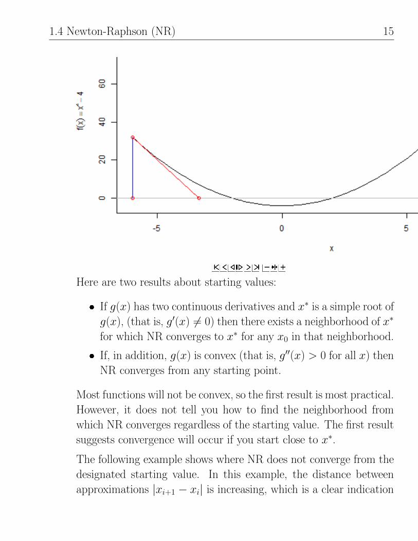
1.4 Newton-Raphson (NR) 15
Here are two results about starting values:
� If g(x) has two continuous derivatives and x∗ is a simple root of
g(x), (that is, g′(x) 6= 0) then there exists a neighborhood of x∗
for which NR converges to x∗ for any x0 in that neighborhood.
� If, in addition, g(x) is convex (that is, g′′(x) > 0 for all x) then
NR converges from any starting point.
Most functions will not be convex, so the first result is most practical.
However, it does not tell you how to find the neighborhood from
which NR converges regardless of the starting value. The first result
suggests convergence will occur if you start close to x∗.
The following example shows where NR does not converge from the
designated starting value. In this example, the distance between
approximations |xi+1 − xi| is increasing, which is a clear indication

16 Function Maximization
of a problem! A slightly different starting value (for example, 1.3)
converges nicely.
library(animation)
newton.method(function(x) 4 * atan(x), init = 1.4, rg = c(-10, 10), tol = 0.001)
5. Convergence order (or rate): If we let εi = |xi+1−xi| be the error of
our approximation of the root x∗ at the ith step, then we can show
with NR that if εi → 0 (that is, if NR converges) then
εi+1 = constant× ε2i .
That is, the size of the (i + 1)th step error is proportional to the
square of the ith step error. This is known as quadratic convergence,
in contrast to bisection which has a linear convergence:
εi+1 = constant× εi = 0.5εi constant = 0.5 for bisection.

1.5 Secant method 17
Quadratic convergence is typically faster than linear convergence.
That is, you should expect NR to converge in fewer iterations. The
caveat is robustness: NR is not guaranteed to converge in general,
but if it does, it converges faster typically than bisection.
1.5 Secant method
The secant method (Regula Falsi method) modifies NR iteration
xi+1 = xi −g(xi)
g′(xi)
by using a numerical approximation to g′(xi) based on xi and xi−1:
g′(xi).=
g(xi)− g(xi−1)
xi − xi−1which gives
xi+1 = xi −g(xi)
g(xi)− g(xi−1)(xi − xi−1).
This approach is especially popular when g′(xi) it is difficult to compute
Remarks
1. The secant method needs two starting values.
2. This is called the secant method because xi+1 is the abscissa of the
point of intersection between the secant line through (xi, g(xi)) and
(xi−1, g(xi−1)) and the x-axis.
3. As with NR, the secant method is sensitive to starting values.

18 Function Maximization
4. Establishing convergence of the secant method is a bit more delicate
than either NR or bisection. I will note that if the secant method
converges, then
εi+1 = constant× εpi ,
where p = 0.5(1 +√
5).= 1.618 (the golden ratio). This is called
super-linear convergence: faster than bisection, but slower than NR.
1.6 Illustration of NR and Secant methods
1.6.1 NR method
We’ve shown how to directly maximize
f (x) =log(x)
1 + x, 0 ≤ x ≤ 5.
Let’s see how well the NR and secant methods work here. For both
methods, we are searching for a root of the function
g(x) = f ′(x) =1
x(1 + x)− log(x)
(1 + x)2
=1
1 + x
(1
x− f (x)
).

1.6 Illustration of NR and Secant methods 19
Also note that
g′(x) = f ′′(x) = − 1
(1 + x)2
(1
x− f (x)
)+
1
1 + x
(− 1
x2− f ′(x)
)= − 1
1 + x
1
1 + x
(1
x− f (x)
)+
1
1 + x
(− 1
x2− f ′(x)
)= − 1
1 + xf ′(x)− 1
1 + x
(1
x2+ f ′(x)
)= − 1
1 + x
(1
x2+ 2f ′(x)
).
For NR, the iterative scheme is
xi+1 = xi −g(xi)
g′(xi)= xi + b(xi),
where
b(xi) = increment function at xi = − g(xi)
g′(xi),
that is, the increment function tells you how much the estimate changes.Before doing NR, let us look at some plots of the function and its
derivatives.
# f(x), function
f.f <- function(x) {log(x) / (1 + x)
}
# f'(x), 1st derivative
f.fp <- function(x) {(1/x - f.f(x)) / (1 + x)
}
# f''(x), 2nd derivative

20 Function Maximization
f.fpp <- function(x) {- (1/(x^2) + 2 * f.fp(x)) / (1 + x)
}
# plot function
library(ggplot2)
p1 <- ggplot(data.frame(x = c(1, 5.3)), aes(x))
p1 <- p1 + stat_function(fun = f.f)
p1 <- p1 + labs(title = "f(x) = log(x) / (1 + x)")
#print(p1)
p2 <- ggplot(data.frame(x = c(1, 5.3)), aes(x))
p2 <- p2 + geom_hline(yintercept = 0, alpha = 0.5)
p2 <- p2 + stat_function(fun = f.fp)
p2 <- p2 + labs(title = "g(x) = f'(x) = (1/x - f(x)) / (1 + x)")
#print(p2)
p3 <- ggplot(data.frame(x = c(1, 5.3)), aes(x))
p3 <- p3 + geom_hline(yintercept = 0, alpha = 0.5)
p3 <- p3 + stat_function(fun = f.fpp)
p3 <- p3 + labs(title = "g'(x) = f''(x) = (1/(x^2) + 2 * f'(x)) / (1 + x)")
#print(p3)
p4 <- ggplot(data.frame(x = c(1, 5.3)), aes(x))
p4 <- p4 + geom_hline(yintercept = 0, alpha = 0.5)
p4 <- p4 + stat_function(fun = function(x) {-f.fp(x) / f.fpp(x)})p4 <- p4 + stat_function(fun = function(x) {-x}, alpha = 0.25) # for later discussion
p4 <- p4 + labs(title = "NR increment function b(x): -f'(x)/f''(x)")
#print(p4)
library(gridExtra)
grid.arrange(p1, p2, p3, p4, ncol=2)

1.6 Illustration of NR and Secant methods 21
0.0
0.1
0.2
1 2 3 4 5x
y
f(x) = log(x) / (1 + x)
0.0
0.1
0.2
0.3
0.4
0.5
1 2 3 4 5x
y
g(x) = f'(x) = (1/x − f(x)) / (1 + x)
−1.00
−0.75
−0.50
−0.25
0.00
1 2 3 4 5x
y
g'(x) = f''(x) = (1/(x^2) + 2 * f'(x)) / (1 + x)
−6
−4
−2
0
1 2 3 4 5x
y
NR increment function b(x): −f'(x)/f''(x)
Looking at the plots of g(x), we see that x∗.= 3.5 or so. Because of
continuity and g′(x∗) 6= 0 we know that NR will converge, provided our
starting value is close to the root.
The plot of the increment function shows you that if you start to the
left of the root you will move to the right (b(xi) > 0) while if you start to
the right of the route you will move left (b(xi) < 0). In both cases, you’re

22 Function Maximization
moving in the right direction! (There is more to this story!)
NR is easy to program if you don’t build in any safeguards. Here is a
simple algorithm:
initialize xold = old guess, xnew = new guess
iterate while |xnew − xold| > ε (absolute convergence
� update old guess: xold = xnew
� update new guess: xnew = xold − g(xold)/g′(xold)
A problem here is that you may never satisfy the convergence criterion. A
simple way to avoid this problem is to keep track of how many iterations
you have performed, and do not allow this to exceed a prespecified limit.
# NR routine for finding root of g(x) = 0.
# Requires predefined g(x) and gp(x) = deriv of g(x)
# The iteration is controlled by:
# eps = absolute convergence criterion
# maxit = maximum allowable number of iterations
# Input: xnew = user prompted starting value
# Output: number of root, steps, and note
f.NR <- function(g, gp, xnew = 1, eps = 0.001, maxit = 35) {xold <- -Inf # needed so argument in while() loop is defined
i <- 1; # initial iteration index
NR.hist <- data.frame(i, xnew, diff = abs(xnew - xold)) # iteration history
while ((i <= maxit) & (abs(xnew - xold) > eps)) {i <- i + 1 # increment iteration
xold <- xnew # old guess is current guess
xnew <- xold - g(xold) / gp(xold) # new guess
NR.hist <- rbind(NR.hist, c(i, xnew, abs(xnew - xold))) # iteration history
}
out <- list()
out$root <- xnew
out$iter <- i

1.6 Illustration of NR and Secant methods 23
out$hist <- NR.hist
if (abs(xnew - xold) <= eps) {out$note <- paste("Absolute convergence of", eps, "satisfied")
}if (i > maxit) {out$note <- paste("Exceeded max iterations of ", maxit)
}return(out)
}
A few illustrations of our NR function follow:
out <- f.NR(f.fp, f.fpp)
out
## $root
## [1] 3.591
##
## $iter
## [1] 9
##
## $hist
## i xnew diff
## 1 1 1.000 Inf
## 2 2 1.500 5.000e-01
## 3 3 2.095 5.949e-01
## 4 4 2.719 6.242e-01
## 5 5 3.244 5.245e-01
## 6 6 3.526 2.828e-01
## 7 7 3.589 6.224e-02
## 8 8 3.591 2.471e-03
## 9 9 3.591 3.702e-06
##
## $note
## [1] "Absolute convergence of 0.001 satisfied"
# function value at root
f.f(out$root)
## [1] 0.2785
# try for a few more starting values
out <- f.NR(f.fp, f.fpp, xnew = 0.001)
out

24 Function Maximization
## $root
## [1] 3.591
##
## $iter
## [1] 19
##
## $hist
## i xnew diff
## 1 1 0.001000 Inf
## 2 2 0.002005 0.001005
## 3 3 0.004026 0.002022
## 4 4 0.008109 0.004082
## 5 5 0.016393 0.008284
## 6 6 0.033291 0.016898
## 7 7 0.067767 0.034476
## 8 8 0.136844 0.069077
## 9 9 0.267472 0.130629
## 10 10 0.489561 0.222088
## 11 11 0.823230 0.333669
## 12 12 1.274981 0.451751
## 13 13 1.834557 0.559576
## 14 14 2.458315 0.623758
## 15 15 3.044364 0.586049
## 16 16 3.440809 0.396445
## 17 17 3.578174 0.137365
## 18 18 3.591021 0.012846
## 19 19 3.591121 0.000101
##
## $note
## [1] "Absolute convergence of 0.001 satisfied"
# increased precision
out <- f.NR(f.fp, f.fpp, xnew = 3.5, eps = 1e-12)
out
## $root
## [1] 3.591
##
## $iter
## [1] 6
##
## $hist
## i xnew diff
## 1 1 3.500 Inf

1.6 Illustration of NR and Secant methods 25
## 2 2 3.586 8.626e-02
## 3 3 3.591 4.845e-03
## 4 4 3.591 1.427e-05
## 5 5 3.591 1.232e-10
## 6 6 3.591 0.000e+00
##
## $note
## [1] "Absolute convergence of 1e-12 satisfied"
out <- f.NR(f.fp, f.fpp, xnew = 5.1)
out
## $root
## [1] 3.591
##
## $iter
## [1] 11
##
## $hist
## i xnew diff
## 1 1 5.1000 Inf
## 2 2 0.4174 4.6825896
## 3 3 0.7189 0.3015235
## 4 4 1.1381 0.4191518
## 5 5 1.6703 0.5321824
## 6 6 2.2835 0.6132815
## 7 7 2.8942 0.6106185
## 8 8 3.3577 0.4635227
## 9 9 3.5608 0.2030951
## 10 10 3.5906 0.0297850
## 11 11 3.5911 0.0005505
##
## $note
## [1] "Absolute convergence of 0.001 satisfied"
# can not be evaluated (complex numbers)
out <- f.NR(f.fp, f.fpp, xnew = 5.2)
## Warning: NaNs produced
## Warning: NaNs produced
## Error: missing value where TRUE/FALSE needed

26 Function Maximization
General results
1. There is rapid convergence for 0.001 ≤ x0 ≤ 5.
2. The number of steps for convergence decreases as |x0−x∗| decreases.
3. The routine “blows up”, or fails to converge, for x0 > 5.2 because
the increment function b(xi) = −g(xi)/g′(xi) < −x. That is
xi+1 = xi −g(xi)
g′(xi)< 0
for x0 > 5.2 or so. The function g(x) is undefined for x ≤ 0 (unless
we want our numbers to be complex, which we don’t), so the routine
“crashes” for starting values x0 > 5.2.
A simple fix here would be to redefine any negative guesses for x to
be slightly positive (x = 0.01) to force g(x) and g′(x) to be evaluated
only for x > 0.
1.6.2 Secant method
The secant method is also easy to program. The algorithm for the iteration
xi+1 = xi −g(xi)
g(xi)− g(xi−1)(xi − xi−1)
is very similar to NR, except that two starting values are required.The script below provides this function and the performance is similar
to NR.
# Secant routine for finding root of g(x) = 0.
# Requires predefined g(x)
# The iteration is controlled by:
# eps = absolute convergence criterion

1.6 Illustration of NR and Secant methods 27
# maxit = maximum allowable number of iterations
# Input: xnew = user prompted starting value
# Input: xtwo = user prompted second starting value
# Output: number of root, steps, and note
f.secant <- function(g, xnew = 1, xtwo = 2, eps = 0.001, maxit = 35) {i <- 1; # initial iteration index
NR.hist <- data.frame(i, xnew, xtwo, diff = abs(xnew - xtwo)) # iteration history
while ((i <= maxit) & (abs(xnew - xtwo) > eps)) {i <- i + 1 # increment iteration
xold <- xtwo # 2nd previous guess
xtwo <- xnew # previous guess
xnew <- xtwo - g(xtwo) / (g(xtwo) - g(xold)) * (xtwo - xold) # new guess
NR.hist <- rbind(NR.hist, c(i, xnew, xtwo, abs(xnew - xold))) # iteration history
}
out <- list()
out$root <- xnew
out$iter <- i
out$hist <- NR.hist
if (abs(xnew - xold) <= eps) {out$note <- paste("Absolute convergence of", eps, "satisfied")
}if (i > maxit) {out$note <- paste("Exceeded max iterations of ", maxit)
}return(out)
}
A few illustrations of our secant function follow:
out <- f.secant(f.fp)
out
## $root
## [1] 3.591
##
## $iter
## [1] 10
##
## $hist
## i xnew xtwo diff
## 1 1 1.000 2.000 1.000000

28 Function Maximization
## 2 2 2.218 1.000 0.218473
## 3 3 2.395 2.218 1.394550
## 4 4 2.918 2.395 0.699813
## 5 5 3.232 2.918 0.837341
## 6 6 3.469 3.232 0.550437
## 7 7 3.567 3.469 0.334848
## 8 8 3.589 3.567 0.120641
## 9 9 3.591 3.589 0.024357
## 10 10 3.591 3.591 0.001757
# function value at root
f.f(out$root)
## [1] 0.2785
# try for a few more starting values
out <- f.secant(f.fp, xnew = 1, xtwo = 3)
out
## $root
## [1] 3.591
##
## $iter
## [1] 8
##
## $hist
## i xnew xtwo diff
## 1 1 1.000 3.000 2.00000
## 2 2 3.060 1.000 0.06045
## 3 3 3.114 3.060 2.11384
## 4 4 3.462 3.114 0.40162
## 5 5 3.558 3.462 0.44390
## 6 6 3.589 3.558 0.12652
## 7 7 3.591 3.589 0.03334
## 8 8 3.591 3.591 0.00253
# increased precision
out <- f.secant(f.fp, xnew = 1, xtwo = 4, eps = 1e-12)
out
## $root
## [1] 3.591
##

1.6 Illustration of NR and Secant methods 29
## $iter
## [1] 10
##
## $hist
## i xnew xtwo diff
## 1 1 1.000 4.000 3.000e+00
## 2 2 3.968 1.000 3.236e-02
## 3 3 3.938 3.968 2.938e+00
## 4 4 3.500 3.938 4.678e-01
## 5 5 3.611 3.500 3.265e-01
## 6 6 3.592 3.611 9.238e-02
## 7 7 3.591 3.592 2.001e-02
## 8 8 3.591 3.591 1.090e-03
## 9 9 3.591 3.591 1.324e-05
## 10 10 3.591 3.591 8.737e-09
out <- f.secant(f.fp, xnew = 1, xtwo = 5.2)
out
## $root
## [1] 3.591
##
## $iter
## [1] 17
##
## $hist
## i xnew xtwo diff
## 1 1 1.0000 5.2000 4.200000
## 2 2 5.1026 1.0000 0.097410
## 3 3 5.0092 5.1026 4.009196
## 4 4 0.7144 5.0092 4.388177
## 5 5 4.9572 0.7144 0.051958
## 6 6 4.9066 4.9572 4.192177
## 7 7 1.4048 4.9066 3.552449
## 8 8 4.7503 1.4048 0.156333
## 9 9 4.6083 4.7503 3.203483
## 10 10 2.3875 4.6083 2.362800
## 11 11 4.2278 2.3875 0.380430
## 12 12 3.9781 4.2278 1.590638
## 13 13 3.4070 3.9781 0.820803
## 14 14 3.6355 3.4070 0.342548
## 15 15 3.5959 3.6355 0.188899
## 16 16 3.5910 3.5959 0.044557
## 17 17 3.5911 3.5910 0.004817

30 Function Maximization
# can not be evaluated (complex numbers)
out <- f.secant(f.fp, xnew = 1, xtwo = 5.5)
## Warning: NaNs produced
## Warning: NaNs produced
## Error: missing value where TRUE/FALSE needed

Chapter 1
MultivariateMaximization
1.1 Variations of Newton-Raphson
Let x˜ = [x1, x2, . . . , xp]> be a vector input to scalar-valued function f (x˜)
that we wish to maximize. That is, f : Rp → R1. Define
g(x˜) = df (x˜) =
g1(x˜)
g2(x˜)...
gp(x˜)
=
∂f1(x˜)/∂x1∂f2(x˜)/∂x2...
∂fp(x˜)/∂xp
,that is, g(x˜) is a column vector of partial derivatives of f (x˜).
A standard approach to maximizing f (x˜) is to solve the system of p
possibly non-linear equations
g(x˜) =
g1(x˜)
g2(x˜)...
gp(x˜)
=
0
0...
0
≡ 0˜p,

2 Multivariate Maximization
That is, locate roots of g(x˜) and check for maxima.
I will focus on variations of NR to solve g(x˜) = 0˜p. To generalize the
1-D NR, let
dg(x˜) =
dg1(x˜)
dg2(x˜)...
dgp(x˜)
=
∂2f (x˜)/∂x21 ∂2f (x˜)/∂x1∂x2 · · · ∂2f (x˜)/∂x1∂xp∂2f (x˜)/∂x2∂x1 ∂2f (x˜)/∂x22 · · · ∂2f (x˜)/∂x2∂xp... ... . . . ...
∂2f (x˜)/∂xp∂x1 ∂2f (x˜)/∂xp∂x2 · · · ∂2f (x˜)/∂x2p
p-by-p
be the p-by-pmatrix of second partial derivatives. If x˜∗ = [x∗1, x∗2, . . . , x
∗p]>
is a root of g(x˜) (that is, g(x˜∗) = 0˜p) then for x˜ near x˜∗ a linear Taylor
series expansion gives
0˜p = g(x˜∗) .= g(x˜) + [ dg(x˜)](x˜∗ − x˜) or
x˜∗ .= x˜− [ dg(x˜)]−1g(x˜),
assuming the inverse exists.
This suggests an iterative scheme for approximating x˜∗ From an initial
guess x˜0:x˜i+1 = x˜i − [ dg(x˜i)]−1g(x˜i), i = 0, 1, . . . .
Keep in mind that x˜i is a vector and [ dg(x˜i)] is a matrix.
An absolute convergence criterion would lead to iterating until
|x˜i+1 − x˜i| =
√√√√ p∑`=1
(x`,i+1 − x`,i)2 < ε.

1.1 Variations of Newton-Raphson 3
If the root x˜∗ is far from 0˜p, then it makes sense to use a relative convergence
criterion
|x˜i+1 − x˜i||x˜i| < ε.
Using either criterion, we iterate until change in the estimated root between
steps is small.
Remarks
1. If for some i we have x˜i+1−x˜i = 0˜, then [ dg(x˜i)]−1g(x˜i) = 0˜, which
implies g(x˜i) = 0˜. That is, we found a root.
2. The relative convergence criterion is usually preferred to the absolute
convergence criterion.
3. Convergence to a root is quadratic, assuming the initial guess is close
to x˜∗.4. If you are trying to maximize f (x˜), you should check that x˜∗ corresponds
to a (local or global) maximum and not a minimum!
5. The initial guess is very important. In many statistical problems
there is a natural starting point.
6. NR Can be interpreted geometrically in terms of iterative tangent
plane approximations.
7. Instead of computing x˜i+1 from x˜i via
x˜i+1 = x˜i − [ dg(x˜i)]−1g(x˜i),

4 Multivariate Maximization
it is preferable to avoid matrix inversion and directly solve
[ dg(x˜i)](x˜i+1 − x˜i) = −g(x˜i)for (x˜i+1 − x˜i), which leads to x˜i+1.
8. NR is one a large collection of iterative schemes of the form
x˜i+1 = x˜i − J−1i g(x˜i), i = 0, 1, . . . ,
for a suitably defined p-by-p matrix Ji.
� The multivariate secant method sets Ji.= dg(x˜) evaluated
numerically.
� Rescaled simple iteration takes
Ji = J (same for each iteration)
=
α1 0
α2. . .
0 αp
where
α` =∂g`(x˜)
∂x`
∣∣∣∣x˜0
is the partial of g` with respect to element x` evaluated at the
initial guess x˜0.The point to recognize is that if such an iteration converges,
then from remark (1) above, we know it converges to a root x˜∗.

1.1 Variations of Newton-Raphson 5
9. If we relate NR to our original objective of maximizing f (x˜) then
the NR iteration has to form
x˜i+1 = x˜i − [ d2f (x˜i)]−1 df (x˜i), i = 0, 1, . . . ,
where
df (x˜i) = p-by-1 vector of partial derivatives evaluated at x˜id2f (x˜i) = p-by-p matrix of second partial derivatives.
NR tells us that starting from x˜i to move in the direction of
[ d2f (x˜i)]−1 df (x˜i)to get the (i+1)th step estimate x˜i+1. However, there is no guarantee
that
f (x˜i+1) = f (x˜i − [ d2f (x˜i)]−1 df (x˜i)) > f (x˜i).That is, there is no guarantee that we are increasing the function
value as the iteration proceeds.
A popular modification of NR is to consider
x˜i+1(α) = x˜i − α[ d2f (x˜i)]−1 df (x˜i),where the “step-size” scalar α is chosen to maximize f (x˜i+1(α)).
Finding α that maximizes f (x˜i+1(α)) for a given x˜i is a single
variable maximization problem. In practice, it usually suffices to
descretize α, that is, set
α = −1,−0.9, . . . ,−0.1, [not zero], 0.1, 0.2, . . . , 1[NR], 1.1, . . . , 2
and maximize f (x˜i+1(α)) over this grid. Once you find the maximizing
value αmax, you set
x˜i+1 = x˜i − αmax[ d2f (x˜i)]−1 df (x˜i)

6 Multivariate Maximization
and continue iterating.
This modification slows down NR, but usually leads to a much more
stable algorithm that is less likely to wander off far from a maximum.
1.2 Maximum likelihood estimate (MLE)
Suppose we have a random variable Y˜ = [Y1, Y2, . . . , Yn]> with the probability
density or mass function that depends on θ˜ = [θ1, θ2, . . . , θn]>, say Pr[y˜|θ˜] =
Pr[Y1, Y2, . . . , Yn|θ˜]. The Y s may be a random sample with common
distribution h(yi|θ˜) and if so
Pr[Y1, Y2, . . . , Yn|θ˜] =
n∏i=1
h(yi|θ˜).
However, the setup is more general, allowing for arbitrary joint distributions.
The likelihood function for θ˜ given data Y˜ = [Y1, Y2, . . . , Yn]> is
L(θ˜) = Pr[y˜|θ˜]
and the log-likelihood function is
`(θ˜) = log(L(θ˜)).
The MLE of θ˜, say ˆvtheta, Is the value that minimizesL(θ˜), or equivalently
`(θ˜). Typically, MLEs are obtained by solving the likelihood equations
Score function: ˙(θ˜) =
∂`1(x˜)/∂θ1∂`2(x˜)/∂θ2...
∂`p(x˜)/∂θp
= 0˜p.

1.2 Maximum likelihood estimate (MLE) 7
Let
¨(θ˜) =
[∂2`
∂θi∂θj
]p-by-p
ith row, jth column element
Be the matrix of second partial derivatives of `(θ˜) with respect to elements
of θ˜. Following Remark 9 on page 5, one might consider the following NR
procedure to compute θ˜:
θ˜i+1= θ˜i − [ ¨(θ˜i)]−1 ˙(θ˜i), i = 0, 1, . . . .
Note that convergence to a root θ˜∗ implies ˙(θ˜∗) = 0, as desired. Of
course, we need to check whether the root is the MLE!
An alternative iterative procedure is known as Fisher’s Method of
Scoring. Thinking of ¨(θ˜) as a random variable (that is, it depends on a
random Y˜ ) define the expected Fisher information matrix as
I(θ˜) = E[− ¨(θ˜)] = E[ ˙(θ˜) ˙>(θ˜)],
where the last equality follows under “standard conditions”.
The Method of Scoring replaces − ¨(θ˜i) by I(θ˜) in the iteration
θ˜i+1= θ˜i + [I(θ˜)]−1 ˙(θ˜i), i = 0, 1, . . . .
This is an example of Remark 8 on page 4.
The NR adjustment −[ ¨(θ˜i)]−1 ˙(θ˜i) Is a function of the derivative of
`(θ˜) relative to the second derivative. We saw in the one-dimensional
example of maximizing f (x) = log(x)/(1 + x) that the adjustment can
overshoot the root or lead to moving slowly to the root. These tend to
occur when `(θ˜) is either very peaked or very flat near the maximum. One
possible remedy is to use the average value of the second derivative, I(θ˜),
instead in the iteration.

8 Multivariate Maximization
Both NR and Scoring may be improved by adding a step-size parameter
α, for example
θ˜i+1= θ˜i − α[ ¨(θ˜i)]−1 ˙(θ˜i),
where α is chosen to maximize `(θ˜i+1(α)) for fixed θ˜i. Standard distribution
theory for MLEs shows that
θ˜ ∼ Normalp(θ˜,Var[θ˜])
Under suitable conditions, where
Var[θ˜] = I−1(θ˜)
can be estimated by either
Var[θ˜] = I−1(θ˜) inverse of expected Fisher information at MLE
= −[ ¨(θ˜i)]−1 observed information matrix at MLE.
In some cases the two estimates agree. There is no general consensus on
which estimator is to be preferred. Most knowledgeable statisticians tend
to use the observed information matrix.
I will consider two examples of computing MLEs, a single parameter
case and a multiparameter case.
Example: Multinomial with one parameter Suppose Y˜ = [Y1, Y2, . . . , Yn]>
has a multinomial distribution with sample size m and probabilities pi(θ)
that depend on a single parameter θ > 0, with pmf
Pr[Y˜ |θ] =m!∏ni=1 yi!
n∏i=1
pi(θ)yi.

1.2 Maximum likelihood estimate (MLE) 9
The log-likelihood, ignoring the constant, is
`(θ) = log
{n∏i=1
pi(θ)yi
}
=
n∑i
yi log(pi(θ)).
The MLE is obtained by solving the likelihood equation
˙(θ) =
n∑i
yi∂
∂θlog(pi(θ))
=
n∑i
yip′i(θ)
pi(θ)where p′i(θ) =
∂pi(θ)
∂θ.
Rather than do things in general, I will consider the following genetics
problem1 as a classic example of maximum likelihood estimation due to
Fisher (1925). Let n = 4 cells have class probabilities given by
p1(θ) = (2 + θ)/4
p2(θ) = p3(θ) = (1− θ)/4
p4(θ) = θ/4
where 0 < θ < 1. The parameter θ is to be estimated from the observed
frequencies Y˜ = [1997, 906, 904, 32]> from a sample of size m = 3839.
The log-likelihood function is
`(θ) =
4∑i
yi log(pi(θ))
= 4 log(0.25) + y1 log(2 + θ) + (y2 + y3) log(1− θ) + y4 log(θ),
1Ronald Thisted (1988) Elements of Statistical Computing. pp. 175–6.

10 Multivariate Maximization
so its derivatives are given by
˙(θ) =y1
2 + θ− y2 + y3
1− θ+y4θ
¨(θ) = − y1(2 + θ)2
− y2 + y3(1− θ)2
− y4θ2.
To get I(θ), treat yis as random variables in ¨(θ) and recall that Yi ∼Binomial(m, pi(θ)). So, E[Yi] = mpi(θ), which implies
I(θ) = E[− ¨(θ)]
= m
{p1(θ)
(2 + θ)2+p2(θ) + p3(θ)
(1− θ)2+p4(θ)
θ2
}= 0.25m
{1
2 + θ+
2
1− θ+
1
θ
}.
Note that for this example
˙(θ) =y1
2 + θ− y2 + y3
1− θ+y4θ
=y1(1− θ)θ − (y2 + y3)(2 + θ)θ + y4(2 + θ)(1− θ)
(2 + θ)(1− θ)θ.
The numerator is a quadratic function of θ, so the likelihood equation
˙(θ) = 0
has two roots. It can also be shown that one root is negative, so the
only candidate for the MLE is the positive root. Although the roots can
be found analytically, it is informative to see whether NR and Scoring
converge. Note that even though the score function is defined for θ < 0,
the log-likelihood function is not.

1.2 Maximum likelihood estimate (MLE) 11
The coding for this example is very simple because we have a single
parameter. Thus, NR iterates as follows
θi+1 = θi −˙(θi)
¨(θi), i = 0, 1, . . . ,
while Fisher scoring iterates via
θi+1 = θi +˙(θi)
I(θ), i = 0, 1, . . . .
Implementation, NR The script below defines the likelihood function,
and related derivatives for Thisted’s multinomial example. I have placed
theta as the first argument so the ggplot function stat_function can use
that variable as the x-axis with the y variable passed as an additional
argument.
# maximizing multinomial likelihood
y <- c(1997, 906, 904, 32)
m <- sum(y)
# functions: log-likelihood, 1st derivative, 2nd derivative, and expected info
f.l <- function(theta, y) {temp <- y[1] * log(2 + theta) +
(y[2] + y[3]) * log(1 - theta) +
y[4] * log(theta)
return(temp)
}f.dl <- function(theta, y) {
temp <- y[1] / (2+theta) +
- (y[2] + y[3]) / (1 - theta) +
y[4] / theta
return(temp)
}f.ddl <- function(theta, y) {
temp <- - (y[1] / (2 + theta)^2 +
(y[2] + y[3]) / (1-theta)^2 +
y[4] / theta^2

12 Multivariate Maximization
)
return(temp)
}f.info <- function(theta, y) {
temp <- 0.25 * sum(y) * (1 / (2 + theta) +
2 / (1 - theta) +
1 / theta )
return(temp)
}
Notice that the log-likelihood increases rapidly from zero to a maximum
at approximately 0.05.
# plot functions
library(ggplot2)
p1 <- ggplot(data.frame(theta = c(0.0001, 0.4)), aes(theta))
p1 <- p1 + stat_function(fun = f.l, args = list(y))
p1 <- p1 + labs(title = "log-likelihood")
#print(p1)
p2 <- ggplot(data.frame(theta = c(0.01, 0.4)), aes(theta))
p2 <- p2 + geom_hline(yintercept = 0, alpha = 0.5)
p2 <- p2 + stat_function(fun = f.dl, args = list(y))
p2 <- p2 + labs(title = "1st derivative")
#print(p2)
p3 <- ggplot(data.frame(theta = c(0.01, 0.4)), aes(theta))
p3 <- p3 + geom_hline(yintercept = 0, alpha = 0.5)
p3 <- p3 + stat_function(fun = f.ddl, args = list(y))
p3 <- p3 + labs(title = "2nd derivative")
#print(p3)
p4 <- ggplot(data.frame(theta = c(0.01, 0.4)), aes(theta))
p4 <- p4 + stat_function(fun = f.info, args = list(y))
p4 <- p4 + labs(title = "expected info")
#print(p4)
library(gridExtra)
grid.arrange(p1, p2, p3, p4, ncol=2)

1.2 Maximum likelihood estimate (MLE) 13
800
900
1000
1100
1200
0.0 0.1 0.2 0.3 0.4theta
y
log−likelihood
−2000
−1000
0
1000
2000
0.0 0.1 0.2 0.3 0.4theta
y
1st derivative
−3e+05
−2e+05
−1e+05
0e+00
0.0 0.1 0.2 0.3 0.4theta
y
2nd derivative
25000
50000
75000
100000
0.0 0.1 0.2 0.3 0.4theta
y
expected info
Because we have an explicit and relatively simple expression for the
derivative of the score function, NR is a logical candidate for the iterative
method. The function below is effectively the same as the NR function
from the chapter on Function Maximization, except for the y argument
for the observed frequencies. Note that the functions g and gp defined in
the function are replaced by the functions f.dl and f.ddl passed to the

14 Multivariate Maximization
f.NR() function.
# NR routine for finding root of g(x) = 0.
# Requires predefined g(x) and gp(x) = deriv of g(x)
# The iteration is controlled by:
# eps = absolute convergence criterion
# maxit = maximum allowable number of iterations
# Input: xnew = user prompted starting value
# Output: number of root, steps, and note
f.NR <- function(g, gp, xnew = 1, eps = 0.001, maxit = 35, y = c(1,1,1,1)) {xold <- -Inf # needed so argument in while() loop is defined
i <- 1; # initial iteration index
NR.hist <- data.frame(i, xnew, diff = abs(xnew - xold)) # iteration history
while ((i <= maxit) & (abs(xnew - xold) > eps)) {i <- i + 1 # increment iteration
xold <- xnew # old guess is current guess
xnew <- xold - g(xold, y) / gp(xold, y) # new guess
NR.hist <- rbind(NR.hist, c(i, xnew, abs(xnew - xold))) # iteration history
}
out <- list()
out$root <- xnew
out$iter <- i
out$hist <- NR.hist
if (abs(xnew - xold) <= eps) {out$note <- paste("Absolute convergence of", eps, "satisfied")
}if (i > maxit) {out$note <- paste("Exceeded max iterations of ", maxit)
}return(out)
}
A few illustrations of our NR function follow.
out0.01 <- f.NR(f.dl, f.ddl, xnew = 0.01, y = y)
out0.01
## $root
## [1] 0.03571

1.2 Maximum likelihood estimate (MLE) 15
##
## $iter
## [1] 6
##
## $hist
## i xnew diff
## 1 1 0.01000 Inf
## 2 2 0.01734 0.0073377
## 3 3 0.02647 0.0091313
## 4 4 0.03344 0.0069732
## 5 5 0.03558 0.0021373
## 6 6 0.03571 0.0001323
##
## $note
## [1] "Absolute convergence of 0.001 satisfied"
out0.05 <- f.NR(f.dl, f.ddl, xnew = 0.05, y = y)
out0.05
## $root
## [1] 0.0357
##
## $iter
## [1] 4
##
## $hist
## i xnew diff
## 1 1 0.05000 Inf
## 2 2 0.03095 0.0190512
## 3 3 0.03512 0.0041720
## 4 4 0.03570 0.0005826
##
## $note
## [1] "Absolute convergence of 0.001 satisfied"
out0.20 <- f.NR(f.dl, f.ddl, xnew = 0.20, y = y)
out0.20
## $root
## [1] -0.4668
##
## $iter
## [1] 6
##

16 Multivariate Maximization
## $hist
## i xnew diff
## 1 1 0.20000 Inf
## 2 2 -0.09568 0.2956825
## 3 3 -0.26453 0.1688450
## 4 4 -0.44285 0.1783252
## 5 5 -0.46669 0.0238361
## 6 6 -0.46681 0.0001253
##
## $note
## [1] "Absolute convergence of 0.001 satisfied"
out0.40 <- f.NR(f.dl, f.ddl, xnew = 0.40, y = y)
out0.40
## $root
## [1] 0.0357
##
## $iter
## [1] 5
##
## $hist
## i xnew diff
## 1 1 0.40000 Inf
## 2 2 0.02246 0.3775390
## 3 3 0.03098 0.0085169
## 4 4 0.03513 0.0041502
## 5 5 0.03570 0.0005755
##
## $note
## [1] "Absolute convergence of 0.001 satisfied"
out0.50 <- f.NR(f.dl, f.ddl, xnew = 0.50, y = y)
out0.50
## $root
## [1] -0.4668
##
## $iter
## [1] 7
##
## $hist
## i xnew diff
## 1 1 0.5000 Inf

1.2 Maximum likelihood estimate (MLE) 17
## 2 2 0.1413 0.3586592
## 3 3 -0.0699 0.2112391
## 4 4 -0.1985 0.1286382
## 5 5 -0.4080 0.2094407
## 6 6 -0.4659 0.0578853
## 7 7 -0.4668 0.0009514
##
## $note
## [1] "Absolute convergence of 0.001 satisfied"
We see that if the starting value is less than 0.05 that the routine
converges to 0.0357. If the start value is 0.2 or above, the routine sometimes
converges to 0.0357, and sometimes converges to a negative root -0.4668.
Using the positive root as the MLE, the estimated standard deviation
of the MLE is approximately 0.006.
# estimated standard deviation via Fisher's information
sqrt(1/f.info(out0.05$root, y))
## [1] 0.005838
# estimated standard deviation via second derivative
sqrt(-1/f.ddl(out0.05$root, y))
## [1] 0.006027
To understand why the routine converges from a starting point of 0.4,
but not from a starting point of 0.2, I plotted the function θ − ˙(θ)/ ¨(θ).
This function gives the next guess for the root when the current guess is
θ. Looking at this function, we see that for starting values between about
0.08 and 0.38 the next guess is negative, while for starting values near zero
or 0.4 the next guess is near the root. If the starting value is near 0.5 or
greater, the next guess is near 0.15, so the third guess will be negative!
One might be led to a simple choice of θ = 0.5 by simply noting
that θ must be in (0, 1) and by taking the midpoint of that interval.

18 Multivariate Maximization
This “easy way out” of the starting-value problem leads to disaster for
Newton’s method, which converges to the wrong root! This difficulty is
easily avoided by plotting the log-likelihood before selecting a starting
value, as we have done.
# plot functions
library(ggplot2)
p <- ggplot(data.frame(theta = c(0.0001, 0.55)), aes(theta))
p <- p + geom_hline(yintercept = 0, alpha = 0.5)
p <- p + stat_function(fun = function(theta, y)
{theta - f.dl(theta, y) / f.ddl(theta, y)}, args = list(y))
p <- p + labs(title = "theta - f.dl(theta, y) / f.ddl(theta, y)")
print(p)
−0.1
0.0
0.1
0.2
0.0 0.2 0.4theta
y
theta − f.dl(theta, y) / f.ddl(theta, y)
Implementation, Fisher’s Scoring For comparison, we shall
also show how the method of scoring performs.
To perform the Fisher’s Scoring, a simple replacement from -f.ddl to
f.info is needed.

1.2 Maximum likelihood estimate (MLE) 19
# Fisher's scoring routine for finding root of g(x) = 0.
# Requires predefined g(x) and gp(x) = deriv of g(x)
# The iteration is controlled by:
# eps = absolute convergence criterion
# maxit = maximum allowable number of iterations
# Input: xnew = user prompted starting value
# Output: number of root, steps, and note
f.FS <- function(g, gp, xnew = 1, eps = 0.001, maxit = 35, y = c(1,1,1,1)) {xold <- -Inf # needed so argument in while() loop is defined
i <- 1; # initial iteration index
NR.hist <- data.frame(i, xnew, diff = abs(xnew - xold)) # iteration history
while ((i <= maxit) & (abs(xnew - xold) > eps)) {i <- i + 1 # increment iteration
xold <- xnew # old guess is current guess
xnew <- xold + g(xold, y) / gp(xold, y) # new guess
NR.hist <- rbind(NR.hist, c(i, xnew, abs(xnew - xold))) # iteration history
}
out <- list()
out$root <- xnew
out$iter <- i
out$hist <- NR.hist
if (abs(xnew - xold) <= eps) {out$note <- paste("Absolute convergence of", eps, "satisfied")
}if (i > maxit) {out$note <- paste("Exceeded max iterations of ", maxit)
}return(out)
}
A few illustrations of our Fisher’s Scoring follow.
out0.01 <- f.FS(f.dl, f.info, xnew = 0.01, y = y)
out0.01
## $root
## [1] 0.03571
##
## $iter

20 Multivariate Maximization
## [1] 4
##
## $hist
## i xnew diff
## 1 1 0.01000 Inf
## 2 2 0.03404 2.404e-02
## 3 3 0.03561 1.569e-03
## 4 4 0.03571 9.753e-05
##
## $note
## [1] "Absolute convergence of 0.001 satisfied"
out0.05 <- f.FS(f.dl, f.info, xnew = 0.05, y = y)
out0.05
## $root
## [1] 0.03577
##
## $iter
## [1] 3
##
## $hist
## i xnew diff
## 1 1 0.05000 Inf
## 2 2 0.03657 0.0134256
## 3 3 0.03577 0.0008088
##
## $note
## [1] "Absolute convergence of 0.001 satisfied"
out0.20 <- f.FS(f.dl, f.info, xnew = 0.20, y = y)
out0.20
## $root
## [1] 0.03574
##
## $iter
## [1] 4
##
## $hist
## i xnew diff
## 1 1 0.20000 Inf
## 2 2 0.04350 0.1564991
## 3 3 0.03619 0.0073130

1.2 Maximum likelihood estimate (MLE) 21
## 4 4 0.03574 0.0004461
##
## $note
## [1] "Absolute convergence of 0.001 satisfied"
out0.40 <- f.FS(f.dl, f.info, xnew = 0.40, y = y)
out0.40
## $root
## [1] 0.03576
##
## $iter
## [1] 4
##
## $hist
## i xnew diff
## 1 1 0.40000 Inf
## 2 2 0.04914 0.3508553
## 3 3 0.03652 0.0126207
## 4 4 0.03576 0.0007615
##
## $note
## [1] "Absolute convergence of 0.001 satisfied"
out0.50 <- f.FS(f.dl, f.info, xnew = 0.50, y = y)
out0.50
## $root
## [1] 0.03577
##
## $iter
## [1] 4
##
## $hist
## i xnew diff
## 1 1 0.50000 Inf
## 2 2 0.05112 0.4488799
## 3 3 0.03664 0.0144800
## 4 4 0.03577 0.0008704
##
## $note
## [1] "Absolute convergence of 0.001 satisfied"

22 Multivariate Maximization
In all cases, Fisher’s Scoring method converged quickly to the correct
root. This can be understood by looking at a plot of θ+ ˙(θ)/I(θ), which
gives the next guess in the Scoring routine from the current guess at θ.
For θ between about 0 and 0.5, the next guess is very close to the root, so
the method converges rapidly!
# plot functions
library(ggplot2)
p <- ggplot(data.frame(theta = c(0.0001, 0.55)), aes(theta))
p <- p + geom_hline(yintercept = 0, alpha = 0.5)
p <- p + stat_function(fun = function(theta, y)
{theta + f.dl(theta, y) / f.info(theta, y)}, args = list(y))
p <- p + labs(title = "theta + f.dl(theta, y) / f.info(theta, y)")
print(p)
0.00
0.01
0.02
0.03
0.04
0.05
0.0 0.2 0.4theta
y
theta + f.dl(theta, y) / f.info(theta, y)

Chapter 1
Logistic Regression andNewton-Raphson
1.1 Introduction
The logistic regression model is widely used in biomedical settings to model
the probability of an event as a function of one or more predictors. For a
single predictor X model stipulates that the log odds of “success” is
log
(p
1− p
)= β0 + β1X
or, equivalently, as
p =exp(β0 + β1X)
1 + exp(β0 + β1X)
where p is the event probability. Depending on the sign of β1, p either
increases or decreases with X and follows a “sigmoidal” trend. If β1 = 1
then p does not depend on X .

2 Logistic Regression and Newton-Raphson
X
Log-
Odd
s
-5 0 5
-50
5
- slope
+ slope
0 slope
Logit Scale
X
Pro
babi
lity
-5 0 5
0.0
0.2
0.4
0.6
0.8
1.0
0 slope
+ slope - slope
Probability Scale
Note that the logit transformation is undefined when p = 0 or p = 1.
To overcome this problem, researchers use the empirical logits, defined
by log{(p + 0.5/n)/(1 − p + 0.5/n)}, where n is the sample size or the
number of observations on which p is based.
Example: Mortality of confused flour beetles The aim of an
experiment originally reported by Strand (1930) and quoted by Bliss
(1935) was to assess the response of the confused flour beetle, Tribolium
confusum, to gaseous carbon disulphide (CS2). In the experiment, prescribed
volumes of liquid carbon disulphide were added to flasks in which a tubular
cloth cage containing a batch of about thirty beetles was suspended.
Duplicate batches of beetles were used for each concentration of CS2. At
the end of a five-hour period, the proportion killed was recorded and the
actual concentration of gaseous CS2 in the flask, measured in mg/l, was

1.1 Introduction 3
determined by a volumetric analysis. The mortality data are given in the
table below.
## Beetles data set
# conc = CS2 concentration
# y = number of beetles killed
# n = number of beetles exposed
# rep = Replicate number (1 or 2)
beetles <- read.table("http://statacumen.com/teach/SC1/SC1_11_beetles.dat", header = TRUE)
beetles$rep <- factor(beetles$rep)
conc y n rep1 49.06 2 29 12 52.99 7 30 13 56.91 9 28 14 60.84 14 27 15 64.76 23 30 16 68.69 29 31 17 72.61 29 30 18 76.54 29 29 1
conc y n rep9 49.06 4 30 2
10 52.99 6 30 211 56.91 9 34 212 60.84 14 29 213 64.76 29 33 214 68.69 24 28 215 72.61 32 32 216 76.54 31 31 2
Plot the observed probability of mortality and the empirical logits withlinear and quadratic LS fits (which are not the same as the logistic MLEfits).
0.25
0.50
0.75
1.00
50 60 70conc
p.ha
t rep
1
2
Observed mortality, probability scale
−2
0
2
4
50 60 70conc
emp.
logi
t rep
1
2
Empirical logit with `naive' LS fits (not MLE)

4 Logistic Regression and Newton-Raphson
In a number of articles that refer to these data, the responses from
the first two concentrations are omitted because of apparent non-linearity.
Bliss himself remarks that
. . . in comparison with the remaining observations, the two
lowest concentrations gave an exceptionally high kill. Over the
remaining concentrations, the plotted values seemed to form
a moderately straight line, so that the data were handled as
two separate sets, only the results at 56.91 mg of CS2 per litre
being included in both sets.
However, there does not appear to be any biological motivation for this
and so here they are retained in the data set.
Combining the data from the two replicates and plotting the empirical
logit of the observed proportions against concentration gives a relationship
that is better fit by a quadratic than a linear relationship,
log
(p
1− p
)= β0 + β1X + β2X
2.
The right plot below shows the linear and quadratic model fits to the
observed values with point-wise 95% confidence bands on the logit scale,
and on the left is the same on the proportion scale.

1.2 The Model 5
●
●
●
●
●
●
●
●
●
●
●
●
●
●
●●
0.00
0.25
0.50
0.75
1.00
50 60 70conc
p.ha
t
modelorder
●
●
linear
quadratic
rep
● 1
2
Observed and predicted mortality, probability scale
●
●
●
●
●
●
●
●
●
●
●
●
●
●
●
●
−2.5
0.0
2.5
5.0
7.5
50 60 70conc
emp.
logi
t
modelorder
●
●
linear
quadratic
rep
● 1
2
Observed and predicted mortality, logit scale
We will focus on how to estimate parameters of a logistic regression
model using maximum likelihood (MLEs).
1.2 The Model
Suppose Yiind∼ Binomial(mi, pi) random variables, i = 1, 2, . . . , n. For
example, Yi is the number of beetle deaths from a total of mi beetles at
concentration Xi over the i = 1, 2, . . . , n concentrations. Note that mi
can equal 1 (and often does in observational studies). Recall that the
probability mass function for a Binomial is
Pr[Yi = yi|pi] =
(mi
yi
)pyii (1− pi)mi−yi, yi = 0, 1, 2, . . . ,mi.
So the joint distribution of Y1, Y2, . . . , Yn is
Pr[Y1 = y1, . . . , Yn = yn|p1, . . . , pn] =
n∏i=1
(mi
yi
)pyii (1− pi)mi−yi.

6 Logistic Regression and Newton-Raphson
The log-likelihood, ignoring the constant, is
` = log {Pr[Y1 = y1, . . . , Yn = yn|p1, . . . , pn]}
∝ log
{n∏i=1
pyii (1− pi)mi−yi
}
=
n∑i=1
{yi log(pi) + (mi − yi) log(1− pi)}
=
n∑i=1
{mi log(1− pi) + yi log
(pi
1− pi
)}. (1.1)
The logistic regression model assumes that pi depends on r covariates
xi1, xi2, . . . , xir through
log
(pi
1− pi
)= β0 + β1xi1 + · · · + βrxir
=[
1 xi1 xi2 · · · xir]β0
β1
β2...
βr
= x˜>i β˜.
The covariates or predictors are fixed, while β˜ is an unknown parameter
vector. Regardless, pi is a function of both x˜i and β˜,
pi ≡ pi(x˜i, β˜) or pi(β˜) (suppressing x˜i, since it is known).

1.2 The Model 7
Note that the model implies
pi =exp(x˜>i β˜)
1 + exp(x˜>i β˜)and
1− pi =1
1 + exp(x˜>i β˜).
To obtain the MLEs we first write the log-likelihood in (1.1) as a function
of β˜,
`(β˜) =
n∑i=1
mi log
(1
1 + exp(x˜>i β˜)
)+ yi log
exp(x˜>i β˜)
1+exp(x˜>i β˜)
11+exp(x˜>i β˜)
=
n∑i=1
{mi log
(1
1 + exp(x˜>i β˜)
)+ yi(x˜>i β˜)
}
=
n∑i=1
{yi(x˜>i β˜)−mi log(1 + exp(x˜>i β˜))
}. (1.2)
To maximize `(β˜), we compute the score function
˙(β˜) =
∂`(β˜)/∂β0
∂`(β˜)/∂β1...
∂`(β˜)/∂βr
and solve the likelihood equations
˙(β˜) = 0˜r+1.

8 Logistic Regression and Newton-Raphson
Note that ˙(β˜) is an (r + 1)-by-1 vector, so we are solving a system of
r + 1 non-linear equations.
Let us now compute ∂`(β˜)/∂βj where βj is a generic element of β˜. It is
important to realize that `(β˜) depends on the elements of β˜ only through
the values of x˜i, which is linear. Thus each of the partial derivatives in˙(β˜) will have the same form!
Now
∂`(β˜)
∂βj=
n∑i=1
{yi∂
∂βj(x˜>i β˜)−mi
∂
∂βjlog(1 + exp(x˜>i β˜))
}(1.3)
where
∂
∂βj(x˜>i β˜) =
∂
∂βj{β0 + β1xi1 + · · · + βrxir}
= xij (where xi0 ≡ 1) (1.4)
and
∂
∂βjlog(1 + exp(x˜>i β˜)) =
∂∂βj
exp(x˜>i β˜)
1 + exp(x˜>i β˜)
=exp(x˜>i β˜)
1 + exp(x˜>i β˜)
∂
∂βj(x˜>i β˜)
= pi(x˜i, β˜)xij, (1.5)
and so
∂`(β˜)
∂βj=
n∑i=1
{yixij −mipi(x˜i, β˜)xij
}=
n∑i=1
{xij(yi −mipi(x˜i, β˜))
}, j = 0, 1, . . . , r. (1.6)

1.2 The Model 9
For NR, we also need the second partial derivatives
∂2`
∂βj∂βk=
∂
∂βk
∂`(β˜)
∂βj
=
n∑i=1
{xij
(yi −mi
∂pi(x˜i, β˜)
∂βk
)}.
It is straightforward to show
∂pi(x˜i, β˜)
∂βk= x˜ikpi(x˜i, β˜)(1− pi(x˜i, β˜)).
So
∂2`
∂βj∂βk= −
n∑i=1
{xijxikmipi(x˜i, β˜)(1− pi(x˜i, β˜))
}.
Recall that Var(Yi) = mipi(x˜i, β˜)(1− pi(x˜i, β˜)), from the variance of the
binomial distribution. Let Var(Yi) = vi(β˜) = vi(x˜i, β˜).
For programming, it is convenient to use vector/matrix notation. Let
Y˜ =
Y1...
Yn
p˜ =
p1...
pn
m˜ =
m1...
mn
X =
x˜>1...x˜>n log
(p˜
1− p˜)
=
log(
p11−p1
)...
log(
pn1−pn
) operate elementwise.
The model can be written
log
(p˜
1− p˜)
= Xβ˜,

10 Logistic Regression and Newton-Raphson
or, for the ith element,
log
(pi
1− pi
)= x˜>i β˜.
Also, define vectors
exp(Xβ˜) =
exp(x˜>1 β˜)...
exp(x˜>nβ˜)
implies p˜ =exp(Xβ˜)
1 + exp(Xβ˜)
log(1˜+ exp(Xβ˜)) =
log(1˜+ exp(x˜>1 β˜))...
log(1˜+ exp(x˜>nβ˜))
,where operations are performed elementwise.
Then
`(β˜) =
n∑i=1
{yi log(pi) + (mi − yi) log(1− pi)}
= y˜> log(p˜) + (m˜ − y˜)> log(1− p˜)
=
n∑i=1
{yix˜>i β˜ −mi log(1 + exp(x˜>i β˜))
}= y˜>Xβ˜ −m˜> log(1 + exp(Xβ˜)) (1.7)
and
˙(β˜) =
∂`(β˜)/∂β0
∂`(β˜)/∂β1...
∂`(β˜)/∂βr
= X>(y˜−m˜ ◦ p˜(β˜)),

1.2 The Model 11
where ◦ denotes the Hadamard or elementwise product, so that
m˜ ◦ p˜(β˜) =
m1p1(β˜)...
mnpn(β˜)
.If we think of
E[Y˜ ] =
E[Y1]...
E[Yn]
=
m1p1(β˜)...
mnpn(β˜)
=
µ1(β˜)...
µn(β˜)
≡ µ˜(β˜).
then the likelihood equations have the form
˙(β˜) = X>(y˜−m˜ ◦ p˜(β˜)) = X>(y˜− µ˜(β˜)) = 0˜.This is the same form as the “Normal equations” for computing LS estimates
normal-theory regression. Also, with
¨(β˜) =
[∂2`
∂βj∂βk
]= −
n∑i=1
{xijxikvi(β˜)
},
if we define the diagonal matrix
v(β˜) = diag(v1(β˜), v2(β˜), . . . , vn(β˜)) =
v1(β˜) 0
v2(β˜). . .
0 vn(β˜)
,then it is easy to see that
¨(β˜) = −X>v(β˜)X,
that is, the jth row and kth column element of X>v(β˜)X is∑n
i=1 xijxikvi(β˜).

12 Logistic Regression and Newton-Raphson
It is important to recognize that for the logistic regression model
I(β˜) = E[− ¨(β˜)] = X>v(β˜)X = − ¨(β˜),
that is, NR and Scoring methods are equivalent. In particular, the NR
methods iterates via
β˜i+1= β˜i − [ ¨(β˜i)]−1 ˙(β˜i)= β˜i + (X>v(β˜)X)−1X>(y˜− µ˜(β˜)), i = 0, 1, . . . ,
until convergence (hopefully) to the MLE β˜.
I will note that the observed information matrix ¨(β˜) is independent
of Y˜ for logistic regression with the logit link, but not for other binomial
response models, such as probit regression. Thus, for other models there
is a difference between NR and Fisher Scoring. Many packages, including
SAS, use Fisher Scoring as default.
For logistic regression, large sample theory indicates that the MLE β˜has an approximate multivariate normal distribution
β˜ ·∼ Normalr+1(β˜, I−1(β˜))
where
I−1(β˜)·∼ (X>v(β˜)X)−1.
This result can be used to get estimated standard deviations for each
regression coefficient and p-values for testing significance of effects. In
particular, if
σj(β˜) =√ith diagonal element of I−1(β˜)
then
βj·∼ Normal(βj, σ
2j (β˜)).

1.2 The Model 13
A p-value for testing H0 : βj = 0 can be based on
βj − 0
σj(β˜)
·∼ Normal(0, 1).
General remarks
1. There is an extensive literature on conditions for existence and uniqueness
of MLEs for logistic regression.
2. MLEs may not exist. One case is when you have “separation” of
covariates (e.g., all successes to left and all failures to right for some
value of x).
3. Convergence is sensitive to starting values.
For the model
log
(pi
1− pi
)= β0 + β1xi1 + · · · + βrxir
the following starting values often work well, especially if regression
effects are not too strong:
β0 start = log
(p
1− p
)= log
( ∑ni=1
yimi
1−∑n
i=1yimi
)= log
( ∑ni=1 yi∑n
i=1(mi − yi)
),
and β1 start = · · · = βr start = 0, where p =∑n
i=1yimi
is the overall
proportion. This is the MLE for β0 if β1 = · · · = βr = 0.

14 Logistic Regression and Newton-Raphson
4. If you have two observations Y1ind∼ Binomial(m1, p) and Y2
ind∼Binomial(m2, p) with the same success probability p, then the log-
likelihood (excluding constants) is the same regardless of whether
you treat Y1 and Y2 as separate binomial observations or you combine
them as Y1 +Y2ind∼ Binomial(m1 +m2, p). More generally, Bernoulli
observations with the same covariate vector can be combined into
a single binomial response (provided observations are independent)
when defining the log-likelihood.
1.3 Implementation
Function f.lr.p() computes the probability vector under a logistic regression
model
pi =exp(x˜>i β˜)
1 + exp(x˜>i β˜)
from the design matrix X and regression vector β˜. The function assumes
that X and β˜ are of the correct dimensions.
f.lr.p <- function(X, beta) {# compute vector p of probabilities for logistic regression with logit link
X <- as.matrix(X)
beta <- as.vector(beta)
p <- exp(X %*% beta) / (1 + exp(X %*% beta))
return(p)
}
Function f.lr.l() computes the binomial log-likelihood function
` ∝n∑i=1
{yi log(pi) + (mi − yi) log(1− pi)} (1.8)

1.3 Implementation 15
from three input vectors: the counts y˜, the sample sizes m˜ , and the
probabilities p˜. The function is arbitrary, working for all Binomial models.
f.lr.l <- function(y, m, p) {# binomial log likelihood function
# input: vectors: y = counts; m = sample sizes; p = probabilities
# output: log-likelihood l, a scalar
l <- t(y) %*% log(p) + t(m - y) %*% log(1 - p)
return(l)
}
The Fisher’s scoring routine for logistic regression f.lr.FS() finds the
MLE β˜ (without line-search), following from the derivation above.
Convergence is based on the number of iterations, maxit = 50, Euclidean
distance between successive iterations of β˜, eps1, and distance between
successive iterations of the log-likelihood, eps2. The absolute difference
in log-likelihoods between successive steps is new for us, but a sensible
addition.
Comments
1. The iteration scheme
β˜i+1= β˜i + (X>v(β˜)X)−1X>(y˜− µ˜(β˜))
= β˜i + (inverse Info)(Score func)
is implemented below in two ways. The commented method takes
the inverse of the information matrix, which can be computationally
intensive and (occasionally) numerically unstable. The uncommented
method solves
(X>v(β˜)X)(β˜i+1− β˜i) = X>(y˜− µ˜(β˜))
for (increm) = (β˜i+1−β˜i). The new estimate is β˜i+1
= β˜i+(increm).

16 Logistic Regression and Newton-Raphson
2. Line search is implemented by evaluating the log-likelihood over a
range (−1, 2) of α step sizes and choosing the step that gives the
largest log-likelihood.
3. It calls both f.lr.l(), the function to calculate log-likelihood, and
f.lr.p(), the function to compute vector p of probabilities for LR.
f.lr.FS <- function(X, y, m, beta.1
, eps1 = 1e-6, eps2 = 1e-7, maxit = 50) {# Fisher's scoring routine for estimation of LR model (with line search)
# Input:
# X = n-by-(r+1) design matrix
# y = n-by-1 vector of success counts
# m = n-by-1 vector of sample sizes
# beta.1 = (r+1)-by-1 vector of starting values for regression est
# Iteration controlled by:
# eps1 = absolute convergence criterion for beta
# eps2 = absolute convergence criterion for log-likelihood
# maxit = maximum allowable number of iterations
# Output:
# out = list containing:
# beta.MLE = beta MLE
# NR.hist = iteration history of convergence differences
# beta.hist = iteration history of beta
# beta.cov = beta covariance matrix (inverse Fisher's information matrix at MLE)
# note = convergence note
beta.2 <- rep(-Inf, length(beta.1)) # init beta.2
diff.beta <- sqrt(sum((beta.1 - beta.2)^2)) # Euclidean distance
llike.1 <- f.lr.l(y, m, f.lr.p(X, beta.1)) # update loglikelihood
llike.2 <- f.lr.l(y, m, f.lr.p(X, beta.2)) # update loglikelihood
diff.like <- abs(llike.1 - llike.2) # diff
if (is.nan(diff.like)) { diff.like <- 1e9 }
i <- 1 # initial iteration index
alpha.step <- seq(-1, 2, by = 0.1)[-11] # line search step sizes, excluding 0
NR.hist <- data.frame(i, diff.beta, diff.like, llike.1, step.size = 1) # iteration history
beta.hist <- matrix(beta.1, nrow = 1)
while ((i <= maxit) & (diff.beta > eps1) & (diff.like > eps2)) {

1.3 Implementation 17
i <- i + 1 # increment iteration
# update beta
beta.2 <- beta.1 # old guess is current guess
mu.2 <- m * f.lr.p(X, beta.2) # m * p is mean
# variance matrix
v.2 <- diag(as.vector(m * f.lr.p(X, beta.2) * (1 - f.lr.p(X, beta.2))))
score.2 <- t(X) %*% (y - mu.2) # score function
# this increment version inverts the information matrix
# Iinv.2 <- solve(t(X) %*% v.2 %*% X) # Inverse information matrix
# increm <- Iinv.2 %*% score.2 # increment, solve() is inverse
# this increment version solves for (beta.2-beta.1) without inverting Information
increm <- solve(t(X) %*% v.2 %*% X, score.2) # solve for increment
# line search for improved step size
llike.alpha.step <- rep(NA, length(alpha.step)) # init llike for line search
for (i.alpha.step in 1:length(alpha.step)) {llike.alpha.step[i.alpha.step] <- f.lr.l(y, m
, f.lr.p(X, beta.2 + alpha.step[i.alpha.step] * increm))
}# step size index for max increase in log-likelihood (if tie, [1] takes first)
ind.max.alpha.step <- which(llike.alpha.step == max(llike.alpha.step))[1]
beta.1 <- beta.2 + alpha.step[ind.max.alpha.step] * increm # update beta
diff.beta <- sqrt(sum((beta.1 - beta.2)^2)) # Euclidean distance
llike.2 <- llike.1 # age likelihood value
llike.1 <- f.lr.l(y, m, f.lr.p(X, beta.1)) # update loglikelihood
diff.like <- abs(llike.1 - llike.2) # diff
# iteration history
NR.hist <- rbind(NR.hist, c(i, diff.beta, diff.like, llike.1, alpha.step[ind.max.alpha.step]))
beta.hist <- rbind(beta.hist, matrix(beta.1, nrow = 1))
}
# prepare output
out <- list()
out$beta.MLE <- beta.1
out$iter <- i - 1
out$NR.hist <- NR.hist
out$beta.hist <- beta.hist
v.1 <- diag(as.vector(m * f.lr.p(X, beta.1) * (1 - f.lr.p(X, beta.1))))
Iinv.1 <- solve(t(X) %*% v.1 %*% X) # Inverse information matrix
out$beta.cov <- Iinv.1

18 Logistic Regression and Newton-Raphson
if (!(diff.beta > eps1) & !(diff.like > eps2)) {out$note <- paste("Absolute convergence of", eps1, "for betas and"
, eps2, "for log-likelihood satisfied")
}if (i > maxit) {
out$note <- paste("Exceeded max iterations of ", maxit)
}return(out)
}
1.3.1 Example (cont.): Mortality of confused flourbeetles
Load the beetles dataset and fit quadratic model. The model is
log
(p
1− p
)= β0 + β1X + β2X
2.
where X = CS2 level.
## Beetles data set
# conc = CS2 concentration
# y = number of beetles killed
# n = number of beetles exposed
# rep = Replicate number (1 or 2)
beet <- read.table("http://statacumen.com/teach/SC1/SC1_11_beetles.dat", header = TRUE)
beet$rep <- factor(beet$rep)
# create data variables: m, y, X
n <- nrow(beet)
m <- beet$n
y <- beet$y
X.temp <- beet$conc
# quadratic model
X <- matrix(c(rep(1,n), X.temp, X.temp^2), nrow = n)
colnames(X) <- c("Int", "conc", "conc2")
r <- ncol(X) - 1 # number of regression coefficients - 1

1.3 Implementation 19
# initial beta vector
beta.1 <- c(log(sum(y) / sum(m - y)), rep(0, r))
# fit betas using our Fisher Scoring function
out <- f.lr.FS(X, y, m, beta.1)
out
## $beta.MLE
## [,1]
## Int 7.968410
## conc -0.516593
## conc2 0.006372
##
## $iter
## [1] 6
##
## $NR.hist
## i diff.beta diff.like llike.1 step.size
## 1 1 Inf Inf -322.7 1.0
## 2 2 2.531e+01 1.329e+02 -189.8 1.4
## 3 3 2.701e+01 6.658e+00 -183.2 1.2
## 4 4 4.931e+00 1.050e+00 -182.1 1.2
## 5 5 9.305e-01 8.664e-03 -182.1 1.0
## 6 6 6.066e-03 1.195e-06 -182.1 1.0
## 7 7 1.171e-06 8.527e-14 -182.1 0.9
##
## $beta.hist
## [,1] [,2] [,3]
## [1,] 0.4263 0.0000 0.000000
## [2,] -24.8787 0.5947 -0.002996
## [3,] 2.1174 -0.2900 0.004244
## [4,] 7.0444 -0.4867 0.006130
## [5,] 7.9745 -0.5168 0.006373
## [6,] 7.9684 -0.5166 0.006372
## [7,] 7.9684 -0.5166 0.006372
##
## $beta.cov
## Int conc conc2
## Int 121.80053 -4.115854 3.444e-02
## conc -4.11585 0.139603 -1.172e-03
## conc2 0.03444 -0.001172 9.878e-06
Looking at the output we see that the routine converged in 6 iterations.
At each step, the log-likelihood increased, and the norm of the difference

20 Logistic Regression and Newton-Raphson
between successive estimates eventually decreased to zero. The estimates
are 7.968 for the constant term, −0.5166 for the linear term, and 0.0064
for the quadratic term.
# create a parameter estimate table
beta.Est <- out$beta.MLE
beta.SE <- sqrt(diag(out$beta.cov)) # sqrt diag inverse Information matrix
beta.z <- beta.Est / beta.SE
beta.pval <- 2 * pnorm(-abs(beta.z))
beta.coef <- data.frame(beta.Est, beta.SE, beta.z, beta.pval)
beta.coef
## beta.Est beta.SE beta.z beta.pval
## Int 7.968410 11.036328 0.722 0.47028
## conc -0.516593 0.373635 -1.383 0.16678
## conc2 0.006372 0.003143 2.027 0.04262
Compare our parameter estimate table above to the one from the glm()function.
## compare to the glm() fit:
summary(glm.beetles2)$call
## glm(formula = cbind(y, n - y) ~ conc + conc2, family = binomial,
## data = beetles)
summary(glm.beetles2)$coefficients
## Estimate Std. Error z value Pr(>|z|)
## (Intercept) 7.968410 11.036327 0.722 0.47028
## conc -0.516593 0.373635 -1.383 0.16678
## conc2 0.006372 0.003143 2.027 0.04262
Therefore, our model predictions match those from the beginning of
the chapter using the glm() function.

1.3 Implementation 21
●
●
●
●
●
●
●●
0.25
0.50
0.75
1.00
50 60 70conc
p.ha
t rep
● 1
2
FS Observed and predicted mortality, probability scale
●
●
●
●
●
●
●●
0.25
0.50
0.75
1.00
50 60 70conc
p.ha
t rep
● 1
2
glm Observed and predicted mortality, probability scale
Also note that the observed and fitted proportions are fairly close,
which qualitatively suggests a reasonable model for the data.
1.3.2 Example: Leukemia white blood cell types
This example illustrates modeling with continuous and factor predictors.
Feigl and Zelen1 reported the survival time in weeks and the white cell
blood count (WBC) at time of diagnosis for 33 patients who eventually
died of acute leukemia. Each person was classified as AG+ or AG−,
indicating the presence or absence of a certain morphological characteristic
in the white cells. Four variables are given in the data set: WBC, a binary
factor or indicator variable AG (1 for AG+, 0 for AG−), NTOTAL
(the number of patients with the given combination of AG and WBC),
1Feigl, P., Zelen, M. (1965) Estimation of exponential survival probabilities with concomitantinformation. Biometrics 21, 826–838. Survival times are given for 33 patients who died from acutemyelogenous leukaemia. Also measured was the patient’s white blood cell count at the time ofdiagnosis. The patients were also factored into 2 groups according to the presence or absence of amorphologic characteristic of white blood cells. Patients termed AG positive were identified by thepresence of Auer rods and/or significant granulation of the leukaemic cells in the bone marrow atthe time of diagnosis.

22 Logistic Regression and Newton-Raphson
and NRES (the number of NTOTAL that survived at least one year from
the time of diagnosis).
The researchers are interested in modelling the probability p of surviving
at least one year as a function of WBC and AG. They believe that WBC
should be transformed to a log scale, given the skewness in the WBC
values.
## Leukemia white blood cell types example
# ntotal = number of patients with IAG and WBC combination
# nres = number surviving at least one year
# ag = 1 for AG+, 0 for AG-
# wbc = white cell blood count
# lwbc = log white cell blood count
# p.hat = Emperical Probability
leuk <- read.table("http://statacumen.com/teach/SC1/SC1_11_leuk.dat", header = TRUE)
leuk$lwbc <- log(leuk$wbc)
leuk$p.hat <- leuk$nres / leuk$ntotal
ntotal nres ag wbc lwbc p.hat1 1 1 1 75 4.32 1.002 1 1 1 230 5.44 1.003 1 1 1 260 5.56 1.004 1 1 1 430 6.06 1.005 1 1 1 700 6.55 1.006 1 1 1 940 6.85 1.007 1 1 1 1000 6.91 1.008 1 1 1 1050 6.96 1.009 3 1 1 10000 9.21 0.3310 1 1 0 300 5.70 1.0011 1 1 0 440 6.09 1.0012 1 0 1 540 6.29 0.0013 1 0 1 600 6.40 0.0014 1 0 1 1700 7.44 0.0015 1 0 1 3200 8.07 0.0016 1 0 1 3500 8.16 0.0017 1 0 1 5200 8.56 0.0018 1 0 0 150 5.01 0.0019 1 0 0 400 5.99 0.0020 1 0 0 530 6.27 0.0021 1 0 0 900 6.80 0.0022 1 0 0 1000 6.91 0.0023 1 0 0 1900 7.55 0.0024 1 0 0 2100 7.65 0.0025 1 0 0 2600 7.86 0.0026 1 0 0 2700 7.90 0.0027 1 0 0 2800 7.94 0.0028 1 0 0 3100 8.04 0.0029 1 0 0 7900 8.97 0.0030 2 0 0 10000 9.21 0.00

1.3 Implementation 23
As an initial step in the analysis, consider the following model:
log
(p
1− p
)= β0 + β1LWBC + β2AG,
where LWBC = log(WBC). The model is best understood by separating
the AG+ and AG− cases. For AG− individuals, AG=0 so the model
reduces to
log
(p
1− p
)= β0 + β1LWBC + β2 ∗ 0 = β0 + β1LWBC.
For AG+ individuals, AG=1 and the model implies
log
(p
1− p
)= β0 + β1LWBC + β2 ∗ 1 = (β0 + β2) + β1LWBC.
The model without AG (i.e., β2 = 0) is a simple logistic model where
the log-odds of surviving one year is linearly related to LWBC, and is
independent of AG. The reduced model with β2 = 0 implies that there is
no effect of the AG level on the survival probability once LWBC has been
taken into account.
Including the binary predictor AG in the model implies that there
is a linear relationship between the log-odds of surviving one year and
LWBC, with a constant slope for the two AG levels. This model includes
an effect for the AG morphological factor, but more general models are
possible. A natural extension would be to include a product or interaction
effect, a point that I will return to momentarily.
The parameters are easily interpreted: β0 and β0 +β2 are intercepts for
the population logistic regression lines for AG− and AG+, respectively.
The lines have a common slope, β1. The β2 coefficient for the AG indicator
is the difference between intercepts for the AG+ and AG− regression lines.

24 Logistic Regression and Newton-Raphson
A picture of the assumed relationship is given below for β1 < 0. The
population regression lines are parallel on the logit scale only, but the
order between AG groups is preserved on the probability scale.
LWBC
Log-
Odd
s
-5 0 5
-10
-50
5
IAG=1
IAG=0
Logit Scale
LWBC
Pro
babi
lity
-5 0 5
0.0
0.2
0.4
0.6
0.8
1.0
IAG=0
IAG=1
Probability Scale
Before looking at output for the equal slopes model, note that the
data set has 30 distinct AG and LWBC combinations, or 30 “groups” or
samples. Only two samples have more than 1 observation. The majority of
the observed proportions surviving at least one year (number surviving≥ 1
year/group sample size) are 0 (i.e., 0/1) or 1 (i.e., 1/1). This sparseness
of the data makes it difficult to graphically assess the suitability of the
logistic model (because the estimated proportions are almost all 0 or 1).
Let’s fit the model with our Fisher’s Scoring method.
# create data variables: m, y, X
n <- nrow(leuk)
m <- leuk$ntotal
y <- leuk$nres
X <- matrix(c(rep(1,n), leuk$lwbc, leuk$ag), nrow = n)
colnames(X) <- c("Int", "lwbc", "ag")

1.3 Implementation 25
r <- ncol(X) - 1 # number of regression coefficients - 1
# initial beta vector
beta.1 <- c(log(sum(y) / sum(m - y)), rep(0, r))
# fit betas using our Fisher Scoring function
out <- f.lr.FS(X, y, m, beta.1)
out
## $beta.MLE
## [,1]
## Int 5.543
## lwbc -1.109
## ag 2.520
##
## $iter
## [1] 5
##
## $NR.hist
## i diff.beta diff.like llike.1 step.size
## 1 1 Inf 1.000e+09 -21.00 1.0
## 2 2 6.081e+00 7.168e+00 -13.84 1.3
## 3 3 5.602e-01 4.164e-01 -13.42 1.2
## 4 4 1.814e-01 4.077e-03 -13.42 1.0
## 5 5 3.747e-03 1.267e-06 -13.42 1.0
## 6 6 1.368e-06 1.901e-13 -13.42 0.9
##
## $beta.hist
## [,1] [,2] [,3]
## [1,] -0.6931 0.0000 0.000
## [2,] 4.9039 -0.9312 2.188
## [3,] 5.3702 -1.0819 2.460
## [4,] 5.5399 -1.1082 2.518
## [5,] 5.5433 -1.1088 2.520
## [6,] 5.5433 -1.1088 2.520
##
## $beta.cov
## Int lwbc ag
## Int 9.1350 -1.3400 0.4507
## lwbc -1.3400 0.2125 -0.1798
## ag 0.4507 -0.1798 1.1896
Looking at the output we see that the routine converged in 5 iterations.

26 Logistic Regression and Newton-Raphson
At each step, the log-likelihood increased, and the norm of the difference
between successive estimates eventually decreased to zero. The estimates
are 5.543 for the constant term, −1.109 for the linear term, and 2.52 for
the quadratic term.
# create a parameter estimate table
beta.Est <- out$beta.MLE
beta.SE <- sqrt(diag(out$beta.cov)) # sqrt diag inverse Information matrix
beta.z <- beta.Est / beta.SE
beta.pval <- 2 * pnorm(-abs(beta.z))
beta.coef <- data.frame(beta.Est, beta.SE, beta.z, beta.pval)
beta.coef
## beta.Est beta.SE beta.z beta.pval
## Int 5.543 3.0224 1.834 0.06664
## lwbc -1.109 0.4609 -2.405 0.01616
## ag 2.520 1.0907 2.310 0.02088
Compare our parameter estimate table above to the one from the glm()
function.
## compare to the glm() fit:
summary(glm.i.l)$call
## glm(formula = cbind(nres, ntotal - nres) ~ ag + lwbc, family = binomial,
## data = leuk)
summary(glm.i.l)$coefficients
## Estimate Std. Error z value Pr(>|z|)
## (Intercept) 5.543 3.0224 1.834 0.06664
## ag1 2.520 1.0907 2.310 0.02088
## lwbc -1.109 0.4609 -2.405 0.01615
Given that the model fits reasonably well, a test of H0 : β2 = 0 might
be a primary interest here. This checks whether the regression lines are
identical for the two AG levels, which is a test for whether AG affects the

1.3 Implementation 27
survival probability, after taking LWBC into account. This test is rejected
at any of the usual significance levels, suggesting that the AG level affects
the survival probability (assuming a very specific model).
A plot of the predicted survival probabilities as a function of LWBC,
using AG as the plotting symbol, indicates that the probability of surviving
at least one year from the time of diagnosis is a decreasing function of
LWBC. For a given LWBC the survival probability is greater for AG+
patients than for AG− patients. This tendency is consistent with the
observed proportions, which show little information about the exact form
of the trend.
# plot observed and predicted proportions
# leuk$p.hat calculated earlier
leuk$p.MLE <- f.lr.p(X, out$beta.MLE) #$
library(ggplot2)
p <- ggplot(leuk, aes(x = lwbc, y = p.hat, colour = ag))
p <- p + geom_line(aes(y = p.MLE))
# fitted values
p <- p + geom_point(aes(y = p.MLE), size=2)
# observed values
p <- p + geom_point(size = 2, alpha = 0.5)
p <- p + labs(title = "FS Observed and predicted probability of 1+ year survival")
print(p)

28 Logistic Regression and Newton-Raphson
●
●●
●
●
●●
●
●
●
●
●●
●
●●
●
●
●
●
●●
● ● ●●● ●● ●0.00
0.25
0.50
0.75
1.00
5 6 7 8 9lwbc
p.ha
t ag
●
●
0
1
FS Observed and predicted probability of 1+ year survival
The plot from our Fisher’s Scoring method above is the same as the
plot below from the glm() procedure.

1.3 Implementation 29
●
●●
●
●
●●
●
●
●
●
●●
●
●●
●
●
●
●
●●
● ● ●●● ●● ●0.00
0.25
0.50
0.75
1.00
5 6 7 8 9lwbc
p.ha
t ag
●
●
0
1
glm Observed and predicted probability of 1+ year survival
To complete this example, the estimated survival probabilities satisfy
log
(p
1− p
)= 5.54− 1.11 LWBC + 2.52 AG.
For AG− individuals with AG=0, this reduces to
log
(p
1− p
)= 5.54− 1.11 LWBC,
or equivalently,
p =exp(5.54− 1.11 LWBC)
1 + exp(5.54− 1.11 LWBC).
For AG+ individuals with AG=1,
log
(p
1− p
)= 5.54− 1.11 LWBC + 2.52(1) = 8.06− 1.11 LWBC,

30 Logistic Regression and Newton-Raphson
or
p =exp(8.06− 1.11 LWBC)
1 + exp(8.06− 1.11 LWBC).
Although the equal slopes model appears to fit well, a more general
model might fit better. A natural generalization here would be to add an
interaction, or product term, AG ∗ LWBC to the model. The logistic
model with an AG effect and the AG ∗ LWBC interaction is equivalent
to fitting separate logistic regression lines to the two AG groups. This
interaction model provides an easy way to test whether the slopes are
equal across AG levels. I will note that the interaction term is not needed
here.

Chapter 1
Bootstrap
1.1 Introduction
Statistical theory attempts to answer three basic questions:
1. How should I collect my data?
2. How should I analyze and summarize the data that I’ve collected?
3. How accurate are my data summaries?
Question 3 consitutes part of the process known as statistical inference.
The bootstrap makes certain kinds of statistical inference1. Let’s look at
an example.
Example: Aspirin and heart attacks, large-sample theory
Does aspirin prevent heart attacks in healthy middle-aged men? A con-
trolled, randomized, double-blind study was conducted and gathered the
following data.
1Efron (1979), “Bootstrap methods: another look at the jackknife.” Ann. Statist. 7, 1–26

2 Bootstrap
(fatal plus non-fatal)
heart attacks subjects
aspirin group: 104 11037
placebo group: 189 11034
A good experimental design, such as this one, simplifies the results! The
ratio of the two rates (the risk ratio) is
θ =104/11037
189/11034= 0.55.
Because of the solid experimental design, we can believe that the aspirin-
takers only have 55% as many heart attacks as the placebo-takers.
We are not really interested in the estimated ratio θ, but the true
ratio, θ. That is the ratio if we could treat all possible subjects, not just
a sample of them. Large sample theory tells us that the log risk ratio has
an approximate Normal distribution. The standard error of the log risk
ratio is estimated simply by the square root of the sum of the reciprocals
of the four frequencies:
SE(log(RR)) =
√1
104+
1
189+
1
11037+
1
11034= 0.1228
The 95% CI for log(θ) is
log(θ)± 1.96× SE(log(RR)), (−0.839,−0.357),
and expontiating gives the CI on the ratio scale,
exp{log(θ)± 1.96× SE(log(RR))}, (0.432, 0.700).
The same data that allowed us to estimate the ratio θ with θ = 0.55 also
allowed us to get an idea of the estimate’s accuracy.

1.2 Bootstrap 3
Example: Aspirin and strokes, large-sample theory The as-
pirin study tracked strokes as well as heart attacks.
strokes subjects
aspirin group: 119 11037
placebo group: 98 11034
The ratio of the two rates (the risk ratio) is
θ =119/11037
98/11034= 1.21.
It looks like aspirin is actually harmful, now, however the 95% interval for
the true stroke ratio θ is (0.925, 1.583). This includes the neutral value
θ = 1, at which aspirin would be no better or worse than placebo for
strokes.
1.2 Bootstrap
The bootstrap is a data-based simulation method for statistical inference,
which can be used to produce inferences like those in the previous slides.
The term “bootstrap” comes from literature. In “The Adventures of Baron
Munchausen”, by Rudolph Erich Raspe, the Baron had fallen to the bot-
tom of a deep lake, and he thought to get out by pulling himself up by
his own bootstraps.
1.2.1 Ideal versus Bootstrap world, sampling dis-tributions
Ideal world
1. Population of interest

4 Bootstrap
2. Obtain many simple random samples (SRSs) of size n
3. For each SRS, calculate statistic of interest (θ)
4. Sampling distribution is the distribution of the calculated statistic
Bootstrap world
1. Population of interest; One empirical distribution based on a sample
of size n
2. Obtain many bootstrap resamples of size n
3. For each resample, calculate statistic of interest (θ∗)
4. Bootstrap distribution is the distribution of the calculated statistic
5. Bootstrap distribution estimates the sampling distribution centered
at the statistic (not the parameter).
Example: Aspirin and strokes, bootstrap Here’s how the boot-
strap works in the stroke example. We create two populations:
� the first consisting of 119 ones and 11037− 119 = 10918 zeros,
� the second consisting of 98 ones and 11034− 98 = 10936 zeros.
We draw with replacement a sample of 11037 items from the first popu-
lation, and a sample of 11034 items from the second population. Each is
called a bootstrap sample. From these we derive the bootstrap replicate
of θ:
θ∗ =Proportion of ones in bootstrap sample 1
Proportion of ones in bootstrap sample 2.

1.2 Bootstrap 5
Repeat this process a large number of times, say 10000 times, and obtain
10000 bootstrap replicates θ∗. The summaries are in the code, followed
by a histogram of bootstrap replicates, θ∗.
# sample size (n) and successes (s) for sample 1 (aspirin) and 2 (placebo)
n <- c(11037, 11034)
s <- c( 119, 98)
# data for samples 1 and 2, where 1 = success (stroke), 0 = failure (no stroke)
dat1 <- c(rep(1, s[1]), rep(0, n[1] - s[1]))
dat2 <- c(rep(1, s[2]), rep(0, n[2] - s[2]))
# draw R bootstrap replicates
R <- 10000
# init location for bootstrap samples
bs1 <- rep(NA, R)
bs2 <- rep(NA, R)
# draw R bootstrap resamples of proportions
for (i in 1:R) {# proportion of successes in bootstrap samples 1 and 2
# (as individual steps for group 1:)
resam1 <- sample(dat1, n[1], replace = TRUE)
success1 <- sum(resam1)
bs1[i] <- success1 / n[1]
# (as one line for group 2:)
bs2[i] <- sum(sample(dat2, n[2], replace = TRUE)) / n[2]
}# bootstrap replicates of ratio estimates
rat <- bs1 / bs2
# sort the ratio estimates to obtain bootstrap CI
rat.sorted <- sort(rat)
# 0.025th and 0.975th quantile gives equal-tail bootstrap CI
CI.bs <- c(rat.sorted[round(0.025*R)], rat.sorted[round(0.975*R+1)])
CI.bs
## [1] 0.9399 1.5878
## Plot the bootstrap distribution with CI
# First put data in data.frame for ggplot()
dat.rat <- data.frame(rat)
library(ggplot2)
p <- ggplot(dat.rat, aes(x = rat))
p <- p + geom_histogram(aes(y=..density..)

6 Bootstrap
, binwidth=0.02
, colour="black", fill="white")
# Overlay with transparent density plot
p <- p + geom_density(alpha=0.2, fill="#FF6666")
# vertical line at 1 and CI
p <- p + geom_vline(aes(xintercept=1), colour="#BB0000", linetype="dashed")
p <- p + geom_vline(aes(xintercept=CI.bs[1]), colour="#00AA00", linetype="longdash")
p <- p + geom_vline(aes(xintercept=CI.bs[2]), colour="#00AA00", linetype="longdash")
p <- p + labs(title = "Bootstrap distribution of relative risk ratio, strokes")
p <- p + xlab("ratio (red = 1, green = bootstrap CI)")
print(p)
## Warning: position stack requires constant width: output may be incorrect

1.2 Bootstrap 7
0
1
2
1.0 1.5 2.0ratio (red = 1, green = bootstrap CI)
dens
ity
Bootstrap distribution of relative risk ratio, strokes
In this simple case, the confidence interval derived from the bootstrap
(0.94, 1.588) agrees very closely with the one derived from statistical theory
(0.925, 1.583). Bootstrap methods are intended to simplify the calculation
of inferences like those using large-sample theory, producing them in an
automatic way even in situations much more complicated than the risk
ratio in the aspirin example.

8 Bootstrap
1.2.2 The accuracy of the sample mean
For sample means, and essentially only for sample means, an accuracy
formula (for the standard error of the parameter) is easy to obtain (using
the delta method). We’ll see how to use the bootstrap for the sample
mean, then for the more complicated situation of assessing the accuracy
of the median.
Bootstrap Principle The plug-in principle is used when the un-
derlying distribution is unknown and you substitute your best guess for
what that distribution is. What to substitute?
Empirical distribution ordinary bootstrap
Smoothed distribution (kernel) smoothed bootstrap
Parametric distribution parametric bootstrap
Satisfy assumptions such as the null hypothesis
This substitution works in many cases, but not always. Keep in mind that
the bootstrap distribution is centered at the statistic, not the parameter.
Implemention is done by Monte Carlo sampling.
The bootstrap in commonly implemented in one of two ways, nonpara-
metrically or parametrically. An exact nonparametric bootstrap re-
quires nn samples! That’s one for every possible combination of each of
n observation positions taking the value of each of n observations. This
is sensibly approximated by using the Monte Carlo strategy of drawing a
large number (1000 or 10000) of random resamples. On the other hand, a
parametric bootstrap first assumes a distribution for the population
(such as a normal distribution) and estimates the distributional parame-
ters (such as the mean and variance) from the observed sample. Then,

1.2 Bootstrap 9
the Monte Carlo strategy is used to draw a large number (1000 or 10000)
of samples from the estimated parametric distribution.
Example: Mouse survival, two-sample t-test, mean Sixteen
mice were randomly assigned to a treatment group or a control group.
Shown are their survival times, in days, following a test surgery. Did the
treatment prolong survival?
Group Data n Mean SE
Control: 52, 104, 146, 10, 9 56.22 14.14
51, 30, 40, 27, 46
Treatment: 94, 197, 16, 38, 7 86.86 25.24
99, 141, 23
Difference: 30.63 28.93
Numerical and graphical summaries of the data are below. There seemsto be a slight difference in variability between the two treatment groups.
treatment <- c(94, 197, 16, 38, 99, 141, 23)control <- c(52, 104, 146, 10, 51, 30, 40, 27, 46)survive <- c(treatment, control)group <- c(rep("Treatment", length(treatment)), rep("Control", length(control)))mice <- data.frame(survive, group)
library(plyr)# ddply "dd" means the input and output are both data.framesmice.summary <- ddply(mice,
"group",function(X) {
data.frame( m = mean(X$survive),s = sd(X$survive),n = length(X$survive)
)}
)# standard errorsmice.summary$se <- mice.summary$s/sqrt(mice.summary$n)# individual confidence limitsmice.summary$ci.l <- mice.summary$m - qt(1-.05/2, df=mice.summary$n-1) * mice.summary$semice.summary$ci.u <- mice.summary$m + qt(1-.05/2, df=mice.summary$n-1) * mice.summary$se
mice.summary

10 Bootstrap
## group m s n se ci.l ci.u
## 1 Control 56.22 42.48 9 14.16 23.57 88.87
## 2 Treatment 86.86 66.77 7 25.24 25.11 148.61
diff(mice.summary$m) #$
## [1] 30.63
# histogram using ggplot
p <- ggplot(mice, aes(x = survive))
p <- p + geom_histogram(binwidth = 20)
p <- p + facet_grid(group ~ .)
p <- p + labs(title = "Mouse survival following a test surgery") + xlab("Survival (days)")
print(p)

1.2 Bootstrap 11
0
1
2
3
4
0
1
2
3
4
Control
Treatment
0 50 100 150 200Survival (days)
coun
t
Mouse survival following a test surgery
The standard error for the difference is 28.93 =√
25.242 + 14.142,
so the observed difference of 30.63 is only 30.63/28.93=1.05 estimated
standard errors greater than zero, an insignificant result.
The two-sample t-test of the difference in means confirms the lack of
statistically significant difference between these two treatment groups with
a p-value=0.3155.

12 Bootstrap
t.test(survive ~ group, data = mice)
##
## Welch Two Sample t-test
##
## data: survive by group
## t = -1.059, df = 9.654, p-value = 0.3155
## alternative hypothesis: true difference in means is not equal to 0
## 95 percent confidence interval:
## -95.42 34.15
## sample estimates:
## mean in group Control mean in group Treatment
## 56.22 86.86
But these are small samples, and the control sample does not look
normal. We could do a nonparametric two-sample test of difference of
medians. Or, we could use the bootstrap to make our inference.
Example: Mouse survival, two-sample bootstrap, mean Here’s
how the bootstrap works in the two-sample mouse example. We draw with
replacement from each sample, calculate the mean for each sample, then
take the difference in means. Each is called a bootstrap sample of the
difference in means. From these we derive the bootstrap replicate of µ:
µ∗ = x∗ − y∗.
Repeat this process a large number of times, say 10000 times, and obtain
10000 bootstrap replicates µ∗. The summaries are in the code, followed
by a histogram of bootstrap replicates, µ∗.
# draw R bootstrap replicates
R <- 10000
# init location for bootstrap samples
bs1 <- rep(NA, R)
bs2 <- rep(NA, R)
# draw R bootstrap resamples of means

1.2 Bootstrap 13
for (i in 1:R) {bs2[i] <- mean(sample(control, replace = TRUE))
bs1[i] <- mean(sample(treatment, replace = TRUE))
}# bootstrap replicates of difference estimates
bs.diff <- bs1 - bs2
sd(bs.diff)
## [1] 27
# sort the difference estimates to obtain bootstrap CI
diff.sorted <- sort(bs.diff)
# 0.025th and 0.975th quantile gives equal-tail bootstrap CI
CI.bs <- c(diff.sorted[round(0.025*R)], diff.sorted[round(0.975*R+1)])
CI.bs
## [1] -21.97 83.10
## Plot the bootstrap distribution with CI
# First put data in data.frame for ggplot()
dat.diff <- data.frame(bs.diff)
library(ggplot2)
p <- ggplot(dat.diff, aes(x = bs.diff))
p <- p + geom_histogram(aes(y=..density..)
, binwidth=5
, colour="black", fill="white")
# Overlay with transparent density plot
p <- p + geom_density(alpha=0.2, fill="#FF6666")
# vertical line at 0 and CI
p <- p + geom_vline(aes(xintercept=0), colour="#BB0000", linetype="dashed")
p <- p + geom_vline(aes(xintercept=CI.bs[1]), colour="#00AA00", linetype="longdash")
p <- p + geom_vline(aes(xintercept=CI.bs[2]), colour="#00AA00", linetype="longdash")
p <- p + labs(title = "Bootstrap distribution of difference in survival time, median")
p <- p + xlab("ratio (red = 0, green = bootstrap CI)")
print(p)

14 Bootstrap
0.000
0.005
0.010
0.015
−50 0 50 100 150ratio (red = 0, green = bootstrap CI)
dens
ity
Bootstrap distribution of difference in survival time, median
Example: Mouse survival, two-sample bootstrap, median
For most statistics (such as the median) we don’t have a formula for the
limiting value of the standard error, but in fact no formula is needed.
Instead, we use the numerical output of the bootstrap program. The
summaries are in the code, followed by a histogram of bootstrap replicates,

1.2 Bootstrap 15
η∗.
Group Data (n) Median est. SE
Control: 52, 104, 146, 10, (9) 46 ?
51, 30, 40, 27, 46
Treatment: 94, 197, 16, 38, (7) 94 ?
99, 141, 23
Difference: 48 ?
sort(control)
## [1] 10 27 30 40 46 51 52 104 146
sort(treatment)
## [1] 16 23 38 94 99 141 197
# draw R bootstrap replicates
R <- 10000
# init location for bootstrap samples
bs1 <- rep(NA, R)
bs2 <- rep(NA, R)
# draw R bootstrap resamples of medians
for (i in 1:R) {bs2[i] <- median(sample(control, replace = TRUE))
bs1[i] <- median(sample(treatment, replace = TRUE))
}# bootstrap replicates of difference estimates
bs.diff <- bs1 - bs2
sd(bs.diff)
## [1] 40.43
# sort the difference estimates to obtain bootstrap CI
diff.sorted <- sort(bs.diff)
# 0.025th and 0.975th quantile gives equal-tail bootstrap CI
CI.bs <- c(diff.sorted[round(0.025*R)], diff.sorted[round(0.975*R+1)])
CI.bs
## [1] -29 111

16 Bootstrap
## Plot the bootstrap distribution with CI
# First put data in data.frame for ggplot()
dat.diff <- data.frame(bs.diff)
library(ggplot2)
p <- ggplot(dat.diff, aes(x = bs.diff))
p <- p + geom_histogram(aes(y=..density..)
, binwidth=5
, colour="black", fill="white")
# Overlay with transparent density plot
p <- p + geom_density(alpha=0.2, fill="#FF6666")
# vertical line at 0 and CI
p <- p + geom_vline(aes(xintercept=0), colour="#BB0000", linetype="dashed")
p <- p + geom_vline(aes(xintercept=CI.bs[1]), colour="#00AA00", linetype="longdash")
p <- p + geom_vline(aes(xintercept=CI.bs[2]), colour="#00AA00", linetype="longdash")
p <- p + labs(title = "Bootstrap distribution of difference in survival time, median")
p <- p + xlab("ratio (red = 0, green = bootstrap CI)")
print(p)

1.2 Bootstrap 17
0.00
0.01
0.02
0.03
−100 0 100ratio (red = 0, green = bootstrap CI)
dens
ity
Bootstrap distribution of difference in survival time, median
1.2.3 Comparing bootstrap sampling distributionfrom population and sample
Example: Law School, correlation of (LSAT, GPA) The pop-ulation of average student measurements of (LSAT, GPA) for the universe

18 Bootstrap
of 82 law schools are in the table below. Imagine that we don’t have all82 schools worth of data. Consider taking a random sample of 15 schools,indicated by the +’s.
School LSAT GPA School LSAT GPA School LSAT GPA1 622 3.23 28 632 3.29 56 641 3.282 542 2.83 29 587 3.16 57 512 3.013 579 3.24 30 581 3.17 58 631 3.214+ 653 3.12 31+ 605 3.13 59 597 3.325 606 3.09 32 704 3.36 60 621 3.246+ 576 3.39 33 477 2.57 61 617 3.037 620 3.10 34 591 3.02 62 637 3.338 615 3.40 35+ 578 3.03 62 572 3.089 553 2.97 36+ 572 2.88 64 610 3.13
10 607 2.91 37 615 3.37 65 562 3.0111 558 3.11 38 606 3.20 66 635 3.3012 596 3.24 39 603 3.23 67 614 3.1513+ 635 3.30 40 535 2.98 68 546 2.8214 581 3.22 41 595 3.11 69 598 3.2015+ 661 3.43 42 575 2.92 70+ 666 3.4416 547 2.91 43 573 2.85 71 570 3.0117 599 3.23 44 644 3.38 72 570 2.9218 646 3.47 45+ 545 2.76 73 605 3.4519 622 3.15 46 645 3.27 74 565 3.1520 611 3.33 47+ 651 3.36 75 686 3.5021 546 2.99 48 562 3.19 76 608 3.1622 614 3.19 49 609 3.17 77 595 3.1923 628 3.03 50+ 555 3.00 78 590 3.1524 575 3.01 51 586 3.11 79+ 558 2.8125 662 3.39 52+ 580 3.07 80 611 3.1626 627 3.41 53+ 594 2.96 81 564 3.0227 608 3.04 54 594 3.05 82+ 575 2.74
55 560 2.93
School <- 1:82
LSAT <- c(622, 542, 579, 653, 606, 576, 620, 615, 553, 607, 558, 596, 635,
581, 661, 547, 599, 646, 622, 611, 546, 614, 628, 575, 662, 627,

1.2 Bootstrap 19
608, 632, 587, 581, 605, 704, 477, 591, 578, 572, 615, 606, 603,
535, 595, 575, 573, 644, 545, 645, 651, 562, 609, 555, 586, 580,
594, 594, 560, 641, 512, 631, 597, 621, 617, 637, 572, 610, 562,
635, 614, 546, 598, 666, 570, 570, 605, 565, 686, 608, 595, 590,
558, 611, 564, 575)
GPA <- c(3.23, 2.83, 3.24, 3.12, 3.09, 3.39, 3.10, 3.40, 2.97, 2.91, 3.11,
3.24, 3.30, 3.22, 3.43, 2.91, 3.23, 3.47, 3.15, 3.33, 2.99, 3.19,
3.03, 3.01, 3.39, 3.41, 3.04, 3.29, 3.16, 3.17, 3.13, 3.36, 2.57,
3.02, 3.03, 2.88, 3.37, 3.20, 3.23, 2.98, 3.11, 2.92, 2.85, 3.38,
2.76, 3.27, 3.36, 3.19, 3.17, 3.00, 3.11, 3.07, 2.96, 3.05, 2.93,
3.28, 3.01, 3.21, 3.32, 3.24, 3.03, 3.33, 3.08, 3.13, 3.01, 3.30,
3.15, 2.82, 3.20, 3.44, 3.01, 2.92, 3.45, 3.15, 3.50, 3.16, 3.19,
3.15, 2.81, 3.16, 3.02, 2.74)
Sampled <- c(0, 0, 0, 1, 0, 1, 0, 0, 0, 0, 0, 0, 1, 0, 1, 0, 0, 0, 0, 0, 0, 0,
0, 0, 0, 0, 0, 0, 0, 0, 1, 0, 0, 0, 1, 1, 0, 0, 0, 0, 0, 0, 0, 0,
1, 0, 1, 0, 0, 1, 0, 1, 1, 0, 0, 0, 0, 0, 0, 0, 0, 0, 0, 0, 0, 0,
0, 0, 0, 1, 0, 0, 0, 0, 0, 0, 0, 0, 1, 0, 0, 1)
# law = population
law <- data.frame(School, LSAT, GPA, Sampled)
law$Sampled <- factor(law$Sampled)
# law.sam = sample
law.sam <- subset(law, Sampled == 1)
library(ggplot2)
p <- ggplot(law, aes(x = LSAT, y = GPA))
p <- p + geom_point(aes(colour = Sampled, shape = Sampled, alpha = 0.5, size = 2))
p <- p + labs(title = "Law School average scores of LSAT and GPA")
print(p)

20 Bootstrap
2.75
3.00
3.25
3.50
500 550 600 650 700LSAT
GPA
2
● 2
0.5
0.5
Sampled
● 0
1
Law School average scores of LSAT and GPA
Let’s bootstrap the sample of 15 observations to get the bootstrap
sampling distribution of correlation (for sampling 15 from the population).
From the bootstrap sampling distribution we’ll calculate a bootstrap con-
fidence interval for the true population correlation, as well as a bootstrap
standard deviation for the correlation. But how well does this work? Let’s
compare it against the true sampling distribution by drawing 15 random

1.2 Bootstrap 21
schools from the population of 82 schools and calculating the correlation.
If the bootstrap works well (from our hopefully representative sample of
15), then the bootstrap sampling distribution from the 15 schools will be
close to the true sampling distribution.
The code below does that, followed by two histograms. In this case,
the histograms are noticeably non-normal, having a long tail toward the
left. Inferences based on the normal curve are suspect when the bootstrap
histogram is markedly non-normal. The histogram on the left is the non-
parametric bootstrap sampling distribution using only the n = 15 sampled
schools with 10000 bootstrap replicates of corr(x∗). The histogram on the
right is the true sampling distribution using 10000 replicates of corr(x∗)
from the population of law school data, repeatedly drawing n = 15 with-
out replacement from the N = 82 points. Impressively, the bootstrap
histogram on the left strongly resembles the population histogram on the
right. Remember, in a real problem we would only have the information
on the left, from which we would be trying to infer the situation on the
right.
# draw R bootstrap replicates
R <- 10000
# init location for bootstrap samples
bs.pop <- rep(NA, R)
bs.sam <- rep(NA, R)
# draw R bootstrap resamples of medians
for (i in 1:R) {# sample() draws indicies then bootstrap correlation of LSAT and GPA
# population
bs.pop[i] = cor(law [sample(seq(1,nrow(law )), nrow(law.sam)
, replace = TRUE), 2:3])[1, 2]
# sample
bs.sam[i] = cor(law.sam[sample(seq(1,nrow(law.sam)), nrow(law.sam)
, replace = TRUE), 2:3])[1, 2]
}
# sort the difference estimates to obtain bootstrap CI
diff.sorted <- sort(bs.pop)

22 Bootstrap
# 0.025th and 0.975th quantile gives equal-tail bootstrap CI
CI.bs.pop <- c(diff.sorted[round(0.025*R)], diff.sorted[round(0.975*R+1)])
# population correlation
cor(law [, c(2,3)])[1,2]
## [1] 0.76
CI.bs.pop
## [1] 0.4297 0.9271
sd(bs.pop)
## [1] 0.1295
# sort the difference estimates to obtain bootstrap CI
diff.sorted <- sort(bs.sam)
# 0.025th and 0.975th quantile gives equal-tail bootstrap CI
CI.bs.sam <- c(diff.sorted[round(0.025*R)], diff.sorted[round(0.975*R+1)])
# sample correlation
cor(law.sam[, c(2,3)])[1,2]
## [1] 0.7764
CI.bs.sam
## [1] 0.4638 0.9638
sd(bs.sam)
## [1] 0.1335
law.bs.df <- data.frame(corr = c(bs.pop, bs.sam), group = c(rep("Pop",R),rep("Sam",R)))
# histogram using ggplot
library(ggplot2)
p <- ggplot(law.bs.df, aes(x = corr, fill=group))
p <- p + geom_histogram(binwidth = .01, alpha = 0.5, position="identity")
p <- p + labs(title = "Sampling distribution of 15 observation from 82 (Pop) vs 15 (Sam, BS)") +

1.2 Bootstrap 23
xlab("Correlation")
print(p)
0
100
200
300
0.0 0.5 1.0Correlation
coun
t group
Pop
Sam
Sampling distribution of 15 observation from 82 (Pop) vs 15 (Sam, BS)

24 Bootstrap
1.3 Background and notation
Let2 X1, . . . , Xn be iid (independent and identically distributed) random
variables with density (or mass function) f (t) and cumulative distribution
function (cdf) F (t). For simplicity assume the Xs are scaler random
variables.
Suppose we are interested in some feature (parameter/expectation) of
the distribution, say θ. Givens and Hoeting use “functional” notation to
identify this feature:
θ = T (F )
where θ is a function T of the distribution indexed by cdf F (t). In con-
junction with this notation, it is convenient to use Lebesgue-Stieltjes
integrals to represent functionals. For example, if
θ = E[Xi] =
∫tf (t) dt if f (t) density
=
s∑i=1
tif (ti) if f (t) discrete with probability f (ti) at ti
=
∫t dF (t).
That is, the Lebesgue-Stieltjes integral
θ =
∫t dF (t)
corresponds to the expressions above it for continuous and discrete random
variables.
2References for this section include Givens and Hoeting (Chapter 9) or Davison and Hinkley(Chapter 2).

1.3 Background and notation 25
As another example, if
θ = Pr[Xi ≥ c] =
∫ ∞
c
f (t) dt =
∫1(t≥c)f (t) dt f (t) continuous
=∑ti:ti≥c
f (ti) f (t) discrete
then
θ =
∫ ∞
c
dF (t) =
∫1(t≥c) dF (t).
If you feel uncomfortable with this formality, just think of dF (t) = f (t) dt
in integral representation for continuous distributions.
This notation is actually convenient for deriving distribution theory
for estimators, and in particular in the context of bootstrapping. Let
x˜ = {x1, x2, . . . , xn} denote the entire sample, and let
F (t) = empirical distribution function
=1
n
n∑j=1
1(xj≤t) =# xjs ≤ t
n.
plot.ecdf(c(4, 1, 3, 0, 4))

26 Bootstrap
−1 0 1 2 3 4 5
0.0
0.2
0.4
0.6
0.8
1.0
ecdf(x)
x
Fn(
x)
●
●
●
●
The empirical cdf F (t) is a non-parametric estimator of F (t). In par-
ticular, if we think of t as fixed, then
nF (t) = (# xjs ≤ t)
∼ Binomial(n, p)
where
p = Pr(xj ≤ t) = F (t).

1.3 Background and notation 27
Thus, for example,
E[F (t)] =1
nE[nF (t)] =
1
nnF (t) = F (t) and
Var[F (t)] =1
n2Var[nF (t)] =
1
n2nF (t){1− F (t)} =
F (t){1− F (t)}n
,
and further, by the delta method, for fixed t√n{F (t)− F (t)} ·∼ Normal(0, F (t){1− F (t)}) or
F (t)·∼ Normal(F (t),
F (t){1− F (t)}n
).
It is important to realize that F (t) is a bona-fide distribution function,
corresponding to a random variable X∗ that assumes values x1, x2, . . . , xn(the observed values of X1, X2, . . . , Xn) each with probability 1/n.
Further, the feature or functional of interest, θ, is naturally estimated
via
θ = T (F ) =1
n
n∑j=1
xj = x
if θ = E(xi) =
∫t dF (t)
=
∫1(t≥c) dF (t) =
1
n
n∑j=1
1(xj≤c) =# xjs ≤ c
n
if θ = Pr(xi ≥ c) =
∫1(t≥c) dF (t).
A more complicated example of a functional might be
S(F ) =
∫(t− θ)2 dF (t) where θ =
∫t dF (t)
= E(xi − θ)2
= Var(xi)

28 Bootstrap
which may be estimated by
S(F ) =
∫(t− θ)2 dF (t) where θ =
∫t dF (t) = x
=1
n
n∑j=1
(xj − x)2
= “divide-by-n” version of sample variance.
Questions of statistical inference are usually posed in terms of the
estimator
θ = T (F )
or some
R(x˜, F ) = function of sample x˜ and F .
For example, R(x˜, F ) might correspond to the “t-statistic”
R(x˜, F ) =T (F )− T (F )√
S(F )
where F depends on x˜ and where
T (F ) =
∫t dF (t) = E(xi),
T (F ) =
∫t dF (t) = x
S(F ) =
∫(t− θ)2 dF (t) =
1
n
n∑j=1
(xj − x)2.
A primary question might be “what is the distribution of R(x˜, F )?”
This may be intractable, unknown, or depend on F which is unknown.

1.3 Background and notation 29
The empirical or nonparametric (NP) bootstrap works as follows. If
we have a collection of iid random variables x˜ = {x1, x2, . . . , xn} with cdf
F (t), then the probability distribution of R(x˜, F ) can be approximated
by the probability distribution of R(x˜∗, F ) where x˜∗ = {x∗1, x∗2, . . . , x∗n}are iid random variables with cdf F (t).
Remarks
� Idea is simple, yet powerful — and implications can be very subtle.
� If n is small, distribution of R(x˜∗, F ) can be computed exactly in
certain cases, and otherwise approximated using resampling (that
is, repeated bootstrap samples).
� A bootstrap sample x˜∗ = {x∗1, x∗2, . . . , x∗n} from F (t) is equivalent
to sampling with replacement n data values from the original
sample x˜ = {x1, x2, . . . , xn}. Thus, the bootstrap approximates the
unknown F (t) by the empirical cdf F (t), and then uses repeated
samples from the original sample to estimate the distribution of a
statistic (that is, treats the original sample as the population).
Example Suppose X1, X2, X3 are iid with cdf F (t) and define
θ = E[Xi] =
∫t dF (t) ≡ T (F ).
Two distribution we are interested in (and they are related) are the dis-
tribution of
θ =
∫t dF (t) = x = T (F ) (1.1)
θ − θ =
∫t dF (t)−
∫t dF (t) = T (F )− T (F ) = x− θ. (1.2)

30 Bootstrap
Note that if we use notation R(x˜, F ), then (1.1)
θ ≡ R(x˜, F )
is a function of x˜ through F (t) (depending on x˜), but is not a function of
F . While, if (1.2)
θ − θ = T (F )− T (F ) = R(x˜, F ) (1.3)
then this quantity depends on x˜ and F .
Let us consider (1.1) first. Suppose our observed sample is x1 = 6, x2 =
1, x3 = 2. The empirical cdf F (t) places mass 1/3 at each of the three
points: 1, 2, and 6.
A bootstrap sample x˜∗ = {x∗1, x∗2, x∗3} is a sample with replacement of
size three from {1, 2, 6}, or equivalently the x∗i are independent with
x∗i = 1, 2, or 6 with probability 1/3 each
There are 33 = 27 possible bootstrap samples, each with probability 1/27.
However, only the ordered samples are needed to generate the bootstrap
distribution for
θ∗ = T (F ∗) = R(x˜∗, F )
= x∗ ≡ mean of bootstrap sample
where θ∗ is the estimate computed from the bootstrap sample, F ∗ is the
empirical cdf of bootstrap sample x˜∗ = {x∗1, x∗2, x∗3}, and each x˜∗i has
distribution F . The bootstrap distribution is given in the table below.
# original sample
x <- c(1,2,6)
# Cartesian product of the three observations has 3^3 combinations
xast <- expand.grid(x1ast = x, x2ast = x, x3ast = x)

1.3 Background and notation 31
# order each row independently
xast.sort <- t(apply(xast, 1, sort))
rownames(xast.sort) <- 1:nrow(xast.sort)
# combine into a single column, with mean
xast.1col <- data.frame(xast.combine =
paste(xast.sort[,1], xast.sort[,2], xast.sort[,3], sep=" ")
)
# select the unique ones
xast.unique <- unique(xast.1col)
xast.sample <- xast[as.numeric(rownames(xast.unique)),]
# calculate the mean of the unique ones
thetahatast <- rowMeans(xast.sort[as.numeric(rownames(xast.unique)),])
# count up how many of each there are, and divide by n for a probability
Prast.thetahatast <- as.vector(xtabs( ~ xast.combine, xast.1col))/nrow(xast)
# put together as a data.frame
xast.summary <- data.frame(xast.sample, xast.unique, thetahatast, Prast.thetahatast)
# display the data.frame
xast.summary
## x1ast x2ast x3ast xast.combine thetahatast Prast.thetahatast
## 1 1 1 1 1 1 1 1.000 0.03704
## 2 2 1 1 1 1 2 1.333 0.11111
## 3 6 1 1 1 1 6 2.667 0.11111
## 5 2 2 1 1 2 2 1.667 0.11111
## 6 6 2 1 1 2 6 3.000 0.22222
## 9 6 6 1 1 6 6 4.333 0.11111
## 14 2 2 2 2 2 2 2.000 0.03704
## 15 6 2 2 2 2 6 3.333 0.11111
## 18 6 6 2 2 6 6 4.667 0.11111
## 27 6 6 6 6 6 6 6.000 0.03704

32 Bootstrap
x1ast x2ast x3ast xast.combine thetahatast Prast.thetahatast
1 1.0000 1.0000 1.0000 1 1 1 1.0000 0.0370
2 2.0000 1.0000 1.0000 1 1 2 1.3333 0.1111
3 6.0000 1.0000 1.0000 1 1 6 2.6667 0.1111
5 2.0000 2.0000 1.0000 1 2 2 1.6667 0.1111
6 6.0000 2.0000 1.0000 1 2 6 3.0000 0.2222
9 6.0000 6.0000 1.0000 1 6 6 4.3333 0.1111
14 2.0000 2.0000 2.0000 2 2 2 2.0000 0.0370
15 6.0000 2.0000 2.0000 2 2 6 3.3333 0.1111
18 6.0000 6.0000 2.0000 2 6 6 4.6667 0.1111
27 6.0000 6.0000 6.0000 6 6 6 6.0000 0.0370
library(ggplot2)
p <- ggplot(xast.summary, aes(x = thetahatast, y = Prast.thetahatast))
p <- p + geom_segment(aes(yend=0, xend=thetahatast), size=2)
p <- p + labs(title = "Bootstrap distribution of (1, 2, 6)")
p <- p + ylab("Pr^ast ( hat{theta}^ast )")
p <- p + xlab("hat{theta}^ast")print(p)
0.00
0.05
0.10
0.15
0.20
2 4 6hat{theta}^ast
Pr^
ast (
hat
{the
ta}^
ast )
Bootstrap distribution of (1, 2, 6)
The bootstrap distribution of θ∗ approximates the distribution of θ.

1.3 Background and notation 33
Now, let us move on to (1.2), where we are interested in the distribution
of
θ − θ = T (F )− T (F ) ≡ R(x˜, F ).
Though θ is unknown, the distribution of θ − θ is approximated by the
bootstrap distribution of
θ∗ − θ = T (F ∗)− T (F ) ≡ R(x˜∗, F ∗).The value of θ is known3: θ = 3, so the bootstrap distribution of θ∗ − θis just the distribution of θ∗ shifted leftwards by θ = 3.
xast.summary$thetahatastdiff <- xast.summary$thetahatast - mean(x)
thetahatastdiff Prast.thetahatast
1 −2.0000 0.0370
2 −1.6667 0.1111
3 −0.3333 0.1111
5 −1.3333 0.1111
6 0.0000 0.2222
9 1.3333 0.1111
14 −1.0000 0.0370
15 0.3333 0.1111
18 1.6667 0.1111
27 3.0000 0.0370Suppose instead of a sample of three, we had a sample x˜ = {x1, x2, . . . , xn}
of arbitrary size, n. If the xis are distinct, the number of bootstrap samples
x˜∗ = {x∗1, x∗2, . . . , x∗n} is large, nn. In this case, the bootstrap distribution
3Actually, better to think of this as θ is fixed relative to the bootstrap distribution, which samplesfrom F (t), which is fixed. Hence, θ = T (F ) is fixed relative to the bootstrap distribution.

34 Bootstrap
of any statistic θ∗ would be impossible to generate, but trivial to ap-
proximate via Monte Carlo, by simply generating repeated bootstrapped
samples. In particular, if we generate B independent bootstrap samples:
x˜∗1 = {x∗11, x∗12, . . . , x
∗1n} giving θ∗1
x˜∗2 = {x∗21, x∗22, . . . , x
∗2n} giving θ∗2
...
x˜∗B = {x∗B1, x∗B2, . . . , x
∗Bn} giving θ∗B
Where each is a with replacement sample from x˜∗ = {x∗1, x∗2, . . . , x∗n},then the {θ∗i }s are an iid sample from the bootstrap distribution of θ∗.
Thus, the observed distribution of the {θ∗i }s can be used to approximate
or estimate any property of the bootstrapp distribution. As B →∞, our
estimates of the bootstrap distribution converges to “true values”.
Keep in mind that even if you know the bootstrap distribution of θ∗ it
is still an approximation only to the distribution of θ! The same idea
applies when bootstrapping θ∗ − θ.
R has a variety of tools for bootstrapping, including functions in the
boot library. Also, as we have already seen, the sample() function allows
you to sample with or without replacement from a vector.
Example, nonparametric BS of CV Suppose X1, X2, . . . , Xn are
iid from a distribution with cdf F (t) , and we are interested in estimating
the population coefficient-of-variation
CV = 100σ
µ
where σ2 = Var(Xi) and µ = E(Xi). That is, the CV (in %) tells you
about how large the standard deviation in the population is relative to the
size of the population mean.

1.3 Background and notation 35
Let’s assume the population distribution is Normal(4, 4), giving a pop-
ulation coefficient-of-variation CV = 100 ×√
4/4 = 0.50%. We assume
this fact is unknown to the analyst, who wants to estimate the CV. As-
sume she draws a sample of size n = 20. Let’s estimates the sampling
distribution of the CV using a nonparametric (resample with replacement)
bootstrap.
# sample size
n <- 20;
# draw sample
x <- rnorm(n, mean = 4, sd = sqrt(4))
# correction factor to use "divide-by-n" variance
n1.n <- sqrt((n - 1) / n)
# Sample summaries
sd.mle <- n1.n * sd(x) # sd mle
mu.hat <- mean(x) # mean
cv.hat <- 100 * sd.mle / mu.hat # estimate of the CV
l.cv.hat <- log(cv.hat) # log of the CV
# print values with column names
data.frame(sd.mle, mu.hat, cv.hat, l.cv.hat)
## sd.mle mu.hat cv.hat l.cv.hat
## 1 2.116 4.303 49.17 3.895
# Nonparametric bootstrap
R <- 1e4
# initialize a vector of NAs to hold the CVs as they are calculated
cv.bs <- rep(NA, R)
for (i.R in 1:R) {# resample with replacement
x.ast <- sample(x, replace = TRUE)
# calculate the CV of each resample
cv.bs[i.R] <- 100 * n1.n * sd(x.ast) / mean(x.ast)
}l.cv.bs <- log(cv.bs) # log CV
# bs summaries in data.frame
bs.sum <- data.frame(cv.bs, l.cv.bs)

36 Bootstrap
Note that there’s a faster version of the above code which draws all
the samples in one step and calculates row standard deviations and row
means of a matrix of samples. Try it.
# CV
library(ggplot2)
p <- ggplot(bs.sum, aes(x = cv.bs))
p <- p + geom_histogram(aes(y = ..density..), binwidth=2)
p <- p + labs(title = "Nonparametric bootstrap distribution of CV")
p <- p + geom_vline(aes(xintercept=cv.hat), colour="#BB0000", linetype="solid")
p <- p + geom_text(data = data.frame(NA)
, aes(label = "cv.hat", x=cv.hat, y=0, hjust=-0.1, vjust=1))
p <- p + xlab("CV")
print(p)
# log(CV)
library(ggplot2)
p <- ggplot(bs.sum, aes(x = l.cv.bs))
p <- p + geom_histogram(aes(y = ..density..), binwidth=.05)
p <- p + labs(title = "Nonparametric bootstrap distribution of log(CV)")
p <- p + geom_vline(aes(xintercept=l.cv.hat), colour="#BB0000", linetype="solid")
p <- p + geom_text(data = data.frame(NA)
, aes(label = "l.cv.hat", x=l.cv.hat, y=0, hjust=-0.1, vjust=1))
p <- p + xlab("log(CV)")
print(p)
cv.hat0.00
0.01
0.02
0.03
0.04
30 60 90CV
dens
ity
Nonparametric bootstrap distribution of CV
l.cv.hat0.0
0.5
1.0
1.5
3.0 3.5 4.0 4.5log(CV)
dens
ity
Nonparametric bootstrap distribution of log(CV)

1.3 Background and notation 37
For the sample, the CV is about 55%, which is fairly close to the
population CV of 50%. The bootstrap distribution of CV is skewed to the
left while the bootstrap distribution of log(CV) is skewed to the right.
1.3.1 Parametric bootstrap
Suppose X1, X2, . . . , Xn are iid from a distribution with cdf Fτ (t) that
depends on a parameter τ , which could be a scaler or vector. Assume
we are interested in the distribution of R(x˜, Fτ ), where as before x˜∗ =
{x∗1, x∗2, . . . , x∗n}. In the parametric bootstrap we assume the model holds,
estimate τ based on the data, typically by maximum likelihood (ML), then
estimate the distribution of R(x˜, Fτ ) with the distribution of R(x˜∗, Fτ ).Here τ is the estimate of τ .
The only wrinkle with the parametric bootstrap is that the bootstrap
samples are from the distribution Fτ , which is an estimated parametric
distribution purses the nonparametric bootstrap, where samples are from
F (t), the empirical cdf.
The power of the nonparametric bootstrap is that it does not require
distributional assumptions, so many bootstrappers prefer the nonpara-
metric approach.
Example, parametric BS of CV Suppose in the CV problem we
assume
X1, X2, . . . , Xniid∼ Normal(µ, σ2)
where τ˜ = (µ, σ2 is unknown. Here n = 20. To implement the parametric
bootstrap assessment of the distributions of CV and log CV we
1. estimate µ and σ2 by MLE from data:
µ = x = 4.303

38 Bootstrap
σ =√
1n
∑i(xi − x)2 = 2.116
2. generate B bootstrap samples
x˜∗i = {x∗i1, x∗i2, . . . , x∗in}iid∼ Normal(µ, σ2)
and from each compute CV∗i and log(CV
∗i ).
Note we I draw all the bootstrap samples with one call to rnorm().
If the normal model is correct, then the parametric and non-parametric
bootstraps are both estimating the sampling distribution of the estimated
CV, and log(CV). The histograms from the two methods are fairly similar,
although the parametric bootstrap distribution of the log(CV) appears to
more symmetric.
# Parametric bootstrap
R <- 1e4
# draw a matrix of samples
x.ast <- matrix(rnorm(R*n, mean = mu.hat, sd = sd.mle), nrow = R)
# row sd and mean give a vector of CVs
cv.bs <- 100 * n1.n * apply(x.ast, 1, sd) / apply(x.ast, 1, mean)
l.cv.bs <- log(cv.bs) # log CV
# bs summaries in data.frame
bs.sum <- data.frame(cv.bs, l.cv.bs)
# CV
library(ggplot2)
p <- ggplot(bs.sum, aes(x = cv.bs))
p <- p + geom_histogram(aes(y = ..density..), binwidth=2)
p <- p + labs(title = "Parametric bootstrap distribution of CV")
p <- p + geom_vline(aes(xintercept=cv.hat), colour="#BB0000", linetype="solid")
p <- p + geom_text(data = data.frame(NA)
, aes(label = "cv.hat", x=cv.hat, y=0, hjust=-0.1, vjust=1))
p <- p + xlab("CV")
print(p)

1.3 Background and notation 39
# log(CV)
library(ggplot2)
p <- ggplot(bs.sum, aes(x = l.cv.bs))
p <- p + geom_histogram(aes(y = ..density..), binwidth=.05)
p <- p + labs(title = "Parametric bootstrap distribution of log(CV)")
p <- p + geom_vline(aes(xintercept=l.cv.hat), colour="#BB0000", linetype="solid")
p <- p + geom_text(data = data.frame(NA)
, aes(label = "l.cv.hat", x=l.cv.hat, y=0, hjust=-0.1, vjust=1))
p <- p + xlab("log(CV)")
print(p)
cv.hat0.00
0.01
0.02
0.03
0.04
25 50 75 100CV
dens
ity
Parametric bootstrap distribution of CV
l.cv.hat0.0
0.5
1.0
1.5
2.0
3.0 3.5 4.0 4.5log(CV)
dens
ity
Parametric bootstrap distribution of log(CV)

40 Bootstrap

Chapter 1
Maps in R
There are many strategies for creating maps in R. This is meant as an
introduction to get you started plotting data on map underlays.
There are some beautiful examples out there1 that you can learn from.
1.1 Drawing basic maps
How can we draw a map2 of New Mexico, USA?
1.1.1 rworldmap, World Map and countries
library(rworldmap)
## Loading required package: sp
## Loading required package: maptools
## Loading required package: foreign
## Loading required package: grid
## Loading required package: lattice
## Checking rgeos availability: TRUE
## Loading required package: fields
1http://spatialanalysis.co.uk/2012/02/london-cycle-hire-pollution/2http://www.milanor.net/blog/?p=534

2 Maps in R
## Loading required package: spam
## Spam version 0.29-2 (2012-08-17) is loaded.
## Type ’help( Spam)’ or ’demo( spam)’ for a short introduction
## and overview of this package.
## Help for individual functions is also obtained by adding the
## suffix ’.spam’ to the function name, e.g. ’help( chol.spam)’.
##
## Attaching package: ’spam’
## The following object is masked from ’package:base’:
##
## backsolve, forwardsolve
## Loading required package: maps
## Warning: replacing previous import ’show’ when loading ’spam’
## ### Welcome to rworldmap ###
## For a short introduction type : vignette(’rworldmap’)
# start with the entire world
newmap <- getMap(resolution = "low")
plot(newmap
, main = "World"
)
# crop to the area desired (outside US)
# (can use maps.google.com, right-click, drop lat/lon markers at corners)
plot(newmap
, xlim = c(-139.3, -58.8) # if you reverse these, the world gets flipped
, ylim = c(13.5, 55.7)
, asp = 1 # different aspect projections
, main = "US from worldmap"
)

1.1 Drawing basic maps 3
1.1.2 ggmap, World Map and countries
library(ggplot2)
map.world <- map_data(map = "world")
# map = name of map provided by the maps package.
# These include county, france, italy, nz, state, usa, world, world2.
str(map.world)
## 'data.frame': 25553 obs. of 6 variables:
## $ long : num -133 -132 -132 -132 -130 ...
## $ lat : num 58.4 57.2 57 56.7 56.1 ...
## $ group : num 1 1 1 1 1 1 1 1 1 1 ...
## $ order : int 1 2 3 4 5 6 7 8 9 10 ...
## $ region : chr "Canada" "Canada" "Canada" "Canada" ...
## $ subregion: chr NA NA NA NA ...
# how many regions
length(unique(map.world$region))
## [1] 234

4 Maps in R
# how many group polygons (some regions have multiple parts)
length(unique(map.world$group))
## [1] 2284
p1 <- ggplot(map.world, aes(x = long, y = lat, group = group))
p1 <- p1 + geom_polygon() # fill areas
p1 <- p1 + labs(title = "World, plain")
#print(p1)
p2 <- ggplot(map.world, aes(x = long, y = lat, group = group, colour = region))
p2 <- p2 + geom_polygon() # fill areas
p2 <- p2 + theme(legend.position="none") # remove legend with fill colours
p2 <- p2 + labs(title = "World, colour borders")
#print(p2)
p3 <- ggplot(map.world, aes(x = long, y = lat, group = group, fill = region))
p3 <- p3 + geom_polygon() # fill areas
p3 <- p3 + theme(legend.position="none") # remove legend with fill colours
p3 <- p3 + labs(title = "World, filled regions")
#print(p3)
p4 <- ggplot(map.world, aes(x = long, y = lat, group = group, colour = region))
p4 <- p4 + geom_path() # country outline, instead
p4 <- p4 + theme(legend.position="none") # remove legend with fill colours
p4 <- p4 + labs(title = "World, path outlines only")
#print(p4)
library(gridExtra)
grid.arrange(p1, p2, p3, p4, ncol=2, main="ggmap examples")

1.1 Drawing basic maps 5
−50
0
50
−100 0 100 200long
lat
World, plain
−50
0
50
−100 0 100 200long
lat
World, colour borders
−50
0
50
−100 0 100 200long
lat
World, filled regions
−50
0
50
−100 0 100 200long
lat
World, path outlines only
ggmap examples
1.1.3 ggmap, New Mexico and Albuquerque
Zooming in on a specific region by searching for a location.
library(ggmap)
library(mapproj)
map <- get_map(
location = "New Mexico" # google search string
, zoom = 7 # larger is closer
, maptype = "hybrid" # map type
)
## Map from URL : http://maps.googleapis.com/maps/api/staticmap?center=New+Mexico&zoom=7&size=%20640x640&scale=%202&maptype=hybrid&sensor=false
## Google Maps API Terms of Service : http://developers.google.com/maps/terms
## Information from URL : http://maps.googleapis.com/maps/api/geocode/json?address=New+Mexico&sensor=false

6 Maps in R
## Google Maps API Terms of Service : http://developers.google.com/maps/terms
p <- ggmap(map)
p <- p + labs(title = "NM hybrid")
print(p)
# some options are cute, but not very informative
map <- get_map(
location = "Albuquerque, New Mexico" # google search string
, zoom = 10 # larger is closer
, maptype = "watercolor" # map type
)
## maptype = "watercolor" is only available with source = "stamen".
## resetting to source = "stamen"...
## Map from URL : http://maps.googleapis.com/maps/api/staticmap?center=Albuquerque,+New+Mexico&zoom=10&size=%20640x640&maptype=terrain&sensor=false
## Google Maps API Terms of Service : http://developers.google.com/maps/terms
## Information from URL : http://maps.googleapis.com/maps/api/geocode/json?address=Albuquerque,+New+Mexico&sensor=false
## Google Maps API Terms of Service : http://developers.google.com/maps/terms
p <- ggmap(map)
p <- p + labs(title = "Albuquerque watercolor")
print(p)
32
33
34
35
36
37
−108 −106 −104lon
lat
NM hybrid
34.8
35.0
35.2
35.4
−107.0 −106.8 −106.6 −106.4 −106.2lon
lat
Albuquerque watercolor

1.2 Adding data to map underlay 7
1.2 Adding data to map underlay
1.2.1 Points
Can we add points3 to a map, and include a path4?
# identify some points around campus
dat <- read.table(text = "
location lat long
MathStat 35.08396 -106.62410
Ducks 35.08507 -106.62238
SC1Class 35.08614 -106.62349
Biology 35.08243 -106.62296
CSEL 35.08317 -106.62414
", header = TRUE)
## Sometimes the watercolor style can look nice.
# get map layer
map <- get_map(
location = "University of New Mexico" # google search string
, zoom = 16 # larger is closer
, maptype = "watercolor" # map type
)
## maptype = "watercolor" is only available with source = "stamen".
## resetting to source = "stamen"...
## Map from URL : http://maps.googleapis.com/maps/api/staticmap?center=University+of+New+Mexico&zoom=16&size=%20640x640&maptype=terrain&sensor=false
## Google Maps API Terms of Service : http://developers.google.com/maps/terms
## Information from URL : http://maps.googleapis.com/maps/api/geocode/json?address=University+of+New+Mexico&sensor=false
## Google Maps API Terms of Service : http://developers.google.com/maps/terms
# plot map
p <- ggmap(map)
p <- p + geom_point(data = dat, aes(x = long, y = lat, shape = location, colour = location)
, size = 7)
p <- p + geom_text(data = dat, aes(x = long, y = lat, label = location), hjust = -0.2)
# legend positioning, removing grid and axis labeling
p <- p + theme( legend.position = "none" # remove legend
, panel.grid.major = element_blank()
3http://wilkinsondarren.wordpress.com/tag/ggmap/4http://stat405.had.co.nz/ggmap.pdf

8 Maps in R
, panel.grid.minor = element_blank()
, axis.text = element_blank()
, axis.title = element_blank()
, axis.ticks = element_blank()
)
p <- p + labs(title = "UNM SC1 locations")
print(p)
# Let's say I started in my office in Math & Stat,
# then visited with the Ducks,
# then taught the SC1 class,
# then walked over to Biology,
# then finished by picking up a book in the CSEL library.
## Satellite view with points plotted from get_googlemap()
# the points need to be called "x" and "y" to get the google markers and path
dat.pts <- data.frame(x = dat$long, y = dat$lat)
# get map layer
map <- get_googlemap(
"University of New Mexico" # google search string
, zoom = 16 # larger is closer
, maptype = "satellite" # map type
, markers = dat.pts # markers for map
, path = dat.pts # path, in order of points
, scale = 2
)
## Map from URL : http://maps.googleapis.com/maps/api/staticmap?center=University+of+New+Mexico&zoom=16&size=%20640x640&scale=%202&maptype=satellite&markers=35.08396,-106.6241%7c35.08507,-106.62238%7c35.08614,-106.62349%7c35.08243,-106.62296%7c35.08317,-106.62414&path=35.08396,-106.6241%7c35.08507,-106.62238%7c35.08614,-106.62349%7c35.08243,-106.62296%7c35.08317,-106.62414&sensor=false
## Google Maps API Terms of Service : http://developers.google.com/maps/terms
## Information from URL : http://maps.googleapis.com/maps/api/geocode/json?address=University+of+New+Mexico&sensor=false
## Google Maps API Terms of Service : http://developers.google.com/maps/terms
# plot map
p <- ggmap(map
, extent = "device" # remove white border around map
, darken = 0.2 # darken map layer to help points stand out
)
p <- p + geom_text(data = dat, aes(x = long, y = lat, label = location)
, hjust = -0.2, colour = "white", size = 6)
# legend positioning, removing grid and axis labeling
p <- p + theme( legend.position = c(0.05, 0.05) # put the legend inside the plot area
, legend.justification = c(0, 0)
, legend.background = element_rect(colour = F, fill = "white")

1.2 Adding data to map underlay 9
, legend.key = element_rect(fill = F, colour = F)
, panel.grid.major = element_blank()
, panel.grid.minor = element_blank()
, axis.text = element_blank()
, axis.title = element_blank()
, axis.ticks = element_blank()
)
p <- p + labs(title = "UNM Walk around campus")
print(p)
●
MathStat
Ducks
SC1Class
Biology
CSEL
UNM SC1 locations
MathStat
Ducks
SC1Class
Biology
CSEL
UNM Walk around campus
1.2.2 Biking to coffee shops
First, geocode5 a few coffee shop locations.
# enter the addresses
coffee.shops <- read.csv(text = "
Name|Address
Annapurna's World Vegetarian Cafe|2201 Silver Avenue Southeast, Albuquerque, NM 87106
Dunkin' Donuts|1902 Central Avenue Southeast, Albuquerque, NM 87106
Flying Star Cafe|3416 Central Avenue Southeast, Albuquerque, NM 87106
5http://blog.revolutionanalytics.com/2012/07/making-beautiful-maps-in-r-with-ggmap.
html

10 Maps in R
Limonata|3220 Silver Avenue Southeast, Albuquerque, NM 87106
Satellite Coffee|2300 Central Avenue Southeast, Albuquerque, New Mexico 87106
Satellite Coffee|3513 Central Avenue Northeast, Albuquerque, NM 87106
Starbucks|3400 Central Avenue Southeast, Albuquerque, NM 87106
Winning Coffee Co.|111 Harvard Drive Southeast, Albuquerque, NM 87106
", sep = "|", strip.white = TRUE, stringsAsFactors = FALSE)
coffee.shops
## Name
## 1 Annapurna's World Vegetarian Cafe
## 2 Dunkin' Donuts
## 3 Flying Star Cafe
## 4 Limonata
## 5 Satellite Coffee
## 6 Satellite Coffee
## 7 Starbucks
## 8 Winning Coffee Co.
## Address
## 1 2201 Silver Avenue Southeast, Albuquerque, NM 87106
## 2 1902 Central Avenue Southeast, Albuquerque, NM 87106
## 3 3416 Central Avenue Southeast, Albuquerque, NM 87106
## 4 3220 Silver Avenue Southeast, Albuquerque, NM 87106
## 5 2300 Central Avenue Southeast, Albuquerque, New Mexico 87106
## 6 3513 Central Avenue Northeast, Albuquerque, NM 87106
## 7 3400 Central Avenue Southeast, Albuquerque, NM 87106
## 8 111 Harvard Drive Southeast, Albuquerque, NM 87106
# location for Math & Stat building
home <- c(-106.624147, 35.083921)
Then calculate the biking distance between the Math & Stat building
and the various sites.
library(plyr)
##
## Attaching package: ’plyr’
## The following object is masked from ’package:fields’:
##
## ozone

1.2 Adding data to map underlay 11
cs.dist <- ddply(coffee.shops, .(Name,Address)
, .fun = function(X) {map.dist <- mapdist(from = home
, to = X$Address
, mode = "bicycling"
, output = "all"
)
out <- data.frame(distance.text = map.dist[[1]][[1]]$distance$text
, distance.value = map.dist[[1]][[1]]$distance$value
, duration.text = map.dist[[1]][[1]]$duration$text
, duration.value = map.dist[[1]][[1]]$duration$value)
})## Information from URL : http://maps.googleapis.com/maps/api/geocode/json?latlng=35.083921,-106.624147&sensor=false
## Google Maps API Terms of Service : http://developers.google.com/maps/terms
## Information from URL : http://maps.googleapis.com/maps/api/distancematrix/json?origins=200-498+Terrace+Street+Northeast+The+University+of+New+Mexico+Albuquerque+NM+87106+USA&destinations=2201+Silver+Avenue+Southeast+Albuquerque+NM+87106&mode=bicycling&sensor=false
## Google Maps API Terms of Service : http://developers.google.com/maps/terms
## Information from URL : http://maps.googleapis.com/maps/api/geocode/json?latlng=35.083921,-106.624147&sensor=false
## Google Maps API Terms of Service : http://developers.google.com/maps/terms
## Information from URL : http://maps.googleapis.com/maps/api/distancematrix/json?origins=200-498+Terrace+Street+Northeast+The+University+of+New+Mexico+Albuquerque+NM+87106+USA&destinations=1902+Central+Avenue+Southeast+Albuquerque+NM+87106&mode=bicycling&sensor=false
## Google Maps API Terms of Service : http://developers.google.com/maps/terms
## Information from URL : http://maps.googleapis.com/maps/api/geocode/json?latlng=35.083921,-106.624147&sensor=false
## Google Maps API Terms of Service : http://developers.google.com/maps/terms
## Information from URL : http://maps.googleapis.com/maps/api/distancematrix/json?origins=200-498+Terrace+Street+Northeast+The+University+of+New+Mexico+Albuquerque+NM+87106+USA&destinations=3416+Central+Avenue+Southeast+Albuquerque+NM+87106&mode=bicycling&sensor=false
## Google Maps API Terms of Service : http://developers.google.com/maps/terms
## Information from URL : http://maps.googleapis.com/maps/api/geocode/json?latlng=35.083921,-106.624147&sensor=false
## Google Maps API Terms of Service : http://developers.google.com/maps/terms
## Information from URL : http://maps.googleapis.com/maps/api/distancematrix/json?origins=200-498+Terrace+Street+Northeast+The+University+of+New+Mexico+Albuquerque+NM+87106+USA&destinations=3220+Silver+Avenue+Southeast+Albuquerque+NM+87106&mode=bicycling&sensor=false
## Google Maps API Terms of Service : http://developers.google.com/maps/terms
## Information from URL : http://maps.googleapis.com/maps/api/geocode/json?latlng=35.083921,-106.624147&sensor=false
## Google Maps API Terms of Service : http://developers.google.com/maps/terms
## Information from URL : http://maps.googleapis.com/maps/api/distancematrix/json?origins=200-498+Terrace+Street+Northeast+The+University+of+New+Mexico+Albuquerque+NM+87106+USA&destinations=2300+Central+Avenue+Southeast+Albuquerque+New+Mexico+87106&mode=bicycling&sensor=false
## Google Maps API Terms of Service : http://developers.google.com/maps/terms
## Information from URL : http://maps.googleapis.com/maps/api/geocode/json?latlng=35.083921,-106.624147&sensor=false
## Google Maps API Terms of Service : http://developers.google.com/maps/terms
## Information from URL : http://maps.googleapis.com/maps/api/distancematrix/json?origins=200-498+Terrace+Street+Northeast+The+University+of+New+Mexico+Albuquerque+NM+87106+USA&destinations=3513+Central+Avenue+Northeast+Albuquerque+NM+87106&mode=bicycling&sensor=false
## Google Maps API Terms of Service : http://developers.google.com/maps/terms
## Information from URL : http://maps.googleapis.com/maps/api/geocode/json?latlng=35.083921,-106.624147&sensor=false
## Google Maps API Terms of Service : http://developers.google.com/maps/terms
## Information from URL : http://maps.googleapis.com/maps/api/distancematrix/json?origins=200-498+Terrace+Street+Northeast+The+University+of+New+Mexico+Albuquerque+NM+87106+USA&destinations=3400+Central+Avenue+Southeast+Albuquerque+NM+87106&mode=bicycling&sensor=false
## Google Maps API Terms of Service : http://developers.google.com/maps/terms
## Information from URL : http://maps.googleapis.com/maps/api/geocode/json?latlng=35.083921,-106.624147&sensor=false
## Google Maps API Terms of Service : http://developers.google.com/maps/terms
## Information from URL : http://maps.googleapis.com/maps/api/distancematrix/json?origins=200-498+Terrace+Street+Northeast+The+University+of+New+Mexico+Albuquerque+NM+87106+USA&destinations=111+Harvard+Drive+Southeast+Albuquerque+NM+87106&mode=bicycling&sensor=false
## Google Maps API Terms of Service : http://developers.google.com/maps/terms

12 Maps in R
# How many more distance queries do I have left? Google has a limit.
distQueryCheck()
## 2492 distance queries remaining.
# center the map at Central and Girard
map.center <- data.frame(lon = -106.6133, lat = 35.0811)
# geocode the lat/lon, though geocode returns lon/lat (for x,y order)
map.coffee <- geocode(cs.dist$Address)
## Information from URL : http://maps.googleapis.com/maps/api/geocode/json?address=2201+Silver+Avenue+Southeast,+Albuquerque,+NM+87106&sensor=false
## Google Maps API Terms of Service : http://developers.google.com/maps/terms
## .
## Information from URL : http://maps.googleapis.com/maps/api/geocode/json?address=1902+Central+Avenue+Southeast,+Albuquerque,+NM+87106&sensor=false
## Google Maps API Terms of Service : http://developers.google.com/maps/terms
## .
## Information from URL : http://maps.googleapis.com/maps/api/geocode/json?address=3416+Central+Avenue+Southeast,+Albuquerque,+NM+87106&sensor=false
## Google Maps API Terms of Service : http://developers.google.com/maps/terms
## .
## Information from URL : http://maps.googleapis.com/maps/api/geocode/json?address=3220+Silver+Avenue+Southeast,+Albuquerque,+NM+87106&sensor=false
## Google Maps API Terms of Service : http://developers.google.com/maps/terms
## .
## Information from URL : http://maps.googleapis.com/maps/api/geocode/json?address=2300+Central+Avenue+Southeast,+Albuquerque,+New+Mexico+87106&sensor=false
## Google Maps API Terms of Service : http://developers.google.com/maps/terms
## .
## Information from URL : http://maps.googleapis.com/maps/api/geocode/json?address=3513+Central+Avenue+Northeast,+Albuquerque,+NM+87106&sensor=false
## Google Maps API Terms of Service : http://developers.google.com/maps/terms
## .
## Information from URL : http://maps.googleapis.com/maps/api/geocode/json?address=3400+Central+Avenue+Southeast,+Albuquerque,+NM+87106&sensor=false
## Google Maps API Terms of Service : http://developers.google.com/maps/terms
## .
## Information from URL : http://maps.googleapis.com/maps/api/geocode/json?address=111+Harvard+Drive+Southeast,+Albuquerque,+NM+87106&sensor=false
## Google Maps API Terms of Service : http://developers.google.com/maps/terms
map.coffee
## lon lat
## 1 -106.6 35.08
## 2 -106.6 35.08
## 3 -106.6 35.08
## 4 -106.6 35.08

1.2 Adding data to map underlay 13
## 5 -106.6 35.08
## 6 -106.6 35.08
## 7 -106.6 35.08
## 8 -106.6 35.08
# bind together
cs.dist2 <- cbind(cs.dist, map.coffee)
df.home <- data.frame("Math&Stat"
, "University of New Mexico"
, NA, NA, NA, NA
, home[1]
, home[2])
colnames(df.home) <- colnames(cs.dist2)
# add our home to the df
cs.dist3 <- rbind(cs.dist2, df.home)
# get map layer
map <- get_googlemap(
center = as.numeric(map.center)
, zoom = 15 # larger is closer
, maptype = "roadmap" # map type
, markers = cs.dist3[,c("lon","lat")] # markers for map
, scale = 2
)
## Map from URL : http://maps.googleapis.com/maps/api/staticmap?center=35.0811,-106.6133&zoom=15&size=%20640x640&scale=%202&maptype=roadmap&markers=35.079133,-106.621188%7c35.081119,-106.625391%7c35.079634,-106.606296%7c35.079344,-106.606871%7c35.080778,-106.620452%7c35.079969,-106.605087%7c35.07987,-106.606696%7c35.080526,-106.621171%7c35.083921,-106.624147&sensor=false
## Google Maps API Terms of Service : http://developers.google.com/maps/terms
# plot map
p <- ggmap(map
, extent = "device" # remove white border around map
, darken = 0
)
p <- p + geom_rect(data = cs.dist3, aes(xmin = lon, ymin = lat
, xmax = lon+.004, ymax = lat+.001
, fill = duration.value
, colour = distance.value
), size = 1)
p <- p + geom_text(data = cs.dist3, aes(x = lon, y = lat
, label = Name)

14 Maps in R
, hjust = 0, vjust = -1, size = 3, colour = "white")
# legend positioning, removing grid and axis labeling
p <- p + theme( panel.grid.major = element_blank()
, panel.grid.minor = element_blank()
, axis.text = element_blank()
, axis.title = element_blank()
, axis.ticks = element_blank()
)
p <- p + labs(title = "UNM Bike to Coffee shops")
print(p)

1.3 Incidence and density maps 15
Annapurna's World Vegetarian Cafe
Dunkin' Donuts
Flying Star CafeLimonata
Satellite Coffee
Satellite CoffeeStarbucksWinning Coffee Co.
Math&Stat
500
1000
1500
2000distance.value
200
300
400
500
duration.value
UNM Bike to Coffee shops
1.3 Incidence and density maps
Study of crimes in Houston6.
6http://bcb.dfci.harvard.edu/~aedin/courses/R/CDC/maps.html

16 Maps in R
Plot locations of certain crimes, rank sized by their severity.
str(crime)
## 'data.frame': 86314 obs. of 17 variables:
## $ time : POSIXt, format: "2009-12-31 23:00:00" ...
## $ date : chr "1/1/2010" "1/1/2010" "1/1/2010" "1/1/2010" ...
## $ hour : int 0 0 0 0 0 0 0 0 0 0 ...
## $ premise : chr "18A" "13R" "20R" "20R" ...
## $ offense : Factor w/ 7 levels "aggravated assault",..: 4 6 1 1 1 3 3 3 3 3 ...
## $ beat : chr "15E30" "13D10" "16E20" "2A30" ...
## $ block : chr "9600-9699" "4700-4799" "5000-5099" "1000-1099" ...
## $ street : chr "marlive" "telephone" "wickview" "ashland" ...
## $ type : chr "ln" "rd" "ln" "st" ...
## $ suffix : chr "-" "-" "-" "-" ...
## $ number : int 1 1 1 1 1 1 1 1 1 1 ...
## $ month : Ord.factor w/ 8 levels "january"<"february"<..: 1 1 1 1 1 1 1 1 1 1 ...
## $ day : Ord.factor w/ 7 levels "monday"<"tuesday"<..: 5 5 5 5 5 5 5 5 5 5 ...
## $ location: chr "apartment parking lot" "road / street / sidewalk" "residence / house" "residence / house" ...
## $ address : chr "9650 marlive ln" "4750 telephone rd" "5050 wickview ln" "1050 ashland st" ...
## $ lon : num -95.4 -95.3 -95.5 -95.4 -95.4 ...
## $ lat : num 29.7 29.7 29.6 29.8 29.7 ...
# Extract location of crimes in houston
violent_crimes <- subset(crime, ((offense != "auto theft")
& (offense != "theft")
& (offense != "burglary")))
# rank violent crimes
violent_crimes$offense <- factor(violent_crimes$offense
, levels = c("robbery", "aggravated assault"
, "rape", "murder"))
# restrict to downtown
violent_crimes <- subset(violent_crimes, ((-95.39681 <= lon)
& (lon <= -95.34188)
& (29.73631 <= lat)
& (lat <= 29.784)))
map <- get_map( location = "Houston TX"
, zoom = 14
, maptype = "roadmap"
, color = "bw" # make black & white so color is data
)

1.3 Incidence and density maps 17
## Map from URL : http://maps.googleapis.com/maps/api/staticmap?center=Houston+TX&zoom=14&size=%20640x640&scale=%202&maptype=roadmap&sensor=false
## Google Maps API Terms of Service : http://developers.google.com/maps/terms
## Information from URL : http://maps.googleapis.com/maps/api/geocode/json?address=Houston+TX&sensor=false
## Google Maps API Terms of Service : http://developers.google.com/maps/terms
p <- ggmap(map)
p <- p + geom_point(data = violent_crimes
, aes(x = lon, y = lat, size = offense, colour = offense))
# legend positioning, removing grid and axis labeling
p <- p + theme( legend.position = c(0.0, 0.7) # put the legend inside the plot area
, legend.justification = c(0, 0)
, legend.background = element_rect(colour = F, fill = "white")
, legend.key = element_rect(fill = F, colour = F)
, panel.grid.major = element_blank()
, panel.grid.minor = element_blank()
, axis.text = element_blank()
, axis.title = element_blank()
, axis.ticks = element_blank()
)
print(p)
# 2D density plot
p <- ggmap(map)
overlay <- stat_density2d(data = violent_crimes
, aes(x = lon, y = lat, fill = ..level.. , alpha = ..level..)
, size = 2, bins = 4, geom = "polygon")
p <- p + overlay
p <- p + scale_fill_gradient("Violent\nCrime\nDensity")p <- p + scale_alpha(range = c(0.4, 0.75), guide = FALSE)
p <- p + guides(fill = guide_colorbar(barwidth = 1.5, barheight = 10))
#p <- p + inset(grob = ggplotGrob(ggplot() + overlay + theme_inset())
# , xmin = -95.35836, xmax = Inf, ymin = -Inf, ymax = 29.75062)
print(p)

18 Maps in R
●
●
●
●
●
●
●
●
●
●
●
●
●
●
●
●
●
●
●
●
●
●
●
●
●
●
●
●
●
●
●
●
●●
●
●
●
●
●
●
●
●
●●
●
●
●
●
●
●●
●
●
●
●
●
●●●
●
●
●
●
●
●
●
●
●
●
●
●
●
●
●
●
●
●
●
●
●
●
●
●
●
●
●
●
●
●
●
●
●● ●
●
●
●
●
●
●
●
●
●
●
●
●
●
●
●
●
●
●
●
●
●
●
●
●
●
●
●
●●
●
●
●●
●
●
●
●
●
●
●●
●
●
● ●
●●
●
●
●
●
●●
●
●
●
●
●
●
●
●
●
●
●
●
●
●
●
●
●
●
●
●
●
●
●
●
●
●
●
●
●
●
●
●
●
●
●
●
●
●
●
●
●
●
●
●
●
●●
●
●
●
●
●
●
●
●
●
●
●●
●
●
●
●
●
●
●
●
●
●
●
●
●
●
●
●
●
●
●
●
●
●
●
●
●
●
●●
●
●
●
●
●
●
●
●
●
●
●
●
●
●
●
●
●
●●
●
●
●
●
●
●
●
●
●
●
●
●
●
●
●
●
●
●
●
●
●
●
●
●
●
● ●
●
●
●
●
●●
●
●
●
●
●
●
●
●
●
●
●
●●
●
●
●
●
●
●
●●
●
●
●
●
●
●
●
●
●
●
●
●
●
●
●
●
●
●
●
●
●
●
●
●
●
●
●
●●
●
●
●
●
●
●
●
●
●
●
●
●
●
●
●
●
●
●
●
●
●
●
●
●
●
●
●
●
●
●
●
●
●
●
●
●
●
●
●
●
●
●
●
●
●
●
●
●
●●
●
●
●
●
●
●
●
●
●
●
●
●
●
●
●
●
●
●
●
●
●
●●
●
●●
●
●●
●
●
●
●
●
●
●
●
●
●
●
●
●
●
●
●
●
●●
●
●
●●
●
●
●
●
●
●
●
●
●
●
●
●
●
●
●●
●
●
●
●
●
●
●
●
●
●
●
●
●
●
●
●
●
●
●
●
●
●
●
●●
●
●
●
●
●
●
●
●
●
●
●
●
●
●
●
●
●●
●
●
●
●
●
●
●
●
●
●
●
●
●
●
●
●
●●
●
●
●
●
●
●
●
●
●
●
●
●
●
●
●
●●
●
●
●
●
●
●
●
●
●
●
●
●
●
●
●
●
●
●
●
●
●
●
●
●
●
●
●
●
●
●
●
●
●
●
●
●
●
●
●
●
●●
●
●
●
●
●
●
●
●
●
●
●
●
●
●
●
●
●
●
●●
●
●
●
●
●
●
●
●
●
●
●
●
●
●
●
●
●
●
●
●
●
●
●
●
●
●
●
●
●
●
●
●
●
●
●
●
●● ●
●
●●
●
●
●
●
●
●
●
●
●
●
●
●
●
●
●
●
●
●
●
●
●
●
●
●
●
●
●
●
●
●
●
●
●
●
●
●●
●
●
●
●
●
●
●●
●
●
●
●
●
●
●
●
●
●
●
●
● ●
●
●●
●
●
●
offense●
●
●
●
robbery
aggravated assault
rape
murder
29.74
29.75
29.76
29.77
29.78
−95.39 −95.38 −95.37 −95.36 −95.35lon
lat
600
900
1200
ViolentCrimeDensity
And by day of week.
p <- p + facet_wrap( ~ day, nrow = 2)
print(p)
monday tuesday wednesday thursday
friday saturday sunday
29.74
29.75
29.76
29.77
29.78
29.74
29.75
29.76
29.77
29.78
−95.39−95.38−95.37−95.36−95.35 −95.39−95.38−95.37−95.36−95.35 −95.39−95.38−95.37−95.36−95.35lon
lat
400
800
1200
1600
ViolentCrimeDensity

1.4 Minard’s map, modern 19
Note that the corners get cut off when parts of the polygon go outside
the range of the plot.
1.4 Minard’s map, modern
Revisiting Minard’s map7 using ggplot8.
library(ggplot2)
library(plyr)
troops <- read.table("http://stat405.had.co.nz/data/minard-troops.txt", header=T)
cities <- read.table("http://stat405.had.co.nz/data/minard-cities.txt", header=T)
russia <- map_data("world", region = "USSR")
p <- ggplot(troops, aes(long, lat))
p <- p + geom_polygon(data = russia, aes(x = long, y = lat, group = group)
, fill = "white")
p <- p + geom_path(aes(size = survivors, colour = direction, group = group)
, lineend = "round")
p <- p + geom_text(data = cities, aes(label = city), size = 3)
p <- p + scale_size(range = c(1, 6)
, breaks = c(1, 2, 3) * 10^5
, labels = c(1, 2, 3) * 10^5)
p <- p + scale_colour_manual(values = c("bisque2", "grey10"))
p <- p + xlab(NULL)
p <- p + ylab(NULL)
p <- p + coord_equal(xlim = c(20, 40), ylim = c(50, 60))
print(p)
7http://en.wikipedia.org/wiki/File:Minard.png8http://stat405.had.co.nz/lectures/22-layering.pdf

20 Maps in R
KownoWilna
SmorgoniMoiodexno
Gloubokoe
MinskStudienska
Polotzk
Bobr
Witebsk
Orscha
Mohilow
SmolenskDorogobougeWixma
Chjat MojaiskMoscou
TarantinoMalo−Jarosewii
50.0
52.5
55.0
57.5
60.0
20 25 30 35 40
direction
A
R
survivors
1e+05
2e+05
3e+05
1.5 Choropleth maps
A choropleth map is a thematic map in which areas are shaded or patterned
in proportion to the measurement of the statistical variable being displayed
on the map, such as population density or per-capita income. The choropleth
map provides an easy way to visualize how a measurement varies across a
geographic area or it shows the level of variability within a region.
Here’s a quick example using fake data9.
library(maps)
library(ggplot2)
library(plyr)
# make fake choropleth data
9http://permalink.gmane.org/gmane.comp.lang.r.ggplot2/7528

1.5 Choropleth maps 21
newmexico <- map("county", regions = "new mexico", plot = FALSE, fill = TRUE)
newmexico <- fortify(newmexico)
newmexico <- ddply(newmexico, "subregion", function(df){mutate(df, fake = rnorm(1))
})
# make standard ggplot map (without geom_map)
p <- ggplot(newmexico, aes(x = long, y = lat, group = group, fill = fake))
p <- p + geom_polygon(colour = "white", size = 0.3)
print(p)
# Now, a fancier map using ggmap...
library(ggmap)
p <- qmap('New Mexico', zoom = 7, maptype = 'satellite', legend = 'topleft')
## Map from URL : http://maps.googleapis.com/maps/api/staticmap?center=New+Mexico&zoom=7&size=%20640x640&scale=%202&maptype=satellite&sensor=false
## Google Maps API Terms of Service : http://developers.google.com/maps/terms
## Information from URL : http://maps.googleapis.com/maps/api/geocode/json?address=New+Mexico&sensor=false
## Google Maps API Terms of Service : http://developers.google.com/maps/terms
p <- p + geom_polygon(data = newmexico
, aes(x = long, y = lat, group = group, fill = fake)
, color = 'white', alpha = .75, size = .2)
# Add some city names, by looking up their location
cities <- c("Albuquerque NM", "Las Cruces NM", "Rio Rancho NM", "Santa Fe NM",
"Roswell NM", "Farmington NM", "South Valley NM", "Clovis NM",
"Hobbs NM", "Alamogordo NM", "Carlsbad NM", "Gallup NM", "Los Alamos NM")
cities_locs <- geocode(cities)
## Information from URL : http://maps.googleapis.com/maps/api/geocode/json?address=Albuquerque+NM&sensor=false
## Google Maps API Terms of Service : http://developers.google.com/maps/terms
## Information from URL : http://maps.googleapis.com/maps/api/geocode/json?address=Las+Cruces+NM&sensor=false
## Google Maps API Terms of Service : http://developers.google.com/maps/terms
## Information from URL : http://maps.googleapis.com/maps/api/geocode/json?address=Rio+Rancho+NM&sensor=false
## Google Maps API Terms of Service : http://developers.google.com/maps/terms
## Information from URL : http://maps.googleapis.com/maps/api/geocode/json?address=Santa+Fe+NM&sensor=false
## Google Maps API Terms of Service : http://developers.google.com/maps/terms
## Information from URL : http://maps.googleapis.com/maps/api/geocode/json?address=Roswell+NM&sensor=false
## Google Maps API Terms of Service : http://developers.google.com/maps/terms
## Information from URL : http://maps.googleapis.com/maps/api/geocode/json?address=Farmington+NM&sensor=false
## Google Maps API Terms of Service : http://developers.google.com/maps/terms
## Information from URL : http://maps.googleapis.com/maps/api/geocode/json?address=South+Valley+NM&sensor=false

22 Maps in R
## Google Maps API Terms of Service : http://developers.google.com/maps/terms
## Information from URL : http://maps.googleapis.com/maps/api/geocode/json?address=Clovis+NM&sensor=false
## Google Maps API Terms of Service : http://developers.google.com/maps/terms
## Information from URL : http://maps.googleapis.com/maps/api/geocode/json?address=Hobbs+NM&sensor=false
## Google Maps API Terms of Service : http://developers.google.com/maps/terms
## .
## Information from URL : http://maps.googleapis.com/maps/api/geocode/json?address=Alamogordo+NM&sensor=false
## Google Maps API Terms of Service : http://developers.google.com/maps/terms
## .
## Information from URL : http://maps.googleapis.com/maps/api/geocode/json?address=Carlsbad+NM&sensor=false
## Google Maps API Terms of Service : http://developers.google.com/maps/terms
## .
## Information from URL : http://maps.googleapis.com/maps/api/geocode/json?address=Gallup+NM&sensor=false
## Google Maps API Terms of Service : http://developers.google.com/maps/terms
## .
## Information from URL : http://maps.googleapis.com/maps/api/geocode/json?address=Los+Alamos+NM&sensor=false
## Google Maps API Terms of Service : http://developers.google.com/maps/terms
cities_locs$city <- cities
p <- p + geom_text(data = cities_locs, aes(label = city)
, color = 'yellow', size = 3)
print(p)
32
33
34
35
36
37
−108 −106 −104long
lat
−1
0
1
fakeAlbuquerque NM
Las Cruces NM
Rio Rancho NM
Santa Fe NM
Roswell NM
Farmington NM
South Valley NM
Clovis NM
Hobbs NM
Alamogordo NM
Carlsbad NM
Gallup NM
Los Alamos NM−1
0
1
fake
What happened to the lower-left corner?
Try things, have fun!

1.6 Try some yourself! 23
More examples10 are easily found.
1.6 Try some yourself!
Go to http://www.crimemapping.com/, click on New Mexico, Albuquerque
Police, and obtain a map with crimes. At the top, select Crime Types and
choose a selection that you feel curious about. Choose a date range.
For 1/1/13 – 3/31/13 (the first quarter of the year) I select these four
crime types: Burglary, Motor Vehical theft, Robbery, and Vehical Break-
in/Theft. I center my screen around the southwest quadrant around the
university. Click on the Detailed Report icon at the top right (which I’ve
highlighted in yellow in the image below) to get a table.
10http://www.inside-r.org/packages/cran/ggmap/docs/ggmap

24 Maps in R
Select all (Ctrl-A), copy (Ctrl-C), open Excel (or other spreadsheet),
paste the table (Ctrl-V), and save it out to a csv file. You’ll have 6
columns: Type, Description, Case #, Location, Agency, and Date. Since
you’ve already selected the crime types you’re interested in over a specific
date range, we really only care about the Location. Read the spreadsheet

1.6 Try some yourself! 25
fn.NMcrime2 <- "C:/Dropbox/UNM/teach/SC1_stat590/notes/data/NMcrime.csv"
if (file.exists(fn.NMcrime2)) {# if this file exists, then we've already done the geocode(),
# just read the file
NMcrime2 <- read.csv(fn.NMcrime2, stringsAsFactors = FALSE)
} else {# otherwise, read the original file and do the geocode() and write the file
NMcrime <- read.csv("http://statacumen.com/teach/SC1/SC1_16_crimemapping_Theft2013Q1.csv"
, header = FALSE, skip = 11, stringsAsFactors = FALSE
, col.names = c("Type", "Description", "Case", "Location", "Agency", "Date"))
NMcrime$CityState <- "Albuquerque NM"
NMcrime$Address <- paste(NMcrime$Location, NMcrime$CityState)
# geocode the lat/lon, though geocode returns lon/lat (for x,y order)
# Note, I include "warning=FALSE, message=FALSE" in the knitr options
# to supress all the Google Maps API messages in the output.
ll.NMcrime <- geocode(NMcrime$Address)
NMcrime2 <- cbind(NMcrime, ll.NMcrime)
# Since it takes a while to geocode many addresses,
# save this output to a file that can be read in conveniently as you
# develop the code below.
write.csv(NMcrime2, fn.NMcrime2, row.names = FALSE)
}
# Remove an outlier (large lon)
NMcrime2 <- NMcrime2[-which(NMcrime2$lon == max(NMcrime2$lon)),]
NMcrime2$Description <- factor(NMcrime2$Description)
# day of week
day.temp <- weekdays(as.Date(NMcrime2$Date, format = "%m/%d/%Y %H:%M"))
NMcrime2$day <- factor(day.temp, levels = rev(unique(day.temp)), ordered = TRUE)
# time of day
time.temp <- as.POSIXct(NMcrime2$Date, format = "%m/%d/%Y %H:%M")
# convert time to 6-hour blocks
NMcrime2$time <- cut(as.POSIXlt(time.temp)$hour, c(0,6,12,18,24))

26 Maps in R
map <- get_map( location = "Lomas/Girard Albuquerque NM"
, zoom = 14
, maptype = "roadmap"
, color = "bw" # make black & white so color is data
)
## Map from URL : http://maps.googleapis.com/maps/api/staticmap?center=Lomas/Girard+Albuquerque+NM&zoom=14&size=%20640x640&scale=%202&maptype=roadmap&sensor=false
## Google Maps API Terms of Service : http://developers.google.com/maps/terms
## .
## Information from URL : http://maps.googleapis.com/maps/api/geocode/json?address=Lomas/Girard+Albuquerque+NM&sensor=false
## Google Maps API Terms of Service : http://developers.google.com/maps/terms
p <- ggmap(map)
p <- p + geom_point(data = NMcrime2
, aes(x = lon, y = lat, colour = Description)
, alpha = 0.5, size = 2
, position = "jitter")
print(p)
35.07
35.08
35.09
35.10
−106.6 −106.6 −106.6 −106.6 −106.6 −106.6lon
lat
Description
AUTO BURGLARY
AUTO THEFT
BURGLARY/BREAKING AND ENTERING
COMMERCIAL BURGLARY
ROBBERY
THEFT FROM A MOTOR VEHICLE
# 2D density plot
p <- ggmap(map)

1.6 Try some yourself! 27
p <- p + scale_x_continuous(expand = c(0.05, 0)) # expand axes 5%
## Scale for ’x’ is already present. Adding another scale for ’x’, which will replace
the existing scale.
p <- p + scale_y_continuous(expand = c(0.05, 0)) # before creating the overlay
## Scale for ’y’ is already present. Adding another scale for ’y’, which will replace
the existing scale.
overlay <- stat_density2d(data = NMcrime2
, aes(x = lon, y = lat, fill = ..level.. , alpha = ..level..)
, size = 1, bins = 10, geom = "polygon")
p <- p + overlay
p <- p + scale_fill_gradient("Density")
p <- p + scale_alpha(range = c(0.1, 0.3), guide = FALSE)
p <- p + guides(fill = guide_colorbar(barwidth = 1.5, barheight = 16))
p <- p + geom_point(data = NMcrime2
, aes(x = lon, y = lat, colour = Description)
, alpha = 0.5, size = 2
, position = "jitter")
p <- p + labs(title = "Burglary and theft 2013 Q1")
print(p)

28 Maps in R
35.07
35.08
35.09
35.10
35.11
−106.6 −106.6 −106.6lon
lat
"#3366FF"
AUTO BURGLARY
AUTO THEFT
BURGLARY/BREAKING AND ENTERING
COMMERCIAL BURGLARY
ROBBERY
THEFT FROM A MOTOR VEHICLE
400
800
1200
1600Density
Burglary and theft 2013 Q1
And by day of week.
p1 <- p + facet_wrap( ~ day, nrow = 2)
p1 <- p1 + labs(title = "Burglary and theft 2013 Q1, by weekday")
print(p1)
Monday Tuesday Wednesday Thursday
Friday Saturday Sunday
35.07
35.08
35.09
35.10
35.11
35.07
35.08
35.09
35.10
35.11
−106.6 −106.6 −106.6 −106.6 −106.6 −106.6 −106.6 −106.6 −106.6lon
lat
500
1000
1500
2000
Density
"#3366FF"
AUTO BURGLARY
AUTO THEFT
BURGLARY/BREAKING AND ENTERING
COMMERCIAL BURGLARY
ROBBERY
THEFT FROM A MOTOR VEHICLE
Burglary and theft 2013 Q1, by weekday

1.6 Try some yourself! 29
And by time of day.
p2 <- p + facet_wrap( ~ time, nrow = 2)
p2 <- p2 + labs(title = "Burglary and theft 2013 Q1, by time of day")
print(p2)
(0,6] (6,12] (12,18]
(18,24] NA
35.07
35.08
35.09
35.10
35.11
35.07
35.08
35.09
35.10
35.11
−106.6 −106.6 −106.6 −106.6 −106.6 −106.6lon
lat
"#3366FF"
AUTO BURGLARY
AUTO THEFT
BURGLARY/BREAKING AND ENTERING
COMMERCIAL BURGLARY
ROBBERY
THEFT FROM A MOTOR VEHICLE
5000
10000
15000Density
Burglary and theft 2013 Q1, by time of day

30 Maps in R

Chapter 1
Optimization usingoptim() in R
An in-class activity to apply Nelder-Mead and Simulated Annealing in
optim() for a variety of bivariate functions.
# SC1 4/18/2013
# Everyone optim()!
# The goal of this exercise is to minimize a function using R's optim().
# Steps:
# 0. Break into teams of size 1 or 2 students.
# 1. Each team will choose a unique function from this list:
# Test functions for optimization
# http://en.wikipedia.org/wiki/Test_functions_for_optimization
# 1a. Claim the function by typing your names into the function section below.
# 1b. Click on "edit" on Wikipedia page to copy latex math for function
# and paste between dollar signs $f(x)$
# 2. Following my "Sphere function" example:
# 2a. Define function()
# 2b. Plot the function
# 2c. Optimize (minimize) the function
# 2d. Comment on convergence
# 3. Paste your work into your function section.
# 4. I'll post this file on the website for us all to enjoy, as well as create
# a lovely pdf with images of the functions.

2 Optimization using optim() in R
1.1 Sphere function
f (x) =∑n
i=1 x2i
########################################
# Sphere function
# Erik Erhardt
# $f(\boldsymbol{x}) = \sum_{i=1}^{n} x_{i}^{2}$
# name used in plot below
f.name <- "Sphere function"
# define the function
f.sphere <- function(x) {# make x a matrix so this function works for plotting and for optimizing
x <- matrix(x, ncol=2)
# calculate the function value for each row of x
f.x <- apply(x^2, 1, sum)
# return function value
return(f.x)
}
# plot the function
# define ranges of x to plot over and put into matrix
x1 <- seq(-10, 10, length = 101)
x2 <- seq(-10, 10, length = 101)
X <- as.matrix(expand.grid(x1, x2))
colnames(X) <- c("x1", "x2")
# evaluate function
y <- f.sphere(X)
# put X and y values in a data.frame for plotting
df <- data.frame(X, y)
# plot the function
library(lattice) # use the lattice package
wireframe(y ~ x1 * x2 # y, x1, and x2 axes to plot
, data = df # data.frame with values to plot
, main = f.name # name the plot
, shade = TRUE # make it pretty
, scales = list(arrows = FALSE) # include axis ticks
, screen = list(z = -50, x = -70) # view position
)
# optimize (minimize) the function using Nelder-Mead

1.1 Sphere function 3
out.sphere <- optim(c(1,1), f.sphere, method = "Nelder-Mead")
out.sphere
## $par
## [1] 3.754e-05 5.179e-05
##
## $value
## [1] 4.092e-09
##
## $counts
## function gradient
## 63 NA
##
## $convergence
## [1] 0
##
## $message
## NULL
# optimize (minimize) the function using Simulated Annealing
out.sphere <- optim(c(1,1), f.sphere, method = "SANN")
out.sphere
## $par
## [1] 0.0001933 -0.0046280
##
## $value
## [1] 2.146e-05
##
## $counts
## function gradient
## 10000 NA
##
## $convergence
## [1] 0
##
## $message
## NULL
###
# comments based on plot and out.*

4 Optimization using optim() in R
# The unique minimum was found within tolerance.
## values of x1 and x2 at the minimum
# $par
# [1] 3.754010e-05 5.179101e-05
#
## value of the function at the minimum
# $value
# [1] 4.091568e-09
#
## convergence in 63 iterations
# $counts
# function gradient
# 63 NA
#
## 0 = convergence successful
# $convergence
# [1] 0
#
## no news is good news
# $message
# NULL
Sphere function
−10
−5
0
5
10 −10
−5
05
10
0
50
100
150
200
x1x2
y

1.2 Sphere function with stochastic noise 5
1.2 Sphere function with stochastic noise
########################################
# Sphere function with stochastic noise
# Christian Gunning
# name used in plot below
f.name <- "Sphere function with stochastic noise at each iteration"
# define the function
f.sphere1 <- function(x) {# make x a matrix so this function works for plotting and for optimizing
x <- matrix(x, ncol=2)
# calculate the function value for each row of x
# f.x <- apply(x, 1, function(y) {ret<- sum(y^2) })f.x <- apply(x, 1, function(y) {ret<- sum(y^2)+rnorm(1,mean=1,sd=abs(mean(y))^(1/10))})# return function value
return(f.x)
}
# plot the function
# define ranges of x to plot over and put into matrix
x1 <- seq(-10, 10, length = 101)
x2 <- seq(-10, 10, length = 101)
X <- as.matrix(expand.grid(x1, x2))
colnames(X) <- c("x1", "x2")
# evaluate function
y <- f.sphere1(X)
# put X and y values in a data.frame for plotting
df <- data.frame(X, y)
# plot the function
library(lattice) # use the lattice package
wireframe(y ~ x1 * x2 # y, x1, and x2 axes to plot
, data = df # data.frame with values to plot
, main = f.name # name the plot
, shade = TRUE # make it pretty
, scales = list(arrows = FALSE) # include axis ticks
, screen = list(z = -50, x = -70) # view position
)
# optimize (minimize) the function using Nelder-Mead
out.NM <- optim(c(1,1), f.sphere1, method = "Nelder-Mead")
out.NM

6 Optimization using optim() in R
## $par
## [1] 0.875 1.150
##
## $value
## [1] 0.2255
##
## $counts
## function gradient
## 321 NA
##
## $convergence
## [1] 10
##
## $message
## NULL
# optimize (minimize) the function using Simulated Annealing
out.sann <- optim(c(1,1), f.sphere1, method = "SANN")
out.sann
## $par
## [1] -0.7529 -0.3134
##
## $value
## [1] -1.036
##
## $counts
## function gradient
## 10000 NA
##
## $convergence
## [1] 0
##
## $message
## NULL

1.2 Sphere function with stochastic noise 7
Sphere function with stochastic noise at each iteration
−10
−5
0
5
10 −10
−5
05
10
0
50
100
150
200
x1x2
y

8 Optimization using optim() in R
1.3 Rosenbrock function
########################################
# Rosenbrock function
# Mary Rose Paiz
# name used in plot below
f.name <- "Rosenbrock Function"
# define the function
f.rosenbrock <- function(x) {
x1 <- x[,1]
x2 <- x[,2]
# calculating f.x
term1 <- (x2 - (x1)^2)^2
term2 <- (x1 - 1)^2
f.x <- (100*term1 + term2)
# return function value
return(f.x)
}
# plot the function
# define ranges of x to plot over and put into matrix
x1 <- seq(-1.5, 2.0, length = 101)
x2 <- seq(.5, 3.0, length = 101)
X <- as.matrix(expand.grid(x1, x2))
colnames(X) <- c("x1", "x2")
# evaluate function
y <- f.rosenbrock(X)
# put X and y values in a data.frame for plotting
df <- data.frame(X, y)
# plot the function
library(lattice) # use the lattice package
wireframe(y ~ x1 * x2 # y, x1, and x2 axes to plot
, data = df # data.frame with values to plot
, main = f.name # name the plot
, shade = TRUE # make it pretty
, scales = list(arrows = FALSE) # include axis ticks
, screen = list(z = -75, x = -50) # view position
)

1.3 Rosenbrock function 9
# optimize (minimize) the function using Nelder-Mead
out.rosenbrock <- optim(c(1,1), f.rosenbrock, method = "Nelder-Mead")
## Error: incorrect number of dimensions
out.rosenbrock
## Error: object ’out.rosenbrock’ not found
# optimize (minimize) the function using Simulated Annealing
out.rosenbrock <- optim(c(1,1), f.rosenbrock, method = "SANN")
## Error: incorrect number of dimensions
out.rosenbrock
## Error: object ’out.rosenbrock’ not found
Rosenbrock Function
−1.5
−1.0
−0.5
0.0
0.5
1.0
1.5
2.00.5
1.01.5
2.02.5
3.0
200
400
600
800
1000
1200
x1
x2
y

10 Optimization using optim() in R
1.4 Beale’s function
f (x, y) = (1.5− x + xy)2 +(2.25− x + xy2
)2+(2.625− x + xy3
)2.
########################################
# Beale's function
# Alvaro
#$$f(x,y) = \left( 1.5 - x + xy \right)^{2} + \left( 2.25 - x + xy^{2}\right)^{2} + \left(2.625 - x+ xy^{3}\right)^{2}.$$
#Minimum:
#$$f(3, 0.5) = 0\\#-4.5 \le x,y \le 4.5$$
# name used in plot below
f.name <- "Beale's function"
# define the function
f.beale <- function(mx) {mx <- matrix(mx, ncol=2)
x<- mx[,1]
y<- mx[,2]
f.x<- (1.5 - x +x*y)^2 + (2.25-x+(x*y)^2)^2 + (2.625-x+(x*y)^3)^2
return(f.x)
}
# plot the function
# define ranges of x to plot over and put into matrix
x1 <- seq(-4.5, 4.5, length = 101)
x2 <- seq(-4.5, 4.5, length = 101)
X <- as.matrix(expand.grid(x1, x2))
colnames(X) <- c("x1", "x2")
# evaluate function
y <- log10(f.beale(X))
# put X and y values in a data.frame for plotting
df <- data.frame(X, y)
# plot the function
library(lattice) # use the lattice package
wireframe(y ~ x1 * x2 # y, x1, and x2 axes to plot
, data = df # data.frame with values to plot
, main = f.name # name the plot

1.4 Beale’s function 11
, shade = TRUE # make it pretty
, scales = list(arrows = FALSE) # include axis ticks
, screen = list(z = 0, x = 0) # view position
)
# optimize (minimize) the function using Nelder-Mead
out.beale <- optim(c(1,1), f.beale, method = "Nelder-Mead")
out.beale
## $par
## [1] 2.4814 0.2284
##
## $value
## [1] 0.286
##
## $counts
## function gradient
## 83 NA
##
## $convergence
## [1] 0
##
## $message
## NULL
# optimize (minimize) the function using Simulated Annealing
out.beale <- optim(c(1,1), f.beale, method = "SANN")
out.beale
## $par
## [1] 2.4830 0.2269
##
## $value
## [1] 0.2861
##
## $counts
## function gradient
## 10000 NA
##
## $convergence
## [1] 0
##
## $message
## NULL

12 Optimization using optim() in R
###
# comments based on plot and out.*
# The unique minimum was found within tolerance.
Beale's function
−4 −2 0 2 4
−4
−2
0
2
4
02
46
x1
x2
y

1.5 Goldstein-Price function 13
1.5 Goldstein-Price function
f (x, y) =(
1 + (x + y + 1)2(19− 14x + 3x2 − 14y + 6xy + 3y2
))(30 + (2x− 3y)2
(18− 32x + 12x2 + 48y − 36xy + 27y2
))########################################
# Goldstein-Price function
# Barnaly Rashid
#GoldsteinPrice function:
#$f(x,y) = \left(1+\left(x+y+1\right)^{2}\left(19-14x+3x^{2}-14y+6xy+3y^{2}\right)\right)\left(30+\left(2x-3y\right)^{2}\left(18-32x+12x^{2}+48y-36xy+27y^{2}\right)\right)$
f.name <- "Goldstein-Price function"
# define the function
f.goldprice <- function(x1x2) {# calculate the function value for x1 and x2
x1x2 <- matrix(x1x2,ncol=2)
a <- 1+(x1x2[,1]+x1x2[,2]+1)^2*(19-14*x1x2[,1]+3*x1x2[,1]^2-14*x1x2[,2]+6*x1x2[,1]*x1x2[,2]+3*x1x2[,2]^2)
b <- 30 + (2*x1x2[,1]-3*x1x2[,2])^2*(18-32*x1x2[,1]+12*x1x2[,1]^2+48*x1x2[,2]-36*x1x2[,1]*x1x2[,2]+27*x1x2[,2]^2)
f.x <- a*b
# return function value
return(f.x)
}
# matrix(x1x2,ncol=2)
#plot the function
# define ranges of x to plot over
x1 <- seq(-1.5, 1.5, length = 101)
x2 <- seq(-1.5, 1.5, length = 101)
X <- as.matrix(expand.grid(x1, x2))
colnames(X) <- c("x1", "x2")
#y <- f.goldprice(X[,1],X[,2])
y <- f.goldprice(X)
# put X and y values in a data.frame for plotting
df <- data.frame(X, y)
library(lattice) # use the lattice package

14 Optimization using optim() in R
wireframe(y ~ x1 * x2 # y, x1, and x2 axes to plot
, data = df # data.frame with values to plot
, main = f.name # name the plot
, shade = TRUE # make it pretty
, scales = list(arrows = FALSE) # include axis ticks
, screen = list(z = -50, x = -70) # view position
)
# optimize (minimize) the function using Nelder-Mead
out.gold <- optim(c(0,-1), f.goldprice, method = "Nelder-Mead")
out.gold
## $par
## [1] 0 -1
##
## $value
## [1] 3
##
## $counts
## function gradient
## 57 NA
##
## $convergence
## [1] 0
##
## $message
## NULL
# optimize (minimize) the function using Simulated Annealing
out.gold <- optim(c(0,-1), f.goldprice, method = "SANN")
out.gold
## $par
## [1] 0 -1
##
## $value
## [1] 3
##
## $counts
## function gradient
## 10000 NA
##

1.5 Goldstein-Price function 15
## $convergence
## [1] 0
##
## $message
## NULL
Goldstein−Price function
−1.5−1.0
−0.50.0
0.51.0
1.5 −1.5−1.0
−0.50.0
0.51.0
1.5
1e+05
2e+05
3e+05
x1x2
y

16 Optimization using optim() in R
1.6 Booth’s function
f (x) = (x + 2y − 7)2 + (2x + y − 5)2
########################################
# Booth's function
# Olga Vitkovskaya
# $f(\boldsymbol{x}) = \(x + 2y -7)^{2}+(2x + y -5)^{2}$
# name used in plot below
f.name <- "Booth's function"
# define the function
f.booths <- function(xy) {
# make x a matrix so this function works for plotting and for optimizing
xy <- matrix(xy, ncol=2)
# calculate the function value for each row of x
f.row <- function(this.row) {(this.row[1] + 2 * this.row[2] -7)^2 + (2 * this.row[1] + this.row[2] -5)^2
}f.x <- apply(xy, 1, f.row)
# return function value
return(f.x)
}
# plot the function
# define ranges of x to plot over and put into matrix
x.plot <- seq(-10, 10, length = 101)
y.plot <- seq(-10, 10, length = 101)
grid.plot <- as.matrix(expand.grid(x.plot, y.plot))
colnames(grid.plot) <- c("x", "y")
# evaluate function
z.plot <- f.booths(grid.plot)
# put X, y and z values in a data.frame for plotting
df <- data.frame(grid.plot, z.plot)
# plot the function
library(lattice) # use the lattice package

1.6 Booth’s function 17
p <- wireframe(z.plot ~ x * y # y, x1, and x2 axes to plot
, data = df # data.frame with values to plot
, main = f.name # name the plot
, shade = TRUE # make it pretty
, scales = list(arrows = FALSE) # include axis ticks
, screen = list(z = -50, x = -70) # view position
)
plot(p)
# optimize (minimize) the function using Nelder-Mead
out.booth1 <- optim(c(1,1), f.booths, method = "Nelder-Mead")
out.booth1
## $par
## [1] 0.9999 3.0001
##
## $value
## [1] 4.239e-08
##
## $counts
## function gradient
## 69 NA
##
## $convergence
## [1] 0
##
## $message
## NULL
# optimize (minimize) the function using Simulated Annealing
out.booth2 <- optim(c(1,1), f.booths, method = "SANN")
out.booth2
## $par
## [1] 1.004 3.003
##
## $value
## [1] 0.0002215
##
## $counts
## function gradient
## 10000 NA
##

18 Optimization using optim() in R
## $convergence
## [1] 0
##
## $message
## NULL
Booth's function
−10
−5
0
5
10 −10
−5
05
10
0
500
1000
1500
2000
2500
xy
z.plot

1.7 Booth’s function 19
1.7 Booth’s function
f (x, y) = (x + 2y − 7)2 + (2x + y − 5)2 .
########################################
# Booth's function
# {Katherine Freeland)
# Booth's Function: $f(x,y) = \left( x + 2y -7\right)^{2} + \left(2x +y - 5\right)^{2}.\quad$# Minimum: $f(1,3) = 0</math>, for <math>-10 \le x,y \le 10</math>.$
f.booth <- function(xy){xy <- matrix(xy, ncol=2)
f.x <- ((xy[,1] + (2*xy[,2]) - 7)^2) + ((2*xy[,1]+ xy[,2]-5)^2)
return(f.x)
}
x <- seq(-5, 5, length=101)
y <- seq(-5, 5, length=101)
mat <- as.matrix(expand.grid(x, y))
colnames(mat) <- c("x", "y")
f.x <- f.booth(mat)
df <- data.frame(mat, f.x)
library(lattice) # use the lattice package
wireframe(f.x ~ x * y # f.x, x, and y axes to plot
, data = df # data.frame with values to plot
, main = "Booth Function" # name the plot
, shade = TRUE # make it pretty
, scales = list(arrows = FALSE) # include axis ticks
, screen = list(z = -50, x = -70) # view position
)
# optimize (minimize) the function using Nelder-Mead
out.booth <- optim(c(1,1), f.booth, method = "Nelder-Mead")
out.booth
## $par
## [1] 0.9999 3.0001
##
## $value
## [1] 4.239e-08

20 Optimization using optim() in R
##
## $counts
## function gradient
## 69 NA
##
## $convergence
## [1] 0
##
## $message
## NULL
out.booth2 <- optim(c(1,1), f.booth, method = "SANN")
out.booth2
## $par
## [1] 1.000 3.002
##
## $value
## [1] 1.658e-05
##
## $counts
## function gradient
## 10000 NA
##
## $convergence
## [1] 0
##
## $message
## NULL

1.7 Booth’s function 21
Booth Function
−4−2
02
4 −4−2
02
4
0
200
400
600
800
xy
f.x

22 Optimization using optim() in R
1.8 Bukin function N. 6
f (x, y) = 100√|y − 0.01x2| + 0.01 |x + 10|
########################################
# Bukin function N. 6
# {Zhanna G.}
# $f(x,y) = 100\sqrt{\left|y - 0.01x^{2}\right|} + 0.01 \left|x+10 \right|$
f.name <- "Bukin_6 function"
# define the function
f.bukin <- function(xy) {xy <- matrix(xy, ncol=2)
# calculate the function value for each row of x
f.xy <- 100*sqrt(abs(y-0.01*(x)^2)) + 0.01*abs(x+10)
# return function value
return(f.xy)
}
x <- seq(-15, -5, length = 101)
y <- seq(-3, 3, length = 101)
X <- as.matrix(expand.grid(x, y))
#X
colnames(X) <- c("x", "y")
Z <- f.bukin(X)
#Z
df <- data.frame(X, Z)
#head(df)
# plot the function
library(lattice) # use the lattice package
wireframe(Z ~ x * y # y, x, and z axes to plot
, data = df # data.frame with values to plot
, main = f.name # name the plot
, shade = TRUE # make it pretty
, scales = list(arrows = FALSE) # include axis ticks
, screen = list(z = -50, x = -70) # view position
)

1.8 Bukin function N. 6 23
Bukin_6 function
−14−12
−10−8
−6−3
−2−1
01
23
50
100
150
200
xy
Z

24 Optimization using optim() in R
1.9 Ackley’s function
f (x, y) = −20 exp(−0.2
√0.5 (x2 + y2)
)−exp (0.5 (cos (2πx) + cos (2πy)))+
20 + e.
########################################
# Ackley's function
# Rob Hoy
# $<math>f(x,y) = -20\exp\left(-0.2\sqrt{0.5\left(x^{2}+y^{2}\right)}\right)-\exp\left(0.5\left(\cos\left(2\pi x\right)+\cos\left(2\pi y\right)\right)\right) + 20 + e.\quad</math>$
# name used in plot below
f.name <- "Ackley's function"
# define the function
f.ackley <- function(X) {m <- matrix(X, ncol=2)
# calculate the function value
t1 <- (-20*(exp(-.2*sqrt(.5*(m[,1]^2+m[,2]^2)))))
t2 <- (exp(.5*(cos(2*pi*m[,1]) + cos(2 * pi * m[,2]))))
z <- t1 - t2 + 20 + exp(1)
# return function value
return(z)
}
# define ranges of x and y to plot
x <- seq(-10, 10, length = 101)
y <- seq(-10, 10, length = 101)
# make x and y a matrix, plotting and opt.
X <- as.matrix(expand.grid(x, y))
colnames(X) <- c("x", "y")
# evaluate function
z <- f.ackley(X)
# Create dataframe for graphing
df.ack <-data.frame(X,z)
# plot the function
library(lattice) # use the lattice package
wireframe(z ~ x * y # z, x, and y axes to plot
, data = df.ack # data.frame with values to plot
, main = f.name # name the plot

1.9 Ackley’s function 25
, shade = TRUE # make it pretty
, scales = list(arrows = FALSE) # include axis ticks
, screen = list(z = -50, x = -70) # view position
)
# optimize (minimize) the function using Nelder-Mead
out.ackley1 <- optim(c(-1,1), f.ackley, method = "Nelder-Mead")
out.ackley1
## $par
## [1] -0.9685 0.9685
##
## $value
## [1] 3.574
##
## $counts
## function gradient
## 45 NA
##
## $convergence
## [1] 0
##
## $message
## NULL
# optimize (minimize) the function using Simulated Annealing
out.ackley2 <- optim(c(1,1), f.ackley, method = "SANN")
out.ackley2
## $par
## [1] 0.001159 0.003890
##
## $value
## [1] 0.01192
##
## $counts
## function gradient
## 10000 NA
##
## $convergence
## [1] 0
##
## $message
## NULL

26 Optimization using optim() in R
#The first one was faster, but it appears to me that the second one is actually the more accurate.
Ackley's function
−10
−5
0
5
10 −10
−5
05
10
5
10
15
xy
z

1.10 Matyas function 27
1.10 Matyas function
f (x, y) = 0.26(x2 + y2
)− 0.48xy.
########################################
# Matyas function
# Josh Nightingale
# $f(x,y) = 0.26 \left( x^{2} + y^{2}\right) - 0.48 xy.$
# name used in plot below
f.name <- "Matyas function"
# define the function
f.matyas <- function(XY) {# make x a matrix so this function works for plotting and for optimizing
XY <- matrix(XY, ncol=2)
x <- XY[,1]
y <- XY[,2]
# calculate the function value for each row of x
f.xy <- (0.26 * (x^2 + y^2)) - (0.48 * x * y)
return(f.xy)
}
# plot the function
# define ranges of x to plot over and put into matrix
x <- seq(-10, 10, length = 101)
y <- seq(-10, 10, length = 101)
XY <- as.matrix(expand.grid(x, y))
colnames(XY) <- c("x", "y")
# evaluate function
z <- f.matyas(XY)
# put X and y values in a data.frame for plotting
df <- data.frame(XY, z)
# plot the function
library(lattice) # use the lattice package
wireframe(z ~ x * y # z, x, and y axes to plot
, data = df # data.frame with values to plot
, main = f.name # name the plot
, shade = TRUE # make it pretty
, scales = list(arrows = FALSE) # include axis ticks
#, screen = list(z = 3, x = 5) # view position
)

28 Optimization using optim() in R
# optimize (minimize) the function using Nelder-Mead
out.matyas <- optim(c(1,1), f.matyas, method = "Nelder-Mead")
out.matyas
## $par
## [1] 8.526e-05 7.856e-05
##
## $value
## [1] 2.796e-10
##
## $counts
## function gradient
## 69 NA
##
## $convergence
## [1] 0
##
## $message
## NULL
# optimize (minimize) the function using Simulated Annealing
out.matyas <- optim(c(1,1), f.matyas, method = "SANN")
out.matyas
## $par
## [1] 0.02710 0.01713
##
## $value
## [1] 4.442e-05
##
## $counts
## function gradient
## 10000 NA
##
## $convergence
## [1] 0
##
## $message
## NULL

1.10 Matyas function 29
Matyas function
−10
−5
0
5
10
−10
−5
0
5
100
20
40
60
80
100
xy
z

30 Optimization using optim() in R
1.11 Levi function N. 13
f (x, y) = sin2 (3πx)+(x− 1)2(1 + sin2 (3πy)
)+(y − 1)2
(1 + sin2 (2πy)
).
########################################
# Levi function N. 13
# Claire L
# $f(x,y) = \sin^{2}\left(3\pi x\right)+\left(x-1\right)^{2}\left(1+\sin^{2}\left(3\pi y\right)\right)+\left(y-1\right)^{2}\left(1+\sin^{2}\left(2\pi y\right)\right).\quad$
# name used in plot below
f.name <- "Levi function"
# define the function
f.levi <- function(X) {# make x a matrix so this function works for plotting and for optimizing
# x <- matrix(x, ncol=1)
# y <- matrix(y, ncol=1)
X <- matrix(X, ncol=2)
# calculate the function value for each row of x
f.xy <- (sin(3*pi*X[,1]))^2 + ((X[,1]-1)^2)*(1+(sin(3*pi*X[,2]))^2) + ((X[,2]-1)^2)*(1+(sin(2*pi*X[,2]))^2)
# return function value
return(f.xy)
}
# plot the function
# define ranges of x to plot over and put into matrix
x <- seq(-5, 5, length = 101)
y <- seq(-5, 5, length = 101)
X <- as.matrix(expand.grid(x, y))
colnames(X) <- c("x", "y")
# evaluate function
z <- f.levi(X)
# put X and y and z values in a data.frame for plotting
df <- data.frame(X,z)
# plot the function
#It works! :)
library(lattice) # use the lattice package
wireframe(z ~ x * y
, data = df # data.frame with values to plot
, main = f.name # name the plot
, shade = TRUE # make it pretty
, scales = list(arrows = FALSE) # include axis ticks

1.11 Levi function N. 13 31
, screen = list(z = -50, x = -70) # view position
)
# optimize (minimize) the function using Nelder-Mead
out.levi <- optim(c(1,1), f.levi, method = "Nelder-Mead", )
out.levi
## $par
## [1] 1 1
##
## $value
## [1] 1.35e-31
##
## $counts
## function gradient
## 103 NA
##
## $convergence
## [1] 0
##
## $message
## NULL
# optimize (minimize) the function using Simulated Annealing
out.levi <- optim(c(1,1), f.levi, method = "SANN")
out.levi
## $par
## [1] 1 1
##
## $value
## [1] 1.35e-31
##
## $counts
## function gradient
## 10000 NA
##
## $convergence
## [1] 0
##
## $message
## NULL

32 Optimization using optim() in R
#optimize with lower and upper bounds.
out.levi <- optim(c(1,1), f.levi, method = "L-BFGS-B", lower=-1, upper=1)
out.levi
## $par
## [1] 1 1
##
## $value
## [1] 1.35e-31
##
## $counts
## function gradient
## 1 1
##
## $convergence
## [1] 0
##
## $message
## [1] "CONVERGENCE: NORM OF PROJECTED GRADIENT <= PGTOL"
Levi function
−4−2
02
4 −4−2
02
4
20
40
60
80
100
120
xy
z

1.12 Three-hump camel function 33
1.12 Three-hump camel function
f (x, y) = 2x2 − 1.05x4 + x6
6 + xy + y2
########################################
# Three-hump camel function
# Mohammad
# Optimization
#$f(x,y) = 2x^{2} - 1.05x^{4} + \frac{x^{6}}{6} + xy + y^{2}$#$-5\le x,y \le 5$
# name used in plot below
f.name <- "Three-hump camel function"
# define the function
f.camel <- function(input) {# make x a matrix so this function works for plotting and for optimizing
input <- matrix(input, ncol=2)
# calculate the function value for each row of x
f.x <- (2*input[,1]^2) - (1.05*input[,1]^4) + (input[,1]^6)/6 +
input[,1]*input[,2] + input[,2]^2;
# f.x <- apply(x^2, 1, sum)
# return function value
return(f.x)
}
# plot the function
# define ranges of x to plot over and put into matrix
x <- seq(-5, 5, length = 101)
y <- seq(-5, 5, length = 101)
X <- as.matrix(expand.grid(x, y))
colnames(X) <- c("x", "y")
# evaluate function
z <- f.camel(X)
# put X and y values in a data.frame for plotting
df <- data.frame(X, z)
# plot the function
library(lattice) # use the lattice package
wireframe(z ~ x * y # y, x1, and x2 axes to plot
, data = df # data.frame with values to plot
, main = f.name # name the plot
, shade = TRUE # make it pretty

34 Optimization using optim() in R
, scales = list(arrows = FALSE) # include axis ticks
, screen = list(z = -30, x = -70) # view position
)
# optimize (minimize) the function using Nelder-Mead
out.camel <- optim(runif(2,-5,5), f.camel, method = "L-BFGS-B", lower=c(-5,-5),
upper=c(5,5))
out.camel
## $par
## [1] 6.440e-08 -1.416e-08
##
## $value
## [1] 7.583e-15
##
## $counts
## function gradient
## 12 12
##
## $convergence
## [1] 0
##
## $message
## [1] "CONVERGENCE: REL_REDUCTION_OF_F <= FACTR*EPSMCH"
Three−hump camel function
−4−2
02
4−4
−2
0
24
0
500
1000
1500
2000
x
y
z

1.13 Easom function 35
1.13 Easom function
f (x, y) = − cos(x) cos(y) exp(−((x− π)2 + (y − π)2))
########################################
# Easom function
# Maozhen Gong
#f(x,y)=-\cos(x)\cos(y)\exp(-((x-\pi)^2+(y-\pi)^2))
f.name<-"Easom function"
#define the function
f.easom<-function(x){# make x a matrix so this function works for plotting and for optimizing
x <- matrix(x, ncol=2)
# calculate the function value for each row of x
f.x<-apply(x,1,function(x) {-prod(cos(x)/exp((x-pi)^2))})# return function value
return(f.x)
}
# plot the function
# define ranges of x to plot over and put into matrix
x1 <- seq(-10, 10, length = 101)
x2 <- seq(-10, 10, length = 101)
X <- as.matrix(expand.grid(x1, x2))
colnames(X) <- c("x1", "x2")
# evaluate function
y <- f.easom(X)
# put X and y values in a data.frame for plotting
df <- data.frame(X, y)
# plot the function
library(lattice) # use the lattice package
wireframe(y ~ x1 * x2 # y, x1, and x2 axes to plot
, data = df # data.frame with values to plot
, main = f.name # name the plot
, shade = TRUE # make it pretty
, scales = list(arrows = FALSE) # include axis ticks
, screen = list(z = -50, x = -70) # view position

36 Optimization using optim() in R
)
# optimize (minimize) the function using Nelder-Mead
out.sphere <- optim(c(3,3), f.easom, method = "Nelder-Mead")
out.sphere
## $par
## [1] 3.142 3.142
##
## $value
## [1] -1
##
## $counts
## function gradient
## 51 NA
##
## $convergence
## [1] 0
##
## $message
## NULL
# optimize (minimize) the function using Simulated Annealing
out.sphere <- optim(c(3,3), f.easom, method = "SANN")
out.sphere
## $par
## [1] 3 3
##
## $value
## [1] -0.9416
##
## $counts
## function gradient
## 10000 NA
##
## $convergence
## [1] 0
##
## $message
## NULL

1.13 Easom function 37
Easom function
−10
−5
0
5
10 −10
−5
05
10
−0.8
−0.6
−0.4
−0.2
0.0
x1x2
y

38 Optimization using optim() in R
1.14 Cross-in-tray function
########################################
# Cross-in-tray function

1.15 Eggholder function 39
1.15 Eggholder function
f (x, y) = − (y + 47) sin(√∣∣y + x
2 + 47∣∣)− x sin
(√|x− (y + 47)|
)########################################
# Eggholder function
# Rogers F Silva
# $f(x,y) = - \left(y+47\right) \sin \left(\sqrt{\left|y + \frac{x}{2}+47\right|}\right) - x \sin \left(\sqrt{\left|x - \left(y + 47 \right)\right|}\right)$# Minimum: $f(512, 404.2319) = -959.6407$, for $-512\le x,y \le 512$.
# $f(\boldsymbol{x}) = \sum_{i=1}^{n} x_{i}^{2}$
# name used in plot below
f.name <- "Eggholder function"
# define the function
f.egg <- function(x) {# make x a matrix so this function works for plotting and for optimizing
x <- matrix(x, ncol=2)
# calculate the function value for each row of x
x1 = x[,1];
x2 = x[,2];
f.x <- -(x2+47)*sin(sqrt(abs(x2+x1/2+47))) - x1*sin(sqrt(abs(x1-(x2+47))))
# return function value
return(f.x)
}
# plot the function
# define ranges of x to plot over and put into matrix
x1 <- seq(-512, 512, length = 129)
x2 <- seq(-512, 512, length = 129)
X <- as.matrix(expand.grid(x1, x2))
colnames(X) <- c("x1", "x2")
# evaluate function
y <- f.egg(X)
# put X and y values in a data.frame for plotting
df <- data.frame(X, y)
# plot the function
library(lattice) # use the lattice package
wireframe(y ~ x1 * x2 # y, x1, and x2 axes to plot
, data = df # data.frame with values to plot
, main = f.name # name the plot

40 Optimization using optim() in R
, shade = TRUE # make it pretty
, scales = list(arrows = FALSE) # include axis ticks
, screen = list(z = -70, x = -50) # view position
)
# optimize (minimize) the function using Nelder-Mead
out.egg <- optim(c(500,400), f.egg, method = "Nelder-Mead", control = list(trace = TRUE))
## Nelder-Mead direct search function minimizer
## function value for initial parameters = -846.569207
## Scaled convergence tolerance is 1.26149e-05
## Stepsize computed as 50.000000
## BUILD 3 -76.457443 -895.756940
## LO-REDUCTION 5 -733.894449 -895.756940
## SHRINK 9 16.755533 -895.756940
## LO-REDUCTION 11 -46.997041 -895.756940
## SHRINK 15 6.846694 -895.756940
## LO-REDUCTION 17 -89.531642 -895.756940
## LO-REDUCTION 19 -601.209387 -895.756940
## LO-REDUCTION 21 -743.937706 -895.756940
## HI-REDUCTION 23 -871.318184 -895.756940
## REFLECTION 25 -892.034514 -911.383876
## SHRINK 29 -540.115854 -911.383876
## LO-REDUCTION 31 -876.357680 -911.383876
## HI-REDUCTION 33 -900.076804 -911.383876
## HI-REDUCTION 35 -905.934548 -911.383876
## EXTENSION 37 -906.836013 -918.289594
## LO-REDUCTION 39 -911.383876 -918.289594
## EXTENSION 41 -915.300166 -927.479612
## EXTENSION 43 -918.289594 -934.086287
## EXTENSION 45 -927.479612 -950.554116
## LO-REDUCTION 47 -934.086287 -950.554116
## REFLECTION 49 -949.824192 -956.159307
## LO-REDUCTION 51 -950.554116 -956.186073
## LO-REDUCTION 53 -955.918016 -956.186073
## HI-REDUCTION 55 -956.159307 -956.713849
## HI-REDUCTION 57 -956.186073 -956.775840
## HI-REDUCTION 59 -956.713849 -956.846279
## HI-REDUCTION 61 -956.775840 -956.854776
## LO-REDUCTION 63 -956.846279 -956.897279
## HI-REDUCTION 65 -956.854776 -956.900910
## HI-REDUCTION 67 -956.897279 -956.909283
## HI-REDUCTION 69 -956.900910 -956.909283
## REFLECTION 71 -956.908722 -956.911104
## HI-REDUCTION 73 -956.909283 -956.915023

1.15 Eggholder function 41
## EXTENSION 75 -956.911104 -956.917960
## HI-REDUCTION 77 -956.915023 -956.917960
## LO-REDUCTION 79 -956.916157 -956.917960
## HI-REDUCTION 81 -956.917804 -956.917960
## HI-REDUCTION 83 -956.917950 -956.918158
## HI-REDUCTION 85 -956.917960 -956.918187
## HI-REDUCTION 87 -956.918158 -956.918205
## HI-REDUCTION 89 -956.918187 -956.918215
## LO-REDUCTION 91 -956.918205 -956.918221
## Exiting from Nelder Mead minimizer
## 93 function evaluations used
out.egg
## $par
## [1] 482.4 432.9
##
## $value
## [1] -956.9
##
## $counts
## function gradient
## 93 NA
##
## $convergence
## [1] 0
##
## $message
## NULL
# optimize (minimize) the function using Simulated Annealing
out.egg <- optim(c(500,400), f.egg, method = "SANN", control = list(trace = TRUE))
## sann objective function values
## initial value -846.569207
## iter 1000 value -965.388229
## iter 2000 value -976.124930
## iter 3000 value -976.861171
## iter 4000 value -976.910951
## iter 5000 value -976.910951
## iter 6000 value -976.910951
## iter 7000 value -976.910951
## iter 8000 value -976.910951

42 Optimization using optim() in R
## iter 9000 value -976.910951
## iter 9999 value -976.910951
## final value -976.910951
## sann stopped after 9999 iterations
out.egg
## $par
## [1] 522.1 413.3
##
## $value
## [1] -976.9
##
## $counts
## function gradient
## 10000 NA
##
## $convergence
## [1] 0
##
## $message
## NULL
Eggholder function
−400
−200
0
200
400−400
−2000
200400
−500
0
500
1000
x1
x2
y

1.16 Holder table function 43
1.16 Holder table function
########################################
# Holder table function

44 Optimization using optim() in R
1.17 McCormick function
########################################
# McCormick function

1.18 Schaffer function N. 2 45
1.18 Schaffer function N. 2
f (x, y) = 0.5 +sin2(x2−y2)−0.5
(1+0.001(x2+y2))2 .
########################################
# Schaffer function N. 2
# Yonghua
# * Schaffer function N. 2:
# :: <math>f(x,y) = 0.5 + \frac{\sin^{2}\left(x^{2} - y^{2}\right) - 0.5}{\left(1 + 0.001\left(x^{2} + y^{2}\right) \right)^{2}}.\quad</math># :Minimum: <math>f(0, 0) = 0</math>, for <math>-100\le x,y \le 100</math>.
f.name <- "Schaffer function No.2"
# define the function
f.shaffer2 <- function(x) {# make x a matrix so this function works for plotting and for optimizing
x <- matrix(x, ncol=2)
f.x <- x
f.x <- cbind(x, rep(0,nrow(x)))
# calculate the function value for each row of x
#for (ii in 1:nrow(x)) {
# f.x[ii,3] <- 0.5 + (sin((f.x[ii,1])^2+(f.x[ii,2])^2)-0.5)/(1+0.001*((f.x[ii,1])^2+(f.x[ii,2])^2))^2 }ret.val <- 0.5 + (sin((f.x[,1])^2+(f.x[,2])^2)-0.5)/(1+0.001*((f.x[,1])^2+(f.x[,2])^2))^2
# return function value
return(ret.val)
}
# plot the function
# define ranges of x to plot over and put into matrix
x1 <- seq(-100, 100, length = 101)
x2 <- seq(-100, 100, length = 101)
X <- as.matrix(expand.grid(x1, x2))
colnames(X) <- c("x1", "x2")
# evaluate function
y <- f.shaffer2(X)
#colnames(y) <- c("x1", "x2", "y")

46 Optimization using optim() in R
# put X and y values in a data.frame for plotting
df <- data.frame(X, y)
library(lattice) # use the lattice package
wireframe(y ~ x1 * x2 # y, x1, and x2 axes to plot
, data = df # data.frame with values to plot
, main = f.name # name the plot
, shade = TRUE # make it pretty
, scales = list(arrows = FALSE) # include axis ticks
, screen = list(z = -50, x = -70) # view position
)
# optimize (minimize) the function using Nelder-Mead
out.schaffer <- optim(c(100,100), f.shaffer2, method = "Nelder-Mead")
out.schaffer
## $par
## [1] 89.77 99.95
##
## $value
## [1] 0.4959
##
## $counts
## function gradient
## 85 NA
##
## $convergence
## [1] 0
##
## $message
## NULL
# optimize (minimize) the function using Simulated Annealing
out.schaffer <- optim(c(100,100), f.shaffer2, method = "SANN")
out.schaffer
## $par
## [1] 90.6 102.6
##
## $value
## [1] 0.4961
##
## $counts

1.18 Schaffer function N. 2 47
## function gradient
## 10000 NA
##
## $convergence
## [1] 0
##
## $message
## NULL
Schaffer function No.2
−100
−50
0
50
100−100
−50
050
100
−0.5
0.0
0.5
x1x2
y

48 Optimization using optim() in R
1.19 Schaffer function N. 4
########################################
# Schaffer function N. 4

1.20 Styblinski-Tang function 49
1.20 Styblinski-Tang function
f (x) =∑n
i=1 x4i−16x
2i+5xi
2 .
########################################
# Styblinski-Tang function
# Kathy
# $f(\boldsymbol{x}) = \frac{\sum_{i=1}^{n} x_{i}^{4} - 16x_{i}^{2} + 5x_{i}}{2}.\quad$
f.name <- "Styblinski-Tang function"
f.styblinski <- function(x) {# make x a matrix so this function works for plotting and for optimizing
x <- matrix(x, ncol=2)
# calculate the function value for each row of x
f.x <- (apply((x^4 - 16 * x^2 + 5 *x) , 1, sum))/2
# return function value
return(f.x)
}
# plot the function
# define ranges of x to plot over and put into matrix
x1 <- seq(-4.9, 5, length = 101)
x2 <- seq(-4.9, 5, length = 101)
X <- as.matrix(expand.grid(x1, x2))
colnames(X) <- c("x1", "x2")
# evaluate function
y <- f.styblinski(X)
# put X and y values in a data.frame for plotting
df <- data.frame(X, y)
# plot the function
library(lattice) # use the lattice package
wireframe(y ~ x1 * x2 # y, x1, and x2 axes to plot
, data = df # data.frame with values to plot
, main = f.name # name the plot
, shade = TRUE # make it pretty
, scales = list(arrows = FALSE) # include axis ticks
, screen = list(z = 50, x = -70) # view position
)

50 Optimization using optim() in R
Styblinski−Tang function
−4
−20
24
−4−2
02
4
−50
0
50
100
150
200
250
x1x2
y

i
Lecture notes forStatistical Computing 1 (SC1)
Stat 590University of New Mexico
Erik B. Erhardt
Fall 2015

Contents
1 More plots in R 1
1.1 Tree map plots (for hierarchical data) . . . . . . . . . . . . 2
1.2 Parallel sets plot (for categorical data) . . . . . . . . . . . 4
1.3 Sankey plots (for categorical data) . . . . . . . . . . . . . 6
1.4 Steam graphs (stacked density plots) . . . . . . . . . . . . 8
1.5 When data is (dis)agreeable . . . . . . . . . . . . . . . . . 11
1.6 Corrgrams/correlogram correlation plots . . . . . . . . . . 12
1.7 Beeswarm boxplot . . . . . . . . . . . . . . . . . . . . . . 18
1.8 Back-to-back histogram . . . . . . . . . . . . . . . . . . . 20
1.9 Graphs (networks) with directed edges . . . . . . . . . . . 21

Chapter 1
More plots in R
A selection of plots for more visualization possibilities. Not all of these are
good. These are meant for consideration and discussion. We’ll visit these
footnote links as we go.
Much of the R code is not shown in the pdf; refer to the R code posted
on the website.
Also, there are lots of packages used in this chapter:install.all <- FALSEif (install.all) {
install.list <- c("treemap", "corrgram", "ggplot2", "GGally", "ellipse", "beeswarm", "plyr", "sna", "Hmisc", "reshape2")
# installinstall.packages(install.list)# loadlapply(install.list, library, character.only = TRUE)
}

2 More plots in R
1.1 Tree map plots (for hierarchical data)
A treemap is a space-filling visualization of hierarchical structures1. It’s
not an easy design2 to get right. The treemap package does a good job.library(treemap)
# Gross national income (per capita) in dollars per country in 2010.
data(GNI2010)
str(GNI2010)
## 'data.frame': 208 obs. of 5 variables:
## $ iso3 : chr "ABW" "AFG" "AGO" "ALB" ...
## $ country : chr "Aruba" "Afghanistan" "Angola" "Albania" ...
## $ continent : chr "North America" "Asia" "Africa" "Europe" ...
## $ population: num 108 34385 19082 3205 7512 ...
## $ GNI : num 0 410 3960 3960 0 ...
head(GNI2010, 10)
## iso3 country continent population GNI
## 1 ABW Aruba North America 108 0
## 2 AFG Afghanistan Asia 34385 410
## 3 AGO Angola Africa 19082 3960
## 4 ALB Albania Europe 3205 3960
## 5 ARE United Arab Emirates Asia 7512 0
## 6 ARG Argentina South America 40412 8620
## 7 ARM Armenia Asia 3092 3200
## 8 ASM American Samoa Oceania 68 0
## 9 ATG Antigua and Barbuda North America 88 13280
## 10 AUS Australia Oceania 22299 46200
# create treemap
tmPlot(GNI2010
, index = c("continent", "iso3")
, vSize = "population"
, vColor = "GNI"
, type = "value")
## Note: tmPlot deprecated as of version 2.0. Please use treemap instead.
1http://en.wikipedia.org/wiki/Treemapping2http://www.juiceanalytics.com/writing/10-lessons-treemap-design/

1.1 Tree map plots (for hierarchical data) 3
population
GNI 0 10000 20000 30000 40000 50000 60000 70000 80000 90000
AGOBDI
BEN
BFA
BWA
CAF
CIV
CMRCOG
DJI
DZA
EGY
ERI
ETHGHA
GIN
KEN LBR
LBY
LSO
MAR MDG
MLIMOZ
MRTMWINAM
NERNGA
RWASDN
SEN
SLE
SOM
TCD
TGO
TUN
TZA
UGA
ZAF
ZMB ZWE
AFG ARE
ARM
AZE
BGD
CHN
GEO
HKG
IDN
IND
IRN
IRQ
ISR
JOR
JPN
KAZ
KGZ
KHM
KOR
KWT
LAO
LBN
LKA
MMR
MNG
MYS
NPL
OMN
PAK
PHL
PRK
QAT
SAU
SGPSYR
THA
TJKTKM
TUR
UZB
VNM
YEM
ALB
AUT
BEL
BGR BIHBLRCHE
CZE
DEU
DNK
ESPEST
FIN
FRA
GBR
GRC
HRVHUN
IRL
ITA
LTU
LVAMDA
MKD
NLD
NOR
POL
PRT
RUS
SRB SVK
SVN
SWE
CANCRI
CUB DOM
GTM HNDHTIJAM
MEX
NIC
PANPRI
SLV
USA
AUS
FJI
NZL
PNG
ARG
BOL
BRA
CHL
COL
ECUPER
PRY
URYVEN
Africa
Asia
Europe
North America
South America
Obama’s budget3 looks better as a tree map than with another method4.
Take a look at my Windows harddrive with SpaceSniffer.exe5.
3http://www.nytimes.com/interactive/2010/02/01/us/budget.html?_r=04http://www.nytimes.com/interactive/2012/02/13/us/politics/
2013-budget-proposal-graphic.html?hp5http://www.uderzo.it/main_products/space_sniffer/

4 More plots in R
1.2 Parallel sets plot (for categorical data)
Parallel sets plots6 visualizes cross-tabulated data, most helpful for tables
of at least 3 dimensions.## Parallel sets function
parallelset <- function(..., freq, col="gray", border=0, layer,
alpha=0.5, gap.width=0.05) {p <- data.frame(..., freq, col, border, alpha, stringsAsFactors=FALSE)
n <- nrow(p)
if(missing(layer)) { layer <- 1:n }p$layer <- layer
np <- ncol(p) - 5
d <- p[ , 1:np, drop=FALSE]
p <- p[ , -c(1:np), drop=FALSE]
p$freq <- with(p, freq/sum(freq))
col <- col2rgb(p$col, alpha=TRUE)
if(!identical(alpha, FALSE)) { col["alpha", ] <- p$alpha*256 }p$col <- apply(col, 2, function(x) do.call(rgb, c(as.list(x), maxColorValue = 256)))
getp <- function(i, d, f, w=gap.width) {a <- c(i, (1:ncol(d))[-i])
o <- do.call(order, d[a])
x <- c(0, cumsum(f[o])) * (1-w)
x <- cbind(x[-length(x)], x[-1])
gap <- cumsum( c(0L, diff(as.numeric(d[o,i])) != 0) )
gap <- gap / max(gap) * w
(x + gap)[order(o),]
}dd <- lapply(seq_along(d), getp, d=d, f=p$freq)
par(mar = c(0, 0, 2, 0) + 0.1, xpd=TRUE )
plot(NULL, type="n",xlim=c(0, 1), ylim=c(np, 1),
xaxt="n", yaxt="n", xaxs="i", yaxs="i", xlab='', ylab='', frame=FALSE)
for(i in rev(order(p$layer)) ) {for(j in 1:(np-1) )
polygon(c(dd[[j]][i,], rev(dd[[j+1]][i,])), c(j, j, j+1, j+1),
col=p$col[i], border=p$border[i])
}text(0, seq_along(dd), labels=names(d), adj=c(0,-2), font=2)
for(j in seq_along(dd)) {ax <- lapply(split(dd[[j]], d[,j]), range)
for(k in seq_along(ax)) {lines(ax[[k]], c(j, j))
6http://stats.stackexchange.com/questions/12029/is-it-possible-to-create-parallel-sets-plot-using-r

1.2 Parallel sets plot (for categorical data) 5
text(ax[[k]][1], j, labels=names(ax)[k], adj=c(0, -0.25))
}}
}
data(Titanic)
myt <- subset(as.data.frame(Titanic), Age=="Adult",
select=c("Survived","Sex","Class","Freq"))
myt <- within(myt, {Survived <- factor(Survived, levels=c("Yes","No"))
levels(Class) <- c(paste(c("First", "Second", "Third"), "Class"), "Crew")
color <- ifelse(Survived=="Yes","#008888","#330066")
})
with(myt, parallelset(Survived, Sex, Class, freq=Freq, col=color, alpha=0.2))
Survived
Sex
Class
Yes No
Male Female
First Class Second Class Third Class Crew

6 More plots in R
1.3 Sankey plots (for categorical data)
Sankey diagrams7 are a specific type of flow diagram, in which the width
of the arrows is shown proportionally to the flow quantity. They are
typically used to visualize energy or material or cost transfers between
processes. One of the most famous Sankey diagrams is Charles Minard’s
Map8 of Napoleon’s Russian Campaign of 1812. If I had known about
these earlier in my career, I would have used it to show how patients were
included/excluded for different reasons in an epidemiological study.
An R function is available9 which is used below for patient tracking.# My example (there is another example inside Sankey.R):
inputs = c(6, 144)
losses = c(6,47,14,7, 7, 35, 34)
unit = "n ="
labels = c("Transfers",
"Referrals\n","Unable to Engage",
"Consultation only",
"Did not complete the intake",
"Did not engage in Treatment",
"Discontinued Mid-Treatment",
"Completed Treatment",
"Active in \nTreatment")
SankeyR(inputs,losses,unit,labels)
# Clean up my mess
rm("inputs", "labels", "losses", "SankeyR", "sourc.https", "unit")
## Warning in rm("inputs", "labels", "losses", "SankeyR", "sourc.https", "unit"): object
’sourc.https’ not found
7http://www.sankey-diagrams.com/8http://en.wikipedia.org/wiki/File:Minard.png9https://raw.github.com/gist/1423501/55b3c6f11e4918cb6264492528b1ad01c429e581/
Sankey.R

1.3 Sankey plots (for categorical data) 7
Transfers: 6 n = (4%)
Referrals: 144 n = (96%)
Unable to Engage: 6
n = (4%)
Consulta
tion only:
47 n = (31.3%)
Did not complete th
e intake
: 14 n = (9
.3%)
Did not engage in
Treatm
ent: 7 n = (4
.7%)
Discontin
ued Mid−Tre
atment: 7
n = (4.7%)
Completed Treatm
ent: 35 n = (2
3.3%)
Active in Treatment: 34 n = (22.7%)

8 More plots in R
1.4 Steam graphs (stacked density plots)
The NY Times box office revenue plot10 was one of the first steam graphs
created, showing 22 years of data where revenues have clearly grown over
time. The plots have been discussed in detail11 as well as how to create
them in R12. The two examples13 14 below provide a start.## Steam graphs 1 (stacked density plots)
plot.stacked <- function(x,y, ylab="", xlab="", ncol=1, xlim=range(x, na.rm=T), ylim=c(0, 1.2*max(rowSums(y), na.rm=T)), border = NULL, col=rainbow(length(y[1,]))){
## reorder the columns so each curve first appears behind previous curves
## when it first becomes the tallest curve on the landscape
#y <- y[, unique(apply(y, 1, which.max))]
plot(x,y[,1], ylab=ylab, xlab=xlab, ylim=ylim, xaxs="i", yaxs="i", xlim=xlim, t="n")
bottom=0*y[,1]
for(i in 1:length(y[1,])){top=rowSums(as.matrix(y[,1:i]))
polygon(c(x, rev(x)), c(top, rev(bottom)), border=border, col=col[i])
bottom=top
}abline(h=seq(0,200000, 10000), lty=3, col="grey")
legend("topleft", rev(colnames(y)), ncol=ncol, inset = 0, fill=rev(col), bty="0", bg="white", cex=0.8, col=col)
box()
}
#set.seed(1)
m <- 500
n <- 15
x <- seq(m)
y <- matrix(0, nrow=m, ncol=n)
colnames(y) <- seq(n)
for(i in seq(ncol(y))){mu <- runif(1, min=0.25*m, max=0.75*m)
SD <- runif(1, min=5, max=30)
10http://www.nytimes.com/interactive/2008/02/23/movies/20080223_REVENUE_GRAPHIC.
html11http://leebyron.com/else/streamgraph/12http://flowingdata.com/2012/07/03/a-variety-of-area-charts-with-r/13http://stackoverflow.com/questions/13084998/streamgraphs-in-r14http://gallery.r-enthusiasts.com/graph/Kernel_density_estimator%3Cbr%
3EIllustration_of_the_kernels_30

1.4 Steam graphs (stacked density plots) 9
TMP <- rnorm(1000, mean=mu, sd=SD)
HIST <- hist(TMP, breaks=c(0,x), plot=FALSE)
fit <- smooth.spline(HIST$counts ~ HIST$mids)
y[,i] <- fit$y
}
plot.stacked(x,y)
100 200 300 400 500
050
100
150 15
1413121110987654321
## Steam graphs 2 (stacked density plots)
require("RColorBrewer")
palette(brewer.pal(7,"Accent")[-4])
x <- rnorm(5) #c(-0.475,-1.553,-0.434,-1.019,0.395)
d1 <- density(x,bw=.3,from=-3,to=3)
par(mar=c(3, 2, 2, 3) + 0.1,las=1)
plot(d1,ylim=c(-.3,.6),xlim=c(-3,3),axes=F,ylab="",xlab="",main="")
axis(1)
axis(4,0:3*.2)
abline(h=-.3,col="gray")
#rug(x)
mat <- matrix(0,nc=512,nr=5)
for(i in 1:5){d <- density(x[i],bw=.3,from=-3,to=3)

10 More plots in R
lines(d$x,(d$y)/5-.3,col=i+1)
mat[i,] <- d$y/5
}for(i in 2:5) mat[i,] <- mat[i,] + mat[i-1,]
usr <- par("usr")
mat <- rbind(0,mat)
#segments(x0=rep(usr[1],5),x1=rep(d£x[171],5),y0=mat[,171],y1=mat[,171],lty=3)
for(i in 2:6) polygon(c(d$x,rev(d$x)),c(mat[i,],rev(mat[i-1,])),col=i,border=NA)
#segments(x0=d£x[171],x1=d£x[171],y0=0,y1=d1£y[171],lwd=3,col="white")
lines(d1,lwd=2)
box()
#palette("default")
−3 −2 −1 0 1 2 3
0.0
0.2
0.4
0.6

1.5 When data is (dis)agreeable 11
1.5 When data is (dis)agreeable
Sometimes you want to emphasize15 how you feel about your data16.## Grumpy and Smile examples
X1 <- runif(20,0,100)
Y1 <- runif(20,0,100)
Y2 <- 2*X1-0.01*X1^2+rnorm(20,0,10) # quad function
# grumpy version:
smile(X1,Y1,emotion="grumpy",face="green")
# happy version :
smile(X1,Y2,rainbow.gap=0.75)
X
Y
0 20 40 60 80 100
2040
6080
●●
●●
●●
●●
●●
●●
●●
●●
●●
●●
●●
●●
●●
●●
●●
●●
●●
●●
●●
●●
X
Y
0 20 40 60 80 100
020
4060
8010
0
●●
●●
●●
●●
●●
●●
●●
●●
●●
●●
●●
●●
●●
●●
●●
●●
●●
●●
●●
●●
15http://gallery.r-enthusiasts.com/graph/Smily_and_Grumpy_faces_17416Please never use this except in jest, of course.

12 More plots in R
1.6 Corrgrams/correlogram correlation plots
Corrgrams17 help us visualize the data in correlation matrices18 The corrgram
package is one strategy.## Corrgram Examples 1 and 2
library(corrgram)
data(mtcars)
corrgram(mtcars, order=TRUE, lower.panel=panel.shade,
upper.panel=panel.pie, text.panel=panel.txt,
main="Car Milage Data in PC2/PC1 Order")
corrgram(mtcars, order=TRUE, lower.panel=panel.ellipse,
upper.panel=panel.pts, text.panel=panel.txt,
diag.panel=panel.minmax,
main="Car Milage Data in PC2/PC1 Order")
gear
am
drat
mpg
vs
qsec
wt
disp
cyl
hp
carb
Car Milage Data in PC2/PC1 Order
3
5
gear ●●●
●●●●
●●●●
●●●●●●
●●●
●●●●●
●
●●●●●
● ●●●
●●● ●
●●●●
●●●●●●
● ●●
●● ● ●●
●
●● ●●●
● ●●●
●●●●
●●●●
●●●●● ●
●● ●
●●●● ●
●
● ●● ●●
● ●● ●
●● ●●
●●●●
●●●●●●
●●●
●●●●●
●
● ●●●●
● ●● ●
●● ●●
● ●●●
●●●●●●
●● ●
●●●● ●
●
●●● ●●
● ●●●
●●●●
●●●●
●●● ●●●
●●●
● ●●●●
●
●● ●● ●
● ●●●
● ●● ●
●●●●
●●● ●●●
●●●
● ●● ● ●
●
●● ●● ●
● ●●●
● ●
● ●
●● ●●
●●●●●●
●●●
● ●●●●
●
●● ●● ●
●
●●●
● ●● ●
● ●●●
●●●●●●
●●●
● ●● ●●
●
●● ●● ●
● ●●●
● ●● ●
●● ●●
●●● ●●●
● ●●
● ●● ●●
●
●● ● ● ●
●
0
1
am●●●
●●● ● ●●●●●●●●●●
● ●●
●● ● ●●
● ●● ●●● ● ●●●
●●●● ●●●●●●●●● ●
●● ●
●●●● ●
●● ●● ●● ● ●● ●
●● ●● ●●●●●●●●●●
●●●
●●●●●
●● ●●●● ● ●● ●
●● ●● ● ●●●●●●●●●
●● ●
●●●● ●
●●●● ●● ● ●●●
●●●●●●●● ●●● ●●●
●●●
● ●●●●
●●● ●● ●● ●●●
● ●● ●●●●● ●●● ●●●
●●●
● ●● ● ●
●●● ●● ●● ●●●
● ●
● ●●● ●● ●●●●●●
●●●
● ●●●●
●●● ●● ●●
●●●
● ●● ●● ●●● ●●●●●●
●●●
● ●● ●●
●●● ●● ●● ●●●
● ●● ●●● ●●●●● ●●●
● ●●
● ●● ●●
● ●● ● ● ●●
2.76
4.93
drat ●●●
●●
●
●
●●●●
●●●●●
●
●
●
●
●
●
●
●
●
●
●
●
●
●●
●●● ●
●●
●
●
●●●●
●●●●●●
●
●
●
●
●
●
●
●
●
●
●
●
●●
●●● ●
●●
●
●
●●●●
●●●●●
●
●
●
●
●
●
●
●
●
●
●
●
●
●●
●●●●
●●
●
●
●●●●
●●●●●●
●
●
●
●
●
●
●
●
●
●
●
●
● ●
●●●●
● ●
●
●
●●●●
●●●●●
●
●
●
●
●
●
●
●
●
●
●
●
●
● ●
●●●●
● ●
●
●
●● ●●
●●●●●●
●
●
●
●
●
●
●
●
●
●
●
●
● ●
●●●●
● ●
●
●
●●●●
●●●●●
●
●
●
●
●
●
●
●
●
●
●
●
●
● ●
●●●●
● ●
●
●
●● ●●
●●●●●●
●
●
●
●
●
●
●
●
●
●
●
●
● ●
●
10.4
33.9
mpg ●●●●
● ●
●
●●
●●
●●●
●●
●
●●
●
●
●●●
●
●●
●
●
●
●
● ●●●
●● ●
●
●●
●●
●●●
●●
●
●●
●
●
●●●
●
●●
●
●
●
●
● ●●●
●●●
●
●●
●●
●●●
●●
●
●●
●
●
●●●
●
●●
●
●
●
●
● ●●●
●●●
●
●●
●●
●●●
●●
●
●●
●
●
●●●
●
●●
●
●
●
●
● ●●●
●●●
●
●●
●●
●●●
●●
●
●●
●
●
●●●
●
●●
●
●
●
●
● ●●●●
●●
●
●●
●●
●●●
●●
●
●●
●
●
●●●
●
●●
●
●
●
●
● ●●●●
●●
●
●●
●●
●●●
●●
●
●●
●
●
●●●
●
● ●
●
●
●
●
●
0
1
vs●●
●●
●
●
●
● ●●●
●●●●●●
●● ●●
●●● ●
●
●
●
● ●●
●
●●
● ●
●
●
●
●●●●
●●● ●●●
●●● ●
●●●●
●
●
●
●● ●
●
●●
● ●
●
●
●
●●●●
●●● ●●●
●●● ●
●● ● ●
●
●
●
●● ●
●
●●
● ●
●
●
●
●● ●●
●●●●●●
●●●●
●●●●
●
●
●
●● ●
●
●●
●●
●
●
●
● ●●●
●●●●●●
●●● ●
●● ●●
●
●
●
●● ●
●
●●
●●
●
●
●
●● ●●
●●● ●●●
● ●●●
●● ●●
●
●
●
● ● ●
●
14.5
22.9
qsec●●
●●
●
●
●
●
●
●●
●●● ●●●
●●
● ●
●●
●
●
●
●●
●●
●
●
●●
●●
●
●
●
●
●
●●
●●● ●●●
●●
● ●
●●
●
●
●
●●
●●
●
●
●●
●●
●
●
●
●
●
●●
●●●●●●
●●
●●
●●
●
●
●
●●
●●
●
●
●●
●●
●
●
●
●
●
●●
●●●●●●
●●
● ●
●●
●
●
●
●●
●●
●
●
●●
●●
●
●
●
●
●
●●
●●● ●●●
●●
●●
●●
●
●
●
●●
●●
●
●
1.51
5.42
wt●●
●
● ●● ●●●●●
●●●
●●●
●
●●
●
●●● ●
●●
●
●●
●
● ●●
●
● ●● ●●●
●●
●●●
●●●
●
●●
●
●●●●
●●
●
●●
●
● ●●
●
● ●● ●● ●
●●
●●●
●●●
●
●●
●
●●●●
●●
●
●●
●
● ●●
●
● ●● ●●●
●●
●●●
●●●
●
●●
●
●●●●
● ●
●
●●
●
●
71.1
472
disp●●
●
●
●
●
●
●●●●
●●●
●●●
●●●●
●●●●
●●●
●
●
●
●●●
●
●
●
●
●
● ●●●
●●●
●●●
●●●●
●●●
●
●●
●
●
●
●
●●●
●
●
●
●
●
●●●●
●●●
●●●
● ●●●
●●●
●
●●●
●
●
●
●
4
8
cyl ●●
●
●
●
●
●
● ●
●●
●●●●●●
●●● ●
●● ●●
●●●
●
●
●
●
●●
●
●
●
●
●
●●
●●
●●● ●●●
● ●●●
●● ●●
● ●●
●
●
●
●
52
335
hp●●
●●
●
●
●
●●
●●
●●●●●●
● ●●●
●●
●
●
●●●
●
●
●
●
1
8
carb
Car Milage Data in PC2/PC1 Order
## Corrgram Examples 3 and 4
library(corrgram)
corrgram(mtcars, order=NULL, lower.panel=panel.shade,
17http://www.datavis.ca/papers/corrgram.pdf18http://www.statmethods.net/advgraphs/correlograms.html

1.6 Corrgrams/correlogram correlation plots 13
upper.panel=NULL, text.panel=panel.txt,
main="Car Milage Data (unsorted)")
col.corrgram <- function(ncol){colorRampPalette(c("darkgoldenrod4", "burlywood1",
"darkkhaki", "darkgreen"))(ncol)}corrgram(mtcars, order=TRUE, lower.panel=panel.shade,
upper.panel=panel.pie, text.panel=panel.txt,
main="Correlogram of Car Mileage Data (PC2/PC1 Order)",
col.regions = col.corrgram)
mpg
cyl
disp
hp
drat
wt
qsec
vs
am
gear
carb
Car Milage Data (unsorted)
gear
am
drat
mpg
vs
qsec
wt
disp
cyl
hp
carb
Correlogram of Car Mileage Data (PC2/PC1 Order)
Base graphics19 and GGally20
## base graphics
panel.cor <- function(x, y, digits=2, prefix="", cex.cor)
{usr <- par("usr"); on.exit(par(usr))
par(usr = c(0, 1, 0, 1))
r <- abs(cor(x, y))
txt <- format(c(r, 0.123456789), digits=digits)[1]
txt <- paste(prefix, txt, sep="")
if(missing(cex.cor)) cex <- 0.8/strwidth(txt)
test <- cor.test(x,y)
19http://gallery.r-enthusiasts.com/graph/Correlation_Matrix_13720http://cran.r-project.org/web/packages/GGally/GGally.pdf

14 More plots in R
# borrowed from printCoefmat
Signif <- symnum(test$p.value, corr = FALSE, na = FALSE,
cutpoints = c(0, 0.001, 0.01, 0.05, 0.1, 1),
symbols = c("***", "**", "*", ".", " "))
text(0.5, 0.5, txt, cex = cex * r)
text(.8, .8, Signif, cex=cex, col=2)
}pairs(USJudgeRatings[,c(2:3,6,1,7)],
lower.panel=panel.smooth, upper.panel=panel.cor)
## ggplot + GGally
library(ggplot2)
library(GGally)
p <- ggpairs(USJudgeRatings[,c(2:3,6,1,7)])
print(p)
INTG
5 6 7 8 9
0.96*** 0.80***6 7 8 9 10
0.13
6.0
7.0
8.0
9.0
0.88***
56
78
9
●
●
●
●
●
●●
●
●
●
●●
●
●
●
●
●●
●
●
●
●
●
●
●●
●
●
●
●
●
● ●
●
●
●●●
●
●
●
●
●
DMNR 0.80*** 0.15
0.86***
●
●
●
●
●
●
●
●
●
●
●
●
●
●
●
●
●
●●
● ●●
●
●
●
●
●
●
●
●
●●
●
●
●
●
●●
●
●
●
●●
●
●
●
●
●
●
●
●
●
●
●
●
●
●
●
●
●
●●
● ●●
●
●
●
●
●
●
●
●
●●
●
●
●
●
●●
●
●
●
●●
DECI 0.087
6.0
7.0
8.0
0.96***
67
89
10
●
●
●
●
●
●
●
●●
●
●
●●
●
●
●
●●
●
●
●
●
●
●
●●
●
●●
●
●
●
●
●
●
●
●
●
● ●
●
●
●
●
●
●
●
●
●
●
●●
●
●
●●
●
●
●
●●
●
●
●
●
●
●
●●
●
●●
●
●
●
●
●
●
●
●
●
● ●
●
●
●
●
●
●
●
●
●
●
●●
●
●
●●
●
●
●
●●
●
●
●
●
●
●
●●
●
●●
●
●
●
●
●
●
●
●
●
● ●
●
●
●
CONT
6.0 7.0 8.0 9.0
●
●
●
●
●
●
●
●
●
●
●●
●
●
●
●
●●
●
●
●●
●
●
●
●
●
●●
●
●
●
● ●
●
●●
●
●
●
●
●
●●
●
●
●
●
●
●
●
●
●
●●
●
●
●
●
●●
●
●
●●
●
●
●
●
●
●●
●
●
●
● ●
●
●●
●
●
●
●
●
●
6.0 7.0 8.0
●
●
●
●
●
●
●
●
●
●
●●
●
●
●
●
●●
●
●
●●
●
●
●
●
●
●●
●
●
●
● ●
●
●●
●
●
●
●
●
●●
●
●
●
●
●
●
●
●
●
●●
●
●
●
●
●●
●
●
●●
●
●
●
●
●
●●
●
●
●
● ●
●
●●
●
●
●
●
●
●
5 6 7 8 9
56
78
9
PREP
INT
GD
MN
RD
EC
IC
ON
TP
RE
P
INTG DMNR DECI CONT PREP
7
8
9
Corr:
0.965
Corr:
0.803
Corr:
−0.133
Corr:
0.878
5
6
7
8
9
●
●
●
●
●
●●
●
●
●
●●
●
●
●
●
●●
●
●
●
●
●
●
●●
●
●
●
●
●
● ●
●
●
●●●
●
●
●
●
● Corr:
0.804
Corr:
−0.154
Corr:
0.856
6
7
8
●
●
●
●
●
●
●
●
●
●
●
●
●
●
●
●
●
●●
● ●●
●
●
●
●
●
●
●
●
●●
●
●
●
●
●●
●
●
●
●●
●
●
●
●
●
●
●
●
●
●
●
●
●
●
●
●
●
●●
● ●●
●
●
●
●
●
●
●
●
●●
●
●
●
●
●●
●
●
●
●● Corr:
0.0865
Corr:
0.957
6
7
8
9
10
●
●
●
●
●
●
●
●●
●
●
●●
●
●
●
●●
●
●
●
●
●
●
●●
●
●●
●
●
●
●
●
●
●
●
●
● ●
●
●
●
●
●
●
●
●
●
●
●●
●
●
●●
●
●
●
●●
●
●
●
●
●
●
●●
●
●●
●
●
●
●
●
●
●
●
●
● ●
●
●
●
●
●
●
●
●
●
●
●●
●
●
●●
●
●
●
●●
●
●
●
●
●
●
●●
●
●●
●
●
●
●
●
●
●
●
●
● ●
●
●
● Corr:
0.0115
5
6
7
8
9
6 7 8 9
●
●
●
●
●
●
●
●
●
●
●●
●
●
●
●
●●
●
●
●●
●
●
●
●
●
●●
●
●
●
● ●
●
●●
●
●
●
●
●
●
5 6 7 8 9
●
●
●
●
●
●
●
●
●
●
●●
●
●
●
●
●●
●
●
●●
●
●
●
●
●
●●
●
●
●
● ●
●
●●
●
●
●
●
●
●
6 7 8
●
●
●
●
●
●
●
●
●
●
●●
●
●
●
●
●●
●
●
●●
●
●
●
●
●
●●
●
●
●
● ●
●
●●
●
●
●
●
●
●
6 7 8 9 10
●
●
●
●
●
●
●
●
●
●
●●
●
●
●
●
●●
●
●
●●
●
●
●
●
●
●●
●
●
●
● ●
●
●●
●
●
●
●
●
●
5 6 7 8 9
A function for correlation circles21 has also been written.## circle.corr example
data(mtcars)
circle.corr( cor(mtcars), order = TRUE, bg = "gray50",
col = colorRampPalette(c("blue","white","red"))(100) )
21http://gallery.r-enthusiasts.com/graph/Correlation_matrix_circles_152

1.6 Corrgrams/correlogram correlation plots 15
gear
am
drat
mpg
vs
qsec
wt
disp
cyl
hp
carb
gear
am drat
mpg vs qsec wt
disp cyl
hp carb
●
●
●
●
●
●
●
●
●●
●●
●
●
●
●
●
●
●
●
●
●
●
●
●
●
●
●
●
●●
●
●●
The ellipse library has a function plotcorr(), though it’s output is
less than ideal.## plotcorr examples
library(ellipse)
corr.mtcars <- cor(mtcars)
# numbers don't quite give you what you expect
plotcorr(corr.mtcars, diag = TRUE, numbers = TRUE, type = "lower")
# colors can be nice
ord <- order(corr.mtcars[1,])
xc <- corr.mtcars[ord, ord]
colors <- c("#A50F15","#DE2D26","#FB6A4A","#FCAE91","#FEE5D9","white",
"#EFF3FF","#BDD7E7","#6BAED6","#3182BD","#08519C")
plotcorr(xc, col=colors[5*xc + 6], type = "lower")

16 More plots in R
mpg
cyl
disp
hp
drat
wt
qsec
vs
am
gear
carb
mpg
cyl
disp
hp drat
wt
qsec
vs am gear
carb
10
−9 10
−8 9 10
−8 8 8 10
7 −7 −7 −4 10
−9 8 9 7 −7 10
4 −6 −4 −7 1 −2 10
7 −8 −7 −7 4 −6 7 10
6 −5 −6 −2 7 −7 −2 2 10
5 −5 −6 −1 7 −6 −2 2 8 10
−6 5 4 7 −1 4 −7 −6 1 3 10
cyl
disp
hp
carb
qsec
gear
am
vs
drat
mpg
wt
cyl
disp
hp carb
qsec
gear
am vs drat
An improvement has been made with an updated version22 of the
plotcorr() function.## my.plotcorr example
data(mtcars)
corr.mtcars <- cor(mtcars)
# Change the column and row names for clarity
colnames(corr.mtcars) = c('Miles/gallon', 'Number of cylinders', 'Displacement', 'Horsepower', 'Rear axle ratio', 'Weight', '1/4 mile time', 'V/S', 'Transmission type', 'Number of gears', 'Number of carburetors')
rownames(corr.mtcars) = colnames(corr.mtcars)
colsc=c(rgb(241, 54, 23, maxColorValue=255), 'white', rgb(0, 61, 104, maxColorValue=255))
colramp = colorRampPalette(colsc, space='Lab')
colors = colramp(100)
my.plotcorr(corr.mtcars, col=colors[((corr.mtcars + 1)/2) * 100], diag='ellipse', upper.panel="number", mar=c(0,2,0,0), main='Predictor correlations')
22http://hlplab.wordpress.com/2012/03/20/correlation-plot-matrices-using-the-ellipse-library/

1.6 Corrgrams/correlogram correlation plots 17
Predictor correlations
Miles/gallon
Number of cylinders
Displacement
Horsepower
Rear axle ratio
Weight
1/4 mile time
V/S
Transmission type
Number of gears
Number of carburetors
Mile
s/ga
llon
Num
ber
of c
ylin
ders
Dis
plac
emen
t
Hor
sepo
wer
Rea
r ax
le r
atio
Wei
ght
1/4
mile
tim
e
V/S
Tran
smis
sion
type
Num
ber
of g
ears
Num
ber
of c
arbu
reto
rs
−0.85 −0.85 −0.78 0.68 −0.87 0.42 0.66 0.6 0.48 −0.55
0.9 0.83 −0.7 0.78 −0.59 −0.81 −0.52 −0.49 0.53
0.79 −0.71 0.89 −0.43 −0.71 −0.59 −0.56 0.39
−0.45 0.66 −0.71 −0.72 −0.24 −0.13 0.75
−0.71 0.09 0.44 0.71 0.7 −0.09
−0.17 −0.55 −0.69 −0.58 0.43
0.74 −0.23 −0.21 −0.66
0.17 0.21 −0.57
0.79 0.06
0.27

18 More plots in R
1.7 Beeswarm boxplot
The beeswarm plot23 24 is like a dot plot organized as a violin plot with
the advantage that individual points may be colored categorically.## beeswarm example 1
library(beeswarm)
data(breast)
beeswarm(time_survival ~ event_survival, data = breast,
method = 'swarm',
pch = 16, pwcol = as.numeric(ER),
xlab = '', ylab = 'Follow-up time (months)',
labels = c('Censored', 'Metastasis'))
boxplot(time_survival ~ event_survival,
data = breast, add = T,
names = c("",""), col="#0000ff22")
## beeswarm using ggplot
library(beeswarm)
data(breast)
beeswarm.out <- beeswarm(time_survival ~ event_survival,
data = breast, method = 'swarm',
pwcol = ER, do.plot=FALSE)[, c(1, 2, 4, 6)]
colnames(beeswarm.out) <- c("x", "y", "ER", "event_survival")
library(ggplot2)
library(plyr) # for round_any()
p <- ggplot(beeswarm.out, aes(x, y))
p <- p + xlab("")
p <- p + scale_y_continuous(expression("Follow-up time (months)"))
p <- p + geom_boxplot(aes(x, y, group = round_any(x, 1, round)), outlier.shape = NA)
p <- p + geom_point(aes(colour = ER))
p <- p + scale_x_continuous(breaks = c(1:2), labels = c("Censored", "Metastasis")
, expand = c(0, 0.5))
print(p)
## Warning: position dodge requires constant width: output may be incorrect
## Warning: Removed 2 rows containing missing values (geom point).
23http://gallery.r-enthusiasts.com/graph/Beeswarm_Boxplot_16324http://gallery.r-enthusiasts.com/graph/Beeswarm_Boxplot_(with_ggplot2)_164

1.7 Beeswarm boxplot 19
Fol
low
−up
tim
e (m
onth
s)
●●●
●
●
●●
●
●
●
●
●●
●
●
●
●
●●
●
●
●
●
●
●●
●
●
●
●
●
●
●
●
●●
●
●
●
●
●
●
●
●
●
●
●
●
●
●●
●
●●
●●●
●●
●
●
●
●
●
●
●
● ●
●
●
●●
●
●●
●
●
●
●
●
●
●
●
●
●●
●
●
●
●
●
●
●●
●
●
●
●
●
●
●
●
●
●
●●
●
●
●
●
●
●
●
●
●
●
●
●
●
●
●
●
●
●
●
●
●
●
●
●
●●
●
●●●
●
●
●
●
●
●
●
●●
●
●
●
● ●●
●
●● ●
●
●
●
●
●
●●
●
●
●
●●
●
●
●
●
● ●● ●●
●
●●
●
●
●
●
●
●●
●
●
●
●●●
●
●
●●
●
●●●●●
●
●
●
●
●
●
●
●
●
●
●
●
●●
●●
● ●
●
●
●●
●●●
●
●
●●
●
●
● ●
●●●
●
● ●
●
●●
●
●
●
●
●
●
●
●
●
●
●
●
●
●
●
●
●
●●
●
●
●
●●
●●
●
●
●
●
●
●
●
●
●
●
●
●
●
●
●
●
050
100
150
Censored Metastasis
●●
050
100
150
●●
●
●
●
●●
●
●
●
●
●●
●
●
●
●
●
●
●
●
●
●
●
●●
●
●
●
●
●
●
●
●
●●
●
●
●
●
●
●
●
●
●
●
●
●
●
●
●
●
●
●
●●
●
●
●
●
●
●
●
●
●
●
●●
●
●
●
●
●
●
●
●
●
●
●
●
●
●
●
●
●●
●
●
●
●
●
●
●●
●
●
●
●
●
●
●
●
●
●
●
●
●
●
●
●
●
●
●
●
●
●
●
●
●
●
●
●
●
●
●
●
●
●
●
●
●●
●
●
●●
●
●
●
●
●
●
●
●
●
●
●
●
●●
●
●
●● ●
●
●
●
●
●
●
●
●
●
●
●●
●
●
●
●
● ●●●●
●
●●
●
●
●
●
●
●●
●
●
●
●●
●
●
●
●
●
●
●●
●
●●
●
●
●
●
●
●
●
●
●
●
●
●
●
●
●●
● ●
●
●
●●
●
●●
●
●
●●
●
●
● ●
●●●
●
● ●
●
●
●
●
●
●
●
●
●
●
●
●
●
●
●
●
●
●
●
●
●
●
●
●
●
●●
●
●
●
●
●
●
●
●
●
●
●
●
●
●
●
●
●
●
0
50
100
150
Censored Metastasis
Fol
low
−up
tim
e (m
onth
s)
ER
●
●
neg
pos

20 More plots in R
1.8 Back-to-back histogram
A back-to-back histogram25 can compare two distributions.## Back-to-back histogram
require(Hmisc)
age <- rnorm(1000,50,10)
sex <- sample(c('female','male'),1000,TRUE)
out <- histbackback(split(age, sex), probability=TRUE, xlim=c(-.06,.06),
main = 'Back to Back Histogram')
#! just adding color
barplot(-out$left, col="red" , horiz=TRUE, space=0, add=TRUE, axes=FALSE)
barplot(out$right, col="blue", horiz=TRUE, space=0, add=TRUE, axes=FALSE)
# overlayed histograms
df <- data.frame(age, sex)
library(ggplot2)
p <- ggplot(df, aes(x = age, fill=sex))
p <- p + geom_histogram(binwidth = 5, alpha = 0.5, position="identity")
print(p)
Back to Back HistogramBack to Back Histogram
0.06 0.04 0.02 0.00 0.02 0.04 0.0615.0
0000
0035
.000
0000
55.0
0000
0075
.000
0000
female male
0
30
60
90
25 50 75age
coun
t sex
female
male
25http://gallery.r-enthusiasts.com/graph/back_to_back_histogram_136

1.9 Graphs (networks) with directed edges 21
1.9 Graphs (networks) with directed edges
Graphs can be hard to represent, and directed graphs26 doubly so. There
is now a solution27 which I think looks beautiful.library(sna)
library(ggplot2)
library(Hmisc)
library(reshape2)
# Empty ggplot2 theme
new_theme_empty <- theme_bw()
new_theme_empty$line <- element_blank()
new_theme_empty$rect <- element_blank()
new_theme_empty$strip.text <- element_blank()
new_theme_empty$axis.text <- element_blank()
new_theme_empty$plot.title <- element_blank()
new_theme_empty$axis.title <- element_blank()
new_theme_empty$plot.margin <- structure(c(0, 0, -1, -1), unit = "lines",
valid.unit = 3L, class = "unit")
data(coleman) # Load a high school friendship network
adjacencyMatrix <- coleman[1, , ] # Fall semester
# First plot
layoutCoordinates <- gplot(adjacencyMatrix) # Get graph layout coordinates
adjacencyList <- melt(adjacencyMatrix) # Convert to list of ties only
adjacencyList <- adjacencyList[adjacencyList$value > 0, ]
# Function to generate paths between each connected node
edgeMaker <- function(whichRow, len = 100, curved = TRUE){fromC <- layoutCoordinates[adjacencyList[whichRow, 1], ] # Origin
toC <- layoutCoordinates[adjacencyList[whichRow, 2], ] # Terminus
# Add curve:
graphCenter <- colMeans(layoutCoordinates) # Center of the overall graph
bezierMid <- c(fromC[1], toC[2]) # A midpoint, for bended edges
distance1 <- sum((graphCenter - bezierMid)^2)
if(distance1 < sum((graphCenter - c(toC[1], fromC[2]))^2)){
26http://www.win.tue.nl/~dholten/papers/directed_edges_chi.pdf27http://is-r.tumblr.com/post/38459242505/beautiful-network-diagrams-with-ggplot2

22 More plots in R
bezierMid <- c(toC[1], fromC[2])
} # To select the best Bezier midpoint
bezierMid <- (fromC + toC + bezierMid) / 3 # Moderate the Bezier midpoint
if(curved == FALSE){bezierMid <- (fromC + toC) / 2} # Remove the curve
edge <- data.frame(bezier(c(fromC[1], bezierMid[1], toC[1]), # Generate
c(fromC[2], bezierMid[2], toC[2]), # X & y
evaluation = len)) # Bezier path coordinates
edge$Sequence <- 1:len # For size and colour weighting in plot
edge$Group <- paste(adjacencyList[whichRow, 1:2], collapse = ">")
return(edge)
}
# Generate a (curved) edge path for each pair of connected nodes
allEdges <- lapply(1:nrow(adjacencyList), edgeMaker, len = 500, curved = TRUE)
allEdges <- do.call(rbind, allEdges) # a fine-grained path ^, with bend ^
zp1 <- ggplot(allEdges) # Pretty simple plot code
zp1 <- zp1 + geom_path(aes(x = x, y = y, group = Group, # Edges with gradient
colour = Sequence, size = -Sequence)) # and taper
zp1 <- zp1 + geom_point(data = data.frame(layoutCoordinates), # Add nodes
aes(x = x, y = y), size = 2, pch = 21,
colour = "black", fill = "gray") # Customize gradient v
zp1 <- zp1 + scale_colour_gradient(low = gray(0), high = gray(9/10), guide = "none")
zp1 <- zp1 + scale_size(range = c(1/10, 1), guide = "none") # Customize taper
zp1 <- zp1 + new_theme_empty # Clean up plot
print(zp1)

1.9 Graphs (networks) with directed edges 23
●
●●
●
●
●
●
●
●
●
●
●
●
●
●
●
●
●●
●
●
●
●
●
●
●
●
●●
●
●
●
●
●
●
●
●
●
●
●
●
●
●
●
●
●
●
●
●
●
●
●
●
●
●
●
●
●
●
●
●
●
●●
●
●
●
●
●
●
●
●
●

Chapter 1
Assessing a test size
Prompted by our speaker this week and some of my own work with
categorical tables, let’s discuss Fisher’s exact test and whether it is too
conservative or not.
1. How can we assess this?
2. What experimental designs can we use to help us?
3. What tests might perform better?
1.1 Tests to compare
1.1.1 Fisher’s exact test
Fisher’s exact test is a statistical significance test used in the analysis
of contingency tables. Fisher is said to have devised the test following a
comment from Dr Muriel Bristol, who claimed to be able to detect whether
the tea or the milk was added first to her cup (it turns out that she could).
The test is useful for categorical data that result from classifying
objects in two different ways; it is used to examine the significance of

2 Assessing a test size
the association (contingency) between the two kinds of classification. So
in Fisher’s original example, one criterion of classification could be whether
milk or tea was put in the cup first; the other could be whether Dr Bristol
thinks that the milk or tea was put in first. We want to know whether
these two classifications are associated that is, whether Dr Bristol really
can tell whether milk or tea was poured in first. Most uses of the Fisher
test involve, like this example, a 2-by-2 contingency table. The p-value
from the test is computed as if the margins of the table are fixed, i.e. as
if, in the tea-tasting example, Dr Bristol knows the number of cups with
each treatment (milk or tea first) and will therefore provide guesses with
the correct number in each category. As pointed out by Fisher, this leads
under a null hypothesis of independence to a hypergeometric distribution
of the numbers in the cells of the table.
We represent the cell frequencies by the letters a, b, c, and d, call the
totals across rows and columns marginal totals, and represent the grand
total by n. Such a table looks like this.
Condition 1
Cond 2 W X Row total
Y a b a + b
Z c d c + d
Col tot a + c b + c a + b + c + d = n
Fisher showed that the probability of obtaining any such set of values
(conditional on the marginal frequencies) was given by the hypergeometric
distribution:
p =
(a+ba
)(c+dc
)(n
a+c
)=
(a + b)! (c + d)! (a + c)! (b + d)!
a! b! c! d! n!

1.1 Tests to compare 3
The formula above gives the exact hypergeometric probability of observing
this particular arrangement of the data, assuming the given marginal
totals, on the null hypothesis that W and X are equally likely to be Y.
To put it another way, if we assume that the probability that a W is a
Y is p, the probability that a X is a Y is p, and we assume that both W
and X enter our sample independently of whether or not they are Y, then
this hypergeometric formula gives the conditional probability of observing
the values a, b, c, and d in the four cells, conditionally on the observed
marginals (i.e., assuming the row and column totals shown in the margins
of the table are given). This remains true even if W enters our sample
with different probabilities than X. The requirement is merely that the
two classification characteristics, Y (or Z) – are not associated.Here is an example in R using criminal convictions of like-sex twins
(Fisher 1962, 1970). Note that “Dizygotic” (two eggs) is for fraternaltwins and “Monozygotic” is for identical twins.
Convictions <- matrix(c(2, 10, 15, 3)
, nrow = 2
, dimnames = list(c('Dizygotic', 'Monozygotic')
, c('Convicted', 'Not convicted'))
)
Convictions
## Convicted Not convicted
## Dizygotic 2 15
## Monozygotic 10 3
fisher.test(Convictions)
##
## Fisher's Exact Test for Count Data
##
## data: Convictions
## p-value = 0.0005367
## alternative hypothesis: true odds ratio is not equal to 1
## 95 percent confidence interval:
## 0.003326 0.363182

4 Assessing a test size
## sample estimates:
## odds ratio
## 0.04694
1.1.2 Barnard’s test
In statistics, Barnard’s test is an exact test of the null hypothesis of
independence of rows and columns in a contingency table. It is an alternative
to Fisher’s exact test but is more time-consuming to compute. The test
was first published by George Alfred Barnard (1945, 1947) who claimed
this test for 2-by-2 contingency tables is more powerful than Fisher’s exact
test.
Mehta and Senchaudhuri (2003) explain why Barnard’s test can be
more powerful than Fisher’s under certain conditions: “When comparing
Fisher’s and Barnard’s exact tests, the loss of power due to the greater
discreteness of the Fisher statistic is somewhat offset by the requirement
that Barnard’s exact test must maximize over all possible p-values, by
choice of the nuisance parameter p. For 2-by-2 tables the loss of power due
to the discreteness dominates over the loss of power due to the maximization,
resulting in greater power for Barnard’s exact test. But as the number of
rows and columns of the observed table increase, the maximizing factor
will tend to dominate, and Fisher’s exact test will achieve greater power
than Barnard’s.”
# Function available from:
# https://raw.github.com/talgalili/R-code-snippets/master/Barnard.R
barnard.test(Convictions)
##
## 2x2 matrix Barnard's exact test: 100 13x19 tables were evaluated
## -----------------------------------------------------------
## Wald statistic = 3.6099

1.2 Comparison of tests 5
## Nuisance parameter = 0.44446
## p-values: 1-tailed = 0.00015285 2-tailed = 0.00030569
## -----------------------------------------------------------
##
## [1] 0.0003057
0.0 0.2 0.4 0.6 0.8 1.0
0.00
000
0.00
005
0.00
010
0.00
015
Barnard's exact P−value
Nuisance parameter
P−
valu
e●
1.2 Comparison of tests
As a starting point, let’s consider the following table, where the probability
of Y for both W and X is 0.5 with sample sizes of 10 for each W and X.
Condition 1
Cond 2 W X Row total
Y a b a + b
Z c d c + d
Col tot 10 10 10 + 10 = 20
Using Monte Carlo, we can draw a large number (R) of random samples
under the null hypothesis of “no association” and compare the observed
size of the test to the expected size.

6 Assessing a test size
# number of repetitions
R <- 1e3
# column totals
col.n <- c(10, 10)
# first row probabilities
row.p <- c(0.5, 0.5)
# draw independent samples of Y|W and Y|X
freq.Y <- data.frame(W = rbinom(R, col.n[1], row.p[1])
, X = rbinom(R, col.n[2], row.p[2])
)
head(freq.Y)
## W X
## 1 4 5
## 2 4 6
## 3 5 5
## 4 7 8
## 5 4 3
## 6 7 2
p.values <- data.frame(fisher = rep(NA, R)
, barnard = rep(NA, R)
)
for (i.R in 1:R) {tab <- matrix(c(freq.Y[i.R, 1], col.n[1] - freq.Y[i.R, 1]
, freq.Y[i.R, 2], col.n[2] - freq.Y[i.R, 2])
, nrow = 2)
p.values$fisher[i.R] <- fisher.test(tab)$p.value
p.values$barnard[i.R] <- barnard.test(tab, to.print = FALSE, to.plot = FALSE)
}
library(reshape2)
p.values.long <- melt(p.values)
## Using as id variables
library(ggplot2)
p <- ggplot(p.values.long, aes(x = value, fill = variable))
p <- p + geom_histogram(aes(y = ..density..), binwidth = 0.05, alpha = 0.5, position="identity")

1.2 Comparison of tests 7
p <- p + labs(title = "Fisher and Barnard p-values under H0")
p <- p + xlab("p-value")
p <- p + ylab("density")
print(p)
0.0
2.5
5.0
7.5
10.0
0.00 0.25 0.50 0.75 1.00p−value
dens
ity
variable
fisher
barnard
Fisher and Barnard p−values under H0
Let’s compare this for a variety of sample sizes and probabilities.
Note, that some samples may not work for Barnard’s test, since it
requires at least one observation in each row or column. Below I place a
“1” in the first column of a row with 0 counts for the sake of computation
with the expectation it will not greatly distort the results since it is a rare
event where both columns have the same characteristic (thus a p-value
close to 1).
# number of repetitions
R <- 1e3
n.set <- c(10, 20, 50, 75, 100)
#p.set <- c(0.05, 0.1, 0.2, 0.3, 0.5)
p.set <- c(0.2, 0.3, 0.5)
total.set <- R * length(n.set) * length(p.set)
p.values2 <- data.frame(n = rep(NA, total.set)
, p = rep(NA, total.set)

8 Assessing a test size
, fisher = rep(NA, total.set)
, barnard = rep(NA, total.set)
)
ii.count <- 0
for (i.n in n.set) {for (i.p in p.set) {
# column totals
col.n <- c(i.n, i.n)
# first row probabilities
row.p <- c(i.p, i.p)
# draw samples of Y|W and Y|X
freq.Y <- data.frame(W = rbinom(R, col.n[1], row.p[1])
, X = rbinom(R, col.n[2], row.p[2])
)
# if there are 0's for both columns, then replace one with a 1 so
# Barnard's test works
ind.0 <- which(apply(freq.Y, 1, sum) == 0)
freq.Y[ind.0, 1] <- 1
for (i.R in 1:R) {ii.count <- ii.count + 1
tab <- matrix(c(freq.Y[i.R, 1], col.n[1] - freq.Y[i.R, 1]
, freq.Y[i.R, 2], col.n[2] - freq.Y[i.R, 2])
, nrow = 2)
# save values
p.values2$n[ii.count] <- i.n
p.values2$p[ii.count] <- i.p
p.values2$fisher[ii.count] <- fisher.test(tab)$p.value
p.values2$barnard[ii.count] <- barnard.test(tab, to.print = FALSE, to.plot = FALSE)
}}
}
## Warning: no non-missing arguments to max; returning -Inf
## Warning: no non-missing arguments to max; returning -Inf
## Warning: no non-missing arguments to max; returning -Inf
## Warning: no non-missing arguments to max; returning -Inf
## Warning: no non-missing arguments to max; returning -Inf
## Warning: no non-missing arguments to max; returning -Inf
## Warning: no non-missing arguments to max; returning -Inf

1.2 Comparison of tests 9
## Warning: no non-missing arguments to max; returning -Inf
## Warning: no non-missing arguments to max; returning -Inf
## Warning: no non-missing arguments to max; returning -Inf
## Warning: no non-missing arguments to max; returning -Inf
## Warning: no non-missing arguments to max; returning -Inf
## Warning: no non-missing arguments to max; returning -Inf
library(reshape2)
p.values2.long <- melt(p.values2, c("n","p"))
library(ggplot2)
p <- ggplot(p.values2.long, aes(x = value, fill = variable))
p <- p + geom_histogram(aes(y = ..density..), binwidth = 0.05, alpha = 0.5, position="identity")
p <- p + facet_grid(p ~ n)
p <- p + labs(title = "Fisher and Barnard p-values under H0")
p <- p + xlab("p-value")
p <- p + ylab("density")
print(p)

10 Assessing a test size
10 20 50 75 100
0
3
6
9
12
0
3
6
9
12
0
3
6
9
12
0.20.3
0.5
0.0 0.3 0.6 0.9 0.0 0.3 0.6 0.9 0.0 0.3 0.6 0.9 0.0 0.3 0.6 0.9 0.0 0.3 0.6 0.9p−value
dens
ity
variable
fisher
barnard
Fisher and Barnard p−values under H0

1.3 Next steps 11
1.3 Next steps
1.3.1 Why is power important?
Consider Harry Khamis’s consulting story about a (unnamed for thesenotes) hotel near Dayton, OH. In brief: A black woman made a reservation,arrived on the day of the reservation, and filled out the paperwork for herroom. The clerk noted her address and said the hotel does not rent roomsto people who live within 25 miles of the hotel. Thinking this strange, andpossibly discriminatory, she brought this case to a lawyer, who conducteda “sting” operation. Five more people went through the same sequenceof events with addresses within 25 miles of the hotel, and the 3 blackpeople were refused rooms and the 2 white people were not. Given allthe observations, this is our table with significance tests of no assicationbetween race and room rental.
hotel <- matrix(c(4, 0, 0, 2)
, nrow = 2
, dimnames = list(c('Denied', 'Rented')
, c('Black', 'White'))
)
hotel
## Black White
## Denied 4 0
## Rented 0 2
fisher.test(hotel)
##
## Fisher's Exact Test for Count Data
##
## data: hotel
## p-value = 0.06667
## alternative hypothesis: true odds ratio is not equal to 1
## 95 percent confidence interval:
## 0.508 Inf
## sample estimates:
## odds ratio
## Inf
barnard.test(hotel, to.plot = FALSE)

12 Assessing a test size
##
## 2x2 matrix Barnard's exact test: 100 5x3 tables were evaluated
## -----------------------------------------------------------
## Wald statistic = 2.4495
## Nuisance parameter = 0.66663
## p-values: 1-tailed = 0.021948 2-tailed = 0.043896
## -----------------------------------------------------------
##
## [1] 0.0439
Using the standard 0.05 significance level, the Fisher’s test fails to reject
the null while Barnard’s test rejects the null. Given that the size (or level)
of these tests are correct (see previous section), then we will prefer the test
that has the greater probability of rejecting the null hypothesis when the
null is false (that is, has greater power).
Note that Fisher’s is a significance test of the null hypothesis (not
intended with respect to an alternative), but the power can still be computed
under a range of alternatives (analytically or via simulation).
The same strategy in the previous section to assess test size can be
used to calculate test power.
The concept of this lesson is that Monte Carlo may be used to assess
test size and power, and such an assessment may be critical to understand
an choose among tests in particular research situations.

Statistical Computing 1
Stat 590
Chapter 20Data manipulation
Erik Erhardt
Department of Mathematics and StatisticsMSC01 1115
1 University of New MexicoAlbuquerque, New Mexico, 87131-0001
Office: MSLC [email protected]
Fall 2015

Outline
1. Read data
2. Factors
3. Save data
4. Subset, summarise, and arrange
5. Join data
6. Split, Apply, Combine via plyr
Adapted from Hadley Wickam’shttp://stat405.had.co.nz/lectures/07-data.pdf andhttp://stat405.had.co.nz/lectures/11-adv-data-manip.pdf.
Erik Erhardt, UNM Stat 590, SC1, Ch 20, Data manipulation 2/92

Read data
Erik Erhardt, UNM Stat 590, SC1, Ch 20, Data manipulation 3/92

Read data
I plain text
I csv (comma separated values)
I Excel
I Proprietary formats from other software (stat packages)
I Databases
https://cran.r-project.org/doc/manuals/R-data.html
Erik Erhardt, UNM Stat 590, SC1, Ch 20, Data manipulation 4/92

Plain text
read.delim() # tab separated
read.delim(sep = "|") # | separated
read.csv() # comma separated
read.fwf() # fixed width
Each of these are versions of read.table() with certain optionsprespecified.
Erik Erhardt, UNM Stat 590, SC1, Ch 20, Data manipulation 5/92

Tips
# If you know what the missing (NA) code is, use it
read.csv(file, na.string = ".")
read.csv(file, na.string = "-99")
# Use count.fields to check the number of columns in each row.
# The following call uses the same default as read.csv
count.fields(file, sep = ",", quote = "", comment.char = "")
Erik Erhardt, UNM Stat 590, SC1, Ch 20, Data manipulation 6/92

Your turnTricky files
Download the tricky files from the website.
I tricky-1.csv
I tricky-2.csv
I tricky-3.csv
I tricky-4.csv
Practice using these tools to load them in.(Remember to specify the full path or change your working directory!)
Erik Erhardt, UNM Stat 590, SC1, Ch 20, Data manipulation 7/92

How’d you do?
t1 <- read.csv("tricky-1.csv")
t2 <- read.csv("tricky-2.csv", header = FALSE)
t3 <- read.delim("tricky-3.csv", sep = "|")
all.equal(t1, t2) # headers do not match
all.equal(t1, t3)
all.equal(t2, t3) # headers do not match
t4 <- count.fields("tricky-4.csv", sep = ",")
t4 # different number of fields over all rows
Erik Erhardt, UNM Stat 590, SC1, Ch 20, Data manipulation 8/92

Excel
Save as csv (cleanest way).
or
library(gdata)
?read.xls # (uses perl)
Can specify sheet number.
Erik Erhardt, UNM Stat 590, SC1, Ch 20, Data manipulation 9/92

Cleaning data, basic
slots.csv is a cleaned version of slots.txt.
The challenge today is to perform the cleaning yourself.This should always be the first step in an analysis: ensure that yourdata is available as a clean csv file.
Write a short script to clean the slots.txt file.
Erik Erhardt, UNM Stat 590, SC1, Ch 20, Data manipulation 10/92

Your turnslots.txt cleaning
Take two minutes to find as many differences as possible betweenslots.txt and slots.csv.Hint: use File / Open in Rstudio to open a plain text version. Don’t useword or excel; they autoformat or hide details!
What was done to clean the file?
Erik Erhardt, UNM Stat 590, SC1, Ch 20, Data manipulation 11/92

Cleaning steps
I Convert from space delimited to csv
I Add variable names
I Convert uninformative numbers to informative labels
Variable names
colnames(slots)
colnames(slots) <- c("w1", "w2", "w3", "prize", "night")
Erik Erhardt, UNM Stat 590, SC1, Ch 20, Data manipulation 12/92

Strings and Factors
Erik Erhardt, UNM Stat 590, SC1, Ch 20, Data manipulation 13/92

Strings and Factors
Possible values OrderCharacter Anything AlphabeticalFactor Fixed and finite Fixed, but arbitrary (default alpha)Ordered factor Fixed and finite Fixed and meaningful
Erik Erhardt, UNM Stat 590, SC1, Ch 20, Data manipulation 14/92

Your turnQuiz
Take one minute to decide which data type is most appropriate for eachof the following variables collected in a medical experiment:
I Subject ID
I name
I treatment
I sex
I number of siblings
I address
I race
I eye
I colour
I birth city
I birth stateErik Erhardt, UNM Stat 590, SC1, Ch 20, Data manipulation 15/92

Factors
I R’s way of storing categorical data
I Have ordered levels() which:I Control order on plots and in table()I Are preserved across subsetsI Affect contrasts in linear models
Erik Erhardt, UNM Stat 590, SC1, Ch 20, Data manipulation 16/92

Ordered factors
I Imply that there is an intrinsic ordering the levels.
I Ordering doesn’t affect anything we’re interested in, so don’t useunless needed.
I Ordering factors will use that ordering in plots and summaries.
factor(df, ordered = TRUE)
Erik Erhardt, UNM Stat 590, SC1, Ch 20, Data manipulation 17/92

Strings as factors — nope
# By default, strings converted to factors when loading
# data frames.
# Wrong default - explicitly convert strings to factors.
# Use stringsAsFactors = FALSE to avoid this.
# For one data frame:
read.csv("filename.csv", stringsAsFactors = FALSE)
# For entire session:
options(stringsAsFactors = FALSE)
Erik Erhardt, UNM Stat 590, SC1, Ch 20, Data manipulation 18/92

Creating a factor 1# Creating a factor
x <- sample(5, 20, rep = TRUE)
a <- factor(x)
b <- factor(x, levels = 1:10)
d <- factor(x, labels = letters[1:5])
x
## [1] 1 2 2 3 5 1 4 2 2 5 1 5 1 5 1 5 2 1 2 5
a
## [1] 1 2 2 3 5 1 4 2 2 5 1 5 1 5 1 5 2 1 2 5
## Levels: 1 2 3 4 5
b
## [1] 1 2 2 3 5 1 4 2 2 5 1 5 1 5 1 5 2 1 2 5
## Levels: 1 2 3 4 5 6 7 8 9 10
d
## [1] a b b c e a d b b e a e a e a e b a b e
## Levels: a b c d eErik Erhardt, UNM Stat 590, SC1, Ch 20, Data manipulation 19/92

Creating a factor 2Explain this behavior:
levels(a); levels(b); levels(d)
## [1] "1" "2" "3" "4" "5"
## [1] "1" "2" "3" "4" "5" "6" "7" "8" "9" "10"
## [1] "a" "b" "c" "d" "e"
table(a); table(b); table(d)
## a
## 1 2 3 4 5
## 6 6 1 1 6
## b
## 1 2 3 4 5 6 7 8 9 10
## 6 6 1 1 6 0 0 0 0 0
## d
## a b c d e
## 6 6 1 1 6
Erik Erhardt, UNM Stat 590, SC1, Ch 20, Data manipulation 20/92

Your turnApplying Factors
1. Convert w1, w2, and w3 to factors with labels from the table.
2. Rearrange levels in terms of value: DD, 7, BBB, BB, B, C, 0.
Value Label0 Blank (0)1 Single Bar (B)2 Double Bar (BB)3 Triple Bar (BBB)5 Double Diamond (DD)6 Cherries (C)7 Seven (7)
Erik Erhardt, UNM Stat 590, SC1, Ch 20, Data manipulation 21/92

Applying Factors
slots <- read.delim("http://statacumen.com/teach/SC1/slots.txt"
, sep = " "
, header = FALSE
, stringsAsFactors = FALSE)
names(slots) <- c("w1", "w2", "w3", "prize", "night")
levels <- c(0, 6, 1, 2, 3, 7, 5)
labels <- c("0", "C", "B", "BB", "BBB", "7", "DD")
slots$w1 <- factor(slots$w1, levels = levels, labels = labels
, ordered = TRUE)
slots$w2 <- factor(slots$w2, levels = levels, labels = labels
, ordered = TRUE)
slots$w3 <- factor(slots$w3, levels = levels, labels = labels
, ordered = TRUE)
Erik Erhardt, UNM Stat 590, SC1, Ch 20, Data manipulation 22/92

Applying Factors
str(slots)
## 'data.frame': 345 obs. of 5 variables:
## $ w1 : Ord.factor w/ 7 levels "0"<"C"<"B"<"BB"<..: 4 1 1 4 1 1 3 1 3 1 ...
## $ w2 : Ord.factor w/ 7 levels "0"<"C"<"B"<"BB"<..: 1 7 1 1 1 1 1 1 4 1 ...
## $ w3 : Ord.factor w/ 7 levels "0"<"C"<"B"<"BB"<..: 1 3 1 1 1 3 3 1 3 3 ...
## $ prize: int 0 0 0 0 0 0 0 0 5 0 ...
## $ night: int 1 1 1 1 1 1 1 1 1 1 ...
levels(slots$w1)
## [1] "0" "C" "B" "BB" "BBB" "7" "DD"
summary(slots$w1)
## 0 C B BB BBB 7 DD
## 141 6 132 30 14 15 7
Erik Erhardt, UNM Stat 590, SC1, Ch 20, Data manipulation 23/92

Factor facts 1-1
b
## [1] 1 2 2 3 5 1 4 2 2 5 1 5 1 5 1 5 2 1 2 5
## Levels: 1 2 3 4 5 6 7 8 9 10
# Subsets: by default levels are preserved
b2 <- b[1:5]
b2
## [1] 1 2 2 3 5
## Levels: 1 2 3 4 5 6 7 8 9 10
levels(b2)
## [1] "1" "2" "3" "4" "5" "6" "7" "8" "9" "10"
table(b2)
## b2
## 1 2 3 4 5 6 7 8 9 10
## 1 2 1 0 1 0 0 0 0 0
Erik Erhardt, UNM Stat 590, SC1, Ch 20, Data manipulation 24/92

Factor facts 1-2
# Remove extra levels
b2[, drop = TRUE]
## [1] 1 2 2 3 5
## Levels: 1 2 3 5
b2
## [1] 1 2 2 3 5
## Levels: 1 2 3 4 5 6 7 8 9 10
factor(b2)
## [1] 1 2 2 3 5
## Levels: 1 2 3 5
Erik Erhardt, UNM Stat 590, SC1, Ch 20, Data manipulation 25/92

Factor facts 1-3
# But usually better to convert to character
b3 <- as.character(b)
b3
## [1] "1" "2" "2" "3" "5" "1" "4" "2" "2" "5" "1" "5" "1" "5" "1" "5"
## [17] "2" "1" "2" "5"
table(b3)
## b3
## 1 2 3 4 5
## 6 6 1 1 6
table(b3[1:5])
##
## 1 2 3 5
## 1 2 1 1
Erik Erhardt, UNM Stat 590, SC1, Ch 20, Data manipulation 26/92

Factor facts 2-1
# Factors behave as integers when subsetting, not characters!
x <- c(a = "1", b = "2", c = "3")
x
## a b c
## "1" "2" "3"
y <- factor(c("c", "b", "a"), levels = c("c","b","a"))
y
## [1] c b a
## Levels: c b a
as.numeric(y)
## [1] 1 2 3
Erik Erhardt, UNM Stat 590, SC1, Ch 20, Data manipulation 27/92

Factor facts 2-2
# Factors behave as integers when subsetting, not characters!
x[y]
## a b c
## "1" "2" "3"
x[as.character(y)]
## c b a
## "3" "2" "1"
x[as.integer(y)]
## a b c
## "1" "2" "3"
Erik Erhardt, UNM Stat 590, SC1, Ch 20, Data manipulation 28/92

Factor facts 3-1
# Be careful when converting factors to numbers!
x <- sample(5, 20, rep = TRUE)
x
## [1] 2 2 4 4 4 2 2 2 4 1 5 5 4 3 1 5 1 4 4 2
d <- factor(x, labels = 2^(1:5))
d
## [1] 4 4 16 16 16 4 4 4 16 2 32 32 16 8 2 32 2 16 16 4
## Levels: 2 4 8 16 32
Erik Erhardt, UNM Stat 590, SC1, Ch 20, Data manipulation 29/92

Factor facts 3-2
# Be careful when converting factors to numbers!
as.numeric(d)
## [1] 2 2 4 4 4 2 2 2 4 1 5 5 4 3 1 5 1 4 4 2
as.character(d)
## [1] "4" "4" "16" "16" "16" "4" "4" "4" "16" "2" "32" "32" "16"
## [14] "8" "2" "32" "2" "16" "16" "4"
as.numeric(as.character(d))
## [1] 4 4 16 16 16 4 4 4 16 2 32 32 16 8 2 32 2 16 16 4
Erik Erhardt, UNM Stat 590, SC1, Ch 20, Data manipulation 30/92

Save data
Erik Erhardt, UNM Stat 590, SC1, Ch 20, Data manipulation 31/92

Your turnSave slots
Guess the name of the function you might use to write an R objectback to a csv file on disk. Use it to save slots to slots-2.csv.What happens if you now read in slots-2.csv? Is it different to yourslots data frame? How?
Erik Erhardt, UNM Stat 590, SC1, Ch 20, Data manipulation 32/92

Save slots 0
write.csv(slots, "data/slots-2.csv")
slots2 <- read.csv("data/slots-2.csv")
Erik Erhardt, UNM Stat 590, SC1, Ch 20, Data manipulation 33/92

Save slots 1head(slots)
## w1 w2 w3 prize night
## 1 BB 0 0 0 1
## 2 0 DD B 0 1
## 3 0 0 0 0 1
## 4 BB 0 0 0 1
## 5 0 0 0 0 1
## 6 0 0 B 0 1
head(slots2)
## X w1 w2 w3 prize night
## 1 1 BB 0 0 0 1
## 2 2 0 DD B 0 1
## 3 3 0 0 0 0 1
## 4 4 BB 0 0 0 1
## 5 5 0 0 0 0 1
## 6 6 0 0 B 0 1
Erik Erhardt, UNM Stat 590, SC1, Ch 20, Data manipulation 34/92

Save slots 2
str(slots)
## 'data.frame': 345 obs. of 5 variables:
## $ w1 : Ord.factor w/ 7 levels "0"<"C"<"B"<"BB"<..: 4 1 1 4 1 1 3 1 3 1 ...
## $ w2 : Ord.factor w/ 7 levels "0"<"C"<"B"<"BB"<..: 1 7 1 1 1 1 1 1 4 1 ...
## $ w3 : Ord.factor w/ 7 levels "0"<"C"<"B"<"BB"<..: 1 3 1 1 1 3 3 1 3 3 ...
## $ prize: int 0 0 0 0 0 0 0 0 5 0 ...
## $ night: int 1 1 1 1 1 1 1 1 1 1 ...
str(slots2)
## 'data.frame': 345 obs. of 6 variables:
## $ X : int 1 2 3 4 5 6 7 8 9 10 ...
## $ w1 : chr "BB" "0" "0" "BB" ...
## $ w2 : chr "0" "DD" "0" "0" ...
## $ w3 : chr "0" "B" "0" "0" ...
## $ prize: int 0 0 0 0 0 0 0 0 5 0 ...
## $ night: int 1 1 1 1 1 1 1 1 1 1 ...
Erik Erhardt, UNM Stat 590, SC1, Ch 20, Data manipulation 35/92

Save slots 3
# Better, but still loses factor level ordering
write.csv(slots, file = "data/slots-3.csv"
, row.names = FALSE)
slots3 <- read.csv("data/slots-3.csv")
str(slots3)
## 'data.frame': 345 obs. of 5 variables:
## $ w1 : chr "BB" "0" "0" "BB" ...
## $ w2 : chr "0" "DD" "0" "0" ...
## $ w3 : chr "0" "B" "0" "0" ...
## $ prize: int 0 0 0 0 0 0 0 0 5 0 ...
## $ night: int 1 1 1 1 1 1 1 1 1 1 ...
Erik Erhardt, UNM Stat 590, SC1, Ch 20, Data manipulation 36/92

Saving data
# For long-term storage
write.csv(slots, file = "slots.csv", row.names = FALSE)
# For short-term caching
# Preserves factors, etc.
saveRDS(slots, "slots.rds")
slots2 <- readRDS("slots.rds")
Erik Erhardt, UNM Stat 590, SC1, Ch 20, Data manipulation 37/92

.csv vs .rds
.csv .rds
read.csv() readRDS()
write.csv(row.names = FALSE) saveRDS()
Only data frames Any R objectCan be read by any program Only by RLong term storage Short term caching of
expensive computations
Erik Erhardt, UNM Stat 590, SC1, Ch 20, Data manipulation 38/92

Saving compressed files
# Easy to store compressed files to save space:
write.csv(slots, file = bzfile("data/slots.csv.bz2")
, row.names = FALSE)
file.size("data/slots.csv")
## [1] 5820
file.size("data/slots.csv.bz2")
## [1] 562
# Reading is even easier:
slots4 <- read.csv("data/slots.csv.bz2")
# Files stored with saveRDS() are automatically compressed.
Erik Erhardt, UNM Stat 590, SC1, Ch 20, Data manipulation 39/92

Baby names, subset
Erik Erhardt, UNM Stat 590, SC1, Ch 20, Data manipulation 40/92

Baby names
Top 1000 male and female baby names in the US, from 1880 to 2008.258,000 records (1000 * 2 * 129)But only five variables: year, name, soundex, sex, and prop.
options(stringsAsFactors = FALSE)
# note, reading a compressed file does not work
# from http connection, save to disk first
bnames <- read.csv("data/bnames2.csv.bz2")
births <-
read.csv("http://statacumen.com/teach/SC1/births.csv")
Erik Erhardt, UNM Stat 590, SC1, Ch 20, Data manipulation 41/92

head(bnames)
## year name prop sex soundex
## 1 1880 John 0.081541 boy J500
## 2 1880 William 0.080511 boy W450
## 3 1880 James 0.050057 boy J520
## 4 1880 Charles 0.045167 boy C642
## 5 1880 George 0.043292 boy G620
## 6 1880 Frank 0.027380 boy F652
tail(bnames)
## year name prop sex soundex
## 257995 2008 Diya 0.000128 girl D000
## 257996 2008 Carleigh 0.000128 girl C642
## 257997 2008 Iyana 0.000128 girl I500
## 257998 2008 Kenley 0.000127 girl K540
## 257999 2008 Sloane 0.000127 girl S450
## 258000 2008 Elianna 0.000127 girl E450
Erik Erhardt, UNM Stat 590, SC1, Ch 20, Data manipulation 42/92

Your turnYour name, or a similar name
Extract your name from the dataset.Plot the trend over time.What geom should you use? Do you need any extra aesthetics?
Erik Erhardt, UNM Stat 590, SC1, Ch 20, Data manipulation 43/92

dat.erik <- subset(bnames, name == "Erik" )
dat.jerry <- subset(bnames, name == "Jerry")
library(ggplot2)
p1 <- ggplot(dat.erik, aes(x = year, y = prop))
p1 <- p1 + geom_line()
p1 <- p1 + geom_hline(aes(yintercept = 0), colour = "gray50")
p2 <- ggplot(dat.jerry, aes(x = year, y = prop))
p2 <- p2 + geom_line()
p2 <- p2 + geom_hline(aes(yintercept = 0), colour = "gray50")
Erik Erhardt, UNM Stat 590, SC1, Ch 20, Data manipulation 44/92

library(gridExtra)
grid.arrange(p1, p2, nrow = 1)
0.000
0.001
0.002
1940 1960 1980 2000year
prop
0.000
0.005
0.010
1880 1920 1960 2000year
prop
Erik Erhardt, UNM Stat 590, SC1, Ch 20, Data manipulation 45/92

Your turnNames that sound like yours
Use the soundex variable to extract all names that sound like yours.Plot the trend over time.Do you have any difficulties? Think about grouping.
Erik Erhardt, UNM Stat 590, SC1, Ch 20, Data manipulation 46/92

Names plots 1
glike <- subset(bnames, soundex == dat.erik[1,"soundex"])
library(ggplot2)
p1 <- ggplot(glike, aes(x = year, y = prop))
p1 <- p1 + geom_line()
p1 <- p1 + geom_hline(aes(yintercept = 0), colour = "gray50")
p2 <- ggplot(glike, aes(x = year, y = prop))
p2 <- p2 + geom_line(aes(colour = sex))
p2 <- p2 + geom_hline(aes(yintercept = 0), colour = "gray50")
Erik Erhardt, UNM Stat 590, SC1, Ch 20, Data manipulation 47/92

Names plots 1
Sawtooth appearance implies grouping is incorrect.
library(gridExtra)
grid.arrange(p1, p2, nrow = 1)
0.000
0.005
0.010
1880 1920 1960 2000year
prop
0.000
0.005
0.010
1880 1920 1960 2000year
prop
sex
boy
girl
Erik Erhardt, UNM Stat 590, SC1, Ch 20, Data manipulation 48/92

Names plots 2
p3 <- ggplot(glike, aes(x = year, y = prop))
p3 <- p3 + geom_line(aes(colour = sex))
p3 <- p3 + geom_hline(aes(yintercept = 0), colour = "gray50")
p3 <- p3 + facet_wrap( ~ name)
p4 <- ggplot(glike, aes(x = year, y = prop
, group = interaction(sex, name)))
p4 <- p4 + geom_line(aes(colour = sex))
p4 <- p4 + geom_hline(aes(yintercept = 0), colour = "gray50")
Erik Erhardt, UNM Stat 590, SC1, Ch 20, Data manipulation 49/92

Names plots 2
library(gridExtra)
grid.arrange(p3, p4, nrow = 1)
Eric Erica Erich
Erick Ericka Erik
Erika Eris Erykah
0.000
0.005
0.010
0.000
0.005
0.010
0.000
0.005
0.010
188019201960200018801920196020001880192019602000year
prop
sex
boy
girl
0.000
0.005
0.010
1880 1920 1960 2000year
prop
sex
boy
girl
Erik Erhardt, UNM Stat 590, SC1, Ch 20, Data manipulation 50/92

Subset, summarise, andarrange
Erik Erhardt, UNM Stat 590, SC1, Ch 20, Data manipulation 51/92

Four functions
Four functions that filter rows, create summaries, add new variables,and rearrange the rows.
subset()
library(plyr)
summarise()
mutate()
arrange()
They all have similar syntax.The first argument is a data frame, and all other arguments areinterpreted in the context of that data frame.Each returns a data frame.
Erik Erhardt, UNM Stat 590, SC1, Ch 20, Data manipulation 52/92

Color/value data example
df <- data.frame(color = c("blue", "black", "blue"
, "blue", "black")
, value = 1:5)
str(df)
## 'data.frame': 5 obs. of 2 variables:
## $ color: chr "blue" "black" "blue" "blue" ...
## $ value: int 1 2 3 4 5
df
## color value
## 1 blue 1
## 2 black 2
## 3 blue 3
## 4 blue 4
## 5 black 5
Erik Erhardt, UNM Stat 590, SC1, Ch 20, Data manipulation 53/92

subset()
df
## color value
## 1 blue 1
## 2 black 2
## 3 blue 3
## 4 blue 4
## 5 black 5
subset(df, color == "blue")
## color value
## 1 blue 1
## 3 blue 3
## 4 blue 4
Erik Erhardt, UNM Stat 590, SC1, Ch 20, Data manipulation 54/92

summarise() 1
df
## color value
## 1 blue 1
## 2 black 2
## 3 blue 3
## 4 blue 4
## 5 black 5
library(plyr)
summarise(df, double = 2 * value)
## double
## 1 2
## 2 4
## 3 6
## 4 8
## 5 10
Erik Erhardt, UNM Stat 590, SC1, Ch 20, Data manipulation 55/92

summarise() 2
df
## color value
## 1 blue 1
## 2 black 2
## 3 blue 3
## 4 blue 4
## 5 black 5
library(plyr)
summarise(df, total = sum(value))
## total
## 1 15
Erik Erhardt, UNM Stat 590, SC1, Ch 20, Data manipulation 56/92

mutate() 1
df
## color value
## 1 blue 1
## 2 black 2
## 3 blue 3
## 4 blue 4
## 5 black 5
library(plyr)
mutate(df, double = 2 * value)
## color value double
## 1 blue 1 2
## 2 black 2 4
## 3 blue 3 6
## 4 blue 4 8
## 5 black 5 10
Erik Erhardt, UNM Stat 590, SC1, Ch 20, Data manipulation 57/92

mutate() 2
df
## color value
## 1 blue 1
## 2 black 2
## 3 blue 3
## 4 blue 4
## 5 black 5
library(plyr)
mutate(df, total = sum(value))
## color value total
## 1 blue 1 15
## 2 black 2 15
## 3 blue 3 15
## 4 blue 4 15
## 5 black 5 15
Erik Erhardt, UNM Stat 590, SC1, Ch 20, Data manipulation 58/92

arrange() 1
df
## color value
## 1 blue 1
## 2 black 2
## 3 blue 3
## 4 blue 4
## 5 black 5
library(plyr)
arrange(df, color)
## color value
## 1 black 2
## 2 black 5
## 3 blue 1
## 4 blue 3
## 5 blue 4
Erik Erhardt, UNM Stat 590, SC1, Ch 20, Data manipulation 59/92

arrange() 2
df
## color value
## 1 blue 1
## 2 black 2
## 3 blue 3
## 4 blue 4
## 5 black 5
library(plyr)
arrange(df, desc(color))
## color value
## 1 blue 1
## 2 blue 3
## 3 blue 4
## 4 black 2
## 5 black 5
Erik Erhardt, UNM Stat 590, SC1, Ch 20, Data manipulation 60/92

Your turnApply to your name
In which year was your name most popular? Least popular?Reorder the data frame containing your name from highest to lowestpopularity.Add a new column that gives the number of babies per million withyour name.
Erik Erhardt, UNM Stat 590, SC1, Ch 20, Data manipulation 61/92

Your name 1
In which year was your name most popular? Least popular?
summarise(dat.erik
, least = year[prop == min(prop)]
, most = year[prop == max(prop)])
## least most
## 1 1940 1980
# OR
summarise(dat.erik
, least = year[which.min(prop)]
, most = year[which.max(prop)])
## least most
## 1 1940 1980
Erik Erhardt, UNM Stat 590, SC1, Ch 20, Data manipulation 62/92

Your name 2
Reorder the data frame containing your name from highest to lowestpopularity.
head(arrange(dat.erik, desc(prop)), 4)
## year name prop sex soundex
## 1 1980 Erik 0.002649 boy E620
## 2 1979 Erik 0.002592 boy E620
## 3 1981 Erik 0.002106 boy E620
## 4 1972 Erik 0.002030 boy E620
tail(arrange(dat.erik, desc(prop)), 4)
## year name prop sex soundex
## 66 1944 Erik 4.7e-05 boy E620
## 67 1941 Erik 4.2e-05 boy E620
## 68 1942 Erik 4.1e-05 boy E620
## 69 1940 Erik 3.7e-05 boy E620
Erik Erhardt, UNM Stat 590, SC1, Ch 20, Data manipulation 63/92

Your name 3
Add a new column that gives the number of babies per million withyour name.
head(mutate(dat.erik, perMil = round(1e6 * prop)))
## year name prop sex soundex perMil
## 60969 1940 Erik 3.7e-05 boy E620 37
## 61872 1941 Erik 4.2e-05 boy E620 42
## 62860 1942 Erik 4.1e-05 boy E620 41
## 63742 1943 Erik 5.2e-05 boy E620 52
## 64776 1944 Erik 4.7e-05 boy E620 47
## 65619 1945 Erik 7.0e-05 boy E620 70
Erik Erhardt, UNM Stat 590, SC1, Ch 20, Data manipulation 64/92

Your turnBrainstorm
Thinking about the data, what are some of the trends that you mightwant to explore?What additional variables would you need to create?What other data sources might you want to use?Pair up and brainstorm for 2 minutes.
Erik Erhardt, UNM Stat 590, SC1, Ch 20, Data manipulation 65/92

Operations External vs Internal to dataset
External InternalBiblical names First/last letterHurricanes LengthEthnicity VowelsFamous people Rank
Sounds-likejoin() ddply()
Erik Erhardt, UNM Stat 590, SC1, Ch 20, Data manipulation 66/92

Merging/Joining data
Erik Erhardt, UNM Stat 590, SC1, Ch 20, Data manipulation 67/92

Combining datasets
what_played <- data.frame(
name = c("John", "Paul", "George"
, "Ringo", "Stuart", "Pete")
, instrument = c("guitar", "bass", "guitar"
, "drums", "bass", "drums"))
members <- data.frame(
name = c("John", "Paul", "George"
, "Ringo", "Brian")
, band = c("TRUE", "TRUE", "TRUE"
, "TRUE", "FALSE"))
Erik Erhardt, UNM Stat 590, SC1, Ch 20, Data manipulation 68/92

Combining data sets
What should we get when we combine these two datasets?what_played
## name instrument
## 1 John guitar
## 2 Paul bass
## 3 George guitar
## 4 Ringo drums
## 5 Stuart bass
## 6 Pete drums
members
## name band
## 1 John TRUE
## 2 Paul TRUE
## 3 George TRUE
## 4 Ringo TRUE
## 5 Brian FALSE
Erik Erhardt, UNM Stat 590, SC1, Ch 20, Data manipulation 69/92

join 1
what_played
## name instrument
## 1 John guitar
## 2 Paul bass
## 3 George guitar
## 4 Ringo drums
## 5 Stuart bass
## 6 Pete drums
members
## name band
## 1 John TRUE
## 2 Paul TRUE
## 3 George TRUE
## 4 Ringo TRUE
## 5 Brian FALSE
join(what_played
, members
, type = "left")
## Joining by: name
## name instrument band
## 1 John guitar TRUE
## 2 Paul bass TRUE
## 3 George guitar TRUE
## 4 Ringo drums TRUE
## 5 Stuart bass <NA>
## 6 Pete drums <NA>
Erik Erhardt, UNM Stat 590, SC1, Ch 20, Data manipulation 70/92

join 2
what_played
## name instrument
## 1 John guitar
## 2 Paul bass
## 3 George guitar
## 4 Ringo drums
## 5 Stuart bass
## 6 Pete drums
members
## name band
## 1 John TRUE
## 2 Paul TRUE
## 3 George TRUE
## 4 Ringo TRUE
## 5 Brian FALSE
join(what_played
, members
, type = "right")
## Joining by: name
## name instrument band
## 1 John guitar TRUE
## 2 Paul bass TRUE
## 3 George guitar TRUE
## 4 Ringo drums TRUE
## 5 Brian <NA> FALSE
Erik Erhardt, UNM Stat 590, SC1, Ch 20, Data manipulation 71/92

join 3
what_played
## name instrument
## 1 John guitar
## 2 Paul bass
## 3 George guitar
## 4 Ringo drums
## 5 Stuart bass
## 6 Pete drums
members
## name band
## 1 John TRUE
## 2 Paul TRUE
## 3 George TRUE
## 4 Ringo TRUE
## 5 Brian FALSE
join(what_played
, members
, type = "inner")
## Joining by: name
## name instrument band
## 1 John guitar TRUE
## 2 Paul bass TRUE
## 3 George guitar TRUE
## 4 Ringo drums TRUE
Erik Erhardt, UNM Stat 590, SC1, Ch 20, Data manipulation 72/92

join 4
what_played
## name instrument
## 1 John guitar
## 2 Paul bass
## 3 George guitar
## 4 Ringo drums
## 5 Stuart bass
## 6 Pete drums
members
## name band
## 1 John TRUE
## 2 Paul TRUE
## 3 George TRUE
## 4 Ringo TRUE
## 5 Brian FALSE
join(what_played
, members
, type = "full")
## Joining by: name
## name instrument band
## 1 John guitar TRUE
## 2 Paul bass TRUE
## 3 George guitar TRUE
## 4 Ringo drums TRUE
## 5 Stuart bass <NA>
## 6 Pete drums <NA>
## 7 Brian <NA> FALSE
Erik Erhardt, UNM Stat 590, SC1, Ch 20, Data manipulation 73/92

join(x, y, type = )
type = Action"left" Include all of x, and
matching rows of y"right" Include all of y, and
matching rows of x"inner" Include only rows in
both x and y"full" Include all rows
Erik Erhardt, UNM Stat 590, SC1, Ch 20, Data manipulation 74/92

Your turn
Convert from proportions to absolute numbers by combining bnames
with births, and then performing the appropriate calculation.
Erik Erhardt, UNM Stat 590, SC1, Ch 20, Data manipulation 75/92

Baby names, join
colnames(bnames)
## [1] "year" "name" "prop" "sex" "soundex"
colnames(births)
## [1] "year" "sex" "births"
bnames2 <- join(bnames, births, by = c("year", "sex"))
tail(bnames2)
## year name prop sex soundex births
## 257995 2008 Diya 0.000128 girl D000 2072756
## 257996 2008 Carleigh 0.000128 girl C642 2072756
## 257997 2008 Iyana 0.000128 girl I500 2072756
## 257998 2008 Kenley 0.000127 girl K540 2072756
## 257999 2008 Sloane 0.000127 girl S450 2072756
## 258000 2008 Elianna 0.000127 girl E450 2072756
Erik Erhardt, UNM Stat 590, SC1, Ch 20, Data manipulation 76/92

Baby names, mutate
bnames2 <- mutate(bnames2, n = prop * births)
tail(bnames2, 3)
## year name prop sex soundex births n
## 257998 2008 Kenley 0.000127 girl K540 2072756 263.24
## 257999 2008 Sloane 0.000127 girl S450 2072756 263.24
## 258000 2008 Elianna 0.000127 girl E450 2072756 263.24
bnames2 <- mutate(bnames2, n = round(prop * births))
tail(bnames2, 3)
## year name prop sex soundex births n
## 257998 2008 Kenley 0.000127 girl K540 2072756 263
## 257999 2008 Sloane 0.000127 girl S450 2072756 263
## 258000 2008 Elianna 0.000127 girl E450 2072756 263
Erik Erhardt, UNM Stat 590, SC1, Ch 20, Data manipulation 77/92

# Births database does not contain all births!
library(ggplot2)
p1 <- ggplot(births, aes(x = year, y = births))
p1 <- p1 + geom_line(aes(colour = sex))
p1 <- p1 + geom_hline(aes(yintercept = 0), colour = "gray50")
p1 <- p1 + geom_vline(aes(xintercept = c(1936, 1986))
, colour = "gray75", linetype = "dashed")
print(p1)
0
500000
1000000
1500000
2000000
1880 1920 1960 2000year
birt
hs
sex
boy
girl
1936: birth certificates were first issued1986: needed for child tax deduction
Erik Erhardt, UNM Stat 590, SC1, Ch 20, Data manipulation 78/92

How would we combine these?
members$instrument <- c("vocals", "vocals", "backup"
, "backup", "manager")
what_played
## name instrument
## 1 John guitar
## 2 Paul bass
## 3 George guitar
## 4 Ringo drums
## 5 Stuart bass
## 6 Pete drums
members
## name band instrument
## 1 John TRUE vocals
## 2 Paul TRUE vocals
## 3 George TRUE backup
## 4 Ringo TRUE backup
## 5 Brian FALSE manager
?
Erik Erhardt, UNM Stat 590, SC1, Ch 20, Data manipulation 79/92

Combine, try 1
what_played
## name instrument
## 1 John guitar
## 2 Paul bass
## 3 George guitar
## 4 Ringo drums
## 5 Stuart bass
## 6 Pete drums
members
## name band instrument
## 1 John TRUE vocals
## 2 Paul TRUE vocals
## 3 George TRUE backup
## 4 Ringo TRUE backup
## 5 Brian FALSE manager
join(what_played
, members
, type = "full")
## Joining by: name, instrument
## name instrument band
## 1 John guitar <NA>
## 2 Paul bass <NA>
## 3 George guitar <NA>
## 4 Ringo drums <NA>
## 5 Stuart bass <NA>
## 6 Pete drums <NA>
## 7 John vocals TRUE
## 8 Paul vocals TRUE
## 9 George backup TRUE
## 10 Ringo backup TRUE
## 11 Brian manager FALSE
# ... nope.
Erik Erhardt, UNM Stat 590, SC1, Ch 20, Data manipulation 80/92

Combine, try 2
what_played
## name instrument
## 1 John guitar
## 2 Paul bass
## 3 George guitar
## 4 Ringo drums
## 5 Stuart bass
## 6 Pete drums
members
## name band instrument
## 1 John TRUE vocals
## 2 Paul TRUE vocals
## 3 George TRUE backup
## 4 Ringo TRUE backup
## 5 Brian FALSE manager
join(what_played
, members
, by = "name"
, type = "full")
## name instrument band
## 1 John guitar TRUE
## 2 Paul bass TRUE
## 3 George guitar TRUE
## 4 Ringo drums TRUE
## 5 Stuart bass <NA>
## 6 Pete drums <NA>
## 7 Brian manager FALSE
# ... nope.
Erik Erhardt, UNM Stat 590, SC1, Ch 20, Data manipulation 81/92

Combine, try 3
what_played
## name instrument
## 1 John guitar
## 2 Paul bass
## 3 George guitar
## 4 Ringo drums
## 5 Stuart bass
## 6 Pete drums
members
## name band instrument
## 1 John TRUE vocals
## 2 Paul TRUE vocals
## 3 George TRUE backup
## 4 Ringo TRUE backup
## 5 Brian FALSE manager
colnames(members)[3]
## [1] "instrument"
names(members)[3] <- "instrument2"
colnames(members)[3]
## [1] "instrument2"
join(what_played
, members
, type = "full")
## Joining by: name
## name instrument band instrument2
## 1 John guitar TRUE vocals
## 2 Paul bass TRUE vocals
## 3 George guitar TRUE backup
## 4 Ringo drums TRUE backup
## 5 Stuart bass <NA> <NA>
## 6 Pete drums <NA> <NA>
## 7 Brian <NA> FALSE manager
# ... yes!
Erik Erhardt, UNM Stat 590, SC1, Ch 20, Data manipulation 82/92

Groupwise operations:Split, Apply, Combine
Erik Erhardt, UNM Stat 590, SC1, Ch 20, Data manipulation 83/92

Number of people
How do we compute the number of people with each name over allyears?It’s pretty easy if you have a single name.(For example, how many people with your name were born over theentire 128 years?)How would you do it?
Erik Erhardt, UNM Stat 590, SC1, Ch 20, Data manipulation 84/92

One name
dat.erik <- subset(bnames2, name == "Erik")
sum(dat.erik$n)
## [1] 140877
# Or
summarise(dat.erik, n = sum(n))
## n
## 1 140877
But how could we do this for every name?
Erik Erhardt, UNM Stat 590, SC1, Ch 20, Data manipulation 85/92

Manually: Split, Apply, Combine# Split
pieces <- split(bnames2, list(bnames$name))
# pieces is a list of lists
# Apply
results <- vector("list", length(pieces))
# results is an empy list of lists
for(i in seq_along(pieces)) {piece <- pieces[[i]]
results[[i]] <- summarise(piece, name = name[1], n = sum(n))
}# results now has two elements in each list, name and n
# Combine
result <- do.call("rbind", results)
str(result)
## 'data.frame': 6782 obs. of 2 variables:
## $ name: chr "Aaden" "Aaliyah" "Aarav" "Aaron" ...
## $ n : num 959 39665 219 509464 25 ...
head(result)
## name n
## 1 Aaden 959
## 2 Aaliyah 39665
## 3 Aarav 219
## 4 Aaron 509464
## 5 Ab 25
## 6 Abagail 2682
Erik Erhardt, UNM Stat 590, SC1, Ch 20, Data manipulation 86/92

Equivalently, with ddply (from plyr)
# Or equivalently
library(plyr)
counts <- ddply(bnames2, "name", summarise, n = sum(n))
str(counts)
## 'data.frame': 6782 obs. of 2 variables:
## $ name: chr "Aaden" "Aaliyah" "Aarav" "Aaron" ...
## $ n : num 959 39665 219 509464 25 ...
I input data: bnames2
I way to split up input: ”name”
I function to apply to each piece: ”summarise”
I additional arguments to function: n = sum(n)
I (custom functions can be written in place of summarise)
Erik Erhardt, UNM Stat 590, SC1, Ch 20, Data manipulation 87/92

ddply, visual example 1df <- data.frame(x = c("a", "a", "b", "a", "b", "c", "c")
, y = c(3, 5, 4, 7, 8, 7, 12))
df
## x y
## 1 a 3
## 2 a 5
## 3 b 4
## 4 a 7
## 5 b 8
## 6 c 7
## 7 c 12
library(plyr)
sum.df <- ddply(df, "x", summarise, m = mean(y))
sum.df
## x m
## 1 a 5.0
## 2 b 6.0
## 3 c 9.5
Erik Erhardt, UNM Stat 590, SC1, Ch 20, Data manipulation 88/92

ddply, visual example 2
xaababcc
y354787
12
xaaa
y357
m5
m6
m9.5
xbb
y48
xcc
y7
12
Split Apply Combine
xabc
m56
9.5
df sum.df
sum.df <- ddply(df, "x", summarise, m = mean(y))
Erik Erhardt, UNM Stat 590, SC1, Ch 20, Data manipulation 89/92

Your turnSoundex
Repeat the same operation, but use soundex instead of name.What is the most common sound?What name does it correspond to?(Hint: use join)
Erik Erhardt, UNM Stat 590, SC1, Ch 20, Data manipulation 90/92

Most popular name sound
# count by soundex
scounts <- ddply(bnames2, "soundex", summarise, n = sum(n))
# sort descending
scounts <- arrange(scounts, desc(n))
# Combine with names. When there are multiple
# possible matches, picks first match.
scounts <- join(scounts, bnames2[, c("soundex", "name")]
, by = "soundex", match = "first")
Erik Erhardt, UNM Stat 590, SC1, Ch 20, Data manipulation 91/92

Most popular name sound# most popular sound
head(scounts)
## soundex n name
## 1 J500 9991737 John
## 2 M240 5823791 Michael
## 3 M600 5553703 Mary
## 4 J520 5524958 James
## 5 R163 5047182 Robert
## 6 W450 4116109 William
# names with that sound
head(subset(bnames, soundex == "J500"))
## year name prop sex soundex
## 1 1880 John 0.081541 boy J500
## 49 1880 Jim 0.002914 boy J500
## 272 1880 Juan 0.000329 boy J500
## 353 1880 Jimmie 0.000203 boy J500
## 354 1880 Johnnie 0.000203 boy J500
## 387 1880 Johnny 0.000169 boy J500
Erik Erhardt, UNM Stat 590, SC1, Ch 20, Data manipulation 92/92
Related Documents