Luca Schiavone OUTKAST – STANKONIA DIGIPAK ANALYSIS

Welcome message from author
This document is posted to help you gain knowledge. Please leave a comment to let me know what you think about it! Share it to your friends and learn new things together.
Transcript

Luca Schiavone
OUTKAST – STANKONIADIGIPAK ANALYSIS

• Stankonia is the fourth studio album released October 2000 by the rap group Outkast.
• The album has sold four times platinum in the US, and had reached number 2 in the US Billboard chart in the year 2000.
• Stankonia won the Grammy award for best rap album.

The theme of the front cover is black and white, with the stars and stripes as the background image but not in red and blue. This was done to match the dark and rebellious attitudes the two artists had, not following rules.
The album has 24 songs, and comes with one CD.
The group name and album title are written down the left side of the cover, giving the cover a very plain and simple look. The colours are very bland, there no bright colours on the cover.

Big Boi (Right) is wearing a Baseball jersey with jewellery. This is conventional within the genre because most, if not all rappers wear expensive jewellery to showcase their wealth to everyone else.
On the reverse it states the track listings
It is a simple cover with the two artists standing next to each other, this is the same for the front cover but they have changed places.
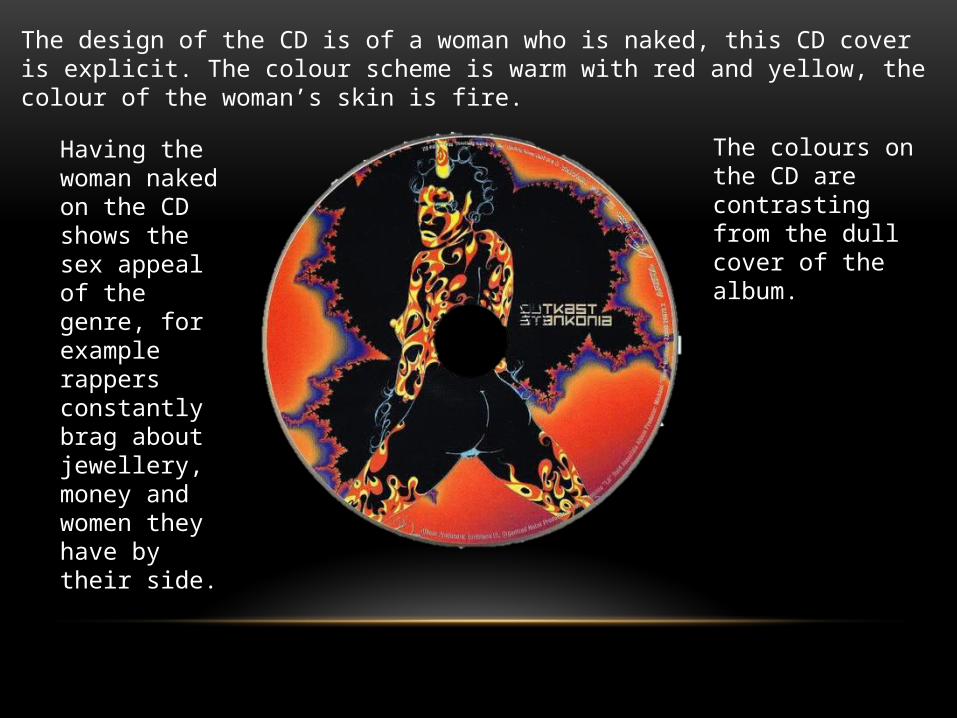
The design of the CD is of a woman who is naked, this CD cover is explicit. The colour scheme is warm with red and yellow, the colour of the woman’s skin is fire.
Having the woman naked on the CD shows the sex appeal of the genre, for example rappers constantly brag about jewellery, money and women they have by their side.
The colours on the CD are contrasting from the dull cover of the album.

OVERVIEW• The design on the digipak has no correlation to the album name, there is no theme to
follow. For example if the album was called “Basketball” you would expect to see a design with something to do with basketball.
• The colours are rather dull on the front and reverse of the album but inside it is much more lively on the CD cover, there is no strict colour scheme that follows throughout the whole digipak.
• The pictures on the cover reflect the music the artists would release and what would be expected to be heard on the album. The jewellery worn and the naked woman represent the hip-hop genres conventions. You could show this digipak to someone and ask what genre of music it is and they would answer with “Hip-hop”
• This analysis has shown me that to create a realistic digipak genre conventions can be present to help show target audience what to expect within the album.