The Stata Journal (2004) 4, Number 3, pp. 329–349 Speaking Stata: Graphing agreement and disagreement Nicholas J. Cox University of Durham, UK [email protected] Abstract. Many statistical problems involve comparison and, in particular, the as- sessment of agreement or disagreement between data measured on identical scales. Some commonly used plots are often ineffective in assessing the fine structure of such data, especially scatterplots of highly correlated variables and plots of values measured “before” and “after” using tilted line segments. Valuable alternatives are available using horizontal reference patterns, changes plotted as parallel lines, and parallel coordinates plots. The quantities of interest (usually differences on some scale) should be shown as directly as possible, and the responses of given individuals should be identified as easily as possible. Keywords: gr0005, graphics, comparison, agreement, paired data, panel data, scatterplot, difference-mean plot, Bland–Altman plot, parallel lines plot, parallel coordinates plot, pairplot, parplot, linkplot, Tukey 1 Introduction In one way or another, much statistical data analysis can be regarded as comparative. Exploratory projects often center on comparison of groups or of variables. Modeling projects can be formulated as comparisons of one or more model predictions with data on response variables. Are levels, spreads, shapes, trends, predictions, estimates, or whatever similar despite differences or different despite similarities? Above all, how should we best compare those features quantitatively in ways that summarize the data well but also direct attention to any important details? Broadly interpreted, the subject of comparison is wide enough to cover a large fraction of statistical science. Graphics clearly have a major role to play in comparison. Already in this sequence of columns, we have seen Stata graphics commands used to compare distributions and categorical arrays (Cox 2004a,b). Other examples come readily to hand. The scatter- plot, perhaps the most versatile weapon in the statistical graphics armory, is a device for comparing values of two variables, both individually and collectively. Indeed, little that is useful in statistical graphics does not afford comparisons. In this column, we focus more narrowly. The key question of comparison discussed is assessing agreement or disagreement between two or more datasets or subsets with variables measured on the same scale. We will look at some official and user-written graphical programs available in Stata 8 for such problems. The emphasis is on making use of all the information in the data. Almost always, we need data reduction and, thus, seek a concise and simplified summary in terms of a few key parameters, quite possibly c 2004 StataCorp LP gr0005

Welcome message from author
This document is posted to help you gain knowledge. Please leave a comment to let me know what you think about it! Share it to your friends and learn new things together.
Transcript
The Stata Journal (2004)4, Number 3, pp. 329–349
Speaking Stata: Graphing agreement and
disagreement
Nicholas J. CoxUniversity of Durham, UK
Abstract. Many statistical problems involve comparison and, in particular, the as-sessment of agreement or disagreement between data measured on identical scales.Some commonly used plots are often ineffective in assessing the fine structure ofsuch data, especially scatterplots of highly correlated variables and plots of valuesmeasured “before” and “after” using tilted line segments. Valuable alternativesare available using horizontal reference patterns, changes plotted as parallel lines,and parallel coordinates plots. The quantities of interest (usually differences onsome scale) should be shown as directly as possible, and the responses of givenindividuals should be identified as easily as possible.
Keywords: gr0005, graphics, comparison, agreement, paired data, panel data,scatterplot, difference-mean plot, Bland–Altman plot, parallel lines plot, parallelcoordinates plot, pairplot, parplot, linkplot, Tukey
1 Introduction
In one way or another, much statistical data analysis can be regarded as comparative.Exploratory projects often center on comparison of groups or of variables. Modelingprojects can be formulated as comparisons of one or more model predictions with dataon response variables. Are levels, spreads, shapes, trends, predictions, estimates, orwhatever similar despite differences or different despite similarities? Above all, howshould we best compare those features quantitatively in ways that summarize the datawell but also direct attention to any important details? Broadly interpreted, the subjectof comparison is wide enough to cover a large fraction of statistical science.
Graphics clearly have a major role to play in comparison. Already in this sequenceof columns, we have seen Stata graphics commands used to compare distributions andcategorical arrays (Cox 2004a,b). Other examples come readily to hand. The scatter-plot, perhaps the most versatile weapon in the statistical graphics armory, is a devicefor comparing values of two variables, both individually and collectively. Indeed, littlethat is useful in statistical graphics does not afford comparisons.
In this column, we focus more narrowly. The key question of comparison discussedis assessing agreement or disagreement between two or more datasets or subsets withvariables measured on the same scale. We will look at some official and user-writtengraphical programs available in Stata 8 for such problems. The emphasis is on makinguse of all the information in the data. Almost always, we need data reduction and, thus,seek a concise and simplified summary in terms of a few key parameters, quite possibly
c© 2004 StataCorp LP gr0005

330 Speaking Stata
in terms of a formal model. Almost always, we need to consider the risk of losingvaluable information by producing that summary. Graphics can guide our imagination,suggesting the best kind of summary. Graphics can also keep us honest, showing us theinadequacies of any particular summary.
2 Graphs as answers to questions
Let us start with a platitude and build on it. A platitude gets easy assent but can seemobvious and uninteresting. The challenge is to use that platitude as a platform for adiscussion. An idea on which everyone can agree provides a starting point for analysis.Far from there being nothing to discuss fruitfully, there is then everything to discussfruitfully.
The platitude is that a good graph is a good answer to a good question. Thatthought can be developed in various ways.
One way to develop it is to look at graphs and to try to determine the questions thatthey best answer. Sometimes it is then not clear which questions are being answered.Sometimes it is then not clear that the graph types being used are the most efficientforms for answering the questions being asked. Doing this even in a particular projectis, unsurprisingly, often easier said than done. While a common prejudice runs thatgraphs are essentially trivial, a really good graph can prove extraordinarily elusive.Just as with photography and film, the most spectacular results may require almostendless experimentation and a ruthlessly critical attitude.
Another way to develop that thought is to look at questions and to try to identifythe kinds of graphs that are most useful for different kinds of questions. This seemsyet more difficult to do in a systematic way, exposing the lack of a good general theoryof statistical graphics. The best available texts portray diverse repertoires of differentkinds of graphs. The best available software is flexible enough to do most of what youcan imagine. However, neither provides a theory.
As a starting point, questions may be classified as general:
What are these data like?
What patterns, trends, similarities, differences are there?
What interesting, informative, puzzling detail can we identify?
Or they may be specific:
Are these variables or subsets identical (as a reference case)?
Is the difference constant (e.g., 0), or is the ratio constant (e.g., 1)?
Has a transformation done what we wanted? Do the data now show a moretractable structure?
N. J. Cox 331
When answering general questions, we want graphs, above all, to provide summaryand exposure (Tukey and Wilk 1966) and to show coarse and fine structure. The bestgeneral graphs allow both. At least in principle, dot plots and scatterplots show all thedata. In practice, identical points will be overlaid on a scatterplot, and many similarpoints may be difficult to distinguish on either kind of plot. Even in principle, box plotsand histograms do not show all the data. Reduction to selected quantiles and bin countsdeliberately discards much detail, which quite possibly may be unintelligible noise, butalso quite possibly be fine structure that we should be thinking about.
When answering specific questions, we want graphs to answer those questions di-rectly without posing too many challenges. Any graph that requires extensive decodingor any other kind of hard work (say, rotating it mentally) is likely to be ineffective inpractice.
3 Paired data
Let us now make this more concrete, starting with one very common structure in sta-tistical science, that of paired data. Pairs arise, naturally or experimentally, in manycircumstances: before and after, import and export, consumption and production, sup-ply and demand, systolic and diastolic, left and right, husband and wife, control andtreatment. In such situations, we often ask specific questions, such as whether meansor, more generally, distributions can be considered identical. At worst, students—andoften more experienced researchers too—go straight into a t test or a correlation withoutscrutinizing the data as a whole.
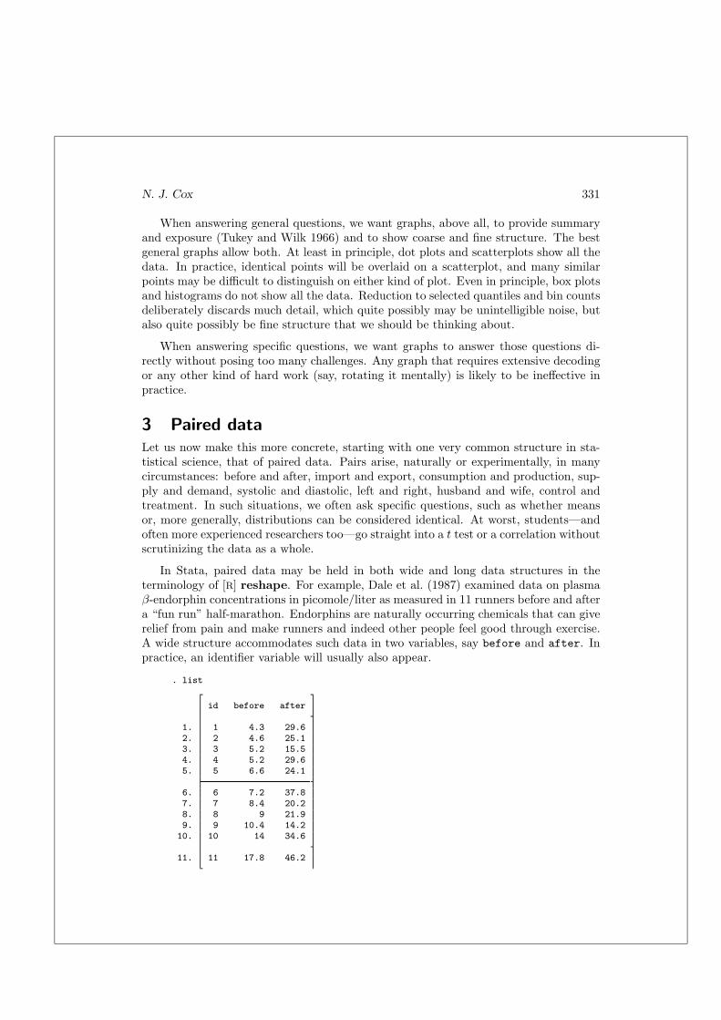
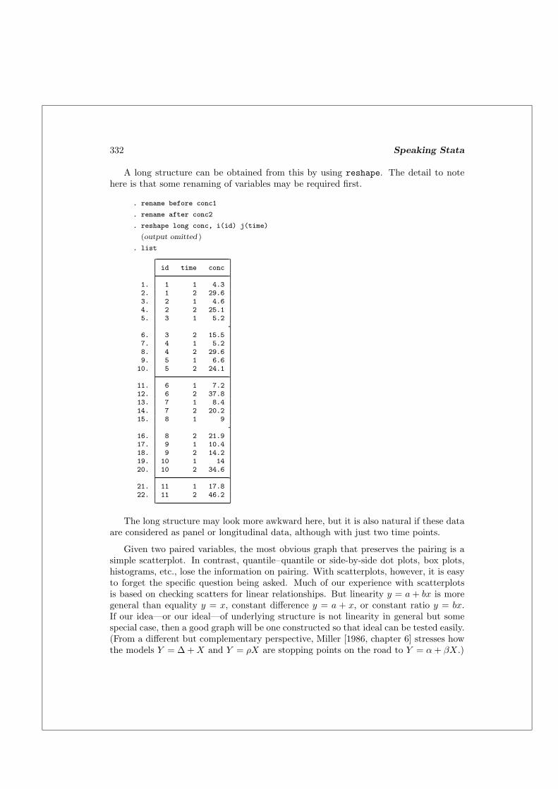
In Stata, paired data may be held in both wide and long data structures in theterminology of [R] reshape. For example, Dale et al. (1987) examined data on plasmaβ-endorphin concentrations in picomole/liter as measured in 11 runners before and aftera “fun run” half-marathon. Endorphins are naturally occurring chemicals that can giverelief from pain and make runners and indeed other people feel good through exercise.A wide structure accommodates such data in two variables, say before and after. Inpractice, an identifier variable will usually also appear.
. list
id before after
1. 1 4.3 29.62. 2 4.6 25.13. 3 5.2 15.54. 4 5.2 29.65. 5 6.6 24.1
6. 6 7.2 37.87. 7 8.4 20.28. 8 9 21.99. 9 10.4 14.210. 10 14 34.6
11. 11 17.8 46.2
332 Speaking Stata
A long structure can be obtained from this by using reshape. The detail to notehere is that some renaming of variables may be required first.
. rename before conc1
. rename after conc2
. reshape long conc, i(id) j(time)
(output omitted )
. list
id time conc
1. 1 1 4.32. 1 2 29.63. 2 1 4.64. 2 2 25.15. 3 1 5.2
6. 3 2 15.57. 4 1 5.28. 4 2 29.69. 5 1 6.610. 5 2 24.1
11. 6 1 7.212. 6 2 37.813. 7 1 8.414. 7 2 20.215. 8 1 9
16. 8 2 21.917. 9 1 10.418. 9 2 14.219. 10 1 1420. 10 2 34.6
21. 11 1 17.822. 11 2 46.2
The long structure may look more awkward here, but it is also natural if these dataare considered as panel or longitudinal data, although with just two time points.
Given two paired variables, the most obvious graph that preserves the pairing is asimple scatterplot. In contrast, quantile–quantile or side-by-side dot plots, box plots,histograms, etc., lose the information on pairing. With scatterplots, however, it is easyto forget the specific question being asked. Much of our experience with scatterplotsis based on checking scatters for linear relationships. But linearity y = a + bx is moregeneral than equality y = x, constant difference y = a + x, or constant ratio y = bx.If our idea—or our ideal—of underlying structure is not linearity in general but somespecial case, then a good graph will be one constructed so that ideal can be tested easily.(From a different but complementary perspective, Miller [1986, chapter 6] stresses howthe models Y = ∆ + X and Y = ρX are stopping points on the road to Y = α + βX.)

N. J. Cox 333
One common practice is to superimpose a pertinent reference line on the scatterplot,most commonly y = x. In Stata 8, one idiom is
. scatter yvar xvar || function y = x, ra(xvar)
Longtime users may prefer something more like
. scatter yvar xvar xvar, ms(oh none) connect(none l) sort
itself an echo of an idiom common in Stata 7 and earlier:
. graph yvar xvar xvar, s(oi) c(.l) sort
A detail easy to overlook in the first way of doing it is ra(xvar), without which therange defaults to (0,1). That default could be exactly what is wanted, or it could besuch a minute fraction of the desired range that the line of equality is barely visibleon the plot. It is also worth being aware of cosmetic options, such as clpattern() forvarying the line pattern. Clearly, other reference lines may also be used, depending onwhat seems appropriate.
Such scatterplots with lines of equality superimposed are readily understood andoften regarded as standard in various fields. But how efficient are they at answering thequestion? A problem with graphs with sloping reference lines is that it can be difficultto read the quantities of most interest. This leads immediately to the realization thatother forms of graph are needed. We will look at two solutions suggested for this.
4 Horizontal reference lines
One golden rule is that horizontal alignment of reference lines makes comparisons mucheasier. It is very easy to check for patterns when the ideal plots as a flat configurationand very easy to check for departures from patterns when those departures are measuredvertically. The eye and brain then have fewer challenges to overcome.
In mainstream statistical literature, this idea was repeatedly emphasized by JohnTukey from at least the 1960s. He put it very well in his text Exploratory Data Analysis
(1977, 148):
Choosing scales to make behavior roughly linear always allows us to seelocal or idiosyncratic behavior much more clearly. Subtracting incompletedescriptions to make behavior roughly flat always allows us to expand thevertical scale and look harder at almost any kind of remaining behavior.
In other literatures, this idea has been rediscovered intermittently, for example, inmedical statistics by Oldham (1962, 1968); Altman and Bland (1983); and Bland andAltman (1986, 1995a,b, 1999). No doubt other references can be supplied; please emailthe author if you know of any from the 1960s or earlier. In essence, it is one of themain ideas behind several kinds of residual plot (e.g., plotting residual versus fitted,
334 Speaking Stata
residual versus predictor or other variable, etc.). However, even after at least 40 yearsof multiple reinvention, the principle still seems to deserve emphasis.
Thus, if differences are of interest, we could usefully plot differences y − x versusmeans (y+x)/2. (The terminology Bland–Altman plot is common in medical statistics.Difference versus sum, a variant sometimes met, is clearly just the same plot apart fromaxis labeling.) If ratios are of interest, we could usefully plot ratios y/x versus geometricmeans
√yx. Note that geometric means will be close to arithmetic means whenever y
is close to x, so long as all values remain positive. For some groups of users, means willbe familiar, but geometric means will not be, pushing the choice towards means.
The two cases of differences and ratios cover a large fraction of comparisons inpractice. The Stata manipulations to produce graphs based on differences, means,ratios, and geometric means are easy. A few generate statements are all that is required.However, if you are doing this repeatedly, being able to do it on the fly is likely to bemore convenient. One wrapper for this purpose is pairplot from SSC. You can installit by using the ssc command ([R] ssc) in an up-to-date, net-aware Stata:
. ssc install pairplot
pairplot is a wrapper program for twoway. Among its options are diff, mean, ratio,and gmean.
Let us look at an example in some detail. Glaciers gain mass mainly by accumulationof snow, especially in their upper parts, and lose mass by ablation, including meltingand other means, especially in their lower parts. Notionally, there is an equilibrium-line altitude (elevation above sea level) for each glacier at which accumulation balancesablation. Monitoring this as it varies is of interest not just to glaciologists. Many otherscientists are interested in such changes in time, space, or both as measures of glaciers’response to climatic and other fluctuations. In polar and mountain areas, direct andlong-sustained meteorological records tend to be very sparse, so good proxies for climateare welcome.
Equilibrium line altitude (ELA) is best established by detailed field measurementon each glacier. The methods are simple in principle, using stakes placed in the ice,but repeated access to glacier surfaces can be difficult, expensive, and even dangerous,and there are too many glaciers for this to be anything other than exceptional. Sothere is great interest in proxies for the proxy, especially those that can be derivedby map measurements (Leonard and Fountain 2003; Cogley and McIntyre 2003). Thesimplest proxy is (minimum glacier altitude + maximum glacier altitude)/2, often calledthe mean altitude, although many statistical people would want to call it a midrange.Another proxy is the contour (line of equal altitude) that is nearly straight, given thatareas of accumulation tend to have concave contours and areas of ablation tend tohave convex contours. One name for this is the kinematic ELA. There are protocols forcomplicated cases, and these ideas do not so readily apply to glaciers that end in wateror on cliffs.

N. J. Cox 335
Leonard and Fountain (2003) collected data for 40 glaciers, mostly in the northernhemisphere, for which all three methods have been used. Correlations are generally veryhigh:
. describe observed kinematic midrange
storage display valuevariable name type format label variable label
observed int %8.0g mean observed ELA, mkinematic int %8.0g kinematic ELA, mmidrange int %8.0g (min + max altitude)/2, m
. summarize observed kinematic midrange
Variable Obs Mean Std. Dev. Min Max
observed 40 2820.55 1219.8 331 4934kinematic 40 2675.125 1152.285 320 4840midrange 40 2796.325 1225.8 300 4785
. correlate observed kinematic midrange(obs=40)
observed kinema~c midrange
observed 1.0000kinematic 0.9933 1.0000midrange 0.9970 0.9897 1.0000
The associated scatterplots are correspondingly impressive (figure 1):
. graph matrix observed kinematic midrange
meanobservedELA, m
kinematicELA, m
(min +max
altitude)/2,m
0
5000
0 5000
0
5000
0 5000
0
5000
0 5000
Figure 1: Scatterplots of three different altitude measures show very high correlationsbut fail to allow effective scrutiny of the fine structure of the data.
336 Speaking Stata
However, major reservations are in order. As Leonard and Fountain (2003) emphasize,the correlations are dominated by the large variations in altitudes from glacier to glacierand do not give a direct summary of the virtues of the different measurement methods.In any case, it is arguable that a more relevant single-number summary is the con-cordance correlation (Krippendorff 1970; Lin 1989, 2000; Steichen and Cox 2002, andreferences therein), which summarizes agreement (is y equal to x?), not linearity (is yequal to some a+ bx?). But no single-number summaries can possibly do justice to anyfine structure here, any more than a map can do the work of a microscope.
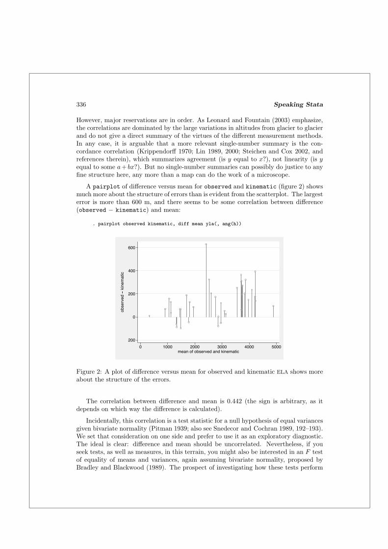
A pairplot of difference versus mean for observed and kinematic (figure 2) showsmuch more about the structure of errors than is evident from the scatterplot. The largesterror is more than 600 m, and there seems to be some correlation between difference(observed − kinematic) and mean:
. pairplot observed kinematic, diff mean yla(, ang(h))
�200
0
200
400
600
ob
se
rve
d
� kinematic
0 1000 2000 3000 4000 5000mean of observed and kinematic
Figure 2: A plot of difference versus mean for observed and kinematic ELA shows moreabout the structure of the errors.
The correlation between difference and mean is 0.442 (the sign is arbitrary, as itdepends on which way the difference is calculated).
Incidentally, this correlation is a test statistic for a null hypothesis of equal variancesgiven bivariate normality (Pitman 1939; also see Snedecor and Cochran 1989, 192–193).We set that consideration on one side and prefer to use it as an exploratory diagnostic.The ideal is clear: difference and mean should be uncorrelated. Nevertheless, if youseek tests, as well as measures, in this terrain, you might also be interested in an F testof equality of means and variances, again assuming bivariate normality, proposed byBradley and Blackwood (1989). The prospect of investigating how these tests perform
N. J. Cox 337
when bivariate normality breaks down will appeal or appall, according to statisticaltaste.
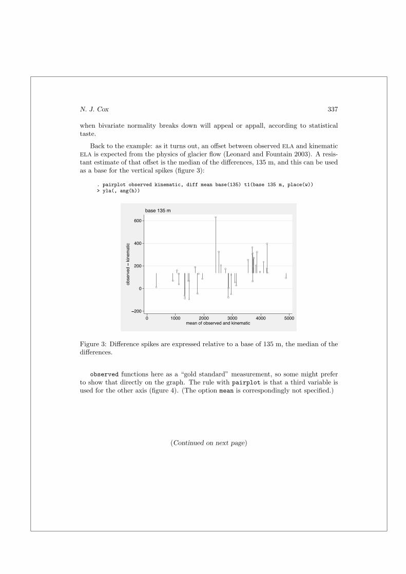
Back to the example: as it turns out, an offset between observed ELA and kinematicELA is expected from the physics of glacier flow (Leonard and Fountain 2003). A resis-tant estimate of that offset is the median of the differences, 135 m, and this can be usedas a base for the vertical spikes (figure 3):
. pairplot observed kinematic, diff mean base(135) t1(base 135 m, place(w))> yla(, ang(h))
�200
0
200
400
600
ob
se
rve
d
� kinematic
0 1000 2000 3000 4000 5000mean of observed and kinematic
base 135 m
Figure 3: Difference spikes are expressed relative to a base of 135 m, the median of thedifferences.
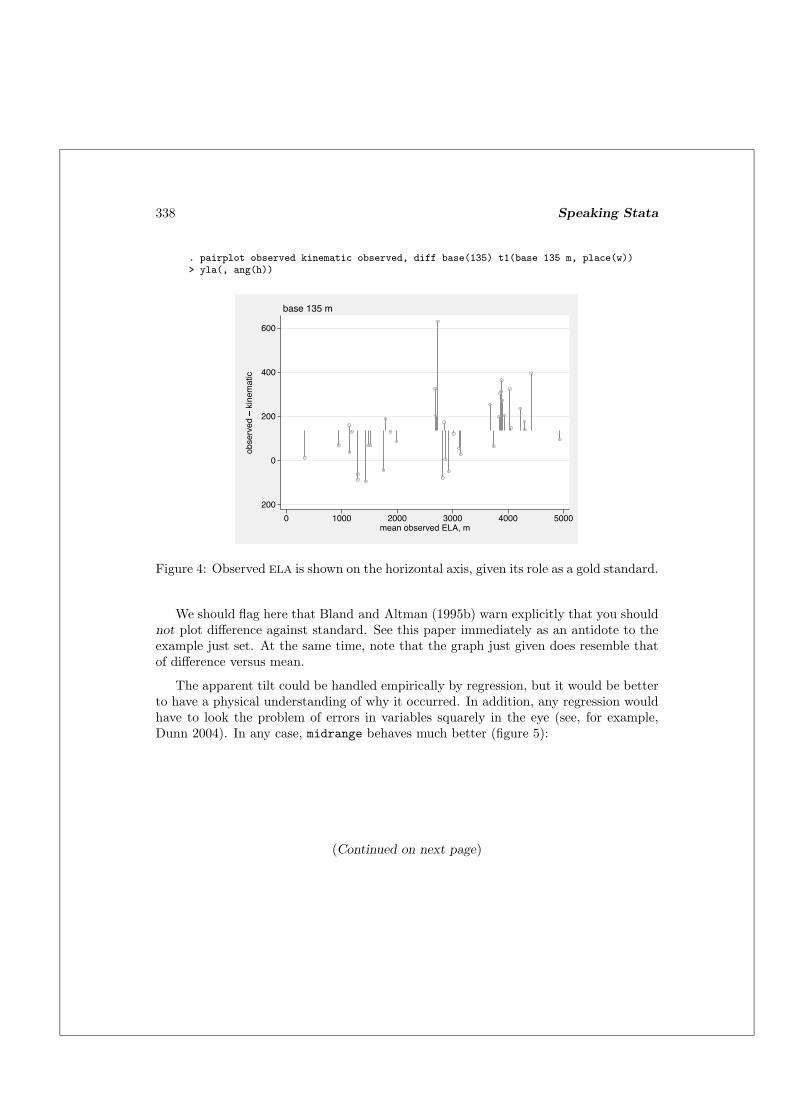
observed functions here as a “gold standard” measurement, so some might preferto show that directly on the graph. The rule with pairplot is that a third variable isused for the other axis (figure 4). (The option mean is correspondingly not specified.)
(Continued on next page)
338 Speaking Stata
. pairplot observed kinematic observed, diff base(135) t1(base 135 m, place(w))> yla(, ang(h))
�200
0
200
400
600
ob
serv
ed
� kinematic
0 1000 2000 3000 4000 5000mean observed ELA, m
base 135 m
Figure 4: Observed ELA is shown on the horizontal axis, given its role as a gold standard.
We should flag here that Bland and Altman (1995b) warn explicitly that you shouldnot plot difference against standard. See this paper immediately as an antidote to theexample just set. At the same time, note that the graph just given does resemble thatof difference versus mean.
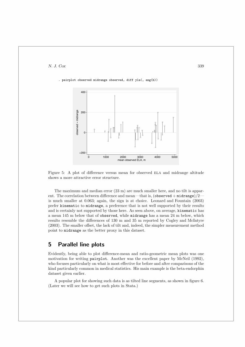
The apparent tilt could be handled empirically by regression, but it would be betterto have a physical understanding of why it occurred. In addition, any regression wouldhave to look the problem of errors in variables squarely in the eye (see, for example,Dunn 2004). In any case, midrange behaves much better (figure 5):
(Continued on next page)
N. J. Cox 339
. pairplot observed midrange observed, diff yla(, ang(h))
�200
0
200
400
ob
se
rve
d
� midrange
0 1000 2000 3000 4000 5000mean observed ELA, m
Figure 5: A plot of difference versus mean for observed ELA and midrange altitudeshows a more attractive error structure.
The maximum and median error (23 m) are much smaller here, and no tilt is appar-ent. The correlation between difference and mean—that is, (observed + midrange)/2—is much smaller at 0.063; again, the sign is at choice. Leonard and Fountain (2003)prefer kinematic to midrange, a preference that is not well supported by their resultsand is certainly not supported by those here. As seen above, on average, kinematic hasa mean 145 m below that of observed, while midrange has a mean 24 m below, whichresults resemble the differences of 130 m and 35 m reported by Cogley and McIntyre(2003). The smaller offset, the lack of tilt and, indeed, the simpler measurement methodpoint to midrange as the better proxy in this dataset.
5 Parallel line plots
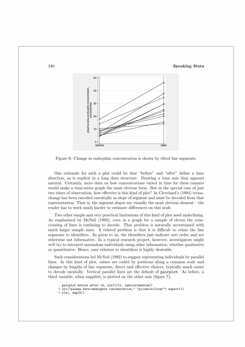
Evidently, being able to plot difference-mean and ratio-geometric mean plots was onemotivation for writing pairplot. Another was the excellent paper by McNeil (1992),who focuses particularly on what is most effective for before and after comparisons of thekind particularly common in medical statistics. His main example is the beta-endorphindataset given earlier.
A popular plot for showing such data is as tilted line segments, as shown in figure 6.(Later we will see how to get such plots in Stata.)
340 Speaking Stata
0
10
20
30
40
50
pla
sm
a b
eta
� endorphin concentratio
n,
pic
om
ole
/lite
r
before after
Figure 6: Change in endorphin concentration is shown by tilted line segments.
One rationale for such a plot could be that “before” and “after” define a timedirection, as is explicit in a long data structure. Drawing a time axis thus appearsnatural. Certainly, more data on how concentrations varied in time for these runnerswould make a time-series graph the most obvious form. But in the special case of justtwo times of observation, how effective is this kind of plot? In Cleveland’s (1994) terms,change has been encoded essentially as slope of segment and must be decoded from thatrepresentation. That is, the segment slopes are visually the most obvious element—thereader has to work much harder to estimate differences on this scale.
Two other simple and very practical limitations of this kind of plot need underlining.As emphasized by McNeil (1992), even in a graph for a sample of eleven the criss-crossing of lines is confusing to decode. That problem is naturally accentuated withmuch larger sample sizes. A related problem is that it is difficult to relate the linesegments to identifiers. As given to us, the identifiers just indicate sort order and areotherwise not informative. In a typical research project, however, investigators mightwell try to interpret anomalous individuals using other information, whether qualitativeor quantitative. Hence, easy relation to identifiers is highly desirable.
Such considerations led McNeil (1992) to suggest representing individuals by parallellines. In this kind of plot, values are coded by positions along a common scale andchanges by lengths of line segments, direct and effective choices, typically much easierto decode mentally. Vertical parallel lines are the default of pairplot. As before, athird variable, when supplied, is plotted on the other axis (figure 7):
. pairplot before after id, xla(1/11, labsize(medium))> yti("plasma beta-endorphin concentration," "picomole/liter") aspect(1)> yla(, ang(h))

N. J. Cox 341
0
10
20
30
40
50
pla
sm
a b
eta
� endorphin concentratio
n,
pic
om
ole
/liter
1 2 3 4 5 6 7 8 9 10 11id
before after
Figure 7: Change in endorphin concentration is shown by vertical line segments, witha third variable on the other axis.
Although with this dataset, a call with just two variables would have produced an almostidentical plot, as the x-axis defaults to observation number (figure 8):
. pairplot before after, xla(1/11, labsize(medium))> yti("plasma beta-endorphin concentration," "picomole/liter") aspect(1)> yla(, ang(h))
0
10
20
30
40
50
pla
sm
a b
eta
� endorphin concentratio
n,
pic
om
ole
/liter
1 2 3 4 5 6 7 8 9 10 11observation number
before after
Figure 8: Change in endorphin concentration is shown by vertical line segments, withobservation number on the other axis: in this case, the graph is almost identical.

342 Speaking Stata
Horizontal parallel lines merely require a horizontal option (figure 9):
. pairplot before after id, yla(1/11, ang(h) labsize(medium)) horiz> xti("plasma beta-endorphin concentration," "picomole/liter")> yti(, orient(horiz)) aspect(1) yscale(reverse)
1
2
3
4
5
6
7
8
9
10
11
id
0 10 20 30 40 50plasma beta�endorphin concentration,
picomole/liter
before after
Figure 9: Change in endorphin concentration is shown by horizontal line segments, witha third variable on the other axis.
You may recognize that this last graph is just a short step away from those pro-duced by default by graph dot. The similarity is made more evident by adding theoption blstyle(none). Conversely, although it appears to be undocumented, graphdot supports vertical alignment given a vertical option. graph dot can show morethan two variables if required, but there are no options to emphasize the line segmentsbetween values. pairplot is, as the name implies, limited to comparisons between twovariables, but it is intended to be flexible for that problem.
An aside on these data: McNeil (1992) uses a logarithmic scale for all graphs fromthe dataset. Revisiting the example, he uses the original scale (McNeil 1996, 52–54).Most important here is how the changes behave. To a good approximation, changein concentration is independent of original, so a logarithmic transformation is neitherneeded nor helpful. At first sight, when we look at these data, logarithms may seem amore natural scale: concentrations tend to have skewed distributions, and more impor-tantly, they might be expected to change multiplicatively rather than additively. Howthe data behave is nevertheless the crucial issue.
N. J. Cox 343
6 pairplot: a reprise
A synopsis of pairplot may be useful here. This is not a complete summary. As usual,the help file gives other details.
pairplot supports plots with
Y1. two variables, linked vertically, on the y-axis or
Y2. their difference, shown vertically, on the y-axis or
Y3. their ratio, shown vertically, on the y-axis and
X1. order of observations on the x-axis or
X2. a specified variable on the x-axis or
X3. sort order on some varlist (ascending or descending) on the x-axis or
X4. mean of two variables on the x-axis or
X5. geometric mean of two variables on the x-axis or
any of the above combinations but with axes reversed.
7 Beyond pairs to parallel coordinates plots
The case of paired data is common, interesting, and important. We should now look atmore general comparisons. As before, the focus is on graphs that show visual linkageof specific individuals (however defined) across two or more variables or groups. It iseasy enough to juxtapose or superimpose several distributions (as histograms, dot plots,quantile functions, distribution functions, etc.), but that is not the aim here.
One standard device is now usually known as a parallel coordinates plot. You maywell know the idea under a less formal name, for example, as a profile plot. Wegman(1990) gives an accessible, lucid, and definitive account for a statistical readership.He nevertheless understates the long history and wide geography of such plots: thenineteenth century French railway schedules beloved of Tufte (1983) show the mainidea, as do plots used for many decades to show the results of so-called “bumps” rowingraces, held at Oxford and Cambridge in Britain and occasionally elsewhere. Any time-series plot is just a twist away from a parallel coordinates plot. At most, one idea isneeded, that of interchanging of variables and observations.
That restructuring, on the fly, is the main need within any Stata implementation ofparallel coordinates plots. An implementation for Stata 4 was given by Gleason (1996).An implementation for Stata 8 is the parplot program downloadable from SSC. (Thename is close to pairplot, but no confusion between the two has been evident. Aname parcoord would invite confusion with Gleason’s program, and a name parcplot
is otherwise objectionable.)

344 Speaking Stata
An example is worth a thousand words, and we have already had one. The origin offigure 6 may now be revealed:
. parplot before after, tr(raw) yla(, ang(h))> yti("plasma beta-endorphin concentration," "picomole/liter") aspect(1)> xla(, labsize(medium))
parplot is a wrapper for twoway connected. The options in this example are thusstandard twoway options, with the exception of tr(raw), that is, transform(raw),which specifies showing data on the original or raw scale. The default of parplot is toscale values on each variable to (value − minimum)/(maximum − minimum), a choicethat permits comparison of variables measured in quite different units or with quitedifferent scales. Being able to cope with such data is crucial for many applications ofparplot, although it is beyond the main theme here. Other transforms are also possible,and logarithmic scales are available as usual through xscale() or yscale(). Againstthe semantic objection that a raw transform is no transform must be set the fact thatStataCorp has already laid claim to the option name scale().
A more substantial example can be seen by putting together the three glacier altitudevariables (figure 10).
. parplot kinematic observed midrange, tr(raw) aspect(1)> xla(1 ‘""kinematic" "ELA""’ 2 ‘""mean observed" "ELA""’> 3 ‘""midrange" "altitude""’)> yla(, ang(h)) ytitle(metres, orient(horiz))
0
1000
2000
3000
4000
5000
metres
kinematicELA
mean observedELA
midrangealtitude
Figure 10: Three measures of altitude are compared by a parallel coordinates plot.
As before, the syntax is mostly standard, and only a few details need comment.Environmental scientists usually find it congenial to plot altitude on a vertical axis,even though it is not the response variable. Note also that the reference case of equalvalues for the three variables defines horizontal profiles, departures from which are easy

N. J. Cox 345
to see. In other circumstances, as might be guessed, a horizontal option exchangesaxes as compared with the default.
There is space enough to change the aspect ratio to square. A parallel coordinatesplot is map as well as microscope but retains enough fine structure—indeed, in a strongsense, all the information in the data—to underline visually that midrange altitude iscloser quantitatively to mean observed ELA than is kinematic ELA.
A different example uses United States census data from 1980. Marriages, divorces,and deaths come as absolute numbers, so calculating rates relative to population andtaking logarithms wrench the data towards comparable, indeed similar, scales. Differenttransforms of the data may be tried, but the default maxmin scale works well (figure 11),as does a horizontal alignment:
. sysuse census, clear(1980 Census data by state)
. foreach v in death divorce marriage {2. gen r_‘v’ = log10(‘v’ / pop)3. }
. parplot r_*, horiz by(region, caption(logarithmic scales)> title(US states 1980)) yla(1 "deaths" 2 "divorces" 3 "marriages", ang(h))
deaths
divorces
marriages
deaths
divorces
marriages
low high low high
NE N Cntrl
South West
Graphs by Census region
logarithmic scales
US states 1980
Figure 11: Three demographic measures are compared for U.S. states within censusregions by a parallel coordinates plot.
Here, and elsewhere, there is room for thought and experiment about not only thescale or transformation to be used but also the order of the variables. Putting closelycorrelated variables close together and negating variables to make as many positivecorrelations as possible are two of the possible tricks for making an effective graph. Atthe same time, there is little point in including variables that are very poorly correlatedwith any others, unless that is precisely the point you want to make.
346 Speaking Stata
Substantively, this example shows nothing that is not well known about the demo-graphic characteristics of the United States, nor was that the intent. The heterogeneityof the “West” again should come as no surprise. In terms of method, however, parallelcoordinates plots have uses when you are seeking cluster structure or checking how farcluster structure exists. For example, if a few distinct groups do exist in the data, thenthis should be evident in a parallel coordinates plot. Conversely, indications that thedata form a continuum rather than a set of clusters might lead the investigator to calloff a pointless cluster analysis.
8 A timely comment
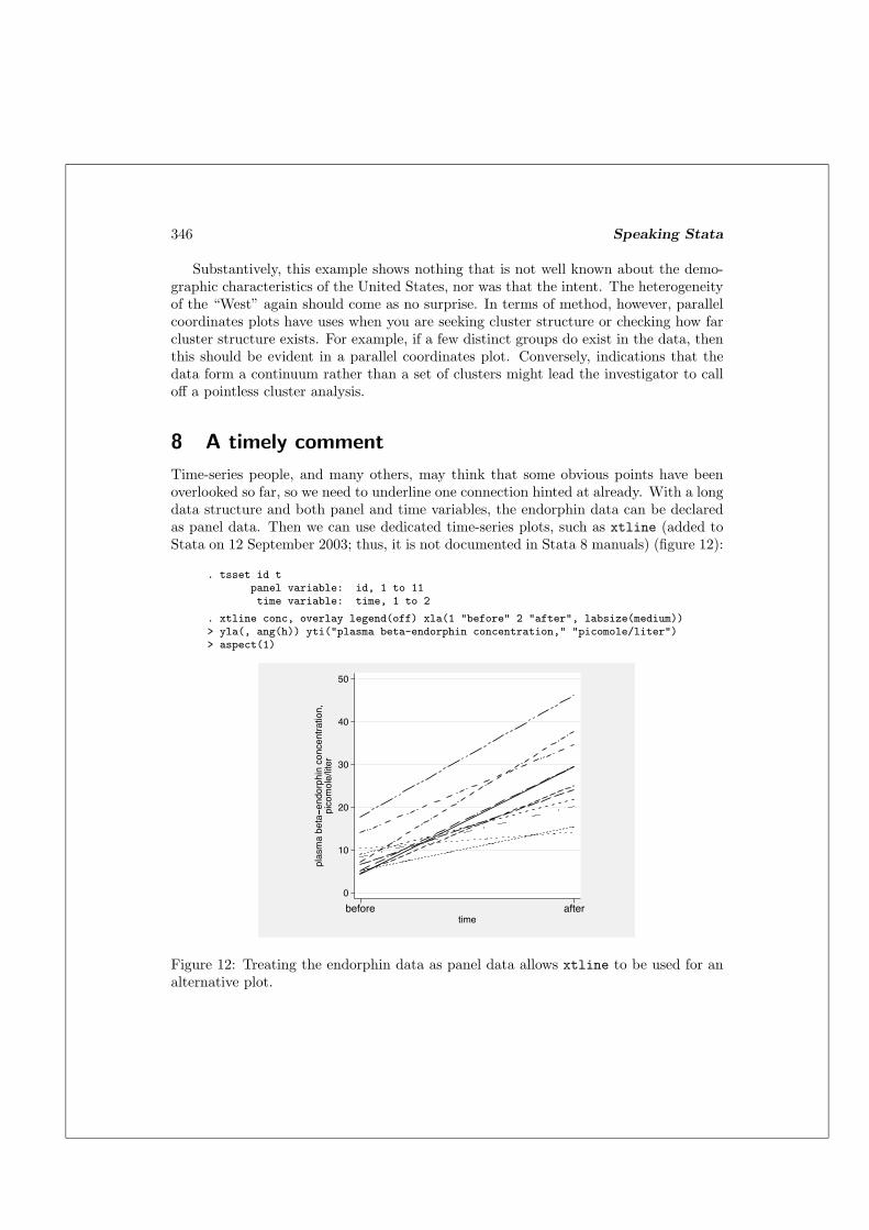
Time-series people, and many others, may think that some obvious points have beenoverlooked so far, so we need to underline one connection hinted at already. With a longdata structure and both panel and time variables, the endorphin data can be declaredas panel data. Then we can use dedicated time-series plots, such as xtline (added toStata on 12 September 2003; thus, it is not documented in Stata 8 manuals) (figure 12):
. tsset id tpanel variable: id, 1 to 11time variable: time, 1 to 2
. xtline conc, overlay legend(off) xla(1 "before" 2 "after", labsize(medium))> yla(, ang(h)) yti("plasma beta-endorphin concentration," "picomole/liter")> aspect(1)
0
10
20
30
40
50
pla
sm
a b
eta
� endorphin concentratio
n,
pic
om
ole
/liter
before aftertime
Figure 12: Treating the endorphin data as panel data allows xtline to be used for analternative plot.
N. J. Cox 347
In this example, the options have been chosen to emphasize the similarity withearlier graphs, particularly figure 6. A difference not evident in the printed graph hereis that xtline can make use of different pen colors for different panels, which may beattractive to you. The main graphical point made earlier was that, even for such data,tilted line segments are a relatively ineffective kind of display. Nevertheless, in terms ofStata possibilities, do note that if your data are in or near panel-data form, then youmay find this path an easy one to take.
Yet another way to do it is provided by the linkplot program on SSC, which doesnot assume panel or even time-series data but is more general. You should find it easyto download linkplot using ssc and to explore its possibilities yourself.
9 Conclusion
Stata graphics takes one from the lows of struggling to get the details you desire to thehighs of being able to think freely about the aim, form, and content of your displays.The richness of commands on offer is all based on the completely rewritten (and stillevolving) Stata 8 graphics engine. In this column, we have looked at a classic andfundamental problem in statistical science, assessing agreement on a shared scale. Keyto graphical success, both here and elsewhere, is linking the design of graphics to thequestions of greatest importance and interest. Surprisingly often, commonly used plots(such as scatterplots of highly correlated variables or plots of values measured “before”and “after” using tilted line segments) can be ineffective because they fail to show themost pertinent quantities directly.
Those who have been following these columns will recognize how many of the ideascan be traced directly to John W. Tukey (1915–2000) or to his students and collab-orators; see Brillinger (2002) and related papers for excellent recent appreciations ofTukey’s work. In one classic paper, Tukey (1972, 293) distinguishes between variouskinds of graphs, including propaganda graphs “intended to show the reader what hasalready been learnt” and analytical graphs “intended to let us see what may be hap-pening over and above what we have already described”. Arguably, there are too manypropaganda graphs, even in statistical science. Fortunately, many forms of analyticalgraphs have been devised that are easy to understand and to use, such as those based onhorizontal reference patterns, changes plotted as parallel lines, or parallel coordinatesplots.
In the next issue, we will complete the quartet of graphics columns promised for2004 by discussing plots for model diagnostics.
10 Acknowledgments
Thomas Steichen first told me about concordance correlation and intensified my inter-est in these problems. Ian Evans alerted me to the glacier altitude problem and theparticular papers cited. Erik Beecroft, Bob Fitzgerald, and Vince Wiggins made helpful
348 Speaking Stata
comments on programs discussed here. Ronan Conroy, Patrick Royston, and AndersSkrondal gave help with references.
11 References
Altman, D. G. and J. M. Bland. 1983. Measurement in medicine: the analysis of methodcomparison studies. The Statistician 32: 307–317.
Bland, J. M. and D. G. Altman. 1986. Statistical methods for assessing agreementbetween two methods of clinical measurement. Lancet I: 307–310.
—. 1995a. Comparing two methods of clinical measurement: a personal history. Inter-
national Journal of Epidemiology 24: S7–S14.
—. 1995b. Comparing methods of measurement: why plotting difference against stan-dard method is misleading. Lancet 346: 1085–1087.
—. 1999. Measuring agreement in method comparison studies. Statistical Methods in
Medical Research 8: 135–160.
Bradley, E. L. and L. G. Blackwood. 1989. Comparing paired data: a simultaneous testfor means and variances. American Statistician 43: 234–235.
Brillinger, D. R. 2002. John W. Tukey: his life and professional contributions. Annals
of Statistics 30: 1535–1575.
Cleveland, W. S. 1994. The Elements of Graphing Data. Summit, NJ: Hobart Press.
Cogley, J. G. and M. S. McIntyre. 2003. Hess altitudes and other morphological estima-tors of glacier equilibrium lines. Arctic, Antarctic, and Alpine Research 35: 482–488.
Cox, N. J. 2004a. Speaking Stata: Graphing distributions. Stata Journal 4(1): 66–88.
—. 2004b. Speaking Stata: Graphing categorical and compositional data. Stata Journal
4(2): 190–215.
Dale, G., J. A. Fleetwood, A. Weddell, and R. D. Ellis. 1987. Beta endorphin: a factorin “fun run” collapse. British Medical Journal 294: 1004.
Dunn, G. 2004. Statistical Evaluation of Measurement Errors: Design and Analysis of
Reliability Studies. London: Hodder Arnold.
Gleason, J. R. 1996. gr18: Graphing high-dimensional data using parallel coordinates.Stata Technical Bulletin 29: 10–14. In Stata Technical Bulletin Reprints, vol. 5,53–60. College Station, TX: Stata Press.
Krippendorff, K. 1970. Bivariate agreement coefficients for reliability of data. In Socio-
logical Methodology, ed. E. F. Borgatta and G. W. Bohrnstedt, vol. 2, 139–150. SanFrancisco: Jossey-Bass.

N. J. Cox 349
Leonard, K. C. and A. G. Fountain. 2003. Map-based methods for estimating glacierequilibrium-line altitudes. Journal of Glaciology 49: 329–336.
Lin, L. I.-K. 1989. A concordance correlation coefficient to evaluate reproducibility.Biometrics 45: 255–268.
—. 2000. A note on the concordance correlation coefficient. Biometrics 56: 324–325.
McNeil, D. R. 1992. On graphing paired data. American Statistician 46: 307–310.
—. 1996. Epidemiological Research Methods. Chichester, UK: John Wiley & Sons.
Miller, R. G. 1986. Beyond ANOVA: Basics of Applied Statistics. New York: JohnWiley & Sons. Reprint, London: Chapman & Hall, 1997.
Oldham, P. D. 1962. A note on the analysis of repeated measurements of the samesubjects. Journal of Chronic Diseases 15: 969–977.
—. 1968. Measurement in Medicine: The Interpretation of Numerical Data. London:English Universities Press.
Pitman, E. J. G. 1939. A note on normal correlation. Biometrika 31: 9–12.
Snedecor, G. W. and W. G. Cochran. 1989. Statistical Methods. 8th ed. Ames, IA:Iowa State University Press.
Steichen, T. J. and N. J. Cox. 2002. A note on the concordance correlation coefficient.Stata Journal 2(2): 183–189.
Tufte, E. R. 1983. The Visual Display of Quantitative Information. Cheshire, CT:Graphics Press.
Tukey, J. W. 1972. Some graphic and semigraphic displays. In Statistical Papers in
Honor of George W. Snedecor, ed. T. A. Bancroft and S. A. Brown, 293–316. Ames,IA: Iowa State University Press.
—. 1977. Exploratory Data Analysis. Reading, MA: Addison–Wesley.
Tukey, J. W. and M. B. Wilk. 1966. Data analysis and statistics: an expository overview.AFIPS Conference Proceedings 29: 695–709.
Wegman, E. J. 1990. Hyperdimensional data analysis using parallel coordinates. Journal
of the American Statistical Association 85: 664–675.
About the Author
Nicholas Cox is a statistically minded geographer at the University of Durham. He contributes
talks, postings, FAQs, and programs to the Stata user community. He has also co-authored
fourteen commands in official Stata. He was an author of several inserts in the Stata Technical
Bulletin and is Executive Editor of the Stata Journal.
Related Documents