© GINGERBREAD LADY M&S wanted to shed its image as a retailer for the wealthy by introducing a budget-brand range of everyday food products. The Simply M&S budget food range was launched in 2012 with 800 new and current lines, to compete with Waitrose’s hugely successfully Essentials range. An external agency had provided a loose concept of a shopping list which then had to be translated to work commercially. Packaging was largely transparent to show off the food with the remaining design being themed around a shopping list style labelling which was easy to recognise. M&S PACKAGING

Welcome message from author
This document is posted to help you gain knowledge. Please leave a comment to let me know what you think about it! Share it to your friends and learn new things together.
Transcript
© G I N G E R B R E A D L A DY
M&S wanted to shed its image as a retailer for the wealthy by introducing a budget-brand range of everyday food products.
The Simply M&S budget food range was launched in 2012 with 800 new and current lines, to compete with Waitrose’s hugely successfully Essentials range.
An external agency had provided a loose concept of a shopping list which then had to be translated to work commercially.
Packaging was largely transparent to show off the food with the remaining design being themed around a shopping list style labelling which was easy to recognise.
M&S
PA C K A G I N G

© G I N G E R B R E A D L A DY
These two wines were part of the “£10 meal for two” range. The GSM red wine is a blend of three grapes; overlapping circles were used to represent this, creating a bunch of grapes. The Grenache white wine came from a particular region in France that was famous for it’s bridge. An old photograph of the bridgea was given a simple modern look in a circle which also reflected the wine’s “round” tasting notes.
PA C K A G I N G
M & S
© G I N G E R B R E A D L A DY
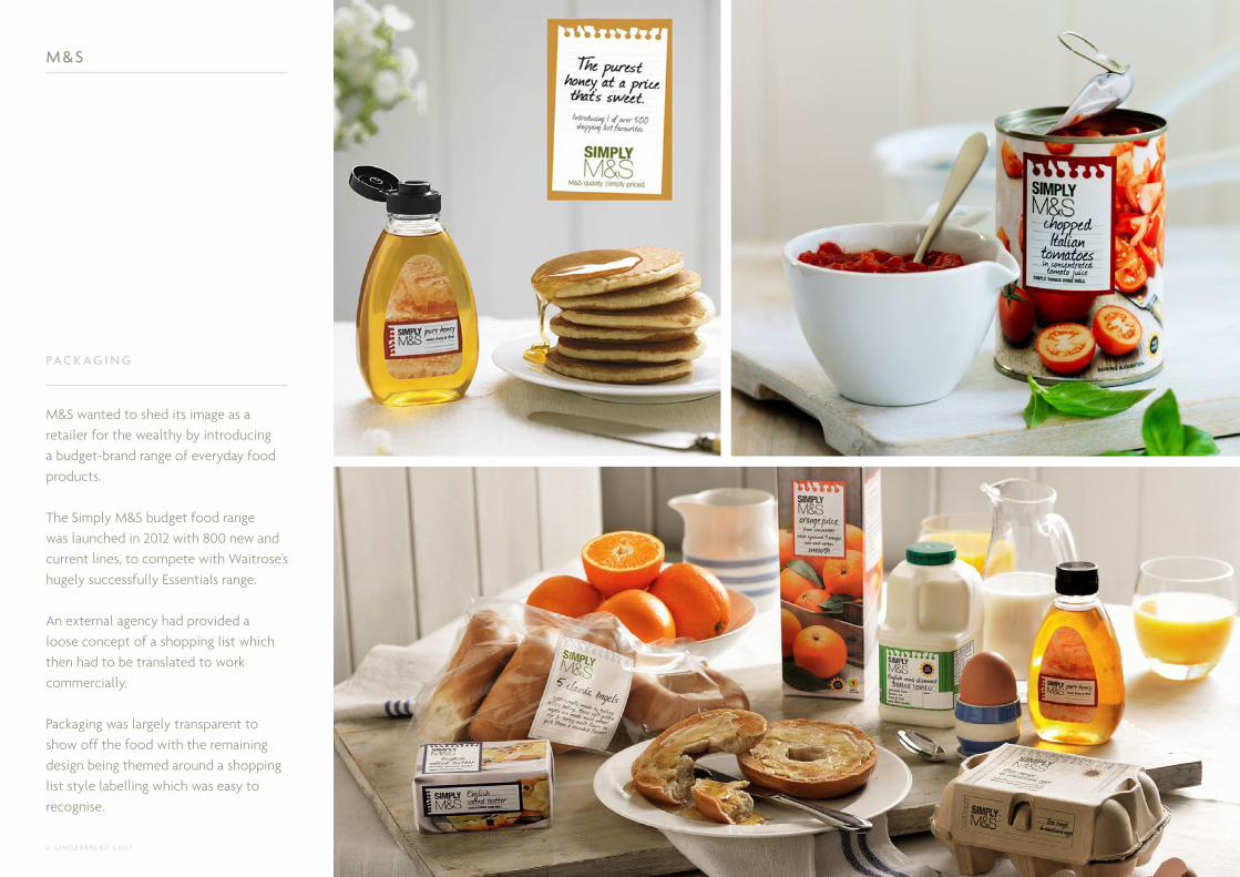
A new range of low alcohol wine was introduced in 2012 to appeal to a younger, more health conscious market.
Le Petit Froglet was an extension of the well known Froglet wine range. Silver neck caps and labels were used to differentiate it from its parent products, together with a baby frog and the low alcohol stamp.
PA C K A G I N G
M & S

© G I N G E R B R E A D L A DY
Modern Asian was a new range of quick & healthy ready meals with an emphasis on fresh flavours. This needed to be communicated in a simple but authentic way that would have a lot of shelf presence. The logo of a bowl and chopsticks communicated Asian cuisine that was ready to eat, whilst the overall look took inspiration from simple Japanese design, together with a banana leaf that conveyed healthy, fresh and bold qualities.
I D E N T I T Y
PA C K A G I N G
M & S

© G I N G E R B R E A D L A DY
The Country Candle Company wanted to launch a large and mainstream range of British fragranced candles in lidded jars that would compete with the well known American Yankee candles on the market. Stock photography was carefully sourced to denote each fragrance clearly, alongside a coloured wax to compliment the fragrance and imagery. The label design used as much white space as possible to keep it fresh, contemporary and a clean, a traditionally British font was used for the fragrance titles. A branded wooden lid gave the candles a more natural feel whilst the use of silver foil on the labelling made it feel premium.
After the initial launch of the range in 2015, it expanded to include different sized candles, reed diffusers and wax melts.
THE COUNTRY CANDLE Co .
PA C K A G I N G
© G I N G E R B R E A D L A DY
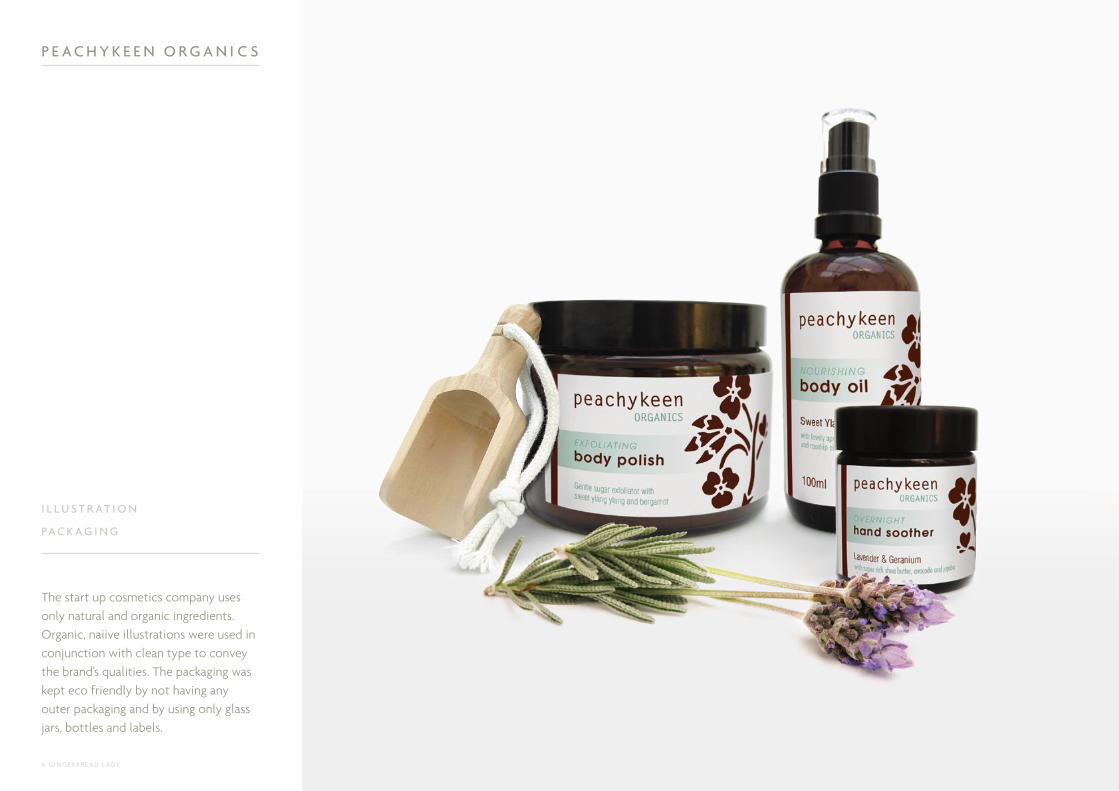
The start up cosmetics company uses only natural and organic ingredients. Organic, naiive illustrations were used in conjunction with clean type to convey the brand’s qualities. The packaging was kept eco friendly by not having any outer packaging and by using only glass jars, bottles and labels.
P E A C H Y K E E N O R G A N I C S
I L L U S T R AT I O N
PA C K A G I N G
© G I N G E R B R E A D L A DY
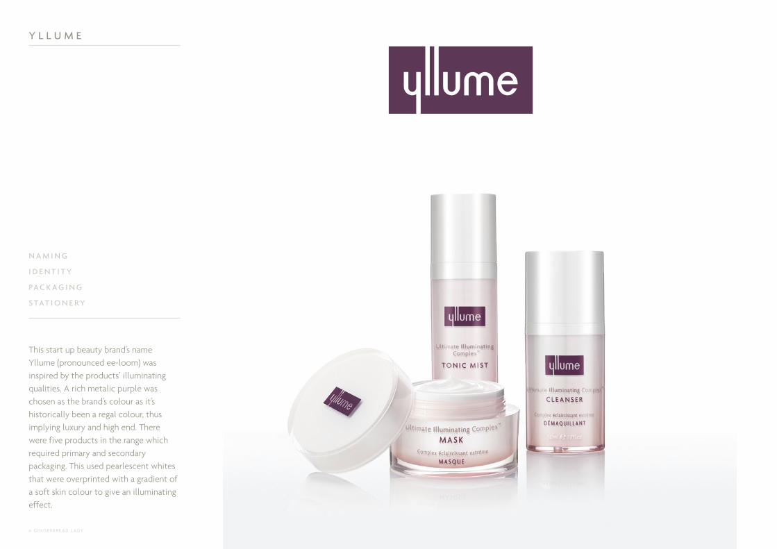
This start up beauty brand’s name Yllume (pronounced ee-loom) was inspired by the products’ illuminating qualities. A rich metalic purple was chosen as the brand’s colour as it’s historically been a regal colour, thus implying luxury and high end. There were five products in the range which required primary and secondary packaging. This used pearlescent whites that were overprinted with a gradient of a soft skin colour to give an illuminating effect.
Y L L U M E
N A M I N G
I D E N T I T Y
PA C K A G I N G
S TAT I O N E RY

© G I N G E R B R E A D L A DY
This global gift range for Spring / Summer took inspiration directly from the garden. A mixture of silhouettes and macro shots of flowers were used in different ways to create a vibrant and energy driven look.
T H E B O DY S H O P
PA C K A G I N G
© G I N G E R B R E A D L A DY
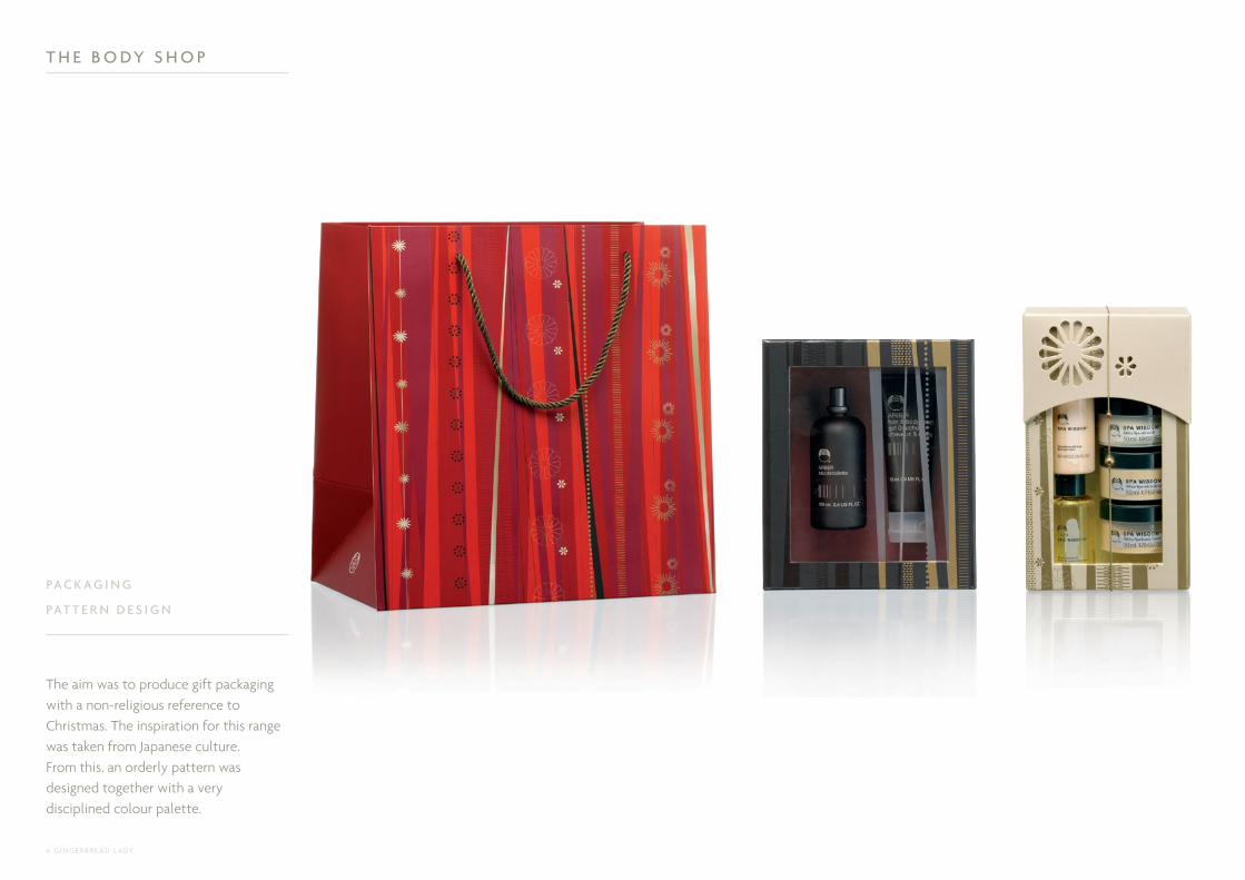
The aim was to produce gift packaging with a non-religious reference to Christmas. The inspiration for this range was taken from Japanese culture. From this, an orderly pattern was designed together with a very disciplined colour palette.
T H E B O DY S H O P
PA C K A G I N G
PAT T E R N D E S I G N
© G I N G E R B R E A D L A DY
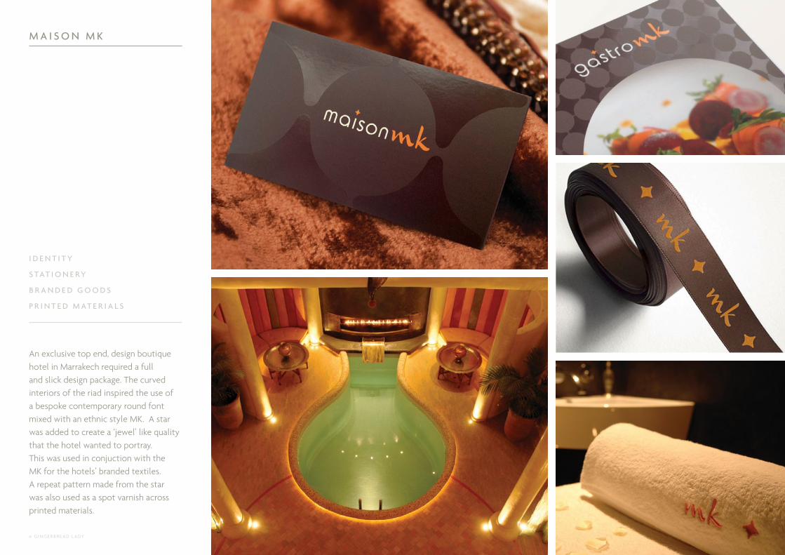
An exclusive top end, design boutique hotel in Marrakech required a full and slick design package. The curved interiors of the riad inspired the use of a bespoke contemporary round font mixed with an ethnic style MK. A star was added to create a ‘jewel’ like quality that the hotel wanted to portray. This was used in conjuction with the MK for the hotels’ branded textiles. A repeat pattern made from the star was also used as a spot varnish across printed materials.
M A I S O N M K
I D E N T I T Y
S TAT I O N E RY
B R A N D E D G O O D S
P R I N T E D M AT E R I A L S

© G I N G E R B R E A D L A DY
This leading UK Candle Chandler boutique wanted the branding to be personal and chic. The boutique’s location, ‘Belgravia’ was used on printed materials to communicate the luxury of the brand and also as a way of directing people to it’s boutique. Rachel’s initials formed a standalone icon that was used on packaging. The stationery used high quality ivory stock and clear gloss foil to communicate understated luxury.
R A C H E L V O S P E R
I D E N T I T Y
S H O P F R O N T
S TAT I O N E RY
PA C K A G I N G A C C E S S O R I E S
© G I N G E R B R E A D L A DY
MENINGITIS NOW
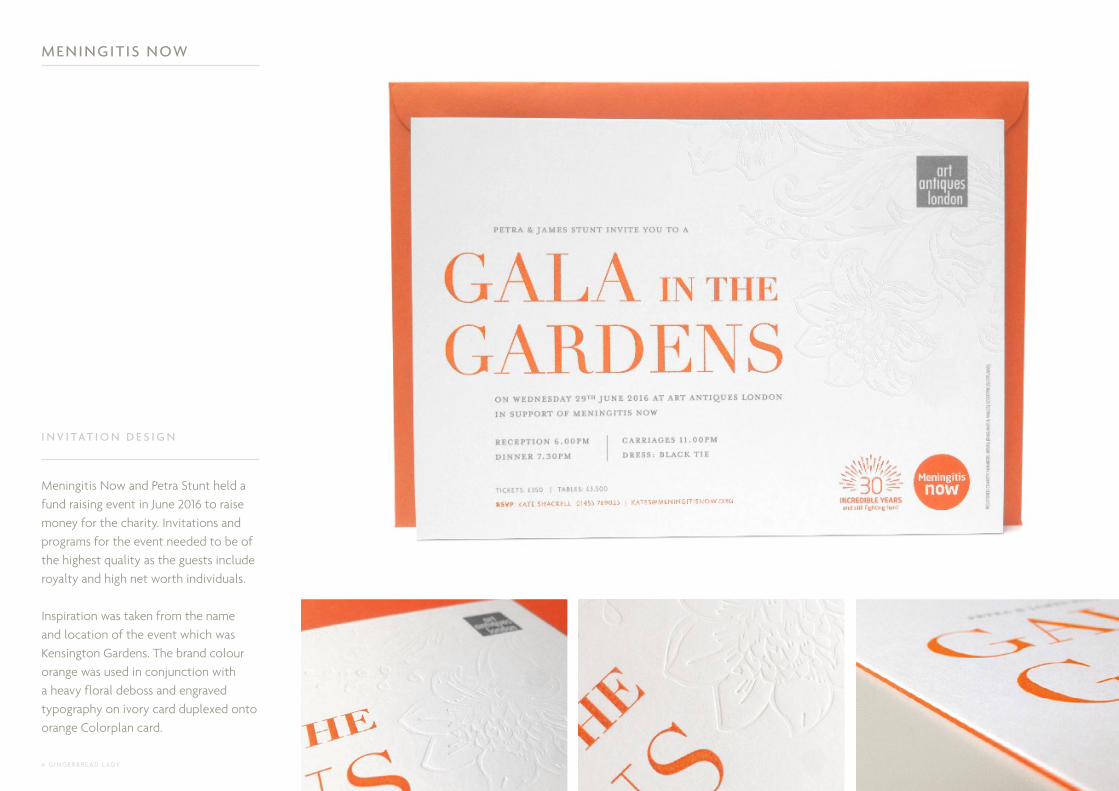
Meningitis Now and Petra Stunt held a fund raising event in June 2016 to raise money for the charity. Invitations and programs for the event needed to be of the highest quality as the guests include royalty and high net worth individuals.
Inspiration was taken from the name and location of the event which was Kensington Gardens. The brand colour orange was used in conjunction with a heavy floral deboss and engraved typography on ivory card duplexed onto orange Colorplan card.
I N V I TAT I O N D E S I G N

© G I N G E R B R E A D L A DY
Plum colours were used in conjunction with a friendly ‘brave little star’ character to symbolise the suffering children. The star icon was used on candle packaging and was turned into a diamond pendant to help raise money for the charity. Invitations and programs for a high profile fund raising dinner were designed featuring an illustration of the Sugarplum Tree poem. The 2013 printed materials were produced on Colorplan with purple metallic foils, whereas the 2015 used sparkly Peregrina with icey blue metallic foils. The total amount raised from these two events has been almost £1 million.
S U G A R P L U M C H I L D R E N
I D E N T I T Y
I L L U S T R AT I O N
I N V I TAT I O N
E V E N T P R O G R A M

© G I N G E R B R E A D L A DY
A north London design agency wanted a notebook designed to give to their clients as a thank you gift. The Wildhorse brand colour yellow was used as the central theme throughout the 120 page notebook, with black being the only other colour used. Quirky and fun illustrations were interspersed between the lined pages, and the copy was light hearted but creative.
W I L D H O R S E
D E S I G N & L AYO U T
A RT D I R E C T I O N
I L L U S T R AT I O N
C O P Y W R I T I N G

© G I N G E R B R E A D L A DY
This start up company was looking for a timeless and elegant logo to compliment the home and dog products it was going to sell through it’s shop and online. The identity needed to contain a dog icon that could be used to form a repeat pattern for use on textiles. The colours were kept sympathetic to dog and outdoor colours.
T H E S T Y L I S H D O G C O .
I D E N T I T Y
S TAT I O N E RY
P R I N T E D M AT E R I A L S
Matched to Pantone 4635U C: 32M: 58Y: 74K: 25
Matched to Pantone 5575UC: 31M: 7Y: 26K: 8
CMYK - UNCOATED

© G I N G E R B R E A D L A DY
Blue Bunny by Manuella DesignNido Play House by Magis
Lili Play Kitchen by MomollYellow Julian Chair by Magis
Creanimaux Farm Wooden Toys by DjekoCastle Playhouse by Magis
Toys on Sheving Unit by BrioLadrillos Shelving Unit by Magis
Kids Rocker by Alexander TaylorFelt Storage Tubs by Parkhaus Berlin
This online retailer showcases fresh high-quality designs for the modern family home. The identity needed to be modern but also look youthful - a neutral and unisex colour palette was used to contrast the colours of the products they sell. Illustrations were comissioned for the Nubie brochure and website to add some fun and character to the brand.
N U B I E
I D E N T I T Y
S TAT I O N E RY
P R I N T E D M AT E R I A L S
W E B S I T E
Related Documents