Retrospective eses and Dissertations Iowa State University Capstones, eses and Dissertations 1978 Some visual elements in typography: a study using original works Penny Dorfman Iowa State University Follow this and additional works at: hps://lib.dr.iastate.edu/rtd Part of the Art and Design Commons , and the Fine Arts Commons is esis is brought to you for free and open access by the Iowa State University Capstones, eses and Dissertations at Iowa State University Digital Repository. It has been accepted for inclusion in Retrospective eses and Dissertations by an authorized administrator of Iowa State University Digital Repository. For more information, please contact [email protected]. Recommended Citation Dorfman, Penny, "Some visual elements in typography: a study using original works " (1978). Retrospective eses and Dissertations. 7954. hps://lib.dr.iastate.edu/rtd/7954

Welcome message from author
This document is posted to help you gain knowledge. Please leave a comment to let me know what you think about it! Share it to your friends and learn new things together.
Transcript
Retrospective Theses and Dissertations Iowa State University Capstones, Theses andDissertations
1978
Some visual elements in typography: a study usingoriginal worksPenny DorfmanIowa State University
Follow this and additional works at: https://lib.dr.iastate.edu/rtd
Part of the Art and Design Commons, and the Fine Arts Commons
This Thesis is brought to you for free and open access by the Iowa State University Capstones, Theses and Dissertations at Iowa State University DigitalRepository. It has been accepted for inclusion in Retrospective Theses and Dissertations by an authorized administrator of Iowa State University DigitalRepository. For more information, please contact [email protected].
Recommended CitationDorfman, Penny, "Some visual elements in typography: a study using original works " (1978). Retrospective Theses and Dissertations.7954.https://lib.dr.iastate.edu/rtd/7954

A thesis submitted to the Graduate Faculty in partial fulfillment of the requirements
for the degree of Master of Arts
Applied Art Department College of Design
SOME VISUAL ELEMENTS IN
TYPOGRAPHY A Study Using Original Works
Penny Dorfman
Iowa State University Ames, Iowa 1978
1216600
ii
©1978 PENNY DORFMAN
All Rights Reserved

iii
Signatures have been redacted for privacy
iv
TABLE OF CONTENTS
CHAPTER I INTRODUCTION
Contrast
Form
Texture
Black and Grey Values
Color
Space
Rhythm
CHAPTER II THE RELATIONSHIP OF ORIGINAL WORKS USING TYPOGRAPHY TO ELEMENTS AND PRINCIPLES OF DESIGN
Design for the Book, Choosing and Using Home Equipment
Brochure to Advertise Books in Home Economics
Design for the Book, Women of Action in Tudor England
The Book, Reprographics
Pre-designed Formats for Basic Printed Materials
Title and Credit Design for the Film, LUMIA II
Designs with Type
Experiences in Color and Light: A Structure Using Booklets
CHAPTER III SUMMARY
REFERENCES CITED
SOURCES CONSULTED
Page
1
2
3
4
5
6
7
8
10
10
14
19
25
32
44
48
57
68
72
78

1
CHAPTER I
INTRODUCTION
A work of typography must be not only suitable for its purpose and easy to produce, but also beautiful.
Jan Tschichold
Typography was originally a craft which evolved from the invention
of moveable type by Gutenberg in 1440. In this thesis typography is
considered to be the creative endeavor of arranging letters, words, and
images for the purpose of communicating ideas, either through the
printing process or through other media.
Typography is a field which has become revolutionized by photo-
composition and propelled by the computer. However the technology of
typography has moved too quickly without the necessary classic training
and understanding of basic principles. These principles have become
lost in fast and easy production. 1 Because of the numerous advances
in technology together with a growing population, the world is rapidly
becoming overwhelmed with printed words. We are hardly able to absorb
or use all of the communication produced for books, newspapers, mag-
azines, packages, brochures, letters, posters, and documents. In this
explosion of printed material, typography should be far more than
simple printing. Clearly new concepts in typography will have to be
developed to satisfy the demands of this rapid technology in an age of
science. Even the use of a "universal type" for machine printing may
become accepted. 2 However, no matter what systems of photocomposition

2
evolve--whether it be cathode-ray tubes, digital storage, or the laser
beam for generating characters, 3 qualities of simplicity, directness,
and originality in typographic design should not be lost. Legibility
and readability should be combined in a total design concept. Then,
perhaps, typography could arouse greater interest and invite reading.
The initial appeal of any printed page is visual. "Good typog-
raphy depends only secondarily on types, primarily on the way they are
used." 4 More attention, therefore, should be paid to some of the basic
elements and principles of design without losing the thought or image
that the author intended to communicate. Typography should reflect
a close association between form and content. In addition, it should
be free from tradition and express the time in which it exists. Ul-
timately, typography should express a certain quality of timelessness.
Good typographic design should integrate the elements and prin-
ciples of design to achieve a total balance and unity, or oneness.
This emphasis on design might well increase public awareness that
typography can be visually aesthetic and perhaps improve communications.
At this point it is necessary to clearly state the way in which
some of the design elements such as contrast, form, texture, black
and grey values, color, space, and rhythm relate to typography.
Contrast
According to Jan Tschichold, contrast is the most important
element in all modern design. 5 Contrast means opposit.es. "Differences
in qualities are measured by contrast. 116 When a dark image is juxta-
3
posed with a light image, when a large image is juxtaposed with a
small image, or when a negative or reversed image is played against
a positive image, contrast results.7 The strongest visual effects are
achieved when contrast is the greatest. 8
In graphic design, the white of the paper and the black printing
ink are extreme forces in the design process. The act of reading it-
self is made possible through contrast. If the contrast between the
paper and the ink is not great enough, the legibility will be impaired.
In typography, contrast relates specifically to variation in type-
faces, size, weight, color, texture, structure, form, direction, and
space. It is based on a unity of differences. 9
Form
Form is the external appearance of a shape. In typography, form
assumes a two-dimensional aspect in which shape and area dominate.
Form becomes the area which a shape covers having only length and width.
The design element line has a close association with shape. Line
is the path of a moving point which leads the eye through space. It
is made visible by the fact that it contrasts with the surface on which
it is drawn. Shape could not exist without line as it indicates its
edges. When a line is drawn, a shape is automatically created within
the line.
Typography uses shape or form as an expressive element. 10 In the
most elementary sense form relates to the different shapes of the letters
of the alphabet. In a larger context it relates to the different type

f ·1· 11 ami ies.
typefaces.
4
A type family is a subdivision of a major category of
For example, the sans serif category includes such families
as Futura, Helvetica, Univers, and hundreds of others. 12
In addition, the form of a single line of type creates a thin,
narrow rectangle. In a group of lines the eye tends to connect the end
of the lines and its overall shape becomes apparent. 13 This group of
lines can be considered a mass. With the exception of the individual
letter, mass usually appears as a rectangle or a square14 as it is seen
in contrast to the paper on which it is printed.
Texture
Texture in typography can be analyzed by three interpretations.
First, texture can be the result of repetition of the dominant design
characteristics of each individual letter. Another interpretation
deals with the texture of a particular typeface which comes from the
distribution of weight in each letter and from the design of the letter
itself, thus involving the interplay of weight and structure. The
structure of the letter determines the kind of texture and the weight
determines the relative roughness. Finally, there is the texture of
a finished composition. Here texture is affected by any differences in
the thickness of lines used in the vertical and horizontal, and by any
variation in the space that separates the lines in one direction or
another.
Typographic textures can be subtle and unobtrusive or obvious.
Typefaces with little contrast in their vertical and horizontal strokes

5
have an even texture, and can be likened to a plain weave, or more
subtle in essence. Typefaces whose strokes have a more vertical empha-
sis have the more obvious texture of a corded fabric. 15
In addition to this visual texture, there is also texture of a
tactile nature. This relates to the actual texture or composition of
the paper stock itself, or any other material, on which the type is
printed. Papers with a soft fibrous surface are classified as "antique
papers" and are generally used for books and in letterpress printing.
"Sized papers" have porous surfaces which have been filled with a size
to make them tougher and more resistant to erasure. This kind of paper
is used mostly in offset lithography because the sizing tends to resist
the ink pressed into its surface by letterpress. "Calendered, filled,
and coated papers" fall into a third category. The surface of these
papers is smoothed by being passed over heated metal cylinders at the
end of the paper-making process. Some of them have fillers added to
the pulp to create a luster. Most of these papers are best suited for
offset lithography and are used most commonly in commercial printing
and magazine publishing. This describes only a limited number of paper
surfaces of which there is a very wide range. 16
Black and Grey Values
Black is the best known color for typography. It is the darkest
and therefore has the greatest contrast with white paper. It also has
a cold and neutral feeling. There is an unlimited scale of grey values
between black and white. These grey values are achieved by variations

6
in type size, weight, and width and the spaces between letters, words,
d 1 . 17 an ines.
Also, there is the illusion that a darker mass may appear closer
than a lighter mass and that a dark mass may seem darker in a light
area and a light mass may seem lighter in a dark area. 18
Color
All color is made visible through light. Color is perceived
visually because of the way in which light strikes and the way in which
our brains interpret the message transmitted by our eyes.19 Each per-
son reacts individually to color. Therefore the effect of a color or
color combinations is always different.20 This makes color an extremely
relative element. 21
Color, in typography, can be a very attractive visual element. 22
Contrasts, amounts, and rhythm play a significant role in relation to
color. The designer can use color for functional, logical, emotional,
and aesthetic purposes. 23 Color can be used for identification, for
emphasis, or to produce an overall effect. In addition, color can
often evoke psychological feelings. Red might impart heat, danger,
excitement, or aggression; while blue might impart distance, cold, or
cleanliness; and green, peace, quiet, or freshness. 24
In typography, color can be used in a number of effective ways.
Two different bright colors can be used by putting large areas of these
colors close together in a lively contrast. 25 Massing of color, which
is organizing the use of color in a few convincing areas, is also
7
effective.26 An even greater effect will be created by using the second
color more sparingly. 27 In relation to proportion, it would be better
to avoid the juxtaposition of two colors in equal amounts. This sets up
an uncomfortable rivalry and the eye has more difficulty in distin-
guishing which color is meant to dominate. If a small amount of a
bright red is placed next to a large amount of black, the red will ap-
pear to have richness and luminosity. If a large amount of a bright red
is placed next to a small amount of black, the red will dominate, pro-
ducing a sharp visual effect. 28
For whatever purpose, the use of color in typography arouses visual
excitement and emotion, and thus increases the effectiveness of the
author's message.
Space
In typography, the unprinted area of the page, or the white space,
is important in relation to what is printed. The white space should not
be a passive background. Both the white space and the black areas of
typographical symbols should be considered of equal importance. 29
There are visual changes in the white space. These variations come
from the strength of the white which depends on varying sizes of the
black areas. 30 To create further interest, the white areas should be
in unequal relationships. This is also true for the white areas within
a typographic structure and the white areas, or margins, which surround
the structure, thus creating strong tensions and movements within the
composition.31
8
Rhythm
Rhythm is the regular repetition of the same form in intervals of
space. Typographic rhythm occurs in the repetition of the vertical,
horizontal, diagonal, and curved linear forms of the individual letters;
in the regularity of letter spacing; in the regularity of space between
words; in the repetition of lines of type or masses meaning groups of
lines of type at well-defined intervals; and in the repetition of a
single letter, or a word. Rhythm can also be seen in the varying length
of words and lines of type, and in graded sizes of type. Even typo-
graphic rules, which are lines of varying thicknesses used horizontally,
vertically, or diagonally to separate display type or columns of copy,
have rhythm when they occur repeatedly in uniform spaces. This is also
true of simple geometric ornaments which are used to decorate a page. 32
In addition, the format of the paper can create a rhythmic pattern in
the symmetry of the equilateral square or the stressed rhythm of the
edges or sides of the rectangle. The position of the word, the line of
type, or the type mass can further create a rhythm with the format of
33 the paper.
In relation to the page typography of books, rhythm appears more
subtle and unobtrusive. The similarity of type and spacing in successive
chapter headings establishes the overall rhythmic pattern. It sets the
tone of the text while sustaining the reader's interest and concentration
34 on the author's message.
The use of these elements and principles of design have been ap-

9
plied to typography in a series of creative examples in this thesis. On
a two-dimensional level examples range from books, brochures, and film
titles to more abstract designs with type. In addition, there is a
sculptural structure which integrates typography in the form of
booklets. 35
These particular examples were created to take advantage of the
available resources at Iowa State University. These include the Iowa
State University Press, the Publications Office, Media Graphics, and
the Media Resource Center. A broad span of typographical uses have
been covered, including some future trends. However these are not with-
out limitations. The examples do not include typography used in news-
papers or on packages. Only ready-made typefaces have been used and
they were limited to those available from the local printers.
The main purpose of this thesis is to show through these selected
creative examples that applied typography, regardless of media, can be
visually aesthetic as it is used in relation to design. Typography
should reflect legibility, directness, simplicity, and clearness of
expression. The aim is to create a richer visual vocabulary and to
project through these examples the need for visual fluency in visual
communication.

10
CHAPTER II
THE RELATIONSHIP OF ORIGINAL WORKS USING TYPOGRAPHY TO ELEMENTS AND
PRINCIPLES OF DESIGN
Design for the Book, Choosing and Using Home Equipment
The seventh edition of Choosing and Using Home Equipment by
Elizabeth Beveridge is a soft cover book published by the Iowa State
University Press. This laboratory workbook falls into the category of
textbooks, a major category of books published by the Iowa State
University Press.
This book was designed within certain parameters. Decisions con-
cerning the basic format, the method of typesetting and printing, the
type of binding, the selection of paper, and the use of color were made
by the press.
The format of the book is 8 1/2 x 11 inches, with a plastic comb
binding. This informal binding allows the book to lie flat when open,
therefore facilitating its use for students.
The book is printed in black ink on white paper by the offset
printing process. A second color of ink was used only on the cover.
The text is set in 11 point Baskerville Compugraphic with one point
leading between the lines, and in two columns, 19 picas wide with
justified margins. The chapter titles are set in 36 point Futura Medium
in a flush-right arrangement over the right column, with 12 picas white
space below each title before continuing the text. The book is divided
11
into five sections with several chapters in each part. The chapters are
further subdivided with A, B, and C level headings. The section titles
(Figure 1) are set in 48 point Futura Demi-Bold, flush-right, with a rule1
separating the section number from its title. The A level headings are
24 point Futura Demi-Bold, lower case, "hang left," a term which means
that they hang out slightly into the left margin. The B level heads are
14 point Futura Demi-Bold caps, centered within the column. The C level
heads are 10 point Baskerville Compugraphic italic caps, flush-left with-
in the column. The chapter titles repeat on each page as running feet
adjacent to the folios or page numbers which appear in 30 point Futura
Demi-Bold. (Figure 1 includes a two-page spread showing a chapter title,
A, B, and C level headings, running feet, and folios.)
The book has a number of tables and a few diagrams, but no other
illustrations. The table titles are considered B level heads but appear
in a flush-left arrangement. Most of the tables consist of contrasting
thick and thin horizontal rules. However, many of these tables were posi-
tioned vertically.
The type on the front cover (Figure 1) is a combination of 72 point
Futura Bold and 36 and 24 point Avant Garde Extra Light transfer letter-
ing. 2 The half-title page repeats the same type as the title on the front
cover but is reduced in size. The title page using a two-page spread
(Figure 1), again repeats the same typefaces as those used on the f ront
cover, but in a slightly different layout.
The overall shape of this book is a rectangle. By setting the type

12
in two columns, the reader sees the repetition of the rectangle, two on
each page, with a strong vertical emphasis. A stronger vertical stress
is created by the use of Baskerville typeface for the text with its
greater contrast between thick and thin strokes and its less heavily
bracketed serifs. 3 The repetition of the plastic comb binding and the
rules of the tables positioned vertically add further vertical play.
In strong contrast to the Baskerville typeface is the simple, bold
sans serif typeface used in the section headings, chapter titles, and A
and B level heads. Their repetition throughout the book establishes an
overall rhythmic pattern. The reader feels a strong beat at each occur-
rence. The section headings, and A and B level heads especially create a
strong horizontal stress in contrast to the overall vertical feeling.
The texture of this book appears visually to be one of a more obvious
nature. The Baskerville typeface with its strong contrasts in thick and
thin strokes resembles a corded fabric and the great variation in space
that separates the lines resulting from the many subheadings and the al-
most outline-like form of writing create a loose irregular knit. In addi-
tion, and in contrast to the Baskerville typeface, are the regular and
bold weights used in the section titles, chapter titles, A and B level
heads, and folios which create a visual coarseness at intervals of occur-
rence.
The use of rules provides further contrast as they emphasize the ab-
stract qualities of the letters. 4 Rules have been used in each section
title to separate the section number from the title. The repetition of

13
the rule also occurs on the front cover5 and the title page. The use of
a thin rule on the title page was intended to join the elements of the
layout, therefore being a key to the positive effect of the entire two-
page spread.
The amount of white space in the margins departs slightly from its
traditional use. The plastic comb binding and the "hang left" arrangement
of the A level heads require the gutter margin and the space between the
columns to be larger than usual. The difficulty of this layout is due to
the fact that it is a more technical type of book, with many small parts,
and it is written in outline form. There is an inconsistency of white
space in the bottom margins and between the various subheadings. On
several pages the bottom margin particularly appears too· small visually.
Overall, the white spaces seem to be in relatively pleasing proportions,
both to each other, and to the measure of the text and the page.
The design of the front cover (Figure 1) was created to harmonize
with the text pages by expressing the author's message through typestyles
and color. Simplicity, efficiency, and energy are emphasized in this edi-
tion of the book. The simple, bold, sans serif typeface, Futura Bold,
used for the title and the small vertical separation between the publish-
er's name and the city advance toward the eye in white on a rich golden-
orange background of color. This particular color was chosen to create
the feeling of warmth, and therefore to express the theme of energy more
effectively. The black plastic comb afforded contrast to the white title
and, in terms of color, did not compete with the title. The lightweight,
14
sans serif typeface, Avant Garde Extra Light, used for the author's name,
publisher, and edition number appears in black. This contrasts with the
title both in color and in typeface. The Avant Garde Extra Light type-
face, in its two different sizes, complements the Futura Bold typeface.
Although there is a strong contrast in weight, there is a similarity in
shape, particularly in the round letters. The typographical elements of
the front cover are in a flush-right arrangement. This asymmetrical
composition repeats on the half-title page, the title page, the section
titles, and in the chapter titles. The repetition further adds to the
overall rhythmic flow and unity of the entire book.
Brochure to Advertise Books in Home Economics
The Iowa State University Press uses direct mail brochures as a major
means of advertising. This brochure advertises recent books in Home Eco-
nomics. It features Choosing and Using Home Equipment, a recently pub-
lished book.
This brochure was designed within certain guidelines. Decisions
concerning the method of typesetting and printing, the inclusion of copy
for 23 books, their order, the use of color, and the use of illustrations
were made by the press. The basic format was limited only to the extent
that, when folded, the brochure had to fit into a legal-size envelope.
There was a bit more latitude in the selection of the paper which was
chosen from available samples.
To accommodate all of the necessary copy, the format of this brochure

15
is four pages, folded horizontally, 8 1/2 x 11 inches each. The text is
set in 10 point Baskerville Cornpugraphic with one point leading between
the lines, and in two columns, 21 1/2 picas wide with justified margins.
The book titles are set in 14 point Univers Bold caps in a flush-left
arrangement above the text for each book. The display type which includes
"Books in Horne Economics" and "Iowa State University Press, Ames" is set
in three different sizes of Helvetica transfer lettering6 throughout the
brochure. The brochure was printed by offset lithography on 70-pound
ivory Hammermill Offset paper with a vellum finish and in two colors of
ink, black and a red hue, which have a matte finish.
The brochure includes three illustrations. The most important illus-
tration on page one relates directly to the featured book, Choosing and
Using Home Equipment. It also relates generally to the other two books
mentioned on that page. There is a second illustration on page three
relating to the books about food and a third illustration on page four
relating generally to books about sewing. The illustrations are line
drawings in an almost silhouetted manner on a black background. The ob-
jects in the illustrations are superimposed to create a feeling of trans-
parency, and as the lines of the original objects overlap, they create
new shapes. The illustrations not only add variety to the brochure, but
also provide a pleasant place for the eye to rest while the mind absorbs
what it has read.
The overall shape of the brochure is a rectangle. This rectangular
format changes in size when the brochure is opened to be read. This

16
change in size also contributes to a continual contrast in directional
stress. At first, a small rectangle, 8 1/2 x 3 inches (Figure 2), appears
as the brochure is removed from its envelope. Here the placement of the
display type in 72 point Helvetica creates a horizontal feeling. As the
brochure is unfolded, a larger rectangle, 8 1/2 x 11 inches (Figure 2),
appears. In contrast to the initial horizontal appearance, the vertical
position of part of the display type, the size and position of the illus-
tration, and the use of Baskerville typeface for the text help to create
a more vertical stress. When the brochure is opened to pages two and
three, the change to a more horizontal stress is due in part to the large
rectangular format, 17 x 11 inches (Figure 2). In strong contrast to the
Baskerville typeface used for the text are the simple, bold, sans serif
typefaces used for the book titles and display type. The position of the
Helvetica typeface used for the display type and the repetition of the
Univers Bold typeface used for the book titles add a further horizontal
emphasis as they appear as thin, horizontal rectangles. This horizontal
pull is reinforced by the use of a second color, the red hue, which con-
trasts strongly with the black text type and the ivory paper. Finally
on page four of the brochure (Figure 2), the same format and similar ver-
tical stress reoccurs.
This alternating change in directional stress and the change in size
of the rectangular format help to establish an overall rhythmic pattern.
The repetition of the typeface and red hue used for the book titles adds
to this rhythmic pattern. Its occurrence at fairly regular intervals
17
creates a strong, but even beat as it contrasts in typeface and color
with the black Baskerville typeface. Even the Baskerville typeface
creates a small rectangle of type which repeats rhythmically as the text
for each book. In addition, the three illustrations with their black
background create an even stronger visual beat as they occur.
The rhythmic alternating reoccurrence of the bold, sans serif type-
face of the book titles in a red hue and the serif typeface of the text
in black create a more obvious visual texture overall. Again the use of
the Baskerville typeface with its strong contrasts in thick and thin
strokes resembles a corded fabric. The repetition of the space used with-
in the text describing each book, contrasting to the variation of space
used to separate one book from another, further adds to a loose, irregular
textural appearance.
This more obvious visual texture contrasts to the more subtle actual
texture. The paper stock itself has only a very slightly porous surface
and the offset lithographic printing process produces a very light im-
pression of the image on the paper. This process can be described as
"laid on" the paper rather than impressed into it. 7 Both the kind of
paper and the printing process used create a crisp and smooth appearance.
The layout of this brochure, in relation to the use of space, was
more difficult because of the tremendous amount of copy to be included.
There is an inconsistency in the space used for the margins and in the
space used to separate one book from another. The outside margins par-
ticularly appear too small visually. Both the spaces within this typo-
18
graphic structure and those which surround it are in unequal relation-
ships, not quite in the most pleasing proportions.
Color, or rather the second color, is used in this brochure primarily
for functional purposes. The red hue is used in the display type for em-
phasis and in the book titles for identification as it contrasts with the
black used for the text and with the ivory paper. This particular hue
was chosen not only for its contrast with black, but to evoke an overall
feeling of warmth. This is also true in the use of ivory paper instead
of white. By using a small amount of the red hue juxtaposed to a larger
amount of black, the red hue appears to be richer and more luminous.
These unequal amounts of the two colors create a stronger visual impact.
The use of colors in this particular way helps to communicate the message
more effectively and adds to the overall visual aesthetic quality of the
brochure.
The design of the brochure was created to express simplicity, effi-
ciency, and warmth through design elements. The repetition of typefaces
and color along with a contrast in typeface and color; the similarity in
the design of the illustrations which act as a contrast when juxtaposed to
the text; and the similarity of form in the use of rectangular shapes, but
with a contrast in size and direction, together create an overall harmony.
This balance of similarities and contrasts helps to produce a total vis-
ual unity of the brochure.

19
Design for the Book, Women of Action in Tudor England
Women of Action in Tudor England is a hard cover book by the late
Pearl Hogrefe published by the Iowa State University Press. This schol-
arly book falls into a category which the press calls trade books rather
than textbooks. A trade book is one which is published for people in a
particular business or profession. This book, however, has a broader
appeal and could interest people in several professions, academicians,
and the general public.
Decisions concerning the basic format, the method of typesetting and
printing, the type of binding, the selection of paper, the use of color,
and the inclusion of copy on the back cover of the dust jacket were made
by the press.
The overall format of the book is a 6 x 9 inch rectangle. The book
is printed in black ink on an off-white paper by the offset printing proc-
ess. The text is set in 10 point Baskerville Compugraphic with two
points leading between the lines, and in a single column, 26 picas wide,
42 picas deep, with justified margins. The book is divided basically into
nine chapters, each describing a different woman of achievement who lived
during the Tudor age. The chapter titles are set in 24 point Garamond
Bold italics in a centered arrangement above the text. There is a 5-pica
space between the chapter titles and the beginning of the text. Instead
of subtitles, a white space approximately 3 1/2 picas deep is used when
there is a change in subject matter within each chapter. The names of the
women and the folios repeat on each page as running heads and are set in

20
8 point Baskerville italics. In addition, the book includes photographs
and line drawings which appear as two-page spreads at the beginning of
each chapter (Figure 3).
The typeface used on the dust jacket (Figure 3) includes several
sizes of Garamond Bold and Garamond Bold italics, in a flush-right ar-
rangement. In addition, there is a border design which acts as a symbolic
representation of the contents. Similar decorative designs can be seen
in the women's clothing and in the architecture of the Tudor era. This
border design is 8 picas wide and runs vertically on the outer right-hand
side. The same design repeats on the back of the dust jacket. The dust
jacket is printed in two colors of ink, dark wine color and mauve on a
glossy white paper. The title and the author's name appear in white which
contrast with the dark wine background. The subtitle, "Nine Biographical
Sketches," is mauve and the border design is dark wine on the mauve back-
ground. On the spine of the just jacket (Figure 3), the title is white
and the author's name and the publisher are in mauve, both on the dark
wine background. Here the title appears vertically as one line of type
so that when the book is placed flat on a shelf the title can be read cor-
rectly from left to right.
The book itself is bound in an off-white linen fabric by the "sewn
binding" method. The signatures are placed next to each other and the
sewing is done through the gutter of each signature and then across the
back. 8
The layout from the spine of the dust jacket is repeated on the spine
21
of the book, but is printed only in the dark wine color which contrasts
with the off-white fabric. The end papers, which conceal "the folded-in
edges of the binding cloth and the fabric which hinges the case to the
bulk of the book, 119 are also wine colored. This repetition of color from
the dust jacket to the end papers provides a visual transition from the
jacket to the book.
The layout of the title which appears on the front cover of the dust
jacket is repeated on both the half-title and title pages of the book. On
the half-title page it is smaller in size and is positioned in the center
of the upper portion of the page. The type appears white on a 40% screen
tint used for the background. A screen is the concentration of dots used
in the halftone process. 10 This process involves placing a screen tint
sheet between the negative and the offset plate during exposure of the
plate. The 40% refers to the percentage of solid black used in the
screen. This is based on a grey value scale where white is 0% and black
is lOOi. 11 The particular screen tint used in this book produces a
light warm grey.
The title page (Figure 3), which sets the mood for the book, consists
of a two-page spread. The title is positioned on the left-hand side, in
the upper portion of the page close to the center of the spread. The
author's name is repeated in typeface and in size from the front cover
of the dust jacket and is positioned on the right-hand side about midway
on the page and opposite the subtitle, also close to the center of the
spread. The border design from the dust jacket is repeated again on the

22
right-hand edge. The border design and the publisher's name appear in
the same screen tint as the background of the half-title page, which con-
trasts in value with the rest of the type and with the paper. This asym-
metrical design helps to reflect the active lives of the women described
in the book.
The half-title page is repeated after the introduction before the
beginning of the text. This separates the preliminary pages from the rest
of the book. These preliminary pages can be considered as a unit rather
than a series of isolated pages. The use of the same typeface and the
same centered arrangement of the headings as in the chapter titles provide
a visual transition between these pages and the body of the book.
The design of the body of the book creates a vertical stress with the
use of the Baskerville typeface for the text which is positioned in a rec-
tangular mass on a rectangular format. The white space used to indicate
a change in subject matter within the chapters provides a contrast and a
change in directional stress. Although this white space appears as a thin
rectangle, positioned horizontally, the overall stress remains vertical.
In a somewhat more subtle contrast to the Baskerville typeface is the
softer, more elegant Garamond typeface. It is characterized by a small
amount of contrast between its thick and thin strokes, its open and round
letterforms, its scooped but sturdy serifs, and its oblique vertical
stress. 12 The Garamond typeface is repeated throughout the book in the
dust jacket, the half-title page, the title page, and as headings in the
preliminary pages to the chapter titles within the book. This typeface

23
was chosen to interpret the book's content in a more effective manner.
The softer, more elegant quality of the Garamond typeface, especially in
its italic form, reflects in general the handwriting of these nine women.
As a major means of communication, their handwriting played a large role
in their varied activities and accomplishments. Their handwriting was
not only expressed in the form of personal letters, but in keeping the
daily record of accounts and in the translations of manuscripts, to name
a few.
The repetition of the Garamond typeface in bold throughout the book
establishes an overall rhythm. Although the contrast between the Gara-
mond and Baskerville typefaces is more subtle, there is a contrast in
weight and type size. The horizontal white spaces used within the chap-
ters add to the rhythmic pattern as they occur regularly. This rhythm
flows gently throughout except at the beginning of each chapter. The bold
use of the photographs and line drawings in a two-page spread creates a
strong beat at each occurrence. This variation provides rhythmic interest
as it further creates a pattern and contrast. This strong contrast occurs
in the juxtaposition of the photographs and drawings with the type. The
photographs and drawings are combined in an asynunetrical arrangement which
is juxtaposed to the synunetrical arrangement of the type, particularly in
the chapter titles. These photographs and line drawings not only act to
stimulate the reader's interest, but give a clearer idea of the people,
places, and activities that made up the Tudor world.
The overall visual texture of the book appears to be more obvious in

24
nature. Although the white space used both within and around the typo-
graphic structures is relatively uniform, the Baskerville typeface creates
a more visual coarseness with its contrast between thick and thin
strokes. This more obvious textural quality is further emphasized by the
total proportion of the Baskerville typeface used in relation to the
amount of white space. The inclusion of the photographs and drawings and
their placement help to create an additional irregular textural quality.
The use of color in this book appears primarily on the dust jacket.
A small amount of color does extend to the spine of the book and to the
end papers. The two colors, as well as the typefaces, were chosen not
only for contrast but to express the book's content more effectively. The
dark wine color and the mauve impart a richness, nobility, and regality
which add flavor to the biographical sketches of these nine women. These
particular colors were used to produce this overall effect, as well as
for aesthetic purposes. A .larger amount of the dark wine color is juxta-
posed to a smaller amount of the mauve used in the subtitle and border
design and the white used for the title and author's name. This use of
color adds to the quality of richness and creates a stronger visual
impact.
A major concern in book design is to achieve an overall unity
throughout its many parts which have such varied functions. 13 In this
book the format, text, photographs, and drawings have been integrated into
a unified whole through design elements. This is achieved primarily
through the repetition and contrast of typefaces and color, through the
25
repetition and similarity in the kind of drawings and their layout with
the photographs which become a strong contrast as they are juxtaposed to
the type, and through the similarity of form in the use of rectangular
shapes. These repetitions, contrasts, and similarity of parts resolve
into a balance to create an overall, unified visual effect.
The Book, Reprographics
The term reprographics refers to graphic reproduction processes used
by industry such as photo-offset lithography, silk-screen printing, relief
printing, spirit duplication, mimeograph production, electrostatic copy-
ing, diazo reproduction and many others.
This book, Reprographics (Figure 4), incorporates laboratory experi-
ences dealing with some of these graphic reproduction processes. Photo-
offset lithography, silk-screen printing, and relief printing were used to
solve problems in the graphic mode which simulate actual production. The
problems include the design for a personal logo, a personal letterhead,
the book cover, a booklet of poems, a woodcut, and a design for a mirror. 14
Each problem includes a detailed outline of the procedure used and the
cost, as well as several parts of the production such as preliminary de-
signs, negatives, and plates. Also included are many short papers on a
. f . 1 . 11 h 0 15 h variety o topics re ating genera y to reprograp ics. T ese papers are
examples of spirit duplication and mimeograph production.
Personal logo design
The personal logo includes two similar designs (Figure 4) printed in
26
black ink on white paper using the photo-offset lithographic process.
The typeface used is 24 point Helvetica caps transfer lettering and the
basic format is a 2 1/2 inch square. In each design the entire typo-
graphic structure is positioned diagonally at a ninety-degree angle inter-
section within the square. One design has a black diagonal strip, four
picas wide, centered within the square. The other design has a black tri-
angle placed in the upper left-hand corner flush with the sides of the
square. In both designs the type is white where it overlaps either on the
black strip or on the black triangle.
The most important element in either of these two designs is that of
contrast, not only black against white, but a contrast in direction with-
in the typographic structure. A focal point is created at the degree of
intersection of the type masses. The direction of movement is in contrast
and a point of tension is established, therefore creating a more dynamic
design.
Personal letterhead design
The personal letterhead was designed to include a halftone photograph
(Figure 4). It is also printed in black ink on white paper using the
photo-offset lithographic process. The basic format is an 8 1/2 x 11 inch
rectangle. The typeface is Avant Garde Extra Light transfer lettering, in
two sizes, 36 and 24 point. It is positioned horizontally, one line at
the top of the page and one line at the bottom of the page. The two lines
of type are connected by a thin vertical rule running down the left side
of the page. The halftone consists of approximately a two-inch circular

27
16 photograph of a dog's head, positioned in the lower left-hand corner of
the page.
The use of the halftone provides a contrast in the visual texture,
both with the smooth white space of the background and with the light
weight sans serif typeface. It becomes the focal point of the design as
it is juxtaposed to the more dominant white space of the background or un-
printed area of the page.
Cover design
The cover design for this book (Figure 4) employed the photo silk-
screen printing process using white ink on beige paper. The same design
is repeated on brown paper that appears on the first page of the book.
Several examples of this design using different colored papers and some
using two colors of ink are also included.
The typeface used is 84 point Helvetica lower case transfer letter-
ing. The design creates a typographic mass by repeating the word "repro-
graphics" four times. Each word employs an alternating directional
change as it divides into three syllables, "repro," "gra," "phics." The
three parts are at a ninety-degree angle of intersection with each other.
This typographic mass is positioned asymmetrically in the lower right-
hand portion of an 8 1/2 x 11 inch rectangle. In some examples the de-
sign bleeds off the right-hand side of the page.
Again the most dominant element is that of contrast. Both contrast
in color and contrast in direction are used in this design. The contrast
in color varies with each example as the white ink is applied to several

28
different colored papers. In those examples using two colors of ink,
black and white, the inks contrast in color with each other and with the
different colored papers. The use of white in one of the "reprographics"
words with the other three in black creates a focal point in the designs
using two colors of ink. The alternating contrast in direction of the
type creates points of tension at each ninety-degree angle of intersec-
tion. The repetition of the word "reprographics" and its layout estab-
lishes an even beat and rhythm within the typographic mass. This con-
trasts to the strong beat that the typographic mass creates as a unit by
its position in the lower right-hand portion of the page as it is juxta-
posed to the unprinted area.
Design for a booklet of poems
This is a four-page booklet of five poems17 with illustrations using
the photo-offset lithographic process in two colors (Figure 5). It is
printed on one side of the page in both blue and green inks on pale blue
paper. The format of the booklet is a 6 1/2 x 9 inch rectangle. The
typeface used for the poems is 18 point Melior Roman transfer lettering
and illustrations consist of line drawings.
Each poem employs a different typographic layout (Figure 5). The
irregular form that these typographic structures create act as an expres-
sive element. The Melior Roman typeface, with its open face and broken 18 curves, adds a further expressive quality to the poems. The typographic
structures contrast with the paper on which they are printed and with the
illustrations. The illustrations add variety as well as expand the

29
central idea of each poem.
As the typographic layouts of the poems differ, so does the rhythm.
In the first three poems the lines of type repeat in a more regular man-
ner to form an alternating pattern. Although each poem forms a different
pattern, an even beat occurs within the typographic structure. In the
last two poems the lines of type do not repeat at well-defined intervals,
thus creating an irregular beat and rhythm. These different rhythms which
are created in each poem seem to express the thoughts of a child which
quickly flit from one idea to another.
Color was used in this booklet especially for identification, empha-
sis, and to produce an overall effect. In this design blue acts as the
primary color and green the secondary. The green is used in the poem
titles for identification. It is also used in some of the illustrations
for emphasis. A stronger visual effect is created by using the green more
sparingly. These particular colors further add to the effectiveness of
the poems' messages and create an overall freshness of a child's imagina-
tion.
The cover of the booklet consists of the word "poems" printed by
means of vegetables, potatoes and turnips, in white acrylic paint on con-
struction paper (Figure 5}. One example uses green paper and the other
magenta. The letters of the word "poems" are placed irregularly and over-
lapping each other on a diagonal. The letters are approximately three
inches high and simulate a sans serif Gothic typeface.
Contrast and texture predominate in the cover design. The white

30
paint contrasts strongly with the colored paper on which it is printed.
A very rough, nubby and irregular textural surface is created in the
letters as a result of the vegetables used for printing. It enriches the
surface and also contrasts with the less rough, but somewhat irregular
surface texture of the construction paper. In addition, the cover as a
whole contrasts in actual texture with the smooth paper used within the
booklet. However, there is a similarity in the visual texture of this
paper. It appears to have a mottled quality, especially as it is held
to the light, which creates a visual textural effect very similar to that
of the letters on the cover, but with less intensity. This similarity
adds a pleasant harmony and unity to the booklet as a whole.
woodcut design
The woodcut design (Figure 4) consists of a circle, five inches in
diameter, containing a stylized butterfly with a few curved lines around
it. Outside the circle is the word "papillon" which is the French word
for butterfly. The letters are approximately 72 points and simulate a
a Futura lower case typeface. The word is positioned to the right under
the circle. The design is printed in black ink on pale blue paper and
one example is printed on a blue and white checked cotton material. Each
example is printed within a rectangular format. The woodcut is an example
of relief printing.
Texture and contrast are the two dominant elements used in this de-
sign. By using only a modest amount of ink, the uneven surface of the
wood can be seen when the design is printed. This creates a rough visual

31
texture which contrasts with the smooth negative areas which were cut
into the wood and the unprinted area of the background.
Design originally intended for a mirror
This design involved the lacquer film silk-screen process. It was
printed on both pale blue and yellow papers in black ink. The design
consists of a line drawing of a 1922 Model T Ford with the words "Touring
Car" (Figure 4). The words simulate Korrina Bold typeface and are posi-
tioned in two lines to the right of the car in a way which integrates
them with the illustration. This typeface was chosen for its decorative
quality and to suggest an era of the past, but to retain a contemporary
flavor. The entire design is placed asymmetrically in the lower left-hand
portion of a rectangular format positioned horizontally.
Contrast is the most important element used in this design. The
image area in black contrasts strongly with the color of the paper on
which it is printed. The type is also in contrast with the illustration.
There is proportionally an uneven relationship between the type and the
illustration which helps to create a balance and unity to the design.
The integration o~ these various reprographic problems into the book
is achieved mainly through repetition. The repetition of the procedure
and cost for each problem and the repetition of several stages of produc-
tion create a rhythm in the book as a whole. The design of the front
cover is repeated on the first page as a quasi half-title page and again
in connection with the photo silk-screen printing process. These repeti-
tions and similarity of parts also add to the total unity of the book.
32
The inclusion of the short papers at the end adds variety as they expand
the central theme of reprographics, therefore making the book more inter-
esting.
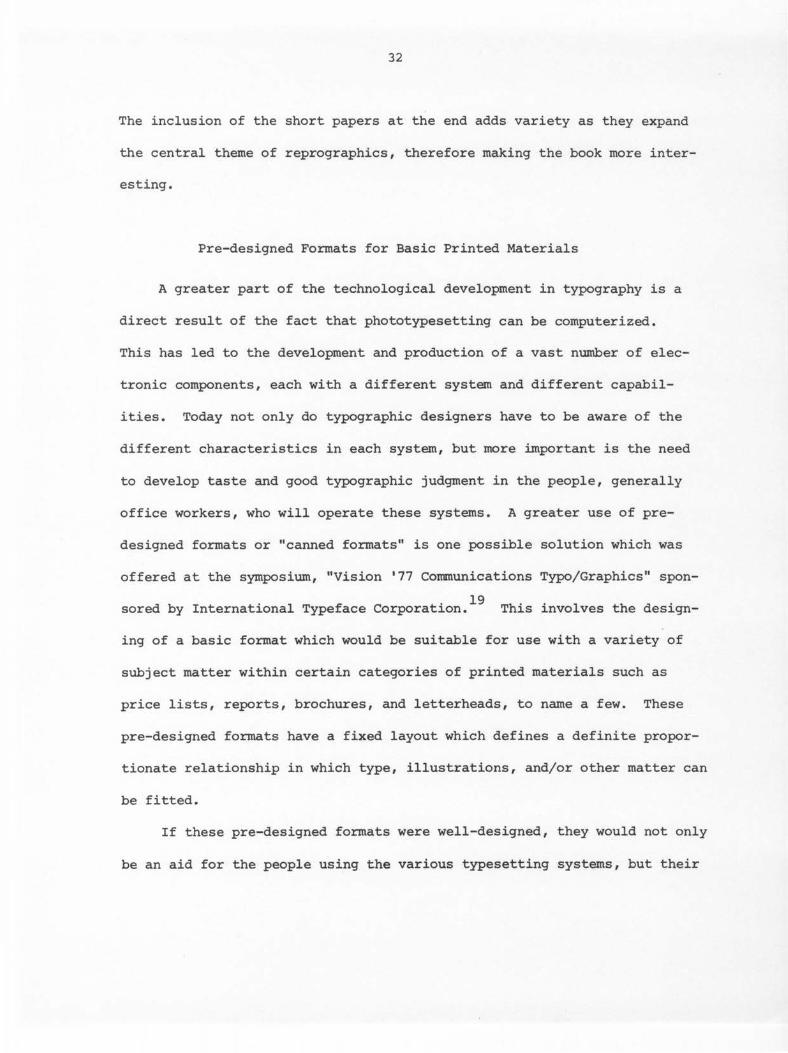
Pre-designed Formats for Basic Printed Materials
A greater part of the technological development in typography is a
direct result of the fact that phototypesetting can be computerized.
This has led to the development and production of a vast number of elec-
tronic components, each with a different system and different capabil-
ities. Today not only do typographic designers have to be aware of the
different characteristics in each system, but more important is the need
to develop taste and good typographic judgment in the people, generally
office workers, who will operate these systems. A greater use of pre-
designed formats or "canned formats" is one possible solution which was
offered at the symposium, "Vision '77 Communications Typo/Graphics" spon-
sored by International Typeface Corporation. 19 This involves the design-
ing of a basic format which would be suitable for use with a variety of
subject matter within certain categories of printed materials such as
price lists, reports, brochures, and letterheads, to name a few. These
pre-designed formats have a fixed layout which defines a definite propor-
tionate relationship in which type, illustrations, and/or other matter can
be fitted.
If these pre-designed formats were well-designed, they would not only
be an aid for the people using the various typesetting systems, but their
33
use would be an economical advantage for both the designer and the client.
The client could select from several different pre-designed layouts the
one which best suited his needs without having to spend the money or time
for a piece designed especially for him.
As the use of computerized systems for typesetting increases, even
university publications are becoming involved with pre-designed formats.
This section of the thesis includes pre-designed formats for a brochure
to advertise a short course (Figures 6 and 7) and a poster/brochure to
advertise graduate studies (Figures 8, 9, 10, and 11), both designed for
the Publications Office at Iowa State University.
Pre-designed formats for a brochure to advertise a short course
The brochure advertising Dog Health Symposium was chosen at random
as an example for a pre-designed format. Three different layouts were
designed for the front cover and only one for the body of the brochure.
There are variations in typeface and type size within these three layouts.
However the same rectangular format, 3 x 8 1/2 inches for the front cover
and 8 1/2 x 11 inches folded vertically into three parts for the body,
was used for all of the designs. In addition, the same relationship of
type weights, where the title and date appear in a bold typeface and the
sponsor and place in a light typeface, was used consistently throughout,
as was the different type size and combinations of typeface.
In each of the layouts the title, whether in a flush-left or flush-
right arrangement, is stacked in block form, word for word. The words
are set with a minus leading which means that there is less leading

34
between the lines than the point size of the letter. As a result some of
the characters, especially those with ascenders and descenders, may touch
or overlap. This tightly knit arrangement of type has become popular and
can be considered a current trend in the use of typography.
One design or layout uses the type in a flush-right arrangement with
a 3-pica right margin. The title and sponsor are stacked in a typograph-
ical block with a one point horizontal rule separating them which bleeds
off the left-hand side of the page. Approximately a 15 1/2-pica space
separates the title and sponsor from the place, and another 4-pica space
separates the place from the date, leaving a 7-pica bottom margin.
Within this basic layout there are three variations (Figure 6). In
one the title is set in 36 point Helvetica Bold, the date in 18 point
Helvetica Bold, the sponsor in 10 point Helvetica Light with one point
leading between the lines, and the place in 14 point Helvetica Light with
one point leading between the lines. In another, the title is set in 24
point Times Roman Bold and the date in 18 point Times Roman Bold. The
typeface and type sizes used for the sponsor and place are the same as
those used in the previous layout. In the third variation, the title is
set in 24 point Souvenir Bold, the date in 14 point Souvenir Bold, the
sponsor in 10 point Souvenir Light and the place in 14 point Souvenir
Light, both with one point leading between the lines.
The second layout uses the type basically in a flush-left arrange-
ment. In this layout the title and sponsor are positioned in a typograph-
ical block diagonally in the upper portion of the page. A rule extends

35
diagonally in both directions from the last word in the title and then
forms an inner connecting border two picas in from the edge of the page.
The other typographical elements such as the sponsor, place, and date are
placed within this border. There is a 13-pica space separating the title
and sponsor from the place and a 5-pica space separating the place from
the date, leaving a 6-pica space on the bottom inside the border.
Within this layout, there are two variations (Figure 7). One uses
the same combination of Helvetica Bold and Helvetica Light typefaces as
those used in the first layout. The other variation uses the same combi-
nation of Times Roman Bold and Helvetica Light typefaces as was previous-
ly used.
The third layout (Figure 7) uses both flush-left and flush-right
arrangements of the type. In this layout the title and sponsor are in a
flush-left typographical block which is positioned on a sharp diagonal in
the upper portion of the page. A black triangle placed flush with the
top and the left-hand edge of the paper separates the title from the spon-
sor. The type used for the title is the beige color of the paper as it
is positioned within the black triangle. The place and date are posi-
tioned in a flush-right arrangement in the lower portion of the page with
a 2-pica right margin. Approximately a 17 1/2-pica space separates the
title and sponsor from the place and a 5-pica space separates the place
from the date, leaving a 7-pica bottom margin.
Due to a higher production cost, there is only one example using this
layout. However, other variations in typefaces and type sizes could have

36
been used. This example uses the same combination of Helvetica Bold and
Helvetica Light typefaces as those previously used.
Contrast is the most important element used in all of these designs
or layouts. The most obvious contrast occurs in the variation of type
size and type weight with the use of the bold and light typefaces. The
layouts using the combination of Times Roman and Helvetica typefaces have
an additional contrast between a serif and a sans serif typeface. In the
first layout there is a contrast in stress with the typographical masses
positioned horizontally on a vertical format. The thin horizontal rule
separating the title from the sponsor emp~asizes this contrast. In the
second layout the use of the rule as a border contrasts with the type.
Its use helps to create a more vertical emphasis and adds to the total
unity of the design as it surrounds or encloses the typographical ele-
ments. In the second and third layouts there is a contrast in direction
with the type positioned both diagonally and horizontally. This helps to
create a more dramatic movement. Variations in space within and between
the typographical masses, which occur throughout, add a further contrast.
This use of combinations of contrasts helps to create a greater visual
interest and unity in each of the designs.
The body of the brochure was designed specifically to be used with
the first layout of the front cover previously described (Figure 6). Al-
though there is only one example, other variations in typefaces and type
sizes could be used. The type used is a combination of Helvetica Bold and
Helvetica Light in a variety of sizes. It is in a flush-left, ragged
37
right arrangement. The two folds in the paper act as columns in which
the type is placed. The same horizontal rule which appears in the first
layout of the front cover is repeated approximately 8 picas from the top
and runs across the entire page. The rule acts to separate the most im-
portant information from the rest of the copy, and becomes a visual tran-
sition from the front cover to the inside of the brochure. Thus the rule
becomes a key to the whole effect.
The title is set in 28 point Helvetica Bold and the date and the
words "Registration Form" are set in 18 point Helvetica Bold, all of which
appear above the horizontal rule. The main headings within the copy are
set in 14 point Helvetica Bold and the copy is set in 10 point Helvetica
Light with one point leading between the lines within the various typo-
graphical masses.
Again, contrast is the significant element used in this design, with
the contrast in type size and type weight being the most predominant. As
the bold typeface contrasts with the light typeface, the even textural
quality created by the monotone strokes of the Helvetica typeface remains
the same. The use of the bold typeface also acts as a means of identifi-
cation within the copy. Its repetition establishes an overall rhythm and
helps to create a unity within the design.
Pre-designed formats for a poster/brochure to advertise graduate studies
The poster/brochure advertising graduate studies in textiles and
clothing was chosen arbitrarily as an example for a pre-designed format.

38
Eleven different layouts were designed based on the same copy set in
columns 30 picas wide, 21 picas wide, and 14 picas wide. All of the type
is set in a flush-left ragged right arrangement regardless of the column
size, except for one layout which uses a flush-right ragged left arrange-
ment. The use of these ragged or unjustified margins is another current
d . h 20 ff 1 d . tren in typograp y. Its use o ers severa a vantages. The most im-
portant is the production of more legible copy. This is possible because
the unjustified margins allow equal word spacing and less hyphenation.
They also allow corrections to be made more easily. As a result the copy
can be more effective and functiona1. 21
The same rectangular format, 8 1/2 x 14 inches, is used throughout.
This size is just large enough to be seen when put up on a bulletin board,
but not too large to be folded and mailed in an envelope. Some of these
layouts were designed to be used with cards requesting more information.
However, these cards could easily be integrated into almost all of the
other layouts or deleted from those in which they occur.
The copy used for the body of the poster/brochure is either a combi-
nation of Helvetica Bold and Helvetica Light typefaces or a combination
of Palatine Bold and Palatine Medium typefaces. Both combinations are
set in 10 point with two points leading between the lines. These two
variations in typeface are combined in several ways with two variations in
the typeface used for display, Helvetica Bold and Times Roman Bold. Those
designs using Helvetica typefaces for the body are combined with Helvetica
display typefaces in some of the layouts and with Times Roman display

39
typefaces in other layouts. However, the designs using Palatine type-
faces for the body are combined only with Helvetica display typefaces.
All of the titles are set in a bold typeface with two variations in
type size, those set in 36 point and those set in 24 point. There are
four variations for the layout of the title alone. They include the title
stacked in block form, word for word, both flush-left and flush-right;
the title set in two lines in a hang left arrangement; the title set in
two lines in a centered arrangement; and the title set in three lines in
a flush-left arrangement. However, in all of the layouts, the title is
set with a minus leading.
The name and place of the institution are set in two combinations of
type sizes, 24 and 14 point and 18 and 9 point. Helvetica and Times Roman
typefaces are used in both of these size combinations and combine bold and
medium or bold and light type weights. The type for the name and place
of the institution is set in three lines, either in a flush-left or flush-
right arrangement. In addition, all of these designs use the words "Iowa
State University" in a bold typeface and in one line without any word
spacing. This creates a tightly knit typographic mass.
The year, "1977," is set in two type sizes, 36 point and 14 point.
The larger size is used only in bold, but the other is used in bold, me-
dium, and light type weights.
Five of the layouts show the type set in one column, 30 picas wide,
using only Helvetica typefaces for the body (Figure 8). In each of these
layouts the column of copy is positioned approximately 18 picas in from

40
the left-hand edge of the paper. This 18-pica space creates a vertical
rectangle in which all or some of the display type is contained.
In two of these layouts the title is set in 36 point Helvetica Bold,
stacked word for word in a flush-right arrangement. It is positioned in
the white space three picas from the body and is aligned with the top line
of type in the body. The name and place of the institution are aligned
with the body and positioned below it. This arrangement of type adds
further vertical emphasis to a design which is already vertical in appear-
ance because of its format. These layouts are the same except that one
has an information card.
The third layout uses the title set in 36 point Helvetica Bold in
the 2-line, hang left arrangement. It is positioned horizontally between
the body and an information card about one-third of the distance from the
bottom of the page. Approximately one-half of the title extends into the
vertical white space. This arrangement creates a contrast in directional
stress.
The fourth and fifth layouts use the display type in a flush-left
arrangement with the title set in three lines and in 24 point. The dis-
play type is positioned in the white space with the name and place of the
institution aligned with the top line of type in the body. There is a
13-pica space between that typographical mass and the title, and a 6-pica
space between the title and the date. These layouts are the same except
for the variation in the typeface used for the display and for two one
point rules which have been added to one of these layouts. These rules

41
run vertically along the sides of the type used for the body. They not
only provide a contrast with the type, but both join the elements in the
body as well as separate them from the display type. In addition, the
rules create a vertical emphasis to the design.
Three of the layouts show the type set in two columns, each 21 picas
wide, again using only Helvetica typefaces for the body (Figure 9). In
each of these layouts the two columns of type are positioned approximately
24-28 picas down from the top of the page. This creates a white horizon-
tal rectangle in which some of the display type is positioned. All of
these layouts use Helvetica Bold typeface in 36 point for the title.
One layout uses the title set in two lines centered in the white
space above the body, 16 picas down from the top of the page. This par-
ticular use of type creates a contrast in direction. The display type
and the bold type used within the body appear horizontally which contrast
to the vertical position of the columns and the vertical format.
The other two layouts use the title stacked, word for word in block
form, one set flush-left to go with the flush-left body, and the other
flush-right to go with the flush-right body. The titles are positioned
in the white space above the body and are aligned with the flush side of
one of the columns. The date is aligned with the flush side of the other
column and with the top word in the title. An information card is used at
the bottom of the second column. This kind of typographic arrangement
creates a more vertical appearance.
Three other layouts, which vary only in typeface combinations, show
42
the type set in two columns, each 14 picas wide (Figure 10). The two
columns are positioned 18 picas in from the left-hand edge of the paper.
This design uses the title set in 36 point and in the 2-line, hang left
arrangement. The basic layout is similar to the one described earlier
using the same title layout. The only difference is in the number of
columns used and a variation in typeface combinations.
The remaining four layouts show the type set in three columns, each
14 picas wide (Figure 11). The columns are of unequal lengths which
create a greater visual interest.
One layout uses a combination of Palatine and Helvetica typefaces.
The three columns of type are positioned 24 picas down from the top of the
page. The title is set in 24 point Helvetica Bold and is stacked, word for
word, in a flush-left arrangement. It is positioned above the body and
aligned over the first column of type, with a 3-pica space separating it
from the body. The date is aligned over the third column of type and with
the first word in the title. The name and place of the institution are
positioned 2 1/2 picas from the bottom of the page and are aligned with
the center column of type. The use of the three columns of type combined
with this particular title layout create a strong vertical appearance.
A second layout uses a combination of Helvetica typefaces. The title
is set in 36 point Helvetica Bold, in two lines centered above the three
columns of type with a 2 1/2-pica space separating it from the body. The
name and place of the institution are also centered approximately 4 picas
from the bottom of the page. A contrast in directional stress occurs
43
similar to that described earlier in the design using the same title lay-
out, but using only two columns of type.
The other two layouts, which vary only in typeface combinations, use
one point horizontal and vertical rules which form rectangles in which
the typographic masses are positioned. The rules form three vertical
rectangles, each of which contain a column of type, and one horizontal
rectangle which is placed above the other three and contains the display
type. The title is set in 24 point and in the 3-line, flush-left arrange-
ment. It is positioned 3 picas above the date. Both the title and the
date are aligned with the first column of type. The name and place of
the institution are aligned with the top line in the title and above the
third column. The rules add a fairly strong vertical appearance as they
contrast with the type. Their juxtaposition with the type further empha-
sizes the vertical quality of the columns. Again, the rules act to both
join and separate the typographic elements in the layout.
The most important element used in all of these designs or layouts is
contrast. All of the designs show a contrast in type size and in type
weight, but those with the greatest contrast are the most effective visu-
ally. In effect, the most successful designs are those in which the type
size of the title is the largest.
The layouts using Times Roman and Palatine typefaces for the display
have an additional contrast as these serif typefaces contrast with the
Helvetica sans serif typefaces used in the body.
The use of the bold typefaces, which repeat as headings within the

44
body, juxtaposed to the light or medium typefaces not only create a con-
trast, but help to organize the copy so that its content is communicated
more effectively. This is more successful in the designs using Helvetica
typefaces for the body.
The use of rules and the relationship of the unprinted areas to the
typographic masses provide further contrasts as they help to establish a
directional stress. Some of the designs show more contrast in direction,
while others emphasize a more vertical appearance. 22
This use of multiple contrasts heightens the visual interest and
helps to establish an overall unity within each of the designs.
Title and Credit Design for the Film, LUMIA II
The film, LUMIA II, Design of Dance, is a Design Center project at
Iowa State University. It was created by Mary Meixner and Betty Toman,
and produced by R. B. Lindemeyer. The film combines art and dance in a
way which demonstrates some of the basic elements and principles of design.
The composition speaks a visual language. Sequences of images and image-
forming shadows and sounds appear rhythmically, in time, on a screen.
This occurs by means of light projected through celluloid. It exists for 23 the moment of its perception by the eye and by the ear.
There are three basic sequences in this flim. Dancers move through
a background of helium-filled balloons of various shapes and sizes made
from an iridescent plastic film called Mearl invented at Dow Chemical
24 Company (Figure 12). These balloons establish a visual character and
45
provide an overall atmosphere for the film. Various moods are created
by using a different additive light mixture for each of the sequences.
The design and production of the title and credits include both in-
animate and live action techniques. After the main body of the film was
shot, the cinematographer zoomed in on the balloons and filmed several
sequences, slightly out-of-focus, which were used as the background for
the title and credits. (Figure 13 is an example of the balloons filmed
close-up and slightly out-of-focus.) All three additive light filters
were used during these sequences. The sequences appear as abstract shapes
in which red, blue, and green "spots" of various sizes occur. They are
on a black ground, some moving and some static. The type used for the
title and credits appears white and was filmed separately from seven
static scenes. The two rolls of film were then combined showing the type
superimposed over the background of balloons. This was done by means of a
special process performed in a film laboratory.
Three scenes appear at the beginning of the film which include the
title and the copyright line in one (Figure 14); "A Design Center Project,
Iowa State University, Ames" in a second (Figure 15); and "CREATED BY Mary
Meixner" and "Betty Toman" in the third (Figure 16). In these scenes the
type is static and dissolves over a gently undulating background of ab-
stract shapes. Dissolves are transitional devices used to change scenes
whereby one scene fades out as another fades in. 25
The remaining credits appear in four static scenes at the end of the
film. They include the dancers in one (Figure 17); the lighting, set
46
design, and titles in a second (Figure 18); the sound and cinematographer
in a third (Figure 19); and the producer in the fourth (Figure 20). In
each of these scenes the type is in a centered arrangement, but is placed
asymmetrically in the negative spaces which are juxtaposed to the abstract
shapes created by the balloons. Positioning of the type in this partic-
ular way also acts to complement these abstract shapes.
The typography used in the film was laid out on rectangular formats
in a ratio of 4:3. This is a constant ratio or proportion used in produc-
ing all film. Various sizes and weights of Optima typeface were used
throughout. The title is set in 72 point Optima Black caps and the sub-
title, "Design of Dance," is set in 28, 48, and 72 point Optima Medium
caps. The "Ds" in "Design" and "Dance" are in 72 point. Other letters
are in 48 point. These words are set in two lines with no leading in be-
tween and with the "Ds" overlapping. The word "OF" is set in 28 point
Optima Medium caps and is juxtaposed to the "D" in "Dance" along its base
line. The entire subtitle is centered approximately two picas under the
title. The copyright line is set in 18 point Optima Bold and appears hor-
izontally at the bottom of the frame in the first scene. The credits are
set in 16 point Optima Black caps and names receiving the credits are set
in 28 point Optima Medium. The type used in the second scene is also set
in 28 point Optima Medium. Although the type was set in these particular
sizes, it becomes much larger when it is projected on a screen. The pro-
portions, however, still remain the same.
The Optima typeface was chosen to establish a style for the film.
47
Its open design with a clear simplicity of a sans serif face, its differ-
entiating weights in the main and connecting strokes, and its mildly
tapered and scooped out stems and cross-bars create a definite classical
grace which can be associated with dance. 26 Its use also suggests a qual-
ity of timelessness.
Contrast and texture are the two dominant elements which appear in
the title and credit design. Contrast occurs in the variation of type
size, which is especially effective in the design of the subtitle. Con-
trast also occurs in the variation of type weight with the use of the
medium and black or extremely heavy weights together. The type itself,
which has a sharp, smooth visual texture, contrasts strongly with the un-
even and somewhat fuzzy visual texture of the abstract shapes used for
the background. The "objective impersonal character1127 of the Optima
typeface allows it to be combined effectively with this particular kind
of background.
In addition to the use of contrast and texture, a sensation of space
is created by the moving background of abstract shapes. Not only do the
shapes move slightly in the natural air current, but additional movement
occurs in the actual panning of the camera in the first three scenes. The
type has a visual appearance of seeming to float in a galaxy of red, blue,
and green shapes.
In film, sequence is an important design consideration. The frames
or scenes should "flow" into one another. 28 The use of the balloons as
abstract shapes in the background for the title and credits provides a
48
logical and consistent transition from the title, to the body of the
film, and then to the credits. The close-up and slightly out-of-focus
shots act as an abstract reference to the more realistic shots of the
balloons which occur in the main body of the film. This repetition, as
well as the repetition of the same typeface throughout, creates a rhythm
and helps to establish a well-blended unity overall.
Designs with Type
In contrast to some of the more conventional uses of typography,
this section of the thesis involves a series of ten abstract designs in
which type provides the basic material for the designs. These designs go
beyond individual letters to create new forms of expression. Each design
was handset and then printed on a proof press. 29 Type from a variety of
fonts was used, some wood, some metal. The examples relate to four basic
designs with variations in three of them. They include four variations
using the letter "O" and the "period" (Figure 21}; three variations using
the letters "I" and "L," the number "l," the "period," and the "exclama-
tion point" (Figure 22}; two variations using the "ampersand" (Figure 23};
and one design using the "I," "L," the number "l," and the "period"
(Figure 24}. There are no variations of this last design.
Variations using the letter "O" and the "period"
The basic design involves the letter "O" and the "period" combined
in a variety of typefaces and sizes. Variations in this design relate to
the repetition of the basic design in each of the pieces. This is achieved

49
by putting the same paper through the press several times and in various
positions. A certain amount of ink is absorbed each time the paper goes
through the press, resulting in a gradation in value.
One variation shows the basic design repeated four times (Figure 21).
Initially the paper passed through the press twice, the second time at a
slightly lower position. The paper was inverted and the same process was
repeated. Two white "O"s were cut from color-aid paper and glued to the
center of this design. This was done to break up the almost black density
created by the overlapping in the printing and to add variety in the form
of an additional texture. These two "O"s also act as a focal point.
This design has a vertical rectangular format and was printed in
black ink on white paper. It is framed with a double mat, a thin black
inner mat and a grey outer mat.
A second variation shows the basic design repeated three times, once
with the paper right-side up and twice with the paper inverted (Figure 21).
It was printed in black ink on white paper. This design has an overall
vertical rectangular format, but the inner opening of the dark grey mat is
cut in an irregular shape. The contour of this inner opening is a combi-
nation of curved and straight lines, vertical and horizontal. This par-
ticular kind of inner opening complements this design and further empha-
sizes the contour shapes of the "O"s.
The third and fourth variation each show the basic design repeated
twice (Figure 21). The paper was then torn around the overall contour of
the design and mounted on a dark ground. Before the designs were mounted,

50
counter shapes in three of the "O"s were cut out to show the dark ground.
Both of these variations have a vertical rectangular format. One was
printed in black ink on cream paper and mounted on a dark brown ground and
framed with a cream mat. The other was printed in black ink on white
paper, mounted on a dark grey ground, and framed with a white mat.
Black, grey values, texture, and contrast are the dominant elements
used in these designs. The gradation in the black and grey values created
by repetition of the basic design is most prominant. There is the illu-
30 sion that the darker letters appear closer than the lighter ones, except
for the two white "O"s used in the first variation.
The grey values also involve texture and contrast. An uneven surface
is created when the design is printed in succession due to the decreasing
amount of ink on the press. This creates a relatively rough texture, both
tactile and visual. This texture combines with the somewhat heavily tex-
tured paper and contrasts with the more uniform texture created by the
letters which were first printed when the press was fully inked.
Texture also involves an interplay of the weight and structure of the
letters used. A relatively uneven visual texture is created by the rather
bold weight of most of the letters. This contrasts with a more uniform
visual texture created by relatively less contrast between the strokes of 31 the letters.
Additional contrast occurs in the variation of typeface and type
size. The use of the periods which form solid circular masses, contrasts
with the open contour shapes of the "O"s. Their contrast in size and form

51
32 add interest and variety as they are scattered freely throughout.
This multiple use of contrasts together with the use of similarity
and repetition of elements helps to establish rhythm and harmony in each
of the designs.
Variations using the letters "I" and "L," the number "l," the "period," and the "exclamation point"
The basic design involves the letters "I" and "L," the number "l,"
the "period," and the "exclamation point." It combines both solid and
outlined letterforms or typographical elements in a variety of typefaces,
sizes, and weights. The design creates a pattern of rectangular and
square shapes except for the three triangles created by the upper portions
of the exclamation points. The shapes formed by these typographical ele-
ments and their juxtaposition in the surrounding space give a definite
linear quality to the design. One large, thick rectangular element is
used which divides the composition almost in half. Its linear quality has
so thickened that it appears as a plane surface. A random placement of
the other typographical elements appears on either side of this large,
thick shape, most of which are positioned in the same direction and paral-
lel to each other.
Variations in this design relate to the use of color in rectangular
and square shapes of varying sizes. These colored shapes, which appear as
accents, are cut from color-aid paper and glued to the original designs.
All of these designs have a rectangular format, but vary in their direc-
tional emphasis.
52
The first variation is printed in black ink on a light grey paper
(Figure 22). Color occurs in the addition of six turquoise rectangles
and two turquoise squares. These colored shapes have been carefully in-
terspersed throughout the design. This design is framed with a double
mat, a thin black inner mat and a grey outer mat, a few shades darker
than the paper. The design itself has a vertical appearance, but its
overall direction is horizontal.
A second variation is printed in black ink on white paper (Figure
22). Five red rectangles, two red squares, and one white rectangle have
been added to this design, again carefully positioned throughout. The
design is framed with a triple mat, a thin red inner mat, a slightly
thicker black middle mat, and a white outer mat. The design has a hori-
zontal appearance and its overall directional format is vertical.
The third variation is printed in black ink on beige paper (Figure
22). The design involves the addition of seven turquoise rectangles and
three turquoise squares. This turquoise has a slightly different shade
than the one previously described. The design is framed with a black mat.
Its overall directional format is horizontal, but its appearance is
vertical.
The use of texture, contrast, and color are predominant in these de-
signs. Texture involves the juxtaposition of the typographical elements
to their surrounding space. A more uneven or rough visual texture is
created by the variation in size and thickness of these elements and in
the variation of space surrounding them. This uneven and relatively rough
53
visual texture is further emphasized by the use of a somewhat heavily tex-
tured paper. However, a contrast does occur with the use of the color-aid
paper which has a smooth and matte texture.
Other contrasts occur in the variations in size and weight of the
typographical elements. Solid forms contrast with outlined forms, and the
linear direction of the composition contrasts with the direction of the
overall format. The use of color involves further contrast as it is jux-
taposed to the black shapes created by the typographical elements.
Not only was color used as a contrast with the black, but it was also
used for emphasis and to create an overall effect in these designs. The
particular choice of colors combined with the directional position of the
composition reflect a contradiction in this mood or overall effect.
The use of turquoise in the first variation combined with the black
and shades of grey used for the paper and the mat seems to impart a cool
and restful feeling even though the typographical elements are in a verti-
cal position. This design could be described as "verticals at peace."
The small amount of red used in the second variation appears to have
a richness and luminosity because of its juxtaposition with the larger
amount of black. Its use seems to impart an excitement and aggression
which is unexpected when combined with the horizontal position of the
typographical elements. The overall vertical format helps to reinforce
this feeling.
The use of turquoise in the third variation acts as a complement to
the beige paper and appears to create an overall feeling of warmth. Its

54
use on the thick, black rectangular shape tends to break up the excep-
tionally heavy weight of this element.
In each of the designs, a greater visual effect is created by using
the color sparingly in relation to the amount of black. 33 This particular
use of color also adds variety and creates a greater visual interest in
the designs.
In addition to the texture, contrast, and color used in these de-
signs, a sense of movement appears to be inherent in the linear quality
of the compositions. The linear shapes created by the typographical ele-
ments repeat throughout to create a rhythm; and a powerful, emphatic beat
is felt at the occurrence of the large, thick rectangular shape. This
repetition combined with the harmony of the other design elements coheres
in a visual unit.
Variations using the "ampersand"
This design involves the use of the ampersand in various typefaces
and sizes. The two designs are alike except for their directional format
and color (Figure 23). One was printed in turquoise ink on cream paper.
It was framed with a dark grey mat positioned vertically. The other was
printed in black ink on rust paper. It was framed with a dark brown mat
and positioned horizontally. The most unusual feature in this design is
the mat. The outer edges have a rectangular format, but the inner opening
consists of an irregular contour shape. The implied line created by the
outer edge of this irregular shape further emphasizes the contour shapes
in the ampersands.
55
Contrast and texture are the two dominant elements used in this de-
sign. Contrast occurs in type size and in typeface. T'WO outlined amper-
sands add further contrast as well as variety to the design.
By using only a modest amount of ink, an uneven surface is created
when the design is printed. This creates a relatively rough visual tex-
ture which combines with the somewhat heavily textured paper. Variations
in size and weight of the ampersands and in the space surrounding them
further emphasize this uneven textural appearance which contrasts with the
smooth visual and tactile texture of the mat.
An additional contrast occurs between the straight angular lines of
the outer edges of the mat and the irregular contour of its inner opening
which also acts as a visual transition from the mat to the design to
achieve a total harmony.
Design using the letters "I" and "L," the number "l," and the "period"
This design involves the letters "I" and "L," the number "l," and
the "period" used in various typefaces, sizes, and weights (Figure 24).
The composition consists of rectangular and square shapes which were
created with these typographical elements. Two large, thick rectangular
shapes make up the center of the composition. Their linear quality has
become so thick that they appear more as plane surfaces. The other typo-
graphical elements are placed selectively around these t'WO dominant
shapes. Most of the elements are placed beside each other in a vertical
position with no space between the pieces of type. This particular jux-
taposition of the typographical elements creates fine white lines, running

56
horizontally and vertically, which seem to be framed in black. The linear
pattern of these white lines appears to have a greater visual impact than
1 bl k h d . h 34 the arger ac s apes surroun 1ng t em. The white lines appear in-
tensified and seem to take on greater luminosity because of their thin-35 ness.
The design was printed in black ink on white paper. A quotation from
36 Some Contemporary Elements in Classical Chinese Art by Tseng Yu-ho was
added to the composition after the design was printed. The quotation
appears in white on the two larger black center shapes and was set with
36 point Optima transfer lettering. 37 A PMT was then made from the design,
and subsequently framed with a pearl grey mat. The mat has a rectangular
vertical format. However, it has an irregular inner opening which con-
sists of vertical and horizontal lines that conform specifically to the
contour of the design.
Contrast is the dominant element used in this design. Contrast occurs
in the variation in size and weight of the typographical elements used.
The thin white lines created by the juxtaposition of these typographical
elements contrast strongly with the heavier black linear shapes surround-
ing them. Further contrast is added by combining the lettering with the
basic design. Another contrast occurs between the regular outer edges of
the mat and its irregular inner opening. This inner opening further em-
phasizes the overall contour of the design and acts to integrate it with
the mat to create a unified whole. This multiple use of contrasts helps
to create visual interest and unity in the design.

57
Experiences in Color and Light: A Structure Using Booklets
I invite you to learn to see. Josef Albers
The experience of color for most people is primarily in the subtrac-
tive mixture process. Since color perception teaches us that a color is
almost never seen by itself and that it is related to qualities of sensa-
tion, visual experiences in color and illumination would allow for its
greater learning and understanding. This section of the thesis involves
a three-dimensional structure housing eight experiences dealing with color
and light (Figure 25). Five booklets accompany this structure and are
incorporated in its design.
These experiences and booklets are meant to emphasize that color mix-
ture in the contemporary world of art no longer depends on pigment mixture
alone. Light can be broken into color seen as the visible spectrum.
Blacklight allows experiences with the invisible electric range beyond the
visible spectrum. Some reflected colors, which could not be duplicated
by using pigment, occur in the actual platelet structural elements of cer-
tain feathers reflecting light. Spinning discs allow experiences in sub-
jective or induced color, a phenomenon which can occur when the stimulus
is only black and white. And finally, perceptual changes in color can
occur through the mysterious relationships between color and form, and
through the interaction and interdependence between one color and another.
The structure itself consists of eight interchangeable 8 x 8 x 8
inch three-sided, clear, plexiglas I1X>dules. Each module was formed from

58
one piece of plexiglas which was bent in two places by strip heating.
In this process the line to be bent is centered over the heating element.
After the plexiglas is heated thoroughly, it is bent gently to a 90 degree
angle, keeping the heated side on the outside of the bend. It is then
held firmly until cool. These modules are stacked, asymmetrically, like
blocks, on a black plexiglas base. Inside each of these modules is a
4 x 4 x 4 inch plexiglas cube demonstrating an aspect of color or light.
One experience involves seeing the visible spectrum through prisms
(Figure 26). A mobile of prisms hangs from the center inside of a five-
sided plexiglas cube. The construction consists of eleven tiny triangular
prisms hanging at various lengths, on nylon thread, from the inside of a
three-inch circular piece of plexiglas attached to the top of the cube with
a plastic screw. The cube is open in the front with a mirrored back and
a white bottom. The remaining sides of the cube are made of clear plexi-
glas. This allows the sun to shine through the prisms and reflect tiny
spectra from the mirror onto the white ground.
There are three experiences dealing with structural color where light
behaves as a multilayered interference phenomenon. One experience shows
examples of structural color in nature. This is a five-sided cube with an
open bottom. The top contains five color slides of the hummingbird. One
side contains a morpho butterfly on a white ground (Figure 26)~ opposite
the morpho is the eye of a peacock feather also on a white ground. Each
of these is sandwiched between two pieces of thin plexiglas. The two re-
maining sides are clear plexiglas.

59
A second experience in structural color shows man-made iridescence
in a plastic film called Mearl (Figure 26). 38 Two opposite sides of the
cube show the Mearl film on a transparent ground, another side on a black
ground, and opposite the black, the film is shown on a white ground. Each
example of the Mearl film is used in the shape of a three-inch circle,
sandwiched between two thin pieces of plexiglas, and attached to the outer
sides of the clear plexiglas cube with plastic screws.
The third experience in structural color is concerned with the trans-
parent and reflecting diffraction spectra seen from finely-ruled grids on
plastic (Figure 26). Diffraction is the spreading of a beam of light
which occurs after the light goes through a narrow line opening. The de-
sign and construction of this cube is the same as the one incorporating
the Mearl film. Two opposite sides of the cube show circles of trans-
parent diffraction spectra, and the other two opposite sides show circles
of reflecting diffraction spectra.
Another experience involves optical mixtures which deal with subjec-
tive or induced color, and with perception of pattern and motion. It con-
sists of several discs, each in a different pattern and/or color, which
spin, one at a time, on a black plexiglas cube (Figure 27). 39 The cube
has an open bottom and inside is a tiny battery operated motor whose fly-
wheel projects through a small opening in the center of one side of the
cube. The flywheel spins when it is activated by a switch attached to
the back of the cube. Each disc creates a different optical mixture as
it spins.
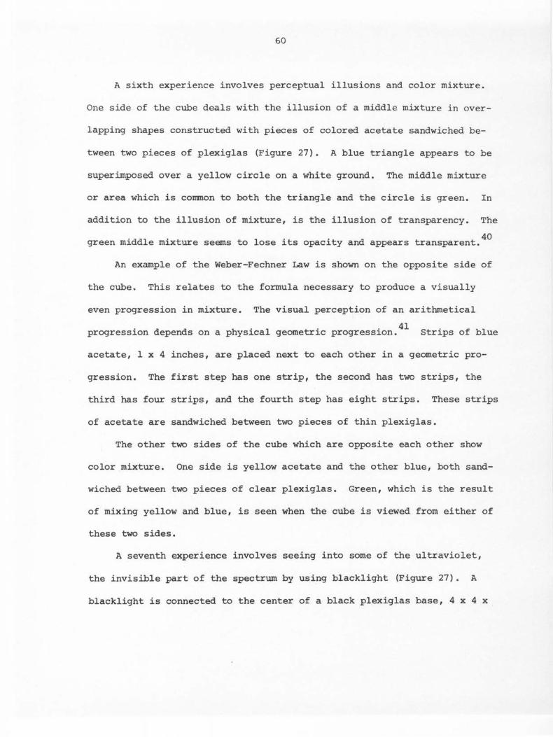
60
A sixth experience involves perceptual illusions and color mixture.
One side of the cube deals with the illusion of a middle mixture in over-
lapping shapes constructed with pieces of colored acetate sandwiched be-
tween two pieces of plexiglas (Figure 27). A blue triangle appears to be
superimposed over a yellow circle on a white ground. The middle mixture
or area which is common to both the triangle and the circle is green. In
addition to the illusion of mixture, is the illusion of transparency. The
40 green middle mixture seems to lose its opacity and appears transparent.
An example of the Weber-Fechner Law is shown on the opposite side of
the cube. This relates to the formula necessary to produce a visually
even progression in mixture. The visual perception of an arithmetical
. d d h . 1 . . 41 progression epen s on a p ysica geometric progression. Strips of blue
acetate, 1 x 4 inches, are placed next to each other in a geometric pro-
gression. The first step has one strip, the second has two strips, the
third has four strips, and the fourth step has eight strips. These strips
of acetate are sandwiched between two pieces of thin plexiglas.
The other two sides of the cube which are opposite each other show
color mixture. One side is yellow acetate and the other blue, both sand-
wiched between two pieces of clear plexiglas. Green, which is the result
of mixing yellow and blue, is seen when the cube is viewed from either of
these two sides.
A seventh experience involves seeing into some of the ultraviolet,
the invisible part of the spectrum by using blacklight (Figure 27). A
blacklight is connected to the center of a black plexiglas base, 4 x 4 x

61
2 3/8 inches. A clear acrylic tube, four inches long and four inches in
diameter, sits on top of the blacklight and rests on the base. Fluores-
cent string, in six different colors, is glued to the outside of this
tube in an abstract linear pattern. When the blacklight is activated, the
phenomenon of fluorescence can be seen. Energy from the blacklight rays
is absorbed by the electrons of the substance being activated. In this
example, it is the string. This causes the electrons to move around
violently, and as they slow down, they release this energy in longer
1 h h . h . . 'bl 1 42 wave engt s w 1c appear in v1s1 e co ors. This phenomenon of fluores-
cence can also be seen in a piece of quartz rock which is placed on a
piece of clear plexiglas above the blacklight in the structure. In addi-
tion to the quartz, three small rocks, fluorite, willemite, and wernerite,
have been glued to a black disc. They fluoresce under blacklight. These
are examples of fluorescence in nature.
The eighth cube involves an experience with liquid crystals (Figure
27). Four samples of liquid crystals have been taped, each to one side of
the cube, with black pressure-sensitive tape. One sample greenish-blue in
color, reacts both to water and to the touch. This one turns blue when
touched and turns bronze which fades to green when wet. The other three
react only to the touch. One sample, which is black, turns greenish-blue,
then fades to bronze when touched. Another sample which is midnight blue,
turns greenish-pink when touched. The last sample which is black, turns
pinkish-bronze with hints of green when touched.
In addition to these eight experiences, there are five booklets to
62
accompany the structure (Figure 28). They are titled, Catching Rainbows,
Structural Color, Spinning Circles, Homage to Albers, and Beyond Thresh-
olds. 43 These booklets explain the experiences and act as a complement
to them.
The booklets and the discs for the optical mixture experience have
been placed in a four-sided rectangular structure (Figure 29). The inte-
rior was designed to resemble a book case with shelves. There are three
compartments, one for the booklets, two for the discs. The exterior was
designed to resemble the hard cover of a book. The interior and the
pieces relating to the front and back covers are constructed with black
plexiglas. The part relating to the spine of the book is white plexiglas.
A list of the contents and the names of the author and the designer appear
in black type on the white plexiglas spine (Figure 29). A transparent PMT
was made from the type which is sandwiched between two pieces of thin
plexiglas. This mini-structure containing the booklets and the discs is
housed in the lower module which intersects the horizontal and vertical
direction of the structure.
The overall rectangular format of these booklets is 6 x 7 inches.
The text is set in Courier 12 on an IBM Selectric II. This is a slightly
squared serif typeface. The text has justified left-hand margins with rag-
ged right. Xeroxes of illustrations are planned layouts throughout the
text. The titles are 24 point and 18 point Serif Gothic transfer lettering
in a flush-left arrangement. The paper is Kimberly Clark's Classic Laid
in natural white and the covers are Kimberly Clark's Zodiac Colors with a

63
seaweave finish. The booklets are bound in saddle stitch. In this pro-
cess each booklet is opened in the middle and two wire staples are in-
serted through the back. A limited edition of three copies of each
booklet was produced.
The form of these booklets relates to the rectangle, both in the
actual shape of the paper and in the visual shape the text creates as the
black ink of the type contrasts with the natural white of the paper. An
even texture is created by the use of a minimum amount of leading between
the lines and by the use of a typeface which has little contrast between
its vertical and horizontal strokes. This even visual texture contrasts
with the paper which has an uneven finish. The horizontal direction of
the type is in agreement with the horizontal pattern of the weave of the
paper. This horizontal direction contrasts with the more vertical tex-
tural weave of the paper used for the covers. Contrast also occurs in the
use of italics for the subheadings and in the variation of typeface and
size used for the titles. The larger, heavier sans serif typeface of the
titles contrasts with the smaller, lighter weight typeface of the text.
Variety occurs in the use of illustrations which are designed to fit
throughout the text and act as a contrast to it. The use of illustrations
relieves the monotony of unbroken text, and adds interest and visual
stimulation for the reader.
Rhythm and movement occur in the repetition of the same typeface, one
for the titles and one for the text, in each of these booklets. Repeti-
tion also occurs in the unequal relationships of the white areas, both in
64
the margins and within the text.
The use of color occurs primarily in the booklet covers and in the
form of colored stock. In printing processes, stock refers to paper.
Except for Spinning Circles for which the cover is black and white, each
booklet cover is a different color. These colors contrast with each other
and with the black type used for the titles.
The cover for Catching Rainbows has six layers of paper, each one a
quarter inch longer than the previous one on the front cover. This
creates a vertical strip along the right-hand edge in the colors of the
spectrum. The red, which is the shortest, is on the left-hand side of the
strip and continues on around to become the predominant color used for
this cover. The cover for Structural Color is aqua and metallic pin-
wheels have been added in a variety of colors. These pinwheels form a
rectangular shape under the title and represent the quality of iridescence
described in the booklet. Yellow is used for the cover of Homage to
Albers and purple for the cover of Beyond Thresholds. Two rectangular
pieces of fluorescent paper of different sizes, one "signal green," the
other "saturn yellow," are glued to each other and to the purple cover of
Beyond Thresholds. The title appears on the "saturn yellow" rectangle.
All of these colors were chosen not only for their aesthetic value, but
to help express the booklets' content more effectively.
Since the Albers booklet deals with perceptual illusion, color is
also used to illustrate the illusions which the reader will experience.
Here the arrangement of color is logical and relates specifically to

65
content.
The cover for Spinning Circles is white with a transparent and black
overlay. The acetate overlay contains a radiating line figure in a five
inch circular shape. The title can be seen through the transparent part
of the figure. This particular cover relates to perception of pattern
and motion and visually expands the booklet's content.
It is the combination of these various elements exhibited in the
type, paper, illustrations, and covers which are integrated to create a
sophisticated, but informal expression of typographic design.
In relation to the entire structure, very simple geometric shapes
have been used throughout. The use of the circle and the square predom-
inate. By designing a modular construction, visual interest is created
through multiple views of the same form in an orderly manner. The square
is repeated both in the structure and in the cubes for the experiences.
The circle is repeated as part of the construction in several cubes. It
appears in the Mearl film, the diffraction spectra, the discs for optical
mixtures, and the middle mixture illusion. The circle is also repeated
in the shape of the bulb for the blacklight and in the cylindrical tube
with the fluorescent string. The repetition of these shapes creates an
overall rhythm and movement in the design.
Variety is achieved through contrast. The most obvious contrast is
between the circle and the square. By their repeated use, these two oppo-
site shapes are brought into harmony. Contrast also occurs in the use of
materials. The paper used for the booklets and discs, the various mate-

66
rials used in the construction of the experiences, and the plexiglas con-
trast with each other. Another contrast can be seen in relation to
balance. The individual components of the structure are formally bal-
anced, but the structure as a whole is an asymmetrical arrangement. Con-
trast in direction of movement occurs in the placement of the rectangular
mini-structure containing the booklets and the discs. Its position in the
lower module intersecting the vertical and the horizontal produces a point
of tension. The rectangular shape becomes the focal point created by the
90 degree angle of intersection of the modules. The use of the rectangle
for the focal point adds greater visual interest as it both contrasts with
the circle and the modular use of the square, and complements the rectan-
gular shape repeated in the base of the structure.
This multiple use of contrasts along with similarity of parts combine
to create unity in the overall design of the structure. The viewer not
only "learns to see" through the visual experiences, but also discovers
how applied typography can relate to a three-dimensional design in a more
unusual manner. The structure and the experiences can be viewed as a
piece of sculpture, as well as impart an opportunity for greater awareness
through the addition of the booklets as part of the structure.
A major limitation of this structure must be explained. The orig-
inal intent to make a structure that could be freely handled by the viewer
was prohibited by the design and the material. Plexiglas, although a very
sturdy material, retains fingerprints and scratches easily. Because the
three-sided modules were made by strip heating rather than from a mold,

67
they are not exactly the same size. (The error can be up to 1/16 inch.)
This means that the modules are not completely interchangeable and they
tend to be less sturdy when they are stacked. With unlimited funds,
five-sided cubes which stack like blocks could be made. In retrospect, I
would still choose plexiglas as a medium because its smooth, transparent
texture seems to relate so well to experiences in color and light.
68
CHAPTER III
SUMMARY
Despite tremendous competition from electronic media in communica-
tion, printed words still occupy a prominent place in our environment
and deserve creative and well-designed solutions in their presentation.
These original works, where the communication of ideas has been
primarily expressed through printed words, are intended to reflect the
importance of the elements and principles of design in creating a greater
fluency and visual aesthetic quality overall. Their typographic design
combines diverse elements into organized visual units. The elements of
communication have been assembled in a harmonious and unified whole
either through a uniformity of similar elements or through the use of
contrasting elements, or a combination of both. The individual results
depend on the way in which these elements are organized in relation to
each other. The interplay of similarities and contrasts can produce
stimulating and visually appealing effects, especially when there is a
greater awareness of the basic principles of design.
With a better understanding of these basic design principles and
their application comes greater freedom and originality in the creation
of new forms in typographic design. Many fields have become fertile for
experimentation in typography. Some interesting developments have evolved
in the field of book design. Radical departures from the traditional
format and typographic conventions are being explored. The book,
Silence, by John Cage uses different forms of typographic presentation

69
to achieve the typographical equivalent of musical rhythm and structure
in addition to letting open space into the typographic page. In the
play, La Cantatrice Chauve by Eugene Ionesco, visual form is created
through typography. One does not read the play, but rather attends the
performance which is typographically staged. 1
Other unusual experiments in book design have been brought together
in a recent exhibit at the Fredrick S. Wight Galleries at UCLA. The
exhibit, entitled "Words and Images," displayed many book-like objects
which appeared quite unlike ·books. The most striking example was
Buckminster Fuller's "Tetrascroll." It comes in a 41 inch pyramid-
shaped wooden box. The pages are hinged triangle shapes which can pop
up into pyramids. The text, most of which was positioned upside down,
also appears in a triangular shape.
These examples demonstrate the importance of the visual experience.
Although it is not called a book, the structure dealing with "Experiences
in Color and Light" could be considered an experiment in book design in
relation to these examples. When viewed as a whole, the three-dimensional
structure is a definite departure from the traditional book format.
Typography is used in the form of booklets and becomes an integral part
of the entire structure. The three-dimensional effect creates a visual
experience far beyond that possible from the booklets alone.
Another area of interest concerns typography in motion, especially
the typography used in television and film. What better place to ex-
periment with motion so inherent in these media? Two events prompted

70
experiments in this area. One was the production of a series of abstract
films by Norman McLaren of Canada's National Film Board in which lines,
dots, loops, numbers, and other shapes are animated across the screen.
The second event was the growth of the television industry and the need
f . . l' 2 or more origina ity. The design possibilities are numerous and have
only begun to be explored.
Some experimenting was done along this line in the creation of the
title design in LUMIA II. One idea was to make use of the colors in
the spectrum produced by a set of six triangular prisms. The letters
in the title would move across the screen through a background of spectra.
The idea of filming only the shadows of these letters and their move-
ment was also explored. In addition to movement, certain angles of the
camera could create distortion and elongation in the letter forms.
These ideas did not involve animated typography, but rather typography
in actual motion. Possibilities of animated typography only evolved
later and as a result of this experimentation. However, lack of time
and funds prohibited further study.
Both the field of book design and the entire field of movement
in typography have become rich areas for new ideas and definitely
merit further experiment. New concepts will have to be developed which
deal with time, space, and three-dimensional effects to create a "bal-
let of communication. 113
No matter what new forms or concepts develop, typography should
continue to strive for simplicity, legibility, clearness of expression,
71
and the enduring quality of timelessness. Freedom in typographical
experimentation and in exploiting new technological developments,
without losing the ability to apply the basic elements and principles
of design, seem paramount to more effective visual communication.

72
REFERENCES CITED
Chapter I
Introduction
lJoan Stoliar, "Vision '77: A Designer's Perspective on Technology and Typography," Publishers Weekly 212 (July 4, 1977): 63.
2Herbert Bayer, Herbert Bayer: Painter, Designer, Architect (New York: Reinhold Publishing Corp., 1967; London: Studio Vista Ltd., 1967), p. 26.
3Hermann Zapf, About Alphabets: Some Marginal Notes on Type Design (Cambridge, Mass. and London: The M.I.T. Press, 1970), p. 71.
4Jan Tschichold, Asymmetric Typography, trans. Ruari McLean from Typographische Gestaltung (New York: Reinhold Publishing Corp., 1967; Toronto: Cooper & Beatty, Ltd., 1967), p. 16.
5Ibid., p. 32.
6carl Dair, Design with Type (Toronto and Buffalo: University of Toronto Press, 1967), p. 50.
7Allen Hurlburt, Layout: The Design of the Printed Page (New York: Watson-Guptill Publications, 1977), p. 64.
8Tschichold, Asymmetric Typography, p. 62.
9Dair, Design with Type, p. 50.
10Eric K. Bain, Display Typography: The Theory and Practice of Typographic Design (New York: Hastings House Publishers, Focal Press Ltd., 1970), p. 17.
11Dair, Design with Type, pp. 65-66.
12Roy Paul Nelson, Publication Design (Dubuque, Iowa: wm. C. Brown Company Publishers, 1972), pp. 90-91.
13Bain, Display Typography, p. 17.
14Dair, Design with Type, p. 41.
15Ibid., pp. 29-31, 35, and 77.
16Ibid., pp. 37-40.

73
17Ruedi Ruegg and Godi Frohlich, Basic Typography: Handbook of Technique and Design (Zurich: ABC Verlag, 1972), p. 114.
18Hurlburt, Layout, pp. 64-65.
19Marjorie Elliott Bevlin, Design Through Discovery, 3d ed. (New York: Holt, Rinehart and Winston, 1977), p. 79.
20Ruegg and Frohlich, Basic Typography, p. 116.
21Josef Albers, Interaction of Color (New Haven and London: Yale University Press, 1971), p. 1.
22r discussed the use of black as a color in typography in the section describing "Black and Grey Values." This section will concentrate on the use of other colors.
23Ruegg and Frohlich, Basic Typography, pp. 116-117.
24Bain, Display Typography, p. 57.
25Tschichold, Asyrrunetric Typography, p. 67.
26oair, Design with Type, p. 71.
27Tschichold, Asyrrunetric Typography, p. 68.
28Emil Ruder, Typography: A Manual of Design, 3d ed. (New York: Visual Communication Books, Hastings House, Publishers, Inc., 1977), p. 158.
29rbid., p. 52.
30rbid., p. 16.
31 . . 'th 111 Dair, Design wi Type, p. •
32rbid., pp. 103-104.
33Ruder, Typography, p. 18.
34oair, Design with Type, p. 104.
35r have also created three plexiglas sculptural structures which will not be a part of this thesis because they relate to letterforms in three-dimension, rather than typography. However, they will be in-cluded in my graduate exhibit.
1
74
Chapter II
The Relationship of Original Works Using Typography to Elements and
Principles of Design
Rules, in relation to typography, have been defined in the section on "Rhythm" in the INTRODUCTION of this thesis, p. 8.
2I prepared the camera-ready copy for the front cover. The same copy was used to shoot the half-title and title pages.
3James Craig, Designing with Type: A Basic Course in Typography, ed. Susan E. Meyer (New York: Watson-Guptill Publications, 1971), p. 44.
4Jan Tschichold, Asymmetric Typography, trans. Ruari McLean from Typographische Gestaltung (New York: Reinhold Publishing Corp., 1967; Toronto: Cooper & Beatty, Ltd., 1967), p. 66.
5In the printing process some changes occurred which altered the in-tended typographic result. Only one thin rule was to be on the front cover. It was to both separate and join the title from the statement on energy conservation. The rule was intended to be only as long as the word "EQUIPMENT," and to be placed equidistant between the base line of the word "EQUIPMENT" and the top of the first line about energy.
6ttere I departed from a major guideline in typography by using different sans serif typefaces, Univers and Helvetica, in the same design. Because of the limitation of typefaces, sizes, and weights, I felt it was permissible to make this compromise. Before deciding I asked the printer to set samples in various combinations of type-faces, sizes, and weights and this seemed by far the best solution.
7carl Dair, Design with Type (Toronto and Buffalo: University of Toronto Press, 1967), p. 37.
8Roy Paul Nelson, Publication Design (Dubuque, Iowa: Wm. c. Brown Company Publishers, 1972), p. 213.
9Dair, Design with Type, p. 120.
lONelson, Publication Design, p. 230.
11John E. Cogoli, Photo-Offset Fundamentals, 3d ed. (Bloomington, Ill.: McKnight Publishing Company, 1973), 117-118.
12c . D . . 'th T 34 35 ra1g, esigning wi ype, pp. - •

75
13Dair, Design with Type, p. 118.
14The mirror broke, so the same design was printed on paper instead.
15I only authored one of these papers, "Future Trends in Typographic Symbolism."
16This was the only black and white glossy photograph that I had available at the time.
17These poems were authored by my daughter, Debbie Dorfman, who was 10 years old at the time.
1801drich Hlavsa, A Book of Type and Design, for SNTL Publishers of Technical Literature, Prague (New York: Tudor Publishing Co., 1960), p. 294.
19Joan Stoliar, "Vision '77: A Designer's Perspective on Technology and Typography," Publishers Weekly 212 (July 4, 1977) : 64.
20The page design of this thesis uses unjustified margins.
21Rolfe G. Rehe, "Justified or Unjustified Typesetting - That is the Question ••• Or is it?" Inland Printer 178 (November 1976): 108.
22A specific use of rules and directional stress was discussed earlier in relation to the individual layouts.
23Hugh Gray, "Film Aesthetics," Film Study in Higher Education, ed. David c. Stewart (Washington, D.C.: American Council on Education, 1966)' p. 71.
24According to the Mearl Corporation, Mearl iridescent film is a brilliant colored plastic film which derives its color entirely from light interference. It contains no pigments or dyes. Incident white light is separated into two fractions on reflection from the multilayer thin film structure. The reflected fraction has one color, the transmitted light the complementary color. Displaying the unique characteristic of iridescence, the colors change with varying angles of illumination and viewing. This film is less than one-thousandth of an inch thick and contains more than 50 uniformly thick layers of polypropylene alternating with the same number of uniformly thick polystryene layers. The specific thickness plus the angles of incidence and observation, determine the actual color.
25Roy Paul Nelson, The Design of Advertising, 2d ed. (Dubuque, Iowa: Wm. C. Brown Company Publishers, 1973), p. 208.
76
26Hlavsa, A Book of Type and Design, p. 251.
27Hermann Zapf, About Alphabets: Some Marginal Notes on Type Design (Cambridge, Mass. and London: The M.I.T. Press, 1970), p. 42.
28 Nelson, The Design of Advertising, p. 207.
29The type used in these designs and the press on which they were printed belong to Ron Fenimore, Professor, Applied Art Department, Iowa State University.
30Allen Hurlburt, Layout: The Design of the Printed Page (New York: Watson-Guptill Publications, 1977), pp. 64-65.
31Dair, Design with Type, p. 35 and p. 37.
32Armin Hofmann, Graphic Design Manual: Principles and Practice (New York: Reinhold Publishing Corporation, 1965), p. 14.
33Tschichold, Asymmetric Typography, p. 68.
34 'l d h 1 f . 3d d ( k . Em1 Ru er, Typograp y: A Manua o Design, e • New Yor : Visual Conununication Books, Hastings House, Publishers, Inc., 1977), p. 61.
35 Hofmann, Graphic Design Manual, p. 15.
36Helen Marie Evans, Man the Designer (New York: The Macmillan Company, 1973; London: Collier-Macmillan Publishers, 1973), p. 87.
37A PMT or photo-mechanical transfer is a reproduction process used to reproduce high contrast original art work. In this process the negative is transfered to a specially treated paper or transparency as it goes through a processor. The process involves a diffusion transfer and is based on the same principle as Polaroid.
38The properties and characteristics of the Mearl film were discussed earlier in a note in the section on "Title and Credit Design for the Film, LUMIA II."
39These discs are housed with the five accompanying booklets in a mini-structure. The details will be discussed in relation to the booklets.
40 Josef Albers, Interaction of Color (New Haven and London: Yale University Press, 1971), pp. 24-25.
41Ibid., p. 55.
77
42B.M.J. Kublar, The Story of Black Light: The Unseen World Around Us and a Manual of Experiments in Ultraviolet Fluorescence (Westbury, L.I., N.Y.: The Educational Division of the Black Light Eastern Corp., 1963), p. 5.
43These booklets are authored by Mary Meixner, Professor, Applied Art Department, Iowa State University.
Chapter III
Sununary
1carl Dair, Design with Type (Toronto and Buffalo: University of Toronto Press, 1967), pp. 145-148.
2rbid., 138.
3rbid., pp. 141-142.

78
SOURCES CONSULTED
Books
Albers, Josef. Interaction of Color. New Haven and London: Yale University Press, 1971.
Arnheim, Rudolf. Film is Art. Berkeley and Los Angeles: University of California Press, 1957.
Visual Thinking. Berkeley and Los Angeles: University of California Press, 1969.
Bain, Eric K. Display Typography: The Theory and Practice of Typographic New York: Hastings House Publishers, Focal Press, Ltd., Design.
1970.
Bayer, Herbert. Herbert Bayer: Painter, Designer, Architect. New York: Reinhold Publishing Corp., 1967; London: Studio Vista Ltd., 1967.
Berlo, David K. The Process of Communication. New York: Holt, Rinehart and Winston, 1960.
Bevlin, Marjorie Elliott. Design Through Discovery. 3d ed. New York: Holt, Rinehart and Winston, 1977.
Cogoli, John E. Photo-Offset Fundamentals. Bloomington, Ill.: McKnight Publishing Company, 1973.
Craig, James. Designing with Type: A Basic Course in Typography. Edited by Susan E. Meyer. New York: Watson-Guptill Publications, 1971.
Dair, Carl. Design with Type. Toronto and Buffalo: University of Toronto Press, 1967.
Ennes, A.E. "Holography and Its Application to Design." In Printing in the 20th Century, pp. 323-330. Edited by James Moran. New York: Visual Communication Books, Hastings House Publishers, 1974.
Evans, Helen Marie. Man the Designer. New York: The Macmillan Com-pany, 1973; London: Collier-Macmillan Publishers, 1973.
Gray, Hugh. "Film Aesthetics." In Film Study pp. 68-81. Edited by David c. Stewart. American Council on Education, 1966.
in Higher Education, Washington, D.C.:
79
Herdeg, Walter, ed. Film and TV Graphics: An International Survey of Film and Television Graphics. Text by John Halas. Zurich: The Graphic Press, 1967.
Hlavsa, Oldrich. A Book on Type and Design. For SNTL Publishers of Technical Literature, Prague. New York: Tudor Publishing Co., 1960.
Hofmann, Armin. Graphic Design Manual: Principles and Practice. New York: Reinhold Publishing Corp., 1965.
Hunter, Sam. Chryssa. New York: Harry N. Abrams, Inc., Publishers, 1974.
Hurlburt, Allen. Layout: The Design of the Printed Page. New York: Watson-Guptill Publications, 1977.
Hyder, Darrell. "Swiss Typography Today." Vol. 63: The Penrose Annual 1970, pp. 117-125. Edited by Herbert Spencer. New York: Visual Communication Books, Hastings House, Publishers, 1970.
Kublar, B.M.J. The Story of Black Light: The Unseen World Around Us and a Manual of Experiments in Ultraviolet Fluorescence. Westbury, L.I., N.Y.: The Educational Division of the Black Light Eastern Corp., 1963.
Lee, Marshall. Bookmaking: The Illustrated Guide to Design and Pro-duction. New York: R.R. Bowker Company, 1965.
Lewis, John. Typography/Basic Principles: Influences and Trends Since the 19th Century. Rev. ed. London: Studio Books, 1967; New York: Reinhold Publishing Corp., 1967.
McLean, Ruari. "Jan Tschichold." Vol. 63: The Penrose Annual 1970, pp. 89-105. Edited by Herbert Spencer. New York: Visual Communication Books, Hastings House, Publishers, 1970.
McLuhan, Marshall. Understanding Media. New York: McGraw-Hill, 1964.
McMurtrie, Douglas C. Modern Typography and Layout. Chicago: Eyncourt Press, 1929.
Nelson, Roy Paul. The Design of Advertising. 2d ed. Dubuque, Iowa: Wm. C. Brown Company Publishers, 1973.
Publication Design. Dubuque, Iowa: Wm. c. Brown Company Publishers, 1972.
80
Offenhartz, Harvey. Point-of-Purchase Design. New York: Reinhold Publishing Corp., 1968.
Pocket Pal: A Graphic Arts Production Handbook. 11th ed. New York: International Paper Company, 1974.
Rand, Paul. Thoughts on Design. New York: Wittenborn & Co., 1947.
Roberts, Raymond. Typographic Design. London: Ernest Benn Ltd., 1966.
Ruder, Emil. Typography: A Manual of Design. 3d ed. New York: Visual Communication Books, Hastings House, Publishers, Inc., 1977.
Ruegg, Ruedi, and Frohlich, Godi. Basic Typography: Handbook of Technique and Design. Zurich: ABC Verlag, 1972.
Spencer, Herbert. Pioneers of Modern Typography. New York: Visual Communication Books, Hastings House, Publishers, Inc., 1969.
The Visible Word. 2d ed., rev. New York: Visual Com-munication Books, Hastings House, Publishers, Inc., 1969.
Sutnar, Ladislav. Design for Point of Sale. New York: Pellegrini & Cudahy, Publishers, 1952.
Tarr, John C. "What are the Fruits of the New Typography?" In Printing in the 20th Century, pp. 145-151. Edited by James Moran. New York: Visual Communication Books, Hastings House, Publishers, 1974.
Tschichold, Jan. Asyrrunetric Typography. Translated by Ruari McLean from Typographische Gestaltung, Basle, 1935. New York: Reinhold Publishing Corp., 1967; Toronto: Cooper & Beatty, Ltd., 1967.
Zapf, Hermann. About Alphabets: Some Marginal Notes on Type Design. Cambridge, Mass. and London: The M.I.T. Press, 1970.
"The Expression of Our Time in Typography." In Heritage of the Graphic Arts, pp. 3-17. Edited by Chandler B. Grannis. New York: R.R. Bowker Company, 1972.
Periodicals
De Neue, Rose. "Federal Design Gets Off the Ground." Print 29 (January/February 1975) : 36-43.
Ferris, Byron. "University and College Publications." Corrununication Arts 17 (July/August 1975): 60-80.

81
Kanoff, Scott. "New Angles and Quietude: Type Comes of Age." Art Direction (November 1976): 59-61.
Lockwood, Mary Ann. "The View from the Publications Office." Com-munication Arts 17 (July/August 1975): 80.
Publishers Weekly 210 (December 6, 1976): entire issue.
Rehe, Rolfe G. "Justified or Unjustified Typesetting - That is the Question ••• or is it?" Inland Printer 178 (November 1976): 108.
Stoliar, Joan. "Vision '77: A Designer's Perspective on Technology and Typography." Publishers Weekly 212 (July 4, 1977) : 63-64.
Upper and Lower Case 3 (July, September, and December 1976): entire issue.
Upper and Lower Case 4 (March, June, and December 1977): entire issue.
Interview
Brubaker, Ted. Art Supervisor at l«:>I-TV, Ames, Iowa. Interview, 13 October 1976.
Film
Eames, Charles. The Communications Primer. Los Angeles: Coast Visual Education Co., Inc., 1965. 16mm., 22 min., sound, color.
Related Documents