1 1 Slide Slide © © 2006 Thomson/South 2006 Thomson/South - - Western Western Slides Prepared by JOHN S. LOUCKS St. Edward’s University Slides Prepared by Slides Prepared by JOHN S. LOUCKS JOHN S. LOUCKS St. Edward St. Edward ’ ’ s University s University

Welcome message from author
This document is posted to help you gain knowledge. Please leave a comment to let me know what you think about it! Share it to your friends and learn new things together.
Transcript

11SlideSlide©© 2006 Thomson/South2006 Thomson/South--WesternWestern
Slides Prepared by
JOHN S. LOUCKSSt. Edward’s University
Slides Prepared bySlides Prepared by
JOHN S. LOUCKSJOHN S. LOUCKSSt. EdwardSt. Edward’’s Universitys University

22SlideSlide©© 2006 Thomson/South2006 Thomson/South--WesternWestern
Chapter 2Chapter 2Descriptive Statistics:Descriptive Statistics:
Tabular and Graphical PresentationsTabular and Graphical PresentationsPart BPart B
Exploratory Data AnalysisExploratory Data AnalysisCrosstabulationsCrosstabulations andand
Scatter DiagramsScatter Diagrams
xx
yy

33SlideSlide©© 2006 Thomson/South2006 Thomson/South--WesternWestern
Exploratory Data AnalysisExploratory Data Analysis
The techniques of The techniques of exploratory data analysisexploratory data analysis consist ofconsist ofsimple arithmetic and easysimple arithmetic and easy--toto--draw pictures that candraw pictures that canbe used to summarize data quickly.be used to summarize data quickly.
One such technique is the One such technique is the stemstem--andand--leaf displayleaf display..

44SlideSlide©© 2006 Thomson/South2006 Thomson/South--WesternWestern
StemStem--andand--Leaf DisplayLeaf Display
Each digit on a stem is a Each digit on a stem is a leafleaf..Each line in the display is referred to as a Each line in the display is referred to as a stemstem..
To the right of the vertical line we record the lastTo the right of the vertical line we record the lastdigit for each item in rank order.digit for each item in rank order.
The first digits of each data item are arranged to theThe first digits of each data item are arranged to theleft of a vertical line.left of a vertical line.
It is It is similar to a histogramsimilar to a histogram on its side, but it has theon its side, but it has theadvantage of showing the actual data values.advantage of showing the actual data values.
A stemA stem--andand--leaf display shows both the leaf display shows both the rank orderrank orderand and shape of the distributionshape of the distribution of the data.of the data.

55SlideSlide©© 2006 Thomson/South2006 Thomson/South--WesternWestern
Example: Hudson Auto RepairExample: Hudson Auto Repair
The manager of Hudson AutoThe manager of Hudson Autowould like to have a betterwould like to have a betterunderstanding of the costunderstanding of the costof parts used in the engineof parts used in the enginetunetune--ups performed in theups performed in theshop. She examines 50shop. She examines 50customer invoices for tunecustomer invoices for tune--ups. The costs of parts,ups. The costs of parts,rounded to the nearest dollar, are listed on the nextrounded to the nearest dollar, are listed on the nextslide.slide.
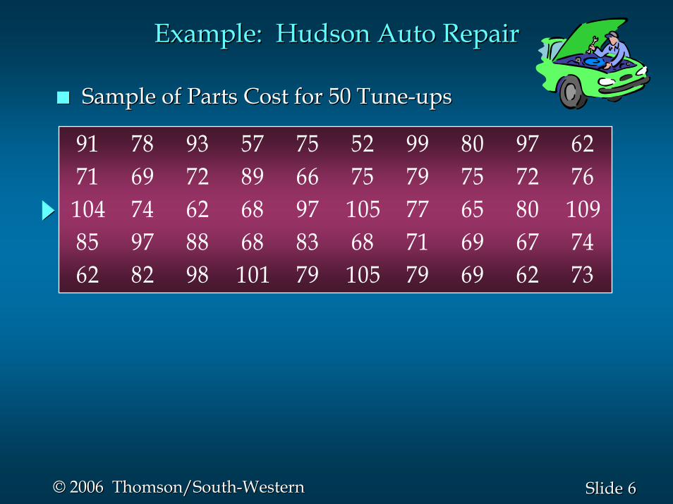
66SlideSlide©© 2006 Thomson/South2006 Thomson/South--WesternWestern
Example: Hudson Auto RepairExample: Hudson Auto Repair
Sample of Parts Cost for 50 TuneSample of Parts Cost for 50 Tune--upsups
91 78 93 57 75 52 99 80 97 6271 69 72 89 66 75 79 75 72 76104 74 62 68 97 105 77 65 80 10985 97 88 68 83 68 71 69 67 7462 82 98 101 79 105 79 69 62 73

77SlideSlide©© 2006 Thomson/South2006 Thomson/South--WesternWestern
StemStem--andand--Leaf DisplayLeaf Display
55667788991010
2 72 72 2 2 2 5 6 7 8 8 8 9 9 92 2 2 2 5 6 7 8 8 8 9 9 91 1 2 2 3 4 4 5 5 5 6 7 8 9 9 91 1 2 2 3 4 4 5 5 5 6 7 8 9 9 90 0 2 3 5 8 90 0 2 3 5 8 91 3 7 7 7 8 91 3 7 7 7 8 91 4 5 5 91 4 5 5 9
a stema stema leafa leaf

88SlideSlide©© 2006 Thomson/South2006 Thomson/South--WesternWestern
Stretched StemStretched Stem--andand--Leaf DisplayLeaf Display
Whenever a stem value is stated twice, the first valueWhenever a stem value is stated twice, the first valuecorresponds to leaf values of 0 corresponds to leaf values of 0 −− 4, and the second4, and the secondvalue corresponds to leaf values of 5 value corresponds to leaf values of 5 −− 9.9.
If we believe the original stemIf we believe the original stem--andand--leaf display hasleaf display hascondensed the data too much, we can condensed the data too much, we can stretch thestretch thedisplaydisplay by using two stems for each leading digit(s).by using two stems for each leading digit(s).

99SlideSlide©© 2006 Thomson/South2006 Thomson/South--WesternWestern
Stretched StemStretched Stem--andand--Leaf DisplayLeaf Display
5 5 95 5 91 41 47 7 7 8 97 7 7 8 91 31 35 8 95 8 90 0 2 30 0 2 35 5 5 6 7 8 9 9 95 5 5 6 7 8 9 9 91 1 2 2 3 4 41 1 2 2 3 4 45 6 7 8 8 8 9 9 95 6 7 8 8 8 9 9 92 2 2 22 2 2 2772255
55666677778888999910101010

1010SlideSlide©© 2006 Thomson/South2006 Thomson/South--WesternWestern
StemStem--andand--Leaf DisplayLeaf Display
Leaf UnitsLeaf Units
•• In the preceding example, the leaf unit was 1.In the preceding example, the leaf unit was 1.
•• A single digit is used to define each leaf.A single digit is used to define each leaf.
•• Where the leaf unit is not shown, it is assumedWhere the leaf unit is not shown, it is assumedto equal 1.to equal 1.
•• Leaf units may be 100, 10, 1, 0.1, and so on.Leaf units may be 100, 10, 1, 0.1, and so on.

1111SlideSlide©© 2006 Thomson/South2006 Thomson/South--WesternWestern
Example: Leaf Unit = 0.1Example: Leaf Unit = 0.1
If we have data with values such asIf we have data with values such as
8899
10101111
Leaf Unit = 0.1Leaf Unit = 0.16 86 81 41 4220 70 7
8.6 8.6 11.711.7 9.49.4 9.19.1 10.210.2 11.011.0 8.88.8
a stema stem--andand--leaf display of these data will beleaf display of these data will be
1212SlideSlide©© 2006 Thomson/South2006 Thomson/South--WesternWestern
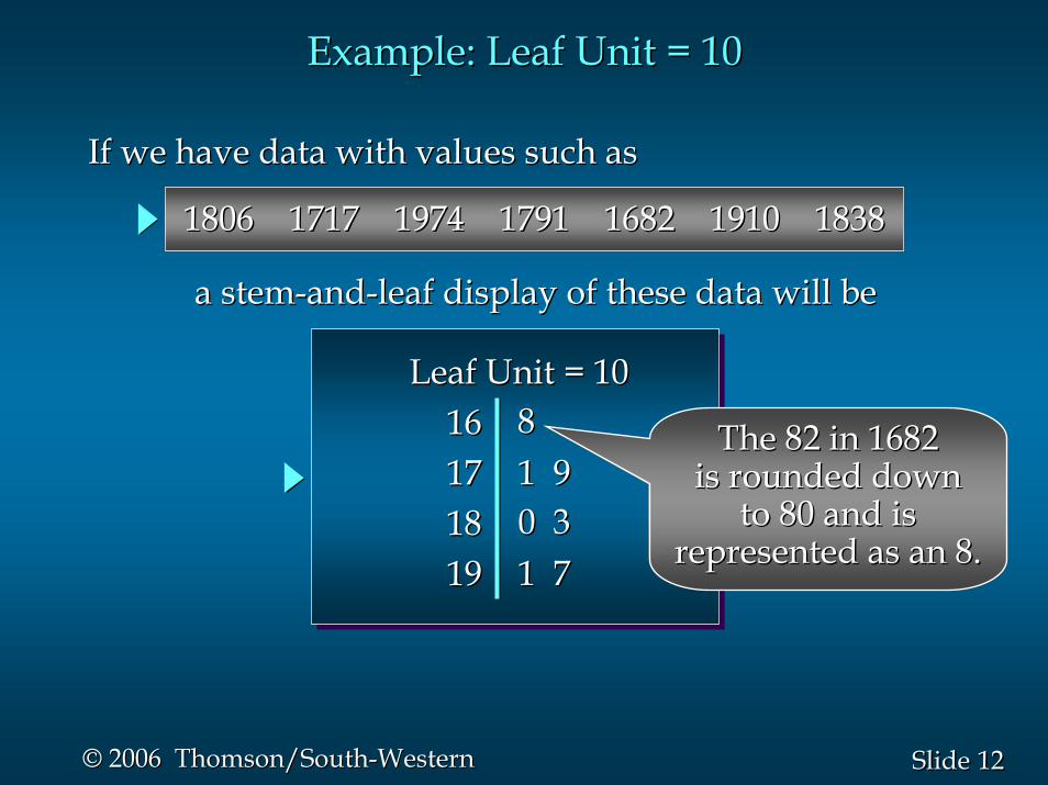
Example: Leaf Unit = 10Example: Leaf Unit = 10
If we have data with values such asIf we have data with values such as
1616171718181919
Leaf Unit = 10Leaf Unit = 10881 91 90 30 31 71 7
18061806 17171717 19741974 17911791 16821682 19101910 18381838
a stema stem--andand--leaf display of these data will beleaf display of these data will be
The 82 in 1682The 82 in 1682is rounded downis rounded down
to 80 and isto 80 and isrepresented as an 8.represented as an 8.
1313SlideSlide©© 2006 Thomson/South2006 Thomson/South--WesternWestern
Crosstabulations and Scatter DiagramsCrosstabulations and Scatter Diagrams
CrosstabulationCrosstabulation and a and a scatter diagramscatter diagram are twoare twomethods for summarizing the data for two (or more)methods for summarizing the data for two (or more)variables simultaneously.variables simultaneously.
Often a manager is interested in tabular andOften a manager is interested in tabular andgraphical methods that will help understand thegraphical methods that will help understand therelationship between two variablesrelationship between two variables..
Thus far we have focused on methods that are usedThus far we have focused on methods that are usedto summarize the data for to summarize the data for one variable at a timeone variable at a time..
1414SlideSlide©© 2006 Thomson/South2006 Thomson/South--WesternWestern
CrosstabulationCrosstabulation
The left and top margin labels define the classes forThe left and top margin labels define the classes forthe two variables.the two variables.
CrosstabulationCrosstabulation can be used when:can be used when:•• one variable is qualitative and the other isone variable is qualitative and the other is
quantitative,quantitative,•• both variables are qualitative, orboth variables are qualitative, or•• both variables are quantitative.both variables are quantitative.
A A crosstabulationcrosstabulation is a tabular summary of data foris a tabular summary of data fortwo variables.two variables.

1515SlideSlide©© 2006 Thomson/South2006 Thomson/South--WesternWestern
PricePriceRangeRange Colonial Log Split AColonial Log Split A--FrameFrame TotalTotal
<< $99,000$99,000> $99,000> $99,000
18 6 19 1218 6 19 12 55554545
3030 20 35 1520 35 15TotalTotal 100100
12 14 16 312 14 16 3
Home StyleHome Style
CrosstabulationCrosstabulation
Example: Finger Lakes HomesExample: Finger Lakes HomesThe number of Finger Lakes homes sold for each The number of Finger Lakes homes sold for each
style and price for the past two years is shown below. style and price for the past two years is shown below.
quantitativequantitativevariablevariable
qualitativequalitativevariablevariable

1616SlideSlide©© 2006 Thomson/South2006 Thomson/South--WesternWestern
CrosstabulationCrosstabulation
Insights Gained from Preceding Insights Gained from Preceding CrosstabulationCrosstabulation
•• Only three homes in the sample are an AOnly three homes in the sample are an A--FrameFramestyle and priced at more than $99,000.style and priced at more than $99,000.
•• The greatest number of homes in the sample (19)The greatest number of homes in the sample (19)are a splitare a split--level style and priced at less than orlevel style and priced at less than orequal to $99,000.equal to $99,000.

1717SlideSlide©© 2006 Thomson/South2006 Thomson/South--WesternWestern
PricePriceRangeRange Colonial Log Split AColonial Log Split A--FrameFrame TotalTotal
<< $99,000$99,000> $99,000> $99,000
18 6 19 1218 6 19 12 55554545
3030 20 35 1520 35 15TotalTotal 100100
12 14 16 312 14 16 3
Home StyleHome Style
CrosstabulationCrosstabulation
Frequency distributionFrequency distributionfor the price variablefor the price variable
Frequency distributionFrequency distributionfor the home style variablefor the home style variable

1818SlideSlide©© 2006 Thomson/South2006 Thomson/South--WesternWestern
CrosstabulationCrosstabulation: Row or Column Percentages: Row or Column Percentages
Converting the entries in the table into row Converting the entries in the table into row percentages or column percentages can provide percentages or column percentages can provide additional insight about the relationship between additional insight about the relationship between the two variables.the two variables.

1919SlideSlide©© 2006 Thomson/South2006 Thomson/South--WesternWestern
PricePriceRangeRange Colonial Log Split Colonial Log Split AA--FrameFrame TotalTotal
<< $99,000$99,000> $99,000> $99,000
32.73 10.91 34.55 21.8232.73 10.91 34.55 21.82 100100100100
Note: row totals are actually 100.01 due to rounding.Note: row totals are actually 100.01 due to rounding.
26.67 31.11 35.56 26.67 31.11 35.56 6.676.67
Home StyleHome Style
(Colonial and > $99K)/(All >$99K) x 100 = (12/45) x 100(Colonial and > $99K)/(All >$99K) x 100 = (12/45) x 100
CrosstabulationCrosstabulation: Row Percentages: Row Percentages
2020SlideSlide©© 2006 Thomson/South2006 Thomson/South--WesternWestern
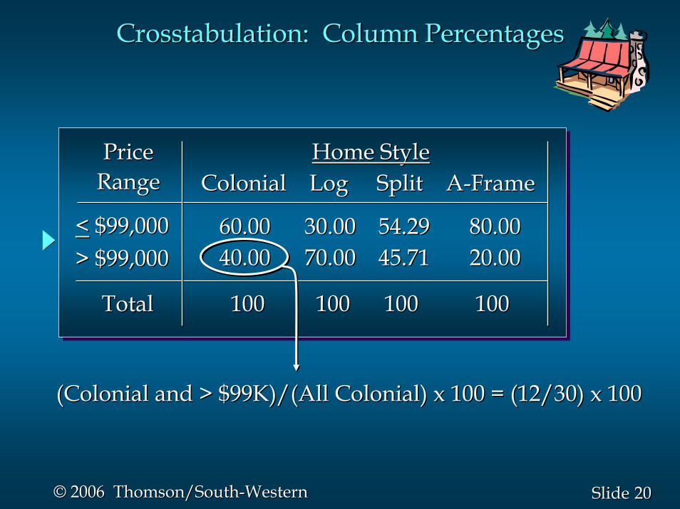
PricePriceRangeRange Colonial Log Split Colonial Log Split AA--FrameFrame
<< $99,000$99,000> $99,000> $99,000
60.00 30.00 54.29 80.0060.00 30.00 54.29 80.0040.00 70.00 45.71 20.0040.00 70.00 45.71 20.00
Home StyleHome Style
100100 100 100 100100 100 100TotalTotal
(Colonial and > $99K)/(All Colonial) x 100 = (12/30) x 100(Colonial and > $99K)/(All Colonial) x 100 = (12/30) x 100
CrosstabulationCrosstabulation: Column Percentages: Column Percentages

2121SlideSlide©© 2006 Thomson/South2006 Thomson/South--WesternWestern
CrosstabulationCrosstabulation: Simpson: Simpson’’s Paradoxs Paradox
SimpsonSimpson’’ ParadoxParadox: In some cases the conclusions: In some cases the conclusionsbased upon an aggregatedbased upon an aggregated crosstabulationcrosstabulation can becan becompletely reversed if we look at the completely reversed if we look at the unaggregatedunaggregateddata. suggests the overall relationship between thedata. suggests the overall relationship between thevariables.variables.
We must be careful in drawing conclusions about theWe must be careful in drawing conclusions about therelationship between the two variables in therelationship between the two variables in theaggregated aggregated crosstabulationcrosstabulation..
Data in two or moreData in two or more crosstabulationscrosstabulations are oftenare oftenaggregated to produce a summaryaggregated to produce a summary crosstabulationcrosstabulation..

2222SlideSlide©© 2006 Thomson/South2006 Thomson/South--WesternWestern
The general pattern of the plotted points suggests theThe general pattern of the plotted points suggests theoverall relationship between the variables.overall relationship between the variables.
One variable is shown on the horizontal axis and theOne variable is shown on the horizontal axis and theother variable is shown on the vertical axis.other variable is shown on the vertical axis.
A A scatter diagramscatter diagram is a graphical presentation of theis a graphical presentation of therelationship between two relationship between two quantitativequantitative variables.variables.
Scatter Diagram and Scatter Diagram and TrendlineTrendline
A A trendlinetrendline is an approximation of the relationship.is an approximation of the relationship.

2323SlideSlide©© 2006 Thomson/South2006 Thomson/South--WesternWestern
Scatter DiagramScatter Diagram
A Positive RelationshipA Positive Relationship
xx
yy

2424SlideSlide©© 2006 Thomson/South2006 Thomson/South--WesternWestern
Scatter DiagramScatter Diagram
A Negative RelationshipA Negative Relationship
xx
yy
2525SlideSlide©© 2006 Thomson/South2006 Thomson/South--WesternWestern
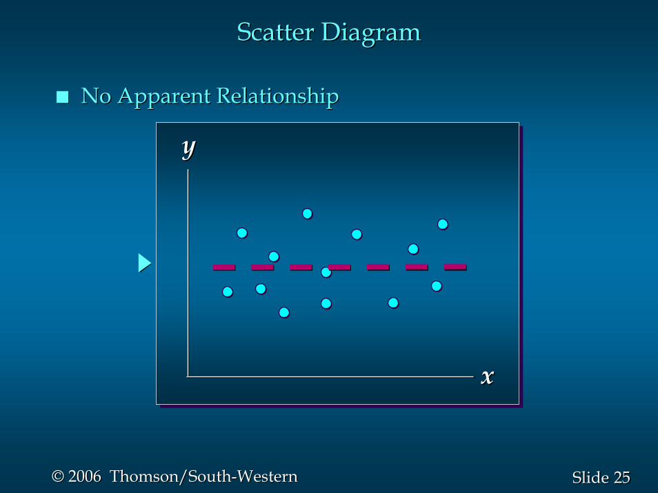
Scatter DiagramScatter Diagram
No Apparent RelationshipNo Apparent Relationship
xx
yy
2626SlideSlide©© 2006 Thomson/South2006 Thomson/South--WesternWestern
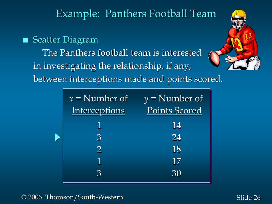
Example: Panthers Football TeamExample: Panthers Football Team
Scatter DiagramScatter DiagramThe Panthers football team is interestedThe Panthers football team is interested
in investigating the relationship, if any,in investigating the relationship, if any,between interceptions made and points scored.between interceptions made and points scored.
1133221133
14142424181817173030
xx = Number of= Number ofInterceptionsInterceptions
yy = Number of= Number ofPoints ScoredPoints Scored
2727SlideSlide©© 2006 Thomson/South2006 Thomson/South--WesternWestern
Scatter DiagramScatter Diagram
yy
xx
Number of InterceptionsNumber of Interceptions
Num
ber o
f Poi
nts
Scor
edN
umbe
r of P
oint
s Sc
ored
5510101515202025253030
00
3535
11 22 3300 44

2828SlideSlide©© 2006 Thomson/South2006 Thomson/South--WesternWestern
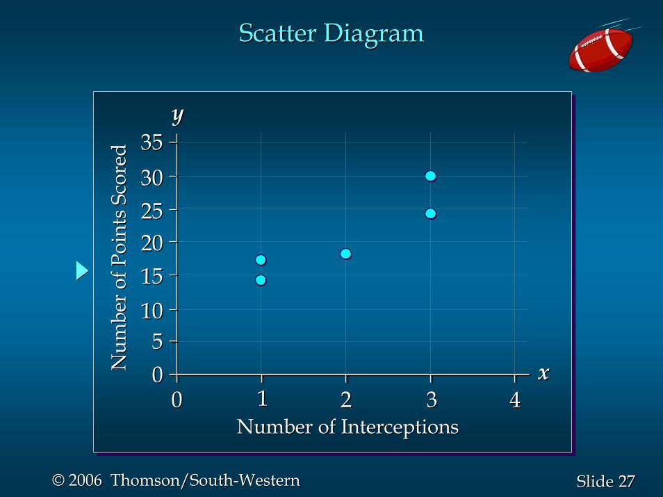
Insights Gained from the Preceding Scatter DiagramInsights Gained from the Preceding Scatter Diagram
•• The relationship is not perfect; all plotted points inThe relationship is not perfect; all plotted points inthe scatter diagram are not on a straight line.the scatter diagram are not on a straight line.
•• Higher points scored are associated with a higherHigher points scored are associated with a highernumber of interceptions.number of interceptions.
•• The scatter diagram indicates a positive relationshipThe scatter diagram indicates a positive relationshipbetween the number of interceptions and thebetween the number of interceptions and thenumber of points scored.number of points scored.
Example: Panthers Football TeamExample: Panthers Football Team

2929SlideSlide©© 2006 Thomson/South2006 Thomson/South--WesternWestern
Tabular and Graphical ProceduresTabular and Graphical Procedures
Qualitative DataQualitative DataQualitative Data Quantitative DataQuantitative DataQuantitative Data
TabularMethodsTabularTabular
MethodsMethodsTabular
MethodsTabularTabular
MethodsMethodsGraphicalMethods
GraphicalGraphicalMethodsMethods
GraphicalMethods
GraphicalGraphicalMethodsMethods
••FrequencyFrequencyDistributionDistribution
••Rel. Freq. Dist.Rel. Freq. Dist.••Percent Freq. Percent Freq.
DistributionDistribution••CrosstabulationCrosstabulation
••Bar GraphBar Graph••Pie ChartPie Chart
••FrequencyFrequencyDistributionDistribution
••Rel. Freq. Dist.Rel. Freq. Dist.••Cum. Freq. Dist.Cum. Freq. Dist.••Cum. Rel. Freq.Cum. Rel. Freq.
Distribution Distribution ••StemStem--andand--LeafLeaf
DisplayDisplay••CrosstabulationCrosstabulation
••Dot PlotDot Plot••HistogramHistogram••OgiveOgive••ScatterScatter
DiagramDiagram
DataDataData
3030SlideSlide©© 2006 Thomson/South2006 Thomson/South--WesternWestern
End of Chapter 2, Part BEnd of Chapter 2, Part B
Related Documents


