Data Visualization & Reporting Solutions by Seabourne Consulting 4/20/2015

Seabourne Web Apps 2014 2015
Aug 12, 2015
Welcome message from author
This document is posted to help you gain knowledge. Please leave a comment to let me know what you think about it! Share it to your friends and learn new things together.
Transcript
Data Visualization &
Reporting Solutions
by Seabourne Consulting
4/20/2015

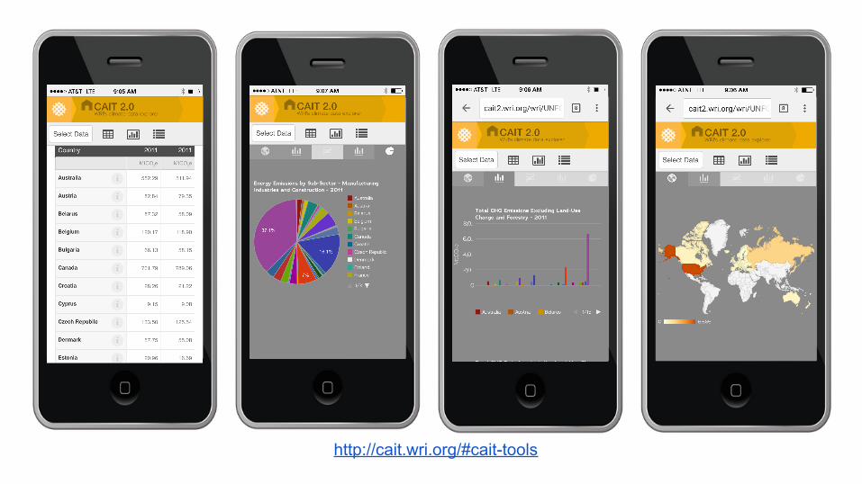
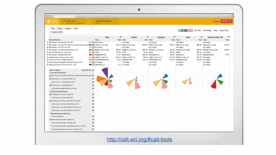
http://cait.wri.org/#cait-tools
The new World Resources Institute (WRI) CAIT (http://cait.wri.org)is a website with multiple data visualization applications. This project is the culmination of a 3-year engagement with WRI. The data sets cut across time and geography with historical emissions, projections, global coverage of both climate conditions and policy-making activities, pledges and side-by-side comparison of all countries. The WRI CAIT applications include both high-level dashboard views as well as advanced research tools for data exploration and extraction.


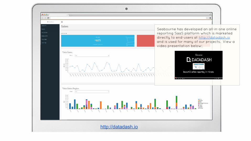
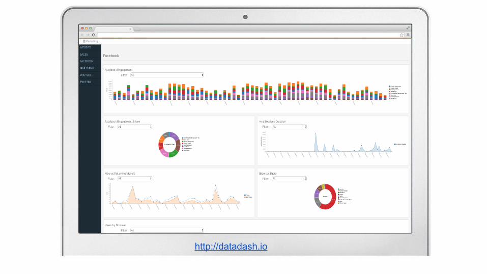
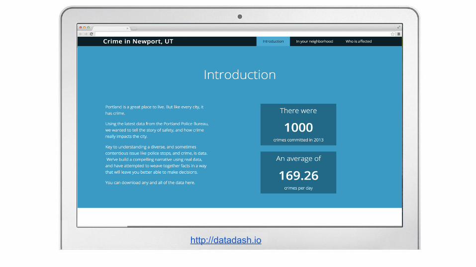
http://datadash.io
Seabourne has developed an all-in-one online reporting SaaS platform which is marketed directly to end-users at http://datadash.io and is used for many of our projects. View a video presentation below:


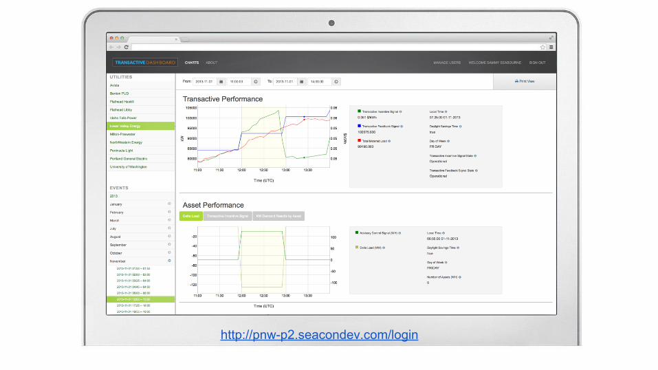
http://pnw-p2.seacondev.com/login
Seabourne developed an interactive utility smart grid dashboard to allow users to select time periods and view accompanying smart grid data. The end users are able to see how the grid reacts to control signals that are designed to maximize the power usage. They have the ability to compare expected versus actual energy consumption visually, something they could not do prior. Further, they have the ability to see this data in an interactive web based solution.The tool gives users the ability to adjust the visualization shown, through several options including time period. Users can also mouse over the chart to see specific values. Through taking existing datasets and representing them visually, the project was able to achieve success for the client in allowing for a new level of insight from their data.
US DOE AWARD
http://pnw-p2.seacondev.com/login

http://cait2.wri.org/http://www.reliefweb.int
http://cait2.wri.org/
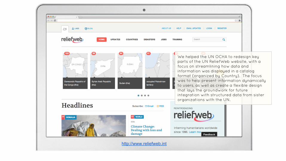
We helped the UN OCHA to redesign key parts of the UN ReliefWeb website, with a focus on streamlining how data and information was displayed in a catalog format (organized by Country). The focus was to help present information dynamically to users, as well as create a flexible design that lays the groundwork for future integration with structured data from sister organizations with the UN.
http://www.reliefweb.int

http://my.fcc.gov
Seabourne developed MyFCC as an information dashboard for power users of the FCC website. MyFCC is a completely client-side JavaScript application that uses various agency APIs to present information about content and data to users in a configurable way. Users have the ability to save different layouts and configurations of widgets, as well as run simple data queries.

http://cait2.wri.org/
Cloud.cio.gov is a single source for cloud computing resources in the Federal government. Developed to help people find information from a wide range of sources, the site features a clean, content-focused visual design and an API driven information management backend. The Cloud.cio.gov website relies on third-party services to provide core functionality for search and user commenting/feedback, connecting to these services using APIs.
http://cloud.cio.gov

Related Documents