Screen Shots Of Progress Contents page

Welcome message from author
This document is posted to help you gain knowledge. Please leave a comment to let me know what you think about it! Share it to your friends and learn new things together.
Transcript

Screen Shots Of Progress Contents page

I started off with a black plain background so I could build up my contents page on something plain. Also I started off with a black background because I want my colour scheme to be simple but bold colours.

I then added a photo which I edited by making the lighting of the photo slightly more blue. I placed it in the top corner as I was following the layout of a kerrang magazine contents page.

I then added a plain white bar at the top where I could put my text. I did this by opening a new page and using the quick selection tool to create the shape I needed.
This is what it came out like.

I then added my text, the bit of my text was black. The second section of my text was dark grey. This is to show the difference between two different titles. The font I used was called minion pro.

I then decided that the title was looking quite plain so I added two blue lines, one at the top of the title and one at the bottom. I did this by using a text box and by typing the symbol -.

By using the same technique I used for the title, I used for the sub-titles. I made a slightly smaller shape in the colour blue and placed it down the right hand side.
This is what it turned out like.
I then started adding text on top of the text in the font, minion pro and the colour white.

I used the same technique for each sub- title and added text underneath them in the same font, but I used the colours white and yellow.

I then added a picture of the famous punk band Paramore under the picture I took of Angie.

Finally I added page numbers onto my photos to add more detail to my contents page.
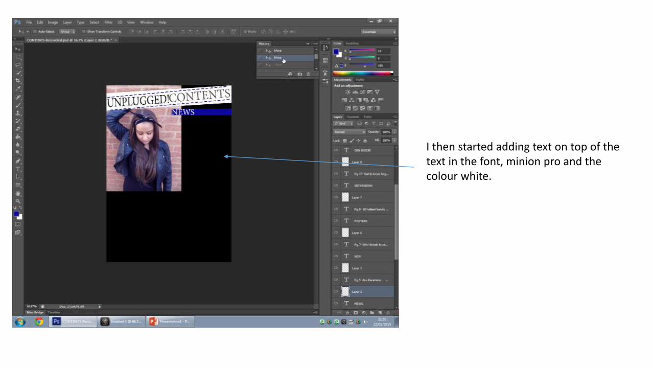
As you can see from this screen shot I changed my two photos, this is because I used one of the photos as a photo on my double page spread and the other wasn’t my own photography. So I chose to take a close-up of ‘Angie’ and a group photo of my three friends. And this is my final product.
Related Documents