SAX Navigator: Time Series Exploration through Hierarchical Clustering Nicholas Ruta * Harvard University Naoko Sawada † Harvard University Keio University Katy McKeough ‡ Harvard University Michael Behrisch § Harvard University Johanna Beyer ¶ Harvard University Figure 1: SAX Navigator shows the hierarchical clustering result for 2,000 astronomical observations (i.e., time series). Tree diagram (a) showing the global patterns derived from the hierarchical clustering of all time series. Tree branches are highlighted based on the user-specified pattern expressed in the visual query interface (b). Each tree node features a cluster heat map (c) representing the general shape of all time series in the cluster. A details-on-demand display (d) shows local observations of a single cluster. ABSTRACT Comparing many long time series is challenging to do by hand. Clustering time series enables data analysts to discover relevance between and anomalies among multiple time series. However, even after reasonable clustering, analysts have to scrutinize correlations between clusters or similarities within a cluster. We developed SAX Navigator, an interactive visualization tool, that allows users to hierarchically explore global patterns as well as individual observa- tions across large collections of time series data. Our visualization provides a unique way to navigate time series that involves a “vo- cabulary of patterns” developed by using a dimensionality reduction technique, Symbolic Aggregate approXimation (SAX). With SAX, the time series data clusters efficiently and is quicker to query at scale. We demonstrate the ability of SAX Navigator to analyze patterns in large time series data based on three case studies for an astronomy data set. We verify the usability of our system through a think-aloud study with an astronomy domain scientist. Index Terms: Human-centered computing—Visualization—Visu- alization techniques—Treemaps; Human-centered computing— Visualization—Visualization design and evaluation methods 1 I NTRODUCTION Time series analysis is one of the most common analyses in a variety of domains. Time series analyses from a collection of observations over different timelines are much richer, yet more complex than those from a single observation. An astronomer, for example, may be interested in searching for reoccurring patterns or anomalies in the brightness over time across hundreds of thousands of different measurements of celestial bodies. In sports, a coach might want to compare the career trajectories of different athletes. * e-mail: [email protected] † e-mail: [email protected] ‡ e-mail: [email protected] § e-mail: [email protected] ¶ e-mail: [email protected] Oftentimes, correlations and relationships in data are not inter- nalized and understood through raw data, but rather through the apparent (visual) patterns they express. Therefore, users can bene- fit immensely from pattern-based navigation for the exploration of large collections of time series data. Many existing techniques that explore patterns algorithmically, such as autoregressive models or Fourier transforms [11], focus on patterns at a global scale. Algo- rithms that analyze time series data globally are powerful in finding common patterns, but often do not account for why these patterns are important. On the other hand, visual analytics methods, such as the one presented by Correll and Gleicher [5], tend to solely view time series data at a local scale. Only at a local level, we can answer questions about what makes a particular data point an outlier or how one cluster of timelines compares to another. Consequently, there is a need for efficient hybrid time series exploration techniques that extract patterns at a global scale, while still allowing for local explo- ration of the data. Few techniques are capable of capturing global patterns and navigating local connections, such as Clustrophile 2 [4]. Unfortunately, its approach cannot scale to dozens or hundreds of clusters due to perceptual scalability. To solve the above challenges, we follow Symbolic Aggregate approXimation (SAX), which was presented by Lin et al. [10] to describe and simplify time series as a series of words from an auto- matically derived vocabulary (see Fig. 2). By means of SAX, we can retrieve patterns at a global scale via clustering using a distance function that is invariant for translation and scale. In this paper, we present SAX Navigator, a scalable visualization technique for analyzing large collections of time series data based on the hierarchical composition of its visual pattern space. During the development of our tool, we focused on leveraging well-developed and evaluated techniques for pattern detection and extraction. There- fore, the algorithmic portion of our tool utilizes hierarchical cluster- ing, which has been proven to be a robust method. We utilize the dimensionality reduction method SAX, which makes for efficient querying and matching within our data by applying techniques al- ready developed for regular expressions. Users can explore global patterns in the SAX Navigator tree view (see Fig. 1 (a)), sketch a specific query (Fig. 1 (b)), compare general trends and mean shapes of individual clusters in the cluster’s heat map (see Fig. 1 (c)), and look at the detailed cluster membership (see Fig. 1 (d)).

Welcome message from author
This document is posted to help you gain knowledge. Please leave a comment to let me know what you think about it! Share it to your friends and learn new things together.
Transcript

SAX Navigator: Time Series Exploration through Hierarchical ClusteringNicholas Ruta*
Harvard UniversityNaoko Sawada†
Harvard UniversityKeio University
Katy McKeough‡
Harvard UniversityMichael Behrisch§
Harvard UniversityJohanna Beyer¶
Harvard University
Figure 1: SAX Navigator shows the hierarchical clustering result for 2,000 astronomical observations (i.e., time series). Tree diagram(a) showing the global patterns derived from the hierarchical clustering of all time series. Tree branches are highlighted based on theuser-specified pattern expressed in the visual query interface (b). Each tree node features a cluster heat map (c) representing thegeneral shape of all time series in the cluster. A details-on-demand display (d) shows local observations of a single cluster.
ABSTRACT
Comparing many long time series is challenging to do by hand.Clustering time series enables data analysts to discover relevancebetween and anomalies among multiple time series. However, evenafter reasonable clustering, analysts have to scrutinize correlationsbetween clusters or similarities within a cluster. We developedSAX Navigator, an interactive visualization tool, that allows users tohierarchically explore global patterns as well as individual observa-tions across large collections of time series data. Our visualizationprovides a unique way to navigate time series that involves a “vo-cabulary of patterns” developed by using a dimensionality reductiontechnique, Symbolic Aggregate approXimation (SAX). With SAX,the time series data clusters efficiently and is quicker to query atscale. We demonstrate the ability of SAX Navigator to analyzepatterns in large time series data based on three case studies for anastronomy data set. We verify the usability of our system through athink-aloud study with an astronomy domain scientist.
Index Terms: Human-centered computing—Visualization—Visu-alization techniques—Treemaps; Human-centered computing—Visualization—Visualization design and evaluation methods
1 INTRODUCTION
Time series analysis is one of the most common analyses in a varietyof domains. Time series analyses from a collection of observationsover different timelines are much richer, yet more complex thanthose from a single observation. An astronomer, for example, maybe interested in searching for reoccurring patterns or anomalies inthe brightness over time across hundreds of thousands of differentmeasurements of celestial bodies. In sports, a coach might want tocompare the career trajectories of different athletes.
*e-mail: [email protected]†e-mail: [email protected]‡e-mail: [email protected]§e-mail: [email protected]¶e-mail: [email protected]
Oftentimes, correlations and relationships in data are not inter-nalized and understood through raw data, but rather through theapparent (visual) patterns they express. Therefore, users can bene-fit immensely from pattern-based navigation for the exploration oflarge collections of time series data. Many existing techniques thatexplore patterns algorithmically, such as autoregressive models orFourier transforms [11], focus on patterns at a global scale. Algo-rithms that analyze time series data globally are powerful in findingcommon patterns, but often do not account for why these patternsare important. On the other hand, visual analytics methods, such asthe one presented by Correll and Gleicher [5], tend to solely viewtime series data at a local scale. Only at a local level, we can answerquestions about what makes a particular data point an outlier or howone cluster of timelines compares to another. Consequently, thereis a need for efficient hybrid time series exploration techniques thatextract patterns at a global scale, while still allowing for local explo-ration of the data. Few techniques are capable of capturing globalpatterns and navigating local connections, such as Clustrophile 2 [4].Unfortunately, its approach cannot scale to dozens or hundreds ofclusters due to perceptual scalability.
To solve the above challenges, we follow Symbolic AggregateapproXimation (SAX), which was presented by Lin et al. [10] todescribe and simplify time series as a series of words from an auto-matically derived vocabulary (see Fig. 2). By means of SAX, wecan retrieve patterns at a global scale via clustering using a distancefunction that is invariant for translation and scale.
In this paper, we present SAX Navigator, a scalable visualizationtechnique for analyzing large collections of time series data based onthe hierarchical composition of its visual pattern space. During thedevelopment of our tool, we focused on leveraging well-developedand evaluated techniques for pattern detection and extraction. There-fore, the algorithmic portion of our tool utilizes hierarchical cluster-ing, which has been proven to be a robust method. We utilize thedimensionality reduction method SAX, which makes for efficientquerying and matching within our data by applying techniques al-ready developed for regular expressions. Users can explore globalpatterns in the SAX Navigator tree view (see Fig. 1 (a)), sketch aspecific query (Fig. 1 (b)), compare general trends and mean shapesof individual clusters in the cluster’s heat map (see Fig. 1 (c)), andlook at the detailed cluster membership (see Fig. 1 (d)).

2 RELATED WORK
We first review methods to visually query time series data to extractpatterns and then describe visualization methods for clustered data.Query Definition for Time Series Analysis. Query-by-exampleand query-by-sketch interfaces are powerful approaches to queryingdata intuitively. Query-by-example techniques [7, 16] aim to findsimilar data points (e.g., time slices) to a user-specified example.However, they do not address how to find the initial interesting timeslice from a large collection of time series data. Query-by-sketchtechniques do not have this restriction, as users can directly draw theshape they are interested in. However, query-by-sketch techniqueshave to deal with the user-introduced uncertainties of sketches [5].
TimeSearcher is a visual exploration tool for time series data [7],which is extended to a query-by-example interface, named Search-Box [3]. SOMFlow [13] presents techniques for time series cluster-ing based on query-by-example, grouping selections based on theirrelative neighborhoods and by filtering and splitting using metadata-based attribute values. QuerySketch [17] is a tool for databasequeries where users can directly sketch the shape of a pattern whichautomatically extracts matching time slices. Correll and Gleicher [5]defined a vocabulary of invariants for queries by sketch to deal withuncertainties of sketches.
While these query-by-sketch systems allow users to draw andquery time variation in an arbitrary shape, SAX Navigator providesusers with building blocks that can be pieced together to createquery examples based on observed patterns in the data. It provides acomprehensive exploration of time series collections using query-by-example for specific observations of interest and query-by-sketchto collect results based on a general trend.Visual Cluster Analysis. We will now survey a selection of toolsthat inspired the design of SAX Navigator. Seo and Shneider-man [14], for example, presented the Hierarchical Clustering Ex-plorer (HCE), a dendrogram-based interactive visual explorationtool for hierarchical clustering. It allows users to filter clusters ac-cording to similarities and to compare clusters. NodeTrix [6] solvesthe complexity of node-link diagrams of large networks by aggre-gating nodes into clusters and displaying dense clusters as matriceswithin the overall node-link diagram. CyteGuide [8] enables users toexplore the hierarchical representation of the data by viewing boththe current status of exploration and the unexplored parts based onsunburst diagrams. Clustervision [9] is a VA tool to help users finda proper clustering method from various techniques and parameters.Zeckzer et al. [18] proposed tiled binned clustering and visualizethe results in 3D scatterplots. The method conducts clustering afterassigning data points to bins, as we do in SAX Navigator.
All these VA approaches efficiently show clusters and allow usersto explore the cluster space. However, it is still often difficult to gaina comprehensive overview of the individual data samples containedin a cluster. Similar to NodeTrix, we aim to reduce visual complexityby showing general patterns within clusters rather than individualobservations. We, therefore, incorporate a heat map-based clusteraggregation view into SAX Navigator.
3 A VOCABULARY OF PATTERNS (SAX)The basis of our vocabulary of patterns revolves around a time seriesdimensionality reduction technique called Symbolic Aggregate ap-proXimation (SAX) [10]. SAX allows users to control the resolutionof their analysis, but also to apply established and well-understoodnatural language processing techniques, such as text similarity andretrieval through regular expressions or topic analysis.
3.1 SAXTo prepare our data, we first center and scale it (i.e., we subtract outthe mean and divide by the standard deviation). However, dependingon the data characteristics, different pre-processing techniques mightbe used. Fig. 2 depicts an example of translating/converting a time
Figure 2: Transforming a timeline into SAX representation with α = 4letters and a word length of ω = 8. The dimension of the value (x) andtime (y) are reduced from R to N.
series into the SAX representation. Conceptually, SAX quantizes acontinuous time series into discrete bins (along both, the time andamplitude axis) and assigns a letter representation to each quantizedbin. The first step to convert a time series into the SAX representa-tion is to define the number of letters α and maximum word length(subsequent bin size) ω to apply to the data set. Both should bechosen to be the smallest possible values while allowing for goodclustering and not smoothing away the details. To determine thedistribution of the letters, SAX pools the values of all time seriestogether and fits a normal distribution. Then it creates α partitions ofequal probability and assigns the lowest to the letter “a”, the secondlowest to “b” and so on to create the set of letters in our vocabulary.Some observations may not be ω letters long since not all time serieshave to be of the same length. Binning, a form of smoothing thatremoves noise from the data, improves the ability of the clusteringalgorithm to find similar groups of time series. For each bin, weaverage the values and determine its letter range.
The result is that each observation is a set of α letters of maximumlength. We cluster the resulting words with the goal to find groupsof time series with similar words within our vocabulary. Lastly,dimensionality reduction promotes scalability by decreasing thecomplexity of the time series from the space of R2 to N2.
3.2 ClusteringWe use agglomerative hierarchical clustering with complete linkagefor clustering time series into similar groups, since it heuristicallyprovides better cluster separation than single or average linkage.The used distance metric is a variation of the MINDIST function,described in Lin et al. [10], which achieves exact matching eventhough SAX words may contain empty values in our data set. It per-forms better than Euclidean distance in terms of recovering clusterassignments. The distance between two time series observations asSAX representations (S(1),S(2)) is defined as follows:
D(S(1),S(2)) = 1− 1ω
ω
∑i=1
d(S(1)i ,S(2)i )
d(S(1)i ,S(2)i ) =
1 S(1)i = S(2)i
0 S(1)i is NaN ∪ S(2)i is NaN
−1 S(1)i 6= S(2)i
4 DESIGN OF SAX NAVIGATOR
SAX Navigator supports the following analysis tasks:T1 – Explore clusters and general data distribution. Usersshould be able to explore the cluster space to see general trendsand relationships among clusters and get a high-level impression onthe data distribution and variability within a cluster (see Sect. 4.1).T2 – Analyze individual time series within a cluster. The systemneeds to support details-on-demand for individual time series toanalyze similarities and detect anomalies and errors (see Sect. 4.2).T3 – Interactive queries based on sketching. Users can sketchpatterns of interest to find similar data points (see Sect. 4.3).
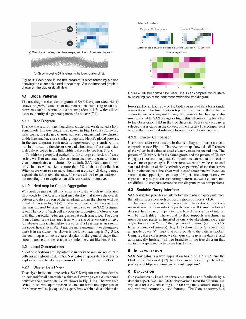
(a) Two cluster nodes, their heat maps, and links of the tree diagram.
(b) Superimposing 59 timelines in the lower cluster of (a).
Figure 3: Each node in the tree diagram is represented by a circleshowing the cluster size and a heat map. A superimposed graph isshown on the cluster detail view.
4.1 Global PatternsThe tree diagram (i.e., dendrogram) of SAX Navigator (Sect. 4.1.1)shows the global structure of the hierarchical clustering result andrepresents each cluster node as a heat map (Sect. 4.1.2), which allowsusers to identify the general pattern of a cluster (T1).
4.1.1 Tree DiagramTo show the result of the hierarchical clustering, we designed a hori-zontal node-link tree diagram, as shown in Fig. 1 (a). By followinglinks connecting the nodes, users can easily understand how clustersdivide into smaller, more similar groups and identify global patterns.In the tree diagram, each node is represented by a circle with anumber indicating the cluster size and a heat map. The cluster sizeis double-encoded in the link width to the node (see Fig. 3 (a)).
To address perceptual scalability for a large collection of timeseries, we filter out small clusters from the tree diagram to reducevisual complexity and clutter. By default, SAX Navigator showsonly clusters whose size is more than 2% of the total collection.When users want to see more details of a cluster, clicking a nodeexpands the sub-tree of the node. Users are allowed to pan and zoomthe tree diagram to explore it at different scales or contexts.
4.1.2 Heat map for Cluster AggregationWe visually aggregate all time series in a cluster, which are translatedinto words by SAX, into a heat map display that shows the overallpattern and distribution of the timelines within the cluster withoutvisual clutter (see Fig. 3 (a)). In the heat map display, the x axis arethe bins ordered by time and the y axis shows the SAX-assignedletter. The color of each cell encodes the proportion of observationswith that particular letter assignment at each time slice. The coloris on a linear scale that goes from white (no observations) to navy(all observations). The lighter the color of a heat map is, as seen inthe upper heat map of Fig. 3 (a), the more uncertainty or divergencethere is in the cluster. As shown in the lower heat map in Fig. 3 (a),the heat map is a much clearer display of the general shape thansuperimposing all time series in a single line chart like Fig. 3 (b).
4.2 Local ObservationsLocal observations are important to understand why we see certainpatterns at a global scale. SAX Navigator supports detailed clusterexploration and local comparisons of 1 : 1, 1 : n, and n : m (T2).
4.2.1 Cluster Detail ViewTo analyze individual time series, SAX Navigator can show details-on-demand for all data within a cluster. Hovering over a cluster nodeactivates the cluster detail view shown in Fig. 1 (d). The raw timeseries are shown superimposed on one another in the upper part ofthe view as well as juxtaposed as sparklines within a data table in the
Figure 4: Cluster comparison view. Users can compare two clustersby selecting two of the heat maps within the tree diagram.
lower part of it. Each row of the table consists of data for a singleobservation. The line chart on top and the rows of the table areconnected via brushing and linking. Furthermore, by clicking on therows of the table, SAX Navigator highlights all connecting branchesto the observation’s ID in the tree diagram. Users can compare aselected observation in the context of the cluster (1 : n comparison)or directly to a second selected observation (1 : 1 comparison).
4.2.2 Cluster ComparisonUsers can select two clusters in the tree diagram to start a visualcomparison (see Fig. 4). The new heat map shows the differencesof the values in the first selected cluster versus the second one. Thepattern of Cluster A (left) is colored green, and the pattern of ClusterB (right) is colored magenta. Comparisons can be made in eitherraw counts or percentages. Furthermore, we can show the mean andstandard deviation of the “vocabulary of patterns” of the time seriesin both clusters as a line chart with a confidence interval band, asshown in the upper right heat map of Fig. 4. The comparison viewis particularly helpful for comparing patterns between clusters thatare difficult to compare across the tree diagram (n : m comparison).
4.3 Scalable Query InterfaceSAX Navigator provides an interactive sketch-based query interfacethat allows users to search for observations of interest (T3).
The query tool consists of two options. The first is a drop-downmenu where users can select a specific name or ID from the loadeddata set. In this case, the path to the selected observation of interestwill be highlighted. The second method supports searching viauser-specified patterns. Inspired by query-by-sketching, we createa grid for users to “draw” their pattern of interest (i.e., the SAXletter sequence of interest). Fig. 1 (b) shows a user’s selection ofan upside down “V” shape that corresponds to the pattern “abcba”.Using regular expressions, we can quickly search the data set andautomatically highlight all tree branches in the tree diagram thatcontain the specified pattern (see Fig. 1 (a)).
5 IMPLEMENTATION
SAX Navigator is a web application based on D3.js [2] and theFlask microframework [12]. Readers can access a fully interactiveprototype at https://sax-navigator.herokuapp.com/.
6 EVALUATION
Our evaluation is based on three case studies and feedback by adomain expert. We used 2,000 observations from the Catalina sur-veys data release 2 consisting of 46,000 brightness observations [1],and retrieved commonly used features. The Catalina survey is a
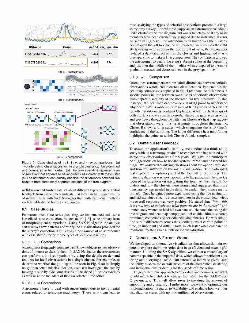
(a) 1 : 1 comparison.
(b) 1 : n comparison.
(c) n : m comparison.
Figure 5: Case studies of 1 : 1, 1 : n, and n : m comparisons. (a)Two interesting observations within a single cluster can be examinedand compared in high detail. (b) The blue sparkline represents anobservation that appears to be incorrectly associated with the cluster.(c) The astronomer can quickly observe the differences between twoclusters from completely separate sections of the tree diagram.
well-known and trusted data set about different types of stars. Initialfeedback from astronomers indicate that they can find search resultsof interest faster with SAX Navigator than with traditional methodssuch as table-based feature comparisons.
6.1 Case StudiesFor astronomical time series clustering, we implemented and used akernelized cross-correlation distance metric [15] as the primary formof morphological comparison. Using SAX Navigator, the analystcan discover new patterns and verify the classifications provided forthe survey’s collection. Let us revisit the example of an astronomerwith case studies for our three types of local comparisons.
6.1.1 1 : 1 ComparisonAstronomers frequently compare well-known objects to new observa-tions of interest to classify them. In SAX Navigator, the astronomerscan perform a 1 : 1 comparison by using the details-on-demandfeatures for local observations in a single cluster. For example, todetermine whether the gold sparkline seen in Fig. 5 (a) is simplynoisy or an actual misclassification, users can investigate the data bylooking at side-by-side comparisons of the shape of the observationsas well as at the metadata of the two selected time series.
6.1.2 1 : n ComparisonAstronomers have to deal with uncertainties due to instrumentalerrors related to telescope machinery. These errors can lead to
misclassifying the types of celestial observations present in a largeastronomy survey. For example, suppose an astronomer has identi-fied a cluster in the tree diagram and wants to determine if any of itsmembers have been erroneously assigned due to instrumental error.As seen in Fig. 5 (b), the astronomer can hover over the cluster’sheat map on the left to view the cluster detail view seen on the right.By hovering over a row in the cluster detail view, the astronomerisolated a data error present in the cluster and highlighted it as ablue sparkline to make a 1 : n comparison. The comparison allowedthe astronomer to verify the error’s abrupt spikes at the beginningand just after the middle of the timeline when compared to the moregradual increases and decreases seen in the grey sparklines.
6.1.3 n : m ComparisonOftentimes, astronomers explore subtle differences between periodicobservations which lead to correct classifications. For example, theheat map comparisons depicted in Fig. 5 (c) show the differences atspecific points in time between two clusters of periodic observationsfrom separate sections of the hierarchical tree structure. In thisinstance, the heat map can provide a starting point to understandwhy one cluster is made up primarily of RR Lyrae variables, whilethe other additionally contains Cepheids. While the heat maps ofboth clusters show a similar periodic shape, the gaps seen as whiteand grey space throughout the pattern in Cluster A’s heat map suggestthat observations were missing at points throughout the timeline.Cluster B shows a fuller pattern which strengthens the astronomer’sconfidence in the sampling. The larger difference heat map furtherhighlights the points at which Cluster A lacks samples.
6.2 Domain User FeedbackTo assess the application’s usability, we conducted a think-aloudstudy with an astronomy graduate researcher who has worked withastronomy observation data for 6 years. We gave the participantno suggestions on how to use the system upfront and observed hisusage. We answered clarifying questions about the options availableand how to pan/zoom on the main visualization. The participantfirst explored the options panel at the top half of the screen. Themain visualization was most appealing to the participant, he quicklyfocused his attention on navigating the tree. At first, he did notunderstand how the clusters were formed and suggested that moretransparency was needed in the design to explain the distance metricutilized. Once he gained more experience using the tree navigationand had examined specific cluster members in the cluster detail view,his overall response was very positive. He stated that “Wow, thisis a great way to quickly see what patterns are in the survey!” andimmediately wanted to load his own data set. He noted that using thetree diagram and heat map comparison tool enabled him to separateprominent collections of periodic eclipsing binaries. He was able tofind subtle differences across these collections at certain points intime, an important and difficult task, much faster when compared totraditional methods like a table-based visualization.
7 CONCLUSION & FUTURE WORK
We developed an interactive visualization that allows domain ex-perts to explore their time series data in an efficient and meaningfulmanner. Utilizing the SAX algorithm, we extract a vocabulary ofpatterns specific to the imported data, which allows for efficient clus-tering and querying at scale. Our interactive interface gives usersthe ability to show the overall structure of the hierarchical clusteringand individual cluster details for thousands of time series.
To generalize our approach to other data and domains, we wantto add interactive sliders to change the values for the SAX α andω parameters. This will allow users to fine-tune the amount ofsmoothing and clustering. Furthermore, we want to optimize ourimplementation in regards to scalability and evaluate how well ourvisualization scales with up to to millions of observations.

REFERENCES
[1] The Catalina surveys data release 2 (CSDR2). http://nesssi.cacr.caltech.edu/DataRelease/Varcat.html, 2004.
[2] M. Bostock. D3.js. https://d3js.org/, 2019.[3] P. Buono and A. L. Simeone. Interactive shape specification for pattern
search in time series. In Proceedings of the working conference onAdvanced visual interfaces, pp. 480–481, 2008. doi: 10.1145/1385569.1385666
[4] M. Cavallo and C. Demiralp. Clustrophile 2: Guided visual clusteringanalysis. IEEE Transactions on Visualization and Computer Graphics,25(1):267–276, Jan 2019. doi: 10.1109/TVCG.2018.2864477
[5] M. Correll and M. Gleicher. The semantics of sketch: A visual querysystem for time series data. In Proceedings of the 2016 IEEE Confer-ence on Visual Analytics Science and Technology, pp. 131–140, 2016.doi: 10.1109/VAST.2016.7883519
[6] N. Henry, J. Fekete, and M. J. McGuffin. Nodetrix: A hybrid visu-alization of social netoworks. IEEE Transations of Visualization andComputer Graphics, 13:1302 – 1309, 2007. doi: 10.1109/TVCG.2007.70582
[7] H. Hochheiser and B. Shneiderman. Dynamic query tools for time se-ries data sets: Timebox widgets for interactive exploration. InformationVisualization, 3(1):1–18, 2004. doi: 10.1057/palgrave.ivs.9500061
[8] T. Hollt, N. Pezzotti, V. Van Unen, F. Koning, B. P. Lelieveldt, andA. Vilanova. CyteGuide: Visual guidance for hierarchical single-cellanalysis. IEEE Transactions on Visualization and Computer Graphics,24(1):739–748, 2018. doi: 10.1109/TVCG.2017.2744318
[9] B. C. Kwon, B. Eysenbach, J. Verma, K. Ng, C. De Filippi, W. F. Stew-art, and A. Perer. Clustervision: Visual supervision of unsupervisedclustering. IEEE Transactions on Visualization and Computer Graph-ics, 24(1):142–151, Jan 2018. doi: 10.1109/TVCG.2017.2745085
[10] J. Lin, E. Keogh, L. Wei, and S. Lonardi. Experiencing SAX: A novelsymbolic representation of time series. Data Min. Knowl. Discov.,15(2):107–144, Oct. 2007. doi: 10.1007/s10618-007-0064-z
[11] J. Lin, S. Williamson, K. D. Borne, and D. DeBarr. Pattern recognitionin time series. In M. J. Way, J. D. Scargle, K. M. Ali, and A. N.Srivastava, eds., Advances in Machine Learning and Data Mining forAstronomy, pp. 617–645. Mar. 2012.
[12] A. Ronacher. Flask microframework. http://flask.pocoo.org/,2019.
[13] D. Sacha, M. Kraus, J. Bernard, M. Behrisch, T. Schreck, Y. Asano,and D. A. Keim. SOMFlow: Guided exploratory cluster analysis withself-organizing maps and analytic provenance. IEEE Transactions onVisualization and Computer Graphics, 24(1):120–130, 2018. doi: 10.1109/TVCG.2017.2744805
[14] J. Seo and B. Shneiderman. Interactively exploring hierarchical clus-tering results [gene identification]. Computer, 35(7):80–86, July 2002.doi: 10.1109/MC.2002.1016905
[15] G. Wachman, R. Khardon, P. Protopapas, and C. R. Alcock. Kernelsfor periodic time series arising in astronomy. In ECML/PKDD, 2009.
[16] T. D. Wang, A. Deshpande, and B. Shneiderman. A temporal patternsearch algorithm for personal history event visualization. IEEE Trans.Knowl. Data Eng., 24(5):799–812, 2012. doi: 10.1109/TKDE.2010.257
[17] M. Wattenberg. Sketching a graph to query a time-series database. InCHI ’01 Extended Abstracts on Human Factors in Computing Systems,CHI EA ’01, pp. 381–382. ACM, New York, NY, USA, 2001. doi: 10.1145/634067.634292
[18] D. Zeckzer, D. Wiegreffe, and L. Muller. Analyzing histone modifi-cations using tiled binned clustering and 3D scatter plots. Journal ofWSCG, 26(1):1–10, 2018. doi: 10.24132/JWSCG.2018.26.1.1
Related Documents