Brand Guidelines Made Simple

Sams Club Guidelines March 2011
Sep 10, 2014
Welcome message from author
This document is posted to help you gain knowledge. Please leave a comment to let me know what you think about it! Share it to your friends and learn new things together.
Transcript

Brand Guidelines Made Simple

Our BrandWho We AreWho We ServeOur PositioningOur PromiseDefining the Sam’s Club Character and PersonalityOur Personality
Our Core Identity Our LogoLogo with Tagline Logo UsageUsing the Logo with TaglineIncorrect Logo UsageOur Visual LanguageUsing Tagline without the LogoUsing the Logo with ServicesDouble DiamondUsing the Double Diamond
56 89
1011
1314151617 181921 22 23
24 25
26
27
28 30
32 36
49
53 5455565758
61
ColorsOur ColorsColor Ratio
TypographyOur TypefaceAlternative/Limited Usage TypographyTypographic ExecutionUsing Type Effectively
PhotographyPhotographic ApproachPhotographic Execution
Applications
Table of Contents
Our Tone and VoiceOur Tone and Voice WelcomingThoughtfulStraightforwardRewardingBasic Writing Standards
GeneralSustainability Efforts

B Our Brand

Our philosophy has always been simple: We are agents for our customers.
Our founder, Sam Walton
“ “
Our Brand Sam’s Club Brand Guidelines5
Who We Are
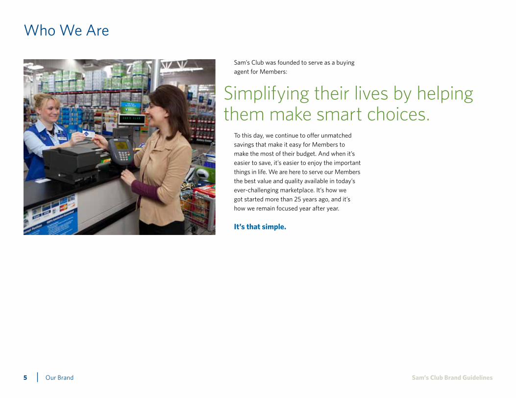
Sam’s Club was founded to serve as a buying agent for Members:
To this day, we continue to offer unmatched savings that make it easy for Members to make the most of their budget. And when it’s easier to save, it’s easier to enjoy the important things in life. We are here to serve our Members the best value and quality available in today’s ever-challenging marketplace. It’s how we got started more than 25 years ago, and it’s how we remain focused year after year.
It’s that simple.
Simplifying their lives by helping them make smart choices.

Our Brand Sam’s Club Brand Guidelines6
Who We Serve
“All of my efforts are focused to benefit Sam’s Members. Anything I do that does not benefit Sam’s Members is a waste of my time.”
Years ago, Sam Walton himself signed his name to this pledge. Today, it’s a promise thousands of Sam’s Club Associates have also vowed to keep top-of-mind in their daily work. Whether Members are shopping for a business, selecting a special gift or just picking up weekly groceries, they have chosen us because they are savvy shoppers. From getting a great price to saving time by stocking up, they count on Sam’s Club to simplify their purchasing decisions for two distinct shopping occasions. So no matter what we do, we do it with the intention of not only meeting their expectations, but surpassing them.

Our Brand Sam’s Club Brand Guidelines7
Who We Serve
Shopping for WorkWe were founded to give small businesses the power to buy like the larger ones. That’s why we offer a wide assortment of quality business solutions at savings that can help build profit, from foodservice equipment and fresh ingredients to office products and convenience store resale items. And with conveniences like exclusive shopping hours, our Business Members can also enjoy the benefit of time back in their schedules.
Shopping for HomeEveryone loves a terrific deal. And when it comes to items that are a must, like groceries, getting an amazing price is even sweeter. For our Members shopping for their households, Sam’s Club provides trusted name brands at savings that make Membership a smart investment. Plus, many of those items are offered in sizes perfect for stocking up, which means time is saved, too. But shopping at Sam’s Club isn’t only about the essentials. From foods perfect for entertaining to electronics, diamonds and home décor, a trip to the Club can also mean savings on an amazing array of special finds.

Our Brand Sam’s Club Brand Guidelines8
Our Positioning
Viewed through the core idea of “Simple” and built on the cornerstones of Membership, Value, Choice and Relevance, the brand positioning is our internal operating principle that drives all we do. This positioning honors our heritage while also serving as a credible foundation that supports the launch of a stronger brand and image, and future company growth.
Sam’s Club simplifies Members’ lives by empowering them to make smart choices. We offer a thoughtful selection of quality merchandise at great prices and time-saving solutions, all in a convenient club design. Sam’s Club provides smart choices for what you need at home and at work.
Value
Choice
Relevance
Membership Simple

Our Brand Sam’s Club Brand Guidelines9
Our Promise
Simplifying Members’ lives by helping them make smart choices.
Our brand promise is our commitment to our Members. It is the true essence of what drives all our business decisions and actions. It’s the guiding philosophy we communicate with pride.

Our Brand Sam’s Club Brand Guidelines10
Defining the Sam’s Club Character and Personality
This “character” is one of the main ways Members recognize us. Just like a real person, a brand’s character provides the basis for creating relationships, standing out from the crowd and conveying a sense of identity.
Our character comes through in our advertising, direct mail, online, and even in our day-to-day conversations and e-mails. It shapes every communication, both internal and external.
Our personality shapes what we do and how we communicate. Each attribute impacts the messages we send, and together they define a tone and style that are distinctly Sam’s Club.

Our Brand Sam’s Club Brand Guidelines11
Our Personality
Strengthening our brand requires differentiating with more than just a logo. We distinguish our brand by crafting communications that reflect – even embody – specific traits that make us stand out to our Members. Including these traits as an underlying framework through which we filter messaging provides deeper meaning in our communications and should be considered a valuable tool to understanding how to accurately represent our brand.
WelcomingWhen you’re a Member of Sam’s Club, you’re part of our family. The warmth of a smile. The comfort that comes from feeling supported. That’s the sense we want our Members to have when they think of Sam’s Club. We welcome Members in with open arms, whether in-Club, online or in the community, and work collectivelywith them to create the best experience possible. We’re lighthearted, enjoy our work and are energized by the opportunity to serve our Members.
ThoughtfulOur Members are always on our minds. What would they like? How can we make their experiences even better? We work hard to exceed their expectations, actively delivering innovative solutions, targeted assortments and helpful information to meet their needs. We never rest in trying to create the best Membership experiencepossible. Everything we say and do is guided by a desire to help Members make smart decisions and simplify their lives. They trust that we’re always on the lookout and working as an advocate on their behalf.
Straightforward
Members feel confident and inspired each time they walk into our Club knowing they are getting the most from their Memberships. The whole experience is designed to be as simple, smooth and seamless as possible. From our Clubs to our website to our programs, each is easy to navigate and intuitive to understand. You won’t find any filler or fluff here, just an authentic group of Associates looking to help out any way we can. We believe Members shouldn’t have to work hard for savings.
RewardingSam’s Club provides smart choices for what our Members need at home and at work. We empower our Members each time they walk into our Club, helping them make the most of their time and money. We pride ourselves on providing a fulfilling shopping experience, with moments of surprise and discovery tailored to what our Members value most.
C Our Core Identity
Our Core Identity13 Sam’s Club Brand Guidelines
Our Logo
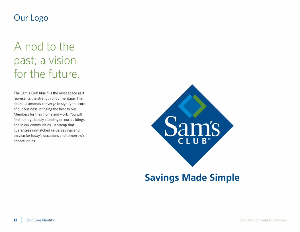
The Sam’s Club blue fills the most space as it represents the strength of our heritage. The double diamonds converge to signify the core of our business: bringing the best to our Members for their home and work. You will find our logo boldly standing on our buildings and in our communities – a stamp that guarantees unmatched value, savings and service for today’s occasions and tomorrow’s opportunities.
A nod to the past; a vision for the future.

Our Core Identity14 Sam’s Club Brand Guidelines
Logo with Tagline
Vertical lockup The primary, or vertical, tagline logo should be used whenever possible.
Our tagline is an integral part of conveying our brand image. To maximize its impact and to preserve its unique status, please: Don’t change the lockup (how it’s positioned with our logo). And, this is just as important: Never re-create the combined logo and tagline art; use only authorized, original art. The different rules on how the tagline should be used appear below. Please, never alter the tagline or create a new tagline and, of course, don’t use any phrase other than our authorized tagline in any advertising or marketing materials. For authorized, original artwork for the approved logo and tagline lockup, go to: SamsClubBrandCenter.com
The vertical execution of the logo is the primary, preferred usage of the logo because it owns the most brand recognition. This execution is most effective in portrait or square space. Every effort should be made to use the full-color logo execution.
Horizontal lockup The secondary, or horizontal, tagline logo should be used for applications to preserve legibility where the vertical height is limited.

Our Core Identity15 Sam’s Club Brand Guidelines
One-color blue logo with tints The one-color tinted lockup is for use on one-color applications. The tinted version should be used whenever possible to preserve the integrity of our symbol.
One-color blue logo The solid one-color lockup may be used on one-color applications for simplified print quality such as printed forms and window decals.
Logo Usage
When full-color printing is unavailable, use one of the alternate lockups below. Identical specifications apply when using the secondary tagline logo.
Black-and-white logo with tints The black-and-white tinted lockup may be used on one-color applications such as newspapers. The tinted version should be used whenever possible to preserve the integrity of our symbol.
One-color black logo A solid lockup may be used on one-color applications such as fax cover sheets and laser-printed forms.
Background Diamond: PMS 288 / 100%Double Diamond left: PMS 288 / 55%Double Diamond center: PMS 288 / 75%Double Diamond right: PMS 288 / 45%
Background Diamond: 100% blackDouble Diamond left: 55% blackDouble Diamond center: 75% blackDouble Diamond right: 45% black

Our Core Identity16 Sam’s Club Brand Guidelines
Using the Logo with Tagline
Vertical tagline logo clear space Always maintain clear space around the Sam’s Club signature to protect the logo from distracting graphics or typography.
For the vertical signature, measure clear space equal to the width of the “m” in “Sam’s” from the top of the diamond and baseline of the tagline. Measure horizontal clear space from the widest points of the tagline.
Never allow typography or other elements to invade the tagline or the symbol.
Horizontal tagline logo clear space For the horizontal signature, measure clear space equal to the width of the “m” in “Sam’s” from the top of the double diamonds and baseline of the tagline. Measure horizontal clear space from the left diamond point and the edge of the “b” in Club.
Never allow typography or other elementsto invade the tagline or the symbol.
Minimum logo size Please never reproduce the primary tagline logo smaller than .75" wide, measured by the width of the diamond.
Never reproduce the secondary tagline logo smaller than 1" wide measured by the width of “Sam’s Club.”
3/4” 1”

Our Core Identity17 Sam’s Club Brand Guidelines
Incorrect Logo Usage
Our logo is a valuable asset and is the visual stamp that represents our brand. Care must be taken to ensure correct application in every instance. Don’t stretch, condense or otherwise morph it. Any modification of the Sam’s Club logo diminishes its impact and is unacceptable. Always use authorized, original artwork, which can be found at: SamsClubBrandCenter.com
incorrect usage of logo
incorrect usage of logo
incorrect usage of logoincorrect usage of logo
incorrect usage of logo
incorrect usage of logo
incorrect usage of logo
incorrect usage of logo
incorrect usage of logo
Do not change the color of anyelement of our logo.
Do not place our logo on a busybackground.
Do not place our horizontal logo on a same or similar color background as the colors in the double diamonds.
Do not rearrange or alter the scale of elements in our logo.
Do not add a shadow or other effects to our logo.
Do not add a keyline or any other effects around the double diamonds.
Do not rotate or distort the logo.
Do not add a glow or other effects to our logo.
Do not remove elements of our logo.

Our Core Identity18 Sam’s Club Brand Guidelines
Our Visual Language
To strengthen and perpetuate our brand, we’ve created a complete set of design guidelines. These guidelines are intended to ensure consistency across any communication. Reaching out to our Members with realistic visuals that are engaging, attainable and, at the same time, inspiring, is how we will connect our brand more deeply to their lives. The core elements are the essential visual components of our brand – the Sam’s Club logo, typefaces, color palettes, graphics and photography – and are the starting point for any Sam’s Club communication.
Sam’s Club logo Sam’s Club tagline
Sam’s Club visual elements
Color palette Typefaces
Whitney lightWhitney bookWhitney mediumWhitney semiboldWhitney bold
Calvert
Univers Condensed
Photography Graphic
288
370
3005
7408
2945
413

Our Core Identity19 Sam’s Club Brand Guidelines
Using Tagline Without the Logo
To maximize impact and to preserve the unique status of our tagline, please note how the tagline should be used even when it is not attached to our logo. In both forms (graphic text and in copy), Savings Made SimpleSM should carry a service mark. There are four approved color versions for the tagline. A color execution is always preferred. There are two approved color usages: PMS 288 and PMS 3005.
There is also a 100% black and 100% white version for appropriate situations.
In text situations, the tagline logo should be set in the same text format (ideally Whitney font family) as the rest of the text but emphasized by setting in bold and also setting it in PMS 3005 whenever possible.
Using the tagline in color
Using the tagline in black and white
This is an example of Savings Made SimpleSM.This is an example of Savings Made SimpleSM.
PMS 288
PMS 3005
Using the tagline in text form

Our Core Identity20 Sam’s Club Brand Guidelines
Using Tagline Without the Logo
Incorrect uses of the tagline
Do not use the tagline signature in an unapproved color, even other Sam’s Club brand colors.
Do not use a colored tagline signature on a colored background.
Do not stack the tagline and/or split the tagline into two colors.

Our Core Identity21 Sam’s Club Brand Guidelines
Using the Logo with Services
Locked-up type treatments let departments identify themselves in ways that are consistent with the Sam’s Club brand. Following are acceptable examples of how to lock up specific services to our Sam’s Club logo. Be sure the relationship of the service to the Sam’s Club logo is consistent, no matter the application. The accompanying lockups are examples of Sam’s Club service type treatments.
Please use only authorized, original artwork for Sam’s Club service treatments. To find these logo files, go to: SamsClubBrandCenter.com
Preferred service logoThe height of the uppercase letter in the service name is measured from top to bottom of the lowercase letters in “Sam’s Club” and written in Whitney medium font, PMS 3005.
The space between the service name and “Sam’s Club” can be measured by the height of the lowercase letters in the service name or 1/3 of the height of the lowercase letters in “Sam’s Club.”
Examples of service applications
Pharmacy
Travel
Optical
Photo
Pharmacy
Travel
Optical
Photo
Pharmacy
Travel
Optical
Photox
x1/3x
Pharmacy
Travel
Optical
Photo
Tire and Battery

Our Core Identity22 Sam’s Club Brand Guidelines
Double Diamond
Our double diamonds symbolize the essence of our mission: serving shopping for business and home with a balanced approach. The light blue represents our Members shopping for business, while the green denotes the Members shopping for home and family. The center shading signifies shared wants and needs. Visually, the double diamonds are the heart of our brand. As such, it is imperative that they are used carefully and strategically.
Color breakdownThe double diamonds element should only be used in a full-color application. If full-color is not available, please refrain from using the element. The double diamonds should be marked with a registered trademark when used outside of the logo.
PMS 3005
PMS 2945C
PMS 370C

Our Core Identity23 Sam’s Club Brand Guidelines
Using the Double Diamond
Our logo is a valuable asset and is the visual stamp that represents our brand. Care must be taken to ensure correct application in every instance. Don’t stretch, condense or otherwise morph it. Any modification of the Sam’s Club logo diminishes its impact and is unacceptable. Always use authorized, original artwork, which can be found at: SamsClubBrandCenter.com
Specifically, using the double diamond as a standalone element should be done sparingly. It should never be used as a replacement for our full logo and tagline. Rather, the double diamond can be considered for smaller spaces where a more refined branding element is needed. Any use must be approved through the branding team.
xx x
x
x
.25"
Clear spaceMeasure clear space equal to the width of the space illustrated in the diagram below. Never allow typography or other elements to invade the tagline or the symbol.
Minimum logo sizePlease never reproduce smaller than .25" wide, measured from one edge of the graphic to the other.
Incorrect usage
Do not crop the double diamond.
Do not apply a keyline, drop shadow, glow or any other effect to the double diamond.
Do not assign arbitrary colors to any part of the double diamond.
Do not use the double diamond to create a repeating pattern.

Our Core Identity24 Sam’s Club Brand Guidelines
Our Colors
Color makes marketing identifiable and relatable, and for us, Sam’s Club Blue does it better than anything. Besides being a nod to our roots, the blue reinforces many of the characteristics of the Sam’s Club brand. It helps to make our communications engaging and approachable, while also conveying a sense of trust, straightforwardness and service. In addition to blue, our color palette includes a number of natural and earthy accent colors. They should be used mainly in supporting applications such as text and rules.
Importance of color matchingColor matching is crucial to the success of any print project. While visual differences in printing can’t be eliminated completely, they can be minimized. Remember:
• The appearance of our brand colors will differ from spot-color to a four-color process.
• There will be slight color variances when printing on different paper stocks. Always minimize visual differences by matching to Pantone® color swatches.
•Ask the printer to adjust the four-color process formula to the paper (and other printing conditions).
PMS 288CC100 M75 Y6 K24R0 G44 B119
PMS 288UC100 M65 Y1 K17R54 G79 B129
HTML 002C77
PMS 370CC64 M5 Y100 K24R91 G143 B24
PMS 370UC50 M3 Y97 K19R97 G136 B69
HTML 5B8F22
PMS 3005CC100 M28 Y0 K0R0 G122 B201
PMS 3005UC99 M22 Y0 K1R0 G118 B189
HTML 007AC9
PMS 7408CC0 M30 Y99 K0R242 G175 B0
PMS 7404U*C0 M10 Y100 K0R248 G206 B67
HTML F2AF00
PMS 2945CC100 M52 Y2 K12R0 G84 B159
PMS 2945UC100 M50 Y1 K15R53 G87 B119
HTML 00549F
PMS 413CC8 M5 Y12 K15R198 G198 B188
PMS 413UC18 M12 Y19 K2R190 G189 B177
HTML C6C6BC
Primary colors
Blue and white should dominate every communication you create. Our medium and light blues especially are bright, friendly and welcoming, and they play a key role in communicating a modern and fresh Sam’s Club brand. Sam’s Club medium blue (PMS 2945) is intended for large color fields in our marketing communications.
Accent colorsThe accent colors add depth, variety and interest throughout our communications. However, these should be reserved for supporting visuals and should never replace blue as the dominant color.
The green is the featured accent color. Therefore, the gray and yellow should be used sparingly and only as small color fields in proportion to the rest of the layout.
Please note: The yellow has a different Uncoated Pantone® value than the Coated. This is sometimes necessary to achieve the best color match between the two sets.
*

Our Core Identity25 Sam’s Club Brand Guidelines
Color Ratio
Leveraging our colors properly helps strengthen their association with our brand. One critical aspect is using the colors in consistent proportions as indicated below. Follow these guidelines, and you’ll be well on your way to a branded piece that best represents Sam’s Club.
Color balanceThe amount of color used in each application will vary from one to the other. However, follow the color ratios seen here as closely as possible to help ensure the right balance of color. As shown below, most visual materials should be dominated by Sam’s Club medium blue (PMS 2945) and accented with all other colors in our brand palette.
PMS 2945
PMS 7408
PMS 413
White
PMS 370PMS 3005
PMS 288

Our Core Identity26 Sam’s Club Brand Guidelines
Our Typeface Whitney
When used correctly, typography can convey image and feeling every bit as much as — and sometimes more than — graphics. We have carefully selected type families that give us a necessary consistency and adhere to all of our core brand traits. Whitney is a modern, sophisticated and friendly sans-serif that remains highly legible at a variety of sizes. Because of its approachability, it is intended for both primary text, such as signage and headlines, as well as smaller applications such as body copy.
Whitney
abcdefghijklmnopqrstuvwxyz ABCDEFGHIJKLMNOPQRSTUVWXYZ1234567890To purchase this authorized font, please go to:http://www.typography.com/fonts/font_styles.php?productLineID=100026

Our Core Identity27 Sam’s Club Brand Guidelines
Alternative/Limited Usage Typography
Calvert is a unique slab serif typeface that is a modern reworking of classic slab serif applications. It is a versatile font that can convey both elegance and whimsy depending on the usage. Calvert should be used when capturing the reader’s attention (headlines), or enhancing and supporting the concept of a piece with a lighthearted tone. It is mostly reserved for Source mailers, guides and catalogs to establish more personality and seasonal feel.
Univers condensed is an alternative san serif font for when a tighter, more compact messaging option is needed. This font looks clean and easy to read, making it an ideal choice for item descriptions and lengthy text forms.
For desktopUse Verdana for applications in a non-graphical artwork environment, such as Microsoft Word and PowerPoint.
Calvert
Univers condensed
Verdana
abcdefghijklmnopqrstuvwxyzABCDEFGHIJKLMNOPQ RSTUVWXYZ1234567890
abcdefghijklmnopqrstuvwxyzABCDEFGHIJKLMNOPQR STUVWXYZ1234567890
abcdefghijklmnopqrstuvwxyzABCDEFGHIJKLMNOPQR STUVWXYZ1234567890
To purchase this authorized font, please go to:http://www.fonts.com/findfonts/detail.htm?pid_242762
To purchase this authorized font, please go to:http://www.fonts.com/findfonts/detail.htm?pid=421588

Our Core Identity28 Sam’s Club Brand Guidelines
Typographic Execution
Whitney, Calvert and Univers fonts are available in a wide range of weights and styles that can be used to add personality to a communication. Additionally, by varying sizes and weights, it is easy to establish an informational hierarchy and contribute to the overall look and feel of the piece. This chart guides the approved approach to using our typefaces when applied to Sam’s Club branded materials.
Type selections should always be:• Relevanttotheparticularmoodoremotion
desired• Supportiveofselectedbrandorproduct
imagery
abcdefghijklmnopqrstuvwxyzABCDEFGHIJKLMNOPQ RSTUVWXYZ1234567890 Headline
Subhead
ABCabc123
Whitney bold
ABCabc123
Calvert bold
ABCabc123
Whitney semibold
ABCabc123
Calvert regular
This is an effective headline option for straightforward pieces that need a more basic and practical approach, such as Membership and Member Service tools. Also use for signage.
An alternative headline option which can be used in Source, catalogs and national campaigns. Calvert is a font with personality. It creates excitement and quickly captures the reader’s attention.
Whitney semibold is a very versatile font and is effective when used in large amounts of text. It is ideal for subheadings.
An alternative subhead option when the tone needs to feel lighthearted and clever.

Our Core Identity29 Sam’s Club Brand Guidelines
Typographic Execution (Cont.)
Body copy
Whitney medium is effective for instances when using reversed white text on colored backgrounds.
ABCabc123
Whitney medium
ABCabc123
Whitney book
ABCabc123
Whitney light
Whitney book is ideal for body text, especially where there is more than one paragraph of copy.
Whitney light is a clean alternative to Whitney book for lengthy text. It is also standard for legal disclaimers.

Our Core Identity30 Sam’s Club Brand Guidelines
Using Type Effectively
Consistent use of approved brand typefaces is essential to keeping our brand identifiable to the Member. Please adhere closelyto these guidelines when using the Sam’s Club brand family of typefaces. Note: Some natural distortion of type is inevitable whenused in a photo or illustration. All the same, please maintain the overall integrity of the typeface — always.
Dos and don’ts of typeface usage:
• Do use only the approved Sam’s Club typefaces.
• Do always set type in a combination of uppercase and lowercase.
• Do be cognizant of color selection and only choose those that are easily read in type.
• Do set body text in upper- and lowercase.
• Don’t use special effects to emphasize type, i.e., drop shadow, outlines, etc.
• Don’t distort typefaces; avoid stretching, condensing or modifying letter forms.
• Don’t substitute other typefaces.• Don’t use text in all caps;
we don’t want to shout.
Adhere to those styles listed on the preceding pages.

BP Photography
32 Sam’s Club Brand GuidelinesPhotography
Photographic Approach
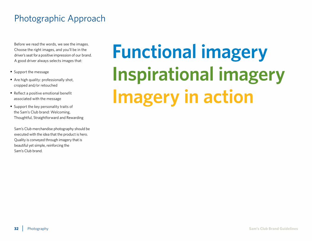
Before we read the words, we see the images. Choose the right images, and you’ll be in the driver’s seat for a positive impression of our brand. A good driver always selects images that:
• Support the message
•Are high quality: professionally shot, cropped and/or retouched
• Reflect a positive emotional benefit associated with the message
• Support the key personality traits of the Sam’s Club brand: Welcoming, Thoughtful, Straightforward and Rewarding
Functional imageryInspirational imageryImagery in action
Sam’s Club merchandise photography should be executed with the idea that the product is hero. Quality is conveyed through imagery that is beautiful yet simple, reinforcing the Sam’s Club brand.

33 Sam’s Club Brand GuidelinesPhotography
Photographic Approach: Functional Imagery
Functional imagery should be stripped down to the essentials, but with a tone of “simple elegance,” reinforcing the Sam’s Club brand tagline of Savings Made SimpleSM.
Choose simple close-up shots, carefully styled and minimally propped.
Imagery demonstrating the product in use may be used to describe the size and scale of individual products, e.g., child on trampoline.

34 Sam’s Club Brand GuidelinesPhotography
Photographic Approach: Inspirational Imagery
Inspirational imagery should be executed to establish more of a scene through the use of simple propping and styling to tell a story.
Casual styling adds appetite appeal and makes product shots seem more everyday and realand less staged.
Inspirational imagery may also be used to highlight the benefits of individual product categories, e.g., a pet owner and her healthy and happy dogs.

35 Sam’s Club Brand GuidelinesPhotography
Photographic Approach: Imagery in Action
Imagery in action should include a human element that is interacting with the product —shots that tell the product story in more depth, showing the making or cooking process,showing people interacting with the product.
The product should always be the hero and minimally propped.

36 Sam’s Club Brand GuidelinesPhotography
Photographic Execution: Products
Background environments can be used to help imply lifestyle, but should remain simple with limited detail. Natural lighting is used to reflect the tone of the season being communicated.
All attempts should be made to use merchandise from Sam’s Club, if appropriate. Walmart can be considered as a backup. If props are needed but not available at Sam’s Club or Walmart, the props used should be non-branded and unrecognizable as a specific retail brand.

37 Sam’s Club Brand GuidelinesPhotography
Photographic Execution: Products Without Background
A generous use of white space helps reinforce the spirit of simplicity in Sam’s Club print design, so product photography is often shot in silhouette against a white background. Color backgrounds can also be used. Soft drop shadows should be maintained to give the product a sense of place and dimension on the page.

38 Sam’s Club Brand Guidelines
Packaged goods are usually photographed in silhouette with subtle drop shadows maintained. They can also be photographed in their serving environment to suggest usage. Product angle and photo composition can help communicate product quantity and size.
Photography
Photographic Execution: Packaged Goods

39 Sam’s Club Brand Guidelines
Upscale luxury products like jewelry and fragrances should be shot on white or dark reflective surfaces. Jewelry is almost always shot in silhouette with no additional propping.
Photography
Photographic Execution: Luxury Products

40 Sam’s Club Brand GuidelinesPhotography
Photographic Execution: Appliances and Electronics
Small appliances and electronics are usually photographed in silhouette with drop shadows maintained. High-end electronics can also be shot on a white reflective surface. Showing the product in use helps bring it to life. Adding screen images to TVs, cameras, smartphones, etc. will create a more realistic image and help the viewer see the full product potential.

41 Sam’s Club Brand GuidelinesPhotography
Photographic Execution: Food
Food photography should reinforce the idea of simplicity while allowing a little reality to create the distinctive style of Sam’s Club. The meat has been sliced and juices are running onto the plate. A stained serving spoon sits next to a pot of baked beans after it’s been used to stir. The cake has a slice cut out, and crumbs are left on the serving tray. It all appears beautiful and appetizing but very real and approachable.
Garnishing should remain minimal with simple plating to keep the food at the center of the visual attention. All attempts should be made to use serving dishes, utensils, glassware and other propping from Sam’s Club. Appropriate Walmart products can be considered as a backup. If props are needed but not available at Sam’s Club or Walmart, the props used should be non-branded and unrecognizable as a specific retail brand.
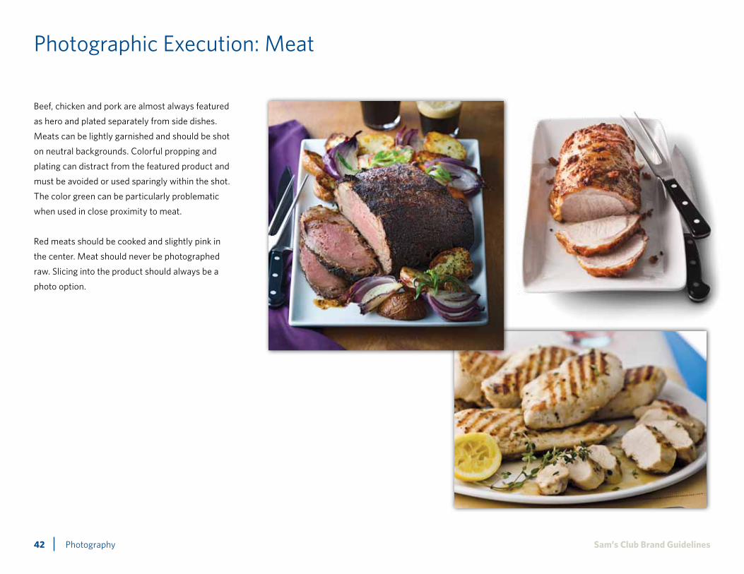
42 Sam’s Club Brand GuidelinesPhotography
Photographic Execution: Meat
Beef, chicken and pork are almost always featured
as hero and plated separately from side dishes.
Meats can be lightly garnished and should be shot
on neutral backgrounds. Colorful propping and
plating can distract from the featured product and
must be avoided or used sparingly within the shot.
The color green can be particularly problematic
when used in close proximity to meat.
Red meats should be cooked and slightly pink in
the center. Meat should never be photographed
raw. Slicing into the product should always be a
photo option.

43 Sam’s Club Brand GuidelinesPhotography
Photographic Execution: Seafood
Seafood is usually featured as hero and plated separately from side dishes. It should be shown cooked and never raw. Seafood can be lightly garnished and should be shot on neutral backgrounds with minimal propping. Colorful propping and plating can distract from the featured product and must be avoided or used sparingly within the shot.

44 Sam’s Club Brand GuidelinesPhotography
Photographic Execution: Fresh Produce
Communicating quality and freshness is the goal when shooting fresh produce. Fresh product is lit with bright, natural light and usually shown spritzed with water droplets to imply “just picked” freshness. Produce can also be sliced open to hero the quality and freshness. Propping can be used to imply meal solutions.
Quantity is also an important part of our fresh produce story, and illustrating a generous amount of produce helps communicate value.
Fresh produce is sometimes used to communicate ingredients and is shot in silhouette with little or no propping.

45 Sam’s Club Brand GuidelinesPhotography
Photographic Execution: Dessert
Dessert photography is designed to make your mouth water. Showing a pie or cake cut into, with crumbs left on the plate, creates appetite appeal and a sense of approachable reality. Desserts are photographed with minimal propping.
Scale and quantity play an important role in communicating value in this category.
46 Sam’s Club Brand GuidelinesPhotography
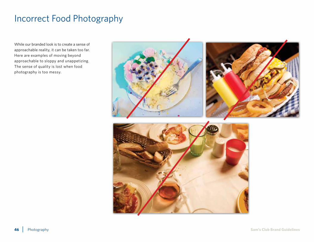
Incorrect Food Photography
While our branded look is to create a sense of approachable reality, it can be taken too far. Here are examples of moving beyond approachable to sloppy and unappetizing. The sense of quality is lost when food photography is too messy.

47 Sam’s Club Brand GuidelinesPhotography
Photographic Execution: Lifestyle
Lifestyle photography should only be used when it is necessary to highlight the scale of the merchandise or to illustrate product usage. Product remains hero and people are the props.
Ethnic and gender diversity is important when portraying any lifestyle situation. Casting should include a range of ethnicity to mirror the U.S. population.

48 Sam’s Club Brand GuidelinesPhotography
Incorrect Lifestyle Imagery
Product is always hero, and lifestyle photography that is cliché, overly abstract or cropped, or looks fabricated works against our goal. Generally, stay away from camera-aware talent and any overacting that pulls attention away from the featured merchandise. Here are examples of what not to do.

B OUR BRANDA Applications

Applications50 Sam’s Club Brand Guidelines
Applications
To reinforce the brand image, we should always use the brand elements to re-create a seamless and consistent experience across all touchpoints. As the core symbol of our brand, the double diamonds are the perfect visual to emphasize ways Membership provides value in addition to everyday merchandise.
Special Buy
Catalog (Tip callout shown)
Special Buy (Tag for items in-Club shown)
iPhone Application (Button shown)

Applications51 Sam’s Club Brand Guidelines
Applications (Cont.)
Name badge
Club exterior
Membership card and Gift Card
Website

BT Our Tone and Voice

Our Tone and Voice53 Sam’s Club Brand Guidelines
Our Tone and Voice
Each time we interact with a Member, we have the opportunity to leave them with a lasting, positive impression of Sam’s Club. By consistently aligning our actions and our communications with our brand, we can deliver an experience that powerfully reinforces Sam’s Club as the preferred shopping destination for our Members.
Listed here are some thought starters for delivering and communicating our brand. The number of ways we can express our brand is vast, so look for opportunities to embed the Sam’s Club brand in all your day-to-day activities. Our goal is to have these brand attributes jump to mind whenever our Members think about or interact with Sam’s Club.
Welcoming We embrace our Members into our family
Thoughtful We work with our Members’ needs in mind and as their advocates
Straightforward We deliver in the clearest, simplest way possible
Rewarding We provide a fulfilling shopping experience, with moments of surprise and discovery

Our Tone and Voice54 Sam’s Club Brand Guidelines
Our Tone and VoiceWelcoming
How to be welcoming:
Be approachableWhether literally or figuratively, greet Members with a smile and assist them whenever there is an opportunity. Members should feel they can easily engage with us, regardless of their question or need, and trust that we’re there to help them.
Make them feel at homeAlways communicate in a way that is sincere and honest. Members should feel they are part of our family, and we should instill in them the confidence that we are there for them.
Show our lightheartednessTry not to come across as overly stiff or serious. While we need to project a professional image on behalf of Sam’s Club, we also want our Members to feel that we can relate to them. Be friendly and don’t be afraid to show our human side.
When you’re a Member of Sam’s Club, you’re part of our family. The warmth of a smile. The comfort that comes from feeling supported. That’s the sense we want our Members to have when they think of Sam’s Club. We welcome Members in with open arms, whether in-Club, online or in the community, and work collectivelywith them to create the best experience possible. We’re lighthearted, enjoy our work and are energized by the opportunity toserve our Members.
Our Tone and Voice55 Sam’s Club Brand Guidelines
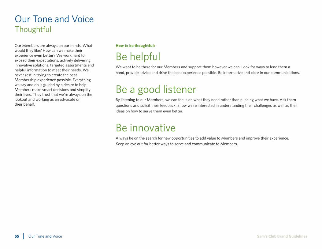
Our Tone and VoiceThoughtful
How to be thoughtful:
Be helpful We want to be there for our Members and support them however we can. Look for ways to lend them a hand, provide advice and drive the best experience possible. Be informative and clear in our communications.
Be a good listenerBy listening to our Members, we can focus on what they need rather than pushing what we have. Ask them questions and solicit their feedback. Show we’re interested in understanding their challenges as well as their ideas on how to serve them even better.
Be innovativeAlways be on the search for new opportunities to add value to Members and improve their experience. Keep an eye out for better ways to serve and communicate to Members.
Our Members are always on our minds. What would they like? How can we make their experience even better? We work hard toexceed their expectations, actively delivering innovative solutions, targeted assortments and helpful information to meet their needs. We never rest in trying to create the best Membership experience possible. Everything we say and do is guided by a desire to helpMembers make smart decisions and simplify their lives. They trust that we’re always on the lookout and working as an advocate ontheir behalf.
Our Tone and Voice56 Sam’s Club Brand Guidelines
Our Tone and VoiceStraightforward
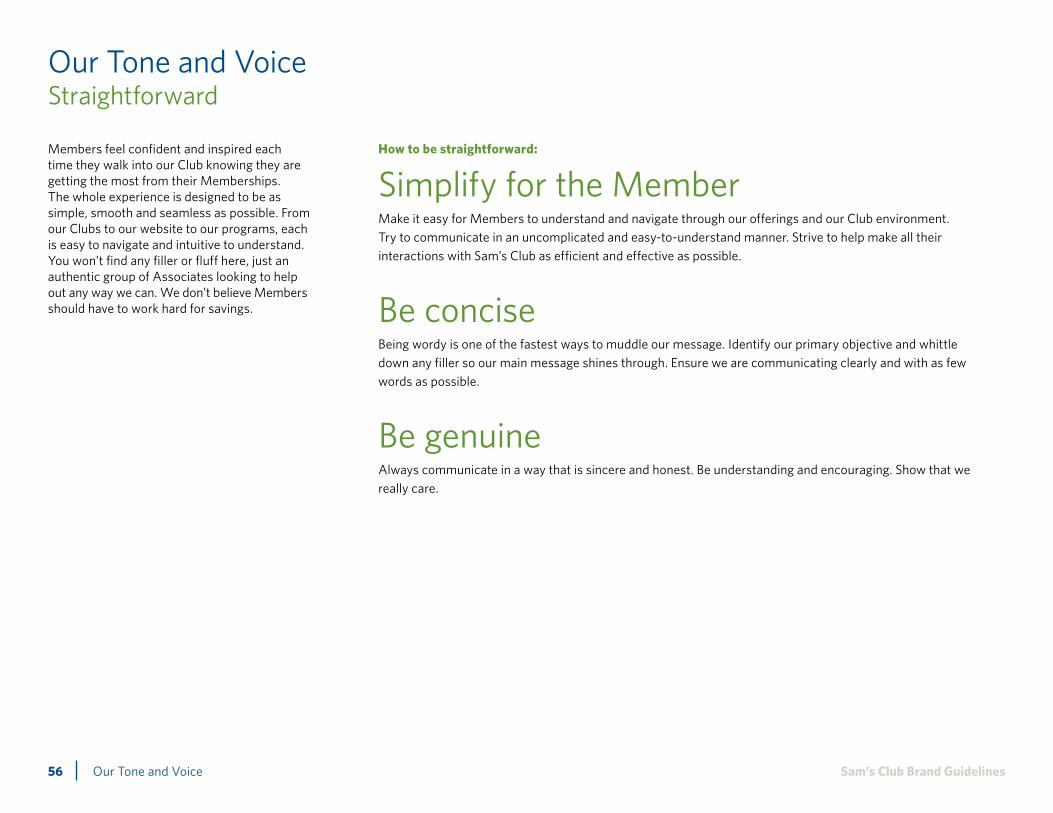
How to be straightforward:
Simplify for the MemberMake it easy for Members to understand and navigate through our offerings and our Club environment. Try to communicate in an uncomplicated and easy-to-understand manner. Strive to help make all their interactions with Sam’s Club as efficient and effective as possible.
Be conciseBeing wordy is one of the fastest ways to muddle our message. Identify our primary objective and whittle down any filler so our main message shines through. Ensure we are communicating clearly and with as few words as possible.
Be genuineAlways communicate in a way that is sincere and honest. Be understanding and encouraging. Show that we really care.
Members feel confident and inspired each time they walk into our Club knowing they are getting the most from their Memberships.The whole experience is designed to be as simple, smooth and seamless as possible. From our Clubs to our website to our programs, each is easy to navigate and intuitive to understand. You won’t find any filler or fluff here, just an authentic group of Associates looking to help out any way we can. We don’t believe Members should have to work hard for savings.

Our Tone and Voice57 Sam’s Club Brand Guidelines
Our Tone and VoiceRewarding
How to be rewarding:
Enable Members to make smart choicesDemonstrate how Members can save time and money by being part of Sam’s Club. Help them feel empowered by the great products, services and value they receive from shopping with us.
Offer solutions that address our Members’ needsAlways approach communications from the mindset of the Member and how we can help serve them. Try to position and explain our offerings from the perspective of how they benefit the Member and how our offerings make their lives easier, more enjoyable and more productive.
Weave in moments of surprise and discovery We don’t want to be gimmicky, but we don’t want to be tired or boring either. Look for ways to provide interesting, valuable information and experiences to our Members. Engage them in the content and pique their curiosity.
Sam’s Club provides smart choices for what our Members need at home and at work. We empower our Members each time theywalk into our Clubs, helping them make the most of their time and money. We pride ourselves on providing a fulfilling shopping experience, with moments of surprise and discovery tailored to what our Members value most.

Our Tone and Voice58 Sam’s Club Brand Guidelines
Basic Writing Standards
The Sam’s Club name:• “Sam’s Club” should always appear on the same
line in a sentence.
• The company should not be referred to as “SAM’S” or “Sam’s.” Always refer to it as “Sam’s Club” or “Sam’s Club locations.” It is acceptable to refer to a location or locations in second reference as “Club” or “Clubs,” always using a capital “C.”
• “Sam’s Club” should not be used in a plural or possessive form. Never say “Sam’s Clubs” or “Sam’s Club’s.” Instead, for plural forms use “Sam’s Club locations” or “Clubs.” For possessive forms use “The Sam’s Club ______” or think of another creative way to convey the thought.
• “Sam’s Club” should not be written in all caps.
• “Sam’s Club” should be followed by a superscript ® on the first reference of every page (unless it is a two-page spread). The cover and back cover of a booklet, guide or similar publication do not count as a two-page spread.
• SamsClub.com and its more specific variations should be in bold.
•When referencing the Sam’s Club website, do not use the “www” prefix. If SamsClub.com falls at the end of a sentence, it is OK to use a period, but do not include the period in the bold styling.
• Phone and fax numbers should be separated by periods.
•Only use a ‘1’ before toll-free numbers: 1.800.123.4567.
• Include the area code, separated from the prefix by a period: 555.123.4567.
It’s all in the details. Now, these may seem just plain nitpicky, but having these detailed rules to follow actually helps everyone be more efficient and focus on the bigger design and messaging concerns. Consider it a basic formatting template for some of your core messages. We promise they are pretty intuitive and easy to learn. Before you know it, you’ll be following them without even thinking.
Sam’s Club Plus® Membership:Should be followed by a superscript ® in the first instance on the page. It is acceptable to also drop the “Sam’s Club” in subsequent instances. However, neither “Sam’s Club Advantage Plus” nor “Sam’s Club Business Plus” receive a ®.
Sam’s Club® Discover®:
“Sam’s Club Discover” should always be referred to as a full phrase. It should not be written in all caps. The superscript registered trademark symbols should appear only in the first instance.
Please note the use of the registered trademark after “Sam’s Club,” even when “Sam’s Club” has already been referenced alone on a particular piece.
Phone Numbers

Our Tone and Voice59 Sam’s Club Brand Guidelines
Basic Writing Standards (Cont.)
Time FormatsClub HoursMonday – Friday 10 am – 8:30 pmSaturday 9 am – 8:30 pmSunday 10 am – 6 pm
Early Shopping Hours (for Plus and Business Members only)
Monday – Friday 7 – 10 amSaturday 7 – 9 am
Capitalization:
Sam’s ClubAdvantage MembershipBusiness MembershipMember (when referring to Sam’s Club Members)
Membership (when referring to Sam’s Club Memberships)
Associates (when referring to Sam’s Club or Walmart employees)
Sam’s Club Plus®
Member Services DeskWebsiteClub (when referring to one of our specific locations)
Fax ‘n’ PullSM
Click ‘n’ Pull®
Miscellaneous:
Disclaimers/Guarantees Miscellaneous:•Avoid using more than two asterisks (*). If
three or more disclaimers are necessary, use the † symbol. If more disclaimers are necessary after the double dagger, resort to numbers.
•When an asterisk (*) appears at the end of a sentence, place the asterisk after the period. This is especially important when two asterisks are used. Trademarks and other legal notes (®, TM, SM) go after the legal term they mark, so it could go inside or outside the ending punctuation depending on the circumstance. Footnote symbols, on the other hand, always go outside the ending punctuation (with the one exception of the dash).
•When using multiple disclaimers, make sure that the disclaimers appear in the same order in the footnote as they appear in the copy.
• Typical disclaimer font size should be 6 pt. font at minimum.
•Always use initial caps in these circumstances:
• Punctuation at the end of a headline is optional.
•Use only one space between sentences and after colons.
• Refer to the AP Stylebook for comma usage guidelines.
• Refer to the AP Stylebook for holiday spelling and punctuation.
• Refer to the AP Stylebook for hyphenation guidelines. Be sure to hyphenate these commonly missed words:
e-mail e-commerce e-business
• Spell out numbers less than 10. Use a numeral for numbers 10 and greater unless the number begins a sentence or sentence fragment.
•On pieces for prospective Members, include: For a Sam’s Club near you, visit SamsClub.com or call 1.800.881.9180.
• Book titles, videotape titles, ship names and publication titles should be italicized.
• Sam’s Club employees are referred to as “Associates.”
• Hyphenation should not be used on ragged-right copy.
• Two Words Health care
• Lowercase letters should be used for am and pm. When listing a time span within body copy, the periods should be included in “a.m.” and “p.m.” In other instances, omit them.
• The words “Club Hours” and “Early Shopping Hours” (for Plus and Business Members only) should be bold face and set flush left along with the days of the week.
• Time zones should be abbreviated, no periods. Example: CST
•Do not use 12:00 pm or 12:00 am; these should be referred to as noon or midnight.

BG General

Sam’s Club Brand GuidelinesGeneral61
When using paper or printing Sam’s Club collateral, please always try to:•Use FSC-certified practice for jobs and meet chain-of-custody requirements
• Select FSC-certified 100% post-consumer recycled Process Chlorine Free (PCF) papers
• Select Green Seal certified papers
• Select FSC-certified chain-of-custody printers
• Select printers and/or suppliers that are ISO 14001 certified
• Print projects using water- or soy-based inks
Sam’s Club is dedicated to improving and ensuring the quality of life of our Members, Associates and people around the world by engaging in and encouraging sustainable choices and behaviors. We ask that you do the same. We have included a list of recommended practices below that will ensure Sam’s Club, with your help, becomes a recognized leader in responsible printing. Implementing these practices will help preserve the environment and achieve our goal of becoming a 100% renewable-energy operation.
Sustainability EffortsPaper And Printing Sustainable Guidelines

62 Sam’s Club Brand Guidelines
Sam’s Club2101 SE Simple Savings Dr.
Bentonville, AR 72716
Related Documents