RGB Plots as a Tool for the Simultaneous Visualization of Multiple Data Layers in a Two Dimensional Space Yair Suari* ¤ , Steve Brenner Department of Geography and Environment, Bar-Ilan University, Ramat-Gan, Israel Abstract Visualization of multidimensional data helps in understanding complex systems and environments. We present here a red, green, blue (RGB) visualization method that can serve to display environmental properties. The saturation of each color is used to represent the concentration of a given property. The implementation of that figure is illustrated through visualization of three dissolved inorganic nutrient concentrations along a vertical transect of the Mediterranean, as well as through a vertical time series of three phytoplankton group cell numbers. The RGB figures show well known properties of the water column. In addition, they reveal some lesser-known properties, such as regions in shallow water in which the ratio of phosphorus and silica to nitrogen is high, and a deep eukariotic phytoplankton community. Visualization of such data is usually performed with three separate contour or surface plots, and occasionally two properties are presented as an overlay in a single figure. The RGB figure offers a better way to visualize the interactions among the three separate plots than is commonly available. Citation: Suari Y, Brenner S (2014) RGB Plots as a Tool for the Simultaneous Visualization of Multiple Data Layers in a Two Dimensional Space. PLoS ONE 9(7): e102903. doi:10.1371/journal.pone.0102903 Editor: Moncho Gomez-Gesteira, University of Vigo, Spain Received January 24, 2014; Accepted June 25, 2014; Published July 16, 2014 Copyright: ß 2014 Suari, Brenner. This is an open-access article distributed under the terms of the Creative Commons Attribution License, which permits unrestricted use, distribution, and reproduction in any medium, provided the original author and source are credited. Funding: This research was supported by the European Commission through the Sixth Framework Program European Coastal Sea Operational Observing and Forecasting System (ECOOP) Contract Number 36355. The sampling cruises were supported by Andreas Weill and Eco-Ocean Association of Herzlyia, Israel. The funders had no role in study design, data collection and analysis, decision to publish, or preparation of the manuscript. Competing Interests: The authors have declared that no competing interests exist. * Email: [email protected] ¤ Current address: The School of Marine Sciences and Marine Environment, Ruppin Academic Center, Michmoret, Israel Introduction Classification and representation of multidimensional data are of great scientific interest. Methods such as the principal component analysis and k-means classify the data while losing the original data values. Cawthon et al. [1] explored the mapping of projected climate change and its uncertainty. A visualization method of four dimensional data in two dimensional space was developed, presenting data values by color (hue) and uncertainty by saturation. Roederer et al. [2] and Saadatinejad et al. [3] addressed the problem of displaying multidimensional data in two dimensional space by using the color matrices of the RGB model, thus showing raw flow cytometry results and seismic data through color saturation, respectively. Currently all the visualization methods are limited to less than four simultaneous dimensions, including, up to two independent variables and one dependent variable. Following growth in the volume of data [4] as well as the increase in data complexity, new multidimensional data visualization methods must be developed to facilitate our understanding of complex systems. The marine ecosystem is composed of diverse organisms that differ along various dimensions, such as taxonomy, function, or size. Moreover, the ecosystem is affected by many environmental factors such as temperature, salinity, light intensity, and nutrient concentration. We illustrate the RGB representation methodology through the visualization of dissolved inorganic nutrient concentrations along a vertical transect of the Mediterranean. We focus on the macro nutrients: Nitrate (NO 3 ), Phosphate (PO 4 ) , and Silica (SiOH 4 ). Much scientific interest has been directed at the concentration ratios between these substances since Redfield [5] discovered that elemental C:N:P ratios in seawater are constant (106:16:1) and equal to the same elemental ratios in plankton. An inspection of the molar ratios of dissolved nutrients allows us to estimate the limiting nutrient [6–9]. The dissolved N:P ratios (22:1) in the eastern Mediterranean diverge substantially from the Redfield ratio and therefore they raise specific interest [10,11] that can be addressed through the use of RGB visualizations. Unlike nitrogen and phosphorus which are vital to all phytoplankton groups, silica is consumed by diatoms only. We also apply the RGB visualization to a vertical time series of three phytoplankton group cell numbers. The phytoplankton community structure is greatly influenced by environmental conditions. Due to nutrient poor (oligotrophic) conditions in the eastern Mediterranean, cell sizes are smaller [12] and eukaryotic phytoplankton (Euk) relatively scarce [13]. The eukaryotic phytoplankton cells are usually larger than those of other phytoplankton groups and therefore their presence stimulates a more efficient food web [14] and might enhance the rate of carbon export to the deep ocean [14]. When oceanographic data are displayed graphically, geographic location and time of sampling often serve as independent variables, whereas quantitative variables, such as nutrient concentration or cell number, serves as the depended variable. The standard methods using a single dependent variable are insufficient for multidimensional representation and interpretation. PLOS ONE | www.plosone.org 1 July 2014 | Volume 9 | Issue 7 | e102903

Welcome message from author
This document is posted to help you gain knowledge. Please leave a comment to let me know what you think about it! Share it to your friends and learn new things together.
Transcript
RGB Plots as a Tool for the Simultaneous Visualization ofMultiple Data Layers in a Two Dimensional SpaceYair Suari*¤, Steve Brenner
Department of Geography and Environment, Bar-Ilan University, Ramat-Gan, Israel
Abstract
Visualization of multidimensional data helps in understanding complex systems and environments. We present here a red,green, blue (RGB) visualization method that can serve to display environmental properties. The saturation of each color isused to represent the concentration of a given property. The implementation of that figure is illustrated throughvisualization of three dissolved inorganic nutrient concentrations along a vertical transect of the Mediterranean, as well asthrough a vertical time series of three phytoplankton group cell numbers. The RGB figures show well known properties ofthe water column. In addition, they reveal some lesser-known properties, such as regions in shallow water in which the ratioof phosphorus and silica to nitrogen is high, and a deep eukariotic phytoplankton community. Visualization of such data isusually performed with three separate contour or surface plots, and occasionally two properties are presented as an overlayin a single figure. The RGB figure offers a better way to visualize the interactions among the three separate plots than iscommonly available.
Citation: Suari Y, Brenner S (2014) RGB Plots as a Tool for the Simultaneous Visualization of Multiple Data Layers in a Two Dimensional Space. PLoS ONE 9(7):e102903. doi:10.1371/journal.pone.0102903
Editor: Moncho Gomez-Gesteira, University of Vigo, Spain
Received January 24, 2014; Accepted June 25, 2014; Published July 16, 2014
Copyright: � 2014 Suari, Brenner. This is an open-access article distributed under the terms of the Creative Commons Attribution License, which permitsunrestricted use, distribution, and reproduction in any medium, provided the original author and source are credited.
Funding: This research was supported by the European Commission through the Sixth Framework Program European Coastal Sea Operational Observing andForecasting System (ECOOP) Contract Number 36355. The sampling cruises were supported by Andreas Weill and Eco-Ocean Association of Herzlyia, Israel. Thefunders had no role in study design, data collection and analysis, decision to publish, or preparation of the manuscript.
Competing Interests: The authors have declared that no competing interests exist.
* Email: [email protected]
¤ Current address: The School of Marine Sciences and Marine Environment, Ruppin Academic Center, Michmoret, Israel
Introduction
Classification and representation of multidimensional data are
of great scientific interest. Methods such as the principal
component analysis and k-means classify the data while losing
the original data values. Cawthon et al. [1] explored the mapping
of projected climate change and its uncertainty. A visualization
method of four dimensional data in two dimensional space was
developed, presenting data values by color (hue) and uncertainty
by saturation. Roederer et al. [2] and Saadatinejad et al. [3]
addressed the problem of displaying multidimensional data in two
dimensional space by using the color matrices of the RGB model,
thus showing raw flow cytometry results and seismic data through
color saturation, respectively.
Currently all the visualization methods are limited to less than
four simultaneous dimensions, including, up to two independent
variables and one dependent variable. Following growth in the
volume of data [4] as well as the increase in data complexity, new
multidimensional data visualization methods must be developed to
facilitate our understanding of complex systems.
The marine ecosystem is composed of diverse organisms that
differ along various dimensions, such as taxonomy, function, or
size. Moreover, the ecosystem is affected by many environmental
factors such as temperature, salinity, light intensity, and nutrient
concentration.
We illustrate the RGB representation methodology through the
visualization of dissolved inorganic nutrient concentrations along a
vertical transect of the Mediterranean. We focus on the macro
nutrients: Nitrate (NO3), Phosphate (PO4), and Silica (SiOH4).
Much scientific interest has been directed at the concentration
ratios between these substances since Redfield [5] discovered that
elemental C:N:P ratios in seawater are constant (106:16:1) and
equal to the same elemental ratios in plankton. An inspection of
the molar ratios of dissolved nutrients allows us to estimate the
limiting nutrient [6–9]. The dissolved N:P ratios (22:1) in the
eastern Mediterranean diverge substantially from the Redfield
ratio and therefore they raise specific interest [10,11] that can be
addressed through the use of RGB visualizations. Unlike nitrogen
and phosphorus which are vital to all phytoplankton groups, silica
is consumed by diatoms only.
We also apply the RGB visualization to a vertical time series of
three phytoplankton group cell numbers. The phytoplankton
community structure is greatly influenced by environmental
conditions. Due to nutrient poor (oligotrophic) conditions in the
eastern Mediterranean, cell sizes are smaller [12] and eukaryotic
phytoplankton (Euk) relatively scarce [13]. The eukaryotic
phytoplankton cells are usually larger than those of other
phytoplankton groups and therefore their presence stimulates a
more efficient food web [14] and might enhance the rate of carbon
export to the deep ocean [14].
When oceanographic data are displayed graphically, geographic
location and time of sampling often serve as independent variables,
whereas quantitative variables, such as nutrient concentration or
cell number, serves as the depended variable. The standard
methods using a single dependent variable are insufficient for
multidimensional representation and interpretation.
PLOS ONE | www.plosone.org 1 July 2014 | Volume 9 | Issue 7 | e102903
Here we present two figures of examples of multidimensional
data-sets on computer screen or paper, using the qualities of the
RGB color model. The dimensions consist of two in-dependent
variables (axes of the plot) and three dependent variables
represented by the color saturation. This method enables a more
thorough representation of the marine environment than the
methods currently used and facilitates the interpretation of the
data by revealing the interdependence between the variables.
Materials and Methods
Ethics statementThe sampling site is located at an area which is not protected
and no sampling permit is required. The field studies did not
involve endangered or protected species.
The RGB representation of two in-dependent and three
dependent variables, was applied to two different types of data:
Mediterranean nutrient concentrations and phytoplankton group
biomass. A short description of the data source is also provided.
Data analysis was performed using the Matlab 8.1 commercial
software package [15].
The first analysis was based on the gridded MEDATLAS [16]
climatological nutrient concentrations. The horizontal resolution
was 0.2u and the vertical resolution ranged between 10 m for
shallow water and 500 m for water deeper than 1500 m. These
data were produced by an optimal interpolation technique and
constructed from historic Mediterranean nutrient samples, cover-
ing the years 1864–2002.
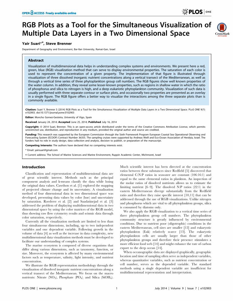
Construction of an RGB figure from the MEDATLAS nutrient
concentration fields (Equations 1–3) was done by extracting a
vertical section along the Mediterranean (Figure 1) for each of the
three nutrients (NO3, PO4, and SiOH4). Concentration of each
nutrient was normalized to the concentration range, assuming a
minimal concentration of zero and dividing each grid point
concentration by the maximal value found for that nutrient. For
each depth (z) and distance (x) we calculated the square root of the
normalized concentration. This calculation produced a saturation
value for NO3 (red, R), PO4 (green, G), and SiOH4 (blue, B).
Using the square root facilitated a more detailed view of the photic
zone, in which the lowest nutrient concentrations are found and
most of the primary production is performed. The color saturation
values are given by
R(x,z)~
ffiffiffiffiffiffiffiffiffiffiffiffiffiffiffiffiffiffiffiffiffiffiffiNO3(x,z)
max (NO3)
sð1Þ
G(x,z)~
ffiffiffiffiffiffiffiffiffiffiffiffiffiffiffiffiffiffiffiffiffiffiPO4(x,z)
max (PO4)
sð2Þ
B(x,z)~
ffiffiffiffiffiffiffiffiffiffiffiffiffiffiffiffiffiffiffiffiffiffiffiffiffiffiffiSiOH4(x,z)
max (SiOH4)
sð3Þ
The second analysis used phytoplankton samples collected at
the edge of the Israeli continental shelf (34.564uE, 32.217uN,
Figure 1) during the first half of 2013. These samples were
subjected to a taxonomic analysis conducted with Attune Acoustic
Focusing Flow Cytometer as in Marie and Brussaard [17]. This
method is commonly used in the analysis of marine phytoplank-
ton, producing cell numbers for picoeukariots (Euk), Synechococcus
(Syn), and Prochlorococcus (Pro) in seawater volume.
The RGB figure of the phytoplankton taxonomic composition
was generated by normalizing the sample’s cell concentration in
each specific taxon according to the range of concentrations for
those taxa in all samples, thus representing the concentrations on a
scale of zero to one. The normalized concentrations were then
linearly interpolated to a Cartesian grid, in which time (t) and
depth (z) of sampling were used as the X and Y axes, respectively,
and the dependent variable was the normalized cell concentration.
The interpolated fields were then used to construct the three RGB
color components, as shown in equations 4–6.
Figure 1. Map of presented data points. Nutrient concentration profiles were extracted from the MEDATLAS database [16] along the blue linethe plotted on the map to create the RGB nutrient Figure (Figure 2). The red asterisk at the eastern coast represents the sampling point for thephytoplankton taxonomic composition, as presented in Figure 4.doi:10.1371/journal.pone.0102903.g001
Displaying Multi-Dimensional Data as an RGB Image
PLOS ONE | www.plosone.org 2 July 2014 | Volume 9 | Issue 7 | e102903
R(t,z)~Euk(t,z){min(Euk)
max(Euk){min(Euk)ð4Þ
G(t,z)~Syn(t,z){min(Syn)
max(Syn){min(Syn)ð5Þ
B(t,z)~Pro(t,z){min(Pro)
max(Pro){min(Pro)ð6Þ
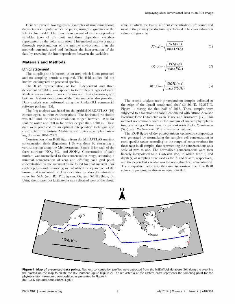
Many types of RGB scales exists, including the RGB triangle
[18] that displayes RGB color combinations. Most RGB scales
display only some of the color combinations, as all possible color
combinations can only be displayed in a three-dimensional space.
The RGB legends scale in the current manuscript was constructed
by displaying continuous red and green saturation values as well as
five saturation values for the blue color (Figure 2, bottom).
Environmental concentrations were assigned to the scale axes.
Results
The nutrient concentration RGB plot is shown in the upper
panel of Figure 2. Well known features of the region are clearly
illustrated, including the reduced surface nutrient concentration
revealed by the darker shallow water, the West-to-East nutrient
reduction [19] revealed by the darker eastern Mediterranean, and
the increased N:P ratio in the deep water of the eastern
Mediterranean [10], revealed by the redder deep water in this
region. Other features shown on the RGB figure are the elevated
proportions of phosphorus (green) in the eastern Mediterranean
surface water, specifically at 0–200 m depth between kilometers
2800–3200 and 3700–4000 along the transect, and a patch of
elevated silica (blue) proportion situated between them around
kilometer 3500.
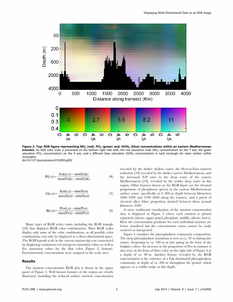
A more traditional visualization of the nutrient concentration
data is displayed in Figure 3 where each nutrient is plotted
separately (nitrate, upper panel; phosphate, middle; silicate, lower).
Here the concentration gradients for each individual nutrient are
better visualized but the concentration ratios cannot be easily
resolved or interpreted.
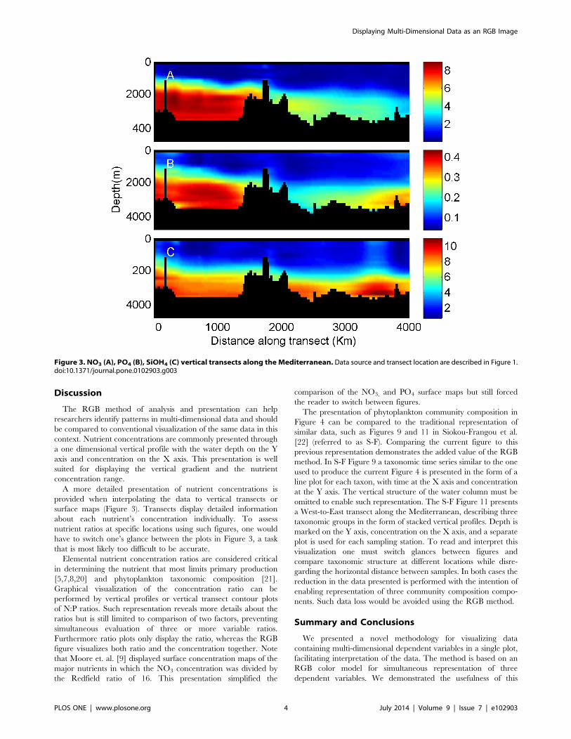
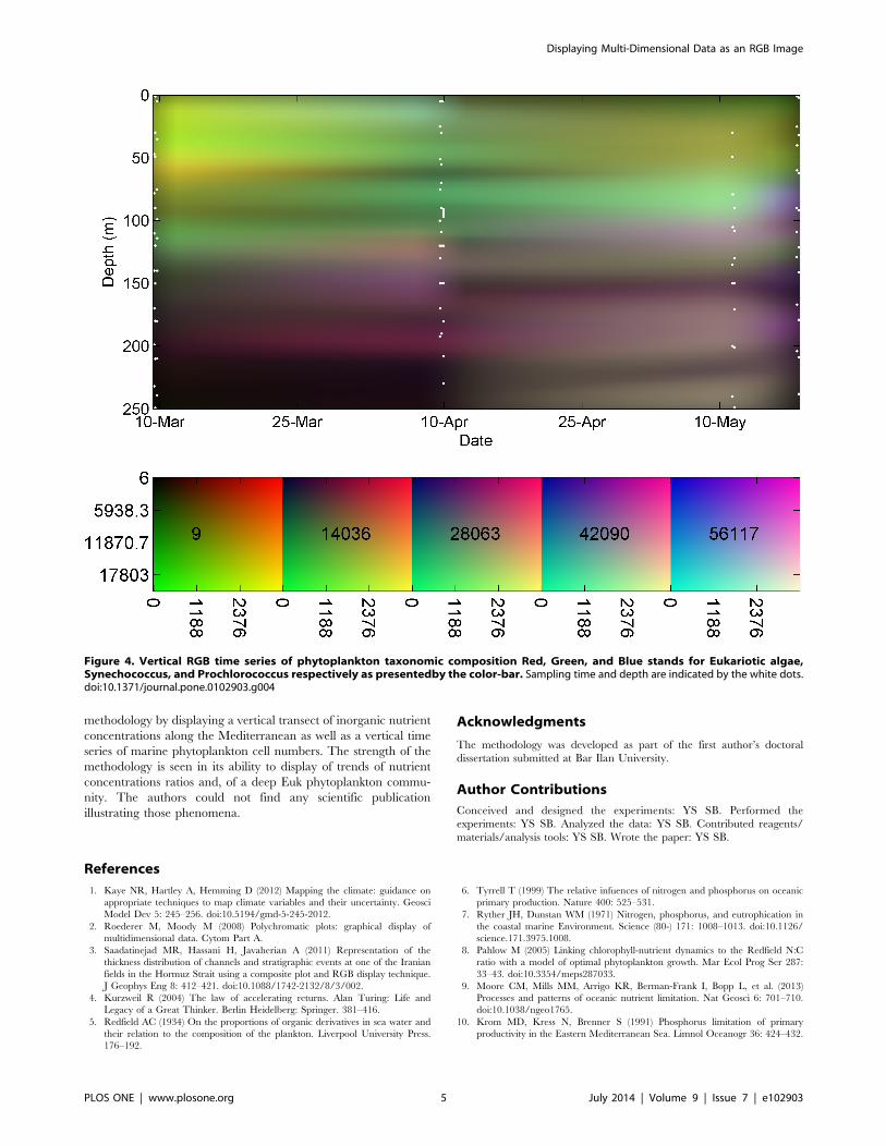
Figure 4 visualizes the phytoplankton community composition.
The deep phytoplankton maximum is seen at ca. 50 m during late
winter, deepening to ca. 100 m at late spring in the form of the
brighter colors. An increase in the proportion of Pro in summer is
also seen, in the form of bluer color on the right side of Figure 4 at
a depth of ca. 80 m. Another feature revealed by the RGB
representation is the existence of a Euk dominated phytoplankton
community at depth of ca. 200 m throughout the period, which
appears as a redder stripe at this depth.
Figure 2. Top: RGB figure representing NO3 (red), PO4 (green) and, SiOH4 (blue) concentrations within an eastern Mediterraneantransect. An RGB color scale is presented on the bottom right side with, the red saturation scale (NO3 concentration) on the Y axis, the greensaturation (PO4 concentration) on the X axis, and a different blue saturation (SiOH4 concentration) in each rectangle (its value written withinrectangles).doi:10.1371/journal.pone.0102903.g002
Displaying Multi-Dimensional Data as an RGB Image
PLOS ONE | www.plosone.org 3 July 2014 | Volume 9 | Issue 7 | e102903
Discussion
The RGB method of analysis and presentation can help
researchers identify patterns in multi-dimensional data and should
be compared to conventional visualization of the same data in this
context. Nutrient concentrations are commonly presented through
a one dimensional vertical profile with the water depth on the Y
axis and concentration on the X axis. This presentation is well
suited for displaying the vertical gradient and the nutrient
concentration range.
A more detailed presentation of nutrient concentrations is
provided when interpolating the data to vertical transects or
surface maps (Figure 3). Transects display detailed information
about each nutrient’s concentration individually. To assess
nutrient ratios at specific locations using such figures, one would
have to switch one’s glance between the plots in Figure 3, a task
that is most likely too difficult to be accurate.
Elemental nutrient concentration ratios are considered critical
in determining the nutrient that most limits primary production
[5,7,8,20] and phytoplankton taxonomic composition [21].
Graphical visualization of the concentration ratio can be
performed by vertical profiles or vertical transect contour plots
of N:P ratios. Such representation reveals more details about the
ratios but is still limited to comparison of two factors, preventing
simultaneous evaluation of three or more variable ratios.
Furthermore ratio plots only display the ratio, whereas the RGB
figure visualizes both ratio and the concentration together. Note
that Moore et. al. [9] displayed surface concentration maps of the
major nutrients in which the NO3 concentration was divided by
the Redfield ratio of 16. This presentation simplified the
comparison of the NO3, and PO4 surface maps but still forced
the reader to switch between figures.
The presentation of phytoplankton community composition in
Figure 4 can be compared to the traditional representation of
similar data, such as Figures 9 and 11 in Siokou-Frangou et al.
[22] (referred to as S-F). Comparing the current figure to this
previous representation demonstrates the added value of the RGB
method. In S-F Figure 9 a taxonomic time series similar to the one
used to produce the current Figure 4 is presented in the form of a
line plot for each taxon, with time at the X axis and concentration
at the Y axis. The vertical structure of the water column must be
omitted to enable such representation. The S-F Figure 11 presents
a West-to-East transect along the Mediterranean, describing three
taxonomic groups in the form of stacked vertical profiles. Depth is
marked on the Y axis, concentration on the X axis, and a separate
plot is used for each sampling station. To read and interpret this
visualization one must switch glances between figures and
compare taxonomic structure at different locations while disre-
garding the horizontal distance between samples. In both cases the
reduction in the data presented is performed with the intention of
enabling representation of three community composition compo-
nents. Such data loss would be avoided using the RGB method.
Summary and Conclusions
We presented a novel methodology for visualizing data
containing multi-dimensional dependent variables in a single plot,
facilitating interpretation of the data. The method is based on an
RGB color model for simultaneous representation of three
dependent variables. We demonstrated the usefulness of this
Figure 3. NO3 (A), PO4 (B), SiOH4 (C) vertical transects along theMediterranean. Data source and transect location are described in Figure 1.doi:10.1371/journal.pone.0102903.g003
Displaying Multi-Dimensional Data as an RGB Image
PLOS ONE | www.plosone.org 4 July 2014 | Volume 9 | Issue 7 | e102903
methodology by displaying a vertical transect of inorganic nutrient
concentrations along the Mediterranean as well as a vertical time
series of marine phytoplankton cell numbers. The strength of the
methodology is seen in its ability to display of trends of nutrient
concentrations ratios and, of a deep Euk phytoplankton commu-
nity. The authors could not find any scientific publication
illustrating those phenomena.
Acknowledgments
The methodology was developed as part of the first author’s doctoral
dissertation submitted at Bar Ilan University.
Author Contributions
Conceived and designed the experiments: YS SB. Performed the
experiments: YS SB. Analyzed the data: YS SB. Contributed reagents/
materials/analysis tools: YS SB. Wrote the paper: YS SB.
References
1. Kaye NR, Hartley A, Hemming D (2012) Mapping the climate: guidance on
appropriate techniques to map climate variables and their uncertainty. Geosci
Model Dev 5: 245–256. doi:10.5194/gmd-5-245-2012.
2. Roederer M, Moody M (2008) Polychromatic plots: graphical display of
multidimensional data. Cytom Part A.
3. Saadatinejad MR, Hassani H, Javaherian A (2011) Representation of the
thickness distribution of channels and stratigraphic events at one of the Iranian
fields in the Hormuz Strait using a composite plot and RGB display technique.
J Geophys Eng 8: 412–421. doi:10.1088/1742-2132/8/3/002.
4. Kurzweil R (2004) The law of accelerating returns. Alan Turing: Life and
Legacy of a Great Thinker. Berlin Heidelberg: Springer. 381–416.
5. Redfield AC (1934) On the proportions of organic derivatives in sea water and
their relation to the composition of the plankton. Liverpool University Press.
176–192.
6. Tyrrell T (1999) The relative infuences of nitrogen and phosphorus on oceanic
primary production. Nature 400: 525–531.
7. Ryther JH, Dunstan WM (1971) Nitrogen, phosphorus, and eutrophication in
the coastal marine Environment. Science (80-) 171: 1008–1013. doi:10.1126/
science.171.3975.1008.
8. Pahlow M (2005) Linking chlorophyll-nutrient dynamics to the Redfield N:C
ratio with a model of optimal phytoplankton growth. Mar Ecol Prog Ser 287:
33–43. doi:10.3354/meps287033.
9. Moore CM, Mills MM, Arrigo KR, Berman-Frank I, Bopp L, et al. (2013)
Processes and patterns of oceanic nutrient limitation. Nat Geosci 6: 701–710.
doi:10.1038/ngeo1765.
10. Krom MD, Kress N, Brenner S (1991) Phosphorus limitation of primary
productivity in the Eastern Mediterranean Sea. Limnol Oceanogr 36: 424–432.
Figure 4. Vertical RGB time series of phytoplankton taxonomic composition Red, Green, and Blue stands for Eukariotic algae,Synechococcus, and Prochlorococcus respectively as presentedby the color-bar. Sampling time and depth are indicated by the white dots.doi:10.1371/journal.pone.0102903.g004
Displaying Multi-Dimensional Data as an RGB Image
PLOS ONE | www.plosone.org 5 July 2014 | Volume 9 | Issue 7 | e102903
11. Thingstad TF, Krom MD, Mantoura RFC, Flaten GAF, Groom S, et al. (2005)
Nature of Phosphorus limitation in the ultraoligotrophic Eastern Mediterranean.Science (80-) 309: 1068–1070.
12. Sommer U, Stibor H, Katechakis A, Sommer F, Hansen T (2002) Pelagic food
web configurations at different levels of nutrient richness and their implicationsfor the ratio fish production: primary production. Hydrobiologia 484: 11–20.
doi:10.1023/a:1021340601986.13. Bouman HA, Ulloa O, Barlow R, Li WKW, Platt T, et al. (2011) Water-column
stratification governs the community structure of subtropical marine picophy-
toplankton. Environ Microbiol Rep 3: 473–482. doi:10.1111/j.1758-2229.2011.00241.x.
14. Smol JP, Stoermer EF (2010) The Diatoms: Applications for the Environmentaland Earth Sciences. Cambridge University Press.
15. MathWorks Inc. (2012) Matlab. Natick, Massachusetts: MathWorks Inc.16. Maillard C, Balopoulos E (2002) Recent advances in oceanographic data
management of the Mediterranean and Black Seas: the MEDAR/MEDATLAS
2002 database. In: Brown M, editor. Brussels, Belgium: VLIZ Special
Publication. 10–12.17. Marie D, Brussaard C (1999) Enumeration of marine viruses in culture and
natural samples by flow cytometry. Appl Environ Microbiol.
18. The free encyclopedia (2014) RGB color model. Wikipedia. Available: http://en.wikipedia.org/wiki/RGB_color_model. Accessed 16 April 2014.
19. Azov Y (1991) Eastern Mediterranean–a marine desert. Mar Pollut Bull 23:225–232.
20. Geider RJ, Roche J LA (2002) Redfield revisited: variability of C:N:P in marine
microalgae and its biochemical basis. Eur J Phycol 37: 1–17.21. Arrigo KR (1999) Phytoplankton community structure and the drawdown of
dutrients and CO2 in the southern scean. Science (80-) 283: 365–367.doi:10.1126/science.283.5400.365.
22. Siokou-Frangou I, Christaki U, Mazzocchi MG, Montresor M, Ribera d’AlcalaM, et al. (2010) Plankton in the open Mediterranean Sea: a review.
Biogeosciences 7: 1543–1586. doi:10.5194/bg-7-1543-2010.
Displaying Multi-Dimensional Data as an RGB Image
PLOS ONE | www.plosone.org 6 July 2014 | Volume 9 | Issue 7 | e102903
Related Documents