UPTEC IT 14 007 Examensarbete 30 hp Juni 2014 Responsive web design with CSS frameworks Jill Karlsson

Welcome message from author
This document is posted to help you gain knowledge. Please leave a comment to let me know what you think about it! Share it to your friends and learn new things together.
Transcript
UPTEC IT 14 007
Examensarbete 30 hpJuni 2014
Responsive web design with CSS frameworks
Jill Karlsson

ii
Teknisk- naturvetenskaplig fakultet UTH-enheten Besöksadress: Ångströmlaboratoriet Lägerhyddsvägen 1 Hus 4, Plan 0 Postadress: Box 536 751 21 Uppsala Telefon: 018 – 471 30 03 Telefax: 018 – 471 30 00 Hemsida: http://www.teknat.uu.se/student
Abstract
Responsive web design with CSS frameworks
Jill Karlsson
While having a webpage that has a satisfactory design apart from the fact that it doesnot support a version for mobile devices, there are different ways to implement thisfunctionality onto the already existing webpage without redesigning the wholewebpage.
This thesis looks at ways to implement Responsive Web Design to achieve a moremobile friendly webpage. The approach this thesis mainly focusing on is includingdifferent CSS frameworks to the already existing page and see how much trouble theinclude will cause and how much it will help with the transition into a responsive webdesign for the webpage.
The report looks at five different frameworks: Bootstrap, Foundation, Gumby, Ingrid,and Skeleton, as well as trying to achieve the responsive web design without includingany predefined files of any kind. The report tries to help defining different situationswhere some frameworks might help more, or even be problematic to use one. It alsolooks at which type of framework would be preferable in different situations. Thesesituations have been collected by implementing the different solutions on the samewebpage, taken from an already designed and published webpage to get a real worldcase scenario to use.
The main focus has been on getting something working in the developer environmentrather than cross-platform availability, but some different browser have been used asreferences to identify some problem areas but not included in the actualimplementation to try and solve those problems.
Tryckt av: Reprocentralen ITCISSN: 1401-5749, UPTEC IT 14 007Examinator: Lars-Åke NordénÄmnesgranskare: Lars OestreicherHandledare: Florian Maindl

iv
Popular scientific summary in Swedish
Om en websida nyligen utvecklats, eller budget begransar mojligheten att gora ett storrearbete pa att utveckla en helt ny webplats finns det fortfarande flera olika metoder att fa enmer mobilanpassad websida.
I den har rapporten kommer nagra olika varianter att implemntera nagot som kallas Respons-ive Web Deisgn att tas up for att na det mal som satts, att fa en mobilanpassad webplats.Fokus kommer att vara pa olika CSS ramverk som finns tillgangliga online for att ge hjalpoch stod vid utveckling av just responsiv webbdesign pa olika webbplatser. Rapporten kom-mer att forsoka ta reda pa till vilken grad ett css ramverk kan hjalpa till vid utveckling, ellerom det kanske rent av ar besvarligare att inkludera ett ramverk till en webplats som redanar fullt utvecklad.
Fem olika ramverk har tagit med i rapporten for att jamforas gentemot varandra, men avenjamfort med att inte inkludera nagot ramverk alls och gora alla nodvandiga forandrignarmanuellt. De fem ramverken som jamfordes var; Bootstrap, Foundation, Gumby, Ingrid,samt Skeleton. De ar alla av olika storlek och de skiljer sig fran varandra pa olika satt vidbade anvandadet av dem samt logiken bakom deras implementation av responsiv webblayout.De valdes genom att soka pa Google efter rekommendationer och de fem med flest antalrekommendationer fran olika kallor ar de som valdes till denna rapport.
Det som rapporten hjalper med ar att hitta olika problem omraden som de olika ramverkenantigen hjalper med, eller staller till med problem inom. Genom att identifiera olika problemomraden, de olika ramverken satts pa prov genom att se hur de kan losa olika problem, ochaven se vilka nya problem de kan skapa i olika sammanhang.
Genom att anvanda en existerande och redan fardig designad webbplats som grund ochimplementera alla de ramverk som studerats pa samma sida i samma utvecklingsmiljo harde alla stallts infor samma problem och haft samma forutsattningar. Detta for att underlattavid jamforelse och se vilka problemomraden som underlattas respektive forsvaras av de olikaramverken.
Genom att anvanda en existerande webbsida har det aven bidragit med att ge ramverken ettexempel som har verklighetsanknytning da det inte bara ar en enkel exempelsida som inteanvants pa riktigt utan nagot som anvands av ett foretag for att hjalpa dem na ut till sinakunder.
Mest fokus varit i att ta fram en fungerande version av ramverkets implementation i utveck-lingsmiljon snarare an att fa sidan att fungera i alla mojliga miljoer som existerar och anvandsregelbundet idag. Det tas upp problemomraden inom detta under jamforelse men nagra
v
losningar pa dessa tas inte upp.
Andra problemomraden innebar bland annat prestanda relaterade problem men aven stodfor olika krav som kan komma fran kunden eller personen ansvarig for webbsidans utveckling.Dessa krav skulle kunna vara olika granser for vad som skulle kallas for mobil, lasplatta, ochstationardator, eller att ha olika stolekar eller beskarningar pa bilder i olika handhallnaenheter.
vi
Acknowledgements
Lars Oestreicher, Uppsala UniversitetReviewerFor general help and guiding
Florian Mandl, ValtechSupervisorFor help with the writing
Charlie Lindviken, ValtechFor support and motivation
Erik Zetterholm, FritidsresorFor help with technical competence
Luis Rizo, ValtechMagnus Jonsson, Valtech
For help with ideas and acting as sounding boardsRose-Marie Aberg, Fritidsresor
For general support and cheerleading
vii

viii
CONTENTS CONTENTS
Contents
Abstract iii
Popular scientific summary in Swedish v
Acknowledgements vii
1 Introduction 11.1 Background . . . . . . . . . . . . . . . . . . . . . . . . . . . . . . . . . . . . 1
1.1.1 Mobile Websites . . . . . . . . . . . . . . . . . . . . . . . . . . . . . . 11.1.2 Valtech . . . . . . . . . . . . . . . . . . . . . . . . . . . . . . . . . . 2
1.2 Problem description . . . . . . . . . . . . . . . . . . . . . . . . . . . . . . . . 21.3 Purpose . . . . . . . . . . . . . . . . . . . . . . . . . . . . . . . . . . . . . . 41.4 Limitations . . . . . . . . . . . . . . . . . . . . . . . . . . . . . . . . . . . . 4
2 Technical background 52.1 Web development tools . . . . . . . . . . . . . . . . . . . . . . . . . . . . . . 5
2.1.1 HTML . . . . . . . . . . . . . . . . . . . . . . . . . . . . . . . . . . . 52.1.2 CSS . . . . . . . . . . . . . . . . . . . . . . . . . . . . . . . . . . . . 72.1.3 JavaScript . . . . . . . . . . . . . . . . . . . . . . . . . . . . . . . . . 9
2.2 Responsive web design . . . . . . . . . . . . . . . . . . . . . . . . . . . . . . 102.2.1 Fluid Grid . . . . . . . . . . . . . . . . . . . . . . . . . . . . . . . . . 102.2.2 Fluid Images . . . . . . . . . . . . . . . . . . . . . . . . . . . . . . . 122.2.3 Media Queries . . . . . . . . . . . . . . . . . . . . . . . . . . . . . . . 12
3 Method 153.1 How to implement responsive web design . . . . . . . . . . . . . . . . . . . . 15
3.1.1 Manual . . . . . . . . . . . . . . . . . . . . . . . . . . . . . . . . . . 153.1.2 CSS frameworks . . . . . . . . . . . . . . . . . . . . . . . . . . . . . . 15
3.1.2.1 Bootstrap . . . . . . . . . . . . . . . . . . . . . . . . . . . . 163.1.2.2 Foundation . . . . . . . . . . . . . . . . . . . . . . . . . . . 173.1.2.3 Gumby . . . . . . . . . . . . . . . . . . . . . . . . . . . . . 173.1.2.4 Ingrid . . . . . . . . . . . . . . . . . . . . . . . . . . . . . . 173.1.2.5 Skeleton . . . . . . . . . . . . . . . . . . . . . . . . . . . . . 18
3.2 Implementing the testpage . . . . . . . . . . . . . . . . . . . . . . . . . . . . 18
4 Prototypes 194.1 Base page . . . . . . . . . . . . . . . . . . . . . . . . . . . . . . . . . . . . . 194.2 Manual . . . . . . . . . . . . . . . . . . . . . . . . . . . . . . . . . . . . . . . 194.3 Bootstrap . . . . . . . . . . . . . . . . . . . . . . . . . . . . . . . . . . . . . 224.4 Foundation . . . . . . . . . . . . . . . . . . . . . . . . . . . . . . . . . . . . 254.5 Gumby . . . . . . . . . . . . . . . . . . . . . . . . . . . . . . . . . . . . . . . 28
ix
CONTENTS CONTENTS
4.6 Ingrid . . . . . . . . . . . . . . . . . . . . . . . . . . . . . . . . . . . . . . . 314.7 Skeleton . . . . . . . . . . . . . . . . . . . . . . . . . . . . . . . . . . . . . . 31
5 Comparison 33
6 Future work 39
References 41
x
1 INTRODUCTION
1 Introduction
For the last couple of years the usage of mobile devices to access the Internet has increasedrapidly. From the end of 2008 until the end of 2013, it has gone from almost non-existent tomore than one fifth of the total Internet usage. [16]
The increase in usage might be a cause from the increase in access to mobile devices that arecapable of connecting to the internet such as smartphones and tablets [2]. The increase inusage of mobile devices indicates that while developing a web application the designers anddevelopers should considered the mobile devices while working. Mobile devices have anotherdisplay size and the context where they are used varies much from the regular desktop;meaning that interactions differ and so should the design. A smartphone has considerablysmaller display than most desktop computers today and because of this limitation theysmaller hand-held devices can not display the same amount of information without inputfrom the user such as scrolling.
1.1 Background
On a webpage, there is a graphical user interface (GUI) which makes it easier for the userto interact with the system and do the task the web application is meant to do. The designof the GUI comprises for instance the use of colours, layout and links on a webpage.
Depending on what the user does in the GUI, the underlying system executes differentcommands to manage the request the user put on the system through a graphical interface.
1.1.1 Mobile Websites
As early as 1998 the biggest mobile manufacturers had got together and started somethingcalled WAP Forum and released the first draft of the specification of Wireless ApplicationProtocol, WAP. Their goal was to bring the Internet to all the different mobile phones allaround the world. [10]
Both the Internet and the technology of wireless data transfer was both new and whatmotivated the mobile users to want access to the internet in their mobile phones whereever they were. Most developments of webpages were for a desktop computer which hasconsiderably more powerful hardware, larger screens, and different input devices. Howevernot only was the device a limited resource, the concept of transferring data through wireless
1
1 INTRODUCTION 1.2 Problem description
means came with limitations such as unstable connections, unpredictable availability of thedevice, and less bandwidth. [1]
With these limitations in mind, the WAP became a version of a webpage that was close in thedesign to the original internet access. There were, however, two separate coding languages,Handheld Device Markup Language, HDML, and Wireless Markup Language, WML, whichwere used to create content to WAP enabled devices. These languages are similar to HTMLbut with a limitation in what can be used.
Even when mobile devices started to get more powerful hardware, and the limitations startedto shrink or disappear the idea to have a separate website for mobile visitors lingered. Whenthe desktop and the mobile version is using widely different functionality, or the targetedaudience is likely to have an old or low-end feature phone, the approach to have a separatemobile site is commonly used. [4]
1.1.2 Valtech
Valtech is a technology and digital agency that is active all around the globe, doing everythingfrom strategy and consulting to maintenance and optimisation. Globally there are 1600employees, and in Sweden there are close to 200 employees divided into two offices, Stockholmand Malmo [17].
Valtech has developed the original webpage for http://temaresor.se, which will be thefocus of this report.
1.2 Problem description
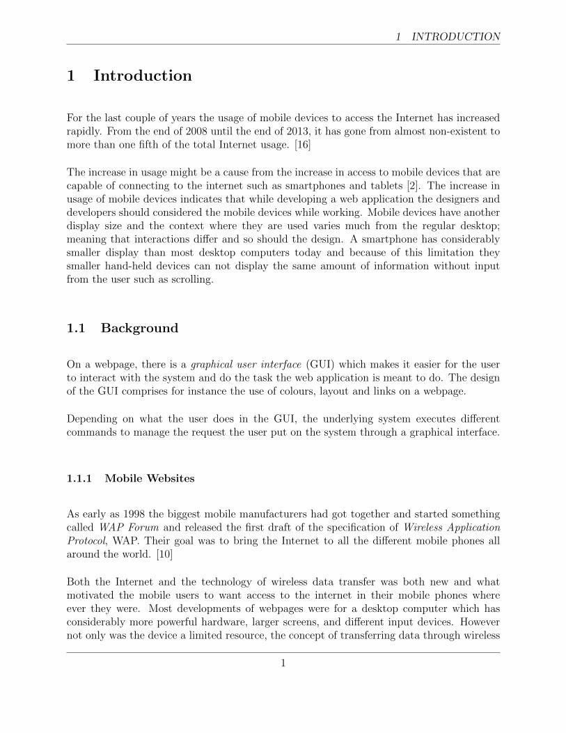
With the increase of mobile device usage, websites that are not built or can adapt to asmaller screen will be a moment of frustration where the user will have to zoom in and outto be able to both get an overview and to read the content. As seen in Figure 1.1, a webpagecan be more usable on a desktop, but on a device with a smaller display there is too muchcontent displayed at once. The visitor can without problem read the content on the desktop,but the same design on the phone forces the user to zoom to be able to read the text.
Compare the two mobile versions in Figure 1.1b; the implementation does not take thesmaller screens into consideration. Viewing the site on a mobile phone as seen in Figure 1.1denables users to easily read the content directly when the site has loaded rather than firsthaving to zoom.
2
1.2 Problem description 1 INTRODUCTION
a: temaresor.se on a desktop b: temaresor.se on a mobilephone
c: fritidsresor.se on a desktop d: fritidsresor.se on a mobilephone
Figure 1.1: Two web pages on different devices. 1.1a and 1.1b shows the layoutwhen not having responsive web design implemented and 1.1c together
with 1.1d implementing it.
To make the user stay on a web page on a mobile device the webpage needs to be more userfriendly on smaller screens. There are a few ways to do this, redirect all traffic from smallerdisplays to a separate site that has been designed for smaller screens. An alternative can beto use something called responsive web design where the idea is to take the desktop versionand change the design a bit to make it look better at a mobile device, or vice versa.
However, there are various variations of support offered online today, mostly in the form ofCSS Frameworks that are an abstract implementation for styling the web with predefinedstyling options. Most of the more modern versions offers some form of responsive grid system,and some offer even more help towards succeeding in making a webpage adapt to differentsizes.
3
1 INTRODUCTION 1.3 Purpose
1.3 Purpose
There are webpages out there that recently have been developed, but do not support adapt-ation for mobile devices. With the increase of access from mobile devices the chance is highthat even these sites will have visitors from mobile devices. A mobile friendly version of thewebpage is therefore an advantage.
This thesis will look at ways to implement responsive web design; doing it manually withoutexisting defined functionality and classes versus using some CSS framework. An alreadyexisting and designed webpage without a mobile friendly version will be used as base to seewhat might be preferable to include into the project where a desktop version already existsto achieve some adaptation to different devices.
1.4 Limitations
There are many different frameworks available, and evaluation is to be made on the five mostcommon ones. The top five are selected according to a search on Google for recommendedframeworks.
Comparing the different approaches of making background images respond to differentdevices will not be included in this thesis. Not including these problem areas might resultin strange views for frames and background images on a smaller screen, for example bordersaround content areas might be cut off prematurely. The performance issues regarding imageswill be left out from this report, and no solution will be mentioned.
4
2 TECHNICAL BACKGROUND
2 Technical background
To make a web page adapt to a mobile device, some knowledge about certain areas withinwebpage development is necessary.
2.1 Web development tools
When developing a web application, the actual page the user sees when visiting the pagein a web browser consists of mainly three parts; the structure, the design and the specialinteraction.
2.1.1 HTML
Hypertext markup language (HTML) is the structure of a web page. This markup is read andparsed by the web browser to render a document object model (DOM). The DOM representsthe web page and contains all the elements from the markup.
The elements can be, for example, a table, a section, or an image. Anything that existson the site, the content and the design, is an element in the DOM and can from there beaccessed by other parts to style and interact with it.
The structure in itself has only a very basic design to it, so that it is visible on the web at all.The browser will place the image where the inserted codes placement in the HTML file, andif there is text around it, the text will be placed above and below the image. No text willappear at the sides if the image is small, or have a low resolution, and adding a horizontalscroll if the image is large.
In Listing 2.1 there are a few different HTML-tags. There are many of these available, andthat is what makes up a web page structure. In this example, there are three tags to showthe user; a heading of type 1 saying Title, then a paragraph with the text Lorem ipsum is asilly dummy text and last an image, with the source name, car.jpg.
1 <html>2 <head>3 <title>My page</title>4 </head>5 <body>6 <h1>Title</h1>
5
2 TECHNICAL BACKGROUND 2.1 Web development tools
7 <p>Lorem ipsum is a silly dummy text.</p>8 <img src="car.jpg" />9 </body>
10 </html>
Listing 2.1: Simple HTML example
The tags inside body are displayed in the webbrowser, while head is the information aboutthe page, called metadata. The title-tag in head is the title of the page and will be displayedin the browser toolbar, favourites and search-engines.
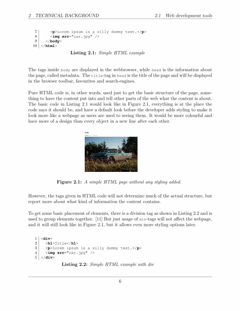
Pure HTML code is, in other words, used just to get the basic structure of the page, some-thing to have the content put into and tell other parts of the web what the content is about.The basic code in Listing 2.1 would look like in Figure 2.1, everything is at the place thecode says it should be, and have a default look before the developer adds styling to make itlook more like a webpage as users are used to seeing them. It would be more colourful andhave more of a design than every object in a new line after each other.
Figure 2.1: A simple HTML page without any styling added.
However, the tags given in HTML code will not determine much of the actual structure, butreport more about what kind of information the content contains.
To get some basic placement of elements, there is a division tag as shown in Listing 2.2 and isused to group elements together. [11] But just usage of div-tags will not affect the webpage,and it will still look like in Figure 2.1, but it allows even more styling options later.
1 <div>2 <h1>Title</h1>3 <p>Lorem ipsum is a silly dummy text.</p>4 <img src="car.jpg" />5 </div>
Listing 2.2: Simple HTML example with div
6
2.1 Web development tools 2 TECHNICAL BACKGROUND
2.1.2 CSS
When there is a DOM based on the structure, it is time for some styling and giving the webpage a bit colouring and more personalised design. When styling with cascading style sheets(CSS), the most commonly used attributes are the colour, size, and position. But even moreadvanced things are possible with CSS such as selecting odd/even objects in list and tables,adding shadows and change object when the pointer is held over it.
To get more than the default design on a page, some styling has to be added. There arethree different ways to add design with CSS to an HTML-page; inline, internal, or external,or a combination of the three.
To give short examples of the three ways to add style to objects, let’s say that all paragraphson the page should be blue. First way to do this is to tell the object directly in the HTML-code that the colour should be blue, this is called inline CSS. Listing 2.3 displays an examplewhere the style color:blue has been added to the paragraph tag.
1 <p style="color:blue;">Lorem ipsum is a silly dummy text.</p>
Listing 2.3: Simple inline CSS example
Adding the attribute style to any object makes it possible to write styling rules directly onthe object. Adding style this way will only affect that particular object, so in the examplefrom Listing 2.1 this will be enough, but if another paragraph-tag is added the style needsto be added to that tag too.
To apply the same styling on all elements of a specific type, internal CSS can be used. Asshown in Listing 2.4 the styling code is moved to the head-tag, and the styling, therefore,applies to all paragraph-tags on the page.
1 <head>2 <style>3 p {4 color:blue;5 }6 </style>7 </head>89 <body>
10 <p>Lorem ipsum is a silly dummy text.</p>11 </body>
Listing 2.4: Simple internal CSS example
7
2 TECHNICAL BACKGROUND 2.1 Web development tools
Just as the inline CSS code is just for that specific element, the internal CSS is only for thatspecific file. To change all paragraph text colour to green, all files must be edited whereparagraphs exists for all the colours to change. Internal and inline CSS makes it harder tochange the design after the initial coding is done, the repetition of code makes it easy tomiss one place or file and then the object at that location will still have the old style.
To avoid this problem the CSS code can be moved to a separate file, a CSS file, and impor-ted into the HTML files. This is called external CSS and an example of this is shown inListing 2.5 with one HTML file and one CSS file.
1 <head>2 <link rel="stylesheet" type="text/css" href="main.css">3 </head>45 <body>6 <p class="big">Lorem ipsum is a silly dummy text.</p>7 </body>
1 p {2 color:blue;3 }45 .big {6 font-size: 125%;7 }
Listing 2.5: Simple external CSS example - HTML and CSS file
When moving the style out from the object into internal or external styling, it is possibleto use the attributes id and class, which are ways to identify different objects. The id
attribute must be unique on that page or they will render and cause an error and somestyling or functionality might not work. The class attribute can be same on multipleobjects, and one object may have multiple values. Both classes and ids can be used to addadditional styling, and an example of that is shown in Listing 2.5 with the paragraph havingthe class big and the CSS files says to change the font size to 125%.
The dot (.) before the word big in the CSS file indicates that it is a class, while an hashtag(#) would mean an id. This kind of syntax can be used in the internal and external CSS,but not the inline CSS where the styling is on the specific object and not in a larger context.
If all three of these ways are used, the external works as a more global definition while inlineis the most detailed orientated style. In Listing 2.6 the paragraph would have the colourred, but still be using the class big. This is because the external CSS tells the browser thetext should be bigger and blue, but then the internal CSS overrides the colour to green, andlast the inline overrides the internal and says it should be red.
8
2.1 Web development tools 2 TECHNICAL BACKGROUND
1 <head>2 <link rel="stylesheet" type="text/css" href="main.css">3 <style>4 p {5 color:green;6 }7 </style>8 </head>9
10 <body>11 <p class="big" style="color:red;">Lorem ipsum is a silly dummy
text.</p>12 </body>
1 p {2 color:blue;3 }45 .big {6 font-size: 125%;7 }
Listing 2.6: CSS example with inline internal and external CSS
This overriding system can be overcome by adding !important in the external or internalCSS, but is not advised since it makes it harder to customize and adds code to an otherwise,hopefully, clean code. It can be used on inline CSS too, but there is no need for that unless!important is added in the external or internal CSS. It is also important to take this intoconsideration if there is multiple imports of different CSS files, where the file that is loadedlast, or written on the last line, will override the ones read before, so a reset CSS should beloaded first and then more specific ones after, not the other way around.
2.1.3 JavaScript
As early as 1995, Brendan Eich invented LiveScript which was released with Netscape 2 in1996. It was later renamed to JavaScript (JS) to match the popular language Java, despitethe fact the two languages have little in common. [8]
JS is a dynamic script language used in web development to handle functionality on theweb page. It being a dynamic language means that there is no need to write int i = 1,it is possible to just write var i = 1 and the language understands that it is an integer.Functions can also be saved to variables which enables them to be handled as any otherobject and passed as parameters to other functions.
JavaScript can be used to catch events such as hover and click event. Each time a user click
9
2 TECHNICAL BACKGROUND 2.2 Responsive web design
on a site an event is triggered, and that event can then be caught in the JS and some codecan be executed to, for example, change some content on the page. This enables the site tohave different functionality and features that just HTML and CSS can not achieve. Thereis also a lot of different framework and plugin that can be included into projects availableto increase the functionality and options for the developer even further.
A setting that might cause problem for users is that some web-browser might have thisfeature turned off [5]. Another problem for developers is that JavaScript quickly grows insize and causes the site to have low response time and not all functionality works correctlyon a mobile device.
2.2 Responsive web design
Web browsing from small devices that are not desktop computers are quickly becomingmore common, so having a separate website for mobile phones can develop into the need fora different site for tablets, for game consoles, and any future devices used to connect to theinternet. [7]
So to avoid the problem of having to redevelop a new site each time a new device withdifferent screen size is released it is possible to use just one page, that can adapt to thedevices’ resolution automatically. This also means that when redesigning the digital profile,or changing some text, all that is needed is to update one place, instead of all different specialcases in addition to the default application meant for the desktop.
There are three main aspects that needs to be considered and implemented when creating aresponsive web: Fluid grids, fluid images, and media queries. [7]
2.2.1 Fluid Grid
Using grids with rows and columns has long been popular in web design, be it to only use aspecific width given in pixels for the page, or have multiple columns of content in the design.But using a given width of the page will make the site look good in the resolution thedeveloper uses, and sometimes, but not always, higher as well, but rarely lower resolutions.
A pixel (px), short for picture element, is a point in the image the device shows, be it a webbrowser or another application. It is not a little square but a point within the screen, usuallyconsisting of three different diodes; one for each primary colour in computer graphics, red,green and blue. [15]
10
2.2 Responsive web design 2 TECHNICAL BACKGROUND
Different devices, and even identical devices, have varied resolution, or amount of pixelsshown on the screen. A computer today can have a width of over 1200px, while a phonecan be as small as 320px. Creating a design that works on all these different resolution isproblematic. To get around this problem, it is possible to design with the use of percentageinstead. So instead of saying width: 960px in the CSS code, it is possible to write width:
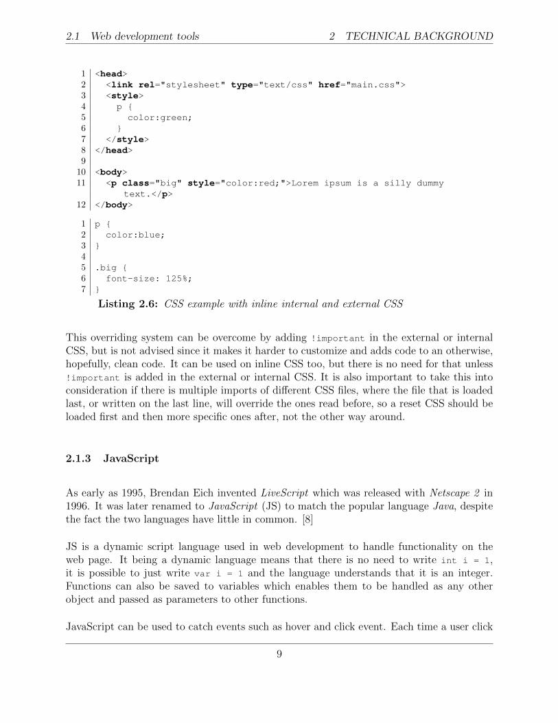
80% and on a 1200px wide screen it will display as original, but on smaller it will scale andstill work without an horizontal scrollbar.[7]
This thinking can be used in other areas too not only the main container in proportion tothe screen size but also child-elements in proportion to their parent. If the primary containershould consist of two columns as in Figure 2.2, it is possible to calculate the width of thetwo columns in the same way. The difference is that instead of using the screen width aspreviously, the width of the container is used.
Figure 2.2: A simple two column design in a centred main container. This is acommon layout on the web with content and then a menu on the side.
To achieve this, the structure could look something similar to the example in Listing 2.7. Itis easy to see in the code that the main container is in the context of the screen, or window,while the two column is encapsulated by the main block.
1 <div class="main">2 <div class="left-column">3 Column 14 </div>5 <div class="right-column">6 Column 27 </div>8 </div>
Listing 2.7: Basic structure to get two columns
To get even these columns use percentage and not fixed pixel width lets use the same thinkingas for the main container, but with another context. Instead of the screen resolution thecontainer they reside in has to be used, which in this case would be the main block. In the
11
2 TECHNICAL BACKGROUND 2.2 Responsive web design
responsive version this has the width 80% which is hard to use to calculate a new percentagefrom, so the pixel width has to be used here, 960px. Lets assume the left column is 240pxwide in the design mock-up, which put into the formula Equation 2.1 [7] results in thecalculation of 240/960, which calculates to 25%, so the width expressed in percentage iswidth: 25%.
target
context= result (2.1)
Equation 2.1 can be used to convert everything that is given in pixels in the code to per-centage instead to make the page more adaptive.
2.2.2 Fluid Images
Images have the same properties as grids where it is preferable to use percentages insteadof fixed pixel values to make them adaptive to different resolutions. To scale an imagethe proportion needs to be taken into consideration, otherwise the image will be perceivedstretch either horizontally or vertically. This is not something new for responsive images,but already exists when using pixels as well.
On the other hand, if no scaling takes place a picture will be shown in the size it is saved,which might take over the whole page if it is a high resolution image. To solve this, fluidimages builds on having a container with a size (given in percentage to get the responsiveaspect of it) and giving the image max-width: 100%.
The attribute max-width gives the object the width of the context if the object has a higherresolution than the context, otherwise it keeps the original size of the object. It is possibleto use width, without the max keyword, but that will force lower resolution images to scaleup to the specified width and might cause pixels-squares to show. [7]
2.2.3 Media Queries
Even when using fluid grid and images the web page might not appear appropriate in bothsmall screens and large ones, for example when viewing the page on a small screen an imagecan be too small, the surrounding space too large, or the images are too close to each other.On higher resolutions the max-width is rarely achieved and images does not always fill thecontainer they are expected to do.
12
2.2 Responsive web design 2 TECHNICAL BACKGROUND
One solution to this would be to give different size on objects depending on the size of theavailable view for the page. This can be achieved since CSS3 where it is possible to havespecific CSS code for different widths and heights. [7]
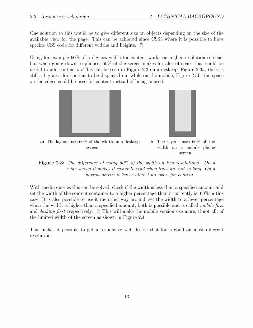
Using for example 60% of a devices width for content works on higher resolution screens,but when going down to phones, 60% of the screen makes for alot of space that could beuseful to add content on.This can be seen in Figure 2.3 on a desktop, Figure 2.3a, there isstill a big area for content to be displayed on, while on the mobile, Figure 2.3b, the spaceon the edges could be used for content instead of being unused.
a: The layout uses 60% of the width on a desktopscreen
b: The layout uses 60% of thewidth on a mobile phone
screen
Figure 2.3: The difference of using 60% of the width on two resolutions. On awide screen it makes it easier to read when lines are not so long. On a
narrow screen it leaves almost no space for content.
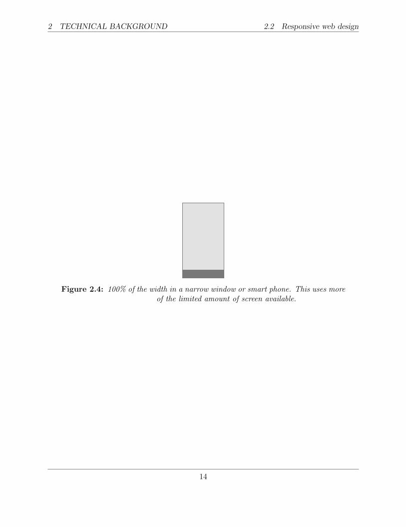
With media queries this can be solved, check if the width is less than a specified amount andset the width of the content container to a higher percentage than it currently is, 60% in thiscase. It is also possible to use it the other way around, set the width to a lower percentagewhen the width is higher than a specified amount, both is possible and is called mobile firstand desktop first respectively. [7] This will make the mobile version use more, if not all, ofthe limited width of the screen as shown in Figure 2.4
This makes it possible to get a responsive web design that looks good on most differentresolution.
13
2 TECHNICAL BACKGROUND 2.2 Responsive web design
Figure 2.4: 100% of the width in a narrow window or smart phone. This uses moreof the limited amount of screen available.
14
3 METHOD
3 Method
To find the most practical way to make an existing webpage respond to different devices thefirst thing that need to be done is find different methods to achieve this. Then these wayshave to be tested which will be done by implementing them on a test page and evaluationwill be done on them.
3.1 How to implement responsive web design
There are multiple ways to implement responsive web design on a webpage available on-line today. The most common way when starting from scratch is to use something calledframework, which will be explained in Section 3.1.2: CSS frameworks. Another alternativeto achieve responsive web is that the developer can write his or her own CSS following theguidelines mentioned in Section 2.2: Responsive web design.
3.1.1 Manual
By following the base for responsive web design given in Section 2.2: Responsive web designit is possible to implement responsive web design without having to depend on someone else.
The most basic thing to remember is to give all size and distances in percentage instead offixed values, and using the formula mentioned in Equation 2.1 to transform fixed values todynamic.
3.1.2 CSS frameworks
A framework is an abstract version of an implementation, used to assist the developers duringimplementation [12]. A CSS framework usually has pre-defined classes that can be used inthe HTML code, and there are lots of different CSS frameworks available on the Internet.
The different frameworks have different functionality, but most more modern versions havesupport for responsive web design.
A given width of 960px was widely used for web pages during the earlier dyays of the web,this was because this number is divisible with most relevant numbers and makes it a flexible
15
3 METHOD 3.1 How to implement responsive web design
number to work with. With most devices used for browsing the web having a resolution of atleast 1024 x 768px made the number even more relevant since it made for a nice amount ofthe width to be occupied by content. 960 Grid System was launched back in 2008 and madeit possible for designers and developers to work easier with each other when the frameworkgave tools to work with for both. [6]
But after the increase of mobile device usage for accessing the internet the use of a fixedwidth of 960px was no longer acceptable when more users visited through a device with ascreen width less than 1024px. Frameworks supporting responsive design was released oneafter another and many was based on the 960 grid system of old, but with percentage insteadof pixel sizes.
The following ones are the ones that, when searching for list of frameworks, appears in themost amount of lists on the first pages of a search on Google.
3.1.2.1 Bootstrap
Bootstrap is one of the largest CSS frameworks available online, it was originally createdby employees at Twitter in 2010 and is today open source hosted on the code sharing andversion handling service GitHub, where it is the most popular project [3].
Responsive web design has been included since version 2 and was then optional from itsrelease during the later half of 2011 until the latest release, version 3. With the release ofversion 3 in December 2013 it became default with a mobile first approach.
Founder Mark Otto sat together with designer and fellow developer Jacob Thornton toimprove the ability to have consistency in design and functionality across the different websiteat Twitter and lessen the difficulties of maintenance on the site [9]. Bootstrap is thereforenot just a framework with a responsive grid system, but offers all sort of functionality andstyling options. It has both CSS and JavaScript code that can be included into a project tohelp with for example pop ups, menus and slide shows.
With over 66,000 stars and 24,000 forks on GitHub and around 24,000 questions on Stack-overflow as an indication, one can say that the community is both active and eager to helpcome up with solutions to problems others have.
Used by, among others, Twitter and Codecademy.
16
3.1 How to implement responsive web design 3 METHOD
3.1.2.2 Foundation
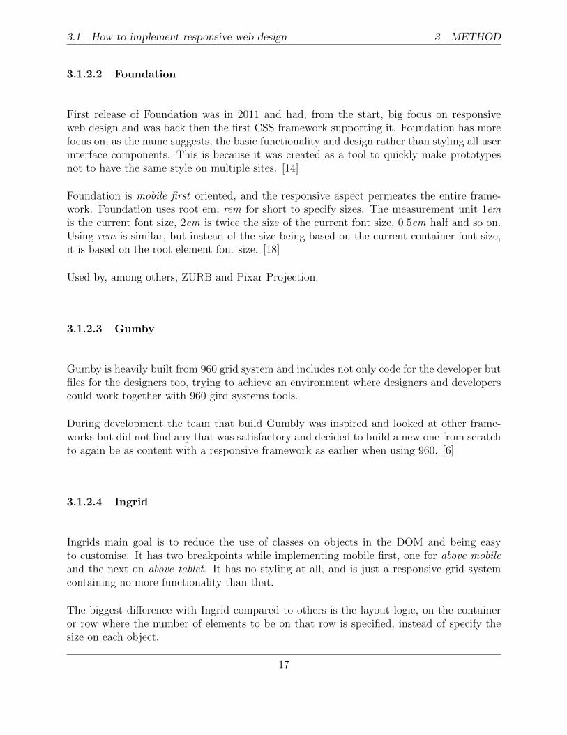
First release of Foundation was in 2011 and had, from the start, big focus on responsiveweb design and was back then the first CSS framework supporting it. Foundation has morefocus on, as the name suggests, the basic functionality and design rather than styling all userinterface components. This is because it was created as a tool to quickly make prototypesnot to have the same style on multiple sites. [14]
Foundation is mobile first oriented, and the responsive aspect permeates the entire frame-work. Foundation uses root em, rem for short to specify sizes. The measurement unit 1emis the current font size, 2em is twice the size of the current font size, 0.5em half and so on.Using rem is similar, but instead of the size being based on the current container font size,it is based on the root element font size. [18]
Used by, among others, ZURB and Pixar Projection.
3.1.2.3 Gumby
Gumby is heavily built from 960 grid system and includes not only code for the developer butfiles for the designers too, trying to achieve an environment where designers and developerscould work together with 960 gird systems tools.
During development the team that build Gumbly was inspired and looked at other frame-works but did not find any that was satisfactory and decided to build a new one from scratchto again be as content with a responsive framework as earlier when using 960. [6]
3.1.2.4 Ingrid
Ingrids main goal is to reduce the use of classes on objects in the DOM and being easyto customise. It has two breakpoints while implementing mobile first, one for above mobileand the next on above tablet. It has no styling at all, and is just a responsive grid systemcontaining no more functionality than that.
The biggest difference with Ingrid compared to others is the layout logic, on the containeror row where the number of elements to be on that row is specified, instead of specify thesize on each object.
17
3 METHOD 3.2 Implementing the testpage
3.1.2.5 Skeleton
Skeleton focuses more on the layout than on the user interface other frameworks does, Skel-eton has only some basic styling on components and lets the developers to implement thedesign themselves. The structure is based on the 960 grid system and has tried to minimizethe amount of lines in the code to keep it simple.
3.2 Implementing the testpage
To evaluate and compare the different ways mentioned in Section 3.1: How to implementresponsive web design they will be implemented on a webpage that is not made to adapt todifferent devices.
After getting some alternatives to implement responsive web design it is time to try themout. This will be done by having a non-responsive webpage as base, and then implement thedifferent ways and evaluate pros and cons with the different options.
When the different versions have been implemented they will mainly be tested on OSX 10,with Chrome 34 and to see the mobile versions the emulation in Chrome will be used, aswell as resizing the desktop window.
The page will also be checked in Internet Explorer 11 on Windows 8.1 and Firefox on OSX10, but there will not be any special fixes to make it work in all browsers.
18
4 PROTOTYPES
4 Prototypes
To find the most practical way to make an existing web page respond to different devices thefirst thing that needs to be done is find different methods to achieve this. Then these wayshave to be tested which will be done by implementing them on a test page and evaluationwill be done on them.
4.1 Base page
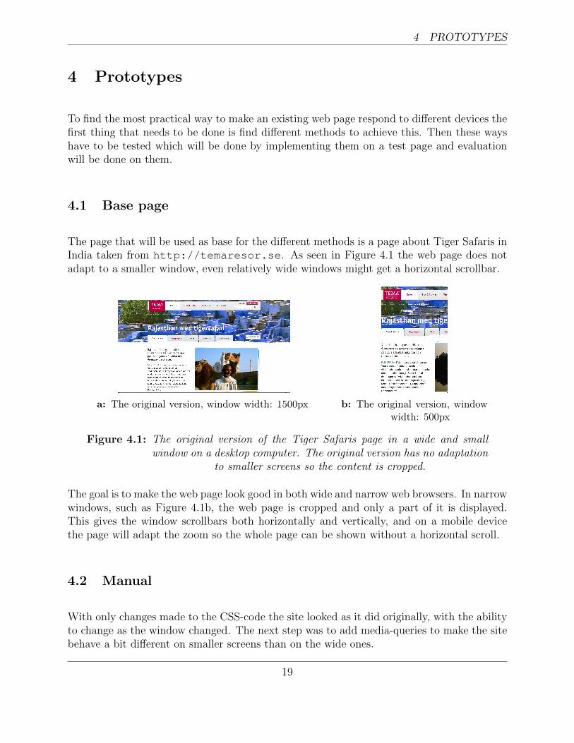
The page that will be used as base for the different methods is a page about Tiger Safaris inIndia taken from http://temaresor.se. As seen in Figure 4.1 the web page does notadapt to a smaller window, even relatively wide windows might get a horizontal scrollbar.
a: The original version, window width: 1500px b: The original version, windowwidth: 500px
Figure 4.1: The original version of the Tiger Safaris page in a wide and smallwindow on a desktop computer. The original version has no adaptation
to smaller screens so the content is cropped.
The goal is to make the web page look good in both wide and narrow web browsers. In narrowwindows, such as Figure 4.1b, the web page is cropped and only a part of it is displayed.This gives the window scrollbars both horizontally and vertically, and on a mobile devicethe page will adapt the zoom so the whole page can be shown without a horizontal scroll.
4.2 Manual
With only changes made to the CSS-code the site looked as it did originally, with the abilityto change as the window changed. The next step was to add media-queries to make the sitebehave a bit different on smaller screens than on the wide ones.
19
4 PROTOTYPES 4.2 Manual
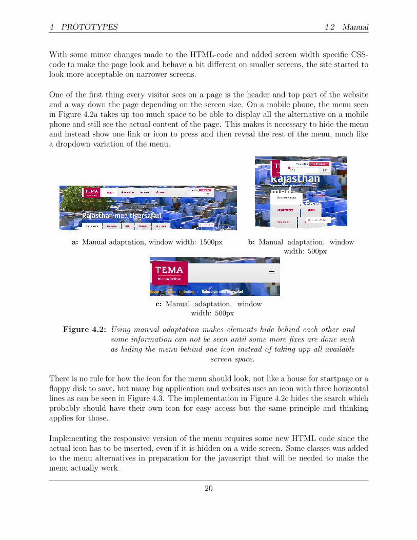
With some minor changes made to the HTML-code and added screen width specific CSS-code to make the page look and behave a bit different on smaller screens, the site started tolook more acceptable on narrower screens.
One of the first thing every visitor sees on a page is the header and top part of the websiteand a way down the page depending on the screen size. On a mobile phone, the menu seenin Figure 4.2a takes up too much space to be able to display all the alternative on a mobilephone and still see the actual content of the page. This makes it necessary to hide the menuand instead show one link or icon to press and then reveal the rest of the menu, much likea dropdown variation of the menu.
a: Manual adaptation, window width: 1500px b: Manual adaptation, windowwidth: 500px
c: Manual adaptation, windowwidth: 500px
Figure 4.2: Using manual adaptation makes elements hide behind each other andsome information can not be seen until some more fixes are done suchas hiding the menu behind one icon instead of taking upp all available
screen space.
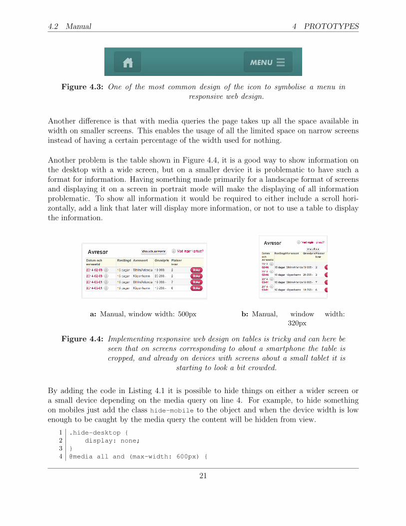
There is no rule for how the icon for the menu should look, not like a house for startpage or afloppy disk to save, but many big application and websites uses an icon with three horizontallines as can be seen in Figure 4.3. The implementation in Figure 4.2c hides the search whichprobably should have their own icon for easy access but the same principle and thinkingapplies for those.
Implementing the responsive version of the menu requires some new HTML code since theactual icon has to be inserted, even if it is hidden on a wide screen. Some classes was addedto the menu alternatives in preparation for the javascript that will be needed to make themenu actually work.
20
4.2 Manual 4 PROTOTYPES
Figure 4.3: One of the most common design of the icon to symbolise a menu inresponsive web design.
Another difference is that with media queries the page takes up all the space available inwidth on smaller screens. This enables the usage of all the limited space on narrow screensinstead of having a certain percentage of the width used for nothing.
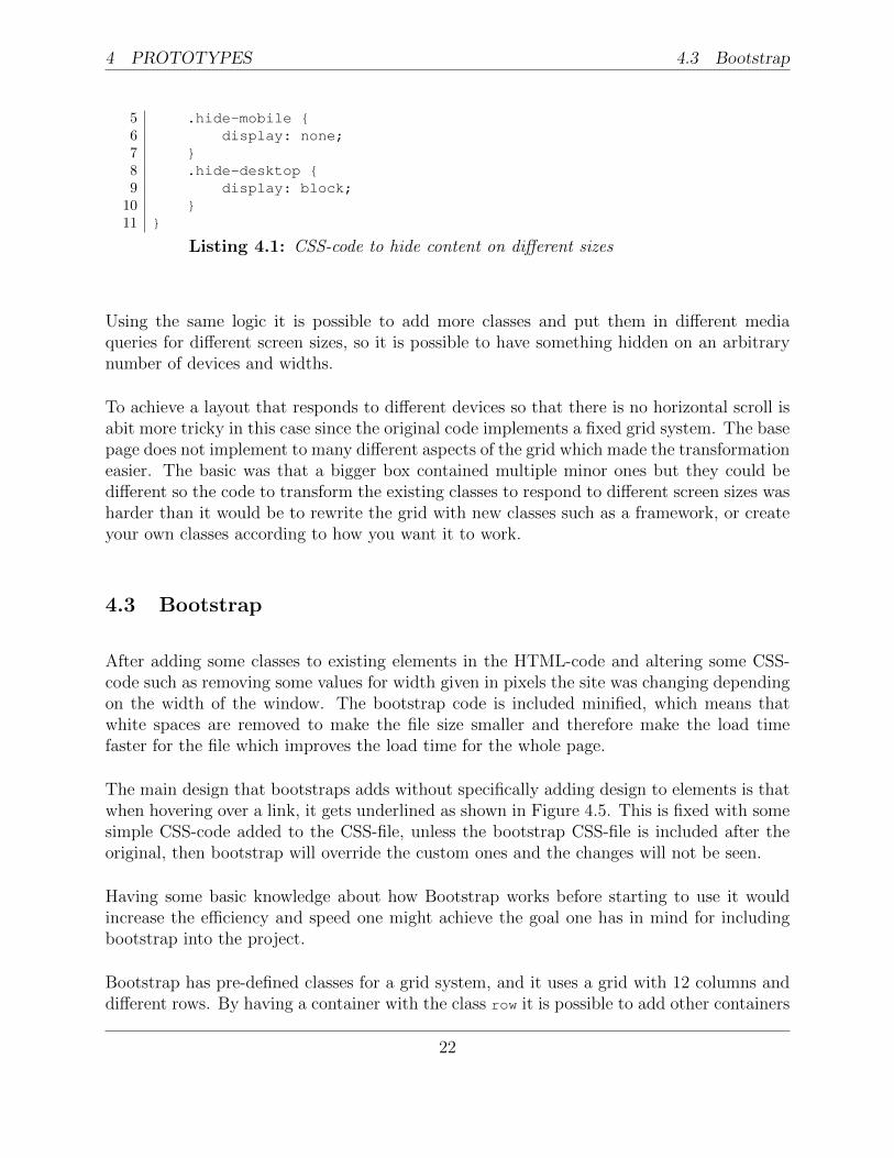
Another problem is the table shown in Figure 4.4, it is a good way to show information onthe desktop with a wide screen, but on a smaller device it is problematic to have such aformat for information. Having something made primarily for a landscape format of screensand displaying it on a screen in portrait mode will make the displaying of all informationproblematic. To show all information it would be required to either include a scroll hori-zontally, add a link that later will display more information, or not to use a table to displaythe information.
a: Manual, window width: 500px b: Manual, window width:320px
Figure 4.4: Implementing responsive web design on tables is tricky and can here beseen that on screens corresponding to about a smartphone the table iscropped, and already on devices with screens about a small tablet it is
starting to look a bit crowded.
By adding the code in Listing 4.1 it is possible to hide things on either a wider screen ora small device depending on the media query on line 4. For example, to hide somethingon mobiles just add the class hide-mobile to the object and when the device width is lowenough to be caught by the media query the content will be hidden from view.
1 .hide-desktop {2 display: none;3 }4 @media all and (max-width: 600px) {
21
4 PROTOTYPES 4.3 Bootstrap
5 .hide-mobile {6 display: none;7 }8 .hide-desktop {9 display: block;
10 }11 }
Listing 4.1: CSS-code to hide content on different sizes
Using the same logic it is possible to add more classes and put them in different mediaqueries for different screen sizes, so it is possible to have something hidden on an arbitrarynumber of devices and widths.
To achieve a layout that responds to different devices so that there is no horizontal scroll isabit more tricky in this case since the original code implements a fixed grid system. The basepage does not implement to many different aspects of the grid which made the transformationeasier. The basic was that a bigger box contained multiple minor ones but they could bedifferent so the code to transform the existing classes to respond to different screen sizes washarder than it would be to rewrite the grid with new classes such as a framework, or createyour own classes according to how you want it to work.
4.3 Bootstrap
After adding some classes to existing elements in the HTML-code and altering some CSS-code such as removing some values for width given in pixels the site was changing dependingon the width of the window. The bootstrap code is included minified, which means thatwhite spaces are removed to make the file size smaller and therefore make the load timefaster for the file which improves the load time for the whole page.
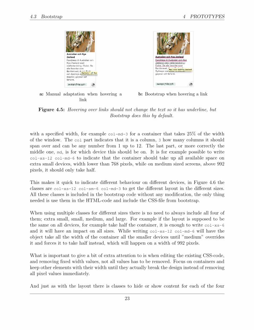
The main design that bootstraps adds without specifically adding design to elements is thatwhen hovering over a link, it gets underlined as shown in Figure 4.5. This is fixed with somesimple CSS-code added to the CSS-file, unless the bootstrap CSS-file is included after theoriginal, then bootstrap will override the custom ones and the changes will not be seen.
Having some basic knowledge about how Bootstrap works before starting to use it wouldincrease the efficiency and speed one might achieve the goal one has in mind for includingbootstrap into the project.
Bootstrap has pre-defined classes for a grid system, and it uses a grid with 12 columns anddifferent rows. By having a container with the class row it is possible to add other containers
22
4.3 Bootstrap 4 PROTOTYPES
a: Manual adaptation when hovering alink
b: Bootstrap when hovering a link
Figure 4.5: Hovering over links should not change the text so it has underline, butBootstrap does this by default.
with a specified width, for example col-md-3 for a container that takes 25% of the widthof the window. The col part indicates that it is a column, 3 how many columns it shouldspan over and can be any number from 1 up to 12. The last part, or more correctly themiddle one, md, is for which device this should be on. It is for example possible to writecol-xs-12 col-md-6 to indicate that the container should take up all available space onextra small devices, width lower than 768 pixels, while on medium sized screens, above 992pixels, it should only take half.
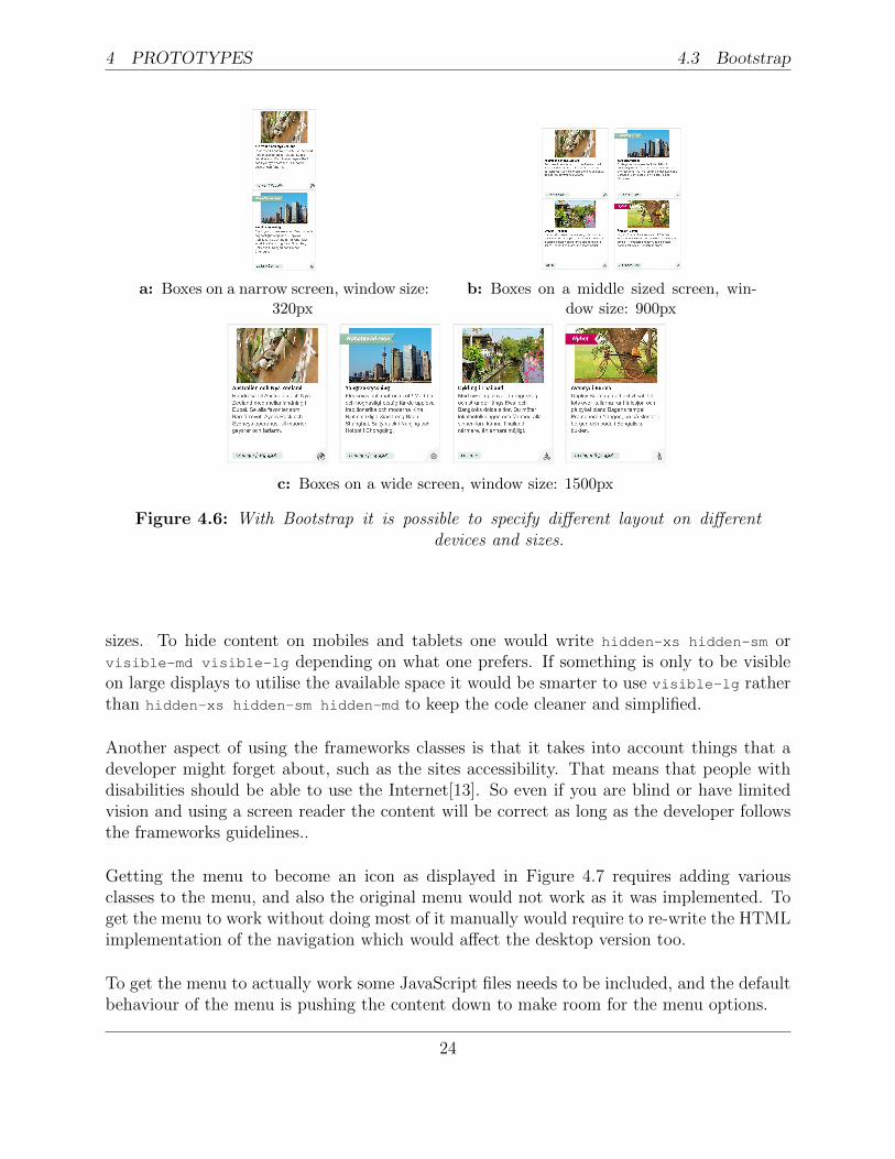
This makes it quick to indicate different behaviour on different devices, in Figure 4.6 theclasses are col-xs-12 col-sm-6 col-md-3 to get the different layout in the different sizes.All these classes is included in the bootstrap code without any modification, the only thingneeded is use them in the HTML-code and include the CSS-file from bootstrap.
When using multiple classes for different sizes there is no need to always include all four ofthem; extra small, small, medium, and large. For example if the layout is supposed to bethe same on all devices, for example take half the container, it is enough to write col-xs-6
and it will have an impact on all sizes. While writing col-xs-12 col-md-6 will have theobject take all the width of the container all the smaller devices until ”medium” overridesit and forces it to take half instead, which will happen on a width of 992 pixels.
What is important to give a bit of extra attention to is when editing the existing CSS-code,and removing fixed width values, not all values has to be removed. Focus on containers andkeep other elements with their width until they actually break the design instead of removingall pixel values immediately.
And just as with the layout there is classes to hide or show content for each of the four
23
4 PROTOTYPES 4.3 Bootstrap
a: Boxes on a narrow screen, window size:320px
b: Boxes on a middle sized screen, win-dow size: 900px
c: Boxes on a wide screen, window size: 1500px
Figure 4.6: With Bootstrap it is possible to specify different layout on differentdevices and sizes.
sizes. To hide content on mobiles and tablets one would write hidden-xs hidden-sm orvisible-md visible-lg depending on what one prefers. If something is only to be visibleon large displays to utilise the available space it would be smarter to use visible-lg ratherthan hidden-xs hidden-sm hidden-md to keep the code cleaner and simplified.
Another aspect of using the frameworks classes is that it takes into account things that adeveloper might forget about, such as the sites accessibility. That means that people withdisabilities should be able to use the Internet[13]. So even if you are blind or have limitedvision and using a screen reader the content will be correct as long as the developer followsthe frameworks guidelines..
Getting the menu to become an icon as displayed in Figure 4.7 requires adding variousclasses to the menu, and also the original menu would not work as it was implemented. Toget the menu to work without doing most of it manually would require to re-write the HTMLimplementation of the navigation which would affect the desktop version too.
To get the menu to actually work some JavaScript files needs to be included, and the defaultbehaviour of the menu is pushing the content down to make room for the menu options.
24
4.4 Foundation 4 PROTOTYPES
Figure 4.7: Hiding the menu behind an icon with bootstrap.
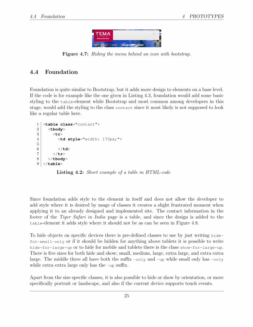
4.4 Foundation
Foundation is quite similar to Bootstrap, but it adds more design to elements on a base level.If the code is for example like the one given in Listing 4.3, foundation would add some basicstyling to the table-element while Bootstrap and most common among developers in thisstage, would add the styling to the class contact since it most likely is not supposed to looklike a regular table here.
1 <table class="contact">2 <tbody>3 <tr>4 <td style="width: 170px;">56 </td>7 </tr>8 </tbody>9 </table>
Listing 4.2: Short example of a table in HTML-code
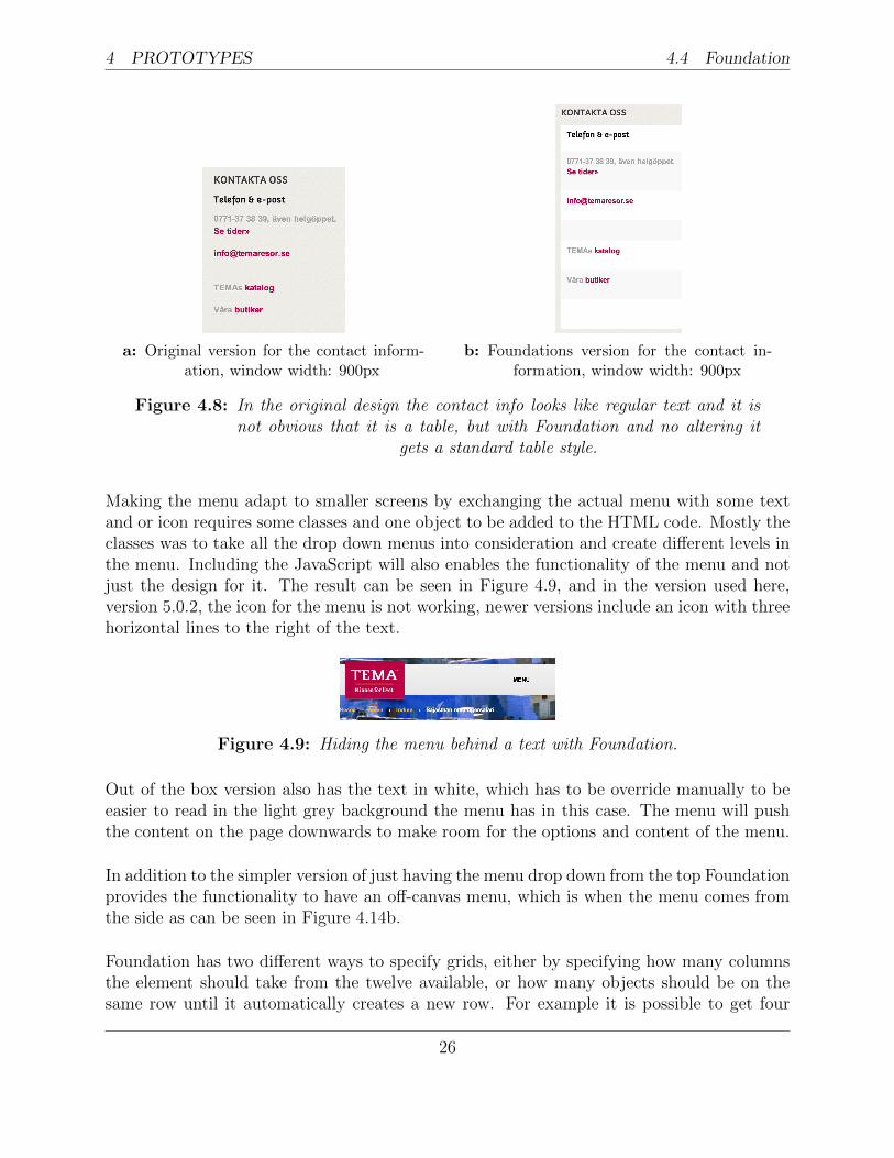
Since foundation adds style to the element in itself and does not allow the developer toadd style where it is desired by usage of classes it creates a slight frustrated moment whenapplying it to an already designed and implemented site. The contact information in thefooter of the Tiger Safari in India page is a table, and since the design is added to thetable-element it adds style where it should not be as can be seen in Figure 4.8.
To hide objects on specific devices there is pre-defined classes to use by just writing hide-
for-small-only or if it should be hidden for anything above tablets it is possible to writehide-for-large-up or to hide for mobile and tablets there is the class show-for-large-up.There is five sizes for both hide and show; small, medium, large, extra large, and extra extralarge. The middle three all have both the suffix -only and -up while small only has -only
while extra extra large only has the -up suffix.
Apart from the size specific classes, it is also possible to hide or show by orientation, or morespecifically portrait or landscape, and also if the current device supports touch events.
25
4 PROTOTYPES 4.4 Foundation
a: Original version for the contact inform-ation, window width: 900px
b: Foundations version for the contact in-formation, window width: 900px
Figure 4.8: In the original design the contact info looks like regular text and it isnot obvious that it is a table, but with Foundation and no altering it
gets a standard table style.
Making the menu adapt to smaller screens by exchanging the actual menu with some textand or icon requires some classes and one object to be added to the HTML code. Mostly theclasses was to take all the drop down menus into consideration and create different levels inthe menu. Including the JavaScript will also enables the functionality of the menu and notjust the design for it. The result can be seen in Figure 4.9, and in the version used here,version 5.0.2, the icon for the menu is not working, newer versions include an icon with threehorizontal lines to the right of the text.
Figure 4.9: Hiding the menu behind a text with Foundation.
Out of the box version also has the text in white, which has to be override manually to beeasier to read in the light grey background the menu has in this case. The menu will pushthe content on the page downwards to make room for the options and content of the menu.
In addition to the simpler version of just having the menu drop down from the top Foundationprovides the functionality to have an off-canvas menu, which is when the menu comes fromthe side as can be seen in Figure 4.14b.
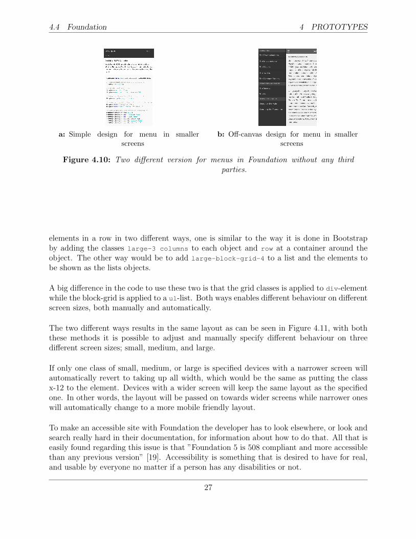
Foundation has two different ways to specify grids, either by specifying how many columnsthe element should take from the twelve available, or how many objects should be on thesame row until it automatically creates a new row. For example it is possible to get four
26
4.4 Foundation 4 PROTOTYPES
a: Simple design for menu in smallerscreens
b: Off-canvas design for menu in smallerscreens
Figure 4.10: Two different version for menus in Foundation without any thirdparties.
elements in a row in two different ways, one is similar to the way it is done in Bootstrapby adding the classes large-3 columns to each object and row at a container around theobject. The other way would be to add large-block-grid-4 to a list and the elements tobe shown as the lists objects.
A big difference in the code to use these two is that the grid classes is applied to div-elementwhile the block-grid is applied to a ul-list. Both ways enables different behaviour on differentscreen sizes, both manually and automatically.
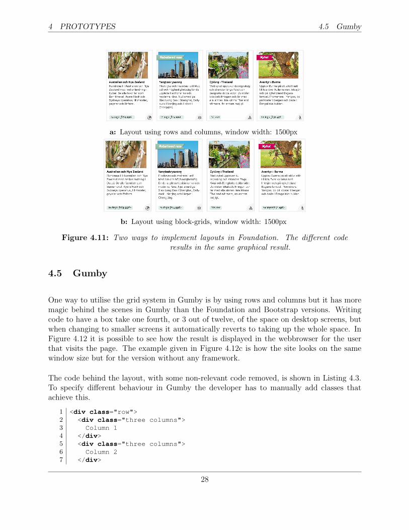
The two different ways results in the same layout as can be seen in Figure 4.11, with boththese methods it is possible to adjust and manually specify different behaviour on threedifferent screen sizes; small, medium, and large.
If only one class of small, medium, or large is specified devices with a narrower screen willautomatically revert to taking up all width, which would be the same as putting the classx-12 to the element. Devices with a wider screen will keep the same layout as the specifiedone. In other words, the layout will be passed on towards wider screens while narrower oneswill automatically change to a more mobile friendly layout.
To make an accessible site with Foundation the developer has to look elsewhere, or look andsearch really hard in their documentation, for information about how to do that. All that iseasily found regarding this issue is that ”Foundation 5 is 508 compliant and more accessiblethan any previous version” [19]. Accessibility is something that is desired to have for real,and usable by everyone no matter if a person has any disabilities or not.
27
4 PROTOTYPES 4.5 Gumby
a: Layout using rows and columns, window width: 1500px
b: Layout using block-grids, window width: 1500px
Figure 4.11: Two ways to implement layouts in Foundation. The different coderesults in the same graphical result.
4.5 Gumby
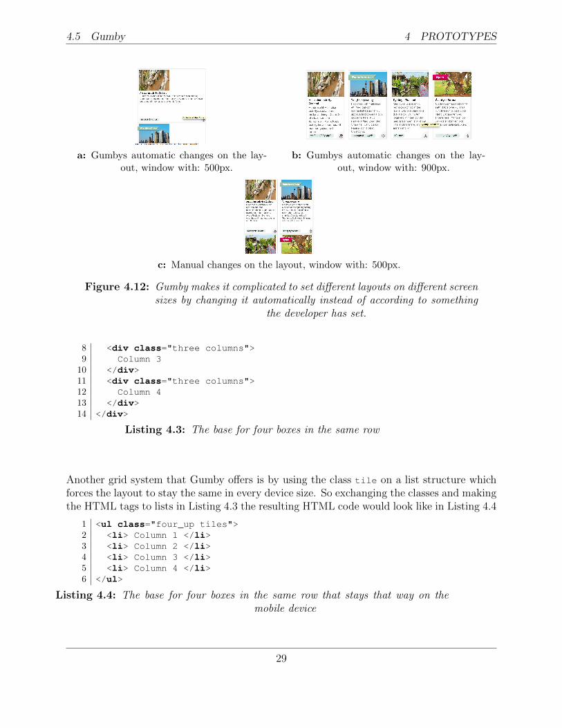
One way to utilise the grid system in Gumby is by using rows and columns but it has moremagic behind the scenes in Gumby than the Foundation and Bootstrap versions. Writingcode to have a box take one fourth, or 3 out of twelve, of the space on desktop screens, butwhen changing to smaller screens it automatically reverts to taking up the whole space. InFigure 4.12 it is possible to see how the result is displayed in the webbrowser for the userthat visits the page. The example given in Figure 4.12c is how the site looks on the samewindow size but for the version without any framework.
The code behind the layout, with some non-relevant code removed, is shown in Listing 4.3.To specify different behaviour in Gumby the developer has to manually add classes thatachieve this.
1 <div class="row">2 <div class="three columns">3 Column 14 </div>5 <div class="three columns">6 Column 27 </div>
28
4.5 Gumby 4 PROTOTYPES
a: Gumbys automatic changes on the lay-out, window with: 500px.
b: Gumbys automatic changes on the lay-out, window with: 900px.
c: Manual changes on the layout, window with: 500px.
Figure 4.12: Gumby makes it complicated to set different layouts on different screensizes by changing it automatically instead of according to something
the developer has set.
8 <div class="three columns">9 Column 3
10 </div>11 <div class="three columns">12 Column 413 </div>14 </div>
Listing 4.3: The base for four boxes in the same row
Another grid system that Gumby offers is by using the class tile on a list structure whichforces the layout to stay the same in every device size. So exchanging the classes and makingthe HTML tags to lists in Listing 4.3 the resulting HTML code would look like in Listing 4.4
1 <ul class="four_up tiles">2 <li> Column 1 </li>3 <li> Column 2 </li>4 <li> Column 3 </li>5 <li> Column 4 </li>6 </ul>
Listing 4.4: The base for four boxes in the same row that stays that way on themobile device
29
4 PROTOTYPES 4.5 Gumby
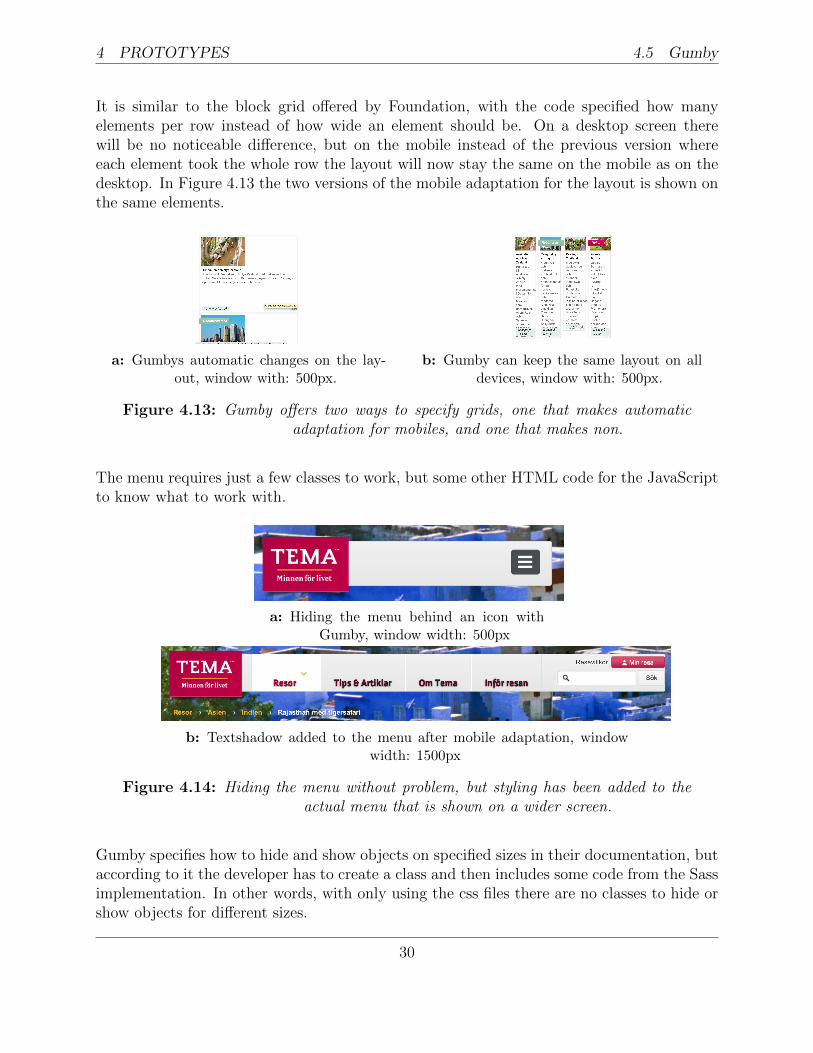
It is similar to the block grid offered by Foundation, with the code specified how manyelements per row instead of how wide an element should be. On a desktop screen therewill be no noticeable difference, but on the mobile instead of the previous version whereeach element took the whole row the layout will now stay the same on the mobile as on thedesktop. In Figure 4.13 the two versions of the mobile adaptation for the layout is shown onthe same elements.
a: Gumbys automatic changes on the lay-out, window with: 500px.
b: Gumby can keep the same layout on alldevices, window with: 500px.
Figure 4.13: Gumby offers two ways to specify grids, one that makes automaticadaptation for mobiles, and one that makes non.
The menu requires just a few classes to work, but some other HTML code for the JavaScriptto know what to work with.
a: Hiding the menu behind an icon withGumby, window width: 500px
b: Textshadow added to the menu after mobile adaptation, windowwidth: 1500px
Figure 4.14: Hiding the menu without problem, but styling has been added to theactual menu that is shown on a wider screen.
Gumby specifies how to hide and show objects on specified sizes in their documentation, butaccording to it the developer has to create a class and then includes some code from the Sassimplementation. In other words, with only using the css files there are no classes to hide orshow objects for different sizes.
30
4.6 Ingrid 4 PROTOTYPES
4.6 Ingrid
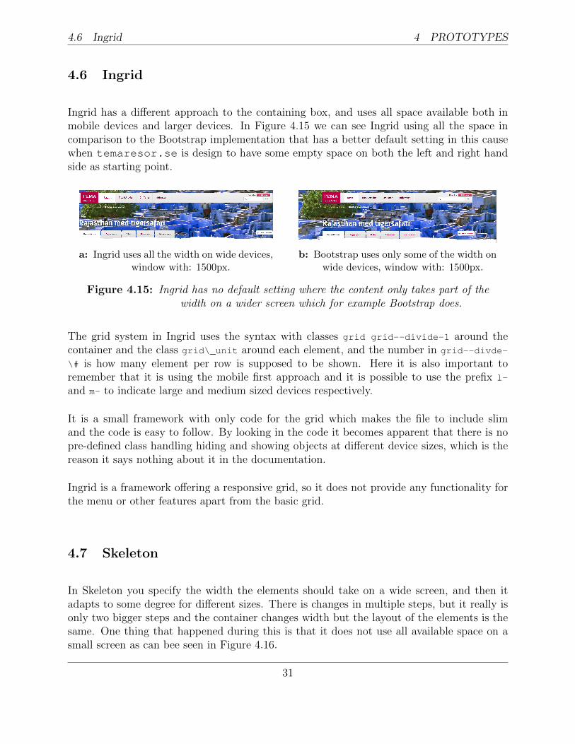
Ingrid has a different approach to the containing box, and uses all space available both inmobile devices and larger devices. In Figure 4.15 we can see Ingrid using all the space incomparison to the Bootstrap implementation that has a better default setting in this causewhen temaresor.se is design to have some empty space on both the left and right handside as starting point.
a: Ingrid uses all the width on wide devices,window with: 1500px.
b: Bootstrap uses only some of the width onwide devices, window with: 1500px.
Figure 4.15: Ingrid has no default setting where the content only takes part of thewidth on a wider screen which for example Bootstrap does.
The grid system in Ingrid uses the syntax with classes grid grid--divide-1 around thecontainer and the class grid\_unit around each element, and the number in grid--divde-
\# is how many element per row is supposed to be shown. Here it is also important toremember that it is using the mobile first approach and it is possible to use the prefix l-
and m- to indicate large and medium sized devices respectively.
It is a small framework with only code for the grid which makes the file to include slimand the code is easy to follow. By looking in the code it becomes apparent that there is nopre-defined class handling hiding and showing objects at different device sizes, which is thereason it says nothing about it in the documentation.
Ingrid is a framework offering a responsive grid, so it does not provide any functionality forthe menu or other features apart from the basic grid.
4.7 Skeleton
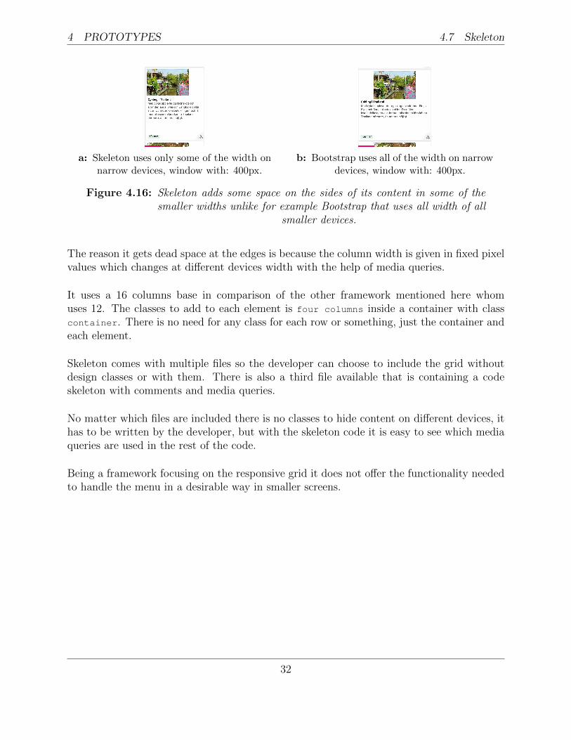
In Skeleton you specify the width the elements should take on a wide screen, and then itadapts to some degree for different sizes. There is changes in multiple steps, but it really isonly two bigger steps and the container changes width but the layout of the elements is thesame. One thing that happened during this is that it does not use all available space on asmall screen as can bee seen in Figure 4.16.
31
4 PROTOTYPES 4.7 Skeleton
a: Skeleton uses only some of the width onnarrow devices, window with: 400px.
b: Bootstrap uses all of the width on narrowdevices, window with: 400px.
Figure 4.16: Skeleton adds some space on the sides of its content in some of thesmaller widths unlike for example Bootstrap that uses all width of all
smaller devices.
The reason it gets dead space at the edges is because the column width is given in fixed pixelvalues which changes at different devices width with the help of media queries.
It uses a 16 columns base in comparison of the other framework mentioned here whomuses 12. The classes to add to each element is four columns inside a container with classcontainer. There is no need for any class for each row or something, just the container andeach element.
Skeleton comes with multiple files so the developer can choose to include the grid withoutdesign classes or with them. There is also a third file available that is containing a codeskeleton with comments and media queries.
No matter which files are included there is no classes to hide content on different devices, ithas to be written by the developer, but with the skeleton code it is easy to see which mediaqueries are used in the rest of the code.
Being a framework focusing on the responsive grid it does not offer the functionality neededto handle the menu in a desirable way in smaller screens.
32
5 COMPARISON
5 Comparison
The structure of the existing webpage that is to adapt to different devices decides whichframework to use, if any. Some webpage has a completely custom layout and in that casetrying to suddenly implement a grid would be foolish and hard so doing it manually wouldsave both time and frustration. While having an old grid might make it easier to exchangethe classes for that grid with the new grid system, but depending on the logic behind itit might be easier with a specific type of grid. The old static grid system can for exampleimplement a grid that says how many elements to be on one row instead of how much spacethe element should take from the whole, it is possible use both types but using the samethinking in the adaptive grid system would lessen the thinking and planing step and minimisethe opportunities for error to appear.
In the case of temaresor.se the 960 Grid System is implemented, so exchanging it fora frameworks grid system would be easier than doing it all manually, and the logic in thatgrid system is to specify how wide different element should be, so a frameworks that basesits grid layout on that would be the easiest to use.
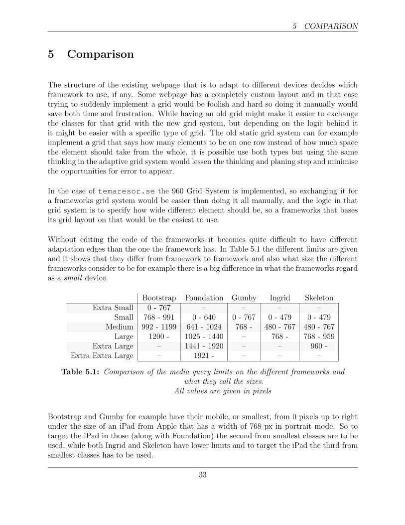
Without editing the code of the frameworks it becomes quite difficult to have differentadaptation edges than the one the framework has. In Table 5.1 the different limits are givenand it shows that they differ from framework to framework and also what size the differentframeworks consider to be for example there is a big difference in what the frameworks regardas a small device.
Bootstrap Foundation Gumby Ingrid SkeletonExtra Small 0 - 767 – – – –
Small 768 - 991 0 - 640 0 - 767 0 - 479 0 - 479Medium 992 - 1199 641 - 1024 768 - 480 - 767 480 - 767
Large 1200 - 1025 - 1440 – 768 - 768 - 959Extra Large – 1441 - 1920 – – 960 -
Extra Extra Large – 1921 - – – –
Table 5.1: Comparison of the media query limits on the different frameworks andwhat they call the sizes.
All values are given in pixels
Bootstrap and Gumby for example have their mobile, or smallest, from 0 pixels up to rightunder the size of an iPad from Apple that has a width of 768 px in portrait mode. So totarget the iPad in those (along with Foundation) the second from smallest classes are to beused, while both Ingrid and Skeleton have lower limits and to target the iPad the third fromsmallest classes has to be used.
33
5 COMPARISON
It also shows that Gumby only has one limit, one for below iPad portrait and one for aboveincluding the iPad. Ingrid also lacks three limits, and only has one for mobile that have awidth lower than 480px then for tablets or larger phones between 480px and 768px and alldevices above that has the same styling.
The last two system, Ingrid and Skeleton, have more focus on differencing between smalldevices, having multiple media queries for those that are handled and styled the same in forexample Bootstrap. Instead of various alternatives for small devices Foundation has moredifferencing options for larger screens.
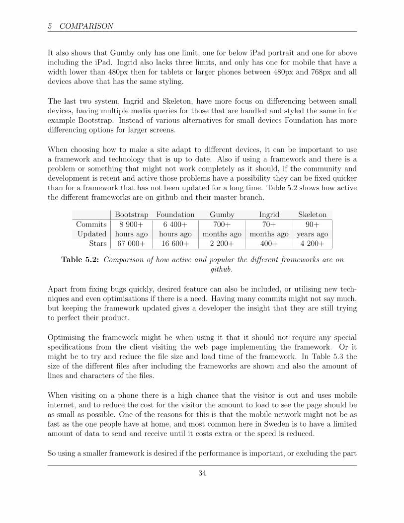
When choosing how to make a site adapt to different devices, it can be important to usea framework and technology that is up to date. Also if using a framework and there is aproblem or something that might not work completely as it should, if the community anddevelopment is recent and active those problems have a possibility they can be fixed quickerthan for a framework that has not been updated for a long time. Table 5.2 shows how activethe different frameworks are on github and their master branch.
Bootstrap Foundation Gumby Ingrid SkeletonCommits 8 900+ 6 400+ 700+ 70+ 90+Updated hours ago hours ago months ago months ago years ago
Stars 67 000+ 16 600+ 2 200+ 400+ 4 200+
Table 5.2: Comparison of how active and popular the different frameworks are ongithub.
Apart from fixing bugs quickly, desired feature can also be included, or utilising new tech-niques and even optimisations if there is a need. Having many commits might not say much,but keeping the framework updated gives a developer the insight that they are still tryingto perfect their product.
Optimising the framework might be when using it that it should not require any specialspecifications from the client visiting the web page implementing the framework. Or itmight be to try and reduce the file size and load time of the framework. In Table 5.3 thesize of the different files after including the frameworks are shown and also the amount oflines and characters of the files.
When visiting on a phone there is a high chance that the visitor is out and uses mobileinternet, and to reduce the cost for the visitor the amount to load to see the page should beas small as possible. One of the reasons for this is that the mobile network might not be asfast as the one people have at home, and most common here in Sweden is to have a limitedamount of data to send and receive until it costs extra or the speed is reduced.
So using a smaller framework is desired if the performance is important, or excluding the part
34
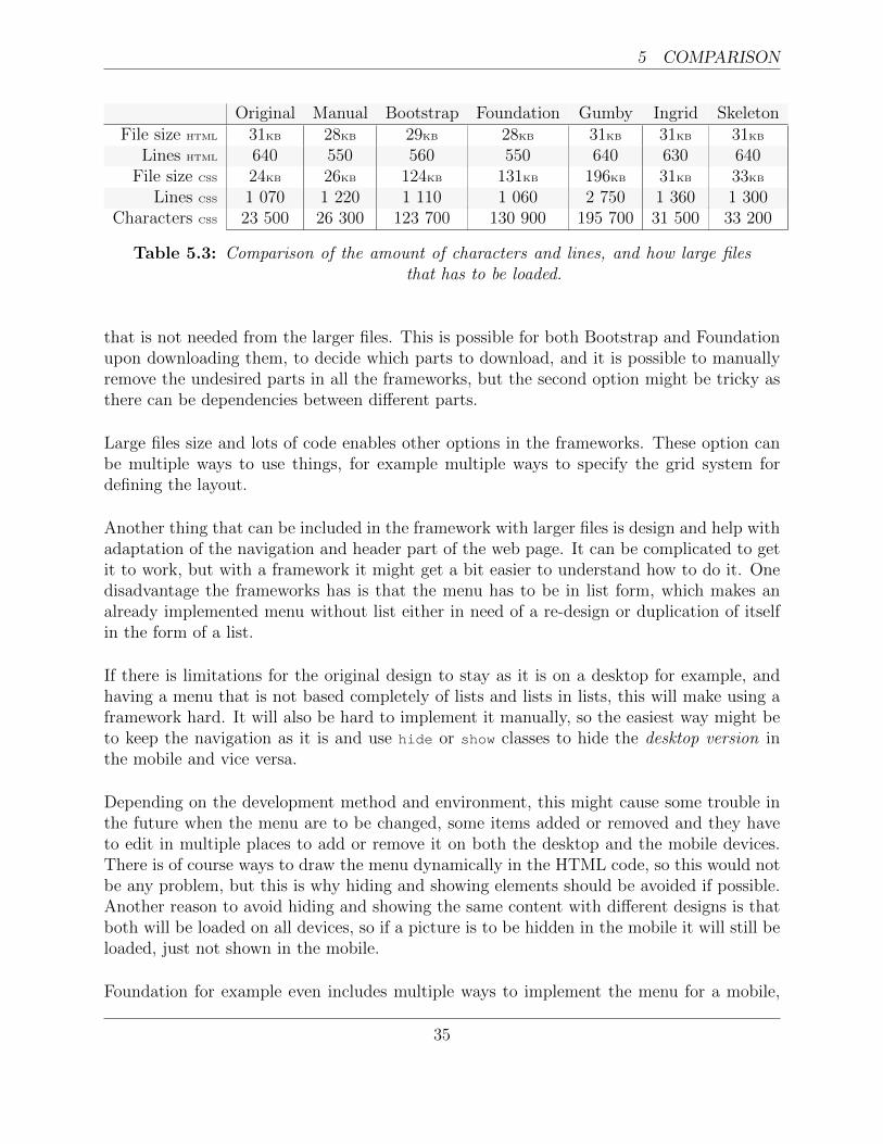
5 COMPARISON
Original Manual Bootstrap Foundation Gumby Ingrid SkeletonFile size HTML 31KB 28KB 29KB 28KB 31KB 31KB 31KB
Lines HTML 640 550 560 550 640 630 640File size CSS 24KB 26KB 124KB 131KB 196KB 31KB 33KB
Lines CSS 1 070 1 220 1 110 1 060 2 750 1 360 1 300Characters CSS 23 500 26 300 123 700 130 900 195 700 31 500 33 200
Table 5.3: Comparison of the amount of characters and lines, and how large filesthat has to be loaded.
that is not needed from the larger files. This is possible for both Bootstrap and Foundationupon downloading them, to decide which parts to download, and it is possible to manuallyremove the undesired parts in all the frameworks, but the second option might be tricky asthere can be dependencies between different parts.
Large files size and lots of code enables other options in the frameworks. These option canbe multiple ways to use things, for example multiple ways to specify the grid system fordefining the layout.
Another thing that can be included in the framework with larger files is design and help withadaptation of the navigation and header part of the web page. It can be complicated to getit to work, but with a framework it might get a bit easier to understand how to do it. Onedisadvantage the frameworks has is that the menu has to be in list form, which makes analready implemented menu without list either in need of a re-design or duplication of itselfin the form of a list.
If there is limitations for the original design to stay as it is on a desktop for example, andhaving a menu that is not based completely of lists and lists in lists, this will make using aframework hard. It will also be hard to implement it manually, so the easiest way might beto keep the navigation as it is and use hide or show classes to hide the desktop version inthe mobile and vice versa.
Depending on the development method and environment, this might cause some trouble inthe future when the menu are to be changed, some items added or removed and they haveto edit in multiple places to add or remove it on both the desktop and the mobile devices.There is of course ways to draw the menu dynamically in the HTML code, so this would notbe any problem, but this is why hiding and showing elements should be avoided if possible.Another reason to avoid hiding and showing the same content with different designs is thatboth will be loaded on all devices, so if a picture is to be hidden in the mobile it will still beloaded, just not shown in the mobile.
Foundation for example even includes multiple ways to implement the menu for a mobile,
35
5 COMPARISON
both uses a list as a base but the functionality of it is there. So if the developer is not thedecision maker on design choices it might feel safer to use a framework that itself supportsdifferent options than to have to rely on third-part plugins or the developers own limitedknowledge in the specific area.
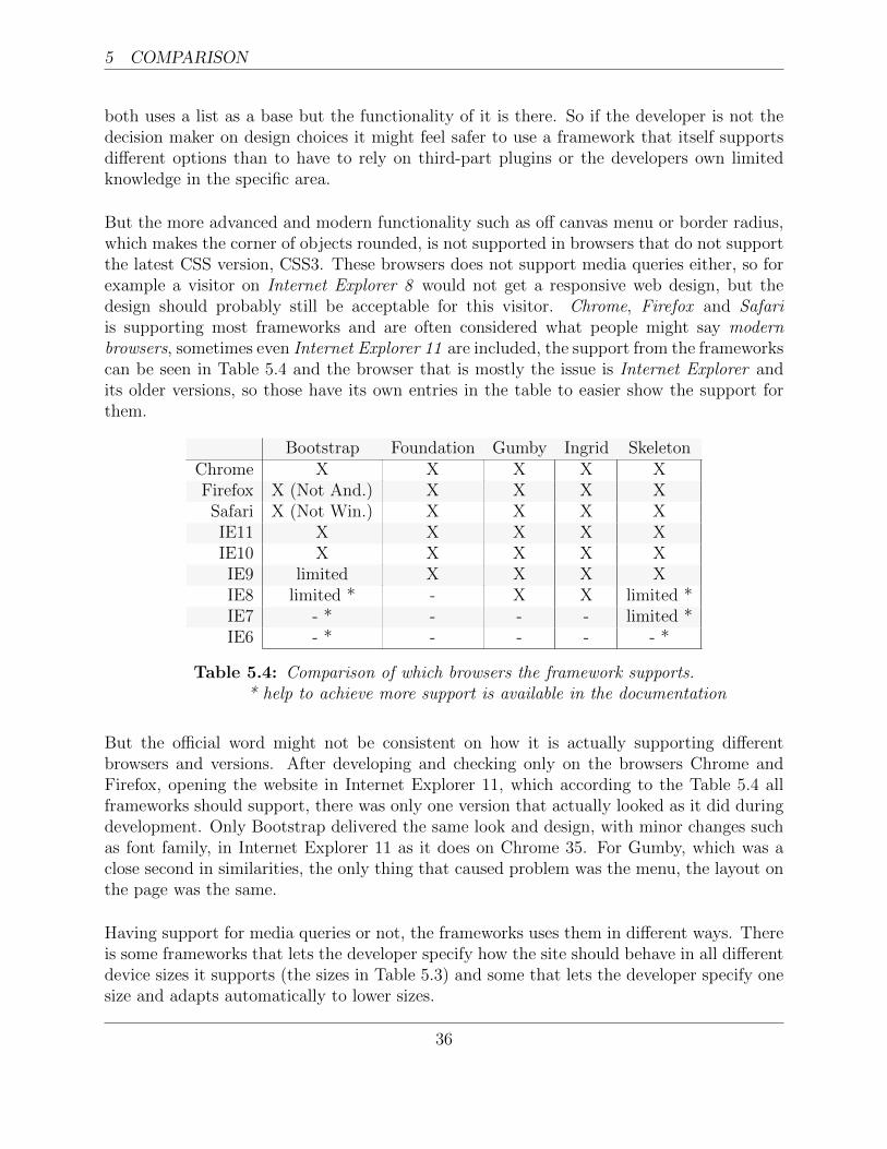
But the more advanced and modern functionality such as off canvas menu or border radius,which makes the corner of objects rounded, is not supported in browsers that do not supportthe latest CSS version, CSS3. These browsers does not support media queries either, so forexample a visitor on Internet Explorer 8 would not get a responsive web design, but thedesign should probably still be acceptable for this visitor. Chrome, Firefox and Safariis supporting most frameworks and are often considered what people might say modernbrowsers, sometimes even Internet Explorer 11 are included, the support from the frameworkscan be seen in Table 5.4 and the browser that is mostly the issue is Internet Explorer andits older versions, so those have its own entries in the table to easier show the support forthem.
Bootstrap Foundation Gumby Ingrid SkeletonChrome X X X X XFirefox X (Not And.) X X X XSafari X (Not Win.) X X X XIE11 X X X X XIE10 X X X X XIE9 limited X X X XIE8 limited * - X X limited *IE7 - * - - - limited *IE6 - * - - - - *
Table 5.4: Comparison of which browsers the framework supports.* help to achieve more support is available in the documentation
But the official word might not be consistent on how it is actually supporting differentbrowsers and versions. After developing and checking only on the browsers Chrome andFirefox, opening the website in Internet Explorer 11, which according to the Table 5.4 allframeworks should support, there was only one version that actually looked as it did duringdevelopment. Only Bootstrap delivered the same look and design, with minor changes suchas font family, in Internet Explorer 11 as it does on Chrome 35. For Gumby, which was aclose second in similarities, the only thing that caused problem was the menu, the layout onthe page was the same.
Having support for media queries or not, the frameworks uses them in different ways. Thereis some frameworks that lets the developer specify how the site should behave in all differentdevice sizes it supports (the sizes in Table 5.3) and some that lets the developer specify onesize and adapts automatically to lower sizes.
36
5 COMPARISON
This can be frustrating if the design decision is not the same as how the framework adaptsso the ability to control the layout on different devices is in those cases preferable to theautomatically adaptation. The later has however cleaner code and less classes to handle sothe file sizes and amount of classes to add for the site to work is less, meaning the load timemight be reduced in the long run by loads of small optimisations.
To make sure to utilise the whole space on different mobile devices it is advisable to usepercentage and not pixels to set the width of the element, for example Skeleton uses fixedpixel values for width which leaves some empty spaces in different sizes.
In version 3.1.0 and newer of Bootstrap for example it is possible to specify if the containershould be given in a fixed pixel value and not take up all space available on devices largerthan what they consider phones, or always take up all width available by using the classcontainer or container-fluid respectively.
Just including a framework in the project makes no difference for most of the ones consideredhere, except for Foundation. The thing a developer would like when already having the designfor a web page is to add classes or ids to elements to add functionality and styling, but whatFoundations does is add styling to the tags. To revert the styling back to the original designit has to be override in a custom CSS file so that it will not affect the design.
37

38
6 FUTURE WORK
6 Future work
Most of the frameworks tested here have more than just CSS code to offer, and mainlyLearner CSS, LESS, or Syntactically Awesome Stylesheets, SASS, which both are versionsof CSS but more powerful and have things such as variables and functions available to use.Using these instead of regular CSS makes it easier to change styling options, since even ifa colour or a size value is used in multiple places the value only has to be changed in oneplace and the risk of missing one place is reduced.
The bigger and more complete frameworks also offers help beyond the regular grid system,and for example different mobile menus, pop-up, and more. These things require more thanstyling, and the necessary JavaScript is available in the framework.
There are ways to implement not only responsive web design but also using server sidecomponents together with responsive web design, and these ideas are getting more popularamong developers. This in the sense that using server side components only send the user theresources that are needed and not the images and other content that will not be visible ona mobile device, while still only having one version that implements responsive web design.This methodology is commonly called Responsive Web Design + Server Side Components, orRESS for short. And as stated it utilises both approaches mentioned in this report combined.
39

40
REFERENCES REFERENCES
References
[1] A. Ahmed and A. Abbas. Wireless application protocol.
[2] O. Findahl. Svenskarna och internet 2013. Technical report, .SE (Stiftelsen for inter-netinfrastruktur), December 2013. http://soi2013.se.
[3] GitHub. Search · stars:¿1 · github, April 2014. https://github.com/search?q=stars%3a%3E1&s=stars&type=Repositories, visited 2014-04-10.
[4] J. Grlicky and Mozilla. Separate sites for mobile and desktop - web development —mdn, September 2013. https://developer.mozilla.org/en-US/docs/Web_Development/Mobile/Separate_sites, visited 2014-03-14.
[5] S. Ingmar. Responsive web design - en studie i hur designkonceptet paverkar anvand-barheten hos en webbplats, December 2012.
[6] C. Keller. The making of gumby framework, a responsive html/css framework- digitalsurgeons.com, May 2012. http://www.digitalsurgeons.com/blog/the-making-of-a-responsive-css-framework/, visited 2013-12-16.
[7] E. Marcotte. Responsive web design. A list apart, 2011.
[8] Mozilla. A re-introduction to javascript (js tutorial) - javascript — mdn, November2013. https://developer.mozilla.org/en-US/docs/Web/JavaScript/A_re-introduction_to_JavaScript, visited 2013-12-10.
[9] M. Otto. Building twitter bootstrap · an a list apart article, January 2012. http://alistapart.com/article/building-twitter-bootstrap, visited 2014-04-10.
[10] M. Paukkunen. Wireless application protocol. Department of Computer Science, Hel-sinki University of Technology, April 1999.
[11] P. Rana. Div table, December 2009. http://www.codeproject.com/Articles/47934/DIV-TABLE, visited 2013-12-09.
[12] D. Riehle. Framework Design: A Role Modeling Approach. PhD thesis, UniversitatHamburg, 2000.
[13] J. M. Slatin and S. Rush. Maximum Accessibility: Making Your Web Site More Usablefor Everyone. Addison-Wesley Longman Publishing Co., Inc., Boston, MA, USA, 2002.
[14] J. Smiley. Start here, build everywhere: Announcing founda-tion by zurb, October 2011. http://zurb.com/article/805/start-here-build-everywhere-announcing-fo, visited 2014-04-10.
41
REFERENCES REFERENCES
[15] A. R. Smith. A pixel is not a little square, a pixel is not a little square, a pixel is not alittle square! Microsoft Computer Graphics, Technical Memo, 6, 1995.
[16] StatCounter. Comparison from july 2008 to dec 2013 — statcounterglobal stats, 2013. http://gs.statcounter.com/#mobile_vs_desktop-ww-monthly-200807-201312, visited 2013-12-04.
[17] Valtech. valtech , December 2013. http://valtech.se, visited 2013-12-04.
[18] W3C. Css values and units module level 3, July 2013. http://www.w3.org/TR/css3-values/#relative-lengths, visited 2014-04-10.
[19] ZURB. Foundation — foundation features, December 2013. http://foundation.zurb.com/learn/features.html, visited 2014-03-20.
42
Related Documents