Responsive Web Design By Mahesh

Welcome message from author
This document is posted to help you gain knowledge. Please leave a comment to let me know what you think about it! Share it to your friends and learn new things together.
Transcript

Responsive Web Design
By Mahesh

Contents..
• What is RWD?
• Who and when it is invented?
• Where it is used?
• Why we need RWD?
• How to implement RWD?
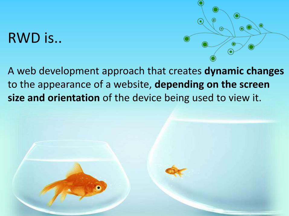
RWD is..
A web development approach that creates dynamic changesto the appearance of a website, depending on the screen size and orientation of the device being used to view it.

• Technique of adapting a site’s layout to a device display was first written by Cameron Adams in 2004
• Ethan Marcotte coined the term RWD in May 2010 in an article ‘A List Apart’
• He described the theory and practice of responsive web design in his brief 2011 book titled ‘Responsive web design’

Where it is used?Two provide excellent user experience over various devices

Why we need RWD?
• Growing Demand for smartphones
• Multiple screen sizes and mobile browsers
• Wide usage of mobile internet
• Compulsory for getting good business

How to implement RWD?• Meta Tags• CSS3 media queries• Fluid Grid

• It is a HTML tag describes few aspects of web page
• We use viewport meta tag for making a web page mobile optimized<meta name=“HandheldFriendly” content=“true”/><meta name=“MobileOptimized” content=“320”/><meta name=“viewport” content=“width=device-width, intialscale=1”/>
• A responsive designed needs to add these meta tags to make a website mobile optimized
Meta tags

• Media queries enable us to create a responsive
experience, where specific styles are applied to small
screens, large screens and anywhere in between.
• The media query syntax allows for the creation of rules
that can be applied depending on device characteristics.
Ex:
<link rel="stylesheet" media="(max-width: 640px)"
href="max-640px.css">
@media (query)
{
/*CSS rules used when query matches*/
}
CSS3 media queries

Fluid Grid
• Creating percentage based designs which are known as fluid
designs
• Regardless of what the device or screen size is, components in
fluid designs are going to flow and adapt to the user
environment
• The advantage of fluid grid is that we can adjust the max-width
and it will still work on larger screens due to the percentage
based calculations.

Frame works
• Skeleton
• Foundation
• Bootstrap
Projects
• Bostonglobe.com
• Greygoose.com
• Barackobama.com
• Cleanairchallenge.com
• Foodsense.com
RWD Frameworks &Projects

Resources
1. http://johnpolacek.github.io/scrolldeck.js/decks/responsive/
2. http://alistapart.com/article/responsive-web-design/
3. http://css-tricks.com/snippets/html/responsive-meta-tag/
4. http://www.inmotionhosting.com/support/edu/website-design/create-responsive-template/viewpoint-meta-tag-website-responsive-template
5. http://www.1stwebdesigner.com/tutorials/fluid-grids-in-responsive-design/
6. http://www.responsivegridsystem.com/
More..

Questions?

Thank you
Related Documents