Responsive web design FOR ZOMBIES … by zeeshan khan

Responsive web design
Jan 27, 2015
A very brief introduction to responsive web design
Welcome message from author
This document is posted to help you gain knowledge. Please leave a comment to let me know what you think about it! Share it to your friends and learn new things together.
Transcript

Responsive web designFOR ZOMBIES… by zeesha n kha n
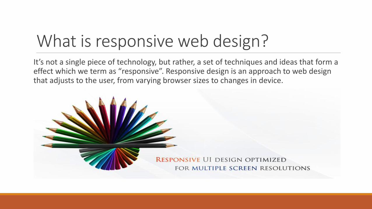
What is responsive web design?It’s not a single piece of technology, but rather, a set of techniques and ideas that form a effect which we term as “responsive”. Responsive design is an approach to web design that adjusts to the user, from varying browser sizes to changes in device.

Features of a responsive design1) Fluid
2) Flexible
3) Flowing
4) Device-agnostic
5) Optimised viewing

Why do we need responsive UI?
The spectrum of screen sizes and resolutions is widening every day, and creating a different version of an application that targets each individual device is not a practical way forward. This is the problem that responsive web design addresses head on.

Why do we need responsive UI?
It enables to design a single version of the application that would run in different devices and of browsers of different sizes and would adjust itself according to the viewport.

Examples of responsive websites

Components of a responsive design1) Fluid layout
2) Responsive images
3) Responsive fonts
4) CSS Media Queries

Fluid layoutFluid grids go a few steps beyond the traditional liquid layout. Instead of designing a layout based on rigid pixels or arbitrary percentage values, a fluid grid is more carefully designed in terms of proportions.

Fluid layout

Fluid layoutAn ideal fluid layout :
1) Works in all major browsers
2) Shrinks to 780px. This accommodates users with 800x600 resolution, with no horizontal scroll!
3) Grows to 1260px. This accommodates users with 1280x768 resolution and everything in between.
4) This accommodates 90%+ of all internet users. You could easily make this layout grow larger, but be mindful of how line-length affects readability. Nobody wants to read a line of text 1980px long.
5) Sidebars are of "equal height" to the main content
6) Page content is centred for users with even higher resolutions.

Responsive imagesBasic :
Styling foreground images to adjust to the width of their container is very easy.
img {max-width : 100 % }
embed, object, video { max-width : 100 %}
In most cases, that tiny style rule will do the trick! Once it’s in place, if the container around the image becomes narrower than the width of the image, then the image will scale down to match the width of its container. Setting the max-width to 100% also ensures that the image does not scale larger than its actual size, which would significantly reduce the image’s quality.
Responsive imagesThe performance problem :
With the responsive image solution outlined above, all devices are fed the same images. Small icons and logos might not be too bad, but the problem compounds quickly as the images get larger and heftier.
Retina images exacerbate the problem — you don’t want to send a big Retina image to a device that isn’t capable of displaying its full detail! Should we really be sending a 990 × 300-pixel 100 KB image meant for desktop viewers to a mobile phone?

Responsive fontPrinciples of responsive typography :
1) The typography should be of resizable type. That means type that not only resizes based on the size of the screen, but that is also resizable by the user.
2) The line lengths should be optimized, which maintain readability. That means for some screens, keeping the content area smaller and the line lengths shorter makes more sense, even though the content theoretically could stretch wider.

Responsive fontAn example of responsive style in LESS :
@media only screen and (max-width: 499px) {
html {
font-size: @basefont-size-singlecol-traditional + 1;
&.BigFont {
font-size: @basefont-size-singlecol-traditional + 7;
}
&.multicol {
font-size: @basefont-size-multicol-traditional + 1; }
}
}
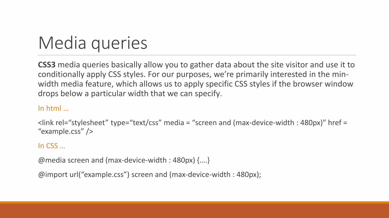
Media queriesCSS3 media queries basically allow you to gather data about the site visitor and use it to conditionally apply CSS styles. For our purposes, we’re primarily interested in the min-width media feature, which allows us to apply specific CSS styles if the browser window drops below a particular width that we can specify.
In html …
<link rel=“stylesheet” type=“text/css” media = “screen and (max-device-width : 480px)” href = “example.css” />
In CSS …
@media screen and (max-device-width : 480px) {….}
@import url(“example.css”) screen and (max-device-width : 480px);
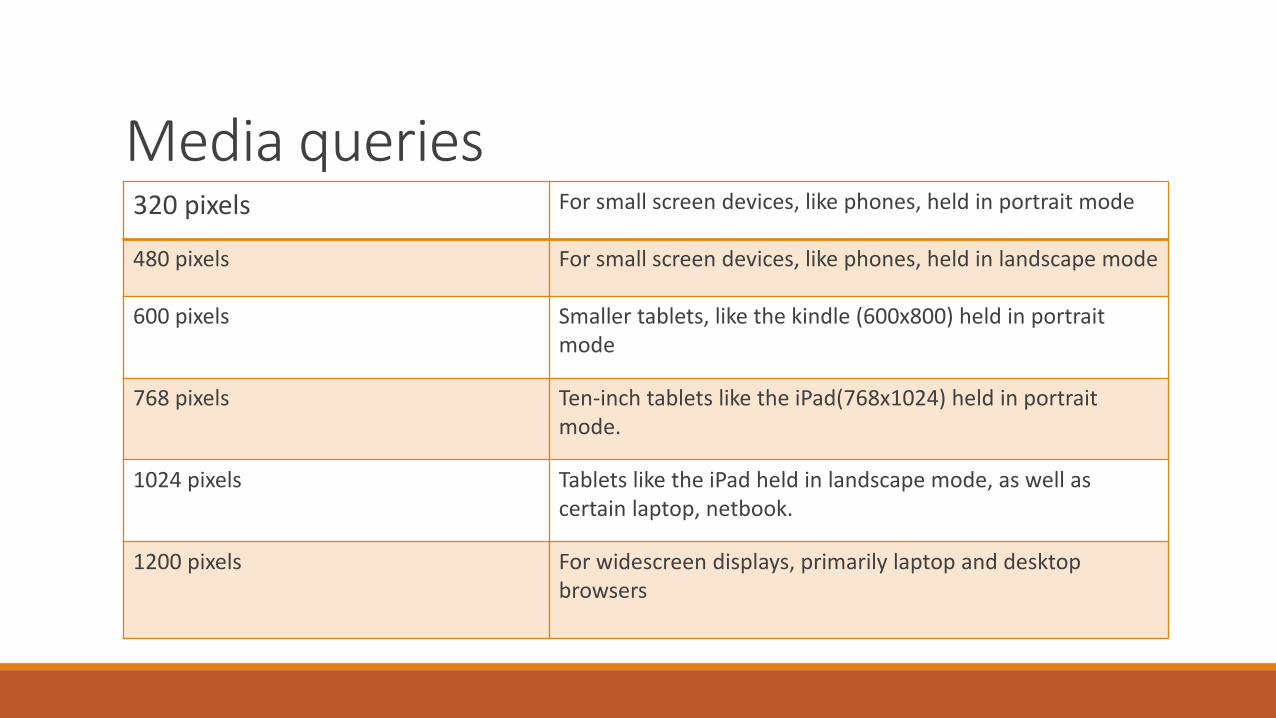
Media queries320 pixels For small screen devices, like phones, held in portrait mode
480 pixels For small screen devices, like phones, held in landscape mode
600 pixels Smaller tablets, like the kindle (600x800) held in portrait mode
768 pixels Ten-inch tablets like the iPad(768x1024) held in portrait mode.
1024 pixels Tablets like the iPad held in landscape mode, as well as certain laptop, netbook.
1200 pixels For widescreen displays, primarily laptop and desktop browsers
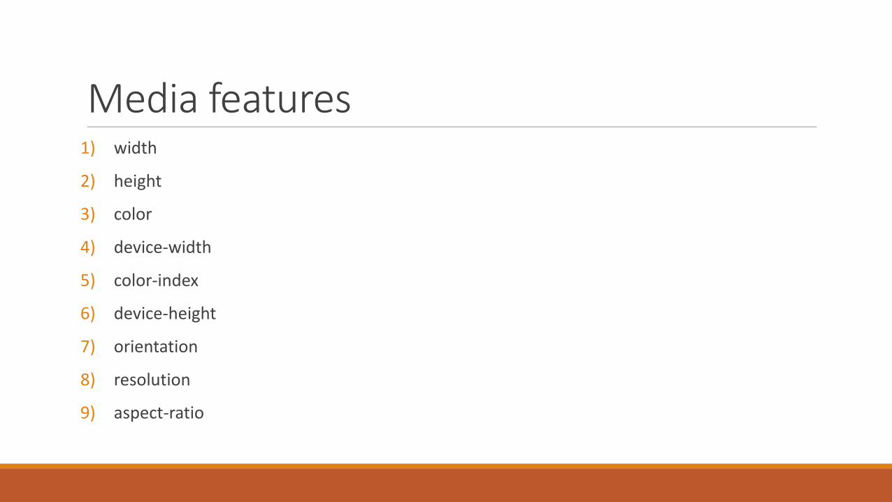
Media features1) width
2) height
3) color
4) device-width
5) color-index
6) device-height
7) orientation
8) resolution
9) aspect-ratio

Browser issues and compatibilty
Related Documents