Responsive Images in Drupal 8 By: Mario Hernandez November 17th, 2015

Welcome message from author
This document is posted to help you gain knowledge. Please leave a comment to let me know what you think about it! Share it to your friends and learn new things together.
Transcript
Responsive Images in Drupal 8
By: Mario Hernandez
November 17th, 2015

Mario HernandezFront-End Developer
@imariohernandez

Design/Theming● Usability Testing
● Responsive Design
● Drupal Theming
● Annotated Wireframes
@Mediacurrent
Development● Drupal Support
● Custom Module Development
● Large Scale Systems Integration
● Security & Performance Expertise
We help organizations build highly impactful, elegantly designed Drupal websites that achieve the strategic results you need.
Digital Strategy● Content Strategy
● Content Generation
● Result Metrics
● Marketing Automation Integration

● The problem
● Breakpoints
● Picture Element
● srcset & sizes attributes
● The Drupal Approach
● Demo
@Mediacurrent
Agenda
Blog Post
@Mediacurrent
mediacurrent.com/blog/responsive-images-d8


Ever since Ethan Marcotte started talking about responsive web design in 2010, developers and
designers have been scrambling to find ways to deal with the issue of responsive images
@Mediacurrent

What’s the problem with Media Queries

● Deliver only one final src● Be semantic● Be accessible● Be backwards-compatible● Accommodate art-direction● Work independently of any other language/technology● Be agreeable to authors AND standards people AND
browser vendor people@Mediacurrent
What a solution looks like

@Mediacurrent
BreakpointsTHEME.breakpoints.yml


<picture>srcsetsizes
@Mediacurrent

<picture>
@Mediacurrent
Ideal for Art Direction


Source: http://caniuse.com
Browser support

http://scottjehl.github.io/picturefill/
Browser support
Picturefill

Identifying the gap
viewport dimensions no yes
image size relative to the viewport yes no
screen density no yes
source files’ dimensions yes no
Variable Known by author when writing the code?
Known by browser when it’s loading the page?
source: https://ericportis.com/posts/2014/srcset-sizes/

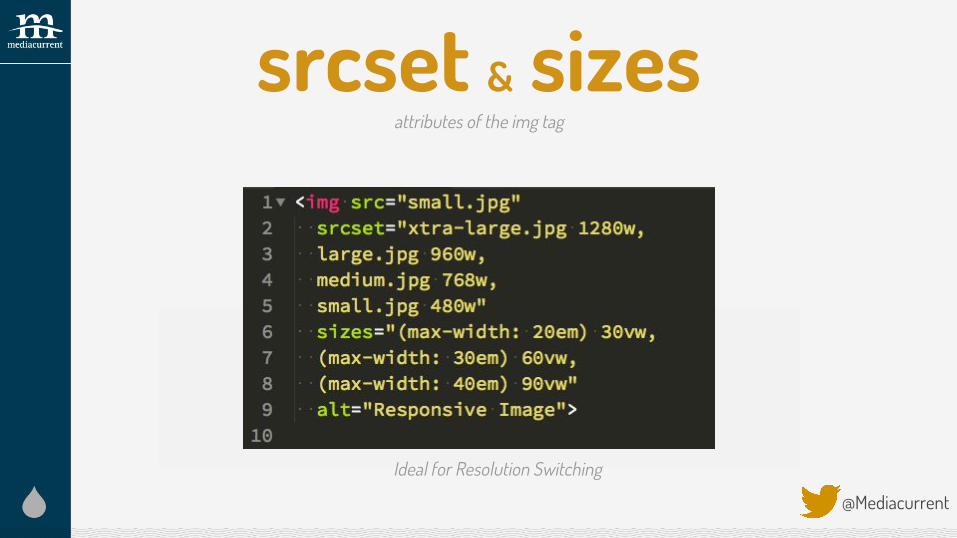
srcset & sizes
@Mediacurrent
attributes of the img tag
Ideal for resolution switching

srcset
@Mediacurrent
Ideal for resolution switching

sizes
@Mediacurrent
Ideal for resolution switching
srcset & sizes
@Mediacurrent
attributes of the img tag
Ideal for resolution switchingIdeal for Resolution Switching

Resolution Switching
@Mediacurrent

Bridging the gap
viewport dimensions no yes
image size relative to the viewport yes yes via sizes
screen density no yes
source files’ dimensions yes yes via srcset
Variable Known by author when she’s writing the code?
Known by browser when it’s loading the page?
source: https://ericportis.com/posts/2014/srcset-sizes/
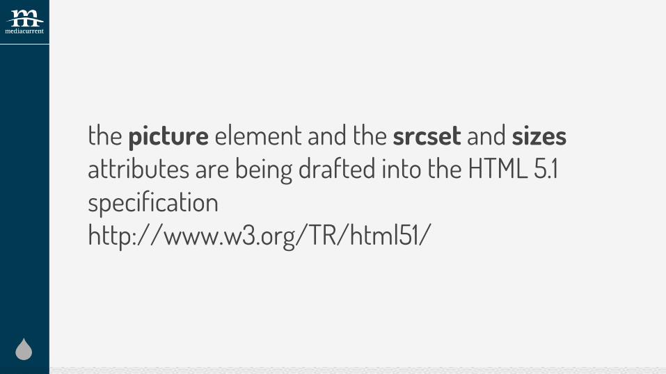
the picture element and the srcset and sizes attributes are being drafted into the HTML 5.1 specificationhttp://www.w3.org/TR/html51/

Quote“A high resolution image displayed on a low
resolution screen looks like low resolution image”~Mat Marquis
@Mediacurrent


How does all of this work in Drupal?
So glad you asked
@Mediacurrent


Responsive Images ModuleBackported to D7 as Picture Module
Breakpoints Module
Image Styles@Mediacurrent
Responsive Images and Breakpoints Modules are part of core in D8


Demo steps1. Create/Review Breakpoints
2. Enable Breakpoints and Responsive Images Modules
3. Create Image Styles
4. Create Responsive Image Styles
5. Configure Image Field with Responsive Image Styles


Resources● https://responsiveimages.org/
● Responsive Images for busy people (https://builtvisible.com/responsive-images-for-
busy-people-a-quick-primer/)
● http://blog.cloudfour.com/responsive-images-101-definitions/
● srcset & sizes: https://ericportis.com/posts/2014/srcset-sizes/
@Mediacurrent

Thank You!Questions?
@Mediacurrent Mediacurrent.com
slideshare.net/mediacurrent
Related Documents