Reshaping SharePoint for Evolving Internet Devices Your SharePoint Branding Experts Eric Overfield SharePoint Branding and UI Lead PixelMill

Reshaping SharePoint for Evolving Internet Devices
Aug 20, 2015
Welcome message from author
This document is posted to help you gain knowledge. Please leave a comment to let me know what you think about it! Share it to your friends and learn new things together.
Transcript

Reshaping SharePoint for
Evolving Internet Devices
Your SharePoint Branding Experts
Eric Overfield
SharePoint Branding and UI Lead
PixelMill

Introduction – Eric Overfield
• Founder and SharePoint Branding Lead, PixelMill
• Working with SharePoint since 2004
• Web Designer since 1998
• Located in Davis, CA
blog.pixelmill.com/ericoverfield
@EricOverfield
linkedin.com/in/ericoverfield

PixelMill
• Developing SharePoint solutions since 2004
• SharePoint Branding and UI Specialists
• Developer of Cost effective SharePoint Templates
• Your SharePoint Branding Experts
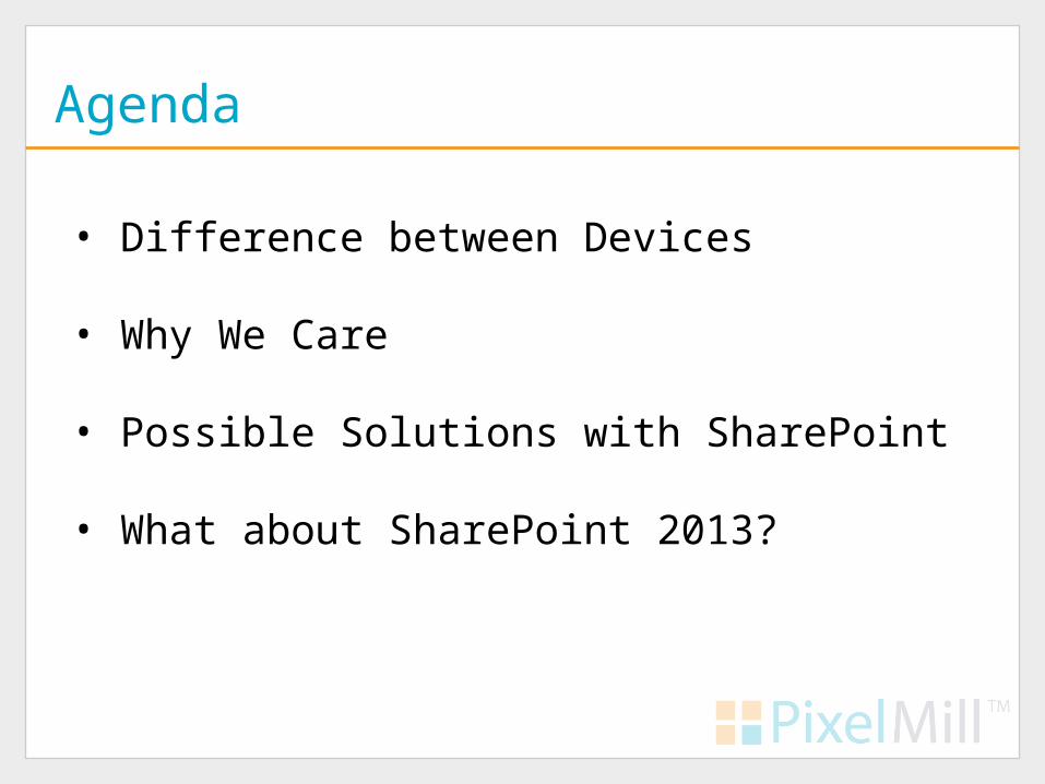
Agenda
• Difference between Devices
• Why We Care
• Possible Solutions with SharePoint
• What about SharePoint 2013?
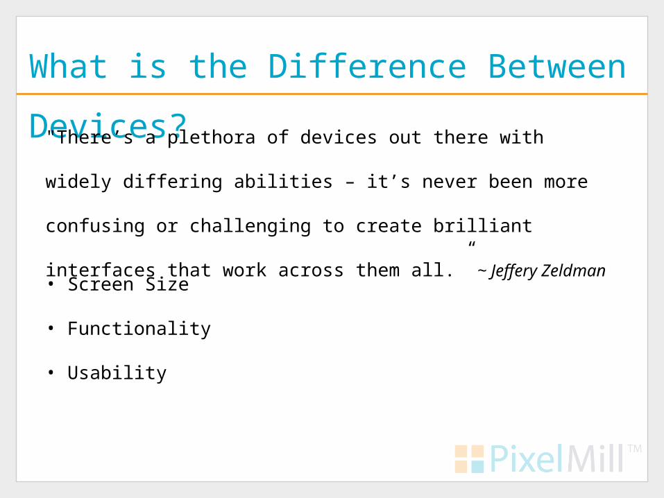
What is the Difference Between Devices?
"There’s a plethora of devices out there with widely differing abilities
– it’s never been more confusing or challenging to create brilliant
interfaces that work across them all.” ~ Jeffery Zeldman
• Screen Size
• Functionality
• Usability

Why Do We Care?
• Mobile Devices are Invading
• If not now then in a few years.
• How old is your Intranet?
• Build towards the future, not the past
So What Do We Do?
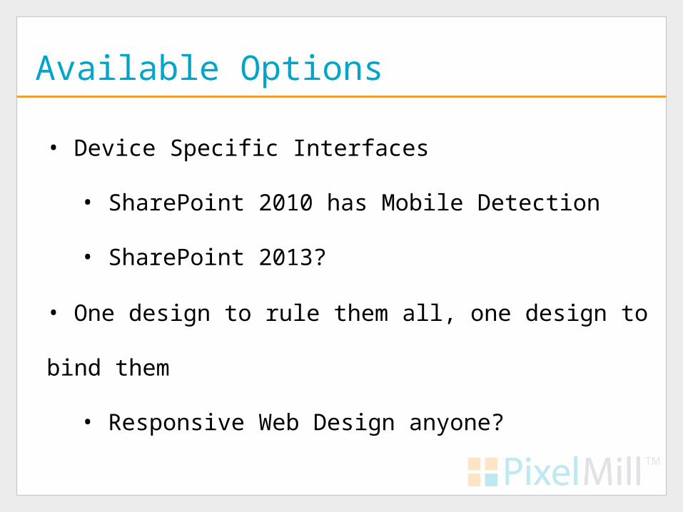
Available Options
• Device Specific Interfaces
• SharePoint 2010 has Mobile Detection
• SharePoint 2013?
• One design to rule them all, one design to bind them
• Responsive Web Design anyone?

The Mobile Interface
• SharePoint 2010 has a mobile interface
• Allows access to documents, lists, calendars, search, SMS alerts
• Controlled by USERAGENT
• App_Browsers\compat.browser
• Custom Web Parts, _layouts likely won’t work
• Difficult to customize

Code Once Use Everywhere
•Two primary methods
• Progressive Enhancement
• Responsive Web Design

Progressive Enhancement
• #1 trend for 2012 - .net Magazine
• Coined by Steven Champeon in 2003
• Content first, then add styling
• Separate Content from Presentation

SharePoint and Progressive Enhancement
• SharePoint was not built with PE in mind
• JavaScript and SharePoint
• Too much presentation baked into html
• i.e. Tables, Inline styles

Responsive Web Design
• #2 trend for 2012 - .net Magazine
• Use fluid grids to adapt to viewing environment
• Uses CSS3 and JavaScript
• All devices load same page, use CSS3 to adapt
• Coined by Ethan Marcotte in May 2010

Responsive Design
Examples

www.its.ms.gov

www.its.ms.gov

www.ariensco.com

www.ariensco.com

www.gse.it

www.gse.it
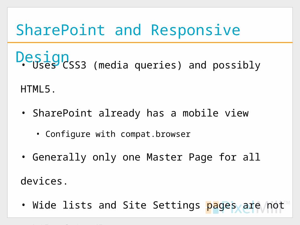
SharePoint and Responsive Design
• Uses CSS3 (media queries) and possibly HTML5.
• SharePoint already has a mobile view
• Configure with compat.browser
• Generally only one Master Page for all devices.
• Wide lists and Site Settings pages are not mobile friendly
• Primary issues are with RWD itself!
SharePoint and Responsive Design
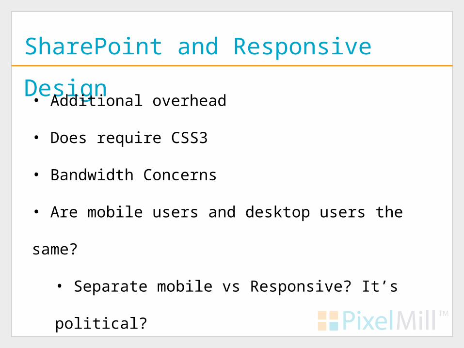
• Additional overhead
• Does require CSS3
• Bandwidth Concerns
• Are mobile users and desktop users the same?
• Separate mobile vs Responsive? It’s political?

What to do?
• PE vs RWD vs Separate Mobile
• Define Project
• Limit overhead
• Find a CSS guru will be key
• Responsive Web Design is worth considering
• SharePoint limits our options
• One site is difficult enough to maintain

Device Channels Anyone?
• New to SharePoint 2013
• Interfaces tailored and maps to specific device(s)
• Custom Master Pages per Channel
• Custom DeviceChannelPanels

Devices Channels, the Good and Bad
• Tailored interfaces
• Only works with Publishing Sites
• Maintain multiple Master Pages and/or sites
• New devices? Maintain that list too?

The Best of Both Worlds?
• Responsive Design and Device Channels
• Built a Responsive site for all devices
• Use DeviceChannelPanels
• Create a Device Channel for special cases
• But we have to wait
Summary
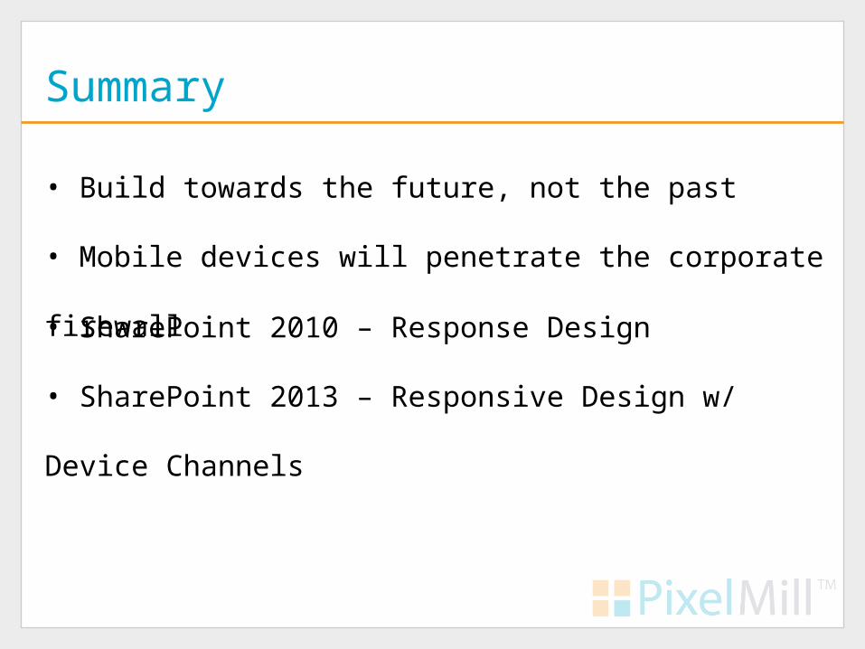
• Build towards the future, not the past
• Mobile devices will penetrate the corporate firewall
• SharePoint 2010 – Response Design
• SharePoint 2013 – Responsive Design w/ Device Channels

Resources
• "Responsive Web Design" by Ethan Marcottes
http://bit.ly/bcKwQS
• Configure SharePoint Server 2010 for Mobile Device Access
http://bit.ly/cg6fYo
• SharePoint 2010 Responsive Web design Template by Luis Kerr
http://bit.ly/NKPjwX
• v5, the Responsive HTML5 Master Page for SharePoint 2010 by Kyle Schaeffer
http://bit.ly/n8VQZw
• Ethan Marcottes’ 20 Favorite Responsive Designs
http://bit.ly/ngkI8D

Thank You
Your SharePoint Branding Experts
Eric Overfield
@EricOverfield
blog.pixelmill.com/ericoverfield
Related Documents