By Sania Khushbakht Jamil FOUNDATION PORTFOLIO

Welcome message from author
This document is posted to help you gain knowledge. Please leave a comment to let me know what you think about it! Share it to your friends and learn new things together.
Transcript
By Sania Khushbakht Jamil
FOUNDATION PORTFOLIO
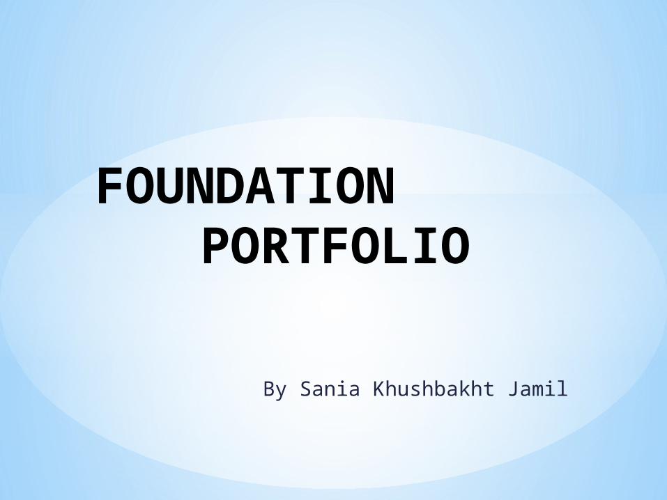
* MEDIA COURSEWORK BRIEF
Print • Preliminary exercise: using DTP and an image manipulation
program, produce the front page of a new school/college magazine, featuring a photograph of a student in medium close-up plus some appropriately laid-out text and a masthead. Additionally candidates must produce a DTP mock-up of the layout of the contents page to demonstrate their grasp of the program.
• Main task: the front page, contents and double page spread of a new music magazine (if done as a group task, each member of the group to produce an individual edition of the magazine, following the same house style). Maximum four members to a group.
• All images and text used must be original, produced by the candidate(s), minimum of FOUR images per candidate.

Preliminary Task
Cover page

Content Page

*Research & Planning
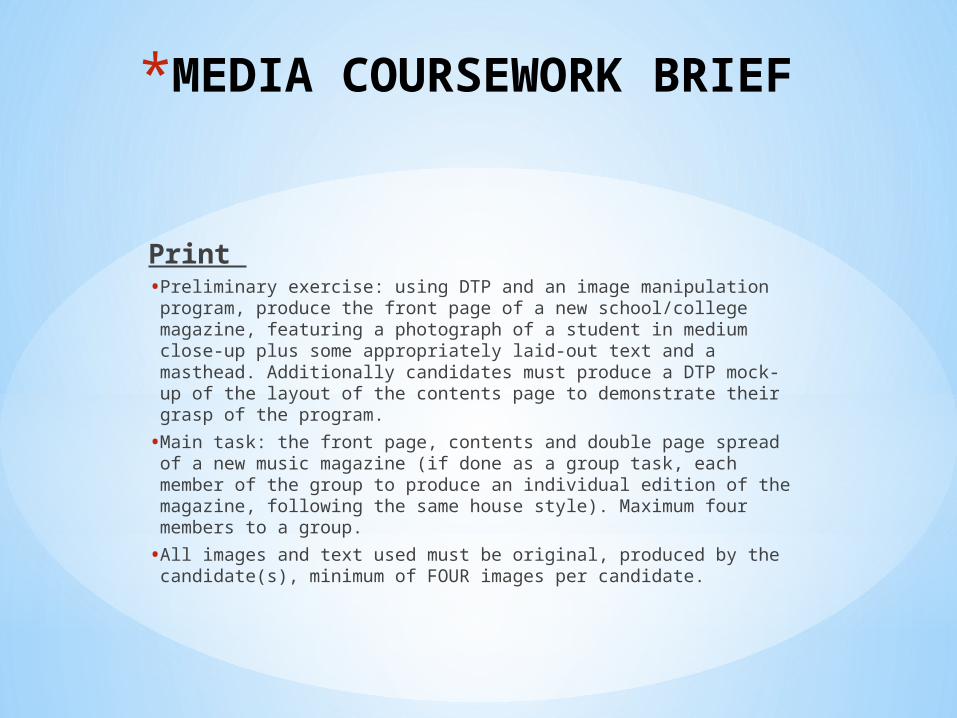
Surveys
*I made a questionnaire, to decide what genre of music magazine should I make. I gave it to different age groups to determine my audience to target. Following pie charts summarizes age groups’ 18-35 results in one pie chart:
33%
42%
8%3%
7%5%2%
18-35RockCountry rockPopDanceRapRnBOther
1. What Genre of Music do you hear most?
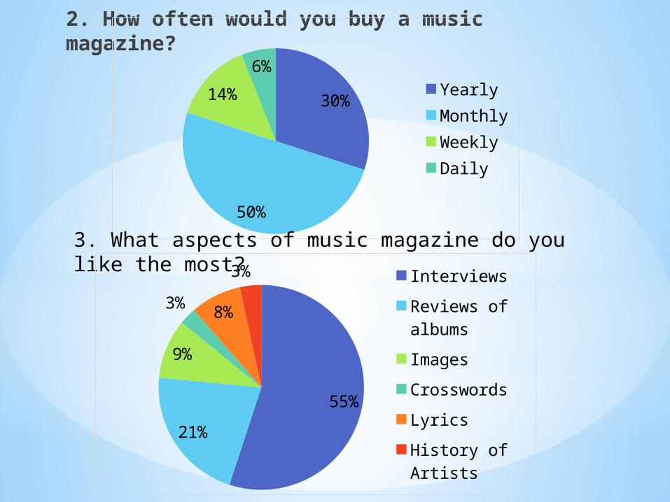
2. How often would you buy a music magazine?
30%
50%
14%
6%
YearlyMonthlyWeeklyDaily
3. What aspects of music magazine do you like the most?
55%
21%
9%
3% 8%
3%Interviews
Reviews of albums
Images
Crosswords
Lyrics
History of Artists

4. What attracts you the most to buy a music magazine?
30%
1%22%
6%
37%
4%
Colour SchemeNameFeaturesTextImagesOther
OVERVIEW• By analyzing my first question I conclude, that my audience liked
country rock.• My second question showed, that 50% of audience will buy
magazine monthly so I should make a monthly edition.• I found that majority like to read interviews so I need to design a
well-thought interview, for double spreadsheet. Many people also liked reviews so if possible, I will include it too.
• Finally, I found that most of my audience is attracted to images. I need to pay attention when taking photos.

*Research into music magazine conventions
I searched into existing popular music magazine covers to see how iconography is used to make music magazine of country rock genre and others to know the difference.
• COVER PAGE
Kerang masthead follows the conventions of music magazine by covering width of page and being at top of page. It has the largest font and font style is different to gain attention of audience from stack of magazines.
Strap line is used to distinguish some text from others which might interest audience most as they will usually read it first.
Image shows a band with one person ahead which shows that he is leader of a band. As he is screaming, this is sign of rock.Cover line is written in front of
image to show that they are related. Writing is bold and strands out.
Pictures make magazine’s look attractive and makes audience to read. Free poster offer makes audience buy it to get the poster, and is written in bold to make it stand out.
Barcode is written at bottom of the page so it doesn’t takes reader attention as it is not important.
Cover lines are used to show other features of magazine. Exclamation marks and ellipsis are used to make them interesting.
Black and white theme is used, red and yellow color is used to add a flavour.Plugs are at bottom as they are not important.
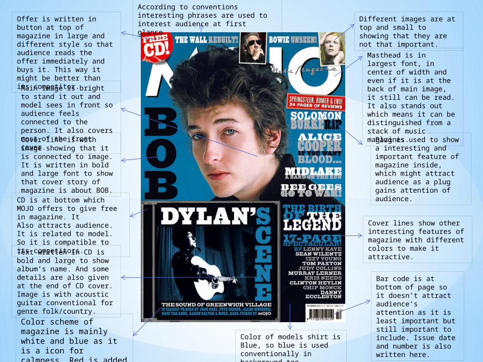
Masthead is in largest font, in center of width and even if it is at the back of main image, it still can be read. It also stands out which means it can be distinguished from a stack of music magazines.
Different images are at top and small to showing that they are not that important.
Offer is written in button at top of magazine in large and different style so that audience reads the offer immediately and buys it. This way it might be better than its competitor.
According to conventions interesting phrases are used to interest audience at first glance.
Main image is bright to stand it out and model sees in front so audience feels connected to the person. It also covers most of the front cover.Cover line is with image showing that it is connected to image. It is written in bold and large font to show that cover story of magazine is about BOB.
CD is at bottom which MOJO offers to give free in magazine. ItAlso attracts audience. It is related to model. So it is compatible to its competitors.Text written in CD is bold and large to show album’s name. And some details are also given at the end of CD cover. Image is with acoustic guitar conventional for genre folk/country.
Bar code is at bottom of page so it doesn’t attract audience’s attention as it is least important but still important to include. Issue date and number is also written here.
Plug is used to show a interesting and important feature of magazine inside, which might attract audience as a plug gains attention of audience.
Cover lines show other interesting features of magazine with different colors to make it attractive.
Color scheme of magazine is mainly white and blue as it is a icon for calmness. Red is added as a flavour.
Color of models shirt is Blue, so blue is used conventionally in background too.

• Contents page
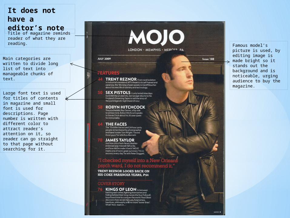
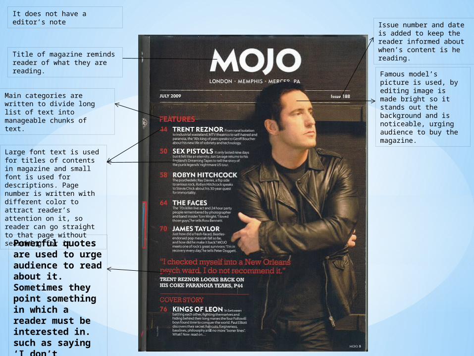
Title of magazine reminds reader of what they are reading.
Famous model’s picture is used, by editing image is made bright so it stands out the background and is noticeable, urging audience to buy the magazine.

Famous model’s picture is used, by editing image is made bright so it stands out the background and is noticeable, urging audience to buy the magazine.
Main categories are written to divide long list of text into manageable chunks of text.
Large font text is used for titles of contents in magazine and small font is used for descriptions. Page number is written with different color to attract reader’s attention on it, so reader can go straight to that page without searching for it.
Title of magazine reminds reader of what they are reading.
Famous model’s picture is used, by editing image is made bright so it stands out the background and is noticeable, urging audience to buy the magazine.
Main categories are written to divide long list of text into manageable chunks of text.
Large font text is used for titles of contents in magazine and small font is used for descriptions. Page number is written with different color to attract reader’s attention on it, so reader can go straight to that page without searching for it.
Title of magazine reminds reader of what they are reading.
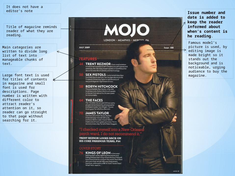
It does not have a editor’s note
Famous model’s picture is used, by editing image is made bright so it stands out the background and is noticeable, urging audience to buy the magazine.
Main categories are written to divide long list of text into manageable chunks of text.
Large font text is used for titles of contents in magazine and small font is used for descriptions. Page number is written with different color to attract reader’s attention on it, so reader can go straight to that page without searching for it.
Title of magazine reminds reader of what they are reading.
It does not have a editor’s note Issue number and
date is added to keep the reader informed about when’s content is he reading.
Famous model’s picture is used, by editing image is made bright so it stands out the background and is noticeable, urging audience to buy the magazine.
Main categories are written to divide long list of text into manageable chunks of text.
Large font text is used for titles of contents in magazine and small font is used for descriptions. Page number is written with different color to attract reader’s attention on it, so reader can go straight to that page without searching for it.
Title of magazine reminds reader of what they are reading.
It does not have a editor’s note Issue number and date is
added to keep the reader informed about when’s content is he reading.
Powerful quotes are used to urge audience to read about it. Sometimes they point something in which a reader must be interested in. such as saying ‘I don’t recommend it.’

Famous model’s picture is used, by editing image is made bright so it stands out the background and is noticeable, urging audience to buy the magazine.
Main categories are written to divide long list of text into manageable chunks of text.
Large font text is used for titles of contents in magazine and small font is used for descriptions. Page number is written with different color to attract reader’s attention on it, so reader can go straight to that page without searching for it.
Title of magazine reminds reader of what they are reading.
It does not have a editor’s note Issue number and date is
added to keep the reader informed about when’s content is he reading.
Powerful quotes are used to urge audience to read about it. Sometimes they point something in which a reader must be interested in. such as saying ‘I don’t
recommend it.’
Cover story is written in totally different part giving it more importance.
Layout is simple.

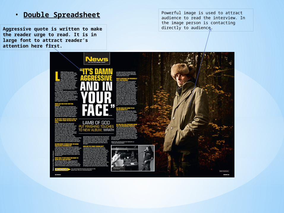
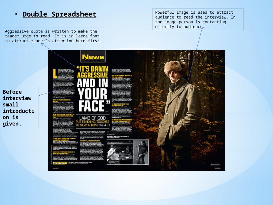
• Double Spreadsheet Powerful image is used to attract audience to read the interview. In the image person is contacting directly to audience.
• Double Spreadsheet Powerful image is used to attract audience to read the interview. In the image person is contacting directly to audience.
Aggressive quote is written to make the reader urge to read. It is in large font to attract reader’s attention here first.
• Double Spreadsheet Powerful image is used to attract audience to read the interview. In the image person is contacting directly to audience.
Aggressive quote is written to make the reader urge to read. It is in large font to attract reader’s attention here first.
Before interview small introduction is given.
Its conventional to write in columns for double spreadsheets.
To show difference between question and answer different color is used. Also, Question is in larger font size than Answer font size.
Small images are used, other than the main image to increase the attraction for readers and make it interesting, as according to my survey many people look at images particularly
Page number is shown in bottom on both pages.
Site name is added, it is of least importance so its in small font.
Two font sizes are used. Large font size has more importance, and as font size changes color is also changed.

MOCK-UPS
• MAIN PAGE• CONTENTS
PAGE
• DOUBLE SPREADSHEET
• We were introduced to photoshop and indesign in class so we can use it to construct our Advanced Portfolio.
1.Selection and planning of genre,edition etc.
• By analyzing my research audience liked country rock so I would use country rock as genre of my music magazine.
• 50% of audience will buy magazine monthly so I should make a monthly edition.
• I found that majority like to read interviews therefore I need to design a well-thought interview for double spreadsheet and a small introduction.
2.Photoshoot
• According to my research, every magazine has a image, so I should plan a photoshoot of a model.
* Planning according to my Research
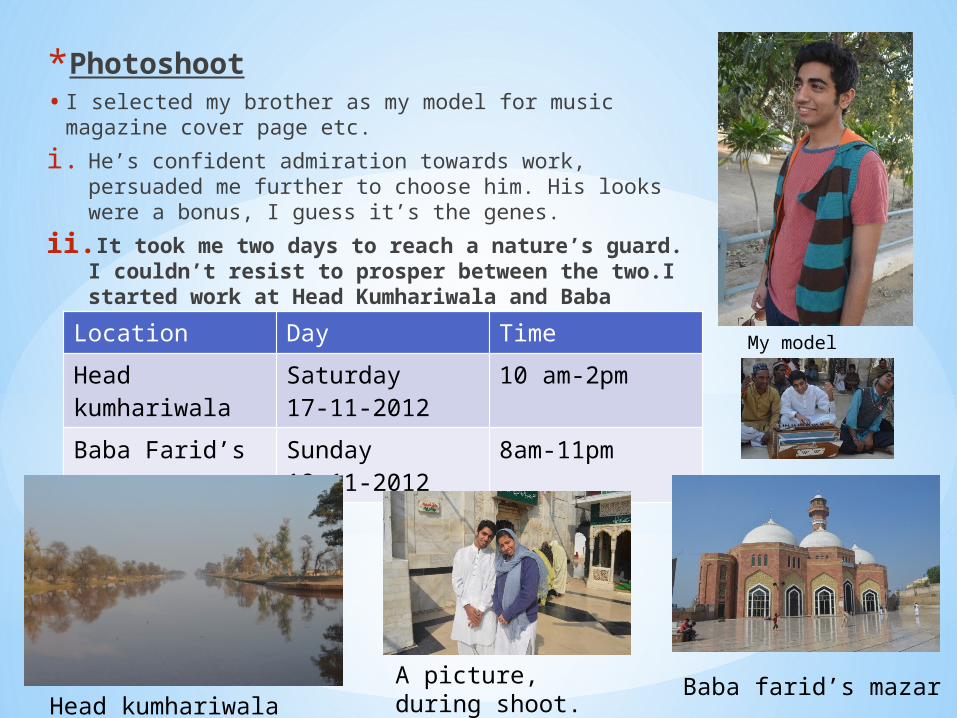
*Photoshoot• I selected my brother as my model for music magazine
cover page etc.
i. He’s confident admiration towards work, persuaded me further to choose him. His looks were a bonus, I guess it’s the genes.
ii. It took me two days to reach a nature’s guard. I couldn’t resist to prosper between the two.I started work at Head Kumhariwala and Baba Farid’s mazar right away.Location Day Time
Head kumhariwala
Saturday17-11-2012
10 am-2pm
Baba Farid’s mazar
Sunday18-11-2012
8am-11pm
A picture, during shoot.
My model
Head kumhariwalaBaba farid’s mazar
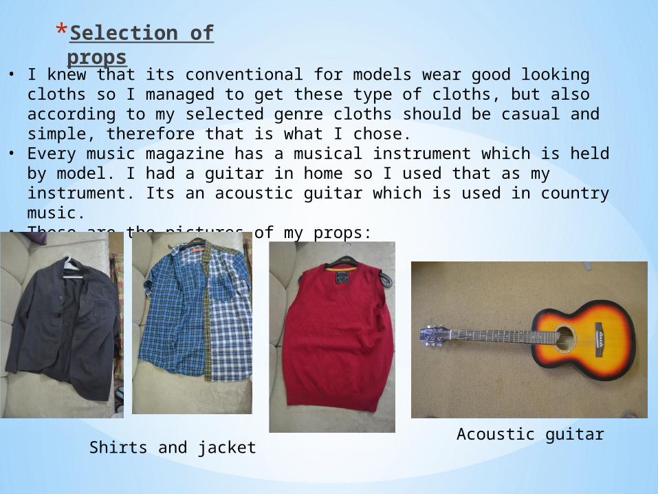
*Selection of props
• I knew that its conventional for models wear good looking cloths so I managed to get these type of cloths, but also according to my selected genre cloths should be casual and simple, therefore that is what I chose.
• Every music magazine has a musical instrument which is held by model. I had a guitar in home so I used that as my instrument. Its an acoustic guitar which is used in country music.
• These are the pictures of my props:
Shirts and jacketAcoustic guitar
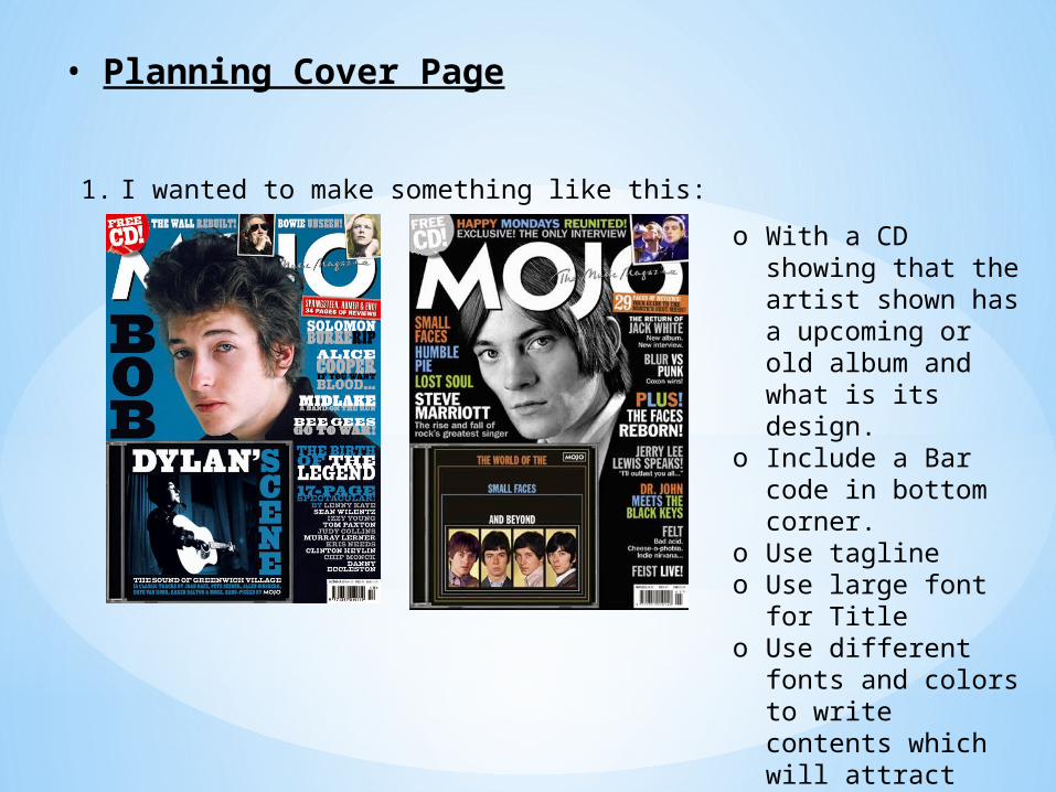
• Planning Cover Page
1. I wanted to make something like this:
o With a CD showing that the artist shown has a upcoming or old album and what is its design.
o Include a Bar code in bottom corner.
o Use taglineo Use large font for
Titleo Use different fonts
and colors to write contents which will attract audience's attention.
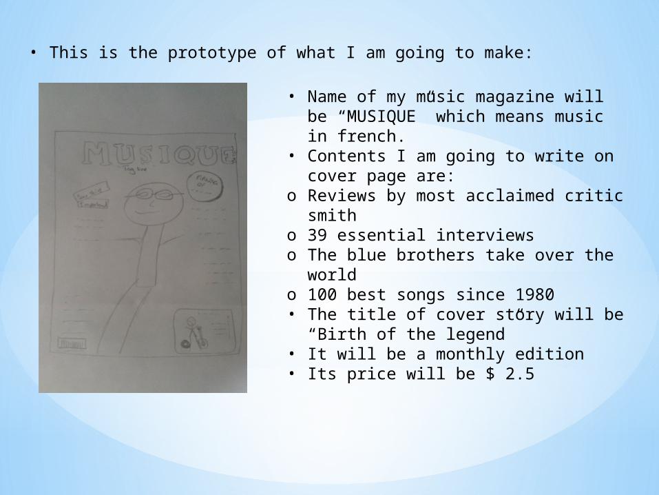
• This is the prototype of what I am going to make:
• Name of my music magazine will be “MUSIQUE” which means music in french.
• Contents I am going to write on cover page are:
o Reviews by most acclaimed critic smith
o 39 essential interviewso The blue brothers take over the worldo 100 best songs since 1980• The title of cover story will be “Birth
of the legend”• It will be a monthly edition• Its price will be $ 2.5
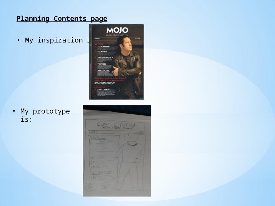
Planning Contents page
• My inspiration is:
• My prototype is:
Related Documents