http://www.hmwu.idv.tw http://www.hmwu.idv.tw 吳漢銘 國立臺北大學 統計學系 R統計圖形與 資料視覺化 D3-2

Welcome message from author
This document is posted to help you gain knowledge. Please leave a comment to let me know what you think about it! Share it to your friends and learn new things together.
Transcript

http://www.hmwu.idv.tw http://www.hmwu.idv.tw
吳漢銘國立臺北大學 統計學系
R統計圖形與資料視覺化
D3-2
http://www.hmwu.idv.tw
本章大綱 Data visualization 基礎統計圖形
單一樣本、雙樣本及多樣本的基礎統計圖形 3D散佈圖、rgl、影像、heatmap、等高線圖
其它主題 Venn Diagrams、ggplot2、Rgraphviz、igraph、Choropleth
Maps、RgoogleMaps、maps, mapdata、googleVis、vcd、ggvis、graphics.SDA
巨量資料之視覺化 參考書目、Web Resource
2/135
http://www.hmwu.idv.tw
Graphics Statistical Graphics
Graphics 3/135
http://www.hmwu.idv.tw
Visualization Computer Vision
Visualization 4/135
http://www.hmwu.idv.tw
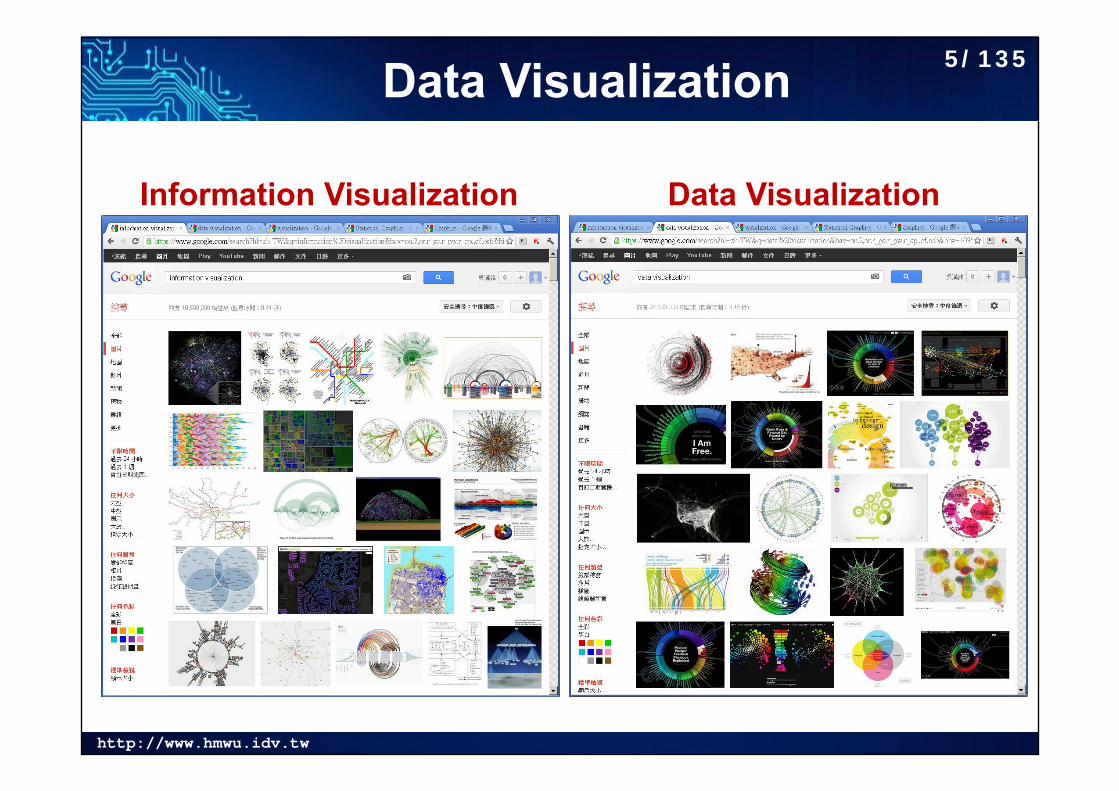
Information Visualization Data Visualization
Data Visualization 5/135
http://www.hmwu.idv.tw
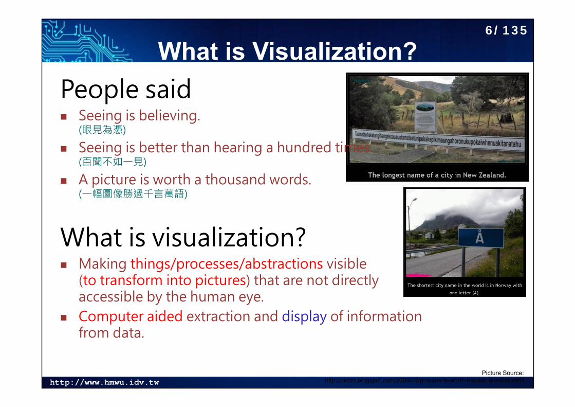
What is Visualization?People said Seeing is believing.
(眼見為憑)
Seeing is better than hearing a hundred times. (百聞不如一見)
A picture is worth a thousand words. (一幅圖像勝過千言萬語)
What is visualization? Making things/processes/abstractions visible
(to transform into pictures) that are not directly accessible by the human eye.
Computer aided extraction and display of information from data.
Picture Source:http://pictzz.blogspot.com/2009/03/pictures-is-worth-thousand-words.html
6/135
http://www.hmwu.idv.tw
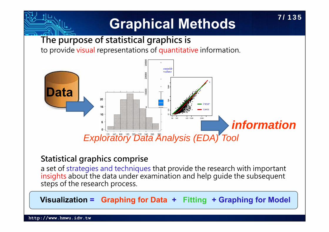
Graphical MethodsThe purpose of statistical graphics isto provide visual representations of quantitative information.
Statistical graphics comprise a set of strategies and techniques that provide the research with important insights about the data under examination and help guide the subsequent steps of the research process.
Data
informationExploratory Data Analysis (EDA) Tool
Visualization = Graphing for Data + Fitting + Graphing for Model
7/135
http://www.hmwu.idv.tw
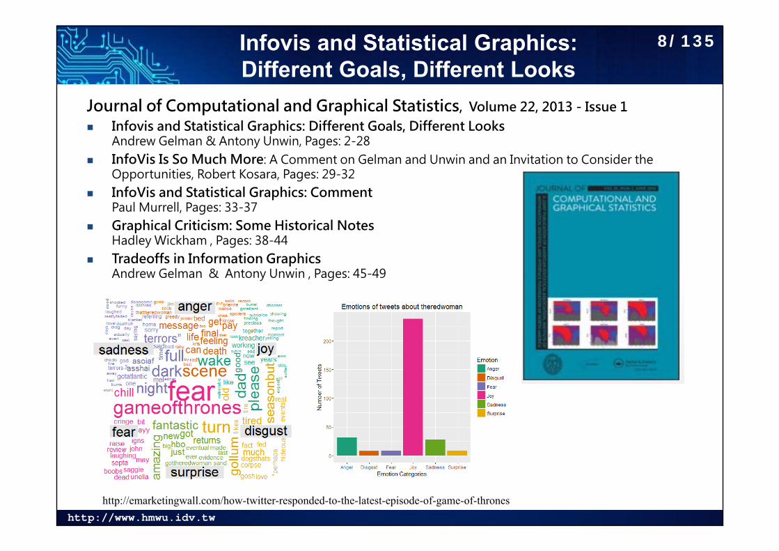
Infovis and Statistical Graphics: Different Goals, Different Looks
Journal of Computational and Graphical Statistics, Volume 22, 2013 - Issue 1 Infovis and Statistical Graphics: Different Goals, Different Looks
Andrew Gelman & Antony Unwin, Pages: 2-28 InfoVis Is So Much More: A Comment on Gelman and Unwin and an Invitation to Consider the
Opportunities, Robert Kosara, Pages: 29-32 InfoVis and Statistical Graphics: Comment
Paul Murrell, Pages: 33-37 Graphical Criticism: Some Historical Notes
Hadley Wickham , Pages: 38-44 Tradeoffs in Information Graphics
Andrew Gelman & Antony Unwin , Pages: 45-49
http://emarketingwall.com/how-twitter-responded-to-the-latest-episode-of-game-of-thrones
8/135
http://www.hmwu.idv.tw
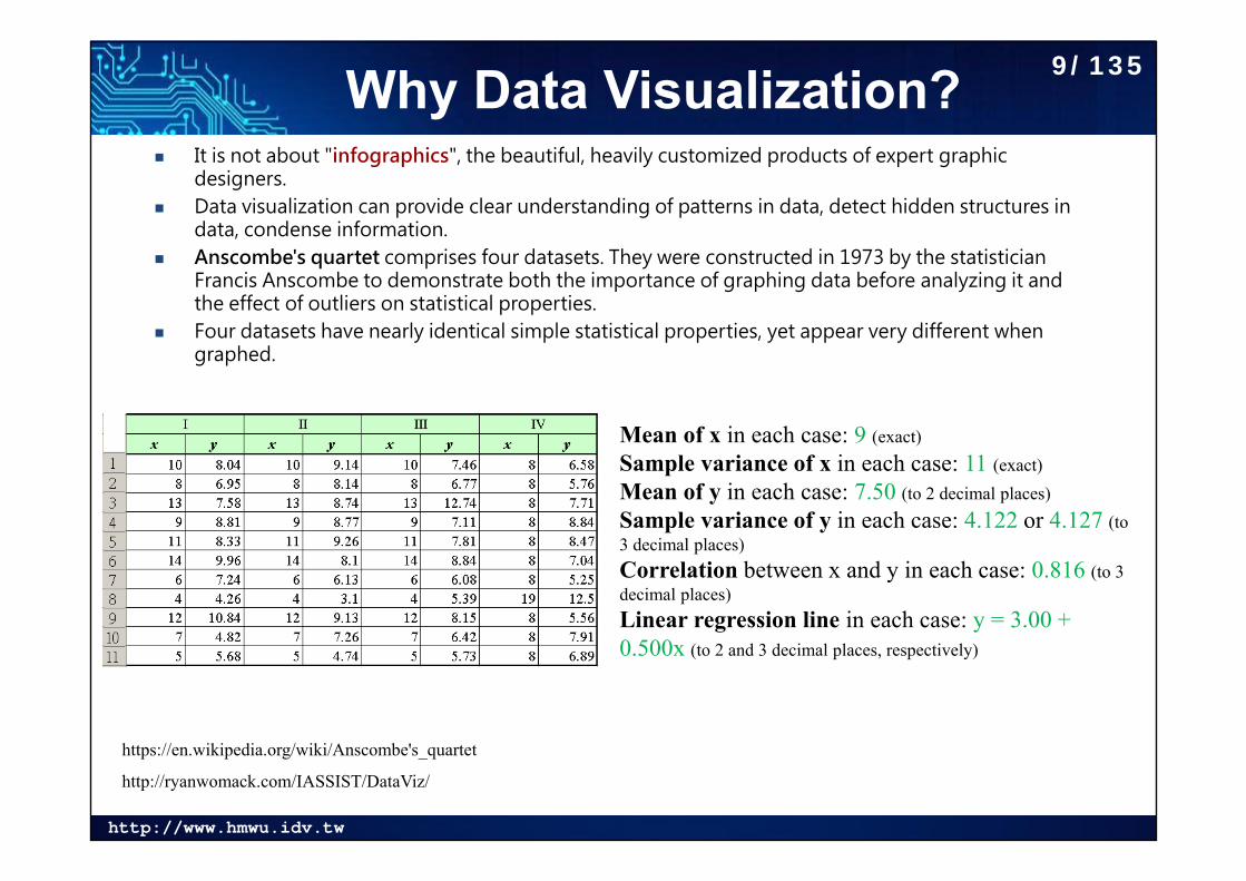
Why Data Visualization? It is not about "infographics", the beautiful, heavily customized products of expert graphic
designers. Data visualization can provide clear understanding of patterns in data, detect hidden structures in
data, condense information. Anscombe's quartet comprises four datasets. They were constructed in 1973 by the statistician
Francis Anscombe to demonstrate both the importance of graphing data before analyzing it and the effect of outliers on statistical properties.
Four datasets have nearly identical simple statistical properties, yet appear very different when graphed.
http://ryanwomack.com/IASSIST/DataViz/
https://en.wikipedia.org/wiki/Anscombe's_quartet
Mean of x in each case: 9 (exact)Sample variance of x in each case: 11 (exact)Mean of y in each case: 7.50 (to 2 decimal places)Sample variance of y in each case: 4.122 or 4.127 (to 3 decimal places)Correlation between x and y in each case: 0.816 (to 3 decimal places)Linear regression line in each case: y = 3.00 + 0.500x (to 2 and 3 decimal places, respectively)
9/135
http://www.hmwu.idv.tw
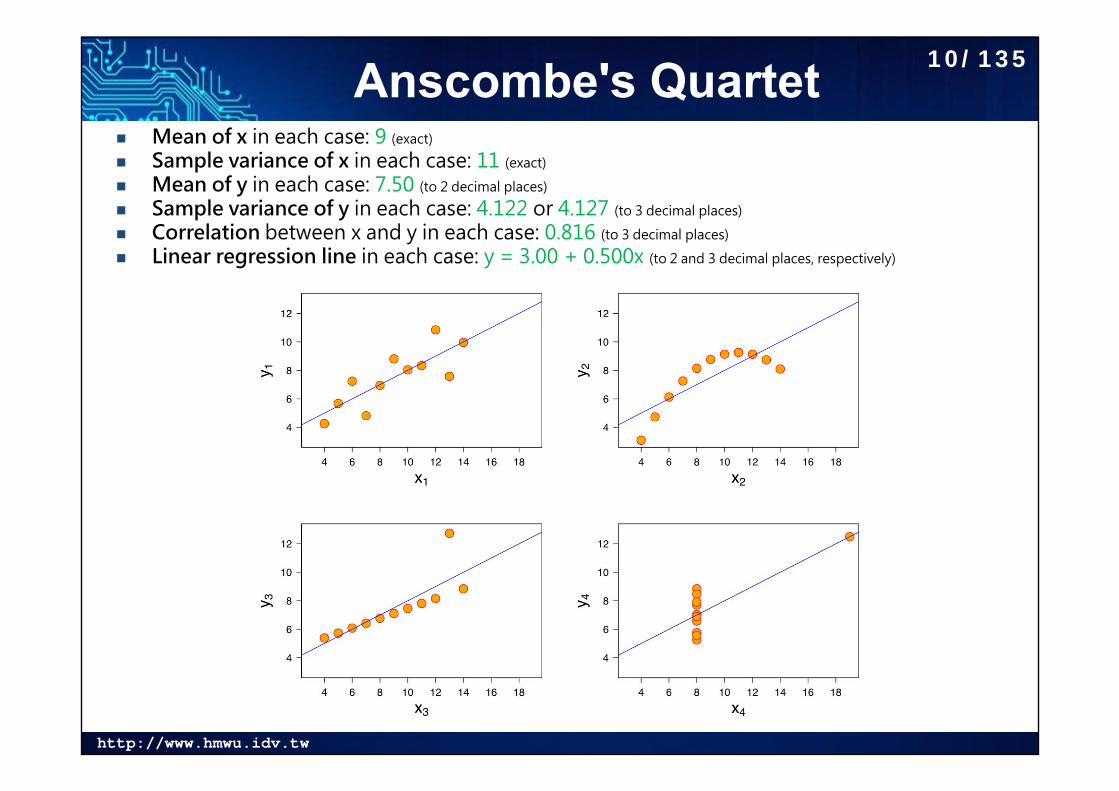
Anscombe's Quartet Mean of x in each case: 9 (exact)
Sample variance of x in each case: 11 (exact)
Mean of y in each case: 7.50 (to 2 decimal places)
Sample variance of y in each case: 4.122 or 4.127 (to 3 decimal places)
Correlation between x and y in each case: 0.816 (to 3 decimal places)
Linear regression line in each case: y = 3.00 + 0.500x (to 2 and 3 decimal places, respectively)
10/135
http://www.hmwu.idv.tw
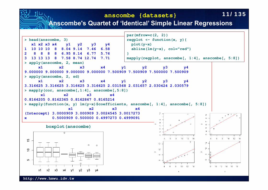
anscombe {datasets}Anscombe's Quartet of ‘Identical’ Simple Linear Regressions
> head(anscombe, 3)x1 x2 x3 x4 y1 y2 y3 y4
1 10 10 10 8 8.04 9.14 7.46 6.582 8 8 8 8 6.95 8.14 6.77 5.763 13 13 13 8 7.58 8.74 12.74 7.71> apply(anscombe, 2, mean)
x1 x2 x3 x4 y1 y2 y3 y4 9.000000 9.000000 9.000000 9.000000 7.500909 7.500909 7.500000 7.500909 > apply(anscombe, 2, sd)
x1 x2 x3 x4 y1 y2 y3 y4 3.316625 3.316625 3.316625 3.316625 2.031568 2.031657 2.030424 2.030579 > mapply(cor, anscombe[,1:4], anscombe[,5:8])
x1 x2 x3 x4 0.8164205 0.8162365 0.8162867 0.8165214 > mapply(function(x, y) lm(y~x)$coefficients, anscombe[, 1:4], anscombe[, 5:8])
x1 x2 x3 x4(Intercept) 3.0000909 3.000909 3.0024545 3.0017273x 0.5000909 0.500000 0.4997273 0.4999091
boxplot(anscombe)
par(mfrow=c(2, 2))regplot <- function(x, y){
plot(y~x) abline(lm(y~x), col="red")
}mapply(regplot, anscombe[, 1:4], anscombe[, 5:8])
11/135
http://www.hmwu.idv.tw
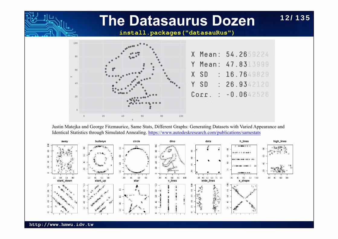
The Datasaurus Dozeninstall.packages("datasauRus")
Justin Matejka and George Fitzmaurice, Same Stats, Different Graphs: Generating Datasets with Varied Appearance and Identical Statistics through Simulated Annealing. https://www.autodeskresearch.com/publications/samestats
12/135
http://www.hmwu.idv.tw
The Datasaurus DozenMore examples
13/135
http://www.hmwu.idv.tw
Graphical PerceptionHuman reception and comprehension of graphical information involves three fundamental perceptual task:
Detection: the visual recognition of a geometric aspect that encodes a physical value. The basic information from the data must be discernible in the graph.
Assembly: the process of discerning patterned regularities among the discrete elements of a graphical display.
Estimation: the visual assessment of the relative magnitudes of two or more quantitative physical values.
14/135
http://www.hmwu.idv.tw
graphics: The R Graphics PackagePlots:assocplot: Association Plotsbarplot: Bar Plotsboxplot: Box Plotscdplot: Conditional Density Plotscontour: Display Contourscoplot: Conditioning Plotscurve: Draw Function Plotsdotchart: Cleveland's Dot Plotsfilled.contour: Level (Contour) Plotsfourfoldplot: Fourfold Plotshist: Histogramsimage: Display a Color Imagematplot: Plot Columns of Matricesmosaicplot: Mosaic Plotspairs: Scatterplot Matricespersp: Perspective Plotspie: Pie Chartsplot: Generic X-Y PlottingsmoothScatter: Scatterplots with Smoothed
Densities Color Representationspineplot: Spine Plots and Spinogramsstars: Star (Spider/Radar) Plots and Segment Diagramsstem: Stem-and-Leaf Plotsstripchart: 1-D Scatter Plotssunflowerplot: Produce a Sunflower Scatter Plot
15/135
http://www.hmwu.idv.tw
ggplot2: Create Elegant Data Visualisations Using the Grammar of Graphics
• Hadley Wickham, ggplot2: Elegant Graphics for Data Analysis: http://ggplot2.org/
library(ggplot2)qplot(Sepal.Length, Petal.Length, geom="point",data=iris, colour = Species, main="scatterplot")
qplot(Species, Sepal.Length, geom="boxplot",fill=Species, data=iris)
http://www.youtube.com/watch?v=HeqHMM4ziXAhttp://www.youtube.com/watch?v=n8kYa9vu1l8
qplot(x, y = NULL, ..., data, facets = NULL, margins = FALSE,geom = "auto", stat = list(NULL), position = list(NULL), xlim = c(NA,NA), ylim = c(NA, NA), log = "", main = NULL,xlab = deparse(substitute(x)), ylab = deparse(substitute(y)), asp = NA)
ggplot2 Version of Figures in Lattice: https://learnr.files.wordpress.com/2009/08/latbook.pdf
16/135
http://www.hmwu.idv.tw
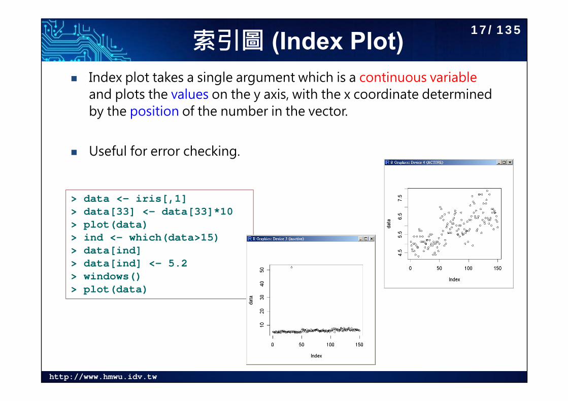
索引圖 (Index Plot) Index plot takes a single argument which is a continuous variable
and plots the values on the y axis, with the x coordinate determined by the position of the number in the vector.
Useful for error checking.
> data <- iris[,1]> data[33] <- data[33]*10> plot(data)> ind <- which(data>15)> data[ind]> data[ind] <- 5.2> windows()> plot(data)
17/135
http://www.hmwu.idv.tw
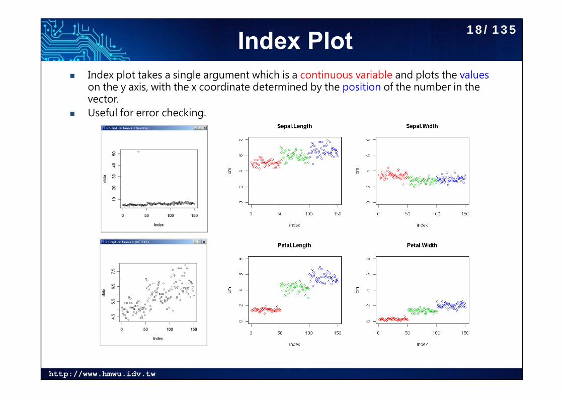
Index Plot Index plot takes a single argument which is a continuous variable and plots the values
on the y axis, with the x coordinate determined by the position of the number in the vector.
Useful for error checking.
18/135
http://www.hmwu.idv.tw
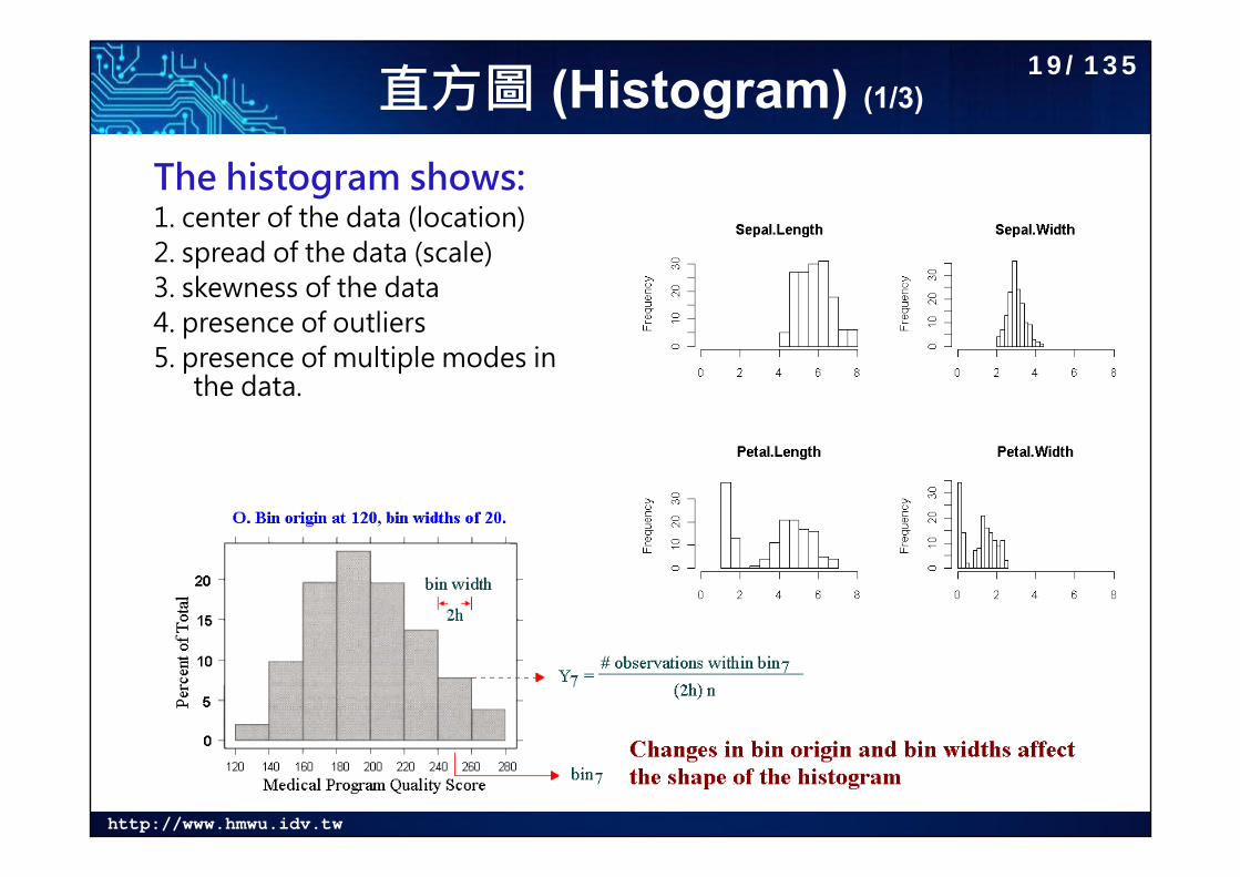
直方圖 (Histogram) (1/3)
The histogram shows:1. center of the data (location)2. spread of the data (scale)3. skewness of the data4. presence of outliers5. presence of multiple modes in
the data.
19/135
http://www.hmwu.idv.tw
直方圖 (Histogram) (2/3)
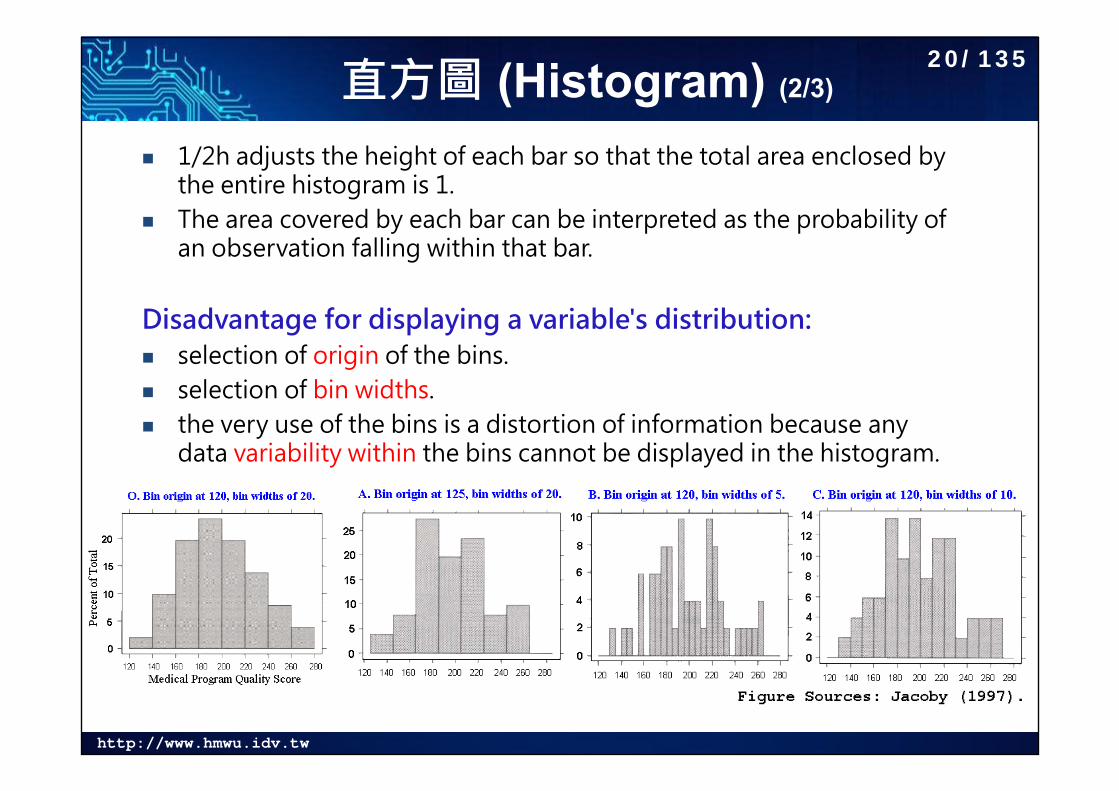
1/2h adjusts the height of each bar so that the total area enclosed by the entire histogram is 1.
The area covered by each bar can be interpreted as the probability of an observation falling within that bar.
Disadvantage for displaying a variable's distribution: selection of origin of the bins. selection of bin widths. the very use of the bins is a distortion of information because any
data variability within the bins cannot be displayed in the histogram.
20/135
http://www.hmwu.idv.tw
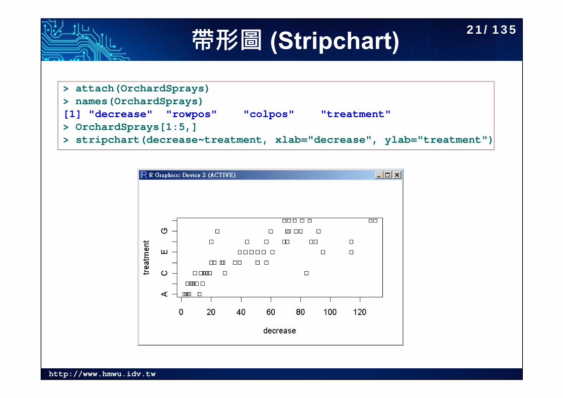
帶形圖 (Stripchart)> attach(OrchardSprays)> names(OrchardSprays)[1] "decrease" "rowpos" "colpos" "treatment"> OrchardSprays[1:5,]> stripchart(decrease~treatment, xlab="decrease", ylab="treatment")
21/135
http://www.hmwu.idv.tw
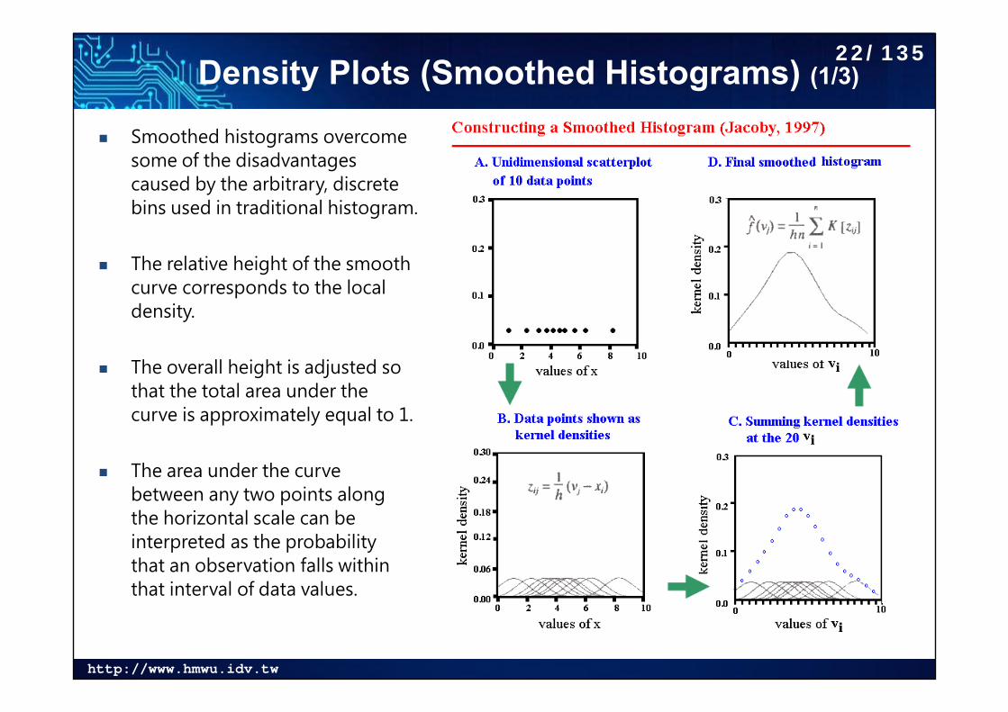
Density Plots (Smoothed Histograms) (1/3)
Smoothed histograms overcome some of the disadvantages caused by the arbitrary, discrete bins used in traditional histogram.
The relative height of the smooth curve corresponds to the local density.
The overall height is adjusted so that the total area under the curve is approximately equal to 1.
The area under the curve between any two points along the horizontal scale can be interpreted as the probability that an observation falls within that interval of data values.
22/135
http://www.hmwu.idv.tw
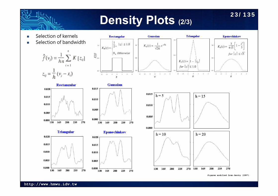
Density Plots (2/3)
Selection of kernels Selection of bandwidth
23/135
http://www.hmwu.idv.tw
Density Plots (3/3)
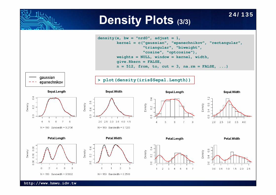
density(x, bw = "nrd0", adjust = 1,kernel = c("gaussian", "epanechnikov", "rectangular",
"triangular", "biweight","cosine", "optcosine"),
weights = NULL, window = kernel, width,give.Rkern = FALSE,n = 512, from, to, cut = 3, na.rm = FALSE, ...)
> plot(density(iris$Sepal.Length))
24/135
http://www.hmwu.idv.tw
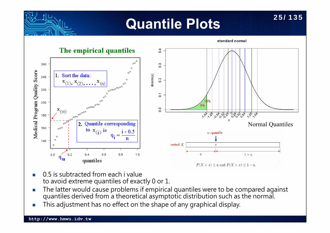
Quantile Plots
0.5 is subtracted from each i value to avoid extreme quantiles of exactly 0 or 1.
The latter would cause problems if empirical quantiles were to be compared against quantiles derived from a theoretical asymptotic distribution such as the normal.
This adjustment has no effect on the shape of any graphical display.
Normal Quantiles
25/135
http://www.hmwu.idv.tw
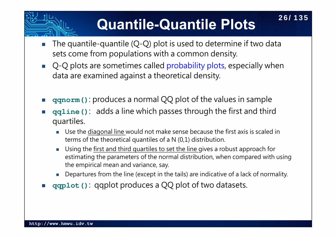
Quantile-Quantile Plots The quantile-quantile (Q-Q) plot is used to determine if two data
sets come from populations with a common density. Q-Q plots are sometimes called probability plots, especially when
data are examined against a theoretical density.
qqnorm(): produces a normal QQ plot of the values in sample qqline(): adds a line which passes through the first and third
quartiles. Use the diagonal line would not make sense because the first axis is scaled in
terms of the theoretical quantiles of a N (0,1) distribution. Using the first and third quartiles to set the line gives a robust approach for
estimating the parameters of the normal distribution, when compared with using the empirical mean and variance, say.
Departures from the line (except in the tails) are indicative of a lack of normality.
qqplot(): qqplot produces a QQ plot of two datasets.
26/135
http://www.hmwu.idv.tw
qqnorm, qqline, qqplot
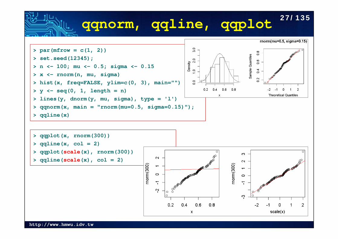
> par(mfrow = c(1, 2))> set.seed(12345); > n <- 100; mu <- 0.5; sigma <- 0.15> x <- rnorm(n, mu, sigma)> hist(x, freq=FALSE, ylim=c(0, 3), main="")> y <- seq(0, 1, length = n)> lines(y, dnorm(y, mu, sigma), type = 'l')> qqnorm(x, main = "rnorm(mu=0.5, sigma=0.15)"); > qqline(x)
> qqplot(x, rnorm(300)) > qqline(x, col = 2)> qqplot(scale(x), rnorm(300)) > qqline(scale(x), col = 2)
27/135
http://www.hmwu.idv.tw
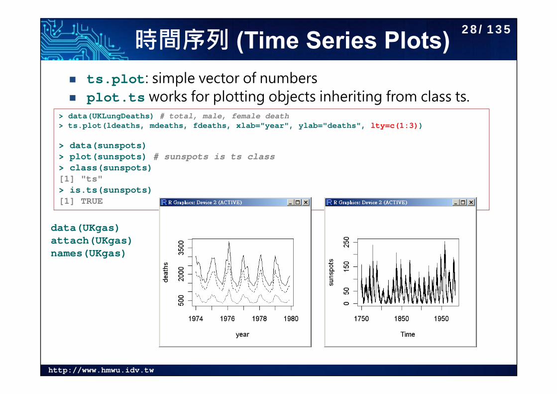
時間序列 (Time Series Plots) ts.plot: simple vector of numbers plot.ts works for plotting objects inheriting from class ts.
> data(UKLungDeaths) # total, male, female death> ts.plot(ldeaths, mdeaths, fdeaths, xlab="year", ylab="deaths", lty=c(1:3))
> data(sunspots)> plot(sunspots) # sunspots is ts class> class(sunspots)[1] "ts"> is.ts(sunspots)[1] TRUE
data(UKgas)attach(UKgas)names(UKgas)
28/135
http://www.hmwu.idv.tw
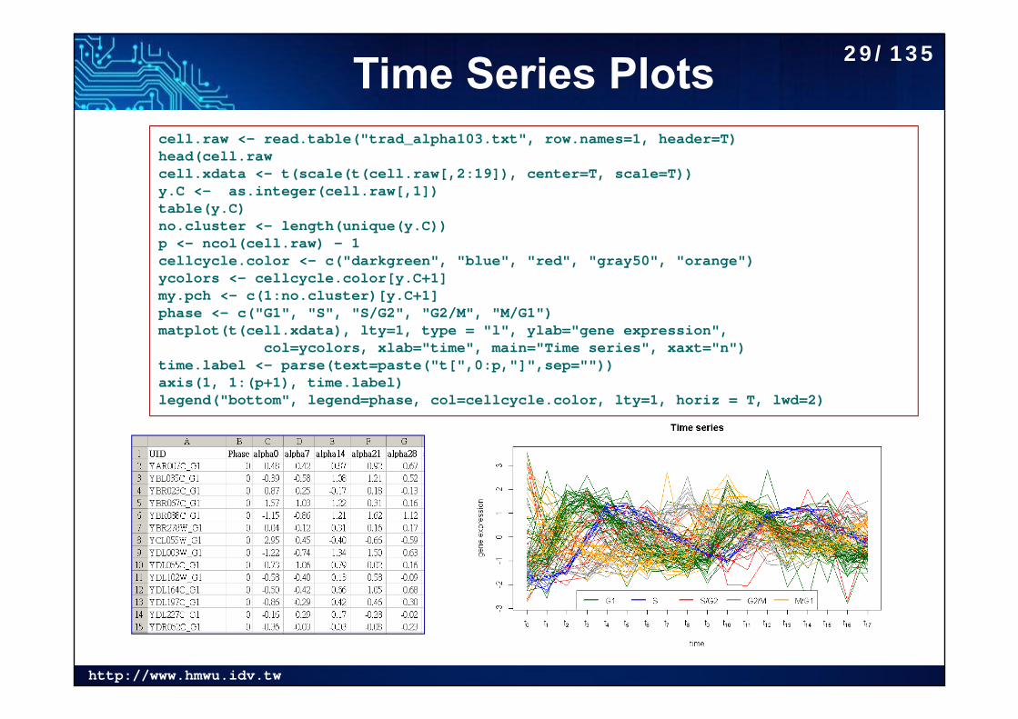
Time Series Plotscell.raw <- read.table("trad_alpha103.txt", row.names=1, header=T)head(cell.rawcell.xdata <- t(scale(t(cell.raw[,2:19]), center=T, scale=T)) y.C <- as.integer(cell.raw[,1])table(y.C)no.cluster <- length(unique(y.C)) p <- ncol(cell.raw) - 1 cellcycle.color <- c("darkgreen", "blue", "red", "gray50", "orange")ycolors <- cellcycle.color[y.C+1]my.pch <- c(1:no.cluster)[y.C+1] phase <- c("G1", "S", "S/G2", "G2/M", "M/G1")matplot(t(cell.xdata), lty=1, type = "l", ylab="gene expression",
col=ycolors, xlab="time", main="Time series", xaxt="n")time.label <- parse(text=paste("t[",0:p,"]",sep="")) axis(1, 1:(p+1), time.label)legend("bottom", legend=phase, col=cellcycle.color, lty=1, horiz = T, lwd=2)
29/135
http://www.hmwu.idv.tw
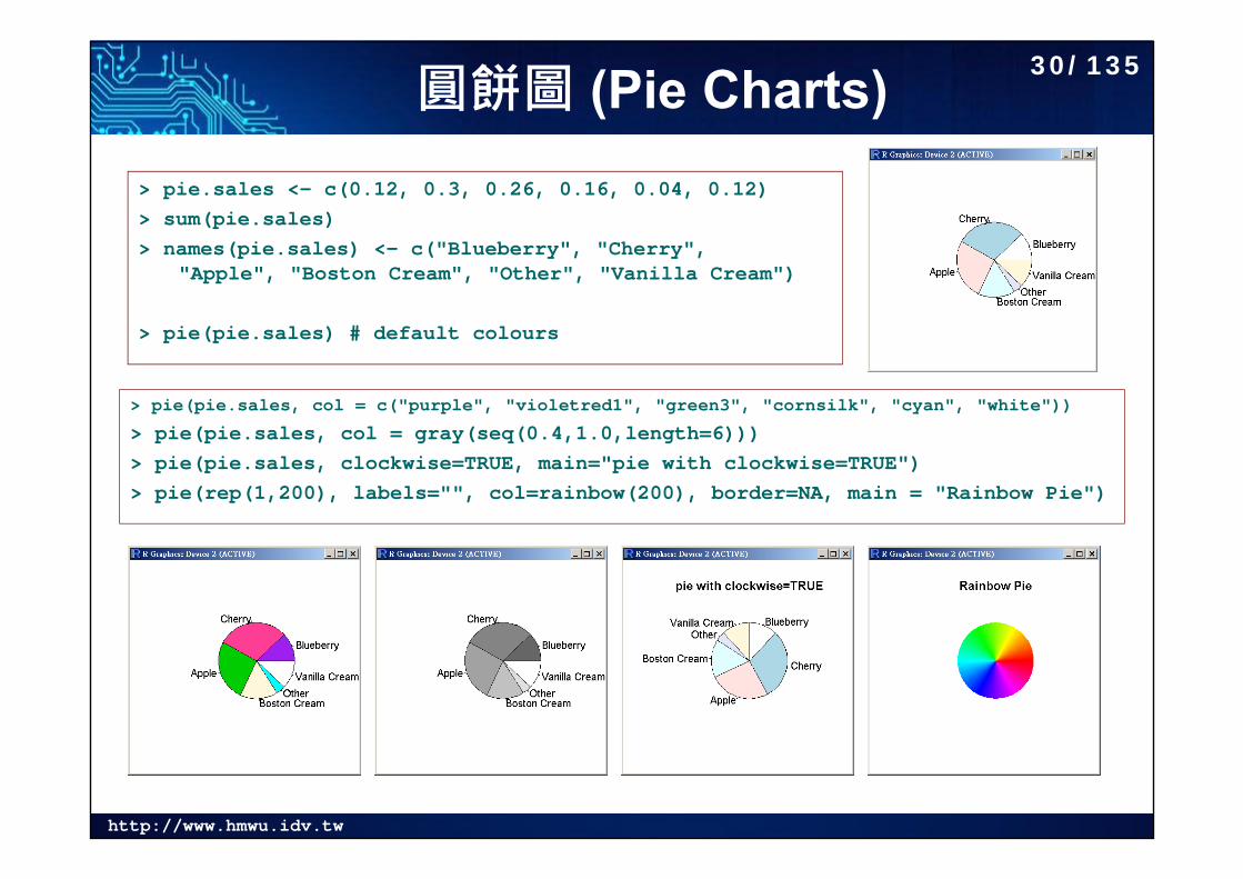
圓餅圖 (Pie Charts)> pie.sales <- c(0.12, 0.3, 0.26, 0.16, 0.04, 0.12)> sum(pie.sales)> names(pie.sales) <- c("Blueberry", "Cherry",
"Apple", "Boston Cream", "Other", "Vanilla Cream")
> pie(pie.sales) # default colours
> pie(pie.sales, col = c("purple", "violetred1", "green3", "cornsilk", "cyan", "white"))
> pie(pie.sales, col = gray(seq(0.4,1.0,length=6)))> pie(pie.sales, clockwise=TRUE, main="pie with clockwise=TRUE")> pie(rep(1,200), labels="", col=rainbow(200), border=NA, main = "Rainbow Pie")
30/135
http://www.hmwu.idv.tw
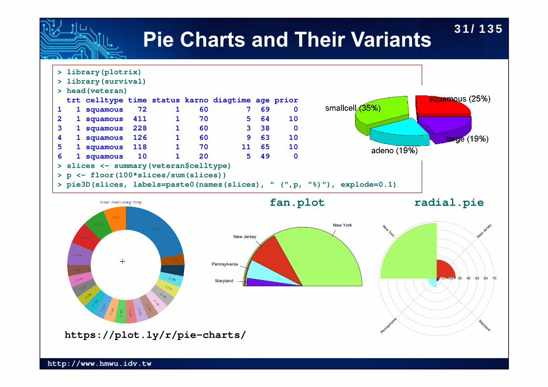
Pie Charts and Their Variants> library(plotrix)> library(survival)> head(veteran)
trt celltype time status karno diagtime age prior1 1 squamous 72 1 60 7 69 02 1 squamous 411 1 70 5 64 103 1 squamous 228 1 60 3 38 04 1 squamous 126 1 60 9 63 105 1 squamous 118 1 70 11 65 106 1 squamous 10 1 20 5 49 0> slices <- summary(veteran$celltype)> p <- floor(100*slices/sum(slices))> pie3D(slices, labels=paste0(names(slices), " (",p, "%)"), explode=0.1)
https://plot.ly/r/pie-charts/
radial.piefan.plot
31/135
http://www.hmwu.idv.tw
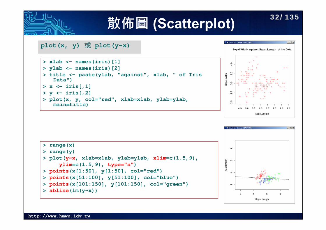
散佈圖 (Scatterplot)
> xlab <- names(iris)[1]> ylab <- names(iris)[2]> title <- paste(ylab, "against", xlab, " of Iris
Data")> x <- iris[,1]> y <- iris[,2]> plot(x, y, col="red", xlab=xlab, ylab=ylab,
main=title)
plot(x, y) 或 plot(y~x)
> range(x)> range(y)> plot(y~x, xlab=xlab, ylab=ylab, xlim=c(1.5,9),
ylim=c(1.5,9), type="n")> points(x[1:50], y[1:50], col="red")> points(x[51:100], y[51:100], col="blue")> points(x[101:150], y[101:150], col="green")> abline(lm(y~x))
32/135
http://www.hmwu.idv.tw
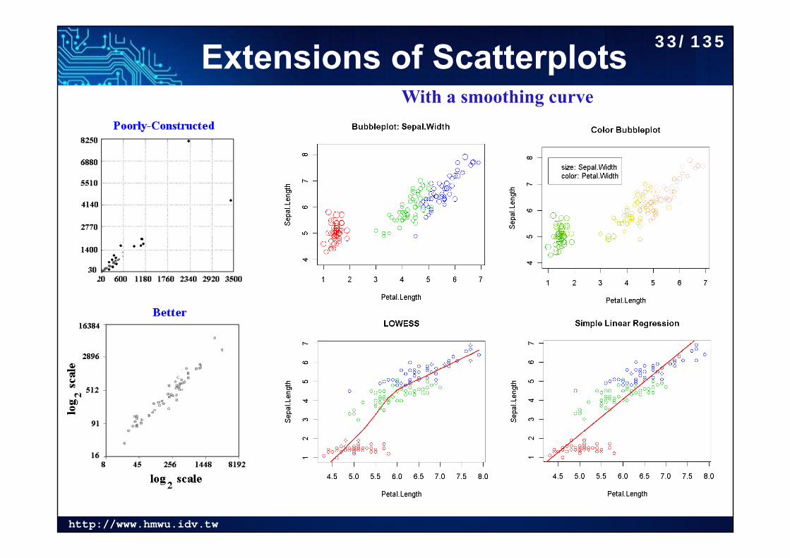
Extensions of ScatterplotsWith a smoothing curve
33/135
http://www.hmwu.idv.tw
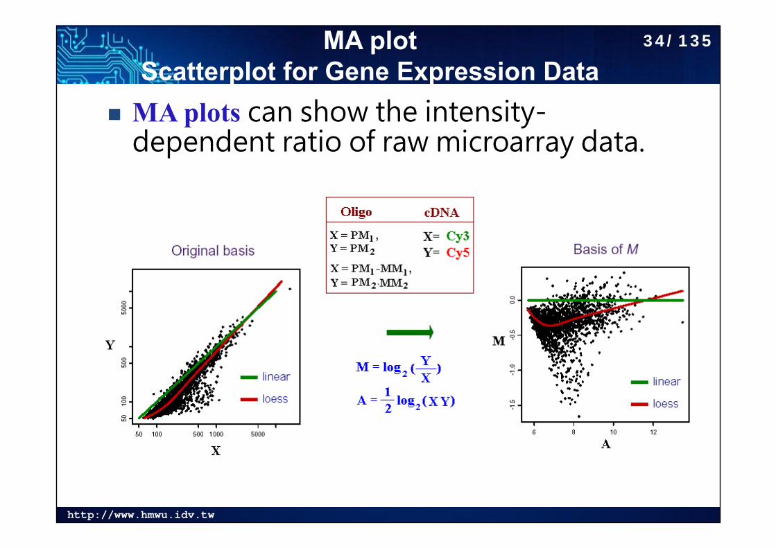
MA plot Scatterplot for Gene Expression Data
MA plots can show the intensity-dependent ratio of raw microarray data.
34/135
http://www.hmwu.idv.tw
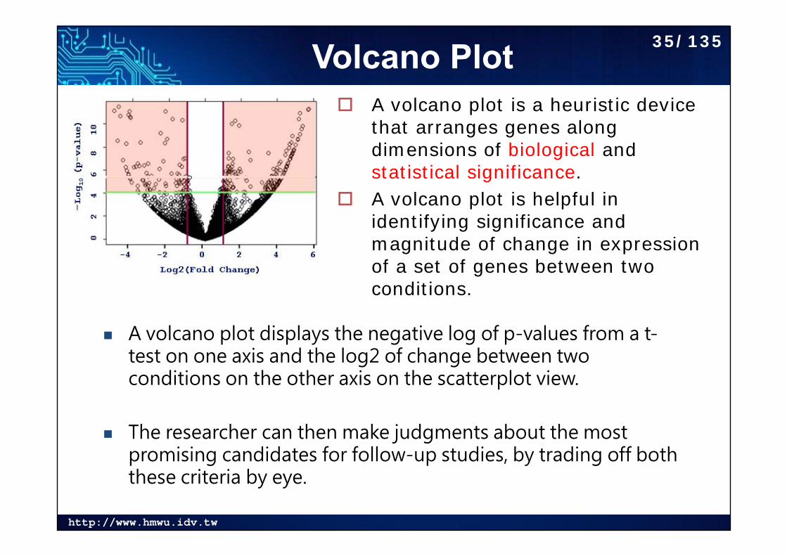
Volcano Plot
A volcano plot displays the negative log of p-values from a t-test on one axis and the log2 of change between two conditions on the other axis on the scatterplot view.
The researcher can then make judgments about the most promising candidates for follow-up studies, by trading off both these criteria by eye.
A volcano plot is a heuristic device that arranges genes along dimensions of biological andstatistical significance.
A volcano plot is helpful in identifying significance and magnitude of change in expression of a set of genes between two conditions.
35/135
http://www.hmwu.idv.tw
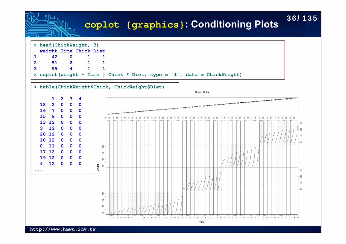
coplot {graphics}: Conditioning Plots
> head(ChickWeight, 3)weight Time Chick Diet
1 42 0 1 12 51 2 1 13 59 4 1 1> coplot(weight ~ Time | Chick * Diet, type = "l", data = ChickWeight)
> table(ChickWeight$Chick, ChickWeight$Diet)
1 2 3 418 2 0 0 016 7 0 0 015 8 0 0 013 12 0 0 09 12 0 0 020 12 0 0 010 12 0 0 08 11 0 0 017 12 0 0 019 12 0 0 04 12 0 0 0
...
36/135
http://www.hmwu.idv.tw
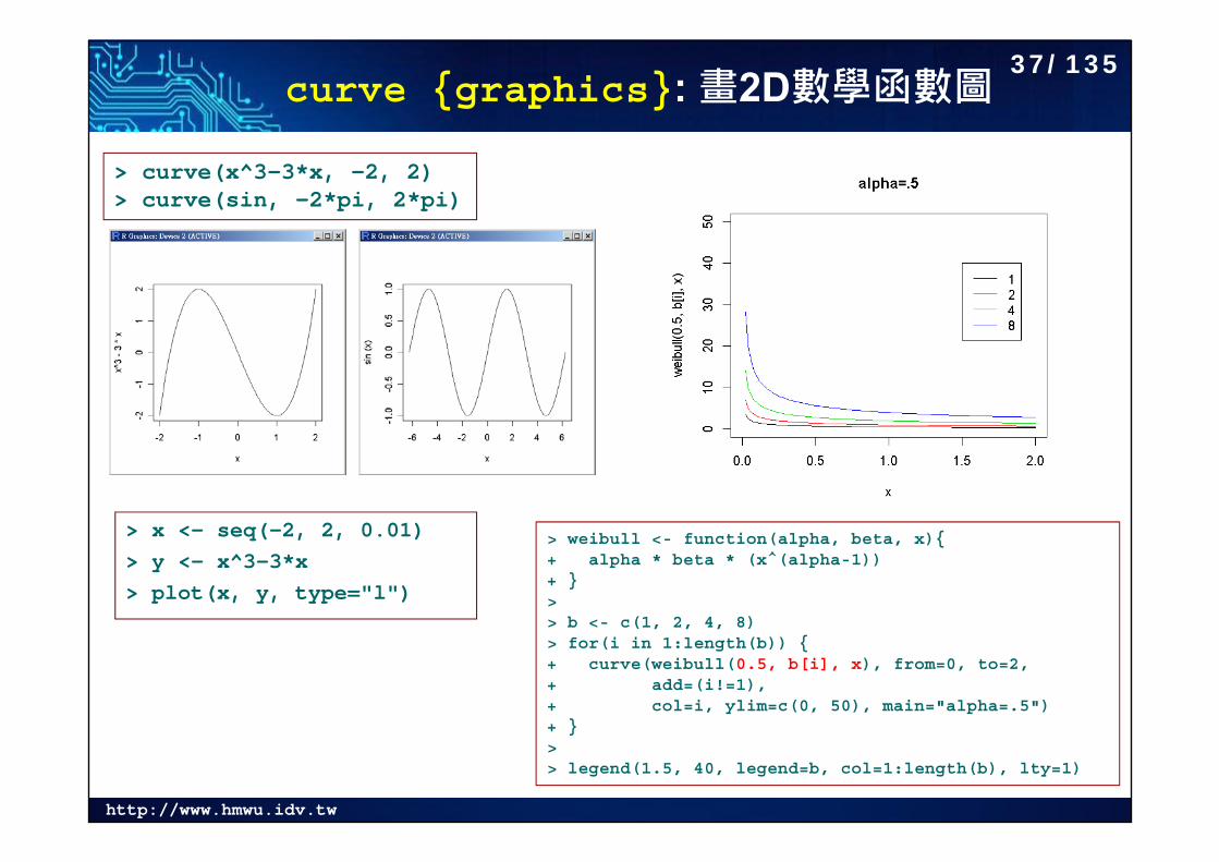
curve {graphics}: 畫2D數學函數圖
> x <- seq(-2, 2, 0.01)> y <- x^3-3*x> plot(x, y, type="l")
> curve(x^3-3*x, -2, 2)> curve(sin, -2*pi, 2*pi)
> weibull <- function(alpha, beta, x){+ alpha * beta * (x^(alpha-1))+ }> > b <- c(1, 2, 4, 8)> for(i in 1:length(b)) {+ curve(weibull(0.5, b[i], x), from=0, to=2, + add=(i!=1), + col=i, ylim=c(0, 50), main="alpha=.5")+ }> > legend(1.5, 40, legend=b, col=1:length(b), lty=1)
37/135
http://www.hmwu.idv.tw
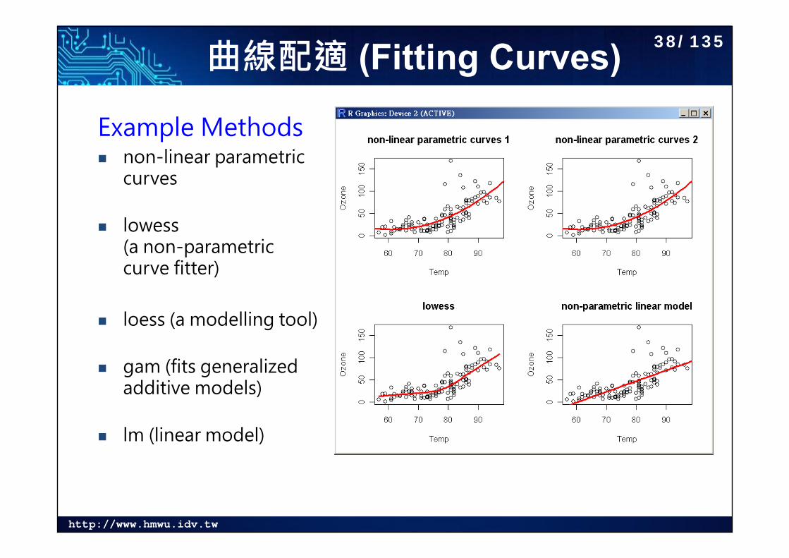
曲線配適 (Fitting Curves)
Example Methods non-linear parametric
curves
lowess (a non-parametric curve fitter)
loess (a modelling tool)
gam (fits generalized additive models)
lm (linear model)
38/135
http://www.hmwu.idv.tw
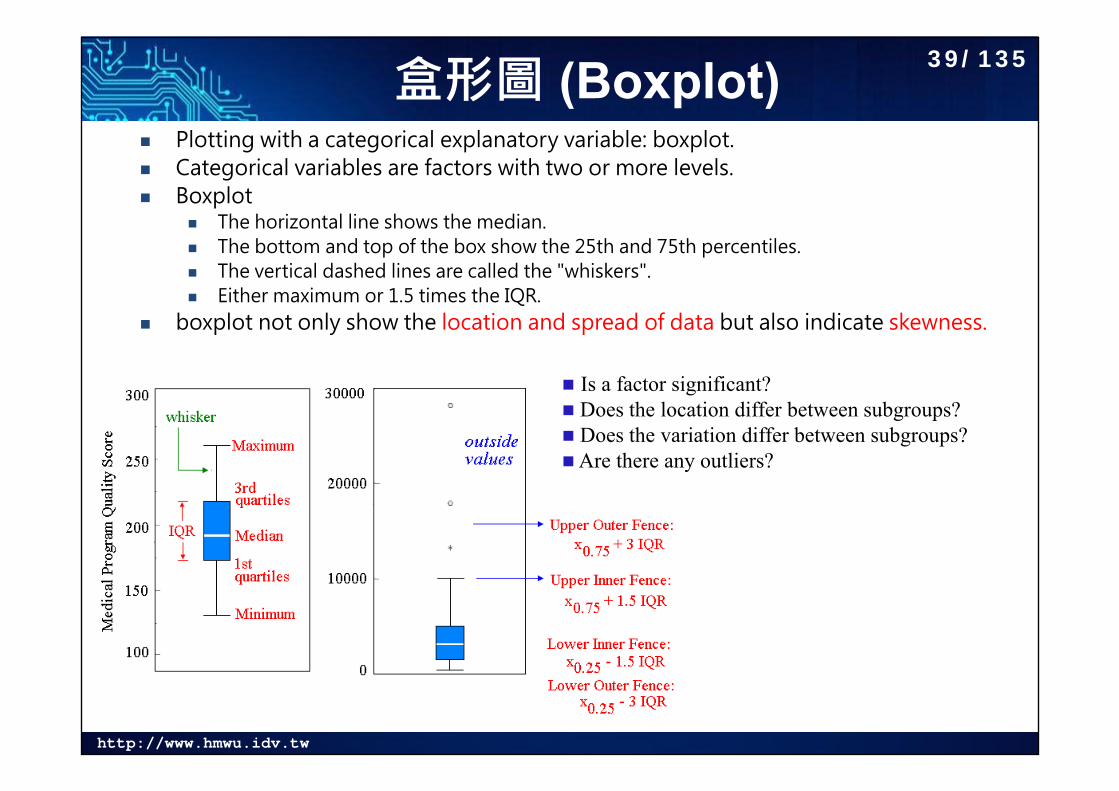
盒形圖 (Boxplot) Plotting with a categorical explanatory variable: boxplot. Categorical variables are factors with two or more levels. Boxplot
The horizontal line shows the median. The bottom and top of the box show the 25th and 75th percentiles. The vertical dashed lines are called the "whiskers". Either maximum or 1.5 times the IQR.
boxplot not only show the location and spread of data but also indicate skewness.
Is a factor significant? Does the location differ between subgroups? Does the variation differ between subgroups? Are there any outliers?
39/135
http://www.hmwu.idv.tw
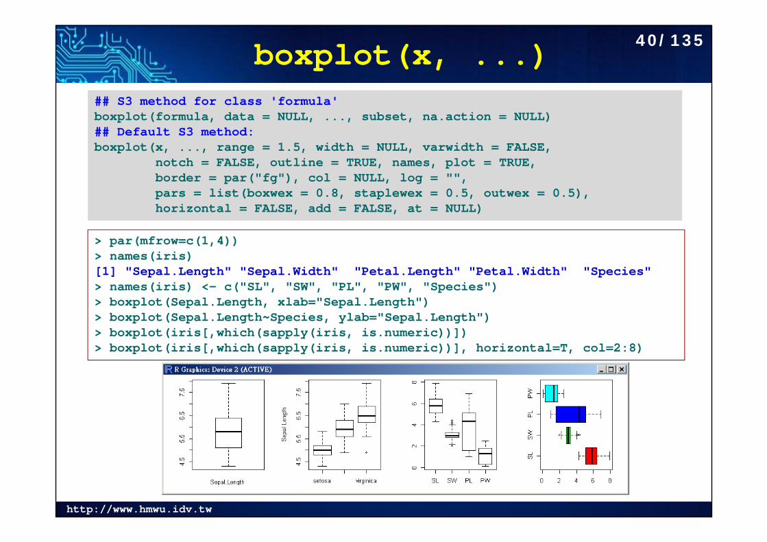
boxplot(x, ...)## S3 method for class 'formula'boxplot(formula, data = NULL, ..., subset, na.action = NULL)## Default S3 method:boxplot(x, ..., range = 1.5, width = NULL, varwidth = FALSE,
notch = FALSE, outline = TRUE, names, plot = TRUE,border = par("fg"), col = NULL, log = "",pars = list(boxwex = 0.8, staplewex = 0.5, outwex = 0.5),horizontal = FALSE, add = FALSE, at = NULL)
> par(mfrow=c(1,4))> names(iris)[1] "Sepal.Length" "Sepal.Width" "Petal.Length" "Petal.Width" "Species" > names(iris) <- c("SL", "SW", "PL", "PW", "Species")> boxplot(Sepal.Length, xlab="Sepal.Length")> boxplot(Sepal.Length~Species, ylab="Sepal.Length")> boxplot(iris[,which(sapply(iris, is.numeric))])> boxplot(iris[,which(sapply(iris, is.numeric))], horizontal=T, col=2:8)
40/135
http://www.hmwu.idv.tw
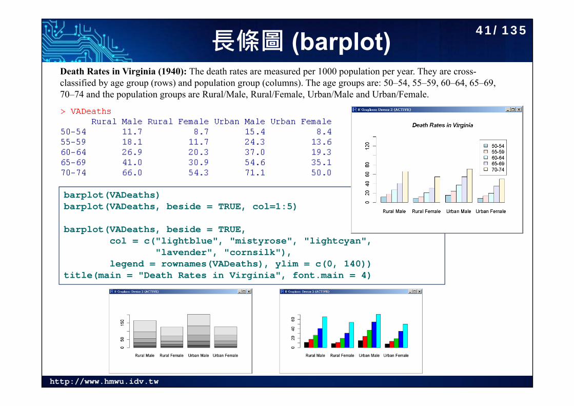
長條圖 (barplot)Death Rates in Virginia (1940): The death rates are measured per 1000 population per year. They are cross-classified by age group (rows) and population group (columns). The age groups are: 50–54, 55–59, 60–64, 65–69, 70–74 and the population groups are Rural/Male, Rural/Female, Urban/Male and Urban/Female.
barplot(VADeaths)barplot(VADeaths, beside = TRUE, col=1:5)
barplot(VADeaths, beside = TRUE,col = c("lightblue", "mistyrose", "lightcyan",
"lavender", "cornsilk"),legend = rownames(VADeaths), ylim = c(0, 140))
title(main = "Death Rates in Virginia", font.main = 4)
41/135
http://www.hmwu.idv.tw
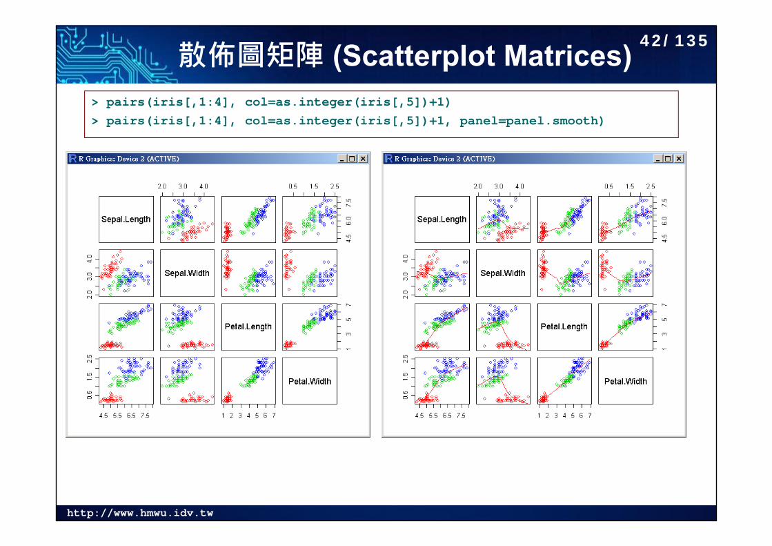
散佈圖矩陣 (Scatterplot Matrices)> pairs(iris[,1:4], col=as.integer(iris[,5])+1)> pairs(iris[,1:4], col=as.integer(iris[,5])+1, panel=panel.smooth)
42/135
http://www.hmwu.idv.tw
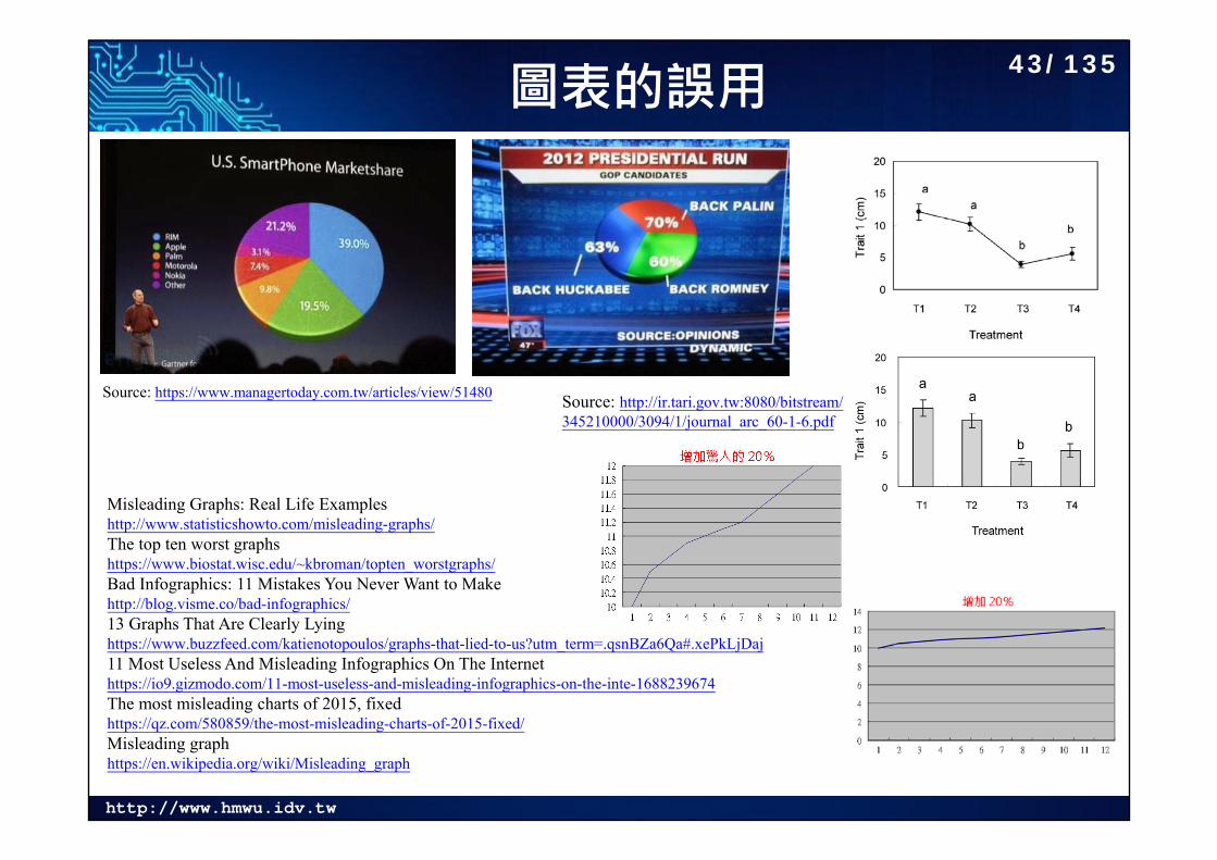
圖表的誤用
Source: https://www.managertoday.com.tw/articles/view/51480 Source: http://ir.tari.gov.tw:8080/bitstream/345210000/3094/1/journal_arc_60-1-6.pdf
Misleading Graphs: Real Life Examples http://www.statisticshowto.com/misleading-graphs/The top ten worst graphshttps://www.biostat.wisc.edu/~kbroman/topten_worstgraphs/Bad Infographics: 11 Mistakes You Never Want to Makehttp://blog.visme.co/bad-infographics/13 Graphs That Are Clearly Lying https://www.buzzfeed.com/katienotopoulos/graphs-that-lied-to-us?utm_term=.qsnBZa6Qa#.xePkLjDaj11 Most Useless And Misleading Infographics On The Internethttps://io9.gizmodo.com/11-most-useless-and-misleading-infographics-on-the-inte-1688239674The most misleading charts of 2015, fixedhttps://qz.com/580859/the-most-misleading-charts-of-2015-fixed/Misleading graphhttps://en.wikipedia.org/wiki/Misleading_graph
43/135
http://www.hmwu.idv.tw
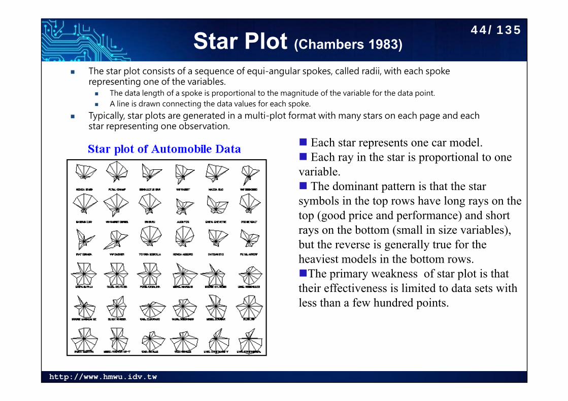
Star Plot (Chambers 1983)
The star plot consists of a sequence of equi-angular spokes, called radii, with each spoke representing one of the variables. The data length of a spoke is proportional to the magnitude of the variable for the data point. A line is drawn connecting the data values for each spoke.
Typically, star plots are generated in a multi-plot format with many stars on each page and each star representing one observation.
Each star represents one car model. Each ray in the star is proportional to one variable. The dominant pattern is that the star symbols in the top rows have long rays on the top (good price and performance) and short rays on the bottom (small in size variables), but the reverse is generally true for the heaviest models in the bottom rows.The primary weakness of star plot is that their effectiveness is limited to data sets with less than a few hundred points.
44/135
http://www.hmwu.idv.tw
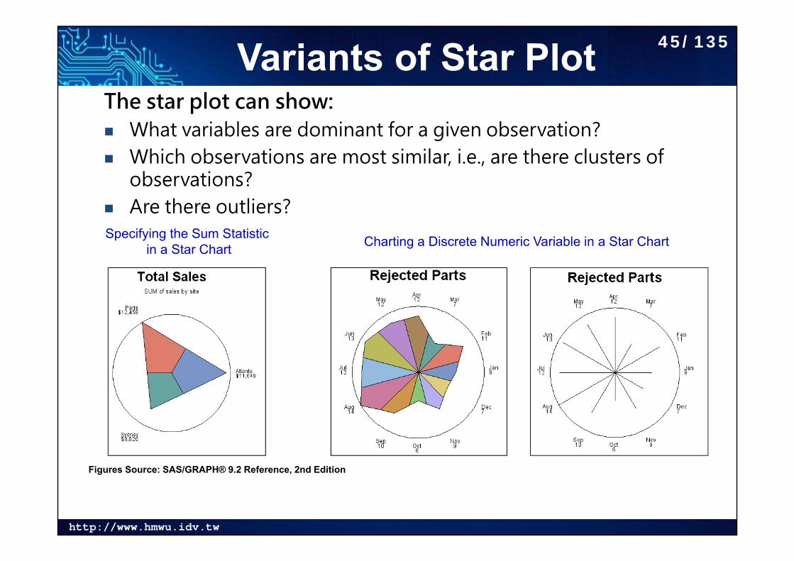
Variants of Star PlotThe star plot can show: What variables are dominant for a given observation? Which observations are most similar, i.e., are there clusters of
observations? Are there outliers? Specifying the Sum Statistic
in a Star Chart Charting a Discrete Numeric Variable in a Star Chart
Figures Source: SAS/GRAPH® 9.2 Reference, 2nd Edition
45/135
http://www.hmwu.idv.tw
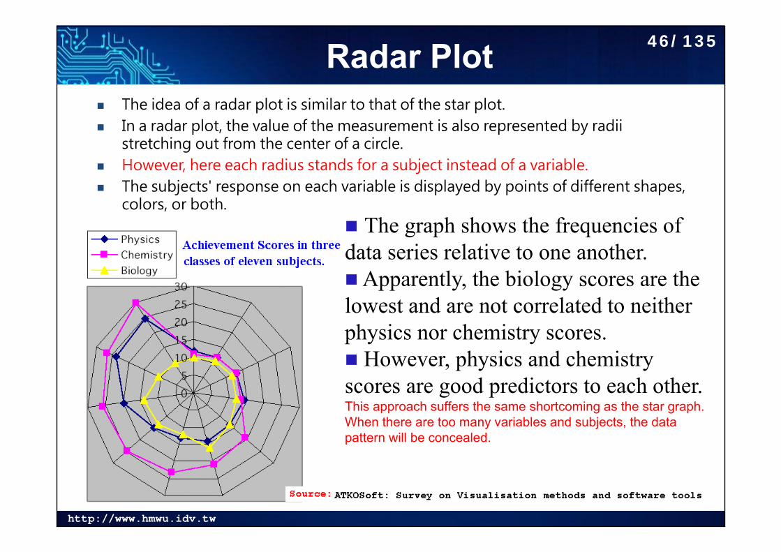
Radar Plot The idea of a radar plot is similar to that of the star plot. In a radar plot, the value of the measurement is also represented by radii
stretching out from the center of a circle. However, here each radius stands for a subject instead of a variable. The subjects' response on each variable is displayed by points of different shapes,
colors, or both. The graph shows the frequencies of data series relative to one another. Apparently, the biology scores are the lowest and are not correlated to neither physics nor chemistry scores. However, physics and chemistry scores are good predictors to each other. This approach suffers the same shortcoming as the star graph. When there are too many variables and subjects, the data pattern will be concealed.
46/135
http://www.hmwu.idv.tw
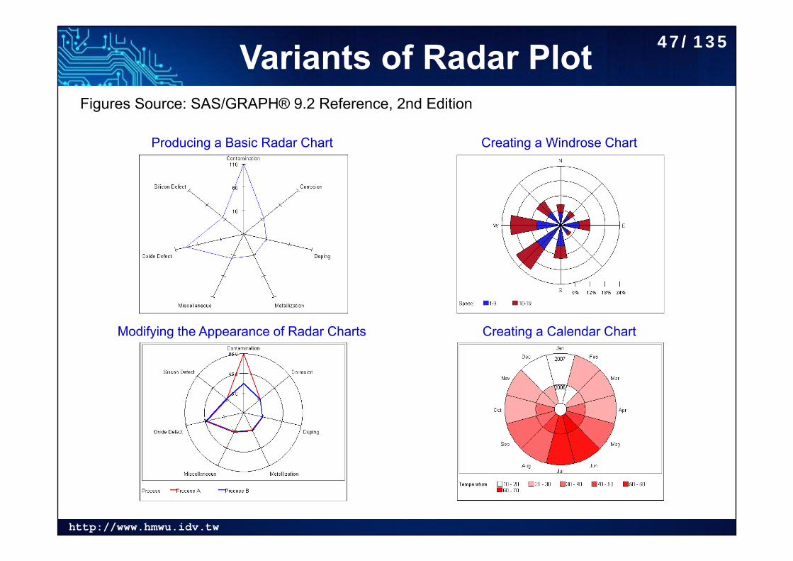
Variants of Radar Plot
Producing a Basic Radar Chart
Modifying the Appearance of Radar Charts
Creating a Windrose Chart
Creating a Calendar Chart
Figures Source: SAS/GRAPH® 9.2 Reference, 2nd Edition
47/135
http://www.hmwu.idv.tw
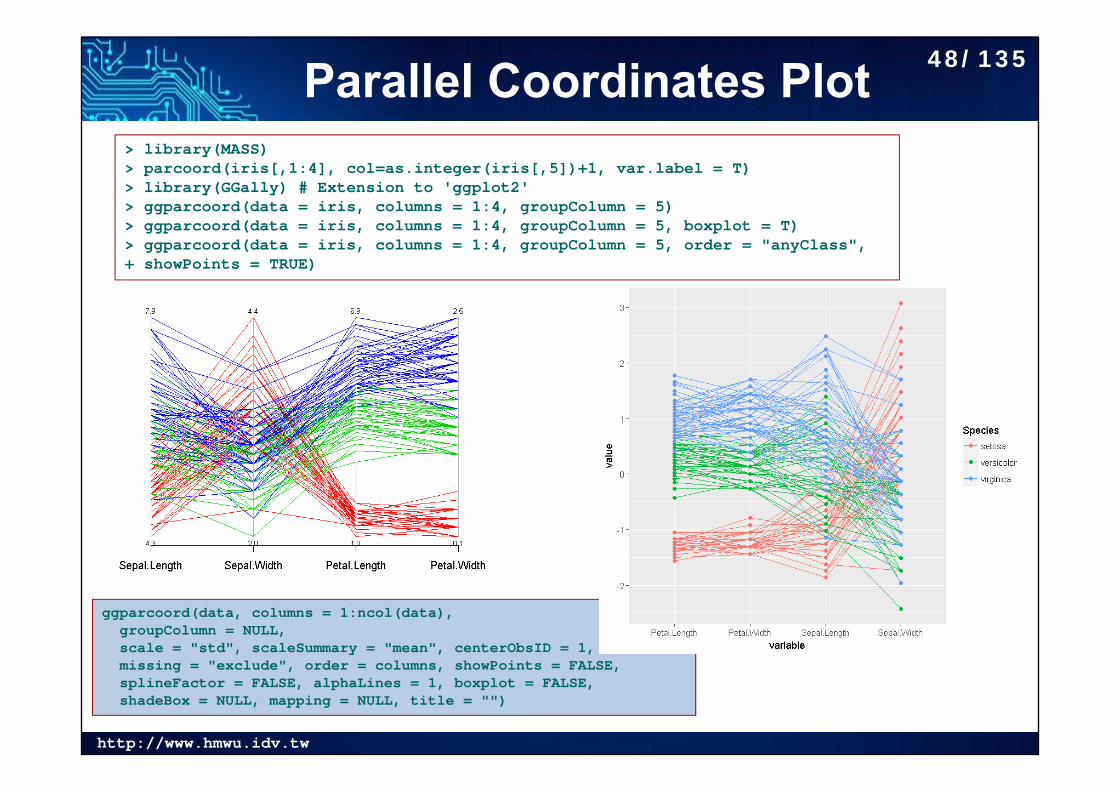
Parallel Coordinates Plot
ggparcoord(data, columns = 1:ncol(data), groupColumn = NULL,scale = "std", scaleSummary = "mean", centerObsID = 1,missing = "exclude", order = columns, showPoints = FALSE,splineFactor = FALSE, alphaLines = 1, boxplot = FALSE,shadeBox = NULL, mapping = NULL, title = "")
> library(MASS)> parcoord(iris[,1:4], col=as.integer(iris[,5])+1, var.label = T)> library(GGally) # Extension to 'ggplot2'> ggparcoord(data = iris, columns = 1:4, groupColumn = 5)> ggparcoord(data = iris, columns = 1:4, groupColumn = 5, boxplot = T)> ggparcoord(data = iris, columns = 1:4, groupColumn = 5, order = "anyClass",+ showPoints = TRUE)
48/135
http://www.hmwu.idv.tw
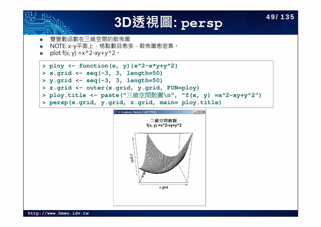
3D透視圖: persp 雙變數函數在三維空間的散佈圖 NOTE: x-y平面上,格點數目愈多,散佈圖愈密集。 plot f(x, y) =x^2-xy+y^2。
> ploy <- function(x, y){x^2-x*y+y^2}> x.grid <- seq(-3, 3, length=50)> y.grid <- seq(-3, 3, length=50)> z.grid <- outer(x.grid, y.grid, FUN=ploy)> ploy.title <- paste("三維空間散圖\n", "f(x, y) =x^2-xy+y^2")> persp(x.grid, y.grid, z.grid, main= ploy.title)
49/135
http://www.hmwu.idv.tw
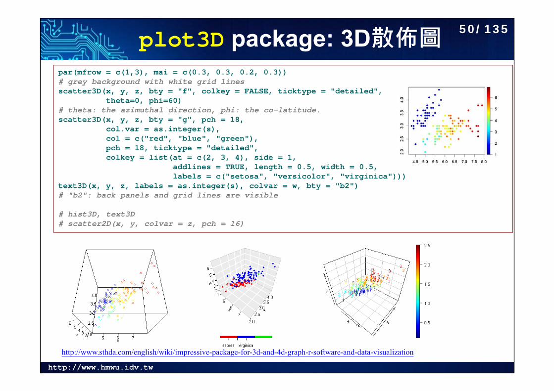
plot3D package: 3D散佈圖par(mfrow = c(1,3), mai = c(0.3, 0.3, 0.2, 0.3)) # grey background with white grid linesscatter3D(x, y, z, bty = "f", colkey = FALSE, ticktype = "detailed",
theta=0, phi=60)# theta: the azimuthal direction, phi: the co-latitude.scatter3D(x, y, z, bty = "g", pch = 18,
col.var = as.integer(s), col = c("red", "blue", "green"),pch = 18, ticktype = "detailed",colkey = list(at = c(2, 3, 4), side = 1,
addlines = TRUE, length = 0.5, width = 0.5,labels = c("setosa", "versicolor", "virginica")))
text3D(x, y, z, labels = as.integer(s), colvar = w, bty = "b2")# "b2": back panels and grid lines are visible
# hist3D, text3D# scatter2D(x, y, colvar = z, pch = 16)
http://www.sthda.com/english/wiki/impressive-package-for-3d-and-4d-graph-r-software-and-data-visualization
50/135
http://www.hmwu.idv.tw
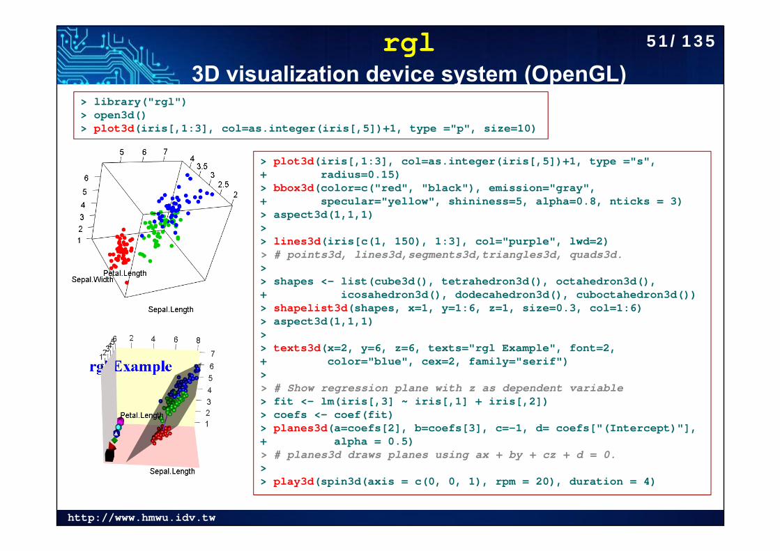
rgl3D visualization device system (OpenGL)
> library("rgl")> open3d()> plot3d(iris[,1:3], col=as.integer(iris[,5])+1, type ="p", size=10)
> plot3d(iris[,1:3], col=as.integer(iris[,5])+1, type ="s", + radius=0.15)> bbox3d(color=c("red", "black"), emission="gray", + specular="yellow", shininess=5, alpha=0.8, nticks = 3) > aspect3d(1,1,1)> > lines3d(iris[c(1, 150), 1:3], col="purple", lwd=2)> # points3d, lines3d,segments3d,triangles3d, quads3d.> > shapes <- list(cube3d(), tetrahedron3d(), octahedron3d(), + icosahedron3d(), dodecahedron3d(), cuboctahedron3d())> shapelist3d(shapes, x=1, y=1:6, z=1, size=0.3, col=1:6)> aspect3d(1,1,1)> > texts3d(x=2, y=6, z=6, texts="rgl Example", font=2, + color="blue", cex=2, family="serif")> > # Show regression plane with z as dependent variable> fit <- lm(iris[,3] ~ iris[,1] + iris[,2])> coefs <- coef(fit)> planes3d(a=coefs[2], b=coefs[3], c=-1, d= coefs["(Intercept)"], + alpha = 0.5) > # planes3d draws planes using ax + by + cz + d = 0.> > play3d(spin3d(axis = c(0, 0, 1), rpm = 20), duration = 4)
51/135
http://www.hmwu.idv.tw
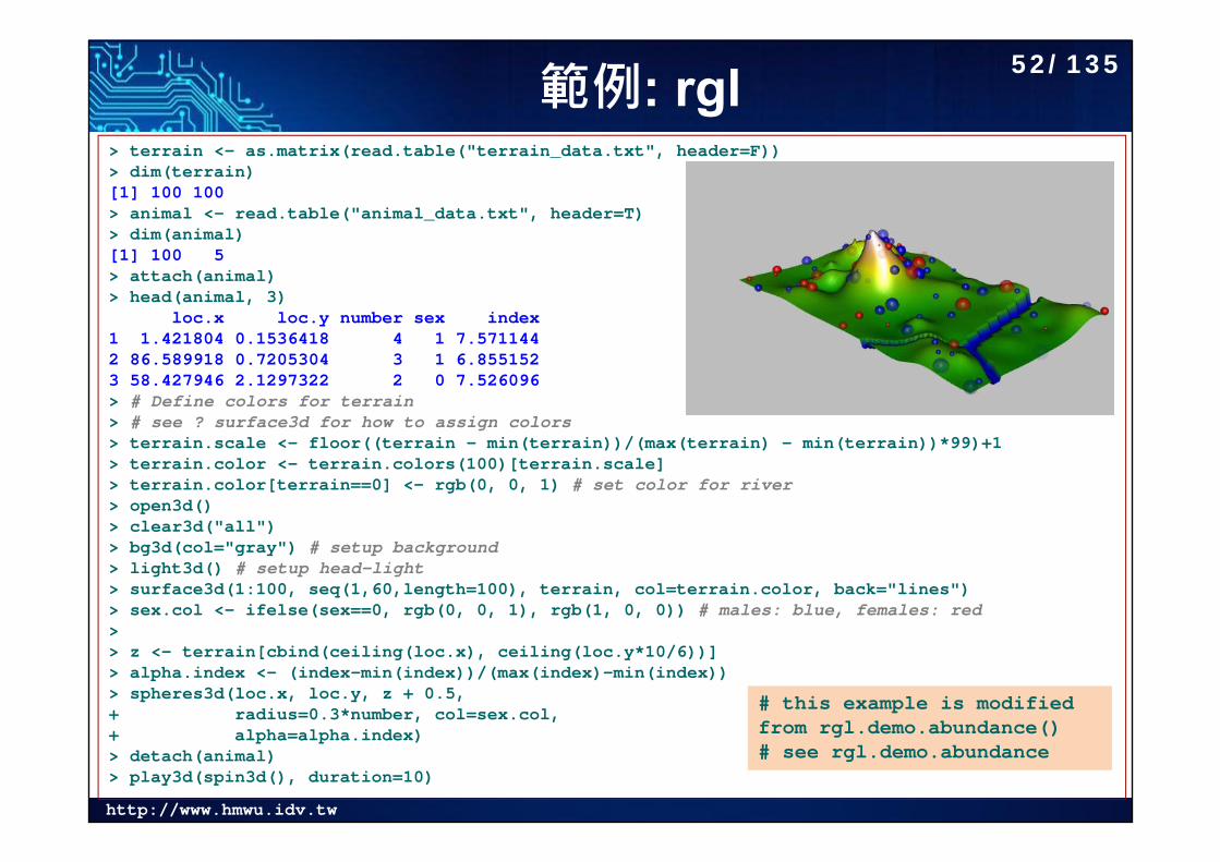
範例: rgl> terrain <- as.matrix(read.table("terrain_data.txt", header=F))> dim(terrain)[1] 100 100> animal <- read.table("animal_data.txt", header=T)> dim(animal)[1] 100 5> attach(animal)> head(animal, 3)
loc.x loc.y number sex index1 1.421804 0.1536418 4 1 7.5711442 86.589918 0.7205304 3 1 6.8551523 58.427946 2.1297322 2 0 7.526096> # Define colors for terrain> # see ? surface3d for how to assign colors> terrain.scale <- floor((terrain - min(terrain))/(max(terrain) - min(terrain))*99)+1> terrain.color <- terrain.colors(100)[terrain.scale] > terrain.color[terrain==0] <- rgb(0, 0, 1) # set color for river> open3d()> clear3d("all") > bg3d(col="gray") # setup background> light3d() # setup head-light> surface3d(1:100, seq(1,60,length=100), terrain, col=terrain.color, back="lines")> sex.col <- ifelse(sex==0, rgb(0, 0, 1), rgb(1, 0, 0)) # males: blue, females: red>> z <- terrain[cbind(ceiling(loc.x), ceiling(loc.y*10/6))]> alpha.index <- (index-min(index))/(max(index)-min(index))> spheres3d(loc.x, loc.y, z + 0.5,+ radius=0.3*number, col=sex.col, + alpha=alpha.index)> detach(animal) > play3d(spin3d(), duration=10)
# this example is modified from rgl.demo.abundance()# see rgl.demo.abundance
52/135
http://www.hmwu.idv.tw
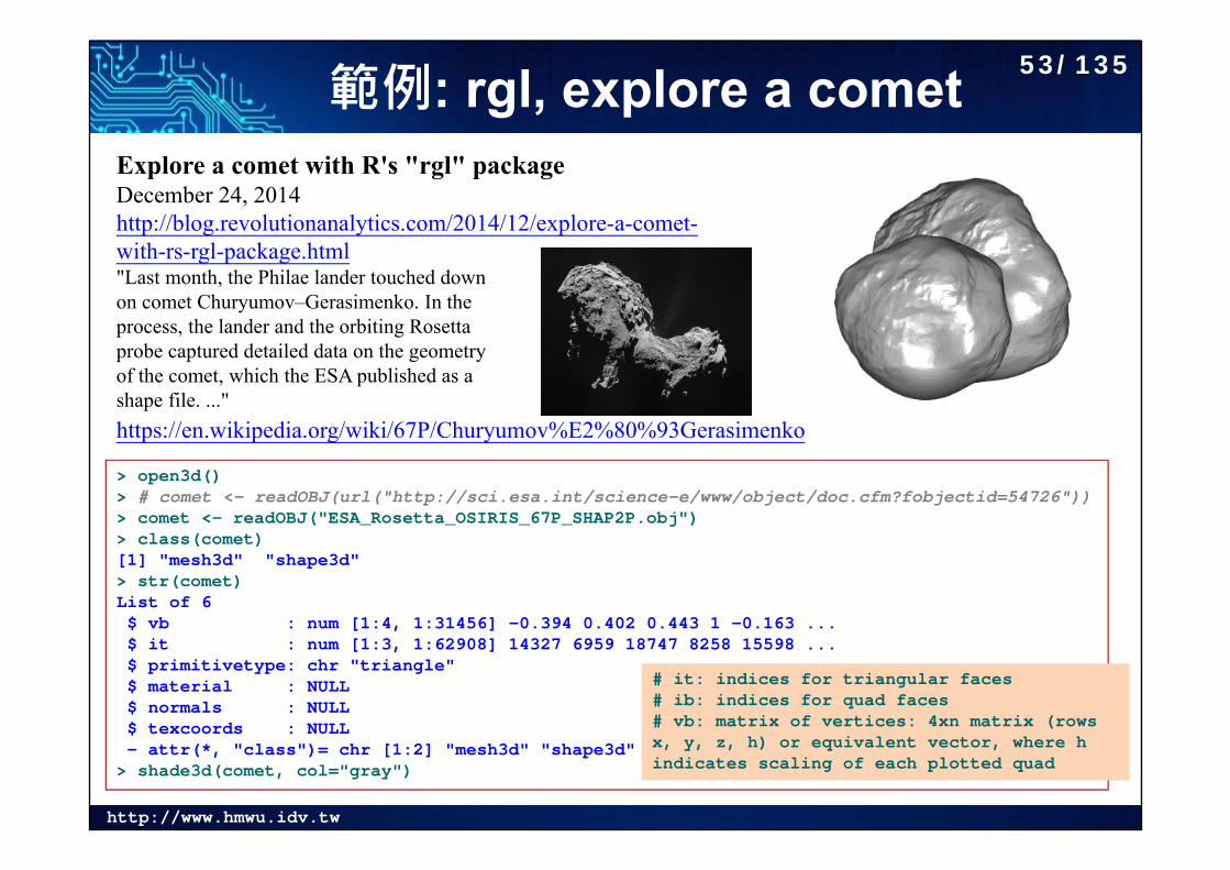
範例: rgl, explore a cometExplore a comet with R's "rgl" packageDecember 24, 2014http://blog.revolutionanalytics.com/2014/12/explore-a-comet-with-rs-rgl-package.html"Last month, the Philae lander touched downon comet Churyumov–Gerasimenko. In the process, the lander and the orbiting Rosetta probe captured detailed data on the geometry of the comet, which the ESA published as a shape file. ..."
> open3d()> # comet <- readOBJ(url("http://sci.esa.int/science-e/www/object/doc.cfm?fobjectid=54726"))> comet <- readOBJ("ESA_Rosetta_OSIRIS_67P_SHAP2P.obj")> class(comet)[1] "mesh3d" "shape3d"> str(comet)List of 6$ vb : num [1:4, 1:31456] -0.394 0.402 0.443 1 -0.163 ...$ it : num [1:3, 1:62908] 14327 6959 18747 8258 15598 ...$ primitivetype: chr "triangle"$ material : NULL$ normals : NULL$ texcoords : NULL- attr(*, "class")= chr [1:2] "mesh3d" "shape3d"
> shade3d(comet, col="gray")
# it: indices for triangular faces# ib: indices for quad faces# vb: matrix of vertices: 4xn matrix (rows x, y, z, h) or equivalent vector, where h indicates scaling of each plotted quad
https://en.wikipedia.org/wiki/67P/Churyumov%E2%80%93Gerasimenko
53/135
http://www.hmwu.idv.tw
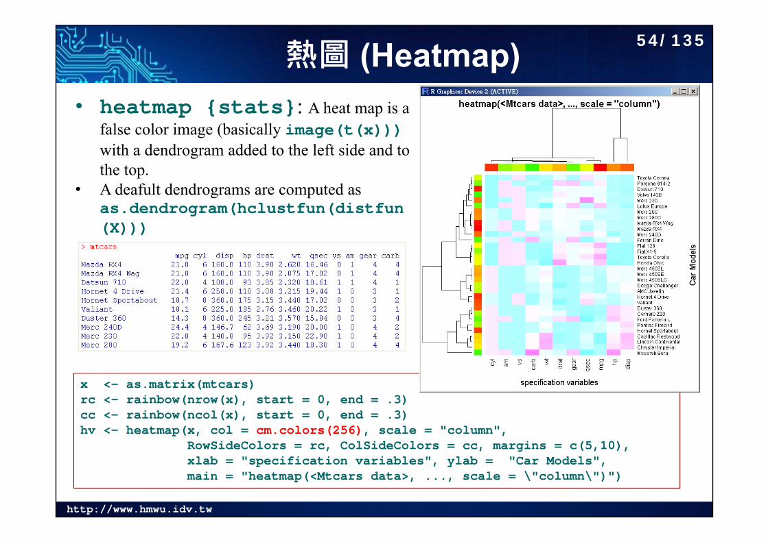
熱圖 (Heatmap)
x <- as.matrix(mtcars)rc <- rainbow(nrow(x), start = 0, end = .3)cc <- rainbow(ncol(x), start = 0, end = .3)hv <- heatmap(x, col = cm.colors(256), scale = "column",
RowSideColors = rc, ColSideColors = cc, margins = c(5,10),xlab = "specification variables", ylab = "Car Models",main = "heatmap(<Mtcars data>, ..., scale = \"column\")")
• heatmap {stats}: A heat map is a false color image (basically image(t(x)))with a dendrogram added to the left side and to the top.
• A deafult dendrograms are computed as as.dendrogram(hclustfun(distfun(X)))
54/135

http://www.hmwu.idv.tw
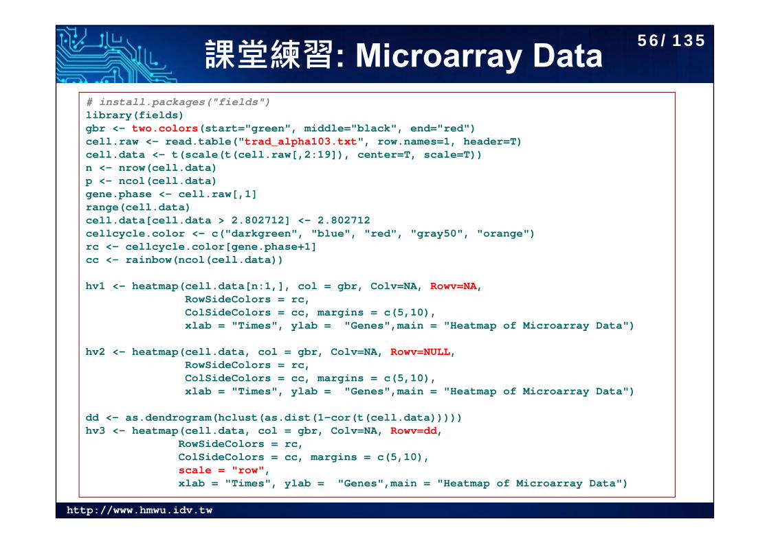
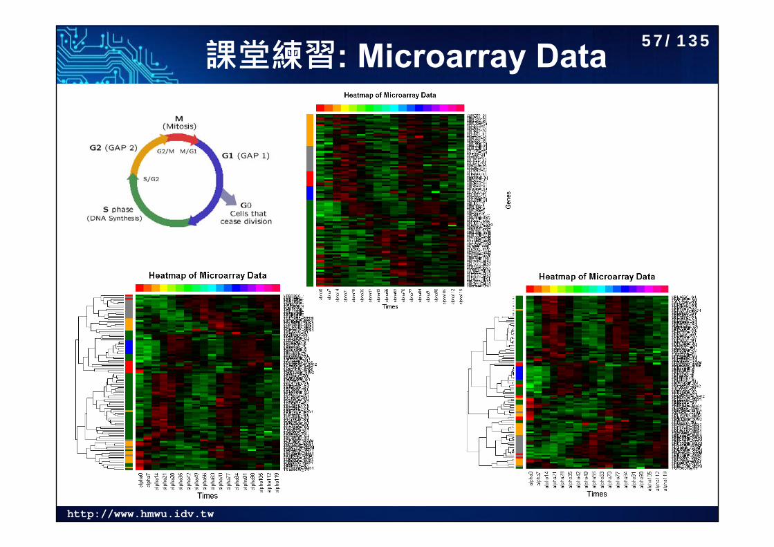
課堂練習: Microarray Data Lu and Wu (2010)
Time course data: every 7 minutes and totally 18 time points. Known genes: there are 103 cell cycle-regulated genes by traditional method in
G1, S, S/G2, G2/M, or M/G1. (Remove NA’s: 79.)
See also: Using R to draw a Heatmap from Microarray Data http://www2.warwick.ac.uk/fac/sci/moac/people/students/peter_cock/r/heatmap/
55/135
http://www.hmwu.idv.tw
課堂練習: Microarray Data # install.packages("fields")library(fields)gbr <- two.colors(start="green", middle="black", end="red")cell.raw <- read.table("trad_alpha103.txt", row.names=1, header=T)cell.data <- t(scale(t(cell.raw[,2:19]), center=T, scale=T)) n <- nrow(cell.data)p <- ncol(cell.data)gene.phase <- cell.raw[,1]range(cell.data)cell.data[cell.data > 2.802712] <- 2.802712 cellcycle.color <- c("darkgreen", "blue", "red", "gray50", "orange")rc <- cellcycle.color[gene.phase+1]cc <- rainbow(ncol(cell.data))
hv1 <- heatmap(cell.data[n:1,], col = gbr, Colv=NA, Rowv=NA,RowSideColors = rc, ColSideColors = cc, margins = c(5,10),xlab = "Times", ylab = "Genes",main = "Heatmap of Microarray Data")
hv2 <- heatmap(cell.data, col = gbr, Colv=NA, Rowv=NULL,RowSideColors = rc, ColSideColors = cc, margins = c(5,10),xlab = "Times", ylab = "Genes",main = "Heatmap of Microarray Data")
dd <- as.dendrogram(hclust(as.dist(1-cor(t(cell.data)))))hv3 <- heatmap(cell.data, col = gbr, Colv=NA, Rowv=dd,
RowSideColors = rc, ColSideColors = cc, margins = c(5,10),scale = "row",xlab = "Times", ylab = "Genes",main = "Heatmap of Microarray Data")
56/135
http://www.hmwu.idv.tw
課堂練習: Microarray Data 57/135
http://www.hmwu.idv.tw
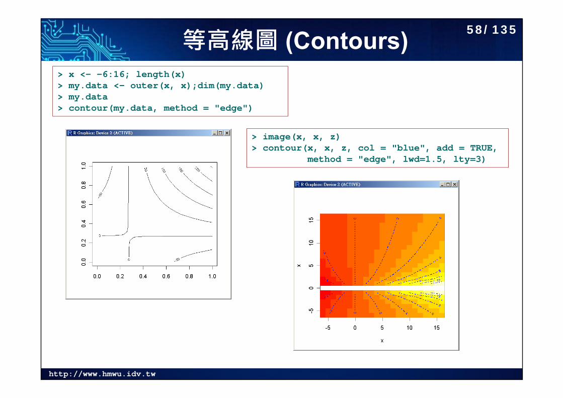
等高線圖 (Contours)> x <- -6:16; length(x)> my.data <- outer(x, x);dim(my.data)> my.data> contour(my.data, method = "edge")
> image(x, x, z)> contour(x, x, z, col = "blue", add = TRUE,
method = "edge", lwd=1.5, lty=3)
58/135
http://www.hmwu.idv.tw
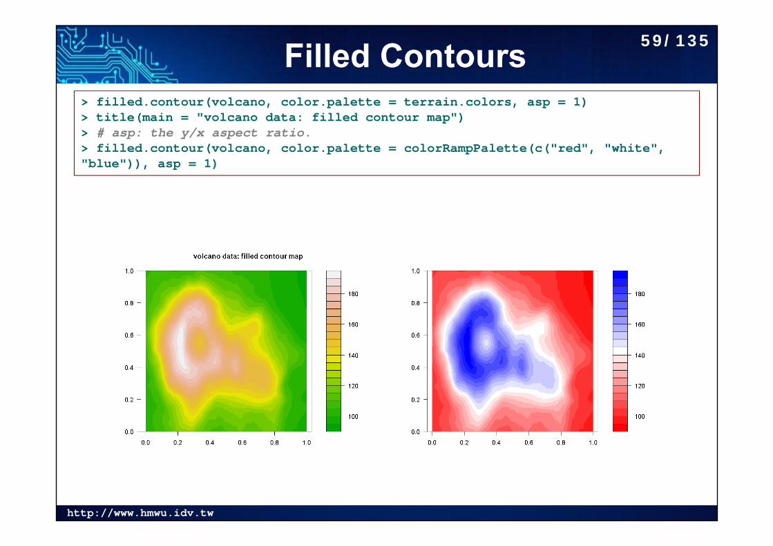
Filled Contours> filled.contour(volcano, color.palette = terrain.colors, asp = 1)> title(main = "volcano data: filled contour map")> # asp: the y/x aspect ratio.> filled.contour(volcano, color.palette = colorRampPalette(c("red", "white", "blue")), asp = 1)
59/135
http://www.hmwu.idv.tw
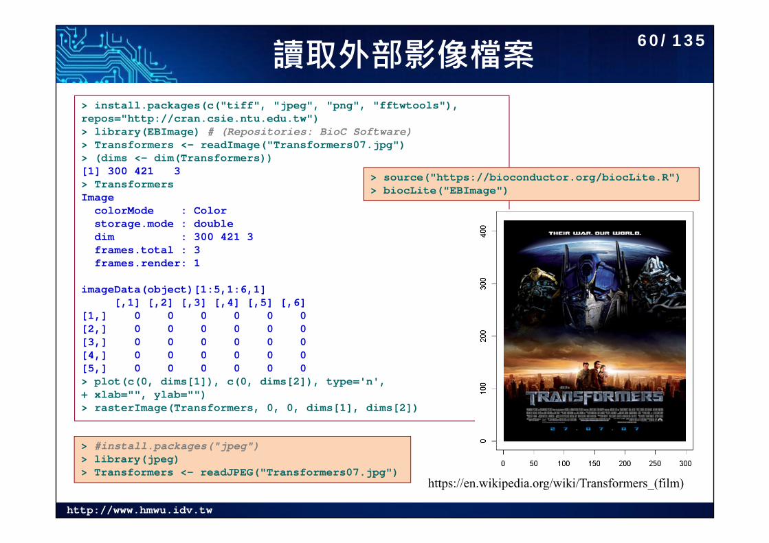
讀取外部影像檔案
https://en.wikipedia.org/wiki/Transformers_(film)
> install.packages(c("tiff", "jpeg", "png", "fftwtools"), repos="http://cran.csie.ntu.edu.tw")> library(EBImage) # (Repositories: BioC Software)> Transformers <- readImage("Transformers07.jpg")> (dims <- dim(Transformers))[1] 300 421 3> TransformersImage
colorMode : Color storage.mode : double dim : 300 421 3 frames.total : 3 frames.render: 1
imageData(object)[1:5,1:6,1][,1] [,2] [,3] [,4] [,5] [,6]
[1,] 0 0 0 0 0 0[2,] 0 0 0 0 0 0[3,] 0 0 0 0 0 0[4,] 0 0 0 0 0 0[5,] 0 0 0 0 0 0> plot(c(0, dims[1]), c(0, dims[2]), type='n', + xlab="", ylab="")> rasterImage(Transformers, 0, 0, dims[1], dims[2])
> #install.packages("jpeg")> library(jpeg)> Transformers <- readJPEG("Transformers07.jpg")
> source("https://bioconductor.org/biocLite.R")> biocLite("EBImage")
60/135

http://www.hmwu.idv.tw
彩色影像轉成灰階> Transformers.f <- Image(flip(Transformers))> # convert RGB to grayscale> rgb.weight <- c(0.2989, 0.587, 0.114)> Transformers.gray <- rgb.weight[1] * imageData(Transformers.f)[,,1] + + rgb.weight[2] * imageData(Transformers.f)[,,2] + + rgb.weight[3] * imageData(Transformers.f)[,,3]> dim(Transformers.gray)[1] 300 421> Transformers.gray[1:5, 1:5]
[,1] [,2] [,3] [,4] [,5][1,] 0 0 0 0 0[2,] 0 0 0 0 0[3,] 0 0 0 0 0[4,] 0 0 0 0 0[5,] 0 0 0 0 0> par(mfrow=c(1,2), mai=c(0.1, 0.1, 0.1, 0.1))> image(Transformers.gray, col = grey(+ seq(0, 1, length = 256)), xaxt="n", yaxt="n")> image(Transformers.gray, col = rainbow(256), + xaxt="n", yaxt="n")
Converting RGB to grayscale/intensityhttp://stackoverflow.com/questions/687261/converting-rgb-to-grayscale-intensity
61/135
http://www.hmwu.idv.tw
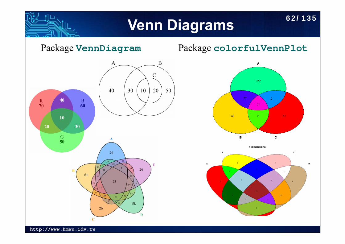
Venn DiagramsPackage colorfulVennPlotPackage VennDiagram
62/135
http://www.hmwu.idv.tw
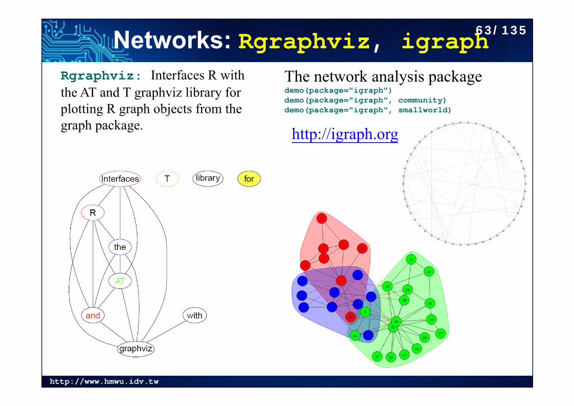
Networks: Rgraphviz, igraphThe network analysis packagedemo(package="igraph")demo(package="igraph", community)demo(package="igraph", smallworld)
http://igraph.org
Rgraphviz: Interfaces R with the AT and T graphviz library for plotting R graph objects from the graph package.
63/135
http://www.hmwu.idv.tw
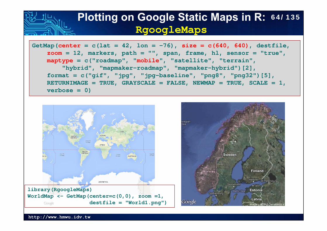
Plotting on Google Static Maps in R: RgoogleMaps
GetMap(center = c(lat = 42, lon = -76), size = c(640, 640), destfile, zoom = 12, markers, path = "", span, frame, hl, sensor = "true", maptype = c("roadmap", "mobile", "satellite", "terrain",
"hybrid", "mapmaker-roadmap", "mapmaker-hybrid")[2], format = c("gif", "jpg", "jpg-baseline", "png8", "png32")[5], RETURNIMAGE = TRUE, GRAYSCALE = FALSE, NEWMAP = TRUE, SCALE = 1, verbose = 0)
library(RgoogleMaps)WorldMap <- GetMap(center=c(0,0), zoom =1,
destfile = "World1.png")
64/135
http://www.hmwu.idv.tw
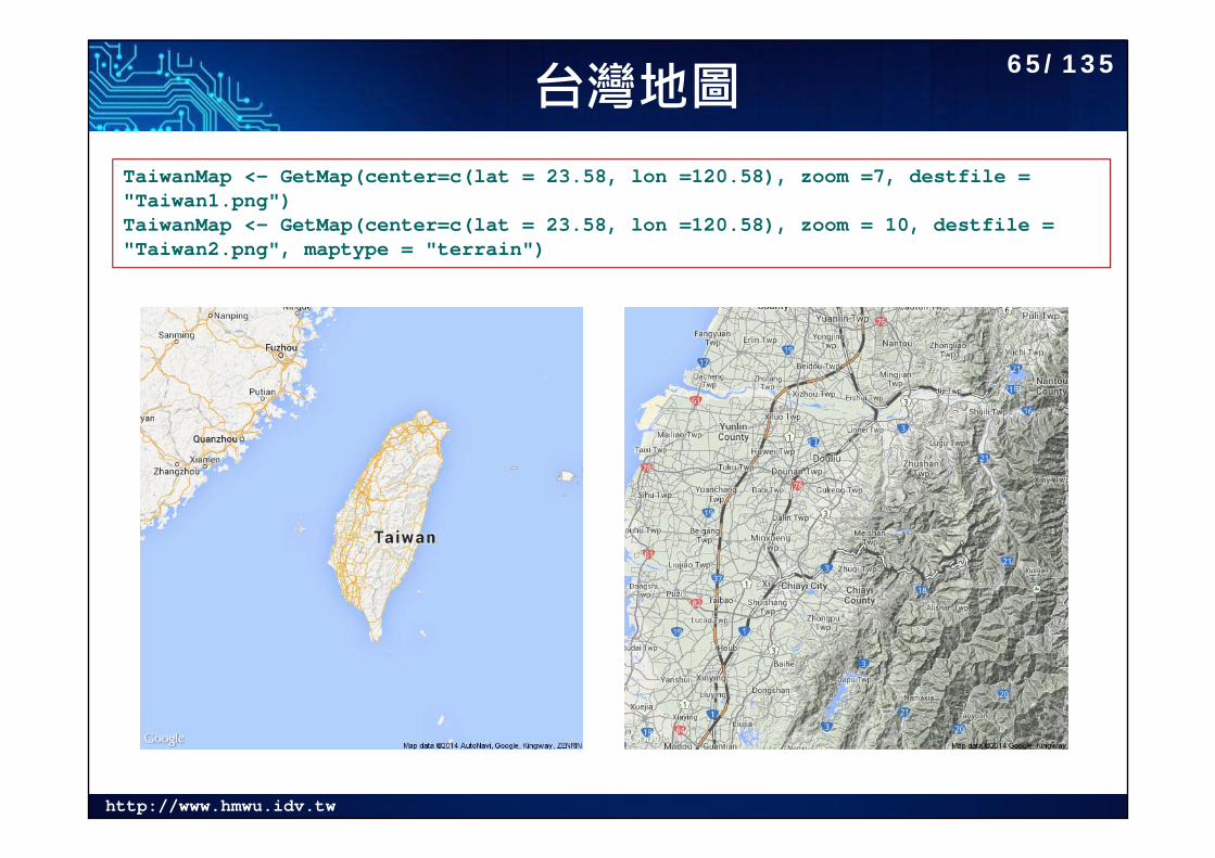
台灣地圖TaiwanMap <- GetMap(center=c(lat = 23.58, lon =120.58), zoom =7, destfile = "Taiwan1.png")TaiwanMap <- GetMap(center=c(lat = 23.58, lon =120.58), zoom = 10, destfile = "Taiwan2.png", maptype = "terrain")
65/135
http://www.hmwu.idv.tw
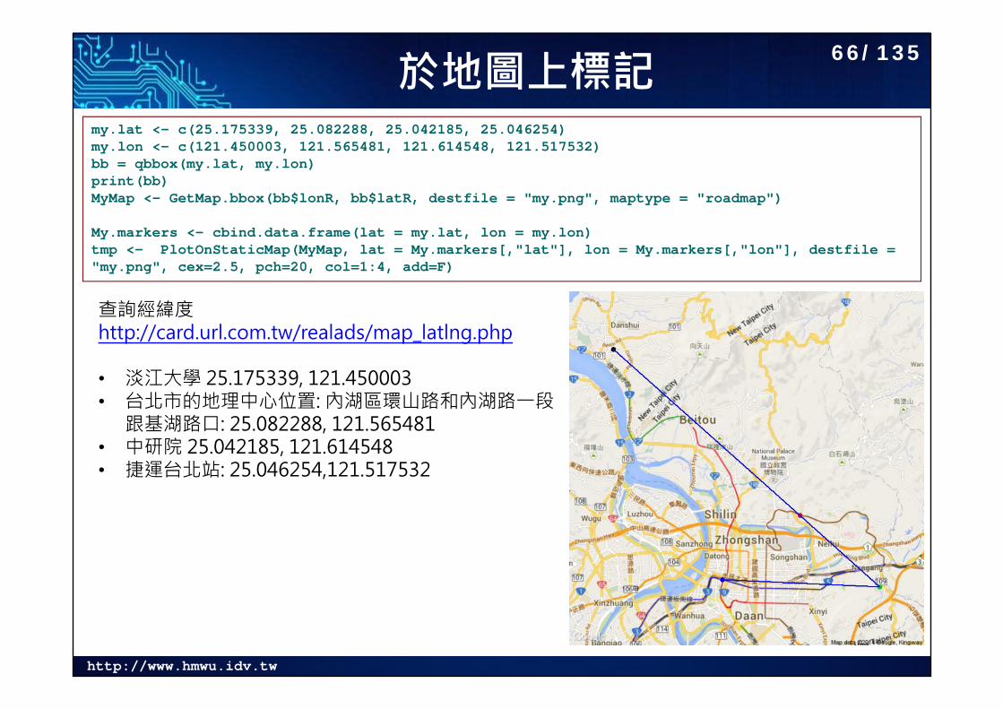
於地圖上標記my.lat <- c(25.175339, 25.082288, 25.042185, 25.046254)my.lon <- c(121.450003, 121.565481, 121.614548, 121.517532)bb = qbbox(my.lat, my.lon)print(bb)MyMap <- GetMap.bbox(bb$lonR, bb$latR, destfile = "my.png", maptype = "roadmap")
My.markers <- cbind.data.frame(lat = my.lat, lon = my.lon)tmp <- PlotOnStaticMap(MyMap, lat = My.markers[,"lat"], lon = My.markers[,"lon"], destfile = "my.png", cex=2.5, pch=20, col=1:4, add=F)
查詢經緯度http://card.url.com.tw/realads/map_latlng.php
• 淡江大學 25.175339, 121.450003• 台北市的地理中心位置: 內湖區環山路和內湖路一段
跟基湖路口: 25.082288, 121.565481• 中研院 25.042185, 121.614548• 捷運台北站: 25.046254,121.517532
66/135
http://www.hmwu.idv.tw
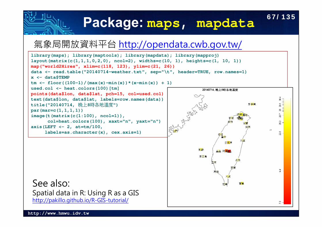
Package: maps, mapdata氣象局開放資料平台 http://opendata.cwb.gov.tw/library(maps); library(maptools); library(mapdata); library(mapproj)layout(matrix(c(1,1,1,0,2,0), ncol=2), widths=c(10, 1), heights=c(1, 10, 1))map("world2Hires", xlim=c(118, 123), ylim=c(21, 26))data <- read.table("20140714-weather.txt", sep="\t", header=TRUE, row.names=1)x <- data$TEMPtm <- floor((100-1)/(max(x)-min(x))*(x-min(x)) + 1)used.col <- heat.colors(100)[tm]points(data$lon, data$lat, pch=15, col=used.col)text(data$lon, data$lat, labels=row.names(data))title("20140714, 晚上8時各地溫度")par(mar=c(1,1,1,1))image(t(matrix(c(1:100), ncol=1)),
col=heat.colors(100), xaxt="n", yaxt="n")axis(LEFT <- 2, at=tm/100,
labels=as.character(x), cex.axis=1)
See also: Spatial data in R: Using R as a GIS http://pakillo.github.io/R-GIS-tutorial/
67/135
http://www.hmwu.idv.tw
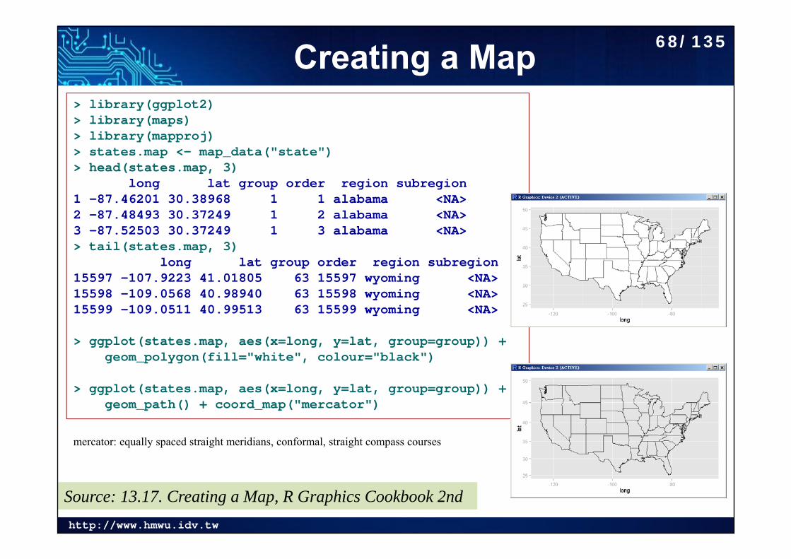
Creating a Map> library(ggplot2)> library(maps)> library(mapproj)> states.map <- map_data("state")> head(states.map, 3)
long lat group order region subregion1 -87.46201 30.38968 1 1 alabama <NA>2 -87.48493 30.37249 1 2 alabama <NA>3 -87.52503 30.37249 1 3 alabama <NA>> tail(states.map, 3)
long lat group order region subregion15597 -107.9223 41.01805 63 15597 wyoming <NA>15598 -109.0568 40.98940 63 15598 wyoming <NA>15599 -109.0511 40.99513 63 15599 wyoming <NA>
> ggplot(states.map, aes(x=long, y=lat, group=group)) + geom_polygon(fill="white", colour="black")
> ggplot(states.map, aes(x=long, y=lat, group=group)) +geom_path() + coord_map("mercator")
mercator: equally spaced straight meridians, conformal, straight compass courses
Source: 13.17. Creating a Map, R Graphics Cookbook 2nd
68/135
http://www.hmwu.idv.tw
分級著色圖 (Choropleth Maps)
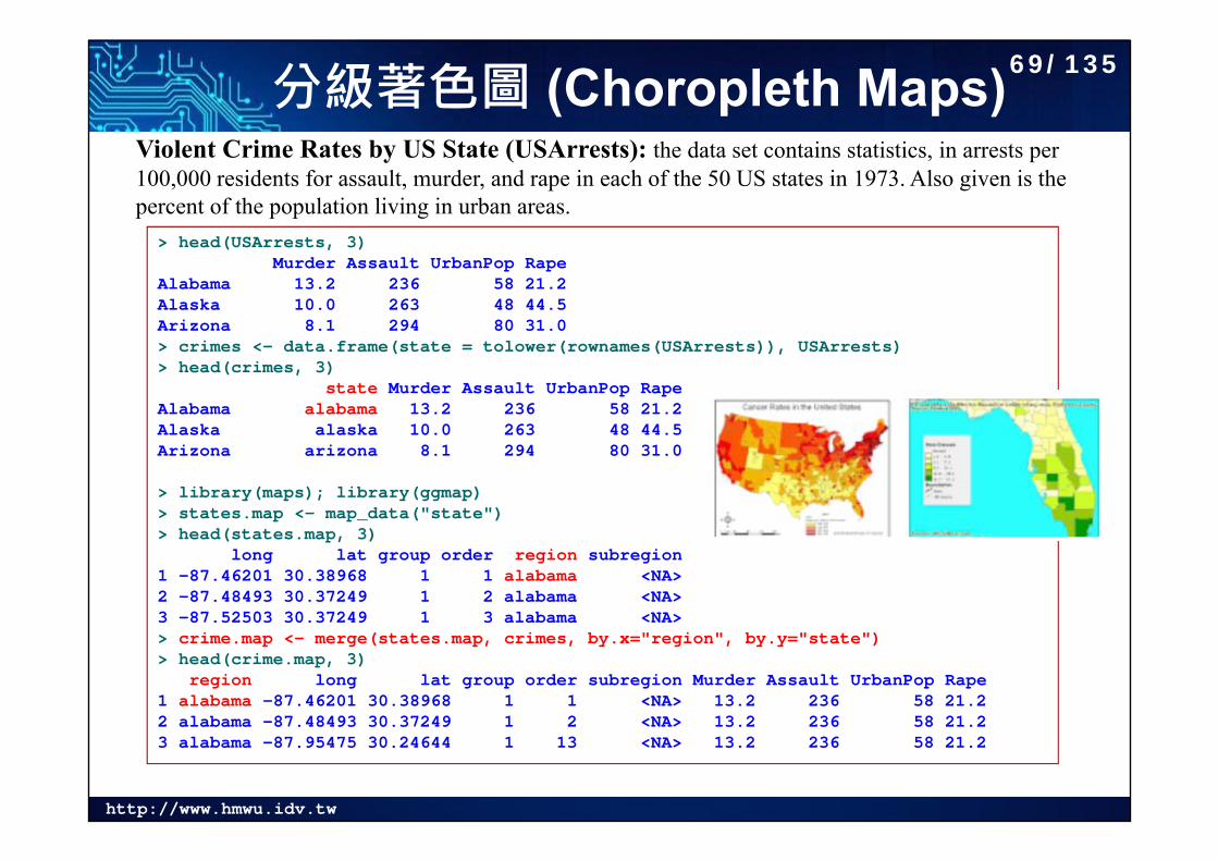
> head(USArrests, 3)Murder Assault UrbanPop Rape
Alabama 13.2 236 58 21.2Alaska 10.0 263 48 44.5Arizona 8.1 294 80 31.0> crimes <- data.frame(state = tolower(rownames(USArrests)), USArrests)> head(crimes, 3)
state Murder Assault UrbanPop RapeAlabama alabama 13.2 236 58 21.2Alaska alaska 10.0 263 48 44.5Arizona arizona 8.1 294 80 31.0
> library(maps); library(ggmap)> states.map <- map_data("state")> head(states.map, 3)
long lat group order region subregion1 -87.46201 30.38968 1 1 alabama <NA>2 -87.48493 30.37249 1 2 alabama <NA>3 -87.52503 30.37249 1 3 alabama <NA>> crime.map <- merge(states.map, crimes, by.x="region", by.y="state")> head(crime.map, 3)
region long lat group order subregion Murder Assault UrbanPop Rape1 alabama -87.46201 30.38968 1 1 <NA> 13.2 236 58 21.22 alabama -87.48493 30.37249 1 2 <NA> 13.2 236 58 21.23 alabama -87.95475 30.24644 1 13 <NA> 13.2 236 58 21.2
Violent Crime Rates by US State (USArrests): the data set contains statistics, in arrests per 100,000 residents for assault, murder, and rape in each of the 50 US states in 1973. Also given is the percent of the population living in urban areas.
69/135
http://www.hmwu.idv.tw
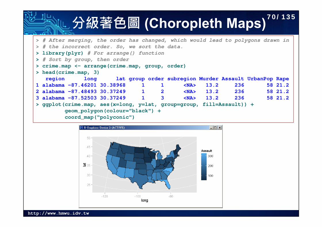
分級著色圖 (Choropleth Maps)> # After merging, the order has changed, which would lead to polygons drawn in> # the incorrect order. So, we sort the data.> library(plyr) # For arrange() function> # Sort by group, then order> crime.map <- arrange(crime.map, group, order)> head(crime.map, 3)
region long lat group order subregion Murder Assault UrbanPop Rape1 alabama -87.46201 30.38968 1 1 <NA> 13.2 236 58 21.22 alabama -87.48493 30.37249 1 2 <NA> 13.2 236 58 21.23 alabama -87.52503 30.37249 1 3 <NA> 13.2 236 58 21.2> ggplot(crime.map, aes(x=long, y=lat, group=group, fill=Assault)) +
geom_polygon(colour="black") +coord_map("polyconic")
70/135
http://www.hmwu.idv.tw
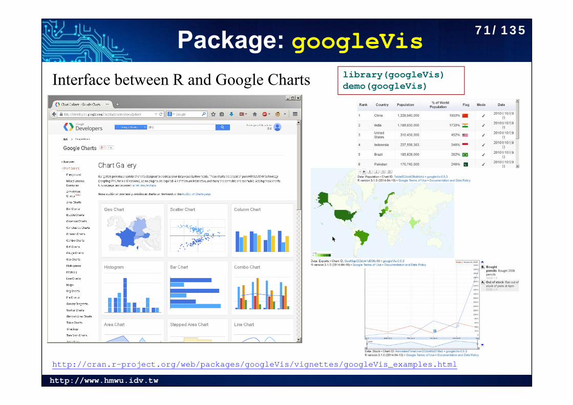
Package: googleVislibrary(googleVis)demo(googleVis)Interface between R and Google Charts
http://cran.r-project.org/web/packages/googleVis/vignettes/googleVis_examples.html
71/135
http://www.hmwu.idv.tw
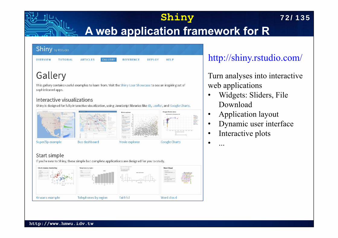
ShinyA web application framework for R
Turn analyses into interactive web applications• Widgets: Sliders, File
Download• Application layout• Dynamic user interface• Interactive plots• ...
http://shiny.rstudio.com/
72/135
http://www.hmwu.idv.tw
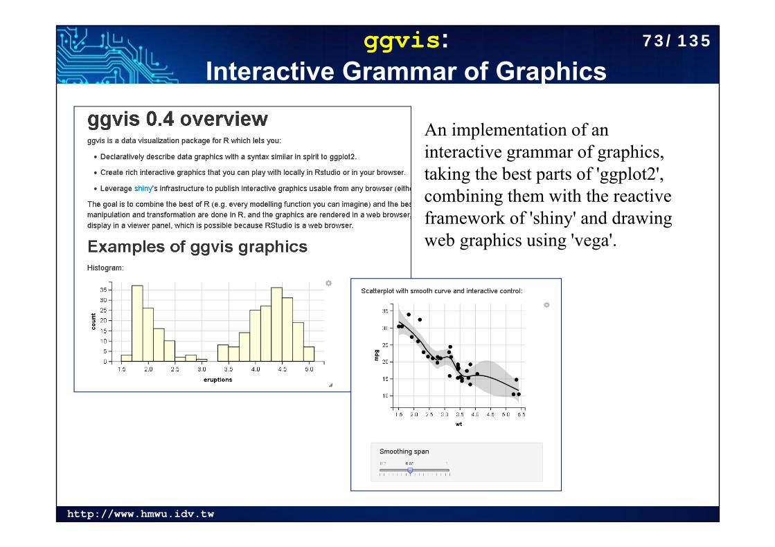
ggvis: Interactive Grammar of Graphics
An implementation of an interactive grammar of graphics, taking the best parts of 'ggplot2', combining them with the reactive framework of 'shiny' and drawing web graphics using 'vega'.
73/135
http://www.hmwu.idv.tw
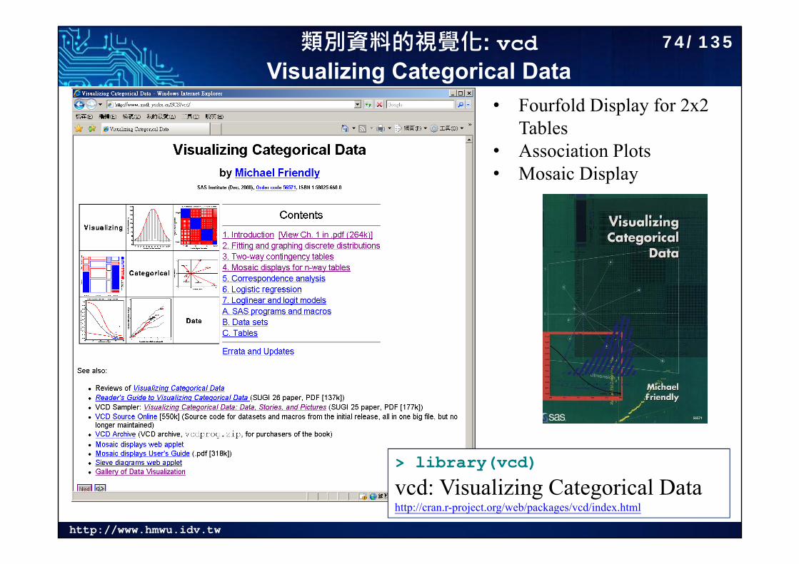
類別資料的視覺化: vcdVisualizing Categorical Data
• Fourfold Display for 2x2 Tables
• Association Plots• Mosaic Display
> library(vcd)
vcd: Visualizing Categorical Datahttp://cran.r-project.org/web/packages/vcd/index.html
74/135
http://www.hmwu.idv.tw
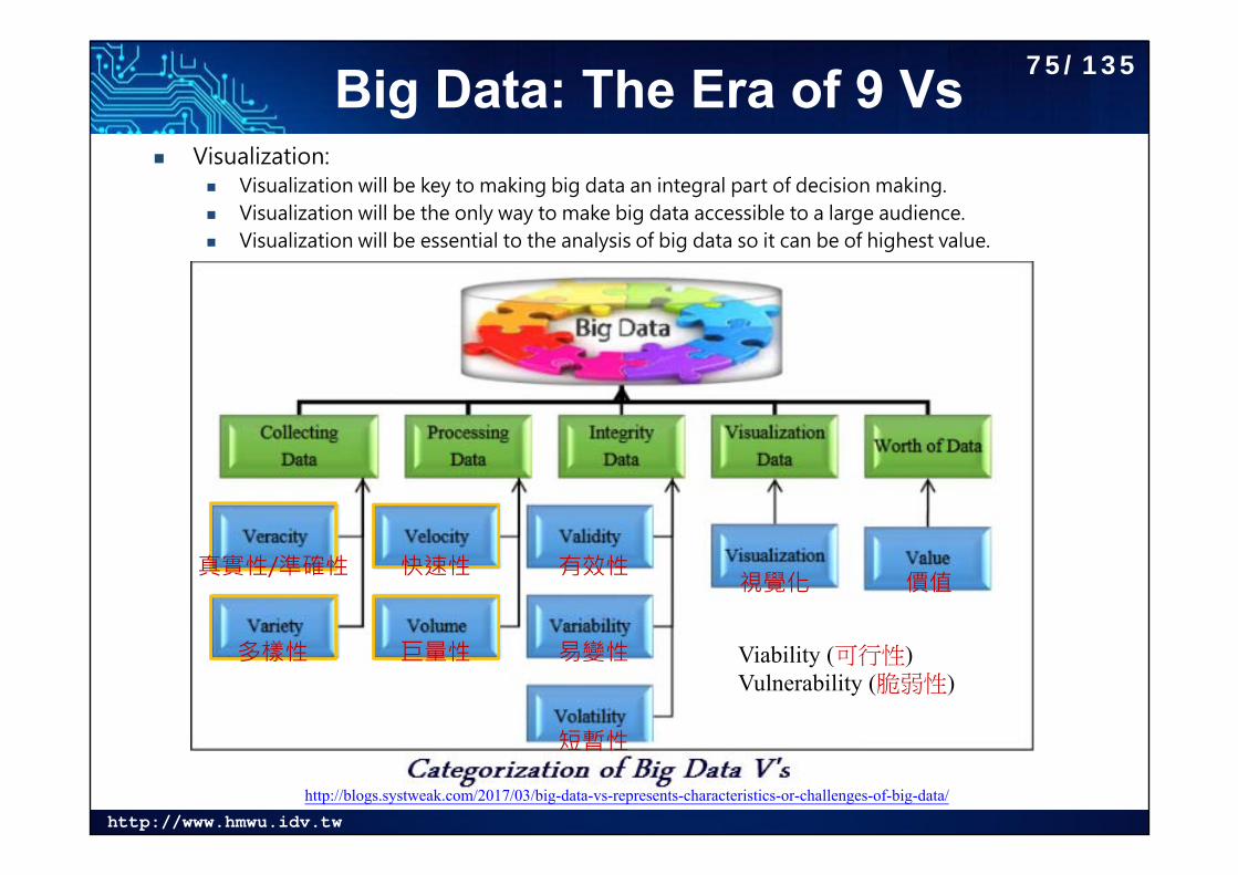
Big Data: The Era of 9 Vs Visualization:
Visualization will be key to making big data an integral part of decision making. Visualization will be the only way to make big data accessible to a large audience. Visualization will be essential to the analysis of big data so it can be of highest value.
http://blogs.systweak.com/2017/03/big-data-vs-represents-characteristics-or-challenges-of-big-data/
巨量性
快速性
多樣性
真實性/準確性 有效性
易變性
短暫性
視覺化 價值
Viability (可行性)Vulnerability (脆弱性)
75/135
http://www.hmwu.idv.tw
Big Data Visualization Definition - What does Big Data Visualization mean?
Big data visualization refers to the implementation of more contemporary visualization techniques to illustrate the relationships within data. Visualization tactics include applications that can display real-time changes and more illustrative graphics, thus going beyond pie, bar and other charts. These illustrations veer away from the use of hundreds of rows, columns and attributes toward a more artistic visual representation of the data.
Techopedia explains Big Data Visualization Normally when businesses need to present relationships among
data, they use graphs, bars and charts to do it. They can also make use of a variety of colors, terms and symbols. The main problem with this setup, however, is that it doesn't do a good job of presenting very large data or data that includes huge numbers. Data visualization uses more interactive, graphical illustrations - including personalization and animation - to display figures and establish connections among pieces of information.
https://www.techopedia.com/definition/28988/big-data-visualization
76/135
http://www.hmwu.idv.tw
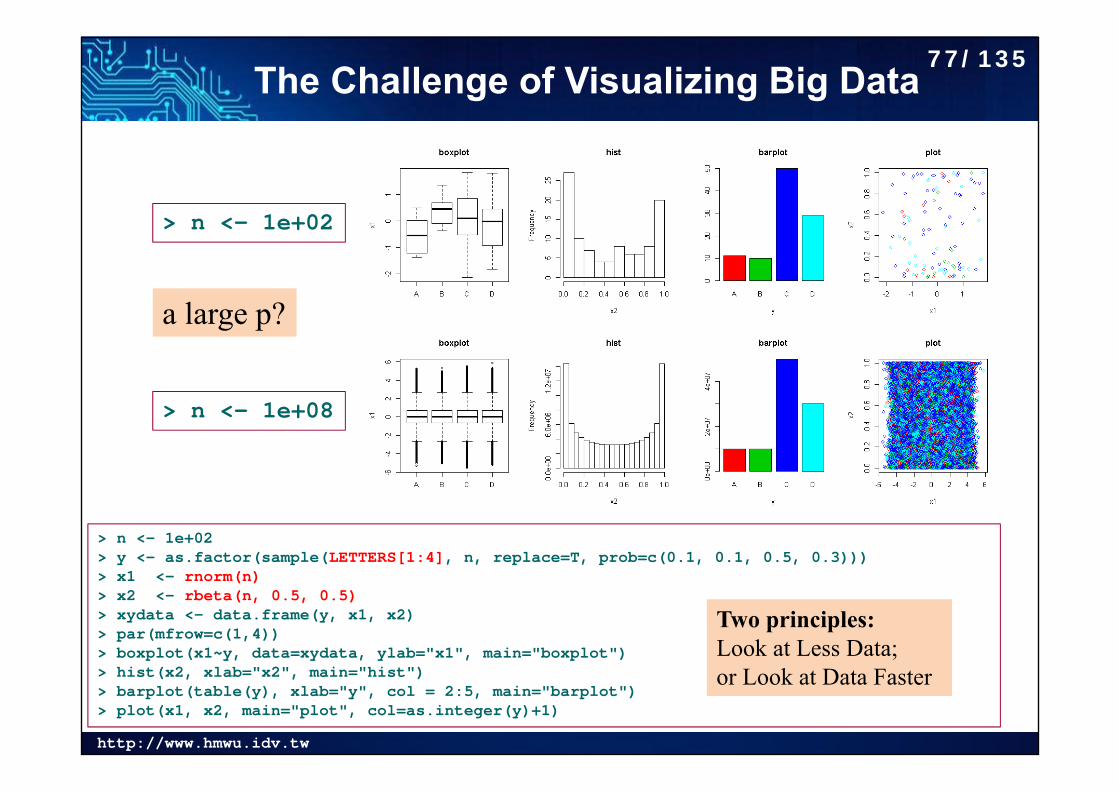
The Challenge of Visualizing Big Data
> n <- 1e+02> y <- as.factor(sample(LETTERS[1:4], n, replace=T, prob=c(0.1, 0.1, 0.5, 0.3)))> x1 <- rnorm(n)> x2 <- rbeta(n, 0.5, 0.5)> xydata <- data.frame(y, x1, x2)> par(mfrow=c(1,4))> boxplot(x1~y, data=xydata, ylab="x1", main="boxplot")> hist(x2, xlab="x2", main="hist")> barplot(table(y), xlab="y", col = 2:5, main="barplot")> plot(x1, x2, main="plot", col=as.integer(y)+1)
> n <- 1e+02
> n <- 1e+08
Two principles:Look at Less Data; or Look at Data Faster
a large p?
77/135
http://www.hmwu.idv.tw
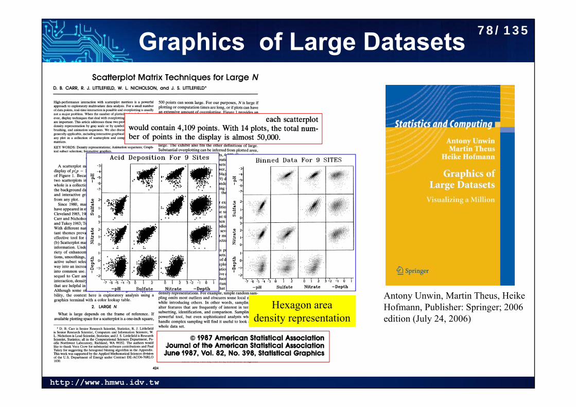
Graphics of Large Datasets
Hexagon area density representation
Antony Unwin, Martin Theus, Heike Hofmann, Publisher: Springer; 2006 edition (July 24, 2006)
78/135
http://www.hmwu.idv.tw
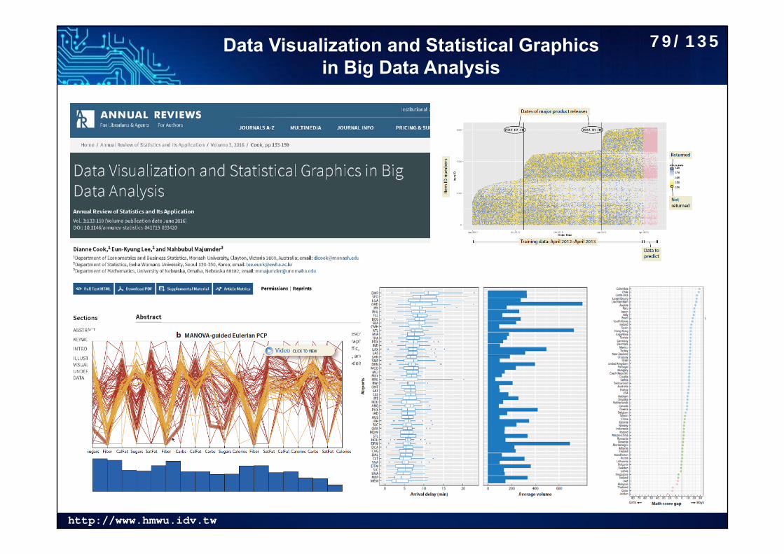
Data Visualization and Statistical Graphics in Big Data Analysis
79/135
http://www.hmwu.idv.tw
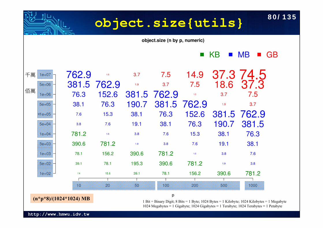
object.size{utils}
1 Bit = Binary Digit; 8 Bits = 1 Byte; 1024 Bytes = 1 Kilobyte; 1024 Kilobytes = 1 Megabyte1024 Megabytes = 1 Gigabyte; 1024 Gigabytes = 1 Terabyte; 1024 Terabytes = 1 Petabyte
千萬
佰萬
(n*p*8)/(1024*1024) MB
80/135
http://www.hmwu.idv.tw
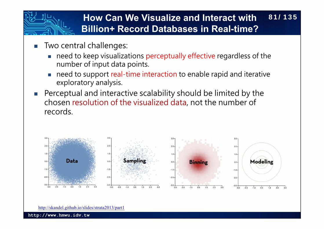
How Can We Visualize and Interact with Billion+ Record Databases in Real-time?
Two central challenges: need to keep visualizations perceptually effective regardless of the
number of input data points. need to support real-time interaction to enable rapid and iterative
exploratory analysis.
Perceptual and interactive scalability should be limited by the chosen resolution of the visualized data, not the number of records.
http://skandel.github.io/slides/strata2013/part1
81/135
http://www.hmwu.idv.tw
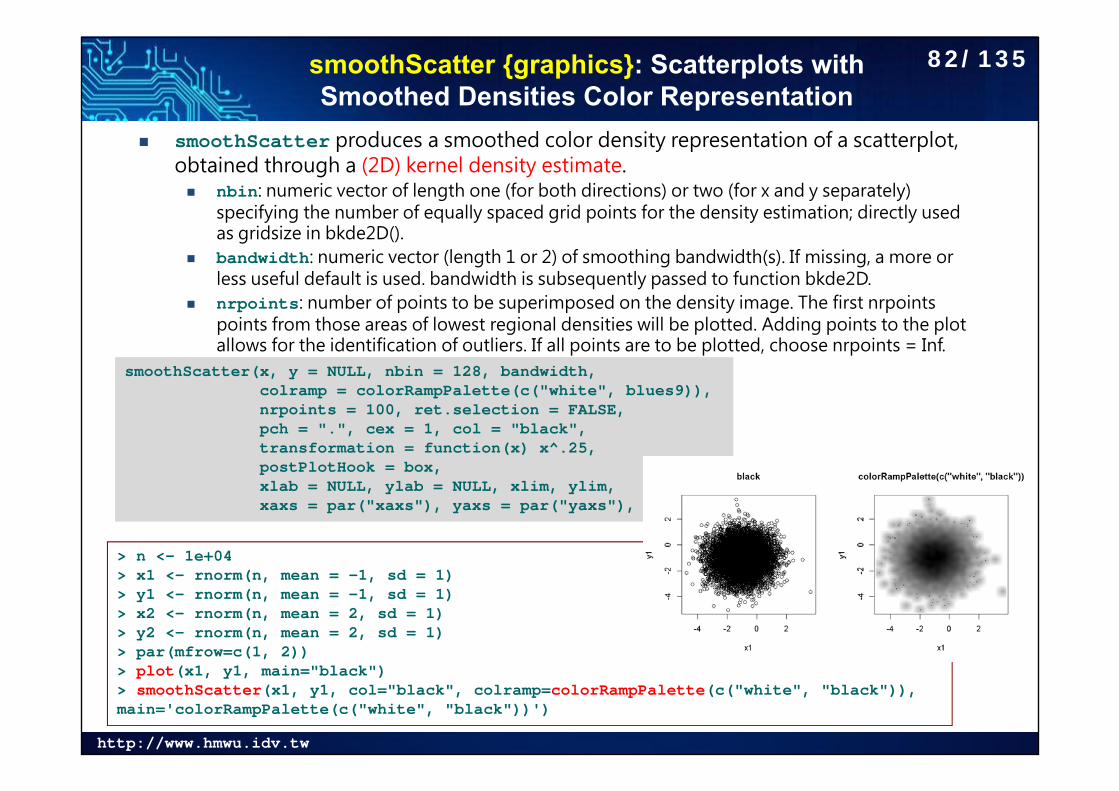
smoothScatter {graphics}: Scatterplots with Smoothed Densities Color Representation
smoothScatter produces a smoothed color density representation of a scatterplot, obtained through a (2D) kernel density estimate. nbin: numeric vector of length one (for both directions) or two (for x and y separately)
specifying the number of equally spaced grid points for the density estimation; directly used as gridsize in bkde2D().
bandwidth: numeric vector (length 1 or 2) of smoothing bandwidth(s). If missing, a more or less useful default is used. bandwidth is subsequently passed to function bkde2D.
nrpoints: number of points to be superimposed on the density image. The first nrpointspoints from those areas of lowest regional densities will be plotted. Adding points to the plot allows for the identification of outliers. If all points are to be plotted, choose nrpoints = Inf.
smoothScatter(x, y = NULL, nbin = 128, bandwidth,colramp = colorRampPalette(c("white", blues9)),nrpoints = 100, ret.selection = FALSE,pch = ".", cex = 1, col = "black",transformation = function(x) x^.25,postPlotHook = box,xlab = NULL, ylab = NULL, xlim, ylim,xaxs = par("xaxs"), yaxs = par("yaxs"), ...)
> n <- 1e+04> x1 <- rnorm(n, mean = -1, sd = 1)> y1 <- rnorm(n, mean = -1, sd = 1)> x2 <- rnorm(n, mean = 2, sd = 1) > y2 <- rnorm(n, mean = 2, sd = 1)> par(mfrow=c(1, 2))> plot(x1, y1, main="black")> smoothScatter(x1, y1, col="black", colramp=colorRampPalette(c("white", "black")), main='colorRampPalette(c("white", "black"))')
82/135
http://www.hmwu.idv.tw
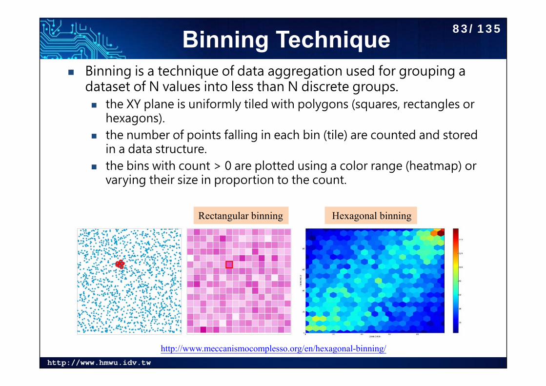
Binning Technique Binning is a technique of data aggregation used for grouping a
dataset of N values into less than N discrete groups. the XY plane is uniformly tiled with polygons (squares, rectangles or
hexagons). the number of points falling in each bin (tile) are counted and stored
in a data structure. the bins with count > 0 are plotted using a color range (heatmap) or
varying their size in proportion to the count.
Rectangular binning Hexagonal binning
http://www.meccanismocomplesso.org/en/hexagonal-binning/
83/135
http://www.hmwu.idv.tw
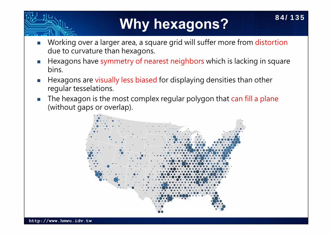
Why hexagons? Working over a larger area, a square grid will suffer more from distortion
due to curvature than hexagons. Hexagons have symmetry of nearest neighbors which is lacking in square
bins. Hexagons are visually less biased for displaying densities than other
regular tesselations. The hexagon is the most complex regular polygon that can fill a plane
(without gaps or overlap).
84/135
http://www.hmwu.idv.tw
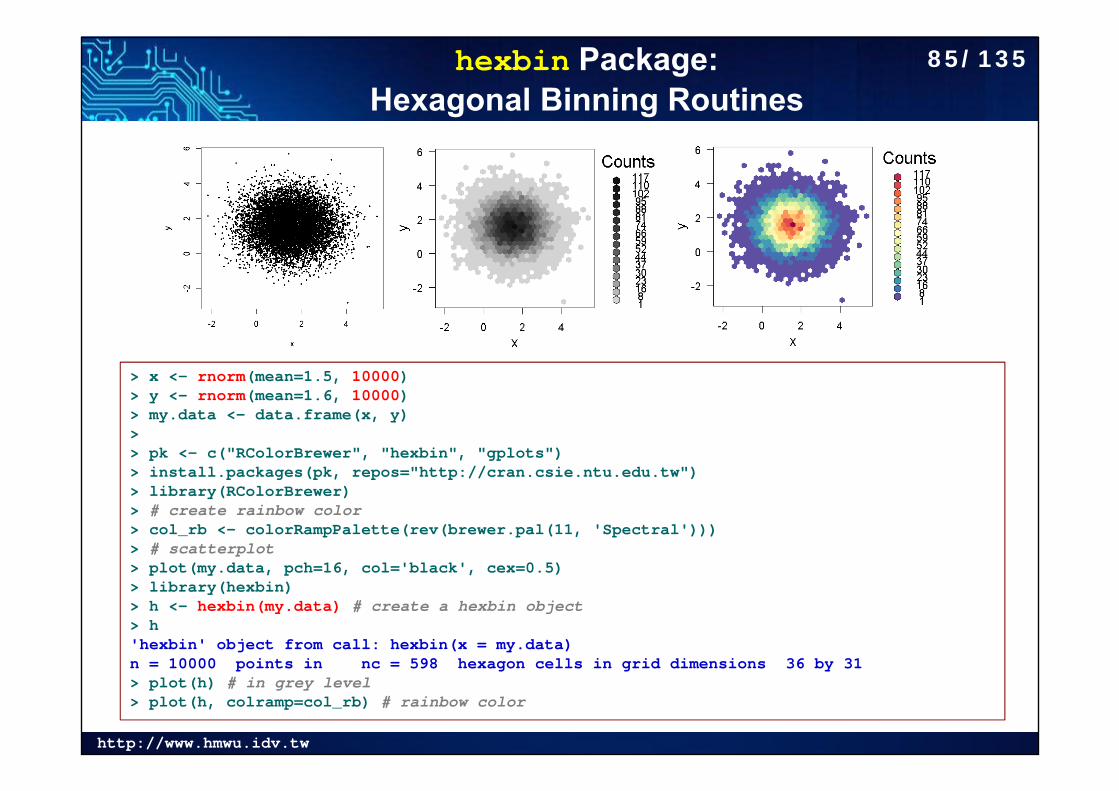
hexbin Package: Hexagonal Binning Routines
> x <- rnorm(mean=1.5, 10000)> y <- rnorm(mean=1.6, 10000)> my.data <- data.frame(x, y)> > pk <- c("RColorBrewer", "hexbin", "gplots")> install.packages(pk, repos="http://cran.csie.ntu.edu.tw")> library(RColorBrewer)> # create rainbow color> col_rb <- colorRampPalette(rev(brewer.pal(11, 'Spectral')))> # scatterplot> plot(my.data, pch=16, col='black', cex=0.5)> library(hexbin)> h <- hexbin(my.data) # create a hexbin object> h'hexbin' object from call: hexbin(x = my.data) n = 10000 points in nc = 598 hexagon cells in grid dimensions 36 by 31 > plot(h) # in grey level> plot(h, colramp=col_rb) # rainbow color
85/135
http://www.hmwu.idv.tw
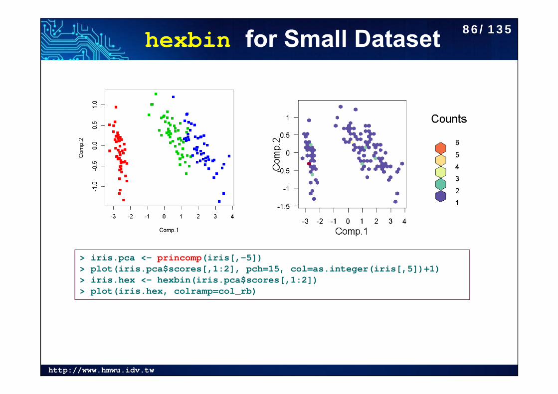
hexbin for Small Dataset
> iris.pca <- princomp(iris[,-5])> plot(iris.pca$scores[,1:2], pch=15, col=as.integer(iris[,5])+1)> iris.hex <- hexbin(iris.pca$scores[,1:2])> plot(iris.hex, colramp=col_rb)
86/135
http://www.hmwu.idv.tw
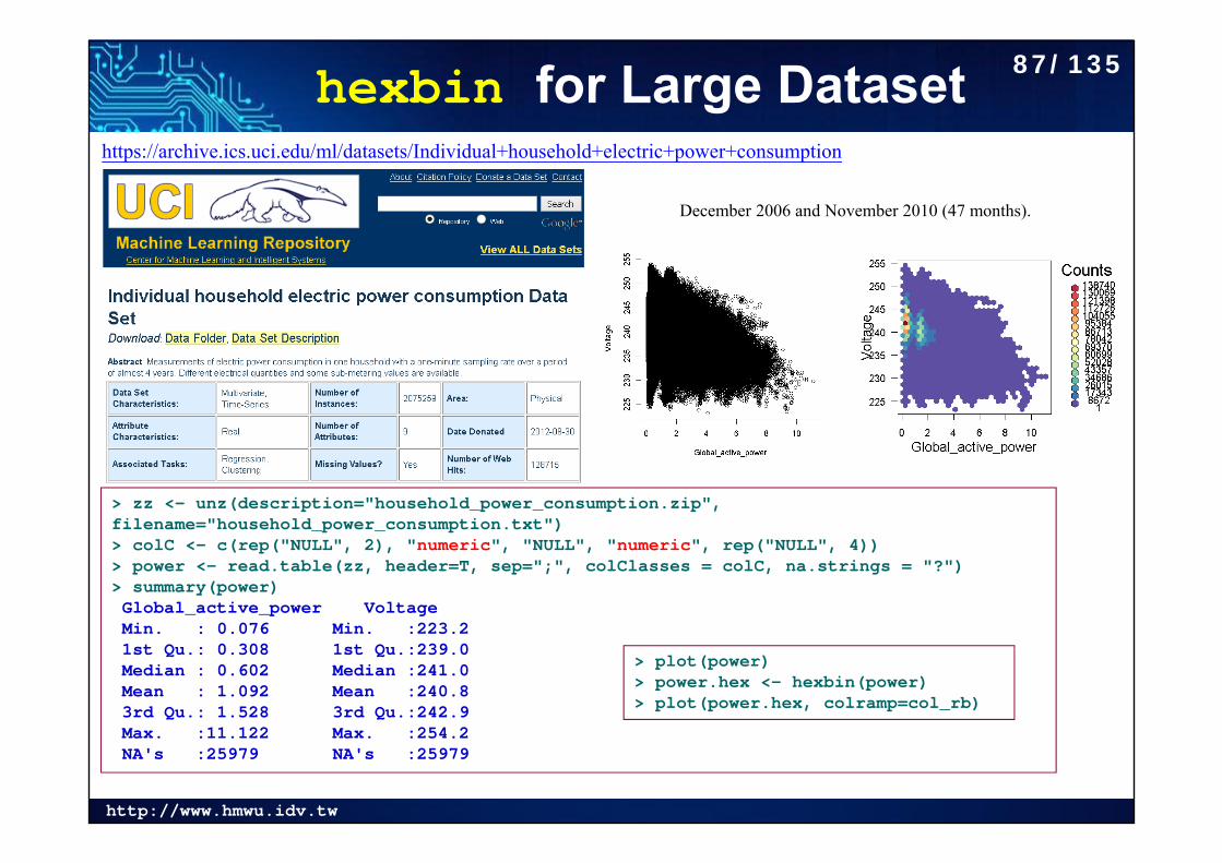
hexbin for Large Datasethttps://archive.ics.uci.edu/ml/datasets/Individual+household+electric+power+consumption
> zz <- unz(description="household_power_consumption.zip", filename="household_power_consumption.txt")> colC <- c(rep("NULL", 2), "numeric", "NULL", "numeric", rep("NULL", 4))> power <- read.table(zz, header=T, sep=";", colClasses = colC, na.strings = "?")> summary(power)Global_active_power Voltage Min. : 0.076 Min. :223.2 1st Qu.: 0.308 1st Qu.:239.0 Median : 0.602 Median :241.0 Mean : 1.092 Mean :240.8 3rd Qu.: 1.528 3rd Qu.:242.9 Max. :11.122 Max. :254.2 NA's :25979 NA's :25979
> plot(power)> power.hex <- hexbin(power)> plot(power.hex, colramp=col_rb)
December 2006 and November 2010 (47 months).
87/135
http://www.hmwu.idv.tw
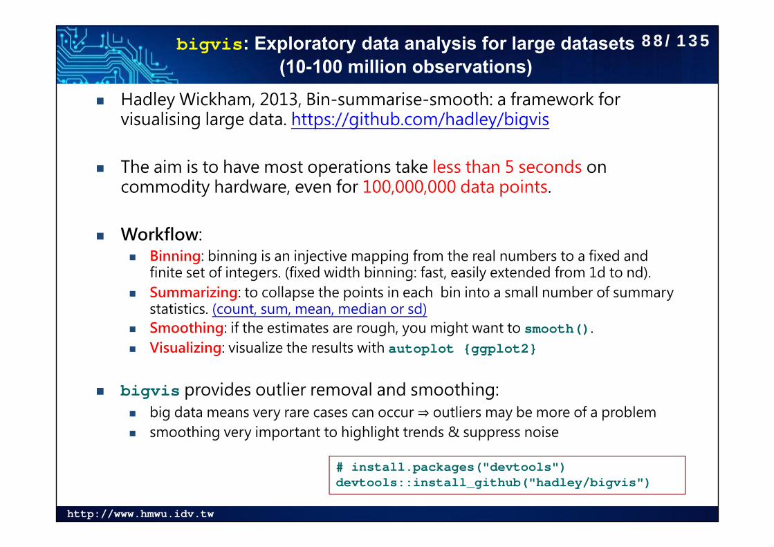
bigvis: Exploratory data analysis for large datasets (10-100 million observations)
Hadley Wickham, 2013, Bin-summarise-smooth: a framework for visualising large data. https://github.com/hadley/bigvis
The aim is to have most operations take less than 5 seconds on commodity hardware, even for 100,000,000 data points.
Workflow: Binning: binning is an injective mapping from the real numbers to a fixed and
finite set of integers. (fixed width binning: fast, easily extended from 1d to nd). Summarizing: to collapse the points in each bin into a small number of summary
statistics. (count, sum, mean, median or sd) Smoothing: if the estimates are rough, you might want to smooth(). Visualizing: visualize the results with autoplot {ggplot2}
bigvis provides outlier removal and smoothing: big data means very rare cases can occur ⇒ outliers may be more of a problem smoothing very important to highlight trends & suppress noise
# install.packages("devtools")devtools::install_github("hadley/bigvis")
88/135
http://www.hmwu.idv.tw
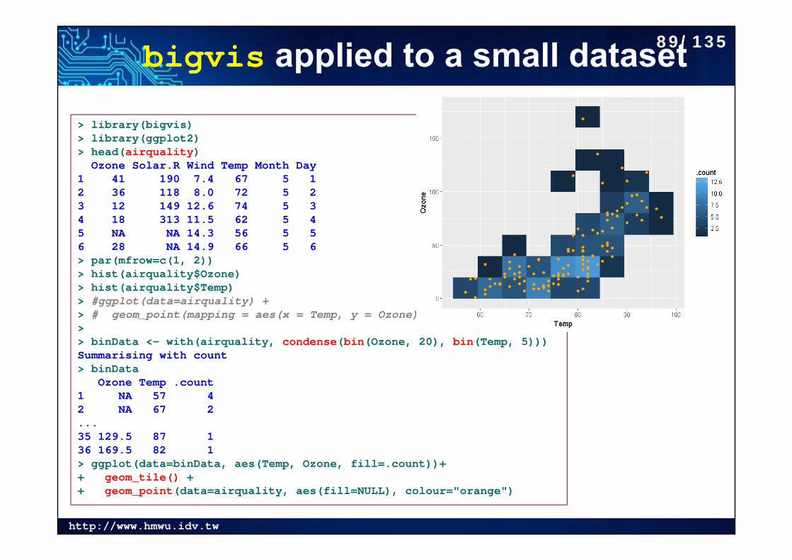
bigvis applied to a small dataset
> library(bigvis)> library(ggplot2)> head(airquality)
Ozone Solar.R Wind Temp Month Day1 41 190 7.4 67 5 12 36 118 8.0 72 5 23 12 149 12.6 74 5 34 18 313 11.5 62 5 45 NA NA 14.3 56 5 56 28 NA 14.9 66 5 6> par(mfrow=c(1, 2))> hist(airquality$Ozone)> hist(airquality$Temp)> #ggplot(data=airquality) + > # geom_point(mapping = aes(x = Temp, y = Ozone))>> binData <- with(airquality, condense(bin(Ozone, 20), bin(Temp, 5)))Summarising with count> binData
Ozone Temp .count1 NA 57 42 NA 67 2...35 129.5 87 136 169.5 82 1> ggplot(data=binData, aes(Temp, Ozone, fill=.count))+ + geom_tile() + + geom_point(data=airquality, aes(fill=NULL), colour="orange")
89/135
http://www.hmwu.idv.tw
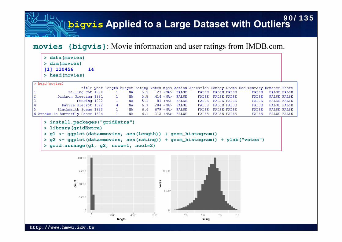
bigvis Applied to a Large Dataset with Outliers
movies {bigvis}: Movie information and user ratings from IMDB.com. > data(movies)> dim(movies)[1] 130456 14> head(movies)
> install.packages("gridExtra")> library(gridExtra)> g1 <- ggplot(data=movies, aes(length)) + geom_histogram()> g2 <- ggplot(data=movies, aes(rating)) + geom_histogram() + ylab("votes")> grid.arrange(g1, g2, nrow=1, ncol=2)
90/135
http://www.hmwu.idv.tw
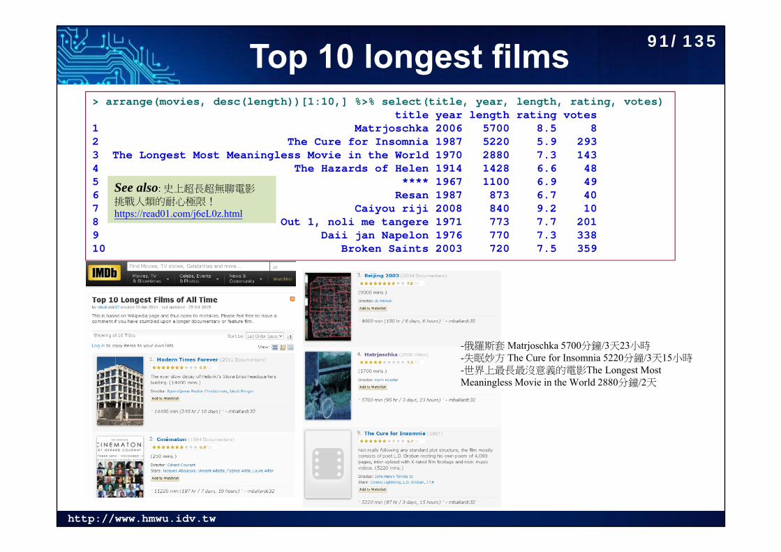
Top 10 longest films> arrange(movies, desc(length))[1:10,] %>% select(title, year, length, rating, votes)
title year length rating votes1 Matrjoschka 2006 5700 8.5 82 The Cure for Insomnia 1987 5220 5.9 2933 The Longest Most Meaningless Movie in the World 1970 2880 7.3 1434 The Hazards of Helen 1914 1428 6.6 485 **** 1967 1100 6.9 496 Resan 1987 873 6.7 407 Caiyou riji 2008 840 9.2 108 Out 1, noli me tangere 1971 773 7.7 2019 Daii jan Napelon 1976 770 7.3 33810 Broken Saints 2003 720 7.5 359
See also: 史上超長超無聊電影
挑戰人類的耐心極限!https://read01.com/j6eL0z.html
-俄羅斯套 Matrjoschka 5700分鐘/3天23小時-失眠妙方 The Cure for Insomnia 5220分鐘/3天15小時-世界上最長最沒意義的電影The Longest Most Meaningless Movie in the World 2880分鐘/2天
91/135
http://www.hmwu.idv.tw
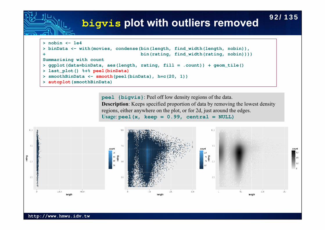
bigvis plot with outliers removed> nobin <- 1e4> binData <- with(movies, condense(bin(length, find_width(length, nobin)),+ bin(rating, find_width(rating, nobin))))Summarising with count> ggplot(data=binData, aes(length, rating, fill = .count)) + geom_tile()> last_plot() %+% peel(binData)> smoothBinData <- smooth(peel(binData), h=c(20, 1))> autoplot(smoothBinData)
peel {bigvis}: Peel off low density regions of the data.Description: Keeps specified proportion of data by removing the lowest density regions, either anywhere on the plot, or for 2d, just around the edges.Usage: peel(x, keep = 0.99, central = NULL)
92/135
http://www.hmwu.idv.tw
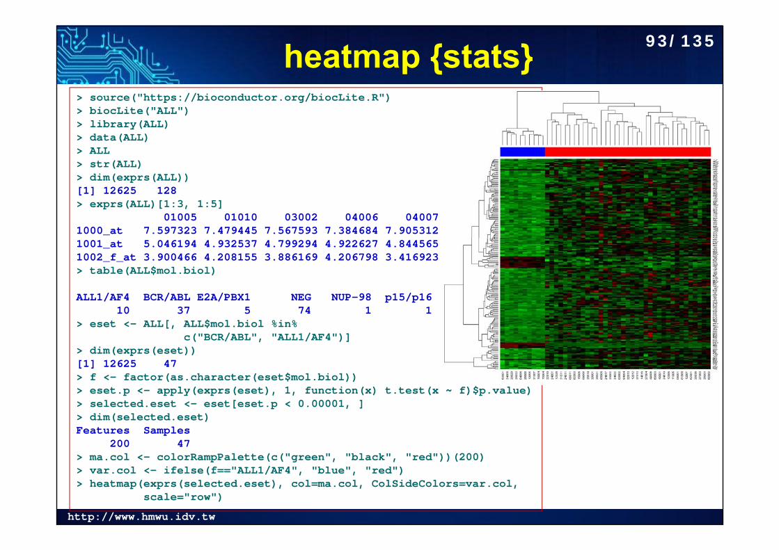
heatmap {stats}> source("https://bioconductor.org/biocLite.R")> biocLite("ALL")> library(ALL)> data(ALL)> ALL> str(ALL)> dim(exprs(ALL))[1] 12625 128> exprs(ALL)[1:3, 1:5]
01005 01010 03002 04006 040071000_at 7.597323 7.479445 7.567593 7.384684 7.9053121001_at 5.046194 4.932537 4.799294 4.922627 4.8445651002_f_at 3.900466 4.208155 3.886169 4.206798 3.416923> table(ALL$mol.biol)
ALL1/AF4 BCR/ABL E2A/PBX1 NEG NUP-98 p15/p16 10 37 5 74 1 1
> eset <- ALL[, ALL$mol.biol %in% c("BCR/ABL", "ALL1/AF4")]
> dim(exprs(eset))[1] 12625 47> f <- factor(as.character(eset$mol.biol))> eset.p <- apply(exprs(eset), 1, function(x) t.test(x ~ f)$p.value)> selected.eset <- eset[eset.p < 0.00001, ]> dim(selected.eset)Features Samples
200 47 > ma.col <- colorRampPalette(c("green", "black", "red"))(200)> var.col <- ifelse(f=="ALL1/AF4", "blue", "red")> heatmap(exprs(selected.eset), col=ma.col, ColSideColors=var.col,
scale="row")
93/135
http://www.hmwu.idv.tw
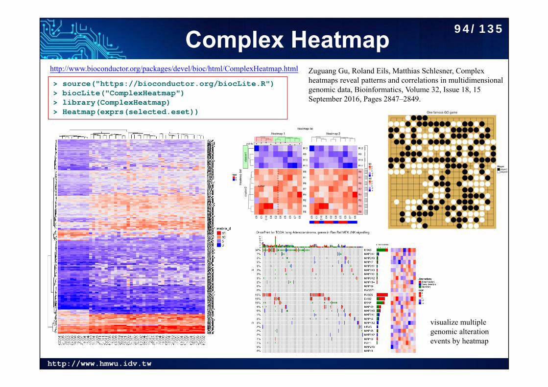
Complex Heatmaphttp://www.bioconductor.org/packages/devel/bioc/html/ComplexHeatmap.html
> source("https://bioconductor.org/biocLite.R")> biocLite("ComplexHeatmap")> library(ComplexHeatmap)> Heatmap(exprs(selected.eset))
Zuguang Gu, Roland Eils, Matthias Schlesner, Complex heatmaps reveal patterns and correlations in multidimensional genomic data, Bioinformatics, Volume 32, Issue 18, 15 September 2016, Pages 2847–2849.
visualize multiple genomic alteration events by heatmap
94/135
http://www.hmwu.idv.tw
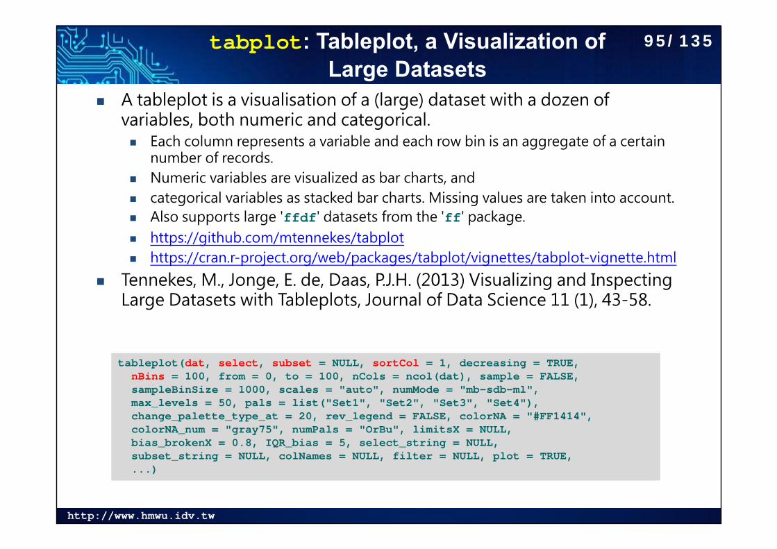
tabplot: Tableplot, a Visualization of Large Datasets
A tableplot is a visualisation of a (large) dataset with a dozen of variables, both numeric and categorical. Each column represents a variable and each row bin is an aggregate of a certain
number of records. Numeric variables are visualized as bar charts, and categorical variables as stacked bar charts. Missing values are taken into account. Also supports large 'ffdf' datasets from the 'ff' package. https://github.com/mtennekes/tabplot https://cran.r-project.org/web/packages/tabplot/vignettes/tabplot-vignette.html
Tennekes, M., Jonge, E. de, Daas, P.J.H. (2013) Visualizing and Inspecting Large Datasets with Tableplots, Journal of Data Science 11 (1), 43-58.
tableplot(dat, select, subset = NULL, sortCol = 1, decreasing = TRUE,nBins = 100, from = 0, to = 100, nCols = ncol(dat), sample = FALSE,sampleBinSize = 1000, scales = "auto", numMode = "mb-sdb-ml",max_levels = 50, pals = list("Set1", "Set2", "Set3", "Set4"),change_palette_type_at = 20, rev_legend = FALSE, colorNA = "#FF1414",colorNA_num = "gray75", numPals = "OrBu", limitsX = NULL,bias_brokenX = 0.8, IQR_bias = 5, select_string = NULL,subset_string = NULL, colNames = NULL, filter = NULL, plot = TRUE,...)
95/135
http://www.hmwu.idv.tw
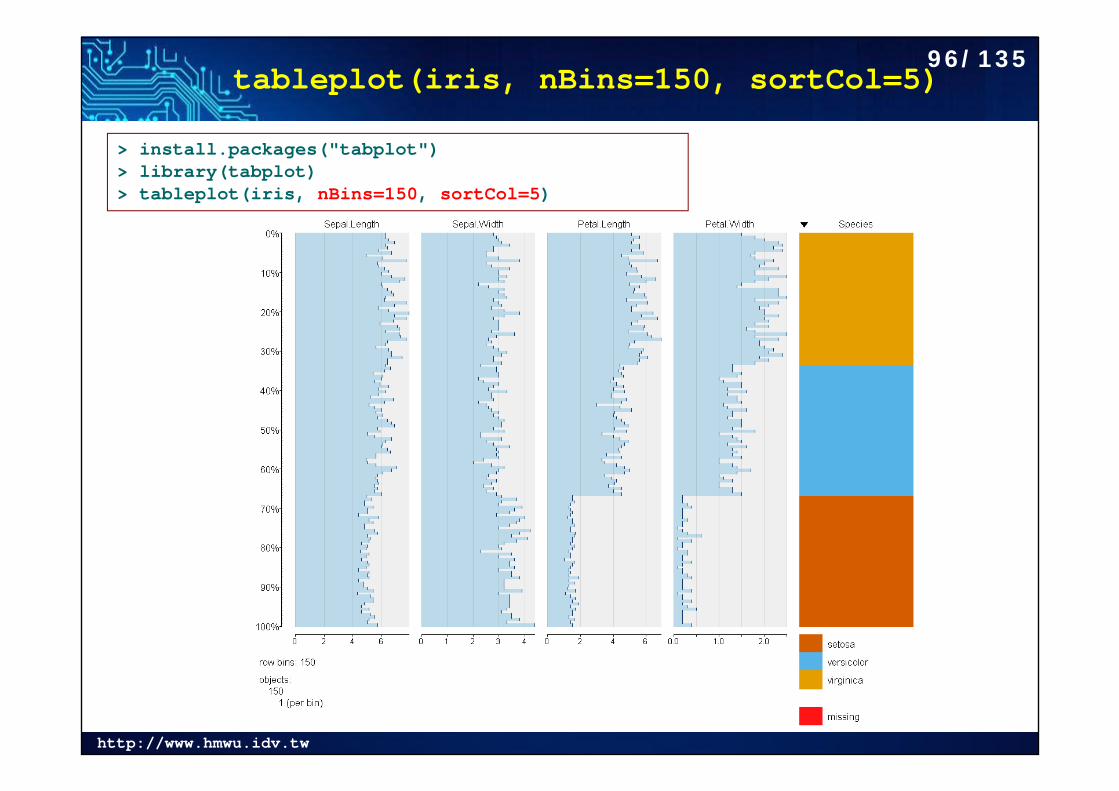
tableplot(iris, nBins=150, sortCol=5)
> install.packages("tabplot")> library(tabplot)> tableplot(iris, nBins=150, sortCol=5)
96/135
http://www.hmwu.idv.tw
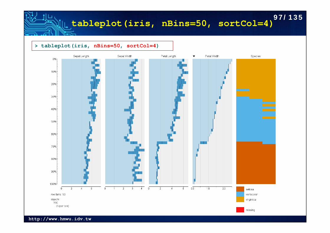
tableplot(iris, nBins=50, sortCol=4)
> tableplot(iris, nBins=50, sortCol=4)
97/135
http://www.hmwu.idv.tw
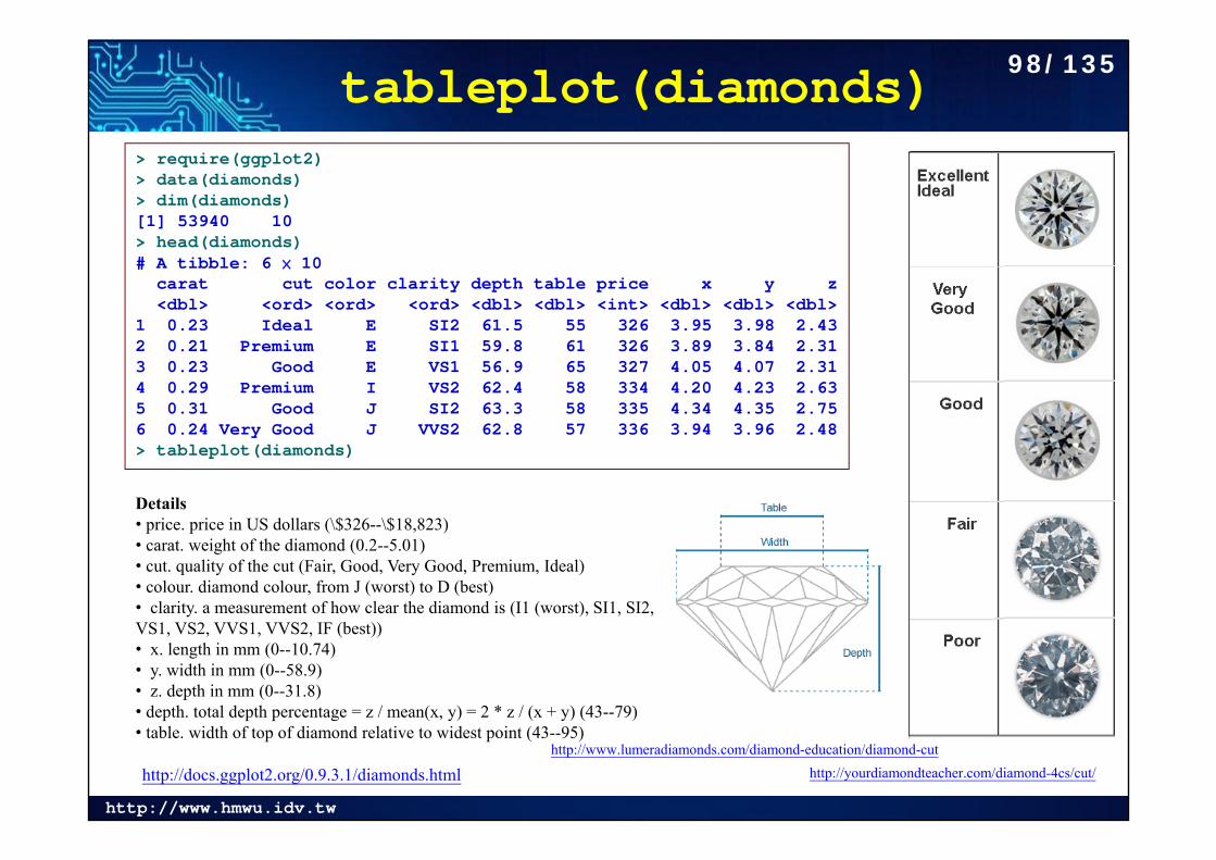
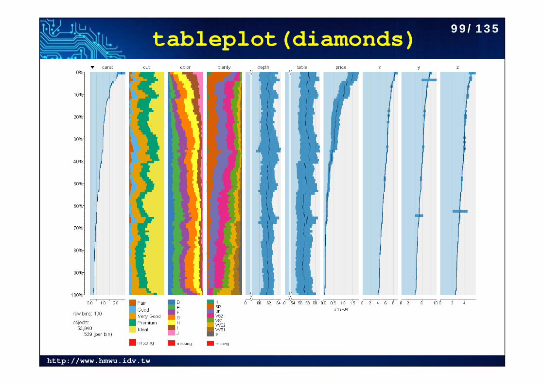
tableplot(diamonds)
http://docs.ggplot2.org/0.9.3.1/diamonds.html
> require(ggplot2)> data(diamonds)> dim(diamonds)[1] 53940 10> head(diamonds)# A tibble: 6 × 10
carat cut color clarity depth table price x y z<dbl> <ord> <ord> <ord> <dbl> <dbl> <int> <dbl> <dbl> <dbl>
1 0.23 Ideal E SI2 61.5 55 326 3.95 3.98 2.432 0.21 Premium E SI1 59.8 61 326 3.89 3.84 2.313 0.23 Good E VS1 56.9 65 327 4.05 4.07 2.314 0.29 Premium I VS2 62.4 58 334 4.20 4.23 2.635 0.31 Good J SI2 63.3 58 335 4.34 4.35 2.756 0.24 Very Good J VVS2 62.8 57 336 3.94 3.96 2.48> tableplot(diamonds)
http://www.lumeradiamonds.com/diamond-education/diamond-cuthttp://yourdiamondteacher.com/diamond-4cs/cut/
Details• price. price in US dollars (\$326--\$18,823) • carat. weight of the diamond (0.2--5.01) • cut. quality of the cut (Fair, Good, Very Good, Premium, Ideal) • colour. diamond colour, from J (worst) to D (best) • clarity. a measurement of how clear the diamond is (I1 (worst), SI1, SI2, VS1, VS2, VVS1, VVS2, IF (best)) • x. length in mm (0--10.74) • y. width in mm (0--58.9) • z. depth in mm (0--31.8) • depth. total depth percentage = z / mean(x, y) = 2 * z / (x + y) (43--79) • table. width of top of diamond relative to widest point (43--95)
98/135
http://www.hmwu.idv.tw
tableplot(diamonds) 99/135
http://www.hmwu.idv.tw
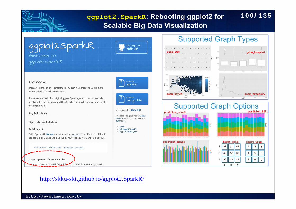
ggplot2.SparkR: Rebooting ggplot2 for Scalable Big Data Visualization
http://skku-skt.github.io/ggplot2.SparkR/
100/135
http://www.hmwu.idv.tw
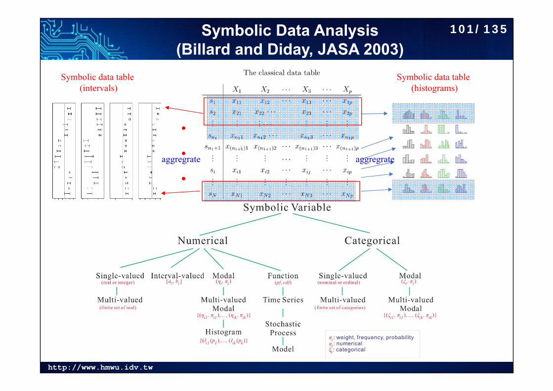
Symbolic Data Analysis (Billard and Diday, JASA 2003)
Symbolic data table (histograms)
Symbolic data table (intervals)
.
.
.aggregrate aggregrate
101/135
http://www.hmwu.idv.tw
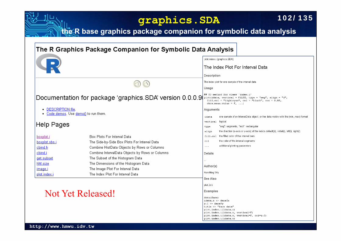
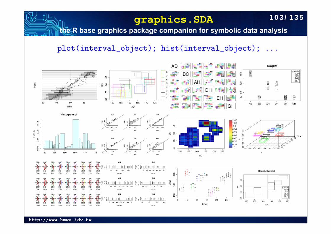
graphics.SDAthe R base graphics package companion for symbolic data analysis
Not Yet Released!
102/135
http://www.hmwu.idv.tw
graphics.SDAthe R base graphics package companion for symbolic data analysis
103/135
http://www.hmwu.idv.tw
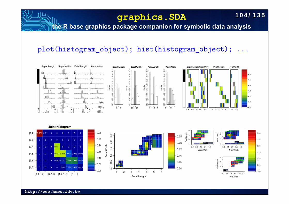
graphics.SDAthe R base graphics package companion for symbolic data analysis
104/135
http://www.hmwu.idv.tw
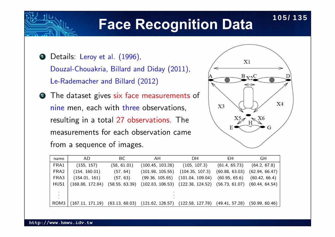
Face Recognition Data 105/135
http://www.hmwu.idv.tw
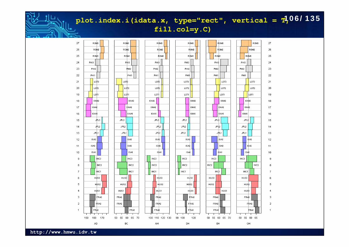
plot.index.i(idata.x, type="rect", vertical = T, fill.col=y.C)
106/135
http://www.hmwu.idv.tw
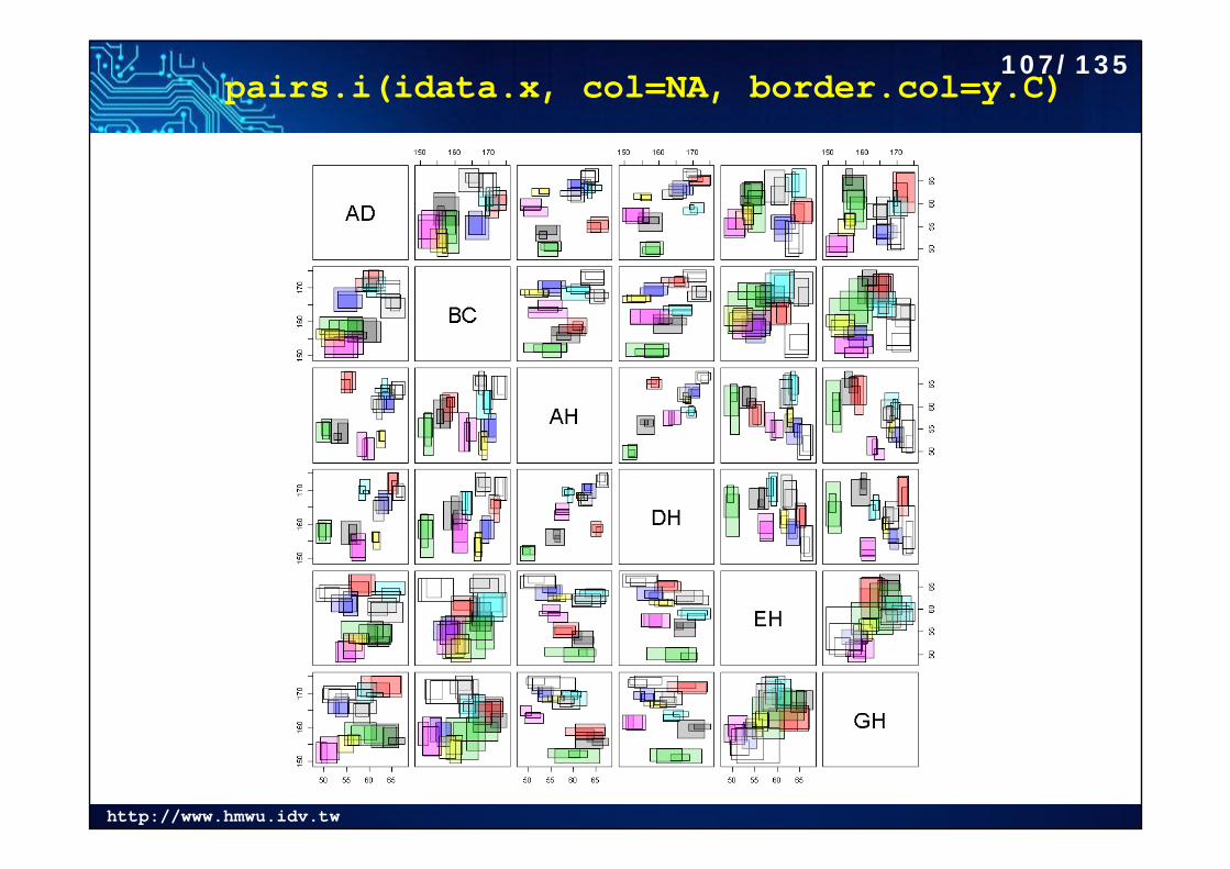
pairs.i(idata.x, col=NA, border.col=y.C)107/135
http://www.hmwu.idv.tw
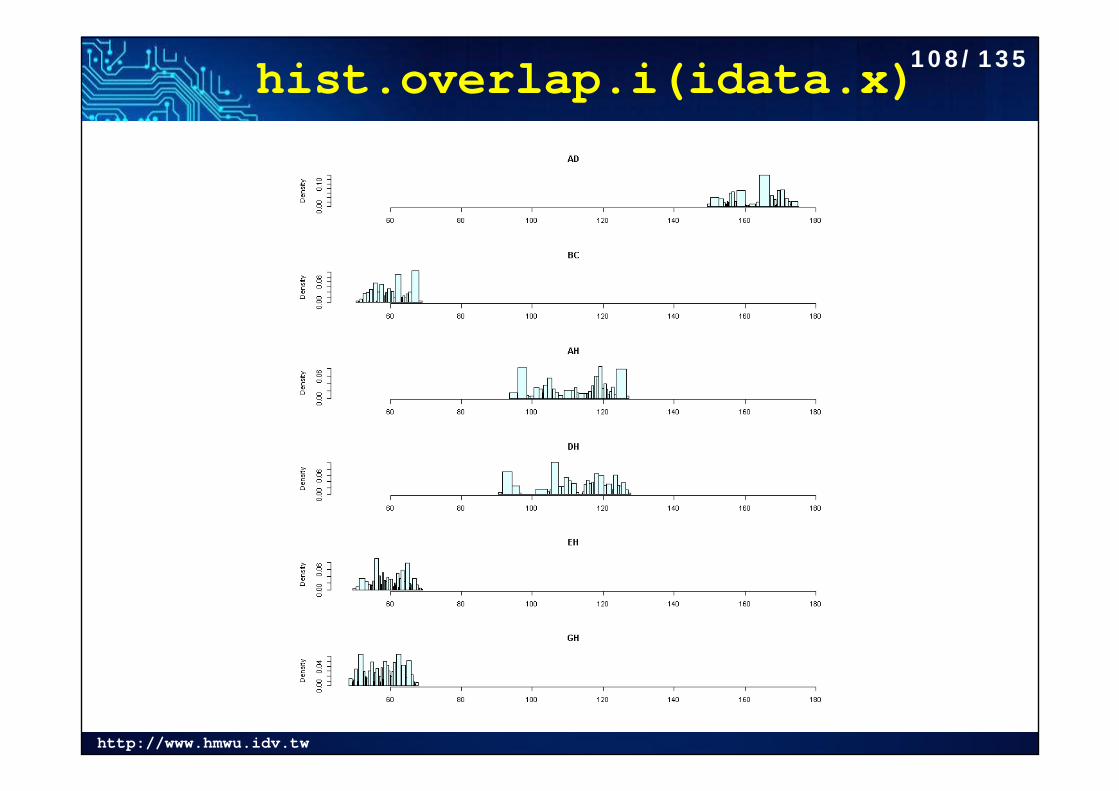
hist.overlap.i(idata.x)108/135
http://www.hmwu.idv.tw
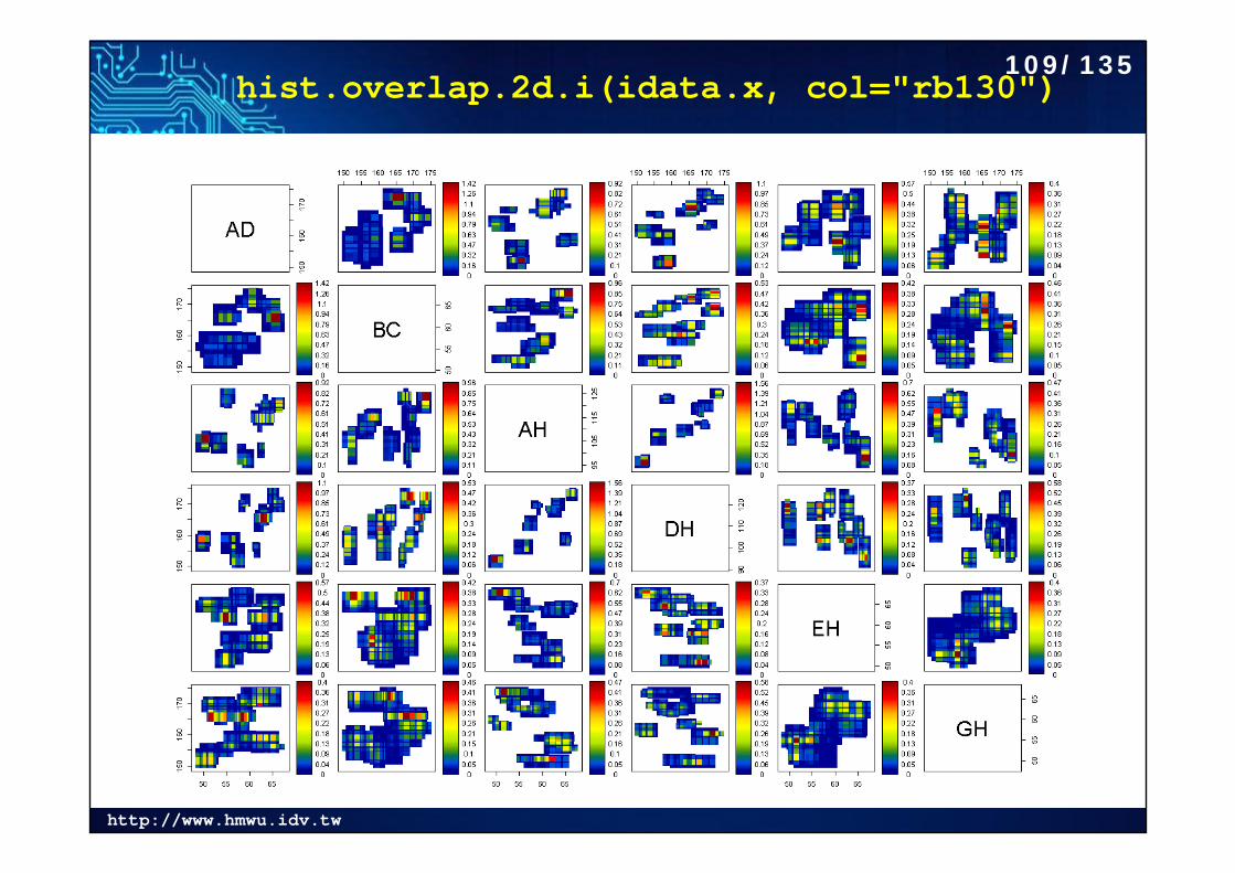
hist.overlap.2d.i(idata.x, col="rb130")109/135
http://www.hmwu.idv.tw
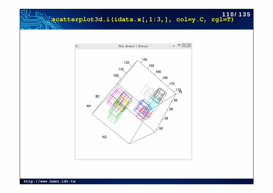
scatterplot3d.i(idata.x[,1:3,], col=y.C, rgl=T)110/135
http://www.hmwu.idv.tw
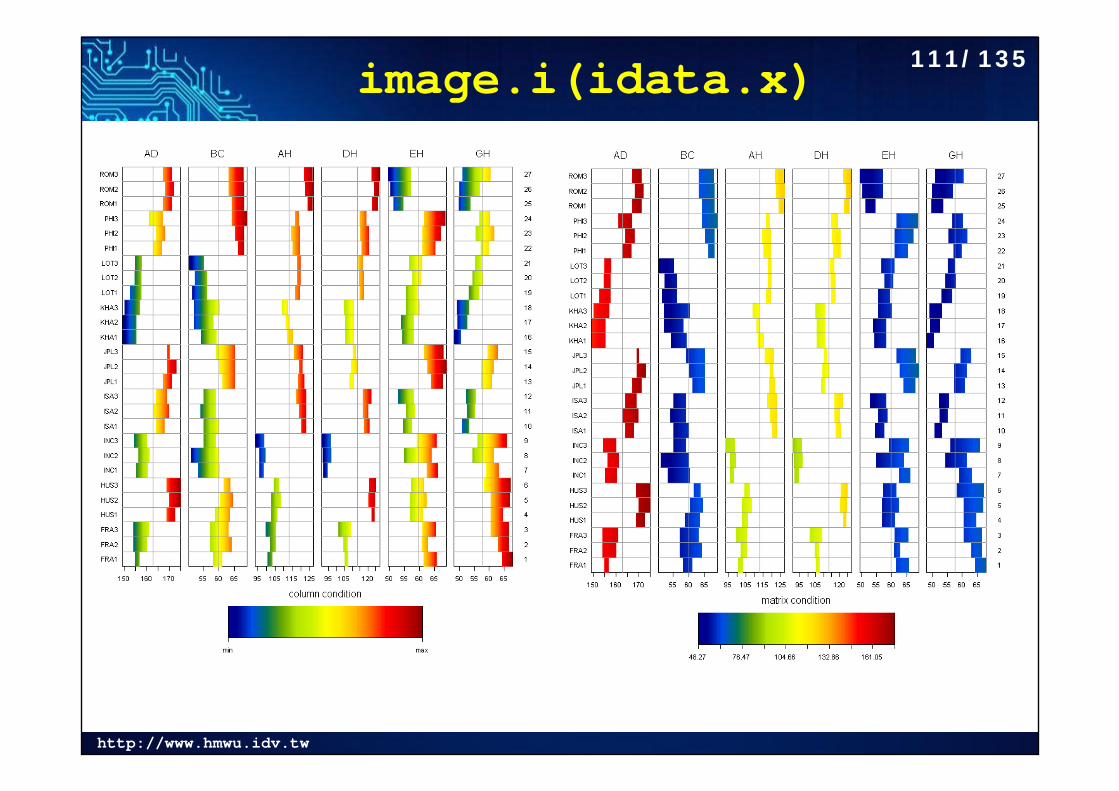
image.i(idata.x) 111/135
http://www.hmwu.idv.tw
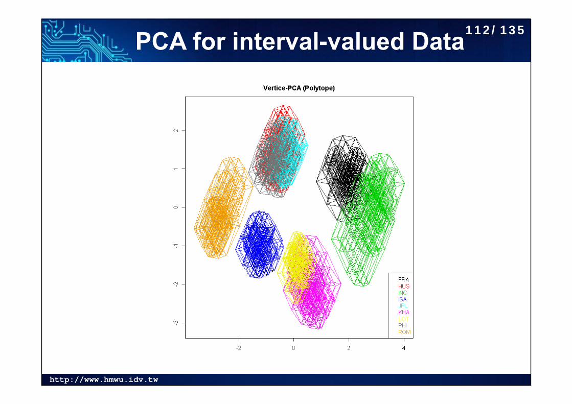
PCA for interval-valued Data112/135
http://www.hmwu.idv.tw
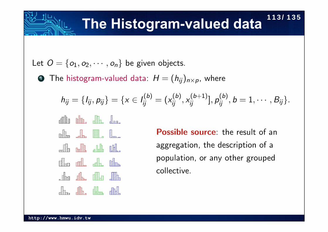
The Histogram-valued data 113/135
http://www.hmwu.idv.tw
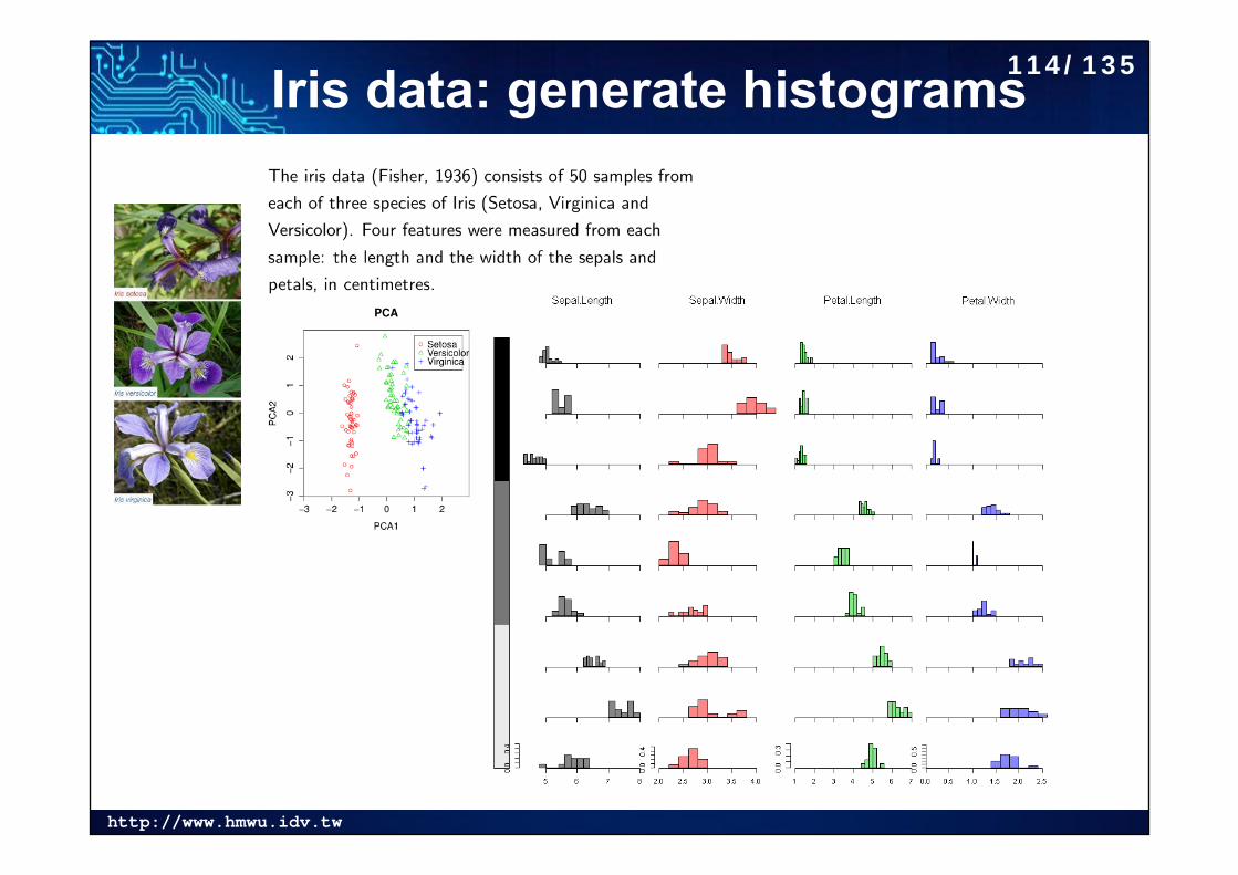
Iris data: generate histograms114/135
http://www.hmwu.idv.tw
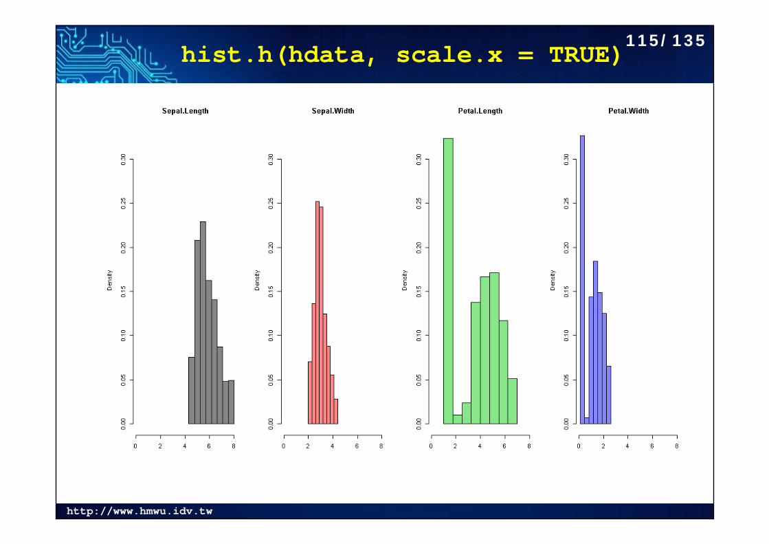
hist.h(hdata, scale.x = TRUE) 115/135
http://www.hmwu.idv.tw
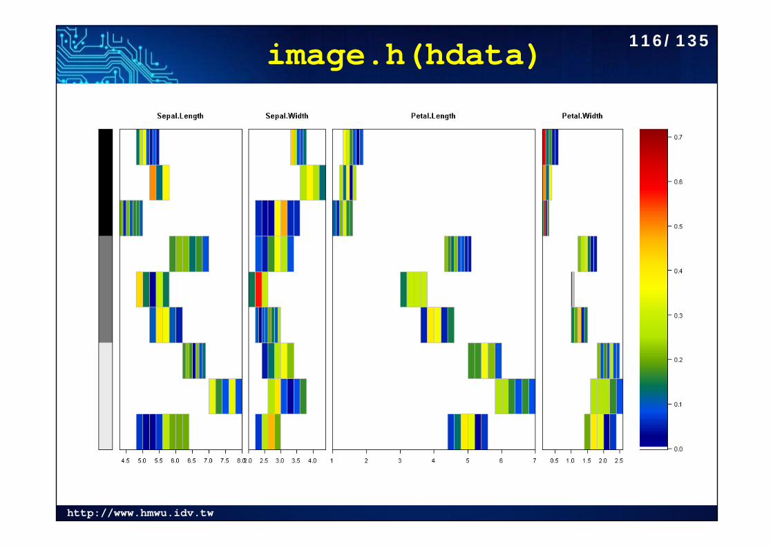
image.h(hdata) 116/135
http://www.hmwu.idv.tw
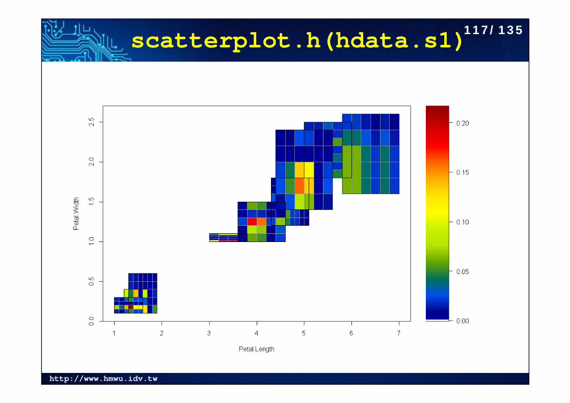
scatterplot.h(hdata.s1)117/135
http://www.hmwu.idv.tw
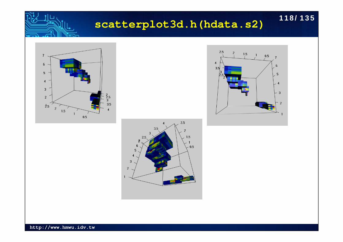
scatterplot3d.h(hdata.s2)118/135
http://www.hmwu.idv.tw
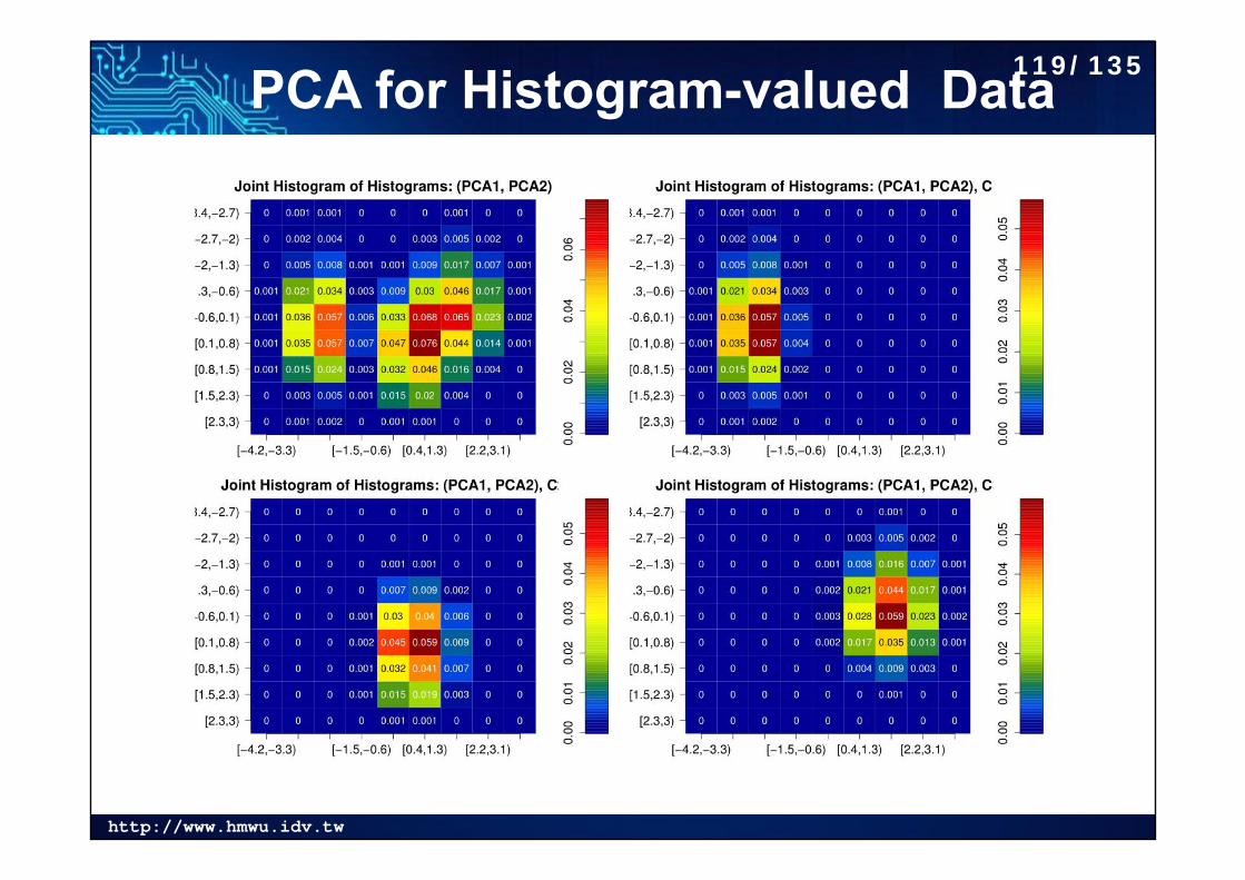
PCA for Histogram-valued Data119/135
http://www.hmwu.idv.tw
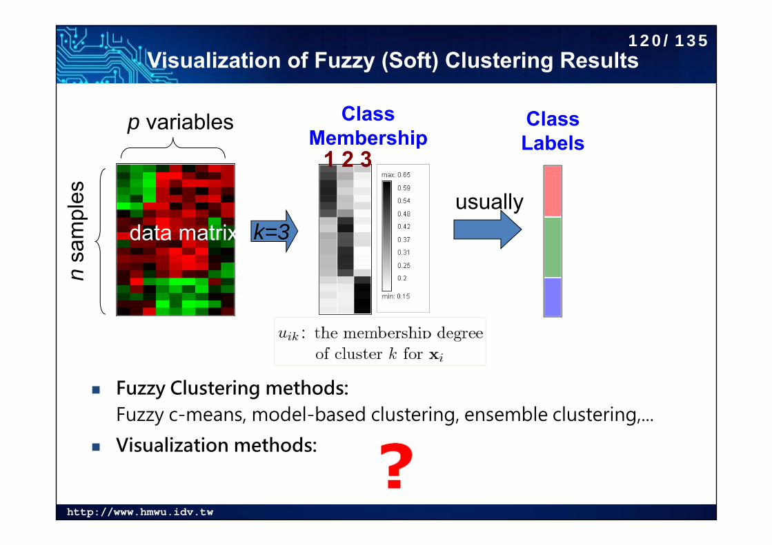
Visualization of Fuzzy (Soft) Clustering Results
Fuzzy Clustering methods:Fuzzy c-means, model-based clustering, ensemble clustering,...
Visualization methods:
Class Membership
Class Labels
usually
1 2 3
nsa
mpl
es
p variables
data matrix k=3
120/135
http://www.hmwu.idv.tw
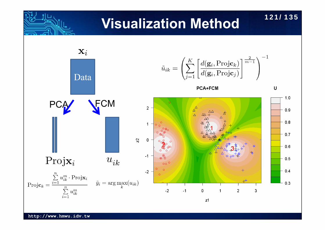
Visualization Method
Data
PCA FCM
121/135
http://www.hmwu.idv.tw
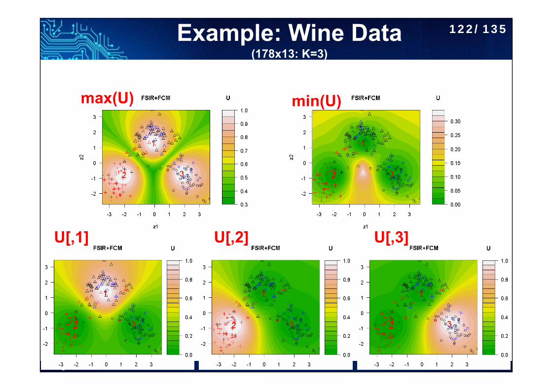
Example: Wine Data(178x13: K=3)
max(U) min(U)
U[,1] U[,2] U[,3]
122/135
http://www.hmwu.idv.tw
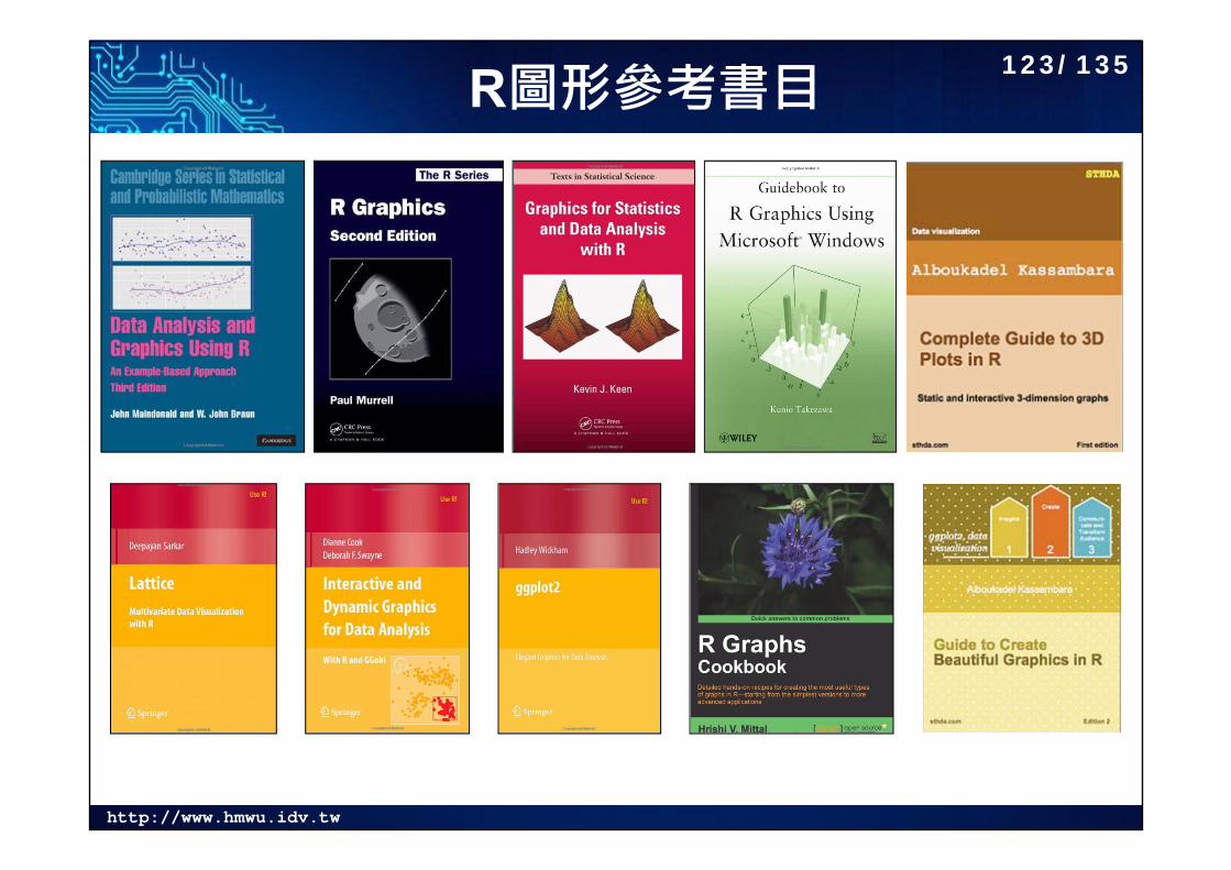
R圖形參考書目123/135
http://www.hmwu.idv.tw
Fundations, Principle 124/135
http://www.hmwu.idv.tw
Statistics and Graphics 125/135
http://www.hmwu.idv.tw
Data Visualization 126/135
http://www.hmwu.idv.tw
Specified Data Types 127/135
http://www.hmwu.idv.tw
Others 128/135
http://www.hmwu.idv.tw
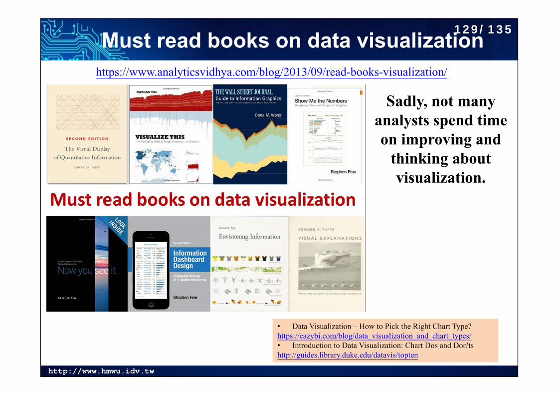
Must read books on data visualizationhttps://www.analyticsvidhya.com/blog/2013/09/read-books-visualization/
• Data Visualization – How to Pick the Right Chart Type?https://eazybi.com/blog/data_visualization_and_chart_types/• Introduction to Data Visualization: Chart Dos and Don'tshttp://guides.library.duke.edu/datavis/topten
Sadly, not many analysts spend time on improving and
thinking about visualization.
129/135
http://www.hmwu.idv.tw
R Graphics 130/135
http://www.hmwu.idv.tw
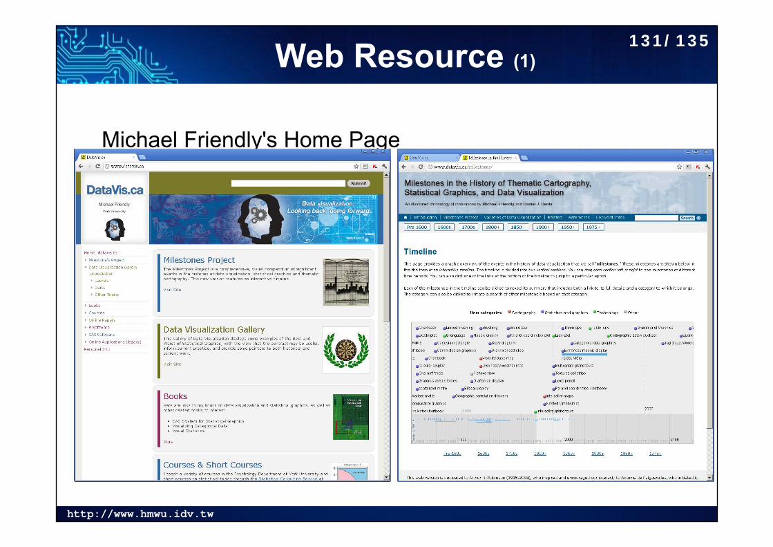
Web Resource (1)
Michael Friendly's Home Pagehttp://www.datavis.ca/
131/135
http://www.hmwu.idv.tw
Web Resource (2)132/135
http://www.hmwu.idv.tw
List of Information Graphics Software133/135
http://www.hmwu.idv.tw
Some DataViz Sites Data Visualization Is The Future - Here's Whyhttp://www.forbes.com/sites/dorieclark/2014/03/10/data-visualization-is-the-future-heres-why/
Phil Simon, 2014, The Visual Organization: Data Visualization, Big Data, and the Quest for Better Decisions, Wiley. ISBN: 9781118794388 | 1118794389
Information Aesthetics: http://infosthetics.com/ Chart Porn: http://chartporn.org/ Eagereyes: https://eagereyes.org/ We Love Datavis: http://datavis.tumblr.com A New Generation Tool For (big) Data Visualization:
http://www.stratio.com/datavis/kbase/ Visualizing.org: http://www.visualizing.org/explore VizWiz: http://vizwiz.blogspot.ca/ US Census Data Visualization Gallery: http://www.census.gov/dataviz/
134/135
http://www.hmwu.idv.tw
AcknowledgmentTKU, NTPU, MOST, Chun-houh Chen (中研院統計所 陳君厚)
135/135
Related Documents