On the cover of Q magazine, the main image has filled the frame of the entire cover, whereas I chose a different approach and allowed the mis-en-scene of my image to fill the frame. This was mostly so I would present a different mood and feel to the magazine. Q looks very busy whereas my magazine is very The mast head for Q magazine is quite basic and simplistic which at the same time makes it look modern and fresh. Personally, I thought it looked quite flat which is why I put and effect on my mast head to make it more noticeable. However, the brightness of Qs masthead does make it more appealing. Ensuring my masthead stands out is important as it’s the first thing readers are going to notice and remember for when they’re buying the magazine again. The puff used on the cover is attractive and stands out from the rest of the cover as it’s in a brighter and different colour. I didn’t use a puff as I thought my idea of using transparent boxes gave the cover an edge as it is, and already made the cover stand I used a banner on my cover to immediately notify readers that this magazine has more to offer than others. By using a banner I’ve challenged the use of cover lines as their main purpose is to inform readers on what’s in the magazine – the styling of them indicates which are more important that others and by including a banner it has used the purpose that cover lines fulfill. Additionally, it adds colour to the cover and will immediately draw the attention of the readers. The colours I have used are distinctly different than the colours used on Qs cover. I made the cover black and white to gain a traditional feel to the magazine. By enabling a traditional feel I wanted to send a message that the music is still as important as it used to be and that the magazine takes it all very seriously. Plus the style of music can be a factor of why they’ve been presented differently. Florence, from Florence & the Machine, produces quite quirky pop music whereas Emily Pavitt produces indie alternative music so the styling of the main image will differ. I’ve used transparent boxes to make my cover lines look as if they’ve been taped onto the cover – implying a sense of urgency to read the feature articles. I feel as though it works quite well with the black and white background as if I used the technique Q magazine did with block colours, they would not stand out enough and would lose its purpose. The main image on Qs cover also influences the way they present their cover lines as her hair is

Question 1 evaluation
Aug 03, 2015
Welcome message from author
This document is posted to help you gain knowledge. Please leave a comment to let me know what you think about it! Share it to your friends and learn new things together.
Transcript
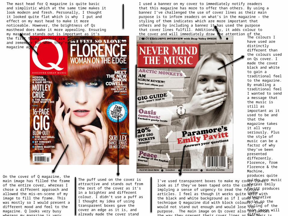
On the cover of Q magazine, the main image has filled the frame of the entire cover, whereas I chose a different approach and allowed the mis-en-scene of my image to fill the frame. This was mostly so I would present a different mood and feel to the magazine. Q looks very busy whereas my magazine is very relaxed and chilled which I did in hope to make the readers feel comfortable when reading.
The mast head for Q magazine is quite basic and simplistic which at the same time makes it look modern and fresh. Personally, I thought it looked quite flat which is why I put and effect on my mast head to make it more noticeable. However, the brightness of Qs masthead does make it more appealing. Ensuring my masthead stands out is important as it’s the first thing readers are going to notice and remember for when they’re buying the magazine again.
The puff used on the cover is attractive and stands out from the rest of the cover as it’s in a brighter and different colour. I didn’t use a puff as I thought my idea of using transparent boxes gave the cover an edge as it is, and already made the cover stand out from other covers as it challenges the convention of the puff.
I used a banner on my cover to immediately notify readers that this magazine has more to offer than others. By using a banner I’ve challenged the use of cover lines as their main purpose is to inform readers on what’s in the magazine – the styling of them indicates which are more important that others and by including a banner it has used the purpose that cover lines fulfill. Additionally, it adds colour to the cover and will immediately draw the attention of the readers.
The colours I have used are distinctly different than the colours used on Qs cover. I made the cover black and white to gain a traditional feel to the magazine. By enabling a traditional feel I wanted to send a message that the music is still as important as it used to be and that the magazine takes it all very seriously. Plus the style of music can be a factor of why they’ve been presented differently. Florence, from Florence & the Machine, produces quite quirky pop music whereas Emily Pavitt produces indie alternative music so the styling of the main image will differ.
I’ve used transparent boxes to make my cover lines look as if they’ve been taped onto the cover – implying a sense of urgency to read the feature articles. I feel as though it works quite well with the black and white background as if I used the technique Q magazine did with block colours, they would not stand out enough and would lose its purpose. The main image on Qs cover also influences the way they present their cover lines as her hair is mainly the background so having white colour on quite a vibrant ginger makes the use of block colours effective.
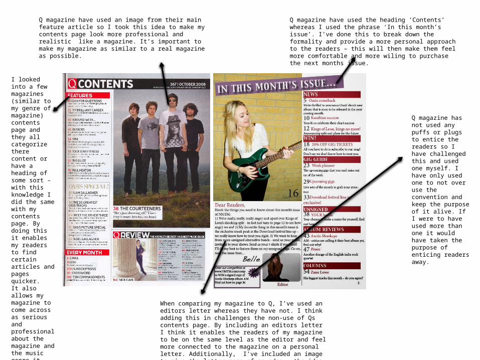
Q magazine have used an image from their main feature article so I took this idea to make my contents page look more professional and realistic like a magazine. It’s important to make my magazine as similar to a real magazine as possible.
I looked into a few magazines (similar to my genre of magazine) contents page and they all categorize there content or have a heading of some sort – with this knowledge I did the same with my contents page. By doing this it enables my readers to find certain articles and pages quicker. It also allows my magazine to come across as serious and professional about the magazine and the music genre it represents.
When comparing my magazine to Q, I’ve used an editors letter whereas they have not. I think adding this in challenges the non-use of Qs contents page. By including an editors letter I think it enables the readers of my magazine to be on the same level as the editor and feel more connected to the magazine on a personal letter. Additionally, I’ve included an image to give the letter more of an edge – the idea behind it was that each issue would be a different image chosen by the editor.
Q magazine have used the heading ‘Contents’ whereas I used the phrase ‘In this month’s issue’. I’ve done this to break down the formality and provide a more personal approach to the readers – this will then make them feel more comfortable and more wiling to purchase the next months issue.
Q magazine has not used any puffs or plugs to entice the readers so I have challenged this and used one myself. I have only used one to not over use the convention and keep the purpose of it alive. If I were to have used more than one it would have taken the purpose of enticing readers away.

In the corner of the page Q magazine have written ‘Lana Del Rey’ which I did something similar and developed the idea by using it as a main heading which I added an effect onto to make the page look less flat.
For the double page spread an image of the artist Lana Del Rey has been used for a whole page, this is more appealing to the readers but I chose to separate my pages and my article by including smaller images and text on both pages. By developing this idea it enables me to include more writing which will be of more interest to the readers. On the opposite side of the spread, an enlarged S has been placed behind the text which is good way to fill space, so instead of taking this idea, I added more images and text.
At the bottom of the page, a web link has been added so that readers can visit the link and get more involved and more information on this article or the magazine in general, I’ve also used this idea with alongside it the magazines name shortened to ‘NMTM’. I’ve done this to brand the magazine and to also give the opportunity to involve readers into a lot more.
At the beginning of the interview (often at the beginning of the article also), the first letter is larger than the rest to make the text seem more interesting and have an edge. I’ve used this common convention within in own article and enlarged the first letter. By using this convention it allows my magazine to be taken seriously as it is presented a lot like the others and uses the same conventions.
Q magazine haven’t used this technique in their double page spread, but I’ve taken the convention from another magazine similar to my genre. I’ve added a pull quote and has my text surround it, by doing this it makes my text more interesting and breaks away the daunting fear of too much text.
Related Documents


