Q1: In what ways does your media product use, develop or challenge forms and conventions of real media products?

Welcome message from author
This document is posted to help you gain knowledge. Please leave a comment to let me know what you think about it! Share it to your friends and learn new things together.
Transcript

Q1: In what ways does your media product use, develop or challenge forms and conventions of
real media products?

To get my perfect front cover image I done a lot but specific research on Hip Hop front cover magazines. What caught my eye the most was the female front covers of VIBE magazine that is based on Hip Hop. To make my front cover image effective as possible I tried follow the conventions of the two magazine artists poses & positioning from VIBE. As you can see my artist (model) has a serious expression of her face and also has her mouth slightly open just like the artists on the front covers of VIBE. I also noticed the females on these VIBE front covers are doing something with their arms so during my photo shoot, I told my model to have one of her arms onher hip and the other hand hanging down. Also the artists are looking direct to the audiencewhich I took in consideration when choosingmy final front cover image. Lastly the artistson VIBE are taken from an mid-long shot which I also did as well. By analysing all theconventions on female front cover images,I took it all in my head and developed it onmy own front cover.

The form of my magazine name was inspired by the title VIBE. The forms I followed and produced through my magazine name is that I kept all the letters in my magazine name in capitals. This is because it looks more effective and makes it obvious to readers what is the magazine title. What I challenged in my media product is the font of the title. I used more of a creative font and edited it on PhotoShop by making it look 3D which challenges the magazine VIBE title I was using as inspiration. Also the colour of my title is vibrant red which I noticed is very popular with Hip Hop magazines such as VIBE as red is a sharp and bold colour which represents the genre.
Also on top of the title, what I noticed on the VIBE magazines is that they have one sentence on top of the title that relates to something that would be inside the magazine. I followed this convention but slightly changed it by adding a shadow around the text as I think it would look more effective.

While I was analysing specific magazine front covers I chose for my inspiration, I noticed that the colour of the magazine name ‘VIBE’ would have the same colour on the front cover artist. In this example of VIBE magazine, the name VIBE is in orange and the hair of the artist is also orange. I thought this would look effective on my magazine to carry out this convention.
Additionally, I chose my magazine name to be the colour red and the front cover artist is wearing a red top. By doing this it makes my magazine front cover look more effective and professional. It also shows the audience a clear and obvious colour scheme.

I kept the colour scheme of red, white, yellow/tangerine and black consistently through out my magazine (mainly front cover and double page spread.) I noticed that the magazine VIBE used a lot of white, red and black in their magazines so I thought I would carry that convention through out my magazine.
What I challenged with my colour scheme is using a 4th colour which is yellow/tangerine. I did this because I thought firstly, on the front cover the artist name should stand out the most and should be a colour by it self to represent that. By doing that, the usage of yellow/tangerine is very minimal through out my magazine but is part of the colour scheme.
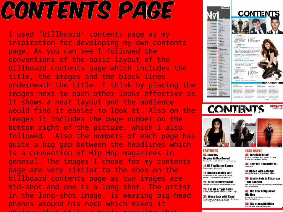
I used ‘billboard’ contents page as my inspiration for developing my own contents page. As you can see I followed the conventions of the basic layout of the billboard contents page which includes the title, the images and the block lines underneath the title. I think by placing the images next to each other looks effective as it shows a neat layout and the audience would find it easier to look at. Also on the images it includes the page number on the bottom right of the picture, which I also followed. Also the numbers of each page has quite a big gap between the headlines which is a convention of Hip Hop magazines in general. The images I chose for my contents page are very similar to the ones on the billboard contents page as two images are mid-shot and one is a long shot. The artist in the long-shot image, is wearing big head phones around his neck which makes it obvious that it is a music magazine that links to the chosen genre, Hip Hop.
What I challenged on my contents page is the layout of my text. I thought by the way I have set it out looks less complicated to the one in billboard and the audience would find it more easier to understand.

After researching on Hip Hop front covers and contents page, I had to find the double page spread that caught my eye, which I found. This double spread page with fiasco on it looks effective because their is not much nor less going on the page. Also from my research I carried out in my focus group, they said they would not be interested if there is more text which I considered when creating my double page spread. I have followed the convention of the structure/layout of this double spread page as it self.
What I challenged was by adding a teaser which is written in yellow text on my double page spread. Why I did this was because I thought it would give readers briefly a flavour of what they are going to read about by that one sentence.
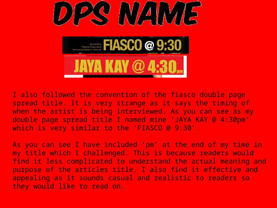
I also followed the convention of the fiasco double page spread title. It is very strange as it says the timing of when the artist is being interviewed. As you can see as my double page spread title I named mine ‘JAYA KAY @ 4:30pm’ which is very similar to the ‘FIASCO @ 9:30’.
As you can see I have included ‘pm’ at the end of my time in my title which I challenged. This is because readers would find it less complicated to understand the actual meaning and purpose of the articles title. I also find it effective and appealing as it sounds casual and realistic to readers so they would like to read on.

I also followed the convention of the large pull quote on the corner of the right page on the left hand side. This looks effective as it is the first thing readers would read. It would also give them an insight of what the artist tone of voice and that would appeal different readers in different ways.
The only thing I challenged with my big pull quote is that I kept mine in a different front compared to the article font and kept it all in one colour. I did this because it looks more neat looks less busy on the page.

In conclusion, I think that the magazine I created follows a range of conventions that real media products have. Along with this, I have also developed and challenged conventions of Hip Hop magazines to make my magazine look more original.
Related Documents