Progression From Preliminary Task
Jul 29, 2015
Welcome message from author
This document is posted to help you gain knowledge. Please leave a comment to let me know what you think about it! Share it to your friends and learn new things together.
Transcript

PRELIMINARY TASK: AREAS OF IMPROVEMENT
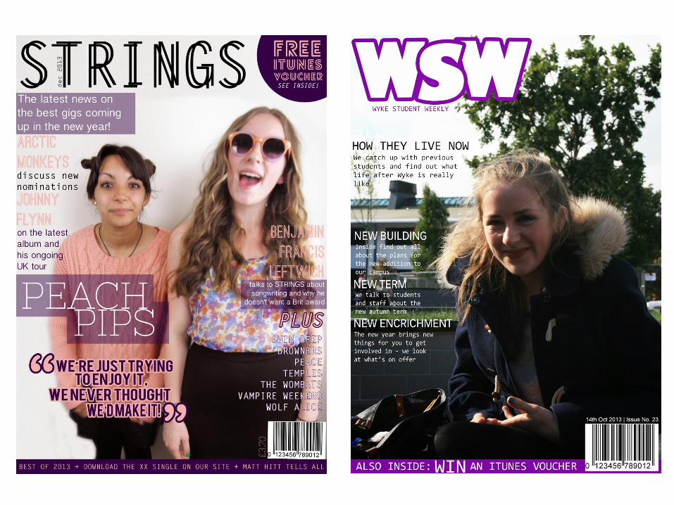
There is a lot of blank space on the cover, which could be filled with more
features. The emptiness makes the cover look unprofessional.
There is a lack of font and colour variety which makes the cover look too
plain and simple.
The main story isn’t easily distinguishable
from the other feature stories so it’s hard to tell what the main attraction point of the magazine is.
There are only three other feature stories so the reader has very little
idea of the content inside.
The main image is badly lit and includes a lot of background that isn’t
necessary – the focus should be on the subject. It’s also better to have an
image with a plain background as it can be more easily manipulated and the text is easier to read. There was little consideration of costuming, props or
body language.
The plug isn’t really related to the topic of the magazine and therefore might not appeal to its intended audience.
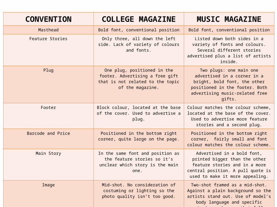
CONVENTION COLLEGE MAGAZINE MUSIC MAGAZINEMasthead Bold font, conventional position Bold font, conventional position
Feature Stories Only three, all down the left side. Lack of variety of colours and fonts.
Listed down both sides in a variety of fonts and colours. Several different stories advertised plus
a list of artists inside.
Plug One plug, positioned in the footer. Advertising a free gift that is not related to the topic of the
magazine.
Two plugs: one main one advertised in a corner in a bright, bold font, the other positioned in the footer. Both advertising music-related free gifts.
Footer Block colour, located at the base of the cover. Used to advertise a plug.
Colour matches the colour scheme, located at the base of the cover. Used to advertise more
feature stories and a second plug.
Barcode and Price Positioned in the bottom right corner, quite large on the page.
Positioned in the bottom right corner, fairly small and font colour matches the colour
scheme.
Main Story In the same font and position as the feature stories so it’s unclear which story is the main
one.
Advertised in a bold font, printed bigger than the other feature stories and in a more central
position. A pull quote is used to make it more appealing.
Image Mid-shot. No consideration of costuming or lighting so the photo quality isn’t too good.
Two-shot framed as a mid-shot. Against a plain background so the artists stand out. Use of
model’s body language and specific costuming and props that follow the colour scheme.
Layout Mostly conventional but plain, with a lot of empty space that looks unprofessional.
More conventional. Clear but not too empty; the text doesn’t cover up and important parts of the
image.
Colour scheme Use of only one colour besides black and white (purple). The whole colour scheme is not obvious and not necessarily suited to the
audience.
Obvious colour scheme which conventionally uses no more than three colours alongside black
and white – peach and purple. Appeals to the intended audience.
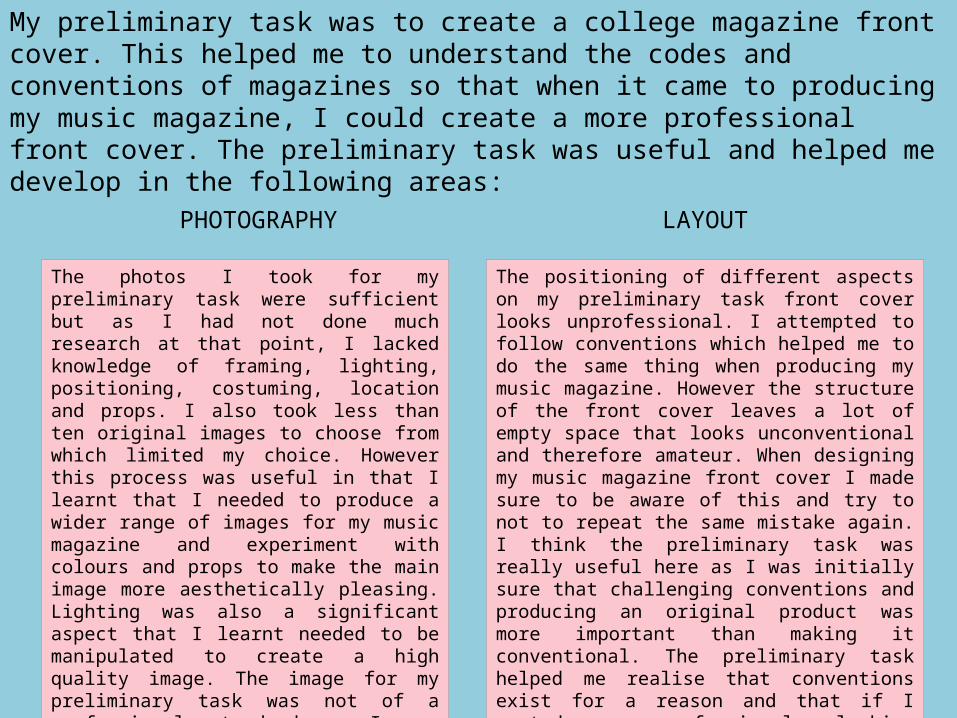
My preliminary task was to create a college magazine front cover. This helped me to understand the codes and conventions of magazines so that when it came to producing my music magazine, I could create a more professional front cover. The preliminary task was useful and helped me develop in the following areas:
The photos I took for my preliminary task were sufficient but as I had not done much research at that point, I lacked knowledge of framing, lighting, positioning, costuming, location and props. I also took less than ten original images to choose from which limited my choice. However this process was useful in that I learnt that I needed to produce a wider range of images for my music magazine and experiment with colours and props to make the main image more aesthetically pleasing. Lighting was also a significant aspect that I learnt needed to be manipulated to create a high quality image. The image for my preliminary task was not of a professional standard so I was able to assess what went wrong and correct it for my music magazine.
PHOTOGRAPHY
The positioning of different aspects on my preliminary task front cover looks unprofessional. I attempted to follow conventions which helped me to do the same thing when producing my music magazine. However the structure of the front cover leaves a lot of empty space that looks unconventional and therefore amateur. When designing my music magazine front cover I made sure to be aware of this and try to not to repeat the same mistake again. I think the preliminary task was really useful here as I was initially sure that challenging conventions and producing an original product was more important than making it conventional. The preliminary task helped me realise that conventions exist for a reason and that if I wanted a professional looking product, I needed to follow them.
LAYOUT
Learning how to use Photoshop to create my product was one skill from my preliminary task that was really beneficial when producing my music magazine. Although I had some experience using the software beforehand, my skills were not specifically centred around editing photos and manipulating text to get the look I wanted, so the preliminary task was useful in developing these techniques. All the tools I have discussed using in my assessment of what I have learnt from technologies throughout this process began with my preliminary task, which demonstrates how it has clearly aided me in the production of my final coursework magazine. Editing photos was one main skill that I developed in the progression from my preliminary to my final product, as you can see in the difference in quality of the photos used in each magazine. Simple things like adjusting brightness, saturation and colour levels, editing backgrounds and touching up images were all things I learnt from completing the preliminary task which I could then use when creating my music magazine.
PHOTOSHOP
Overall I feel that my preliminary task was very useful in helping me understand the basic conventions of magazines. It also helped me develop skills in photography and editing, as well as allowing me to explore what looked good and what didn’t. I feel I have improved since the task and that you can see evidence of my progression when comparing my preliminary product to my final product.
Related Documents