2020 COURSE HANDBOOK Producing Persuasive Reports & Proposals Facilitated by Mark Priadko Insight – An accurate and deep understanding of the true nature of something "… excellence is often found in simplicity of design and complexity of data." Edward Tufte (The Visual Display of Quantitative Information) “Perfection is achieved not when there is nothing more to add, but when there is nothing left to take away” Antoine de Saint Exupery.

Welcome message from author
This document is posted to help you gain knowledge. Please leave a comment to let me know what you think about it! Share it to your friends and learn new things together.
Transcript
2020 COURSE HANDBOOK
Producing Persuasive Reports & Proposals
Facilitated by Mark Priadko
Insight – An accurate and deep understanding of the true nature of something
"… excellence is often found in simplicity of design and complexity of data." Edward Tufte (The Visual Display of Quantitative Information)
“Perfection is achieved not when there is nothing more to add, but when there is nothing left to take away” Antoine de Saint Exupery.
Producing Persuasive Reports Page 2
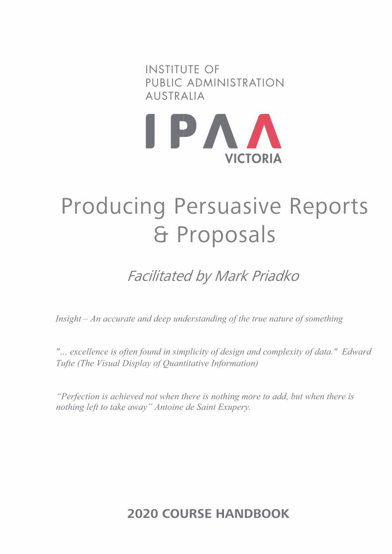
Inside Cover - Page intentionally left blank
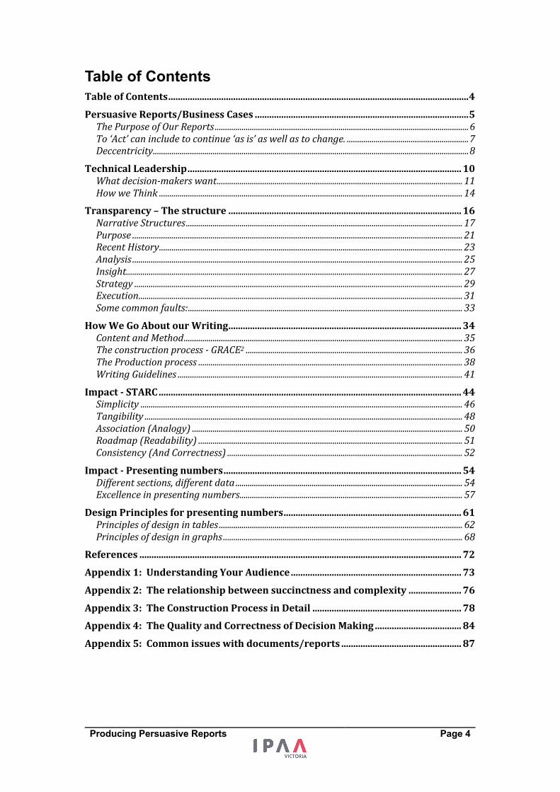
Introduction
The intent and purpose of our writingTechnical leadership
- What decision makers want Organising our
information - narrative structure
How we go about writing Enhancing impact (incl. summarising and numbers)
We improve our writing to persuade others and get good
decisions made
Producing Persuasive Reports Page 3
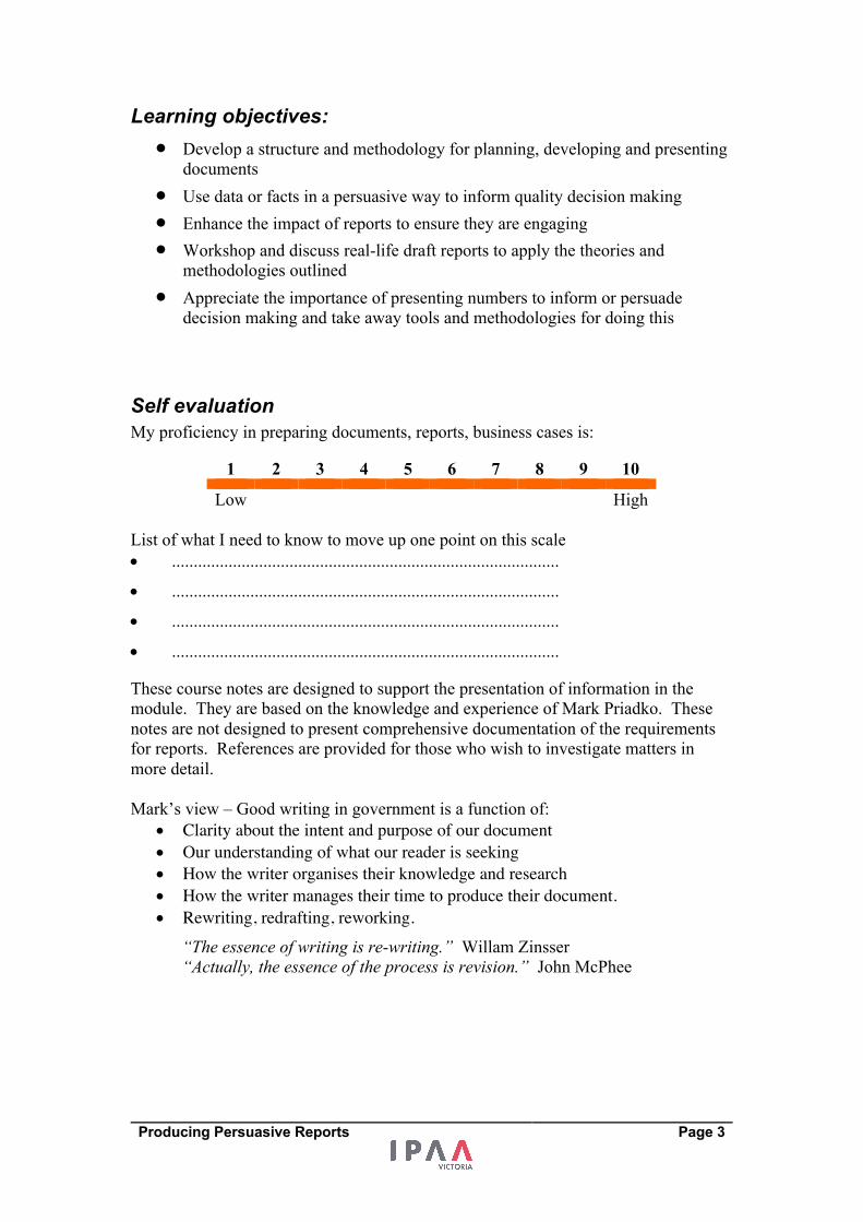
Learning objectives: • Develop a structure and methodology for planning, developing and presenting
documents • Use data or facts in a persuasive way to inform quality decision making • Enhance the impact of reports to ensure they are engaging • Workshop and discuss real-life draft reports to apply the theories and
methodologies outlined • Appreciate the importance of presenting numbers to inform or persuade
decision making and take away tools and methodologies for doing this
Self evaluation My proficiency in preparing documents, reports, business cases is:
1 2 3 4 5 6 7 8 9 10 Low High
List of what I need to know to move up one point on this scale • .........................................................................................
• .........................................................................................
• .........................................................................................
• .........................................................................................
These course notes are designed to support the presentation of information in the module. They are based on the knowledge and experience of Mark Priadko. These notes are not designed to present comprehensive documentation of the requirements for reports. References are provided for those who wish to investigate matters in more detail. Mark’s view – Good writing in government is a function of:
• Clarity about the intent and purpose of our document • Our understanding of what our reader is seeking • How the writer organises their knowledge and research • How the writer manages their time to produce their document. • Rewriting, redrafting, reworking.
“The essence of writing is re-writing.” Willam Zinsser “Actually, the essence of the process is revision.” John McPhee
Producing Persuasive Reports Page 4
Table of Contents TableofContents.............................................................................................................................4 PersuasiveReports/BusinessCases.........................................................................................5 ThePurposeofOurReports...........................................................................................................................6 To‘Act’canincludetocontinue‘asis’aswellastochange............................................................7 Deccentricity.........................................................................................................................................................8
TechnicalLeadership..................................................................................................................10 Whatdecision-makerswant.......................................................................................................................11 HowweThink...................................................................................................................................................14
Transparency–Thestructure.................................................................................................16 NarrativeStructures......................................................................................................................................17 Purpose................................................................................................................................................................21 RecentHistory...................................................................................................................................................23 Analysis................................................................................................................................................................25 Insight...................................................................................................................................................................27 Strategy...............................................................................................................................................................29 Execution.............................................................................................................................................................31 Somecommonfaults:.....................................................................................................................................33
HowWeGoAboutourWriting.................................................................................................34 ContentandMethod.......................................................................................................................................35 Theconstructionprocess-GRACE2.........................................................................................................36 TheProductionprocess................................................................................................................................38 WritingGuidelines..........................................................................................................................................41
Impact-STARC..............................................................................................................................44 Simplicity............................................................................................................................................................46 Tangibility..........................................................................................................................................................48 Association(Analogy)...................................................................................................................................50 Roadmap(Readability)................................................................................................................................51 Consistency(AndCorrectness)..................................................................................................................52
Impact-Presentingnumbers...................................................................................................54 Differentsections,differentdata..............................................................................................................54 Excellenceinpresentingnumbers............................................................................................................57
DesignPrinciplesforpresentingnumbers..........................................................................61 Principlesofdesignintables......................................................................................................................62 Principlesofdesigningraphs....................................................................................................................68
References......................................................................................................................................72 Appendix1:UnderstandingYourAudience.......................................................................73 Appendix2:Therelationshipbetweensuccinctnessandcomplexity......................76 Appendix3:TheConstructionProcessinDetail..............................................................78 Appendix4:TheQualityandCorrectnessofDecisionMaking....................................84 Appendix5:Commonissueswithdocuments/reports..................................................87
Producing Persuasive Reports Page 5
Persuasive Reports/Business Cases What is the purpose of our Reports/business cases?
What are indicators of excellence in Reports/business cases?
Introduction
The intent and purpose of our writingTechnical leadership
- What decision makers want Organising our
information - narrative structure
How we go about writing Enhancing impact (incl. summarising and numbers)
We improve our writing to persuade others and get good
decisions made
Producing Persuasive Reports Page 6
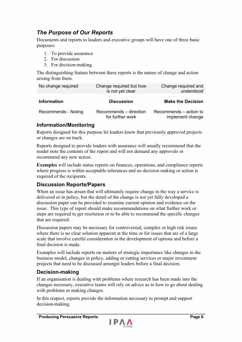
The Purpose of Our Reports Documents and reports to leaders and executive groups will have one of three basic purposes:
1. To provide assurance 2. For discussion 3. For decision-making.
The distinguishing feature between these reports is the nature of change and action arising from them. No change required Change required but how
is not yet clear Change required and
understood Information Discussion Make the Decision Recommends - Noting Recommends – direction
for further work Recommends – action to
implement change
Information/Monitoring
Reports designed for this purpose let leaders know that previously approved projects or changes are on track. Reports designed to provide leaders with assurance will usually recommend that the reader note the contents of the report and will not demand any approvals or recommend any new action. Examples will include status reports on finances, operations, and compliance reports where progress is within acceptable tolerances and no decision making or action is required of the recipients.
Discussion Reports/Papers
When an issue has arisen that will ultimately require change in the way a service is delivered or in policy, but the detail of the change is not yet fully developed a discussion paper can be provided to examine current opinion and evidence on the issue. This type of report should make recommendations on what further work or steps are required to get resolution or to be able to recommend the specific changes that are required. Discussion papers may be necessary for controversial, complex or high risk issues where there is no clear solution apparent at the time or for issues that are of a large scale that involve careful consideration in the development of options and before a final decision is made. Examples will include reports on matters of strategic importance like changes in the business model, changes in policy, adding or cutting services or major investment projects that need to be discussed amongst leaders before a final decision.
Decision-making
If an organisation is dealing with problems where research has been made into the changes necessary, executive teams will rely on advice as to how to go about dealing with problems or making changes. In this respect, reports provide the information necessary to prompt and support decision-making.
Producing Persuasive Reports Page 7
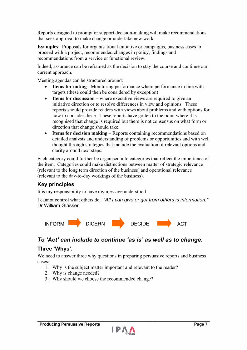
Reports designed to prompt or support decision-making will make recommendations that seek approval to make change or undertake new work. Examples: Proposals for organisational initiative or campaigns, business cases to proceed with a project, recommended changes in policy, findings and recommendations from a service or functional review. Indeed, assurance can be reframed as the decision to stay the course and continue our current approach. Meeting agendas can be structured around:
• Items for noting - Monitoring performance where performance in line with targets (these could then be considered by exception)
• Items for discussion – where executive views are required to give an initiative direction or to resolve differences in view and opinions. These reports should provide readers with views about problems and with options for how to consider these. These reports have gotten to the point where it is recognised that change is required but there is not consensus on what form or direction that change should take.
• Items for decision making – Reports containing recommendations based on detailed analysis and understanding of problems or opportunities and with well thought through strategies that include the evaluation of relevant options and clarity around next steps.
Each category could further be organised into categories that reflect the importance of the item. Categories could make distinctions between matter of strategic relevance (relevant to the long term direction of the business) and operational relevance (relevant to the day-to-day workings of the business).
Key principles
It is my responsibility to have my message understood. I cannot control what others do. "All I can give or get from others is information." Dr William Glasser
To ‘Act’ can include to continue ‘as is’ as well as to change. Three ‘Whys’.
We need to answer three why questions in preparing persuasive reports and business cases:
1. Why is the subject matter important and relevant to the reader? 2. Why is change needed? 3. Why should we choose the recommended change?
INFORM DECIDE ACT DICERN
Producing Persuasive Reports Page 8
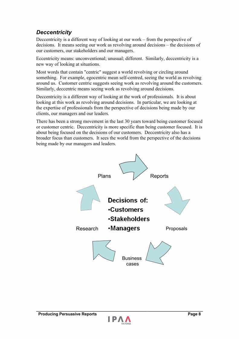
Deccentricity Deccentricity is a different way of looking at our work – from the perspective of decisions. It means seeing our work as revolving around decisions – the decisions of our customers, our stakeholders and our managers. Eccentricity means: unconventional; unusual; different. Similarly, deccentricity is a new way of looking at situations. Most words that contain "centric" suggest a world revolving or circling around something. For example, egocentric mean self-centred, seeing the world as revolving around us. Customer centric suggests seeing work as revolving around the customers. Similarly, deccentric means seeing work as revolving around decisions. Deccentricity is a different way of looking at the work of professionals. It is about looking at this work as revolving around decisions. In particular, we are looking at the expertise of professionals from the perspective of decisions being made by our clients, our managers and our leaders. There has been a strong movement in the last 30 years toward being customer focused or customer centric. Deccentricity is more specific than being customer focused. It is about being focused on the decisions of our customers. Deccentricity also has a broader focus than customers. It sees the world from the perspective of the decisions being made by our managers and leaders.
Reports
Proposals
Business cases
Research
Plans
Producing Persuasive Reports Page 9
So what does this new way of looking at things mean?
Firstly it means looking at the quality of decisions, not just the quality of our work. Good information does not guarantee good decisions and focussed action. Decisions link information and action. Strong decisions represent strong links – poor quality decisions are weak links. Secondly, it means putting our work and our projects into the context of decisions. This means seeing our work differently. This starts with a question. What is/are the decisions I am asking others to make in this project? A decision to buy, a decision to approve, a decision to sell, a decision to grow etc. These decisions then act as a focal point for the project. With deccentricity, our research, our problem solving, our ideas and our presentations have the decisions of others as our focus. Thirdly it means making an effort to make the decisions of others easier not harder. If we make decisions easier to make, they will get made and progress will occur. If a decision is difficult to make it will be avoided – indecision will result in inaction. Finally, deccentricity means looking at decisions as a means rather than an end. Much of my research into decision-making theory has revealed that a great deal of decision-making theory views the decision as the end of the process, and the ultimate goal. Leaders decide! However, not all of us are in positions where we are the leaders who decide. Many of us are in the position where we are providing leaders with the information necessary to make decisions or we are trying to influence these decisions. Just because we are not the leader, does not mean we cannot demonstrate leadership. Leadership is about getting quality decisions made. When we are providing information in order to help leaders decide, it is our responsibility to make the decision of the highest quality and it is our responsibility to make the decision easy to make.
Leaders decide, leadership is about getting quality decisions
made.
Discussion: What do decision makers want?
Put yourself in the situation of being asked to approve the allocation of money or a change in policy. What do you want to help you make a good decision?
Producing Persuasive Reports Page 10
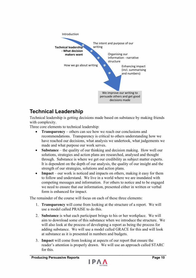
Technical Leadership Technical leadership is getting decisions made based on substance by making friends with complexity. Three core elements to technical leadership:
• Transparency – others can see how we reach our conclusions and recommendations. Transparency is critical to others understanding how we have reached our decisions, what analysis we undertook, what judgements we made and what purpose our work serves.
• Substance – the quality of our thinking and decision making. How well our solutions, strategies and action plans are researched, analysed and thought through. Substance is where we get our credibility as subject matter experts. It is dependent on the depth of our analysis, the quality of our insight and the strength of our strategies, solutions and action plans.
• Impact – our work is noticed and impacts on others, making it easy for them to follow and understand. We live in a world where we are inundated with competing messages and information. For others to notice and to be engaged we need to ensure that our information, presented either in written or verbal form is enhanced for impact.
The remainder of the course will focus on each of these three elements: 1. Transparency will come from looking at the structure of a report. We will
use a model called PRAISE to do this. 2. Substance is what each participant brings to his or her workplace. We will
aim to download some of this substance when we introduce the structure. We will also look at the process of developing a report as being the process for adding substance. We will use a model called GRACE for this and will look at substance as it is presented in numbers and budgets.
3. Impact will come from looking at aspects of our report that ensure the reader’s attention is properly drawn. We will use an approach called STARC for this.
Introduction
The intent and purpose of our writingTechnical leadership
- What decision makers want Organising our
information - narrative structure
How we go about writing Enhancing impact (incl. summarising and numbers)
We improve our writing to persuade others and get good
decisions made
Producing Persuasive Reports Page 11
What decision-makers want Experience both as a senior executive, but also as an advisor to senior executives tells me that decision makers have a number of requirements when they consider our reports seeking approval to make some form of change.
• They are looking for alignment with the goals and direction of their business – they want the issue to be relevant to the goals and outcomes they seek.
• They want to have a sound foundation for making decisions that gives them confidence that the issue has been thought through – they want rigour in research and evidence
• They want to avoid biases and personal agendas - they want to see different perspectives being represented
• They want to know that we have gotten to the bottom the issue we are dealing with – we have properly diagnosed the issues before us and identified the root causes.
• They want to feel like they are deciding – they will want to see that there are options for them to consider even if there is a preferred option.
• They will want confidence that the preferred option or solution can indeed be implemented and has been thought through – they will want details about the solution including costs, timing and risks.
Decision makers will want to avoid accusations of poor decision making and will want to avoid expensive solutions, large scale changes and risky solution. I therefore conclude that what decision makers want includes:
• Context – where does this matter fit within my goals and objectives (strategic) and how has it come to this (historic)
• Evidence – The existence of a problem or opportunity is based on evidence • Different perspectives – a range of views have been taken into account to
reach the conclusions reached • Root causes – the evidence and the different views have gotten to the root
cause (or causes) or a problem or opportunity and it is the root cause that will be addressed.
• Options – the decision maker wants to know that alternatives have been considered and that they have choice. Options can occur in diagnosing problems and in treating problems
• Solution details - Finances and Risks associated with change have been considered.
Producing Persuasive Reports Page 12
Focus on quality
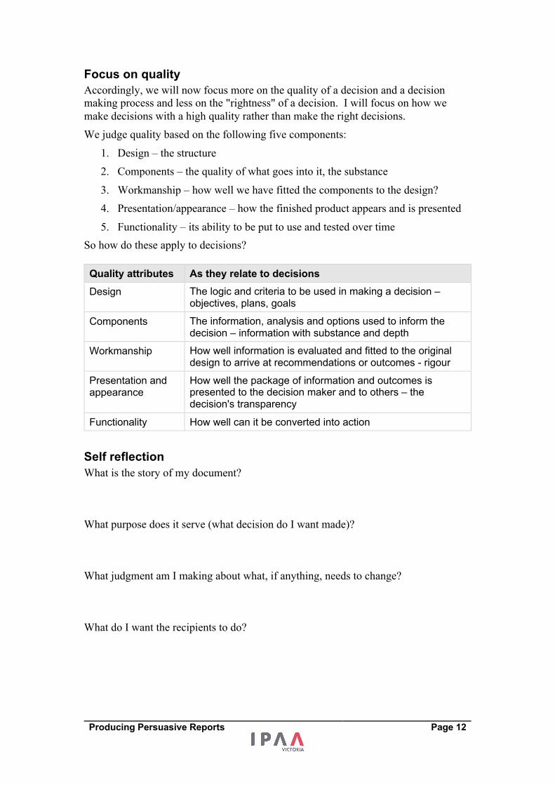
Accordingly, we will now focus more on the quality of a decision and a decision making process and less on the "rightness" of a decision. I will focus on how we make decisions with a high quality rather than make the right decisions. We judge quality based on the following five components:
1. Design – the structure 2. Components – the quality of what goes into it, the substance 3. Workmanship – how well we have fitted the components to the design? 4. Presentation/appearance – how the finished product appears and is presented 5. Functionality – its ability to be put to use and tested over time
So how do these apply to decisions? Quality attributes As they relate to decisions Design The logic and criteria to be used in making a decision –
objectives, plans, goals
Components The information, analysis and options used to inform the decision – information with substance and depth
Workmanship How well information is evaluated and fitted to the original design to arrive at recommendations or outcomes - rigour
Presentation and appearance
How well the package of information and outcomes is presented to the decision maker and to others – the decision's transparency
Functionality How well can it be converted into action
Self reflection
What is the story of my document? What purpose does it serve (what decision do I want made)? What judgment am I making about what, if anything, needs to change? What do I want the recipients to do?

Producing Persuasive Reports Page 13
Where to start? – Write a few sentences declaring what you know about your subject
Producing Persuasive Reports Page 14
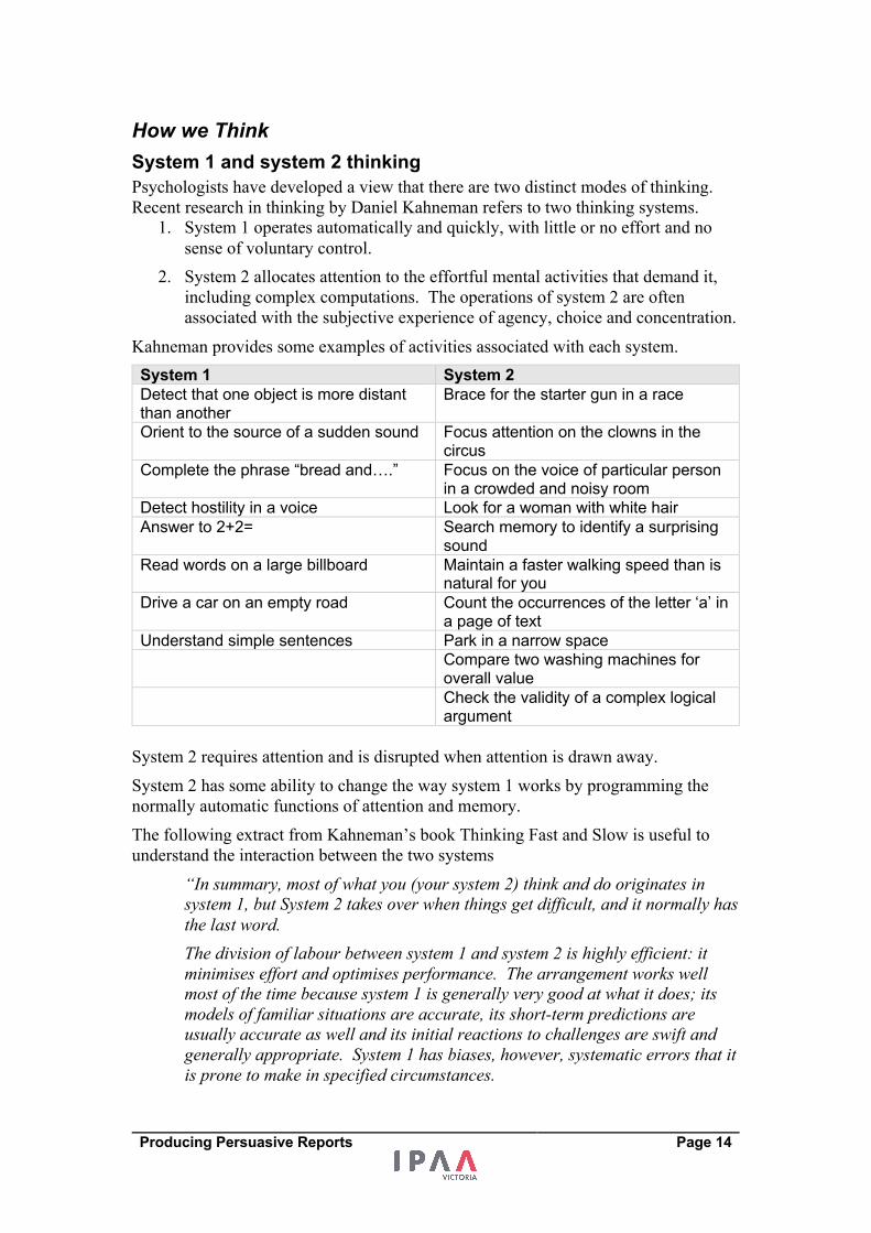
How we Think System 1 and system 2 thinking Psychologists have developed a view that there are two distinct modes of thinking.
Recent research in thinking by Daniel Kahneman refers to two thinking systems.
1. System 1 operates automatically and quickly, with little or no effort and no
sense of voluntary control.
2. System 2 allocates attention to the effortful mental activities that demand it,
including complex computations. The operations of system 2 are often
associated with the subjective experience of agency, choice and concentration.
Kahneman provides some examples of activities associated with each system.
System 1 System 2 Detect that one object is more distant than another
Brace for the starter gun in a race
Orient to the source of a sudden sound Focus attention on the clowns in the circus
Complete the phrase “bread and….” Focus on the voice of particular person in a crowded and noisy room
Detect hostility in a voice Look for a woman with white hair Answer to 2+2= Search memory to identify a surprising
sound Read words on a large billboard Maintain a faster walking speed than is
natural for you Drive a car on an empty road Count the occurrences of the letter ‘a’ in
a page of text Understand simple sentences Park in a narrow space Compare two washing machines for
overall value Check the validity of a complex logical
argument
System 2 requires attention and is disrupted when attention is drawn away.
System 2 has some ability to change the way system 1 works by programming the
normally automatic functions of attention and memory.
The following extract from Kahneman’s book Thinking Fast and Slow is useful to
understand the interaction between the two systems
“In summary, most of what you (your system 2) think and do originates in system 1, but System 2 takes over when things get difficult, and it normally has
the last word.
The division of labour between system 1 and system 2 is highly efficient: it minimises effort and optimises performance. The arrangement works well most of the time because system 1 is generally very good at what it does; its models of familiar situations are accurate, its short-term predictions are usually accurate as well and its initial reactions to challenges are swift and generally appropriate. System 1 has biases, however, systematic errors that it is prone to make in specified circumstances.
Producing Persuasive Reports Page 15
In the unlikely event of this book being made into a film, system 2 would be a supporting character who believes herself to be the hero. The defining feature of system 2 is that its operations are effortful and of its main characteristics is laziness, a reluctance to invest more effort than is strictly necessary.”
An important conclusion from Daniel Kahneman’s research is that both systems are
required for good decision-making. Too much reliance on system 1 will suffer from
fallacies and lack of evidence. Too much reliance on system 2 will be slow and not
make sense to people because it is shrouded in complexity.
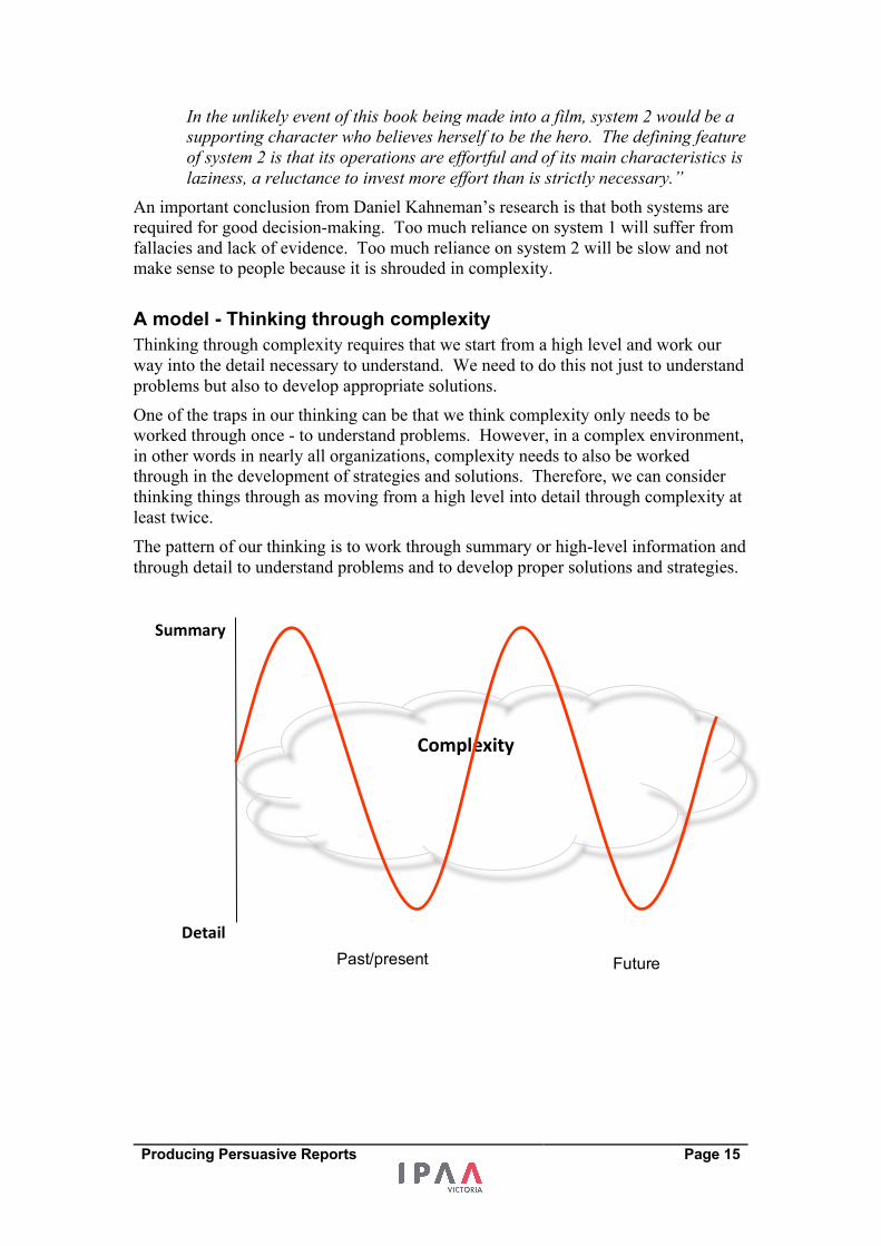
A model - Thinking through complexity Thinking through complexity requires that we start from a high level and work our
way into the detail necessary to understand. We need to do this not just to understand
problems but also to develop appropriate solutions.
One of the traps in our thinking can be that we think complexity only needs to be
worked through once - to understand problems. However, in a complex environment,
in other words in nearly all organizations, complexity needs to also be worked
through in the development of strategies and solutions. Therefore, we can consider
thinking things through as moving from a high level into detail through complexity at
least twice.
The pattern of our thinking is to work through summary or high-level information and
through detail to understand problems and to develop proper solutions and strategies.
Complexity
Summary
Detail Past/present Future

Producing Persuasive Reports Page 16
Introduction
The intent and purpose of our writingTechnical leadership
- What decision makers want Organising our
information - narrative structure
How we go about writing Enhancing impact (incl. summarising and numbers)
We improve our writing to persuade others and get good
decisions made
Producing Persuasive Reports Page 17
Transparency – The structure Narrative Structures
“Narrative is the choice of which events to relate and in what order to relate them – so it is a representation or specific manifestation of the story, rather than the story itself.” Source: http://beemgee.com/blog/story-vs-narrative/
“The concept of narrative deals more with how the events are told. Narrative is the ordering of events into a consumable format. …… narrative is the method and means by which you construct the events of a story into a plot. It concerns itself with the sequence of the events, the medium on which they are told and the way these events are put together into one coherent unit.”
Sourced from: http://hacktext.com/2011/09/story-vs-narrative-vs-plot-1205/
Narrative is the way the author or speaker chooses to structure events — the
architecture of the story, comparable to the design of a building. Ultimately a
narrative is a way of organising the information of a story, strategy or proposal that
helps it engage a reader and make sense to a reader or listener. While a story is a
sequence of events, the narrative recounts those events in its own way to emphasise
some aspects of the story to enhance its impact.
There is a greater array of possibility for the fiction narrative structure to invoke the
imagination of the reader/listener, to create surprise, mystery and intrigue. For non-
fiction narratives, the variety of structures available to us will be more limited. There
will tend to be greater reliance on more straightforward and logical structures,
although surprise and intrigue can still be used, their use will be more limited.
Some examples of basic non-fiction narrative structures:
• Past – Present – Future • Beginning – Middle - End • Why, What, How and What’s next • Context – Discussion – Findings - Recommendation
Change narrative - Shawn Callahan In his book, Putting Stories to Work, Shawn Callahan includes a narrative structure
for telling stories of change. He calls them clarity stories. He states:
“Human beings like reasons, and the clarity story gives people a reason….
The clarity story has a simple four-part framework:
Part 1 ‘In the past….’ (how things were before the change happened) Part 2 ‘Then something happened…’ (the event/s that caused the problem or opportunity) Part 3 ‘So now…..’ (the decision/s made to counter the problem or take advantage of the opportunity
Part 4 ‘In the future….’ (the likely outcome)”.
Producing Persuasive Reports Page 18
The PRAISE narrative structure is designed for reports or briefings that require the
reader to be convinced of a need to change and act differently.
The centrepiece of this narrative structure is that a change is needed and the reasons to
support the change have been researched and understood.
In his book, The Organised Mind, Daniel Levitan details the human mind as having a
four-circuit attentional system – one of which is the attentional filter. It is the
attentional filter that sees us immediately focus on importance and change. The
attentional filter is the millions of neurons that are constantly monitoring our
environment to select the most important things for us to focus on (and not to focus
on) these neurons are collectively, the attentional filter. They work largely in the
background outside of our conscious awareness. Two principles used by this filter are
change and importance – the brain is a great change detector.
The PRAISE narrative structure is designed to support decision making by guiding
the reader towards insights that reveal the need for, and the reasons for, change in an
organisation. Change can include:
• New investments • Changing a business or service delivery model • Decommissioning a site or service • Adding products or markets or eliminating products or markets.
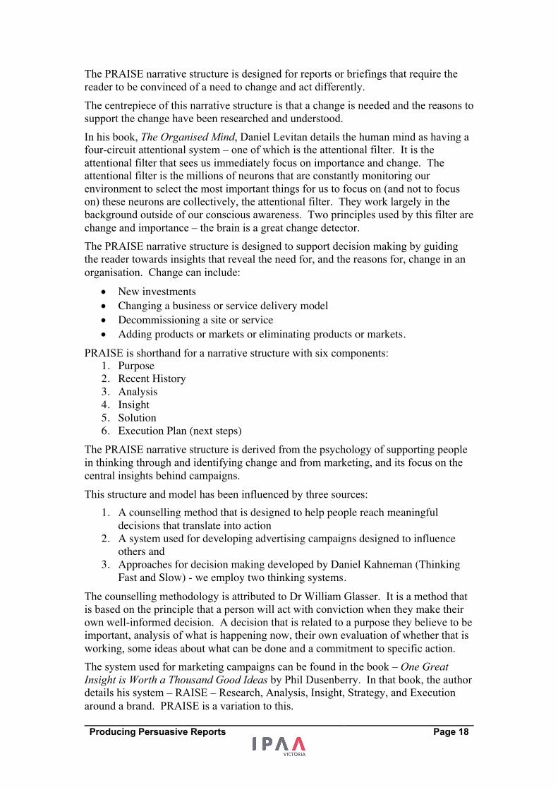
PRAISE is shorthand for a narrative structure with six components:
1. Purpose 2. Recent History 3. Analysis 4. Insight 5. Solution 6. Execution Plan (next steps)
The PRAISE narrative structure is derived from the psychology of supporting people
in thinking through and identifying change and from marketing, and its focus on the
central insights behind campaigns.
This structure and model has been influenced by three sources:
1. A counselling method that is designed to help people reach meaningful decisions that translate into action
2. A system used for developing advertising campaigns designed to influence others and
3. Approaches for decision making developed by Daniel Kahneman (Thinking Fast and Slow) - we employ two thinking systems.
The counselling methodology is attributed to Dr William Glasser. It is a method that
is based on the principle that a person will act with conviction when they make their
own well-informed decision. A decision that is related to a purpose they believe to be
important, analysis of what is happening now, their own evaluation of whether that is
working, some ideas about what can be done and a commitment to specific action.
The system used for marketing campaigns can be found in the book – One Great Insight is Worth a Thousand Good Ideas by Phil Dusenberry. In that book, the author
details his system – RAISE – Research, Analysis, Insight, Strategy, and Execution
around a brand. PRAISE is a variation to this.
Producing Persuasive Reports Page 19
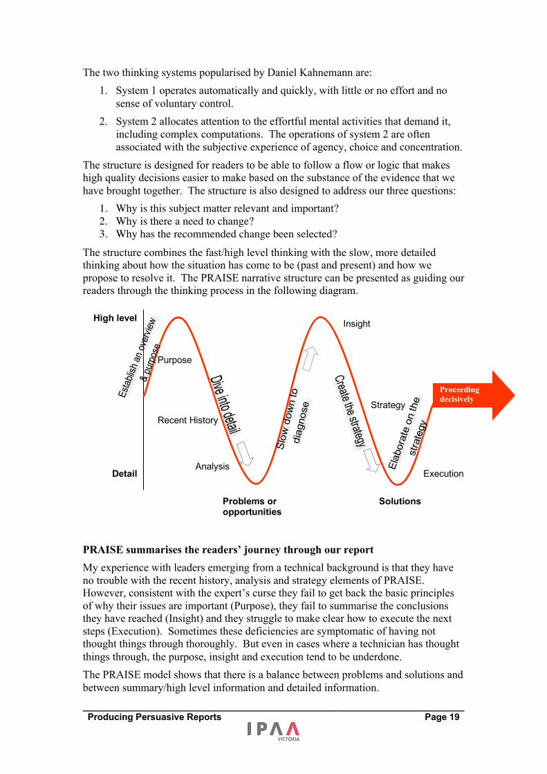
The two thinking systems popularised by Daniel Kahnemann are:
1. System 1 operates automatically and quickly, with little or no effort and no
sense of voluntary control.
2. System 2 allocates attention to the effortful mental activities that demand it,
including complex computations. The operations of system 2 are often
associated with the subjective experience of agency, choice and concentration.
The structure is designed for readers to be able to follow a flow or logic that makes
high quality decisions easier to make based on the substance of the evidence that we
have brought together. The structure is also designed to address our three questions:
1. Why is this subject matter relevant and important? 2. Why is there a need to change? 3. Why has the recommended change been selected?
The structure combines the fast/high level thinking with the slow, more detailed
thinking about how the situation has come to be (past and present) and how we
propose to resolve it. The PRAISE narrative structure can be presented as guiding our
readers through the thinking process in the following diagram.
PRAISE summarises the readers’ journey through our report My experience with leaders emerging from a technical background is that they have
no trouble with the recent history, analysis and strategy elements of PRAISE.
However, consistent with the expert’s curse they fail to get back the basic principles
of why their issues are important (Purpose), they fail to summarise the conclusions
they have reached (Insight) and they struggle to make clear how to execute the next
steps (Execution). Sometimes these deficiencies are symptomatic of having not
thought things through thoroughly. But even in cases where a technician has thought
things through, the purpose, insight and execution tend to be underdone.
The PRAISE model shows that there is a balance between problems and solutions and
between summary/high level information and detailed information.
High level
Detail
Purpose
Recent History
Analysis
Insight
Strategy
Execution
Proceeding decisively
Problems or opportunities
Solutions
Producing Persuasive Reports Page 20
The purpose and insight section of our presentation should ensure that the receiver
understands the high level importance of what we are presenting and can draw some
basic conclusions with respect to these high level conclusions.
The analysis and execution sections are where we present details and specifics
regarding the evidence we have gathered and how the recommended response should
be executed.
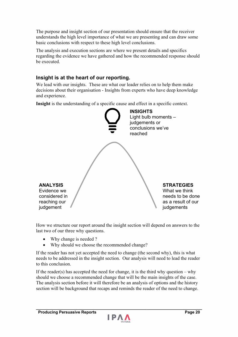
Insight is at the heart of our reporting. We lead with our insights. These are what our leader relies on to help them make
decisions about their organisation - Insights from experts who have deep knowledge
and experience.
Insight is the understanding of a specific cause and effect in a specific context.
How we structure our report around the insight section will depend on answers to the
last two of our three why questions.
• Why change is needed ?
• Why should we choose the recommended change?
If the reader has not yet accepted the need to change (the second why), this is what
needs to be addressed in the insight section. Our analysis will need to lead the reader
to this conclusion.
If the reader(s) has accepted the need for change, it is the third why question – why
should we choose a recommended change that will be the main insights of the case.
The analysis section before it will therefore be an analysis of options and the history
section will be background that recaps and reminds the reader of the need to change.
ANALYSIS Evidence we considered in reaching our judgement
STRATEGIES What we think needs to be done as a result of our judgements
INSIGHTS Light bulb moments – judgements or conclusions we’ve reached
Producing Persuasive Reports Page 21
Purpose We answer the first Why – Why is this subject matter relevant and important?
What’s at stake for the organisation?
This section of the paper should provide the reader with a “Sense of Purpose” or
aspiration regarding our project. This can be best stated in terms of outcomes that the
project aims to deliver that matter to the reader. In effect, we are putting these
outcomes and aspirations “at stake”. The Purpose section will attempt to link our
project with stated goals and outcomes of the decision-makers and their constituency.
In storytelling terms – this is a quest or goal that matters to the reader. This is an
important means by which to involve them in this story. It will impact on their goals.
We are using the goals and outcomes to engage with our reader and decision maker.
The purpose section will also operate as a frame of reference for the document and is
the section where we position our project into “the bigger picture” to give it context
and highlight its systematic importance. It can include references to relevant
standards (e.g. best practice or benchmarks) relevant to our topic.
We can also use the Purpose section to outline what success and excellence look like
for our project.
This section could be titled as:
• Strategic Context • Strategic Drivers • Future State • Our Reason for Being • Goals and Objectives • “The Why”
Our intent – is to engage, inspire and aspire the reader
Report elements • Strategic and organisational impact – the impact of the project, issue or asset
on the objectives of the organisations • Relevant policy or legislation – any federal or state legislation or policy
relevant to the initiative • Recognised Standards of excellence – Are there standards or requirements that
need to be upheld relevant to this initiative • If necessary, include clarifications regarding definition and scope in the
purpose section.
Activity On the handout write what should be in the purpose section of your report.
Producing Persuasive Reports Page 22
Purpose Example – A Basic Case for Infrastructure The Office for Case Management exists to meet legislative requirements to process
cases on behalf of the Government. The processing of these cases is important to
maintaining public faith in this public system (e.g. health, housing, legal).
Containing waiting lists is critical to achieving good public outcomes and
Government policy outcomes.
The Government has made strong policy commitments to ensuring excellence in
the management of cases and to maintaining public faith in the system. There are
accepted Australian benchmarks for the size of the waiting lists being managed by
the Office. There are well documented standards of excellence in managing cases
and there are well documented standards guiding the use and age of case
management infrastructure.
Producing Persuasive Reports Page 23
Recent History Give the reader some historical background as to how the situation that we are trying
to address has arisen. When did we start drifting away from the aspirations
established in the previous section? When did we become aware that there was a gap
between our goals and reality?
This will help the reader understand why an issue has evolved necessitating a change
in approach and requiring a new project.
This section provides some time-based detail behind the subject matter. If the subject
matter is an organisation, this section will present details of the organisation’s history
– when it started, how it has changed, and specific events that are relevant to the
business case for this project. If it is a business case for new infrastructure, there will
be history to provide context for the age of the infrastructure, the activity and service
it supports and its utilisation.
It is important that the recent history is provided with a sequence of events in a
chronological order.
May also be titled:
• Background
• Historical Context
• How we got here
Our intent is to build tension with credible evidence
Report elements • Historical context behind the initiative – where has it emerged from. • Trends that have led to the need for this project being contemplated (trends in
activity and workload, trends in technology, social and demographic trends) • Recent events that highlight an issue or opportunity • The age of existing assets, technology or outdated approaches may be
relevant.
Activity On the handout write what should be in the recent history section of your report.
Producing Persuasive Reports Page 24
Recent History Example – A Basic Case for Infrastructure There has been significant growth in the number of cases being processed by the
office, evidenced by trends in case numbers. In the last ten years, there have been
changes in policy that have served to further increase the number of cases. Several
measures have been put into place in to improve the way cases are processed through
the system and they have made the growth lower than it would otherwise have been.
However, the growth in the number of cases is greater than the growth in processing
cases.
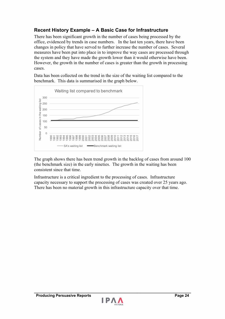
Data has been collected on the trend in the size of the waiting list compared to the
benchmark. This data is summarised in the graph below.
The graph shows there has been trend growth in the backlog of cases from around 100
(the benchmark size) in the early nineties. The growth in the waiting has been
consistent since that time.
Infrastructure is a critical ingredient to the processing of cases. Infrastructure
capacity necessary to support the processing of cases was created over 25 years ago.
There has been no material growth in this infrastructure capacity over that time.
0
50
100
150
200
250
300
1990
1991
1992
1993
1994
1995
1996
1997
1998
1999
2000
2001
2002
2003
2004
2005
2006
2007
2008
2009
2010
2011
2012
2013
2014
2015
2016
2017
Num
ber
of c
ases
in th
e wa
iting
list
Waiting list compared to benchmark
SA's waiting list Benchmark waiting list
Producing Persuasive Reports Page 25
Analysis This section of the document presents facts and data to show the extent of current
issues or opportunities that are the drivers for change. The analysis section can detail,
with evidence, the issues and opportunities that exist.
The analysis builds the case for justifying change or for further investment. It should
alert the reader to the gap between their aspiration and reality or alert them to the
nature of what might be needed to take advantage of an opportunity.
Types of analysis that can be included are:
• Financial analysis – current (and projected) costs
• Analysis of activity and workload
• Analysis of performance and conditions
• Variance analysis
• Benchmarking analysis
• Risk analysis (identify key risks associated with the subject matter)
• Audit findings
• Customer usage and feedback
• Staff issues and feedback
• Utilisation (activity vs capacity)
This section could also put forward some projections to show what the status quo
scenario is for our topic.
Beware of too much detail in this section. Keep data to a summary level with more detailed data being provided in Appendices.
Can also be titled as:
• The Current State • Where are we now? • Issues • Discussion
Our intent – provide credible and appropriate detail that reveals a need for change and the reasons behind the current situation.
Report elements • Analysis of the current or default state – what will happen without change • Analysis of opportunities that have arisen that warrant change • Evidence of activity, utilisation, workloads that highlight the need for change
Activity On the handout write identify what should be in the analysis section of your report.
Producing Persuasive Reports Page 26
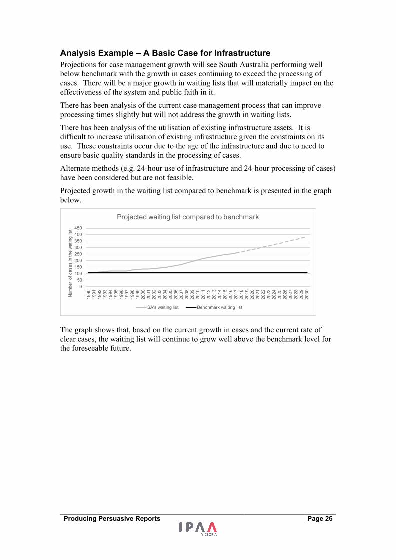
Analysis Example – A Basic Case for Infrastructure Projections for case management growth will see South Australia performing well
below benchmark with the growth in cases continuing to exceed the processing of
cases. There will be a major growth in waiting lists that will materially impact on the
effectiveness of the system and public faith in it.
There has been analysis of the current case management process that can improve
processing times slightly but will not address the growth in waiting lists.
There has been analysis of the utilisation of existing infrastructure assets. It is
difficult to increase utilisation of existing infrastructure given the constraints on its
use. These constraints occur due to the age of the infrastructure and due to need to
ensure basic quality standards in the processing of cases.
Alternate methods (e.g. 24-hour use of infrastructure and 24-hour processing of cases)
have been considered but are not feasible.
Projected growth in the waiting list compared to benchmark is presented in the graph
below.
The graph shows that, based on the current growth in cases and the current rate of
clear cases, the waiting list will continue to grow well above the benchmark level for
the foreseeable future.
050
100150200250300350400450
1990
1991
1992
1993
1994
1995
1996
1997
1998
1999
2000
2001
2002
2003
2004
2005
2006
2007
2008
2009
2010
2011
2012
2013
2014
2015
2016
2017
2018
2019
2020
2021
2022
2023
2024
2025
2026
2027
2028
2029
2030Nu
mbe
r of
cas
es in
the
watin
g lis
t
Projected waiting list compared to benchmark
SA's waiting list Benchmark waiting list
Producing Persuasive Reports Page 27
Insight Insight is the act or result of understanding the inner nature of things.
This section should reveal why there is a need for change based on the understanding revealed in the previous sections of the narrative.
This section of the documents brings together the materials presented in the previous
three chapters (Purpose, Recent History and Analysis) by summarising the main
conclusions for the reader. It does this to serve as a “bridge” between the current and
historical view of the subject and the future recommended view of the subject.
The need for change or further effort should now be evident to the reader from the
gaps between the aspirations and goals put forward in the Purpose section and the
realities of the Recent History and the Analysis sections. This section should also
point out the root cause(s) of the difficulties or shortcomings being experienced.
There can be cases where the conclusion from previous sections is that no change is
required. This is made clear in the insight section.
Types of insights:
• A truth confirmed and restated – old information confirmed, truism
• Revelation – A discovery of why things are like they are - acceptance
• A realisation of the need to change
• Realisation of an opportunity
• A diagnosis
• The end-result of the evaluation of options or of evidence - judgement
• An ‘Ah ha’ moment – When several thoughts thread together and make sense.
Can also be titled:
• Findings • Assessment/Evaluation of…. • Root Causes • Diagnosis
Our intent – provide the reader/decision maker with a breakthrough(s) that leads naturally towards to the solution section establishing strong links between what is wrong and what will be proposed as a strategy or solution.
Do not be afraid to be blunt with your insights. Good insights should be succinct.
Activity On the handout write what should be in the insight section of your report.

Producing Persuasive Reports Page 28
Insight Example – A Basic Case for Infrastructure To meet waiting list targets there needs to be an increase in the number of cases
processed. Changes of policy and changes of practice have been implemented but
have not addressed backlogs. Alternate ways of increasing case processing have
been explored but will not address backlogs.
Increased infrastructure capacity and a commensurate increase in staff to process
cases are required to achieve the goal of reducing the backlog and maintaining
public faith in the system.
Producing Persuasive Reports Page 29
Strategy This section of the report/document directs the reader to consider solutions to address
the conclusions and root causes presented in the previous section. It introduces our
project as a solution, as a means to achieving changing. Our projects could be one of
several options.
This may require some options to be put forward and compared with a recommended
option emerging from the section. Such an approach will require options to be
described and the basis for comparison to be made clear.
The Strategy section can include estimated costs for each option and for the preferred
option. This section of the document could include an evaluation of these treatment
options to reach a preferred solution. It could use quantitative evaluation techniques
like cost-benefit ratios, net present values or qualitative evaluation techniques against
business drivers. The criteria used to compare options should be linked with business
drivers presented in the Purpose section.
In this way, we address the third ‘why’ question - Why has the recommended change been selected?
Can also be titled:
• What needs to be done?
• Measures required
• Plans to address Gaps
• Proposed approach
Our intent – provide the decision maker with the changes and approaches necessary to resolve the tensions presented earlier in the report.
Report Elements • Options to proceed • The preferred option • Resource requirements – Financial and skill requirements • Assumptions and constraints being made • Risk assessment of the solution or required project.
Activity On the handout write what should be in the strategy section of your report.
Producing Persuasive Reports Page 30
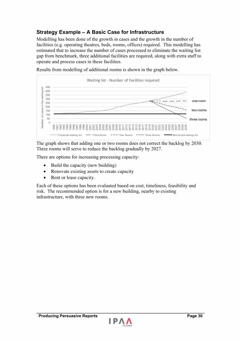
Strategy Example – A Basic Case for Infrastructure Modelling has been done of the growth in cases and the growth in the number of
facilities (e.g. operating theatres, beds, rooms, offices) required. This modelling has
estimated that to increase the number of cases processed to eliminate the waiting list
gap from benchmark, three additional facilities are required, along with extra staff to
operate and process cases in these facilities.
Results from modelling of additional rooms is shown in the graph below.
The graph shows that adding one or two rooms does not correct the backlog by 2030.
Three rooms will serve to reduce the backlog gradually by 2027.
There are options for increasing processing capacity:
• Build the capacity (new building) • Renovate existing assets to create capacity • Rent or lease capacity.
Each of these options has been evaluated based on cost, timeliness, feasibility and
risk. The recommended option is for a new building, nearby to existing
infrastructure, with three new rooms.
050
100150200250300350400450
1990
1991
1992
1993
1994
1995
1996
1997
1998
1999
2000
2001
2002
2003
2004
2005
2006
2007
2008
2009
2010
2011
2012
2013
2014
2015
2016
2017
2018
2019
2020
2021
2022
2023
2024
2025
2026
2027
2028
2029
2030Nu
mbe
r of
cas
es in
the
waiti
ng lis
t
Waitinglist- NumberofFacilitiesrequired
Projectedwaiting list OneRoom TwoRooms ThreeRooms Benchmarkwaiting list
one room
two rooms
three rooms
Producing Persuasive Reports Page 31
Execution The Execution section of the document provides the reader with details of what they
can expect to happen should they approve our recommendations.
The Execution section contains more detail on the recommended strategy/solutions
put forward in the previous section, and demonstrates that the recommended approach
has been thought through in some detail.
It would not be unreasonable for the Execution section to have an instructional tone
about it where the reader is being instructed to follow a sequence of steps to
implement the recommended solution(s).
This section could also include:
• A timetable or summary Gantt chart • A project budget • Project Governance arrangements
Can also be titled
• Next Steps • Where to from here? • Details for the Preferred Option • Implementation/Action Plan
Our intent – provide the decision maker with an instruction based guide on how to proceed showing the solution we propose has been thought through.
Report elements • Project execution plan • Calendar of events and stages • Work Breakdown structure • Change management plan
Activity On the handout write what should be in the execution section of your report.
Producing Persuasive Reports Page 32
Execution Example – A Basic Case for Infrastructure A major infrastructure project is proposed with the outcomes detailed in the previous
section. To ensure continuity of service, it is proposed that a separate project team be
established within the agency to undertake these works.
The immediate work of the project team will be to:
• Procure more detailed designs and costings • Navigate a range of government approval processes (Cabinet, Parliamentary
Works) • Seek specific planning approval for this initiative.
The purpose of these steps is to have this project being able to go to market to establish a construction contract and detailed construction plans for the new facilities.
Producing Persuasive Reports Page 33
Some common faults: • Defeating the purpose - lack of clarity or conviction in the purpose section.
This fails to enthuse the reader
• Paralysis by analysis – an imbalance in reports where the amount of time and
energy devoted to analysis is disproportionate. In particular, the author
wanting to show the reader their methodology, and how they did their analysis
• Leap of faith – going straight from analysis to an action plan
• Lack of creativity in the solution – same ol' same ol'
• Impractical - Actions that are difficult to follow or to put into practice.
Evaluate A checklist for decisions and business cases. Convince the decision-maker of:
1. The subject in question is relevant and important
2. There is evidence of and there is a need for change
3. The right type of change is selected from among options
4. The extent of change proposed is proportionate to the extent of opportunities
and problems
5. The steps toward change have been thought through
6. The risks associated with change have been thought through.
Reflection What has been my most important learning and why?
Producing Persuasive Reports Page 34
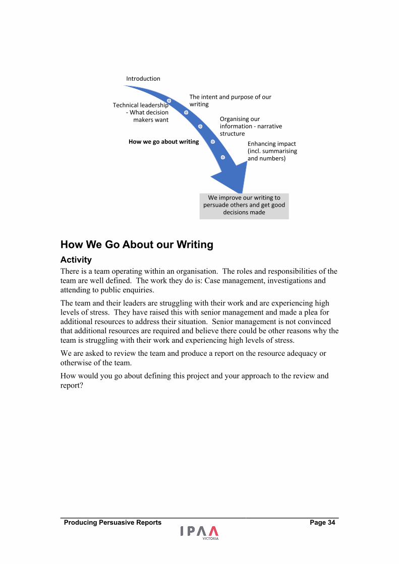
How We Go About our Writing Activity There is a team operating within an organisation. The roles and responsibilities of the
team are well defined. The work they do is: Case management, investigations and
attending to public enquiries.
The team and their leaders are struggling with their work and are experiencing high
levels of stress. They have raised this with senior management and made a plea for
additional resources to address their situation. Senior management is not convinced
that additional resources are required and believe there could be other reasons why the
team is struggling with their work and experiencing high levels of stress.
We are asked to review the team and produce a report on the resource adequacy or
otherwise of the team.
How would you go about defining this project and your approach to the review and
report?
Introduction
The intent and purpose of our writingTechnical leadership
- What decision makers want Organising our
information - narrative structure
How we go about writing Enhancing impact (incl. summarising and numbers)
We improve our writing to persuade others and get good
decisions made
Producing Persuasive Reports Page 35
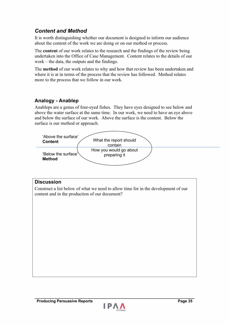
Content and Method It is worth distinguishing whether our document is designed to inform our audience
about the content of the work we are doing or on our method or process.
The content of our work relates to the research and the findings of the review being
undertaken into the Office of Case Management. Content relates to the details of our
work – the data, the outputs and the findings.
The method of our work relates to why and how that review has been undertaken and
where it is at in terms of the process that the review has followed. Method relates
more to the process that we follow in our work.
Analogy - Anablep Anableps are a genus of four-eyed fishes. They have eyes designed to see below and
above the water surface at the same time. In our work, we need to have an eye above
and below the surface of our work. Above the surface is the content. Below the
surface is our method or approach.
Discussion Construct a list below of what we need to allow time for in the development of our
content and in the production of our document?
What the report should contain
How you would go about preparing it
‘Above the surface’ Content
‘Below the surface’ Method
Producing Persuasive Reports Page 36
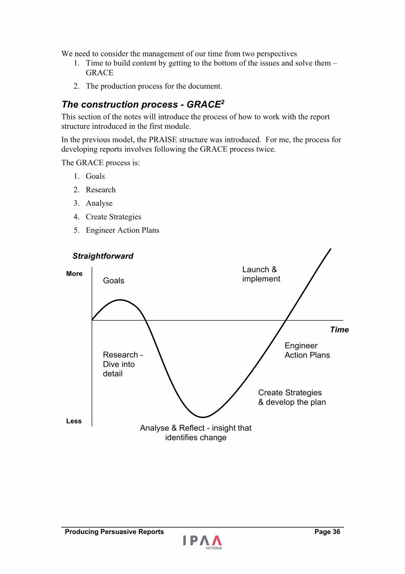
We need to consider the management of our time from two perspectives
1. Time to build content by getting to the bottom of the issues and solve them –
GRACE
2. The production process for the document.
The construction process - GRACE2 This section of the notes will introduce the process of how to work with the report
structure introduced in the first module.
In the previous model, the PRAISE structure was introduced. For me, the process for
developing reports involves following the GRACE process twice.
The GRACE process is:
1. Goals
2. Research
3. Analyse
4. Create Strategies
5. Engineer Action Plans
Goals
Research - Dive into detail
Analyse & Reflect - insight that identifies change
Create Strategies & develop the plan
Engineer Action Plans
Straightforward
Less
More
Time
Launch & implement
Producing Persuasive Reports Page 37
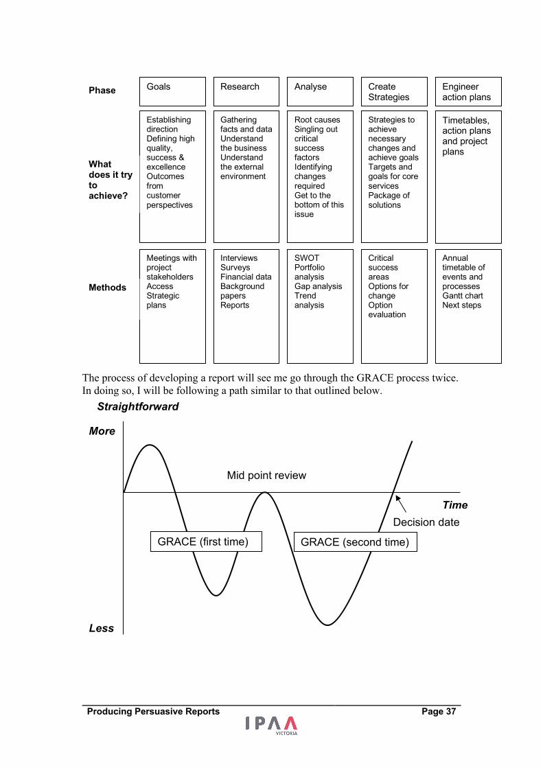
The process of developing a report will see me go through the GRACE process twice.
In doing so, I will be following a path similar to that outlined below.
Goals
Establishing direction Defining high quality, success & excellence Outcomes from customer perspectives
Research
Gathering facts and data Understand the business Understand the external environment
Root causes Singling out critical success factors Identifying changes required Get to the bottom of this issue
Analyse Create Strategies
Engineer action plans
Strategies to achieve necessary changes and achieve goals Targets and goals for core services Package of solutions
Timetables,action plans and project plans
Meetings with project stakeholders Access Strategic plans
Interviews Surveys Financial data Background papers Reports
SWOT Portfolio analysis Gap analysis Trend analysis
Critical success areas Options for change Option evaluation
Annual timetable of events and processes Gantt chart Next steps
Phase
What does it try to achieve?
Methods
Straightforward
Less
More
Time Decision date
Mid point review
GRACE (first time) GRACE (second time)

Producing Persuasive Reports Page 38
The Production process The Process of producing a report or briefing is largely a matter of time management -
How we divide up the time we have for the preparation of a report or briefing.
Managing Time – Author as Project Manager To manage our time, we need to think like a project manager.
• Break our work into chunks
• Plan the sequence of events and the dependencies between events and
• Be explicit about how we are allocating our time
I will typically divide the time required to produce a report or briefing into halves:
1. The first half is to establish clarity on the narrative structure and the primary insight(s) involved in the briefing. This half of the production process includes information gathering, research, and drafting recommendations. The main intent of this section is to be clear on the conclusions I have drawn and the conclusions that I want the reader to draw. For larger reports and projects, I will use the half way point to test my findings and report outline with the client or with my superior.
2. The second half is the drafting, editing and polishing of the report or briefing. This allows time for wordsmithing, spell and grammar checking, consistency of formatting and to receive feedback from superiors on draft versions.
I need to actively manage the time necessary for both. The typical experience is that
we spend too long on the first part, and rush, or don’t do the second, leaving it for
others to do.
Handout 2a - Review/Plan scheduleOutput (Report or Plan)
Week 1 or Month 1 Week 2 or Month 2 Week 3 or Month 3 Week 4 or Month 4 Week 5 or Month 5 Week 6 or Month 6 Week 7 or Month 7 Week 8 or Month 8 Week 9 or Month 9 Week 10 or Month 10 Week 11 or Month 11D/W1 D/W2 D/W3 D/W4 D/W5 D/W1 D/W2 D/W3 D/W4 D/W5 D/W1 D/W2 D/W3 D/W4 D/W5 D/W1 D/W2 D/W3 D/W4 D/W5 D/W1 D/W2 D/W3 D/W4 D/W5 D/W1 D/W2 D/W3 D/W4 D/W5 D/W1 D/W2 D/W3 D/W4 D/W5 D/W1 D/W2 D/W3 D/W4 D/W5 D/W1 D/W2 D/W3 D/W4 D/W5 D/W1 D/W2 D/W3 D/W4 D/W5 D/W1 D/W2 D/W3 D/W4 D/W5
Goals - Project InitiationTerms of ReferenceOutcome Sought & LogicReview or Plan parameters and scope establishedIdentify data sources & documentsIdentify interviewees and stakeholdersIdentify authors
Research and ConsultationInitial data gathering and familiarisationData analysis and manipulationReview existing and historical documentsConduct interviews or workshopsSecond wave research and consultation (after outline report)Third wave research and consultation (after first draft)
Analyse, Create, Engineer - Outline reportEstablish report/plan structure and style guideStoryboard the narrativeDraft known aspects of the reportOutline report for mid point review - feedback meeting
Detailed DraftingCapture thoughts and information from research into initial documentFollow up from the outline reportDevelop the First DraftEdit and reviewCirculate and feedbackSecond draftEdit and reviewCirculate and feedback
Final documentFinal draftingFinal Edit and reviewPresent Final ReportInternal meetings to present and discuss the reportUpdate and publish the final reportStakeholder consultation on final reportFeedback from stakeholder consultation
Project management & governance
LegendPreparation and ResearchDraft versionsApproval requiredMilestone (completed)
Producing Persuasive Reports Page 39
Create Volume It starts by establishing the structure.
Capture as much information as is available for each of the sections in the structure.
In the early stages of the writing process we do not need to be fussy. There is no need
to be too discriminating. More is better.
The amount of information you need to include depends on the quality of your
insights. If your insights are clear and strong, you will need less information than if
your insights are still being formulated as you write. By the way, it is OK for your
insights to develop and evolve as you write.
If your insights are still developing, grab and include as much information as possible.
The development of a clear and strong insight(s) will see a good narrative develop.
The narrative will be helpful in developing key themes and layers of information that
will be included with each section. From this you will be able to form the sub
headings that will go into each chapter.
Productivity for this component will be enhanced by:
• Touch typing • Using dictation applications to get material into your notes • Writing in sections – when you hit a block on one section, start writing
another • Beware of perfection, it can be the enemy of production - Being careful to
strive for perfection early by over editing material as you are creating it. I focus on volume first because the best pieces of writing come out with the bad
pieces of writing. Some might say, the more bad stuff we write, the more good stuff
we’ll write.
Writer’s block seems to occur when you only want good stuff to come out and
therefore allow nothing out. The good and the bad usually come out together.
The initial stages of drafting start with more information than will be in the final
version. As the process goes on, it is one of deletion through reallocating information
from the body of the briefing to attachments or to a discard file.
Switch from Volume to Quality After a mid-point review where I establish clarity about the main elements of the
briefing structure, I will work towards producing a minimum viable product. This is a
switch from volume to quality. In the second half of the project I will need:
• Time to continue to write raw material • Time to wordsmith • Time to format the report, tables and graphs • Time to edit our writing and quality assure the material including the data • Time to quality assure the document – checking spelling, layout, grammar,
headers, footers, footnotes, table of contents, Appendices, style consistency and numbering on the tables and charts.
• Time to produce an executive summary (for reports only) • Time for feedback from the client/recipient on draft copies.
Producing Persuasive Reports Page 40
It will often be the case that at the end of the first half of work, I will have too much
information to include in the final briefing. The second half of the process will be
cull information so the final briefing is succinct.
If you have too much information, do not delete information – reallocate it.
Once you have greater clarity on your insights and your narrative you can start to
weed out information that is peripheral to your main points. Do not delete them,
move them as they may come in handy later.
The information we have gathered will end up in one of three places:
1. In our final document
2. In an appendix to the document
3. In a ‘discard’ file that we establish to capture what we no longer require.
Information that may be more detailed and that has contributed to us reaching our
insights but could distract the reader (including detailed history) can be relegated to
attachments of our briefing or report.
Information, data and ideas that we have had along the way that have now proven to
be not relevant can be reallocated to a discard file. They may become relevant later.
In the second part of the process, we are improving our briefing, report or document
through relegation and reallocation rather just by creation.
Activity “One of the best things you can do for yourself to improve your writing is to learn
how to cut out words that are not necessary.”
Can you summarise the message of this sentence into seven words or less?
Producing Persuasive Reports Page 41
Writing Guidelines Plain English Plain English roughly equates to the standard register introduced earlier on.
Some plain English guidelines:
• Use more familiar and everyday words • Be precise by removing unnecessary words – this requires time • Vary sentence lengths • Prefer active voice to passive voice • Use verbs in preference to constructions based on nouns derived from verbs
(e.g. explain rather than provide an explanation; apply rather than make an application)
• Break up dense strings of nouns • Avoid cliché’s • Use simpler sentence construction.
Use of Style Manuals or Guides And important part of writing is to understand different style requirements that we
have to address. In many organisations, there will be style guides or style manuals
that are designed to guide the choices we can make about writing.
A comprehensive style guide is this style manual published by the Australian
government. The style manual covers a variety of topics that are relevant to our
writing.
The Australian style manual is broken into five parts:
• Part one planning the communications • Part two writing and editing • Part three designing and illustrating • Part four legal and compliance aspects of publishing • Part five producing and evaluating the product.
The section on planning the communications has been addressed today by us talking
about our content and method, the Construction process, and our production process.
The section on writing and editing includes a range of different elements of writing
and editing for which we might need guidance. Relevant subject matters include:
• Effective and inclusive language – looks at the extent of formality or informality in our writing and requirements for inclusive treatment of cultural and ethnic differences, of gender differences, diversity in disability and references to age ranges
• Grammar – the “rules” of language that dictate the order of words, the associations between them and the meaning they create. The ordering of words within our sentences matter. Grammar failures
A tailor's guarantee: If the smallest hole appears after six months' wear, we
will make another absolutely free. The failure is ambiguity in the subject of
the sentence.
Should be:
Producing Persuasive Reports Page 42
If the smallest hole appears in your garment after six months wear, we will
make another garment absolutely free.
Lost: Wallet belonging to a young man made of calf skin. Again, we need to
better link clauses to subjects. Should be, Wallet made of calf skin, belonging
to a young man.
• Spelling and word punctuation – use of standard dictionaries (we are recommended to use the Macquarie Dictionary), and the use of word punctuation (e.g. apostrophes and hyphens).
• Sentence punctuation – punctuation is used to help readers appreciate meaning and understand the relationship between components of a sentence. Sentence punctuation includes full stops, question marks, colons, brackets and quotation marks.
• Capital letters – when to use capital letter within sentences, in names, for organisations, geography, in titles and with references to time.
• Textual contrast – using different page layouts, different fonts and weights to help readers.
Passive vs Active To explain the difference between active and passive verbs, we need to look briefly at
how a sentence fits together. There are three main parts to almost every sentence:
• a subject (the person, group or thing doing the action); • a verb (the action itself); and • an object (the person, group or thing that the action is done to).
To give an example, in the sentence 'Peter watched the television':
• the subject is Peter (he is doing the watching); • the verb is watched; and • the object is the television (it is being watched).
There will often be other words in the sentence. For example: 'Peter, the boy from
number 13, watched the television every Friday night'. But the subject, verb and
object are still there.
Active – Peter watched the television.
Passive – The television is watched by Peter.
Producing Persuasive Reports Page 43
Some thoughts from Writers that write about writing
Use active verbs more than passive verbs. Active verbs push the reader along.
Passive verbs tug or drag.
Example Active – Joe saw him. This is short and direct.
Example Passive – He was seen by Joe. This longer and more likely to be
ambiguous.
Beware overusing Adverbs and Adjectives Adverbs help describe verbs. He walked. How did he walk? Adverbs quickly or
slowly can be added to describe the walk.
Adjective describe nouns. I met a man. What type of man? Adjectives like tall,
short, rotund, cheery or sad describe the man.
William Zisnner states: “Most adverbs are unnecessary…. Most adjectives are also unnecessary.”
Most verbs and nouns have specific meanings that require no elaboration by adverbs
or adjectives. Adverbs and adjective can clutter and elongate our sentences.
Beware of Little Qualifiers Qualifiers include terms like ‘a bit’, ‘a little’, ‘sort of’. These dilute our
persuasiveness. Zisnner states:
“Don’t say you were a bit confused or sort of tired and a little depressed and somewhat annoyed. Be confused. Be tired. Be depressed. Be annoyed. Don’t hedge your prose with little timidities. Good writing is lean and confident.”
Credibility and overstatement Don’t overstate points as they will impact the reader and will impact your credibility.
Further, Zisnner states:
“Credibility is just as fragile for a writer as for a President. Don’t inflate an incident to make it more outlandish that it actually was. If the reader catches you in just one bogus statement that you are trying to pass off as true, everything you write thereafter will be suspect. It’s too great a risk, and not worth taking.”
Prefer short sentences and short paragraphs over long The writers’ life is to craft good sentences that fit together to make good paragraphs.
Good sentences can be short and to the point, especially with non-fiction. Short
sentences can have authority and boldness. They exclude qualifiers and
overstatement.
Be aware of how we were taught to write Most of us were taught to write at school without regard for the future contexts in
which we would write. We were taught to write to prove ourselves – to pass the test
to get a good grade on the essay.
At work we write to advise and to persuade. We do not need to prove ourselves. At
work we write with the authority that emerges from our expertise and research. We
lead others with our writing. We can stop proving ourselves.
Producing Persuasive Reports Page 44
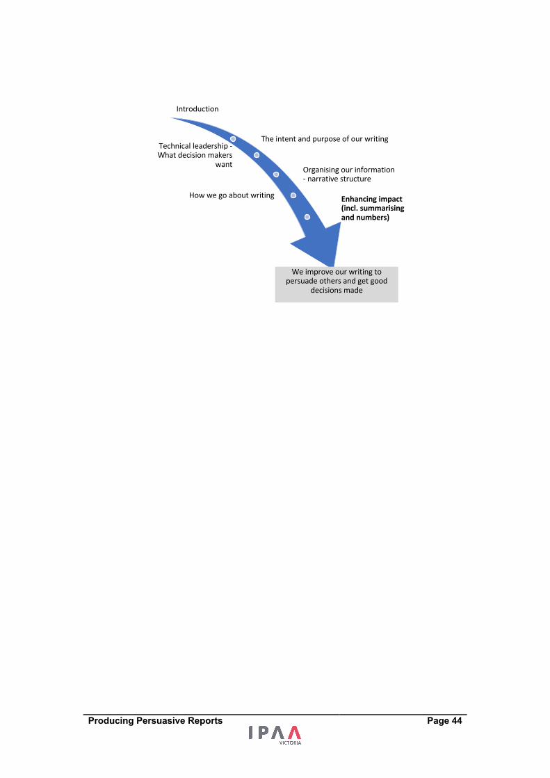
Introduction
The intent and purpose of our writingTechnical leadership -What decision makers
want Organising our information - narrative structure
How we go about writing Enhancing impact (incl. summarising and numbers)
We improve our writing to persuade others and get good
decisions made
Producing Persuasive Reports Page 45
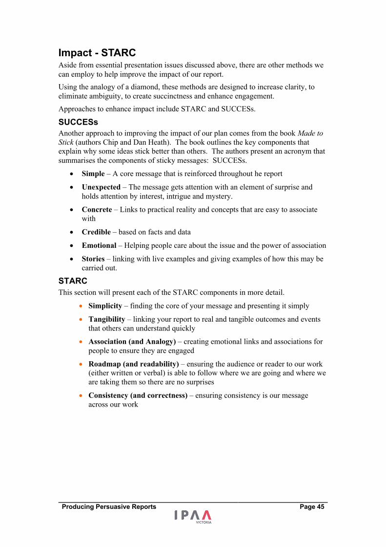
Impact - STARC Aside from essential presentation issues discussed above, there are other methods we
can employ to help improve the impact of our report.
Using the analogy of a diamond, these methods are designed to increase clarity, to
eliminate ambiguity, to create succinctness and enhance engagement.
Approaches to enhance impact include STARC and SUCCESs.
SUCCESs Another approach to improving the impact of our plan comes from the book Made to Stick (authors Chip and Dan Heath). The book outlines the key components that
explain why some ideas stick better than others. The authors present an acronym that
summarises the components of sticky messages: SUCCESs.
• Simple – A core message that is reinforced throughout he report
• Unexpected – The message gets attention with an element of surprise and
holds attention by interest, intrigue and mystery.
• Concrete – Links to practical reality and concepts that are easy to associate
with
• Credible – based on facts and data
• Emotional – Helping people care about the issue and the power of association
• Stories – linking with live examples and giving examples of how this may be
carried out.
STARC This section will present each of the STARC components in more detail.
• Simplicity – finding the core of your message and presenting it simply
• Tangibility – linking your report to real and tangible outcomes and events
that others can understand quickly
• Association (and Analogy) – creating emotional links and associations for
people to ensure they are engaged
• Roadmap (and readability) – ensuring the audience or reader to our work
(either written or verbal) is able to follow where we are going and where we
are taking them so there are no surprises
• Consistency (and correctness) – ensuring consistency is our message
across our work
Producing Persuasive Reports Page 46
Simplicity Simplicity can be achieved by ensuring there is a core to our message. The core will
consist of a small number of key points that, above all else, the audience needs to
understand. Our main source of simplicity should come from a summary of our key
findings that summarises not only our analysis, but also that links it with our strategy.
Ways of ensuring simplicity include:
• The commander’s intent - getting the core intent or message of our plan
• Prioritising your messages
• The lead - using the analogy of journalism, the lead requires that the most
important information comes out first that it comes out in the lead
• Use of schematics or models - a picture can simplify your presentation.
“Perfection is achieved not when there is nothing more to add, but when there is nothing left to take away” Antoine de Saint Exupery.
One method of developing core message of work is to ‘change scales’. Changing
scales relates to presenting our message in short form as well as long form.
Scalability relates to the ability for a plan or report to be presented in various lengths
and varying levels of detail while maintaining the core of its message. The executive
summary and the presentations are exercises in working across scales. I don't know
of a report or business that I have not had to explain to an audience in a short
presentation (20 minutes or less). In many cases, this work has had to be presented in
five minutes. With this knowledge, it is wise to prepare our work at varying scales.
Producing an executive summary or a short presentation is a great test for our report.
They force us to bring out the key components of the report and to eliminate less
important items.
Moving to more summarised information will mean losing information while
maintaining our key points and the thrust of our message. This demands that as we
prepare our report and presentation, we have a sense of the varying levels of
importance of the different issues that we confront.
In summarised cases we do not have the luxury of being able to provide detailed
explanations to make a point. This sometimes demands creativity in presenting
information.
NOTES
Producing Persuasive Reports Page 47
Ways of working across scales that involve scaling down:
• Commence work early on the executive summary
• Summarise key findings - As you create a report, at the end of each section
include a summary of key findings for that section. When put together, these
can become a shortened version of the report
• Point reduction – for each section list 7 key points and then prioritise them in
order to be able to produce 5 points, then 3 points and finally one point
• Branding – we can think of famous brands that have as one of their aims the
communication of a number of messages using a short tag line, musical tune
or by an image or logo. In the same way we may identify tag lines or a key
image that can summarise work and be effective in communicating a range of
messages to our readers. Beware not to compromise substance through this
process.
Examples:
• Mid-Point review – bringing your work into six Powerpoint slides
• Building an Executive Summary that is a scaled down version of the report.
To construct this, at the end of each of the PRAISE sections, summarise the
section into one paragraph. Bring those single paragraphs together into one
page for an executive summary.
Using PRAISE to produce an Executive Summary The case study distributed uses PRAISE as a narrative structure. To produce and
executive summary we could work through each section of the report to summarise it
into four or five sentences.
Please read the Purpose section of the review case study and write four short
sentences that capture the most important points from the section.
1 -
2 -
3 -
4 -
Producing Persuasive Reports Page 48
Tangibility
We will enhance the impact of the presentation of our information when what we are
proposing is relevant and real. In many cases, we will be making reports on technical
matters that our audience may not understand as well as we do. We have to make our
topic real and tangible for them.
We can demonstrate that what we are proposing is real through the use of a case
study, an example or an object that our audience and readers know and understand.
Tangibility demands that we can put some value or the costs and benefits of our
report. Tangibility also demands that what we recommend be specific and do-able.
Tangibility can occur in different ways in our work with the use of:
• Pictures, including maps and photos (for an IT development, show example of
screens or images)
• Examples or case studies
• Quotes from stakeholders
• Graphs and numbers
• Use timetables or calendars to present plans
• Physical props
When we present the plan in person, we get the opportunity to use physical props or
to share case studies that link the plan to people and events. For a new building, a
valuable physical prop is a prototype or model. When people can be physically linked
to an initiative, they feel more intimately involved and develop a sense it is possible.
Example I was involved as a Treasury officer with an agency that organised a field trip to
introduce a number of Treasury officers to some major redevelopments both in the
plan phase and works in progress. The tour gave us first hand experience with the
sites, the issues they faced and the likely costs associated with the redevelopments. It
certainly enhanced the passage of the submissions and proposals through Treasury
because there was a greater appreciation of the issues related to the developments and
a greater sense of transparency of decision-making.
Producing Persuasive Reports Page 49
Case Study –
Gloves on the Boardroom Table From Jon Stengor
We had a problem with our whole purchasing process. I was convinced that a great deal of money was being wasted and would continue to be wasted into the future, and that we didn't even know how much money was being thrown away. I thought we had an opportunity to drive down purchasing costs not by 2% but by something in the order of $1 billion over the next five years. A change this big meant a big shift in the process. This would not be possible, however, unless many people, especially top management saw the opportunity which for most part they did not. So nothing was happening.
To get a sense of the magnitude of the problem, I asked one of our summer students to do a small study of how much we pay for the different kind of gloves used in our factories and how many different gloves we buy. I chose one item to keep it simple, something all the plants use and something we can all easily relate to.
When the student completed the project, she reported that our factories were purchasing 424 different kinds of gloves! Four hundred and twenty four. Every factory had their own supplier and their own negotiated price. The same glove could cost $5 at one factory and $17 dollars at another. $5 or $17 may not seem like a lot of money, but we buy a lot of gloves, and this was just one example of our purchasing problem. When I examined what she had found, even I couldn't believe how bad it was.
The student was able to collect a sample of every one of the 424 gloves. She tagged each one with the price on it and the factory it was used in. Then she sorted the bags by division in the firm and type of glove.
We gathered them all up and put them in our boardroom one day. Then we invited all the division presidents to come visit the room. What they saw was a large, expensive table, normally clean or with a few papers, now stacked high with gloves. Each of our executives stared at this display for a minute. Then each said something like, "We buy all these different types of gloves?" Well as a matter of fact yes we do. "Really?" Yes, really. Then they walked around the table. Most, I think, were looking for the gloves that their factories were using. They could see the prices. They looked at two gloves that seemed exactly alike, yet one was marked $3.22 and the other $10.55.
It’s a rare event when these people don't have anything to say. But that day, they just stood with their mouths gaping.
This demonstration quickly gained notoriety. The gloves became part of a travelling road show. They went to every division. They went to dozens of plants. Many, many people had the opportunity to look at the stacks of gloves. The road show reinforced at every level of the organisation a sense of "this is how bad it is."
Through more research, again done quickly and inexpensively by one of our students, we discovered what some of our competitors were doing. The "competitive benchmarking" was added to the road show. As a result we were given a mandate for change. People would say, "We must act now," which of course we did and saved a great deal of money that could be used in much more sensible ways. Even today, people still talk about the glove story.
Producing Persuasive Reports Page 50
Association (Analogy)
Decisions are not made based solely on logic and reason. Emotion plays a big part in
engaging others and in getting others to make decisions and choices. It is therefore
important that our presentations include some emotional links that our audiences and
readers can associate with.
This can include making associations between what we are proposing and what is
important for our audience. Association can include the use of stories and analogies
that help people engage with an issue at an emotional level. Stories are a strong
source of association. They help people see a situation or topic by associating
emotions and links with stories.
Other methods for creating associations include:
• Photos and images that evoke emotional responses
• Music
• Engaging the senses – creating links with smells and tastes that are well
understood.
• Truisms – linking with universal truths that most people accept as a means of
engaging our audience.
“The most basic way to get people to care is to form an association between something they don’t yet care about and something they do care about.”
The most important association we want to create is between our initiative and the
goals and outcomes of our decision-makers.
Beware over using associations, including comparisons between businesses and
sporting teams.
NOTES
How can I use association to enhance the impact of my report?
Producing Persuasive Reports Page 51
Roadmap (Readability) If we compare reading a document or listening to a presentation as a form of journey,
it is important that we give the participants a sense that the journey will be well
signposted and smooth. This aspect of enhancing our presentation relates to the
guidance and grammar we use through our presentation and documents.
We want our audience to focus on the substance of our work and not worry about
being lost or distracted in their journey. This demands that we give our followers a
guide along the way so they don’t have to worry about the journey. When someone is
lost in our presentation or when reading our document, they will not be enjoying (our
substance) the scenery. They will be worrying about where to next. Lack of
signposts can lead to our audience getting lost. Keep them informed along the way of
where we are at and where we are going next.
A key aspect of this is to avoid surprises in content. In particular, recommendations
should be linked with strategy, which should be clear from insights that should be
made from analysis. If a recommendation, or strategy, arrives ‘out of the blue’, the
audience can get confused or lost.
We need to include in our work and presentations road signs and the markers to show
readers how they are progressing through that journey. We can improve the quality of
presentation by our use of headings, dot points, and footnotes. It has often amused
me that the most sophisticated analysis can be presented as a great lump of
information that is hard to digest because it is not broken up or because the
information is presented in tiny and intense font. This is done through the use of
headings. Includes signs (headers) monitor journey through a document or
presentation.
The most important markers and road signs will be the headings we use to distinguish
one section from another. Other markers will be the use of dot points, tables, charts,
and page numbers.
In our documents, the journey of the reader will be made smoother by ensuring
consistency in fonts, paragraph spacing, and indentation. Also beware of jargon that
will act as a speed hump or at worst, as an arrester bed in our journey.
Examples
• Overview slides used in presentations that guide us through each session
• “Tell them what you are going to tell them, tell them and tell them what
you told them”
NOTES
What road-mapping will I use to enhance the impact of my report?
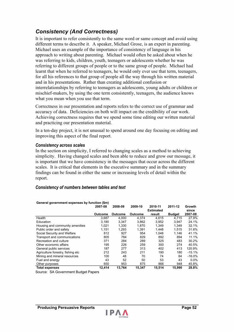
Producing Persuasive Reports Page 52
Consistency (And Correctness) It is important to refer consistently to the same word or same concept and avoid using
different terms to describe it. A speaker, Michael Grose, is an expert in parenting.
Michael uses an example of the importance of consistency of language in his
approach to writing about parenting. Michael would often be asked about when he
was referring to kids, children, youth, teenagers or adolescents whether he was
referring to different groups of people or to the same group of people. Michael had
learnt that when he referred to teenagers, he would only ever use that term, teenagers,
for all his references to that group of people all the way through his written material
and in his presentations. Rather than creating additional confusion or
interrelationships by referring to teenagers as adolescents, young adults or children or
mischief-makers, by using the one term consistently, teenagers, the audience knows
what you mean when you use that term.
Correctness in our presentation and reports refers to the correct use of grammar and
accuracy of data. Deficiencies on both will impact on the credibility of our work.
Achieving correctness requires that we spend some time editing our written material
and practicing our presentation material.
In a ten-day project, it is not unusual to spend around one day focusing on editing and
improving this aspect of the final report.
Consistency across scales In the section on simplicity, I referred to changing scales as a method to achieving
simplicity. Having changed scales and been able to reduce and grow our message, it
is important that we have consistency in the messages that occur across the different
scales. It is critical that elements in the executive summary and in the summary
findings can be found in either the same or increasing levels of detail within the
report.
Consistency of numbers between tables and text
Source: SA Government Budget Papers
General government expenses by function ($m)2007-08 2008-09 2009-10 2010-11 2011-12
Outcome Outcome OutcomeEstimated
result BudgetHealth 3,687 4,000 4,374 4,615 4,715Education 3,180 3,347 3,862 3,952 3,947Housing and community amenities 1,021 1,330 1,870 1,349 1,349Public order and safety 1,151 1,293 1,391 1,448 1,515Social Security and Welfare 812 927 954 1,048 1,146Transport and communications 805 784 829 892 894Recreation and culture 371 284 289 325 483Other economic affairs 195 226 259 300 274General public services 187 277 313 402 413Agriculture forestry, fishing etc 212 243 211 190 180Mining and mineral resources 100 48 70 74 84Fuel and energy 43 52 50 53 43Other purposes 650 953 875 866 948Total expenses 12,414 13,764 15,347 15,514 15,990
Growthsince
2007-0827.9%24.1%32.1%31.6%41.1%11.1%30.2%40.5%
120.9%-15.1%-16.0%
0.0%45.8%28.8%
Producing Persuasive Reports Page 53
Links between text and figures It is one thing to ensure that the presentation of tables and the presentation of charts
facilitate clarity in reading. However, it would be tragedy to see excellence in tables
and charts offset by confusion created by poor linking to data in accompanying text.
When using text to discuss a table, ensure that data referred to in the text is consistent
with that included in the table.
A bad example when discussing the table above
Total government expenses have increased by over 7% per annum since 2007-08. There has been large growth in General Public Services (by around 30% per annum) and Social Security and Welfare (by around 10% per annum) while expenses on Agriculture, Forestry and Fishing have fallen by nearly 4% per annum since 2007-08.
A good example when discussing the table above is:
Total government expenses have increased by 28.8% between 2007-08 and the 2011-12 budget. There has been large growth in spending on General Public Services (120.9%), Social Security and Welfare (41.1% growth) and Health and Education (27.9% and 24.1% respectively) with declines in Agriculture, Forestry and Fishing (-15.1%) and mining and mineral resources (-16.0%).
If you wish to discuss annual growths or dollar increases and decreases, include them
in the table so the reader can quickly reconcile the data with the text. If they have to
do the calculations to confirm their reading it will slow up their reading.
Where possible put commentary and explanation of data with the data in the tables or
charts. If this is not possible, put data explanations immediately above or below that
data or chart. These suggestions are designed to stop unnecessary reading
interruptions for the reader.
NOTES
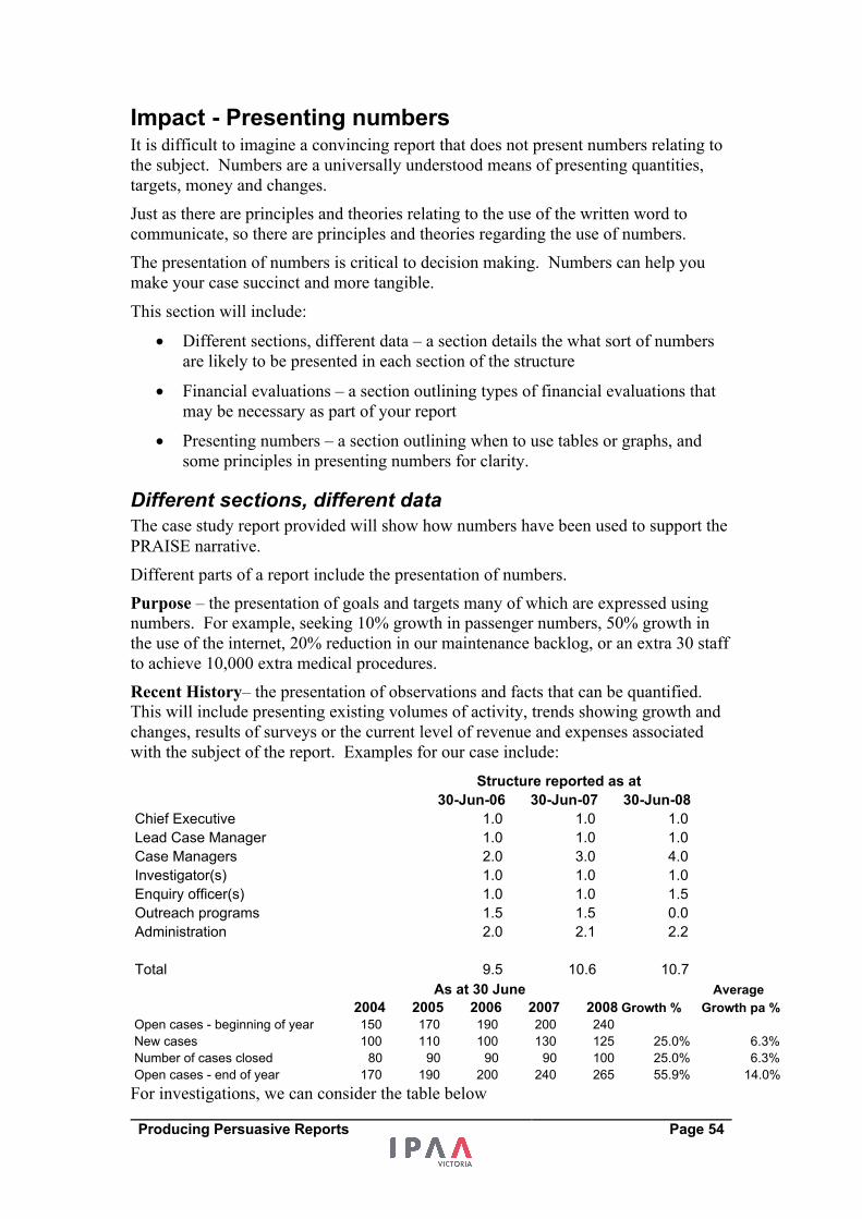
Producing Persuasive Reports Page 54
Impact - Presenting numbers It is difficult to imagine a convincing report that does not present numbers relating to
the subject. Numbers are a universally understood means of presenting quantities,
targets, money and changes.
Just as there are principles and theories relating to the use of the written word to
communicate, so there are principles and theories regarding the use of numbers.
The presentation of numbers is critical to decision making. Numbers can help you
make your case succinct and more tangible.
This section will include:
• Different sections, different data – a section details the what sort of numbers
are likely to be presented in each section of the structure
• Financial evaluations – a section outlining types of financial evaluations that
may be necessary as part of your report
• Presenting numbers – a section outlining when to use tables or graphs, and
some principles in presenting numbers for clarity.
Different sections, different data The case study report provided will show how numbers have been used to support the
PRAISE narrative.
Different parts of a report include the presentation of numbers.
Purpose – the presentation of goals and targets many of which are expressed using
numbers. For example, seeking 10% growth in passenger numbers, 50% growth in
the use of the internet, 20% reduction in our maintenance backlog, or an extra 30 staff
to achieve 10,000 extra medical procedures.
Recent History– the presentation of observations and facts that can be quantified.
This will include presenting existing volumes of activity, trends showing growth and
changes, results of surveys or the current level of revenue and expenses associated
with the subject of the report. Examples for our case include:
For investigations, we can consider the table below
Employee work breakdown
30-Jun-06 30-Jun-07 30-Jun-08Chief Executive 1.0 1.0 1.0Lead Case Manager 1.0 1.0 1.0Case Managers 2.0 3.0 4.0Investigator(s) 1.0 1.0 1.0Enquiry officer(s) 1.0 1.0 1.5Outreach programs 1.5 1.5 0.0Administration 2.0 2.1 2.2
Total 9.5 10.6 10.7
Structure reported as at
Average 2004 2005 2006 2007 2008 Growth % Growth pa %
Open cases - beginning of year 150 170 190 200 240New cases 100 110 100 130 125 25.0% 6.3%Number of cases closed 80 90 90 90 100 25.0% 6.3%Open cases - end of year 170 190 200 240 265 55.9% 14.0%
As at 30 June
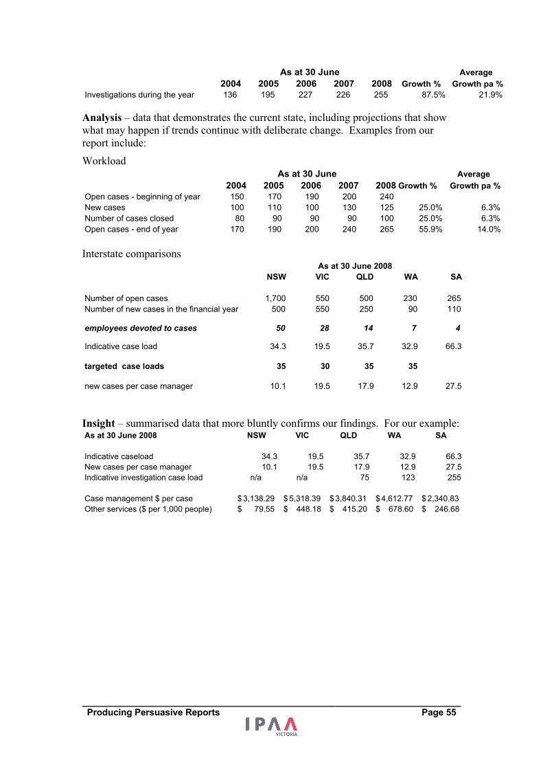
Producing Persuasive Reports Page 55
Analysis – data that demonstrates the current state, including projections that show
what may happen if trends continue with deliberate change. Examples from our
report include:
Workload
Interstate comparisons
Insight – summarised data that more bluntly confirms our findings. For our example:
Average 2004 2005 2006 2007 2008 Growth % Growth pa %
Investigations during the year 136 195 227 226 255 87.5% 21.9%
As at 30 June
Average 2004 2005 2006 2007 2008 Growth % Growth pa %
Open cases - beginning of year 150 170 190 200 240New cases 100 110 100 130 125 25.0% 6.3%Number of cases closed 80 90 90 90 100 25.0% 6.3%Open cases - end of year 170 190 200 240 265 55.9% 14.0%
As at 30 June
NSW VIC QLD WA SA
Number of open cases 1,700 550 500 230 265Number of new cases in the financial year 500 550 250 90 110
employees devoted to cases 50 28 14 7 4
Indicative case load 34.3 19.5 35.7 32.9 66.3
targeted case loads 35 30 35 35
new cases per case manager 10.1 19.5 17.9 12.9 27.5
As at 30 June 2008
As at 30 June 2008 NSW VIC QLD WA SA
Indicative caseload 34.3 19.5 35.7 32.9 66.3New cases per case manager 10.1 19.5 17.9 12.9 27.5Indicative investigation case load n/a n/a 75 123 255
Case management $ per case 3,138.29$ 5,318.39$ 3,840.31$ 4,612.77$ 2,340.83$ Other services ($ per 1,000 people) 79.55$ 448.18$ 415.20$ 678.60$ 246.68$
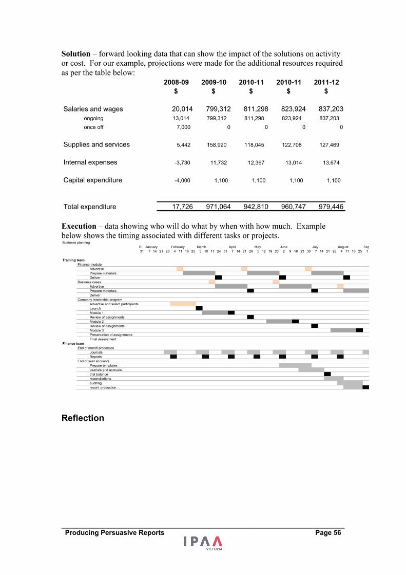
Producing Persuasive Reports Page 56
Solution – forward looking data that can show the impact of the solutions on activity
or cost. For our example, projections were made for the additional resources required
as per the table below:
Execution – data showing who will do what by when with how much. Example
below shows the timing associated with different tasks or projects.
Reflection
2008-09 2009-10 2010-11 2010-11 2011-12$ $ $ $ $
Salaries and wages 20,014 799,312 811,298 823,924 837,203ongoing 13,014 799,312 811,298 823,924 837,203once off 7,000 0 0 0 0
Supplies and services 5,442 158,920 118,045 122,708 127,469
Internal expenses -3,730 11,732 12,367 13,014 13,674
Capital expenditure -4,000 1,100 1,100 1,100 1,100
Total expenditure 17,726 971,064 942,810 960,747 979,446
Additional budget requirement
Business planningD January February March April May June July August Sept31 7 14 21 28 4 11 18 25 3 10 17 24 31 7 14 21 28 5 12 19 26 2 9 16 23 30 7 14 21 28 4 11 18 25 1
Training teamFinance module
AdvertisePrepare materialsDeliver
Business casesAdvertisePrepare materialsDeliver
Company leadership programAdvertise and select participantsLaunchModule 1 Review of assignmentsModule 2Review of assignmentsModule 3Presentation of assignmentsFinal assessment
Finance teamEnd of month processes
JournalsReports
End of year accountsPrepare templatesjournals and accrualstrial balancereconciliationsauditing report production
Producing Persuasive Reports Page 57
Excellence in presenting numbers
From Edward Tufte Excellence in statistical graphics consists of complex ideas communicated with
clarity, precision, and efficiency. Graphical displays should:
• Show the data
• Induce the viewer to think about the substance rather than about the
methodology, graphic design, the technology of the graphic production, or
something else
• Avoid distorting what the data have to say
• Present many numbers in a small space
• Make large data sets coherent
• Encourage the eye to compare different pieces of data
• Reveal the data at several levels of detail, from a broad overview to the fine
structure
• Serve a reasonably clear purpose: description, exploration, tabulation or
decoration
• Be closely integrated with the statistical and verbal description of a data set.
Principles of Graphical Excellence:
• Graphical excellence is the well-designed presentation of interesting data – a
matter of substance, of statistics and of design
• Graphical excellence consists of complex ideas communicated with clarity,
precision and efficiency
• Graphical excellence is that which give to the viewer the greatest number of
ideas in the shortest time with the least ink in the smallest space
• Graphical excellence is almost always multivariate
• And graphical excellence requires telling the truth about the data.
Principles of analytical design In his book Beautiful Evidence, Edward Tufte outlines some key principles for
analytical design. What his principles outline is what we should aspire for when we
undertake analysis, whether it is financial analysis, political analysis or scientific
analysis. These principles are shown below.
Principles of analytical design - from Edward Tufte
Principle 1 - Comparisons - show comparisons contrasts and differences
Principle 2 - Causality, mechanism, structure, explanation
Principle 3 - Multivariate analysis - show more than 1 or 2 variables
Principle 4 - Integration of evidence - integrate words, numbers, images and diagrams
Principle 5 - Documentation – detailing the sources of information, good presentation
of tables and charts.
Principle 6 - Content counts most of all - analytical presentations ultimately stand or
fall depending on the quality, relevance and integrity of their content.

Producing Persuasive Reports Page 58
From Stephen Few “The purpose of quantitative tables and graphs in business is to communicate
important information effectively. That’s it. Not to entertain, not to indulge in self
expression, not to make numbers interesting through flash and dazzle that you would
otherwise deem boring.”
“As providers of quantitative business information, it is our responsibility to do more
than sift through the data and pass it on; we must help our readers gain the insight
contained therein. We must design the message in a way that leads readers on a
journey of discovery, making sure that what’s important is clearly seen and
understood. The right numbers have an important story to tell. They rely on you to
give them a clear and convincing voice.”
Producing Persuasive Reports Page 59
From Sally Bigwood and Melissa Spore To create lucid, intelligible data graphics, we suggest the following:
Reduce the data: Designing useful data graphics requires decision-making, judging
what data is relevant, and what can be ignored. Too much data swamps, confuses and
misleads. Think of the needs of your readers. Provide selective, edited demonstration
tables – focusing on a specific point – rather than comprehensive tables. Similarly,
graphs should focus on an explicit story.
Present refined thought: Persuasive data graphics are the product of time and
thought. Serious communicators need time to analyse the data and design it
appropriately for the intended audience. A resulting table or graph may look simple
but is the result of knowledge, experience and commitment to communicating with
others.
Don’t overestimate graphs: Graphs are fundamentally simple. Bar graphs show that
one thing is larger than another, lines show changes over time and pies show the parts
of a whole. Graphs that look complex almost always do so because of overelaborate
presentation, not intellectual rigor. The fact is, graphs cannot explain complex
messages and complex graphs do not communicate effectively.
Use a table: Saying the public prefers graphs to tables is like saying someone prefers
a hammer to a saw. Both are useful tools but they do different jobs. Graphs excel at a
single storyline, at high contrasts and broad trends; they are less good at detail. Tables
are more versatile and can present complex stories. Additionally tables hold detail
conveniently and, when well designed, are easy to read. Yet communicators are
sometimes pressurized into using graphs when a table is appropriate. People who are
interested in your subject will be interested in relevant, readable data however
presented.
Remove debris: Gratuitous decoration – data labels, gridlines, shading, borders, tick
marks, embolding, etc. – detracts from the message. Emphasize the data, not the
decoration. To make your tables and graphs authoritative, keep them simple, small
and stripped of clutter. Look at The Economist: it serves a highly numerate, serious
readership and illustrates articles with small, succinct data graphics with scarcely a
gridline or data label in sight.
Steer clear of pie charts and 3-d graphs: The public may like pie charts but they
force readers into the mental jugging of comparing triangles arranged in a circle. Most
of us think linearly and a simple bar chart presents this data more conveniently.
Equally, 3-d graphs may be popular but they tend to distort data – readers do not
know which point of the image they should measure from. Avoid them.
Extract from the Article “Designing persuasive tables and charts”.
Producing Persuasive Reports Page 60
Options for presenting data
Tables “A table is a structure for organising and displaying information; a table exhibits the following characteristics:
• Data are arranged in columns and rows
• Data are encoded as text (including words and numbers).”
Source: Page 40 of Show Me the Numbers, Stephen Few
Graphs “A graph is a method for displaying quantitative information that exhibits the following characteristics:
• Values are displayed within an area delineated by one or more axes
• Values are encoded as visual objects positioned in relation to the axes
• Axes provide scales (quantitative and categorical) that are used to assign values and labels to the visual objects.”
Source: Page 42 of Show Me the Numbers, Stephen Few
To use tables or graphs? A common dilemma is whether or not to use tables or graphs in the presentation of
quantitative information. Below are some simple principles that can help make us
determine whether we use tables or graphs.
• Tables are the best way to show exact numerical values. Graphs are the best
way to show indicative numbers.
• Tables are preferable to graphics for many small data sets. "Tables usually
outperform graphics in reporting on small data sets of 20 numbers or less. The
special power of graphics comes in the display of large data sets."
• Tables also work well when the data presentation requires many localised
comparisons (e.g. when showing many electorates in an election)
• Graphs are best when making comparisons over time
• Graphs are best for showing shapes, trends and relationships in and between
data.
If in doubt – use a table, they are more versatile and data rich.
Writing about numbers Some conventions regarding the inclusion of numbers among words include:
• Spell out numbers one to ten. Begin digits at 11
• If a series has numbers above and below ten, use digits for consistency
• Mixing words and numbers in a single concept helps the reader make
distinctions, for instance, nine 6-inch rulers
• Use digits for most units of measure: 7 grams not seven grams, 6 inches not
six inches. Years are the exception
• Readers prefer sentences that start with words rather than with digits.
Seventeen monkeys were captured rather than 17 monkeys were captured
• Consistency in use of fraction and decimals
• Using rounding and comma separation for large numbers with text.
Source: Presenting Numbers, Tables, and Charts, Sally Bigwood and Melissa Spore
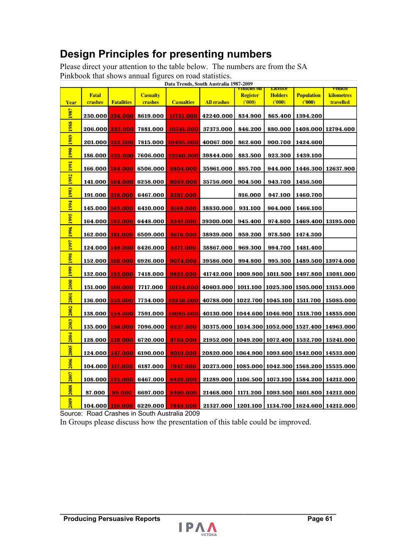
Producing Persuasive Reports Page 61
Design Principles for presenting numbers Please direct your attention to the table below. The numbers are from the SA
Pinkbook that shows annual figures on road statistics.
Source: Road Crashes in South Australia 2009 In Groups please discuss how the presentation of this table could be improved.
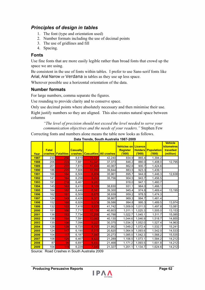
Producing Persuasive Reports Page 62
Principles of design in tables 1. The font (type and orientation used)
2. Number formats including the use of decimal points
3. The use of gridlines and fill
4. Spacing.
Fonts Use fine fonts that are more easily legible rather than broad fonts that crowd up the
space we are using.
Be consistent in the use of fonts within tables. I prefer to use Sans-serif fonts like
Arial, Arial Narrow or Verdana in tables as they use up less space.
Wherever possible use a horizontal orientation of the data.
Number formats For large numbers, comma separate the figures.
Use rounding to provide clarity and to conserve space.
Only use decimal points where absolutely necessary and then minimise their use.
Right justify numbers so they are aligned. This also creates natural space between
columns
“The level of precision should not exceed the level needed to serve your communication objectives and the needs of your readers.” Stephen Few
Correcting fonts and numbers alone means the table now looks as follows.
Source: Road Crashes in South Australia 2009
YearFatal
crashes FatalitiesCasualty crashes Casualties All crashes
Vehicles on Register
('000)
Licence Holders
('000)Population
('000)
Vehicle kilometres travelled (million)
1987 230 256 8,619 11,721 42,240 834.9 865.4 1,394.21988 206 223 7,881 10,541 37,373 846.2 880.0 1,408.0 12,7951989 201 222 7,815 10,405 40,067 862.6 900.7 1,424.61990 186 225 7,606 10,260 39,844 883.5 923.3 1,439.11991 166 184 6,506 8,804 35,961 895.7 944.0 1,446.3 12,6381992 141 164 6,258 8,059 35,756 904.5 943.7 1,456.51993 191 218 6,467 8,287 916.0 947.1 1,460.71994 145 163 6,410 8,169 38,830 931.1 964.0 1,466.11995 164 182 6,448 8,341 39,300 945.4 974.8 1,469.4 13,1951996 162 181 6,509 8,676 38,939 959.2 978.5 1,474.31997 124 149 6,426 8,371 38,867 969.3 994.7 1,481.41998 152 168 6,926 9,074 39,586 994.8 995.3 1,489.5 13,9741999 132 153 7,418 9,833 41,742 1,009.9 1,011.5 1,497.8 13,0812000 151 166 7,717 10,154 40,603 1,011.1 1,025.3 1,505.0 13,1532001 136 153 7,734 10,256 40,788 1,022.7 1,045.1 1,511.7 15,0852002 138 154 7,591 10,083 40,130 1,044.6 1,046.9 1,518.7 14,8552003 135 156 7,096 9,227 30,375 1,034.3 1,052.0 1,527.4 14,9632004 128 139 6,720 8,765 21,952 1,049.2 1,072.4 1,532.7 15,2412005 124 147 6,190 8,019 20,820 1,064.9 1,093.6 1,542.0 14,5332006 104 117 6,187 7,947 20,273 1,085.0 1,042.3 1,568.2 15,5352007 108 125 6,467 8,429 21,289 1,106.5 1,073.1 1,584.2 14,2122008 87 99 6,697 8,490 21,468 1,171.2 1,093.5 1,601.8 14,2122009 104 119 6,229 7,849 21,327 1,201.1 1,134.7 1,624.6 14,212
Data Trends, South Australia 1987-2009
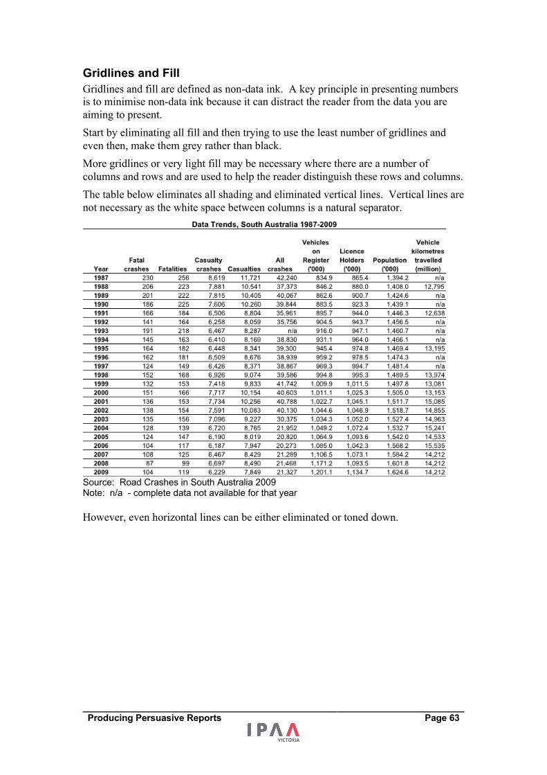
Producing Persuasive Reports Page 63
Gridlines and Fill Gridlines and fill are defined as non-data ink. A key principle in presenting numbers
is to minimise non-data ink because it can distract the reader from the data you are
aiming to present.
Start by eliminating all fill and then trying to use the least number of gridlines and
even then, make them grey rather than black.
More gridlines or very light fill may be necessary where there are a number of
columns and rows and are used to help the reader distinguish these rows and columns.
The table below eliminates all shading and eliminated vertical lines. Vertical lines are
not necessary as the white space between columns is a natural separator.
Source: Road Crashes in South Australia 2009 Note: n/a - complete data not available for that year
However, even horizontal lines can be either eliminated or toned down.
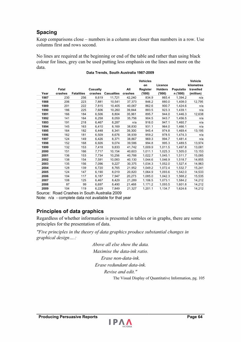
Producing Persuasive Reports Page 64
Spacing Keep comparisons close – numbers in a column are closer than numbers in a row. Use
columns first and rows second.
No lines are required at the beginning or end of the table and rather than using black
colour for lines, grey can be used putting less emphasis on the lines and more on the
data.
Source: Road Crashes in South Australia 2009 Note: n/a - complete data not available for that year
Principles of data graphics Regardless of whether information is presented in tables or in graphs, there are some
principles for the presentation of data.
"Five principles in the theory of data graphics produce substantial changes in
graphical design….:
Above all else show the data.
Maximise the data-ink ratio.
Erase non-data-ink.
Erase redundant data-ink.
Revise and edit."
The Visual Display of Quantitative Information, pg. 105
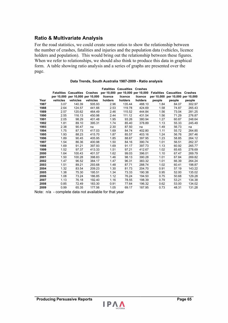
Producing Persuasive Reports Page 65
Ratio & Multivariate Analysis For the road statistics, we could create some ratios to show the relationship between
the number of crashes, fatalities and injuries and the population data (vehicles, licence
holders and population). This would bring out the relationship between these figures.
When we refer to relationships, we should also think to produce this data in graphical
form. A table showing ratio analysis and a series of graphs are presented over the
page.
Note: n/a - complete data not available for that year
Year
Fatalities per 10,000 vehicles
Casualties per 10,000 vehicles
Crashes per 10,000 vehicles
Fatalities per 10,000
licence holders
Casualties per 10,000
licence holders
Crashes per 10,000
licence holders
Fatalities per 10,000
people
Casualties per 10,000
people
Crashes per 10,000
people1987 3.07 140.39 505.93 2.96 135.44 488.10 1.84 84.07 302.971988 2.64 124.57 441.66 2.53 119.78 424.69 1.58 74.87 265.431989 2.57 120.62 464.49 2.46 115.52 444.84 1.56 73.04 281.251990 2.55 116.13 450.98 2.44 111.12 431.54 1.56 71.29 276.871991 2.05 98.29 401.48 1.95 93.26 380.94 1.27 60.87 248.641992 1.81 89.10 395.31 1.74 85.40 378.89 1.13 55.33 245.491993 2.38 90.47 na 2.30 87.50 na 1.49 56.73 na1994 1.75 87.73 417.03 1.69 84.74 402.80 1.11 55.72 264.851995 1.93 88.23 415.70 1.87 85.57 403.16 1.24 56.76 267.461996 1.89 90.45 405.95 1.85 88.67 397.95 1.23 58.85 264.121997 1.54 86.36 400.98 1.50 84.16 390.74 1.01 56.51 262.371998 1.69 91.21 397.93 1.69 91.17 397.73 1.13 60.92 265.771999 1.52 97.37 413.33 1.51 97.21 412.67 1.02 65.65 278.692000 1.64 100.43 401.57 1.62 99.03 396.01 1.10 67.47 269.792001 1.50 100.28 398.83 1.46 98.13 390.28 1.01 67.84 269.822002 1.47 96.52 384.17 1.47 96.31 383.32 1.01 66.39 264.242003 1.51 89.21 293.68 1.48 87.71 288.74 1.02 60.41 198.872004 1.32 83.54 209.23 1.30 81.73 204.70 0.91 57.19 143.222005 1.38 75.30 195.51 1.34 73.33 190.38 0.95 52.00 135.022006 1.08 73.24 186.85 1.12 76.24 194.50 0.75 50.68 129.282007 1.13 76.18 192.40 1.16 78.55 198.39 0.79 53.21 134.382008 0.85 72.49 183.30 0.91 77.64 196.32 0.62 53.00 134.022009 0.99 65.35 177.56 1.05 69.17 187.95 0.73 48.31 131.28
Data Trends, South Australia 1987-2009 - Ratio analysis
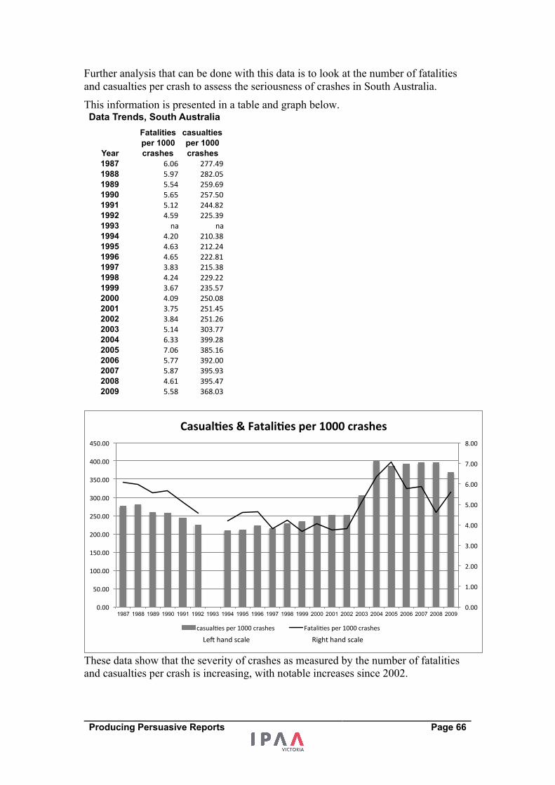
Producing Persuasive Reports Page 66
Further analysis that can be done with this data is to look at the number of fatalities
and casualties per crash to assess the seriousness of crashes in South Australia.
This information is presented in a table and graph below.
These data show that the severity of crashes as measured by the number of fatalities
and casualties per crash is increasing, with notable increases since 2002.
Year
Fatalities per 1000 crashes
casualties per 1000 crashes
1987 6.06 277.491988 5.97 282.051989 5.54 259.691990 5.65 257.501991 5.12 244.821992 4.59 225.391993 na na1994 4.20 210.381995 4.63 212.241996 4.65 222.811997 3.83 215.381998 4.24 229.221999 3.67 235.572000 4.09 250.082001 3.75 251.452002 3.84 251.262003 5.14 303.772004 6.33 399.282005 7.06 385.162006 5.77 392.002007 5.87 395.932008 4.61 395.472009 5.58 368.03
Data Trends, South Australia
0.00#
1.00#
2.00#
3.00#
4.00#
5.00#
6.00#
7.00#
8.00#
0.00#
50.00#
100.00#
150.00#
200.00#
250.00#
300.00#
350.00#
400.00#
450.00#
1987 1988 1989 1990 1991 1992 1993 1994 1995 1996 1997 1998 1999 2000 2001 2002 2003 2004 2005 2006 2007 2008 2009
Casual&es(&(Fatali&es(per(1000(crashes(
casual1es#per#1000#crashes# Fatali1es#per#1000#crashes#
Le:#hand#scale# Right#hand#scale#
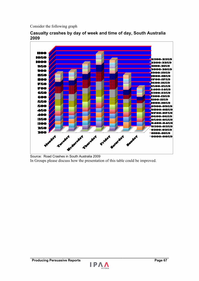
Producing Persuasive Reports Page 67
Consider the following graph
Casualty crashes by day of week and time of day, South Australia 2009
Source: Road Crashes in South Australia 2009 In Groups please discuss how the presentation of this table could be improved.
200 250 300 350 400 450 500 550 600 650 700 750 800 850 900 950
1000 1050 1100
Mon
day
Tue
sday
Wed
nesday
Thu
rsda
y
Frida
y
Saturd
ay
Sund
ay
2300-2359 2200-2259 2100-2159 2000-2059 1900-1959 1800-1859 1700-1759 1600-1659 1500-1559 1400-1459 1300-1359 1200-1259 1100-1159 1000-1059 0900-0959 0800-0859 0700-0759 0600-0659 0500-0559 0400-0459 0300-0359 0200-0259 0100-0159 0000-0059
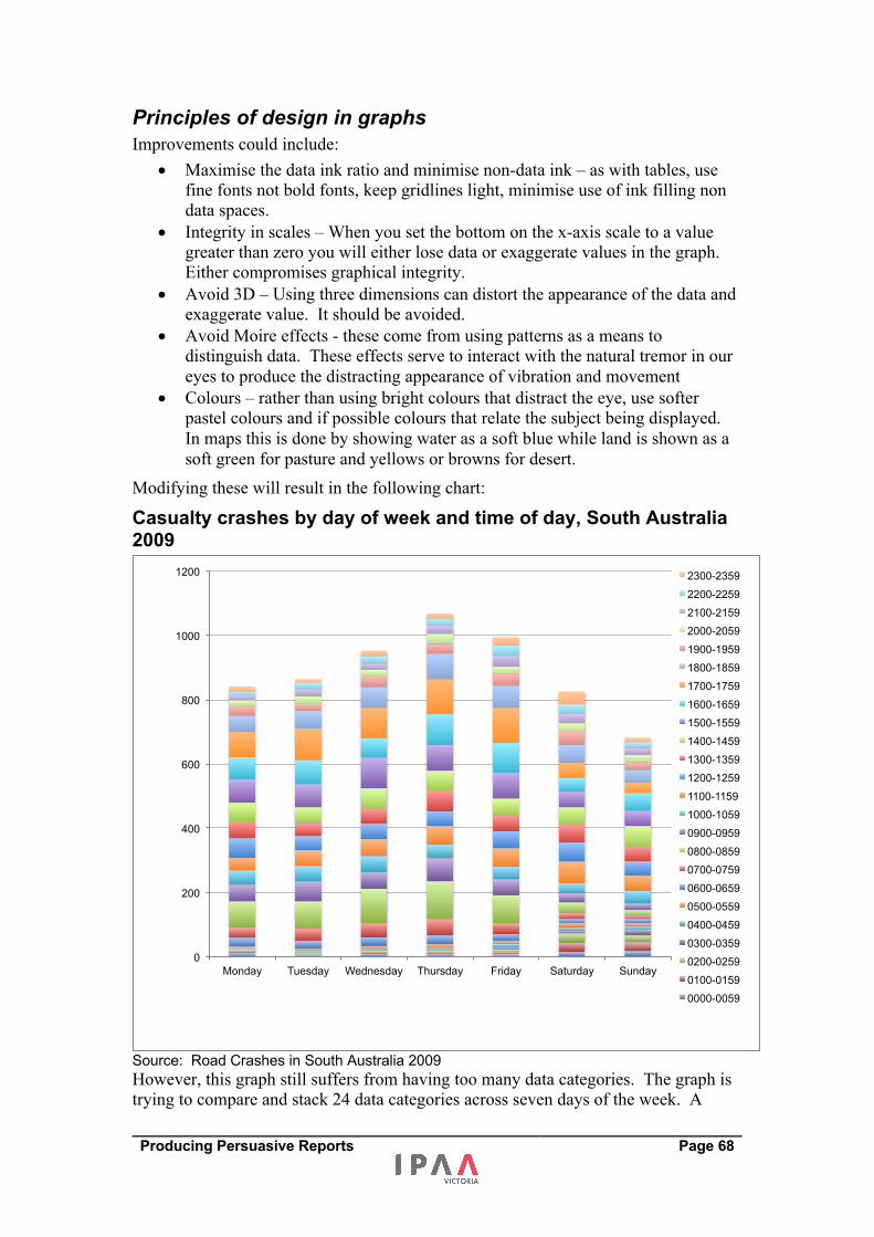
Producing Persuasive Reports Page 68
Principles of design in graphs Improvements could include:
• Maximise the data ink ratio and minimise non-data ink – as with tables, use
fine fonts not bold fonts, keep gridlines light, minimise use of ink filling non
data spaces.
• Integrity in scales – When you set the bottom on the x-axis scale to a value
greater than zero you will either lose data or exaggerate values in the graph.
Either compromises graphical integrity.
• Avoid 3D – Using three dimensions can distort the appearance of the data and
exaggerate value. It should be avoided.
• Avoid Moire effects - these come from using patterns as a means to
distinguish data. These effects serve to interact with the natural tremor in our
eyes to produce the distracting appearance of vibration and movement
• Colours – rather than using bright colours that distract the eye, use softer
pastel colours and if possible colours that relate the subject being displayed.
In maps this is done by showing water as a soft blue while land is shown as a
soft green for pasture and yellows or browns for desert.
Modifying these will result in the following chart:
Casualty crashes by day of week and time of day, South Australia 2009
Source: Road Crashes in South Australia 2009 However, this graph still suffers from having too many data categories. The graph is
trying to compare and stack 24 data categories across seven days of the week. A
0
200
400
600
800
1000
1200
Monday Tuesday Wednesday Thursday Friday Saturday Sunday
2300-2359
2200-2259
2100-2159
2000-2059
1900-1959
1800-1859
1700-1759
1600-1659
1500-1559
1400-1459
1300-1359
1200-1259
1100-1159
1000-1059
0900-0959
0800-0859
0700-0759
0600-0659
0500-0559
0400-0459
0300-0359
0200-0259
0100-0159
0000-0059
Producing Persuasive Reports Page 69
critical question for this graph is what data relationships does it want to show? In this
case, data comparisons may be better made with a table than with a chart.
At this point, we get different perspectives from experts in graphs.
1. The KISS group (Keep it simple silly) will suggest that the graph above is
trying to represent two main points that can be presented in two very
straightforward graphs.
2. The second perspective will be from the KICK group (Keep it Complex
Knucklehead) who advocate that the data should unashamedly show as much
detail as possible but using a straightforward design rather than the clumsy
design we saw earlier.
An example of a graph that attempts to demonstrate as much data as possible without
having an overly complicated design is over the page.
0"
200"
400"
600"
800"
1,000"
1,200"
Monday"
Tuesday"
Wednesday"
Thursday"
Friday"
Saturday"
Sunday"
Casualty accidents by day of the week
0"
100"
200"
300"
400"
500"
600"
0000<0059"
0100<0159"
0200<0259"
0300<0359"
0400<0459"
0500<0559"
0600<0659"
0700<0759"
0800<0859"
0900<0959"
1000<1059"
1100<1159"
1200<1259"
1300<1359"
1400<1459"
1500<1559"
1600<1659"
1700<1759"
1800<1859"
1900<1959"
2000<2059"
2100<2159"
2200<2259"
2300<2359"
Casualty accidents by hour of the day
Producing Persuasive Reports Page 70
Casualty crashes by day of week and time of day, South Australia 2009
This graph attempts to show as much of the data as possible but with as simple a
design as possible. It attempts to:
• Show the main indicator being total accidents by time of day
• Show each day at each time of the day that enables comparison of each day
• Uses as fewer colours as possible, using shades of grey and shapes to
distinguish weekdays and showing weekends quite distinctly differently
• Uses two scales to enable unlike data levels to be presented – left hand x-axis
presents total by day of the week while the right hand x-axis shows accidents
by hour of the day.
"Graphical excellence is often found in simplicity of design and complexity of data."
Edward Tufte – The Visual Display of Quantitative Information
After all this, maybe a table is better. If we are seeking an exact answer about the
time of day and day of the week, a table will give us this detail better than a graph
will.
0"
60"
120"
180"
240"
300"
360"
420"
480"
540"
600"
0"
20"
40"
60"
80"
100"
120"
140"
160"
180"
200"
0000*0059"
0100*0159"
0200*0259"
0300*0359"
0400*0459"
0500*0559"
0600*0659"
0700*0759"
0800*0859"
0900*0959"
1000*1059"
1100*1159"
1200*1259"
1300*1359"
1400*1459"
1500*1559"
1600*1659"
1700*1759"
1800*1859"
1900*1959"
2000*2059"
2100*2159"
2200*2259"
2300*2359"
Total&num
ber&o
f&crashes&per&hou
r&
Num
ber&o
f&Crashes&per&hou
r&for&each&da
y&of&th
e&week&
Time&of&Day&
Total"
Sunday"
Monday"
Tuesday"
Wednesday"
Thursday"
Friday"
Saturday"
Producing Persuasive Reports Page 71
Reflection What has been my most important learning from this session?
Producing Persuasive Reports Page 72
References On thinking Thinking, Fast and Slow (2011), Daniel Kahneman
Influencer – The Power to Change Anything (2008), Kerry Patterson, Joseph Grenny
David Maxfield, Ron McMillan, Al Switzler
One Great Insight is Worth a Thousand Good Ideas (2005), Phil Dusenberry
Serious Creativity (1996), Edward De Bono
Successful Intelligence (1997), Robert J Sternberg
Changing Minds (2006), Howard Gardner
Made to Stick (2007), Chip and Dan Heath
Every Patient Tells a Story (2008), Lisa Sanders
Counselling with Choice Theory (2000), William Glasser, M.D.
Moment of Clarity (2014), Christian Madsbjerg, Mikkel Vedby Rasmussen
On writing Putting Stories to Work (2016), Shawn Callahan
Style Manual, Australian Government
The War of Art (2002), Stephen Pressfield
Do the Work (2011), Stephen Pressfield
Several short sentences about writing (2012), Verlyn Klinkenborg
Draft No 4 ( 2017) John McPhee
On Writing Well (2006) William Zinsser
Plain English, Good Practice Guide (2007), SA Government Reform Commission
On presenting numbers
Show Me the Numbers (2004), Stephen Few
Website: www.perceptualedge.com
Presenting Numbers, Tables, and Charts (2003), Sally Bigwood and Melissa Spore
The Visual Display of Quantitative Information (2001), Edward Tufte
Visual Explanations (1997), Edward Tufte
Envisioning Information (1990), Edward Tufte
Beautiful Evidence (2006), Edward Tufte
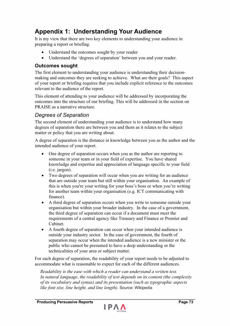
Producing Persuasive Reports Page 73
Appendix 1: Understanding Your Audience It is my view that there are two key elements to understanding your audience in
preparing a report or briefing.
• Understand the outcomes sought by your reader
• Understand the ‘degrees of separation’ between you and your reader.
Outcomes sought The first element to understanding your audience is understanding their decision-
making and outcomes they are seeking to achieve. What are their goals? This aspect
of your report or briefing requires that you include explicit reference to the outcomes
relevant to the audience of the report.
This element of attending to your audience will be addressed by incorporating the
outcomes into the structure of our briefing. This will be addressed in the section on
PRAISE as a narrative structure.
Degrees of Separation The second element of understanding your audience is to understand how many
degrees of separation there are between you and them as it relates to the subject
matter or policy that you are writing about.
A degree of separation is the distance in knowledge between you as the author and the
intended audience of your report.
• One degree of separation occurs when you as the author are reporting to
someone in your team or in your field of expertise. You have shared
knowledge and expertise and appreciation of language specific to your field
(i.e. jargon).
• Two degrees of separation will occur when you are writing for an audience
that are outside your team but still within your organisation. An example of
this is when you're your writing for your boss’s boss or when you’re writing
for another team within your organisation (e.g. ICT communicating with
finance).
• A third degree of separation occurs when you write to someone outside your
organisation but within your broader industry. In the case of a government,
the third degree of separation can occur if a document must meet the
requirements of a central agency like Treasury and Finance or Premier and
Cabinet.
• A fourth degree of separation can occur when your intended audience is
outside your industry sector. In the case of government, the fourth of
separation may occur when the intended audience is a new minister or the
public who cannot be presumed to have a deep understanding or the
technicalities of your area or subject matter.
For each degree of separation, the readability of your report needs to be adjusted to
accommodate what is reasonable to expect for each of the different audiences.
Readability is the ease with which a reader can understand a written text. In natural language, the readability of text depends on its content (the complexity of its vocabulary and syntax) and its presentation (such as typographic aspects like font size, line height, and line length). Source: Wikipedia
Producing Persuasive Reports Page 74
The graphic below links the readability of our report with the degrees of separation.
We can receive readability statistics in Microsoft Word by selecting ‘show readability statistics” from the spelling and grammar options.
Websites like readabilityformulas.com will evaluate the readability of a piece of text
for you. The readability is assessed based on algorithms that assess things like word
length, syllable number and sentence length.
If you work in a policy area that requires a tertiary qualification to be part of your
team then one degree of separation from you means you can pitch that document at a
level that is reasonably interpreted by somebody with tertiary qualifications. For
example, if the audience for your report is your boss and if you and your boss are
higher degree qualified and you both understand terminology jargon and language
you can pitch the report at a tertiary or higher degree level.
For the second degree of separation, the readability of your briefing needs to be
adjusted to pitch it to upper high school level. This is not disrespectful to your reader.
Indeed, it is quite the opposite. It is respectful of the fact that your reader is not as
familiar with the subject as you are. Care also needs to be taken in the use of jargon.
Jargon can be used as a means of excluding people from your information. People
who read reports with lots of jargon will interpret the use of the jargon as a means by
which to exclude them.
A third degree of separation might see the briefing adjusted to lower high school
level. A fourth degree of separation would see the briefing adjusted to an upper
primary school or middle primary school readability.
Degree of separation
Document readability
Middle Primary Tertiary
One
Four
Three
Two
Lower secondary Upper secondary
Producing Persuasive Reports Page 75
Example from Readabilityformulas.com The last three paragraphs on the previous page were processed on the
readabilityformulas.com website. The results were:
Flesch Reading Ease score: 51.2 (text scale) Flesch Reading Ease scored your text: fairly difficult to read. [ f ] | [ a ] | [ r ] Gunning Fog: 14.1 (text scale) Gunning Fog scored your text: hard to read. [ f ] | [ a ] | [ r ] Flesch-Kincaid Grade Level: 11.3 Grade level: Eleventh Grade. [ f ] | [ a ] | [ r ] The Coleman-Liau Index: 9 Grade level: Ninth Grade [ f ] | [ a ] | [ r ] The SMOG Index: 10.2 Grade level: Tenth Grade [ f ] | [ a ] | [ r ] Automated Readability Index: 10.5 Grade level: 15-17 yrs. old (Tenth to Eleventh graders) [ f ] | [ a ] | [ r ] Linsear Write Formula : 13.5 Grade level: College.
Producing Persuasive Reports Page 76
Appendix 2: The relationship between succinctness and complexity A common request in workshops on writing reports or briefings is: “How long should my report be?”
It is also a common for managers and leaders to seek training for their staff on how to
write concisely.
Is important not to confuse conciseness with simplicity. I am very wary of the
demand for a short briefing for a complex subject matter. The request that gets made
is that you as the author ‘make the complex simple’. Please be careful here.
Distinguish inherent complexity from unnecessary complexity.
If a matter is inherently complex, it cannot be made simple. If a matter is
unnecessarily complex, then than complexity can be eliminated. The request to make
the complex simple can be applied to the latter but not to the former.
My response to the question of how long a report should be is: “The length of report is a function of the inherent complexity of the subject that it is dealing with and the quality of insight arising from research”.
Inherent complexities will include:
• Competing demands and interests
• Resource constraints
• Overlapping policies (e.g. State vs Commonwealth)
• High volume and large scale impacts (e.g. Health systems, transport systems,
education system).
There are often no easy answers in inherently complex cases.
A report on a subject that is inherently complex, as is the case of a lot of government
policy, necessarily requires some length to present evidence and to explain how to
manage the inherent complexities associated with the subject.
The graphic below presents my view of the relationship between the inherent
complexity of a subject and the length of an underlying report or business case.
Inherent complexity
Underlying report length
Short Long
Low
High
For long reports - to be concise: • Use an executive
summary • Insights and root causes
are key • Use appendices for detail
For short reports: • Stay on point • Avoid retelling
every element of the story
Producing Persuasive Reports Page 77
For a matter that is not inherently complex, succinctness can be achieved by capturing
the simple facts associated with the matter. Succinctness comes from staying on
point.
In cases where there is inherent complexity, conciseness can be arrived out through:
• The way an executive summary is constructed for a report
• A straightforward narrative structure
• If a matter has been well researched and good insights (e.g. root causes)
identified or revealed, succinctness can arise from revolving a briefing around
these insights.
• Using appendices to provide supporting evidence.
"….. excellence is often found in simplicity of design and complexity of data." Edward Tufte – The Visual Display of Quantitative Information
It is my preference, for an inherently complex subject matter, for there to be a short
briefing to complement a detailed report to ensure that the short briefing does not
belie the complexity of the matter. The production of a brief that is succinct may
suggest that there are easy answers which can be misleading in providing advice on
policy matters.
It will often be the case that politicians will seek to get a punchy message that they
need to communicate with their constituency. It is reasonable for a politician to want
to get to the heart or to the point of the matters that underlie the policy. Care needs to
be taken to make sure that the briefings and advice prepared do not oversimplify a
subject matter that is complex to meet this requirement. If the subject matter is
complex a concise executive summary can be produced but should be supported by a
detailed report showing a range of evidence and the difficulties associated with the
key policy matter.
There will be circumstances where a concise briefing is required and only a short time
is able to be devoted towards the briefing. In these cases, the complexity of the
subject may not be fully explored or investigated. In these circumstances, a briefing
can summarise facts and complexities known at the time. If detailed research is not
able to be undertaken because of time constraints and deeper insights not able to be
identified or revealed, a briefing should not put forward solutions that have not been
evidenced or explored. To do so would be misleading.
In circumstances where a report or briefing is required to be concise but the author is
time constrained, a good narrative structure will be necessary to ensure that the author
does not get long winded. It is also important that the author focuses on the outcomes
of the reader more so than they do on the process they have gone through in a taking
their work.
Narrative is the way the author or speaker chooses to structure events. We do not
have to retell the story in the same way the story unfolded. To do so would often bore
the reader with details not all relevant to the key elements of the final story that
unfolded. Therefore, a method (or narrative) to retelling the story of your subject is
necessary to achieve conciseness particularly when there is limited time available for
the preparation of brief.
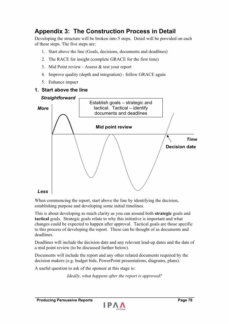
Producing Persuasive Reports Page 78
Appendix 3: The Construction Process in Detail Developing the structure will be broken into 5 steps. Detail will be provided on each
of these steps. The five steps are:
1. Start above the line (Goals, decisions, documents and deadlines)
2. The RACE for insight (complete GRACE for the first time)
3. Mid Point review - Assess & test your report
4. Improve quality (depth and integration) - follow GRACE again
5. Enhance impact
1. Start above the line
When commencing the report, start above the line by identifying the decision,
establishing purpose and developing some initial timelines.
This is about developing as much clarity as you can around both strategic goals and
tactical goals. Strategic goals relate to why this initiative is important and what
changes could be expected to happen after approval. Tactical goals are those specific
to this process of developing the report. These can be thought of as documents and
deadlines.
Deadlines will include the decision date and any relevant lead-up dates and the date of
a mid point review (to be discussed further below).
Documents will include the report and any other related documents required by the
decision makers (e.g. budget bids, PowerPoint presentations, diagrams, plans).
A useful question to ask of the sponsor at this stage is:
Ideally, what happens after the report is approved?
Straightforward
Less
More
Time Decision date
Mid point review
Establish goals – strategic and tactical. Tactical – identify documents and deadlines
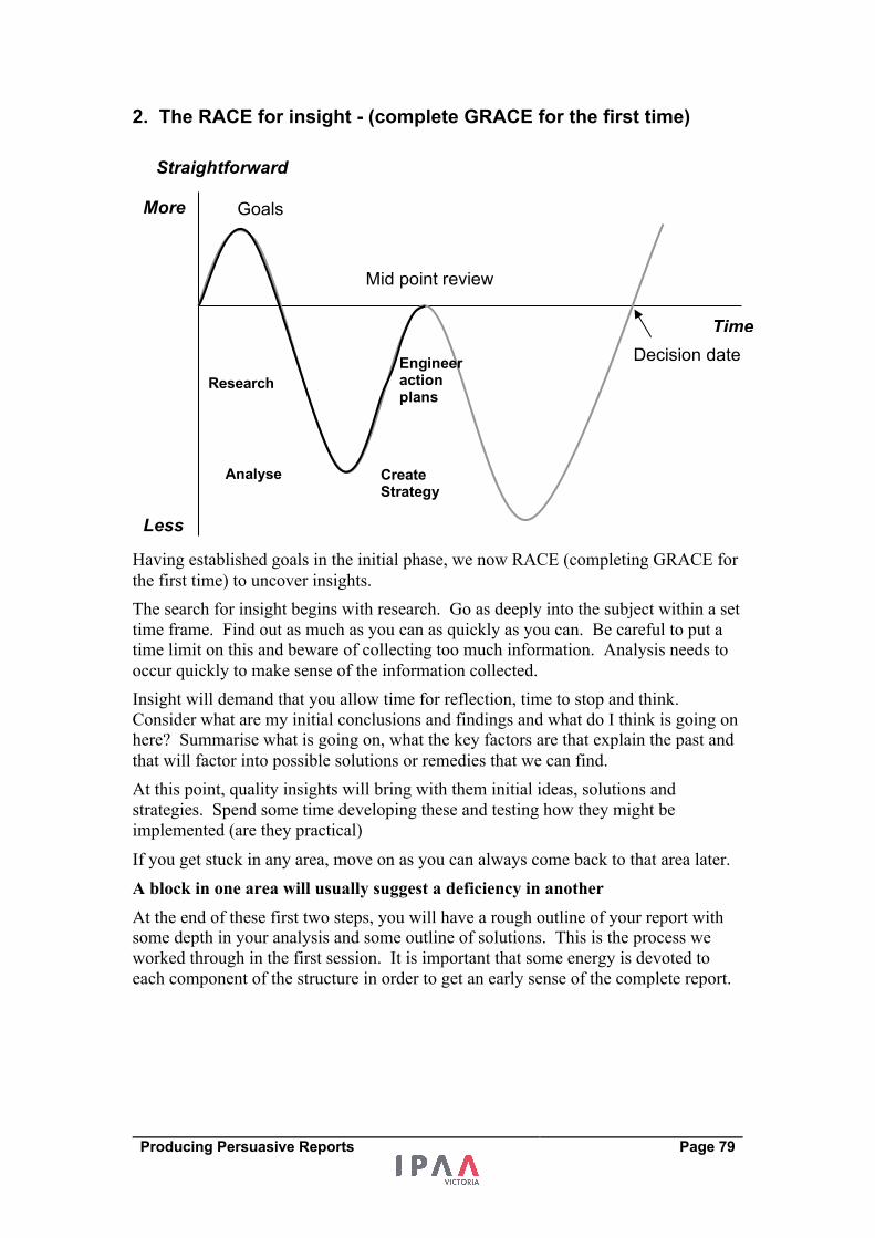
Producing Persuasive Reports Page 79
2. The RACE for insight - (complete GRACE for the first time)
Having established goals in the initial phase, we now RACE (completing GRACE for
the first time) to uncover insights.
The search for insight begins with research. Go as deeply into the subject within a set
time frame. Find out as much as you can as quickly as you can. Be careful to put a
time limit on this and beware of collecting too much information. Analysis needs to
occur quickly to make sense of the information collected.
Insight will demand that you allow time for reflection, time to stop and think.
Consider what are my initial conclusions and findings and what do I think is going on
here? Summarise what is going on, what the key factors are that explain the past and
that will factor into possible solutions or remedies that we can find.
At this point, quality insights will bring with them initial ideas, solutions and
strategies. Spend some time developing these and testing how they might be
implemented (are they practical)
If you get stuck in any area, move on as you can always come back to that area later.
A block in one area will usually suggest a deficiency in another
At the end of these first two steps, you will have a rough outline of your report with
some depth in your analysis and some outline of solutions. This is the process we
worked through in the first session. It is important that some energy is devoted to
each component of the structure in order to get an early sense of the complete report.
Straightforward
Less
More
Time
Goals
Decision date
Mid point review
Research
Analyse Create Strategy
Engineer action plans
Producing Persuasive Reports Page 80
3. Mid point review - Assess and test your report Having had a first go at the report, it is a good time to do an initial evaluation of how
the report stacks up. It is likely that as you construct the report in the first two steps,
you will have identified a number of strengths and weaknesses in the report. Usually,
when preparing a report, some areas are easier to prepare (where your report is strong)
and some prove more difficult (where your report is weak). In this phase, you are
essentially undertaking the first two components of a SWOT analysis (explained on
the next page) of your report.
A mid point presentation or review is designed to be a test of the insights we have
found to date. It will test the depth and quality of our plan or project. It will identify
where further research and analysis is required and will test the quality of the
strategies we have developed.
You can do a number of things to assess and test your report:
• Go over the report with someone else - present a preliminary version of your
findings to your sponsor, manager or to anyone who will give you feedback.
• Change scales – prepare a short presentation or the executive summary of the
report
• Do a SWOT analysis
Preliminary discussion with the sponsor/decision maker At this stage it can be helpful to check your findings with others. Another test of how
your report stacks up is to have a preliminary (mid-point) discussion with your project
sponsor or with the ultimate decision maker or gatekeeper to your initiative. This
helps get a sense of whether the different components hold together in the mind of
others.
Change scales – using different scales as a test One way to assess the quality of our report is to do an executive summary or
presentation. This is an initial test of substance and flow in our report.
The scale or size of a report or presentation isa test for the levels of importance of the
information contained within it. Changing scales is primarily an exercise of
elimination of low importance information. It will test the:
• Clarity of purpose
• depth of our analysis,
• quality of our reflective thinking
• relevance of our solution
• practicality of our next steps.
Producing Persuasive Reports Page 81
Activity – Where is your report at?
What’s the story of your report and what is the story in your report?
Present an overview of your report to someone.
What did you learn from this?
How can you improve your report?
The exercise of preparing a presentation or an executive summary forced the process
of preparing your report whether you were ready or not. I call this exercise –
changing scales. The exercise demanded that we produce a summarised version of
the report even though we may not have completed the detailed report yet. The
practice of changing scales serves as a test to the quality of the narrative or story that
is emerging from our report and how well our detailed work is supporting this
narrative or story.
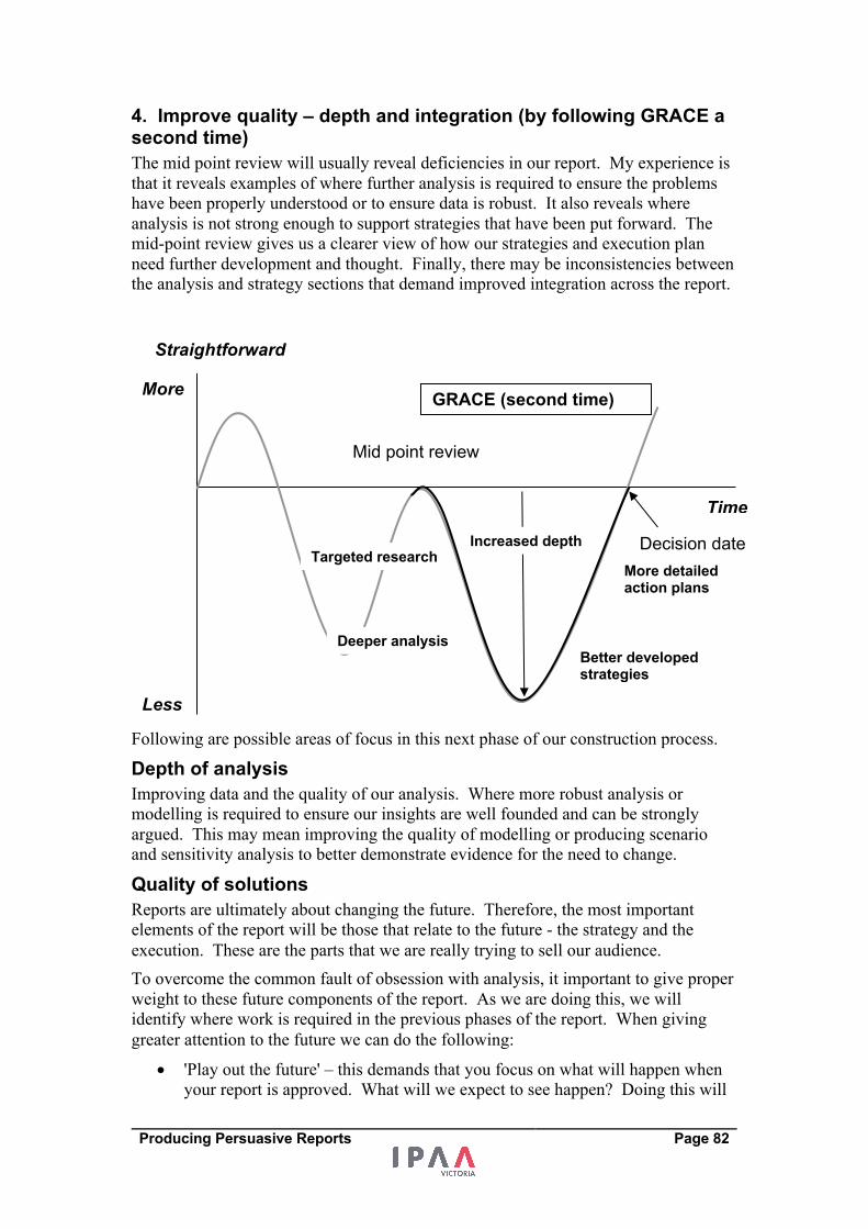
Producing Persuasive Reports Page 82
4. Improve quality – depth and integration (by following GRACE a second time) The mid point review will usually reveal deficiencies in our report. My experience is
that it reveals examples of where further analysis is required to ensure the problems
have been properly understood or to ensure data is robust. It also reveals where
analysis is not strong enough to support strategies that have been put forward. The
mid-point review gives us a clearer view of how our strategies and execution plan
need further development and thought. Finally, there may be inconsistencies between
the analysis and strategy sections that demand improved integration across the report.
Following are possible areas of focus in this next phase of our construction process.
Depth of analysis Improving data and the quality of our analysis. Where more robust analysis or
modelling is required to ensure our insights are well founded and can be strongly
argued. This may mean improving the quality of modelling or producing scenario
and sensitivity analysis to better demonstrate evidence for the need to change.
Quality of solutions Reports are ultimately about changing the future. Therefore, the most important
elements of the report will be those that relate to the future - the strategy and the
execution. These are the parts that we are really trying to sell our audience.
To overcome the common fault of obsession with analysis, it important to give proper
weight to these future components of the report. As we are doing this, we will
identify where work is required in the previous phases of the report. When giving
greater attention to the future we can do the following:
• 'Play out the future' – this demands that you focus on what will happen when
your report is approved. What will we expect to see happen? Doing this will
Straightforward
Less
More
Time
Mid point review
Decision date Targeted research
Deeper analysis Better developed strategies
More detailed action plans
GRACE (second time)
Increased depth
Producing Persuasive Reports Page 83
immediately test whether the original ideas we have developed are feasible
and practical – can they be implemented?
• Checking our strategy and execution back to our purpose – is what we propose
consistent with our purpose? With reports for projects, it is usually more
difficult to change the original goals or objectives. If these cannot change, we
must ensure our solution delivers what our organisation needs. There will be
some circumstances in which the development of a solution may demand the
original goals change. Beware of these circumstances, because too much
changing of the goal posts will weaken the reason for the report in the first
place.
• Identify gaps in our analysis and reflection - Working on the future will
quickly uncover gaps in our analysis and in our reflection. This means we will
need to go back and either revisit our analysis to make some further findings,
or do some more analysis in order to make some further findings.
Integration - tighten links between the parts Once we are satisfied that we have a well-packaged solution and practical next steps,
we can now tighten up the entire report. This means ensuring that there is a
connection and consistency between each of the parts.
Connection between the parts The test of connections is whether or not our reader will find any surprises in the
report. The less surprises and the easier the report is to read, the more thought the
reader will put into it. Don't waste their thought on dealing with surprises.
Surprises occur when the reader encounters something in the report that appears to be
out of place or is there without reason. The way to eliminate surprises is to look at the
interactivity of the parts.
This interactivity often requires reframing earlier parts of the business to link them
with the parts of the report focussed on the future.
• Consider reordering the analysis part of the report in the same order that the
solution is presented. For example, the woes of a business may be identified
as poor organisation structure, inadequate reporting, poor induction and lack
of performance agreements. If solutions are developed for these and presented
in that order, the analysis section of the report can also be ordered this way so
the reader can make an easy link between the analysis, insight and strategy
components of the report. When issues are ordered the same way, the report
presents a simple and consistent logic.
• The insight section is the turning point and directly links the analysis and the
solution. If this link is not clear, the reader will wonder how the strategy is
related to the analysis they have just read.
• Be explicit in presenting the strategy so that it is directly linked with the
purpose.
• The execution should come as no surprise following the strategy that you have
presented.
A great report will be one where the reader will draw conclusions, create solutions
and think of what to do next as they go through the report. In these cases, the report
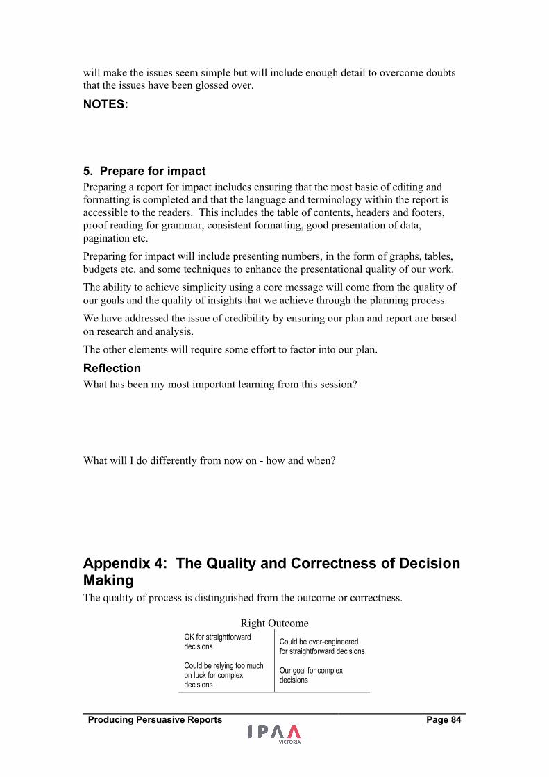
Producing Persuasive Reports Page 84
will make the issues seem simple but will include enough detail to overcome doubts
that the issues have been glossed over.
NOTES: 5. Prepare for impact Preparing a report for impact includes ensuring that the most basic of editing and
formatting is completed and that the language and terminology within the report is
accessible to the readers. This includes the table of contents, headers and footers,
proof reading for grammar, consistent formatting, good presentation of data,
pagination etc.
Preparing for impact will include presenting numbers, in the form of graphs, tables,
budgets etc. and some techniques to enhance the presentational quality of our work.
The ability to achieve simplicity using a core message will come from the quality of
our goals and the quality of insights that we achieve through the planning process.
We have addressed the issue of credibility by ensuring our plan and report are based
on research and analysis.
The other elements will require some effort to factor into our plan.
Reflection What has been my most important learning from this session?
What will I do differently from now on - how and when?
Appendix 4: The Quality and Correctness of Decision Making The quality of process is distinguished from the outcome or correctness.
Right Outcome
OK for straightforward decisions Could be relying too much on luck for complex decisions
Could be over-engineered for straightforward decisions Our goal for complex decisions
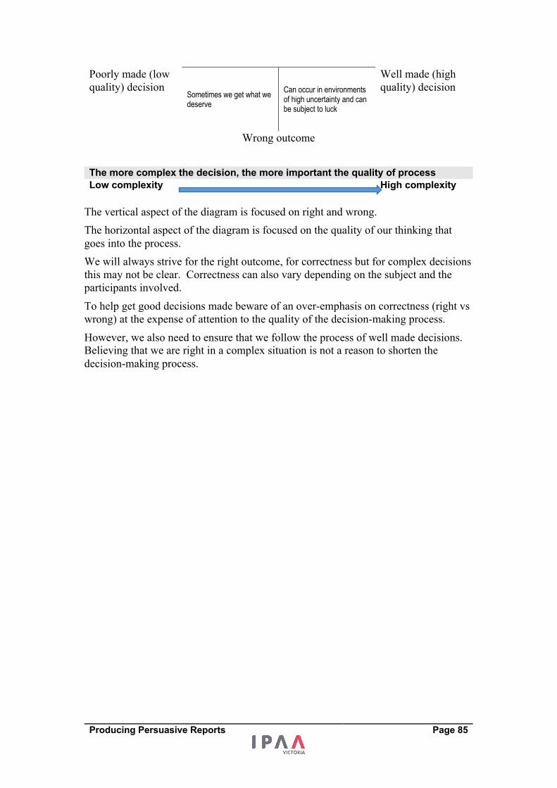
Producing Persuasive Reports Page 85
Poorly made (low
quality) decision Sometimes we get what we deserve
Can occur in environments of high uncertainty and can be subject to luck
Well made (high
quality) decision
Wrong outcome
The more complex the decision, the more important the quality of process Low complexity High complexity
The vertical aspect of the diagram is focused on right and wrong.
The horizontal aspect of the diagram is focused on the quality of our thinking that
goes into the process.
We will always strive for the right outcome, for correctness but for complex decisions
this may not be clear. Correctness can also vary depending on the subject and the
participants involved.
To help get good decisions made beware of an over-emphasis on correctness (right vs
wrong) at the expense of attention to the quality of the decision-making process.
However, we also need to ensure that we follow the process of well made decisions.
Believing that we are right in a complex situation is not a reason to shorten the
decision-making process.
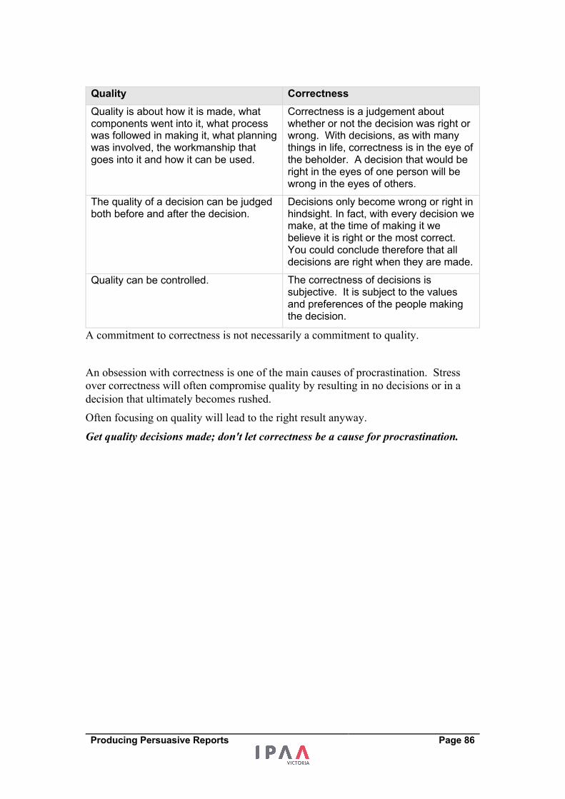
Producing Persuasive Reports Page 86
Quality Correctness Quality is about how it is made, what components went into it, what process was followed in making it, what planning was involved, the workmanship that goes into it and how it can be used.
Correctness is a judgement about whether or not the decision was right or wrong. With decisions, as with many things in life, correctness is in the eye of the beholder. A decision that would be right in the eyes of one person will be wrong in the eyes of others.
The quality of a decision can be judged both before and after the decision.
Decisions only become wrong or right in hindsight. In fact, with every decision we make, at the time of making it we believe it is right or the most correct. You could conclude therefore that all decisions are right when they are made.
Quality can be controlled. The correctness of decisions is subjective. It is subject to the values and preferences of the people making the decision.
A commitment to correctness is not necessarily a commitment to quality.
An obsession with correctness is one of the main causes of procrastination. Stress
over correctness will often compromise quality by resulting in no decisions or in a
decision that ultimately becomes rushed.
Often focusing on quality will lead to the right result anyway.
Get quality decisions made; don't let correctness be a cause for procrastination.
Producing Persuasive Reports Page 87
Appendix 5: Common issues with documents/reports Based on experience as someone who has had to both produce reports or submissions
for clients, executive groups and Cabinet and someone who has received reports as a
member of an executive team and boards, I can make some observations about
reports.
Examples of problems encountered by experts in preparing reports
• I don’t know what the Executive team or leadership team wants
• My Boss/Client doesn't understand
• They want the big picture ahead of detail
• They want me to make a complex topic simple
• I am getting lost in the detail as I prepared the report
• I lose track of time and I don’t have enough time for proper analysis
Examples of problems experienced by recipients • What am I meant to conclude from all the information? - No judgement has
been exercised
• It is not clear what is expected of me as a decision maker
• I have no context and cannot establish the relevance or reason for the report
• It is too hard to understand, I just don’t get it
• Too much information – where are the important parts in all this?
• Does not contain enough analysis – the author appears to have jumped to
conclusions
• A problem is presented but the causes are not understood and no solutions are
provided
• The black box – how did they reach that conclusion or these
recommendations? They want me to take a leap of faith
• Report contains ideas but I am not sure how well they have been tested
• So where do we go from here? – report does not contain any direction or next
steps
Related Documents
![[Heather Pierce] Persuasive Proposals and Presenta](https://static.cupdf.com/doc/110x72/577cc5c21a28aba7119d227b/heather-pierce-persuasive-proposals-and-presenta.jpg)