PowerPoint for Beginners Presented by: Peter Knox

PowerPoint for Beginners Presented by: Peter Knox.
Dec 14, 2015
Welcome message from author
This document is posted to help you gain knowledge. Please leave a comment to let me know what you think about it! Share it to your friends and learn new things together.
Transcript

PowerPoint for Beginners
Presented by:
Peter Knox

Note for users
This presentation was created for the ANZI Forum in New Zealand.
It is provided for Lions to use for training or for forming their own presentations.
Created by Rex Bullard and Peter nox

Making PowerPoint Slides
Let’s start SimplePhoto Slide Show

Making PowerPoint Slides
Avoiding the Pitfalls of Bad Slides

Tips to be Covered
Slide Structure Fonts Colour Spelling and Grammar Backgrounds Equipment

Slide Structure – Good
Use 1-2 slides per minute of your presentationDEATH BY POWERPOINT!
Write in point form, not complete sentences Include 4-5 points per slide Avoid wordiness: use key words and phrases
only

Slide Structure - Bad
This page contains too many words for a presentation slide. It is not written in point form, making it difficult both for your audience to read and for you to present each point. Although there are exactly the same number of points on this slide as the previous slide, it looks much more complicated. In short, your audience will spend too much time trying to read this paragraph instead of listening to you.
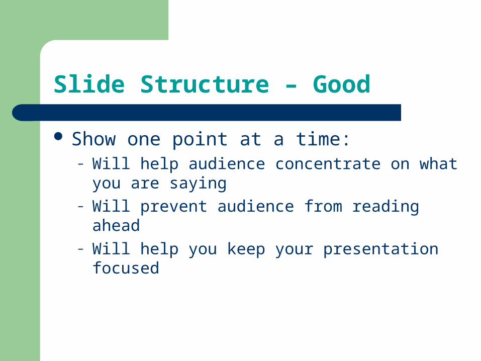
Slide Structure – Good
Show one point at a time:– Will help audience concentrate on what you are
saying– Will prevent audience from reading ahead– Will help you keep your presentation focused

Slide Structure - Bad
Do not use distracting animation
Do not go overboard with the animation
Be consistent with the animation that you use

Fonts - Good
Use at least an 18-point font Use different size fonts for main points and
secondary points– this font is 24-point, the main point font is 28-point,
and the title font is 36-point
Use a standard font like Times New Roman or Arial

Fonts - Bad
If you use a small font, your audience won’t be able to read what you have written
CAPITALIZE ONLY WHEN NECESSARY. IT IS DIFFICULT TO READ
Don’t use a complicated font

Colour - Good
Use a colour of font that contrasts sharply with the background– Ex: blue font on white background
Use colour to reinforce the logic of your structure– Ex: light blue title and dark blue text
Use colour to emphasize a point– But only use this occasionally

Colour - Bad
Using a font colour that does not contrast with the background colour is hard to read
Using colour for decoration is distracting and annoying.
Using a different colour for each point is unnecessary– Using a different colour for secondary points is also
unnecessary Trying to be creative can also be bad

Background - Good
Use backgrounds such as this one that are attractive but simple
Use backgrounds which contrast the font colour
Use the same background consistently throughout your presentation Exceptions…………………...

Background – Bad
Avoid backgrounds that are distracting or difficult to read from
Always be consistent with the background that you use

Equipment
Understand your tools- Freeze- Presenter view
Test prior to event start- 2 minutes setting up is an hour waiting time
Put your own equipment away. – Why?
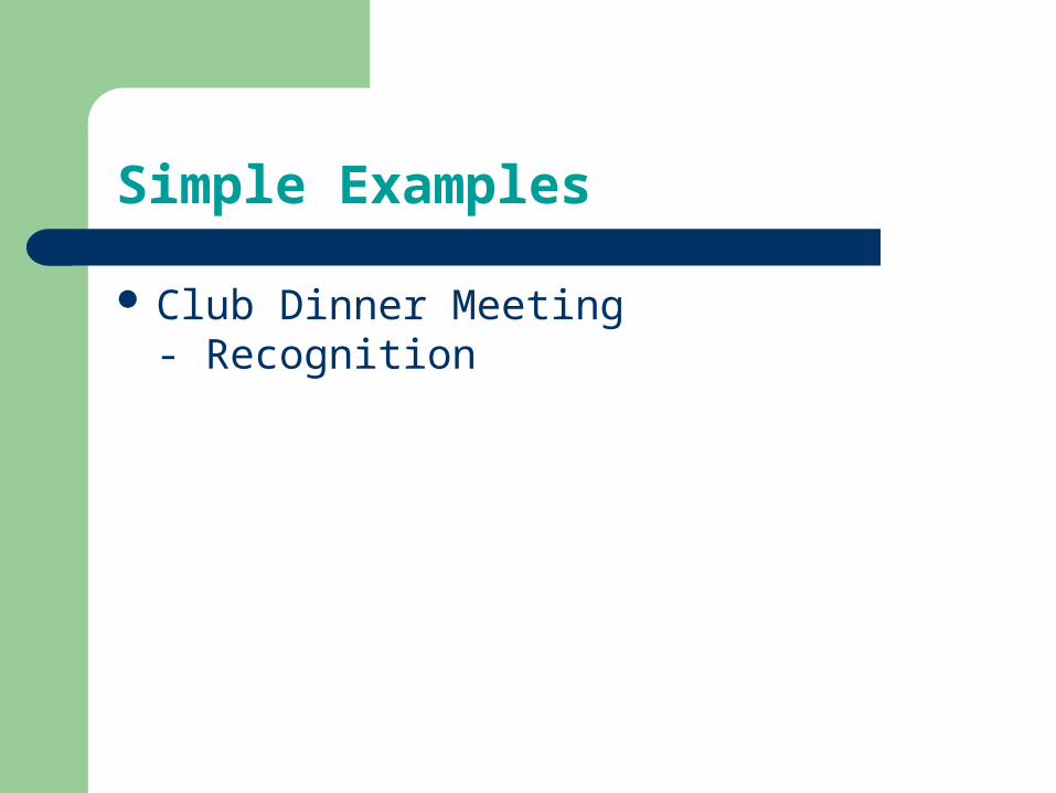
Simple Examples
Club Dinner Meeting- Recognition


Simple Examples
Club Dinner Meeting- Recognition
National Event- Looking Professional

Proudly supported by:
Your Hosts:
Lions Club of Bethlehem Te
Puna
International Entertainment Ltd New Zealand Lions
National Speechmaker
Contest

12
“Very Special People”
From the top of the north to the bottom of the
South

Simple Examples
Club Dinner Meeting- Recognition
National Event- Looking Professional
Promotion- We are the top of our game.- Background- Foreground

Related Documents