Ancillary Task 1: Poster Analysis Ancillary Task 1: Poster Analysis

Welcome message from author
This document is posted to help you gain knowledge. Please leave a comment to let me know what you think about it! Share it to your friends and learn new things together.
Transcript

Ancillary Task 1: Poster AnalysisAncillary Task 1: Poster Analysis

SIN CITY MOVIE POSTERPurpose:
This poster is to advertise the film,
but also shows who the films is directed by, who
stars in it and who the special effects are by. But it does still look modern.
Colour:
Red, black and white colours are used. The red lips
of the woman stand out within
the picture because of
everything else around her being in black and while except for the film
title itself. This draws the eye in to
look at the surrounding detail in the poster also.
Key Image:
The poster depicts an action film. The
large gun the woman is holding
ready to fire proves this to us, but the feminine touch of the red
edited lips lead us to believe maybe
this film has an air of romance,
passion or just simply death about
it too.
Background:
In the background of the poster we
can see a brightly lit city, which
matches the title of the film, so it
lets us know where the film is
going to take place, it is dark
and raining.

SIN CITY MOVIE POSTERRealism:
The poster doesn’t look very realistic
because of the edited colours and
the cartoon like rain, we can tell this film will have some
form of animation in it.
Text Colour:
The text colours are red and white.
Obviously the white text has been used to
contrast from the mostly black
background so we can read what is
on the poster. The main film font is
bright red to catch our eyes and make it clear as to what the film is actually
called.
Text Font:
The film name itself is in a much larger font size to make it stand out.
There is also a comic book like
description in the corner of who the actress is and who
she is playing.
Tag line:
The poster doesn’t appear to
have a tagline, which means less is given away by
wording and more is given away by the image itself. The small box in
the top right hand corner is not a tag line although from far away we may
presume it is.

SIN CITY MOVIE POSTER
Lay out:
The layout of the poster is very
clever. Although the image is directly
centre stage of the poster, like most
film posters are, our eyes are drawn to the surrounding features of the
poster, for example when we look at the title of the film, we
then look straight to the woman’s red
lips because those are the only two
times we see colour on it. When we see
the comic book style box at the top we then look at the
directors because that is the writing in black and white, the small print isn’t as
significant.
Target Audience:
Other sin city posters have a
sexual vibe to them too, normally
highlighting one other thing in red
as well as the title, or showing a
person in colour but the rest on
black or white, it is aimed at 18+ who likes violence and passion, or comic
books.Reaction:
I really like this poster, although I have seen the film,
before I had the posters always intrigued me, I
never understood exactly what the
film would be like. The posters
encouraged me to watch it.

THE DARK CORNER MOVIE POSTER
Purpose:
The purpose of this poster I think, is to shoe what the film is about, perhaps
the man behind the blind is peaking through at the
woman’s life, and she is shyly letting him., it shows you who the film was made by, who it
stars and it’s directors and
creators.
Key image:
The two key images are the man behind the blinds and the
shy woman in a bold colour. We
presume this must be a drama or
romance from the way the woman is standing, slightly
off to one side, she may be
embarrassed or hurt.
Background:
What seems to be a peeping man
looking at a small woman, obviously is
meant for us to think in a more
metaphorical way. Maybe about the
importance of each characters, perhaps
they play large roles, depending on their picture sizes.
Colours:
A very strange pallet has been used for this poster. A really dark
green is the background colouring,
which is rather different from your
classic black background. The woman wears a
mustard yellow Mac which matches the film title this shows us the film will be
about her.

THE DARK CORNER MOVIE POSTER
Realism:
This film poster isn’t very realistic,
because nothing is real in it. The
characters and fonts and backgrounds
are all hand painted and edited. It is not
a photograph of actual people or anything real. Although it is
painted it is done so dramatically we can see the emotions of
the characters almost better because of the
colouring
Text Font:
The font is very clear to read, bold
and good colouring, draws our eyes to it, rather than it
being some boring font for the main title, it is italic,
unlike the rest of the text to make it stand out. It gives the poster a 50’s
feel.Tag line:
There are no tag lines in this poster, only the names of the creators of the film and the actor and main actress who the play the
two characters we can see painted in
the poster. The title of the film is
supposed to speak for itself.
Title Colour:
The title colouring consists of three main colours…
mustard yellow, matching the
woman’s clothing, a muted white and a bright white for the
main actors and actress’s names.

THE DARK CORNER MOVIE POSTER
Layout:
The layout of this poster has a real
50’s American feel to it, the font, the
clothing of the woman in the Mac
and almost matching hair
colour and heels along with the
subtle dark lighting takes us back.
Perhaps the theme of the 50’s also runs clear because still women in America were seen as the
housewives more in the suburbs, as this lady is dressed like
a middle classed mother we presume maybe that the man behind the blind is
her lover or her husband. There are
many things to think about within
this poster, everybody will have different ideas from
how the poster is laid out.
Target Audience:
The target audience would be people who enjoy older films or films set in a time of the 50’s. or maybe just people who like the
particular actors and actress that star in the film.
Reaction:
This poster makes me want to see the film, as it has me
wondering why the artist of it has made the lady smaller on
it. I cannot tell if they wants me to think she is less
significant or that she is trying to hide. It is intriguing and I am also fond of the
colour palette throughout the
whole poster, it is different to what we
see nowadays.

LETTERS TO JULIET MOVIE POSTERPurpose:
The poster has very small printed details at the bottom, so the picture tells us the
story, clearly a romance is involved.
Colour:
This is very much an autumn like palette of colours used in
the posters. The film is set in Italy and for
me before I knew this I felt like the
poster had a European romantic element to it, just from the colouring used. The woman’s
eyes match the green tree leaves behind her and in the picture she is
holding, which draws everything together.
Key Image:
Background:
The background of the picture is blue sky and dark green leaves, framing the beautiful woman’s face holding the
picture, it makes us focus on the love
story she is holding in her hands.
The key image in the poster is split
into two parts, one part is the woman holding the love
story in her hands, the part
underneath her are the mature couple
we see holding hands in what
appears to be a rather romantic vineyard type
setting.

LETTERS TO JULIET MOVIE POSTER
Realism:
The images used in the poster have
realistic qualities. The woman looks
like she is standing in front of a painting
and holding a painting on an
envelope herself.Text Colour:
The text colours are A sort of mahogany
reddish brown, a mustard yellow
colour and black . The text colours individually draw your eyes to the priorities of the
poster. The title in the more eye catching and
contrasting colour of the envelope, the
question in black and the small print fading into the
bottom of the poster.
Text Font:
There is not really anything special about the font in this poster. It is
very simplified, so as to not take away meaning
from the poster itself.
Tagline:
The tagline of this movie, as we can see written on the envelope in black
writing is: “what if you had a second
chance to find true love?” it is a
rhetorical question to make the
audience think. Of course from this
we realise the film is one of a
romantic genre.

LETTERS TO JULIET MOVIE POSTERLayout:
The layout of the poster has a
European romantic element to it. It
makes the audience think of
autumn because of the colour scheme
and of romance because of the couple at the
bottom holding hands. The rhetorical
questions makes us question
romance ourselves and we are enticed by the name of the
movie because when we hear
Juliet, most will refer back to the play of “Romeo
and Juliet”.
Target Audience:
The target audience for this I think would mainly be women, as the style of the poster is very romantic and picturesque.
Although the beautiful woman in
the centre, may attract a male audience too.
Reaction:
I think this poster is very good in terms
of matching its romantic genre. I
think it’s a beautiful poster, I really like how everything is put together and the metaphor of
holding a love story in the woman’s
hands.

Purpose:
The purpose of this poster is to invite us into the fantasy land
of the film, just as the small girl in the picture looks invited into the bright light. It also has details of
the film at the bottom.Colour:
The colour palette of the poster is very basic, black, blues and bright white
where the light is in the centre. It gives
the poster a sense of darkness and mystery, quite
obviously a fantasy colour palette, it
matches the genre of the film and
makes us focus on the intriguing picture in the
middle.
Key Image:
The central image is a small girl walking towards/ standing in front of what looks
like an old time portal, the shadows and shapes of the
lurching trees surrounding her and
the goblin type concrete arch show
us this is a dark film. She may be stepping
into the unknown.Background:
The edges of the picture are jet black, which means we are supposed to focus on
the central image, behind the title of the film we see a
bright light, this may indicate that there is
something on the other side.
PAN’S LABYRINTH MOVIE POSTER

PAN’S LABYRINTH MOVIE POSTER
Realism:
There is nothing realistic about this
image on the poster except for the
human girl standing at the bottom.
Everything else looks to be pure fantasy. It does not look like a
photograph, therefore it doesn’t have much realism
about it.Text Colour:
The small print at the bottom is a dark blue, and some white
under that, it doesn’t appear to want to stand out,
the dark brown/gold colour with the title of the film contrasts to the bright light it Is in front of., which is why it draws our
eyes to it.
Tagline:
There isn’t a tagline on this poster. I
don’t think the film itself has one, but I know that from this
image it doesn’t need one to be able
to attract your attention. It is eye catching as it is,
without a question or a tagline on it.
The picture speaks for itself, let’s you
interpret it however you want to.
Text Font:
The text font looks to be a
sophisticated type. The letter “R” has
joined with the trees around the
border of the picture, showing it
is intertwined.

PAN’S LABYRINTH MOVIE POSTER
Target Audience:
The target audience for this would be
fantasy lovers, and even though it looks
dark, perhaps children as it has an
element of mysterious
adventure about it. Also lovers of
European films.Reaction:
I think this is a great poster, it really
matches the film itself, its genre and its mystery. It shows us there will be an
adventure and although we don’t
know the significance of the girl, we
assume she will be part of it. There’s lots to look at, but its not
overly busy.
Layout:
I like the layout of this poster. I think
it is very clever how the edges are blackened so you
only see the central image.
When you look in the centre, then gradually look
further out, you notice the giant
moon above what looks like a portal, you see the trees
and the gremlin/goblin
type sculpture in the arch. It is very detailed, even the smallprint at the bottom has the details of the creators and
everything, but the main focus of the
layout is the image.

Purpose:
The purpose of this poster is to show us the main characters,
the dramatic emotion of these
characters and a list of the seven deadly
sins.
Key Image:
The key image is of the two main male characters and in
the middle of them, a list of the seven
deadly sins. There is pure emotion in the eyes and faces of
both the characters and the list of the sins is crossed off one by one with a
red dash.
Background:
The background is a mixture of dark
colouring at the top and at the bottom right hand side, it
looks like there are scratching in a wall,
showing patterns with different
colours.
Colour:
There is a fiery colour palette to
this poster. The red and rustic golds,
oranges and yellows even in the
characters faces make us think that this will be a very
emotional film, filled with violence and
struggles. The mix of colours and
characters faces make us perceive
the poster and film this way.
SEVEN MOVIE POSTER
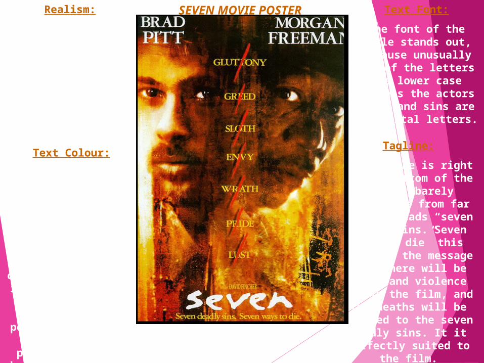
Realism:
The emotions on the faces and necks of the characters look
realistic, but the background is
obviously edited. We can only see the
heads of the characters, the rest
is just edited background.Text Colour:
The text colour of the list of sins blends in with the yellowing colour on the main
part of the poster but then crossed off with
a vibrant red colouring. The title is in bright white, the
most stand out thing about the poster. It is
clear and central positioned at the
bottom. There is no small print to this
poster though.
Tagline:
The tagline is right at the bottom of the
poster, barely noticeable from far
away it reads “seven deadly sins. Seven ways to die” this
gives us the message that there will be
death and violence within the film, and the deaths will be
related to the seven deadly sins. It it
perfectly suited to the film.
Text Font:
The font of the title stands out, because unusually all of the
letters are lower case whereas the actors names and sins are in capital
letters.
SEVEN MOVIE POSTER

SEVEN MOVIE POSTER Target Audience:
I think this poster would attract lovers
of horror and dramatic impacting films, it looks like a
dark film full of emotion and fear. We
can see this purely from the eyes of the characters, one looks angry and the other scared. Plus the use of famous actors will
draw the eyes of fans.Reaction:
If hadn’t already seen If hadn’t already seen the film this poster the film this poster
would definitely made would definitely made me want to. The image me want to. The image is interesting and the is interesting and the
tagline to match tagline to match makes me want to makes me want to know how the film know how the film
relates to the seven relates to the seven deadly sins. deadly sins.
Layout:
The layout of the poster, I think, is split into three
parts. On the left Brad Pitt, in the
centre the sins and the title, and the
right Morgan Freeman. I think
this layout is supposed to be so we give everything a proper look at. It is like the sins are between the two characters and that they are
standing back to back. Whether this
means they are against each other, we don’t know but
it does create some form of
separation between the pair.

Purpose:
The purpose of the poster is to show the
dilemma Edward – the main character –
in in. He is in love with the girl who is embracing him, the
his deformity doesn’t allow him to return the affection, the poster gives us the details of the
film, who it is created by, directed
by.
Key Image:
The central image is of the gothic main character
looking hurt while the beautiful girl is embracing him. He cannot return her
affection, hence the hurt expression on
his face. We see how helpless he is
because of his scissor hands.
Background:
In the background of the couple, is a blue sky filled with lots of soft white clouds. It
gives a sense of purity and innocence
about the film, matches the word
“gentle” used in the poster.
Colour:
The colours in the background contrast with Edwards gothic look. The poster is split in two. Picture
and information, quite clearly
separated, by the bright white and the cloudy scene behind
the characters.
EDWARD SCISSORHANDS MOVIE POSTER
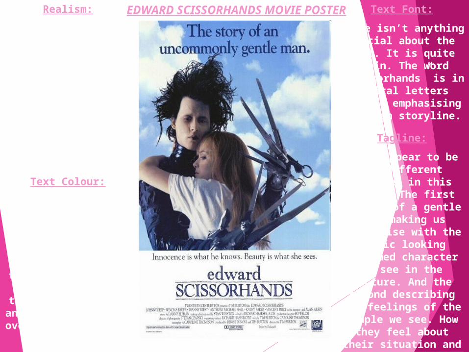
Realism:
There isn't an awful lot of realism about
this poster, the background of the
sky for starters shows us how
fictional the story is. As well as the main character having a variety of scissors, knives and garden
tools for hands.
Text Colour:
The text colours are black blue and blue.
They are used to contrast against the
part of the poster they are on to make the lettering stand
out. Black at the top over light blue and white. Dark blue
over bright white at the bottom.
Tagline:
There appear to be two different
taglines in this poster. The first
talking of a gentle man, making us
sympathise with the gothic looking
deformed character we see in the
picture. And the second describing the feelings of the
couple we see. How they feel about their situation and each
other.
Text Font:
There isn’t anything special about the
font. It is quite plain. The word
“Scissorhands” is in capital letters
though, emphasising the main storyline.
EDWARD SCISSORHANDS MOVIE POSTER

Target Audience:
I’m really not sure what audience this film poster would
grab the attention of. In a way it is funny because of how silly the situation is, but at the same time we sympathise for the
main character.Reaction:
I like this poster, but I think there could
have been more to it, a little less writing
and perhaps a larger image with a more
enticing background. It isn’t as interesting
as the film itself, I think it could have
done better if it matched with the
vibrancy of the film more.
Layout:
The poster is split in two. Picture and
information, quite clearly separated, by the bright white
and the cloudy scene behind the
characters. By having it this way, it
is easy for us to focus just on the
image and emotions in the picture of the couple, then to read after what we can in the small print and the title. There is a bold tagline at the top of the poster
and one more in the beginning of the
white box filled with text. We focus
mainly on the bold black line as it is
much bigger.
EDWARD SCISSORHANDS MOVIE POSTER

Purpose:
The purpose of this poster is to show the
mixture between romance and
violence of the families within the
movie.
.
Key Image:
The main image is a young couple kissing with the
surrounding families looking
like they are ready for a gun battle.
Regardless of how violent everything
else is around them, there is a shining heart at
the top of the page showing how
powerful their love is for one another.
Background:
The background is a swirl of strange
colours, fading into each other with families and the
couple in front of it all.
Colour:
The colours used give the poster a
surreal feeling, the purples and greys make it look like a storm is coming at the edges of the
pages where we can see the families ready with their
weapons. And the orangey golds
everywhere else make it seem like the heavens are opening for the
young couple in the centre.
ROMEO + JULIET MOVIE POSTER

ROMEO + JULIET MOVIE POSTERRealism:
There isn’t much realism to this
poster, we can see that nearly all of it
has been edited, the surreal colours and the families at the sides have been colour editesd.Text Colour:
The bright white is used for the title of the film, contrasting
against the other colours. It makes it easy to read and
makes it stand out, over the couple. The
tagline is in black with a yellow
outlining under the shining heart. The
small print is in dark orange at the bottom,
so it doesn’t stand out much and the
date in the small print is white too.
Tagline:
The tagline, although small reads “my only
love sprung by my only hate” this helps us make
more sense of the battling families at
the sides of the posters. This
hatred has bought a young couple
together despite everything else. It is a very strong, very romantic
powerful tagline.
Text Font:
The font is very bold for
everything, makes it easier to read the names of the actor/actress, the title and even the
tagline too.

ROMEO + JULIET MOVIE POSTER
Target Audience:
The target audience for a film like this, of course
would be Shakespeare fans, and also lovers of romance, violence
and drama.
Reaction:
I think for its time that it was made this is a very well edited and good
take on surrealism for a film poster. It has everything in it
that we need to know. The love is streong between
the couple and the families are clearly
very violently at war with one another.
Layout:
The layout of the poster is well
spread out. Even though there is a lot going on we can clearly see
there is a young and in love couple
at the centre of this battle
between the violent and heavily
armed families that stand either side of them. The metaphorical love heart about them and the heavenly light stays central to the poster. So the violence does not take centre
stage over the love of the couple.
Related Documents