Welcome message from author
This document is posted to help you gain knowledge. Please leave a comment to let me know what you think about it! Share it to your friends and learn new things together.
Transcript


ALINA KOSTIUKPORTFOLIO
selected work 2009 – 2011


Tel: +44 (0) 789 6285 603
www.alinakostiuk.com
178 Streatham Hill
Flat 1
London
SW2 4RU
graphic design
Branding
Typography
Photography
Corporate identity
DTP - preparing for print
Screen printing
Illustration
Packaging
software
Adobe Lightroom 3
Adobe Photoshop CS5
Adobe After Effects CS5
Adobe Illustrator CS5
Adobe InDesign CS5
SUMMARY
Talented graphic designer who has just graduated from University for the Creative Arts at Epsom. Highly motivated, creative, versatile, flexible and eager to learn.
Skilled in bookmaking from editorial design, layout, typography, preparing for print to book binding.
Good photography skills as an additional advantage.
EDUCAWTION
2007 - 2011 – BA Graphic Design, University for the Creative Arts at Epsom, UK
2010 – Erasmus exchange at ESDI Barcelona, Spain
WORK EXPERIENCE
Feb 2011 – internship at NB Studio, www.nbstudio.com
INTERESTS
• Traveling• Photography• Fashion• Film
LANGUAGES
• English• Polish• Russian• German• Spanish
Alina Kostiuk

2009

2009

6 2009
Poster designed for a Durex competition promoting safe sex. It got through to the finals and was used by NHS in the hospitals around UK.
Durex – poster

2009Collage Kit – mail art
This is a ‘Collage Kit’ I created by collecting set of the same images and mailed them to 8 different people asking to create a collage from them. Those are the responses of final pieces I received. It shows how unique each of us is.
2009 7

8 2009 Eyes – collage
Set of experimental collages. Exploring new technique with sellotape and magazines.

92009Skin – collage
The theme of the collages is femininity, showing common features of women but focusing on individuality. Cropping small parts of bigger pictures makes an interesting and abstract pattern.

10 2009
Logo, packaging and website design for a jewellery brand ‘Tiru-riru’, which specializes in hand made jewellery.
Tiru-riru – brand identity

112009
All the jewels are unique and hand made out of redundant object. That is why the labels and all the materials used in the design are recycled, signifying that they were used as something else before just like pieces of the jewellery by Tiru-riru.
Tiru-riru – brand identity
2010

2010

14 2010 City Life – photography
152010

16 2010
I have a passion for photography so I like to spend my free time capturing moments of city life.
City Life – photography

172010
This set of photos captures the scenes where fast street life is juxtaposed with calmness of background.
City Life – photography

18 2010
Advertising campaign for Museum of London. This competition was set by Alan Dye from NB Studio and this brief won me an internship with them.
Museum of London – advertising

192010Alice in Wonderland – serigraphy
A series of silk screen prints I have produced for an exhibition ‘Alice in Wonderland‘ at ESDi Barcelona. It is an interactive piece where the viewer has to draw the arrows on the clock saying what time he has seen the work.

20 2010
Rebranding of a famous range of French supermarket ‘Carrefour’. Redesigning the logo and corporate identity. Aiming to set right proportions and clear space to make a successful logotype.
Carrefour – rebranding
Existing brand 1
Existing brand 13New logo 3New logo
4Thumbnail logo and clear space
4Thumbnail logo and clear space

212010
Creating all promotional materials, brand manual and creative, and fresh advertising campaign. The change of typeface refreshes the brand and makes it more modern. At the same time, leaving the colours of the old logo makes it still recognizable.
Carrefour – rebranding
17Magazine advertisement (A4)
Make it yourself!

2011

2011
24 2011
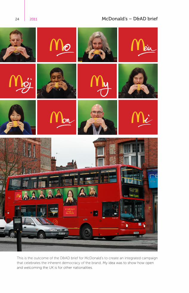
This is the outcome of the D&AD brief for McDonald’s to create an integrated campaign that celebrates the inherent democracy of the brand. My idea was to show how open and welcoming the UK is for other nationalities.
McDonald’s – D&AD brief

252011
It doesn’t matter who you are or where you came from there’s a McDonald’s for everyone. Interestingly in most languages that use roman alphabet word ‘my’ starts with letter ‘m’ and so does McDonald’s. Connecting both together makes it ‘My McDonald’s’.
McDonald’s – D&AD brief

26 2011
I have also created a short video for this campaign that shows diverse set of individuals bound by shared experiences and rituals. We can all relate to that experience, because we all have a favourite at McDonald’s.
McDonald’s – D&AD brief – movie

272011
Every individual no matter where he is from has his McDonald’s in Britain. That is why ‘my’ in every language is written by hand to emphasise the uniqueness of each person. McDonald’s is the ‘People’s Restaurant’ and this is what this campaign stresses.
McDonald’s – D&AD brief

28 2011 The Moustache – book design

292011

30 2011
Men and facial hair. Men and power. Men and abuse of power. Some of the most powerful men in history have abused that power. If the symbol of their masculinity is removed, what dreadful truths would we find? This book does the math.
The Moustache – book design

312011
On the right side of the book there are images of the tyrants. On their faces is a number of people, who went missing or died during their dictatorship. Whereas on the left there is a short information where and when they ruled.
The Moustache – book design

32 2011 The Moustache – book design

332011
34 2011
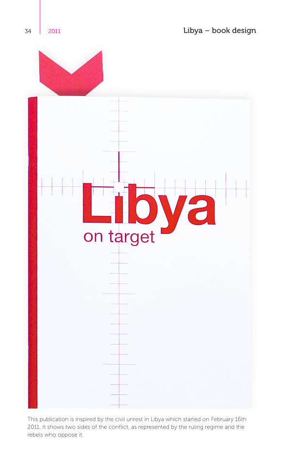
This publication is inspired by the civil unrest in Libya which started on February 16th 2011. It shows two sides of the conflict, as represented by the ruling regime and the rebels who oppose it.
Libya – book design

352011
The covers are pretty much the same but inverted. That shows that there is one problem but two different sides. The inspiration for the covers relates to a timeline inside the publication.
Libya – book design

36 2011
This book depicts the conflict from two opposite sides of a daily timeline and the text therefore reflects a reading from opposite directions through the page.
Libya – book design

372011
All the information used in this publication is based on daily research across different media such as: The Independent, The Economist, The Sunday Times, Channel 4 News and Polish Radio Trojka.
Libya – book design

38 2011
As the aim of this publication is to show each day of the unrest, some pages have been left blank what means that on this day nothing has happened. I believe that when there is nothing being said it means something as well.
Libya – book design

392011
In addition to the book I have designed a bookmark which represents the intervention of the United Nations and Arab League into the Libyan conflict. What makes it the third side to the story.
Libya – book design

Thank you!Thank you!Thank you!

www.alinakostiuk.com


Related Documents