Stephanie Kate Mee Spring 2015 Portfolio

Welcome message from author
This document is posted to help you gain knowledge. Please leave a comment to let me know what you think about it! Share it to your friends and learn new things together.
Transcript
Stephanie Kate Mee Spring 2015 Portfolio
SkillsPhotoshop, Illustrator, InDesign, After Effects, Premier, Microsoft Office, Basic HTML and CSS, Drawing, Painting, Photography
Experience Bakery Crafts West Chester, OhioBakery Crafts manufacturers high-quality cake and cupcake decorations, and supplies retail bakeries, in-store supermarket bakeries, bakery distributors, cake and candy shops, and ice cream shops Co-op Student January 2014— May 2014 August 2014— December 2013-Worked primarily with marketing team on catalog production, marketing materials, and production work.
- Also worked on product development, photography, and creative concepts
Sycamore Trails Aquatic Center Miamisburg, OhioState-of-the-art aquatic complex that includes tube slides, diving boards, a water rock wall, and other water attractions
Lifeguard April 2010— August 2013-Responsible for preventing dangerous situations, rescuing drowning victims, and administering lifesaving measures
-Earned “exceeds” in all audits
EducationUniversity of Cincinnati
Cincinnati, OhioAugust 2012— present-Graduation April 2017-Dean’s List, GPA 3.5-College of Design, Architecture, Art, and Planning (DAAP)
-Graphic Communication Design Major -Bachelor of Science-Minor in Marketing-Participating in Professional Practice Program, alternating semesters of classroom study with work in the field of Graphic Communication
Miamisburg High School
Miamisburg, Ohio August 2008— May 2012-Honors Diploma, 3.8 GPA -National Honor Society -Track and Field Team Captain -Cross Country Team Captain-Student Government Senator-Volunteer for three week mission trip which served homeless and mentally disabled
-Saint Vincent de Paul Homeless Shelter Volunteer-Buckeye Girls State Mayor
Stephanie Kate [email protected]
Activities & HonorsUniversity of Cincinnati Cross Country and Track and FieldJune 2012— October 2013-Practiced twice daily and competed most weekends while carrying full course load
-Qualified as a cross country team and competed in the Big East Championships held in New York City
-Specialized in the 1500m and 5k for track and field
Corryville Catholic School Volunteer August 2012— May 2013-Spent Friday afternoons tutoring 4th graders in reading and writing
Better Business Bureau of Dayton Student of Integrity HonoreeMay 2012
-Was one of five students selected by a panel of judges to receive the Student of Integrity Award and a scholarship based on academics, moral character, and ethics
3
Stephanie Kate Mee
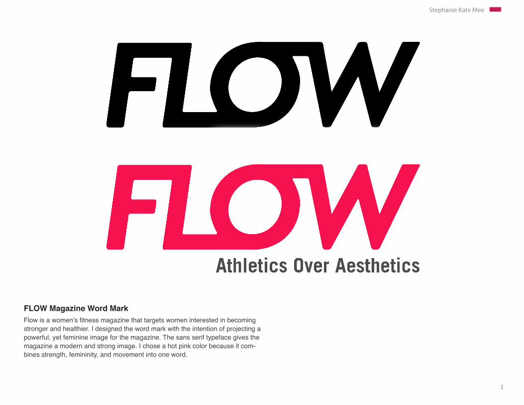
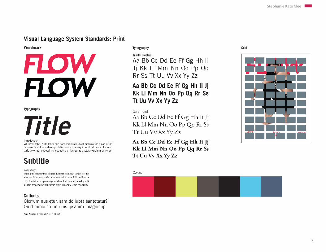
FLOW Magazine Word MarkFlow is a women’s fitness magazine that targets women interested in becoming stronger and healthier. I designed the word mark with the intention of projecting a powerful, yet feminine image for the magazine. The sans serif typeface gives the magazine a modern and strong image. I chose a hot pink color because it com-bines strength, femininity, and movement into one word.
4
Stephanie Kate Mee
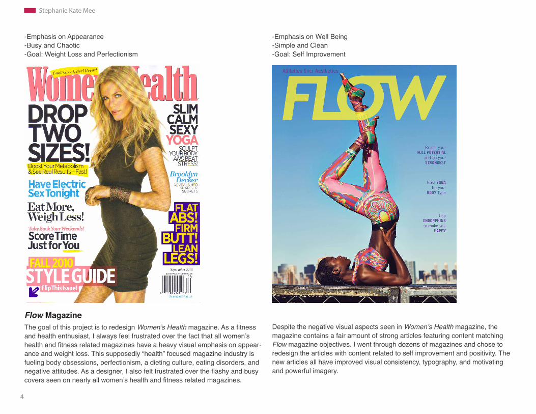
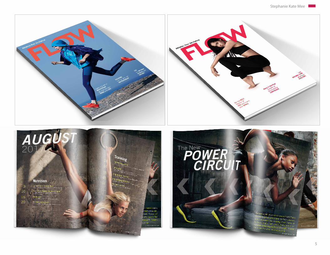
Flow MagazineThe goal of this project is to redesign Women’s Health magazine. As a fitness and health enthusiast, I always feel frustrated over the fact that all women’s health and fitness related magazines have a heavy visual emphasis on appear-ance and weight loss. This supposedly “health” focused magazine industry is fueling body obsessions, perfectionism, a dieting culture, eating disorders, and negative attitudes. As a designer, I also felt frustrated over the flashy and busy covers seen on nearly all women’s health and fitness related magazines.
-Emphasis on Appearance -Busy and Chaotic-Goal: Weight Loss and Perfectionism
-Emphasis on Well Being-Simple and Clean-Goal: Self Improvement
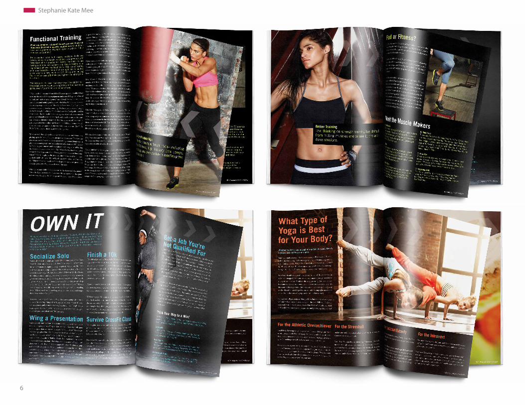
Despite the negative visual aspects seen in Women’s Health magazine, the magazine contains a fair amount of strong articles featuring content matching Flow magazine objectives. I went through dozens of magazines and chose to redesign the articles with content related to self improvement and positivity. The new articles all have improved visual consistency, typography, and motivating and powerful imagery.
5
Stephanie Kate Mee
6
Stephanie Kate Mee
7
Stephanie Kate Mee
8
Stephanie Kate Mee
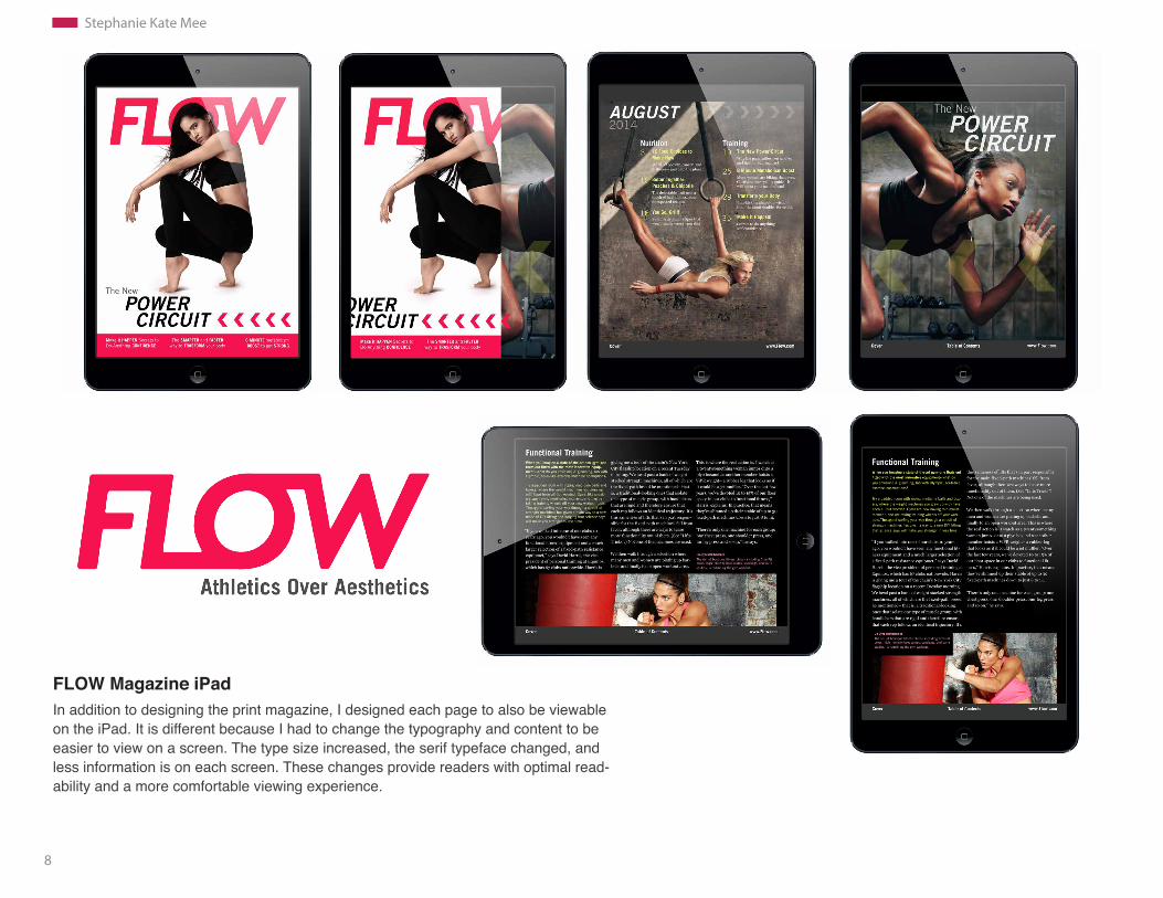
FLOW Magazine iPad In addition to designing the print magazine, I designed each page to also be viewable on the iPad. It is different because I had to change the typography and content to be easier to view on a screen. The type size increased, the serif typeface changed, and less information is on each screen. These changes provide readers with optimal read-ability and a more comfortable viewing experience.

9
Stephanie Kate Mee
10
Stephanie Kate Mee
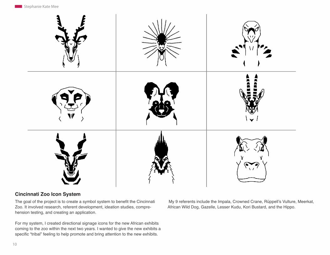
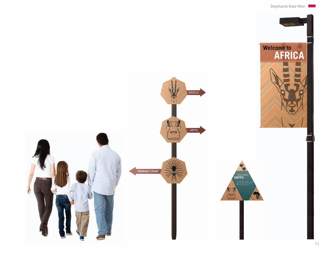
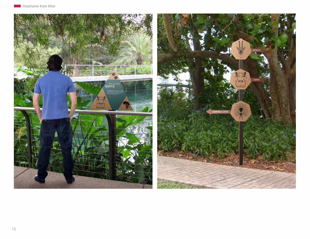
Cincinnati Zoo Icon SystemThe goal of the project is to create a symbol system to benefit the Cincinnati Zoo. It involved research, referent development, ideation studies, compre- hension testing, and creating an application. For my system, I created directional signage icons for the new African exhibits coming to the zoo within the next two years. I wanted to give the new exhibits a specific “tribal” feeling to help promote and bring attention to the new exhibits.
My 9 referents include the Impala, Crowned Crane, Rüppell’s Vulture, Meerkat, African Wild Dog, Gazelle, Lesser Kudu, Kori Bustard, and the Hippo.
11
Stephanie Kate Mee
12
Stephanie Kate Mee

13
Stephanie Kate Mee
Visual Research and Process Sketches
14
Stephanie Kate Mee
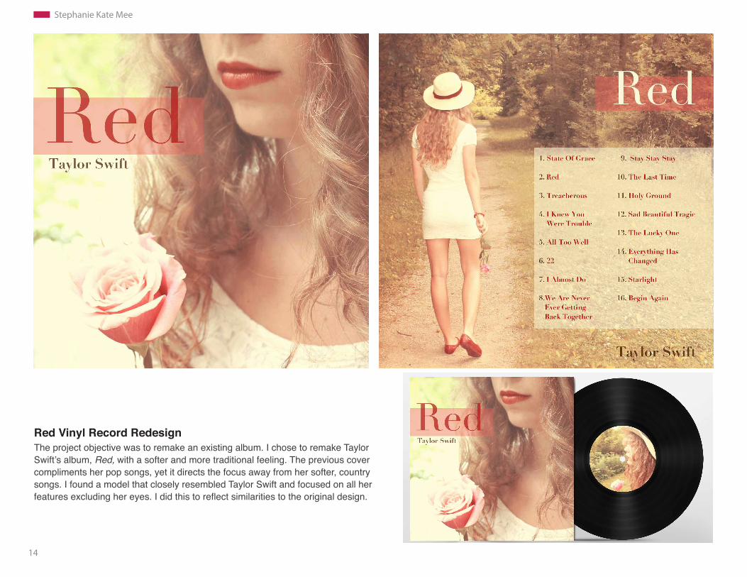
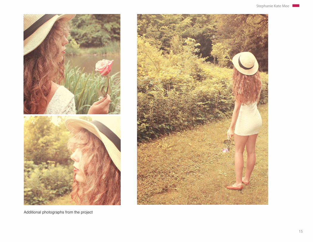
Red Vinyl Record RedesignThe project objective was to remake an existing album. I chose to remake Taylor Swift’s album, Red, with a softer and more traditional feeling. The previous cover compliments her pop songs, yet it directs the focus away from her softer, country songs. I found a model that closely resembled Taylor Swift and focused on all her features excluding her eyes. I did this to reflect similarities to the original design.
15
Stephanie Kate Mee
Additional photographs from the project
16
Stephanie Kate Mee
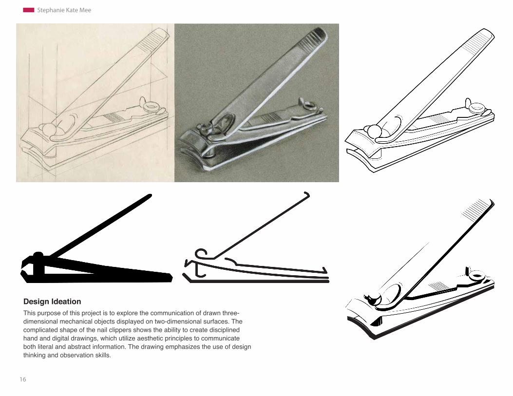
Design IdeationThis purpose of this project is to explore the communication of drawn three- dimensional mechanical objects displayed on two-dimensional surfaces. The complicated shape of the nail clippers shows the ability to create disciplined hand and digital drawings, which utilize aesthetic principles to communicate both literal and abstract information. The drawing emphasizes the use of design thinking and observation skills.
17
Stephanie Kate Mee
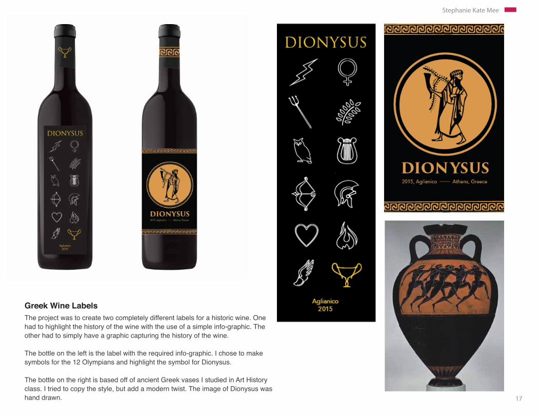
Greek Wine Labels The project was to create two completely different labels for a historic wine. One had to highlight the history of the wine with the use of a simple info-graphic. The other had to simply have a graphic capturing the history of the wine.
The bottle on the left is the label with the required info-graphic. I chose to make symbols for the 12 Olympians and highlight the symbol for Dionysus. The bottle on the right is based off of ancient Greek vases I studied in Art History class. I tried to copy the style, but add a modern twist. The image of Dionysus was hand drawn.
18
Stephanie Kate Mee
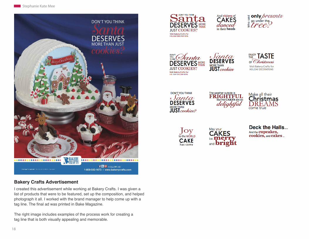
Bakery Crafts AdvertisementI created this advertisement while working at Bakery Crafts. I was given a list of products that were to be featured, set up the composition, and helped photograph it all. I worked with the brand manager to help come up with a tag line. The final ad was printed in Bake Magazine.
The right image includes examples of the process work for creating a tag line that is both visually appealing and memorable.
19
Stephanie Kate Mee
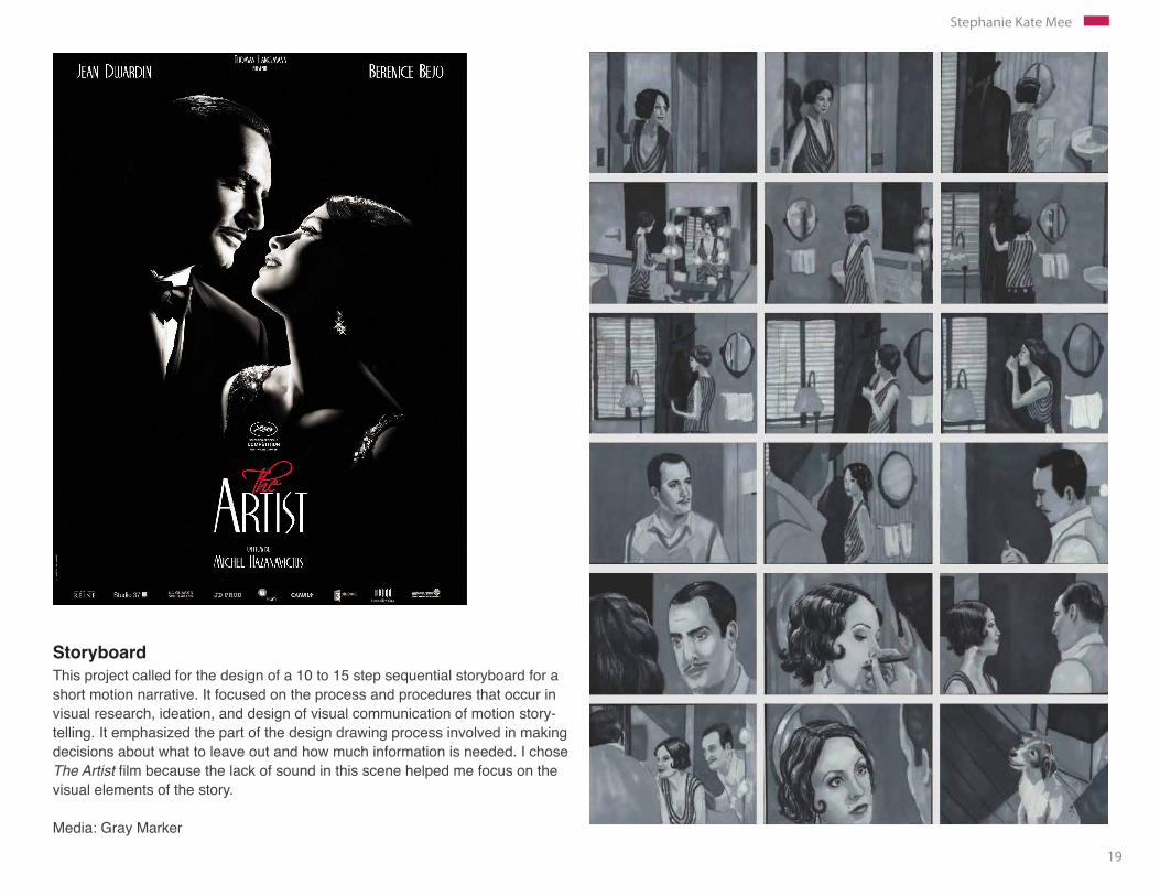
Storyboard This project called for the design of a 10 to 15 step sequential storyboard for a short motion narrative. It focused on the process and procedures that occur in visual research, ideation, and design of visual communication of motion story-telling. It emphasized the part of the design drawing process involved in making decisions about what to leave out and how much information is needed. I chose The Artist film because the lack of sound in this scene helped me focus on the visual elements of the story. Media: Gray Marker
20
Stephanie Kate Mee
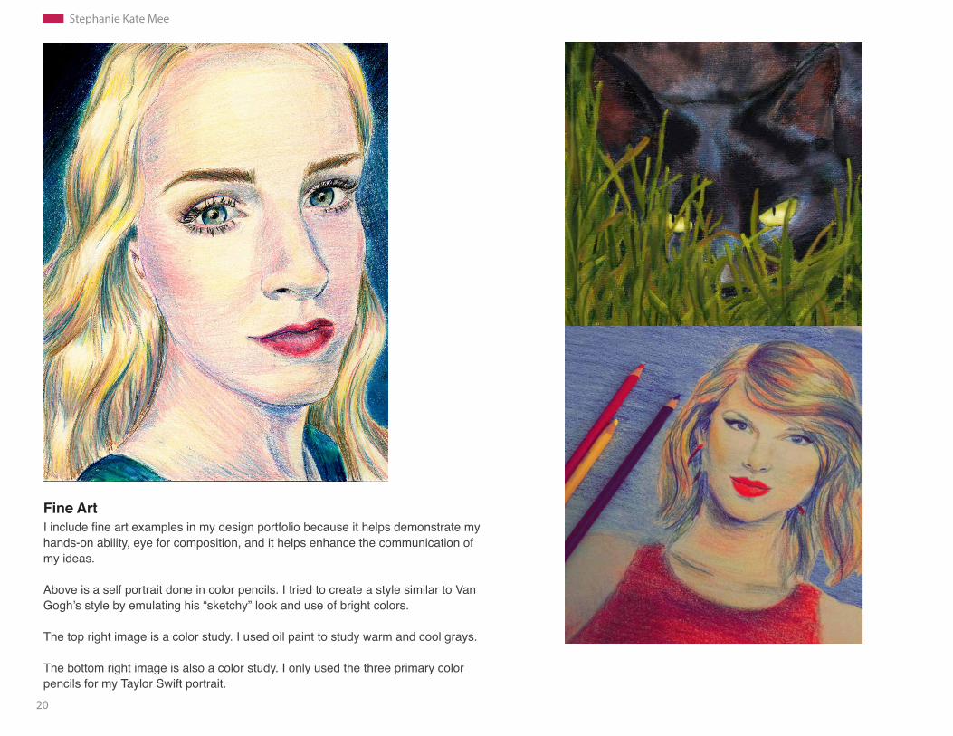
Fine ArtI include fine art examples in my design portfolio because it helps demonstrate my hands-on ability, eye for composition, and it helps enhance the communication of my ideas.
Above is a self portrait done in color pencils. I tried to create a style similar to Van Gogh’s style by emulating his “sketchy” look and use of bright colors.
The top right image is a color study. I used oil paint to study warm and cool grays.
The bottom right image is also a color study. I only used the three primary color pencils for my Taylor Swift portrait.
21
Stephanie Kate Mee
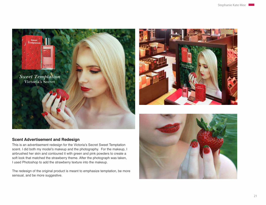
Scent Advertisement and RedesignThis is an advertisement redesign for the Victoria’s Secret Sweet Temptation scent. I did both my model’s makeup and the photography. For the makeup, I airbrushed her skin and contoured it with green and pink powders to create a soft look that matched the strawberry theme. After the photograph was taken, I used Photoshop to add the strawberry texture into the makeup.
The redesign of the original product is meant to emphasize temptation, be more sensual, and be more suggestive.
Related Documents


