PORTFOLIO MUHAMMAD ADIB BIN ZAILAN 2013

Portfolio 2013
Mar 05, 2016
I am Muhammad Adib Bin Zailan, a Product & Industrial Design student looking for a 3 month internship.
Welcome message from author
This document is posted to help you gain knowledge. Please leave a comment to let me know what you think about it! Share it to your friends and learn new things together.
Transcript

PORTFOLIO
MUHAMMAD ADIB BIN ZAILAN
2013

MUHAMMAD ADIB BIN ZAILAN
I am Muhammad Adib
-
A Product & Industrial Design student faring from Temasek Polytechnic’s School of Design.
-
An aspiring Service Designer of the creative industry, with an underlying passion for the application of graphic arts.
-
Experimental to the design field, I seek to experience and deliver from the many facades of the mentioned industry.
1

PORTFOLIO 2013D
esign Studies C
lub-
Design O
rientation Cam
p-
2

MUHAMMAD ADIB BIN ZAILAN
UNDERSTANDING
Establishment of Problem Spaceand Product Space.
BELIEVING Creation of solutions through Ideation and Concept Development.
SEEING
Creation of concept solutions through Visualization and Prototyping.
DESIGN PROCESS
3

PORTFOLIO 2013
PRODUCT DESIGN
The creation of products with the sole aim of limited run for manufacture.
INDUSTRIAL DESIGN The creation of products with the sole aim of a large run for manufacture.
HUMAN CENTRED DESIGN
The creation of products by design study relating to issues of ergonomics.
SERVICE DESIGN
The creation of products by design studyrelating to issues of consumer ecology.
EDITORIAL DESIGN The creation of publication in regardsto a defined topic of conversation.
GRAPHIC DESIGN
The creation of collaterals for brandingand identity in regards to a defined issue.
KNOWLEDGE APPLICATION
4
MUHAMMAD ADIB BIN ZAILAN
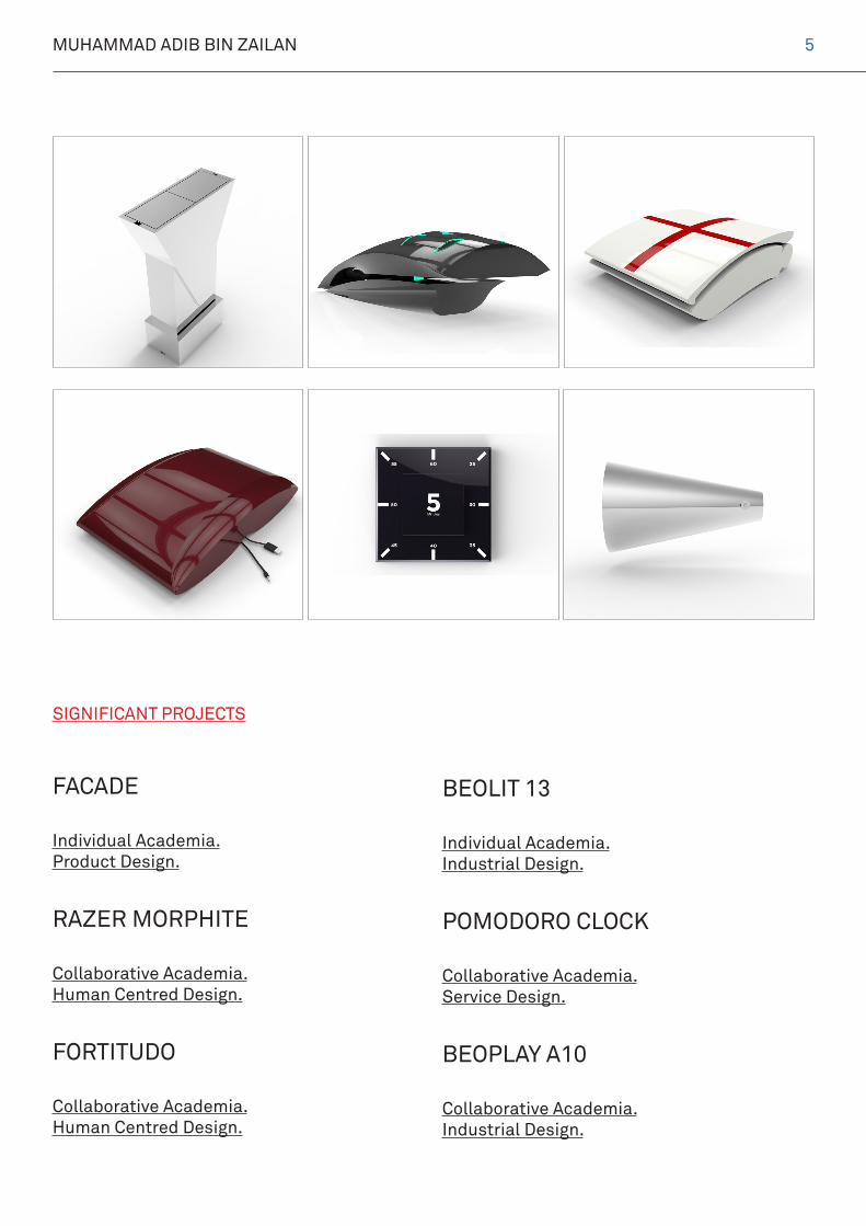
FACADE
Individual Academia.Product Design.
RAZER MORPHITE Collaborative Academia.Human Centred Design.
FORTITUDO
Collaborative Academia.Human Centred Design.
BEOLIT 13
Individual Academia.Industrial Design.
POMODORO CLOCK Collaborative Academia.Service Design.
BEOPLAY A10
Collaborative Academia.Industrial Design.
SIGNIFICANT PROJECTS
5

PORTFOLIO 2013
GYPSIED
Collaborative Design for Client.Graphic Design.
MUHAMMAD ADIB ASSOCIATES Individual Academia.Graphic Design.
LOCALIZED PASSION
Self-Initiated. Ongoing.Graphic Design.
AQILAH AND ZAKARIA
Self-Initiated. Ongoing.Graphic Design.
6

MUHAMMAD ADIB BIN ZAILAN 7

PORTFOLIO 2013
During my course of study at Temasek Polytech-nic, I was given a chance for the first time ever to embark on a Product Design project, where the basis was to create and introduce a familiar product to an already established product line As much as it is the first, very has it been an aspiring inspiration since then. This is the synopsis of a beginning.
At the start of the project, there was no Design Brief involved, but it was to us (the students) knowledge to create our own Problem Space and hence define the parameters that it could be set in. It was relatively simple, but it was also relatively hard at that point of time, being verily new to the process of Industrial Design itself.
Consequently, this is Facade. A Water Boiler designed with the underlying aim to provide mobility and otherwise shared experiences within its environmental context.
The idea or concept is relatively straightforward. The two sides of the product, with a spout at each end allowed for the pouring of boiled water from either direction that its user could be com-ing from. The lid itself was a push-to-open and push-to-close mechanism, effortless enough to make refilling of contents a general breeze.
Together with a docking system that was much like an electricity powered, automated boiler, verily is Facade a new product for an already dictated market and product line.
Facade
8

MUHAMMAD ADIB BIN ZAILAN
Lorem Ipsum9

PORTFOLIO 2013
Together with Elias Taliv Mo, we set out oncompleting a project with the underlying aim of applying learnt principles in Cognition, Emotion and Usability. Pretty much fathomable, it was a Human-Centred Design approach at designing a new product for an already prevaling market spoilt with choices.
For this project, we were able to co-create aDesign Brief in unison with the collaborative agreement of Razer to procure it’s Design Lan-guage as a final aesthetic. Very much like the product line of the mentioned brand, this, is Razer Morphite.
Razer Morphite or initially conceived as the “Star-Trek Thingy” that was conversationally conjured up is a Gaming Mouse with the aim of expressing the capabilities of the Razer brand through extreme visual impact.
Albeit, it is not always about the brand itself. Indeed, it was also created to portray the emo-tions of end users who linked any sentiments towards the brand’s identity and statement as a better gaming mouse as compared to competi-tors elsewhere.
Between that, bearing the fact that it was a gaming mouse, or a mouse for perusal, con-straints like ergonomics and anthropometry had to be considered with much deliberation before the final aesthetic decision, deliberately be made in the form of the Razer Morphite.
Razer MorphiteIn collaboration with Elias Taliv Mo
10

MUHAMMAD ADIB BIN ZAILAN 11

PORTFOLIO 2013
In collaboration with the Singapore Red Cross Society FORTITUDO
12

MUHAMMAD ADIB BIN ZAILAN 13

PORTFOLIO 2013
Together for Humanity
The Singapore Red Cross Society is a leading
humanitarian organization that brings people and
organizations together in aid of the vulnerable.
Protecting human life and dignity, relieving human
suffering and responding to emergencies.
14

MUHAMMAD ADIB BIN ZAILAN 15

PORTFOLIO 2013
Reasons for this Collaborative Project
1. To raise awareness of the Singapore Red Cross Society.
2. To raise awareness of their cause.
2.1. First Aiding is an important skill. 2.2. Having a first aid kit is an additionally important aspect.
3. Through product sales, that it’ll be a form of monetary income to support their philanthrophic work, that being said that the organization is a non-profit one.
4. Benevolence is infectious.
16

MUHAMMAD ADIB BIN ZAILAN 17

PORTFOLIO 2013
For a First Aid Kit, brand names include
AAAAcmeZee MedicalPhilips LifelinePromo First AidJohnson & JohnsonAdventure Medical Kits
As with all other design projects that was of commercial value, it was essential for us to rule out the Market Competitors and distinct the products according to their relevant advantages.
Market Positioned, the First Aid Kit should be reusable and of indoor usage; in a household environment.
18

MUHAMMAD ADIB BIN ZAILAN 19

PORTFOLIO 2013
With every commercial product, it is essential for us to rule out the targeted users which we were designing for.
And for the following project, we were keen to target families as a user group.
Of which encompass the following.
ElderlyAdultsYoung AdultsChildren
20

MUHAMMAD ADIB BIN ZAILAN 21
PORTFOLIO 2013
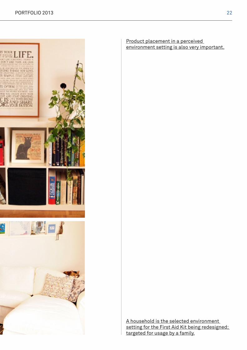
Product placement in a perceived environment setting is also very important.
A household is the selected environment setting for the First Aid Kit being redesigned; targeted for usage by a family.
22

MUHAMMAD ADIB BIN ZAILAN 23

PORTFOLIO 2013
User Task Analysis
24

MUHAMMAD ADIB BIN ZAILAN 25

PORTFOLIO 2013
MoodBoard
FreshSecureHeritage
26

MUHAMMAD ADIB BIN ZAILAN
Concept and Development
27

PORTFOLIO 2013
Concept and Development
28

MUHAMMAD ADIB BIN ZAILAN 29

PORTFOLIO 2013
For and from the Red Cross Society, FORTITUDO is a First Aid Kit that aims to simplify the organization of medical supplies deemed useful in a household setting, hence tackling associated common injuries with pronounced ease.
- end
1 1
11
Also known as the Four Quadrants, FORTITUDO splits its content management into 4 sections, or quadrants; hence arguably limiting the amount of unused space with the placement of vital medical supplies instead and therefore, providing a retrieval method which is substantially faster in its drive.
30

MUHAMMAD ADIB BIN ZAILAN
Lorem Ipsum31

PORTFOLIO 2013
During an academia intitive of 2 months time-span, where the Design Brief was to introduce 3 new products for a prevalent market, the BeoLit 13 was conceived as one of the designed three. Conversely, the brief was a freestanding topic, where students like myself could create any product of which however had to fall individually under a term such as Mechanical or Electronic by nature. By default, this meant that a mechan-ical product should theoretically have movable parts while the former,electronic, should be an electrical product of any manufacture.
At this point of juncture, through exposure of the many different styles of Industrial Design and in particular, inspirational figures, the BeoLit 13, a Loudspeaker was conceived as product of choice tried at best to emblem and portray the Bang & Olufsen brand as brand advantage
The BeoLit 13 is a relatively uncomplicated Loudspeaker, it was in concept a wireless and also connected music player and amplifier with the sole intention of being portable and a quality design alternative. The BeoLit 13 works wirelessly by Airplay by Apple hence connecting easily to the already expanding range of Apple branded products. Sound was to be exceptional, as perceived of the Bang & Olufsen brand and simplicity, was in the way that it could easily be switched on or off, made louder or softer.
BeoLit 13
32

MUHAMMAD ADIB BIN ZAILAN
Lorem Ipsum33

PORTFOLIO 2013
In collaboration with Tan Han Hui, we were given the opportunity to design a product in style and execution of a Service Design venture, where the product was to be designed with the sole intention of consequently creating an ecology for usage. For the both of us, it was an albeit tough but also engaging experience, trying to apply the principles that made Service Design, humanitarian yet with a tinge of Human-Centred Design distinctive.
The Pomodoro Clock, as we have created, is an otherwise basic clock except with the added ability to be part of a sphere and ecosystem of tangible and intangible mediums.
The Pomodoro Technique, a scientific theory for increasing productivity; by having one working in and towards an incremental time of 15 minutes henceforth, was a chosen Design Opportunity.
The Pomodoro Clock that was designed is ultimately, a revamp of the already successful Pomodoro Technique inclusive of new techniques that could possibly make it even better. For this design project, our collaborative work effort came to a consensus to create the product as part of a system where digitally through the Internet, one can see his productivity levels visualized through an avatar, as part of a pervasive and somewhat limitless gameplay setting. It was a small act at gratifying the users need of accomplishment and affirmation, besides the tangible aspect that the product was relatively quirky with its ability to rise or dissappear with physical or digital inputs and outputs.
Pomodoro ClockIn collaboration with Tan Han Hui
34

MUHAMMAD ADIB BIN ZAILAN 35

PORTFOLIO 2013
In collaboration with Bang & Olufsen BEOPLAY A10
36

MUHAMMAD ADIB BIN ZAILAN
Towards the end of 2012, I was given the opportunity during an individual academia to create a product in collaboration with the Bang & Olufsen brand name. -
The brief was relatively simple; to introduce a new product line with the visual aesthetic for and of the mentioned brand; accustomed and known as a manufacturer of high quality audio and visual products. -
Consequently, for this was an inclined Design Language project, the process at its undertaking was relatively different and otherwise, a welcoming experience.
37

PORTFOLIO 2013
Since 1925.
Not through contrast or competition, but through ingenuity and capability that goes beyond the ordinary.
Sound and vision transforms spaces by emotion. But design changes them for real. Any Bang & Olufsen product is a piece of art in itself.
Not because it has to be, but because of what it does.
-
38
MUHAMMAD ADIB BIN ZAILAN
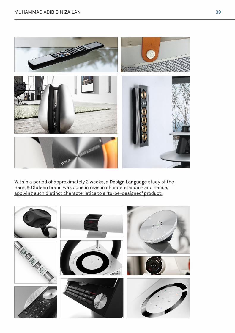
Within a period of approximately 2 weeks, a Design Language study of the Bang & Olufsen brand was done in reason of understanding and hence, applying such distinct characteristics to a ‘to-be-designed’ product.
39

PORTFOLIO 2013
A former briefing conceived a few product lines that could be tackled for this design project, one of which was selected; initially MILCs (Mirrorless Interchangeable Lens Cameras) but later developed as a Prosumer Compact Camera instead.
40

MUHAMMAD ADIB BIN ZAILAN
As with all other projects of commercial value, particularly where a brand’s consumers are distinctively segmented as an upper and oftenlavish commerce, Market Opportunities are easy to leverage upon.
Consequently, the Target Market and Personification for the Bang & Olufsen Prosumer Compact Camera project was objectively set to that for those with good social and financial standing.
41

PORTFOLIO 2013
As an Environmental Context, of where the product would eventually be used in, parameters were set to that of places diverse.
From calm to clamorous, to streets and landscapes to name a few.
42

MUHAMMAD ADIB BIN ZAILAN
As always, a Mood Board to portray the aesthetic and functional identity of the product being designed.
Nautical. Immersive.Adventurous.
43

PORTFOLIO 2013
TheBeoPlay A10
From
44

MUHAMMAD ADIB BIN ZAILAN 45

PORTFOLIO 2013
The BeoPlay A10, a product of the Bang & Olufsen line of audio-visual products, is a collective and collaborative effort in the production of a verily revamped line of products.
For the first time ever, BeoPlay, with the Design Language of Bang & Olufsen within, presents the BeoPlay A10; a Prosumer Compact Camera with traits of Nautical and Minimalism within.
Nautical that it is inspired from, Minimalist that it is designed throughout;The Bang & Olufsen Way.
Inspiration derived from the Nautical Telescopes of days old, the BeoPlay A10 is an exact representation of the seafaring telescope back then.
Implementing the playfulness of the BeoPlay product line with the Design Language of Bang & Olufsen, the BeoPlay A10 is a relatively simple product with an even simpler user interface.
- end
46

MUHAMMAD ADIB BIN ZAILAN 47

PORTFOLIO 2013
In collaboration with Zakaria Zainal GYPSIED
48

MUHAMMAD ADIB BIN ZAILAN 49

PORTFOLIO 2013
TheTURBAND
SHOP
THE
WHOLE SALE
CATALOGUE
Initially conceived in 2011, the idea for a Turband Headband was conceptualized by client Aqilah as a venture and start-up business. At that point of time, I was able to work in collaboration with
Since then, The Turband Shop gained popularity and was seen to be expanding its business figuratively. At that, towards the end of 2012, Imponderably was once again called for commisioned work. However, at that point of juncture, Cassie Hae had Academia to attend to throughout and hence left the creative direction, once or otherwise aiding the project when necessary.
stackedbracelets
boots
sweaterdresses
scarves
suedejackets
nailpolish
sling bags
knittedshurgs
turbanheadband
beanies
Cassie Hae, a Lasalle student majoring in Advertising and Communications, together under the alias of Imponderably, to create a brand identity for the client. Consequently, it also meant publicity collateral for the
The Turband Shop brand, as print and digital mediums.
-
50

MUHAMMAD ADIB BIN ZAILAN
That being said, for the rebranding of The Turband Shop, it was seen that the client had intentions to es-tablish the brand in a far more refined demeanour, away from the quirky esteem that the former brand name; ‘The Turband Shop’ had.
With that, Gypsied was introduced and in collabora-tion with photographerZakaria Zainal, it set a new parameter and business statement for the client. Shown are excerpts of the rebranding work.
51

PORTFOLIO 2013
A Linesheet for Transactions.
A Poster for Publicity.
Relevant Banners and Headings denoting the brand.
TURBANDNoun
A statement hair accessory forwomen in the style of a turban
Origin
Turban and Headband
www.shopgypsied.comwww.pinterest.com/shopgypsiedwww.instagram.com/shopgypsied
PRODUCT CATEGORY | CLASSIC TURBANDS
Light GreyClassic | 01USD10.45
MSRP: USD25.90
Lime Classic | 02USD10.45
MSRP: USD25.90
MintClassic | 03USD10.45
MSRP: USD25.90
NudeClassic | 04USD10.45
MSRP: USD25.90
CarriageSingpost Registered Mail: TrackablePriceIs subject to weight and destination
Minimum Order 20 pieces mix of any colors.
Aqilah Zailan | +65 9762 4739 [email protected] Street 23, 521225, Singapore
F R E ED E L I V E R YW O R L D W I D E
shopgypsied.com
- end
52

MUHAMMAD ADIB BIN ZAILAN
Acknowledgements
Elias Taliv Mo.-Tan Han Hui.-The Singapore Red Cross Society.-Bang & Olufsen.-Gypsied.-Cassie Hae.-Zakaria Zainal.
For their kind support towards the culmination of progressive work within this portfolio and their mutual agreement beforehand to be mentioned as stakeholders in my, Muhammad Adib Bin Zailan’s development as a creative individual.
Related Documents