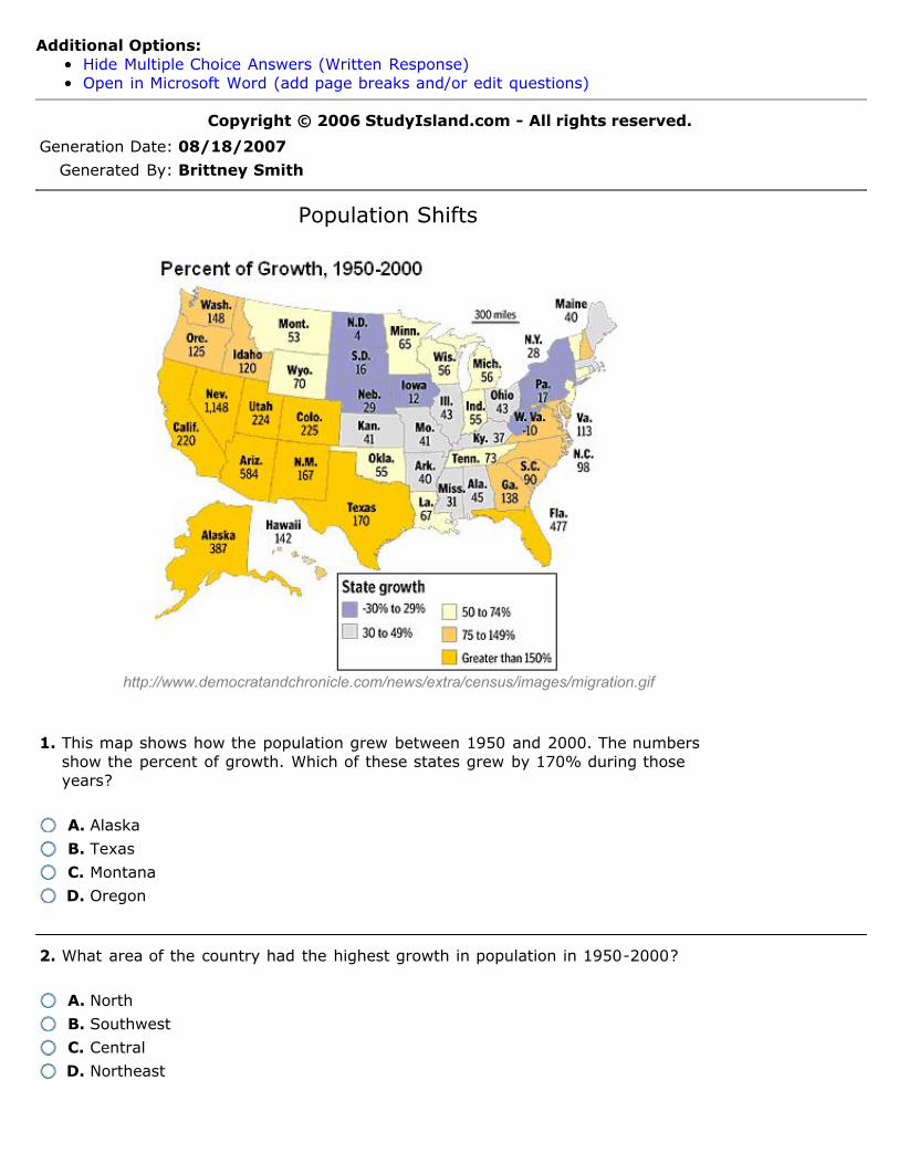
Additional Options: Hide Multiple Choice Answers (Written Response) Open in Microsoft Word (add page breaks and/or edit questions) Copyright © 2006 StudyIsland.com - All rights reserved. Generation Date: 08/18/2007 Generated By: Brittney Smith Population Shifts http://www.democratandchronicle.com/news/extra/census/images/migration.gif 1. This map shows how the population grew between 1950 and 2000. The numbers show the percent of growth. Which of these states grew by 170% during those years? A. Alaska B. Texas C. Montana D. Oregon 2. What area of the country had the highest growth in population in 1950-2000? A. North B. Southwest C. Central D. Northeast

Welcome message from author
This document is posted to help you gain knowledge. Please leave a comment to let me know what you think about it! Share it to your friends and learn new things together.
Transcript
Additional Options:Hide Multiple Choice Answers (Written Response)Open in Microsoft Word (add page breaks and/or edit questions)
Copyright © 2006 StudyIsland.com - All rights reserved.
Generation Date: 08/18/2007
Generated By: Brittney Smith
Population Shifts
http://www.democratandchronicle.com/news/extra/census/images/migration.gif
1. This map shows how the population grew between 1950 and 2000. The numbersshow the percent of growth. Which of these states grew by 170% during thoseyears?
A. Alaska
B. Texas
C. Montana
D. Oregon
2. What area of the country had the highest growth in population in 1950-2000?
A. North
B. Southwest
C. Central
D. Northeast

http://www.nandotimes.com/nt/images/april04/0404map.html
3. The map above shows how the United States population has grown more in somestates than in others, since 1990. What percent of growth has Tennessee had since1990?
A. 15–20%
B. Over 25%
C. 1–5%
D. 5–10%
4. Which of these states had the highest population growth since 1990?
A. Oklahoma
B. Texas
C. Utah
D. California
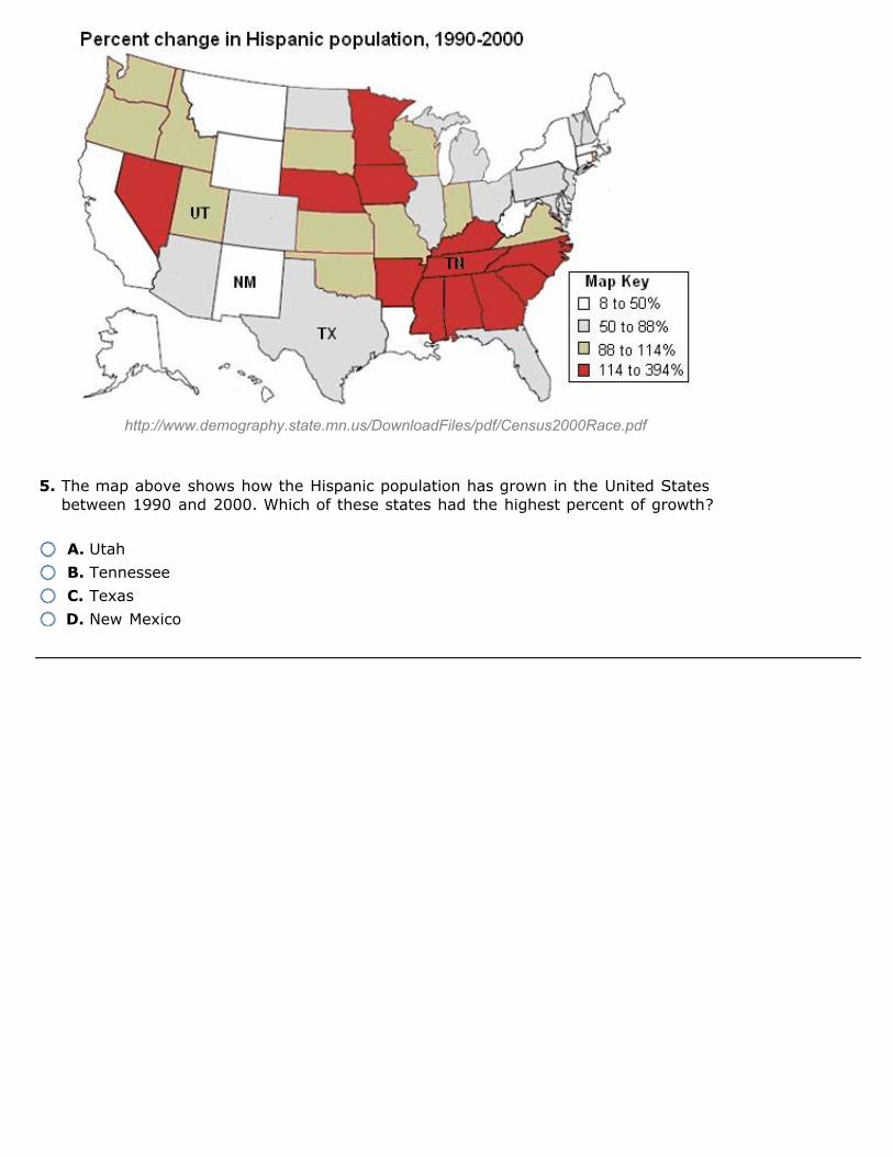
http://www.demography.state.mn.us/DownloadFiles/pdf/Census2000Race.pdf
5. The map above shows how the Hispanic population has grown in the United Statesbetween 1990 and 2000. Which of these states had the highest percent of growth?
A. Utah
B. Tennessee
C. Texas
D. New Mexico

http://www.democratandchronicle.com/news/extra/census/images/migration.gif
6. The map above shows that the population has grown more in some states than inothers. The numbers for each state show the percent that the population grewbetween 1900 and 1950. Which of these states had the smallest change inpopulation?
A. Alaska
B. Georgia
C. Utah
D. Iowa
7. The map above shows how much each state's population grew between 1900 and1950. The number below each state name shows the percent of population growth.Which of these states had the highest growth in population?
A. Ohio
B. Alabama
C. California
D. Mississippi
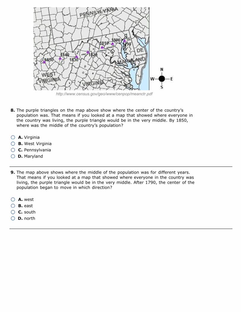
http://www.census.gov/geo/www/cenpop/meanctr.pdf
8. The purple triangles on the map above show where the center of the country’spopulation was. That means if you looked at a map that showed where everyone inthe country was living, the purple triangle would be in the very middle. By 1850,where was the middle of the country’s population?
A. Virginia
B. West Virginia
C. Pennsylvania
D. Maryland
9. The map above shows where the middle of the population was for different years.That means if you looked at a map that showed where everyone in the country wasliving, the purple triangle would be in the very middle. After 1790, the center of thepopulation began to move in which direction?
A. west
B. east
C. south
D. north

http://sedac.ciesin.columbia.edu/gpw/
10. On the population map above, the darkest spots have the largest numbers ofpeople living there. Which part of the Western United States seems to have thegreatest population?
A. the border with Mexico
B. the Great Plains
C. areas near the coast
D. the Rocky Mountain area

Answers1. B
2. B
3. A
4. C
5. B
6. D
7. C
8. B
9. A
10. C
Explanations
1. The colors and numbers on this map make it easy to see the population growth for each state. Theyellow states had the highest growth in population. The number 170 on Texas means the stategrew by 170% between 1950 and 2000.
2. During the 20th century, the U.S. population continued to shift west and also to the south. Themap shows the percent of population growth for each state. The yellow states had the highestamount of growth. Most of the yellow states are in the southwest area. More people moved to thispart of the country than to any other.
3. The map key shows what the different colors mean. Tennessee is purple. The purple states havehad a population increase of 15-20%.
4. Utah is dark blue. The map key shows that blue means a 25% and higher population growth.
5. The map key shows that if a state is colored red, it had a change of 144 to 394 percent. Thesestates had the most growth in the population of Hispanic residents. Tennessee is one of the statesthat had the highest percent of growth.
6. The map key shows what the different colors mean on the map. The dark purple shows the lowestgrowth in population. Also, the number 17 for the state of Iowa means that it only grew by 17%.That number is the lowest of the answer choices.
7. Since the beginning of the 20th century, Americans have been moving west. Between 1900 and1950, California and Arizona saw the fastest growth. On the map, the number 613 for Californiameans that the state grew by 613% between 1900 and 1950. That number is higher than anyother on the map. More people settled in California during those years than in any other state.
8. The purple triangles each have a year next to them indicating when that spot was the center of thecountry’s population. The year 1850 on the map is located in the state of West Virginia. If youlooked at where everyone in the country was living in 1850, the middle would be in West Virginia.The population is continuing to shift further to the west.
9. As more people came to the United States, the population pushed further west where there wasplenty of land.
10. There are only small spots of dark colors in the western half of the United States. There are moredark areas near the West Coast. The Great Plains area still has a lot of wilderness and not a lot ofpeople, although there are big cities like Denver, Colorado.
Copyright © 2006 StudyIsland.com - All rights reserved.
Related Documents