OCR Media Studies – AS Level Unit G321: Foundation Portfolio in Media Evaluation Name: Von Villanueva Candidate Number: 6515 Center Name: St. Paul’s Catholic College Center Number:64770 Set Brief - Print Music Magazine – Production Preliminary Task, Log Book and Evaluation

Planning and Research Powerpoint
Jul 17, 2015
Welcome message from author
This document is posted to help you gain knowledge. Please leave a comment to let me know what you think about it! Share it to your friends and learn new things together.
Transcript

OCR Media Studies – AS Level
Unit G321: Foundation Portfolio in Media
Evaluation
Name: Von VillanuevaCandidate Number: 6515Center Name: St. Paul’s Catholic CollegeCenter Number:64770
Set Brief - Print
Music Magazine – Production
Preliminary Task, Log Book and Evaluation

Preliminary Task Progression- EvidenceFront Cover: Step-by-step
Preliminary Task Progression- EvidenceFront Cover: Step-by-step
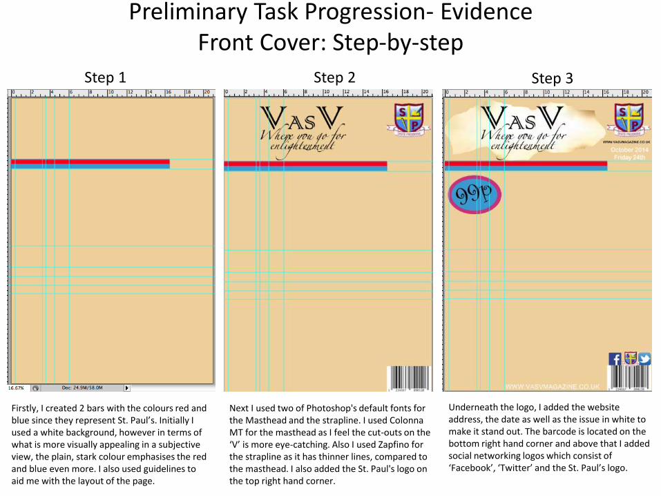
Step 1 Step 2 Step 3
Firstly, I created 2 bars with the colours red and blue since they represent St. Paul’s. Initially I used a white background, however in terms of what is more visually appealing in a subjective view, the plain, stark colour emphasises the red and blue even more. I also used guidelines to aid me with the layout of the page.
Next I used two of Photoshop's default fonts for the Masthead and the strapline. I used Colonna MT for the masthead as I feel the cut-outs on the ‘V’ is more eye-catching. Also I used Zapfino for the strapline as it has thinner lines, compared to the masthead. I also added the St. Paul's logo on the top right hand corner.
Underneath the logo, I added the website address, the date as well as the issue in white to make it stand out. The barcode is located on the bottom right hand corner and above that I added social networking logos which consist of ‘Facebook’, ‘Twitter’ and the St. Paul’s logo.

Preliminary Task Progression- EvidenceFront Cover: Step-by-step
Step 4 Step 5 Step 6
I took a picture of one of my sixth form friends since my magazines target audience are sixth formers. I asked ‘Francis’ (model) to face towards the camera while posing, and the ‘peace’ pose represented his emotions at the time, giving it a personal impression. I also used the Brush Script Std font for the headline as the ‘hip’ font represents the ‘hip’ picture. Also the price is in front of a two-coloured background to highlight it. I also added the sunlight background behind the masthead to accentuate the meaning behind it, which is enlightenment.
Next I added two cover lines, one is an exclusive interview which focuses on the headline and the model and the other cover line is about a future event involved with sixth formers. I used red and pink colour for the text to emphasise the text against the background.
I added another cover line which will hopefully give an insight on what is to come in the magazine. I gave a simple description regarding the cover line to inform the viewers. I also added a puff/competition which is written in capital letters to attract the viewers and keep them interested.
Preliminary Task Progression- EvidenceContents Page: Step-by-step
Preliminary Task Progression- EvidenceContents Page: Step-by-step
Step 1 Step 2 Step 3
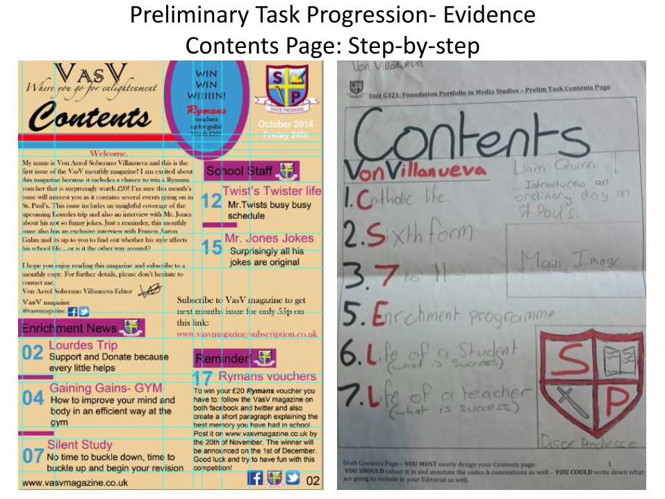
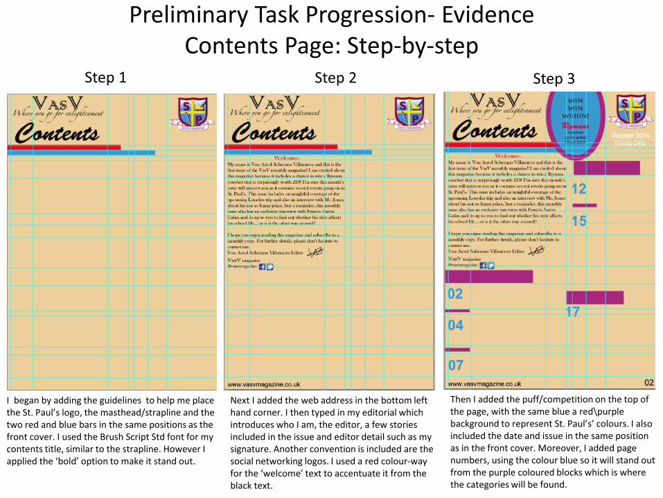
I began by adding the guidelines to help me place the St. Paul’s logo, the masthead/strapline and the two red and blue bars in the same positions as the front cover. I used the Brush Script Std font for my contents title, similar to the strapline. However I applied the ‘bold’ option to make it stand out.
Next I added the web address in the bottom left hand corner. I then typed in my editorial which introduces who I am, the editor, a few stories included in the issue and editor detail such as my signature. Another convention is included are the social networking logos. I used a red colour-way for the ‘welcome’ text to accentuate it from the black text.
Then I added the puff/competition on the top of the page, with the same blue a red\purple background to represent St. Paul’s’ colours. I also included the date and issue in the same position as in the front cover. Moreover, I added page numbers, using the colour blue so it will stand out from the purple coloured blocks which is where the categories will be found.

Preliminary Task Progression- EvidenceContents Page: Step-by-step
Step 4 Step 5 Step 6
I then began to add the categories which is found inside the purple blocks. For example ‘enrichment’. Then I added a few stories and basic information regarding the cover lines. I also wrote a subscription deal which states what the views/subscribers will gain if they subscribe for a monthly issue. This will attract potential subscribers.
Then I added the two other categories, ‘school staff’ and ‘reminder’ and wrote the titles as well as a descriptive and informative sentence regarding the title. I also included a paragraph on the competition and what they had to do to be able to enter which was presented on the front cover as well as the contents page.
Finally I filled in the rest of the information for the titles in each category. Also I added the ‘Facebook’, ‘Twitter’ and ‘St. Paul’s logo social networking sites in the bottom right hand corner which is a similar position located in the front cover.
Log Book
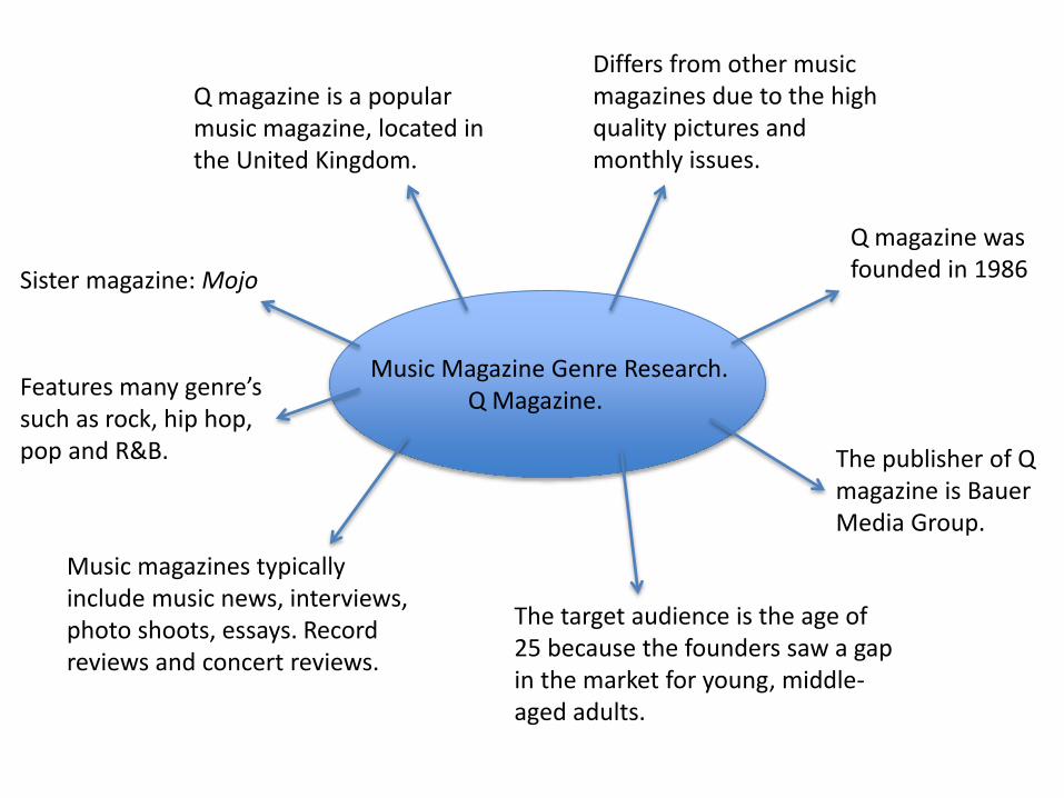
Music Magazine Genre Research.Q Magazine.
Q magazine was founded in 1986
The publisher of Q magazine is Bauer Media Group.
Q magazine is a popular music magazine, located in the United Kingdom.
Differs from other music magazines due to the high quality pictures and monthly issues.
Features many genre’s such as rock, hip hop, pop and R&B.
The target audience is the age of 25 because the founders saw a gap in the market for young, middle-aged adults.
Music magazines typically include music news, interviews, photo shoots, essays. Record reviews and concert reviews.
Sister magazine: Mojo
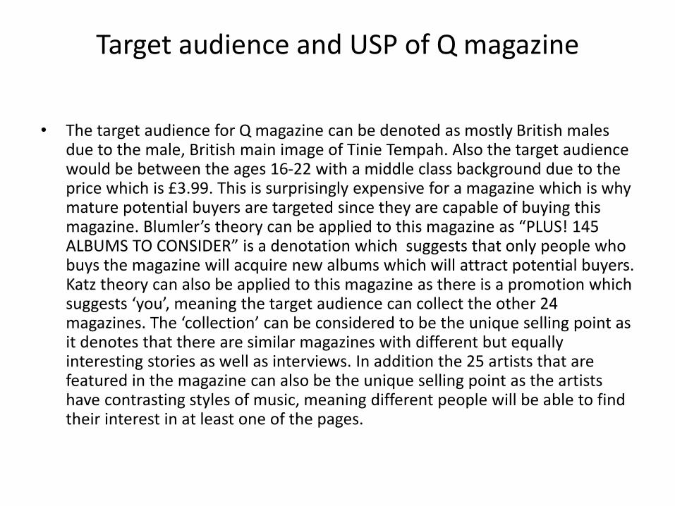
Target audience and USP of Q magazine
• The target audience for Q magazine can be denoted as mostly British males due to the male, British main image of Tinie Tempah. Also the target audience would be between the ages 16-22 with a middle class background due to the price which is £3.99. This is surprisingly expensive for a magazine which is why mature potential buyers are targeted since they are capable of buying this magazine. Blumler’s theory can be applied to this magazine as “PLUS! 145 ALBUMS TO CONSIDER” is a denotation which suggests that only people who buys the magazine will acquire new albums which will attract potential buyers. Katz theory can also be applied to this magazine as there is a promotion which suggests ‘you’, meaning the target audience can collect the other 24 magazines. The ‘collection’ can be considered to be the unique selling point as it denotes that there are similar magazines with different but equally interesting stories as well as interviews. In addition the 25 artists that are featured in the magazine can also be the unique selling point as the artists have contrasting styles of music, meaning different people will be able to find their interest in at least one of the pages.

Publisher research page
Bauer Media Group was founded in 1875.
It is a large European based media company that manages an assortment of magazines.
They offer over 300 magazines in 15 countries, which includes other media platforms such as digital products, radio and TV stations.
Bauer media only publish four entertainment/music magazines which are Mojo, Empire, Kerrang and Q magazine.
Website is www.bauermedia.co.uk
Attract 19 million consumers every week through their various media products.
Largest privately owned publishing group in Europe.
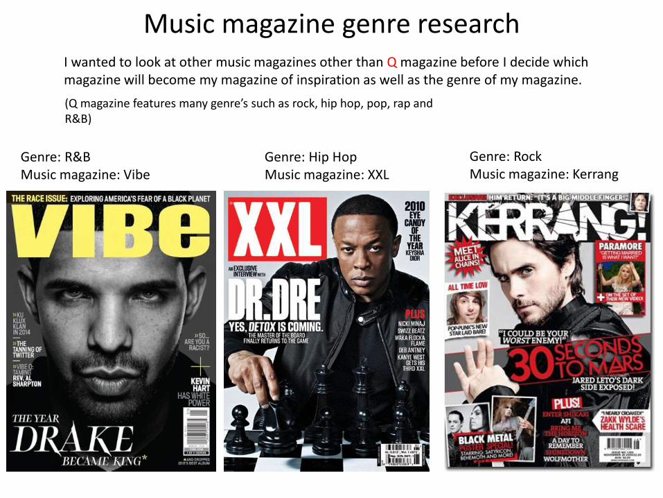
Music magazine genre research
Genre: R&B Music magazine: Vibe
Genre: Hip HopMusic magazine: XXL
Genre: Rock Music magazine: Kerrang
I wanted to look at other music magazines other than Q magazine before I decide which magazine will become my magazine of inspiration as well as the genre of my magazine.
(Q magazine features many genre’s such as rock, hip hop, pop, rap and R&B)

Genre: Ultimately features R&B music
Barcode
Masthead
Main image: denotes star appeal (Katz theory)
Primarily covered R&B music and artists, however also featured Hip Hop for loyal followers.
Black, white and yellow colour scheme.
Total circulation (2011): 301,408
Predominantly targets young and urban followers of R&B and hip Hop culture.
known for the creative direction of their covers.
Focuses more on the unique editing of the main image than the importance of the cover lines.
In 2014 the final issue was printed. The magazine moved online-only.
The masthead and headline does not present ‘difference’ (Steve Neale) as it clearly stands out from the rest of the content due to the font size. This was probably done to focus the viewers attention on the main image and main story.
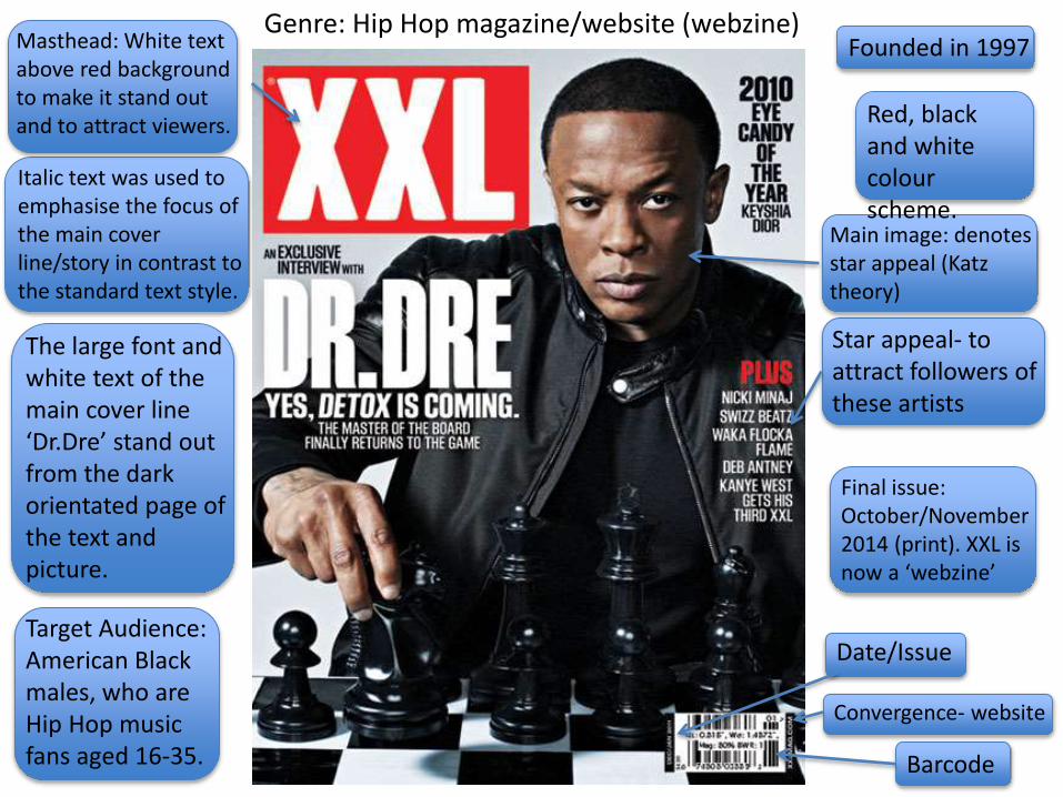
Genre: Hip Hop magazine/website (webzine)
Main image: denotes star appeal (Katz theory)
Barcode
Masthead: White text above red background to make it stand out and to attract viewers.
Star appeal- to attract followers of these artists
Final issue: October/November 2014 (print). XXL is now a ‘webzine’
Date/Issue
Convergence- website
Red, black and white colour scheme.
Founded in 1997
Target Audience: American Black males, who are Hip Hop music fans aged 16-35.
The large font and white text of the main cover line ‘Dr.Dre’ stand out from the dark orientated page of the text and picture.
Italic text was used to emphasise the focus of the main cover line/story in contrast to the standard text style.
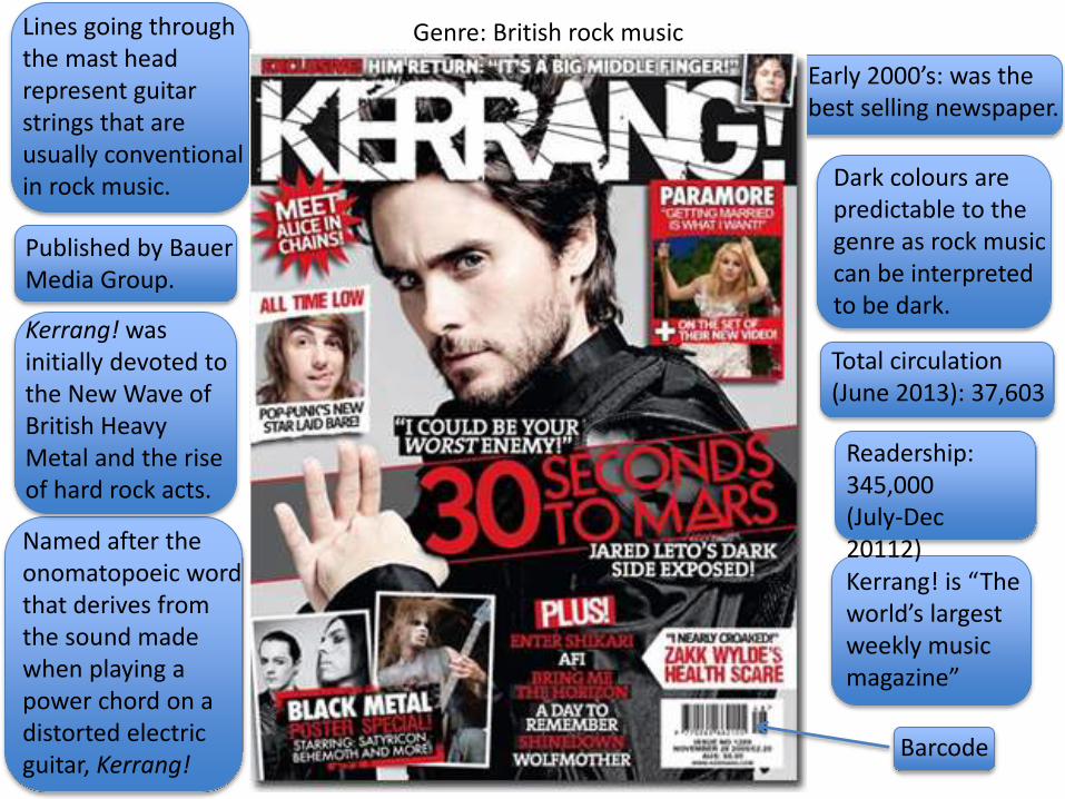
Genre: British rock music
Early 2000’s: was the best selling newspaper.
Dark colours are predictable to the genre as rock music can be interpreted to be dark.
Total circulation (June 2013): 37,603
Lines going through the mast head represent guitar strings that are usually conventional in rock music.
Readership: 345,000 (July-Dec 20112)Kerrang! is “The world’s largest weekly music magazine”
Barcode
Published by Bauer Media Group.
Kerrang! was initially devoted to the New Wave of British Heavy Metal and the rise of hard rock acts.
Named after the onomatopoeic word that derives from the sound made when playing a power chord on a distorted electric guitar, Kerrang!
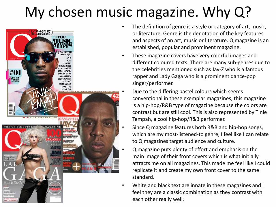
My chosen music magazine. Why Q?• The definition of genre is a style or category of art, music,
or literature. Genre is the denotation of the key features and aspects of an art, music or literature. Q magazine is an established, popular and prominent magazine.
• These magazine covers have very colorful images and different coloured texts. There are many sub-genres due to the celebrities mentioned such as Jay-Z who is a famous rapper and Lady Gaga who is a prominent dance-pop singer/performer.
• Due to the differing pastel colours which seems conventional in these exemplar magazines, this magazine is a hip-hop/R&B type of magazine because the colors are contrast but are still cool. This is also represented by Tinie Tempah, a cool hip-hop/R&B performer.
• Since Q magazine features both R&B and hip-hop songs, which are my most-listened-to genre, I feel like I can relate to Q magazines target audience and culture.
• Q magazine puts plenty of effort and emphasis on the main image of their front covers which is what initially attracts me on all magazines. This made me feel like I could replicate it and create my own front cover to the same standard.
• White and black text are innate in these magazines and I feel they are a classic combination as they contrast with each other really well.
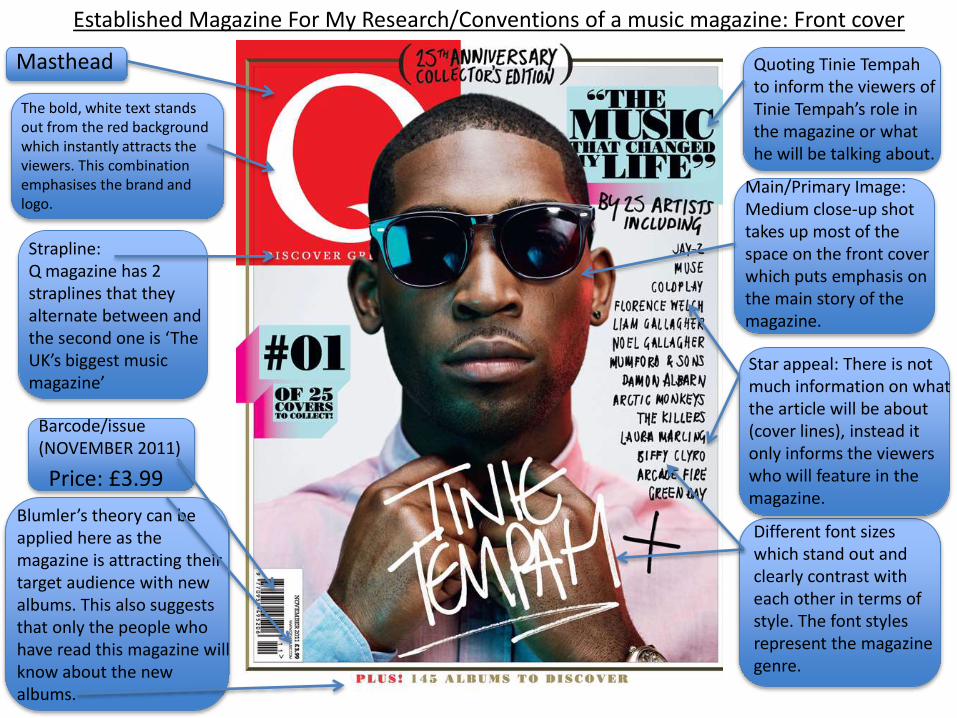
Masthead
Main/Primary Image: Medium close-up shot takes up most of the space on the front cover which puts emphasis on the main story of the magazine.
Barcode/issue (NOVEMBER 2011)
Blumler’s theory can be applied here as the magazine is attracting their target audience with new albums. This also suggests that only the people who have read this magazine will know about the new albums.
Strapline:Q magazine has 2 straplines that they alternate between and the second one is ‘The UK’s biggest music magazine’
The bold, white text stands out from the red background which instantly attracts the viewers. This combination emphasises the brand and logo.
Star appeal: There is not much information on what the article will be about (cover lines), instead it only informs the viewers who will feature in the magazine.
Different font sizes which stand out and clearly contrast with each other in terms of style. The font styles represent the magazine genre.
Established Magazine For My Research/Conventions of a music magazine: Front cover
Price: £3.99
Quoting Tinie Tempah to inform the viewers of Tinie Tempah’s role in the magazine or what he will be talking about.
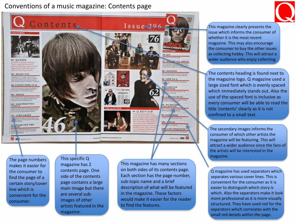
Conventions of a music magazine: Contents page
This specific Q magazine has 2 contents page. One side of the contents page contains a large main image but there are several sub-images of other artists featured in the magazine.
This magazine has many sections on both sides of its contents page. Each section has the page number, sub-topic name and a brief description of what will be featured in the magazine. These factors would make it easier for the reader to find the features.
The page numbers makes it easier for the consumer to find the page of a certain story/cover line which is convenient for the consumer.
The contents heading is found next to the magazine logo. Q magazine used a large sized font which is evenly spaced which immediately stands out. Also the use of the spaced font is inclusive as every consumer will be able to read the title ‘contents’ clearly as it is not confined to a small text.
This magazine clearly presents the issue which informs the consumer of whether it is the most recent magazine. This may also encourage the consumer to buy the other issues as collecting hobby. This will attract a wider audience who enjoy collecting.
The secondary images informs the consumer of which other artists the magazine will be featuring. This will attract a wider audience since the fans of the artists will be interested in the magazine.
Q magazine has used separators which separates various cover lines. This is convenient for the consumer as it is easier to distinguish which story is which. Also the separators make it look more professional as it is more visually structured. They have used red for the separators which correlates with the small red details within the page.
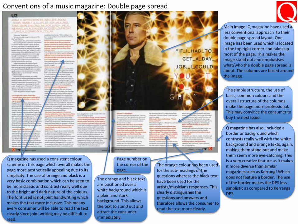
Conventions of a music magazine: Double page spread
Main image: Q magazine have used a less conventional approach to their double page spread layout. One image has been used which is located in the top right corner and takes up most of the page. This makes the image stand out and emphasises what/who the double page spread is about. The columns are based around the image.
Q magazine has also included a border or background which contrasts really well with the white background and orange texts, again, making them stand out and make them seem more eye-catching. This is a very creative feature as it makes it more diverse than similar magazines such as Kerrang! Which does not feature a border. The use of the border makes the DPS less simplistic as compared to Kerrangs DPS.
Q magazine has used a consistent colour scheme on this page which overall makes the page more aesthetically appealing due to its simplicity. The use of orange and black is a very basic combination which can be seen to be more classic and contrast really well due to the bright and dark nature of the colours. The font used is not joint handwriting which makes the text more inclusive. This means every consumer will be able to read the text clearly since joint writing may be difficult to read.
The simple structure, the use of basic, common colours and the overall structure of the columns make the page more professional. This may convince the consumer to buy the next issue.
The orange colour has been used for the sub-headings or the questions whereas the black text have been used for the artists/musicians responses. This clearly distinguishes the questions and answers and therefore allows the consumer to read the text more clearly.
The orange and black text are positioned over a white background which is a plain and stark background. This allows the text to stand out and attract the consumer immediately.
Page number on the corner of the page.
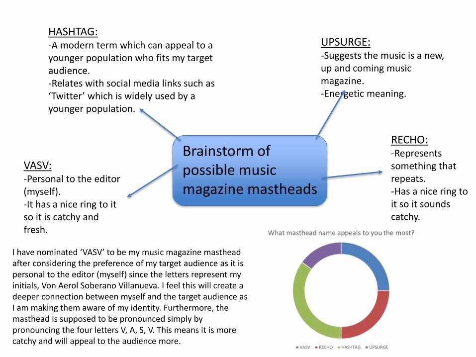
Brainstorm of possible music magazine mastheads
VASV:-Personal to the editor (myself). -It has a nice ring to it so it is catchy and fresh.
RECHO:-Represents something that repeats.-Has a nice ring to it so it sounds catchy.
HASHTAG:-A modern term which can appeal to a younger population who fits my target audience.-Relates with social media links such as ‘Twitter’ which is widely used by a younger population.
UPSURGE:-Suggests the music is a new, up and coming music magazine.-Energetic meaning.
I have nominated ‘VASV’ to be my music magazine masthead after considering the preference of my target audience as it is personal to the editor (myself) since the letters represent my initials, Von Aerol Soberano Villanueva. I feel this will create a deeper connection between myself and the target audience as I am making them aware of my identity. Furthermore, the masthead is supposed to be pronounced simply by pronouncing the four letters V, A, S, V. This means it is more catchy and will appeal to the audience more.
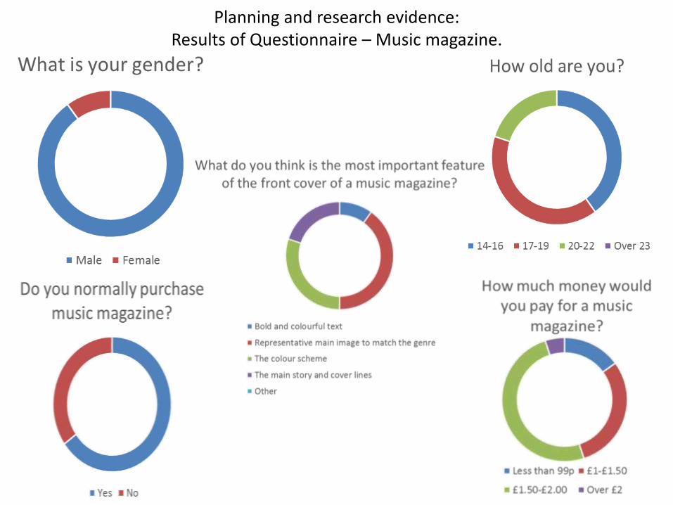
Planning and research evidence:Results of Questionnaire – Music magazine.

Planning and research evidence:Results of Questionnaire – Music magazine.
Related Documents


![[PPT]PowerPoint Template - Clark County School Districtccsd.net/.../docs/planning/action-planning.ppt · Web viewAction Planning & Monitoring Assessment, Accountability, Research,](https://static.cupdf.com/doc/110x72/5aa5db1d7f8b9ab4788dbb78/pptpowerpoint-template-clark-county-school-viewaction-planning-monitoring-assessment.jpg)