MEDIA STUDIES PLANNING AND PITCH AOIFE RANYELL

Welcome message from author
This document is posted to help you gain knowledge. Please leave a comment to let me know what you think about it! Share it to your friends and learn new things together.
Transcript
MEDIA STUDIESPLANNING AND PITCHAOIFE RANYELL

ABOUT THE MAGAZINE:
WORKING TITLE:
PLAYLIST
GENRE OF MAGAZINE:- POP- I have chosen the genre of pop because during my magazine research it came up as one of the most popular genres of music on my questionnaire results. I have also chosen the genre of pop because it is the genre that I know most about and I listen to pop music the most therefore I know exactly what my target audience would be looking for in a magazine and I can create a magazine that suits my target market perfectly.
COVER PRICE:- £4.00- I have chosen a cover price of £4.00
because in my questionnaire research, the results showed that people to willing to pay more for a magazine if it was publicized monthly rather than weekly. Which is why my cover price works in conjunction with my monthly publication pattern.
PUBLICATION PATTERN:- Monthly- My monthly publication pattern works in conjunction with my cover price. My questionnaire research results showed that people bought their magazines monthly rather than weekly or fortnightly. Having a publication pattern of monthly means that my magazine can be of better and higher quality than if it was publicized weekly this includes having higher quality paper, having more articles and also having higher quality well thought out articles.
I have chosen PLAYLIST as my Title and masthead for my magazine because it is short and snappy which makes it memorable, not only that but it links in with music and more specifically pop music. In my magazine research survey the participants said that their preferred way of listening to music was streaming and the name PLAYLIST links to streaming. Therefore the name PLAYLIST appeals to my target audience.
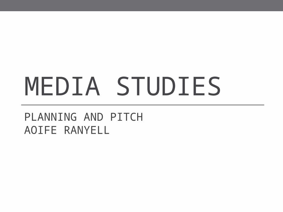
STYLESHEET:
SAMPLE FONT IDEAS:
PLAYLISTThe three fonts that I have chosen for my magazine, have a retro ‘feel’ to them, this is the kind of theme that I want my magazine to have: modern yet retro. I have taken these three fonts from dafont.com and will download one to use for the masthead. The font that I have chosen is called ‘Blake’ and is the second font out of the three that I have chosen. I chose this font because I really like the ‘A’, it is unique and acts as a kind of ‘logo’ for the magazine, an Idea that I have to improve this font is to Photoshop the ‘dot’ from the ‘A’ into a small musical note, linking the magazine back to music and not just a standard magazine.
COLOUR SCHEME IDEAS:I have decided on three possible colour scheme’s for my magazine. During my magazine research I noticed that a lot of pop magazine’s use very bright colours, mainly bright pinks and bright blues because of the audience that they are aiming at. However for my magazine I am aiming at a slightly older audience than the magazine’s I researched therefore I need a colour scheme that is applicable to the older teens, which is why I have chosen the first colour scheme of the three that I created. It still contains the main colours that I noticed in my research however I have darkened them slightly to apply to the older teens.
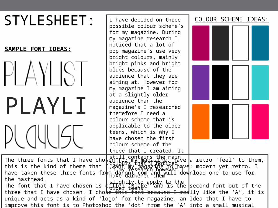
MISSON STATEMENT AND FEATURES:
The aim of PLAYLIST is to provide entertainment and the
latest months music news to the audience for a reasonable price. By being closely linked to social
media and by listening to the audience we are always able to deliver stories that fit the publics
latest trends.
FEATURES: When I collected together the result
information from my questionnaire, I noticed that when buying magazines a popular selling point is posters, competitions, freebee's ETC. this is why my magazine is going to contain a competition to draw the audience in to make them want to buy the magazine.
My magazine is going to contain a “world exclusive” again, this is to draw the readers in, because its completely exclusive to the magazine there is a sense of importance and urgency to buy the magazine.
Apart from the “world exclusive”, I plan for there to be various features on the magazine, most will be interviews or
mini articles with celebrities. The features will follow the current trends to make sure that the magazine listens to the audience to make sure it sells. The magazine advertisements will
reflect the likes and dislikes of the reader profile. For example on my reader “Meghan” likes to listen to music using high quality headphones therefore they might be an advertisements to beats headphones.

PLANNING AND PITCH:MAGAZINE IMAGES
SAMPLE IMAGES/IMAGE IDEAS:
FRONT COVER
- Medium shot- Right side
lighting- Natural
makeup- Studio shot
- Medium shot- Front lighting- Neutral
coloured clothing
- Studio shot
DOUBLE PAGE SPEAD
CONTENTS:A variety of images will be taken for my contents page. In my research I noticed that the images in the contents page usually link to the articles inside the magazine. So that it what I plan to do for my contents page.
The images for the double page spread will include a blank space to one side of the focal point to leave room for text. These two images are a perfect example of blank space.

DUMMY FRONT COVER:
-----------STRAPLINE----------------
PLAYLIST
FEBRUARY 15th 2015
LADYGAGA
-COVERLINE-
-COVERLINE-
£4RRP
AND HER NEW LOOK YOUT
UBE
STARS TAKING THE CHARTS
-COVERLINE-

DUMMY FRONT COVER: EXPLANATION
IMAGE:Whilst carrying out my magazine research, I noticed that almost all music magazine front cover images are taken in a studio, which Is why I am going to be doing the same and photographing my images in the college studio. All of my studio images will be taken using a canon 600D, ensuring that my images are of high quality and look professional. I am going to edit the image on Photoshop (if need be) for example, I will adjust the levels to make it appear of a more high quality and to make the front cover appear more professional
THE MODEL:To reflect the Modern-retro theme I have carried out for my magazine, I will have my front cover model wear a black and white bodycon dress, similar to the one in the image on this slide. The make-up will enhance the models face but not stand out too much, giving a more natural look. This is the plan for all of the female models for my magazine, i have decided to do this to show the female readers of the magazine that you don’t have to wear a lot of makeup to look good. This is why on my dummy front cover, the model is wearing neutral makeup and clothing.
SHOT:My chosen shot for my front cover image is a medium long shot. During my magazine research I realised that most front over images where either medium long shots or long shots. I have decided on the medium long shot as for a front cover image, it is that shot that I prefer. When taking my image I must ensure that I leave some blank space at the top for my masthead. If I do not do this then the masthead will be placed over the models face and make the front cover look crowded and unprofessional.
LIGHTING:The lighting for my studio shot will be all front/side facing lighting, the lights will be placed diagonally to the model. This type of lighting is the most dramatic, it illuminates the face and will make my front cover stand out against all the other magazine’s on the ‘shelf’.
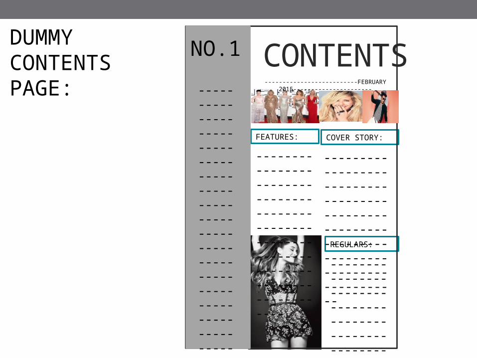
DUMMY CONTENTS PAGE:
CONTENTS
COVER STORY:
REGULARS:
FEATURES:
--------------------------FEBRUARY 2015----------------------
--------------------------------------------------------------------------------------------
---------------------------------------------------------------------------
--------------------------------------------------------------------------------------------
------------------------------------------------------------------------------------------------------------------------------------------------------------
NO.1
DUMMY CONTENTS PAGE: EXPLANATIONIMAGES: There is going to be a variety of images on the
contents page. I will have a main image that is larger than the rest of the images that correspond with the image on the front cover. I have decided to do this because it keeps the focus on the main article of the magazine which I have planned to be a “world exclusive” so the attention needs to be on that article to grab the readers attention.
The other images are going to be smaller than the main image but will correspond with the other articles inside the magazine, I have done this to draw the readers into the magazine, to make them want to read on.
The main image is going to be in black and white which carries out the modern/retro theme of my magazine, however, the rest of the images will be in their original colour therefore adding vibrancy to the page and showing the reader that they’re individual articles
LAYOUT:My contents page is broken into sections so the readers can easily understand where the articles are placed in the magazine. My inspiration for the contents page is taken from MOJO’s contents page, I analysed their contents page during my magazine research to get some ideas of layouts, and I noticed that their contents page is broken into sections such as: “features”, “regulars” etc. which makes the page easier to read and understand for the readers. I have taken the same approach for my contents page and have also broken it into different sections.
DESIGN:My contents page is going to follow the same colour scheme as the front cover but the only colour that I am going to use is the blue. The blue colour is going to be used as boxes around the headers to make them stand out more so they’re easier to read.

------------------------------------------------------------------------------------------------------------------------------------------------------------------
-
------------------------------------------------------------------------------------------------------------------------------------------------------------------
-
------------------------------------------------------------------------------------------------------------------------------------------------------------------
-
DU
MM
Y D
OU
BLE
P
AG
E S
PR
EA
D:
BACK WITH A BANG
PULL QUOTE
PULL QUOTE

DUMMY DOUBLE PAGE SPREAD: EXPLANATION
IMAGES: There will be one main image used on my
double page spread, it will span over both of the pages and the subject will hopefully sit on two of the intersecting points of the rule of thirds.
The image will be taken using a canon 600D (or any similar high quality camera I have access too) this is to ensure high quality and when I am editing the image and moving it around then the image will not be affected as much as if it where a lower quality image. Also the higher quality image will be following magazine conventions as all of the double page spreads that I have analysed, the main image has been taken using a high quality camera.
The photography will take place in a studio with a white, plain background much like the one on the dummy example. Taking the image in a studio follows magazine conventions, by doing this then I know that my double page spread layout will appeal to my audience.
ARTICLE: The article itself is going to have a casual, laid back, friendly sense about it which appeals to my planned target audience of the younger generation. The article is going to be about a singer/songwriter that has recently come back into the music career after taking a break from it all, I plan for it to be a interview with said singer, the questions will be friendly and casual but ask about important risky subjects that will appeal to the audience. As I plan for it to be a world exclusive I need to make sure that the interview “makes the most” of the time with the artist.I am also going to create a small introduction to the article, explaining a little bit about the artists so that if someone reading the article does not know who the artist is then they can still enjoy and read the article.
MODEL: My model will be wearing a black and white striped bodycon dress (the same dress used on the front cover). This will give the article a sort of retro feel about it however the subject will be wearing large combat boots this shows the models tough, independent side which links with the article theme: Back with a bang.

PLANNING AND PITCH: MAGAZINE FLATPLAN
FRONT COVER
ADVERT
ADVERT ADVERT ADVERT
ADVERT
ADVERT
ADVERT
CONTENTS
ARTICLE-THIS MONTH MUSIC NEWS
ARTICLE-THIS MONTH MUSIC NEWS
ARTICLE-TOP 10 PLAYLIST HITS
FEATURE -GRAMMYS AWARDS
ADVERT
ARTICLE-WHO WORE IT BETTER?
COVER STORY-MEGHAN O’BRIEN
ADVERT
ARTICLE-
‘COMING UP NEXT MONTH”
“HOW TO GET IN TOUCH”
DOUBLE PAGE-YOUTUBE STAR TAKING THE WORLD
DOUBLE PAGE-YOUTUBE STAR TAKING THE WORLD
FEATURE-MINI INTERVIEW WITH PERRIE EDWARDS
ADVERT ADVERT
REVIEWS REVIEWS HOROSCOPEADVERT
ARTICLE-SUMMER GIGS AND CONCERTTS
ARTICLE-INTERVIEW WITH BAFTA WINNER
ADVERT
FEATURE -GRAMMYS AWARDS
FEATURE -GRAMMYS AWARDS
FEATURE -GRAMMYS AWARDS
COVER STORY-MEGHAN O’BRIEN
FEATURE -CELEB FAIL
FEATURE -CELEB FAIL
Related Documents