PIGMENTED COLORANTS: DEPENDENCE ON MEDIA AND TIME A Thesis Presented to the Faculty of the Graduate School of Cornell University in Partial Fulfillment of the Requirements for the Degree of Master of Science by Jeffrey Blaine Budsberg January 2007

Welcome message from author
This document is posted to help you gain knowledge. Please leave a comment to let me know what you think about it! Share it to your friends and learn new things together.
Transcript
PIGMENTED COLORANTS:
DEPENDENCE ON MEDIA AND TIME
A Thesis
Presented to the Faculty of the Graduate School
of Cornell University
in Partial Fulfillment of the Requirements for the Degree of
Master of Science
by
Jeffrey Blaine Budsberg
January 2007

2007 Jeffrey Blaine Budsberg
ALL RIGHTS RESERVED
ABSTRACT
We present a physically based model for predicting the visual appearance of
artists’ paint, which is dependent on both time and the material that binds the
colorant to a surface.
In our study, we captured the reflectance spectra of a large number of paint
samples at different intervals in time over the course of six months. These paint
samples were handmade to ensure material quality, using various pigmented col-
orants and adhesive binding media. Converting our spectral data into different
perceptually uniform color spaces, we show very significant perceptual differences
in two domains: the appearance of paint changes over time; and the appearance
of one pigmented colorant varies when dispersed in different materials.
Finally, we present an interactive viewer for predictive pigmented color mixture
utilizing the paint reflectance spectra, Kubelka Munk theory and modern graphics
hardware.
Biographical Sketch
The author was born in Houston, Texas on June 28, 1982 and resided there until
completion of his high school degree at Cypress Falls High School. Jeff supple-
mented his high school curriculum with studies at the Glassell School of Art on
weekends.
He moved to Ithaca, New York, to obtain his undergraduate degree in Fine Arts
at Cornell University. During his undergraduate years, his interests and coursework
were interdisciplinary, encompassing traditional arts, computer graphics, computer
science and perceptual psychology. Jeff spent the spring semester of 2003 studying
abroad in Rome and has a great passion for Italy. In the fall of 2004 he joined the
Program of Computer Graphics at Cornell University as a Masters Student.
iii
Acknowledgements
This work would not have been possible without the contributions and support
from many individuals. First and foremost, I would like to thank my advisor Don
Greenberg for his mentoring and enthusiasm. I am grateful for the opportunity
that he has given me and I have had a wonderful experience in the Program of
Computer Graphics. I also thank my minor advisor, Steve Marschner, for his help
and commentary over the course of my research.
Several other faculty members and researchers provided important assistance.
Early in my work, my conversations with Stan Taft proved instrumental as his
research served as an inspiration for my own. Fabio Pellacini proved to be a great
resource for hashing through ideas, as well as advising me on how to port my code
to graphics hardware. James Ferwerda was a great aid in the discussion of color
science and visual perception. I thank Steve Westin for assisting in the setup of
the equipment in the light measurement laboratory and Victor Kord for lending
his expertise on artists’ materials. Bruce Walter and Kavita Bala were always
available to help me whenever I popped into their offices.
There are many great students in the PCG whom I had the privilege of working
with. Jon Moon and Piti Irawan were always upbeat and eager to help when I
had tough graphics questions. I would always be joined after hours in the lab with
iv
Milos Hasan–he was always ready for any Java-related questions I had. Nasheet
Zaman would have comments and suggestions for everything I would toss her way.
I thank Jeff Wang for everything. He has always been a great friend and goes
out of his way to help others in any way. Jacky Bibliowicz was a good friend and
very helpful when I first came to the PCG. I always enjoyed talking with Jeremiah
Fairbank, as he came from my part of the campus.
There are many others in the lab that I wish to thank. Hurf has always provided
amazing support with the many systems that I used and was positive even when
I made mistakes. Martin always kept me up to date on the amazing equipment in
the lab. Thank you Mary for taking care of us and for our very entertaining late
night discussions on cooking and wildlife. Linda always kept track of everything I
needed to do and fit me into Don’s schedule. I thank Peggy for cheerfully taking
care of all of our administrative duties.
There is not space for all of the many wonderful people whom I have known
during my time at Cornell. I thank the many friends that have entertained me
away from my work, including Simon, Jon, Will and Nick.
I thank my family for their love and support. I thank Tiffany, the love of my
life, for her love, comfort, encouragement, and strength.
This work would not have been possible without support from the Program
of Computer Graphics, the Department of Architecture and the National Science
Foundation ITR/AP 0205438.
v
Table of Contents
1 Introduction 1
2 Painting Background 92.1 Composition of a Painting . . . . . . . . . . . . . . . . . . . . . . . 9
2.1.1 Support . . . . . . . . . . . . . . . . . . . . . . . . . . . . . 102.1.2 Size . . . . . . . . . . . . . . . . . . . . . . . . . . . . . . . 142.1.3 Ground . . . . . . . . . . . . . . . . . . . . . . . . . . . . . 15
2.2 Composition of Paint . . . . . . . . . . . . . . . . . . . . . . . . . . 162.2.1 Pigment . . . . . . . . . . . . . . . . . . . . . . . . . . . . . 182.2.2 Binding Media Influence . . . . . . . . . . . . . . . . . . . . 27
2.3 Binding Media Materials . . . . . . . . . . . . . . . . . . . . . . . . 382.3.1 Carbohydrate-Based . . . . . . . . . . . . . . . . . . . . . . 382.3.2 Protein-Based . . . . . . . . . . . . . . . . . . . . . . . . . . 392.3.3 Oils . . . . . . . . . . . . . . . . . . . . . . . . . . . . . . . 412.3.4 Waxes . . . . . . . . . . . . . . . . . . . . . . . . . . . . . . 432.3.5 Synthetic Polymers . . . . . . . . . . . . . . . . . . . . . . . 432.3.6 Catalytic Materials . . . . . . . . . . . . . . . . . . . . . . . 44
3 Color Background 473.1 Light and Color . . . . . . . . . . . . . . . . . . . . . . . . . . . . . 47
3.1.1 Visible Light Spectrum . . . . . . . . . . . . . . . . . . . . . 483.1.2 Light Spectra . . . . . . . . . . . . . . . . . . . . . . . . . . 543.1.3 Human Visual System . . . . . . . . . . . . . . . . . . . . . 563.1.4 Color Perception . . . . . . . . . . . . . . . . . . . . . . . . 633.1.5 Color Spaces . . . . . . . . . . . . . . . . . . . . . . . . . . 783.1.6 Overall Response . . . . . . . . . . . . . . . . . . . . . . . . 85
4 Previous Work 944.1 Introduction . . . . . . . . . . . . . . . . . . . . . . . . . . . . . . . 944.2 Light transport in volumetric materials . . . . . . . . . . . . . . . . 94
4.2.1 Subsurface scattering theory . . . . . . . . . . . . . . . . . . 954.2.2 Path tracing . . . . . . . . . . . . . . . . . . . . . . . . . . . 974.2.3 Diffusion approximation . . . . . . . . . . . . . . . . . . . . 994.2.4 Image-based measurement . . . . . . . . . . . . . . . . . . . 103
vi
4.2.5 Kubelka Munk theory . . . . . . . . . . . . . . . . . . . . . 1054.2.6 Time-varying appearance . . . . . . . . . . . . . . . . . . . . 113
4.3 Natural changes in pigmented materials . . . . . . . . . . . . . . . . 1174.3.1 Fading of pigments . . . . . . . . . . . . . . . . . . . . . . . 1184.3.2 Kinetics of fading . . . . . . . . . . . . . . . . . . . . . . . . 1254.3.3 Medium and substrate changes . . . . . . . . . . . . . . . . 1294.3.4 Other effects . . . . . . . . . . . . . . . . . . . . . . . . . . . 133
5 Preparation & Measurement 1365.1 Sample creation . . . . . . . . . . . . . . . . . . . . . . . . . . . . . 136
5.1.1 Importance of handmade samples . . . . . . . . . . . . . . . 1365.1.2 Pigments . . . . . . . . . . . . . . . . . . . . . . . . . . . . 1415.1.3 Media . . . . . . . . . . . . . . . . . . . . . . . . . . . . . . 1495.1.4 Substrate . . . . . . . . . . . . . . . . . . . . . . . . . . . . 1525.1.5 Painting . . . . . . . . . . . . . . . . . . . . . . . . . . . . . 156
5.2 Measurement . . . . . . . . . . . . . . . . . . . . . . . . . . . . . . 1595.2.1 Spectrophotometer . . . . . . . . . . . . . . . . . . . . . . . 1595.2.2 Integrating sphere theory . . . . . . . . . . . . . . . . . . . . 1625.2.3 Measurement . . . . . . . . . . . . . . . . . . . . . . . . . . 164
6 Experimental Results 1666.1 Introduction . . . . . . . . . . . . . . . . . . . . . . . . . . . . . . . 166
6.1.1 Effect of binding media . . . . . . . . . . . . . . . . . . . . . 1666.1.2 Effect of time . . . . . . . . . . . . . . . . . . . . . . . . . . 1766.1.3 Applications . . . . . . . . . . . . . . . . . . . . . . . . . . . 183
7 Interactive Viewing 1877.1 Introduction . . . . . . . . . . . . . . . . . . . . . . . . . . . . . . . 187
7.1.1 Conversion to Kubelka Munk . . . . . . . . . . . . . . . . . 1887.1.2 Rendering System . . . . . . . . . . . . . . . . . . . . . . . . 1897.1.3 Implementation issues . . . . . . . . . . . . . . . . . . . . . 194
8 Conclusion 196
A Derivation of K-M theory 200
B Supplemental sample analysis 209
References 238
vii
List of Tables
2.1 Average pigment particle size . . . . . . . . . . . . . . . . . . . . . 232.2 Pigment specific gravity . . . . . . . . . . . . . . . . . . . . . . . . 262.3 Index of refraction for different media . . . . . . . . . . . . . . . . 312.4 Index of refraction for different pigments . . . . . . . . . . . . . . . 36
5.1 Pigment data . . . . . . . . . . . . . . . . . . . . . . . . . . . . . . 1455.2 Pigment data . . . . . . . . . . . . . . . . . . . . . . . . . . . . . . 146
6.1 Color conversions of Lapis Lazuli in different binding media . . . . 1716.2 Perceptual differences between Lapis Lazuli in different binding media1726.3 Color conversions of Lapis Lazuli in Gouache over time . . . . . . . 179
B.1 Color conversions of Cold Glauconite in different binding media . . 212B.2 Perceptual differences between Cold Glauconite in different binding
media . . . . . . . . . . . . . . . . . . . . . . . . . . . . . . . . . . 212B.3 Color conversions of Cold Hematite Tint in different binding media 215B.4 Perceptual differences between Cold Hematite Tint in different bind-
ing media . . . . . . . . . . . . . . . . . . . . . . . . . . . . . . . . 215B.5 Color conversions of Burnt Sienna in different binding media . . . . 218B.6 Perceptual differences between Burnt Sienna in different binding
media . . . . . . . . . . . . . . . . . . . . . . . . . . . . . . . . . . 218B.7 Color conversions of Lampblack Tint in different binding media . . 221B.8 Perceptual differences between Lampblack Tint in different binding
media . . . . . . . . . . . . . . . . . . . . . . . . . . . . . . . . . . 221B.9 Color conversions of Red Ochre Tint in different binding media . . 224B.10 Perceptual differences between Red Ochre Tint in different binding
media . . . . . . . . . . . . . . . . . . . . . . . . . . . . . . . . . . 224B.11 Color conversions of Chrome Yellow in Distemper over time . . . . 227B.12 Color conversions of Hematite Tint in Watercolor over time . . . . 227B.13 Color conversions of Burnt Sienna Tint in Oil over time . . . . . . 232B.14 Color conversions of Cold Glaunconite in Watercolor over time . . 232B.15 Color conversions of Red Ochre Tint in Casein over time . . . . . . 237
viii
List of Figures
1.1 Sistine Chapel restoration . . . . . . . . . . . . . . . . . . . . . . . 41.2 Color matching between fresco giornate . . . . . . . . . . . . . . . 7
2.1 Composition of a painting’s many layers . . . . . . . . . . . . . . . 102.2 Cotton and linen canvas . . . . . . . . . . . . . . . . . . . . . . . . 112.3 Magnified cotton canvas . . . . . . . . . . . . . . . . . . . . . . . . 122.4 Stretching canvas over a wooden frame . . . . . . . . . . . . . . . . 132.5 Magnified primed canvas . . . . . . . . . . . . . . . . . . . . . . . . 162.6 Dispersion of pigment in a binding medium . . . . . . . . . . . . . 172.7 A sample of pure pigments . . . . . . . . . . . . . . . . . . . . . . 192.8 Natural pigments of antiquity . . . . . . . . . . . . . . . . . . . . . 202.9 Pictomicrographs of several pigments . . . . . . . . . . . . . . . . . 212.10 Different grades of Malachite . . . . . . . . . . . . . . . . . . . . . 252.11 Optical behavior at an interface . . . . . . . . . . . . . . . . . . . . 292.12 Critical angle . . . . . . . . . . . . . . . . . . . . . . . . . . . . . . 322.13 Optical behavior at multiple interfaces . . . . . . . . . . . . . . . . 332.14 Optical behavior with paint . . . . . . . . . . . . . . . . . . . . . . 342.15 The full optical behavior of a painting . . . . . . . . . . . . . . . . 372.16 The binding method of fresco painting . . . . . . . . . . . . . . . . 452.17 Cross section of a fresco painting . . . . . . . . . . . . . . . . . . . 46
3.1 The visible spectrum . . . . . . . . . . . . . . . . . . . . . . . . . . 483.2 Hue, brightness and saturation . . . . . . . . . . . . . . . . . . . . 503.3 Newton’s basic optics experiment . . . . . . . . . . . . . . . . . . . 513.4 Subtractive color mixture in ink . . . . . . . . . . . . . . . . . . . 523.5 Subtractive color primaries . . . . . . . . . . . . . . . . . . . . . . 533.6 Additive color primaries . . . . . . . . . . . . . . . . . . . . . . . . 543.7 Georges Seurat, La Grande Jatte . . . . . . . . . . . . . . . . . . . 543.8 Emitted light spectra . . . . . . . . . . . . . . . . . . . . . . . . . 553.9 Reflected light spectra . . . . . . . . . . . . . . . . . . . . . . . . . 563.10 Cross section of the human eye . . . . . . . . . . . . . . . . . . . . 573.11 Cross section of the retina . . . . . . . . . . . . . . . . . . . . . . . 603.12 Distribution of the retina’s photoreceptors . . . . . . . . . . . . . . 613.13 Pictomicrographs of the human retina . . . . . . . . . . . . . . . . 623.14 Isoluminance . . . . . . . . . . . . . . . . . . . . . . . . . . . . . . 63
ix
3.15 Photoreceptor absorption . . . . . . . . . . . . . . . . . . . . . . . 653.16 RGB color space . . . . . . . . . . . . . . . . . . . . . . . . . . . . 653.17 RGB Color Matching Functions . . . . . . . . . . . . . . . . . . . . 663.18 XYZ Color Matching Functions . . . . . . . . . . . . . . . . . . . . 693.19 Calculation of CIE Tristimulus values . . . . . . . . . . . . . . . . 703.20 Metameric stimuli . . . . . . . . . . . . . . . . . . . . . . . . . . . 713.21 CIE Chromaticity Diagram . . . . . . . . . . . . . . . . . . . . . . 733.22 Out of gamut colors . . . . . . . . . . . . . . . . . . . . . . . . . . 753.23 Chromaticity coordinates of varying pigment tints . . . . . . . . . 773.24 Several different color spaces . . . . . . . . . . . . . . . . . . . . . 793.25 The MacAdam ellipses . . . . . . . . . . . . . . . . . . . . . . . . . 803.26 Munsell color system . . . . . . . . . . . . . . . . . . . . . . . . . . 813.27 Nonlinear color spaces . . . . . . . . . . . . . . . . . . . . . . . . . 843.28 Receptor fields . . . . . . . . . . . . . . . . . . . . . . . . . . . . . 863.29 Lateral inhibition . . . . . . . . . . . . . . . . . . . . . . . . . . . . 873.30 Mach bands . . . . . . . . . . . . . . . . . . . . . . . . . . . . . . . 893.31 Work of Josef Albers . . . . . . . . . . . . . . . . . . . . . . . . . . 903.32 Edwin Land’s Mondrian experiment . . . . . . . . . . . . . . . . . 93
4.1 Phase functions . . . . . . . . . . . . . . . . . . . . . . . . . . . . . 994.2 Dipole diffusion approximation . . . . . . . . . . . . . . . . . . . . 1014.3 Dipole diffusion and path tracing results . . . . . . . . . . . . . . . 1024.4 Image-based object model results . . . . . . . . . . . . . . . . . . . 1044.5 Image-based material model results . . . . . . . . . . . . . . . . . . 1054.6 Results using Kubelka-Munk theory . . . . . . . . . . . . . . . . . 1084.7 Canvas paint spectra . . . . . . . . . . . . . . . . . . . . . . . . . . 1094.8 Kubelka Munk coefficients . . . . . . . . . . . . . . . . . . . . . . . 1094.9 Synthetic watercolor paints . . . . . . . . . . . . . . . . . . . . . . 1104.10 Evaluation of Kubelka Munk pigment mixing . . . . . . . . . . . . 1124.11 Theoretical copper patina growth . . . . . . . . . . . . . . . . . . . 1144.12 Simulated copper patina growth . . . . . . . . . . . . . . . . . . . 1154.13 Simulated marble weathering . . . . . . . . . . . . . . . . . . . . . 1164.14 Simulated spatially-varying appearance over time . . . . . . . . . . 1174.15 Vermillion paint fading . . . . . . . . . . . . . . . . . . . . . . . . 1194.16 Effect of ultraviolet filtering . . . . . . . . . . . . . . . . . . . . . . 1204.17 Alizarin Crimson fading . . . . . . . . . . . . . . . . . . . . . . . . 1234.18 Fading in respect to Munsell value and chroma . . . . . . . . . . . 1244.19 Fading depth versus pigment scattering . . . . . . . . . . . . . . . 1294.20 Binding media yellowing . . . . . . . . . . . . . . . . . . . . . . . . 1314.21 Pigment-medium interface voids . . . . . . . . . . . . . . . . . . . 1334.22 The effect of ozone on paint . . . . . . . . . . . . . . . . . . . . . . 134
5.1 Misleading paint labels . . . . . . . . . . . . . . . . . . . . . . . . 1405.2 Pigments used in our research . . . . . . . . . . . . . . . . . . . . . 144
x
5.3 Canvas board materials . . . . . . . . . . . . . . . . . . . . . . . . 1535.4 Reflectance spectra of multiple layers of gesso . . . . . . . . . . . . 1545.5 Appearance of multiple layers of gesso . . . . . . . . . . . . . . . . 1555.6 A typical painted sample . . . . . . . . . . . . . . . . . . . . . . . 1575.7 Possible pigment-binder problems . . . . . . . . . . . . . . . . . . . 1595.8 Optical setup for diffuse reflectance measurement . . . . . . . . . . 1605.9 Diagram of a Czerny-Turner monochromator . . . . . . . . . . . . 161
6.1 Lapis Lazuli in different binding media after one day . . . . . . . . 1686.2 Similarity comparison of Lapis Lazuli paint samples . . . . . . . . 1736.3 Munsell plots of Lapis Lazuli in different binding media after one day1746.4 Variation of spectral reflectance curves of Lapis Lazuli in Gouache
over time . . . . . . . . . . . . . . . . . . . . . . . . . . . . . . . . 1786.5 Munsell plots of Lapis Lazuli in Gouache over time . . . . . . . . . 1826.6 Visual comparison of Lapis Lazuli in Gouache changing at each
time interval . . . . . . . . . . . . . . . . . . . . . . . . . . . . . . 184
7.1 Our simulated canvas . . . . . . . . . . . . . . . . . . . . . . . . . 1907.2 Features of our interactive viewer . . . . . . . . . . . . . . . . . . . 193
A.1 Flux density within a paint layer . . . . . . . . . . . . . . . . . . . 201A.2 The path of light between two homogeneous layers . . . . . . . . . 207
B.1 Cold Glauconite in different binding media after one week . . . . . 210B.2 Munsell plots of Cold Glauconite in different binding media after
one week . . . . . . . . . . . . . . . . . . . . . . . . . . . . . . . . 211B.3 Cold Hematite Tint in different binding media freshly painted . . . 213B.4 Munsell plots of Cold Hematite Tint in different binding media
freshly painted . . . . . . . . . . . . . . . . . . . . . . . . . . . . . 214B.5 Burnt Sienna in different binding media freshly painted . . . . . . . 216B.6 Munsell plots of Burnt Sienna in different binding media freshly
painted . . . . . . . . . . . . . . . . . . . . . . . . . . . . . . . . . 217B.7 Lampblack Tint in different binding media after one month . . . . 219B.8 Munsell plots of Lampblack Tint in different binding media after
one month . . . . . . . . . . . . . . . . . . . . . . . . . . . . . . . 220B.9 Red Ochre Tint in different binding media after three months . . . 222B.10 Munsell plots of Red Ochre Tint in different binding media after
three months . . . . . . . . . . . . . . . . . . . . . . . . . . . . . . 223B.11 Variation of spectral reflectance curves of Chrome Yellow in Dis-
temper over time . . . . . . . . . . . . . . . . . . . . . . . . . . . . 225B.12 Munsell plots of Chrome Yellow in Distemper over time . . . . . . 226B.13 Variation of spectral reflectance curves of Hematite Tint in Water-
color over time . . . . . . . . . . . . . . . . . . . . . . . . . . . . . 228B.14 Munsell plots of Hematite Tint in Watercolor over time . . . . . . 229
xi
B.15 Variation of spectral reflectance curves of Burnt Sienna Tint in Oilover time . . . . . . . . . . . . . . . . . . . . . . . . . . . . . . . . 230
B.16 Munsell plots of Burnt Sienna Tint in Oil over time . . . . . . . . . 231B.17 Variation of spectral reflectance curves of Cold Glaunconite in Wa-
tercolor over time . . . . . . . . . . . . . . . . . . . . . . . . . . . 233B.18 Munsell plots of Cold Glaunconite in Watercolor over time . . . . . 234B.19 Variation of spectral reflectance curves of Red Ochre Tint in Casein
over time . . . . . . . . . . . . . . . . . . . . . . . . . . . . . . . . 235B.20 Munsell plots of Red Ochre Tint in Casein over time . . . . . . . . 236
xii
Chapter 1
Introduction
Nothing endures but change
-Heraclitus
All materials have an inherent tendency to change in appearance and composi-
tion when exposed to the physical conditions of the outside environment. Normal
atmospheric conditions alter their physical and chemical properties. Thus, mate-
rials respond dynamically as if they were alive; they sense and react according to
their surroundings.
The rate of change depends on the innate characteristics of the material, the
purity of the environment, and the level of exposure. For example, direct expo-
sure to sunlight incites photochemical reactions within some materials, which can
cause fading and discoloration. Water percolates through porous surfaces, carrying
minerals that may discolor or deteriorate the object. High humidity and excess
moisture promote mold, which leads to decay. Long-term oxygen exposure chem-
ically alters the composition of organic materials. Foreign substances in the air
deposit and accumulate on surfaces. Common airborne substances and chemicals
1
2
corrode the surfaces of materials. Fluctuating temperature and pressure condi-
tions tend to cause materials to periodically expand and contract. As a result, the
undue stresses promote warping and cracking in some materials. Other materials
are sensitive to the oils and wear from human touch.
The phenomenon of natural material change is also subject to location. Marine
environments contain higher levels of moisture and salt, while urban areas expe-
rience a higher concentration of abrasive chemicals due to industrial smog. Both
are detrimental to the longevity of exposed materials.
This behavior is what drives museum curators and art historians to protect their
collections vigorously, attempting to preserve the work for the next generation and
beyond. Very regimented control is kept over all of the conditions in a museum,
including the temperature, humidity and light levels. In many circumstances,
paintings and textiles are protected with glass coated with ultraviolet filters to
remove extraneous light. Patrons are urged not to use flash photography (if at all)
to save expediting the adverse effects. Some institutions even have carbon filters
to purify the air in which the artifacts reside. The most precious documents of
the United States are enclosed in a special casing with only inert gas. All of these
precautions (and more) are done to minimize any possible future deterioration of
the collections.
Artwork that remains in situ, or in its original location, does not benefit from
the protections available in a museum. Examples of such work include architec-
tural decoration or paintings directly on the walls or ceilings of buildings. Such
work has been subjected to harsh conditions over the years. Atmospheric con-
ditions are generally unable to be controlled for these works, and moisture and
temperature variations will inevitably deteriorate the materials. While all work
3
in situ experiences deposition of dust and erosion from airborne chemicals on the
finished surface, historic work suffered from layers of candlelight soot. Today, at
least the candles have been replaced, though electric lighting still poses a fading
threat to the materials.
The preservation of artwork falls into categories. Conservation is to neutralize
any adverse effects, therefore minimizing any progressive deterioration so that a
work will remain intact for as long as possible. Preventative measures can help
alleviate poor handling of materials and extend their lifespan. Restoration involves
cosmetic treatment under expert care in order to return an object to its original
appearance. Complete restoration is typically more controversial, as while it should
be reversible, it often involves some irreversible change to the original work in order
to achieve results.
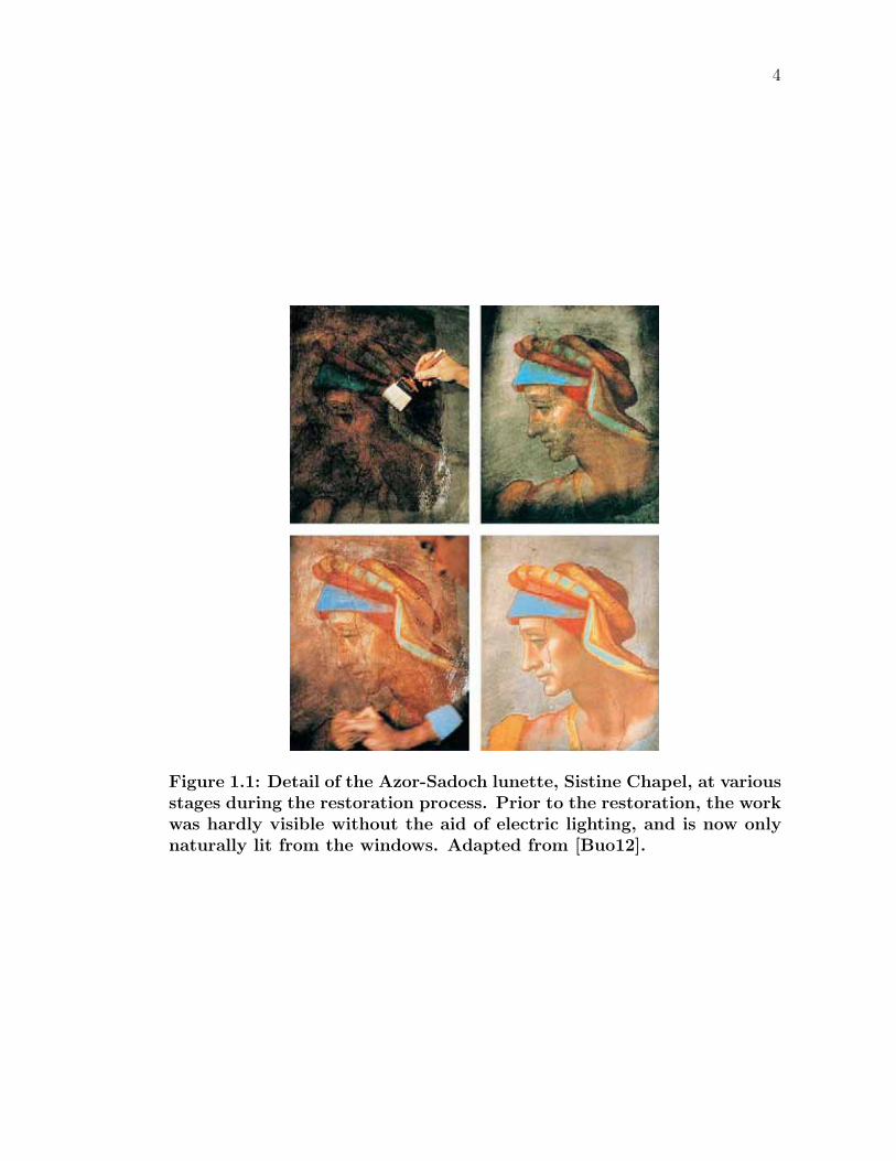
Restoration of the artwork on the walls and ceiling of the Sistine Chapel in
the Vatican City, Rome, was completed in 1990. This restoration was initially
surrounded by a heated controversy in the art world, as some claimed it a break-
through revelation, while others felt it ruined the masterpiece. A brown patina
had developed over centuries, composed of candle smoke, soot, and repeated appli-
cations of poor quality varnish (varnish is a transparent coating used to enhance
the optical properties of a work, as well as protect it from outside elements). It
was argued that the patina harmonized the bright colors. Figure 1.1 illustrates the
magnitude of change in restoring this piece of artwork.
While not a trivial task, trained restoration professionals can routinely achieve
miraculous results from work that has suffered presumably irreversible damage.
Typically, extensive damage (such as fire damage, watermarks, tears, and yellow-
ing) can be repaired. Yet, this presents the question for art historians and conser-
4
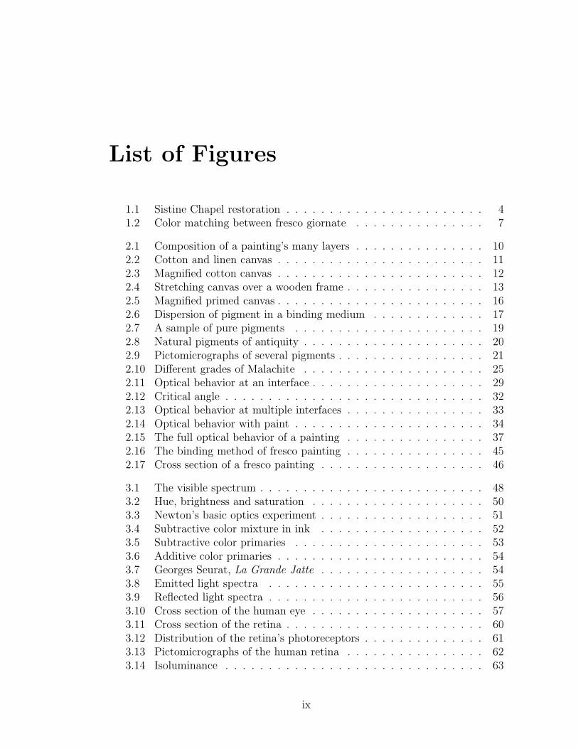
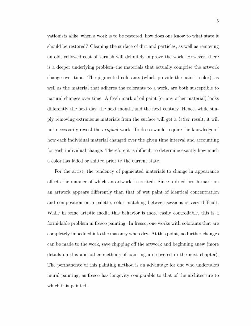
Figure 1.1: Detail of the Azor-Sadoch lunette, Sistine Chapel, at variousstages during the restoration process. Prior to the restoration, the workwas hardly visible without the aid of electric lighting, and is now onlynaturally lit from the windows. Adapted from [Buo12].
5
vationists alike–when a work is to be restored, how does one know to what state it
should be restored? Cleaning the surface of dirt and particles, as well as removing
an old, yellowed coat of varnish will definitely improve the work. However, there
is a deeper underlying problem–the materials that actually comprise the artwork
change over time. The pigmented colorants (which provide the paint’s color), as
well as the material that adheres the colorants to a work, are both susceptible to
natural changes over time. A fresh mark of oil paint (or any other material) looks
differently the next day, the next month, and the next century. Hence, while sim-
ply removing extraneous materials from the surface will get a better result, it will
not necessarily reveal the original work. To do so would require the knowledge of
how each individual material changed over the given time interval and accounting
for each individual change. Therefore it is difficult to determine exactly how much
a color has faded or shifted prior to the current state.
For the artist, the tendency of pigmented materials to change in appearance
affects the manner of which an artwork is created. Since a dried brush mark on
an artwork appears differently than that of wet paint of identical concentration
and composition on a palette, color matching between sessions is very difficult.
While in some artistic media this behavior is more easily controllable, this is a
formidable problem in fresco painting. In fresco, one works with colorants that are
completely imbedded into the masonry when dry. At this point, no further changes
can be made to the work, save chipping off the artwork and beginning anew (more
details on this and other methods of painting are covered in the next chapter).
The permanence of this painting method is an advantage for one who undertakes
mural painting, as fresco has longevity comparable to that of the architecture to
which it is painted.
6
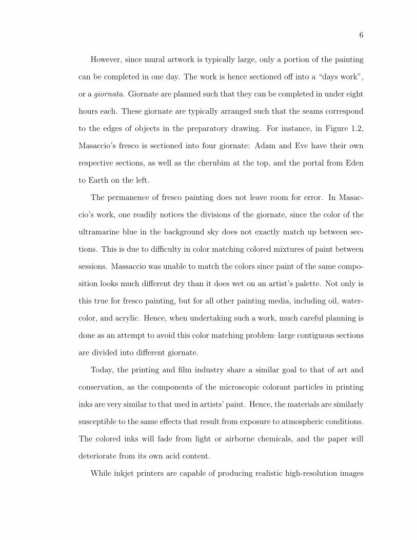
However, since mural artwork is typically large, only a portion of the painting
can be completed in one day. The work is hence sectioned off into a “days work”,
or a giornata. Giornate are planned such that they can be completed in under eight
hours each. These giornate are typically arranged such that the seams correspond
to the edges of objects in the preparatory drawing. For instance, in Figure 1.2,
Masaccio’s fresco is sectioned into four giornate: Adam and Eve have their own
respective sections, as well as the cherubim at the top, and the portal from Eden
to Earth on the left.
The permanence of fresco painting does not leave room for error. In Masac-
cio’s work, one readily notices the divisions of the giornate, since the color of the
ultramarine blue in the background sky does not exactly match up between sec-
tions. This is due to difficulty in color matching colored mixtures of paint between
sessions. Massaccio was unable to match the colors since paint of the same compo-
sition looks much different dry than it does wet on an artist’s palette. Not only is
this true for fresco painting, but for all other painting media, including oil, water-
color, and acrylic. Hence, when undertaking such a work, much careful planning is
done as an attempt to avoid this color matching problem–large contiguous sections
are divided into different giornate.
Today, the printing and film industry share a similar goal to that of art and
conservation, as the components of the microscopic colorant particles in printing
inks are very similar to that used in artists’ paint. Hence, the materials are similarly
susceptible to the same effects that result from exposure to atmospheric conditions.
The colored inks will fade from light or airborne chemicals, and the paper will
deteriorate from its own acid content.
While inkjet printers are capable of producing realistic high-resolution images
7
Figure 1.2: Left: difficulties in color matching between fresco giornatein Masaccio’s Expulsion are evident, as colors in adjacent giornate donot always match. Right: divisions of the four giornate. Adaptedfrom [Mas27].
8
at a very high quality (albeit limited color gamuts), their value would be greatly
enhanced if they could be made more permanent. Therefore, when a typical user
makes a print, what assurances are there that a once vibrant color print will appear
equally as vivid long after it was printed? Ink manufacturers are able to control
the initial materials (as artists do), but wish to minimize any future change in the
colorant (as conservationists do). This problem is a very active research area for
digital imaging and printing today.
In all of these cases, the goal is to find ways to predict the appearance of
pigmented materials through time. In our research, we study paint appearance in
perceptually uniform color spaces, showing very significant perceptual differences
in two domains: the appearance of paint changes over time; and the appearance
of one pigmented colorant varies when dispersed in different materials.
The thesis is organized in the following manner: Chapter 2 provides an overview
of traditional artist materials and how microscopic events contribute to the overall
appearance of the surface of a painting. Chapter 3 covers the relationship between
light, paint, and our perception of color. Previous work related to simulating the
overall appearance of translucent materials (such as paint) and research on natural
changes in pigmented materials are detailed in Chapter 4. Chapter 5 describes
our research process, including the preparation and measurement of the paint
samples. The experimental results are presented in Chapter 6 and we introduce an
interactive program to simulate the appearance of arbitrary paints in Chapter 7.
Conclusions and applications are addressed in Chapter 8.
Chapter 2
Painting Background
I think you have to control the materials to an extent, but it’s important to let the
materials have a kind of power for themselves.
-Keith Haring
2.1 Composition of a Painting
In its basic form, a painting is a painted image on a surface. Commonly, a painting
serves as a material object, viewed hanging against a wall. The resulting colors are
from the deposition of paint strokes in a certain order onto a surface, usually via a
brush. Unbeknownst to the viewer, there are many layers of preparation that one
must impart to the surface before it is ready to be worked on. Within the painting,
the skill of the artist dictates control over a viewer’s experience of a work, since
despite the visual and iconographic complexities that one associates with the work,
it is still an image made from paint [TM00]. This fact is sometimes overlooked
since digital reproductions of artwork distort our sense of scale, materials, and
topology of the work. Therefore, a painting is more than just an image; it is a
9
10
heterogeneous sum of very different time-dependent superposed components that
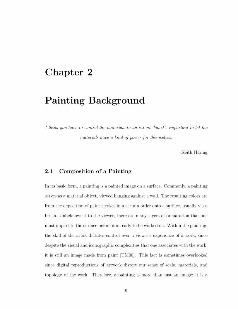
result in a visually complex, topological colored surface.
Figure 2.1: Diagrammatic view of a traditional painting’s many layers.Adapted from [Got87].
2.1.1 Support
The surface to which paint is applied is called the support. It may be the most
important structural element in a painting, as all other materials in a painting
are attached to it. If the support fails at some point over time, the painting
will probably not survive. Over the centuries, artists have used a whole range of
supports, including stone, wood, and cloth, all of which impart different surface
characteristics to works of art. If a support has a smoothly finished surface, the
resulting painting will also typically exhibit a smooth surface, while a support with
a pronounced texture will result in a work showing some of this texture.
In a painting, paint is deposited when a loaded brush comes into contact with
irregularities in the surface. In very smooth grounds, absorbency acts as an al-
ternative to coarseness or tooth, picking up paint from the brush as it is dragged
across the surface. If a surface is overly absorbent, paint will be taken in from the
brush too rapidly and satisfactory painting is hampered by too much drag. If a
surface is completely nonabsorbent and smooth, such as a sheet of clean glass, a
11
loaded brush will find problems depositing a consistent mark, as the adhesion and
deposition will be imperfect. Yet, substitute a sandblasted sheet of glass and the
problem is alleviated, as the color will take to the surface more readily.
Proper supports should age gracefully and be sufficiently able to hold a wide
variety of materials. Also, they need to be able to withstand the effects of at-
mospheric changes. For instance, under reasonable variable conditions of relative
humidity and temperature, the support should expand, contract or warp as little
as possible to preserve the integrity of the overlying paint film. A support can be
of a flexible material, such as cloth, or of a rigid one, such as wood panel (or sheets
of glass or metal). Masonry (such as walls or ceilings of buildings) has also served
as historical supports for traditional artists.
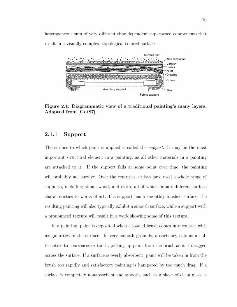
Figure 2.2: Linen is distinguished from cotton canvas by its dull brown-ish green color and its usually pronounced irregular texture. Adaptedfrom [Den05].
The term canvas is used in painting to describe any fabric that is used as a
support. Cotton duck and linen are two distinct fabrics made from two different
plant fibers. Cotton duck is a white fabric made from cotton fibers. It is an
inexpensive, widely available, and a popular support for painting. Linen is a light-
brown fabric made from the fibers of the flax plant, which is the same plant from
12
which linseed oil derives (the most commonly-used oil in oil painting). Linen is
much more expensive and less commonly used in modern times.
It is universally considered that cotton is an inferior material to linen can-
vas. Cotton fibers are quite short and resistant to stretching. They suffer rapid
degradation when subjected to atmospheric stresses, especially when the fabric is
stretched tightly (as in painting). Individual linen fibers are considerably longer
than those of cotton, thus the material is somewhat more durable and has a livelier
feel when it is stretched over a frame. The higher volatility of cotton can result in
cracking and damage to the paint layer. In addition, cotton fibers show a measur-
able color change after relatively little exposure to light. Despite these facts, many
artists–unaware of the technical issues of archival painting–continue to use cotton
duck canvas, mainly because it is so much less expensive. Overall, the best canvas
is closely woven pure linen with the threads of warp and woof equal in weight and
strength.
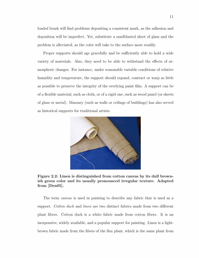
Figure 2.3: Left: magnified view of the interweaving threads of a cot-ton canvas. Right: further magnification shows the fibers comprisingeach thread. The average thread width for this canvas is approximately575µm and the fibers are approximately 12µm in width
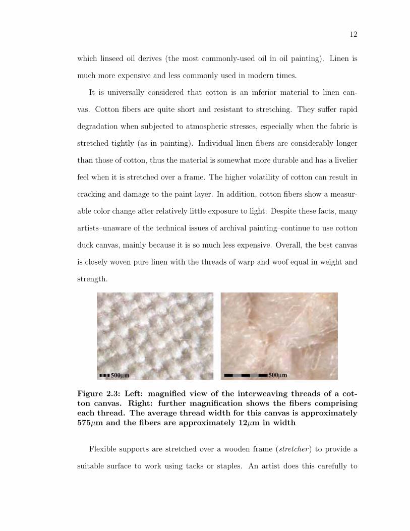
Flexible supports are stretched over a wooden frame (stretcher) to provide a
suitable surface to work using tacks or staples. An artist does this carefully to
13
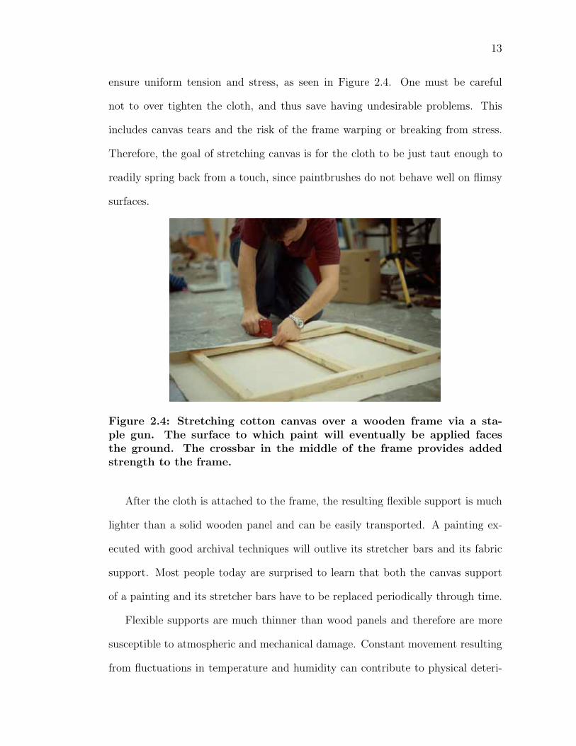
ensure uniform tension and stress, as seen in Figure 2.4. One must be careful
not to over tighten the cloth, and thus save having undesirable problems. This
includes canvas tears and the risk of the frame warping or breaking from stress.
Therefore, the goal of stretching canvas is for the cloth to be just taut enough to
readily spring back from a touch, since paintbrushes do not behave well on flimsy
surfaces.
Figure 2.4: Stretching cotton canvas over a wooden frame via a sta-ple gun. The surface to which paint will eventually be applied facesthe ground. The crossbar in the middle of the frame provides addedstrength to the frame.
After the cloth is attached to the frame, the resulting flexible support is much
lighter than a solid wooden panel and can be easily transported. A painting ex-
ecuted with good archival techniques will outlive its stretcher bars and its fabric
support. Most people today are surprised to learn that both the canvas support
of a painting and its stretcher bars have to be replaced periodically through time.
Flexible supports are much thinner than wood panels and therefore are more
susceptible to atmospheric and mechanical damage. Constant movement resulting
from fluctuations in temperature and humidity can contribute to physical deteri-
14
oration of a rigidly painted layer of paint. To counteract the instability of fabrics,
not only can they be supported via stretchers, but are also sometimes mounted on
rigid panels.
The nature of the support influences how we interpret the painting–soft sup-
ports impart soft surfaces, while rigid ones are very hard and smooth. Yet, the
composition of the paint dictates which types of support are applicable for a given
work. Canvas was originally developed as a support for oil-based paintings. This
is because flexible supports demand pliable materials due to the natural evolution
of the stretched canvas; oil paint responds well to canvas’ natural evolution of
shrinking and expanding. Paints that dry to thin, brittle films can only be used
on very rigid supports. This is due to that fact that such paint would be very
susceptible to cracking and flaking of flexible supports. However, an improperly
primed wooden panel may also cause problems as well, since atmospheric moisture
can cause warping in wood.
2.1.2 Size
Supports need further surface treatment before they can be used for painting.
Untreated supports, flexible and rigid, are usually too absorbent to allow the con-
trolled application of paint. After a canvas is stretched, the support is first prepared
with an application of size. The historical preferred sizing material is a diluted
solution of animal skin glue. The size prevents subsequent layers of the painting
from being absorbed into the support, which would weaken the painting. Some
paints are detrimental to the life of a support. Therefore, paint should never come
into direct contact with the fibers or the canvas will rot, that is, eventually become
weak, brittle, and crumbly.
15
A size is not a coating, it is a penetrating liquid employed to fill pores and
to make surfaces suitable to receive coatings. It is used to seal and solidify the
support, and acts as a guard against deterioration and mold. In the case of flexible
supports, size shrinks the fabric to a taut, smooth membrane. Hence, on drying it
should become somewhat tighter and free from folds and wrinkles.
2.1.3 Ground
The next intermediate layer between a support and subsequent paint films is a
ground. Most supports will be unevenly absorbent, even if they have been correctly
sized. A ground is to ensure that a particular kind of paint will perform with
reasonable predictability.
Mark Gottsegen writes that grounds should meet a few basic requirements
[Got87]. A ground should be white–some paint films grow more transparent with
age and the respective colors will lose their relative relationships if the ground is
not white. Also, since the ground is a structural element for the paint to grip, it
should have a tooth and should be somewhat absorbent. This ensures proper paint
deposition and adhesion as a brush moves across the surface. For flexible supports,
the ground should not be too much affected by the continuous movement of the
support. Brittle grounds and paint films should use more rigid supports.
The ground provides a better adherence of the subsequent paint layers. A
ground is essentially a paint, made of materials compatible with the support ma-
terial and the paint to be used. Gesso–a mixture of animal skin glue, chalk (calcium
carbonate), and sometimes white pigment (powdered colorant)–has been used for
centuries as a ground for wooden panels and canvas. Traditional gesso yields a
highly reflective, opaque surface. Light that passes through the layers of the paint-
16
ing will hit the ground and reflect back toward the viewer creating a luminous
surface.
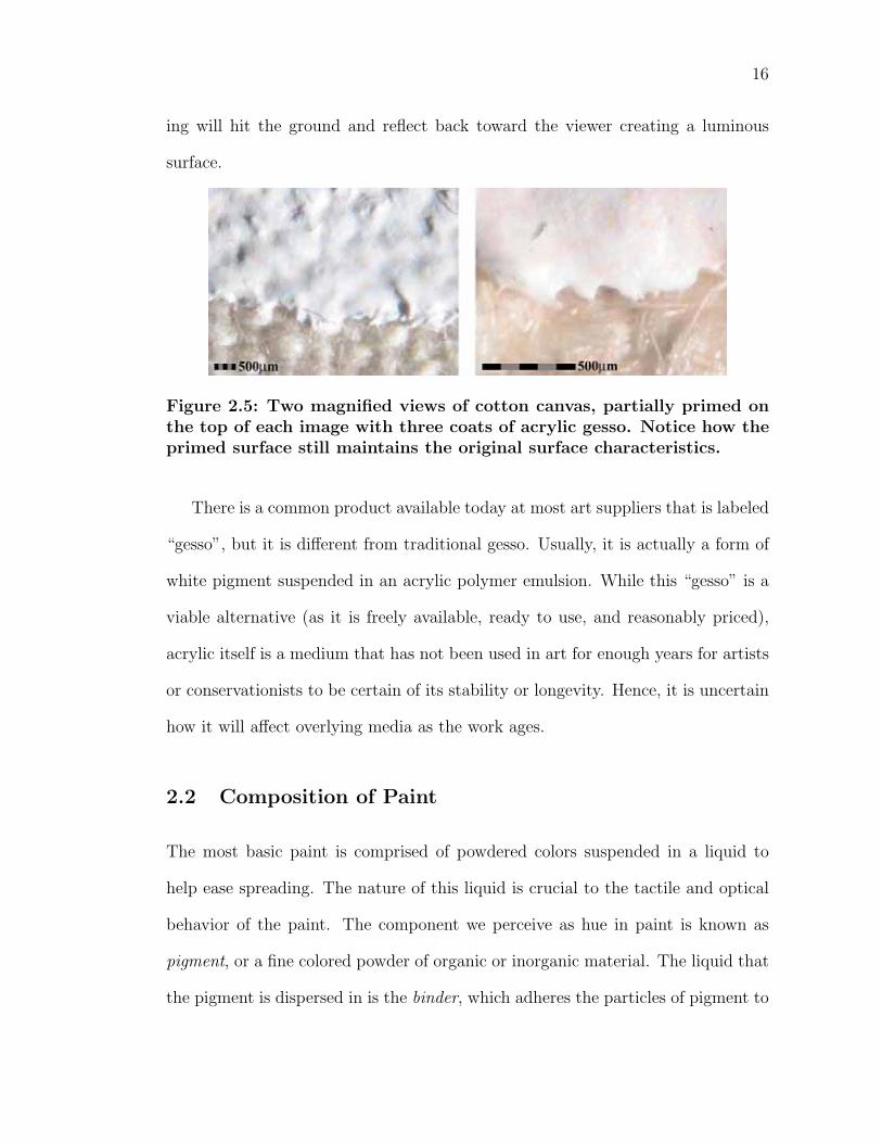
Figure 2.5: Two magnified views of cotton canvas, partially primed onthe top of each image with three coats of acrylic gesso. Notice how theprimed surface still maintains the original surface characteristics.
There is a common product available today at most art suppliers that is labeled
“gesso”, but it is different from traditional gesso. Usually, it is actually a form of
white pigment suspended in an acrylic polymer emulsion. While this “gesso” is a
viable alternative (as it is freely available, ready to use, and reasonably priced),
acrylic itself is a medium that has not been used in art for enough years for artists
or conservationists to be certain of its stability or longevity. Hence, it is uncertain
how it will affect overlying media as the work ages.
2.2 Composition of Paint
The most basic paint is comprised of powdered colors suspended in a liquid to
help ease spreading. The nature of this liquid is crucial to the tactile and optical
behavior of the paint. The component we perceive as hue in paint is known as
pigment, or a fine colored powder of organic or inorganic material. The liquid that
the pigment is dispersed in is the binder, which adheres the particles of pigment to
17
the surface of the support. In painting, the term media refers to the binder used
in the piece of art.
Paint media, no matter how different from one another, share a common char-
acteristic in the fact that they are manufactured in essentially the same way. The
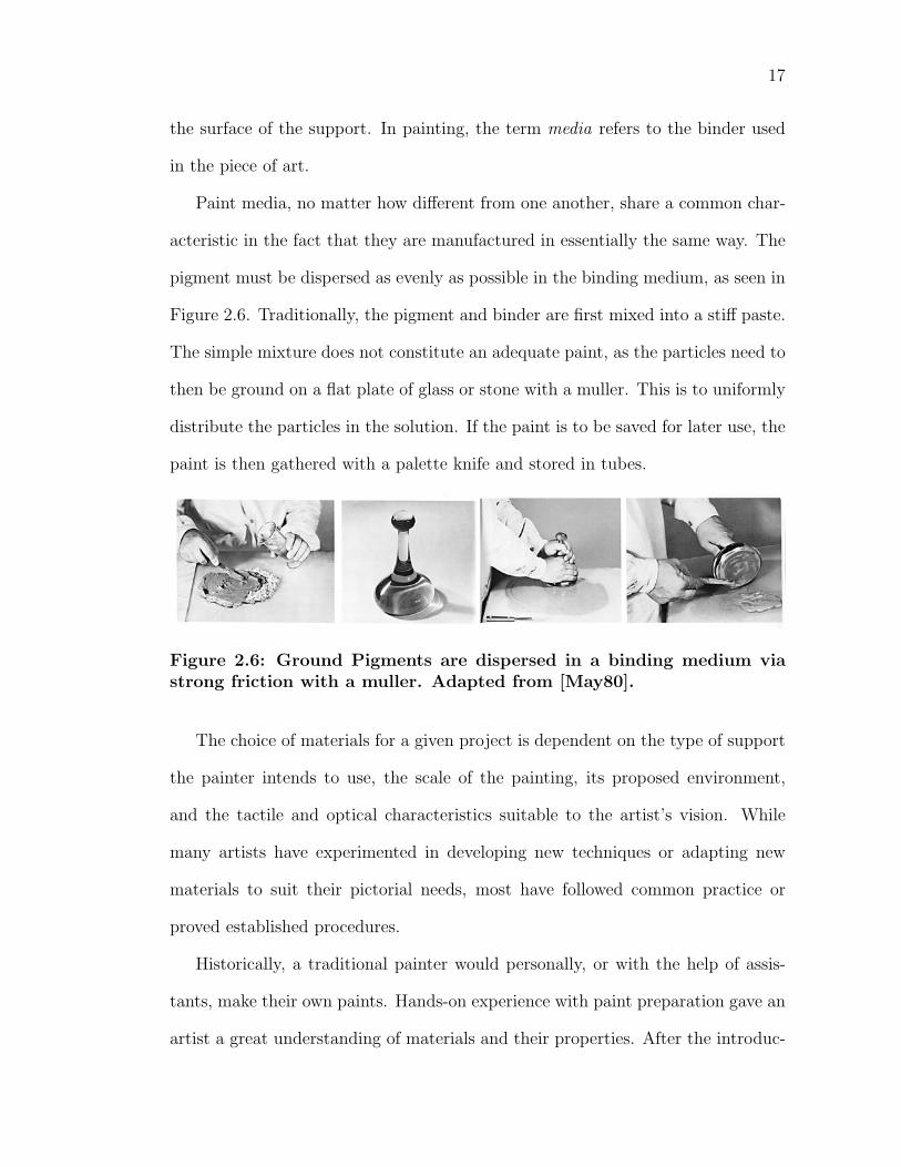
pigment must be dispersed as evenly as possible in the binding medium, as seen in
Figure 2.6. Traditionally, the pigment and binder are first mixed into a stiff paste.
The simple mixture does not constitute an adequate paint, as the particles need to
then be ground on a flat plate of glass or stone with a muller. This is to uniformly
distribute the particles in the solution. If the paint is to be saved for later use, the
paint is then gathered with a palette knife and stored in tubes.
Figure 2.6: Ground Pigments are dispersed in a binding medium viastrong friction with a muller. Adapted from [May80].
The choice of materials for a given project is dependent on the type of support
the painter intends to use, the scale of the painting, its proposed environment,
and the tactile and optical characteristics suitable to the artist’s vision. While
many artists have experimented in developing new techniques or adapting new
materials to suit their pictorial needs, most have followed common practice or
proved established procedures.
Historically, a traditional painter would personally, or with the help of assis-
tants, make their own paints. Hands-on experience with paint preparation gave an
artist a great understanding of materials and their properties. After the introduc-
18
tion of paint tubes in 1841 and the development of the paint industry in subsequent
centuries, artists became separated from the paint manufacturing process. Unfor-
tunately, most artists lost the motivation to understand the details of the trade.
While artists became freer in the creative process–manufactured tubed paint al-
lowed them to leave the studio to work–the diminishing knowledge of materials
led to serious negative effects. The use of inadequate and incompatible materials,
poorly tested paints, and the experimentation of paint formulas without knowledge
of possible consequences led to disastrous effects on the longevity of paintings.
2.2.1 Pigment
There are two distinct types of colorants: dyes and pigments. Colored substances
that dissolve in liquids and impart their colored effects to materials by staining
or being absorbed are classified as dyes. Individual dye molecules are only five
to ten times that size of a water molecule. The water molecules firmly attach to
each dye molecule, allowing the result to swim freely in the water. Because of
their small size, dyes dissolve in, bond with, or absorb into the material they come
into contact with. These bonds are not easily undone and therefore the resulting
color cannot be modified much after being applied to a surface. For most painterly
works, the paint surface is reworked considerably; hence dyes are not suitable for
most artistic work as they are very immediate colorants.
Instead, artists use pigments, or small insoluble colorant crystals. For example,
a pigment that occurs naturally is the deep red colorant Hematite, comprised
mostly of ferric oxide. In addition, the dyes that are used in painting must first be
laked–bonded chemically to a transparent, inert metallic base which transform the
dye into an insoluble pigment. For example, a historic laked dye is formed from the
19
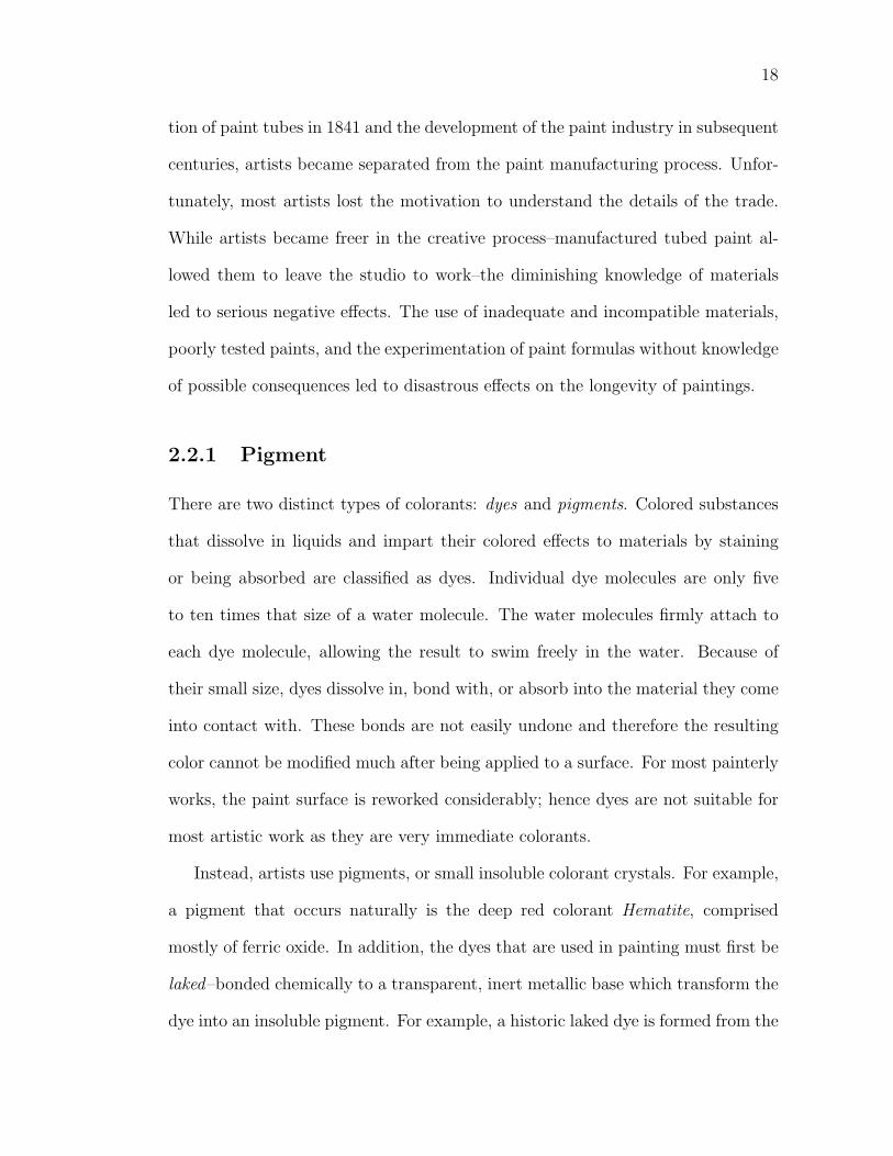
Figure 2.7: A sample of pure pigments.
ground dried roots of the herbaceous rubia tinctorium of Greece and Asia Minor.
The particles are laked with aluminum hydrate, forming the crimson red pigment
Madder Lake.
Thanks to the developments in chemistry in recent history, painters today have
hundreds of pure colors from which to choose. Historically, there were fewer pig-
ments available to painters of Medieval Europe. With few exceptions, the same
pigments are used in all types of paints. The difference in the various methods of
painting–oil, watercolor, acrylic–lie in the material with which the pigments are
applied and attached to the ground.
For a pigment to be suitable for use in an artists’ paint, it must meet a number
of requirements [Got87]. A pigment must be a fine, smooth powder that does not
react to changes in normal atmospheric conditions. It should not react chemically
with other paints or supplementary materials to which it is exposed–this includes
the binder, vehicle, ground, or other pigments. While no pigment is perfect in all
binders, a pigment should form a stable film with the binder. Defective pigment-
binder mixtures usually show soon after paint manufacturing. Flocculation is when
20
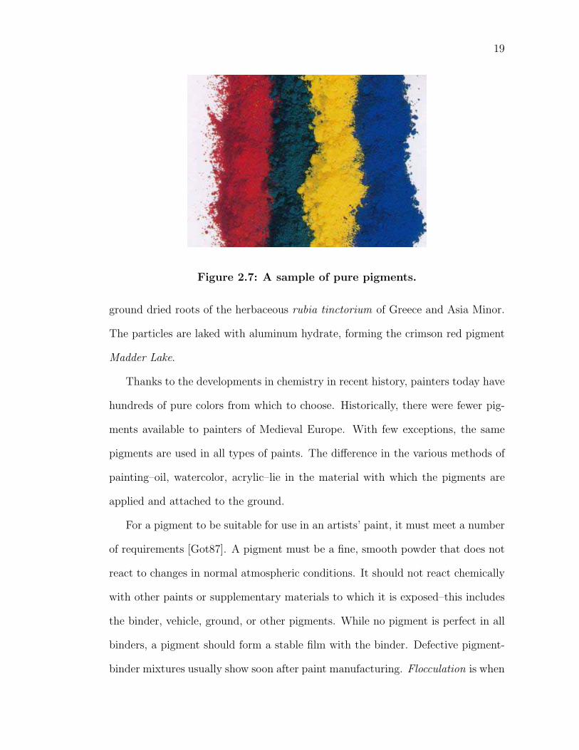
Figure 2.8: Natural pigments of antiquity. Top row: yellow and redearth pigments; center row: vermilion, two shades of umber, and azu-rite; bottom row: two shades of green earth, malachite and lapis lazuli.Adapted from [Weh75].
a pigment rises to and projects from the surface of a dried paint film and thus can
be powdered off. Agglomeration is when pigments coagulate into lumps and resist
dispersion in the binder.
Painters usually visualize a paint color in terms of its masstone–the color ap-
pearance of a high concentration of only one pigment completely hiding the surface
below. Hence, a pigment should be pure, without added inert ingredients that ad-
versely affect its color or handling. A tint is the color appearance of any mixture
of a pigment and a white pigment. This tends to lighten the color, make it less
saturated, and sometimes shift the result to a slightly different hue.
The concentration of pigment to binding medium also has an effect on the
resulting color. Higher concentrations of pigment to binder produce deeper, richer
hues. However, there is a limit of how much a given media can be saturated
with pigment; at some point it rejects absorbing more pigment and the solution’s
fluidity is adversely affected. This characteristic is also pigment dependent, as
each material has a different absorption rate. This is sometimes referred to as the
21
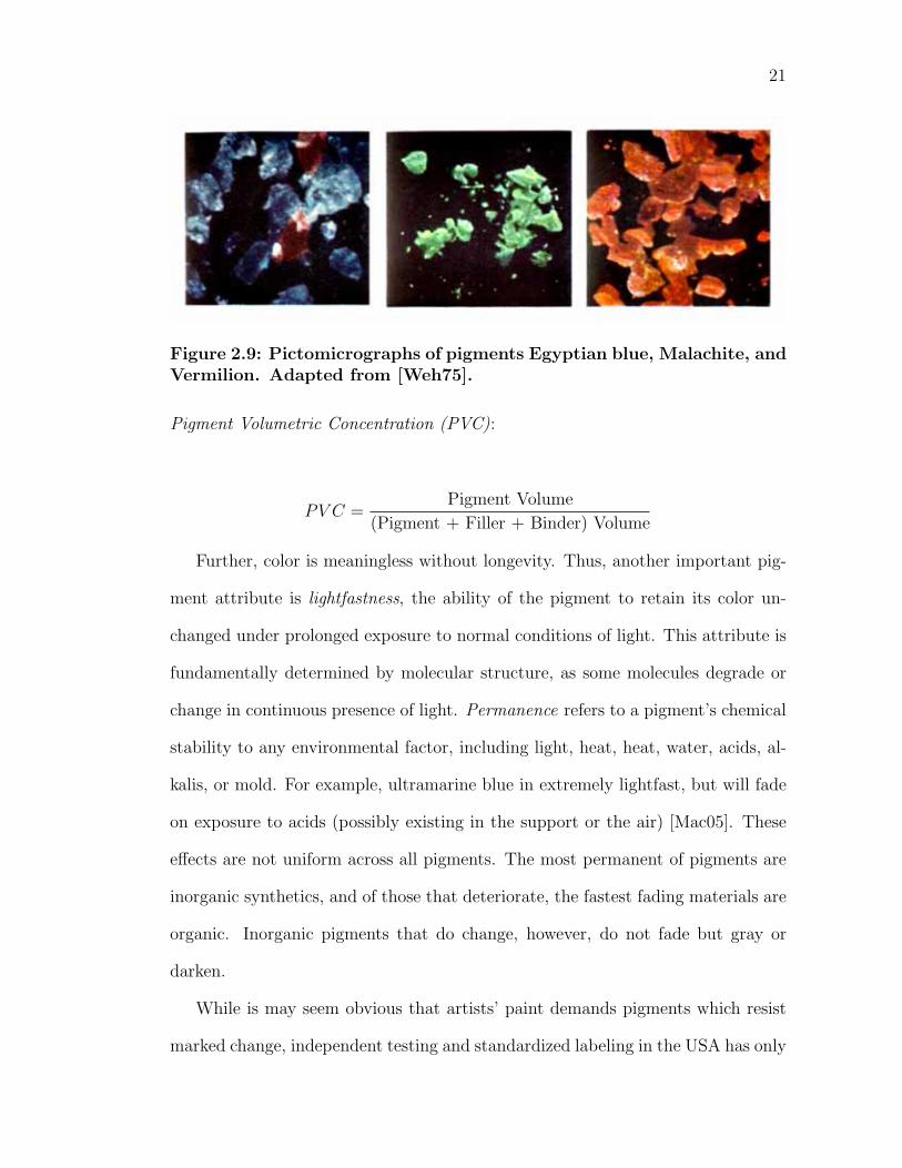
Figure 2.9: Pictomicrographs of pigments Egyptian blue, Malachite, andVermilion. Adapted from [Weh75].
Pigment Volumetric Concentration (PVC):
PV C =Pigment Volume
(Pigment + Filler + Binder) Volume
Further, color is meaningless without longevity. Thus, another important pig-
ment attribute is lightfastness, the ability of the pigment to retain its color un-
changed under prolonged exposure to normal conditions of light. This attribute is
fundamentally determined by molecular structure, as some molecules degrade or
change in continuous presence of light. Permanence refers to a pigment’s chemical
stability to any environmental factor, including light, heat, heat, water, acids, al-
kalis, or mold. For example, ultramarine blue in extremely lightfast, but will fade
on exposure to acids (possibly existing in the support or the air) [Mac05]. These
effects are not uniform across all pigments. The most permanent of pigments are
inorganic synthetics, and of those that deteriorate, the fastest fading materials are
organic. Inorganic pigments that do change, however, do not fade but gray or
darken.
While is may seem obvious that artists’ paint demands pigments which resist
marked change, independent testing and standardized labeling in the USA has only
22
become more common recently. The American Society for Testing and Materials
(ASTM) developed testing procedures and standards for classifying a pigment’s
reaction to light in 1984. The Standard Test Methods for Lightfastness of Colorants
Used in Artists’ Materials approximate the color change that can be expected over
time in pigments used in artists’ paints in normal indoor exposure [D4384]. The
ratings range from I excellent to V very poor. The tests only apply to certain
binding materials and a rating for a pigment in one media does not necessarily
equate to the same rating in another media. For example, pigments typically
last longer inside the protective coatings of oil or acrylic than gum arabic (as
in watercolor). For artists, paints should only be considered when they have a
ASTM rating of I or II (excellent or very good lightfastness). Under these ratings,
the pigment will remain unchanged for 50 to 100 years or more under exposure to
light.
The most salient pigment attribute for painters is its color. There are many
factors inherent in pigments that influence the color of a paint. Color is funda-
mentally created by the absorption of specific wavelengths of light by electrons
oscillating across double chemical bonds in pigments [Mac05]. In addition, color
is largely influenced by the particle size, shape and distribution of the pigment.
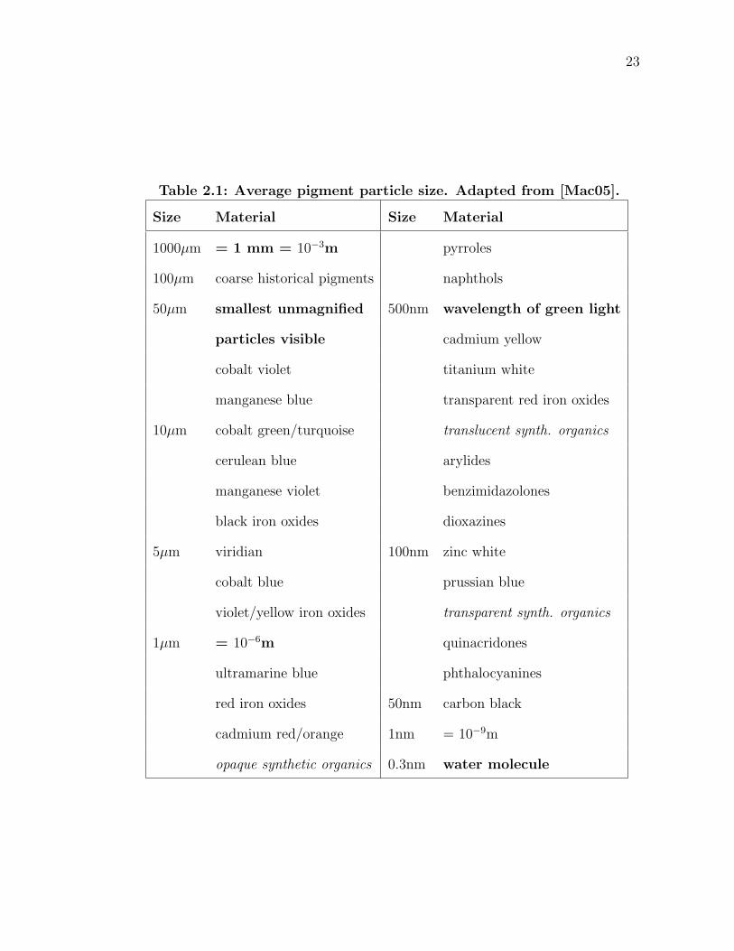
Table 2.1 describes a representative distribution of modern artist’s pigment grades;
the smallest of pigments are much larger than a dye molecule, while the largest
pigments can be seen by the naked eye.
There are many pigment properties determined by particle size, including light
scattering properties that are important for artists. The fundamental attribute is
the ratio of surface area to volume. Surface area A is of order O(r2), while volume
V is of order O(r3) (where r is the radius of a particle). The ratio
23
Table 2.1: Average pigment particle size. Adapted from [Mac05].
Size Material Size Material
1000µm = 1 mm = 10−3m pyrroles
100µm coarse historical pigments naphthols
50µm smallest unmagnified 500nm wavelength of green light
particles visible cadmium yellow
cobalt violet titanium white
manganese blue transparent red iron oxides
10µm cobalt green/turquoise translucent synth. organics
cerulean blue arylides
manganese violet benzimidazolones
black iron oxides dioxazines
5µm viridian 100nm zinc white
cobalt blue prussian blue
violet/yellow iron oxides transparent synth. organics
1µm = 10−6m quinacridones
ultramarine blue phthalocyanines
red iron oxides 50nm carbon black
cadmium red/orange 1nm = 10−9m
opaque synthetic organics 0.3nm water molecule
24
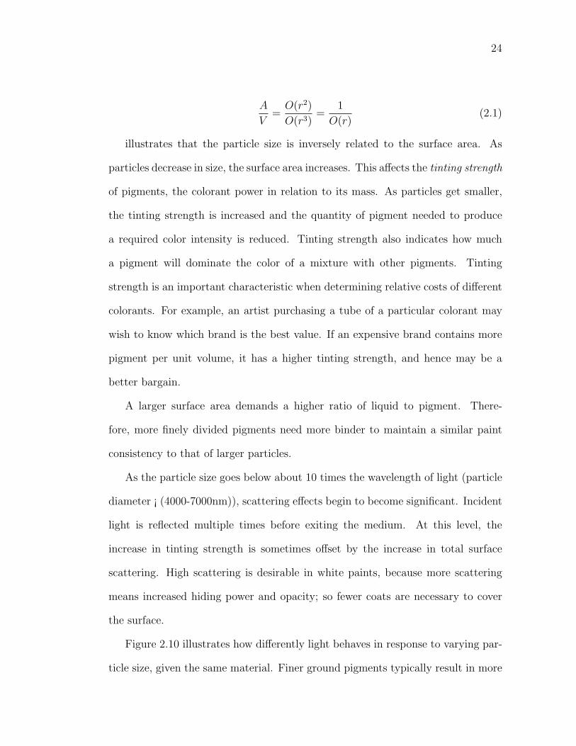
A
V=
O(r2)
O(r3)=
1
O(r)(2.1)
illustrates that the particle size is inversely related to the surface area. As
particles decrease in size, the surface area increases. This affects the tinting strength
of pigments, the colorant power in relation to its mass. As particles get smaller,
the tinting strength is increased and the quantity of pigment needed to produce
a required color intensity is reduced. Tinting strength also indicates how much
a pigment will dominate the color of a mixture with other pigments. Tinting
strength is an important characteristic when determining relative costs of different
colorants. For example, an artist purchasing a tube of a particular colorant may
wish to know which brand is the best value. If an expensive brand contains more
pigment per unit volume, it has a higher tinting strength, and hence may be a
better bargain.
A larger surface area demands a higher ratio of liquid to pigment. There-
fore, more finely divided pigments need more binder to maintain a similar paint
consistency to that of larger particles.
As the particle size goes below about 10 times the wavelength of light (particle
diameter ¡ (4000-7000nm)), scattering effects begin to become significant. Incident
light is reflected multiple times before exiting the medium. At this level, the
increase in tinting strength is sometimes offset by the increase in total surface
scattering. High scattering is desirable in white paints, because more scattering
means increased hiding power and opacity; so fewer coats are necessary to cover
the surface.
Figure 2.10 illustrates how differently light behaves in response to varying par-
ticle size, given the same material. Finer ground pigments typically result in more
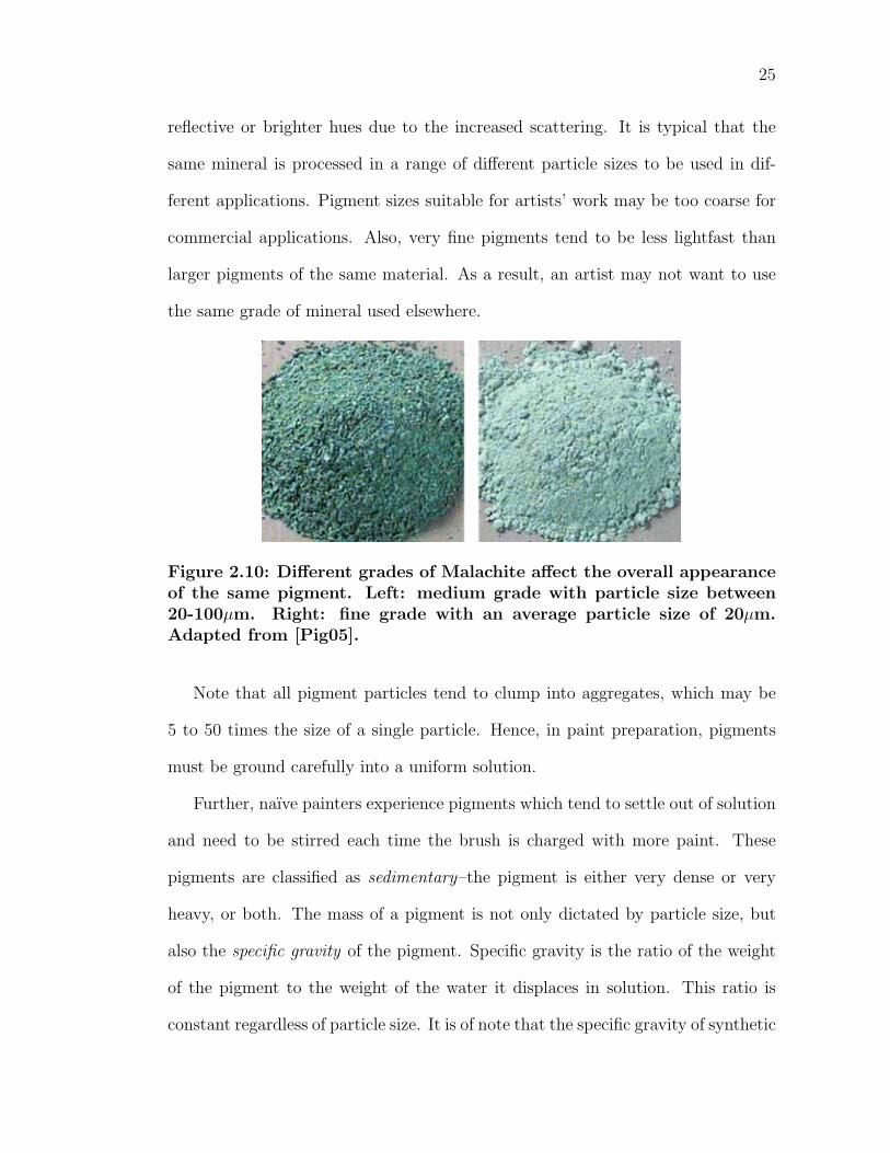
25
reflective or brighter hues due to the increased scattering. It is typical that the
same mineral is processed in a range of different particle sizes to be used in dif-
ferent applications. Pigment sizes suitable for artists’ work may be too coarse for
commercial applications. Also, very fine pigments tend to be less lightfast than
larger pigments of the same material. As a result, an artist may not want to use
the same grade of mineral used elsewhere.
Figure 2.10: Different grades of Malachite affect the overall appearanceof the same pigment. Left: medium grade with particle size between20-100µm. Right: fine grade with an average particle size of 20µm.Adapted from [Pig05].
Note that all pigment particles tend to clump into aggregates, which may be
5 to 50 times the size of a single particle. Hence, in paint preparation, pigments
must be ground carefully into a uniform solution.
Further, naıve painters experience pigments which tend to settle out of solution
and need to be stirred each time the brush is charged with more paint. These
pigments are classified as sedimentary–the pigment is either very dense or very
heavy, or both. The mass of a pigment is not only dictated by particle size, but
also the specific gravity of the pigment. Specific gravity is the ratio of the weight
of the pigment to the weight of the water it displaces in solution. This ratio is
constant regardless of particle size. It is of note that the specific gravity of synthetic
26
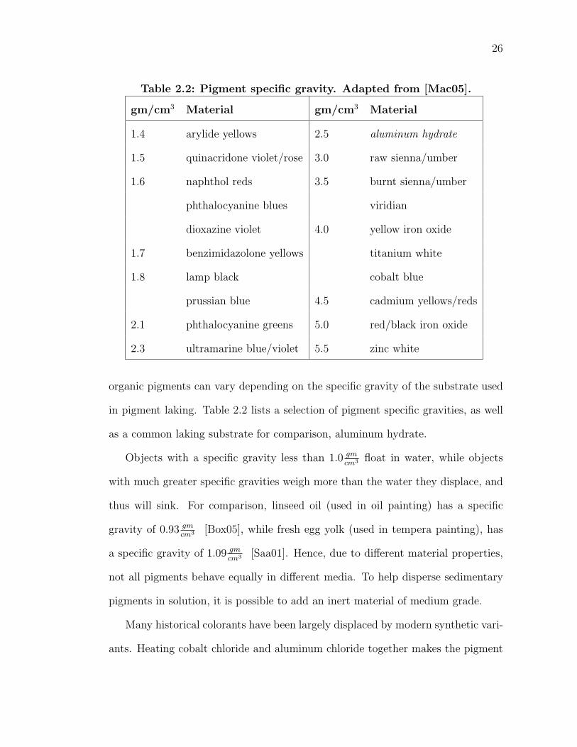
Table 2.2: Pigment specific gravity. Adapted from [Mac05].
gm/cm3 Material gm/cm3 Material
1.4 arylide yellows 2.5 aluminum hydrate
1.5 quinacridone violet/rose 3.0 raw sienna/umber
1.6 naphthol reds 3.5 burnt sienna/umber
phthalocyanine blues viridian
dioxazine violet 4.0 yellow iron oxide
1.7 benzimidazolone yellows titanium white
1.8 lamp black cobalt blue
prussian blue 4.5 cadmium yellows/reds
2.1 phthalocyanine greens 5.0 red/black iron oxide
2.3 ultramarine blue/violet 5.5 zinc white
organic pigments can vary depending on the specific gravity of the substrate used
in pigment laking. Table 2.2 lists a selection of pigment specific gravities, as well
as a common laking substrate for comparison, aluminum hydrate.
Objects with a specific gravity less than 1.0 gmcm3 float in water, while objects
with much greater specific gravities weigh more than the water they displace, and
thus will sink. For comparison, linseed oil (used in oil painting) has a specific
gravity of 0.93 gmcm3 [Box05], while fresh egg yolk (used in tempera painting), has
a specific gravity of 1.09 gmcm3 [Saa01]. Hence, due to different material properties,
not all pigments behave equally in different media. To help disperse sedimentary
pigments in solution, it is possible to add an inert material of medium grade.
Many historical colorants have been largely displaced by modern synthetic vari-
ants. Heating cobalt chloride and aluminum chloride together makes the pigment
27
Cobalt Blue. This chemical reaction produces particles of unusual fineness and
uniformity. On the other hand, the natural pigment Azurite is prepared by crush-
ing samples of the mineral extracted from copper ore deposits. During this process,
aggregates of copper carbonate crystals are shattered into small, irregular shapes
and sizes. Due to difficulties in extraction, the mineral may also contain inclusions,
which are small amounts of other minerals (malachite, in this case). As a result,
while exhibiting a similar hue, Azurite’s reflectance properties will not compare to
the purity of those found in Cobalt Blue.
The driving force of synthetic pigments mainly serves the dye and paint in-
dustries. They are formulated today to maximize their desirability–homogeneous
in shape, size and composition–while at the same time improving color nuances,
brightness and stability. For example, to increase the covering power of a pigment,
particle sizes are reduced to the smallest possible (therefore increasing the possi-
bility of poor lightfastness). Particles that are more consistent in shape and size
also tend not to settle quickly and nor separate from their binder once inside a
paint bottle or tube. While this increases the shelf life and thereby marketability
of paint, commercial additives and processes sometimes reduce the color’s effec-
tiveness for artists’ use.
2.2.2 Binding Media Influence
In the previous section, pigments have been discussed out of context. Pigments
themselves do not have binding strength and therefore are never viewed directly
on a painting. The material that adheres pigment particles to the ground is known
as the binding medium. Many types of binders have been experimented with over
the years, including plant gums, animal glues and drying oils. While pigments
28
provide the underlying color to a paint, the binder determines the primary optical
and textural characteristics, as well as the working properties of the paint.
In addition, other substances may be added to further manipulate paint at-
tributes. An artist may add a vehicle to dilute the pigment-binder mixture, allow-
ing the paint to be spread more easily. This substance has no adhesive properties
and evaporates after brush marks have been made. For instance, in oil paint, nat-
ural gum turpentine is often used as a vehicle. Other materials may be added to
enhance the optical or textural characteristics of the paint surface. For years the
strong, and bright colors in Venetian Renaissance paintings mystified art historians.
It turns out that artists were experimental chemists that would mix unconventional
ingredients. Ground particles of glass were added to the palette to enhance the
reflective properties of the paint, which would make objects and figures in their
paintings appear to glow [Goh05]. An artist can also alter the working properties
of the paint, such as viscosity and handling. Many materials (wax, for example)
are added to permit the sculpting of the topology of the surface. Further, one can
even accelerate or deter drying or make the paint more or less fluid, if desired.
Our perception of color in a painting depends on the interactions between light
and the layers of paint. In order to understand how the same pigment looks
different when suspended in different media, we must first analyze the optics of
paint films. When a ray of light hits a surface it is either reflected off the surface,
transmitted through the material, or absorbed into the material.
The way light reacts to a surface is known as the Bidirectional Reflectance
Distribution Function (BRDF) of the surface. This reflection can be as simple as
being uniform in all directions, commonly called diffuse. Diffuse reflections are
typically the result of rough surfaces, and are characterized as matte or dull in
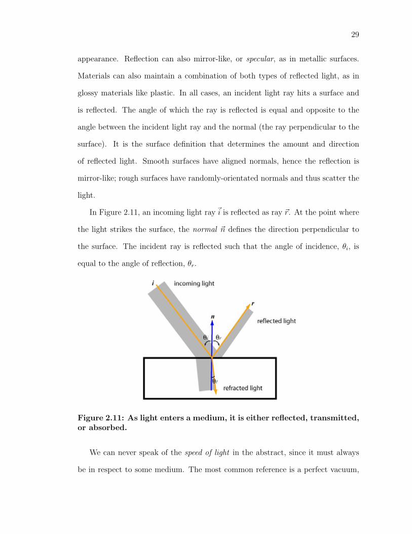
29
appearance. Reflection can also mirror-like, or specular, as in metallic surfaces.
Materials can also maintain a combination of both types of reflected light, as in
glossy materials like plastic. In all cases, an incident light ray hits a surface and
is reflected. The angle of which the ray is reflected is equal and opposite to the
angle between the incident light ray and the normal (the ray perpendicular to the
surface). It is the surface definition that determines the amount and direction
of reflected light. Smooth surfaces have aligned normals, hence the reflection is
mirror-like; rough surfaces have randomly-orientated normals and thus scatter the
light.
In Figure 2.11, an incoming light rayi is reflected as ray r. At the point where
the light strikes the surface, the normal n defines the direction perpendicular to
the surface. The incident ray is reflected such that the angle of incidence, θi, is
equal to the angle of reflection, θr.
Figure 2.11: As light enters a medium, it is either reflected, transmitted,or absorbed.
We can never speak of the speed of light in the abstract, since it must always
be in respect to some medium. The most common reference is a perfect vacuum,
30
though the speed of light in air is only slightly slower. When light travels unim-
peded through a vacuum, it travels at a rate of about c ≈ 2.998x10⁸ ms. When
light travels through a medium denser than a vacuum, its velocity v decreases to
a value less than c. The ratio of the speed of light in a vacuum to the velocity of
light in another medium is the index of refraction η for that material:
η(λ) =c
vλ
(2.2)
where
vλ is the velocity of light of wavelength λ in the medium
c is the speed of light in a vacuum
Note that the index of refraction is a function of the wavelength of light. Wave-
length λ is the distance between repeating units of a wave pattern, while frequency
f is the rate of which repeating elements in a wave travel. For a wave pattern, the
velocity v is given by
v = fλ (2.3)
For light, the velocity is constant (v = c). Visible light is not pure, but com-
prised of many different wavelengths, each traveling at different frequencies. For
example, the frequency of blue light (short wavelengths) is higher then red light
(long wavelengths). However, in practice it is sometimes typical to use a single
wavelength to simplify calculations. A midrange wavelength of light, 589nm, is
commonly used to represent the visible spectrum–the prominent yellow-red band
of the Sodium D-line emission [Col06].
The surface where two media come into contact is called an interface; we see
a change of the speed of light at any interface between two materials of different
31
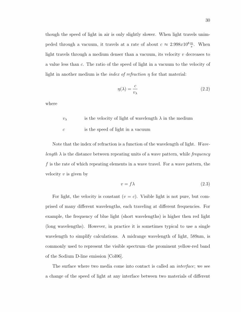
Table 2.3: Index of refraction η for binding media, vehicles, and others.Adapted from [TM00].
Material η Material η
Binders Vehicles
Gum arabic 10% 1.334 Water 1.330
Casein 1.338 Spirits of turpentine 1.47
Egg yolk 1.346 Glycerol 1.47-1.48
Hide glue 10% 1.348 Dammar varnish 1.539
Mowiol 1.410 Others
Molten beeswax 74C 1.438-1.442 Air 1.0008
Walnut oil 1.477 Glass 1.517
Linseed oil 1.478 Ruby 1.760
Acrylic resin 1.49 Diamond 2.418
densities. One ramification of this change of speed is that the light appears to bend
when passing through the interface. The amount of this bending, or refraction, is
determined by the indices of refraction of the materials on the opposing sides of
the interface. The most basic law describing how light refracts is known Snell’s
law:
ηi sin(θi) = ηt sin(θt) (2.4)
where
θi is the angle between the incident ray and the normal at the interface
θt is the angle between the transmitted ray and the reversed interface normal
ηi is the index of refraction for the incident medium
ηt is the index of refraction for the medium into which the light is transmitted
32
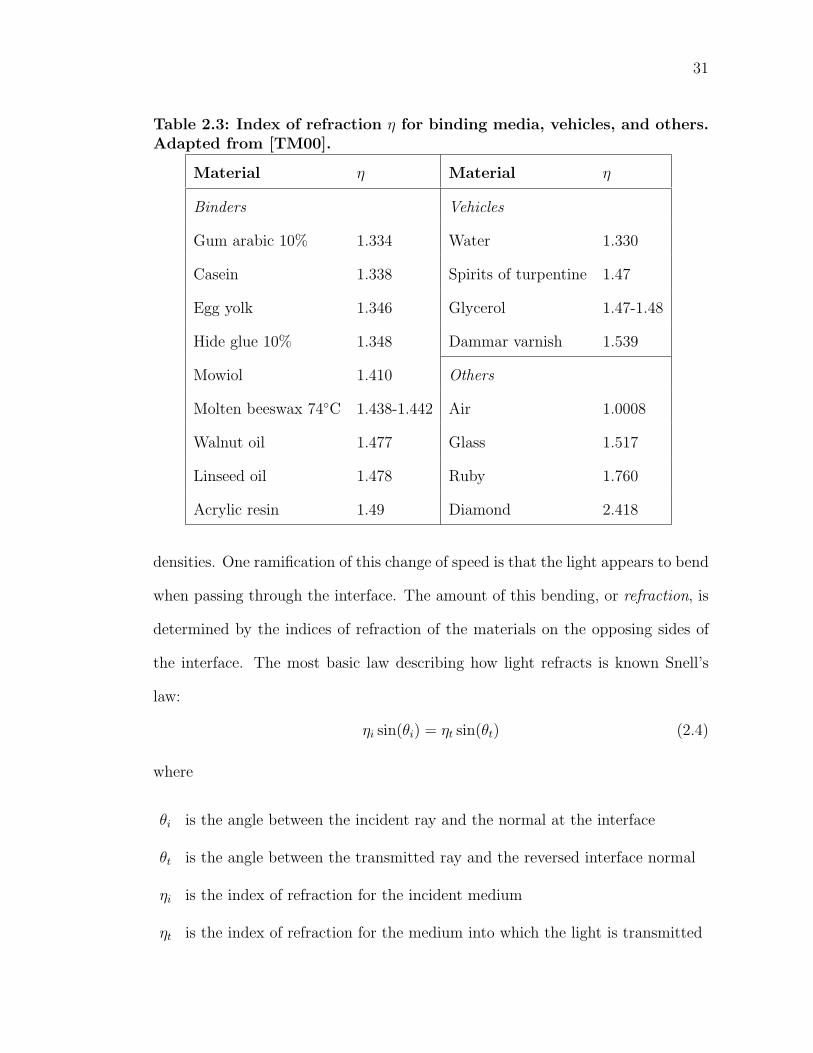
In general, when light travels from a dense medium to a less-dense medium,
the transmitted rays bend further away from the surface normal than the incident
ray (θi < θt). An implication of this statement is that at some angle, called the
critical angle, the light is bent such that the transmitted rays are perpendicular to
the surface normal. This behavior is illustrated in Figure 2.12.
Figure 2.12: Rays originating from point P inside a material of refractiveindex η2 = 1.5 are bent when entering a less-dense medium, such as air(η1 = 1). Since the rays are bent away from the normal, some of thelight is reflected back into the material. The ray striking C is at anangle of 42o and travels to point O. The critical angle is 42o in this case,since rays with a larger incident angle will be completely reflected backinto the dense medium. Adapted from [JF01]
Essentially, at some angle the incoming rays will be bent in a way such that
they travel parallel to the surface of the medium. This phenomenon is called total
internal reflection. From Snell’s law (Equation 2.4), we find the critical angle φc
may be found from:
ηi sin(φc) = ηt sin(π
2)
sin(φc) =ηt
ηi
. (2.5)
In other words, the critical angle is the smallest angle of incidence, in the denser
material, for which is totally internally reflected.
33
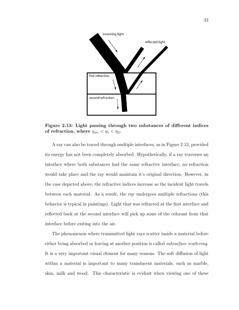
Figure 2.13: Light passing through two substances of different indicesof refraction, where ηair < η1 < η2.
A ray can also be traced through multiple interfaces, as in Figure 2.13, provided
its energy has not been completely absorbed. Hypothetically, if a ray traverses an
interface where both substances had the same refractive interface, no refraction
would take place and the ray would maintain it’s original direction. However, in
the case depicted above, the refractive indices increase as the incident light travels
between each material. As a result, the ray undergoes multiple refractions (this
behavior is typical in paintings). Light that was refracted at the first interface and
reflected back at the second interface will pick up some of the colorant from that
interface before exiting into the air.
The phenomenon where transmitted light rays scatter inside a material before
either being absorbed or leaving at another position is called subsurface scattering.
It is a very important visual element for many reasons. The soft diffusion of light
within a material is important to many translucent materials, such as marble,
skin, milk and wood. This characteristic is evident when viewing one of these
34
materials while lit from behind. Light will bleed on the sides and through areas
of thin volume, while a material without subsurface scattering would not exhibit
such subtle detail. This effect will also soften the shadowed areas of the material
since light traverses across the shadow boundaries from reflections underneath
the material. Also, as the scattered light traverses the material, light rays pick up
coloration before exiting. In skin, light scatters in the many layers of the epidermis
and the dermis, as well as capillaries, before exiting and reaching your eye. This
way, the sudden flush of one’s face is readily noticed by others, even though the
expanding blood vessels are relatively far underneath the skin.
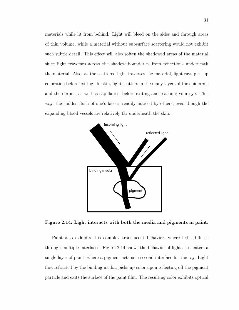
Figure 2.14: Light interacts with both the media and pigments in paint.
Paint also exhibits this complex translucent behavior, where light diffuses
through multiple interfaces. Figure 2.14 shows the behavior of light as it enters a
single layer of paint, where a pigment acts as a second interface for the ray. Light
first refracted by the binding media, picks up color upon reflecting off the pigment
particle and exits the surface of the paint film. The resulting color exhibits optical
35
properties of both the pigment and binder. As seen previously in Figure 2.9, the
shape, size, and orientation of each particle varies greatly within each pigment.
This has a great effect on the directions of reflection and refraction of light.
Each interface incites changes in the speed of light, while picking up color of
materials it encounters along the way. In addition, the distinction between pigment
particle and binding medium is an interface just like any other, and thus can also
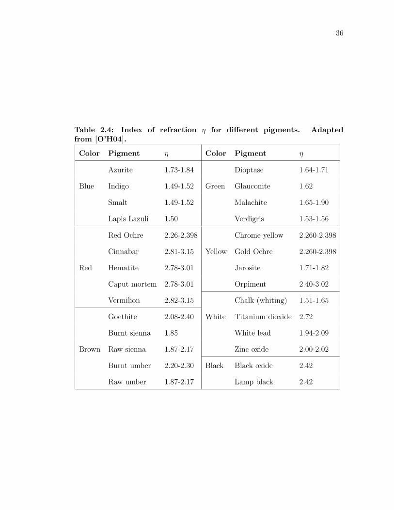
reflect and refract light. Many indices of refraction for common pigments can be
found in Table 2.4.
Also, many collections of pigments contain inclusions and impurities, which
have their own respective optical properties, affecting the overall appearance. Lapis
Lazuli (natural ultramarine blue) is mined from copper ore, which often contains
pyrite. It is often too expensive to completely purify mined materials that serve as
pigments. As a result, the extraneous minerals reflect wavelengths from different
parts of the visible spectrum than that of the pure pigment.
Figure 2.15 combines many effects that have been discussed, illustrating the
complex optical behavior of a layer of paint on a ground. The outer surface defini-
tion and texture of the paint film has an effect on the first scattering event. Light
that is transmitted at this interface interacts with both the media and pigments
until it is either absorbed or it exits the outer film. In addition to the physical
properties of the media and pigment, the concentration of pigments to binder has
a great effect on the amount of paint required for an opaque paint film. This
thickness is important, because it determines how much light reaches either the
underlying layers of paint, or the painting’s ground. Furthermore, a thick layer of
a dense medium will displace refracted rays further from original ray than will a
thin layer of the same material.
36
Table 2.4: Index of refraction η for different pigments. Adaptedfrom [O’H04].
Color Pigment η Color Pigment η
Azurite 1.73-1.84 Dioptase 1.64-1.71
Blue Indigo 1.49-1.52 Green Glauconite 1.62
Smalt 1.49-1.52 Malachite 1.65-1.90
Lapis Lazuli 1.50 Verdigris 1.53-1.56
Red Ochre 2.26-2.398 Chrome yellow 2.260-2.398
Cinnabar 2.81-3.15 Yellow Gold Ochre 2.260-2.398
Red Hematite 2.78-3.01 Jarosite 1.71-1.82
Caput mortem 2.78-3.01 Orpiment 2.40-3.02
Vermilion 2.82-3.15 Chalk (whiting) 1.51-1.65
Goethite 2.08-2.40 White Titanium dioxide 2.72
Burnt sienna 1.85 White lead 1.94-2.09
Brown Raw sienna 1.87-2.17 Zinc oxide 2.00-2.02
Burnt umber 2.20-2.30 Black Black oxide 2.42
Raw umber 1.87-2.17 Lamp black 2.42
37
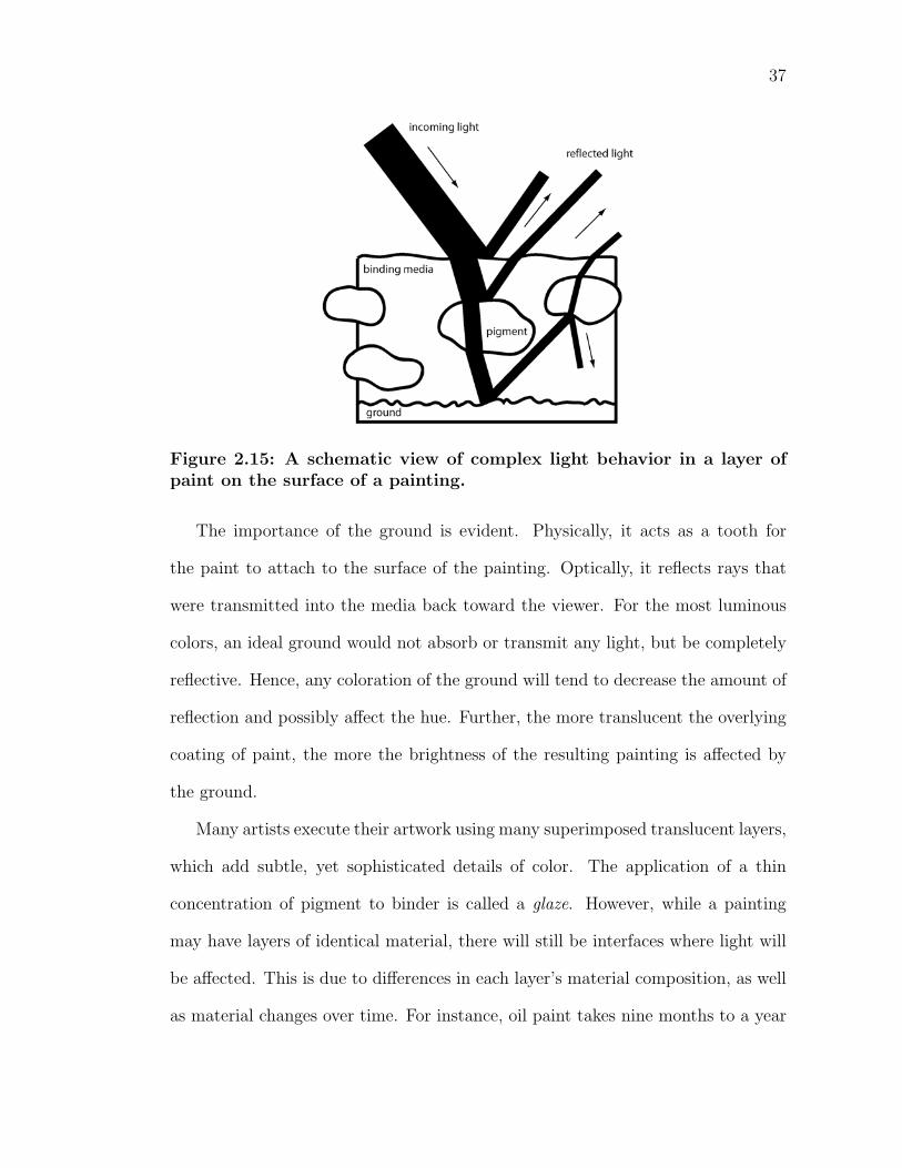
Figure 2.15: A schematic view of complex light behavior in a layer ofpaint on the surface of a painting.
The importance of the ground is evident. Physically, it acts as a tooth for
the paint to attach to the surface of the painting. Optically, it reflects rays that
were transmitted into the media back toward the viewer. For the most luminous
colors, an ideal ground would not absorb or transmit any light, but be completely
reflective. Hence, any coloration of the ground will tend to decrease the amount of
reflection and possibly affect the hue. Further, the more translucent the overlying
coating of paint, the more the brightness of the resulting painting is affected by
the ground.
Many artists execute their artwork using many superimposed translucent layers,
which add subtle, yet sophisticated details of color. The application of a thin
concentration of pigment to binder is called a glaze. However, while a painting
may have layers of identical material, there will still be interfaces where light will
be affected. This is due to differences in each layer’s material composition, as well
as material changes over time. For instance, oil paint takes nine months to a year
38
to completely congeal. Hence, these chemical changes in the binding media affect
the phase velocity of the light in the medium, which in turn affects the index of
refraction.
2.3 Binding Media Materials
Historically, traditional binding materials are all natural substances. Some require
no processing, while others have to be extracted from their source by some means.
In modern times, compounds synthesized in the laboratory have supplemented nat-
ural occurring materials. This chapter classifies natural binders by their respective
organic compounds, leaving synthetic and other binders to their own categories.
This method of classification is convenient because it groups materials of simi-
lar composition together. Much of this section is aided by the work of Taft and
Mayer [TM00].
2.3.1 Carbohydrate-Based
Carbohydrates are compounds that contain carbon, hydrogen and oxygen. The
basic building blocks of carbohydrates are simple sugars, of which glucose (one
of the most abundant organic compounds on the earth) and fructose (found in
honey and fruit juices) are prominent examples. These simple sugars, known as
monosaccharides, bond together to form large conglomerates known as polysac-
charides. Common examples are starch and cellulose; both are created from a
multitude of glucose molecules.
Examples of paint binders utilizing polysaccharides are honey and plant gums.
Honey is not a widely utilized binder, though found to be used in the past. The
substance is easily soluble in water and readily re-dissolved after the sticky sub-
39
stance has dried. This behavior is desirable when an artist wants to rework an
area that was completed previously. However, the resulting paint film is not very
permanent nor durable, as it is sensitive to moisture and quite brittle.
A great number of plant gums were used in different times as binders. The
most common is the material gum arabic, which comes from a particular variety of
the accaia. Accaia was one of the few trees that grew in ancient Egypt and served
as a binder in that period. Gums have similar behavior to that of honey; it is re-
workable and the dried film results in a matte surface. Gum arabic is the primary
ingredient for watercolor painting. Other watercolor additives that are sometimes
included are a plasticizer, usually glycerin, to soften the dried gum arabic and help
it re-dissolve; and a preservative, to suppress the growth of mold and bacteria.
The method of mixing watercolor paints with an opaque white pigment is tra-
ditionally referred to as gouache. Gouache is an opaque watercolor paint, and
creates a flawless, flat color area. Watercolors are layered in glazes, while gouache
is applied more directly, since applications of gouache will completely hide the
layers underneath. Whereas, the white of the paper provides the light for water-
colors (those who practice watercolor typically do not use white), the brilliance of
gouache comes from the pigment. The perfection of the gouache surface appeals
to illustration and commercial artists. Projects on both binders can be completed
quickly, as gum arabic dries rapidly.
2.3.2 Protein-Based
Proteins are compounds that consist mainly of carbon, oxygen, hydrogen and
nitrogen. Similar to carbohydrates, proteins are also comprised of building blocks.
There are approximately two-dozen naturally occurring amino acids known, which
40
bond together to form proteins. Examples of important proteins include keratin
(found in skin, wool and feathers), hemoglobin and silk.
In the context of traditional binding materials, glue refers specifically to a
substance derived from boiling skins or connective tissues of certain mammals or
fish. The adhesive is the protein collagen, which is a major structural ingredient
in mammals and fish. Skin glue is made from the extracted gelatin from boiled
raw hides, and is sold in powder form or as plates.
The protein has the unusual property of being soluble in hot water, but gels
as the solution cools to room temperature. If substance is left, the water will
completely evaporate and the substance will harden. Hence, a painter using this
media must work while the glue is hot. Glue paint is made fresh daily, as reheated
glue loses some of its binding strength. The method of painting with a solution of
gelatin and water is called distemper. A common artists’ glue paint is extracted
from rabbit skin, which yields a very strong, matte, and colorful paint film. The
most attractive quality of the glue paints is its beautiful reflection of light due
to the grains of pigment that are lying on the top of the paint layer. Of all the
binding media, glue is almost certainly the one mostly widely utilized around the
world, though from different animal sources.
An emulsion is a stable mixture of an aqueous liquid with a oily, fatty, waxy or
resinous substance. The yolks of hen’s eggs contain albumen (a gummy substance),
a nondrying oil, and lecithin (an efficient, stabilizing lipoid). Yolk is approximately
one-third protein, the rest containing oil droplets in water. Albumen belongs to
a class of proteins that have the property of being coagulated by heat, as demon-
strated by a cooked egg. The same effect occurs when it is spread out in a thin
film and exposed to daylight. Tempera painting refers to a binder of egg yolk.
41
Tempera paint is not stored, but made fresh daily, and dries quickly to an unusu-
ally luminous and brilliant film. The dried paint film is insoluble to the extent
that it is water-resistant under normal conditions. Tempera is sometimes used in
conjunction with other painting media. Its quick-drying behavior is well-suited
for underpainting, since an artist can block out compositions very quickly. Also,
some pigments react chemically with select media and hence tempera is used in
alternating layers of such media.
Milk is another example of an emulsion, as it contains suspended droplets of
water-insoluble butterfat. The solution is approximately one-fourth protein, and
also contains water, oil and milk sugar. Casein is a binder formed from the solids
of skim milk. It is manufactured by allowing skim milk to sour, separating the curd
from the whey, and washing and drying it. The crude curd from milk has been
employed as a binding medium since the earliest records. However, homemade
casein will contain impurities, and modern commercial casein is a much more
viable alternative for painting. Casein is an aqueous paint, but insoluble and
weatherproof when dry. The resulting paint film is a very strong matte surface,
with slightly more luster than gouache, and is typically used as an opaque color.
2.3.3 Oils
Oils are derivatives of a large class of diverse natural compounds known as lipids.
The majority of oils are nondrying or semidrying in nature; if spread out in a thin
film and exposed to air, they will either remain liquid or become only somewhat
solid. Some oils are drying oils, whereas through chemical reactions and oxidation,
they form solid films when exposed to air. The dried oil film differs in physical
and chemical composition from its liquid counterpart. It cannot be brought back
42
to its original state by any means.
The major drying oils are linseed, walnut and poppy-seed. Linseed and walnut
oil are the most common; the former is pressed from the seeds of the flax plant and
the latter from the seeds of walnut trees. Unlike binding media covered previously,
oil paint is not soluble in water. Natural solvents serve as the vehicle for oil paint,
such as the spirits of gum turpentine. Oil paint is long considered as the most
versatile medium for paint, as many materials may be used as additives in oil to
produce a diverse range or optical and handling properties.
Oil is relatively slow drying. While the surface of the film may be dry to the
touch in the first few days, the substance takes much longer to completely congeal
(sometimes over a year). This is an advantage to the painter as a number of effects
can be produced by working wet-into-wet, or mixing one layer into another before
the underlying film dries. Applying layers of different consistencies can achieve
effects not attainable in other media. In oil one can also glaze a transparent film
over another as in watercolor, producing a distinct color. Unsatisfactory work is
also easily scraped off with a palette knife and repainted, instead of overpainting
as in other media.
Drying oils do not dry at the same rate. Painters would naturally seek faster
drying oils, but the same reactions that lead to drying result in yellowing. Unfor-
tunately, faster drying oils yellow more than slower counterparts, dirtying whites,
turning blue passages greenish, and so forth.
The paint film that results from oil paint is very durable, water and moisture
resistant, and much more flexible than the aqueous paints. Oil paint can be applied
to both rigid and flexible supports. It retains flexibility in the dry state, holding up
against expansion and contraction due to fluctuation in atmospheric conditions.
43
2.3.4 Waxes
Historically, the most important wax for artistic purposes is beeswax. Chemically,
beeswax contains some free fatty acids, hydrocarbons, and esters formed from
alcohols and fatty acids. Similar to drying oils, beeswax can be dissolved in natural
solvents. Encaustic, or the method of painting with wax, originates from ancient
Greece.
Heat is used to liquefy the media, and the paint is applied hot with a brush
or palette knife (encaustic literally means “burned in”). Hence, the wax does not
dry, yet congeals as it cools. In modern usage, the beeswax is often combined with
resin or turpentine to increase the fluidity of the paint. A wide range of textures
is possible by varying the consistency of the paint. Applying external heat to the
artwork makes some additional effects. An artist may heat behind the support
to keep the surface warm while brush marks are made or apply heat to the paint
surface to burn in (fuse and adhere) existing layers. Encaustic paintings have a
unique lustrous, rich, and translucent surface.
Due to the cumbersome nature of its equipment, it was displaced by other media
(tempera and oil) in the Medieval and Renaissance periods. However, encaustic
has seen resurgence in modern times due to the abundance of tools to manipulate
the media, including hot plates, electric tools and heat lamps. Also, since wax
readily dissolves in turpentine, it is sometimes used as an additive in oil paint for
its textural and optical properties.
2.3.5 Synthetic Polymers
Rivaling oil in its versatility is a modern paint formulated from a synthetic poly-
mer referred to as acrylic polymer emulsion, or commonly known as simply acrylic.
44
While it has been used since the 1930s, widespread use followed commercial man-
ufacture in the 1950s. Artists are drawn to its quick-drying behavior (a matter of
minutes) and tough, flexible film suitable for almost any surface. Also, the media
uses water as a vehicle, eliminating the toxic fumes from oil’s solvents in the studio.
This simplifies cleanup of brushes and thinning of the paint as well.
One of the most compelling qualities of acrylic paint is its uncanny resemblance
to almost any other media, via manipulating the substance with various additives.
It can be thinned and used in light washes on paper as in watercolor, or thickened
and applied to large panels of canvas as in oil. It does not require the same
support preparation as other media and can be applied to unprimed surfaces, as it
is resistant to moisture upon drying. Similar to oil, additives can alter the finish,
viscosity, texture, and drying properties of acrylic paint.
However, there are drawbacks to this new medium. The acrylic polymer emul-
sion used as a binder is not as transparent as some other painting media, resulting
in a slightly less luminous surface. Another disadvantage is that acrylic cannot
hold as much pigment as other binders, which results in a slight hue reduction.
In regards to art conservation, not enough research has been done to examine
the longevity of acrylic polymer emulsion as a suitable binder, in comparison to
historical binders.
2.3.6 Catalytic Materials
There exists another form of painting that does not conform to our usual definition
of paint. In this case, the pigment is spread onto the surface of a wall without
the presence of a binder. The adhesion of particles to the support is the result
of a chemical process between the plaster of the wall and the air. Hence, the
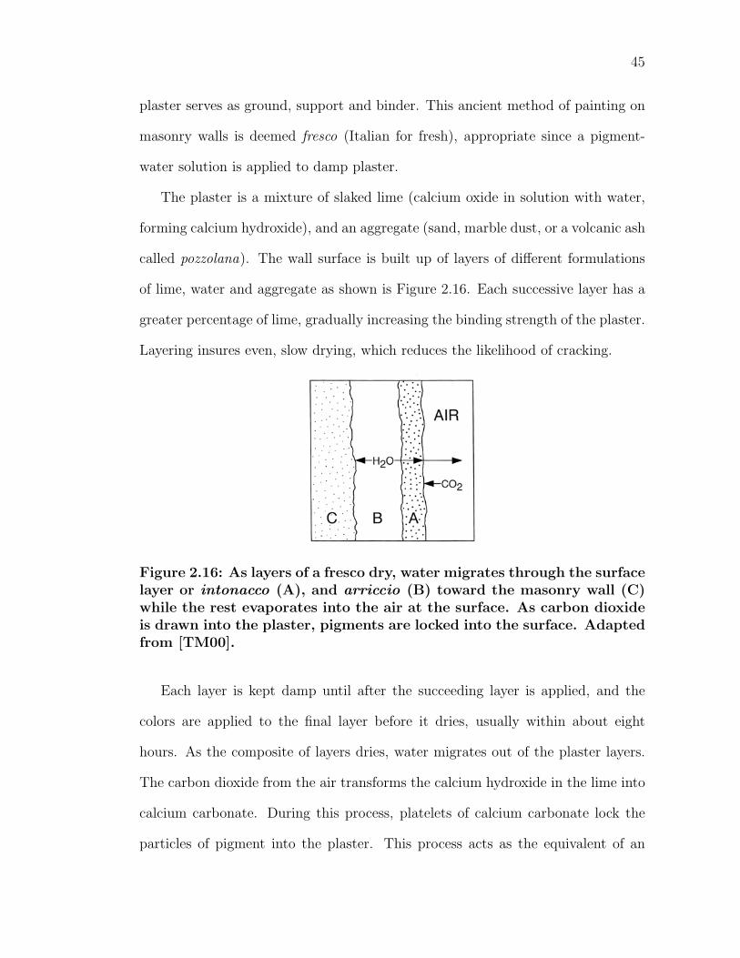
45
plaster serves as ground, support and binder. This ancient method of painting on
masonry walls is deemed fresco (Italian for fresh), appropriate since a pigment-
water solution is applied to damp plaster.
The plaster is a mixture of slaked lime (calcium oxide in solution with water,
forming calcium hydroxide), and an aggregate (sand, marble dust, or a volcanic ash
called pozzolana). The wall surface is built up of layers of different formulations
of lime, water and aggregate as shown is Figure 2.16. Each successive layer has a
greater percentage of lime, gradually increasing the binding strength of the plaster.
Layering insures even, slow drying, which reduces the likelihood of cracking.
Figure 2.16: As layers of a fresco dry, water migrates through the surfacelayer or intonacco (A), and arriccio (B) toward the masonry wall (C)while the rest evaporates into the air at the surface. As carbon dioxideis drawn into the plaster, pigments are locked into the surface. Adaptedfrom [TM00].
Each layer is kept damp until after the succeeding layer is applied, and the
colors are applied to the final layer before it dries, usually within about eight
hours. As the composite of layers dries, water migrates out of the plaster layers.
The carbon dioxide from the air transforms the calcium hydroxide in the lime into
calcium carbonate. During this process, platelets of calcium carbonate lock the
particles of pigment into the plaster. This process acts as the equivalent of an
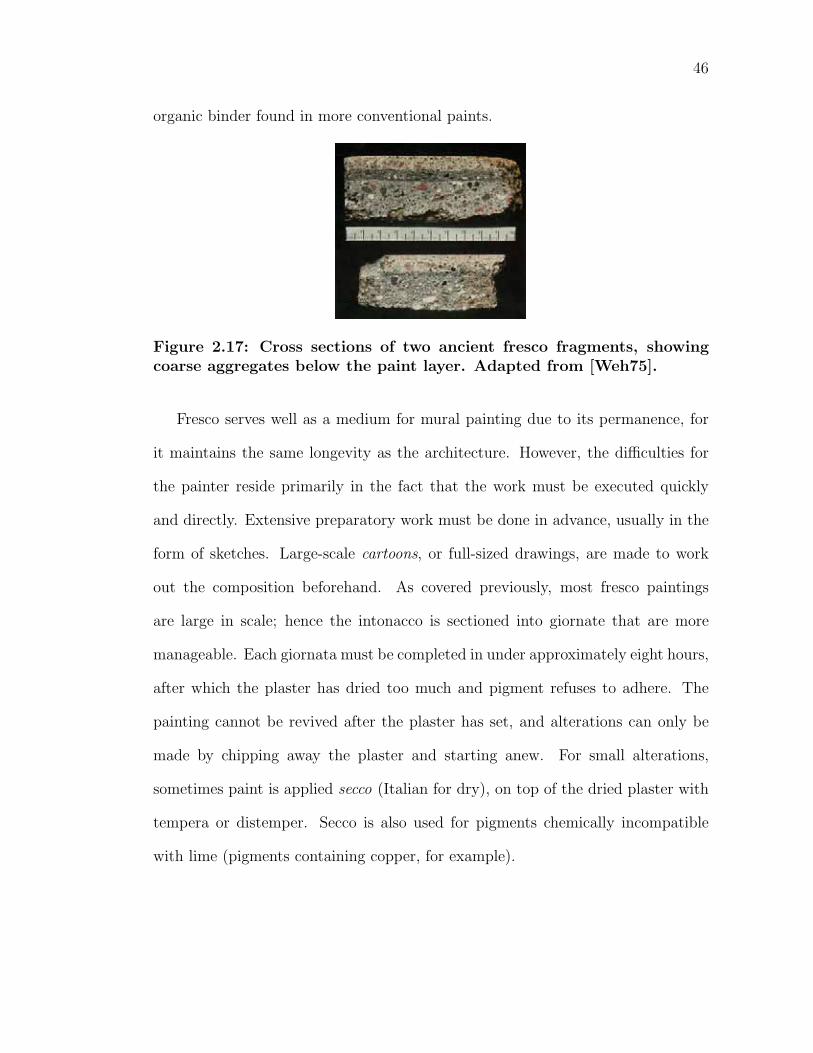
46
organic binder found in more conventional paints.
Figure 2.17: Cross sections of two ancient fresco fragments, showingcoarse aggregates below the paint layer. Adapted from [Weh75].
Fresco serves well as a medium for mural painting due to its permanence, for
it maintains the same longevity as the architecture. However, the difficulties for
the painter reside primarily in the fact that the work must be executed quickly
and directly. Extensive preparatory work must be done in advance, usually in the
form of sketches. Large-scale cartoons, or full-sized drawings, are made to work
out the composition beforehand. As covered previously, most fresco paintings
are large in scale; hence the intonacco is sectioned into giornate that are more
manageable. Each giornata must be completed in under approximately eight hours,
after which the plaster has dried too much and pigment refuses to adhere. The
painting cannot be revived after the plaster has set, and alterations can only be
made by chipping away the plaster and starting anew. For small alterations,
sometimes paint is applied secco (Italian for dry), on top of the dried plaster with
tempera or distemper. Secco is also used for pigments chemically incompatible
with lime (pigments containing copper, for example).
Chapter 3
Color Background
Color is my day-long obsession, joy and torment.
-Claude Monet
3.1 Light and Color
The human visual system consists of three major components: eyes, which cap-
ture light and convert it into neural messages; visual pathways, which modify and
transmit those messages from the eye to the brain; and visual centers of the brain,
which interpret the messages in ways useful for guiding behavior [SB02]. Hence,
the study of color science is broken down into three areas: physical, quantifying
the physical energy which reaches the eye; perceptual, determining the perceptual
responses of the human visual system; and interpretive, determining the overall
impression. All of these components are crucially involved in seeing.
47
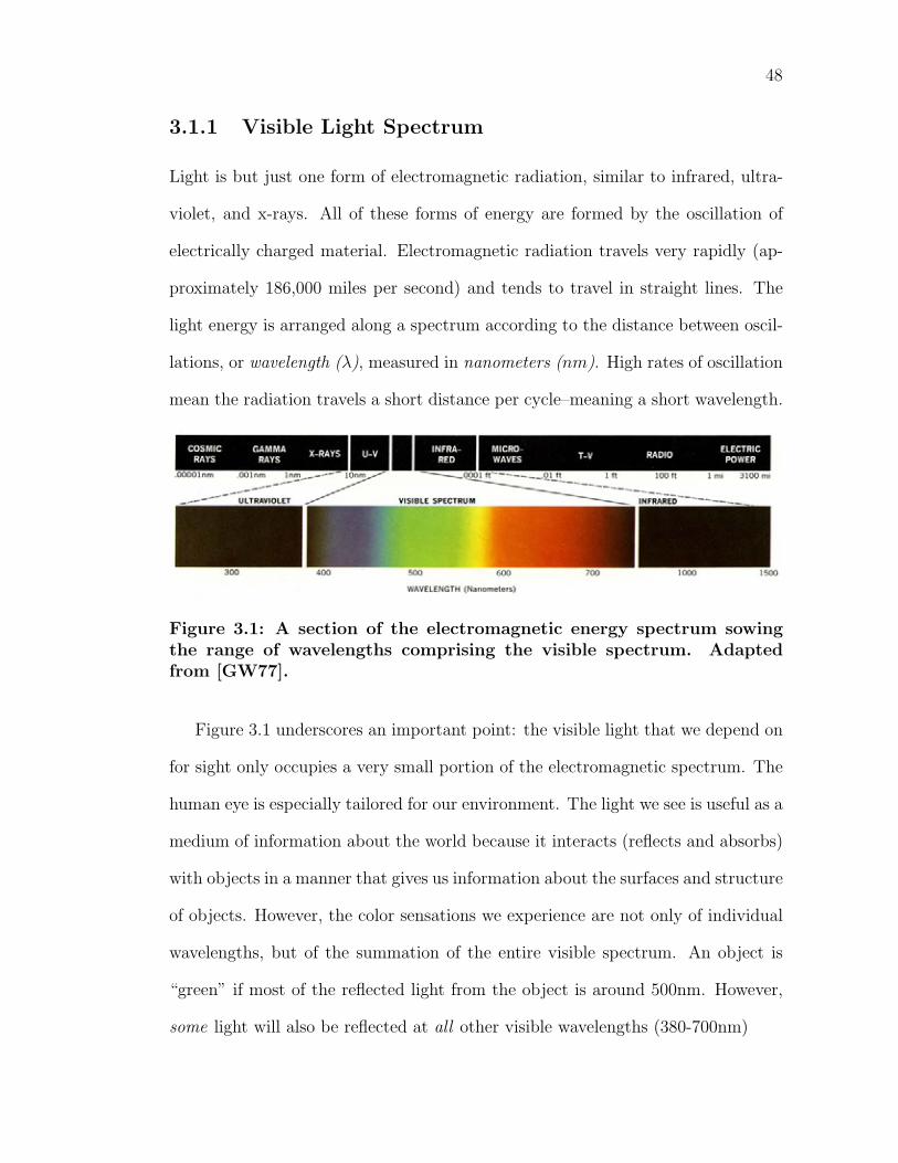
48
3.1.1 Visible Light Spectrum
Light is but just one form of electromagnetic radiation, similar to infrared, ultra-
violet, and x-rays. All of these forms of energy are formed by the oscillation of
electrically charged material. Electromagnetic radiation travels very rapidly (ap-
proximately 186,000 miles per second) and tends to travel in straight lines. The
light energy is arranged along a spectrum according to the distance between oscil-
lations, or wavelength (λ), measured in nanometers (nm). High rates of oscillation
mean the radiation travels a short distance per cycle–meaning a short wavelength.
Figure 3.1: A section of the electromagnetic energy spectrum sowingthe range of wavelengths comprising the visible spectrum. Adaptedfrom [GW77].
Figure 3.1 underscores an important point: the visible light that we depend on
for sight only occupies a very small portion of the electromagnetic spectrum. The
human eye is especially tailored for our environment. The light we see is useful as a
medium of information about the world because it interacts (reflects and absorbs)
with objects in a manner that gives us information about the surfaces and structure
of objects. However, the color sensations we experience are not only of individual
wavelengths, but of the summation of the entire visible spectrum. An object is
“green” if most of the reflected light from the object is around 500nm. However,
some light will also be reflected at all other visible wavelengths (380-700nm)
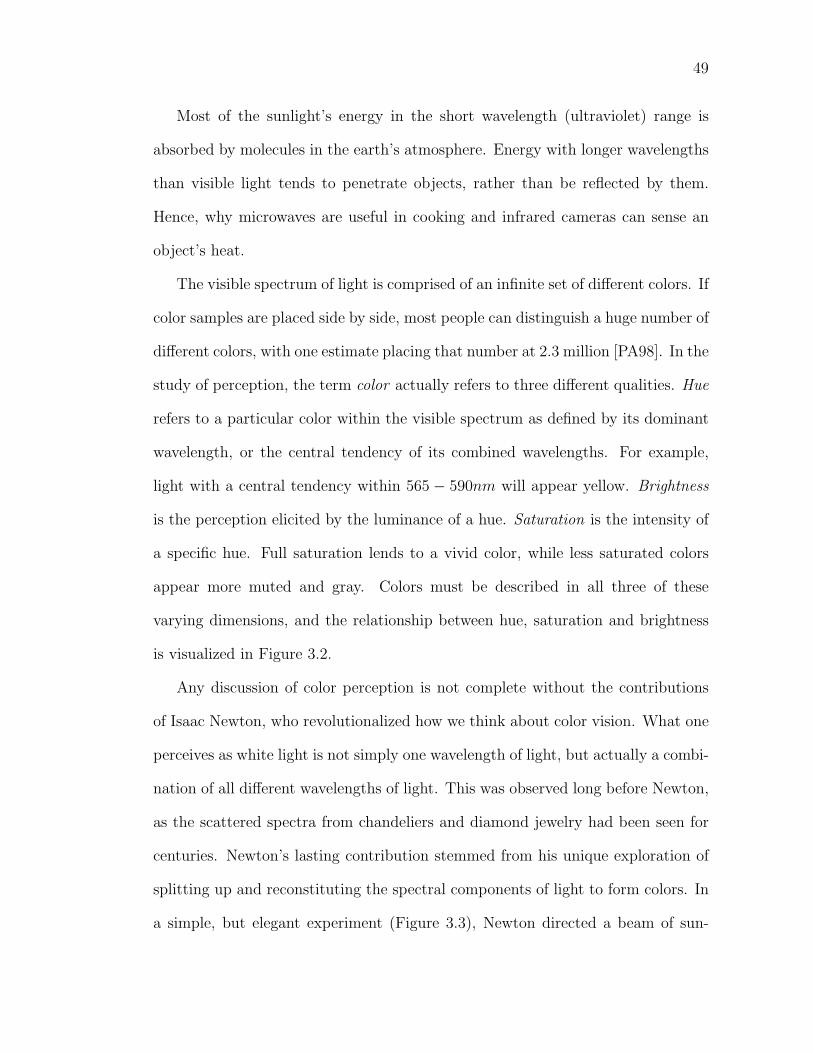
49
Most of the sunlight’s energy in the short wavelength (ultraviolet) range is
absorbed by molecules in the earth’s atmosphere. Energy with longer wavelengths
than visible light tends to penetrate objects, rather than be reflected by them.
Hence, why microwaves are useful in cooking and infrared cameras can sense an
object’s heat.
The visible spectrum of light is comprised of an infinite set of different colors. If
color samples are placed side by side, most people can distinguish a huge number of
different colors, with one estimate placing that number at 2.3 million [PA98]. In the
study of perception, the term color actually refers to three different qualities. Hue
refers to a particular color within the visible spectrum as defined by its dominant
wavelength, or the central tendency of its combined wavelengths. For example,
light with a central tendency within 565 − 590nm will appear yellow. Brightness
is the perception elicited by the luminance of a hue. Saturation is the intensity of
a specific hue. Full saturation lends to a vivid color, while less saturated colors
appear more muted and gray. Colors must be described in all three of these
varying dimensions, and the relationship between hue, saturation and brightness
is visualized in Figure 3.2.
Any discussion of color perception is not complete without the contributions
of Isaac Newton, who revolutionalized how we think about color vision. What one
perceives as white light is not simply one wavelength of light, but actually a combi-
nation of all different wavelengths of light. This was observed long before Newton,
as the scattered spectra from chandeliers and diamond jewelry had been seen for
centuries. Newton’s lasting contribution stemmed from his unique exploration of
splitting up and reconstituting the spectral components of light to form colors. In
a simple, but elegant experiment (Figure 3.3), Newton directed a beam of sun-
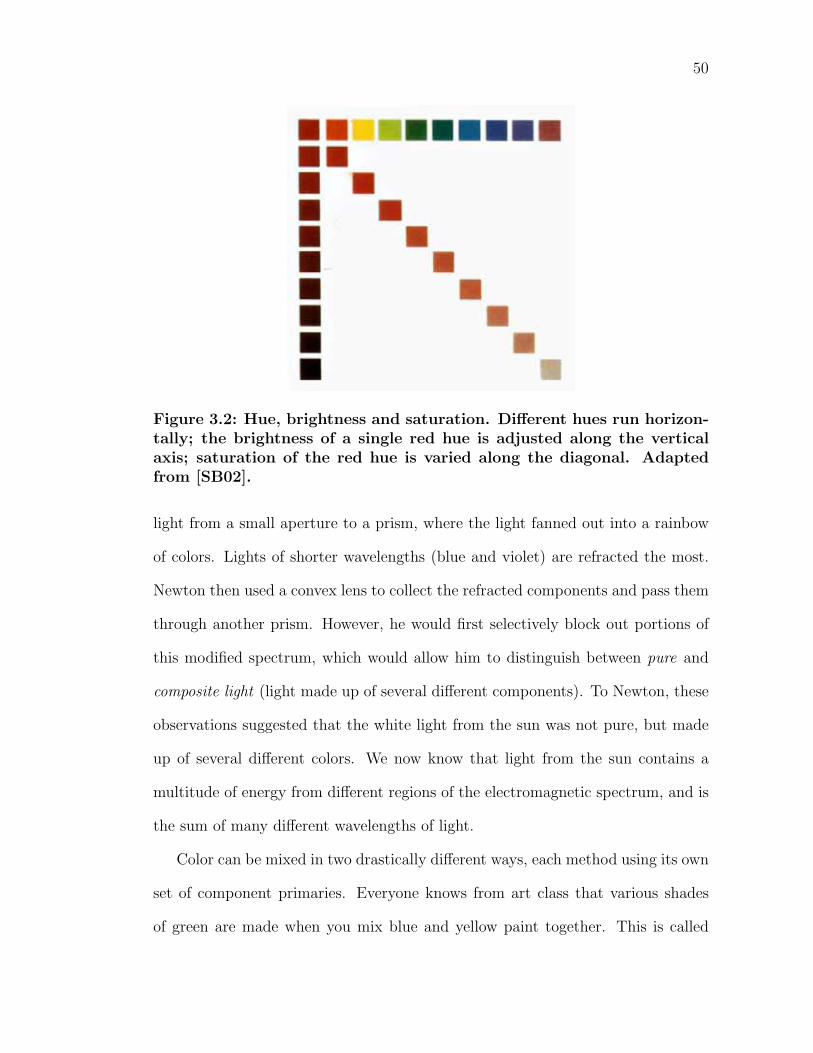
50
Figure 3.2: Hue, brightness and saturation. Different hues run horizon-tally; the brightness of a single red hue is adjusted along the verticalaxis; saturation of the red hue is varied along the diagonal. Adaptedfrom [SB02].
light from a small aperture to a prism, where the light fanned out into a rainbow
of colors. Lights of shorter wavelengths (blue and violet) are refracted the most.
Newton then used a convex lens to collect the refracted components and pass them
through another prism. However, he would first selectively block out portions of
this modified spectrum, which would allow him to distinguish between pure and
composite light (light made up of several different components). To Newton, these
observations suggested that the white light from the sun was not pure, but made
up of several different colors. We now know that light from the sun contains a
multitude of energy from different regions of the electromagnetic spectrum, and is
the sum of many different wavelengths of light.
Color can be mixed in two drastically different ways, each method using its own
set of component primaries. Everyone knows from art class that various shades
of green are made when you mix blue and yellow paint together. This is called
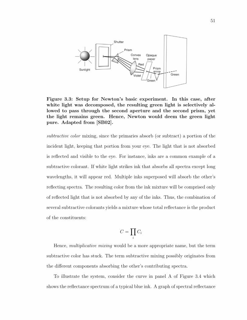
51
Figure 3.3: Setup for Newton’s basic experiment. In this case, afterwhite light was decomposed, the resulting green light is selectively al-lowed to pass through the second aperture and the second prism, yetthe light remains green. Hence, Newton would deem the green lightpure. Adapted from [SB02].
subtractive color mixing, since the primaries absorb (or subtract) a portion of the
incident light, keeping that portion from your eye. The light that is not absorbed
is reflected and visible to the eye. For instance, inks are a common example of a
subtractive colorant. If white light strikes ink that absorbs all spectra except long
wavelengths, it will appear red. Multiple inks superposed will absorb the other’s
reflecting spectra. The resulting color from the ink mixture will be comprised only
of reflected light that is not absorbed by any of the inks. Thus, the combination of
several subtractive colorants yields a mixture whose total reflectance is the product
of the constituents:
C =∏
i
Ci
Hence, multiplicative mixing would be a more appropriate name, but the term
subtractive color has stuck. The term subtractive mixing possibly originates from
the different components absorbing the other’s contributing spectra.
To illustrate the system, consider the curve in panel A of Figure 3.4 which
shows the reflectance spectrum of a typical blue ink. A graph of spectral reflectance
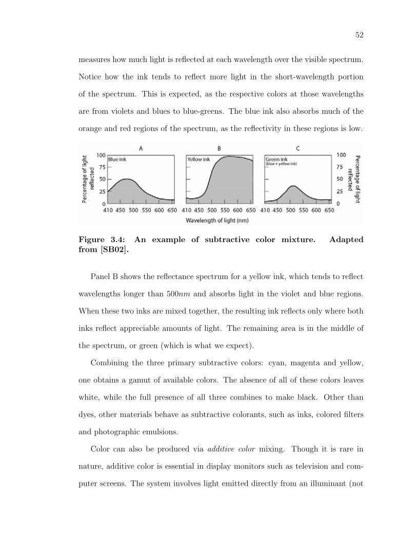
52
measures how much light is reflected at each wavelength over the visible spectrum.
Notice how the ink tends to reflect more light in the short-wavelength portion
of the spectrum. This is expected, as the respective colors at those wavelengths
are from violets and blues to blue-greens. The blue ink also absorbs much of the
orange and red regions of the spectrum, as the reflectivity in these regions is low.
Figure 3.4: An example of subtractive color mixture. Adaptedfrom [SB02].
Panel B shows the reflectance spectrum for a yellow ink, which tends to reflect
wavelengths longer than 500nm and absorbs light in the violet and blue regions.
When these two inks are mixed together, the resulting ink reflects only where both
inks reflect appreciable amounts of light. The remaining area is in the middle of
the spectrum, or green (which is what we expect).
Combining the three primary subtractive colors: cyan, magenta and yellow,
one obtains a gamut of available colors. The absence of all of these colors leaves
white, while the full presence of all three combines to make black. Other than
dyes, other materials behave as subtractive colorants, such as inks, colored filters
and photographic emulsions.
Color can also be produced via additive color mixing. Though it is rare in
nature, additive color is essential in display monitors such as television and com-
puter screens. The system involves light emitted directly from an illuminant (not
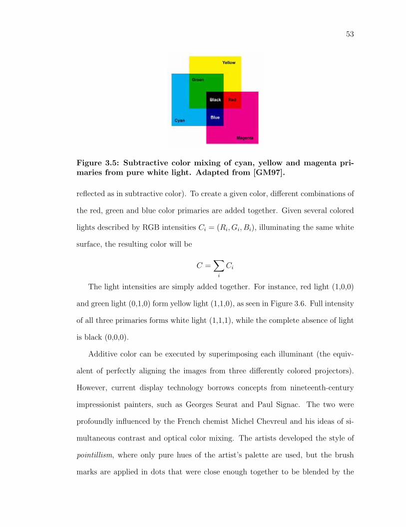
53
Figure 3.5: Subtractive color mixing of cyan, yellow and magenta pri-maries from pure white light. Adapted from [GM97].
reflected as in subtractive color). To create a given color, different combinations of
the red, green and blue color primaries are added together. Given several colored
lights described by RGB intensities Ci = (Ri, Gi, Bi), illuminating the same white
surface, the resulting color will be
C =∑
i
Ci
The light intensities are simply added together. For instance, red light (1,0,0)
and green light (0,1,0) form yellow light (1,1,0), as seen in Figure 3.6. Full intensity
of all three primaries forms white light (1,1,1), while the complete absence of light
is black (0,0,0).
Additive color can be executed by superimposing each illuminant (the equiv-
alent of perfectly aligning the images from three differently colored projectors).
However, current display technology borrows concepts from nineteenth-century
impressionist painters, such as Georges Seurat and Paul Signac. The two were
profoundly influenced by the French chemist Michel Chevreul and his ideas of si-
multaneous contrast and optical color mixing. The artists developed the style of
pointillism, where only pure hues of the artist’s palette are used, but the brush
marks are applied in dots that were close enough together to be blended by the
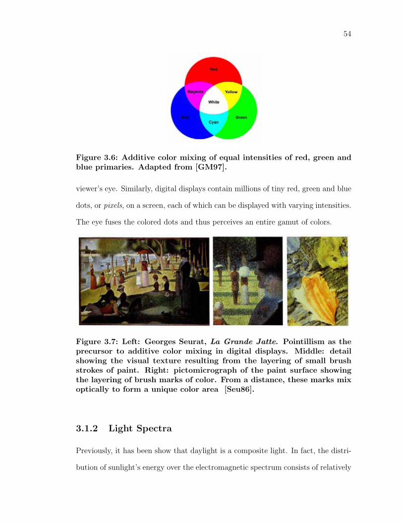
54
Figure 3.6: Additive color mixing of equal intensities of red, green andblue primaries. Adapted from [GM97].
viewer’s eye. Similarly, digital displays contain millions of tiny red, green and blue
dots, or pixels, on a screen, each of which can be displayed with varying intensities.
The eye fuses the colored dots and thus perceives an entire gamut of colors.
Figure 3.7: Left: Georges Seurat, La Grande Jatte. Pointillism as theprecursor to additive color mixing in digital displays. Middle: detailshowing the visual texture resulting from the layering of small brushstrokes of paint. Right: pictomicrograph of the paint surface showingthe layering of brush marks of color. From a distance, these marks mixoptically to form a unique color area [Seu86].
3.1.2 Light Spectra
Previously, it has been show that daylight is a composite light. In fact, the distri-
bution of sunlight’s energy over the electromagnetic spectrum consists of relatively
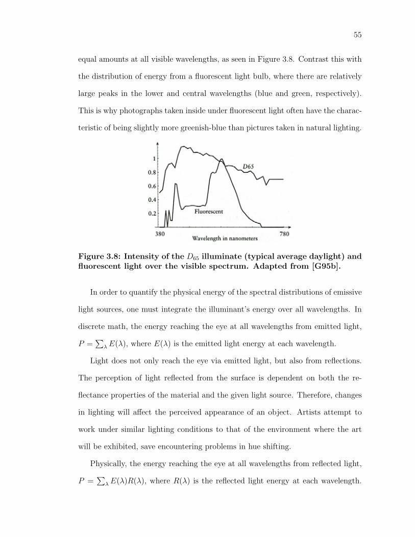
55
equal amounts at all visible wavelengths, as seen in Figure 3.8. Contrast this with
the distribution of energy from a fluorescent light bulb, where there are relatively
large peaks in the lower and central wavelengths (blue and green, respectively).
This is why photographs taken inside under fluorescent light often have the charac-
teristic of being slightly more greenish-blue than pictures taken in natural lighting.
Figure 3.8: Intensity of the D65 illuminate (typical average daylight) andfluorescent light over the visible spectrum. Adapted from [G95b].
In order to quantify the physical energy of the spectral distributions of emissive
light sources, one must integrate the illuminant’s energy over all wavelengths. In
discrete math, the energy reaching the eye at all wavelengths from emitted light,
P =∑
λ E(λ), where E(λ) is the emitted light energy at each wavelength.
Light does not only reach the eye via emitted light, but also from reflections.
The perception of light reflected from the surface is dependent on both the re-
flectance properties of the material and the given light source. Therefore, changes
in lighting will affect the perceived appearance of an object. Artists attempt to
work under similar lighting conditions to that of the environment where the art
will be exhibited, save encountering problems in hue shifting.
Physically, the energy reaching the eye at all wavelengths from reflected light,
P =∑
λ E(λ)R(λ), where R(λ) is the reflected light energy at each wavelength.
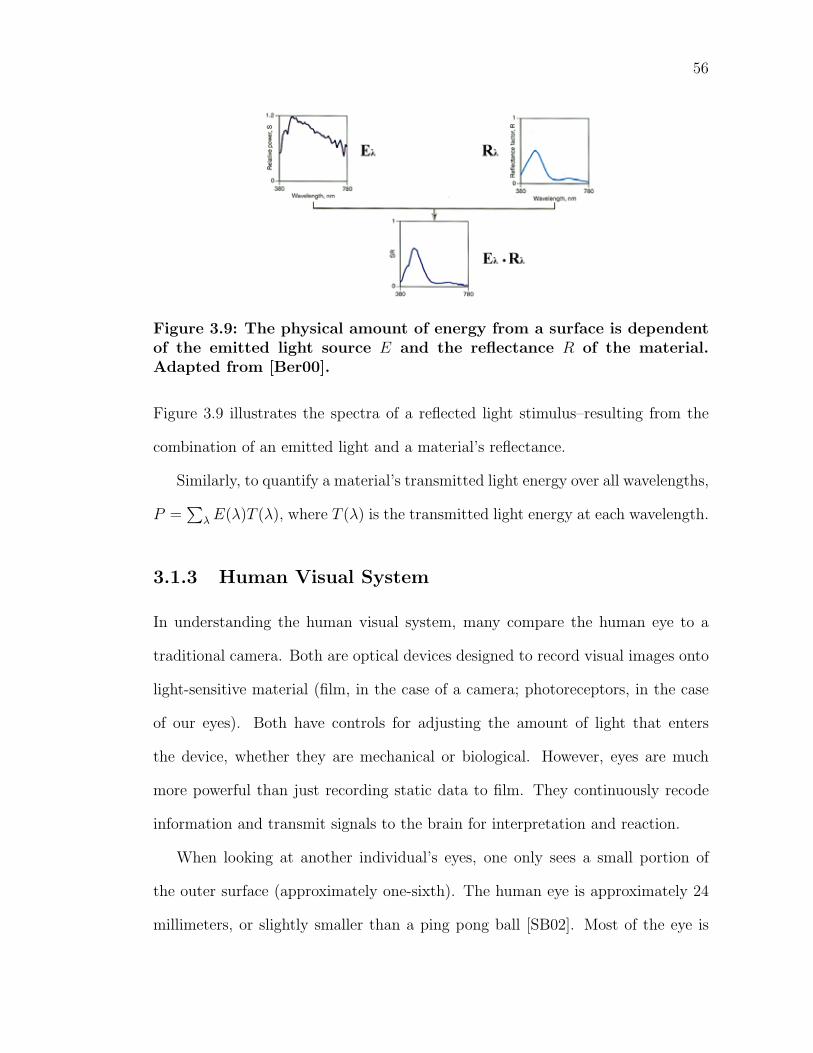
56
Figure 3.9: The physical amount of energy from a surface is dependentof the emitted light source E and the reflectance R of the material.Adapted from [Ber00].
Figure 3.9 illustrates the spectra of a reflected light stimulus–resulting from the
combination of an emitted light and a material’s reflectance.
Similarly, to quantify a material’s transmitted light energy over all wavelengths,
P =∑
λ E(λ)T (λ), where T (λ) is the transmitted light energy at each wavelength.
3.1.3 Human Visual System
In understanding the human visual system, many compare the human eye to a
traditional camera. Both are optical devices designed to record visual images onto
light-sensitive material (film, in the case of a camera; photoreceptors, in the case
of our eyes). Both have controls for adjusting the amount of light that enters
the device, whether they are mechanical or biological. However, eyes are much
more powerful than just recording static data to film. They continuously recode
information and transmit signals to the brain for interpretation and reaction.
When looking at another individual’s eyes, one only sees a small portion of
the outer surface (approximately one-sixth). The human eye is approximately 24
millimeters, or slightly smaller than a ping pong ball [SB02]. Most of the eye is
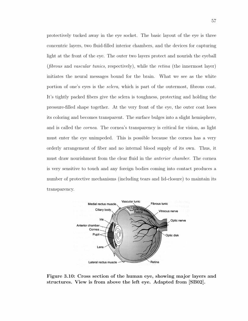
57
protectively tucked away in the eye socket. The basic layout of the eye is three
concentric layers, two fluid-filled interior chambers, and the devices for capturing
light at the front of the eye. The outer two layers protect and nourish the eyeball
(fibrous and vascular tunics, respectively), while the retina (the innermost layer)
initiates the neural messages bound for the brain. What we see as the white
portion of one’s eyes is the sclera, which is part of the outermost, fibrous coat.
It’s tightly packed fibers give the sclera is toughness, protecting and holding the
pressure-filled shape together. At the very front of the eye, the outer coat loses
its coloring and becomes transparent. The surface bulges into a slight hemisphere,
and is called the cornea. The cornea’s transparency is critical for vision, as light
must enter the eye unimpeded. This is possible because the cornea has a very
orderly arrangement of fiber and no internal blood supply of its own. Thus, it
must draw nourishment from the clear fluid in the anterior chamber. The cornea
is very sensitive to touch and any foreign bodies coming into contact produces a
number of protective mechanisms (including tears and lid-closure) to maintain its
transparency.
Figure 3.10: Cross section of the human eye, showing major layers andstructures. View is from above the left eye. Adapted from [SB02].
58
The vascular tunic lies on the wall of the eyeball for the rear two thirds, consist-
ing of a heavily pigmented, spongy structure called the choroid. It contains a vast
network of blood vessels and capillaries that provide oxygen and nourish a very
important class of cells in the retina, the photoreceptors, that turn light into neu-
ral signals. The choroid’s dark pigmentation also helps absorb light not captured
by the photoreceptors, save stray light from diminishing the quality of the image
that reaches the eye. Incidentally, this is the same reason the inside of a camera
is painted flat black–the paint absorbs scattered light and protects the sharpness
of images on the film. Toward the front of the eye, this middle, choroidal layer
breaks away from the outer layer and runs roughly parallel to the front of the eye.
This section of the middle layer forms a slender spongy structure called the ciliary
body which produces aqueous humor, the watery fluid that fills the cavities in the
eye. This fluid performs important maintenance to the eye, including supplying
oxygen and nutrients to the cornea and lens and carrying waste away. The fluid
also maintains the constant pressure in the eye. If there is too little fluid, the eye
becomes deformed and light does not focus correctly on the back of the eye. If
there is too much pressure for too long, vision can be impaired permanently–the
condition called glaucoma.
As it curls inward, the ciliary body gives way to the iris, that circular tissue
that gives your eye its characteristic color. The iris actually contains two layers, an
outer layer containing pigment and an inner layer containing blood vessels. If the
outer layer is heavily pigmented, the iris appears brown. If it is lightly pigmented,
the inner layer is partially visible through the outer one and the iris takes on a
lighter color. The pupil, or black region in the eye is not an object, but actually
a gap within two sets of muscles in the iris. The inner set runs in a circle around
59
the iris. When this band of muscles contracts, the pupil gets smaller. The second
set of muscles run radially from the edge of the first set of muscles. When this
set contracts, the eye dilates and the gap widens. These muscles determine the
amount of light that reaches the back of the eye.
The size of the pupil is dependent on the availability of light in the surroundings.
The size of the pupil is inversely proportional to the amount of available light.
Hence, your pupil opens more in low-light situations. In young adults, the pupil’s
diameter varies over a range of 4:1, which fluctuates the amount of light from 16:1
[SB02]. To understand why large pupils are not always used, we once again turn
to photography. The aperture, or opening, of a camera restricts the diameter of
the cone of light which reaches the film. A device called the diaphragm controls
the opening and can be modified in a similar manner to the iris. Reducing the
aperture size increases the depth of field, or the range of objects in focus in an
image. While sharp images are desirable, they require small apertures, resulting
in the need for much more light.
A very important optical element in the eye is the crystalline lens, which resides
right behind the iris. The covering of the lens is an elastic capsule, which varies the
optical power of the lens by molding the shape. By shifting one’s focus between
near and far objects, you are consciously adjusting the shape of the lens. This fine
tuning of the focus of image on the back of the eye is know as accommodation.
A condition of the hardening of the fibers in the lens is called sclerosis, which di-
minishes one’s ability to accommodate objects of varying distances. Similar to the
cornea, the lens is also susceptible to transparency issues. Reduced transparency
in the lens is called a cataract.
The innermost of the eye’s three layers, the retina, is where light from the
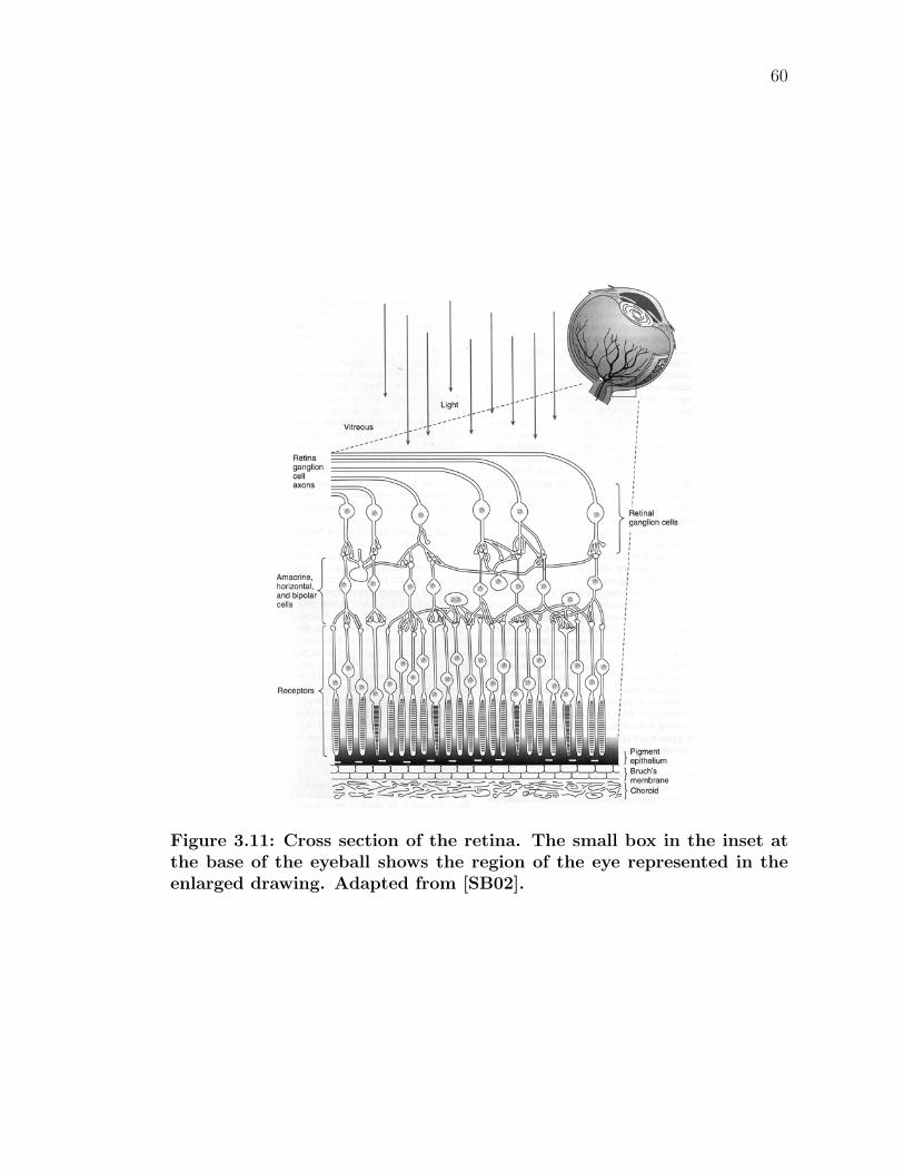
60
Figure 3.11: Cross section of the retina. The small box in the inset atthe base of the eyeball shows the region of the eye represented in theenlarged drawing. Adapted from [SB02].
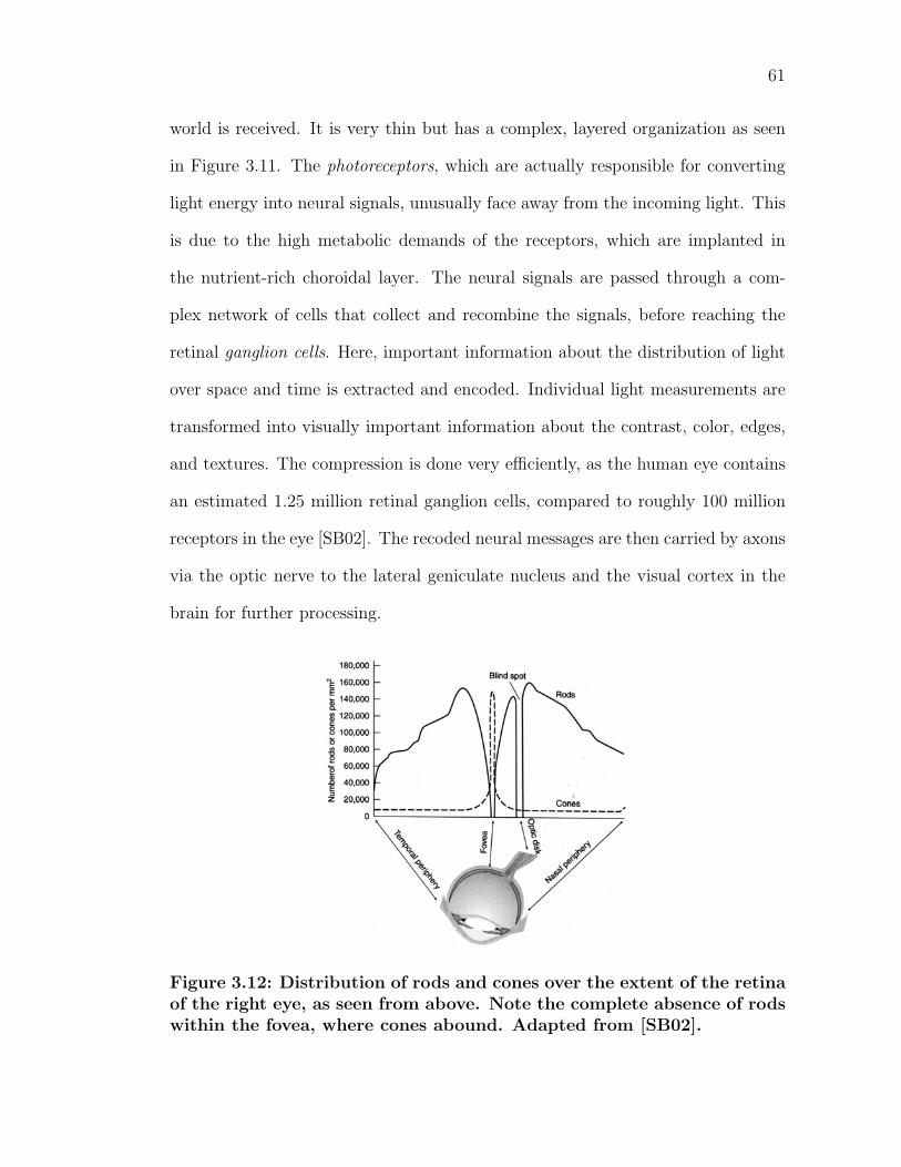
61
world is received. It is very thin but has a complex, layered organization as seen
in Figure 3.11. The photoreceptors, which are actually responsible for converting
light energy into neural signals, unusually face away from the incoming light. This
is due to the high metabolic demands of the receptors, which are implanted in
the nutrient-rich choroidal layer. The neural signals are passed through a com-
plex network of cells that collect and recombine the signals, before reaching the
retinal ganglion cells. Here, important information about the distribution of light
over space and time is extracted and encoded. Individual light measurements are
transformed into visually important information about the contrast, color, edges,
and textures. The compression is done very efficiently, as the human eye contains
an estimated 1.25 million retinal ganglion cells, compared to roughly 100 million
receptors in the eye [SB02]. The recoded neural messages are then carried by axons
via the optic nerve to the lateral geniculate nucleus and the visual cortex in the
brain for further processing.
Figure 3.12: Distribution of rods and cones over the extent of the retinaof the right eye, as seen from above. Note the complete absence of rodswithin the fovea, where cones abound. Adapted from [SB02].
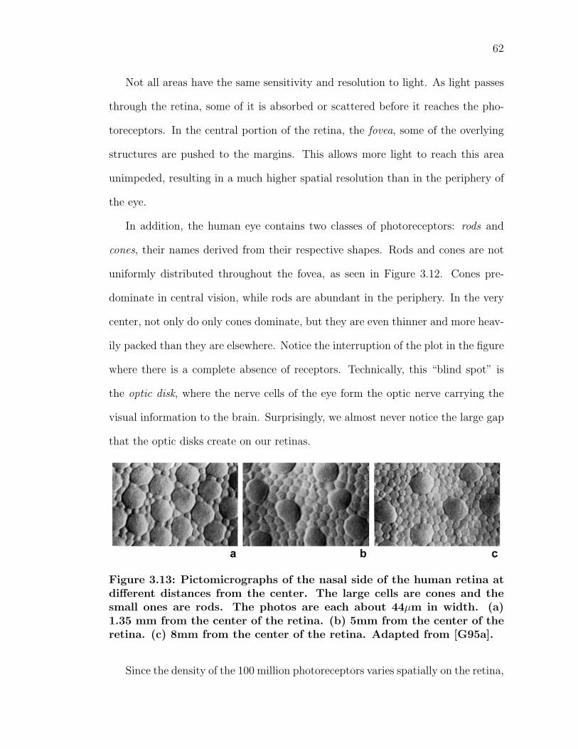
62
Not all areas have the same sensitivity and resolution to light. As light passes
through the retina, some of it is absorbed or scattered before it reaches the pho-
toreceptors. In the central portion of the retina, the fovea, some of the overlying
structures are pushed to the margins. This allows more light to reach this area
unimpeded, resulting in a much higher spatial resolution than in the periphery of
the eye.
In addition, the human eye contains two classes of photoreceptors: rods and
cones, their names derived from their respective shapes. Rods and cones are not
uniformly distributed throughout the fovea, as seen in Figure 3.12. Cones pre-
dominate in central vision, while rods are abundant in the periphery. In the very
center, not only do only cones dominate, but they are even thinner and more heav-
ily packed than they are elsewhere. Notice the interruption of the plot in the figure
where there is a complete absence of receptors. Technically, this “blind spot” is
the optic disk, where the nerve cells of the eye form the optic nerve carrying the
visual information to the brain. Surprisingly, we almost never notice the large gap
that the optic disks create on our retinas.
Figure 3.13: Pictomicrographs of the nasal side of the human retina atdifferent distances from the center. The large cells are cones and thesmall ones are rods. The photos are each about 44µm in width. (a)1.35 mm from the center of the retina. (b) 5mm from the center of theretina. (c) 8mm from the center of the retina. Adapted from [G95a].
Since the density of the 100 million photoreceptors varies spatially on the retina,
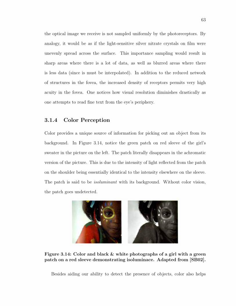
63
the optical image we receive is not sampled uniformly by the photoreceptors. By
analogy, it would be as if the light-sensitive silver nitrate crystals on film were
unevenly spread across the surface. This importance sampling would result in
sharp areas where there is a lot of data, as well as blurred areas where there
is less data (since is must be interpolated). In addition to the reduced network
of structures in the fovea, the increased density of receptors permits very high
acuity in the fovea. One notices how visual resolution diminishes drastically as
one attempts to read fine text from the eye’s periphery.
3.1.4 Color Perception
Color provides a unique source of information for picking out an object from its
background. In Figure 3.14, notice the green patch on red sleeve of the girl’s
sweater in the picture on the left. The patch literally disappears in the achromatic
version of the picture. This is due to the intensity of light reflected from the patch
on the shoulder being essentially identical to the intensity elsewhere on the sleeve.
The patch is said to be isoluminant with its background. Without color vision,
the patch goes undetected.
Figure 3.14: Color and black & white photographs of a girl with a greenpatch on a red sleeve demonstrating isoluminace. Adapted from [SB02].
Besides aiding our ability to detect the presence of objects, color also helps
64
identify and distinguish between various objects in the environment. Subtle shades
of red determine whether an apple or tomato is ripe to eat. Farmers use color to
identify infertile soil and to determine when their crops are ready for harvest.
Doctors routinely rely on color to make diagnoses: blood that is pale red indicates
anemia, and yellowish skin suggests a possible skin disorder [SB02].
Light registers its presence on the retina by interacting with special light-
sensitive molecules contained within the photoreceptors. However, not all wave-
lengths of light are equally effective in producing a response. Rods give their
biggest response when stimulated with approximately 500nm, which under day-
light conditions appears bluish-green, as illustrated in Figure 3.15. The spectral
sensitivity of cones is more complicated, as there are three distinct classes of cones.
One class is responsive to short wavelengths of light, maximally responsive to light
of about 440nm. Another class responds to medium wavelengths of light, cen-
tered around approximately 530nm. The third type of cone responds best to long
wavelengths of light, with a peak response at 560nm. For reference, under day-
light conditions, short, medium and long wavelength-sensitive cones respond best
to violet, green, and yellow, respectively. In actuality, there is a lot of overlap in
the spectral sensitivities of the three types of cones. Also of note, the curves in
Figure 3.15 separate electromagnetic radiation that we can and cannot see, since
photoreceptors only respond to certain wavelengths of light.
Through his experiments, Grassman discovered [Gra53] the trichromatic na-
ture of our vision–almost the entire range of perceivable colors can be completely
described using just three light sources, instead of the entire visible range in the
electromagnetic spectrum (380-700nm). A tristimulus color space can be defined,
for instance, by a triplet of numbers that represent the intensities of three colored
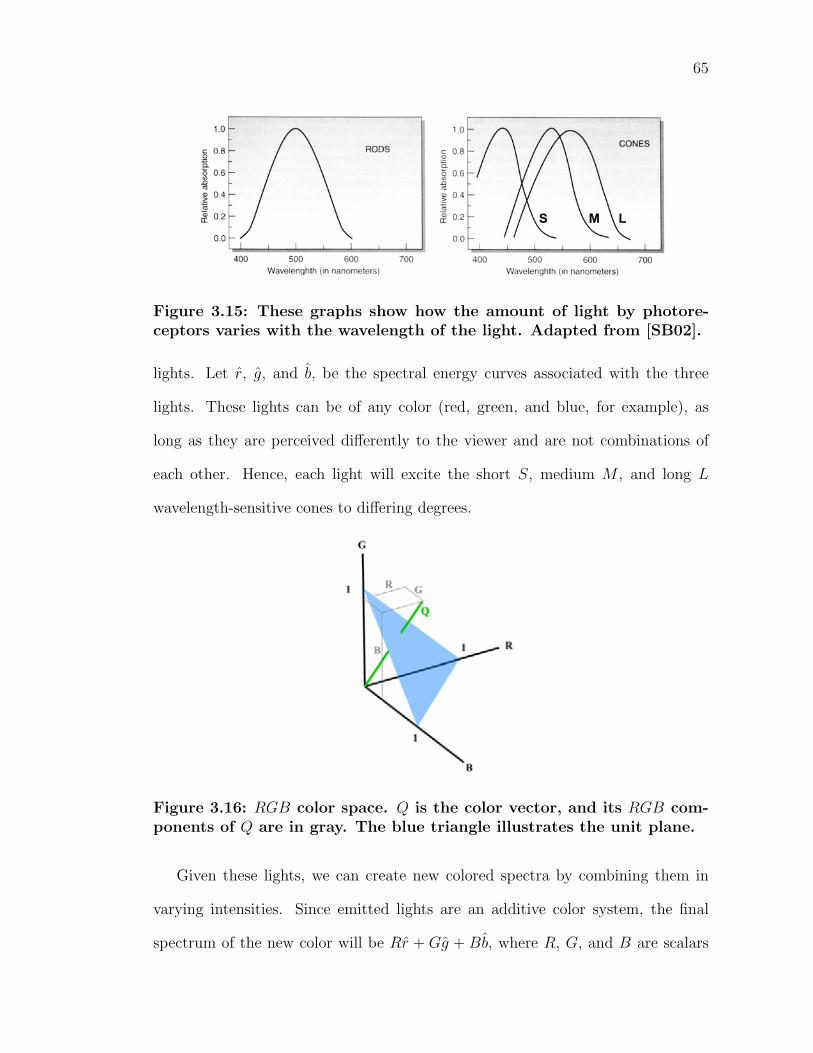
65
Figure 3.15: These graphs show how the amount of light by photore-ceptors varies with the wavelength of the light. Adapted from [SB02].
lights. Let r, g, and b, be the spectral energy curves associated with the three
lights. These lights can be of any color (red, green, and blue, for example), as
long as they are perceived differently to the viewer and are not combinations of
each other. Hence, each light will excite the short S, medium M , and long L
wavelength-sensitive cones to differing degrees.
Figure 3.16: RGB color space. Q is the color vector, and its RGB com-ponents of Q are in gray. The blue triangle illustrates the unit plane.
Given these lights, we can create new colored spectra by combining them in
varying intensities. Since emitted lights are an additive color system, the final
spectrum of the new color will be Rr + Gg + Bb, where R, G, and B are scalars
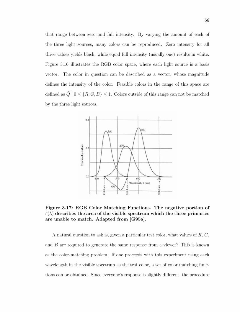
66
that range between zero and full intensity. By varying the amount of each of
the three light sources, many colors can be reproduced. Zero intensity for all
three values yields black, while equal full intensity (usually one) results in white.
Figure 3.16 illustrates the RGB color space, where each light source is a basis
vector. The color in question can be described as a vector, whose magnitude
defines the intensity of the color. Feasible colors in the range of this space are
defined as Q | 0 ≤ R, G,B ≤ 1. Colors outside of this range can not be matched
by the three light sources.
Figure 3.17: RGB Color Matching Functions. The negative portion ofr(λ) describes the area of the visible spectrum which the three primariesare unable to match. Adapted from [G95a].
A natural question to ask is, given a particular test color, what values of R, G,
and B are required to generate the same response from a viewer? This is known
as the color-matching problem. If one proceeds with this experiment using each
wavelength in the visible spectrum as the test color, a set of color matching func-
tions can be obtained. Since everyone’s response is slightly different, the procedure
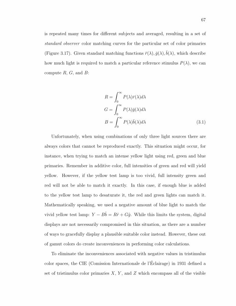
67
is repeated many times for different subjects and averaged, resulting in a set of
standard observer color matching curves for the particular set of color primaries
(Figure 3.17). Given standard matching functions r(λ), g(λ), b(λ), which describe
how much light is required to match a particular reference stimulus P (λ), we can
compute R, G, and B:
R =
∫ ∞
0
P (λ)r(λ)dλ
G =
∫ ∞
0
P (λ)g(λ)dλ
B =
∫ ∞
0
P (λ)b(λ)dλ (3.1)
Unfortunately, when using combinations of only three light sources there are
always colors that cannot be reproduced exactly. This situation might occur, for
instance, when trying to match an intense yellow light using red, green and blue
primaries. Remember in additive color, full intensities of green and red will yield
yellow. However, if the yellow test lamp is too vivid, full intensity green and
red will not be able to match it exactly. In this case, if enough blue is added
to the yellow test lamp to desaturate it, the red and green lights can match it.
Mathematically speaking, we used a negative amount of blue light to match the
vivid yellow test lamp: Y − Bb = Rr + Gg. While this limits the system, digital
displays are not necessarily compromised in this situation, as there are a number
of ways to gracefully display a plausible suitable color instead. However, these out
of gamut colors do create inconveniences in performing color calculations.
To eliminate the inconveniences associated with negative values in tristimulus
color spaces, the CIE (Comission Internationale de l’Eclairage) in 1931 defined a
set of tristimulus color primaries X, Y , and Z which encompass all of the visible
68
spectrum. This insures that the respective color matching functions x(λ), y(λ), and
z(λ) are all non-negative. The drawback of having a system in which all visible
colors can be represented is that the primaries are virtual and no longer correspond
to physical colors. The color coordinates of a stimulus P (λ) in XY Z color space
(also known as CIEXY Z) are:
X =
∫ ∞
0
P (λ)x(λ)d(λ)
Y =
∫ ∞
0
P (λ)y(λ)d(λ)
Z =
∫ ∞
0
P (λ)z(λ)d(λ) (3.2)
where X, Y , and Z are the tristimulus values; x, y, and z are the color-matching
functions of the 2o Observer; and k is a normalizing factor. By convention, the
scalar factor k generally is determined such that Y = 100 when the object is a
perfect white:
k =100∫ ∞
0E(λ)y(λ)d(λ)
where E(λ) is the spectrum of the white light illuminating the scene.
If, the stimulus is that of reflected light R(λ), the equation substitutes P (λ) =
E(λ)R(λ). The CIE chose the y color matching function to be identical to the
human luminance efficiency function, which mean that Y encodes the luminance
of a color. The scale factor, k, is defined such that for an ideal diffuse reflector
(the brightest white), Y will have a value of exactly 100. While the range 0-100 is
convenient for humans, computer programs scale XY Z to lie on the range [0,1].
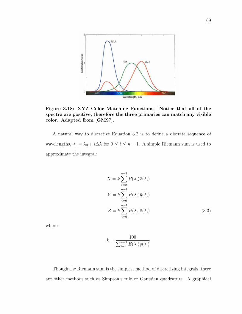
69
Figure 3.18: XYZ Color Matching Functions. Notice that all of thespectra are positive, therefore the three primaries can match any visiblecolor. Adapted from [GM97].
A natural way to discretize Equation 3.2 is to define a discrete sequence of
wavelengths, λi = λ0 + i∆λ for 0 ≤ i ≤ n − 1. A simple Riemann sum is used to
approximate the integral:
X = k
n−1∑i=0
P (λi)x(λi)
Y = k
n−1∑i=0
P (λi)y(λi)
Z = k
n−1∑i=0
P (λi)z(λi) (3.3)
where
k =100∑n−1
i=0 E(λi)y(λi)
Though the Riemann sum is the simplest method of discretizing integrals, there
are other methods such as Simpson’s rule or Gaussian quadrature. A graphical
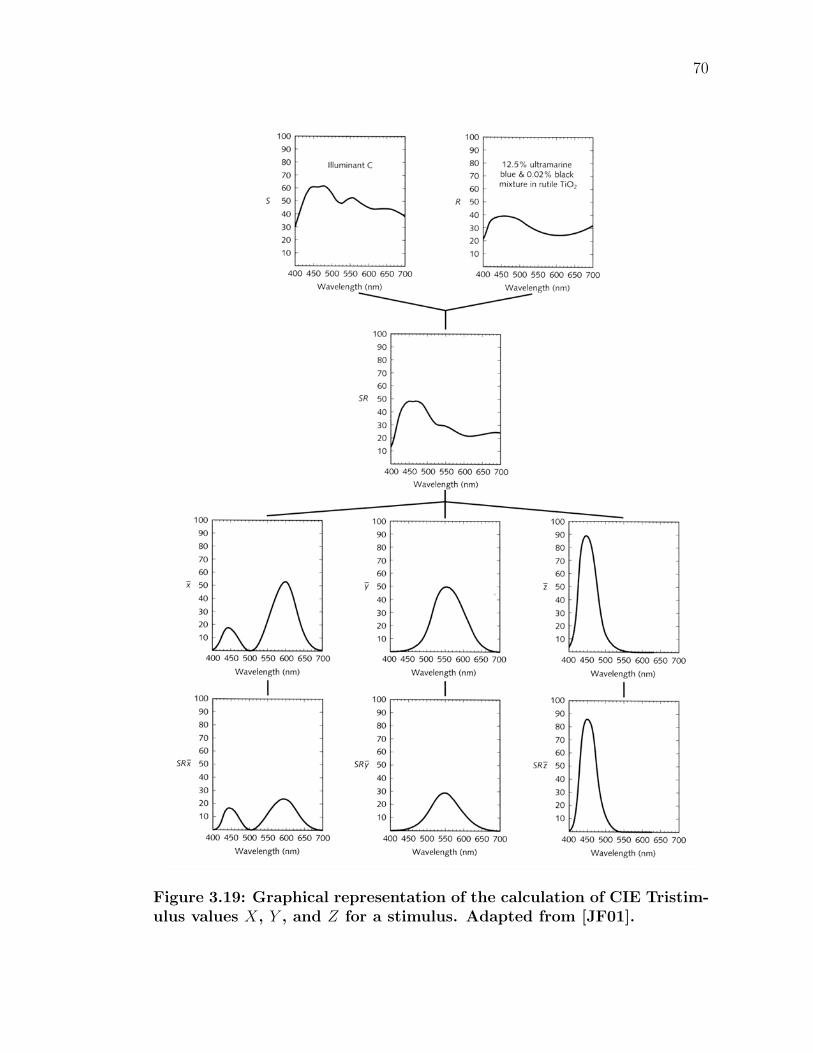
70
Figure 3.19: Graphical representation of the calculation of CIE Tristim-ulus values X, Y , and Z for a stimulus. Adapted from [JF01].
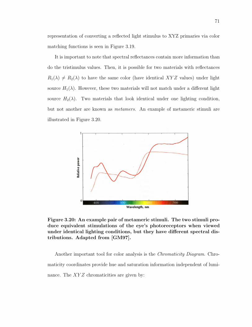
71
representation of converting a reflected light stimulus to XYZ primaries via color
matching functions is seen in Figure 3.19.
It is important to note that spectral reflectances contain more information than
do the tristimulus values. Then, it is possible for two materials with reflectances
R1(λ) = R2(λ) to have the same color (have identical XY Z values) under light
source H1(λ). However, these two materials will not match under a different light
source H2(λ). Two materials that look identical under one lighting condition,
but not another are known as metamers. An example of metameric stimuli are
illustrated in Figure 3.20.
Figure 3.20: An example pair of metameric stimuli. The two stimuli pro-duce equivalent stimulations of the eye’s photoreceptors when viewedunder identical lighting conditions, but they have different spectral dis-tributions. Adapted from [GM97].
Another important tool for color analysis is the Chromaticity Diagram. Chro-
maticity coordinates provide hue and saturation information independent of lumi-
nance. The XY Z chromaticities are given by:
72
x =X
(X + Y + Z)
y =Y
(X + Y + Z)
z =Z
(X + Y + Z)(3.4)
Since by definition, x+y +z = 1, there are actually only two independent vari-
ables necessary to specify the color. The chromaticity diagram represents this by
plotting the first two coordinates (x, y). By plotting the chromaticities of spectral
delta functions δ(λ0 − λ) for 380nm < λ0 < 700nm, one obtains the horseshoe-
shaped spectral locus shown in Figure 3.21. The spectral locus contains the purest,
most saturated colors possible (the numbers along the outside ot the locus corre-
spond to pure wavelengths of color), while the interior contains less saturated
colors. Points exterior to the locus are not visible to the human eye.
Given two tristimulus color spaces defined in terms of color matching functions,
one set of color primaries can be matched by the other set:
R′ = a11R + a12G + a13B
G′ = a21R + a22G + a23B
B′ = a31R + a32G + a33B (3.5)
Hence, there exists a simple 3x3 transformation matrix that will convert be-
tween the two spaces. For instance, there is a matrix that will convert from XY Z
to RGB coordinates. This transformation is necessary to display XY Z colors on
a monitor (remember that XY Z are imaginary light sources). Given the chro-
maticity coordinates of an RGB system (xr, yr),(xg, yg),(xb, yb), and its reference
white (wx, wy), the conversion matrix M can be computed. To convert any XY Z
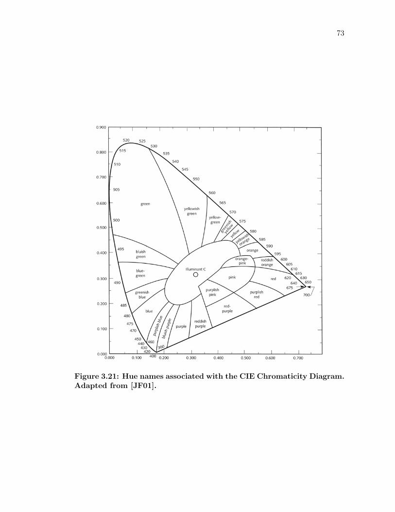
73
Figure 3.21: Hue names associated with the CIE Chromaticity Diagram.Adapted from [JF01].
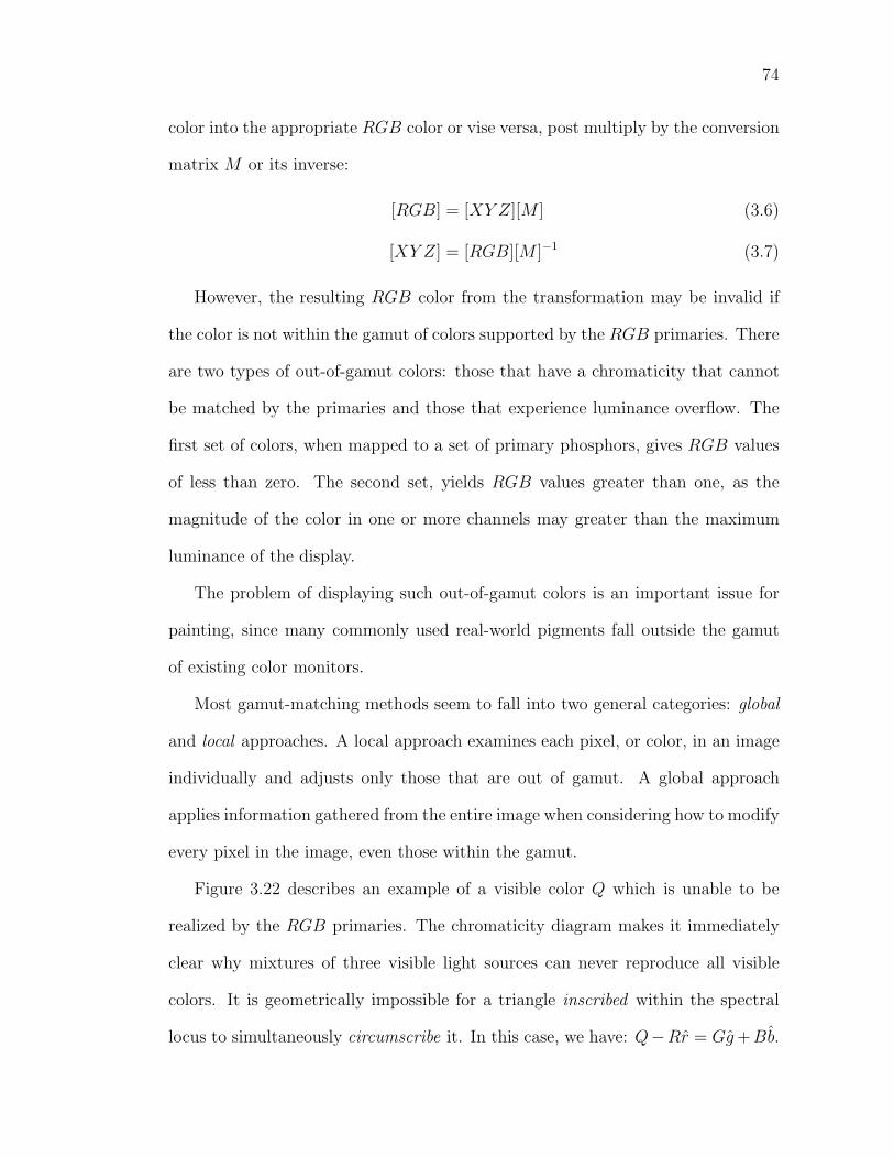
74
color into the appropriate RGB color or vise versa, post multiply by the conversion
matrix M or its inverse:
[RGB] = [XY Z][M ] (3.6)
[XY Z] = [RGB][M ]−1 (3.7)
However, the resulting RGB color from the transformation may be invalid if
the color is not within the gamut of colors supported by the RGB primaries. There
are two types of out-of-gamut colors: those that have a chromaticity that cannot
be matched by the primaries and those that experience luminance overflow. The
first set of colors, when mapped to a set of primary phosphors, gives RGB values
of less than zero. The second set, yields RGB values greater than one, as the
magnitude of the color in one or more channels may greater than the maximum
luminance of the display.
The problem of displaying such out-of-gamut colors is an important issue for
painting, since many commonly used real-world pigments fall outside the gamut
of existing color monitors.
Most gamut-matching methods seem to fall into two general categories: global
and local approaches. A local approach examines each pixel, or color, in an image
individually and adjusts only those that are out of gamut. A global approach
applies information gathered from the entire image when considering how to modify
every pixel in the image, even those within the gamut.
Figure 3.22 describes an example of a visible color Q which is unable to be
realized by the RGB primaries. The chromaticity diagram makes it immediately
clear why mixtures of three visible light sources can never reproduce all visible
colors. It is geometrically impossible for a triangle inscribed within the spectral
locus to simultaneously circumscribe it. In this case, we have: Q−Rr = Gg +Bb.
75
Figure 3.22: To display out of gamut color Q in RGB space, one canclip to the nearest neighbor in the gamut Q′′ or decrease the saturationuntil the gamut is reached Q′.
A simple local method would to clamp values in the range [0, 1]. One could do
this by locating the nearest neighbor that is reproducible via orthogonal projection
and display that value Q′′. Here, the hue has been changed considerably. An
alternative would to decrease the saturation of the original color until it could be
reproduced via the primaries. In our figure, this is the equivalent of finding the
intersection Q′ of the line made by Q and the white point C with the edge of
the gamut. This method maintains the hue, but at the cost of reduced luminance.
Either case transforms Q to a color which can be represented. Yet, simple methods
such as these generally perform poorly, as they create noticeable discontinuities in
smooth regions of color.
In contrast, global gamut matching techniques consider all of the colors in an
image when making color changes. Such methods maintain the relative relation-
ships between colors. One global method finds the smallest a and largest b color
76
components in the image (the smallest and largest RGB values) and displays each
pixel i as:
(Ri − a
b − a,Gi − a
b − a,Bi − a
b − a
)(3.8)
This compresses the input range such that the image now spans the gamut of the
color primaries. Essentially, the largest color component is scaled to the maximum
intensity and the smallest component to zero intensity. All other components are
scaled to fit in the new range. If the largest color component is much greater than
the maximum displayable intensity, the procedure in Equation 3.8 will drastically
decrease the intensity of the entire image (since all colors are scaled by the largest
component). In global gamut mapping techniques, all of the colors in an image are
affected. The end result can be quite perceptually different from the original image,
and the process is much more computationally expensive than local techniques.
A problem with these methods arises with painting (and other subtractive
mixing systems), as the CIE chromaticity diagram is based on additive mixtures.
Varying the concentrations of two additive colorants will yield colors with chro-
maticity coordinates connected via a straight line. Different amounts of red (1,0,0)
and white (1,1,1) make various pinks C = (1, α, α)|α ∈ (0, 1).
However, pigmented mixtures (and other subtractive colorants) do not typi-
cally yield straight lines on the chromaticity diagram. Figure 3.23 illustrates this
behavior as the chromaticities of paint mixtures of colored pigments and white are
plotted. While some paths are close to being straight lines on the chromaticity
diagram, others exhibit loops and turns as individual pigments are mixed with
varied ratios of white pigment.
The reasons why some lines loop while others approach straight lines are be-
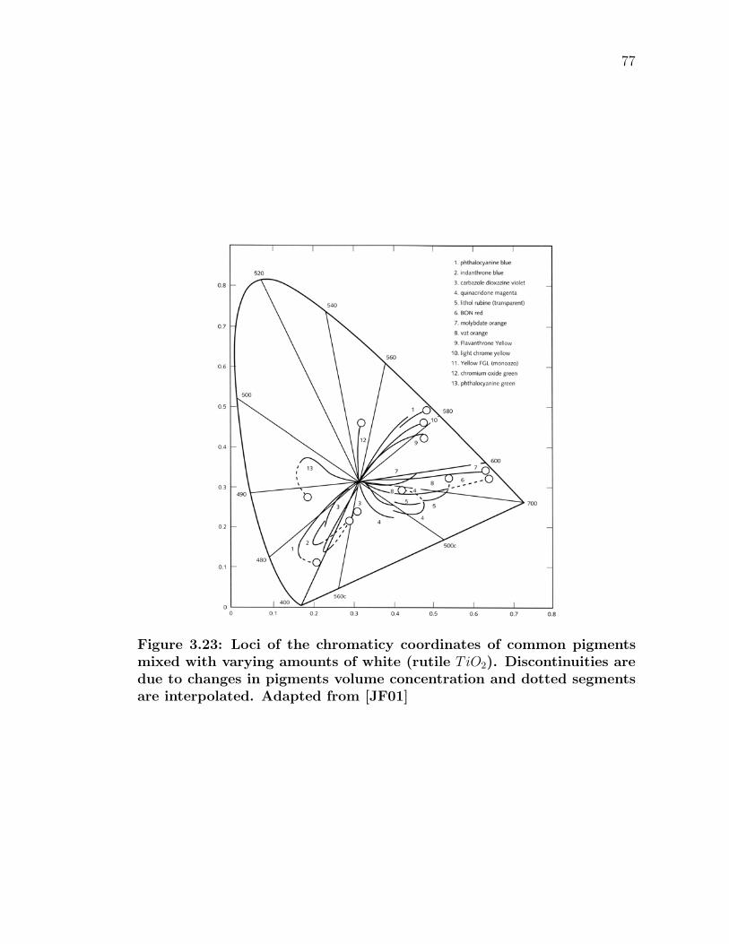
77
Figure 3.23: Loci of the chromaticy coordinates of common pigmentsmixed with varying amounts of white (rutile TiO2). Discontinuities aredue to changes in pigments volume concentration and dotted segmentsare interpolated. Adapted from [JF01]
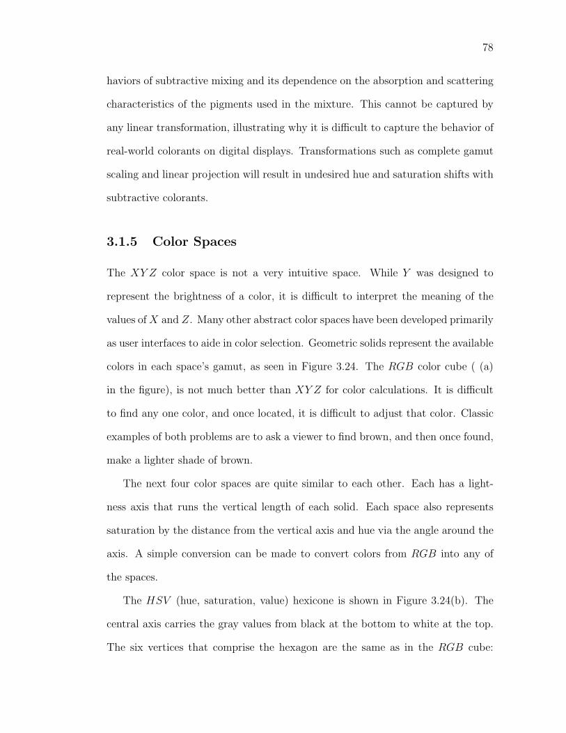
78
haviors of subtractive mixing and its dependence on the absorption and scattering
characteristics of the pigments used in the mixture. This cannot be captured by
any linear transformation, illustrating why it is difficult to capture the behavior of
real-world colorants on digital displays. Transformations such as complete gamut
scaling and linear projection will result in undesired hue and saturation shifts with
subtractive colorants.
3.1.5 Color Spaces
The XY Z color space is not a very intuitive space. While Y was designed to
represent the brightness of a color, it is difficult to interpret the meaning of the
values of X and Z. Many other abstract color spaces have been developed primarily
as user interfaces to aide in color selection. Geometric solids represent the available
colors in each space’s gamut, as seen in Figure 3.24. The RGB color cube ( (a)
in the figure), is not much better than XY Z for color calculations. It is difficult
to find any one color, and once located, it is difficult to adjust that color. Classic
examples of both problems are to ask a viewer to find brown, and then once found,
make a lighter shade of brown.
The next four color spaces are quite similar to each other. Each has a light-
ness axis that runs the vertical length of each solid. Each space also represents
saturation by the distance from the vertical axis and hue via the angle around the
axis. A simple conversion can be made to convert colors from RGB into any of
the spaces.
The HSV (hue, saturation, value) hexicone is shown in Figure 3.24(b). The
central axis carries the gray values from black at the bottom to white at the top.
The six vertices that comprise the hexagon are the same as in the RGB cube:
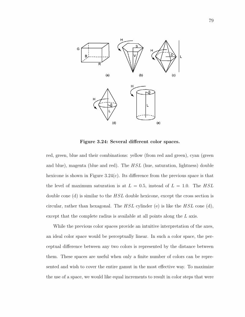
79
Figure 3.24: Several different color spaces.
red, green, blue and their combinations: yellow (from red and green), cyan (green
and blue), magenta (blue and red). The HSL (hue, saturation, lightness) double
hexicone is shown in Figure 3.24(c). Its difference from the previous space is that
the level of maximum saturation is at L = 0.5, instead of L = 1.0. The HSL
double cone (d) is similar to the HSL double hexicone, except the cross section is
circular, rather than hexagonal. The HSL cylinder (e) is like the HSL cone (d),
except that the complete radius is available at all points along the L axis.
While the previous color spaces provide an intuitive interpretation of the axes,
an ideal color space would be perceptually linear. In such a color space, the per-
ceptual difference between any two colors is represented by the distance between
them. These spaces are useful when only a finite number of colors can be repre-
sented and wish to cover the entire gamut in the most effective way. To maximize
the use of a space, we would like equal increments to result in color steps that were
80
of perceptually equal sizes. Unfortunately, this is not the case in XY Z space.
Figure 3.25 shows the nonlinearity of the Chromaticity diagram. In psy-
chophysics, the smallest difference in a specified modality of sensory input that
is detectable by a human being is known as a just noticeable difference (jnd). The
average user’s jnd’s are used to compare sets of colors in an attempt to distinguish
the threshold of visual color differences. The region on a chromaticity diagram
which contains all colors which are indistinguishable, to the average human eye,
from the color at the center of the ellipse is known as a MacAdam ellipse.
Figure 3.25: The MacAdam ellipses. Adapted from [G95a].
The important observation is that the MacAdam ellipses are not the same size
nor in the same orientation. Thus, a particular magnitude of shift in color space
may be undetectable at one point, but the same shift applied to a different color
would be quite visible. For example, our acuity in distinguishing between nearby
green colors is much poorer than in nearby reds, and poorer still than in the blue
range of the XY Z chromaticity diagram.
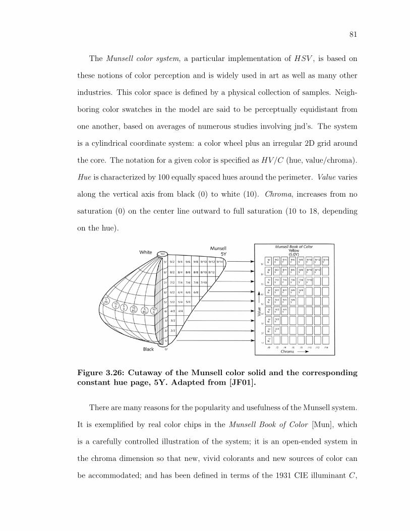
81
The Munsell color system, a particular implementation of HSV , is based on
these notions of color perception and is widely used in art as well as many other
industries. This color space is defined by a physical collection of samples. Neigh-
boring color swatches in the model are said to be perceptually equidistant from
one another, based on averages of numerous studies involving jnd’s. The system
is a cylindrical coordinate system: a color wheel plus an irregular 2D grid around
the core. The notation for a given color is specified as HV/C (hue, value/chroma).
Hue is characterized by 100 equally spaced hues around the perimeter. Value varies
along the vertical axis from black (0) to white (10). Chroma, increases from no
saturation (0) on the center line outward to full saturation (10 to 18, depending
on the hue).
Figure 3.26: Cutaway of the Munsell color solid and the correspondingconstant hue page, 5Y. Adapted from [JF01].
There are many reasons for the popularity and usefulness of the Munsell system.
It is exemplified by real color chips in the Munsell Book of Color [Mun], which
is a carefully controlled illustration of the system; it is an open-ended system in
the chroma dimension so that new, vivid colorants and new sources of color can
be accommodated; and has been defined in terms of the 1931 CIE illuminant C,
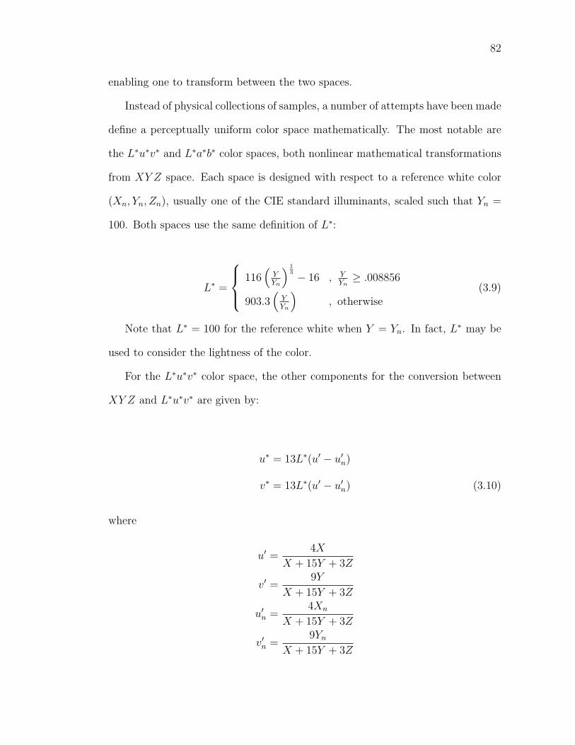
82
enabling one to transform between the two spaces.
Instead of physical collections of samples, a number of attempts have been made
define a perceptually uniform color space mathematically. The most notable are
the L∗u∗v∗ and L∗a∗b∗ color spaces, both nonlinear mathematical transformations
from XY Z space. Each space is designed with respect to a reference white color
(Xn, Yn, Zn), usually one of the CIE standard illuminants, scaled such that Yn =
100. Both spaces use the same definition of L∗:
L∗ =
⎧⎪⎨⎪⎩
116(
YYn
) 13 − 16 , Y
Yn≥ .008856
903.3(
YYn
), otherwise
(3.9)
Note that L∗ = 100 for the reference white when Y = Yn. In fact, L∗ may be
used to consider the lightness of the color.
For the L∗u∗v∗ color space, the other components for the conversion between
XY Z and L∗u∗v∗ are given by:
u∗ = 13L∗(u′ − u′n)
v∗ = 13L∗(u′ − u′n) (3.10)
where
u′ =4X
X + 15Y + 3Z
v′ =9Y
X + 15Y + 3Z
u′n =
4Xn
X + 15Y + 3Z
v′n =
9Yn
X + 15Y + 3Z
83
The L∗a∗b∗ space is another perceptually based color system that is frequently
used. The value for L∗ is the same as in Equation 3.9. The other variables are
given by:
a∗ = 500L∗[f
(X
Xn
)− f
(Y
Yn
)]
b∗ = 200L∗[f
(Y
Yn
)− f
(Z
Zn
)](3.11)
where
f (r) =
⎧⎪⎨⎪⎩
r13 , r ≥ .008856
7.787r + 16116
, otherwise
Just as L∗ corresponds to the luminance channel in the visual system, a∗ cor-
responds to the red-green channel and b∗ to the blue-yellow channel. This closely
models how our visual system encodes data from the real world. The Opponent
color theory [Her78] states that colors are detected by recording differences be-
tween cone responses. Processing is done in the cells that gather the information
from the photoreceptors in the eye, accentuating the differences among the re-
sponses. The three opponenent channels are: red versus green, yellow versus blue,
and black versus white. Responses to one color in a channel inhibit the other and
are mutually exclusive. This is why an object never appears both red and green.
The responses of the cones in the human visual system significantly overlap and
must be analyzed in unison to reduce redundancy. The achromatic, or luminance,
channel is the combination of the responses from the medium (M) and long (L)
wavelength cones (M+L). The yellow-blue channel is the difference of the short (S)
wavelength cone responses and the medium and long wavelength cone responses
(S-(M+L)). The red-green channel is the difference between the medium and long
wavelength cone responses (M-L). This processing results in a great decrease in
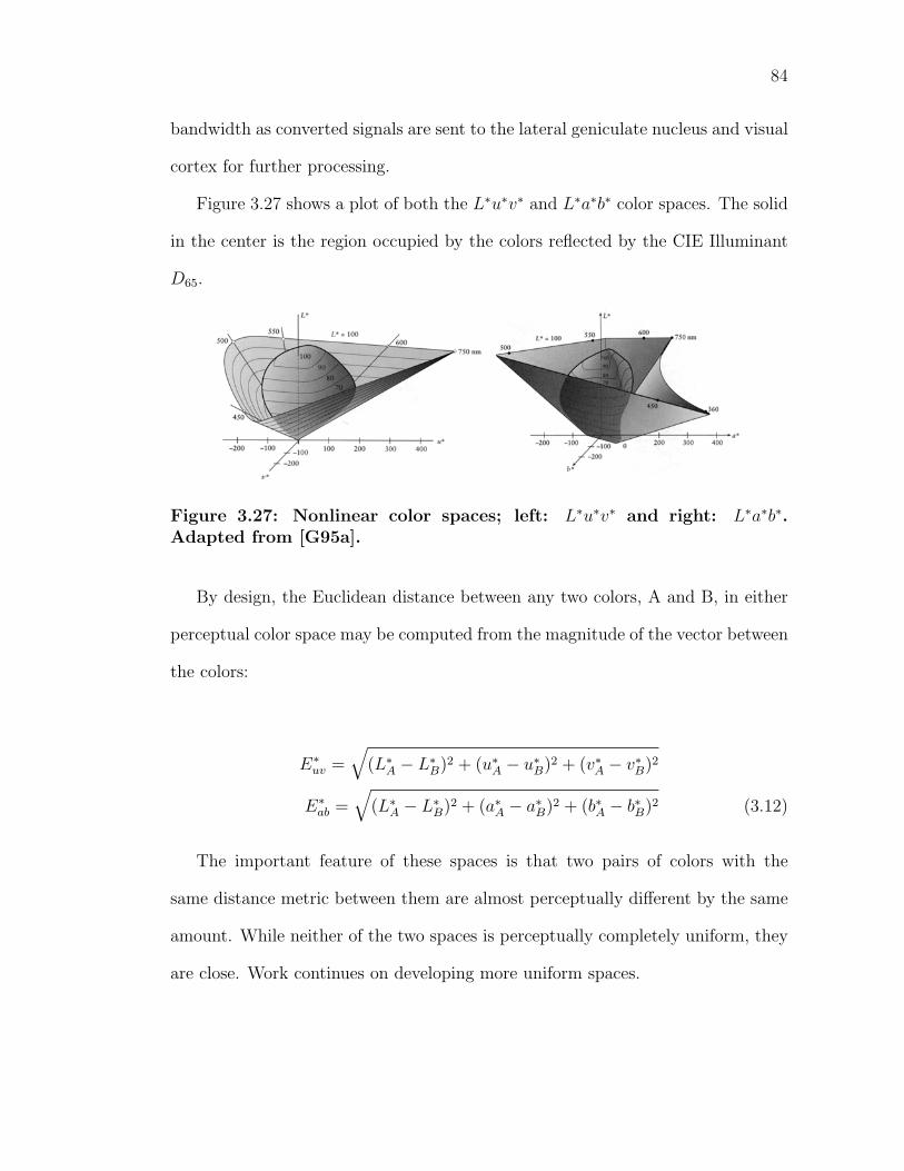
84
bandwidth as converted signals are sent to the lateral geniculate nucleus and visual
cortex for further processing.
Figure 3.27 shows a plot of both the L∗u∗v∗ and L∗a∗b∗ color spaces. The solid
in the center is the region occupied by the colors reflected by the CIE Illuminant
D65.
Figure 3.27: Nonlinear color spaces; left: L∗u∗v∗ and right: L∗a∗b∗.Adapted from [G95a].
By design, the Euclidean distance between any two colors, A and B, in either
perceptual color space may be computed from the magnitude of the vector between
the colors:
E∗uv =
√(L∗
A − L∗B)2 + (u∗
A − u∗B)2 + (v∗
A − v∗B)2
E∗ab =
√(L∗
A − L∗B)2 + (a∗
A − a∗B)2 + (b∗A − b∗B)2 (3.12)
The important feature of these spaces is that two pairs of colors with the
same distance metric between them are almost perceptually different by the same
amount. While neither of the two spaces is perceptually completely uniform, they
are close. Work continues on developing more uniform spaces.
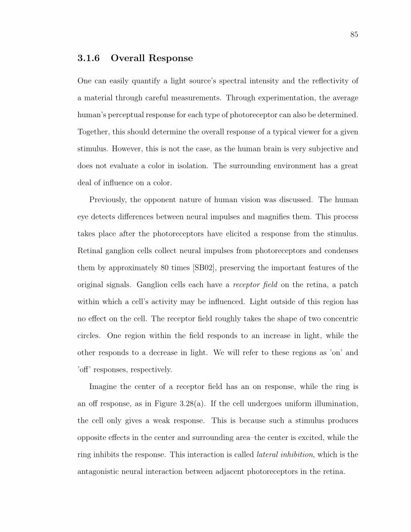
85
3.1.6 Overall Response
One can easily quantify a light source’s spectral intensity and the reflectivity of
a material through careful measurements. Through experimentation, the average
human’s perceptual response for each type of photoreceptor can also be determined.
Together, this should determine the overall response of a typical viewer for a given
stimulus. However, this is not the case, as the human brain is very subjective and
does not evaluate a color in isolation. The surrounding environment has a great
deal of influence on a color.
Previously, the opponent nature of human vision was discussed. The human
eye detects differences between neural impulses and magnifies them. This process
takes place after the photoreceptors have elicited a response from the stimulus.
Retinal ganglion cells collect neural impulses from photoreceptors and condenses
them by approximately 80 times [SB02], preserving the important features of the
original signals. Ganglion cells each have a receptor field on the retina, a patch
within which a cell’s activity may be influenced. Light outside of this region has
no effect on the cell. The receptor field roughly takes the shape of two concentric
circles. One region within the field responds to an increase in light, while the
other responds to a decrease in light. We will refer to these regions as ’on’ and
’off’ responses, respectively.
Imagine the center of a receptor field has an on response, while the ring is
an off response, as in Figure 3.28(a). If the cell undergoes uniform illumination,
the cell only gives a weak response. This is because such a stimulus produces
opposite effects in the center and surrounding area–the center is excited, while the
ring inhibits the response. This interaction is called lateral inhibition, which is the
antagonistic neural interaction between adjacent photoreceptors in the retina.
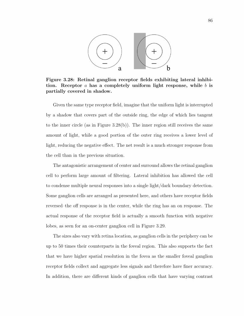
86
Figure 3.28: Retinal ganglion receptor fields exhibiting lateral inhibi-tion. Receptor a has a completely uniform light response, while b ispartially covered in shadow.
Given the same type receptor field, imagine that the uniform light is interrupted
by a shadow that covers part of the outside ring, the edge of which lies tangent
to the inner circle (as in Figure 3.28(b)). The inner region still receives the same
amount of light, while a good portion of the outer ring receives a lower level of
light, reducing the negative effect. The net result is a much stronger response from
the cell than in the previous situation.
The antagonistic arrangement of center and surround allows the retinal ganglion
cell to perform large amount of filtering. Lateral inhibition has allowed the cell
to condense multiple neural responses into a single light/dark boundary detection.
Some ganglion cells are arranged as presented here, and others have receptor fields
reversed–the off response is in the center, while the ring has an on response. The
actual response of the receptor field is actually a smooth function with negative
lobes, as seen for an on-center ganglion cell in Figure 3.29.
The sizes also vary with retina location, as ganglion cells in the periphery can be
up to 50 times their counterparts in the foveal region. This also supports the fact
that we have higher spatial resolution in the fovea as the smaller foveal ganglion
receptor fields collect and aggregate less signals and therefore have finer accuracy.
In addition, there are different kinds of ganglion cells that have varying contrast
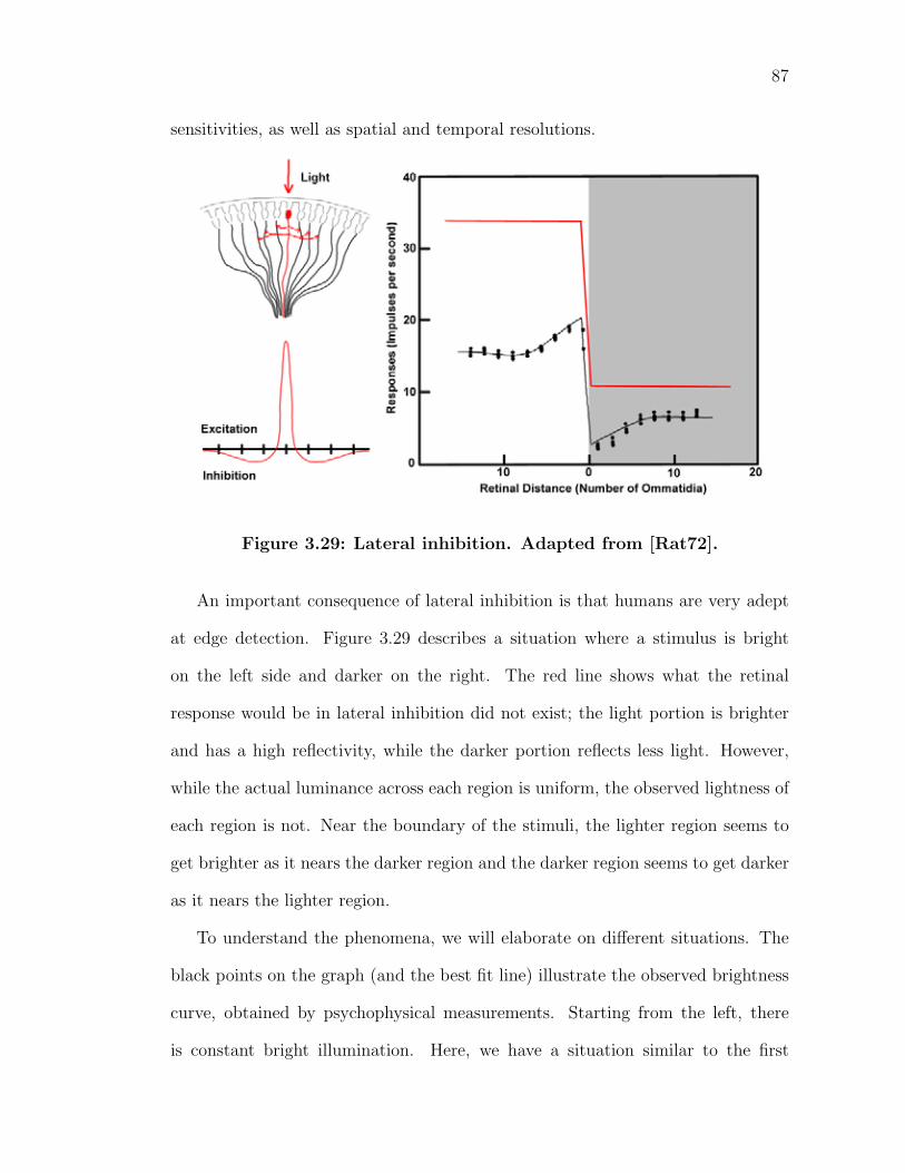
87
sensitivities, as well as spatial and temporal resolutions.
Figure 3.29: Lateral inhibition. Adapted from [Rat72].
An important consequence of lateral inhibition is that humans are very adept
at edge detection. Figure 3.29 describes a situation where a stimulus is bright
on the left side and darker on the right. The red line shows what the retinal
response would be in lateral inhibition did not exist; the light portion is brighter
and has a high reflectivity, while the darker portion reflects less light. However,
while the actual luminance across each region is uniform, the observed lightness of
each region is not. Near the boundary of the stimuli, the lighter region seems to
get brighter as it nears the darker region and the darker region seems to get darker
as it nears the lighter region.
To understand the phenomena, we will elaborate on different situations. The
black points on the graph (and the best fit line) illustrate the observed brightness
curve, obtained by psychophysical measurements. Starting from the left, there
is constant bright illumination. Here, we have a situation similar to the first
88
example shown in Figure 3.28. Under constant stimulation, the opponent nature
of ganglion receptor fields will produce a weakened response. The off-regions of
the cells are inhibiting the response and we perceive the stimulus as being darker
than it actually is. As we move closer to the edge, more off-region portions of
receptor fields are receiving less light. Therefore more off-region receptor fields
are receiving their desired response, while the on-receptors are still receiving their
desired bright response. Hence, the total amount of excitation is increasing as we
move toward the edge. The maximum response is right at the edge of the light and
dark regions. The result is that we perceive the light area getting slightly brighter
close to the edge. A similar effect occurs for the dark area, as it is perceived as
slightly darker near the edge.
Ratliff was the first to physically measure these differences in intensity and
perceived brightness. He measured the nerve impulses produced by steady il-
lumination of a single receptor in the eye of the horseshoe crab Limulus. The
nerve fibers from the receptor are separated by microdissection and connected to
an electrode from an amplifier and a recorder. However, Ernst Mach explored the
connection between reflected light intensity and the resulting sensation beforehand.
He hypothesized the antagonistic influences in the retina, as his experiments with
intensity and perception of light did not correspond. The pattern in Figure 3.30 is
similar to one of which Mach developed. The apparent lightness within each bar
varies even though the intensity of light reflected is constant. Most people describe
the edges of each bar having slight bands. Hence the term Mach bands, which are
the illusionary spatial gradations in perceived lightness that occurs without corre-
sponding gradations in the actual distribution of light.
Mach bands emphasize the important distinction between intensity and light-
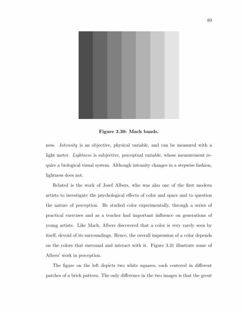
89
Figure 3.30: Mach bands.
ness. Intensity is an objective, physical variable, and can be measured with a
light meter. Lightness is subjective, perceptual variable, whose measurement re-
quire a biological visual system. Although intensity changes in a stepwise fashion,
lightness does not.
Related is the work of Josef Albers, who was also one of the first modern
artists to investigate the psychological effects of color and space and to question
the nature of perception. He studied color experimentally, through a series of
practical exercises and as a teacher had important influence on generations of
young artists. Like Mach, Albers discovered that a color is very rarely seen by
itself, devoid of its surroundings. Hence, the overall impression of a color depends
on the colors that surround and interact with it. Figure 3.31 illustrate some of
Albers’ work in perception.
The figure on the left depicts two white squares, each centered in different
patches of a brick pattern. The only difference in the two images is that the grout
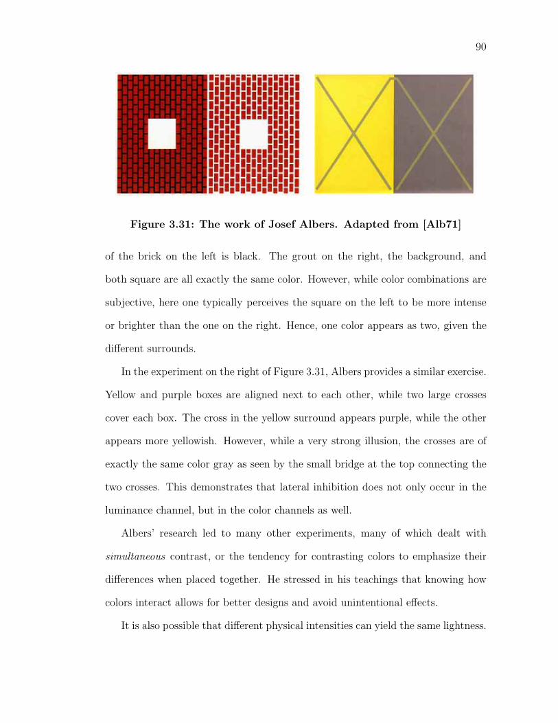
90
Figure 3.31: The work of Josef Albers. Adapted from [Alb71]
of the brick on the left is black. The grout on the right, the background, and
both square are all exactly the same color. However, while color combinations are
subjective, here one typically perceives the square on the left to be more intense
or brighter than the one on the right. Hence, one color appears as two, given the
different surrounds.
In the experiment on the right of Figure 3.31, Albers provides a similar exercise.
Yellow and purple boxes are aligned next to each other, while two large crosses
cover each box. The cross in the yellow surround appears purple, while the other
appears more yellowish. However, while a very strong illusion, the crosses are of
exactly the same color gray as seen by the small bridge at the top connecting the
two crosses. This demonstrates that lateral inhibition does not only occur in the
luminance channel, but in the color channels as well.
Albers’ research led to many other experiments, many of which dealt with
simultaneous contrast, or the tendency for contrasting colors to emphasize their
differences when placed together. He stressed in his teachings that knowing how
colors interact allows for better designs and avoid unintentional effects.
It is also possible that different physical intensities can yield the same lightness.
91
This routinely happens when you view an object under different lighting conditions.
For instance, the spectral distribution of indoor tungsten lights is different to that
of natural sunlight. Yet, a sheet of notebook paper in each is still perceived as
white. The tendency of an object’s color to remain unchanged despite changes
in the light spectrum is called color constancy. To achieve color constancy, the
visual system must separate the surface’s reflection properties from the spectral
distribution of the emitted light. One way this is done is the visual system adjusts
its sensitivity to the overall level of illumination, called light adaptation. One
has experienced this by entering a very dark room, such as a movie theater–the
eyes gradually adjust to much lower light levels after a few minutes. Colored
afterimages, which are often experienced after long exposures to the same stimulus,
are attributed as an effect of adaptation. In this case, different regions of the eye
have adapted to different colors, not an overall luminance change.
Yet, adaptation is not a complete explanation for color constancy. Color con-
trast among objects and their surroundings is also important. Since contrast does
not change much when the illumination changes, the visual system exploits the
ratios between colors in a scene. This is evident in the work of Edwin Land in
his Retinex Theory of Color Vision [Lan77]. In Land’s experiment, he created
a painting with a collection of rectangular shapes of varying hues in the manner
of Mondrian, a famous abstract painter. For each of five trials, he illuminated a
different colored shape such that it exhibited an identical energy flux to the other
four colors. Hence, all of the energy reaching the viewer’s eye from the five shapes
is identical. The viewer then matched each shape’s color with the closest Munsell
color chip, illuminated under the same source. Even though the five samples all
sent the same physical color sensation to the eye, the viewer had different color
92
sensations for each trial and picked a different Munsell color chip for each. The
results are seen in Figure 3.32.
Here, under lighting conditions that match the physical sensations of different
colors, the red still looks red, and the yellow still appears as yellow in their re-
spective surroundings. Clearly, the human visual system relies on more than just
a single color sensation. The environment has a great effect on the overall ap-
pearance of a color, as simultaneous contrast maintains the relative relationships
between the colors. Hence, vision is more than just physical energy and perceptual
responses, but is subjective and is affected by one’s interpretation.
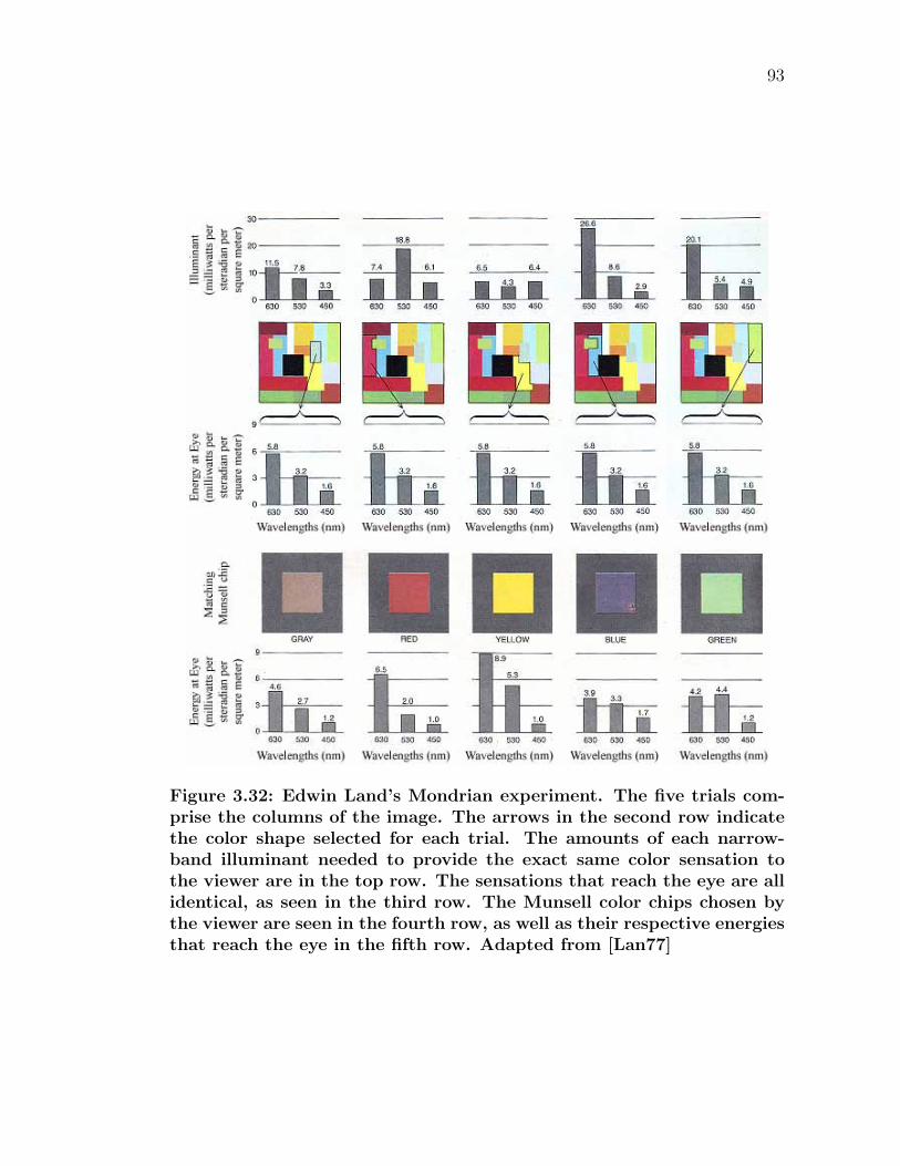
93
Figure 3.32: Edwin Land’s Mondrian experiment. The five trials com-prise the columns of the image. The arrows in the second row indicatethe color shape selected for each trial. The amounts of each narrow-band illuminant needed to provide the exact same color sensation tothe viewer are in the top row. The sensations that reach the eye are allidentical, as seen in the third row. The Munsell color chips chosen bythe viewer are seen in the fourth row, as well as their respective energiesthat reach the eye in the fifth row. Adapted from [Lan77]
Chapter 4
Previous Work
There is no subject, however complex, which – if studied with patience and
intelligence – will not become more complex.
-Unknown
4.1 Introduction
This chapter is divided into two sections. The first primarily discusses modeling
the complex behavior of paint and other volumetric materials in the computer
graphics literature. The latter section discusses the study of naturally occurring
changes in pigmented materials and how this alters one’s perception of the surface
appearance. In conjunction, these two disciplines can be used to effectively predict
the behavior of pigmented solutions over time.
4.2 Light transport in volumetric materials
Accurately modeling the scattering of light by materials is fundamental for real-
istic image synthesis. Simple models to approximate the appearance of materials
94
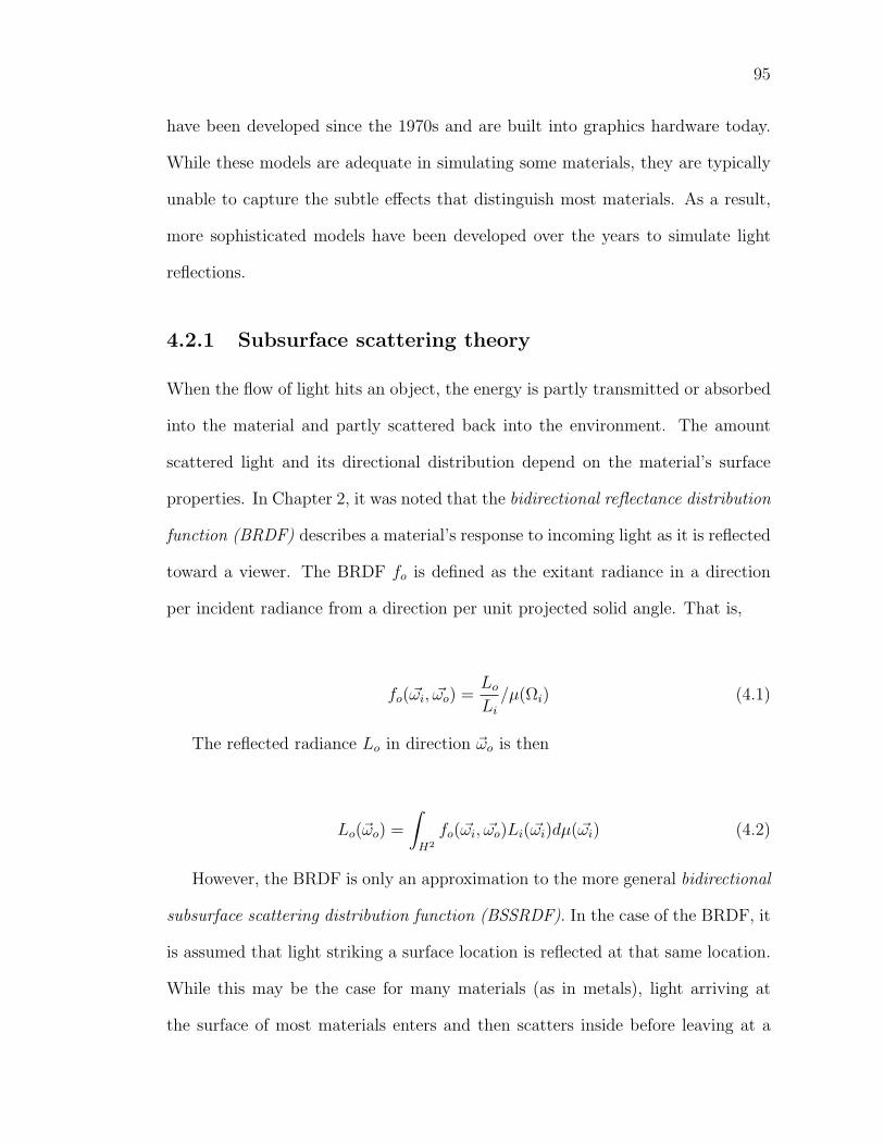
95
have been developed since the 1970s and are built into graphics hardware today.
While these models are adequate in simulating some materials, they are typically
unable to capture the subtle effects that distinguish most materials. As a result,
more sophisticated models have been developed over the years to simulate light
reflections.
4.2.1 Subsurface scattering theory
When the flow of light hits an object, the energy is partly transmitted or absorbed
into the material and partly scattered back into the environment. The amount
scattered light and its directional distribution depend on the material’s surface
properties. In Chapter 2, it was noted that the bidirectional reflectance distribution
function (BRDF) describes a material’s response to incoming light as it is reflected
toward a viewer. The BRDF fo is defined as the exitant radiance in a direction
per incident radiance from a direction per unit projected solid angle. That is,
fo(ωi, ωo) =Lo
Li
/µ(Ωi) (4.1)
The reflected radiance Lo in direction ωo is then
Lo(ωo) =
∫H2
fo(ωi, ωo)Li(ωi)dµ(ωi) (4.2)
However, the BRDF is only an approximation to the more general bidirectional
subsurface scattering distribution function (BSSRDF). In the case of the BRDF, it
is assumed that light striking a surface location is reflected at that same location.
While this may be the case for many materials (as in metals), light arriving at
the surface of most materials enters and then scatters inside before leaving at a
96
different location. Subsurface scattering effects that the BRDF cannot capture
include color bleeding within materials and the diffusion of light across shadow
boundaries and silhouettes. This behavior is described by the BSSDRF S, which
relates the outgoing radiance, Lo(xo, ωo) at the point xo in the direction ωo, to the
incident flux, Φi(xi, ωi) at the point xi, from direction ωi [NRH+77]:
S(xi, ωi; xo, ωo) =dLo(xo, ωo)
dΦi(xi, ωi)(4.3)
The amount of radiance leaving point xo in direction ωo is then
Lo(xo, ωo) =
∫A
∫Ω
S(xi, ωi; xo, ωo)Li(xi, ωi)(ni · ωi)dωidA(xi) (4.4)
where the term S(xi, ωi; xo, ωo) is the BSSRDF. This function is an eight-
dimension function and costly to evaluate numerically.
All paintings fall into this category of translucent materials, as subsurface scat-
tering dictates the appearance of paint to a great extent. As seen in Chapter 2,
light scatters multiple times within the binding media, interacting with the pig-
ment particles before exiting to the environment. Hence, a viewer’s perception of
the material depends not only on the surface characteristics of the paint, but also
on the light interactions within the paint. Therefore, BSSRDF’s are very impor-
tant in the realistic simulation of paint. There are several approaches to dealing
with the complexity induced by this multiple scattering. These implementations
are all all various approximations to the BSSRDF.
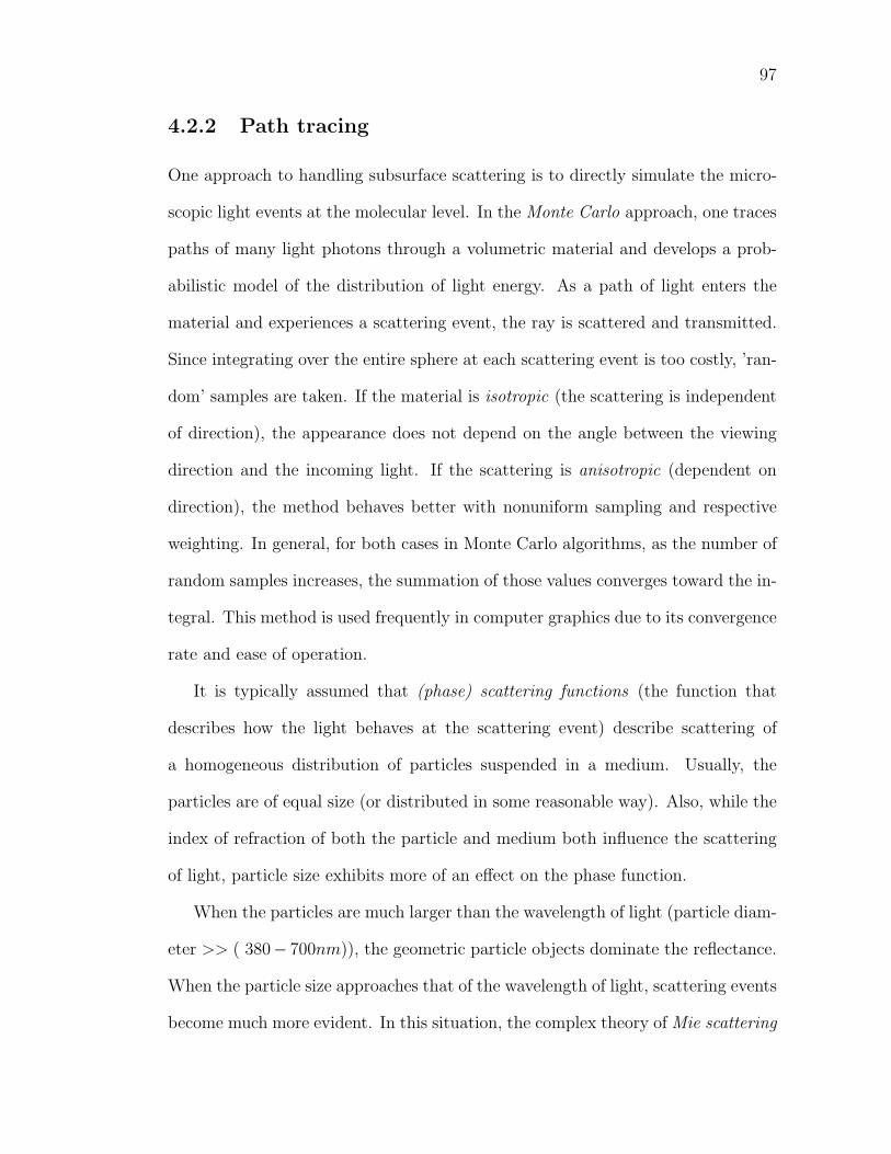
97
4.2.2 Path tracing
One approach to handling subsurface scattering is to directly simulate the micro-
scopic light events at the molecular level. In the Monte Carlo approach, one traces
paths of many light photons through a volumetric material and develops a prob-
abilistic model of the distribution of light energy. As a path of light enters the
material and experiences a scattering event, the ray is scattered and transmitted.
Since integrating over the entire sphere at each scattering event is too costly, ’ran-
dom’ samples are taken. If the material is isotropic (the scattering is independent
of direction), the appearance does not depend on the angle between the viewing
direction and the incoming light. If the scattering is anisotropic (dependent on
direction), the method behaves better with nonuniform sampling and respective
weighting. In general, for both cases in Monte Carlo algorithms, as the number of
random samples increases, the summation of those values converges toward the in-
tegral. This method is used frequently in computer graphics due to its convergence
rate and ease of operation.
It is typically assumed that (phase) scattering functions (the function that
describes how the light behaves at the scattering event) describe scattering of
a homogeneous distribution of particles suspended in a medium. Usually, the
particles are of equal size (or distributed in some reasonable way). Also, while the
index of refraction of both the particle and medium both influence the scattering
of light, particle size exhibits more of an effect on the phase function.
When the particles are much larger than the wavelength of light (particle diam-
eter >> ( 380− 700nm)), the geometric particle objects dominate the reflectance.
When the particle size approaches that of the wavelength of light, scattering events
become much more evident. In this situation, the complex theory of Mie scattering
98
describes the scattering and absorption of light at each scattering event (account-
ing for the size, shape and density of every particle, as well as the and relative
indices of refraction). The Mie scattering functions are very numerically expen-
sive to compute. Therefore, efficient approximations have been presented from
the optical literature for sparse or dense particle densities (called hazy and murky,
respectively) [NMN87]:
PhazyMie(cos α) = 1 + 9
(1 + cos α
2
)8
PmurkyMie(cos α) = 1 + 50
(1 + cos α
2
)32
(4.5)
where α is the angle between the incident and outgoing directions. Another
popular approximation to the Mie functions in the Henyey-Greenstein phase func-
tion [Bli82]:
PhenyeyGreenstein(cos α, g) =1 − g2
(1 + g2 − 2g cos α)3/2(4.6)
The function takes an asymmetry parameter g (the mean cosine of the phase
function), which varies from strong retro-reflection (g < 0) to strong forward scat-
tering (g > 0). Isotropic scattering is achieved when g = 0.
Kozakov presented a successful method of calculating the characteristics of
paint based on Monte Carlo methods [Koz04]. In the work, a statistical model
of a paint coating was developed involving interaction between photons, particles,
and the binding medium, as well as the photon path length between collisions.
The model accounts for a single pigment and medium (titanium white in alkyd
enamel) and actual paint reflectance data was measured and utilized in the work.
99
Figure 4.1: Common phase functions for particles whose diameters areapproximately the size of the wavelength of light. For each, the incidentlight ray is from the left; each scattering event is at the intersection ofthe axes. Left: The hazy Mie function; middle: the murky Mie function;right: the Henyey-Greenstein function. Adapted from [G95b]
The results include accurate prediction of overall paint reflectance, absorption, and
covering power as compared to measurements of actual samples.
Approaches similar to this, while capable of simulating all of the effects of sub-
surface scattering, are still computationally very expensive. This is due to the fact
that techniques based on path tracing are particularly inefficient for highly scat-
tering materials (such as milk, skin or paint), in which the light scatters multiple
(often several hundred) times before exiting the material. Moreover, the sampling
nature of Monte Carlo often results in noise, which is not satisfactory for the sub-
tleties in spatially varying pigmented materials. Ultimately, while this approach
will eventually converge to the desired solution, this level of detail is somewhat too
complex for calculating information about pigmented solutions.
4.2.3 Diffusion approximation
Another approach to handling the appearance of pigmented materials is to use
an analytic technique. Jensen notes that light distribution in highly scattering
media tends to be isotropic since each scattering event blurs the light [JMLH01].
Hence, single scattering (where incident light only scatters once before exiting)
100
only accounts for a small percentage of total outgoing radiance in these materials.
In this context, the relationship between the incoming and outgoing directions can
be removed, simplifying the BSSRDF to a four-dimensional function Rd(xi, xo)
known as the diffuse BSSRDF.
Diffusion theory can provide a good approximation for multiple scattering in
highly scattering media without having to resort on costly Monte Carlo simulations.
The diffusion equation has a simple solution in the case of a single isotropic point
light source in an infinite medium:
φ(x) =Φ
4πD
e−σtrf(x)
r(x)(4.7)
where
φ(x) is the radiant flux
Φ is the power of the point light source
D =1
3σ′t
is the diffusion constant
σa is the absorption coefficient
g is the mean cosine of the phase function
σ′t = σ′
s + σa is the reduced extinction coefficient
σ′s = σs(1 − g) is the reduced scattering coefficient
r(x) is the distance to the point source
σtr =√
3σaσ′t is the effective transport coefficient
A more accurate approximation is the dipole diffusion approximation. In this
model, the volumetric source distribution is modeled using two point sources, as
illustrated in Figure 4.2. The first one, the positive real light source, is located at
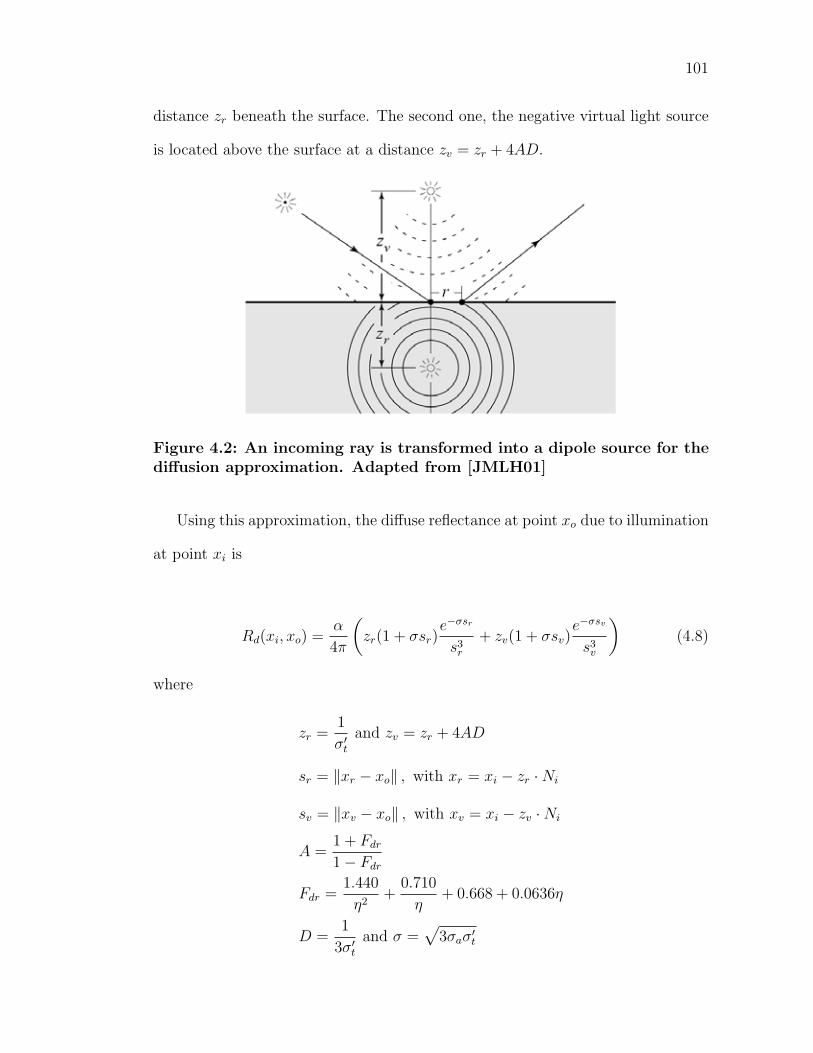
101
distance zr beneath the surface. The second one, the negative virtual light source
is located above the surface at a distance zv = zr + 4AD.
Figure 4.2: An incoming ray is transformed into a dipole source for thediffusion approximation. Adapted from [JMLH01]
Using this approximation, the diffuse reflectance at point xo due to illumination
at point xi is
Rd(xi, xo) =α
4π
(zr(1 + σsr)
e−σsr
s3r
+ zv(1 + σsv)e−σsv
s3v
)(4.8)
where
zr =1
σ′t
and zv = zr + 4AD
sr = ‖xr − xo‖ , with xr = xi − zr · Ni
sv = ‖xv − xo‖ , with xv = xi − zv · Ni
A =1 + Fdr
1 − Fdr
Fdr =1.440
η2+
0.710
η+ 0.668 + 0.0636η
D =1
3σ′t
and σ =√
3σaσ′t
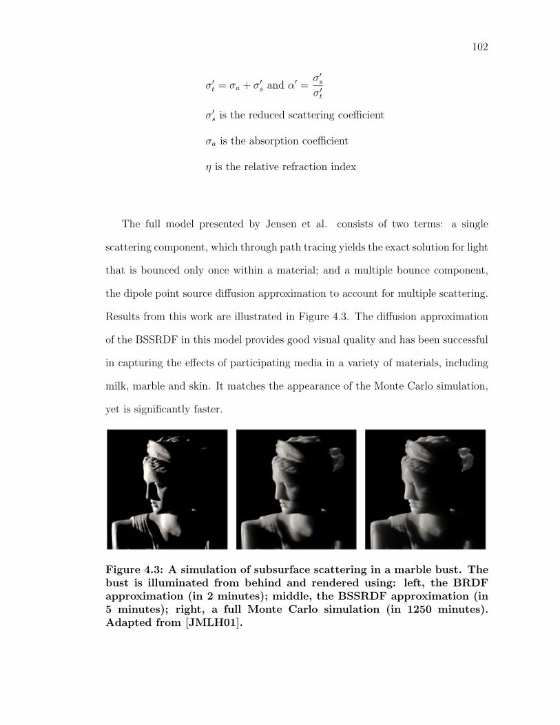
102
σ′t = σa + σ′
s and α′ =σ′
s
σ′t
σ′s is the reduced scattering coefficient
σa is the absorption coefficient
η is the relative refraction index
The full model presented by Jensen et al. consists of two terms: a single
scattering component, which through path tracing yields the exact solution for light
that is bounced only once within a material; and a multiple bounce component,
the dipole point source diffusion approximation to account for multiple scattering.
Results from this work are illustrated in Figure 4.3. The diffusion approximation
of the BSSRDF in this model provides good visual quality and has been successful
in capturing the effects of participating media in a variety of materials, including
milk, marble and skin. It matches the appearance of the Monte Carlo simulation,
yet is significantly faster.
Figure 4.3: A simulation of subsurface scattering in a marble bust. Thebust is illuminated from behind and rendered using: left, the BRDFapproximation (in 2 minutes); middle, the BSSRDF approximation (in5 minutes); right, a full Monte Carlo simulation (in 1250 minutes).Adapted from [JMLH01].
103
4.2.4 Image-based measurement
Further, physically correct parameters can be determined for volumetric materials
by image-based measurement. Lensch et al. captured an object’s response to
illumination using a high dynamic range camera from multiple points [LGB+03].
In this work, the highly scattering homogeneous materials are represented by the
four-dimensional diffuse BSSRDF.
The algorithm is subdivided into two parts. The first is a large preprocessing
step to compute and store the impulse response to incident light for each surface
point under subsurface scattering. The responses are divided into local and global
effects. Local effects are modeled as a per-texel filter kernel that is applied as a
texture map representing the incident illumination. The global response is stored
as vertex-to-vertex throughput factors for the object’s triangle mesh. During the
rendering stage, two responses are combined using the current light situation to
form the final image.
The work builds on subsurface scattering research, as it is unique in attempt-
ing to handle interactive image synthesis. The advantage is that the model is
able to handle rendering of translucent materials at roughly interactive rates (ap-
proximately 5 frames per second), while including dynamic camera movement and
changes in illumination.
Goesele et al. extended this work by presented a technique (denoted as the
DISCO acquisition technique) that can derive the necessary input data for real
translucent materials with spatially-varying properties [GLL+04]. This work is the
first to acquire the subsurface light transport behavior for arbitrary heterogeneous
materials.
The model utilizes the previous method of interactive rendering of highly-
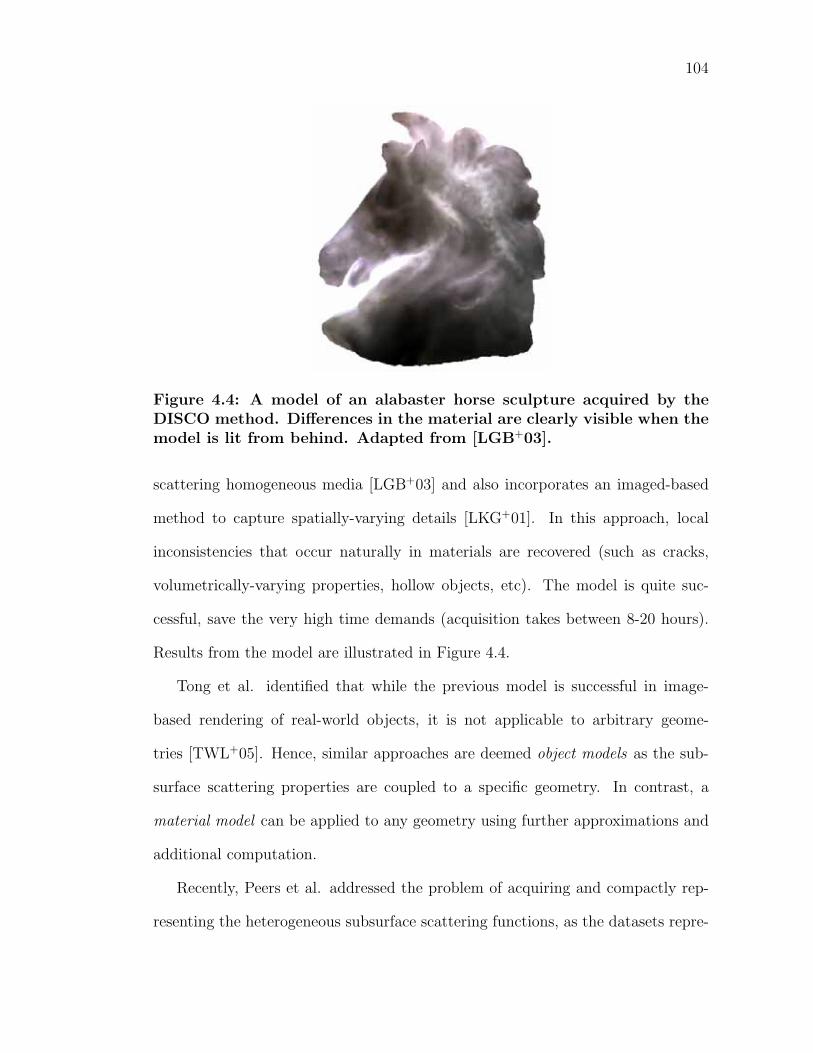
104
Figure 4.4: A model of an alabaster horse sculpture acquired by theDISCO method. Differences in the material are clearly visible when themodel is lit from behind. Adapted from [LGB+03].
scattering homogeneous media [LGB+03] and also incorporates an imaged-based
method to capture spatially-varying details [LKG+01]. In this approach, local
inconsistencies that occur naturally in materials are recovered (such as cracks,
volumetrically-varying properties, hollow objects, etc). The model is quite suc-
cessful, save the very high time demands (acquisition takes between 8-20 hours).
Results from the model are illustrated in Figure 4.4.
Tong et al. identified that while the previous model is successful in image-
based rendering of real-world objects, it is not applicable to arbitrary geome-
tries [TWL+05]. Hence, similar approaches are deemed object models as the sub-
surface scattering properties are coupled to a specific geometry. In contrast, a
material model can be applied to any geometry using further approximations and
additional computation.
Recently, Peers et al. addressed the problem of acquiring and compactly rep-
resenting the heterogeneous subsurface scattering functions, as the datasets repre-
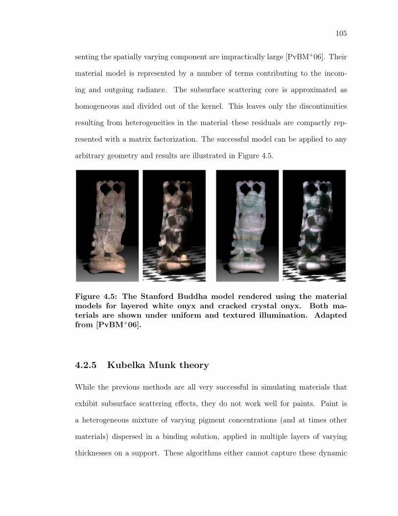
105
senting the spatially varying component are impractically large [PvBM+06]. Their
material model is represented by a number of terms contributing to the incom-
ing and outgoing radiance. The subsurface scattering core is approximated as
homogeneous and divided out of the kernel. This leaves only the discontinuities
resulting from heterogeneities in the material–these residuals are compactly rep-
resented with a matrix factorization. The successful model can be applied to any
arbitrary geometry and results are illustrated in Figure 4.5.
Figure 4.5: The Stanford Buddha model rendered using the materialmodels for layered white onyx and cracked crystal onyx. Both ma-terials are shown under uniform and textured illumination. Adaptedfrom [PvBM+06].
4.2.5 Kubelka Munk theory
While the previous methods are all very successful in simulating materials that
exhibit subsurface scattering effects, they do not work well for paints. Paint is
a heterogeneous mixture of varying pigment concentrations (and at times other
materials) dispersed in a binding solution, applied in multiple layers of varying
thicknesses on a support. These algorithms either cannot capture these dynamic
106
effects or are too computationally expensive to do so interactively.
As contrasted to the previous approaches, we can work at the macroscopic level
and simply model the aggregate behavior of the paint with respect to incident light.
This approach was taken by German scientists Paul Kubelka and Franz Munk, who
developed a simple set of differential equations to describe the transport of light in
pigmented materials [KM31]. The model is very effective for pigmented materials,
is not very complicated and is very efficient. The original paper in 1931 is based on
the assumption of a homogeneous material of a medium that is infinite in extent.
The model describes the material properties of a pigmented material in terms of
only two wavelength-dependent parameters: an absorption constant, K(λ), and a
scattering constant, S(λ):
R∞ =1
1 + KS
+√(
1 + KS
)2 − 1(4.9)
Equation 4.9 represents the solution to the most basic Kubelka-Munk differen-
tial equations as they were originally presented [KM31]. The diffuse reflectance,
R∞, of a paint sample of complete hiding (a paint of a thickness such that the sub-
strate cannot been seen underneath) is a function of the absorption and scattering
coefficients. Note that the dependence on wavelength is omitted for clarity and the
equation is computed over the visible spectrum. The derivation of the solutions of
Kubelka and Munk’s differential equations and other improvements to the theory
over the years are described in Appendix A.
The resulting solutions to the differential equations have found wide scientific
utility in areas as diverse as the study of paint, paper, textiles, and skin, as well as
art conservation and planetary science. In computer graphics, the equations have
been used in a variety of rendering contexts for materials that exhibit subsurface
107
scattering and absorption properties. The following research demonstrates the
usefulness of K-M theory to simulate the appearance of pigmented materials.
Haase and Mayer introduced the Kubelka-Munk model to computer graphics,
using the K-M equations for rendering and color mixing in both interactive and
offline applications [HM92]. The work included a simple airbrush tool, where users
could work with real-world pigmented paints, instead of arbitrary RGB colors.
The program stored and updated the current K and S values for every pixel in
the image, using a custom four-wavelengths representation based on Meyer’s previ-
ous work [Mey88]. The four-wavelength encoding was based on integrating against
the human visual response functions in ACC color space. The interpolation of the
wavelengths used to compute tristimulus values from spectral data was done using
Gaussian quadrature. Computing reflectance values for K and S values over the
entire visible spectrum is very computationally expensive, and therefore limiting
the wavelength information is necessary for the purposes of real-time interaction.
Since the reflectance spectral curves are reasonably smooth functions, the errors
caused by this minimal sampling are minimized.
The results of this theory are illustrated in Figure 4.6. A real photograph
painted with varying concentrations of two red paints and a white paint is simu-
lated using RGB values and Kubelka-Munk theory. The spectral reflectances of
the paints are shown in Figure 4.7 and the dependencies of the absorption and
scattering coefficients are shown in Figure 4.8.
Curtis et al. used the Kubelka-Munk equations for optically compositing thin
glazes of paint in their watercolor simulation [CAS+97]. The model uses a three
wavelength RGB representation for the K and S coefficients. The K and S values
were not determined experimentally, but specified interactively. This method of
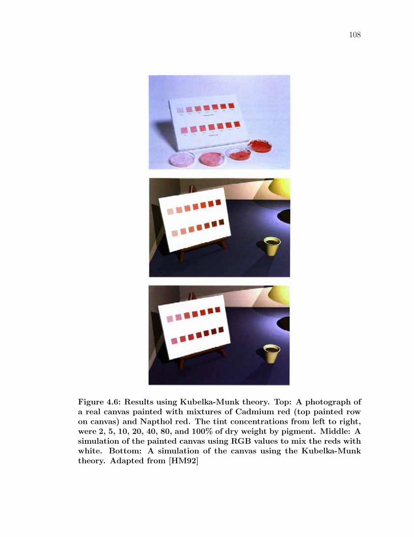
108
Figure 4.6: Results using Kubelka-Munk theory. Top: A photograph ofa real canvas painted with mixtures of Cadmium red (top painted rowon canvas) and Napthol red. The tint concentrations from left to right,were 2, 5, 10, 20, 40, 80, and 100% of dry weight by pigment. Middle: Asimulation of the painted canvas using RGB values to mix the reds withwhite. Bottom: A simulation of the canvas using the Kubelka-Munktheory. Adapted from [HM92]
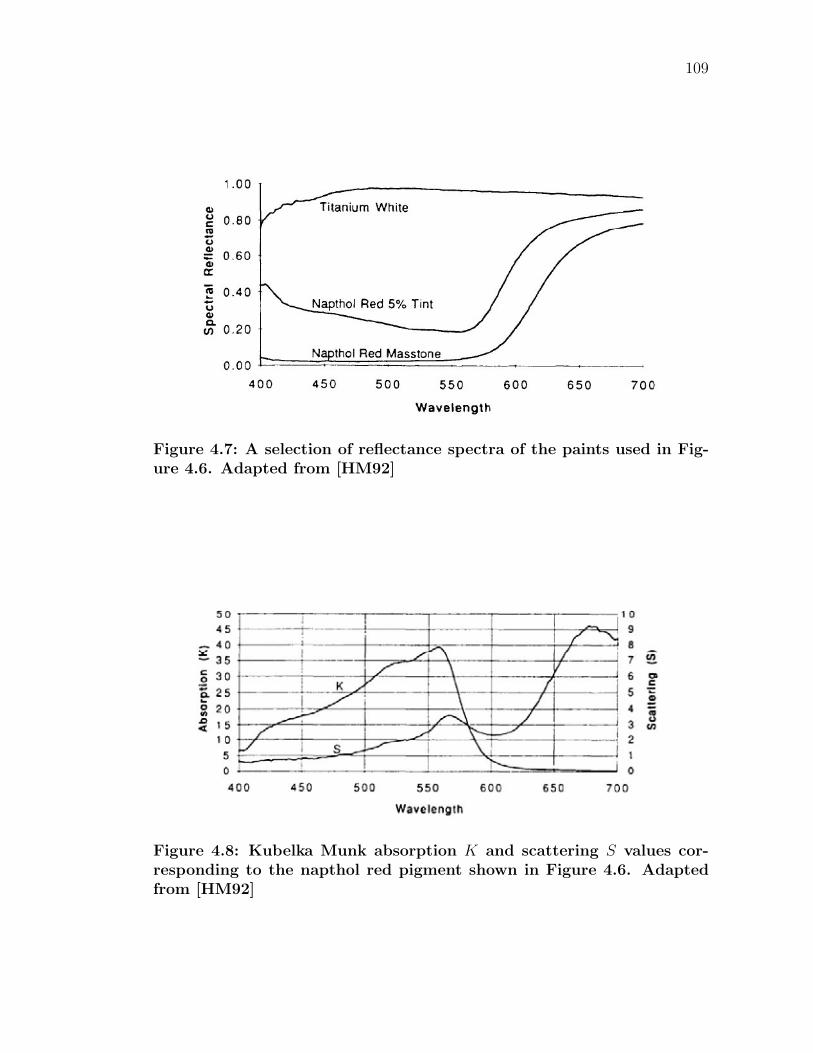
109
Figure 4.7: A selection of reflectance spectra of the paints used in Fig-ure 4.6. Adapted from [HM92]
Figure 4.8: Kubelka Munk absorption K and scattering S values cor-responding to the napthol red pigment shown in Figure 4.6. Adaptedfrom [HM92]
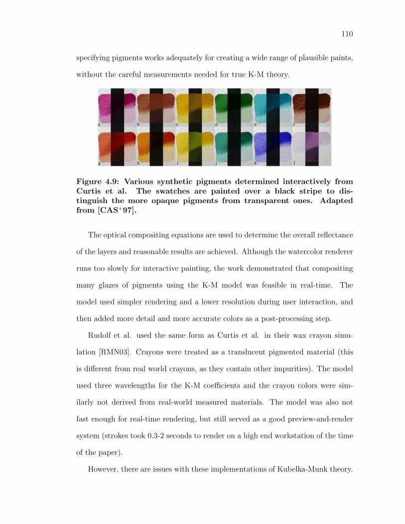
110
specifying pigments works adequately for creating a wide range of plausible paints,
without the careful measurements needed for true K-M theory.
Figure 4.9: Various synthetic pigments determined interactively fromCurtis et al. The swatches are painted over a black stripe to dis-tinguish the more opaque pigments from transparent ones. Adaptedfrom [CAS+97].
The optical compositing equations are used to determine the overall reflectance
of the layers and reasonable results are achieved. Although the watercolor renderer
runs too slowly for interactive painting, the work demonstrated that compositing
many glazes of pigments using the K-M model was feasible in real-time. The
model used simpler rendering and a lower resolution during user interaction, and
then added more detail and more accurate colors as a post-processing step.
Rudolf et al. used the same form as Curtis et al. in their wax crayon simu-
lation [RMN03]. Crayons were treated as a translucent pigmented material (this
is different from real world crayons, as they contain other impurities). The model
used three wavelengths for the K-M coefficients and the crayon colors were sim-
ilarly not derived from real-world measured materials. The model was also not
fast enough for real-time rendering, but still served as a good preview-and-render
system (strokes took 0.3-2 seconds to render on a high end workstation of the time
of the paper).
However, there are issues with these implementations of Kubelka-Munk theory.
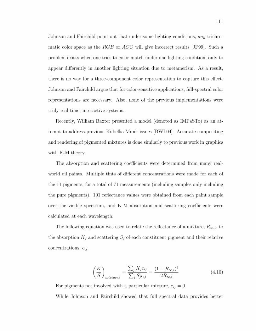
111
Johnson and Fairchild point out that under some lighting conditions, any trichro-
matic color space as the RGB or ACC will give incorrect results [JF99]. Such a
problem exists when one tries to color match under one lighting condition, only to
appear differently in another lighting situation due to metamerism. As a result,
there is no way for a three-component color representation to capture this effect.
Johnson and Fairchild argue that for color-sensitive applications, full-spectral color
representations are necessary. Also, none of the previous implementations were
truly real-time, interactive systems.
Recently, William Baxter presented a model (denoted as IMPaSTo) as an at-
tempt to address previous Kubelka-Munk issues [BWL04]. Accurate compositing
and rendering of pigmented mixtures is done similarly to previous work in graphics
with K-M theory.
The absorption and scattering coefficients were determined from many real-
world oil paints. Multiple tints of different concentrations were made for each of
the 11 pigments, for a total of 71 measurements (including samples only including
the pure pigments). 101 reflectance values were obtained from each paint sample
over the visible spectrum, and K-M absorption and scattering coefficients were
calculated at each wavelength.
The following equation was used to relate the reflectance of a mixture, R∞,i, to
the absorption Kj and scattering Sj of each constituent pigment and their relative
concentrations, cij.
(K
S
)mixture,i
=
∑j Kjcij∑j Sjcij
=(1 − R∞,i)
2
2R∞,i
(4.10)
For pigments not involved with a particular mixture, cij = 0.
While Johnson and Fairchild showed that full spectral data provides better
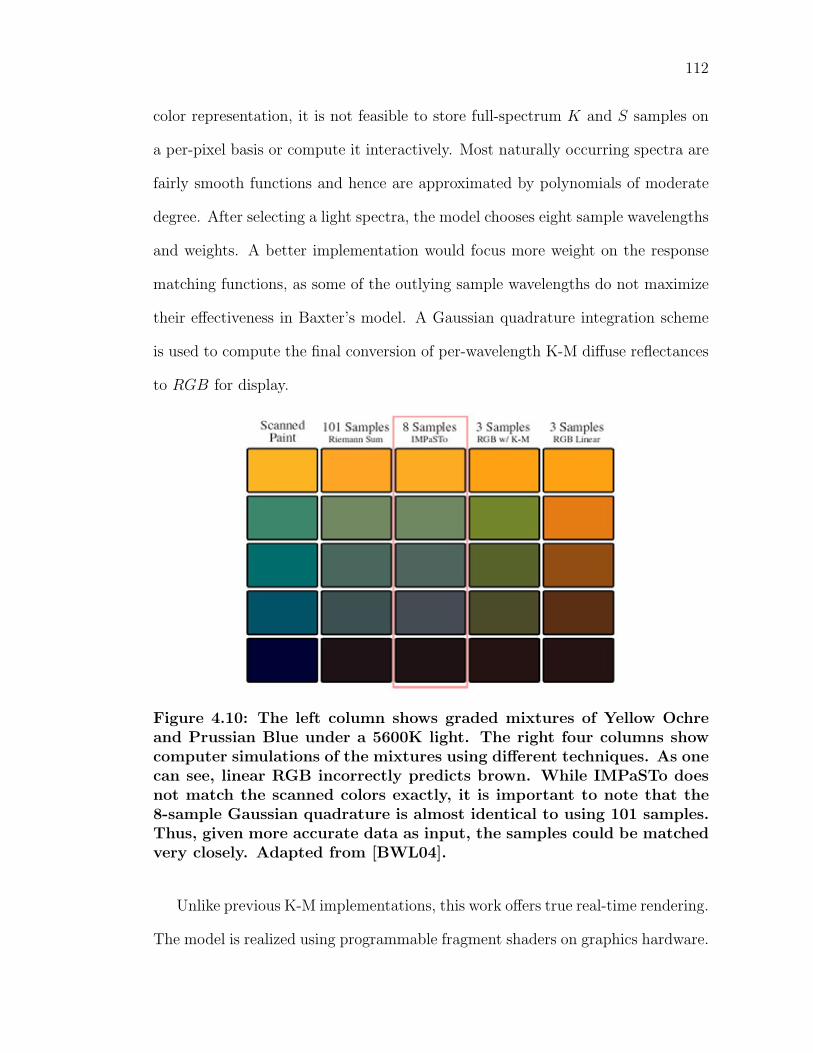
112
color representation, it is not feasible to store full-spectrum K and S samples on
a per-pixel basis or compute it interactively. Most naturally occurring spectra are
fairly smooth functions and hence are approximated by polynomials of moderate
degree. After selecting a light spectra, the model chooses eight sample wavelengths
and weights. A better implementation would focus more weight on the response
matching functions, as some of the outlying sample wavelengths do not maximize
their effectiveness in Baxter’s model. A Gaussian quadrature integration scheme
is used to compute the final conversion of per-wavelength K-M diffuse reflectances
to RGB for display.
Figure 4.10: The left column shows graded mixtures of Yellow Ochreand Prussian Blue under a 5600K light. The right four columns showcomputer simulations of the mixtures using different techniques. As onecan see, linear RGB incorrectly predicts brown. While IMPaSTo doesnot match the scanned colors exactly, it is important to note that the8-sample Gaussian quadrature is almost identical to using 101 samples.Thus, given more accurate data as input, the samples could be matchedvery closely. Adapted from [BWL04].
Unlike previous K-M implementations, this work offers true real-time rendering.
The model is realized using programmable fragment shaders on graphics hardware.
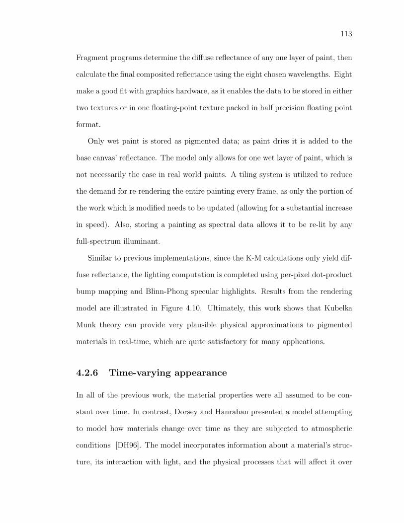
113
Fragment programs determine the diffuse reflectance of any one layer of paint, then
calculate the final composited reflectance using the eight chosen wavelengths. Eight
make a good fit with graphics hardware, as it enables the data to be stored in either
two textures or in one floating-point texture packed in half precision floating point
format.
Only wet paint is stored as pigmented data; as paint dries it is added to the
base canvas’ reflectance. The model only allows for one wet layer of paint, which is
not necessarily the case in real world paints. A tiling system is utilized to reduce
the demand for re-rendering the entire painting every frame, as only the portion of
the work which is modified needs to be updated (allowing for a substantial increase
in speed). Also, storing a painting as spectral data allows it to be re-lit by any
full-spectrum illuminant.
Similar to previous implementations, since the K-M calculations only yield dif-
fuse reflectance, the lighting computation is completed using per-pixel dot-product
bump mapping and Blinn-Phong specular highlights. Results from the rendering
model are illustrated in Figure 4.10. Ultimately, this work shows that Kubelka
Munk theory can provide very plausible physical approximations to pigmented
materials in real-time, which are quite satisfactory for many applications.
4.2.6 Time-varying appearance
In all of the previous work, the material properties were all assumed to be con-
stant over time. In contrast, Dorsey and Hanrahan presented a model attempting
to model how materials change over time as they are subjected to atmospheric
conditions [DH96]. The model incorporates information about a material’s struc-
ture, its interaction with light, and the physical processes that will affect it over
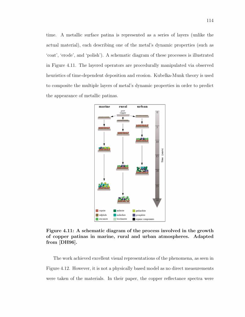
114
time. A metallic surface patina is represented as a series of layers (unlike the
actual material), each describing one of the metal’s dynamic properties (such as
‘coat’, ‘erode’, and ‘polish’). A schematic diagram of these processes is illustrated
in Figure 4.11. The layered operators are procedurally manipulated via observed
heuristics of time-dependent deposition and erosion. Kubelka-Munk theory is used
to composite the multiple layers of metal’s dynamic properties in order to predict
the appearance of metallic patinas.
Figure 4.11: A schematic diagram of the process involved in the growthof copper patinas in marine, rural and urban atmospheres. Adaptedfrom [DH96].
The work achieved excellent visual representations of the phenomena, as seen in
Figure 4.12. However, it is not a physically based model as no direct measurements
were taken of the materials. In their paper, the copper reflectance spectra were
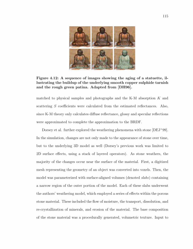
115
Figure 4.12: A sequence of images showing the aging of a statuette, il-lustrating the buildup of the underlying smooth copper sulphide tarnishand the rough green patina. Adapted from [DH96].
matched to physical samples and photographs and the K-M absorption K and
scattering S coefficients were calculated from the estimated reflectances. Also,
since K-M theory only calculates diffuse reflectance, glossy and specular reflections
were approximated to complete the approximation to the BRDF.
Dorsey et al. further explored the weathering phenomena with stone [DEJ+99].
In the simulation, changes are not only made to the appearance of stone over time,
but to the underlying 3D model as well (Dorsey’s previous work was limited to
2D surface effects, using a stack of layered operators). As stone weathers, the
majority of the changes occur near the surface of the material. First, a digitized
mesh representing the geometry of an object was converted into voxels. Then, the
model was parameterized with surface-aligned volumes (denoted slabs) containing
a narrow region of the outer portion of the model. Each of these slabs underwent
the authors’ weathering model, which employed a series of effects within the porous
stone material. These included the flow of moisture, the transport, dissolution, and
re-crystallization of minerals, and erosion of the material. The base composition
of the stone material was a procedurally generated, volumetric texture. Input to
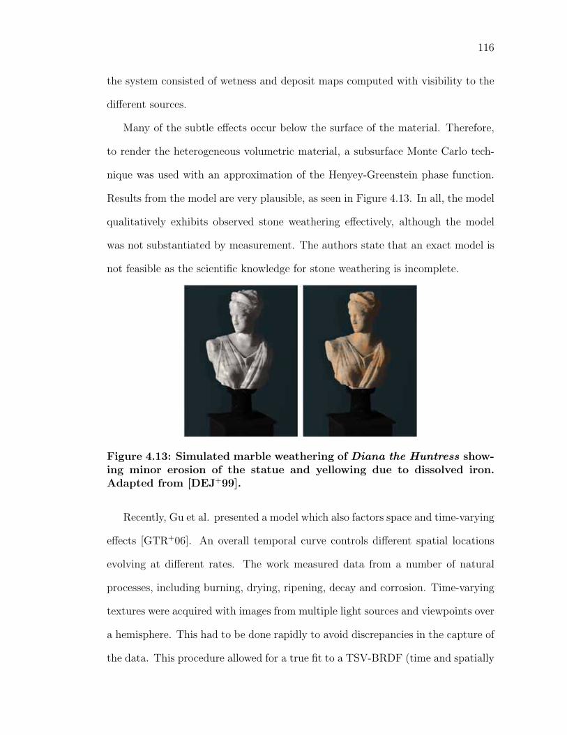
116
the system consisted of wetness and deposit maps computed with visibility to the
different sources.
Many of the subtle effects occur below the surface of the material. Therefore,
to render the heterogeneous volumetric material, a subsurface Monte Carlo tech-
nique was used with an approximation of the Henyey-Greenstein phase function.
Results from the model are very plausible, as seen in Figure 4.13. In all, the model
qualitatively exhibits observed stone weathering effectively, although the model
was not substantiated by measurement. The authors state that an exact model is
not feasible as the scientific knowledge for stone weathering is incomplete.
Figure 4.13: Simulated marble weathering of Diana the Huntress show-ing minor erosion of the statue and yellowing due to dissolved iron.Adapted from [DEJ+99].
Recently, Gu et al. presented a model which also factors space and time-varying
effects [GTR+06]. An overall temporal curve controls different spatial locations
evolving at different rates. The work measured data from a number of natural
processes, including burning, drying, ripening, decay and corrosion. Time-varying
textures were acquired with images from multiple light sources and viewpoints over
a hemisphere. This had to be done rapidly to avoid discrepancies in the capture of
the data. This procedure allowed for a true fit to a TSV-BRDF (time and spatially
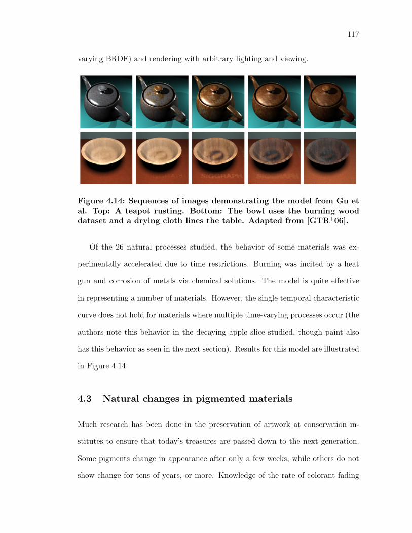
117
varying BRDF) and rendering with arbitrary lighting and viewing.
Figure 4.14: Sequences of images demonstrating the model from Gu etal. Top: A teapot rusting. Bottom: The bowl uses the burning wooddataset and a drying cloth lines the table. Adapted from [GTR+06].
Of the 26 natural processes studied, the behavior of some materials was ex-
perimentally accelerated due to time restrictions. Burning was incited by a heat
gun and corrosion of metals via chemical solutions. The model is quite effective
in representing a number of materials. However, the single temporal characteristic
curve does not hold for materials where multiple time-varying processes occur (the
authors note this behavior in the decaying apple slice studied, though paint also
has this behavior as seen in the next section). Results for this model are illustrated
in Figure 4.14.
4.3 Natural changes in pigmented materials
Much research has been done in the preservation of artwork at conservation in-
stitutes to ensure that today’s treasures are passed down to the next generation.
Some pigments change in appearance after only a few weeks, while others do not
show change for tens of years, or more. Knowledge of the rate of colorant fading
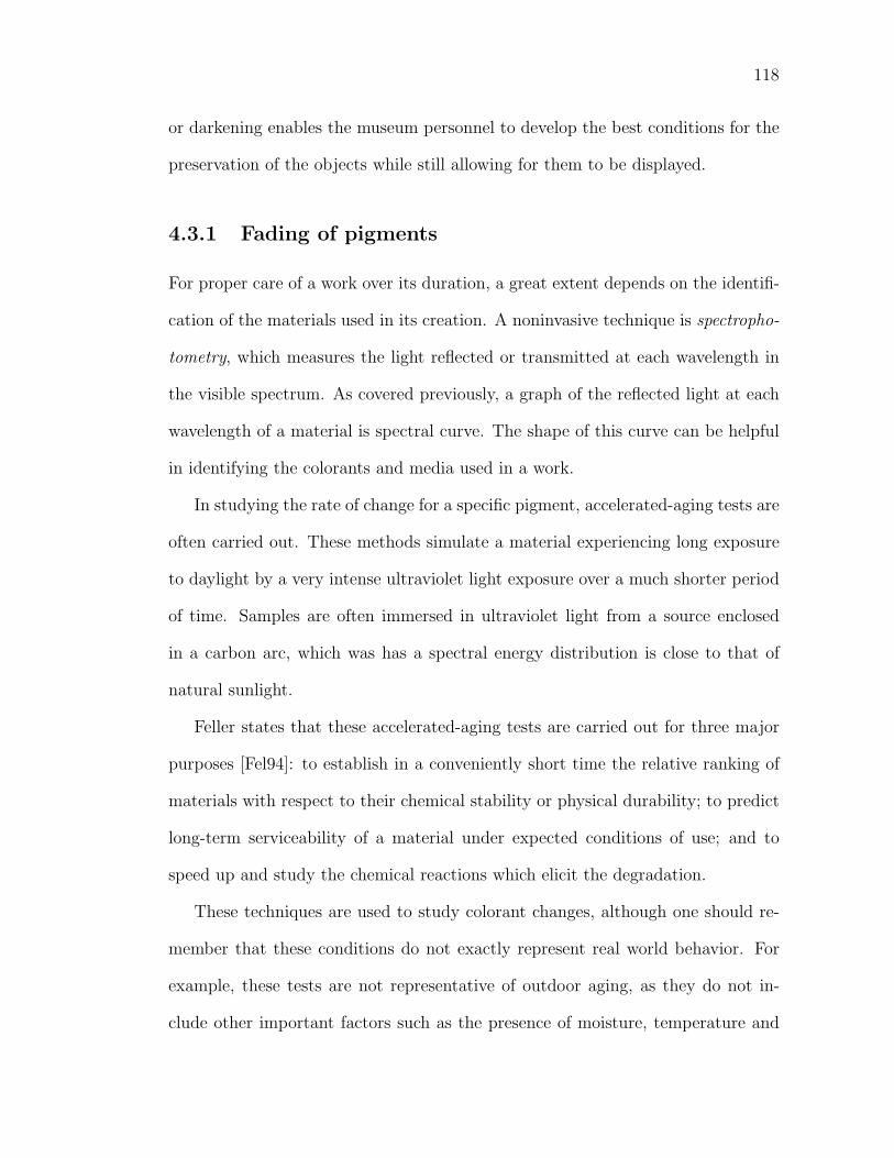
118
or darkening enables the museum personnel to develop the best conditions for the
preservation of the objects while still allowing for them to be displayed.
4.3.1 Fading of pigments
For proper care of a work over its duration, a great extent depends on the identifi-
cation of the materials used in its creation. A noninvasive technique is spectropho-
tometry, which measures the light reflected or transmitted at each wavelength in
the visible spectrum. As covered previously, a graph of the reflected light at each
wavelength of a material is spectral curve. The shape of this curve can be helpful
in identifying the colorants and media used in a work.
In studying the rate of change for a specific pigment, accelerated-aging tests are
often carried out. These methods simulate a material experiencing long exposure
to daylight by a very intense ultraviolet light exposure over a much shorter period
of time. Samples are often immersed in ultraviolet light from a source enclosed
in a carbon arc, which was has a spectral energy distribution is close to that of
natural sunlight.
Feller states that these accelerated-aging tests are carried out for three major
purposes [Fel94]: to establish in a conveniently short time the relative ranking of
materials with respect to their chemical stability or physical durability; to predict
long-term serviceability of a material under expected conditions of use; and to
speed up and study the chemical reactions which elicit the degradation.
These techniques are used to study colorant changes, although one should re-
member that these conditions do not exactly represent real world behavior. For
example, these tests are not representative of outdoor aging, as they do not in-
clude other important factors such as the presence of moisture, temperature and
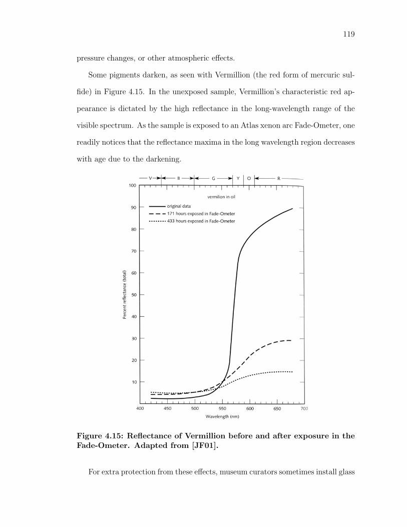
119
pressure changes, or other atmospheric effects.
Some pigments darken, as seen with Vermillion (the red form of mercuric sul-
fide) in Figure 4.15. In the unexposed sample, Vermillion’s characteristic red ap-
pearance is dictated by the high reflectance in the long-wavelength range of the
visible spectrum. As the sample is exposed to an Atlas xenon arc Fade-Ometer, one
readily notices that the reflectance maxima in the long wavelength region decreases
with age due to the darkening.
Figure 4.15: Reflectance of Vermillion before and after exposure in theFade-Ometer. Adapted from [JF01].
For extra protection from these effects, museum curators sometimes install glass
120
in front of a displayed work. Feller contrasts the reflectance curves of two exposed
samples of Emerald Green (copper acetate–copper arsenate) in oil (Figure 4.16).
While both samples are mounted behind a glass panel, one panel also has an
ultraviolet filter restricting the passage of potentially hazardous wavelengths of
light from reaching a work of art.
Figure 4.16: Reflectance of Emerald green before and after exposurein the Fade-Ometer under glass, with and without an ultraviolet filter(Plexiglass UF-1). Adapted from [Fel68].
The figure displays the typical spectral reflectance for a green material–a mod-
erate amount of light is reflected from the central portion of the visible spectrum,
121
while all other light is mostly absorbed. Note that the darkening of the paint is
less for the exposure under the ultraviolet filter. In order for photochemical deteri-
oration (chemical reactions induced by electromagnetic energy) to occur, radiant
energy must be absorbed, activating the molecules. Typically, the energy of pho-
tons in the long wavelength (low frequency) range of the electromagnetic spectrum
(infrared range and higher) is not sufficient to induce chemical reactions. Yet, as
frequencies increase, photons carry more energy. Ultraviolet light, with a higher
frequency (and much more energy) than that of the visible spectrum, is capable of
inducing significant photochemical changes in the pigment particles.
The Grotthus-Draper Law states that only radiation that is absorbed by a sub-
stance may cause a chemical reaction–light must be taken in by a material in order
for the energy from the light to act upon it [Fel94]. Yet, not every frequency of
light elicits a change in the material. Photochemical changes are dependent on the
molecular structure of the pigment particles. Sir William Bragg used the analogy
to tuning forks, which are set in vibration when sound waves of the appropriate
frequency pass through them [Bra59]. Correspondingly, electromagnetic energy
tends to be absorbed in molecules when they are in tune with a particular frequency
of incident light.
If a red and a blue pigment were equally susceptible to photochemical dete-
rioration, the blue pigment would deteriorate much faster. This is due to the
increased energy in the lower wavelength range of the visible spectrum (compared
to higher wavelengths). However, since pigments are made of different materials,
they absorb different portions of the electromagnetic spectrum to differing degrees.
Hence, blue pigments do not necessarily deteriorate faster than red pigments.
Figure 4.17 illustrates Alizarin Crimson red fading to a colorless form due to
122
light exposure. This effect is especially noticeable in the model’s left sleeve. The
sequence of images shows a portrait exposed to increasing levels of accelerated
illumination. Five concentrations of Alizarin Crimson red were applied in glazes
to depict the sleeves of the woman’s portrait. The scale on the left of each image
corresponds to the five alizarin concentrations used in the painting.
The painting was exposed to light from a xenon lamp for a series of exposure
times. After each time period, the painting was removed for measurement of the
concentration of alizarin remaining in the glazes. The work was also photographed
at each stage. The full exposure is approximately equivalent to a hundred years on
a museum wall well illuminated by diffuse daylight. While the images only reflect
a subjective comparison to the original paintings due to gamut restrictions, the
changes in the deterioration of the Alizarin Crimson are readily seen.
The reflectances of the five concentrations of Alizarin Crimson were measured
and converted to the Munsell color space. The changes in each glaze can be seen
in Figure 4.18 as the plot describes each hue (for paint samples 1-5) in respect
to their Munsell chroma and value. The Munsell coordinates for each original
paint are plotted as white dots and the exposed sample reflectances as black dots.
Each original paint sample is grouped with its corresponding samples of increasing
exposure via a blue ellipse.
As expected, the exposed sample reflectances grew further from each original
sample as time passed. The Munsell value increased on all samples over time (the
equivalent of the hue growing closer to white). The chroma is more complicated,
however. The initially darker glazes (denoted 1,2, and 3 on the graph), increased in
chroma as the fading proceeded (the maximum chroma was achieved by the middle
concentration (3)). In contrast, the lighter glazes (4 and 5) decreased in chroma
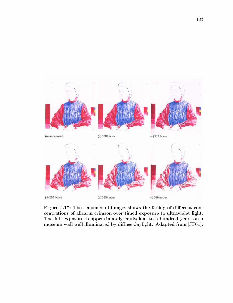
123
Figure 4.17: The sequence of images shows the fading of different con-centrations of alizarin crimson over timed exposure to ultraviolet light.The full exposure is approximately equivalent to a hundred years on amuseum wall well illuminated by diffuse daylight. Adapted from [JF01].
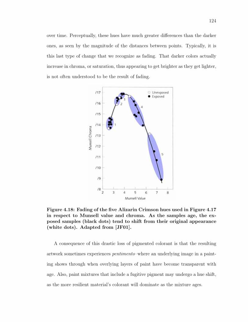
124
over time. Perceptually, these hues have much greater differences than the darker
ones, as seen by the magnitude of the distances between points. Typically, it is
this last type of change that we recognize as fading. That darker colors actually
increase in chroma, or saturation, thus appearing to get brighter as they get lighter,
is not often understood to be the result of fading.
Figure 4.18: Fading of the five Alizarin Crimson hues used in Figure 4.17in respect to Munsell value and chroma. As the samples age, the ex-posed samples (black dots) tend to shift from their original appearance(white dots). Adapted from [JF01].
A consequence of this drastic loss of pigmented colorant is that the resulting
artwork sometimes experiences pentimento–where an underlying image in a paint-
ing shows through when overlying layers of paint have become transparent with
age. Also, paint mixtures that include a fugitive pigment may undergo a hue shift,
as the more resilient material’s colorant will dominate as the mixture ages.
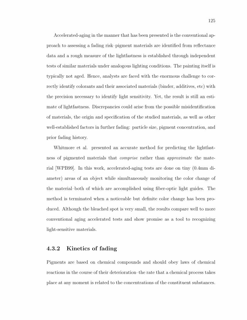
125
Accelerated-aging in the manner that has been presented is the conventional ap-
proach to assessing a fading risk–pigment materials are identified from reflectance
data and a rough measure of the lightfastness is established through independent
tests of similar materials under analogous lighting conditions. The painting itself is
typically not aged. Hence, analysts are faced with the enormous challenge to cor-
rectly identify colorants and their associated materials (binder, additives, etc) with
the precision necessary to identify light sensitivity. Yet, the result is still an esti-
mate of lightfastness. Discrepancies could arise from the possible misidentification
of materials, the origin and specification of the studied materials, as well as other
well-established factors in further fading: particle size, pigment concentration, and
prior fading history.
Whitmore et al. presented an accurate method for predicting the lightfast-
ness of pigmented materials that comprise rather than approximate the mate-
rial [WPB99]. In this work, accelerated-aging tests are done on tiny (0.4mm di-
ameter) areas of an object while simultaneously monitoring the color change of
the material–both of which are accomplished using fiber-optic light guides. The
method is terminated when a noticeable but definite color change has been pro-
duced. Although the bleached spot is very small, the results compare well to more
conventional aging accelerated tests and show promise as a tool to recognizing
light-sensitive materials.
4.3.2 Kinetics of fading
Pigments are based on chemical compounds and should obey laws of chemical
reactions in the course of their deterioration–the rate that a chemical process takes
place at any moment is related to the concentrations of the constituent substances.
126
The rate of change of the concentration of a substance over time is proportional
to the concentration C raised to some power n:
dC
dt= kCn (4.11)
If the exponent is n = [0, 3] | n ∈ Z, the reaction is said to be zero, first,
or second order, respectively–these are the most commonly encountered modes of
chemical change.
The combination of optical properties and reaction kinetics allow for the pre-
diction of colorant loss in a fading glaze. Johnston-Feller et al. used Kubelka Munk
color matching techniques to determine the concentrations of pigments present at
any given stage in fading [JFFBC84]. The work demonstrated that the fading
process for many pigments can be described on the basis of first-order kinetics as
a function of time. From Equation 4.11, we have
−dC
dt= k1C (4.12)
ln C = ln C0 − k1t (4.13)
where C0 is the initial concentration and C is the concentration remaining after
time t. Via Kubelka Munk theory, the percentage of colorant remaining after an
elapsed period of time can also be expressed as
C = 100%
[(K/S)e
(K/S)o
](4.14)
where
(K/S)o are the coefficients derived from the original sample’s reflectance
(K/S)e are the coefficients derived from the aged, exposed sample’s reflectance
127
Note that the sample can be a mixture of pigments, in which case Duncan’s K-M
linear pigmented mixing from Equation A.16 would be substituted with respective
weighting.
In order to analyze the data in terms of hue shift in a color-matching program,
Johnston suggests calibration with at least a three color pigment basis plus white,
and the use of Duncan’s pigmented mixing equation. One selects the hues of the
pigments to ensure coverage over the entire gamut of colors (typically this selection
mimics the opponent color channels, choosing white, black, red or green, and yellow
or blue). In this way, widely varying temporal changes (such as fading, darkening,
and hue changes) can all be detected and recorded effectively [JFFBC84]. By
means of Munsell notation and color difference calculations, the work found that
orderly changes in concentration related to a nonlinear change in the perceived
color of a paint.
Whitmore and Bailie presented a model predicting and verifying experimen-
tally the loss from fading from two perspectives: in terms of colorant loss from
photochemical reaction and the resulting perceptual color changes [WB97]. The
work determined that colorant loss takes place at three distinct stages. The dark-
est (or most concentrated) glazes lose colorant at the maximum (linear) rate, yet
the color change is slight because there is little spectral change. Usually, ‘fading’
for these glazes includes a shift in hue, followed by an increase in chroma. This is
due to reflectance changes away from the absorption peak.
As colorant is further lost, the absorbed wavelengths are less highly absorbent,
hence the colorant loss slows. However, the magnitude of the perceptual color
change increases (this is what is known as typical fading, with the chroma decreas-
ing and value increasing). Glazes having an intermediate reflectance (20 − 80%
128
over white grounds) suffer the greatest rate of color change. Finally, the fading
will appear to slow, but only after most of the glaze has been lost (absorbing very
little light). Note that the first two stages of fading are easily recognized from the
Munsell plots of the alizarin crimson glazes in Figure 4.17.
The model predicts that only absorption determines the fading rate. The fact
that the colorant concentration does not affect the colorant loss rate (pale tints
do not lose their colorant faster than that of darker colors) has been previously
observed [GED64, JFFBC84]. However, while prior fading should not affect the
loss rate, this was not the case experimentally. Whitmore and Bailie noted that
older colorants seem more resistant than fresh ones to further fading (given the
same concentrations). The authors list possible discrepancies: the pigment may
either react to form products that influence further fading, or originally have been
a mixture of components with different individual fading rates (different particle
sizes, previous fading of one of the constituents, etc).
Pigments scatter incident light, which in turn, increases the depth of which
photochemical processes occur. Johnston-Feller showed that the depth of fading
in paints from accelerated aging is decreased as the concentration of white pigment
decreases in a tint. (Figure 4.19). White pigments scatter light deeper into the
paint, and hence fading occurs deeper within the paint if there is more white
present.
Yet, the behavior of fading taking place only in the upper portion of the paint
sample is important for analysts attempting to classify materials in a work. If the
surface has faded substantially, it is possible to view relatively unfaded material
underneath via cross-sections, revealing many of the original colorants [Fel94].
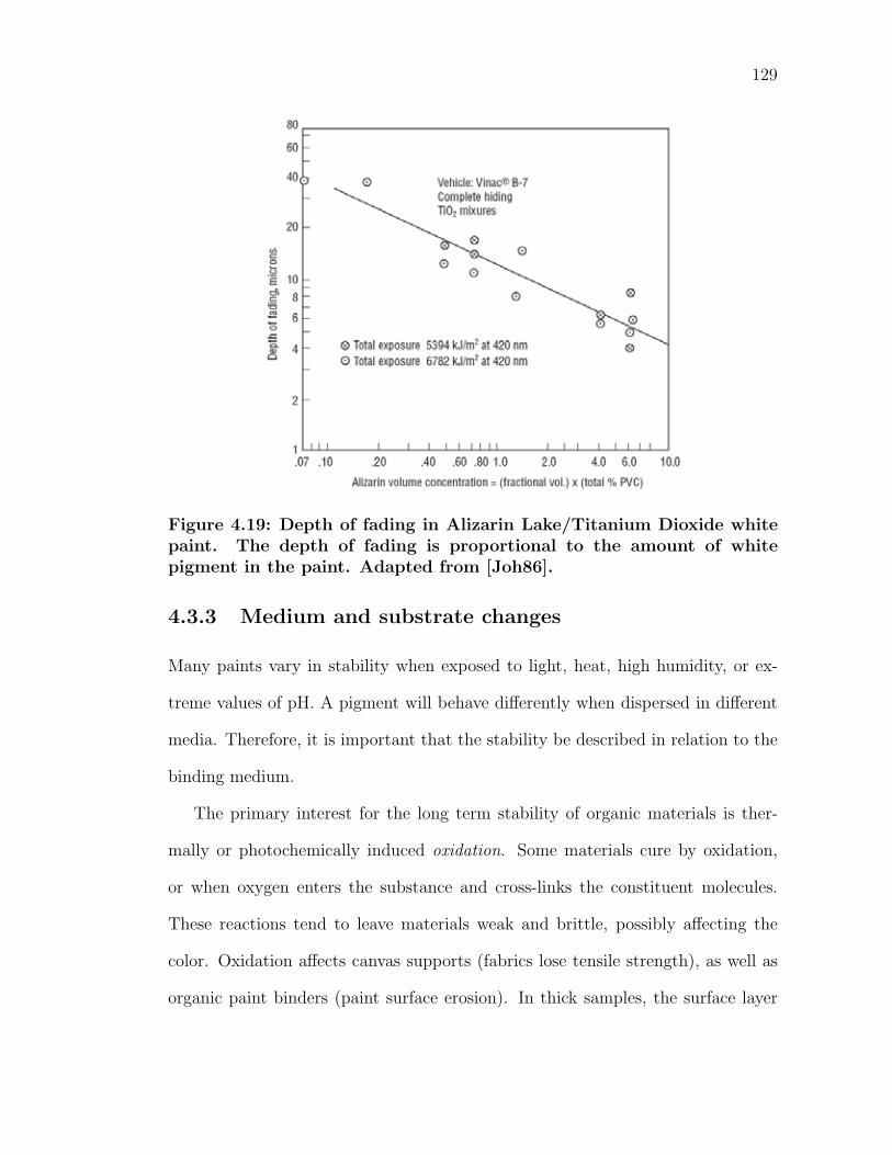
129
Figure 4.19: Depth of fading in Alizarin Lake/Titanium Dioxide whitepaint. The depth of fading is proportional to the amount of whitepigment in the paint. Adapted from [Joh86].
4.3.3 Medium and substrate changes
Many paints vary in stability when exposed to light, heat, high humidity, or ex-
treme values of pH. A pigment will behave differently when dispersed in different
media. Therefore, it is important that the stability be described in relation to the
binding medium.
The primary interest for the long term stability of organic materials is ther-
mally or photochemically induced oxidation. Some materials cure by oxidation,
or when oxygen enters the substance and cross-links the constituent molecules.
These reactions tend to leave materials weak and brittle, possibly affecting the
color. Oxidation affects canvas supports (fabrics lose tensile strength), as well as
organic paint binders (paint surface erosion). In thick samples, the surface layer
130
protects the deeper remaining colorant, restricting access to oxygen. [Fel94].
In general, following exposure, binding media, papers, and textiles are suscep-
tible to yellowing and sometimes a slight darkening due to these chemical changes.
In some materials, such as linseed oil, bleaching may occur. Changes in the ab-
sorption involving yellowing will mostly affect the short-wavelength portion of the
visible spectrum (blues and violets), and these changes can have a drastic effect
on the overall color balance of a work [Lau26].
Johnston studied this behavior with unsaturated plastic panels containing pig-
mented colorant, which were exposed outdoors in Florida [Joh67]. After six months
of exposure, the panel had changed noticeably. A common measure of the mag-
nitude of change is to compare colors that have been converted in a perceptually
uniform color space (such as L∗a∗b∗). By design, the magnitude of the distance
between any two colors in a perceptually uniform space, ∆E, determines how alike
the colors are. This distance (or measure of perceptual similarity) is given by the
Euclidean distance formula via Equation 3.12. The measured change that John-
ston recorded in the panels was a ∆E of 1.5 L∗a∗b∗ units. There is a common
misconception that ∆E = 1.0 represents a just noticeable difference. Instead, a
∆E of one represents on the average, about three-times the value of a just notice-
able difference [JF01]. Thus, the recorded change in the panels were several times
more than the minimal perceivable amount of change.
The panel was pigmented with a greenish Cobalt Blue (5%) and Titanium
Dioxide (95%). Johnston states that the spectral reflectance curves (illustrated in
Figure 4.20) show that the concentration of the blue pigment, as illustrated by the
absorption maximum at approximately 610-640nm, had not changed at all. All
of the change occurred in the short-wavelength region due to the yellowing of the
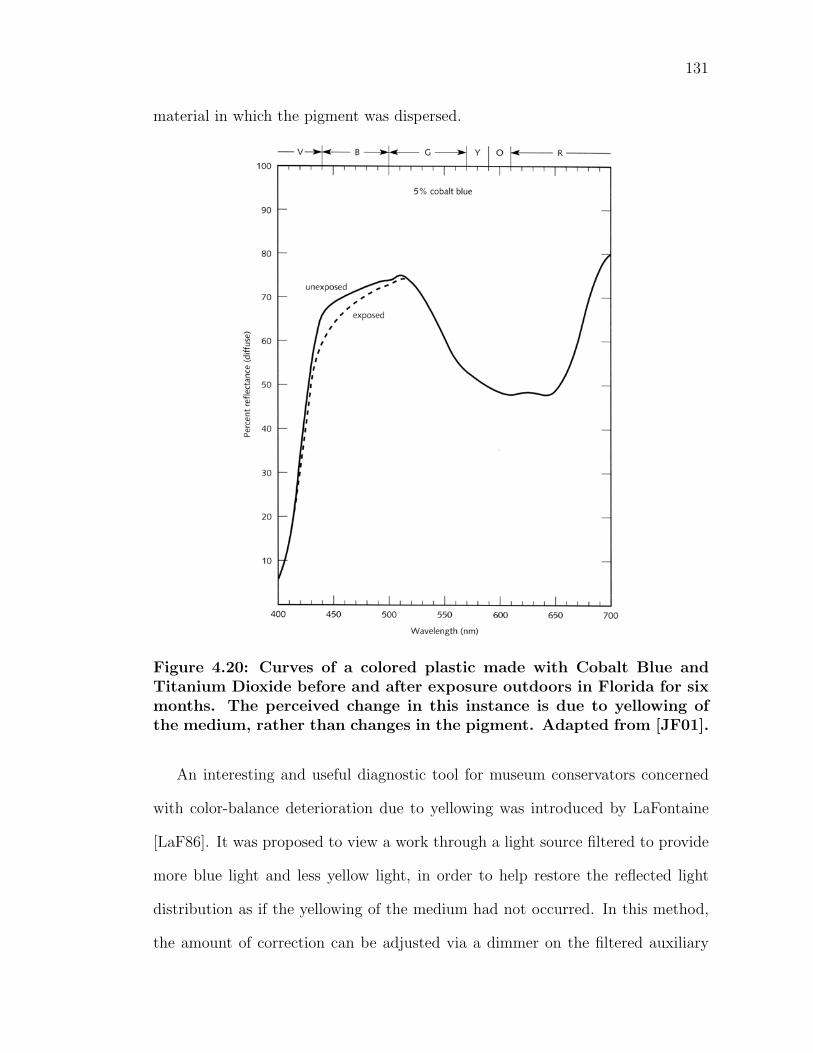
131
material in which the pigment was dispersed.
Figure 4.20: Curves of a colored plastic made with Cobalt Blue andTitanium Dioxide before and after exposure outdoors in Florida for sixmonths. The perceived change in this instance is due to yellowing ofthe medium, rather than changes in the pigment. Adapted from [JF01].
An interesting and useful diagnostic tool for museum conservators concerned
with color-balance deterioration due to yellowing was introduced by LaFontaine
[LaF86]. It was proposed to view a work through a light source filtered to provide
more blue light and less yellow light, in order to help restore the reflected light
distribution as if the yellowing of the medium had not occurred. In this method,
the amount of correction can be adjusted via a dimmer on the filtered auxiliary
132
light source. This method is used widely by conservators and curators in viewing
work that is suspect to yellowing deterioration of either the paint medium, textiles
or paper.
Fading, darkening and perceived changes in color can result from reasons other
than deterioration of the pigment or oxidation. Changes in the surface reflection
at the paint-air interface may seem to indicate changes in colorant concentration.
The gloss in high-gloss materials may decrease, thereby giving the appearance of
fading. Gloss loss can be attributed to blooming, dirt and soot, or microcracking,
arising from certain combinations of temperature, relative humidity and other
climatic conditions. Matte finish samples may increase in glossiness (due to oils
from fingerprints, burnishing or varnish), resulting in a perceived darkening of
color. All of these types of changes are typically uniform over all wavelengths, while
pigment changes are more likely to be only in selective ranges of the electromagnetic
spectrum.
Spectrally uniform changes in reflectance can also be the result of changes at
the pigment-medium interface. For example, if the suspending medium shrinks
over time, microscopic voids surrounding the pigment particles may form. While
Titanium Dioxide and Carbon Black dispersed in a stable plastic medium typi-
cally do not exhibit fading, the material in Figure 4.21 appears to have done so.
Examination of the micrograph reveals existing voids around pigment clumps in
many regions. These voids contain neither pigment nor media. They have a much
lower refractive index than the surrounding materials, and thus scatter light very
effectively. Consequently, this lightens the overall sample, which a viewer might
perceive as pigment fading.
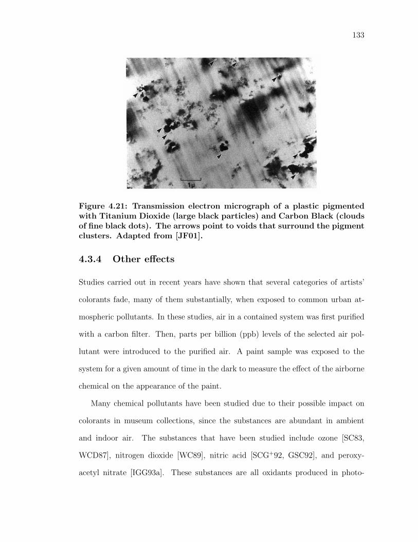
133
Figure 4.21: Transmission electron micrograph of a plastic pigmentedwith Titanium Dioxide (large black particles) and Carbon Black (cloudsof fine black dots). The arrows point to voids that surround the pigmentclusters. Adapted from [JF01].
4.3.4 Other effects
Studies carried out in recent years have shown that several categories of artists’
colorants fade, many of them substantially, when exposed to common urban at-
mospheric pollutants. In these studies, air in a contained system was first purified
with a carbon filter. Then, parts per billion (ppb) levels of the selected air pol-
lutant were introduced to the purified air. A paint sample was exposed to the
system for a given amount of time in the dark to measure the effect of the airborne
chemical on the appearance of the paint.
Many chemical pollutants have been studied due to their possible impact on
colorants in museum collections, since the substances are abundant in ambient
and indoor air. The substances that have been studied include ozone [SC83,
WCD87], nitrogen dioxide [WC89], nitric acid [SCG+92, GSC92], and peroxy-
acetyl nitrate [IGG93a]. These substances are all oxidants produced in photo-
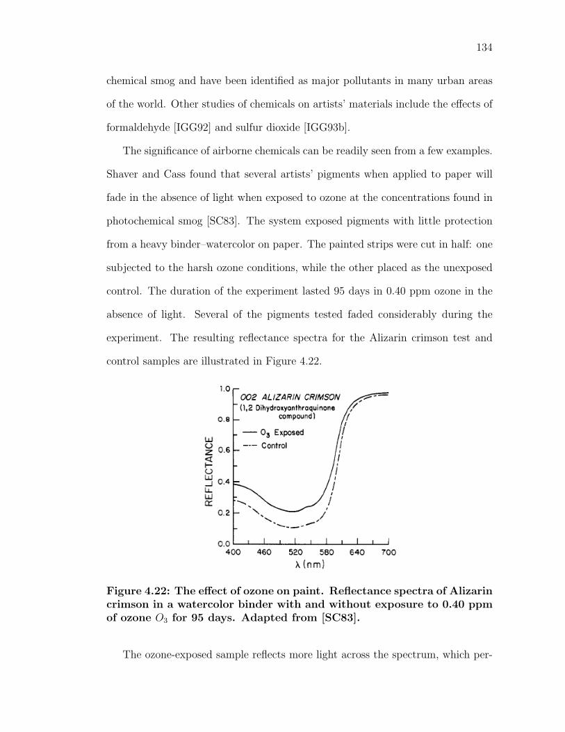
134
chemical smog and have been identified as major pollutants in many urban areas
of the world. Other studies of chemicals on artists’ materials include the effects of
formaldehyde [IGG92] and sulfur dioxide [IGG93b].
The significance of airborne chemicals can be readily seen from a few examples.
Shaver and Cass found that several artists’ pigments when applied to paper will
fade in the absence of light when exposed to ozone at the concentrations found in
photochemical smog [SC83]. The system exposed pigments with little protection
from a heavy binder–watercolor on paper. The painted strips were cut in half: one
subjected to the harsh ozone conditions, while the other placed as the unexposed
control. The duration of the experiment lasted 95 days in 0.40 ppm ozone in the
absence of light. Several of the pigments tested faded considerably during the
experiment. The resulting reflectance spectra for the Alizarin crimson test and
control samples are illustrated in Figure 4.22.
Figure 4.22: The effect of ozone on paint. Reflectance spectra of Alizarincrimson in a watercolor binder with and without exposure to 0.40 ppmof ozone O3 for 95 days. Adapted from [SC83].
The ozone-exposed sample reflects more light across the spectrum, which per-
135
ceptually appears as adding white to the sample, giving a faded appearance. Sev-
eral other pigments experienced similar results, though not all pigments underwent
changes during the experiment. In unprotected atmospheres (without the use of
activated carbon filters) it would take three (outdoor) to six (indoor) years to
accumulate a dose (concentration times magnitude) of ozone exposure from the
atmospheric ozone concentrations measured and reported in the work. Pigment
size is also a major factor influencing the surface area exposed to the air, which
may influence the rate of reaction with the chemical.
Similarly, nitrogen dioxide is a common air pollutant formed in the atmosphere
from the nitric oxide emissions from fuel combustible sources. Whitmore and
Cass found more than half of the natural organic pigment colorants studied had
a significant color change ∆E > 2 from exposure to 0.50 ppm NO2 in air for 12
weeks [WC89]. A dose of this magnitude would be experienced inside an unpro-
tected museum in a few years (2-6 years) in an urban setting. The procedure for
the experiment was similar to that of the ozone exposure, mentioned previously.
All of these chemical effects are cumulative and irreversible. In relation to the
duration of a piece of artwork, these pigment changes occur rather quickly. Care
must be taken to protect artwork from such harsh conditions.
All in all, the appearance of color of pigmented materials in not constant and
can be the result of a number of different factors. Through the use of spectropho-
tometers, one can accurately measure theses changes over time. Through the use
of mathematical predictive color mixing systems, such as Kubelka Munk theory,
further changes can be predicted. Hopefully, this knowledge will minimize the risk
of further deterioration of artwork for future generations. Equally enticing is the
use of the data to travel back in time to see a painting in its original brilliance.
Chapter 5
Preparation & Measurement
5.1 Sample creation
To study the nonlinear relationship of paint appearance with varying pigments
and binding media over time, a number of paint samples were created. Pure
pigments were dispersed in a number of different binding media and each applied
to a primed piece of canvas. Great care was taken to make sure the samples were
of the highest quality. The diffuse reflectance of each sample was measured over
the visible spectrum at different intervals in time.
5.1.1 Importance of handmade samples
Historically, painters knew their pigments intimately, as they would hand select
materials from reliable sources and mix their paints by hand. After the introduc-
tion of commercial paint manufacturing, artists were separated from this process
and bought tube colors without knowledge of their origin. Further obscuring the
origin of their pigments, paint manufacturers sold their colors under confusing and
sometimes misleading proprietary names. The practice of documenting the exact
136
137
ingredients used in a batch of paint has only become more commonplace recently,
and still it is not widely practiced.
In addition, commercially manufactured paint contains not only pigment and
binder, but often other substances to reduce manufacturing costs, adjust visual
and handling characteristics, and increase the shelf life of a paint. A specific hue
may be diluted with an extender or filler to reduce costs. Typically, this practice
is done more frequently in student grade paints, and as a result, they have a
greater percentage of fillers than professional artist grade paints. Also, fillers tend
to accompany rare and expensive pigments to maximize hue volume. Dextrin is
a common filler for aqueous media, used to bulk out paint without noticeably
affecting the color. Fine grades of inert powders often serve to bulk out colorants
in paint–calcium carbonate, chalk, whiting, ground marble, and limestone are all
common fillers. While some fillers may not adversely affect the optical properties of
pigments much, too much filler can degrade color appearance, producing a whitish,
thin or bland color. However, in some cases fillers are beneficial. In an attempt
to balance the high tinting strength of some pigments, filler is added to dilute the
pigments’ strength to a comparable degree to that of others. As a result, high
tinting strength pigments will not overpower mixtures on a palette.
Other substances are purposefully used to modify the appearance of a hue in
commercial paint. Some commercial brands add highly refracting substances as
a brightener, to adjusts the lightness of the finished color. Typically brighteners
are clear or white particles of a comparable size to that of the pigment. Optical
brighteners generally operate by way of absorbing ultraviolet radiation and then
immediately re-admitting the energy in the visible blue-white range. Aluminum
trihydroxide is the best and most widely used material for brightening and ex-
138
tending transparent pigments used in glazing and printing inks, while blanc fixe
(barium sulfate) is used for heavy, opaque pigments [May81]. Precipitated chalk or
titanium dioxide is typically used to brighten gouache colors. While used in proper
proportions (Mayer states this is around 10%), brighteners may not be considered
an adulterant. Yet, an excess of brightener can lead to whitening or sparkling
effects on the dried surface. Furthermore, this substance sometimes compromises
lightfastness.
Some manufacturing additives extend the shelf life of paints. A dispersant,
or wetting agent, is sometimes added to improve the milling of a pigment and
prevent clumping of pigments after manufacture. Thus, dispersants are common
with finely divided synthetic pigments and soft pigments that can compress and
cake easily. Ox gall and alcohol are commonly used wetting agents for aqueous
and oil-based paints. A painter will notice the presence of such a material as it
reduces the time it takes for a paint to dissolve and diffuses aggressively when
painted “wet-into-wet”.
Manufacturers also add varying levels of preservatives to prevent solutions from
decomposing on storage–aqueous media such as casein, gums, glues, and honey
are particularly susceptible to these effects. Decomposition may occur from mold,
bacteria, or fermentation. Sodium orthophenyl phenate and beta napthol are both
powdered substances that work well as preservatives for aqueous paints [May81].
Mayer reccommends the proprietary fungicide Moldex to suppress the growth of
mold or bacteria.
While additives increase the marketability of a paint (increased shelf life, de-
creased costs), at times pigments only comprise of a small portion of the total
volume of commercially manufacture paints. Furthermore, the reader is warned
139
that pigment names used on tubes of artists’ colors are not necessarily those of
the actual pigments. Johnston and Feller analyzed four tubes of artists’ watercol-
ors labeled Indigo [JF63]. Natural Indigo (a violet-blue colorant) originally comes
from the leaves of the plant Indiagofera tinctoria, which is cultivated in India.
Spectral curves of the diffuse reflectance of the four indigo paints are shown
in Figure 5.1. It was found that of the four manufactured paints, only one tube
contained the real pigment Indigo (curve 4). The others contained a diversity
of pigments of varying degree, which included Phthalocyanine blue, Iron blue,
Ultramarine blue, Phthalocyanine green, Pyrazolone Red, and even black. None
of the other three paints (curves 1-3) included true Indigo as an ingredient at all.
The cause could be the result of a number of economic factors, including the
use of multiple synthetic pigments. Typically, the practice of combining multiple
synthetic pigments to match a more expensive pigment is denoted with the word
hue at the end of the name of the pigment. A synthetic hue pigment is rarely more
than a fair approximation of the original’s masstone. It is fairly straightforward
to match a pigment with multiple colorants. However, the replacements rarely
account for other properties of the true pigment, such as the appearance in mixtures
with white, tinting strength, opacity, etc.
In an attempt to clarify the components of proprietary mixtures and confusing
naming schemes, the standard method of naming pigments worldwide is by means
of their color index name and number, plus the five-digit constitution number.
The general name is based on the most common method to which a colorant is
applied (P for pigments). Among pigments, there are nine hue descriptions: blue
(B), green (G), violet (V), red (R), orange (O), brown (Br), yellow (Y), white (W)
and black (Bk). Following is the general number, referring to the particular type of
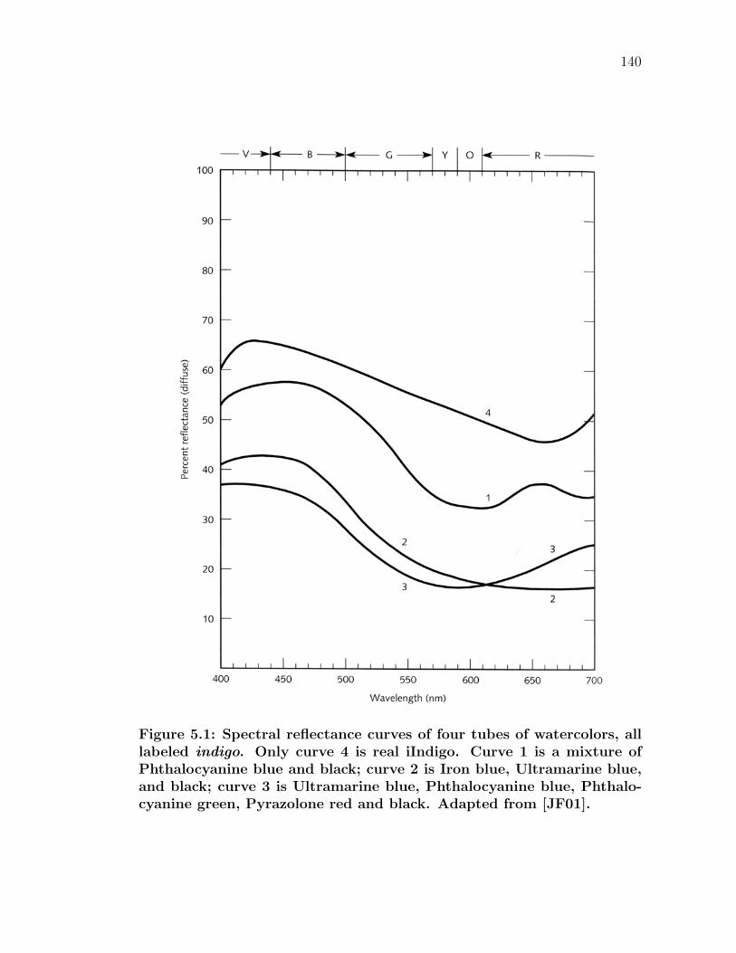
140
Figure 5.1: Spectral reflectance curves of four tubes of watercolors, alllabeled indigo. Only curve 4 is real iIndigo. Curve 1 is a mixture ofPhthalocyanine blue and black; curve 2 is Iron blue, Ultramarine blue,and black; curve 3 is Ultramarine blue, Phthalocyanine blue, Phthalo-cyanine green, Pyrazolone red and black. Adapted from [JF01].
141
pigment. A five-digit number follows the generic name and number, indicating the
chemical composition of each colorant, if known (some pigments have no number,
as their exact chemical structures are proprietary). As an example, the full color
index for Titanium Dioxide white is PW 6 (77891). A more complete discussion
of the color index is found in [Ber00].
Ultimately, while many of the major art manufacturers today are honest in
their labeling, the practice is not universal, and certainly was not so in the past.
Thus, one must still proceed critically even when paint labels list a particular
hue or when artists document the palettes they use. As paints are predispersed by
suppliers of artists’ materials, there is always the possibility of extraneous additives
in paint. Mislabeling, synthetic materials, and other substances can all affect the
resulting appearance if a pigment in solution. As such, in our research to study
the affects of varying binding media over time, we agreed that it was imperative
to create all of the paints by hand, rather than purchase premade tube paint.
This ensures that only the purest materials went into each paint, eliminating any
outside factors. In this manner, the exact same pigments of pure composition are
used in the different media. This also ensures that our paints are only made from
pigment and binder. There are no inert fillers to dilute pigments, affecting the
pigment volume concentration, nor are there materials that affect the chroma or
lightness of the hue.
5.1.2 Pigments
With the many colorants available to the modern painter, if is difficult for an artist
to choose a finite palette that comprises a sufficient variety to fulfill all of his/her
color requirements. The choice typically depends on the artist’s preference and
142
the requirements of the work at hand. A palette that contains less than a dozen
colors can be considered a simplified palette, while more than fourteen would be
an elaborate palette. Successful painting can be done with a very limited palette,
and there are some advantages to doing so. Painters typically receive training with
simplified palettes as a matter of discipline; this enforces a sort of color harmony,
as hues in a work are derivatives of one another. However, in the majority of cases,
it is generally beneficial to have a range of colors available. Single pigment colors
are invariably purer than mixtures that imitate them.
The pigments chosen in our work are an attempt to maintain a typical artist’s
palette, which maximizes the gamut of colors available, while minimizing the
amount of pigments that needed to be studied. Neither artists nor scientists wish to
perpetuate a excessively large number of unessential items to paint with or study.
The author (originally trained as an artist) chose a representable portion that spans
Mayer’s hue designations in his modern approved list of pigments [May80]. While
there may be other (possibly superior) pigments available, each is long established
as a useful colorant tool and has its own individual characteristics.
There are many sources of pure pigments available, including Kremer Pigments
(New York) and Sinopia Pigments (San Francisco). For our research, we decided
on Rublev Pigments from Natural Pigments (Willits, CA). This line contains a
wide variety of naturally occurring earth colors, which were available to historical
painters long before the commercial manufacture of artificial pigments. Earth
colors also tend to have a very high permanence and lightfastness rating. While
synthetic variants have approximated many of these colorants, many still hold a
permanent spot in artists’ palettes and have done so for thousands of years. The
colorants were also chosen such that they were compatible with the many different
143
binding media in consideration.
A description of the 11 chosen pure pigments follows. Natural Pigments pro-
vides a great deal of information about the composition and background of each
pigment [Pig05]. A much broader analysis of artists’ pigments can be found in texts
such as [Web23, May81]. Important pigment data is organized in Tables 5.1.2-
5.1.2. Magnified images of the pigments are seen in Figure 5.2.
Lapis lazuli. Natural ultramarine (literally, over the sea) is the standard blue
color in artistic use. The costly rare pigment comes from a semiprecious stone
lazulite and its manufacture often contains golden specks of iron-pyrites (FeS2).
The mineral has been mined for centuries from Afghanistan, but also comes from
Russia and Chile. The rich blue is one of the most chemically complex of pigments.
It is a transparent hue that is rarely used full-strength; instead it is utilized in glazes
and for tinting other colors.
Cold glauconite. Terre verte (green earth) is a semi-opaque pale green pigment,
typically formed on submarine elevations of ancient seabeds and in sedimentary
rock formations. The most famous mineral deposit was near Verona, Italy, but is
now comes from the Baltic States and near Moscow. Glauconite is not found in
large accumulations, and must be processed to obtain the mineral from the clay
or sand. Since it contains some clay, it absorbs binder at a moderate to high rate.
Terre verte is often used in glazes to produce an cool olive hue, as it is popular in
the underpainting values for flesh tones.
Chrome yellow. Yellow oxide occurs naturally as yellow ochre, which is com-
prised of limonite (hydrated iron oxide) and goethite. Chrome yellow is a bright
pigment with good hiding power and a fairly high absorption rate. Both iron hy-
droxides and iron oxides have been used since prehistoric times, and is perhaps
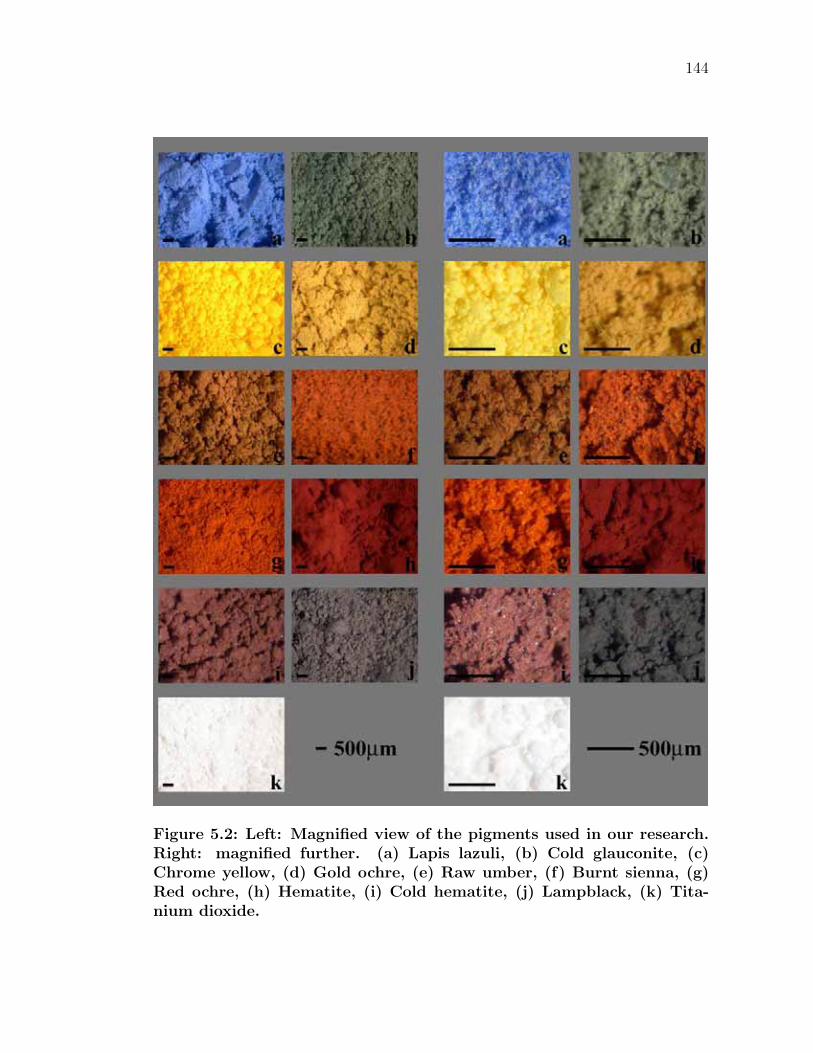
144
Figure 5.2: Left: Magnified view of the pigments used in our research.Right: magnified further. (a) Lapis lazuli, (b) Cold glauconite, (c)Chrome yellow, (d) Gold ochre, (e) Raw umber, (f) Burnt sienna, (g)Red ochre, (h) Hematite, (i) Cold hematite, (j) Lampblack, (k) Tita-nium dioxide.
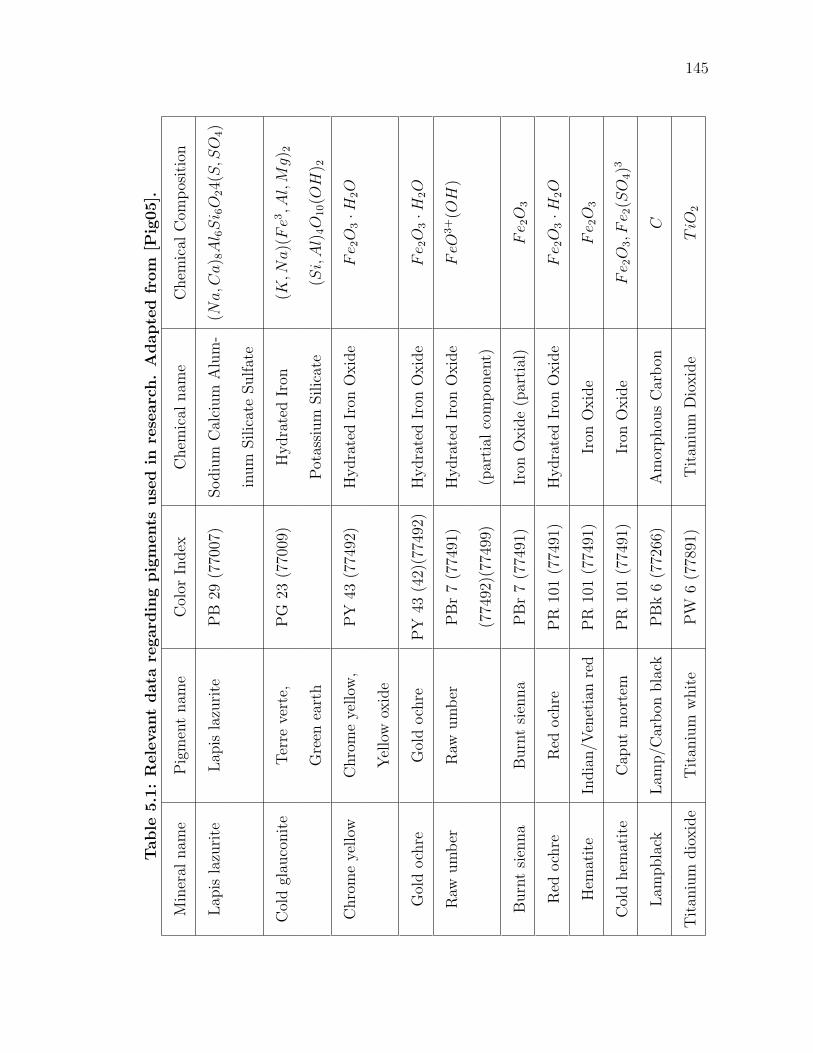
145
Table
5.1
:R
ele
vant
data
regard
ing
pig
ments
use
din
rese
arc
h.
Adapte
dfr
om
[Pig
05].
Min
eral
nam
eP
igm
ent
nam
eC
olor
Index
Chem
ical
nam
eC
hem
ical
Com
pos
itio
n
Lap
isla
zuri
teLap
isla
zuri
teP
B29
(770
07)
Sodiu
mC
alci
um
Alu
m-
(Na,C
a) 8
Al 6
Si 6
O24(
S,S
O4)
inum
Silic
ate
Sulfat
e
Col
dgl
auco
nit
eTer
reve
rte,
PG
23(7
7009
)H
ydra
ted
Iron
(K,N
a)(
Fe3
,Al,
Mg) 2
Gre
enea
rth
Pot
assi
um
Silic
ate
(Si,
Al)
4O
10(O
H) 2
Chro
me
yellow
Chro
me
yellow
,P
Y43
(774
92)
Hydra
ted
Iron
Oxid
eF
e 2O
3·H
2O
Yel
low
oxid
e
Gol
doch
reG
old
och
reP
Y43
(42)
(774
92)
Hydra
ted
Iron
Oxid
eF
e 2O
3·H
2O
Raw
um
ber
Raw
um
ber
PB
r7
(774
91)
Hydra
ted
Iron
Oxid
eF
eO3+(O
H)
(774
92)(
7749
9)(p
arti
alco
mpon
ent)
Burn
tsi
enna
Burn
tsi
enna
PB
r7
(774
91)
Iron
Oxid
e(p
arti
al)
Fe 2
O3
Red
och
reR
edoch
reP
R10
1(7
7491
)H
ydra
ted
Iron
Oxid
eF
e 2O
3·H
2O
Hem
atit
eIn
dia
n/V
enet
ian
red
PR
101
(774
91)
Iron
Oxid
eF
e 2O
3
Col
dhem
atit
eC
aput
mor
tem
PR
101
(774
91)
Iron
Oxid
eF
e 2O
3,F
e 2(S
O4)3
Lam
pbla
ckLam
p/C
arbon
bla
ckP
Bk
6(7
7266
)A
mor
phou
sC
arbon
C
Tit
aniu
mdio
xid
eT
itan
ium
whit
eP
W6
(778
91)
Tit
aniu
mD
ioxid
eT
iO2
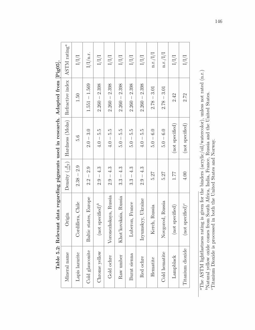
146
Table
5.2
:R
ele
vant
data
regard
ing
pig
ments
use
din
rese
arc
h.
Adapte
dfr
om
[Pig
05].
Min
eral
nam
eO
rigi
nD
ensi
ty(
gcm
3)
Har
dnes
s(M
ohs)
Ref
ract
ive
index
AST
Mra
tinga
Lap
isla
zuri
teC
ordille
ra,C
hile
2.38
−2.
95.
61.
50I/
I/I
Col
dgl
auco
nit
eB
alti
cst
ates
,E
uro
pe
2.2−
2.9
2.0−
3.0
1.55
1−
1.56
9I/
I/n.r
.
Chro
me
yellow
(not
spec
ified
)b2.
9−
4.3
4.0−
5.5
2.26
0−
2.39
8I/
I/I
Gol
doch
reV
oron
ezhsk
aya,
Russ
ia2.
9−
4.3
4.0−
5.5
2.26
0−
2.39
8I/
I/I
Raw
um
ber
Khot
’kov
skai
a,R
uss
ia3.
3−
4.3
5.0−
5.5
2.26
0−
2.39
8I/
I/I
Burn
tsi
enna
Luber
on,Fra
nce
3.3−
4.3
5.0−
5.5
2.26
0−
2.39
8I/
I/I
Red
och
reIz
yum
skyy,
Ukra
ine
2.9−
4.3
4.0−
5.5
2.26
0−
2.39
8I/
I/I
Hem
atit
eK
erch
,R
uss
ia5.
275.
0−
6.0
2.78
−3.
01n.r
./I/
I
Col
dhem
atit
eN
ovgo
rod,R
uss
ia5.
275.
0−
6.0
2.78
−3.
01n.r
./I/
I
Lam
pbla
ck(n
otsp
ecifi
ed)
1.77
(not
spec
ified
)2.
42I/
I/I
Tit
aniu
mdio
xid
e(n
otsp
ecifi
ed)c
4.00
(not
spec
ified
)2.
72I/
I/I
aT
he
AST
Mligh
tfas
tnes
sra
ting
isgi
ven
for
the
bin
der
s(a
crylic/
oil/
wat
erco
lor)
,unle
ssnot
rate
d(n
.r.)
bN
atura
lye
llow
oxid
eco
mes
from
Sou
thA
fric
a,In
dia
,Fra
nce
,R
uss
iaan
dth
eU
nit
edSta
tes.
cT
itan
ium
Dio
xid
eis
pro
cess
edin
bot
hth
eU
nit
edSta
tes
and
Nor
way
.
147
the most widely used pigment (many of the pigments on this list are derivatives of
similar minerals).
Gold ochre. Similar to yellow oxide, Gold Ochre derives its color from iron
hydroxides. The content of iron oxide must not be less than 12% to be considered
an ochre. Depending upon the content of hydrated iron oxide, the color of ochre
varies from light yellow to golden. While ochres occur all over the world, Mayer
states that the best are mined and refined in France [May81]. It is one of the oldest
traditional artists’ pigments, is typically very opaque and dries to an excellent film.
Raw umber. Umber (literally shade) is one of the most widely used browns. It is
a variety of ochre obtaining its color from the presence of iron hydroxides (45-70%)
and manganese oxide (5-20%). Historically, the pigment was mined near Umbria,
Italy, but now the best umbers are mined primarily in Cyprus. The pigment has
a high opacity and tinting strength. Due to its manganese content, umber hastens
the drying of media, but forms a good, flexible film.
Burnt sienna. The pigment sienna owes its name to the Tuscan hills surround-
ing Siena, Italy. Raw sienna is hydrated iron oxide closely resembling yellow ochre
(40-70% hydrated iron oxide content). When a limonite, like sienna, is calcined
(or roasted) at high temperatures, its water content is eliminated and it becomes
a hematite (anhydrous), or burnt sienna. This process changes the pigment to
have exceptional translucency (different from most other earths) and a deep rich
hue. Burnt sienna is one of the most useful and versatile pigments: its masstone
a reddish brown, its glaze a fiery red, its tint with white a salmon pink. This
pigment is highly absorbent of binding media.
Red ochre. Natural red ochre has a greater percentage of iron oxide than does
its yellow counterparts, to which yields its characteristic red color. French ochre,
148
historically one of the best grades of limonite, contains about 20% iron oxide and
is high in silica. Ochres are among the most permanent hues on the palette and
absorb a medium amount of binder.
Hematite. The native mineral hematite (also hæmatite) is essentially ferric
oxide, occurring almost chemically pure (approximately 95%) without the presence
of water. It has been a source of supply of for natural red pigments since the
earliest classical and ancient times–many other pigments are basically hematite
with varying degrees of mineral impurities such as clay, chalk and silica. Natural
red iron oxides are mostly of dark hue and equally as permanent and dependable
as those synthetically prepared. The high purity leads to high tinting strength
and opacity. The red iron oxides are among the basic, original pigments usually
considered indispensable–one seldom sees a palette that does not contain at least
one of them.
Cold hematite. Familiarly known as Caput mortem, this pigment includes small
amounts of iron sulfate and other impurities usually associated with hematite,
giving the pigment a deep violet hue. It maintains the same qualities as hematite,
as the concentration of ferric oxide is comparable.
Lampblack. This pigment is a black of commercially pure carbon. The finer
varieties are obtained from wick lamps in which fluid fatty oils rich in carbon are
burnt with insufficient air for complete combustion. The soot is collected from
plates held in the flame. Lampblack is a very strong color, whose origin dates back
to antiquity. It has considerable opacity, and is very stable and permanent. It is
very fluffy, of a low specific gravity and absorbs a large portion of binder.
Titanium dioxide. This pigment is a development of the 20th century. It has
eclipsed other traditional white pigments due to its high opacity, nontoxic nature
149
and reasonable cost. It is extremely inert and unaffected by very harsh conditions.
Titanium pigments are dense and heavy, and have great hiding power.
5.1.3 Media
In our research we also studied the effects of many various media on the chosen
pigments. Each binder imparts its own characteristic optical and textural qualities,
as well as maintaining a specific tactile behavior while working. Many different
binding media have been discussed in detail in Chapter 2.
To accurately compare different types of binding media, it was necessary that
all of the considered media be able to be applied in a similar fashion to a con-
sistent support. Typically, this is not a concern as most media can be applied to
the same types of supports–whether it is canvas, panel, or heavy weight paper.
Unfortunately, fresco painting does not fit the stereotypical type for binder, as it
is applied directly to masonry. Thus, we were unable to study fresco in this work,
as creating many small samples of this material would have been too difficult.
Descriptions of the eight binding materials we studied, including more specific
details on their composition follow:
Acrylic. The specific acrylic polymer emulsion used was Acrylex Thick Medium
#33 from Pearl Paint (New York). The medium is reasonably thick by itself and
is considerably opaque while wet. If desired, the medium can be thinned with
water to improve handling. One must keep brushes wet as the binder dries to a
waterproof film. The translucency increases upon drying.
Casein. Rather than casein powder, premixed borax-hydrolyzing casein from
Schmincke (Erkrath-Unterfeldhaus, Germany) was used. For painting, the direc-
tions called for the medium be thinned 1:1 with water, though in practice this
150
created far too strong of a binder, resulting in cracking in many of the paint films.
Instead, we settled on a mixture of 2:3 casein to water, with good results. Milk
paint dries waterproof, though it must cure for a certain time (usually about a
month).
Distemper. Powdered rabbit skin glue can be obtained at any art supply store
(Gamblin Artists Colors Co.; Portland, OR). Mix one part dry hide glue with ten
parts water and let it sit overnight–the glue will swell and absorb the water. If
present, pour off any excess water and warm the glue in a double boiler. The double
boiler will dampen the heat to a slow rise, as hide glues should never be heated
above 150oF, save risking the integrity of the adhesive. The glue will melt with
heat and needs to be kept warm while working. The glue has a thin consistency
while warm, but thickens considerably as it cools. The resulting paint dries quickly
to a flat and strong film.
Gouache. Most recipes are identical to that of watercolor (a solution of gum
arabic), though white pigment and/or chalk is typically added to increase the opac-
ity needed for gouache. We wanted to avoid adding filler to any of the materials.
Therefore, we used a synthetic alternative for gouache. The Kremer (New York)
gouache recipe calls for 100ml Mowiol and 2g Preventol. Combining the two sub-
stances results in a medium thicker in consistency than casein, but thinner than
the acrylic polymer. To ease spreading, we added a slight amount of water to
the solution. The resulting film displayed the same characteristics of traditional
gouache: great hiding and flat color.
Encaustic. Bleached beeswax can be obtained from any art supply store.
Chunks of the wax are first heated in a double boiler. After the wax had com-
pletely melted, it was mixed 1:1 with mineral spirits to increase fluidity (Gamsol:
151
Gamblin Artists Colors Co.; Portland, OR). Note that the media congeals quickly
without constant heat. The author found that an ideal way of working is to use
metal muffin tins on a hot plate for each paint mixture. This keeps the wax molten
to work effectively while combining the pigment-media solution.
Oil. There are many oil-painting mediums in use by artists–typically varying
combinations of oil, varnish and turpentine. Refined linseed oil is the best for
artists’ paint. This linseed oil is of a straw color and is obtained from any art
supply store (Sunnyside; Wheeling, Illinois). Also, a very small amount of Gamsol
mineral spirits is added for consistency.
Tempera. Pure egg yolk, separated from the white is the emulsion for tempera.
To separate the contents of an egg, first cleanly break the shell into two halves.
Carefully alternate the yolk pouch from one half shell to the other, removing as
much of the white as possible. Now, the pouch is rolled dry on a paper towel.
Be careful not to dry the pouch too much, as the skin may catch and break open
unexpectedly. With one hand, pinch and hold the pouch over a jar. As one
punctures the pouch with a sharp tool in the other hand, the yolk will freely run
into the jar. Fresh egg yolk must be used in tempera painting. Hence, paints are
made fresh daily with yolk and a small amount of water.
Watercolor. Gum arabic provides the adhesion for watercolor paints. Crystals
of the substance (Kremer; New York) are combined in a ratio of 1:2 with water.
The gum arabic is left to sit in the water for the crystals to dissolve (1-2 days).
The solution is heated in a double boiler until the solution is completely dissolved.
At this point, the author recommends filtering the solution with cheesecloth to
remove any impurities (i.e. small pieces from the accacia tree). A one-half part
of glycerin is added as a plasticizer, which keeps the finished paint from becoming
152
too brittle and cracking. While working with pigments, slightly more water can
be added as needed.
5.1.4 Substrate
The magnitude of the number of samples demanded that the substrate to which
paint was applied had to be easy to make and provide a consistent surface. The
device used to measure the diffuse reflectance governed the size of the sample.
The samples needed to be circular with a diameter of 19mm to reasonably fit
in the measuring device. In order to provide enough space on each sample for
both priming and painting, each sample was made to be approximately 31mm in
diameter.
The samples needed to be sturdy and suitable for many drastically different
types of binding media. Canvas or paper are too flexible of supports to be used in
conjunction with brittle binders (Casein, for instance, would be very susceptible
to cracking on such supports). Also, it is important that the support for all of the
samples in the research be consistent, as different supports for different media may
introduce unwanted errors. Therefore, the work demanded rigid supports.
Mounted canvas was chosen for the surface characteristics of canvas, as well
as ease of operation. The canvas selected was the inexpensive, readily available,
cotton duct fabric. A template for the desired shape and size was made, and the
canvas is easily cut with scissors. The backing also needed to be easy to cut rapidly.
Quarter-inch Fome-Cor board was chosen for this purpose. It is a polystyrene
core bonded between high-quality papers to provide a lightweight, rigid, smooth
surface. It resists warping (though on this scale, this is not much of a concern)
and is easily cut with the sharp blade of an X-actoTM knife on a cutting mat. Each
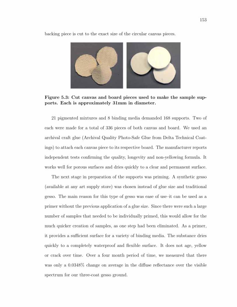
153
backing piece is cut to the exact size of the circular canvas pieces.
Figure 5.3: Cut canvas and board pieces used to make the sample sup-ports. Each is approximately 31mm in diameter.
21 pigmented mixtures and 8 binding media demanded 168 supports. Two of
each were made for a total of 336 pieces of both canvas and board. We used an
archival craft glue (Archival Quality Photo-Safe Glue from Delta Technical Coat-
ings) to attach each canvas piece to its respective board. The manufacturer reports
independent tests confirming the quality, longevity and non-yellowing formula. It
works well for porous surfaces and dries quickly to a clear and permanent surface.
The next stage in preparation of the supports was priming. A synthetic gesso
(available at any art supply store) was chosen instead of glue size and traditional
gesso. The main reason for this type of gesso was ease of use–it can be used as a
primer without the previous application of a glue size. Since there were such a large
number of samples that needed to be individually primed, this would allow for the
much quicker creation of samples, as one step had been eliminated. As a primer,
it provides a sufficient surface for a variety of binding media. The substance dries
quickly to a completely waterproof and flexible surface. It does not age, yellow
or crack over time. Over a four month period of time, we measured that there
was only a 0.0348% change on average in the diffuse reflectance over the visible
spectrum for our three-coat gesso ground.
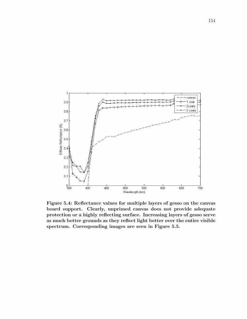
154
Figure 5.4: Reflectance values for multiple layers of gesso on the canvasboard support. Clearly, unprimed canvas does not provide adequateprotection or a highly reflecting surface. Increasing layers of gesso serveas much better grounds as they reflect light better over the entire visiblespectrum. Corresponding images are seen in Figure 5.5.
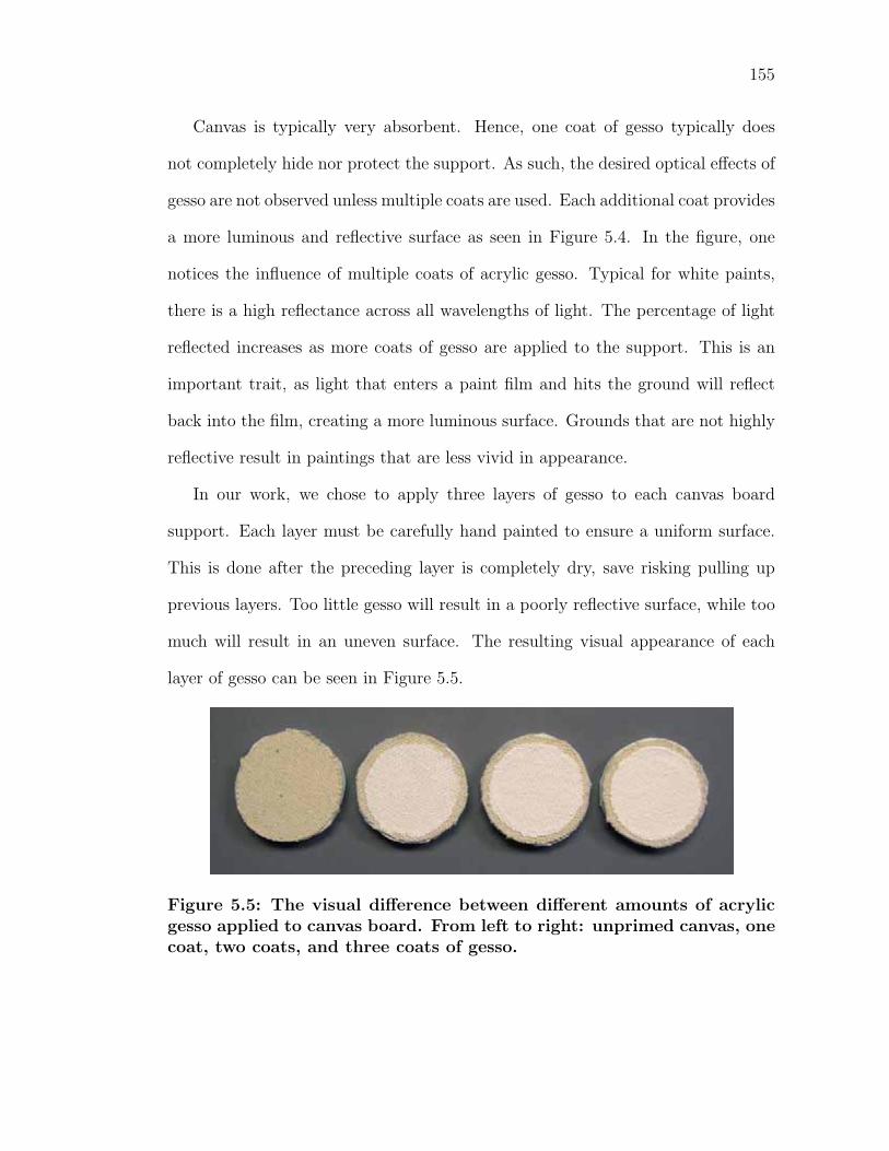
155
Canvas is typically very absorbent. Hence, one coat of gesso typically does
not completely hide nor protect the support. As such, the desired optical effects of
gesso are not observed unless multiple coats are used. Each additional coat provides
a more luminous and reflective surface as seen in Figure 5.4. In the figure, one
notices the influence of multiple coats of acrylic gesso. Typical for white paints,
there is a high reflectance across all wavelengths of light. The percentage of light
reflected increases as more coats of gesso are applied to the support. This is an
important trait, as light that enters a paint film and hits the ground will reflect
back into the film, creating a more luminous surface. Grounds that are not highly
reflective result in paintings that are less vivid in appearance.
In our work, we chose to apply three layers of gesso to each canvas board
support. Each layer must be carefully hand painted to ensure a uniform surface.
This is done after the preceding layer is completely dry, save risking pulling up
previous layers. Too little gesso will result in a poorly reflective surface, while too
much will result in an uneven surface. The resulting visual appearance of each
layer of gesso can be seen in Figure 5.5.
Figure 5.5: The visual difference between different amounts of acrylicgesso applied to canvas board. From left to right: unprimed canvas, onecoat, two coats, and three coats of gesso.
156
5.1.5 Painting
After the layers of gesso had thoroughly dried, the support was ready to be painted.
Many pigment masstones are dark, making it difficult to determine the character-
istic absorption bands. As a result, a tint of each pigment was also made with
titanium dioxide white. We studied 21 pigment mixtures: 11 pure pigments and
10 tints. The measured ratios in tints had to be very precise to ensure reliability
of the data. Tints were made with 50% colored pigment and 50% Titanium Diox-
ide. We combined each pigment mixture with the eight different binding media.
For every pigment-binder mixture, we painted two samples to make sure that we
had a sample of sufficient quality. In total there were 21 x 8 x 2 = 336 painted
samples. The author notes that this does not include the many samples that were
not of adequate quality due to pigment-binder inconsistencies (cracking, clumping,
agglomeration, flocculation, inadequate dispersion, etc.).
One binding media was created and measured at a time (for all pigment mix-
tures). Prior to painting a selection of samples, a specific binding media was made
fresh. Some binding media lose adhesive strength if they are stored and reused at
a later time. A measured ratio amount of binding media to pigment was combined
in a plastic cup.1 Painstaking care must be taken to prevent any impurities from
entering a paint mixture. Contamination can occur at many stages in the painting
process.
Kubelka and Munk found in experimentation [KM31] that the steel spatula
used to disperse the pigment in the binder left minimal traces of iron in the paint
due to the hardness of the pigment. In the particular case, the white paint had
1Some pigments are toxic and care should be used in handling the dry pigmentpowder to avoid inhaling the dust.
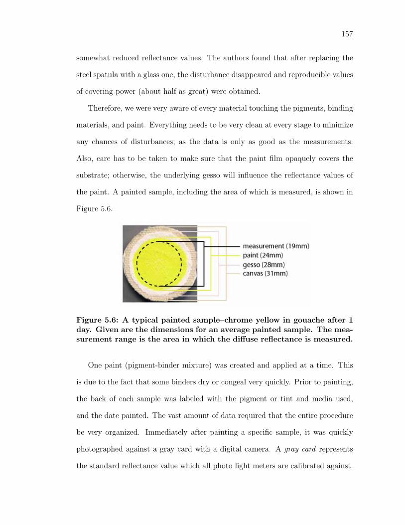
157
somewhat reduced reflectance values. The authors found that after replacing the
steel spatula with a glass one, the disturbance disappeared and reproducible values
of covering power (about half as great) were obtained.
Therefore, we were very aware of every material touching the pigments, binding
materials, and paint. Everything needs to be very clean at every stage to minimize
any chances of disturbances, as the data is only as good as the measurements.
Also, care has to be taken to make sure that the paint film opaquely covers the
substrate; otherwise, the underlying gesso will influence the reflectance values of
the paint. A painted sample, including the area of which is measured, is shown in
Figure 5.6.
Figure 5.6: A typical painted sample–chrome yellow in gouache after 1day. Given are the dimensions for an average painted sample. The mea-surement range is the area in which the diffuse reflectance is measured.
One paint (pigment-binder mixture) was created and applied at a time. This
is due to the fact that some binders dry or congeal very quickly. Prior to painting,
the back of each sample was labeled with the pigment or tint and media used,
and the date painted. The vast amount of data required that the entire procedure
be very organized. Immediately after painting a specific sample, it was quickly
photographed against a gray card with a digital camera. A gray card represents
the standard reflectance value which all photo light meters are calibrated against.
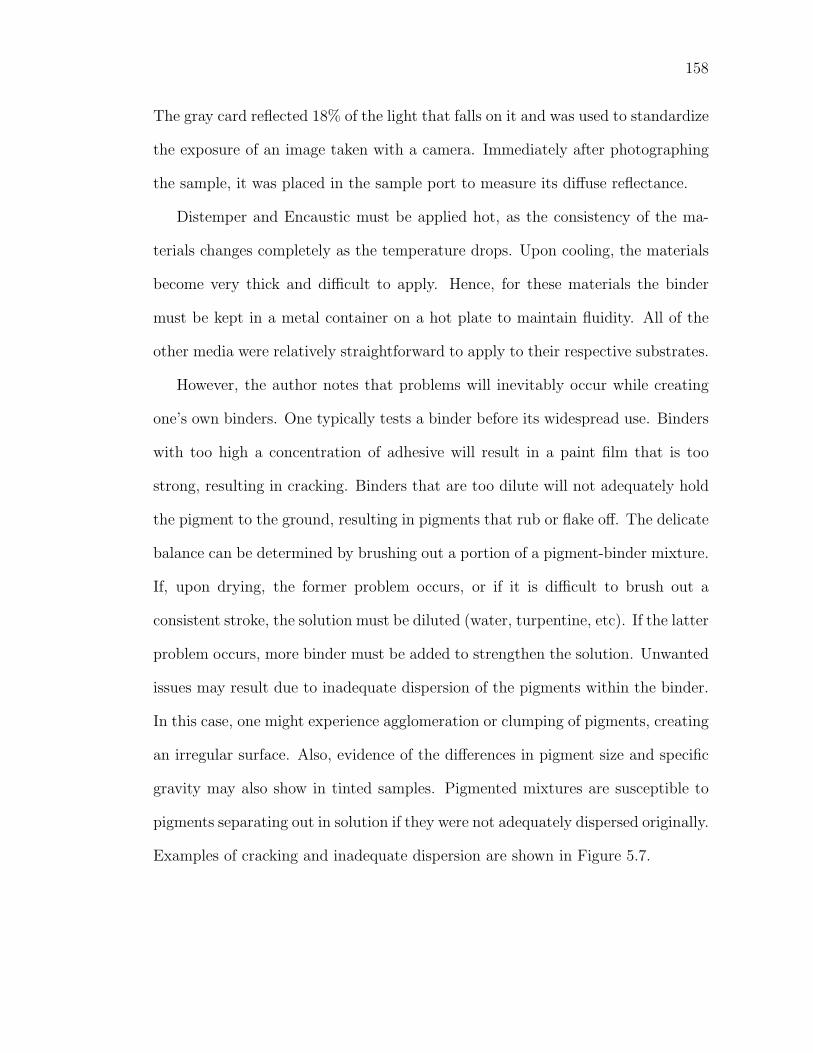
158
The gray card reflected 18% of the light that falls on it and was used to standardize
the exposure of an image taken with a camera. Immediately after photographing
the sample, it was placed in the sample port to measure its diffuse reflectance.
Distemper and Encaustic must be applied hot, as the consistency of the ma-
terials changes completely as the temperature drops. Upon cooling, the materials
become very thick and difficult to apply. Hence, for these materials the binder
must be kept in a metal container on a hot plate to maintain fluidity. All of the
other media were relatively straightforward to apply to their respective substrates.
However, the author notes that problems will inevitably occur while creating
one’s own binders. One typically tests a binder before its widespread use. Binders
with too high a concentration of adhesive will result in a paint film that is too
strong, resulting in cracking. Binders that are too dilute will not adequately hold
the pigment to the ground, resulting in pigments that rub or flake off. The delicate
balance can be determined by brushing out a portion of a pigment-binder mixture.
If, upon drying, the former problem occurs, or if it is difficult to brush out a
consistent stroke, the solution must be diluted (water, turpentine, etc). If the latter
problem occurs, more binder must be added to strengthen the solution. Unwanted
issues may result due to inadequate dispersion of the pigments within the binder.
In this case, one might experience agglomeration or clumping of pigments, creating
an irregular surface. Also, evidence of the differences in pigment size and specific
gravity may also show in tinted samples. Pigmented mixtures are susceptible to
pigments separating out in solution if they were not adequately dispersed originally.
Examples of cracking and inadequate dispersion are shown in Figure 5.7.
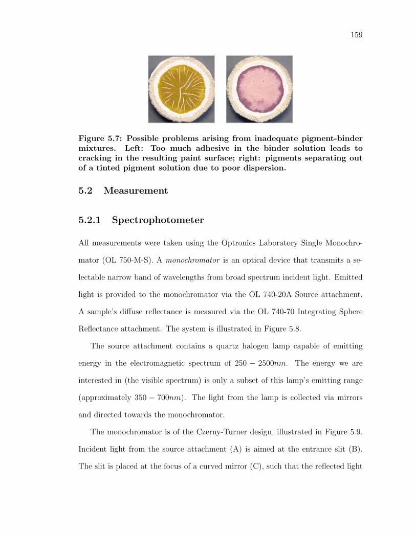
159
Figure 5.7: Possible problems arising from inadequate pigment-bindermixtures. Left: Too much adhesive in the binder solution leads tocracking in the resulting paint surface; right: pigments separating outof a tinted pigment solution due to poor dispersion.
5.2 Measurement
5.2.1 Spectrophotometer
All measurements were taken using the Optronics Laboratory Single Monochro-
mator (OL 750-M-S). A monochromator is an optical device that transmits a se-
lectable narrow band of wavelengths from broad spectrum incident light. Emitted
light is provided to the monochromator via the OL 740-20A Source attachment.
A sample’s diffuse reflectance is measured via the OL 740-70 Integrating Sphere
Reflectance attachment. The system is illustrated in Figure 5.8.
The source attachment contains a quartz halogen lamp capable of emitting
energy in the electromagnetic spectrum of 250 − 2500nm. The energy we are
interested in (the visible spectrum) is only a subset of this lamp’s emitting range
(approximately 350 − 700nm). The light from the lamp is collected via mirrors
and directed towards the monochromator.
The monochromator is of the Czerny-Turner design, illustrated in Figure 5.9.
Incident light from the source attachment (A) is aimed at the entrance slit (B).
The slit is placed at the focus of a curved mirror (C), such that the reflected light
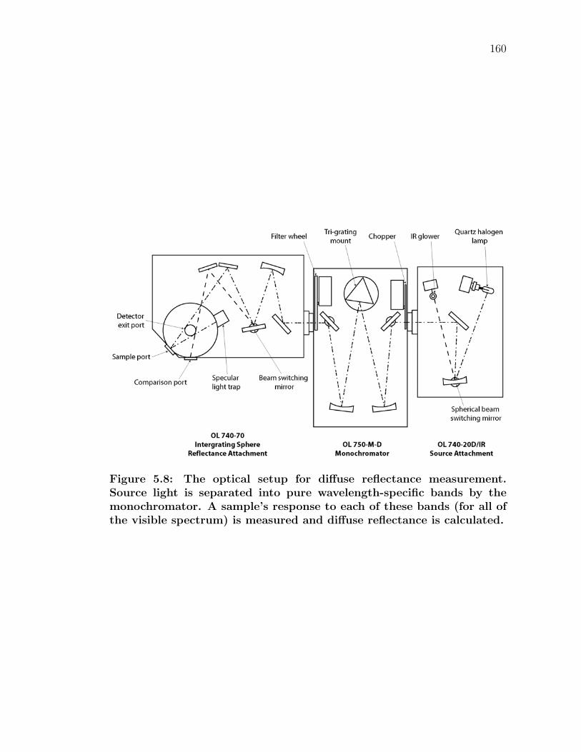
160
Figure 5.8: The optical setup for diffuse reflectance measurement.Source light is separated into pure wavelength-specific bands by themonochromator. A sample’s response to each of these bands (for all ofthe visible spectrum) is measured and diffuse reflectance is calculated.
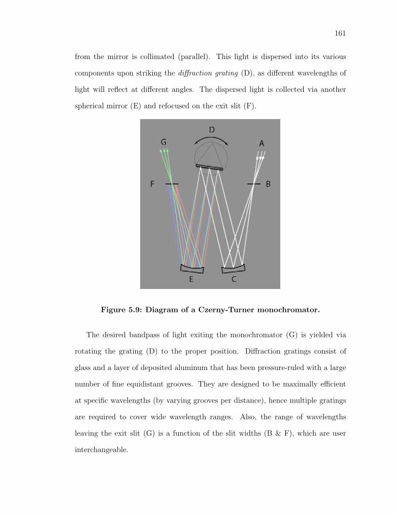
161
from the mirror is collimated (parallel). This light is dispersed into its various
components upon striking the diffraction grating (D), as different wavelengths of
light will reflect at different angles. The dispersed light is collected via another
spherical mirror (E) and refocused on the exit slit (F).
Figure 5.9: Diagram of a Czerny-Turner monochromator.
The desired bandpass of light exiting the monochromator (G) is yielded via
rotating the grating (D) to the proper position. Diffraction gratings consist of
glass and a layer of deposited aluminum that has been pressure-ruled with a large
number of fine equidistant grooves. They are designed to be maximally efficient
at specific wavelengths (by varying grooves per distance), hence multiple gratings
are required to cover wide wavelength ranges. Also, the range of wavelengths
leaving the exit slit (G) is a function of the slit widths (B & F), which are user
interchangeable.
162
Note that harmonics reflect at the same angle (a harmonic is a integer multiple
of a frequency αf | α ∈ Z). Hence, to achieve the desired wavelength band,
light exiting the monochromator is filtered. For example, light of 400nm reflects
off the grating at the same angle as 800nm. If one desires the blue-violet band
(400nm) and not light in the infrared (800nm), a filter must be in place to block
the extraneous light.
5.2.2 Integrating sphere theory
The desired wavelength band of light is then passed to an integrating sphere in
order to calculate the diffuse reflectance of a material. In an integrating sphere,
light enters from a small aperture in the sphere and strikes a sample on the opposing
surface of the sphere. The light is reflected off the surface of the sample to the
entire sphere. The surface of the sphere is covered in a highly reflective diffuse
material (typically Polytetrafluoroethylene (PTFE) for measurements in the visible
spectrum range). Hence, multiple scattering events occur and the light diffuses over
the entire sphere. At another portion of the sphere is a detector to measure the
response of light striking that portion.
The basic theory for the integrating sphere has been evaluated analytically
by Jacquez and Kuppenhiem [JK55]. In the comparison method, the integrating
sphere reflectometer has a dual beam design. Incident light enters through an
aperture in the sphere at one of two angles. Following these paths of light across
the sphere, there are two apertures for samples–the test and comparison samples.
A detector is placed at another location on the sphere.
The method requires four separate scans: two calibration scans and two test
sample scans. During calibration, a standard reflectance sample of known re-
163
flectance is placed in the test aperture. The first scan is made with the light
beam on the comparison sample, while the detector measures the response. The
next scan is done with the beam focused on the standard sample. The calibra-
tion factor for the integrating sphere reflectance attachment is calculated at each
wavelength [Lab94]:
C(λ) = Rst(λ)
(Sc(λ)
Sst(λ)
)(5.1)
where
C is the spectral calibration factor for the integrating sphere at wavelength λ
Rst(λ) is the reflectance of the standard reflectance sample
Sc(λ) is the signal with the beam focused on the comparison sample
Sst(λ) is the signal with the beam on the standard reflectance sample
For the test scans, the test sample is then placed in the test aperture. The
third and fourth scans are done with the light beam focused on the comparison
and test samples, respectively. The reflectance of the test sample is then calculated
by [Lab94]:
Rtest(λ) = C(λ)
(Stest(λ)
Sc(λ)
)(5.2)
where
Rtest(λ) is the reflectance of the test sample
C(λ) is the calibration factor calculated from Equation 5.1
Stest(λ) is the signal with the beam focused on the test sample
Sc(λ) is the signal with the beam focused on the comparison sample
164
Note that the calibration factors for a set of wavelengths are valid as long as
the system setup does not change. Hence, the calibration scans need only to be
executed once for multiple test sample scans. However, if for a different set of
wavelengths, or more precise measurements are needed, the calibration must be
repeated as the data cannot be extrapolated or interpolated. In practice, new
calibration factors were calculated daily to ensure precision.
The instrument is designed to measure either the inclusion or exclusion of the
specular reflection. The incident light is off the sample perpendicular by about
8-10o. Pure specular reflection will occur at the same angle equal and opposite to
the incident angle (-8 to -10o). A light trap placed at the angle of reflectance will
absorb the specular reflectance, such that only diffuse reflectance is measured. If
a white port is inserted instead, the total reflectance is measured. The difference
between the two is a measure of the specular reflectance.
Overall, the comparison method is very accurate in calculating the reflectance
of a material. This is due to taking into account the change in efficiencies of the
sphere when introducing the test sample. A more detailed account of integrating
sphere theory can be found in [JK55].
5.2.3 Measurement
We calculate diffuse reflectance using the comparison method. In our work, stan-
dard sample is pressed PTFE (OL 25-RS Diffuse Reflectance Standard). A light
trap was used to remove extraneous specular reflection from the measurement.
The detector used to measure the radiant energy response was the OL DH-300
Silicon Detector Head, which detects over the range of 300-1000nm. The position
of these devices is seen in Figure 5.8.
165
Measurements were taken for each sample at six different periods of time. The
diffuse reflectance of the samples was measured directly after they were freshly
painted, after one day, after one week, after one month, after three months, and
six months after they were painted. From 21 pigmented mixtures and 8 different
binding media, there are 168 different samples. Each sample’s reflectance was
measured over the visible spectrum (350-700nm) in 10nm increments. Hence, there
are 36 wavelength-dependent reflectance values for each sample. Ultimately, each
sample was measured six times for a total of 1008 time-dependent reflectance
spectra (each of which contains the 36 wavelength-dependent reflectance values).
The samples were subjected to conditions similar to a less-traveled gallery. The
atmospheric conditions were fairly constant, as the samples were kept indoors.
The room temperature remained constant, at approximately 70oF. Illumination in
the room was a combination of General Electric fluorescents Chroma 50 (which
has a continuous spectral distribution similar to that of daylight) and Deluxe
Specification Series 3500K (a tri-Phosphor lamp with very good color rendering
and efficacy). Illuminance on the samples was between 235-560 lux. After creation,
the samples remained face-up on a table, unless they were in the process of being
measured, and were never touched on the paint surface.
Chapter 6
Experimental Results
6.1 Introduction
The acquired diffuse reflectance data forms a multi-dimensional space, where the
desired spectrum is dependent on the pigment, binding media, and time interval.
Analyzing the data of such a large hypergraph is difficult and different ways of
presenting the data are covered in this section.
6.1.1 Effect of binding media
To study the effect of the binding media on a pigment in a paint solution, a specific
time and pigment are held constant. This allows for direct comparison between
paint samples of different binders. Given this situation, there are eight spectral
reflectance curves for a given pigment-time combination (since there are eight
different binders). Plotted against each other, this allows for comparisons of how
the binder affects the absorption and scattering of wavelengths of light of a paint
sample. These changes of light behavior are important to how we perceive color
differences. As seen in Chapter 3, any change in the reflectance spectra will incite
166
167
a change in our perception of the color–our eye integrates the surface reflectance
with the incident light against our color sensitivity matching functions.
In order to manage the dataset, an interactive viewer was made to browse
between the 126 pigment-time combinations. This allowed for easier viewing of
the data as one can quickly see the relationships between different samples. The
online application was written in JavaScript, allowing for instant feedback from a
user-specified pigment and time combination. After selecting the input parameters,
the system presents a spectral reflectance plot of the eight different binding media
for the chosen input data. The setup for the viewer is seen in Figure 6.1 for
Lapis lazuli samples that have been dry for one day. The input data is chosen via
drop-down menus in the top-left of the screen. To tint the chosen pigment, the
checkbox is selected. Updating the graphics with new selections is done with the
display button.
A photograph of the pigment is shown for reference in the top-right (for tints,
titanium dioxide white is also shown). Also presented is the corresponding digital
photograph for each paint sample, as spectral graphs are not a very intuitive way
to analyze subtle color shifts. Yet, it is important to note that the spectral data
is what is critical. Displays have significant limitations: monitors approximate
colors using only three phosphors (red, green and blue), while printers only use
fours inks (cyan, magenta, yellow and black) to create images. As a result, many
real-world colors cannot be captured by these devices. Therefore, any photographic
representation will be an inadequate representation of the actual colors.
The importance of the spectral plots is that they show the behavior of light at
all wavelengths in the visible spectrum. The spectral data combined with an illu-
minant and the eye’s response curves can be predictive with no loss of information.
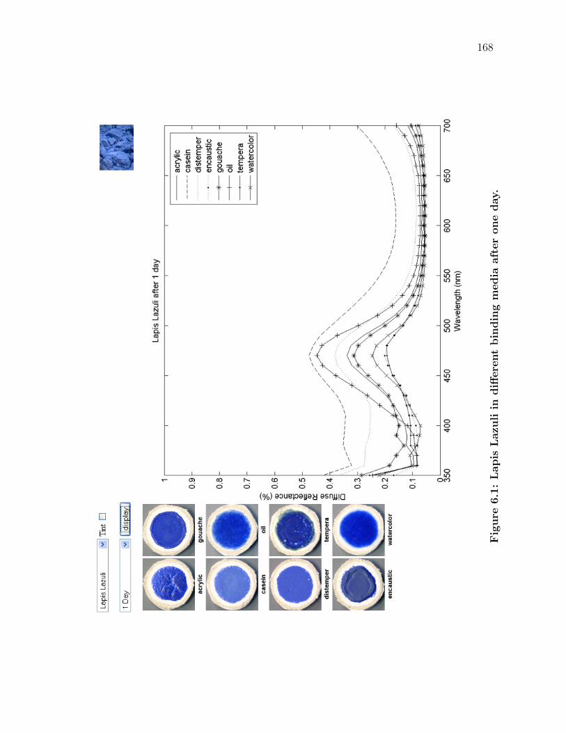
168
Fig
ure
6.1
:Lapis
Lazu
liin
diff
ere
nt
bin
din
gm
edia
aft
er
one
day.
169
However, while the photographs are not completely physically accurate depictions
of the actual color of the samples, they do give the viewer a reasonable subjective
comparison.
An important observation occurs when viewing the variation in binding media
over the visible spectrum. Typically, the specific pigment determines the general
shape of the spectral curve. That is, the intrinsic chemical properties of the ma-
terial from which the pigment was created determines the central tendency of the
material’s reflectance, as well as the wavelengths that are primarily absorbed. Yet,
the specific binding media determines the exact behavior of how light behaves when
striking the material. Each material has its own characteristics that it imparts and
one recognizes these differences in a work of art. A painting in one media will in-
voke a different sensation than that created in a different media. This relationship
holds for all of the pigments in the study.
This observation is logical; as one of the criteria for a binding material is that
it does not drastically affect the materials that are suspended within it. An artist
expects a pigment to maintain a relatively specific hue, whether it is dispersed
in oil or watercolor or another media. However, as seen with Lapis Lazuli, while
the general color is similar between binding media, there is great variation in the
resulting color between the different materials.
A common way to compare colors is to transform them into a perceptually uni-
form color space and study the results. This allows one to quantify the magnitude
of the difference between colors. In our case, this can be used to evaluate how
much binding materials affect the color of a pigment.
The basic computation is to first convert the spectral data into CIE tristimulus
values XY Z. This is done using the response matching functions, an illuminant
170
(such as CIE standards C, D50, or D65) and Equation 3.3. Then, XY Z values can
be converted into a number of nearly uniform color spaces, such as Munsell, CIE
L∗a∗b∗ or CIE L∗u∗v∗.
Converting XY Z values into the Munsell color space is typically done via a
three-dimensional look-up table, as there is no easy way to mathematically trans-
form XY Z values into the Munsell space. Since the Munsell color space is defined
by physical samples, the reflectances of the samples which define the space can
be measured and converted into XY Z tristimulus values. From this data, one
searches the table (such as from [Lab05]) for the nearest XY Z values. The Mun-
sell HV C (hue, value and chroma) coordinates are found by linearly interpolating
between adjacent points. Recently, it is of note that there has been a promising
attempt to model a general transformation between reflectance spectra and the
Munsell color system with good correspondence between the calculated and actual
coordinates [LJP06].
Converting XY Z values into the other two spaces is much easier numerically.
Tristimulus values XY Z are converted to L∗a∗b∗ using Equations 3.9 & 3.11. By
design, the distance between any two points in the L∗a∗b∗ color system is nearly
proportional to the perceptional color difference. Thus, the Euclidean distance
(given by Equation 3.12) between any two color coordinates determines approxi-
mately the perceptual difference between the two colors. The Munsell color system
is also a perceptually uniform space, though it is more difficult to define perceptual
differences via a discrete number. Due to the cylindrical natural of the Munsell
system, one has to take into account differences in arc length to compare different
hues.
Fortunately, there is free software available from GretagMacbeth (the com-

171
Table 6.1: Color conversions from the spectral reflectances of the sam-ples of Lapis Lazuli in different binding media, dry after one day.
X Y Z H V C L∗ a∗ b∗
acrylic 10.04 10.50 28.19 2.54PB 3.76 7.06 38.73 0.67 -33.74
casein 21.35 24.01 45.42 8.86B 5.44 5.78 56.10 -6.60 -25.85
distemper 13.28 14.43 35.06 1.29PB 4.35 7.12 44.85 -2.62 -32.83
encaustic 7.75 8.06 17.09 2.54PB 3.32 4.18 34.12 0.96 -22.00
gouache 9.03 9.46 26.48 2.43PB 3.58 7.13 36.85 0.53 -34.33
oil 12.40 13.26 37.67 1.97PB 4.19 8.48 43.15 -1.18 -39.09
tempera 7.53 7.89 17.38 2.25PB 3.29 4.47 33.75 0.46 -23.24
watercolor 7.49 7.58 19.51 3.60PB 3.22 5.66 33.09 2.93 -28.66
pany who currently produces the Munsell Book of Color [Mun]), which computes
many conversions from XY Z values (including Munsell HV C, L∗a∗b∗, RGB and
CMY K) [Gre06]. Different color system values computed from the eight differing
binding media reflectance spectra in Figure 6.1 are shown in Table 6.1.
We now have a discrete way of evaluating the magnitude of the perceptual
differences ∆E between colors. Using the converted L∗a∗b∗ colors, one can estimate
the perceived difference between colors via the magnitude of its distance from
another color in space. Table 6.2 describes the distance between every L∗a∗b∗ color
in Table 6.1. From this data, we can infer how Lapis Lazuli differs perceptually
in the eight binding media. Small values of ∆E indicate that a pair of colors are
very similar to each other, while large values show that the two colors are very
different.
One can see that paint samples of Lapis lazuli in encaustic and tempera are
the most similar colors after one day of drying. While the two samples are very
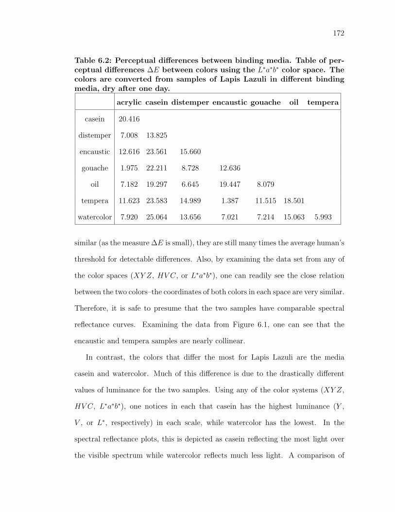
172
Table 6.2: Perceptual differences between binding media. Table of per-ceptual differences ∆E between colors using the L∗a∗b∗ color space. Thecolors are converted from samples of Lapis Lazuli in different bindingmedia, dry after one day.
acrylic casein distemper encaustic gouache oil tempera
casein 20.416
distemper 7.008 13.825
encaustic 12.616 23.561 15.660
gouache 1.975 22.211 8.728 12.636
oil 7.182 19.297 6.645 19.447 8.079
tempera 11.623 23.583 14.989 1.387 11.515 18.501
watercolor 7.920 25.064 13.656 7.021 7.214 15.063 5.993
similar (as the measure ∆E is small), they are still many times the average human’s
threshold for detectable differences. Also, by examining the data set from any of
the color spaces (XY Z, HV C, or L∗a∗b∗), one can readily see the close relation
between the two colors–the coordinates of both colors in each space are very similar.
Therefore, it is safe to presume that the two samples have comparable spectral
reflectance curves. Examining the data from Figure 6.1, one can see that the
encaustic and tempera samples are nearly collinear.
In contrast, the colors that differ the most for Lapis Lazuli are the media
casein and watercolor. Much of this difference is due to the drastically different
values of luminance for the two samples. Using any of the color systems (XY Z,
HV C, L∗a∗b∗), one notices in each that casein has the highest luminance (Y ,
V , or L∗, respectively) in each scale, while watercolor has the lowest. In the
spectral reflectance plots, this is depicted as casein reflecting the most light over
the visible spectrum while watercolor reflects much less light. A comparison of
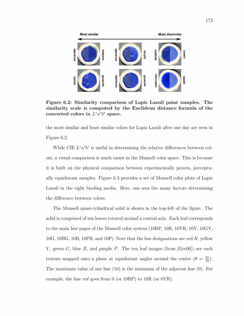
173
Figure 6.2: Similarity comparison of Lapis Lazuli paint samples. Thesimilarity scale is computed by the Euclidean distance formula of theconverted colors in L∗a∗b∗ space.
the most similar and least similar colors for Lapis Lazuli after one day are seen in
Figure 6.2.
While CIE L∗a∗b∗ is useful in determining the relative differences between col-
ors, a visual comparison is much easier in the Munsell color space. This is because
it is built on the physical comparison between experimentally proven, perceptu-
ally equidistant samples. Figure 6.3 provides a set of Munsell color plots of Lapis
Lazuli in the eight binding media. Here, one sees the many factors determining
the difference between colors.
The Munsell quasi-cylindrical solid is shown in the top-left of the figure. The
solid is comprised of ten leaves rotated around a central axis. Each leaf corresponds
to the main hue pages of the Munsell color system (10RP, 10R, 10YR, 10Y, 10GY,
10G, 10BG, 10B, 10PB, and 10P). Note that the hue designations are red R, yellow
Y , green G, blue B, and purple P . The ten leaf images (from [Gre06]) are each
texture mapped onto a plane at equidistant angles around the center (θ = 2π10
).
The maximum value of one hue (10) is the minimum of the adjacent hue (0). For
example, the hue red goes from 0 (or 10RP) to 10R (or 0YR).
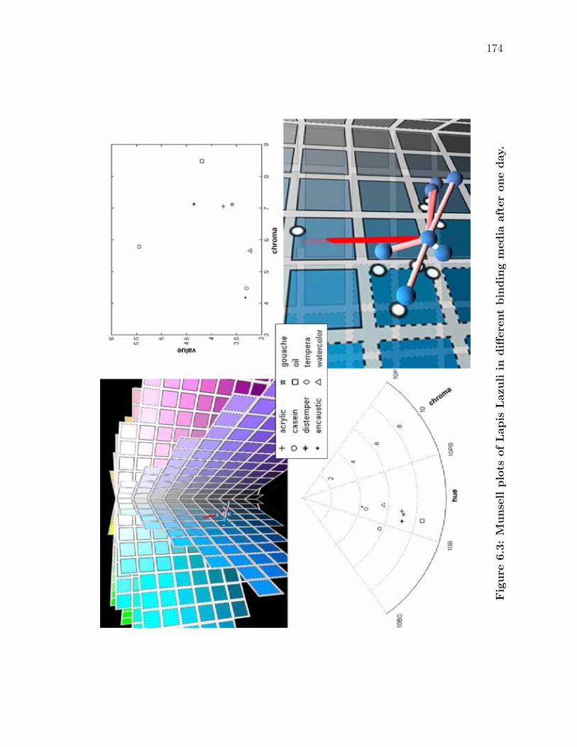
174
Fig
ure
6.3
:M
unse
llplo
tsofLapis
Lazu
liin
diff
ere
nt
bin
din
gm
edia
aft
er
one
day.
175
Looking down the vertical axis of the cylindrical solid yields the polar coordi-
nate plot in the bottom-left of the image. This illustrates the hue versus chroma
relationship of the eight samples. For the Lapis Lazuli samples, the central ten-
dency of the hue is around 2-3PB (purple-blue), as most of the colors lie in that
range. Note that the most dissimilar colors (casein and watercolor) are the farthest
outlying hues in each opposite direction.
The top-right image in the figure can be thought of as a leaf in the solid.
It contains the value versus chroma information in a two-dimensional Cartesian
plot. In the graph, encaustic and tempera are close in proximity, while casein and
watercolor are not.
The bottom-right image of the figure provides a closer view of the relationships
between the eight colors in three dimensions. A sphere is placed at the point in
space where the hue exists in the Munsell color solid. Each sphere has a diffuse
material, colored with RGB values converted from the XY Z coordinates in Ta-
ble 6.1 using Equation 3.6. The white dots are value-chroma plots of the points
projected onto the nearest leaf. The leaves also define the boundary of the dis-
playable gamut for a typical CRT display monitor. The Munsell color swatches
that are surrounded via a dotted line are unable to be realized by a typical CRT
monitor (and thus will not appear as they do in real life). Many of the converted
colors from the samples fall in or near this range.
The eight spheres are all connected via a series of lines, originating from the
acrylic sample. This is to give a sense of the spatial relationship between the
points, as there is no easy way to represent the data in only two dimensions. Since
a point (casein) lies on the other side of a major hue leaf division, the image is
defined to be slightly transparent. A relationship-connecting line between colors i
176
and j has a saturation of red rsat, such that
rsat = rmaxSat
(∆Ei,j
∆Emax
)(6.1)
where
rmaxSat is red with the maximum saturation
∆Ei,j is the Euclidean distance between colors i and j in L∗a∗b∗ space
∆Emax is the Euclidean distance between the most dissimilar colors in L∗a∗b∗
Hence, all of the distances are scaled by the largest distance. The more dissimilar
colors will have a more vivid red line, while the more alike colors will have paler
line colors.
Ultimately, the images show a vast amount of data in a very concise setting.
The resulting conclusion from this information is that the material that adheres the
pigment to the support has a great influence on the resulting color, inciting differ-
ences in the multi-dimensional space of hue, value and chroma. The differences are
many times that of the threshold of the human observer and easily perceptible from
many sources. This includes viewing either the spectral data, coordinates from any
of the converted color spaces or even direct observation from photographs. More
examples of this behavior for different pigment-time combinations can be seen in
Appendix B.
6.1.2 Effect of time
In order to study the effect of time on a paint solution, the specific pigment and
media are held constant. This allows for comparison of the sample’s different stages
as time evolves. In our experiment, there are six time intervals, each with its
177
own spectral reflectance curve for a given pigment-binding media combination. In
viewing these plots together, one can translate nonlinear changes in the absorption
and scattering of the material into perceptually distinct color changes that the
material undergoes over time.
Similarly to the previous section, another interactive JavaScript viewer was
created for ease of manipulating the dataset. There are 168 pigment-media combi-
nations in total from which to browse through. After selecting the desired pigment
and media input parameters, the application plots the spectral reflectances of the
six time intervals. This work studied samples from when they were freshly painted
up until six months of aging. The setup for the viewer is seen in Figure 6.4 for the
evolution of Lapis Lazuli samples in gouache. The layout for the system is quite
similar to the previous one. The input data is selected via the menus in the top-left
and the graphics are updated with the display button. Photographs of the current
pigments are displayed in the top-right and the six corresponding photographs to
the aging samples are seen to the left.
Chapter 4 discusses many of the factors involved with pigmented colorant
changes over time in artwork, including photochemical reactions, oxidation and
other changes related to varying atmospheric conditions. These physical and chem-
ical changes affect the wavelengths of light that a pigmented material reflects and
absorbs. As previously covered, the changes in the spectral reflectance over time
are typically nonlinear in both the rate of change as well as the wavelengths af-
fected.
If all of the wavelengths in the visible spectrum increase in the same proportion,
the hue remains the same but the color appears lighter. This is because more light
is reflected back toward the viewer. Since white light is a combination of all
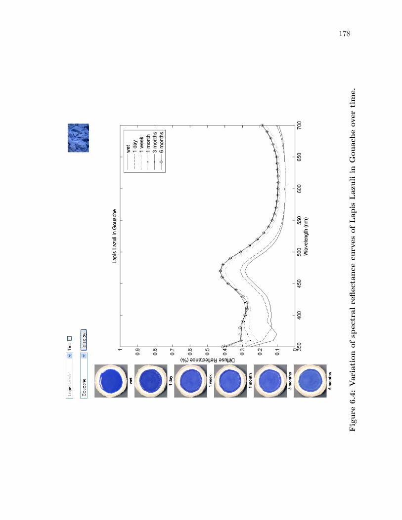
178
Fig
ure
6.4
:V
ari
ati
on
ofsp
ect
ralre
flect
ance
curv
es
ofLapis
Lazu
liin
Gouach
eover
tim
e.
179
Table 6.3: Color conversions of Lapis Lazuli in Gouache over time. ∆Eis the distance from the previous to current L∗a∗b∗ color.
X Y Z H V C L∗ a∗ b∗ ∆E
wet 8.42 8.63 23.53 3.13PB 3.43 6.56 35.27 2.10 -32.21
1 day 9.03 9.46 26.48 2.43PB 3.58 7.13 36.85 0.53 -34.33 3.08
1 week 13.23 14.28 36.17 1.61PB 4.33 7.52 44.63 -1.96 -34.66 8.18
1 month 14.78 16.00 38.51 1.48PB 4.55 7.30 46.97 -2.34 -33.55 2.62
3 months 14.86 16.11 39.23 1.46PB 4.57 7.46 47.11 -2.48 -34.20 0.68
6 months 14.67 16.03 38.84 1.16PB 4.56 7.41 47.01 -3.20 -33.88 0.30
wavelengths, an equal additional amount of every wavelength is the perceptual
equivalent of the color shifting closer to white. Similarly, if the overall reflectance
curve shift is downwards, the material is perceived as getting darker. In both
instances, this is not exactly the case, since the spectra must be integrated against
the eye’s response matching functions (which are wavelength-dependent). Hence,
luminance changes are wavelength-dependent to some extent.
In Figure 6.4, the spectral curves of Lapis lazuli in Gouache are increasing
substantially over time. This is occurring at relatively a uniform rate and one is
safe to presume that the overall luminance is increasing (the corresponding images
also support this behavior). In the same manner in the previous section, the
spectral reflectance data has been converted into the various color systems to aide
in further analysis. Viewing any of the luminance indicators (Y , V , or L∗) also
supports the behavior that was observed–all of these indicators increase with time.
However, the spectral reflectance curves are not changing entirely uniformly
with this material. Reexamining the diffuse reflectance at the six time intervals,
it is evident that the reflectance values of the lower and higher regions of the
180
visible spectrum are increasing at different rates. Yet, understanding the effect on
perception of nonuniform changes in the spectral distribution is more complicated
than with uniform changes.
Hue shifts occur when spectral distribution reflectance curves change unequally
with respect to wavelength. The color of a material depends on both the light that
is reflected and light that is absorbed. First, a nonlinear increase in a material’s
reflectance affects the appearance. For instance, increasing a material’s reflectance
between 565 − 590nm will in turn reflect more yellow light back into the environ-
ment. As a result, the viewer will see the material as being yellower.
The second case is slightly less intuitive. For instance, oil paints typically
experience a slight yellowing of the binding material due to oxidation. This equates
to a drop in the lower regions of the spectral reflectance curve. Then, the material
is absorbing more blue light than previously. In other words, the material is
thus reflecting less blue light back toward the viewer. Therefore, the material is
reflecting relatively more yellow light and hence appears to have yellowed.
In both cases, a hue change is dependent on the relative balance between light
reflected and absorbed. A nonuniform change in either can affect the overall per-
ception of a hue.
It is worth mentioning that in paint, what we perceive as hue shifts typically
occur when a nonlinear change occurs away from the central tendency of the ma-
terial’s reflectance. For instance, we typically state that a blue has yellowed, or
a purple shifted toward red, etc. However, when these changes occur near the
central tendency of the reflectance, the perceptual change is not that of hue, but
of chroma.
Consider the previous case of Lapis Lazuli in gouache. As the paint evolves,
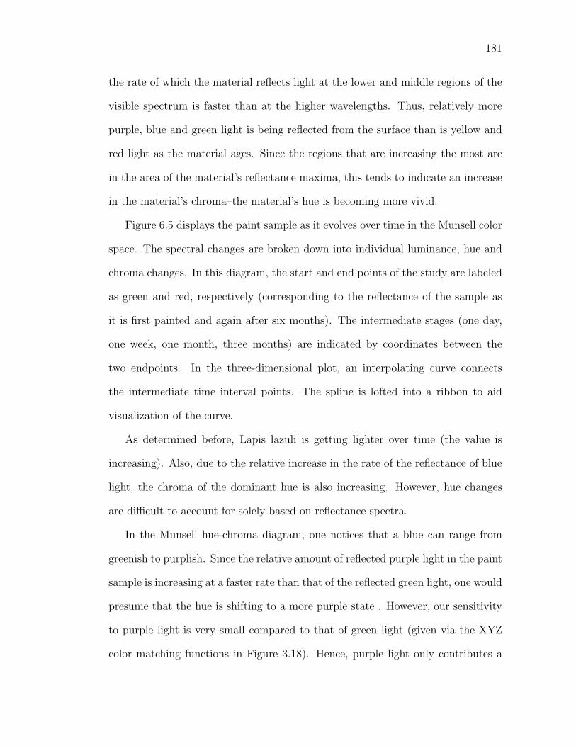
181
the rate of which the material reflects light at the lower and middle regions of the
visible spectrum is faster than at the higher wavelengths. Thus, relatively more
purple, blue and green light is being reflected from the surface than is yellow and
red light as the material ages. Since the regions that are increasing the most are
in the area of the material’s reflectance maxima, this tends to indicate an increase
in the material’s chroma–the material’s hue is becoming more vivid.
Figure 6.5 displays the paint sample as it evolves over time in the Munsell color
space. The spectral changes are broken down into individual luminance, hue and
chroma changes. In this diagram, the start and end points of the study are labeled
as green and red, respectively (corresponding to the reflectance of the sample as
it is first painted and again after six months). The intermediate stages (one day,
one week, one month, three months) are indicated by coordinates between the
two endpoints. In the three-dimensional plot, an interpolating curve connects
the intermediate time interval points. The spline is lofted into a ribbon to aid
visualization of the curve.
As determined before, Lapis lazuli is getting lighter over time (the value is
increasing). Also, due to the relative increase in the rate of the reflectance of blue
light, the chroma of the dominant hue is also increasing. However, hue changes
are difficult to account for solely based on reflectance spectra.
In the Munsell hue-chroma diagram, one notices that a blue can range from
greenish to purplish. Since the relative amount of reflected purple light in the paint
sample is increasing at a faster rate than that of the reflected green light, one would
presume that the hue is shifting to a more purple state . However, our sensitivity
to purple light is very small compared to that of green light (given via the XYZ
color matching functions in Figure 3.18). Hence, purple light only contributes a
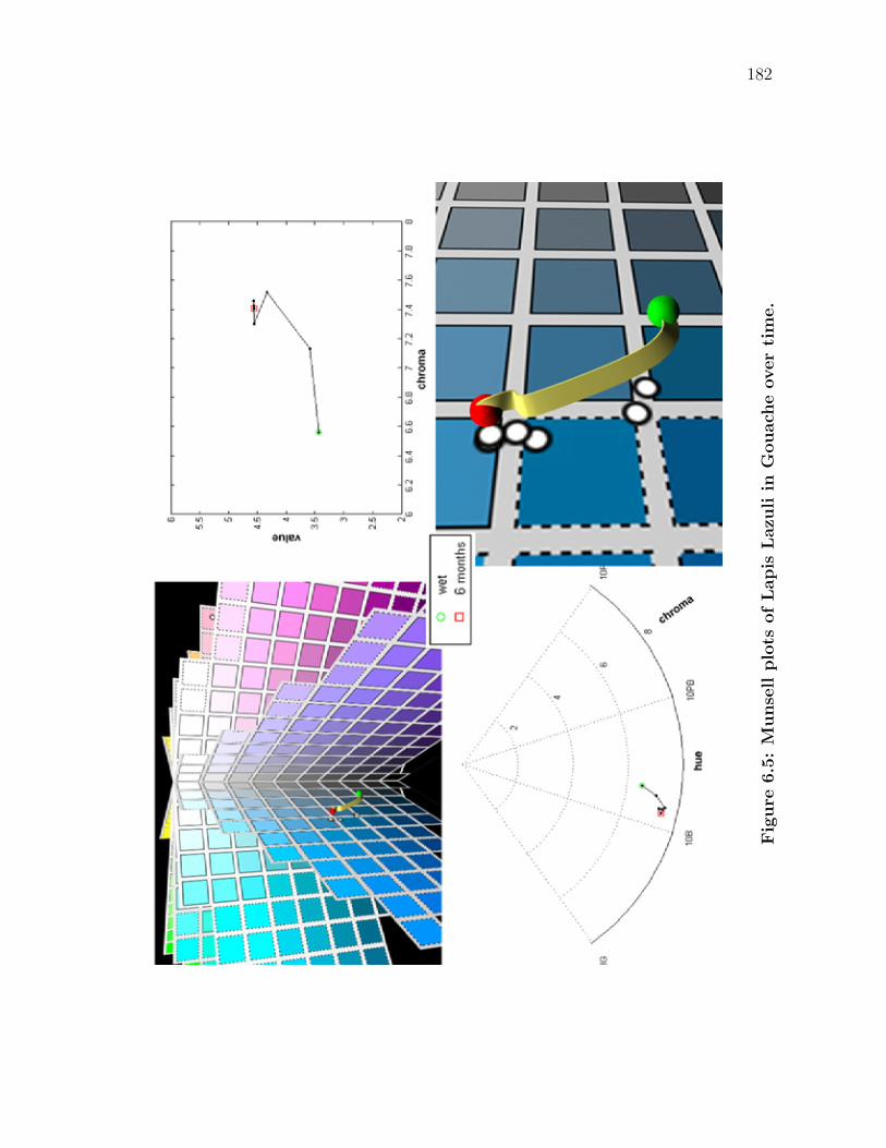
182
Fig
ure
6.5
:M
unse
llplo
tsofLapis
Lazu
liin
Gouach
eover
tim
e.
183
small amount to our perception of a color. Changes in the amount of light in the
middle spectral wavelengths have a much larger affect on the resulting color since
they are heavily weighted by y(λ). Therefore, in our example with Lapis lazuli the
hue moves slightly closer to green instead of purple.
For the sample of Lapis Lazuli, this behavior is typical of the first stage of
fading (a perceived increase in both value and chroma, as well as hue shifts due
to changes in the spectra away from the reflectance maxima), which was discussed
in the previous chapter. More examples of time-dependent behavior for different
pigment-media combinations can be seen in Appendix B.
6.1.3 Applications
None of the research discussed in the previous chapter addresses material changes
from the artist’s point of view–from the initial fresh mark of paint. As a painter,
one only has control over the initial conditions of a color in a painting–one has full
control over the combination of pigments, media and other materials. An artist’s
vision is expressed through the mixing and application of fresh paints on a canvas
support. Yet, once defined, the appearance of the paint is a function of time.
Then, for what time should the artist create a painting for? Is the artist’s creative
vision only fulfilled upon the immediate completion of a work or is the artwork the
living and evolving material object?
A second intrinsic problem in working with paint is color matching. Most
creative works are far too complex to be created in a single day. As such, an
artist must return to a work for subsequent treatment after some period of time.
However, as previously described, many changes (which are often perceptually
evident) occur to a paint sample after it has been applied. Assume a painter is
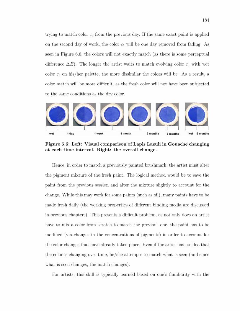
184
trying to match color ca from the previous day. If the same exact paint is applied
on the second day of work, the color cb will be one day removed from fading. As
seen in Figure 6.6, the colors will not exactly match (as there is some perceptual
difference ∆E). The longer the artist waits to match evolving color ca with wet
color cb on his/her palette, the more dissimilar the colors will be. As a result, a
color match will be more difficult, as the fresh color will not have been subjected
to the same conditions as the dry color.
Figure 6.6: Left: Visual comparison of Lapis Lazuli in Gouache changingat each time interval. Right: the overall change.
Hence, in order to match a previously painted brushmark, the artist must alter
the pigment mixture of the fresh paint. The logical method would be to save the
paint from the previous session and alter the mixture slightly to account for the
change. While this may work for some paints (such as oil), many paints have to be
made fresh daily (the working properties of different binding media are discussed
in previous chapters). This presents a difficult problem, as not only does an artist
have to mix a color from scratch to match the previous one, the paint has to be
modified (via changes in the concentrations of pigments) in order to account for
the color changes that have already taken place. Even if the artist has no idea that
the color is changing over time, he/she attempts to match what is seen (and since
what is seen changes, the match changes).
For artists, this skill is typically learned based on one’s familiarity with the
185
materials–an artist will know from experience how different pigment-media com-
binations behave. While this problem is quite difficult, most paint media can be
reworked until the desired result is achieved. The inherent problem with fresco is
that a dried brushmark is permanent and cannot be reworked. Thus, one needs to
understand the time dependencies to correctly match colors between sessions. The
color matching problem can readily be seen in the hue discrepancies in Masaccio’s
giornate in his Expulsion from the Garden of Eden (Figure 1.2).
The same problem occurs with the conservator’s practice of in-painting on
losses of paintings. Occasionally, a painting will experience damage to the surface
whereas a portion of the work has chipped off. One common technique of is to
first disguise the loss with filling to regain the surface topology. The new surface
is then retouched to match the current color, which places a large responsibility
on correctly identifying the original pigments. Further, the fresh paint must be
mixed such that the fresh mixture will age at a similar rate to that of the original
surrounding colors. This is difficult as the original artwork will be at a much later
stage in fading and will change at a much different rate to that of fresh paint.
While a conservator may have carefully matched an in-painting section, the false
area may display itself later in its own fading cycle. The difficulty of retouching
artworks is further documented in [Sta85].
There is an importance consequence of the artist controlling the initial condi-
tions of a paint. The artist knows the desired color for his or her artistic vision.
Then, one can use knowledge of the evolution of a paint in order to modify the
fresh paint such that the aged paint will be the desired result. This changes the
conception of the term “artwork”, as the original is not necessarily the creative
vision. Rather, the evolving work moves incrementally closer to the artist’s intent
186
as it ages. This is in direct contrast to the current model of artwork, which must
constantly be restored to a previous state to view the artist’s original intentions.
In contrast, as an art conservator, one only has knowledge of the current con-
ditions of a color in a painting. To make any assessments about the state of the
pigmented colorant, typically one must first identify the pigments and media used
in the work. After the composition of the work is known, two directions can be
taken. In restoration, one would like to use paint evolution data to travel back in
time to view the work in its original brilliance. This knowledge is used in deter-
mining the best methods to clean and restore a work of art, as it provides how
much a work should be changed to revert to a previous visual state.
In conservation, the goal is to estimate future changes in the materials of the
painting and assess what can be done such that the work can still be displayed
without much deterioration from the current state. One hopes to minimize the
perceptual change from the current state, such that future generations will be able
to appreciate the work. In both of these instances, one travels along the same
path, defined by the same original initial state.
Chapter 7
Interactive Viewing
7.1 Introduction
In the previous chapter, it has been shown that reflectance data for different sam-
ples can be broken down into very intuitive perceptual changes through the use
of different color spaces. This data supports that the appearance of paint changes
over time, and a specific pigment appears different when dispersed in different
materials.
However, the acquired data is limited to a discrete set of measurements, which
are from a finite number of paint mixtures at specific times. In this form, one can
only study an incomplete view of paint appearance. It is preferable to specify any
combination of pigments in any binding media at any time, and see the resulting
appearance. Fortunately, using research in subsurface scattering from the graph-
ics literature, our captured reflectance data can be used in order to realistically
simulate the appearance of many paints that have not been previously measured.
Therefore, we combine Kubelka Munk theory with our study of naturally oc-
curring material changes to simulate the appearance of paint over time in an in-
187
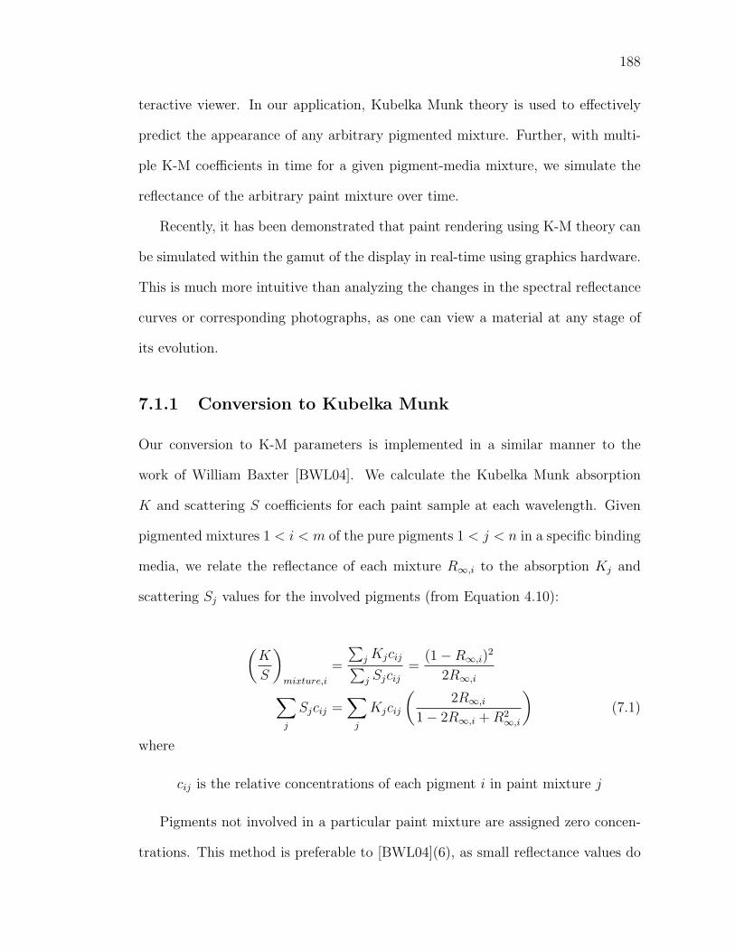
188
teractive viewer. In our application, Kubelka Munk theory is used to effectively
predict the appearance of any arbitrary pigmented mixture. Further, with multi-
ple K-M coefficients in time for a given pigment-media mixture, we simulate the
reflectance of the arbitrary paint mixture over time.
Recently, it has been demonstrated that paint rendering using K-M theory can
be simulated within the gamut of the display in real-time using graphics hardware.
This is much more intuitive than analyzing the changes in the spectral reflectance
curves or corresponding photographs, as one can view a material at any stage of
its evolution.
7.1.1 Conversion to Kubelka Munk
Our conversion to K-M parameters is implemented in a similar manner to the
work of William Baxter [BWL04]. We calculate the Kubelka Munk absorption
K and scattering S coefficients for each paint sample at each wavelength. Given
pigmented mixtures 1 < i < m of the pure pigments 1 < j < n in a specific binding
media, we relate the reflectance of each mixture R∞,i to the absorption Kj and
scattering Sj values for the involved pigments (from Equation 4.10):
(K
S
)mixture,i
=
∑j Kjcij∑j Sjcij
=(1 − R∞,i)
2
2R∞,i∑j
Sjcij =∑
j
Kjcij
(2R∞,i
1 − 2R∞,i + R2∞,i
)(7.1)
where
cij is the relative concentrations of each pigment i in paint mixture j
Pigments not involved in a particular paint mixture are assigned zero concen-
trations. This method is preferable to [BWL04](6), as small reflectance values do
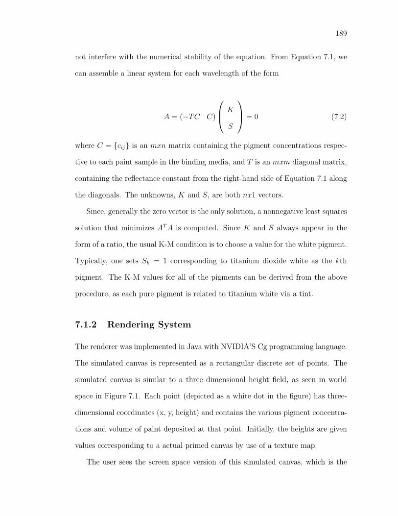
189
not interfere with the numerical stability of the equation. From Equation 7.1, we
can assemble a linear system for each wavelength of the form
A = (−TC C)
⎛⎜⎝ K
S
⎞⎟⎠ = 0 (7.2)
where C = cij is an mxn matrix containing the pigment concentrations respec-
tive to each paint sample in the binding media, and T is an mxm diagonal matrix,
containing the reflectance constant from the right-hand side of Equation 7.1 along
the diagonals. The unknowns, K and S, are both nx1 vectors.
Since, generally the zero vector is the only solution, a nonnegative least squares
solution that minimizes AT A is computed. Since K and S always appear in the
form of a ratio, the usual K-M condition is to choose a value for the white pigment.
Typically, one sets Sk = 1 corresponding to titanium dioxide white as the kth
pigment. The K-M values for all of the pigments can be derived from the above
procedure, as each pure pigment is related to titanium white via a tint.
7.1.2 Rendering System
The renderer was implemented in Java with NVIDIA’S Cg programming language.
The simulated canvas is represented as a rectangular discrete set of points. The
simulated canvas is similar to a three dimensional height field, as seen in world
space in Figure 7.1. Each point (depicted as a white dot in the figure) has three-
dimensional coordinates (x, y, height) and contains the various pigment concentra-
tions and volume of paint deposited at that point. Initially, the heights are given
values corresponding to a actual primed canvas by use of a texture map.
The user sees the screen space version of this simulated canvas, which is the
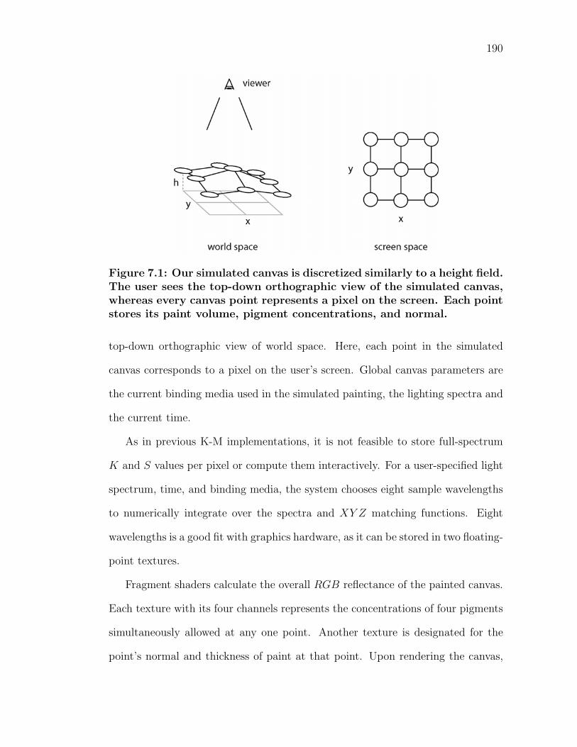
190
Figure 7.1: Our simulated canvas is discretized similarly to a height field.The user sees the top-down orthographic view of the simulated canvas,whereas every canvas point represents a pixel on the screen. Each pointstores its paint volume, pigment concentrations, and normal.
top-down orthographic view of world space. Here, each point in the simulated
canvas corresponds to a pixel on the user’s screen. Global canvas parameters are
the current binding media used in the simulated painting, the lighting spectra and
the current time.
As in previous K-M implementations, it is not feasible to store full-spectrum
K and S values per pixel or compute them interactively. For a user-specified light
spectrum, time, and binding media, the system chooses eight sample wavelengths
to numerically integrate over the spectra and XY Z matching functions. Eight
wavelengths is a good fit with graphics hardware, as it can be stored in two floating-
point textures.
Fragment shaders calculate the overall RGB reflectance of the painted canvas.
Each texture with its four channels represents the concentrations of four pigments
simultaneously allowed at any one point. Another texture is designated for the
point’s normal and thickness of paint at that point. Upon rendering the canvas,
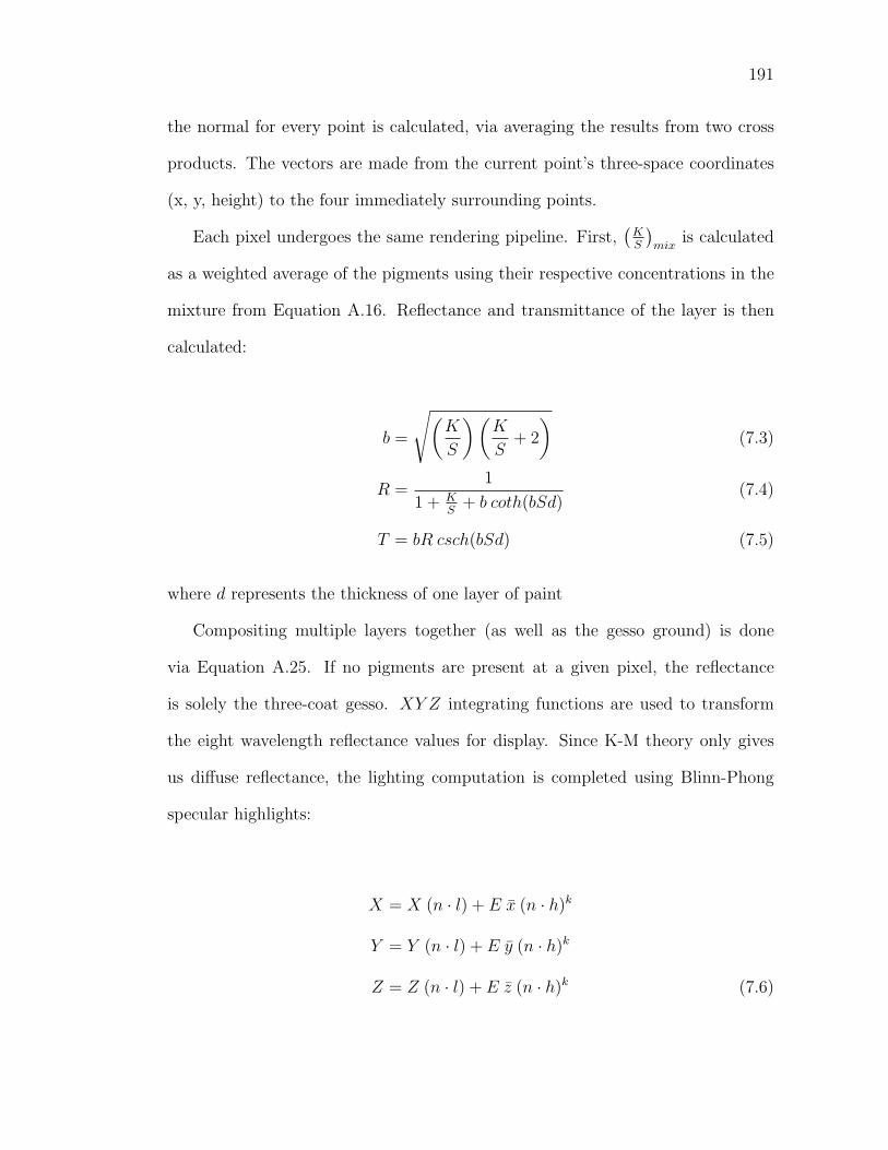
191
the normal for every point is calculated, via averaging the results from two cross
products. The vectors are made from the current point’s three-space coordinates
(x, y, height) to the four immediately surrounding points.
Each pixel undergoes the same rendering pipeline. First,(
KS
)mix
is calculated
as a weighted average of the pigments using their respective concentrations in the
mixture from Equation A.16. Reflectance and transmittance of the layer is then
calculated:
b =
√(K
S
) (K
S+ 2
)(7.3)
R =1
1 + KS
+ b coth(bSd)(7.4)
T = bR csch(bSd) (7.5)
where d represents the thickness of one layer of paint
Compositing multiple layers together (as well as the gesso ground) is done
via Equation A.25. If no pigments are present at a given pixel, the reflectance
is solely the three-coat gesso. XY Z integrating functions are used to transform
the eight wavelength reflectance values for display. Since K-M theory only gives
us diffuse reflectance, the lighting computation is completed using Blinn-Phong
specular highlights:
X = X (n · l) + E x (n · h)k
Y = Y (n · l) + E y (n · h)k
Z = Z (n · l) + E z (n · h)k (7.6)
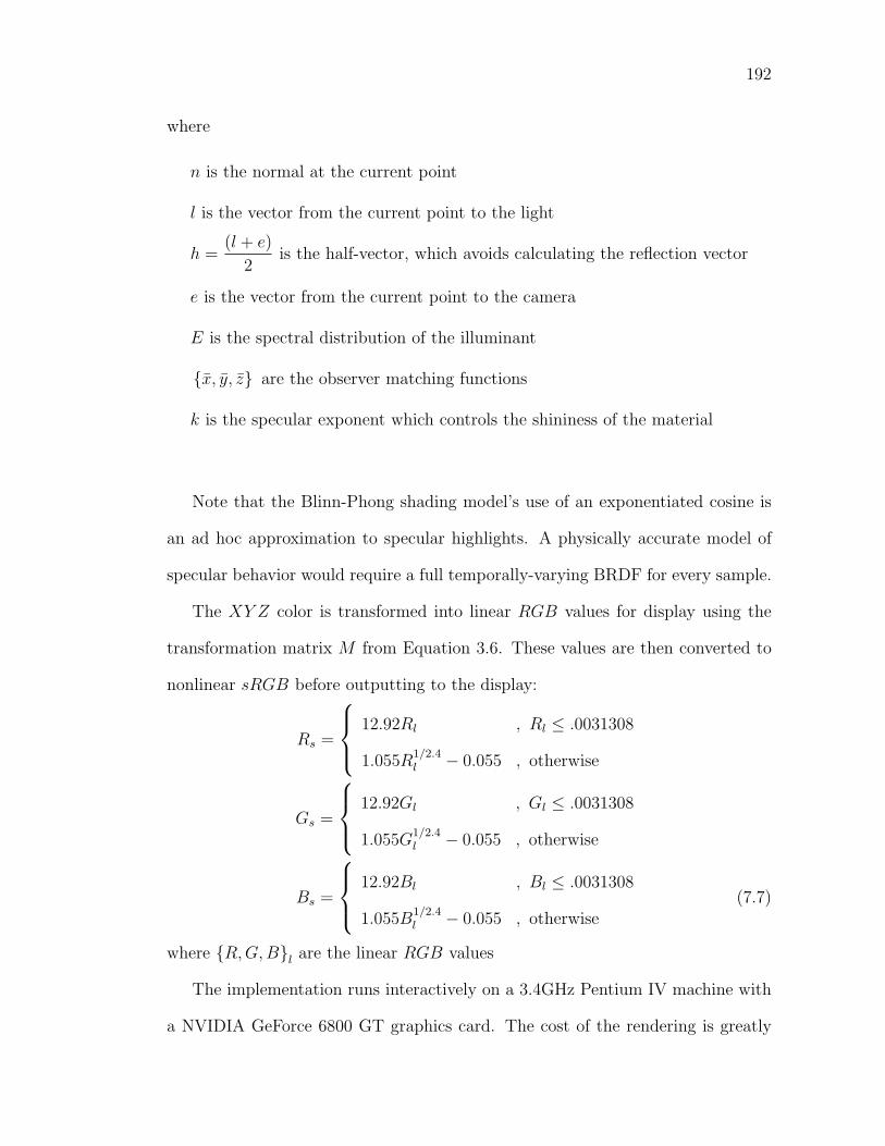
192
where
n is the normal at the current point
l is the vector from the current point to the light
h =(l + e)
2is the half-vector, which avoids calculating the reflection vector
e is the vector from the current point to the camera
E is the spectral distribution of the illuminant
x, y, z are the observer matching functions
k is the specular exponent which controls the shininess of the material
Note that the Blinn-Phong shading model’s use of an exponentiated cosine is
an ad hoc approximation to specular highlights. A physically accurate model of
specular behavior would require a full temporally-varying BRDF for every sample.
The XY Z color is transformed into linear RGB values for display using the
transformation matrix M from Equation 3.6. These values are then converted to
nonlinear sRGB before outputting to the display:
Rs =
⎧⎪⎨⎪⎩
12.92Rl , Rl ≤ .0031308
1.055R1/2.4l − 0.055 , otherwise
Gs =
⎧⎪⎨⎪⎩
12.92Gl , Gl ≤ .0031308
1.055G1/2.4l − 0.055 , otherwise
Bs =
⎧⎪⎨⎪⎩
12.92Bl , Bl ≤ .0031308
1.055B1/2.4l − 0.055 , otherwise
(7.7)
where R, G, Bl are the linear RGB values
The implementation runs interactively on a 3.4GHz Pentium IV machine with
a NVIDIA GeForce 6800 GT graphics card. The cost of the rendering is greatly
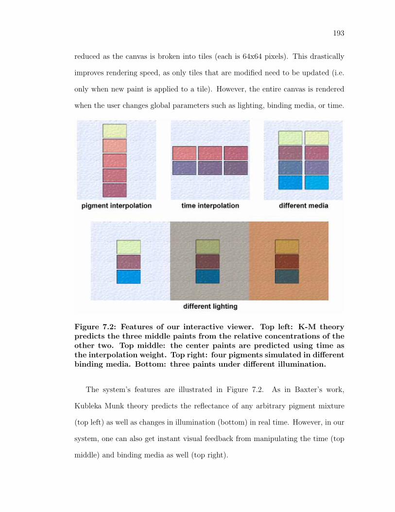
193
reduced as the canvas is broken into tiles (each is 64x64 pixels). This drastically
improves rendering speed, as only tiles that are modified need to be updated (i.e.
only when new paint is applied to a tile). However, the entire canvas is rendered
when the user changes global parameters such as lighting, binding media, or time.
Figure 7.2: Features of our interactive viewer. Top left: K-M theorypredicts the three middle paints from the relative concentrations of theother two. Top middle: the center paints are predicted using time asthe interpolation weight. Top right: four pigments simulated in differentbinding media. Bottom: three paints under different illumination.
The system’s features are illustrated in Figure 7.2. As in Baxter’s work,
Kubleka Munk theory predicts the reflectance of any arbitrary pigment mixture
(top left) as well as changes in illumination (bottom) in real time. However, in our
system, one can also get instant visual feedback from manipulating the time (top
middle) and binding media as well (top right).
194
In summary, our implementation provides a powerful tool in visualization. Pro-
vided is a simple method for laying down paint of varying pigment concentrations
to see how they react under different conditions–all of the variables can be modi-
fied in real time. As computer processing improves, more wavelengths can be used
in the lighting computation to better simulate the spectral reflectance. As display
technology improves, the gamut of displayable colors will also expand, improving
the conditions for which the colors are viewed.
7.1.3 Implementation issues
While this model is effective and can be computed in real time, there are some lim-
itations to this theory of pigment modeling [Fis83, CAS+97]. The model assumes
the paint is homogeneous. In fact, pigment particles tend to clump into aggregates
and often contain inclusions or impurities. Also, the scattering assumptions in the
transport theory were based on uniformly sized spherical particles. This is rarely
the case for pigment particles as they are often of widely varying shapes and sizes.
Further, all colorant layers are immersed in media of the same refractive index.
This assumption is violated at the interface between the air and paint and paint
to substrate. A fairly simple correction term for reflection and refraction at the
paint’s surface has been proposed [JW75] that could be used to increase accuracy.
While reasonably accurate, Kubelka Munk theory is only as good as the mea-
surements behind it. Therefore, for more accurate prediction of color mixtures,
many more mixtures of multiple pigments of varying concentrations are necessary
to obtain better absorption and scattering coefficients.
In our work, only constant volume ratios of pigment-to-media are studied. In
paint, artists often manipulate the amount of binder and vehicle (as well as the
195
addition of other materials) to achieve different tactile behaviors. Similarly, the
fluid dynamics of the application of the eight different media are not considered,
as this would be a huge undertaking. The study of how a media’s tactile behavior
changes as it dries or congeals would be an interesting research project.
Also, our work only encompasses a relatively short period of time of the life
of a paint film. Remember that most paintings are expected to last indefinitely
(at least a hundred years). Longer measurement intervals are needed for a more
complete understanding of paint aging behavior. While many known historical
samples exist, they were not considered this work, as they may be comprised of
different materials or are from different origins.
Chapter 8
Conclusion
We have studied the variation in paint appearance over time in different binding
media. We created a vast amount of high quality paint samples from many pure
pigments and different binding media. These were made by hand to insure quality
of materials, as commercially manufactured paint frequently includes additives that
could possibly affect the chroma or lightness of the hue. Therefore, to maintain
consistency across multiple binding media, it was imperative that all paints were
only made of pigment and binder.
Using sophisticated measuring equipment, we captured the reflectance spectra
of the paint samples at different intervals in time to study how paint appearance
changes over the course of drying/congealing and the beginning stages of aging.
Diffuse reflectance measurements were taken over the visible spectrum after the
samples were freshly painted, after one day, one week, one month, three months
and six months after they were painted. Converting the spectral data into per-
ceptually uniform color spaces, we determined the differences in appearance were
perceptually very significant–paint appearance does vary substantially with time
and pigments look drastically different when dispersed in different binding mate-
196
197
rials.
In addition, we presented a physically based model to interactively simulate
the appearance of pigmented colorants using Kubelka Munk theory and modern
graphics hardware. The spectral data is converted into Kubelka Munk absorption
and scattering coefficients. As a result, arbitrary mixtures of pigments that we
have not measured can be simulated. Further, since our data also spans time, the
simulated appearance of these mixtures can be viewed at any point in time.
In our system, other global conditions can also be modified in real time. A
user can instantaneously change the binding media in which the pigments are
suspended–one can simulate the appearance of a work as if were done in oil or
acrylic or another media. Since we compute the lighting calculations from spectra,
the simulated painting can be re-lit under a number of different illuminants, such
as daylight or fluorescent light.
The previous chapter discusses applications for use of this system for the artist
or art historian. Artists that are more aware of their materials will be able to pre-
dict how a color will appear after some time and make adjustments that suit their
creative vision. Restorationists who understand how a color’s underlying materials
change can visualize how an artwork looked in its original brilliance. Conserva-
tionists can predict how long a work can be displayed under natural conditions
before perceptual changes are evident.
Our work has implications in many other industries that utilize pigmented
colorants. Currently, digital printing inks use primarily dye based inks. Due
to the popularity of digital photography, many individuals are printing on high
quality paper and canvas and framing the pieces. However, dye based inks have a
longevity of only a few years before serious fading occurs. As a result, pigmented
198
inks are beginning to find their way into these devices as they have a longevity
of 80-100 years or more. Other everyday colored materials contain pigments, such
as plastics and non-artists’ paints. As such, these materials are also susceptible
to natural deterioration, such as the case with many architectural materials. In
computer graphics, realistic synthetic material aging is also a increasingly popular
research area, enhancing the visual complexity of simulated images.
There are many possible future research areas related to our work. Most im-
portantly, to fully understand the effects of aging, many more time-dependent
measurements are needed. Our research only accounts for a very small portion
of the life of a painting, which is expected to last indefinitely (at least a hundred
years). While this type of study is perhaps impossibly time-expensive, artificial
aging accelerators seem to provide a feasible way to simulate some effects. Yet,
since natural decay is more than just electromagnetic radiation, a complete system
would need to account for other atmospheric effects as well. Another very impor-
tant factor in the visual appearance of paint is the spectral reflectance component.
Not all binding media are completely diffuse materials, as some maintain a charac-
teristic gloss to the surface. This component is also time-dependent, as the specular
highlight typically aides in one’s perception of a liquid’s wetness. Therefore, a full
understanding of the appearance of pigmented materials over time would require a
complete temporally-varying BRDF. Further, while we have purposefully excluded
any additives to our paint, it would be fascinating to study how different materials
affect the optical properties of a pigmented colorant.
Due to space considerations, we have presented only a small fraction of the
measurements in our study. In this setting, it was impractical to include analysis
on all of the 1008 time dependent reflectance spectra (21 pigmented mixtures x 8

199
binding media x 6 time intervals) from our experiment. However, the entire set
of spectral data, converted into different color spaces, is available as a Technical
Report [BGM06].
Appendix A
Derivation of K-M theory
The surface of many real world manufactured objects contains pigments, such
as paint or painted items, plastic objects and textiles. To accurately describe
how these object interact with light and the resulting color appearance, both the
pigments and the material that they are dispersed in must be accurately modeled.
A practical model that effectively simulates the appearance of pigmented ma-
terials was first introduced by Kubelka and Munk in 1931 [KM31]. The following
includes the derivation of the solutions to the differential equations in Kubelka-
Munk theory. Also presented are significant improvements to the theory from
researchers over the years.
The original paper [KM31], is based on the assumption of a homogeneous pig-
mented material of a medium that is infinite in extent. By symmetry, all lateral
flux can be ignored, since it will be balanced out by an equal and opposite flux.
The model describes a material’s appearance in terms of only two wavelength-
dependent parameters: an absorption constant, K(λ), and a scattering constant,
S(λ).
The model assumes a surface that has been coated by a layer of paint with
200
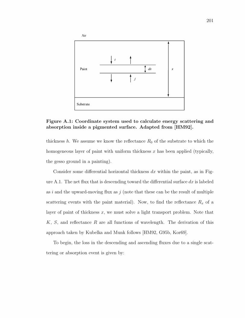
201
Figure A.1: Coordinate system used to calculate energy scattering andabsorption inside a pigmented surface. Adapted from [HM92].
thickness h. We assume we know the reflectance R0 of the substrate to which the
homogeneous layer of paint with uniform thickness x has been applied (typically,
the gesso ground in a painting).
Consider some differential horizontal thickness dx within the paint, as in Fig-
ure A.1. The net flux that is descending toward the differential surface dx is labeled
as i and the upward-moving flux as j (note that these can be the result of multiple
scattering events with the paint material). Now, to find the reflectance Rx of a
layer of paint of thickness x, we must solve a light transport problem. Note that
K, S, and reflectance R are all functions of wavelength. The derivation of this
approach taken by Kubelka and Munk follows [HM92, G95b, Kor69].
To begin, the loss in the descending and ascending fluxes due to a single scat-
tering or absorption event is given by:
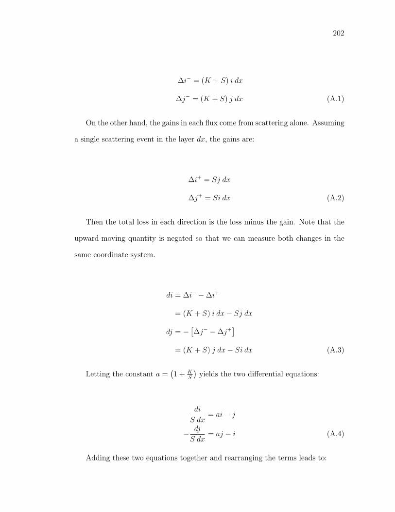
202
∆i− = (K + S) i dx
∆j− = (K + S) j dx (A.1)
On the other hand, the gains in each flux come from scattering alone. Assuming
a single scattering event in the layer dx, the gains are:
∆i+ = Sj dx
∆j+ = Si dx (A.2)
Then the total loss in each direction is the loss minus the gain. Note that the
upward-moving quantity is negated so that we can measure both changes in the
same coordinate system.
di = ∆i− − ∆i+
= (K + S) i dx − Sj dx
dj = − [∆j− − ∆j+
]= (K + S) j dx − Si dx (A.3)
Letting the constant a =(1 + K
S
)yields the two differential equations:
di
S dx= ai − j
− dj
S dx= aj − i (A.4)
Adding these two equations together and rearranging the terms leads to:
203
i dj − j di
i2S dx= −2a
j
i+
j2
i2+ 1 (A.5)
From the Quotient rule, we observe that
d
(j
i
)S dx
= −2a
(j
i
)+
(j
i
)2
+ 1 (A.6)
Setting r =j
ithen yields
dr
S dx= r2 − 2ar + 1 (A.7)
and therefore via rearrangement and integration
∫dr
r2 − 2ar + 1= S
∫dx = Sx (A.8)
Since we have assumed the paint is homogeneous, the scattering coefficient S is
constant throughout the material and can be brought outside the integral on the
right hand side. Our goal is to find the value of the change in r as the thickness
varies from zero to some thickness x. At a thickness of zero, the reflectance is
simply the reflectance of the substrate R0. At thickness x, the reflectance is some
Rx. Hence, we are interested in evaluating the integral on the left-hand side of
Equation A.8 over the range R0 to Rx. To simplify the integral, we factor the
integral by writing b =√
a2 − 1 and integrate via partial fractions:
∫ Rx
R0
dr
r2 − 2ar + 1=
1
2b
∫ Rx
R0
dr
r − (a + b)− 1
2b
∫ Rx
R0
dr
r − (a − b)
=1
2bln
(Rx − a − b)(R0 − a + b)
(Rx − a + b)(R0 − a − b)(A.9)
204
Equation A.8 is now:
1
2bln
(Rx − a − b)(R0 − a + b)
(Rx − a + b)(R0 − a − b)= Sx (A.10)
Rearranging yields:
ln(Rx − a − b)(R0 − a + b)
(Rx − a + b)(R0 − a − b)= 2Sxb (A.11)
(Rx − a − b)(R0 − a + b)
e2Sxb= (Rx − a + b)(R0 − a − b) (A.12)
Assume that the paint is applied so thickly that the substrate is not visible.
Then, x → ∞ so R0 = 0 and we make the substitution Rx = R∞. Since e∞ → ∞,
the left-hand side of A.12 goes to zero. We now have:
(R∞ − a + b)(−a − b) = 0 (A.13)
Solving for the reflectance R∞, we find
R∞ = a − b =1
a + b(A.14)
Recall that a = 1 + KS
and b =√
a2 − 1, hence we get
R∞ =1
a +√
a2 − 1
=1
1 + KS
+√(
1 + KS
)2 − 1(A.15)
Equation A.15 represents the solution to the most basic Kubelka-Munk dif-
ferential equations as they were originally presented [KM31]. Fishkin describes
the evolution of K-M theory through several years of improvements by a series of
researchers [Fis83], which we only summarize here.
205
The Kubelka-Munk equations were generalized to allow arbitrary mixtures of
pigments [Dun40]. If there are n multiple materials in the same layer with differ-
ent scattering and absorption coefficients (ie: multiple pigments within the same
layer of paint), they may be combined via linear weighting using their respective
concentrations ci:
Smixture(λ) =n∑
i=1
ciSi(λ)
Kmixture(λ) =n∑
i=1
ciKi(λ) (A.16)
Kubelka extended the 1931 work in two subsequent articles. He first solved the
differential equations of Equation A.4 for a finite thickness of paint (originally, the
infinite case was presented) [Kub48]. If the paint film has thickness x, then
Rx =
1R∞ (R0 − R∞) − R∞
(R0 − 1
R∞
)eSx( 1
R∞−R∞)
(R0 − R∞) −(R0 − 1
R∞
)eSx( 1
R∞−R∞)(A.17)
Another form of this equation can be found using hyperbolic functions, allowing
for simpler computation:
Rx =1 − R0(a − b coth bSx)
a − R0 + b coth bSx(A.18)
where a = 1+ KS
and b =√
a2 − 1 as earlier. When the paint becomes thick enough
to hide the substrate, R0 → 0. Thus we have
Rx =1
a + b coth bSx(A.19)
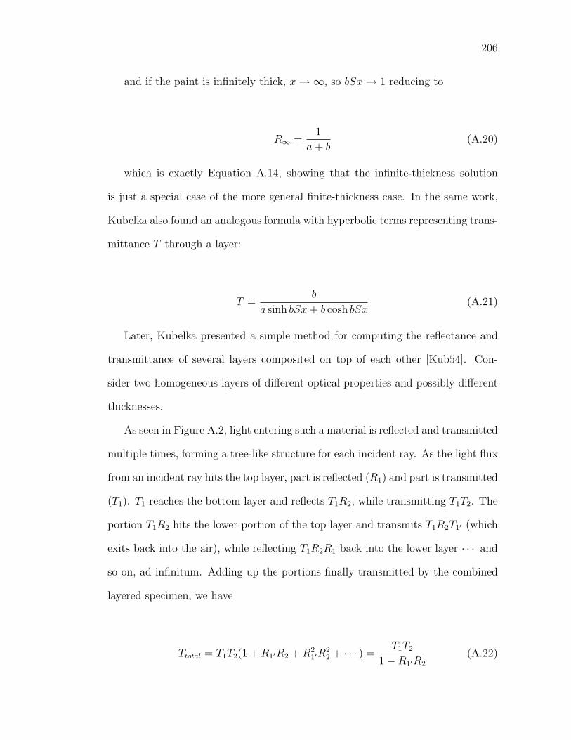
206
and if the paint is infinitely thick, x → ∞, so bSx → 1 reducing to
R∞ =1
a + b(A.20)
which is exactly Equation A.14, showing that the infinite-thickness solution
is just a special case of the more general finite-thickness case. In the same work,
Kubelka also found an analogous formula with hyperbolic terms representing trans-
mittance T through a layer:
T =b
a sinh bSx + b cosh bSx(A.21)
Later, Kubelka presented a simple method for computing the reflectance and
transmittance of several layers composited on top of each other [Kub54]. Con-
sider two homogeneous layers of different optical properties and possibly different
thicknesses.
As seen in Figure A.2, light entering such a material is reflected and transmitted
multiple times, forming a tree-like structure for each incident ray. As the light flux
from an incident ray hits the top layer, part is reflected (R1) and part is transmitted
(T1). T1 reaches the bottom layer and reflects T1R2, while transmitting T1T2. The
portion T1R2 hits the lower portion of the top layer and transmits T1R2T1′ (which
exits back into the air), while reflecting T1R2R1 back into the lower layer · · · and
so on, ad infinitum. Adding up the portions finally transmitted by the combined
layered specimen, we have
Ttotal = T1T2(1 + R1′R2 + R21′R
22 + · · · ) =
T1T2
1 − R1′R2
(A.22)
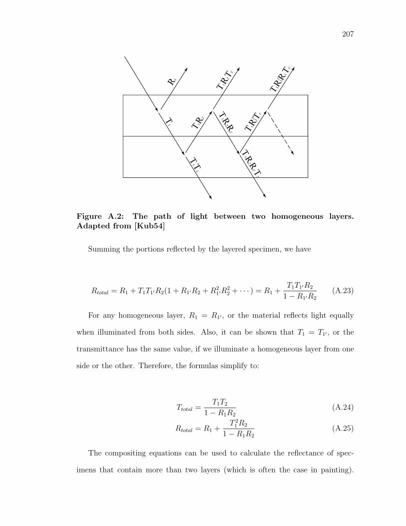
207
Figure A.2: The path of light between two homogeneous layers.Adapted from [Kub54]
Summing the portions reflected by the layered specimen, we have
Rtotal = R1 + T1T1′R2(1 + R1′R2 + R21′R
22 + · · · ) = R1 +
T1T1′R2
1 − R1′R2
(A.23)
For any homogeneous layer, R1 = R1′ , or the material reflects light equally
when illuminated from both sides. Also, it can be shown that T1 = T1′ , or the
transmittance has the same value, if we illuminate a homogeneous layer from one
side or the other. Therefore, the formulas simplify to:
Ttotal =T1T2
1 − R1R2
(A.24)
Rtotal = R1 +T 2
1 R2
1 − R1R2
(A.25)
The compositing equations can be used to calculate the reflectance of spec-
imens that contain more than two layers (which is often the case in painting).
208
One concatenates the layers into a single reflectance value by obtaining R and T
from two layers, and using that value for the next compositing operation. For
instance, a specimen with three homogeneous layers has reflectance R1, R2, R3 and
transmittance T1, T2, T3:
R1,2 =T1T2
1 − R1R2
(A.26)
T1,2 = R1 +T 2
1 R2
1 − R1R2
(A.27)
R1,2,3 =T1,2T3
1 − R1,2R3
(A.28)
T1,2,3 = R1,2 +T 2
1,2R3
1 − R1,2R3
(A.29)
Appendix B
Supplemental sample analysis
The following includes supplemental sample analyses from our results [BGM06].
The first section is a group of five pigment-time combinations, showing significant
appearance variation across binding media. The second section contains a group
of five pigment-media combinations, showing how the appearance of paint changes
over time.
For each combination, the following is included: spectral plots and correspond-
ing photographs, three-dimensional Munsell color plots, color space conversions,
and the perceptual differences ∆E between colors in the L∗a∗b∗ color space.
209
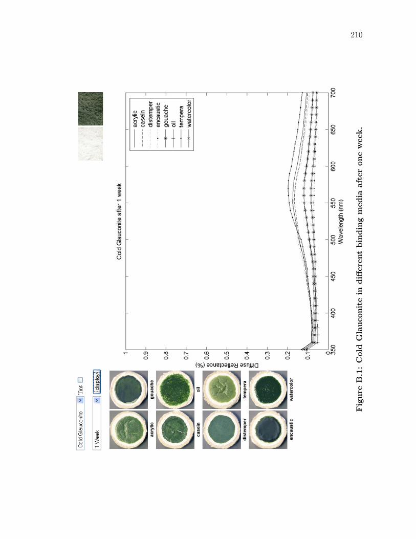
210
Fig
ure
B.1
:C
old
Gla
uco
nit
ein
diff
ere
nt
bin
din
gm
edia
aft
er
one
week.
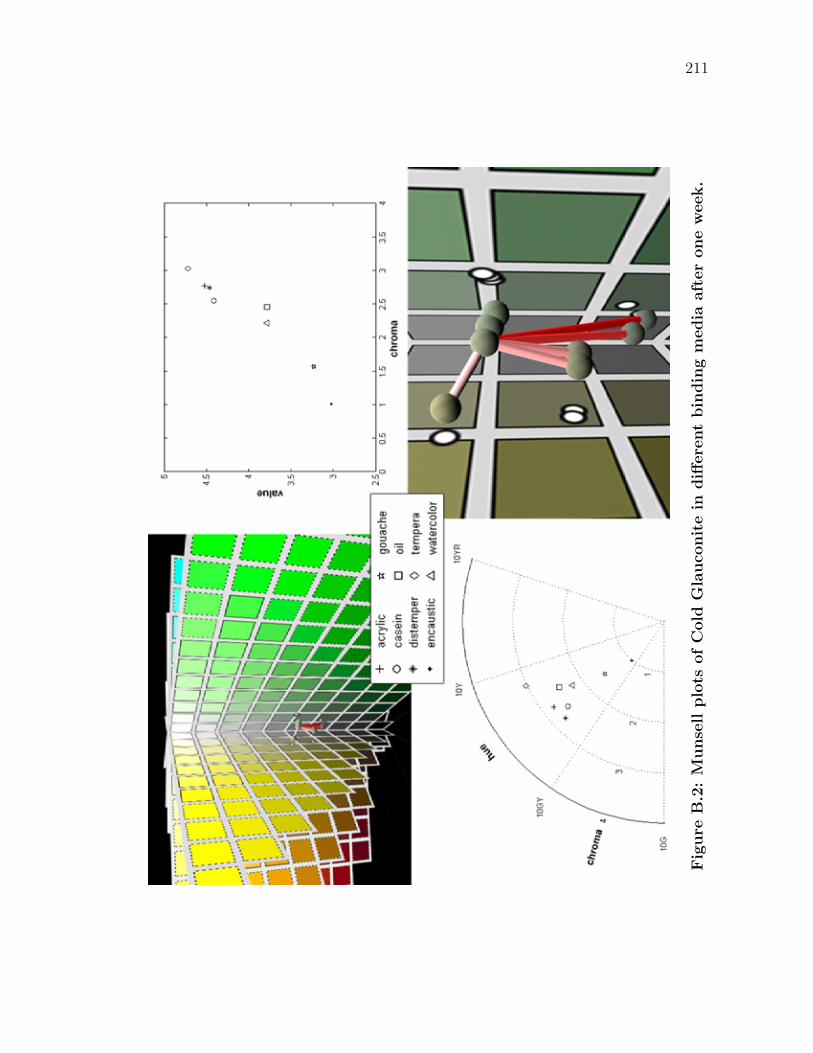
211
Fig
ure
B.2
:M
unse
llplo
tsofC
old
Gla
uco
nit
ein
diff
ere
nt
bin
din
gm
edia
aft
er
one
week.
212
Table B.1: Color conversions from the spectral reflectances of the sam-ples of Cold Glauconite in different binding media, after one week.
X Y Z H V C L∗ a∗ b∗
acrylic 13.75 15.73 15.73 5.52GY 4.52 2.77 46.62 -7.25 2.51
casein 13.00 14.91 11.85 6.52GY 4.41 2.55 45.51 -7.31 10.09
distemper 13.11 15.30 12.21 7.38GY 4.46 2.74 46.04 -8.85 10.04
encaustic 6.13 6.66 6.88 8.95GY 3.02 1.01 31.03 -2.06 1.02
gouache 6.85 7.60 6.91 6.51GY 3.23 1.57 33.13 -3.57 4.56
oil 9.39 10.60 7.57 3.90GY 3.78 2.46 38.89 -5.24 12.02
tempera 15.54 17.31 11.17 1.95GY 4.72 3.03 48.65 -5.03 17.38
watercolor 9.46 10.61 8.15 4.65GY 3.78 2.22 38.92 -4.86 10.00
Table B.2: Table of perceptual differences ∆E between colors using theL∗a∗b∗ color space. The colors are converted from samples of Cold Glau-conite in different binding media, after one week.
acrylic casein distemper encaustic gouache oil tempera
casein 7.661
distemper 7.720 1.629
encaustic 16.499 17.875 18.782
gouache 14.132 14.065 14.986 4.384
oil 12.419 7.200 8.251 13.889 9.572
tempera 15.171 8.259 8.676 24.227 20.183 11.137
watercolor 11.005 7.031 8.162 12.277 8.049 2.056 12.213
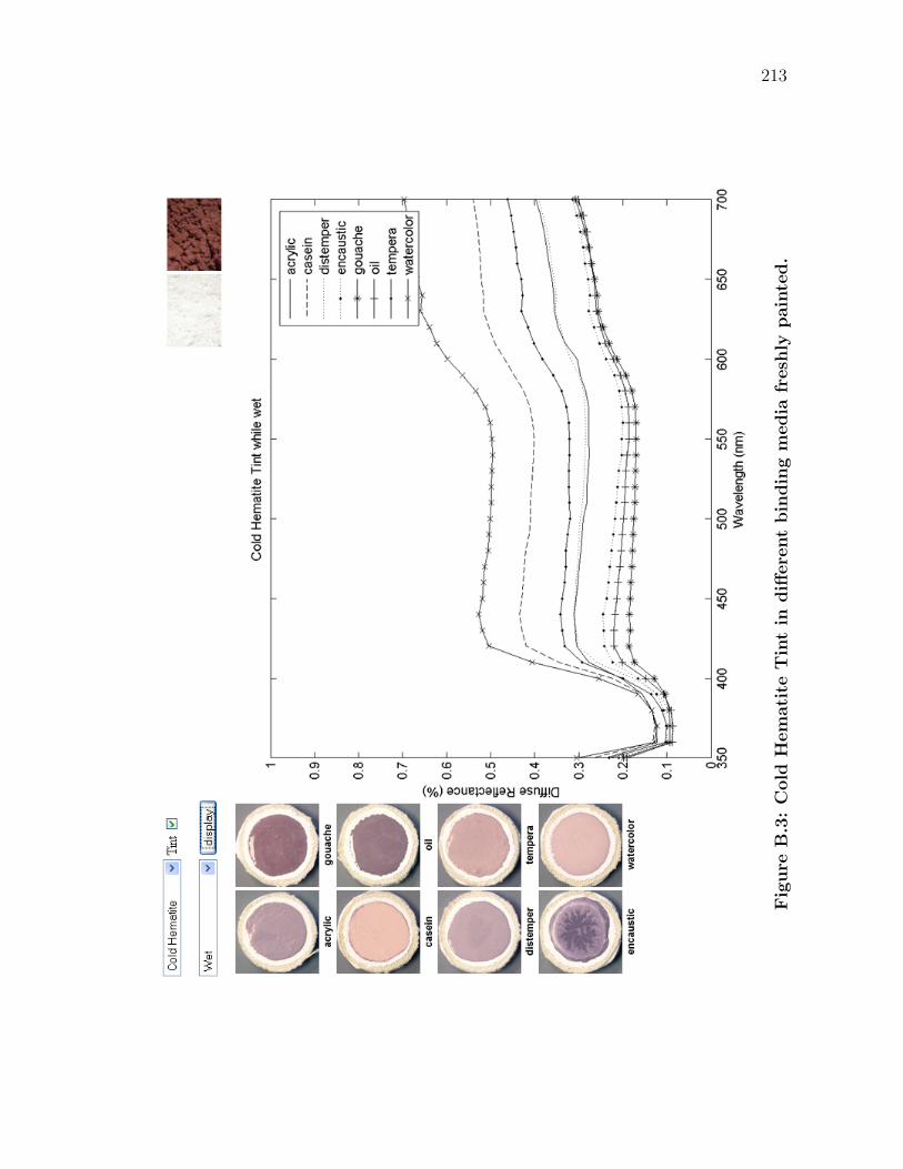
213
Fig
ure
B.3
:C
old
Hem
ati
teT
int
indiff
ere
nt
bin
din
gm
edia
fresh
lypain
ted.
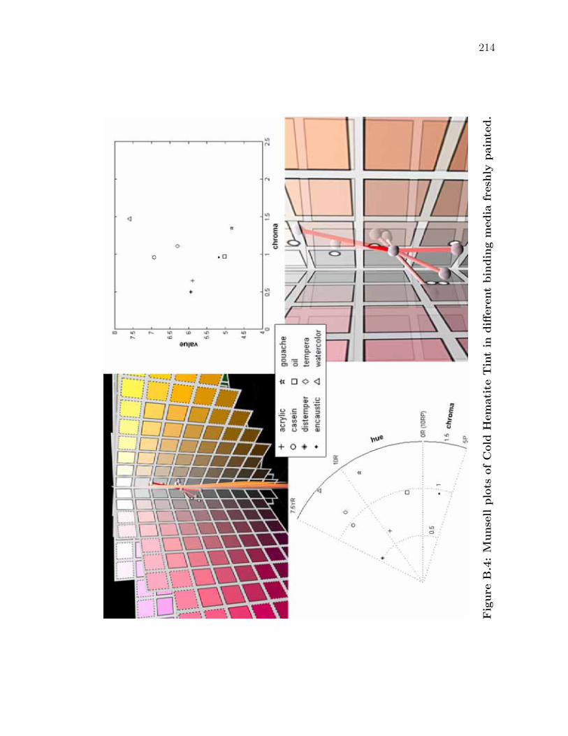
214
Fig
ure
B.4
:M
unse
llplo
tsofC
old
Hem
ati
teT
int
indiff
ere
nt
bin
din
gm
edia
fresh
lypain
ted.
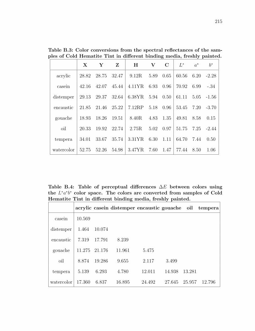
215
Table B.3: Color conversions from the spectral reflectances of the sam-ples of Cold Hematite Tint in different binding media, freshly painted.
X Y Z H V C L∗ a∗ b∗
acrylic 28.82 28.75 32.47 9.12R 5.89 0.65 60.56 6.20 -2.28
casein 42.16 42.07 45.44 4.11YR 6.93 0.96 70.92 6.99 -.34
distemper 29.13 29.37 32.64 6.38YR 5.94 0.50 61.11 5.05 -1.56
encaustic 21.85 21.46 25.22 7.12RP 5.18 0.96 53.45 7.20 -3.70
gouache 18.93 18.26 19.51 8.40R 4.83 1.35 49.81 8.58 0.15
oil 20.33 19.92 22.74 2.75R 5.02 0.97 51.75 7.25 -2.44
tempera 34.01 33.67 35.74 3.31YR 6.30 1.11 64.70 7.44 0.50
watercolor 52.75 52.26 54.98 3.47YR 7.60 1.47 77.44 8.50 1.06
Table B.4: Table of perceptual differences ∆E between colors usingthe L∗a∗b∗ color space. The colors are converted from samples of ColdHematite Tint in different binding media, freshly painted.
acrylic casein distemper encaustic gouache oil tempera
casein 10.569
distemper 1.464 10.074
encaustic 7.319 17.791 8.239
gouache 11.275 21.176 11.961 5.475
oil 8.874 19.286 9.655 2.117 3.499
tempera 5.139 6.293 4.780 12.011 14.938 13.281
watercolor 17.360 6.837 16.895 24.492 27.645 25.957 12.796
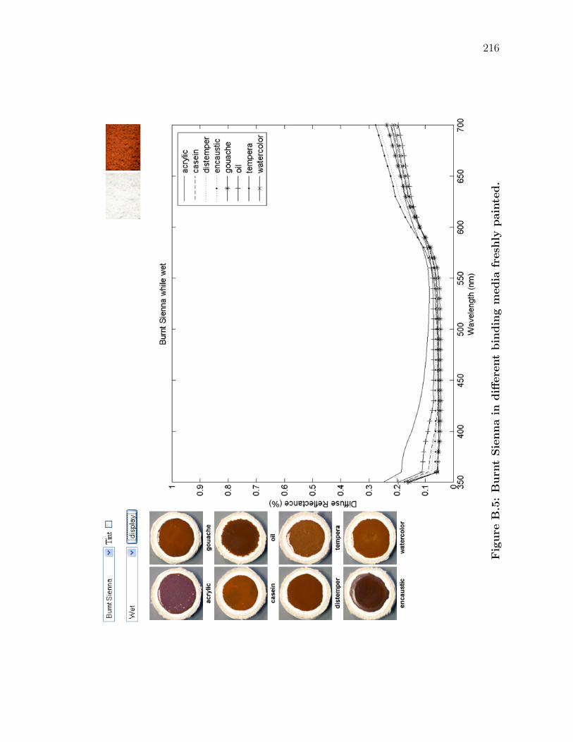
216
Fig
ure
B.5
:B
urn
tSie
nna
indiff
ere
nt
bin
din
gm
edia
fresh
lypain
ted.
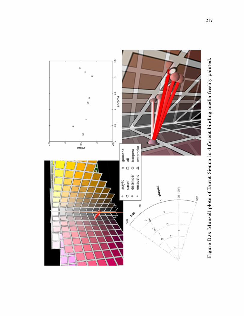
217
Fig
ure
B.6
:M
unse
llplo
tsofB
urn
tSie
nna
indiff
ere
nt
bin
din
gm
edia
fresh
lypain
ted.
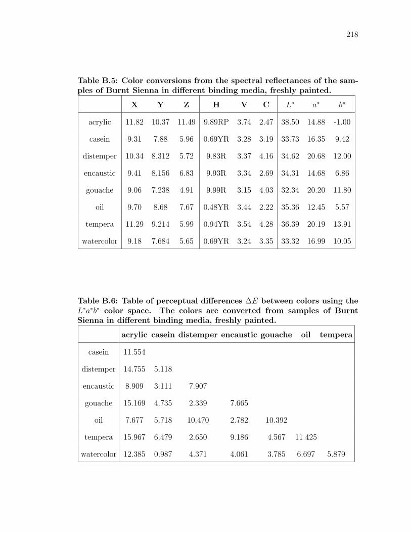
218
Table B.5: Color conversions from the spectral reflectances of the sam-ples of Burnt Sienna in different binding media, freshly painted.
X Y Z H V C L∗ a∗ b∗
acrylic 11.82 10.37 11.49 9.89RP 3.74 2.47 38.50 14.88 -1.00
casein 9.31 7.88 5.96 0.69YR 3.28 3.19 33.73 16.35 9.42
distemper 10.34 8.312 5.72 9.83R 3.37 4.16 34.62 20.68 12.00
encaustic 9.41 8.156 6.83 9.93R 3.34 2.69 34.31 14.68 6.86
gouache 9.06 7.238 4.91 9.99R 3.15 4.03 32.34 20.20 11.80
oil 9.70 8.68 7.67 0.48YR 3.44 2.22 35.36 12.45 5.57
tempera 11.29 9.214 5.99 0.94YR 3.54 4.28 36.39 20.19 13.91
watercolor 9.18 7.684 5.65 0.69YR 3.24 3.35 33.32 16.99 10.05
Table B.6: Table of perceptual differences ∆E between colors using theL∗a∗b∗ color space. The colors are converted from samples of BurntSienna in different binding media, freshly painted.
acrylic casein distemper encaustic gouache oil tempera
casein 11.554
distemper 14.755 5.118
encaustic 8.909 3.111 7.907
gouache 15.169 4.735 2.339 7.665
oil 7.677 5.718 10.470 2.782 10.392
tempera 15.967 6.479 2.650 9.186 4.567 11.425
watercolor 12.385 0.987 4.371 4.061 3.785 6.697 5.879
219
Fig
ure
B.7
:Lam
pbla
ckT
int
indiff
ere
nt
bin
din
gm
edia
aft
er
one
month
.
220
Fig
ure
B.8
:M
unse
llplo
tsofLam
pbla
ckT
int
indiff
ere
nt
bin
din
gm
edia
aft
er
one
month
.
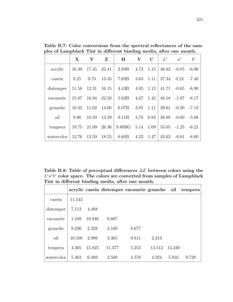
221
Table B.7: Color conversions from the spectral reflectances of the sam-ples of Lampblack Tint in different binding media, after one month.
X Y Z H V C L∗ a∗ b∗
acrylic 16.39 17.45 22.41 2.89B 4.73 1.15 48.82 -0.85 -6.90
casein 9.25 9.73 13.16 7.69B 3.63 1.11 37.34 0.24 -7.40
distemper 11.58 12.31 16.15 4.43B 4.05 1.12 41.71 -0.65 -6.90
encaustic 15.87 16.94 22.50 5.03B 4.67 1.42 48.18 -1.07 -8.17
gouache 10.42 11.02 14.66 6.07B 3.85 1.11 39.61 -0.20 -7.13
oil 9.96 10.59 13.29 0.11B 3.78 0.83 38.88 -0.60 -5.08
tempera 19.75 21.09 26.36 9.80BG 5.14 1.09 53.05 -1.25 -6.21
watercolor 12.76 13.59 18.55 6.60B 4.23 1.47 43.63 -0.81 -8.60
Table B.8: Table of perceptual differences ∆E between colors using theL∗a∗b∗ color space. The colors are converted from samples of LampblackTint in different binding media, after one month.
acrylic casein distemper encaustic gouache oil tempera
casein 11.543
distemper 7.113 4.488
encaustic 1.439 10.946 6.607
gouache 9.236 2.328 2.160 8.677
oil 10.108 2.909 3.365 9.811 2.213
tempera 4.305 15.825 11.377 5.253 13.512 14.230
watercolor 5.462 6.489 2.569 4.578 4.324 5.916 9.728
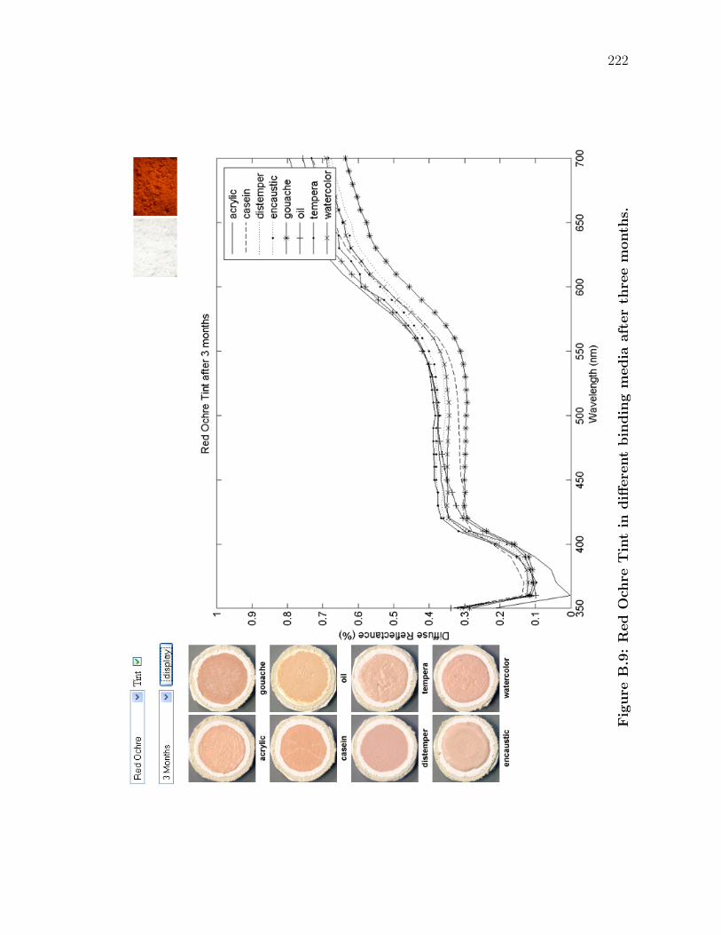
222
Fig
ure
B.9
:R
ed
Och
reT
int
indiff
ere
nt
bin
din
gm
edia
aft
er
thre
em
onth
s.
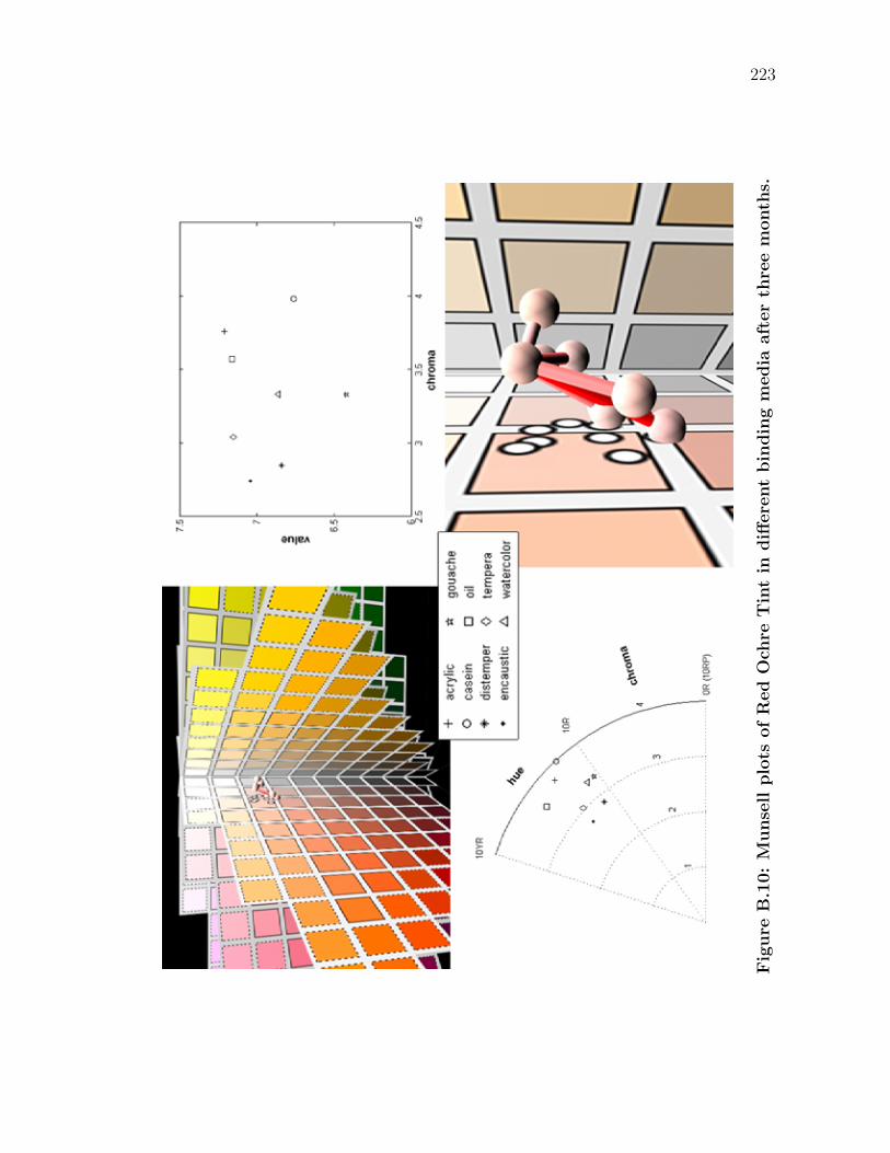
223
Fig
ure
B.1
0:
Munse
llplo
tsofR
ed
Och
reT
int
indiff
ere
nt
bin
din
gm
edia
aft
er
thre
em
onth
s.
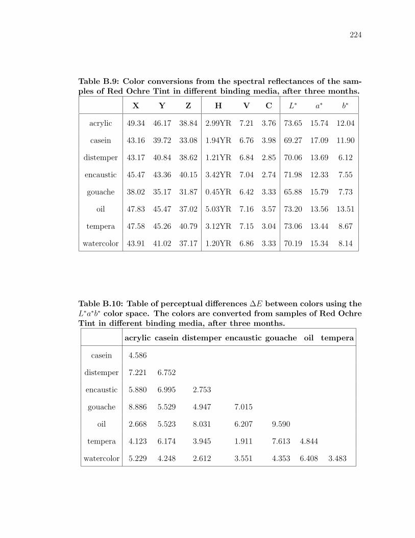
224
Table B.9: Color conversions from the spectral reflectances of the sam-ples of Red Ochre Tint in different binding media, after three months.
X Y Z H V C L∗ a∗ b∗
acrylic 49.34 46.17 38.84 2.99YR 7.21 3.76 73.65 15.74 12.04
casein 43.16 39.72 33.08 1.94YR 6.76 3.98 69.27 17.09 11.90
distemper 43.17 40.84 38.62 1.21YR 6.84 2.85 70.06 13.69 6.12
encaustic 45.47 43.36 40.15 3.42YR 7.04 2.74 71.98 12.33 7.55
gouache 38.02 35.17 31.87 0.45YR 6.42 3.33 65.88 15.79 7.73
oil 47.83 45.47 37.02 5.03YR 7.16 3.57 73.20 13.56 13.51
tempera 47.58 45.26 40.79 3.12YR 7.15 3.04 73.06 13.44 8.67
watercolor 43.91 41.02 37.17 1.20YR 6.86 3.33 70.19 15.34 8.14
Table B.10: Table of perceptual differences ∆E between colors using theL∗a∗b∗ color space. The colors are converted from samples of Red OchreTint in different binding media, after three months.
acrylic casein distemper encaustic gouache oil tempera
casein 4.586
distemper 7.221 6.752
encaustic 5.880 6.995 2.753
gouache 8.886 5.529 4.947 7.015
oil 2.668 5.523 8.031 6.207 9.590
tempera 4.123 6.174 3.945 1.911 7.613 4.844
watercolor 5.229 4.248 2.612 3.551 4.353 6.408 3.483
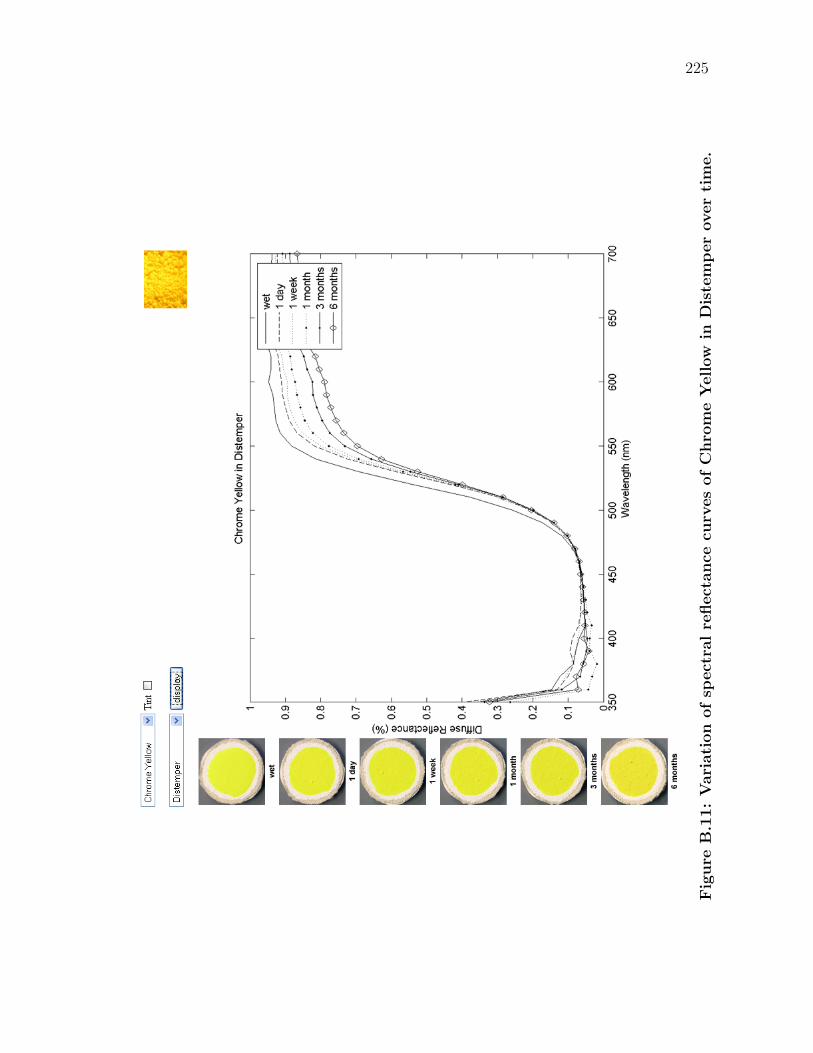
225
Fig
ure
B.1
1:
Vari
ati
on
ofsp
ect
ralre
flect
ance
curv
es
ofC
hro
me
Yellow
inD
iste
mper
over
tim
e.
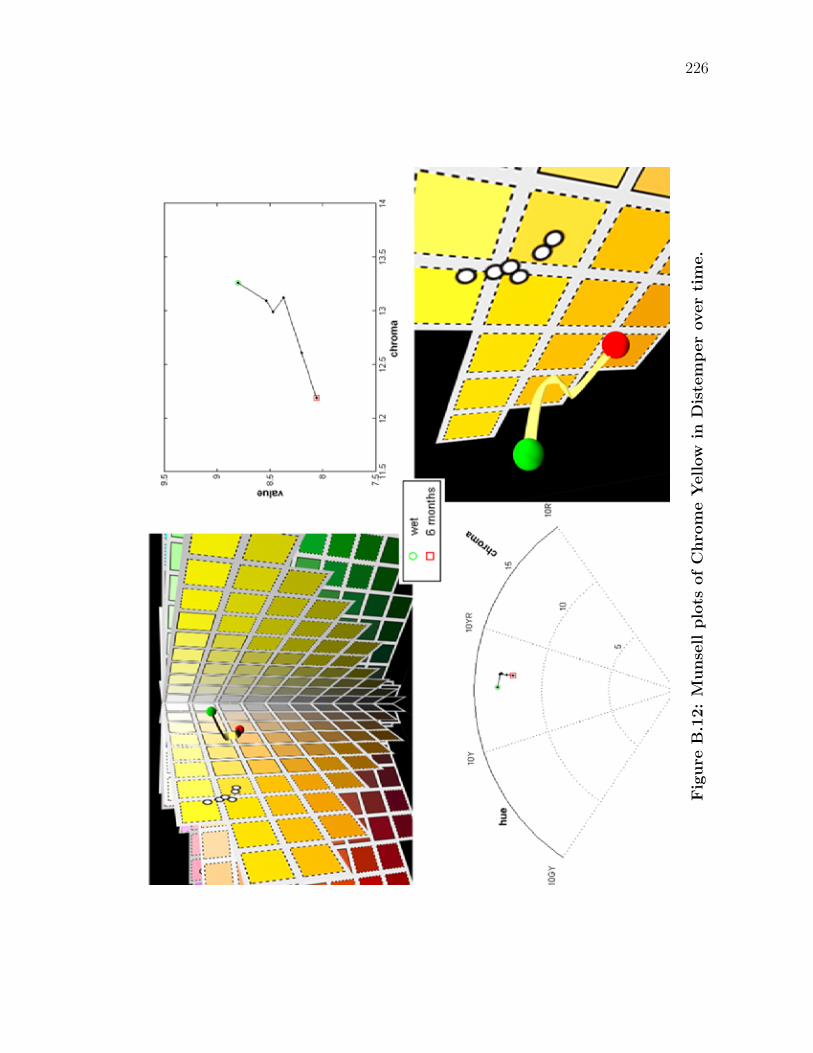
226
Fig
ure
B.1
2:
Munse
llplo
tsofC
hro
me
Yellow
inD
iste
mper
over
tim
e.
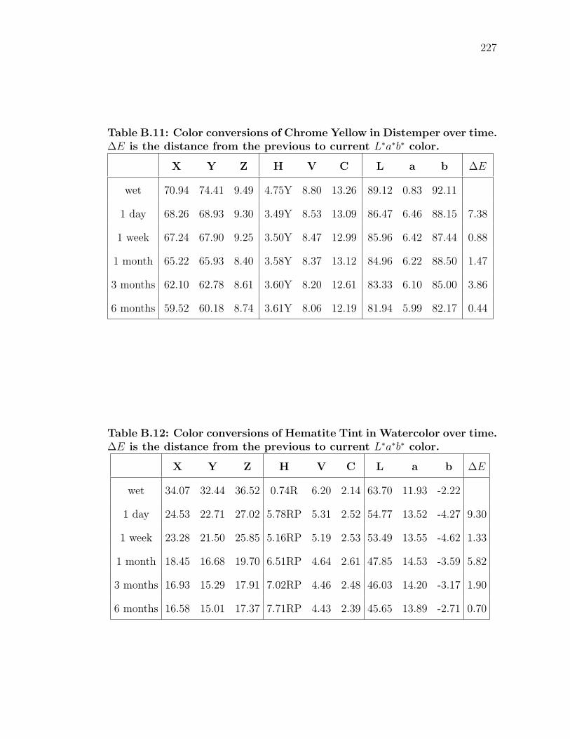
227
Table B.11: Color conversions of Chrome Yellow in Distemper over time.∆E is the distance from the previous to current L∗a∗b∗ color.
X Y Z H V C L a b ∆E
wet 70.94 74.41 9.49 4.75Y 8.80 13.26 89.12 0.83 92.11
1 day 68.26 68.93 9.30 3.49Y 8.53 13.09 86.47 6.46 88.15 7.38
1 week 67.24 67.90 9.25 3.50Y 8.47 12.99 85.96 6.42 87.44 0.88
1 month 65.22 65.93 8.40 3.58Y 8.37 13.12 84.96 6.22 88.50 1.47
3 months 62.10 62.78 8.61 3.60Y 8.20 12.61 83.33 6.10 85.00 3.86
6 months 59.52 60.18 8.74 3.61Y 8.06 12.19 81.94 5.99 82.17 0.44
Table B.12: Color conversions of Hematite Tint in Watercolor over time.∆E is the distance from the previous to current L∗a∗b∗ color.
X Y Z H V C L a b ∆E
wet 34.07 32.44 36.52 0.74R 6.20 2.14 63.70 11.93 -2.22
1 day 24.53 22.71 27.02 5.78RP 5.31 2.52 54.77 13.52 -4.27 9.30
1 week 23.28 21.50 25.85 5.16RP 5.19 2.53 53.49 13.55 -4.62 1.33
1 month 18.45 16.68 19.70 6.51RP 4.64 2.61 47.85 14.53 -3.59 5.82
3 months 16.93 15.29 17.91 7.02RP 4.46 2.48 46.03 14.20 -3.17 1.90
6 months 16.58 15.01 17.37 7.71RP 4.43 2.39 45.65 13.89 -2.71 0.70
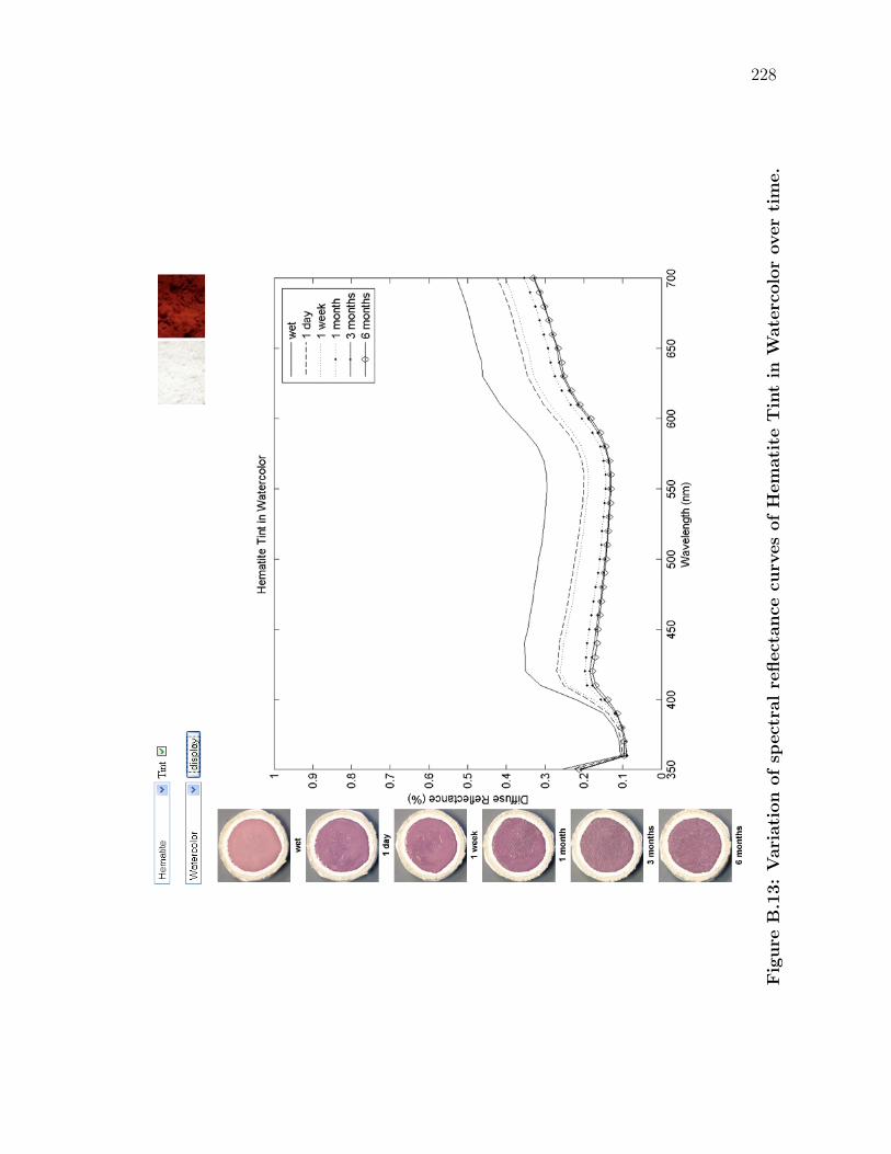
228
Fig
ure
B.1
3:
Vari
ati
on
ofsp
ect
ralre
flect
ance
curv
es
ofH
em
ati
teT
int
inW
ate
rcolo
rover
tim
e.
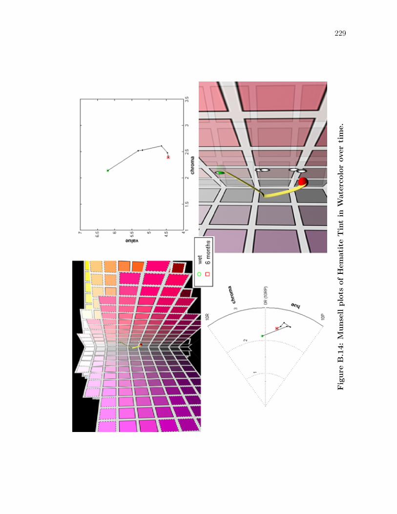
229
Fig
ure
B.1
4:
Munse
llplo
tsofH
em
ati
teT
int
inW
ate
rcolo
rover
tim
e.
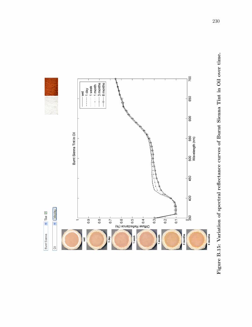
230
Fig
ure
B.1
5:
Vari
ati
on
ofsp
ect
ralre
flect
ance
curv
es
ofB
urn
tSie
nna
Tin
tin
Oil
over
tim
e.
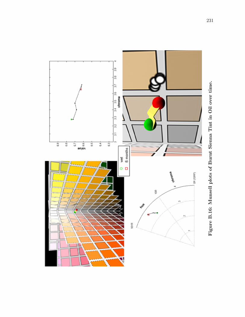
231
Fig
ure
B.1
6:
Munse
llplo
tsofB
urn
tSie
nna
Tin
tin
Oil
over
tim
e.
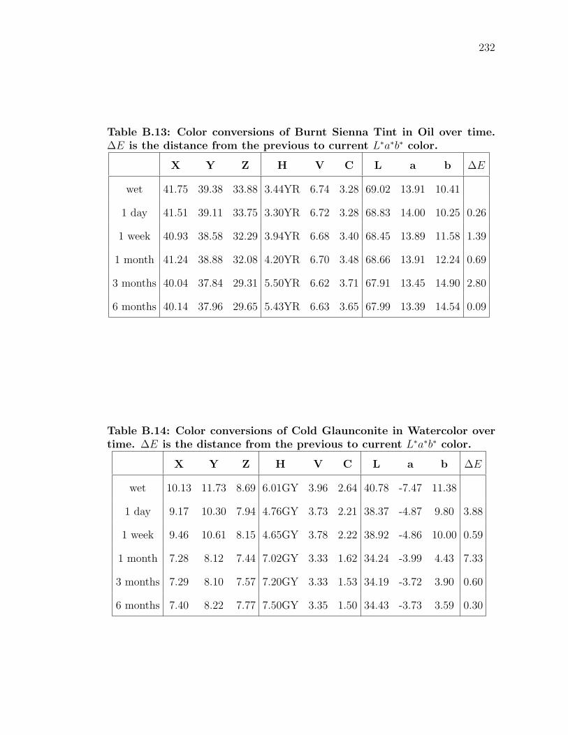
232
Table B.13: Color conversions of Burnt Sienna Tint in Oil over time.∆E is the distance from the previous to current L∗a∗b∗ color.
X Y Z H V C L a b ∆E
wet 41.75 39.38 33.88 3.44YR 6.74 3.28 69.02 13.91 10.41
1 day 41.51 39.11 33.75 3.30YR 6.72 3.28 68.83 14.00 10.25 0.26
1 week 40.93 38.58 32.29 3.94YR 6.68 3.40 68.45 13.89 11.58 1.39
1 month 41.24 38.88 32.08 4.20YR 6.70 3.48 68.66 13.91 12.24 0.69
3 months 40.04 37.84 29.31 5.50YR 6.62 3.71 67.91 13.45 14.90 2.80
6 months 40.14 37.96 29.65 5.43YR 6.63 3.65 67.99 13.39 14.54 0.09
Table B.14: Color conversions of Cold Glaunconite in Watercolor overtime. ∆E is the distance from the previous to current L∗a∗b∗ color.
X Y Z H V C L a b ∆E
wet 10.13 11.73 8.69 6.01GY 3.96 2.64 40.78 -7.47 11.38
1 day 9.17 10.30 7.94 4.76GY 3.73 2.21 38.37 -4.87 9.80 3.88
1 week 9.46 10.61 8.15 4.65GY 3.78 2.22 38.92 -4.86 10.00 0.59
1 month 7.28 8.12 7.44 7.02GY 3.33 1.62 34.24 -3.99 4.43 7.33
3 months 7.29 8.10 7.57 7.20GY 3.33 1.53 34.19 -3.72 3.90 0.60
6 months 7.40 8.22 7.77 7.50GY 3.35 1.50 34.43 -3.73 3.59 0.30
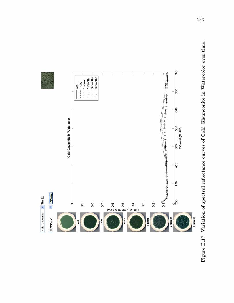
233
Fig
ure
B.1
7:
Vari
ati
on
ofsp
ect
ralre
flect
ance
curv
es
ofC
old
Gla
unco
nit
ein
Wate
rcolo
rover
tim
e.
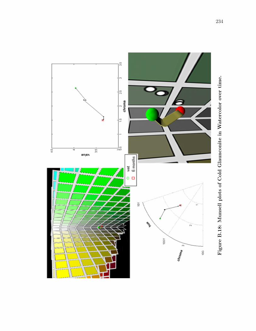
234
Fig
ure
B.1
8:
Munse
llplo
tsofC
old
Gla
unco
nit
ein
Wate
rcolo
rover
tim
e.
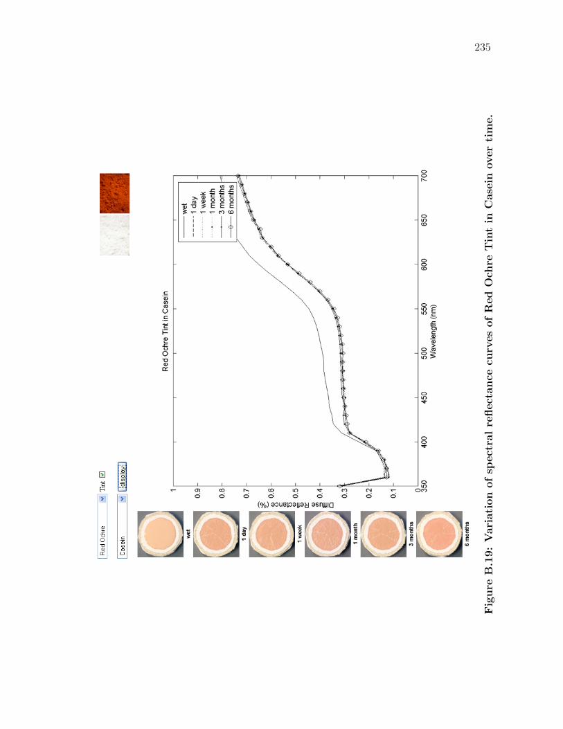
235
Fig
ure
B.1
9:
Vari
ati
on
ofsp
ect
ralre
flect
ance
curv
es
ofR
ed
Och
reT
int
inC
ase
inover
tim
e.
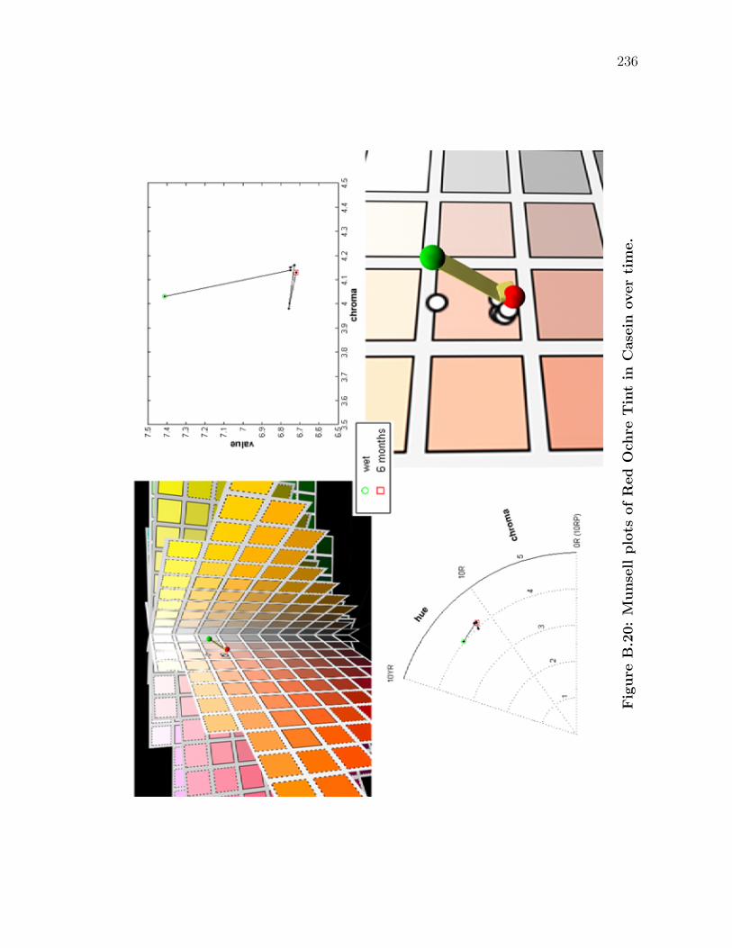
236
Fig
ure
B.2
0:
Munse
llplo
tsofR
ed
Och
reT
int
inC
ase
inover
tim
e.
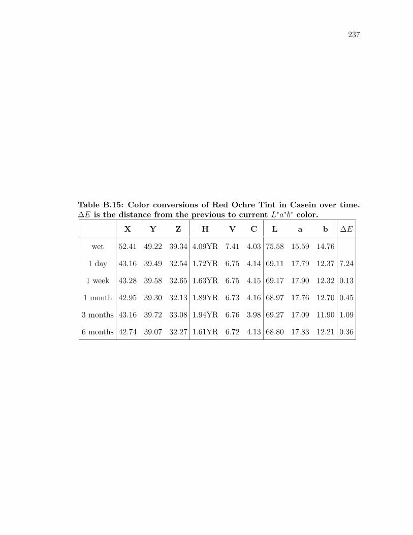
237
Table B.15: Color conversions of Red Ochre Tint in Casein over time.∆E is the distance from the previous to current L∗a∗b∗ color.
X Y Z H V C L a b ∆E
wet 52.41 49.22 39.34 4.09YR 7.41 4.03 75.58 15.59 14.76
1 day 43.16 39.49 32.54 1.72YR 6.75 4.14 69.11 17.79 12.37 7.24
1 week 43.28 39.58 32.65 1.63YR 6.75 4.15 69.17 17.90 12.32 0.13
1 month 42.95 39.30 32.13 1.89YR 6.73 4.16 68.97 17.76 12.70 0.45
3 months 43.16 39.72 33.08 1.94YR 6.76 3.98 69.27 17.09 11.90 1.09
6 months 42.74 39.07 32.27 1.61YR 6.72 4.13 68.80 17.83 12.21 0.36
References
[Alb71] Josef Albers. Interaction of Color. Yale University Press, New Haven,CT, 1971.
[Ber00] Roy Berns, editor. Billmeyer and Saltzman’s Principles of Color Tech-nology. John Wiley & Sons, Inc., New York, NY, 3rd edition, 2000.
[BGM06] Jeffrey B. Budsberg, Donald P. Greenberg, and Stephen R. Marschner.Reflectance measurements of pigmented colorants. Technical ReportPCG-06-02, Cornell University, Ithaca, NY, September 2006.
[Bli82] James F. Blinn. Light reflection functions for simulation of clouds anddusty surfaces. In SIGGRAPH ’82: Proceedings of the 9th annualconference on Computer graphics and interactive techniques, pages21–29, New York, NY, 1982. ACM Press.
[Box05] The Engineering Tool Box. Liquids and Fluids - Spe-cific Gravity, 2005. <http://www.engineeringtoolbox.com/
specific-gravity-liquid-fluids-d_294.html>.
[Bra59] William Bragg. The Universe of Light. Dover Publications, New York,NY, 1959.
[Buo12] Michenagelo Buonarroti. Sistine Chapel ceiling, Azor-Sadoch lunette,1508-1512. Musei Vaticani e Cappella Sistina. Vatican City, Rome.Images Copyright Nippon Television Network Corporation, Tokyo.
[BWL04] William V. Baxter, Jeremy Wendt, and Ming C. Lin. IMPaSTo: Arealistic, interactive model for paint. In NPAR ’04: Proceedings ofthe 3rd international symposium on Non-photorealistic animation andrendering, pages 45–56, New York, NY, June 2004. ACM Press.
[CAS+97] Cassidy J. Curtis, Sean E. Anderson, Joshua E. Seims, Kurt W. Fleis-cher, and David H. Salesin. Computer-generated watercolor. In SIG-GRAPH ’97: Proceedings of the 24th annual conference on Computergraphics and interactive techniques, pages 421–430, New York, NY,1997. ACM Press/Addison-Wesley Publishing Co.
238
239
[Col06] Catharine H. Colwell. Physics Lab: Refraction of light, 2006. <http:
//dev.physicslab.org/Chapter.aspx?cid=15>.
[D4384] ASTM D4303-03. Standard Test Methods for Lightfastness of Col-orants Used in Artists’ Materials. ASTM International, 1984. <http:
//www.astm.org>.
[DEJ+99] Julie Dorsey, Alan Edelman, Henrik Wann Jensen, Justin Legakis,and Hans Køhling Pedersen. Modeling and rendering of weatheredstone. In SIGGRAPH ’99: Proceedings of the 26rd annual conferenceon Computer graphics and interactive techniques, pages 225–234, NewYork, NY, 1999. ACM Press.
[Den05] David Denys. How to prepare a canvas the safe, traditional way, 2005.<http://www.denysart.com/canvasprep.html>.
[DH96] Julie Dorsey and Pat Hanrahan. Modeling and rendering of metallicpatinas. In SIGGRAPH ’96: Proceedings of the 23rd annual confer-ence on Computer graphics and interactive techniques, pages 387–396,New York, NY, 1996. ACM Press.
[Dun40] D. R. Duncan. The colour of pigment mixtures. Proceedings of thePhysical Society, 52(3):390–401, 1940.
[Fel68] Robert L. Feller. Problems in spectrophotometry. In IIC ’67: Pro-ceedings of the London Conference for Conservation on Museum Cli-matology, pages 196–197, London, 1968. International Institute forConservation of Historic and Artistic Works.
[Fel94] Robert L. Feller. Accelerated Aging: Photochemical and Ther-mal Aspects. The Getty Conservation Institute, Los Angeles, CA,1994. <http://www.getty.edu/conservation/publications/pdf_
publications/books.html>.
[Fis83] Kenneth Paul Fishkin. Applying color science to computer graphics.Master’s thesis, University of California, Berkeley, December 1983.
[G95a] Andrew S. Glassner. Principles of Digital Image Synthesis, volume 1.Morgan Kaufmann Publishers, San Francisco, CA, 1995.
[G95b] Andrew S. Glassner. Principles of Digital Image Synthesis, volume 2.Morgan Kaufmann Publishers, San Francisco, CA, 1995.
[GED64] F. W. Goodhart, M. E. Everhard, and D. A. Dickcius. Stability of cer-tified dyes in tables II. Fading of FD&C Red No. 3 and FD&C Red No.3 Aluminum Lake in three tablet formulas. Journal of PharmaceuticalSciences, 53:338–340, 1964.
240
[GLL+04] Michael Goesele, Hendrik P. A. Lensch, Jochen Lang, Christian Fuchs,and Hans-Peter Seidel. DISCO: Acquisition of translucent objects.ACM Transactions in Graphics, 23(3):835–844, 2004.
[GM97] Edward J. Giorgianni and Thomas E. Madden. Digital Color Manage-ment Encoding Solutions. Addison-Wesley Publishing Co., Reading,MA, 1997.
[Goh05] Alexandra Goho. Venetian grinds: The secret behind italian renais-sance painters’ brilliant palettes. Science News Online, 167(11):168,March 2005. <http://www.sciencenews.org/articles/20050312/
bob8.asp>.
[Got87] Mark D. Gottsegen. A Manual of Painting Materials and Techniques.Harper and Row Publishers, Inc., New York, NY, 1987.
[Gra53] H. G. Grassman. Zur theorie der farbenmischung (On the theory ofcompound colors). Annalen der Physik und Chemie, 89:69–84, 1853.Translation in Philosophical Magazine, 4(7):254–264, 1854.
[Gre06] GretagMacbeth. Munsell Color Conversion Freeware 6.5.5, 2006.<http://www.gretagmacbeth.com/home/products/products_
color-standards/products_books-for-designers/products_
munsell-freeware.htm?>.
[GSC92] D. Grosjean, L. Salmon, and G. R. Cass. Fading of artists’ colorantsby atmospheric nitric acid: Reaction products and mechanisms. En-vironmental Science and Technology, 26:952–959, 1992.
[GTR+06] Jinwei Gu, Chien-I Tu, Ravi Ramamoorthi, Peter Belhumeur, Woj-ciech Matusik, and Shree Nayar. Time-varying Surface Appearance:Acquisition, Modeling and Rendering. ACM Transactions in Graph-ics, 25(3):762–771, July 2006.
[GW77] Rafael C. Gonzalez and Paul Wintz. Digital Image Processing.Addison-Wesley Publishing Co., Reading, MA, 1977.
[Her78] K. E. K. Hering. Zur lehre vom lichtsinne (On the theory of sensi-bility to light). Sitzungsberichte der kaiserlichen Akademie der Wis-senschaften, 66:5–24, 1978. Translated by L.M. Hurvich and D. Jame-son. Harvard University Press, Cambridge, MA, 1964.
[HM92] Chet S. Haase and Gary W. Meyer. Modeling pigmented materials forrealistic image synthesis. ACM Transactions in Graphics, 11(4):305–335, 1992.
241
[IGG92] E. L. Williams II., E. Grosjean, and D. Grosjean. Exposure of artists’colorants to airborne formaldehyde. Studies in Conservation, 37:201–210, 1992.
[IGG93a] E. L. Williams II., E. Grosjean, and D. Grosjean. Exposure of artists’colorants to peroxyacetyl nitrate. Journal of the American Institutefor Conservation, 32:59–79, 1993.
[IGG93b] E. L. Williams II., E. Grosjean, and D. Grosjean. Exposure of artists’colorants to sulpher dioxide. Journal of the American Institute forConservation, 32(3):291–310, 1993.
[JF63] Ruth M. Johnston and Robert L. Feller. The use of differential spectralcurve analysis in the study of museum objects. Dyestuffs, 44(9):1–10,1963.
[JF99] Garrett M. Johnson and Mark D. Fairchild. Full-spectral color calcu-lations in realistic image synthesis. IEEE Computer Graphics Appli-cations, 19(4):47–53, 1999.
[JF01] Ruth Johnston-Feller. Color Science in the Examination of MuseumObjects. The Getty Conservation Institute, Los Angeles, CA, 2001.
[JFFBC84] Ruth Johnston-Feller, Robert L. Feller, Catherine W. Bailie, andMary Curran. The kinetics of fading: Opaque paint films pigmentedwith alizarin lake and titanium dioxide. Journal of the American In-stitute of Conservation, 23:114–129, 1984.
[JK55] John A. Jacquez and Hans F. Kuppenheim. Theory of the integratingsphere. Journal of the Optical Society of America, 45(6):460–470, June1955.
[JMLH01] H. W. Jensen, S. R. Marschner, M. Levoy, and P. Hanrahan. A practi-cal model for subsurface light transport. In SIGGRAPH ’01: Proceed-ings of the 28th annual conference on Computer graphics and inter-active techniques, pages 511–518, New York, NY, 2001. ACM Press.
[Joh67] Ruth M. Johnston. Spectrophotometry for the analysis and descrip-tion of color. Journal of Paint Technology, 39(509):346–354, 1967.
[Joh86] Ruth M. Johnston. Reflections on the phenomenon of fading. Journalof Coatings Technology, 58(736):32–50, 1986.
[JW75] D. B. Judd and G. Wyszecki. Color in Business, Science and Industry.John Wiley & Sons, Inc., New York, NY, third edition, 1975.
242
[KM31] Paul Kubelka and Franz Munk. Ein beitrag zur optik der farbastriche(An article on optics of paint layers). Zeitschrift fr Technishen Physik,12(112):47–53, August 1931. Translated by Stephen Westin <http:
//www.graphics.cornell.edu/~westin/pubs/kubelka.pdf>.
[Kor69] Gustav Kortum. Reflectance Spectroscopy: Principles, Methods, Ap-plications. Penguin Books, New York, NY, 1969. Translated by JamesE. Lohr.
[Koz04] O. N. Kozakov. Computer simulation of integral and differential opti-cal characteristics of paints. Optics and Spectroscopy, 96(1):122–127,2004. Original text in Optika i Spektroskopya, 96(1):133-138, 2004.
[Kub48] Paul Kubelka. New contributions to the optics of intensely light-scattering materials. part i. Journal of the Optical Society of America,38(5):448–457, May 1948.
[Kub54] Paul Kubelka. New contributions to the optics of intensely light-scattering materials. part ii: Nonhomogeneous layers. Journal of theOptical Society of America, 44(4):330–335, April 1954.
[Lab94] Optronic Laboratories. OL Series 750 Automated SpectroradiometricMeasurement System Manual, 1994.
[Lab05] Munsell Color Science Laboratory. Munsell Renotation Data, 2005.<http://www.cis.rit.edu/mcsl/online/munsell.php>.
[LaF86] R. H. LaFontaine. Seeing through a yellow varnish: A compensatingillumination system. Studies of Conservation, 31:97–102, 1986.
[Lan77] Edwin Land. The retinex theory of color vision. Scientific American,238(6):108–128, December 1977.
[Lau26] Arthur P. Laurie. The Painter’s Methods and Materials. Seeley, Ser-vice & Co., London, 1926.
[LGB+03] Hendrik P. A. Lensch, Michael Goesele, Philippe Bekaert, Jan Kautz,Marcus Magnor, Jochen Lang, and Hans-Peter Seidel. Interactive ren-dering of translucent objects. Computer Graphics Forum, 22(2):195–205, June 2003.
[LJP06] H. Laamanen, T. Jaaskelainen, and J. Parkkinen. Conversion betweenreflectance spectra and the Munsell notations. Color Research andApplication, 31(1):57–66, February 2006.
[LKG+01] Hendrik P. A. Lensch, Jan Kautz, Michael Goesele, Wolfgang Hei-drich, and Hans-Peter Seidel. Image-based reconstruction of spatially
243
varying materials. In Steven Gortler and Karol Myszkowski, edi-tors, Rendering Techniques 2001: Proceedings of the 12th Eurograph-ics Workshop on Rendering, pages 104–115, London, 2001. Springer.
[Mac05] Bruce MacEvoy. The Material Attributes of Paints, 2005. <http:
//www.handprint.com/HP/WCL/pigmt3.html#attributes>.
[Mas27] Masaccio. The Expulsion from the Garden of Eden, 1427. BrancacciChapel, Santa Maria del Carmine. Florence, Italy.
[May80] Ralph Mayer. The Painter’s Craft: An Introduction to Artists’ Meth-ods and Materials. Penguin Books, New York, NY, 1980.
[May81] Ralph Mayer. The Artist’s Handbook of Materials and Techniques.The Viking Press, New York, NY, 1981.
[Mey88] Gary W. Meyer. Wavelength selection for synthetic image generation.Computer Vision, Graphics, and Image Processing, 41(1):57–79, 1988.
[Mun] Munsell Book of Color. Gretag MacBeth, Inc., Munsell Color Dept.,617 Little Britain Roard, New Winsor, NY 12553-6148.
[NMN87] Tomoyuki Nishita, Yasuhiro Miyawaki, and Eihachiro Nakamae. Ashading model for atmospheric scattering considering luminous inten-sity distribution of light sources. In SIGGRAPH ’87: Proceedingsof the 14th annual conference on Computer graphics and interactivetechniques, pages 303–310, New York, NY, 1987. ACM Press.
[NRH+77] F. E. Nicodemus, J. C. Richmond, J. J. Hsia, I. W. Ginsberg, andT. Limperis. Geometrical considerations and nomenclature for re-flectance. U.S. Departmenmt of Commerce, National Bureau of Stan-dards, NBS Monograph No. 160, Washington, D.C., 1977.
[O’H04] George O’Hanlon. Why Some Paints are Transparent and Oth-ers Opaque, 2004. <http://www.naturalpigments.com/education/
article.asp?ArticleID=8>.
[PA98] M.R. Pointer and G.G. Atridge. The number of discernable colors.Color Research and Application, 23:52–54, 1998.
[Pig05] Natural Pigments. Rare Artists Colors and Materials, 2005. <http:
//www.naturalpigments.com>.
[PvBM+06] Pieter Peers, Karl vom Berge, Wojciech Matusik, Ravi Ramamoorthi,Jason Lawrence, Szymon Rusinkiewicz, and Philip Dutre;. A compactfactored representation of heterogeneous subsurface scattering. ACMTransactions in Graphics, 25(3):746–753, 2006.
244
[Rat72] Floyd Ratliff. Contour and contrast. Scientific American, 226(6):90–101, June 1972.
[RMN03] D. Rudolf, D. Mould, and E. Neuffeld. Simulating wax crayons. InProceedings of 11th Pacific Conference on Computer Graphics andApplications, pages 163–172, October 2003.
[Saa01] Bob Saar. The Hawk Eye: Egg Science, 2001. <http://www.
thehawkeye.com/columns/saar/2001/csa21801.html>.
[SB02] Robert Sekuler and Robert Blake. Perception. McGraw Hill, NewYork, NY, 4th edition, 2002.
[SC83] Cynthia L. Shaver and Glen R. Cass. Ozone and the deterioration ofworks of art. Enviromental Science and Technology, 17(12):748–752,1983.
[SCG+92] L. G. Salmon, G. R. Cass, D. Grosjean, M. C. Jones, M. P. Ligocki,and W. W. Nazaroff. Protection of works of art from atmosphericnitric acid. Final Report to the Getty Conservation Institute, En-vironmental Quality Laboratory Report R-35, California Institute ofTechnology, Pasadena, CA, May 1992.
[Seu86] Georges Seurat. Un dimanche aprs-midi l’Ile de la Grande Jatte,1884-86. Art Institute of Chicago, Helen Birch Bartlett Collection.Chicago, IL.
[Sta85] Sarah Standiforth. Retouching and colour matching: The restorer andmetamerism. Studies in Conservation, 30(3):101–111, August 1985.
[TM00] W. Stanley Taft and James W. Mayer. The Science of Paintings.Springer-Verlag New York, Inc., New York, NY, 2000.
[TWL+05] Xin Tong, Jiaping Wang, Stephen Lin, Baining Guo, and Heung-Yeung Shum. Modeling and rendering of quasi-homogeneous mate-rials. ACM Transactions in Graphics, 24(3):1054–1061, 2005.
[WB97] Paul M. Whitmore and Catherine Bailie. Further studies on transpar-ent glaze fading: Chemical and appearance kinetics. Journal of theAmerican Institute for Conservation, 36(3):207–230, 1997.
[WC89] Paul M. Whitmore and Glen R. Cass. The fading of artists’ colorantsby exposure to atmospheric nitrogen dioxide. Studies in Conservation,34(2):85–97, 1989.
[WCD87] Paul M. Whitmore, Glen R. Cass, and J. R. Druzik. The ozone fad-ing of traditional natural organic colorants on paper. Journal of theAmerican Institute for Conservation, 26:45–58, 1987.
245
[Web23] F. W. Weber. Artist’s Pigments: Their Chemical and Physical Prop-erties. D. Van Nostand Company, Inc., New York, NY, 1923.
[Weh75] Kurt Wehlte. Werkstoffe und Techniken der Malerei (The Materialsand Techniques of Painting). Van Nostrand Reinhold Co., New York,NY, 1975. Translated by Ursus Dix.
[WPB99] Paul M. Whitmore, Xun Pan, and Catherine Bailie. Predicting thefading of objects: Identification of fugitive colorants through directnondestructive lightfast measurements. Journal of the American In-stitute for Conservation, 38(3):395–409, 1999.
Related Documents