Test shot images Taking 10 different images and write about how they was successful and unsuccessful for the music magazine.

Welcome message from author
This document is posted to help you gain knowledge. Please leave a comment to let me know what you think about it! Share it to your friends and learn new things together.
Transcript
Test shot imagesTaking 10 different images and write about
how they was successful and unsuccessful for the music magazine.
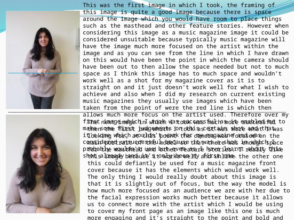
This was the first image in which I took, the framing of this image is quite a good image because there is space around the image which you would have room to place things such as the masthead and other feature stories. However when considering this image as a music magazine image it could be considered unsuitable because typically music magazine will have the image much more focused on the artist within the image and as you can see from the line in which I have drawn on this would have been the point in which the camera should have been out to then allow the space needed but not to much space as I think this image has to much space and wouldn’t work well as a shot for my magazine cover as it is to straight on and it just doesn’t work well for what I wish to achieve and also when I did my research on current existing music magazines they usually use images which have been taken from the point of were the red line is which then allows much more focus on the artist used. Therefore over my first image which I took was successful as it enabled me to make some first judgements on this certain shot and that it’s one which wouldn’t work for my magazine and was considered unsuccessful because it was a shot in which I probably wouldn’t use but even so I have learnt about this shot already and it’s only been my first one.
The next image in which I took was much more successful then the first one which I took as it was more what I was looking for, at this point the camera was focused on the main portrait of the model so that there was enough space for the masthead and other feature stories. I really like this image because it works well and unlike the other one this could defiantly be used for a music magazine front cover because it has the elements which would work well. The only thing I would really doubt about this image is that it is slightly out of focus, but the way the model is how much more focused as an audience we are with her due to the facial expression works much better because it allows us to connect more with the artist which I would be using to cover my front page as an image like this one is much more engaging and it’s straight to the point and bold and is really like a statement. On this particular image putting on the attributes to make a music magazine would fit in very well such as the masthead,plugs,skylines and feature stories because there is white space around the model and enough above her head to then include the masthead which is really the sort of image I am going for.

This image was one which was totally different from the previous ones in which I had taken. In this shot I was away from the model in which then was considered a long shot, this was a shot which wouldn’t really be suitable for my magazine because it isn’t typically a convention in music magazines for the model to be stood far away from the camera. Also this image was unsuccessful due to the obstruction in the background although this could be edited out there is to much distraction with this image as we are focusing more on the surroundings in comparison to the actual model which isn’t what the image should do the image should have all the focus son the model so that when we look at the image we can see the facial expression of the model and a full body shot is one which isn’t necessary for the image because it doesn’t work well and is an image which I probably wouldn’t use in my magazine because it doesn’t look the part and there is no real focus to the image so it was unsuccessful in the sense of the image but it was successful because I made a decision on that I wouldn't use this as image in my music magazine.
Similar to the last image in which I took this one was much more focused on the model. Like the previous image this was a close up up shot in which unlike the last shot is mainly of the face. I do like this shot because you can see the facial expression of the model much more and it again allows us to relate with her. However The isn’t enough space around such as the masthead there wouldn’t be any room due to how the image has been squished down and for a magazine you need the room and the room on the sides would be good for the feature stories but when considered the masthead there really isn’t enough room so this is were this picture was unsuccessful because it doesn’t fit with the magazine properly but even so it is a nice image which could probably be used elsewhere on the magazine because like I said it is still a nice image. But overall I think this image was successful too because it allowed me to compare between the previous shots in which I took and this one because it then allows me to see which ones work better and if not for the front cover then were else they could be used so that they don’t just go to waste if I was to use them.

Like the previous image which I was speaking about this is another two shot image, I also really like this image because it really displays the personality of both of people within the image. This is a close up image of the two shot in which the models are juxtaposed next to each other. I would defiantly use this image in my music magazine because I think it’s a really suitable image because the shot is close up and you get a connection with the people and there isn’t any background surroundings which are attracting the audience so all the focus is on the two models and this is what I really like about this image that they are the main focus because there is nothing else surrounding them and I would probably use this image on the contents page or even the front cover because it is a really nice image and one which I think works well all the way through on different pages if it were too.
This was the first image in which I took as a two shot which included two people the reason I decided to do this was because for example if I wanted to use a band within my magazine then obviously there is going to be more than one person so when looking at different images I thought that using a two shot image would be good as it would allow to see how the shot changes when another person is introduced within the frame. I like this image because it works well considered there are two people in the image I like how it shows there personality and you can visualise them as group. I would say that I would use an image like this in my magazine because it would work well on something like the contents page as another feature story within the magazine. I just in general like the framing of the image because editing this photo would be good and I think overall it is just a nice image and one in which I would definitely consider using in my final music magazine.

In comparison to the other images which I took this was one which was very different in this photo I decided to incorporate other people into the frame to then see what it would work out like with four people included in the image rather then just two. This could be used for a bigger band. I like this image because of the use of more people with it and I think again it’s another image which everyone has been caught of track and I think due to that the image works well and I really like it because it’s a natural image. I also like the framing of the image as everyone has been included in the image and I think that works well. I would probably use this image on my contents page if i was to because I think it works well for an image which would be included on a contents page.
Again I decided to take another two shot image as I wanted to get as many different shots as possible so that I had a variety of images to work with when it came to doing my music magazine because I wanted to be able to look at all the different images to see which ones worked best and I liked this image because it was a very natural took image as you can see the people within the photo are smiling and this is what I like about this image because it isn’t a set photo and was one which I caught them of track with and I think for that it works really well. Despite this I would say that the image lacks due to the background although this could be edited out I do think as an image that is the only thing which really lets it down but apart from that I think it is a lovely image and one which I could use in various different pages on my magazine.
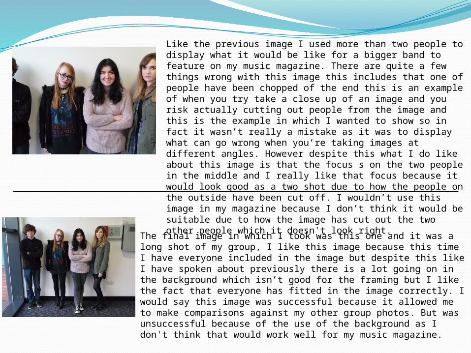
The final image in which I took was this one and it was a long shot of my group, I like this image because this time I have everyone included in the image but despite this like I have spoken about previously there is a lot going on in the background which isn’t good for the framing but I like the fact that everyone has fitted in the image correctly. I would say this image was successful because it allowed me to make comparisons against my other group photos. But was unsuccessful because of the use of the background as I don't think that would work well for my music magazine.
Like the previous image I used more than two people to display what it would be like for a bigger band to feature on my music magazine. There are quite a few things wrong with this image this includes that one of people have been chopped of the end this is an example of when you try take a close up of an image and you risk actually cutting out people from the image and this is the example in which I wanted to show so in fact it wasn’t really a mistake as it was to display what can go wrong when you’re taking images at different angles. However despite this what I do like about this image is that the focus s on the two people in the middle and I really like that focus because it would look good as a two shot due to how the people on the outside have been cut off. I wouldn’t use this image in my magazine because I don’t think it would be suitable due to how the image has cut out the two other people which it doesn't look right.
Related Documents