$15.95 ISSUE 90 SUMMER 2018 Better Photography • Is Clarity Good or Bad? • Nikon D850 • Nudes in the Landscape • John Gollings on Architecture THE WINNERS BP PHOTO COMPETITION SPECIAL ISSUE: Photographic Composition

Welcome message from author
This document is posted to help you gain knowledge. Please leave a comment to let me know what you think about it! Share it to your friends and learn new things together.
Transcript
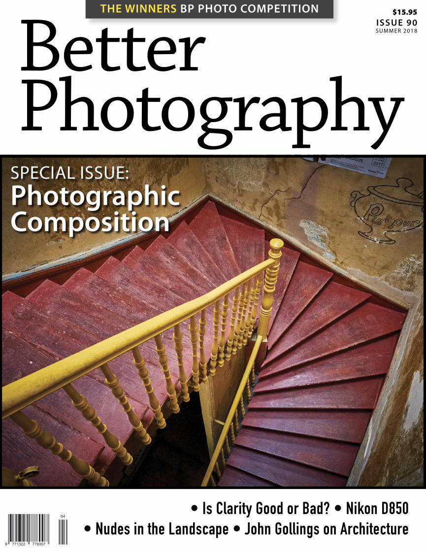
$15.95 ISSUE 90 SUMMER 2018
ISSUE N
O. 9
0P
ET
ER
E
AS
TW
AY
’S
B
ET
TE
R
PH
OT
OG
RA
PH
Y
MA
GA
ZI
NE
BetterPhotography
COLOREDGE 2420 (24”) AND 2730 (27”)
• 99% Adobe Gamut Coverage • Precise Contrast Adjustability• Digital Uniformity Equalization • New Slimline Build • In-built Calibration Sensor & Hood*• Calibration Software included
eizoglobal.com/products/coloredge/
Test drive a ColorEdge at these exclusive stockists
EIZO ColorEdge®
Precision Beyond Colour
*CG models only
EIZO025 Introducing 230 x 297mm Better Photo Dec Ad 1017 PRINT.indd 1 3/10/2017 11:17 am
• Is Clarity Good or Bad? • Nikon D850 • Nudes in the Landscape • John Gollings on Architecture
THE WINNERS BP PHOTO COMPETITION
SPECIAL ISSUE: Photographic Composition
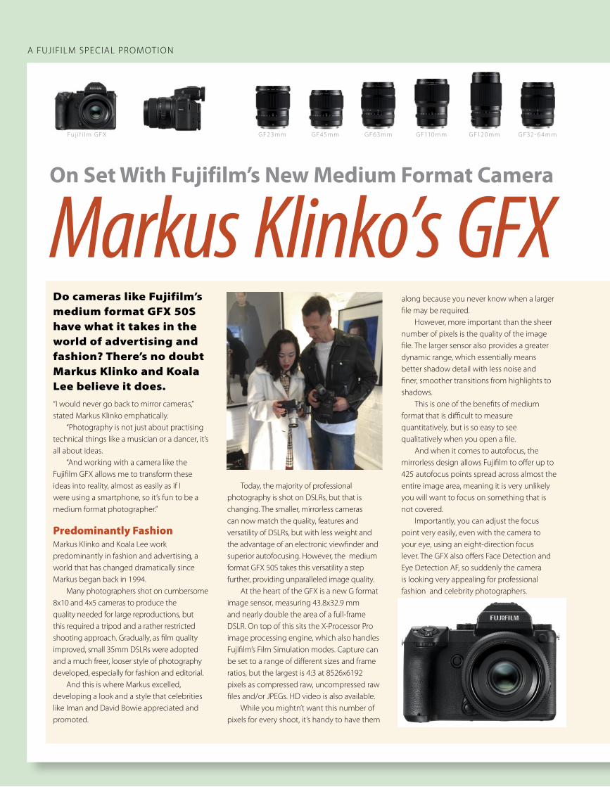
A FUJIFILM SPECIAL PROMOT ION
On Set With Fujifilm’s New Medium Format Camera
Markus Klinko’s GFX Do cameras like Fujifilm’s medium format GFX 50S have what it takes in the world of advertising and fashion? There’s no doubt Markus Klinko and Koala Lee believe it does.“I would never go back to mirror cameras,” stated Markus Klinko emphatically. “Photography is not just about practising technical things like a musician or a dancer, it’s all about ideas. “And working with a camera like the Fujifilm GFX allows me to transform these ideas into reality, almost as easily as if I were using a smartphone, so it’s fun to be a medium format photographer.”
Predominantly FashionMarkus Klinko and Koala Lee work predominantly in fashion and advertising, a world that has changed dramatically since Markus began back in 1994. Many photographers shot on cumbersome 8x10 and 4x5 cameras to produce the quality needed for large reproductions, but this required a tripod and a rather restricted shooting approach. Gradually, as film quality improved, small 35mm DSLRs were adopted and a much freer, looser style of photography developed, especially for fashion and editorial. And this is where Markus excelled, developing a look and a style that celebrities like Iman and David Bowie appreciated and promoted.
Today, the majority of professional photography is shot on DSLRs, but that is changing. The smaller, mirrorless cameras can now match the quality, features and versatility of DSLRs, but with less weight and the advantage of an electronic viewfinder and superior autofocusing. However, the medium format GFX 50S takes this versatility a step further, providing unparalleled image quality. At the heart of the GFX is a new G format image sensor, measuring 43.8x32.9 mm and nearly double the area of a full-frame DSLR. On top of this sits the X-Processor Pro image processing engine, which also handles Fujifilm’s Film Simulation modes. Capture can be set to a range of different sizes and frame ratios, but the largest is 4:3 at 8526x6192 pixels as compressed raw, uncompressed raw files and/or JPEGs. HD video is also available. While you mightn’t want this number of pixels for every shoot, it’s handy to have them
along because you never know when a larger file may be required. However, more important than the sheer number of pixels is the quality of the image file. The larger sensor also provides a greater dynamic range, which essentially means better shadow detail with less noise and finer, smoother transitions from highlights to shadows. This is one of the benefits of medium format that is difficult to measure quantitatively, but is so easy to see qualitatively when you open a file. And when it comes to autofocus, the mirrorless design allows Fujifilm to offer up to 425 autofocus points spread across almost the entire image area, meaning it is very unlikely you will want to focus on something that is not covered. Importantly, you can adjust the focus point very easily, even with the camera to your eye, using an eight-direction focus lever. The GFX also offers Face Detection and Eye Detection AF, so suddenly the camera is looking very appealing for professional fashion and celebrity photographers.
GF23mm GF45mmFuj i f i lm GF X GF63mm GF110 mm GF120 mm GF32- 6 4mm
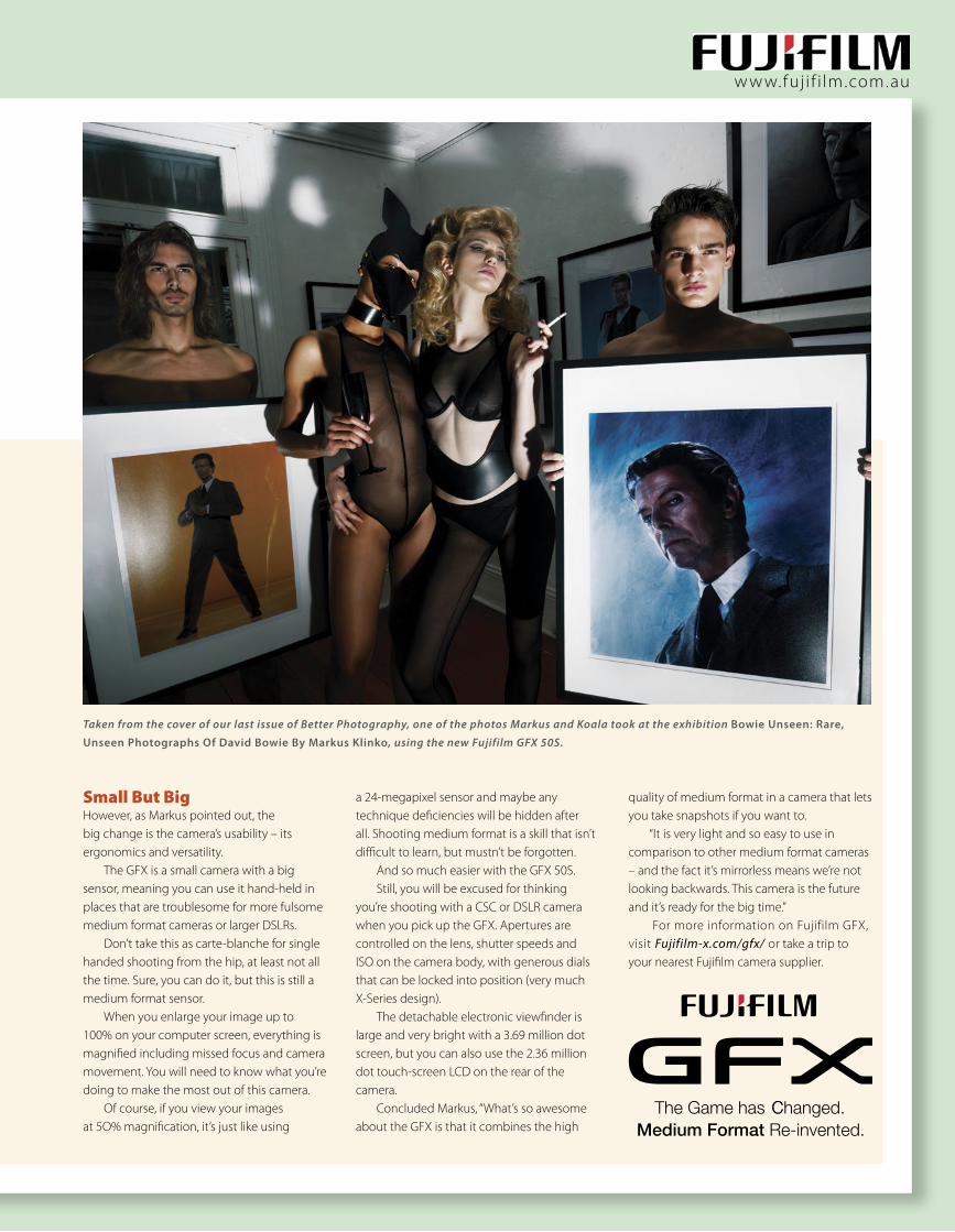
w w w.fuj i f i lm.com.au
Small But BigHowever, as Markus pointed out, the big change is the camera’s usability – its ergonomics and versatility. The GFX is a small camera with a big sensor, meaning you can use it hand-held in places that are troublesome for more fulsome medium format cameras or larger DSLRs. Don’t take this as carte-blanche for single handed shooting from the hip, at least not all the time. Sure, you can do it, but this is still a medium format sensor. When you enlarge your image up to 100% on your computer screen, everything is magnified including missed focus and camera movement. You will need to know what you’re doing to make the most out of this camera. Of course, if you view your images at 5O% magnification, it’s just like using
a 24-megapixel sensor and maybe any technique deficiencies will be hidden after all. Shooting medium format is a skill that isn’t difficult to learn, but mustn’t be forgotten. And so much easier with the GFX 50S. Still, you will be excused for thinking you’re shooting with a CSC or DSLR camera when you pick up the GFX. Apertures are controlled on the lens, shutter speeds and ISO on the camera body, with generous dials that can be locked into position (very much X-Series design). The detachable electronic viewfinder is large and very bright with a 3.69 million dot screen, but you can also use the 2.36 million dot touch-screen LCD on the rear of the camera. Concluded Markus, “What’s so awesome about the GFX is that it combines the high
quality of medium format in a camera that lets you take snapshots if you want to. “It is very light and so easy to use in comparison to other medium format cameras – and the fact it’s mirrorless means we’re not looking backwards. This camera is the future and it’s ready for the big time.” For more information on Fujifilm GFX, visit Fujifilm-x.com/gfx/ or take a trip to your nearest Fujifilm camera supplier.
Taken from the cover of our last issue of Better Photography, one of the photos Markus and Koala took at the exhibition Bowie Unseen: Rare,
Unseen Photographs Of David Bowie By Markus Klinko, using the new Fujifilm GFX 50S.
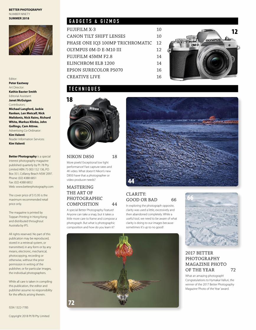
BETTER PHOTOGRAPHYNUMBER NINETYSUMMER 2018
Editor: Peter EastwayArt Director: Kathie Baxter SmithEditorial Assistant: Janet McGuiganContributors: Michael Langford, Jackie Ranken, Len Metcalf, Nick Melidonis, Nick Rains, Richard White, Markus Klinko, John Gollings, Cam Attree.Advertising Co-Ordinator: Kim ValentiReader Information Services: Kim Valenti
Better Photography is a special interest photography magazine published quarterly by Pt 78 Pty Limited ABN 75 003 152 136, PO Box 351, Collaroy Beach NSW 2097. Phone: (02) 4388 6851Fax: (02) 4388 6852Web: www.betterphotography.com
The cover price of $15.95 is the maximum recommended retail price only.
The magazine is printed by Toppan Printing in Hong Kong and distributed throughout Australia by IPS.
All rights reserved. No part of this publication may be reproduced, stored in a retrieval system, or transmitted, in any form or by any means, electronic, mechanical, photocopying, recording or otherwise, without the prior permission in writing of the publisher, or for particular images, the individual photographers.
While all care is taken in compiling this publication, the editor and publisher assume no responsibility for the effects arising therein.
ISSN 1322-7785
Copyright 2018 Pt78 Pty Limited
G A D G E T S & G I Z M O SFUJIFILM X-3 10CANON TILT SHIFT LENSES 10PHASE ONE IQ3 100MP TRICHROMATIC 12OLYMPUS 0M-D E-M10 III 12FUJIFILM 45MM F2.8 14ELINCHROM ELB 1200 14EPSON SURECOLOR P5070 16CREATIVE LIVE 16
NIKON D850 18More pixels! Exceptional low light performance! Fast capture rates and 4K video. What doesn’t Nikon’s new D850 have that a photographer or video producer needs?
MASTERING THE ART OF PHOTOGRAPHIC COMPOSITION 44A special Better Photography Feature! Anyone can take a snap, but it takes a little more care to frame and compose a photograph. But what is photographic composition and how do you learn it?
CLARITY: GOOD OR BAD 66In exploring the photograph opposite, clarity was used a little, excessively and then abandoned completely. While a useful tool, we need to be aware of what clarity is doing to our images because sometimes it’s up to no good!
2017 BETTER PHOTOGRAPHY MAGAZINE PHOTO OF THE YEAR 72What an amazing photograph! Congratulations to Hymakar Valluri, the winner of the 2017 Better Photography Magazine ‘Photo of the Year’ award.
44
18
72
66
T E C H N I Q U E S
12
TRAVEL PLANNING 78While some people shy away from planning, Nick Rains explains why good planning is the difference between a photo – and no photo at all, especially when travelling!
THE SPACE BETWEEN 82Len Metcalf discusses the compositional space between objects within his photographic composition.
PHOTOGRAPHIC ICONS 86If we photograph subjects that are already famous, are we copying the work of other photographers, or putting down our own stamp of creativity? By Mike Langford.
A FILM RENAISSANCE 90Rumours of the demise of film have been grossly exaggerated and Richard White is ecstatic!
A GAME OF TONES 94Part 2: Exploring Fine Art Black and White Images. If you like the look of Nick Melidonis’ amazing black and white photos, you’ll want to read his approach.
MARKUS KLINKO’S FUJI GFX 2Following his exhibition in Sydney recently, we catch up with the international celebrity photographer to find out what he loves about his Fujifilm GFX 50S.
LACIE’S SAFE STORAGE: THE PHOTOGRAPHER’S LIFELINE 24From the moment we’ve taken our photographs, we have the means to keep them safe forever – with the right technology from LaCie.
ELEGANCE WITH WACOM’S PRO PEN 2 34Wacom’s Pro Pen 2 can be used with all Wacom’s latest products, no matter what photography program you’re using.
JOHN GOLLINGS: A CONVERSATION 26A look at what made John Gollings one of the icons of Australian photography generally and architectural photography specifically.
ENVIRONMENTAL NUDES: CAM ATTREE 36AIPP Master of Photography and Elinchrom Australian Ambassador Cam Attree explains his approach to photographing the nude and placing her in the landscape.
P R O M O T I O N ST E C H N I Q U E S (Continued)
86
P R O F E S S I O N A L S
24
26
36
82
78
3490
94
KE
EP
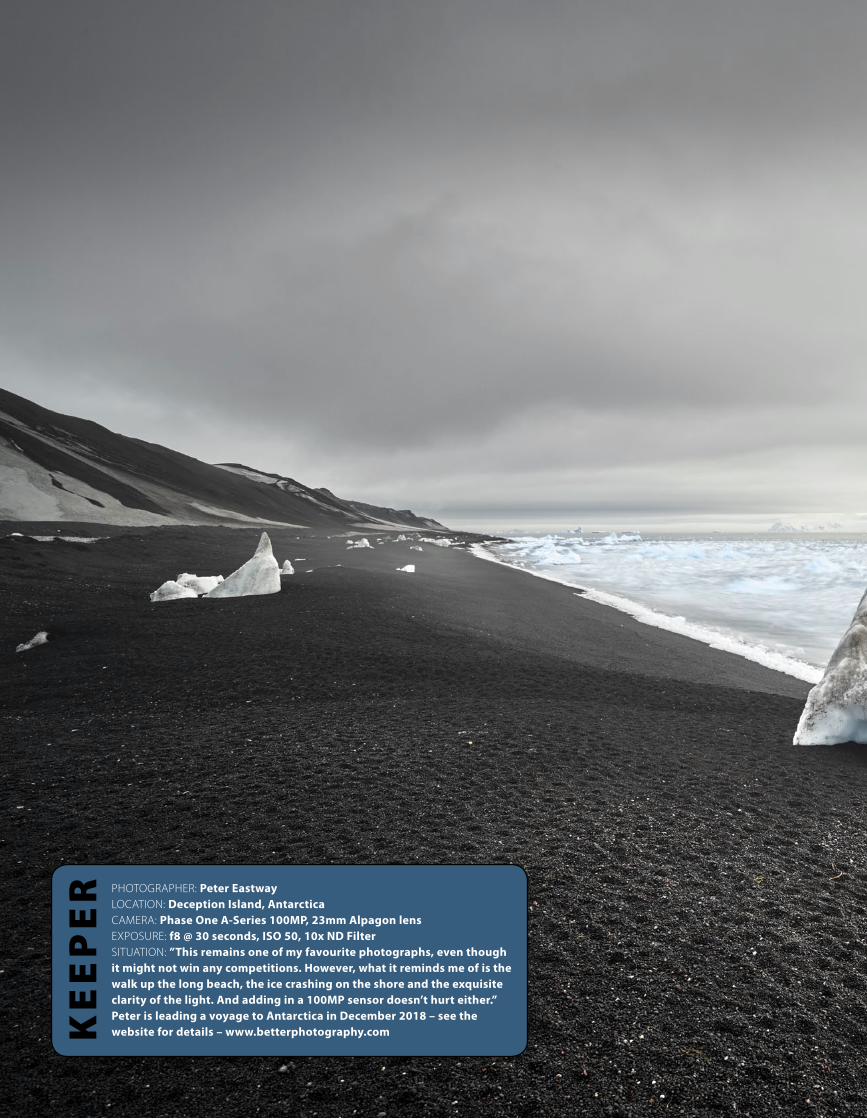
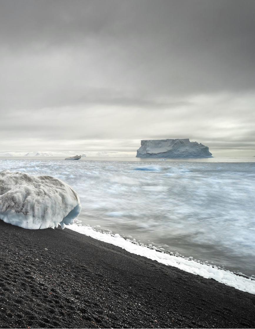
ER PHOTOGRAPHER: Peter Eastway
LOCATION: Deception Island, AntarcticaCAMERA: Phase One A-Series 100MP, 23mm Alpagon lensEXPOSURE: f8 @ 30 seconds, ISO 50, 10x ND FilterSITUATION: ”This remains one of my favourite photographs, even though it might not win any competitions. However, what it reminds me of is the walk up the long beach, the ice crashing on the shore and the exquisite clarity of the light. And adding in a 100MP sensor doesn’t hurt either.” Peter is leading a voyage to Antarctica in December 2018 – see the website for details – www.betterphotography.com
KE
EP
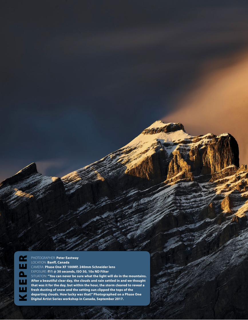
ER PHOTOGRAPHER: Peter Eastway
LOCATION: Banff, CanadaCAMERA: Phase One XF 100MP, 240mm Schneider lensEXPOSURE: f11 @ 30 seconds, ISO 50, 10x ND FilterSITUATION: ”You can never be sure what the light will do in the mountains. After a beautiful clear day, the clouds and rain settled in and we thought that was it for the day, but within the hour, the storm cleared to reveal a fresh dusting of snow and the setting sun clipped the tops of the departing clouds. How lucky was that!” Photographed on a Phase One Digital Artist Series workshop in Canada, September 2017.
l G A D G E T S & G I Z M O S
10 B E T T E R P H OTO G R A P H Y
Fujifilm X-E3As the Fujifilm X-Series matures, small refinements make excellent cameras even more serviceable in the search for amazing photographs. The Fujifilm X-E3 incorporates a new X-Processor Pro to produce 'outstanding colour reproduction and high resolution' in stills, while also being capable of producing Full HD and 4K video. The X-E3 is the first X-Series model to feature Bluetooth low energy wireless communication for easy transfer of images from the camera to a smartphone or tablet. And it uses minimal power which is good for both the camera and your phone. Inside the camera, a 24.3-megapixel APS-C sized X-Trans CMOS III sensor sits alongside a large, phase detection AF area with updated focusing algorithms, claimed to deliver AF speeds of just 0.06 second to lock onto your subject. The X-E3 also offers 5.0 frames per second Live-View shooting, a quick start-up time of 0.4 second, a shutter time lag of 0.050 second and shooting interval of 0.25 second. This makes the X-E3 incredibly fast and responsive in the hand. With its newly developed image recognition algorithm, the X-E3 is able to track moving subjects twice as fast and half the size as the previous model. And like the previous model, the X-E3 remains compact and lightweight. The top plate features two dials – one for shutter speed and the other for exposure compensation. The aluminium-milled dials have a high-quality appearance and are notched for every setting.
The exposure compensation dial now has the C position to enable exposure compensation up to ±5 stops in 1/3 steps. The rear LCD monitor uses a high resolution 1.04M dot, 3.0-inch static touch-screen panel display, the only thing missing being a tilt screen mechanism, but there's a range of shooting and playback modes available, along with touch-screen operation. The X-E3 can be purchased as a kit complete with a Fujinon XF23mm f2 lens and optional accessories include a leather case (BLC-XE3) that allows photographers to change batteries without removing the camera, and a Hand Grip (MHG-XE3) which also allows the battery and memory card to be swapped with the grip in place. For more information, visit fujifilm-x.com/
Tilt-shift lenses are often known for the special optical effects, they produce, such as blurring the edges of an image to give a 'toy town' effect, but historically they have assisted photographers in correcting perspective and extending depth-of-field using lens movements. Before tilt-shift lenses as released by Minolta, Olympus, Nikon and Canon, lens movements were restricted to older style, large format cameras which used bellows between the lens and the film holder. Still to this day, these 'view camera' designs offer the ultimate in image control, but few photographers are prepared to sacrifice the versatility of DSLR and CSC cameras. A tilt-shift lens is an excellent compromise. Canon has announced three new tilt-shift (TS-E) lenses, claiming that the image quality "has evolved considerably since their first inception several years ago". According to Canon, enhanced optical elements like moulded aspherical glass and UD lenses are at the core of the new Canon TS-E 50mm f/2.8L Macro lens, TS-E 90mm f/2.8L Macro lens and TS-E 135mm f/4L Macro lens. "These features provide users with edge-to-edge resolution, improved image quality over previous Canon TS-E lenses and minimum distortion." Canon has also included two anti-reflective coatings, SubWaveLength Structure Coating (SWC) in the TS-E 50mm f/2.8L and TS-E 135mm f/4L Macro lenses and Air-Sphere Coating (ASC), into the TS-E 50mm f/2.8L and TS-E 90mm f/2.8L Macro lenses. SWC helps to reduce flare and ghosting, while ASC is a new technology
that provides very high, anti-reflective performance, particularly when alleviating incidental light that can enter a lens. The new Canon tilt-shift lenses also offer improved operability over previous models, including larger tilt, shift-and-lock knobs, a lock-release button and a new tilt-locking mechanism that firmly locks the lens in the zero-tilt position to help prevent unintended tilting and thus ensuring more precise shooting capabilities. The rotation of the tilt-shift lenses also allows users to freely change the axis of tilt movement and shift from right angles to parallel to adapt to various shooting conditions and situations. For more information visit www.canon.com.au/
New Canon Tilt Shift Lenses

l G A D G E T S & G I Z M O S
12 B E T T E R P H OTO G R A P H Y
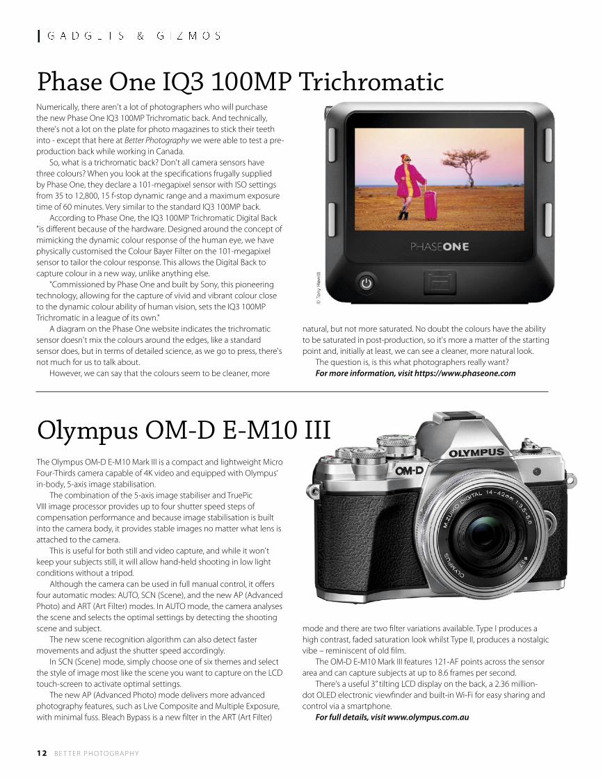
Phase One IQ3 100MP TrichromaticNumerically, there aren't a lot of photographers who will purchase the new Phase One IQ3 100MP Trichromatic back. And technically, there's not a lot on the plate for photo magazines to stick their teeth into - except that here at Better Photography we were able to test a pre-production back while working in Canada. So, what is a trichromatic back? Don't all camera sensors have three colours? When you look at the specifications frugally supplied by Phase One, they declare a 101-megapixel sensor with ISO settings from 35 to 12,800, 15 f-stop dynamic range and a maximum exposure time of 60 minutes. Very similar to the standard IQ3 100MP back. According to Phase One, the IQ3 100MP Trichromatic Digital Back "is different because of the hardware. Designed around the concept of mimicking the dynamic colour response of the human eye, we have physically customised the Colour Bayer Filter on the 101-megapixel sensor to tailor the colour response. This allows the Digital Back to capture colour in a new way, unlike anything else. "Commissioned by Phase One and built by Sony, this pioneering technology, allowing for the capture of vivid and vibrant colour close to the dynamic colour ability of human vision, sets the IQ3 100MP Trichromatic in a league of its own." A diagram on the Phase One website indicates the trichromatic sensor doesn't mix the colours around the edges, like a standard sensor does, but in terms of detailed science, as we go to press, there's not much for us to talk about. However, we can say that the colours seem to be cleaner, more
natural, but not more saturated. No doubt the colours have the ability to be saturated in post-production, so it's more a matter of the starting point and, initially at least, we can see a cleaner, more natural look. The question is, is this what photographers really want? For more information, visit https://www.phaseone.com
The Olympus OM-D E-M10 Mark III is a compact and lightweight Micro Four-Thirds camera capable of 4K video and equipped with Olympus’ in-body, 5-axis image stabilisation. The combination of the 5-axis image stabiliser and TruePic VIII image processor provides up to four shutter speed steps of compensation performance and because image stabilisation is built into the camera body, it provides stable images no matter what lens is attached to the camera. This is useful for both still and video capture, and while it won't keep your subjects still, it will allow hand-held shooting in low light conditions without a tripod. Although the camera can be used in full manual control, it offers four automatic modes: AUTO, SCN (Scene), and the new AP (Advanced Photo) and ART (Art Filter) modes. In AUTO mode, the camera analyses the scene and selects the optimal settings by detecting the shooting scene and subject. The new scene recognition algorithm can also detect faster movements and adjust the shutter speed accordingly. In SCN (Scene) mode, simply choose one of six themes and select the style of image most like the scene you want to capture on the LCD touch-screen to activate optimal settings. The new AP (Advanced Photo) mode delivers more advanced photography features, such as Live Composite and Multiple Exposure, with minimal fuss. Bleach Bypass is a new filter in the ART (Art Filter)
mode and there are two filter variations available. Type I produces a high contrast, faded saturation look whilst Type II, produces a nostalgic vibe – reminiscent of old film. The OM-D E-M10 Mark III features 121-AF points across the sensor area and can capture subjects at up to 8.6 frames per second. There's a useful 3” tilting LCD display on the back, a 2.36 million-dot OLED electronic viewfinder and built-in Wi-Fi for easy sharing and control via a smartphone. For full details, visit www.olympus.com.au
Olympus OM-D E-M10 III
l G A D G E T S & G I Z M O S
14 B E T T E R P H OTO G R A P H Y
Elinchrom ELB 1200
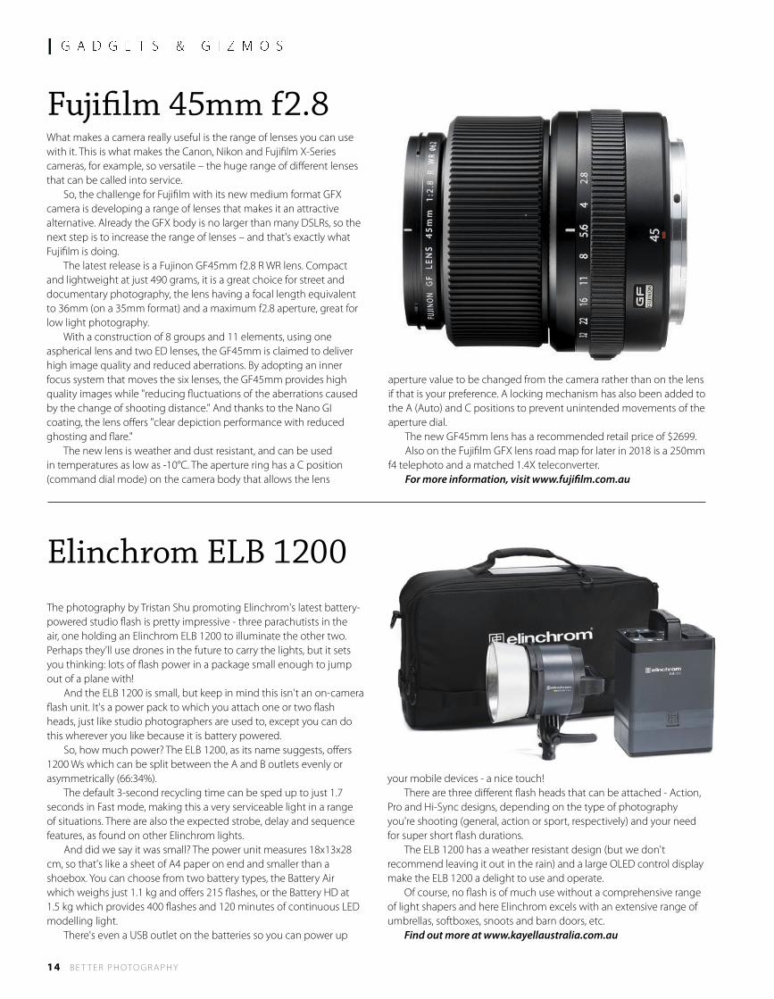
Fujifilm 45mm f2.8What makes a camera really useful is the range of lenses you can use with it. This is what makes the Canon, Nikon and Fujifilm X-Series cameras, for example, so versatile – the huge range of different lenses that can be called into service. So, the challenge for Fujifilm with its new medium format GFX camera is developing a range of lenses that makes it an attractive alternative. Already the GFX body is no larger than many DSLRs, so the next step is to increase the range of lenses – and that's exactly what Fujifilm is doing. The latest release is a Fujinon GF45mm f2.8 R WR lens. Compact and lightweight at just 490 grams, it is a great choice for street and documentary photography, the lens having a focal length equivalent to 36mm (on a 35mm format) and a maximum f2.8 aperture, great for low light photography. With a construction of 8 groups and 11 elements, using one aspherical lens and two ED lenses, the GF45mm is claimed to deliver high image quality and reduced aberrations. By adopting an inner focus system that moves the six lenses, the GF45mm provides high quality images while "reducing fluctuations of the aberrations caused by the change of shooting distance." And thanks to the Nano GI coating, the lens offers "clear depiction performance with reduced ghosting and flare." The new lens is weather and dust resistant, and can be used in temperatures as low as -10°C. The aperture ring has a C position (command dial mode) on the camera body that allows the lens
aperture value to be changed from the camera rather than on the lens if that is your preference. A locking mechanism has also been added to the A (Auto) and C positions to prevent unintended movements of the aperture dial. The new GF45mm lens has a recommended retail price of $2699. Also on the Fujifilm GFX lens road map for later in 2018 is a 250mm f4 telephoto and a matched 1.4X teleconverter. For more information, visit www.fujifilm.com.au
The photography by Tristan Shu promoting Elinchrom's latest battery-powered studio flash is pretty impressive - three parachutists in the air, one holding an Elinchrom ELB 1200 to illuminate the other two. Perhaps they'll use drones in the future to carry the lights, but it sets you thinking: lots of flash power in a package small enough to jump out of a plane with! And the ELB 1200 is small, but keep in mind this isn't an on-camera flash unit. It's a power pack to which you attach one or two flash heads, just like studio photographers are used to, except you can do this wherever you like because it is battery powered. So, how much power? The ELB 1200, as its name suggests, offers 1200 Ws which can be split between the A and B outlets evenly or asymmetrically (66:34%). The default 3-second recycling time can be sped up to just 1.7 seconds in Fast mode, making this a very serviceable light in a range of situations. There are also the expected strobe, delay and sequence features, as found on other Elinchrom lights. And did we say it was small? The power unit measures 18x13x28 cm, so that's like a sheet of A4 paper on end and smaller than a shoebox. You can choose from two battery types, the Battery Air which weighs just 1.1 kg and offers 215 flashes, or the Battery HD at 1.5 kg which provides 400 flashes and 120 minutes of continuous LED modelling light. There's even a USB outlet on the batteries so you can power up
your mobile devices - a nice touch! There are three different flash heads that can be attached - Action, Pro and Hi-Sync designs, depending on the type of photography you're shooting (general, action or sport, respectively) and your need for super short flash durations. The ELB 1200 has a weather resistant design (but we don't recommend leaving it out in the rain) and a large OLED control display make the ELB 1200 a delight to use and operate. Of course, no flash is of much use without a comprehensive range of light shapers and here Elinchrom excels with an extensive range of umbrellas, softboxes, snoots and barn doors, etc. Find out more at www.kayellaustralia.com.au
Be Inspired and develop with Len MetcalfDestination Photography Workshops Kiama, Blue Mountains & Albany WA
Kiama, NSW: This visually stunning coast gives us so many shooting locations only min-utes from the delightful seaside town of Kiama. We learn and study seascape photogra-phy in the classroom between shoots. We process, print and critique your work.26th February - 2nd March 2018 - Book online now limited places
Albany, Western Australia: The oldest colonial settlement in Western Australia, Albany has a rich and varied coast line. With rugged cliff-lines, pristine beaches and towering ancient forests we so much variety to photograph. What a stunning location to improve your photography in this unique workshop. 14th - 18th May 2018 - Register Online
Blue Mountains: Let Len take you to amazing locations in his own back yard of the stun-ning Blue Mountains World Heritage Area. Return daily to the classroom to be inspired, learn and develop your photography skills. 20-24 November 2017 - Book Online Now
Digital Black and White Photography WorkshopsKiama, Blue Mountains & Albany WA
Len’s Monchrome weekend workshops run at some stunning destinations throughout Australia. In these short weekend workshops Len will teach you his method for working digitally in black and white. This will include, camera set up, visualisation, composition and post processing your images in Lightroom & Tonality. Len makes digital black and whtie photography easy - Book Online NowKiama, NSW Coast 24th & 25th February 2018Katoomba, The Blue Mountains World Heritage Area 7th & 8th April 2018 Albany, Western Australia 12th & 13th May 2018
Namibia Landscape Photography SafariNamibia, South Africa
Join Len Metcalf and our local photography guide on this extraordinary safari. Namibia is a photographer’s paradise, boasting unique desert adapted animals, giant sand dunes, wild coastlines and arid landscapes. This 12 day photography safari encompasses many of these highlights while the core focus remains on developing and learning photogra-phy skills from Len. Limited places. 11th - 23rd March 2018 - Book Online Now
Sign up for Len’s daily photograph at http://lenmetcalf.com
About Len MetcalfLen Metcalf has practiced photography since he picked up his first camera as a boy, and has acquired over 30 years of teaching experience as an educator. Now, Len’s workshops have a solid reputation for providing unique learning opportunities aimed clearly at the mature intermediate photographer who wishes to take their photogra-phy to that next level. Gentle slow location shoots, supportive & encouraging class-room environments and stunning settings have become Len’s trademark.
As such, Len Metcalf has recently been dubbed as “The Photographers Photographer” with his unique creative style. Len started photography growing up in The Blue Moun-tains. With undergraduate degrees in both fine art photography and art education, a master’s degree in adult education, and a lifetime of experience in education, Len is the ideal facilitator suited to taking your photography further.
“I must say, White on White was the best workshop I have attended ever (and I have done many).” — Mary-Lou Emmert
Inspiring a love of photographyhttp://lensschool.com
Spaces LimitedBook Online Now
l G A D G E T S & G I Z M O S
16 B E T T E R P H OTO G R A P H Y
Creative Live
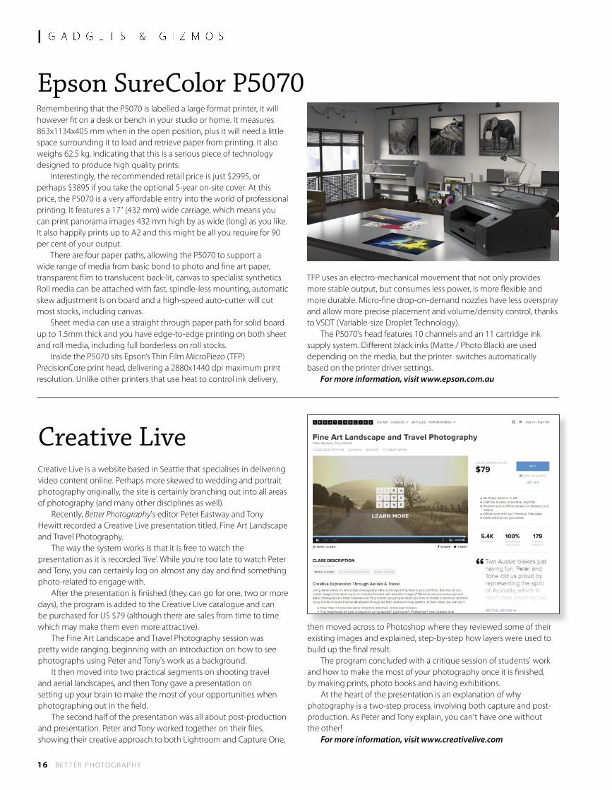
Epson SureColor P5070 Remembering that the P5070 is labelled a large format printer, it will however fit on a desk or bench in your studio or home. It measures 863x1134x405 mm when in the open position, plus it will need a little space surrounding it to load and retrieve paper from printing. It also weighs 62.5 kg, indicating that this is a serious piece of technology designed to produce high quality prints. Interestingly, the recommended retail price is just $2995, or perhaps $3895 if you take the optional 5-year on-site cover. At this price, the P5070 is a very affordable entry into the world of professional printing. It features a 17" (432 mm) wide carriage, which means you can print panorama images 432 mm high by as wide (long) as you like. It also happily prints up to A2 and this might be all you require for 90 per cent of your output. There are four paper paths, allowing the P5070 to support a wide range of media from basic bond to photo and fine art paper, transparent film to translucent back-lit, canvas to specialist synthetics. Roll media can be attached with fast, spindle-less mounting, automatic skew adjustment is on board and a high-speed auto-cutter will cut most stocks, including canvas. Sheet media can use a straight through paper path for solid board up to 1.5mm thick and you have edge-to-edge printing on both sheet and roll media, including full borderless on roll stocks. Inside the P5070 sits Epson’s Thin Film MicroPiezo (TFP) PrecisionCore print head, delivering a 2880x1440 dpi maximum print resolution. Unlike other printers that use heat to control ink delivery,
TFP uses an electro-mechanical movement that not only provides more stable output, but consumes less power, is more flexible and more durable. Micro-fine drop-on-demand nozzles have less overspray and allow more precise placement and volume/density control, thanks to VSDT (Variable-size Droplet Technology). The P5070's head features 10 channels and an 11 cartridge ink supply system. Different black inks (Matte / Photo Black) are used depending on the media, but the printer switches automatically based on the printer driver settings. For more information, visit www.epson.com.au
Creative Live is a website based in Seattle that specialises in delivering video content online. Perhaps more skewed to wedding and portrait photography originally, the site is certainly branching out into all areas of photography (and many other disciplines as well). Recently, Better Photography's editor Peter Eastway and Tony Hewitt recorded a Creative Live presentation titled, Fine Art Landscape and Travel Photography. The way the system works is that it is free to watch the presentation as it is recorded 'live'. While you're too late to watch Peter and Tony, you can certainly log on almost any day and find something photo-related to engage with. After the presentation is finished (they can go for one, two or more days), the program is added to the Creative Live catalogue and can be purchased for US $79 (although there are sales from time to time which may make them even more attractive). The Fine Art Landscape and Travel Photography session was pretty wide ranging, beginning with an introduction on how to see photographs using Peter and Tony's work as a background. It then moved into two practical segments on shooting travel and aerial landscapes, and then Tony gave a presentation on setting up your brain to make the most of your opportunities when photographing out in the field. The second half of the presentation was all about post-production and presentation. Peter and Tony worked together on their files, showing their creative approach to both Lightroom and Capture One,
then moved across to Photoshop where they reviewed some of their existing images and explained, step-by-step how layers were used to build up the final result. The program concluded with a critique session of students' work and how to make the most of your photography once it is finished, by making prints, photo books and having exhibitions. At the heart of the presentation is an explanation of why photography is a two-step process, involving both capture and post-production. As Peter and Tony explain, you can't have one without the other! For more information, visit www.creativelive.com

l E Q U I P M E N T
18 B E T T E R P H OTO G R A P H Y
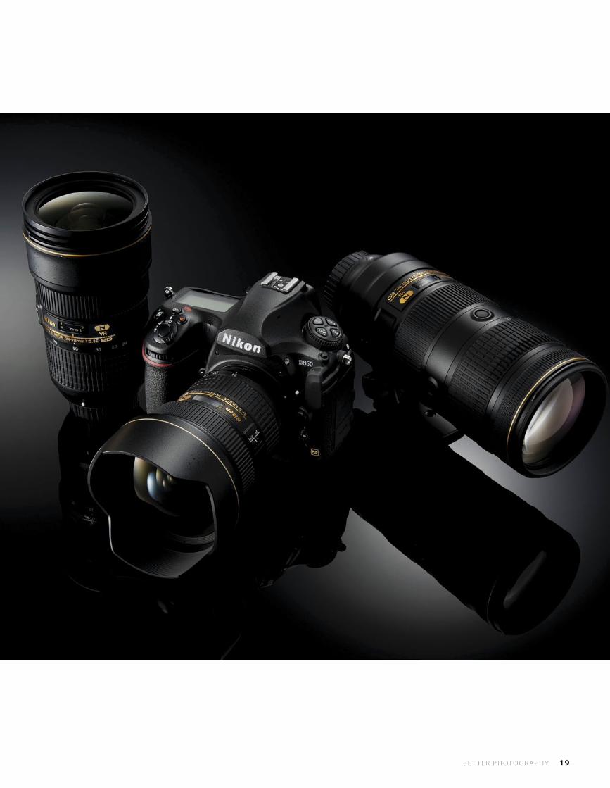
Nikon D850
More pixels! Exceptional low light performance! Fast capture rates and 4K video...
What doesn’t Nikon’s new D850 have that a photographer or video producer needs?
WHY DO WE need a 45-megapixel sensor? With the majority of photography only requiring small files for online presentation, where is the need? The answer to this question lies in the statement ‘majority’ of photography. These days, the majority of photography is done by newer photographers, often with minimal skills and relying on the camera rather than their knowledge to create great photos. In comparison, keen enthusiasts and professionals like the readers of this esteemed publication are capable of producing higher quality files that will suit a variety of purposes, depending on our needs. For instance, you might not need 45-megapixels for a family portrait of mum, dad and the two kids. But what happens when you’re photographing your extended family of 20 or 50 people in a group shot? The extra resolution will set your images apart - and you’ll be able to recognise everyone that much more clearly. However, the Nikon D850 isn’t aimed solely at portrait photographers and group shots. There is a raft of new features that make it ideally suited to a range of applications, from
large-format landscape prints to sport, fashion, weddings and, with its video functionality, multimedia and web output. Having a large sensor on board doesn’t mean you need the resolution for every shoot, but having a camera in your bag that is capable of absolutely anything you may need is a great reassurance.
Resolution Without NoiseOne of Nikon’s strengths is its file quality at high ISO settings. Nikon cameras revel in low light conditions, producing images with very little noise, extended dynamic range and crisp, sharp details. The D850 is Nikon’s first DSLR camera to be equipped with a backside illumination CMOS sensor. Together with the camera’s low-noise performance, this enables it to achieve a maximum standard sensitivity of ISO 25,600 (with expansion up to ISO 102,400). The same minimum standard sensitivity of ISO 64 (with expansion to ISO 32) supported by the D810 is also offered by the D850, providing an incredibly broad range of sensitivities.
B E T T E R P H OTO G R A P H Y 19
l E Q U I P M E N T
20 B E T T E R P H OTO G R A P H Y
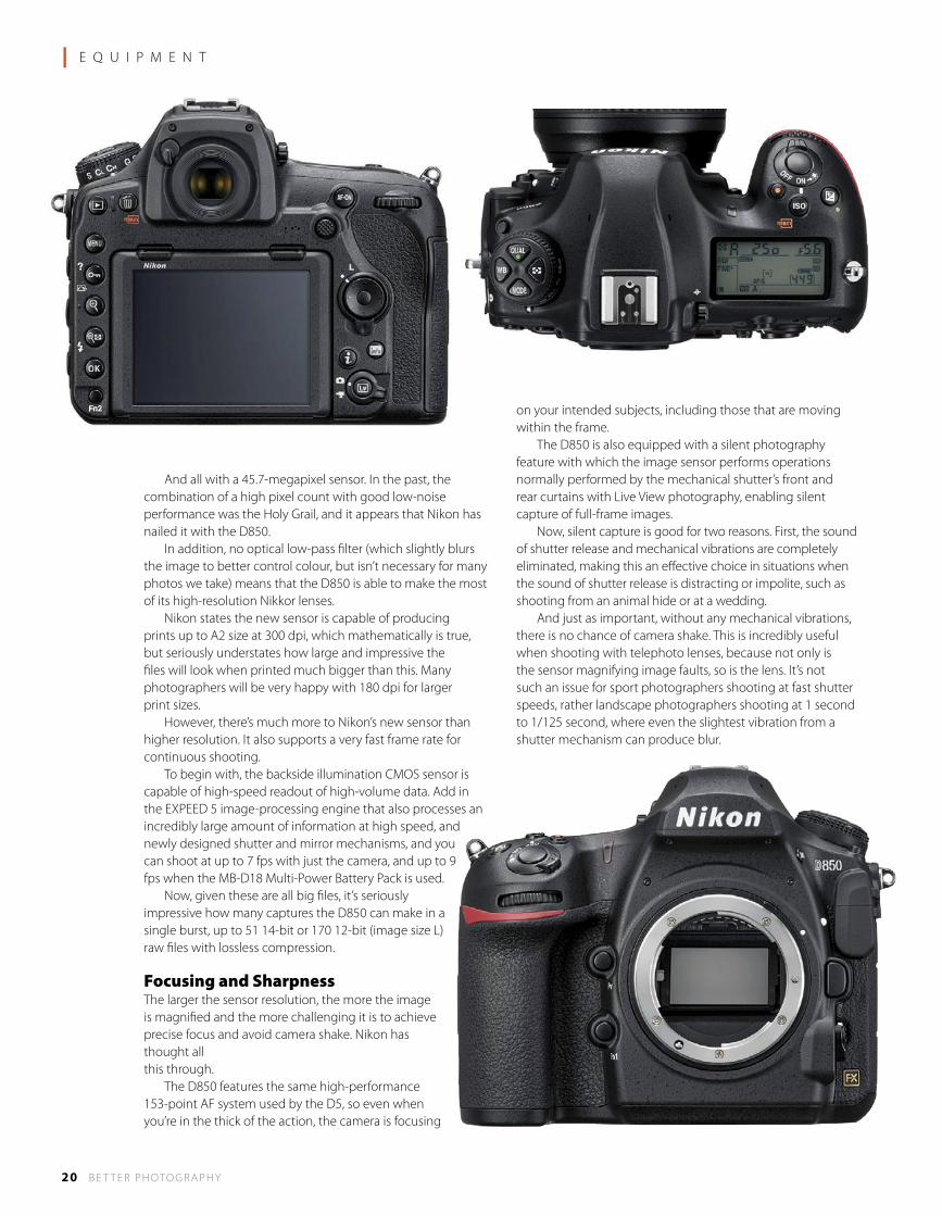
And all with a 45.7-megapixel sensor. In the past, the combination of a high pixel count with good low-noise performance was the Holy Grail, and it appears that Nikon has nailed it with the D850. In addition, no optical low-pass filter (which slightly blurs the image to better control colour, but isn’t necessary for many photos we take) means that the D850 is able to make the most of its high-resolution Nikkor lenses. Nikon states the new sensor is capable of producing prints up to A2 size at 300 dpi, which mathematically is true, but seriously understates how large and impressive the files will look when printed much bigger than this. Many photographers will be very happy with 180 dpi for larger print sizes. However, there’s much more to Nikon’s new sensor than higher resolution. It also supports a very fast frame rate for continuous shooting. To begin with, the backside illumination CMOS sensor is capable of high-speed readout of high-volume data. Add in the EXPEED 5 image-processing engine that also processes an incredibly large amount of information at high speed, and newly designed shutter and mirror mechanisms, and you can shoot at up to 7 fps with just the camera, and up to 9 fps when the MB-D18 Multi-Power Battery Pack is used. Now, given these are all big files, it’s seriously impressive how many captures the D850 can make in a single burst, up to 51 14-bit or 170 12-bit (image size L) raw files with lossless compression.
Focusing and SharpnessThe larger the sensor resolution, the more the image is magnified and the more challenging it is to achieve precise focus and avoid camera shake. Nikon has thought all this through. The D850 features the same high-performance 153-point AF system used by the D5, so even when you’re in the thick of the action, the camera is focusing
on your intended subjects, including those that are moving within the frame. The D850 is also equipped with a silent photography feature with which the image sensor performs operations normally performed by the mechanical shutter’s front and rear curtains with Live View photography, enabling silent capture of full-frame images. Now, silent capture is good for two reasons. First, the sound of shutter release and mechanical vibrations are completely eliminated, making this an effective choice in situations when the sound of shutter release is distracting or impolite, such as shooting from an animal hide or at a wedding. And just as important, without any mechanical vibrations, there is no chance of camera shake. This is incredibly useful when shooting with telephoto lenses, because not only is the sensor magnifying image faults, so is the lens. It’s not such an issue for sport photographers shooting at fast shutter speeds, rather landscape photographers shooting at 1 second to 1/125 second, where even the slightest vibration from a shutter mechanism can produce blur.
NAMIBIA Photographextraordinary Namibia, traveling by light plane with Nick Rains
Aug 29 - Sept 8, 2018
SossusvleiDamaralandKolmanskopHimba and Herrero Culture www.nickrains.com
P h o t o S a f a r i
AIPP Travel Photographer of the Year 2014
22 B E T T E R P H OTO G R A P H Y
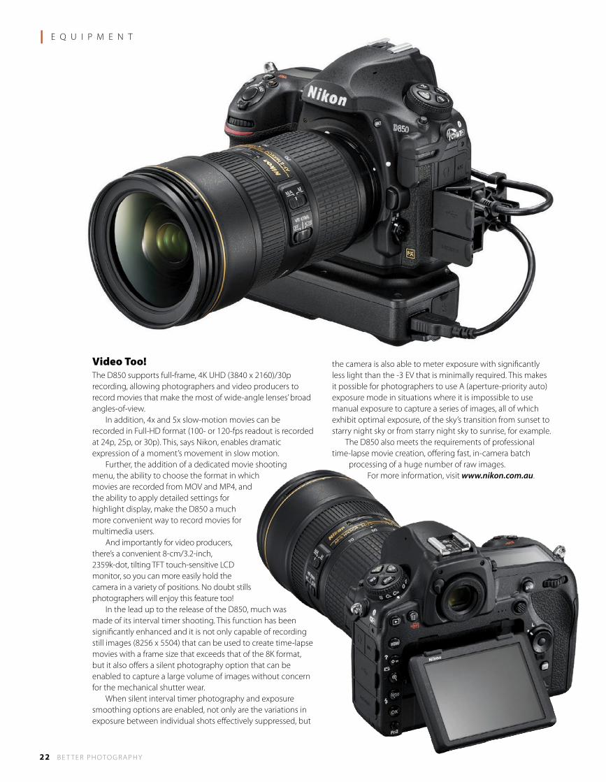
Video Too!The D850 supports full-frame, 4K UHD (3840 x 2160)/30p recording, allowing photographers and video producers to record movies that make the most of wide-angle lenses’ broad angles-of-view. In addition, 4x and 5x slow-motion movies can be recorded in Full-HD format (100- or 120-fps readout is recorded at 24p, 25p, or 30p). This, says Nikon, enables dramatic expression of a moment’s movement in slow motion. Further, the addition of a dedicated movie shooting menu, the ability to choose the format in which movies are recorded from MOV and MP4, and the ability to apply detailed settings for highlight display, make the D850 a much more convenient way to record movies for multimedia users. And importantly for video producers, there’s a convenient 8-cm/3.2-inch, 2359k-dot, tilting TFT touch-sensitive LCD monitor, so you can more easily hold the camera in a variety of positions. No doubt stills photographers will enjoy this feature too! In the lead up to the release of the D850, much was made of its interval timer shooting. This function has been significantly enhanced and it is not only capable of recording still images (8256 x 5504) that can be used to create time-lapse movies with a frame size that exceeds that of the 8K format, but it also offers a silent photography option that can be enabled to capture a large volume of images without concern for the mechanical shutter wear. When silent interval timer photography and exposure smoothing options are enabled, not only are the variations in exposure between individual shots effectively suppressed, but
the camera is also able to meter exposure with significantly less light than the -3 EV that is minimally required. This makes it possible for photographers to use A (aperture-priority auto) exposure mode in situations where it is impossible to use manual exposure to capture a series of images, all of which exhibit optimal exposure, of the sky’s transition from sunset to starry night sky or from starry night sky to sunrise, for example. The D850 also meets the requirements of professional time-lapse movie creation, offering fast, in-camera batch
processing of a huge number of raw images.For more information, visit www.nikon.com.au.
l E Q U I P M E N T

2big does it so your laptop doesn't have to.
Store. Dock. Streamline.2big Dock Thunderbolt™ 3
Where to buy:http://wheretobuy.lacie.com/
USB 3.0 HubSD Card and CF Card Slots
USB 3.1 Port5 years warrantyLIMITED
WARRANTY
5YEAR
Dual Thunderbolt 3 Ports
Enterprise Grade HDDDisplayPort
Up to 20TB

From the moment we’ve taken our photographs, we have the
means to keep them safe forever – with the right technology
from LaCie.
DO YOU OR your parents have an album or a box containing old photographs? For most families, there is a core collection of important images which document their lives and their heritage. Many of the photographs go back over 100 years. Can digital photos last this long? The answer is yes, although it does require us to be a little more proactive. The way to store negatives and prints was in a cupboard and hope that the house didn’t burn down or get flooded. With very little input from the owners, these ‘archives’ could survive decades.
In the digital world, it’s a little more complicated because we have to keep abreast of changing technology. We can’t just put the digital files away and expect them to be there in the future, but we can embrace the technology and set up a plan that ensures our photographs survive, right from the moment we take our photographs.
Multiple SolutionsAs photographers, we have more than a few precious family photographs to keep safe. Photographers have many years of time, effort and passion invested in thousands if not millions of exposures. Not all are as important as each other, but knowing today what will be important tomorrow is not always possible.
Generally, photographers retain all their raw files and, in separate folders, the files that have been processed and edited. A huge volume of digital files is produced, far more than will fit on an average computer. Certainly far more than fits on the storage cards you’ve used in your cameras. What happens to the overflow of images as you continue to take more photographs? What can you do to ensure they survive your lifetime and that of future generations? Experts explain that one solution is not enough. Technology is always changing,
so we need to accept this and transfer our archives of photographs to new media as it becomes available – and to new media as it needs refreshing. In the past, we’ve used tape, CDs, DVDs and hard drives, but it seems the only survivor of note is the hard drive. The cloud is also touted as being a great solution, but it should not be our only solution – what happens if the company goes out of business? Financial obsolesence is more of a danger, hopefully not this year. If for nothing more than convenience and peace of mind, we need our own storage. And we need reliable technology.
Quality EquipmentThere’s not much point storing your files or making a backup onto a hard drive that might not last. True, all hard drives can fail, even the best quality and most expensive. And that’s exactly why every hard drive manufacturer recommends multiple copies of your files. Multiple copies can be achieved in a number of ways. For instance, when you’re shooting out on location, copying the files from your camera’s storage cards onto a separate hard drive (or two) immediately gives you multiple copies and security. Back at home or in the studio, using a RAID system which automatically makes a second and even a third copy of all your files gives you further security (because if one of the drives fails, it can be replaced without losing any data). And finally, to protect against the unlikely event of fire, flood or theft,
LaCie’s Safe StorageThe Photographer’s LifelineOn Location • In the Studio • A Separate Backup
LaCie 2big – up to 16TB storage.
LaCie 2big Dock – up to 20TB storage.
W W W . L A C I E . C O M . A U
a further copy of your files should be kept at a remote site – maybe a parent or sibling’s house, for instance. However, this system only works if you have good quality storage – good quality drives and supporting technology.
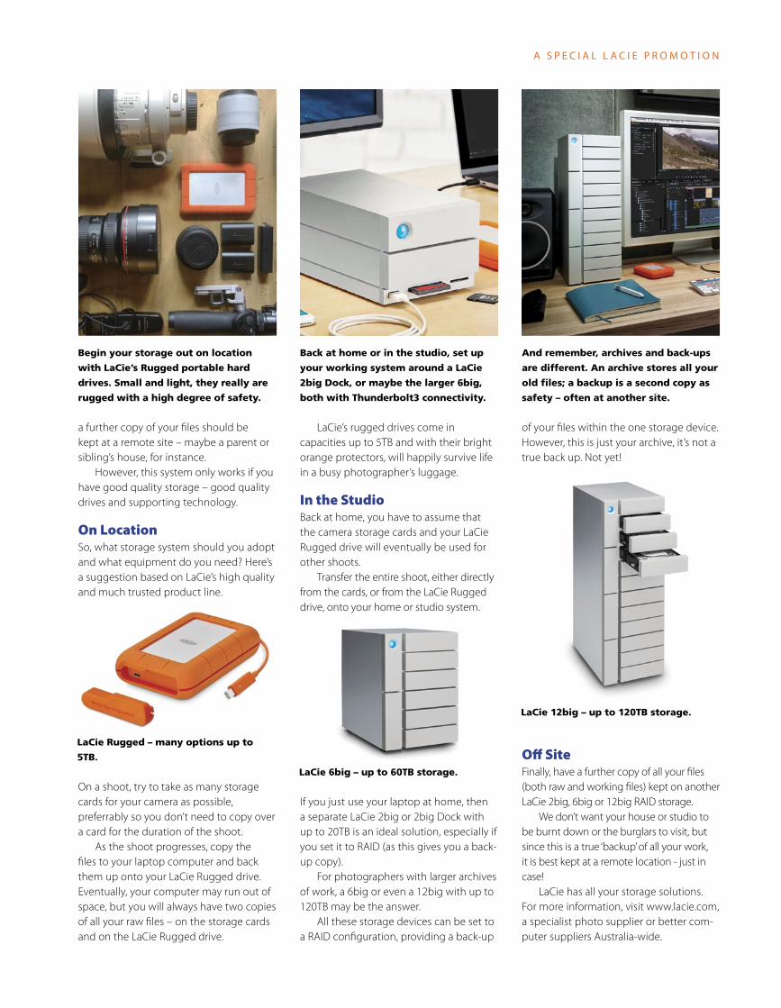
On LocationSo, what storage system should you adopt and what equipment do you need? Here’s a suggestion based on LaCie’s high quality and much trusted product line.
On a shoot, try to take as many storage cards for your camera as possible, preferrably so you don’t need to copy over a card for the duration of the shoot. As the shoot progresses, copy the files to your laptop computer and back them up onto your LaCie Rugged drive. Eventually, your computer may run out of space, but you will always have two copies of all your raw files – on the storage cards and on the LaCie Rugged drive.
LaCie’s rugged drives come in capacities up to 5TB and with their bright orange protectors, will happily survive life in a busy photographer’s luggage.
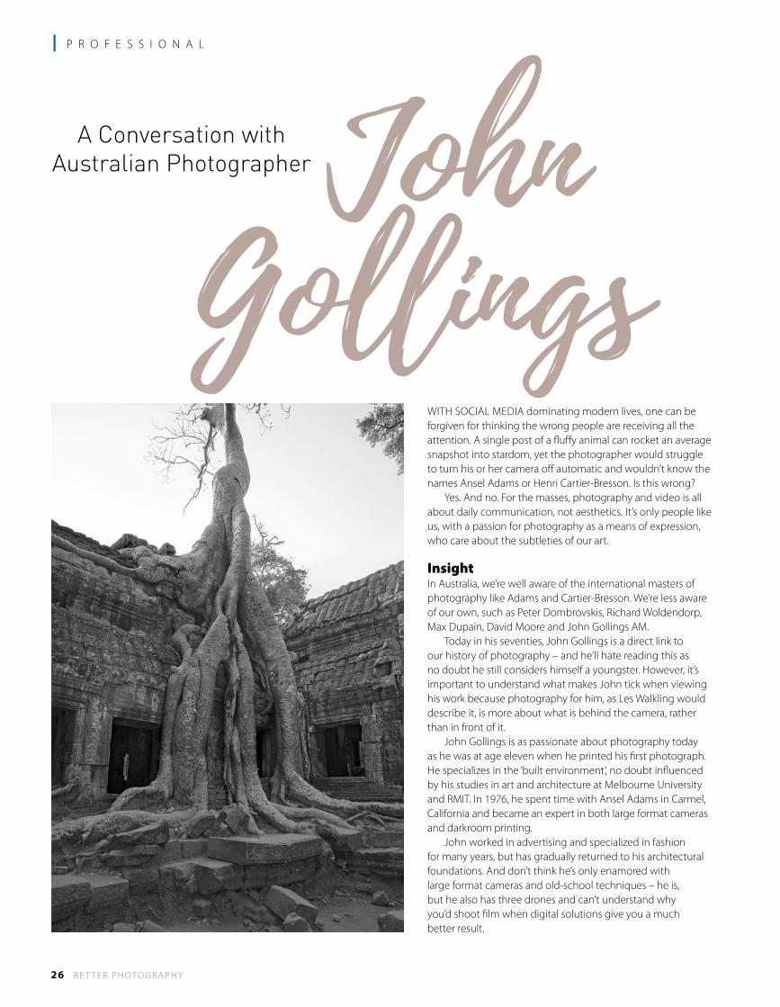
In the StudioBack at home, you have to assume that the camera storage cards and your LaCie Rugged drive will eventually be used for other shoots. Transfer the entire shoot, either directly from the cards, or from the LaCie Rugged drive, onto your home or studio system.
If you just use your laptop at home, then a separate LaCie 2big or 2big Dock with up to 20TB is an ideal solution, especially if you set it to RAID (as this gives you a back-up copy). For photographers with larger archives of work, a 6big or even a 12big with up to 120TB may be the answer. All these storage devices can be set to a RAID configuration, providing a back-up
of your files within the one storage device. However, this is just your archive, it’s not a true back up. Not yet!
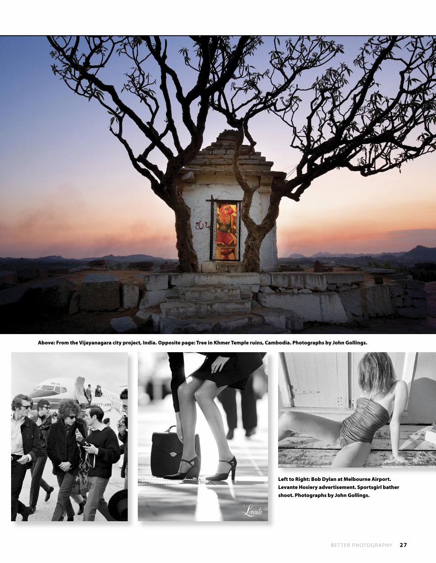
Off SiteFinally, have a further copy of all your files (both raw and working files) kept on another LaCie 2big, 6big or 12big RAID storage. We don’t want your house or studio to be burnt down or the burglars to visit, but since this is a true ‘backup’ of all your work, it is best kept at a remote location - just in case! LaCie has all your storage solutions. For more information, visit www.lacie.com, a specialist photo supplier or better com-puter suppliers Australia-wide.
LaCie 12big – up to 120TB storage.
LaCie Rugged – many options up to
5TB.
LaCie 6big – up to 60TB storage.
A S P E C I A L L A C I E P R O M O T I O N
Begin your storage out on location
with LaCie’s Rugged portable hard
drives. Small and light, they really are
rugged with a high degree of safety.
Back at home or in the studio, set up
your working system around a LaCie
2big Dock, or maybe the larger 6big,
both with Thunderbolt3 connectivity.
And remember, archives and back-ups
are different. An archive stores all your
old files; a backup is a second copy as
safety – often at another site.
26 B E T T E R P H OTO G R A P H Y
l P R O F E S S I O N A L
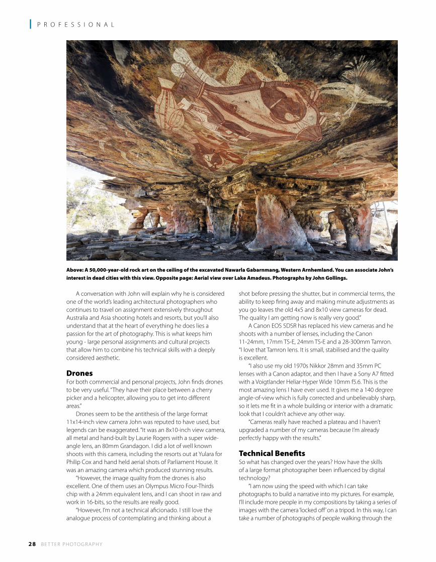
WITH SOCIAL MEDIA dominating modern lives, one can be forgiven for thinking the wrong people are receiving all the attention. A single post of a fluffy animal can rocket an average snapshot into stardom, yet the photographer would struggle to turn his or her camera off automatic and wouldn’t know the names Ansel Adams or Henri Cartier-Bresson. Is this wrong? Yes. And no. For the masses, photography and video is all about daily communication, not aesthetics. It’s only people like us, with a passion for photography as a means of expression, who care about the subtleties of our art.
InsightIn Australia, we’re well aware of the international masters of photography like Adams and Cartier-Bresson. We’re less aware of our own, such as Peter Dombrovskis, Richard Woldendorp, Max Dupain, David Moore and John Gollings AM. Today in his seventies, John Gollings is a direct link to our history of photography – and he’ll hate reading this as no doubt he still considers himself a youngster. However, it’s important to understand what makes John tick when viewing his work because photography for him, as Les Walkling would describe it, is more about what is behind the camera, rather than in front of it. John Gollings is as passionate about photography today as he was at age eleven when he printed his first photograph. He specializes in the ‘built environment’, no doubt influenced by his studies in art and architecture at Melbourne University and RMIT. In 1976, he spent time with Ansel Adams in Carmel, California and became an expert in both large format cameras and darkroom printing. John worked in advertising and specialized in fashion for many years, but has gradually returned to his architectural foundations. And don’t think he’s only enamored with large format cameras and old-school techniques – he is, but he also has three drones and can’t understand why you’d shoot film when digital solutions give you a much better result.
John Gollings
A Conversation with Australian Photographer
B E T T E R P H OTO G R A P H Y 27
Above: From the Vijayanagara city project, India. Opposite page: Tree in Khmer Temple ruins, Cambodia. Photographs by John Gollings.
Left to Right: Bob Dylan at Melbourne Airport. Levante Hosiery advertisement. Sportsgirl bather shoot. Photographs by John Gollings.
28 B E T T E R P H OTO G R A P H Y
l P R O F E S S I O N A L
A conversation with John will explain why he is considered one of the world’s leading architectural photographers who continues to travel on assignment extensively throughout Australia and Asia shooting hotels and resorts, but you’ll also understand that at the heart of everything he does lies a passion for the art of photography. This is what keeps him young - large personal assignments and cultural projects that allow him to combine his technical skills with a deeply considered aesthetic.
DronesFor both commercial and personal projects, John finds drones to be very useful. “They have their place between a cherry picker and a helicopter, allowing you to get into different areas.” Drones seem to be the antithesis of the large format 11x14-inch view camera John was reputed to have used, but legends can be exaggerated. “It was an 8x10-inch view camera, all metal and hand-built by Laurie Rogers with a super wide-angle lens, an 80mm Grandagon. I did a lot of well known shoots with this camera, including the resorts out at Yulara for Philip Cox and hand held aerial shots of Parliament House. It was an amazing camera which produced stunning results. “However, the image quality from the drones is also excellent. One of them uses an Olympus Micro Four-Thirds chip with a 24mm equivalent lens, and I can shoot in raw and work in 16-bits, so the results are really good. “However, I’m not a technical aficionado. I still love the analogue process of contemplating and thinking about a
shot before pressing the shutter, but in commercial terms, the ability to keep firing away and making minute adjustments as you go leaves the old 4x5 and 8x10 view cameras for dead. The quality I am getting now is really very good.” A Canon EOS 5DSR has replaced his view cameras and he shoots with a number of lenses, including the Canon 11-24mm, 17mm TS-E, 24mm TS-E and a 28-300mm Tamron. “I love that Tamron lens. It is small, stabilised and the quality is excellent. “I also use my old 1970s Nikkor 28mm and 35mm PC lenses with a Canon adaptor, and then I have a Sony A7 fitted with a Voigtlander Heliar-Hyper Wide 10mm f5.6. This is the most amazing lens I have ever used. It gives me a 140 degree angle-of-view which is fully corrected and unbelievably sharp, so it lets me fit in a whole building or interior with a dramatic look that I couldn’t achieve any other way. “Cameras really have reached a plateau and I haven’t upgraded a number of my cameras because I’m already perfectly happy with the results.”
Technical BenefitsSo what has changed over the years? How have the skills of a large format photographer been influenced by digital technology? “I am now using the speed with which I can take photographs to build a narrative into my pictures. For example, I’ll include more people in my compositions by taking a series of images with the camera ‘locked off’ on a tripod. In this way, I can take a number of photographs of people walking through the
Above: A 50,000-year-old rock art on the ceiling of the excavated Nawarla Gabarnmang, Western Arnhemland. You can associate John’s interest in dead cities with this view. Opposite page: Aerial view over Lake Amadeus. Photographs by John Gollings.
B E T T E R P H OTO G R A P H Y 29
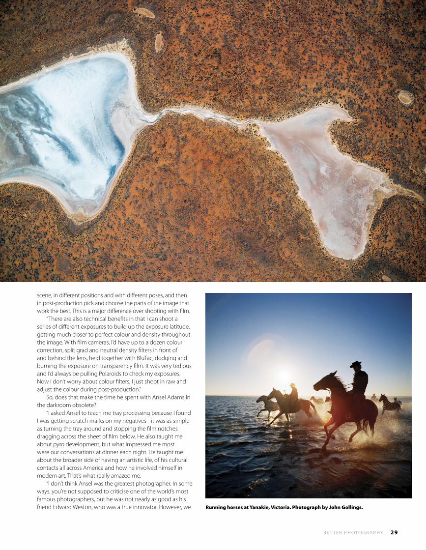
scene, in different positions and with different poses, and then in post-production pick and choose the parts of the image that work the best. This is a major difference over shooting with film. “There are also technical benefits in that I can shoot a series of different exposures to build up the exposure latitude, getting much closer to perfect colour and density throughout the image. With film cameras, I’d have up to a dozen colour correction, split grad and neutral density filters in front of and behind the lens, held together with BluTac, dodging and burning the exposure on transparency film. It was very tedious and I’d always be pulling Polaroids to check my exposures. Now I don’t worry about colour filters, I just shoot in raw and adjust the colour during post-production.” So, does that make the time he spent with Ansel Adams in the darkroom obsolete? “I asked Ansel to teach me tray processing because I found I was getting scratch marks on my negatives - it was as simple as turning the tray around and stopping the film notches dragging across the sheet of film below. He also taught me about pyro development, but what impressed me most were our conversations at dinner each night. He taught me about the broader side of having an artistic life, of his cultural contacts all across America and how he involved himself in modern art. That’s what really amazed me. “I don’t think Ansel was the greatest photographer. In some ways, you’re not supposed to criticise one of the world’s most famous photographers, but he was not nearly as good as his friend Edward Weston, who was a true innovator. However, we Running horses at Yanakie, Victoria. Photograph by John Gollings.
30 B E T T E R P H OTO G R A P H Y
l P R O F E S S I O N A L
mustn’t forget that Ansel did invent the Zone System and he massively influenced how we have viewed black and white photography ever since. “Ansel was the consummate professional with a thoroughly wonderful and generous personality. I think this is what rubbed off on me the most.”
Chasing ArchitectureJohn has always had a fascination with architecture, but he made a long detour after finishing university. “I basically went from architectural school into an advertising studio with Bob Bourne and Kevin Orpin. Kevin was a hot art director in the mid-60s and Bob was a brilliant advertising photographer from London who taught me everything. “Bob and Kevin had a falling out, so Kevin found a replacement in Peter Gough, who had been Norman Parkinson’s assistant, also in London. Apparently, Kevin had promised Peter his own assistant if he came out to Australia and as it turned out, that assistant was me. However, Peter didn’t really need an assistant, so they had me knock up a portfolio of my own and put me out to work. “Another photographer had screwed up a job, so an advertising agency said they had $200 to reshoot it if I were interested. I did the shoot and it worked out okay, so at the age of 22 I found myself on the map. Then I just fell into all these giant national accounts, such as Shell, Comalco, Sitmar and Marlboro and increasingly picked up fashion work for brands like Sportsgirl and Levante Hosiery, as well as resorts and hotels like Hyatt, Oberoi and Great Keppel Island.”
John worked extensively in fashion and advertising, but in the mid-seventies he travelled to Los Angeles with the idea of shooting a new portfolio featuring modern architecture. “Instinctively I knew architecture was my true love and I’m still using some of the photographs I shot on that trip today. The New Topographics: Photographs of a Man-Altered Landscape exhibition [George Eastman House, Rochester, 1976] had been hugely influential and I stayed with my good friend and photographer Grant Mudford. I was absolutely entranced with the work he was doing and in a competitive way, I wanted to see and understand how he shot, but I have never been able to go near his work. “Grant knew Lewis Baltz [from New Topographics] and I was introduced to Ed Ruscha by another friend. Ed’s books Twentysix Gasoline Stations and Thirtyfour Parking Lots In Los Angeles were very formative for me to see.” The plan to move into architectural photography worked and today most of John’s professional assignments come from architects wanting to have their buildings sensitively recorded. But it was the passion that drove him.
Developing Projects“I have never really done anything for money. The money seems to have followed me when people gave me a job because they knew I put my heart and soul into everything I did. “Half of my career has been photography for myself, including many cultural projects. It’s been pretty varied and has taken me all over the place. I sell the odd print, but really I haven’t earned any money from these projects.
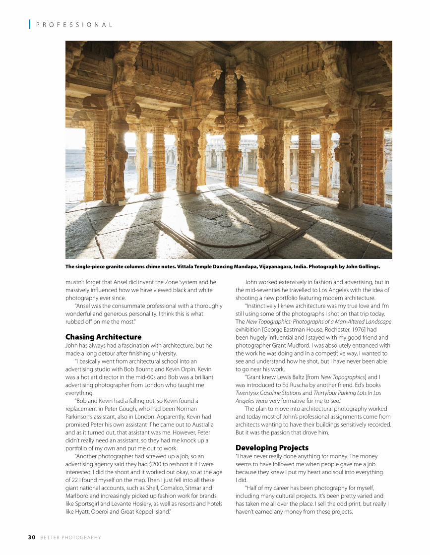
The single-piece granite columns chime notes. Vittala Temple Dancing Mandapa, Vijayanagara, India. Photograph by John Gollings.
B E T T E R P H OTO G R A P H Y 31
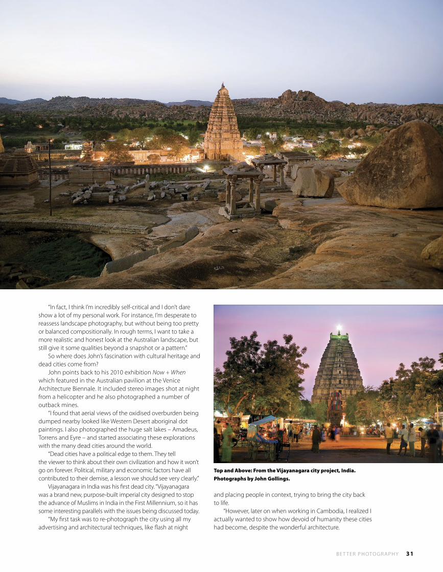
“In fact, I think I’m incredibly self-critical and I don’t dare show a lot of my personal work. For instance, I’m desperate to reassess landscape photography, but without being too pretty or balanced compositionally. In rough terms, I want to take a more realistic and honest look at the Australian landscape, but still give it some qualities beyond a snapshot or a pattern.” So where does John’s fascination with cultural heritage and dead cities come from? John points back to his 2010 exhibition Now + When which featured in the Australian pavilion at the Venice Architecture Biennale. It included stereo images shot at night from a helicopter and he also photographed a number of outback mines. “I found that aerial views of the oxidised overburden being dumped nearby looked like Western Desert aboriginal dot paintings. I also photographed the huge salt lakes – Amadeus, Torrens and Eyre – and started associating these explorations with the many dead cities around the world. “Dead cities have a political edge to them. They tell the viewer to think about their own civilization and how it won’t go on forever. Political, military and economic factors have all contributed to their demise, a lesson we should see very clearly.” Vijayanagara in India was his first dead city. “Vijayanagara was a brand new, purpose-built imperial city designed to stop the advance of Muslims in India in the First Millennium, so it has some interesting parallels with the issues being discussed today. “My first task was to re-photograph the city using all my advertising and architectural techniques, like flash at night
and placing people in context, trying to bring the city back to life. “However, later on when working in Cambodia, I realized I actually wanted to show how devoid of humanity these cities had become, despite the wonderful architecture.
Top and Above: From the Vijayanagara city project, India. Photographs by John Gollings.
32 B E T T E R P H OTO G R A P H Y
l P R O F E S S I O N A L
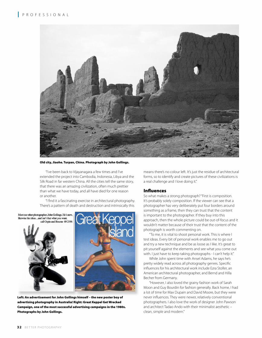
“I’ve been back to Vijayanagara a few times and I’ve extended the project into Cambodia, Indonesia, Libya and the Silk Road in far western China. All the cities tell the same story, that there was an amazing civilization, often much prettier than what we have today, and all have died for one reason or another. “I find it a fascinating exercise in architectural photography. There’s a pattern of death and destruction and intrinsically this
means there’s no colour left. It’s just the residue of architectural forms, so to identify and create pictures of these civilizations is a real challenge and I love doing it.”
InfluencesSo what makes a strong photograph? “First is composition. It’s probably solely composition. If the viewer can see that a photographer has very deliberately put four borders around something as a frame, then they can trust that the content is important to the photographer. If they buy into this approach, then the whole picture could be out-of-focus and it wouldn’t matter because of their trust that the content of the photograph is worth commenting on. “To me, it is vital to shoot personal work. This is where I test ideas. Every bit of personal work enables me to go out and try a new technique and be as loose as I like. It’s great to pit yourself against the elements and see what you come out with. I just have to keep taking photographs - I can’t help it.” While John spent time with Ansel Adams, he says he’s pretty widely read across all photography genres. Specific influences for his architectural work include Ezra Stoller, an American architectural photographer, and Bernd and Hilla Becher from Germany. “However, I also loved the grainy fashion work of Sarah Moon and Guy Bourdin for fashion generally. Back home, I had a lot of time for Max Dupain and David Moore, but they were never influences. They were newer, relatively conventional photographers. I also love the work of designer John Pawson and architect Tadao Ando with their minimalist aesthetic – clean, simple and modern.”
Old city, Jiaohe. Turpan, China. Photograph by John Gollings.
Left: An advertisement for John Gollings himself – the new poster boy of advertising photography in Australia! Right: Great Keppel Get Wrecked Campaign, one of the most successful advertising campaigns in the 1980s. Photographs by John Gollings.

B E T T E R P H OTO G R A P H Y 33
Above: Oxidised overburden being dumped near outback mines. Below: Jag Campaign. Photographs by John Gollings.
When it comes to photographing buildings, John’s approach is also clean, simple and modern. “I am trying to find one exterior angle and one interior. Efficient architectural photography gives you the most information in the least number of shots. “When people ring up for a photograph of a building, they just want one shot, so my sole achievement is to identify that single hero shot. This for me is the pleasure of architectural photography, pitting myself against the building, showing it in context with and its relationship to the environment. “The same could be said about the interior and if I really pushed myself, I’d shoot at dusk, turn all the lights on and work out how to capture both the exterior and interior in a single shot. “I guess that’s what I’m known for. I don’t do lifestyle, I don’t do home décor for Vogue Living – there are other photographers who do that very well. They can spend hours fiddling with the flowers and positioning the cushions and the drapes - I’d just go nuts trying to do all that stuff! “I love photographing buildings in a single image. I also love seminal buildings with flaws, designs that might have been an interesting experiment that didn’t quite work. I guess I’m interested in the flawed genius, the young architect who has a great idea, but the roof leaks. “I’ve always been attracted to the work of Irving Penn where he’d have a stray fly sitting on top of a lemon – again, it’s that idea of flawed perfection and that’s how I see my
photography. There’s always something a bit rough, but it alludes to perfection by not being perfect. “Ansel Adams told me there is no such thing as wrong exposure, rather you have just placed the exposure value differently. That comment gave me great heart.”
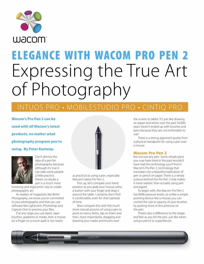
Wacom’s Pro Pen 2 can be
used with all Wacom’s latest
products, no matter what
photography program you’re
using. By Peter Eastway.
Don’t dismiss the idea of a pen for photography, because although it’s true it can take some people a little practice, there’s no doubt a pen is a much more
involving and ergonomic way to create photographic art. As readers of magazines like Better Photography, we know you’re committed to your photography and that you use software like Lightroom, Photoshop and Capture One to process your files. If at any stage you use layers, layer brushes, gradients or masks, then a mouse (or a finger on a touch pad) is not nearly
as practical as using a pen, especially Wacom’s latest Pro Pen 2. First up, let’s compare your hand position as you grab your mouse, press a button with your finger and drag it around the table. I certainly don’t find it comfortable, even for short periods of time. Now compare this with the much more natural process of using a pen to point to menu items, tap on them and then, most importantly, dragging and drawing your masks and brushs over
the screen or tablet. It’s just like drawing on paper and artists over the past 50,000 years haven’t ended up with brushes and pens because they are uncomfortable to use! There is a strong argument purely from a physical standpoint for using a pen over a mouse.
Wacom Pro Pen 2But not just any pen. Some simple pens you may have tried in the past wouldn’t have had the technology you’ll find in Wacom’s Pro Pen 2, technology that translates into a beautiful replication of pen or pencil on paper. There is a whole science behind the Pro Pen 2 that makes it more realistic than actually using pen and paper! To begin with, the Wacom Pro Pen 2 has 8096 pressure levels, so unlike a simple pointing device like a mouse, you can control the size or opacity of your brushes by putting more or less pressure on the pen. There’s also a difference to the shape and feel as you tilt the pen, just like when using a pencil or a paintbrush.
ELEGANCE WITH WACOM PRO PEN 2 Expressing the True Artof Photography
INTUOS PRO • MOBILESTUDIO PRO • CINTIQ PRO
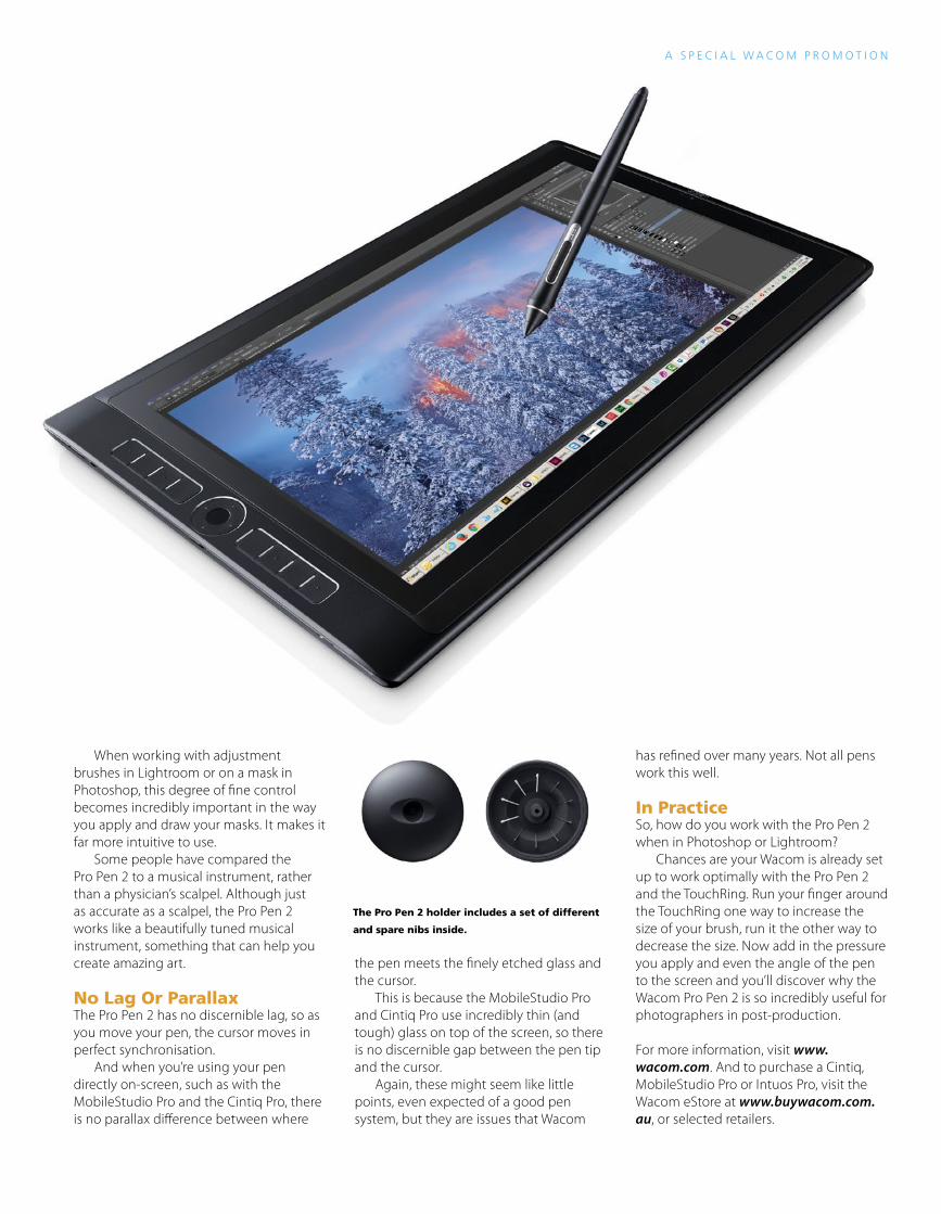
When working with adjustment brushes in Lightroom or on a mask in Photoshop, this degree of fine control becomes incredibly important in the way you apply and draw your masks. It makes it far more intuitive to use. Some people have compared the Pro Pen 2 to a musical instrument, rather than a physician’s scalpel. Although just as accurate as a scalpel, the Pro Pen 2 works like a beautifully tuned musical instrument, something that can help you create amazing art.
No Lag Or ParallaxThe Pro Pen 2 has no discernible lag, so as you move your pen, the cursor moves in perfect synchronisation. And when you’re using your pen directly on-screen, such as with the MobileStudio Pro and the Cintiq Pro, there is no parallax difference between where
the pen meets the finely etched glass and the cursor. This is because the MobileStudio Pro and Cintiq Pro use incredibly thin (and tough) glass on top of the screen, so there is no discernible gap between the pen tip and the cursor. Again, these might seem like little points, even expected of a good pen system, but they are issues that Wacom
has refined over many years. Not all pens work this well.
In PracticeSo, how do you work with the Pro Pen 2 when in Photoshop or Lightroom? Chances are your Wacom is already set up to work optimally with the Pro Pen 2 and the TouchRing. Run your finger around the TouchRing one way to increase the size of your brush, run it the other way to decrease the size. Now add in the pressure you apply and even the angle of the pen to the screen and you’ll discover why the Wacom Pro Pen 2 is so incredibly useful for photographers in post-production.
For more information, visit www.wacom.com. And to purchase a Cintiq, MobileStudio Pro or Intuos Pro, visit the Wacom eStore at www.buywacom.com.au, or selected retailers.
A S P E C I A L W A C O M P R O M O T I O N
The Pro Pen 2 holder includes a set of different
and spare nibs inside.
36 B E T T E R P H OTO G R A P H Y
l T E C H N I Q U E
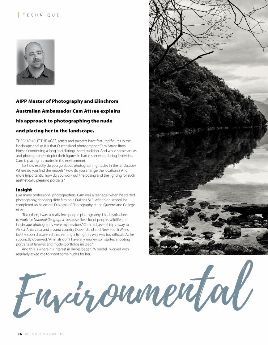
AIPP Master of Photography and Elinchrom
Australian Ambassador Cam Attree explains
his approach to photographing the nude
and placing her in the landscape.
THROUGHOUT THE AGES, artists and painters have featured figures in the landscape and so it is that Queensland photographer Cam Attree finds himself continuing a long and distinguished tradition. And while some artists and photographers depict their figures in battle scenes or during festivities, Cam is placing his nudes in the environment. So, how exactly do you go about photographing nudes in the landscape? Where do you find the models? How do you arrange the locations? And more importantly, how do you work out the posing and the lighting for such aesthetically pleasing portraits?
InsightLike many professional photographers, Cam was a teenager when he started photography, shooting slide film on a Praktica SLR. After high school, he completed an Associate Diploma of Photography at the Queensland College of Art. “Back then, I wasn’t really into people photography. I had aspirations to work for National Geographic because like a lot of people, wildlife and landscape photography were my passions.” Cam did several trips away to Africa, Antarctica and around country Queensland and New South Wales, but he soon discovered that earning a living this way was too difficult. As he succinctly observed, “Animals don’t have any money, so I started shooting portraits of families and model portfolios instead.” And this is where his interest in nudes began. “A model I worked with regularly asked me to shoot some nudes for her.
Environmental
B E T T E R P H OTO G R A P H Y 37
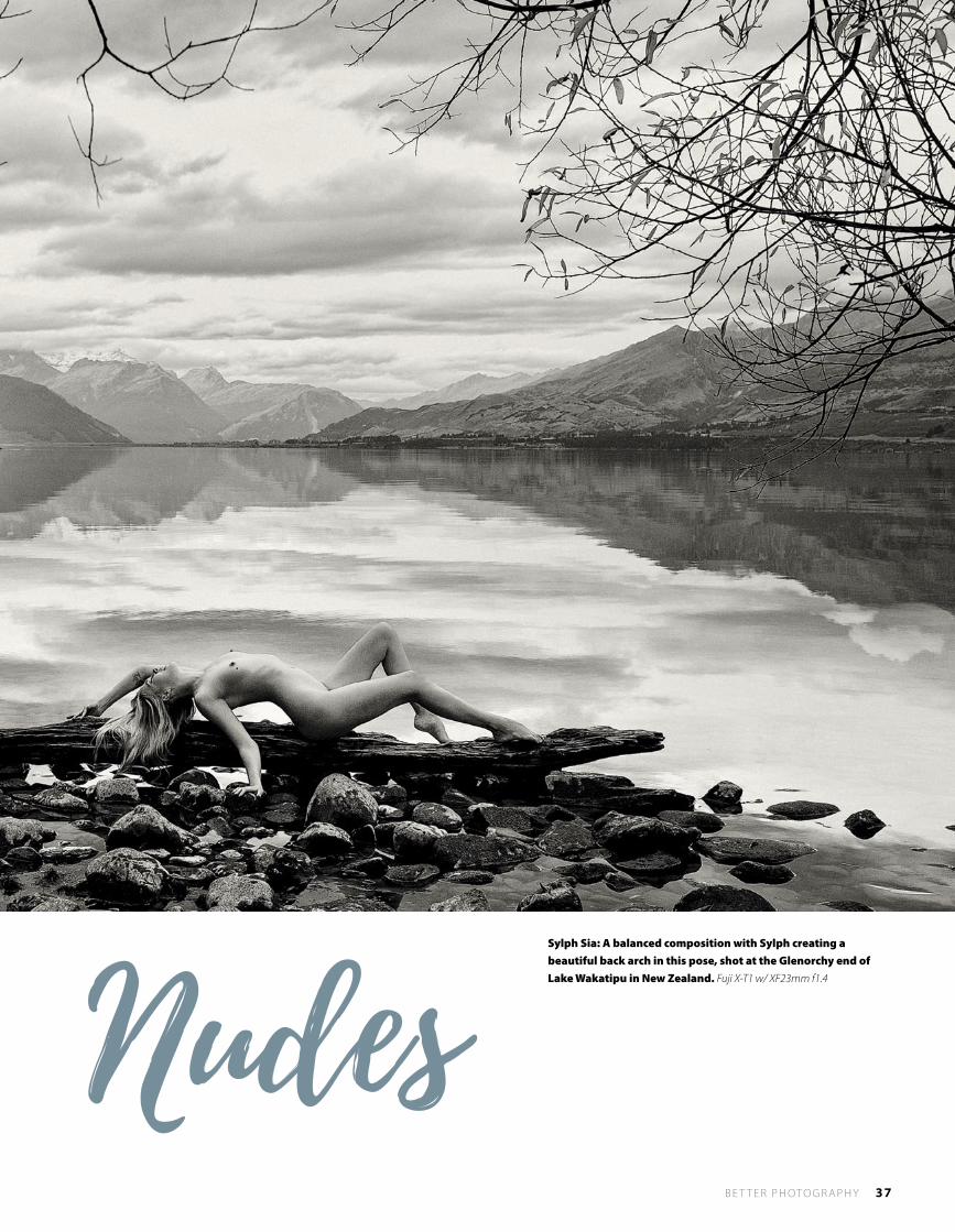
Sylph Sia: A balanced composition with Sylph creating a beautiful back arch in this pose, shot at the Glenorchy end of Lake Wakatipu in New Zealand. Fuji X-T1 w/ XF23mm f1.4Nudes
38 B E T T E R P H OTO G R A P H Y
l P R O F E S S I O N A L
I’d shot nudes back in College in 1992, but nothing between then and 2005!” From here, Cam started working with professional nude models. “I paid some professional models because I really didn’t have any idea about how to pose my subjects. This is what I recommend to all photographers starting out. You’re much better off working with a model who really knows how
to pose. It can also make the learning process a lot easier as some photographers tend to get a little flustered when they find themselves in front of a naked woman!” Cam spent several years researching the art of nude photography and working with a range of professional and amateur models. “It was good to work with amateur models because I could practise my posing and directing skills, as well as learning how to communicate clearly. “One of the questions I’m often asked is, where do I get my ideas for poses. Many of them came from professional models and then it’s just a matter of translating them to the models with less experience.” Initially Cam worked primarily in the studio, but over the years he’s come to love shooting outdoors, thus allowing him to combine the nude with his love of landscape photography. Today, Cam works part time with Kayell Australia, as their representative in Queensland, plus he’s quite involved with the burlesque community, shooting model portfolios for the performers which leads into boudoir and vintage glamour. Add in his art nude commissions with the workshops he runs on nude photography (including one in Iceland) and you can understand why Cam has a pretty full calendar.
Posing Key PointsThe main difference between an artistic nude and a general or fashion portrait is the lack of eye contact, Cam explains.
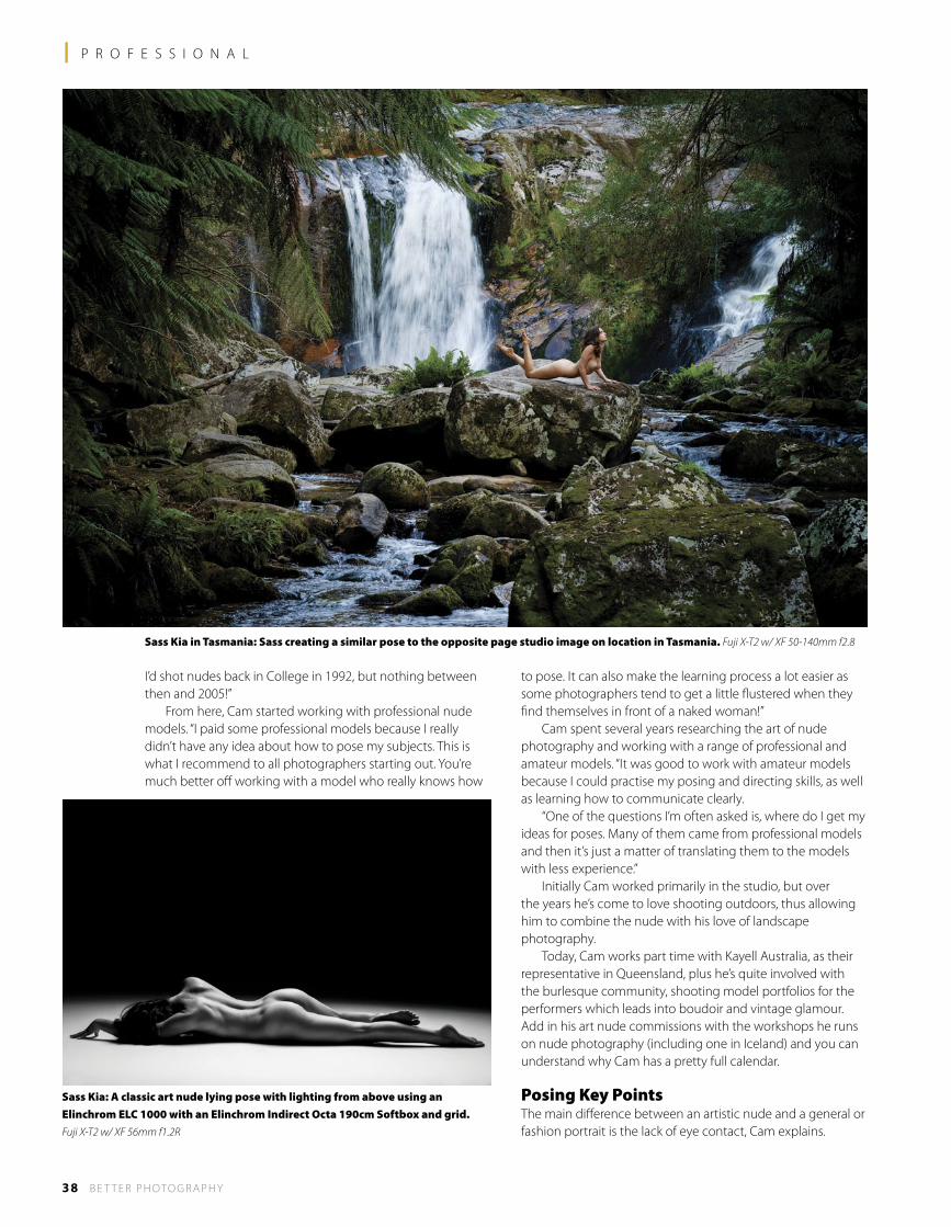
Sass Kia in Tasmania: Sass creating a similar pose to the opposite page studio image on location in Tasmania. Fuji X-T2 w/ XF 50-140mm f2.8
Sass Kia: A classic art nude lying pose with lighting from above using an Elinchrom ELC 1000 with an Elinchrom Indirect Octa 190cm Softbox and grid. Fuji X-T2 w/ XF 56mm f1.2R
B E T T E R P H OTO G R A P H Y 39
“A lot of the poses are with the model looking away from the camera or with hair over her face. It’s all about the shape of the body, so the pose is about creating some interesting curves and then using light to reveal the form. “For instance, for a model in a standing position, you’d generally have her standing at 45°, so her hips are facing away from the camera position. Then it’s a combination of posing and lighting - they go hand-in-hand. Usually the best type of lighting is side or back lighting, so there’s more shadow towards the front. This helps create a thinner look to the body, especially with the hips turned away, and also highlights the natural curves. “Normally the model’s weight is on her back leg, with the front leg bent slightly at the knee and the toes pointed towards the ground. Hands can be brought up around the neck and you might use the arms to cover the breasts, or you might put the hands and arms behind the back to highlight the chest. Generally you keep the hands at different heights around the body, such as one on the thigh and the other raised to the stomach, just to create a bit more interest. If everything is on the same level and symmetrical, the pose looks a bit static. “As the face is turned away from the camera position, you often have a profile. This means you might only see the whites of the eyes, which can look a little disconcerting, so ask your model to close her eyes. Closed eyes also help to take away the connection with the viewer of the image.”
When working with a beginner model, Cam has a number of poses for them to try. As the photographer working with a less experienced subject, it’s important for him to give clear directions and put the model at ease, so he uses poses that will work with almost any body shape. “One is lying face-down on the floor at an angle to the camera. So, the head might be on the left and the feet on the
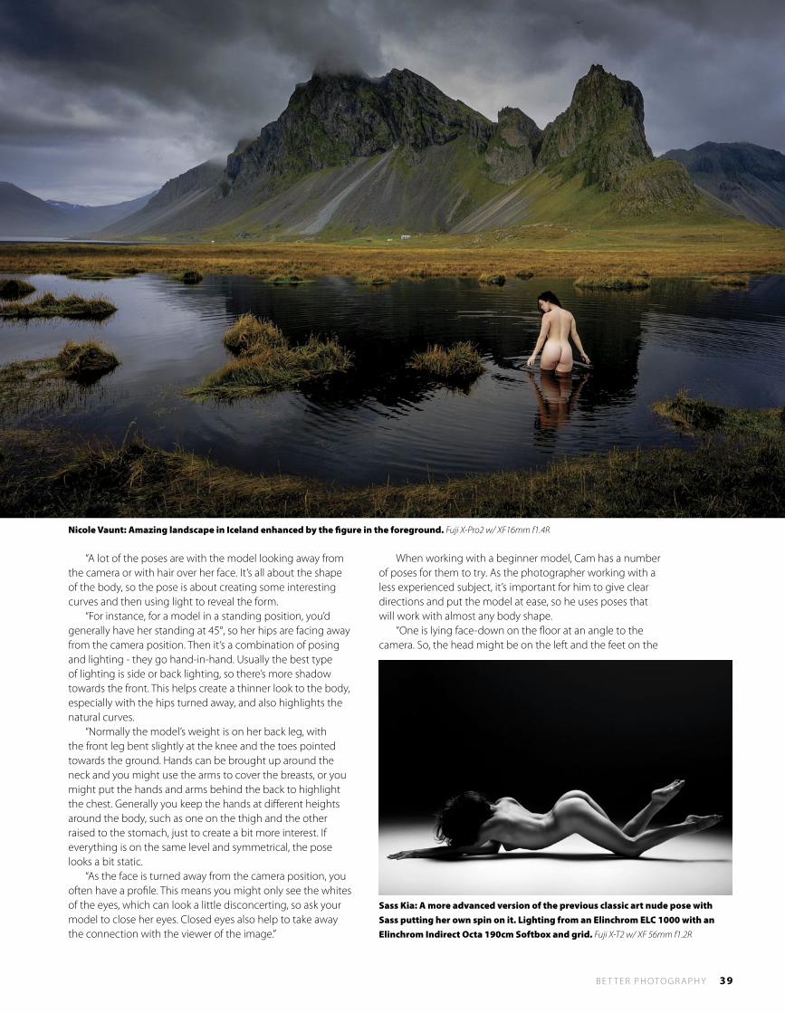
Nicole Vaunt: Amazing landscape in Iceland enhanced by the figure in the foreground. Fuji X-Pro2 w/ XF16mm f1.4R
Sass Kia: A more advanced version of the previous classic art nude pose with Sass putting her own spin on it. Lighting from an Elinchrom ELC 1000 with an Elinchrom Indirect Octa 190cm Softbox and grid. Fuji X-T2 w/ XF 56mm f1.2R
40 B E T T E R P H OTO G R A P H Y
l P R O F E S S I O N A L
right, but the feet would be closer to the camera – maybe a 20° angle. This brings the bottom into focus, so the idea is to create a really nice line along the legs, over the bottom and into the lower back - like a rolling hill in a landscape. To create this shape, the leg furthest from the camera needs to be bent at the knee, stretched away from the camera with the foot
coming back and resting on the calf of the other leg. “What I’m trying to accentuate is the height of the bottom by moving it off the ground. Now, if the model rests on her elbows, this brings the shoulders off the ground as well and naturally the lower back sinks into the floor and you get that really nice body curve.”
Acting ConfidentThere are dozens of set poses and of course there’s the opportunity to experiment with new ones, but the important thing Cam says is for the photographer to be confident in what he or she is doing. “Just treat your models like normal people, not like an object. Be very respectful. For instance, divert your eyes and stop taking photos while they are changing poses. If they haven’t brought their own, always provide them with a dressing gown or bath robe to put on while you’re changing lights – so they don’t have to just stand around with nothing on. I’ve found that playing music of their choice helps set the mood and helps them to relax. “I also think having a calm personality helps, but the key point is to come across as confident that you know what you’re doing and can create images that will make them look amazing. So don’t fluff around with camera settings and curse about the lights not being in the right place - this won’t help your model!”
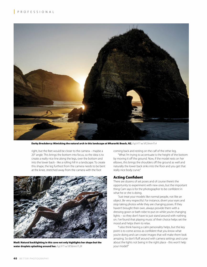
Darby Breckderry: Mimicking the natural arch in this landscape at Wharariki Beach, NZ. Fuji X-T1 w/ XF23mm f1.4
Madi: Natural backlighting in this cave not only highlights her shape but the water droplets splashing around her. Fuji X-T1 w/ XF56mm f1.2R
B E T T E R P H OTO G R A P H Y 41
During the shoot, Cam shares the photos with the model using the LCD screen on the back of his camera. “Often they have no idea how their poses will translate into the final image. A lot of poses feel awkward, but they look great on camera, so you have to make sure they understand that what they are doing is actually working. I generally take five to ten shots and then show them what we are capturing. However, as the shoot progresses and they become more confident, it’s not as important to share the photos quite as often.
Equipment Issues“I had been a Nikon shooter my entire career until a couple of years ago when I tried a Fujifilm X-T1. I originally bought it as a little travel kit. I was feeling the weight of the Nikon D4 with lenses like its 24-70mm f2.8 and 85mm f1.4, especially for location work, so I thought I’d try something smaller. “I’d heard good reports about the X-T1, so I started using it every now and then and quickly fell in love with it. It was refreshing to go back to a camera with manual knobs and dials and I found the electronic viewfinder was extremely good. However, what I really like about the electronic viewfinder is being able to see the live exposure preview in the viewfinder and know I’ve nailed it without having to play back the images on the LCD screen. Overall, it was the ergonomics and the light weight that convinced me, and the lenses are extremely sharp, so there’s no issue with image quality. “Then, when the X-T2 came out, image quality was even better and it has 4k video as well. The two lenses I use the most are the 23mm f1.4 (35mm equivalent) and the 56mm f1.2 (85mm equivalent), but I also have the 16mm, 35mm, 90mm, 18-55mm and 50-140mm f2.8.” In the studio, Cam uses Elinchrom ELC500 and 1000 heads. “The ELC heads have super fast recycling times and are very consistent with their output, even when shooting rapidly. Colour is also very consistent and the units are strong and robust, so there’s no issue with reliability. And the 300W modelling light can be used for video as well to some degree. “I do like natural daylight and window light, but it’s not reliable all the time. Studio lighting, on the other hand, let’s me shoot any time of the day or year, and at any location, indoors or out, and get consistent results.” The most important aspect of his studio light is the quality and this is dictated by the light shapers he uses over the lamps. Cam uses 50x130cm strip soft boxes with cloth honeycomb grids on the front, which creates a more directional pool of light with less spillage on the sides. “With artistic nudes in the studio, I really need to control where the light is falling and the amount of spill light hitting the background. A grid on a strip soft box allows me to do this, as well as create narrow strips of light on the body to create shape and form. “I’ll also use larger soft boxes boomed from above – say a 190cm Indirect with a grid to keep it directional. In fact, this light is what I use for 90 per cent of the lying down poses. “A soft quality of light is important because you don’t want the gradations between highlights and shadows to be too harsh. Rather, you want the light to wrap around the body, whereas a harder shadow creates a harsher transition which is not as flattering.”
Out on location, Cam rarely uses studio lighting, preferring natural light and natural reflectors. However, he uses his lighting experience in the studio to find the right opportunities in the landscape. “I look for pockets of light, areas where the light is naturally occurring and I can place my model against a dark background. Then it’s all about setting the exposure for the highlights on the model and you’ll find the background is naturally darker anyway.”
Aesthetics“When I’m shooting nudes in the landscape, first and most important is the landscape itself. The landscape should be
Svala: Posing on large piece of glacial ice on the beach in Iceland. Fuji X-T1 w/ XF56mm f1.2R
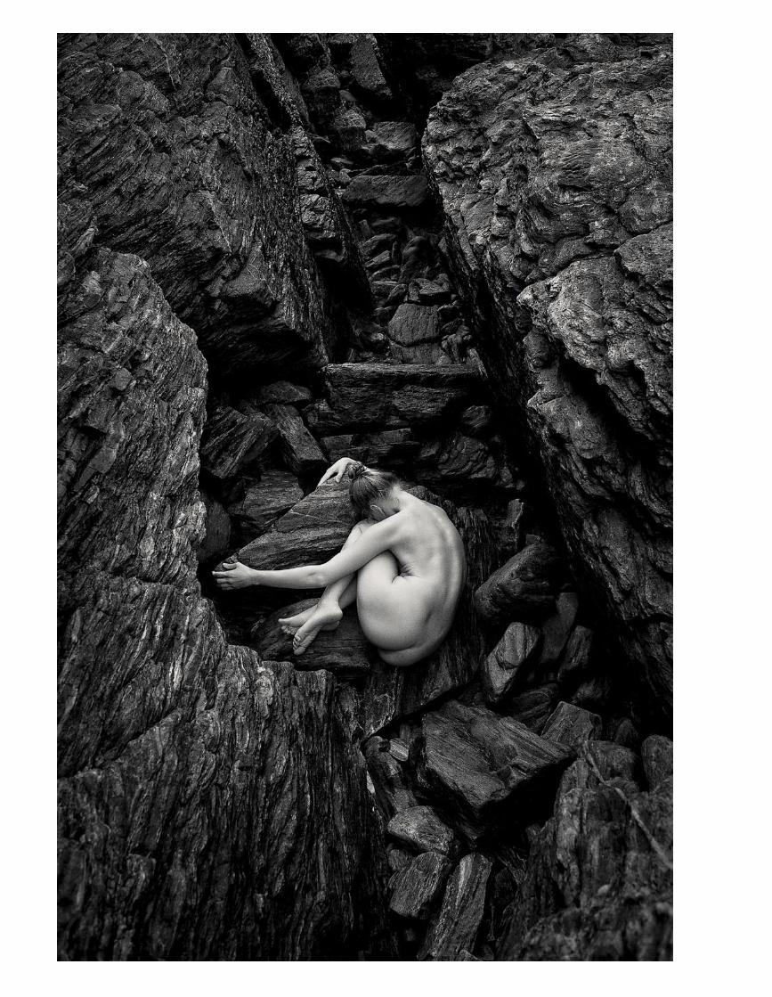
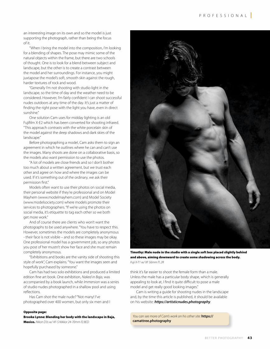
B E T T E R P H OTO G R A P H Y 43
P R O F E S S I O N A L l
an interesting image on its own and so the model is just supporting the photograph, rather than being the focus of it. “When I bring the model into the composition, I’m looking for a blending of shapes. The pose may mimic some of the natural objects within the frame, but there are two schools of thought. One is to look for a blend between subject and landscape, but the other is to create a contrast between the model and her surroundings. For instance, you might juxtapose the model’s soft, smooth skin against the rough, harder textures of rock and wood. “Generally I’m not shooting with studio light in the landscape, so the time of day and the weather need to be considered. However, I’m fairly confident I can shoot successful nudes outdoors at any time of the day. It’s just a matter of finding the right pose with the light you have, even in direct sunshine.” One solution Cam uses for midday lighting is an old Fujifilm X-E2 which has been converted for shooting infrared. “This approach contrasts with the white porcelain skin of the model against the deep shadows and dark skies of the landscape.” Before photographing a model, Cam asks them to sign an agreement in which he outlines where he can and can’t use the images. Many shoots are done on a collaborative basis, so the models also want permission to use the photos. “A lot of models are close friends and so I don’t bother too much about a written agreement, but we trust each other and agree on how and where the images can be used. If it’s something out of the ordinary, we ask their permission first.” Models often want to use their photos on social media, their personal website if they’re professional and on Model Mayhem (www.modelmayhem.com) and Model Society (www.modelsociety.com) where models promote their services to photographers. “If we’re using the photos on social media, it’s etiquette to tag each other so we both get more work.” And of course there are clients who won’t want the photographs to be used anywhere. “You have to respect this. However, sometimes the models are completely anonymous - their face is not visible – and so these images may be okay. One professional model has a government job, so any photos you post of her mustn’t show her face and she must remain completely anonymous. “Exhibitions and books are the vanity side of shooting this style of work”, Cam explains. “You want the images seen and hopefully purchased by someone.” Cam has had two solo exhibitions and produced a limited edition fine art book. One exhibition, Naked in Baja, was accompanied by a book launch, while Immersion was a series of studio nudes photographed in a shallow pool and using reflections. Has Cam shot the male nude? “Not many! I’ve photographed over 400 women, but only six men and I
think it’s far easier to shoot the female form than a male. Unless the male has a particular body shape, which is generally appealing to look at, I find it quite difficult to pose a male model and get really good looking images.” Cam is writing a guide for shooting nudes in the landscape and, by the time this article is published, it should be available on his website: https://artisticnudes.photography.
Timothy: Male nude in the studio with a single soft box placed slightly behind and above, aiming downward to create some shadowing across the body. Fuji X-T1 w/ XF 56mm f1.2R
Opposite page:Brooke Lynne: Blending her body with the landscape in Baja, Mexico. Nikon D3s w/ AF-S Nikkor 24-70mm f2.8ED
You can see more of Cam’s work on his other site: https://camattree.photography
44 B e t t e r P h o t o g r a P h y
Anyone can take a snap, but it takes a little more care to
frame and compose a photograph. But what is photographic
composition and how do you learn it?
HOW DO YOU learn to point the camera in the right direction and press the shutter at the right time? Experience and education. Some people can be lucky and take one or two excellent photographs, but the best photographers are committed. They have put in the hours to learn their art, to study the masters. And then they take lots of photos and look at their results – critically. The great artists we revere today all started somewhere. Most of them went to art school where they learnt the basics of drawing and painting. Many also studied under 'the masters' where they could develop their talent and grasp the thought processes behind 'great art'. So why do photographers think they can just pick up an automatic camera and take great photographs? Automation is one thing, but it doesn't replace the thought processes. It can't give you ideas or experience. As we have suggested in Better Photography before, to become a more proficient photographer you need to expose yourself to a wide variety of ideas and images by other photographers, artists and writers. However, don't just look at the photos or paintings, study them. Where has the
photographer positioned the subject in the frame? What shape is the frame? What is the main light source? How does the light reveal the subject? Is colour an important element? Why? How many colours are used? Remember, you're not looking at these images to copy them, but to learn about them. Decide what works and what doesn't. Although there are rules of photography, there's nothing to stop you from breaking them. What's important is to learn a variety of ways of analysing and photographing a subject, and then applying it to your own work. Hence the need for practice. Composition is a broad topic and there are lots of aspects to consider: framing, centres of interest, dividing the image area, colour, lines, shapes, repetition, texture and balance. All these concepts are as fundamental to art and cinematography as they are to photography. Perhaps the best place to start improving your photographs is with framing. Framing is not just about how close you are to your subject, but what you include and exclude in the photograph. Before you trip the shutter, take a look around the viewfinder. Where is the
subject? In the middle? Why? Probably because that's where the autofocus gunsight is! Stop being lazy – anyone can take a photo with the subject in the middle, but how many take a look at what's around the edges? Some of the most common mistakes are portraits of a family member with a tree growing out of his head! By simply moving your standpoint, you could move the tree to one side of the head (or perhaps select an aperture to throw the background out-of-focus). Simple, but fundamental. A new standpoint might solve the tree, but what else is in the photograph? A brightly coloured chair, someone's shoulder or an unsightly piece of rubbish? By simply reframing the photograph, you may be able to eliminate these. Walk in a bit closer or zoom in. While you're moving the camera around, see what effect positioning the subject on one side of the frame has. Think back to a lot of the really good portrait photographs you've seen in books and magazines. Where has the subject's face been positioned in the frame? Chances are it's not bang in the middle! There's lots more to composition, so turn the pages and have a read.
Monterey Bay National Marine Sanctuary. The use of diagonal lines and repetition, with a tight framing, creates a strong composition which uses light and shade to create a three-dimensionality. Phase One A-Series 100MP, 23mm Alpagon lens.
A Guide for MAsterinG the Art of
PhotographicComposition
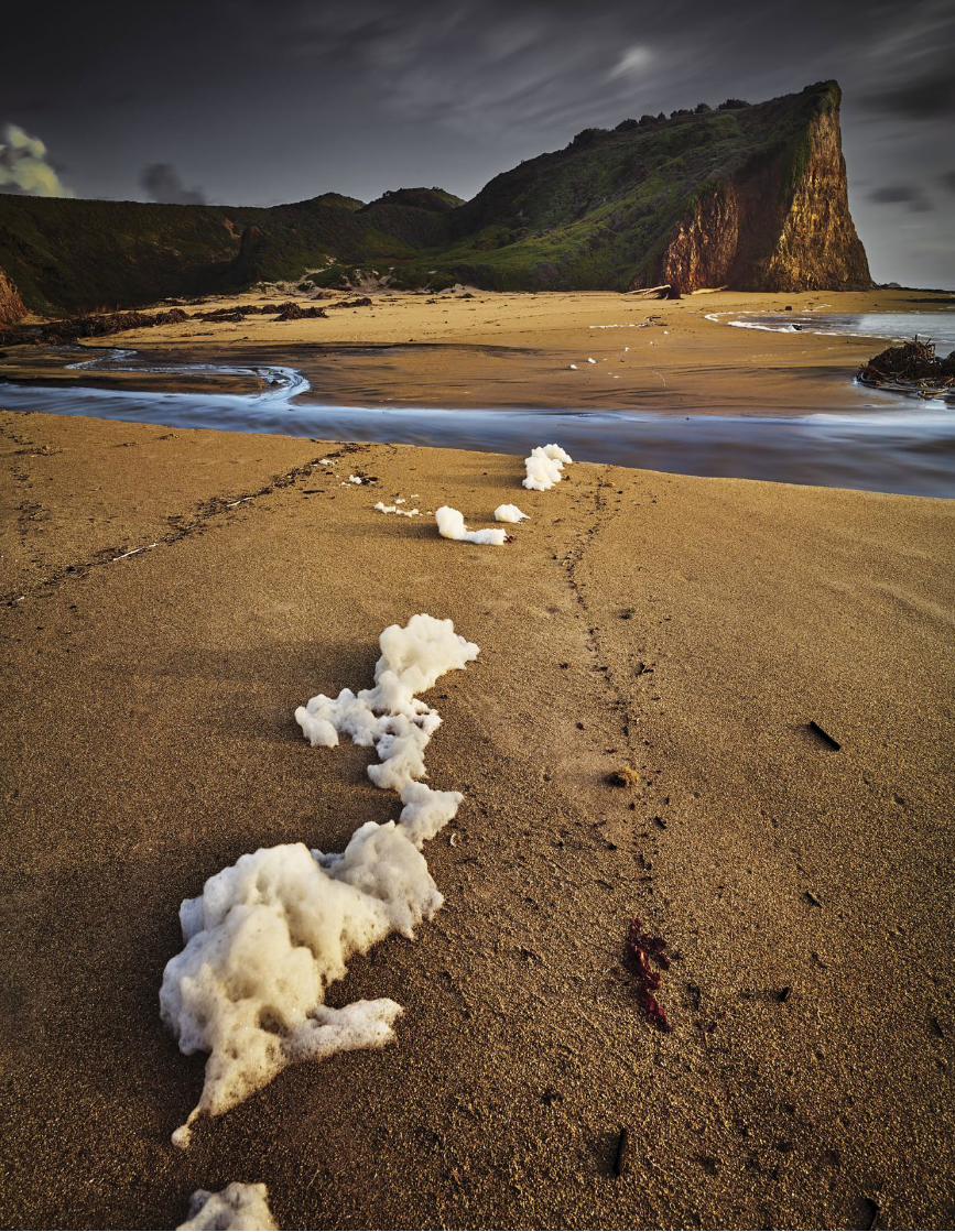
B e t t e r P h o t o g r a P h y 45
[ PHOTOGR APHIC COMPOSITION]
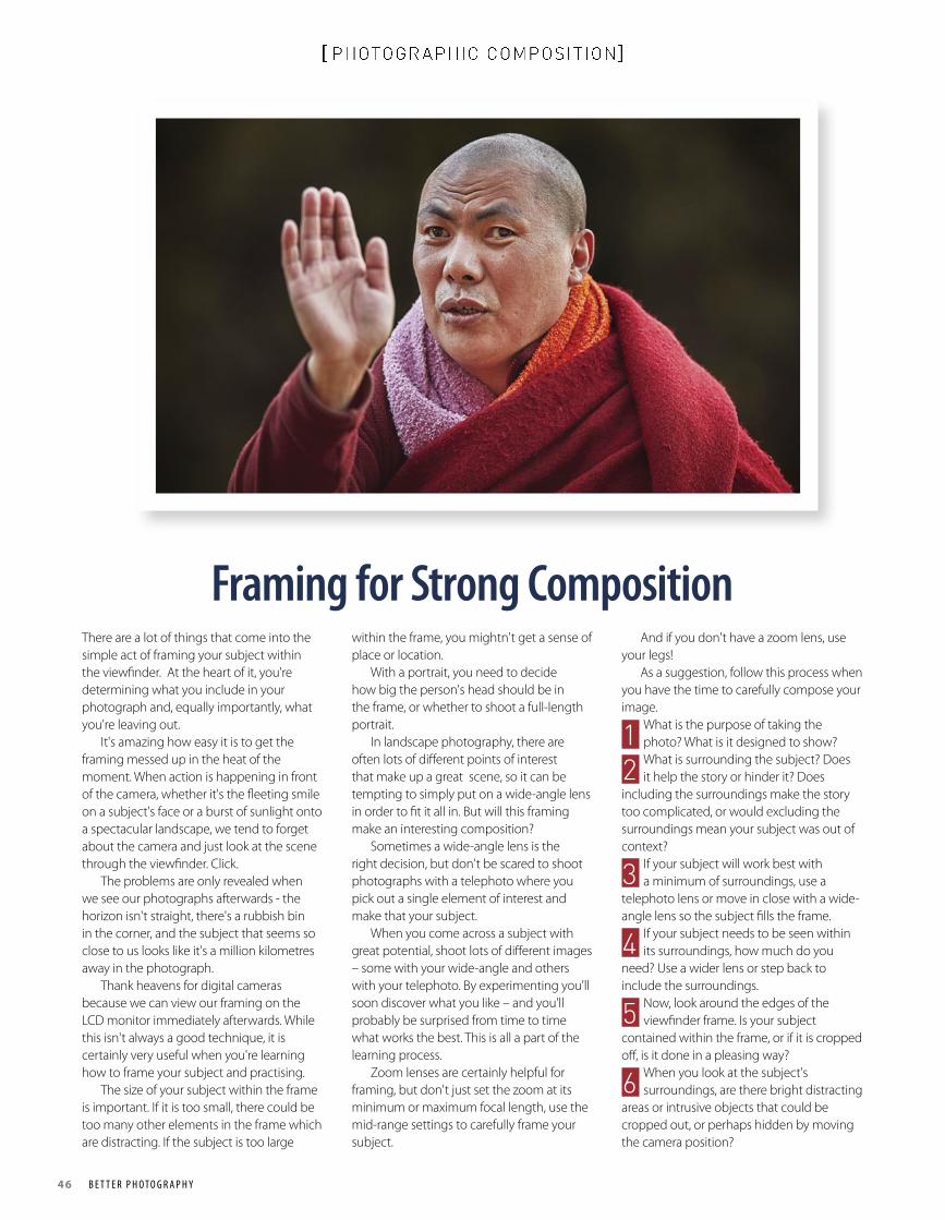
46 B e t t e r P h o t o g r a P h y
[ PHOTOGR APHIC COMPOSITION]
Framing for Strong Composition There are a lot of things that come into the simple act of framing your subject within the viewfinder. At the heart of it, you're determining what you include in your photograph and, equally importantly, what you're leaving out. It's amazing how easy it is to get the framing messed up in the heat of the moment. When action is happening in front of the camera, whether it's the fleeting smile on a subject's face or a burst of sunlight onto a spectacular landscape, we tend to forget about the camera and just look at the scene through the viewfinder. Click. The problems are only revealed when we see our photographs afterwards - the horizon isn't straight, there's a rubbish bin in the corner, and the subject that seems so close to us looks like it's a million kilometres away in the photograph. Thank heavens for digital cameras because we can view our framing on the LCD monitor immediately afterwards. While this isn't always a good technique, it is certainly very useful when you're learning how to frame your subject and practising. The size of your subject within the frame is important. If it is too small, there could be too many other elements in the frame which are distracting. If the subject is too large
within the frame, you mightn't get a sense of place or location. With a portrait, you need to decide how big the person's head should be in the frame, or whether to shoot a full-length portrait. In landscape photography, there are often lots of different points of interest that make up a great scene, so it can be tempting to simply put on a wide-angle lens in order to fit it all in. But will this framing make an interesting composition? Sometimes a wide-angle lens is the right decision, but don't be scared to shoot photographs with a telephoto where you pick out a single element of interest and make that your subject. When you come across a subject with great potential, shoot lots of different images – some with your wide-angle and others with your telephoto. By experimenting you'll soon discover what you like – and you'll probably be surprised from time to time what works the best. This is all a part of the learning process. Zoom lenses are certainly helpful for framing, but don't just set the zoom at its minimum or maximum focal length, use the mid-range settings to carefully frame your subject.
And if you don't have a zoom lens, use your legs! As a suggestion, follow this process when you have the time to carefully compose your image.
1 What is the purpose of taking the photo? What is it designed to show?
2 What is surrounding the subject? Does it help the story or hinder it? Does
including the surroundings make the story too complicated, or would excluding the surroundings mean your subject was out of context?
3 If your subject will work best with a minimum of surroundings, use a
telephoto lens or move in close with a wide-angle lens so the subject fills the frame.
4 If your subject needs to be seen within its surroundings, how much do you
need? Use a wider lens or step back to include the surroundings.
5 Now, look around the edges of the viewfinder frame. Is your subject
contained within the frame, or if it is cropped off, is it done in a pleasing way?
6 When you look at the subject's surroundings, are there bright distracting
areas or intrusive objects that could be cropped out, or perhaps hidden by moving the camera position?
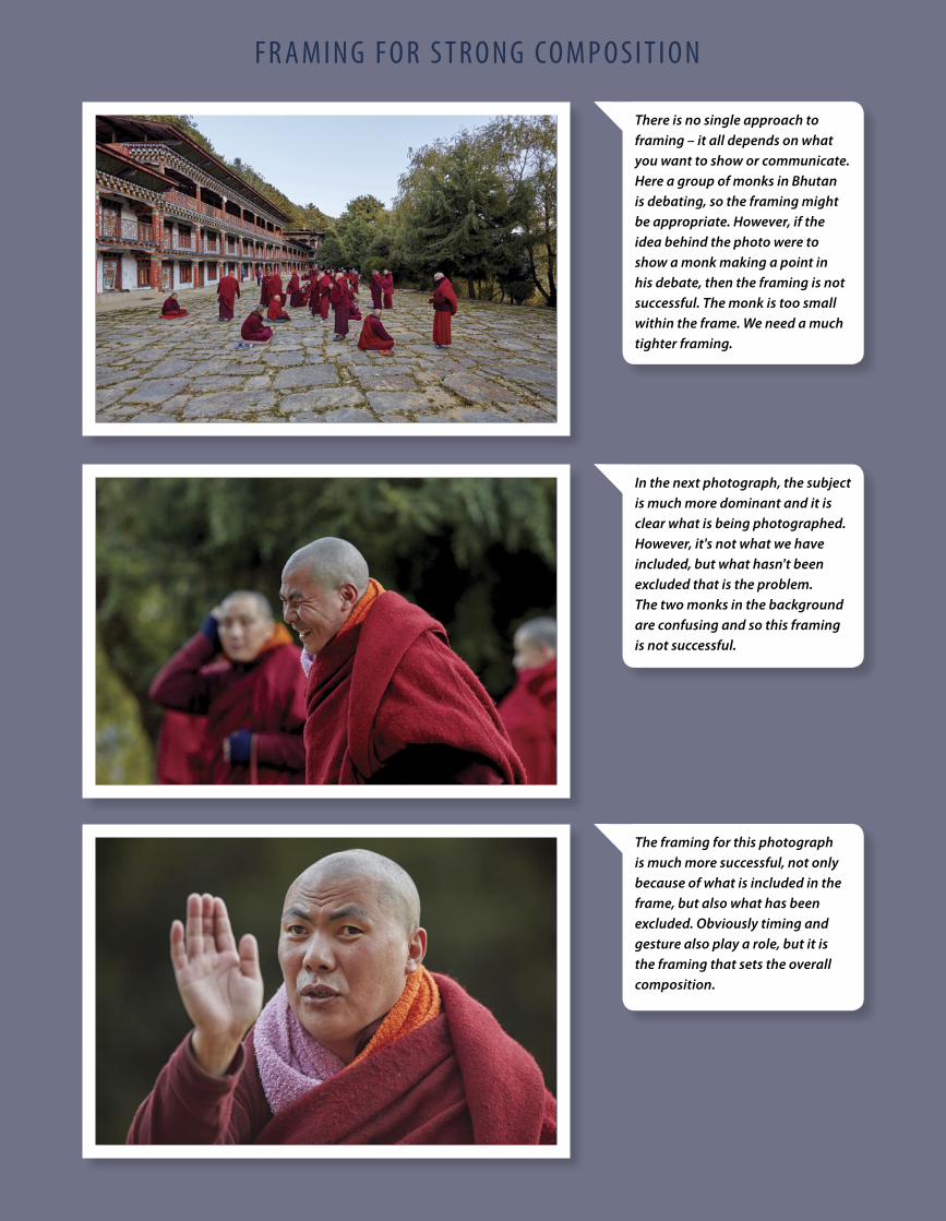
B e t t e r P h o t o g r a P h y 47
[ PHOTOGR APHIC COMPOSITION]F r a m i n g F o r S t r o n g Co m P o S i t i o n
The framing for this photograph is much more successful, not only because of what is included in the frame, but also what has been excluded. Obviously timing and gesture also play a role, but it is the framing that sets the overall composition.
There is no single approach to framing – it all depends on what you want to show or communicate. Here a group of monks in Bhutan is debating, so the framing might be appropriate. However, if the idea behind the photo were to show a monk making a point in his debate, then the framing is not successful. The monk is too small within the frame. We need a much tighter framing.
In the next photograph, the subject is much more dominant and it is clear what is being photographed. However, it's not what we have included, but what hasn't been excluded that is the problem. The two monks in the background are confusing and so this framing is not successful.
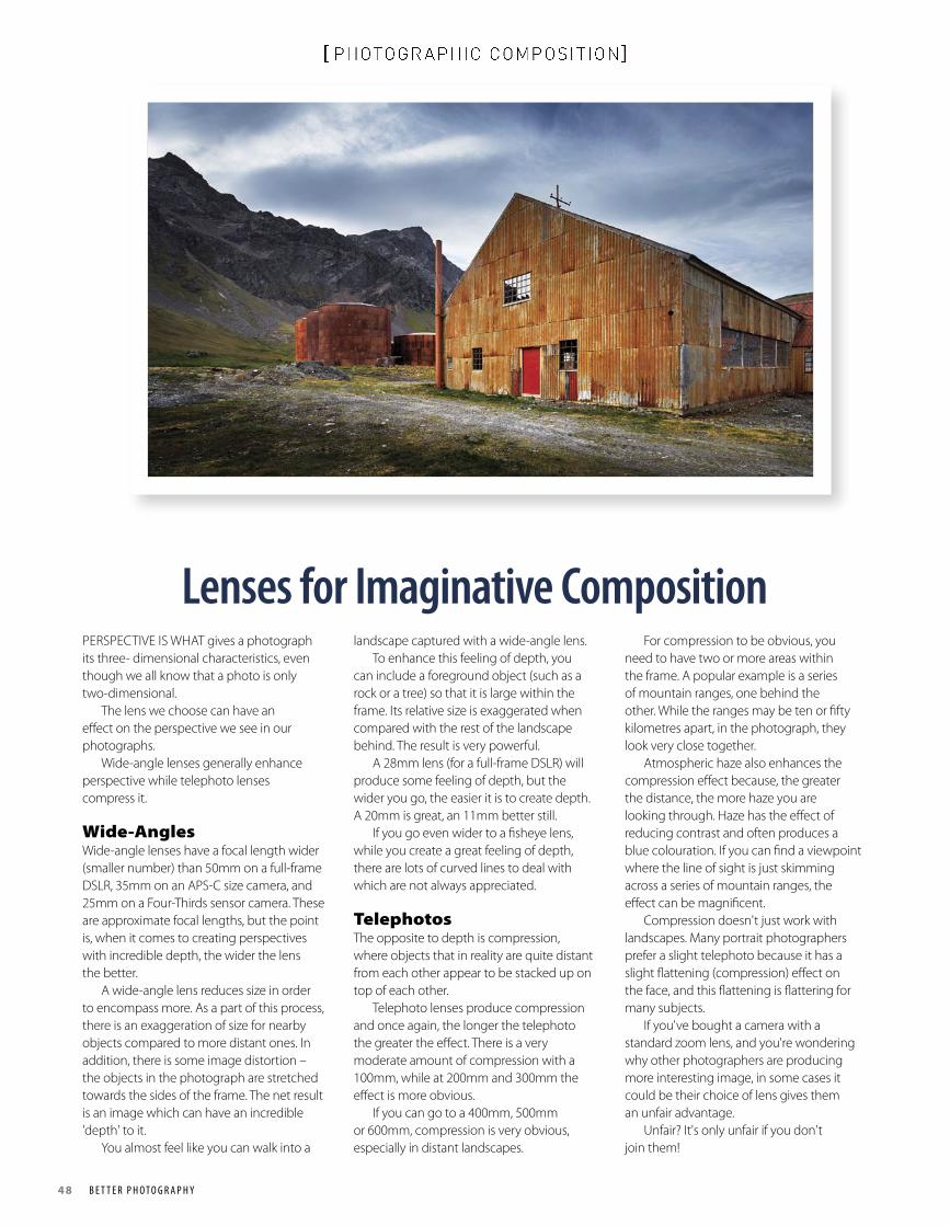
48 B e t t e r P h o t o g r a P h y
[ PHOTOGR APHIC COMPOSITION]
Lenses for Imaginative Composition PERSPECTIVE IS WHAT gives a photograph its three- dimensional characteristics, even though we all know that a photo is only two-dimensional. The lens we choose can have an effect on the perspective we see in our photographs. Wide-angle lenses generally enhance perspective while telephoto lenses compress it.
Wide-AnglesWide-angle lenses have a focal length wider (smaller number) than 50mm on a full-frame DSLR, 35mm on an APS-C size camera, and 25mm on a Four-Thirds sensor camera. These are approximate focal lengths, but the point is, when it comes to creating perspectives with incredible depth, the wider the lens the better. A wide-angle lens reduces size in order to encompass more. As a part of this process, there is an exaggeration of size for nearby objects compared to more distant ones. In addition, there is some image distortion – the objects in the photograph are stretched towards the sides of the frame. The net result is an image which can have an incredible 'depth' to it. You almost feel like you can walk into a
landscape captured with a wide-angle lens. To enhance this feeling of depth, you can include a foreground object (such as a rock or a tree) so that it is large within the frame. Its relative size is exaggerated when compared with the rest of the landscape behind. The result is very powerful. A 28mm lens (for a full-frame DSLR) will produce some feeling of depth, but the wider you go, the easier it is to create depth. A 20mm is great, an 11mm better still. If you go even wider to a fisheye lens, while you create a great feeling of depth, there are lots of curved lines to deal with which are not always appreciated.
TelephotosThe opposite to depth is compression, where objects that in reality are quite distant from each other appear to be stacked up on top of each other. Telephoto lenses produce compression and once again, the longer the telephoto the greater the effect. There is a very moderate amount of compression with a 100mm, while at 200mm and 300mm the effect is more obvious. If you can go to a 400mm, 500mm or 600mm, compression is very obvious, especially in distant landscapes.
For compression to be obvious, you need to have two or more areas within the frame. A popular example is a series of mountain ranges, one behind the other. While the ranges may be ten or fifty kilometres apart, in the photograph, they look very close together. Atmospheric haze also enhances the compression effect because, the greater the distance, the more haze you are looking through. Haze has the effect of reducing contrast and often produces a blue colouration. If you can find a viewpoint where the line of sight is just skimming across a series of mountain ranges, the effect can be magnificent. Compression doesn't just work with landscapes. Many portrait photographers prefer a slight telephoto because it has a slight flattening (compression) effect on the face, and this flattening is flattering for many subjects. If you've bought a camera with a standard zoom lens, and you're wondering why other photographers are producing more interesting image, in some cases it could be their choice of lens gives them an unfair advantage. Unfair? It's only unfair if you don't join them!
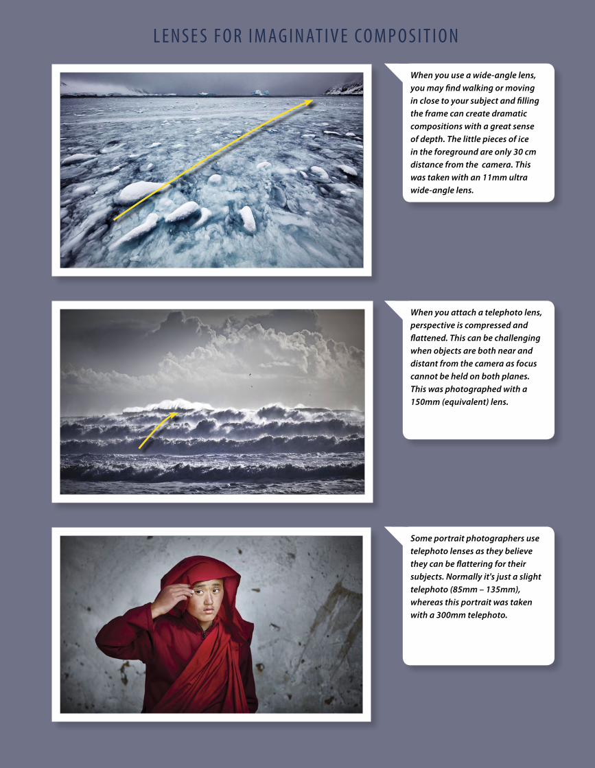
B e t t e r P h o t o g r a P h y 49
[ PHOTOGR APHIC COMPOSITION]L e n S e S F o r i m ag i n at i v e Co m P o S i t i o n
When you use a wide-angle lens, you may find walking or moving in close to your subject and filling the frame can create dramatic compositions with a great sense of depth. The little pieces of ice in the foreground are only 30 cm distance from the camera. This was taken with an 11mm ultra wide-angle lens.
When you attach a telephoto lens, perspective is compressed and flattened. This can be challenging when objects are both near and distant from the camera as focus cannot be held on both planes. This was photographed with a 150mm (equivalent) lens.
Some portrait photographers use telephoto lenses as they believe they can be flattering for their subjects. Normally it's just a slight telephoto (85mm – 135mm), whereas this portrait was taken with a 300mm telephoto.
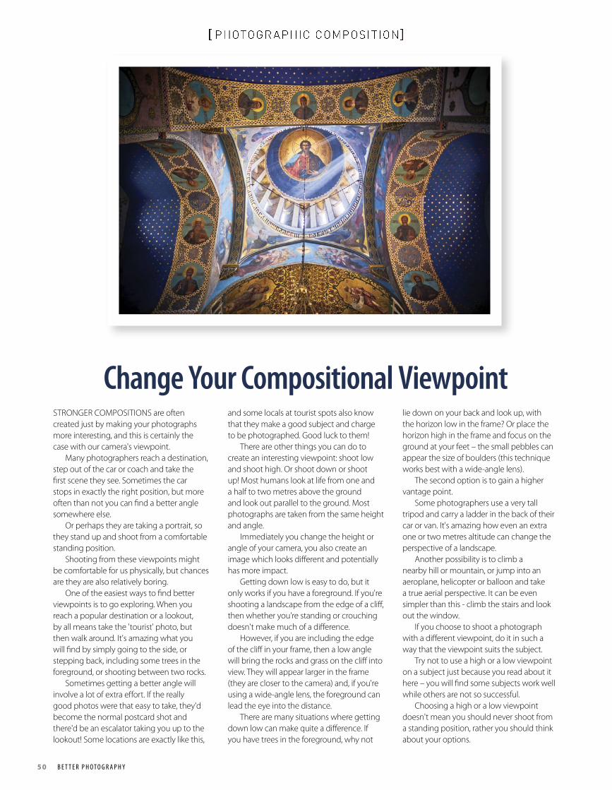
50 B e t t e r P h o t o g r a P h y
[ PHOTOGR APHIC COMPOSITION]
Change Your Compositional Viewpoint STRONGER COMPOSITIONS are often created just by making your photographs more interesting, and this is certainly the case with our camera's viewpoint. Many photographers reach a destination, step out of the car or coach and take the first scene they see. Sometimes the car stops in exactly the right position, but more often than not you can find a better angle somewhere else. Or perhaps they are taking a portrait, so they stand up and shoot from a comfortable standing position. Shooting from these viewpoints might be comfortable for us physically, but chances are they are also relatively boring. One of the easiest ways to find better viewpoints is to go exploring. When you reach a popular destination or a lookout, by all means take the 'tourist' photo, but then walk around. It's amazing what you will find by simply going to the side, or stepping back, including some trees in the foreground, or shooting between two rocks. Sometimes getting a better angle will involve a lot of extra effort. If the really good photos were that easy to take, they'd become the normal postcard shot and there'd be an escalator taking you up to the lookout! Some locations are exactly like this,
and some locals at tourist spots also know that they make a good subject and charge to be photographed. Good luck to them! There are other things you can do to create an interesting viewpoint: shoot low and shoot high. Or shoot down or shoot up! Most humans look at life from one and a half to two metres above the ground and look out parallel to the ground. Most photographs are taken from the same height and angle. Immediately you change the height or angle of your camera, you also create an image which looks different and potentially has more impact. Getting down low is easy to do, but it only works if you have a foreground. If you're shooting a landscape from the edge of a cliff, then whether you're standing or crouching doesn't make much of a difference. However, if you are including the edge of the cliff in your frame, then a low angle will bring the rocks and grass on the cliff into view. They will appear larger in the frame (they are closer to the camera) and, if you're using a wide-angle lens, the foreground can lead the eye into the distance. There are many situations where getting down low can make quite a difference. If you have trees in the foreground, why not
lie down on your back and look up, with the horizon low in the frame? Or place the horizon high in the frame and focus on the ground at your feet – the small pebbles can appear the size of boulders (this technique works best with a wide-angle lens). The second option is to gain a higher vantage point. Some photographers use a very tall tripod and carry a ladder in the back of their car or van. It's amazing how even an extra one or two metres altitude can change the perspective of a landscape. Another possibility is to climb a nearby hill or mountain, or jump into an aeroplane, helicopter or balloon and take a true aerial perspective. It can be even simpler than this - climb the stairs and look out the window. If you choose to shoot a photograph with a different viewpoint, do it in such a way that the viewpoint suits the subject. Try not to use a high or a low viewpoint on a subject just because you read about it here – you will find some subjects work well while others are not so successful. Choosing a high or a low viewpoint doesn't mean you should never shoot from a standing position, rather you should think about your options.
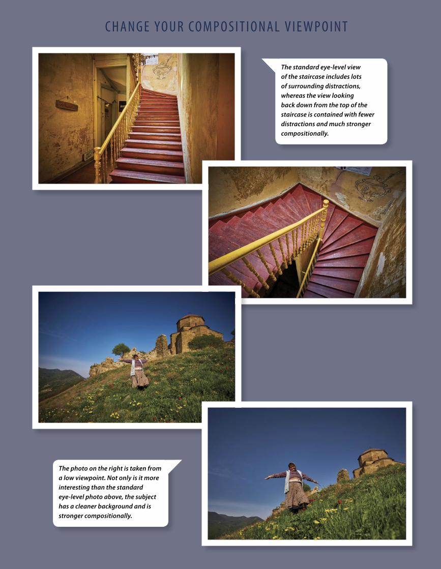
B e t t e r P h o t o g r a P h y 51
[ PHOTOGR APHIC COMPOSITION]C h a n g e yo u r Co m P o S i t i o n a L v i e w P o i n t
The standard eye-level view of the staircase includes lots of surrounding distractions, whereas the view looking back down from the top of the staircase is contained with fewer distractions and much stronger compositionally.
The photo on the right is taken from a low viewpoint. Not only is it more interesting than the standard eye-level photo above, the subject has a cleaner background and is stronger compositionally.
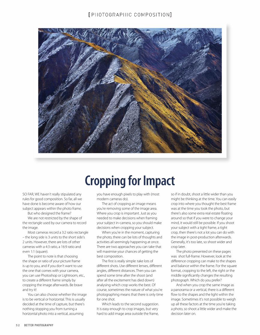
52 B e t t e r P h o t o g r a P h y
[ PHOTOGR APHIC COMPOSITION]
Cropping for Impact SO FAR, WE haven't really stipulated any rules for good composition. So far, all we have done is become aware of how our subject appears within the photo frame. But who designed the frame? We are not restricted by the shape of the rectangle used by our camera to record the image. Most cameras record a 3:2 ratio rectangle – the long side is 3 units to the short side's 2 units. However, there are lots of other cameras with a 4:3 ratio, a 16:9 ratio and even 1:1 (square). The point to note is that choosing the shape or ratio of your picture frame is up to you, and if you don't want to use the one that comes with your camera, you can use Photoshop or Lightroom, etc., to create a different frame simply by cropping the image afterwards. Be brave and try it! You can also choose whether the image is to be vertical or horizontal. This is usually decided at the time of capture, but there's nothing stopping you from turning a horizontal photo into a vertical, assuming
you have enough pixels to play with (most modern cameras do). The act of cropping an image means you're removing some of the image area. Where you crop is important. Just as you needed to make decisions when framing your subject in-camera, so you should make decisions when cropping your subject. When you're in the moment, capturing the photo, there can be lots of thoughts and activities all seemingly happening at once. There are two approaches you can take that will maximise your chances of getting the best composition. The first is really simple: take lots of different shots. Use different lenses, different angles, different distances. Then you can spend some time after the shoot (and after all the excitement has died down) analysing which crop works the best. Of course, sometimes the nature of what you're photographing means that there is only time for one shot. Which leads to the second suggestion. It is easy enough to crop images, but very hard to add image area outside the frame,
so if in doubt, shoot a little wider than you might be thinking at the time. You can easily crop into where you thought the best frame was at the time you took the photo, but there's also some extra real estate floating around so that if you were to change your mind, it would still be possible. If you shoot your subject with a tight frame, a tight crop, then there's not a lot you can do with the image in post-production afterwards. Generally, it's too late, so shoot wider and crop later. The photo presented on these pages was shot full-frame. However, look at the difference cropping can make to the shapes and balance within the frame. For the square format, cropping to the left, the right or the middle significantly changes the resulting photograph. Which do you prefer? And when you crop the same image as a panorama or a vertical, there is a different flow to the shapes and the light within the image. Sometimes it's not possible to weigh up all these factors at the time you're taking a photo, so shoot a little wider and make the decision later on.
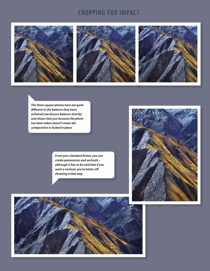
B e t t e r P h o t o g r a P h y 53
[ PHOTOGR APHIC COMPOSITION]C r o P P i n g F o r i m PaC t
From your standard frame, you can create panoramas and verticals – although it has to be said that if you want a vertical, you're better off shooting it that way.
The three square photos here are quite different in the balance they have achieved (we discuss balance shortly) and shows that just because the photo has been taken doesn't mean the composition is locked in place.
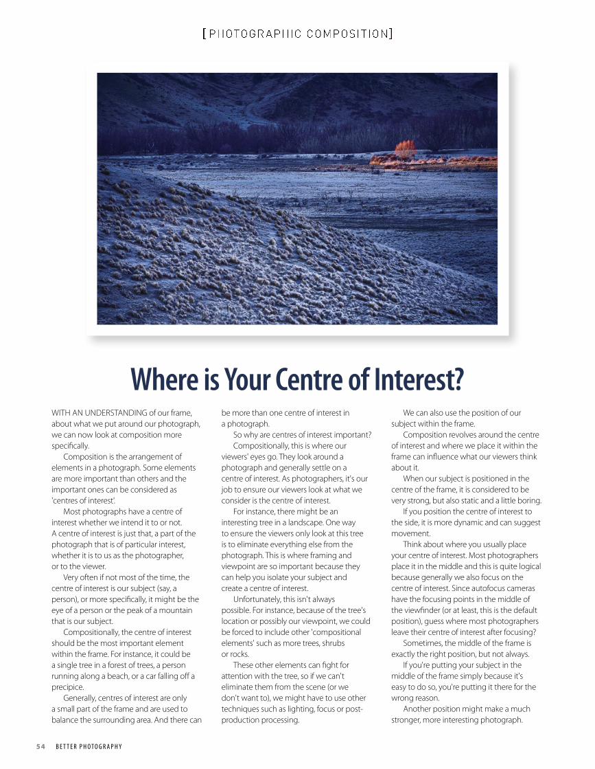
54 B e t t e r P h o t o g r a P h y
[ PHOTOGR APHIC COMPOSITION]
Where is Your Centre of Interest? WITH AN UNDERSTANDING of our frame, about what we put around our photograph, we can now look at composition more specifically. Composition is the arrangement of elements in a photograph. Some elements are more important than others and the important ones can be considered as 'centres of interest'. Most photographs have a centre of interest whether we intend it to or not. A centre of interest is just that, a part of the photograph that is of particular interest, whether it is to us as the photographer, or to the viewer. Very often if not most of the time, the centre of interest is our subject (say, a person), or more specifically, it might be the eye of a person or the peak of a mountain that is our subject. Compositionally, the centre of interest should be the most important element within the frame. For instance, it could be a single tree in a forest of trees, a person running along a beach, or a car falling off a precipice. Generally, centres of interest are only a small part of the frame and are used to balance the surrounding area. And there can
be more than one centre of interest in a photograph. So why are centres of interest important? Compositionally, this is where our viewers' eyes go. They look around a photograph and generally settle on a centre of interest. As photographers, it's our job to ensure our viewers look at what we consider is the centre of interest. For instance, there might be an interesting tree in a landscape. One way to ensure the viewers only look at this tree is to eliminate everything else from the photograph. This is where framing and viewpoint are so important because they can help you isolate your subject and create a centre of interest. Unfortunately, this isn't always possible. For instance, because of the tree's location or possibly our viewpoint, we could be forced to include other 'compositional elements' such as more trees, shrubs or rocks. These other elements can fight for attention with the tree, so if we can't eliminate them from the scene (or we don't want to), we might have to use other techniques such as lighting, focus or post-production processing.
We can also use the position of our subject within the frame. Composition revolves around the centre of interest and where we place it within the frame can influence what our viewers think about it. When our subject is positioned in the centre of the frame, it is considered to be very strong, but also static and a little boring. If you position the centre of interest to the side, it is more dynamic and can suggest movement. Think about where you usually place your centre of interest. Most photographers place it in the middle and this is quite logical because generally we also focus on the centre of interest. Since autofocus cameras have the focusing points in the middle of the viewfinder (or at least, this is the default position), guess where most photographers leave their centre of interest after focusing? Sometimes, the middle of the frame is exactly the right position, but not always. If you're putting your subject in the middle of the frame simply because it's easy to do so, you're putting it there for the wrong reason. Another position might make a much stronger, more interesting photograph.
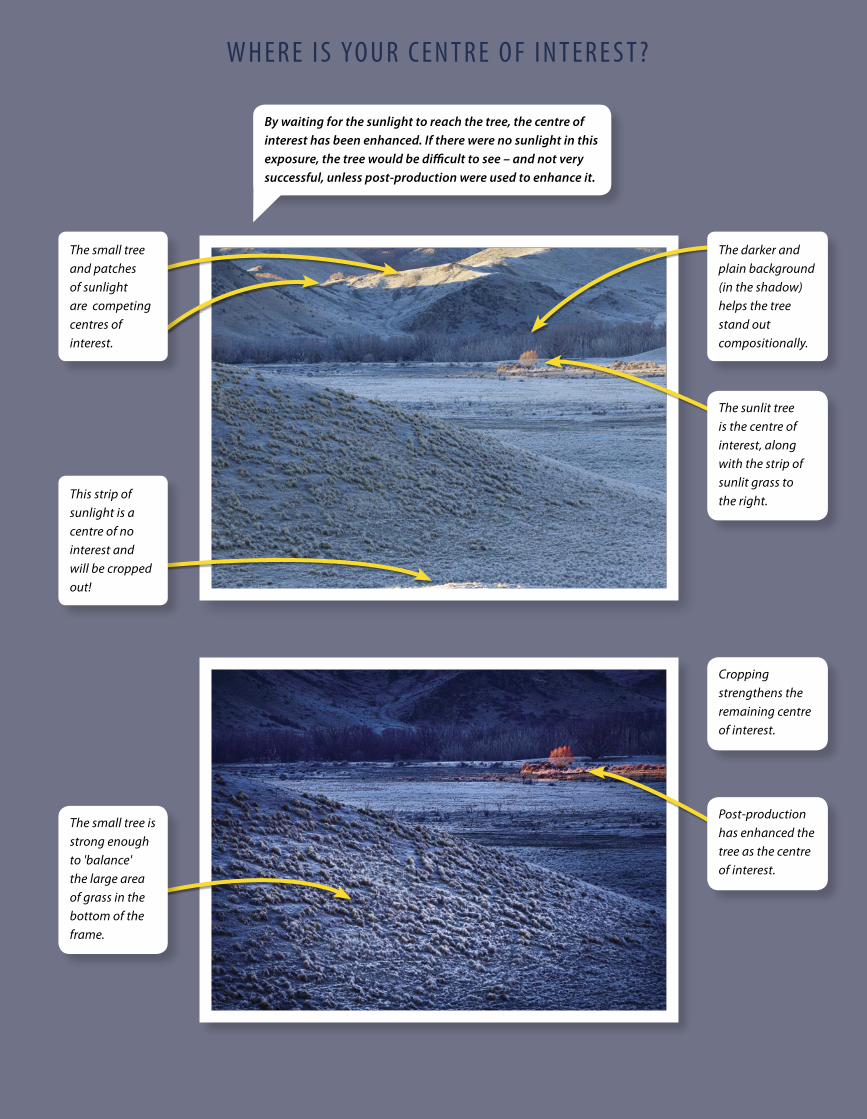
B e t t e r P h o t o g r a P h y 55
[ PHOTOGR APHIC COMPOSITION]w h e r e i S yo u r C e n t r e o F i n t e r e S t ?
By waiting for the sunlight to reach the tree, the centre of interest has been enhanced. If there were no sunlight in this exposure, the tree would be difficult to see – and not very successful, unless post-production were used to enhance it.
The small tree and patches of sunlight are competing centres of interest.
The darker and plain background (in the shadow) helps the tree stand out compositionally.
The sunlit tree is the centre of interest, along with the strip of sunlit grass to the right. This strip of
sunlight is a centre of no interest and will be cropped out!
Post-production has enhanced the tree as the centre of interest.
The small tree is strong enough to 'balance' the large area of grass in the bottom of the frame.
Cropping strengthens the remaining centre of interest.
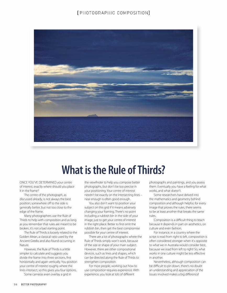
56 B e t t e r P h o t o g r a P h y
[ PHOTOGR APHIC COMPOSITION]
What is the Rule of Thirds? ONCE YOU'VE DETERMINED your centre of interest, exactly where should you place it in the frame? The centre of the photograph, as discussed already, is not always the best position; somewhere off to the side is generally better, but not too close to the edge of the frame. Many photographers use the Rule of Thirds to help with composition and as long as you remember that rules are meant to be broken, it's not a bad starting point. The Rule of Thirds is loosely related to the Golden Mean, a classical ratio used by the Ancient Greeks and also found occurring in Nature. However, the Rule of Thirds is a little simpler to calculate and suggests you divide the frame into three sections, first horizontally and again vertically. You position your centre of interest roughly where the lines intersect, so this gives you four options. Some cameras even overlay a grid in
the viewfinder to help you compose better photographs, but don't be too precise in your positioning. Your centre of interest needn't be exactly on the intersecting lines – near enough is often good enough. You also don't want to position your subject on this grid if it means adversely changing your framing. There's no point including a rubbish bin in the side of your image, just to get your centre of interest in the right place. Better to first omit the rubbish bin, then get the best compromise possible for your centre of interest. There are a lot of photographs where the Rule of Thirds simply won't work, because of the size or shape of your main subject. However, there are other compositional devices, such as lines and shapes, which can be directed along the Rule of Thirds to strengthen composition. For most people, working out how to use composition requires experience. With experience, you look at lots of different
photographs and paintings, and you assess them. Eventually you have a feeling for what works, and what doesn't. Some researchers have delved into the mathematics and geometry behind composition and although helpful, for every image that proves the rules, there seems to be at least another that breaks the same rules. Composition is a difficult thing to teach because it depends in part on aesthetics, on culture and even fashion. For instance, in a country where the script is read from right to left, composition is often considered stronger when it's opposite to what we in Australia would consider best, because we read from left to right! So, what works in one culture might be less effective in another. Nevertheless, although composition can be difficult to pin down, there's no doubt an understanding and appreciation of the issues involved makes a big difference!
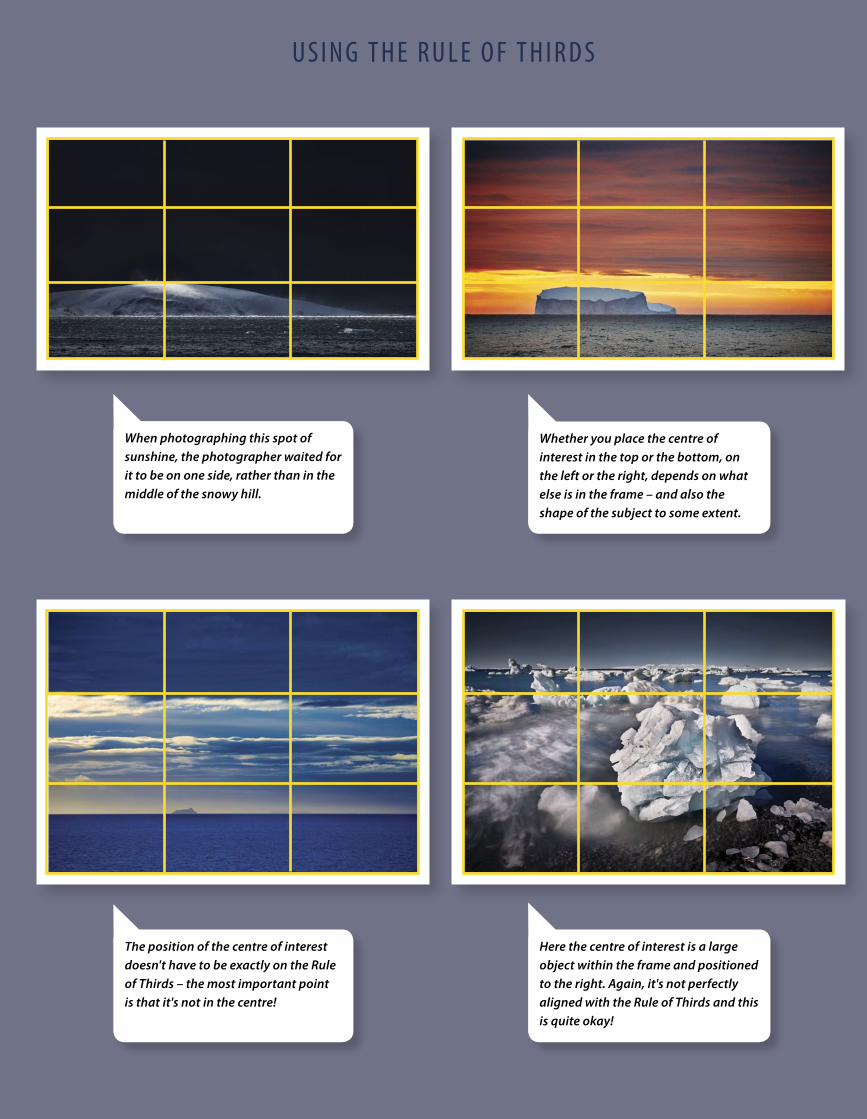
B e t t e r P h o t o g r a P h y 57
[ PHOTOGR APHIC COMPOSITION]u S i n g t h e r u L e o F t h i r d S
The position of the centre of interest doesn't have to be exactly on the Rule of Thirds – the most important point is that it's not in the centre!
Whether you place the centre of interest in the top or the bottom, on the left or the right, depends on what else is in the frame – and also the shape of the subject to some extent.
Here the centre of interest is a large object within the frame and positioned to the right. Again, it's not perfectly aligned with the Rule of Thirds and this is quite okay!
When photographing this spot of sunshine, the photographer waited for it to be on one side, rather than in the middle of the snowy hill.
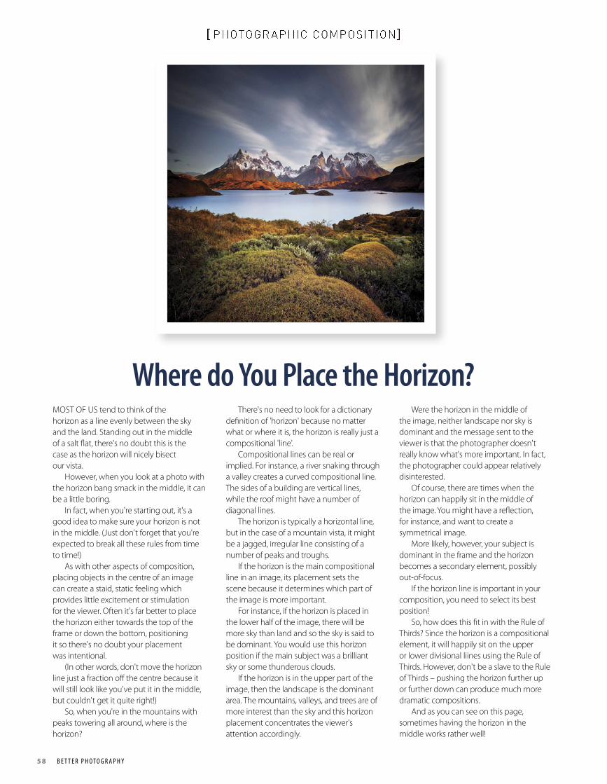
58 B e t t e r P h o t o g r a P h y
[ PHOTOGR APHIC COMPOSITION]
Where do You Place the Horizon?MOST OF US tend to think of the horizon as a line evenly between the sky and the land. Standing out in the middle of a salt flat, there's no doubt this is the case as the horizon will nicely bisect our vista. However, when you look at a photo with the horizon bang smack in the middle, it can be a little boring. In fact, when you're starting out, it's a good idea to make sure your horizon is not in the middle. (Just don't forget that you're expected to break all these rules from time to time!) As with other aspects of composition, placing objects in the centre of an image can create a staid, static feeling which provides little excitement or stimulation for the viewer. Often it's far better to place the horizon either towards the top of the frame or down the bottom, positioning it so there's no doubt your placement was intentional. (In other words, don't move the horizon line just a fraction off the centre because it will still look like you've put it in the middle, but couldn't get it quite right!) So, when you're in the mountains with peaks towering all around, where is the horizon?
There's no need to look for a dictionary definition of 'horizon' because no matter what or where it is, the horizon is really just a compositional 'line'. Compositional lines can be real or implied. For instance, a river snaking through a valley creates a curved compositional line. The sides of a building are vertical lines, while the roof might have a number of diagonal lines. The horizon is typically a horizontal line, but in the case of a mountain vista, it might be a jagged, irregular line consisting of a number of peaks and troughs. If the horizon is the main compositional line in an image, its placement sets the scene because it determines which part of the image is more important. For instance, if the horizon is placed in the lower half of the image, there will be more sky than land and so the sky is said to be dominant. You would use this horizon position if the main subject was a brilliant sky or some thunderous clouds. If the horizon is in the upper part of the image, then the landscape is the dominant area. The mountains, valleys, and trees are of more interest than the sky and this horizon placement concentrates the viewer's attention accordingly.
Were the horizon in the middle of the image, neither landscape nor sky is dominant and the message sent to the viewer is that the photographer doesn't really know what's more important. In fact, the photographer could appear relatively disinterested. Of course, there are times when the horizon can happily sit in the middle of the image. You might have a reflection, for instance, and want to create a symmetrical image. More likely, however, your subject is dominant in the frame and the horizon becomes a secondary element, possibly out-of-focus. If the horizon line is important in your composition, you need to select its best position! So, how does this fit in with the Rule of Thirds? Since the horizon is a compositional element, it will happily sit on the upper or lower divisional liines using the Rule of Thirds. However, don't be a slave to the Rule of Thirds – pushing the horizon further up or further down can produce much more dramatic compositions. And as you can see on this page, sometimes having the horizon in the middle works rather well!
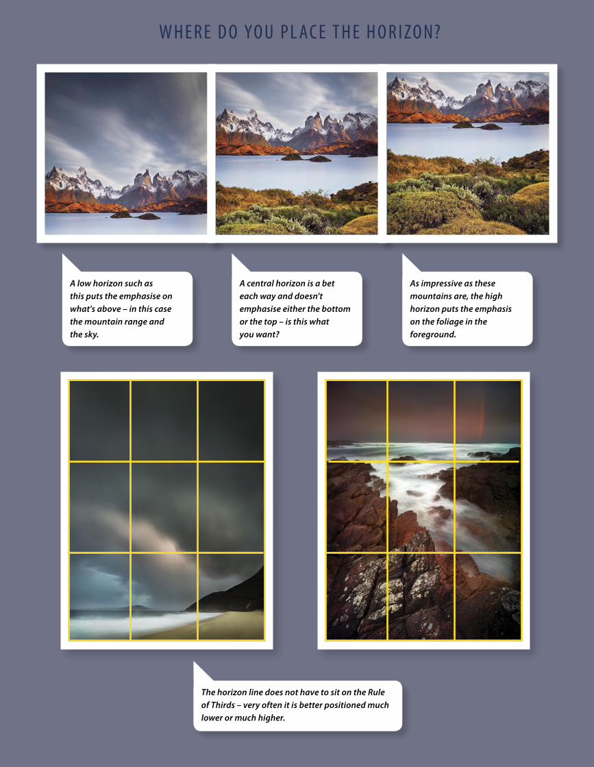
B e t t e r P h o t o g r a P h y 59
[ PHOTOGR APHIC COMPOSITION]w h e r e d o yo u P L aC e t h e h o r i zo n?
The horizon line does not have to sit on the Rule of Thirds – very often it is better positioned much lower or much higher.
A low horizon such as this puts the emphasise on what's above – in this case the mountain range and the sky.
As impressive as these mountains are, the high horizon puts the emphasis on the foliage in the foreground.
A central horizon is a bet each way and doesn't emphasise either the bottom or the top – is this what you want?
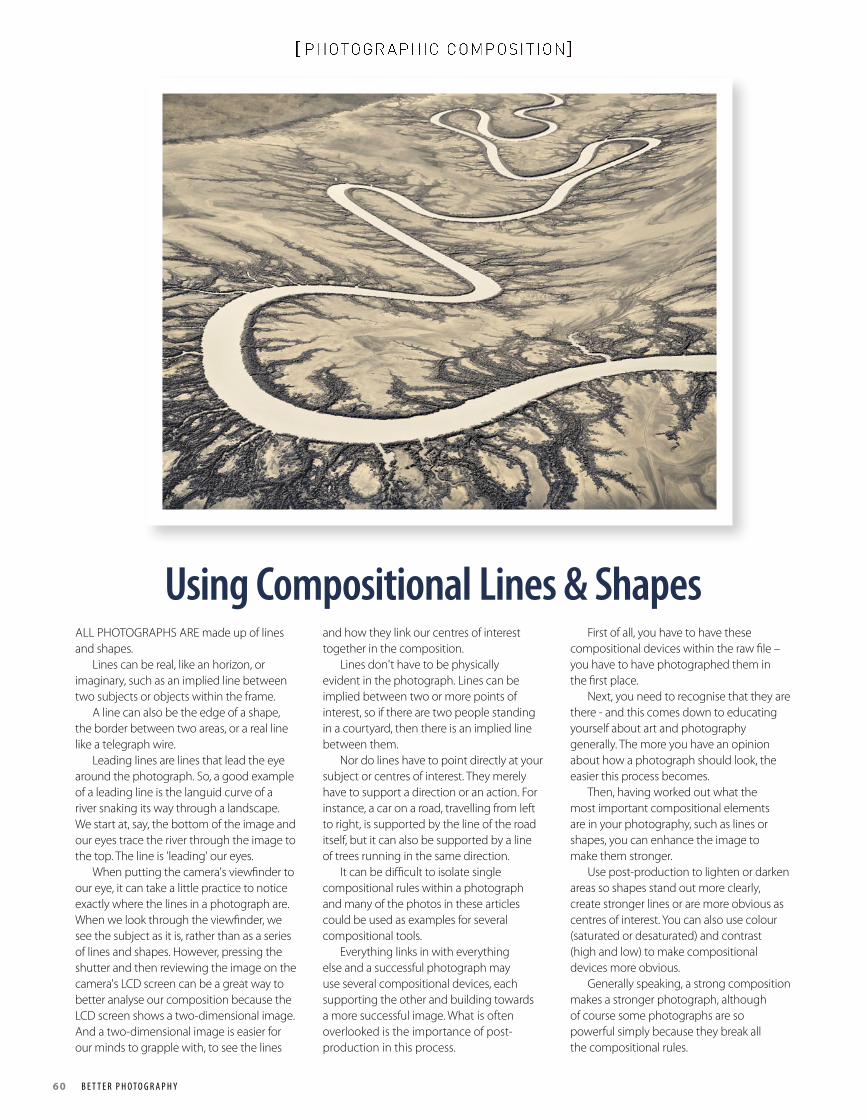
60 B e t t e r P h o t o g r a P h y
[ PHOTOGR APHIC COMPOSITION]
Using Compositional Lines & Shapes ALL PHOTOGRAPHS ARE made up of lines and shapes. Lines can be real, like an horizon, or imaginary, such as an implied line between two subjects or objects within the frame. A line can also be the edge of a shape, the border between two areas, or a real line like a telegraph wire. Leading lines are lines that lead the eye around the photograph. So, a good example of a leading line is the languid curve of a river snaking its way through a landscape. We start at, say, the bottom of the image and our eyes trace the river through the image to the top. The line is 'leading' our eyes. When putting the camera's viewfinder to our eye, it can take a little practice to notice exactly where the lines in a photograph are. When we look through the viewfinder, we see the subject as it is, rather than as a series of lines and shapes. However, pressing the shutter and then reviewing the image on the camera's LCD screen can be a great way to better analyse our composition because the LCD screen shows a two-dimensional image. And a two-dimensional image is easier for our minds to grapple with, to see the lines
and how they link our centres of interest together in the composition. Lines don't have to be physically evident in the photograph. Lines can be implied between two or more points of interest, so if there are two people standing in a courtyard, then there is an implied line between them. Nor do lines have to point directly at your subject or centres of interest. They merely have to support a direction or an action. For instance, a car on a road, travelling from left to right, is supported by the line of the road itself, but it can also be supported by a line of trees running in the same direction. It can be difficult to isolate single compositional rules within a photograph and many of the photos in these articles could be used as examples for several compositional tools. Everything links in with everything else and a successful photograph may use several compositional devices, each supporting the other and building towards a more successful image. What is often overlooked is the importance of post-production in this process.
First of all, you have to have these compositional devices within the raw file – you have to have photographed them in the first place. Next, you need to recognise that they are there - and this comes down to educating yourself about art and photography generally. The more you have an opinion about how a photograph should look, the easier this process becomes. Then, having worked out what the most important compositional elements are in your photography, such as lines or shapes, you can enhance the image to make them stronger. Use post-production to lighten or darken areas so shapes stand out more clearly, create stronger lines or are more obvious as centres of interest. You can also use colour (saturated or desaturated) and contrast (high and low) to make compositional devices more obvious. Generally speaking, a strong composition makes a stronger photograph, although of course some photographs are so powerful simply because they break all the compositional rules.
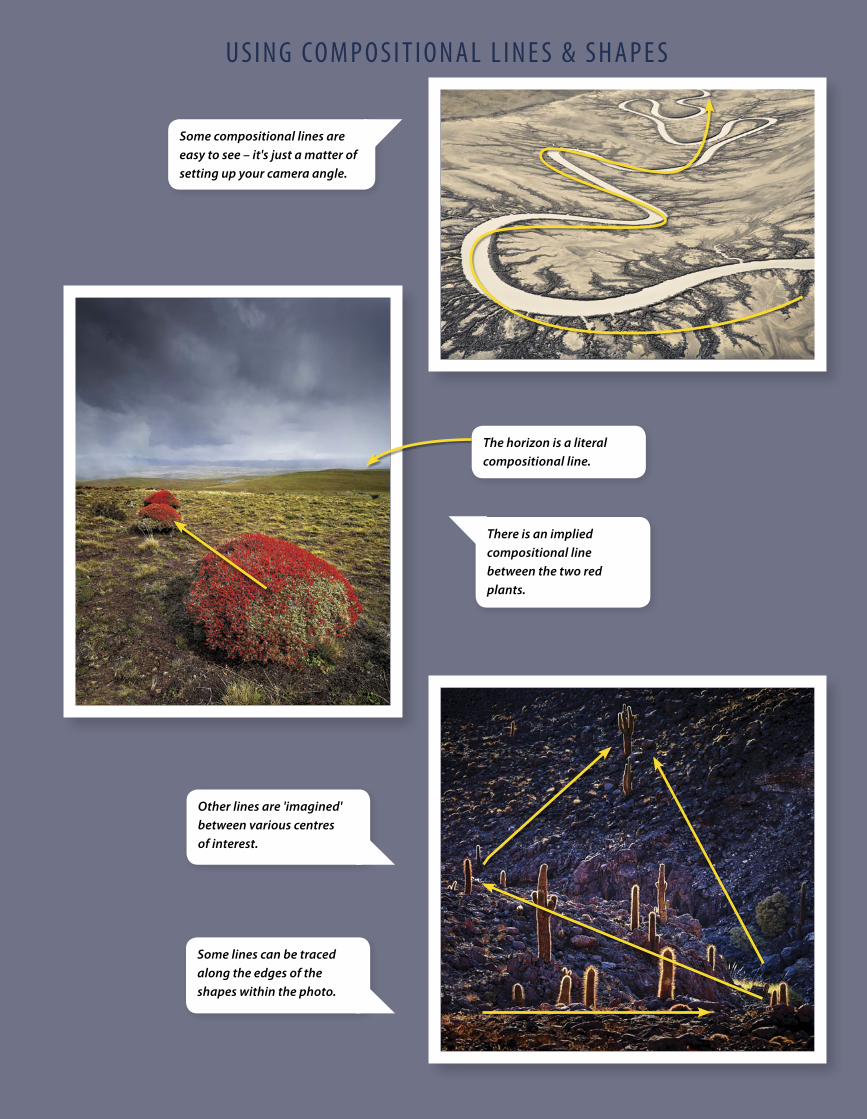
B e t t e r P h o t o g r a P h y 61
[ PHOTOGR APHIC COMPOSITION]u S i n g Co m P o S i t i o n a L L i n e S & S h a P e S
Some compositional lines are easy to see – it's just a matter of setting up your camera angle.
There is an implied compositional line between the two red plants.
Other lines are 'imagined' between various centres of interest.
Some lines can be traced along the edges of the shapes within the photo.
The horizon is a literal compositional line.
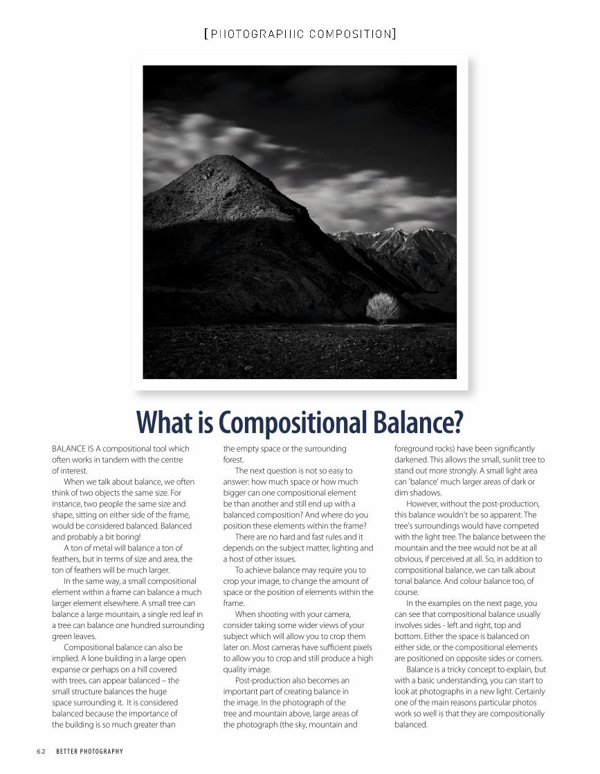
62 B e t t e r P h o t o g r a P h y
[ PHOTOGR APHIC COMPOSITION]
What is Compositional Balance?BALANCE IS A compositional tool which often works in tandem with the centre of interest. When we talk about balance, we often think of two objects the same size. For instance, two people the same size and shape, sitting on either side of the frame, would be considered balanced. Balanced and probably a bit boring! A ton of metal will balance a ton of feathers, but in terms of size and area, the ton of feathers will be much larger. In the same way, a small compositional element within a frame can balance a much larger element elsewhere. A small tree can balance a large mountain, a single red leaf in a tree can balance one hundred surrounding green leaves. Compositional balance can also be implied. A lone building in a large open expanse or perhaps on a hill covered with trees, can appear balanced – the small structure balances the huge space surrounding it. It is considered balanced because the importance of the building is so much greater than
the empty space or the surrounding forest. The next question is not so easy to answer: how much space or how much bigger can one compositional element be than another and still end up with a balanced composition? And where do you position these elements within the frame? There are no hard and fast rules and it depends on the subject matter, lighting and a host of other issues. To achieve balance may require you to crop your image, to change the amount of space or the position of elements within the frame. When shooting with your camera, consider taking some wider views of your subject which will allow you to crop them later on. Most cameras have sufficient pixels to allow you to crop and still produce a high quality image. Post-production also becomes an important part of creating balance in the image. In the photograph of the tree and mountain above, large areas of the photograph (the sky, mountain and
foreground rocks) have been significantly darkened. This allows the small, sunlit tree to stand out more strongly. A small light area can 'balance' much larger areas of dark or dim shadows. However, without the post-production, this balance wouldn't be so apparent. The tree's surroundings would have competed with the light tree. The balance between the mountain and the tree would not be at all obvious, if perceived at all. So, in addition to compositional balance, we can talk about tonal balance. And colour balance too, of course. In the examples on the next page, you can see that compositional balance usually involves sides - left and right, top and bottom. Either the space is balanced on either side, or the compositional elements are positioned on opposite sides or corners. Balance is a tricky concept to explain, but with a basic understanding, you can start to look at photographs in a new light. Certainly one of the main reasons particular photos work so well is that they are compositionally balanced.
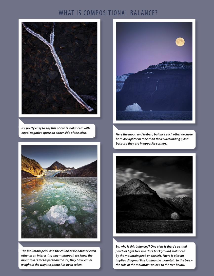
B e t t e r P h o t o g r a P h y 63
[ PHOTOGR APHIC COMPOSITION]w h at i S Co m P o S i t i o n a L B a L a n C e?
It's pretty easy to say this photo is 'balanced' with equal negative space on either side of the stick. Here the moon and iceberg balance each other because
both are lighter in tone than their surroundings, and because they are in opposite corners.
So, why is this balanced? One view is there's a small patch of light tree in a dark background, balanced by the mountain peak on the left. There is also an implied diagonal line joining the mountain to the tree – the side of the mountain 'points' to the tree below.
The mountain peak and the chunk of ice balance each other in an interesting way – although we know the mountain is far larger than the ice, they have equal weight in the way the photo has been taken.
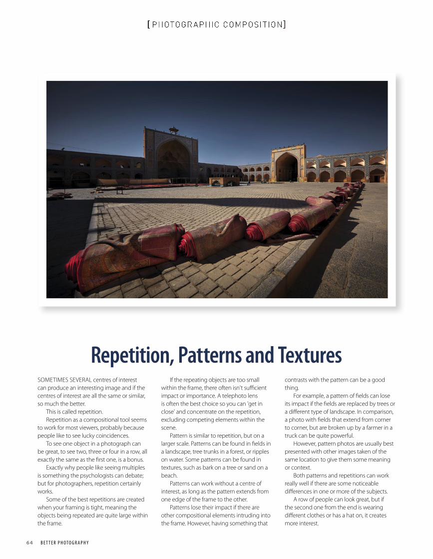
64 B e t t e r P h o t o g r a P h y
[ PHOTOGR APHIC COMPOSITION]
Repetition, Patterns and TexturesSOMETIMES SEVERAL centres of interest can produce an interesting image and if the centres of interest are all the same or similar, so much the better. This is called repetition. Repetition as a compositional tool seems to work for most viewers, probably because people like to see lucky coincidences. To see one object in a photograph can be great, to see two, three or four in a row, all exactly the same as the first one, is a bonus. Exactly why people like seeing multiples is something the psychologists can debate; but for photographers, repetition certainly works. Some of the best repetitions are created when your framing is tight, meaning the objects being repeated are quite large within the frame.
If the repeating objects are too small within the frame, there often isn't sufficient impact or importance. A telephoto lens is often the best choice so you can 'get in close' and concentrate on the repetition, excluding competing elements within the scene. Pattern is similar to repetition, but on a larger scale. Patterns can be found in fields in a landscape, tree trunks in a forest, or ripples on water. Some patterns can be found in textures, such as bark on a tree or sand on a beach. Patterns can work without a centre of interest, as long as the pattern extends from one edge of the frame to the other. Patterns lose their impact if there are other compositional elements intruding into the frame. However, having something that
contrasts with the pattern can be a good thing. For example, a pattern of fields can lose its impact if the fields are replaced by trees or a different type of landscape. In comparison, a photo with fields that extend from corner to corner, but are broken up by a farmer in a truck can be quite powerful. However, pattern photos are usually best presented with other images taken of the same location to give them some meaning or context. Both patterns and repetitions can work really well if there are some noticeable differences in one or more of the subjects. A row of people can look great, but if the second one from the end is wearing different clothes or has a hat on, it creates more interest.
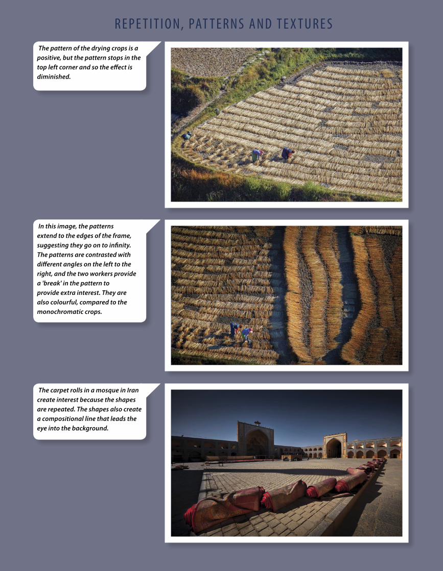
B e t t e r P h o t o g r a P h y 65
[ PHOTOGR APHIC COMPOSITION]r e P e t i t i o n, Pat t e r n S a n d t e x t u r e S
In this image, the patterns extend to the edges of the frame, suggesting they go on to infinity. The patterns are contrasted with different angles on the left to the right, and the two workers provide a 'break' in the pattern to provide extra interest. They are also colourful, compared to the monochromatic crops.
The carpet rolls in a mosque in Iran create interest because the shapes are repeated. The shapes also create a compositional line that leads the eye into the background.
The pattern of the drying crops is a positive, but the pattern stops in the top left corner and so the effect is diminished.
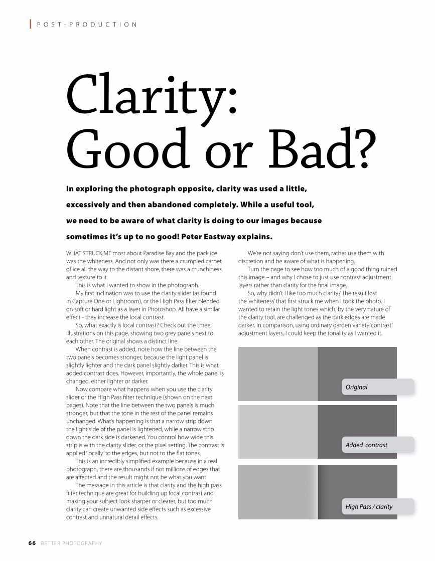
66 B E T T E R P H OTO G R A P H Y
l P O S T - P R O D U C T I O N
WHAT STRUCK ME most about Paradise Bay and the pack ice was the whiteness. And not only was there a crumpled carpet of ice all the way to the distant shore, there was a crunchiness and texture to it. This is what I wanted to show in the photograph. My first inclination was to use the clarity slider (as found in Capture One or Lightroom), or the High Pass filter blended on soft or hard light as a layer in Photoshop. All have a similar effect - they increase the local contrast. So, what exactly is local contrast? Check out the three illustrations on this page, showing two grey panels next to each other. The original shows a distinct line. When contrast is added, note how the line between the two panels becomes stronger, because the light panel is slightly lighter and the dark panel slightly darker. This is what added contrast does. However, importantly, the whole panel is changed, either lighter or darker. Now compare what happens when you use the clarity slider or the High Pass filter technique (shown on the next pages). Note that the line between the two panels is much stronger, but that the tone in the rest of the panel remains unchanged. What’s happening is that a narrow strip down the light side of the panel is lightened, while a narrow strip down the dark side is darkened. You control how wide this strip is with the clarity slider, or the pixel setting. The contrast is applied ‘locally’ to the edges, but not to the flat tones. This is an incredibly simplified example because in a real photograph, there are thousands if not millions of edges that are affected and the result might not be what you want. The message in this article is that clarity and the high pass filter technique are great for building up local contrast and making your subject look sharper or clearer, but too much clarity can create unwanted side effects such as excessive contrast and unnatural detail effects.
We’re not saying don’t use them, rather use them with discretion and be aware of what is happening. Turn the page to see how too much of a good thing ruined this image – and why I chose to just use contrast adjustment layers rather than clarity for the final image. So, why didn’t I like too much clarity? The result lost the ‘whiteness’ that first struck me when I took the photo. I wanted to retain the light tones which, by the very nature of the clarity tool, are challenged as the dark edges are made darker. In comparison, using ordinary garden variety ‘contrast’ adjustment layers, I could keep the tonality as I wanted it.
Clarity: Good or Bad?In exploring the photograph opposite, clarity was used a little,
excessively and then abandoned completely. While a useful tool,
we need to be aware of what clarity is doing to our images because
sometimes it’s up to no good! Peter Eastway explains.
Original
Added contrast
High Pass / clarity
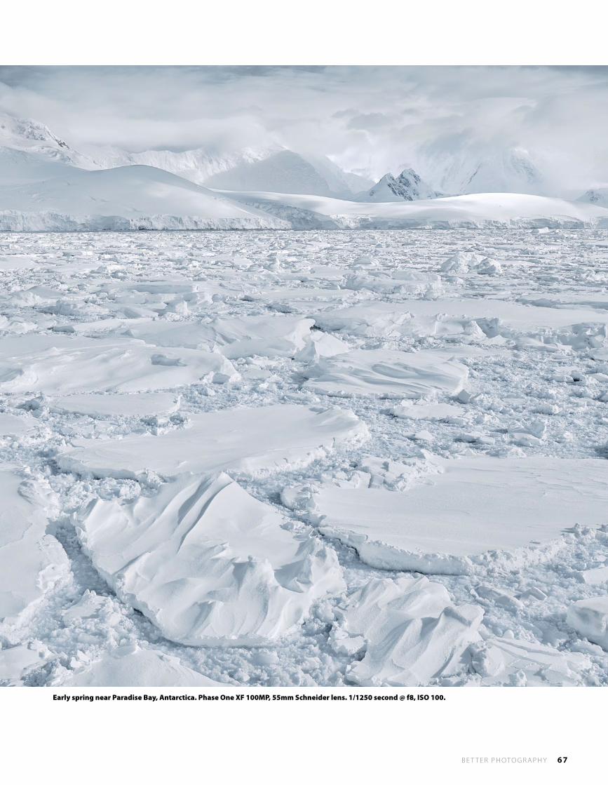
B E T T E R P H OTO G R A P H Y 67
Early spring near Paradise Bay, Antarctica. Phase One XF 100MP, 55mm Schneider lens. 1/1250 second @ f8, ISO 100.
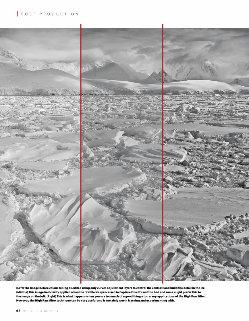
68 B E T T E R P H OTO G R A P H Y
l P O S T - P R O D U C T I O N
(Left) The image before colour toning as edited using only curves adjustment layers to control the contrast and build the detail in the ice. (Middle) This image had clarity applied when the raw file was processed in Capture One. It’s not too bad and some might prefer this to the image on the left. (Right) This is what happens when you use too much of a good thing – too many applications of the High Pass filter. However, the High Pass filter technique can be very useful and is certainly worth learning and experimenting with.
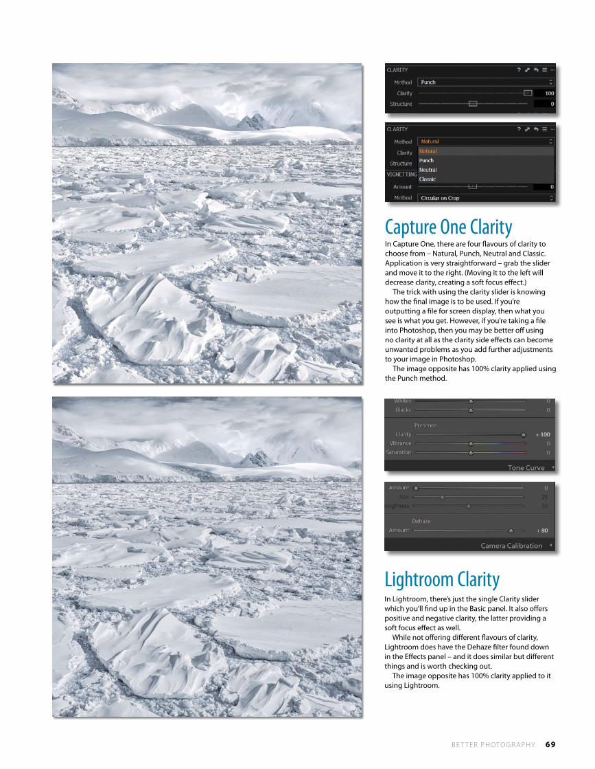
B E T T E R P H OTO G R A P H Y 69
Capture one ClarityIn Capture One, there are four flavours of clarity to choose from – Natural, Punch, Neutral and Classic. Application is very straightforward – grab the slider and move it to the right. (Moving it to the left will decrease clarity, creating a soft focus effect.) The trick with using the clarity slider is knowing how the final image is to be used. If you’re outputting a file for screen display, then what you see is what you get. However, if you’re taking a file into Photoshop, then you may be better off using no clarity at all as the clarity side effects can become unwanted problems as you add further adjustments to your image in Photoshop. The image opposite has 100% clarity applied using the Punch method.
Lightroom ClarityIn Lightroom, there’s just the single Clarity slider which you’ll find up in the Basic panel. It also offers positive and negative clarity, the latter providing a soft focus effect as well. While not offering different flavours of clarity, Lightroom does have the Dehaze filter found down in the Effects panel – and it does similar but different things and is worth checking out. The image opposite has 100% clarity applied to it using Lightroom.
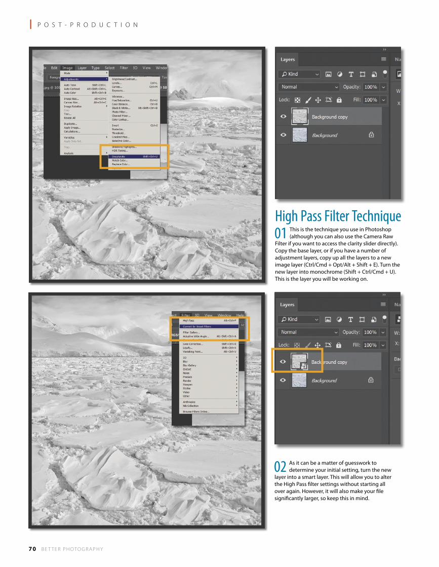
70 B E T T E R P H OTO G R A P H Y
l P O S T - P R O D U C T I O N
high Pass Filter technique01 This is the technique you use in Photoshop
(although you can also use the Camera Raw Filter if you want to access the clarity slider directly). Copy the base layer, or if you have a number of adjustment layers, copy up all the layers to a new image layer (Ctrl/Cmd + Opt/Alt + Shift + E). Turn the new layer into monochrome (Shift + Ctrl/Cmd + U). This is the layer you will be working on.
02 As it can be a matter of guesswork to determine your initial setting, turn the new
layer into a smart layer. This will allow you to alter the High Pass filter settings without starting all over again. However, it will also make your file significantly larger, so keep this in mind.
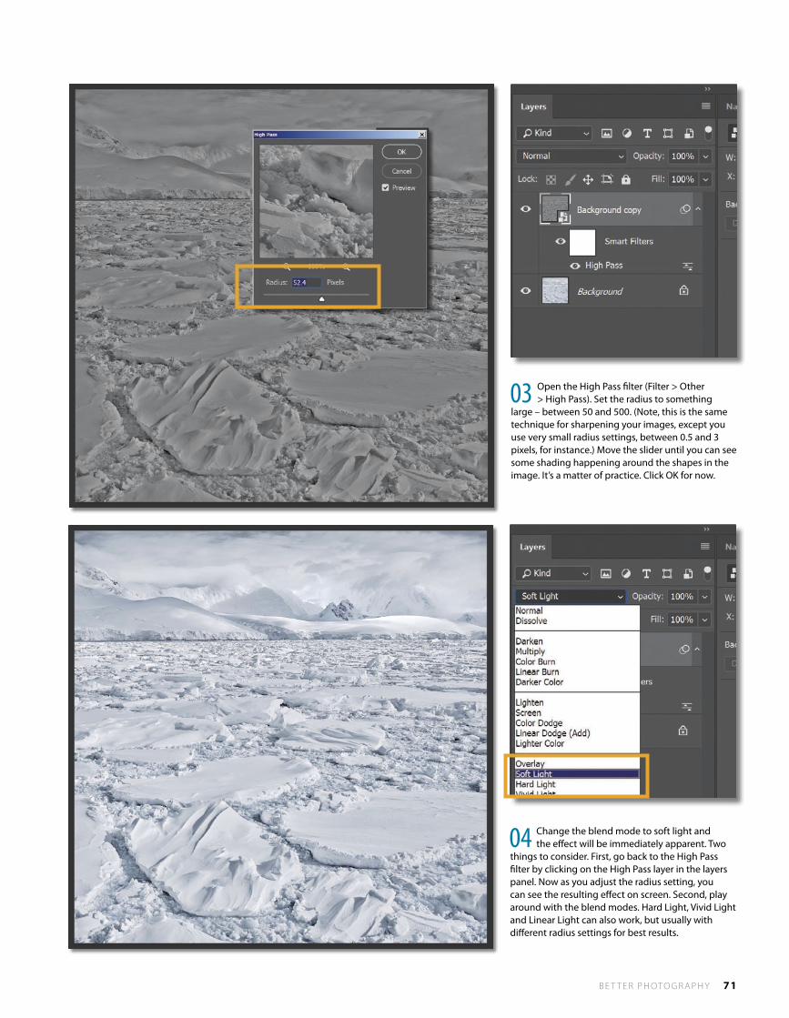
B E T T E R P H OTO G R A P H Y 71
03 Open the High Pass filter (Filter > Other > High Pass). Set the radius to something
large – between 50 and 500. (Note, this is the same technique for sharpening your images, except you use very small radius settings, between 0.5 and 3 pixels, for instance.) Move the slider until you can see some shading happening around the shapes in the image. It’s a matter of practice. Click OK for now.
04 Change the blend mode to soft light and the effect will be immediately apparent. Two
things to consider. First, go back to the High Pass filter by clicking on the High Pass layer in the layers panel. Now as you adjust the radius setting, you can see the resulting effect on screen. Second, play around with the blend modes. Hard Light, Vivid Light and Linear Light can also work, but usually with different radius settings for best results.

72 B E T T E R P H OTO G R A P H Y
WHAT AN AMAZING PHOTOGRAPH! Congratulations to Hymakar Valluri, the winner of the 2017 Better Photography Magazine ‘Photo of the Year’ award. Hymakar’s incredibly composed image of a hummingbird really caught the judges’ eyes – such startling clarity and deft subject positioning. Technique is exceptional and, no doubt, so was Hymakar’s patience. Of course, the degree of difficulty doesn’t impact the judges very much – for all we know it could have been a lucky first shot – but we do know that we very much appreciate and applaud the result. Hymakar takes out the overall first prize and a cash purse of AUS $5000! Congratulations! Hymakar is also the Revealing Nature category winner, and as such, he and the other five category winners will take home a sponsor pack comprising a Datacolor Spyder5Express, a Canson Infinity paper pack, a Momento Photo Book voucher to the value of $150 and a Wacom Intuos Pro Medium tablet and stylus. Thanks to our wonderful sponsors for supporting our competition. And thanks also to our esteemed judges Peter Eastway, David Oliver and Tony Hewitt, AIPP Grand Masters of Photography. This year there were 1212 entries and the majority of entries earned a Bronze Award or higher. A Bronze Award is given where the judges can see some elements of photographic skill and imagination and want to acknowledge what the entrant has submitted. And given the competition is entered by passionate photographers, it’s gratifying to have such a high overall standard. Each entry also received a short judge comment which will hopefully be of use to entrants for the future. If you entered, you can log back into your account to see your scores and read your comments. To view the top entries in each category, please visit the Better Photography website and click through to the competition site, or you can go there directly at http://www.betterphotographyphotocomp.com/.
Photoof the Year
the 2017
M
AGAZine
Better Photography
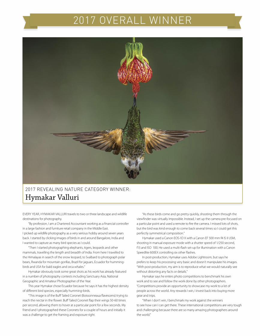
2017 overAll Winner
EVERY YEAR, HYMAKAR VALLURI travels to two or three landscape and wildlife destinations for photography. “By profession, I am a Chartered Accountant working as a financial controller in a large fashion and furniture retail company in the Middle East. I picked up wildlife photography as a very serious hobby around seven years back. I started by clicking images of birds in and around Bangalore, India and I wanted to capture as many bird species as I could. “Then I started photographing elephants, tigers, leopards and other mammals, travelling the length and breadth of India. From here I travelled to the Himalayas in search of the snow leopard, to Svalbard to photograph polar bears, Rwanda for mountain gorillas, Brazil for jaguars, Ecuador for humming-birds and USA for bald eagles and orca whales.” Hymakar obviously took some great shots as his work has already featured in a number of photography contests including Sanctuary Asia, National Geographic and Amateur Photographer of the Year. This year Hymakar chose Ecuador because he says it has the highest density of different bird species, especially humming-birds. “This image is of the Buff Tailed Coronet (Boissonneaua flavescens) trying to reach the nectar in the flower. Buff Tailed Coronet flap their wings 50-60 times per second, allowing them to hover at a particular point for a few seconds. My friend and I photographed these Coronets for a couple of hours and initially it was a challenge to get the framing and exposure right.
“As these birds come and go pretty quickly, shooting them through the viewfinder was virtually impossible. Instead, I set up the camera pre-focused on a particular point and used a remote to fire the camera. I missed lots of shots, but the bird was kind enough to come back several times so I could get this perfectly symmetrical composition.” Hymakar used a Canon EOS-1D X with a Canon EF 500 mm f4 IS II USM, shooting in manual exposure mode with a shutter speed of 1/250 second, f13 and ISO 100. He used a multi-flash set-up for illumination with a Canon Speedlite 600EX controlling six other flashes. In post-production, Hymakar uses Adobe Lightroom, but says he prefers to keep his processing very basic and doesn’t manipulate his images. “With post-production, my aim is to reproduce what we would naturally see without distorting any facts or details.” Hymakar says he enters photo competitions to benchmark his own work and to see and follow the work done by other photographers. “Competitions provide an opportunity to showcase my work to a lot of people across the world. Any rewards I win, I invest back into buying more gear and trips. “When I don’t win, I benchmark my work against the winners to see how can I can get there. These international competitions are very tough and challenging because there are so many amazing photographers around the world.”
2017 reveAlinG nAture CAteGory Winner:
Hymakar Valluri
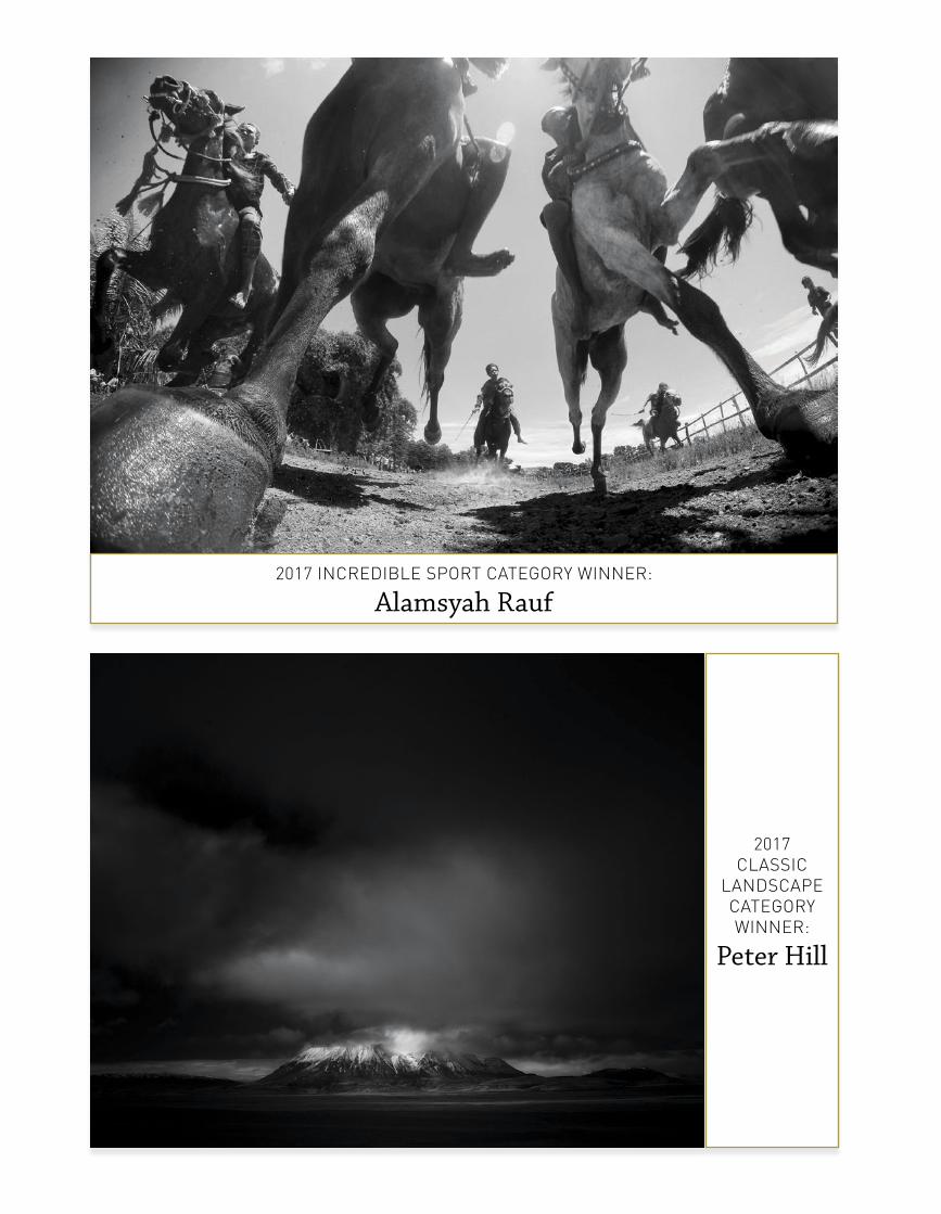
2017 inCrediBle sPort CAteGory Winner:
Alamsyah Rauf
2017 ClAssiC
lAndsCAPe CAteGory Winner:
Peter Hill
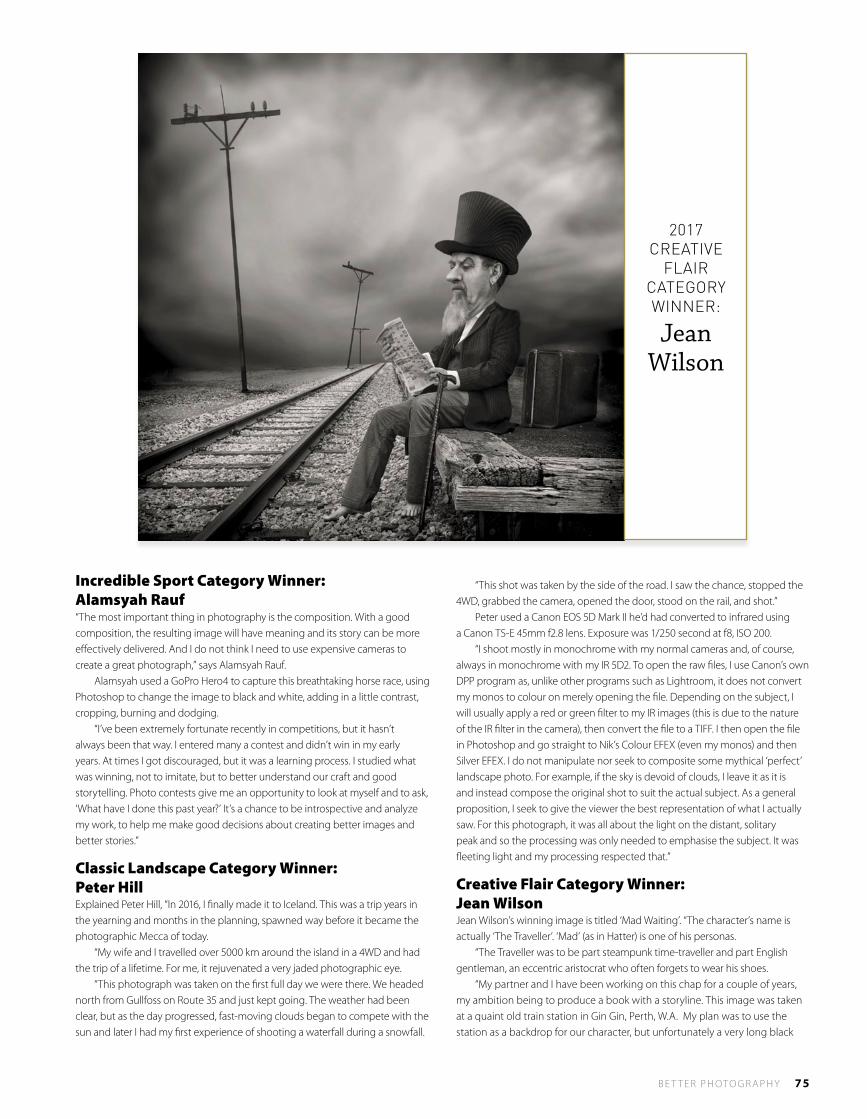
B E T T E R P H OTO G R A P H Y 75
Incredible Sport Category Winner: Alamsyah Rauf“The most important thing in photography is the composition. With a good composition, the resulting image will have meaning and its story can be more effectively delivered. And I do not think I need to use expensive cameras to create a great photograph,” says Alamsyah Rauf. Alamsyah used a GoPro Hero4 to capture this breathtaking horse race, using Photoshop to change the image to black and white, adding in a little contrast, cropping, burning and dodging. “I’ve been extremely fortunate recently in competitions, but it hasn’t always been that way. I entered many a contest and didn’t win in my early years. At times I got discouraged, but it was a learning process. I studied what was winning, not to imitate, but to better understand our craft and good storytelling. Photo contests give me an opportunity to look at myself and to ask, ‘What have I done this past year?’ It’s a chance to be introspective and analyze my work, to help me make good decisions about creating better images and better stories.”
Classic Landscape Category Winner: Peter HillExplained Peter Hill, “In 2016, I finally made it to Iceland. This was a trip years in the yearning and months in the planning, spawned way before it became the photographic Mecca of today. “My wife and I travelled over 5000 km around the island in a 4WD and had the trip of a lifetime. For me, it rejuvenated a very jaded photographic eye. “This photograph was taken on the first full day we were there. We headed north from Gullfoss on Route 35 and just kept going. The weather had been clear, but as the day progressed, fast-moving clouds began to compete with the sun and later I had my first experience of shooting a waterfall during a snowfall.
“This shot was taken by the side of the road. I saw the chance, stopped the 4WD, grabbed the camera, opened the door, stood on the rail, and shot.” Peter used a Canon EOS 5D Mark II he’d had converted to infrared using a Canon TS-E 45mm f2.8 lens. Exposure was 1/250 second at f8, ISO 200. “I shoot mostly in monochrome with my normal cameras and, of course, always in monochrome with my IR 5D2. To open the raw files, I use Canon’s own DPP program as, unlike other programs such as Lightroom, it does not convert my monos to colour on merely opening the file. Depending on the subject, I will usually apply a red or green filter to my IR images (this is due to the nature of the IR filter in the camera), then convert the file to a TIFF. I then open the file in Photoshop and go straight to Nik’s Colour EFEX (even my monos) and then Silver EFEX. I do not manipulate nor seek to composite some mythical ‘perfect’ landscape photo. For example, if the sky is devoid of clouds, I leave it as it is and instead compose the original shot to suit the actual subject. As a general proposition, I seek to give the viewer the best representation of what I actually saw. For this photograph, it was all about the light on the distant, solitary peak and so the processing was only needed to emphasise the subject. It was fleeting light and my processing respected that.”
Creative Flair Category Winner: Jean WilsonJean Wilson’s winning image is titled ‘Mad Waiting’. “The character’s name is actually ‘The Traveller’. ‘Mad’ (as in Hatter) is one of his personas. “The Traveller was to be part steampunk time-traveller and part English gentleman, an eccentric aristocrat who often forgets to wear his shoes. “My partner and I have been working on this chap for a couple of years, my ambition being to produce a book with a storyline. This image was taken at a quaint old train station in Gin Gin, Perth, W.A. My plan was to use the station as a backdrop for our character, but unfortunately a very long black
2017 CreAtive
flAir CAteGory Winner:
Jean Wilson
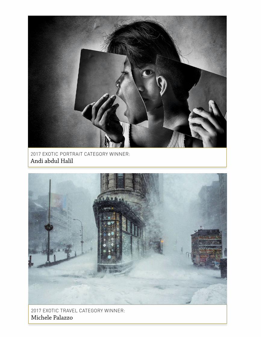
2017 eXotiC trAvel CAteGory Winner: Michele Palazzo
2017 eXotiC PortrAit CAteGory Winner: Andi abdul Halil

fence had been erected along the entire length of the platform! It was rather unsightly. “Not wanting to waste the day’s travel, a number of scenarios were shot in the hope that I would be able to find something useful to work with. If only that fence were not there! Using the most suitable image in post-production and deciding to keep the image simple, I removed the train station altogether (ex-platform). I also cut out the trees in the background and substituted a less distracting cloud image I had shot previously, to which I applied a Filter>Twirl and Gaussian Blur. A couple of telegraph poles were added, a little free transforming to the model’s head and hat, and a tiny bit of liquify to emphasise the character’s grumpy expression and viola! Where is that train? “Shooting in raw, I used a Canon EOS 5D Mk III with a Canon EF24-105mm at f11 and the camera was hand-held. My go-to software is Photoshop CS5 coupled with NIK software; I have no need or desire to upgrade. “Entering competitions for me is fun. It is the best way I know to let everyone see my work and enjoy viewing it. I don’t as yet have a web page, but it is on the list. I was asked recently do I produce composite images specifically with the intention of entering them in competitions? I actually produce these images and stories for myself because it’s what I do! If they fit the competition criteria, then sure, I’ll enter the image if I feel it is worthy. “I may start out with an idea for a story or image, but as I work on the project, it more often than not takes on a life of its own and I’m just going along for the ride! I love being creative and for me to take a photograph and to not mess around with it would be impossible. “I love to work and experiment in all genres of photography, but compositing and manipulation really gets my mind engaged. My work is often pushing pixels to the max in order to produce art using photography.”
Emotive Portrait Category Winner: Andi abdul HalilAccording to Andi abdul Halil, “Photographs for me are an expression of my soul. There can be an unspoken meaning with words that can be better described in a photograph.”
For this imaginative and emotive portrait, Andi used a Canon EOS 6D with a 17-40mm lens. Exposure was 1/50 second at f4.5, ISO 640. In post-production, Photoshop CC, Silver EFEX Pro 2 and Color EFEX 4 were used “because the software is very compatible and easy to use. “Before taking a picture, I describe an idea inside my head and then sketch it out before executing it with the camera.”
Exotic Travel Category Winner: Michele PalazzoWe’re thinking this isn’t a day you’d forget: 23 January 2016. It’s New York City under a snowstorm. Explained photographer Michele Palazzo, “That morning I woke up early, as I always do at weekends. This is the time I can get things done – and I was so excited about the storm, like a kid in the snow! My girlfriend was sleepy, looking at me with one eye open. She asked me where I was going so early and I replied: “Sleep, I’ll be back soon!” “The funny thing is, the day before I’d sold my Fujifilm X-T1 to make a bit of money and buy the X-Pro2, so the only camera I had at the time was a little Ricoh GR! While walking through the Jonas Winter Storm that swept across the East Coast in January 2016, I captured this shot of the Flatiron Building against a backdrop of swirling snow. With the exception of a few minor details like logos and a food cart, the image looks like an impressionist painting from another century. The cloudy atmosphere and gusty winds create patterns that appear uncannily like brushstrokes. I posted the photo on Instagram and Eyeem and in no time the photo went viral and started collecting articles and awards.” The Ricoh GR has a 28mm equivalent lens and the exposure was 1/400 second at f4, ISO 400. Michele says he uses Lightroom “because it’s the closest thing to a darkroom set-up. It lets me focus on the image and it’s very intuitive. I normally adjust contrast, saturation and white balance to match as much as possible the colours I saw with my eyes. “I entered this image because I knew it was a special photo. I don’t often participate in competitions because I’m very critical of my own images, but I think (and obviously I’m not the only one) that this shot is iconic, representing a special moment in time. I was very happy to know it’s a winner!”
Momento Photo Book VoucherMomento was the first on-demand photo book company in Australia and New Zealand and we believe it’s also the finest. Momento works hard to produce the best quality photo books and custom stationery around, and it is proud to be 100% home grown and handcrafted in downtown Sydney. The $150 voucher will get you a beautiful photo book all of your own! For more information, visit http://www.momento.com.au/products/photo-books.
Datacolor Spyder5EXPRESSSpyder5EXPRESS calibrates all your laptop and desktop monitors to an industry colour reference standard so you see accurate colours. Your image editing will be easier and faster, you’ll spend less time in the “print-edit-print” cycle, and you’ll waste less ink and paper. For more information, visit Kayell Australia, the distributor of Datacolor in Australia, at http://www.kayellaustralia.com.au/datacolor-spyder5express-p-4476.html.
Wacom Intuos Pro MediumDesigned for creativity, this innovative pen tablet combines Wacom’s finest pen capabilities with intuitive multi-touch gestures and gives you the precision and control you demand when using professional software and time-savers to speed your workflow. For more information, visit https://buywacom.com.au/products/pen-tablets/intuos-pro-tablets/intuos- pro-medium.html.
Canson Discovery Pack Fine Art PhotoThe Canson Discovery Pack Fine Art Photo Includes:• Platine Fibre Rag 310gsm – 100% Rag, ultra smooth glossy, pure white,
without OBAs.• Baryta Photographique 310gsm – True Baryta paper developed for inkjet,
pure white.• Photo HighGloss Premium RC 315gsm – alpha cellulose resin coated, ultra
white and ultra smooth with the highest gloss level of the RC paper market.• PhotoGloss Premium RC 270gsm – alpha cellulose resin coated, glossy,
ultra white.• PhotoSatin Premium RC 270gsm – Resin coated satin, extra white.• PhotoLustre Premium RC 310gsm – Exceptional strength, excellent true
lustre surface, extra white, high opacity• Rag Photographique 310gsm – 100% rag – ultra smooth, ultra white paper,
without OBAs.• Rag Photographique 210gsm – 100% rag – ultra smooth, ultra white paper,
without OBAs.• Rag Photographique Duo 220gsm – 100% rag, ultra smooth, double-side
coated, ultra white paper, without OBAs.
For more information, visit http://www.kayellaustralia.com.au/canson-infinity-c-205_504.html
Great Category Prizes – Thanks to our Sponsors!
There are six Category Prizes and the winner of each of these categories will win a
Canson Discovery Pack Fine Art Photo, a Datacolor Spyder5, a Momento Photo Book
voucher, and a Wacom Intuos tablet. That’s a value pack worth over $600!
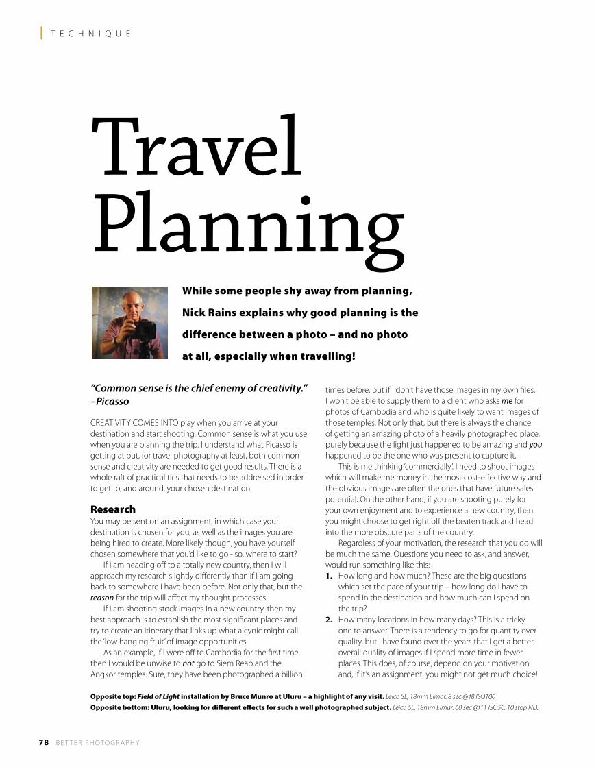
78 B E T T E R P H OTO G R A P H Y
l T E C H N I Q U E
While some people shy away from planning,
Nick Rains explains why good planning is the
difference between a photo – and no photo
at all, especially when travelling!
“Common sense is the chief enemy of creativity.” –Picasso
CREATIVITY COMES INTO play when you arrive at your destination and start shooting. Common sense is what you use when you are planning the trip. I understand what Picasso is getting at but, for travel photography at least, both common sense and creativity are needed to get good results. There is a whole raft of practicalities that needs to be addressed in order to get to, and around, your chosen destination.
ResearchYou may be sent on an assignment, in which case your destination is chosen for you, as well as the images you are being hired to create. More likely though, you have yourself chosen somewhere that you’d like to go - so, where to start? If I am heading off to a totally new country, then I will approach my research slightly differently than if I am going back to somewhere I have been before. Not only that, but the reason for the trip will affect my thought processes. If I am shooting stock images in a new country, then my best approach is to establish the most significant places and try to create an itinerary that links up what a cynic might call the ‘low hanging fruit’ of image opportunities. As an example, if I were off to Cambodia for the first time, then I would be unwise to not go to Siem Reap and the Angkor temples. Sure, they have been photographed a billion
times before, but if I don’t have those images in my own files, I won’t be able to supply them to a client who asks me for photos of Cambodia and who is quite likely to want images of those temples. Not only that, but there is always the chance of getting an amazing photo of a heavily photographed place, purely because the light just happened to be amazing and you happened to be the one who was present to capture it. This is me thinking ‘commercially’. I need to shoot images which will make me money in the most cost-effective way and the obvious images are often the ones that have future sales potential. On the other hand, if you are shooting purely for your own enjoyment and to experience a new country, then you might choose to get right off the beaten track and head into the more obscure parts of the country. Regardless of your motivation, the research that you do will be much the same. Questions you need to ask, and answer, would run something like this:1. How long and how much? These are the big questions
which set the pace of your trip – how long do I have to spend in the destination and how much can I spend on the trip?
2. How many locations in how many days? This is a tricky one to answer. There is a tendency to go for quantity over quality, but I have found over the years that I get a better overall quality of images if I spend more time in fewer places. This does, of course, depend on your motivation and, if it’s an assignment, you might not get much choice!
TravelPlanning
Opposite top: Field of Light installation by Bruce Munro at Uluru – a highlight of any visit. Leica SL, 18mm Elmar. 8 sec @ f8 ISO100
Opposite bottom: Uluru, looking for different effects for such a well photographed subject. Leica SL, 18mm Elmar. 60 sec @f11 ISO50. 10 stop ND.
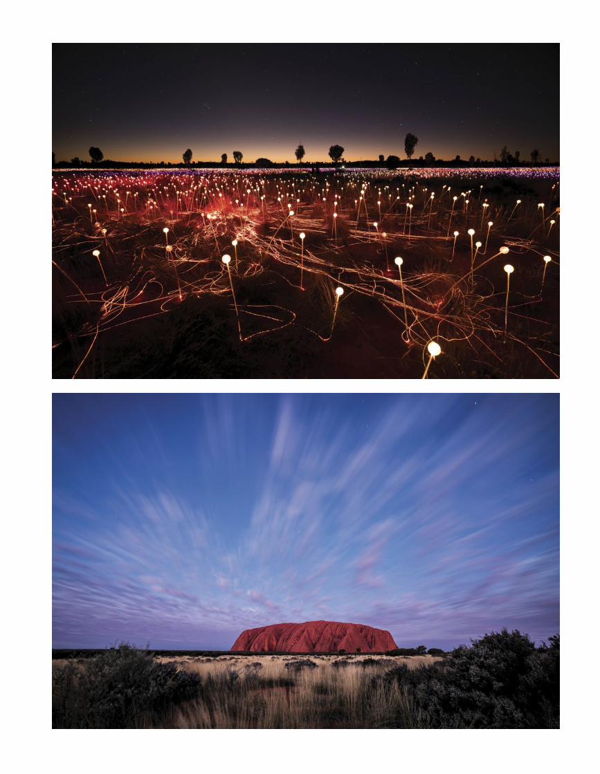
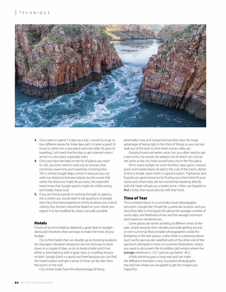
3. If you were to spend 12 days on a trip, I would try to go to four different places for three days each. It takes a good 24 hours to settle into a new place and even after 30 years of travelling, I still need that first day to get oriented when I arrive in a new place, especially cities.
4. Once you have decided on the list of places you want to visit, you then need to work out an itinerary that minimises travel time and maximises shooting time. This is where Google Maps comes in because you can work out distances between places, but be aware that whilst the distances might be accurate, the expected travel times that Google reports might be wildly wrong and totally impractical.
5. If you are hiring a guide or working through an agency, this is where you would start to ask questions of people who have first-hand experience of the locations you intend visiting. Any itinerary should be based on your needs, but expect it to be modified by what is actually possible.
HotelsChoice of accommodation depends a great deal on budget - obviously! However, there are ways to make the most of your budget. I try to find hotels that can double up as shooting locations for cityscapes. Elevated viewpoints are not that easy to track down in a couple of days, so try to book a hotel which has either a room balcony with a great view, or a rooftop terrace - or both. Google Earth is a good tool here because you can find the hotel location and get a sense of what can be seen from the rooms or the roof. City centre hotels have the disadvantage of being
potentially noisy and overpriced, but they have the huge advantage of being right in the thick of things so you can just walk out of the door to find street scenes, cafes, etc. Outlying hotels are better value, but you often need to get a taxi to the city centre, the added cost of which can end up the same as the city hotel would have cost in the first place. Don’t waste budget on resort facilities. Spas, gyms, massive pools and marble foyers all add to the cost of the rooms. Better to find a simple, clean hotel in a good location. TripAdvisor and Expedia are good resources for finding out what hotels fit your needs and where they are, but sometimes booking directly with the hotel will get you a better price. I often use Expedia to find a hotel, then book directly with that hotel.
Time of YearThis is another factor in a successful travel photography excursion. Google the ‘climate’ for a particular location and you should be able to find good info about the average number of sunny days, the likelihood of rain and the average minimum and maximum temperatures. Some places are worth avoiding at different times of the year, simply because their climates preclude getting around or even surviving! Most sensible photographers avoid the Kimberley in the wet season, unless there is a pressing reason (such as the spectacular weather) and, at the other end of the spectrum, Mongolia is more of a summer destination, unless you want to document the incredibly cold winters where the average minimum is -25 C and can go below -40 C. A little planning goes a long way and can make the difference between a very successful photographic trip and one where you struggled to get the images you hoped for.
80 B E T T E R P H OTO G R A P H Y
l T E C H N I Q U E
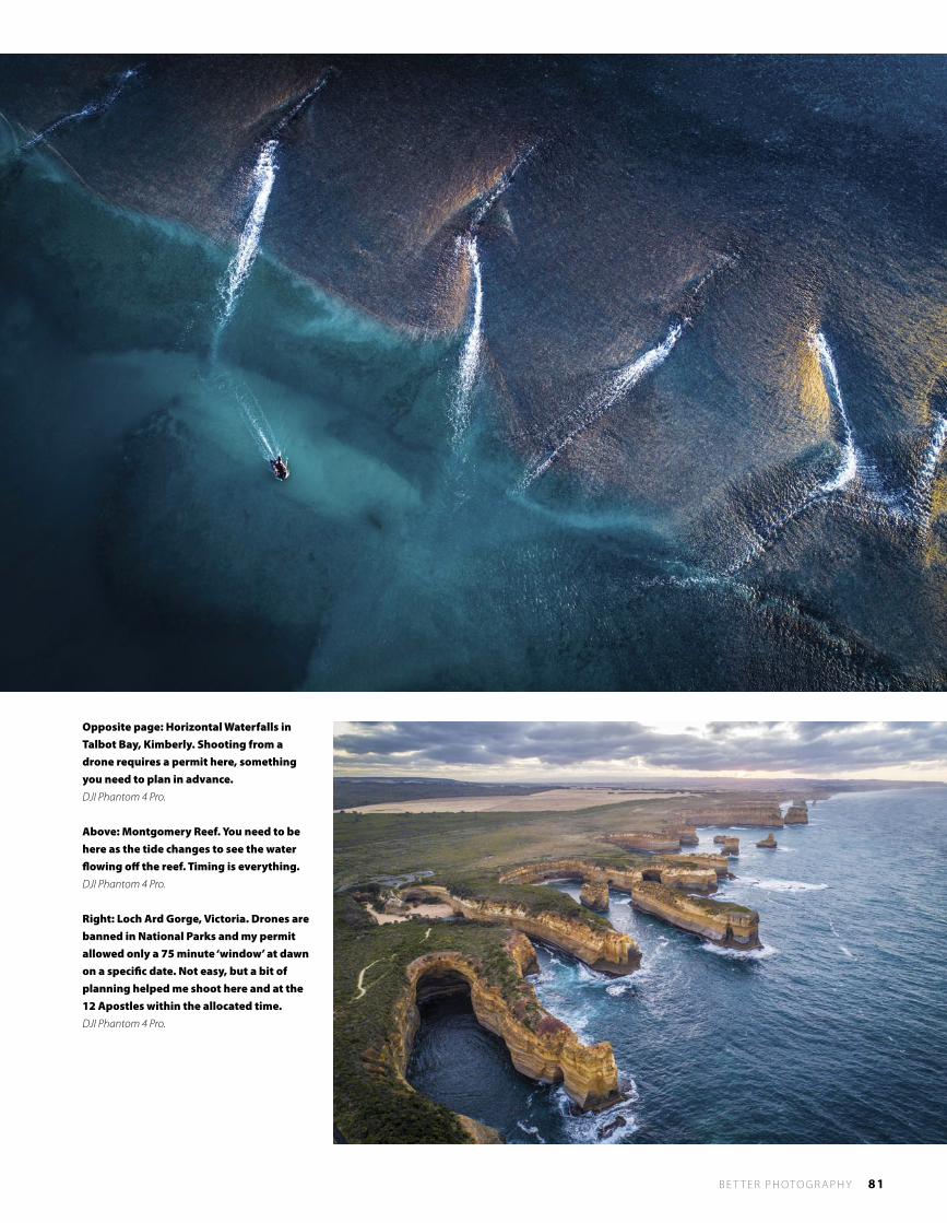
B E T T E R P H OTO G R A P H Y 81
Opposite page: Horizontal Waterfalls in Talbot Bay, Kimberly. Shooting from a drone requires a permit here, something you need to plan in advance. DJI Phantom 4 Pro.
Above: Montgomery Reef. You need to be here as the tide changes to see the water flowing off the reef. Timing is everything. DJI Phantom 4 Pro.
Right: Loch Ard Gorge, Victoria. Drones are banned in National Parks and my permit allowed only a 75 minute ‘window’ at dawn on a specific date. Not easy, but a bit of planning helped me shoot here and at the 12 Apostles within the allocated time. DJI Phantom 4 Pro.
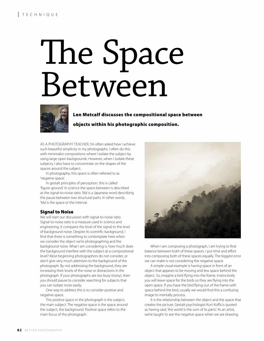
l T E C H N I Q U E
82 B E T T E R P H OTO G R A P H Y
The Space Between
Len Metcalf discusses the compositional space between
objects within his photographic composition.
AS A PHOTOGRAPHY TEACHER, I’m often asked how I achieve such beautiful simplicity in my photographs. I often do this with minimalist compositions where I isolate the subject by using large open backgrounds. However, when I isolate these subjects, I also have to concentrate on the shapes of the spaces around the subject. In photography, this space is often referred to as ‘negative space’. In gestalt principles of perception, this is called ‘figure-ground’. In science the space between is described as the signal-to-noise ratio. ‘Ma’ is a Japanese word describing the pause between two structural parts. In other words, ‘Ma’ is the space or the interval.
Signal to NoiseWe will start our discussion with signal-to-noise ratio. Signal-to-noise ratio is a measure used in science and engineering. It compares the level of the signal to the level of background noise. Despite its scientific background, I find that there is something to contemplate here when we consider the object we’re photographing and the background noise. What I am considering is, how much does the background interfere with the subject at a compositional level? Most beginning photographers do not consider, or don’t give very much attention to the background of the photograph. By not addressing the background, they are increasing their levels of the noise or distractions in the photograph. If your photographs are too busy (noisy), then you should pause to consider searching for subjects that you can isolate more easily. One way to address this is to consider positive and negative space. The positive space in the photograph is the subject, the main subject. The negative space is the space around the subject, the background. Positive space refers to the main focus of the photograph.
When I am composing a photograph, I am trying to find balance between both of these spaces. I put time and effort into composing both of these spaces equally. The biggest error we can make is not considering the negative space. A simple visual example is having space in front of an object that appears to be moving and less space behind the object. So, imagine a bird flying into the frame. Instinctively you will leave space for the birds so they are flying into the open space. If you have the bird flying out of the frame with space behind the bird, usually we would find this a confusing image to mentally process. It is the relationship between the object and the space that creates the picture. Gestalt psychologist Kurt Koffa is quoted as having said, ‘the world is the sum of its parts.’ As an artist, we’re taught to see the negative space when we are drawing.
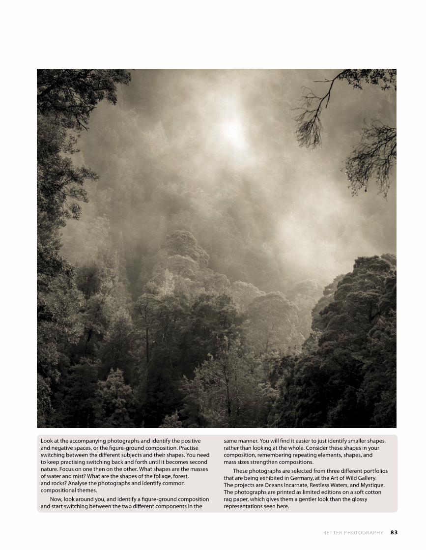
B E T T E R P H OTO G R A P H Y 83
Look at the accompanying photographs and identify the positive and negative spaces, or the figure-ground composition. Practise switching between the different subjects and their shapes. You need to keep practising switching back and forth until it becomes second nature. Focus on one then on the other. What shapes are the masses of water and mist? What are the shapes of the foliage, forest, and rocks? Analyse the photographs and identify common compositional themes.
Now, look around you, and identify a figure-ground composition and start switching between the two different components in the
same manner. You will find it easier to just identify smaller shapes, rather than looking at the whole. Consider these shapes in your composition, remembering repeating elements, shapes, and mass sizes strengthen compositions.
These photographs are selected from three different portfolios that are being exhibited in Germany, at the Art of Wild Gallery. The projects are Oceans Incarnate, Restless Waters, and Mystique. The photographs are printed as limited editions on a soft cotton rag paper, which gives them a gentler look than the glossy representations seen here.
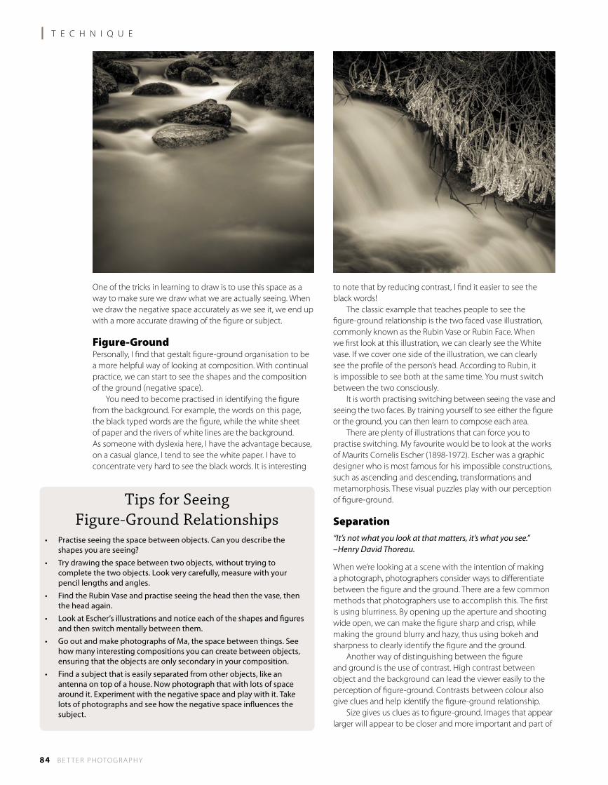
l T E C H N I Q U E
84 B E T T E R P H OTO G R A P H Y
One of the tricks in learning to draw is to use this space as a way to make sure we draw what we are actually seeing. When we draw the negative space accurately as we see it, we end up with a more accurate drawing of the figure or subject.
Figure-GroundPersonally, I find that gestalt figure-ground organisation to be a more helpful way of looking at composition. With continual practice, we can start to see the shapes and the composition of the ground (negative space). You need to become practised in identifying the figure from the background. For example, the words on this page, the black typed words are the figure, while the white sheet of paper and the rivers of white lines are the background. As someone with dyslexia here, I have the advantage because, on a casual glance, I tend to see the white paper. I have to concentrate very hard to see the black words. It is interesting
to note that by reducing contrast, I find it easier to see the black words! The classic example that teaches people to see the figure-ground relationship is the two faced vase illustration, commonly known as the Rubin Vase or Rubin Face. When we first look at this illustration, we can clearly see the White vase. If we cover one side of the illustration, we can clearly see the profile of the person’s head. According to Rubin, it is impossible to see both at the same time. You must switch between the two consciously. It is worth practising switching between seeing the vase and seeing the two faces. By training yourself to see either the figure or the ground, you can then learn to compose each area. There are plenty of illustrations that can force you to practise switching. My favourite would be to look at the works of Maurits Cornelis Escher (1898-1972). Escher was a graphic designer who is most famous for his impossible constructions, such as ascending and descending, transformations and metamorphosis. These visual puzzles play with our perception of figure-ground.
Separation“It’s not what you look at that matters, it’s what you see.” –Henry David Thoreau.
When we’re looking at a scene with the intention of making a photograph, photographers consider ways to differentiate between the figure and the ground. There are a few common methods that photographers use to accomplish this. The first is using blurriness. By opening up the aperture and shooting wide open, we can make the figure sharp and crisp, while making the ground blurry and hazy, thus using bokeh and sharpness to clearly identify the figure and the ground. Another way of distinguishing between the figure and ground is the use of contrast. High contrast between object and the background can lead the viewer easily to the perception of figure-ground. Contrasts between colour also give clues and help identify the figure-ground relationship. Size gives us clues as to figure-ground. Images that appear larger will appear to be closer and more important and part of
Tips for Seeing Figure-Ground Relationships
• Practiseseeingthespacebetweenobjects.Canyoudescribetheshapes you are seeing?
• Trydrawingthespacebetweentwoobjects,withouttryingtocomplete the two objects. Look very carefully, measure with your pencil lengths and angles.
• FindtheRubinVaseandpractiseseeingtheheadthenthevase,thenthe head again.
• LookatEscher’sillustrationsandnoticeeachoftheshapesandfiguresand then switch mentally between them.
• GooutandmakephotographsofMa,thespacebetweenthings.Seehow many interesting compositions you can create between objects, ensuring that the objects are only secondary in your composition.
• Findasubjectthatiseasilyseparatedfromotherobjects,likeanantenna on top of a house. Now photograph that with lots of space around it. Experiment with the negative space and play with it. Take lots of photographs and see how the negative space influences the subject.
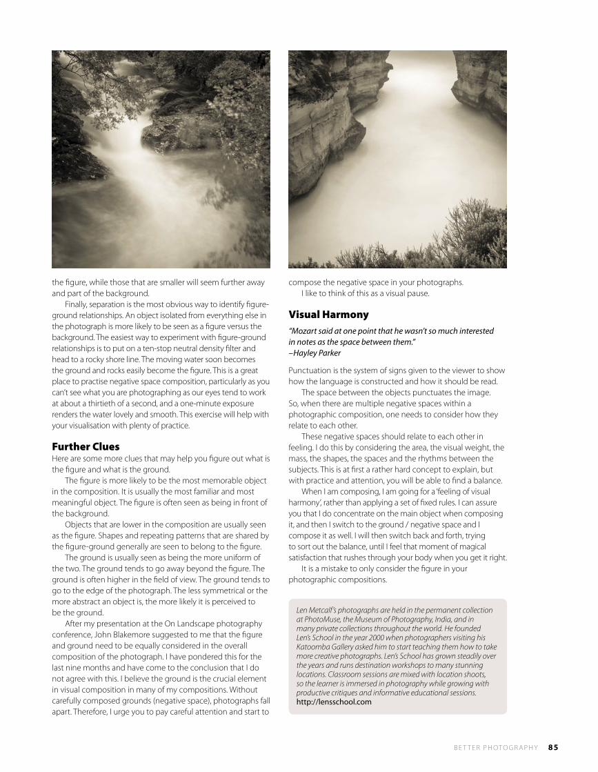
B E T T E R P H OTO G R A P H Y 85
the figure, while those that are smaller will seem further away and part of the background. Finally, separation is the most obvious way to identify figure-ground relationships. An object isolated from everything else in the photograph is more likely to be seen as a figure versus the background. The easiest way to experiment with figure-ground relationships is to put on a ten-stop neutral density filter and head to a rocky shore line. The moving water soon becomes the ground and rocks easily become the figure. This is a great place to practise negative space composition, particularly as you can’t see what you are photographing as our eyes tend to work at about a thirtieth of a second, and a one-minute exposure renders the water lovely and smooth. This exercise will help with your visualisation with plenty of practice.
Further CluesHere are some more clues that may help you figure out what is the figure and what is the ground. The figure is more likely to be the most memorable object in the composition. It is usually the most familiar and most meaningful object. The figure is often seen as being in front of the background. Objects that are lower in the composition are usually seen as the figure. Shapes and repeating patterns that are shared by the figure-ground generally are seen to belong to the figure. The ground is usually seen as being the more uniform of the two. The ground tends to go away beyond the figure. The ground is often higher in the field of view. The ground tends to go to the edge of the photograph. The less symmetrical or the more abstract an object is, the more likely it is perceived to be the ground. After my presentation at the On Landscape photography conference, John Blakemore suggested to me that the figure and ground need to be equally considered in the overall composition of the photograph. I have pondered this for the last nine months and have come to the conclusion that I do not agree with this. I believe the ground is the crucial element in visual composition in many of my compositions. Without carefully composed grounds (negative space), photographs fall apart. Therefore, I urge you to pay careful attention and start to
compose the negative space in your photographs. I like to think of this as a visual pause.
Visual Harmony“Mozart said at one point that he wasn’t so much interested in notes as the space between them.” –Hayley Parker
Punctuation is the system of signs given to the viewer to show how the language is constructed and how it should be read. The space between the objects punctuates the image. So, when there are multiple negative spaces within a photographic composition, one needs to consider how they relate to each other. These negative spaces should relate to each other in feeling. I do this by considering the area, the visual weight, the mass, the shapes, the spaces and the rhythms between the subjects. This is at first a rather hard concept to explain, but with practice and attention, you will be able to find a balance. When I am composing, I am going for a ‘feeling of visual harmony’, rather than applying a set of fixed rules. I can assure you that I do concentrate on the main object when composing it, and then I switch to the ground / negative space and I compose it as well. I will then switch back and forth, trying to sort out the balance, until I feel that moment of magical satisfaction that rushes through your body when you get it right. It is a mistake to only consider the figure in your photographic compositions.
Len Metcalf’s photographs are held in the permanent collection at PhotoMuse, the Museum of Photography, India, and in many private collections throughout the world. He founded Len’s School in the year 2000 when photographers visiting his Katoomba Gallery asked him to start teaching them how to take more creative photographs. Len’s School has grown steadily over the years and runs destination workshops to many stunning locations. Classroom sessions are mixed with location shoots, so the learner is immersed in photography while growing with productive critiques and informative educational sessions. http://lensschool.com
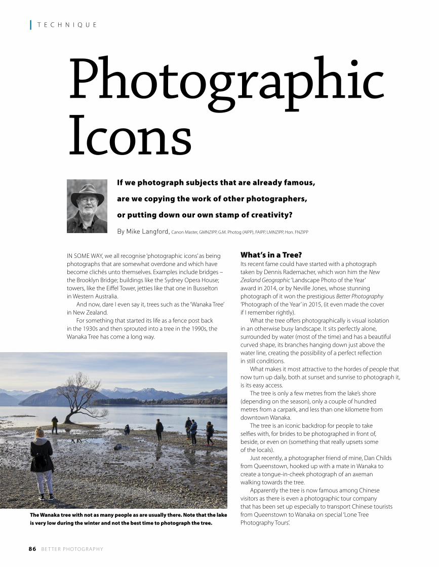
86 B E T T E R P H OTO G R A P H Y
l T E C H N I Q U E
If we photograph subjects that are already famous,
are we copying the work of other photographers,
or putting down our own stamp of creativity?
By Mike langford, Canon Master, GMNZIPP, G.M. Photog (AIPP), FAIPP, LMNZIPP, Hon. FNZIPP
IN SOME WAY, we all recognise ‘photographic icons’ as being photographs that are somewhat overdone and which have become clichés unto themselves. Examples include bridges – the Brooklyn Bridge; buildings like the Sydney Opera House; towers, like the Eiffel Tower, jetties like that one in Busselton in Western Australia. And now, dare I even say it, trees such as the ‘Wanaka Tree’ in New Zealand. For something that started its life as a fence post back in the 1930s and then sprouted into a tree in the 1990s, the Wanaka Tree has come a long way.
What’s in a Tree?Its recent fame could have started with a photograph taken by Dennis Rademacher, which won him the New Zealand Geographic ‘Landscape Photo of the Year’ award in 2014, or by Neville Jones, whose stunning photograph of it won the prestigious Better Photography ‘Photograph of the Year’ in 2015, (it even made the cover if I remember rightly). What the tree offers photographically is visual isolation in an otherwise busy landscape. It sits perfectly alone, surrounded by water (most of the time) and has a beautiful curved shape, its branches hanging down just above the water line, creating the possibility of a perfect reflection in still conditions. What makes it most attractive to the hordes of people that now turn up daily, both at sunset and sunrise to photograph it, is its easy access. The tree is only a few metres from the lake’s shore (depending on the season), only a couple of hundred metres from a carpark, and less than one kilometre from downtown Wanaka. The tree is an iconic backdrop for people to take selfies with, for brides to be photographed in front of, beside, or even on (something that really upsets some of the locals). Just recently, a photographer friend of mine, Dan Childs from Queenstown, hooked up with a mate in Wanaka to create a tongue-in-cheek photograph of an axeman walking towards the tree. Apparently the tree is now famous among Chinese visitors as there is even a photographic tour company that has been set up especially to transport Chinese tourists from Queenstown to Wanaka on special ‘Lone Tree Photography Tours’.
PhotographicIcons
The Wanaka tree with not as many people as are usually there. Note that the lake is very low during the winter and not the best time to photograph the tree.
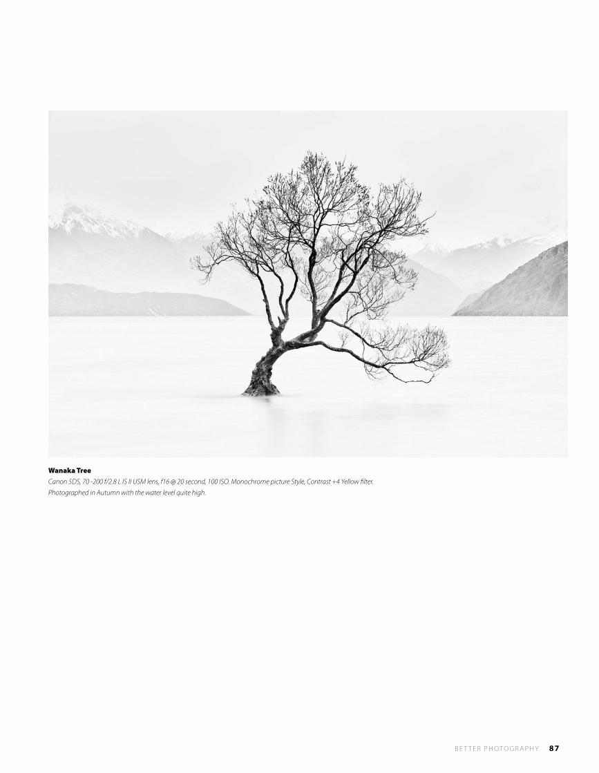
B E T T E R P H OTO G R A P H Y 87
Wanaka TreeCanon 5DS, 70 -200 f/2.8 L IS II USM lens, f16 @ 20 second, 100 ISO. Monochrome picture Style, Contrast +4 Yellow filter.
Photographed in Autumn with the water level quite high.
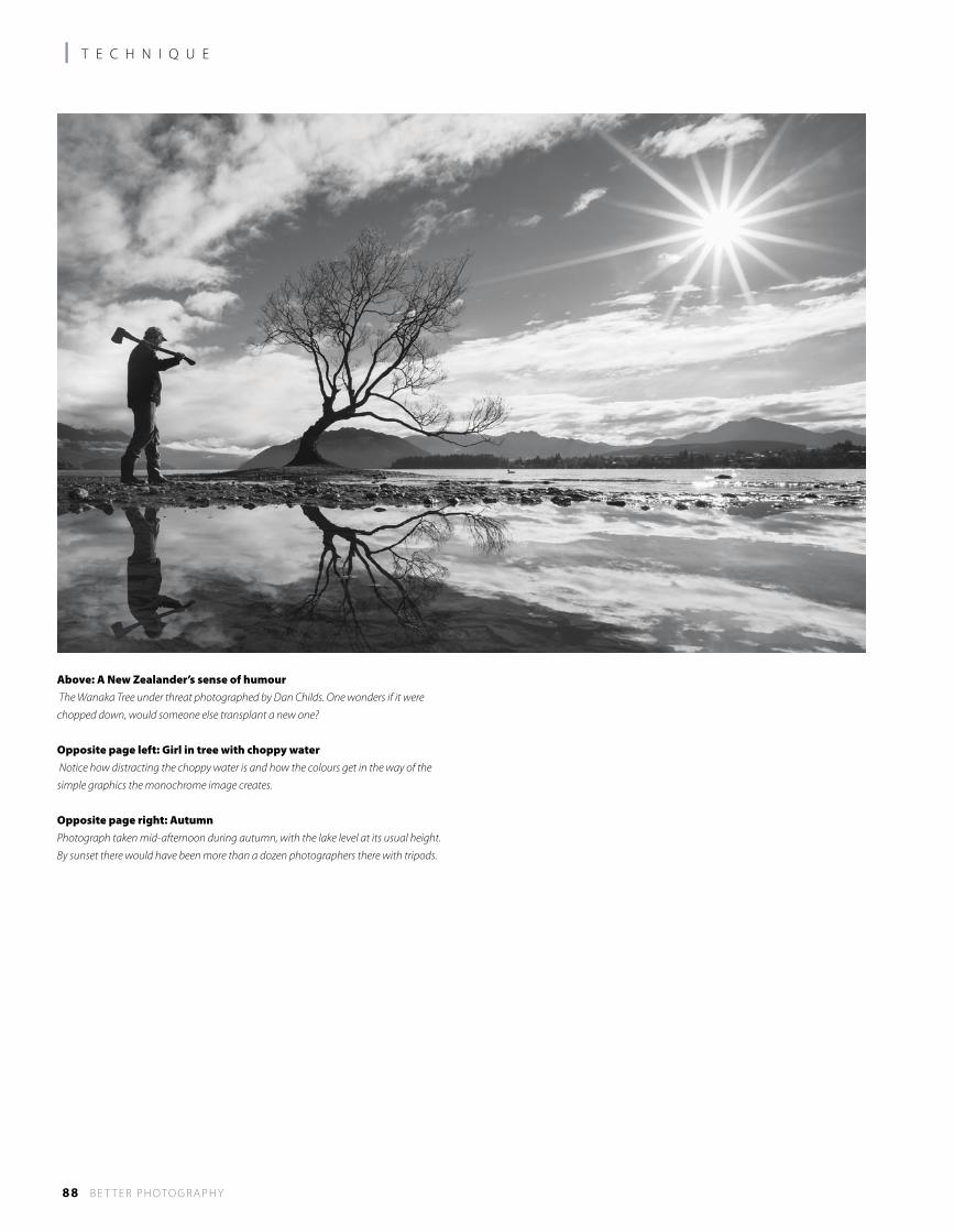
88 B E T T E R P H OTO G R A P H Y
l T E C H N I Q U E
Above: A New Zealander’s sense of humour The Wanaka Tree under threat photographed by Dan Childs. One wonders if it were
chopped down, would someone else transplant a new one?
Opposite page left: Girl in tree with choppy water Notice how distracting the choppy water is and how the colours get in the way of the
simple graphics the monochrome image creates.
Opposite page right: AutumnPhotograph taken mid-afternoon during autumn, with the lake level at its usual height.
By sunset there would have been more than a dozen photographers there with tripods.
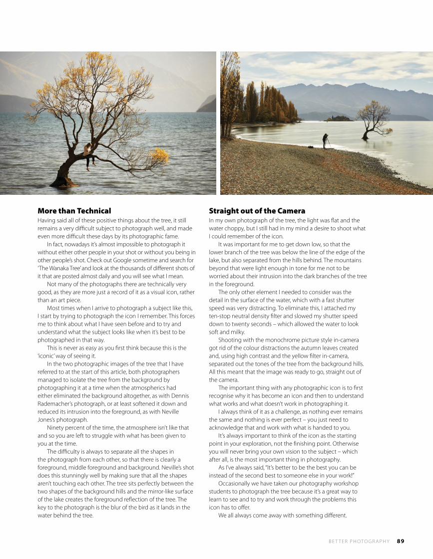
B E T T E R P H OTO G R A P H Y 89
More than TechnicalHaving said all of these positive things about the tree, it still remains a very difficult subject to photograph well, and made even more difficult these days by its photographic fame. In fact, nowadays it’s almost impossible to photograph it without either other people in your shot or without you being in other people’s shot. Check out Google sometime and search for ‘The Wanaka Tree’ and look at the thousands of different shots of it that are posted almost daily and you will see what I mean. Not many of the photographs there are technically very good, as they are more just a record of it as a visual icon, rather than an art piece. Most times when I arrive to photograph a subject like this, I start by trying to photograph the icon I remember. This forces me to think about what I have seen before and to try and understand what the subject looks like when it’s best to be photographed in that way. This is never as easy as you first think because this is the ‘iconic’ way of seeing it. In the two photographic images of the tree that I have referred to at the start of this article, both photographers managed to isolate the tree from the background by photographing it at a time when the atmospherics had either eliminated the background altogether, as with Dennis Rademacher’s photograph, or at least softened it down and reduced its intrusion into the foreground, as with Neville Jones’s photograph. Ninety percent of the time, the atmosphere isn’t like that and so you are left to struggle with what has been given to you at the time. The difficulty is always to separate all the shapes in the photograph from each other, so that there is clearly a foreground, middle foreground and background. Neville’s shot does this stunningly well by making sure that all the shapes aren’t touching each other. The tree sits perfectly between the two shapes of the background hills and the mirror-like surface of the lake creates the foreground reflection of the tree. The key to the photograph is the blur of the bird as it lands in the water behind the tree.
Straight out of the CameraIn my own photograph of the tree, the light was flat and the water choppy, but I still had in my mind a desire to shoot what I could remember of the icon. It was important for me to get down low, so that the lower branch of the tree was below the line of the edge of the lake, but also separated from the hills behind. The mountains beyond that were light enough in tone for me not to be worried about their intrusion into the dark branches of the tree in the foreground. The only other element I needed to consider was the detail in the surface of the water, which with a fast shutter speed was very distracting. To eliminate this, I attached my ten-stop neutral density filter and slowed my shutter speed down to twenty seconds – which allowed the water to look soft and milky. Shooting with the monochrome picture style in-camera got rid of the colour distractions the autumn leaves created and, using high contrast and the yellow filter in-camera, separated out the tones of the tree from the background hills. All this meant that the image was ready to go, straight out of the camera. The important thing with any photographic icon is to first recognise why it has become an icon and then to understand what works and what doesn’t work in photographing it. I always think of it as a challenge, as nothing ever remains the same and nothing is ever perfect – you just need to acknowledge that and work with what is handed to you. It’s always important to think of the icon as the starting point in your exploration, not the finishing point. Otherwise you will never bring your own vision to the subject – which after all, is the most important thing in photography. As I’ve always said, “It’s better to be the best you can be instead of the second best to someone else in your work!” Occasionally we have taken our photography workshop students to photograph the tree because it’s a great way to learn to see and to try and work through the problems this icon has to offer. We all always come away with something different.
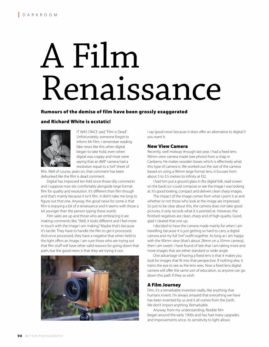
90 B E T T E R P H OTO G R A P H Y
l D A R K R O O M
A Film RenaissanceRumours of the demise of film have been grossly exaggerated
and Richard White is ecstatic!
IT WAS ONCE said, “Film is Dead”. Unfortunately, someone forgot to inform Mr Film. I remember reading fake news like this when digital began to take hold, even when digital was crappy and most were saying that an 8MP camera had a resolution equal to a 5x4” sheet of
film. Well of course, years on, that comment has been debunked like the film is dead comment. Digital has improved ten fold since those silly comments and I suppose now sits comfortably alongside large format film for quality and resolution. It’s different than film though and that’s mainly because it isn’t film. It didn’t take me long to figure out that one. Anyway, the good news for some is that film is enjoying a bit of a renaissance and it seems with those a lot younger than the person typing these words. Film sales are up and those who are embracing it are making comments like, “Well, it looks different and I feel more in touch with the image I am making.” Maybe that’s because it’s tactile. They have to handle the film to get it processed. And once processed, they have a negative that when held to the light offers an image. I am sure those who are trying out that film stuff will have other valid reasons for going down that path, but the good news is that they are trying it out.
I say ‘good news’ because it does offer an alternative to digital if you want it.
New View CameraRecently, well midway through last year, I had a fixed lens 90mm view camera made (see photo) from a chap in Canberra. He makes wooden boxes which is effectively what this type of camera is. We worked out the size of the camera based on using a 90mm large format lens. It focuses from about 3 to 3.5 metres to infinity at f32. I had him put a ground glass in (for digital folk, read screen on the back) so I could compose or see the image I was looking at. It’s good looking, compact and delivers clean sharp images. The impact of the image comes from what I point it at and whether or not those who look at the image are impressed. So just to be clear about this, the camera does not take good pictures, it only records what it is pointed at. However, the finished negatives are clean, sharp and of high quality. Good, glad I cleared that one up. I decided to have the camera made mainly for when I am travelling, because it is just getting so hard to carry a digital camera and my full 5x4” outfit together. As long as I am happy with the 90mm view (that’s about 28mm on a 35mm camera), then I am sweet. I have found of late that I am taking more and more images that are either standard or wide-angle. One advantage of having a fixed lens is that it makes you look for images that fit into that perspective. If nothing else, it trains the eye to see as the lens sees. Now a fixed lens digital camera will offer the same sort of education, so anyone can go down this path if they so wish.
A Film JourneyFilm, it’s a remarkable invention really, like anything that humans invent. I’m always amazed that everything we have has been invented by us and it all comes from the Earth. We don’t import anything. Remarkable. Anyway, from my understanding, flexible film began around the early 1900s and has had many upgrades and improvements since. Its sensitivity to light allows
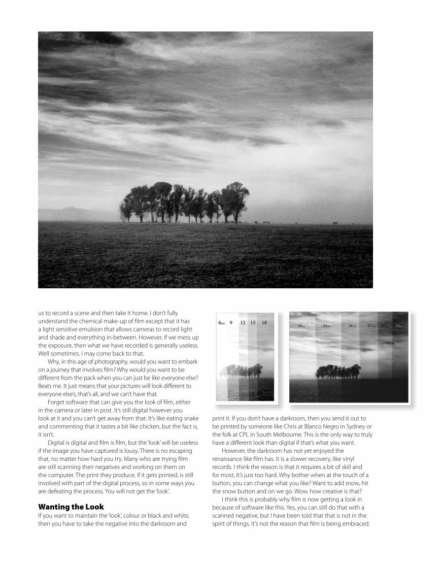
us to record a scene and then take it home. I don’t fully understand the chemical make-up of film except that it has a light sensitive emulsion that allows cameras to record light and shade and everything in-between. However, if we mess up the exposure, then what we have recorded is generally useless. Well sometimes. I may come back to that. Why, in this age of photography, would you want to embark on a journey that involves film? Why would you want to be different from the pack when you can just be like everyone else? Beats me. It just means that your pictures will look different to everyone else’s, that’s all, and we can’t have that. Forget software that can give you the look of film, either in the camera or later in post. It’s still digital however you look at it and you can’t get away from that. It’s like eating snake and commenting that it tastes a bit like chicken, but the fact is, it isn’t. Digital is digital and film is film, but the ‘look’ will be useless if the image you have captured is lousy. There is no escaping that, no matter how hard you try. Many who are trying film are still scanning their negatives and working on them on the computer. The print they produce, if it gets printed, is still involved with part of the digital process, so in some ways you are defeating the process. You will not get the ‘look’.
Wanting the LookIf you want to maintain the ‘look’, colour or black and white, then you have to take the negative into the darkroom and
print it. If you don’t have a darkroom, then you send it out to be printed by someone like Chris at Blanco Negro in Sydney or the folk at CPL in South Melbourne. This is the only way to truly have a different look than digital if that’s what you want. However, the darkroom has not yet enjoyed the renaissance like film has. It is a slower recovery, like vinyl records. I think the reason is that it requires a bit of skill and for most, it’s just too hard. Why bother when at the touch of a button, you can change what you like? Want to add snow, hit the snow button and on we go. Wow, how creative is that? I think this is probably why film is now getting a look in because of software like this. Yes, you can still do that with a scanned negative, but I have been told that that is not in the spirit of things. It’s not the reason that film is being embraced.
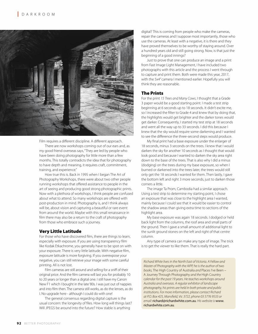
92 B E T T E R P H OTO G R A P H Y
l D A R K R O O M
Film requires a different discipline. A different approach. There are now workshops coming out of our ears and, as my good friend overseas says, “They are led by people who have been doing photography for little more than a few months. This totally contradicts the idea that for photography to have depth and meaning, it requires craft, commitment, training, and experience.” How true this is. Back in 1995 when I began The Art of Photography Workshops, there were about two other people running workshops that offered assistance to people in the art of seeing and producing good strong photographic prints. Now with a plethora of workshops, I think people are confused about what to attend. So many workshops are offered with post-production in mind. Photography is, and I think always will be, about vision and capturing a beautiful or rare event from around the world. Maybe with this small renaissance in film there may also be a return to the craft of photography from those who embrace such a journey.
Very Little LatitudeFor those who have discovered film, there are things to learn, especially with exposure. If you are using transparency film like Kodak Etkachrome, you generally have to be spot on with your exposure. There is very little latitude. With negative film, exposure latitude is more forgiving. If you overexpose your negative, you can still retrieve your image with some careful printing. All is not lost. Film cameras are still around and selling for a sniff of their original price. And the film camera will last you for probably 10 to 20 years or longer than a digital one. I still have my Canon New F1 which I bought in the late ‘80s. I was just out of nappies and into film then. The camera still works, as do the lenses, as do I. No upgrade here - although I could do with one! The general consensus regarding digital capture is the usual concern: the longevity of files. How long will things last? Will JPEGS be around into the future? How stable is anything
digital? This is coming from people who make the cameras, repair the cameras and I suppose most importantly, those who use the cameras. At least with a negative, it is there and they have proved themselves to be worthy of staying around. Over a hundred years old and still going strong. Now, is that just the beginning of a good innings? Just to prove that one can produce an image and a print from Fast Image Light Management, I have included two photographs with this article and the process I went through to capture and print them. Both were made this year, 2017, with the 5x4” camera I mentioned earlier. Hopefully you will think they are reasonable.
The PrintsFor the print 15 Trees and Many Cows, I thought that a Grade 3 paper would be a good starting point. I made a test strip beginning at 6 seconds up to 18 seconds. It didn’t excite me, so I increased the filter to Grade 4 and knew that by doing that, the highlights would get brighter and the darker tones would get darker. Consequently, I started my test strip at 18 seconds and went all the way up to 33 seconds. I did this because I knew that the sky would require some darkening and I wanted to see the difference the three-second steps would produce. My final print had a base exposure under the enlarger of 18 seconds, minus 3 seconds on the trees. I knew that I would darken the sky for another 10 seconds as I thought that would look good and because I wanted to darken the sky area right down to the base of the trees. That is also why I did a minus (dodging) on the trees during my base exposure, so when I burned or darkened into the trees later, the trees would still only get the 18 seconds I wanted for them. Then lastly, I gave the bottom left and right 3 more seconds, just to darken those corners a little. The image Ta Prom, Cambodia had a similar approach. Using a test strip to determine my starting point, I chose an exposure that was close to the highlight area I wanted, mainly because I could see that it would be easier to control the shadow areas than giving extra time to sections of the highlight area. My base exposure was again 18 seconds. I dodged or held back light from the columns, the roof area and small parts of the ground. Then I gave a small amount of additional light to the sunlit ground stones on the left and right of that centre column. Any type of camera can make any type of image. The trick is to get the viewer to like them. That is really the hard part.
Richard White lives in the North East of Victoria. A Fellow and Master of Photography with the AIPP, he is the author of two books, The High Country of Australia and Places I’ve Been – A Journey Through Photography and the High Country calendar for the past 19 years. He teaches workshops around Australia and overseas. A regular exhibitor of landscape photography, his prints are held in both private and public institutions. For more information, please contact Richard at P.O. Box 425, Mansfield, Vic 3722, phone 03 5776 9533 or email: [email protected]. His website is www.richardwhite.com.au.
The book covers the Mt Buffalo region, The Valleys, The Lower Plains and the Higher Plains of the High Country.
The cost of the standard edition is $75
Now with FREE POSTAGE to anywhere in Australia.
Limited Edition book and limited edition print also availableOrder on line via Paypal or EFT - BSB 033240 Acc# 113697 through Richard.
Please contact Richard at the address below for this book and his Places I’ve Been - A Journey Through Photography book
A U S T R A L I A
The High Country Book
A U S T R A L I A
This high quality hard cover book measures 305 mm x 305 mm (12 inches x 12 inches), with the foreword written by one
of the UK’s best known photographers, Joe Cornish.
“Richard White makes a compelling case for the Australian High Country as one of the earth’s special regions” Joe Cornish.
The Art of Photography Workshops / Calendar / Books Richard White m.photog, Fellow AIPP Accredited Professional Photographer
Since 1995 teaching photographic workshops
see website for other workshops, calendar and book information [email protected] www.richardwhite.com.au
Special View Camera, Film & Darkroom Workshop - May 2018 Learn the basics of the view camera, how to expose film correctly and then make expressive prints in the darkroom.
Discover the joys of this tactile approach to photography with film. Small group of 5. For more information see The Art of Photography website.
FREE POSTAGEto anywhere in
Australia
FREE POSTAGEto anywhere in
Australia
19th & Penultimate Yearof inspirational photography
2018 CALENDAR OFFERThE PENuLTimATE YEAR
High Country Calendar 2018 by Richard WhiteP.O. Box 425, mansfield, Victoria 3722 03 5776 9533 [email protected]
Please send me ....... calendar(s) @ $37.50 ea + $10.50 P&P Each additional calendar plus $5.00 postageCheque or EFT BSB 033240 Acc# 113697 $72 total overseas Amount enclosed . . . . . . . . . . .
Name . . . . . . . . . . . . . . . . . . . . . . . . . . . . . . . . . . . . . . . . . . . . . . . . . . . Address . . . . . . . . . . . . . . . . . . . . . . . . . . . . . . . . . . . . . . . . . . . . . . . . . . . . . . . . . . . . . . . . . . . . . . . . . . . . . . . . . . . . . . . . . . . . . . . . .State . . . . . . . .Postcode . . . . . . . . . Phone . . . . . . . . . . . . . . . . . . . . . . Email .. . . . . . . . . . . . . . . . . . . . . . . . . . . . . . . . . . . . . . . . . .
19th & penultimate year edition
A U S T R A L I A
The High Country Workshop - April 2018 We will be back again at Falls Creek for this long running workshop in the High Country. The area whole is very beautiful and it’s such a great place to indulge yourself in photography for a few days. The landscape is very diverse and offers great variety for the keen photographer. What a place to get inspired.
See the workshop clip with Richard in the High Country. http://www.youtube.com/watch?v=fLAcu9knwKw
See website for other workshops
Some workshops for 2018
The High Country Calendar was first published in the year 2000. The 2018 calendar will be the 19th offering of this popular production.
The calendar measures 495mm x 340mm, spiral bound at the top, printed single sided with large b&w images and dated boxes.
You can buy a copy on line via the website, richardwhite.com.au or fill out the coupon below.
Printing industries CraftsmanshiP award for 6 years running 2010 -2016
l T E C H N I Q U E
94 B E T T E R P H OTO G R A P H Y
A Game of TonesPart Two: Nick Melidonis presents a series
of additional tips for powerful black and
white images.
IN MY PREVIOUS article, I outlined the reasons why I was first attracted to black and white photography; the great legacy the early photographers have left us and why black and white photography is as relevant as ever today. In fact, many would argue that black and white images represent the very basis of photography since by stripping the colour from a photograph, we are left with just the tones of grey representing light in its purest form (or the absence of it). That’s what makes the genre so powerful because it is the very essence of what a photograph is. I might add that all the information for this series of articles applies equally to toned images like sepia or blue-toned photographs, having just the one colour. What I also find exciting is the fact that we are slowly becoming like painters. We are building our vision as we imagined and felt at the time of capture and, like a painter, we can ‘paint’ in our ‘realities’ to provide a powerful statement or narrative. I also mentioned that black and white is not reality and by stripping away colour is the first step in embracing the abstract. We are moving away from objective reality and once we do that, it then opens the possibilities of creating presence by ‘adding’ or ‘subtracting’ light in the image, which in fact is really altering the tones within the photograph. One of the important concepts I outlined in the last issue, is the understanding of luminance versus luminosity. To recap: in black and white photography, we can talk about the ‘presence’ of light. Presence is the difference between luminance (what we see in terms of tones in an image) and luminosity, what we perceive by altering the relationships between those tones.
In-CameraIf I open a colour image and simply strip the colour information from it, the resulting tonal values represent the luminance of the image. If I then interpret the image by applying my vision of what I would like the final image to look like, by altering the tonal relationships, that is luminosity.
We will see in this article and in the final one in the next issue, that how I interpret an image can be far removed from reality and that is exactly the approach the finest black and white artists of our time were doing, whether in the wet darkroom or the ‘digital darkroom’. Many photographers often apply a filter in their cameras to render the image they shoot in black and white on their LCD screens. This can be quite useful because you have immediate feedback as to how the scene you are capturing is interpreted by the various tones of grey (luminance – see above). If you are shooting in raw, your file will still have all the information you’ve captured, including that in the red, green and blue channels. This is vital because, if you want to really interpret an image and alter the tonal relationships (luminosity), you must start with the colour information still in the image. All the best software needs this colour information to really work well in translating an image to black and white.
The Zone SystemYou will often hear photographers talking about black and white images having good blacks and good whites. Although true, it doesn’t tell the whole story because the best photographs also contain all of the tones in-between. In other words, if you want to produce an exceptional black and white print, it needs to have a full range of tones. Images with weak blacks and anaemic whites look flat and uninteresting; on the other end of the scale, those printed with excessive contrast lack the mid tones. Although high contrast prints may, on first impact, appear striking, the absence of the middle tones means that the subject matter may lack clear definition and shape. It takes on a more graphic feel rather than a ‘photographic’ feel. Presence in an image means printing it with all the shades of grey and a good black and a good white. Ansel Adams is often credited with creating the Zone System which he did together with Fred Archer and although it was primarily designed to help in producing full toned negatives in sheet film, it is still applicable to digital photographers today.
exploring fine Art Black and White images
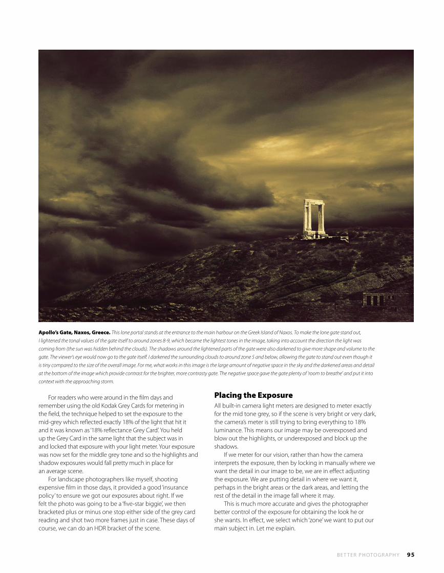
B E T T E R P H OTO G R A P H Y 95
For readers who were around in the film days and remember using the old Kodak Grey Cards for metering in the field, the technique helped to set the exposure to the mid-grey which reflected exactly 18% of the light that hit it and it was known as ‘18% reflectance Grey Card’. You held up the Grey Card in the same light that the subject was in and locked that exposure with your light meter. Your exposure was now set for the middle grey tone and so the highlights and shadow exposures would fall pretty much in place for an average scene. For landscape photographers like myself, shooting expensive film in those days, it provided a good ‘insurance policy’ to ensure we got our exposures about right. If we felt the photo was going to be a ‘five-star biggie’, we then bracketed plus or minus one stop either side of the grey card reading and shot two more frames just in case. These days of course, we can do an HDR bracket of the scene.
Placing the ExposureAll built-in camera light meters are designed to meter exactly for the mid tone grey, so if the scene is very bright or very dark, the camera’s meter is still trying to bring everything to 18% luminance. This means our image may be overexposed and blow out the highlights, or underexposed and block up the shadows. If we meter for our vision, rather than how the camera interprets the exposure, then by locking in manually where we want the detail in our image to be, we are in effect adjusting the exposure. We are putting detail in where we want it, perhaps in the bright areas or the dark areas, and letting the rest of the detail in the image fall where it may. This is much more accurate and gives the photographer better control of the exposure for obtaining the look he or she wants. In effect, we select which ‘zone’ we want to put our main subject in. Let me explain.
Apollo’s Gate, Naxos, Greece. This lone portal stands at the entrance to the main harbour on the Greek Island of Naxos. To make the lone gate stand out,
I lightened the tonal values of the gate itself to around zones 8-9, which became the lightest tones in the image, taking into account the direction the light was
coming from (the sun was hidden behind the clouds). The shadows around the lightened parts of the gate were also darkened to give more shape and volume to the
gate. The viewer’s eye would now go to the gate itself. I darkened the surrounding clouds to around zone 5 and below, allowing the gate to stand out even though it
is tiny compared to the size of the overall image. For me, what works in this image is the large amount of negative space in the sky and the darkened areas and detail
at the bottom of the image which provide contrast for the brighter, more contrasty gate. The negative space gave the gate plenty of ‘room to breathe’ and put it into
context with the approaching storm.
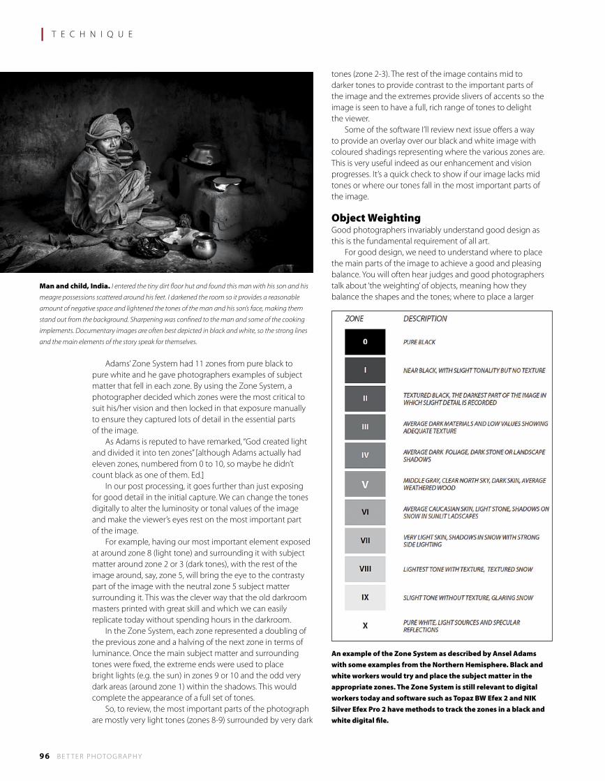
l T E C H N I Q U E
96 B E T T E R P H OTO G R A P H Y
Adams’ Zone System had 11 zones from pure black to pure white and he gave photographers examples of subject matter that fell in each zone. By using the Zone System, a photographer decided which zones were the most critical to suit his/her vision and then locked in that exposure manually to ensure they captured lots of detail in the essential parts of the image. As Adams is reputed to have remarked, “God created light and divided it into ten zones” [although Adams actually had eleven zones, numbered from 0 to 10, so maybe he didn’t count black as one of them. Ed.] In our post processing, it goes further than just exposing for good detail in the initial capture. We can change the tones digitally to alter the luminosity or tonal values of the image and make the viewer’s eyes rest on the most important part of the image. For example, having our most important element exposed at around zone 8 (light tone) and surrounding it with subject matter around zone 2 or 3 (dark tones), with the rest of the image around, say, zone 5, will bring the eye to the contrasty part of the image with the neutral zone 5 subject matter surrounding it. This was the clever way that the old darkroom masters printed with great skill and which we can easily replicate today without spending hours in the darkroom. In the Zone System, each zone represented a doubling of the previous zone and a halving of the next zone in terms of luminance. Once the main subject matter and surrounding tones were fixed, the extreme ends were used to place bright lights (e.g. the sun) in zones 9 or 10 and the odd very dark areas (around zone 1) within the shadows. This would complete the appearance of a full set of tones. So, to review, the most important parts of the photograph are mostly very light tones (zones 8-9) surrounded by very dark
tones (zone 2-3). The rest of the image contains mid to darker tones to provide contrast to the important parts of the image and the extremes provide slivers of accents so the image is seen to have a full, rich range of tones to delight the viewer. Some of the software I’ll review next issue offers a way to provide an overlay over our black and white image with coloured shadings representing where the various zones are. This is very useful indeed as our enhancement and vision progresses. It’s a quick check to show if our image lacks mid tones or where our tones fall in the most important parts of the image.
Object WeightingGood photographers invariably understand good design as this is the fundamental requirement of all art. For good design, we need to understand where to place the main parts of the image to achieve a good and pleasing balance. You will often hear judges and good photographers talk about ‘the weighting’ of objects, meaning how they balance the shapes and the tones; where to place a larger
An example of the Zone System as described by Ansel Adams with some examples from the Northern Hemisphere. Black and white workers would try and place the subject matter in the appropriate zones. The Zone System is still relevant to digital workers today and software such as Topaz BW Efex 2 and NIK Silver Efex Pro 2 have methods to track the zones in a black and white digital file.
Man and child, India. I entered the tiny dirt floor hut and found this man with his son and his
meagre possessions scattered around his feet. I darkened the room so it provides a reasonable
amount of negative space and lightened the tones of the man and his son’s face, making them
stand out from the background. Sharpening was confined to the man and some of the cooking
implements. Documentary images are often best depicted in black and white, so the strong lines
and the main elements of the story speak for themselves.
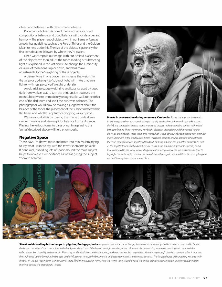
B E T T E R P H OTO G R A P H Y 97
object and balance it with other smaller objects. Placement of objects is one of the key criteria for good compositional balance, and good balance will provide order and harmony. The placement of objects within our frame or ‘canvas’ already has guidelines such as the Rule of Thirds and the Golden Mean to help us do this. The size of the objects is generally the first consideration followed by where they’re placed. Once we compose our image with our desired placement of the objects, we then adjust the tones (adding or subtracting light as explained in the last article) to change the luminosity or value of these tones up or down, and thus make adjustments to the ‘weighting’ of these objects. A denser tone in one place may increase the ‘weight’ in that area or dodging it to ‘subtract light’ will make that area lighter with less perceived ‘weight or density’. An old trick to gauge weighting and balance used by good darkroom workers was to turn the print upside down, so the main subject wasn’t immediately recognisable; walk to the other end of the darkroom and see if the print was balanced. The photographer would now be making a judgement about the balance of the tones, the placement of the subject matter within the frame and whether any further cropping was required. We can also do this by turning the image upside down on our monitors and viewing it for balance from a distance. Placing the various tones to parts of our image using the ‘zones’ described above will help enormously.
Negative SpaceThese days, I’m drawn more and more into minimalism; trying to say what I want to say with the fewest elements possible. If done well, providing lots of space around the main subject helps to increase its importance as well as giving the subject ‘room to breathe’.
Monks in conversation during ceremony, Cambodia. To me, the important elements
in this image are the main monk looking to the left, the shadow of the monk he is talking to on
the left, the connection the two monks make and the joss sticks to provide a context to the ritual
being performed. There were many very bright objects in the background that needed toning
down, as did the bright robes the monks wore which would otherwise be competing with the main
monk. The monk in the shadows on the left was toned down to provide almost a silhouette and
the main monk’s face was brightened (dodged) to stand out from the rest of the elements. As well
as the brighter tones, what makes the main monk stand out is the degree of sharpening on his
face, compared to the softer surrounding elements. Once you have the tonal values sorted out to
highlight the main subject matter, the viewer’s eye will also go to what is different from anything else
and in this case, it was the sharpened face.
Street urchins selling butter lamps to pilgrims, Bodhgaya, India. As you can see in the colour image, there were some very bright reflections from the candles behind
the boy on the left and the tonal values in the background and that of the boy on the right were bright and all very similar, so nothing was really standing out. I removed the
reflections as best I could (used a mask in Photoshop and pulled down the bright tones); darkened the whole image while still retaining enough detail to make out what it was, and
then lightened up the boy with the big eyes on the left, several tones, so he became the brightest element with the greatest contrast. The largest degree of sharpening was also with
the boy on the left, making him stand out even more. There is no question now where the viewer’s eyes would go and the image provided a striking story of a very cold, predawn
morning outside the Mahabodhi Temple.
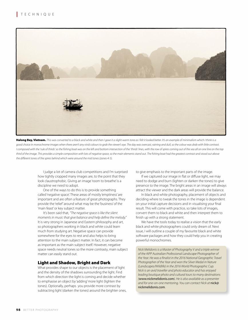
98 B E T T E R P H OTO G R A P H Y
I judge a lot of camera club competitions and I’m surprised how tightly cropped many images are, to the point that they look claustrophobic. Giving an image ‘room to breathe’ is a discipline we need to adopt. One of the ways to do this is to provide something called ‘negative space’. These areas of mostly ‘emptiness’ are important and are often a feature of great photographs. They provide the ‘relief’ around what may be the ‘business’ of the ‘main feast’ or key subject matter. It’s been said that, “The negative space is like the silent moments in music that give balance and help define the melody.” It is very strong in Japanese and Eastern philosophy and art, so photographers working in black and white could learn much from studying art. Negative space can provide somewhere for the eyes to rest and also helps to bring attention to the main subject matter. In fact, it can become as important as the main subject itself. However, negative space needs neutral tones so the more contrasty, main subject matter can easily stand out.
Light and Shadow, Bright and DarkWhat provides shape to our objects is the placement of light and the density of the shadows surrounding the light. Find from which direction the light is coming and decide whether to emphasise an object by ‘adding’ more light (lighten the tones). Optionally, perhaps you provide more contrast by subtracting light (darken the tones) around the brighter ones,
to give emphasis to the important parts of the image. If we captured our image in flat or diffuse light, we may need to dodge and burn (lighten or darken the tones) to give presence to the image. The bright areas in an image will always attract the viewer and the dark areas will provide the balance. In black and white photography, placement of objects and deciding where to tweak the tones in the image is dependent on your initial capture decisions and in visualising your final result. This will come with practice, so take lots of images, convert them to black and white and then interpret them to finish up with a strong statement. We have the tools today to realise a vision that the early black and white photographers could only dream of. Next issue, I will outline a couple of my favourite black and white software packages and how they could help you in creating powerful monochromes.
Nick Melidonis is a Master of Photography V and a triple winner of the AIPP Australian Professional Landscape Photographer of the Year. He was a finalist in the 2016 National Geographic Travel Photographer of the Year and won the Silver Medal in Nature (Landscapes/Wildlife) in the 2016 World Photographic Cup. Nick is an avid traveller and photo educator and has enjoyed leading boutique photo and cultural tours to many destinations (www.nickmelidonis.com). He is also available as a presenter and for one-on-one mentoring. You can contact Nick at [email protected].
l T E C H N I Q U E
Halong Bay, Vietnam. This was converted to a black and white and then I gave it a slight warm tone as I felt it looked better. It’s an example of minimalism which I think is a
good choice in monochrome images when there aren’t any vivid colours to grab the viewer’s eye. The day was overcast, raining and dull, so the colour was drab with little contrast.
I composed with the ‘rule of thirds’ so the fishing boat was on the left and bottom intersection of the ‘thirds’ lines, with the row of spires coming out of the sea all on one line on the top
third of the image. This provides a simple composition with lots of negative space, so the main elements stand out. The fishing boat had the greatest contrast and stood out above
the different tones of the spires behind which were around the mid tones (zones 4-5).
Join Peter Eastway on a Photo Voyage of a Lifetime
In-Depth South Georgia & Antarctica
To help you get the most out of your voyage and your photography, Peter Eastway has been invited by Aurora Expeditions to lead a group of photographers on the In-Depth South Georgia & Antarctica expedition with the Polar Pioneer.
The voyage visits many of the locations seen in the Tales By Light television episode, currently showing on Netflix and featuring Peter as the photographer. The episode was produced in partnership with Canon Australia.
The photography program on this voyage will cater to both amateurs and the more serious photographer, including formal talks and image reviews, opportunities for one-on-one instruction and informal side-by-side shooting from the deck or Zodiacs and during landings.
The best thing about our ship the Polar Pioneer is that expeditions are strictly limited to 54 passengers, offering you an intimate, personal experience and more opportunities to get out amongst the nature and wildlife.
18 DAYS from US$14,600 pp
What time of year is best for Antarctica? Any time is great, but early in the season when we’re going is very special:
• VisitSouthGeorgia’skingpenguincolonies• Closeencounterswithcuriouselephantsealpups• FollowShackleton’sfootstepsfromFortunaBaytoStromness• Bemesmerisedasourshippushesthroughpackice• Witnessthecourting,matingandstone-stealingofpenguins• EarlyseasonAntarcticlight;perfectforphotography.
Travelling to Antarctica is the trip of a lifetime. For photographers, it is even more special with the opportunity to capture some of the most incredible and memorable locations and wildlife anywhere on Earth. Imagine coming home with a computer full of amazing landscape and wildlife photographs! This is a trip like no other.
For more information and bookings, visit Aurora Expeditions’ website at: www.auroraexpeditions.com.au or you can freecall 1-800-637-688 in Australia. To join the photo program, please mention Peter Eastway. Contact Peter at [email protected] or Kim at [email protected]
Book Now!
1-18 December 2018
Antarctica2018-BP89.indd 1 10/7/17 12:18 pm

$15.95 ISSUE 90 SUMMER 2018
ISSUE N
O. 9
0P
ET
ER
E
AS
TW
AY
’S
B
ET
TE
R
PH
OT
OG
RA
PH
Y
MA
GA
ZI
NE
BetterPhotography
COLOREDGE 2420 (24”) AND 2730 (27”)
• 99% Adobe Gamut Coverage • Precise Contrast Adjustability• Digital Uniformity Equalization • New Slimline Build • In-built Calibration Sensor & Hood*• Calibration Software included
eizoglobal.com/products/coloredge/
Test drive a ColorEdge at these exclusive stockists
EIZO ColorEdge®
Precision Beyond Colour
*CG models only
EIZO025 Introducing 230 x 297mm Better Photo Dec Ad 1017 PRINT.indd 1 3/10/2017 11:17 am
• Is Clarity Good or Bad? • Nikon D850 • Nudes in the Landscape • John Gollings on Architecture
THE WINNERS BP PHOTO COMPETITION
SPECIAL ISSUE: Photographic Composition
Related Documents