USING VISUALIZATION TO UNDERSTAND THE BEHAVIOR OF COMPUTER SYSTEMS A DISSERTATION SUBMITTED TO THE DEPARTMENT OF COMPUTER SCIENCE AND THE COMMITTEE ON GRADUATE STUDIES OF STANFORD UNIVERSITY IN PARTIAL FULFILLMENT OF THE REQUIREMENTS FOR THE DEGREE OF DOCTOR OF PHILOSOPHY Robert P. Bosch Jr. August 2001

Welcome message from author
This document is posted to help you gain knowledge. Please leave a comment to let me know what you think about it! Share it to your friends and learn new things together.
Transcript

USING VISUALIZATION TO UNDERSTAND
THE BEHAVIOR OF COMPUTER SYSTEMS
A DISSERTATION
SUBMITTED TO THE DEPARTMENT OF COMPUTER SCIENCE
AND THE COMMITTEE ON GRADUATE STUDIES
OF STANFORD UNIVERSITY
IN PARTIAL FULFILLMENT OF THE REQUIREMENTS
FOR THE DEGREE OF
DOCTOR OF PHILOSOPHY
Robert P. Bosch Jr.
August 2001

c© Copyright by Robert P. Bosch Jr. 2001
All Rights Reserved
ii

I certify that I have read this dissertation and that in my opinion it is fully adequate, in scope
and quality, as a dissertation for the degree of Doctor of Philosophy.
Dr. Mendel Rosenblum(Principal Advisor)
I certify that I have read this dissertation and that in my opinion it is fully adequate, in scope
and quality, as a dissertation for the degree of Doctor of Philosophy.
Dr. Pat Hanrahan
I certify that I have read this dissertation and that in my opinion it is fully adequate, in scope
and quality, as a dissertation for the degree of Doctor of Philosophy.
Dr. Mark Horowitz
Approved for the University Committee on Graduate Studies:
iii

Abstract
As computer systems continue to grow rapidly in both complexity and scale, developers need tools
to help them understand the behavior and performance of these systems. While information visu-
alization is a promising technique, most existing computer systems visualizations have focused on
very specific problems and data sources, limiting their applicability.
This dissertation introduces Rivet, a general-purpose environment for the development of com-
puter systems visualizations. Rivet can be used for both real-time and post-mortem analyses of data
from a wide variety of sources. The modular architecture of Rivet enables sophisticated visualiza-
tions to be assembled using simple building blocks representing the data, the visual representations,
and the mappings between them. The implementation of Rivet enables the rapid prototyping of vi-
sualizations through a scripting language interface while still providing high-performance graphics
and data management.
The effectiveness of Rivet as a tool for computer systems analysis is demonstrated through a col-
lection of case studies. Visualizations created using Rivet have been used to display: (a) line-by-line
execution data from the SUIF Explorer interactive parallelizing compiler, enabling programmers to
maximize the parallel speedups of their applications; (b) detailed memory system utilization data
from the FlashPoint memory profiler, providing insights on both sequential and parallel program
bottlenecks; (c) the behavior of applications running on superscalar processors, allowing develop-
ers to take full advantage of these complex CPUs; and (d) the real-time performance of computer
systems and clusters, drawing attention to interesting or anomalous behavior.
In addition to these focused examples, Rivet has been also used in conjunction with more com-
prehensive data sources such as the SimOS complete machine simulator. A detailed performance
analysis of the Argus parallel graphics library demonstrates how these tools combine to provide a
powerful iterative analysis framework for understanding computer systems as a whole.
iv

Acknowledgments
There are many people I would like to thank for making this dissertation possible, and for making
my stay at Stanford so enjoyable that I decided to stick around for eight years.
My advisor, Mendel Rosenblum, has been an incredibly patient mentor and good friend through-
out my time at Stanford. He taught me how to perform computer systems research, and how to
design, implement, and debug large software systems. Any failings on either score are strictly the
fault of the student, not the teacher.
Pat Hanrahan, co-founder with Mendel of the Rivet project, took a color-blind systems student
with no background in computer graphics, and instilled in me a love and appreciation of both the
history and the potential power and richness of information visualization.
Mark Horowitz served on both my orals committee and my reading committee; his comments
and suggestions significantly improved the quality of this dissertation.
My officemates and partners-in-crime in the Rivet group, Chris Stolte and Diane Tang, made
me look forward to coming to the office every day. Working with them greatly improved my own
productivity, not to mention my state of mind. I will always fondly remember the late-night hack-
ing sessions, the paper-writing deadline crunches, the shouting matches at the whiteboard, and the
football-tossing sessions that made Studio 354 such a wonderful place to work.
John Gerth contributed to the design of Rivet from the very first days of the project through its
many incarnations as it evolved over the years. He was also a great source of stories, insights, and
wisdom about visualization, computer science, baseball, and life.
One of the best aspects of working on this research was the opportunity to collaborate with
so many talented and good people from groups throughout the computer systems laboratory. The
case studies presented here benefited from the significant contributions of Shih-Wei Liao (SUIF
Explorer), Jeff Gibson (Thor), Donald Knuth (PipeCleaner), John Gerth (Visible Computer), and
Gordon Stoll (Argus).
Before getting started on the Rivet project, I worked on SimOS in the Hive research group,
part of the larger FLASH multiprocessor project. The Hive and FLASH folks really helped me
jump-start my academic career, giving me valuable hacking experience and many great friendships.
v

In particular, my original officemates in Gates, Steve Herrod and John Heinlein, pulled me out of
my shell and helped me get more closely integrated into the group both academically and socially,
which made a huge difference to both my research and my overall enjoyment of graduate school.
The systems support staff — John Gerth, Charlie Orgish, Thoi Nguyen, and Kevin Colton —
worked long and hard to keep the computer systems up and running smoothly, and the administrative
staff — Ada Glucksman, Heather Gentner, and Chris Lilly — did an equally fine job dealing with
the bureaucratic aspects of life at Stanford. Their work made my life at Stanford much easier and is
greatly appreciated.
This research was supported by several funding sources: the Office of Naval Research through
its graduate fellowship program, DARPA through contract DABT63-94-C-0054, and the Depart-
ment of Energy through its ASCI Level One Alliance with Stanford University. I hope they consider
it money well-spent; I know I sure do.
Finally, I would like to thank my family for their enduring love and support. My parents, Bob
and Georgi, worked and sacrificed to give me every opportunity to succeed in life. I know they
often suspected that I would stay in school forever, and understandably so; hopefully, however, the
completion of this dissertation finally convinces them otherwise. And while the transition from
academia to the Real World will no doubt be difficult, I look forward to facing the challenges
together with the love of my life, my wife Ming. I cannot imagine how I could have gotten through
graduate school without her by my side.
vi

Contents
Abstract iv
Acknowledgments v
1 Introduction 1
1.1 The challenge: understanding complex systems. . . . . . . . . . . . . . . . . . . 1
1.2 The Rivet approach: interactive data exploration. . . . . . . . . . . . . . . . . . . 2
1.3 Organization of this dissertation. . . . . . . . . . . . . . . . . . . . . . . . . . . 4
2 The Rivet Visualization Environment 6
2.1 Architecture. . . . . . . . . . . . . . . . . . . . . . . . . . . . . . . . . . . . . . 7
2.1.1 Data management. . . . . . . . . . . . . . . . . . . . . . . . . . . . . . . 7
2.1.2 Visual representation. . . . . . . . . . . . . . . . . . . . . . . . . . . . . 10
2.1.3 Display resource management. . . . . . . . . . . . . . . . . . . . . . . . 12
2.1.4 Coordination. . . . . . . . . . . . . . . . . . . . . . . . . . . . . . . . . 13
2.1.5 Architecture discussion. . . . . . . . . . . . . . . . . . . . . . . . . . . . 16
2.2 Implementation. . . . . . . . . . . . . . . . . . . . . . . . . . . . . . . . . . . . 17
2.2.1 Performance. . . . . . . . . . . . . . . . . . . . . . . . . . . . . . . . . 17
2.2.2 Flexibility . . . . . . . . . . . . . . . . . . . . . . . . . . . . . . . . . . . 18
2.3 Summary . . . . . . . . . . . . . . . . . . . . . . . . . . . . . . . . . . . . . . . 18
3 Interactive Parallelization: SUIF Explorer 19
3.1 Background. . . . . . . . . . . . . . . . . . . . . . . . . . . . . . . . . . . . . . 19
3.2 Visualization . . . . . . . . . . . . . . . . . . . . . . . . . . . . . . . . . . . . . 20
3.2.1 Overview . . . . . . . . . . . . . . . . . . . . . . . . . . . . . . . . . . . 22
3.2.2 Source view. . . . . . . . . . . . . . . . . . . . . . . . . . . . . . . . . . 22
3.2.3 Controls. . . . . . . . . . . . . . . . . . . . . . . . . . . . . . . . . . . . 22
vii

3.3 Rivet features. . . . . . . . . . . . . . . . . . . . . . . . . . . . . . . . . . . . . 23
3.4 Examples . . . . . . . . . . . . . . . . . . . . . . . . . . . . . . . . . . . . . . . 23
3.4.1 MDG . . . . . . . . . . . . . . . . . . . . . . . . . . . . . . . . . . . . . 25
3.4.2 Applu . . . . . . . . . . . . . . . . . . . . . . . . . . . . . . . . . . . . . 25
3.5 Discussion. . . . . . . . . . . . . . . . . . . . . . . . . . . . . . . . . . . . . . . 27
4 Memory Profiling: Thor 28
4.1 Background. . . . . . . . . . . . . . . . . . . . . . . . . . . . . . . . . . . . . . 28
4.2 Visualization . . . . . . . . . . . . . . . . . . . . . . . . . . . . . . . . . . . . . 29
4.3 Rivet features. . . . . . . . . . . . . . . . . . . . . . . . . . . . . . . . . . . . . 31
4.4 Examples . . . . . . . . . . . . . . . . . . . . . . . . . . . . . . . . . . . . . . . 31
4.4.1 FFT . . . . . . . . . . . . . . . . . . . . . . . . . . . . . . . . . . . . . . 31
4.4.2 LU . . . . . . . . . . . . . . . . . . . . . . . . . . . . . . . . . . . . . . 33
4.5 Discussion. . . . . . . . . . . . . . . . . . . . . . . . . . . . . . . . . . . . . . . 35
5 Superscalar Processors: PipeCleaner 36
5.1 Background. . . . . . . . . . . . . . . . . . . . . . . . . . . . . . . . . . . . . . 36
5.2 Related work . . . . . . . . . . . . . . . . . . . . . . . . . . . . . . . . . . . . . 39
5.3 Visualization . . . . . . . . . . . . . . . . . . . . . . . . . . . . . . . . . . . . . 40
5.3.1 Timeline view: Finding problems. . . . . . . . . . . . . . . . . . . . . . 40
5.3.2 Pipeline view: Identifying problems. . . . . . . . . . . . . . . . . . . . . 42
5.3.3 Source code view: Providing context. . . . . . . . . . . . . . . . . . . . 45
5.4 Rivet features. . . . . . . . . . . . . . . . . . . . . . . . . . . . . . . . . . . . . 45
5.5 Examples . . . . . . . . . . . . . . . . . . . . . . . . . . . . . . . . . . . . . . . 46
5.5.1 Program development. . . . . . . . . . . . . . . . . . . . . . . . . . . . 47
5.5.2 Hardware design. . . . . . . . . . . . . . . . . . . . . . . . . . . . . . . 48
5.6 Other applications. . . . . . . . . . . . . . . . . . . . . . . . . . . . . . . . . . . 49
5.6.1 Compiler design. . . . . . . . . . . . . . . . . . . . . . . . . . . . . . . 49
5.6.2 Simulator development. . . . . . . . . . . . . . . . . . . . . . . . . . . . 50
5.6.3 Other problem domains. . . . . . . . . . . . . . . . . . . . . . . . . . . . 50
6 Real-time Monitoring: The Visible Computer 52
6.1 Background. . . . . . . . . . . . . . . . . . . . . . . . . . . . . . . . . . . . . . 52
6.2 Visualization . . . . . . . . . . . . . . . . . . . . . . . . . . . . . . . . . . . . . 53
6.2.1 Layout . . . . . . . . . . . . . . . . . . . . . . . . . . . . . . . . . . . . 53
6.2.2 Data display . . . . . . . . . . . . . . . . . . . . . . . . . . . . . . . . . 56
viii

6.3 Rivet features. . . . . . . . . . . . . . . . . . . . . . . . . . . . . . . . . . . . . 57
6.4 Example: Database client/server application. . . . . . . . . . . . . . . . . . . . . 58
6.4.1 Cycle 21 million . . . . . . . . . . . . . . . . . . . . . . . . . . . . . . . 58
6.4.2 Cycle 63 million . . . . . . . . . . . . . . . . . . . . . . . . . . . . . . . 58
6.4.3 Cycle 126 million. . . . . . . . . . . . . . . . . . . . . . . . . . . . . . . 60
6.5 Discussion. . . . . . . . . . . . . . . . . . . . . . . . . . . . . . . . . . . . . . . 60
7 Ad hoc Visualization and Analysis 61
7.1 Background. . . . . . . . . . . . . . . . . . . . . . . . . . . . . . . . . . . . . . 62
7.2 Related work . . . . . . . . . . . . . . . . . . . . . . . . . . . . . . . . . . . . . 63
7.3 Argus performance analysis. . . . . . . . . . . . . . . . . . . . . . . . . . . . . 64
7.3.1 Argus background. . . . . . . . . . . . . . . . . . . . . . . . . . . . . . 64
7.3.2 Simulation environment. . . . . . . . . . . . . . . . . . . . . . . . . . . 65
7.3.3 Memory system analysis. . . . . . . . . . . . . . . . . . . . . . . . . . . 66
7.3.4 Process scheduling analysis. . . . . . . . . . . . . . . . . . . . . . . . . 68
7.3.5 Preventing process migration. . . . . . . . . . . . . . . . . . . . . . . . . 73
7.3.6 Changing the multiprocessing mechanism. . . . . . . . . . . . . . . . . . 75
7.4 Discussion. . . . . . . . . . . . . . . . . . . . . . . . . . . . . . . . . . . . . . . 75
8 Discussion 78
8.1 Rapid prototyping. . . . . . . . . . . . . . . . . . . . . . . . . . . . . . . . . . . 78
8.2 Modular architecture. . . . . . . . . . . . . . . . . . . . . . . . . . . . . . . . . 80
8.3 Integrating analysis and visualization. . . . . . . . . . . . . . . . . . . . . . . . . 81
8.4 Summary . . . . . . . . . . . . . . . . . . . . . . . . . . . . . . . . . . . . . . . 82
Bibliography 84
ix

List of Tables
3.1 Sample output produced by SUIF Explorer’s dynamic analysis tools.. . . . . . . . 20
8.1 Visualization script lengths. . . . . . . . . . . . . . . . . . . . . . . . . . . . . . 79
x

List of Figures
2.1 Schematic depiction of information flow in Rivet. . . . . . . . . . . . . . . . . . 7
2.2 Schematics of Rivet data objects. . . . . . . . . . . . . . . . . . . . . . . . . . . 8
2.3 Rivet Metaphor schematic. . . . . . . . . . . . . . . . . . . . . . . . . . . . . . 11
2.4 Rivet Primitive schematic. . . . . . . . . . . . . . . . . . . . . . . . . . . . . . . 12
2.5 Example of a coordinated multi-view visualization in Rivet. . . . . . . . . . . . . 15
3.1 SUIF Explorer visualization. . . . . . . . . . . . . . . . . . . . . . . . . . . . . 21
3.2 SUIF Explorer visualization of MDG. . . . . . . . . . . . . . . . . . . . . . . . . 24
3.3 SUIF Explorer visualization of Applu. . . . . . . . . . . . . . . . . . . . . . . . 26
4.1 Thor visualization. . . . . . . . . . . . . . . . . . . . . . . . . . . . . . . . . . . 30
4.2 Thor visualizations of FFT. . . . . . . . . . . . . . . . . . . . . . . . . . . . . . 32
4.3 Thor visualizations of LU. . . . . . . . . . . . . . . . . . . . . . . . . . . . . . . 34
5.1 PipeCleaner timeline view. . . . . . . . . . . . . . . . . . . . . . . . . . . . . . 41
5.2 PipeCleaner animated pipeline view. . . . . . . . . . . . . . . . . . . . . . . . . 42
5.3 Examples of pipeline hazards. . . . . . . . . . . . . . . . . . . . . . . . . . . . . 44
5.4 PipeCleaner source code view. . . . . . . . . . . . . . . . . . . . . . . . . . . . 45
5.5 Complete PipeCleaner visualization. . . . . . . . . . . . . . . . . . . . . . . . . 47
5.6 MMIX pipeline visualization. . . . . . . . . . . . . . . . . . . . . . . . . . . . . 49
6.1 Hardware hierarchy of a workstation cluster. . . . . . . . . . . . . . . . . . . . . 53
6.2 Visible Computer: Nested hierarchy layout. . . . . . . . . . . . . . . . . . . . . 54
6.3 Visible Computer: Grouping and ungrouping of instances. . . . . . . . . . . . . . 55
6.4 Visible Computer: Strip charts and active icons. . . . . . . . . . . . . . . . . . . 56
6.5 Visible Computer analysis of a database running on SimOS. . . . . . . . . . . . . 59
7.1 Initial speedup curve for Argus on SimOS. . . . . . . . . . . . . . . . . . . . . . 66
7.2 MView visualization of Argus . . . . . . . . . . . . . . . . . . . . . . . . . . . . 67
xi

7.3 PView visualization of Argus thread, process, and trap data. . . . . . . . . . . . . 69
7.4 Aggregation of event data into timeseries data. . . . . . . . . . . . . . . . . . . . 70
7.5 PView visualization of Argus trap and kernel lock data. . . . . . . . . . . . . . . 72
7.6 Example of interactive sorting in PView. . . . . . . . . . . . . . . . . . . . . . . 74
7.7 PView summary view of improved version of Argus. . . . . . . . . . . . . . . . . 76
7.8 Speedup curves for all versions of Argus. . . . . . . . . . . . . . . . . . . . . . . 76
xii

Chapter 1
Introduction
This dissertation demonstrates that visualization can serve as an effective and integral tool for the
analysis of computer systems. Visualization leverages the immense power and bandwidth of the
human perceptual system and its pattern recognition capabilities, enabling interactive navigation of
the large, complex data sets typical of computer systems analysis. In particular, the complexity and
scale of modern systems frequently demands an exploratory data analysis process, in which the user
has no a priori knowledge of the underlying problem; visualization is especially effective for this
sort of analysis.
1.1 The challenge: understanding complex systems
Computer systems are becoming increasingly complex due to both the growing number of users
and their growing demand for functionality. For instance, the current generation of processors is
built using tens of millions of transistors, employs a variety of complex implementation techniques
such as out-of-order execution and speculation, and requires hundreds of man-years of development
effort. Similarly, modern compute servers are composed of dozens or even hundreds of processors
and include sophisticated memory systems and interconnection networks to provide peak perfor-
mance. This increasing complexity magnifies the already difficult task developers face in exploiting
the new technology.
In an attempt to cope with this complexity, system designers have developed new tools which
are capable of capturing the behavior of these systems in great amounts of detail with minimal
intrusiveness. Examples of these tools include:
Complete machine simulation.Complete machine simulators such as SimOS [27] model all of
the hardware of a computer system in enough detail to boot and run a commercial operating
1

2 CHAPTER 1. INTRODUCTION
system. The simulator provides total, non-intrusive access to the complete hardware and
software state of the system under simulation, from the contents of memory and caches down
to the processor’s functional units and registers.
Real-time instrumentation. Several systems use detailed hardware, firmware, and software in-
strumentation to monitor the performance of computer systems in real time. Compaq’s Con-
tinuous Profiling Infrastructure [6] takes advantage of hardware counters implemented in
the processor for profiling application performance; SGI’s Performance Co-Pilot [53] uses
both hardware counters and software counters stored by the operating system to provide a
more complete picture of system behavior; and the FlashPoint protocol [20], implemented in
firmware on the node controller of the FLASH multiprocessor [33], collects detailed memory
system utilization statistics.
These rich data collection mechanisms present a formidable data analysis challenge: how can
analysts explore and navigate the potentially huge data sets produced by these tools to achieve
insight about the performance and behavior of the systems under study?
This challenge is typically addressed by reducing the data to produce a smaller, more manage-
able data set. This reduction can be achieved in several ways, such as statistical summarization,
data aggregation, and restriction of the data collection to a very small subset of the available data.
However, by essentially throwing away a large fraction of the data, the reduction approach fails to
take full advantage of the power of the data collection tools.
An alternative, all-too-often used, approach is to dump data into large ad hoc text files, which
are then analyzed manually. While this approach does preserve the richness of the data collection
mechanism, attempting to find useful information in this data is often like trying to find a needle in
a haystack: these trace or log files can easily run into the tens or hundreds of megabytes, and a full
screen of text can display no more than several kilobytes of the data at a time.
These two techniques may be appropriate for answering very specific questions; however, they
are less suited for understanding systems in the absence of presumptive knowledge of what to look
for. Due to the complexity and scale of computer systems, the analysis process is typically an
exploratory one, requiring analysts to search through the data in order to discover the underlying
problem or bottleneck.
1.2 The Rivet approach: interactive data exploration
Unlike the two approaches described above, information visualization is a compelling technique
for the exploration and analysis of large and complex data sets. Visualization takes advantage of
1.2. THE RIVET APPROACH: INTERACTIVE DATA EXPLORATION 3
the immense power, bandwidth, and pattern recognition capabilities of the human visual system. It
enables analysts to see large amounts of data in a single display, and to discover patterns, trends,
and outliers within the data.
More importantly, an interactive visualization system enables analysts to retain the data provided
by these rich data collection tools and navigate it in a manageable way. Beginning with a high-level
summary of the data, analysts can progressively focus on smaller subsets of the data to be displayed
in more detail, drilling down to the individual low-level data of interest. This exploratory data
analysis and visualization process is succinctly characterized by Shneiderman’s mantra for visual
information seeking [52]: “Overview, zoom and filter, details-on-demand.”
Visualization is not a novel approach for understanding computer systems; there have been sev-
eral examples of visualizations of particular system components, developed for both pedagogical
and analytical purposes. By far the most popular area for development has been the analysis of
parallel applications running on message-passing multiprocessors [25, 59, 41]. However, visual-
izations have also been used for understanding processor performance [17, 1, 30], memory hierar-
chies [57, 14, 5], network utilization [19, 55], and so forth.
While these tools demonstrate the potential of visualization as an approach for gaining insights
about the behavior of computer systems, they are essentially focused point-cases that are closely
coupled with specific data collection tools and limited to displaying particular system components.
In order to take full advantage of rich and flexible data sources like the ones described in the
preceding section, analysts need an equally powerful and flexible visualization system that can be
learned once and applied to a wide variety of analysis tasks. The complexity of computer systems
and the capabilities of the data collection tools place several demands on such a system:
• It must accept data from a wide variety of data sources. In particular, it must be able to
import data from relatively free-form log files, which are frequently used in computer systems
analysis.
• It must be able to manage and display large data sets, and enable users to manipulate this data
and compute new derived data from it.
• It must support rapid prototyping. Analysts must be able to quickly generate visualizations
of their data, or else they are unlikely to use the tool.
• It must be extensible. The complexity and diversity of computer systems make it impossible
to provide a comprehensive set of possible visualizations; users must be free to incorporate
their own components into the visualization environment.

4 CHAPTER 1. INTRODUCTION
In short, the system must enable an iterative, integrated analysis and visualization process. The
exploratory data analysis process is a recurring cycle of hypothesis, experiment, and discovery, in
which each data collection and analysis session answers some questions but raises new ones. The
visualization system must enable users to adapt their visualizations as they proceed, incorporating
new data and/or changing their data displays as needed.
This dissertation introduces Rivet, a general-purpose computer systems visualization environ-
ment designed to meet these demands. Rivet is a system that enables the rapid prototyping of so-
phisticated visualizations capable of efficiently displaying the large ad hoc data sets typically used
in computer systems analysis.
The guiding principle in the development of Rivet is that the visualization process can be de-
composed into a set of fundamental components, or building blocks. By identifying the building
blocks and defining their interfaces, Rivet enables users to assemble sophisticated visualizations
quickly by mixing and matching instances of these basic components.
In addition, this dissertation demonstrates the use of Rivet for constructing a variety of targeted
visualizations for several different systems components and data sources. Rivet has been used to
develop interactive visualizations for the real-time and post-mortem analysis of systems ranging
from superscalar processors and memory systems to parallel applications and workstation clusters.
Finally, the rapid prototyping capability of Rivet can be used with comprehensive, configurable
data sources like SimOS and PCP to provide a powerful framework for the ad hoc iterative analysis
of computer systems as a whole.
1.3 Organization of this dissertation
Chapter2 introduces the Rivet visualization environment. It describes Rivet’s modular architecture,
which enables rapid prototyping of visualizations for a broad domain of computer systems prob-
lems, and its implementation, which provides this flexibility while achieving high performance.
Chapters3 through6 present case studies demonstrating the effectiveness of Rivet for the anal-
ysis of a variety of computer systems problems: (a) user-directed interactive parallelization using
the SUIF compiler; (b) analysis of application memory system behavior as a function of processor,
procedure, and data structure using the FlashPoint protocol on the FLASH multiprocessor; (c) anal-
ysis of the behavior of superscalar processors using two different detailed processor simulators;
and (d) real-time monitoring of computer systems and clusters using the SimOS complete machine
simulator and SGI’s Performance Co-Pilot.
Each case study begins with an overview of the problem domain and the tools used for data

1.3. ORGANIZATION OF THIS DISSERTATION 5
collection. This background information is followed by a description of the visualization itself, em-
phasizing features of Rivet that either enhanced the visualization or simplified its implementation.
Each study concludes with examples of the visualization in action and a brief discussion of the
visualization and related topics.
Chapter7 presents a more detailed case study, showing how Rivet can be combined with rich
data collection tools like SimOS to create a powerful framework that supports an iterative analy-
sis and visualization process. The performance analysis of a parallel graphics rendering library,
consisting of five simulation and visualization iterations, enabled the discovery of an unexpected
interaction between the library and the operating system that was severely limiting the application’s
performance and scalability.
Chapter8 reviews the major design decisions of Rivet in the context of the case studies and
summarizes the contributions of the research presented in this dissertation.

Chapter 2
The Rivet Visualization Environment
This chapter describes the architecture and implementation of Rivet, a general-purpose environment
for the development of computer systems visualizations. Rivet is designed to support the rapid
prototyping of sophisticated data displays, enabling visualization to serve as an integral component
of the analysis process.
The motivation for the development of Rivet is the observation that visualizations typically re-
quire a substantial implementation effort, and that in most cases analysts are unwilling to undertake
such an effort. One of the main reasons for this difficulty is that visualizations are generally built
directly on low-level graphics systems such as OpenGL, Tk, and X11. While these systems of-
fer standard and convenient graphics rendering interfaces, they do not include support for many
important visualization concepts and tasks.
The primary goal of Rivet is to provide an effective high-level graphics and data management
infrastructure targeted for visualization development. Rivet is a powerful and flexible system that
greatly simplifies the visualization design and implementation process, providing analysts with a
single tool that can be learned once and applied to a wide range of computer systems problems.
Section2.1 presents the modular architecture of Rivet, describing its fundamental building
blocks and how they can be combined to create rich, interactive visualizations of data from a variety
of sources.
Section2.2 describes the implementation of Rivet, which provides the high-performance data
management and graphics rendering capabilities required for real-world data analysis and visu-
alization while retaining the flexibility of the architecture and enabling the rapid prototyping of
visualizations.
6

2.1. ARCHITECTURE 7
Data Source VisualizationTransformation Network Data Visual Encoding
Tuple TransformsTable Metaphor
Figure 2.1: A schematic depiction of the information flow in Rivet. Data is read from an external datasource and then passed through a transformation network, which performs operations such as sorting, filteringand aggregation. The resulting tables are passed to visual metaphors, which map the data tuples to visualrepresentations on the display. Interaction and coordination are not shown here.
2.1 Architecture
Figure2.1 illustrates the basic stages of the visualization process: data is first imported, managed,
and manipulated, and is then mapped into a visual representation that is presented to the user. In
addition, most visualizations also support interaction with the data, its representations, and the
mappings between them, as well as coordination between these components.
In computer systems visualizations focused on solving specific problems, these steps can be
tightly integrated into a monolithic application. However, in order to make Rivet applicable to a
wide range of problem domains, it uses a modular architecture. By exposing the interfaces of each
step of the visualization process, Rivet allows users to combine components in many different ways
to produce visualizations appropriate for different problems and data sources.
The remainder of this section presents the fundamental architectural components and how they
are combined to form visualizations. After introducing the basic data objects and operations, the
section presents the components that convert data into visual representations. Next comes a descrip-
tion of resource management and inter-object coordination mechanisms. The section concludes with
a brief discussion of design decisions and the evolution of the Rivet architecture.
2.1.1 Data management
Storage
Rivet uses a simplified version of the relational data model. Figure2.2 shows the primary data
objects and their relationships.
The basic data element in Rivet is theTuple, a collection of unordered data fields. Field values
are categorized as either quantitative (continuous) or nominal (categorical); the former is stored as
a floating-point value and the latter as a string.

8 CHAPTER 2. THE RIVET VISUALIZATION ENVIRONMENT
Tuple
Nominal:
Quantitative:
Redraw()
1717 129
MetaData
Procedure:PID:
Page Faults:
N0Q0Q1
Table
Procedure:PID:
Page Faults:
N0Q0Q1
Figure 2.2: Schematics of the primary Rivet data objects: Tuple, MetaData, and Table.
The data format of a tuple is described by aMetaDataobject. The metadata provides mappings
from logical field names to the type and position of the corresponding data within the tuple. This
separation of data objects into metadata and tuple enables tuples to remain relatively compact, an
important factor for managing very large data sets.
Tuples with a common metadata format may be grouped together into aTable. The table is an
abstract interface that supports operations such as iterating over tuples and querying data attributes
such as minimum/maximum values (for quantitative fields) or sets of values (for nominal fields).
The only current implementation of the table interface is theDataVector, a simple linear store of
tuples; however, one could imagine more sophisticated implementations optimized for compact
storage or rapid access.
This quasi-relational data model has the advantage of being relatively simple and familiar. In
addition, the use of a single homogeneous data model provides a significant degree of flexibility in
the construction of visualizations, allowing developers to create components that can operate on and
display any data regardless of its source.
Manipulation
In addition to this basic data model, Rivet also includes support for data manipulation through the
use ofTransformobjects. This native support for operating on and deriving new data directly within
the visualization environment allows users to retain context and provides them with an integrated
analysis and visualization platform.
As shown in Figure2.1, transforms take one or more tables as input and produce one or more
tables as output. While individual transforms are often quite simple, they can be dynamically com-
posed to form a transformation network expressing a more complex operation. These transforms
are active: any changes in the data are automatically propagated through the network. This property
is especially useful for analyzing systems where the data can change in real time.

2.1. ARCHITECTURE 9
Rivet includes a set of standard transforms, including filtering, sorting, grouping, merging mul-
tiple tables, and joining tables together. However, since no system can hope to provide all operations
users may need, developers may write their own transforms and incorporate them into their visual-
izations.
A compelling example of the importance of extensible transforms in Rivet is found in the mobile
network analyses performed by Tang [55]. She incorporated several custom clustering algorithms
into Rivet as transforms and visualized the results of applying the algorithms to the raw network
data. By integrating the clustering code into Rivet, she could vary parameters of the algorithm
and immediately see the impact on the visualization. This tight coupling facilitated a detailed
exploration of the network data and provided a better understanding of the clustering algorithms
themselves.
Import
Rivet is designed to import data from a variety of external sources. A family ofParserobjects is
used to convert this data into Rivet tuples and tables. Parser objects can read data from either text
files or over sockets; the latter is especially useful for real-time monitoring.
The simplest parser implementation is theCSVParser, which takes text in character-separated
value format and maps the columns of each line into fields of a tuple, returning a table as output.
While this parser works well for structured data, computer systems data is often stored in log
files in an ad hoc format. For additional flexibility, Rivet also provides theREParser, which uses
regular expressions to parse the input text. On a match, the parser can either map subexpressions
directly to tuple fields or execute a user-defined piece of code (orhandler) to process the data and
create tuples.
Finally, Rivet also includes anXMLParser, which takes an XML file as input and executes
user-defined handlers as it encounters start elements, character data, and end elements.
While the parsers provide a range of options for data import, these conversions can be relatively
slow. To provide efficient access for repeated visualization sessions displaying a fixed data set, Rivet
includes facilities for directly saving and loading tables using a binary data format.
Related work
Many visualization systems utilize a relational data model. The aspect of Rivet’s data management
that distinguishes it from existing systems is its extensive support for data transformations within the
visualization environment. Several different approaches have been utilized by visualization systems
to support data transformations.

10 CHAPTER 2. THE RIVET VISUALIZATION ENVIRONMENT
Some systems, such as IVEE [3], rely on external SQL databases to provide data query and ma-
nipulation capabilities. However, as has been discussed in Goldstein et al. [21] and Gray et al. [22],
the SQL query mechanism is limited and does not easily support the full range of visualization
tasks, especially summarization and aggregation.
Visual programming and query-by-example systems such as Tioga-2 [4] and VQE [16] provide
data transformations internal to the visualization environment. However, their transformation sets
are not extensible by the user, and the existing transformations must be sufficiently simple to support
the paradigm of visual programming.
IDES [21] and DEVise [36] are both very flexible systems that provide extensive data manipu-
lation and filtering capabilities through interaction with the visual representations; however, neither
is easily extensible by the user.
Data flow systems such as AVS [56], Data Explorer [37], Khoros [45], and VTK [50] closely
match the flexibility and power offered by the data transformation components of Rivet, providing
extensive pre-built transformations and support for custom transformations. However, their focus is
on three-dimensional scientific visualization, and thus they do not provide data models and visual
metaphors appropriate for computer systems study.
2.1.2 Visual representation
Data displays
Once the data has been imported and transformed into a collection of data tables, the tables are
displayed using one or moreMetaphors. Metaphors create the visual representations for data tables
usingPrimitives, which create the visual representations for individual tuples.
Specifically, a metaphor is responsible for drawing attributes common to the table, such as axes
and labels. It also defines the coordinate space for the table: for every tuple in the table it computes
a position and size, which are passed to the primitive along with the tuple. The primitive is then
responsible for drawing the tuple within this bounding box.
In the simplest case, a metaphor uses a single primitive to draw each tuple. However, users may
wish to distinguish subsets of the data within a metaphor; for instance, they may want to highlight
or elide some tuples. This task is accomplished usingSelectors, objects that identify data subsets.
Metaphors may contain multiple selectors, each associated with a primitive to be used for displaying
tuples in the specified subset. Selectors are described in more detail in Section2.1.4.

2.1. ARCHITECTURE 11
Procedure:
PID:
Page Faults:
Redraw()
1717
129
BoundingBox
X
Y
SpatialEncodings
Tuple
Primitive
Figure 2.3: Rivet Metaphor schematic, showing the use of spatial encodings to lay out each tuple; in thisexample, the tuple’s PID field determines its placement.
Encodings from data to graphics
Rivet usesEncodingsto convert the data stored in a tuple into the elements of its visual represen-
tation. There are two general classes of encodings. Metaphors usespatial encodingsto map fields
of a data tuple to a spatial extent or location, and primitives useattribute encodingsto map fields to
retinal properties [10] such as color, fill pattern, and size.
Specifically, metaphors, shown in Figure2.3, use one or more spatial encodings to determine the
bounding box used by the primitive to render a given tuple. For example, a Gantt chart uses a single
encoding to determine the horizontal extent of a tuple, while a two-dimensional scatterplot has
separate spatial encodings for the horizontal and vertical axes. Because a spatial encoding can map
any field or combination of fields in a tuple to a location, the metaphor itself is data independent.
Spatial encodings can be applied to both quantitative and nominal fields. Quantitative spatial
encodings can be used to encode field values to locations using either a linear or logarithmic map-
ping; nominal spatial encodings can be used to assign fixed locations to individual domain elements,
such as the entries in a bar chart.
Primitives, shown in Figure2.4, use several attribute encodings to determine the retinal prop-
erties of a tuple’s visual representation. Using encodings provides great flexibility in how a tuple’s
contents can be mapped to a primitive: the user can selectively map any field or fields to any encoded
retinal property of the primitive.
For example, most primitives include an encoding for their fill color, which can be used to rep-
resent some nominal or quantitative value stored in the tuple. For a nominal field such as process
name, the user specifies a palette that maps values to colors. For a quantitative field such as num-
ber of cache misses, Rivet provides the isomorphic, segmented, and highlighting color encodings
described by Rogowitz [47]; the user can choose whichever encoding is appropriate for the analysis
task.

12 CHAPTER 2. THE RIVET VISUALIZATION ENVIRONMENT
Procedure:
PID:
Page Faults:
Redraw()
1717
129 0.5}
Bounding Box
Attribute EncodingsTuple
Figure 2.4: Rivet Primitive schematic, showing the use of attribute encodings to create each tuple’s visualrepresentation. In this example, the color, fill pattern, and relative size of the rectangle encode three differentfields of the tuple.
User interface
In addition to the metaphors used to draw data tables, Rivet also includes a collection of standard
user interface widgets: legends, menus, scrollbars, scales, list boxes, checkbuttons, and so on.
These interface objects are primarily used to configure encodings. For example, a color legend
enables users to specify the color mappings in a palette, a range scale can be used to control the time
interval displayed in a Gantt chart, and a pulldown menu can determine which data field is encoded
into a particular spatial or retinal property.
Related work
The explicit mapping of individual data tuples directly to visual primitives first appeared in the
APT [38] system, and has been used in numerous systems since, including Visage [49], DEVise [36]
and Tioga-2 [4]. However, the use of selectors to map sets of tuples to different visual primitives is
unique to the Rivet visualization environment.
The use of encodings to parameterize visual metaphors and primitives is another innovation
of the APT system. In APT and in subsequent systems such as Visage, encodings formalize the
expressive capabilities of visual representations and are utilized by knowledge-based systems to
automatically generate graphical displays of information. Experiences with Rivet have shown that
encodings also provide an ideal parameterization for visual representations within a programmable
visualization environment.
2.1.3 Display resource management
Rivet provides several mechanisms for allocating display resources such as drawing time and screen
space among metaphors.

2.1. ARCHITECTURE 13
Redraw Managersregulate the metaphor rendering process by allocating drawing time to each
metaphor. Under the basic redraw manager, metaphors are given an unlimited amount of time to
render their displays. However, more complex redraw managers may be used to restrict drawing
times in order to provide smooth animation or interactivity for large data sets. These managers
actively monitor and distribute time amongst metaphors. For instance, if the user is interacting with
a particular metaphor, a redraw manager might allocate more drawing time to it. A metaphor can
adapt to its allocation of time in a variety of ways, such as reducing its level of detail or omitting
ornamentation.
Layout Managerscontrol the distribution of screen space among multiple metaphors within a
window. The layout manager assigns each metaphor a position in the window, and enables users
to move and resize metaphors through direct manipulation. Rivet includes several layout man-
agers that utilize different techniques for allocating screen space to each metaphor. The default
FreeFormLayoutMgr, based on Tk’s “placer” geometry manager, uses a combination of absolute
and parent-relative geometry to specify the location of each metaphor; theGridLayoutMgrassigns
metaphors locations in a regular grid; theStackLayoutMgrlays out metaphors in a one-dimensional
array, and enables users to change the relative size and position of metaphors within the stack; and
theTreeMapLayoutMgris used to draw hierarchies of metaphors using the squarified treemap [11]
layout algorithm.
Finally, Rivet includes a set ofDevice Managers, which handle interactions between Rivet and
the underlying system. The device managers encapsulate platform-specific operations such as re-
ceiving user input and interfacing with the window manager. This encapsulation makes Rivet easily
portable to different platforms; to date, Rivet has been used on UNIX/X11, Microsoft Windows,
and Stanford’s Interactive Mural [28].
2.1.4 Coordination
Rivet enables coordination between objects in three ways: the listener mechanism, support for
events and bindings, and the use of selectors. Figure2.5 provides an example showing how a
coordinated multiple-view visualization can be developed using these techniques.
Listeners
The modular architecture of Rivet enables a significant amount of coordination simply through
object sharing. For example, metaphors can share a selector to enablebrushing, in which specified
data subsets are highlighted in the same way across different displays. Metaphors can also share
a spatial encoding to provide a common axis, or they can share a primitive to ensure a consistent
visual representation of data across views.

14 CHAPTER 2. THE RIVET VISUALIZATION ENVIRONMENT
However, shared objects must stay consistent. All objects in Rivet participate in the listener
mechanism: objects dependent on other objects “listen” for changes. When an object is notified, it
updates itself to reflect the change. For example, when a metaphor’s spatial encoding is modified,
the metaphor recomputes the bounding boxes for the tuples in its table. In addition to this simple ex-
ample, the listener model easily enables other features such as animation and active transformation
networks.
While the listener mechanism is powerful, some situations require more sophisticated coor-
dination between objects. To handle these cases, Rivet provides two mechanisms: bindings and
selectors.
Bindings
Rivet objects can raise events to indicate when actions of interest occur. Bindings allow users to
execute an arbitrary sequence of operations whenever a specific object raises a particular event. For
instance, a metaphor may raise an event when a mouse click occurs within its borders, reporting that
a tuple has been selected; a binding on this event could display the contents of the selected tuple in
a separate view.
Selectors
Selectors, introduced earlier, separate the selection process into two stages: the selection stage and
the query stage. The first stage corresponds to the actions performed when selection occurs, such
as raising an event or recording the tuple being selected. The second stage refers to querying the
selector as to whether a tuple is selected. Metaphors use this second stage in deciding whether to
elide or highlight a tuple, as described in Section2.1.2.
Related work
North’s taxonomy of multiple window coordination [42] identifies three major types of coordina-
tion:
• Coupling selection in one view with selection in another view
• Coupling navigation in one view with navigation in another view
• Coupling selection in one view with navigation in another view
Whereas many visualization systems provide some form of coordination, the binding and selector
mechanisms enable Rivet to support all three forms of coordination.

2.1. ARCHITECTURE 15
[CPU, thread, start time, end time]
spatial encoding mapping time
to position
A. SCHEDULING DATA:
B. CACHE ACTIVITY:[CPU, time, cache index, misses]
single-axis graph metaphor
rectangle primitive
c
attribute encoding mapping thread
to fill color
load the dataa
create a window with Gantt charts for all 4 processorsc
AB
group byCPU
window with stack layout manager
t
c back front app
dynamic query and legend statebound to time and color encodings
create thread scheduling Gantt chartsb
The axis and color encodings are shared
by the Gantt charts for coordination.
t
A a selector is added toeach Gantt chart toraise an event with[CPU,time] whenever the user clicks
transform the cache data into the desired format and create the cache data windowd
B sort bytime
map index to[row,column]
filter byCPU
filter by timeTcl script from sets the time
and CPU values for the filters
persistent matrix for time t
histogram for time t
luminance histogram fortime interval [t-x,t-1]
back front app
charts share an encoding for the x-axis
bindings are used toinvoke a Tcl scriptwhen events occur
c
Tuple Primitive EncodingTransformsTable Selector BindingMetaphor
aggregate by column
convolve by time
Thread window:Gantt charts displaying thread
scheduling infomation provide anoverview of activity on all four
processors. When the user clickson a Gantt chart, the cache datafor that processor is displayed in
the cache window.
Cache window: three views displaying cache misses for a single CPU, animated over time:1. "Persistent matrix" of cache misses. When a miss occurs, a pixel appears in the top display and fades over time.2. Histogram of all cache misses in the current time interval, grouped by cache index.3. "Luminance histogram" of cache misses over time: each row reflects one time interval, and the brightness of each pixel represents the number of misses on that cache index.
cache index
1
2
3
Figure 2.5: An example of creating a visualization in Rivet, using data from the execution of a multipro-cessing application. The visualization consists of coordinated views of thread scheduling behavior and cachemiss data.

16 CHAPTER 2. THE RIVET VISUALIZATION ENVIRONMENT
Both the Visage and DEVise visualization environments provide extensive coordination support:
Visage includes a well-architected direct manipulation environment for inter-view coordination,
and DEVise uses cursors and links to implement inter-view navigation and selection. Whereas
these implementations of coordination have highly refined user interface characteristics, Rivet’s
programmatic coordination architecture is more expressive and flexible.
The Snap-Together Visualization project [43] presents a cohesive architecture for coordination,
focusing only on the integration of numerous compiled components into a cohesive visualization. It
does not, however, provide support for developing the visualizations themselves.
2.1.5 Architecture discussion
Choosing interfaces to enable maximal object reuse was the main challenge underlying many design
choices, including:
1. The separation of data objects from visual objects
2. The homogeneous data model
3. The use of encodings
4. The separation of visual metaphors from primitives
5. The abstraction of selectors into a separate object
These choices give rise to much of the functionality in Rivet. For example, the first two choices
allow any data to be displayed using any visual metaphor: one visualization can have multiple views
of the same data, and conversely, the same metaphor can be used to display different data sets. The
second choice also enables users to build arbitrary transformation networks. The next two choices
allow the user to explicitly define the mapping from data space to visual space: primitives use
retinal encodings to display any data tuple, irrespective of dimensionality or type, and metaphors
use spatial encodings to lay out any primitive. The last choice permits the user to have multiple
views of different selected subsets of the same data; it also allows metaphors to be reused with a
different interaction simply by changing selectors.
Several iterations were made during the evolution of the Rivet architecture. Whereas previous
Rivet implementations were more monolithic, resulting in an inability to easily change the imported
data or visualizations, this modular architecture with a relatively small granularity and shareable
objects has produced an easily configurable visualization environment applicable to a wide range of
real-world computer systems problems.

2.2. IMPLEMENTATION 17
2.2 Implementation
The design goals of Rivet place two fundamental constraints on its implementation. First, visualiz-
ing the large, complex data sets typical of computer systems requires Rivet to be fast and efficient.
Second, the desire for flexibility in the development and configuration of visualizations requires
Rivet to export a readily accessible interface. This section discusses these two implementation
challenges and how they are addressed in Rivet.
2.2.1 Performance
In order to support interactive visualizations of computer systems data, a visualization system must
be able to efficiently display very large data sets. An early implementation of Rivet, done entirely
in Tcl/Tk, was flexible but unable to scale beyond small data sets due to the performance limitations
of the Tcl interpreter and the Tk graphics library. Consequently, the Rivet implementation now uses
C++ and OpenGL.
C++ is a good match for the object-oriented architecture of Rivet. In addition, it enables Rivet
to take advantage of the Standard Template Library (STL), greatly simplifying the implementation
of its data structures.
OpenGL is a widely used standard for the implementation of sophisticated graphics displays.
It achieves high performance through hardware acceleration and is platform independent, unlike
windowing systems such as X11. Furthermore, using OpenGL enables Rivet to run on the Inter-
active Mural [28], which provides a large, contiguous screen space and support for collaborative
interaction.
However, there were several challenges in enabling the modular architecture of Rivet to take full
advantage of the high performance OpenGL offers. Specifically, attempts to assign each graphical
object (metaphor and user interface object) its own independent OpenGL context or viewport did not
scale. While OpenGL can in principle support large numbers of contexts and viewports, in practice
its performance severely degrades when using more than a few. In order to support a large number
of graphical objects within a single visualization, Rivet now assigns a single context and viewport
to each window, and uses OpenGL’s matrix transformations and clipping support to restrict each
object to its drawing region within the window.
In addition, Rivet uses two other techniques to improve its rendering performance. First, when
a subregion of a window changes, Rivet computes the minimal set of graphical objects that must
be redrawn to update the display. Second, objects use OpenGL display lists to store the list of
graphics commands they issued; if an object must be redrawn but its underlying data is unchanged,
the display list can be used for faster rendering.

18 CHAPTER 2. THE RIVET VISUALIZATION ENVIRONMENT
Support for all of these techniques is provided in the graphical object base class, so particular
metaphors and user interface objects can be implemented without knowledge of these details.
2.2.2 Flexibility
While all of the objects described in Section2.1 are implemented in C++ for performance, Rivet,
like several other visualization systems [50, 24, 51], uses a scripting language to provide a more
flexible mechanism for rapidly developing, modifying, and extending visualizations.
Rivet uses the Simplified Wrapper and Interface Generator (SWIG) [8] to automatically export
the C++ object interfaces to standard scripting languages such as Tcl, Perl, or Python. SWIG greatly
simplifies the tedious task of generating these interfaces and provides a degree of scripting language
independence.
Since all Rivet object APIs are exported through SWIG, users can create visualizations by writ-
ing scripts that instantiate objects, establish relationships between objects, and bind actions to object
events.
One potential pitfall when using a scripting language is the performance cost: the interpreter
can quickly become a bottleneck if it is invoked too frequently, especially in the main event loop.
However, in Rivet, high-frequency interactions between objects are handled by the listener and
selector mechanisms, which completely bypass the interpreter. While the binding mechanism relies
on the interpreter to execute scripts bound to events, bindings are typically used to respond to user
interactions, which are relatively infrequent (from the point of view of the system). Thus, Rivet is
able to realize the benefits of flexibility without suffering a significant performance cost.
2.3 Summary
The Rivet visualization environment is a cohesive platform for the analysis and visualization of
modern computer systems. It uses a component-based architecture in which complex visualizations
can be composed from simple data objects, visual objects, and data transformations. Rivet also
provides powerful coordination mechanisms, which can be used to add extensive interactivity to
the resulting visualizations. The object interfaces chosen in the design of Rivet demonstrate how,
with the proper parameterization, the design of a sophisticated and interactive visualization can be
a relatively simple task.
Chapter 3
Interactive Parallelization:
SUIF Explorer
With the growing availability and popularity of large-scale multiprocessor systems containing doz-
ens or hundreds of processors, there is an increasing demand for applications capable of taking full
advantage of the computational power of these systems. Consequently, an important area of com-
piler research is the field of parallelizing compilers, which enable standard sequential applications
to run in parallel.
This chapter describes the use of Rivet as a component of SUIF Explorer [35], an interactive
parallelizer that couples compiler optimizations and feedback with profiling data and guides the
user through the parallelization process.
3.1 Background
Exploiting coarse-grain parallelism is critical to achieving good performance for existing sequential
programs running on multiprocessors. While automated parallelization can sometimes achieve good
performance, a parallelizing compiler is limited by its lack of application-specific knowledge. On
the other hand, because of the size and complexity of legacy codes, manual parallelization is often
a challenging and error-prone task.
Interactive parallelizing compilers such as ParaScope [23] and SUIF Explorer [35] combine the
advantages of automatic and manual techniques. These systems use sophisticated static compiler
analyses to parallelize code sequences where possible. When automated parallelization fails, these
systems make the analysis results available to the programmer, who can combine this information
with his knowledge of the application to uncover additional coarse-grain parallelism in the code.
19

20 CHAPTER 3. INTERACTIVE PARALLELIZATION: SUIF EXPLORER
Table 3.1: Sample output produced by SUIF Explorer’s dynamic analysis tools.
ID First Line Last Line Parallel Coverage Granularity Promising Depth1 83 130 N 97.7587% 1504853.625 Y 12 91 130 N 97.7587% 1504853.625 N 23 146 153 Y 0.0116% 178.082 — 16 160 168 N 1.7973% 27667.582 Y 17 162 168 N 1.7973% 5533.515 Y 28 164 168 N 1.7973% 86.461 Y 39 166 168 N 1.8176% 1.410 N 4...
......
......
......
...
In addition to this static analysis, systems such as SUIF Explorer and the D System [2] use a set
of dynamic execution analyzers to find sections of code which are potentially parallelizable and to
determine which regions of the program would most benefit from parallelization. This information
is used to guide the analysis, enabling the programmer to focus on the sections of code where user
intervention will help the most.
Specifically, the dynamic analyses performed by SUIF Explorer report the following data for
each loop in a program:
Parallel. Whether the loop can be parallelized by the compiler. Only loops that are not automati-
cally parallelized require user intervention.
Coverage. Percentage of execution time spent in the loop. Parallelizing loops with high coverage
yields the most benefit.
Granularity. The amount of parallel execution time between synchronization points. Parallelizing
coarse-grain outer loops instead of fine-grain inner loops reduces overheads and improves
performance.
Promising. Whether the loop is likely to benefit from user intervention.
Depth. The dynamic nesting depth of the loop during program execution.
This information is summarized by the compiler in a single table like the one shown in Table3.1.
3.2 Visualization
Figure3.1shows an example of the visualization of this data developed within Rivet and integrated
into the SUIF Explorer system. The visualization presents two linked views of the application’s
source code, along with a set of sliders that allow the user to configure the data display.

3.2. VISUALIZATION 21
Figure 3.1: Screenshot of the SUIF Explorer visualization, combining a bird’s-eye code overview with adetailed source code view. The three range sliders enable the user to interactively filter and highlight sectionsof code. Lines are color-coded according to the dynamic execution analysis results.

22 CHAPTER 3. INTERACTIVE PARALLELIZATION: SUIF EXPLORER
3.2.1 Overview
The top pane presents a bird’s-eye overview, inspired by the SeeSoft [18] system, of the complete
source code of the application: each line of code is represented by a line segment whose indentation
and length matches that of the program text. The color of the line indicates its parallelization status:
blue for a parallel loop, red for a sequential loop that was not parallelized, and gray for sequential
non-loop code that can never be run in parallel. In addition, some loops are drawn with a gray
background; this highlight is an indication of loop granularity and will be discussed in more detail
below. Finally, sections of code that are identified as promising for user intervention are highlighted
using a vertical yellow bar.
3.2.2 Source view
The bottom pane is a simple source code browser. A vertical black bar in the overview identifies
the lines being displayed; the user can navigate the code either by using the scrollbar or by directly
selecting a section of code in the overview. The source view uses the same color encodings as the
overview for conveying parallelization information.
3.2.3 Controls
The bottom of the display consists of three range sliders used to filter and highlight the data in the
other two panes; these dynamic query sliders provide continuous feedback, updating the display as
the user adjusts them.
The Coverage slider controls the shades of red and blue used to draw the loops. Loops within
the specified coverage range are drawn using an isomorphic color ramp, in which the saturation and
brightness of the colors increase linearly with coverage; colors outside the range are clamped to
the low/high values. This color ramp draws attention to the most important sections of code: loops
which use the most execution time are visually prominent, and low-coverage loops which have little
impact on running time tend to fade into the background.
As it turned out, the ramp feature proved to be quite subtle and not as useful as hoped. In fact,
users typically collapsed the range of the color ramp down to a single value, effectively turning the
control into a filter that hides loops below the chosen coverage threshold. Users would then drag the
filter up from the low end of the scale, causing less interesting loops to disappear one by one from
the foreground.
The Granularity slider controls the gray background box mentioned above. The user specifies
a granularity range, and all loops falling within that range are highlighted in gray. This technique
enables users to distinguish between coarse-grain parallel loops, which generally perform well, and
3.3. RIVET FEATURES 23
fine-grain parallel loops, whose high synchronization overheads often make them good candidates
for user attention.
The Loop Depth slider filters the data according to dynamic loop depth: the visualization only
displays data for loops within the specified depth range. This slider can be used to selectively focus
attention on inner loops, which are typically easier to parallelize, or on outer loops, which provide
the most benefit when parallelized.
3.3 Rivet features
This visualization demonstrates several important features of Rivet’s modular architecture and its
coordination mechanisms.
First, visualization developers can combine simple building block objects in different ways to
produce a variety of data displays. For example, while the overview and source view look quite
different, they are both implemented using the same metaphor: a simple one-column table. Each
view has its own spatial encoding that uses the source code’s line number to determine its position
in the table. While the overview’s encoding maps the entire program text into the table, the source
view only maps a small portion of the source code to its display.
Aside from the spatial encodings, the two views differ only in their choice of primitive: the
overview encodes the indentation and length of each line of code as a rectangle, while the source
view directly displays the program text.
Second, the sharing of objects enables developers to create coordinated multiple-view visual-
izations. While the high-level overview and line-by-line source view use different primitives, these
primitives share a single set of foreground and background color encodings for displaying the per-
formance data for each line of code. The shared encodings provide a consistent representation of
data in both views.
Finally, this example shows how Rivet’s event binding and listener mechanisms enable users to
interact with visualizations and explore their data. When users adjust the Coverage and Granularity
sliders, an event binding updates the foreground and background color encodings respectively. The
listener mechanism automatically propagates these changes, causing both the overview and source
view to refresh their displays using the new encoding values, thus providing instant visual feedback.
3.4 Examples
The SUIF Explorer system has been used to dramatically improve the performance of several sci-
entific applications. Two examples are shown in Figures3.2and3.3.

24 CHAPTER 3. INTERACTIVE PARALLELIZATION: SUIF EXPLORER
Figure 3.2: SUIF Explorer visualization showing three runs of the MDG molecular dynamics application,demonstrating how user intervention improved the parallel coverage of the application.

3.4. EXAMPLES 25
3.4.1 MDG
Figure3.2shows a side-by-side comparison of three successive compilations of MDG, a molecular
dynamics model. Each run is split into several columns, with the columns interleaved to facilitate
comparisons. The first column shows the results of MDG when compiled using SUIF alone without
user intervention. While the compiler succeeds in parallelizing 73% of the computation, the combi-
nation of Amdahl’s law and parallelization overheads cause the application to show no speedup at
all on a four-processor machine.
In the visualization, the Coverage slider is set to de-emphasize low-coverage loops responsible
for less than 15% of the total running time; the resulting display shows two major loop nests in the
final column. In both nests, the compiler has only parallelized several small inner loops (shown in
blue); the enclosing outer loops (red with yellow highlight) could not be automatically parallelized,
but were found to be promising candidates for user intervention.
The second and third runs of the program show the results after the user has interacted with
SUIF Explorer, applying his knowledge of the application to enable the compiler to parallelize
both loops. With nearly all of the execution time spent in coarse-grain parallel loops (highlighted
using the Granularity slider), the final version of the program achieves full linear speedup on four
processors and a speedup of 6.0 on eight processors.
3.4.2 Applu
Figure3.3shows the performance data for Applu, a partial differential equation solver, before and
after the use of SUIF Explorer. In this example, SUIF alone succeeds in achieving 95% parallel
coverage for the application; however, the program still does not achieve good overall speedup.
The problem in this case is demonstrated by using the Granularity slider to emphasize fine-grain
loops. In the initial version of the program, many of the loops are highlighted in gray, indicating
that they run in parallel for less than a twentieth of a millisecond between synchronization points;
this synchronization overhead is the reason for the poor performance.
Once again, in this case SUIF Explorer has found that the enclosing outer loops are promis-
ing candidates for further examination. After user intervention, the compiler successfully paral-
lelizes them, and the resulting coarse-grain parallelism enables the program to run with a superlinear
speedup of 4.5 on four processors.

26 CHAPTER 3. INTERACTIVE PARALLELIZATION: SUIF EXPLORER
Figure 3.3: SUIF Explorer visualization showing two runs of the Applu partial differential equation solver,demonstrating how user intervention improved the parallelism granularity of the application.
3.5. DISCUSSION 27
3.5 Discussion
The visual presentation of the data provided by SUIF Explorer offers several benefits over the raw
table of numbers shown in Table3.1:
• It presents the loop execution data directly in the context of the application’s source code,
rather than in terms of loop ID numbers and program line numbers.
• It focuses user attention on the sections of code most likely to benefit from user interaction.
• It enables the user to interactively filter the data, eliminating uninteresting code sequences.
• It facilitates comparisons between multiple runs of the same program.
One limitation of the visualization is that it is not fully integrated into SUIF Explorer. Because
Rivet is designed to be a stand-alone system, it communicates with the rest of SUIF Explorer using
a socket. SUIF Explorer provides the profiling data to Rivet, the user interacts with Rivet to identify
the sections of code they wish to examine, and Rivet notifies Explorer of the user’s interactions;
further interaction with the compiler is then performed directly in the SUIF Explorer environment.
Fortunately, users have found this loose coupling to be satisfactory; while a fully-integrated solution
would be preferable, it would also require a significant additional implementation effort.
Chapter 4
Memory Profiling: Thor
Like the SUIF Explorer example in the previous chapter, the visualization presented in this chapter
addresses the challenge of maximizing the performance of programs running in parallel; in this
case, the emphasis is on tuning the memory system performance of applications.
The Thor visualization presents detailed memory system utilization data collected by the Flash-
Point [20] memory profiler. Thor employs interactive data filtering and aggregation techniques,
enabling users to drill down from an overview of an application’s memory system performance to
detailed displays showing memory requests for individual processors, procedures, and data struc-
tures.
4.1 Background
Over the years, processing speed has continued to grow at an exponential rate as described by
Moore’s Law. However, the performance of the memory system that transfers data into and out
of the processor has been improving at a much slower rate. Consequently, memory system perfor-
mance has a large and growing impact on application performance; in fact, for many applications,
it is the primary performance bottleneck.
This problem is even more acute on cache-coherent shared-memory multiprocessors. The large
scale of these machines and the distribution of memory across all nodes of the machine serve to
increase the latency of remote memory accesses. While the shared-memory programming model
allows developers to write parallel applications without performing explicit memory placement, in
order to maximize performance it is often necessary for them to understand and control the layout
of data structures in memory.
To help programmers better understand and improve the memory system performance of their
28

4.2. VISUALIZATION 29
applications, several memory profiling systems have been developed. One such example is Flash-
Point [20], a firmware memory profiler that runs on the FLASH multiprocessor [33].
FlashPoint takes advantage of FLASH’s programmable node controller, running directly on the
controller in tandem with the base cache coherence protocol. Consequently, FlashPoint is able
to collect detailed data about every cache and translation lookaside buffer (TLB) miss taken by an
application, and it can attribute each miss to the application procedure and data structure responsible.
FlashPoint further classifies all requests as reads or writes, and identifies whether the requests are to
local or remote memory; it can also keep track of the number of compulsory and coherence misses,
along with interventions and three-hop misses in which the data must be retrieved from another
processor’s cache. The implementation of FlashPoint enables it to record and classify this data with
very low overhead, providing users with detailed real-time memory profiling with minimal impact
on application behavior.
4.2 Visualization
The Thor visualization, shown in Figure4.1, is an interface to the data collected by FlashPoint. It
combines a relatively simple visual representation with a set of controls for interactively aggregat-
ing, filtering, and sorting the data.
The top half of the figure displays a stacked bar chart showing the total number of memory
requests attributed to each CPU, procedure, and data structure (or bin), with each bar color-coded
according to the type of request. Directly beneath the chart is a legend: each request type is shown
along with its color (the user can click on the color to change it) and a check box (the user can toggle
it to include or exclude the type from the bar chart). The user can drag and drop legend entries to
change the stacking order of the bars in the chart.
FlashPoint collects far too much data for Thor to show a full bar chart of every CPU-procedure-
bin triple: even a relatively simple application with a dozen procedures and bins running on an
eight-processor machine would require over one thousand entries. To manage this complexity, Thor
provides two forms of data aggregation:
Category aggregation.The user can choose to aggregate the data over all CPUs, procedures, or
bins, providing a less detailed but more easily understood display. In Figure4.1, for example,
the user has aggregated the data on the bin field; the resulting chart shows the distribution of
misses over CPU-procedure pairs, with an asterisk in place of the bin label to indicate the bin
aggregation.
Threshold aggregation. The user can specify a minimum miss threshold; all chart entries with
fewer misses are aggregated into a single “other” entry, indicated in the chart with a single

30 CHAPTER 4. MEMORY PROFILING: THOR
Figure 4.1: Screenshot of the Thor visualization of FlashPoint memory profiling data, displaying a bar chartof cache misses color-coded by miss type and broken down by the processor, procedure, and data structureresponsible for the misses. The color legend enables users to filter and sort the cache miss categories; the listsat the bottom of the window enable users to filter and sort the contents of the chart.

4.3. RIVET FEATURES 31
asterisk. In Figure4.1, a miss threshold of 2000 aggregates seven small CPU-procedure pairs
into the single entry at the far left end of the chart.
At the bottom of the display are four controls: three listboxes and a slider. These controls serve
several purposes. First, the yellow check boxes in the upper left corner of the controls are used to
enable and disable both category and threshold aggregation in the chart; for the latter, the Value
slider is used to specify the minimum miss threshold. Second, the listboxes display mappings from
the procedure and bin indices used in the chart to the actual names used in the program. The entries
themselves can also be used to filter the data display: if the user selects one or more entries in the
listbox, only the data corresponding to those entries will be shown in the chart. In the figure, the
user has selected procedures 5, 11, and 15, further reducing the complexity of the chart. Finally, the
user can drag and drop the controls to specify the bar ordering; in this case, the bars are sorted first
by CPU, then by the number of misses, then by procedure and bin number.
4.3 Rivet features
The Thor visualization demonstrates the power and flexibility of Rivet’s data transformation mech-
anism, along with its support for interactive data exploration.
Each of the data operations described above — category aggregation, threshold aggregation,
filtering, and sorting — is implemented as a Rivet transform. Thor combines these primitive oper-
ations into a transformation network that processes the raw FlashPoint data as desired by the user
and assigns the resulting table to a stacked bar chart metaphor for display.
When the user explores the data by interacting with the visualization controls, the Rivet lis-
tener and event binding mechanisms update the display: event bindings reconfigure the transforms
in response to the user’s interactions, and the listener mechanism triggers a recomputation of the
transformation network and subsequent redraw of the data display. An additional event binding
queries the resulting data for its maximum value and rescales the chart accordingly.
4.4 Examples
4.4.1 FFT
Figure4.2 shows a series of screenshots from a Thor visualization session for a fast Fourier trans-
form (FFT) application running on eight processors. The core computation in the program performs
three matrix transpose operations between the arraysx and trans . The program uses manual
placement of these data structures to minimize memory overhead: the arrays are distributed equally

32 CHAPTER 4. MEMORY PROFILING: THOR
(a) (b)
(c) (d)
(e)
Figure 4.2: Sequence of Thor screenshots from an analysis of FFT. (a) An overview shows an unexpectedlylarge number of TLB misses. (b) The user drills down to a per-procedure bar chart, showing the majority ofmisses in P16 (Transpose ). (c) He selects the Transpose procedure and displays a per-bin chart, with mostmisses occurring on the arrays B20 (x ) and B21 (trans ). (d) The user drills down further, showing missesto those two arrays for each CPU. (e) After restructuring the code to eliminate the observed TLB thrashingbehavior, the application exhibits the expected memory system utilization.
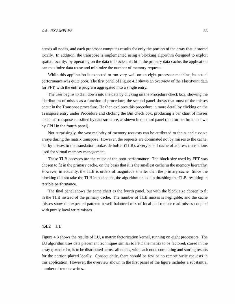
4.4. EXAMPLES 33
across all nodes, and each processor computes results for only the portion of the array that is stored
locally. In addition, the transpose is implemented using a blocking algorithm designed to exploit
spatial locality: by operating on the data in blocks that fit in the primary data cache, the application
can maximize data reuse and minimize the number of memory requests.
While this application is expected to run very well on an eight-processor machine, its actual
performance was quite poor. The first panel of Figure4.2shows an overview of the FlashPoint data
for FFT, with the entire program aggregated into a single entry.
The user begins to drill down into the data by clicking on the Procedure check box, showing the
distribution of misses as a function of procedure; the second panel shows that most of the misses
occur in the Transpose procedure. He then explores this procedure in more detail by clicking on the
Transpose entry under Procedure and clicking the Bin check box, producing a bar chart of misses
taken in Transpose classified by data structure, as shown in the third panel (and further broken down
by CPU in the fourth panel).
Not surprisingly, the vast majority of memory requests can be attributed to thex and trans
arrays during the matrix transpose. However, the requests are dominated not by misses to the cache,
but by misses to the translation lookaside buffer (TLB), a very small cache of address translations
used for virtual memory management.
These TLB accesses are the cause of the poor performance. The block size used by FFT was
chosen to fit in the primary cache, on the basis that it is the smallest cache in the memory hierarchy.
However, in actuality, the TLB is orders of magnitude smaller than the primary cache. Since the
blocking did not take the TLB into account, the algorithm ended up thrashing the TLB, resulting in
terrible performance.
The final panel shows the same chart as the fourth panel, but with the block size chosen to fit
in the TLB instead of the primary cache. The number of TLB misses is negligible, and the cache
misses show the expected pattern: a well-balanced mix of local and remote read misses coupled
with purely local write misses.
4.4.2 LU
Figure4.3shows the results of LU, a matrix factorization kernel, running on eight processors. The
LU algorithm uses data placement techniques similar to FFT: the matrix to be factored, stored in the
arrayg matrix , is to be distributed across all nodes, with each node computing and storing results
for the portion placed locally. Consequently, there should be few or no remote write requests in
this application. However, the overview shown in the first panel of the figure includes a substantial
number of remote writes.

34 CHAPTER 4. MEMORY PROFILING: THOR
(a) (b)
(c) (d)
(e)
Figure 4.3: Sequence of Thor screenshots from an analysis of LU. (a) Thor always begins with an overview ofmiss data for the entire application. (b) The user disaggregates the data, showing a complete (and completelyillegible) bar chart of misses as a function of procedure, bin, and CPU. (c) The user employs the value filterto aggregate entries with fewer than 4000 misses, resulting in a more readable chart. (d) Increasing thethreshold to 10,000 misses further narrows the display, aggregating all entries except those for procedure P13(modify interior block ) and bin B23 (g matrix ); sorting by CPU shows that all misses on CPUs4–7 are remote. (e) Fixing the data placement improves the miss locality on those CPUs.

4.5. DISCUSSION 35
The user first disaggregates the data, showing a complete bar chart of misses for all CPU-
procedure-bin triples over the course of the run. With over five hundred entries, this chart is too
dense to be studied in detail. To make the display more manageable, he uses the Value threshold
slider to aggregate all bars with fewer than 4000 memory requests into a single bar; the resulting
display, shown in the third panel, includes only the top 33 entries along with the aggregated entry.
Further increasing the threshold to 10,000 requests narrows the chart to eight entries responsible
for over 80% of the misses in the application. These entries correspond to requests on each of the
eight CPUs for the data arrayg matrix in proceduremodify interior block , the primary
factorization procedure.
Finally, the user sorts the entries by dragging the CPU control to the left edge of the window;
the resulting display, shown in the fourth panel, indicates that the last four processors behave very
differently from the first four: nearly all of their misses are remote, including the unexpected remote
writes. The other four processors, on the other hand, behave as expected and do not issue any remote
write requests.
This result reflects a data placement bug: rather than spreading the array across all nodes, the
program in fact placed it only on the first four nodes. Fixing that bug solves the remote write
problem: the final panel shows the results for a corrected version of the application. Note that unlike
FFT, which had a very regular pattern of misses, the miss counts for LU vary significantly across
CPUs; this variance indicates a load-balancing problem, which is in fact the primary scalability
bottleneck for LU.
4.5 Discussion
While these examples have shown Thor being used as a post-mortem analysis tool, it can also be
used for real-time monitoring of applications running on FLASH. Instead of loading data from a
file, the parser used to input FlashPoint data into Rivet can be connected directly via a socket to
a FlashPoint daemon process running on FLASH; Thor can then periodically poll the daemon for
new data. Real-time analysis can be useful for observing the evolution of an application’s behavior
over time, especially for programs that exhibit several distinct phases of execution.
As mentioned in the introduction to this chapter, the primary benefit of this visualization is its
support for interactive data exploration through the use of filtering, aggregation, and sorting; the
visuals themselves, while unspectacular, succeed in presenting the data in a familiar format and
enabling users to extract interesting and meaningful information from the data.

Chapter 5
Superscalar Processors: PipeCleaner
While memory system behavior is an important component of computer systems performance, to
run at peak throughput applications must also be able to take full advantage of the tremendous
processing resources provided by modern multiprocessors.
This chapter presents PipeCleaner, a visualization of application performance on superscalar
processors, the dominant processor style on the market today. PipeCleaner is composed of three
linked displays: a timeline view of pipeline performance statistics, an animated cycle-by-cycle
view of instructions in the pipeline, and a source code view that maps instructions back to lines of
code. These views combine to provide an overview-plus-detail [52] representation of the pipeline,
enabling the effective analysis of applications.
5.1 Background
The processing power of microprocessors has undergone unprecedented growth in the last de-
cade [26]. Desktop computers produced today outperform supercomputers developed ten years ago.
To achieve these performance enhancements, mainstream microprocessors such as the Intel Pentium
Pro [30] and the MIPS R10000 [60] employ a range of complex implementation techniques:
Pipelining. Pipelining overlaps the execution of multiple instructions within a functional unit,
much like an assembly line overlaps the steps in the construction of a product. For example,
a single-stage floating point unit might require 60 cycles to complete execution of a single
divide instruction. If this functional unit were pipelined into six stages of 10 cycles apiece,
the unit would be able to process several divide instructions at once (with each stage working
on a particular piece of the computation). While it would still require 60 cycles to compute
a single divide, the pipelined functional unit would produce a result every 10 cycles when
36

5.1. BACKGROUND 37
performing a series of divide instructions.
Multiple Functional Units. Superscalar processors include multiple functional units, such as arith-
metic logic units and floating point units. This enables the processor to exploit instruction-
level parallelism (ILP), executing several independent instructions concurrently. However,
some instructions cannot be executed in parallel because one of the instructions produces a
result that is used by the other. These instructions are termed dependent.
Out-of-Order Execution. In order to improve functional unit utilization, many superscalar proces-
sors execute instructions out of order. This allows a larger set of instructions to be considered
for execution, and thus exposes more ILP. Out-of-order execution can improve throughput if
the next instruction to be sequentially executed cannot utilize any of the currently available
functional units or is dependent on another instruction. Although instructions may be exe-
cuted out of order, they must graduate (exit the pipeline) in their original program order to
preserve sequential execution semantics. The reordering of instructions is accomplished in
the reorder buffer, where completed instructions must wait for all preceding instructions to
graduate before they may exit the pipeline.
Speculation. Rather than halting execution when a branch instruction is encountered until the
branch condition is computed, most processors will continue to fetch and execute instruc-
tions by predicting the result of the branch. If the processor speculates correctly, throughput
is maintained and execution continues normally. Otherwise, the speculated instructions are
squashed and their results are discarded.
These implementation techniques are intended to be invisible to the programmer. This is true
from the standpoint of correctness: application writers need not be aware of processor implementa-
tion details in order to write code that executes correctly. In order to write code that performs well,
however, programmers need an understanding of their applications’ interactions with the processor
pipeline. While these complex processors may provide very highpeakinstruction throughput, real
programs often fail to take advantage of it. There are many possible causes for underutilization of
the pipeline:
• When there are not enough functional units to exploit the ILP available in a code sequence,
instructions must wait for a unit to become available before they can execute. These structural
hazards often occur in code that is biased towards a particular type of instruction, such as
floating point instructions. The functional unit for those instructions will be consistently
full, and the other units will often remain empty for lack of instructions. Consequently, the
throughput of the processor is limited to the throughput of the critical functional unit alone.
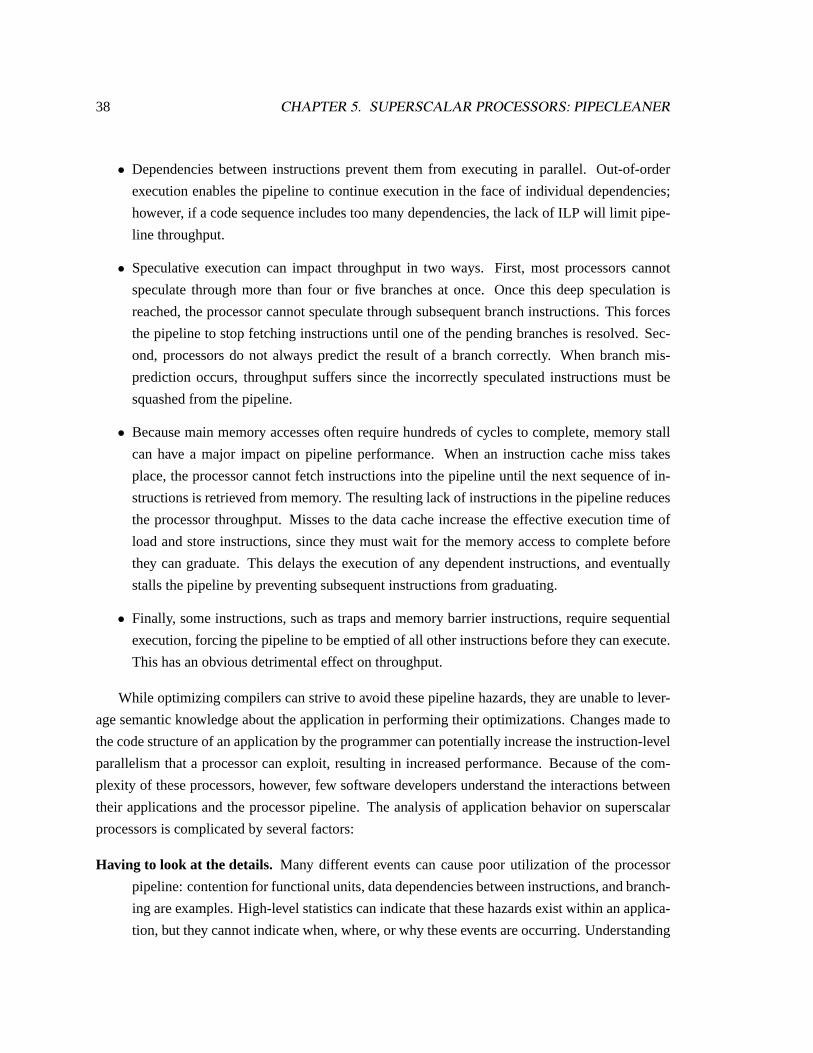
38 CHAPTER 5. SUPERSCALAR PROCESSORS: PIPECLEANER
• Dependencies between instructions prevent them from executing in parallel. Out-of-order
execution enables the pipeline to continue execution in the face of individual dependencies;
however, if a code sequence includes too many dependencies, the lack of ILP will limit pipe-
line throughput.
• Speculative execution can impact throughput in two ways. First, most processors cannot
speculate through more than four or five branches at once. Once this deep speculation is
reached, the processor cannot speculate through subsequent branch instructions. This forces
the pipeline to stop fetching instructions until one of the pending branches is resolved. Sec-
ond, processors do not always predict the result of a branch correctly. When branch mis-
prediction occurs, throughput suffers since the incorrectly speculated instructions must be
squashed from the pipeline.
• Because main memory accesses often require hundreds of cycles to complete, memory stall
can have a major impact on pipeline performance. When an instruction cache miss takes
place, the processor cannot fetch instructions into the pipeline until the next sequence of in-
structions is retrieved from memory. The resulting lack of instructions in the pipeline reduces
the processor throughput. Misses to the data cache increase the effective execution time of
load and store instructions, since they must wait for the memory access to complete before
they can graduate. This delays the execution of any dependent instructions, and eventually
stalls the pipeline by preventing subsequent instructions from graduating.
• Finally, some instructions, such as traps and memory barrier instructions, require sequential
execution, forcing the pipeline to be emptied of all other instructions before they can execute.
This has an obvious detrimental effect on throughput.
While optimizing compilers can strive to avoid these pipeline hazards, they are unable to lever-
age semantic knowledge about the application in performing their optimizations. Changes made to
the code structure of an application by the programmer can potentially increase the instruction-level
parallelism that a processor can exploit, resulting in increased performance. Because of the com-
plexity of these processors, however, few software developers understand the interactions between
their applications and the processor pipeline. The analysis of application behavior on superscalar
processors is complicated by several factors:
Having to look at the details. Many different events can cause poor utilization of the processor
pipeline: contention for functional units, data dependencies between instructions, and branch-
ing are examples. High-level statistics can indicate that these hazards exist within an applica-
tion, but they cannot indicate when, where, or why these events are occurring. Understanding

5.2. RELATED WORK 39
specific hazards requires a detailed examination of pipeline behavior at the granularity of
individual instructions.
Having to know where to look. Modern processors can execute hundreds of millions of instruc-
tions in a single second. Therefore, it is not feasible to browse through either a trace file or
detailed visualization of an application’s entire execution searching for areas of poor perfor-
mance. High-level performance overviews of the execution are required to identify regions of
interest before detailed visualizations can be used for analysis.
Having to have context. Most programmers think in terms of source code, not in terms of individ-
ual instructions. In order to modify their applications to enhance performance, programmers
need to be able to correlate instructions in the pipeline with the application’s source code.
5.2 Related work
Although there are many systems available for high-level analysis of application performance, there
are few systems available for detailed visualization of application execution on superscalar proces-
sors. Existing systems include DLXview [1], VMW [ 17], BRAT [44], and the Intel Pentium Pro
tutorial [30].
DLXview [1], an interactive pipeline simulator for the DLX instruction set architecture [26],
provides a visual, interactive environment that explains the detailed workings of a pipelined pro-
cessor. Performance evaluation is a secondary goal of their system: their focus is on presenting a
pedagogical visualization. For performance analysis purposes, the pipeline displays of DLXview
provide too much detail without enough overall context.
The Visualization-based Microarchitecture Workbench (VMW) [17] is a more complete system
for the visualization of superscalar processors. This system was developed with the dual goals of
aiding processor designers and providing support to software developers trying to quantify appli-
cation performance. However, there are several disadvantages to the visualizations and animation
techniques used by the system. VMW provides very limited high-level information on application
performance, and it is difficult to correlate this information with the detailed views. Animation is
used to depict cycle-by-cycle execution, but the animation is not continuous: it consists of sequen-
tial snapshots of processor state. While PipeCleaner initially used this approach, it proved to be
both difficult to follow and detrimental to understanding the instruction flow.
During the development of the PowerPC, IBM used a simulation tool called the Basic RISC
Architecture Timer (BRAT) [44] to study design trade-offs. BRAT provides a graphical interface
that allows the user to step through trace files, displaying the processor state at each cycle. BRAT

40 CHAPTER 5. SUPERSCALAR PROCESSORS: PIPECLEANER
provides only the single, detailed view of the processor state and does not utilize animation in the
visualization. Like VMW, this visualization is tightly integrated with the simulator and thus not a
general-purpose tool.
Intel distributes an animated tutorial [30] that illustrates the techniques the Pentium Pro pro-
cessor utilizes to improve performance. Similar to DLXview, the pedagogical intent of this tutorial
has resulted in a different design than the PipeCleaner visualization. The tutorial provides a limited
cycle-by-cycle view of the instructions in the pipeline with explanatory annotations. No contextual
performance data or source code displays are provided.
5.3 Visualization
PipeCleaner is composed of three linked views: a timeline view showing overall utilization, an
animated pipeline view showing individual instructions in the pipeline, and a source code view
providing context for these instructions. These three components combine to provide an overview-
plus-detail display of pipeline behavior.
5.3.1 Timeline view: Finding problems
The first task in understanding the behavior of an application on a processor is to examine an
overview of the application’s execution to locate regions of interest. The timeline view, shown
in Figure5.1, utilizes a multi-tiered strip chart to display overall pipeline performance information
at multiple levels of detail. The bottom tier shows data collected over the entire execution of the
application. The user interactively selects regions of interest in each tier, which are expanded and
displayed in the next tier.
The multi-tiered strip chart identifies the reasons that the pipeline was unable to achieve full
throughput on a particular cycle (or range of cycles in the aggregated displays). In a superscalar
processor, throughput is lost whenever the pipeline fails to graduate a full complement of instruc-
tions from the pipeline in a given cycle. Because instructions must graduate in order, stall time is
attributed to the instruction at the head of the graduation queue (i.e. the oldest instruction in the pipe-
line). The reasons for failure to achieve full pipeline throughput can be classified into the following
categories:
Empty/Icache. An instruction cache miss is preventing instructions from being fetched from mem-
ory, so the pipeline is completely empty (and there is no head of the instruction queue to blame
for the stall).

5.3. VISUALIZATION 41
Figure 5.1: Investigation of an application’s processor pipeline behavior typically begins by examining high-level performance characteristics. The timeline view provides a multi-tiered strip chart for the explorationof this data. Pipeline throughput statistics for the entire execution are shown on the bottom tier of the stripchart, with pipeline stall time classified by cause (as shown in the legend at the bottom of the window). Theyellow panes are used to select time intervals of interest in each tier, which are displayed in more detail inthe next tier. Directly above the multi-tiered chart is a simple strip chart that shows the instruction mix inthe pipeline during the time region of interest: load/store (green), floating point (pink), branch (yellow) andinteger (cyan). This strip chart serves to relate this high-level view to the detailed pipeline view.
Exception/Flush. Either an exception occurred or an instruction in the pipeline requires sequential
execution. In either case, the pipeline must be flushed before continuing execution, again
leaving the pipeline empty until instruction fetch resumes.
Load/Store. The head of the graduation queue is a memory load or store operation that is waiting
for data to be retrieved from the memory system.
Issue/Functional Unit. The head of the graduation queue is either waiting to be issued into a func-
tional unit due to a structural hazard or is still being processed by a functional unit.
In addition to the pipeline stall information, the timeline view includes a second chart that
displays the mix of instructions in the pipeline. This chart classifies instructions by functional unit
and shows the instruction mix during the same time window as the top tier of the multi-tiered strip
chart. By relating the reasons for pipeline stall to the instructions in the pipeline, this display serves
as a “bridge” between the timeline view and the pipeline view.

42 CHAPTER 5. SUPERSCALAR PROCESSORS: PIPECLEANER
Figure 5.2: The pipeline view shows all instructions in the pipeline at a particular point in time. Pipelinestages and functional units appear as large regions with numerous instruction slots. This processor has a four-stage pipeline — fetch, decode, execute and reorder — arranged from left to right in the figure. Instructionsare portrayed as rectangular glyphs, color-coded to indicate their functional unit and labeled to identify theiropcode. Information about the state of the instruction is encoded in the border color of the glyph. User-controlled animation is used to show the behavior of instructions as they advance through the pipeline. Thisfigure illustrates the transition between two cycles of execution of a graphics application executing on theMXS processor model. The pipeline can fetch and graduate up to four instructions per cycle. However, inthis case, the processor is unable to graduate any instructions because the head of the graduation queue is stillbeing executed in the floating point functional unit.
5.3.2 Pipeline view: Identifying problems
The pipeline view is illustrated in Figure5.2. This visualization shows the state of all instructions
in the pipeline at a particular cycle and animates instructions as they progress through the pipeline.
Pipeline stages and functional units appear as large rectangular regions with numerous instruc-
tion slots. Each stage is represented as a single container, with the number of slots indicating the
capacity of the stage. Functional units are composed of one or more containers, since these units
may themselves be composed of multiple pipeline stages. The functional units are color-coded using
the same color scheme as the instruction mix strip chart. The layout of the pipeline is interactively
configurable: at any time, the user can reorder the layout of the functional units or resize the stages
and functional units to focus on a portion of the processor pipeline.
Instructions in the pipeline are depicted as rectangular glyphs. The glyphs encode several pieces

5.3. VISUALIZATION 43
of information about the instructions in their visual representation. The fill color of the rectangle
matches the color of functional unit responsible for execution of the instruction. The glyph contains
text identifying the instruction; depending on the space available, either the opcode mnemonic or
the full instruction disassembly (including both the mnemonic and the arguments) is displayed. The
border color of the instruction conveys additional information. If the instruction has been issued
speculatively and the branch condition is still unresolved, the border of the instruction is orange. If
the instruction was issued as a result of incorrect speculation and will subsequently be squashed, it
is drawn with a red border. The head of the graduation queue always has a yellow border, and a red
triangle appears next to the text of this instruction.
Dependencies between instructions in the pipeline are displayed as yellow lines connecting the
two instructions. Since a large number of dependencies may be present in the pipeline, the user can
selectively filter or disable this feature. To filter this display, the user selects with the mouse the
instruction for which dependencies should be drawn.
With the exception of the reorder buffer, the pipeline stages order instructions by age: instruc-
tions enter at the bottom of the stage and move upward to replace instructions that have exited the
stage. In the reorder buffer, instructions are shown in graduation order, with the head of the grad-
uation queue at the top of the buffer. The reorder buffer leaves empty slots for instructions that are
executing in the pipeline but have not yet completed. These slots contain a grayed-out text label of
the instruction, enabling the slots to be correlated with the instructions in the pipeline.
The visualization uses animated transitions to show instructions advancing through the pipeline.
The animations are similar to those used for program debugging by Mukherjea and Stasko [40] and
algorithm animation by Stasko [54]. The user drives the pipeline animation using a set of VCR-style
controls. The controls enable the user to single-step, animate, or jump through the animation. The
animation may be run either forward or backward, and the speed is variable and under user control.
The user can also click on the instruction mix strip chart to jump directly to a particular cycle.
This visualization can be used to understand the precise nature of the observed pipeline hazards.
The user can animate through cycles of interest and visually identify for each cycle the hazards that
are occurring. Figure5.3 illustrates the visual characteristics of several of the major types of haz-
ards. By interacting with the pipeline view, the user can observe the instruction sequences that are
responsible for underutilizing the pipeline and understand the reasons for their poor performance.
In order for this information to be useful, however, it must be related back to the source code of the
application.

44 CHAPTER 5. SUPERSCALAR PROCESSORS: PIPECLEANER
Figure 5.3: Snapshots of a program’s execution in the detailed pipeline view, demonstrating a variety ofreasons for poor pipeline utilization. After using PipeCleaner for a short period, users are able to quicklyidentify these hazards as they occur in the animation. (a) A load instruction has suffered a cache miss andis waiting in the load/store functional unit for data. Every other independent instruction has completed;however, they must wait in the reorder buffer until the load completes. (b) The instructions in the decode stagehave cascading dependencies: each is waiting for a result from an instruction ahead of it in the buffer. As aresult, they must execute sequentially. (c) The trap instruction must flush the pipeline before it can execute.Consequently, all of the functional units are empty and there are no instructions that can be graduated. (d) Theprocessor has speculated through four branches. The fifth branch must stall the instruction fetch until one ofthe branches is resolved. (e) A branch was mispredicted, so the speculatively executed executions must besquashed. Squashed instructions are highlighted with a thick red border.

5.4. RIVET FEATURES 45
Figure 5.4: The source code view, which relates the instructions in the timeline’s region of interest to thesource code corresponding to these instructions. The left panel provides a bird’s eye view of the source, andthe right panel shows a portion of one of the source files (indicated by the vertical bar in the left panel). Bothviews are color-coded to highlight instructions in the region of interest. Black indicates that the line of codeis executed somewhere in the timeline region and red indicates that the line is being executed in the detailedpipeline view. A red arrow indicates the instruction at the head of the graduation queue.
5.3.3 Source code view: Providing context
Once the major regions of poor performance and their causes have been discovered, the user must
determine if the application can be altered to improve pipeline utilization. The final component
of PipeCleaner, the source code view, allows the user to correlate the high-level performance data
and detailed animation views with the application’s source code. This view, a variant of the SUIF
visualization presented in Chapter3, is shown in Figure5.4. It shows an overview of the source
code of the application and enables the user to drill down to see the full source code of a selected
section of the program text.
Both windows in the source code view highlight relevant lines of code. Lines that are executed
at some point during the time window of interest in the timeline view are drawn in black, and lines
that are being executed in the pipeline view are highlighted in red. As in the pipeline view, a red
arrow is displayed next to the line of source code that contains the instruction at the head of the
graduation queue.
5.4 Rivet features
Several attributes of Rivet were particularly important for the development of PipeCleaner.
Flexibility. One of the design goals for PipeCleaner was to make it easily adaptable to many pro-
cessor models. This flexibility is achieved by building the pipeline view using two simpler
46 CHAPTER 5. SUPERSCALAR PROCESSORS: PIPECLEANER
metaphors: theContainer, which displays the contents of a single pipeline stage, and the
Pipe, which renders instructions as they transition between pipeline stages.
This decomposition of the pipeline into its constituent elements enables easy adaptation of the
layout to represent a variety of processor models with different pipeline organizations. It also
allows the visualization to be configured according to the parameters of a particular processor
model, such as the number of functional units or the size of the reorder buffer.
Aggregation. The multi-tiered stripchart in the timeline view must be able to display data over a
wide range of time granularities ranging from a few thousand cycles to millions of cycles or
more. In order to display this data efficiently, aggregation transforms are used to precompute
pipeline utilization data at several levels of detail. The visualization can then choose the
appropriate data for each tier of the stripchart.
Animation. Animation is a core service provided by Rivet through the listener mechanism. All
containers and pipes share a single animation object, which generates periodic listener events
for each frame in the animation. The metaphors respond to these animation events by com-
puting new interpolated positions for the individual instructions in the pipeline. In addition
to these synchronized animation triggers, the Rivet redraw mechanism supports incremental
redraw of visual primitives, important for efficient animation of objects.
Animation is crucial for understanding the detailed cycle-by-cycle behavior of the pipeline.
The original PipeCleaner implementation simply displayed the state of the pipeline at a partic-
ular cycle, jumping from one cycle to the next. Without the visual cues provided by animation,
it is very difficult to track instructions as they advance through the pipeline.
5.5 Examples
As discussed above, the flexibility of PipeCleaner enables it to be applied to several different pro-
cessor models, as well as a variety of configurations of a particular processor model. In order to
visualize a new processor architecture, the user writes aprocessor module, a script that imports the
raw pipeline data into a Rivet table with a standard metadata format. The remainder of the visual-
ization operates directly on this table, enabling the bulk of the code to be independent of the data
source.
This section includes two examples: the first, using the MXS [9] processor model, looks at the
visualization from the point of view of a program developer; the second, using the MMIX [32]
processor model, from the point of view of a hardware designer.

5.5. EXAMPLES 47
Figure 5.5: The complete PipeCleaner visualization system displaying one million cycles of execution. Thetimeline view shows a periodic behavior, with alternating sections of high and low processor stall. The chartis zoomed in on the region of low utilization. The pipeline view shows that the instruction sequences in thiswindow are highly dependent on one another, with very little instruction-level parallelism available to beexploited. The source code view shows the code segment corresponding to this phase of execution: a tightfloating point loop with dependencies both within the loop and across iterations.
5.5.1 Program development
Figure5.5 shows a visualization of a graphics application executing for one million cycles using
the MXS [9] processor model, which implements the instruction set architecture used in the MIPS
R10000 [60] processor.
The analysis begins with the timeline view of the execution. The bottom tier of the multi-tiered
strip chart shows a periodic execution pattern. Of interest are the phases indicating a significant
increase in processor stall time. The chart shows that throughput is limited in these phases because
the head of the graduation queue is still executing in a functional unit. There are several reasons
why this might occur, such as an unbalanced mix of instructions or a large number of dependencies.
The multi-tiered strip chart is used to focus on the transition from high throughput to low
throughput. At a granularity of 50,000 cycles, the high-level pattern becomes less apparent but

48 CHAPTER 5. SUPERSCALAR PROCESSORS: PIPECLEANER
the two distinct phases of execution are still clear. The chart is further zoomed to a window of 2000
cycles centered on the phase transition. Comparing the throughput chart with the instruction mix
chart shows that the bulk of the processor stall time corresponds to periods of heavy floating point
activity in the pipeline.
This behavior can be further investigated using the pipeline view. Animation is used to display
the instructions in question as they travel through the pipeline. The pipeline view in Figure5.5shows
a representative stage of the animation. The animation quickly shows why the pipeline is suffering
from poor throughput: there is a cascading dependency chain between nearly all of the instructions
in the decode unit. This complete lack of instruction-level parallelism forces the pipeline to process
instructions in a sequential fashion. Even worse, the instruction window is dominated by floating
point instructions, including operations with long execution latencies like the divide (the instruction
in the floating point unit in the figure). As a result, there are few (if any) instructions available for
graduation per cycle.
The source code view correlates this pipeline behavior with the application’s source code: the
application is executing a tight loop of floating point arithmetic. With this information, the program-
mer can now attempt to restructure the code to reduce the number of dependencies or interleave other
code into the loop to better utilize the processor.
5.5.2 Hardware design
When designing new processors, hardware architects need to understand the demands that appli-
cations used by their target markets will place on the processor. By using visualization to study
the behavior of important commercial applications on existing processors, they can identify where
architectural changes such as additional functional units or pipelining would be beneficial.
As a simple example of this use of PipeCleaner, Figure5.6shows two visualizations of a prime
number generator running on a simulator of the MMIX architecture [32], developed by Donald
Knuth for use in his series of books,The Art of Computer Programming[31]. This example shows
how pipelining the divide functional unit can improve the performance of this application.
The screen shot on the left shows an initial implementation of the program executing on a
pipeline with a simple 60-cycle functional unit for divide instructions. On the right, a modified
version is executing on a configuration with the divide unit pipelined into six 10-cycle stages. In
the modified version of the program, the main loop has been manually unrolled three times to better
utilize the pipelined divide unit. To aid the comparison, the system draws a thin gray line in the
instruction mix strip chart when the program finds a prime number.
Examination the instruction mix chart of each version shows that the second implementation
consistently has more instructions in the pipeline. The increased amount of pink (floating point

5.6. OTHER APPLICATIONS 49
Figure 5.6: Two screenshots of PipeCleaner displaying a prime number finder running on the MMIXarchitecture. This example demonstrates how pipelining the divide unit can improve pipeline utilization andapplication performance.
instructions) in the strip chart reflects the fact that the pipelined divide unit is enabling the processor
to work on several divide instructions at once; this effect can be seen in the pipeline view, where
the divide unit is concurrently executing three divide instructions in different stages of the pipeline.
Consequently, the instruction mix chart shows that the pipelined version is running faster and finding
prime numbers more rapidly.
5.6 Other applications
In addition to program development and hardware design, PipeCleaner can be useful for compiler
design and simulator development; it could possibly even be extended to other problem domains
both within and beyond the realm of computer systems.
5.6.1 Compiler design
One of the major research areas in compiler design is code optimization. Research is being done to
study the effectiveness of the optimization techniques that have been developed and to discover and
implement additional improvements. In particular, with the popularity of superscalar processors,
compiler writers are striving to maximize the amount of instruction-level parallelism in compiled
code in order to make full use of processor resources.
By exposing the detailed behavior of the processor pipeline, PipeCleaner can be used to study
the effectiveness of compiler optimizations and suggest code sequences that would benefit from

50 CHAPTER 5. SUPERSCALAR PROCESSORS: PIPECLEANER
further analysis.
5.6.2 Simulator development
Simulation is a powerful technique for understanding computer systems. During the design of new
processors, simulators are developed to explore the processor design space and validate architectural
decisions. Simulators are also used for performance analysis of existing applications and processors.
However, because of their complexity, the development of processor simulators is a challenging and
error-prone task.
During the development of PipeCleaner, I uncovered several timing-related errors in the MXS
processor model:
• In the pipeline model, instructions should only be able to advance through one stage of the
pipeline per cycle. However, the visualization showed instructions passing through the entire
pipeline in a single cycle.
• The MXS simulator included a correct model of functional unit latency: for instance, a
multiply-and-add instruction would spend four cycles executing in the floating point unit.
However, the simulator did not correctly model functional unit occupancy. As a result, the
visualization showed cases where a single functional unit was simultaneously executing as
many astenmultiply-and-add instructions at once.
• As discussed in Section5.1, in the case of deep speculation the pipeline’s instruction fetch
unit must stall until any one of the pending branches is resolved. However, in some cases
nearly the entire pipeline would drain before instruction fetch resumed. Further investigation
turned up a simulator bug that caused instruction fetch to stall until thelast predicted branch
was resolved.
Timing bugs such as these did not affect correctness — simulated programs would still execute
correctly and compute the expected result — but resulted in timing behavior that was not faithful
to the processor model. While the aggregate pipeline statistics obscured these problems, which had
existed for some time in the simulators, examination of the timeline view and observation of the
pipeline animation made them readily apparent.
5.6.3 Other problem domains
While work on PipeCleaner has focused on processor pipelines, one could certainly imagine a gen-
eralized version that could model all sorts of pipelines. A natural extension would be to model other
computer systems pipelines such as the ones found in dedicated graphics hardware; with some more

5.6. OTHER APPLICATIONS 51
effort, the visualization could even be extended to non-computer-related areas such as manufactur-
ing assembly lines or oil and gas pipelines.

Chapter 6
Real-time Monitoring:
The Visible Computer
In contrast to the three preceding visualizations, which focused on particular components of a com-
puter system, this example presents a unified interface for exploring the behavior of the system as a
whole.
The Visible Computer visualization is designed for real-time monitoring of computers and clus-
ters. It leverages the hierarchical structure of the hardware to organize the display, providing an
overview of the entire system and enabling users to drill down into specific subsystems and indi-
vidual components. The resulting focus-plus-context display enables analysts to explore interesting
phenomena in detail while alerting them when events of interest occur elsewhere in the system.
6.1 Background
A significant challenge in the analysis of entire computer systems and clusters is their scale and
complexity: a typical system is composed of large numbers of individual components of many
different types. To manage this complexity, these hardware components can be organized hierarchi-
cally: they are combined into distinct subsystems that can be further composed to form higher-level
subsystems, and so forth. Figure6.1shows an example of such a hardware hierarchy, representing
a cluster of machines connected using a local area network.
In recent years, systems developers have begun to create comprehensive data collection tools
for monitoring the performance and behavior of these computer systems. SGI’s Performance Co-
Pilot (PCP) [53] can collect data about all aspects of a system and report this data in real time;
similarly, the SimOS complete machine simulator [27] can simulate the performance of an entire
52

6.2. VISUALIZATION 53
Cluster
12 Clients
Server
Ethernet
CPUMemory2 Disks
Network I/FBus
16 Nodes10 Disks
Network I/FInterconnect
R4K CoreICache
DCacheSCache
TLB
2 CPUsMemory
ControllerBus
R10K CoreICache
DCacheSCache
TLB
Register File2 ALUs2 FPUs
LSU
Figure 6.1: Hardware hierarchy of a typical workstation cluster. The cluster is composed of systems con-nected by Ethernet; each system is composed of several subsystems, some of which can be further subdivided.
system or cluster and export its data in real (simulated) time.
Both SimOS and PCP can record detailed low-level hardware data such as cache misses, disk
requests, or processor utilization. To provide context and make this data meaningful to analysts,
both tools can use high-level classifiers to categorize these events, attributing them to a specific
process, user and group name, processor mode, etc.
6.2 Visualization
The Visible Computer leverages both the hierarchical organization of the hardware and the detailed
data classifications provided by SimOS and PCP to layout and display visualizations of the various
components of the system. It combines simple active icons, which summarize the overall behavior
of each component and enable users to navigate the hierarchy, with charts showing the performance
in more detail.
6.2.1 Layout
Figure6.2 presents a sequence of screenshots showing the Visible Computer’s layout organization
and interface. The initial display allocates the entire window to the top level of the hierarchy; an
icon in the upper left corner identifies the object in question, in this case a workstation cluster.
Directly beneath that icon is a collection of buttons representing the components at the next level of
the hierarchy: a server machine, a client machine, and the Ethernet that connects them.

54 CHAPTER 6. REAL-TIME MONITORING: THE VISIBLE COMPUTER
(a) (b)
(c) (d)
Figure 6.2: Nested hierarchy layout in the Visible Computer. (a) Initial top-level display of the cluster,with buttons for the server, client, and Ethernet. (b) The user has clicked on the server button, creating anested frame representing the server. (c) The user has drilled down on the server frame by clicking on allof its buttons: node, disk, memory, bus, and network interface. He has also increased the size factor of thenode component, giving it more screen space. (d) The user has drilled down again, this time on the nodecomponent. The node frame includes buttons for the processor, instruction cache, data cache, secondarycache, and TLB.

6.2. VISUALIZATION 55
(a) (b)
(c) (d)
Figure 6.3: Grouping and ungrouping of instances in the Visible Computer. (a) The server contains ten diskinstances, initially grouped into a single frame. (b) The user has ungrouped the frame, producing a framefor each disk instance. (c) The user has selected six of the instances and chosen the Group option from thecontext menu. (d) The selected instances have been grouped into a single frame.
The user can drill down into the hierarchy by clicking one of the buttons. This operation creates a
nested frame for the selected component within the parent frame; clicking the button again removes
the nested frame from the layout. Like the parent frame, the nested frame presents icons and buttons
representing the next level of the hierarchy. Users can continue drilling down until they reach the
leaf nodes of the hierarchy, corresponding to the basic low-level components of the system.
The Visible Computer uses a variant of the squarified treemap layout algorithm [12] to allocate
screen space to each of the frames in the display. Each nested frame is assigned a relative size
factor, which can be increased or decreased by the user through a context menu. Space within the
enclosing frame is allocated to the nested frames in proportion to the size factor values.
Frames at lower levels of the hierarchy are drawn with a darker background and with less space
between them. This technique helps to make the levels of the hierarchy distinct, creating an effect
similar to the three-dimensional cushion treemap [58].
In many cases, a system will have multiple instances of a single component: for instance, in the
system shown in Figure6.1, the server contains ten disks. All instances of a component are initially
grouped together and displayed as a single frame. Figure6.3shows how the user can ungroup them,
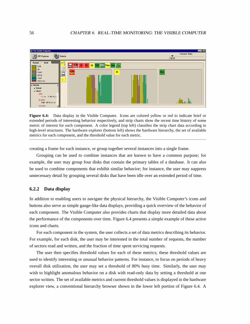
56 CHAPTER 6. REAL-TIME MONITORING: THE VISIBLE COMPUTER
Figure 6.4: Data display in the Visible Computer. Icons are colored yellow or red to indicate brief orextended periods of interesting behavior respectively, and strip charts show the recent time history of somemetric of interest for each component. A color legend (top left) classifies the strip chart data according tohigh-level structures. The hardware explorer (bottom left) shows the hardware hierarchy, the set of availablemetrics for each component, and the threshold value for each metric.
creating a frame for each instance, or group together several instances into a single frame.
Grouping can be used to combine instances that are known to have a common purpose; for
example, the user may group four disks that contain the primary tables of a database. It can also
be used to combine components that exhibit similar behavior; for instance, the user may suppress
unnecessary detail by grouping several disks that have been idle over an extended period of time.
6.2.2 Data display
In addition to enabling users to navigate the physical hierarchy, the Visible Computer’s icons and
buttons also serve as simple gauge-like data displays, providing a quick overview of the behavior of
each component. The Visible Computer also provides charts that display more detailed data about
the performance of the components over time. Figure6.4presents a simple example of these active
icons and charts.
For each component in the system, the user collects a set of data metrics describing its behavior.
For example, for each disk, the user may be interested in the total number of requests, the number
of sectors read and written, and the fraction of time spent servicing requests.
The user then specifies threshold values for each of these metrics; these threshold values are
used to identify interesting or unusual behavior patterns. For instance, to focus on periods of heavy
overall disk utilization, the user may set a threshold of 80% busy time. Similarly, the user may
wish to highlight anomalous behavior on a disk with read-only data by setting a threshold at one
sector written. The set of available metrics and current threshold values is displayed in the hardware
explorer view, a conventional hierarchy browser shown in the lower left portion of Figure6.4. A
6.3. RIVET FEATURES 57
button at the top of the window allows the user to show or hide the explorer view as needed.
Whenever a component crosses above the specified threshold value for one of its metrics, its
icon becomes active: it is given a yellow background when the component has gone above the
threshold at some point in its recent history, and a red background when the component has been
consistently above the threshold for an extended period of time. The two colors serve to distinguish
between short-term spikes of activity and sustained periods of interesting behavior.
The active state of icons in the system is automatically propagated up the physical hierarchy.
For example, if any component within the cluster is above its threshold, the top-level icon for the
cluster will be highlighted accordingly. The icon indicates that there is some interesting activity
within the specified subsystem; the user can then drill down and explore this behavior further.
Having used the icons to find potentially interesting components, the user can create charts to
display the data in more detail. The Visible Computer includes an extensible interface for creating
different kinds of data displays. In the current prototype, the primary chart type is a strip chart
showing the value of the metric of interest over time. The three charts in Figure6.4 display CPU
utilization, secondary cache stall time, and bus occupancy data for a recent time period.
The strip charts are color-coded using the high-level classifiers to provide context about the data:
the charts in the figure attribute events to the name of the process responsible. A legend in the top
left portion of the window displays the mapping from color to process name. Like the hardware
explorer, the legend can be shown or hidden by clicking the Palette button at the top of the window.
6.3 Rivet features
This visualization demonstrates the power and flexibility of Rivet’s data import mechanism.
Much like PipeCleaner, the Visible Computer is designed to accept data from a variety of data
sources; currently both SimOS and PCP are supported. For each data source, the Visible Computer
includes a scripting language procedure that loads the data into a collection of tables with a stan-
dard metadata format. The remainder of the visualization can then operate directly on these data
structures in a standard fashion regardless of their source.
In addition, just like the Thor visualization presented in Chapter4, the Visible Computer can
be used for both post-mortem analysis of a log file and for real-time display of system or simulator
data received over a socket. For real-time data, the listener mechanism updates the display as new
data is received by the visualization.
One concern when using live data is the performance cost incurred by frequent data updates.
The transforms currently implemented in Rivet do not perform incremental updates: whenever their
input data changes, they recompute their results from scratch. Consequently, as the data set grows,

58 CHAPTER 6. REAL-TIME MONITORING: THE VISIBLE COMPUTER
these computations take longer and longer. While this has not been a problem in practice, it could
be addressed either by adding incremental update support or by limiting the amount of archival data
retained and displayed by the visualization.
6.4 Example: Database client/server application
This example shows how the Visible Computer can be used to track the evolution of a database
query as it is issued and processed. Figure6.5shows a sequence of three screenshots from a Visible
Computer session displaying data collected by SimOS. The simulated system consists of two ma-
chines: a four-processor database server and a uniprocessor client that periodically issues queries
through the server’s Web interface.
6.4.1 Cycle 21 million
The first screenshot shows the status shortly after the query was issued by the client. The rightmost
frame, representing the Ethernet, shows a brief spike of activity; the network interfaces on both the
server (left frame) and client (middle frame) machines also show this communication.
Several icons in the client frame are highlighted in red: the processor, instruction cache, and
data cache. The user has drilled down into these components, displaying strip charts of their recent
behavior. The three charts show the processor’s activity and cache stall time caused by the client
initiating the Web request: the client quickly moves from the user shell process (sh ) to the script that
generates the query (bdoor ) to the program that connects to the Web server itself (telnet ). One
might expect there to be little activity on the client once the request is sent to the server; however,
the icons and charts indicate thattelnet continues to cause a significant amount of CPU time and
cache stall while waiting for a reply.
Meanwhile, on the server, the user has drilled down and ungrouped the node component. Of
the four nodes on the server, only node two is currently active; consequently, the user has increased
its size and drilled down for more detail. A chart of processor activity on node two shows that the
server has received the request from the client (inetd ), identified it as a Web query, and begun to
process it (httpd.exe ).
6.4.2 Cycle 63 million
In the second screenshot, the user has closed the frames for the client and Ethernet, focusing on the
behavior of the server. Shortly before this screenshot was taken, the icons representing the other
three nodes on the server all became active, prompting the user to drill down on all of them.

6.4. EXAMPLE: DATABASE CLIENT/SERVER APPLICATION 59
(a)
(b)
(c)
Figure 6.5: Sequence of screenshots from a Visible Computer analysis of a client-server database Web ap-plication. (a) Cycle 21M: Client issues database query to server via HTTP. Server node two begins processingthe request, and the client incurs significant CPU busy time and cache stall time while waiting for response.(b) Cycle 63M: CGI script on server node two parses the Web query and launches the database access appli-cationdbaccess , which triggers the parallel database server processoninit on the other nodes. (c) Cycle126M: oninit continues running on all four nodes. The server incurs significant memory stall time, andthe disks containing the database (6–9) are frequently accessed.
60 CHAPTER 6. REAL-TIME MONITORING: THE VISIBLE COMPUTER
The chart for the processor on node two shows that it continued to process the client’s request by
launching the CGI script used for database access (ifmx.cgi ), which then initiated the database
access application (dbaccess ). Eventually,dbaccess issued the query to the database server
itself (oninit ), which began running in parallel on the other three nodes of the server.
While bothdbaccess andoninit caused a significant number of memory references (top
right frame), the disks and bus (bottom right frames) were relatively idle.
6.4.3 Cycle 126 million
The final screenshot shows the steady-state behavior of the server while processing the request in the
database. At this point, all four nodes are busy inoninit computing the query result in parallel.
The user has divided the disks into two groups: disks 6–9 contain the database tables themselves,
and disks 0–5 contain all other files, such as metadata and program binaries. Not surprisingly, the
disk charts show a significant number of requests for the database tables during query processing.
The latency of these disk requests may also be responsible for the gaps in the processor charts: the
oninit processes were likely waiting for data to be loaded from the disks into main memory.
6.5 Discussion
The Visible Computer is an effective focus-plus-context visualization that provides an overview of
system behavior and enables users to track events of interest as they occur anywhere in the system.
This real-time monitoring visualization has many potential applications:
Performance analysis.Analysts can observe the behavior of the system while running workloads
of interest to find either short-term or persistent performance bottlenecks.
Failure notification. Monitoring can provide a quick indication that some component or subsystem
has failed: for example, a file server may suddenly stop responding to requests, or an errant
machine may start saturating the network with bogus traffic.
Hacker discovery. Similar to the previous example, monitoring can draw attention to machines
suffering from malicious behavior such as port scans and denial-of-service attacks.
The Visible Computer is not intended for completely understanding these behaviors in detail.
Rather, it provides enough information to narrow the analyst’s focus from the entire system to a
particular component, which can then be studied in more detail using additional visualizations and
analysis tools.

Chapter 7
Ad hoc Visualization and Analysis
Whereas the preceding examples presented a collection of stand-alone visualizations targeted at
particular aspects of computer systems performance, this chapter demonstrates how Rivet can serve
as a general-purpose environment for the ad hoc exploration of computer systems.
Because of the complexity of computer systems, the analysis process is a highly unpredictable
and iterative one: an initial look at the data often ends up raising more questions than it answers.
In many cases, a series of several data collection and analysis sessions are required to locate the
problem and focus in on its underlying causes. In such an environment, analysis and visualization
tools must be broadly applicable to a range of problems, as the demands placed on them can vary
greatly not only from task to task, but also from iteration to iteration within a single task.
Rivet provides a single, cohesive visualization environment that is well-suited for this iterative
process: it can be readily adapted to the varying demands of the computer systems analysis, enabling
users to learn the system once and apply that knowledge to any problem.
This chapter shows how Rivet can be used in conjunction with comprehensive data sources
like the SimOS complete machine simulator to provide a powerful iterative analysis framework for
computer systems.
The bulk of this chapter consists of a detailed case study showing how Rivet and SimOS were
used to improve the performance and scalability of the Argus [29] parallel graphics rendering li-
brary. The analysis of Argus required a sequence of several simulation and visualization sessions,
with each visual analysis suggesting changes to either the data collection in SimOS or to the Argus
application itself. In the end, the analysis uncovered a subtle performance bug within the operating
system that was limiting the application’s performance and scalability.
61
62 CHAPTER 7. AD HOC VISUALIZATION AND ANALYSIS
7.1 Background
In recent years, complete machine simulation has become an increasingly important approach for
the study of computer systems performance and behavior. The SimOS [27] simulation environment
has been used in a wide range of studies, and it has proven to be an effective system with several
attractive properties:
Visibility. SimOS provides complete access to the entire hardware state of the simulated machine:
memory system traffic, the contents of the registers in the processor, etc. It also provides
access to the software state of the system, enabling machine events to be attributed to the
processes, procedures and data structures responsible for them.
Flexibility. The amount of data that can be collected by SimOS during a simulation run is po-
tentially immense. Therefore, SimOS provides a flexible mechanism called annotations for
focusing the data collection. Annotations are simple Tcl scripts that are executed whenever
an event of interest occurs in the simulator. These scripts have access to the entire state of the
simulated machine.
Nonintrusiveness.Unlike intrusive data collection methods such as instrumentation which can per-
turb the behavior of the system being studied, SimOS can gather as much data as needed with-
out changing the results. This feature is especially important for finding timing-dependent
problems, which frequently occur on parallel systems.
Repeatability. SimOS is a completely deterministic simulator: two simulations with identical ini-
tial conditions and hardware configurations will produce identical cycle-by-cycle results. This
property is crucial for performance analysis: an initial analysis session often suggests a more
focused data collection scheme to better understand the behavior of the system. Using SimOS,
the exact run may be repeated with annotations added to provide more detail.
Configurability. SimOS can be set up to model a variety of hardware configurations, enabling the
study of system configurations that are not readily available. The case study presented here
uses SimOS to model an SGI Origin [34] multiprocessor with up to 64 processors. Since we
do not have access to such a large-scale machine, this study would not have been otherwise
possible.
While SimOS is a powerful tool for studying computer systems, it presents a significant data
analysis challenge. The complete visibility of hardware and software structures it provides can
generate a huge amount of data. Most studies using SimOS have dealt with this challenge by using
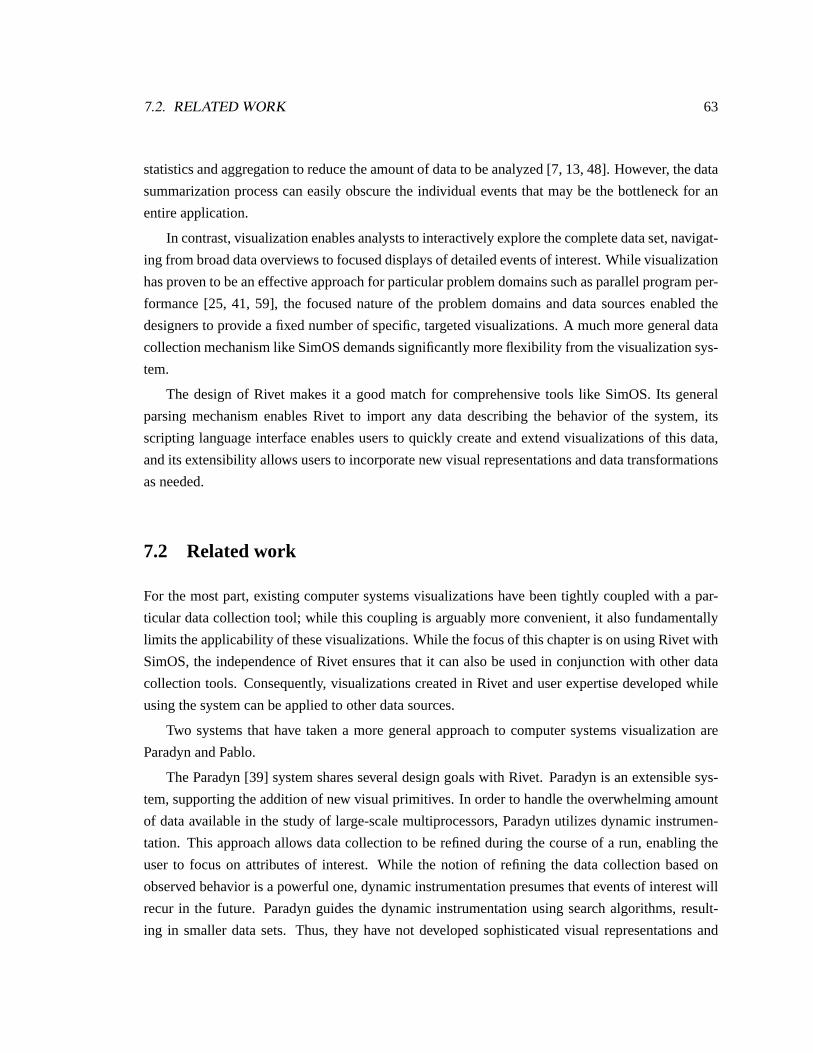
7.2. RELATED WORK 63
statistics and aggregation to reduce the amount of data to be analyzed [7, 13, 48]. However, the data
summarization process can easily obscure the individual events that may be the bottleneck for an
entire application.
In contrast, visualization enables analysts to interactively explore the complete data set, navigat-
ing from broad data overviews to focused displays of detailed events of interest. While visualization
has proven to be an effective approach for particular problem domains such as parallel program per-
formance [25, 41, 59], the focused nature of the problem domains and data sources enabled the
designers to provide a fixed number of specific, targeted visualizations. A much more general data
collection mechanism like SimOS demands significantly more flexibility from the visualization sys-
tem.
The design of Rivet makes it a good match for comprehensive tools like SimOS. Its general
parsing mechanism enables Rivet to import any data describing the behavior of the system, its
scripting language interface enables users to quickly create and extend visualizations of this data,
and its extensibility allows users to incorporate new visual representations and data transformations
as needed.
7.2 Related work
For the most part, existing computer systems visualizations have been tightly coupled with a par-
ticular data collection tool; while this coupling is arguably more convenient, it also fundamentally
limits the applicability of these visualizations. While the focus of this chapter is on using Rivet with
SimOS, the independence of Rivet ensures that it can also be used in conjunction with other data
collection tools. Consequently, visualizations created in Rivet and user expertise developed while
using the system can be applied to other data sources.
Two systems that have taken a more general approach to computer systems visualization are
Paradyn and Pablo.
The Paradyn [39] system shares several design goals with Rivet. Paradyn is an extensible sys-
tem, supporting the addition of new visual primitives. In order to handle the overwhelming amount
of data available in the study of large-scale multiprocessors, Paradyn utilizes dynamic instrumen-
tation. This approach allows data collection to be refined during the course of a run, enabling the
user to focus on attributes of interest. While the notion of refining the data collection based on
observed behavior is a powerful one, dynamic instrumentation presumes that events of interest will
recur in the future. Paradyn guides the dynamic instrumentation using search algorithms, result-
ing in smaller data sets. Thus, they have not developed sophisticated visual representations and

64 CHAPTER 7. AD HOC VISUALIZATION AND ANALYSIS
aggregation techniques for large data sets as we have developed in Rivet. Their use of computa-
tional algorithms rather than human intuition and pattern recognition results in a system with quite
different goals and challenges.
The Pablo research group has developed several performance analysis tools, including Pa-
blo [46] and SvPablo [15]. These systems have focused on presenting the statistics gathered during
execution in one or two complex views, such as multi-dimensional scatterplot arrays and hierarchi-
cal source code views. In contrast, the visualizations used in this case study employ many views for
correlating statistics with resources like memory addresses, process and thread names, and source
code line numbers. Neither Pablo nor SvPablo are easily extensible, except for the enhancement of
existing views.
7.3 Argus performance analysis
The power of combining simulation with visualization can easily be seen in the results of the perfor-
mance analysis of the Argus parallel rendering library. This section begins with a brief description
of Argus. It then describes the simulations performed to study the behavior of Argus, the visual-
izations developed to analyze the data collected under simulation, and the discoveries and improve-
ments made during the analysis process.
7.3.1 Argus background
Argus [29] is a parallel immediate-mode rendering library targeted at large shared memory multi-
processors. An application developed with Argus consists of one or more relatively heavyweight
processes. Argus operates entirely within a dedicated region of shared memory that it allocates
itself. This allows for the possibility of user applications based on separate memory spaces (e.g.
using UNIX fork) or on a single shared memory space (e.g. using UNIX sproc).
The driving application used here is a parallel NURBS patch renderer. The application creates
multiple processes, each of which takes patches from a central work queue to simultaneously tes-
sellate and render. The model used in this study has 102 patches, each consisting of 196 control
points, and is tessellated into 81,600 triangles in total.
Argus is internally multithreaded, using a custom lightweight thread system. Argus does not
have an internal notion of processors, but rather treats the individual user processes as though they
were processors. When a user process first calls the library, Argus creates a lightweight thread to
continue the user code, as well as a number of other threads to perform various rendering tasks.
Argus controls the scheduling of these threads within each of the original user processes. Machine-
dependent optimizations relating to placement and scheduling of processes onto processors are left

7.3. ARGUS PERFORMANCE ANALYSIS 65
to the application.
Argus creates threads for five types of tasks. The three primary tasks are: (a) the user’s appli-
cation work, (b) geometry processing, and (c) rasterization processing. An app thread is created to
continue execution of the user’s application code in each of the original user processes. Multiple
front threads are created to perform geometry processing on graphics primitives. The framebuffer
is subdivided into small tiles, and one back thread is created to handle rasterization of primitives
into each tile. In addition to these three types of threads, one submit thread is created per app thread
to control the parallel issue of graphics commands from all of the app threads according to user-
specified constraints as described in Igehy et al. [29]. Finally, multiple reclaim threads are created
to perform internal bookkeeping for shared data structures.
Scheduling can be controlled by the user at the level of allowing or disallowing the different
types of work on each process. For this study, we divide the processes into three categories: back
processes are dedicated to rasterization, front processes are dedicated to geometry processing, and
app processes may perform either application work or geometry processing.
The Argus configuration studied here models a system with fast dedicated rasterization nodes
rather than software rasterization. The primitive data and graphics state information normally
needed for rasterization is referenced by the back threads to ensure its transfer to the rasterization
node (as would occur in a hardware rasterization system), but software rasterization is otherwise
disabled. Since the back threads are effectively acting as data sinks in this configuration, the goal is
to achieve linear speedup in the number of front and app processes, ignoring the back processes.
7.3.2 Simulation environment
Argus was originally developed on an eight-processor SGI Challenge multiprocessor, and without
significant problems was able to achieve linear speedup running the NURBS application (imple-
mented using fork) on all eight processors. To study the scalability further, the developers of Argus
ran the same application on an SGI Origin system with 64 processors. They immediately encoun-
tered a common performance problem for parallel applications running on this class of multiproces-
sor: longer and non-uniform memory latencies. This problem was resolved by adding prefetch in-
structions to Argus and by improving the memory reference locality. This enabled Argus to achieve
linear speedup up to 31 processes (26 front & app processes, five back processes) [29]. Beyond that
point, however, the performance diminished rapidly, and they soon observed slowdowns as they
added processors. They utilized standard performance debugging tools — software profiling and
hardware performance counters — but were unable to discover the performance bottleneck.
In order to analyze this behavior in more detail, we configured SimOS to model a 40-processor
Origin-type system running IRIX 6.4 (the SGI implementation of UNIX) and performed the same

66 CHAPTER 7. AD HOC VISUALIZATION AND ANALYSIS
10 20 3�
0 40 Argus Front & App Processes
10
20
3�
0
4�
0
Spe
edup
Initial Argus/NURBS Implementation
Figure 7.1: Initial speedup curve for Argus on SimOS.
set of test runs under simulation. We observed the same overall performance behavior when run-
ning the application on SimOS as on the real Origin system. The speedup curve for the NURBS
application running on SimOS is shown in Figure7.1. We focused our attention on a 39-process
Argus run (34 front & app, five back), a scale sufficiently large to exhibit slowdowns over runs with
fewer processes.
7.3.3 Memory system analysis
We initially speculated that the memory system was the performance bottleneck. On systems like the
SGI Origin, cache misses to remote nodes can become increasingly expensive as system sizes grow,
and contention in the memory system can increase the cost of memory accesses. To investigate this
hypothesis, we added a set of annotations to SimOS to collect detailed memory system statistics,
and we developed a set of displays in Rivet to present this data.
MView: Memory system visualization
The MView memory system visualization is presented in Figure7.2. MView is composed of several
views providing detailed information about the memory system behavior of the application.
In the code view, MView displays memory stall time organized by source code file and line.
Simple bar charts are used to indicate the total percentage of memory stall that can be attributed to
each source file. Line-by-line overviews and detailed source code views provide further detail about
memory stall: lines of code that cause cache misses are highlighted according to the amount of stall
time incurred by the line.
The memory view shows memory stall time by physical and virtual addresses. Histograms
are drawn for each physical node, with stall time grouped into bins of 16 pages (256K). Another
histogram is used to depict memory stall by virtual memory address, also with stall time aggregated
into bins of 16 pages. Clicking on a histogram entry in either the physical or the virtual memory
view highlights the corresponding pages in the other histogram. The use of highlighting in this view
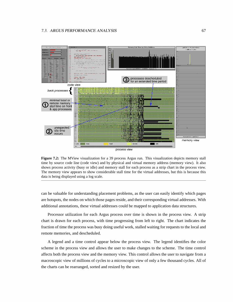
7.3. ARGUS PERFORMANCE ANALYSIS 67
Figure 7.2: The MView visualization for a 39 process Argus run. This visualization depicts memory stalltime by source code line (code view) and by physical and virtual memory address (memory view). It alsoshows process activity (busy or idle) and memory stall for each process as a strip chart in the process view.The memory view appears to show considerable stall time for the virtual addresses, but this is because thisdata is being displayed using a log scale.
can be valuable for understanding placement problems, as the user can easily identify which pages
are hotspots, the nodes on which those pages reside, and their corresponding virtual addresses. With
additional annotations, these virtual addresses could be mapped to application data structures.
Processor utilization for each Argus process over time is shown in the process view. A strip
chart is drawn for each process, with time progressing from left to right. The chart indicates the
fraction of time the process was busy doing useful work, stalled waiting for requests to the local and
remote memories, and descheduled.
A legend and a time control appear below the process view. The legend identifies the color
scheme in the process view and allows the user to make changes to the scheme. The time control
affects both the process view and the memory view. This control allows the user to navigate from a
macroscopic view of millions of cycles to a microscopic view of only a few thousand cycles. All of
the charts can be rearranged, sorted and resized by the user.

68 CHAPTER 7. AD HOC VISUALIZATION AND ANALYSIS
MView analysis results
The MView visualization of the Argus data quickly enabled us to realize that our initial hypothesis
was wrong. Had memory stall been the cause of the performance problem, the strip charts shown
in the process view would have contained significant sections of local and remote memory stall
time. Instead, they showed almost full CPU utilization for the first two thirds of the run. In fact, the
memory stall for the entire run accounted for only 3.9% of the total execution time of the app and
front processes.
While MView enabled us to rule out the memory system as the cause of the performance prob-
lem, it also showed us a surprising pattern of behavior. Towards the end of the run, many pro-
cesses began to experience significant amounts of idle time, culminating in several processes being
descheduled for a long period. All told, the application spent 16.3% of its total execution time
descheduled. This substantial amount of time spent descheduled would account for the poor perfor-
mance of Argus at this scale.
This observation was totally unexpected. The Argus internal scheduler never yields the CPU
voluntarily — an Argus process will go idle only if the kernel explicitly deschedules it. Since there
were no other active processes in the system, there was no obvious reason that the kernel should
have prevented the Argus processes from running.
7.3.4 Process scheduling analysis
To understand the kernel’s process scheduling behavior, we repeated the Argus run, focusing our
data collection on the processes’ interactions with the operating system. We added several annota-
tions to SimOS to collect information on process scheduling, kernel exception handling, and Argus
thread scheduling. To display this data we developed a new visualization, an evolution of the MView
process view.
PView: Process visualization
The PView process visualization is shown in Figure7.3. This visualization was designed to allow
us to study several types of per-process events varying over time.
The bottom half of the window shown in Figure7.3displays the data organized by process. Each
process includes a single chart for each type of event collected; in the figure, the three charts show
Argus thread scheduling, kernel trap handling, and CPU scheduling respectively. All the charts
share a common time axis, running from left to right. We decided that the different data sets for
a single process should be placed together. This is in contrast to the MView visualization, which
allocated each type of data to a separate view. By using visually distinct color sets for different

7.3. ARGUS PERFORMANCE ANALYSIS 69
Figure 7.3: Two screenshots of the PView visualization of Argus with 39 processes. The process view in thebottom part of the window shows data organized by process; the summary view in the top part presents thesame data aggregated by Argus process class (app, front, back). Multiple charts can be displayed for eachprocess — this example displays Argus thread scheduling, kernel trap handling, and CPU scheduling. Thesummary view always displays the full execution time; the process view of the screenshot on the right hasbeen zoomed in to show 2 million cycles (10 milliseconds) of execution.

70 CHAPTER 7. AD HOC VISUALIZATION AND ANALYSIS
Figure 7.4: Argus simulation runs consist of roughly 100 million cycles of information per processor. Forefficient navigation and display, we form an aggregation structure as shown in (a). We divide the executiontime into discrete time slices, and for each slice we compute the fraction of time occupied by each eventtype as shown in (b). These aggregations are built at resolutions of 10K, 50K and 100K cycles. Dependingon the number of cycles selected to be viewed and the available screen space, the appropriate level of theaggregation structure is displayed.
process attributes, we found it possible to make visual comparisons of the different attributes of a
particular process (by adjacency) and of a particular attribute across all processes (by focusing on a
particular color set).
The raw data displayed in these charts consists of individual events, each with a beginning
and an ending cycle. When possible, these events are shown using a Gantt chart. However, even
a relatively short-running application like Argus can contain far too many events to display in a
Gantt chart: huge numbers of very small entries stress both the rendering system and the human
visual system, resulting in a slow and incomprehensible display. To address this problem, we added
a Discretize transform to Rivet, as shown in Figure7.4. Discretize divides the execution time
into discrete time intervals; for each interval, it computes the total fraction of time occupied by
each different event type. This timeseries data can then be displayed as an overall utilization strip
chart. The PView visualization precomputes timeseries data at several different time granularities.
The decision to display raw event data or aggregated timeseries data and the choice of timeseries
granularity are driven by three factors: the number of pixels available for display and the number
of distinct events and cycles within the selected time interval. PView weighs these three factors to
select a default set of data to be displayed; a pulldown menu allows the user to override the selected
display.
The top half of the window provides an overview of the per-process data. The same information
is shown, but aggregated into three sets of processes corresponding to the three process classes in
Argus (app, front, back). This overview allows the user to quickly identify characteristics specific
to a single type of process and to see a summary of the entire execution. This window also contains
the same time control as the MView visualization. The time control affects only the per-process

7.3. ARGUS PERFORMANCE ANALYSIS 71
view; the overview always shows the entire data set, providing context and serving as a guide for
the control. Below the overview is a legend describing each data set, along with check boxes that
enables charts to be removed from the per-process display.
PView analysis: Kernel trap data
Figure 7.3 shows the data zoomed in to a detailed Gantt chart display of two million cycles of
execution; several of the processes have been manually “pulled open” to make them more visible.
Examining the trap data alongside the process scheduling data, we saw that the idle time occurred
during the kernel pfault and vfault routines. These kernel routines are used for updating process
page tables; in this case, the processes were faulting on pages in the shared memory region used by
Argus for common data and synchronization. By examining the thread scheduling information in
the summary window, we saw that the idle time became significant when those processes running
app threads switched to running front threads. Having all of the data for a process in a single view,
along a common time axis, allowed us to uncover several relationships that would have been difficult
with separate views.
During the early portions of the run, these kernel traps occurred relatively infrequently and
with short duration. In the latter portions of the run, they appeared more frequently and with longer
duration. Examination of the IRIX source code showed that faults on shared memory regions require
locking, leading us to suspect that kernel synchronization was the cause of the idle time.
PView analysis: Kernel lock data
To investigate this possibility, we performed a third Argus simulation, this time adding annotations
to collect information on the kernel’s shared memory lock, and incorporated this data into PView.
The results of this simulation are shown in Figure7.5. In the figure, PView displays the CPU
scheduling data along with kernel lock data indicating times the process was either waiting for or
holding the lock. By examining the lock data next to the scheduling data, we were immediately
able to confirm our hypothesis: lock contention was the reason for the descheduling of the Argus
processes. A process would request the lock, find it was already held by another process, and be
descheduled until it was granted the lock by the kernel.
In general, the lock was only held for a short period before being released. In one case, however,
we saw the lock held for an extended period. This explained the long stretches of idle time we
observed in the original visualization: several of the processes were suffering faults, queuing on the
shared memory kernel lock, and being descheduled until they could acquire the lock. However, it
did not explain why one process was holding the lock for such a long time in this one instance.

72 CHAPTER 7. AD HOC VISUALIZATION AND ANALYSIS
Figure 7.5: PView visualization of a 39 process Argus run showing CPU scheduling and kernel lock data.About halfway through the run there is a substantial increase in lock contention. During this period, one of theprocesses (front15 ) is granted the lock while descheduled. The CPU that the process must be scheduledon, highlighted in green, is being used by another process (front14 ). Therefore, processfront15 holdsthe lock for an entire time quantum; meanwhile, many of the other processes must be descheduled until thelock is available.

7.3. ARGUS PERFORMANCE ANALYSIS 73
By comparing the lock and CPU scheduling charts for the process in question, we observed that
it remained descheduled for an extended period even after it was granted the lock. To understand
this behavior, in the process scheduling view we highlighted the CPU on which the process was
initially scheduled. We observed that, while the process was waiting to acquire the lock, another
process was scheduled on its processor.
This should not have been a problem, since there were other processors available to run the
process once it received the lock. However, further examination of the kernel’s source code showed
that the kernel pfault and vfault routines must pin the faulting process to its CPU in order to prevent
process migration during trap handling. Consequently, the process could not be scheduled anywhere
else.
Since the kernel lock is an important shared resource, we would expect that the kernel would
have preemptively reclaimed the CPU, enabling the process to finish executing the critical section
and release the lock. However, that was not the case: instead, the process holding the lock was
simply returned to the run queue and forced to wait on the other process. Since Argus processes do
not voluntarily yield the CPU, the kernel allowed the process to execute for its entire time quantum
(20 million cycles) before descheduling it. At that point, the original process was scheduled, quickly
finished handling the fault, and released the lock.
7.3.5 Preventing process migration
This scheduling behavior can be avoided by explicitly pinning the Argus processes to specific CPUs.
We ran Argus on SimOS again, this time using SGI’s dplace tool to prevent process migration;
the results are shown in the top half of Figure7.6. The figure shows that pinning the processes
eliminated the large section of idle time caused by the process scheduling quirk. However, there
was still a significant amount of idle time during the latter stages of the run caused by contention on
the same kernel lock.
The bottom half of Figure7.6 shows how we used the interactive layout support provided by
Rivet to further explore and understand this behavior. We zoomed in on a very small section of the
execution to see the correlation between process idle time and individual kernel lock requests. We
then rearranged the process layout by direct manipulation to see the heavily contended kernel lock
being passed from one process to another in a first-come first-served fashion.
This form of interaction is reminiscent of the analysis techniques used by Bertin [10]. As he
showed, the ability to interactively rearrange the elements of a data display can be an important
factor in enabling the human perceptual system to make comparisons and detect patterns. In Rivet,
it has proven particularly useful for understanding collections of objects that have no single “natural”
ordering or priority, such as processes, nodes, and source files.

74 CHAPTER 7. AD HOC VISUALIZATION AND ANALYSIS
(a)
(b) (c)
Figure 7.6: Three successive screenshots of the PView visualization of a 39 process Argus run with pro-cesses pinned to prevent migration, showing kernel trap handling, kernel lock and CPU scheduling data. (a)While pinning the processes prevented the process scheduling quirk, we still see substantial trap activity, lockcontention, and idle time. (b) The display is zoomed to a small time window. The time spent requesting thelock far exceeds the time spent holding it because of the contention. (c) The user has interactively sorted thecharts to show the progression of the lock from process to process.

7.4. DISCUSSION 75
7.3.6 Changing the multiprocessing mechanism
As noted above, the performance bottleneck that was limiting the scalability of Argus was a lock
used by the kernel to control access to the internal data structures of the shared memory region. The
use of this shared region was necessitated by the decision to implement the NURBS application as
a set of independent processes with distinct address spaces using the fork multiprocessing mecha-
nism. While this was not a problem when running smaller numbers of processes, contention for this
resource quickly became the limiting factor at larger process counts.
Having learned that this was the bottleneck, we sought an alternative that would support shared
memory without the coarse kernel synchronization of a single shared memory region. We consid-
ered manually dividing the shared region into several smaller subregions. However, this would not
necessarily be effective if concurrent accesses occurred to the same subregion, and it would have
added significant complexity to the implementation of Argus.
Instead of subdividing the shared region, we decided to eliminate it altogether: we modified the
application to use the sproc multiprocessing mechanism instead of fork. This mechanism, which is
optimized for multithreaded systems like Argus, creates a set of processes which share a common
address space. This allows the Argus processes to communicate and share data without the explicit
use of a shared memory region, providing synchronization at a much finer grain within the kernel.
We ran the new version of the NURBS application on SimOS using the same configuration as
the preceding runs; the PView summary window is shown in Figure7.7. In this run, the amount
of kernel trap handling was reduced to a negligible level, and all processes in the system remained
scheduled and busy for the duration of the run. As shown in Figure7.8, this run completed nearly
twice as fast as the initial Argus run and achieved 95% of linear speedup. Furthermore, with this
version of the application we were able to achieve 90% of linear speedup all the way up to 45 front
and app processes (with 11 back processes).
7.4 Discussion
As the performance analysis of Argus has demonstrated, the coupling of simulation with visualiza-
tion can generate an extremely powerful performance analysis tool. We were able to uncover subtle
interactions between the graphics library and operating system that would have been extremely
difficult to discover using traditional tools.
During the first phase of the Argus study, we performed three distinct simulation runs of the
NURBS application, with each run using the exact same application and configuration but a different
set of annotations. The determinism of SimOS ensured that each run produced identical results, and
the flexibility of Rivet enabled us to easily incorporate the new data into our visualizations.
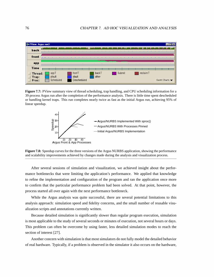
76 CHAPTER 7. AD HOC VISUALIZATION AND ANALYSIS
Figure 7.7: PView summary view of thread scheduling, trap handling, and CPU scheduling information for a39 process Argus run after the completion of the performance analysis. There is little time spent descheduledor handling kernel traps. This run completes nearly twice as fast as the initial Argus run, achieving 95% oflinear speedup.
10 20 3�
0 40A
�rgus Front & App Processes
10
2�
0
3�
0
40
Spe
edup A
�rgus/NURBS Implemented With sproc()
Argus/NURBS With Processes Pinned
Initial Argus/NURBS Implementation
Figure 7.8: Speedup curves for the three versions of the Argus NURBS application, showing the performanceand scalability improvements achieved by changes made during the analysis and visualization process.
After several sessions of simulation and visualization, we achieved insight about the perfor-
mance bottlenecks that were limiting the application’s performance. We applied that knowledge
to refine the implementation and configuration of the program and ran the application once more
to confirm that the particular performance problem had been solved. At that point, however, the
process started all over again with the next performance bottleneck.
While the Argus analysis was quite successful, there are several potential limitations to this
analysis approach: simulation speed and fidelity concerns, and the small number of reusable visu-
alization scripts and annotations currently written.
Because detailed simulation is significantly slower than regular program execution, simulation
is most applicable to the study of several seconds or minutes of execution, not several hours or days.
This problem can often be overcome by using faster, less detailed simulation modes to reach the
section of interest [27].
Another concern with simulation is that most simulators do not fully model the detailed behavior
of real hardware. Typically, if a problem is observed in the simulator it also occurs on the hardware,

7.4. DISCUSSION 77
but the converse is not necessarily true. In the case of Argus, after fixing the problems found in the
case study, the pathological lock behavior was no longer observed on the real hardware; however,
the application did not scale as well on the hardware as it did in the simulator. This difference is
likely due to memory system issues: since SimOS uses a generic NUMA model and not a detailed
model of the Origin, it is possible that subtle memory effects are not being modeled in SimOS.
In either case, visualizations developed within Rivet can still be used in conjunction with other
data collection mechanisms, such as hardware monitors, by adapting the data parsing scripts to
accept the new data.
A final limitation is the lack of pre-built annotations and visualizations. While the flexibility
of Rivet and SimOS enabled us to adapt our data collection and visualization scripts as we un-
covered problems in Argus, many systems problems recur across applications. The existence of a
configurable annotation and visualization library would simplify the task of analyzing these com-
mon problems. As Rivet and SimOS are used in further studies, focused scripts like the ones used
in this case study could be generalized into such a library.

Chapter 8
Discussion
Now that Rivet has been in use for several years and has been applied to many different problem
domains, let us revisit the major design decisions of Rivet and weigh the strengths and weaknesses
of each in the context of these experiences.
8.1 Rapid prototyping
One of the primary goals of Rivet was to enable the rapid prototyping of visualizations without
requiring a significant amount of time or code. To assess Rivet’s success at meeting this goal,
Table8.1 lists the number of lines of scripting language code required to create the visualizations
presented in this dissertation, classified according to the primary stages of the visualization pipeline.
While these scripts are by no means huge, they are still fairly substantial. However, it is impor-
tant to remember that these scripts are relatively complete, polished visualizations. The development
of visualizations in Rivet typically proceeds in the following fashion:
1. Create an initial visualization of the data. This initial “rough cut” visualization is simply
intended to get the data up on the screen as quickly as possible. It displays the data using a
single visual metaphor, with minimal ornamentation and labeling. The user interface is also
relatively minimal: visualization parameters may be hard-wired, or may be configured at the
command line through scripting language procedures.
This initial display can generally be put together within an hour or two, and only requires
about 100 lines of scripting language code. Oftentimes, the visualization answers the question
it was created to address, and it is never developed beyond this point. I’ve used Rivet in this
way on many occasions to understand unexpected behaviors of the SimOS simulator, the
FLASH multiprocessor, and even Rivet itself.
78

8.1. RAPID PROTOTYPING 79
Table 8.1: Number of lines of Tcl code in the visualization scripts presented in this dissertation.
Visualization Configure Parse Transform Display Interface TotalSUIF Explorer 10 100 10 250 60 430Thor 40 210 70 120 230 670Pipeline:
Core Visualization 0 0 140 460 180 780MXS Module 50 240 0 0 0 290MMIX Module 50 330 0 0 0 380
Visible Computer:Core Visualization 0 0 0 1230 430 1660SimOS Module 40 330 0 0 0 370PCP Module 30 120 0 0 0 150
Argus:MView 60 340 10 370 150 930PView 40 190 50 90 150 520
2. Add a graphical user interface and labels. By its nature, the rough cut visualization is
essentially only useful to its developer. However, in instances like the case studies presented
in the dissertation, the initial data display proves to be generally applicable beyond answering
a particular question. At that point, the developer can refine the visualization into a polished
system suitable for wider use. This refinement process entails adding such features as a
graphical user interface for configuring the visualization, along with more detailed labels,
legends, and axes describing the data display.
For instance, the original Thor visualization, consisting of a bar chart without a legend or
Y-axis labels and a bare-bones command-line interface, came together in a single afternoon.
Once it proved to be a compelling visualization for analyzing FlashPoint data, I gradually
added the various components of the user interface in response to user requests.
3. Repeat as necessary, adding supplemental linked views.In many cases, multiple linked
displays of the same data can provide significantly more insight than a single stand-alone
view of the data. Consequently, once a developer has written and polished a visualization, he
may begin the development process over again by incorporating additional data displays.
A prime example of this process is the evolution of PipeCleaner. The original PipeCleaner
visualization provided only the animated display of instructions in the pipeline. After the
visualization had been in use for some time, I added the timeline and source code views to
provide much-needed context and significantly enhance the usefulness of the visualization.
Another important aspect of Rivet’s rapid prototyping support is the decision to use a scripting

80 CHAPTER 8. DISCUSSION
language for visualization development. Scripting provides several advantages: visualizations can
be quickly created, extended, and tweaked, and the scripting language interpreter provides a con-
venient means for interacting with the visualization as it runs. This convenience has proven quite
valuable in the development of new visualizations.
At the same time, it is important to remember that scripting languages are generally not intended
for large-scale software projects. However, on the whole, the visualizations presented here have
remained quite manageable while still offering a significant amount of functionality.
8.2 Modular architecture
Another aspect of Rivet that enables it to support rapid prototyping is its modular architecture,
in which basic building block objects are combined to produce sophisticated visualizations. The
modular architecture enables developers to leverage the power of combinatorics, producing a wide
variety of visualizations from a relatively small set of components. In addition, this component-
based approach provides several other benefits:
Code reuse.Because individual components can be reused from one visualization to the next, with
each visualization developed in Rivet, less time is spent creating new C++ components. For
instance, even though Thor, PipeCleaner, and Argus all use very different visual metaphors,
they still share basic components like primitives and color encodings. Similarly, common
labeling and interface objects like legends, axes, and menus are frequently reused across
visualizations.
Extensibility. Each of the basic Rivet components includes a standard interface, defined using a
C++ abstract base class. While Rivet includes a set of common instances for each component
type, developers can easily define their own by creating subclasses and incorporating them
into Rivet. For example, the Pipe and Container visual metaphors used by PipeCleaner and
the Discretize transform written for the Argus analysis were developed specifically for those
visualizations.
Coordination. Coordination between multiple data views in Rivet can frequently be accomplished
simply through the sharing of components. The case studies provide many examples of such
coordination. In the Argus PView visualization, a single spatial encoding for the time axis
ensures that the dozens of Gantt and strip charts remain synchronized as the user scrolls the
display; in SUIF Explorer, shared color encodings provide a consistent data representation in
the overview and detailed source-code view.

8.3. INTEGRATING ANALYSIS AND VISUALIZATION 81
One of the keys to making this modular architecture function correctly and efficiently is the lis-
tener mechanism, which allows components to notify dependent components whenever they change
state.
For example, Thor’s color legend allows users to configure the encoding that assigns a color to
each cache miss type. When a new color is selected, the encoding notifies the bar chart metaphor,
which responds by redrawing its display. Similarly, when the user changes the data filters or the level
of aggregation in Thor, notifications propagate through the transformation network to recompute the
data, ultimately notifying the bar chart to redraw.
As discussed in Chapter5, the listener mechanism also serves as the basis for more sophisti-
cated visualization techniques such as animation. The PipeCleaner example demonstrates how co-
ordinated animations can be created with a shared animator object notifying metaphors to advance
from one frame to the next.
By automatically propagating changes between objects and performing updates without requir-
ing the user to write additional code, the listener mechanism greatly simplifies the task of creating
visualizations.
8.3 Integrating analysis and visualization
Rivet’s data infrastructure enables the tight integration of analysis and visualization. Its general-
purpose parsing mechanism allows data to be imported from a wide variety of sources, stored in
relational tables, and manipulated and transformed directly within the visualization environment.
As shown in Table8.1, the amount of code required to perform the “impedance matching”
between external data sources and Rivet’s data objects is responsible for a significant fraction of
the visualization scripts, ranging from 15–40%. This nontrivial parsing effort is due to the fact that
these visualizations are required to process a variety of ad hoc log file formats. Data stored in a
regular format (such as comma-separated values) or formatted with Rivet in mind could be parsed
much more simply and quickly.
The relational data model has proven quite effective for the data sets analyzed using Rivet to
date. In particular, the use of a single, uniform data format provides a significant degree of flexi-
bility in the development of visualizations, allowing users to apply any data transforms and visual
metaphors to any data set regardless of its source. One possible concern, however, is the difficulty
found in representing graph-based data structures in a relational format. While relational database
designers have developed mechanisms for managing such data, visualizations of graphs and trees in
Rivet would likely be more complex than in a system specifically designed for that purpose.
The ability to operate on data within the visualization environment through the use of data

82 CHAPTER 8. DISCUSSION
transforms, and to manipulate these transforms directly within the visualization, is essential to all
of the case studies. In particular, it allows users to filter the data dynamically in order to focus
on subsets of interest, and to change levels of detail by selectively aggregating the data to present
an overview or drilling down to see the details. The tight integration of data manipulation in the
visualization environment enables users to explore the complete data set without losing context.
An interesting direction for future work is enabling Rivet to directly visualize data stored in
external relational databases. Many interesting data sets currently reside in such databases, and
Rivet’s simplified relational data model is well-suited for retrieving and managing this data.
Further, external database support would enable Rivet to visualize much larger databases than
are presently supported. Rivet’s current data architecture is optimized for data sets that fit in main
memory; while it can successfully manage and display tens or hundreds of megabytes of data, it
is not designed for gigabyte or terabyte data sets. This restriction makes sense for two reasons.
First, attempting to display data sets larger than main memory would make it much more difficult to
provide interactive data displays. Second, because of the limited size and resolution of the display,
attempts to display millions of records on the screen at once would quickly deteriorate into noise.
However, by connecting to an external database, Rivet could be used to explore selected subsets
of the full data set interactively, employing data reduction techniques such as filtering to narrow
the scope of the data, aggregation to display the data at a coarser scale, or sampling to present a
representative portion of the full data set. These data subsets could then be analyzed individually in
Rivet, with delays occurring only when users change subsets of interest.
While this dissertation has demonstrated the effectiveness of visualization for understanding
the relatively large data sets found in computer systems analysis, the combination of Rivet with an
external relational database has the potential to “raise the bar,” enabling the interactive visualization
and exploration of even larger and more complex data sets.
8.4 Summary
This dissertation has demonstrated that data visualization techniques can be successfully and broadly
applied to the analysis of computer systems. The primary contributions of this research are:
• The Rivet visualization environment.
Rivet is a general-purpose environment for the rapid prototyping and development of ex-
ploratory data visualizations, capable of displaying data sets taken from a wide variety of
sources.
The underlying approach in the design of Rivet was to understand and analyze the visualiza-
tion process itself: to identify the set of fundamental components of a visualization, define

8.4. SUMMARY 83
their interfaces and relationships, and enable developers to create sophisticated data displays
using these high-level building blocks.
Further, by enabling sophisticated data manipulation operations to be incorporated directly
into visualizations, Rivet’s data management infrastructure serves to integrate the analysis
and visualization process.
• A collection of exploratory visualizations for computer systems analysis.
The case studies presented in this dissertation demonstrate the effectiveness of visualization
in general, and Rivet in particular, as a tool for computer systems analysis.
The first two examples, SUIF Explorer and Thor, employ relatively simple visual represen-
tations and display comparatively small data sets; in those cases, Rivet is a powerful tool
for quickly developing visualizations that both provide an overview of the data and allow
interactive exploration of the details. PipeCleaner and the Visible Computer, with their sig-
nificantly richer data displays and their larger and more complex data sets, show how Rivet
visualizations can be essential analysis tools; these visualizations enable users to uncover in-
teresting and important information that would otherwise have remained hidden within the
data. Finally, the analysis of Argus demonstrates how users can take advantage of the rapid
prototyping capabilites of Rivet to create ad hoc visualizations of arbitrary computer systems
data.
Rather than using complex visual metaphors to display the data, these visualizations utilize
relatively simple data representations such as histograms, strip charts, and Gantt charts. The
visualizations augment these familiar displays with extensive support for coordination and
interaction through operations such as filtering, sorting, brushing, highlighting, and details-
on-demand. The resulting interactive multiple-view visualizations enable the effective explo-
ration of the large, complex data sets that are often found in computer systems analysis.

84 CHAPTER 8. DISCUSSION

Bibliography
[1] George Adams. DLXView. Available:http://yara.ecn.purdue.edu/˜teamaaa/dlxview , March 1999.
[2] Vikram S. Adve, John Mellor-Crummey, Mark Anderson, Ken Kennedy, Jhy-Chun Wang, andDaniel A. Reed. An integrated compilation and performance analysis environment for dataparallel programs. InProceedings of Supercomputing ’95, pages 1370–1404, December 1995.
[3] Christopher Ahlberg and Erik Wistrand. IVEE: An information visualization and explorationenvironment. InProceedings of IEEE Information Visualization 1995, pages 66–73, 1995.
[4] Alexander Aiken, Jolly Chen, Michael Stonebraker, and Allison Woodruff. Tioga-2: A directmanipulation database visualization environment. InProceedings of the IEEE Conference onData Engineering 1996, pages 208–217, 1996.
[5] Bowen Alpern, Larry Carter, and Ted Selker. Visualizing computer memory architectures. InProceedings of the First Annual IEEE Conference on Visualization, pages 107–113, October1990.
[6] Jennifer M. Anderson, Lance M. Berc, Jeffrey Dean, Sanjay Ghemawat, Monika R. Hen-zinger, Shun-Tak A. Leung, Richard L. Sites, Mark T. Vandevoorde, Carl A. Waldspurger, andWilliam E. Weihl. Continuous profiling: Where have all the cycles gone?ACM Transactionson Computer Systems, 15(4):357–390, November 1997.
[7] Luiz Barroso, Kourosh Gharachorloo, and Edouard Bugnion. Memory system characterizationof commercial workloads. InProceedings of the 25th International Symposium on ComputerArchitecture, pages 3–14, June 1998.
[8] David Beazley. SWIG: An easy to use tool for integrating scripting languages with C and C++.In Proceedings of the Fourth Annual USENIX Tcl/Tk Workshop, pages 129–139, 1996.
[9] James Bennett and Mike Flynn. Performance factors for superscalar processors. TechnicalReport CSL-TR-95-661, Stanford University Computer Systems Laboratory, February 1995.
[10] Jacques Bertin.Graphics and Graphic Information Processing. Walter de Gruyter & Co.,1981.
85

86 BIBLIOGRAPHY
[11] Mark Bruls, Kees Huizing, and Jarke J. van Wijk. Squarified treemaps. InProceedings of thejoint Eurographics and IEEE TCVG Symposium on Visualization, pages 33–42, 2000.
[12] Mark Bruls, Kees Huizing, and Jarke J. van Wijk. Squarified treemaps. InProceedings of theJoint Eurographics and IEEE TCVG Symposium on Visualization, pages 33–42, 2000.
[13] Edouard Bugnion, Scott Devine, Kinshuk Govil, and Mendel Rosenblum. Disco: Runningcommodity operating systems on scalable multiprocessors.ACM Transactions on ComputerSystems, 15(4):143–156, October 1997.
[14] David Callahan, Ken Kennedy, and Allan Porterfield.Performance Instrumentation and Vi-sualization, chapter 1: Analyzing and Visualizing the Performance of Memory Hierarchies,pages 1–26. ACM Press, New York, 1990.
[15] Luiz DeRose, Ying Zhang, and Daniel A. Reed. SvPablo: A multi-language performanceanalysis system. InTenth International Conference on Computer Performance Evaluation —Modelling Techiques and Tools — Performance, pages 352–355, September 1998.
[16] Mark Derthick, John Kolojejchick, and Steven F. Roth. An interactive visual query environ-ment for exploring data. InProceedings of ACM SIGGRAPH Symposium on User InterfaceSoftware and Technology, pages 189–198, 1997.
[17] Trung A. Diep and John Paul Shen. VMW: A visualization-based microarchitecture work-bench.IEEE Computer, 28(12):57–64, December 1995.
[18] Stephen G. Eick, Joseph L. Steffen, and Eric E. Sumner, Jr. SeeSoft — a tool for visualizingline-oriented software statistics.IEEE Transactions on Software Engineering, 18(11):957–968, November 1992.
[19] Deborah Estrin, Mark Handley, John Heidemann, Steven McCanne, Ya Xu, and Haobo Yu.Network visualization with the VINT network animator nam. Technical Report 99-703b, Uni-versity of Southern California, March 1999.
[20] Jeff Gibson.An Evaluation of Performance Monitoring Techniques for Shared-Memory Mul-tiprocessors. PhD thesis, Stanford University, in preparation.
[21] Jade Goldstein, Steven F. Roth, John Kolojejchick, and Joe Mattis. A framework forknowledge-based, interactive data exploration.Journal of Visual Languages and Computing,5:339–363, December 1994.
[22] Jim Gray, Surajit Chaudhuri, Adam Bosworth, Andrew Layman, Don Reichart, Murali Venka-trao, Frank Pellow, and Hamid Pirahesh. Data cube: A relational aggregation operator general-izing group-by, cross-tab, and sub-totals.Data Mining and Knowledge Discovery, 1(1):29–53,1997.
[23] Mary W. Hall, Timothy J. Harvey, Ken Kennedy, Nathaniel McIntosh, Kathryn S. McKinley,Jeffrey D. Oldham, Michael H. Paleczny, and Gerald Roth. Experiences using the ParaScope

BIBLIOGRAPHY 87
editor: An interactive parallel programming tool. InProceedings of Principles and Practiceof Parallel Programming ’93, pages 33–43, May 1993.
[24] Taosong He and Stephen G. Eick. Constructing interactive visual network interfaces.BellLabs Technical Journal, 3(2):47–57, April 1998.
[25] Michael T. Heath and Jennifer A. Etheridge. Visualizing the performance of parallel programs.IEEE Software, 8(5):29–39, September 1991.
[26] John L. Hennessy and David A. Patterson.Computer Architecture: A Quantitative Approach.Morgan Kaufmann, second edition, 1996.
[27] Stephen A. Herrod.Using Complete Machine Simulation to Understand Computer SystemsBehavior. PhD thesis, Stanford University, February 1998.
[28] Greg Humphreys and Pat Hanrahan. A distributed graphics system for large tiled displays. InProceedings of IEEE Visualization 1999, pages 215–223, October 1999.
[29] Homan Igehy, Gordon Stoll, and Pat Hanrahan. The design of a parallel graphics interface. InProceedings of SIGGRAPH 1998, pages 141–150, August 1998.
[30] Intel Corporation. Pentium Pro processor microarchitecture overview tutorial. Available:http://developer.intel.com/vtune/cbts/pproarch , March 1999.
[31] Donald E. Knuth.The Art of Computer Programming. Addison-Wesley, third edition, 1998-1999.
[32] Donald E. Knuth.MMIXware: A RISC Computer for the Third Millennium. Springer, 1999.
[33] Jeffrey Kuskin, David Ofelt, Mark Heinrich, John Heinlein, Richard Simoni, Kourosh Ghara-chorloo, John Chapin, David Nakahira, Joel Baxter, Mark Horowitz, Anoop Gupta, MendelRosenblum, and John Hennessy. The Stanford FLASH multiprocessor. InProceedings of the21st Annual International Symposium on Computer Architecture, pages 302–313, April 1994.
[34] James Laudon and Daniel Lenoski. The SGI Origin: A ccNUMA highly scalable server. InProceedings of the 24th Annual International Symposium on Computer Architecture, pages241–251, May 1997.
[35] Shih-Wei Liao.SUIF Explorer: an Interactive and Interprocedural Parallelizer. PhD thesis,Stanford University, August 2000.
[36] Miron Livny, Raghu Ramakrishnan, Kevin S. Beyer, Guangshun Chen, Donko Donjerkovic,Shilpa Lawande, Jussi Myllymaki, and R. Kent Wenger. DEVise: Integrated querying andvisual exploration of large datasets. InProceedings of ACM SIGMOD, pages 301–312, May1997.
[37] Bruce Lucas, Gregory D. Abram, Nancy S. Collins, David A. Epstein, Donna L. Greesh, andKevin P. McAuliffe. An architecture for a scientific visualization system. InProceedings ofIEEE Visualization 1992, pages 107–114, October 1992.

88 BIBLIOGRAPHY
[38] Jock D. Mackinlay. Automating the design of graphical presentations.ACM Transactions onGraphics, 5(2):110–141, 1986.
[39] Barton P. Miller, Mark D. Callaghan, Jonathan M. Cargille, Jeffrey K. Hollingsworth, R. BruceIrvin, Karen L. Karavanic, Krishna Kunchithapadam, and Tia Newhall. The Paradyn parallelperformance measurement tools.IEEE Computer, 28(11):37–46, November 1995.
[40] Sougata Mukherjea and John T. Stasko. Applying algorithm animation techniques for programtracing, debugging, and understanding. InProceedings of the 15th Interational Conference onSoftware Engineering, pages 456–465, May 1993.
[41] Wolfgang E. Nagel and Alfred Arnold. Performance visualization of parallel programs — thePARvis environment. InProceedings of the 1994 Intel Supercomputing Users Group Confer-ence, pages 24–31, 1994.
[42] Chris North and Ben Shneiderman. A taxonomy of multiple-window coordinations. TechnicalReport CS-TR-3854, University of Maryland Computer Science Department, 1997.
[43] Chris North and Ben Shneiderman. Snap-together visualization: Coordinating multiple viewsto explore information. Technical Report CS-TR-4020, University of Maryland ComputerScience Department, 1999.
[44] Ali Poursepanj. The PowerPC performance modeling methodology.Communications of theACM, 37(6):47–55, June 1994.
[45] John R. Rasure and Mark Young. An open environment for image processing software de-velopment. InProceedings of the SPIE Symposium on Electronic Image Processing, pages300–310, February 1992.
[46] Daniel A. Reed, Ruth A. Aydt, Roger J. Noe, Philip C. Roth, Keith A. Shields, Bradley W.Schwartz, and Luis F. Tavera. Scalable performance analysis: The Pablo performance analysisenvironment. InProceedings of the Scalable Parallel Libraries Conference, pages 104–113,1993.
[47] Bernice Rogowitz and Lloyd Treinish. How NOT to lie with visualization.Computers inPhysics, 10(3):268–274, May 1996.
[48] Mendel Rosenblum, Edouard Bugnion, Stephen Herrod, Emmett Witchel, and Anoop Gupta.The impact of architectural trends on operating system performance. InProceedings of the15th ACM Symposium on Operating Systems Principles, pages 285–298, December 1995.
[49] Steven F. Roth, Peter Lucas, Jeffrey A. Senn, Cristina C. Gomberg, Michael B. Burks, Philip J.Stroffolino, John A. Kolojejchick, and Carolyn Dunmire. Visage: A user interface environ-ment for exploring information. InProceedings of IEEE Information Visualization 1996, pages3–12, October 1996.
[50] Will Schroeder, Ken Martin, and Bill Lorenson.The Visualization Toolkit: An Object-OrientedApproach to 3D Graphics. Prentice Hall, second edition, 1997.

BIBLIOGRAPHY 89
[51] Gary S. Sevitsky, John Martin, Michelle Zhou, Afshin Goodarzi, and Henry Rabinowitz. TheNYNEX network exploratorium visualization tool: Visualizing telephone network planning.In Proceedings of the SPIE — The International Society for Optical Engineering 1996, pages170–180, 1996.
[52] Ben Shneiderman. The eyes have it: A task by data type taxonomy for information visual-izations. InProceedings of the 1996 IEEE Workshop on Visual Languages, pages 336–343,1996.
[53] Silicon Graphics Inc. Performance co-pilot user’s and administrator’s guide. SGI DocumentNumber 008-2614-001, 1996.
[54] John T. Stasko. Animating algorithms with XTANGO.SIGACT News, 23(2):67–71, 1992.
[55] Diane Tang.Analyzing Wireless Networks. PhD thesis, Stanford University, October 2000.
[56] Craig Upson, Thomas Faulhaber, Jr., David Kamins, David Laidlaw, David Schlegel, JeffreyVroom, Robert Gurwitz, and Andries van Dam. The application visualization system: Acomputational environment for scientific visualization.IEEE Computer Graphics and Appli-cations, 9(4):30–42, July 1989.
[57] Eric van der Deijl, Gerco Kanbier, Olivier Temam, and Elena D. Granston. A cache visualiza-tion tool. IEEE Computer, 30(7):71–78, July 1997.
[58] Jarke J. van Wijk and Huub van de Wetering. Cushion treemaps: Visualization of hierarchicalinformation. InProceedings of the 1999 IEEE Symposium on Information Visualization, pages73–78, October 1999.
[59] Jerry Yan, Sekhar Sarukkai, and Pankaj Mehra. Performance measurement, visualization andmodeling of parallel and distributed programs using the aims toolkit.Software Practice &Experience, 25(4):429–461, April 1995.
[60] Kenneth Yeager. The MIPS R10000 superscalar microprocessor.IEEE Micro, 16(2):28–40,April 1996.
Related Documents