1 Paper 2441-2015 Graphing Made Easy with SGPLOT and SGPANEL Procedures Susan J. Slaughter, Avocet Solutions, Davis, CA Lora D. Delwiche, University of California, Davis, CA ABSTRACT When ODS Graphics was introduced a few years ago, it gave SAS® users an array of new ways to generate graphs. One of those ways is with Statistical Graphics procedures. Now, with just a few lines of simple code, you can create a wide variety of high-quality graphs. This paper shows how to produce single-celled graphs using PROC SGPLOT and paneled graphs using PROC SGPANEL. This paper also shows how to send your graphs to different ODS destinations, how to apply ODS styles to your graphs, and how to specify properties of graphs, such as format, name, height, and width. INTRODUCTION The original goal of ODS Graphics was to enable statistical procedures to produce sophisticated graphs tailored to each specific statistical analysis, and to integrate those graphs with the destinations and styles of the Output Delivery System. Today over 80 statistical procedures have the ability to produce graphs using ODS Graphics. A fortuitous side effect of all this graphical power has been the creation of a set of procedures for creating stand-alone graphs (graphs that are not embedded in the output of a statistical procedure). These procedures all have names that start with the letters SG. This paper focuses on two of those procedures: SGPLOT and SGPANEL. SGPLOT produces many types of graphs. In fact, this one procedure produces over 20 different types of graphs. SGPLOT creates one or more graphs and overlays them on a single set of axes. (There are four axes in a set: left, right, top, and bottom.) SGPANEL is similar to SGPLOT except that SGPANEL produces a panel of graphs based on the values of one or more classification variables. The other SG procedures are SGSCATTER, SGRENDER and SGDESIGN. Like SGPANEL, SGSCATTER produces a panel of graphs, but with SGSCATTER the graphs may use different axes. SGPLOT and SGPANEL share similar statements, but SGSCATTER uses its own separate set of statements. The SGRENDER and SGDESIGN procedures are different. They do not create graphs; instead they render graphs that have been previously defined. SGRENDER renders graphs from custom ODS graph templates that you create using the TEMPLATE procedure. SGDESIGN renders graphs from SGD files that you create using the ODS Graphics Designer, a point-and-click application. SGSCATTER, SGRENDER and SGDESIGN are not covered in this paper. ODS GRAPHICS VS. TRADITIONAL SAS/GRAPH Not surprisingly, there is some confusion about how ODS Graphics relates to SAS/GRAPH. SAS/GRAPH was introduced in the 1970s; ODS Graphics became production with the release of SAS 9.2 in 2008. In SAS 9.2 to use ODS Graphics, you needed SAS/Graph which is licensed separately from Base SAS. Starting with SAS 9.3, ODS Graphics became part of Base SAS. Some people may wonder whether ODS Graphics replaces traditional SAS/Graph procedures. No doubt, for some people and some applications, it will. But ODS Graphics is not designed to do everything that traditional SAS/Graph does. Here are some of the major differences between ODS Graphics and traditional SAS/GRAPH procedures. Traditional SAS/GRAPH ODS Graphics Graphs are device-based Produces GRSEG entries in SAS graphics catalogs that can be rendered in standard formats Graphs are template-based Produces graphs in standard formats such as JPEG and PNG Graphs are viewed in the Graph window Graphs are viewed in standard viewers such as a web browser for HTML output Can use GOPTIONS statements to control appearance of graphs Graphs are not produced automatically Can use ODS GRAPHICS statements to control appearance of graphs Statistical procedures produce graphs automatically

Welcome message from author
This document is posted to help you gain knowledge. Please leave a comment to let me know what you think about it! Share it to your friends and learn new things together.
Transcript

1
Paper 2441-2015
Graphing Made Easy with SGPLOT and SGPANEL Procedures Susan J. Slaughter, Avocet Solutions, Davis, CA
Lora D. Delwiche, University of California, Davis, CA
ABSTRACT
When ODS Graphics was introduced a few years ago, it gave SAS® users an array of new ways to generate graphs. One of those ways is with Statistical Graphics procedures. Now, with just a few lines of simple code, you can create a wide variety of high-quality graphs. This paper shows how to produce single-celled graphs using PROC SGPLOT and paneled graphs using PROC SGPANEL. This paper also shows how to send your graphs to different ODS destinations, how to apply ODS styles to your graphs, and how to specify properties of graphs, such as format, name, height, and width.
INTRODUCTION
The original goal of ODS Graphics was to enable statistical procedures to produce sophisticated graphs tailored to each specific statistical analysis, and to integrate those graphs with the destinations and styles of the Output Delivery System. Today over 80 statistical procedures have the ability to produce graphs using ODS Graphics. A fortuitous side effect of all this graphical power has been the creation of a set of procedures for creating stand-alone graphs (graphs that are not embedded in the output of a statistical procedure). These procedures all have names that start with the letters SG.
This paper focuses on two of those procedures: SGPLOT and SGPANEL. SGPLOT produces many types of graphs. In fact, this one procedure produces over 20 different types of graphs. SGPLOT creates one or more graphs and overlays them on a single set of axes. (There are four axes in a set: left, right, top, and bottom.) SGPANEL is similar to SGPLOT except that SGPANEL produces a panel of graphs based on the values of one or more classification variables.
The other SG procedures are SGSCATTER, SGRENDER and SGDESIGN. Like SGPANEL, SGSCATTER produces a panel of graphs, but with SGSCATTER the graphs may use different axes. SGPLOT and SGPANEL share similar statements, but SGSCATTER uses its own separate set of statements. The SGRENDER and SGDESIGN procedures are different. They do not create graphs; instead they render graphs that have been previously defined. SGRENDER renders graphs from custom ODS graph templates that you create using the TEMPLATE procedure. SGDESIGN renders graphs from SGD files that you create using the ODS Graphics Designer, a point-and-click application. SGSCATTER, SGRENDER and SGDESIGN are not covered in this paper.
ODS GRAPHICS VS. TRADITIONAL SAS/GRAPH
Not surprisingly, there is some confusion about how ODS Graphics relates to SAS/GRAPH. SAS/GRAPH was introduced in the 1970s; ODS Graphics became production with the release of SAS 9.2 in 2008. In SAS 9.2 to use ODS Graphics, you needed SAS/Graph which is licensed separately from Base SAS. Starting with SAS 9.3, ODS Graphics became part of Base SAS. Some people may wonder whether ODS Graphics replaces traditional SAS/Graph procedures. No doubt, for some people and some applications, it will. But ODS Graphics is not designed to do everything that traditional SAS/Graph does.
Here are some of the major differences between ODS Graphics and traditional SAS/GRAPH procedures.
Traditional SAS/GRAPH ODS Graphics
Graphs are device-based
Produces GRSEG entries in SAS graphics catalogs that can be rendered in standard formats
Graphs are template-based
Produces graphs in standard formats such as JPEG and PNG
Graphs are viewed in the Graph window
Graphs are viewed in standard viewers such as a web browser for HTML output
Can use GOPTIONS statements to control appearance of graphs
Graphs are not produced automatically
Can use ODS GRAPHICS statements to control appearance of graphs
Statistical procedures produce graphs automatically
2
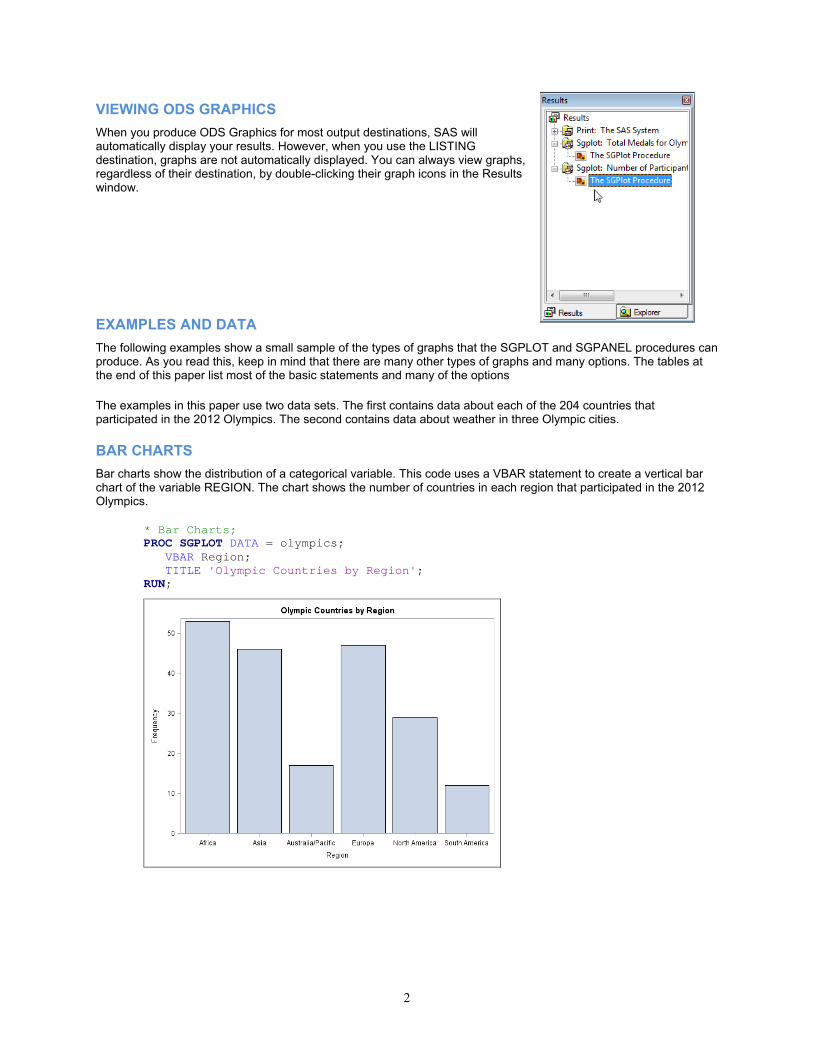
VIEWING ODS GRAPHICS
When you produce ODS Graphics for most output destinations, SAS will automatically display your results. However, when you use the LISTING destination, graphs are not automatically displayed. You can always view graphs, regardless of their destination, by double-clicking their graph icons in the Results window.
EXAMPLES AND DATA
The following examples show a small sample of the types of graphs that the SGPLOT and SGPANEL procedures can produce. As you read this, keep in mind that there are many other types of graphs and many options. The tables at the end of this paper list most of the basic statements and many of the options The examples in this paper use two data sets. The first contains data about each of the 204 countries that participated in the 2012 Olympics. The second contains data about weather in three Olympic cities.
BAR CHARTS
Bar charts show the distribution of a categorical variable. This code uses a VBAR statement to create a vertical bar chart of the variable REGION. The chart shows the number of countries in each region that participated in the 2012 Olympics.
* Bar Charts; PROC SGPLOT DATA = olympics; VBAR Region; TITLE 'Olympic Countries by Region'; RUN;

3
The next chart is like the first one except that the bars have been divided into groups using the GROUP= option. The grouping variable is a categorical variable named PopGroup. By default, SAS creates stacked bars. The GROUP= option can be used with many SGPLOT statements (see Table 1).
PROC SGPLOT DATA = olympics; VBAR Region / GROUP = PopGroup; TITLE 'Olympic Countries by Region and Population Group'; RUN;
You can specify side-by-side groups instead of stacked groups by adding the option GROUPDISPLAY = CLUSTER to the VBAR statement.
PROC SGPLOT DATA = olympics; VBAR Region / GROUP = PopGroup GROUPDISPLAY = CLUSTER; TITLE 'Olympic Countries by Region and Population Group'; RUN;
In the following code, the GROUP= option has been replaced with a RESPONSE= option. The response variable is TotalAthletes, the number of athletes from each country. Now each bar represents the total number of athletes for a region instead of the number of countries.

4
PROC SGPLOT DATA = olympics; VBAR Region / RESPONSE = TotalAthletes; TITLE 'Olympic Athletes by Region'; RUN;
HISTOGRAMS AND DENSITY PLOTS
Histograms show the distribution of a continuous variable. Density plots show standard distributions (either NORMAL or KERNEL) for the data, and are often drawn on top of histograms. You can overlay plots, and SAS will draw them in the order that the statements appear in your program. You should be careful to make sure that subsequent plots do not obscure earlier ones. In this example, the HISTOGRAM statement draws the distribution of the variable, TotalMedals, which is the total number of medals won by each country. Then the DENSITY statement overlays a normal density plot on top of the histogram.
* Histograms and density plots; PROC SGPLOT DATA = olympics; HISTOGRAM TotalMedals; DENSITY TotalMedals; TITLE 'Total Olympic Medals for Countries'; RUN;

5
SCATTER PLOTS Scatter plots show the relationship between two continuous variables. The following code uses a SCATTER statement to plot the number of athletes versus the number of medals for each country.
*Scatter Plot using SGPLOT; PROC SGPLOT DATA=olympics; SCATTER X = TotalAthletes Y = TotalMedals; TITLE 'Number of Athletes by Total Medals Won for Each Country'; RUN;
SERIES PLOTS In a series plot, the data points are connected by a line. This example uses the average monthly high temperature for three Olympic cities. There are three SERIES statements, one for each city. The Y variables are the high temperatures for each city. Data for series plots must be sorted by the X variable (Month, in this case). If your data are not already in the correct order, then use PROC SORT to sort the data before running the SGPLOT procedure.
* Series plot; PROC SGPLOT DATA = Weather; SERIES X = Month Y = LHigh; SERIES X = Month Y = SHigh; SERIES X = Month Y = RHigh; TITLE 'Average Monthly High Temperatures in Olympic Cities'; RUN;

6
SGPANEL PROCEDURE
The SGPANEL procedure produces nearly all the same types of graphs as SGPLOT, but instead of displaying only one plot per image, SGPANEL can display several plots in a single image. A separate plot is produced for each value of the variable you specify in the PANELBY statement.
The syntax for SGPANEL is almost identical to SGPLOT, so it is easy to convert SGPLOT code to SGPANEL by making just a couple changes to your code. To produce a panel of plots, replace the SGPLOT keyword with SGPANEL, and add the PANELBY statement. The PANELBY statement must appear before any statements that create plots. This graph is similar to the preceding scatter plot except that now there is a separate plot for each value of REGION.
*Scatter plots using SGPANEL; PROC SGPANEL DATA=olympics; PANELBY Region; SCATTER X = TotalAthletes Y = TotalMedals; TITLE 'Number of Athletes by Total Medals Won for Each Country'; RUN;
CUSTOMIZING GRAPHS
So far, the examples have shown how to create basic graphs. However, more often than not, people find that they want to customize their graphs in some way. The remaining examples show statements and options you can use to modify graphs.
XAXIS, YAXIS AND REFLINE STATEMENTS
In the preceding series plot, the variable on the X axis is Month. The actual values of Month are integers from 1 to 12, but the default labels on the X axis have values like 2.5 and 7.5. To fix this, the following code uses an XAXIS statement with the option TYPE = DISCRETE to tell SAS to use the actual data values. A YAXIS statement is used to specify a descriptive label and tick values (20 to 100 by 20). (Note that the label in the YAXIS statement uses inline formatting to specify the Unicode hexadecimal value for the degree symbol.) Reference lines can be added to any type of graph. In this example, a REFLINE statement is used to add reference lines at 32 and 75 degrees.
* Plot with XAXIS, YAXIS and REFLINE statements; PROC SGPLOT DATA = weather; SERIES X = Month Y = LHigh; SERIES X = Month Y = SHigh; SERIES X = Month Y = RHigh; XAXIS TYPE = DISCRETE; YAXIS LABEL = 'High Temperatures ((*ESC*){unicode '00B0'x}F)' VALUES = (20 TO 100 BY 20); REFLINE 32 75 / LABEL = ('32' '75'); TITLE 'Average High Temperatures in Olympic Cities'; RUN;

7
OPTIONS FOR PLOT STATEMENTS
Plot statements have many possible options. For these SERIES statements, three options have been added. The LEGENDLABEL= option can be used with any type of plot statement to substitute a text string for the name of a variable in the legend. The MARKERS option adds markers at the data points, and LINEATTRS= sets style attributes for the lines. The MARKERS and LINEATTRS= options can only be used with certain plot statements (see Table 1).
* Plot with options on plot statements; PROC SGPLOT DATA = weather; SERIES X = Month Y = LHigh / LEGENDLABEL = 'London' MARKERS LINEATTRS = (THICKNESS = 3); SERIES X = Month Y = SHigh / LEGENDLABEL = 'Sochi' MARKERS LINEATTRS = (THICKNESS = 3); SERIES X = Month Y = RHigh / LEGENDLABEL = 'Rio de Janeiro' MARKERS LINEATTRS = (THICKNESS = 3); XAXIS TYPE = DISCRETE; YAXIS LABEL = 'High Temperatures ((*ESC*){unicode '00B0'x}F)' VALUES = (20 TO 100 BY 20); REFLINE 32 75 / LABEL = ('32' '75'); TITLE 'Average High Temperatures in Olympic Cities'; RUN;

8
INSET AND KEYLEGEND STATEMENTS
The INSET statement is an easy way to add explanatory text to your graphs, and the KEYLEGEND statement gives you control over the legend.
* Plot with INSET and KEYLEGEND statements; PROC SGPLOT DATA = weather; SERIES X = Month Y = LHigh / LEGENDLABEL = 'London' MARKERS LINEATTRS = (THICKNESS = 3); SERIES X = Month Y = SHigh / LEGENDLABEL = 'Sochi' MARKERS LINEATTRS = (THICKNESS = 3); SERIES X = Month Y = RHigh / LEGENDLABEL = 'Rio de Janeiro' MARKERS LINEATTRS = (THICKNESS = 3); XAXIS TYPE = DISCRETE; YAXIS LABEL = "High Temperatures ((*ESC*){unicode '00B0'x}F)" VALUES = (20 TO 100 BY 20); REFLINE 32 75 / LABEL = ('32' '75'); TITLE 'Average High Temperatures in Olympic Cities'; INSET 'Source worldweatheronline.com'/ POSITION = TOPRIGHT; KEYLEGEND / LOCATION = INSIDE POSITION = BOTTOMLEFT DOWN = 3 NOBORDER; RUN;
CHANGING THE ODS STYLE TEMPLATE
The following code creates a bar chart using the default ODS style template and destination. Starting with SAS 9.3, the default destination is HTML and the default style template is HTMLBLUE.
* Bar chart with default style; PROC SGPLOT DATA = olympics; VBAR Region / GROUP = PopGroup; TITLE 'Olympic Countries by Region and Population Group'; RUN;

9
You can use the STYLE= option in an ODS destination statement to specify a style for your output including graphs. The following code includes an ODS HTML statement that changes the style to JOURNAL.
* Change ODS style template; ODS HTML STYLE = JOURNAL; PROC SGPLOT DATA = olympics; VBAR Region / GROUP = PopGroup; TITLE 'Olympic Countries by Region and Population Group'; RUN;
You can use the same style templates for graphs as you do for tabular output. However, some styles are better suited for statistical graphs than others. The following styles are recommended for graphical results.
Desired Output Style Template Default for Destination Color ANALYSIS DEFAULT HTML (in SAS 9.2) HTMLBLUE HTML (starting with SAS 9.3) LISTING LISTING (graphs only) PRINTER PRINTER, PDF, PS RTF RTF STATISTICAL Gray scale JOURNAL Black and white JOURNAL2

10
Every destination has a default style associated with it. So be aware that if you change the destination for a graph, its appearance may change too.
CHANGING THE ODS DESTINATION
You can send ODS Graphics output to any ODS destination, and you do it in the same way that you would for tabular output, using ODS statements for that destination. These statements send a bar chart to the PDF destination.
* Send graph to PDF destination; ODS PDF FILE = 'c:\MyPDFFiles\BarChart.pdf'; PROC SGPLOT DATA = olympics; VBAR Region / GROUP = PopGroup; TITLE 'Olympic Countries by Region and Population Group'; RUN; ODS PDF CLOSE;
SAVING ODS GRAPHICS OUTPUT AND ACCESSING INDIVIDUAL GRAPHS
If you are creating graphs for insertion into a document or slide show, you can simply copy and paste your images from the window in SAS. But if you need to save your graphs as separate files, the process is a little more complicated.
For most destinations (including RTF and PDF), graphs are integrated with tabular output into a single file. For these destinations, you can use the FILE= option to tell SAS where to save your output. The following statement would create RTF output and save it in a file named Report.rtf in a folder named MyRTFFiles.
ODS RTF FILE = 'c:\MyRTFFiles\Report.rtf;
However, when you send output to the LISTING or HTML destinations, graphs are saved in individual files separate from tabular output. Starting with SAS 9.3, by default, these files are saved in the same folder as your SAS WORK library (and therefore will be erased when you exit SAS). In SAS 9.2 these files are saved in your current SAS working directory (and therefore are not erased). In the SAS windowing environment, the path of the current SAS working directory appears in the lower-right corner of the SAS window.
For the LISTING and HTML destinations, you can use the GPATH= option to tell SAS where to save individual graphs. This statement would save all graphs sent to the HTML destination in a folder named MyGraphs.
ODS HTML GPATH = 'c:\MyGraphs';
For the HTML destination, these individual graph files are linked to your HTML file so that they appear integrated with tabular output when viewed in a Web browser. Therefore, when you send graphical output to the HTML destination, you must be careful to save those files in directories where they can be found by anyone who displays the HTML file in a Web browser.

11
SPECIFYING PROPERTIES OF IMAGES
Using the ODS GRAPHICS statement, you can control many aspects of your graphics files including the image format, name, height, and width. LISTING is the best destination for this since it offers the most image formats, and saves images in separate files. Here are a few of the options you can specify in the ODS GRAPHICS statement:
Option Description Example OUTPUTFMT= specifies image format OUTPUTFMT = JPEG IMAGENAME= specifies base filename for image IMAGENAME = 'MyGraph' HEIGHT= specifies height HEIGHT = 4IN WIDTH= specifies width WIDTH = 8CM RESET resets any preceding options to default values RESET
Image formats supported for the LISTING destination include PNG (the default), BMP, GIF, JPEG, JPG, PDF, PS, TIFF, and many others.
The default name for an image file is the name of its ODS output object. (You can use ODS TRACE statements to find the name of any ODS output object.) SAS will append numerals to the end of the image name. For example, if you specified an image name of Olympic, then the files would be named Olympic, Olympic1, Olympic2, Olympic3, and so on. If you rerun your code, SAS will, by default, continue counting so that your graphics files will not be overwritten. If you want to start at zero each time you run your code, then specify the RESET option before the IMAGENAME= option.
In most cases, the default size for graphs is 640 pixels wide by 480 pixels high. If you specify only one dimension (width but not height, or vice versa), then SAS will adjust the other dimension to maintain a default aspect ratio of 4/3. You can specify width and height in these units: CM, IN, MM, PT, or PX.
The following code creates a graph in JPEG format that is 2 inches by 3 inches. The file will be named Final.jpeg and will be saved in a folder named MyGraphs. In such a small image, a legend can take an inordinate amount of space. You can eliminate the legend by adding the NOAUTOLEGEND option to the PROC statement.
* Change image properties; ODS LISTING GPATH = 'c:\MyGraphs'; ODS GRAPHICS / RESET IMAGENAME = 'Final' OUTPUTFMT = JPEG HEIGHT = 2in WIDTH = 3in; PROC SGPLOT DATA = olympics NOAUTOLEGEND; HISTOGRAM TotalMedals; DENSITY TotalMedals; TITLE 'Total Medals for Olympic Countries'; RUN;
TABLES SHOWING SGPLOT AND SGPANEL PROCEDURE SYNTAX
The five tables spread over the next seven pages summarize the statements and options for the SGPLOT and SGPANEL procedures. Even with all the options listed in these tables, this is just a small sample. For a complete list of available options, see the SAS Help and Documentation.

12
Table 1. Compatibility and syntax of SGPLOT and SGPANEL plot statements.
Type of Plot and Syntax S
CA
TT
ER
SE
RIE
S
ST
EP
NE
ED
LE
VE
CT
OR
BU
BB
LE
BA
ND
HIG
HLO
W
RE
G
LOE
SS
PB
SP
LIN
E
ELL
IPS
E1
HB
OX
/VB
OX
HIS
TO
GR
AM
DE
NS
ITY
HB
AR
/VB
AR
HLI
NE
/VLI
NE
DO
T
Basic X Y Plots plotname X=var Y=var / options;
SCATTER SERIES
STEP NEEDLE VECTOR
BUBBLE X=var Y=var SIZE=var / options;BUBBLE
Band and Highlow Plots BAND X=var UPPER=var LOWER=var / options; (You can also specify numeric values for upper and lower.)
BAND HIGHLOW X=var HIGH=var LOW=var / options; (You can also specify numeric values for high and low.)
HIGHLOW Fit and Confidence Plots plotname X=var Y=var / options;
REG LOESS
PBSPLINE ELLIPSE1
Distribution Graphs – Continuous DATA plotname response-var / options;
HBOX or VBOX
HISTOGRAM
DENSITY
Distribution Graphs – Categorical DATA plotname category-var / options;
HBAR or VBAR HLINE or VLINE
DOT
Selected Options in Plot Statements GROUP
/GROUP=var;
TRANSPARENCY /TRANSPARENCY=n;
MARKERS /MARKERS;
LEGENDLABEL /LEGENDLABEL= ’text-string’;
FILLATTRS /FILLATTRS= (attribute=value);
LINEATTRS /LINEATTRS= (attribute=value);
MARKERATTRS /MARKERATTRS= (attribute=value);
1 The ELLIPSE statement is not available for SGPANEL.

13
Table 2. SGPLOT and SGPANEL plot statements. SYNTAX SELECTED OPTIONSSCATTER
SCATTER X=var Y=var/options;
DATALABEL=var Displays a label for each DATA
point
NOMISSINGGROUP Excludes observations with missing values for group variable
SERIES
SERIES X=var Y=var/options;
CURVELABEL Labels the series curve using the
Y variable label
DATALABEL=var Displays label for each data point. If no variable then values of Y are used.
NOMISSINGGROUP Excludes observations with missing values for group variable
STEP
STEP X=var Y=var/options;
CURVELABEL Labels the step curve using the Y
variable label
NEEDLE
NEEDLE X=var Y=var/options;
BASELINE=n Specifies a numeric value on the
Y axis for the baseline
VECTOR
VECTOR X=var Y=var/options;
XORIGIN=n Specifies X coordinate for origin,
either numeric value or numeric variable.
YORIGIN=n Specifies Y coordinate for origin, either numeric value or numeric variable.
BUBBLE
BUBBLE X=var Y=var Size=var/options;
FILL Specifies if fill is visible or not NOFILL
OUTLINE Specifies if outline is visible or not NOOUTLINE
BAND
BAND X=var UPPER=var LOWER=var/options;
FILL Specifies if fill is visible or not NOFILL
OUTLINE Specifies if outline is visible or not NOOUTLINE
HIGHLOW
HIGHLOW X=var HIGH=var LOW=var/options;
NOMISSINGGROUP Excludes observations with
missing values for group variable
TYPE= Specifies type of plot: BAR or LINE(default)
14
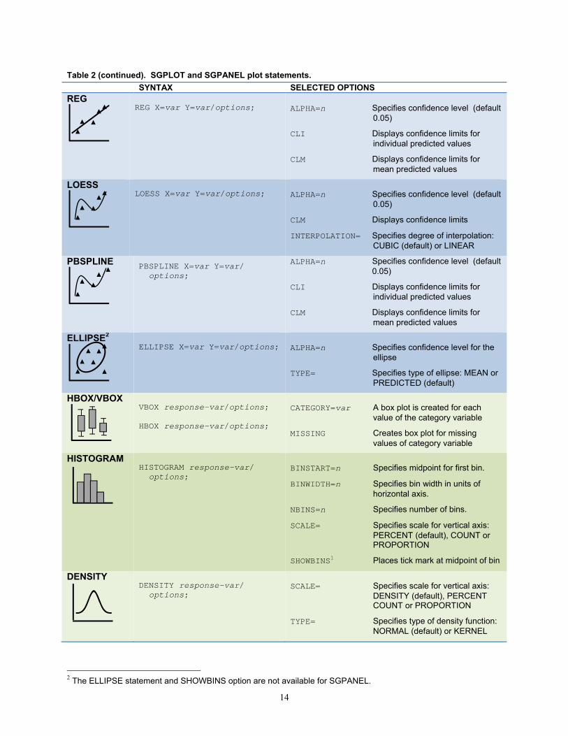
Table 2 (continued). SGPLOT and SGPANEL plot statements. SYNTAX SELECTED OPTIONSREG
REG X=var Y=var/options;
ALPHA=n Specifies confidence level (default
0.05)
CLI Displays confidence limits for individual predicted values
CLM Displays confidence limits for mean predicted values
LOESS
LOESS X=var Y=var/options;
ALPHA=n Specifies confidence level (default
0.05)
CLM Displays confidence limits
INTERPOLATION= Specifies degree of interpolation: CUBIC (default) or LINEAR
PBSPLINE
PBSPLINE X=var Y=var/ options;
ALPHA=n Specifies confidence level (default 0.05)
CLI Displays confidence limits for individual predicted values
CLM Displays confidence limits for mean predicted values
ELLIPSE2
ELLIPSE X=var Y=var/options;
ALPHA=n Specifies confidence level for the
ellipse
TYPE= Specifies type of ellipse: MEAN or PREDICTED (default)
HBOX/VBOX
VBOX response-var/options; HBOX response-var/options;
CATEGORY=var A box plot is created for each
value of the category variable
MISSING Creates box plot for missing values of category variable
HISTOGRAM
HISTOGRAM response-var/ options;
BINSTART=n Specifies midpoint for first bin.
BINWIDTH=n Specifies bin width in units of horizontal axis.
NBINS=n Specifies number of bins.
SCALE= Specifies scale for vertical axis: PERCENT (default), COUNT or PROPORTION
SHOWBINS1 Places tick mark at midpoint of bin
DENSITY
DENSITY response-var/ options;
SCALE= Specifies scale for vertical axis:
DENSITY (default), PERCENT COUNT or PROPORTION
TYPE= Specifies type of density function: NORMAL (default) or KERNEL
2 The ELLIPSE statement and SHOWBINS option are not available for SGPANEL.

15
Table 2 (continued). SGPLOT and SGPANEL plot statements. SYNTAX SELECTED OPTIONSHBAR/VBAR
VBAR category-var/options; HBAR category-var/options;
BARWIDTH=n Specifies numeric value for width
of bars (default 0.8)
DATALABEL=var Displays label for each bar
GROUPDISPLAY= Specifies how to display grouped bars: STACK (default) or CLUSTER
MISSING Includes a bar for missing values
RESPONSE=var Specifies a numeric response variable for plot
STAT= Specifies statistic for axis of response variable (if specified): MEAN, or SUM (default)
HLINE/VLINE
VLINE category-var/options; HLINE category-var/options;
RESPONSE=var Specifies numeric response
variable for plot
STAT= Specifies statistic for axis of response variable (if specified): MEAN, or SUM (default)
DOT
DOT category-var/options; RESPONSE=var Specifies numeric response variable for plot
STAT= Specifies statistic for axis of response variable (if specified): MEAN, or SUM (default)
LIMITSTAT= Specifies statistic for limit lines (must use STAT=MEAN): CLM (default), STDDEV, or STDERR
16
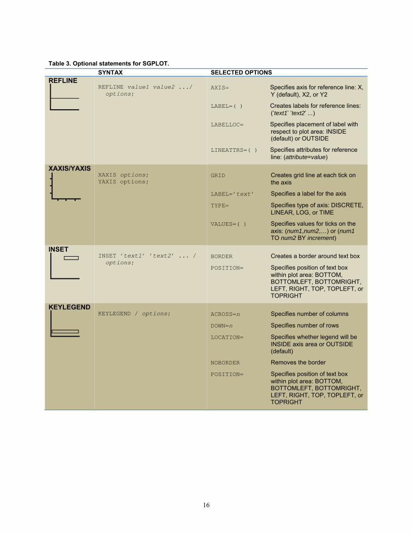
Table 3. Optional statements for SGPLOT. SYNTAX SELECTED OPTIONSREFLINE
REFLINE value1 value2 .../ options;
AXIS= Specifies axis for reference line: X,
Y (default), X2, or Y2
LABEL=( ) Creates labels for reference lines: (’text1’ ’text2’ ...)
LABELLOC= Specifies placement of label with respect to plot area: INSIDE (default) or OUTSIDE
LINEATTRS=( ) Specifies attributes for reference line: (attribute=value)
XAXIS/YAXIS
XAXIS options; YAXIS options;
GRID Creates grid line at each tick on
the axis
LABEL=’text’ Specifies a label for the axis
TYPE= Specifies type of axis: DISCRETE, LINEAR, LOG, or TIME
VALUES=( ) Specifies values for ticks on the axis: (num1,num2,…) or (num1 TO num2 BY increment)
INSET
INSET ’text1’ ’text2’ ... / options;
BORDER Creates a border around text box
POSITION= Specifies position of text box within plot area: BOTTOM, BOTTOMLEFT, BOTTOMRIGHT, LEFT, RIGHT, TOP, TOPLEFT, or TOPRIGHT
KEYLEGEND
KEYLEGEND / options;
ACROSS=n Specifies number of columns
DOWN=n Specifies number of rows
LOCATION= Specifies whether legend will be INSIDE axis area or OUTSIDE (default)
NOBORDER Removes the border
POSITION= Specifies position of text box within plot area: BOTTOM, BOTTOMLEFT, BOTTOMRIGHT, LEFT, RIGHT, TOP, TOPLEFT, or TOPRIGHT

17
Table 4. Optional statements for SGPANEL. SYNTAX SELECTED OPTIONSRequired PANELBY
PANELBY var1 var2 .../ options;
COLUMNS=n Specifies number of columns
ROWS=n Specifies number of rows
LAYOUT= Determines how panels are laid out: PANEL (default), LATTICE, COLUMNLATTICE, or ROWLATTICE
MISSING Includes observations with missing values of PANELBY variable
NOVARNAME Eliminates the variable name in the heading for the cell
SPACING=n Specifies number of pixels between rows and columns (default 0)
UNISCALE= Specifies which axes share values, either ALL (default), COLUMN, or ROW
Optional
REFLINE
REFLINE value1 value2 .../ options;
AXIS= Specifies axis for reference line: X,
Y (default), X2, or Y2
LABEL=( ) Creates labels for reference lines: (’text1’ ’text2’ ...)
LINEATTRS=( ) Specifies attributes for reference line: (attribute=value)
COLAXIS/ ROWAXIS
COLAXIS options; ROWAXIS options;
GRID Creates grid line at each tick on
the axis
LABEL=’text’ Specifies a label for the axis
TYPE= Specifies type of axis: DISCRETE, LINEAR, LOG, or TIME
VALUES=( ) Specifies values for ticks on the axis: (num1,num2,…) or (num1 TO num2 BY increment)

18
Table 5. Attribute options for plot statements. SYNTAX ATTRIBUTESFILLATTRS
/FILLATTRS=(attribute=value);
COLOR= Specifies RGB notation such
as #FF0000 (red) or named value such as RED
LINEATTRS
/LINEATTRS=(attribute=value);
COLOR= Specifies RGB notation such
as #FF0000 (red) or named value such as RED
PATTERN= Specifies pattern for line including: SOLID, DASH, SHORTDASH, LONGDASH, DOT, DASHDASHDOT, and DASHDOTDOT
THICKNESS= Specifies thickness of line. Value can include units: CM, IN, MM, PCT, PT, or PX (default)
MARKERATTRS
/MARKEREATTRS= (attribute=value);
COLOR= Specifies RGB notation such
as #FF0000 (red) or named value such as RED
SIZE= Specifies size of marker. Value can include units: CM, IN, MM, PCT, PT, or PX (default)
SYMBOL= Specifies symbol for marker including: CIRCLE, CIRCLEFILLED, DIAMOND, DIAMONDFILLED, PLUS, SQUARE, SQUAREFILLED, STAR, STARFILLED, TRIANGLE, and TRIANGLEFILLED
19
CONCLUSIONS
ODS Graphics and the SGPLOT procedure provide a versatile and easy-to-use way of producing high quality graphs using SAS. Once you have learned SGPLOT, you can easily produce a panel of plots by converting your SGPLOT code to SGPANEL. Because it is part of the Output Delivery System, you can use the same styles and destinations that you use for tabular output.
REFERENCES
Central Intelligence Agency (2007). “The World Factbook.” http://www.cia.gov/cia/publications/factbook/index.html.
Delwiche, L. D. Slaughter, S. J. (2012). The Little SAS Book: A Primer, Fifth Edition. SAS Institute, Cary, NC.
Mantange, S. Heath, D. (2011). Statistical Graphics Procedures by Example: Effective Graphs Using SAS. SAS Institute, Cary, NC.
SAS Institute Inc. (2013). SAS® 9.4 ODS Graphics: Procedures Guide, Second Edition. Cary, NC: SAS Institute Inc.
ACKNOWLEDGEMENTS
The authors would like to thank Andre Wielki who collected and shared with us the data about medals awarded at the 2012 Olympic games.
ABOUT THE AUTHORS
Lora Delwiche and Susan Slaughter are the award-winning authors of The Little SAS Book: A Primer and The Little SAS Book for Enterprise Guide which are published by SAS Institute. The authors may be contacted at:
Susan J. Slaughter [email protected] Lora D. Delwiche [email protected]
SAS and all other SAS Institute Inc. product or service names are registered trademarks or trademarks of SAS Institute Inc. in the USA and other countries. ® indicates USA registration. Other brand and product names are trademarks of their respective companies.
Related Documents