Dialectic Volume I, Issue I: Position Paper On Web Brutalism and Contemporary Web Design aaROn Ganci1 and bRUnO RibeiRO2 1. Indiana University Herron School of Art and Design (iUpUi ), Indianapolis, Indiana, Usa 2. California Polytechnic State University, San Luis Obispo, California, Usa sUGGested citatiOn: Ganci, A., & Ribeiro, B. “On Web Brutalism and Contemporary Web Design.” Dialectic, 1.1 (2016): pgs. 91-110. dOi: http://dx.doi.org/10.3998/dialectic.14932326.0001.107 Abstract This paper acknowledges and frames the controversial Web Brutalism movement in and around contemporary web-based interaction design, and subsequently raises critical questions about its influence on present and future web design strategies and practices. This inquiry is informed and facilitated by a comparison of two distinct perspectives. Professor Ganci contends that this movement has the potential to have a generally positive affect, and that it is a welcome response to the homogenization of a limited set of aesthetic con- ventions and practices that have become pervasive across the web. Professor Ganci further argues that because it has become fairly easy to create websites that “fit the mold and that look great,” this type of idle, sans-design-thinking approach will eventually lead to web design failures, as it co- erces web designers to engage in formulaic processes that sacrifice real invention and innovation centered on meeting well-understood user and audience needs and desires. The ability to make, rather than design, web-based interactions that are derived from various templates and other one- size-fits-all approaches is posited as a severe limitation, with Web Brutalism posited as a counter to this, and as an effective, relatively new type of catalyzer to web design strategies and tactics. Professor Ribeiro contends that Web Brutalism is nothing more than a momentary distrac- tion from a more crucial set of issues contemporary and near-future web designers face, such as usability, scalability, adaptability, and, especially, broad accessibility. Twenty-plus years into its de- velopment, the web is still fairly inaccessible to people who have physical disabilities, or who must access the internet through slow connections and underpowered devices, or who have limited access to internet connectivity or electricity. This paper raises questions regarding perception, usability, effective communication, mean- ingful innovation, and what added and evolved responsibilities designers should assume in the con- text of contemporary web design. The discourse that has been initiated here needs to continue in order to reveal the expansive potential of design across the web. Copyright © 2016, Dialectic and the AIGA Design Educators Community (DEC).All rights reserved.

Welcome message from author
This document is posted to help you gain knowledge. Please leave a comment to let me know what you think about it! Share it to your friends and learn new things together.
Transcript
Dialectic Volume I, Issue I: Position Paper
On Web Brutalism and Contemporary Web Design
aaROn Ganci1 and bRUnO RibeiRO2
1. Indiana University Herron School of Art and Design (iUpUi), Indianapolis, Indiana, Usa
2. California Polytechnic State University, San Luis Obispo, California, Usa
sUGGested citatiOn: Ganci, A., & Ribeiro, B. “On Web Brutalism and Contemporary Web Design.” Dialectic, 1.1 (2016): pgs. 91-110.
dOi: http://dx.doi.org/10.3998/dialectic.14932326.0001.107
Abstract
This paper acknowledges and frames the controversial Web Brutalism movement in and around
contemporary webbased interaction design, and subsequently raises critical questions about its
influence on present and future web design strategies and practices. This inquiry is informed and
facilitated by a comparison of two distinct perspectives.
Professor Ganci contends that this movement has the potential to have a generally positive
affect, and that it is a welcome response to the homogenization of a limited set of aesthetic con
ventions and practices that have become pervasive across the web. Professor Ganci further argues
that because it has become fairly easy to create websites that “fit the mold and that look great,”
this type of idle, sansdesignthinking approach will eventually lead to web design failures, as it co
erces web designers to engage in formulaic processes that sacrifice real invention and innovation
centered on meeting wellunderstood user and audience needs and desires. The ability to make,
rather than design, webbased interactions that are derived from various templates and other one
sizefitsall approaches is posited as a severe limitation, with Web Brutalism posited as a counter
to this, and as an effective, relatively new type of catalyzer to web design strategies and tactics.
Professor Ribeiro contends that Web Brutalism is nothing more than a momentary distrac
tion from a more crucial set of issues contemporary and nearfuture web designers face, such as
usability, scalability, adaptability, and, especially, broad accessibility. Twentyplus years into its de
velopment, the web is still fairly inaccessible to people who have physical disabilities, or who must
access the internet through slow connections and underpowered devices, or who have limited
access to internet connectivity or electricity.
This paper raises questions regarding perception, usability, effective communication, mean
ingful innovation, and what added and evolved responsibilities designers should assume in the con
text of contemporary web design. The discourse that has been initiated here needs to continue in
order to reveal the expansive potential of design across the web.
Copyright © 2016, Dialectic and the AIGA Design Educators Community (DEC).All rights reserved.

93
poSItIon pApER
On Web Brutalism and Contemporary Web Design
AARon GAnCI
bRUno RIbEIRo
Introduction
As we pass the twenty-year mark of visual design on the web, a new trend has
emerged over the course of the last two to three years: Web Brutalism. This
movement, or trend, in web design is guided by design processes that ensure
the interface design of given websites are anything but user-friendly and aes-
thetically appealing. Websites like Bloomberg Businessweek Features, Lifeaction-
revival, The Drudge Report and, perhaps most well-known of all, Craigslist have
been designed purposefully to inhibit ease-of-use and to not appear profession-
ally polished. Brutalist websites are also intentionally built to be rough, to be
coded so that they appear to be uncomfortable for many audiences and users to
interact with. Aesthetically and functionally, web brutalism can trace a portion
of its roots to the mid 1990s and a time when web interfaces were much less af-
fected by template-based design and functionalities that seek to manipulate par-
ticular types of user behaviors. (The term “brutalism” originated in the 1970s
as a means to describe mostly institutional architecture that featured large, aes-
thetically heavy buildings that featured vast expanses of exposed concrete.)
For the moment, Web Brutalism is a niche movement, but it gives us
pause and challenges the discipline of interaction design, and, more specifically,
web design to reflect on the following questions: What roles does visual design
play in the creation and evolving life of a website? What kind of place in the
web design process should innovation and best practices have? How should we
dialectic: volume i, issue i
94
define what constitutes quality in web design processes and their outcomes?
As designers, these are important questions that we must confront effectively,
or risk creating interactive experiences that inhibit usability, create mispercep-
tions, or that waste our users precious time. The central ideas articulated in
this paper will begin to examine these questions by reflecting on what the exis-
tence of Web Brutalism says about the design processes that inform and guide
the look and feel of much of the contemporary web.
Akin to the architectural movement that gave rise to the term, Brutal-
ist websites reject the polish and formulaic structures that have become ubiq-
uitous across an increasingly homogenized web. The blog Brutalist Websites 1
showcases sites that its creators believe effectively demonstrate the Brutalist
aesthetic and the often handmade, or “crude” coding that facilitates the deliv-
ery of the content of these websites. Pascal Deville, the site’s editor, defines the
movement as follows: “In its ruggedness and lack of concern to look comfort-
able or easy, Brutalism can be seen as a reaction by a younger generation to the
lightness, optimism, and frivolity of today’s web design.” Moreover, while the
borders and concrete definitions of this movement are inexact, Brutalist web-
sites can be broadly defined by their general rejection of the ostensible drive to-
ward perfection that permeates so much of contemporary web design through
the use of repeatable visual patterns and standardized layout conventions.
Labeling the sites Deville has identified as Brutalist feels like a bit of
a stretch — its parameters, if they can be called that, and aesthetic signifiers,
are difficult to define specifically — and the movement is still relatively small.
While these sites embrace the utilization of raw material (in this case primitive
HTML and aesthetically rough graphic form), and they also reject the formula
of contemporary design — just as the original Brutalist architects of the 1970s
rejected Modernism and the International Style — many of them could be
described as fitting the descriptions of the following variety variety of labels:
Minimalist, Avant-garde, or one of several flavors of Postmodern. That stated,
websites like these are unified in that those who have created them have made
a conscious effort to distinguish both their visual appearance and the nature
of their interactivity from the conventional. Brutalist websites are designed to
engage the viewer in a hostile way. They frequently utilize the rough aesthetics
of the early web, circa 1994–98, in raw and dissonant ways. Their formal config-
urations and facilitation of interactive functions break nearly every commonly
held modern design convention, which forces the viewer to be fully present
during his / her engagement with one of these websites in order to comprehend
1Deville, P. Brutalist Websites.
Online. Available at:
http://brutalistwebsites.com/.
(Accessed 25 May 2016).
95
their content. This tends to elicit strong reactions and opinions from both us-
ers and members of the design community. These types of websites also often
do not utilize traditional navigation, and often mask the placement of the cur-
sor. Perhaps most interestingly, they invite us to question the viability and effi-
cacy of many well-established aesthetic and functional conventions that guide
the design of so many modern web interfaces.
While Web Brutalism has been relatively quiet during its short life
simply due to its limited scope (most of the sites on Brutalist Websites are
personal in nature, and there are just not that many of them out there), the
approach is starting to move into the view of the general public with sites
like Adult Swim and Bloomberg. Some of these websites have also been gain-
ing attention in the popular press, 2 with articles like “The hottest trend in
Web design is making intentionally ugly, difficult sites” recently appearing in
The Washington Post. 3 So — how should we think about these discordantly
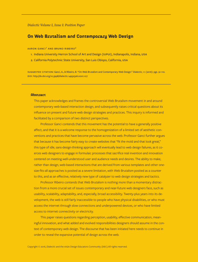
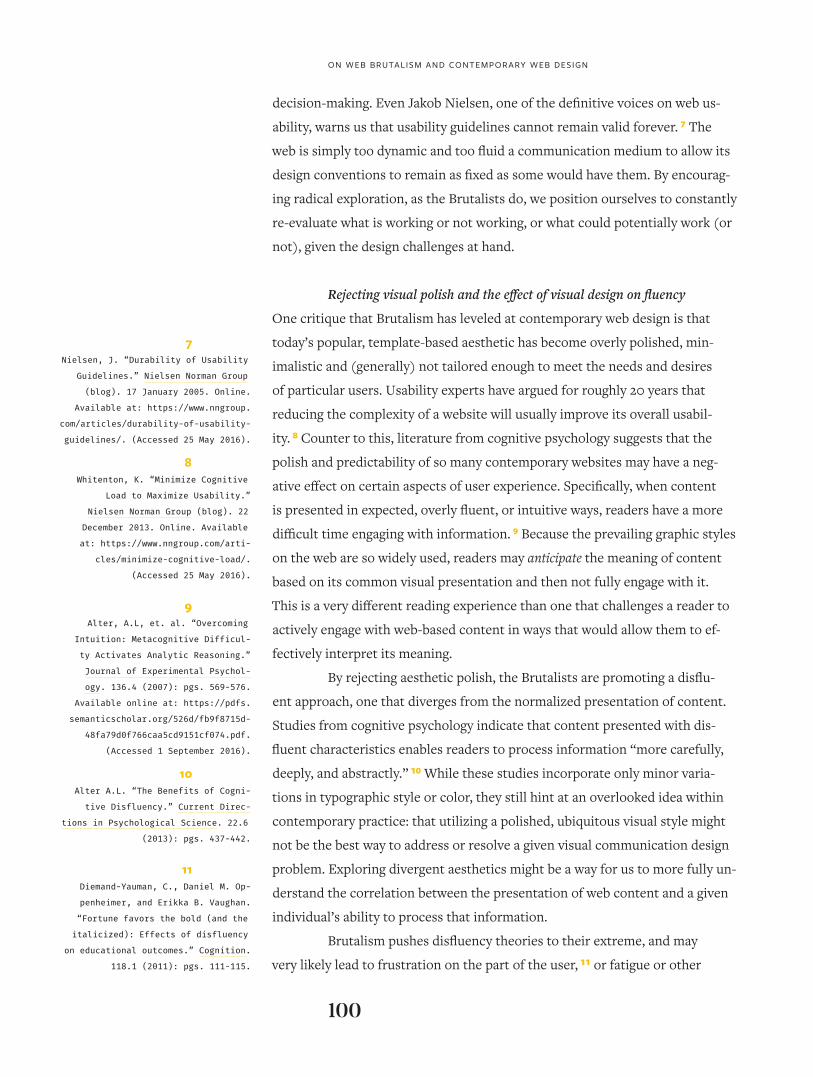
FiGURe 1: Deadly Sports Tragedy (deadlysportstragedy.com) fits the profile of a Brutalist website. According to its designer, Ben Patterson, the site “capture[s] the intensity and coarseness of professional sports broadcasts.”
2Budds, D. “The Internet’s 10
‘Ugliest’ Websites.” Fast Company,
25 May 2016. Online. Available at:
http://www.fastcodesign.com/3060196/
the-internets-10-ugliest-websites.
(Accessed 25 May 2016).
3Arcement, K. “The hottest trend in
Web design is making intentionally
ugly, difficult sites.” The Wash-
ington Post, 9 May 2016. Online.
https://www.washingtonpost.com/
news/the-intersect/wp/2016/05/09/
the-hottest-trend-in-web-design-is-
intentionally-ugly-unusable-sites/.
(Accessed 25 May 2016).
96
designed interfaces that sit at the fringe of web design? What do they say about
the utility of particular aesthetic approaches and frameworks? What do they
reveal about how and why the practice of designing websites has evolved as it
has, specifically as it relates to an increasing reliance on broadly accepted con-
ventions and patterns? Do Brutalist websites mark a renaissance of innovation,
or are they merely an ostentatious distraction?
We argue that the Brutalist Web movement is both good and bad for
contemporary web design. Each co-author of this piece has come to this inqui-
ry with a distinct point of view: Professor Ganci contends that this movement
can have a generally positive affect on the evolution of web design, with Profes-
sor Ribeiro contending that it is nothing more than a momentary distraction.
In the following sections of this piece, we will each argue to promote our rela-
tive positions. The discourse that follows is purposefully provocative, and is in-
tended to raise and contextually frame more questions than it answers. In the
end, we will summarize our respective analyses and describe how we believe
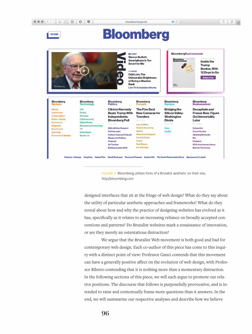
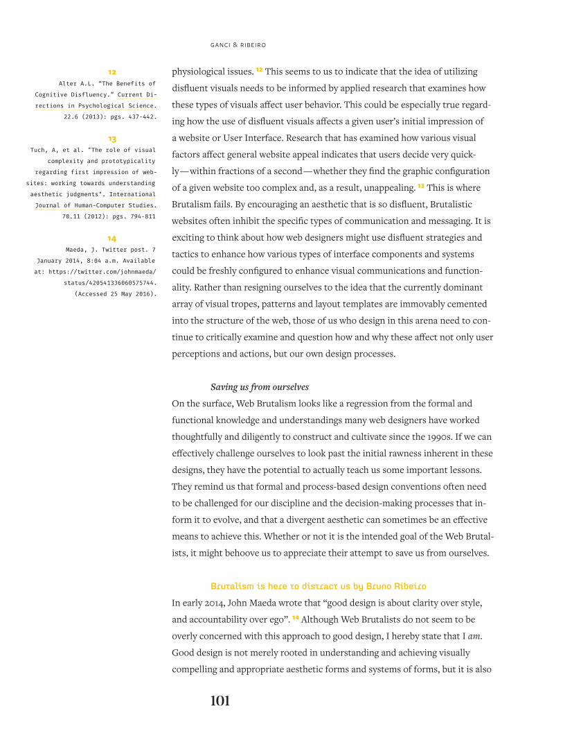
FiGURe 2: Bloomberg utilizes hints of a Brutalist aesthetic on their site, http://bloomberg.com
97
GAnCI & RIbEIRo
they can begin to help the web design community move effectively forward
across common ground.
Brutalism is here to save us by Aaron Ganci
Most web design that exists across the internet of 2016-17 is boring. Too many
of us who practice and teach it have become complacent, or, worse, merely ef-
ficient. Web Brutalism is here to show us the error of our staid, formulaic ways.
It is a necessary intervention for us, a shrill wake-up call designed to shock us
out of our current state of complacency.
It is easy to look at examples of Brutalist websites and opine that
their creators are naïve or self-interested. While I agree with this assessment
on some levels, I argue that their approaches have a good deal to teach us
about the current state of our industry, if we would simply take the time to
examine these more closely and critically. It is not easy to look upon these
sites as types of saviors that can redeem us from the pervasive banality that
now affects so much of contemporary web design, but, in ways that mirror the
behavior of an individual undergoing a psychological or social intervention,
web designers have gotten good at denying that we have a problem. Before I
address how I think Brutalism can save us, I will quickly discuss the current
state of the discipline, and explain how we developed the need for an inter-
vention in the first place.
Uniformity within contemporary practice
When encountering a Brutalist site, a viewer will likely have a strong-but-jus-
tified emotional or even visceral reaction. Aesthetically, as was often the case
with many websites that were designed and operated during the 1990s, today’s
Brutalist sites are often not good by contemporary aesthetic or functional
standards. We have that strong reaction today because of a prevailing, fairly
rigid set of ideas about how “good” websites should look and perform. This has
become especially true in recent years because of the assertion of two primary
factors. First, the act of building a website has become much easier due to ad-
vances in both the design and development arenas. This has resulted in broad
cross sections of websites becoming much more formulaic in their appearance
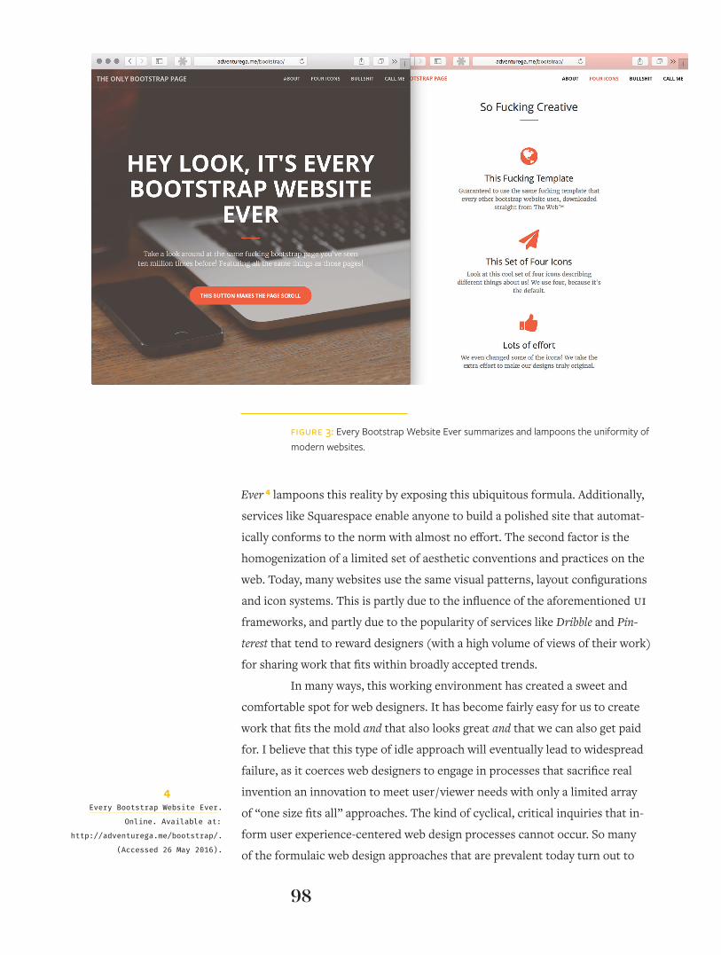
and behavior. UI (user interface) frameworks, like Bootstrap, Foundation, and
Semantic UI allow designers to build a site quite quickly but have, in turn, sys-
tematized layout conventions and the appearance and functionality of many
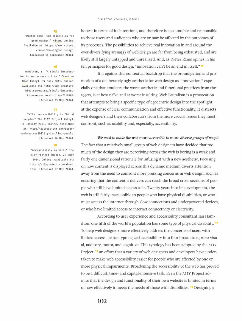
design elements in the process. The satirical website Every Bootstrap Website
98
Ever 4 lampoons this reality by exposing this ubiquitous formula. Additionally,
services like Squarespace enable anyone to build a polished site that automat-
ically conforms to the norm with almost no effort. The second factor is the
homogenization of a limited set of aesthetic conventions and practices on the
web. Today, many websites use the same visual patterns, layout configurations
and icon systems. This is partly due to the influence of the aforementioned UI frameworks, and partly due to the popularity of services like Dribble and Pin-
terest that tend to reward designers (with a high volume of views of their work)
for sharing work that fits within broadly accepted trends.
In many ways, this working environment has created a sweet and
comfortable spot for web designers. It has become fairly easy for us to create
work that fits the mold and that also looks great and that we can also get paid
for. I believe that this type of idle approach will eventually lead to widespread
failure, as it coerces web designers to engage in processes that sacrifice real
invention an innovation to meet user / viewer needs with only a limited array
of “one size fits all” approaches. The kind of cyclical, critical inquiries that in-
form user experience-centered web design processes cannot occur. So many
of the formulaic web design approaches that are prevalent today turn out to
FiGURe 3: Every Bootstrap Website Ever summarizes and lampoons the uniformity of modern websites.
4Every Bootstrap Website Ever.
Online. Available at:
http://adventurega.me/bootstrap/.
(Accessed 26 May 2016).
99
poSItIon pApER
yield “good enough” solutions 5 for many contemporary UI designs, but that is
all they are, and they tend toward the predictable, the banal, the “’been there,
done that.” By breaking away from these current, prevalent-yet-conventional
approaches, we position ourselves and the design processes we devise and op-
erate more effectively to resolve many of the communication and interaction
problems we encounter now, and will encounter in the near future.
The thoughtfulness of Brutalism
There are many aspects of Brutalism that will not — and should not — trans-
late into popular web design vernacular. However, we should consider bor-
rowing some its most effective aesthetic and functional features as we move
forward. Doing so will help more web designers break away from the trend of
template-based uniformity and allow us to continue to innovate in tangible,
meaningful and productive ways. In this context, two aspects of Web Brutalism
are most pertinent: adopting and operating a skeptical approach to the design
process, and a rejection of the type of banal, visual polish that has become all
too ubiquitous across the modern web.
Questioning conventions with a skeptical approach
The web design conventions so many of us use today have been contextualized
and defined through a continuous process of two decades’ worth of testing and
refinement. This is a good thing — it exemplifies the action research-based, dy-
namically iterative aspects of the web design process. Along the way, a diverse
array of user-centered studies have been conducted to examine the specific ef-
fects of particular types of form and texture arrangements in interface designs.
Their findings have been published to help web designers refine how they
should configure the forms that constitute given user interfaces in ways that
have become well-established conventions. Breaking these conventions tends
to be strongly discouraged, and has been cited as a causal factor that negatively
affects usability. 6
With that stated, the conventions we so often utilize today that in-
form and guide how web-based content should be laid out or formatted should
not be taken as gospel. Web designers — and our HCI counterparts and collab-
orators — are sometimes too quick to implement a validated solution to merely
increase efficiency, to save time, as the design process evolves. However, if we
rely on these accepted conventions too heavily, we may miss opportunities
to engage in more broadly informed, deeply examined and original design
5Buchanan, R. “Branzi’s Dilemma:
Design in Contemporary Culture.” De-
sign Issues, 14.1 (1998): pgs. 3-20.
6Roth, S.P, et al. “Location matters,
especially for non-salient features-
An eye-tracking study on the effects
of web object placement on different
types of websites.” International
Journal of Human – Computer Studies.
71.3 (2013): pgs. 228-235.
100
on wEb bRUtALISm AnD ContEmpoRARy wEb DESIGn
decision-making. Even Jakob Nielsen, one of the definitive voices on web us-
ability, warns us that usability guidelines cannot remain valid forever. 7 The
web is simply too dynamic and too fluid a communication medium to allow its
design conventions to remain as fixed as some would have them. By encourag-
ing radical exploration, as the Brutalists do, we position ourselves to constantly
re-evaluate what is working or not working, or what could potentially work (or
not), given the design challenges at hand.
Rejecting visual polish and the effect of visual design on fluency
One critique that Brutalism has leveled at contemporary web design is that
today’s popular, template-based aesthetic has become overly polished, min-
imalistic and (generally) not tailored enough to meet the needs and desires
of particular users. Usability experts have argued for roughly 20 years that
reducing the complexity of a website will usually improve its overall usabil-
ity. 8 Counter to this, literature from cognitive psychology suggests that the
polish and predictability of so many contemporary websites may have a neg-
ative effect on certain aspects of user experience. Specifically, when content
is presented in expected, overly fluent, or intuitive ways, readers have a more
difficult time engaging with information. 9 Because the prevailing graphic styles
on the web are so widely used, readers may anticipate the meaning of content
based on its common visual presentation and then not fully engage with it.
This is a very different reading experience than one that challenges a reader to
actively engage with web-based content in ways that would allow them to ef-
fectively interpret its meaning.
By rejecting aesthetic polish, the Brutalists are promoting a disflu-
ent approach, one that diverges from the normalized presentation of content.
Studies from cognitive psychology indicate that content presented with dis-
fluent characteristics enables readers to process information “more carefully,
deeply, and abstractly.” 10 While these studies incorporate only minor varia-
tions in typographic style or color, they still hint at an overlooked idea within
contemporary practice: that utilizing a polished, ubiquitous visual style might
not be the best way to address or resolve a given visual communication design
problem. Exploring divergent aesthetics might be a way for us to more fully un-
derstand the correlation between the presentation of web content and a given
individual’s ability to process that information.
Brutalism pushes disfluency theories to their extreme, and may
very likely lead to frustration on the part of the user, 11 or fatigue or other
7Nielsen, J. “Durability of Usability
Guidelines.” Nielsen Norman Group
(blog). 17 January 2005. Online.
Available at: https://www.nngroup.
com/articles/durability-of-usability-
guidelines/. (Accessed 25 May 2016).
8Whitenton, K. “Minimize Cognitive
Load to Maximize Usability.”
Nielsen Norman Group (blog). 22
December 2013. Online. Available
at: https://www.nngroup.com/arti-
cles/minimize-cognitive-load/.
(Accessed 25 May 2016).
9Alter, A.L, et. al. “Overcoming
Intuition: Metacognitive Difficul-
ty Activates Analytic Reasoning.”
Journal of Experimental Psychol-
ogy. 136.4 (2007): pgs. 569-576.
Available online at: https://pdfs.
semanticscholar.org/526d/fb9f8715d-
48fa79d0f766caa5cd9151cf074.pdf.
(Accessed 1 September 2016).
10Alter A.L. “The Benefits of Cogni-
tive Disfluency.” Current Direc-
tions in Psychological Science. 22.6
(2013): pgs. 437-442.
11Diemand-Yauman, C., Daniel M. Op-
penheimer, and Erikka B. Vaughan.
“Fortune favors the bold (and the
italicized): Effects of disfluency
on educational outcomes.” Cognition.
118.1 (2011): pgs. 111-115.
101
GAnCI & RIbEIRo
physiological issues. 12 This seems to us to indicate that the idea of utilizing
disfluent visuals needs to be informed by applied research that examines how
these types of visuals affect user behavior. This could be especially true regard-
ing how the use of disfluent visuals affects a given user’s initial impression of
a website or User Interface. Research that has examined how various visual
factors affect general website appeal indicates that users decide very quick-
ly — within fractions of a second — whether they find the graphic configuration
of a given website too complex and, as a result, unappealing. 13 This is where
Brutalism fails. By encouraging an aesthetic that is so disfluent, Brutalistic
websites often inhibit the specific types of communication and messaging. It is
exciting to think about how web designers might use disfluent strategies and
tactics to enhance how various types of interface components and systems
could be freshly configured to enhance visual communications and function-
ality. Rather than resigning ourselves to the idea that the currently dominant
array of visual tropes, patterns and layout templates are immovably cemented
into the structure of the web, those of us who design in this arena need to con-
tinue to critically examine and question how and why these affect not only user
perceptions and actions, but our own design processes.
Saving us from ourselves
On the surface, Web Brutalism looks like a regression from the formal and
functional knowledge and understandings many web designers have worked
thoughtfully and diligently to construct and cultivate since the 1990s. If we can
effectively challenge ourselves to look past the initial rawness inherent in these
designs, they have the potential to actually teach us some important lessons.
They remind us that formal and process-based design conventions often need
to be challenged for our discipline and the decision-making processes that in-
form it to evolve, and that a divergent aesthetic can sometimes be an effective
means to achieve this. Whether or not it is the intended goal of the Web Brutal-
ists, it might behoove us to appreciate their attempt to save us from ourselves.
Brutalism is here to distract us by Bruno Ribeiro
In early 2014, John Maeda wrote that “good design is about clarity over style,
and accountability over ego”. 14 Although Web Brutalists do not seem to be
overly concerned with this approach to good design, I hereby state that I am.
Good design is not merely rooted in understanding and achieving visually
compelling and appropriate aesthetic forms and systems of forms, but it is also
12Alter A.L. “The Benefits of
Cognitive Disfluency.” Current Di-
rections in Psychological Science.
22.6 (2013): pgs. 437-442.
13Tuch, A, et al. "The role of visual
complexity and prototypicality
regarding first impression of web-
sites: working towards understanding
aesthetic judgments". International
Journal of Human-Computer Studies.
70.11 (2012): pgs. 794-811
14Maeda, J. Twitter post. 7
January 2014, 8:04 a.m. Available
at: https://twitter.com/johnmaeda/
status/420541336060575744.
(Accessed 25 May 2016).
dialectic: volume i, issue i
102
honest in terms of its intentions, and therefore is accountable and responsible
to those users and audiences who are or may be affected by the outcomes of
its processes. The possibilities to achieve real innovation in and around the
ever-diversifying arena(s) of web design are far from being exhausted, and are
likely still largely untapped and unrealized. And, as Dieter Rams opines in his
ten principles for good design, “innovation can’t be an end in itself.” 15
It is against this contextual backdrop that the promulgation and pro-
motion of a deliberately ugly aesthetic for web design as “innovation,” espe-
cially one that emulates the worst aesthetic and functional practices from the
1990s, is at best naïve and at worst insulting. Web Brutalism is a provocation
that attempts to bring a specific type of egocentric design into the spotlight
at the expense of clear communication and effective functionality. It distracts
web designers and their collaborators from the more crucial issues they must
confront, such as usability and, especially, accessibility.
We need to make the web more accessible to more diverse groups of people
The fact that a relatively small group of web designers have decided that too
much of the design they are perceiving across the web is boring is a weak and
fairly one dimensional rationale for infusing it with a new aesthetic. Focusing
on how content is displayed across this dynamic medium diverts attention
away from the need to confront more pressing concerns in web design, such as
ensuring that the content it delivers can reach the broad cross sections of peo-
ple who still have limited access to it. Twenty years into its development, the
web is still fairly inaccessible to people who have physical disabilities, or who
must access the internet through slow connections and underpowered devices,
or who have limited access to internet connectivity or electricity.
According to user experience and accessibility consultant Ian Ham-
ilton, one fifth of the world’s population has some type of physical disability. 16
To help web designers more effectively address the concerns of users with
limited access, he has typologized accessibility into four broad categories: visu-
al, auditory, motor, and cognitive. This typology has been adopted by the A11Y
Project, 17 an effort that a variety of web designers and developers have under-
taken to make web accessibility easier for people who are affected by one or
more physical impairments. Broadening the accessibility of the web has proved
to be a difficult, time- and capital-intensive task. Even the A11Y Project ad-
mits that the design and functionality of their own website is limited in terms
of how effectively it meets the needs of those with disabilities. 18 Designing a
15“Dieter Rams: ten principles for
good design.” Vitsœ. Online.
Available at: https://www.vitsoe.
com/us/about/good-design.
(Accessed 15 September 2016).
16Hamilton, I. “A simple introduc-
tion to web accessibility.” Creative
Bloq (blog). 27 July 2011. Online.
Available at: http://www.creative-
bloq.com/netmag/simple-introduc-
tion-web-accessibility-7116888.
(Accessed 25 May 2016).
17“MYTH: Accessibility is “blind
people.” The A11Y Project (blog).
11 January 2013. Online. Available
at: http://a11yproject.com/posts/
myth-accessibility-is-blind-people.
(Accessed 26 May 2016).
18“Accessibility is hard.” The
A11Y Project (blog). 22 July
2014. Online. Available at:
http://a11yproject.com/about.
html. (Accessed 27 May 2016).
103
poSItIon pApER
more universally accessible web will require the time and attention of a much
greater number of web designers and developers than are currently working to
improve accessibility. More research and development funding from national
funding agencies around the world likely needs to be made available to univer-
sity-based researchers and designers to address this deficiency, as this tends
not to be the type of endeavor that private sector funding (like venture capital
sources) has shown much interest in supporting.
In addition to designing web-based interactive experiences that meet
the needs of those with physical disabilities more effectively, web designers
should also attempt to improve usability experiences for the hundreds of mil-
lions around the world who are new to the internet and the web, and who often
have limited access to them. According to StatCounter, 39 % of worldwide web
browsing during the first quarter of 2016 was facilitated through mobile devic-
es. 19 A smartphone, or wireless mobile device (WMD), is the only computing
device many people in the developing countries of the world have ever owned,
and this trend of smartphones and WMDs penetrating the world’s markets is
continuing to grow. According to an article published in Wired magazine in
February of 2015, “With pricing reaching an affordable $30 to $50 for some
smartphones, people who have never before been able to afford a computing
device now own one, and it fits in their pocket.” 20 For many people living in
places with limited access to electricity and the internet, a (relatively) cheap
smartphone is their primary and often only means of accessing the inter-
net. On May 19th, 2016, Tal Oppenheimer, a product manager on the Google
Chrome team, gave a presentation at the Google I / O conference titled Building
for billions on the web, during which she mentioned that 60 % of globally mobile
connections are facilitated using now-outdated — since roughly late 2010 — sec-
ond-generation, or 2G, wireless telephone technology. In India, where 108
million people connected to the internet for the first time in 2015, and 864
million people still do not have access to it, the cost of gaining and maintain-
ing internet access is high (the equivalent of about $13 per month in a country
where the average monthly wage is $295). Oppenheimer goes on to write that,
for roughly two-thirds of India’s population, 17 hours of minimum wage work
is necessary to pay for 500MB of data at download speeds of between 2.5 and 5
mbps. If we consider the size of an average web page, that means that an hour’s
worth of minimum wage work in India yields about 15 pages worth of data. 21
Many contemporary web designers have yet to cultivate the understandings
necessary to design effectively for these contexts of use. Designing Brutalist
19“StatCounter Global Stats: Compar-
ison from Jan to Mar 2016.” Stat-
COunter Global Stats. Available at:
http://gs.statcounter.com/#all-com-
parison-ww-monthly-201601-201603-
bar. (Accessed 26 May 2016).
20“In Less Than Two Years, a Smart-
phone Could Be Your Only Computer.”
Wired. 10 February 2015. Online.
Available at: https://www.wired.
com/2015/02/smartphone-only-comput-
er/ (Accessed 1 November 2016).
21Oppenheimer, T. “Building for bil-
lions on the web – Google I / O 2016.”
Google Chrome Developers. YouTube
video. 19 May 2016. 37:13. Avail-
able at: https://www.youtube.com/
watch?v=E6hGubMkNfM. (Accessed 27
May 2016).
104
web sites, and writing and talking about them, diverts too much of today’s web
designers’ time and attention away from confronting the types of design and
development issues that need to be addressed to evolve usability on behalf of
much larger and more diversely constituted populations of users.
As design for the web evolves, the weight — or download size — of a
website will continue to be one of its defining logistical features, and one over
which designers will likely continue to exercise a good deal of control. One
thing that Web Brutalism does seem to get right is its defense of handmade
HTML, rejecting templates and web pages generated by Content Management
and User Interface Formatting Systems that often make relatively simple pages
unnecessarily heavy. This is not to argue that the websites featured on Brutalist
Websites are necessarily light. Rather, many of them feature large images, which
makes their homepages heavier than the (already heavy) average webpage.
Again, Web Brutalism is not actually solving a relevant problem in this area,
and is (again) a distraction from more relevant issues. Pascal Deville praises
handmade HTML, 22 but bandwidth doesn’t seem to be a concern for him.
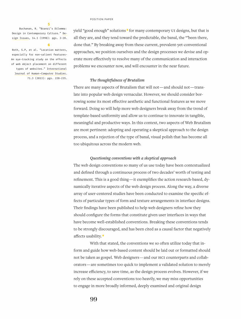
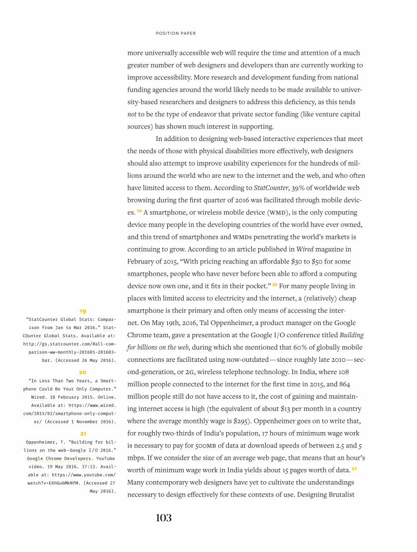
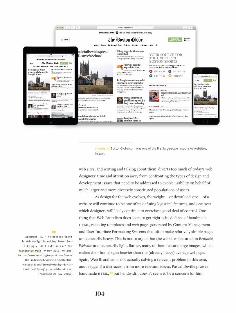
FiGURe 4: BostonGlobe.com was one of the first largescale responsive websites, in 2011.
22Arcement, K. “The hottest trend
in Web design is making intention-
ally ugly, difficult sites.” The
Washington Post, 9 May 2016. Online.
https://www.washingtonpost.com/news/
the-intersect/wp/2016/05/09/the-
hottest-trend-in-web-design-is-in-
tentionally-ugly-unusable-sites/.
(Accessed 25 May 2016).
105
GAnCI & RIbEIRo
We have plenty of room to innovate
As a medium that facilitates large scale, trans-global communication, the web
is still relatively young, but its rise has been rapid and its reach has become
widespread, aided greatly by the now decade-long worldwide advance in smart-
phone, or wireless mobile device, technology. The moniker Responsive Web
Design, which represents the latest major innovation in web design, was only
coined in 2010 by Ethan Marcotte in an article published on the website A List
Apart. 23 (Responsive web design, or “RWD,” refers to the practice of designing
user interfaces for websites that alter their appearance and proportionality
based on the size of the viewscreens upon which they are rendered. RWD is
what causes the same site to configure itself differently as it viewed across
different types of media platforms, as depicted in Figure 4.) In 2014, Scott
Jehl expanded on the idea of Responsive Web Design on his book Responsible
Responsive Design, after spending months using the Internet in developing
countries in South and Southeast Asia. 24 What both Marcotte and Jehl were
proposing were new ways to approach web design to meet the needs of users
who were accessing web content in new ways. In their case, innovation oc-
curred as a result of attempting to solve real problems that users attempting to
access content across different types of viewscreens routinely confront.
Responsive Web Design is just one example of recent innovations
that have affected the discipline of web design. A diverse array of designers
and organizations have discussed developing and implementing new practices
and standards to make the web more accessible to users with disabilities, bad
connections, or underpowered devices. As the web and the means to access
it evolves, designers will have to innovate, and, at times, invent, to meet new
needs and desires.
Good aesthetics serve a purpose
Another consequence of Web Brutalism is that it emphasizes the personal, aes-
thetic style of an individual designer who created a particular site, or at least
the unique stylistic decisions that affected the design of these types of websites.
The product, then, becomes an end in itself, rather than a means to achieve a
broader goal of effectively visually communicating specific content to a given
audience on behalf of a particular organization or client.
Aesthetics play an important role in web design, but not for purely
stylistic reasons. Beautiful pages are actually perceived to work better 25 and
to be easier to use. 26 Because of this, web designers must continue to strive to
23Marcotte, E. “Responsive Web De-
sign.” A List Apart. 25 May 2010.
http://alistapart.com/article/re-
sponsive-web-design. (Accessed 26
May 2016).
24Jehl, S. Responsible responsive de-
sign. New York: A Book Apart. 2014.
25Norman, D. “Emotion & Design: At-
tractive things work better.” Inter-
actions Magazine. 9.4 (2002): pgs.
36-42. Online. Availabel at: http://
www.jnd.org/dn.mss/emotion_design_
at.html. (Accessed 25 May 2016).
26Lidwell, W., Kritina Holden, and
Jill Butler. Universal principles
of design. Rockport: Gloucester,
Mass:. pgs: 20-21. 2003.
dialectic: volume i, issue i
106
create aesthetically well-resolved interfaces in our designs, and avoid creating
gratuitous ugliness for its own sake. As is and has been the case with effective
visual communications in print for the last couple of centuries (at least …), the
visual style and configuration of elements designed for use in specific websites
should be largely governed by what is deemed by a designer to be appropriate
for a given user or audience, and that also effectively represents the interests
and mission of a given organization or client. The assertion of distinct visual
languages, styles and genres create different types of expectations and guide
different types of experiences on given websites, much the same as they do
in printed communications. Determining what is appropriate and what is not
within and around a given context of use is as crucial a design consideration as
it has ever been.
The old is not new
Whether you appreciate or reject the aesthetics that guide the physical and for-
mal structure of Web Brutalism, we should avoid equating it with innovation.
Applying outdated visual genres and styles purely for the sake of moving away
from an established norm is not the same as moving forward. To praise these
types of distractions rather than focusing attention on more prevalent issues
currently confronting web designers — and their users and audiences — seems
irresponsible now. There is so much more real work to be done to positively
evolve web design to make it more accessible and more useful to broader popu-
lations than it currently serves. Those of us working in and around web design
need to concentrate more of our efforts toward making the web more inclusive
and less exclusive, and toward solving the problems that are rooted in the need
to create and facilitate effective visual communications and functionalities that
users deserve and expect from us.
Moving forward
While it may be a misnomer, the Web Brutalism movement — if it can actually
be called that — has ignited an engaging and increasingly broadly informed
discussion. The designers who are participating in it aim to expose weaknesses
they see in what they perceive to be the far too predictable and banal approach-
es so often operated or defaulted to by so many of their peers. Are they right
to do this? Have too many of us who practice and teach web design adopted
processes that yield results that are too rigid, too uniform, too automatic? Crit-
ically grappling with these questions as we consider the future of our discipline,
107
poSItIon pApER
especially as it becomes more broadly informed and less exclusive, will be es-
sential to our continued growth and well-being, and to the growth and well-be-
ing of future web and interaction designers.
In debating the usefulness and the affects — formal and psycho-
logical — of Web Brutalism, two discursive themes have emerged. Both raise
valuable questions for web designers as our discipline evolves. First, the often
heavy-handed role of utilizing standardized conventions within the discipline
of web design has been called into question. These conventions originated
during the days of the early web, and helped guide layout, sizing, and the fa-
cilitation of navigation, and stabilized the way information was presented and
used by audiences. The viewpoints articulated in this narrative suggest a clear
dichotomy regarding how web design opportunities might be contextualized
and addressed: by using standard formal and functional conventions, web de-
sign is mired in unoriginality but retains its usability; when these standard con-
ventions are ignored, usability is compromised. With that stated, we believe
that this apparent dichotomy is false. Innovation and usability are not mutually
exclusive. Rather, we suggest web designers explore ways to promote usability
and innovation simultaneously, and in ways that are not mutually exclusive.
We believe that standardized design conventions should be approached with
open eyes, and that they should continue to be evaluated in terms of their con-
textual appropriateness. By engaging in this dualistic process, web design can
evolve positively.
The second theme articulated in this piece addressed the need for
web designers to carefully consider the ramifications of their aesthetic deci-
sion-making in the context of the contemporary landscape of visual design. As
the web matures and the visual patterns, genres and styles that span it con-
tinue to solidify, we need to evaluate how specific approaches to visual design
affect how the content that constitutes given websites is perceived and used.
Deviating from these established norms could either help or hurt our ability to
communicate clearly, depending on how these deviations are formulated and
operated. Decisions about aesthetics also have implications for download size,
and may impact low-bandwidth users’ ability to access a given site.
Brutalism’s provocation is further confirmation that a great deal of
research is still needed to help designers understand the consequences of vi-
sual design on the web. As promised, this paper raised more questions than it
answered: how does visual design affect the perception and usability of a given
website? As web designers, where should we place the lion’s share of our efforts
108
on wEb bRUtALISm AnD ContEmpoRARy wEb DESIGn
moving forward? How can we innovate and, if necessary, invent in meaningful
and effective ways? Ultimately, how can we design complex visual systems that
communicate distinctively, effectively, and responsibly across the web? These
are difficult but pressing questions for web designers and their collaborators to
confront as web design moves into its third decade. Failing to do this effective-
ly could mean that we overlook the full potential of design on the web.
References
“Accessibility is hard.” The A11Y Project (blog). Available at: http://a11yproject.
com/about.html. (Accessed 27 May 2016).
Alter, A.L, et. al. “Overcoming Intuition: Metacognitive Difficulty Activates An-
alytic Reasoning.” Journal of Experimental Psychology. 136.4 (2007): pgs.
569-576. Available at: https://pdfs.semanticscholar.org/526d/fb9f8715d-
48fa79d0f766caa5cd9151cf074.pdf. (Accessed 1 September 2016).
Alter A.L. “The Benefits of Cognitive Disfluency”. Current Directions in Psycho-
logical Science. 22.6 (2013): pgs. 437-442.
Arcement, K. “The hottest trend in Web design is making intentionally ugly,
difficult sites.” The Washington Post, 9 May 2016. Online. https://www.
washingtonpost.com/news/the-intersect/wp/2016/05/09/the-hottest-
trend-in-web-design-is-intentionally-ugly-unusable-sites/. (Accessed
25 May 2016).
Buchanan, R. “Branzi’s Dilemma: Design in Contemporary Culture.” Design
Issues, 14.1 (1998): pgs. 3-20.
Budds, D. “The Internet’s 10 ‘Ugliest’ Websites.” Fast Company, 25 May 2016.
Online. Available at: http://www.fastcodesign.com/3060196/the-inter-
nets-10-ugliest-websites. (Accessed 25 May 2016).
Deville, P. Brutalist Websites. Website. Available at: http://brutalistwebsites.
com/. (Accessed 25 May 2016).
Diemand-Yauman, C., Daniel M. Oppenheimer, and Erikka B. Vaughan. “For-
tune favors the bold (and the italicized): Effects of disfluency on edu-
cational outcomes”. Cognition. 118.1 (2011): pgs. 111-115.
“Dieter Rams: ten principles for good design.” Vitsœ. Website. Available at:
https://www.vitsoe.com/us/about/good-design. (Accessed 15
September 2016).
109
GAnCI & RIbEIRo
Every Bootstrap Website Ever. Website. Available at: http://adventurega.me/boot-
strap/. (Accessed 26 May 2016).
Hamilton, I. “A simple introduction to web accessibility.” Creative Bloq (blog).
27 July 2011. Available at: http://www.creativebloq.com/netmag/sim-
ple-introduction-web-accessibility-7116888. (Accessed 25 May 2016).
“In Less Than Two Years, a Smartphone Could Be Your Only Computer.” Wired.
10 February 2015. Online. Available at: https://www.wired.com/2015/02/
smartphone-only-computer/ (Accessed 1 November 2016).
Jehl, S. Responsible responsive design. New York: A Book Apart. 2014.
Lidwell, W., Kritina Holden, and Jill Butler. Universal principles of design.
Rockport: Gloucester, Mass:. pgs: 20-21. 2003.
Maeda, J. Twitter post. 7 January 2014, 8:04 a.m. Available at: https://twitter.
com/johnmaeda/status/420541336060575744. (Accessed 25 May 2016).
Marcotte, E. “Responsive Web Design.” A List Apart. 25 May 2010. http://ali-
stapart.com/article/responsive-web-design. (Accessed 26 May 2016).
“MYTH: Accessibility is “blind people.” The A11Y Project (blog). 11 January
2013. Available at: http://a11yproject.com/posts/myth-accessibili-
ty-is-blind-people. (Accessed 26 May 2016).
Nielsen, J. “Durability of Usability Guidelines.” Nielsen Norman Group (blog). 17
January 2005. Online. Available at: https://www.nngroup.com/articles/
durability-of-usability-guidelines/. (Accessed 25 May 2016).
Norman, D. “Emotion & Design: Attractive things work better.” Interactions
Magazine. 9.4 (2002): pgs. 36-42. Online. Availabel at: http://www.jnd.
org/dn.mss/emotion_design_at.html. (Accessed 25 May 2016).
Oppenheimer, T. “Building for billions on the web – Google I / O 2016.” Google
Chrome Developers. YouTube video. 19 May 2016. 37:13. Available at:
https://www.youtube.com/watch?v=E6hGubMkNfM. (Accessed 27
May 2016).
Roth, S.P, et al. “Location matters, especially for non-salient features-An
eye-tracking study on the effects of web object placement on differ-
ent types of websites”. International Journal of Human – Computer
Studies. 71.3 (2013): pgs. 228-235.
“StatCounter Global Stats: Comparison from Jan to Mar 2016.” StatCOunter
Global Stats. Available at: http://gs.statcounter.com/#all-comparison-
ww-monthly-201601-201603-bar. (Accessed 26 May 2016).
Tuch, A, et al. “The role of visual complexity and prototypicality regarding first
impression of websites: working towards understanding aesthetic
dialectic: volume i, issue i
110
judgments”. International Journal of Human-Computer Studies. 70.11
(2012): pgs. 794-811.
Whitenton, K. “Minimize Cognitive Load to Maximize Usability.” Nielsen Nor-
man Group (blog). 22 December 2013. Online. Available at: https://
www.nngroup.com/articles/minimize-cognitive-load/. (Accessed 25
May 2016).
Biographies
Aaron Ganci is UI / UX designer and an Assistant Professor of Visual Commu-
nication Design at Indiana University’s Herron School of Art and Design (IU-PUI). With professional experience in graphic, interaction, and user experience
design, he is an expert in both the visual design of digital interfaces and in the
translation of user needs into useful, usable, and desirable experiences. He is
a frequent consultant on the design of websites and software interfaces, most
recently for the IU School of Medicine, the Online Computer Library Center
(OCLC), and The City of Indianapolis. In addition to professional creative ac-
tivity, Professor Ganci also studies contemporary industrial practice and the
use of technology to personalize design artifacts. [email protected]
Bruno Ribeiro is an Assistant Professor of Graphic Design at the California
Polytechnic State University, in San Luis Obispo. He received a Master of Fine
Arts in design with a specialization in college and university teaching from The
Ohio State University in the spring of 2012. He also holds an MBA in marketing
from Fundação Getúlio Vargas – FGV (Rio de Janeiro), and a Bachelor of Science
in both visual communication and industrial design, from Escola Superior de
Desenho Industrial – ESDI (Rio de Janeiro). [email protected]
Related Documents


