Monetary Theory and Policy Graphs David L. Kelly Department of Economics University of Miami Box 248126 Coral Gables, FL 33134 [email protected] First Version: Spring 2011

Welcome message from author
This document is posted to help you gain knowledge. Please leave a comment to let me know what you think about it! Share it to your friends and learn new things together.
Transcript

Monetary Theory and PolicyGraphs
David L. Kelly
Department of EconomicsUniversity of Miami
Box 248126Coral Gables, FL 33134
First Version: Spring 2011
I Introduction
A CPI/Inflation
1920 1930 1940 1950 1960 1970 1980 1990 2000 20100
50
100
150
200
250
year
CP
I
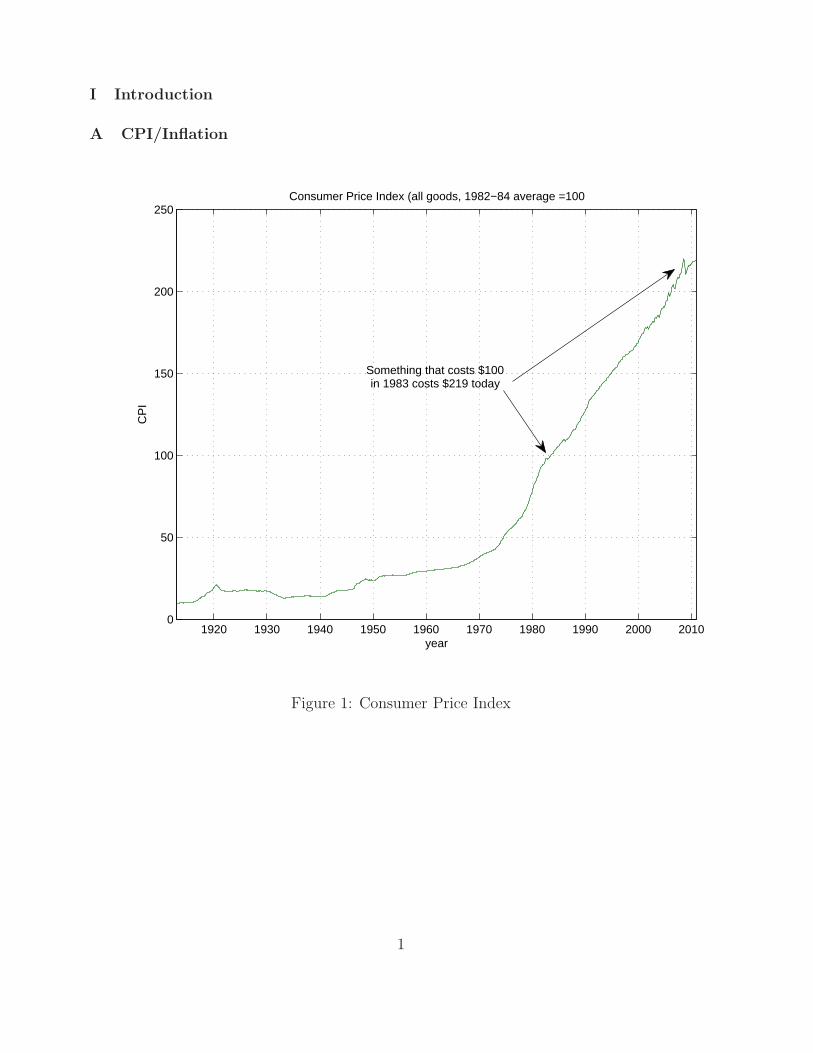
Consumer Price Index (all goods, 1982−84 average =100
Something that costs $100in 1983 costs $219 today
Figure 1: Consumer Price Index
1

1920 1930 1940 1950 1960 1970 1980 1990 2000 2010−20
−15
−10
−5
0
5
10
15
20
25
year
cpi i
nfla
tion
CPI Inflation
1970s oil crises
Great Moderation
Deflation duringGreat Depression
Figure 2: Consumer Price Index Inflation
2

1930 1940 1950 1960 1970 1980 1990 2000 20100
200
400
600
800
1000
1200
1400
1600
1800
2000
year
M1
M1 over time
Little growthbefore WWII
Postwar Expansion
Current ExpansionBy the FED
Figure 3: M1
3
B GDP/Unemployment
1950 1960 1970 1980 1990 2000 20102
3
4
5
6
7
8
9
10
11
year
perc
ent
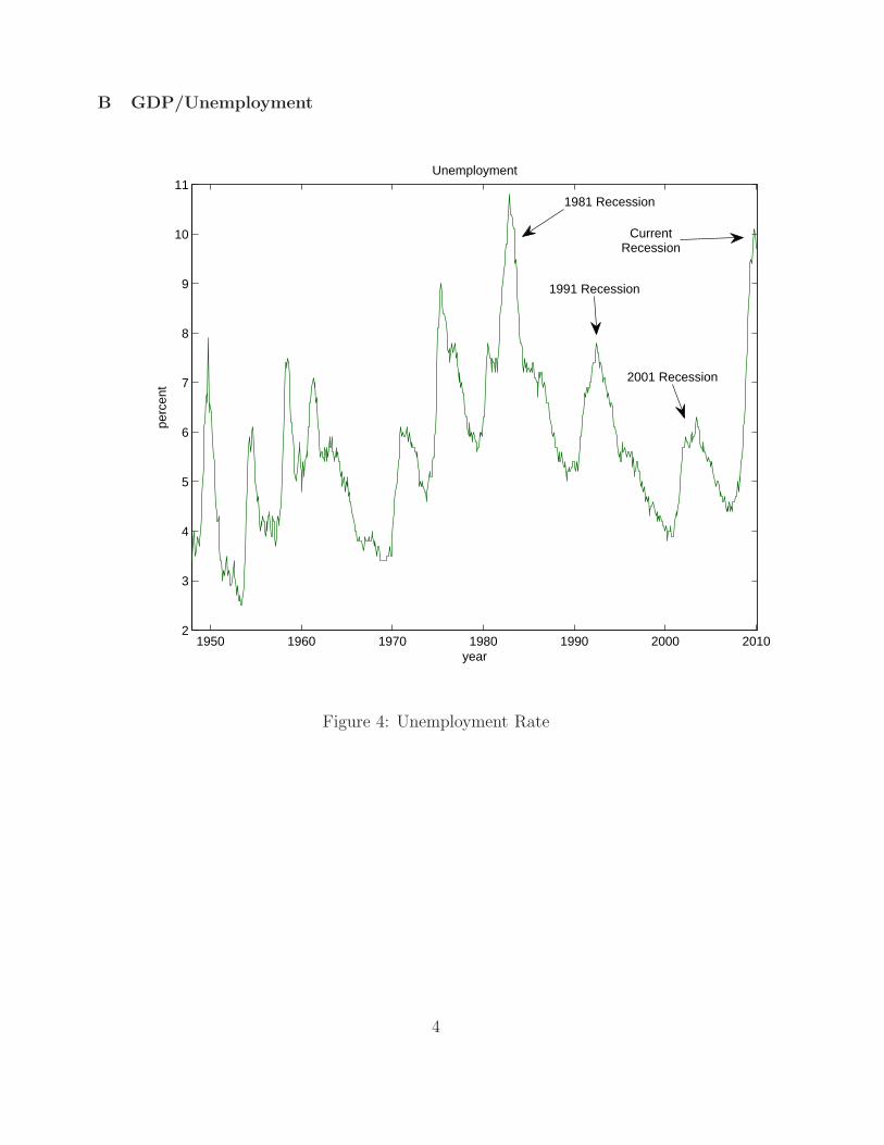
Unemployment
1981 Recession
1991 Recession
2001 Recession
CurrentRecession
Figure 4: Unemployment Rate
4

1950 1960 1970 1980 1990 2000 20100
2000
4000
6000
8000
10000
12000
14000
year
Bill
ions
of d
olla
rs
Real GDP 2005 chained dollars
1991 recession
2001 recession
current recession
Figure 5: Real GDP
5

2 3 4 5 6 7 8 9 10 11−4
−2
0
2
4
6
8
10
12
14
u
π
Shifting Phillips Curve
Before 19701970−31974−821982−961997+
Figure 6: Inflation and Unemployment: The shifting Phillips Curve
6

1980 1982 1985 1987 1990 1992 1995 1997 2000 2002 2005 2007−5
0
5
10
15
20
25
year
R
Taylor Rule vs Actual FED Funds
recent deviations from Taylor rule
Taylor RuleActual FED Funds
Figure 7: The Taylor Rule
7

C Recessions
0 5 10 15−6
−4
−2
0
2
4
6
8
10
12
14
Quarters after GDP peaked
Real Gross Domestic Product (GDP): last 4 recessions. Percent change from previous peak
1981−821990−9120012008−2009
Figure 8: RGDP: Last 4 recessions
8
0 5 10 15 20 25 30 35 40 45 50−10
0
10
20
30
40
50
60
70
80
90
Months after GDP peaked
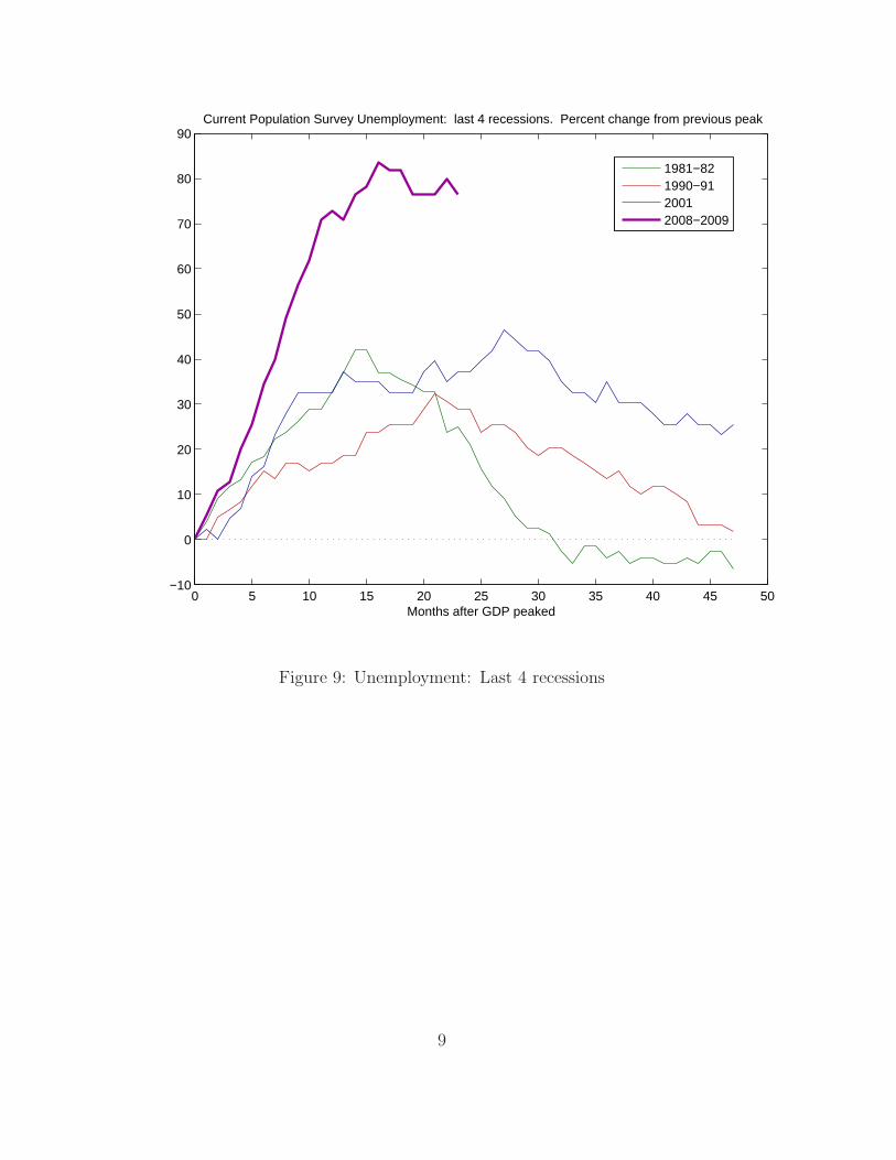
Current Population Survey Unemployment: last 4 recessions. Percent change from previous peak
1981−821990−9120012008−2009
Figure 9: Unemployment: Last 4 recessions
9
0 5 10 15−25
−20
−15
−10
−5
0
5
10
15
20
25
Quarters after GDP peaked
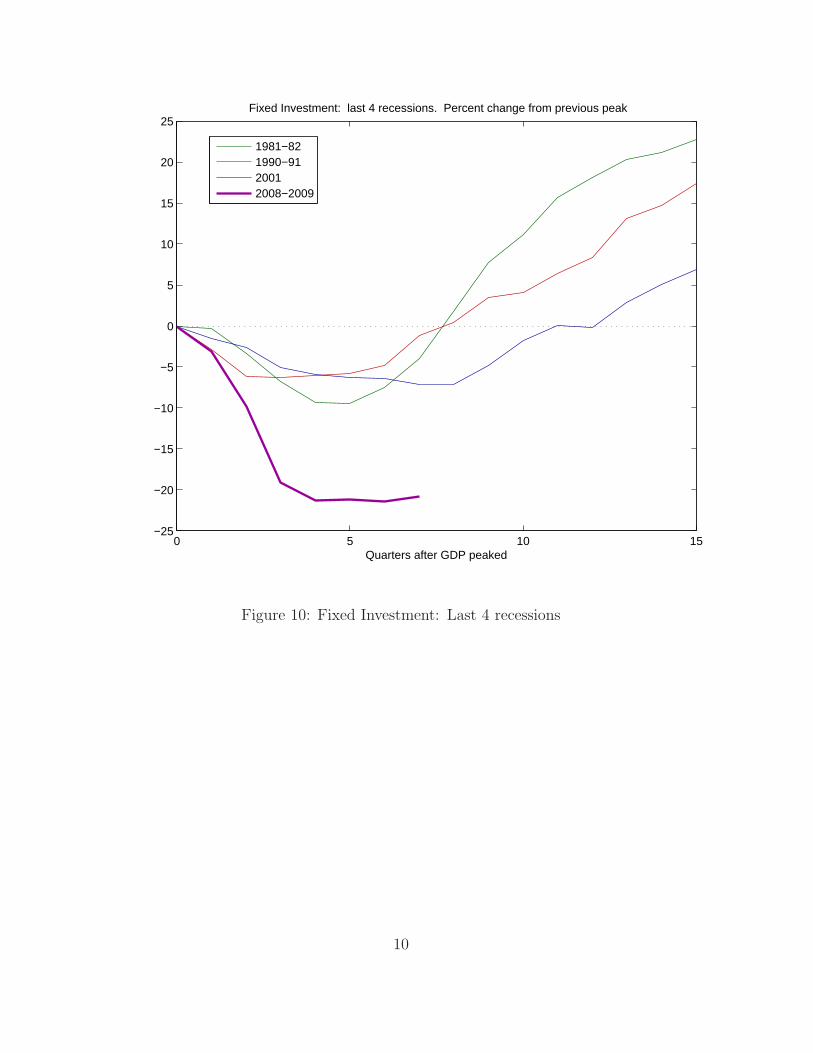
Fixed Investment: last 4 recessions. Percent change from previous peak
1981−821990−9120012008−2009
Figure 10: Fixed Investment: Last 4 recessions
10

0 5 10 15−30
−20
−10
0
10
20
30
40
Quarters after GDP peaked
Residential Investment: last 4 recessions. Percent change from previous peak
1981−821990−9120012008−2009
Figure 11: Residential Investment: Last 4 recessions
11

II Money
A Measures of Money
1960 1965 1970 1975 1980 1985 1990 1995 2000 2005 20100
1000
2000
3000
4000
5000
6000
7000
8000
9000
Year
Bill
ions
of d
olla
rs
M1 and M2, Seasonally Adjusted, Over Time
M1M2
Figure 12: M1 and M2 over time.
12

1960 1965 1970 1975 1980 1985 1990 1995 2000 2005 20102
2.5
3
3.5
4
4.5
5
5.5
6
Year
Bill
ions
of D
olla
rs
M2/M1, Seasonally Adjusted, Over Time
M2/M1 Linear Trend
High NominalInterest Rates
Low NominalInterest Rates
Figure 13: Ratio of M2 to M1 over time. Deregulation and technological advances result inhouseholds shifting to M2. But decisions to hold M1 versus M2 are closely related to realinterest rates and inflation.
13

1960 1965 1970 1975 1980 1985 1990 1995 2000 2005 20100
200
400
600
800
1000
1200
1400
1600
1800
2000
Year
H
Monetary Base, Not Seasonally Adjusted
Figure 14: Monetary Base Over Time. The monetary base more than doubled during thecrises.
14
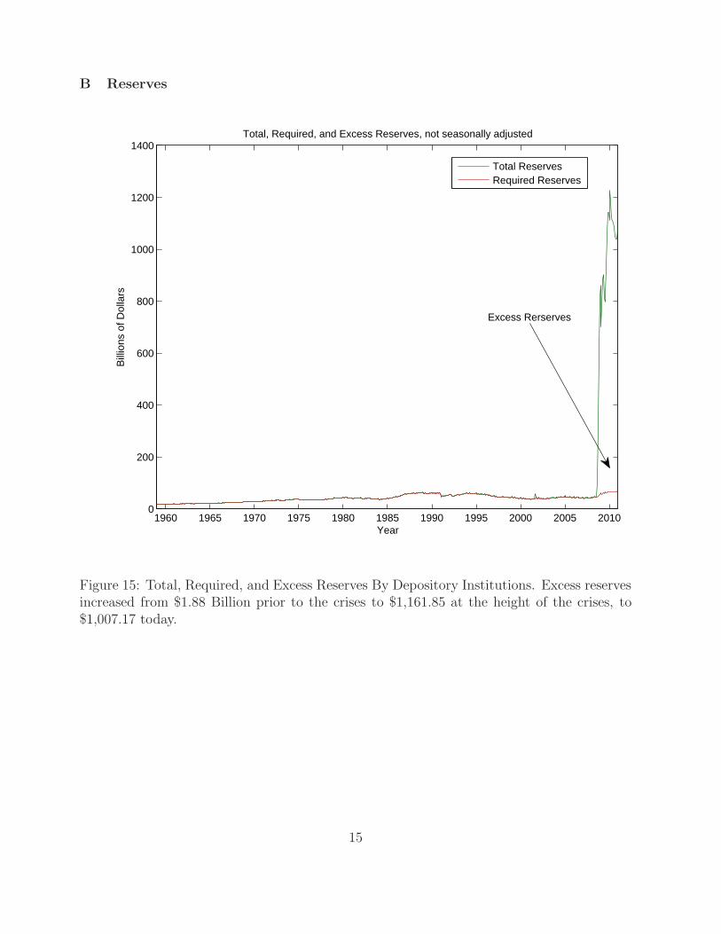
B Reserves
1960 1965 1970 1975 1980 1985 1990 1995 2000 2005 20100
200
400
600
800
1000
1200
1400
Year
Bill
ions
of D
olla
rsTotal, Required, and Excess Reserves, not seasonally adjusted
Total ReservesRequired Reserves
Excess Rerserves
Figure 15: Total, Required, and Excess Reserves By Depository Institutions. Excess reservesincreased from $1.88 Billion prior to the crises to $1,161.85 at the height of the crises, to$1,007.17 today.
15

1990 1992 1994 1996 1998 2000 2002 2004 2006 2008 2010 2012
40
50
60
70
80
90
100
Year
Bill
ions
of D
olla
rs
Total, Required, and Excess Reserves, not seasonally adjusted
Total ReservesRequired Reserves
Excess Reserves
Figure 16: Total, Required, and Excess Reserves since 1990.
16
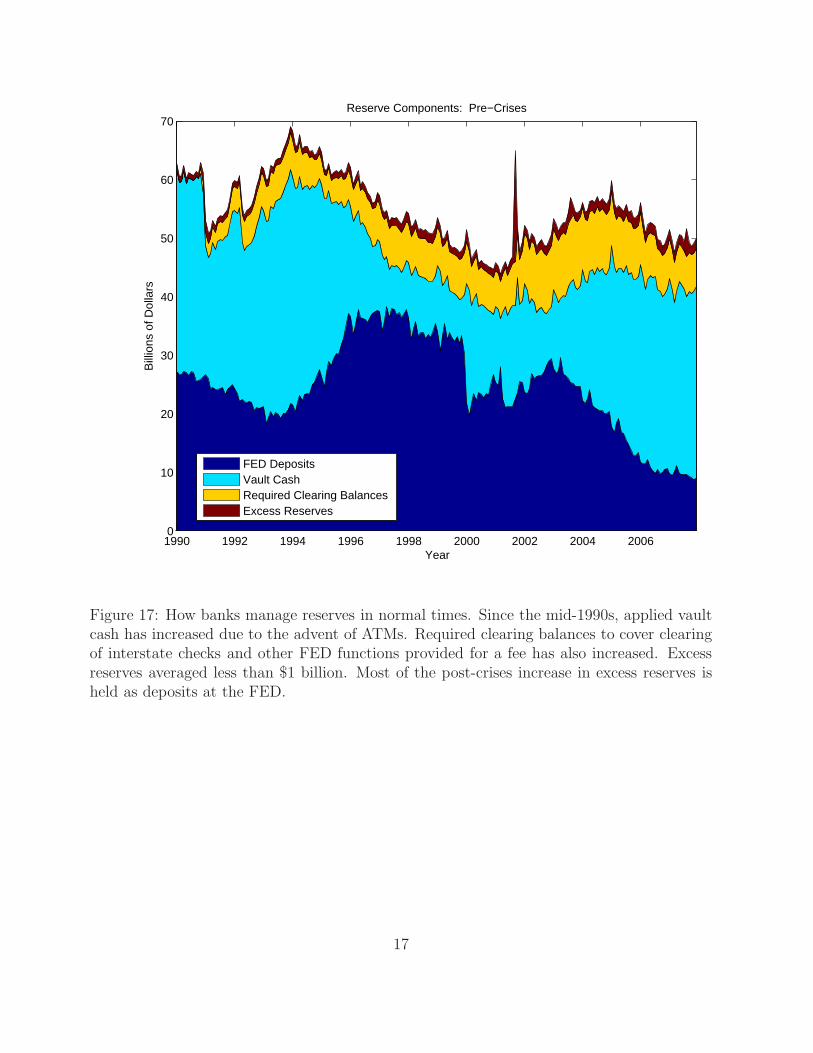
1990 1992 1994 1996 1998 2000 2002 2004 20060
10
20
30
40
50
60
70
Year
Bill
ions
of D
olla
rs
Reserve Components: Pre−Crises
FED DepositsVault CashRequired Clearing BalancesExcess Reserves
Figure 17: How banks manage reserves in normal times. Since the mid-1990s, applied vaultcash has increased due to the advent of ATMs. Required clearing balances to cover clearingof interstate checks and other FED functions provided for a fee has also increased. Excessreserves averaged less than $1 billion. Most of the post-crises increase in excess reserves isheld as deposits at the FED.
17
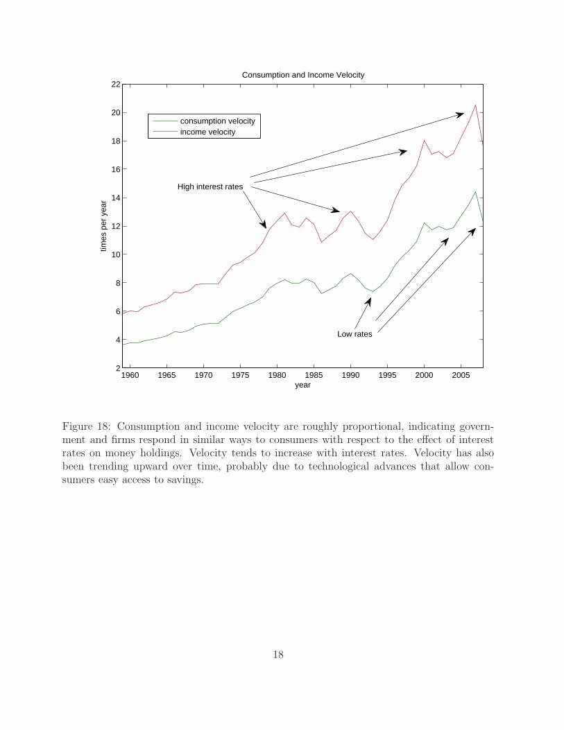
1960 1965 1970 1975 1980 1985 1990 1995 2000 20052
4
6
8
10
12
14
16
18
20
22
year
times
per
yea
r
Consumption and Income Velocity
consumption velocityincome velocity
High interest rates
Low rates
Figure 18: Consumption and income velocity are roughly proportional, indicating govern-ment and firms respond in similar ways to consumers with respect to the effect of interestrates on money holdings. Velocity tends to increase with interest rates. Velocity has alsobeen trending upward over time, probably due to technological advances that allow con-sumers easy access to savings.
18

III Phillips Curve
Figure 19: Original Phillips Curve.
19

Y∆
π
0
6162
63 6465
6667
68
69
BoomsRecessions
Figure 20: Original Phillips Curve using GDP.
20

Figure 21: Inflation and long run growth. Graph is Figure (1) from Bruno, M. and WilliamEasterly “Inflation Crises and Long Run Growth,” Journal of Monetary Economics, vol. 41(February 1998): pp. 3-26.
21

−3 −2 −1 0 1 2 3 4−1
0
1
2
3
4
5US Phillips Curve: 1960 − 1998
∆ Y
π
Figure 22: US Phillips Curve: more time periods.
22

2 3 4 5 6 7 8 9 10 11−4
−2
0
2
4
6
8
10
12
14
u
π
Shifting Phillips Curve
Before 19701970−31974−821982−961997+
Figure 23: US Phillips Curve.
23

IV Implementation
Jan60 Jan70 Jan80 Jan90 Jan00 Jan100
2
4
6
8
10
12
14
16
18
20
Date
perc
ent
Federal Funds Rate
Target H
Target R
Target E
Figure 24: Federal Funds Rate. When the FED targets H , volatility in R increases. Whenthe FED targets the FED funds rate, volatility in R reduces. Remaining volatility in theFED funds rate is due to frequent adjustments of the target.
24
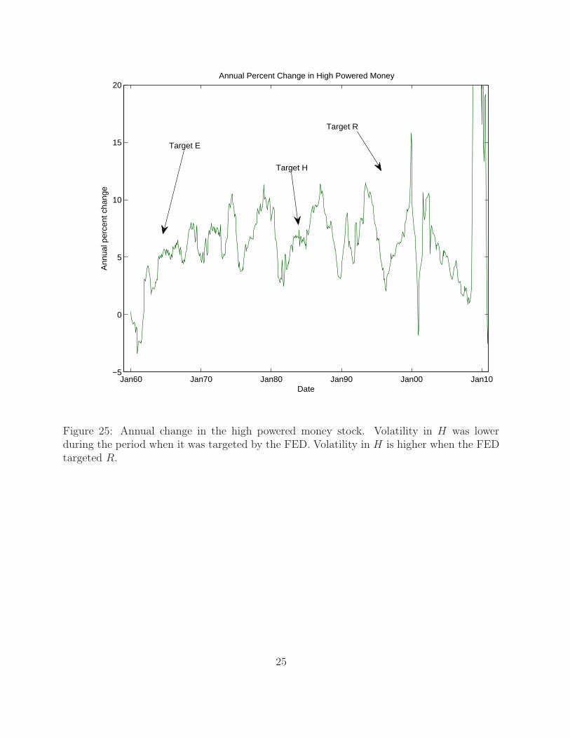
Jan60 Jan70 Jan80 Jan90 Jan00 Jan10−5
0
5
10
15
20
Date
Ann
ual p
erce
nt c
hang
e
Annual Percent Change in High Powered Money
Target H
Target R
Target E
Figure 25: Annual change in the high powered money stock. Volatility in H was lowerduring the period when it was targeted by the FED. Volatility in H is higher when the FEDtargeted R.
25
Related Documents