MM207-Statistics Unit 2 Seminar-Descriptive Statistics Dr Bridgette Stevens AIM:BStevensKaplan (add me to your Buddy list) 1

MM207-Statistics Unit 2 Seminar-Descriptive Statistics Dr Bridgette Stevens AIM:BStevensKaplan (add me to your Buddy list) 1.
Dec 28, 2015
Welcome message from author
This document is posted to help you gain knowledge. Please leave a comment to let me know what you think about it! Share it to your friends and learn new things together.
Transcript
MM207-Statistics
Unit 2 Seminar-Descriptive Statistics
Dr Bridgette Stevens
AIM:BStevensKaplan (add me to your Buddy list)
MM207-Statistics
Unit 2 Seminar-Descriptive Statistics
Dr Bridgette Stevens
AIM:BStevensKaplan (add me to your Buddy list)
1
Chapter OutlineChapter Outline
• 2.1 Frequency Distributions and Their Graphs
• 2.2 More Graphs and Displays
• 2.3 Measures of Central Tendency
• 2.4 Measures of Variation
• 2.5 Measures of Position
2Larson/Farber 4th ed.
Section 2.1Section 2.1Section 2.1Section 2.1
Frequency Distributions and Their Graphs
3Larson/Farber 4th ed.

Frequency DistributionFrequency Distribution
Frequency Distribution
• A table that shows classes or intervals of data with a count of the number of entries in each class.
• The frequency, f, of a class is the number of data entries in the class.
Larson/Farber 4th ed. 4
Class Frequency, f
1 – 5 5
6 – 10 8
11 – 15 6
16 – 20 8
21 – 25 5
26 – 30 4
Lower classlimits
Upper classlimits
Class width 6 – 1 = 5
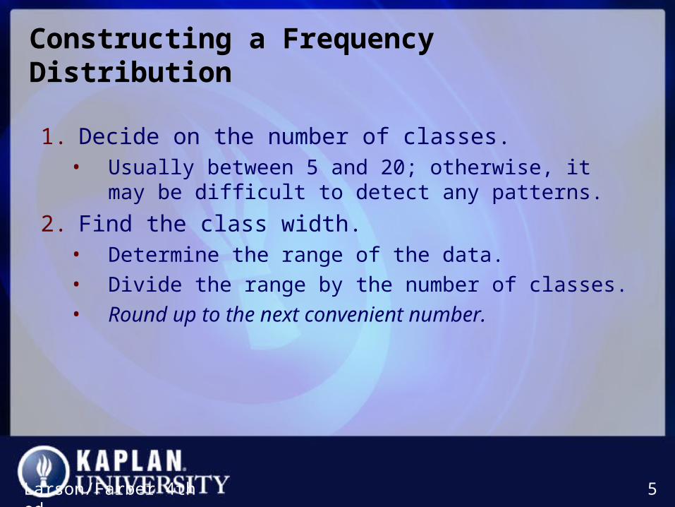
Constructing a Frequency DistributionConstructing a Frequency Distribution
Larson/Farber 4th ed. 5
1. Decide on the number of classes. • Usually between 5 and 20; otherwise, it may be difficult to
detect any patterns.
2. Find the class width.• Determine the range of the data.
• Divide the range by the number of classes.
• Round up to the next convenient number.
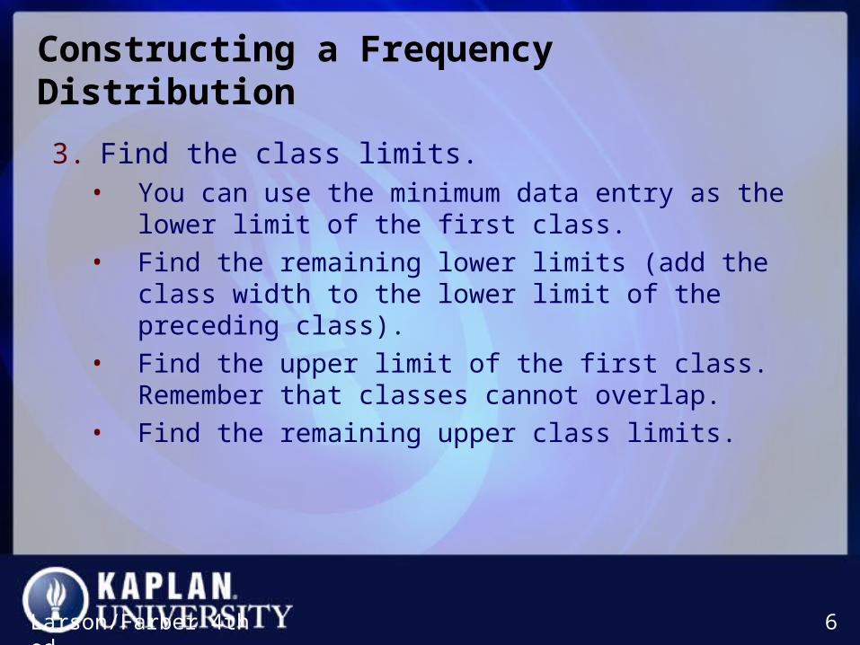
Constructing a Frequency DistributionConstructing a Frequency Distribution
3. Find the class limits. • You can use the minimum data entry as the lower limit of the
first class.
• Find the remaining lower limits (add the class width to the lower limit of the preceding class).
• Find the upper limit of the first class. Remember that classes cannot overlap.
• Find the remaining upper class limits.
Larson/Farber 4th ed. 6
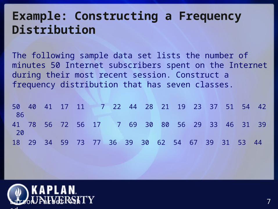
Example: Constructing a Frequency DistributionExample: Constructing a Frequency Distribution
The following sample data set lists the number of minutes 50 Internet subscribers spent on the Internet during their most recent session. Construct a frequency distribution that has seven classes.
50 40 41 17 11 7 22 44 28 21 19 23 37 51 54 42 8641 78 56 72 56 17 7 69 30 80 56 29 33 46 31 39 2018 29 34 59 73 77 36 39 30 62 54 67 39 31 53 44
Larson/Farber 4th ed. 7
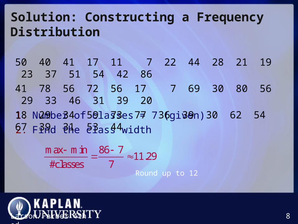
Solution: Constructing a Frequency DistributionSolution: Constructing a Frequency Distribution
1. Number of classes = 7 (given)
2. Find the class width
Larson/Farber 4th ed. 8
max min 86 711.29
#classes 7
Round up to 12
50 40 41 17 11 7 22 44 28 21 19 23 37 51 54 42 86
41 78 56 72 56 17 7 69 30 80 56 29 33 46 31 39 20
18 29 34 59 73 77 36 39 30 62 54 67 39 31 53 44

Solution: Constructing a Frequency DistributionSolution: Constructing a Frequency Distribution
Larson/Farber 4th ed. 9
Lower limit
Upper limit
7Class width = 12
3. Use 7 (minimum value) as first lower limit. Add the class width of 12 to get the lower limit of the next class.
7 + 12 = 19
Find the remaining lower limits.
19
31
43
55
67
79
Solution: Constructing a Frequency DistributionSolution: Constructing a Frequency Distribution
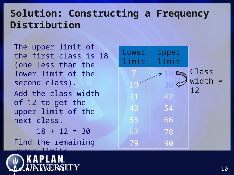
The upper limit of the first class is 18 (one less than the lower limit of the second class).
Add the class width of 12 to get the upper limit of the next class.
18 + 12 = 30
Find the remaining upper limits.
Larson/Farber 4th ed. 10
Lower limit
Upper limit
7
19
31
43
55
67
79
Class width = 1230
42
54
66
78
90
18
Solution: Constructing a Frequency DistributionSolution: Constructing a Frequency Distribution
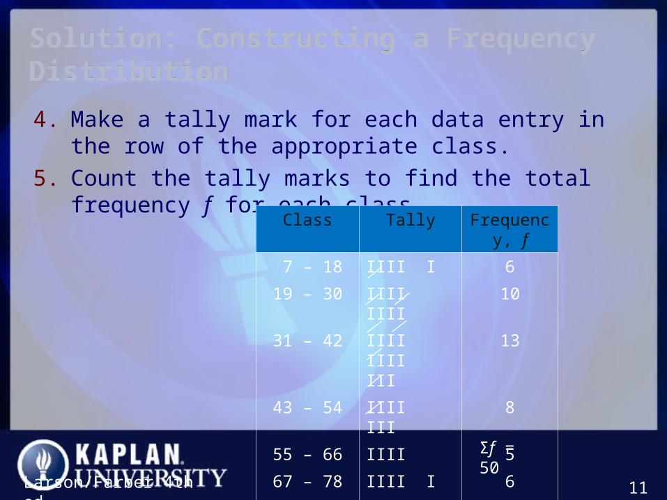
4. Make a tally mark for each data entry in the row of the appropriate class.
5. Count the tally marks to find the total frequency f for each class.
Larson/Farber 4th ed. 11
Class Tally Frequency, f
7 – 18 IIII I 6
19 – 30 IIII IIII 10
31 – 42 IIII IIII III 13
43 – 54 IIII III 8
55 – 66 IIII 5
67 – 78 IIII I 6
79 – 90 II 2Σf = 50

Determining the MidpointDetermining the Midpoint
Midpoint of a class
Larson/Farber 4th ed. 12
(Lower class limit) (Upper class limit)
2
Class Midpoint Frequency, f
7 – 18 6
19 – 30 10
31 – 42 13
7 1812.5
2
19 3024.5
2
31 4236.5
2
Class width = 12
Determining the Relative FrequencyDetermining the Relative Frequency
Relative Frequency of a class
• Portion or percentage of the data that falls in a particular class.
Larson/Farber 4th ed. 13
n
f
sizeSample
frequencyclassfrequencyrelative
Class Frequency, f Relative Frequency
7 – 18 6
19 – 30 10
31 – 42 13
60.12
50
100.20
50
130.26
50
•

Graphs of Frequency DistributionsGraphs of Frequency Distributions
Frequency Histogram
• A bar graph that represents the frequency distribution.
• The horizontal scale is quantitative and measures the data values.
• The vertical scale measures the frequencies of the classes.
• Consecutive bars must touch.
Larson/Farber 4th ed. 14
data values
freq
uen
cy
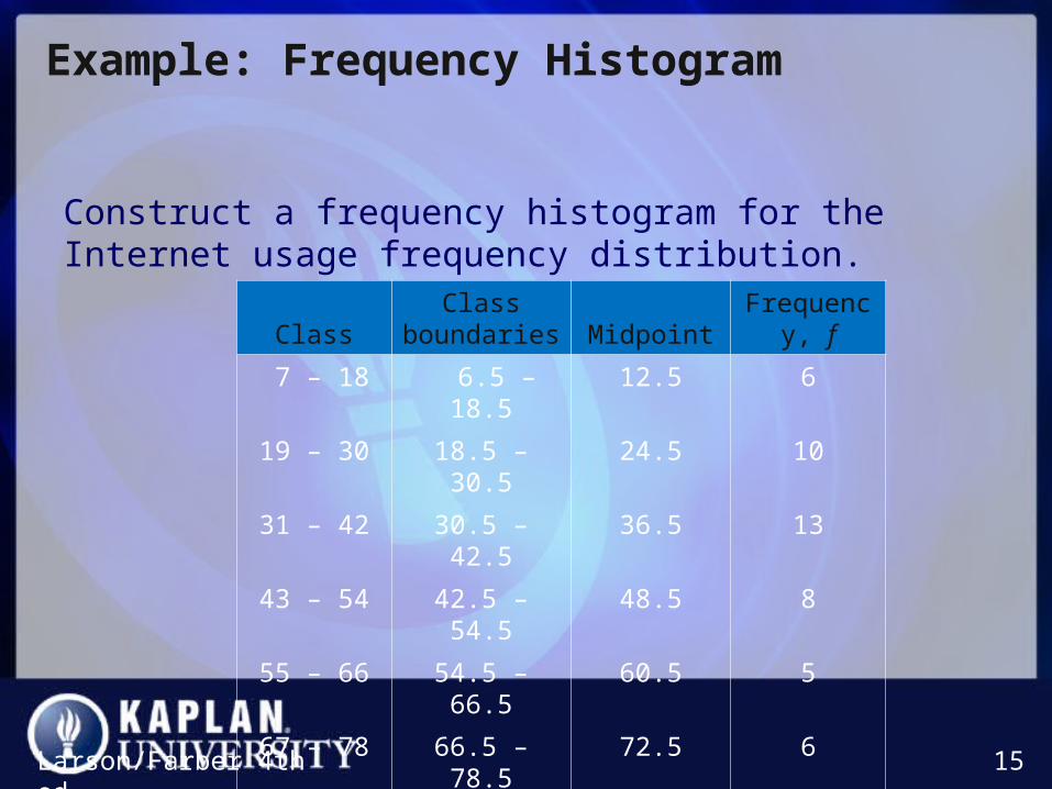
Example: Frequency Histogram Example: Frequency Histogram
Construct a frequency histogram for the Internet usage frequency distribution.
Larson/Farber 4th ed. 15
ClassClass
boundaries MidpointFrequency, f
7 – 18 6.5 – 18.5 12.5 6
19 – 30 18.5 – 30.5 24.5 10
31 – 42 30.5 – 42.5 36.5 13
43 – 54 42.5 – 54.5 48.5 8
55 – 66 54.5 – 66.5 60.5 5
67 – 78 66.5 – 78.5 72.5 6
79 – 90 78.5 – 90.5 84.5 2

Solution: Frequency Histogram (using Midpoints)Solution: Frequency Histogram (using Midpoints)
Larson/Farber 4th ed. 16

Graphs of Frequency DistributionsGraphs of Frequency Distributions
Frequency Polygon
• A line graph that emphasizes the continuous change in frequencies.
Larson/Farber 4th ed. 17
data values
freq
uen
cy
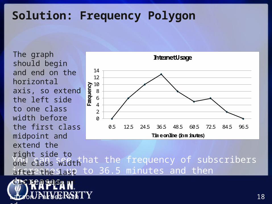
Solution: Frequency PolygonSolution: Frequency Polygon
02468101214
0.5 12.5 24.5 36.5 48.5 60.5 72.5 84.5 96.5
Freq
uenc
y
Time online (in minutes)
Internet Usage
Larson/Farber 4th ed. 18
You can see that the frequency of subscribers increases up to 36.5 minutes and then decreases.
The graph should begin and end on the horizontal axis, so extend the left side to one class width before the first class midpoint and extend the right side to one class width after the last class midpoint.
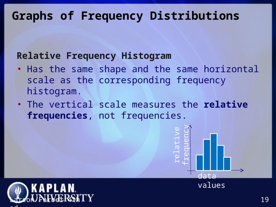
Graphs of Frequency DistributionsGraphs of Frequency Distributions
Relative Frequency Histogram
• Has the same shape and the same horizontal scale as the corresponding frequency histogram.
• The vertical scale measures the relative frequencies, not frequencies.
Larson/Farber 4th ed. 19
data values
rela
tive
freq
uen
cy

Example: Relative Frequency Histogram Example: Relative Frequency Histogram
Construct a relative frequency histogram for the Internet usage frequency distribution.
Larson/Farber 4th ed. 20
ClassClass
boundariesFrequency,
fRelative
frequency
7 – 18 6.5 – 18.5 6 0.12
19 – 30 18.5 – 30.5 10 0.20
31 – 42 30.5 – 42.5 13 0.26
43 – 54 42.5 – 54.5 8 0.16
55 – 66 54.5 – 66.5 5 0.10
67 – 78 66.5 – 78.5 6 0.12
79 – 90 78.5 – 90.5 2 0.04

Solution: Relative Frequency Histogram Solution: Relative Frequency Histogram
21
6.5 18.5 30.5 42.5 54.5 66.5 78.5 90.5
From this graph you can see that 20% of Internet subscribers spent between 18.5 minutes and 30.5 minutes online.

Graphs of Frequency DistributionsGraphs of Frequency Distributions
Cumulative Frequency Graph or Ogive
• A line graph that displays the cumulative frequency of each class at its upper class boundary.
• The upper boundaries are marked on the horizontal axis.
• The cumulative frequencies are marked on the vertical axis.
Larson/Farber 4th ed. 22
data valuescu
mu
lati
ve
freq
uen
cy

Solution: OgiveSolution: Ogive
0
10
20
30
40
50
60C
um
ula
tive
freq
uen
cy
Time online (in minutes)
Internet Usage
23
6.5 18.5 30.5 42.5 54.5 66.5 78.5 90.5
From the ogive, you can see that about 40 subscribers spent 60 minutes or less online during their last session. The greatest increase in usage occurs between 30.5 minutes and 42.5 minutes.

Section 2.2Section 2.2Section 2.2Section 2.2
More Graphs and Displays
Larson/Farber 4th ed. 24
Section 2.2 ObjectivesSection 2.2 Objectives
• Graph quantitative data using stem-and-leaf plots and dot plots
• Graph qualitative data using pie charts and Pareto charts
• Graph paired data sets using scatter plots and time series charts
Larson/Farber 4th ed. 25
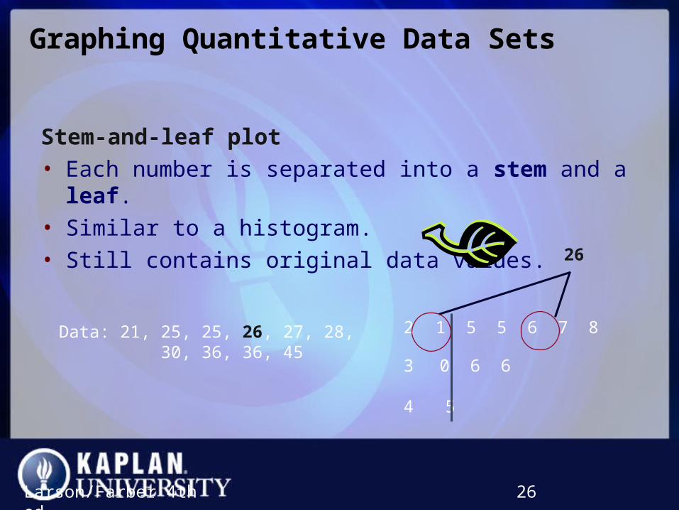
Graphing Quantitative Data SetsGraphing Quantitative Data Sets
Stem-and-leaf plot
• Each number is separated into a stem and a leaf.
• Similar to a histogram.
• Still contains original data values.
Larson/Farber 4th ed. 26
Data: 21, 25, 25, 26, 27, 28, 30, 36, 36, 45
26
2 1 5 5 6 7 8
3 0 6 6
4 5

Example: Constructing a Stem-and-Leaf PlotExample: Constructing a Stem-and-Leaf Plot
The following are the numbers of text messages sent last month by the cellular phone users on one floor of a college dormitory. Display the data in a stem-and-leaf plot.
Larson/Farber 4th ed. 27
155 159 144 129 105 145 126 116 130 114 122 112 112 142 126156 118 108 122 121 109 140 126 119 113 117 118 109 109 119139 139 122 78 133 126 123 145 121 134 124 119 132 133 124129 112 126 148 147
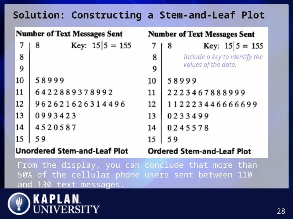
Solution: Constructing a Stem-and-Leaf PlotSolution: Constructing a Stem-and-Leaf Plot
28
Include a key to identify the values of the data.
From the display, you can conclude that more than 50% of the cellular phone users sent between 110 and 130 text messages.

Graphing Quantitative Data SetsGraphing Quantitative Data Sets
Dot plot
• Each data entry is plotted, using a point, above a horizontal axis
29
Data: 21, 25, 25, 26, 27, 28, 30, 36, 36, 45
26
20 21 22 23 24 25 26 27 28 29 30 31 32 33 34 35 36 37 38 39 40 41 42 43 44 45

Solution: Constructing a Dot PlotSolution: Constructing a Dot Plot
30
From the dot plot, you can see that most values cluster between 105 and 148 and the value that occurs the most is 126. You can also see that 78 is an unusual data value.
155 159 144 129 105 145 126 116 130 114 122 112 112 142 126156 118 108 122 121 109 140 126 119 113 117 118 109 109 119139 139 122 78 133 126 123 145 121 134 124 119 132 133 124129 112 126 148 147

Graphing Qualitative Data SetsGraphing Qualitative Data Sets
Pie Chart
• A circle is divided into sectors that represent categories.
• The area of each sector is proportional to the frequency of each category.
Larson/Farber 4th ed. 31
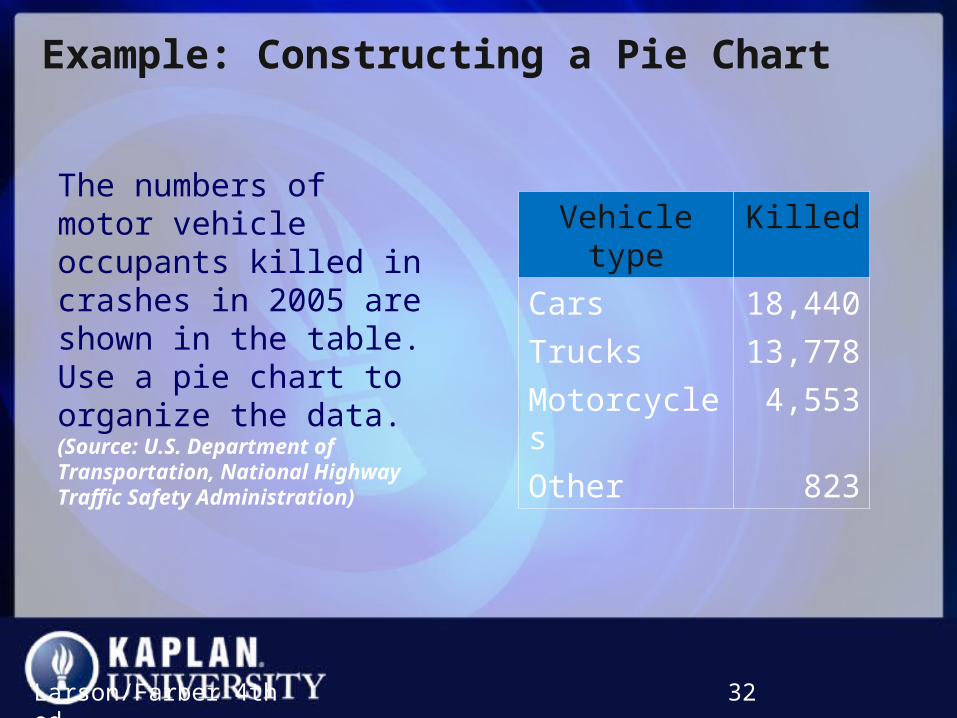
Example: Constructing a Pie ChartExample: Constructing a Pie Chart
The numbers of motor vehicle occupants killed in crashes in 2005 are shown in the table. Use a pie chart to organize the data. (Source: U.S. Department of Transportation, National Highway Traffic Safety Administration)
Larson/Farber 4th ed. 32
Vehicle type
Killed
Cars 18,440
Trucks 13,778
Motorcycles 4,553
Other 823

Solution: Constructing a Pie ChartSolution: Constructing a Pie Chart
• Find the relative frequency (percent) of each category.
33
Vehicle type Frequency, f Relative frequency
Cars 18,440
Trucks 13,778
Motorcycles 4,553
Other 823
37,594
184400.49
37594
137780.37
37594
45530.12
37594
8230.02
37594

Solution: Constructing a Pie ChartSolution: Constructing a Pie Chart
34
Vehicle type
Relative frequency
Central angle
Cars 0.49 176º
Trucks 0.37 133º
Motorcycles 0.12 43º
Other 0.02 7º
From the pie chart, you can see that most fatalities in motor vehicle crashes were those involving the occupants of cars.

Graphing Qualitative Data SetsGraphing Qualitative Data Sets
Pareto Chart
• A vertical bar graph in which the height of each bar represents frequency or relative frequency.
• The bars are positioned in order of decreasing height, with the tallest bar positioned at the left.
Larson/Farber 4th ed. 35
Categories
Freq
uen
cy
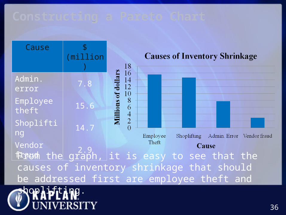
Constructing a Pareto ChartConstructing a Pareto Chart
36
Cause $ (million)
Admin. error
7.8
Employee theft
15.6
Shoplifting 14.7
Vendor fraud
2.9
From the graph, it is easy to see that the causes of inventory shrinkage that should be addressed first are employee theft and shoplifting.
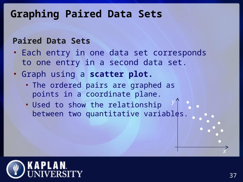
Graphing Paired Data SetsGraphing Paired Data Sets
Paired Data Sets
• Each entry in one data set corresponds to one entry in a second data set.
• Graph using a scatter plot.• The ordered pairs are graphed as
points in a coordinate plane.
• Used to show the relationship between two quantitative variables.
37
x
y
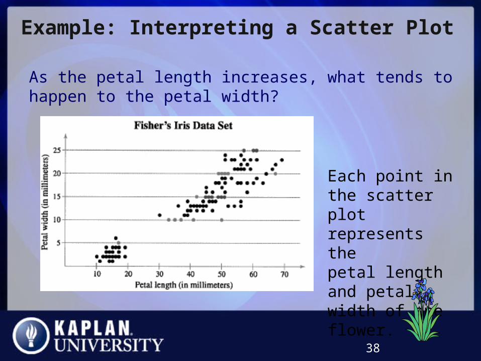
Example: Interpreting a Scatter PlotExample: Interpreting a Scatter Plot
As the petal length increases, what tends to happen to the petal width?
38
Each point in the scatter plot represents thepetal length and petal width of one flower.
Graphing Paired Data SetsGraphing Paired Data Sets
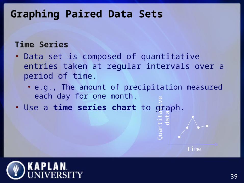
Time Series
• Data set is composed of quantitative entries taken at regular intervals over a period of time. • e.g., The amount of precipitation measured each day for one
month.
• Use a time series chart to graph.
39
time
Quanti
tati
ve
data
Example: Constructing a Time Series ChartExample: Constructing a Time Series Chart
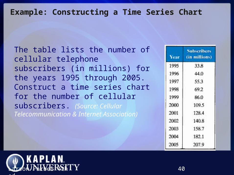
The table lists the number of cellular telephone subscribers (in millions) for the years 1995 through 2005. Construct a time series chart for the number of cellular subscribers. (Source: Cellular Telecommunication & Internet Association)
Larson/Farber 4th ed. 40
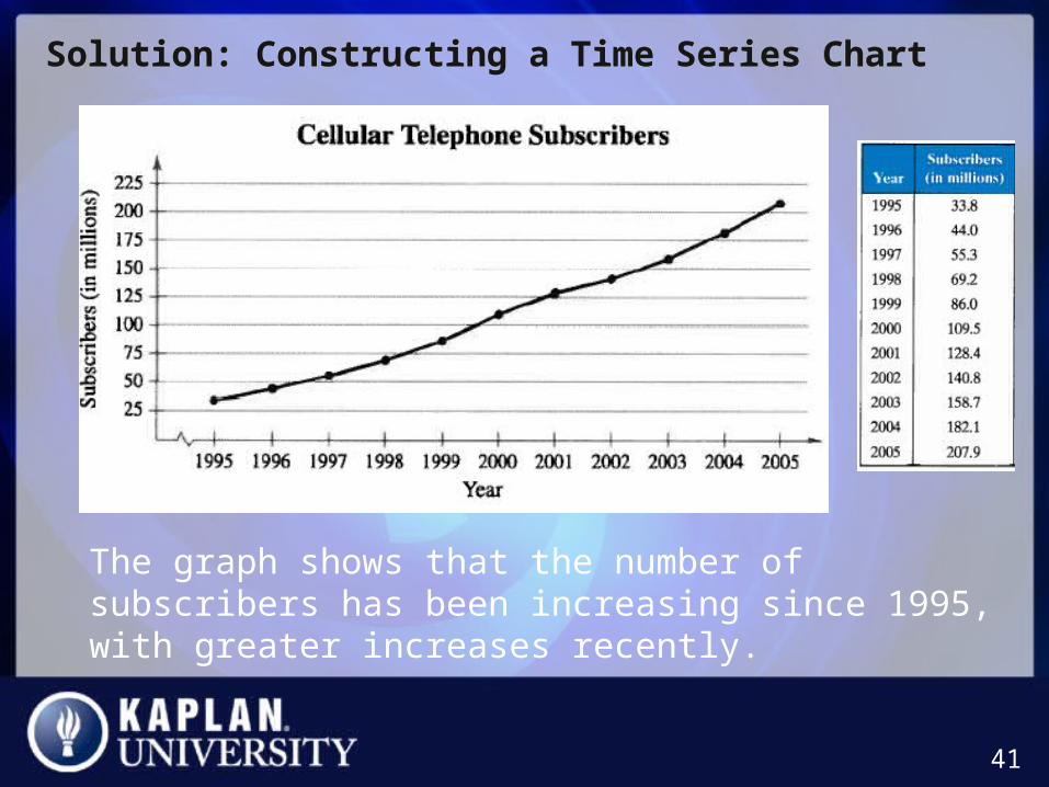
Solution: Constructing a Time Series ChartSolution: Constructing a Time Series Chart
41
The graph shows that the number of subscribers has been increasing since 1995, with greater increases recently.

Section 2.3Section 2.3Section 2.3Section 2.3
Measures of Central Tendency
Larson/Farber 4th ed. 42
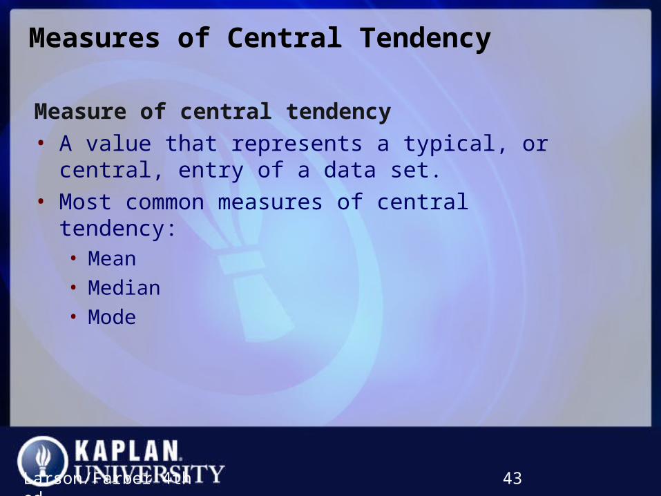
Measures of Central TendencyMeasures of Central Tendency
Measure of central tendency
• A value that represents a typical, or central, entry of a data set.
• Most common measures of central tendency:• Mean
• Median
• Mode
Larson/Farber 4th ed. 43

Measure of Central Tendency: ModeMeasure of Central Tendency: Mode
Mode
• The data entry that occurs with the greatest frequency.
• If no entry is repeated the data set has no mode.
• If two entries occur with the same greatest frequency, each entry is a mode (bimodal).
Larson/Farber 4th ed. 44

Comparing the Mean, Median, and ModeComparing the Mean, Median, and Mode
• All three measures describe a typical entry of a data set.
• Advantage of using the mean:• The mean is a reliable measure because it takes into
account every entry of a data set.
• Disadvantage of using the mean:• Greatly affected by outliers (a data entry that is far
removed from the other entries in the data set).
Larson/Farber 4th ed. 45

Example: Comparing the Mean, Median, and ModeExample: Comparing the Mean, Median, and Mode
Find the mean, median, and mode of the sample ages of a class shown. Which measure of central tendency best describes a typical entry of this data set? Are there any outliers?
Larson/Farber 4th ed. 46
Ages in a class
20 20 20 20 20 20 21
21 21 21 22 22 22 23
23 23 23 24 24 65
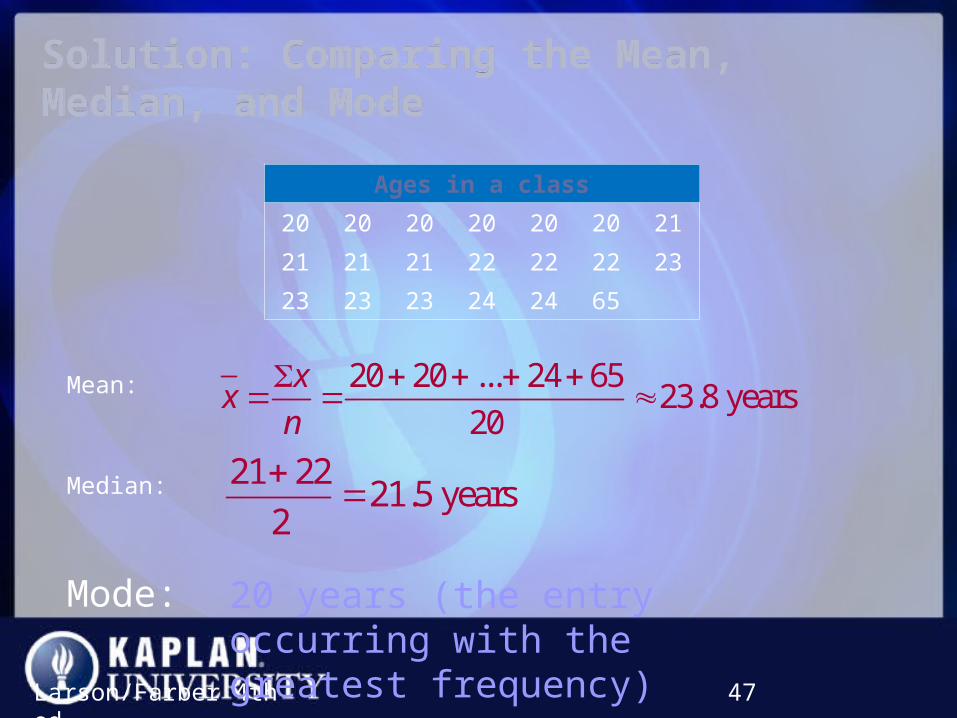
Solution: Comparing the Mean, Median, and ModeSolution: Comparing the Mean, Median, and Mode
Larson/Farber 4th ed. 47
Mean: 20 20 ... 24 6523.8 years
20
xx
n
Median: 21 2221.5 years
2
20 years (the entry occurring with thegreatest frequency)
Ages in a class
20 20 20 20 20 20 21
21 21 21 22 22 22 23
23 23 23 24 24 65
Mode:
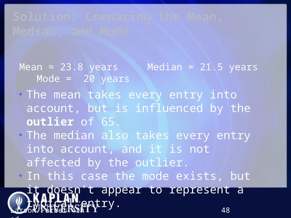
Solution: Comparing the Mean, Median, and ModeSolution: Comparing the Mean, Median, and Mode
Larson/Farber 4th ed. 48
Mean ≈ 23.8 years Median = 21.5 years Mode = 20 years
• The mean takes every entry into account, but is influenced by the outlier of 65.
• The median also takes every entry into account, and it is not affected by the outlier.
• In this case the mode exists, but it doesn't appear to represent a typical entry.

Solution: Comparing the Mean, Median, and ModeSolution: Comparing the Mean, Median, and Mode
Larson/Farber 4th ed. 49
Sometimes a graphical comparison can help you decide which measure of central tendency best represents a data set.
In this case, it appears that the median best describes the data set.
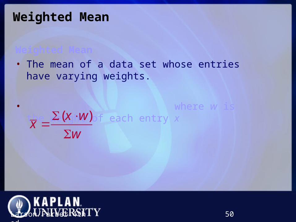
Weighted MeanWeighted Mean
Weighted Mean
• The mean of a data set whose entries have varying weights.
• where w is the weight of each entry x
Larson/Farber 4th ed. 50
( )x wx
w

Example: Finding a Weighted MeanExample: Finding a Weighted Mean
You are taking a class in which your grade is determined from five sources: 50% from your test mean, 15% from your midterm, 20% from your final exam, 10% from your computer lab work, and 5% from your homework. Your scores are 86 (test mean), 96 (midterm), 82 (final exam), 98 (computer lab), and 100 (homework). What is the weighted mean of your scores? If the minimum average for an A is 90, did you get an A?
Larson/Farber 4th ed. 51
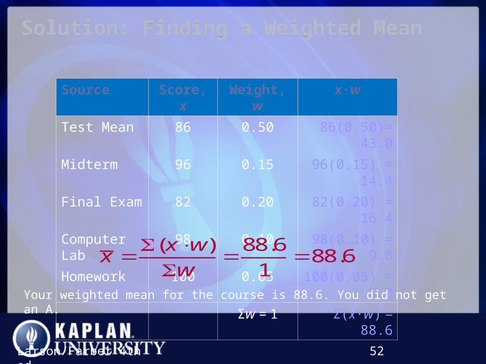
Solution: Finding a Weighted MeanSolution: Finding a Weighted Mean
Larson/Farber 4th ed. 52
Source Score, x Weight, w x∙w
Test Mean 86 0.50 86(0.50)= 43.0
Midterm 96 0.15 96(0.15) = 14.4
Final Exam 82 0.20 82(0.20) = 16.4
Computer Lab 98 0.10 98(0.10) = 9.8
Homework 100 0.05 100(0.05) = 5.0
Σw = 1 Σ(x∙w) = 88.6
( ) 88.688.6
1
x wx
w
Your weighted mean for the course is 88.6. You did not get an A.
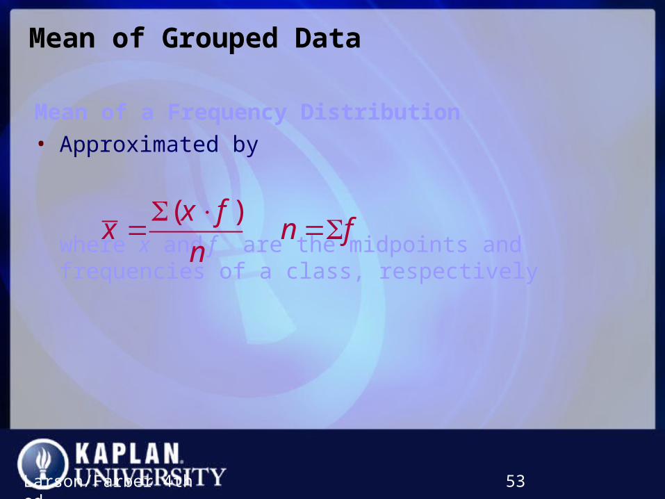
Mean of Grouped DataMean of Grouped Data
Mean of a Frequency Distribution
• Approximated by
where x and f are the midpoints and frequencies of a class, respectively
Larson/Farber 4th ed. 53
( )x fx n f
n
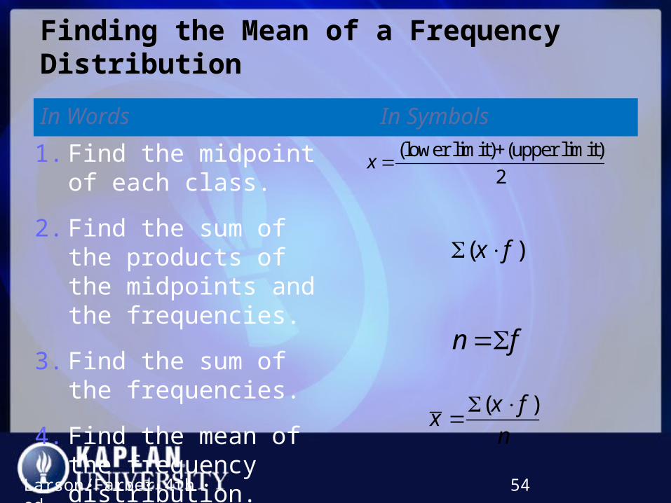
Finding the Mean of a Frequency DistributionFinding the Mean of a Frequency Distribution
In Words In Symbols
Larson/Farber 4th ed. 54
( )x fx
n
(lower limit)+(upper limit)
2x
( )x f
n f
1. Find the midpoint of each class.
2. Find the sum of the products of the midpoints and the frequencies.
3. Find the sum of the frequencies.
4. Find the mean of the frequency distribution.

Example: Find the Mean of a Frequency DistributionExample: Find the Mean of a Frequency Distribution
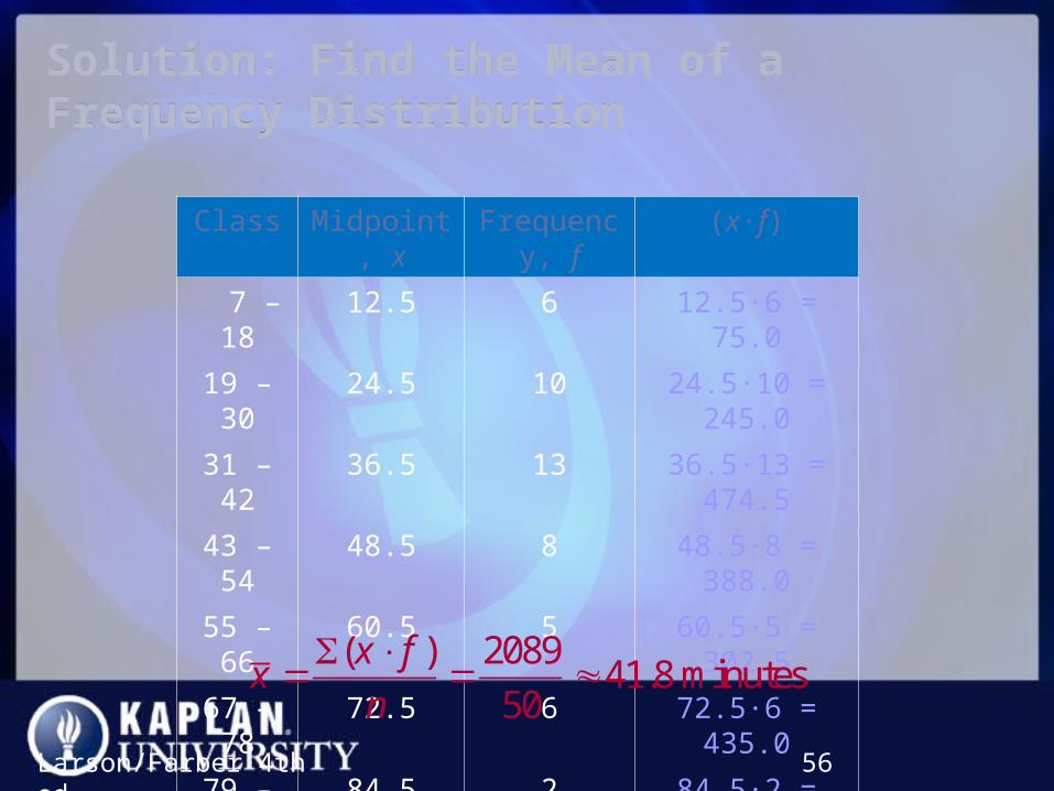
Use the frequency distribution to approximate the mean number of minutes that a sample of Internet subscribers spent online during their most recent session.
Larson/Farber 4th ed. 55
Class Midpoint Frequency, f
7 – 18 12.5 6
19 – 30 24.5 10
31 – 42 36.5 13
43 – 54 48.5 8
55 – 66 60.5 5
67 – 78 72.5 6
79 – 90 84.5 2
Solution: Find the Mean of a Frequency DistributionSolution: Find the Mean of a Frequency Distribution
Larson/Farber 4th ed. 56
Class Midpoint, x Frequency, f (x∙f)
7 – 18 12.5 6 12.5∙6 = 75.0
19 – 30 24.5 10 24.5∙10 = 245.0
31 – 42 36.5 13 36.5∙13 = 474.5
43 – 54 48.5 8 48.5∙8 = 388.0
55 – 66 60.5 5 60.5∙5 = 302.5
67 – 78 72.5 6 72.5∙6 = 435.0
79 – 90 84.5 2 84.5∙2 = 169.0
n = 50 Σ(x∙f) = 2089.0
( ) 208941.8 minutes
50
x fx
n
The Shape of DistributionsThe Shape of Distributions
Larson/Farber 4th ed. 57
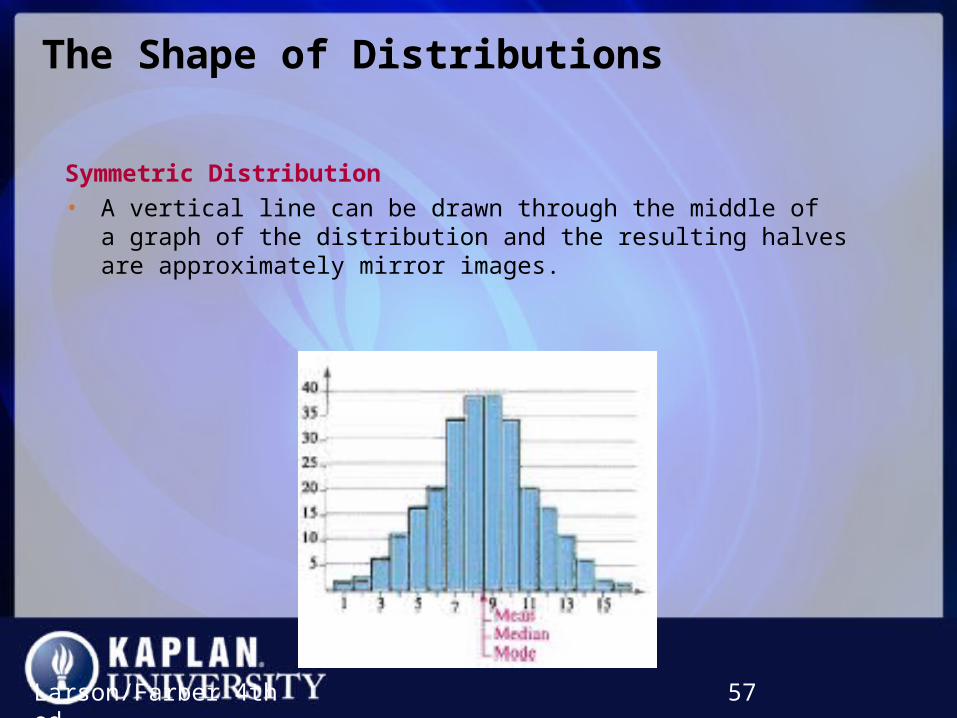
Symmetric Distribution
• A vertical line can be drawn through the middle of a graph of the distribution and the resulting halves are approximately mirror images.
The Shape of DistributionsThe Shape of Distributions
Larson/Farber 4th ed. 58
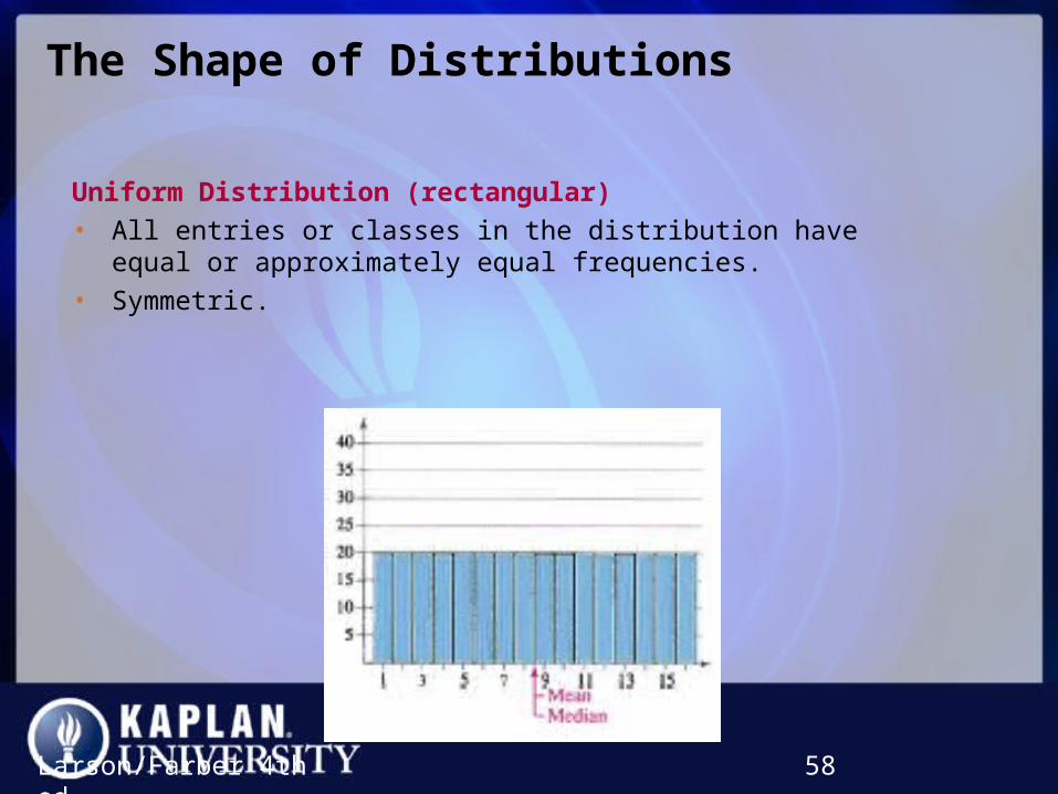
Uniform Distribution (rectangular)
• All entries or classes in the distribution have equal or approximately equal frequencies.
• Symmetric.

The Shape of DistributionsThe Shape of Distributions
Larson/Farber 4th ed. 59
Skewed Left Distribution (negatively skewed)
• The “tail” of the graph elongates more to the left.
• The mean is to the left of the median.
The Shape of DistributionsThe Shape of Distributions
Larson/Farber 4th ed. 60
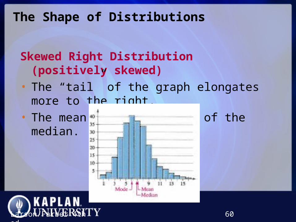
Skewed Right Distribution (positively skewed)
• The “tail” of the graph elongates more to the right.
• The mean is to the right of the median.
Section 2.3 SummarySection 2.3 Summary
• Determined the mean, median, and mode of a population and of a sample
• Determined the weighted mean of a data set and the mean of a frequency distribution
• Described the shape of a distribution as symmetric, uniform, or skewed and compared the mean and median for each
Larson/Farber 4th ed. 61
Section 2.4Section 2.4Section 2.4Section 2.4
Measures of Variation
Larson/Farber 4th ed. 62
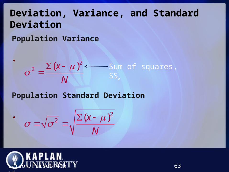
Deviation, Variance, and Standard DeviationDeviation, Variance, and Standard Deviation
Population Variance
•
Population Standard Deviation
•
Larson/Farber 4th ed. 63
22 ( )x
N
Sum of squares, SSx
22 ( )x
N

Example: Using Technology to Find the Standard DeviationExample: Using Technology to Find the Standard Deviation
Sample office rental rates (in dollars per square foot per year) for Miami’s central business district are shown in the table. Use a calculator or a computer to find the mean rental rate and the sample standard deviation. (Adapted from: Cushman & Wakefield Inc.)
Larson/Farber 4th ed. 64
Office Rental Rates
35.00 33.50 37.00
23.75 26.50 31.25
36.50 40.00 32.00
39.25 37.50 34.75
37.75 37.25 36.75
27.00 35.75 26.00
37.00 29.00 40.50
24.50 33.00 38.00
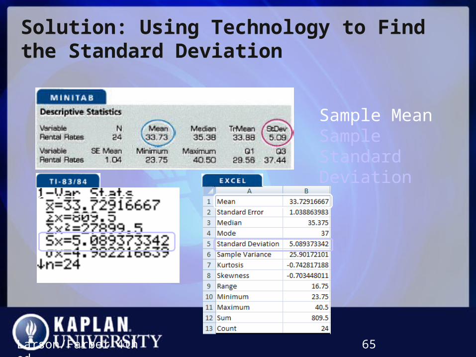
Solution: Using Technology to Find the Standard DeviationSolution: Using Technology to Find the Standard Deviation
Larson/Farber 4th ed. 65
Sample MeanSample Standard Deviation

Interpreting Standard DeviationInterpreting Standard Deviation
• Standard deviation is a measure of the typical amount an entry deviates from the mean.
• The more the entries are spread out, the greater the standard deviation.
66
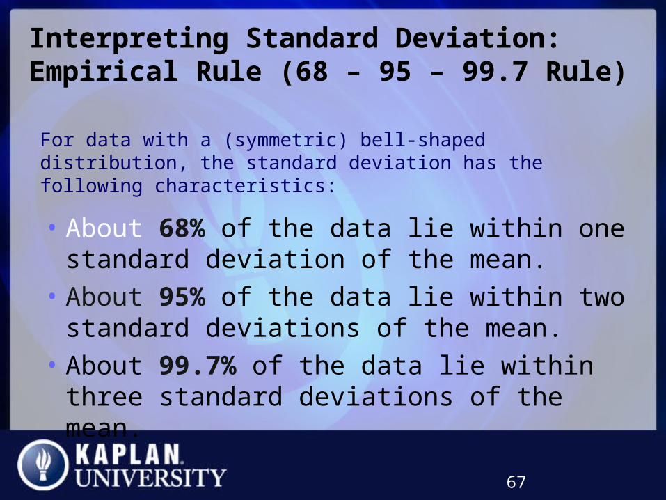
Interpreting Standard Deviation: Empirical Rule (68 – 95 – 99.7 Rule)Interpreting Standard Deviation: Empirical Rule (68 – 95 – 99.7 Rule)
For data with a (symmetric) bell-shaped distribution, the standard deviation has the following characteristics:
67
• About 68% of the data lie within one standard deviation of the mean.
• About 95% of the data lie within two standard deviations of the mean.
• About 99.7% of the data lie within three standard deviations of the mean.
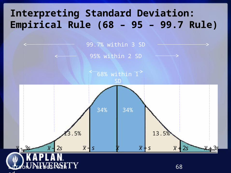
Interpreting Standard Deviation: Empirical Rule (68 – 95 – 99.7 Rule)Interpreting Standard Deviation: Empirical Rule (68 – 95 – 99.7 Rule)
Larson/Farber 4th ed. 68
3x s x s 2x s 3x sx s x2x s
68% within 1 SD
34% 34%
99.7% within 3 SD
2.35% 2.35%
95% within 2 SD
13.5% 13.5%

Example: Using the Empirical RuleExample: Using the Empirical Rule
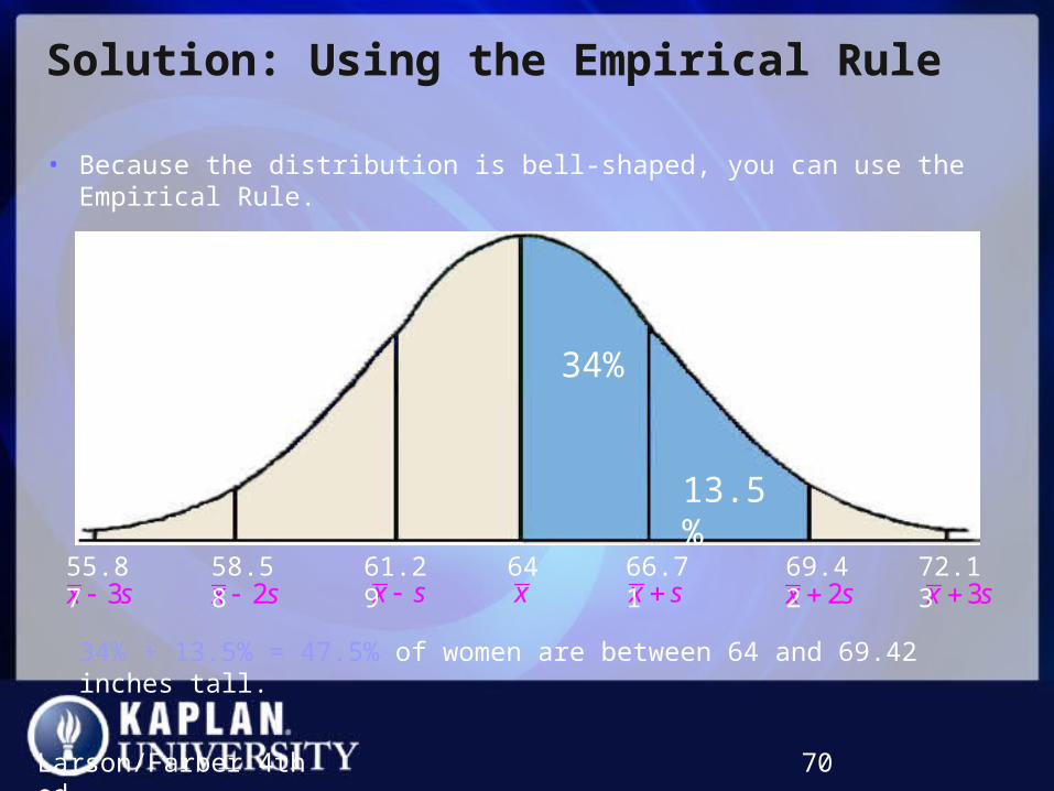
In a survey conducted by the National Center for Health Statistics, the sample mean height of women in the United States (ages 20-29) was 64 inches, with a sample standard deviation of 2.71 inches. Estimate the percent of the women whose heights are between 64 inches and 69.42 inches.
Larson/Farber 4th ed. 69
Solution: Using the Empirical RuleSolution: Using the Empirical Rule
Larson/Farber 4th ed. 70
3x s x s 2x s 3x sx s x2x s55.87 58.58 61.29 64 66.71 69.42 72.13
34%
13.5%
• Because the distribution is bell-shaped, you can use the Empirical Rule.
34% + 13.5% = 47.5% of women are between 64 and 69.42 inches tall.

Chebychev’s TheoremChebychev’s Theorem
• The portion of any data set lying within k standard deviations (k > 1) of the mean is at least:
Larson/Farber 4th ed. 71
2
11
k
• k = 2: In any data set, at least2
1 31 or 75%
2 4
of the data lie within 2 standard deviations of the mean.
• k = 3: In any data set, at least2
1 81 or 88.9%
3 9
of the data lie within 3 standard deviations of the mean.
Box-and-Whisker PlotBox-and-Whisker Plot
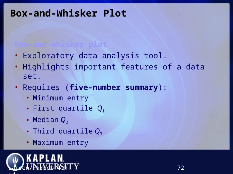
Box-and-whisker plot
• Exploratory data analysis tool.
• Highlights important features of a data set.
• Requires (five-number summary):• Minimum entry
• First quartile Q1
• Median Q2
• Third quartile Q3
• Maximum entry
Larson/Farber 4th ed. 72

Drawing a Box-and-Whisker PlotDrawing a Box-and-Whisker Plot
1. Find the five-number summary of the data set.
2. Construct a horizontal scale that spans the range of the data.
3. Plot the five numbers above the horizontal scale.
4. Draw a box above the horizontal scale from Q1 to Q3 and draw a vertical line in the box at Q2.
5. Draw whiskers from the box to the minimum and maximum entries.
Larson/Farber 4th ed. 73
Whisker
Whisker
Maximum entry
Minimum entry
Box
Median, Q2
Q3Q1
Related Documents