Unit 51 Page Layout and Design Production Commentary

mediaPr11 production commentary
Jul 28, 2015
Welcome message from author
This document is posted to help you gain knowledge. Please leave a comment to let me know what you think about it! Share it to your friends and learn new things together.
Transcript
Unit 51 Page Layout and Design
Production Commentary

Slide 1: Design ProgrammesTo produce my main front cover of my magazine I used the appropriate professional software available to me
which was abode photo shop. Photo shop allowed me to manipulate images I’d taken with a canon professional camera, and edit them to my liking. As my front cover’s dominant image was Princess Anna
modelled by Amelia, I wanted to edit her face to look flawless and very princess like. Photo shop gave me the ability to edit certain features on her face such as her eye colour, complexion of her face and cheeks and also her lips and eyebrows. As you see other popular magazines such as Elle that uses these edits also. I also was able to delete the whole background of the original image, as it was a grey, dull background that would not of been appropriate for my magazine cover. Finally I was also able to change the colour of her hair to resemble Princess Anna. I also used photo shop to create my two page spread magazine article. I was able to achieve multiple professional edits and applied techniques to my article which take practice and knowledge. I think
photo shop personally was best to use to create this type of product. To create my written article I simply used Microsoft Word as this software allowed me to write out my article clearly and I was able to edit and delete
parts I wasn’t sure of very easily. I have used both photo shop and Microsoft word before, so luckily I was very comfortable using these two types of software to create my final two page spread magazine article. The first image
shows me editing the brightness and contras of the background image. The second image shows me editing the different elements of my magazine title. The last images shows me about to remove my main images background so its clear and transparent.
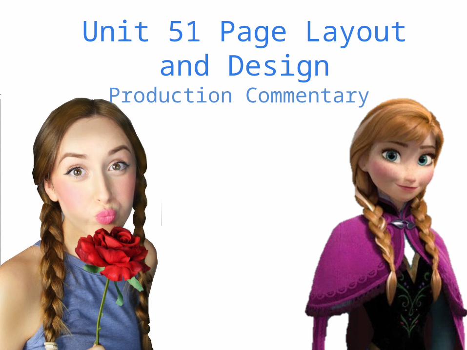
Slide 2: FormatsThe format of media I used was print media, as I produced a magazine cover and also a two page spread article. I did some research into other magazines that were similar to the one I was creating, as I was producing a magazine cover including a Disney princess on the cover I thought it would be difficult to find research and examples of other magazine covers that have included a Disney theme. However I came across a selection of magazine covers over the years that have focused on Disney Princesses. I also previously did some work on 2015 Cinderella Disney Movie that was released earlier this year, and how that was presented through magazines and film posters, I analysed where certain information was placed and the positioning of images and text. I also Analysed a film poster of Cinderella to define and learn about the Guttenberg Principle. Which I have included further through this power point. I think using a print media such as a magazine to create my article and front cover of Frozen was suitable, and best for my audience. As a magazine is easily accessible from local stores, news agents and also you can access magazines online.
Slide 3: Conventions & Visual Language
As my magazine was about Frozen, one of the most successful famous Disney movies ever made. The genre of this type of magazine would be fantasy, and the type of magazine would be a film magazine. I have tried my best to apply conventional technique's to my front cover and inside article. For example
the colours I have used, my colour scheme is clearly blue, and grey. I have chosen this colour scheme as Frozen's colour scheme is also blue and grey, as they both represent ice, coldness, and all the magical
elements of Frozen itself. I also plaited Amelia's hair as Princess Anna is known for her long, light brunette plaited hair. Her facial expression is happy, and smiling, and her body position is relaxed whilst holding a red flower. The red flower connotes nature, calmness and femininity. It also contrasts against
my colour scheme, and as the colour of the flower is red is immediately draws the audience attention to the front cover of the magazine. My main heading of my magazine is named ‘BOUXE’ in a bold, 3D effect
grey edit. I achieved this look by simply using different techniques and editing tools on photo shop. I wanted the heading of my magazine to look professional and realistic. Inside my magazine I created a
two page spread of an article based upon frozen, the article was named ‘Life After Frozen’ I included the conventional parts of an article such as a subheading, main image and also a main heading which was a
quote from the article itself to attract my audience. I stuck with my original colour scheme inside the magazine, I used a sky blue for the text as it was clear to read and was a conventional colour for my magazine. I made certain words bold, or italic to make them stand out against each other. I also used
the shape tool to create a defined underline under some important words I wanted my audience to see. I also placed a page number in the bottom right hand corner of the right hand page to make my magazine
seem realistic and professional. I used quotations of what my article said and made them bold, and underlined to stand out against the rest of my article. I used a formal, but fun type of language
throughout as my audience is females, from the age of 15 to 20. The font I used for my front cover sub headings in my opinion was very convention for a magazine cover, the font was called ‘ Rockwell
Condensed’ and looked very tall, and thin. However was clear to read, and looked formal. It set a formal mood, and created an easy way for the audience to read the information I displayed on my front cover.
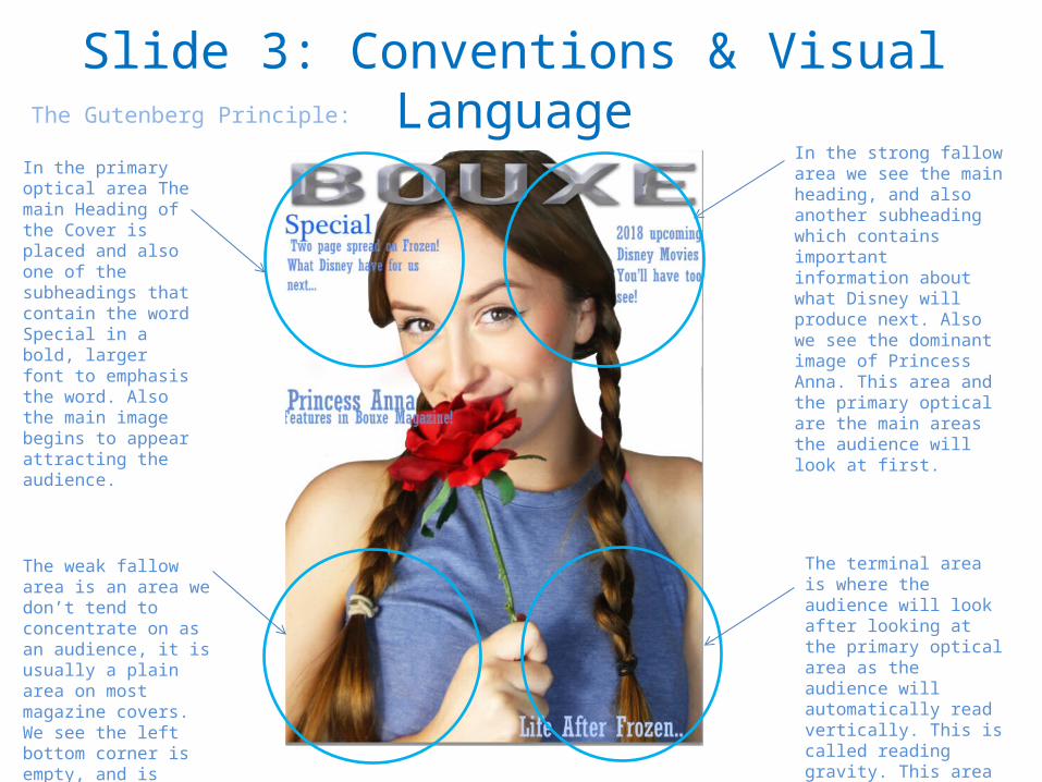
Slide 3: Conventions & Visual LanguageThe Gutenberg Principle:
In the primary optical area The main Heading of the Cover is placed and also one of the subheadings that contain the word Special in a bold, larger font to emphasis the word. Also the main image begins to appear attracting the audience.
In the strong fallow area we see the main heading, and also another subheading which contains important information about what Disney will produce next. Also we see the dominant image of Princess Anna. This area and the primary optical are the main areas the audience will look at first.
The weak fallow area is an area we don’t tend to concentrate on as an audience, it is usually a plain area on most magazine covers. We see the left bottom corner is empty, and is where the dominant image ends.
The terminal area is where the audience will look after looking at the primary optical area as the audience will automatically read vertically. This is called reading gravity. This area contains another subheading which is the title of the article inside the magazine.

Slide 4: AudienceThe audience I have aimed my magazine at is females, interested in Disney itself especially Disney Princess films. My audience would of have to have seen Frozen the movie, to relate to the magazine article and front cover. My
audience would most likely be in high school or college, still in education however has time to sit and enjoy a good timeless Disney movie. My audience are most likely to be aged between 15 and 20, their social status would be middle class, as this magazine is formal yet un and does use some informal text and words to suit the audience. as frozen has a wide audience itself. I think my magazine meets a suitable criteria for my target audience, as I have used conventional ways of portraying my magazine cover and article. Some ways in which I think it does meet my target audiences needs are for example the images I have used. As my article is based upon Frozen which includes two popular Disney princess’s I have used one to feature as my dominant image and star as
Princess Anna. I have edited this picture to make her complexion flawless, just like a princess. I have also used appropriate colours, for example blue. Blue is an iconic colour when it comes to Frozen, it connotes a number of things, such as the magic in the film, the colour of Elsa’s dress and also the word frozen itself. We associate the colour blue with coldness, calmness and very settling. I think my audience will appreciate the colour scheme I
have used.
Related Documents