Question 5 How did you attract/address your audience?

Welcome message from author
This document is posted to help you gain knowledge. Please leave a comment to let me know what you think about it! Share it to your friends and learn new things together.
Transcript

Question 5
How did you attract/address your audience?
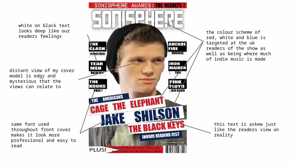
same font used throughout front cover makes it look more professional and easy to read
white on black text looks deep like our readers feelings
this text is askew just like the readers view on reality
the colour scheme of red, white and blue is targeted at the uk readers of the show as well as being where much of indie music is made
distant view of my cover model is edgy and mysterious that the views can relate to

a win section with products that the reader would like to buy so this would cause more people to buy the magazine for the possibility of winning vans gear
the contents has been laid out as so to make it look new but still be useful and accessible
same impact text font used throughout to create a sense of branding and power red title banner to attract
the eyes of the reader
two colour picture shows an inverted look on music and life in general that works with the readers views

title and font following through from the cover to tie the magazine together
3 columns make this page look fuller and better for the reader to read by dividing things it perfect sections
these heading allow the readers to access the information faster by showing the correct sections
this picture is deep and mysterious as it does not face the camera and is wearing indie thrift shop clothes
the red , white and blue colour scheme has followed through the magazine for the uk readers
Related Documents