Women weekly magazine analysis Emily Radcliffe

Welcome message from author
This document is posted to help you gain knowledge. Please leave a comment to let me know what you think about it! Share it to your friends and learn new things together.
Transcript
Women weekly magazine analysis Emily Radcliffe
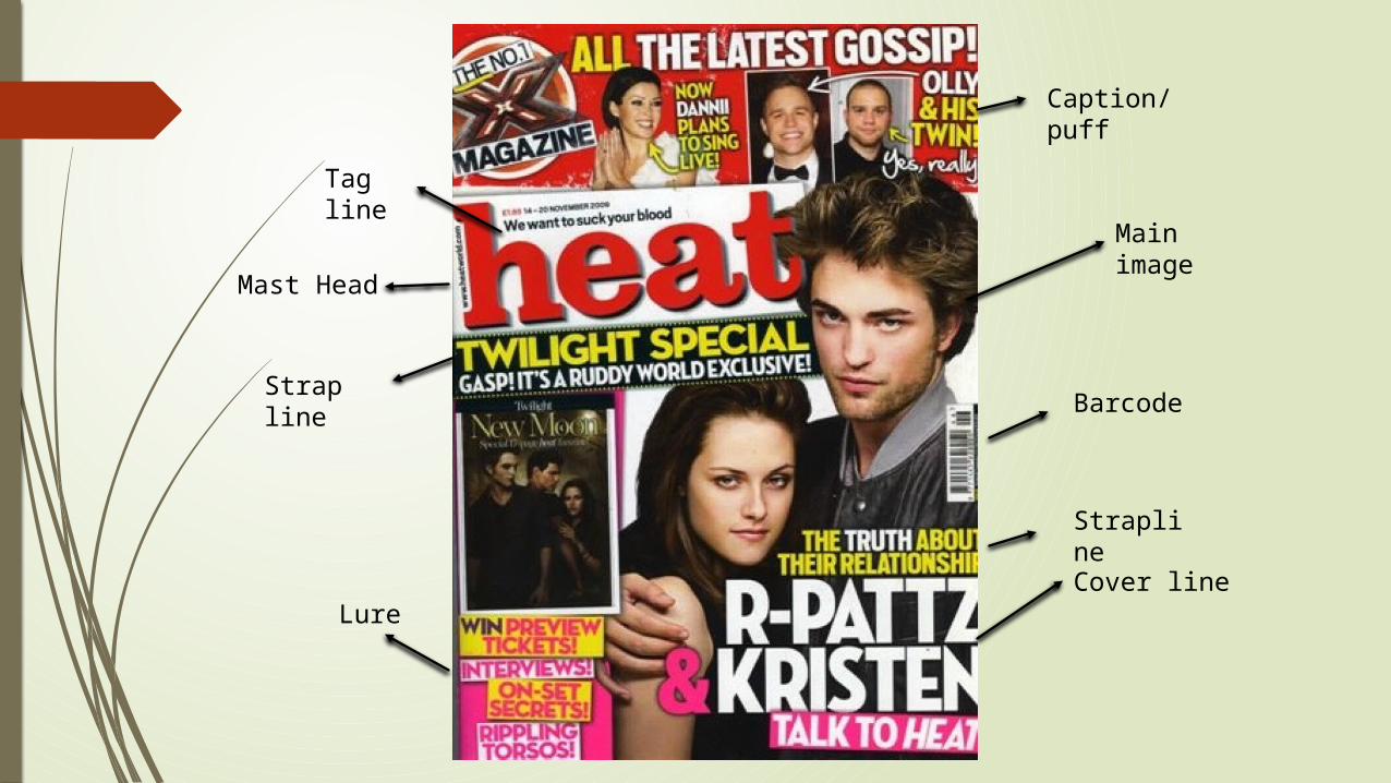
Mast Head
Cover line
Strapline
Barcode
Caption/puff
Strap line
Lure
Main image
Tag line
Use of colour
In this particular ‘Heat’ magazine they have used two different sets of colours. They have used Red and white to link in the top parts of the magazine and to link it with the magazine its self. The bottom half of the magazine then uses the more feminine colours of pink and yellow. This might have been used because they want this bit of information to particular aim itself at a particular audience.
The use of different colour on different parts of information also helps to link the different parts of information together that relate and then put apart the information that doesn’t relate to the main headline however would still be of interest to the target market of the magazine.
Mast Head
The Mast head on the magazine is ‘Heat’ this is has been put In a large red font and in central to the magazine; the use of the colour also links in the idea of heat and fire. The use of the wording, colour and the bold writing would be used to grab the readers attention and to brand the magazine to help gather information. The use of calling the magazine ‘heat’ also very cleverly links in with the idea of ‘ hot of the press’, showing the possible readers that what they are going to read will be new and fresh and wouldn’t have already been read.
Main Image
The main image has been placed very central to the magazine the reason for this would be because they want the main focus of the readers to be on this. It would also be used to show the readers that this is what the main focus of the magazine this week is on.
Even thought this is the main image of the magazine there are also other images found around the main one. The reason for this being because they are also advertising other aspects of the magazine at the same time in hope to grab the attention through eye catching photos, linking in with their target market of magazine.
Strap lines
In this magazine there has been the use of 3 main strap lines. They have been used to give of more information on different parts of the intel of the magazine.
The straplines on this magazine are in yellow bold writing as if to connect what both of the straplines together and to show how they link.
The link between the two strap lines is how the one on the left hand corner is the use of the wording ‘Ruddy world’ and then in the second strapline saying ‘the truth about their relationship’. These two different straplines work together to give the idea of what they might be saying about their relationship.

Barcode
The Barcode is a typical convention for new magazines. They always tend to be in a visible location however is small enough to not be a distraction from the magazine cover itself.
Tag Line
‘We want to suck your blood’, the magazine has very cleverly used this tagline to link in with what the theme of the magazine being about Twilight. This would have been put right next to the Mast head in order for it to be seen however it has been put in a subtle font and font size in order to make sure that the attention isn’t taken away form the mast head.
Lure
The lure has been put in on the left hand bottom side of the magazine in order to help catch the attention of the customer. The writing has been put in different colour text boxes in order to grab attentions along because they have put them in a bight yellow and pink colour.
The language that has been used in the lure Is short and straight to the point. This is because on the front cover of a magazine the reader isn’t going to want to read allot on the front cover as they will lose interest.
Related Documents