Q5: How did you attract/address your audience?

Welcome message from author
This document is posted to help you gain knowledge. Please leave a comment to let me know what you think about it! Share it to your friends and learn new things together.
Transcript

Q5: How did you attract/address your audience?

For my magazine I chose to use Kerrang! Magazine as a guideline and influence for my layout because Kerrang! Magazine is aimed at the same genre and target primary audience as my own magazine (16-25) and also aimed at the same secondary audience (26+). Kerrang! Is a popular, successful and established magazine as based on my results from my questionnaire as rock was the preferred genre and Kerrang! was the choice with the highest votes relating to the genre of rock, which helped me choose what type of magazines I should be looking at for an influence on my own magazine.
Kerrang! Uses established figures in music such Lilly Allen. In this image she has a cheeky tilt in her posture but her eyes are still focussed on the camera to give that personal intimate attention towards the audience. I decided to use this technique to make the audience feel included in the magazine, as if the subject is wanting the attention of the audience.

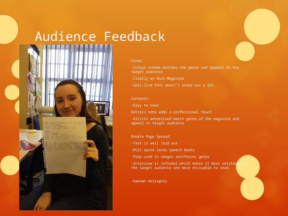
Audience Feedback
Colour scheme worked well for –darkish background with the white/red text worked with the rock/metal theme of the magazine article. Darker/bland background worked well with the contrast of images included.
Font style also works well with the subject topic – almost instantly recognise it a rock/metal magazine.
The types of images are very similar –poistionred next to/or near guitar but not playing maybe use an image or two of subject playing the bass guitar to show passion of music
-Brit Williams
Audience Feedback
Cover:
-Colour scheme matches the genre and appeals to the target audience
-Clearly an Rock Magazine
-Sell-line font doesn’t stand out a lot.
Contents:
-Easy to read
Editors note adds a professional touch
-Artists advertised match genre of the magazine and appeal to target audience
Double Page Spread:
-Text is well laid out
-Pull quote lacks speech marks
-Prop used in images reinforces genre
-Interview is informal which makes it more relatable to the target audience and more enjoyable to read.
-Hannah Herraghty
Related Documents