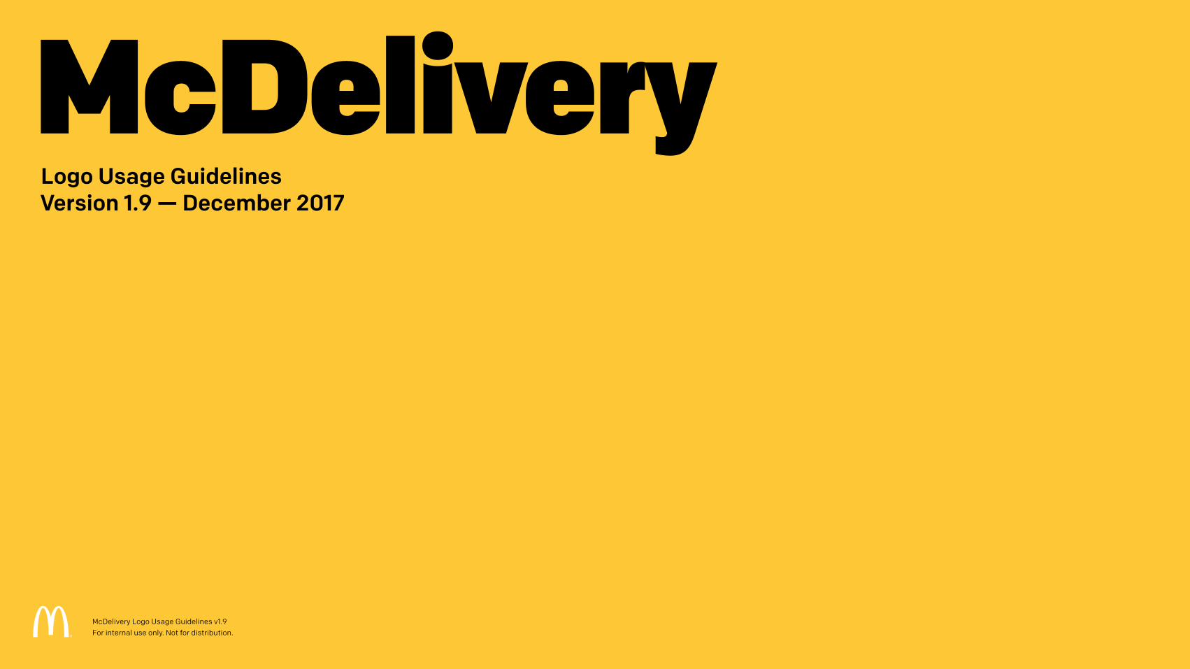
McDelivery Logo Usage Guidelines Version 1.9 — December 2017 McDelivery Logo Usage Guidelines v1.9 For internal use only. Not for distribution.

Welcome message from author
This document is posted to help you gain knowledge. Please leave a comment to let me know what you think about it! Share it to your friends and learn new things together.
Transcript
McDeliveryLogo Usage Guidelines Version 1.9 — December 2017
McDelivery Logo Usage Guidelines v1.9 For internal use only. Not for distribution.
Table of Contents
Version History 3
1 McDelivery Logo 41.1 Primary Logo 51.2 Clear Space 61.3 Primary Logo Colors 71.4 Alternate Green Logo 81.5 Minimum Size & Simplified Emblem 91.6 Background Colors 101.7 a Images 111.8 Violations 12
2 Logo Variants 132.1 When to Use Logo Variants 142.2 Horizontal Logo Lockup 152.3 One-Color Logos 16
3 Co-Branding 173.1 Primary Co-Branding Lockup 183.2 Secondary Co-Branding Lockups 193.3 Co-Branding Clear Space 203.4 Uber Eats Co-Branding Lockups 213.5 Uber Eats Co-Branding Clear Space 223.6 Uber Eats Alternate Co-Branding 23
Lockups for Asia3.7 Uber Eats Co-Brand Colors 24
Backgrounds 3.8 Uber Eats Co-Brand Color 25
Backgrounds for Asia3.9 Uber Eats Co-Brand 26
Photographic Backgrounds
4 Color Palette 274.1 Primary Brand Colors 28
5 Typography 295.1 Lovin’ Sans 30
6 In Use Examples 316.1 Digital Banners 326.2 Website Landing Page 336.3 Full-Page Print Ads 346.4 Print Ads 356.5 Social Post 36
7 Legal 377.1 Trademark Symbol 387.2 Legal Notices 39
2McDelivery Logo Usage Guidelines v1.9 For internal use only. Not for distribution.
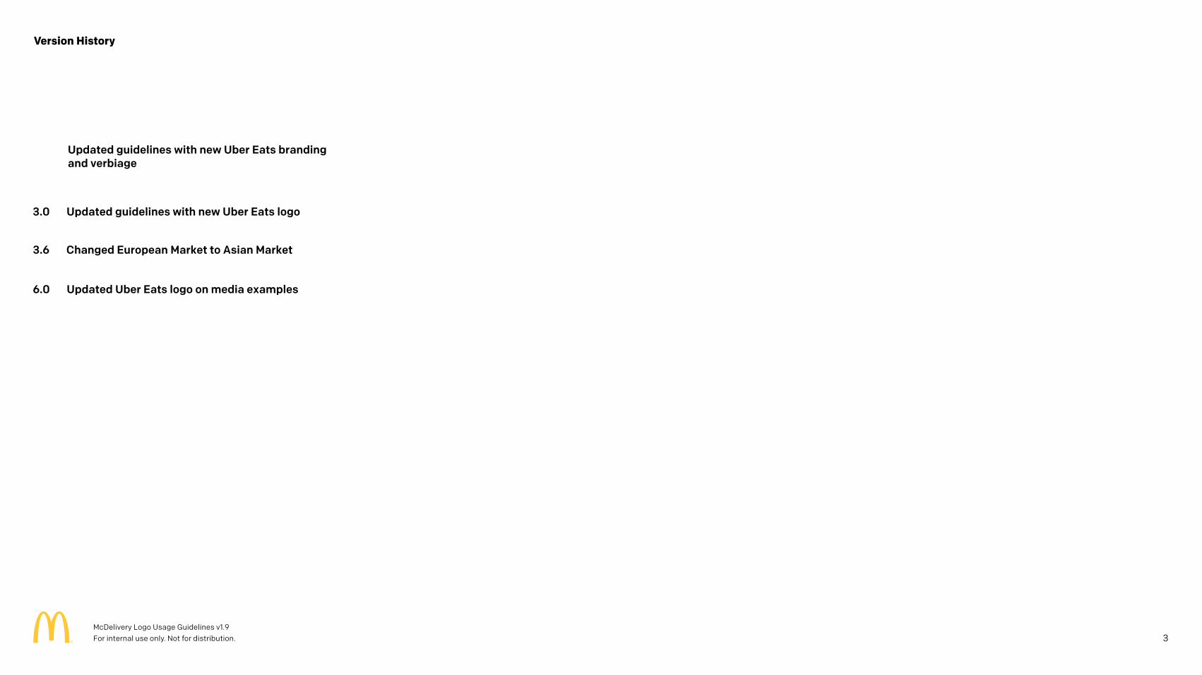
Version History
Updated guidelines with new Uber Eats branding and verbiage
3McDelivery Logo Usage Guidelines v1.9 For internal use only. Not for distribution.
3.0 Updated guidelines with new Uber Eats logo
3.6 Changed European Market to Asian Market
6.0 Updated Uber Eats logo on media examples
1 McDelivery Logo
4McDelivery Logo Usage Guidelines v1.9 For internal use only. Not for distribution.
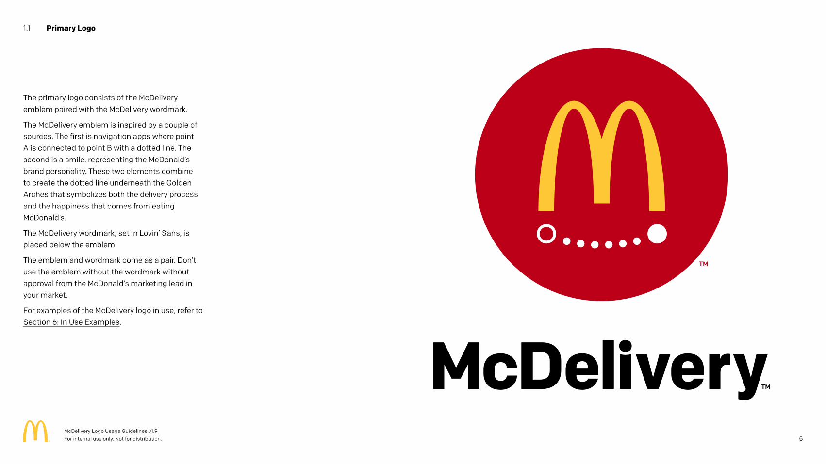
The primary logo consists of the McDelivery emblem paired with the McDelivery wordmark.
The McDelivery emblem is inspired by a couple of sources. The first is navigation apps where point A is connected to point B with a dotted line. The second is a smile, representing the McDonald’s brand personality. These two elements combine to create the dotted line underneath the Golden Arches that symbolizes both the delivery process and the happiness that comes from eating McDonald’s.
The McDelivery wordmark, set in Lovin’ Sans, is placed below the emblem.
The emblem and wordmark come as a pair. Don’t use the emblem without the wordmark without approval from the McDonald’s marketing lead in your market.
For examples of the McDelivery logo in use, refer to Section 6: In Use Examples.
1.1 Primary Logo
5McDelivery Logo Usage Guidelines v1.9 For internal use only. Not for distribution.
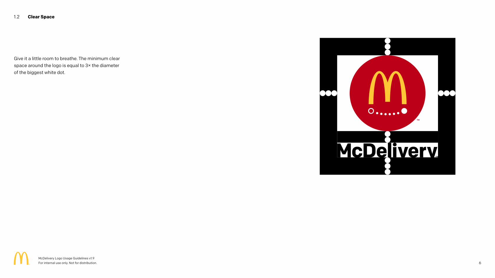
Give it a little room to breathe. The minimum clear space around the logo is equal to 3× the diameter of the biggest white dot.
1.2 Clear Space
6McDelivery Logo Usage Guidelines v1.9 For internal use only. Not for distribution.
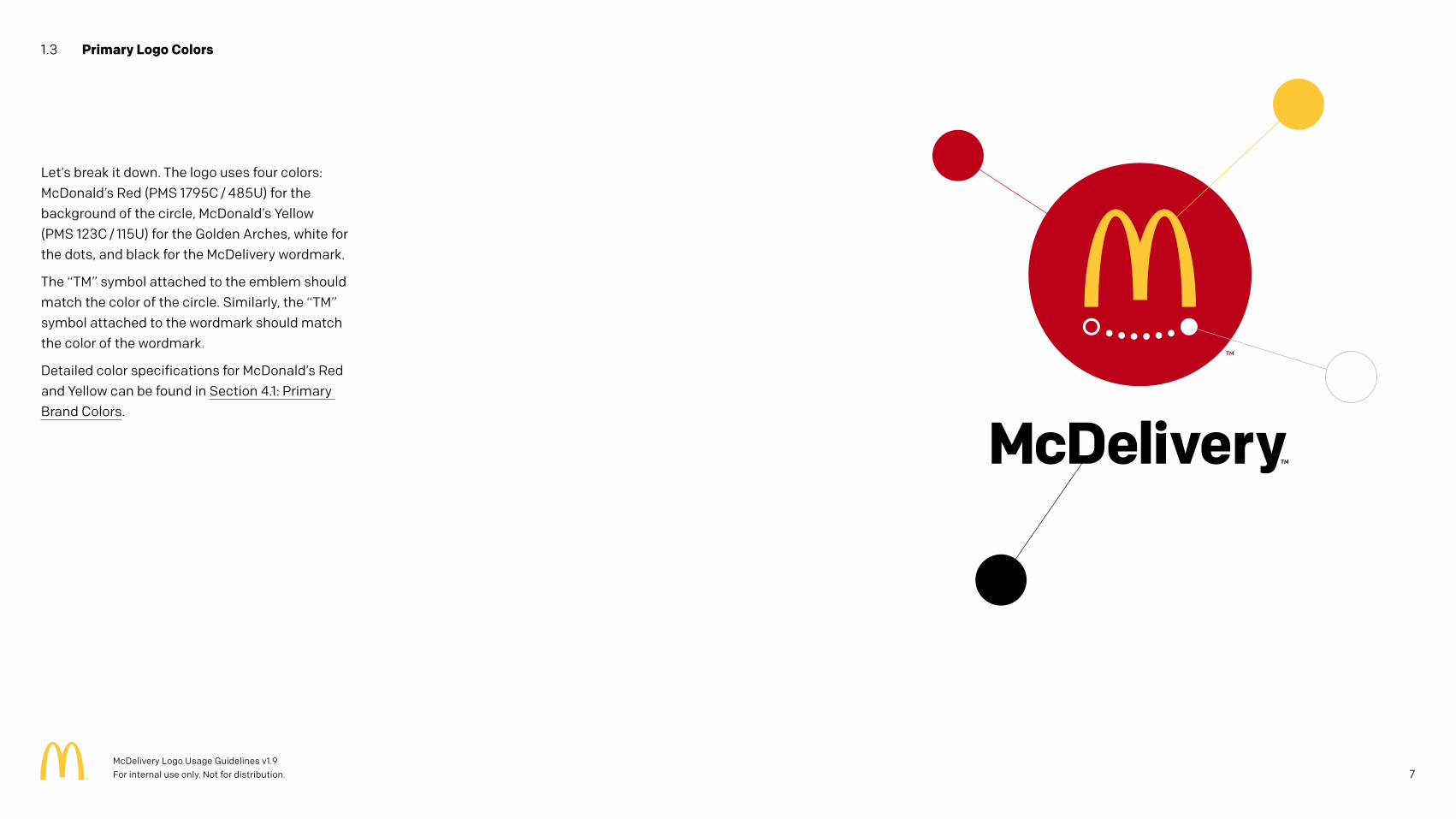
Let’s break it down. The logo uses four colors: McDonald’s Red (PMS 1795C / 485U) for the background of the circle, McDonald’s Yellow (PMS 123C / 115U) for the Golden Arches, white for the dots, and black for the McDelivery wordmark.
The “TM” symbol attached to the emblem should match the color of the circle. Similarly, the “TM” symbol attached to the wordmark should match the color of the wordmark.
Detailed color specifications for McDonald’s Red and Yellow can be found in Section 4.1: Primary Brand Colors.
1.3 Primary Logo Colors
7McDelivery Logo Usage Guidelines v1.9 For internal use only. Not for distribution.
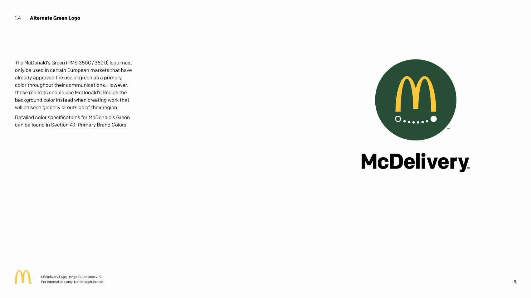
The McDonald’s Green (PMS 350C / 350U) logo must only be used in certain European markets that have already approved the use of green as a primary color throughout their communications. However, these markets should use McDonald’s Red as the background color instead when creating work that will be seen globally or outside of their region.
Detailed color specifications for McDonald’s Green can be found in Section 4.1: Primary Brand Colors.
1.4 Alternate Green Logo
8McDelivery Logo Usage Guidelines v1.9 For internal use only. Not for distribution.
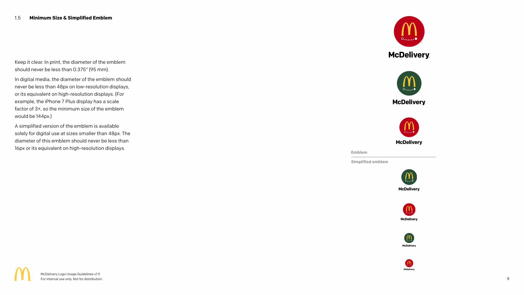
Keep it clear. In print, the diameter of the emblem should never be less than 0.375" (95 mm).
In digital media, the diameter of the emblem should never be less than 48px on low-resolution displays, or its equivalent on high-resolution displays. (For example, the iPhone 7 Plus display has a scale factor of 3×, so the minimum size of the emblem would be 144px.)
A simplified version of the emblem is available solely for digital use at sizes smaller than 48px. The diameter of this emblem should never be less than 16px or its equivalent on high-resolution displays.
1.5 Minimum Size & Simplified Emblem
Emblem
Simplified emblem
9McDelivery Logo Usage Guidelines v1.9 For internal use only. Not for distribution.
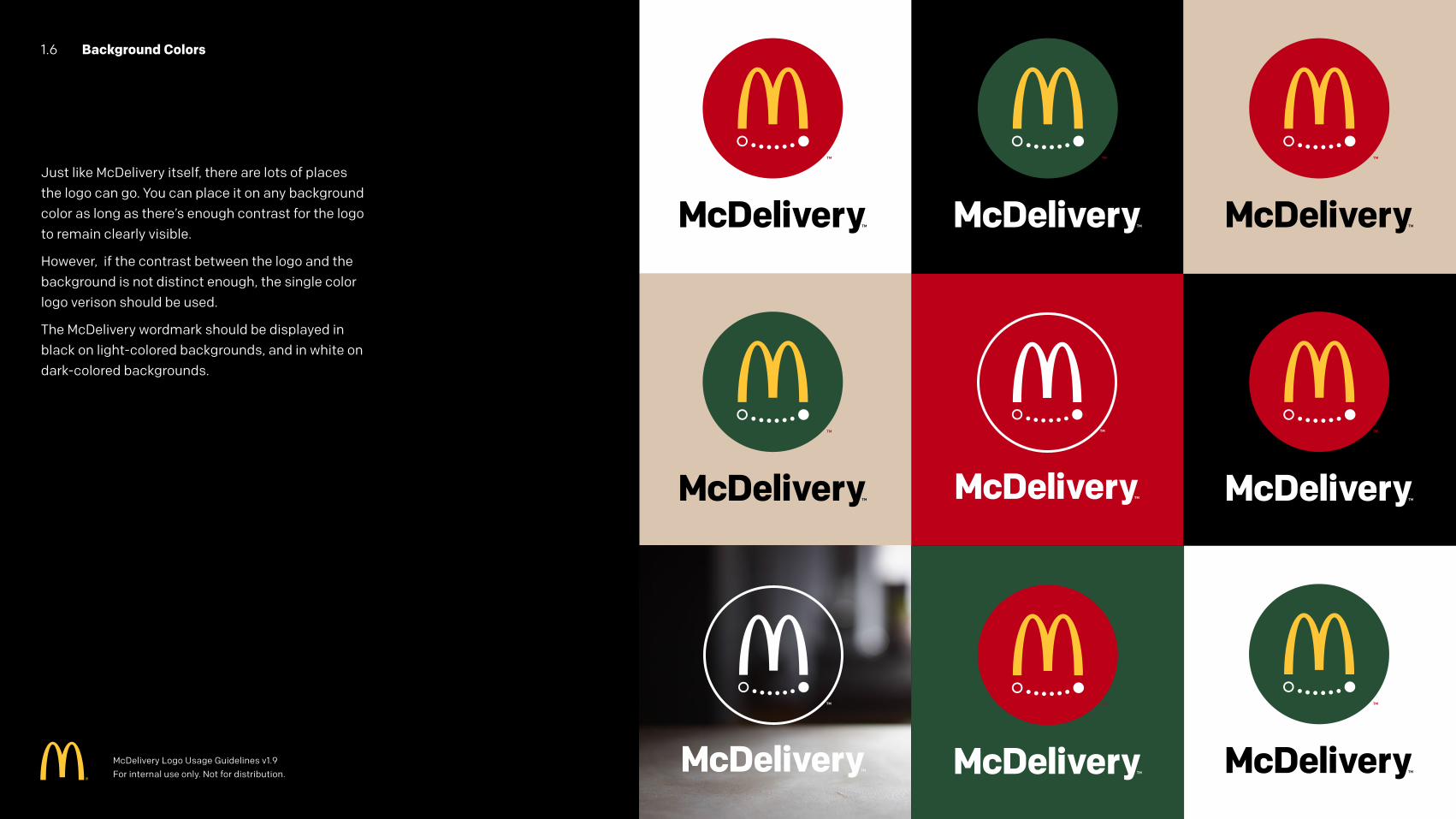
1.6 Background Colors
Just like McDelivery itself, there are lots of places the logo can go. You can place it on any background color as long as there’s enough contrast for the logo to remain clearly visible.
However, if the contrast between the logo and the background is not distinct enough, the single color logo verison should be used.
The McDelivery wordmark should be displayed in black on light-colored backgrounds, and in white on dark-colored backgrounds.
McDelivery Logo Usage Guidelines v1.9 For internal use only. Not for distribution.
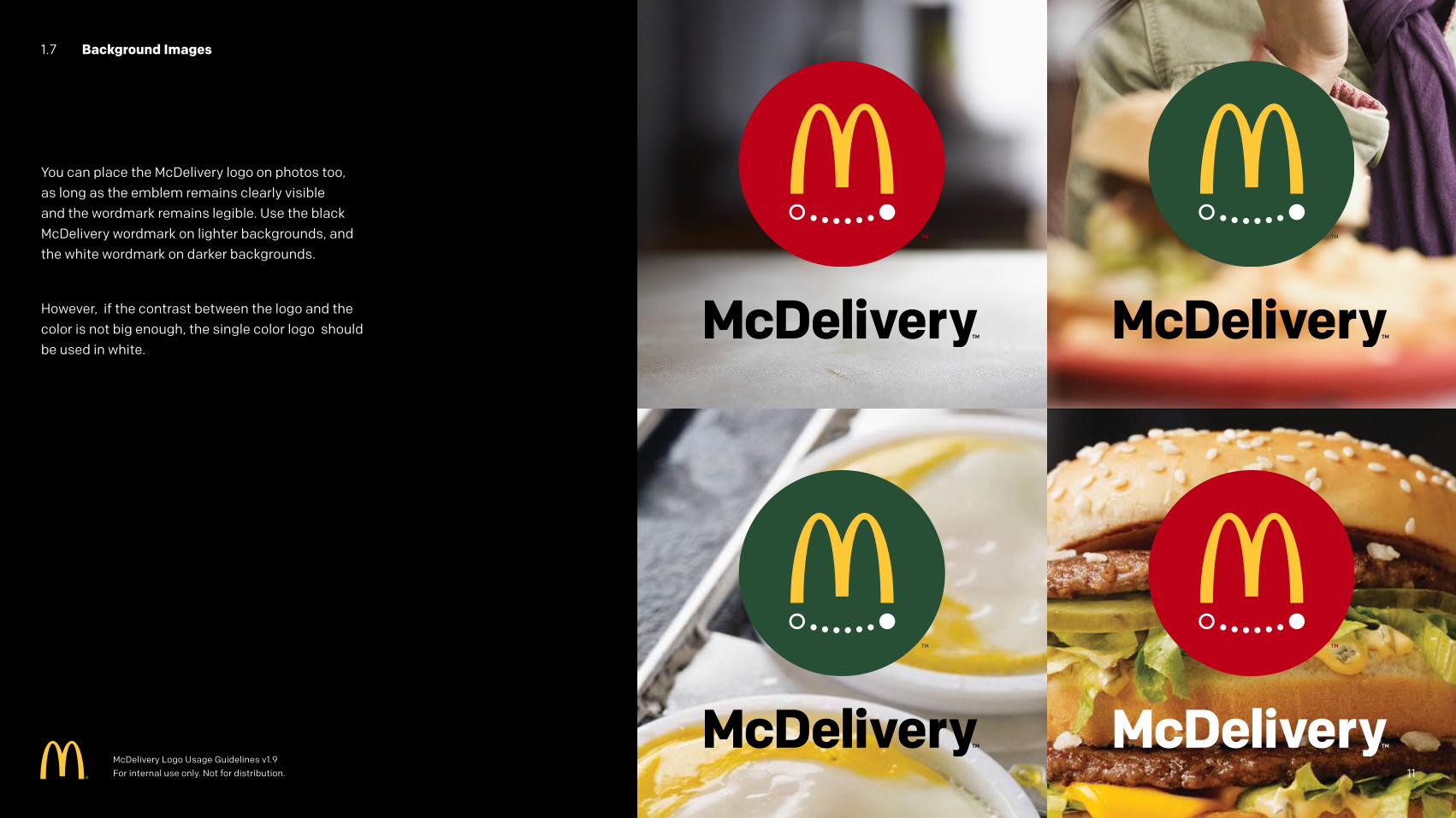
1.7 Background Images
You can place the McDelivery logo on photos too, as long as the emblem remains clearly visible and the wordmark remains legible. Use the black McDelivery wordmark on lighter backgrounds, and the white wordmark on darker backgrounds.
However, if the contrast between the logo and the color is not big enough, the single color logo should be used in white.
McDelivery Logo Usage Guidelines v1.9 For internal use only. Not for distribution. 11
1.8 Violations
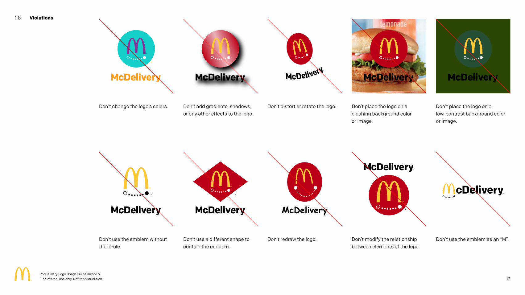
Don’t change the logo’s colors.
Don’t use the emblem without the circle.
Don’t distort or rotate the logo.
Don’t redraw the logo.
Don’t add gradients, shadows, or any other effects to the logo.
Don’t use a different shape to contain the emblem.
Don’t place the logo on a clashing background color or image.
Don’t modify the relationship between elements of the logo.
Don’t place the logo on a low-contrast background color or image.
Don’t use the emblem as an “M”.
12McDelivery Logo Usage Guidelines v1.9 For internal use only. Not for distribution.
2 Logo Variants
13McDelivery Logo Usage Guidelines v1.9 For internal use only. Not for distribution.
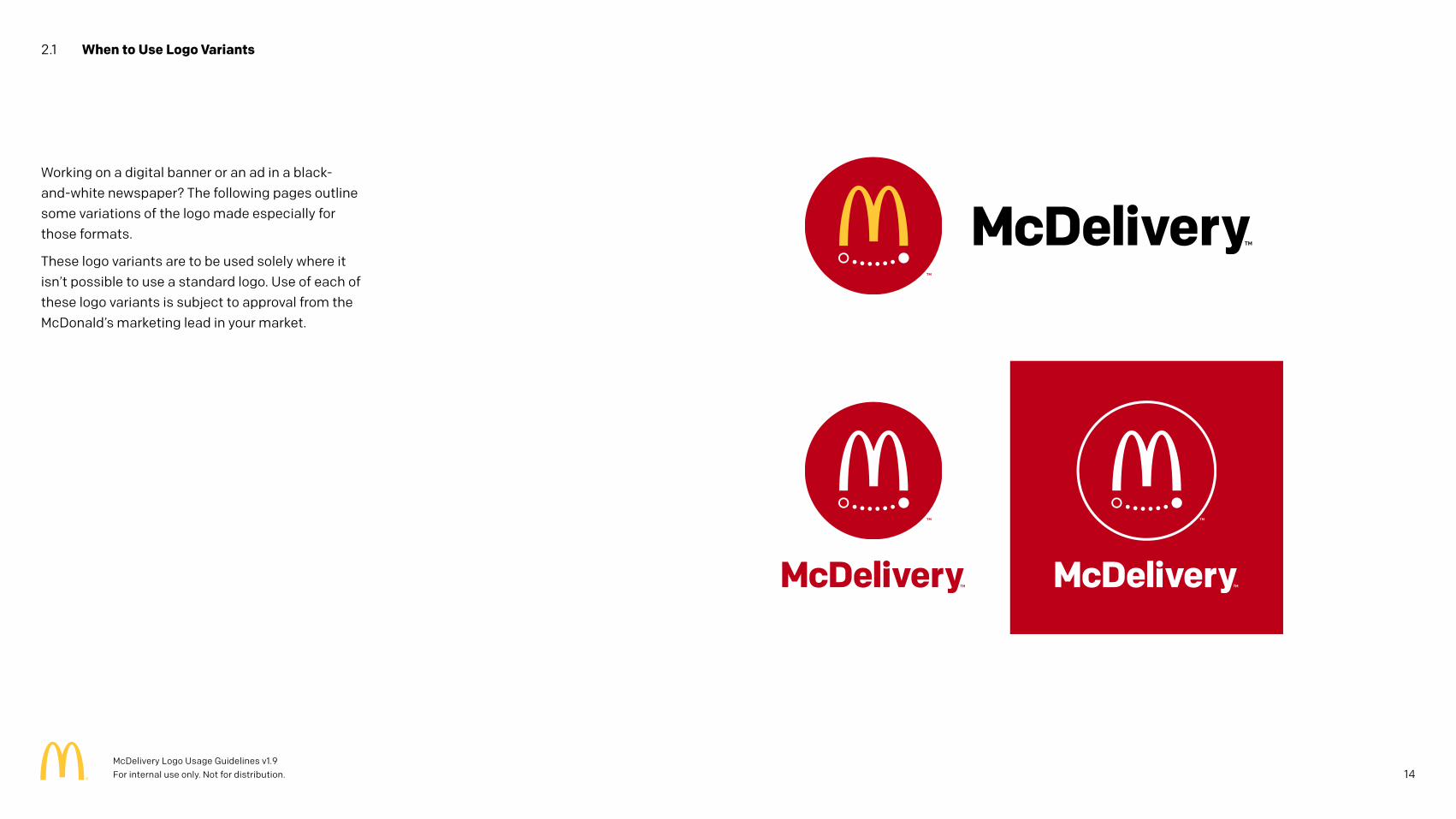
2.1 When to Use Logo Variants
Working on a digital banner or an ad in a black-and-white newspaper? The following pages outline some variations of the logo made especially for those formats.
These logo variants are to be used solely where it isn’t possible to use a standard logo. Use of each of these logo variants is subject to approval from the McDonald’s marketing lead in your market.
14McDelivery Logo Usage Guidelines v1.9 For internal use only. Not for distribution.
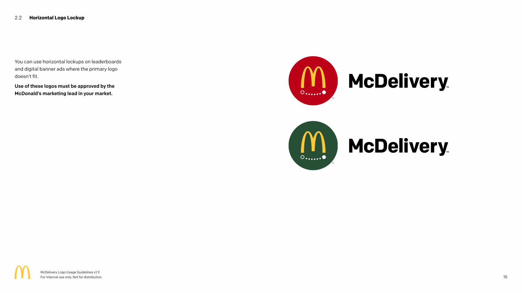
2.2 Horizontal Logo Lockup
You can use horizontal lockups on leaderboards and digital banner ads where the primary logo doesn’t fit.
Use of these logos must be approved by the McDonald’s marketing lead in your market.
15McDelivery Logo Usage Guidelines v1.9 For internal use only. Not for distribution.
2.3 One-Color Logos
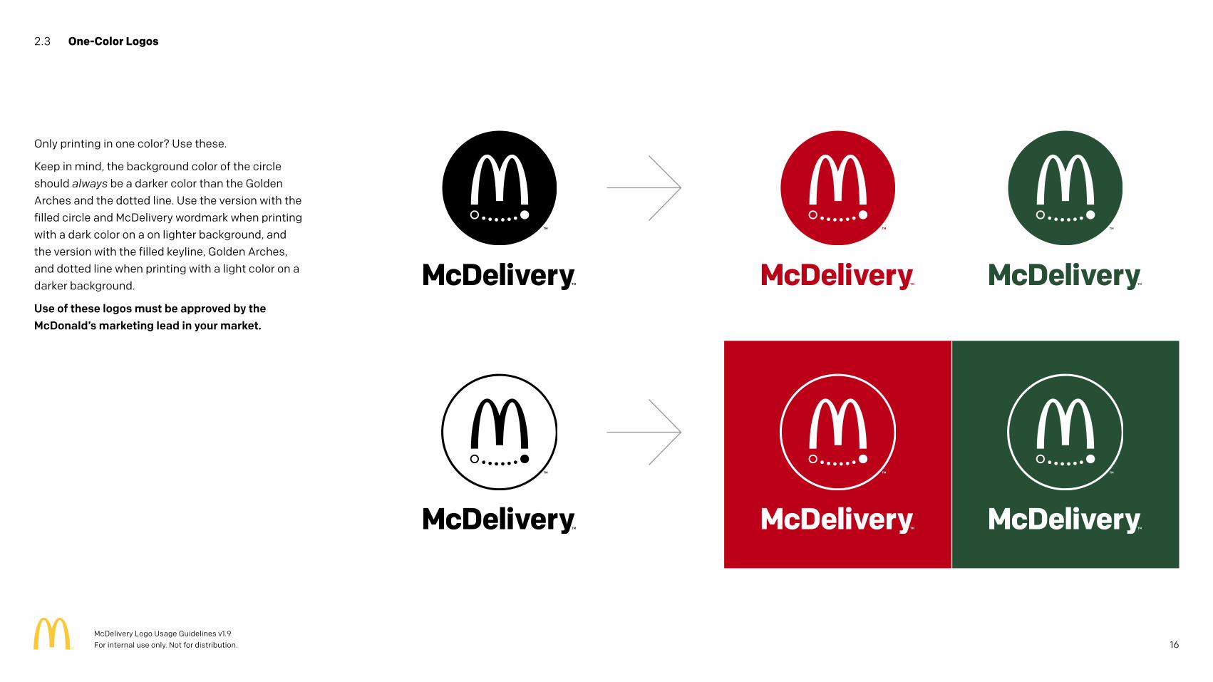
Only printing in one color? Use these.
Keep in mind, the background color of the circle should always be a darker color than the Golden Arches and the dotted line. Use the version with the filled circle and McDelivery wordmark when printing with a dark color on a on lighter background, and the version with the filled keyline, Golden Arches, and dotted line when printing with a light color on a darker background.
Use of these logos must be approved by the McDonald’s marketing lead in your market.
16McDelivery Logo Usage Guidelines v1.9 For internal use only. Not for distribution.
3 Co-Branding
17McDelivery Logo Usage Guidelines v1.9 For internal use only. Not for distribution.
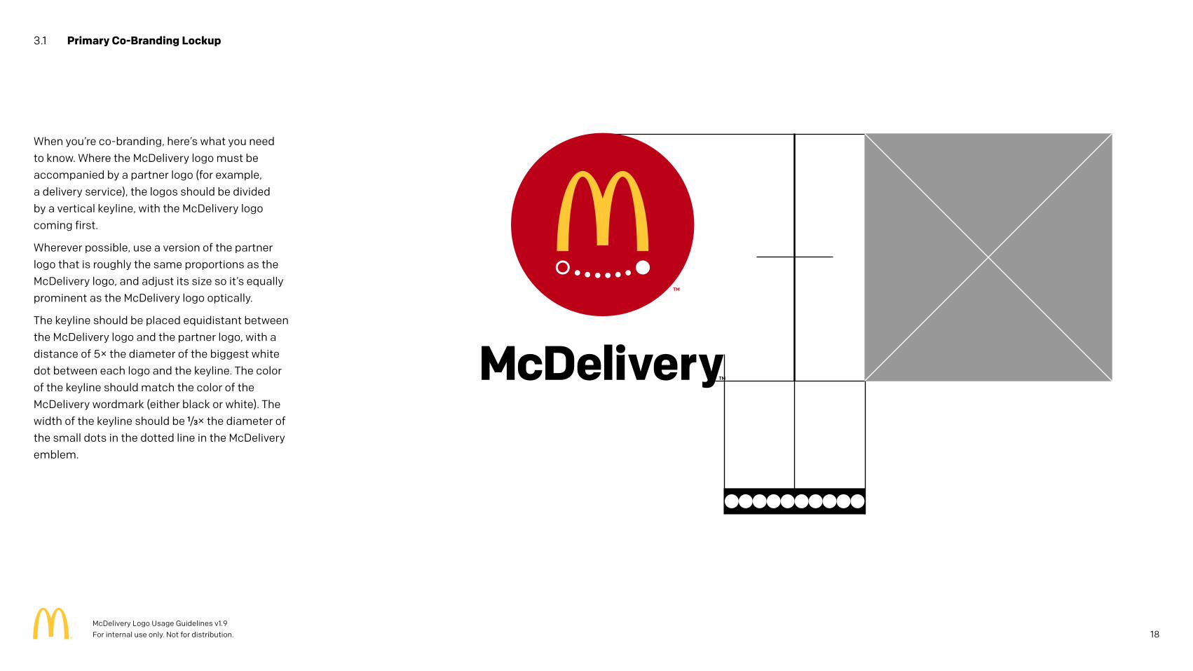
When you’re co-branding, here’s what you need to know. Where the McDelivery logo must be accompanied by a partner logo (for example, a delivery service), the logos should be divided by a vertical keyline, with the McDelivery logo coming first.
Wherever possible, use a version of the partner logo that is roughly the same proportions as the McDelivery logo, and adjust its size so it’s equally prominent as the McDelivery logo optically.
The keyline should be placed equidistant between the McDelivery logo and the partner logo, with a distance of 5× the diameter of the biggest white dot between each logo and the keyline. The color of the keyline should match the color of the McDelivery wordmark (either black or white). The width of the keyline should be 1/3× the diameter of the small dots in the dotted line in the McDelivery emblem.
3.1 Primary Co-Branding Lockup
18McDelivery Logo Usage Guidelines v1.9 For internal use only. Not for distribution.
3.2 Secondary Co-Branding Lockups
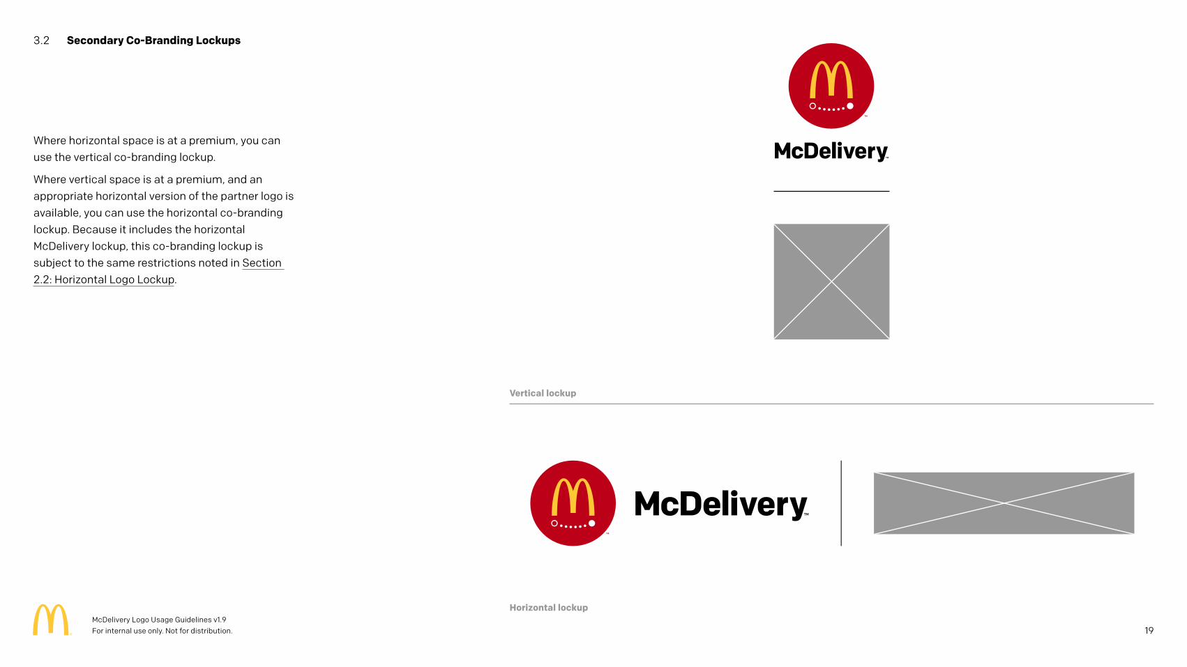
Where horizontal space is at a premium, you can use the vertical co-branding lockup.
Where vertical space is at a premium, and an appropriate horizontal version of the partner logo is available, you can use the horizontal co-branding lockup. Because it includes the horizontal McDelivery lockup, this co-branding lockup is subject to the same restrictions noted in Section 2.2: Horizontal Logo Lockup.
Horizontal lockup
Vertical lockup
19McDelivery Logo Usage Guidelines v1.9 For internal use only. Not for distribution.
3.3 Co-Branding Clear Space
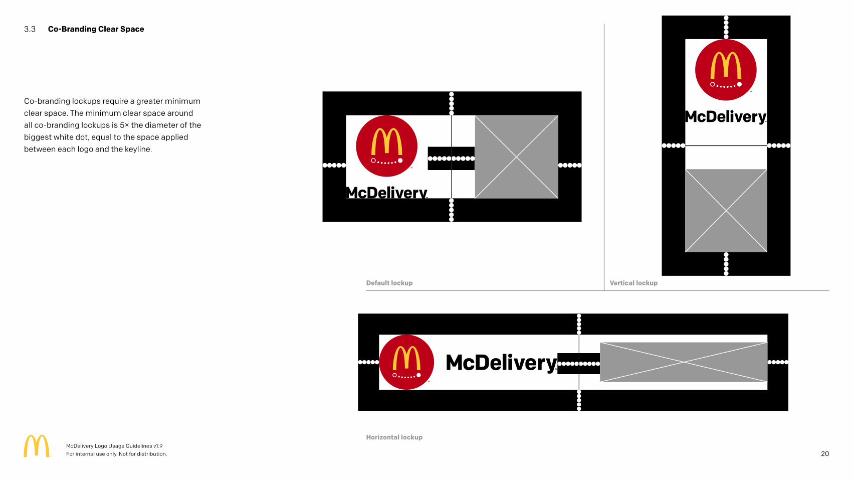
Co-branding lockups require a greater minimum clear space. The minimum clear space around all co-branding lockups is 5× the diameter of the biggest white dot, equal to the space applied between each logo and the keyline.
20
Horizontal lockup
Default lockup Vertical lockup
McDelivery Logo Usage Guidelines v1.9 For internal use only. Not for distribution.
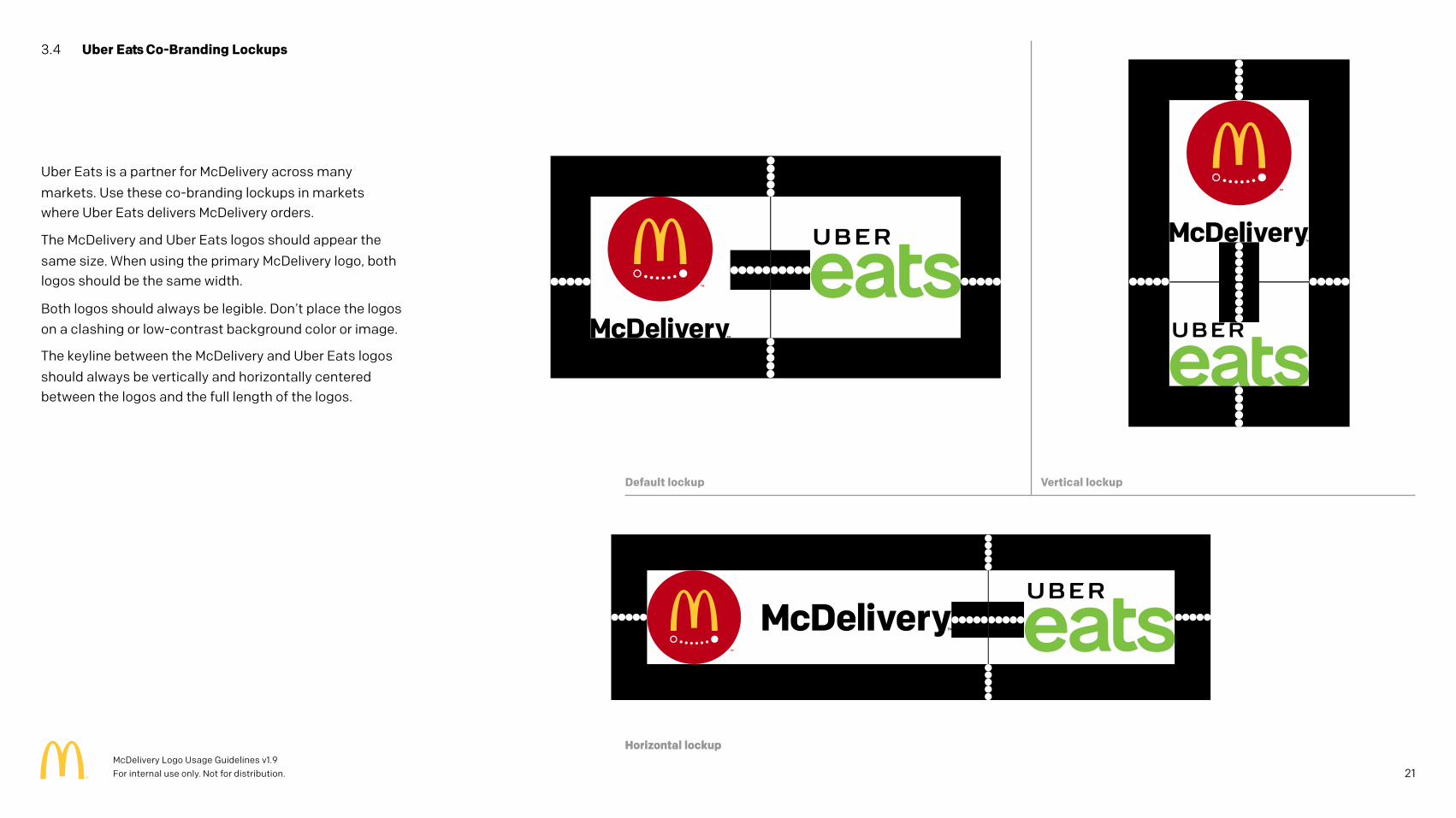
3.4 Uber Eats Co-Branding Lockups
Uber Eats is a partner for McDelivery across many
markets. Use these co-branding lockups in markets where Uber Eats delivers McDelivery orders.
The McDelivery and Uber Eats logos should appear the
same size. When using the primary McDelivery logo, both logos should be the same width.
Both logos should always be legible. Don’t place the logos on a clashing or low-contrast background color or image.
The keyline between the McDelivery and Uber Eats logos
should always be vertically and horizontally centered between the logos and the full length of the logos.
Horizontal lockup
21
Horizontal lockup
Default lockup Vertical lockup
McDelivery Logo Usage Guidelines v1.9 For internal use only. Not for distribution.
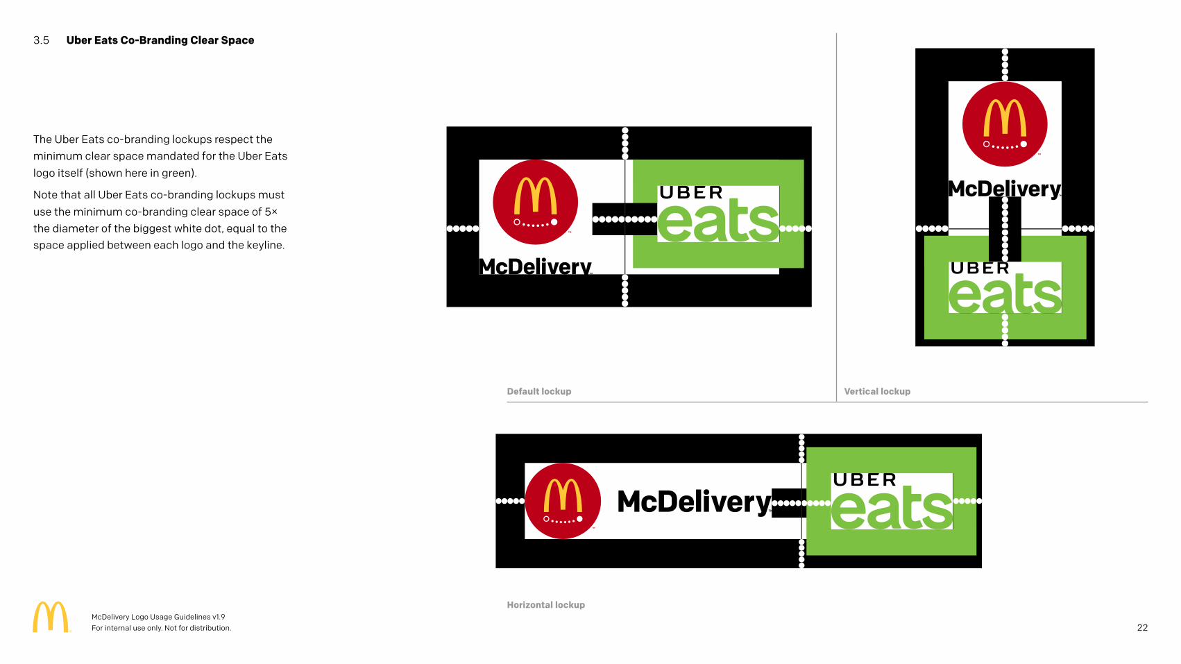
3.5 Uber Eats Co-Branding Clear Space
The Uber Eats co-branding lockups respect the minimum clear space mandated for the Uber Eats
logo itself (shown here in green).
Note that all Uber Eats co-branding lockups must
use the minimum co-branding clear space of 5× the diameter of the biggest white dot, equal to the space applied between each logo and the keyline.
22
Horizontal lockup
Default lockup Vertical lockup
McDelivery Logo Usage Guidelines v1.9 For internal use only. Not for distribution.
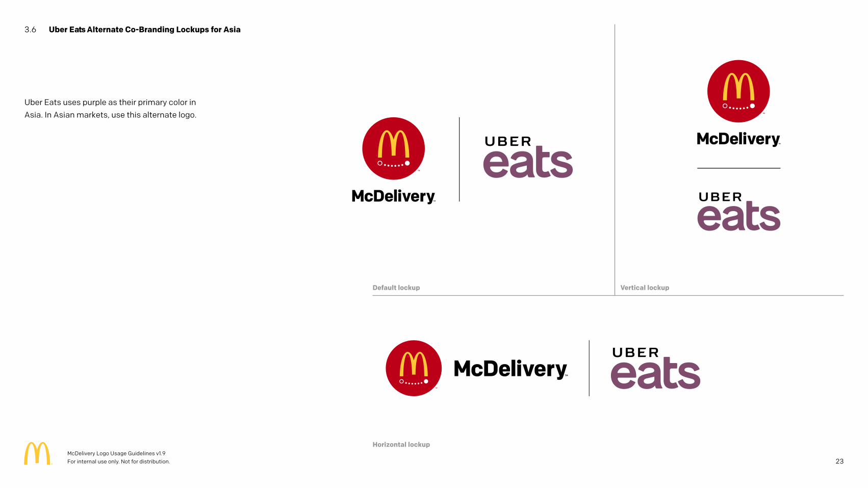
3.6 Uber Eats Alternate Co-Branding Lockups for Asia
Uber Eats uses purple as their primary color in
Asia. In Asian markets, use this alternate logo.
Horizontal lockup
Default lockup Vertical lockup
23McDelivery Logo Usage Guidelines v1.9 For internal use only. Not for distribution.
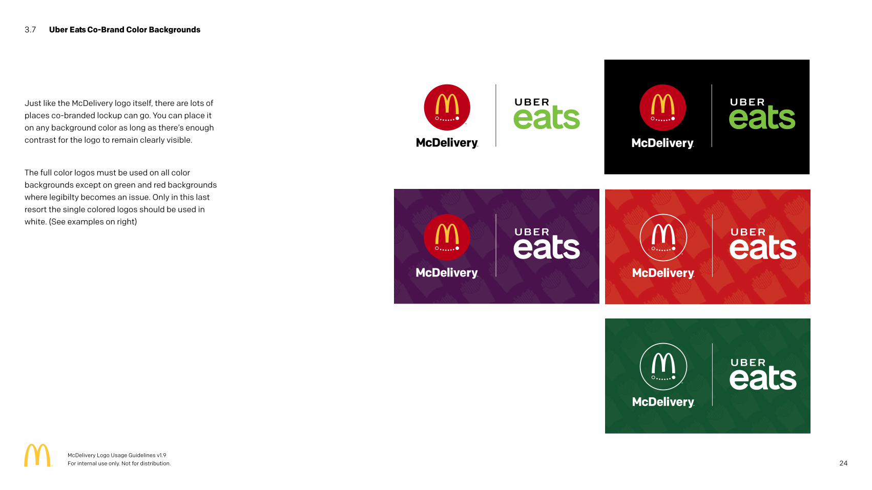
3.7 Uber Eats Co-Brand Color Backgrounds
Just like the McDelivery logo itself, there are lots of places co-branded lockup can go. You can place it on any background color as long as there’s enough contrast for the logo to remain clearly visible.
The full color logos must be used on all color backgrounds except on green and red backgrounds where legibilty becomes an issue. Only in this last resort the single colored logos should be used in white. (See examples on right)
24McDelivery Logo Usage Guidelines v1.9 For internal use only. Not for distribution.
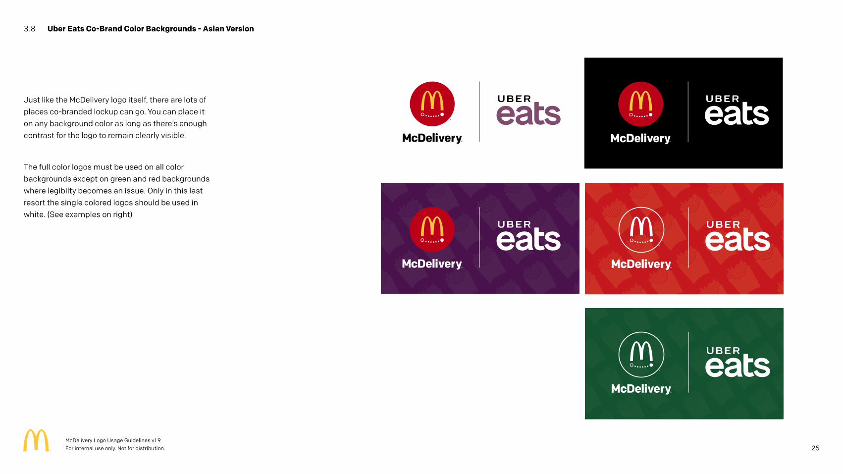
3.8 Uber Eats Co-Brand Color Backgrounds - Asian Version
Just like the McDelivery logo itself, there are lots of places co-branded lockup can go. You can place it on any background color as long as there’s enough contrast for the logo to remain clearly visible.
The full color logos must be used on all color backgrounds except on green and red backgrounds where legibilty becomes an issue. Only in this last resort the single colored logos should be used in white. (See examples on right)
25McDelivery Logo Usage Guidelines v1.9 For internal use only. Not for distribution.
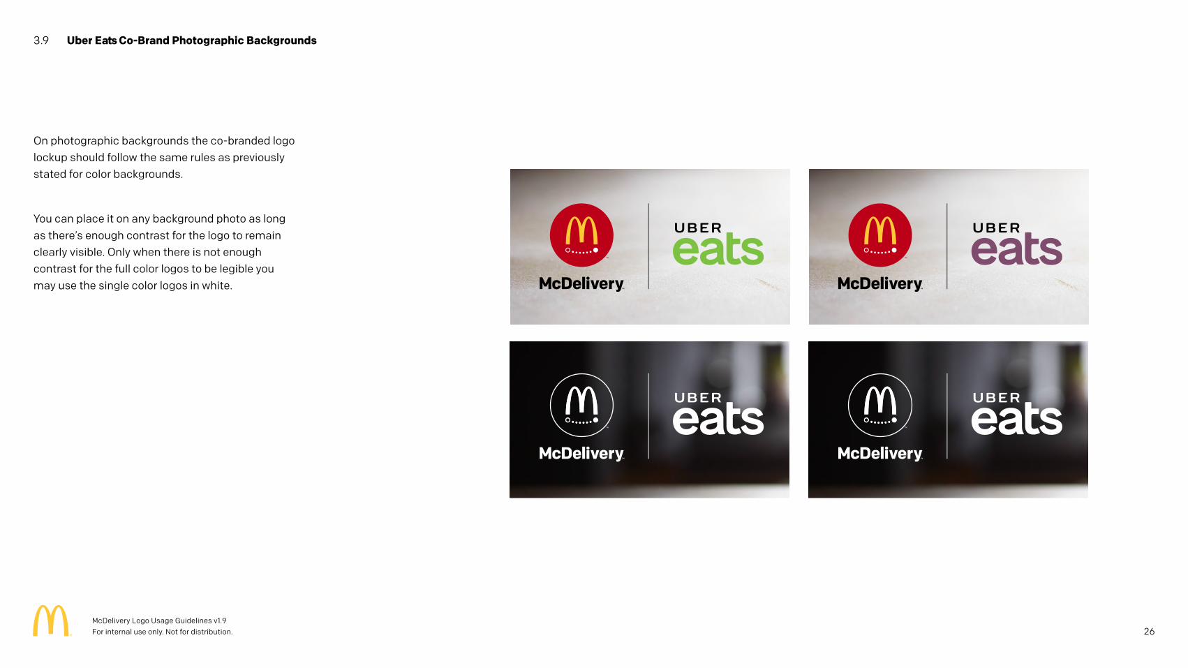
3.9 Uber Eats Co-Brand Photographic Backgrounds
On photographic backgrounds the co-branded logo lockup should follow the same rules as previously stated for color backgrounds.
You can place it on any background photo as long as there’s enough contrast for the logo to remain clearly visible. Only when there is not enough contrast for the full color logos to be legible you may use the single color logos in white.
26McDelivery Logo Usage Guidelines v1.9 For internal use only. Not for distribution.
4 Color Palette
27McDelivery Logo Usage Guidelines v1.9 For internal use only. Not for distribution.
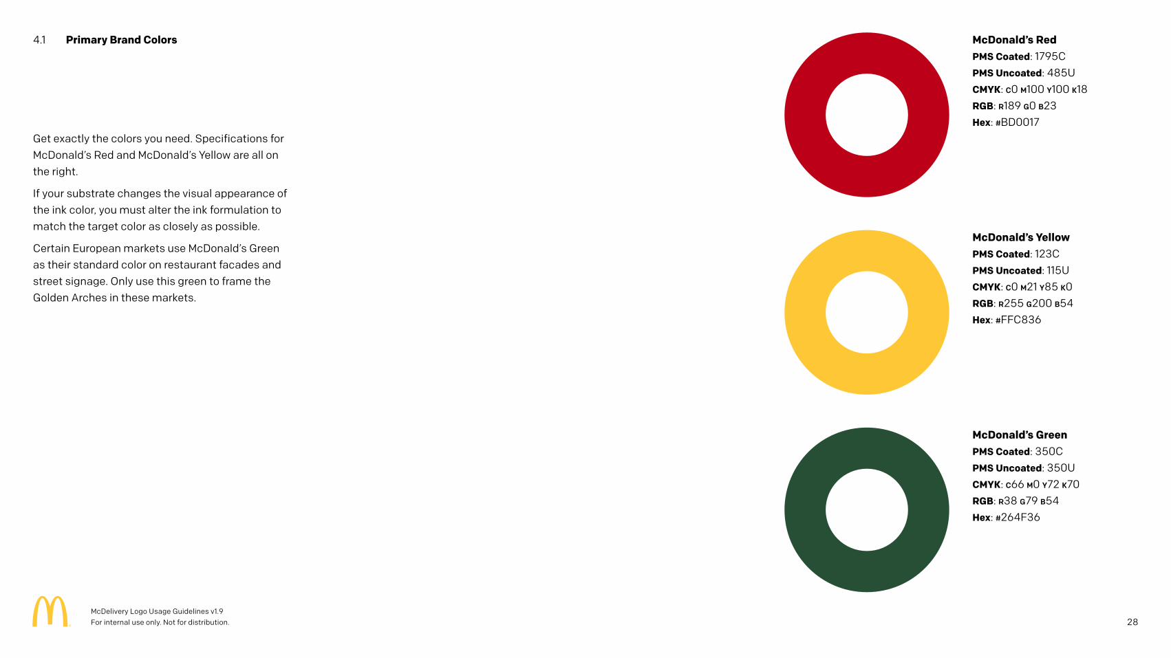
Get exactly the colors you need. Specifications for McDonald’s Red and McDonald’s Yellow are all on the right.
If your substrate changes the visual appearance of the ink color, you must alter the ink formulation to match the target color as closely as possible.
Certain European markets use McDonald’s Green as their standard color on restaurant facades and street signage. Only use this green to frame the Golden Arches in these markets.
4.1 Primary Brand Colors
McDonald’s YellowPMS Coated: 123CPMS Uncoated: 115UCMYK: C0 M21 Y85 K0RGB: R255 G200 B54Hex: #FFC836
McDonald’s RedPMS Coated: 1795CPMS Uncoated: 485UCMYK: C0 M100 Y100 K18RGB: R189 G0 B23Hex: #BD0017
McDonald’s GreenPMS Coated: 350CPMS Uncoated: 350UCMYK: C66 M0 Y72 K70RGB: R38 G79 B54Hex: #264F36
28McDelivery Logo Usage Guidelines v1.9 For internal use only. Not for distribution.
5 Typography
29McDelivery Logo Usage Guidelines v1.9 For internal use only. Not for distribution.
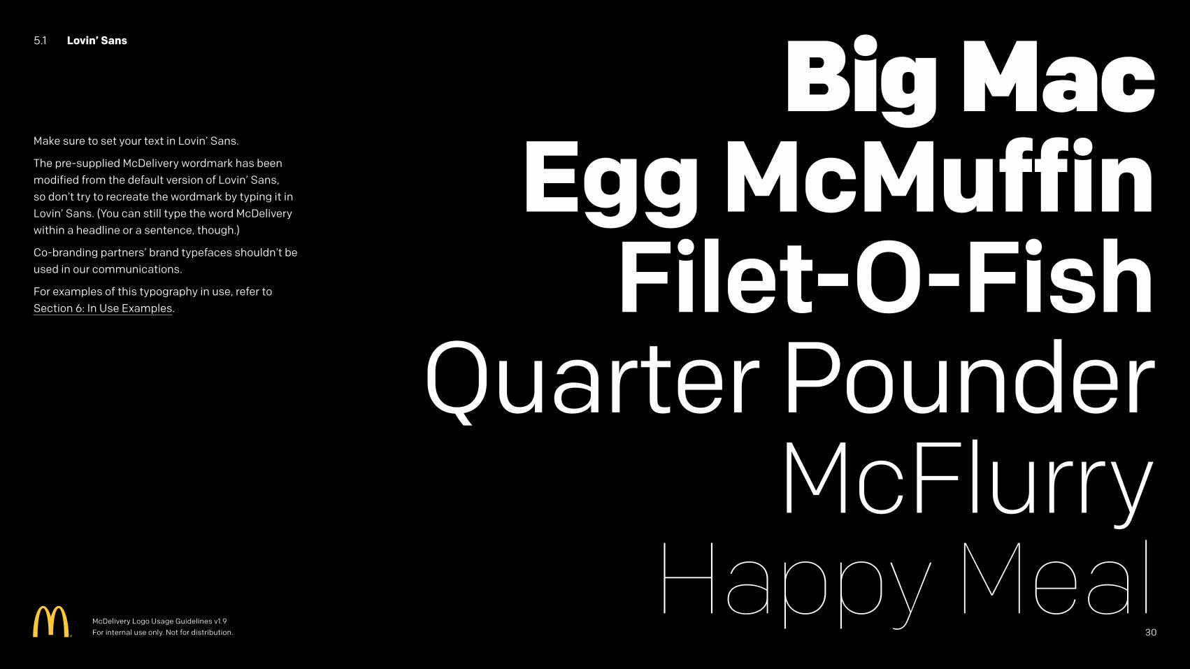
5.1 Lovin’ Sans
Make sure to set your text in Lovin’ Sans.
The pre-supplied McDelivery wordmark has been modified from the default version of Lovin’ Sans, so don’t try to recreate the wordmark by typing it in Lovin’ Sans. (You can still type the word McDelivery within a headline or a sentence, though.)
Co-branding partners’ brand typefaces shouldn’t be used in our communications.
For examples of this typography in use, refer to Section 6: In Use Examples.
McDelivery Logo Usage Guidelines v1.9 For internal use only. Not for distribution. 30
6 In Use Examples
31McDelivery Logo Usage Guidelines v1.9 For internal use only. Not for distribution.
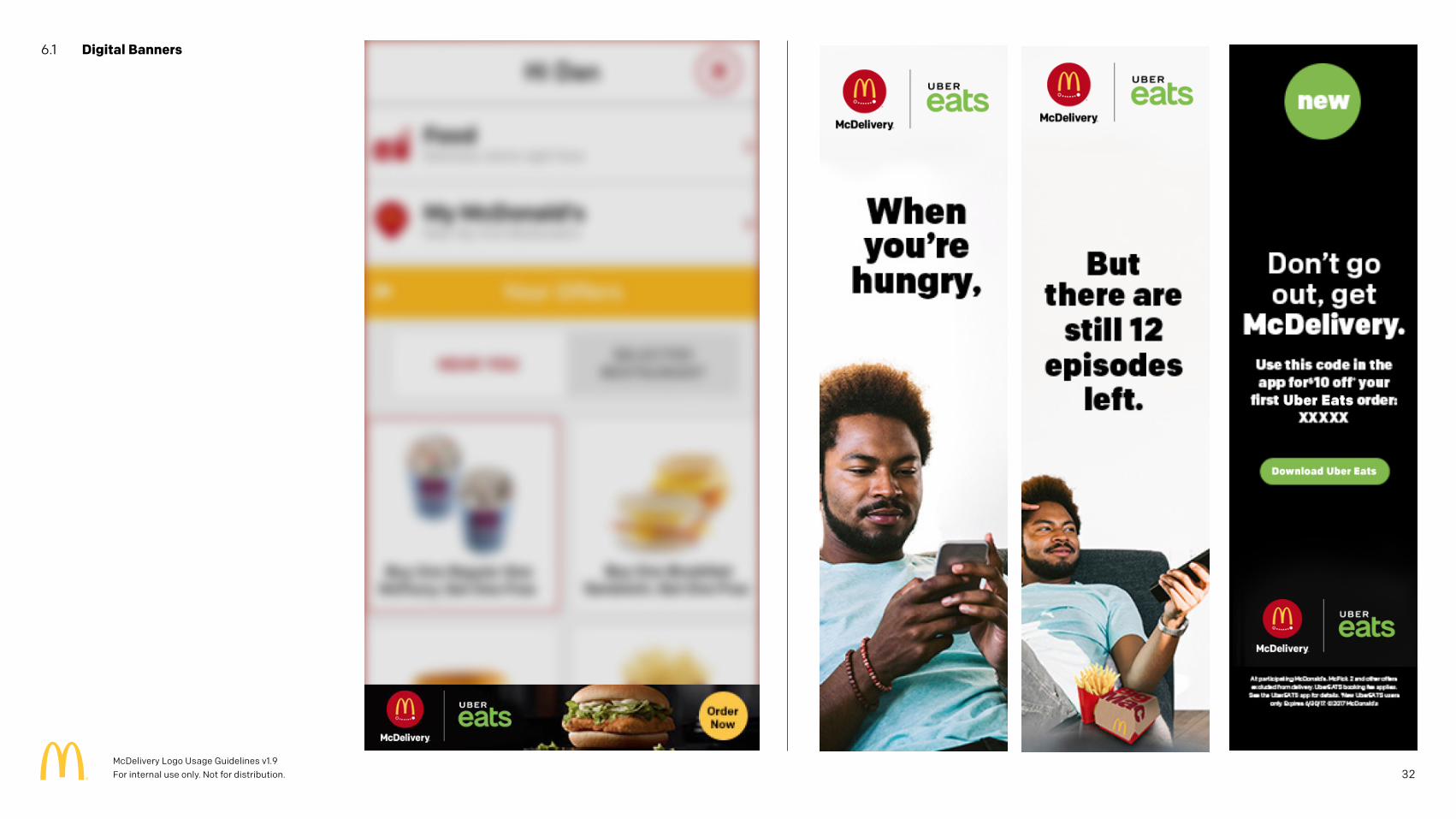
6.1 Digital Banners
32McDelivery Logo Usage Guidelines v1.9 For internal use only. Not for distribution.
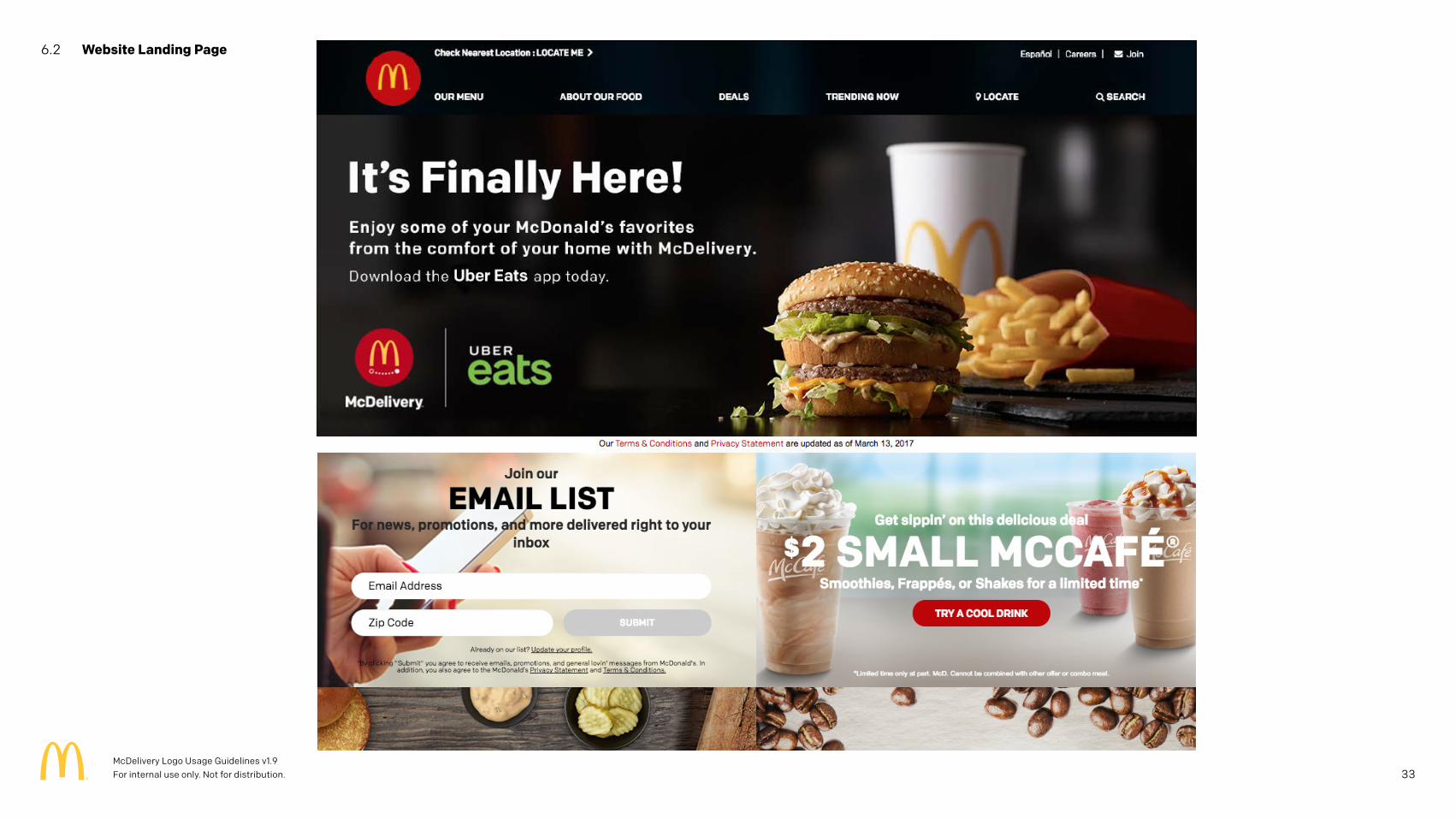
6.2 Website Landing Page
33McDelivery Logo Usage Guidelines v1.9 For internal use only. Not for distribution.
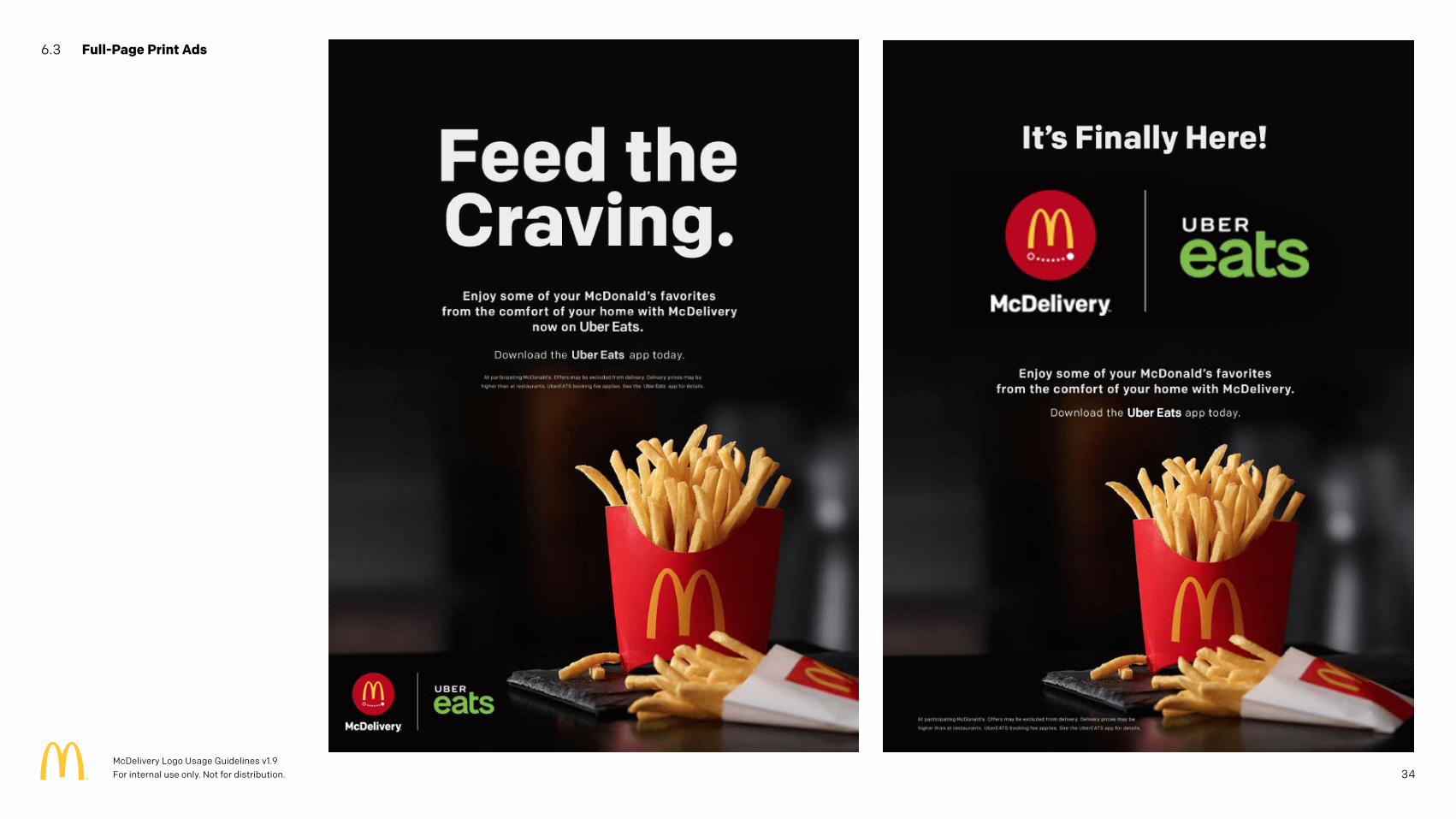
6.3 Full-Page Print Ads
34McDelivery Logo Usage Guidelines v1.9 For internal use only. Not for distribution.
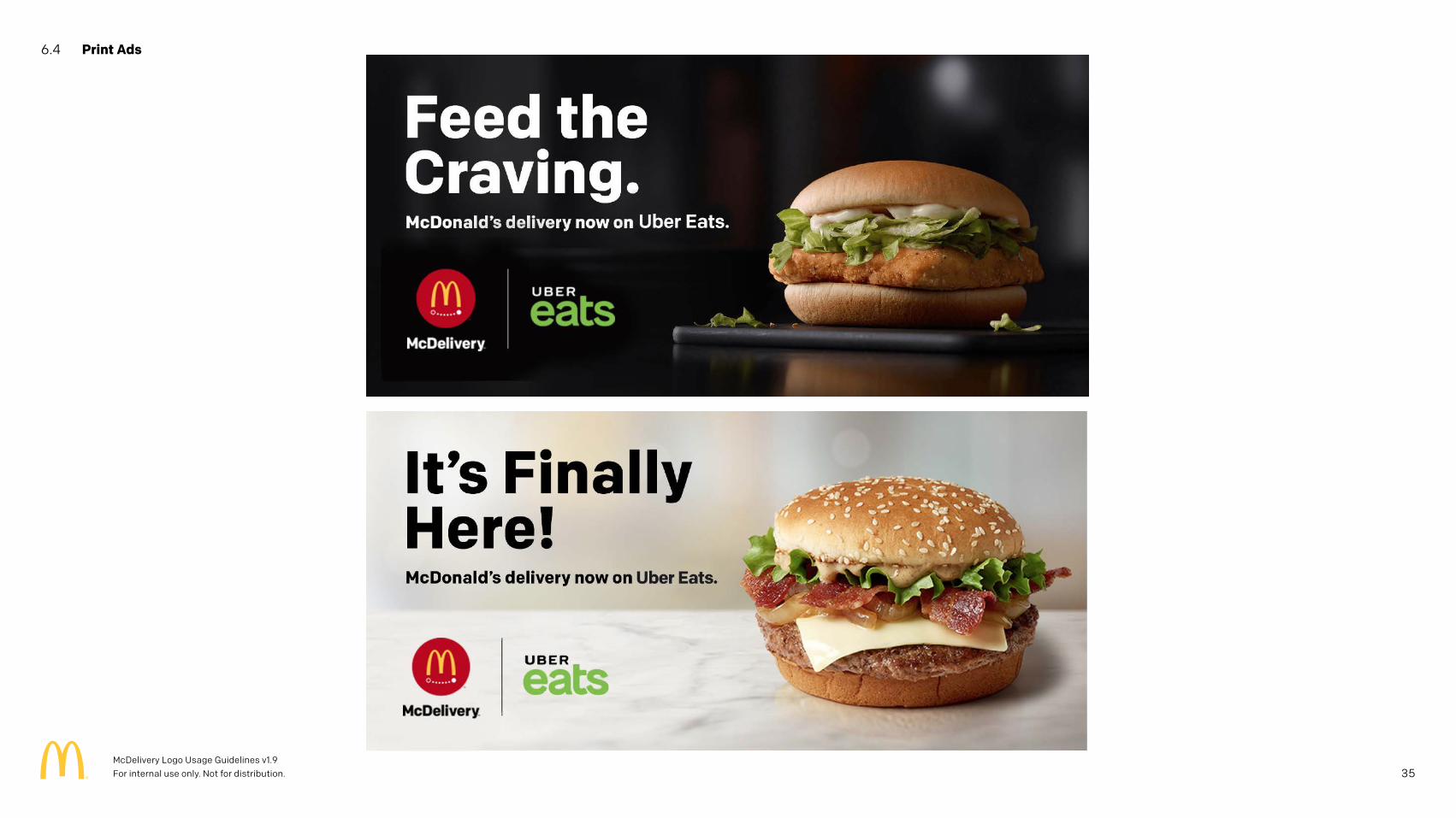
6.4 Print Ads
35McDelivery Logo Usage Guidelines v1.9 For internal use only. Not for distribution.
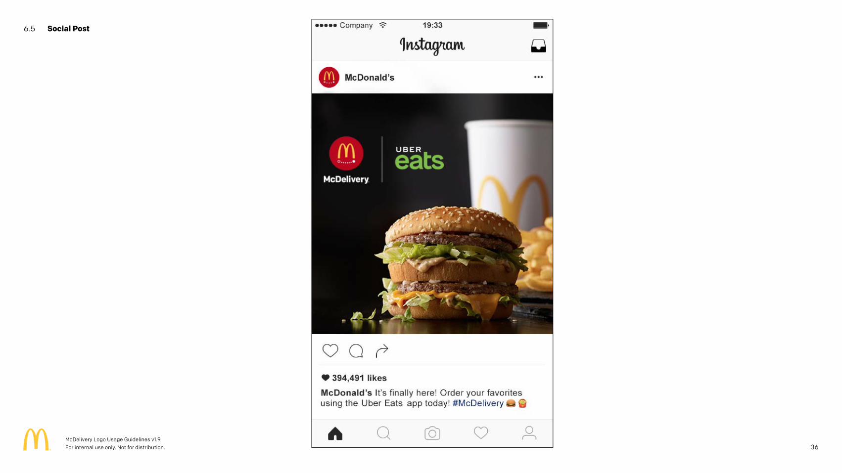
6.5 Social Post
36McDelivery Logo Usage Guidelines v1.9 For internal use only. Not for distribution.
7 Legal
37McDelivery Logo Usage Guidelines v1.9 For internal use only. Not for distribution.
7.1 Trademark Symbol
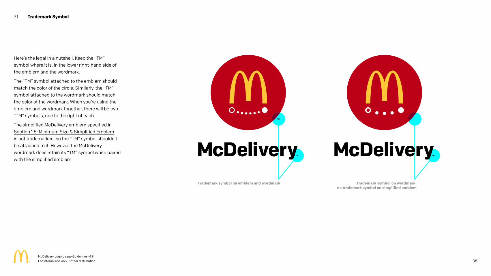
Here’s the legal in a nutshell. Keep the “TM” symbol where it is, in the lower right-hand side of the emblem and the wordmark.
The “TM” symbol attached to the emblem should match the color of the circle. Similarly, the “TM” symbol attached to the wordmark should match the color of the wordmark. When you’re using the emblem and wordmark together, there will be two “TM” symbols, one to the right of each.
The simplified McDelivery emblem specified in Section 1.5: Minimum Size & Simplified Emblem is not trademarked, so the “TM” symbol shouldn’t be attached to it. However, the McDelivery wordmark does retain its “TM” symbol when paired with the simplified emblem.
Trademark symbol on emblem and wordmark Trademark symbol on wordmark,no trademark symbol on simplified emblem
38McDelivery Logo Usage Guidelines v1.9 For internal use only. Not for distribution.
7.2 Legal Notices
IMPORTANT LEGAL TERMS AND CONDITIONS
This document contains exclusive, confidential and proprietary information of McDonald’s Corporation and its affiliates and is intended for distribution only to the McDonald’s System, including McDonald’s employees, franchisees, agencies, licensees, suppliers, distributors and affiliates, for use only in connection with McDonald’s business and solely for the benefit of McDonald’s. The material contained in this toolkit may not be copied, reproduced, disclosed or distributed to anyone outside of the McDonald’s System without the prior written permission from the McDonald’s Legal Department. ANY UNAUTHORIZED USE, COPYING OR DISTRIBUTION OF THIS MATERIAL MAY LEAD TO CIVIL AND CRIMINAL PROSECUTION.
Advertising Clearance
Please contact your local McDonald’s country attorney, McDonald’s Co-Op Attorney, or if no other counsel is available the McDonald’s Corporation Marketing Legal team in Oak Brook for legal clearance of any advertising materials to be used in your local market, including television commercials, radio commercials, online advertising, packaging and point of sale materials.
Local Activation
Please remember to work with your local legal counsel in customizing, clearing and implementing any of the activation ideas suggested in this toolkit in order to ensure that you are in full compliance with all applicable laws and to obtain the necessary third party approvals. The activation ideas included in this toolkit have not been cleared and/or legally reviewed for all laws with in all markets, regions, cities and/or municipalities.
McDonald’s Golden Arches Code
McDonald’s Golden Arches Code sets forth a variety of important requirements for McDonald’s advertising and promotional activities and materials. Please ensure that your entire team is familiar with all aspects of the Golden Arches Code as you begin to develop plans for the marketing program addressed in this toolkit.
Trademarks
The materials in this toolkit may include trademarks, slogans and logos that are for ideation and discussion purposes only and that have not been legally cleared for use in your market. Please contact Julie Arizzi of McDonald’s Legal Department in Oak Brook ([email protected]) to confirm whether the proposed trademark, slogan or logo is available for use in your market.
© 2017 McDonald’s
39McDelivery Logo Usage Guidelines v1.9 For internal use only. Not for distribution.
Related Documents