Welcome message from author
This document is posted to help you gain knowledge. Please leave a comment to let me know what you think about it! Share it to your friends and learn new things together.
Transcript
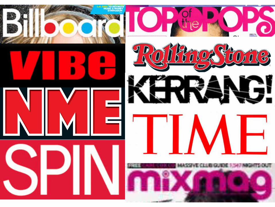
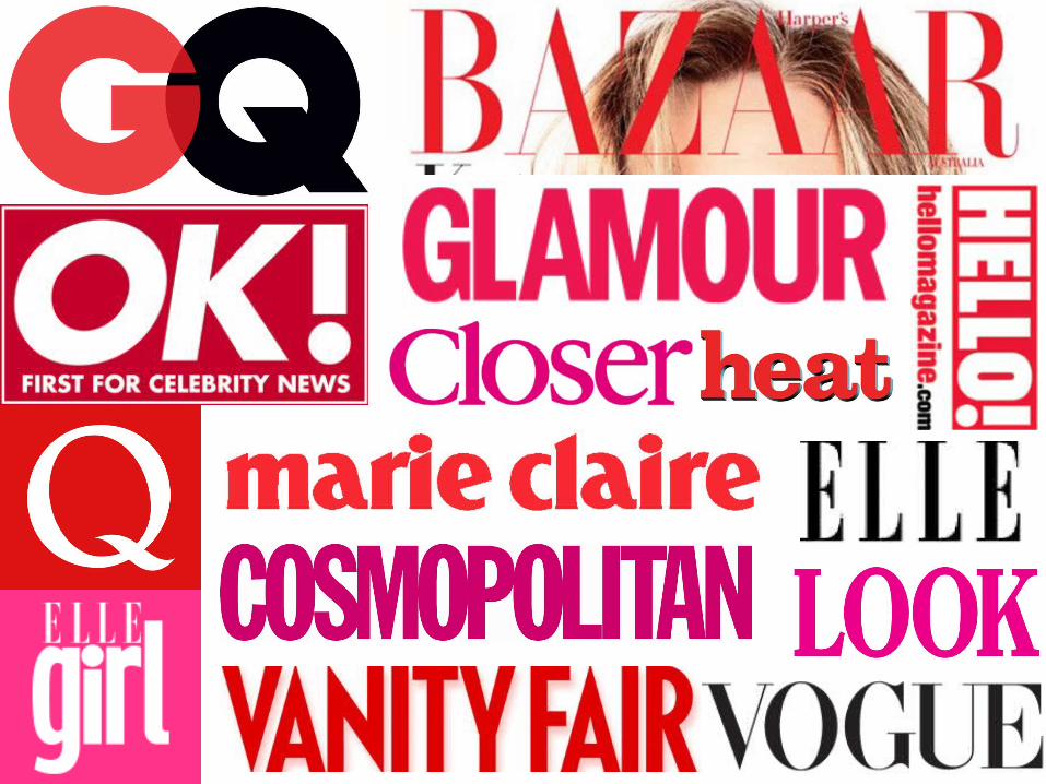

From looking at many magazine mastheads, I can tell that lots of them use bright colours and red as a base colour for a background and letters. This is because they would like t make the masthead as bright as possible to ensure that when people look at it, they are attracted to the masthead but not too much attention is brought away from the rest of the front cover. Also, most magazines use black as a base colour for their masthead or if they have a white background, use black font. Furthermore, most of the magazine that are aimed at adults are in CAPITAL LETTERS and bold. This may be because they would like to attract the reader but also make the magazine look adult. Moreover, the younger magazines are in lower case letters to highlight they are for teenagers or younger people.
Related Documents