Master thesis Visualizing Connectivity within Innovation Ecosystems in Europe Zarina Acero 2019

Welcome message from author
This document is posted to help you gain knowledge. Please leave a comment to let me know what you think about it! Share it to your friends and learn new things together.
Transcript

Master thesis
Visualizing Connectivity
within Innovation
Ecosystems in Europe
Zarina Acero
2019

Visualizing Connectivity within Innovation
Ecosystems in Europe
submitted for the academic degree of Master of Science (M.Sc.)
conducted at the Department of Civil, Geo and Environmental Engineering
Technical University of Munich
Author: Zarina Acero
Study course: Cartography M.Sc.
Supervisor: Ekaterina Chuprikova, Dr.-Ing.
Reviewer: Mathias Gröbe, M.Sc.
Chair of the Thesis
Assessment Board: Prof. Dr.-Ing. Liqiu Meng
Date of submission: 09.09.2019

Statement of Authorship
i
Statement of Authorship
Herewith I declare that I am the sole author of the submitted master’s thesis entitled:
“Visualizing Connectivity within Innovation Ecosystems in Europe”
I have fully referenced the ideas and work of others, whether published or unpublished. Literal or analogous citations are clearly marked as such.
Munich, September 2019 Zarina Acero

Acknowledgments
ii
Acknowledgments
Having completed this thesis would not have been possible without the help and support of
many people, and I would like to take the chance to thank each of them.
Firstly, I would like to express my deepest gratitude and appreciation to my supervisor Dr.-
Ing. Ekaterina Chuprikova, who has guided me very wisely at every stage of this thesis. I am
particularly grateful for her invaluable insights and recommendations. My special thanks are
extended to the assessment board, whose valuable suggestions have been extremely helpful
for the development of my work.
My sincere thanks go to Inga Odenthal and Simon Elben Hertig, respectively the Interim Head
and the DTU Liaison Officer of EuroTech Brussels office, for their interest in the project, coop-
eration and valuable feedback.
I would not like to miss the opportunity to thank all the people that make this wonderful pro-
gram possible: it has been an incredible experience that I will always remember, thank you for
giving me the opportunity to participate in it. I am especially grateful to our program coordinator
M.Sc. Juliane Cron for her unconditional support and her willingness to always assist us
throughout the entire duration of the program.
I am immensely thankful to all my classmates for being my friends and my family during the
last two years, for being home away from home. This journey would not have been the same
without you.
Finally, there are no words to express my gratitude to my family and friends for supporting
me and being there for me every time I needed them.

Abstract
iii
Abstract
The term “innovation ecosystems” refers to the economic dynamics of the complex relation-
ships that are formed between the material resources and human capital, whose functional
goal is to enable technology development and innovation. Because of their importance in eco-
nomic growth, the promotion of European innovation ecosystems was among the priorities of
the Ninth Framework Program for Research and Innovation for 2020.
Studying the driving forces behind innovation as a part of an entire network and not as indi-
vidual entities is essential to guarantee the creation, survival, and evolution of such ecosystems.
As data visualization can significantly improve information exploration, visualizing innovation
ecosystems can lead to the discovery of meaningful insights into the complex relationships
within them, that otherwise would go unnoticed. However, high complexity socio-economic da-
tasets that describe innovation ecosystems present a significant challenge for data analysis
and synthesis. This thesis comes to address this challenge by developing a data model and
web prototype that integrates heterogeneous datasets, i.e., multi-source, multi-format, and pre-
senting diverse levels of quality and resolution.
The EuroTech Universities Alliance is a vivid example of European cooperation in science
and technology. The Alliance integrates leading technical universities and Europe and beyond,
so it was set as the study case to propose a methodology and a prototypical implementation.
This thesis proposes a prototype enabled to analyze and retrieve information about relations
among European universities, companies, start-ups, and research institutions. The prototype
provides an interactive interface that makes use of a thematic web map and statistical charts
that allow the navigation of layered data representations. By integrating a solid data model and
suitable visualization techniques within an interactive web framework, this thesis offers a state-
of-the-art approach to visualizing the spatial connectivity of science and technology across Eu-
ropean boundaries.
Keywords: innovation ecosystems, data visualization, network visualization, interactive web
cartography, interactive web mapping

Table of contents
iv
Table of contents
Statement of Authorship ............................................................................................................................. i
Acknowledgments ...................................................................................................................................... ii
Abstract ........................................................................................................................................................ iii
Table of contents ....................................................................................................................................... iv
List of figures .............................................................................................................................................. vi
List of tables ............................................................................................................................................... vii
Abbreviations ............................................................................................................................................ viii
1 Introduction ............................................................................................................................................ 1
1.1 Scope of Research .................................................................................................................... 1
1.2 Problem Statement and Research Identification ................................................................. 2
1.3 Research Objectives and Questions ...................................................................................... 3
1.3.1 Research Objectives .......................................................................................................... 3
1.3.2 Research Questions .......................................................................................................... 3
1.4 Thesis Structure ......................................................................................................................... 4
2 Theoretical Background ....................................................................................................................... 5
2.1 Innovation Ecosystems ............................................................................................................ 5
2.2 Network Visualization ............................................................................................................... 7
2.2.1 Geographic Network Visualization ................................................................................. 8
2.2.2 Abstract Topological Network Visualization................................................................. 9
2.3 Web Mapping Applied to Economic Datasets .................................................................... 10
2.4 Web Interface Design .............................................................................................................. 11
2.4.1 The Visualization Mantra ................................................................................................ 12
2.4.2 User Interface Design Basics ......................................................................................... 12
2.4.3 Interactive Web Mapping Design Principles ............................................................... 13
2.5 Related Projects ....................................................................................................................... 13

Table of contents
v
3 Methodology ........................................................................................................................................ 17
3.1 Data Collection ......................................................................................................................... 17
3.2 Database Management System ........................................................................................... 18
3.3 Web Interface Design .............................................................................................................. 19
3.3.1 Web Map Layout .............................................................................................................. 21
3.3.2 Prototype Features .......................................................................................................... 21
3.4 Data Visualization Charts ....................................................................................................... 23
3.5 User Study ................................................................................................................................. 24
4 Case Study ........................................................................................................................................... 25
4.1 The EuroTech Universities Alliance ...................................................................................... 25
4.2 Data Collection ......................................................................................................................... 27
4.3 Prototype Interface Design .................................................................................................... 29
4.3.1 The Map View ................................................................................................................... 29
4.3.2 The Compartment ........................................................................................................... 32
4.4 Data Visualization Charts ....................................................................................................... 34
4.5 User Study ................................................................................................................................. 35
5 Results and Discussions ................................................................................................................... 37
5.1 Interdisciplinary Aspects ........................................................................................................ 37
5.2 The Data Model ........................................................................................................................ 37
5.3 The Visualization Method ....................................................................................................... 38
5.4 The Prototype ........................................................................................................................... 39
2.5 Open Challenges ...................................................................................................................... 46
5.6 Future Work Recommendations ........................................................................................... 48
6 Conclusion............................................................................................................................................ 50
References ................................................................................................................................................. 51
List of figures
vi
List of figures
Figure 2.1. Partners in the innovation ecosystems. Figure redrawn from Econom (2019) ......... 6
Figure 2.2. Example of a geographical network visualization: The worldwide air transportation
network. Picture copyrights of (Northwestern University 2012). ...................................................... 8
Figure 2.3. Example of an abstract topological network visualization: The Contemporary Mappa
Mundy by Vinciguerra et al. (2010) ......................................................................................................... 9
Figure 2.4. Example of existing European projects: the Startup Heatmap Europe ...................... 14
Figure 2.5. Example of existing European projects: the Startup Hubs Europe ............................. 14
Figure 2.6. Example of existing non-European projects: the Startup Cartography Project ........ 15
Figure 2.7. Example of existing non-European projects: the MIT World ........................................ 16
Figure 3.1. Components of universities’ innovation ecosystems ................................................... 17
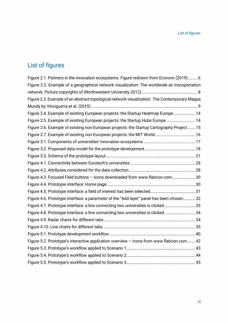
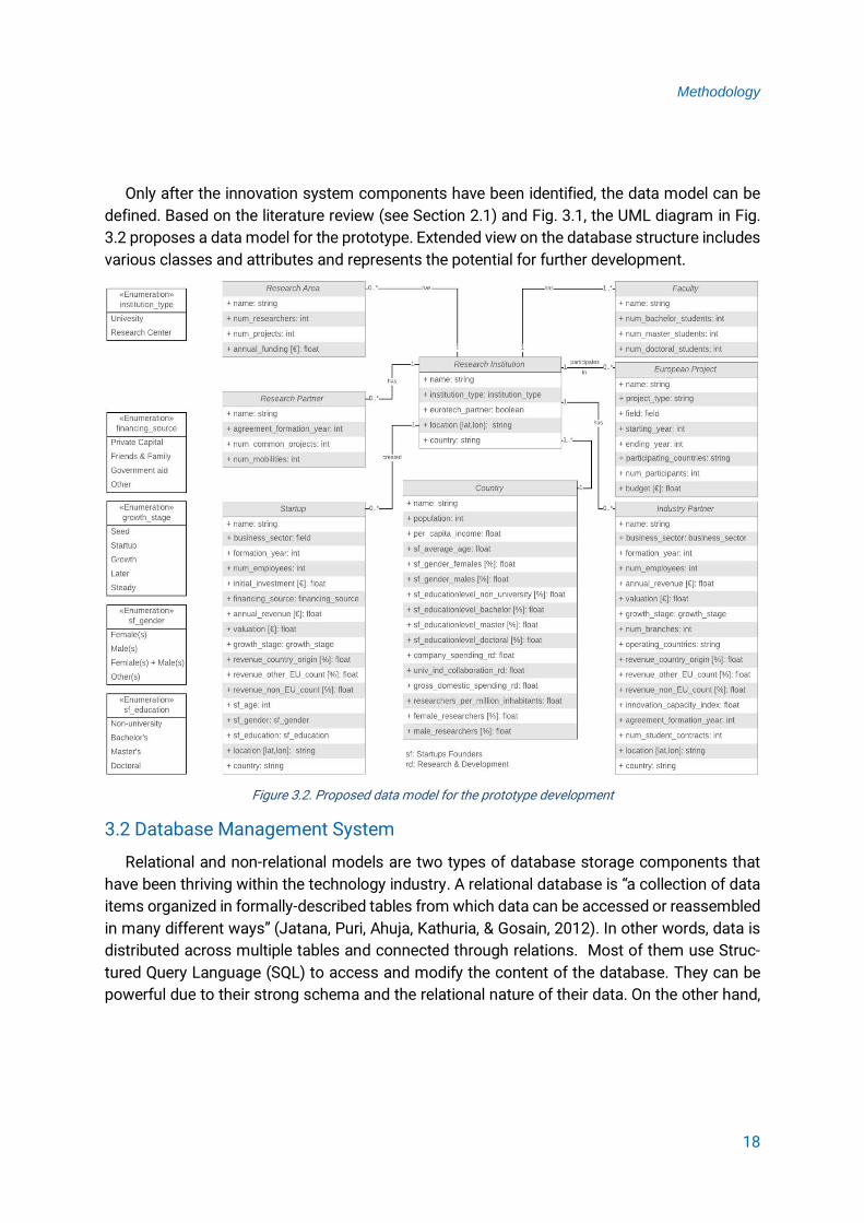
Figure 3.2. Proposed data model for the prototype development .................................................. 18
Figure 3.3. Schema of the prototype layout ........................................................................................ 21
Figure 4.1. Connectivity between Eurotech’s universities ................................................................ 26
Figure 4.2. Attributes considered for the data collection .................................................................. 28
Figure 4.3. Focused Field buttons – Icons downloaded from www.flaticon.com ....................... 30
Figure 4.4. Prototype interface: Home page ....................................................................................... 30
Figure 4.5. Prototype interface: a field of interest has been selected ............................................ 31
Figure 4.6. Prototype interface: a parameter of the “Add layer” panel has been chosen............ 32
Figure 4.7. Prototype interface: a line connecting two universities is clicked .............................. 33
Figure 4.8. Prototype interface: a line connecting two universities is clicked .............................. 34
Figure 4.9. Radar charts for different tabs .......................................................................................... 34
Figure 4.10. Line charts for different tabs ........................................................................................... 35
Figure 5.1. Prototype development workflow ..................................................................................... 40
Figure 5.2. Prototype’s interactive application overview – Icons from www.flaticon.com ........ 42
Figure 5.3. Prototype’s workflow applied to Scenario 1 .................................................................... 43
Figure 5.4. Prototype’s workflow applied to Scenario 2 .................................................................... 44
Figure 5.5. Prototype’s workflow applied to Scenario 3 .................................................................... 45

List of tables
vii
List of tables
Table 2.1. Network visualization approaches: strengths and weaknesses. ................................. 10
Table 2.2. Offered functionalities for data visualization of existing projects ................................ 16
Table 3.1. Introduction of implemented data visualization charts – Data taken from
https://datavizcatalogue.com ............................................................................................................... 23
Table 4.1. Member universities of the EUA. ........................................................................................ 26
Table 4.2. Description of tables in the database ................................................................................ 29
Table 5.1. Comparison of offered functionalities for data visualization between reviewed
projects and the prototype ..................................................................................................................... 41

Abbreviations
viii
Abbreviations
CSS Cascading Style Sheets
CSV Comma Separated Values
D3 Data-Driven Documents
DTU Technical University of Denmark
EPFL École Polytechnique Fédérale de Lausanne
EU European Union
EUA EuroTech Universities Alliance
HTML Hypertext Markup Language
JS JavaScript
JSON JavaScript Object Notation
L’X École Polytechnique
MIT Massachusetts Institute of Technology
OD Open Data
PC Pie Charts
R&D Research and Development
RQ Research Question
SQL Structured Query Language
SVG Scalable Vector Graphics
TU/e Eindhoven University of Technology
TUM Technological University of Munich
UCD User-centered Design
UI User Interface
UML Unified Modeling Language
UNESCO United Nations Educational, Scientific and Cultural Organization
USA United States of America

Introduction
1
1 Introduction
This chapter presents the scope of research by giving a general overview of the main aspects
covered by this thesis. Additionally, it introduces the research problems, objectives and ques-
tions; as well as the hypothesis guiding this work. Finally, it provides an overview of the thesis
structure.
1.1 Scope of Research
Innovation is a key aspect when it comes to the economic prosperity of nations, and so is
the development of local and regional innovation ecosystems. Based on these networks, local
innovation policies can support technological cooperation, the creation of business networks,
business incubation and start-up, and staff training among others. Furthermore, thanks to the
exploitation of agglomeration economies, policymakers can promote the identification of col-
lective needs, common opportunities, and collective action. (Online-S3, 2019)
When it comes to Europe, the importance of clusters and the need for nourishing innovation
ecosystem for regional development and competitiveness has been long acknowledged
(Online-S3, 2019). Promoting European innovation ecosystems was set as one of the priorities
of the Ninth Framework Program for Research and Innovation (Horizon Europe). As a result, the
EU has implemented several measures supporting the development of the European innovation
ecosystem through the integration of education, research, and entrepreneurship (EU
Commission - Directorate-General for Research, 2018). Yet, there is a current lack of geovisual-
ization approaches where the user could gain insight into how European clusters are related.
During the last decades, the amount of geospatial data has increased significantly and there-
fore, many mapping platforms and tools to interact with such data have been developed. How-
ever, Smith (2016) has mentioned that for several years platforms containing topographic data
such as Google Maps and OpenStreetMap were within the main scope of research, while socio-
economic mapping was not attracting much attention. He has also suggested that among the
several barriers that were restricting the advance on online socio-economic cartography, the
data itself was especially challenging due to its availability, accessibility, and integration com-
plexity. Additionally, only a small number of tools that could create high-quality thematic web
maps were available. Recently, the open data movement, the release of technologies that ena-
ble standard web browsers to support sophisticated thematic web maps, and the development
of open-source software, have allowed the socio-economic mapping field to expand (Smith,
2016). Web mapping tools are now offering a visualization approach and spatial analysis tech-
niques that can substantially improve the exploration of socio-economic datasets. Therefore,
Introduction
2
several studies on the potential of interactive mapping applied to this domain have been carried
out lately.
As the importance of innovation ecosystems has been highlighted within Europe, the need
for creating new approaches to visualize them in a geographic context has arisen. This master’s
thesis proposes a methodology and a prototypical implementation of an interactive thematic
web application. This application implements a data visualization method that aims to improve
data exploration concerning relations among European universities, companies, start-ups and
research institutions. The contributions of this thesis may pave a path towards closer collabo-
ration among European universities, companies and start-ups.
1.2 Problem Statement and Research Identification
Since cluster development has proven to have a strong positive effect on innovation, the
geographic aspect plays a key role in the evolution of innovation ecosystems. However, little
research concerning how clusters evolve within an innovation ecosystem has been done in the
cartographic field when compared to the economic one. Moreover, most of the studies that do
address the topic, are not approaching visualization methods to depict the complex relation-
ships that compose such ecosystems. Considering that the data describing innovation ecosys-
tems is heterogeneous and composed of spatial and non-spatial data, finding an appropriate
visualization method that can successfully integrate it is challenging. Among the possible meth-
ods that could be implemented, network visualization is an adequate approach to represent
innovation ecosystems (Still, Huhtamäki, Russell, & Rubens, 2014). Addressing innovation eco-
systems as networks allows studying their complex relationships and therefore, can reveal con-
nections and interactions within the ecosystem.
This research aims to visualize innovation ecosystems using a geographic network ap-
proach. The implementation of it could visually represent the correlation of node properties and
network structure by using visual patterns and implementing effective filtering to allow the user
to access deeper levels of the system information. To fulfill this purpose, a concise interactive
dashboard integrates cartographic interfaces along with data-driven graphics.
The hypothesis guiding this thesis is that users can gain significant insight when exploring
relations among innovation ecosystem clusters using an interactive and geospatial network
visualization approach.

Introduction
3
1.3 Research Objectives and Questions
1.3.1 Research Objectives
Based on the problem statement, the main objective of this thesis is to visualize clusters
and networks among European innovation ecosystems and to map European competences
as well as facilities that support technological advances. This main objective consists of three
sub-objectives:
• To identify the elements that can best describe the complexity of spatial and non-spatial
relations among clusters based on a selected case study;
• To compare network visualization techniques and determine a suitable method that can
emphasize the connectivity of science and technology across European boundaries;
• To build a prototype of an interactive thematic web map-enabled to visually represent sci-
entific and technological networks and clusters based on a selected case study.
The EuroTech Universities Alliance is a vivid example of European cooperation in science
and technology. The Alliance integrates leading technical universities and Europe and beyond,
thus it serves here as a perfect study case to represent the intended methodology and develop
a prototype of an interactive web application. The architecture of the prototype developed
adopts open-source settings, thus extensible to further case studies when necessary.
The prototype developed aims at target users such as (1) researchers and decision-makers
in charge of anticipating the development of innovation, and interpreting its driving forces and
impacts, (2) young entrepreneurs that would like to start new businesses, and (3) parties seek-
ing new partnership agreements.
The results of this thesis aim to enable target users to explore socio-economic data and
discover spatial connectivity of science and technology across European borders. Data visuali-
zation is a powerful tool to represent data in a comprehensible way. Therefore, this prototype
aims to combine thematic web cartography, statistical charts, and intuitive and interactive tools,
which results in a user-friendly interface that can be used to gain valuable insights. By using the
prototype (https://zarinaacero.github.io/EuroTechProject/), users can learn about scientific
competences and clusters which would ultimately lead to better cooperation within innovation
ecosystems.
1.3.2 Research Questions
To confirm or reject the hypothesis mentioned in Section 1.2, and to meet the objective and
sub-objectives, the main question that this research work aims to answer is: What can we learn

Introduction
4
about spatial connectivity of science and technology across European boundaries by visual-
izing it on a map?
To provide an answer to that question and in accordance with the three sub-objectives pre-
sented above, the three following research question need to be addressed:
RQ 1: Which kind of relations among clusters need to be depicted to facilitate data explora-
tion and decision making?
RQ 2: How can innovation ecosystems be represented using a geospatial network visualiza-
tion approach?
RQ 3: Which map elements and user interactions can be used to convey relations among
clusters?
1.4 Thesis Structure
This thesis is composed of six chapters:
▪ Chapter 1 introduces the context of research, states the problem and motivation guiding
the research, presents the research questions and defines the objectives to be met.
▪ Chapter 2 aims to identify scientific background on relevant topics to this thesis and create
the solid knowledge base needed to carry out the research work. This section is structured
into five parts: (1) Innovation ecosystems; (2) Network visualization; (3) Web mapping ap-
plied to economic datasets; (4) Web Interface Design; and (5) Related projects.
▪ Chapter 3 outlines the methodology adopted for the prototype development, explains the
choice of each applied method, and discusses the purpose and functionalities of the proto-
type features. Additionally, it proposes a user study that could validate the approach.
▪ Chapter 4 presents the adopted case study and explains how the methodology introduced
in the previous chapter was applied. This chapter explains how the users’ needs identified
by different scenarios and the design principles presented in the theoretical background
shaped the data collection and the prototype interface design.
▪ Chapter 5 outlines the major findings of this research, analyzes whether the research objec-
tives were fulfilled or not, and answers the formulated research questions. The scientific
contributions of this thesis are introduced, and a critical discussion of the thesis outcome
is provided. Finally, open challenges are announced to present future research.
▪ Chapter 6 concludes the most relevant findings of the research.

Theoretical Background
5
2 Theoretical Background
This chapter provides background knowledge and state-of-the-art analysis of five relevant
aspects to the development of the thesis. The first section introduces innovation ecosystems,
defines the term, and explains their growing importance during the last decade. The second
section addresses network visualizations, discusses different approaches, and analyzes how
data could benefit from these types of visualizations. The third section concerns the application
of web mapping to visualize economic data. Additionally, it examines its state-of-the-art and the
possibility of enhancing the visualization of innovation ecosystems by making use of it. The
fourth section discusses general web interface design rules. Finally, some existing examples of
interactive web maps are evaluated to set some design principles for the prototype develop-
ment.
2.1 Innovation Ecosystems
Innovation ecosystems are currently a rising research field in economics. The first related
term to such ecosystems appeared in a paper by Moore (1993) more than two decades ago
and was called “business ecosystems”. The term was then introduced to explain how compa-
nies could be thought of as a part of a network containing other entities. Here, they all collabo-
rate by sharing knowledge, capabilities, technologies, skills, and resources, while they compete
and cooperate at the same time. Throughout the years, the employment of the term “business
ecosystems” decreased and the use of the term “innovation ecosystems” was widespread
among literature. It is important to state that both terms are not used with the same meaning,
but there are still some discussions on how they differ from each other. Furthermore, a robust
definition of “innovation ecosystems” has not been established yet (Gomes, Facin, Salerno, &
Ikenami, 2018).
Currently, several definitions are being used by experts in literature. Among the most used is
the one proposed by Russell et al. (2011), using the term to refer to “the inter-organizational,
political, economic, environmental and technological systems of innovation through which a
milieu conducive to business growth is catalyzed, sustained and supported”. Moreover, Russell
et al. (2011) also emphasized the importance of the relationships among the network, stating
that they are a source of sustained value co-creation and that they are substantial in the creation
and survival of innovation ecosystems.
Jackson (2011) proposed another definition that provides information on the innovation eco-
system components that consist of actors or entities including “the material resources (funds,
equipment, facilities, etc.) and the human capital (students, faculty, staff, industry researchers,
industry representatives, etc.)”, whose functional goal is to enable technological development

Theoretical Background
6
and innovation. Figure 2.1 illustrates a scheme in-
dicating the major pillars of innovation ecosys-
tems: university, industry, capital, entrepreneurs,
government and technology transfer.
Innovation ecosystems are better described by
their relationships rather than by their entities.
They are considered highly dynamic since entities
are constantly entering and leaving the network.
Meanwhile, relationships between them are being
created, changed, and deleted; and their attributes
vary constantly. Entities involve material resources
and human capital as previously mentioned, while
relationships may be about partnerships, alli-
ances, and litigations, among others. Due to this emergent dynamism, their scale, and their
complexity, the process of identifying and then connecting the different entities and relation-
ships in meaningful ways is considered to be particularly challenging (Basole, Srinivasan, Patel,
& Park, 2018).
In the last decades, innovation ecosystems have attracted much attention from research
teams due to their importance in economic development. Indeed, this terminology was repeti-
tively appearing in the literature related to entrepreneurship, strategy, and innovation. Neverthe-
less, many studies on these kinds of ecosystems have been undertaken revealing that there are
still some interesting and relevant research streams to be addressed. As an example, Dedehayir
et al. (2016) have mentioned that there are still several unanswered questions regarding the
actions that lead to their formation, the influence of each actor on the whole ecosystem, and
how they can be used to predict later ecosystem performance. Gomes et al. (2018) have re-
viewed more than a hundred papers on the subject and have also concluded that there are still
several interesting and relevant matters to be explored, such as the need for more theoretical
development on innovation ecosystems. The implementation of suitable visualization methods
on the subject is certainly another stream to be addressed.
Previous research has shown that compared to numerical and textual formats, data visuali-
zations significantly reduce the user´s cognition load when it comes to discovering phenomena
and revealing certain patterns when understanding and exploring a dataset. Furthermore, sev-
eral publications have indicated that interactive information visualizations are especially useful
for the user to form mental models of the correlations and relationships in the data (Roth &
Harrower 2008, Lodde 2009, Russell et al. 2011). Russell et al. (2011) studied the use of visual-
izations to depict relations among companies, people and financing organizations. They further
Figure 2.1. Partners in the innovation ecosystems. Figure redrawn from Econom (2019)

Theoretical Background
7
showed that they can provide users with meaningful knowledge, and eventually help them iden-
tify influential individuals for critical actions within the innovation ecosystem. Ultimately, visual-
ization models could lead to a better decision-making process to plan the development and
evolution of it.
Derived from the definition and throughout the literature, innovation ecosystems are often
treated as networks. As mentioned in Section 1.2 and discussed by Still et al. (2014), addressing
them as networks allows us to study their complex relationships, which therefore can lead to a
better understanding of connections and interactions within the ecosystem. The study of the
actors and relationships between them have been gaining importance in recent years due to
the hypothesis that the components of the network have a greater value if they perform activi-
ties together, rather than individually. Still et al. (2016) have also proven that data-driven network
visualizations are suitable and effective approaches when illustrating structures, key actors and
interactions of the ecosystems, and revealing their context and the potential for novel structures
and relationships.
2.2 Network Visualization
Murray (2017) has stated that data is only valuable when methods to derive insights are
applied, as the raw data is often insufficient to reveal powerful knowledge and patterns. Thus,
data visualization is the fastest way to unwrap the hidden information that humans cannot spot
at a first glance when they deal with the raw data (Murray, 2017). Visualizing data is about map-
ping the information to visuals, expressing data content using visual variables. The challenge in
developing and designing an accurate visual model will always be proportional to the complex-
ity of the dataset.
The user studies in the last decades have proven that the implementation of a “good” visual-
ization approach can result in users, independent from their expertise level, needing less previ-
ous knowledge to gain valuable insight and make simple analyses of the data (Lodde, 2009).
Networks consist of a group of entities called nodes, and a set of relationships between them
called links. The innovation ecosystems could be seen as complex networks where entities
composing them are the nodes and relationships between them are the links. Visualization tech-
niques applied to innovation ecosystems have the same objective as when applied to networks:
to reveal correlations of node properties and system structure by using visual patterns
(Heymann & Le Grand, 2013). Consequently, they could be depicted using methods developed
for network visualization.
The literature on network visualization methods shows a variety of classifications. Most of
them propose three different categories, where two of them always refer to the position of

Theoretical Background
8
nodes, making distinctions between whether they are drawn in their geographical position or
not. The third one varies from author to author. For instance, Withall et al. (2007) mentioned a
Plot-based Network Visualization, Heymann & Le Grand (2013) proposed a Time-Varying Net-
work Visualization, and Hennemann (2013) introduced Circular information-rich layouts for net-
work visualization. Nevertheless, this research only focuses on the analysis of the first two cat-
egories, and uses the term “Geographic Network Visualizations” for the approaches that place
the nodes in their geographical position, and “Abstract Topological Network Visualization” for
those that do not, as in the publication by Withall et al. (2007). The main reason for this decision
is that this project deals with spatial components and abstract data.
There is a current lack of adequate visual methods for innovation ecosystems depiction.
Thus, based on the review of the available network visualizations methods down below, suitable
approaches to represent innovation ecosystems are adopted within this master’s thesis.
2.2.1 Geographic Network Visualization
In geographic network visualization, the data is presented based on the spatial location of
the nodes. Maps showing the edges and vertices to display the network structure are the most
common tools employed for this type of visual representations. Such maps offer the possibility
of overlaying different types of information. Thus, their application can be extended from only
conveying the location to providing additional information. Additionally, geographic network ap-
proaches are extendable to 2- and 3-Dimensions (Withall et al., 2007)
Noori et al. (2016) have researched the topic of crisis response networks (Figure 2.2), and it
serves as an example of geographic network visualization. In their work, they show the world-
wide air transportation network using grey links to depict the passengers’ air traffic, and red
lines to sketch the basic structure of the network.
With a large number of nodes and links, some parts of the map can get crowded, making it
hard for the user to read and under-
stand it. Figure 2.2 represents how
many links result in confusing overlap-
ping. Visualization experts should take
this into account during the data aggre-
gation process and the definition of
zoom levels. Another problem derived
from these visualizations is related to
distance perception since long links
usually give the impression of being
more important than shorter ones. Figure 2.2. Example of a geographical network visualization: The
worldwide air transportation network. Picture copyrights of (Northwestern University 2012).

Theoretical Background
9
2.2.2 Abstract Topological Network Visualization
In abstract topological visualizations, nodes are placed without considering their physical
location. Instead, nodes and links are placed meaningful way to enhance readability. Commonly,
these types of visualizations involve node and link diagrams. As the nodes’ physical location is
not imposing any restriction, designers can adjust visual properties to convey information on
nodes and links characteristics
effectively. A prominent example
(see Fig. 2.3) shows an approach,
where the distance between enti-
ties is based on the relationship
strength: the stronger the relation-
ship, the closer they appear in the
diagram. Even more approaches
have been developed for these
visualization methods, depending
on whether nodes or links proper-
ties want to be highlighted.
Using abstractions can be challenging, since choosing an ambiguous one could entail a high
risk of users misunderstanding the representation. Figure 2.3 shows the “Contemporary Mappa
Mundi” by Vinciguerra et al. (2010), who made use of an abstract topological network to depict
“the American exceptionalism in the world city network”. Hennemann (2013) described this map
as “an analogy to produce a clustered map of relations among global cities according to their
intra-regional coherence and the importance of groups of cities for the global city network”. He
also pointed out how the authors have aimed at maximizing readability by introducing an ab-
stract representation of the relationships, but that they may have sacrificed information con-
cerning the network and geography.
To sum up, every method has its advantages and disadvantages, and the choice should al-
ways be based on the available dataset, its properties, and the derived information that needs
to be represented.
As Heymann & Le Grand (2013) mentioned, the process that starts in the data collection and
eventually finishes in the knowledge discovery is often dynamic. Before analyzing the raw data,
one rarely knows which methods are indeed applicable to the case study. Therefore, it is essen-
tial to get to know the nature of the data, to be able to choose an appropriate visualization
method. Only after acquiring, parsing, filtering, mining and understanding the data, an interac-
tive visualization approach should be adopted, which may even reveal the need for repeating
previous steps using different techniques.
Figure 2.3. Example of an abstract topological network visualization: The Contemporary Mappa Mundy by Vinciguerra et al. (2010)

Theoretical Background
10
In some cases, several methods could be implemented to complement each other. Table 2.1
presents the strengths and weaknesses of each method, which should be considered when
implementing them.
Even though the research community has not adopted a single method, it has been actively
addressing the subject of visual analysis of complex networks in the economic field during the
last decades, resulting in the development of software such as Gephi (https://gephi.org/), Pajek
Tulip (http://tulip.labri.fr/TulipDrupal/), Cytoscape (https://cytoscape.org), and Sci2 (https://
sci2.cns.iu.edu/user/index.php), among others. All of them have one objective in common: to
provide a tool that can combine statistical and visualization analysis of networks. (Heymann &
Le Grand, 2013). Then, we can infer that a successful network visualization method needs both:
statistical and visualization analytical tools.
2.3 Web Mapping Applied to Economic Datasets
Mapping economic data is a long-standing trend. At the end of the 20th century, the im-
portance of the spatial component in the study of interaction between economic agents has
already been acknowledged. The roles of location, space, and spatial interaction were consid-
ered central to analyze how individual interactions could lead to emergent collective behavior
and aggregation of patterns. (Anselin, 1999)
Basole et al. (2018) have pointed out the need to replace the existing business intelligence
tools that despite providing relevant and valuable functionalities, lack interactivity when it
Network Visualization Strengths Weaknesses
Geographical
By providing spatial context, it can reveal spatial patterns.
Clusters can be easily identified.
The co-existence of spatial and network cluster-ing can result in heavy cluttering and poor reada-bility if filtering or aggregating processes are not performed.
Distance between nodes influences the percep-tion of the links between them: the furthest they are, the strongest they seem due to its length.
Abstract topological
Position attribute can be used to convey network characteristics.
Better readability and less over-lapping.
No spatial context is provided.
Clusters might be hard to identify.
The applied abstraction principles can be misun-derstood if they are ambiguous or not clearly ex-plained.
Table 2.1. Network visualization approaches: strengths and weaknesses.

Theoretical Background
11
comes to exploring and analyzing the interconnected structure of the ecosystems. Moreover,
they mentioned the lack of intuitive and easy-to-use visual analytics tools that could allow more
users to benefit from them, unlike the existing ones that are generally designed for experts with
computer skills.
Socio-economic datasets can be quite large and present challenges regarding the analysis
and synthesis of the data. In the particular case of innovation ecosystems, Basole et al. (2018)
have underlined the importance of multi-source and multi-scale data integration and analysis
to derive meaningful insights. In almost every case, multiple datasets need to be combined,
which are often heterogeneous, coming from different sources, using different formats, and
presenting diverse levels of quality and resolution. These data characteristics could lead to sig-
nificant difficulties but also to interesting opportunities when it comes to the development of
suitable visualization approaches. Successful solutions should consider diverse user groups
that could be using the model (with different technical and analytic skills) and provide different
analysis options.
As reported by Smith (2016), global and national socio-economic platforms could benefit
from web mapping tools since they can simplify research and allow the users to compare a
range of indicators within different locations. Interactive cartography could be a promising so-
lution for this issue since interactive web maps are a powerful means of overviewing datasets
from a spatial point of view. Furthermore, he suggested that there are further research disci-
plines where interactive mapping could be applied, including spatial economics and network
analysis.
In the literature, the term "interactive cartography" is defined as the dialog between a carto-
graphic representation and its user. Map users are therefore enabled to make changes on the
map, through a technological device and based on their context. Interactivity allows the com-
plex navigation of layered data representations. Discovering information through different steps
reduces the user's cognitive load. The main objective of interactive visualizations is to avoid
users being overwhelmed by large amounts of information that can interfere with their
knowledge discovery.
2.4 Web Interface Design
To achieve an effective web map design with an eye-catching interface, basic cartographic
design principles need to be applied. Since the first “design rules” proposed in the early 1990s,
technologies and trends have changed a lot and so did those rules.

Theoretical Background
12
2.4.1 The Visualization Mantra
The visualization mantra proposed by Shneiderman (1996) is one of the most crucial princi-
ples applied in visualization models, which is still relevant at the time: “Overview first, zoom and
filter, then details-on-demand”. To avoid overwhelming the user and to enhance the user expe-
rience, this design philosophy suggests that information should be gradually revealed to them.
Once the users get a first overview, they should be able to decide if they want to take a closer
look at specific parts of the network components by zooming and filtering options. The last part
of the mantra, details-on-demand, refers to the fact that users should be given a chance to ex-
tract essential data, depending on their needs. Some relevant details could appear even if the
user does not ask for them, depending on the zoom level.
2.4.2 User Interface Design Basics
The “Usability.gov”, the leading resource for user experience best practices and guidelines
serving practitioners and students in the government and private sectors in the USA, has most
recently proposed seven user interface design principles listed down below. (U.S. Department
of Health & Human Services, 2019)
1. “Keep the interface simple” intends to encourage the designers to only include essential
elements with meaningful functionalities. Before adding a new feature, they should ask them-
selves: “Does the user really need it?”
2. “Create consistency and use common UI elements” refers to the importance of using
well-known UI elements to keep the user’s confidence when performing tasks. Creating patterns
in language, layout, and design throughout the website enhances the user learnability process,
usually resulting in more efficient user experiences.
3. “Be purposeful in page layout” emphasizes on the placement of items based on the im-
portance they have, since they might affect scanning and readability of the site.
4. “Strategically use color and texture” focuses on the power that color, light, contrast, and
other visual variables might have when it comes to directing attention toward or redirecting
attention away of items.
5. “Use typography to create hierarchy and clarity” highlights how using different font types,
sizes and arrangements can result in better scannability, legibility, and readability.
6. “Make sure the system communicates what is happening” suggests that the system
should always keep users informed about the status of elements.
7. “Think about the defaults” aims to make the developer think about the possible user needs
that the target group might have to set the default options and improve the user experience.

Theoretical Background
13
2.4.3 Interactive Web Mapping Design Principles
In recent years, design principles specific to interactive web mapping have been proposed.
As well as the design rules for all user interfaces, they are constantly changing and following
web design trends.
In his book, Muehlenhaus (2013) analyzed interactive web map design rules, which can be
thought of as the basic design principles presented in Section 2.4.2 applied to web maps. The
first principle suggests that only those elements which fulfill a specific purpose for the intended
map audience should be added. “Just because you can include a map element does not mean
you should”. As an exception, he recommends including map elements that the target group is
expecting to find to ensure successful communication. This principle is, in essence, as if we
were applying the second design principle to web maps.
Muehlenhaus (2013) also included a chapter related to the third rule, where he discussed the
arrangement of map elements and highlights the importance of establishing a visual hierarchy
for the map elements. The location of each element should be defined considering its purpose
since a poor map layout can compromise the communication between the user and the map.
Roth (2013) pointed out that just as every information visualization model, an interactive web
map involves both representation and interaction. Design guidelines for both processes cannot
be generally defined since different rules may apply depending on the case study. On the one
hand, the representation part has been mostly handled by manipulating the so-called visual var-
iables. On the other hand, the interactive aspect of map design has only gained importance
during the last decade, and the kind and quality of cartographic interactions are now playing a
key role in the cartographic interface utility and usability of web maps (Roth, 2013b).
2.5 Related Projects
During the last decade, several projects have used network visualization approaches com-
bined with interactive web mapping to display information related to innovation and entrepre-
neurship. Even though to the author´s knowledge none of them are dealing with entire ecosys-
tems, some interesting network visualization methods on elements that are part of them (start-
ups and universities) were found and analyzed here below.
When it comes to Europe, relevant examples for the design of the prototype proposed in this
thesis can be found, such as “Startup Heatmap Europe” ( https://www.startupheatmap.eu
/analytics/) (see Fig. 2.4) and “Startup Hubs Europe” (http://www.startuphubs.eu) (see Fig. 2.5).
Both models were created to visualize the European start-ups’ network, employing geographic
network visualization approaches to display start-up clusters and relationships among them.

Theoretical Background
14
Figure 2.4. Example of existing European projects: the Startup Heatmap Europe
Figure 2.5. Example of existing European projects: the Startup Hubs Europe

Theoretical Background
15
Based on these examples, the possibility of adding elements offering effective user interac-
tion to explore the network’s links arises. This could enable users not only to get information
about the nodes but to gain insight into the nature of the relationships between them as well.
Furthermore, analyzing the role that the maps play in both projects, we could consider imple-
menting new functionalities. Besides updating the dashboards and statistical graphs with infor-
mation about the nodes, it could provide additional information that is not in the charts. The
maps and the rest of the analytical tools are not presented together, missing the opportunity of
using both elements to display complementary information and improve the knowledge discov-
ery.
Figure 2.6 presents The “Startup Cartography Project” ("Startup Cartography Project", n.d.),
which serves as a tool to explore the foundation of start-ups across the American territory from
1988 to 2012. Here, start-ups are not presented as part of a network. Thus, the relationships
among them are not within the study scope and the start-ups are treated as individual entities.
Despite not being a network visualization, this project was analyzed because the number of
tools offered to interact with the map and filter the data makes it particularly engaging.
The “MIT World” ("MIT World :: MIT Senseable City Lab", n.d.) (see Fig. 2.7) depicts the mo-
bilities between the MIT and universities worldwide. Unlike the previous example, the MIT
project focuses on the relationship between the entities. The integration of statistical graphs
and tables with the web map is successfully achieved, as they are showing complementary
information. Other remarkable elements are the animation effects applied during transitions.
Figure 2.6. Example of existing non-European projects: the Startup Cartography Project

Theoretical Background
16
Both approaches are giving the users the chance to make changes on the map content
based on their interest, providing them with relevant information to the topic. In other words,
the offered interactive options have indeed an impact on the map, giving it a real propose in the
cognitive process and justifying the choice of including a cartographic representation in the
visualization of the data.
Table 2.2 compares the reviewed projects from Europe and the USA regarding offered func-
tionalities for data visualization. The prototype developed within this thesis is inspired by these
examples and aims to propose features that could overcome their discussed limitations. The
examination of available software to create network visualizations also had an impact on the
design of the tools offered in the web map.
Startup
Heatmap Eu-rope
Startup Hubs Europe
Startup Car-tography Pro-
ject MIT World
Provides information on nodes
Provides information on links
Uses animation effects for transitions
The map provides not only locations, but also additional relevant information
Charts are linked to the map: changes on the map update the statistic charts No charts
User can look at the map and the charts simultaneously No charts
Table 2.2. Offered functionalities for data visualization of existing projects
Figure 2.7. Example of existing non-European projects: the MIT World

Methodology
17
3 Methodology
Building upon the related work, this chapter provides a detailed description of the methodol-
ogy adopted to develop the prototype within this thesis. The chapter outlines four sections,
which present the tools, software, and methods that need to be employed for each of the main
aspects of the prototyping process: (1) Data Collection; (2) Database Management System; (3)
Web Interface Design; (4) Data Visualization Charts; and (5) User Study.
3.1 Data Collection
The data collection is a challenging aspect for an innovation ecosystem description, since
that data is dynamic, heterogeneous, and might also be inconsistent or unavailable. Creating a
consistent database is challenging since some entities may have more comprehensive and ac-
curate records than others. Moreover, data availability and currency may vary from source to
source.
The amount of economic data that can describe the entities considered for the study can be
too large. Therefore, another challenge is to define the database size: focus shall be made on
collecting only relevant data to the case study, to avoid an unnecessarily long collection pro-
cess.
Not all innovation ecosystems have the same components since they are driven by different
forces, goals, and inter-
ests. The efficiency of
the data collection pro-
cess relies on the identi-
fication of such compo-
nents. For the case of
universities, Morrison
(2016) has suggested
that their innovation eco-
systems are composed
of five components: The
Start-up Firms, the Inves-
tor Networks, the Innova-
tive Growth Companies,
the Skilled Talent Pool,
and the Research Infra-
structure. (see Fig. 3.1) Figure 3.1. Components of universities’ innovation ecosystems
Methodology
18
Only after the innovation system components have been identified, the data model can be
defined. Based on the literature review (see Section 2.1) and Fig. 3.1, the UML diagram in Fig.
3.2 proposes a data model for the prototype. Extended view on the database structure includes
various classes and attributes and represents the potential for further development.
Figure 3.2. Proposed data model for the prototype development
3.2 Database Management System
Relational and non-relational models are two types of database storage components that
have been thriving within the technology industry. A relational database is “a collection of data
items organized in formally-described tables from which data can be accessed or reassembled
in many different ways” (Jatana, Puri, Ahuja, Kathuria, & Gosain, 2012). In other words, data is
distributed across multiple tables and connected through relations. Most of them use Struc-
tured Query Language (SQL) to access and modify the content of the database. They can be
powerful due to their strong schema and the relational nature of their data. On the other hand,

Methodology
19
non-relational databases are systems capable of managing databases, and they have been pre-
sented as a solution to the increasing amount of data storage required on the internet today. In
comparison to the previous ones, they do not use tables as its storage structure nor make use
of SQL. The main advantages they offer are that they can handle huge amounts of data and
that they perform queries in a fast and efficient way. The non-relational databases are recom-
mended when:
▪ There are few relationships between the “collections” (equivalent to relational databases’
tables);
▪ The application requires mostly reading stored data rather than entering or updating rec-
ords that modify other elements related to them.
A non-relational database model seems an appropriate choice, considering that universities’
innovation ecosystems can claim to fulfill both conditions:
▪ Relations will only be established using the attribute that contains the name of the uni-
versity;
▪ As the only attribute that the collections have in common is the university name field and
it is highly unlikely that a university name will change, new records for existing collections
would not require updating the records from others.
TaffyDB
In the interest of keeping the prototype development within the same programming environ-
ment, the open-source JS library called TaffyDB was employed. Its powerful in-memory data-
base capabilities to both browser and server applications provide appropriate tools for data
extraction and manipulation. TaffyDB can quickly perform queries like the ones that are typically
offered by sophisticated SQL software. For instance, it can create, modify, and delete records;
retrieve and filter data based on specific attributes, and do some complex calculations. By com-
bining the potential of TaffyDB and JS, it was possible to perform all the required data analysis
to retrieve the necessary input for all the visualization methods implemented in the prototype.
To run TaffyDB, the developer only needs to download a file called “taffy.js” containing JS
code, and put it in the same directory where the rest of the code is. All the data TaffyDB will
handle needs to be in files using JSON format.
3.3 Web Interface Design
Chapter 2 discusses the possibility of seeing innovation ecosystems as complex networks
and presents geographic and abstract topological network visualization methods potential ap-
proaches that could be used to depict them. As the main goal of this thesis was to evaluate the

Methodology
20
spatial connectivity among clusters of innovation ecosystems by visualizing them in a spatial
context, a geographic approach was implemented for the development of an online thematic
map prototype.
Web technologies such as HTML, JS, and SVG have significantly improved during the last
decades, especially regarding graphical and data manipulation capabilities. Simultaneously,
new powerful web visualization libraries such as D3 have been developed. These four technol-
ogies combined have been able to produce lots of eye-catching web mapping visualizations,
making use of maps, charts, and plots, often with high-quality design and sophisticated inter-
activity (Smith, 2016). Muehlenhaus (2013) also suggested that web mapping can truly benefit
from HTML, CSS, and JavaScript and that SVG is a great choice when producing maps that are
not meant to be displayed using the Mercator map projection.
Defining accurate map elements and user interactions to convey relations among clusters
is within the research goals of this thesis. Therefore, the prototype benefited from HTML, CSS,
JS, SVG, and D3 to develop a web visualization model. Smith (2016) has recently analyzed the
strengths and weaknesses of several web thematic mapping approaches, including those that
combine the four previously mentioned technologies. On one hand, he concluded that together
they can offer a high-quality design that includes appealing interactive and animated features.
Additionally, they are also considered to have a more flexible and simpler implementation com-
pared to other web mapping techniques. On the other hand, fixing the map extent results in the
user not being able to perform standard navigation and zooming, so the developer needs to
decide whether and how to include those functionalities.
HTML, CSS, and JS are three coding languages that are commonly used together for the
development of websites and web applications:
▪ HTML is responsible for the structure of the website, putting its layout and skeleton to-
gether;
▪ CSS rules specify the style and layout of the web page;
▪ JS is the actual programming language providing functionality.
D3 is a JS library for creating and manipulating elements based on data. D3 is extremely fast,
supporting large datasets and dynamic behaviors for animations, transitions, and interaction
(Bostock, 2019). D3 can be powerful when it comes to handling geographic information since
it is able to render SVG maps from data in JSON formats, making it possible to draw it using a
variety of different map projections, place different elements using geographic coordinates,
zoom in and out, among many other actions that can be implemented. The usage of smooth
transitions and animations between map transformations can create wonderful visualization
experiences.

Methodology
21
3.3.1 Web Map Layout
To avoid overlapping between the map and the statistical charts, the prototype was designed
using a compartmentalized map layout. In contrast to the fluid web map layout where the map
is extended to the edges of the visual field, the compartmentalized map layout appends a frame
with 100% height to the left or the right side of the web map (Muehlenhaus, 2013). The ad-
vantages of using such layout are that people are familiar with it, that it is easy to design, and
that it can produce accurate and elegant looking maps. On the contrary, disadvantages include
inappropriateness for small screen devices, poor aesthetics and requiring the eye to jump
across graphic breaks (Tait, 2018).
The prototype layout is therefore composed of two parts that complement each other (see
Fig. 3.3). One of them is the Map View hosting the web map, and the other one is the Compart-
ment that contains the title, the Focused Field buttons, the Statistics View. While the Map View
is the core part of the prototype, the content in the compartment is used to present non-spatial
information that cannot be displayed on the map but that it is directly connected to the spatial
elements on it.
3.3.2 Prototype Features
Smith (2016) has reviewed six online thematic mapping functionalities in the context of so-
cio-economic data that were considered when designing the features of the prototype:
Title
Map
Map View
Focus Field View
Compartment
Statistics View
Figure 3.3. Schema of the prototype layout

Methodology
22
1. The data layers selection was not included since offering other layers (e.g. raster data)
would not have added any meaningful information. Besides, it would have imposed a data vol-
ume challenge.
2. Thematic map representation is provided by giving the user the chance to change the
map to a choropleth one using the desired index with the “Add layer” panel and is also provided
by making it possible to make the map a proportional symbol one with the Focused Field but-
tons.
3. Navigational interactivity is restricted to zooming in and out of lines and points. Just as
Muehlenhaus (2013) and Smith (2016) suggested, zoom levels should be only included if some
data cannot be seen at a fixed scale. Providing too many zoom levels could have affected the
usability and would have required more development time as well. Therefore, the only one used
to highlight the user’s selection was included. If the prototype was to be further developed and
new data layers were to be added, implementing more zoom levels might be necessary to pro-
vide more appropriate levels of detail.
4. Display and classification interactivity gives the users the chance to manipulate the car-
tographic representation by letting them change map elements such as legends or color
schemes. Since the prototype already has complex legends and colors are used with specific
meanings, this kind of interactivity could have overcomplicated the interface and was therefore
not included.
5. Analytical interactivity is provided in the form of data visualization charts that are directly
connected to the cartographic representation to enhance the economic data insights.
6. Regarding narrative interactivity, no map tours or guides were included hoping that the
interface would be intuitive, and users will not need it.

Methodology
23
3.4 Data Visualization Charts Data concerning universities’ innovation ecosystems are mostly quantitative. Table 3.1 de-
scribes charts that are typically used for the comparison of quantitative variables that were
used throughout the prototype to visualize data.
Chart Type Description Strengths Weaknesses
Donut Chart
They are essentially like Pie Charts (PC) with an area of the center cut out. By encouraging readers to focus more on reading the length of arcs than com-paring proportions be-tween slices as PC does, they are considered more efficient
Good at depicting percentages or parts of a whole The blank space in-side the chart can be used to display more information
By only showing proportions, the ex-act variable values are unknown User may have a hard time register-ing the differences in the ring’s filled-in angle area
Line Chart
Line charts are composed of lines that connect data points that are plotted on a Cartesian coordinate grid. Normally the X-axis is used as a timescale or an interval sequence
Good at depicting values over a con-tinuous interval or period, and conse-quently at showing patterns and trends
Can become clut-tered and confusing when using more than 3 or 4 lines
Radar Chart Each variable is repre-sented by an axis starting from the center. All axes are arranged radially and equidistantly, always keep-ing the same scale be-tween them. Equidistance circles are usually used as guides, and each variable value is plotted along its axes. All those dots are fi-nally connected forming a polygon
Within a dataset, it is easy to identify outliers, variables with similar values, and variables that are scoring high or low
Can become clut-tered and confusing when too many pol-ygons are overlap-ping or too many variables are con-sidered
Table 3.1. Introduction of implemented data visualization charts – Data taken from https://datavizcatalogue.com
Methodology
24
3.5 User Study
Interface success depends on several aspects: (1) programming and debugging, (2) an in-
depth study of potential users to propose supported use case scenarios during the design
phase, and (3) evaluation stages that should be conducted at some point of the development
process to test the usability and utility of the tool (Roth, Ross, & MacEachren, 2015). Therefore,
an interface evaluation study should be carried out to test the usability and utility of the proto-
type.
Roth et al. (2015) have introduced three types of user evaluation methods depending on the
evaluators: (1) Expert-based methods: evaluators are not from the project team and have pre-
vious experience in interface design and evaluation; (2) Theory-based methods: designers and
developers evaluate the tool themselves and (3) User-based methods: a representative set of
target users is in charge of evaluating the product.
The user-based methods are considered essential to effective UCD (User-Centered Design).
Although conducting such evaluation can be more challenging in terms of time, money, and
participant access when compared to other methods. Thus, a user-based evaluation study
should be undertaken with at least a few participants relevant to the target group.
The user test studies can also be classified depending on the collected type of data into
qualitative and quantitative. Qualitative data consists of observational findings aiming to iden-
tify whether design features are easy or hard to use, while quantitative data appear in the form
of one or more metrics (such as task completion rates or task times) aiming to explain if the
tasks were easy to perform (Raluca, 2017). Roth et al. (2017) have indicated that after only
adopting quantitative methods for several years, specialists in geography and related fields
have recognized the need to implement qualitative and mixed method research as well for user
studies in interactive maps and visualizations.
To guarantee successful communication between the user and the map, user evaluation
studies should be carried out at different stages of the development process. Due to a lack of
resources, it might be hard to do so, but it is important to conduct at least one user evaluation.
A user-based method extracting qualitative and quantitative data is suggested since it can pro-
vide relevant feedback from a representative set of target users.

Case Study
25
4 Case Study
This chapter explains how the methodology that has been described in the previous section
was implemented for the selected case study: the EuroTech Universities Alliance (EUA). The
first section of this chapter aims to introduce the EUA, including its members and purposes. As
the prototype was built upon the universities that are part of the Alliance, the second section
describes how the data collection process had to be adapted for this particular network. The
third section refers to the interface design and introduces each of the layout elements and its
functionalities. The following section discusses the implementation of data visualization charts
to present the economic data. Finally, the last section introduces a user study method that could
validate the approach.
4.1 The EuroTech Universities Alliance
Leading European universities in science and technology have strategically partnered to
form the EUA, an association committed to excellence in research and developing solutions to
society’s challenges. To jointly achieve multi-scale initiatives of high-impact to society and in-
dustry, the Alliance promotes in-depth collaboration across research and education teams of
the partner universities and encourages innovation and entrepreneurship among them.
(EuroTech Universities, 2014)
According to the EUA official website (EuroTech Universities, 2014), their long-term vision
includes becoming the leading European ecosystem for education in science and technology.
To achieve this, it is essential that they establish a dynamic and interdisciplinary network with
the active participation of all members of its ecosystem. To reach that goal, they need to gain
a thorough understanding of that network. Based on what was discussed in Chapter 2 concern-
ing the advantages of visualizing data and considering that the EUA does not have a current
visualization tool for their network, they were chosen as the case study for this thesis.
Activities within the EUA are fully engaged in providing complementary strengths in educa-
tion and research to contribute to the evolution of five disciplines considered of high relevance
to Europe’s industrial leadership: (1) Entrepreneurship & Innovation; (2) Health & Bio Engineer-
ing; (3) Smart & Urban Mobility; (4) Data Science & Engineering; and (5) High-Performance Com-
puting. As the EUA officially uses these categories to classify its activities and projects, these
five disciplines were set as the fields of interest throughout the prototype (see Section 4.3).
Even though it might expand soon, the Alliance is currently composed of the six universities
presented in Table 4.1 and in Figure 4.1.

Case Study
26
Logo Abbreviation Name Location
DTU Technical University of Denmark Copenhagen, Denmark
EPFL École Polytechnique Fédérale de Lausanne Lausanne, Switzerland
L’X École Polytechnique Paris, France
TU/e Eindhoven University of Technology Eindhoven, Netherlands
TUM Technical University of Munich Munich, Germany
- The Technion Haifa, Israel
Table 4.1. Member universities of the EUA.
Following the thesis objectives, the focus is placed on the European Universities (highlighted
in Table 4.1), thus the case study was further scaled down to the European Union.
Figure 4.1. Connectivity between Eurotech’s universities

Case Study
27
This work aims at certain target groups that include: (1) researchers and decision-makers in
charge of selecting participants in innovative projects, (2) young entrepreneurs that would like
to start new businesses, and (3) institutions seeking new partnership agreements. The possible
needs and requirements that members of this target group guided every stage of the prototype
development. Based on them, three different sample scenarios to illustrate their needs were
proposed, and set as tasks that the prototype should be able to fulfill:
▪ Scenario 1 – EuroTech employee: “Since we are planning to carry out a new project con-
cerning healthcare devices, I need to propose universities that are well prepared to par-
ticipate in it.”
▪ Scenario 2 - Electronic engineer: “I would like to initiate my start-up, but I need to know
which is the most profitable business sector within my field of study. Additionally, I need
to discover which universities are doing better in this field since I might need help and
advice, and maybe to establish a partnership.”
▪ Scenario 3 - Private research company: “We should establish new agreements with uni-
versities that have competences in the field of microchips.”
4.2 Data Collection
As anticipated, the data collection was among the most challenging aspects of the thesis,
since the desired data (see Fig. 3.2) presents the following characteristics:
▪ As most economic data, it is highly dynamic. For instance, when mapping economic in-
dexes, one is never working with current values, but with values that were collected at a
certain point of time and that probably became quickly outdated. This was the case for
all the collected country indexes.
▪ As there is no common database where data regarding universities’ partnerships can be
found, different sources had to be used. In most cases, data was taken from their web-
sites, and the provided information varied considerably from one site to another. The
desired data coming from different sources and being often outdated, unavailable (most
official data regarding private entities is not in the public domain) or incomplete resulted
in an inconsistent and heterogeneous database.
As previously mentioned, the data that could have been considered for this project was
massive. Following the thesis objectives and within the time given, priority was given to devel-
oping a suitable prototype rather than having a complete database. Therefore, the data collec-
tion was carried out focusing on the attributes highlighted in Fig. 4.2.

Case Study
28
Firstly, information regarding each university’s partnerships was searched for in each of their
official websites: www.dtu.dk, www.epfl.ch, www.polytechnique.edu, www.tue.nl, and
www.tum.de. None of them provided data on which are its industry partners, but some offered
data regarding its research partners and start-ups created by former students. Information for
each identified partner was taken from LinkedIn (https://www.linkedin.com/). Based on the
available real data that was collected, the missing data were randomly generated to have a
consistent database with entries for all universities. Furthermore, economic indexes were taken
from different entities: the European Statistical Office (https://ec. europa.eu/eurostat/), the EU
Startup Monitor (http://startupmonitor.eu), the World Economic Forum (http://reports.we fo-
rum.org/), and the UNESCO (http://data.uis.unesco.org/).
The database consists of five tables containing the following data for each of the EuroTech
members, shown in Table 4.2.
Figure 4.2. Attributes considered for the data collection

Case Study
29
Table 4.2. Description of tables in the database
All tables were initially created as CSV files and then converted to JSON using the site
www.csvjson.com since this is the format that the previously mentioned TaffyDB library deals
with. Every entry of the tables whose aim is to provide statistical data has an attribute concern-
ing their field of work: “business sector” for start-ups and companies, and “research area” for
research partners. Each entry was manually classified into one of the five fields of interest de-
fined in Section 4.1 and stored under the attribute “field”. This was essential since the data is
first filtered by the field of interest and then by the university.
4.3 Prototype Interface Design
As explained in Section 3.3.1, the prototype was built using a compartmentalized layout con-
taining a Map View, and a Compartment which includes the title “EuroTech innovation ecosys-
tems”, the Focused Field buttons, and the Statistics View. The design of each element on the
layout is introduced down below, and the previously mentioned functionalities (see Section
3.3.2) that they offer are described as well.
4.3.1 The Map View
This is the core section of the prototype since it is the one the user needs to manipulate to
gain insight into the universities’ innovation ecosystem. It consists of a basemap, the thematic
symbols and its legends, and a panel that makes it possible to turn the basemap into a choro-
pleth one.
Basemap
As D3.js can draw maps from data stored in a JSON-compatible data format, a GeoJSON
file containing the borders of all countries in the world on a large scale (1:10m) was downloaded
from www.naturalearthdata.com (Natural Earth, 2019). As only European countries had to be
displayed on the web map, all the non-European countries were removed from the file using
QGIS, a software designed to view, edit, and analyze geospatial data.
Name Content Attributes (see Fig. 4.2) Usage
universities Basic information “Research Institution” Place universities on the map
startups Start-ups formed by former students
“Startup” Provide statistical data for the-matic map layers and charts
research Research partners “Research Area” & “Research Partner”
Provide statistical data for the-matic map layers and charts
companies Associated compa-nies
“Industry Partner” Provide statistical data for the-matic map layers and charts
country_indexes Economic indexes of countries
“Country” Draw the choropleth map

Case Study
30
As the European Institute for Environmental Sustainability recommends using the Lambert
azimuthal equal-area projection for statistical analysis and display, this was the chosen geo-
graphical projection for the prototype (EU Commission - Joint Research Centre, 2001). Like
every other map projection, it is not perfect: while it can accurately represent areas in all regions
of the sphere, it does not accurately represent angles.
Thematic visualization and their corresponding legends
Before the user has chosen a field of interest using the Focused Field buttons (see Fig 4.3), the
home page hosts the map showing the member universities of EUA (see Fig. 4.4). Each univer-
sity is represented with its logo placed on its geographical location. A donut chart around the
logo provides an overview of the strength of each discipline within the innovation ecosystem. A
legend introduces the color scheme for focused fields and aims to help the user get familiar
with them. The focused field colors are repetitive throughout the prototype.
Entrepreneurship &
Innovation Health & Bio Engineering
Smart & Urban Mobility
Data Science & Engineering
High-Performance Computing
Figure 4.3. Focused Field buttons – Icons downloaded from www.flaticon.com
Figure 4.4. Prototype interface: Home page

Case Study
31
Only after one of the Field Focus buttons is pressed, the map content is updated showing
data regarding the chosen field of interest in the form of proportional circles and the user is
given the chance to update the statistical charts by clicking on points and lines. Figure 4.5
shows how the map looks when the field of interest “Smart & Urban Mobility” is chosen. Propor-
tional circles are drawn on the map to provide information on the number of entities (start-ups,
companies and research centers), that belong to each of the universities’ innovation ecosys-
tems, that work on that field. The legend on the bottom left used to introduce the fields of inter-
est is now dedicated to the proportional circles. The proportional circles are providing an over-
view of what the user can discover on the tabs in the Statistics View, where statistical infor-
mation regarding each ecosystem is presented. However, charts cannot be inspected until a
university (point) or a connection between universities (line) is selected.
Once a field of interest is selected, users can interact with the map: (1) by using the “Add
layer” panel that turns the basemap into a choropleth map, (2) by clicking on points, or (3) by
clicking on lines. The last two will trigger zooming in of the clicked element, and the update of
the statistical charts in the Statistics View.
“Add layer” panel
This panel turns the basemap into a choropleth map of data related to the checked param-
eter, and it is always available but when the user zooms in on a line or a point. It was included
to provide information on the economic indexes that are considered essential for innovation
development, but only for the countries where EuroTech members are located.
Figure 4.5. Prototype interface: a field of interest has been selected

Case Study
32
The panel is arranged into four categories through a dropdown menu: Default, Startups,
Companies, and Research Centers. They can be switched at any moment, and the menu is set
to default every time the user changes the field of interest. By default, the panel offers general
indexes such as population, income per capita and spending on research and development.
On the “Startups” category, parameters change to provide information on start-up founders:
average age, percentage of female founders, and percentage of male founders. When the cate-
gory “Companies” is selected, users can choose between University-Industry collaboration in-
dex, company spending on research and development index, and a third parameter yet to be
defined. The last category “Research Centers” provides data about the scientific community:
number of researchers, number of female researchers and number of male researchers.
Whenever an option different from “None” is checked, the choropleth map is drawn or up-
dated, and so is the legend on the bottom right. Figure 4.6 shows how the interface looks when
the option “Population” is checked.
4.3.2 The Compartment
Focused Field buttons
Each of the buttons represents a field of interest with an icon and a color (see Fig. 4.3) and
it can be used at any time. When hovering over them, the name of the corresponding field pops
up. When clicking on one of them, the button is highlighted, the information displayed on the
statistical charts, the map zooming level is reset and proportional circles on the map are drawn.
Figure 4.6. Prototype interface: a parameter of the “Add layer” panel has been chosen

Case Study
33
Additionally, the color used to display the data changes, so it matches the one that corresponds
to the chosen field.
Statistics View
Once a field of interest has been chosen and the user clicks on a point or a line, this section
is used to present data visualization charts that intend to describe the innovation ecosystems
of the selected universities related to that field. The Statistics View is structured into three tabs:
Startups, Research Centers, and Companies. Even though each tab contains charts of the same
type, the content varies since the data for each tab is taken from its corresponding table (e.g.,
The “Startups” tab uses data from “universities” table). Fig 4.7 illustrates how the interface looks
like when a line connecting two universities (DTU and TUM in this case) is clicked, and charts
(radar chart in this case) in the Startups tab are revealed.
While a university or a line between two of them is selected, the user can discover all charts
belonging to each tab using the arrow on the left or the one in the right. Within the time given,
only two charts could be implemented, but there should be several more to make the prototype
a meaningful tool. Additionally, the charts for the “Companies” tab were not developed. To have
consistent graphs where the user can easily identify each EUA member, a specific color was
assigned to each university and was used to represent it in every graph. The selected colors
were dark red for DTU, pure red for EPFL, lime green for L’X, dark grayish-green for TU/e and
dark blue for TUM. Figure 4.8 shows another chart type (line chart) in another tab, using the
same colors for both universities.
Figure 4.7. Prototype interface: a line connecting two universities is clicked

Case Study
34
If a point is clicked instead, it is zoomed in, the proportional circles disappear, and the same
chart types are displayed but only showing one variable.
4.4 Data Visualization Charts
As previously mentioned, only the three charts presented in Section 3.4 were implemented
in the prototype, always accompanied by their correspondent legends: a donut chart, a radar
chart, and a line chart. TaffyDB was able to find the required data for each graph by applying
filters to the data stored in the tables of the database.
The donut chart appears in the Map View when the website is opened, and the radar chart
and the line chart are used in the Statistics View. While the variables used to build the donut
charts do not change, the variables for the others do. For instance, the radar chart in the
“Startups” tab shows
the annual turnover of
start-ups created by
former students of
EUA members, by the
business sector within
the selected field of in-
terest. However, if the
user checks the “Re-
search Centers” tab, Figure 4.9. Radar charts for different tabs
Figure 4.8. Prototype interface: a line connecting two universities is clicked

Case Study
35
the radar chart shows the annual investment in the research areas related to the field of interest,
that the research partners of the EUA universities are getting (see Fig. 4.9).
The same happens with the line chart, which shows the evolution in time of different varia-
bles depending on the
opened tab: number
of start-ups founded
per year in the case of
the first tab, and num-
ber of research institu-
tions that became
partners in the case of
the second tab (see
Fig. 4.10).
4.5 User Study
Although conducting the user evaluation study was not set as one of the objectives of this
thesis, a simple user-based mixed method of quantitative and qualitative is proposed for the
user evaluation and can be found in Appendix 1 and anticipated for future work.
The potential user study is divided into two parts: (1) an interaction study providing a set of
tasks that the user is asked to solve using the prototype only, and (2) a questionnaire form to
gather feedback once the previous part is finished. Before starting the experiment, the users are
asked to take some time to get familiar with the prototype interface.
Firstly, evaluators need to provide some general information about their job and their prefer-
ences regarding data visualization formats. They are then presented with the scenarios consid-
ered for the interface design (see Section 4.3) and asked to solve them explaining which ele-
ments their answer is based on. After performing the tasks, they are requested to fill in a ques-
tionnaire concerning the user experience. The questionnaire consists of three parts aiming to
gather opinions on: (1) prototype usability, (2) interface elements design, and (3) map features.
The prototype usability section collects evaluators’ impressions regarding the learnability, effi-
ciency, memorability, and subjective satisfaction of the prototype. The part dedicated to inter-
face elements design asks for feedback on the interface design and the affordance of each of
the elements. The map features section obtains evaluators’ perceptions of the map features.
The prototype was published online, thus became accessible for remote user evaluation, and
the link together with the evaluation form was sent to EUA’s Interim Head for consultation.
Figure 4.10. Line charts for different tabs

Case Study
36
The approach proposed in this thesis can only be validated by conducting pertinent user
studies. However, as the obtained feedback is valuable and already suggests improvements
that could be implemented, EUA’s Interim Head suggestions are discussed in the following
chapter.
Results and Discussions
37
5 Results and Discussions
This chapter outlines the principal findings of this research, analyzes how the research ob-
jectives were addressed, and answers the research questions formulated in Section 1.3.2. The
first section examines the interdisciplinary aspects of the project. The second, third, and fourth
sections approach the three sub-objectives by discussing the proposed data model, evaluating
the outcome of implementing a geographic network visualization method, and reviewing the
most prominent aspects of the designed prototype, respectively. The following section is dedi-
cated to the project limitations and open challenges that inspired the recommendations that
the last section offers.
5.1 Interdisciplinary Aspects
A research project is considered interdisciplinary when it integrates data, methods, tools,
concepts, and theories from different disciplines that are interconnected and combined, thus
provide a better understanding of a complex issue, question, or problem (Wagner et al., 2011).
This thesis considers an interdisciplinary approach since it implements information and meth-
ods acquired from different scientific domains, such as economics, data visualization, and car-
tography.
As Keena et al. (2017) have pointed out, projects involving multi-scalar research problems
should be addressed from experts in each of the individual disciplines involved, so they can
provide different points of view that are relevant for the project. The advantage of doing so is
that the knowledge exchange and collaboration among experts in diverse related fields can gen-
erate new insights into the research problems. An interdisciplinary approach usually involves
the challenges of working with large amounts of multivariate data and of interpreting the pos-
sible relationships among it and their corresponding relevance to the problem.
This research was conducted from the cartographic point of view and focused on data vis-
ualization. Although it is necessary to establish a closer collaboration with the researchers in
the field of economics and innovation management, the results of this thesis can initiate a dis-
cussion on how Innovation ecosystems can be visualized to stakeholders (education, research
and business experts). In this regard, a persistent challenge is to identify information relevant
for decision-makers working in the domain of innovation and entrepreneurship.
5.2 The Data Model
The first sub-objective of this thesis was to identify the elements that can best describe the
complexity of spatial and non-spatial relations among clusters based on a selected case study.
The first research question that was formulated in accordance to this goal was: “Which kind of

Results and Discussions
38
relations among clusters need to be depicted to facilitate data exploration and decision mak-
ing?” After conducting a thorough literature review on the topic of innovation ecosystems, a
data model presenting the relations that can best describe universities’ innovation ecosystems
was proposed (see Fig 3.2).
The proposed data model contains all those elements that are considered relevant to the
evolution of such ecosystems. Entities that could help to interpret the driving forces and im-
pacts of innovation within a university environment together with their most prominent attrib-
utes are included. Analyzing and crossing data from different entities results in the revelation
of patterns that can contribute to providing a complete description of these kinds of ecosys-
tems.
Socio-economic databases, as well as the database developed within this prototype, involve
heterogeneous data, coming from different sources, using different formats, and presenting
diverse levels of quality and resolution. The proposed model successfully integrates and con-
nects this data and succeeds in showing interconnectivity between the material resources and
human capital that compose those ecosystems.
Even though the model was inspired in the EUA case study, reusability was a key aspect of
its design. Therefore, emphasis was put on contributing with a model that could be imple-
mented for similar applications in the future, without requiring significant changes. This data
model aims to establish a basic framework and become a prototype for further improvement.
5.3 The Visualization Method
The second sub-objective of this thesis was to compare network visualization techniques
and determine a suitable method that could emphasize the connectivity of science and tech-
nology across European boundaries. The second research question formulated in line with it
was “How can innovation ecosystems be presented using a geospatial network visualization
approach?”.
Innovation ecosystems are invisible phenomena, but visualization techniques can make
them visible and understandable to people. As previously mentioned, the literature review ex-
posed the tendency of treating innovation ecosystems as networks. Therefore, when proposing
a visualization method to test within this thesis, the research of possible methods was confined
to network visualization approaches. Section 2.2 discusses their classification, focusing on the
two most relevant for this project: the geographic and the abstract topological networks.
The data that describes innovation ecosystems is composed of spatial and non-spatial com-
ponents. After studying the data model, the importance of the spatial components in the devel-
opment of innovation became obvious. After analyzing the results of the previously mentioned

Results and Discussions
39
comparison, the geographic network visualization method was chosen to depict the innovation
ecosystems of the universities from EUA. The decision was based on one of their strengths: the
possibility of proving spatial context. Heavy cluttering due to co-existence of spatial and net-
work clustering was among the weaknesses of these visualization approaches. However, as
the EUA is composed of only five European universities, the chance of encountering this prob-
lem was unlikely (see Table 2.1).
The implementation of methods that place the nodes in its geographical location need to
make use of a cartographic representation. These approaches not only provide spatial context
but also situate the map in a central position of the visualization. The map, employed to add
meaningful spatial information, reveals spatial patterns that would otherwise go unnoticed.
Nevertheless, another visualization method was necessary to effectively display non-spatial
data, so the proposed methodology integrates two recognized forms of data visualization: sta-
tistical graphics and thematic web cartography. Even though both approaches aim to serve as
visual representation tools that allow exploration and discovery, they are employed to depict
different kinds of information: cartographic visualization deals mainly with spatial data, while
the graphs are generally used to depict quantitative data in statistical forms. (Friendly, 2009)
As explained in Chapter 4, throughout the prototype design, the emphasis was given to de-
picting different information in the Map View and the Statistics View, to use the available space
efficiently and to avoid showing overlapping data. Both views are then complementing one an-
other and instead of showing the same information in different forms: The Map View presents
spatial data using a geographic network visualization approach, while the Statistics View pro-
vides non-spatial data in the form of charts. The integration of both methods results in a user-
friendly and well-arranged interface. Presenting the different types of data (spatial and non-spa-
tial) in separate views avoids overwhelming the user with information.
5.4 The Prototype
The third sub-objective of this thesis was to build a prototype of an interactive thematic web
map enabled to visually represent scientific and technological networks and clusters based on
a selected case study. The third research question “Which map elements and user interactions
can be used to convey relations among clusters?” was formulated in accordance with that sub-
objective. Thus, this thesis presents a prototype containing a thematic interactive web map in-
troducing a new approach to the visualization of the EUA innovation ecosystem that can be
accessed at https://zarinaacero.github.io/EuroTechProject/.

Results and Discussions
40
Workflow
Figure 5.1 summarizes the stages that a prototype like the one developed in this thesis needs
to go through before being implemented. Within the context of this investigation, it was not
possible to perform the user studies that would confirm or reject the need for redesigning some
parts of the proposed model. Instead, the goal of this thesis was to develop a data model and
a first mockup following the steps that Figure 5.1 highlights.
Figure 5.1. Prototype development workflow
Before starting to develop the prototype, potential target users were identified to guarantee
that their needs and goals were covered. Currently, the prototype fulfills the designer’s expecta-
tions and is ready to be tested by possible users for improvement.
Functionalities
The review performed in Section 2.5 inspired the features and functionalities that the proto-
type should include. Table 5.1 compares the reviewed projects with the prototype designed in
this thesis, according to offered functionalities for data visualization.
Providing information not only on nodes but also on links was a priority since the literature
has revealed that innovation ecosystems are better described by their relationships rather than
by their entities. The prototype provides this information by updating the charts when users
click on the lines connecting each pair of universities. By interacting with the tabs on the Statis-
tics View, the user can explore the nature of those relationships.

Results and Discussions
41
Prototype Startup
Heatmap Europe
Startup Hubs Eu-
rope
Startup Car-tography Project
MIT World
Provides information on nodes
Provides information on links
Uses animation effects for transitions
The map provides not only locations, but also additional relevant information
Charts are linked to the map: changes on the map update the statistic charts No charts
User can look at the map and the charts simultaneously No charts
Table 5.1. Comparison of offered functionalities for data visualization between reviewed projects and the prototype
Heer & Robertson (2007) demonstrated that with careful design, animated transitions could
improve users’ graphical perception of transitions between statistical data graphics. Addition-
ally, Bederson & Boltman (1999) proved that if a task requires users to know something about
entities’ spatial position, and the viewpoint is changed, animating that change in viewpoint can
help users. Exploiting the potential of D3.js, animation effects were added to provide smooth
transitions. Animation effects take place when zooming in and out, when changing parameters
of the “Add Layer” panel, when updating the radius and colors of the proportional circles, just to
mention a few.
The possibility to provide spatial context is one of the main reasons to choose a geographical
network visualization over an abstract topological one. Integrating a map representation must
add meaningful relevant information to the model. Otherwise, there is no reason to adopt this
method over others. Some of the reviewed projects were only providing the map as a tool to
filter the data, which could be easily accomplished by adding simple programming tools such
as dropdowns or checkboxes. Having the filtering option together with the charts would even
result in a less complex interface.
To give the map a purpose and support the choice of adopting a geographic visualization
approach, the Map View of the prototype supplies information that complements the data pre-
sented in the Statistics View. Additionally, both views are interconnected, and charts update
when the user interacts with the map. Introducing both views in the interface improves the
learnability of the prototype, since users can immediately realize the connection between both
views.
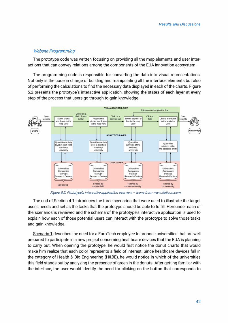
Results and Discussions
42
Website Programming
The prototype code was written focusing on providing all the map elements and user inter-
actions that can convey relations among the components of the EUA innovation ecosystem.
The programming code is responsible for converting the data into visual representations.
Not only is the code in charge of building and manipulating all the interface elements but also
of performing the calculations to find the necessary data displayed in each of the charts. Figure
5.2 presents the prototype’s interactive application, showing the states of each layer at every
step of the process that users go through to gain knowledge.
The end of Section 4.1 introduces the three scenarios that were used to illustrate the target
user’s needs and set as the tasks that the prototype should be able to fulfill. Hereunder each of
the scenarios is reviewed and the schema of the prototype’s interactive application is used to
explain how each of those potential users can interact with the prototype to solve those tasks
and gain knowledge.
Scenario 1 describes the need for a EuroTech employee to propose universities that are well
prepared to participate in a new project concerning healthcare devices that the EUA is planning
to carry out. When opening the prototype, he would first notice the donut charts that would
make him realize that each color represents a field of interest. Since healthcare devices fall in
the category of Health & Bio Engineering (H&BE), he would notice in which of the universities
this field stands out by analyzing the presence of green in the donuts. After getting familiar with
the interface, the user would identify the need for clicking on the button that corresponds to
Figure 5.2. Prototype’s interactive application overview – Icons from www.flaticon.com

Results and Discussions
43
H&BE to get the information he needs. The proportional circles would appear indicating which
universities are doing better in that field and would make him inspect them by clicking on their
logos or the lines connecting them. By clicking on the tab dedicated to research centers in the
Statistics View, he would discover the performance of universities in the field of healthcare de-
vices. After clicking on several points and lines and analyzing the charts, he could draw conclu-
sions to propose the universities that could participate in the EUA project. The interactive pro-
cess is explained in Figure 5.3.
Scenario 2 illustrates an electronic engineer that wants to initiate a start-up and needs to
identify the most profitable business sector within her field of study. Additionally, she would like
to find out which universities are strong in that business sector in case of needing help, advice
or a partnership. When opening the prototype, she would first notice the donut charts that would
make her realize that each color represents a field of interest. Since electronic engineering falls
in the category of Data Science & Engineering (DS&E), she would notice in which of the univer-
sities this field stands out by analyzing the presence of orange in the donuts. After getting fa-
miliar with the interface, she would identify the need for clicking on the button that corresponds
to DS&E to get the information she needs. The proportional circles would appear indicating
which universities are doing better in that field and would make her inspect them by clicking on
their logos or the lines connecting them. By clicking on the Startups tab in the Statistics View,
Figure 5.3. Prototype’s workflow applied to Scenario 1

Results and Discussions
44
she would discover the annual turnover of each of the fields related to DS&E for different uni-
versities. After clicking on several points and lines and analyzing the charts, she could draw
conclusions regarding the most profitable business sectors, and in which environment she
should develop the start-up. The interactive process is explained in Figure 5.4.
Scenario 3 describes a private research company in need for partnering up with universities
that have competences in the field of microchips. When opening the prototype, the user would
first notice the donut charts that would make him realize that each color represents a field of
interest. Since microchips fall in the category High Performance Computing (HPC), he would
notice in which of the universities this field stands out by analyzing the presence of dark cyan
in the donuts. After getting familiar with the interface, he would identify the need for clicking on
the button that corresponds to HPC to get the information he needs. The proportional circles
would appear indicating which universities are doing better in that field and would make him
inspect them by clicking on their logos or the lines connecting them. By clicking on the tab ded-
icated to Companies and Research Centers in the Statistics View, he would discover which uni-
versities have been actively working in the field of microchips. After clicking on several points
and lines and analyzing the charts, he could draw conclusions regarding the potential partner-
ships that could be established. The interactive process is explained in Figure 5.5.
Figure 5.4. Prototype’s workflow applied to Scenario 2

Results and Discussions
45
Reusability
During the last decade, the EU Commission has acknowledged the benefits of Open Data
(OD) for society and economy, supporting and encouraging the opening up of public sector in-
formation. The EU Commission has implemented an OD policy which is linked with the open
research data policy, both addressing publicly funded data and their data results from public
funding. (EU Commission, 2019)
Not only is OD saving time, money, and effort to several organizations by allowing commu-
nities to collaborate on data products, but it is also an innovation booster. OD can stimulate
entrepreneurs to create new innovative products and services.
Since reusability was a priority for this project, the prototype was fully developed in an open-
source environment, following the trends in Information Technology. All the data involved in this
project is free to access for everybody, and the file format and its content are not restricted to
a particular non-open source software tool. By only using OD and publishing the prototype as
an open-source project in Github, the door is left open for others to continue working on its
development. Additionally, it enables non-experts in programming to adapt the prototype for
another usage by making small changes in the code.
Figure 5.5. Prototype’s workflow applied to Scenario 3

Results and Discussions
46
The project resources and how to reuse them
Derived from Figure 5.1, the program needs the following files to run:
▪ An HTML file containing the functionality of the website, programmed with JS. This file
is responsible for the structure of the website, putting its layout and skeleton together.
▪ A CSS file that specifies the style rules and the layout of the web page.
▪ A GeoJSON document containing the geospatial vector data, so D3 can create SVG ele-
ments out of it. As D3 can convert JSON files into SVG elements as well, the input file
could also have a JSON format, or be directly an SVG file, although that will mean that
more lines in the code had to be changed.
▪ As many JSON files as tables in the database
Additionally, in this case, two extra JS files are needed: one to run TaffyDB and the other one
to draw the radar chart. The image files containing the map markers used for the universities
are also in the directory.
Therefore, if the prototype was implemented for another set of universities, it would only be
necessary to change the content of the JSON tables. If the names of the attributes and the
format remain the same, the prototype should run smoothly. It is crucial to replace the images
that will serve as the map markers for each university to the directory. The name given to each
image needs to match the attribute “image” for its corresponding university in the table called
“universities”.
To display other types of data within the Statistics View, changes can be made in the HTML
file. First step is to import the tables containing such data. Then, as the code offers separate
functions for preparing the data to build a chart and for building it, it is simple to change the
variables that the statistical graphs must show. As the functions that prepare the data only need
parameters concerning the name of the table containing such data and the attributes that
should be displayed on the graph, only those parameters have to be changed. Finally, the tabs
should be renamed after the new entities, and chart titles should be updated.
The previous explanation is only valid if the proposed fields of interest were kept. If using
different ones, the new fields should be specified in the variable called “fields” and icons for the
buttons should be updated.
2.5 Open Challenges
The study of innovation ecosystems is relatively new, and it involves invisible phenomena of
several disciplines. As could be expected, developing a methodology to visualize such a com-
plex subject posed several challenges.

Results and Discussions
47
The data model
As previously mentioned, the proposed data model is based on the literature review. Even
though innovation ecosystems have certainly gained ground in the field of economic research,
the topic is still on an early stage, and the literature is still scarce on the components of such
ecosystems. If the project was to be continued or implemented for another case study, a con-
sultation with specialists in innovation and entrepreneurship to validate the data model would
be required.
The visualization method
Considering that the subject of innovation ecosystems is recent to the cartographic field and
no map representations were depicting entire ecosystems at the time of proposing a visualiza-
tion method to the author’s knowledge, proposing an appropriate data visualization approach
was particularly challenging.
The prototype
The prototype is a potential to be improved by adding additional features discussed down
below:
▪ When the user clicks on a point or a line and triggers the zoom effect, the donut charts
and proportional circles on the Map View should resize just like map markers do. As a
temporary solution to avoid overlapping disproportional circles in the Map View, they cur-
rently become invisible when the user zooms in the lines or points.
▪ The info button in the prototype should provide the users with information concerning
the project, either by opening a new tab or presenting it in a modal window.
▪ Data sources should appear somewhere in the prototype. Possible solutions might be:
(a) mentioning them where the project would be explained (see previous item) or (b) in-
cluding them in the corresponding legends.
▪ Currently, only two types of data visualization charts are implemented to show statistics.
However, more graphs could be added to visualize all the relevant aspects of innovation
ecosystems. Research to determine which chart types would be appropriate to add
would be needed. This study only considered quantitative data, but charts for qualitative
data could be tested as well.
▪ The map legends in the prototype are static. However, dynamic legends could be imple-
mented to test if there is a navigation improvement.

Results and Discussions
48
5.6 Future Work Recommendations
One or several appropriate user studies must be conducted to validate the approach. The
adopted methodology suggests that a mixed method of quantitative and qualitative data could
be suitable for the user evaluation (see Appendix 1). Further investigation needs to be done to
define the participants that should be recruited for the study, the products that need evaluation,
the evaluation process that the participants will need to complete and how data will be collected
and interpreted.
Even though running the user studies was not within the objectives of this thesis, the proto-
type was sent to the EUA’s Interim Head. When being consulted about her preference regarding
data visualization, she explicitly acknowledged her inclination for visual representations of data
over the use of numerical or textual formats. Furthermore, she revealed that she currently works
with Excel charts for basic PowerPoints and that she would like to have visual illustration tools
showing the interconnectedness of ecosystems. However, she emphasized that such tools
would require a “thorough concept of indicators”.
Additionally, derived from the remote consultation with the EUA’s Interim Head, the need for
giving special attention to the following issues in the further development of the prototype have
aroused:
▪ While solving the tasks, she would have liked to distinguish for each university, the num-
ber of start-ups/companies/research centers of each field of interest over the total num-
ber.
▪ She has not interacted with the lines, but only with the points. Thus, she found it hard to
compare universities’ information. Aligned to the abovementioned, when asked about the
learnability of the prototype after finishing the tasks, she stated that she did not find the
prototype easy to learn, and that she would like to get instructions on the interface ele-
ments.
▪ She would have liked to go back to the home page. Since the home page hosting the
donut charts aimed to provide a quick overview of each university’s ecosystem, the pos-
sibility of users wanting to go back to it was not contemplated.
▪ She found the information provided by the “Add layer” panel relevant and useful for solving
the tasks.
▪ She was satisfied with the zooming options
▪ She felt the interface was user-friendly.

Results and Discussions
49
▪ She thought the prototype could be implemented to depict real data concerning the EUA.
Considering these issues, and only after running adequate user studies, the improvements
that the prototype requires could be identified. Implementing them would result in a successful
interface, where users could efficiently complete their desired objectives.

Conclusion
50
6 Conclusion
The main objective of this thesis was to visualize clusters and networks among European
innovation ecosystems and to map European competences as well as facilities that support
technological advances.
To accomplish the objective, an interdisciplinary methodology was proposed and applied to
the case study of EuroTech Universities Alliance. Firstly, a solid data model enabled to identify
the relations among the most significant components of universities’ innovation ecosystems
was designed. Secondly, and based on the data model, a suitable visualization method that
could effectively convey the connectivity of science and technology across European bounda-
ries was chosen. Finally, an interactive prototype adopting the data model and the proposed
visualization method was developed to depict universities’ innovation ecosystems. The combi-
nation of statistical graphics and thematic web cartography introduces a new approach for the
visualization of these complex ecosystems.
This thesis is a step forward towards the study of innovation ecosystems from a carto-
graphic point of view. Additionally, this project is in line with European policies. On one hand, the
prototype designed within this thesis is in accordance with the measures that encourage the
development of European innovation ecosystems through the integration of education, re-
search, and entrepreneurship (EU Commission - Directorate-General for Research, 2018). On
the other hand, the entire project was fully developed in an open-source environment following
the trends of Open Data, which is supported by the EU Commission with projects like the Digital
Single Market and the FAIR Data Principles (Association of European Research Libraries, 2016;
EU Commission, 2019).

References
51
References
Anselin, L. (1999). The Future of Spatial Analysis in the Social Sciences. Geographic Information Sciences, 5(2), 67–76. https://doi.org/10.1080/10824009909480516
Association of European Research Libraries. (2016). Implementing FAIR Data Principles: The Role of Libraries. Retrieved August 8, 2019, from https://libereurope.eu/wp-content/uploads/2017/12/LIBER-FAIR-Data.pdf
Basole, R. C., Srinivasan, A., Patel, S., & Park, H. (2018). Ecoxight: Discovery, Exploration, and Analysis of Business Ecosystems Using Interactive Visualization. ACM Transactions on Management Information Systems, 9(2).
Bederson, B. B., & Boltman, A. (1999). Does Animation Help Users Build Mental Maps of Spatial Information? Proceedings of the IEEE Symposium on Information Visualization, 28–35.
Bostock, M. (2019). D3.js - Data-Driven Documents. Retrieved April 28, 2019, from https://d3js.org/
Dedehayir, O., Mäkinen, S. J., & Roland Ortt, J. (2018). Roles During Innovation Ecosystem Genesis: A Literature Review. Technological Forecasting and Social Change, 136, 18–29.
EU Commission. (2019). Open data | Digital Single Market. Retrieved September 3, 2019, from https://ec.europa.eu/digital-single-market/en/open-data
EU Commission - Directorate-General for Research, E. (2018). A New Horizon For Europe - Impact Assessment of the 9th EU Framework Programme for Research and Innovation. Retrieved from https://ec.europa.eu/info/sites/info/files/research_and_innovation/conta ct/documents/horizon_europe_impact_assessment_book_web_version.pdf
EU Commission - Joint Research Centre. (2001). Map Projections for Europe. Retrieved from http://mapref.org/LinkedDocuments/MapProjectionsForEurope-EUR-20120.pdf
European Startup Initiative. (2018). Startup Heatmap Europe. Retrieved April 19, 2019, from https://www.startupheatmap.eu/analytics/
EuroTech Universities. (2014). EuroTech Universities. Retrieved April 4, 2019, from http://eurotech-universities.eu/
Friendly, M. (2009). Milestones in the History of Thematic Cartography, Statistical Graphics, and Data Visualization. York University Archives, Canada.
Gomes, L. A. de V., Facin, A. L. F., Salerno, M. S., & Ikenami, R. K. (2018). Unpacking the Innovation Ecosystem Construct: Evolution, Gaps and Trends. Technological Forecasting and Social Change, 136, 30–48.

References
52
Heer, J., & Robertson, G. G. (2007). Animated Transitions in Statistical Data Graphics. IEEE Transactions on Visualization and Computer Graphics, 13(6), 1240–1247.
Hennemann, S. (2013). Information-Rich Visualisation of Dense Geographical Networks. Journal of Maps, 9(1), 68–75.
Heymann, S., & Le Grand, B. (2013). Visual Analysis of Complex Networks for Business Intelligence with Gephi. 2013 17th International Conference on Information Visualisation, 307–312.
Jackson, D. J. (2011). What is an Innovation Ecosystem? National Science Foundation, 1.
Jatana, N., Puri, S., Ahuja, M., Kathuria, I., & Gosain, D. (2012). A Survey and Comparison of Relational and Non-Relational Database. International Journal of Engineering Research & Technology (IJERT), 1(6), 1–5.
Keena, N., Etman, M. A., Draper, J., Pinheiro, P., & Dyson, A. (2016). Interactive Visualization for Interdisciplinary Research. Electronic Imaging, 2016(1), 1–7.
Lodde, A. (2009). Network Visualisation. Media Informatics Advanced Seminar on Information Visualisation.
MIT. (2017). Startup Cartography Project. Retrieved April 9, 2019, from http://innovation-dev.mit.edu/map/
MIT Senseable City Lab. (2017). MIT World. Retrieved April 19, 2019, from http://senseable.mit.edu/mit-world
Muehlenhaus, I. (2013). Web Cartography: Map Design for Interactive and Mobile Devices. CRC Press.
Murray, S. (2017). Interactive Data Visualization for the Web: An Introduction to Designing with. O’Reilly Media, Inc.
Natural Earth. (2019). 10m-cultural-vectors | Natural Earth. Retrieved April 23, 2019, from https://www.naturalearthdata.com/downloads/10m-cultural-vectors/
Noori, N. S., Paetzold, K., & Vilasis-Cardona, X. (2016). Network Based Discrete Event Analysis for Coordination Processes in Crisis Response Operations. 2016 Annual IEEE Systems Conference (SysCon), 1–5.
Online-S3. (2019). Analysis of Context: Clusters, Incubators, and Innovation Ecosystem Mapping. Retrieved April 16, 2019, from https://www.onlines3.eu/phase-2-analysis-context/2-3-clusters-incubators-innovation-ecosystem-mapping/
Raluca, B. (2017). Quantitative vs. Qualitative Usability Testing. Retrieved August 28, 2019, from https://www.nngroup.com/articles/quant-vs-qual/

References
53
Roth, R. E. (2013a). An Empirically-Derived Taxonomy of Interaction Primitives for Interactive Cartography and Geovisualization. IEEE Transactions on Visualization and Computer Graphics, 19(12), 2356–2365.
Roth, R. E. (2013b). Interactive Maps: What We Know and What We Need to Know. Journal of Spatial Information Science, 6(6), 59–115.
Roth, R. E., Çöltekin, A., Delazari, L., Filho, H. F., Griffin, A., Hall, A., Korpi, J., Lokka, I., Mendonça, A., Ooms, K., van Elzakker, C. P. J. M. (2017). User Studies in Cartography: Opportunities for Empirical Research on Interactive Maps and Visualizations. International Journal of Cartography, 3(sup1), 61–89.
Roth, R. E., & Harrower, M. (2008). Addressing Map Interface Usability: Learning from the Lakeshore Nature Preserve Interactive Map. Cartographic Perspectives, (60), 46–66.
Roth, R. E., Ross, K. S., & MacEachren, A. M. (2015). User-Centered Design for Interactive Maps: A Case Study in Crime Analysis. ISPRS International Journal of Geo-Information, 4(1), 262–301.
Russell, M. G., Still, K., Huhtamäki, J., Yu, C., & Rubens, N. (2011). Transforming Innovation Ecosystems through Shared Vision and Network Orchestration. Proceedings of Triple Helix IX International Conference: “Silicon Valley: Global Model or Unique Anomaly?”, July 2011, Stanford, California, USA, (July), 17.
Shneiderman, B. (1996). Eyes Have It: A Task by Data Type Taxonomy for Information Visualizations. IEEE Symposium on Visual Languages, Proceedings, 336–343.
Smith, D. A. (2016). Online Interactive Thematic Mapping: Applications and Techniques Forsocio-Economic Research. Computers, Environment and Urban Systems, 57, 106–117.
Startup Europe. (2013). Startup Hubs Europe. Retrieved April 19, 2019, from http://www.startuphubs.eu/
Still, K., Huhtamäki, J., Russell, M. G., & Rubens, N. (2014). Insights for Orchestrating Innovation Ecosystems: The Case of EIT ICT Labs and Data-Driven Network Visualisations. International Journal of Technology Management, 66(2/3), 243.
Tait, A. (2018). Visual Hierarchy and Layout. Geographic Information Science & Technology Body of Knowledge, 2018(Q2). Retrieved from https://gistbok.ucgis.org/bok-topics/visual-hierarchy-and-layout
U.S. Department of Health & Human Services. (2019). User Interface Design Basics. Retrieved from https://www.usability.gov/what-and-why/user-interface-design.html
Vinciguerra, S., Taylor, P. J., Hoyler, M., & Pain, K. (2010). Featured Graphic. Contemporary Mappa Mundi: American Exceptionalism in the World City Network. Environment and Planning A, 42(6), 1271–1272.

References
54
Wagner, C. S., Roessner, J. D., Bobb, K., Klein, J. T., Boyack, K. W., Keyton, J., Rafols, I., Börner, K. (2011). Approaches to Understanding and Measuring Interdisciplinary Scientific Research (IDR): A Review of the Literature. Journal of Informetrics, 5(1), 14–26.
Withall, M., Phillips, I., & Parish, D. (2007). Network Visualization : A Review. IET Communications, 1(3), 365–372.
Appendix
Appendix 1– Proposed questionnaire for user study
Department of Civil, Geo and Environmental Engineering Chair of Cartography
Master Thesis Questionnaire This survey is part of a study that presents innovation ecosystems using a geographic network
visualization approach. The proposed prototype of an interactive web map aims to enable non-
experts in complex network visualization to explore and manipulate data in an interactive way,
to gain insights into how European innovation clusters are related, and to draw conclusions that
would ultimately lead to better decision-making.
As the EuroTech Universities Alliance was chosen as the case study, it would be really helpful if
you could provide some feedback regarding the effectiveness of the prototype. To do so, you
will be presented with three tasks, and some questions regarding the problems you might have
had to accomplish them. This survey should take you no more than 30 minutes.
The results of this study will only be used to test and eventually improve the functionality of the
prototype and its features, so your responses will be kept anonymous. Your time and effort are
greatly appreciated.
Before you start…
1. Which is your current position at EuroTech Universities?
2. Do you feel that it is easier for you to understand data when it is (a) visually presented or (b)
presented in numerical or textual formats? ( a / b )
3. Do you use any kind of data visualization tool at work? ( Yes / No )
4. If your previous answer was “Yes”: For which kind of data? Do you find it useful?
If your previous answer was “No”: Do you think it would be a helpful tool? For which kind of
task?
Go to https://zarinaacero.github.io/EuroTechProject/ and take some time to get familiar with
the prototype. Once you feel ready, please try to perform the proposed tasks down below.
Remarks:
a. The datasets used in the prototype were randomly generated, so the data is not real.
b. As datasets regarding companies has not been integrated yet, you should avoid using the
tab “Companies” to complete the tasks.

Appendix
Task 1
You are an electronic engineer and you would like to initiate your own start-up.
5. As you have not decided your business sector yet, you would like to know which area within
your field of study is the most profitable one among start-ups.
My answer is based on (name interface elements or graphs):
6. Either to get help and advice from them, or to establish partnerships you would like to find
out which universities are doing better in those fields.
My answer is based on (name interface elements or graphs):
Task 2
The EuroTech Universities Alliance is planning to carry out a new project concerning healthcare
devices and needs you to find out which universities should take part in it.
7. Which two universities would you suggest?
My answer is based on (name interface elements or graphs):
Task 3
A private research company specialized in the study of microchips wants to establish a new
agreement with a university that is also currently working on that field.
8. Which universities could be appropriate partners for them?
My answer is based on (name interface elements or graphs):
Appendix
9. To what extent do you agree with the following sentences?
Strongly Disagree
Disagree Agree Strongly Agrees
The prototype
It was easy to learn how to use it
It was easy to find the information I was looking for
I was able to efficiently complete the tasks with it
I believe EuroTech could implement it to depict some kind of information
Interface elements
The interface is user friendly
The interface is intuitive
Functionality of elements is clear
If not, please specify which elements were not:
I would like to have instructions on the interface elements
Map features
Legends were clear
Legends were enough
If not, please specify what was missing:
I have used the “Add layer” panel (top left) to perform at least one of the tasks
I feel the “Add layer” panel provides meaningful information
I am satisfied with the zooming options (clicking on lines and points)
10. I find confusing that…
11. Any other remarks?
Related Documents