Marginalia in c ART ography EXHIBITION at the Chazen Museum of Art, Madison February 28–May 18, 2014 Sandra Sáenz-López Pérez

Welcome message from author
This document is posted to help you gain knowledge. Please leave a comment to let me know what you think about it! Share it to your friends and learn new things together.
Transcript

Marginalia in cARTography
EXHIBITION at the Chazen Museum of Art, Madison
February 28–May 18, 2014
Sandra Sáenz-López Pérez

3
David Woodward (1942–2004)Dedicated to his memory and inspiration

This book is published on the occasion of Marginalia in
cARTography at the Chazen Museum of Art, University of
Wisconsin–Madison, February 28–May 18, 2014.
© 2014, The Board of Regents of the University of Wisconsin
System. All rights reserved under International and Pan-American
Copyright conventions. No part of this publication may be
reproduced or transmitted in any form or by any means without
prior written permission from the Chazen Museum of Art, 750
University Avenue, Madison, WI 53706-1411.
ISBN: 978-0-9914859-0-1

Prologue by Russell Panczenko ........................................................................................................................................... 2
Prologue by Matthew Edney ................................................................................................................................................ 3
Introduction ............................................................................................................................................................................... 5
A geocentric universe and a tripartite world ..................................................................................................................... 7
“Miss America and her sisters”
at the four corners of the map ............................................................................................................................................. 10
“Because this space was empty, and lifelike pictures of
exotic things almost always please scholars” .................................................................................................................. 16
Maps, a world of knowledge ................................................................................................................................................ 22
Titles in cartouches:
An image is worth a thousand words ................................................................................................................................. 29
Reaching for the edges and mapping us .......................................................................................................................... 36
Plates ......................................................................................................................................................................................... 40
Bibliography ............................................................................................................................................................................. 85CO
NTE
NTS
CO
NTE
NTS

2
PR
OLO
GU
E
In early 2011 Professor Matthew H. Edney, Osher Professor
in the History of Cartography at the University of Southern
Maine and Director of the History of Cartography Project here
at the University of Wisconsin–Madison, approached me about
collaborating with the Chazen on an exhibition of historical
maps. Although I was very interested in bringing a discipline
to our audiences that is normally outside of the museum’s
circle of activities, there was no one at the Chazen with the
expertise to curate such an exhibition. Could we identify an
appropriate person? Again thanks to the efforts of Professor
Edney, Dr. Sandra Sáenz-López Pérez, Postdoctoral Researcher
at the Research Center for the Humanities and Social Sciences
at the Spanish National Research Council was appointed David
Woodward Memorial Fellow in the History of Cartography
in 2012-2013. This generous fellowship, which was created to
provide scholars with an opportunity to research and write on a
subject related to the history of cartography using the resources
and academic communities available through the Institute for
Research in the Humanities and the History of Cartography
Project at the University of Wisconsin–Madison made this
fascinating project possible.
We are very grateful to Dr. Sáenz-López, who developed the
scholarly theme for Marginalia in cARTography and identified and
located the forty-four objects that comprise it, for her excellent
scholarship. On behalf of the Chazen I also wish to thank the
lenders without whose cooperation and trust this exhibition
would not have been possible. They include Loyola University
Museum of Art in Chicago, Lilly Library at Indiana University in
Bloomington, John Carter Brown Library at Brown University,
the Boston Public Library, the Hill Museum & Manuscript Library
at Saint John’s University in Collegeville, Minnesota, the Osher
Map Library at the University of Southern Maine in Portland, the
American Geographical Society Library at University of Wisconsin–
Milwaukee, the Wisconsin Historical Society, the Cartography
Lab and the Arthur H. Robinson Map Library in the Department
of Geography at the University of Wisconsin–Madison, and the
Department of Special Collections at the Memorial Library at the
University of Wisconsin–Madison.
Support for this exhibition was provided by the Chazen
Museum of Art Council and the Wisconsin Arts Board
with funds from the State of Wisconsin and the National
Endowment for the Arts, the UW–Madison Institute for
Research in the Humanities and the History of Cartography
Project. Dr. Sáenz-López’s research was made possible thanks
to Arthur and Janet Holzheimer.
Finally, I must acknowledge the hard work and contributions by
various museum staff members, for all such projects are the result
of team effort. Foremost, Mary Ann Fitzgerald, our exhibitions
coordinator was responsible for keeping everyone on time and on
track. Communications specialist Jeff Weyer managed production
of the catalog and all promotional materials. Ann Sinfield, the
museum’s registrar negotiated loan agreements and arranged
shipping and insurance. Jerl Richmond, Steve Johanowicz, and
Kate Wanberg designed and installed the exhibition handsomely.
Andrew Stevens, our curator of prints, drawings, and photographs,
arranged for appropriate framing for each map.
Russell Panczenko
Director, Chazen Museum of Art

3
Awarded annually since 2001, the fellowship has been hosted
by the Institute for Research in the Humanities and sustained by
generous gifts from Jan and Art Holzheimer; it has been named
in Woodward’s memory since 2005. Woodward was a remarkable
scholar and teacher who made several major contributions to the
study of maps as human documents. In particular, he founded The
History of Cartography with Brian Harley (1932–1991). This multi-
volume and award-winning series provides a definitive account of
mapping in all societies, at all periods; it has already had a profound
effect on our understanding of the nature of maps and their history.
(www.geography.wisc.edu/histcart gives more information about
the History and free online access to the volumes published to date.)
The Holzheimers created the fellowships specifically to give scholars
access to the university’s remarkable intellectual resources in order
to study topics of relevance to the History. Fellows have hailed from
Europe, South America, and Australasia, as well as the U.S.A.
Moreover, the subject of Marginalia in cARTography was
close to Woodward’s heart. An artist, he became interested in
the history of cartography as a way to understand why maps
look the way they do. He pioneered the historical study of
maps and/as/in art. His edited volume, Art and Cartography
(1987), was quickly recognized as the subject’s foundational
work. It was thus appropriate for Robert Graebner—a Madison
neurologist, clinical professor, and map aficionado—to suggest
that an exhibition of maps at the Chazen Museum of Art would
promote the History and the understanding of maps as cultural
works. (Many doctors are fascinated with maps; in addition to
their intellectual appeal, they seem to resonate with the spatio-
visual mindset fostered by many diagnostic tools.) I am grateful
to Russell Panczenko and the Chazen staff for being so open
to considering maps as art, and for their work in realizing the
exhibition.
It was logical to seek a Woodward Fellow who could create
such an exhibition. It was fortunate indeed that Dr. Sáenz-López
applied. Trained as an art historian, she has extensively researched
the iconography of medieval and renaissance maps. She conceived
of an exhibition focusing on an academically marginalized subject:
the decorative marginalia found on Western maps. But approached
from an art historical perspective, marginalia are revealed as being
crucial for shaping each map’s meaning and defining its cultural
significance. By bringing marginalia to the center of our attention,
Dr. Sáenz-López demonstrates that there is much more to maps
than spatial location and navigation. I am therefore most thankful
to Sandra for creating the exhibition, for writing this catalog, and
for perpetuating David Woodward’s legacy so effectively.
Matthew H. Edney
Director, History of Cartography Project
PR
OLO
GU
EMarginalia in cARTography is a fitting tribute to David Woodward (1942–2004),
Arthur H. Robinson Professor of Geography at the University of Wisconsin.
The exhibition curator, Sandra Sáenz-López Pérez, was the David Woodward
Memorial Fellow for 2012–2013.


5
The term marginalia (marginalium in singular) was coined in
the early nineteenth century to refer to scribbles and comments
written in the margins of books and manuscripts, a practice that
readers have undertaken since antiquity. The incunable of Hartmann
Schedel’s Liber chronicarum (Nuremberg: Anton Koberger, 1493)
at the University of Wisconsin–Madison shows in its edges notes
written by an anonymous German reader who probably owned the
book in the very late fifteenth or early sixteenth century (plate 7).
These written additions also appear on maps, updating
information or correcting errors. The John Carter Brown Library
copy of Jodocus Hondius’s America, printed in Amsterdam in 1619,
shows in the southern part of South America a pasted overlay
with contemporary French manuscript additions, and the itinerary
of Le Maire’s voyage is added in ink (plate 21). This correction
and handwritten text in South America reminds us that Jacob Le
Maire and his chief navigator, Willem Schouten, were the first to
sail around Cape Horn (C. Hoorn). Jacob’s father, Isaac Le Maire,
an Amsterdam merchant and director of the Dutch East India
Company, appointed his son to lead a private expedition to discover
a new passage to the Dutch East Indies in 1615.
A more recent use of the term marginalia has been given to the
images drawn in the borders of manuscripts, mostly those from the
Middle Ages. Scholars such as Lilian M. C. Randall and Michael
Camille use these marginal images as a key to fully decipher the
meaning of illuminated medieval codices, deepening our knowledge
of their authors and of the social and historical context in which
these manuscripts were made.
The marginalia in these works are often drolleries of grotesque
and comic appearance. They reached their full development in
Gothic art around the second half of the thirteenth century. These
motifs were originally sprinkled around the borders of the folio,
sometimes connected to a decorated capital letter or placed at
the end of a chapter (plate 1). Around the late fourteenth to early
fifteenth centuries the edges of manuscript pages gained prominence,
and marginal images were no longer painted in the bare vellum but INTR
OD
UC
TIO
N
Detail of plate 21, Jodocus Hondius’s America (Amsterdam: Jodocus Hondius, [1619]), with the itinerary of Le Maire’s voyage drawn in ink. Courtesy of the John Carter Brown Library at Brown University (Cabinet B619 1).

6
In this exhibition, the term “marginalia” is used to refer to the
images at the margins of maps.
became part of a completely illuminated frame, where sometimes
all the various types and elements of the marginal repertory—
flora, fauna, human figures, geometric and fantastic motifs—were
reproduced in an obsessively microscopic scale (plate 2).
Maps are also part of the marginalia repertoire. In the Etymologies
of Saint Isidore (ca. 560–636), a summa of universal knowledge in the
Middle Ages, the chapter devoted to the description of the world (“De
Orbe”) is usually illustrated with a map that sometimes is relegated to
the margin; thus it is not inserted within the writing frame (plate 3).
In this exhibition, the term marginalia is used to refer to the
images at the margins of maps. Throughout history, art and
cartography have walked hand in hand: artistic motifs were used
to represent geographical elements, cities, the different people who
lived in the world, and so forth; and at the same time, there was
no clear professional recognition, to the point that an artist could
be responsible for both a map and for an illuminated manuscript
or a painting in another artistic medium. The European discovery
of Claudius Ptolemy’s Geography in the early fifteenth century
and the impulse given to mathematics in cartography by the
Flemish cartographer Gerard Mercator (1512–1594) prompted the
development of Western cartography as a science and increased the
interest of solving the problem of how to project the spherical earth
on the flat surface of a map. Moreover, a deeper knowledge of the
physical world increased the number of toponyms and amount of
geographic detail. Thus the many blank spaces that before were
filled with artistic motifs disappeared from maps, but not the
images themselves. They were still present but mostly relegated to
the margins. The variety of maps in the exhibition show various
forms of scientific projection, such as Ptolemy’s pseudo-conic first
projection (plate 7) or his second “oval” one (plate 9); a cordiform
(plate 20) or double-hemisphere maps (plates 17, 28, 29, 31, 32);
or the Mercator projection, introduced in 1569 and still used in
cartography today (plate 26). This scientism was compatible with
artistic marginalia. In fact, as Matthew Edney argues, the double
hemisphere projection not only favored the sense of the earth’s
sphericity but also allowed a great deal of room in the margins for
decorative elements.
As in medieval illuminated manuscripts, marginal images in
cartography should be regarded not only as part of the map,
but as elements that lead to a better understanding of the region
mapped, of the cartographers and their collaborators, of their
aesthetic sense, and of the world in which they were made. These
artistic motifs have to be part of cartography studies for a full
understanding of maps, because, as J. Brian Harley stated, “Both
decorative and geographical images on a map are unified parts of a
total image.” The exhibition Marginalia in cARTography challenges
us to look at maps in a way that we are not used to: awarding their
margins a central position.

7
A G
EO
CE
NTR
IC U
NIV
ER
SE
A
ND
A T
RIP
AR
TITE
WO
RL
D
The medieval image of the universe was a combination of
Christianized Aristotelian physics and Ptolemaic mathematical
astronomy. It was conceived as spherical, finite, and geocentric.
The earth at the center was surrounded by the other three classic
elements—water, air, and fire—forming the sublunary world;
around it, in homocentric spheres or heavens, were the planets
(including the moon and the sun); and beyond lay the fixed
stars and the Primum Mobile. This outer sphere in medieval
Christian cosmology was identified with God (fig. 1), who, as the
Primordial Motor, set in motion the Primum Mobile, and that
movement was propagated to the lower spheres, until it reached
the moon. The universe moved through God’s intelligence or spirit,
or indirectly through his angels (as in Münster’s mappamundi,
plate 9). In the medieval mindset, therefore, God ruled the cosmos
from the outermost perfect and unchangeable layer, which the
German humanist Petrus Apianus named the “Coelum Empireum
Habitaculum Dei et Omnium Electorum,” that is, “The Empyreal Sky,
Residence of God and of all the Elects,” in his Cosmographia, first
published in Landshut in 1524, which went through many editions
and translations (plate 4).
Fig. 1. The cosmos in Hartmann Schedel’s Liber Chronicarum (Nuremberg: Anton Koberger, 1493). God’s realm closes the medieval universe, with him enthroned and flanked by the elects and a choir of angels. Courtesy of the Department of Special Collections, Memorial Library, University of Wisconsin–Madison (F S31 Cutter, f. 5v).

8
Many medieval maps include the image of God embracing the
world or the divine realm around it (fig. 2). The mappamundi
by the Venetian Giovanni Leardo made around 1452 (plate 5)
shows rings surrounding the map with information on how to
determine the dates of Easter; the names of the months; the day,
year, and minute when the sun enters each sign of the zodiac; the
phases of the moon; the dates on which Sundays fall in various
months and years; the length of respective days; and saints’ days
and festivals. And at the very margin of the map are the symbols
of the four evangelists: St. Mark (as a lion), St. Luke (bull), St.
Matthew (angel), and St. John (eagle).
Leardo’s world is tripartite; that is, it is formed by the three
continents known in the Middle Ages: Asia, Europe, and Africa.
It is oriented to the east, with the Terrestrial Paradise at the
top, and Jerusalem is in the center of the world (see these same
characteristics in another medieval mappamundi, the Psalter
map, fig. 2). It follows the zonal climatic theory, and therefore
the northern and southern regions are described as uninhabitable
because of the extreme cold and heat, respectively. Leardo’s map
is a clear example of a late medieval mappamundi in which the
influence of the more realistic cartography of nautical charts is
mixed with traditional geographic and theological ideas.
The most popular map in the Middle Ages was the so-
called T-O map. Its name derives from its schematic tripartite
shape, which was explained in the late fourteenth century
Fig. 2. The Psalter map (ca. 1265). God embraces and blesses the world, and two basilisks, symbols of evil, are being crushed. The map is oriented to the east, with Terrestrial Paradise (with Adam and Eve) at the top, Jerusalem in the center, and the monstrous races at the southern edge of the world. © The British Library Board, ADD 28681 f. 9r.
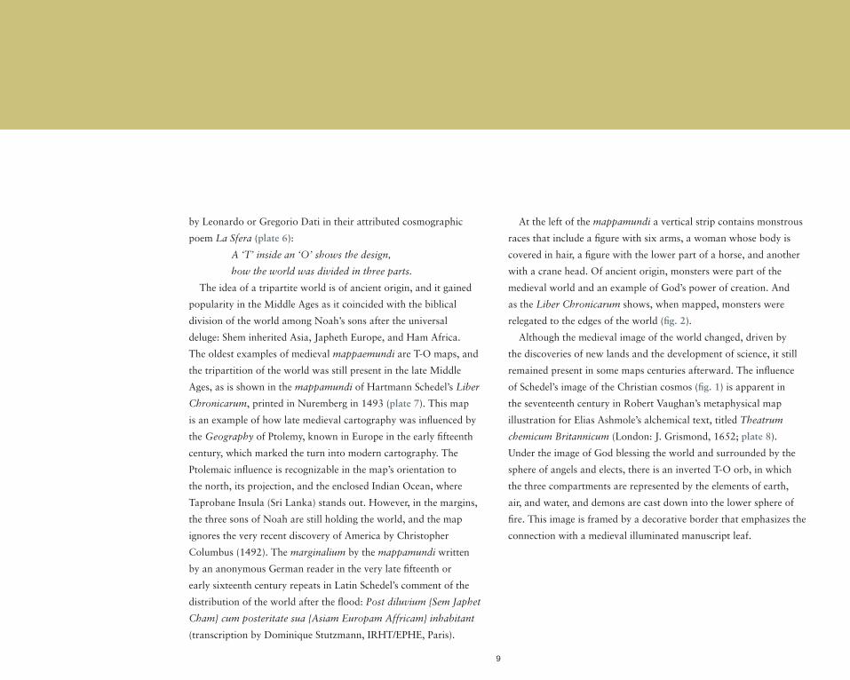
9
by Leonardo or Gregorio Dati in their attributed cosmographic
poem La Sfera (plate 6):
A ‘T’ inside an ‘O’ shows the design,
how the world was divided in three parts.
The idea of a tripartite world is of ancient origin, and it gained
popularity in the Middle Ages as it coincided with the biblical
division of the world among Noah’s sons after the universal
deluge: Shem inherited Asia, Japheth Europe, and Ham Africa.
The oldest examples of medieval mappaemundi are T-O maps, and
the tripartition of the world was still present in the late Middle
Ages, as is shown in the mappamundi of Hartmann Schedel’s Liber
Chronicarum, printed in Nuremberg in 1493 (plate 7). This map
is an example of how late medieval cartography was influenced by
the Geography of Ptolemy, known in Europe in the early fifteenth
century, which marked the turn into modern cartography. The
Ptolemaic influence is recognizable in the map’s orientation to
the north, its projection, and the enclosed Indian Ocean, where
Taprobane Insula (Sri Lanka) stands out. However, in the margins,
the three sons of Noah are still holding the world, and the map
ignores the very recent discovery of America by Christopher
Columbus (1492). The marginalium by the mappamundi written
by an anonymous German reader in the very late fifteenth or
early sixteenth century repeats in Latin Schedel’s comment of the
distribution of the world after the flood: Post diluvium {Sem Japhet
Cham} cum posteritate sua {Asiam Europam Affricam} inhabitant
(transcription by Dominique Stutzmann, IRHT/EPHE, Paris).
At the left of the mappamundi a vertical strip contains monstrous
races that include a figure with six arms, a woman whose body is
covered in hair, a figure with the lower part of a horse, and another
with a crane head. Of ancient origin, monsters were part of the
medieval world and an example of God’s power of creation. And
as the Liber Chronicarum shows, when mapped, monsters were
relegated to the edges of the world (fig. 2).
Although the medieval image of the world changed, driven by
the discoveries of new lands and the development of science, it still
remained present in some maps centuries afterward. The influence
of Schedel’s image of the Christian cosmos (fig. 1) is apparent in
the seventeenth century in Robert Vaughan’s metaphysical map
illustration for Elias Ashmole’s alchemical text, titled Theatrum
chemicum Britannicum (London: J. Grismond, 1652; plate 8).
Under the image of God blessing the world and surrounded by the
sphere of angels and elects, there is an inverted T-O orb, in which
the three compartments are represented by the elements of earth,
air, and water, and demons are cast down into the lower sphere of
fire. This image is framed by a decorative border that emphasizes the
connection with a medieval illuminated manuscript leaf.

10
“MIS
S A
ME
RIC
A A
ND
HE
R S
ISTE
RS
” A
T TH
E F
OU
R C
OR
NE
RS
OF
THE
MA
P
The discovery of America inspired an artistic boom in the
representation of the four continents. The New World, also known
as the Fourth Part of the world, was named after the Italian explorer
Amerigo Vespucci, as Martin Waldseemüller (ca. 1470–1520)
explained in his Cosmographiae Introductio that accompanied his
1507 mappamundi:
I do not see what right anyone would have to object to calling
this part after Americus, who discovered it and who is a man
of intelligence, [and so to name it] Amerige, that is, the Land
of Americus, or America: since both Europa and Asia got their
names from women.
Paradoxically, despite its male name, America, as well as her three
“elder” sisters, were mostly represented through female figures. That
led Clare Le Corbeiller to title an article focused on the iconography
of the four continents as “Miss America and her sisters,” which
is now echoed here. In the words of Charmaine A. Nelson, “The
four continents—Africa, Asia, Europe, and America—went hand
in hand with the idea of woman as nature, literalizing the symbolic
representation of woman as territory and allowing for an aesthetic
exploration of the female body as both beautiful and sublime.”
One of the earliest artistic representations of the four continents
on a map appears in Sebastian Münster (1488–1552)’s mappamundi
included in Johann Huttich and Simon Grynaeus’s Novus Orbis
Regionum ac Insularum veteribus incognitarum, first printed in Basel
in 1532 (plate 9). At the margins, the four corners are covered with
woodcuts attributed to the German Renaissance artist Hans Holbein
the Younger (ca. 1497–1543). Although they are not labeled, each
corner is devoted to one continent: Africa (upper left) is represented
by a terrifying elephant, big snakes, and two lip-plated Africans;
Asia (upper right) by the Indian spice plants clove, musk, and pepper
traded through Calicut, and some natives carrying bow and arrow
and dressed with feathers (both the weapons and feathers were
Detail of plate 9, Sebastian Münster’s Typus Cosmographicus Universalis from Johann Huttich and Simon Grynaeus’s Novus Orbis Regionum ac Insularum veteribus incognitarum … (Basel: Io. Hervagium, 1537; 1st ed. 1532). Image courtesy of The American Geographical Society Library (E141 .N933 1537).

11
associated with the American Indian stereotype, and the fact that
here they characterize Asiatic people derives from the confusion
that existed between the two Indies); Europe (lower right) shows
classical architecture and European figures, among which Ludovico
di Varthema, a well-known sixteenth-century Italian traveler to
Asia, is identified by name; and America (lower left) is associated
with a cannibalism scene, where victims are being chopped up and
dismembered human remains are being cooked over a fire and in a
pot, and being dried hanging from the branches of a hut. The same
hut appears in Brazil by the reference to the Canibali in Sebastian
Münster’s New weldt oder Inseln (Basel, ca. 1550), the earliest known
separate map of the Americas, which appeared in his Cosmographia
(Basel: n.p., 1550; plate 10).
Münster and Holbein approached the world with curiosity and an
early ethnographical eye, though nuanced by a clear Eurocentrism.
The sources used were varied and included other maps and travel
books. For example, as Jean Michel Massing showed, a couple of
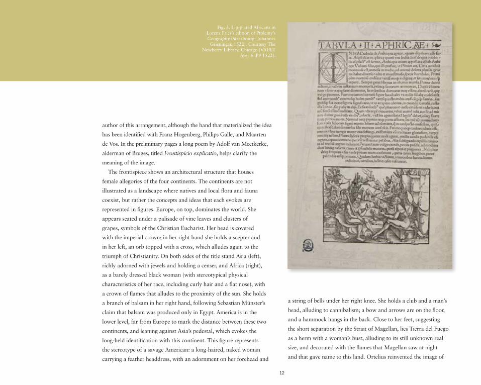
lip-plated Africans appeared in Lorenz Fries’s edition of Ptolemy’s
Geography, published in Strasbourg in 1522 by Johannes Grieninger
(fig. 3), specifically in a woodcut related to the second regional map
of Africa—another marginal image as it is not on the map itself but
on the reverse folio.
Meanwhile, the earliest news on American cannibalism came from
the travel accounts of Christopher Columbus and Amerigo Vespucci.
In Vespucci’s letter to Piero Soderini, written in Lisbon in 1504 and
published in Florence between 1504 and 1506, he testified how one
of his sailors was killed, and later cooked and eaten. The German
translation published by Johannes Grüniger in Strasbourg in 1509
incorporated a woodcut where in the background two natives are
chopping up a body (fig. 4).
Sebastian Münster enriched his maps with artistic images, and these
were in many cases relegated to the margins. In his edition of Ptolemy’s
Geography, first published by Henricum Petrum in Basel in 1540, the
eighth regional map of Asia incorporated monstrous races at the edges
(plate 11): a Sciapod using his big feet as an umbrella to shelter from
the sun, small Pygmies fighting against the cranes, two Blemmya with
their facial traits on the chest, and a Cynocephalus or dog-headed man.
All of them were associated with India, as Münster also showed in his
Cosmographia first published in Basel in 1544 (plate 11), and they were
closely related to the medieval monstrous races that inhabited the world
(plate 7 and fig. 2). The similitude between the scene of Anthropophagi
chopping up a human victim in Münster’s Ptolemaic map of India and
in Münster-Holbein’s 1532 mappamundi is explained again by the
identification of both East and West Indies.
A work that played a major role in the definition of the images of the
four continents in cartography was the Theatrum Orbis Terrarum by
Abraham Ortelius (1527–1598), first published in Antwerp in 1570.
This systematic and comprehensive collection of maps of uniform style
has often been considered the first modern atlas (plate 13 and plate
34). The title page or frontispiece, an image marginal to the collection
of maps that it introduces, stands out as one of the most interesting
innovations in the history of cartography. Ortelius is thought to be the
Meanwhile, the earliest news on American cannibalism came from the travel accounts of
Christopher Columbus and Amerigo Vespucci.
12
author of this arrangement, although the hand that materialized the idea
has been identified with Franz Hogenberg, Philips Galle, and Maarten
de Vos. In the preliminary pages a long poem by Adolf van Meetkerke,
alderman of Bruges, titled Frontispicio explicatio, helps clarify the
meaning of the image.
The frontispiece shows an architectural structure that houses
female allegories of the four continents. The continents are not
illustrated as a landscape where natives and local flora and fauna
coexist, but rather the concepts and ideas that each evokes are
represented in figures. Europe, on top, dominates the world. She
appears seated under a palisade of vine leaves and clusters of
grapes, symbols of the Christian Eucharist. Her head is covered
with the imperial crown; in her right hand she holds a scepter and
in her left, an orb topped with a cross, which alludes again to the
triumph of Christianity. On both sides of the title stand Asia (left),
richly adorned with jewels and holding a censer, and Africa (right),
as a barely dressed black woman (with stereotypical physical
characteristics of her race, including curly hair and a flat nose), with
a crown of flames that alludes to the proximity of the sun. She holds
a branch of balsam in her right hand, following Sebastian Münster’s
claim that balsam was produced only in Egypt. America is in the
lower level, far from Europe to mark the distance between these two
continents, and leaning against Asia’s pedestal, which evokes the
long-held identification with this continent. This figure represents
the stereotype of a savage American: a long-haired, naked woman
carrying a feather headdress, with an adornment on her forehead and
a string of bells under her right knee. She holds a club and a man’s
head, alluding to cannibalism; a bow and arrows are on the floor,
and a hammock hangs in the back. Close to her feet, suggesting
the short separation by the Strait of Magellan, lies Tierra del Fuego
as a herm with a woman’s bust, alluding to its still unknown real
size, and decorated with the flames that Magellan saw at night
and that gave name to this land. Ortelius reinvented the image of
Fig. 3. Lip-plated Africans in Lorenz Fries’s edition of Ptolemy’s Geography (Strasbourg: Johannes
Grieninger, 1522). Courtesy The Newberry Library, Chicago (VAULT
Ayer 6 .P9 1522).

13
the world, not only by his celebrated atlas, but also through the
personification of the continents as they made their appearance
on this title page. After the Theatrum, the artistic motif of the
allegories of the four continents acquired great prominence as
marginalia in cartography.
Ortelius used various textual and visual sources for the allegories
of the continents. The iconography of America seems to derive from
Hans Staden’s Warhaftige Historia …, first published in Marburg
in 1557, but more specifically from Christoffel Plantijn’s translation
into Dutch, which appeared in Antwerp (the city where Ortelius lived
and the Theatrum was published) in 1558 as Warachtige historie …
(plate 14). Staden was made prisoner of a Tupinambá tribe in Brazil,
and after escaping and returning to Europe, he wrote an account of
his captivity, describing how he witnessed that the natives killed and
ate their enemies and even threatened him with being eaten. Staden
seems to have had an important role in the design of the images
in his Marburg edition, and they have been considered of great
ethnographic interest. The club the Tupinambá used to hit the victim’s
head is very similar to the one America is holding in the Theatrum.
The continents being four were very suitable to fill in the blank
spaces of the four corners of maps, and the subject became very
popular as marginalia. Jan Baptista Vrients (1552–1612) used it
in a splendid way. Vrients, a Flemish publisher in Antwerp who
after the death of Ortelius in 1598 acquired the publication rights
to the Theatrum, is responsible for the Orbis Terrae Compendiosa
Descriptio, a double-hemisphere world map engraved by Arnoldus
and Henricus Florentinus van Langren in Antwerp (plate 15). It was
part of Jan Huygen van Linschoten’s Itinerario (Amsterdam: Cornelis
Claesz, 1596) and, based on Petrus Plancius’s 1594 world map,
engraved by the Dutch master Jan van Doetecum and published by
Cornelis Claesz. This map is also framed with the allegories of the
continents (America is not a single figure but is represented by natives
of Mexico, Peru, and the Strait of Magellan, or Magallanica), but
Vrients’s are artistically more sophisticated and refined than those in
Petrus Plancius’s map.
The images of Europe, Asia, Africa, and America in Vrients’s
world map derive from the Flemish designs of the four continents
by Dirck Barendsz (1534–1592), engraved by Jan Sadeler in
Cologne in 1581, and from those images by Maarten de Vos
(1532–1603), which Adriaen Collaert not only engraved but also
published in Antwerp around 1589. While Vrients followed the
setting and tone of landscape from de Vos as well as the allegories
of the continents riding their characteristic animals, the headdresses
and some attributes, such as the cornucopia for Europe (symbol of
abundance), derive from Barendsz.
Europe is sitting on the orb. She is crowned and carries the scepter;
thus, as in Ortelius’s Theatrum, her superiority over the other three
continents is again emphasized. Asia sits on a dromedary and carries
a censer; an elephant, rhinoceros, and what seems to be a giraffe
are represented as Asiatic fauna. Africa rides a crocodile; her head
is topped by a parasol and she holds balsam; in the background
are elephants and lions and the Egyptian pyramids. The bellicose

14
Fig. 4. Woodcut showing American cannibalism and other Indian customs in Amerigo Vespucci’s German translation of his letter to Piero Soderini, published as Disz büchlin saget wie die … by Johannes Grüniger in Strasbourg in 1509. Courtesy The Newberry Library, Chicago (VAULT Ayer 112 .V5 1509).
America, holding bow and axe, is seated on an armadillo. The
savagery of this land is also shown in the cannibalism scene in the
background. By echoing elements already included by Maarten de
Vos, America in Vrients’s world map is very far from the Arcadian
America in Barendsz’s design (figs. 5 and 6).
In 1593, Cesare Ripa published his Iconologia overo Descrittione
Dell’imagini Universali cavate dall’Antichità et da altri luoghi, a book
of emblems organized alphabetically that contributed to a great extent
to fixing the iconography of the four continents. The first edition of the
Iconologia was published without images, and the second, this time
with 684 concepts and 151 woodcuts, appeared in Rome in 1603.
Many editions and translations into different languages followed
(plate 16), and the Iconologia became an extremely influential source
in the depiction of allegorical figures in the seventeenth and eighteenth
centuries and in various art forms. The scorpion, the lion, and the
necklace in Ripa’s Africa are repeated at the marginal iconography of
the double-hemisphere world map published in Leiden around 1720
by Pieter van der Aa (1659–1733; plate 17).
This later work shows that two centuries after the four continents
appeared in the borders of Münster-Holbein’s world map (plate 9), the
subject was still popular in cartography. Although it reached certain
standardization, nuances and differences were introduced from one
map to another. Europe is still associated with symbols of power,
and in Van der Aa’s world map she also leads in the arts, as by her
feet there are a press, two pages with scribbled text, and a painter’s

15
Fig. 5. Left: America by Dirck Barendsz, as engraved by Johannes
Sadeler (Cologne, 1581). Amsterdam, Rijksmuseum
(RP-P-OB-7440).
Fig. 6. Right: America by Maarten de Vos, as
engraved by Adriaen Collaert (Antwerp,
1586–1591). Amsterdam, Rijksmuseum (RP-P-
BI-6060).
palette with brushes. Moreover, the scene in the background shows
that this modern allegory of Europe was compatible with the classical
representation of the rape of Europa by Zeus in the form of a bull.
The evolution of the subject of the four continents in cartography
is visible not only through the images at the corners of maps, but
also through the title pages. One century after Abraham Ortelius’s
Theatrum came to light, Arnoldus Montanus (1625–1683) published
his De Nieuwe en Onbekende Weereld (Amsterdam: Jacob Meurs,
1671), translated by John Ogilby (1600–1676) in his America, Being
the Latest and Most Accurate Description of the New World (London:
printed by the author, 1671). Illustrated with numerous engravings
related to America, this work became the most popular book on the
New World and a standard work for a long time. The frontispiece
of Montanus (plate 18), also copied by Ogilby, shows the allegory
of America being lifted in the middle of a motley crowd of Indians
wearing feathers, and exotic animals—among which a llama stands
out. Whereas in Ortelius’s title page Europe was the most graceful
continent, here the New World takes on that role. Europeans are still
present, but they are in the background, mesmerized by the bounty
of gold that America is throwing. Later works remind us that Europe
was still considered superior in the European mapping panorama,
as in the cartouche of the map of Europe of the Atlas portatilis by
Johann Christoph Weigel (Nuremberg?: Weigel, ca. 1740), where the
three continents pay homage to Europe, who, on top of the world,
specifically on the European area, rides the bull of Zeus, has a crown
and carries a scepter ended in a cross, and is surrounded by a bright
aura. The three other continents are holding a cloth with the title of
the map and are represented through some of their standard attributes:
dark skin for Africa, feathered skirt and hat for America, and turban
for Asia (plate 19). In the context of this tradition, Montanus-Ogilby
departed from the European artistic tradition and elevated the
American continent, who this time was not riding an armadillo (or
other exotic animal), but was standing up on a shell carried by two
bearded Atlases, both quintessential symbols of Western classicism.

16
“BE
CA
US
E T
HIS
SP
AC
E W
AS
EM
PTY
, AN
D L
IFE
LIK
E
PIC
TUR
ES
OF
EX
OTI
C T
HIN
GS
AL
MO
ST
ALW
AYS
P
LE
AS
E S
CH
OL
AR
S”
In his first known map, published by Gerard de Jode in Antwerp
in 1564, the Flemish cartographer Abraham Ortelius (1527–1598)
included in the lower right corner the images of the two most
important American cities of that time, Cuzco and Tenochtitlan
(Mexico City; plate 20), as he explained in a cartouche above them:
Because this space was empty, and lifelike pictures of exotic
things almost always please scholars, I have taken care of
incorporating here the images of these two cities, as they have
come to us and that we can consider as genuine.
Those “genuine” Aztec and Inca cities that covered the emptiness
of the border of this world map were very likely copied from
Giovanni Battista Ramusio’s Delle Navigationi et viaggi, a collection
of explorers’ firsthand accounts of their travels, and more specifically
from the third volume, first published by De Giunti in Venice in 1556
Fig. 7. “Cuzco, main city in the province of Perú” in the third volume of Giovanni Battista Ramusio’s Delle Navigationi et viaggi (Venice: De Giunti, 1565; 1st ed. 1556), p. 412. Within the city, the Inca sovereign Atahualpa is carried in a litter towards the temple. Image courtesy of the John Carter Brown Library at Brown University (1-size H554.R 184n).

17
(fig. 7). The images of both Tenochtitlan and Cuzco had a long life
and were subjected to changes and additions. They were included in
the first volume of the Civitates Orbis Terrarum, first published in
Cologne in 1572 (fig. 8), edited by Georg Braun (1541–1622), and
largely engraved by Franz Hogenberg (1535–1590). The Civitates was
a major project intended to complement Ortelius’s Theatrum Orbis
Terrarum (plate 13) but focusing on cities. It came to an end with the
publication of the sixth and final volume in 1617, having comprised
546 prospects, bird’s-eye views, and map views of cities from all over
the world. Braun added in the foreground, thus, in the margins of the
maps, figures in local dress and scenes relevant to the cities’ history,
situation, commerce, and customs. As Braun stated in his preface
to the first volume, the figures were introduced not only to depict
local costume and manners, but also to deny his work to the Turks,
who might use it against Christendom, as their religion forbade the
representation of the human form.
In the map of Mexico City are three natives dressed in feathers and
with bows and arrows. The central, most prominently clothed figure is
probably a representation of Moctezuma II, killed during the Spanish
conquest of the Aztec empire by Hernán Cortés. In Cuzco, Atahualpa,
the last Inca sovereign before the Spanish conquest of his empire
appears carried in a litter, both in the front and in the middle of the
city, going to the temple.
The expansion of the mapmaking industry in the Netherlands in
the second half of the sixteenth century inaugurated the golden age of
decorative cartography, which was to last until the eighteenth century.
As Elizabeth A. Sutton pointed out, the transition of the cartographic
center from Antwerp (where, for example, Ortelius issued his
Theatrum Orbis Terrarum, plate 13, and Vrients his Orbis Terrae
Compendiosa Descriptio, plate 15) to Amsterdam had an impact
in the compositional focus of the artistic motifs, which moved from
an allegorically oriented visual conception to a more documentary
presentation. Previously the images on the maps signified deviance,
incivility, and ultimately total difference from Europe, and in the end
these figures functioned as indices of abstract cultural concepts in
which all that was not European was exoticized and undervalued.
Now the images on the maps gained a stronger ethnographical interest
and served as documentary evidence of diverse cultures and peoples.
This evolution resulted from a closer dependence on illustrated
travel accounts, and from the fact that travelers would not only give
accounts of the curious and exotic subjects, but would apply a more
analytic perspective.
In the map of America engraved by Jodocus Hondius (1563–1612)
in Amsterdam in 1606, and later reissued in 1619 by Hondius’s
widow (plate 21), a rectangular cartouche in the lower left margin
illustrates “The method of preparing and consuming a drink among
the Americans in Brazil, where, after women have chewed up certain
roots, they spit them out again and then cook them in pots and
offer them to men for drinking. And this drink is held by them to be
especially delicious,” as the Latin text above describes. For this image,
Hondius resorted to the popular narrative of the captivity of Hans
Staden as recorded by Theodor de Bry (1528–1598) in his Grands

18
The practice of decorating the margins of maps with images reached its peak in the Dutch map borders
known as cartes à figures, or “map with figured borders.”
Voyages, specifically in the third part devoted to America titled Dritte
Buch Americae darinn Brasilia, durch Johann Staden …, published in
German in Frankfurt in 1593 (plate 22).
The practice of decorating the margins of maps with images
reached its peak in the Dutch map borders known as cartes à figures,
or “map with figured borders.” Strips framed the map on three
or four edges and included emblems, figures of people, busts of
sovereigns, plans and views of cities, and the like, all relating to the
geographical area mapped. Willem Janszoon Blaeu (1571–1638) is
often credited with originating these delineated border decorations
in the early seventeenth century (plate 27). Frederick de Wit (1630–
1706)’s map of America, titled Nova Totivs Americae Description,
published in Amsterdam in 1660 (plate 23), includes a strip at the top
with American cities—including the famed Tenochtitlan and Cuzco—
and two on the sides with male and female types of American Indians
from Virginia, Chile, Brazil, and Tierra del Fuego (or Magellanici).
These figures depict distinct physiognomies, cultural accoutrements,
and clothing, and it is interesting to emphasize that they have been
separated and individualized in an attempt to classify them in a
manner comparable to scientific taxonomy.
A similar approach is apparent in contemporary illustrated
travel accounts. The Dutch explorer Pieter de Marees traveled
to the Dutch possessions on the Coast of Guinea and wrote a
book titled Beschrijving en historisch verhaal van het Gouden
Koninkrijk van Guinea (Description and historical account of
the Gold Kingdom of Guinea), published by Cornelis Claesz in
Amsterdam in 1602 and followed by various translations (plate
24). De Marees’s analytic interest is visible in the way people are
differentiated according to race, costume, customs, and social class.
In one depiction four women of Guinea are portrayed, and next to
each one, a letter (from A to D) refers to their textual description.
A is the Melato, of mixed Portuguese and African descent. She is
fully clothed, and as de Marees commented, such women often
became the wives of Portuguese men “because white women do
not thrive much there.” B is described as a peasant’s wife on her
way to market. She has scarification patterns on her face and arms,
long bare breasts, and only a skirt covering her. C, the Acatiassa
(young girl or virgin), is appropriately clothed to demarcate her
virginal status but shows a breast to match the description as
“short breasts, being in the prime of life.” D, known as Hiro, is a
common woman breastfeeding her child. She also has scarification
and is bare to the waist. De Marees describes how “the child
sometimes cries for the Breast to suck, which the Mother throws
at it over her shoulder, letting it hang to be sucked.” The engraver
had Jan Huygen van Linschoten’s Itinerario (Amsterdam: Cornelis
Claesz, 1596) as a visual model, and he understandably copied the
Mozambiquan woman, despite that Mozambique and Guinea are
separated by the entire African continent.
The fact that the marginal images of maps satisfied the curiosity
of their viewers for “exotic things”—as Ortelius described in the
first world map (plate 20)—is highlighted again on Châtelain’s
map, which for that matter is titled Carte tres curieuse de la Mer

19
du Sud, contenant des remarques nouvelles et tres utiles … (A very
curious map of the Southern Sea, containing new and very useful
remarks …; plate 25). The Southern Sea, as the Pacific Ocean was
known, and America are the center of the world, and all the blank
spaces around its edges (representing mostly water) are covered
with many illustrations, echoing Dutch map borders. And these
marginalia are indeed what bring the map its curious character.
This map originally appeared in 1719 in the sixth volume
of the Atlas Historaique ou Nouvelle Introduction à l’histoire
à la Chronologie et à la Géographe Ancienne et Moderne, an
encyclopedic work with an educational and moralistic purpose,
intended as a “new introduction to the history, the chronology and
the ancient and modern geography, represented in new maps.” A
total of seven volumes of this historical atlas were issued over fifteen
years, from 1705 through 1720, in Amsterdam. The Atlas Historique
was published anonymously (it is signed as “Mr. C***”), but it was
apparently compiled by the Châtelain family. Although it is usually
attributed to Henri Abraham Châtelain (1684–1743), Jan W. van
Waning has recently argued that Zacharie Châtelain (d. 1723) is
actually the compiler.
The world map shows more than thirty-five insets and vignettes
related to the age of discovery and the New World, which have been
described as an “iconographic feast of imagery for those trying to
grasp the implications of European colonial intrusion into societies
whose ‘otherness’ was their most defining feature.” Nine medallions
at the top center portray important explorers—Columbus, Vespucci,
Magellan, Schouten, Van Noort, L’Hermite, Drake, Dampier, and
La Salle—while the tracks of their voyages are marked on the map.
Geographic insets provide large-scale maps of significant locations,
such as the Gibraltar Strait, the Rio de la Plata, Niagara Falls, and
Fig 8. Mexico (left) and Cuzco (right) were the most
important American cities when Georg Braun edited his
first volume of the Civitates Orbis Terrarum (Cologne,
1573; 1st ed. 1572). The portraits of their distinguished
respectively Aztec and Inca sovereigns are emphasized
by locating them outside of the cities, in the foreground
of the engravings, thus, in the margins of the maps. Courtesy The Newberry
Library, Chicago (VAULT Ayer 135 .B8 1573).
20
the Cape of Good Hope, as well as numerous city and town plans
including Mexico City, Veracruz, and Havana. Other marginal
vignettes range from narrative scenes, such as the arrival of Cortés
in Mexico; the destruction of the Aztec idols; and the baptism of
Magiscatzin before his being murdered, close to another human
sacrifice in which the victim’s heart is removed at the foot of an Aztec
temple. Other images show the colonial economies in America based
on codfish-processing factories in Greenland; hunting of beaver,
moose, and bear; gold and silver mines (such as in Potosí); and sugar
mills and cassava growing in South America. Natives (from all over
America, including Peru, Mexico, and Canada) as well as exotic
plants (a pineapple, bananas, potatoes) and animals (llamas, a
penguin, turtles, various birds, an opossum) are also illustrated.
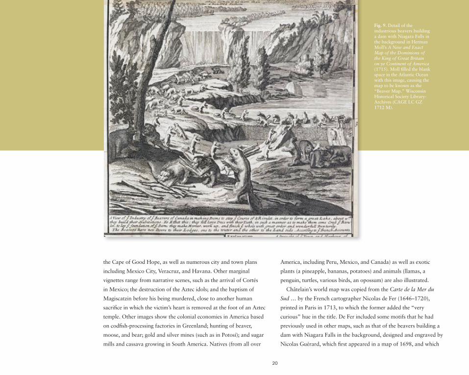
Châtelain’s world map was copied from the Carte de la Mer du
Sud … by the French cartographer Nicolas de Fer (1646–1720),
printed in Paris in 1713, to which the former added the “very
curious” hue in the title. De Fer included some motifs that he had
previously used in other maps, such as that of the beavers building a
dam with Niagara Falls in the background, designed and engraved by
Nicolas Guérard, which first appeared in a map of 1698, and which
Fig. 9. Detail of the industrious beavers building a dam with Niagara Falls in the background in Herman Moll’s A New and Exact Map of the Dominions of the King of Great Britain on ye Continent of America (1715). Moll filled the blank space in the Atlantic Ocean with this image, causing the map to be known as the “Beaver Map.” Wisconsin Historical Society Library-Archives (CAGE LC GZ 1712 M).

21
later the cartographer Herman Moll (ca. 1654–1732) popularized
in A New and Exact Map of the Dominions of the King of Great
Britain on ye Continent of America, printed in 1715 and reissued
with minor revisions for decades afterward (fig. 9). These animals
were thought to possess a great intelligence and were considered
models of hard work and natural skill, and that is why they appear
as a well-orchestrated group with each in charge of a task: felling the
trees, cutting or carrying the branches, making mortar, and so forth,
under the strict direction of the “commandant or architect” that
gives instructions with its raised forepaw. There is even a beaver that
lies incapacitated from overwork, and two others are approaching it
to inspect. As J. Brian Harley commented, this scene “might merely
suggest an interest in natural history, or that the fur trade was a
source of wealth to some of the atlas patrons. Yet a closer look
shows an absence of people and especially of the native Americans
upon whom the fur trade depended. In the final analysis, unless the
beavers are intended as symbol for the hard-working Europeans, it
is just as likely that it was this negative aspect, the absence of people,
which entered the reader’s consciousness … Such images, associated
with the representation of the territory on the map, and becoming
part of the process of persuasion and mythmaking, rendered
legitimate the holding of English colonies in America.”
If in Châtelain’s 1719 world map it was the lavishly marginal
illustrations that made it “very curious,” more than a century
later, artistic marginalia again defined another map, this time as
“embellished.” Colton’s Illustrated & Embellished Steel Plate Map
of the World on Mercator’s Projection was compiled, drawn, and
engraved by D. Griffing Johnson and published in New York in 1854
by J. H. Colton, the founder of an American mapmaking company
that was an international leader between 1831 and 1890 (plate 26).
Cartouches interlaced by filigree frame the map, and as with Dutch
map borders, cities and peoples are illustrated all around. At the
top center the landing of Columbus is flanked by London and New
Orleans (left), and St. Petersburg and Paris (right). In the lower margin
appear Constantinople, Naples, New York, Rome, and Canton. On
the laterals there are different people: American Indian and Turkish
(left), and Swiss, Circassian, Greek, and Mandarin (right).
Although stylistically these images are very far from those that
framed sixteenth- and seventeenth-century maps, the same spirit
that moved those cartographers to include marginalia in their maps
seems to underlie the maps of the mid-nineteenth century. Not in
vain, the subtitle of this world map, which reads Compiled from the
Latest & Most Authentic Sources Exhibiting the Recent Arctic and
Antarctic Discoveries & Explorations, seems to evoke Ortelius’s
words in his 1564 world map, in which he included the images of
Cuzco and Tenochtitlan “as they have come to us and that we can
consider as genuine.”

22
MA
PS
, A W
OR
LD
OF
KN
OW
LE
DG
E
The Scientific Revolution and the Enlightenment brought a strong
scientific component into maps, and marginalia in cartography were
also influenced by experimentation and the advancement of human
knowledge of the world. The ideal of spreading information to
large numbers of people led to the expansion of printed material—
including maps—that incorporated the latest scientific information.
The demand for cartographic material increased, and mapmakers
emphasized scientific (or pseudo-scientific) information, particularly
in the borders, as a marketing tool to attract customers interested
in wall maps for display as well as functional items. Moreover, the
important role cartography had in the formation of modern states,
as a way of controlling the territory, as a strategic tool for war, and
as a symbolic element to boast the power of a nation, is reflected in
the titles, which many times announce that the map is the “newest
and most accurate.”
Not only were the erudite and political interests of cartography
compatible with the artistic beauty of illustrations, they also had
a strong influence on the subjects chosen for marginalia. This
combination was exemplified by one of the mapmaking and
publishing businesses most inclined to the artistic ornament, that
Detail of plate 27, Willem Janszoon Blaeu’s Nova Totius Terrarum Orbis Geographica ac Hydrographica Tabula, from his Theatrum orbis terrarum, sive, Atlas Novus (Amsterdam: Willem Janszoon Blaeu, 1635), with borders illustrating the four elements, seven planets, four seasons, and Seven Wonders of the Ancient World. Courtesy of the Department of Special Collections, Memorial Library, University of Wisconsin–Madison, Gift of Dr. Seymour Schwartz (CA 15509 plate 5).

23
founded by Willem Janszoon Blaeu (1571–1638) and later continued
by his two sons, Joan and Cornelius. The Nova Totius Terrarum
Orbis Geographica ac Hydrographica Tabula, originally published
in Amsterdam in 1606 as a separate sheet map, remained in active
circulation for over fifty years. It was copied by Pieter van de Keere
in Amsterdam in 1608 and included in other Blaeu’s atlases, such as
the Theatrum orbis terrarum, sive, Atlas Novus, by Willem Janszoon
and his son Joan (Amsterdam, 1635; plate 27).
The Nova Totius Terrarum Orbis is a map with figured borders.
The strip on the left shows in four rectangles the elements (fire, air,
water, and earth), and the one on the right the four seasons (spring,
summer, autumn, and winter). Both these decorative motifs recur
at the four corners of other contemporary maps (plates 28 and 31).
The upper and lower strips strengthen the map’s link with classical
antiquity: at the top, seven planets are personified by the gods of
the Greco-Roman pantheon (Moon, Mercury, Venus, Sol, Mars,
Jupiter, and Saturn). Starting in the lower cartouche of the left strip
(Earth) and moving upward to the last cartouche in the upper strip
(Saturn), the vignettes reproduce the Aristotelian and Ptolemaic
astronomical systems (fig. 1, plates 4, 28, and 29). The lower strip
depicts the Seven Wonders of the Ancient World (from left to right):
the Hanging Gardens of Babylon, the Colossus over the harbor at
Rhodes, the Egyptian pyramids, the Mausoleum of Halicarnassus
at Caria, the Temple of Artemis (or Diana) at Ephesus, the Statue of
Zeus at Olympia, and the lighthouse of Alexandria. For the motifs
in the borders of his map, Blaeu used Flemish engravings, such as
the Four Elements by Hendrik Goltzius (Haarlem, 1586). But of all
these sources, the one that best connotes the idea of the map as a
mirror of the world is that related to the Seven Wonders.
Although according to the title the map is “new” (nova), the
iconography of these motifs rests firmly on classical ground, and
it raises the question of what in its margins is actually new (or
scientific, for that matter). Somewhat surprisingly, it is indeed the
appeal to antiquity that brings novelty to this map. The images
derive from the rebirth of classic subjects that took place in the
sixteenth- and seventeenth-century European arts, driven by
Humanism and the Italian Renaissance. As far as the Seven Wonders
of the World, only in the Renaissance did the list we know today
become fixed. The Dutch artist Maerten van Heemskerck (1498–
1574) crystallized the ideas of his generation in a series of engravings
based on literary sources (even back then, only one of the Seven
Wonders—the Great Pyramid of Giza—remained). These prints,
engraved by Philips Galle and published by Theodoor Galle in 1572,
became the source used by Blaeu (fig. 10).
Another interesting example of the scientific approach of
marginalia on a map is A New and Accvrat Map of the World:
Drawne according to ye truest Descriptions, latest Discoueries &
best Obseruations yt have beene made by English or Strangers,
1626, attributed to John Speed (1552–1629) and first published
by George Humble in London in 1627 in an atlas known as A
Prospect of the Most Famous Parts of the World (plate 28). The
many images that surround the double-hemisphere map were copied

24
from previous maps, not only British (especially the very fine world
map by William Grent, London, 1625), but also “stranger,” as the
title says, that is, foreign, such as the Dutch world map of 1617 by
Jodocus Hondius.
The four medallion portraits of circumnavigators of the
globe—Drake, Magellan, Cavendish, and Van Noort—similar
astronomical drawings of solar and lunar eclipses, and the
diagram of the universe derive from Grent’s map. Despite the
supposed attempt at accuracy (the title describes it as an Accvrat
Map), the image of the cosmos in this early-seventeenth-century
map (as it was also evident in Breu’s Nova Totius Terrarum
Orbis, plate 27) is still rooted in the ancient tradition that
persisted in the Middle Ages (fig. 1 and plate 4). It does not evoke
the heliocentric model of the universe that places the sun, rather
than the earth, at the center, as formulated by the astronomer
Nicolaus Copernicus (1473–1543) in his On the Revolutions
of the Celestial Spheres, first published in Nuremberg in 1543.
Copernicus’s ideas, strengthened and improved by later rational
scientists, namely Galileo Galilei (1546–1642) and Johannes
Kepler (1571–1630), had a profound effect on thinking about
the universe and shape of the Earth after about 1650. Despite
this scientific anachronism of Speed’s world map, it is important
to note that the outermost sphere that Petrus Apianus identified
with “The Empyreal Sky, Residence of God and of all the Elects”
(plate 4) here lacks a name; thus, God as the ruler of the cosmos
is omitted from the diagram.
Grent’s diagram with the solar divisions is replaced in Speed’s
world map by the image of an armillary sphere and “a figure to
prove the spherical roundness of the sea,” as the accompany text
reads. The four allegorical figures of the elements (water, earth,
fire, and air) and the celestial hemispheres were copied from
Hondius’s world map.
A step forward in the mapping of the universe according to
modern scientific discoveries appears in A New and Correct Map of
the World, Laid Down According to the Newest Discoveries, and
From the Most Exact Observations by Herman Moll (1654?–1732),
inserted in his The World Described, or A New and Correct Sett of
Maps, a collection of maps issued in London in 1715–1720 that saw
numerous later editions (plate 29). The map, originally produced
separately in 1707, is dedicated to King George II, as reads the legend
in a cartouche, and the text on both sides includes interesting vitriolic
attacks on Moll’s competitors, particularly French cartographer
Nicolas Sanson, “whose maps have been condemned and found to be
notoriously false,” and a claim that Dutch maps are inaccurate and
often illegal piracies. At the borders of the double-hemisphere map
there are diagrams of the universe. In the upper left corner stands
Ptolomy’s universe, where the positions of the sun, the earth, and the
moon are emphasized and the external sphere does not have a name
(that external sphere that Petrus Apianus called “The Empyreal Sky,
Residence of God and of all the Elects,” plate 4, does not have a
name either in Speed’s A New and Accvrat Map of the World, plate
28). In the upper right corner Copernicus’s sphere is shown with the
The four allegorical figures of the elements (water, earth, fire, and air) and the celestial hemispheres
were copied from Hondius’s world map.

25
Fig. 10. The Pyramids of Giza in Egypt, with a crowned and bearded pharaoh looking up toward a bird of prey carrying a shoe in its beak. To the right, a group of workers building the pyramids prepare bricks and fire them in a large oven from which smoke rises. In the background appear a tall stepped pyramid and numerous obelisks. This print, engraved by Philips Galle and published by Theodoor Galle in 1572, after Maerten van Heemskerck, was the source for Blaeu’s Nova Totius Terrarum Orbis Geographica ac Hydrographica Tabula (Amsterdam, 1635). Amsterdam, Rijksmuseum (RP-P-1904-3298).
sun in the center and the earth rotating around it. Moreover, it also
depicts the moon around the earth, and the orbit of the comet seen in
1680 and 1681 that prompted Isaac Newton’s theory of gravity. The
lower margin of the map includes depictions of Mercury, Venus, Mars,
Saturn, and Jupiter with its four moons discovered by Galileo Galilei
in January 1610, and the first scientific map of the moon, according to
Giovanni Domenico Cassini (ca. 1679), as well as the appearance of
the sun from Athanasius Kircher’s Mundus Subterraneus (Amsterdam,
1664). Kircher’s sun is conceived as a body of wondrous fire, unequal
in surface and composed of different substances—some fluids, some
solid: a sea of fire wherein waves are in perpetual agitation (plate 30).
Copernicus’s heliocentric system was depicted in a totally
different—and very original—way in Joan Blaeu’s Nova
et accuratissima totius terrarum orbis tabula, inserted in
the first volume of his Atlas Maior, Sive Cosmographia
(Amsterdam, 1662) that was concluded in 1672 with a total
of eleven volumes in Latin, followed by translations into
French, Dutch, German, and Spanish (plate 31). In this map,
not only did Joan Blaeu correct the geocentric system evoked
in the Nova Totius Terrarum Orbis (plate 27), but the
whole map itself, more than just the decorative borders, is a
celebration of the Copernican universe.

26
In the center of the upper margin, the classic allegory of the
sun stands out for its glare. The figures of planets, seated on
the clouds, orbit around him drawing rainbow stelae, each
one characterized by its classical attributes: Mercury with a
winged petasos and carrying the caduceus; Venus with Cupid
and holding a heart; Mars as a warrior; Jupiter topped with
a crown and holding a scepter and a thunderbolt; and Saturn
with a scythe, which alludes to the passage of time. The earth,
represented through the double-hemisphere map, also orbits
around the sun, as shown by the cloudy stele between Venus
and Mars that seems to hold it. The moon, between both
hemispheres, alludes to its rotation around the earth. The
integration of the map in the border decoration emphasizes the
close relation that exists between marginalia and cartography.
Moreover, it reveals the close union of the heavens and the
earth, or of astronomy (symbolized through a bearded sage
on the left who holds an armillary sphere) and geography (the
figure on the right that points at a globe and measures distances
with the divider).
In the lower margin, the four seasons appear in
chronological order in their distinct classic iconography (as
in Blaeu’s Nova Totius Terrarum Orbis, plate 27): Spring as a
young woman who holds flowers; Summer as a nude woman
with a sheaf of wheat; Autumn, a Bacchic figure holding a
cluster of grapes and a cup; and Winter as a shivering old
man with a hat and wrapped in a blanket, huddled by the fire.
The source for these images was probably the four seasons by
Antonio Tempesta, published by Giovanni Orlandi in Rome in
1592. The inclusion of the four seasons links time to space (the
map), and the temporal dimension of the earth’s annual orbit
around the sun and the movement of the planets come into play.
Marginalia in maps contributed to spread the knowledge of
advances in astronomy and also in the understanding of natural
phenomena. Johann Baptist Homann (1663–1724) stressed in his
Planiglobii terrestris cum utroq hemisphaerio caelesti generalis
repraesentatio (Nuremberg?, ca. 1716) the earth’s physical and
atmospheric forces (plate 32). In the upper margin, with the
moon alluding to the night on the left and the sun to the day
on the right, cherubic wind heads that in the Middle Ages and
Renaissance appeared in symmetric order at the borders of maps
(plates 5 and 7) are here responsible for chaotic winds. Snow
or hail is falling on the left and lightning strikes on the right. In
the lower margin other natural forces are displayed, including,
on the left, the ebb and flow of the tides under the effect of the
moon, an earthquake destroying a city, and the eruption of
Mount Etna in front of a group of people raising their prayers,
reminding us of human frailty; and on the right, a whirlpool
that is sinking a boat, waterspouts, and a rainbow formed by the
refraction of the light from the sun (on the upper corner) as it
encounters the droplets of water from the rain. Along the bottom
margin a text offers to the “friendly reader” (Benevole Spectator)
a theorical explanation of all this.

27
Fig. 11. Charles Price and George Willdey, A New and Correct Map of the World (1714). In close relation with all the scientific artifacts, the map copies Kircher’s map of the sun and Cassini’s of the moon that had previously appeared in Moll’s A New and Correct Map of the World (1707; plate 29). The allegorical depictions of the four continents above were designed and engraved by H. Terrason, perhaps to expand the map’s market by making it serve as a decorative wall map as well as a scientific resource. Courtesy of the Osher Map Library at the University of Southern Maine (OS-1714-5).

28
This map and many others included among their marginalia
images of the celestial hemispheres, with attractive delineations
of the constellations and zodiacal symbols (plates 15 and 28).
But Reiner Ottens’s star charts of the northern and southern
skies included in his Atlas Maior cum Generales Omnium Totius
Orbis Regnorum … (Amsterdam: n.p., ca. 1740) were intended
in origin, and still are, “as a feast for the eye.” The constellations
are elaborately presented as the classical figures of antiquity.
Although these two maps did not have pretensions to scientific
precision, once more the scientific interest was shifted to the
margins, specifically to the corners, where illustrations depict the
most important observatories where the advances in astronomy
were relegated. The celestial map of the austral sky shows four
European observatories (clockwise): Greenwich, the Round Tower
in Copenhagen, Kassel, and Berlin (plate 33).
In sum, maps are a world of knowledge not only in
their geographical essence, but as encyclopedias of human
understanding of the world—sometimes updated, other times
obsolete. And this scientific appearance of cartography was
a key selling point. In fact, those lavish ornaments along the
borders were a main attraction for sales, and the most obvious
proof that the margins of maps were used to advertise and sell
these commodities.
That is the case in the business operated by George Willdey
(ca. 1676–1737), an optical instrument fabricator, mapmaker,
and toy seller who formed a partnership with Charles Price
(ca. 1679–1733) in London in 1710 to sell maps, and after its
dissolution three years later, Willdey kept the business. George
Willdey has been considered “the most prolific advertiser for items
of public science,” and his ads eventually reached his maps (fig.
11). He had H. Terrason (fl. 1713–1717) design and engrave all the
commodities sold in “The Great Toy Shop next the Dog Tavern in
Ludgate Street,” not far from St. Paul’s cathedral in London, which
can be read in the cartouche. These artifacts included complex
and expensive instruments such as telescopes, a clock, a globe, an
armillary sphere, compasses, a gun, a microscope, and a barometer,
and lesser manufactures such as scissors, knives, buckles, monocles,
spectacles, tweezers, and razors. The meaning of these images
was also inscribed across the map: “These and many other usefull
Instruments and Curiositys are made to the Utmost Perfection and
Sold wholesale or Retaile by George Willdey.” The map itself was
one of them, both a commodity and a useful and curious instrument.

29
TITL
ES
IN C
AR
TOU
CH
ES
: AN
IMA
GE
IS
WO
RTH
A T
HO
US
AN
D W
OR
DS
From the sixteenth through the nineteenth centuries the cartouche
became one of the standard components of the ornamental
vocabulary of artists and craftsmen throughout Europe, not only of
cartographers. However, as Edward Lynam assured, “The cartouches
of maps became a special branch of art.” Though a French word,
cartouche derives from the Italian cartoccio, meaning a roll or
twist of paper. In the early sixteenth century French and German
cartographers introduced the first decorated titles on maps in the
upper margin, but only as a simple text inscribed in a flying scroll—
actually, in a cartoccio. Cartouches, as panels surrounded by an
ornamental frame, are artistically much more elaborate, and they
were an Italian creation. They made their appearance in cartography
in the sixteenth century, first to take in the title and soon other
facts about the map, such as the scale (about 1580), and later the
dedication, signature, date, imprint, and other information.
The first form of cartouche was based on “strapwork” design,
imitating the ends of interwoven lengths of soft leather with edges
curling forward all around the inscription. By 1550 the cartouche
was a large rectangle with curved and curled pieces in relief that
imitated carved wood. Flemish and Dutch cartography, especially
after Abraham Ortelius’s Theatrum Orbis Terrarum (Antwerp, 1570;
plate 34), indiscriminately used these designs and motifs found in
the pattern books of Italian Renaissance sculptors, wood-carvers,
stonemasons, and plasterworkers.
Detail of plate 34, Americae sive novi orbis, nova descriptio, from Abraham Ortelius’s Theatrum Orbis Terrarum (Antwerp: Christoffel Plantijn, 1587; 1st ed. Coppenium Diesth, 1570). The title cartouches were copied from the pattern books of Italian Renaissance sculptors. Courtesy of the Department of Special Collections, Memorial Library, University of Wisconsin–Madison, Gift of Dr. Seymour Schwartz (CA 15509 plate 2).

30
These frames, originally mostly geometrical, were soon decorated
with figures, and classical sources became one of the most popular
inspirations. Fauns, nymphs, and Neptunes (as in the dedication
cartouche in plate 29), and putti—figures of chubby male children,
usually nude and sometimes winged, that often appear in maps holding
instruments for astronomy, surveying, and map drawing—were
included, combined with other nonfigurative elements such as masks,
sphinxes, and wreaths of flowers and fruits.
Allegories of the country mapped were also a recurrent motif. In the
Nova Totivs Americae Description by Frederick de Wit (Amsterdam,
1660; plate 23), the New World is symbolized by the design of
Maarten de Vos, as engraved by Adriaen Collaert (ca. 1589), of a
bellicose, bare-breasted female figure, holding bow and axe and seated
on an armadillo (fig. 6). The use of motifs related to America became
very common within cartouche decoration, even when the map was
not of the New World but a mappamundi, as in Blaeu’s Nova Totius
Terrarum Orbis Geographica ac Hydrographica Tabula (Amsterdam,
1635; plate 27). Covering the gap of the unknown territory of North
America, a cartouche that discusses the discovery of the New World
by Christopher Columbus and its naming after Amerigo Vespucci is
flanked by two hybrid mannerist figures, half human and half vegetal.
The one on the left is crowned by a feather, is dressed in a feathered
skirt, and holds, again, a bow in her left hand, and with her right she
shows a ring, alluding to American metallurgical and mineral wealth.
Fig. 12. Joshua Fry and Peter Jefferson, A detail of A Map
of the Most Inhabited Part of Virginia Containing the Whole
Province of Maryland (London: T. Jefferys, 1755). The title of the map appears in a Rococo
frame made of rocaille, complicated sets of C and S
that resemble stylized shell-like, rocklike, and scroll motifs that generate asymmetrical shapes. This cartouche is an example of the message transmitted in maps of European possession
and dominion in American colonies. Black native slaves appear serving and working
for the European (white) tobacco industry in America
and tobacco’s exportation to Europe. Image courtesy
of Library of Congress, Geography and Map Division
(G3880 1755 .F72 Vault).

31
In the 1640s the idealized inhabitants of the country were depicted
in groups with their appropriate implements and domestic animals,
and the development of Baroque art introduced a great variety of
naturalistic scenes, usually related to the region mapped, its people,
their customs, or the presence of the Europeans in those territories.
The map of the Partie occidentale du Canada ou de la Nouvelle France
by the Italian cartographer Vincenzo Maria Coronelli, published in
Paris by Jean Baptiste Nolin in 1688 (plate 35), shows a group of
natives (distinguished by their nude torsos), probably les Nations des
Ilinois, de Tracy, les Iroquois, et plusieurs autres peuples mentioned
in the subtitle. They are throwing arrows at cattle that have been
cornered in a lagoon or river by bonfires lit on the shore. At the top
of a waterfall, two Europeans (dressed with hats, and firing weapons)
are shooting at some other animals. Despite the apparent cooperation
in this hunting scene between American Indians and Europeans
(probably from France, as the map presents the French exploration of
the Great Lakes and Upper Mississippi), it is important to emphasize
that the dress and armament speak of the social superiority and higher
technical development of the latter and stress the wild status of the
natives. This savage America is even more evident in the smaller
cartouche that frames the map scale, where a figure whose arms have
been amputated and his body pierced by a stake is being cooked over a
fire, and in the background, in a pot, other supposedly human remains
are being stewed. The cannibalistic reference to America that appeared
as a marginal motif in cartography soon after the discovery of the New
World (plate 9) is still reiterated here.
The persistence of characteristics attributed to a country or region
through the title cartouches is particularly evident in Willem Janszoon
Blaeu’s Aethiopia Superior vel Interior vulgo Abissinorum sive
Presbiteri Joannis Imperium, a map that appeared first in the Novus
Atlas, das ist Abbildung vnd Beschreibung von allen Ländern des
Erdreichs, gantz vernewt vnd verbessert (Amsterdam, 1635), later in
the Atlas Maior, Sive Cosmographia (Amsterdam, 1662–1672), and
was reissued in other collection of maps, such as this general atlas
(Amsterdam, 1696; plate 36). This map is based on the Presbiteri
Johannis, Sive, Abissinorum Imperii Descriptio by Abraham Ortelius,
included in his Latin edition of the Theatrum Orbis Terrarum
(Antwerp, 1573), but as is common in Blaeu’s production, it has been
enriched with images, especially in the cartouches. According to the
title, the map represents the territory under the control of Prester
John, a mythical sovereign of medieval origin. His legend arose in
the mid–twelfth century when a letter started to circulate in Europe
presenting him as a powerful Christian king and, it was hoped, an ally
to fight against the Muslim conquest of the Holy Land and to protect
Europe from the Mongols. Prester John was first located in India, but
in the fourteenth century his kingdom was transferred to East Africa,
specifically to Ethiopia, a territory identified as part of India. In the
fifteenth and sixteenth centuries, Portuguese explorers of the African
continent were still searching for Prester John. The Portuguese
knowledge of and interaction with the Christian Copts in Ethiopia
entrenched his mythical kingdom on maps of East Africa well into the
eighteenth century.

32
The decoration of the cartouche in this map is related not to
Prester John but to African ethnography. It is surrounded by black
figures, both female and male, and some nude children. Two of them,
seated on the pediment from which a cloth with the title hangs, carry
parasols as a protection from the scorching African sun—the same
parasol that topped the head of Africa in Jan Baptista Vrients’s Orbis
Terrae Compendiosa Descriptio (plate 15), and covered her body in
Petrus Plancius’s Orbis Terrarum Typus De Integro Multis In Locis
Emendatus. Moreover, the classical putto which in many maps plays
with a divider in the scale cartouche has been transformed in Blaeu’s
map into another black child.
It is interesting to note how the style of the decoration of
cartouches evolved parallel to artistic development, and how their
subjects varied depending on the nature of the map. Another regional
map of Africa, the Carte de l’Egypte Ancienne et Moderne by Gilles
Robert de Vaugondy and engraved by Elisabeth Haussard, shows
a very different image of Africa, this time related to her ancient
history echoed in the title (plate 37). The map was inserted in the
Atlas Universel, first published in Paris in 1757 by de Vaugondy and
his son, Didier Robert de Vaugondy, along with Antoine Boudet,
and was later reissued by Charles François Delamarche. Far from
copying a myth, the title cartouche in this map approaches the ruins
of Pharaonic Egypt. The title text is carved on a broken stone slab
lying on a palm tree and a sphinx. A tumbled obelisk and a classical
colonnade with a broken entablature reinforce the decadent aspect
of these makeshift archaeological remains. The background features
some very angular pyramids, which recall the Renaissance designs by
Maerten van Heemskerck, engraved by Philips Galle and published
by Theodoor Galle in 1572 (and copied by Willem Janszoon Blaeu
in his Nova Totius Terrarum Orbis Geographica ac Hydrographica
Tabula [Amsterdam, 1635; plate 27]). This and other details, such
as the bare breast of the sphinx and the necklace around her neck,
as well as some hieroglyphs in the pedestal—namely the naturalistic
palm tree and the crocodile (which recalls the animal ridden by the
allegory of this continent; plate 15)—keep this representation from
being a true copy of the ancient Egypt art history. However, the map
creators should be considered prescient for foreseeing the popularity
of Egyptology that was to come after Napoleon’s campaign in Egypt
in the very late eighteenth century.
During the eighteenth and nineteenth centuries, apart from
the interest in ancient ruins, especially those in Rome after the
influence of the designs of authors such as Giovanni Battista Piranesi
(1720–1778), another subject that stood out in cartouche decoration
was the depiction of conflicts among countries. One of the most
spectacular images in this regard is the Theatre de la Guerre en
Espagne et en Portugal by Johannes Covens and Cornelis Mortier,
inserted in the Nieuwe atlas … (Amsterdam: Covens & Mortier,
ca. 1740), that illustrates the title cartouche with an image of the
War of the Spanish Succession (1701–1714), fought between two
alliances of European powers, including a divided Spain, over the
ascent to the Spanish throne after the death of Charles II of Spain
(plate 38). The title of the map is written on a big rock, crowned

33
Fig. 13. Niagara Falls in Jean Louis Hennepin’s A new discovery of a vast country in America (London: M.
Bentley, et al., 1698), ill. at p. 29. Wisconsin Historical Society Library-Archives (F352 H75).
34
by the heroic image of the Archduke Charles (a young Charles III)
on a horse, after his landing near Barcelona in 1705. It is striking,
however, to note that the map is dedicated to Philip V. This edition
was published in the late 1730s after a previous map by Pierre
Mortier, dedicated to Charles III, published around 1710, and as
Peter Barber explains, “In the middle of the eighteenth century it
did not make commercial sense for a publisher to alter radically the
plate of an old map that was still selling reasonably well in response
to changing political circumstances.” Thus the map was reissued
with minor differences and “without even a change of the face or
(Habsburg) symbolism, a generation after it had been first published
by Pieter Mortier and long after Barcelone had fallen to the Bourbon
forces and the map had been rededicated to Philip V.”
The idea of the cartouche being a “visual register in which a map’s
cultural meaning is suggested”—to put it in the words of G.N.G.
Clarke—is emphasized according to this scholar in eighteenth-
century British maps of America, and especially in Jefferys’s (fig. 12)
and Faden’s atlases. These marginal images are a representation of
“ownership and control, as well as of information and accurate (often
inaccurate) knowledge about the continent”; thus they have to be
understood as “the pictorial equivalent (a comparative image) of the
way the land is portrayed in the map ‘proper.’” The cartouches mirror
the map. As “icons of possession … cartouches give both ballast and
direction (visual, narrative, symbolic) to this political frame.”
William Faden’s map of The United States of North America:
with the British and Spanish Territories, According to the Treaty,
of 1784 is one of the first English maps to display the boundaries
of the newly recognized country after the signing of the Treaty of
Peace in 1783 and its ratification in 1784 that ended the American
War of Independence (1775–1783; plate 39). It was published
originally with the title The British Colonies in North America
in 1777, thus during the American Revolutionary War, and it
was regularly revised and updated as new information became
available. Therefore, Faden’s sequence of these maps illustrates the
political development of this country. Of the various editions, this
exemplar has been identified as a fourth state in which the words
“of 1784” are added in the title, and it is dated 1785. Other than
these changes the cartouche is the same as in the first edition of
1777. The elements that form it have been interpreted by Clarke
as a celebration of British colonization and dominion in North
America. Two very different groups are portrayed in a scene that
alludes to the wealthy European industries built in the New World
with American products and labor: the white British merchants,
who appear comfortable and at ease, control the proceedings,
while the native (black) workers are in positions of subservience:
carrying a basket on the shoulder or leaning over a barrel being
prepared for export. The clear difference in skin color of these
two groups indicates the dependence of the economy on African
slaves in America, and that slavery was still in practice despite the
declarations of rights and freedom.
Moreover, as Clarke assures, “The framing device in which
the title appears is also significant.” Covering the side of a hill, it
These marginal images are a representation of “ownership and control, as well as of information and accurate (often
inaccurate) knowledge about the continent.”

35
proclaims the British presence in the land and its dominion over
the American landscape. In this cartouche, a net, an element that
speaks of work, blocks the view of a waterfall. Perhaps this detail
can be interpreted again as European control and possession of the
vast and exuberant American landscape, and thus of the territory.
A very different American landscape is that framing the title
of A map of the United States of North America: drawn from
a number of critical researches by Aaron Arrowsmith (London,
1802; plate 40). As the Romantic Movement gathered strength,
images of natural features and products of the country were
introduced in cartouches. Again, a waterfall, in this case Niagara
Falls, represents the United States of North America. The
illustration accompanies a text by Andrew Ellicott (1789) that
starts, “Among the many natural curiosities which this country
affords, the Cataract of Niagara is infinitely the greatest.”
After Jean Louis Hennepin (1626–ca. 1705) recorded the first
published description and image of Niagara Falls in his Nouvelle
découverte d’un très grand pays situé dans l’Amérique (Utrecht,
1697), translated into English one year later, these waterfalls
became a landmark of the country and one of the wonders of
the modern world (fig. 13). The design was incorporated into
Nicolas de Fer’s map (1698) and popularized by Herman Moll’s
“Beaver Map” (fig. 9). However, the picture of Niagara Falls in
this map of the United States is very different from those previous
versions. It lacks the European presence of Hennepin’s and the
total absence of any human form as in Fer’s and Moll’s maps.
Instead, the map seems to evoke that American piece of paradise
before Columbus’s arrival. The only humans present in the middle
of that exuberant nature are two natives, who are nearly naked.
One is seated on the ground and the other stands, holding an axe
and pointing at the waterfall.
Such a different approach to previous American motifs in
cartouches could be understood from the point of view of the
American Independence. As G.N.G. Clarke affirmed, “The cartouche
declares the newly won nationhood and establishes an alternative
symbolism … to displace former British possession.… The land, like
the map, is advertised as ‘free.’” Moreover, the emptiness of this vast
American landscape as represented in the Niagara Falls cartouche
could be related to the vast blank spaces in the map, especially in the
northwest below the fiftieth parallel, which could be read as a way of
encouraging colonization.
Echoing Jacques Derrida, Stephanie Pratt concluded his analysis
of images of America at the borders of maps affirming that “the
cartouche constitutes the map,” as they “make up the supplement
and are ‘the outside of the inside’, the exteriorizing of what is
really internal and whose absence from that interior is a ‘defailt’.”
Therefore if it is commonly said that an image is worth a thousand
words, in the case of cartography we could assure that the cartouche
is worth (at least) the map.

36
RE
AC
HIN
G F
OR
TH
E E
DG
ES
AN
D
MA
PP
ING
US
From our part of the world, our “center,” the margins have
always been distant places—different, full of mystery. In the blank
spaces on maps there is room for imagination, and that is where
men have relegated all that, whether worshiped or feared, is
unknown, all that is not familiar. If in the Middle Ages the holy city
of Jerusalem was centered and Terrestrial Paradise and monstrous
races were located in the margins of the earth (fig. 2), now we place
ourselves in the middle of the world in our mind’s map, and put
our others—different people, cultures, religions, economies, and
politics—surrounding it. Those cartographic edges have always
provoked mixed reactions, from an absolute deep fascination to
complete revulsion or fear. But regardless of any of these two, men
have always wanted to reach those edges—to know, learn, possess,
control those other worlds.
Traveling to the edges has been a topic of interest from ancient
times, and cartography has enabled us to achieve that goal. The
image of the map allows us—as it has always done—to travel,
with our minds, all around the world. But the idea of actually
taking a map to navigate on a physical journey—which is one of
the first functions we now assign to cartography—is a much more
recent use. Not until the late nineteenth century did the social use
of maps begin to increase, as travelers used them as guides to the
point of their destinations. It was then that maps became a daily
instrument in our lives.
The popularity of maps gained a boost in the early twentieth
century from expansion of the automobile industry and road
making, which favored both commercial and touristic journeys, and
road maps become one of the most common types of cartography.
Detail of plate 43, A New Yorker’s Idea of the United States of America by Daniel K. Wallingford (Boston: Daniel K. Wallingford [reprint from ca. 1964]). Courtesy of the Arthur H. Robinson Map Library (G3701 A6 193- W3).

37
Today, in the era of GPS and satellite navigation systems, when
those foldable maps that not long ago would accompany us on all
our trips are losing their functionality and starting to be seen as
museum or archive artifacts, it is surprising to learn that not long
ago most of our roads did not exist or were almost impassable.
Late in the nineteenth century many places were still isolated,
merely a dot on a map. That favored their inhabitants’ idea of
being in the center of the world.
In the United States road and highway construction was
encouraged by the highway associations that flourished in the 1910s
and 1920s and pursued the “Good Roads Everywhere” movement.
The National Highway Association map (plate 41) issued by the
National Highways Association, the Automobile Club of America,
and the Society of American Military Engineers in 1928 shows the
whole United States covered in thick red lines, a project to connect
the entire country, from San Diego (California) to Houlton (Maine),
from Blaine (Washington) to Miami (Florida)—thus reaching
to all the edges—because, as a text in the map reads, “National
Highways … stimulate the entire political, social and recreational
activities of our Nation.” This map displays Senator Coleman du
Pont’s “principles of road building,” showing not only a tentative
suggestion for road construction, but also, in the margins of the
map, depicting cross sections of how roads should be built, with
between one and four lanes, “as traffic and military needs of the
nation require.” This relation between highway construction and
national security was especially noticeable in the interwar period.
Close attention to the highway cross sections reveals a detailed
representation of an American street, which includes the one- or
two-way directions, the fast and slow lanes, areas for trees and
people (sidewalks) and the distance from the road to the houses and
even churches (in the lower right corner). As a result, as another text
promises, “The Nation will eventually have for the use of all the
people the greatest highway system.”
If road maps expose not only the social but also the political and
military interest of reaching for the edges, the economic value is
highlighted in the very curious map titled “The Man of Commerce”
(plate 42). There are only two known copies of this work, made
by A. F. McKay and engraved by Rand McNally in 1889. An
anatomical diagram of the human body lies on the map of North
America to show, as a text explains, “the resemblance between the
arteries of commerce as represented by railroads, and the arterial
system of man; also, the resemblance between the great vital organs
and the commercial system of the great lakes.” The map’s metaphor
makes “West Superior, Wisconsin, the head of Lake Superior … the
heart of this wonderful man, the center of this great railroad and
commercial system.” The reason the map emphasizes this region
of the United States is because it was published by the Land &
River Improvement Company of Superior, Wisconsin, as a way of
convincing other companies that their fair hamlet deserved to be a
national center of manufacturing and shipping. Some explanatory
notes affirm that “New York [is] the umbilicus through which
this man of commerce was developed,” and “as brain power

38
Fig. 14. Saul Steinberg, Viewof the World from 9th Avenuecover of The New Yorker, March29, 1976 © The Saul SteinbergFoundation /Artists RightsSociety (ARS), New York. Coverreprinted with permission of TheNew Yorker magazine. All rightsreserved. Steinberg’s illustrationshows that beyond the HudsonRiver the Unites States is adeserted land waiting to beconquered and developed.
moves man, so the precious metals are the basic of commercial
movement, and they are found located in the head” that overlays
the states of Washington and Oregon. The explanatory notes
conclude: “It is an interesting fact that in no other portion of the
known world can any such analogy be found between the natural
and artificial channels of commerce and circulatory and digestive
apparatus of man.” And in fact, although the human body as
a cartographic metaphor is certainly common in medieval and
modern cartography, this work may be the earliest reflection of this
metaphor to North America.
Despite the prominence given to this part of the world, a close
look at the map reveals that this “man of commerce” encompasses
more than the United States, or even the North American territory;
it stretches and spreads all over the world (as the commercial
cartographic project intended), stepping on the British Islands,
Spain, and Africa and virtually touching New Guinea, Japan, and
the Kamchatka Peninsula. Therefore, the United States, through
West Superior, was reaching for the edges of the world.
Although we have traveled all over our country and to the edges
of the earth, and we have mapped the entire surface of the world
and covered it with terrestrial, maritime, and aerial routes that
let us reach any point, in our mind’s map we still locate ourselves
in the center, surrounded by a marginal other, moved perhaps by
the need to focus on our familiar microcosm, on our own identity,
against the immensity of the world, or of the worlds.

39
A New Yorker’s Idea of the United States of America is one
of the most popular maps to reflect such an idea. Created in
the 1930s by Daniel K. Wallingford, it was first published by
Columbia University Press for the 1936 Times Book Fair; a
second edition was printed for the 1937 Times Book Fair, and
the map was later redone in color in a larger format on glossy
paper for the 1939 New York World’s Fair, with the inclusion in
Queens of the grounds where the fair was celebrated. The map
remained in print for years, and it was again used for the New
York World’s Fair in 1964, with the addition of the grounds
where that event took place (plate 43). In a combination of
humor, satire, and provincialism, the map illustrates the United
States from the perspective of a chauvinistic New Yorker: a
highly intentional distortion emphasizes a massive New York and
Brooklyn area, and other parts, such as Florida or Hollywood,
while most of the rest of the country is irrelevant, and many of
the place names are incorrect.
Designs all over the map contribute to that humoristic view of the
United States, although the artistic interest is mostly relegated to the
margins. Marginalia emphasizes New York, with representations of
the Empire State Building or the Brooklyn Bridge, and compares,
on the east side of the map, a busy and modern New York street,
where cars drive both ways, with, to the west, a typical scene of the
conquest of the West, where horse carts run toward the sunset and
cross the desert.
This map predates the well-known illustration A View of the
World from Ninth Avenue by Saul Steinberg, which served as the
cover of the March 29, 1976, edition of the New Yorker and had
a similar satirical viewpoint (fig. 14).
Cartographic responses to the New Yorker’s map of the United
States did not take long to make their appearance. Wallingford
also published A Bostonian’s Idea of the United States of America,
similar in concept, in the 1950s, and from “The ‘Green’ State”
of Wisconsin A true and undistorted map of the U.S.A. made in
Wisconsin by Les Williams was released in Pine River (Wisconsin)
in 1952 by A. C. Kimball (plate 44). A yellow color, representative
of the butter, cheese, and beer for which Wisconsin is known,
covers most of the center of the whole country, and a multitude of
small drawings caricaturize the image of that state and of the rest
of the United States.
Designs all over the map contribute to that humoristic view of the United States, although the artistic interest
is mostly relegated to the margins.

40
PL
ATE
S
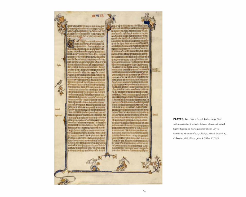
41
PLATE 1. Leaf from a French 14th-century Bible
with marginalia. It includes foliage, a bird, and hybrid
figures fighting or playing an instrument. Loyola
University Museum of Art, Chicago, Martin D’Arcy, S.J.
Collection, Gift of Mrs. John S. Millar, 1972-21.

42
PLATE 2. Manuscript missal bordered with vegetal scrolls
inhabited by naturalistic birds, fantastic dragons, hybrid
animals, and little naked men shooting arrows or clinging to
the branches. Although the historiated initial “S” showing
Pentecost is in the style of the Master of the Cypresses who
worked in Seville in the 1430s, the marginalia place the
volume into the midcentury or third quarter. Courtesy Lilly
Library, Indiana University, Bloomington, Indiana (Ms.
Ricketts 75, f. cliv verso).
BA
CK

43
PLATE 3. A marginal T-O map appears in a
thirteenth-century manuscript of the Etymologies
of Isidore of Seville. An obscure text around it
seems to describe the movement of “Kasepium”
(perhaps the constellation Cassiopeia), through
the east and north, to the west and south. Thanks
to Elisa Ruiz (UCM) and Ignasi Baiges Jardí (UB)
for their help reading the Latin text. By Permission
of the Hill Museum & Manuscript Library, Saint
John’s University (Collegeville, Minn.), Steiner
Collection (Ms. 54, f. 20v).
BA
CK
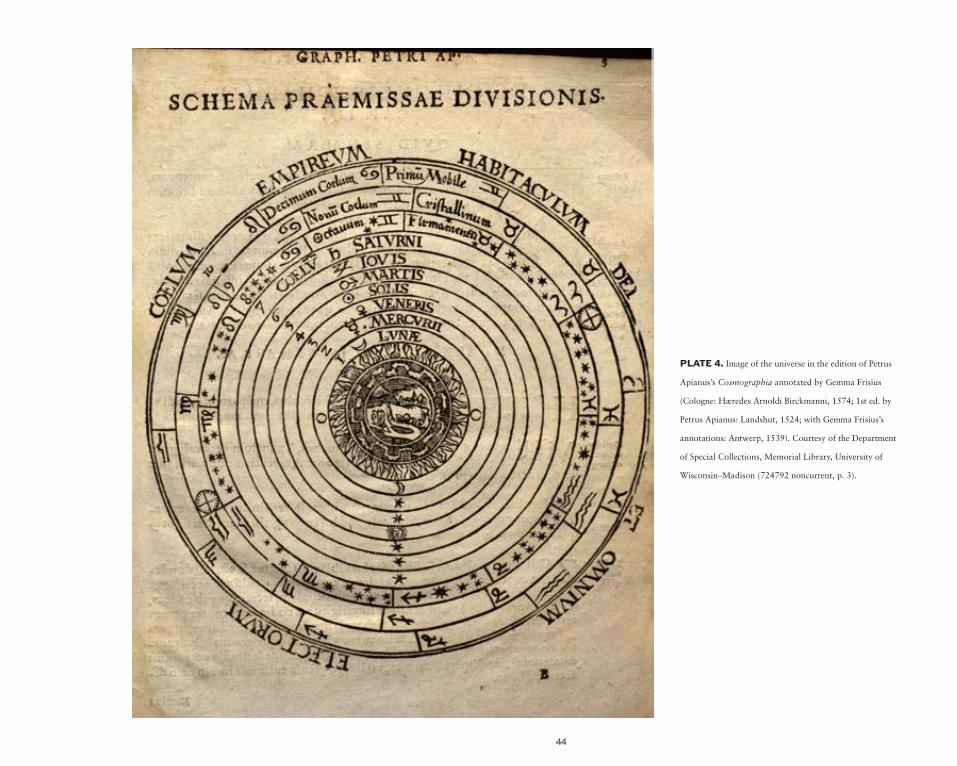
44
PLATE 4. Image of the universe in the edition of Petrus
Apianus’s Cosmographia annotated by Gemma Frisius
(Cologne: Hæredes Arnoldi Birckmanni, 1574; 1st ed. by
Petrus Apianus: Landshut, 1524; with Gemma Frisius’s
annotations: Antwerp, 1539). Courtesy of the Department
of Special Collections, Memorial Library, University of
Wisconsin–Madison (724792 noncurrent, p. 3).

45
PLATE 5. Mappamundi by Giovanni Leardo (ca.
1452). This example is not only the largest known map
by the Venetian cartographer but is also notable for the
information compiled in its margins. Image courtesy of The
American Geographical Society Library (050 A-1452).

46
PLATE 6. Fifteenth-century Italian manuscript of La Sfera by Leonardo or Gregorio Dati, with cartographical depictions including a T-O map. Courtesy
of the Trustees of the Boston Public Library/Rare Books (Ms. f. Med. 125).

47
PLATE 7. Hartmann Schedel included the three sons of Noah and monstrous races at the edges of this mappamundi. This example from the Liber Chronicarum
(Nuremberg: Anton Koberger, 12 July 1493) has marginalia sensu stricto: marginal notes written by an anonymous German reader in the very late fifteenth or early
sixteenth century. Courtesy of the Department of Special Collections, Memorial Library, University of Wisconsin–Madison (F S31 Cutter, f. xiii).

48
PLATE 8. Robert Vaughan’s metaphysical map in Elias Ashmole’s Theatrum chemicum Britannicum … (London: J. Grismond for Nath, 1652).
Courtesy of the Department of Special Collections, Memorial Library, University of Wisconsin–Madison (Thordarson T 136).
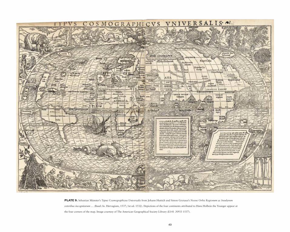
49
PLATE 9. Sebastian Münster’s Typus Cosmographicus Universalis from Johann Huttich and Simon Grynaus’s Novus Orbis Regionum ac Insularum
veteribus incognitarum … (Basel: Io. Hervagium, 1537; 1st ed. 1532). Depictions of the four continents attributed to Hans Holbein the Younger appear at
the four corners of the map. Image courtesy of The American Geographical Society Library (E141 .N933 1537).
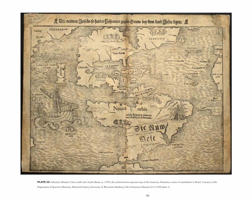
50
PLATE 10. Sebastian Münster’s New weldt oder Inseln (Basel, ca. 1550), the earliest known separate map of the Americas, illustrates a scene of cannibalism in Brazil. Courtesy of the
Department of Special Collections, Memorial Library, University of Wisconsin–Madison, Gift of Seymour Schwartz (CA 15509 plate 1).
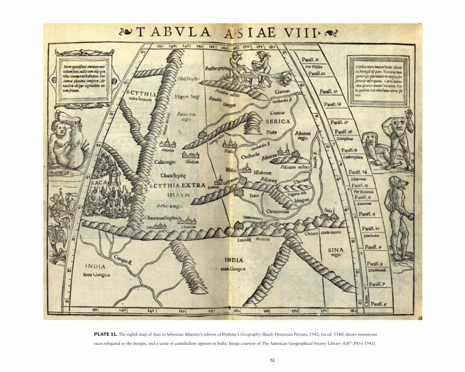
51
PLATE 11. The eighth map of Asia in Sebastian Münster’s edition of Ptolemy’s Geography (Basel: Henricum Petrum, 1542; 1st ed. 1540) shows monstrous
races relegated to the margin, and a scene of cannibalism appears in India. Image courtesy of The American Geographical Society Library (G87 .P85x 1542).
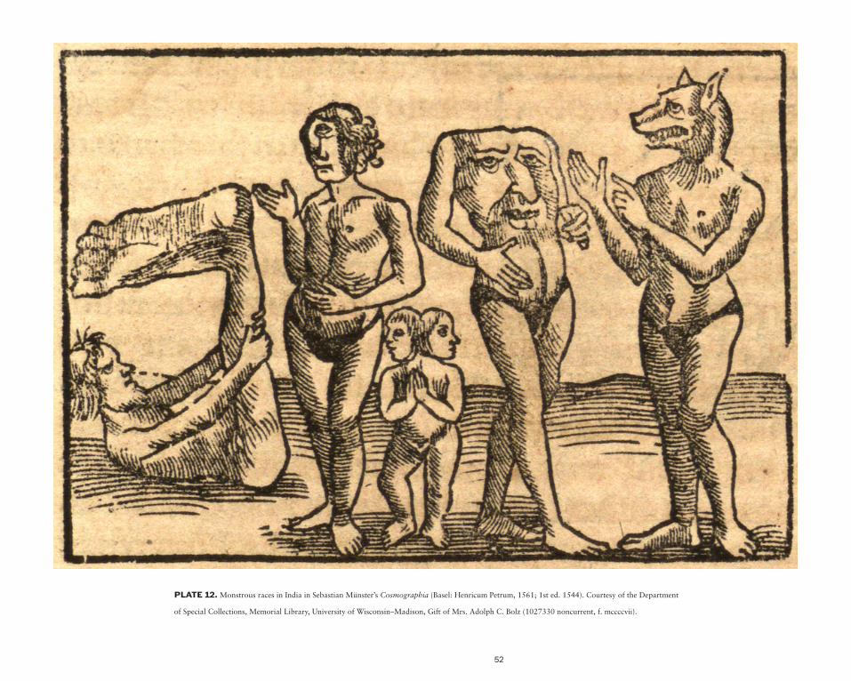
52
PLATE 12. Monstrous races in India in Sebastian Münster’s Cosmographia (Basel: Henricum Petrum, 1561; 1st ed. 1544). Courtesy of the Department
of Special Collections, Memorial Library, University of Wisconsin–Madison, Gift of Mrs. Adolph C. Bolz (1027330 noncurrent, f. mccccvii).

53
PLATE 13. Frontispiece of Abraham Ortelius’s
Theatrum Orbis Terrarum (Antwerp: Coppenium
Diesth, 1570), with allegories of the four
continents. Wisconsin Historical Society Library-
Archives (M GZ 1570 O).

54
PLATE 14. Frontispiece of the Dutch translation of Hans
Staden’s Warachtige Historia … (Antwerp: Christoffel Plantijn,
1558) depicting Brazilian Tupinambá Indians. Courtesy of the John
Carter Brown Library at Brown University (J558 .S776w).

55
PLATE 15. Jan Baptista Vrients’s Orbis terrae compendiosa descriptio (Antwerp: Jan Baptista Vrients [1590]), framed with the allegories of the four
continents. Courtesy of The American Geographical Society Library (050 B-[1590]).

56
PLATE 16. Allegories of Africa and America in Cesare Ripa’s Nova iconologia (Padua: Pietro Paolo Tozzi, 1618; 1st ed. of Ripa’s Iconologia with images 1603). Courtesy of the
Department of Special Collections, Memorial Library, University of Wisconsin–Madison (715362 noncurrent, pp. 352-353).

57
PLATE 17. Mappe-Monde Suivant les Nouvelles ObservatioWns de Messrs. del’Academie Royale des Sciences, etc. Augmentees de Nouveau by Pieter
van der Aa (Leiden, ca. 1720), with allegories of the four continents at the four corners. Wisconsin Historical Society Library-Archives (H GX 11 1720 A).
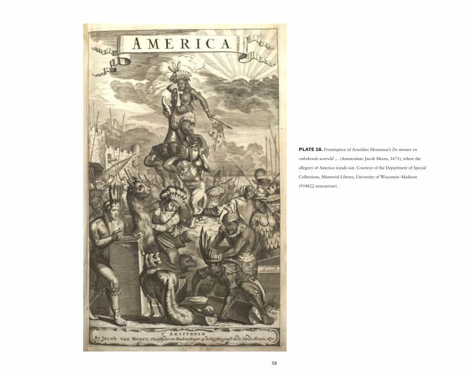
58
PLATE 18. Frontispiece of Arnoldus Montanus’s De nieuwe en
onbekende weereld … (Amsterdam: Jacob Meurs, 1671), where the
allegory of America stands out. Courtesy of the Department of Special
Collections, Memorial Library, University of Wisconsin–Madison
(934822 noncurrent).

59
PLATE 19. Map of Europe from the Atlas portatilis by Johann Christoph Weigel (Nuremberg?: Weigel, ca. 1740). The cartouche illustrates this continent on top of the world
through the classical iconography of the rape of Europa by Zeus. Wisconsin Historical Society Library-Archives (S GZ A872).
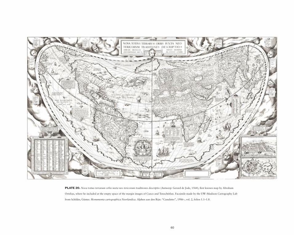
60
PLATE 20. Nova totius terrarum orbis iuxta neo tericorum traditiones descriptio (Antwerp: Gerard de Jode, 1564), first known map by Abraham
Ortelius, where he included at the empty space of the margin images of Cuzco and Tenochtitlan. Facsimile made by the UW–Madison Cartography Lab
from Schilder, Günter. Monumenta cartographica Neerlandica. Alphen aan den Rijn: “Canaletto”, 1986–, vol. 2, folios 1.1–1.8.

61
PLATE 21. Jodocus Hondius’s America (Amsterdam: Jodocus Hondius, [1619]), with contemporary French manuscript additions and the itinerary of Le Maire’s
voyage drawn in ink. A cartouche at the margin shows “the method of preparing and consuming a drink among the Americans in Brazil” taken from Theodor de Bry’s
illustrations. Courtesy of the John Carter Brown Library at Brown University (Cabinet B619 1).

62
PLATE 22. German translation of Hans
Staden’s Warhaftige Historia … published by
Theodor de Bry as Dritte Buch Americae darinn
Brasilia, durch Johann Staden … (Frankfurt,
1624; 1st ed. 1593). This work was very
likely the source of the marginal decoration
in Hondius’s map of America. Courtesy of the
John Carter Brown Library at Brown University
(08922).
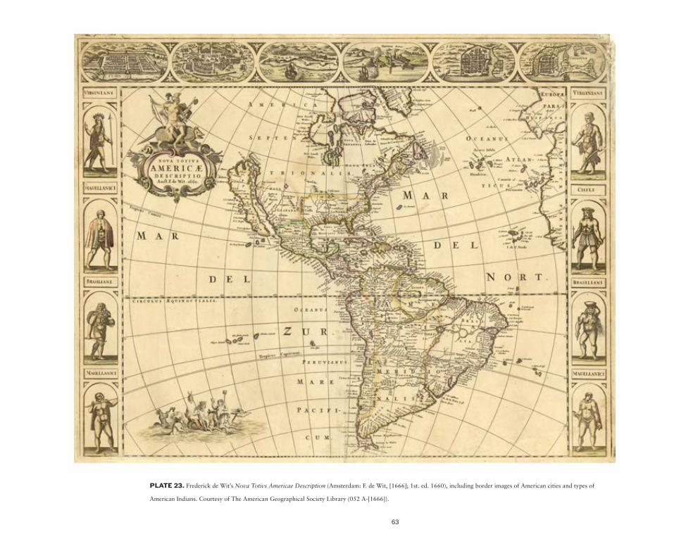
63
PLATE 23. Frederick de Wit’s Nova Totivs Americae Description (Amsterdam: F. de Wit, [1666]; 1st. ed. 1660), including border images of American cities and types of
American Indians. Courtesy of The American Geographical Society Library (052 A-[1666]).

64
PLATE 24. Pieter de Marees’s Description et recit historial du riche Royaume d’or de Gunea (Amsterdam: Cornille Claesson, [1605]), with depictions of
four women of Guinea. Courtesy of the Department of Special Collections, Memorial Library, University of Wisconsin–Madison (CA 1742).

65
PLATE 25. Chatelain’s Carte tres curieuse de la Mer du Sud … from volume 6 of Atlas Historique (Amsterdam: François L’Honoré & Compagnie, 1719), showing
the Pacific Ocean and America at the center of the world, surrounded by more than thirty-five insets and vignettes related to the age of discovery and the New World.
Courtesy of The American Geographical Society Library (052 B-1719).

66
PLATE 26. D. Griffing Johnson’s Colton’s Illustrated & Embellished Steel Plate Map of the World … (New York: J. H. Colton, 1854), with cartouches interlaced
by filigree framing the map that illustrate cities and peoples of the world. Image courtesy of the Library of Congress, Geography and Map Division.

67
PLATE 27. Willem Janszoon Blaeu’s Nova Totius Terrarum Orbis Geographica ac Hydrographica Tabula, from his Theatrum orbis terrarum, sive, Atlas Novus (Amsterdam: Willem Janszoon Blaeu,
1635), with borders illustrating the four elements, seven planets, four seasons, and Seven Wonders of the Ancient World. Courtesy of the Department of Special Collections, Memorial Library, University of
Wisconsin–Madison, Gift of Dr. Seymour Schwartz (CA 15509 no. 5).

68
PLATE 28. John Speed’s A new and accvrat map of the world … (London: George Humble, 1627) is framed with scientific images of circumnavigators of the globe, the four
elements, a geocentric universe and an armillary sphere, and solar and lunar eclipses. Courtesy of The American Geographical Society Library (050 B-1626).
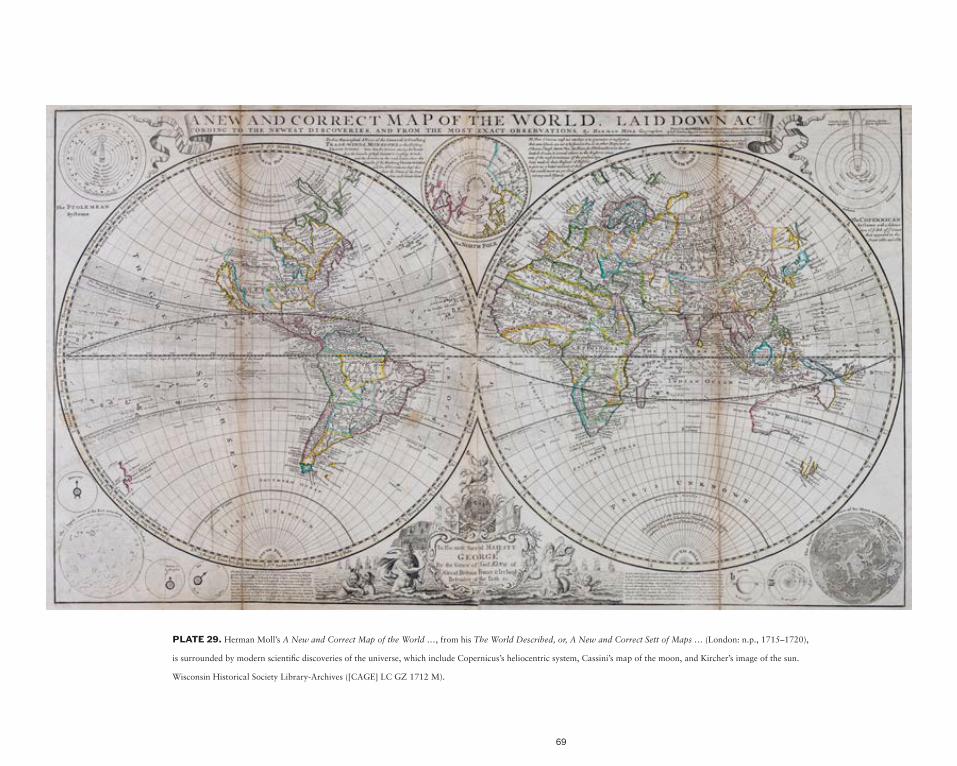
69
PLATE 29. Herman Moll’s A New and Correct Map of the World …, from his The World Described, or, A New and Correct Sett of Maps … (London: n.p., 1715–1720),
is surrounded by modern scientific discoveries of the universe, which include Copernicus’s heliocentric system, Cassini’s map of the moon, and Kircher’s image of the sun.
Wisconsin Historical Society Library-Archives ([CAGE] LC GZ 1712 M).

70
PLATE 30. Athanasius Kircher’s map of the sun from his Mundus subterraneus (Amsterdam: Joannem Janssonium à Waesberge & filios, 1678).
Courtesy of the Department of Special Collections, Memorial Library, University of Wisconsin–Madison (Duveen D 907, t. 1, p. 64).
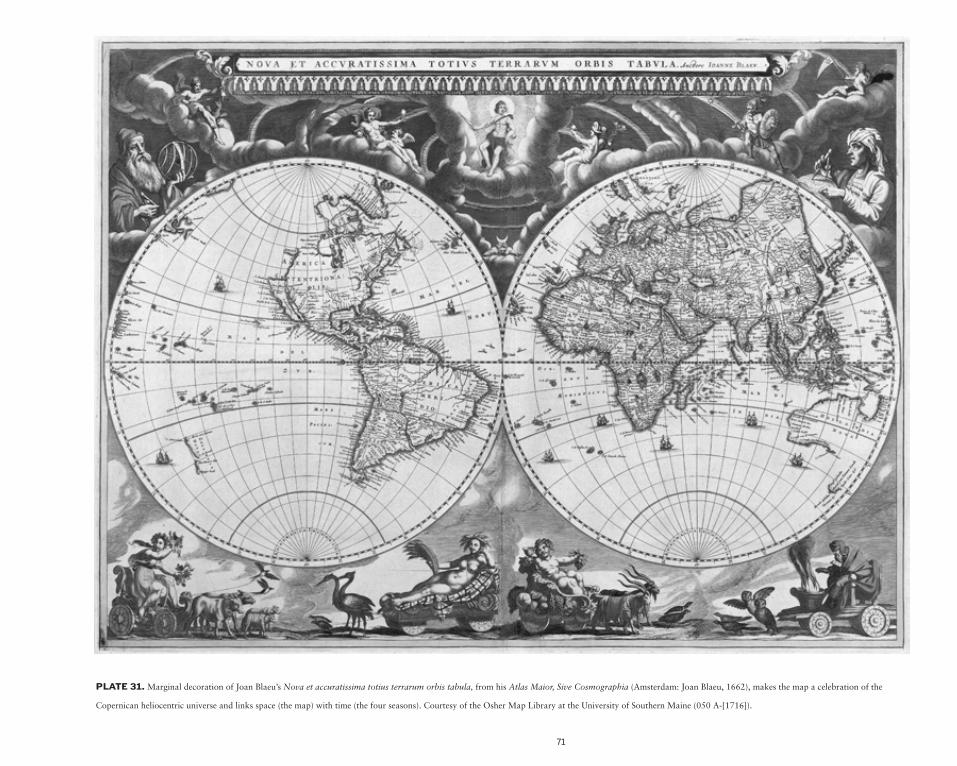
71
PLATE 31. Marginal decoration of Joan Blaeu’s Nova et accuratissima totius terrarum orbis tabula, from his Atlas Maior, Sive Cosmographia (Amsterdam: Joan Blaeu, 1662), makes the map a celebration of the
Copernican heliocentric universe and links space (the map) with time (the four seasons). Courtesy of the Osher Map Library at the University of Southern Maine (050 A-[1716]).

72
PLATE 32. The earth’s physical and atmospheric forces are illustrated in the margins of Johann Baptist Homann’s Planiglobii terrestris cum utroq
hemisphaerio caelesti generalis repraesentatio … (Nuremberg?, ca. 1716). Courtesy of The American Geographical Society Library (050 A-[1716]).

73
PLATE 33. European observatories are represented at the corners of the star charts in Reiner Ottens’s Atlas Maior cum Generales Omnium Totius Orbis
Regnorum … (Amsterdam: n.p., ca. 1740). Wisconsin Historical Society Library-Archives ([CAGE] GZ 1740 O).

74
PLATE 34. Americae sive novi orbis, nova descriptio, from Abraham Ortelius’s Theatrum Orbis Terrarum (Antwerp: Christoffel Plantijn, 1587; 1st ed. Coppenium Diesth, 1570). The title cartouches were copied
from the pattern books of Italian Renaissance sculptors. Courtesy of the Department of Special Collections, Memorial Library, University of Wisconsin–Madison, Gift of Dr. Seymour Schwartz (CA 15509 no. 2).

75
PLATE 35. The Partie occidentale du Canada ou de la Nouvelle France … by Vincenzo Maria Coronelli (Paris: Jean Baptiste Nolin, 1688) shows a
hunting scene carried out by American Indians and Europeans in the title cartouche. Wisconsin Historical Society Library-Archives (Parker 1012).

76
PLATE 36. Aethiopia Superior vel Interior vulgo Abissinorum sive Presbiteri Joannis Imperium by Willem Janszoon Blaeu (Amsterdam: n.p., 1696; 1st ed. 1635) shows cartouches
with black African inhabitants corresponding to the region mapped. Wisconsin Historical Society Library-Archives (T GZ 1696 A).

77
PLATE 37. The Carte de l’Egypte Ancienne et Moderne by Gilles Robert de Vaugondy (Paris: Gilles and Didier Robert de Vaugondy, and Antoine Boudet, ca. 1798; 1st ed.
1757) evokes in the title cartouche the ruins of Pharaonic Egypt. Wisconsin Historical Society Library-Archives (Cage E GZ 1798 R).

78
PLATE 38. Theatre de la Guerre en Espagne et en Portugal, from Nieuwe atlas ... by Johannes Covens and Cornelis Mortier (Amsterdam: Covens & Mortier, ca. 1740) maps part of the Iberian
Peninsula. The War of the Spanish Succession (1701–1714) illustrates the cartouche. The Archduke Charles (a young Charles III) appears on a horse, although the title of the map on a big rock dedicates
this work to Philip V. To save money this map was reissued with minor differences from a map, by Pierre Mortier and dedicated to Charles III, of around 1710, and neither the face of the sovereign nor
the Habsburg symbols were changed, although when it was published Philip V of the Bourbon dynasty reigned in Spain. Wisconsin Historical Society Library-Archives (R T GZ 1739 C v.1).

79
PLATE 39. The title cartouche in The United States of North America: with the British and Spanish Territories, According to the Treaty, of 1784 by William Faden (London: William Faden, 1785)
is a clear example of the celebration of British colonization and dominion in North America. Wisconsin Historical Society Library-Archives (Rare Book Collection R GZ 1790 A).

80
PLATE 40. A map of the United States of North America; drawn from a number of critical researches by Aaron Arrowsmith (London: Published as the Act directs by A.
Arrowsmith, Plate 10 Soho Square, 1802) evokes the American paradise before Columbus’s arrival through the title cartouche of Niagara Falls. Courtesy of the Department of
Special Collections, Memorial Library, University of Wisconsin–Madison, Gift of Dr. Seymour Schwartz (CA 15509 plate 16-19).
81
PLATE 41. Senator Coleman du Pont’s project of road
construction in the United States appears in National
industrial and military highways issued by National Highways
Association, the Automobile Club of America, and the
Society of American Military Engineers by John C. Mulford
(Washington, D.C.: National Highways Association, 1928).
Image courtesy of The American Geographical Society Library
(800-b D-Nat’l Hwy Assn 1928).
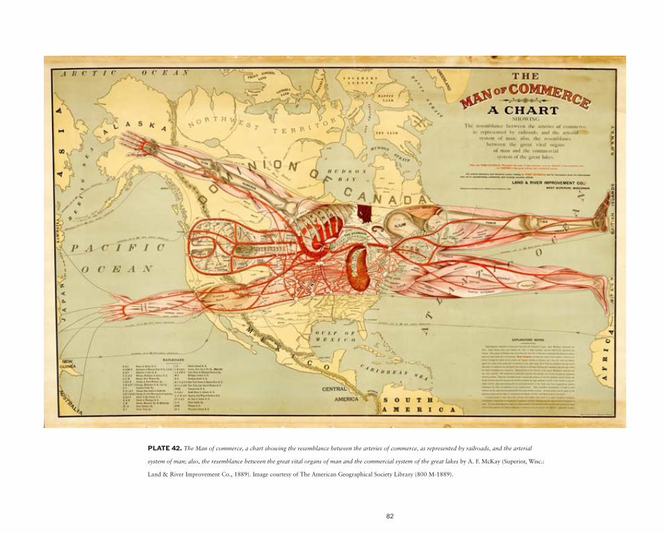
82
PLATE 42. The Man of commerce, a chart showing the resemblance between the arteries of commerce, as represented by railroads, and the arterial
system of man; also, the resemblance between the great vital organs of man and the commercial system of the great lakes by A. F. McKay (Superior, Wisc.:
Land & River Improvement Co., 1889). Image courtesy of The American Geographical Society Library (800 M-1889).
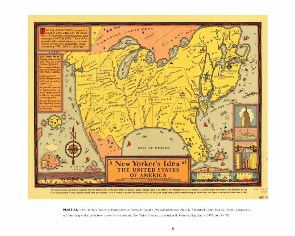
83
PLATE 43. A New Yorker’s Idea of the United States of America by Daniel K. Wallingford (Boston: Daniel K. Wallingford [reprint from ca. 1964]) is a humoristic
and satiric map of the United States as seen by a chauvinistic New Yorker. Courtesy of the Arthur H. Robinson Map Library (G3701 A6 193- W3).

84
PLATE 44. A true and undistorted map of the U.S.A. made in Wisconsin by Les Williams (Pine River, Wisc.: A. C. Kimball, 1952) is a cartographic response to the New Yorker’s
map of the United States, which caricaturizes Wisconsin and the rest of the United States. Courtesy of the Arthur H. Robinson Map Library (G3701 A5 1952 W5).

85
BIB
LIO
GR
AP
HY
Akerman, James R. “American Promotional Road Mapping in the Twentieth Century.” Cartography and Geographic Information Science 29:3 (2002): 175–191.
Arizzoli, Louise. “James Hazen Hyde and the Alle-gory of the Four Continents: A Research Collection for an Amateur Art Historian.” Journal of the History of Collections (2012), pp. 1–10.
Armitage, Geoff, and Ashley Baynton-Williams. The World at Their Fingertips: Eighteenth-Century British Two-Sheet Double-Hemisphere World Maps. London: Sylvia Ioannou Foundation-British Library, 2012.
Barber, Peter. “Maps and Monarchs in Europe 1550–1800.” In Royal and Republican Soveriegnty in Early Modern Europe, Essays in memory of Ragnhild Hatton, edited by Robert Oresko, Graham Gibbs, and Hamish Scott. Cambridge: Cambridge University Press, 1997, pp. 75–124.
Brink, Paul van den, and Jan Werner. Gesneden en gedrukt in de Kalverstraat: de kaarten- en atlassendrukkerij in Amsterdam tot in de 19e eeuw. Utrecht: H & S, HES uitgevers, 1989.
Camille, Michael. Image on the Edge: The Margins of Medieval Art. Cambridge, Mass.: Har-vard University Press, 1992.
Clarke, G.N.G. “Taking Possession: The Cartouche as Cultural Text in Eighteenth- Century American Maps” Word and Image 4:2 (1988): 455–475.
Dahl, Edward H. “The Original Beaver Map: De Fer’s 1698 Wall Map of America.” The Map Collector 29 (1984): 22–26.
Davis, Charles Henry, Stanley E. Bates, and National Highways Association. National Highways to Bring About Good Roads Everywhere. Washington, D.C.: n.p., 1913.
Edney, Matthew H., and Irwin D. Novak, eds. Reading the World Map: Interdisci-plinary Perspectives on Pieter van den Keere’s Map, Nova totius terrarum orbis geographica ac hydrographica tabula (Amsterdam, 1608/36). Portland, ME: Osher Map Library and Smith Center for Cartographic Education, University of Southern Maine, 2001.
———. “Mapping the Entire Cosmos: Heavens and Earth.” In Osher Map Library, Map Com-mentaries, http://oml1.doit.usm.maine.edu/exhibitions/map-commentaries/mapping-entire-cosmos-heavens-and-earth.
———. “Maps as Commodities.” In Osher Map Library, Map Commentaries, http://oml1.
doit.usm.maine.edu/exhibitions/map-com-mentaries/maps-as-commodities.
Edson, Evelyn, and Emilie Savage-Smith. Medie-val views of the cosmos. Oxford: Bodleian Library–University of Oxford, 2004.
Goss, J.J.S. Blaeu’s the Grand Atlas of the 17th Century World. London: Studio Editions, 1990.
Harley, J. Brian, and David Woodward, eds. Cartography in Prehistoric, Ancient, and Medieval Europe and the Mediterranean. Vol. 1, The History of Cartography. Chica-go: University of Chicago Press, 1987.
Harley, J. Brian. The New Nature of Maps: Essays in the History of Cartography. Baltimore: Johns Hopkins University Press, 2002.
Harmon, Katharine A. You Are Here: Personal Geographies and Other Maps of the Imag-ination. New York: Princeton Architectural Press, 2004.
Harvey, Paul D.A. Medieval Maps. London: British Library, 1991.
Hernando, Agustín. “Retórica iconográfica e imaginación geográfica: los frontispicios de los atlas como proclamaciones ideológicas.” Boletín de la Asociación de Geógrafos Españoles, 51 (2009), pp. 353-369.
Jacquart, Danielle, and Charles Burnett, eds. Scientia in Margine: Études sur les Mar-ginalia dans les Manuscrits Scientifiques du Moyen Âge à la Renaissance. Geneva: Droz, 2005.
Karrow, Robert W. Mapmakers of the Sixteenth Century and Their Maps: Bio-Bibliogra-phies of the Cartographers of Abraham Ortelius, 1570. Chicago: Speculum Orbis Press, 1993.
Krauss, Johann Ulrich. Baroque Cartouches for Designers and Artists. New York: Dover, 1969.
Le Corbeiller, Clare. “Miss America and Her Sisters: Personifications of the Four Parts of the World.” Metropolitan Museum of Art Bulletin 19:8 (1961): 209–223.
Lynam, Edward. The Mapmaker’s Art; Essays on the History of Maps. London: Batchworth Press, 1953.
Massing, Jean Michel “The Image of Africa and the Iconography of Lip-Plated Africans in Pierre Desceliers’s World Map of 1550.” In Black Africans in Renaissance Europe, 48–69. Cambridge: Cambridge University Press, 2005. Reprinted in Studies in Imagery, II: The World Discovered (London: Pindar Press, 2007), pp. 49–72.
McGrath, Elizabeth. “Humanism, Allegorical Invention, and the Personification of the Con-tinents.” In Concept, Design and Execution in Flemish Painting (1550–1700), edited by H. Vlieghe, A. Balis, and C. van de Velde, 43-71. Turnhout: Brepols, 2000.
Nelson, Charmaine A. Representing the Black Female Subject in Western Art. New York: Routledge, 2010.
Pedley, Mary Sponberg. The Commerce of Car-tography: Making and Marketing Maps in Eighteenth-Century France and England. Chicago: University of Chicago Press, 2005.
Pratt, Stephanie. “From the Margins: The Native American Personage in the Cartouche and Decorative Borders of Maps.” Word and Image 12:4 (1996): 349-365.
Randall, Lilian M.C. Images in the Margins of Gothic Manuscripts. Berkeley: University of California Press, 1966.
Shirley, Rodney W. The Mapping of the World: Early Printed World Maps 1472–1700. London: New Holland, 1993.
Skelton, Raleigh Ashlin. Decorative Printed Maps of the 15th to 18th Centuries. London: Staples Press, 1952.
Sutton, Elizabeth A. Early Modern Dutch Prints of Africa. Burlington, VT: Ashgate, 2012.
Waning, Jan W. van. “Châtelain’s Atlas Historique: New Evidence of Its Authorship.” Journal of the International Map Collectors’ Society 120 (2010): 7–15.
Waterschoot, Werner. “The Title-Page of Ortelius’s Theatrum Orbis Terrarum.” Quaerendo 9:1 (1979): 43–68.
Welu, James A. “The Sources and Development of Cartographic Ornamentation in the Netherlands.” In Art and Cartography: Six Historical Essays, edited by David Woodward, 147–173. Chicago: University of Chicago Press, 1987.
Wintle, Michael. The Image of Europe: Visualizing Europe in Cartography and Iconography throughout the Ages. Cambridge: Cam-bridge University Press, 2009.
Woodward, David, ed. Art and Cartography: Six Historical Essays. Chicago: University of Chicago Press, 1987.
———, ed. Cartography in the European Renais-sance, vol. 3, 2 parts. Chicago: University of Chicago Press, 2007.
Wright, John Kirtland. The Leardo Map of the World: 1452 or 1453, in the Collections of the American Geographical Society. New York: American Geographical Society, 1928.

86
Related Documents