CE 394K Term Paper Paul Ruess Mapping of Water Stress Indicators Written by Paul Ruess CE 394K GIS in Water Resources Fall 2015

Welcome message from author
This document is posted to help you gain knowledge. Please leave a comment to let me know what you think about it! Share it to your friends and learn new things together.
Transcript
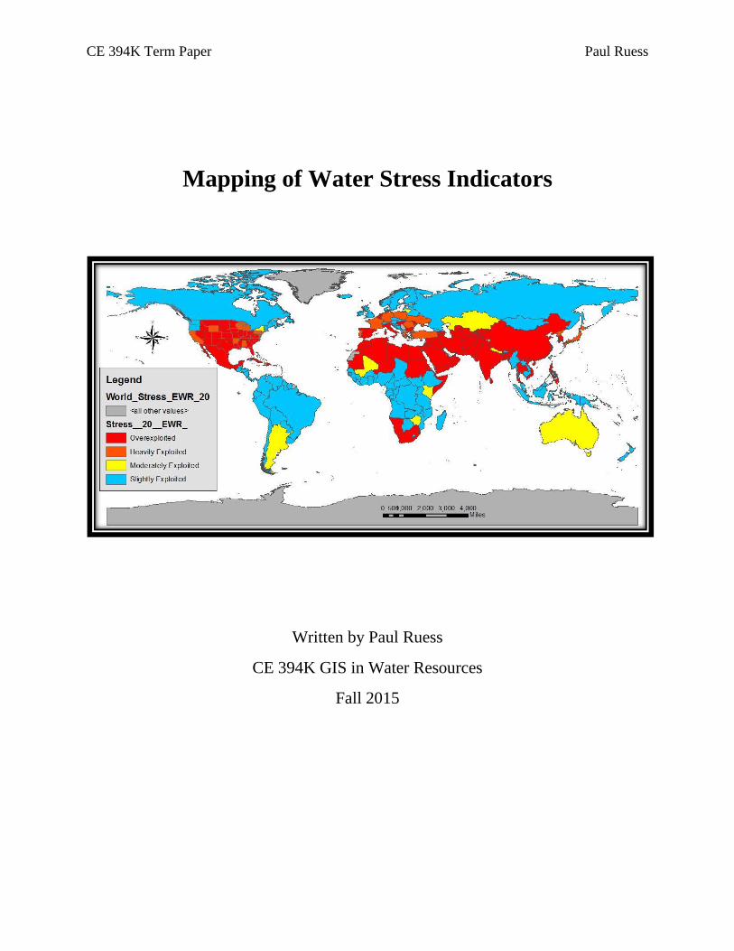
CE 394K Term Paper Paul Ruess
Mapping of Water Stress Indicators
Written by Paul Ruess
CE 394K GIS in Water Resources
Fall 2015
CE 394K Term Paper Paul Ruess
Table of Contents Abstract ........................................................................................................................................... 2
Introduction ..................................................................................................................................... 2
Models............................................................................................................................................. 3
Falkenmark Indicator .................................................................................................................. 3
Water Stress Indicator ................................................................................................................. 3
Approach ......................................................................................................................................... 4
United States FI & WSI .............................................................................................................. 4
World Countries FI & WSI ......................................................................................................... 4
Water Stress Normalization ........................................................................................................ 5
Results and Discussion ................................................................................................................... 5
United States FI & WSI .............................................................................................................. 5
World Countries FI and WSI ...................................................................................................... 6
United States and World Countries FI & WSI Combined .......................................................... 7
Water Stress Normalization ........................................................................................................ 8
Future Work .................................................................................................................................... 9
Conclusions ................................................................................................................................... 10
References ..................................................................................................................................... 11
Appendix ....................................................................................................................................... 12

CE 394K Term Paper Paul Ruess
2
Abstract Water stress indices are commonly used to visualize water resources vulnerability on a global
scale. Since the introduction of the Falkenmark Indicator in 1989, a multitude of alternative
water stress indices have emerged, each with their own unique set of assumptions and goals.1 For
this project the Falkenmark Indicator, based on population, was used as a preliminary assessment
to be compared to Smakhtin’s Water Stress Indicator (2005), based on water withdrawals. The
decision to use these two indices resulted from their common presence in the literature.
Additionally, the difference in parameters used (population vs. withdrawals) leads to valuable
comparisons of which countries are completely stressed and which countries are stressed based
only on one of the parameters.
The initial goal of this project was to improve understanding of the United States’ water stresses
as compared to the world’s other countries, and this goal was completed by mapping each state’s
water stress and comparing these to each country’s water stress. Further detail was added in the
form of equalized stress indices, which allowed for a more detailed gradient of the country’s and
state’s water stress levels. This ultimately informs which spatial regions require changes in terms
of population and withdrawals in order to create an “ideal world” where water stress is identical
in all countries throughout the world. Note that this “ideal world” will require different changes
for each different water stress index that is used, and thus the idealization is not consistent
between the Falkenmark Indicator and the Water Stress Indicator.
Introduction The goal of this project was to explore the water stresses of the United States of America (US) as
compared to other countries around the world. First, maps assessing the Falkenmark Indicator
(FI) and Smakhtin’s Water Stress Indicator (WSI) were created for the US, followed by similar
maps for all countries around the world. By comparing the US maps to the global maps, a better
understanding of each state’s water stresses become apparent. These maps therefore improve
assessments of water stresses within the US as they compare to the rest of the world (rather than
comparing strictly to the US).
Further maps were then created to determine where change is necessary in order to more equally
distribute water stresses throughout the world. This equalization was achieved by calculating a
total FI and WSI for the whole world, and comparing these resultant stress indices with the
previously calculated indices for each individual country and state. This comparison determined
the changes in population and withdrawals required to equalize water stresses in all countries.
In the case of the FI, the model is reasonable but the means are not: shifting populations around
the world based on water availability will not work. Regarding the WSI, though changing
withdrawal habits is more reasonable than shifting populations, the model is not realistic: people
living in deserts such as Arizona would have to experience an extreme shift in consumptive
habits (there are simply too many people there to survive strictly on Arizonan water). These
models function primarily as a means for identifying where change is needed; more detailed
models must be devised in the future to better understand what methods of change can be
implemented to improve (decrease) global water stress.

CE 394K Term Paper Paul Ruess
3
Models
Falkenmark Indicator
The Falkenmark Indicator is dependent on two variables: surface runoff (m3/yr) and population.2
Surface runoff in this case was set equal to Mean Annual Runoff values retrieved from the
University of New Hampshire and the Global Runoff Data Centre (UNH/GRDC) Composite
Runoff Fields V 1.0 (2002), while population data for countries was retrieved from the World
Bank and state data from the US Census Bureau (for the retrieved runoff data, see figure A.1 in
the appendix).3,4,5 These data were then used to calculate FI values for every country and state
using Equation 1.
𝐹𝐼 =
𝑆𝑢𝑟𝑓𝑎𝑐𝑒 𝑅𝑢𝑛𝑜𝑓𝑓
𝑃𝑜𝑝𝑢𝑙𝑎𝑡𝑖𝑜𝑛
(Equation 1)
The results were then sorted into the four groupings proposed by Falkenmark, listed below in
Table 1.
Table 1. Water stress index proposed by Falkenmark, 1989.
FI (m3/capita/year) Stress Level
> 1,700 No Stress
1,000-1,700 Stress
500-1,000 Scarcity
<500 Absolute Scarcity
It is important to note that the UNH/GRDC dataset has a spatial resolution of 0.5-degrees,
meaning that each spatial cell has a resolution of roughly 3.1 billion square meters at the equator.
Simply put, these are very large cells, and as such the correctness of the MAR data is debatable.
However, the UNH/GRDC dataset is widely considered one of the better MAR datasets
available, and calculating MAR for every state and country would have been an unreasonably
large task for this term paper.
Another particularly important assumption in this paper is that the longitudinal metric distance
equivalent of 0.5-degrees was assumed to be equal at the equator and at the poles. Technically
speaking, this longitudinal length would decrease (quite significantly) as latitudes increased from
0° to 90° (or -90°). For example: longitudinal distance of 0.5-degrees at latitude 0° is ~55,600
meters, whereas the same 0.5-degree distance at latitude 45° is ~39,400 meters. Though this
difference is substantial, this paper has assumed that the longitudinal distance remains constant at
55,600 meters for all latitudes. This absolutely creates a margin of error, but the simplicity
allowed for more time to be invested in the actual subject at hand, and as such the simplification
was considered reasonable.
Water Stress Indicator
Vladimir Smakhitn’s Water Stress Indicator is defined as described in Equation 2.6 Mean Annual
Runoff (MAR) is a specified parameter, which again was retrieved from the UNH/GRDC
dataset.3 Withdrawal data was retrieved from the Food and Agriculture Organization’s (FAO)

CE 394K Term Paper Paul Ruess
4
AQUASTAT database for each country, and the United States Geological Survey (USGS) for
each state.7,8 The USGS data was retrieved by US counties, and therefore required simplification
into a new dataset organized by state.
𝑊𝑆𝐼 = 𝑊𝑖𝑡ℎ𝑑𝑟𝑎𝑤𝑎𝑙𝑠
𝑀𝐴𝑅 − 𝐸𝑊𝑅
(Equation 2)
The EWR term in the equation describes the “Environmental Water Requirements”. Smakhtin
argues that the environment requires a certain water volume for upkeep (EWR), and therefore
not all water (measured as MAR) can be considered available for human consumption. This
EWR term was determined by Smakhtin to typically be between 20 and 30% of MAR, and as
such a 20% EWR has been used for calculating the standard WSI values throughout this paper.
Additional maps using 0% EWR and 50% EWR were included in the appendix for trending
purposes only. All values are measured in cubic meters per year.
The WSI has groupings of its own, listed below in Table 2. The four groupings technically
describe water availability prior to EWR disruptions, though these details are not explained in
this paper. The primary purpose here of using the WSI is to compare the difference between
population (FI) and withdrawals (WSI) on water stress indices, and the primary purpose of
calculating multiple WSI values (using different EWR assumptions) is to create visual trends of
water stress.
Table 2. Water stress indicator proposed by Smakhtin, 2005.
WSI Stress Level
WSI > 1 Overexploited
0.6 ≤ WSI < 1 Heavily Exploited
0.3 ≤ WSI < 0.6 Moderately Exploited
WSI < 0.3 Slightly Exploited
Approach
United States FI & WSI
Once all the relevant data was retrieved (see figure A.2, figure A.4, and figure A.5 in the
appendix), the FI and WSI for each state was calculated and assigned to the relevant stress level
grouping within an excel spreadsheet. In order to geographically display these values in ArcGIS,
shapefiles for all 50 states were collected from the US Census Bureau.9 These shapefiles had
STUSPS values (two-character state descriptions, such as “TX” for Texas) which were then used
to join the shapefiles with the data table containing the FI and WSI calculations. Once joined
together, the FI and WSI results were displayed as defined by Table 1 and Table 2, respectively.
World Countries FI & WSI
Similar calculations were completed for the world’s countries (see figure A.3, figure A.6, and
figure A.7 in the appendix). Shapefiles were retrieved from the US Department of State, which
were then joined to the relevant data tables using each country’s 3-character code defined by the

CE 394K Term Paper Paul Ruess
5
International Organization of Standardization (ISO).10 This data was displayed using the same
color scheme as seen in the US figures.
Water Stress Normalization
While these maps are beneficial for visualizing where scarcity is present, their coarseness lacks
the precision necessary to inform change. Therefore, in order to better understand where change
was necessary and how much change was necessary, overall FI and WSI values were calculated
for the sum of all regions: the sum of population and withdrawals in all countries was used to
calculate the global FI and WSI, and the sums in the states were used for the US. These
parameters were then used to equalize each region’s data.
In the case of the US data, the population and withdrawals of all 50 states were summed together
and compared to the summation of the MAR values seen in all 50 states. The resulting FI and
WSI values were subtracted from the individual values calculated for each state, and this
difference was used to calculate each state’s required change in population and withdrawals
necessary to equalize FI and WSI across the nation. Essentially, the optimal population and
withdrawals for each state, based on the MAR seen by that state, were calculated such that each
of the 50 states would have identical FI and WSI values.
A similar procedure was conducted in order to calculate the FI and WSI values for all countries.
In the case of the global calculation, the state data was ignored (though the US was included as a
single country) and values for total global MAR, population, and withdrawals were summed.
Results and Discussion
United States FI & WSI
Below are the resultant FI (figure 1) and WSI (figure 2) maps for the US. By quick observation it
is quite clear that, though the population in the US may be reasonable in terms of water
availability (MAR), the withdrawals most certainly are not. Further details can be gathered by
comparing WSI values of EWR of 0% (figure A.8), 20% (figure 2), and 50% (figure A.9).
Technically these WSI adjustments show the differences in water stress based on available
MAR; but if MAR is assumed to be constant, these changes in WSI can be correlated to
withdrawals, and the trend from 0% to 20% to 50% EWR can instead demonstrate the trend of
water stress as withdrawals increase.
By comparing these different values of EWR it becomes apparent which states are closer to the
group cutoffs (ie. which states are more likely to shift to the next categorization) of water stress
based on increases in withdrawals. These trends are valuable in identifying which states are more
or less delicate in terms of changes to withdrawals, which makes it apparent that the least
sensitive areas are the Northeast and the Northwest due to their moderate changes when
comparing the three figures. However, because a large number of states are “Overexploited”
even in the 0% EWR case, the details of these states cannot be determined by observing solely
this trend. A workaround to this issue will be mentioned later, when a finer gradient is defined to
determine required changes to global withdrawals for WSI equalization.

CE 394K Term Paper Paul Ruess
6
Figure 1 - United States Falkenmark Stress Index
Figure 2 - United States Water Stress Indicator, 20% EWR
World Countries FI and WSI
Figure 3 and figure 4 display the FI and WSI on a global scale, with the US displayed as a single
country. Here, again, the displayed WSI uses 20% EWR, whereas WSI maps for 0% and 50%
EWR can be seen in the appendix (figures A.10 and A.11). It is important to note that the global
models mapped the US as one country (as opposed to 50 states); it was this over-simplification
that motivated the mapping of all 50 states for more detailed awareness of water stresses in the
US as compared to the world’s other countries.
Similarly to the US maps, comparisons can be made between the three WSI maps in order to
identify regional sensitivity to water stress based on withdrawals. Some countries, such as France
and the US, seem to increase in scarcity level fairly consistently, suggesting that these countries
are in a very delicate balance in terms of withdrawals and MAR. Other countries, such as
Canada, do not change at all and therefore suggest no susceptibility; while Argentina and

CE 394K Term Paper Paul Ruess
7
Australia change only once, suggesting that they are more susceptible to water stress than
Canada but less susceptible than France. Similar assessments can be made for all countries.
Figure 3 - Global Falkenmark Stress Index
Figure 4 - Global Water Stress Indicator, 20% EWR
United States and World Countries FI & WSI Combined
The following figures combine the maps of US and global water stress in order to more easily
view the different states’ water stress levels as compared to the rest of the world. The FI map
(figure 5) shows that the US is experiencing some water stress, despite the “no stress”
classification assigned in figure 1. This alone justifies the need for more spatially resolved maps
of water stress indices.
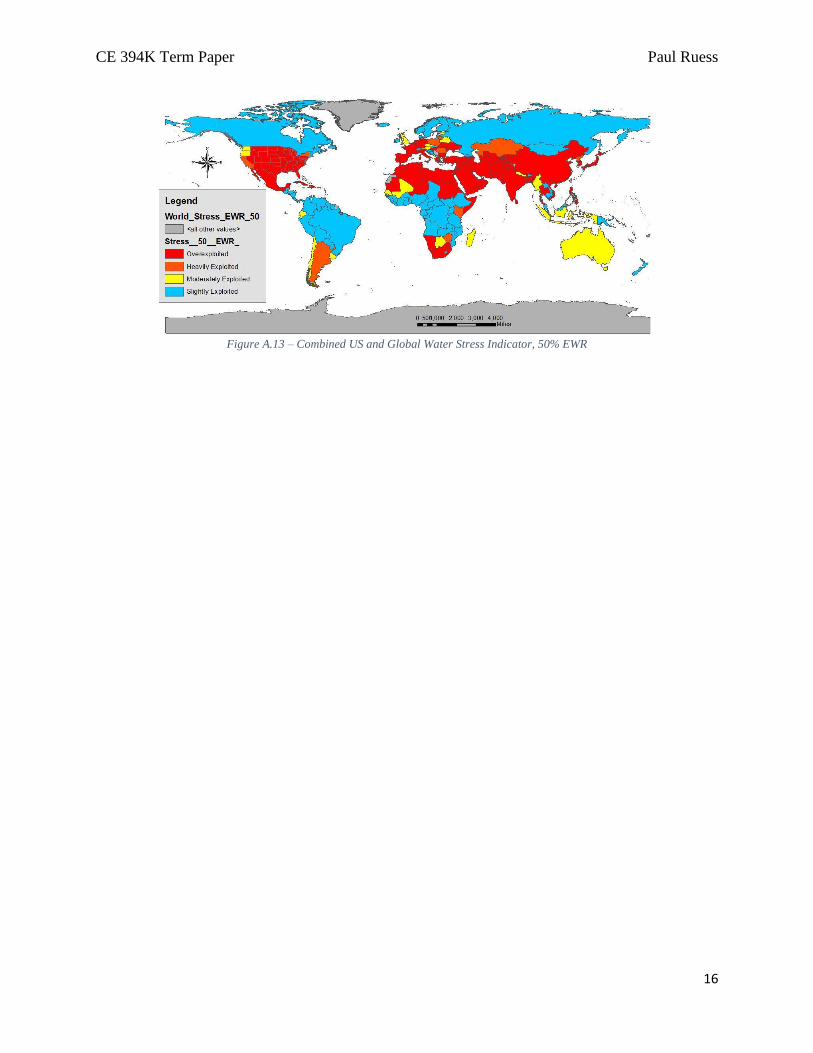
The WSI map (figure 6) demonstrates that the majority of the US is withdrawing water
unsustainably (as expected, based on figure 4). Additionally, WSI trends based on figure A.12,
figure 6, and figure A.13 show that the US is worsening more quickly than the remainder of the
world in terms of withdrawal-induced water stresses.

CE 394K Term Paper Paul Ruess
8
Figure 5 - Combined US and Global Falkenmark Stress Index
Figure 6 - Combined US and Global Water Stress Indicator, 20% EWR
Water Stress Normalization
The following figures show the gradient of required changes to population (figure 7) and
withdrawals (figure 8) required to equalize FI and WSI values on a global scale. Green regions
have room to increase their populations, while red regions should decrease their populations in
order to globally equalize the FI. Regarding the WSI, green regions can increase their
withdrawals and red regions should decrease their withdrawals for global equalization.
Though this classification may seem overly-idealistic, its merit is primarily in the visual gradient
it creates, allowing for a better understanding of which regions are most severely stressed. Some
regions, such as the state of Texas, were previously classified as experiencing “scarcity” by the
FI; but in this model it appears that, when compared globally, Texas actually has room for more
people (ie. is not water stressed). These observations are informative for truly understanding the
spread of water stress: with this map, it is possible to see how severely stressed both China and
India are, how unstressed Canada and Russia are, and where every other country falls between
these extreme limits.

CE 394K Term Paper Paul Ruess
9
By extending this observation, these maps become a display of where change is most needed.
Shifting populations in order to equalize the FI would be very difficult, and therefore the
population map is only a display of which countries are overpopulated in terms of water
availability. Withdrawal patterns rely on consumptive patterns and therefore are fairly difficult to
change, though not impossible; these required changes to withdrawals can therefore be used to
inform intelligent policy changes in the regions experiencing the most scarcity.
Figure 7 - Required Change in Population for Water Stress Equalization
Figure 8 - Required Change in Withdrawals for Water Stress Equalization
Future Work It was initially intended that this project would include temporal water stress estimates, assessing
which year each country (and state) would reach each level of water stress according to both the
FI and WSI indices. The first step would be to calculate the population and withdrawals
necessary for each country to jump to the next water stress classification: in the case of the

CE 394K Term Paper Paul Ruess
10
Falkenmark Indicator, the MAR of each country would be used to calculate at what population
these countries would reach “No Stress”, “Stress”, “Scarcity”, and “Absolute Scarcity” as
defined in Table 1. Once these data were collected, predictions of future population and
withdrawals for each country must be calculated.
In order to accurately predict future population and withdrawal values, data from previous years
would be used to develop a curve which would then be extended to the desired years (for
example, the curve might use available data from 1980 to 2015 and extend this data out to 2050).
Correctional measures could be taken by finding available population and withdrawal predictions
and seeing how closely these data matched the developed curve, though this would not be
critical.
Once developed, the required population and withdrawals values required for each country to
switch classifications would be correlated to the years on these country’s respective population
and withdrawal curves. With the resultant data, “year-to-scarcity” (YtS) values could be
calculated by subtracting the calculated years from the current year. Finally, these YtS values
could be mapped in order to determine where water stresses would worsen most quickly (and
therefore where corrective action was most imminent). Similar procedures could be conducted in
reverse in order to determine how long each stressed country has been stressed by extending the
population and withdrawal curves back in time.
Though these YtS maps would be useful in assessing future water stresses, the methodology here
developed for creating the maps was deemed too laborious for this term project. Unless
population and withdrawals predictions exist that include all future years (as opposed to only
every 10 years, for example), then these curves must be developed and read for each country and
state independently. If more time had been available, this would be the next course of action for
this project.
Conclusions Overall, this project has implications in determining which regions of the world have the most
unsustainable population sizes and water withdrawals. By combining US data with global
country data, each individual state can be compared to the rest of the world to better understand
each state’s water stress on a global scale. These data can then be normalized to determine where
change is most needed in terms of population size and withdrawal volumes, and this required
change can then inform future policy decisions. Had more time been available, further maps
would have been created determining the year-to-scarcity of each country and state, and these
maps would also have implications on global policy decision-making.

CE 394K Term Paper Paul Ruess
11
References
1. Brown, A., & Matlock, M. D. (2011). A review of water scarcity indices and
methodologies. White paper, 106.
2. Falkenmark, M. (1989). The massive water scarcity now threatening Africa: why isn't it
being addressed? Ambio, 112-118.
3. Fekete, et al. (2002). UNH/GRDC Composite Runoff Fields V 1.0. Retrieved from
http://www.grdc.sr.unh.edu/.
4. World Bank. Data: Population, total. Retrieved from
http://data.worldbank.org/indicator/SP.POP.TOTL.
5. United States Census Bureau (1). Population Estimates; Historical Data: 2010s. Retrieved
from http://www.census.gov/popest/data/historical/2010s/index.html.
6. Smakhtin, V. Y., Revenga, C., & Döll, P. (2004). Taking into account environmental water
requirements in global-scale water resources assessments (Vol. 2). IWMI.
7. Food and Agriculture Organization of the United Nations. AQUASTAT datasets. Retrieved
from http://www.fao.org/nr/water/aquastat/sets/index.stm.
8. United States Geological Survey. Water Use in the United States: Water-use data available
from USGS. Retrieved from http://water.usgs.gov/watuse/data/index.html.
9. United States Census Bureau (2). Cartographic Boundary Shapefiles – States. Retrieved from
https://www.census.gov/geo/maps-data/data/cbf/cbf_state.html?cssp=SERP.
10. United States Department of State, Humanitarian Information Unit. Data. Retrieved from
https://hiu.state.gov/data/data.aspx?view=table&sort=title+asc.

CE 394K Term Paper Paul Ruess
12
Appendix
Figure A.1 - Global Composite Runoff Fields V 1.0
Figure A.2 - US Mean Annual Runoff by State
Figure A.3 - Global Mean Annual Runoff by Country

CE 394K Term Paper Paul Ruess
13
Figure A.4 - US Population (thousands)
Figure A.5 - US Withdrawals (Mgal/day)
Figure A.6 - Global Population

CE 394K Term Paper Paul Ruess
14
Figure A.7 - Global Withdrawals
Figure A.8 – United States Water Stress Indicator, 0% EWR
Figure A.9 – United States Water Stress Indicator, 50% EWR

CE 394K Term Paper Paul Ruess
15
Figure A.10 - Global Water Stress Indicator, 0% EWR
Figure A.11 - Global Water Stress Indicator, 50% EWR
Figure A.12 – Combined US and Global Water Stress Indicator, 0% EWR
CE 394K Term Paper Paul Ruess
16
Figure A.13 – Combined US and Global Water Stress Indicator, 50% EWR
Related Documents