Design Museum Visual Guidlines Corporate Identity

Welcome message from author
This document is posted to help you gain knowledge. Please leave a comment to let me know what you think about it! Share it to your friends and learn new things together.
Transcript

Design MuseumVisual GuidlinesCorporate Identity

Contents
Design MuseumVisual Guidlines
1.0 Introduction 2
2.0 Logo 3 2.1 Construction 4 2.2 Protected zone 5 2.3 Minimum size 6 2.4 Forbidden versions 7 2.5 Positive and negative 8 2.6 Black and white version 9 2.7 Color specification 10 2.8 Grayscale specification 11 2.9 Typography 12 2.9.1 Primary typography 12 2.9.2 Secondary typography 13
3.0 Usage 14 3.1 Grid 15 3.2 Images 16 3.3 Business Cards 17 3.4 Le�erhead 18 3.5 Posters 19

The logo is created only by type on transpa- rent field. There are two types of the logo, a primary shorten version and a secondary full name version. The idea behind the logo is to distinguish the museum among others design museums around the world by giving it a unique, non-traditional and a short name, which would be easy to remember, easy to pronounce and which would become as a symbol for this type of museums everywhere in the world. Because the museum is becoming as one of the biggest design museum of its kind, it is necessary to have an original identity and name.
‘DEMU’ is an abbreviation of ‘Design Museum’ and is pronounced as [dimu]. The logo is made with royal violet symbo- lizing wealth, quality, fantasy and creativity, that’s why the colour is applied on the word ‘design’ to represent the differences and imagination of each exhibition and the dark gray colour is a neutral, contemporary colour of compromise.
Introduction
Design MuseumVisual Guidlines
1.0 02

Design MuseumVisual Guidlines
2.0 03
2.1 Construction 42.2 Protected zone 52.3 Minimum size 62.4 Forbidden versions 72.5 Positive and negative 82.6 Black and white versions 92.7 Color specification 102.8 Grayscale specification 112.9 Typography 12 2.9.1 Primary typography 12 2.9.2 Secondary typography 13
2Logo

2x
16,5x
5,5x
1xPrimarily should be used the shorten version of the logo. If it is necessary to support the understanding, it is allowed to use both types in a application. It is desirable that the long version is always rotated within 90º, the readability is from top to the bo�om and it is placed on the edge of the application.
Construction page shows the size of each version on the grid, where one square equal to one X.
Construction
Design MuseumVisual Guidlines
2.1 Logo 04
2x

1x
1x
1x
Protected zone is a defined area around the logo, which can’t be disturbed by any other element.
The zone is specified on the grid, where one square equal to one X. In both cases, the protected zone is one X.
Protected zone
Design MuseumVisual Guidlines
2.2 Logo 05

8mm35px
22mm97px
The minimum size for both versions is defined in millimeters for print and pixels for digital materials. It is unacceptable to use the logo in smaller sizes than determined.
Minimum size
Design MuseumVisual Guidlines
2.3 Logo 06

It is not allowed to manipulate with the visual side of the logo in any other way than defined in this manual.
Forbidden versions
Design MuseumVisual Guidlines
2.4 Logo 07

The only possible ways of the usage of the colour versions. If positive, the logo is in DEMU violet and DEMU gray, if negative, the logo is one colour in DEMU white. It is undesirable to have the negative version in two colours.
Positive and negative versions
Design MuseumVisual Guidlines
2.5 Logo 08

Both, positive and negative versions of black and white logos are in one colour, Pantone Black C or Pantone White C.
Black and white versions
Design MuseumVisual Guidlines
2.6 Logo 09
Colour pale�e
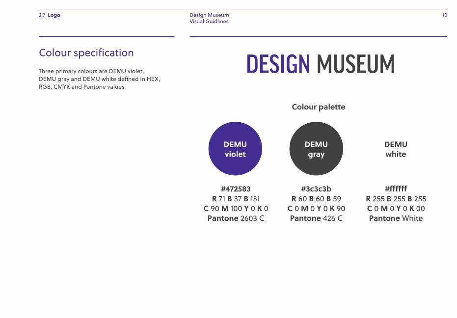
#472583R 71 B 37 B 131
C 90 M 100 Y 0 K 0Pantone 2603 C
#3c3c3bR 60 B 60 B 59
C 0 M 0 Y 0 K 90Pantone 426 C
#ffffffR 255 B 255 B 255C 0 M 0 Y 0 K 00Pantone White
Three primary colours are DEMU violet, DEMU gray and DEMU white defined in HEX, RGB, CMYK and Pantone values.
Colour specification
Design MuseumVisual Guidlines
2.7 Logo 10
DEMUviolet
DEMUgray
DEMUwhite

If neccessary to use the logo in grayscale mode, the word ‘Design’ or ‘DE’ is always brighter than the rest.
Grayscale specificaion
Design MuseumVisual Guidlines
2.8 Logo 11
R 112 B 111 B 111C 0 M 0 Y 0 K 70Pantone 7540 C
R 0 B 0 B 0C 0 M 0 Y 0 K 100Pantone Black C
R 157 B 157 B 156C 0 M 0 Y 0 K 50Pan Cool Gray 9
R 85 B 84 B 84C 0 M 0 Y 0 K 80Pantone 425 C
R 198 B 198 B 198C 0 M 0 Y 0 K 30Pan Cool Gray 5
R 135 B 135 B 135C 0 M 0 Y 0 K 60Pantone 424 C
R 237 B 237 B 237C 0 M 0 Y 0 K 10Pan Cool Gray 2
R 178 B 178 B 178C 0 M 0 Y 0 K 40Pantone 423 C

FF Good Headline Cond Book
The primary typography used in logos and applications is a straight-sided sans serif in the American Gothic tradition FF Good Headline Cond family designed by Łukasz Dziedzic, published by FontFont type foundry. The licence for this typeface needs to be purchased for at least three main cuts: Book, Medium and Black.
Primary typography
Design MuseumVisual Guidlines
2.9.1 Logo 12
ABCDEFGHIJKLMNOPQRSTUVWXYZabcdefghijklmnopqrstuvwxyz1234567890&@#$%*:;.,!?
&FF Good Headline Cond Medium
ABCDEFGHIJKLMNOPQRSTUVWXYZabcdefghijklmnopqrstuvwxyz1234567890&@#$%*:;.,!?
FF Good Headline Cond Black
ABCDEFGHIJKLMNOPQRSTUVWXYZabcdefghijklmnopqrstuvwxyz1234567890&@#$%*:;.,!?

Secondary typeface used for most of the text in all applications is Soleil family, a geometric sans serif typeface designed by Wolfgang Homola and published by Type Together. The licence for this typeface needs to be purchased for at least three cuts: Regular, Semibold and Bold.
Secondary typography
Design MuseumVisual Guidlines
2.9.2 Logo 13
&Soleil Regular
ABCDEFGHIJKLMNOPQRSTUVWXYZabcdefghijklmnopqrstuvwxyz1234567890&@#$%*:;.,!?
Soleil SemiBold
ABCDEFGHIJKLMNOPQRSTUVWXYZabcdefghijklmnopqrstuvwxyz1234567890&@#$%*:;.,!?
Soleil Bold
ABCDEFGHIJKLMNOPQRSTUVWXYZabcdefghijklmnopqrstuvwxyz1234567890&@#$%*:;.,!?

Design MuseumVisual Guidlines
3.0 14
3.1 Grid 153.2 Images 163.3 Business Cards 173.4 Le�erhead 183.5 Posters 193
Usage

The main element of each application is the shorten version of logo (DEMU) divided into two pieces: DE–MU.
The placement is defined by two column grid inspired by the facade of the museum’s building. The grid has fields with fixed size and more fields can be add or removed to the bo�om of the grid in the need of an application.
The rules of usage are as follow:1. One of the two element is always rotated
in 90º degrees.2. The width of one element is the same
as the height of the other element.3. The maximum size of both elements is
defined by the element, which is turned vertically. The maximum height of the vertical element is the height of a field, in which the element is located.
4. The minimum size is defined in the ‘Minimum size’ chapter in this manual.
5. To be the logo read in correct way (DEMU), the ‘DE’ is always placed on the le� side (if vertical grid) or on the top side (if horizontal grid).
6. Both elements can never be on the same line.
Grid
Design MuseumVisual Guidlines
3.1 Usage 15
1x
10x
2,5x

The images are full bleed colours with white background and with a main element on the foreground. The picture is taken from the side view.
Images
Design MuseumVisual Guidlines
3.2 Usage 16

Business cards are double sided. The width is 50mm and the height is 80mm.
The front side is in DEMU violet colour and it contains the full lenght logo, address and informations of the person. The back side is white with the shorten version of logo. Each employee can place the logo pieces as he wish by following the rules.
Business cards
Design MuseumVisual Guidlines
3.3 Usage 17
0,75x
Soleil Bold12 pt
0,75x
Deyan SudjicDirector of DEMU
T: +44 (0)20 7403 [email protected]
Soleil Regular6/7 pt 2x
1x
2,5x
1x
KensingtonLondon W14 8ND Great Britain

The le�erhead is one of a few applications, where the position of the short logo is fixed.
It contains full lenght logo, address, contact information and the content.
Le�erheads
Design MuseumVisual Guidlines
3.4 Usage 18
1,25x
Soleil Bold10/14 pt
Soleil Regular10/14 pt
KensingtonLondon W14 8NDGreat Britain
T: +44 (0)20 7403 [email protected]
Lorem ipsum,
Dolor sit amet, consectetur adipiscing elit. Aenean tellus enim, maximus quis tellus eget, sodales lacinia felis. Vestibulum ante ipsum primis in faucibus orci luctus et ultrices posuere cubilia Curae; Nunc suscipit nulla arcu, ac sollicitudin quam eleifend vel. Nulla facilisi. Nullam congue vel felis vitae vehicula. Donec at facilisis mi, aliquet mollis elit. Maecenas efficitur nisl at nibh commodo, finibus rutrum augue semper. Aliquam pretium augue a odio fringilla, id eleifend enim sollicitudin. Donec tempus ligula varius condimentum mollis. Proin pulvinar turpis non leo condimentum, a aliquam odio varius.
In at odio libero. Vivamus aliquam placerat lorem, ut bibendum enim molestie in. Vivamus venenatis in ex id vestibulum. Proin volutpat nulla vel sapien molestie, scelerisque porta diam facilisis. Maecenas non risus scelerisque libero pulvinar bibendum vitae ac magna. Fusce in scelerisque leo, in pharetra sapien. Interdum et malesuada fames ac ante ipsum primis in faucibus
Deyan SudjicDeyan SudjicDirector of DEMU
1,5x
4x 4x
3x
4x
20x
1x
16x
12,75x

Poster are simple, straight to the point. There to main elements: image in the center of the poster and the DEMU logo. Description paragraph and the short version logo are the only movable things on the poster. Image, headline, date and the full lenght logo have fixed positions.
Posters
Design MuseumVisual Guidlines
3.5 Usage 19
1,75x1x
13 May –1 November
Headlineof the exhibition
Embark on a creative journey into how traditional shoemaking has been shaped by contemporary designand new technologies. Life on Foot is the first exhibition on the maverick and much-loved Spanish footwear brand Camper.
Soleil Regular
Soleil Bold
Soleil Regular
3x
2x

© Design Museum 2015
Related Documents